\n
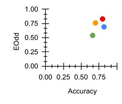
## Scatter Plot: Accuracy vs. EOdd
### Overview
The image presents a scatter plot visualizing the relationship between "Accuracy" and "EOdd". Five data points are plotted on the graph, each represented by a different colored circle. The plot aims to show how the EOdd value changes with varying levels of Accuracy.
### Components/Axes
* **X-axis:** Labeled "Accuracy", ranging from 0.00 to 0.75, with tick marks at 0.00, 0.25, 0.50, and 0.75.
* **Y-axis:** Labeled "EOdd", ranging from 0.00 to 1.00, with tick marks at 0.00, 0.25, 0.50, 0.75, and 1.00.
* **Data Points:** Five distinct colored circles representing individual data observations. No legend is provided, so colors are used to differentiate points.
### Detailed Analysis
The data points are as follows (approximate values based on visual estimation):
* **Red Point:** Accuracy ≈ 0.75, EOdd ≈ 0.75
* **Orange Point:** Accuracy ≈ 0.65, EOdd ≈ 0.75
* **Blue Point:** Accuracy ≈ 0.70, EOdd ≈ 0.70
* **Green Point:** Accuracy ≈ 0.55, EOdd ≈ 0.50
* **Yellow Point:** Accuracy ≈ 0.60, EOdd ≈ 0.80
The points do not appear to follow a strong linear trend. There is some clustering around EOdd values of 0.70-0.80.
### Key Observations
* The data points are relatively sparse, making it difficult to draw definitive conclusions about the relationship between Accuracy and EOdd.
* The yellow point is an outlier, exhibiting a higher EOdd value (approximately 0.80) compared to other points with similar Accuracy levels.
* There is a range of Accuracy values, from approximately 0.55 to 0.75.
### Interpretation
The scatter plot suggests a potentially weak positive correlation between Accuracy and EOdd, but the limited number of data points and the outlier prevent a strong conclusion. The EOdd value does not consistently increase with Accuracy. The yellow point suggests that for an Accuracy of around 0.60, the EOdd can be significantly higher than other observations. This could indicate a different underlying mechanism or a unique characteristic of that particular data point. Further investigation with a larger dataset would be necessary to confirm any trends and understand the factors influencing the EOdd value. The lack of a legend makes it difficult to interpret the meaning of each color, and therefore the context of the data is limited.