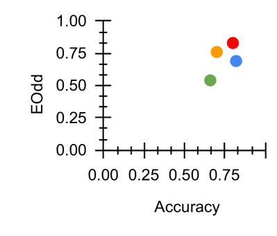
## Scatter Plot: Accuracy vs. EOOdd
### Overview
The image depicts a scatter plot comparing two metrics: **Accuracy** (x-axis) and **EOOdd** (y-axis). Four distinct data points are plotted, each represented by a unique color (red, orange, blue, green). The axes range from 0.00 to 1.00 for both metrics, with gridlines at 0.25 intervals. The legend associates colors with labels, though no explicit labels are provided in the image.
---
### Components/Axes
- **X-axis (Accuracy)**: Labeled "Accuracy," scaled from 0.00 to 0.80 in increments of 0.25.
- **Y-axis (EOOdd)**: Labeled "EOOdd," scaled from 0.00 to 1.00 in increments of 0.25.
- **Legend**: Positioned on the right side of the plot, mapping colors to labels:
- Red
- Orange
- Blue
- Green
---
### Detailed Analysis
1. **Red Data Point**:
- **Position**: Top-right quadrant.
- **Accuracy**: ~0.80 (highest among all points).
- **EOOdd**: ~0.80 (highest among all points).
2. **Orange Data Point**:
- **Position**: Slightly left and below the red point.
- **Accuracy**: ~0.70.
- **EOOdd**: ~0.75.
3. **Blue Data Point**:
- **Position**: Right of the orange point but lower on the y-axis.
- **Accuracy**: ~0.75.
- **EOOdd**: ~0.70.
4. **Green Data Point**:
- **Position**: Bottom-left quadrant relative to the other points.
- **Accuracy**: ~0.60.
- **EOOdd**: ~0.50 (lowest among all points).
---
### Key Observations
- **Highest Performance**: The red point dominates both metrics, achieving the highest accuracy (~0.80) and EOOdd (~0.80).
- **Lowest Performance**: The green point is the weakest, with accuracy (~0.60) and EOOdd (~0.50) significantly lower than others.
- **Trade-offs**: The blue and orange points show intermediate values, with blue prioritizing accuracy (~0.75) over EOOdd (~0.70), while orange balances both (~0.70 accuracy, ~0.75 EOOdd).
- **Spread**: Data points are dispersed, suggesting variability in performance across the measured criteria.
---
### Interpretation
The plot illustrates a **positive correlation** between accuracy and EOOdd, as higher accuracy generally aligns with higher EOOdd values. However, exceptions exist:
- The blue point (accuracy: 0.75, EOOdd: 0.70) demonstrates that high accuracy does not always guarantee high EOOdd.
- The green point (accuracy: 0.60, EOOdd: 0.50) may represent an outlier or a scenario where both metrics underperform.
This suggests that while accuracy and EOOdd often improve together, other factors (e.g., model complexity, data quality, or contextual constraints) may influence their relationship. The red point could represent an optimal configuration, whereas the green point highlights potential areas for improvement.