## Bayesian Online Changepoint Detection
## Ryan Prescott Adams
Cavendish Laboratory Cambridge CB3 0HE United Kingdom
## Abstract
Changepoints are abrupt variations in the generative parameters of a data sequence. Online detection of changepoints is useful in modelling and prediction of time series in application areas such as finance, biometrics, and robotics. While frequentist methods have yielded online filtering and prediction techniques, most Bayesian papers have focused on the retrospective segmentation problem. Here we examine the case where the model parameters before and after the changepoint are independent and we derive an online algorithm for exact inference of the most recent changepoint. We compute the probability distribution of the length of the current 'run,' or time since the last changepoint, using a simple message-passing algorithm. Our implementation is highly modular so that the algorithm may be applied to a variety of types of data. We illustrate this modularity by demonstrating the algorithm on three different real-world data sets.
## 1 INTRODUCTION
Changepoint detection is the identification of abrupt changes in the generative parameters of sequential data. As an online and offline signal processing tool, it has proven to be useful in applications such as process control [1], EEG analysis [5, 2, 17], DNA segmentation [6], econometrics [7, 18], and disease demographics [9].
Frequentist approaches to changepoint detection, from the pioneering work of Page [22, 23] and Lorden [19] to recent work using support vector machines [10], offer online changepoint detectors. Most Bayesian approaches to changepoint detection, in contrast, have been offline and retrospective [24, 4, 26, 13, 8]. With a
David J.C. MacKay Cavendish Laboratory
Cambridge CB3 0HE United Kingdom few exceptions [16, 20], the Bayesian papers on changepoint detection focus on segmentation and techniques to generate samples from the posterior distribution over changepoint locations.
In this paper, we present a Bayesian changepoint detection algorithm for online inference. Rather than retrospective segmentation, we focus on causal predictive filtering; generating an accurate distribution of the next unseen datum in the sequence, given only data already observed. For many applications in machine intelligence, this is a natural requirement. Robots must navigate based on past sensor data from an environment that may have abruptly changed: a door may be closed now, for example, or the furniture may have been moved. In vision systems, the brightness change when a light switch is flipped or when the sun comes out.
We assume that a sequence of observations x 1 , x 2 , . . . , x T may be divided into non-overlapping product partitions [3]. The delineations between partitions are called the changepoints. We further assume that for each partition ρ , the data within it are i.i.d. from some probability distribution P ( x t | η ρ ). The parameters η ρ , ρ = 1 , 2 , . . . are taken to be i.i.d. as well. We denote the contiguous set of observations between time a and b inclusive as x a : b . The discrete a priori probability distribution over the interval between changepoints is denoted as P gap ( g ).
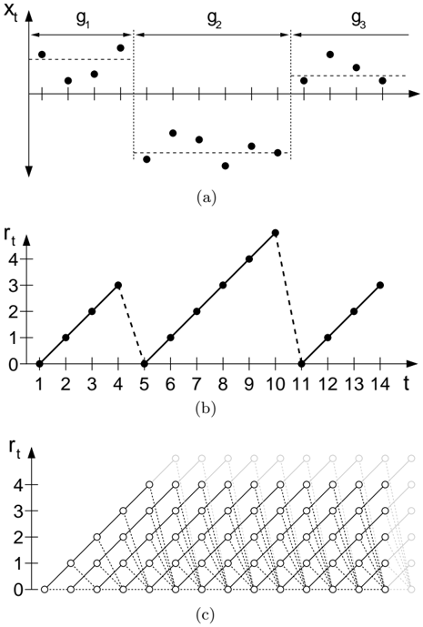
We are concerned with estimating the posterior distribution over the current 'run length,' or time since the last changepoint, given the data so far observed. We denote the length of the current run at time t by r t . We also use the notation x ( r ) t to indicate the set of observations associated with the run r t . As r may be zero, the set x ( r ) may be empty. We illustrate the relationship between the run length r and some hypothetical univariate data in Figures 1(a) and 1(b).
Figure 1: This figure illustrates how we describe a changepoint model expressed in terms of run lengths. Figure 1(a) shows hypothetical univariate data divided by changepoints on the mean into three segments of lengths g 1 = 4, g 2 = 6, and an undetermined length g 3 . Figure 1(b) shows the run length r t as a function of time. r t drops to zero when a changepoint occurs. Figure 1(c) shows the trellis on which the messagepassing algorithm lives. Solid lines indicate that probability mass is being passed 'upwards,' causing the run length to grow at the next time step. Dotted lines indicate the possibility that the current run is truncated and the run length drops to zero.
<details>
<summary>Image 1 Details</summary>
### Visual Description
## Time Series Analysis Diagrams
### Overview
The image presents three diagrams related to time series analysis. Diagram (a) shows a discrete time series, while diagrams (b) and (c) illustrate cumulative reward functions based on the time series in (a).
### Components/Axes
**Diagram (a):**
* **X-axis:** Represents time, denoted as 't'. The axis has tick marks, but no explicit numerical labels.
* **Y-axis:** Represents the value of the time series, denoted as 'xt'.
* **Regions:** The time series is divided into three regions labeled g1, g2, and g3. These regions are visually separated by dotted vertical lines.
* **Data Points:** Discrete data points are plotted within each region. The points in g1 are generally above the x-axis, the points in g2 are generally below the x-axis, and the points in g3 are generally above the x-axis.
* **Horizontal Dotted Lines:** Horizontal dotted lines are drawn to visually represent the approximate upper and lower bounds of the data points within each region.
**Diagram (b):**
* **X-axis:** Represents time, denoted as 't'. The axis is labeled with numerical values from 1 to 14.
* **Y-axis:** Represents the cumulative reward, denoted as 'rt'. The axis is labeled with numerical values from 0 to 4.
* **Data Points:** Data points are connected by lines. The lines are solid when the cumulative reward is increasing and dashed when the cumulative reward decreases.
**Diagram (c):**
* **X-axis:** Represents time, but without explicit labels.
* **Y-axis:** Represents the cumulative reward, denoted as 'rt'. The axis is labeled with numerical values from 0 to 4.
* **Data Points:** Data points are represented by circles, connected by dotted lines. The circles and lines fade into the background as time increases.
### Detailed Analysis
**Diagram (a):**
* **Region g1:** The data points are generally positive, with values around 1.
* **Region g2:** The data points are generally negative, with values around -1.
* **Region g3:** The data points are generally positive, with values around 1.
**Diagram (b):**
* **Time 1-4:** The cumulative reward increases linearly from 0 to approximately 3.
* **Time 4-5:** The cumulative reward decreases from approximately 3 to 0.
* **Time 5-10:** The cumulative reward increases linearly from 0 to approximately 4.5.
* **Time 10-11:** The cumulative reward decreases from approximately 4.5 to 0.
* **Time 11-14:** The cumulative reward increases linearly from 0 to approximately 3.
**Diagram (c):**
* The diagram shows multiple paths of cumulative reward, starting from time 0. Each path represents a possible sequence of rewards.
* The paths are constructed by connecting data points with dotted lines. The paths that start earlier are darker and more visible, while the paths that start later are lighter and fade into the background.
### Key Observations
* Diagram (a) shows a time series with alternating positive and negative values.
* Diagram (b) shows a cumulative reward function that increases when the time series is positive and decreases when the time series is negative.
* Diagram (c) shows multiple possible paths of cumulative reward, representing different sequences of rewards.
### Interpretation
The diagrams illustrate the relationship between a discrete time series and its cumulative reward function. Diagram (a) provides the raw data, while diagrams (b) and (c) show how the cumulative reward changes over time based on the values of the time series. The alternating positive and negative values in diagram (a) lead to increases and decreases in the cumulative reward in diagram (b). Diagram (c) provides a more comprehensive view of the possible cumulative reward paths, taking into account different sequences of rewards. The diagrams are useful for understanding how a time series can be used to generate rewards and how the cumulative reward changes over time.
</details>
## 2 RECURSIVE RUN LENGTH ESTIMATION
We assume that we can compute the predictive distribution conditional on a given run length r t . We then integrate over the posterior distribution on the current run length to find the marginal predictive distribution:
<!-- formula-not-decoded -->
To find the posterior distribution
<!-- formula-not-decoded -->
we write the joint distribution over run length and observed data recursively.
<!-- formula-not-decoded -->
Note that the predictive distribution P ( x t | r t -1 , x 1: t ) depends only on the recent data x ( r ) t . We can thus generate a recursive message-passing algorithm for the joint distribution over the current run length and the data, based on two calculations: 1) the prior over r t given r t -1 , and 2) the predictive distribution over the newly-observed datum, given the data since the last changepoint.
## 2.1 THE CHANGEPOINT PRIOR
The conditional prior on the changepoint P ( r t | r t -1 ) gives this algorithm its computational efficiency, as it has nonzero mass at only two outcomes: the run length either continues to grow and r t = r t -1 +1 or a changepoint occurs and r t = 0.
<!-- formula-not-decoded -->
The function H ( τ ) is the hazard function . [11].
<!-- formula-not-decoded -->
In the special case is where P gap ( g ) is a discrete exponential (geometric) distribution with timescale λ , the process is memoryless and the hazard function is constant at H ( τ ) = 1 /λ .
Figure 1(c) illustrates the resulting message-passing algorithm. In this diagram, the circles represent runlength hypotheses. The lines between the circles show recursive transfer of mass between time steps. Solid lines indicate that probability mass is being passed 'upwards,' causing the run length to grow at the next time step. Dotted lines indicate that the current run is truncated and the run length drops to zero.
## 2.2 BOUNDARY CONDITIONS
A recursive algorithm must not only define the recurrence relation, but also the initialization conditions. We consider two cases: 1) a changepoint occurred a priori before the first datum, such as when observing a game. In such cases we place all of the probability mass for the initial run length at zero, i.e. P ( r 0 =0) = 1. 2) We observe some recent subset of the data, such as when modelling climate change. In this case the prior over the initial run length is the normalized survival function [11]
<!-- formula-not-decoded -->
where Z is an appropriate normalizing constant, and
<!-- formula-not-decoded -->
## 2.3 CONJUGATE-EXPONENTIAL MODELS
Conjugate-exponential models are particularly convenient for integrating with the changepoint detection scheme described here. Exponential family likelihoods allow inference with a finite number of sufficient statistics which can be calculated incrementally as data arrives. Exponential family likelihoods have the form
<!-- formula-not-decoded -->
where
<!-- formula-not-decoded -->
The strength of the conjugate-exponential representation is that both the prior and posterior take the form of an exponential-family distribution over η that can be summarized by succinct hyperparameters ν and χ .
<!-- formula-not-decoded -->
We wish to infer the parameter vector η associated with the data from a current run length r t . We denote this run-specific model parameter as η ( r ) t . After finding the posterior distribution P ( η ( r ) t | r t , x ( r ) t ), we can marginalize out the parameters to find the predictive distribution, conditional on the length of the current run.
<!-- formula-not-decoded -->
<!-- formula-not-decoded -->
Algorithm 1: The online changepoint algorithm with prediction. An additional optimization not shown is to truncate the per-timestep vectors when the tail of P ( r t | x 1: t ) has mass beneath a threshold.
This marginal predictive distribution, while generally not itself an exponential-family distribution, is usually a simple function of the sufficient statistics. When exact distributions are not available, compact approximations such as that described by Snelson and Ghahramani [25] may be useful. We will only address the exact case in this paper, where the predictive distribution associated with a particular current run length is parameterized by ν ( r ) t and χ ( r ) t .
<!-- formula-not-decoded -->
<!-- formula-not-decoded -->
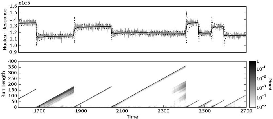
Figure 2: The top plot is a 1100-datum subset of nuclear magnetic response during the drilling of a well. The data are plotted in light gray, with the predictive mean (solid dark line) and predictive 1σ error bars (dotted lines) overlaid. The bottom plot shows the posterior probability of the current run P ( r t | x 1: t ) at each time step, using a logarithmic color scale. Darker pixels indicate higher probability.
<details>
<summary>Image 2 Details</summary>
### Visual Description
## Combined Chart: Nuclear Response and Run Length vs. Time
### Overview
The image presents two charts stacked vertically. The top chart displays the "Nuclear Response" over time, showing fluctuations and plateaus. The bottom chart is a heatmap showing "Run Length" over time, with the color intensity representing the probability P(run).
### Components/Axes
**Top Chart:**
* **Y-axis:** "Nuclear Response" with a scale factor of x1e5. The axis ranges from 0.9 x1e5 to 1.6 x1e5, with tick marks at 0.9, 1.0, 1.1, 1.2, 1.3, 1.4, 1.5, and 1.6.
* **X-axis:** "Time" (shared with the bottom chart).
* **Data Series:**
* A noisy gray line that fluctuates around a central value.
* A solid black line that represents a smoothed version of the noisy gray line.
* A dashed black line that appears to be a model or prediction.
**Bottom Chart:**
* **Y-axis:** "Run Length" ranging from 0 to 400, with tick marks every 50 units.
* **X-axis:** "Time" ranging from approximately 1600 to 2700, with tick marks at 1700, 1900, 2100, 2300, 2500, and 2700.
* **Colorbar (Right):** Represents "P(run)" (probability of run) on a logarithmic scale, ranging from 1 (darkest) to 10^-5 (lightest). The colorbar has tick marks at 1, 10^-1, 10^-2, 10^-3, 10^-4, and 10^-5.
### Detailed Analysis
**Top Chart (Nuclear Response):**
* **Time 1600-1850:** The nuclear response is relatively stable around 1.4 x1e5.
* **Time 1850-1900:** The nuclear response drops sharply to approximately 1.15 x1e5.
* **Time 1900-2350:** The nuclear response remains relatively stable around 1.2 x1e5.
* **Time 2350-2450:** The nuclear response increases sharply to approximately 1.4 x1e5.
* **Time 2450-2500:** The nuclear response drops sharply to approximately 1.15 x1e5.
* **Time 2500-2700:** The nuclear response remains relatively stable around 1.2 x1e5.
**Bottom Chart (Run Length):**
* The heatmap shows diagonal lines originating from the x-axis. The slope of these lines indicates the rate of increase in "Run Length" over time.
* The intensity of the lines represents the probability "P(run)". Darker lines indicate higher probabilities.
* Several distinct "runs" are visible, starting at different times.
* The run starting around time 2300 shows a more diffuse pattern, indicating a wider range of run lengths with significant probability.
### Key Observations
* The "Nuclear Response" exhibits distinct plateaus and sharp transitions.
* The "Run Length" heatmap shows discrete runs with varying probabilities.
* The time axis is shared between the two charts, allowing for direct comparison of the "Nuclear Response" and "Run Length" behavior.
### Interpretation
The data suggests a relationship between the "Nuclear Response" and the initiation of "runs". The sharp transitions in "Nuclear Response" may be triggering events for the start of new runs. The heatmap provides information about the distribution of run lengths and their probabilities over time. The diffuse pattern around time 2300 suggests a more complex process or a change in the underlying dynamics. The dashed line in the top chart likely represents a model attempting to capture the dynamics of the nuclear response, and its deviations from the actual data (gray line) could indicate model limitations or unmodeled factors influencing the system.
</details>
## 2.4 COMPUTATIONAL COST
The complete algorithm, assuming exponential-family likelihoods, is shown in Algorithm 1. The space- and time-complexity per time-step are linear in the number of data points so far observed. A trivial modification of the algorithm is to discard the run length probability estimates in the tail of the distribution which have a total mass less than some threshold, say 10 -4 . This yields a constant average complexity per iteration on the order of the expected run length E [ r ], although the worst-case complexity is still linear in the data.
## 3 EXPERIMENTAL RESULTS
In this section we demonstrate several implementations of the changepoint algorithm developed in this paper. We examine three real-world example datasets. The first case is a varying Gaussian mean from welllog data. In the second example we consider abrupt changes of variance in daily returns of the Dow Jones Industrial Average. The final data are the intervals between coal mining disasters, which we model as a Poisson process. In each of the three examples, we use a discrete exponential prior over the interval between changepoints.
## 3.1 WELL-LOG DATA
These data are 4050 measurements of nuclear magnetic response taken during the drilling of a well. The data are used to interpret the geophysical structure of the rock surrounding the well. The variations in mean reflect the stratification of the earth's crust. These data have been studied in the context of changepoint detection by ´ O Ruanaidh and Fitzgerald [21], and by Fearnhead and Clifford [12].
The changepoint detection algorithm was run on these data using a univariate Gaussian model with prior parameters µ = 1 . 15 × 10 5 and σ = 1 × 10 4 . The rate of the discrete exponential prior, λ gap , was 250. A subset of the data is shown in Figure 2, with the predictive mean and standard deviation overlaid on the top plot. The bottom plot shows the log probability over the current run length at each time step. Notice that the drops to zero run-length correspond well with the abrupt changes in the mean of the data. Immediately after a changepoint, the predictive variance increases, as would be expected for a sudden reduction in data.
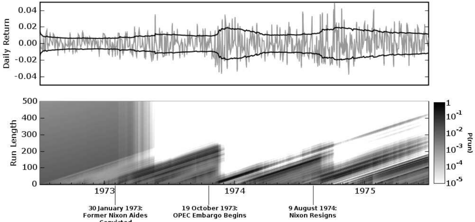
## 3.2 1972-75 DOW JONES RETURNS
During the three year period from the middle of 1972 to the middle of 1975, several major events occurred that had potential macroeconomic effects. Significant among these are the Watergate affair and the OPEC oil embargo. We applied the changepoint detection algorithm described here to daily returns of the Dow Jones Industrial Average from July 3, 1972 to June 30, 1975. We modelled the returns
<!-- formula-not-decoded -->
<details>
<summary>Image 3 Details</summary>
### Visual Description
## Chart: Daily Return and Run Length Analysis (1973-1975)
### Overview
The image presents two plots. The top plot shows the daily return fluctuating around zero, with upper and lower bounds indicated by black lines. The bottom plot is a heatmap showing the probability of run length over time, with specific events marked along the x-axis.
### Components/Axes
**Top Plot:**
* **Y-axis:** Daily Return, ranging from -0.04 to 0.04 with increments of 0.02.
* **X-axis:** Time (implicit, but spans approximately 1973-1975, matching the bottom plot).
* **Data:** A fluctuating gray line representing the daily return. Two black lines represent upper and lower bounds.
**Bottom Plot:**
* **Y-axis:** Run Length, ranging from 0 to 500 with increments of 100.
* **X-axis:** Time, spanning from approximately 1973 to 1975.
* **Color Scale (right side):** P(run), ranging from 1 to 10^-5 on a logarithmic scale. Darker shades represent higher probabilities.
* **Events (marked on the x-axis):**
* 30 January 1973: Former Nixon Aides Convicted
* 19 October 1973: OPEC Embargo Begins
* 9 August 1974: Nixon Resigns
### Detailed Analysis
**Top Plot (Daily Return):**
* The gray line fluctuates around 0.00.
* The black lines representing the upper and lower bounds appear to widen slightly around mid-1974.
* The daily return fluctuates between approximately -0.02 and 0.02 for most of the period.
**Bottom Plot (Run Length Probability):**
* The heatmap shows diagonal lines, indicating the probability of different run lengths over time.
* The probability generally decreases as the run length increases.
* There are vertical bands of higher probability that seem to start at the time of the events marked on the x-axis.
* Before January 1973, the probability of longer run lengths is relatively high.
* After January 1973, the probability of longer run lengths decreases significantly.
* After the OPEC embargo in October 1973, the probability of longer run lengths increases again, but not as high as before January 1973.
* After Nixon's resignation in August 1974, the probability of longer run lengths increases again.
### Key Observations
* The daily return fluctuates around zero, with some periods of increased volatility.
* The probability of longer run lengths appears to be affected by major political and economic events.
* The period before January 1973 shows a higher probability of longer run lengths compared to the rest of the period.
### Interpretation
The plots suggest a relationship between major political and economic events and the probability of run lengths in the market. The conviction of Nixon's aides, the OPEC embargo, and Nixon's resignation all appear to coincide with changes in the probability of longer run lengths. This could indicate that these events introduced uncertainty or instability into the market, affecting the persistence of trends. The daily return plot provides context, showing the volatility of the market during this period. The higher probability of longer run lengths before January 1973 might indicate a period of greater stability or predictability in the market before the events of the Watergate scandal and the oil crisis.
</details>
Convicted
Figure 3: The top plot shows daily returns on the Dow Jones Industrial Average, with an overlaid plot of the predictive volatility. The bottom plot shows the posterior probability of the current run length P ( r t | x 1: t ) at each time step, using a logarithmic color scale. Darker pixels indicate higher probability. The time axis is in business days, as this is market data. Three events are marked: the conviction of G. Gordon Liddy and James W. McCord, Jr. on January 30, 1973; the beginning of the OPEC embargo against the United States on October 19, 1973; and the resignation of President Nixon on August 9, 1974.
(where p close is the daily closing price) with a zeromean Gaussian distribution and piecewise-constant variance. Hsu [14] performed a similar analysis on a subset of these data, using frequentist techniques and weekly returns.
We used a gamma prior on the inverse variance, with a = 1 and b = 10 -4 . The exponential prior on changepoint interval had rate λ gap = 250. In Figure 3, the top plot shows the daily returns with the predictive standard deviation overlaid. The bottom plot shows the posterior probability of the current run length, P ( r t | x 1: t ). Three events are marked on the plot: the conviction of Nixon re-election officials G. Gordon Liddy and James W. McCord, Jr., the beginning of the oil embargo against the United States by the Organization of Petroleum Exporting Countries (OPEC), and the resignation of President Nixon.
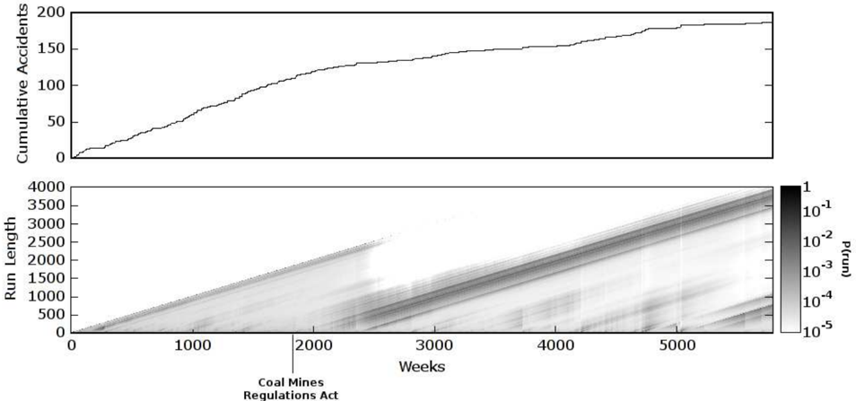
## 3.3 COAL MINE DISASTER DATA
These data from Jarrett [15] are dates of coal mining explosions that killed ten or more men between March 15, 1851 and March 22, 1962. We modelled the data as an Poisson process by weeks, with a gamma prior on the rate with a = b = 1. The rate of the exponential prior on the changepoint inverval was λ gap = 1000. The data are shown in Figure 4. The top plot shows the cumulative number of accidents. The rate of the
Possion process determines the local average of the slope. The posterior probability of the current run length is shown in the bottom plot. The introduction of the Coal Mines Regulations Act in 1887 (corresponding to weeks 1868 to 1920) is also marked.
## 4 DISCUSSION
This paper contributes a predictive, online interpetation of Bayesian changepoint detection and provides a simple and exact method for calculating the posterior probability of the current run length. We have demonstrated this algorithm on three real-world data sets with different modelling requirements.
Additionally, this framework provides convenient delineation between the implementation of the changepoint algorithm and the implementation of the model. This modularity allows changepoint-detection code to use an object-oriented, 'pluggable' type architecture.
## Acknowledgements
The authors would like to thank Phil Cowans and Marian Frazier for valuable discussions. This work was funded by the Gates Cambridge Trust.
<details>
<summary>Image 4 Details</summary>
### Visual Description
## Combined Chart: Cumulative Accidents and Run Length Probability
### Overview
The image presents two charts stacked vertically. The top chart is a line graph showing the cumulative number of accidents over time. The bottom chart is a heatmap displaying the probability of different run lengths over time. The x-axis for both charts represents time in weeks. A vertical line indicates the implementation of the Coal Mines Regulations Act.
### Components/Axes
**Top Chart:**
* **Y-axis:** "Cumulative Accidents", ranging from 0 to 200 in increments of 50.
* **X-axis:** Implied "Weeks" (same as the bottom chart).
* **Data Series:** A single black line representing the cumulative accident count.
**Bottom Chart:**
* **Y-axis:** "Run Length", ranging from 0 to 4000 in increments of 500.
* **X-axis:** "Weeks", ranging from 0 to approximately 5500 in increments of 1000.
* **Color Scale:** A vertical color bar on the right side labeled "P(run)". The scale is logarithmic, ranging from 1 (darkest) to 10^-5 (lightest). The scale markers are 1, 10^-1, 10^-2, 10^-3, 10^-4, and 10^-5.
* **Vertical Line:** A vertical line at approximately 2200 weeks, labeled "Coal Mines Regulations Act".
### Detailed Analysis or ### Content Details
**Top Chart (Cumulative Accidents):**
* The cumulative accident count increases over time, but the rate of increase varies.
* Initially, the line slopes upward steeply, indicating a rapid increase in accidents.
* Around 1000 weeks, the slope decreases, suggesting a slower rate of accidents.
* The line flattens out somewhat after approximately 4000 weeks, indicating a further reduction in the accident rate.
* Approximate data points:
* At 0 weeks, Cumulative Accidents = 0
* At 1000 weeks, Cumulative Accidents = 75 +/- 5
* At 2000 weeks, Cumulative Accidents = 130 +/- 5
* At 3000 weeks, Cumulative Accidents = 150 +/- 5
* At 4000 weeks, Cumulative Accidents = 180 +/- 5
* At 5000 weeks, Cumulative Accidents = 190 +/- 5
**Bottom Chart (Run Length Probability):**
* The heatmap shows the probability of different run lengths over time. Darker areas indicate higher probabilities.
* There is a general trend of increasing run length probability over time, visible as a diagonal band from the bottom-left to the top-right.
* Before the "Coal Mines Regulations Act" line, there are some areas of higher probability at shorter run lengths.
* After the "Coal Mines Regulations Act" line, the higher probability areas seem to shift towards longer run lengths.
* The probability distribution appears to change around the time of the "Coal Mines Regulations Act".
* The heatmap shows bands of varying probability, suggesting that certain run lengths are more common at different times.
### Key Observations
* The cumulative accident count increases over time, but the rate of increase slows down.
* The "Coal Mines Regulations Act" appears to have an impact on both the cumulative accident count and the run length probability.
* The heatmap shows a general trend of increasing run length probability over time.
### Interpretation
The data suggests that the "Coal Mines Regulations Act" may have had a positive impact on safety in coal mines. The cumulative accident count shows a decrease in the rate of accidents after the act was implemented. The heatmap shows a shift towards longer run lengths, which could indicate that accidents are becoming less frequent or that the mines are operating more consistently.
The relationship between the two charts is that they both provide information about safety in coal mines over time. The cumulative accident count gives an overall picture of the number of accidents, while the heatmap provides more detailed information about the probability of different run lengths.
A notable outlier is the period before 1000 weeks, where the cumulative accident count increases rapidly. This could indicate that there were some specific factors that contributed to a higher accident rate during this time.
</details>
RegulationsAct
Figure 4: These data are the weekly occurrence of coal mine disasters that killed ten or more people between 1851 and 1962. The top plot is the cumulative number of accidents. The accident rate determines the local average slope of the plot. The introduction of the Coal Mines Regulations Act in 1887 is marked. The year 1887 corresponds to weeks 1868 to 1920 on this plot. The bottom plot shows the posterior probability of the current run length at each time step, P ( r t | x 1: t ).
## References
- [1] Leo A. Aroian and Howard Levene. The effectiveness of quality control charts. Journal of the American Statistical Association , 45(252):520529, 1950.
- [2] J. S. Barlow, O. D. Creutzfeldt, D. Michael, J. Houchin, and H. Epelbaum. Automatic adaptive segmentation of clinical EEGs,. Electroencephalography and Clinical Neurophysiology , 51(5):512-525, May 1981.
- [3] D. Barry and J. A. Hartigan. Product partition models for change point problems. The Annals of Statistics , 20:260-279, 1992.
- [4] D. Barry and J. A. Hartigan. A Bayesian analysis of change point problems. Journal of the American Statistical Association , 88:309-319, 1993.
- [5] G. Bodenstein and H. M. Praetorius. Feature extraction from the electroencephalogram by adaptive segmentation. Proceedings of the IEEE , 65(5):642-652, 1977.
- [6] J. V. Braun, R. K. Braun, and H. G. M¨ uller. Multiple changepoint fitting via quasilikelihood, with application to DNA sequence segmentation. Biometrika , 87(2):301-314, June 2000.
- [7] Jie Chen and A. K. Gupta. Testing and locating variance changepoints with application to stock prices. Journal of the American Statistical Association , 92(438):739-747, June 1997.
- [8] Siddhartha Chib. Estimation and comparison of multiple change-point models. Journal of Econometrics , 86(2):221-241, October 1998.
- [9] D. Denison and C. Holmes. Bayesian partitioning for estimating disease risk, 1999.
- [10] F. Desobry, M. Davy, and C. Doncarli. An online kernel change detection algorithm. IEEE Transactions on Signal Processing , 53(8):29612974, August 2005.
- [11] Merran Evans, Nicholas Hastings, and Brian Peacock. Statistical Distributions . WileyInterscience, June 2000.
- [12] Paul Fearnhead and Peter Clifford. On-line inference for hidden Markov models via particle filters. Journal of the Royal Statistical Society B , 65(4):887-899, 2003.
- [13] P. Green. Reversible jump Markov chain Monte Carlo computation and Bayesian model determination, 1995.
- [14] D. A. Hsu. Tests for variance shift at an unknown time point. Applied Statistics , 26(3):279284, 1977.
- [15] R. G. Jarrett. A note on the intervals between coal-mining disasters. Biometrika , 66(1):191-193, 1979.
- [16] Timothy T. Jervis and Stuart I. Jardine. Alarm system for wellbore site. United States Patent 5,952,569, October 1997.
- [17] A. Y. Kaplan and S. L. Shishkin. Application of the change-point analysis to the investigation of the brain's electrical activity. In B. E. Brodsky and B. S. Darkhovsky, editors, Non-Parametric Statistical Diagnosis : Problems and Methods , pages 333-388. Springer, 2000.
- [18] Gary M. Koop and Simon M. Potter. Forecasting and estimating multiple change-point models with an unknown number of change points. Technical report, Federal Reserve Bank of New York, December 2004.
- [19] G. Lorden. Procedures for reacting to a change in distribution. The Annals of Mathematical Statistics , 42(6):1897-1908, December 1971.
- [20] J. J. ´ O Ruanaidh, W. J. Fitzgerald, and K. J. Pope. Recursive Bayesian location of a discontinuity in time series. In Acoustics, Speech, and Signal Processing, 1994. ICASSP-94., 1994 IEEE International Conference on , volume iv, pages IV/513-IV/516 vol.4, 1994.
- [21] Joseph J. K. ´ O Ruanaidh and William J. Fitzgerald. Numerical Bayesian Methods Applied to Signal Processing (Statistics and Computing) . Springer, February 1996.
- [22] E. S. Page. Continuous inspection schemes. Biometrika , 41(1/2):100-115, June 1954.
- [23] E. S. Page. A test for a change in a parameter occurring at an unknown point. Biometrika , 42(3/4):523-527, 1955.
- [24] A. F. M. Smith. A Bayesian approach to inference about a change-point in a sequence of random variables. Biometrika , 62(2):407-416, 1975.
- [25] Edward Snelson and Zoubin Ghahramani. Compact approximations to Bayesian predictive distributions. In ICML '05: Proceedings of the 22nd international conference on Machine learning , pages 840-847, New York, NY, USA, 2005. ACM Press.
- [26] D. A. Stephens. Bayesian retrospective multiplechangepoint identification. Applied Statistics , 43:159-178, 1994.