# Unknown Title
## Complexity of Networks (reprise)
## Russell K. Standish
Mathematics and Statistics, University of New South Wales hpcoder@hpcoders.com.au
November 3, 2018
## Abstract
Network or graph structures are ubiquitous in the study of complex systems. Often, we are interested in complexity trends of these system as it evolves under some dynamic. An example might be looking at the complexity of a food web as species enter an ecosystem via migration or speciation, and leave via extinction.
In a previous paper, a complexity measure of networks was proposed based on the complexity is information content paradigm. To apply this paradigm to any object, one must fix two things: a representation language, in which strings of symbols from some alphabet describe, or stand for the objects being considered; and a means of determining when two such descriptions refer to the same object. With these two things set, the information content of an object can be computed in principle from the number of equivalent descriptions describing a particular object.
The previously proposed representation language had the deficiency that the fully connected and empty networks were the most complex for a given number of nodes. A variation of this measure, called zcomplexity, applied a compression algorithm to the resulting bitstring representation, to solve this problem. Unfortunately, zcomplexity proved too computationally expensive to be practical.
In this paper, I propose a new representation language that encodes the number of links along with the number of nodes and a representation of the linklist. This, like zcomplexity, exhibits minimal complexity for fully connected and empty networks, but is as tractable as the original measure.
This measure is extended to directed and weighted links, and several real world networks have their network complexities compared with randomly generated model networks with matched node and link counts, and matched link weight distributions. Compared with the random networks, the real world networks have significantly higher complexity, as do artificially generated food webs created via an evolutionary process, in several well known ALife models.
Keywords: complexity; information; networks; foodwebs
## 1 Introduction
This work situates itself firmly within the complexity is information content paradigm, a topic that dates back to the 1960s with the work of Kolmogorov, Chaitin and Solomonoff. Prokopenko et al. [28] provide a recent review of the area, and argue for the importance of information theory to the notion of complexity measure. In [32], I argue that information content provides an overarching complexity measure that connects the many and various complexity measures proposed (see [14] for a review) up to that time. In some ways, information-based complexity measures are priveleged, motivating the present work to develop a satisfactory information-based complexity measure of networks.
The idea is fairly simple. In most cases, there is an obvious prefix-free representation language within which descriptions of the objects of interest can be encoded. There is also a classifier of descriptions that can determine if two descriptions correspond to the same object. This classifier is commonly called the observer , denoted O ( x ).
To compute the complexity of some object x , count the number of equivalent descriptions ω ( /lscript,x ) of length /lscript that map to the object x under the agreed classifier. Then the complexity of x is given in the limit as /lscript →∞ :
$$( x ) = \lim _ { t \rightarrow + \infty } ( t \log N - \log w )$$
where N is the size of the alphabet used for the representation language.
Because the representation language is prefix-free, every description y in that language has a unique prefix of length s ( y ). The classifier does not care what symbols appear after this unique prefix. Hence ω ( /lscript,O ( y )) ≥ N /lscript -s ( y ) . As /lscript increases, ω must increase as fast, if not faster than N /lscript , and do so monotonically. Therefore C ( O ( y )) decreases monotonically with /lscript , but is bounded below by 0. So equation (1) converges.
The relationship of this algorithmic complexity measure to more familiar measures such as Kolmogorov (KCS) complexity, is given by the coding theorem[22, Thm 4.3.3]. In this case, the descriptions are halting programs of some given universal Turing machine U , which is also the classifier. Equation (1) then corresponds to the logarithm of the universal a priori probability , which is a kind of formalised Occam's razor that gives higher weight to simpler (in the KCS sense) computable theories for generating priors in Bayesian reasoning. The difference between this version of C and KCS complexity is bounded by a constant independent of the complexity of x , so these measures become equivalent in the limit as message size goes to infinity.
Many measures of network properties have been proposed, starting with node count and connectivity (no. of links), and passing in no particular order through cyclomatic number (no. of independent loops), spanning height (or width), no. of spanning trees, distribution of links per node and so on. Graphs tend to be classified using these measures small world graphs tend to have small spanning height relative to the number of nodes and scale free networks exhibit a power law distribution of node link count.
Some of these measures are related to graph complexity, for example node count and connectivity can be argued to be lower and upper bounds of the network complexity respectively. More recent attempts include offdiagonal complexity [9], which was compared with an earlier version of this proposal in [36], and medium articulation [42, 19].
However, none of the proposed measures gives a theoretically satisfactory complexity measure, which in any case is context dependent (ie dependent on the observer O , and the representation language).
In setting the classifier function, we assume that only the graph's topology counts - positions, and labels of nodes and links are not considered important. Links may be directed or undirected. We consider the important extension of weighted links in a subsequent section.
A plausible variant classifier problem might occur when the network describes a dynamical system (such as interaction matrix of the EcoLab model, which will be introduced later). In such a case, one might be interested in classifying the network according to numbers and types of dynamical attractors, which will be strongly influenced by the cyclomatic count of the core network, but only weakly influenced by the periphery. However, this problem lies beyond the scope of this paper.
The issue of representation language, however is far more problematic. In some cases, eg with genetic regulatory networks, there may be a clear representation language, but for many cases there is no uniquely identifiable language. However, the invariance theorem [22, Thm 2.1.1] states that the difference in complexity determined by two different Turing complete representation languages (each of which is determined by a universal Turing machine) is at most a constant, independent of the objects being measured. Thus, in some sense it does not matter what representation one picks - one is free to pick a representation that is convenient, however one must take care with non-Turing complete representations.
In the next section, I will present a concrete graph description language that can be represented as binary strings, and is amenable to analysis. The quantity ω in eq (1) can be simply computed from the size of the automorphism group, for which computationally feasible algorithms exist[23].
The notion of complexity presented in this paper naturally marries with thermodynamic entropy S [21]:
$$\max = C + S$$
where S max is called potential entropy , ie the largest possible value that entropy can assume under the specified conditions. The interest here is that a dynamical process updating network links can be viewed as a dissipative system, with links being made and broken corresponding to a thermodynamic flux. It would be interesting to see if such processes behave according the maximum entropy production principle[10] or the minimum entropy production principle[27].
In artificial life, the issue of complexity trends in evolution is extremely important[5]. I have explored the complexity of individual Tierran organisms[33,
35], which, if anything, shows a trend to simpler organisms. However, it is entirely plausible that complexity growth takes place in the network of ecological interactions between individuals. For example, in the evolution of the eukaryotic cell, mitochondria are simpler entities than the free-living bacteria they were supposedly descended from. A computationally feasible measure of network complexity is an important prerequisite for further studies of evolutionary complexity trends.
In the results section, several well-known food web datasets are analysed, and compared with randomly-shuffled 'neutral models'. An intriguing 'complexity surplus' is observed, which is also observed in the food webs of several different ALife systems that have undergone evolution.
## 2 Representation Language
One very simple implementation language for undirected graphs is to label the nodes 1 ..n , and the links by the pair ( i, j ) , i < j of nodes that the links connect. The linklist can be represented simply by an L = n ( n -1) / 2 length bitstring, where the 1 2 j ( j -1) + i th position is 1 if link ( i, j ) is present, and 0 otherwise.
The directed case requires doubling the size of the linklist, ie or L = n ( n -1). We also need to prepend the string with the value of N in order to make it prefixfree - the simplest approach is to interpret the number of leading 1s as the number n , which adds a term n +1 to the measured complexity.
This proposal was analysed in [36], and has the unsatisfactory property that the fully connected or empty networks are maximally complex for a given node count. An alternative scheme is to also include the link count as part of the prefix, and to use binary coding for both the node and link counts. The sequence will start with /ceilingleft log 2 n /ceilingright 1's, followed by a zero stop bit, so the prefix will be 2 /ceilingleft log 2 n /ceilingright + /ceilingleft log 2 L /ceilingright +1 bits.
This scheme entails that some of bitstrings are not valid networks, namely ones where the link count does not match the number of 1s in the linklist. We can, however, use rank encoding[25] of the linklist to represent the link pattern. The number of possible linklists corresponding to a given node/link specification is given by
$$\sigma = ( L ) = \frac { L _ { 1 } } { ( L - l ) ! }$$
This will have a minimum value of 1 at l = 0 (empty network) and l = L , the fully connected network.
Finally, we need to compute ω of the linklist, which is just the total number of possible renumberings of the nodes ( n !), divided by the size of the graph automorphism group, which can be practically computed by Nauty[23], or a new algorithm I developed called SuperNOVA[38] which exhibits better performance on sparsely linked networks.
A network A that has a link wherever B doesn't, and vice-versa might be called a complement of B . A bitstring for A can be found by inverting the 1s and 0s in the linklist part of the network description. Obviously, ω ( A,L ) = ω ( B,L ),
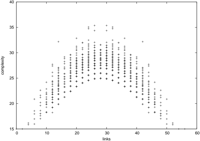
Figure 1: The new complexity measure as a function of link count for all networks with 8 nodes. This shows the strong dependence of complexity on link count, and the symmetry between networks and their complements.
<details>
<summary>Image 1 Details</summary>
### Visual Description
## Scatter Plot: Complexity vs. Links
### Overview
The image is a scatter plot visualizing the relationship between "links" (x-axis) and "complexity" (y-axis). Data points are represented as black plus signs ("+"), with a legend confirming this symbol corresponds to "Data Points." The plot exhibits a bell-shaped distribution, peaking around 30 links with a complexity of approximately 35. The axes range from 0–60 for links and 15–40 for complexity.
### Components/Axes
- **X-axis (Links)**: Labeled "links," scaled from 0 to 60 in increments of 10.
- **Y-axis (Complexity)**: Labeled "complexity," scaled from 15 to 40 in increments of 5.
- **Legend**: Located in the top-right corner, featuring a black plus sign ("+") labeled "Data Points."
- **Data Points**: Black plus signs distributed across the plot, forming a symmetric, unimodal distribution.
### Detailed Analysis
- **Trend**: The data points form a clear bell curve, with complexity increasing as links approach 30, then decreasing symmetrically.
- **Peak**: The highest complexity (~35) occurs at ~30 links.
- **Spread**:
- Links: 10–50 (most points clustered between 15–45).
- Complexity: 18–33 (lowest at ~18 for 5–10 links, highest at ~35 for 30 links).
- **Density**: Points are densest around 20–40 links, with sparser data at the extremes (e.g., <10 or >50 links).
- **Symmetry**: The distribution is roughly symmetric around 30 links, suggesting a normal-like distribution.
### Key Observations
1. **Optimal Link Threshold**: Complexity peaks at ~30 links, implying an optimal number of links for maximum complexity.
2. **Diminishing Returns**: Beyond 30 links, complexity decreases, suggesting redundancy or inefficiency in adding more links.
3. **Symmetry**: The bell shape indicates a balanced relationship between links and complexity, with no significant outliers.
4. **Data Distribution**: Points are evenly distributed around the peak, with no abrupt jumps or gaps.
### Interpretation
The data suggests a **non-linear relationship** between links and complexity, where increasing links initially enhances complexity but eventually reduces it. This could reflect:
- **System Design**: In networks or models, adding links beyond a critical point may introduce redundancy, reducing overall complexity.
- **Efficiency Trade-offs**: The peak at 30 links might represent an optimal balance between connectivity and simplicity.
- **Statistical Pattern**: The symmetry and bell shape align with a normal distribution, though the exact statistical properties (e.g., standard deviation) cannot be confirmed without raw data.
The absence of outliers and the clear peak imply a consistent, predictable relationship, useful for optimizing systems where link complexity is a critical factor.
</details>
so the complexity of a network is equal to that of its complement, as can be seen in Figure 1.
A connection can be drawn from this complexity measure, to that proposed in [11]. In their proposal, nodes are labelled, so the network is uniquely specified by the node and link counts, along with a rank-encoded linklist. Also, nodes may link to themselves, so L = n 2 . Consequently, their complexity measure will be
$$c = 2 \log _ { 2 } n + \vert \log _ { 2 } L \vert + 1 +$$
This is, to within a term of order log 2 n corresponding to the lead-in prefix specifying the node count, equal to the unnumbered formula given on page 326 of [11].
## 3 New complexity measure compared with the previous proposals
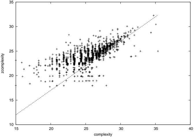
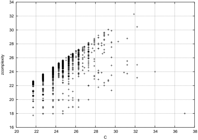
Figures 2 and 3 [36, Fig. 1] shows zcomplexity plotted against the new complexity and the original complexity proposal for all networks of order 8 respectively.
Figure 2: C z plotted against C for all networks of order 8. The diagonal line corresponds to C = C z +3.
<details>
<summary>Image 2 Details</summary>
### Visual Description
## Scatter Plot: Relationship Between Complexity and Zcomplexity
### Overview
The image depicts a scatter plot with a dashed trend line, illustrating the relationship between two variables: "complexity" (x-axis) and "zcomplexity" (y-axis). Data points are represented as black plus signs ("+"), and a dashed line suggests a linear trend.
### Components/Axes
- **X-axis (complexity)**:
- Label: "complexity"
- Scale: 15 to 40 (increments of 5)
- Position: Bottom of the plot
- **Y-axis (zcomplexity)**:
- Label: "zcomplexity"
- Scale: 10 to 35 (increments of 5)
- Position: Left side of the plot
- **Legend**:
- No explicit legend is present.
- **Trend Line**:
- Dashed line connecting approximate points (15,12) to (35,32).
- Slope: Calculated as (32-12)/(35-15) = 1.0, equation: **y = x - 3**.
### Detailed Analysis
- **Data Points**:
- Black plus signs ("+") are distributed across the plot, with higher density near the trend line.
- Points deviate from the line, showing variability (e.g., some points lie above or below the line).
- **Trend Line**:
- The dashed line slopes upward, indicating a positive correlation between complexity and zcomplexity.
- At x = 15, y ≈ 12; at x = 35, y ≈ 32.
### Key Observations
1. **Positive Correlation**: The trend line confirms a direct relationship between complexity and zcomplexity.
2. **Spread of Data**: Points are scattered around the line, with some clustering in the middle range (x ≈ 20–30, y ≈ 20–25).
3. **Outliers**: No extreme outliers are visible, but variability increases at higher x-values (e.g., x > 30).
### Interpretation
The plot suggests that as complexity increases, zcomplexity also increases linearly, with a slope of 1.0. The spread of data points around the trend line indicates inherent variability in the relationship, possibly due to unaccounted factors or measurement noise. The absence of a legend implies the data series is singular, and the trend line serves as a visual summary of the central tendency. This could reflect a controlled experiment or observational study where complexity directly influences zcomplexity, though the exact nature of the variables remains undefined.
</details>
Figure 3: C z plotted against the original C from [36] for all networks of order 8, reproduced from that paper.
<details>
<summary>Image 3 Details</summary>
### Visual Description
## Scatter Plot: Relationship Between C and zcomplexity
### Overview
The image is a scatter plot with a grid background, displaying data points as black squares and plus signs. The x-axis is labeled "C" (ranging from 20 to 38), and the y-axis is labeled "zcomplexity" (ranging from 16 to 34). The data points are distributed across the plot, with distinct clustering patterns.
### Components/Axes
- **X-axis (C)**: Labeled "C", with tick marks at intervals of 2 (20, 22, 24, ..., 38).
- **Y-axis (zcomplexity)**: Labeled "zcomplexity", with tick marks at intervals of 2 (16, 18, 20, ..., 34).
- **Grid**: Dotted lines form a grid to aid in reading values.
- **Data Points**:
- **Black squares**: Clustered in the lower-left region (C ≈ 20–25, zcomplexity ≈ 18–24).
- **Plus signs**: Scattered across the plot, with higher density in the upper-right region (C ≈ 25–38, zcomplexity ≈ 24–32).
- **Legend**: Not visible in the image.
### Detailed Analysis
- **Black squares**:
- Concentrated between C = 20–25 and zcomplexity = 18–24.
- Some outliers extend slightly to C = 26–28 and zcomplexity = 22–26.
- **Plus signs**:
- Spread across C = 25–38 and zcomplexity = 24–32.
- Notable outliers:
- A single plus at (C = 36, zcomplexity = 18).
- A cluster of pluses near (C = 28–30, zcomplexity = 26–28).
- **Distribution**:
- Lower-left region (C < 25, zcomplexity < 24) dominated by squares.
- Upper-right region (C > 25, zcomplexity > 24) dominated by pluses.
### Key Observations
1. **Clustering**: The black squares form a dense cluster in the lower-left, suggesting a potential relationship between lower C values and lower zcomplexity.
2. **Spread**: The plus signs are more dispersed, indicating variability in zcomplexity for higher C values.
3. **Outliers**: The plus at (36, 18) is an anomaly, as it deviates from the general trend of higher zcomplexity with increasing C.
4. **No Legend**: The absence of a legend leaves the meaning of the symbols (squares vs. pluses) ambiguous.
### Interpretation
The data suggests a possible inverse relationship between C and zcomplexity in the lower range (C < 25), where lower C values correspond to lower zcomplexity. However, for higher C values (C > 25), zcomplexity increases but with greater variability, as indicated by the spread of plus signs. The outlier at (36, 18) may represent an exception or a data point from a different category. Without a legend, the distinction between squares and pluses remains unclear, but their spatial distribution implies two distinct groups or conditions. Further context is needed to confirm the nature of the relationship and the significance of the symbols.
</details>
The new complexity proposal is quite well correlated with zcomplexity, and is in this example about 3 bits higher than zcomplexity. This is just the difference in prefixes between the two schemes (the original proposal used 8 1 bits followed by a stop bit = 9 bits overall to represent the node count, and the new scheme uses 3 1 bits and a stop bit to represent the field width of the node count, 3 bits for the node field and 5 bits for the link count field = 12 bits overall). Data points appearing above the line correspond to networks whose linkfields compress better with the new algorithm than the scheme used with zcomplexity. Conversely, data points below the line are better compressed with the old algorithm.
We can conclude that the new scheme usually compresses the link list field better than the run length encoding scheme employed in [36], and so is a better measure of complexity than zcomplexity, as well as being far more tractable. The slightly more complex prefix of the new scheme grows logarithmically with node count, so will ultimately be more compressed than the prefix of the old scheme, which grows linearly.
## 4 Comparison with medium articulation
In the last few years Wilhelm[42, 19] introduced a new complexity like measure that addresses the intuition that complexity should be minimal for the empty and full networks, and peak for intermediate values (like figure 1). It is obtained by multiplying an information quantity that increases with link count by a different information that falls. The resulting measure is therefore in square bits, so one should perhaps consider the square root as the complexity measure.
Precisely, medium articulation is given by
<!-- formula-not-decoded -->
where w ij is the normalised weight ( ∑ ij w ij = 1) of the link from node i to node j .
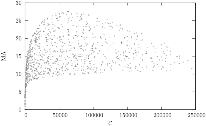
Figure 4 shows medium articulation plotted against C for a sample of 1000 Erd¨ os-R´ enyi networks up to order 500. There is no clear relationship between medium articulation and complexity for the average network. Medium articulation does not appear to discriminate between complex networks. however if we restrict our attention to simple networks (Figures 5 and 6) medium articulation is strongly correlated with complexity, and so could be used as a proxy for complexity for these cases.
## 5 Weighted links
Whilst the information contained in link weights might be significant in some circumstances (for instance the weights of a neural network can only be varied in a limited range without changing the overall qualitative behaviour of the network), of particular theoretical interest is to consider the weights as continuous
Figure 4: Medium Articulation plotted against complexity for 1000 randomly sampled Erd¨ os-R´ enyi graphs up to order 500.
<details>
<summary>Image 4 Details</summary>
### Visual Description
## Scatter Plot: Relationship Between MA and c
### Overview
The image is a scatter plot depicting the relationship between two variables: "MA" (y-axis) and "c" (x-axis). Data points are distributed across the plot, with a general trend of increasing MA values as c increases. The plot is sparse in the lower-left region and becomes denser toward the upper-right, suggesting a non-linear or asymptotic relationship.
### Components/Axes
- **X-axis (c)**: Labeled "c", with values ranging from 0 to 250,000 in increments of 50,000. No explicit units are provided.
- **Y-axis (MA)**: Labeled "MA", with values ranging from 0 to 30 in increments of 5. No explicit units are provided.
- **Data Points**: Black dots (no legend or color coding). No additional annotations or text are visible in the image.
### Detailed Analysis
- **Data Distribution**:
- At low values of c (0–50,000), MA values are tightly clustered near 0–5, indicating minimal variability.
- As c increases (50,000–150,000), MA values spread out more broadly, with some points reaching up to ~15.
- Beyond c = 150,000, MA values continue to increase but with greater dispersion, reaching up to ~25 at c = 250,000.
- The highest MA value observed is approximately 25, occurring at the maximum c value (250,000).
- **Trends**:
- The relationship between MA and c appears to follow a logarithmic or saturating curve, as the rate of increase in MA slows at higher c values.
- No clear linear correlation is evident; the spread of points suggests potential outliers or variability in the data.
### Key Observations
- The data points are densest in the lower-left quadrant (c < 50,000, MA < 5), indicating a concentration of low MA values for small c.
- A noticeable "tail" of points extends toward higher MA values as c increases, suggesting a possible threshold or limit to MA growth.
- No distinct clusters or subgroups are visible, implying a single underlying relationship between MA and c.
### Interpretation
The plot suggests that MA increases with c, but the relationship is not strictly linear. The saturation effect at higher c values (e.g., MA plateauing near 25) could indicate a maximum capacity or limiting factor in the system being measured. The variability in MA at higher c values might reflect measurement noise, external influences, or non-uniform conditions. The absence of a legend or additional context limits the ability to interpret the exact meaning of "MA" and "c," but the trend implies a positive, diminishing-returns relationship. This could be relevant in fields such as economics, biology, or engineering, where growth rates often exhibit such patterns.
</details>
Figure 5: Medium Articulation plotted against complexity for 1000 randomly sampled Erd¨ os-R´ enyi graphs up to order 500 with no more than 2 n links.
<details>
<summary>Image 5 Details</summary>
### Visual Description
## Scatter Plot: Relationship Between C and MA
### Overview
The image is a scatter plot depicting the relationship between two variables, labeled "C" (x-axis) and "MA" (y-axis). The data points form a nonlinear curve that starts steeply and gradually flattens as "C" increases. The plot spans from 0 to 6000 on the x-axis and 0 to 14 on the y-axis.
### Components/Axes
- **X-axis (C)**: Labeled "C", with values ranging from 0 to 6000 in increments of 1000.
- **Y-axis (MA)**: Labeled "MA", with values ranging from 0 to 14 in increments of 2.
- **Data Points**: Scattered dots forming a curve. No legend or additional labels are present.
### Detailed Analysis
- **Initial Trend**: At low values of "C" (0–1000), "MA" increases rapidly, with data points densely packed near the origin.
- **Mid-Range Trend**: Between "C" = 1000 and 3000, the curve continues upward but with a less steep slope.
- **High-Value Trend**: Beyond "C" = 3000, the curve flattens significantly, with "MA" values plateauing near 12–14.
- **Data Distribution**: Points are clustered along the curve, with minimal deviation. No outliers are visible.
### Key Observations
1. **Nonlinear Relationship**: The curve suggests a diminishing return effect, where "MA" increases with "C" but at a decreasing rate.
2. **Saturation Point**: "MA" appears to approach a maximum value (~12–14) as "C" increases beyond 3000.
3. **Data Density**: Points are tightly grouped along the curve, indicating a strong correlation between "C" and "MA".
### Interpretation
The plot demonstrates that "MA" is a function of "C" with a nonlinear relationship. The initial steep rise implies a strong dependency at low "C" values, while the flattening curve suggests diminishing returns or a saturation threshold. This could indicate a system where increasing "C" yields progressively smaller gains in "MA" after a certain point. The absence of a legend or additional context limits the ability to assign specific units or meanings to "C" and "MA", but the trend itself is clear. The data may represent a physical, economic, or computational relationship, but further information is needed for precise interpretation.
</details>
Figure 6: Medium Articulation plotted against complexity for 1000 randomly sampled Erd¨ os-R´ enyi graphs up to order 500 with more than n ( n -5) / 2 links.
<details>
<summary>Image 6 Details</summary>
### Visual Description
## Scatter Plot: Relationship Between C and MA
### Overview
The image depicts a scatter plot illustrating the relationship between two variables: **C** (x-axis) and **MA** (y-axis). The data points form a curve that begins with a steep upward trajectory, then gradually flattens as **C** increases. The plot suggests a saturation effect, where **MA** increases rapidly with **C** initially but plateaus at higher values of **C**.
---
### Components/Axes
- **Y-Axis (MA)**: Labeled "MA," scaled from 3 to 12 in increments of 1.
- **X-Axis (C)**: Labeled "C," scaled from 0 to 300,000 in increments of 50,000.
- **Data Points**: Black dots representing individual measurements.
- **No Legend**: No additional categories or color-coded data series are present.
---
### Detailed Analysis
1. **Initial Trend (C = 0 to 50,000)**:
- **MA** rises sharply from ~3 to ~8.
- Example data points:
- (0, 3)
- (50,000, 8)
2. **Mid-Range Trend (C = 50,000 to 150,000)**:
- **MA** continues to increase but at a slower rate, reaching ~10.
- Example data points:
- (100,000, 9.5)
- (150,000, 10)
3. **Saturation Phase (C = 150,000 to 250,000)**:
- **MA** plateaus between ~10 and ~11, showing minimal growth despite large increases in **C**.
- Example data points:
- (200,000, 10.5)
- (250,000, 11)
4. **Flattening Beyond 250,000**:
- The curve levels off completely, with **MA** remaining near 11 even as **C** approaches 300,000.
---
### Key Observations
- **Saturation Effect**: **MA** exhibits diminishing returns as **C** increases, indicating a maximum capacity or limit.
- **Inflection Point**: The steepest growth occurs between **C = 0** and **C = 50,000**, after which the rate of increase slows significantly.
- **Asymptotic Behavior**: The curve approaches a horizontal asymptote at **MA ≈ 11**, suggesting a theoretical upper bound.
---
### Interpretation
The data implies that **MA** is highly sensitive to **C** in its early stages but becomes less responsive as **C** grows. This could reflect phenomena such as:
- **Resource Allocation**: Initial investments in **C** yield significant improvements in **MA**, but further investments yield diminishing returns.
- **System Capacity**: **MA** may represent a system's output or performance metric that saturates at a critical threshold of **C**.
- **Biological/Physical Processes**: Analogous to enzyme kinetics or material stress-strain curves, where initial gains are rapid but plateau due to inherent limits.
The absence of a legend or additional context limits the ability to confirm the exact nature of **C** and **MA**, but the trend strongly suggests a saturation model. Outliers or anomalies are not evident in the provided data.
</details>
parameters connecting one network structure with another. For instance if a network X has the same network structure as the unweighted graph A, with b links of weight 1 describing the graph B and the remaining a -b links of weight w , then we would like the network complexity of X to vary smoothly between that of A and B as w varies from 1 to 0. [16] introduced a similar measure.
The most obvious way of defining this continuous complexity measure is to start with normalised weights ∑ i w i = 1. Then arrange the links in weight order, and compute the complexity of networks with just those links of weights less than w . The final complexity value is obtained by integrating:
$$c ( X = N \times L ) = \int _ { 0 } ^ { 1 } c ( N \times \{ i \}$$
Obviously, since the integrand is a stepped function, this is computed in practice by a sum of complexities of partial networks.
## 6 Comparing network complexity with the Erd¨ osR´ enyi random model
I applied the weighted network complexity measure (6) to several well-known real network datasets, obtained from Mark Newman's website[41, 20, 26], the Pajek website[7, 39, 40, 17, 2, 1, 3] and Duncan Watt's website[13, 18], with the
Figure 7: The distribution of complexities of the shuffled Narragansett Bay food web[24]. Both a normal and a log-normal distribution have been fitted to the data - the log-normal is a slightly better fit than the normal distribution. In the bottom right hand corner is marked the complexity value computed for the actual Narragansett food web (58.2 bits).
<details>
<summary>Image 7 Details</summary>
### Visual Description
## Line Graph: Relationship Between Complexity and a Metric
### Overview
The image depicts a line graph with two distinct curves (dashed green and dotted red) plotted against a scatter of data points marked with 'x'. The x-axis is labeled "Complexity" (ranging from 40 to 60), and the y-axis represents a numerical metric (0 to 40). The graph includes two mathematical equations in the legend, describing the trends of the curves.
### Components/Axes
- **X-Axis (Complexity)**:
- Label: "Complexity"
- Scale: 40 to 60, with ticks at 40, 45, 50, 55, 60.
- **Y-Axis (Metric)**:
- Label: Numerical value (no explicit label provided).
- Scale: 0 to 40, with increments of 5.
- **Legends**:
1. **Dashed Green Line**:
- Equation: $ \frac{39.8}{0.0351403x} \exp\left(-0.5\left(\frac{\log(x) - 3.67978}{0.0351403}\right)^2\right) $
2. **Dotted Red Line**:
- Equation: $ \frac{39.8}{1.40794} \exp\left(-0.5\left(\frac{x - 39.6623}{1.40794}\right)^2\right) $
### Detailed Analysis
- **Dashed Green Curve (Logarithmic Function)**:
- Peaks near **x ≈ 40** with a y-value of approximately **35**.
- Broad, symmetric distribution with a gradual decline on both sides.
- Data points ('x') align closely with the curve, showing minor deviations.
- **Dotted Red Curve (Linear Function)**:
- Peaks near **x ≈ 39.8** with a y-value of approximately **30**.
- Narrower, steeper distribution, declining sharply after the peak.
- Data points ('x') cluster near the peak but spread more widely at higher x-values (45–60).
- **Data Points**:
- Scattered 'x' markers are concentrated around the peaks of both curves.
- At higher x-values (>50), data points diverge significantly from both curves, suggesting potential outliers or experimental variability.
### Key Observations
1. The logarithmic curve (green) exhibits a broader, more gradual trend, while the linear curve (red) is sharper and narrower.
2. Data points align better with the logarithmic curve at lower x-values (40–45) but show greater dispersion at higher x-values (50–60).
3. The red curve’s peak (x ≈ 39.8) occurs slightly left of the green curve’s peak (x ≈ 40), indicating a subtle shift in optimal complexity.
### Interpretation
The graph likely models how a specific metric (e.g., efficiency, error rate) varies with system complexity. The logarithmic trend suggests diminishing returns or a peak performance at moderate complexity, while the linear trend implies a more direct, localized relationship. The data points’ divergence at higher complexity values may indicate:
- Experimental noise or measurement errors.
- A transition to a different regime where neither model applies.
- The presence of additional variables not accounted for in the equations.
The coexistence of two models highlights the importance of context: the logarithmic function may better represent systems with gradual complexity increases, while the linear model could apply to abrupt changes. Further investigation is needed to determine which trend dominates under specific conditions.
</details>
results shown in Table 1. The number of nodes and links of the networks varied greatly, so the raw complexity values are not particularly meaningful, as the computed value is highly dependent on these two network parameters. What is needed is some neutral model for each network to compare the results to.
At first, one might want to compare the values to an Erd¨ os-R´ enyi random network with the same number of nodes and links. However, in practice, the real network complexities are much less than that of an ER network with the same number of nodes and links. This is because in our scheme, a network with weighted link weights looks somewhat like a simpler network formed by removing some of the weakest links from the original. An obvious neutral network model with weighted network links has the weights drawn from a normal distribution with mean 0. The sign of the weight can be interpreted as the link direction. Because the weights in equation (6) are normalised, the complexity value is independent of the standard deviation of the normal distribution. However, such networks are still much more complex than the real networks, as the link weight distribution doesn't match that found in the real network.
Instead, a simple way of generating a neutral model is to break and reattach the network links to random nodes, without merging links, leaving the original link weights unaltered. In the following experiment, we generate 1000 of these shuffled networks. The distribution of complexities can be fitted to a lognormal distribution, which gives a better likelihood than a normal distribution for all networks studied here[8], although the difference between a log-normal and a normal fit becomes less pronounced for more complex networks. Figure 7 shows the distribution of complexity values computed by shuffling the Narragansett food web, and the best fit normal and lognormal distributions.
In what follows we compute the average 〈 ln C ER 〉 and standard deviation
σ ER of the logarithm of the neutral model complexities. We can then compare the network complexity with the ensemble of neutral models to obtain a p -value, the probability that the observed complexity is that of a random network. The p -values are so small that is better to represent the value as a number of standard deviations ('sigmas') that the logarithm of the measured complexity value is from the mean logarithm of the shuffled networks. A value of 6 sigmas corresponds to a p -value less than 1 . 3 × 10 -4 , although this must be taken with a certain grain of salt, as the distribution of shuffled complexity values has a fatter tail than the fitted log-normal distribution. In none of these samples did the shuffled network complexity exceed the original network's complexity, meaning the p -value is less than 10 -3 . The difference C exp( 〈 ln C ER 〉 ) is the amount of information contained in the specific arrangement of links.
A code implementing this algorithm is implemented as a C++ library, and is available from version 4.D36 onwards as part of the Eco Lab system, an open source modelling framework hosted at http://ecolab.sourceforge.net.
## 7 ALife models
## 7.1 Tierra
Tierra [29] is a well known artificial life system in which self reproducing computer programs written in an assembly-like language are allowed to evolve. The programs, or digital organisms can interact with each other via template matching operations, modelled loosely on the way proteins interact in real biological systems. A number of distinct strategies evolve, including parasitism, where organisms make use of another organism's code and hyper-parasitism where an organism sets traps for parasites in order to steal their CPU resources. At any point in time in a Tierra run, there is an interaction network between the species present, which is the closest thing in the Tierra world to a foodweb.
Tierra is an aging platform, with the last release (v6.02) having been released more than six years ago. For this work, I used an even older release (5.0), for which I have had some experience in working with. Tierra was originally written in C for an environment where ints were 16 bits and long ints 32 bits. This posed a problem for using it on the current generation of 64 bit computers, where the word sizes are doubled. Some effort was needed to get the code 64 bit clean. Secondly a means of extracting the interaction network was needed. Whilst Tierra provided the concept of 'watch bits', which recorded whether a digital organism had accessed another's genome or vice versa, it did not record which other genome was accessed. So I modified the template matching code to log the pair of genome labels that performed the template match to a file.
Having a record of interactions by genotype label, it is necessary to map the genotype to phenotype. In Tierra, the phenotype is the behaviour of the digital organism, and can be judged by running the organisms pairwise in a tournament, to see what effect each has on the other. The precise details for how this can be done is described in [33].
Having a record of interactions between phenotypes, and discarding self-self interactions, there are a number of ways of turning that record into a foodweb. The simplest way, which I adopted, was sum the interactions between each pair of phenotypes over a sliding window of 20 million executed instructions, and doing this every 100 million executed instructions. This lead to time series of around 1000 foodwebs for each Tierra run.
In Tierra, parsimony pressure is controlled by the parameter SlicePow. CPU time is allocated proportional to genome size raised to SlicePow. If SlicePow is close to 0, then there is great evolutionary pressure for the organisms to get as small as possible to increase their replication rate. When it is one, this pressure is eliminated. In [35], I found that a SlicePow of around 0.95 was optimal. If it were much higher, the organisms grow so large and so rapidly that they eventually occupy more than 50% of the soup. At which point they kill the soup at their next Mal (memory allocation) operation. In this work, I altered the implementation of Mal to fail if the request was more than than the soup size divided by minimum population save threshold (usually around 10). Organisms any larger than this will never appear in the Genebanker (Tierra's equivalent of the fossil record), as their population can never exceed the save threshold. This modification allows SlicePow = 1 runs to run for an extensive period of time without the soup dying.
## 7.2 EcoLab
EcoLab was introduced by the author as a simple model of an evolving ecosystem [31]. The ecological dynamics is described by an n -dimensional generalised Lotka-Volterra equation:
$$n _ { i } = r _ { i n _ { i } } + \sum _ { j } ^ { n _ { i } } b _ { i j } n _ { j }$$
where n i is the population density of species i , r i its growth rate and β ij the interaction matrix. Extinction is handled via a novel stochastic truncation algorithm, rather than the more usual threshold method. Speciation occurs by randomly mutating the ecological parameters ( r i and β ij ) of the parents, subject to the constraint that the system remain bounded [30].
The interaction matrix is a candidate foodweb, but has too much information. Its offdiagonal terms may be negative as well as positive, whereas for the complexity definition (6), we need the link weights to be positive. There are a number of ways of resolving this issue, such as ignoring the sign of the off-diagonal term (ie taking its absolute value), or antisymmetrising the matrix by subtracting its transpose, then using the sign of the offdiagonal term to determine the link direction.
For the purposes of this study, I chose to subtract just the negative β ij terms from themselves and their transpose terms β ji . This effects a maximal encoding of the interaction matrix information in the network structure, with link direction and weight encoding the direction and size of resource flow. The effect is as follows:
- Both β ij and β ji are positive (the mutualist case). Neither offdiagonal term changes, and the two nodes have links pointing in both directions, with weights given by the two offdiagonal terms.
- Both β ij and β ji are negative (the competitive case). The terms are swapped, and the signs changed to be positive. Again the two nodes have links pointing in both directions, but the link direction reflects the direction of resource flow.
- Both β ij and β ji are of opposite sign (the predator-prey or parasitic case). Only a single link exists between species i and j , whose weight is the summed absolute values of the offdiagonal terms, and whose link direction reflects the direction of resource flow.
## 7.3 Webworld
Webworld is another evolving ecology model, similar in some respects to EcoLab, introduced by [6], with some modifications described in [12]. It features more realistic ecological interactions than does EcoLab, in that it tracks biomass resources. It too has an interaction matrix called a functional response in that model that could serve as a foodweb, which is converted to a directed weighted graph in the same way as the EcoLab interaction matrix. I used the Webworld implementation distributed with the Eco Lab simulation platform [34]. The parameters were chosen as R = 10 5 , b = 5 × 10 -3 , c = 0 . 8 and λ = 0 . 1.
## 8 Methods and materials
Tierra was run on a 512KB soup, with SlicePow set to 1, until the soup died, typically after some 5 × 10 10 instructions have executed. Some variant runs were performed with SlicePow=0.95, and with different random number generators, but no difference in the outcome was observed.
The source code of Tierra 5.0 was modified in a few places, as described in the Tierra section of this paper. The final source code is available as tierra.5.0.D7.tar.gz from the Eco Lab website hosted on SourceForge (http://ecolab.sf.net).
The genebanker output was processed by the eco-tierra.3.D13 code, also available from the Eco Lab website, to produce a list of phenotype equivalents for each genotype. A function for processing the interaction log file generated by Tierra and producing a timeseries of foodweb graphs was added to Eco-tierra. The script for running this postprocessing step is process ecollog.tcl.
The EcoLab model was adapted to convert the interaction matrix into a foodweb and log the foodweb to disk every 1000 time steps for later processing. The Webworld model was adapted similarly. The model parameters were as documented in the included ecolab.tcl and webworld.tcl experiment files of the ecolab.5.D1 distribution, which is also available from the Eco Lab website.
Finally, each foodweb, whether real world, or ALife generated, and 100 linkshuffled control versions were run through the network complexity algorithm
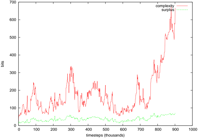
Figure 8: Complexity of the Tierran interaction network for SlicePow=0.95, and the associated complexity surplus. The surplus was typically 15-30 times the standard deviation of the ER neutral network complexities.
<details>
<summary>Image 8 Details</summary>
### Visual Description
## Line Graph: Complexity vs. Surplus Over Instructions
### Overview
The image is a line graph depicting two data series: "complexity" (red line) and "surplus" (green line), plotted against "instructions (billions)" on the x-axis and "bits" on the y-axis. The red line exhibits high variability with sharp peaks and troughs, while the green line remains relatively stable but shows a gradual increase toward the end of the x-axis range.
### Components/Axes
- **X-axis**: "instructions (billions)" ranging from 0 to 100 (in increments of 10).
- **Y-axis**: "bits" ranging from 0 to 450 (in increments of 50).
- **Legend**: Located in the **top-right corner**, with:
- **Red line**: Labeled "complexity"
- **Green line**: Labeled "surplus"
### Detailed Analysis
1. **Complexity (Red Line)**:
- Starts at approximately **400 bits** at 0 instructions.
- Exhibits **high volatility**, with peaks reaching up to **450 bits** and troughs as low as **100 bits**.
- Shows a **sharp decline** after ~80 billion instructions, dropping to ~50 bits by 100 billion.
- Notable spikes occur around **20, 40, 60, and 80 billion instructions**.
2. **Surplus (Green Line)**:
- Begins at ~100 bits at 0 instructions.
- Remains relatively stable between **50–100 bits** for most of the x-axis range.
- Shows a **gradual increase** after ~70 billion instructions, peaking at ~150 bits near 100 billion.
### Key Observations
- **Inverse Relationship**: As "instructions" increase, "complexity" fluctuates wildly but ultimately decreases sharply, while "surplus" remains stable before rising.
- **Threshold Effect**: The sharp drop in complexity after 80 billion instructions suggests a potential system limitation or optimization point.
- **Stability vs. Volatility**: "Surplus" demonstrates consistent behavior, whereas "complexity" is highly erratic, indicating differing underlying dynamics.
### Interpretation
The data suggests a system where **complexity decreases as surplus increases**, possibly reflecting resource allocation, optimization, or a trade-off between computational load and available capacity. The abrupt decline in complexity after 80 billion instructions could indicate a **critical threshold** where the system becomes more efficient or constrained. The stability of "surplus" implies a controlled or buffered resource, while the volatility of "complexity" may reflect external factors or algorithmic inefficiencies.
**Note**: All values are approximate due to the graph's granularity and lack of explicit numerical markers.
</details>
(6). This is documented in the cmpERmodel.tcl script of ecolab.5.D1. The average and standard deviation of ln C was calculated, rather than C directly, as the shuffled complexity values fitted a log-normal distribution better than a standard normal distribution. The difference between the measured complexity and exp 〈 ln C〉 (ie the geometric mean of the control network complexities) is what is reported as the surplus in Figures 8-10.
## 9 ALife results
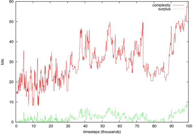
Figures 8-10 show the computed complexity values and the surplus of the complexity over the average randomly shuffled networks. In both the EcoLab and Tierra cases, significant amounts of surplus complexity can be observed, but not in the case of WebWorld. In WebWorld's case, this is probably because the system complexity was not very high in the first place - the diversity typically ranged between 5 and 10 species throughout the WebWorld run. It is possible that the competition parameter c was too high for this run to generate any appreciable foodweb complexity.
An earlier report of these results [37] did not show significant complexity,
Figure 9: Complexity of EcoLab's foodweb, and the associated complexity surplus. For most of the run, the surplus was 10-40 times the standard deviation of the ER neutral network complexities, but in the final complexity growth phase, it was several 100.
<details>
<summary>Image 9 Details</summary>
### Visual Description
## Line Graph: Complexity vs. Surplus Over Timesteps
### Overview
The image depicts a line graph comparing two metrics—**complexity** (red solid line) and **surplus** (green dashed line)—across **1,000 timesteps** (x-axis) measured in thousands. The y-axis represents values in **bits**. The red line exhibits significant volatility, with sharp peaks and troughs, while the green line remains relatively stable but shows a gradual upward trend.
---
### Components/Axes
- **X-axis**: "timesteps (thousands)" (range: 0 to 1,000,000).
- **Y-axis**: "bits" (range: 0 to 700).
- **Legend**:
- **Red solid line**: "complexity" (top-right corner).
- **Green dashed line**: "surplus" (top-right corner).
---
### Detailed Analysis
1. **Complexity (Red Line)**:
- **Initial Phase (0–200k timesteps)**: Starts at ~50 bits, fluctuates between 50–200 bits, with a peak at ~250k timesteps (~300 bits).
- **Mid-Phase (200k–700k timesteps)**: Oscillates between 50–250 bits, with a notable dip to ~50 bits at ~600k timesteps.
- **Final Phase (700k–1,000k timesteps)**: Sharp upward trend, surging from ~200 bits to ~650 bits by 1,000k timesteps.
2. **Surplus (Green Line)**:
- **Entire Range**: Begins at ~10 bits, remains stable between 10–40 bits until ~800k timesteps, then rises steadily to ~60 bits by 1,000k timesteps.
---
### Key Observations
- **Volatility of Complexity**: The red line shows erratic behavior, with multiple peaks and troughs, suggesting instability or external influences.
- **Steady Growth of Surplus**: The green line’s gradual increase contrasts with the red line’s volatility, indicating a more predictable trend.
- **Final Spike in Complexity**: The abrupt rise in complexity at the end (800k–1,000k timesteps) may signal a critical threshold or system failure.
---
### Interpretation
- **Relationship Between Metrics**: Complexity grows disproportionately faster than surplus, particularly in the final phase. This could imply diminishing returns or resource exhaustion as timesteps increase.
- **Anomalies**: The sharp final spike in complexity (650 bits) may represent a tipping point, such as a system collapse or exponential growth event.
- **Implications**: The disparity between complexity and surplus suggests that while surplus increases predictably, complexity’s volatility could destabilize the system over time.
---
**Note**: Exact numerical values are approximated due to the absence of gridlines or labeled data points. Uncertainty in values is inferred from the scale and line positioning.
</details>
Figure 10: Complexity of Webworld's foodweb, and the associated complexity surplus. The surplus was typically 1-5 times the standard deviation of the ER neutral network complexities.
<details>
<summary>Image 10 Details</summary>
### Visual Description
## Line Chart: Complexity vs. Surplus Over Timesteps
### Overview
The image is a line chart depicting two data series: "complexity" (solid red line) and "surplus" (dashed green line) across 100,000 timesteps. The y-axis represents "bits," while the x-axis represents "timesteps (thousands)." The red line exhibits significant fluctuations, while the green line remains relatively stable but low.
### Components/Axes
- **X-axis**: "timesteps (thousands)" with markers at 0, 10, 20, ..., 100 (in thousands).
- **Y-axis**: "bits" with markers at 0, 10, 20, ..., 60.
- **Legend**: Located in the top-right corner. Red = "complexity," Green (dashed) = "surplus."
- **Lines**:
- Red (complexity): Dominates the upper portion of the chart.
- Green (surplus): Confined to the lower 10% of the y-axis.
### Detailed Analysis
- **Complexity (Red Line)**:
- Starts at ~15 bits (timestep 0).
- Peaks at ~50 bits (timestep ~30k) and ~55 bits (timestep ~95k).
- Exhibits sharp upward/downward spikes, with an overall upward trend.
- Average value: ~30–40 bits, with outliers reaching ~55 bits.
- **Surplus (Green Line)**:
- Remains below 10 bits throughout.
- Peaks at ~8 bits (timestep ~50k) and ~9 bits (timestep ~95k).
- Average value: ~3–5 bits, with minor fluctuations.
### Key Observations
1. **Complexity Dominance**: The red line consistently exceeds the green line by 20–50 bits, indicating complexity is orders of magnitude higher than surplus.
2. **Volatility**: Complexity shows erratic behavior, with sharp increases and drops (e.g., ~20k to 30k timesteps).
3. **Stability**: Surplus remains stable, with no significant upward/downward trends.
4. **No Intersection**: The two lines never converge, suggesting no overlap in their magnitudes.
### Interpretation
- **Trend Implications**: The upward trend in complexity suggests increasing system/resource demands over time, while the stable surplus implies limited capacity to accommodate growth. This could indicate a system approaching resource constraints.
- **Anomalies**: The sharp peaks in complexity (e.g., ~30k and ~95k timesteps) may correspond to critical events (e.g., system upgrades, failures). The surplus’s minor fluctuations might reflect minor adjustments in resource allocation.
- **Relationship**: The lack of correlation between the two lines suggests they are influenced by independent factors. For example, complexity could relate to algorithmic changes, while surplus might reflect fixed resource pools.
### Spatial Grounding
- **Legend**: Top-right corner, clearly associating colors with labels.
- **Lines**: Red (complexity) occupies the upper 80% of the y-axis; green (surplus) is confined to the lower 10%.
### Content Details
- **Complexity Values**:
- Timestep 0: ~15 bits.
- Timestep 30k: ~50 bits (peak).
- Timestep 95k: ~55 bits (final peak).
- **Surplus Values**:
- Timestep 0: ~2 bits.
- Timestep 50k: ~8 bits (peak).
- Timestep 95k: ~9 bits (final peak).
### Key Observations (Reiterated)
- Complexity’s volatility contrasts with surplus’s stability.
- No overlap between the two lines, emphasizing their distinct magnitudes.
### Interpretation (Reiterated)
The data highlights a critical imbalance: rising complexity outpaces surplus capacity, raising concerns about sustainability. The system may require intervention to address resource allocation or complexity management.
</details>
unlike what is shown here. It was discovered that the process of writing the foodweb data to an intermediate file stripped the weight data from the network links, preserving only the graph's topological structure. It turns out that the complexity surplus phenomenon is only present in weighted networks - unweighted networks tend to be indistinguishable from randomly generated networks.
## 10 Discussion
In this paper, a modified version of a previously proposed simple representation language for n -node directed graphs is given. This modification leads to a more intuitive complexity measure that gives a minimum value for empty and full networks. When compared with the zcomplexity measure introduced in the previous paper, it is somewhat correlated with, and is at least as good a measure as zcomplexity, but has the advantage of being far more tractable.
When compared with random networks created by shuffling the links, all real world example networks exhibited higher complexity than the random network. The difference between the complexity of the real network and the mean of the complexities of the randomly shuffled network represents structural information contained in the specific arrangement of links making up the network. To test the hypothesis that networks generated by evolutionary selection will also have a complexity surplus representing the functional nature of the network, I ran the same analysis on foodwebs generated by various artificial life systems. These too, exhibited the same complexity surplus seen in the real world networks.
By contrast, I have applied this technique to some scale free networks generated by the Barab´ asi-Albert preferential attachment process [4], with varying numbers of attachment points per node and different weight distributions. On none of these graphs were significant complexity surpluses generated.
If the weights are stripped off the edges, then the effect disappears, which provides a clue as to the origin of the effect. In equation (6), the components dominating the sum will tend to be connected giant components of the overall network with very few cycles. The randomly shuffled versions of these, however, will tend to be composed of small disconnected components, with many of the same motifs represented over and over again. Consequently, the shuffled network has a great deal of symmetry, reducing the overall complexity. Even though naively one might think that random networks should be the most complex within the class of networks of a given node and link count, given the nature of Kolmogorov complexity to favour random strings, the weighted complexity formula (6) is sensitive to the structure within the network that has meaning to system behaviour that the network represents.
Reverting to an earlier posed question about the amount of complexity stored within the foodweb as compared with individual organism's phenotypic complexity, the results in Figure 8 gives a preliminary answer. Each foodweb in Figure 8 averaged around 100 species, the average phenotypic complexity of which is around 150-200 bits (750 bits at maximum)[33]. So the 250-400 bits of network complexity is but a drop in the bucket of phenotypic complexity.
## References
- [1] Almunia, J., Basterretxea, G., Aristegui, J., and Ulanowicz., R. (1999) Benthicpelagic switching in a coastal subtropical lagoon. Estuarine, Coastal and Shelf Science , 49 , 363-384.
- [2] Baird, D., Luczkovich, J., and Christian, R. R. (1998) Assessment of spatial and temporal variability in ecosystem attributes of the St Marks National Wildlife Refuge, Apalachee Bay, Florida. Estuarine, Coastal, and Shelf Science , 47 , 329-349.
- [3] Baird, D. and Ulanowicz, R. (1989) The seasonal dynamics of the Chesapeake Bay ecosystem. Ecological Monographs , 59 , 329-364.
- [4] Barab´ asi, A.-L. and Albert, R. (1999) Emergence of scaling in random networks. Science , 286 , 509-512.
- [5] Bedau, M. A., McCaskill, J. S., Packard, N. H., Rasmussen, S., Adami, C., Green, D. G., Ikegami, T., Kaneko, K., and Ray, T. S. (2000) Open problems in artificial life. Artificial Life , 6 , 363-376.
- [6] Caldarelli, G., Higgs, P. G., and McKane, A. J. (1998) Modelling coevolution in multispecies communities. J. Theor, Biol. , 193 , 345-358.
- [7] Christian, R. and Luczkovich, J. (1999) Organizing and understanding a winter's seagrass foodweb network through effective trophic levels. Ecological Modelling , 117 , 99-124.
- [8] Clauset, A., Shalizi, C. R., and Newman, M. E. J. (2009) Power-law distributions in empirical data. SIAM Review , 51 , 661-703, arXiv:0706.1062.
- [9] Claussen, J. C. (2007) Offdiagonal complexity: A computationally quick complexity measure for graphs and networks. Physica A , 375 , 365-373, arXiv:q-bio.MN/0410024.
- [10] Dewar, R. (2003) Informational theory explanation of the fluctuation theorem, maximum entropy production and self-organized criticality in nonequilibrium stationary states. J. Phys. A , 36 , 631-641.
- [11] Dorin, A. and Korb, K. B. (2010) Network measures of ecosystem complexity. Fellerman et al. [15], pp. 323-328.
- [12] Drossel, B., Higgs, P. G., and McKane, A. J. (2001) The influence of predator-prey population dynamics on the long-term evolution of food web structure. J. Theor. Biol. , 208 , 91-107.
- [13] Duch, J. and Arenas, A. (2005) Community identification using extremal optimization. Physical Review E , 72 , 027104.
- [14] Edmonds, B. (1999) Syntactic Measures of Complexity . Ph.D. thesis, University of Manchester, http://bruce.edmonds.name/thesis/, Complexity Bibliography: http://bruce.edmonds.name/compbib/.
- [15] Fellerman, H. et al. (eds.) (2010) Proceedings of Artificial Life XII , MIT Press.
- [16] G¨ ornerup, O. and Crutchfield, J. P. (2008) Hierarchical self-organization in the finitary process soup. Artificial Life , 14 , 245-254.
- [17] Hagy, J. (2002) Eutrophication, hypoxia and trophic transfer efficiency in Chesapeake Bay . Ph.D. thesis, University of Maryland at College Park (USA).
- [18] Jeong, H., Mason, S., Barab´ asi, A.-L., and Oltvai, Z. N. (2001) Centrality and lethality of protein networks. Nature , 411 , 41.
- [19] Kim, J. and Wilhelm, T. (2008) What is a complex graph. Physica A , 387 , 2637-2652.
- [20] Knuth, D. E. (1993) The Stanford GraphBase: A Platform for Combinatorial Computing . Addison-Wesley.
- [21] Layzer, D. (1988) Growth and order in the universe. Weber, B. H., Depew, D. J., and Smith, J. D. (eds.), Entropy, Information and Evolution , pp. 23-39, MIT Press.
- [22] Li, M. and Vit´ anyi, P. (1997) An Introduction to Kolmogorov Complexity and its Applications . Springer, 2nd edn.
- [23] McKay, B. D. (1981) Practical graph isomorphism. Congressus Numerantium , 30 , 45-87.
- [24] Monaco, M. and Ulanowicz, R. (1997) Comparative ecosystem trophic structure of three U.S. Mid-Atlantic estuaries. Mar. Ecol. Prog. Ser. , 161 , 239-254.
- [25] Myrvold, W. and Ruskey, F. (2001) Ranking and unranking permutations in linear time. Information Processing Letters , 79 , 281-284.
- [26] Newman, M. E. J. (2006) Finding community structure in networks using the eigenvectors of matrices. Phys. Rev. E , 74 , 036104.
- [27] Prigogine, I. (1980) From Being into Becoming . W.H. Freeman.
- [28] Prokopenko, M., Boschetti, F., and Ryan, A. J. (2009) An informationtheoretic primer on complexity, self-organization, and emergence. Complexity , 15 , 11-28.
- [29] Ray, T. (1991) An approach to the synthesis of life. Langton, C. G., Taylor, C., Farmer, J. D., and Rasmussen, S. (eds.), Artificial Life II , p. 371, Addison-Wesley.
- [30] Standish, R. K. (2000) The role of innovation within economics. Barnett, W., Chiarella, C., Keen, S., Marks, R., and Schnabl, H. (eds.), Commerce, Complexity and Evolution , vol. 11 of International Symposia in Economic Theory and Econometrics , pp. 61-79, Cambridge UP.
- [31] Standish, R. K. (1994) Population models with random embryologies as a paradigm for evolution. Complexity International , 2 .
- [32] Standish, R. K. (2001) On complexity and emergence. Complexity International , 9 , arXiv:nlin.AO/0101006.
- [33] Standish, R. K. (2003) Open-ended artificial evolution. International Journal of Computational Intelligence and Applications , 3 , 167, arXiv:nlin.AO/0210027.
- [34] Standish, R. K. (2004) Ecolab, Webworld and self-organisation. Pollack et al. (eds.), Artificial Life IX , Cambridge, MA, p. 358, MIT Press.
- [35] Standish, R. K. (2004) The influence of parsimony and randomness on complexity growth in Tierra. Bedau et al. (eds.), ALife IX Workshop and Tutorial Proceedings , pp. 51-55, arXiv:nlin.AO/0604026.
- [36] Standish, R. K. (2005) Complexity of networks. Abbass et al. (eds.), Recent Advances in Artificial Life , Singapore, vol. 3 of Advances in Natural Computation , pp. 253-263, World Scientific, arXiv:cs.IT/0508075.
- [37] Standish, R. K. (2010) Network complexity of foodwebs. Fellerman et al. [15], pp. 337-343.
- [38] Standish, R. K. (2010) SuperNOVA: a novel algorithm for graph automorphism calculations. Journal of Algorithms - Algorithms in Cognition, Informatics and Logic , submitted, arXix: 0905.3927.
- [39] Ulanowicz, R., Bondavalli, C., and Egnotovich, M. (1998) Network analysis of trophic dynamics in South Florida ecosystem, FY 97: The Florida Bay ecosystem. Tech. rep., Chesapeake Biological Laboratory, Solomons, MD 20688-0038 USA, [UMCES]CBL 98-123.
- [40] Ulanowicz, R., Heymans, J., and Egnotovich., M. (2000) Network analysis of trophic dynamics in South Florida ecosystems, FY 99: The graminoid ecosystem. Tech. rep., Chesapeake Biological Laboratory, Solomons, MD 20688-0038 USA, [UMCES] CBL 00-0176.
- [41] Watts, D. J. and Strogatz, S. H. (1998) Collective dynamics of 'small-world' networks. Nature , 393 , 409-10.
- [42] Wilhelm, T. and Hollunder, J. (2007) Information theoretic description of networks. Physica A , 385 , 385-396.
Table 1: Complexity values of several freely available network datasets. celegansneural, lesmis and adjnoun are available from Mark Newman's website, representing the neural network of the C. elegans nematode[41], the coappearance of characters in the novel Les Mis´ erables by Victor Hugo[20] and the adjacency network of common adjectives and nouns in the novel David Copperfield by Charles Dickens[26]. The metabolic data of C. elegans [13] and protein interaction network in yeast[18] are available from Duncan Watt's website. PA1 and PA3 are networks generated via preferential attachment with in degree of one or three respectively, and uniformly distributed link weights. The other datasets are food webs available from the Pajek website [7, 39, 40, 17, 2, 1, 3]. For each network, the number of nodes and links are given, along with the computed complexity C . In the fourth column, the original network is shuffled 1000 times, and the logarithm of the complexity is averaged ( 〈 ln C ER 〉 ). The fifth column gives the difference between these two values, which represents the information content of the specific arrangement of links. The final column gives a measure of the significance of this difference in terms of the number of standard deviations ('sigmas') of the distribution of shuffled networks. In two examples, the distributions of shuffled networks had zero standard deviation, so ∞ appears in this column.
| Dataset | nodes | links | C | e 〈 ln C ER 〉 | C - e 〈 ln C ER 〉 | | ln C-〈 ln C ER 〉| σ ER |
|-------------------|---------|---------|---------|-----------------|---------------------|--------------------------------------|
| celegansneural | 297 | 2345 | 442.7 | 251.6 | 191.1 | 29 |
| lesmis | 77 | 508 | 199.7 | 114.2 | 85.4 | 24 |
| adjnoun | 112 | 850 | 3891 | 3890 | 0.98 | ∞ |
| yeast | 2112 | 4406 | 33500.6 | 30218.2 | 3282.4 | 113.0 |
| celegansmetabolic | 453 | 4050 | 25421.8 | 25387.2 | 34.6 | ∞ |
| baydry | 128 | 2138 | 126.6 | 54.2 | 72.3 | 22 |
| baywet | 128 | 2107 | 128.3 | 51 | 77.3 | 20 |
| cypdry | 71 | 641 | 85.7 | 44.1 | 41.5 | 13 |
| cypwet | 71 | 632 | 87.4 | 42.3 | 45 | 14 |
| gramdry | 69 | 911 | 47.4 | 31.6 | 15.8 | 10 |
| gramwet | 69 | 912 | 54.5 | 32.7 | 21.8 | 12 |
| Chesapeake | 39 | 177 | 66.8 | 45.7 | 21.1 | 10.4 |
| ChesLower | 37 | 178 | 82.1 | 62.5 | 19.6 | 10.6 |
| ChesMiddle | 37 | 208 | 65.2 | 48 | 17.3 | 9.3 |
| ChesUpper | 37 | 215 | 81.8 | 60.7 | 21.1 | 10.2 |
| CrystalC | 24 | 126 | 31.1 | 24.2 | 6.9 | 6.4 |
| CrystalD | 24 | 100 | 31.3 | 24.2 | 7 | 6.2 |
| Everglades | 69 | 912 | 54.5 | 32.7 | 21.8 | 11.8 |
| Florida | 128 | 2107 | 128.4 | 51 | 77.3 | 20.1 |
| Maspalomas | 24 | 83 | 70.3 | 61.7 | 8.6 | 5.3 |
| Michigan | 39 | 219 | 47.6 | 33.7 | 14 | 9.5 |
| Mondego | 46 | 393 | 45.2 | 32.2 | 13 | 10.0 |
| Narragan | 35 | 219 | 58.2 | 39.6 | 18.6 | 11.0 |
| Rhode | 19 | 54 | 36.3 | 30.3 | 6 | 5.3 |
| StMarks | 54 | 354 | 110.8 | 73.6 | 37.2 | 16.0 |
| PA1 | 100 | 99 | 98.9 | 85.4 | 13.5 | 2.5 |
| PA3 | 100 | 177 | 225.9 | 207.3 | 18.6 | 3.0 |