# Unknown Title
## How citation boosts promote scientific paradigm shifts and Nobel Prizes
Amin Mazloumian, 1 Young-Ho Eom, 2 Dirk Helbing, 1 Sergi Lozano, 1 and Santo Fortunato 2
ETH Z¨ urich, CLU E1, Clausiusstrasse 50, 8092 Z¨ urich, Switzerland 2 Complex Networks & Systems Lagrange Laboratory, ISI Foundation, Turin, Italy
Nobel Prizes are commonly seen to be among the most prestigious achievements of our times. Based on mining several million citations, we quantitatively analyze the processes driving paradigm shifts in science. We find that groundbreaking discoveries of Nobel Prize Laureates and other famous scientists are not only acknowledged by many citations of their landmark papers. Surprisingly, they also boost the citation rates of their previous publications. Given that innovations must outcompete the rich-gets-richer effect for scientific citations, it turns out that they can make their way only through citation cascades. A quantitative analysis reveals how and why they happen. Science appears to behave like a self-organized critical system, in which citation cascades of all sizes occur, from continuous scientific progress all the way up to scientific revolutions, which change the way we see our world. Measuring the 'boosting effect' of landmark papers, our analysis reveals how new ideas and new players can make their way and finally triumph in a world dominated by established paradigms. The underlying 'boost factor' is also useful to discover scientific breakthroughs and talents much earlier than through classical citation analysis, which by now has become a widespread method to measure scientific excellence, influencing scientific careers and the distribution of research funds. Our findings reveal patterns of collective social behavior, which are also interesting from an attention economics perspective. Understanding the origin of scientific authority may therefore ultimately help to explain, how social influence comes about and why the value of goods depends so strongly on the attention they attract.
PACS numbers: 89.75.-k
## I. INTRODUCTION
Ground-breaking papers are extreme events [1] in science. They can transform the way in which researchers do science in terms of the subjects they choose, the methods they use, and the way they present their results. The related spreading of ideas has been described as an epidemic percolation process in a social network [2]. However, the impact of most innovations is limited. There are only a few ideas, which gain attention all over the world and across disciplinary boundaries [3]. Typical examples are elementary particle physics, the theory of evolution, superconductivity, neural networks, chaos theory, systems biology, nanoscience, or network theory.
It is still a puzzle, however, how a new idea and its proponent can be successful, given that they must beat the rich-gets-richer dynamics of already established ideas and scientists. According to the Matthew effect [4-7], famous scientists receive an amount of credit that may sometimes appear disproportionate to their actual contributions, to the detriment of younger or less known scholars. This implies a great authority of a small number of scientists, which is reflected by the big attention received by their work and ideas, and of the scholars working with them [8].
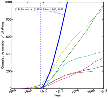
Therefore, how can a previously unknown scientist establish at all a high scientific reputation and authority, if those who get a lot of citations receive even more over time? Here we shed light on this puzzle. The following results for 124 Nobel Prize Laureates in chemistry, economics, medicine and physics suggest that innovators can gain reputation and innovations can successfully spread, mainly because a scientist's body of work overall enjoys a greater impact after the publication of a landmark paper. Not only do colleagues notice the ground-breaking paper, but the latter also attracts the attention to older publications of the same author (see Fig. 1). Consequently, future papers have an impact on past papers, as their relevance is newly weighted.
We focus here on citations as indicator of scientific impact [9-13], studying data from the ISI Web of Science, but the use of click streams [14] would be conceivable as well. It is well-known that the relative number of citations correlates with research quality [15-17]. Citations are now regularly used in university rankings [18], in academic recruitments and for the distribution of funds among scholars and scientific institutions [19].
## II. RESULTS
We evaluated data for 124 Nobel Prize Laureates that were awarded in the last two decades (1990-2009), which include an impressive number of about 2 million citations. For all of them and other internationally established experts as well, we find peaks in the changes of their citation rates (Figs. 2 and 3).
Moreover, it is always possible to attribute to these peaks landmark papers (Fig. 4), which have reached hundreds of citations over the period of a decade. Such landmark papers are rare even in the lives of the most excellent scientists, but some authors have several such peaks.
Technically, we detect a groundbreaking article a published at time t = t a by comparing the citation rates
Figure 1: Illustration of the boosting effect. Typical citation trajectories of papers, here for Nobel Prize Laureate John Bennett Fenn, who received the award in chemistry in 2002 for the development of the electrospray ionization technique used to analyze biological macromolecules. The original article, entitled Electrospray ionization for mass spectrometry of large biomolecules , coauthored by M. Mann, C. K. Meng, S. F. Wong and C. M. Whitehouse, was published in Science in 1989 and is the most cited work of Fenn, with currently over 3 , 000 citations. The diagram reports the growth in time of the total number of citations received by this landmark paper (blue solid line) and by six older papers. The diagram indicates that the number of citations of the landmark paper has literally exploded in the first years after its appearance. However, after its publication in 1989, a number of other papers also enjoyed a much higher citation rate. Thus, a sizeable part of previous scientific work has reached a big impact after the publication of the landmark paper. We found that the occurrence of this boosting effect is characteristic for successful scientific careers.
<details>
<summary>Image 1 Details</summary>
### Visual Description
## Line Chart: Cumulative Citations Over Time for Multiple Publications
### Overview
The image is a line chart displaying the cumulative number of citations received by several academic publications over time, from 1980 to 2009. The chart highlights one specific paper, "J.B. Fenn et al. (1989) Science 246, 4929," which shows a dramatically higher citation rate compared to the others plotted. The data is presented as a series of colored lines on a white background with a black border.
### Components/Axes
* **X-Axis (Horizontal):** Labeled "Year". It spans from 1980 to 2009, with major tick marks and labels every 5 years (1980, 1985, 1990, 1995, 2000, 2005, 2009).
* **Y-Axis (Vertical):** Labeled "Cumulative number of citations". It spans from 0 to 1000, with major tick marks and labels every 200 units (0, 200, 400, 600, 800, 1000).
* **Annotation:** Located in the top-left quadrant of the chart area. It contains the text "J.B. Fenn et al. (1989) Science 246, 4929" with a light blue arrow pointing down and to the right, indicating the corresponding data line.
* **Vertical Reference Line:** A dashed blue vertical line is positioned at the year 1989, aligning with the publication year of the annotated paper.
* **Data Series (Lines):** There are seven distinct colored lines representing different publications. A legend is **not visible** in the provided image, so the specific identities of the papers corresponding to each color (other than the annotated one) are unknown.
### Detailed Analysis
The chart plots the growth in citation count for each paper as a function of time. All lines start at or near zero citations before their respective publication dates and show non-decreasing, cumulative trends.
1. **Thick Blue Line (Annotated Paper - J.B. Fenn et al., 1989):**
* **Trend:** This line exhibits the steepest and most sustained upward slope of all series. It begins its ascent around 1989-1990.
* **Data Points (Approximate):**
* 1990: ~50 citations
* 1995: ~500 citations
* 2000: ~1000+ citations (exceeds the top of the y-axis scale before 2000)
* **Spatial Grounding:** The annotation arrow in the top-left points directly to this line. It is the most prominent line due to its thickness and color.
2. **Yellow/Gold Line:**
* **Trend:** Shows a strong, steady upward slope, second only to the blue line.
* **Data Points (Approximate):** Starts rising in the mid-1980s. Reaches ~200 by 1995, ~600 by 2000, and ends near ~950 by 2009.
3. **Green Line:**
* **Trend:** Also shows a strong, steady upward slope, very similar in trajectory to the yellow line but slightly lower.
* **Data Points (Approximate):** Starts rising around 1990. Reaches ~150 by 1995, ~500 by 2000, and ends near ~900 by 2009.
4. **Cyan/Light Blue Line:**
* **Trend:** Shows a moderate, steady upward slope.
* **Data Points (Approximate):** Starts rising in the mid-1980s. Reaches ~100 by 1995, ~300 by 2000, and ends near ~420 by 2009.
5. **Magenta/Pink Line:**
* **Trend:** Shows a moderate upward slope, beginning later than most others.
* **Data Points (Approximate):** Starts rising around 1990. Reaches ~50 by 1995, ~200 by 2000, and ends near ~350 by 2009.
6. **Brown Line:**
* **Trend:** Shows a shallow upward slope, flattening significantly after 2000.
* **Data Points (Approximate):** Starts rising in the mid-1980s. Reaches ~100 by 1995, ~200 by 2000, and ends near ~200 by 2009 (showing very little growth in the final decade).
7. **Gray Line:**
* **Trend:** Shows a shallow upward slope, similar to the brown line.
* **Data Points (Approximate):** Starts rising around 1990. Reaches ~50 by 1995, ~150 by 2000, and ends near ~250 by 2009.
### Key Observations
* **Dominant Outlier:** The paper by Fenn et al. (1989) is a clear outlier, accumulating citations at a rate far exceeding the other six papers shown. Its line crosses the 1000-citation mark before the year 2000, while the next closest papers (yellow, green) approach that level only by 2009.
* **Growth Phases:** Most lines show an inflection point around 1990-1995 where the rate of citation accumulation increases. The brown line is notable for plateauing after approximately 2000.
* **Clustering:** The yellow and green lines follow very similar trajectories. The cyan, magenta, brown, and gray lines form a lower cluster with more modest cumulative totals.
* **Missing Legend:** The absence of a legend is a critical limitation, preventing the association of the yellow, green, cyan, magenta, brown, and gray lines with specific publications.
### Interpretation
This chart is a classic representation of citation impact in scientific literature. It visually demonstrates the concept of a "seminal paper" or "breakthrough study." The Fenn et al. (1989) paper, which is for the development of electrospray ionization for mass spectrometry (a fact known from external context but not stated in the image), exhibits the characteristic "hockey stick" growth curve of a highly influential work that opened a new field or enabled widespread technological adoption.
The other lines likely represent important but less transformative papers within the same or related fields. Their varying slopes and final totals illustrate the natural hierarchy of impact in academia. The vertical line at 1989 serves as a temporal anchor, emphasizing that the explosive growth of the Fenn paper began immediately after its publication. The chart effectively argues, through pure data visualization, that the 1989 *Science* paper had an exceptional and outsized influence on its field compared to its contemporaries shown here. The primary investigative reading is one of comparative impact and the identification of a landmark publication through its bibliometric footprint.
</details>
before and after t a for the earlier papers. The analysis proceeds as follows: Given a year t and a time window w , we take all papers of the studied author that were published since the beginning of his/her career until year t . The citation rate R <t,w measures the average number of citations received per paper per year in the period from t -w + 1 to t . Similarly, the citation rate R >t,w measures the average number of citations received by the same publications per paper per year between t +1 and t + w (or 2009, if t + w exceeds 2009). The ratio R w ( t ) = R >t,w /R <t,w , which we call the 'boost factor', is a variable that detects critical events in the life of a scientist: sudden increases in the citation rates (as illustrated by Fig. 1) show up as peaks in the time-dependent plot of R w ( t ).
In our analysis we used the generalized boost factor R ′ w ( t ), which reduces the influence of random variations
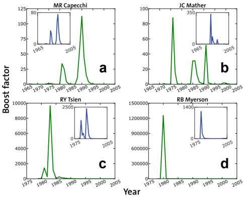
Figure 2: Typical time evolutions of the boost factor. Temporal dependence of R ′ w ( t ) for Nobel Laureates [here for (a) Mario R. Capecchi (Medicine, 2007), (b) John C. Mather (Physics, 2006), (c) Roger Y. Tsien (Chemistry, 2008) and (d) Roger B. Myerson (Economics, 2007)]. Sharp peaks indicate citation boosts in favor of older papers, triggered by the publication and recognition of a landmark paper. Insets: The peaks even persist (though somewhat smaller), if in the determination of the citation counts c p,t , the landmark paper is skipped (which is defined as the paper that produces the largest reduction in the peak size, when excluded from the computation of the boost factor). We conclude that the observed citation boosts are mostly due to a collective effect involving several publications rather than due to the high citation rate of the landmark paper itself.
<details>
<summary>Image 2 Details</summary>
### Visual Description
## Multi-Panel Line Chart: Boost Factor Temporal Analysis for Four Individuals
### Overview
The image is a composite figure containing four separate line charts arranged in a 2x2 grid. Each chart plots a "Boost factor" on the y-axis against "Year" on the x-axis for a different individual. The charts are labeled **a**, **b**, **c**, and **d** in the bottom-right corner of each panel. Each main chart includes a smaller inset chart in its top-right corner, providing a zoomed or alternative view of the data. The primary data lines are green, and the inset data lines are blue.
### Components/Axes
* **Overall Structure:** Four panels in a 2x2 grid.
* **Panel Labels:** Lowercase letters **a**, **b**, **c**, **d** are positioned in the bottom-right corner of each respective panel.
* **Common Y-Axis Label (Left Side):** "Boost factor" is written vertically along the left edge of the entire figure, applying to all four panels.
* **Common X-Axis Label (Bottom):** "Year" is centered at the bottom of the entire figure, applying to all four panels.
* **Panel Titles (Top of each panel):**
* **a (Top-Left):** "MR Capecchi"
* **b (Top-Right):** "JC Mather"
* **c (Bottom-Left):** "RY Tsien"
* **d (Bottom-Right):** "RB Myerson"
* **Axes Scales (Approximate):**
* **Panel a (MR Capecchi):**
* Y-axis: 0 to 125, with major ticks at 0, 25, 50, 75, 100, 125.
* X-axis: 1965 to 2005, with major ticks every 5 years (1965, 1970, ..., 2005).
* **Panel b (JC Mather):**
* Y-axis: 0 to 100, with major ticks at 0, 20, 40, 60, 80, 100.
* X-axis: 1965 to 2005, with major ticks every 5 years.
* **Panel c (RY Tsien):**
* Y-axis: 0 to 10000, with major ticks at 0, 2000, 4000, 6000, 8000, 10000.
* X-axis: 1975 to 2005, with major ticks every 5 years (1975, 1980, ..., 2005).
* **Panel d (RB Myerson):**
* Y-axis: 0 to 1,500,000 (1.5e6), with major ticks at 0, 300000, 600000, 900000, 1200000, 1500000.
* X-axis: 1975 to 2005, with major ticks every 5 years.
* **Inset Charts:** Each panel contains a smaller chart in its top-right quadrant.
* **Inset a:** Y-axis 0 to 80, X-axis 1965 to 2005.
* **Inset b:** Y-axis 0 to 350, X-axis 1965 to 2005.
* **Inset c:** Y-axis 0 to 2500, X-axis 1975 to 2005.
* **Inset d:** Y-axis 0 to 1400, X-axis 1975 to 2005.
### Detailed Analysis
**Panel a: MR Capecchi**
* **Trend:** The green line shows two distinct peaks. A smaller, broader peak occurs around 1980, followed by a much larger, sharper peak around 1990. The value then drops to near zero.
* **Key Data Points (Approximate):**
* Peak 1: Year ~1980, Boost factor ~30.
* Peak 2: Year ~1990, Boost factor ~110.
* **Inset (Blue Line):** Shows two sharp peaks. The first is around 1970 (value ~40), and the second, taller peak is around 1980 (value ~75).
**Panel b: JC Mather**
* **Trend:** The green line shows three peaks. A very sharp, tall peak occurs around 1975. A second, smaller peak appears around 1985. A third peak, similar in height to the second, occurs around 1990.
* **Key Data Points (Approximate):**
* Peak 1: Year ~1975, Boost factor ~90.
* Peak 2: Year ~1985, Boost factor ~30.
* Peak 3: Year ~1990, Boost factor ~50.
* **Inset (Blue Line):** Shows a cluster of sharp peaks between approximately 1995 and 2000. The tallest peak in this cluster reaches ~300.
**Panel c: RY Tsien**
* **Trend:** The green line shows a single, extremely sharp and dominant peak. There is a very small precursor bump just before the main spike.
* **Key Data Points (Approximate):**
* Main Peak: Year ~1982, Boost factor ~9500.
* Precursor Bump: Year ~1980, Boost factor ~1000.
* **Inset (Blue Line):** Shows two sharp peaks. The first is around 1980 (value ~1500), and the second, taller peak is around 1990 (value ~2200).
**Panel d: RB Myerson**
* **Trend:** The green line shows a single, extremely sharp and dominant peak, similar in shape to panel c but on a vastly different y-axis scale.
* **Key Data Points (Approximate):**
* Main Peak: Year ~1982, Boost factor ~1,400,000.
* **Inset (Blue Line):** Shows a single sharp peak around 1995, reaching a value of ~1300.
### Key Observations
1. **Scale Disparity:** The y-axis ("Boost factor") scales differ by orders of magnitude across panels. Panel d (RB Myerson) has values in the millions, panel c (RY Tsien) in the thousands, and panels a and b in the tens to hundreds.
2. **Temporal Clustering:** The major peaks for all four individuals occur within a roughly 20-year window (1975-1995).
3. **Peak Morphology:** The peaks are generally sharp and spike-like, suggesting discrete, impactful events rather than gradual trends.
4. **Inset Function:** The insets appear to show either a different data series (blue vs. green) or a different processing of the same data, often highlighting activity in different time periods than the main peak (e.g., inset b shows activity post-1995, while the main green peaks are pre-1995).
### Interpretation
This figure likely visualizes the impact or recognition ("Boost factor") of specific contributions by four individuals over time. The sharp peaks strongly correlate with years of major awards, most plausibly Nobel Prizes.
* **MR Capecchi (a):** Peaks around 1980 and 1990 could correspond to key methodological developments (e.g., gene targeting in mice) and the subsequent Nobel Prize (2007). The inset may show earlier foundational work.
* **JC Mather (b):** Peaks around 1975, 1985, and 1990 may relate to work on the Cosmic Background Explorer (COBE) satellite and its Nobel Prize (2006). The inset's post-1995 peaks could indicate later impact or related research.
* **RY Tsien (c):** The massive, singular peak around 1982 aligns with the development of Green Fluorescent Protein (GFP) as a biological tool, leading to the Nobel Prize (2008). The inset shows significant activity around 1990, possibly reflecting the widespread adoption and application of GFP technology.
* **RB Myerson (d):** The enormous peak around 1982 likely marks the publication of seminal work in mechanism design theory, culminating in the Nobel Prize (2007). The scale is notably larger than the others, which may be an artifact of the metric used or indicate a different field's citation/impact patterns.
**Overall Pattern:** The data suggests that for these individuals, professional "boost" is not a steady climb but is characterized by discrete, transformative events—likely major discoveries or awards—that create dramatic, lasting spikes in recognition. The differing scales highlight that the "Boost factor" metric may be field-specific or normalized within each individual's domain, making cross-panel numerical comparison less meaningful than the comparison of temporal patterns.
</details>
in the citation rates (see Materials and Methods).
Figure 2 shows typical plots of the boost factors R ′ w ( t ) of four Nobel Prize Laureates. Interestingly, peaks are even found, when those papers, which mostly contribute to them, are excluded from the analysis (see insets of Fig. 2). That is, the observed increases in the citation rates are not just due to the landmark papers themselves, but rather to a collective effect, namely an increase in the citation rates of previously published papers. This results from the greater visibility that the body of work of the corresponding scientist receives after the publication of a landmark paper and establishes an increased scientific impact ('authority'). From the perspective of attention economics [20], it may be interpreted as a herding effect resulting from the way in which relevant information is collectively discovered in an information-rich environment. Interestingly, we have found that older papers receiving a boost are not always works related to the topic of the landmark paper.
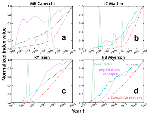
Traditional citation analysis does not reveal such crucial events in the life of a scientist very well. Figure 3 shows the time history of three classical citation indices: the average number of citations per paper 〈 c ( t ) 〉 , the cumulative number C ( t ) of citations, and the Hirsch in-
Figure 3: Dynamics of the boost factor R ′ w ( t ) versus traditional citation variables. Each panel displays the time histories of four variables: the boost factor R ′ w ( t ), the average number of citations per paper 〈 c ( t ) 〉 , the cumulative number of citations C ( t ), and the H -index earned until year t [21]. The panels refer to the same Nobel Laureates as displayed in Fig. 2. The classical indices have relatively smooth profiles, i.e. they are not very sensitive to extreme events in the life of a scientist like the publication of landmark papers. An advantage of the boost factor is that its peaks allow one to identify scientific breakthroughs earlier.
<details>
<summary>Image 3 Details</summary>
### Visual Description
## Line Charts: Normalized Citation Metrics for Four Researchers
### Overview
The image displays four line charts arranged in a 2x2 grid, each tracking the normalized citation metrics of a different Nobel laureate in Physiology or Medicine over time (1965-2005). The charts compare four distinct bibliometric indices for each researcher.
### Components/Axes
* **Overall Structure:** Four subplots labeled **a**, **b**, **c**, and **d** in the bottom-right corner of each chart.
* **Common Y-Axis (Left):** Label: `Normalized index value`. Scale: Linear, from `0.0` to `1.0` in increments of `0.2`.
* **Common X-Axis (Bottom):** Label: `Year t`. Scale: Linear, from `1965` to `2005` in increments of 5 years.
* **Subplot Titles (Top Center):**
* a: `MR Capecchi`
* b: `JC Mather`
* c: `RY Tsien`
* d: `RB Myerson`
* **Legend (Located in subplot d, top-left quadrant):**
* `Boost factor` (Solid green line)
* `Avg. Citations per paper` (Pink dotted line)
* `h-index` (Blue dashed line)
* `Cumulative citations` (Red dotted line)
### Detailed Analysis
**Chart a: MR Capecchi**
* **Boost factor (Green):** Shows two major, sharp peaks. The first peak reaches ~0.95 around 1978. The second, broader peak reaches ~1.0 around 1990. It drops to near zero between peaks and after 1995.
* **Avg. Citations per paper (Pink):** Rises rapidly from 1965, reaching ~0.7 by 1975. It fluctuates between 0.6 and 0.8 until the mid-1990s, then climbs steadily to 1.0 by 2005.
* **h-index (Blue):** Shows a steady, near-linear increase from 1965, reaching ~0.5 by 1990 and 1.0 by 2005.
* **Cumulative citations (Red):** Begins rising later than the others, around 1975. It follows a smooth, accelerating curve, reaching 1.0 by 2005.
**Chart b: JC Mather**
* **Boost factor (Green):** Exhibits one extremely sharp, narrow peak reaching 1.0 around 1974. It remains near zero for the rest of the timeline.
* **Avg. Citations per paper (Pink):** Shows a low, fluctuating baseline until the mid-1980s, then begins a steady climb, reaching 1.0 by 2005.
* **h-index (Blue):** Follows a smooth, accelerating upward curve, starting its rise around 1975 and reaching 1.0 by 2005.
* **Cumulative citations (Red):** Begins its ascent around 1980, following a smooth curve similar to the h-index but slightly lagging, reaching 1.0 by 2005.
**Chart c: RY Tsien**
* **Boost factor (Green):** Has one major, sharp peak reaching 1.0 around 1982. It shows smaller fluctuations before and after this peak.
* **Avg. Citations per paper (Pink):** Rises sharply in the late 1970s, reaching a plateau of ~0.8 by 1985. It stays near this level until the late 1990s, then rises to 1.0.
* **h-index (Blue):** Shows a steady, linear increase from the mid-1970s, reaching 1.0 by 2005.
* **Cumulative citations (Red):** Begins rising around 1980, following a smooth, accelerating curve to 1.0 by 2005.
**Chart d: RB Myerson (Contains Legend)**
* **Boost factor (Green):** Shows one major, sharp peak reaching 1.0 around 1982. It has a smaller secondary peak around 1994.
* **Avg. Citations per paper (Pink):** Remains very low until the early 1980s, then begins a steady, linear climb to 1.0 by 2005.
* **h-index (Blue):** Follows a smooth, accelerating upward curve, starting its rise around 1980 and reaching 1.0 by 2005.
* **Cumulative citations (Red):** Begins its ascent around 1982, following a smooth curve that closely tracks the h-index, reaching 1.0 by 2005.
### Key Observations
1. **Boost Factor Anomaly:** The "Boost factor" metric behaves fundamentally differently from the others. It is characterized by one or two sharp, transient peaks (likely corresponding to a single highly influential paper or discovery) and is near zero at all other times.
2. **Convergence by 2005:** All four metrics for all four researchers are normalized to reach a value of 1.0 by the final year, 2005. This is a normalization artifact, not a natural convergence.
3. **Metric Trajectories:** The "h-index" and "Cumulative citations" show smooth, monotonically increasing curves for all researchers, reflecting their cumulative nature. "Avg. Citations per paper" can show more volatility and plateaus.
4. **Temporal Shifts:** The onset of significant growth for the cumulative metrics (h-index, Cumulative citations) varies by researcher, occurring roughly between 1975 and 1982, which may correlate with the timing of their major contributions.
### Interpretation
This visualization compares the *shape* of impact over a career for four distinguished scientists, using normalized indices. The data suggests:
* **Different Impact Profiles:** The charts reveal distinct "impact signatures." JC Mather's profile (b) is dominated by a single, early blockbuster paper (massive Boost factor spike), after which his average citations and h-index grow steadily. In contrast, MR Capecchi (a) shows evidence of two major impactful periods.
* **Nature of the Metrics:** The stark contrast between the volatile "Boost factor" and the smooth cumulative curves illustrates the difference between measuring a singular "hit" versus sustained, accumulating influence. The h-index and cumulative citations are shown to be robust, steadily growing measures of long-term scholarly impact.
* **Career Arcs:** The delayed start of the cumulative curves for some researchers (e.g., RB Myerson) compared to others may indicate a longer period of foundational work before their research achieved high visibility and citation impact.
* **Normalization Purpose:** By normalizing each metric to a 0-1 scale over the 40-year period, the chart emphasizes comparative *trends and timing* over absolute values. It allows us to see, for example, that RY Tsien's average citations per paper reached a high plateau earlier in his career than JC Mather's.
**Language Declaration:** All text in the image is in English.
</details>
dex [21] ( h -index) H ( t ) in year t . For comparison, the evolution of the boost factor R ′ w ( t ) is depicted as well. All indices were divided by their maximum value, in order to normalize them and to use the same scale for all. The profiles of the classical indices are rather smooth in most cases, and it is often very hard to see any significant effects of landmark papers. However, this is not surprising, as the boost factor is designed to capture abrupt variations in the citation rates, while both C ( t ) and H ( t ) reflect the overall production of a scientist and are therefore less sensitive to extreme events.
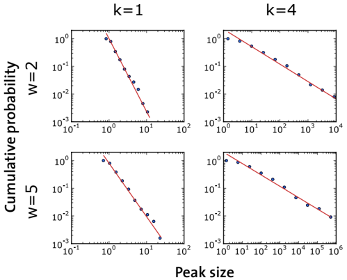
To gain a better understanding of our findings, Figs. 4 and 5 present a statistical analysis of the boosts observed for Nobel Prize Laureates. Figure 4 demonstrates that pronounced peaks are indeed related to highly cited papers. Furthermore, Fig. 5 analyzes the size distribution of peaks. The distribution looks like a power law for all choices of the parameters w and k (at least within the relevant range of small values). This suggests that the bursts are produced by citation cascades as they would occur in a self-organized critical system [22]. In fact, power laws were found to result from human interactions also in other contexts [23-25].
The mechanism underlying citation cascades is the discovery of new ideas, which colleagues refer to in the references of their papers. Moreover, according to the rich-gets-richer effect, successful papers are more often cited, also to raise their own success. Innovations may
Figure 4: Correlation between papers and the local maxima ('peaks') of R ′ w ( t ). We first determined the ranks of all papers of an author based on the total number of citations received until the year 2009 inclusively. We then determined the rank of that particular publication, which had the greatest contribution to the peak. This was done by measuring the reduction in the height of the peak, when the paper was excluded from the calculation of the boost factor (as in the insets of Fig. 2). The distribution of the ranks of 'landmark papers' is dominated by low values, implying that they are indeed among the top publications of their authors.
<details>
<summary>Image 4 Details</summary>
### Visual Description
## Histogram: Distribution of Scientists Across Top Percentage Brackets
### Overview
The image displays a histogram (bar chart) illustrating the distribution of scientists across different "Top percentage" categories. The chart shows a highly skewed distribution, with a very high concentration of scientists in the lowest percentage bracket, followed by a rapid decline.
### Components/Axes
* **Chart Type:** Histogram / Bar Chart.
* **Y-Axis (Vertical):**
* **Label:** "Percentage of scientists"
* **Scale:** Linear scale from 0 to 60.
* **Major Tick Marks:** 0, 10, 20, 30, 40, 50, 60.
* **X-Axis (Horizontal):**
* **Label:** "Top percentage"
* **Scale:** Linear scale from 0 to 50.
* **Major Tick Marks:** 0, 10, 20, 30, 40, 50.
* **Minor Tick Marks:** Appear at intervals of 5 units (e.g., 5, 15, 25, 35, 45).
* **Data Series:** A single series represented by blue vertical bars. There is no legend, as only one data category is plotted.
* **Spatial Layout:** The chart is centered within the frame. The y-axis is positioned on the left, and the x-axis is at the bottom. The bars originate from the x-axis.
### Detailed Analysis
The histogram consists of bars representing discrete bins along the "Top percentage" axis. The height of each bar corresponds to the "Percentage of scientists" in that bin. Values are approximate based on visual estimation against the y-axis scale.
| Approximate "Top percentage" Bin (X-axis) | Approximate "Percentage of scientists" (Y-axis) | Visual Trend Description |
| :--- | :--- | :--- |
| 0 - 5 | ~60% | This is the tallest bar by a significant margin, indicating the majority of scientists fall within this lowest "Top percentage" bracket. |
| 5 - 10 | ~13% | A sharp drop from the first bar. |
| 10 - 15 | ~8% | Continues the steep downward trend. |
| 15 - 20 | ~2% | Very low percentage. |
| 20 - 25 | ~2% | Similar height to the previous bin. |
| 25 - 30 | ~3% | Slight increase from the previous two bins. |
| 30 - 35 | ~2% | Returns to a very low level. |
| 35 - 40 | ~1% | Barely visible bar. |
| 40 - 45 | ~1% | Barely visible bar. |
| 45 - 50 | ~1% | Barely visible bar. |
**Trend Verification:** The data series exhibits a classic "long tail" or power-law distribution. The line formed by the tops of the bars slopes sharply downward from left to right, with the most significant drop occurring between the first and second bins.
### Key Observations
1. **Extreme Skew:** The distribution is heavily right-skewed. Approximately 60% of scientists are concentrated in the 0-5% "Top percentage" bracket.
2. **Rapid Decay:** The percentage of scientists drops precipitously after the first bin. By the 10-15% bracket, the value is less than one-seventh of the initial value.
3. **Long Tail:** A very small but non-zero percentage of scientists (approximately 1-3% per bin) is distributed across the higher "Top percentage" brackets from 15% to 50%.
4. **No Mid-Range Peak:** There is no secondary peak or plateau in the middle of the distribution; it is a continuous, steep decline followed by a low, flat tail.
### Interpretation
This histogram visually demonstrates a phenomenon consistent with the **Pareto Principle (80/20 rule)** or a **power-law distribution**, commonly observed in metrics of scientific impact, productivity, or citation counts.
* **What the data suggests:** The label "Top percentage" is ambiguous without further context, but it likely refers to a ranking metric (e.g., top X% of scientists by citations, publications, or h-index). The chart shows that an overwhelming majority of scientists (~60%) are found in the very top tier (0-5%), while progressively fewer scientists are found in the subsequent, broader tiers. This implies a high degree of inequality or concentration in whatever metric is being measured.
* **How elements relate:** The x-axis ("Top percentage") represents increasingly inclusive or broader categories of scientists. The y-axis shows the proportion of the total scientist population that falls into each category. The relationship is inverse and non-linear: as the category broadens (moving right on the x-axis), the proportion of scientists it contains shrinks dramatically.
* **Notable anomalies/implications:** The most striking feature is the dominance of the first bin. If "Top percentage" refers to performance, this could indicate that a large group of scientists is clustered at a high-performance threshold, with a rapid drop-off to a smaller group of extreme outliers in the long tail. Alternatively, if the bins represent percentiles (e.g., top 5%, top 10%), the chart shows that the "top 5%" category itself contains 60% of the population, which would be a paradoxical labeling. This highlights the critical need for precise definitions of the axis labels to correctly interpret the data's real-world meaning. The chart effectively communicates extreme concentration, regardless of the specific metric.
</details>
even cause scientists to change their research direction or approach. Apparently, such feedback effects can create citation cascades, which are ultimately triggered by landmark papers.
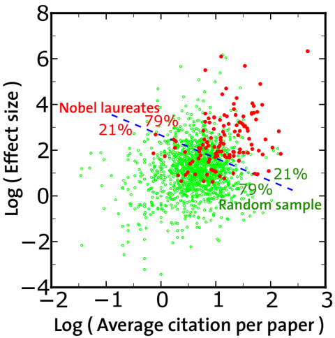
Finally, it is important to check whether the boost factor is able to distinguish exceptional scientists from average ones. Since any criteria used to define 'normal scientists' may be questioned, we have assembled a set of scientists taken at random. Scientists were chosen among those who published at least one paper in the year 2000. We selected 400 names for each of four fields: Medicine, Physics, Chemistry and Economy. After discarding those with no citations, we ended up with 1361 scientists. In Fig. 6 we draw on a bidimensional plane each scientist of our random sample (empty circles), together with the Nobel Prize Laureates considered (full circles). The two dimensions are the value of the boost factor and the average number of citations of a scientist. A cluster analysis separates the populations in the proportions of 79% to 21%. The separation is significant but there is an overlap of the two datasets, mainly because of two reasons. First, by picking a large number of scientists at random, as we did, there is a finite probability to choose also outstanding scholars. We have verified that this is the case. Therefore, some of the empty circles deserve to sit on the top-right part of the diagram, like many Nobel Prize Laureates. The second reason is that we are considering
Figure 5: Cumulative probability distribution of peak heights in the boost factor curves of Nobel Prize Laureates. The four panels correspond to different choices of the parameters k and w . The power law fits (lines) are performed with the maximum likelihood method [26]. The exponents for the direct distribution (of which the cumulative distribution is the integral) are: 3 . 63 ± 0 . 16 (top left), 2 . 93 ± 0 . 16 (bottom left), 1 . 63 ± 0 . 05 (top right), 1 . 41 ± 0 . 05 (bottom right). The best fits have the following lower cutoffs and values of the KolmogorovSmirnov (KS) statistics: 1 . 06, 0 . 0289 (top left), 1 . 15, 0 . 0264 (bottom left), 13 . 1, 0 . 038 (top right), 24 . 7, 0 . 0462 (bottom right). The KS values support the power law ansatz for the shape of the curves. Still, we point out that on the left plots the data span just one decade in the variable, so one has to be careful about the existence of power laws here.
<details>
<summary>Image 5 Details</summary>
### Visual Description
## Log-Log Scatter Plots: Cumulative Probability vs. Peak Size
### Overview
The image displays a 2x2 grid of four scatter plots. Each plot shows the relationship between "Peak size" (x-axis) and "Cumulative probability" (y-axis) on logarithmic scales. The plots are differentiated by two parameters: `k` (columns: 1 and 4) and `w` (rows: 2 and 5). Each plot contains blue data points and a fitted red trend line, suggesting a power-law or similar heavy-tailed distribution.
### Components/Axes
* **Grid Structure:** A 2x2 matrix of subplots.
* **Top-Left:** Title `k=1`, `w=2`
* **Top-Right:** Title `k=4`, `w=2`
* **Bottom-Left:** Title `k=1`, `w=5`
* **Bottom-Right:** Title `k=4`, `w=5`
* **X-Axis (All Plots):** Label: `Peak size`. Scale: Logarithmic (base 10).
* For `k=1` plots (left column): Range approximately from `10^-1` to `10^2`.
* For `k=4` plots (right column): Range approximately from `10^0` to `10^4` (top-right) and `10^0` to `10^6` (bottom-right).
* **Y-Axis (All Plots):** Label: `Cumulative probability`. Scale: Logarithmic (base 10). Range approximately from `10^-3` to `10^0` (i.e., 0.001 to 1).
* **Data Series:** Each plot contains a series of blue circular data points.
* **Trend Line:** Each plot contains a solid red line representing a linear fit to the data on the log-log scale.
### Detailed Analysis
**Plot 1 (Top-Left: k=1, w=2):**
* **Trend:** The blue data points follow a steep, downward-sloping linear trend on the log-log plot.
* **Data Points (Approximate):** The series starts near `(Peak size ≈ 10^0, Cumulative probability ≈ 10^0)` and ends near `(Peak size ≈ 10^1, Cumulative probability ≈ 10^-3)`.
* **Slope:** The red trend line has a steep negative slope, approximately -3 (calculated as (log10(10^-3) - log10(10^0)) / (log10(10^1) - log10(10^0)) = (-3 - 0)/(1 - 0) = -3).
**Plot 2 (Top-Right: k=4, w=2):**
* **Trend:** The blue data points follow a less steep, downward-sloping linear trend compared to the k=1 case.
* **Data Points (Approximate):** The series starts near `(Peak size ≈ 10^0, Cumulative probability ≈ 10^0)` and ends near `(Peak size ≈ 10^4, Cumulative probability ≈ 10^-2)`.
* **Slope:** The red trend line has a moderate negative slope, approximately -0.5 (estimated as (log10(10^-2) - log10(10^0)) / (log10(10^4) - log10(10^0)) = (-2 - 0)/(4 - 0) = -0.5).
**Plot 3 (Bottom-Left: k=1, w=5):**
* **Trend:** The blue data points follow a steep, downward-sloping linear trend, very similar to the k=1, w=2 plot.
* **Data Points (Approximate):** The series starts near `(Peak size ≈ 10^0, Cumulative probability ≈ 10^0)` and ends near `(Peak size ≈ 10^1.5, Cumulative probability ≈ 10^-3)`.
* **Slope:** The red trend line has a steep negative slope, approximately -2 (estimated as (log10(10^-3) - log10(10^0)) / (log10(10^1.5) - log10(10^0)) ≈ (-3 - 0)/(1.5 - 0) = -2).
**Plot 4 (Bottom-Right: k=4, w=5):**
* **Trend:** The blue data points follow a shallow, downward-sloping linear trend, spanning the widest range on the x-axis.
* **Data Points (Approximate):** The series starts near `(Peak size ≈ 10^0, Cumulative probability ≈ 10^0)` and ends near `(Peak size ≈ 10^6, Cumulative probability ≈ 10^-2)`.
* **Slope:** The red trend line has a very shallow negative slope, approximately -0.33 (estimated as (log10(10^-2) - log10(10^0)) / (log10(10^6) - log10(10^0)) = (-2 - 0)/(6 - 0) ≈ -0.33).
### Key Observations
1. **Parameter `k` Dominates Slope:** The most significant visual difference is between the left column (`k=1`) and the right column (`k=4`). The `k=1` plots show a much steeper decline in cumulative probability with increasing peak size compared to the `k=4` plots.
2. **Parameter `w` Affects Range:** For a fixed `k`, increasing `w` from 2 to 5 extends the range of the x-axis (`Peak size`) over which the data is plotted, particularly noticeable for `k=4` (from ~10^4 to ~10^6).
3. **Power-Law Behavior:** The linear relationship on the log-log plots strongly suggests that the cumulative probability `P(X ≥ x)` follows a power-law distribution of the form `P(X ≥ x) ∝ x^(-α)`, where the negative slope of the red line corresponds to the exponent `-α`.
4. **Consistent Starting Point:** All four distributions appear to start at a cumulative probability of 1 (10^0) for the smallest peak sizes (~10^0), which is typical for a complementary cumulative distribution function (CCDF).
### Interpretation
These plots likely analyze the statistical distribution of "peak sizes" from a system or process governed by parameters `k` and `w`. The power-law behavior indicates a heavy-tailed distribution, meaning very large peaks, while rare, are more probable than they would be in a normal (Gaussian) distribution.
* **The parameter `k` appears to control the "heaviness" of the tail.** A lower `k` (k=1) results in a steeper slope (larger exponent α), meaning the probability of observing very large peaks decays rapidly. A higher `k` (k=4) results in a shallower slope (smaller exponent α), indicating a "heavier" tail where extreme events are relatively more likely.
* **The parameter `w` seems to influence the scale or observation window** of the process, as it extends the maximum observed peak size without drastically changing the fundamental slope (for a given `k`).
**In a practical context,** this could model phenomena like earthquake magnitudes, city sizes, or failure sizes in complex systems. The analysis shows that tuning `k` dramatically changes the risk profile (likelihood of extreme events), while `w` might relate to the system's size or duration of observation. The clear separation of trends by `k` suggests it is the primary control parameter for the underlying generative mechanism.
</details>
scholars from different disciplines, which generally have different citation frequencies. This affects particularly the average number of citations of a scientist, but also the value of the boost factor. In this way, the position in the diagram is affected by the specific research topic, and the distribution of the points in the diagram of Fig. 6 is a superposition of field-specific distributions. Nevertheless, the two datasets, though overlapping, are clearly distinct. Adding further dimensions could considerably improve the result. In this respect, the boost factor can be used together with other measures to better specify the performance of scientists.
## III. DISCUSSION
In summary, groundbreaking scientific papers have a boosting effect on previous publications of their authors, bringing them to the attention of the scientific community and establishing their 'authority'. We have provided the first quantitative characterization of this phenomenon by introducing a new variable, the 'boost factor', which is sensitive to sudden changes in the citation
Figure 6: Two-dimensional representation of our collection of Nobel Prize Laureates and a set of 1361 scientists, which were randomly selected. On the x-axis we report the average number of citations of a scientist, on the y-axis his/her boost factor. It can be seen that, on average, Nobel Prize winners clearly perform better. However a Nobel Prize is not solely determined by the average number of citations and the boost factor, but also by further factors. These may be the degree of innovation or quality, which are hard to quantify.
<details>
<summary>Image 6 Details</summary>
### Visual Description
## Scatter Plot: Nobel Laureates vs. Random Sample - Citation Impact vs. Effect Size
### Overview
This image is a scatter plot comparing two datasets: "Nobel laureates" (represented by red dots) and a "Random sample" (represented by green dots). The plot visualizes the relationship between the logarithmic average citations per paper (x-axis) and the logarithmic effect size (y-axis) for each data point (presumably individual scientific papers or authors). A dashed blue trend line is overlaid on the data.
### Components/Axes
* **Chart Type:** Scatter plot with logarithmic axes.
* **X-Axis:**
* **Label:** `Log ( Average citation per paper )`
* **Scale:** Linear scale from -2 to 3, with major ticks at -2, -1, 0, 1, 2, 3.
* **Y-Axis:**
* **Label:** `Log ( Effect size )`
* **Scale:** Linear scale from -4 to 8, with major ticks at -4, -2, 0, 2, 4, 6, 8.
* **Legend:**
* **Position:** Top-left corner of the plot area.
* **Entry 1:** `Nobel laureates` - Associated with red filled circles.
* **Entry 2:** `Random sample` - Associated with green open circles.
* **Annotations:**
* **Near Nobel laureates cluster (upper-right quadrant):** `21%` (in red) and `79%` (in red).
* **Near Random sample cluster (center to lower-right):** `21%` (in green) and `79%` (in green).
* **Trend Line:** A dashed blue line with a negative slope, running diagonally from the upper-left to the lower-right of the plot area.
### Detailed Analysis
* **Data Distribution - Nobel Laureates (Red):**
* **Spatial Grounding:** Primarily clustered in the upper-right quadrant of the plot.
* **Trend Verification:** The cluster shows a general positive correlation; points with higher log(citations) tend to have higher log(effect size).
* **Data Points:** The red points are densely packed between approximately X=0.5 to X=2.5 and Y=1 to Y=6. A few outliers exist, with one point near X=2.8, Y=6.5.
* **Annotations:** The `21%` and `79%` labels are placed within this cluster. Their exact referent (e.g., percentage of points above/below a threshold) is not explicitly defined in the chart.
* **Data Distribution - Random Sample (Green):**
* **Spatial Grounding:** Spread widely across the center and lower portions of the plot, with a dense concentration around the origin (X=0, Y=0).
* **Trend Verification:** The overall cloud of green points shows a very weak or slightly negative correlation, as suggested by the overlaid blue dashed line.
* **Data Points:** The green points span a wide range, from approximately X=-1.5 to X=2.5 and Y=-3.5 to Y=4. The highest density is between X=-0.5 to X=1.5 and Y=-1 to Y=2.
* **Annotations:** The `21%` and `79%` labels in green are placed near the right side of the main green cluster.
* **Trend Line (Blue Dashed):**
* **Position:** Starts near (X=-1, Y=4) and ends near (X=2.5, Y=0).
* **Interpretation:** This line indicates a negative relationship between log(citations) and log(effect size) for the dataset it models, which appears to be more aligned with the overall trend of the "Random sample" than the "Nobel laureates."
### Key Observations
1. **Clear Separation:** The "Nobel laureates" dataset is distinctly shifted towards the upper-right compared to the "Random sample," indicating systematically higher values for both average citations per paper and effect size.
2. **Density Contrast:** The "Random sample" points are far more numerous and densely packed, especially around lower values, while the "Nobel laureates" points are fewer and form a looser cluster at higher values.
3. **Divergent Trends:** The two groups exhibit different internal trends. The Nobel laureates show a positive correlation, while the random sample's trend is flat or slightly negative (as per the blue line).
4. **Ambiguous Percentages:** The `21%` and `79%` annotations are prominent but lack a clear key. They may represent the proportion of points in a quadrant defined by unseen thresholds (e.g., median values), but this cannot be confirmed from the image alone.
### Interpretation
This chart presents a Peircean investigation into scientific impact. It suggests that papers by Nobel laureates are not just marginally better but occupy a different region of the impact space—they are both more cited and have a larger measured "effect size" (a term common in meta-analysis, implying the magnitude of a studied phenomenon). The positive correlation within the laureate group implies that for these elite scientists, higher visibility (citations) aligns with greater substantive impact (effect size).
In contrast, the random sample shows no such alignment; higher citations do not predict a larger effect size, and the overall trend is slightly negative. This could imply that for the average scientific paper, citation count is driven by factors other than the core magnitude of the finding (e.g., topic popularity, institutional prestige, or narrative appeal).
The stark visual separation between the two clouds is the most powerful message: the scientific output of Nobel laureates is quantitatively distinct in both metrics. The chart argues that exceptional recognition (a Nobel Prize) correlates with a fundamentally different profile of scholarly impact, characterized by a synergistic relationship between recognition (citations) and measured effect. The purpose of the `21%/79%` annotations remains unclear but may be intended to highlight a specific statistical breakdown within each group, such as the proportion of papers above or below a certain impact threshold.
</details>
rates. The fact that landmark papers trigger the collective discovery of older papers amplifies their impact and tends to generate pronounced spikes long before the paper receives full recognition. The boosting factor can therefore serve to discover new breakthroughs and talents more quickly than classical citation indices. It may also help to assemble good research teams, which have a pivotal role in modern science [27-29].
The power law behavior observed in the distribution of peak sizes suggests that science progresses through phase transitions [30] with citation avalanches on all scales-from small cascades reflecting quasi-continuous scientific progress all the way up to scientific revolutions, which fundamentally change our perception of the world. While this provides new evidence for sudden paradigm shifts [31], our results also give a better idea of why and how they happen.
It is noteworthy that similar feedback effects may determine the social influence of politicians, or prices of stocks and products (and, thereby, the value of companies). In fact, despite the long history of research on these subjects, such phenomena are still not fully understood. There is evidence, however, that the power of a person or the value of a company increase with the level
of attention they enjoy. Consequently, our study of scientific impact is likely to shed new light on these scientific puzzles as well.
## IV. MATERIALS AND METHODS
The basic goal is to improve the signal-to-noise ratio in the citation rates, in order to detect sudden changes in them. An effective method to reduce the influence of papers with largely fluctuating citation rates is to weight highly cited papers more. This can be achieved by raising the number of cites to the power k , where k > 1. Therefore, our formula to compute R ′ w ( t ) looks as follows:
$$R _ { t } ( t ) = \frac { \sum _ { p } \sum _ { t ' } t ^ { + w } } { \sum _ { p } \sum _ { t ' } t ^ { - w } }$$
Here, c p,t ′ is the number of cites received by paper p in year t ′ . The sum over p includes all papers published
- [1] Albeverio S, Jentsch V, Kantz H, eds. (2006) Extreme Events in Nature and Society. Berlin, Germany: Springer.
- [2] Bettencourt LM, Cintr´ on-Arias A, Kaiser DI, CastilloCh´ avez C (2006) The power of a good idea: Quantitative modeling of the spread of ideas from epidemiological models. Physica A 364: 513 - 536.
- [3] Davenport TH, Beck JC (2001) The Attention Economy : Understanding the New Currency of Business Boston, USA: Harvard Business School Press.
- [4] Merton RK (1968) The Matthew effect in science: The reward and communication systems of science are considered. Science 159: 56-63.
- [5] Merton RK (1988) The Matthew effect in science, ii: Cumulative advantage and the symbolism of intellectual property. ISIS 79: 606-623.
- [6] Scharnhorst A (1997) Characteristics and impact of the matthew effect for countries. Scientometrics 40: 407-422.
- [7] Petersen AM, Jung WS, Yang JS, Stanley HE (2011) Quantitative and empirical demonstration of the Matthew effect in a study of career longevity. Proc Natl Acad Sci USA 108: 18-23.
- [8] Malmgren RD, Ottino JM, Nunes Amaral LA (2010) The role of mentorship in protege performance. Nature 465: 622-626.
- [9] Garfield E (1955) Citation Indexes for Science: A New Dimension in Documentation through Association of Ideas. Science 122: 108-111.
- [10] Garfield E (1979) Citation Indexing. Its Theory and Applications in Science, Technology, and Humanities. New York, USA: Wiley.
- [11] Egghe L, Rousseau R (1990) Introduction to Informetrics: Quantitative Methods in Library, Documentation and Information Science. Amsterdam, The Netherlands: Elsevier.
- [12] Amsterdamska O, Leydesdorff L (1989) Citations: indicators of significance. Scientometrics 15: 449-471.
before the year t ; w is the time window selected to compute the boosting effect. For k = 1 we recover the original definition of R w ( t ) (see main text). For the analysis presented in the paper we have used k = 4 and w = 5, but our conclusions are not very sensitive to the choice of smaller values of k and w .
## V. ACKNOWLEDGMENTS
We acknowledge the use of ISI Web of Science data of Thomson Reuters for our citation analysis. A.M., S.L. and D.H. were partially supported by the Future and Emerging Technologies programme FP7-COSI-ICT of the European Commission through the project QLectives (grant no.: 231200). Y.-H. E. and S. F. gratefully acknowledge ICTeCollective, grant 238597 of the European Commission.
- [13] Petersen AM, Wang F, Stanley HE (2010) Methods for measuring the citations and productivity of scientists across time and discipline. Phys Rev E 81: 036114.
- [14] Bollen J, de Sompel HV, Smith JA, Luce R (2005) Toward alternative metrics of journal impact: A comparison of download and citation data. Information Processing & Management 41: 1419 - 1440.
- [15] Trajtenberg M (1990) A penny for your quotes: Patent citations and the value of innovations. RAND Journal of Economics 21: 172-187.
- [16] Aksnes DW (2006) Citation rates and perceptions of scientific contribution. J Am Soc Inf Sci Technol 57: 169185.
- [17] Moed HF (2005) Citation Analysis in Research Evaluation. Berlin, Germany: Springer.
- [18] Van Raan AJF (2005) Fatal attraction: Conceptual and methodological problems in the ranking of universities by bibliometric methods. Scientometrics 62: 133-143.
- [19] Boyack KW, B¨ orner K (2003) Indicator-assisted evaluation and funding of research: visualizing the influence of grants on the number and citation counts of research papers. J Am Soc Inf Sci Technol 54: 447-461.
- [20] Wu F, Huberman BA (2007) Novelty and collective attention. Proc Natl Acad Sci USA 104: 17599-17601.
- [21] Hirsch JE (2005) An index to quantify an individual's scientific research output. Proc Natl Acad Sci USA 102: 16569-16572.
- [22] Bak P, Tang C, Wiesenfeld K (1987) Self-organized criticality: An explanation of the 1/f noise. Phys Rev Lett 59: 381-384.
- [23] Barab´ asi AL (2005) The origin of bursts and heavy tails in human dynamics. Nature 435: 207-211.
- [24] Oliveira JG, Barab´ asi AL (2005) Human dynamics: The correspondence patterns of Darwin and Einstein. Nature 437: 1251.
- [25] Malmgren RD, Stouffer DB, Campanharo ASLO, Amaral LAN (2009) On Universality in Human Correspondence
Activity. Science 325: 1696-1700.
- [26] Clauset A, Shalizi CR, Newman MEJ (2007) Power-law distributions in empirical data. SIAM Reviews 51: 661703.
- [27] Guimer` a R, Uzzi B, Spiro J, Amaral LAN (2005) Team Assembly Mechanisms Determine Collaboration Network Structure and Team Performance. Science 308: 697-702.
- [28] Wuchty S, Jones BF, Uzzi B (2007) The Increasing Dominance of Teams in Production of Knowledge. Science 316: 1036-1039.
- [29] Jones BF, Wuchty S, Uzzi B (2008) Multi-University Research Teams: Shifting Impact, Geography, and Stratification in Science. Science 322: 1259-1262.
- [30] Stanley HE (1987) Introduction to Phase Transitions and Critical Phenomena. New York, USA: Oxford University Press.
- [31] Kuhn TS (1962) The Structure of Scientific Revolutions. Chicago, USA: University of Chicago Press.