2001.11263v2
Model: gemini-2.0-flash
# Sound field reconstruction in rooms: inpainting meets super-resolution
**Authors**: Francesc Lluís, Pablo Martínez-Nuevo, Martin Bo Møller, Sven Ewan Shepstone
## Sound field reconstruction in rooms: inpainting meets super-resolution
Francesc Llu´ ıs, 1, a Pablo Mart´ ınez-Nuevo, 2 Martin Bo Møller, 2 and Sven Ewan Shepstone 2 1 Department of Music Acoustics, University of Music and Performing Arts Vienna, Austria 2 R&D Acoustics, Bang & Olufsen, Struer, 7600, Denmark
(Dated: 7 August 2020)
In this paper, a deep-learning-based method for sound field reconstruction is proposed. It is shown the possibility to reconstruct the magnitude of the sound pressure in the frequency band 30-300 Hz for an entire room by using a very low number of irregularly distributed microphones arbitrarily arranged. Moreover, the approach is agnostic to the location of the measurements in the Euclidean space. In particular, the presented approach uses a limited number of arbitrary discrete measurements of the magnitude of the sound field pressure in order to extrapolate this field to a higher-resolution grid of discrete points in space with a low computational complexity. The method is based on a U-net-like neural network with partial convolutions trained solely on simulated data, which itself is constructed from numerical simulations of Green's function across thousands of common rectangular rooms. Although extensible to three dimensions and different room shapes, the method focuses on reconstructing a two-dimensional plane of a rectangular room from measurements of the three-dimensional sound field. Experiments using simulated data together with an experimental validation in a real listening room are shown. The results suggest a performance which may exceed conventional reconstruction techniques for a low number of microphones and computational requirements.
c © 2020 Acoustical Society of America.
[XYZ]
## I. INTRODUCTION
The functions describing sound propagation, such as sound pressure or particle velocity, operate scalar and vector values respectively which vary across the temporal and spatial dimensions. There are many applications where knowledge of the spatial variation of the sound field is of paramount interest, for example, sound field navigation for virtual reality environments 1,2 , accurate spatial sound field reproduction over predefined regions of space 3-5 , or sound field control in reverberant environments 6,7 .
The different reconstruction scenarios are determined by the type of information gathered from the sound field. Depending on the type of acquisition, several techniques are used, ranging for example, from acoustic holography 8 , acousto-optic methods 9,10 , or traditional discrete sets of spatial samples 11 . The latter is particularly convenient in practice since it requires simple microphones.
In the case of sound field reconstruction in rooms, there exist several methods in the literature. In particular, model-based approaches based on samples of the sound pressure at a discrete set of locations tend to dominate the area. Results using classical sampling 11 , i.e. based on bandwidth analysis, build upon the image
a lluis-salvado@mdw.ac.at
[https://doi.org(DOI number)]
Pages: 1-12
source method to characterize the sound field in a room in order to derive bounds on the aliasing error for a given sampling density. This leads to an impractically high density of microphones for an acceptable reconstruction error. Another approach to simplify the model and the number of measurements is based on parameterizing the room impulse response as a pole-zero system 12 .
Compressive sensing approaches have been effective in reducing the number of measurements compared to these previous methods. They inherently require an underlying assumption of the sparsity of the chosen room acoustics model. Utilizing modal theory, it is possible to consider a plane wave approximation of the sound field 13 in a room in order to describe it spatially as a sparse linear combination of damped complex exponentials 14-16 . Dictionaries tend to be large, performance degrades at high frequencies, and the interpolated location should be, in general, in the far field with respect to the source. Under the image source method, estimation of the early part of the room impulse response is also possible assuming a few dominant image sources 17 . These techniques are in general sensitive to the choice of sampling scheme used in order to guarantee meaningful solutions and wellconditioned problems. Empirical methods for the latter are commonly adopted leading to some restrictions in the arrangement of microphones. Exploiting information about the modal frequencies may allow a more general microphone arrangement 18 at the expense of sensitivity to source location, modal density, and accurate modal
frequencies estimation. Additionally, finding solutions to these sparse inverse problems is typically computationally demanding 19 .
In this paper, we adopt a data-driven approach to the problem of sound field sampling and reconstruction, which, for the present application, appears to be unexplored. For clarity of exposition, we focus on a twodimensional horizontal plane of three-dimensional rectangular rooms. We consider a very low number of irregularly and arbitrarily distributed measurements to recover the magnitude of the sound pressure in a room across the spatial dimension for the frequency range 30-300 Hz. In contrast to previous methods, our approach is location agnostic in the sense that it does not require knowledge of the microphone positions or the interpolation points in the Euclidean space. These characteristics can contribute to designing more practical sampling and reconstruction procedures. The goal of the paper is then threefold: use a very low number of microphones, accommodate irregular and location agnostic microphone distributions, and carry out inference that is computationally efficient.
We first view the sound field as a two-dimensional discrete signal. The acquisition step can be interpreted as producing a low-resolution signal with missing samples. Then, the recovery step consists of filling the missing data of a high-resolution two-dimensional signal. We show how this process can be viewed as jointly performing inpainting 20,21 and super-resolution 22,23 , both wellknown techniques in image processing with a good performance using deep learning methods. In particular, we use a U-net neural network 24 with partial convolutions 21 trained on simulated data that simultaneously performs inpainting and super-resolution. Under this framework, we show how it is possible to recover a high-resolution field from a very low number of irregular and locationagnostic measurements with low computational complexity in the inference process.
The paper is organized as follows: Section II establishes the conceptual framework under which the reconstruction problem is addressed, i.e. as a learning algorithm drawing upon inpainting and super-resolution techniques. The details about the neural network architecture and the training procedure used for recovery are explained in Section III. Section IV presents results concerning the reconstruction accuracy of the proposed algorithm both in simulated and experimental settings, i.e. in real rooms.
## II. PROBLEM DESCRIPTION
We frame the problem of sound field reconstruction within a data-driven approach, i.e. we aim at developing a recovery algorithm that directly and progressively learns from raw sound field data. The machine learning methods that have been particularly successful in this regard fall under deep learning systems. These have significantly outperformed model-based approaches in tasks such as, but not limited to, image classification, analysis, and restoration 25,26 ; or speech recognition and synthesis 27,28 .
The novelty of the present approach lies in the observation that the magnitude of the sound pressure in a room can be interpreted as a two-dimensional discrete function defined on a rectangular grid of points in space, i.e. in the same way a raster image is represented by a rectangular grid of pixels. This allows us to exploit the effectiveness of deep learning techniques in image processing. Although the principles governing the proposed algorithm can, in principle, be extended to three-dimensional regions, we focus on reconstructing the three-dimensional field in a two-dimensional plane for the sake of simplicity. We further assume that the enclosures of interest consist of rectangular rooms corresponding to domestic standards 29 . Note that the method described here could also be extended to different room shapes.
In particular, the function that we sample and reconstruct is a discrete version of the magnitude of the Fourier transform of the sound field in a given frequency band. We show in the following how reconstructing this function is connected to the well-known concepts of image inpainting and super-resolution. Let us first denote the spatio-temporal sound field in a three-dimensional rectangular room as p ( r , t ) where R = (0 , l x ) × (0 , l y ) × (0 , l z ) for some l x , l y , l z > 0 and r ∈ R . The magnitude of its Fourier transform is given by
<!-- formula-not-decoded -->
for ω ∈ R and r ∈ R .
Initially, given a room, we can define the following rectangular grid as a set on an arbitrary two-dimensional plane, i.e.
<!-- formula-not-decoded -->
for z o ∈ (0 , l z ), i = 0 , . . . , I -1, j = 0 , . . . , J -1, and some integers I, J ≥ 2. Then, the available spatial sample points, denoted as S o , consist of a subset of D o . It is important to observe that there is no constraint whatsoever with regard to the pattern that S o has to form within D o . This allows us to have, for example, irregularly distributed spatial sample points within the room. For a given excitation frequency, the available samples can then be expressed as follows
<!-- formula-not-decoded -->
Note that the problem of interpolating s ( r , ω ) to the entire domain D o from known values in S o can be viewed as image inpainting, i.e. filling in the missing holes of a raster image. This is motivated by the irregular nature of the sampling pattern.
However, we are interested in reconstruction on an even finer rectangular grid in order to capture the smallscale spatial variations of the sound field. In order to do so, we eventually interpolate the sound field to a grid of
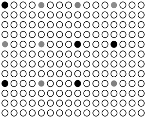
FIG. 1. Illustration of the spatial points considered for reconstruction of the function s ( r , ω ) for a given frequency. The set D o consists of the solid black and gray circles where the former, for example, can be interpreted as S o . The set D L,P o is then given by all the points depicted where inpainting and super-resolution is jointly performed from knowledge of the function in S o . Note that here L = P = 4. (Color online.)
<details>
<summary>Image 1 Details</summary>
### Visual Description
## Dot Matrix: Sparse Distribution
### Overview
The image presents a dot matrix pattern. It consists of a grid of circles, most of which are white (hollow). A small number of circles are filled in either black or gray, creating a sparse distribution of colored dots within the grid.
### Components/Axes
* **Grid:** A rectangular grid of circles. The grid appears to be approximately 10 rows by 15 columns.
* **White Circles:** The majority of the circles are white (hollow).
* **Black Circles:** A few circles are filled in black.
* **Gray Circles:** A few circles are filled in gray.
### Detailed Analysis
The distribution of black and gray circles is as follows:
* **Black Circles:**
* One black circle is located in the top-left corner (row 1, column 1).
* One black circle is located in the middle of the grid (row 4, column 8).
* One black circle is located in the middle of the grid (row 4, column 12).
* One black circle is located in the bottom-left corner (row 7, column 1).
* One black circle is located in the bottom-middle (row 7, column 8).
* **Gray Circles:**
* Three gray circles are located near the top of the grid (row 1, columns 5, 9, and 13).
* Two gray circles are located in the middle of the grid (row 4, columns 2 and 4).
* One gray circle is located near the bottom of the grid (row 7, column 12).
### Key Observations
* The black and gray circles are sparsely distributed throughout the grid.
* There is no immediately obvious pattern to the placement of the colored circles.
* The majority of the grid is filled with white circles.
### Interpretation
The image likely represents a visual encoding of data, where the black and gray circles indicate specific data points or events within a larger dataset represented by the grid. Without additional context, it is impossible to determine the meaning of the black and gray circles. The sparse distribution suggests that the events or data points they represent are relatively rare within the overall dataset. The image could be a simplified representation of a spatial distribution, a binary matrix, or some other form of data visualization.
</details>
points corresponding to an upsampled version of the set D o , i.e.
<!-- formula-not-decoded -->
where i = 0 , . . . , ( I -1) L , j = 0 , . . . , ( J -1) P , and some integers L, P ≥ 1. In the signal processing community, reconstructing a function on the domain D L,P o (the high resolution signal) from knowledge of the function on D o (the low resolution signal) is known as super-resolution. Fig. 1 illustrates how the different sets D o , D L,P o , and S o are placed under the inpainting and super-resolution framework.
In summary, we aim at designing an estimator g w with the structure of a neural network where its parameters are real-valued weights w learned from simulated data. In particular, for a given set of frequencies of interest { ω k } K k =1 , the estimator is defined as follows
<!-- formula-not-decoded -->
The goal is then that the error
<!-- formula-not-decoded -->
is reduced for each frequency point.
It is important to note that the actual input to the neural network will represent the values { s ( r , ω k ) } r ∈D o ,k in the rectangular grid D o as a tensor-the missing values will be included by means of a mask on the original grid. For each frequency, this can be seen as a matrix. This implies that there is no information whatsoever provided at the input about the location of these values in the Euclidean coordinate system, i.e. the algorithm is location agnostic. In other words, irrespective of the room dimensions, we assume that our algorithm accepts measurements from a rectangular grid, whose absolute size
<details>
<summary>Image 2 Details</summary>
### Visual Description
## Diagram: Sound Source Localization
### Overview
The image illustrates a sound source localization process using two different sensor array configurations and their corresponding occupancy maps. It shows how sound sources are detected and represented in a grid-based format.
### Components/Axes
* **Top-Left Array:** A rectangular array of sensors, oriented with the x-axis horizontal and the y-axis vertical. The array contains a mix of active sensors (represented by solid black circles) and inactive sensors (represented by dashed red circles). A speaker icon indicates the location of a sound source.
* **Top-Right Array:** A square array of sensors, oriented with the x-axis horizontal and the y-axis vertical. Similar to the left array, it contains active (black) and inactive (red) sensors, along with a speaker icon.
* **Bottom Grid:** A grid representing an occupancy map. Grey squares indicate occupied cells, presumably where sound sources are detected.
* **Arrows:** Two arrows labeled "D(1)o" and "D(2)o" indicate the transformation from the sensor arrays to the occupancy map.
### Detailed Analysis
* **Top-Left Array:**
* The array is arranged in 6 rows and 6 columns.
* The x-axis points to the right, and the y-axis points upwards.
* The sound source (speaker icon) is located near the bottom of the array.
* The active sensors (black circles) are clustered around the sound source.
* **Top-Right Array:**
* The array is arranged in 7 rows and 7 columns.
* The x-axis points to the right, and the y-axis points upwards.
* The sound source (speaker icon) is located near the top-right of the array.
* The active sensors (black circles) are clustered around the sound source.
* **Bottom Grid:**
* The grid is 8x8.
* The grey squares are located at approximately (2,2), (2,3), (4,5).
* **Arrows:**
* The arrow labeled "D(1)o" points from the left array to the bottom grid.
* The arrow labeled "D(2)o" points from the right array to the bottom grid.
### Key Observations
* The active sensors in each array are clustered around the sound source.
* The occupancy map reflects the location of the sound source in each array.
* The transformation from the sensor arrays to the occupancy map is represented by the arrows and labels.
### Interpretation
The diagram illustrates a sound source localization system. The sensor arrays detect sound, and the active sensors indicate the presence of a sound source. The occupancy map provides a simplified representation of the sound source location. The "D(1)o" and "D(2)o" likely represent different processing or mapping functions that transform the sensor data into the occupancy grid. The different array configurations (rectangular vs. square) may represent different sensor arrangements or experimental setups. The occupancy map provides a discrete representation of the sound source location, which could be used for further analysis or decision-making. The clustering of active sensors around the sound source suggests a spatial correlation between sensor activity and sound source proximity.
</details>
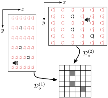
FIG. 2. Example of the location agnostic property. Two rooms with different sizes lead to different rectangular grids in the Euclidean space, i.e. D (1) o = D (2) o . For a given frequency, we use a matrix to represent the input to the network. However, the measured and missing values in both cases (in black and red respectively) are placed at the same matrix entries. This essentially disregards any information about their locations in the Euclidean space. Similarly, the source location is considered unknown. (Color online.)
depends on the room size. In the same way an image reconstruction algorithm would learn to recover images that have been stretched, shrunk, or zoomed in or out (see Fig. 2). Thus, the absolute separation of points along each dimension is not the same. For example, in a room with dimensions l x × l y , input points will be at distance of l x I and l y J .
We will occasionally use tensors in order to represent function values on discrete spatial and frequency domains and as the data structure for the neural network operations. In particular, tensors, irrespective of their order, are denoted by bold uppercase letters, e.g. matrices can be denoted by A ∈ R n 1 × n 2 for n 1 , n 2 ∈ N . Regarding function values, we interchangeably use the tensor representation. For example, consider { s ( r , ω k ) } r ∈D L,P o ,k , then it possible to arrange its values into a tensor S ∈ R IL × JP × K whose elements are given by
<!-- formula-not-decoded -->
## III. APPROACH
We propose a learning algorithm capable of estimating the magnitude of the spatial sound field, for a given frequency range, at a predefined number of locations based on very few measurements from irregularly distributed microphones. The microphones are assumed to provide the room transfer functions (RTFs) at those particular locations for a given frequency range. It is assumed that these microphones are located in a rectangular grid with a predefined number of points irrespective of the room size (see Fig. 2). Note that the source location
is also considered unknown. The prediction algorithm then provides an estimate of the corresponding RTFs at the desired locations.
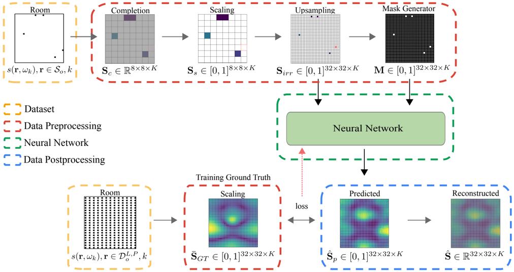
The approach is to train an artificial neural network that learns the structure of these sound fields from thousands of different examples of common domestic rectangular rooms. The main parts of the algorithm, which we describe in detail in the following sections, and illustrate in Fig. 3, can be briefly summarized as follows:
- Dataset: we simulate three-dimensional sound fields, in the frequency band [30,300] Hz, for thousands of common rectangular rooms. The magnitude of the pressure in the available spatial sample points S o serves as input to the network after a preprocessing step. The magnitude of the pressure in the finer rectangular grid, i.e. { s ( r , ω k ) } r ∈D L,P o ,k , is then used to train the network in a supervised manner.
- Data Preprocessing: from { s ( r , ω k ) } r ∈S o ,k , we generate a grid version, defined on D L,P o , consisting of the observed samples and a mask that encodes the information about the locations of these measurements. This preprocessing step involves completion, scaling, and upsampling operations.
- Neural Network: The architecture learns to predict a scaled version of the two-dimensional function { s ( r , ω k ) } r ∈D L,P o ,k from the preprocessed observed sample values { s ( r , ω k ) } r ∈S o ,k and the mask.
- Data Postprocessing: Estimates the appropriate scaling in order to restore the predicted values to the range of the source data.
The data and code of the proposed algorithm is freely available online 30 .
## A. Dataset
The sound field in a lightly damped rectangular room can be approximated using Green's function expressing the solution as an infinite summation of room modes (or standing waves) in the x-,y-, and z-dimension of the room 31
<!-- formula-not-decoded -->
Here, for compactness ∑ N denotes a triple summation across the modal order in each dimension of the room i.e. ∑ N = ∑ ∞ n x =0 ∑ ∞ n y =0 ∑ ∞ n z =0 and correspondingly N represents the triplet of integers n x , n y , n z . The volume of the room is denoted V , ψ N ( · ) is the mode shape associated with a specific N , ω N is the angular resonance frequency of the mode, τ N is the time constant of the mode, and c is the speed of sound. The room shape is here determined assuming rigid boundaries leading to the expression
<!-- formula-not-decoded -->
where Λ N = √ n x n y n z are normalization constants with 0 = 1, 1 = 2 = . . . = 2.
Throughout this work, the focus is to predict the variation of the sound field in a single xy -plane, hence, we seek to train a model which can predict the variation of the sound pressure in the plane. With the purpose to generalize for any xy -plane, we remove the height variation in the Dataset by setting n z = 0. The time constants of each mode are determined from the absorption coefficient calculated using Sabine's equation and assuming a reverberation time T 60 of 0.6 s and uniform distribution of absorption on the surfaces of the room.
We use this model to simulate point source radiation in 5 000 rectangular rooms. Room size and room proportions are randomly created following the recommendation for listening room dimensions for audio reproduction in the standard ITU - R BS.1116 - 3 29 . The floor area ranges from 20 m 2 to 60 m 2 and the dimension ratios follow:
<!-- formula-not-decoded -->
where l x , l y , and l z correspond to length, width, and height respectively. In addition, the source is placed at a random xy -location, i.e. ( x o , y o , 0) for x o ∈ (0 , l x ) and y o ∈ (0 , l y ). Both the dimensions and source location are sampled uniformly.
The magnitude of the sound field pressure is acquired in the finer rectangular grid D L,P o with L = P = 4 and I = J = 8. This essentially divides the room into a grid of 32 by 32 uniformly-spaced points independently of its dimensions. We analyze the results with 1/12th octave frequency resolution in the range [30, 300] Hz including all room modes with a resonance frequency below 400 Hz. This gives K = 40 frequency points. The sound fields generated using this technique are referred to as ground truth sound fields, i.e. s GT ( r , ω k ) := s ( r , ω k ) for r ∈ D L,P o and k = 1 , . . . K . A subset of s GT ( r , ω k ) containing the observed samples captured by the microphones, { s GT ( r , ω k ) } r ∈S o ,k , is used in the preprocessing part.
## B. Preprocessing
This part addresses the processing stage necessary to handle the arbitrary nature of the sampling distribution. In particular, the raw input data is allowed to be variable in size and sampling location. In order to address this, we complete the input data to take values on D o . This is followed by a scaling operation in order to generalize the predictions for arbitrary sources and receivers. The actual information of where the samples are located within D L,P o is encoded into a mask-like function. An upsampled version of this processed input data together with this mask comprises the final input to the network.
FIG. 3. Diagram showing the different steps of the algorithm design. The data is assumed to be represented as third-order tensors in order to include the frequency dimension and the spatial dimensions; however, for the sake of illustration, the former is not shown. The preprocessing stage generates the input mask together with an upsampled and scaled version of the observed samples. The training examples are also scaled. For our choice of parameters, the two input tensors and the training examples take values in [0 , 1] 32 × 32 × 40 . During training, the observed sample values are drawn from our simulated dataset of sound fields in rooms. (Color online.)
<details>
<summary>Image 3 Details</summary>
### Visual Description
## Neural Network Training Diagram
### Overview
The image is a diagram illustrating the training process of a neural network. It shows the flow of data from the initial dataset through preprocessing steps, the neural network itself, and post-processing to generate predicted and reconstructed outputs, which are then compared to the training ground truth to calculate the loss.
### Components/Axes
* **Legend (Top-Left)**:
* Yellow dashed box: Dataset
* Red dashed box: Data Preprocessing
* Green dashed box: Neural Network
* Blue dashed box: Data Postprocessing
* **Dataset (Top-Left)**:
* Label: "Room"
* Equation: s(r, wk), r ∈ So, k
* Description: A diagram of a room with several black dots inside.
* **Data Preprocessing (Top)**:
* **Completion**:
* Label: "Completion"
* Equation: Sc ∈ R^(8x8xK)
* Description: An 8x8 grid with some squares colored gray, purple, and blue.
* **Scaling**:
* Label: "Scaling"
* Equation: Ss ∈ [0,1]^(8x8xK)
* Description: An 8x8 grid with some squares colored blue and purple.
* **Upsampling**:
* Label: "Upsampling"
* Equation: Sirr ∈ [0,1]^(32x32xK)
* Description: A 32x32 grid with some squares colored black and red.
* **Mask Generator**:
* Label: "Mask Generator"
* Equation: M ∈ [0,1]^(32x32xK)
* Description: A 32x32 black grid with several white squares.
* **Neural Network (Center)**:
* Label: "Neural Network"
* Description: A green rounded rectangle.
* **Training Ground Truth (Bottom-Center)**:
* Label: "Training Ground Truth"
* **Scaling**:
* Label: "Scaling"
* Equation: S_GT ∈ [0,1]^(32x32xK)
* Description: A 32x32 grid with a heatmap-like color distribution, ranging from blue to yellow.
* **Data Postprocessing (Bottom-Right)**:
* **Predicted**:
* Label: "Predicted"
* Equation: S_p ∈ [0,1]^(32x32xK)
* Description: A 32x32 grid with a heatmap-like color distribution, ranging from blue to yellow.
* **Reconstructed**:
* Label: "Reconstructed"
* Equation: Ŝ ∈ R^(32x32xK)
* Description: A 32x32 grid with a heatmap-like color distribution, ranging from blue to yellow.
* **Dataset (Bottom-Left)**:
* Label: "Room"
* Equation: s(r, wk), r ∈ D_o^(L,P), k
* Description: A diagram of a room filled with black dots.
* **Arrows**:
* Gray arrows indicate the flow of data.
* Red arrow indicates the "loss" feedback.
### Detailed Analysis or ### Content Details
The diagram illustrates the process of training a neural network to reconstruct a "room" representation. The process begins with an initial "Room" dataset, which is preprocessed through steps labeled "Completion", "Scaling", "Upsampling", and "Mask Generator". These steps transform the initial data into a format suitable for the neural network. The preprocessed data is then fed into the "Neural Network". The output of the neural network is post-processed into "Predicted" and "Reconstructed" representations. The "Predicted" output is compared to the "Training Ground Truth" to calculate the "loss", which is then used to update the neural network's parameters.
### Key Observations
* The data preprocessing steps involve transforming the initial room representation through a series of scaling and masking operations.
* The neural network aims to predict and reconstruct a target representation that matches the training ground truth.
* The loss function provides feedback to the neural network, guiding the learning process.
### Interpretation
The diagram depicts a typical neural network training pipeline. The "Room" dataset likely represents some form of spatial data or scene information. The preprocessing steps are designed to prepare this data for the neural network, potentially by filling in missing information ("Completion"), normalizing the data ("Scaling"), increasing the resolution ("Upsampling"), and focusing on relevant regions ("Mask Generator"). The neural network then learns to map this preprocessed input to a target representation, as defined by the "Training Ground Truth". The "loss" function quantifies the difference between the network's predictions and the ground truth, allowing the network to iteratively improve its performance. The "Reconstructed" output represents the network's attempt to recreate the original input from its learned representation.
</details>
## 1. Completion
We assume that the possible observed pressure values correspond to locations within the coarser grid D o , which also covers the whole room area. In this paper, the choice of parameters results in D o being a grid of 8 by 8 points. The samples observed are then given by { s GT ( r , ω k ) } r ∈S o ,k . Irrespective of the structure of S o , i.e. the number and pattern of observed samples, the neural network is designed so that the size of the input data is fixed. In order to address this, we introduce a function defined on D o that, in a sense, completes the acquired data, i.e.
<!-- formula-not-decoded -->
for each ω k . In other words, for the locations where no samples are provided, i.e. no microphone is present, s c is chosen arbitrarily to take the maximum value.
## 2. Scaling
We want the proposed method to be independent of the gain in the measurement equipment and the reproduction system. Thus, we introduce a scaling for the sample values s c in such a way that the range is restricted to [0,1], i.e.
<!-- formula-not-decoded -->
for each ω k . Consequently, the neural network will learn to predict the sound field values in [0,1]. A postprocessing stage will be added so that the predictions are restored to the original range.
## 3. Upsampling
Since we are interested in predicting values in the finer rectangular grid, D L,P o , we transform s s ∈ R 8 × 8 × 40 to a function s irr ∈ R 32 × 32 × 40 by means of an upsampling operation. This new function s irr consists of a scaled version of the irregularly-distributed microphone measurements. In particular, we have that
<!-- formula-not-decoded -->
for each ω k . The original measurements are incorporated into s c , however, the actual input values to the network are given by s irr . Note that the value of s irr for r ∈
FIG. 4. Schematic diagram of the neural network architecture proposed in this paper. This diagram is not exhaustive in terms of all the operations involved. For further details, the reader can refer to the text. (Color online.)
<details>
<summary>Image 4 Details</summary>
### Visual Description
## Diagram: U-Net Architecture
### Overview
The image depicts a U-Net architecture diagram, a type of convolutional neural network often used for image segmentation. The diagram illustrates the flow of data through various layers, including convolutional layers, batch normalization, and upsampling operations. The architecture has a symmetrical U-shape, with a contracting (encoder) path on the left and an expanding (decoder) path on the right.
### Components/Axes
* **Legend (Top-Left)**:
* Up 2x2: Gray arrow pointing upwards.
* Concatenate: Gray arrow pointing to the right.
* Batch Normalization: Blue arrow pointing to the right.
* Partial Conv 3x3: Blue arrow pointing to the right.
* Partial Conv 5x5: Red arrow pointing upwards.
* Conv 1x1: Green arrow pointing upwards.
* **Blocks**: Each block represents a layer or a series of layers. The blocks are colored either yellow or dark green. The dimensions of the feature maps are indicated above and below each block (e.g., 32x32, 16x16, 8x8, 4x4, 2x2).
* **Labels**:
* S<sub>irr</sub>: Located on the left side of the diagram, near the top.
* M: Located next to S<sub>irr</sub>.
* S<sub>p</sub>: Located on the right side of the diagram, near the top.
### Detailed Analysis
**Encoder (Contracting Path - Left Side)**:
1. **Input Block**:
* Dimensions: 32x32
* Values: 40 (top), 40 (top), S<sub>irr</sub>, M
2. **First Downsampling Block**:
* Dimensions: 16x16
* Values: 64 (top), 64 (top)
* Connection: Red arrow (Partial Conv 5x5) from the input block.
3. **Second Downsampling Block**:
* Dimensions: 8x8
* Values: 128 (top), 128 (top)
* Connection: Blue arrow (Partial Conv 3x3) from the first downsampling block.
4. **Third Downsampling Block**:
* Dimensions: 4x4
* Values: 256 (top), 256 (top)
* Connection: Blue arrow (Partial Conv 3x3) from the second downsampling block.
5. **Bottom Block**:
* Dimensions: 2x2
* Values: 512 (top), 512 (top)
* Connection: Blue arrow (Partial Conv 3x3) from the third downsampling block.
**Decoder (Expanding Path - Right Side)**:
1. **First Upsampling Block**:
* Dimensions: 4x4
* Values: 768 (top), 768 (top)
* Connection: Gray arrow (Concatenate) from the bottom block.
2. **Second Upsampling Block**:
* Dimensions: 8x8
* Values: 384 (top), 384 (top)
* Connection: Gray arrow (Concatenate) from the first upsampling block.
3. **Third Upsampling Block**:
* Dimensions: 16x16
* Values: 192 (top), 192 (top)
* Connection: Blue arrow (Batch Normalization) from the second upsampling block, and a gray arrow (Concatenate) from the second downsampling block.
4. **Fourth Upsampling Block**:
* Dimensions: 32x32
* Values: 104 (top), 104 (top)
* Connection: Blue arrow (Batch Normalization) from the third upsampling block, and a gray arrow (Concatenate) from the first downsampling block.
5. **Output Block**:
* Dimensions: 32x32
* Values: 40 (top), 40 (top), S<sub>p</sub>
* Connection: Green arrow (Conv 1x1) from the fourth upsampling block.
**Skip Connections**:
* Gray dotted lines represent skip connections that concatenate feature maps from the encoder path to the decoder path. These connections help to preserve fine-grained details and improve the accuracy of the segmentation.
### Key Observations
* The U-Net architecture is symmetrical, with a contracting path and an expanding path.
* Skip connections are used to concatenate feature maps from the encoder path to the decoder path.
* The dimensions of the feature maps decrease in the encoder path and increase in the decoder path.
* The diagram illustrates the flow of data through various layers, including convolutional layers, batch normalization, and upsampling operations.
### Interpretation
The U-Net architecture is designed for image segmentation tasks. The contracting path captures the context of the image, while the expanding path enables precise localization. The skip connections help to preserve fine-grained details and improve the accuracy of the segmentation. The diagram provides a visual representation of the architecture and the flow of data through the network. The use of different colored arrows indicates different operations, such as batch normalization, partial convolutions, and upsampling. The dimensions of the feature maps at each layer are also indicated, providing a detailed view of the network's structure.
</details>
D L,P o \ D o can be arbitrarily chosen due to the maskrelated operation that follows.
## 4. Mask generator
The function s irr does not provide any information about which values have been originally observed. Thus, we simultaneously generate a mask, defined on the finer grid D L,P o , that carries information about the spatial locations of the measurements. This mask takes the value 1 at each available spatial sample point and 0 otherwise, i.e.
<!-- formula-not-decoded -->
for all ω k . Clearly, the mask must be the same for every frequency point.
## 5. Input
The input data to the network consists of thirdorder tensors representing the frequency dimension and the two spatial dimensions, i.e. M ∈ [0 , 1] 32 × 32 × 40 and S irr ∈ [0 , 1] 32 × 32 × 40 . It is important to emphasize that the network performs convolutions considering the three dimensions in order to learn the relationships within and between frequency and space.
## C. Neural Network
## 1. Architecture
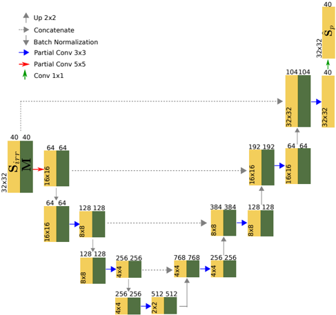
We propose a U-Net-like deep neural network 24 with partial convolutions 21 in order to predict the magnitude of the sound field pressure in a room. U-Net was first introduced for the task of biomedical image segmentation and since then it has been successfully used in many cases.
The U-Net encoder-decoder structure can learn multi-resolution features of the sound field in the frequency-space domain, i.e. it can capture the sound field variations at different scales in both domains. This is carried out by the encoder which halves the feature maps by using a stride of 2 and doubling the filter size in each partial convolution. The decoder then reverses this procedure by upsampling the feature maps and reducing by 2 the filter size. After each partial convolution, the encoder uses a ReLU activation while the decoder uses a Leaky ReLU activation with a negative slope coefficient of 0.2. Furthermore, the decoder, through concatenation, incorporates at the same hierarchical level the feature maps and masks computed by the encoder. In other words, the features from different resolutions in the frequency-space domain are also utilized as an input in the upsampling layers of the decoder. Finally, a 1 × 1 convolution with a sigmoid activation projects the last feature map to generate the predicted sound field ˆ S p . Fig. 4 shows a schematic diagram of the architecture.
Although there are similarities between U-Net and a standard encoder-decoder architecture, their skip connections are paramount in order to attain better performance. This has been shown by ablation studies in image segmentation 32 and label-to-image 33 tasks. Skip connections allow U-Net to access low-level information that may be lost when propagated through the network. In the current case, skip connections help to recover spatial information lost during downsampling which corresponds to the initial arrangement of measurements.
## 2. Partial Convolutions
Unlike traditional convolutions, partial convolutions 21 allow us to compute the output feature maps based solely on the available spatial sample points from the input feature maps. This provides the necessary flexibility to use any number of microphones at irregularly distributed locations. Let w be the sliding convolutional window with size k h × k t . Consider further I w ∈ R k h × k t × C and M w ∈ [0 , 1] k h × k t × C as corresponding to the C -channel input feature maps and mask within w respectively. The tensor W ∈ R k h × k t × C ′ × C respresents the filter weights and b ∈ R C ′ is the bias. Partial convolution computes each spatial location value o ′ w ∈ R C ′ in the C ′ -channel output feature maps as
<!-- formula-not-decoded -->
where sum( · ) receives a tensor as an argument and provides the summation of its elements, is the Hadamard product, and · is a combination, in different dimensions, of matrix dot products and element-wise summations 21 . The scaling factor sum( 1 ) sum( M w ) can be interpreted as a measure of the amount of known information in the input feature maps. Then, the mask M w is updated at each spatial location m ′ ∈ R C ′ as follows:
<!-- formula-not-decoded -->
## 3. Loss Function
In order to train the model in a supervised manner, we also use a scaled version of the ground truth in order to be consistent with the output data before postprocessing. The assumption is that this process may also assist the learning process. The scaling is given by
<!-- formula-not-decoded -->
for r ∈ D L,P o and k = 1 , . . . , K . It is clear then that ¯ s GT ( r , ω k ) ∈ [0 , 1].
As a loss function, we use two terms in order to distinguish between predicted values in the available spatial sample points S o and its complement under D L,P o . We first define
<!-- formula-not-decoded -->
and then
<!-- formula-not-decoded -->
where 1 ∈ R 32 × 32 × 40 with all entries equal to 1, and sum( | · | ) acting on a tensor is the summation of the absolute value of its elements. The combined loss function finally takes the form
<!-- formula-not-decoded -->
The factors in (20) were chosen as the best performing ones after analyzing the performance on 1 000 validation rooms.
## 4. Training Procedure
The model is trained in two different stages using supervised learning. We use 75% of the dataset for training purposes and the remaining 25% is used for validation. For both stages, the model is trained during 400 epochs and the weights with less validation loss are selected. In the first stage, the learning rate is set to 2 · 10 -4 and batch normalization is enabled in all layers. For the second stage, the learning rate is set to 5 · 10 -5 with batch normalization disabled in all encoding layers. Training the model in multiple stages helps to overcome the error generated by batch normalization when computing, in the first stage, the mean and variance for all input values, corresponding to known and unknown locations. In addition, faster convergence is achieved.
## D. Postprocessing
We use linear regression to restore the output of the neural network ˆ s p to its original range. Thus, the rescaled version takes the form
<!-- formula-not-decoded -->
for all r ∈ D L,P o and k = 1 , . . . , K , where the values a k , b k ∈ R are determined through the following optimization problem
<!-- formula-not-decoded -->
for each k = 1 , . . . , K . Note that the rescaling operation could be implemented as another neural network that learns the mapping function. However, experiments showed that linear regression provided reasonable performance.
## IV. RESULTS
## A. Evaluation Metrics
We use two different measures of performance for the proposed method. First, we consider the normalized mean square error (NMSE) computed for each frequency point, i.e.
<!-- formula-not-decoded -->
The NMSE mainly provides an average absolute squared error over all locations between the reconstructed and the original signals. As a consequence, a high NMSE value may result from a poor performance locally while performing individually well in the remaining spatial locations.
Therefore, we use the concept of mean structural similarity 34 (MSSIM) from image processing. This evaluates how the model predicts the overall shape of the pressure distribution for each frequency point. Moreover, it also provides a measure of performance that is independent of the scaling chosen. Let us first introduce the structural similarity index (SSIM) between two matrices A , B ∈ R n × n as follows
<!-- formula-not-decoded -->
where µ is the mean of the corresponding matrix entries, σ 2 the estimate of the variance of the entries, and σ AB is the covariance estimate between the entries of A and B . The constants c 1 = ( h 1 R ) 2 and c 2 = ( h 2 R ) 2 , where
FIG. 5. Normalized mean squared error (NMSE) estimated from simulated data. The results are reported for different number of microphone observations n mic , i.e. ( ): n mic = 5, ( ): n mic = 15, ( ): n mic = 35, and ( ): n mic = 55. (Color online.)
<details>
<summary>Image 5 Details</summary>
### Visual Description
## Chart: NMSE vs. Frequency
### Overview
The image is a line chart showing the relationship between NMSE (Normalized Mean Squared Error) in dB and Frequency in Hz. There are four distinct data series represented by different colored lines: blue, orange, red, and brown. The chart illustrates how NMSE changes with frequency for each series.
### Components/Axes
* **X-axis:** Frequency [Hz]. The scale ranges from approximately 30 Hz to 300 Hz. Major tick marks are present at 30, 40, 50, 60, 70, 80, 90, 100, 200, and 300 Hz.
* **Y-axis:** NMSE (dB). The scale ranges from -25 dB to -5 dB. Major tick marks are present at -25, -20, -15, -10, and -5 dB.
* **Data Series:** Four data series are plotted on the chart, each represented by a different color: blue, orange, red, and brown. There is no explicit legend, so the series are identified by color.
### Detailed Analysis
* **Blue Line:** This line generally slopes upward, indicating that NMSE increases with frequency.
* At 30 Hz, the NMSE is approximately -11.5 dB.
* It dips to around -13 dB at 40 Hz.
* It then rises sharply to approximately -7 dB at 100 Hz.
* The line plateaus around -6 dB between 200 Hz and 300 Hz.
* **Orange Line:** This line also slopes upward, showing an increase in NMSE with frequency.
* At 30 Hz, the NMSE is approximately -20 dB.
* It rises to approximately -11 dB at 100 Hz.
* The line plateaus around -8 dB between 200 Hz and 300 Hz.
* **Red Line:** This line shows a similar upward trend, with NMSE increasing with frequency.
* At 30 Hz, the NMSE is approximately -23.5 dB.
* It rises to approximately -14 dB at 100 Hz.
* The line plateaus around -9 dB between 200 Hz and 300 Hz.
* **Brown Line:** This line also slopes upward, indicating that NMSE increases with frequency.
* At 30 Hz, the NMSE is approximately -25 dB.
* It rises to approximately -15 dB at 100 Hz.
* The line plateaus around -10 dB between 200 Hz and 300 Hz.
### Key Observations
* All four data series show a general trend of increasing NMSE with increasing frequency.
* The blue line consistently exhibits the highest NMSE values across the frequency range.
* The brown line consistently exhibits the lowest NMSE values across the frequency range.
* The NMSE values for all series tend to converge as the frequency increases beyond 200 Hz.
### Interpretation
The chart suggests that, across the four data series, higher frequencies generally result in lower error (higher NMSE values, since the values are negative dB). The blue series performs the best (lowest error), while the brown series performs the worst (highest error). The convergence of the lines at higher frequencies indicates that the performance difference between the series diminishes as frequency increases. The initial dip in the blue line around 40 Hz is an anomaly that might warrant further investigation. The data demonstrates a clear relationship between frequency and NMSE, with performance generally improving at higher frequencies.
</details>
R is the dynamic range of the entry values, are meant to stabilize the division with a weak denominator. We set h 1 and h 2 to the standard values 0.01 and 0.03 respectively.
In our scenario, we consider the individual matrices S k ∈ R IL × JP , i.e. the k -th matrix of tensor S ∈ R IL × JP × K . Now, let { S n k ( η ) } N n =1 denote the set of all possible windowed versions of S k of size η × η . The mean structural similarity is then given by
<!-- formula-not-decoded -->
for each frequency point. In the results presented, we have used η = 7.
## B. Simulated Data
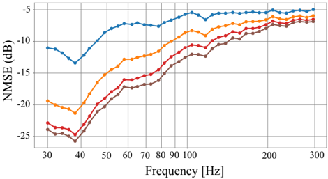
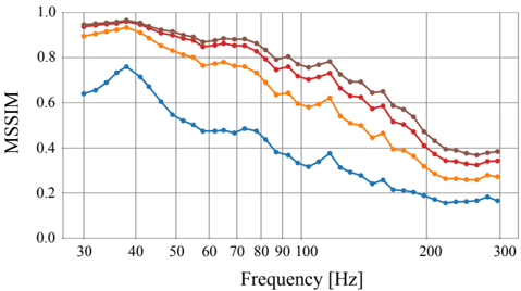
We asses the reconstruction performance of the proposed method, i.e. the generalization error, by using sound fields in 30 different rooms. These have been simulated identically to the training data and have not been previously seen by the network. We are interested in evaluating the performance with regard to the number of irregularly placed microphones, denoted by n mic . Thus, given n mic , we analyze the reconstruction in each room placing the microphones in 10 000 different arrangements, i.e. each realization corresponds to a different S o . Figures 5 and 6 show, as a function of frequency, the average NMSE in dB and MSSIM for all rooms and locations tested and different number of available microphones.
Results show a general improved performance in sound field reconstruction as the number of available microphones is increased. At the same time, performance degrades as the frequency increases. This is in agreement with theoretical results that, given a maximum frequency content, require a higher sampling density for a more robust reconstruction and, given a reconstruction error, the sampling density constraints also increase whenever higher frequency content is available 11,35 . This suggests
FIG. 6. Mean structural similarity index (MSSIM) estimated from simulated data. The results are reported for different number of microphone observations n mic , i.e. ( ): n mic = 5, ( ): n mic = 15, ( ): n mic = 35, and ( ): n mic = 55. (Color online.)
<details>
<summary>Image 6 Details</summary>
### Visual Description
## Line Chart: MSSIM vs. Frequency
### Overview
The image is a line chart showing the relationship between MSSIM (Multi-Scale Structural Similarity Index) and Frequency (in Hz). There are four distinct data series represented by different colored lines: brown, red, orange, and blue. The chart illustrates how MSSIM values change across a range of frequencies from approximately 30 Hz to 300 Hz.
### Components/Axes
* **Y-axis (Vertical):** Labeled "MSSIM," ranging from 0.0 to 1.0 in increments of 0.2.
* **X-axis (Horizontal):** Labeled "Frequency [Hz]," ranging from 30 Hz to 300 Hz. Major tick marks are present at 30, 40, 50, 60, 70, 80, 90, 100, 200, and 300 Hz.
* **Data Series:** Four lines representing different conditions or configurations. The legend is missing, so the exact meaning of each line is unknown.
### Detailed Analysis
**1. Brown Line:**
* **Trend:** The brown line starts at a high MSSIM value, remains relatively stable between 30 Hz and 60 Hz, and then gradually decreases as frequency increases.
* **Data Points:**
* At 30 Hz, MSSIM ≈ 0.95
* At 60 Hz, MSSIM ≈ 0.92
* At 100 Hz, MSSIM ≈ 0.85
* At 200 Hz, MSSIM ≈ 0.75
* At 300 Hz, MSSIM ≈ 0.72
**2. Red Line:**
* **Trend:** Similar to the brown line, the red line starts high, plateaus slightly, and then decreases with increasing frequency.
* **Data Points:**
* At 30 Hz, MSSIM ≈ 0.92
* At 60 Hz, MSSIM ≈ 0.88
* At 100 Hz, MSSIM ≈ 0.78
* At 200 Hz, MSSIM ≈ 0.60
* At 300 Hz, MSSIM ≈ 0.38
**3. Orange Line:**
* **Trend:** The orange line also starts high but decreases more noticeably than the brown and red lines as frequency increases.
* **Data Points:**
* At 30 Hz, MSSIM ≈ 0.90
* At 60 Hz, MSSIM ≈ 0.82
* At 100 Hz, MSSIM ≈ 0.70
* At 200 Hz, MSSIM ≈ 0.45
* At 300 Hz, MSSIM ≈ 0.30
**4. Blue Line:**
* **Trend:** The blue line has a distinct trend. It starts lower than the other lines, increases to a peak around 40 Hz, and then decreases significantly as frequency increases.
* **Data Points:**
* At 30 Hz, MSSIM ≈ 0.64
* At 40 Hz, MSSIM ≈ 0.75
* At 60 Hz, MSSIM ≈ 0.50
* At 100 Hz, MSSIM ≈ 0.45
* At 200 Hz, MSSIM ≈ 0.20
* At 300 Hz, MSSIM ≈ 0.15
### Key Observations
* The brown line consistently exhibits the highest MSSIM values across the frequency range.
* The blue line has the lowest MSSIM values, especially at higher frequencies.
* All lines show a general decreasing trend in MSSIM as frequency increases, except for the initial increase in the blue line.
* The rate of decrease varies among the lines, with the blue line showing the most rapid decline.
### Interpretation
The chart suggests that the MSSIM values are generally inversely related to frequency. This could indicate that the similarity between images or signals being compared decreases as the frequency of the signal increases. The different colored lines likely represent different processing methods, configurations, or types of data. The brown line represents the configuration that preserves the most similarity across all frequencies, while the blue line represents the configuration that preserves the least similarity, especially at higher frequencies. The peak in the blue line around 40 Hz might indicate a resonance or specific characteristic of that configuration at that frequency. Without a legend, the specific meaning of each line remains speculative.
</details>
that the neural network capacity is subject to the same physical limitations as classical methods when learning the spatial variations of the pressure distribution. In other words, at high frequencies it is hindered by undersampling and also requires more observations to improve robustness. For example, the relative improvement as the number of microphones increase is higher at lower frequencies as opposed to the high-frequency range. It is at this high frequency range where more observations do not provide a big impact on performance. However, the requirements in terms of sampling density for a particular performance seem to be less stringent than other methods present in the literature. For example, only n mic = 5 microphones are able to provide an NMSE below -5 dB for the frequency range considered in common domestic rooms.
It is also important to observe that the loss functions defined in Eq. 18 and Eq. 19 are suitable for prediction at low frequencies but they underperform at high frequencies. These commonly result in predictions that emphasize the median value in order to reduce the overall error. This can explain, in the frequency range 100-300 Hz, the more abrupt changes in performance of the MSSIM as opposed to the NMSE.
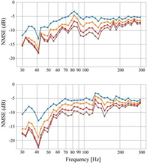
## C. Experimental Data
We test the model optimized for simulated data in a real listening room. The RTFs are estimated for two different source locations on a two-dimensional grid consisting of 32 by 32 points uniformly spaced along the corresponding dimensions. In particular, impulse response measurements were conducted from two 10' loudspeakers on a grid one meter above the floor in a rectangular room of dimensions 4 . 16 × 6 . 46 × 2 . 3 m. The measurements were performed using 4-second duration exponential sweeps from 0.1 Hz to 24 kHz at a sampling frequency of 48 kHz 36 . These measurements were performed with
FIG. 7. Normalized mean square error (NMSE) in dB estimated from experimental data. Top and bottom plots correspond to different source locations. The results are reported for different number of microphone observations n mic , i.e. ( ): n mic = 5, ( ): n mic = 15, ( ): n mic = 35, and ( ): n mic = 55. (Color online.)
<details>
<summary>Image 7 Details</summary>
### Visual Description
## Line Charts: NMSE vs. Frequency (Two Plots)
### Overview
The image contains two line charts, one above the other, both plotting NMSE (Normalized Mean Squared Error) in dB against Frequency in Hz. Each chart displays four data series, represented by different colored lines: blue, orange, red, and brown. The charts appear to show the performance of different systems or configurations across a range of frequencies. The top and bottom charts appear to show similar trends, but may represent different experimental conditions or datasets.
### Components/Axes
* **Y-axis (NMSE (dB))**: Both charts have the same y-axis, labeled "NMSE (dB)". The scale ranges from -20 dB to 0 dB, with gridlines at -15 dB, -10 dB, and -5 dB.
* **X-axis (Frequency [Hz])**: Both charts have the same x-axis, labeled "Frequency [Hz]". The scale ranges from approximately 30 Hz to 300 Hz. Major tick marks are present at 30, 40, 50, 60, 70, 80, 90, 100, 200, and 300 Hz.
* **Data Series**: Four data series are plotted on each chart, distinguished by color:
* Blue
* Orange
* Red
* Brown
* **Legend**: There is no explicit legend in the image. The data series are identified by color only.
### Detailed Analysis
**Top Chart:**
* **Blue Line**: The blue line starts at approximately -12 dB at 30 Hz, decreases to approximately -13 dB at 40 Hz, then increases sharply to a peak of approximately -2 dB around 80 Hz. After the peak, it gradually decreases to approximately -6 dB at 300 Hz.
* 30 Hz: -12 dB
* 40 Hz: -13 dB
* 80 Hz: -2 dB
* 300 Hz: -6 dB
* **Orange Line**: The orange line starts at approximately -14 dB at 30 Hz, decreases to approximately -15 dB at 40 Hz, then increases sharply to a peak of approximately -5 dB around 80 Hz. After the peak, it gradually decreases to approximately -7 dB at 300 Hz.
* 30 Hz: -14 dB
* 40 Hz: -15 dB
* 80 Hz: -5 dB
* 300 Hz: -7 dB
* **Red Line**: The red line starts at approximately -15 dB at 30 Hz, decreases to approximately -17 dB at 40 Hz, then increases sharply to a peak of approximately -8 dB around 80 Hz. After the peak, it gradually decreases to approximately -8 dB at 300 Hz.
* 30 Hz: -15 dB
* 40 Hz: -17 dB
* 80 Hz: -8 dB
* 300 Hz: -8 dB
* **Brown Line**: The brown line starts at approximately -16 dB at 30 Hz, decreases to approximately -18 dB at 40 Hz, then increases sharply to a peak of approximately -10 dB around 80 Hz. After the peak, it gradually decreases to approximately -9 dB at 300 Hz.
* 30 Hz: -16 dB
* 40 Hz: -18 dB
* 80 Hz: -10 dB
* 300 Hz: -9 dB
**Bottom Chart:**
* **Blue Line**: The blue line starts at approximately -11 dB at 30 Hz, decreases to approximately -12 dB at 40 Hz, then increases sharply to a peak of approximately -4 dB around 80 Hz. After the peak, it gradually decreases to approximately -6 dB at 300 Hz.
* 30 Hz: -11 dB
* 40 Hz: -12 dB
* 80 Hz: -4 dB
* 300 Hz: -6 dB
* **Orange Line**: The orange line starts at approximately -16 dB at 30 Hz, decreases to approximately -17 dB at 40 Hz, then increases sharply to a peak of approximately -6 dB around 80 Hz. After the peak, it gradually decreases to approximately -7 dB at 300 Hz.
* 30 Hz: -16 dB
* 40 Hz: -17 dB
* 80 Hz: -6 dB
* 300 Hz: -7 dB
* **Red Line**: The red line starts at approximately -17 dB at 30 Hz, decreases to approximately -21 dB at 40 Hz, then increases sharply to a peak of approximately -8 dB around 80 Hz. After the peak, it gradually decreases to approximately -8 dB at 300 Hz.
* 30 Hz: -17 dB
* 40 Hz: -21 dB
* 80 Hz: -8 dB
* 300 Hz: -8 dB
* **Brown Line**: The brown line starts at approximately -18 dB at 30 Hz, decreases to approximately -22 dB at 40 Hz, then increases sharply to a peak of approximately -11 dB around 80 Hz. After the peak, it gradually decreases to approximately -9 dB at 300 Hz.
* 30 Hz: -18 dB
* 40 Hz: -22 dB
* 80 Hz: -11 dB
* 300 Hz: -9 dB
### Key Observations
* All lines in both charts show a similar trend: a decrease in NMSE from 30 Hz to 80 Hz, followed by a gradual decrease from 80 Hz to 300 Hz.
* The blue line consistently exhibits the highest NMSE values across the frequency range in both charts.
* The brown line consistently exhibits the lowest NMSE values across the frequency range in both charts.
* The NMSE values are generally lower (better) at higher frequencies (200-300 Hz) compared to lower frequencies (30-40 Hz).
* There is a significant dip in NMSE around 40 Hz for all lines in both charts.
* The bottom chart has lower NMSE values at 40 Hz compared to the top chart.
### Interpretation
The charts likely represent the performance of different signal processing or communication systems across a range of frequencies. The NMSE metric indicates the level of distortion or error in the signal. Lower NMSE values indicate better performance.
The consistent trend across all data series suggests that there is a common characteristic in the systems' behavior with respect to frequency. The peak in NMSE around 80 Hz could indicate a resonance or a frequency-dependent limitation in the systems. The lower NMSE at higher frequencies suggests that the systems perform better at those frequencies.
The differences between the data series (blue, orange, red, brown) likely represent different configurations, parameters, or algorithms used in the systems. The blue line consistently showing the highest NMSE suggests that the corresponding configuration is the least effective. Conversely, the brown line suggests the most effective configuration.
The two charts may represent different experimental conditions or datasets. The bottom chart showing lower NMSE values at 40 Hz suggests that the conditions in the bottom chart are more favorable for performance at that frequency.
</details>
two microphones, each covering roughly half of the grid. The microphones were a Br¨ uel & Kjær (B&K) 4192 and a B&K4133 1 2 ' condenser microphone connected to a B&K Nexus conditioning amplifier and recorded with an RME Fireface UFX+ sound card. Both microphones were level calibrated at 1 kHz using a B&K 4231 calibrator prior to the measurements. The reverberation time of the room, specified as the arithmetic average of the 1/3 octave T 20 estimates 37 in the range of 32 Hz to 316 Hz, was 0.46 s.
Similar to the previous scenario, we investigate the performance of the model with regard to the number of microphones placed in the room. We are particularly interested in assessing the performance when using very few observations. Thus, for each predefined source location, we also use here 5, 15, 35, and 55 microphones in 10 000 different arrangements and analyze the mean performance with a 95% confidence interval. These results are reported in Figures 7 and 8.
It is important to emphasize that the model was trained using simulated data. Moreover, the simulations were simplified by assuming mode shapes equal to rigid walls and removing all room modes including height variation, neither of which is true for the experimental data. It can be observed that, given n mic , the NMSE improves for decreasing frequencies as a general trend although
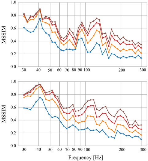
FIG. 8. Mean structural similarity (MSSIM) estimated from experimental data. Top and bottom plots correspond to different source locations. The results are reported for different number of microphone observations n mic , i.e. ( ): n mic = 5, ( ): n mic = 15, ( ): n mic = 35, and ( ): n mic = 55. (Color online.)
<details>
<summary>Image 8 Details</summary>
### Visual Description
## Line Graphs: MSSIM vs. Frequency
### Overview
The image contains two line graphs, one above the other, both plotting MSSIM (Multi-Scale Structural Similarity Index Measure) against Frequency in Hertz (Hz). Each graph displays four data series, represented by different colored lines: brown, red, orange, and blue. The graphs show how MSSIM values change with increasing frequency. The general trend for all lines is a decrease in MSSIM as frequency increases, with some fluctuations.
### Components/Axes
* **Y-axis (MSSIM):**
* Label: MSSIM
* Scale: 0.0 to 1.0, with increments of 0.2.
* **X-axis (Frequency):**
* Label: Frequency [Hz]
* Scale: 30 to 300 Hz, with marked points at 30, 40, 50, 60, 70, 80, 90, 100, 200, and 300 Hz.
* **Data Series:**
* Brown Line
* Red Line
* Orange Line
* Blue Line
* **Positioning:** The two graphs are stacked vertically, with the top graph directly above the bottom graph.
### Detailed Analysis
**Top Graph:**
* **Brown Line:** Starts at approximately 0.78 at 30 Hz, peaks around 0.88 at 40 Hz, then generally decreases with fluctuations, ending at approximately 0.35 at 300 Hz.
* **Red Line:** Starts at approximately 0.75 at 30 Hz, peaks around 0.85 at 40 Hz, then decreases with fluctuations, ending at approximately 0.30 at 300 Hz.
* **Orange Line:** Starts at approximately 0.72 at 30 Hz, peaks around 0.75 at 40 Hz, then decreases with fluctuations, ending at approximately 0.25 at 300 Hz.
* **Blue Line:** Starts at approximately 0.58 at 30 Hz, peaks around 0.75 at 40 Hz, then decreases with fluctuations, ending at approximately 0.15 at 300 Hz.
**Bottom Graph:**
* **Brown Line:** Starts at approximately 0.78 at 30 Hz, peaks around 0.95 at 40 Hz, then generally decreases with fluctuations, ending at approximately 0.60 at 300 Hz.
* **Red Line:** Starts at approximately 0.75 at 30 Hz, peaks around 0.90 at 40 Hz, then decreases with fluctuations, ending at approximately 0.40 at 300 Hz.
* **Orange Line:** Starts at approximately 0.70 at 30 Hz, peaks around 0.75 at 40 Hz, then decreases with fluctuations, ending at approximately 0.20 at 300 Hz.
* **Blue Line:** Starts at approximately 0.55 at 30 Hz, peaks around 0.70 at 40 Hz, then decreases with fluctuations, ending at approximately 0.10 at 300 Hz.
### Key Observations
* All four data series in both graphs show a general decreasing trend of MSSIM with increasing frequency.
* The brown line consistently has the highest MSSIM values across the frequency range in both graphs.
* The blue line consistently has the lowest MSSIM values across the frequency range in both graphs.
* There is a noticeable peak in MSSIM values for all lines around 40 Hz in both graphs.
* The MSSIM values fluctuate more at lower frequencies (30-100 Hz) compared to higher frequencies (200-300 Hz).
* The bottom graph has higher MSSIM values than the top graph.
### Interpretation
The graphs illustrate the relationship between MSSIM and frequency for four different conditions or settings (represented by the different colored lines). The decreasing trend suggests that as frequency increases, the structural similarity between images or signals decreases. The higher MSSIM values for the brown line indicate that the corresponding condition or setting results in better structural similarity compared to the others. The lower MSSIM values for the blue line indicate the opposite. The peak around 40 Hz suggests a frequency range where structural similarity is relatively high for all conditions. The difference between the top and bottom graphs suggests that the bottom graph has better structural similarity than the top graph. The fluctuations at lower frequencies might indicate more sensitivity or variability in structural similarity at those frequencies.
</details>
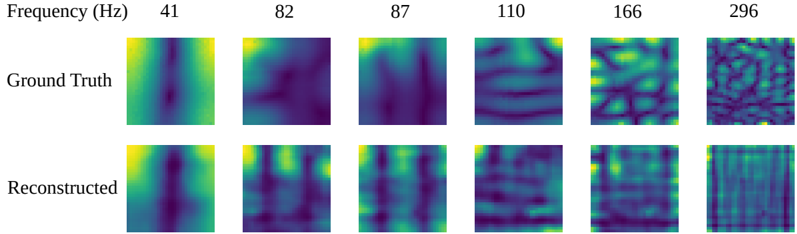
there exist inconsistencies at a local level, i.e. adjacent frequencies may present abrupt changes in performance. The same interpretation applies to the MSSIM. In particular, there are two specific frequencies acting as outliers, i.e. 82 Hz and 157 Hz for the two different source locations. In this case, this is likely to be caused by the sources being positioned at nulls of the room modes. Fig. 9 depicts a representation of the magnitude of the sound field when the reconstruction is performed using only 5 microphones.
## D. Computational Complexity
Apart from the reduced number of microphones used, another advantage of the proposed method is the computational complexity regarding the inference operation. The training stage is usually time consuming, but it can often be run offline. The model size is relatively small with 3.9 million parameters resulting in a deterministic inference time of approximately 0.05 s on a Nvidia GeForce GTX 1080 Ti GPU (value estimated from 100 different room predictions).
Microphone Distribution
<details>
<summary>Image 9 Details</summary>
### Visual Description
## Scatter Plot: Distribution of 'a'
### Overview
The image is a simple scatter plot showing the distribution of the letter "a" across a square area. There are five instances of the letter "a" scattered in different locations within the square.
### Components/Axes
* There are no explicit axes or scales. The square area acts as a visual boundary for the distribution.
* The data points are represented by the letter "a".
### Detailed Analysis
* **Data Points:**
* Two "a"s are located in the top-left quadrant, relatively close to each other.
* One "a" is located near the center of the square.
* One "a" is located in the lower-center area.
* One "a" is located in the bottom-right quadrant.
### Key Observations
* The distribution of "a" is uneven, with a cluster in the top-left and a sparser distribution elsewhere.
* There is no apparent pattern or trend in the placement of the "a"s.
### Interpretation
The image appears to be a random distribution of the letter "a" within a defined area. Without additional context, it's difficult to infer any specific meaning or purpose behind this distribution. It could be a placeholder, a visual example, or part of a larger dataset where the position of "a" represents some other variable.
</details>
FIG. 9. Visualization of the model reconstruction when using 5 microphones arbitrarily placed. The results are shown for different frequencies in a real room where the source location is the same as the top plots in Figures 7 and 8. (Color online.)
<details>
<summary>Image 10 Details</summary>
### Visual Description
## Image Comparison: Ground Truth vs. Reconstructed Images at Varying Frequencies
### Overview
The image presents a visual comparison between "Ground Truth" and "Reconstructed" images at different frequencies. Each image is a square, and the color within each square represents some value, likely intensity or amplitude. The frequencies range from 41 Hz to 296 Hz. The image is arranged in a 2x6 grid, with the top row showing the ground truth and the bottom row showing the reconstructed images.
### Components/Axes
* **X-axis (Frequency):** The frequencies are displayed above each column of images. The values are 41 Hz, 82 Hz, 87 Hz, 110 Hz, 166 Hz, and 296 Hz.
* **Y-axis (Image Type):** The rows are labeled "Ground Truth" (top row) and "Reconstructed" (bottom row).
* **Image Color:** The color within each image likely represents a magnitude or intensity. The color scale appears to range from dark blue/purple (low) to yellow (high).
### Detailed Analysis or ### Content Details
**Ground Truth Images:**
* **41 Hz:** A vertical band of higher intensity (yellow/green) is visible in the center of the image, surrounded by lower intensity (blue/purple) regions.
* **82 Hz:** The image shows a more diffuse pattern, with a central region of higher intensity and less distinct boundaries compared to 41 Hz.
* **87 Hz:** Similar to 82 Hz, but with a slightly more defined vertical structure.
* **110 Hz:** The image displays a more complex pattern with horizontal bands of varying intensity.
* **166 Hz:** The pattern becomes even more complex, with a grid-like structure of alternating high and low intensity regions.
* **296 Hz:** The image appears highly textured and noisy, with a fine-grained pattern of high and low intensity regions.
**Reconstructed Images:**
* **41 Hz:** The reconstructed image captures the central vertical band of higher intensity, but it appears less sharp and more blurred than the ground truth.
* **82 Hz:** The reconstructed image shows a similar diffuse pattern to the ground truth, but with less contrast.
* **87 Hz:** The reconstructed image captures the vertical structure, but it is less defined than in the ground truth.
* **110 Hz:** The reconstructed image shows horizontal bands, but they are less distinct and more blurred compared to the ground truth.
* **166 Hz:** The reconstructed image captures the grid-like structure, but the contrast between high and low intensity regions is reduced.
* **296 Hz:** The reconstructed image shows a textured pattern, but it appears smoother and less noisy than the ground truth.
### Key Observations
* As frequency increases, the complexity of the image patterns increases in both the ground truth and reconstructed images.
* The reconstructed images generally capture the main features of the ground truth images, but with reduced contrast and sharpness.
* The reconstruction quality appears to decrease slightly as frequency increases, with the reconstructed image at 296 Hz being the least similar to its ground truth counterpart.
### Interpretation
The image demonstrates the performance of a reconstruction algorithm at different frequencies. The comparison between the ground truth and reconstructed images provides a visual assessment of the algorithm's ability to capture the underlying patterns at each frequency. The reduced contrast and sharpness in the reconstructed images suggest that the algorithm may be losing some information during the reconstruction process. The decreasing reconstruction quality at higher frequencies indicates that the algorithm may have limitations in capturing the fine details of complex patterns. This could be due to factors such as the algorithm's resolution, noise sensitivity, or ability to handle high-frequency components.
</details>
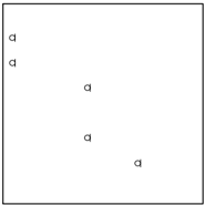
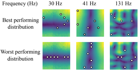
FIG. 10. Best and worst performing sampling distributions for 6 microphones in terms of NMSE performance. The results are shown for different frequencies in a real room where the source location is the same as the top plots in Figures 7 and 8. Symbol ( ◦ ) represents the microphone locations. (Color online.)
<details>
<summary>Image 11 Details</summary>
### Visual Description
## Heatmap: Best and Worst Performing Distributions at Different Frequencies
### Overview
The image presents a series of heatmaps visualizing "best performing" and "worst performing" distributions at three different frequencies: 30 Hz, 41 Hz, and 131 Hz. Each heatmap is overlaid with white circles, indicating specific data points or locations of interest. The heatmaps use a color gradient, likely representing a performance metric, with darker colors potentially indicating lower values and lighter colors indicating higher values.
### Components/Axes
* **Title:** Frequency (Hz)
* **Frequencies:** 30 Hz, 41 Hz, 131 Hz (arranged horizontally)
* **Distribution Types:**
* Best performing distribution (top row)
* Worst performing distribution (bottom row)
* **Heatmap Color Gradient:** The heatmaps use a color gradient that transitions from dark purple/blue to yellow/green. It is assumed that the color represents a performance metric, but the exact scale is not provided.
* **Data Points:** White circles are overlaid on each heatmap, marking specific locations.
### Detailed Analysis
**30 Hz**
* **Best performing distribution:** The heatmap shows a horizontal band of darker color (lower values) in the middle, with lighter colors (higher values) above and below. The white circles are scattered above this darker band.
* **Worst performing distribution:** The heatmap shows a more uniform color distribution, with a slight gradient from top to bottom. The white circles are arranged in a horizontal line in the middle.
**41 Hz**
* **Best performing distribution:** The heatmap shows a more complex pattern with vertical undulations. The white circles are scattered across the heatmap.
* **Worst performing distribution:** The heatmap shows a similar undulating pattern to the "best performing" distribution, but with slightly different color intensities. The white circles are scattered, mostly in the lower half.
**131 Hz**
* **Best performing distribution:** The heatmap shows a complex, mottled pattern with no clear dominant direction. The white circles are scattered across the heatmap.
* **Worst performing distribution:** The heatmap shows a similar complex, mottled pattern to the "best performing" distribution. The white circles are scattered across the heatmap.
### Key Observations
* The "best performing" and "worst performing" distributions appear to differ more significantly at lower frequencies (30 Hz and 41 Hz) than at the higher frequency (131 Hz).
* At 30 Hz, the "best performing" distribution has a distinct horizontal band of lower values, while the "worst performing" distribution is more uniform.
* The white circles appear to be positioned at locations of interest within each heatmap, potentially indicating local maxima or minima.
* As frequency increases, the patterns in the heatmaps become more complex and less structured.
### Interpretation
The heatmaps likely represent the spatial distribution of some performance metric under different conditions (frequencies and distribution types). The "best performing" and "worst performing" labels suggest that the metric is related to the effectiveness or efficiency of a system.
The data suggests that the frequency of operation has a significant impact on the performance distribution. At lower frequencies, there are more distinct differences between the "best" and "worst" distributions, implying that the system is more sensitive to the distribution at these frequencies. As the frequency increases, the distributions become more similar, suggesting that the system's performance becomes less dependent on the specific distribution.
The white circles highlight specific locations within each distribution that are of particular interest. These locations could represent areas of high or low performance, or points where the distribution is particularly sensitive to changes in frequency. Without more context, it's difficult to determine the exact meaning of these points.
</details>
## E. Microphone Distribution
In our analysis, we have mainly focused on the performance based on the number of observations. However, we are also interested in studying the impact that particular microphone distributions have on the performance. Fig. 10 shows an illustration of the best and worst performing microphone distributions in terms of the NMSE. It can be observed that a better reconstruction at a specific frequency is achieved when the microphones capture the maximum variation of the pressure values. On the contrary, if the observations consist solely of the dip-like part of the room modes, the reconstruction degrades significantly. Evidently, this effect is frequency dependent, thus there is not a microphone setup that performs well across all frequencies. However, this also suggests that an unstructured microphone arrangement may be more likely to avoid these sampling issues caused by the modal structure.
## V. DISCUSSION
The work presented here indicates the potential for applying neural networks to predict sound field variations in an entire room from few microphone observations in a location agnostic manner. The training data was based on simplifying assumptions e.g. near-rigid walls, no room modes with height variation, and perfectly rectangular room shape. Despite the mismatch between the training and test scenarios, the network shows promising results under unseen data. This can be understood in relation to the literature where it has been shown that the structure of convolutional neural networks represents a prior which conditions the network to perform well for imagelike signals 38 . The magnitude of the spatial sound field naturally fits the latter. Further, the results can be interpreted as a transfer learning 39 approach where the architecture itself helps to generalize well in the experimental scenario from weights only learned with simulated data.
Despite the discrepancy between training data and the experimental measurements, the extrapolation results are encouraging. It is, therefore, expected that the method could be extended to more complicated scenarios like non-rectangular rooms with complex boundary conditions given the appropriate training data.
## VI. CONCLUSIONS
In this paper, a deep-learning-based method for sound field reconstruction in rectangular rooms has been proposed and examined. The method jointly performs inpainting and super-resolution in order to reconstruct the magnitude of the sound pressure in a two-dimensional plane of a three-dimensional room. The focus of this work is threefold: use a very low number of microphones, accommodate irregular and location agnostic microphone distributions, and carry out inference that is computationally efficient. The results suggest a performance which offers advantages in these three directions, e.g. even using 5 microphones arbitrarily placed the method provides an acceptable reconstruction error with a low inference time.
Regarding future work, the study of generative adversarial networks as discriminators may help to increase the performance at high frequencies. In addition, using more complex acoustic simulation models during the training stage could overcome performance inconsistencies at a local level as well as providing a lower generalization error when using experimental data.
## ACKNOWLEDGMENTS
This project has received funding from the European Union's Horizon 2020 research and innovation programme under the Marie Sk lodowska-Curie grant agreement No 812719.
- 1 J. G. Tylka and E. Choueiri, 'Comparison of techniques for binaural navigation of higher-order ambisonic soundfields,' in Audio Engineering Society Convention 139 , Audio Engineering Society (2015).
- 2 J. G. Tylka and E. Choueiri, 'Soundfield navigation using an array of higher-order ambisonics microphones,' in Audio Engineering Society Conference: 2016 AES International Conference on Audio for Virtual and Augmented Reality , Audio Engineering Society (2016).
- 3 A. J. Berkhout, D. de Vries, and P. Vogel, 'Acoustic control by wave field synthesis,' The Journal of the Acoustical Society of America 93 (5), 2764-2778 (1993).
- 4 W. Druyvesteyn and J. Garas, 'Personal sound,' Journal of the Audio Engineering Society 45 (9), 685-701 (1997).
- 5 D. B. Ward and T. D. Abhayapala, 'Reproduction of a planewave sound field using an array of loudspeakers,' IEEE Transactions on speech and audio processing 9 (6), 697-707 (2001).
- 6 T. Betlehem and T. D. Abhayapala, 'Theory and design of sound field reproduction in reverberant rooms,' The Journal of the Acoustical Society of America 117 (4), 2100-2111 (2005).
- 7 B. D. Radlovic, R. C. Williamson, and R. A. Kennedy, 'Equalization in an acoustic reverberant environment: Robustness results,' IEEE Transactions on Speech and Audio Processing 8 (3), 311-319 (2000).
- 8 E. G. Williams, Fourier acoustics: sound radiation and nearfield acoustical holography (Elsevier, 1999).
- 9 A. Torras-Rosell, S. Barrera-Figueroa, and F. Jacobsen, 'Sound field reconstruction using acousto-optic tomography,' The Journal of the Acoustical Society of America 131 (5), 3786-3793 (2012).
- 10 E. Fernandez-Grande, A. Torras-Rosell, and F. Jacobsen, 'Holographic reconstruction of sound fields based on the acoustooptic effect,' in INTER-NOISE and NOISE-CON Congress and Conference Proceedings , Institute of Noise Control Engineering (2013), Vol. 247, pp. 3181-3190.
- 11 T. Ajdler, L. Sbaiz, and M. Vetterli, 'The plenacoustic function and its sampling,' IEEE transactions on Signal Processing 54 (10), 3790-3804 (2006).
- 12 Y. Haneda, Y. Kaneda, and N. Kitawaki, 'Common-acousticalpole and residue model and its application to spatial interpolation and extrapolation of a room transfer function,' IEEE Transactions on Speech and Audio Processing 7 (6), 709-717 (1999).
- 13 A. Moiola, R. Hiptmair, and I. Perugia, 'Plane wave approximation of homogeneous helmholtz solutions,' Zeitschrift f¨ ur angewandte Mathematik und Physik 62 (5), 809 (2011).
- 14 R. Mignot, G. Chardon, and L. Daudet, 'Low frequency interpolation of room impulse responses using compressed sensing,' IEEE/ACM Transactions on Audio, Speech, and Language Processing 22 (1), 205-216 (2013).
- 15 N. Antonello, E. De Sena, M. Moonen, P. A. Naylor, and T. van Waterschoot, 'Room impulse response interpolation us-
- ing a sparse spatio-temporal representation of the sound field,' IEEE/ACM Transactions on Audio, Speech, and Language Processing 25 (10), 1929-1941 (2017).
- 16 S. A. Verburg and E. Fernandez-Grande, 'Reconstruction of the sound field in a room using compressive sensing,' The Journal of the Acoustical Society of America 143 (6), 3770-3779 (2018).
- 17 R. Mignot, L. Daudet, and F. Ollivier, 'Room reverberation reconstruction: Interpolation of the early part using compressed sensing,' IEEE Transactions on Audio, Speech, and Language Processing 21 (11), 2301-2312 (2013).
- 18 E. F. Grande, 'Sound field reconstruction in a room from spatially distributed measurements,' in 23rd International Congress on Acoustics , German Acoustical Society (DEGA) (2019), pp. 4961-68.
- 19 S.-J. Kim, K. Koh, M. Lustig, S. Boyd, and D. Gorinevsky, 'An interior-point method for large-scale 1 -regularized least squares,' IEEE journal of selected topics in signal processing 1 (4), 606-617 (2007).
- 20 M. Bertalmio, G. Sapiro, V. Caselles, and C. Ballester, 'Image inpainting,' in Proceedings of the 27th annual conference on Computer graphics and interactive techniques , ACM Press/AddisonWesley Publishing Co. (2000), pp. 417-424.
- 21 G. Liu, F. A. Reda, K. J. Shih, T.-C. Wang, A. Tao, and B. Catanzaro, 'Image inpainting for irregular holes using partial convolutions,' in Proceedings of the European Conference on Computer Vision (ECCV) (2018), pp. 85-100.
- 22 W. T. Freeman, T. R. Jones, and E. C. Pasztor, 'Examplebased super-resolution,' IEEE Computer graphics and Applications 22 (2), 56-65 (2002).
- 23 Y. Zhang, Y. Tian, Y. Kong, B. Zhong, and Y. Fu, 'Residual dense network for image super-resolution,' in Proceedings of the IEEE Conference on Computer Vision and Pattern Recognition (2018), pp. 2472-2481.
- 24 O. Ronneberger, P. Fischer, and T. Brox, 'U-net: Convolutional networks for biomedical image segmentation,' in International Conference on Medical image computing and computer-assisted intervention , Springer (2015), pp. 234-241.
- 25 K. He, X. Zhang, S. Ren, and J. Sun, 'Deep residual learning for image recognition,' in Proceedings of the IEEE conference on computer vision and pattern recognition (2016), pp. 770-778.
- 26 F. Chollet, 'Xception: Deep learning with depthwise separable convolutions,' in Proceedings of the IEEE conference on computer vision and pattern recognition (2017), pp. 1251-1258.
- 27 A. B. Nassif, I. Shahin, I. Attili, M. Azzeh, and K. Shaalan, 'Speech recognition using deep neural networks: A systematic review,' IEEE Access 7 , 19143-19165 (2019).
- 28 Y. Wang, R. Skerry-Ryan, D. Stanton, Y. Wu, R. J. Weiss, N. Jaitly, Z. Yang, Y. Xiao, Z. Chen, S. Bengio, et al. , 'Tacotron: Towards end-to-end speech synthesis,' Proc. Interspeech 2017 4006-4010 (2017).
- 29 I. T. Union, 'Recommendation itu-r bs. 1116-3: Methods for the subjective assessment of small impairments in audio systems' (2015).
- 30 See supplementary material at github.com/francesclluis/ sound-field-neural-network .
- 31 F. Jacobsen and P. M. Juhl, Fundamentals of general linear acoustics (John Wiley & Sons, 2013).
- 32 M. Drozdzal, E. Vorontsov, G. Chartrand, S. Kadoury, and C. Pal, 'The importance of skip connections in biomedical image segmentation,' in Deep Learning and Data Labeling for Medical Applications (Springer, 2016), pp. 179-187.
- 33 P. Isola, J.-Y. Zhu, T. Zhou, and A. A. Efros, 'Image-to-image translation with conditional adversarial networks,' in Proceedings of the IEEE conference on computer vision and pattern recognition (2017), pp. 1125-1134.
- 34 Z. Wang, A. C. Bovik, H. R. Sheikh, E. P. Simoncelli, et al. , 'Image quality assessment: from error visibility to structural similarity,' IEEE transactions on image processing 13 (4), 600-612 (2004).
- 35 H. J. Landau, 'Necessary density conditions for sampling and interpolation of certain entire functions,' Acta Mathematica 117 (1), 37-52 (1967).
- 36 A. Farina, 'Simultaneous measurement of impulse response and distortion with a swept-sine technique,' in Audio Engineering Society Convention 108 , Audio Engineering Society (2000).
- 37 I. 3382-2, 'Acoustics measurement of room acoustic parameters part 2: Reverberation time in ordinary rooms' (2008).
- 38 D. Ulyanov, A. Vedaldi, and V. Lempitsky, 'Deep image prior,' in Proceedings of the IEEE Conference on Computer Vision and Pattern Recognition (2018), pp. 9446-9454.
- 39 I. Goodfellow, Y. Bengio, and A. Courville, Deep Learning (MIT Press, 2016) http://www.deeplearningbook.org .