2006.02757v2
Model: nemotron-free
## A scaling approach to estimate the age-dependent COVID-19 infection fatality ratio from incomplete data
Beatriz Seoane Departamento de F´ ısica Te´ orica, Universidad Complutense, 28040 Madrid, Spain.
beseoane@ucm.es
January 28, 2021
## Abstract
SARS-CoV-2 has disrupted the life of billions of people around the world since the first outbreak was officially declared in China at the beginning of 2020. Yet, important questions such as how deadly it is or its degree of spread within different countries remain unanswered. In this work, we exploit the 'universal' increase of the mortality rate with age observed in different countries since the beginning of their respective outbreaks, combined with the results of the antibody prevalence tests in the population of Spain, to unveil both unknowns. We test these results with an analogous antibody rate survey in the canton of Geneva, Switzerland, showing a good agreement. We also argue that the official number of deaths over 70 years old might be importantly underestimated in most of the countries, and we use the comparison between the official records with the number of deaths mentioning COVID-19 in the death certificates to quantify by how much. Using this information, we estimate the infection fatality ratio (IFR) for the different age segments and the fraction of the population infected in different countries assuming a uniform exposure to the virus in all age segments. We also give estimations for the non-uniform IFR using the sero-epidemiological results of Spain, showing a very similar increase of the fatality ratio with age. Only for Spain, we estimate the probability (if infected) of being identified as a case, being hospitalized or admitted in the intensive care units as function of age. In general, we observe a nearly exponential increase of the fatality ratio with age, which anticipates large differences in total IFR in countries with different demographic distributions, with numbers that range from 1.82% in Italy, to 0.62% in China or even 0.14% in middle Africa.
## 1 Introduction
The severe acute respiratory syndrome coronavirus 2 (SARS-CoV-2) has quickly spread around the world since its first notice in December of 2019. The pandemic of the disease caused by this virus, the coronavirus disease 2019 (COVID-19), at the moment of this writing, has claimed more than 400 thousand lives. Many countries in the world have declared different levels of population confinement measures to try to minimize the number of new infections and to prevent the collapse of their respective health systems. As the first wave of the outbreak starts to be controlled, the question of how to proceed
next arises. The daily number of deaths is progressively decreasing in Europe, and with it, the majority of the countries are starting to release the national lock-downs. The design of future strategies will be sustained on the evolution of the official statistics, and the problem is that these statistics are very defective and incomplete. This is so because, on the one hand, the total number official cases is strongly limited by each country's screening capacity, which means that only a small fraction of the total infections is correctly identified (typically those presenting symptoms above a certain level of severity fixed by each country's policy). On the other hand, the shortage of screening tests and an overwhelmed health system also tend to underestimate the number of deaths in the official records. The actual degree of under-counting for both measures is unknown and most likely country dependent, combined with the fact that the pandemic is still on going, results in largely irreconcilable case fatality ratios (CFR) all over the world [1-3].
Efforts have been made to determine the clinical severity of the virus [4-8] and its dependence with factors such as age [9], sex [10] or comorbidities [11-13], but determining precisely how deadly this virus is remains hard [14,15]. Many different solutions using the available data have been proposed to extract the correct CFR [2,16-21], estimate the number of infections [22,23] or the infection fatality ratio [24-27]. Even the results of some early sero-epideomiological tests sampling the population degree of immunity have been strongly controversial [28,29]. Probably the most reliable estimations for the infection fatality ratio (IFR, the probability of dying once infected) as a function of the patient's age, were proposed by Verity et al. in Ref. [25] using the data from 4999 individual cases in mainland China and exported cases outside China. The ratios obtained were further validated with the reported cases in the Diamond Princess cruise ship [30]. Yet, these estimations were based on two assumptions. Firstly, a perfect detection of all the infections among people in their fifties, a debatable hypothesis given the difficulty of systematically identifying all the mild and asymptomatic infections. And second, that the virus had spread uniformly within the population of all ages, which is rather improbable because they were analyzing mainly infections among travelers (that tend to be younger). Nevertheless, the picture is clear, the lethality of the virus increases sharply with the patients' age, being particularly deadly for elderly people and mild for kids.
In the absence of a reliable number of confirmed infections, most of the statistics have focused on the number of deaths, which are expected to be a fraction of the first one. But deaths are much less common than infections, which means that in order to estimate correctly the infections, one needs a very accurate death counting. In this sense, it is widely accepted that the number of real deaths linked to COVID-19 is noticeably larger than what officials statistics say [31,32], but estimating precisely how much is hard and will likely depend strongly on the country data collection policy and capacity. One can try to estimate the size of this discrepancy from the excess mortality observed since the beginning of the pandemic in the public death records. This approach, though apparently infallible, is not without difficulties. Indeed, in most of the countries, the epidemic peak took place at the same time as that of the lock-down measures, which means that, on the one hand, the mortality for accidents and injuries has decreased [33-36], and on the other hand, the health system being under a lot of stress, the mortality linked to lack of medical assistance for other diseases has strongly increased too [37]. Correcting these effects in the reference mortality trend requires a careful an exclusive analysis.
## 2 Materials and Methods
In this work, we attempt to estimate the IFR as function of age using scaling arguments relating the cumulative number of deaths reported in different countries and age groups.
We provide all the details concerning the databases used for the analysis in the Materials section below (Section 2.1) and the definitions of our variables in the Methods Section (Section 2.2). We then use these age-distributed measures to establish a direct correspondence between the mortality rates in patients below 70 years old (where we argue the official counting is more accurate, see Section 3.1) published in different countries around the world (but mostly in Europe) in Section 3.2. This good correspondence allows us to make predictions about the degree of spread of the virus in different populations, or the global IFR of a country, as compared to another one. We also observe that the collapse of the mortality rate with age in different countries is compatible with a pure exponential increase of the IFR with age (assuming a uniform attack rate). The scale of total infections is then consistently fixed from the rate of immunity obtained via blood tests of a statistical sampling of the citizens Spain in Section 3.3 (and compared to seroprevalence tests in Geneva, Switzerland, and New York City, United States). This scale allows us to compute the IFR as function of age and the number of current infections in each country that are given in Table 1. In addition, we estimate the probability of being detected as official case, needing hospitalization and intensive care (if infected) as function of age in Spain in Section 3.4. All these rates are obtained under the assumption of a uniform attack rate, an assumption that seems fairly reasonable seeing the immunity measures of the Spanish test, measures that, when once taken into account, do not change qualitatively the results discussed so far (see in Section 4.1). Finally, we estimate the extent of the under-counting of deaths linked to COVID-19 among the elderly in the different countries (assuming, again, a uniform attack rate) and give estimations for the overall lethality of the virus in Section 4.2.
## 2.1 Materials
We provide below the details and sources concerning the data used in the analysis.
## 2.1.1 Age profile of the COVID-19 deaths
We study the distribution of cumulative deaths by age-groups in different countries and regions. In general, we consider only COVID-19 confirmed deaths (that of patients tested positive for the disease). In order to quantify the possible under-counting of deaths associated to COVID-19, we also consider registers of the deaths were COVID-19 appeared in the death certificate, even as a simple suspicion, details are given in the Under-reporting of deaths subsection.
## National data
The information about the distribution of the number deaths associated to COVID-19 with age in different countries is taken from the database prepared by the 'Institut national d'´ etudes d´ emographiques (Ined)' (France) freely available for scientific use at the website https:/dc-covid.site.ined.fr/fr/donnees/ . For the rest of epidemic's measures in Spain (cases, hospitalizations, entries to intensive care unit and deaths), we used the COVID-19 datadista database [38]. In both cases, these databases collect together the official information published by each country's health authorities. More details about each country's data sources and apparition of these data in the paper are given in Table S1.
Some countries give the age profile for a sub-group of the total number of deaths. If this were the case, we assumed a uniform sampling of the ages in all the age segments, and we renormalize all the cumulative deaths by age so that the sum of the deaths over all the age groups matches the total number of deaths published by each country on the 22nd of May of 2020.
Regional and local data In addition to the national data, we also discuss the age-profiles of different regions in France, Switzerland and Unite States of America in Section 3.3. For the distribution of COVID-19 deaths with age by department in France, we used the data furnished by Sant´ e Publique France, in particular the 'donnees-hospitalieres-classe-age' available at the Donn´ ees hospitali` eres relatives ` a l'´ epid´ emie de COVID-19 website (data downloaded the 20/05/2020). The information about the COVID-19 deaths in the Canton of Geneva is taken from the 'N. 5 - 18 au 24 mai 2020' report in the R´ epublique et canton de Gen` eve website. The information about the deaths in New York city is taken from the 'Total Deaths' reports of NYC health website,
## Under-reporting of deaths
We estimate the degree of under-reporting of deaths linked to COVID-19 by comparing systematically the number of deaths having COVID-19 mentioned in their death certificate (even if the link was just a mere suspicion), with the number of deaths having laboratory confirmation for COVID-19. In order to compare data between age groups, we normalize this difference by the number of confirmed deaths, that is:
$$\text {Fraction of under-counting} = \frac { \text {Deaths (COVID-19 suspected & confirmed)} \cdot \text {Deaths (confirmed)} } { \text {Deaths (confirmed)} }$$
(1)
The data concerning deaths mentioning COVID-19 in the death certificate was taken from the 'up to week ending the 22nd of May' report in the ONS website (England and Wales) and the 'Informe de situaci´ on 22 de mayo 2020' from Comunidad de Madrid website.
The age distribution of the official data (to generate Fig. 2) is taken for (England only) from the Ined database (which is extracted from the daily report of the National Health Service that includes only deaths tested positive for Covid-19 occurred in hospitals only). In order to account for the deaths in Wales, we multiplied the English distribution by 1.05 (Wales deaths represent a 5% of the sum of the deaths of Wales and England in the ONS report). In order to estimate the official age distribution of deaths in Madrid, we renormalized the national age distribution of cumulative deaths by the official cumulative number of Madrid at the 14th and 22nd of May. This is a reasonable approximation considering that almost a third of the total COVID-19 deaths in Spain occurred in Madrid.
## 2.1.2 Demographics information
For the demographics distribution of the different countries, we used the data available at the Ined database which corresponds to the last distribution published by each country official statistics' agencies (more details can be found in Table S1), and the database from the 'World Population Prospects' of the United Nations https://population.un.org/wpp/Download/Standard/Population/ (the estimation for 2020) for the discussions about demography distribution in other parts of the world and their expected effect in the Global IFR (see Section 4.3). The demographics of the Geneva canton was extracted from Statistiques cantonales in the R´ epublique et canton de Gen` eve website. For the demographics of New York City we used the data published in the NYCdata website from 2016.
## 2.2 Methods
Statistical offices and health institutions of many countries have been publishing regularly the age distribution of the cumulative number of deaths occurred in their territory since the beginning of the outbreak. We have combined national data from
Denmark, England & Wales, France, Germany, Italy, South Korea, Netherlands, Norway, Portugal and Spain, regional data from Geneva (Switzerland) and Madrid (Spain), and local data from New York City (Unite States of America). Unless something else is mentioned, we consider 10 age groups, each gathering together patients with ages in the same decade (with the exception of the patients over 90 years old, which are grouped together). Since the different age segments are not uniformly populated, and this distribution changes significantly from one country to another, we discuss always the number of deaths normalized by the number density of people x α ( C ) in each age group α and country C , that is,
$$\hat { D } _ { \alpha } ( t ; \mathcal { C } ) \equiv \frac { D _ { \alpha } ( t ; \mathcal { C } ) } { x _ { \alpha } ( \mathcal { C } ) } , \quad ( 2 )$$
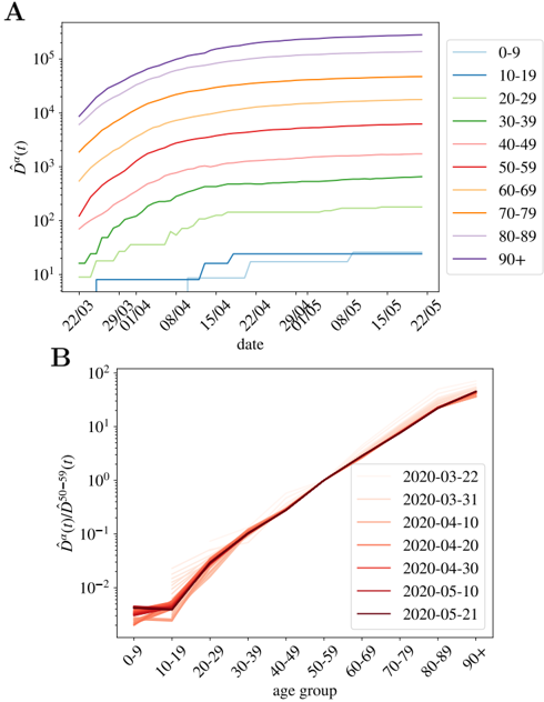
being D α ( t ; C ) the cumulative number of deaths at a time t . In the following, we will refer to ˆ D α ( t ; C ) as the normalized cumulative number of deaths and we will omit the country variable C , unless explicitly needed. We show in Fig. 1-A the evolution of ˆ D α ( t ) in France for our ten age groups. As shown, once the effects of the demographic pyramid are removed (the fact that there are much more people in their fifties than in the nineties in any population, for example), the mortality expands over almost five orders of magnitude between kids and elderly people.
Asymptotically, that is, for a large number of total infections in a country, the cumulative number of deaths in each α at a given t , will be a fixed fraction of the cumulative number of infected individuals in that group, I α , at a previous date t -∆, thus ∆ is an effective time related to the time elapsed between infection and death (estimated to be, in average, around 20 days [39-41]) 1 . Then,
$$D _ { \alpha } ( t ) = f _ { \alpha } I _ { \alpha } ( t - \Delta ) + \mathcal { O } \left ( \sqrt { f _ { \alpha } I _ { \alpha } } \right ) ,$$
being the proportionality factor, f α , the infection fatality ratio (IFR) for the age group 2 . The assignment of a unique delay for all the cases is, of course, an over simplification, but which yet works quite well as the number of infections becomes large. We show, for instance, the perfect match in time between the cumulative number of cases and deaths at a later time in Spain in Fig. S1.
In general, we do not know either the total number of infections I = ∑ α I α , or the number of infections in a particular age segment I α , but we know the latter should be an (essentially constant) fraction of the total number of infections, plus fluctuations, that is,
$$I _ { \alpha } ( t ) = r _ { \alpha } x _ { \alpha } I ( t ) + \mathcal { O } \left ( \sqrt { r _ { \alpha } x _ { \alpha } I } \right ) ,$$
with r α ( ∼ I α /x α I ) being the relative risk of infection for group α as compared to the probability of infection if all ages had the same probability of getting infected (that is, r α = 1 for all α ). In other words, r α > 1 (or r α < 1) means that group α is more (or less) prone to being infected than by random. Note also, that, by definition, ∑ α r α x α = 1. This r α has the advantage of being dimensionless, and differs from the standard definition of attack rate for an age-group, which would be r α I/N , with N the total country population. Recent results analyzing the spread of the virus within close contacts in the outbreak in China suggests a uniform exposure of the virus across the
1 In general, ∆ depends on α and on the country C , but we omit it here for simplicity because the differences are extremely subtle at this time of the outbreak.
2 Note that the probability that n people of age within α die (among a total number of infections I ), is described by a Binomial distribution, B( n, p ), where p is the probability of being infected and dying at that age (i.e. p = I α f α /I ). Then, the expected number of deaths, is E( n ) = Np = f α I α and the expected error of this value is Desv( n ) = √ Ip (1 -p ) ≈ √ f α I α since p 1.
population [42], meaning that r α = 1 for all the groups (quite different from the patterns observed for the seasonal flu [43,44]). There is, however, an important debate whether the low fatality observed in patients below 20 years old is related to a low risk of death or a low risk of infection. For the moment we keep this variable free and we will discuss it at the end of the paper. This risk of infection r α could, in principle, vary with time, but we do not observe a systematic change with time (at least in the period studied). This will be clearer with the discussion around Fig. 1-B for the cumulative deaths, or for the analogous figure concerning the daily measures (which should be more sensitive to a change in r α ) in Supplemental Fig. S2.
Fig 1. Normalized number of deaths occurred in French hospitals as a function of age. A We show the evolution with time of the cumulative number of deaths normalized by the number density of individuals in age group α (i.e. ˆ D α ( t ) in Eq. (2)). In B , we show ˆ D α ( t ) / ˆ D 50 -59 ( t ) as function of the age group, for all the times in A (the darker the color, the more recent the measurement, and we give some dates in the legend). This quotient is essentially time-independent as discussed in Eq. (7), and it lets us estimate the quotient between the UIFR (the IFR under the assumption of uniform attack rate, see Eq. (6)) of the two age groups, that is, ˆ f α / ˆ f 50 -59 .
<details>
<summary>Image 1 Details</summary>
### Visual Description
## Line Graphs: Age Group Trends and Ratios Over Time
### Overview
The image contains two line graphs (A and B) analyzing age-related trends in a metric denoted as **D̂a(t)**. Chart A tracks **D̂a(t)** values across age groups over time, while Chart B examines the ratio of **D̂a(t)** to **D̂50-59(t)** across age groups for specific dates.
---
### Components/Axes
#### Chart A
- **X-axis**: Labeled "date" with markers for **22/03**, **29/03**, **01/04**, **08/04**, **15/04**, **22/04**, **29/04**, **01/05**, **08/05**, **15/05**, **22/05** (March–May 2020).
- **Y-axis**: Labeled **D̂a(t)** on a logarithmic scale (10¹ to 10⁵).
- **Legend**: Positioned on the right, mapping age groups to colors:
- **0-9**: Blue
- **10-19**: Teal
- **20-29**: Light green
- **30-39**: Green
- **40-49**: Pink
- **50-59**: Red
- **60-69**: Orange
- **70-79**: Light orange
- **80-89**: Light purple
- **90+**: Purple
#### Chart B
- **X-axis**: Labeled "age group" with categories **0-9**, **10-19**, ..., **90+**.
- **Y-axis**: Labeled **D̂a(t)/D̂50-59(t)** on a logarithmic scale (10⁻² to 10¹).
- **Legend**: Positioned on the right, mapping dates to colors:
- **2020-03-22**: Light red
- **2020-03-31**: Red
- **2020-04-10**: Dark red
- **2020-04-20**: Maroon
- **2020-05-10**: Dark maroon
- **2020-05-21**: Black
---
### Detailed Analysis
#### Chart A
- **Trends**:
- All age groups show **increasing D̂a(t)** over time.
- **90+** (purple) consistently has the highest values, peaking near **10⁵** by **22/05**.
- **0-9** (blue) remains the lowest, plateauing near **10¹**.
- **50-59** (red) shows a sharp rise from ~10² to ~10⁴ between **22/03** and **22/05**.
- **Spatial Grounding**:
- Legend aligns with line colors (e.g., purple for **90+** matches the topmost line).
- Lines are plotted left-to-right chronologically.
#### Chart B
- **Trends**:
- Ratio **D̂a(t)/D̂50-59(t)** increases with age, peaking at **90+** (~10¹).
- **0-9** (light red) starts near **10⁻²** and rises slightly.
- Lines for all dates overlap closely, indicating minimal temporal variation.
- **Spatial Grounding**:
- Legend colors match line hues (e.g., dark maroon for **2020-05-10** aligns with the darkest line).
---
### Key Observations
1. **Age-Dependent Risk**: Older age groups (e.g., **90+**) exhibit significantly higher **D̂a(t)** values than younger groups, with a 10⁴-fold difference between **0-9** and **90+** by **22/05**.
2. **Consistency Over Time**: Ratios in Chart B remain stable across dates, suggesting the age-related trend is robust.
3. **Acceleration in Mid-Age Groups**: **50-59** (red) shows a steep upward curve in Chart A, indicating a critical inflection point.
---
### Interpretation
- **Public Health Implications**: The data suggests **D̂a(t)** (possibly disease prevalence or mortality risk) disproportionately affects older populations, with the **90+** group at highest risk.
- **Temporal Dynamics**: The sharp rise in **50-59** (Chart A) may reflect an emerging wave of cases or policy changes during this period.
- **Ratio Stability (Chart B)**: The consistency of age-related ratios across dates implies that relative risk profiles for age groups remained unchanged during the observed period, despite absolute values increasing.
No textual content or tables are present in the image. All data is derived from line trends and axis labels.
</details>
## 3 Results
## 3.1 The counting of deaths is more accurate below 70 years old
The under-counting of deaths comes from mainly two sources: (i) only the deaths that can be directly linked to COVID-19 (by means of a positive result in a PCR test, typically) are included in the official counting and (ii) countries mostly count the deaths occurred within hospital facilities in the statistics. Source (i) tells us that all the patients that die before being tested are invisible. This will happen eventually at all ages but since old patients are more prone to develop severe symptoms and have more difficulties to seek immediate medical attention, this situation will be far more common among the elderly. Also source (ii) mainly affects old people because being hospitals crowded, the oldest patients have been often treated in retirement/care homes or in their own homes. For these reasons, we expect a significantly more accurate reporting of the deaths of younger patients (in particular, under 70 years old). As we show below, it is also possible to quantify this idea.
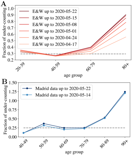
According to the Office of National Statistics in the United Kingdom, among deaths mentioning COVID-19 in the death certificate (in England and Wales by the 22nd of May) 64% took place in hospital, 29% in care houses and 5% at home [45]. Analogous data published by the Community of Madrid's government (which counts more than 1/3 of the official deaths in Spain) reports similar ratios: 61% hospitals, 32% socio-sanitary places and 6% home. France counts separately the deaths occurring in hospitals and in care homes, and the latter being almost 60% of the former. Deaths occurring in care houses are a large portion of the total in all countries, which means that an incomplete counting there, modifies notably the overall statistics. However, once we look at the mortality per age group, such under-counting only affects the patients of a certain age. In fact, we can compare the number of deaths having COVID-19 mentioned in the death certificate (even if it is only a suspicion, which most probably represents an over-counting of the real deaths) and the official counting of deaths linked to COVID-19. In Fig. 2, we show fraction of under-counted deaths with respect to the official numbers (see the definition in Eq. (1)) for England and Wales and the Community of Madrid. In both places, the under-counting is relatively age independent under 70-80 years old, and very important above, specially for the patients above 90 years old, where real numbers may probably double the official counting. Furthermore, this mismatch is getting worse as records in England and Wales are correctly updated (in Madrid it seems rather stabilized). Details on the data used to generate these plots are given in the Materials.
In summary, we expect a small mismatch between the real and the official number of deaths among patients under 70 years old (the ∼ 30% of under-counting is probably too large because deaths caused by other diseases are probably also included in this count), and a much higher systematic under-counting for the older segments. The actual numbers will depend on the country capacity to detect quickly the infections, but also on the particular details concerning the counting of official deaths (which establishments are considered). We give these details, together with the last date used for each country in the Methods and Dataset section.
## 3.2 Scaling between age segments
The combination of Eqs. (3) and (4) tells us that:
$$\hat { D } _ { \alpha } ( t ) = \hat { f } _ { \alpha } I ( t - \Delta ) + \mathcal { O } \left ( \sqrt { \hat { f } _ { \alpha } I / x _ { \alpha } } \right ) ,$$
$$\hat { f } _ { \alpha } = r _ { \alpha } f _ { \alpha } , ( 6 )$$
where
⊔√∐̂√]}{(}˜(√{̂˜√∖̂}√
〉
⊕∐̂√]̂(̂∐√∐(√√(√}(∖∖
⊕∐̂√]̂(̂∐√∐(√√(√}(∖∖
∐˜˜(˜√}√√
Fig 2. Under-counting of deaths per age groups. We show the fraction of under-counted deaths, per age groups, observed when comparing the number of deaths certificates where COVID-19 was mentioned either confirmed or suspected, and the official deaths attributed to COVID-19, relatively to this second number, see Eq. (1) for the definition, for England and Wales in A , and for the Community of Madrid B . The horizontal lines mark the mean rate of 'under-counting' below 80 years old.
<details>
<summary>Image 2 Details</summary>
### Visual Description
## Line Graphs: Fraction of Under-Counting by Age Group and Madrid Data Comparison
### Overview
The image contains two line graphs (A and B) analyzing the fraction of under-counting across age groups. Chart A shows trends over multiple dates, while Chart B compares Madrid data across two specific dates. Both graphs highlight age-related disparities in under-counting.
### Components/Axes
**Chart A (Top Panel):**
- **X-axis**: Age groups (20-39, 40-59, 60-79, 80+)
- **Y-axis**: Fraction of under-counting (0.0 to 1.0)
- **Legend**: Dates (2020-04-17, 2020-04-24, 2020-05-01, 2020-05-08, 2020-05-15, 2020-05-22) with color gradients from dark red (earliest) to light orange (latest)
- **Legend Position**: Top-left corner
- **Trend**: All lines slope upward, with steeper increases in the 80+ age group.
**Chart B (Bottom Panel):**
- **X-axis**: Age groups (40-49, 50-59, 60-69, 70-79, 80-89, 90+)
- **Y-axis**: Fraction of under-counting (0.0 to 1.5)
- **Legend**: Madrid data up to 2020-05-22 (dark blue) and 2020-05-14 (light blue)
- **Legend Position**: Right side
- **Trend**: Both lines show upward trajectories, with the 90+ group exhibiting the sharpest rise.
### Detailed Analysis
**Chart A:**
- **20-39 Age Group**: All lines remain near 0.3, with minimal variation.
- **40-59 Age Group**: Lines hover around 0.3–0.4, showing slight increases over time.
- **60-79 Age Group**: Gradual rise from ~0.4 to ~0.6 across dates.
- **80+ Age Group**: Steep upward trend, reaching ~0.9 by 2020-05-22.
- **Key Data Points**:
- 2020-04-17: 80+ group ~0.3
- 2020-05-22: 80+ group ~0.9
**Chart B:**
- **40-49 Age Group**: Both Madrid datasets (~0.1–0.2).
- **50-59 Age Group**: Dark blue (~0.4) vs. light blue (~0.3).
- **60-69 Age Group**: Dark blue (~0.3) vs. light blue (~0.2).
- **70-79 Age Group**: Dark blue (~0.3) vs. light blue (~0.2).
- **80-89 Age Group**: Dark blue (~0.5) vs. light blue (~0.4).
- **90+ Age Group**: Dark blue (~1.3) vs. light blue (~1.2).
- **Key Data Points**:
- 2020-05-14: 90+ group ~1.2
- 2020-05-22: 90+ group ~1.3
### Key Observations
1. **Age-Related Disparities**: Under-counting increases significantly with age, particularly in the 80+ and 90+ groups.
2. **Temporal Trends**: Later dates (e.g., 2020-05-22) show higher under-counting fractions compared to earlier dates.
3. **Madrid Data Comparison**: The 2020-05-22 dataset consistently reports higher under-counting than the 2020-05-14 dataset, especially in the 90+ group.
4. **Steepest Increases**: The 80+ and 90+ groups exhibit the most pronounced upward trends, suggesting systemic under-reporting or data collection challenges for elderly populations.
### Interpretation
The data suggests that under-counting is not uniform across age groups, with the oldest populations (80+ and 90+) experiencing the highest discrepancies. This could reflect:
- **Data Collection Challenges**: Older individuals may be less likely to participate in surveys or have their deaths reported.
- **Temporal Factors**: The increase in under-counting over time (e.g., from 2020-04-17 to 2020-05-22) might correlate with events like the COVID-19 pandemic, which disproportionately affected elderly populations.
- **Regional Variations**: The Madrid data comparison indicates that later data collection periods (e.g., 2020-05-22) may have improved reporting, but the 90+ group still shows significant gaps.
The trends underscore the need for targeted data collection strategies for elderly populations to ensure accurate demographic and health statistics.
</details>
would be the probability of dying with age α if the virus attacked uniformly all ages within the population. In other words, this is the 'apparent' fatality since it weights how deadly the virus is (statistically) for a patient in an age group, with the relative risk of getting infected at that particular age. For this reason, we refer to ˆ f α as the uniform infection fatality rate (UIFR) (i.e. the IFR under the assumption of uniform attack rate between ages), as compared to f α , which is the real (potentially non-uniform) IFR associated to the disease. Both measures are only equal if r α = 1 for all α .
All together, for all age segments, ˆ D α ( t ; c ) is expected to be proportional to the total number of infections at a previous date, I ( t -∆). Alternatively, the quotient between the mortality rate of two distinct age groups,
$$\frac { \hat { D } _ { \alpha } ( t ) } { \hat { D } ^ { \beta } ( t ) } = \frac { \hat { f } _ { \alpha } } { \hat { f } ^ { \beta } } + \mathcal { O } \left ( \sqrt { \hat { f } _ { \alpha } I / x _ { \alpha } } \right ) + \mathcal { O } \left ( \sqrt { \hat { f } ^ { \beta } I / x ^ { \beta } } \right ) \quad ( 7 )$$
should be time independent (as long as the number of the expected deaths for each group is large enough), and equal to the quotient between the UIFR of each group. This is precisely what we observe for the deaths occurred in French hospitals (see Fig. 1-B) where we show the quotient between each ˆ D α ( t ), and the deaths among patients in their fifties, ˆ D 50 -59 ( t ) for all daily reports since the 22nd of March of 2020 (the darker the color the more recent the measurements) 3 . Thus, with this kind of analysis, even if we
3 The other countries considered shows qualitatively the same behavior, we decided to show France because it has been reporting age statistics (on a daily basis) for the entire number of deaths occurred up to that date.
do not know the exact mortality associated to the virus, we can determine how deadlier it is, at least apparently, for an age group as compared to another. We say apparent, because up to here, we cannot distinguish if the virus seems less aggressive for an age segment because the lethality is low (that is, f α 1) or because so few individuals of that age got infected (that is, r α 1).
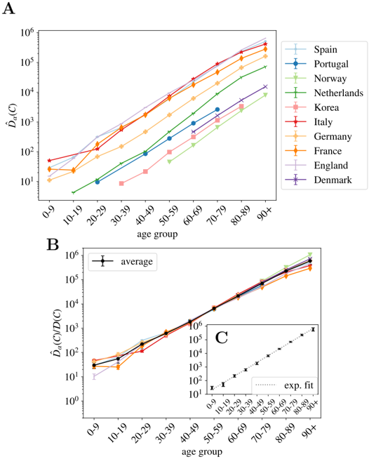
The same kind of arguments applies to data from different countries at a fixed time. Indeed, one expects that the IFR, f α , should not vary too much from country to country (at least within countries with comparable health systems). However, the relative attack risk r α may do. Yet, if these differences are not large, also ˆ f α should be country independent. In such case, Eq. (5) tells us that the different ˆ D α ( C ), essentially differ by a multiplicative constant proportional to the total number of infections, I ( C ), in each country. We show in Fig. 3-A, the counting ˆ D α by the 22nd of May of 2020 available for the different countries where we found information about the death profiles by decades of age (see Materials section for details) as a function of α .
As argued, the different countries' curves are essentially parallel in logarithmic scale, with the exception of the Netherlands, where the mortality increases in the elderly segments must faster than the rest of the countries (we do not known the reason, it might be related to a significantly different r α ). In other words, we can extract both the number of total infections and the UIFR by age (but for a multiplicative constant common to all the countries, or all the ages, respectively) from the collapse of these curves. We show in Fig. 3-B this collapse (where Netherlands was excluded even if the curve collapses well with the rest below 70 years old), which works extremely well for all the countries in the age region between 30-69 years old (despite the different orders of magnitude of ˆ D α ( C )). Deaths below 30 are very rare, which means that strong fluctuations between countries are expected (see Eq. (5)). The collapse is less satisfying above 70 years old, but, as discussed, we believe it is mostly related to a different degree of under-counting of deaths for these segments of age (though other effects, such as an effective protection of the elderly population might be an important effect in some countries too). Yet, we believe that it is mostly related to under-reporting effects, because, for instance, the French curve would quickly match the rest of the countries if one added (for the segment over 80 years old) the official deaths occurring in care houses to the hospital deaths shown here 4 . We will try to estimate the extent of this under-reporting in each country below.
One can now exploit this similarity in the increase of cumulative deaths with age between countries to remove the statistical fluctuations. Thus, the country average of this collapse gives us the UIFR (but for an unknown proportionality constant ˆ f 0 common to all age segments). We give the values of this average in Table S2. Data obtained is compatible with an exponential growth of the UIFR with age (as shown in Fig. 3-C). In fact, we obtain a very good fit of the data to
$$\overline { { \hat { f } _ { \alpha } } } \, \infty \exp \left ( \mathcal { A } \times a g e _ { \alpha } \right ) \quad ( 8 )$$
with A = 0 . 115(7) 5 . This strong dependence of the fatality with age anticipates a widely variable global UIFR ( ∑ α x α ˆ f α ) between countries due to the different demographic distributions. We will discuss this point in Section 4.3. Let us stress that we show this fit with a purely descriptive purpose, since we shall not use these results any further in the analysis.
4 see, the data published by Sante Publique France https://www.santepubliquefrance.fr/ maladies-et-traumatismes/maladies-et-infections-respiratoires/infection-a-coronavirus/ articles/infection-au-nouveau-coronavirus-sars-cov-2-covid-19-france-et-monde .
5 In particular, we used the least squares method to fit log ˆ f α (and its error) as function of age α via a linear regression. The good quality of the fit is evaluated through the low value of the χ 2 / d . o . f = 3 . 8 / 8.
Fig 3. Normalized number of deaths in different countries as a function of age. A We show the normalized number of deaths per age group (defined in Eq. (2)) for a selection of countries affected by the COVID-19 epidemic at very different scales. In B , we show the same data (excluding the Netherlands) but where each country has been multiplied by a constant D ( C ) so that it collapses with the Spanish curve in the age region in between 30 and 70 years old. The values of each country's constants are given in Table S2. In black, we show the country average for each age segment (errors calculated with the boostrap method up to a 95% of confidence), and in C the fit of this average to a pure exponential function, see Eq. (8).
<details>
<summary>Image 3 Details</summary>
### Visual Description
## Line Graphs: Age-Dependent D̂α(C) Across Countries and Trends
### Overview
The image contains three interconnected line graphs (A, B, C) analyzing age-dependent values of D̂α(C) across different countries and age groups. Chart A shows country-specific trends, Chart B presents an average trend, and Chart C provides an exponential fit for a subset of data.
### Components/Axes
**Chart A (Main Panel):**
- **Y-axis (left):** D̂α(C) (log scale: 10¹ to 10⁶)
- **X-axis:** Age groups (0-9, 10-19, ..., 90+)
- **Legend (top-right):**
- Spain (light blue), Portugal (dark blue), Norway (green), Netherlands (dark green), Korea (pink), Italy (red), Germany (orange), France (yellow), England (purple), Denmark (dark purple)
- **Inset Chart C (bottom-right of Chart B):**
- Y-axis: D̂α(C) (log scale: 10¹ to 10⁶)
- X-axis: Age groups (0-9 to 90+)
- Dotted line labeled "exp. fit"
**Chart B (Average Trend):**
- **Y-axis (left):** D̂α(C)/D(C) (log scale: 10⁰ to 10⁶)
- **X-axis:** Age groups (0-9 to 90+)
- **Legend:** "average" (black line with error bars)
### Detailed Analysis
**Chart A Trends:**
- All countries show **upward trends** with age, but slopes vary:
- **Italy (red)** and **France (yellow)** have the steepest increases, reaching ~10⁵ by 90+.
- **Norway (green)** and **Netherlands (dark green)** show moderate growth (~10³ to 10⁴).
- **Korea (pink)** and **Denmark (dark purple)** exhibit slower growth (~10² to 10³).
- **Spain (light blue)** and **Portugal (dark blue)** start low but accelerate sharply after 60-69.
- **Germany (orange)** and **England (purple)** follow intermediate trajectories.
**Chart B (Average):**
- The **black "average" line** rises exponentially, doubling roughly every 10-year age group (e.g., ~10¹ at 0-9 to ~10⁶ at 90+).
- Error bars (vertical lines) indicate uncertainty, smallest for younger age groups and largest for 90+.
**Chart C (Exponential Fit):**
- Data points align closely with the **dotted exponential curve**, confirming a power-law relationship: D̂α(C) ∝ exp(k·age).
### Key Observations
1. **Country-Specific Variability:** Italy and France show significantly higher D̂α(C) values across all age groups compared to other nations.
2. **Exponential Scaling:** Both the average trend (Chart B) and inset fit (Chart C) confirm exponential growth with age.
3. **Data Uncertainty:** Larger error bars in older age groups (e.g., 90+) suggest less reliable measurements or higher variability.
### Interpretation
The data suggests that D̂α(C) scales exponentially with age across populations, with country-specific factors (e.g., healthcare systems, lifestyle) influencing the magnitude. Italy and France’s elevated values may reflect demographic or epidemiological differences. The exponential fit in Chart C implies a universal mechanistic relationship, potentially tied to biological aging processes. Discrepancies between countries highlight the need for region-specific public health strategies.
</details>
Furthermore, the collapsing constant is essentially the relative of the total number of infected people in a country with respect to our reference country, that is, I ( C ) /I (Spain). This is not entirely true due to the different country policies concerning the death-counting, but, as discussed, we estimated that the unreported fraction under 70 years old is inferior to 30% (see Fig. 2) and the quotient of the under-estimation of the two countries would, in general, much smaller. We show these collapsing constants in Table S2.
## 3.3 Fixing the scale
## 3.3.1 Number of infections and uniform fatality rate
Up to this point, we have only obtained the number of infections by country with respect to the number of total infections in Spain, and a quotient proportional to the UIFR (the IFR assuming uniform attack rate) by age. In both cases, the proportionality
Table 1. Estimations assuming a uniform attack rate. We show our estimation for the uniform infection fatality rate (UIFR) before and after quantifying the effects of the systematic under-counting of deaths. We also estimate the percentage of the population infected in each country by the end of May of 2020. Errors include the statistical error ( ± sigma , the standard deviation obtained through error propagation of the results in Table 1, and the uncertainty of the prevalence survey in Spain) and a systematic error of 35% of possible under-counting of deaths, see Section 4.2).
| | Uniform infection fatality rate | Uniform infection fatality rate | % Population infected | % Population infected |
|-----------|-----------------------------------|-----------------------------------|-------------------------|-------------------------|
| age group | with under-counting | estimation without under-counting | Country | |
| 0-9 | 0.0012%(4) | 0.00118%(0.00082-0.0016) | Spain | 5.0%(4) |
| 10-19 | 0.0021%(7) | 0.00211%(0.0014-0.0028) | Portugal | 1.0%(4) |
| 20-29 | 0.009%(23) | 0.00878%(0.0065-0.012) | Norway | 0.33%(12) |
| 30-39 | 0.024%(5) | 0.0241%(0.019-0.032) | Korea | 0.06%(2) |
| 40-49 | 0.072%(18) | 0.0722%(0.056-0.097) | Italy | 4.3%(16) |
| 50-59 | 0.26%(5) | 0.256%(0.21-0.35) | Germany | 0.8%(3) |
| 60-69 | 0.84%(0.14) | 0.839%(0.71-1.1) | France | 3.4%(12) |
| 70-79 | 2.8%(5) | 3.47%(2.9-4.7) | England | 6%(2) |
| 80-89 | 8.9%(18) | 12.7%(11.-17.) | Denmark | 0.9%(3) |
| 90+ | 23.%(7) | 42.1%(34.-57.) | | |
constants (though both related) are unknown. In order to fix the scale, one can look at the statistical studies of prevalence of antibodies against SARS-Cov2 in different populations. In particular, we refer to the preliminary results of the sero-epidemiological study of the Spanish population (inferred from 60983 participants) made public by the Spanish Health Ministry the 13th of May of 2020 [46], that estimates that only a 5.0% (95% interval of confidence (IC): 4.7%-5.4%) of the Spanish population had been infected (from blood tests drawn in between 27/04-11/05/2020). Also, as an independent control of the scale, we use the results of an analogous sero-prevalence survey of the residents of the Geneva, Switzerland (from 1335 participants) [47].
The sampled rate of immunity in the Spanish population allows us to fix I (Spain) in Table S2 and with it, estimate the number of infections in each of the countries shown in Fig. 3, as summarized in Table 1). The results obtained are lower, but compatible, with the independent estimations by Phipps et al. [23] or Salje et al. for France [48], and compatible with the results of small antibody prevalence survey in England [6.78% (95% C.I. 5.21%-8.64%)] [49] and marginally compatible with a survey among blood donors in Denmark [1.7% (95% C.I. 0.9%-2.3%)] [50]. As shown, the rates of infection (for the entire country) are rather low, in particular compared to the 60-70% herd immunity threshold (even if it were lowered for other effects [51]). Yet, it is important to stress that the propagation of the virus has been rather heterogeneous in the territory, being the contagion rather high in certain regions and insignificant in others. We take for example France, where the age distribution of the COVID-19 deaths is available for all the departments (see Materials). Using also the data up to the 22nd of May, we estimate that the percentage of the population infected has reached 12% in the Island of France (the department of Paris), 7% in the Great East, 2.5% in Upper France, and it is 1% or less in the rest of departments.
Furthermore, the total number of infections allows us to estimate the UIFR as function of the age in Spain just by dividing our ˆ D α by this number, that is, using Eq. (3),
$$\hat { f } _ { \alpha } ( S p a i n ) \sim \frac { \hat { D } _ { \alpha } ( S p a i n ) } { I ( S p a i n ) } .$$
We show the values obtained using this formula in Fig. 4-A. Then, we can extract ˆ f 0
from the comparison of ˆ f α (Spain) with the values ˆ f 0 ˆ f α in Table 1, in the age regions where we believe that the counting of deaths is reliable (the region where the collapse of Fig. 3-B is good). We use the group 50-59 to fix this constant ( ˆ f 0 = ˆ f 50 -59 Spain / ˆ f 50 -59 ), which allows us to reconstruct entirely our estimate for the averaged UIFR (we show these values in Fig. 4-A and Table 1). This determination of the UIFR is expected to underestimate the fatality ratio for the oldest segments of population, we will try to correct this bias in the next section. We will also include this corrected estimation in Table 1).
We can test the accuracy of the estimated IFRs by this method, using another independent sero-epidemiological survey. In particular, we use the work by Stringhini et al. [47] that measures the degree of seroprevalence in the canton of Geneva (Switzerland) from samples of 1335 participants. Up to the 24th of May of 2020, the canton's authorities had reported 277 deaths, all but one in patients above 50 years old. We can use the age distribution of these deaths and our estimation of the IFR in Table 1, to guess the fraction of the population that have been infected so far using Eq. (3). We show in Fig. 4-B, the quotient D α /x α ˆ f α N , being N the total population of the canton of Geneva. If our ˆ f α were, indeed a good estimation for the real IFR, this quotient should give us the fraction of the population infected in that age group, which was estimated to be very similar above 50 years old and equal to 3.7% (95% CI 0.99-6.0) and about 8.5% (95%CI 4.99-11.7) in between 20-49 years old [47]. As shown, our predictions are in very good agreement with the survey estimation (specially once the systematic under-counting of deaths in the estimation of the IFR is corrected, see Section 4.2).
The perfect match between the results in Spain and Switzerland (and in a lesser detail with England and Denmark) lends great confidence to the estimated ratio between deaths and infections. Yet, let us stress that these estimations might be only valid for similar health systems, similar percentages of comorbidities in the population, and for hospitals not too overwhelmed during the worst moments of the epidemic peak. In fact, if we use the IFR of Table. 1 to estimate the percentage of infections in New York City (NYC) from the distribution of the deaths by age published by NYC Health at different dates (we show the results in Fig. S3), we obtain predictions for the overall antibody prevalence that evolve in time from 27% (data from 15th of April), 48% (the 1st of May), 57% (the 15th of May), to 63% (the 2nd of June). In other words, this would suggest that herd immunity would had already been reached in the city. However, there are proofs that this is not true. Indeed, the presence of antibodies within the NYC's citizens was randomly sampled during the last weeks of April, in the base of a survey of 15000 people in all the New York State. The results announced by the Governor in a press conference the 2nd of May of 2020 reported that only a 19.9% of the tested presented antibodies. If we move forward ∼ 20 days in time to see this reflected in the deaths [39,40], we overestimate the infections by a factor 3, which inevitably suggests that the IFR was higher in New York City that what it was in Spain or in Geneva, unless there are issues in the sero-prevalence study, something hard to estimate because technical details of the survey have not been published so far (to our knowledge). The origin of this mismatch might be multiple: a non universal access to health care, higher presence of comorbidities among the young population and/or collapse of hospitals. For this point, we would like to stress that the effects of a possible sanitary collapse must be more evident in NYC than nowhere else, given the disproportionate dimension of the NYC outbreak with respect to the rest of countries considered here. For instance, just in NYC there were almost twice more deaths in patients below 50 years old than in the whole Italy during the Spring of 2020.
We can also compare our IFR with previous estimations. Our numbers are smaller than the estimation by Verity et al. [25] for all the age segments except those that
concern the elderly patients (though still compatible with their confidence interval for most of the age groups), and about three times smaller than the CFR (the probability of dying among the confirmed cases) per age group measured in South Korea (where a massive number of screening tests were made). This difference could be explained, in both cases, from an under-estimation of the total number of infections. On the one hand, the IFR in Ref. [25] was estimated from the CFR, and the statistical prevalence of antibodies among the travelers returning home from repatriation flights (which represents a much lower sampling that the one considered in the Spanish survey). On the other hand, Korea has been very successful identifying new infections by tracking the social contacts of the infected, but it is very unlikely that they are able to trace all the infections.
Before ending this Section, we want to warn about the limitations of the current sero-epidemological surveys, which will probably affect our results (even though we would like to stress that the Spanish survey has been praised for its robustness [52]). In fact, extracting accurate results from them is challenging for different reasons. Firstly, because the study must be well designed to avoid undesirable bias in the recruitment of the participants. Secondly, because the probability of detecting the antibodies change with time [53] (an effect that must be taken into account [54]). Thirdly, because available tests are not very accurate [55], which means that statistical adjustments must be included in the analysis to avoid mistaking the antibody rate with the false positive rate [56]. And finally, because the spread of the virus have been very heterogeneous in space (as we illustrated for France above), which means that very large samples are necessary to get the correct picture of a country.
## 3.4 Other probabilities
Spain also gives age distributed data (for groups of patients with ages in the same decades) for the cumulative number of official cases, C α , new hospitalizations, H α , and new admissions in intensive care units, S α . Due to the shortage of screening tests, for most of the age groups, the number of cases gives us a measure of the number of patients with symptoms severe enough to visit an emergency room. For the oldest groups, it might not be the case because care houses with confirmed cases have been more systematically tested than the rest of the population. Then, we apply the same reasoning used to compute the UIFR to these indicators, which allows us to estimate the probability of being included in each of the other three categories (always assuming uniform attack rate). Unlike the deaths, policies concerning who get tested, hospitalized and/or admitted in an intensive care unit probably depend strongly on the country, which means that these probabilities might not be directly extrapolated to other countries.
Equation (5) reads for a general observable X ( X = C, H, S, or D ),
$$\hat { X } _ { \alpha } ( t ) = \hat { f } _ { \alpha } ^ { X } I ( t - \Delta _ { X } ) + \mathcal { O } \left ( \sqrt { \hat { f } _ { \alpha } ^ { X } I / x _ { \alpha } } \right ) ,$$
which means that we can directly extract the probability of being included in the X category ˆ f X using the measure I (Spain) from the antibody prevalence study [46]. Note that knowing the precise value of ∆ X is not crucial here because the propagation of the disease was essentially interrupted in Spain during by the end of May, which means that I ( t -∆ X ) changes very little with time at this point. We show the estimations of these probabilities per age group in Fig. 5.
We see that, between 20-80 years old, the probability of being confirmed as a case does not depend too much on age, and it keeps fixed around 1 every 10 infections. The probability is higher for older segments and much smaller for people below 20 years old.
For the other indicators, we observe a strong dependence of all levels of severity with age. For the intensive care unit admissions, however, above 70 years old, one sees clearly the effects of the policies regulating the access to intensive care with age, an access that becomes rare over 80 years old. A situation which certainly contributes to increasing slightly the mortality rate for the oldest age groups. We show in Fig. 5-B narrower age groups concerning the youngest patients. This second Figure tells us that the severity related to COVID-19 in children is rather heterogeneous in age, being particularly dangerous for kids below 2 years old (an age segment for which the admissions in intensive care are more common than for patients above 40 years old as shown in Fig. 5-B). Furthermore, these probabilities might be underestimated by the uniform attack rate assumption, since one expects a significantly lower exposure to the virus at these low ages (we will see this confirmed in the data shown in Fig. 6).
## 4 Discussion
## 4.1 On the non-uniform distribution of infections
Our indicator for the IFR, the UIFR ˆ f α (and the probabilities of presenting different degrees of acuteness), measure how more probable is to die with a given age, which is not necessarily the true IFR (that is, the probability of dying once infected, our f α in (3)). The two observables are only equal if the contagion is uniform among all age segments of the population (we recall that, in our definition, f α = ˆ f α /r α , and uniform attack rate implies r α = 1). In other words, with our approach we are not able to distinguish if the mortality is low in a particular age segment because (i) the disease is mild at these ages (low f α ) or (ii) because this age segment is rarely infected (low exposure, r α 1 in Eq. (4)). Previous studies estimating the IFR per age group, for instance Ref. [25], assumed a uniform spread of the virus, something that seems justified by contagion dynamics studies [42].
The sero-epidemiological study [46], gives also some clues about this point, because it also estimates the attack rate for different age groups. We can extract our relative risk, r α , from the estimated attack rate (we recall that the attack rate given by r α I/N , with N the country-population). We show the values we obtain in Fig. 6-A. The measures only report a significantly lower spread among children (which might be related to the closure of the schools during the lock-down), but for the rest of the ages the distribution is not so far away from the uniform attack rate. In any case, no exponentially increasing attack rate with age is found to balance the strong increase of the fatality with age. However, the much lower exposure of the kids to the virus tells us that the probabilities estimated in Fig. 5-B might be underestimated in that age segment, something that could change the overall picture of the severity of COVID-19 in babies, that might be similar to that of the adults. The change of tendency of the severity with age in the case of infants could related with the suspected connection between the COVID-19 and Kawasaki diseases [57-59].
We can nevertheless compute the real (non-uniform) IFR using these values for r α for the Spanish data, and compare it with our previous estimation. We show the results in Fig. 6-B. As shown, both estimations are essentially compatible for all the age segments, which lends confidence to our previous results. The real fatalities will slightly change once the effect of the non-uniform attack rate is included, but we do not expect these non-uniform fatalities to change drastically with respect to the uniform estimations we gave above.
## 4.2 On the under-counting of deaths
As discussed above, one expects the number of deaths associated to COVID-19 to be underestimated in the official statistics, specially on what concerns to the elderly people. In this section, we try to estimate by how much. The collapse of Fig. 3-B shows us that Norway reports a higher number of deaths in the age segments above 70 years old than the rest of the countries, while the scaling of the normalized number of deaths in lower age groups are fairly similar to other countries. We believe that their counting is more accurate than in the rest of countries for two reasons. Firstly, because the Norwegian authorities reported deaths (of patients tested positive for COVID-19) occurring everywhere: hospitals (38%), caring and retirement houses (59%) and homes (2%). And second, because the country was much less affected than the rest of countries considered (Norway has reported only 235 deaths so far), which means that they are much better equipped to properly detect and treat all the infections. For this reason, we can use the Norwegian measures to estimate quantitatively our under-determination of the IFR among the elderly. In particular, we estimate an under-estimation of the mortality in the elderly groups of 70-79: 22%, 80-89: 40% and 90+: 86%. We show in Fig. 4-B, that this simple (and uncorrelated) correction allows us to predict correctly the measured prevalence of antibodies among the oldest people in the canton of Geneva (Switzerland) [47].
Yet, from the comparison with the Norwegian data we can only argue in terms of the scaling of the IFR of an age segment with respect to other, but not on the factor common to all age segments. For this, we can use the comparison between our estimation for the UIFR based on official COVID-19 deaths and those where COVID-19 appeared mentioned in the death certificate. The sero-prevalence study [46] estimated that a 11.3% of the population of the Community of Madrid had been infected, so we can use this number to estimate the IFR of the region. Such a IFR has to be regarded as an upper limit of the real one, because 'suspicion of COVID-19' probably encompasses many other respiratory diseases. We show this IFR compared to our previous estimation, and the estimation after correcting the under-counting of the oldest segments (using the Norwegian death data) in Fig. S4. We observe that, firstly, the 'Norwegian' correction introduced for the elderly segments is in perfect agreement with the scaling observed in the Madrid regional data, with attaches confidence to this correction, and second, that Madrid's estimation is around 35% larger than our previous estimation for all age groups. This comparison gives us an upper limit of the real IFR, which means that it allows us to estimate the maximum error of the predictions given up to now (as discuss, the real IFR is expected to lie in between the estimation based on the official COVID-19 deaths and this suspected deaths' one). We show these estimations in Table 1 and Fig. 4-A after taking the effects of under-counting into account.
We can use these corrections to estimate the number of unreported deaths for each of the countries considered and the values of the UIFR per age to compute the global IFR of each country. We show this data in Table 2. Considering that a lower diffusion of the virus among the elderly would result also in a lower apparent mortality in these groups, we give also the expected total IFR if the actual counting were perfect (left side of the parenthesis), and if a constant 35% of under-counting was present in all the age groups (right-side of the parenthesis).
## 4.3 On the overall infection fatality ratios and demographics
The values of Table 2 shows us that the global fatality of the disease depends strongly on the demographics pyramid of each country, which is a direct consequence of the nearly exponential dependence of the UIFR with age. In fact, we can use the average
Table 2. Country-dependent estimates. We estimate the percentage of unreported number of deaths for each country together with the expected fatality ratio once included these estimated missing deaths. In the parenthesis we include the expected values if the current death counting was perfect (no missing deaths, left side of the parenthesis) and if heavy under-counting was present, such as the one observed when comparing with number of deaths with COVID-19 in the death certificate (right side of the parenthesis). ∗ France numbers were computed using only the deaths occurring in hospital facilities, which means that a 58% of under-counting is already confirmed with the counting of deaths occurring in care-houses. We cannot correct the minimum IFR because we do not have the age profile of these deaths.
| | % of missing deaths | % total IFR |
|----------|-----------------------|-----------------|
| Spain | 38.%(0-86) | 1.6%(1.1-2.1) |
| Portugal | 9.1%(0-47) | 1.3%(1.2-1.8) |
| Norway | 0%(0-33) | 1.2%(1.2-1.6) |
| Korea | 16.%(0-57) | 0.87%(0.70-1.2) |
| Italy | 61.%(0-120) | 1.8%(0.98-2.4) |
| Germany | 32.%(0-78) | 1.6%(1.1-2.1) |
| France ∗ | 110%(0-190) | 1.6%(0.84-2.2) |
| England | 79.%(0-140) | 1.3%(0.88-1.8) |
| Denmark | 29.%(0-74) | 1.3%(0.97-1.7) |
values given in Table 1 to explore how the global IFR would change in different parts of the world just due to a different distribution of the number of citizens with age (that is, leaving aside the differences related to the different health systems or economical/social conditions). This observation was previously proposed in [60]. With our estimations, we expect that, while for Italy the IFR would be 1.8%, the same IFR age profile predicts a 0.62% IFR in China (extremely similar to the one estimated in Ref. [25]) or a 0.14% in middle Africa, which could explain, partially, why the outbreaks have been significantly less important there than in Europe (where the overall IFR would be 1.38%).
## 5 Conclusions
We have studied the scaling of the cumulative number of deaths related to COVID-19 with age in different countries. After normalizing these numbers by the fraction of people with that age over the entire population, we observe that the lethality of the disease increases (almost) exponentially with age, expanding over almost 5 orders of magnitude between the 0-9 and 90+ age segments. In addition, we show that this scaling with age is essentially country independent for ages under 70 years old. We argue that the differences observed over this age are mostly related to different levels of under-counting of deaths among elderly people. The collapse of the mortality data allows us establish direct correspondences between the cumulative number of infections occurred in each country since the beginning of the outbreak.
At a second stage, we use the Spanish survey of the sero-prevalence anti-SARS-CoV-2 antibodies in the Spanish population [46] to fix the scale between the number of infections and the number of deaths, which allows us to estimate the COVID-19 infection fatality ratio as function of age (under the assumption of uniform attack rate). We evaluate these numbers with an analogous prevalence survey of the Genova canton [47]. We also show that, when applied to the COVID-19 death profile of New York City, our predictions are not compatible with the antibody rates estimated by the New York State [61]. This observation suggests that either the real immunity rate is much higher (and reached herd immunity levels) or the fatality ratio has been
significantly higher in New York City than in Spain or Geneva, a discrepancy that might be related to a different health system, a higher prevalence of comorbidities in their population or a collapse of the sanitary system during the worse moments of the epidemics. The scale of the number of infections allows us to compute as well the probability (if infected) of being classified a case, hospitalized, admitted in intensive care units or dying in Spain. The results show a clear increase of all degrees of severity with age, with the notable exception of the infections in patients below 2 years old that lead to much more complications than for older young patients, a situation that could be aggravated by the low exposure of this population to the virus during the lock-down measures.
We further discuss the validity of the uniform attack rate hypothesis using the age distribution of the antibody rates in the Spanish sero-epidemiological study, concluding that even if differences of exposure of the virus between ages are observed, differences do not change qualitatively our estimations for the infection fatality ratio. However, the low attack rate measured among babies warns us that our estimations for the infection fatality rate below 2 years old might be importantly underestimated.
We use information concerning the number of death certificates where COVID-19 was referred as possible death cause to show that the under-counting of deaths is a problem that mostly concerns the deaths of old patients. We use the scaling of the mortality with age in Norway to estimate the real fatality ratio of the elderly age segments (in other words, reverse the under-counting). We then test these estimations with the age profile of deaths in the canton of Geneva and of the deaths certificates in the Community of Madrid.
Finally, our analysis relies exclusively on public statics' data and can easily be updated as more accurate information is available (for instance regarding the attack rates in different countries or better estimations of the total number of infections). For instance, severity rates are now known to be strongly dependent on the patients sex [10] or comorbidities [13] too, features that could be directly included in this analysis with no effort and that would greatly help to understand the interplay between them and age. In addition, if consolidated, the probabilities and the approach explained here, can be easily used to estimate the degree of penetration of the SARS-CoV-2 in different cities, regions, or countries, and to track the evolution of the pandemics.
Finally, but not least, we want to stress that we only analyzed the changes of the total mortality with age, but the socio-economical environment of the patients plays also an important role. This study could be generalized to include such variables.
## 6 Acknowledgments
I would like to thank Aur´ elien Decelle, Luca Leuzzi, Enzo Marinari, Giorgio Parisi, Federico Ricci-Tersenghi, Riccardo Spezia and Francesco Zamponi for useful and interesting discussions, and to Elisabeth Agoritsas, Ada Altieri, Alessio Andronico, Marco Baity-Jesi and David Yllanes for a critical and constructive read of the manuscript.
## References
1. Worldometer. Coronavirus (COVID-19) Mortality Rate. https://wwwworldometersinfo/coronavirus/coronavirus-death-rate/ . 2020;.
2. B¨ ottcher L, Xia M, Chou T. Why estimating population-based case fatality rates during epidemics may be misleading. arXiv preprint arXiv:200312032. 2020;.
3. Chirico F, Nucera G, Magnavita N. Estimating case fatality ratio during COVID-19 epidemics: Pitfalls and alternatives. Journal of Infection in Developing Countries. 2020;14(5):438-439. doi:10.3855/jidc.12787.
4. Guan Wj, Ni Zy, Hu Y, Liang Wh, Ou Cq, He Jx, et al. Clinical characteristics of coronavirus disease 2019 in China. New England journal of medicine. 2020;382(18):1708-1720.
5. Wu JT, Leung K, Bushman M, Kishore N, Niehus R, de Salazar PM, et al. Estimating clinical severity of COVID-19 from the transmission dynamics in Wuhan, China. Nature Medicine. 2020;26(4):506-510.
6. Surveillances V. The epidemiological characteristics of an outbreak of 2019 novel coronavirus diseases (COVID-19)-China, 2020. China CDC Weekly. 2020;2(8):113-122.
7. Buonanno P, Galletta S, Puca M. Estimating the severity of COVID-19: Evidence from the Italian epicenter. Plos one. 2020;15(10):e0239569.
8. Cao J, Tu WJ, Cheng W, Yu L, Liu YK, Hu X, et al. Clinical features and short-term outcomes of 102 patients with coronavirus disease 2019 in Wuhan, China. Clinical Infectious Diseases. 2020;71(15):748-755.
9. Dudel C, Riffe T, Acosta E, van Raalte A, Strozza C, Myrskyl¨ a M. Monitoring trends and differences in COVID-19 case-fatality rates using decomposition methods: Contributions of age structure and age-specific fatality. PLOS one. 2020;15(9):e0238904.
10. Vahidy FS, Pan AP, Ahnstedt H, Munshi Y, Choi HA, Tiruneh Y, et al. Sex differences in susceptibility, severity, and outcomes of coronavirus disease 2019: Cross-sectional analysis from a diverse US metropolitan area. PloS one. 2021;16(1):e0245556.
11. Brand˜ ao Neto RA, Marchini JF, Marino LO, Alencar JC, Lazar Neto F, Ribeiro S, et al. Mortality and other outcomes of patients with coronavirus disease pneumonia admitted to the emergency department: A prospective observational Brazilian study. PloS one. 2021;16(1):e0244532.
12. Ara´ ujo MPD, Nunes VMdA, Costa LdA, Souza TAd, Torres GdV, Nobre TTX. Health conditions of potential risk for severe Covid-19 in institutionalized elderly people. PloS one. 2021;16(1):e0245432.
13. Chidambaram V, Tun NL, Haque WZ, Majella MG, Sivakumar RK, Kumar A, et al. Factors associated with disease severity and mortality among patients with COVID-19: A systematic review and meta-analysis. PloS one. 2020;15(11):e0241541.
14. Ruan S. Likelihood of survival of coronavirus disease 2019. The Lancet Infectious Diseases. 2020;.
15. Mallapaty S. How deadly is the coronavirus? Scientists are close to an answer. Nature. 2020;582(7813):467-468. doi:10.1038/d41586-020-01738-2.
16. Angelopoulos AN, Pathak R, Varma R, Jordan MI. Identifying and Correcting Bias from Time-and Severity-Dependent Reporting Rates in the Estimation of the COVID-19 Case Fatality Rate. arXiv preprint arXiv:200308592. 2020;.
17. Baud D, Qi X, Nielsen-Saines K, Musso D, Pomar L, Favre G. Real estimates of mortality following COVID-19 infection. The Lancet Infectious Diseases. 2020;20(7):773. doi:10.1016/S1473-3099(20)30195-X.
18. Spychalski P, B la˙ zy´ nska-Spychalska A, Kobiela J. Estimating case fatality rates of COVID-19. The Lancet Infectious Diseases. 2020;20(7):774-775. doi:10.1016/S1473-3099(20)30246-2.
19. Rosakis P, Marketou ME. Rethinking case fatality ratios for covid-19 from a data-driven viewpoint. Journal of Infection. 2020;81(2):e162-e164. doi:10.1016/j.jinf.2020.06.010.
20. Abate SM, Ahmed Ali S, Mantfardo B, Basu B. Rate of Intensive Care Unit admission and outcomes among patients with coronavirus: A systematic review and Meta-analysis. PloS one. 2020;15(7):e0235653.
21. Narayanan CS. A novel cohort analysis approach to determining the case fatality rate of COVID-19 and other infectious diseases. Plos one. 2020;15(6):e0233146.
22. Flaxman S, Mishra S, Gandy A, Unwin HJT, Coupland H, Mellan TA, et al. Estimating the number of infections and the impact of non-pharmaceutical interventions on COVID-19 in European countries: technical description update. arXiv preprint arXiv:200411342. 2020;.
23. Phipps SJ, Grafton RQ, Kompas T. Estimating the true (population) infection rate for COVID-19: A Backcasting Approach with Monte Carlo Methods. medRxiv. 2020;.
24. Jung Sm, Akhmetzhanov AR, Hayashi K, Linton NM, Yang Y, Yuan B, et al. Real-time estimation of the risk of death from novel coronavirus (COVID-19) infection: inference using exported cases. Journal of clinical medicine. 2020;9(2):523.
25. Verity R, Okell LC, Dorigatti I, Winskill P, Whittaker C, Imai N, et al. Estimates of the severity of coronavirus disease 2019: a model-based analysis. The Lancet infectious diseases. 2020;.
26. Sonoo M, Kanbayashi T, Shimohata T, Kobayashi M, Hayashi H. Estimation of the true infection rate and infection fatality rate of COVID-19 in the whole population of each country. medRxiv. 2020;.
27. Modi C, Boehm V, Ferraro S, Stein G, Seljak U. How deadly is COVID-19? A rigorous analysis of excess mortality and age-dependent fatality rates in Italy. medRxiv. 2020;.
28. Bendavid E, Mulaney B, Sood N, Shah S, Ling E, Bromley-Dulfano R, et al. COVID-19 Antibody Seroprevalence in Santa Clara County, California. MedRxiv. 2020;.
29. Bennett ST, Steyvers M. Estimating COVID-19 Antibody Seroprevalence in Santa Clara County, California. A re-analysis of Bendavid et al. medRxiv. 2020;.
30. Russell TW, Hellewell J, Jarvis CI, Zandvoort KV, Abbott S, Ratnayake R, et al. Estimating the infection and case fatality ratio for coronavirus disease (COVID-19) using age-adjusted data from the outbreak on the Diamond Princess cruise ship, February 2020. Eurosurveillance. 2020;25(12):2000256. doi:10.2807/1560-7917.ES.2020.25.12.2000256.
31. Leon DA, Shkolnikov VM, Smeeth L, Magnus P, Pechholdov´ a M, Jarvis CI. COVID-19: a need for real-time monitoring of weekly excess deaths. The Lancet. 2020;395(10234):e81.
32. Economist T. Tracking covid-19 excess deaths across countries; 2020. https://www.economist.com/graphic-detail/2020/04/16/ tracking-covid-19-excess-deaths-across-countries .
33. Oguzoglu U. COVID-19 Lockdowns and Decline in Traffic Related Deaths and Injuries. IZA Discussion Paper. 2020;13278.
34. Christey G, Amey J, Campbell A, Smith A. Variation in volumes and characteristics of trauma patients admitted to a level one trauma centre during national level 4 lockdown for COVID-19 in New Zealand. NZ Med J. 2020;24:81-8.
35. Saladi´ e ` O, Bustamante E, Guti´ errez A. COVID-19 lockdown and reduction of traffic accidents in Tarragona province, Spain. Transportation Research Interdisciplinary Perspectives. 2020; p. 100218.
36. Nu˜ nez JH, Sallent A, Lakhani K, Guerra-Farfan E, Vidal N, Ekhtiari S, et al. Impact of the COVID-19 Pandemic on an Emergency Traumatology Service: Experience at a Tertiary Trauma Centre in Spain. Injury. 2020;.
37. Ricci-Tersenghi F. An estimate of direct and indirect deaths related to the COVID-19 epidemic in Italy. https://medium.com/@riccife/ an-estimate-of-direct-and-indirect-deaths-related-to-the-covid-19-epidem Medium. 2020;.
38. Datadista. COVID 19; 2020. https://github.com/datadista/datasets/tree/master/ .
39. He X, Lau EH, Wu P, Deng X, Wang J, Hao X, et al. Temporal dynamics in viral shedding and transmissibility of COVID-19. Nature medicine. 2020;26(5):672-675.
40. Linton NM, Kobayashi T, Yang Y, Hayashi K, Akhmetzhanov AR, Jung Sm, et al. Incubation period and other epidemiological characteristics of 2019 novel coronavirus infections with right truncation: a statistical analysis of publicly available case data. Journal of clinical medicine. 2020;9(2):538.
41. Verma V, Vishwakarma RK, Verma A, Nath DC, Khan HT. Time-to-Death approach in revealing Chronicity and Severity of COVID-19 across the World. PloS one. 2020;15(5):e0233074.
42. Bi Q, Wu Y, Mei S, Ye C, Zou X, Zhang Z, et al. Epidemiology and transmission of COVID-19 in 391 cases and 1286 of their close contacts in Shenzhen, China: a retrospective cohort study. The Lancet Infectious Diseases. 2020;.
43. Ferguson NM, Cummings DA, Cauchemez S, Fraser C, Riley S, Meeyai A, et al. Strategies for containing an emerging influenza pandemic in Southeast Asia. Nature. 2005;437(7056):209-214.
44. Mossong J, Hens N, Jit M, Beutels P, Auranen K, Mikolajczyk R, et al. Social contacts and mixing patterns relevant to the spread of infectious diseases. PLoS medicine. 2008;5(3).
45. for National Statistics (UK) O. Deaths registered weekly in England and Wales, provisional; 2020. Download data.
46. de Sanidad (Spain) M. ESTUDIO ENE-COVID19: PRIMERA RONDA ESTUDIO NACIONAL DE SERO-EPIDEMIOLOG ´ IA DE LA INFECCI ´ ON POR SARS-COV-2 EN ESPA˜ nA; 2020. See report.
47. Stringhini S, Wisniak A, Piumatti G, Azman AS, Lauer SA, Baysson H, et al. Repeated seroprevalence of anti-SARS-CoV-2 IgG antibodies in a population-based sample from Geneva, Switzerland. medRxiv. 2020;.
48. Salje H, Tran Kiem C, Lefrancq N, Courtejoie N, Bosetti P, Paireau J, et al. Estimating the burden of SARS-CoV-2 in France. Science. 2020;doi:10.1126/science.abc3517.
49. for National Statistics (UK) O. Coronavirus (COVID-19) Infection Survey pilot: 28 May 2020; 2020. Report.
50. Erikstrup C, Hother CE, Pedersen OBV, Mølbak K, Skov RL, Holm DK, et al. Estimation of SARS-CoV-2 infection fatality rate by real-time antibody screening of blood donors. medRxiv. 2020;.
51. Gomes MGM, Aguas R, Corder RM, King JG, Langwig KE, Souto-Maior C, et al. Individual variation in susceptibility or exposure to SARS-CoV-2 lowers the herd immunity threshold. medRxiv. 2020;.
52. Yasinski E. Researchers Applaud Spanish COVID-19 Serological Survey. The Scientist. 2020;.
53. Sethuraman N, Jeremiah SS, Ryo A. Interpreting Diagnostic Tests for SARS-CoV-2. JAMA. 2020;doi:10.1001/jama.2020.8259.
54. Rosado J, Cockram C, Merkling SH, Demeret C, Meola A, Kerneis S, et al. Serological signatures of SARS-CoV-2 infection: Implications for antibody-based diagnostics. medRxiv. 2020;.
55. Whitman JD, Hiatt J, Mowery CT, Shy BR, Yu R, Yamamoto TN, et al. Test performance evaluation of SARS-CoV-2 serological assays. MedRxiv. 2020;.
56. Sempos C, Tian L. Adjusting Coronavirus prevalence estimates for laboratory test kit error. medRxiv. 2020;.
57. Riphagen S, Gomez X, Gonzalez-Martinez C, Wilkinson N, Theocharis P. Hyperinflammatory shock in children during COVID-19 pandemic. The Lancet. 2020;395(10237):1607-1608.
58. Jones VG, Mills M, Suarez D, Hogan CA, Yeh D, Segal JB, et al. COVID-19 and Kawasaki disease: novel virus and novel case. Hospital Pediatrics. 2020;10(6):537-540.
59. Harahsheh AS, Dahdah N, Newburger JW, Portman MA, Piram M, Tulloh R, et al. Missed or delayed diagnosis of Kawasaki disease during the 2019 Novel coronavirus disease (COVID-19) pandemic. The Journal of Pediatrics. 2020;.
60. Dowd JB, Andriano L, Brazel DM, Rotondi V, Block P, Ding X, et al. Demographic science aids in understanding the spread and fatality rates of COVID-19. Proceedings of the National Academy of Sciences. 2020;117(18):9696-9698.
61. State) GPONY; 2020. https://www.governor.ny.gov/news/amid-ongoing-covid19-pandemic-governor-cuomo-announces-results-completed-antibody-testing.
Fig 4. Probabilities assuming a uniform attack rate. A We use the measurements of the number of infections in Spain to estimate the UIFR using Eq. (3) in both regions. We fix the constant ˆ f 0 in Table S2 using the estimation of the UIFR in Spain for the age group 50-59 to infer the values of the country average UIFR (from the collapse of Fig. 3-B). We show this first estimation in red, and in green, we show the UIFR after correcting the under-counting of deaths over 70 years old. We compare these results with the estimation by Verity et al. [25] and the CFR (i.e. the probability of dying for confirmed COVID-19 cases, not the IFR) by age in South Korea. In B , we use the IFR estimations from A ¯ and Table 1, to predict the seroprevalence of anti-SARS-CoV-2 antibodies in the population of Geneva, Switzerland, from the official distribution of deaths per age of a total of 277 deceases. The predicted fraction of infections is given in dots (in green, if we used the bare estimation of Eq. (9), in violet, if we include the corrections linked to under-counting). In horizontal lines (and the 95% of confidence interval in gray shadow), we show the actual values measured from the antibody survey of Ref. [47] in patients of different age-groups.
<details>
<summary>Image 4 Details</summary>
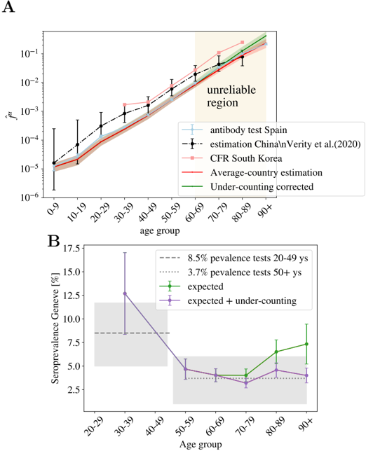
### Visual Description
## Line Graph: Age Group vs. ~f_A (Logarithmic Scale)
### Overview
The chart displays the relationship between age groups (0-9 to 90+) and a logarithmic metric (~f_A) across multiple data sources. A shaded "unreliable region" is highlighted for age groups 60-90+.
### Components/Axes
- **X-axis**: Age groups (0-9, 10-19, ..., 90+).
- **Y-axis**: ~f_A (logarithmic scale, 10⁻⁶ to 10⁻¹).
- **Legend**:
- **Blue dashed line**: Antibody test Spain.
- **Black dashed line**: Estimation China/Verity et al. (2020).
- **Pink dashed line**: CFR South Korea.
- **Red solid line**: Average-country estimation.
- **Green solid line**: Under-counting corrected.
### Detailed Analysis
- **Antibody test Spain (blue dashed)**: Increases steadily from ~10⁻⁵ (0-9) to ~10⁻² (90+).
- **Estimation China/Verity et al. (black dashed)**: Similar trend to Spain, with ~10⁻⁵ (0-9) to ~10⁻² (90+).
- **CFR South Korea (pink dashed)**: Slightly lower than Spain, ~10⁻⁵ (0-9) to ~10⁻² (90+).
- **Average-country estimation (red solid)**: Flattest trend, ~10⁻⁵ (0-9) to ~10⁻³ (90+).
- **Under-counting corrected (green solid)**: Highest values, ~10⁻⁵ (0-9) to ~10⁻¹ (90+).
- **Unreliable region (shaded)**: Covers age groups 60-90+, indicating potential data quality issues.
### Key Observations
- All data series show increasing ~f_A with age, but the **under-counting corrected** line (green) has the steepest slope.
- The **unreliable region** (60-90+) overlaps with the highest ~f_A values, suggesting possible overestimation or data limitations in older populations.
- **Average-country estimation** (red) deviates significantly from other sources, remaining relatively flat.
### Interpretation
The data suggests that **under-counting corrections** (green line) significantly elevate ~f_A values, particularly in older age groups. The **unreliable region** (60-90+) may reflect challenges in data collection or modeling accuracy for elderly populations. The divergence between **average-country estimation** (red) and other sources highlights variability in regional reporting or methodological assumptions.
---
## Bar Chart: Age Group vs. Seroprevalence Geneve (%)
### Overview
This chart compares seroprevalence rates in Geneva across age groups (20-29 to 90+), with reference lines for 8.5% (20-49) and 3.7% (50+).
### Components/Axes
- **X-axis**: Age groups (20-29, 30-39, ..., 90+).
- **Y-axis**: Seroprevalence Geneve (%) (0-17.5%).
- **Legend**:
- **Dashed gray line**: 8.5% prevalence (20-49).
- **Dotted gray line**: 3.7% prevalence (50+).
- **Green solid line**: Expected seroprevalence.
- **Purple solid line**: Expected + under-counting.
### Detailed Analysis
- **20-29 age group**: ~12% seroprevalence (highest).
- **30-39**: ~10% (slightly lower).
- **40-49**: ~8% (approaching 8.5% reference).
- **50-59**: ~5% (below 3.7% reference).
- **60-69**: ~4% (consistent with 3.7% reference).
- **70-79**: ~3% (slightly below 3.7%).
- **80-89**: ~6% (increase from 70-79).
- **90+**: ~7% (highest in older groups).
- **Expected (green)**: Flat line at ~5% across all age groups.
- **Expected + under-counting (purple)**: Dips below 5% for 50-79, then rises to ~5% for 80-90+.
### Key Observations
- **Younger age groups (20-49)** show higher seroprevalence (~10-12%) compared to older groups.
- **Older age groups (50+)** exhibit lower seroprevalence (~3-7%), with a notable increase in 80-90+.
- The **expected + under-counting** line (purple) underestimates seroprevalence for 50-79 but aligns with observed values for 80-90+.
### Interpretation
The data indicates **age-related disparities in seroprevalence**, with younger populations showing higher infection rates. The **expected + under-counting** line suggests that under-reporting may suppress seroprevalence estimates in middle-aged groups (50-79), while older groups (80-90+) may have more accurate or slightly adjusted values. The **8.5% and 3.7% reference lines** highlight thresholds for different age brackets, emphasizing the need for age-specific epidemiological models.
</details>
Fig 5. Other probabilities as function of age assuming uniform attack rate. In A we show the probability of being classified as official case, ˆ f C , being hospitalized, ˆ f H , admitted in intensive care, ˆ f S , and dying, ˆ f D , in Spain in Spring 2020, as function of the age using age segments of 10 years. B , we show the same data but were the kid's information has been grouped by smaller age-segments, evidencing the severity of the cases in patients under 2 years old. A is generated using the data by the Spanish Health Ministry up to the 22nd of May and B with the data published by the RENAVE, see Materials and Table 2.1.
<details>
<summary>Image 5 Details</summary>
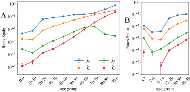
### Visual Description
## Line Graphs: Age-Specific Rate Trends Across Age Groups
### Overview
The image contains two line graphs (A and B) comparing age-specific rates across four categories (f̂_C, f̂_H, f̂_S, f̂_D) for different age groups. Graph A uses decade-based age ranges (0-9 to 90+), while Graph B uses finer-grained age brackets (<2 to 40-49). All rates are plotted on a logarithmic scale (10⁻⁶ to 10⁰).
### Components/Axes
- **X-axis (Graph A)**: Age groups (0-9, 10-19, ..., 90+)
- **Y-axis (Graph A)**: Rates per span (log scale: 10⁻⁵ to 10⁰)
- **X-axis (Graph B)**: Age groups (<2, 2-4, ..., 40-49)
- **Y-axis (Graph B)**: Rates per span (log scale: 10⁻⁶ to 10⁻¹)
- **Legends**:
- **Graph A**:
- Blue: f̂_C (Child-related rate)
- Orange: f̂_H (Health-related rate)
- Green: f̂_S (Social-related rate)
- Red: f̂_D (Disease-related rate)
- **Graph B**:
- Blue: f̂_C
- Green: f̂_S
- Orange: f̂_H
- Red: f̂_D
### Detailed Analysis
#### Graph A Trends
1. **f̂_C (Blue)**:
- Starts at ~1×10⁻² (0-9) and increases steadily to ~1×10⁻¹ (90+).
- Slope: ~0.03 per decade (linear approximation).
2. **f̂_H (Orange)**:
- Begins at ~1×10⁻³ (0-9), rises to ~1×10⁻¹ (90+).
- Slope: ~0.025 per decade.
3. **f̂_S (Green)**:
- Peaks at ~1×10⁻² (60-79), then declines to ~1×10⁻³ (90+).
- Initial rise: ~0.02 per decade (0-60), decline: ~0.01 per decade (70-90).
4. **f̂_D (Red)**:
- Starts at ~1×10⁻⁵ (0-9), increases to ~1×10⁻¹ (90+).
- Slope: ~0.02 per decade.
#### Graph B Trends
1. **f̂_C (Blue)**:
- Dips to ~1×10⁻³ (2-4), then rises to ~1×10⁻¹ (40-49).
- Notable: Sharp increase from 15-29 (~1×10⁻²) to 40-49 (~1×10⁻¹).
2. **f̂_S (Green)**:
- Peaks at ~1×10⁻² (40-49), declines to ~1×10⁻³ (2-4).
- Initial rise: ~0.015 per age group (2-4 to 40-49).
3. **f̂_H (Orange)**:
- Dips to ~1×10⁻⁴ (2-4), then rises to ~1×10⁻² (40-49).
- Slope: ~0.01 per age group.
4. **f̂_D (Red)**:
- Starts at ~1×10⁻⁶ (2-4), rises to ~1×10⁻⁴ (40-49).
- Slope: ~0.005 per age group.
### Key Observations
1. **Consistent Aging Trends**: All rates increase with age in both graphs, except f̂_S in Graph A (peaks at 60-79).
2. **Divergent Patterns**:
- f̂_C and f̂_H show steeper increases in Graph B compared to Graph A.
- f̂_S exhibits a mid-life peak in Graph A but a late-life peak in Graph B.
3. **Anomalies**:
- f̂_D in Graph B has a significant dip at 2-4 (~1×10⁻⁶), suggesting lower disease rates in early childhood.
- f̂_S in Graph A declines after 70-79, while it rises in Graph B.
### Interpretation
The data suggests age-related increases in all rate categories, with distinct patterns:
- **f̂_C and f̂_H**: Likely reflect cumulative exposure (e.g., chronic conditions, healthcare utilization) that intensify with age.
- **f̂_S**: Peaks in mid-to-late life (Graph A) or late life (Graph B), possibly indicating social engagement or isolation effects.
- **f̂_D**: Shows age-dependent disease prevalence, with a notable drop in early childhood (Graph B), possibly due to pediatric resilience or vaccination impacts.
The logarithmic scale emphasizes multiplicative differences, highlighting that rates for older age groups (e.g., 90+ in Graph A) are orders of magnitude higher than younger cohorts. The divergence between graphs A and B may reflect methodological differences (e.g., age binning resolution) or contextual factors (e.g., cohort effects).
</details>
Fig 6. Uniform versus non uniform IFR. A We show the relative risk of infection for an age segment r α (see Eq. (4) and definition below) taken from the sero-epidemiological study of the Spanish population [46]. While the youngest segments of the population seem to be less hit by the virus, the distribution of the infections is rather similar to that of a uniform attack rate, indicated by the dashed line r α = 1 here. The 95% confidence interval for r α is indicated by the red shadow. B We show the estimated uniform and nonuniform IFR for Spain and compare it with the CFR as a function of age. The error for the non-uniform IFR is shown by a red shadow.
<details>
<summary>Image 6 Details</summary>
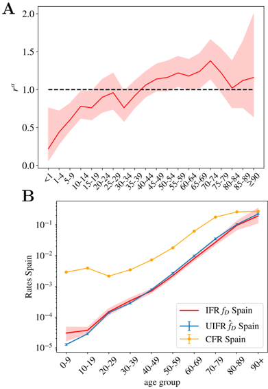
### Visual Description
## Line Charts: Age-Related Rates in Spain
### Overview
The image contains two line charts analyzing age-related epidemiological rates in Spain. Chart A shows a single metric (rσ) across age groups with a reference threshold, while Chart B compares three distinct rates (IFR, UIFR, CFR) across the lifespan. Both charts use age groups as the x-axis and logarithmic/linear scales for rates.
### Components/Axes
**Chart A:**
- **X-axis**: Age groups labeled as "<1", "1-4", "5-9", ..., "≥90" (categorical, non-linear spacing)
- **Y-axis**: "rσ" (linear scale, 0.0–2.0)
- **Legend**: Red line represents primary data series (no explicit label, inferred from context)
- **Additional elements**: Dashed black reference line at y=1.0
**Chart B:**
- **X-axis**: Age groups labeled "0-9", "10-19", ..., "90+" (categorical, non-linear spacing)
- **Y-axis**: "Rates Spain" (logarithmic scale, 10⁻⁵–10⁻¹)
- **Legend**:
- Red: IFR f_D Spain
- Blue: UIFR f_D Spain
- Yellow: CFR Spain
- **Error indicators**: Blue line has error bars (vertical lines with caps)
### Detailed Analysis
**Chart A Trends:**
- Red line starts at ~0.3 (age "<1"), rises to ~1.2 by age "40-49", then fluctuates between 1.0–1.4 until "≥90"
- Shaded area (confidence interval) widens significantly after age "60-69"
- Dashed reference line at y=1.0 acts as a threshold (crossed at ~age "30-39")
**Chart B Trends:**
- All three lines show exponential growth with age
- CFR Spain (yellow) consistently highest, reaching ~10⁻¹ by "90+"
- IFR Spain (red) and UIFR Spain (blue) converge at older ages (~10⁻² by "80-89")
- Blue line (UIFR) shows larger error margins (error bars) than red line
### Key Observations
1. **Threshold Breach**: Chart A's rσ metric crosses the critical threshold (1.0) at middle age, suggesting increased risk/severity in older populations.
2. **Rate Divergence**: Chart B reveals CFR Spain is 10–100x higher than IFR/UFR rates in all age groups.
3. **Uncertainty Patterns**: Blue line (UIFR) has visibly larger error margins, particularly in younger age groups.
4. **Log-Scale Impact**: Chart B's logarithmic y-axis emphasizes exponential growth in rates with age.
### Interpretation
The data suggests age is a critical factor in Spanish epidemiological outcomes:
- **Chart A** likely measures a composite risk metric (rσ) that becomes statistically significant (>1.0) in middle-aged populations, with measurement uncertainty increasing in elderly cohorts.
- **Chart B** demonstrates that case fatality rates (CFR) dominate over infection fatality rates (IFR) and underlying infection fatality rates (UIFR), particularly in centenarians. The convergence of IFR and UIFR at older ages may indicate underreporting of mild cases in geriatric populations.
- The larger error margins in UIFR estimates (blue line) suggest methodological challenges in measuring subclinical infections, especially in younger age groups where infection rates may be higher but less clinically apparent.
*Note: All values are approximate due to lack of gridlines. Logarithmic scale in Chart B compresses older age group differences.*
</details>
Table S1. Source and details of the age-distributed data (by country) used in the analysis. In the last column, we detail the Figures and Tables generated with these data. All these data are freely available for scientific use at the website: https:/dc-covid.site.ined.fr/fr/donnees/ .
| Country | dates | Origin of the data (from INED) | Data details | Demographic sources | Data used for |
|-------------------|--------------------------------|---------------------------------------------------------------------------------------------------------------------|---------------------------------------------------------------------------------------------------------------------------------------------------------------------------------------------------|-------------------------------------------------------------------------------------|--------------------------------------------------------|
| Spain | 21/05/2020 21/05/2020 | Ministerio de Sanidad, Con- sumo y Bienestar Social (MSCBS) MSCBS from datadista database | Cumulative deaths with con- firmed COVID-19 infection occurred in hospitals or else- where Confirmed cases, hospitaliza- tions, deaths occurred in hos- pitals or elsewhere, and en- tries in ICU | Instituto Nacional de Estad´ ıstica (INE) 01/07/2019 ' | Figs. 3,4 and 6-B and Ta- bles S2, 1, and 2. Figs. 5-A |
| | 21/05/2020 | Red Nacional de Vigilancia Epi- demiol´ ogica (RENAVE) | Deaths occurred in hospitals or elsewhere | ' | Figs. 5-B |
| Portugal | 19/05/2020 | Servi¸ co Nacional de Sa´ ude, SNS-Dire¸ c˜ ao Geral da Sa´ ude, DGS | Cumulative deaths with con- firmed COVID-19 infection | Eurostat, © European Union, 1995-2020 | Figs. 3 and 4 and Tables S2, 1, and 2. |
| Norway | 20/05/2020 | Folkehelseinstituttet, 'COVID- 19 Dagsrapport' | Cumulative deaths in hospi- tals and in other health insti- tutions (nursing homes, etc) and homes | Norway Statistics, Table 07459: 'Population, by age and sex, 1986 - 2020' | Figs. 3 and 4 and Tables S2, 1, and 2. |
| Netherlands | 21/05/2020 | Rijksinstituut voor Volksge- zondheid en Milieu | Cumulative deaths with con- firmed COVID-19 infection in hospitals and elsewhere | CBS Statistics Nether- lands 01/01/2019 | Fig. 3-A. |
| South Korea | 15/04/2020 | Korea Centers for Disease Con- trol & Prevention (KCDC) | Cumulative deaths with con- firmed COVID-19 infection | KOSIS (Korean Statis- tical Information Ser- vice) statistical database 23/04/2020. | Figs. 3 and 4 and Tables S2, 1, and 2. |
| Italy | 18/05/2020 | Italian National Institute of Health (Istituto superiore di sanit` a - ISS); Daily Infograph- ics, | Cumulative deaths | Italian National Insti- tute of Statistics (Istat) 01/01/2019 | Figs. 3 and 4 and Tables S2, 1, and 2. |
| Germany | 21/05/2020 | Robert Koch-Institut (RKI) | Cumulative deaths with con- firmed COVID-19 infection | Eurostat, © Euro- pean Union, 1995-2020, 10/04/2020. | Figs. 3 and 4 and Tables S2, 1, and 2. |
| France | 21/05/2020 22/03 to 21/05/2020 | Data are communicated daily by Public Health France (SpF) to the French Institut for De- mographic Studies (INED) ' | Cumulative deaths with con- firmed COVID-19 infection occurred in hospitals ' | L'Institut national de la statistique et des ´ etudes ´ economiques (Insee) ' | Figs. 3 and 4 and Tables S2, 1, and 2. Figs. 1 . |
| England and Wales | 22/05/2020 | Office for National Statis- tics (ONS). Deaths registered weekly in England and Wales. | Cumulative deaths (COVID- 19 was mentioned on the death certificate) occurred in hospitals or elsewhere. | Office for National Statis- tics (ONS) 30/06/2018 | Figs. 3 and 4 and Tables S2, 1, and 2. |
| England | 22/05/2020 | National Health Service (NHS) | Cumulative deaths with con- firmed COVID-19 infection occurred in hospitals. | Office for National Statis- tics (ONS) 30/06/2018 | Fig. 2. |
| Denmark | 20/05/2020 | Statens Serum Institut (SSI) | Cumulative deaths with con- firmed COVID-19 infection | Statistics Denmark 01/01/2020 | Figs. 3 and 4 and Tables S2, 1, and 2. |
Table S2. Collapse of the mortality rate in different countries. We give the values extracted from the collapse of Fig. 3-B: the increase of the mortality with age (proportional to the uniform fatality ratio ˆ f α ) and the number of infections in each country with respect to the number of infections in Spain I C /I Spain equal to the collapsing constant D ( C ). The relative scaling of the mortality above 70 years old is expected to be significantly underestimated. Errors are obtained using the boostrap method at 95% of confidence. The errors of D ( C ) are only the statistical errors extracted from the data collapse, they do not include the systematic error associated to the different policies of death counting the different countries which would be much larger, we try to give a better estimate below.
| Scaling relations | Scaling relations | Scaling relations | Scaling relations |
|---------------------|---------------------|---------------------|--------------------------|
| age group | ∝ ˆ f α | Country | D ( C ) = I C /I (Spain) |
| 0-9 | 28(9) | Spain | 1.0(0) |
| 10-19 | 51(14) | Portugal | 0.045(2) |
| 20-29 | 21(4) × 10 | Norway | 0.0076(4) |
| 30-39 | 60(10) × 10 | Korea | 0.014(2) |
| 40-49 | 18(3) × 10 2 | Italy | 1.1(2) |
| 50-59 | 63(8) × 10 2 | Germany | 0.27(2) |
| 60-69 | 21(1.6) × 10 3 | France | 0.96(8) |
| 70-79 | 69(7) × 10 3 | England | 1.48(2) |
| 80-89 | 22(3) × 10 4 | Denmark | 0.02(-) |
| 90+ | 5.6(16) × 10 5 | | |
Fig S1. Simple scaling relation linking the evolution of the cumulative number of deaths and the cases with time. We show the evolution with time of the cumulative total number of official COVID-19 cases and deaths in Spain. In the inset the deaths' curve is displayed 5 days backwards in time and multiplied by 9, following very precisely the cases' evolution once it surpassed approximately the 100 cases. Please not that cases are confirmed much later than the infection date and later than the onset of apparition of symptoms.
<details>
<summary>Image 7 Details</summary>
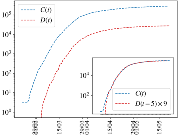
### Visual Description
## Line Graph: Growth Trends of C(t) and D(t) Over Time
### Overview
The image displays a logarithmic-scale line graph comparing two time-dependent variables, **C(t)** (blue dashed line) and **D(t)** (red dashed line), over a date range from **29/03** to **15/05**. A secondary inset graph in the bottom-right corner compares **C(t)** with **D(t-5) × 9**, focusing on a narrower date range (**15/04** to **15/05**). Both axes use logarithmic scaling (y-axis: 10⁰ to 10⁵; x-axis: dates).
---
### Components/Axes
- **X-axis (Horizontal)**: Dates labeled as **29/03**, **15/03**, **29/04**, **15/04**, **29/05**, **15/05**.
- **Y-axis (Vertical)**: Logarithmic scale from **10⁰** to **10⁵**, with ticks at **10¹**, **10²**, **10³**, **10⁴**, **10⁵**.
- **Legend**:
- Top-left corner:
- **C(t)**: Blue dashed line.
- **D(t)**: Red dashed line.
- **Inset Graph**:
- Bottom-right corner:
- **C(t)**: Blue dashed line.
- **D(t-5) × 9**: Red dashed line.
---
### Detailed Analysis
#### Main Graph Trends
1. **C(t) (Blue Dashed Line)**:
- Starts near **10¹** on **29/03**.
- Rises steadily, reaching **~10⁵** by **15/05**.
- Growth appears exponential, with a consistent upward slope.
2. **D(t) (Red Dashed Line)**:
- Begins near **10⁰** on **29/03**.
- Accelerates sharply after **15/03**, surpassing **10³** by **29/04**.
- Plateaus near **10⁴** by **15/05**, remaining below **C(t)** throughout.
#### Inset Graph Trends
- **C(t) (Blue Dashed Line)**:
- Starts near **10¹** on **15/04**.
- Reaches **~10⁴** by **15/05**, mirroring the main graph’s trend.
- **D(t-5) × 9 (Red Dashed Line)**:
- Begins near **10⁰** on **15/04**.
- Accelerates to **~10⁴** by **15/05**, closely matching **C(t)**.
- The scaling factor **×9** suggests normalization to align with **C(t)**’s growth trajectory.
---
### Key Observations
1. **Growth Disparity**:
- **C(t)** grows exponentially faster than **D(t)** in the main graph.
- **D(t)** lags significantly behind **C(t)** until the final date (**15/05**).
2. **Inset Normalization**:
- Scaling **D(t-5)** by **×9** in the inset compresses its growth to align with **C(t)** by **15/05**.
- This implies **D(t)** may represent a delayed or scaled version of **C(t)**.
3. **Date-Specific Values**:
- **C(t)**:
- **29/03**: ~10¹
- **15/03**: ~10²
- **29/04**: ~10³.5
- **15/05**: ~10⁵
- **D(t)**:
- **29/03**: ~10⁰
- **15/03**: ~10¹
- **29/04**: ~10³
- **15/05**: ~10⁴
---
### Interpretation
- **Relationship Between C(t) and D(t)**:
The inset graph suggests **D(t)** is a delayed and scaled version of **C(t)**. The **×9** factor and **5-day lag** (D(t-5)) indicate that **D(t)** may represent a cumulative or lagged effect of **C(t)**, such as a delayed response in a dynamic system.
- **Exponential Growth**:
Both variables exhibit exponential growth, but **C(t)** dominates, implying it could represent a primary driver (e.g., infection rate) while **D(t)** reflects a secondary metric (e.g., recovery rate) with inherent delays.
- **Anomalies**:
- **D(t)**’s sharp acceleration after **15/03** may indicate an external intervention or phase change.
- The **×9** scaling in the inset highlights the need for normalization to compare trends directly.
- **Practical Implications**:
If **C(t)** and **D(t)** represent real-world metrics (e.g., disease spread and mitigation efforts), the data suggests mitigation efforts (**D(t)**) lag behind the primary trend (**C(t)**) but eventually converge when scaled appropriately.
---
### Final Notes
- All legend labels and line colors are consistent.
- Logarithmic scaling emphasizes relative growth rates over absolute values.
- The inset graph is critical for understanding the relationship between **C(t)** and **D(t)**.
</details>
Fig S2. Daily normalized number of deaths registered in French hospitals as function of age and time. A We show the daily measures of deaths for age group α (normalized by the population density at this group), ∆ ˆ D α ( t ), for different dates. The darker the color, the more recent the measure. In B we show the collapse of the data when we normalize the data with the numbers of group 60-69 years old. Distinct date data collapse worse in a single curve than in the case of the cumulative number of deaths in Fig. 1 because being the daily measures smaller, the fluctuations are much larger, yest, we do not observe any systematic change of the attack risk r α with time.
<details>
<summary>Image 8 Details</summary>
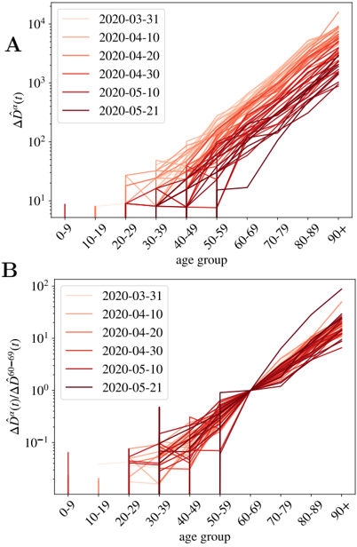
### Visual Description
## Line Graphs: Age Group Trends in ΔÂ(t) and ΔÂ(t)/ΔÂ60-69(t) (2020-03-31 to 2020-05-21)
### Overview
Two line graphs (A and B) depict age-group-specific trends in a metric denoted ΔÂ(t) and its ratio to ΔÂ60-69(t) over six dates in March-May 2020. Both graphs use logarithmic y-axes and show increasing trends with age and time.
### Components/Axes
- **X-axis (both graphs)**: Age groups (0-9, 10-19, ..., 90+), evenly spaced.
- **Y-axis (Graph A)**: ΔÂ(t) (log scale: 10¹ to 10⁴).
- **Y-axis (Graph B)**: ΔÂ(t)/ΔÂ60-69(t) (log scale: 10⁻¹ to 10²).
- **Legends**:
- Left-aligned, with dates (2020-03-31 to 2020-05-21) in shades of red/orange.
- Colors match line colors in graphs (e.g., lightest shade = 2020-03-31, darkest = 2020-05-21).
- **Line styles**: Solid lines for all dates; no markers or error bars visible.
### Detailed Analysis
#### Graph A: ΔÂ(t)
- **Trends**:
- All age groups show upward trends over time.
- Younger groups (0-9, 10-19) have lower values (10¹–10² range).
- Older groups (60-69+) exhibit exponential growth (10³–10⁴ range by 2020-05-21).
- Steepest increases occur in 70-79, 80-89, and 90+ groups.
- **Notable patterns**:
- Lines for later dates (e.g., 2020-05-21) consistently lie above earlier dates.
- Age-group separation widens over time (e.g., 90+ group in 2020-05-21 is ~100x higher than 2020-03-31).
#### Graph B: ΔÂ(t)/ΔÂ60-69(t)
- **Trends**:
- Ratios increase with age (0-9: ~10⁻¹; 90+: ~10² by 2020-05-21).
- All dates show similar age-group progression, but later dates have higher ratios.
- 60-69 group acts as a baseline (ratio = 1 by definition).
- **Notable patterns**:
- 70-79 and older groups show the largest relative increases (e.g., 90+ group ratio rises from ~10⁰ to ~10²).
- Lines for 2020-05-21 are consistently above earlier dates across all age groups.
### Key Observations
1. **Age-Group Disparity**: Older age groups (60+) exhibit significantly higher ΔÂ(t) values and ratios compared to younger groups.
2. **Temporal Acceleration**: Both metrics increase over time, with the steepest growth observed in the final observation period (2020-05-21).
3. **Baseline Reference**: The 60-69 age group serves as a normalization anchor in Graph B, highlighting relative growth in older cohorts.
### Interpretation
The data suggests a strong correlation between age and the magnitude of ΔÂ(t), with older populations experiencing disproportionately higher values. The ratio in Graph B indicates that growth in ΔÂ(t) accelerates more sharply in age groups older than 60-69 over time. This could imply age-related vulnerability or exposure factors in a public health context (e.g., disease spread, resource allocation). The consistent upward trend across dates highlights a worsening trend, potentially signaling the need for targeted interventions for elderly populations. Uncertainties include the exact nature of ΔÂ(t) and whether the logarithmic scale compresses late-stage growth.
</details>
Fig S3. Predictions for the sero-prevalence in New York City. We show our predictions for the sero-prevalence presence in New York City using the death age profile published at different dates and the IFR of Table 1 (without under-counting corrections). Our predictions are significantly higher than the results of the sero-epidemiological survey announced by the New York State Governor the 2nd of May of 2020.
<details>
<summary>Image 9 Details</summary>
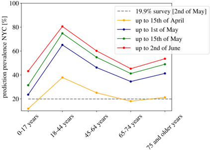
### Visual Description
## Line Graph: Prediction Prevalence in NYC by Age Group and Date
### Overview
The image is a line graph depicting the predicted prevalence of an unspecified condition in New York City (NYC) across five age groups (0-17 years, 18-44 years, 45-64 years, 65-74 years, 75+ years) over time. The y-axis represents prediction prevalence as a percentage, while the x-axis categorizes age groups. Five data series are plotted, each corresponding to a specific date range or survey, with distinct colors and markers.
### Components/Axes
- **X-Axis (Categories)**: Age groups labeled as "0-17 years," "18-44 years," "45-64 years," "65-74 years," and "75 and older years."
- **Y-Axis (Scale)**: Prediction prevalence in NYC (%) ranging from 0% to 100% in 20% increments.
- **Legend**: Located in the top-right corner, with the following entries:
- Gray dashed line: "19.9% survey [2nd of May]"
- Yellow line with circles: "up to 15th of April"
- Blue line with circles: "up to 1st of May"
- Green line with circles: "up to 15th of May"
- Red line with circles: "up to 2nd of June"
### Detailed Analysis
#### Age Group: 0-17 years
- **Yellow line ("up to 15th of April")**: Starts at ~10% and rises sharply to ~35% by 18-44 years.
- **Blue line ("up to 1st of May")**: Begins at ~25% and peaks at ~65% for 18-44 years.
- **Green line ("up to 15th of May")**: Starts at ~30% and reaches ~75% for 18-44 years.
- **Red line ("up to 2nd of June")**: Begins at ~40% and peaks at ~80% for 18-44 years.
#### Age Group: 18-44 years
- **Yellow line**: Peaks at ~35% (15th of April).
- **Blue line**: Peaks at ~65% (1st of May).
- **Green line**: Peaks at ~75% (15th of May).
- **Red line**: Peaks at ~80% (2nd of June).
#### Age Group: 45-64 years
- **Yellow line**: Drops to ~25% (15th of April).
- **Blue line**: Declines to ~45% (1st of May).
- **Green line**: Falls to ~55% (15th of May).
- **Red line**: Reduces to ~60% (2nd of June).
#### Age Group: 65-74 years
- **Yellow line**: Lowest at ~20% (15th of April).
- **Blue line**: Slightly increases to ~35% (1st of May).
- **Green line**: Rises to ~40% (15th of May).
- **Red line**: Increases to ~45% (2nd of June).
#### Age Group: 75+ years
- **Yellow line**: Remains flat at ~20% (15th of April).
- **Blue line**: Slightly increases to ~25% (1st of May).
- **Green line**: Rises to ~30% (15th of May).
- **Red line**: Increases to ~35% (2nd of June).
### Key Observations
1. **Peak Prevalence**: The 18-44 age group consistently shows the highest prevalence across all dates, peaking at ~80% by June 2nd.
2. **Temporal Trends**: Prevalence increases over time for most age groups, with the steepest rise observed between April 15th and June 2nd.
3. **Survey Baseline**: The gray dashed line (19.9% survey on May 2nd) acts as a reference point, remaining constant across all age groups.
4. **Lowest Prevalence**: The 75+ age group has the lowest values, ranging from ~20% to ~35% across dates.
### Interpretation
The data suggests a significant increase in predicted prevalence in NYC, particularly among younger adults (18-44 years), with the highest values observed by June 2nd. The temporal progression (April to June) indicates a possible seasonal or event-driven trend, such as a public health crisis or policy change. The 19.9% survey line may represent a baseline or target threshold, as it remains constant despite fluctuations in other data series. The 0-17 age group shows a steady rise, potentially linked to factors like school reopenings or seasonal exposure. Conversely, older age groups (65+ years) exhibit lower prevalence, which could reflect differences in susceptibility, healthcare access, or reporting practices. The sharp decline after June 2nd in some lines might indicate interventions or data collection adjustments.
</details>
Fig S4. Estimation of the uniform infection fatality rate by age for the Community of Madrid using the number of deaths where COVID-19 was mentioned in the death certificate (black dots), compared with our estimation of the UIFR extracted from the average of several countries (blue line) and the same estimation where the fatality of the oldest segments was adjusted to take into account the systematic under-counting of elderly deaths (estimated using the Norwegian distribution of deaths with age). We see that this correction match very well the scaling observed in Madrid's data.
<details>
<summary>Image 10 Details</summary>
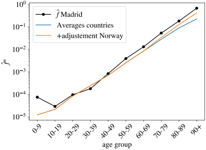
### Visual Description
## Line Graph: Age Group vs. f̂ Values
### Overview
The image is a line graph comparing three data series across age groups (0-9 to 90+) on a logarithmic y-axis (10⁻⁵ to 10⁰). The lines represent:
- **Black**: `f̂Madrid` (Madrid-specific values)
- **Blue**: `Averages countries` (global averages)
- **Orange**: `+adjustment Norway` (adjusted values for Norway)
### Components/Axes
- **X-axis**: Age groups (0-9, 10-19, ..., 90+), labeled sequentially.
- **Y-axis**: Logarithmic scale (`f̂`) from 10⁻⁵ to 10⁰.
- **Legend**: Positioned in the top-left corner, with color-coded labels for each series.
### Detailed Analysis
1. **`f̂Madrid` (Black Line)**:
- Starts at ~10⁻⁴ for 0-9.
- Drops sharply to ~10⁻⁵ at 10-19.
- Rises steadily to ~10⁻¹ at 90+.
- Notable dip at 10-19, then consistent upward trend.
2. **`Averages countries` (Blue Line)**:
- Begins at ~10⁻⁵ for 0-9.
- Gradually increases to ~10⁻¹ at 90+.
- Smooth, linear ascent with no dips.
3. **`+adjustment Norway` (Orange Line)**:
- Starts below `f̂Madrid` at ~10⁻⁵ for 0-9.
- Crosses `f̂Madrid` near 60-69 (~10⁻²).
- Overtakes `f̂Madrid` by 80-89 (~10⁻¹) and reaches ~10⁰ at 90+.
### Key Observations
- **Madrid's Dip**: The black line shows an anomalous drop at 10-19, contrasting with its overall upward trend.
- **Norway's Adjustment**: The orange line surpasses both Madrid and global averages in older age groups (60+), suggesting significant adjustments in later life stages.
- **Logarithmic Scale**: Emphasizes exponential growth in older age groups, particularly for Norway's adjusted values.
### Interpretation
The data suggests that `f̂` (possibly a frequency, risk, or adjusted metric) increases with age across all regions. Madrid's sharp dip at 10-19 may reflect localized factors (e.g., policy changes, demographic shifts). Norway's adjusted values indicate targeted interventions or demographic adjustments that amplify outcomes in older populations. The global average (`Averages countries`) serves as a baseline, showing consistent but slower growth compared to adjusted Norway. The logarithmic scale highlights disproportionate increases in older age groups, particularly for Norway, which may imply policy effectiveness or demographic aging trends.
</details>