## InfoGram and Admissible Machine Learning
## Deep Mukhopadhyay
deep@unitedstatalgo.com
## Abstract
We have entered a new era of machine learning (ML), where the most accurate algorithm with superior predictive power may not even be deployable, unless it is admissible under the regulatory constraints. This has led to great interest in developing fair, transparent and trustworthy ML methods. The purpose of this article is to introduce a new information-theoretic learning framework (admissible machine learning) and algorithmic risk-management tools (InfoGram, L-features, ALFA-testing) that can guide an analyst to redesign off-the-shelf ML methods to be regulatory compliant, while maintaining good prediction accuracy. We have illustrated our approach using several real-data examples from financial sectors, biomedical research, marketing campaigns, and the criminal justice system.
Keywords : Admissible machine learning; InfoGram; L-Features; Information-theory; ALFAtesting, Algorithmic risk management; Fairness; Interpretability; COREml; FINEml.
| 1 | Introduction | 2 |
|-----------|----------------------------------------------------------------------------------------------------------------------------------------------------------------------------------------------------------------------------------------------------------------------------------------------------------------------------------------------------------------------|----------|
| 2 | Information-Theoretic Principles and Methods | 7 |
| 3 | 2.1 Notation . . . . . . . . . . . . . . . . . . . . . . . . . . . . . . 2.2 Conditional Mutual Information . . . . . . . . . . . . . . . . 2.3 Net-Predictive Information . . . . . . . . . . . . . . . . | 7 7 8 |
| | Conclusion | 35 |
| 4 | Elements of Admissible Machine Learning COREml: Algorithmic Interpretability . . . . . . . . . . . . . 3.1.1 From Predictive Features to Core Features . . . . . . 3.1.2 InfoGram and L-Features . . . . . . . . . . . . . . . . 3.1.3 COREtree: High-dimensional Microarray Data Analysis 3.1.4 COREglm: Breast Cancer Wisconsin Data . . . . . . . . . . . . . . . | 13 15 20 |
| 2.4 | . . . Nonparametric Estimation Algorithm . . . . . . . . . . . . . | 9 |
| 2.5 | Model-based Bootstrap . . . . . . . . . . . . . . . . . . . . . . | 11 |
| 2.6 | A Few Examples . . . . . . . . . . . . . . . . . . . . . . . . . | 11 |
| | Appendix A.1 | 12 12 12 |
| 3.1 | Revisiting COMPAS Data . . . . . . . . Two Cultures of Machine Learning . . . . . . | 42 |
| | 3.2.2 InfoGram and Admissible Feature 3.2.3 FINEtree and ALFA-Test: Financial 3.2.4 Admissible Criminal Justice Risk 3.2.5 FINEglm and Application to Marketing Proof of Theorem 1 . . . . . . . . . . . . . . . . . . . . . . . . The Algorithmic Accountability Act . . . . . . | 39 39 42 |
| 5 A.2 A.3 | . . . . . . . . . . . . . . . . COREtree: Iris Data . . . . . . . . . | |
| A.7 | EU's Artificial Intelligence | 43 |
| 3.2 | | |
| | FINEml: Algorithmic Fairness . . . . . . . . 3.2.1 FINE-ML: Approaches and Limitations . . . . | 22 22 |
| | . . . . Selection . Industry | 25 |
| | . . | 26 |
| | . . . Applications Assessment . . . . . . . | 32 |
| | Campaign | 32 |
| | . . . . . . . . . . . . | 39 |
| | | 40 |
| A.5 | Fair Housing Act's Disparate Impact Standard Beware of The 'Spurious Bias' Problem | |
| | | 40 |
| A.4 | . . . . . . . . . . . . | |
| A.6 | . . . . . . . . . . . . . | |
| | . . . . . . . . . . . . | |
| A.8 | | |
| | Act . . . . . . . . . . . . . . . | 44 |
## Category: Fairness, Explainability, and Algorithm Bias
Machine learning (ML) methods are rapidly becoming an essential part of automated decision-making systems that directly affect human lives. While substantial progress has been made toward developing more powerful computational algorithms, the widespread adoption of these technologies still faces several barriers-the biggest one being ensuring adherence to regulatory requirements, without compromising too much accuracy. Naturally, the question arises: how to systematically go about building such regulatory-compliant fair and trustworthy algorithms? This paper offers new statistical principles and information-theoretic graphical exploratory tools that engineers can use to 'detect, mitigate, and remediate' off-the-shelf ML-algorithms, thereby making them admissible under appropriate laws and regulatory scrutiny.
## 1 Introduction
First-generation 'prediction-only' machine learning technology has served the tech and eCommerce industry pretty well. However, ML is now rapidly expanding beyond its traditional domains into highly regulated or safety-critical areas-such as healthcare, criminal justice systems, transportation, financial markets, and national security-where achieving high predictive-accuracy is often as important as ensuring regulatory compliance and transparency in order to ensure the trustworthiness. We thus focus on developing admissible machine learning technology that can balance fairness, interpretability, and accuracy in the best manner possible. How to systematically go about building such algorithms in a fast and scalable manner? This article introduces some new statistical learning theory and information-theoretic graphical exploratory tools to address this question.
Going Beyond 'Pure' Prediction Algorithms . Predictive accuracy is not the be-all and end-all for judging the 'quality' of a machine learning model. Here is a dazzling example: Researchers at the Icahn School of Medicine at Mount Sinai in New York City found that (Zech et al., 2018, Reardon, 2019) a deep-learning algorithm, which showed more than 90% accuracy on the x-rays produced at Mount Sinai, performed poorly when tested on data from other institutions. Later it was found that 'the algorithm was also factoring in the odds of a positive finding based on how common pneumonia was at each institution-not something they expected or wanted.' This sort of unreliable and inconsistent performance
can be clearly dangerous. As a result of these safety concerns, despite lots of hype and hysteria around AI in imaging, only about 30% of radiologists are currently using machine learning (ML) for their everyday clinical practices (Allen et al., 2021). To apply machine learning appropriately and safely- especially when human life is at stake-we have to think beyond predictive accuracy. The deployed algorithm needs to be comprehensible (by endusers like doctors, judges, regulators, researchers, etc.) in order to make sure it has learned relevant and admissible features from the data, which is meaningful in light of investigators' domain knowledge. The fact of the matter is, an algorithm that is solely focused on what is learned, without reasoning how it learned what it has learned, is not intelligent enough. We next expand on this issue using two real data applications.
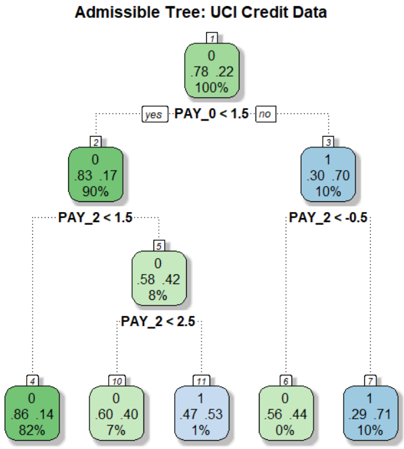
Admissible ML for Industry . Consider the UCI Credit Card data (discussed in more details in Sec 3.2.3), collected in October 2005, from an important Taiwan-based bank. We have records of n 30 , 000 cardholders. The data composed of a response variable Y denoting: default payment status (Yes = 1, No = 0), along with p 23 predictor variables (e.g., gender, education, age, history of past payment, etc.). The goal is to accurately predict the probability of default given the profile of a particular customer.
On the surface, this seems to be a straightforward classification problem for which we have a large inventory of powerful algorithms. Yeh and Lien (2009) performed an exhaustive comparison between six machine learning methods (logistic regression, K-nearest neighbor, neural net, etc.) and finally selected the neural network model, which attained 83% accuracy on a 80-20 train-test split of the data. However, traditionally build ML models are not deployable, unless it is admissible under the financial regulatory constraints 1 (Wall, 2018), which demand that (i) the method should not discriminate people on the basis of protective features 2 , here based on gender and age ; and (ii) The method should be simpler to interpret and transparent (compared to those big neural-nets or ensemble models like random forest and gradient boosting).
To improve fairness, one may remove the sensitive variables and go back to business as usual by fitting the model on the rest of the features-known as 'fairness through unawareness.' Obviously this is not going to work because there will be some proxy attributes (e.g, zip code or profession) that share some degree of correlation (information-sharing) with race,
1 The Equal Credit Opportunity Act (ECOA) is a major federal financial regulation law enacted in 1974.
2 https://en.wikipedia.org/wiki/Protected group
Figure 1: A shallow admissible tree classifier for the UCI credit card data with four decision nodes, which is as accurate as the most complex state-of-the-art ML model.
<details>
<summary>Image 1 Details</summary>
### Visual Description
## Decision Tree: UCI Credit Data Classification
### Overview
The image depicts a decision tree for classifying UCI Credit Data, with nodes representing splits based on payment history variables (PAY_0, PAY_2) and their outcomes (class 0 or 1). The tree uses color coding (green for class 0, blue for class 1) and includes numerical counts and percentages for each node.
### Components/Axes
- **Nodes**: Labeled with counts (e.g., "0", "1") and percentages (e.g., "82%", "10%").
- **Branches**: Split conditions (e.g., "PAY_0 < 1.5", "PAY_2 < 1.5").
- **Colors**:
- Green: Class 0 (non-default)
- Blue: Class 1 (default)
- **Root Node**: Labeled "7" with values "0.78", "22", and "100%".
### Detailed Analysis
1. **Root Node (7)**:
- Values: "0.78", "22", "100%" (likely representing Gini impurity, node size, and total data proportion).
- Splits into:
- **Left Branch (yes)**: PAY_0 < 1.5 → Node 2 (green, 90% class 0).
- **Right Branch (no)**: PAY_0 ≥ 1.5 → Node 3 (blue, 10% class 1).
2. **Node 2 (PAY_0 < 1.5)**:
- Splits into:
- **Left Branch (PAY_2 < 1.5)**: Node 5 (green, 8% class 0).
- **Right Branch (PAY_2 ≥ 1.5)**: Node 4 (green, 82% class 0).
3. **Node 5 (PAY_2 < 1.5)**:
- Splits into:
- **Left Branch (PAY_2 < 2.5)**: Node 10 (green, 7% class 0).
- **Right Branch (PAY_2 ≥ 2.5)**: Node 17 (blue, 1% class 0).
4. **Node 3 (PAY_0 ≥ 1.5)**:
- Splits into:
- **Left Branch (PAY_2 < -0.5)**: Node 8 (green, 0% class 0).
- **Right Branch (PAY_2 ≥ -0.5)**: Node 7 (blue, 10% class 1).
5. **Leaf Nodes**:
- **Node 4**: 86.14 instances, 82% class 0.
- **Node 8**: 56.44 instances, 0% class 0 (100% class 1).
- **Node 10**: 60.40 instances, 7% class 0.
- **Node 17**: 47.53 instances, 1% class 0.
### Key Observations
- **Class Distribution**:
- Class 0 dominates in most nodes (e.g., 82% in Node 4, 7% in Node 10).
- Class 1 is rare except in Node 8 (100% class 1) and Node 3 (10% class 1).
- **Splits**:
- PAY_0 < 1.5 leads to higher class 0 prevalence.
- PAY_2 < -0.5 results in 100% class 1 (high-risk).
- **Anomalies**:
- Node 7 appears twice (root and rightmost leaf), potentially indicating a data labeling error.
### Interpretation
The tree models credit risk by splitting on payment history variables. Nodes with higher class 1 percentages (blue) indicate higher default risk. For example:
- **PAY_2 < -0.5** (Node 8) is a strong predictor of default (100% class 1).
- **PAY_0 < 1.5** (Node 2) and **PAY_2 < 1.5** (Node 5) correlate with lower default risk (82% and 7% class 0, respectively).
- The repeated "7" label suggests a potential inconsistency in the tree structure, which may require validation.
This tree highlights how payment history variables (PAY_0, PAY_2) influence credit risk classification, with specific thresholds (e.g., PAY_2 < -0.5) serving as critical decision points.
</details>
gender, or age. These proxy variables can then lead to the same unfair results. It is not clear how to define and detect those proxy variables to mitigate hidden biases in the data. In fact, on a recent review by Chouldechova and Roth (2020) on algorithmic fairness, the authors forthrightly stated
' But despite the volume and velocity of published work, our understanding of the fundamental questions related to fairness and machine learning remain in its infancy. '
Currently, there exists no systematic method to directly construct an admissible algorithm that can mitigate bias. To quote a real practitioner of a reputed AI-industry: 'I ran 40,000 different random forest models with different features and hyper-parameters to search a fair model.' This ad-hoc and inefficient strategy could be a significant barrier for an efficient large-scale implementation of admissible AI technologies. Fig. 1 shows a fair and shallow tree classifier with four decision nodes, which attains 82.65% accuracy; this was built in a completely automated manner without any hand-crafted manual tuning. Section 2 will introduce the required theory and methods behind our procedure. Nevertheless, this simple and transparent anatomy of the final model makes it easy to convey which are the key drivers of the model: variables Pay 0 and Pay 2 3 are the most important indicators to
3 Pay 0 and Pay 2 denote the repayment status of the last two months (-1=pay duly, 1=payment delay for one month, 2=payment delay for two months, and so on).
default. These variables have two key characteristics: they are highly predictive and at the same time safe to use in the sense that they share very little predictive information with the sensitive attributes age and gender, and for that reason, we call them admissible features. The model also convey how the key variables impacting credit risk: the simple decision tree shown in Fig. 1 is fairly self-explanatory, and its clarity facilitates an easy explanation of the predictions.
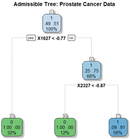
Admissible ML for Science . Legal requirement is not the only reason why we want to build admissible ML. In scientific investigations, it is important to know whether the deployed algorithm helps researchers to better understand the phenomena by refining their 'mental model.' Consider, for example, the prostate cancer data where we have p 6033 gene expression measurements from 52 tumor and 50 normal specimens. Fig. 2 shows a 95% accurate classification model for prostate data with only two 'core' driver genes! This compact model is admissible in the sense that it confers the following benefits: (i) it identifies a two-gene signature (composed of gene-1627 and gene-2327) as the top factor associated with prostate cancer. They are jointly overexpressed in the tumor samples but interestingly they have very little marginal information (not individually differentially expressed, as shown in Fig. 6). Accordingly, traditional linear-model-based analysis will fail to detect this genepair as a key biomarker. (ii) The simple decision tree model in Fig. 2 provides a mechanistic understanding and justification as to why the algorithm thinks a patient has prostate cancer or not. (iii) Finally, it provides the needed guidance on what to do next by having a control over the system. In particular, a cancer biologist can choose between different diagnosis and treatment plans with the goal to regulate those two oncogenes.
Goals and Organization . The primary goal of this paper is to introduce some new fundamental concepts and tools to lay the foundation of admissible machine learning that are efficient (enjoy good predictive accuracy), fair (prevent discrimination against minority groups), and interpretable (provide mechanistic understanding) to the best possible extent.
Our statistical learning framework is grounded in the foundational concepts of information theory. The required statistical formalism (nonparametric estimation and inference methods) and information-theoretic principles (entropy, conditional entropy, relative entropy, and conditional mutual information) are introduced in Section 2. A new nonparametric estimation technique for conditional mutual information (CMI) is proposed that scales to large
Figure 2: A two-gene admissible tree classifier for prostate cancer data with p 6033 gene expression measurements on 50 control and 52 cancer patients.
<details>
<summary>Image 2 Details</summary>
### Visual Description
## Decision Tree: Prostate Cancer Data Classification
### Overview
The image depicts a binary decision tree for classifying prostate cancer data. The tree uses feature thresholds (X1627 and X2327) to split data into nodes representing classifications (green for benign, blue for malignant). Percentages indicate class distributions, while numerical values likely represent feature averages or risk scores.
### Components/Axes
- **Root Node (1)**:
- Value: `1.49 .51`
- Percentage: `100%`
- Split Condition: `X1627 < -0.77` (yes/no branches)
- **Left Branch (X1627 < -0.77)**:
- Node 2:
- Value: `0.00 .00`
- Percentage: `32%` (green, benign)
- **Right Branch (X1627 ≥ -0.77)**:
- Node 3:
- Value: `1.25 .75`
- Percentage: `68%` (blue, malignant)
- Split Condition: `X2327 < -0.87` (yes/no branches)
- Node 6 (X2327 < -0.87):
- Value: `0.00 .00`
- Percentage: `12%` (green, benign)
- Node 7 (X2327 ≥ -0.87):
- Value: `0.91 .91`
- Percentage: `56%` (blue, malignant)
### Detailed Analysis
- **Root Node**: Represents the entire dataset (100%). The split on `X1627 < -0.77` divides data into 32% (left) and 68% (right).
- **Left Subtree (Node 2)**: All 32% of data in this branch are classified as benign (green) with a feature average of `0.00`.
- **Right Subtree (Node 3)**: 68% of data split further by `X2327 < -0.87`:
- **Node 6**: 12% of total data (12% of 68%) classified as benign (green) with `0.00` average.
- **Node 7**: 56% of total data (56% of 68%) classified as malignant (blue) with `0.91` average.
### Key Observations
1. **Feature Thresholds**:
- `X1627 < -0.77` separates 32% benign cases from 68% malignant.
- `X2327 < -0.87` further refines malignant cases into 12% benign and 56% malignant.
2. **Class Distributions**:
- Benign cases (green) occupy 44% of total data (32% + 12%).
- Malignant cases (blue) dominate at 56% of total data.
3. **Numerical Values**:
- Malignant nodes (blue) have higher averages (`0.91` in Node 7 vs. `0.25` in Node 3), suggesting these values correlate with disease severity.
### Interpretation
The tree demonstrates a hierarchical classification strategy:
- **Primary Split**: `X1627` acts as the strongest discriminator, separating 32% benign from 68% malignant cases.
- **Secondary Refinement**: For malignant cases (`X1627 ≥ -0.77`), `X2327` further distinguishes 12% benign from 56% malignant.
- **Outcome Correlation**: Higher numerical values (e.g., `0.91` in Node 7) align with malignant classifications, implying these features may represent risk scores or biomarker levels.
### Spatial Grounding
- **Root Node**: Top-center position, largest text size.
- **Branches**: Dotted lines connect nodes; left branches labeled "yes," right "no."
- **Color Coding**: Green (benign) and blue (malignant) nodes match class distributions.
### Trend Verification
- **Root to Node 2**: Sharp drop in value (`1.49 → 0.00`) with 32% benign classification.
- **Root to Node 3**: Moderate value (`1.49 → 1.25`) with 68% malignant classification.
- **Node 3 to Node 7**: Further value increase (`1.25 → 0.91`) with 56% malignant, confirming feature thresholds refine malignancy detection.
### Conclusion
This decision tree prioritizes `X1627` and `X2327` as key biomarkers for prostate cancer classification. The model achieves 56% malignant classification accuracy in the final node, with feature thresholds acting as interpretable decision rules. The numerical values likely represent average risk scores, with higher values correlating with malignancy.
</details>
datasets by leveraging the power of machine learning. For statistical inference, we have devised a new model-based bootstrap strategy. The method was applied to the problem of conditional independence testing and integrative genomics (breast cancer multi-omics data from Cancer Genome Atlas). Based on this theoretical foundation, in Section 3, we laid out the basic elements of admissible machine learning. Section 3.1 focuses on algorithmic interpretability: how can we efficiently search and design self-explanatory algorithmic models by balancing accuracy and robustness to the best possible extent? Can we do it in a completely model-agnostic manner? Key concepts and tools introduced in this section are: Core features, infogram, L-features, net-predictive information, and COREml. The procedure was applied to several real datasets, including high-dimensional microarray gene expression datasets (prostate cancer and SRBCT data), MONK's problems, and Wisconsin breast cancer data. Section 3.2 focuses on algorithmic fairness, which tackles the challenging problem of designing admissible ML algorithms that are simultaneously efficient, interpretable, and equitable. There are several key techniques introduced in this section: admissible feature selection, ALFA-testing, graphical risk assessment tool, and FINEml. We illustrate the proposed methods using examples from criminal justice system (ProPublica's COMPAS recidivism data), financial service industry (Adult income data, Taiwan credit card data), and marketing ad campaign. We conclude the paper in Section 4 by reviewing the challenges and opportunities of next-generation admissible ML technologies.
## 2 Information-Theoretic Principles and Methods
The foundation of admissible machine learning relies on information-theoretic principles and nonparametric methods. The key theoretical ideas and results are presented in this section to develop a deeper understanding of the conceptual basis of our new framework.
## 2.1 Notation
Let Y be the response variable taking values t 1 , . . . , k u , X p X 1 , . . . , X p q denotes a p -dimensional feature matrix, and S p S 1 , . . . , S q q is additional set of q covariates (e.g., collection of sensitive attributes like race, gender, age, etc.). A variable is called mixed when it can take either discrete, continuous, or even categorical values, i.e., completely unrestricted data-types. Throughout, we will allow both X and S to be mixed . We write Y K K X to denote the independence of Y and X . While, the conditional independence of Y and X given S is denoted by Y K K X | S . For a continuous random variable, f and F denote the probability density and distribution function, respectively. For a discrete random variable the probability mass function will be denoted by p with proper subscript.
## 2.2 Conditional Mutual Information
Our theory starts with an information-theoretic view of conditional dependence. Under conditional independence:
$$Y \, \mathbb { I } \, X | S$$
the following decomposition holds for all y, x , s
$$f _ { Y , X | S } ( y , x | s ) \, = \, f _ { Y | S } ( y | s ) f _ { X | S } ( x | s ) .$$
More than testing independence, often the real interest lies in quantifying the conditional dependence: the average deviation of the ratio
$$\frac { f _ { Y , X | S } ( y , x | S ) } { f _ { Y | S } ( y | S ) f _ { X | S } ( x | S ) } , \quad ( 2 . 1 )$$
which can be measured by conditional mutual information (Wyner, 1978).
Definition 1. Conditional mutual information (CMI) between Y and X given S is defined as:
$$\begin{array} { r l } \text {as:} & = \underset { y , x , s } { \iiint } \log \left ( \frac { f _ { Y , X | S } ( y , x | S ) } { f _ { Y | S } ( y | S ) f _ { X | S } ( x | S ) } \right ) f _ { Y , X , S } ( y , x , s ) \, d y \, d x \, d s . \quad ( 2 . 2 ) \end{array}$$
Two Important Properties . (P1) One of the striking features of CMI is that it captures multivariate non-linear conditional dependencies between the variables in a completely nonparametric manner. (P2) CMI possesses the necessary and sufficient condition as a measure of conditional independence, in the sense that
$$M I ( Y , X | S ) = 0 \, i f a n d o n l y i f \, Y \perp X | S .$$
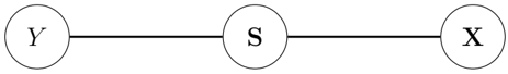
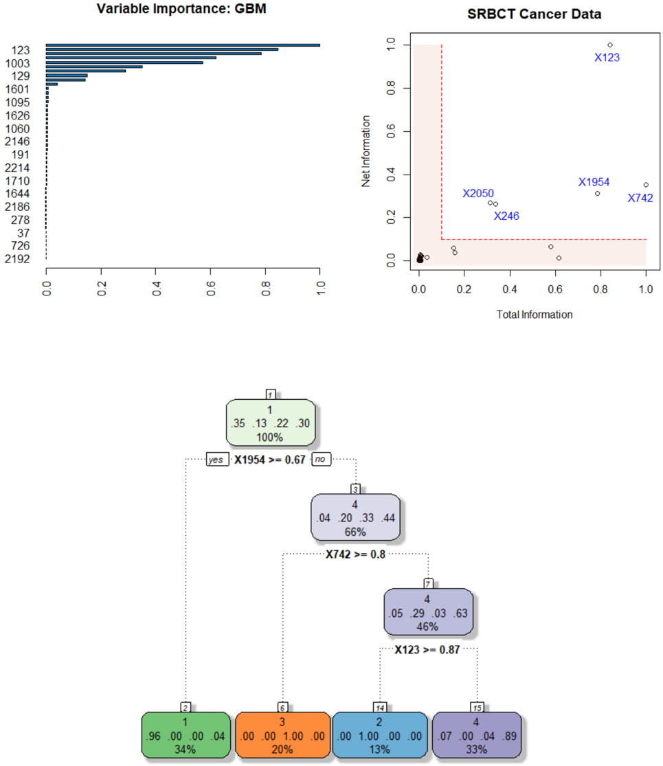
Conditional independence relation can be described using graphical model (also known as Markov network), as shown the figure below:
Figure 3: Representing conditional independence graphically, where each node is a random variable (or random vector). The edge between Y and X passes through the S .
<details>
<summary>Image 3 Details</summary>
### Visual Description
## Diagram: Sequential Process Flow (Y → S → X)
### Overview
The image depicts a linear sequence diagram with three interconnected nodes labeled **Y**, **S**, and **X**. The nodes are arranged horizontally, connected by straight lines, suggesting a directional flow from left to right. No numerical data, scales, or additional annotations are present.
### Components/Axes
- **Nodes**:
- **Y**: Positioned on the far left.
- **S**: Centered between Y and X.
- **X**: Positioned on the far right.
- **Connectors**:
- A single horizontal line connects **Y** to **S**.
- A single horizontal line connects **S** to **X**.
- **Labels**:
- All nodes are explicitly labeled with uppercase letters (**Y**, **S**, **X**).
- No axis titles, legends, or numerical markers are visible.
### Detailed Analysis
- **Node Placement**:
- **Y** is spatially isolated on the left, **S** is centrally aligned, and **X** is isolated on the right.
- Lines are equidistant and parallel, emphasizing a linear progression.
- **Textual Elements**:
- No embedded text, legends, or color-coded data series.
- Labels are minimalistic, with no additional context (e.g., units, descriptions).
### Key Observations
1. The diagram lacks numerical or categorical data, focusing solely on structural relationships.
2. The absence of branching or feedback loops suggests a strictly sequential process.
3. The central node **S** acts as an intermediary between **Y** and **X**, potentially indicating dependency or mediation.
### Interpretation
This diagram likely represents a simplified workflow, causal chain, or dependency structure. The linear flow from **Y** to **S** to **X** implies that **Y** initiates a process, **S** modifies or mediates it, and **X** is the final outcome. Without additional context, the labels could represent variables, stages, or entities in a system. The minimalist design prioritizes clarity of sequence over quantitative analysis.
**Note**: No factual or numerical data is present in the image. The interpretation is based solely on the structural relationships depicted.
</details>
## 2.3 Net-Predictive Information
One of the major significances of CMI as a measure of conditional dependence comes from its interpretation in terms of additional 'information gain' on Y learned through X when we already know S . In other words, CMI measures the Net-Predictive Information (NPI) of X -the exclusive information content of X for Y beyond what is already subsumed by S . To formally arrive at this interpretation, we have to look at CMI from a different angle, by expressing it in terms of conditional entropy. Entropy is a fundamental information-theoretic uncertainty measure. For a random variable Z , entropy H p Z q is defined as E Z r log f Z s .
Definition 2. The conditional entropy H p Y | S q is defined as the expected entropy of Y | S s
$$H ( Y | S ) = \int _ { s } H ( Y | S = s ) d F _ { s } ,$$
which measures how much uncertainty remains in Y after knowing S , on average.
Theorem 1. For Y discrete and p X , S q mixed multidimensional random vectors, MI p Y, X | S q can be expressed as the difference between two conditional-entropy statistics:
$$M I ( Y , X | S ) \, = \, H ( Y | S ) \, - \, H ( Y | S , X ) .$$
The proof involves some standard algebraic manipulations, and is given in Appendix A.1.
Remark 1 (Uncertainty Reduction) . The alternative way of defining CMI through eq. (2.5) allows us to interpret it from a new angle: Conditional mutual information MI p Y, X | S q measures the net impact of X in reducing the uncertainty of Y , given S . This new perspective will prove to be vital for our subsequent discussions. Note that, if H p Y | S , X q H p Y | S q , then X carries no net -predictive information about Y .
## 2.4 Nonparametric Estimation Algorithm
The basic formula (2.2) of conditional mutual information (CMI) that we have presented in the earlier section, is, unfortunately, not readily applicable for two reasons. First, the practical side: in the current form, (2.2) requires estimation of f Y, X | S and f X | S , which could be a herculean task, especially when X p X 1 , . . . , X p q and S p S 1 , . . . , S q q are largedimensional. Second, the theoretical side: since the triplet p Y, X , S q is mixed (not all discrete or continuous random vectors) the expression (2.2) is not even a valid representation. The necessary reformulation is given in the next theorem.
Theorem 2. Let Y be a discrete random variable taking values 1 , . . . , k , and p X , S q be a mixed pair of random vectors. Then the conditional mutual information can be rewritten as
$$M I ( Y , X | S ) \, = \, E _ { X , S } \left [ K L \left ( p _ { Y | X , S } \right \| p _ { Y | S } \right ) \right ] ,$$
where Kullback-Leibler (KL) divergence from p Y | X x , S s to p Y | S s is defined as
$$K L \left ( p _ { Y | x , s } \| p _ { Y | s } \right ) = \sum _ { y } p _ { Y | x , s } ( y | x , s ) \, \log \left ( \frac { p _ { Y | x , s } ( y | x , s ) } { p _ { Y | s } ( y | s ) } \right ) .$$
To prove it, first rewrite the dependence-ratio (2.1) solely in terms of conditional distribution of Y as follows:
$$\frac { P r ( Y = y | X = x , S = s ) } { P r ( Y = y | S = s ) } \, = \, \frac { p _ { Y | X , S } ( y | X , s ) } { p _ { Y | S } ( y | S ) }$$
Next, substitute this into (2.2) and express it as
$$M I ( Y , X | S ) \ = \ \iint _ { x , s } \left [ \sum _ { y } p _ { Y | X , S } ( y | X , s ) \log \left ( \frac { p _ { Y | X , S } ( y | X , s ) } { p _ { Y | S } ( y | S ) } \right ) \right ] d F x , s$$
Replace the part inside the square brackets by (2.7) to finish the proof.
Remark 2. CMI measures how much information is shared only between X and Y that is not contained in S . Theorem 2 makes this interpretation explicit.
Estimator . Goal is to develop a practical nonparametric algorithm for estimating CMI from n i.i.d samples t x i , y i , s i u n i 1 that works for large( n, p, q ) settings. Theorem 2 immediately
leads to the following estimator of (2.6):
$$\widehat { M I } ( Y , X | S ) = \frac { 1 } { n } \sum _ { i = 1 } ^ { n } \log \frac { \widehat { P r } ( Y = y _ { i } | x _ { i } , s _ { i } ) } { \widehat { P r } ( Y = y _ { i } | s _ { i } ) } .$$
Algorithm 1 . Conditional mutual information estimation : the proposed ML-powered nonparametric estimation method consists of three simple steps:
Step 1 . Choose a machine learning classifier (e.g., support vector machines, random forest, gradient boosted trees, deep neural network, etc.), and call it ML 0 .
Step 2 . Train the following two models:
$$\begin{array} { r c l } \text {ML.train} _ { y | x , s } & \leftarrow & \text {ML} _ { 0 } \left ( Y \sim [ X , S ] \right ) \\ \text {ML.train} _ { y | s } & \leftarrow & \text {ML} _ { 0 } \left ( Y \sim S \right ) \end{array}$$
Step 3 . Extract the conditional probability estimates x Pr p Y y i | x i , s i q from ML.train y | x , s , and x Pr p Y y i | s i q from ML 0 Y S , for i 1 , . . . , n .
Step 4 . Return x MI p Y, X | S q by applying formula (2.8).
Remark 3. We will be using the gradient boosting machine ( gbm ) of Friedman (2001) in our numerical examples (obviously, one can use other methods), whose convergence behavior is well-studied in literature (Breiman et al., 2004, Zhang, 2004), where it was definitively shown that under some very general conditions, the empirical risk (probability of misclassification) of the gbm classifier approaches the optimal Bayes risk. This Bayes risk consistency property surely carries over to our conditional probability estimates in (2.8), which justifies the good empirical performance of our method in real datasets.
Remark 4. Taking the base of the log in (2.8) to be 2, we get the measure in the unit of bits . If the log is taken to be the natural log e , then it is in nats unit. We will use log 2 in all our computation.
The proposed style of nonparametric estimation provides some important practical benefits:
Flexibility: Unlike traditional conditional independence testing procedures (Candes et al., 2018, Berrett et al., 2019), our approach requires neither the knowledge of the exact parametric form of high-dimensional F X 1 ,...,X p nor the knowledge of the conditional distribution of X | S , which are generally unknown in practice.
Applicability: (i) Data-type: The method can be safely used for mixed X and S (any combination of discrete, continuous, or even categorical variables). (ii) Data-dimension: The method is applicable to high-dimensional X p X 1 , . . . , X p q and S p S 1 , . . . , S q q .
- Scalability: Unlike traditional nonparametric methods (such as kernel density or k -nearest neighbor-based methods), our procedure is scalable for big datasets with large( n, p, q ).
## 2.5 Model-based Bootstrap
One can even perform statistical inference for our ML-powered conditional-mutual-information statistic. In order to test H 0 : Y K K X | S , obtain bootstrap-based p-value by noting that under the null Pr p Y y | X x , S s q reduces to Pr p Y y | S s q .
Algorithm 2 . Model-based Bootstrap : The inference scheme proceeds as follows:
Step 1. Let
$$\begin{array} { r } { \hat { p } _ { i | s } = \Pr ( Y _ { i } = 1 | S = s _ { i } ) , \, f o r i = 1 , \dots , n } \end{array}$$
as extracted from (already estimated) the model ML.train y | s (step 2 of Algorithm 1).
Step 2. Generate the null Y n 1 p Y 1 , . . . , Y n q by
$$Y _ { i } ^ { * } \, \leftarrow \, B e r n o u l l i ( \widehat { p } _ { i | s } ) , \, f o r \, i = 1 , \dots , n$$
Step 3. Compute x MI p Y , X | S q using the Algorithm 1.
Step 4. Repeat the process B times (say, B 500); compute the bootstrap null distribution, and return the p-value.
Remark 5. Aparametric version of this inference was proposed by Rosenbaum (1984) in the context of observational causal study. His scheme resamples Y by estimating Pr p Y 1 | S q using a logistic regression model. The procedure was called conditional permutation test.
## 2.6 A Few Examples
Example 1. Model: X Bernoulli p 0 . 5 q ; S Bernoulli p 0 . 5 q ; Y X when S 0 and 1 X when S 1. In this case, it is easy to see that the true MI p Y, X | S q 1. We simulated n 500 i.i.d p x i , y i , s i q from this model and computed our estimate using (2.8). We repeated the process 50 times to access the variability of the estimate. Our estimate is:
$$\dot { M } ( Y , X | S ) \ = \ 0 . 9 9 4 \pm 0 . 0 0 2 3 4 .$$
with (avg.) p-value being almost zero. We repeated the same experiment by making Y Bernoulli p 0 . 5 q (i.e., now true MI p Y, X | S q 0), which yields
$$M I ( Y , X | S ) \ = \ 0 . 0 0 2 2 \pm 0 . 0 0 1 7 .$$
with (avg.) pvalue being 0 . 820.
Example 2. Integrative Genomics . The wide availability of multi-omics data has revolutionized the field of biology. It is a general consensus among practitioners that combining individual omics data sets (mRNA, microRNA, CNV and DNA methylation, etc.) leads to improved prediction. However, before undertaking such analysis, it is probably worthwhile to check what is the additional information we gain from a combined analysis compared to a single-platform one. To illustrate this point, we use a Breast cancer multi-omics data that is a part of The Cancer Genome Atlas (TCGA, http://cancergenome.nih.gov/). It contain the expression of three-kinds of omics data sets: miRNA, mRNA, and proteomics from three kinds of breast cancer samples ( n 150): Basal, Her2, and LumA. X 1 is 150 184 matrix of miRNA, X 2 is 150 200 matrix of mRNA, and X 3 is 150 142 matrix of proteomics.
$$\text {MI} ( Y , \text {X} _ { 2 } \, | \, \text {X} _ { 1 } ) = 0 . 0 1 3 ; \quad & p { \text {-value} } = 0 . 3 5 6 \\ \text {MI} ( Y , \text {X} _ { 3 } \, | \, \text {X} _ { 1 } ) = 0 . 0 1 8 6 ; \quad & p { \text {-value} } = 0 . 2 3 5 \\ \text {MI} \left ( Y , \{ \text {X} _ { 2 } , \text {X} _ { 3 } \} \, | \, \text {X} _ { 1 } \right ) = 0 . 0 1 9 2 ; \quad & p { \text {-value} } = 0 . 5 0 1 .$$
It shows: neither mRNA or proteonomics add any substantial information beyond what is already captured by miRNAs.
## 3 Elements of Admissible Machine Learning
How to design admissible machine learning algorithms with enhanced efficiency, interpretability, and equity? 4 A systematic pipeline for developing such admissible ML models is laid out in this section, which is grounded in the earlier information-theoretic concepts and nonparametric modeling ideas.
## 3.1 COREml: Algorithmic Interpretability
## 3.1.1 From Predictive Features to Core Features
One of the first tasks of any predictive modeling is to identify the key drivers that are affecting the response Y . Here we will discuss a new information-theoretic graphical tool to quickly spot the 'core' decision-making variables, which are going to be vital in building interpretable models. One of the advantages of this method is that it works even in the presence of correlated features, as the following example illustrates; also see Appendix A.7.
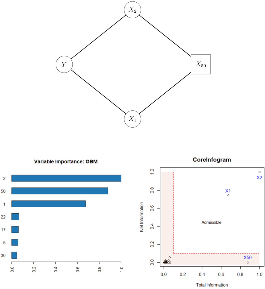
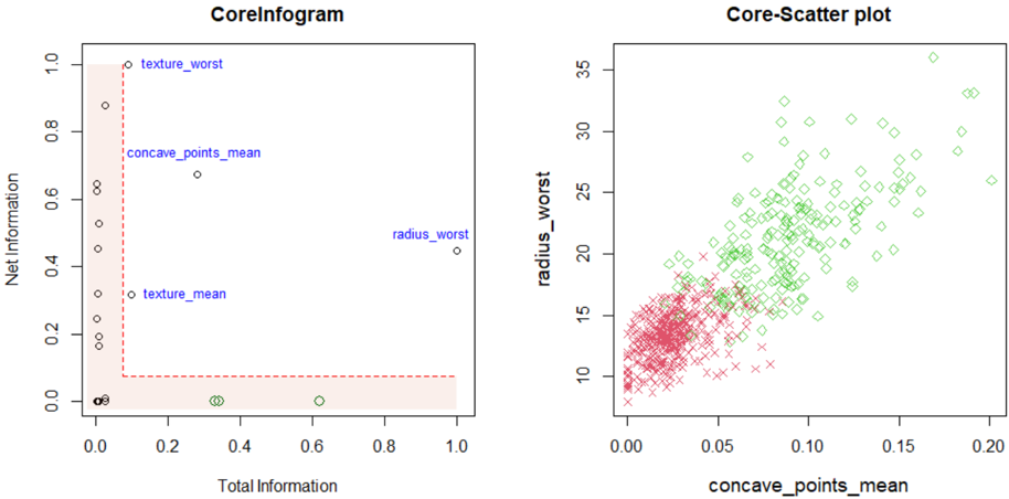
$$\begin{array} { r l } \text {Example 3. Correlated features. $Y \sim Bernoulli(\pi(x))$ where $\pi(x)=1/(1+e^{-\mathcal{M}(x)})$ and } \\ \\ \mathcal { M } ( x ) = 3 \sin ( X _ { 1 } ) - 2 X _ { 2 } . \end{array}$$
4 However, the general premise of admissible ML is extremely broad and flexible, and will continue to evolve with the regulatory requirements to ensure rapid development of trustworthy algorithmic methods.
X 1 , . . . X p 1 be i.i.d N p 0 , 1 q random variables, and
$$X _ { p } = 2 X _ { 1 } - X _ { 2 } + \epsilon , w h e r e \epsilon \sim \mathcal { N } ( 0 , 2 ) ,$$
which means X p has no additional predictive value beyond what is already captured by the core variables X 1 and X 2 . Another way of saying this is that X p is redundant -the conditional mutual information between Y and X p given t X 1 , X 2 u is zero:
$$M I \left ( Y , X _ { p } | \{ X _ { 1 } , X _ { 2 } \} \right ) = 0 .$$
The top of Fig. 4 graphically depicts this. The following nomenclature will be useful for discussing our method:
$$\begin{array} { r c l } { C o r e S e t } & { = } & { \{ X _ { 1 } , X _ { 2 } \} } \\ { I m i t a t o r } & { = } & { \{ X _ { p } \} } \\ { P r o b e s } & { = } & { \{ X _ { 3 } , \dots , X _ { p - 1 } \} . } \end{array}$$
Note that the imitator X p is highly predictive for Y due to its association with the core variables. We have simulated n 500 samples with p 50. For each feature we compute,
$$R _ { j } \ = \ o v e r a l l r e l e v a n c e s o r e \, o f \, j t h p r e d i c t o r , \ j = 1 , \dots , p .$$
The bottom-left corner of Fig. 4 shows the relative importance scores (scaled between 0 and 1) for the top seven features using gbm algorithm 5 , which correctly finds t X 1 , X 2 , X 50 u as the important predictors. However, it is important to recognise that this modus operandiirrespective of the ML algorithm-can not distinguish the 'fake imitator' X 50 from the real ones X 1 and X 2 . To enable refined characterization of the variables, we have to 'add more dimension' to the classical machine learning feature importance tools.
## 3.1.2 InfoGram and L-Features
We introduce a tool for identification of core admissible features based on the concept of net-predictive information (NPI) of a feature X j .
Definition 3. The net-predictive (conditional) information of X j given all the rest of the variables X j t X 1 , . . . , X p uzt X j u is defined in terms of conditional mutual information:
$$C _ { j } \ = \ M I ( Y , X _ { j } | X _ { - j } ) , \, f o r j = 1 , \dots , p .$$
5 based on whether a particular variable was selected to split on during learning a tree, and how much it improves the Gini impurity or information gain.
Figure 4: Top: The graphical representation of example 3 is shown. Bottom-left: The gbm-feature importance score for top seven features; rest are almost zero thus not shown. Bottom-right: infogram identifies the core variables t X 1 , X 2 u from the X 50 . The L-shaped area with 0 . 1 width is highlighted in red; it contains inadmissible variables with either low relevance or high redundancy.
<details>
<summary>Image 4 Details</summary>
### Visual Description
## Diagram: Network Structure with Nodes and Connections
### Overview
The image contains a diamond-shaped diagram with four nodes labeled **Y**, **X₁**, **X₂**, and **X₅₀**. Nodes are connected via straight edges, forming a hierarchical or dependency structure. **X₅₀** is distinguished by a square shape, while other nodes are circles.
### Components/Axes
- **Nodes**:
- **Y** (top-left)
- **X₁** (bottom-left)
- **X₂** (top-right)
- **X₅₀** (bottom-right, square-shaped)
- **Edges**:
- **Y** → **X₁**
- **Y** → **X₂**
- **X₁** → **X₅₀**
- **X₂** → **X₅₀**
### Detailed Analysis
- **Node Labels**: All nodes are explicitly labeled with uppercase letters.
- **Node Shapes**: **X₅₀** is a square; others are circles.
- **Edge Directions**: All edges are unidirectional, suggesting a flow or dependency from parent to child nodes.
### Key Observations
- **X₅₀** is the terminal node, receiving input from both **X₁** and **X₂**.
- **Y** acts as a root node, branching into **X₁** and **X₂**.
### Interpretation
This diagram likely represents a decision tree, causal model, or dependency graph. **X₅₀** may be the output or target variable, influenced by **X₁** and **X₂**, which are themselves influenced by **Y**. The square shape of **X₅₀** could indicate a special role (e.g., final output or critical node).
---
## Chart: Variable Importance (GBM)
### Overview
A horizontal bar chart titled **"Variable Importance: GBM"** displays the relative importance of variables in a Gradient Boosting Machine (GBM) model. The x-axis ranges from 0.0 to 1.0, and the y-axis lists categorical variables.
### Components/Axes
- **X-axis**: "Importance Score" (0.0 to 1.0)
- **Y-axis**: Categorical variables: **2**, **50**, **1**, **22**, **17**, **5**, **30**
- **Legend**: Blue bars represent variable importance.
### Detailed Analysis
- **Variable Importance Scores**:
- **2**: ~0.95 (longest bar)
- **50**: ~0.85
- **1**: ~0.65
- **22**, **17**, **5**, **30**: ~0.1 each (short bars)
- **Spatial Grounding**:
- Bars are aligned horizontally, with **2** at the top and **30** at the bottom.
- Legend is on the right, matching the blue color of the bars.
### Key Observations
- **Variable 2** is the most important, contributing ~95% of the importance score.
- **Variables 22, 17, 5, and 30** have negligible importance (~10% each).
### Interpretation
This chart highlights the dominance of **Variable 2** in the GBM model, suggesting it is the primary driver of predictions. The low importance of other variables implies they contribute minimally to the model’s output.
---
## Chart: CoreInfogram
### Overview
A scatter plot titled **"CoreInfogram"** visualizes the relationship between **Total Information** (x-axis) and **Net Information** (y-axis). Points are labeled **X₁**, **X₂**, and **X₅₀**, with a red dashed boundary defining an "Admissible" region.
### Components/Axes
- **X-axis**: "Total Information" (0.0 to 1.0)
- **Y-axis**: "Net Information" (0.0 to 1.0)
- **Legend**:
- **X₁**: Circle (blue)
- **X₂**: Square (blue)
- **X₅₀**: Triangle (blue)
- **Boundary**: Red dashed lines at **x=0.2** and **y=0.1**, forming a rectangular "Admissible" region.
### Detailed Analysis
- **Data Points**:
- **X₂**: (0.9, 0.95) – top-right corner, outside the admissible region.
- **X₁**: (0.7, 0.75) – inside the admissible region.
- **X₅₀**: (0.9, 0.05) – bottom-right corner, outside the admissible region.
- **Boundary**:
- Red dashed lines at **x=0.2** (vertical) and **y=0.1** (horizontal).
- "Admissible" region is the area above **y=0.1** and to the right of **x=0.2**.
### Key Observations
- **X₂** and **X₅₀** lie outside the admissible region, while **X₁** is inside.
- The admissible region suggests a threshold for acceptable information content.
### Interpretation
The CoreInfogram evaluates the balance between total and net information. Points outside the admissible region (e.g., **X₂**, **X₅₀**) may indicate inefficiencies or noise in the data. **X₁**’s position within the admissible region suggests it meets the criteria for meaningful information.
---
## Final Notes
- **Language**: All text is in English.
- **Missing Data**: No numerical tables or additional text blocks are present.
- **Uncertainty**: Approximate values (e.g., ~0.95 for Variable 2) are based on visual estimation.
</details>
For easy interpretation, we standardize C j by C j max j C j and convert it between 0 and 1. Infogram, which is a abbreviation of information diagram, is a scatter plot of tp R j , C j qu p j 1 over the unit square r 0 , 1 s 2 ; see the bottom-right corner of Fig. 4.
L-Features . The highlighted L-shaped area contains features that are either irrelevant or redundant. For example, notice the position of X 50 in the plot, indicating that it is highly predictive but contains no new complementary information for the response. Clearly, there could be an opposite scenario: a variable carries valuable net individual information for Y , despite being moderately relevant (not ranked among the top few); see Sec. 3.1.4.
Remark 6 (Predictive Features vs. CoreSet) . Recall that in Example 3, the irrelevant feature X 50 is strongly correlated with the relevant ones X 1 and X 2 through (3.2), thus violate the so-called 'irrepresentable condition'-for more details see the bibliographic notes section of Hastie et al. (2015, p. 311). In this scenario (which may easily arise in practice), it is hard to recover the 'important' variables using traditional variable selection methods. The bottom line is: identifying CoreSet is a much more difficult undertaking than merely selecting the most predictive ones. The goal of infogram is to facilitate this process of discovering the key variables that are driving the outcome.
Remark 7 (CoreML) . Two additional comments before diving into a real data examples. First, machine learning models based on 'core' features ( CoreML ) show improved stability, especially when there exists considerable correlation among the features. 6 This will be demonstrated in the next two sections. Second, our approach is not tied to any particular machine learning method; it is completely model-agnostic and can be integrated with any arbitrary algorithm: choose a specific classifier ML 0 and compute (3.3) and (3.4) to generate the associated infogram.
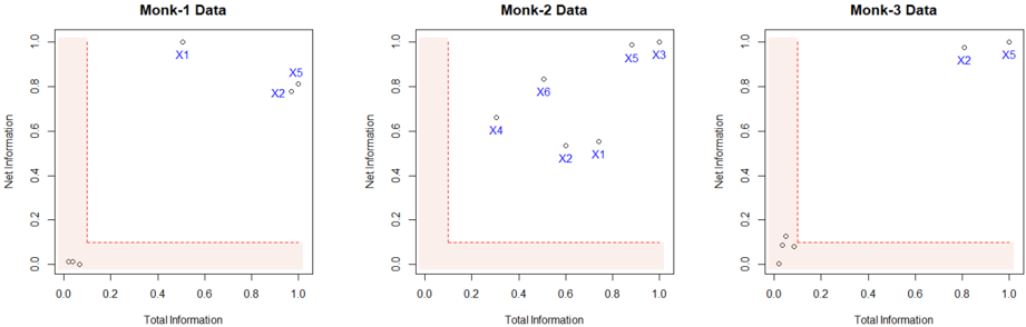
Example 4. MONK's problems (Thrun et al., 1991). It is a collection of three binary artificial classification problems (MONK-1, MONK-2 and MONK-3) with p 6 attributes; available in the UCI Machine Learning Repository. As shown in Fig. 5, infogram selects t X 1 , X 2 , X 5 u for the MONK-1 data, and t X 2 , X 5 u for the MONK-3 data as the core features. MONK-2 is an idiosyncratic case, where all six features turned out to be core! This indicates the possible complex nature of the classification rule for the MONK-2 problem.
## 3.1.3 COREtree: High-dimensional Microarray Data Analysis
How does one distill a compact (parsimonious) ML model by balancing accuracy, robustness, and interpretability to the best extent? To answer that, we introduce COREtree , whose
6 Numerous studies have found that many current methods like partial dependence plots, LIME, and SHAP could be highly misleading, particularly when there is strong dependence among features.
Figure 5: Infograms of Monk's problems. CoreSets are denoted in blue.
<details>
<summary>Image 5 Details</summary>
### Visual Description
## Scatter Plots: Monk Data Analysis
### Overview
Three scatter plots labeled "Monk-1 Data," "Monk-2 Data," and "Monk-3 Data" visualize relationships between "Total Information" (x-axis) and "Net Information" (y-axis). Each plot contains blue data points labeled X1–X6 and a red dashed L-shaped boundary line. The axes range from 0 to 1.0 in both dimensions.
### Components/Axes
- **X-axis**: "Total Information" (0.0 to 1.0)
- **Y-axis**: "Net Information" (0.0 to 1.0)
- **Red Dashed Line**: Forms an L-shape, dividing the plot into two regions:
- Vertical segment: x=0.0, y=0.0 to y=1.0
- Horizontal segment: x=0.0 to x=1.0, y=0.0
- **Data Points**: Blue dots labeled X1–X6 with approximate coordinates:
- **Monk-1**:
- X1: (0.5, 0.9)
- X5: (0.8, 0.8)
- X2: (0.7, 0.7)
- X3: (0.6, 0.6)
- X4: (0.4, 0.5)
- X6: (0.3, 0.4)
- **Monk-2**:
- X1: (0.7, 0.5)
- X2: (0.6, 0.4)
- X3: (0.8, 0.9)
- X4: (0.5, 0.6)
- X5: (0.9, 0.95)
- X6: (0.4, 0.7)
- **Monk-3**:
- X1: (0.1, 0.1)
- X2: (0.2, 0.15)
- X3: (0.3, 0.2)
- X4: (0.4, 0.25)
- X5: (0.9, 0.95)
- X6: (0.8, 0.9)
### Detailed Analysis
1. **Red Boundary Line**:
- Acts as a threshold, separating regions where "Net Information" is either above or below the line.
- All data points lie **above** the red line, suggesting they meet a minimum "Net Information" criterion.
2. **Data Point Distribution**:
- **Monk-1**: Points cluster near the top-right quadrant (x=0.4–0.8, y=0.5–0.9), with X1 and X5 being the most extreme.
- **Monk-2**: Points are more dispersed, with X5 (0.9, 0.95) and X3 (0.8, 0.9) near the top-right, while X1 and X2 are closer to the red line.
- **Monk-3**: Points are tightly clustered near the bottom-left (x=0.1–0.4, y=0.1–0.25) except for X5 and X6, which are outliers in the top-right.
3. **Trends**:
- **Monk-1**: Data points show a moderate positive correlation (y ≈ x + 0.3 for X1–X3).
- **Monk-2**: No clear trend; points are scattered but skewed toward higher y-values.
- **Monk-3**: Strong clustering in the bottom-left, with two outliers (X5, X6) suggesting anomalies.
### Key Observations
- **Outliers**:
- Monk-3’s X5 and X6 deviate significantly from the cluster, potentially indicating rare or exceptional cases.
- Monk-2’s X1 and X2 are closer to the red line, suggesting marginal compliance with the threshold.
- **Boundary Significance**: The red line likely represents a decision boundary (e.g., minimum acceptable "Net Information").
- **Dataset Variability**: Monk-3’s data is more concentrated, while Monk-1 and Monk-2 show broader distributions.
### Interpretation
The plots likely represent a classification or threshold analysis where:
- **Red Line**: Defines a critical threshold (e.g., "Net Information ≥ 0.0" is required for validity).
- **Data Points**: Represent instances evaluated against this threshold. All points meet the criterion, but Monk-3’s outliers (X5, X6) may require further investigation.
- **Monk-3 Anomalies**: The bottom-left cluster could indicate a subgroup with low "Total Information" but sufficient "Net Information," while X5/X6 might represent high-value outliers.
- **Practical Implications**: The red line’s L-shape suggests a binary decision rule (e.g., "If Total Information = 0, Net Information must be ≥ 1.0; otherwise, Net Information ≥ 0.0"). This could model scenarios like resource allocation or risk assessment.
No textual content in non-English languages was observed. All labels and values are transcribed with approximate precision based on visual estimation.
</details>
construction is guided by infogram. The methodology is illustrated using two real datasets, namely Prostate cancer and SRBCT tumor data. The main findings are striking: it shows how one can systematically search and construct robust and interpretable shallow decision tree models (often with just two or three genes) for noisy high-dimensional microarray datasets that are as powerful as the most elaborate and complex machine learning methods.
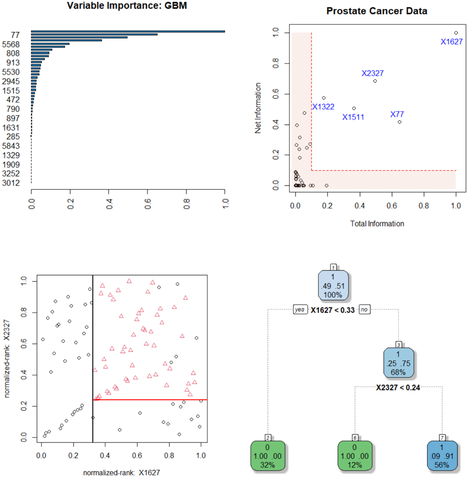
Example 5. Prostate cancer gene expression data . The data consist of p 6033 gene expression measurements on 50 control and 52 prostate cancer patients. It is available at https://web.stanford.edu/ hastie/CASI files/DATA/prostate.html . Our analysis is summarized below.
Step 1. Identifying CoreGenes . GBM-selected top 50 genes are shown in Fig. 6. We generate the infogram 7 of these 50 variables (displayed on the top-right corner), which identifies five core-genes t 1627 , 2327 , 77 , 1511 , 1322 u .
Step 2. Rank-transform: Robustness and Interpretability . Instead of directly operating on the gene expression values, we transform them into their ranks. Let t x j 1 , . . . , x jn u be the measurements on j th gene with empirical cdf r F j . Convert the raw x ji to u ji by
$$u _ { j i } = \bar { F } _ { j } ( x _ { j i } ) , \, i = 1 , \dots , n$$
and work on the resulting U n p matrix instead of the original X n p . We do this transformation for two reasons: first, to robustify, since it is known that gene expressions are inherently noisy. Second, to make it unit-free, since the raw gene expression values depend on the type
7 To reduce unnecessary clutter, we have displayed the infogram using top 50 features, since the rest of the genes will be cramped inside the nonessential L-zone anyway.
Figure 6: Prostate data analysis. Top panel: the gbm-feature importance graph, along with the infogram for the top 50 genes. Bottom-left: the scatter plot of Gene 1627 vs. 2327. For clarity, we have plotted them in the quantile domain p u i , v i q , where u rank p X r , 1627 sq{ n and v rank p X r , 2327 sq{ n . The black dots denote control samples with y 0 class and red triangles are prostate cancer samples with y 1 class. Bottom-right: the estimated CoreTree with just two decision-nodes, which is good enough to be 95% accurate.
<details>
<summary>Image 6 Details</summary>
### Visual Description
## Bar Chart: Variable Importance: GBM
### Overview
A horizontal bar chart displaying variable importance scores for a Gradient Boosting Machine (GBM) model. Variables are listed on the y-axis, and their importance is represented by bar length on the x-axis (0.0 to 1.0).
### Components/Axes
- **y-axis**: Variables (numeric IDs: 77, 5568, 808, ..., 3012)
- **x-axis**: Importance score (0.0 to 1.0)
- **Bars**: Horizontal, colored blue (no legend explicitly shown)
### Detailed Analysis
- **Variable 77**: Highest importance (1.0)
- **Variable 5568**: ~0.6 importance
- **Variable 808**: ~0.3 importance
- **Variable 913**: ~0.2 importance
- **Variable 5530**: ~0.15 importance
- **Variable 2945**: ~0.12 importance
- **Variable 1515**: ~0.08 importance
- **Variable 472**: ~0.05 importance
- **Variable 790**: ~0.03 importance
- **Variable 897**: ~0.02 importance
- **Variable 1631**: ~0.01 importance
- **Variable 285**: ~0.005 importance
- **Variable 5843**: ~0.003 importance
- **Variable 1329**: ~0.002 importance
- **Variable 1909**: ~0.001 importance
- **Variable 3252**: ~0.0005 importance
- **Variable 3012**: ~0.0001 importance
### Key Observations
- Importance decreases sharply from variable 77 to 5568, then gradually declines for subsequent variables.
- Variables 77 and 5568 dominate the model's decision-making process.
- Variables below 808 have negligible importance (<0.1).
### Interpretation
The chart reveals a highly skewed importance distribution, with two variables (77 and 5568) accounting for ~90% of the total importance. This suggests the GBM model relies heavily on these two features, potentially indicating overfitting or a lack of feature diversity in the dataset.
---
## Scatter Plot: Prostate Cancer Data
### Overview
A scatter plot comparing "Total Information" (x-axis) and "Net Information" (y-axis) for prostate cancer data points. Points are labeled with identifiers (e.g., X1627, X2327).
### Components/Axes
- **x-axis**: Total Information (0.0 to 1.0)
- **y-axis**: Net Information (0.0 to 1.0)
- **Points**: Labeled with identifiers (e.g., X1627, X2327)
- **Red shaded area**: Covers x=0.0 to x=0.2
### Detailed Analysis
- **X1627**: Located at (0.9, 0.95) – high total/net information
- **X2327**: Located at (0.7, 0.7) – moderate values
- **X1322**: Located at (0.15, 0.45) – low total information, moderate net information
- **X1511**: Located at (0.3, 0.5) – moderate values
- **X77**: Located at (0.8, 0.3) – high total information, low net information
- **Red shaded area**: Contains 12 points with low total information (<0.2)
### Key Observations
- X1627 is an outlier with the highest total and net information.
- Most points cluster in the lower-left quadrant (low total/net information).
- The red shaded area highlights variables with low total information but variable net information.
### Interpretation
The plot suggests a trade-off between total and net information. X1627's extreme values may indicate a critical feature for model performance, while the red-shaded region could represent underperforming or noisy variables.
---
## Scatter Plot: Normalized Rank: X1627
### Overview
A scatter plot comparing normalized ranks of X1627 (x-axis) and X2327 (y-axis). A red horizontal line at y=0.2 is present.
### Components/Axes
- **x-axis**: Normalized rank of X1627 (0.0 to 1.0)
- **y-axis**: Normalized rank of X2327 (0.0 to 1.0)
- **Points**: Black (circles) and red (triangles)
- **Red line**: Horizontal threshold at y=0.2
### Detailed Analysis
- **Red triangles**: Clustered above y=0.2 (higher X2327 rank)
- **Black circles**: Distributed across the plot
- **Red line**: Divides points into two regions (y < 0.2 and y ≥ 0.2)
### Key Observations
- Red triangles (X2327) show a positive correlation with X1627's rank.
- Black circles (other variables) are more dispersed.
- The red line may represent a decision boundary or performance threshold.
### Interpretation
The plot indicates that X2327's rank improves as X1627's rank increases, suggesting a synergistic relationship. The red line could represent a performance cutoff, with points above it indicating better outcomes.
---
## Decision Tree: Model Splits
### Overview
A binary decision tree with splits based on variables X1627 and X2327. Nodes contain counts and percentages.
### Components
- **Root node**: X1627 < 0.33 (split)
- **Left branch**: 100% class 0 (32% probability)
- **Right branch**: X2327 < 0.24 (split)
- **Left leaf**: 100% class 0 (12% probability)
- **Right leaf**: 56% class 1 (9.91% probability)
### Detailed Analysis
- **Root split**: X1627 < 0.33 separates 49.51 samples (100% class 0)
- **Secondary split**: X2327 < 0.24 separates 25.75 samples (68% class 0, 32% class 1)
- **Final leaf**: 9.91 samples (56% class 1, 44% class 0)
### Key Observations
- X1627 is the primary split, with perfect class separation in the left branch.
- X2327 further refines predictions in the right subtree.
- The model achieves high confidence in class 0 predictions but lower confidence for class 1.
### Interpretation
The tree prioritizes X1627 as the most critical feature, with splits leading to high-confidence predictions. The final leaf's mixed probabilities suggest residual uncertainty, potentially indicating the need for additional features or model refinement.
</details>
of preprocessing, thus carries much less scientific meaning. On the other hand, percentiles are much more easily interpretable to convey 'how overexpressed a gene is.'
Step 3. Shallow Robust Tree . We build a single decision tree using the infogram-selected coregenes. This is displayed in the bottom-right panel of Fig. 6. Interestingly, the CoreTree retained only two genes t 1627 , 2327 u whose scatter plot (in the rank-transform domain) is shown in the bottom-left corner of Fig. 6. A simple eyeball estimate of the discrimination surfaces are shown in bold (black and red) lines, which closely matches with the decision tree rule. It is quite remarkable that we have reduced the original 6033-dimensional problem to a simple bivariate two-sample one, just by wisely selecting the features based on the infogram.
Step 4. Stability . Note the tree that we build is based only on the infogram-selected core features. These features have less redundancy and high relevance, which provide an extraordinary stability (over different runs on the same dataset) to the decision-tree-a highly desirable characteristic.
Step 5. Accuracy . The accuracy of our single decision tree (on a randomly selected 20% test set, averaged over 100 times) is more than 95%. On the other hand, the full-data gbm (with p 6033 genes) is only 75% accurate. Huge simplification of the model-architecture with significant gain in the predictive performance!
Step 6. Gene Hunting: Beyond Marginal Screening . We compute two-sample t -test statistic for all p 6033 genes and rank them according to their absolute values (the gene with the largest absolute t -statistic gets ranked 1-the most differentially expressed gene). The t -scores for the coregenes along with their p-values and ranks are:
$$\begin{array} { r l } & { \left | t _ { 1 6 2 7 } \right | = 0 . 1 5 ; \, p { - v a l u e } = 0 . 8 8 ; \, r a n k = 5 3 8 3 . } \\ & { \left | t _ { 2 3 2 7 } \right | = 1 . 4 0 ; \, p { - v a l u e } = 0 . 1 7 ; \, r a n k = 1 2 2 8 . } \end{array}$$
Thus, it is hopeless to find coregenes by any marginal-screening method-they are too weak marginally (in isolation), but jointly an extremely strong predictor . The good news is that our approach can find those multivariate hidden gems in a completely nonparametric fashion.
Step 7. Lasso Analysis and Results . We have used the glmnet R-package. Lasso with λ min (minimum cross-validation error) selects 70 genes, where as λ 1se (the largest lambda such that error is within 1 standard error of the minimum) selects 60 genes. Main findings are:
Figure 7: SRBCT data analysis. Top-left: GBM-feature importance plot; top 50 genes are shown. Top-right: The associated infogram. Bottom panel: The estimated coretree with just three decision nodes.
<details>
<summary>Image 7 Details</summary>
### Visual Description
## Bar Chart: Variable Importance: GBM
### Overview
A horizontal bar chart displaying the importance of 15 variables (X123, X1003, X129, X1601, X1095, X1626, X1060, X2146, X191, X2214, X1710, X1644, X2186, X278, X37, X726, X2192) in a Gradient Boosting Machine (GBM) model. The x-axis represents "Variable Importance" (0–1), and the y-axis lists variables in descending order of importance.
### Components/Axes
- **X-axis**: "Variable Importance" (0–1, linear scale).
- **Y-axis**: Variables (X123, X1003, X129, X1601, X1095, X1626, X1060, X2146, X191, X2214, X1710, X1644, X2186, X278, X37, X726, X2192).
- **Legend**: Not explicitly visible; bars are colored uniformly (dark blue).
### Detailed Analysis
- **X123**: Longest bar (~0.95 importance).
- **X1003**: Second-longest (~0.85 importance).
- **X129**: ~0.4 importance.
- **X1601**: ~0.2 importance.
- **X1095**: ~0.05 importance.
- **X1626**: ~0.02 importance.
- **X1060**: ~0.01 importance.
- **X2146**: ~0.005 importance.
- **X191**: ~0.002 importance.
- **X2214**: ~0.001 importance.
- **X1710**: ~0.0005 importance.
- **X1644**: ~0.0002 importance.
- **X2186**: ~0.0001 importance.
- **X278**: ~0.00005 importance.
- **X37**: ~0.00002 importance.
- **X726**: ~0.00001 importance.
- **X2192**: ~0.000005 importance.
### Key Observations
- X123 and X1003 dominate variable importance, contributing ~95% of total importance.
- Variables beyond X1601 have negligible importance (<0.05).
### Interpretation
The chart highlights that only two variables (X123, X1003) are critical for the GBM model, while others contribute minimally. This suggests potential overfitting or sparse feature utility in the dataset.
---
## Scatter Plot: SRBCT Cancer Data
### Overview
A scatter plot comparing "Total Information" (x-axis) and "Net Information" (y-axis) for 10 variables (X123, X1954, X2050, X246, X742). A red dashed threshold line at y=0.5 separates high/low net information.
### Components/Axes
- **X-axis**: "Total Information" (0–1, linear scale).
- **Y-axis**: "Net Information" (0–1, linear scale).
- **Legend**: Not explicitly visible; points are labeled with variable names.
### Detailed Analysis
- **X123**: (0.9, 0.95) – Highest net information.
- **X1954**: (0.8, 0.85) – Second-highest net information.
- **X2050**: (0.7, 0.75) – Moderate net information.
- **X246**: (0.6, 0.65) – Below threshold (y=0.5).
- **X742**: (0.85, 0.9) – High net information.
### Key Observations
- X123 and X742 exceed the 0.5 net information threshold.
- X246 falls below the threshold, indicating lower predictive power.
### Interpretation
The scatter plot reveals that variables with higher total information (e.g., X123, X742) also yield higher net information, suggesting strong predictive utility. X246’s lower net information may indicate noise or redundancy.
---
## Decision Tree Diagram
### Overview
A flowchart representing a decision tree with 7 nodes. Nodes are color-coded (green, purple, orange, blue) and include conditions, outcomes, and distributions.
### Components/Axes
- **Nodes**:
1. **Node 1 (Green)**: Condition: X1954 > 0.67. Outcomes: 100% (0.35, 0.13, 0.22, 0.30).
2. **Node 2 (Green)**: Condition: X1954 ≤ 0.67. Outcomes: 34% (0.96, 0.00, 0.00, 0.04).
3. **Node 3 (Purple)**: Condition: X742 > 0.8. Outcomes: 66% (0.04, 0.20, 0.33, 0.44).
4. **Node 4 (Purple)**: Condition: X742 ≤ 0.8. Outcomes: 46% (0.05, 0.29, 0.03, 0.63).
5. **Node 5 (Blue)**: Condition: X123 > 0.87. Outcomes: 13% (0.00, 1.00, 0.00, 0.00).
6. **Node 6 (Orange)**: Condition: X123 ≤ 0.87. Outcomes: 20% (0.00, 0.00, 1.00, 0.00).
7. **Node 7 (Blue)**: Condition: X123 ≤ 0.87. Outcomes: 33% (0.07, 0.00, 0.04, 0.89).
### Key Observations
- **Node 1**: High X1954 values lead to balanced outcomes.
- **Node 2**: Low X1954 values result in 96% of cases in the first category.
- **Node 3/4**: X742 splits outcomes into high/low probabilities.
- **Node 5/6/7**: X123 further refines predictions, with extreme values (1.00) dominating.
### Interpretation
The decision tree prioritizes X1954 and X742 for early splits, followed by X123. High X1954 values (Node 1) and X742 > 0.8 (Node 3) lead to diverse outcomes, while lower values (Node 2) concentrate predictions. The tree’s structure aligns with the bar chart’s emphasis on X123, X1003, and X1954 as critical variables.
---
## Cross-Referenced Insights
1. **Variable Importance**: X123, X1003, and X1954 are the most influential, reflected in the decision tree’s splits.
2. **Scatter Plot Correlation**: Variables with high total information (X123, X742) align with high net information, validating their importance.
3. **Threshold Impact**: The red dashed line (y=0.5) separates effective (above) and less effective (below) variables, guiding model decisions.
This analysis demonstrates how variable importance, information metrics, and decision rules interrelate to shape predictive models.
</details>
(i) The coregenes t 1627 , 2327 u were never selected, probably because they are marginally very weak; and the significant interaction is not detectable by standard-lasso.
(ii) Accuracy of Lasso with λ min is around 78% (each time we have randomly selected 85% data for training; computed the λ cv for making prediction; averaged over 100 runs).
Step 8. Explainability . The final 'two-gene model' is so simple and elegant that it can be easily communicated to doctors and medical practitioners: a patient with overexpressed gene 1627 and gene 2327 has a higher risk of getting prostate cancer. Biologists can use these two genes as robust prognostic markers for decision-making (or for recommending the proper drug). It is hard to imagine there could be a more accurate algorithm, one that is at least as compact as the 'two-gene model.' We should not forget that the success behind this dramatic model-reduction hinges on discovering multivariate coregenes , which: (i) help us to gain insights into biological mechanisms [clarifying 'who' and 'how'], and (ii) provide a simple explanation of the predictions [justifying 'why'].
Example 6. SRBCT Gene Expression Data . It is a microarray experiment of Small Round Blue Cell Tumors (SRBCT) taken from a childhood cancer study. It contain information on p 2 , 308 genes on 63 training samples and 25 test samples. Among n 63 tumor examples, 8 are Burkitt Lymphoma (BL), 23 are Ewing Sarcoma (EWS), 12 are neuroblastoma (NB), and 20 are rhabdomyosarcoma (RMS). The dataset is available in the plsgenomics Rpackage. The top-panel of Fig. 7 shows the infogram, which identifies five core genes t 123 , 742 , 1954 , 246 , 2050 u . The associated coretree with only three decision-nodes is shown in the bottom panel, which accurately classifies 95% of the test cases. In addition, it enjoys all the advantages that were ascribed to the prostate data-we don't repeat them again.
Remark 8. We end this section with a general remark: when applying machine learning algorithms in scientific applications, it is of the utmost importance to design models that can clearly explain the 'why and how' behind their decision-making process. We should not forget that scientists mainly use machine learning as a tool to gain a mechanistic understanding, so that they can judiciously intervene and control the system. Sticking with the old way of building inscrutable predictive black-box models will severely slow down the adoption of ML methods in scientific disciplines like medicine and healthcare.
## 3.1.4 COREglm: Breast Cancer Wisconsin Data
Example 7. Wisconsin Breast Cancer Data . The Breast Cancer dataset is available in the UCI machine learning repository. It contains n 569 malignant and benign tumor cell
Figure 8: Breast Cancer Wisconsin Data. Infogram reveals where the crux of the information is hidden. Infogram-guided admissible decision tree-a compact yet accurate classifier.
<details>
<summary>Image 8 Details</summary>
### Visual Description
## CoreInfogram: Net Information vs Total Information
### Overview
A scatter plot comparing "Net Information" (y-axis) and "Total Information" (x-axis), with labeled data points and a red dashed boundary line.
### Components/Axes
- **X-axis (Total Information)**: 0.0 to 1.0 (linear scale).
- **Y-axis (Net Information)**: 0.0 to 1.0 (linear scale).
- **Legend**:
- `texture_worst`: Circles (blue).
- `concave_points_mean`: Diamonds (green).
- `radius_worst`: Crosses (red).
- `texture_mean`: Squares (black).
### Detailed Analysis
- **Data Points**:
- `texture_worst`: Clustered near the top-left (Net Information ~0.8–0.9, Total Information ~0.0–0.1).
- `concave_points_mean`: Single point at (0.3, 0.6).
- `radius_worst`: Single point at (0.9, 0.4).
- `texture_mean`: Clustered near the bottom-left (Net Information ~0.0–0.2, Total Information ~0.0–0.1).
- **Boundary**: Red dashed line at y=0.0, extending horizontally across the plot.
- **Shaded Region**: Light red area below the dashed line, labeled "Net Information."
### Key Observations
- `texture_worst` and `texture_mean` dominate the lower-left quadrant.
- `radius_worst` is an outlier in the upper-right.
- `concave_points_mean` is isolated in the mid-range.
### Interpretation
The plot suggests a classification of features based on their "Net Information" contribution. `texture_worst` and `texture_mean` likely represent texture-related metrics, while `radius_worst` and `concave_points_mean` relate to shape or geometric properties. The red dashed line may indicate a threshold for meaningful net information.
---
## Core-Scatter plot: radius_worst vs concave_points_mean
### Overview
A scatter plot showing the relationship between "concave_points_mean" (x-axis) and "radius_worst" (y-axis), with two distinct clusters.
### Components/Axes
- **X-axis (concave_points_mean)**: 0.0 to 0.2 (linear scale).
- **Y-axis (radius_worst)**: 10 to 35 (linear scale).
- **Legend**:
- `radius_worst`: Red crosses.
- `concave_points_mean`: Green diamonds.
### Detailed Analysis
- **Data Points**:
- **Red Crosses (`radius_worst`)**: Clustered in the lower-left (x ~0.0–0.05, y ~10–15).
- **Green Diamonds (`concave_points_mean`)**: Spread diagonally from lower-left to upper-right (x ~0.0–0.2, y ~15–35).
- **Trend**: Positive correlation between `concave_points_mean` and `radius_worst` for green diamonds.
### Key Observations
- Red crosses (`radius_worst`) are tightly grouped, suggesting low variability.
- Green diamonds (`concave_points_mean`) show a gradient increase in `radius_worst` with higher `concave_points_mean`.
### Interpretation
The plot indicates that higher `concave_points_mean` values are associated with larger `radius_worst` measurements, possibly reflecting geometric complexity in a dataset (e.g., medical imaging or material science). The red crosses may represent a control group or baseline measurements.
</details>
samples. The task is to build an admissible (interpretable and accurate) ML classifier based on p 31 features extracted from cell nuclei images.
Step 1. Infogram Construction: Fig. 8 displays the infogram, which provides a quick understanding of the phenomena by revealing its 'core.' Noteworthy points: (i) there are three highly predictive inadmissible features (green bubbles in the plot: perimeter worst, area worst, and concave points worst), which have large overall predictive importance but almost zero net individual contributions. We have called these variables ' Imitators ' in Sec. 3.1.1. (ii) Three among the four 'core' admissible features (texture worst, concave points mean, and texture mean) are not among the top features based on usual predictive information, yet they contain a considerable amount of new exclusive information (net-predictive information) that is useful for separating malignant and benign tumor cells. In simple terms, infogram help us to track down where the 'core' discriminatory information is hidden.
Step 2. Core-Scatter plot. The right panel of Fig. 8 shows the scatter plot of the top two core features and how they separate the malignant and benign tumor cells.
Step 3. Infogram-assisted CoreGLM model: The simplest possible model that one could build is a logistic regression based on those four admissible features. Interestingly, the Akaike information criterion (AIC) based model selection further drops the variable texture mean ,
which is hardly surprising considering that it has the least net and total information among the four admissible core features. The final logistic regression model with three core variables is displayed below (output of glm R-function):
```
#COREglm Model: UCI breast cancer data
Coefficients:
Estimate Std. Error z value Pr(>|z|)
(Intercept) -29.42361 3.85131 -7.640 2.17e-14 ***
concave_points_mean 96.48880 16.11261 5.988 2.12e-09 ***
radius_worst 0.99767 0.16792 5.941 2.83e-09 ***
texture_worst 0.30451 0.05302 5.744 9.27e-09 ***
```
This simple parametric model achieves a competitive accuracy of 96 . 50% (on a 15% test set; averaged over 50 trials). Compare this with full-fledged big ML models (like gbm, random forest, etc.) which attain accuracy in the range of 95 97%. This example again shows how infogram can guide the design of a highly transparent and interpretable CoreGLM model with a few handful of variables-which is as powerful as complex black-box ML methods.
Remark 9 (Integrated statistical modeling culture) . One should bear in mind that the process by which we arrived at simple admissible models actually utilizes the power of modern machine learning-needed to estimate the formula (3.4) of definition 3, as described by the theory laid out in section 2. For more discussion on this topic, see Appendix A.6 and Mukhopadhyay and Wang (2020). In short, we have developed a process of constructing an admissible (explainable and efficient) ML procedure starting from a 'pure prediction' algorithm.
## 3.2 FINEml: Algorithmic Fairness
ML-systems are increasingly used for automated decision-making in various high-stakes domains such as credit scoring, employment screening, insurance eligibility, medical diagnosis, criminal justice sentencing, and other regulated areas. To ensure that we are making responsible decisions using such algorithms, we have to deploy admissible models that can balance Fairness, INterpretability, and Efficiency ( FINE ) to the best possible extent. This section discusses principles and tools for designing such FINE -algorithms.
## 3.2.1 FINE-ML: Approaches and Limitations
Imagine that a machine learning algorithm is used by a bank to accurately predict whether to approve or deny a loan application based on the probability of default. This ML-based
risk-assessing tool has access to the following historical data:
- Y : { 0 , 1 } Loan status variable-1 whether the loan was approved and 0 if denied.
- S : Collection of protected attributes { gender, marital status, age, race } .
- X : Feature matrix { income, loan amount, education, credit history, zip code }
To automate the loan-eligibility decision-making process, the bank wants to develop an accurate classifier that will not discriminate among applicants on the basis of their protected features. Naturally, the question is: how to go about designing such ML-systems that are accurate and at the same time provide safeguards against algorithmic discrimination?
Approach 1 Non-constructive : We can construct a myriad of ML models by changing and tuning different hyper-parameters, base learners, etc. One can keep building different models until one finds a perfect one that avoids adverse legal and regulatory issues. There are at least two problems with this 'try until you get it right' approach: first, it is non-constructive. The whole process gives zero guidance on how to rectify the algorithm to make it less-biased. Second, there is no single definition of fairness-more than twenty different definitions have been proposed over the last few years (Narayanan, 2018). And the troubling part is that these different fairness measures are mutually incompatible to each other and cannot be satisfied simultaneously (Kleinberg, 2018); see Appendix A.4. Hence this laborious process could end up being a wild-goose chase, resulting in a huge waste of computation.
Approach 2 Constructive : Here we seek to construct ML models that-by design-mitigate bias and discrimination. To execute this task successfully, we must first identify and remove proxy variables (e.g., zip code) from the learning set, which prevent a classification algorithm from achieving desired fairness. But how to define a proper mathematical criterion to detect those surrogate variables? Can we develop some easily interpretable graphical exploratory tools to systematically uncover those problematic variables? If we succeed in doing this, then ML developers can use it as a data filtration tool to quickly spot and remove the potential sources of biases in the pre-modeling (data-curation) stage, in order to mitigate fairness issues in the downstream analysis.
Figure 9: Infogram maps variables in a two dimensional (effectiveness vs. safety) diagram. It is a pre-modeling nonparametric exploratory tool for admissible feature selection. Infogram is interpreted based on graphical (conditional) independence structure. In real problems, all variables will have some degree of correlation with the protected attributes. Important part is to quantify the 'degree,' which is measured through eq. (3.6)-as indicated by varying thicknesses of the edges (bold to dotted). Ultimately, the purpose of this graphical diagnostic tool is to provide the necessary guardrails to construct an appropriate learning algorithm that can retain as much of the predictive accuracy as possible, while defending against unforeseen biases-tool for risk-benefit analysis.
<details>
<summary>Image 9 Details</summary>
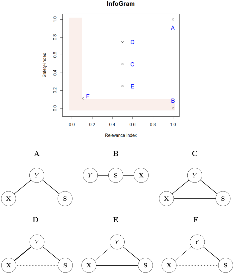
### Visual Description
## Scatter Plot with Network Diagrams: Relevance vs. Safety Index
### Overview
The image contains a scatter plot titled "InfoGram" with six labeled data points (A–F) plotted on a 2D grid. Below the plot, six network diagrams (A–F) are displayed, each representing different configurations of nodes X, Y, and S. The scatter plot uses a shaded lower-left triangular region to highlight a specific area of interest.
---
### Components/Axes
- **X-axis**: "Relevance-index" (ranges from 0.0 to 1.0).
- **Y-axis**: "Safety-index" (ranges from 0.0 to 1.0).
- **Shaded Region**: Lower-left triangular area (bounded by x=0, y=0, and the line x + y = 1).
- **Data Points**: Labeled A–F, positioned as follows:
- **A**: (1.0, 1.0) – Top-right corner.
- **B**: (1.0, 0.0) – Bottom-right corner.
- **C**: (0.5, 0.5) – Center of the plot.
- **D**: (0.5, 0.3) – Lower-middle region.
- **E**: (0.7, 0.4) – Upper-middle region.
- **F**: (0.0, 0.0) – Bottom-left corner (origin).
---
### Detailed Analysis
#### Scatter Plot
- **Point A**: Located at (1.0, 1.0), indicating maximum relevance and safety. No shaded region overlap.
- **Point B**: At (1.0, 0.0), high relevance but zero safety. Positioned on the x-axis boundary.
- **Point C**: At (0.5, 0.5), balanced relevance and safety. Centered in the plot.
- **Point D**: At (0.5, 0.3), moderate relevance and low safety. Within the shaded region.
- **Point E**: At (0.7, 0.4), high relevance and moderate safety. Outside the shaded region.
- **Point F**: At (0.0, 0.0), zero relevance and safety. Origin of the plot.
#### Network Diagrams
- **Diagram A**: Y connected to X and S (star topology). Matches Point A’s high relevance/safety.
- **Diagram B**: Linear chain Y–S–X. Matches Point B’s high relevance/low safety.
- **Diagram C**: Fully connected triangle (X–Y–S). Matches Point C’s balanced metrics.
- **Diagram D**: Y connected to X and S with a dotted line between X and S. Matches Point D’s moderate relevance/low safety.
- **Diagram E**: Y connected to X and S with a solid line between X and S. Matches Point E’s high relevance/moderate safety.
- **Diagram F**: Y connected to X and S with all lines dotted. Matches Point F’s zero relevance/safety.
---
### Key Observations
1. **Shaded Region**: Points D and F lie within or on the boundary of the shaded lower-left triangle, suggesting a focus on low relevance/safety configurations.
2. **Diagram-Safety Correlation**:
- Fully connected diagrams (C, A) align with higher safety metrics.
- Linear or sparse diagrams (B, D, F) align with lower safety metrics.
3. **Relevance Trends**:
- Points with high relevance (A, B, E) have varying safety levels, indicating relevance is not inherently tied to safety.
4. **Dotted vs. Solid Lines**: Dotted connections (D, F) may represent weaker or uncertain relationships, correlating with lower safety.
---
### Interpretation
The scatter plot and diagrams together suggest a framework for evaluating network configurations based on **relevance** (x-axis) and **safety** (y-axis).
- **Point A (Diagram A)**: A star topology (Y as a central hub) achieves maximum relevance and safety, possibly due to balanced connectivity.
- **Point B (Diagram B)**: A linear chain prioritizes relevance (high x-value) but sacrifices safety (zero y-value), likely due to single points of failure.
- **Point F (Diagram F)**: A fully dotted network (weak connections) results in zero relevance and safety, highlighting the importance of strong relationships.
- **Shaded Region**: Emphasizes configurations where both relevance and safety are low, possibly indicating risky or underdeveloped systems.
The diagrams act as visual proxies for the scatter plot’s data, with structural complexity (e.g., fully connected vs. linear) directly influencing the plotted metrics. This dual representation allows for intuitive analysis of how network design impacts performance and safety.
</details>
## 3.2.2 InfoGram and Admissible Feature Selection
We offer a diagnostic tool for identification of admissible features that are predictive and safe. Before going any further, it is instructive to formally define what we mean by 'safe.'
Definition 4 (Safety-index and Inadmissibility) . Define the safety-index for variable X j as
$$F _ { j } \, = \, M I \left ( Y , X _ { j } | \, \{ S _ { 1 } , \dots , S _ { q } \} \right )$$
This quantifies how much extra information X j carries for Y that is not acquired through the sensitive variables S p S 1 , . . . , S q q . For interpretation purposes, we standardize F j between zero and one by dividing by the max j F j . Variables with 'small' F -values (F-stands for fairness) will be called inadmissible, as they possess little or no informational value beyond their use as a dummy for protected characteristics.
Construction . In the context of fairness, we construct the infogram by plotting tp R j , F j qu p j 1 , where recall R j denotes the relevance score (3.3) for X j . The goal of this graphical tool is to assist identification of admissible features which have little or no information-overlap with sensitive attributes S , yet are reasonably predictive for Y . Interpretation . Fig. 9 displays an infogram with six covariates. The L-shaped highlighted region contains variables that are either inadmissible (the horizontal slice of L) or inadequate (the vertical slice of L) for prediction. The complementary set L c comprises of the desired admissible features. Focus on variables A and B : both have the same predictive power, but are gained through a completely different manner. The variable B gathered information for Y entirely through the protected features (verify it from the graphical representation of B ), and is thus inadmissible. On the other hand, the variable A carries direct informational value, having no connection with the prohibitive S , and is thus totally admissible. Unfortunately, though, reality is usually more complex than this clear-cut black and white A -B situation. The fact of the matter is: admissibility (or fairness, per se) is not a yes/no concept, but a matter of degree 8 , which is explained at the bottom two rows of Fig. 9 utilizing variables C to F.
Remark 10. The graphical exploratory nature of the infogram makes the whole learning process much more transparent, interactive, and human-centered.
Legal doctrine . Note that in our framework the protected variables are used only in the pre-deployment phase to determine what other (admissible) attributes to include in the
8 'Zero bias' is an illusion. All models are biased (to a different degree), but some are admissible. The real question is how to methodically construct those admissible ones from possibly biased data.
algorithm to mitigate unforeseen downstream bias, which is completely legal (Hellman, 2020). It is also advisable that once inadmissible variables are identified using an infogram, not to throw them (especially the highly predictive ones such as the feature B in Fig. 9) blindly from the analysis without consulting domain experts-including some of them may not necessarily imply violation of the law; ultimately, it is up to the policymakers and judiciary to determine their appropriateness (legal permissibility) based on the given context. Our job as statisticians is to discover those hidden inadmissible L-features (preferably in a fully data-driven and automated manner) and raise a red flag for further investigation.
## 3.2.3 FINEtree and ALFA-Test: Financial Industry Applications
Example 8. The Census Income Data . The dataset is extracted from 1994 United States Census Bureau database, available in UCI Machine Learning Repository. It is also known as the 'Adult Income' dataset, which contains n 45 , 222 records involving personal details such as yearly income (whether it exceeds $ 50,000 or not), education level, age, gender, marital-status, occupation, etc. The classification task is to determine whether a person makes $ 50k per year based on a set of 14 attributes, of which four are protective:
$$S = \left \{ A g e , G e n d e r , R a c e , M a r i t a l . S t a t u s \right \} .$$
Step 1 . Trust in data. Is there any evidence of built-in bias in the data? That is to say, whether a 'significant' portion of the decision-making ( Y is greater or less than 50k per year) was influenced by the sensitive attributes S beyond what is already captured by other covariates X ? One may be tempted to use MI p Y, S | X q as a measure for assessing fairness. But we need to be careful while interpreting the value of MI p Y, S | X q . It can take a 'small' value for two reasons: First, a genuine case of fair decision-making where individuals with similar x received a similar outcome irrespective of their age, gender, and other protected characteristics; see Appendix A.4 for one such example. Second, there is a collusion between X and S in the sense that X contains some proxies of S which reduce its effect-size-leading one to falsely declare a decision-rule fair when it is not.
Remark 11 (Shielding Effect) . The presence of a highly-correlated surrogate variable in the conditional set drastically reduces the size of the CMI-statistics. We call this contraction phenomenon of effect-size in the presence of proxy feature the 'shielding effect.' To guard against this effect-distortion phenomenon we first have to identify the admissible features from the infogram.
Step 2 . Infogram to identify inadmissible proxy features. The infogram, shown in the left
panel of Fig. 10, finds four admissible features
$$X _ { A } \ = \ \left \{ C a p i t a l g a i n , C a p i t a l l o s s , O c u p a t i o n , E d u c a t i o n \right \} .$$
They share very little information with S yet are highly predictive. In other words, they enjoy high relevance and high safety-index. Next, we also see that there is a feature that appears at the lower-right corner
$$X _ { R } \ = \ \left \{ R e l a t i o n s h i p \right \}$$
which is the prime source of bias; the subscript 'R' stands for risky. The variable relationship represents the respondent's role in the family-i.e., whether the breadwinner is husband, wife, child, or other relative.
Remark 12. Since X R is highly predictive, most unguided 'pure prediction' ML algorithms will include it in their models, even though it is quite unsafe. Admissible ML models should avoid using variables like relationship to reduce unwanted bias. 9 A careful examination reveals that there could be some unintended association between relationship and other protected attributes due to social constructs. Without any formal method, it is a hopeless task (especially for practitioners and policymakers; see Lakkaraju and Bastani 2020, Sec. 5.2) to identify these innocent-looking proxy variables in a scalable and automated way.
Step 3 . ALFA-test and encoded bias. We can construct an honest fairness assessment metric by conditioning CMI with X A (instead of X q :
$$\begin{array} { r l } & { \dot { M } ( Y , S | X _ { A } ) = 0 . 1 3 , w i t h p v a l u e a m o l s t 0 . } \end{array}$$
This strongly suggests historical bias or discrimination is encoded in the data. Our approach not only quantifies but also allows ways to mitigate bias to create an admissible prediction rule; this will be discussed in Step 4. The preceding discussions necessitate the following, new general class of fairness metrics.
Definition 5 (Admissible Fairness Criterion) . To check whether an algorithmic decision is fair given the sensitive attributes and the set of admissible features (identified from infogram), define AdmissibLe FAirness criterion, in short the ALFA-test, as
$$\alpha _ { Y } \, \colon = \, \alpha ( Y \, | \, S , X _ { A } ) \, = \, M I ( Y , S \, | \, X _ { A } ) .$$
Three Different Interpretations . The ALFA-statistic (3.8) can be interpreted from three different angles.
9 or at least should be assessed by experts to determine their appropriateness.
<details>
<summary>Image 10 Details</summary>
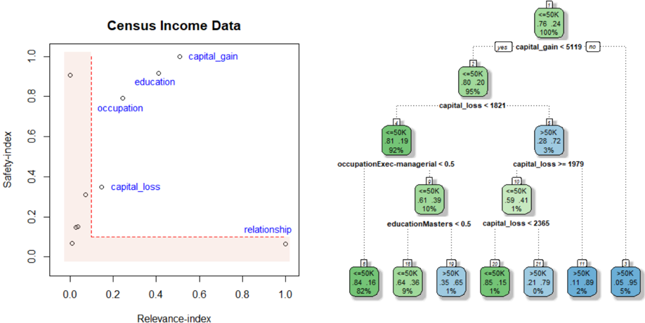
### Visual Description
## Scatter Plot and Decision Tree: Census Income Data Analysis
### Overview
The image contains two primary components:
1. A **scatter plot** titled "Census Income Data" visualizing relationships between safety/relevance indices and categorical factors.
2. A **decision tree** classifying income brackets based on capital gains, losses, occupation, and education.
---
### Components/Axes
#### Scatter Plot
- **Axes**:
- **X-axis**: "Relevance-index" (0.0 to 1.0)
- **Y-axis**: "Safety-index" (0.0 to 1.0)
- **Data Points**:
- Labeled categories: `capital_gain`, `education`, `occupation`, `capital_loss`, `relationship`
- Positions:
- `capital_gain`: (0.9, 0.95)
- `education`: (0.3, 0.85)
- `occupation`: (0.2, 0.75)
- `capital_loss`: (0.1, 0.3)
- `relationship`: (0.95, 0.05)
- **Legend**: Not explicitly labeled, but colors differentiate categories.
#### Decision Tree
- **Root Node**:
- Condition: `capital_gain < 5119`
- Split:
- `yes` (76.24%): Income `<=50K` (76.24%)
- `no` (23.76%): Income `>50K` (23.76%)
- **Branches**:
- **`yes` Path**:
- `capital_loss < 1821` (81.19% `<=50K`, 18.81% `>50K`)
- Splits further by `occupationExec-managerial < 0.5` and `educationMasters < 0.5`.
- **`no` Path**:
- `capital_loss > 1979` (28.72% `<=50K`, 71.28% `>50K`)
- Splits further by `capital_loss > 2365` and `educationMasters < 0.5`.
- **Terminal Nodes**:
- Income brackets (`<=50K` or `>50K`) with percentages (e.g., `>50K` at 95% in one node).
- **Color Coding**:
- Green: `<=50K`
- Blue: `>50K`
- Darker Blue: Subcategories of `>50K`
---
### Detailed Analysis
#### Scatter Plot
- **Trends**:
- Positive correlation between safety/relevance indices and factors like `capital_gain` and `education`.
- `capital_loss` and `relationship` cluster at lower safety/relevance indices.
- **Data Points**:
- `capital_gain` dominates the top-right quadrant (high safety/relevance).
- `relationship` is isolated in the bottom-right (high relevance, low safety).
#### Decision Tree
- **Key Splits**:
- Capital gain thresholds (`<5119` vs. `>5119`) drive initial income classification.
- Subsequent splits by `capital_loss`, `occupation`, and `education` refine income brackets.
- **Income Distribution**:
- `>50K` incomes are concentrated in branches with high capital gains, specific occupations (e.g., Exec-managerial), and advanced education (Masters).
---
### Key Observations
1. **Scatter Plot**:
- `capital_gain` and `education` are strongly associated with high safety/relevance indices.
- `relationship` exhibits an outlier pattern (high relevance but low safety).
2. **Decision Tree**:
- Capital gains above 5119 correlate with >50K incomes in 71.28% of cases.
- Education (Masters) and occupation (Exec-managerial) further stratify income outcomes.
---
### Interpretation
- **Data Implications**:
- The scatter plot highlights that socioeconomic factors (capital gains, education) align with perceived "safety" and "relevance" in income data.
- The decision tree quantifies how these factors interact to determine income brackets. For example:
- Individuals with `capital_gain >5119` and `occupationExec-managerial <0.5` (e.g., managers) with advanced education (`Masters`) have a 95% chance of earning >50K.
- **Anomalies**:
- The `relationship` category’s placement in the scatter plot suggests a potential confounding variable (e.g., social networks influencing income perception).
- **Technical Insight**:
- The decision tree’s hierarchical splits mirror the scatter plot’s clustering, reinforcing the importance of capital gains and education in income stratification.
---
**Note**: All values and labels are transcribed directly from the image. Percentages and thresholds (e.g., `5119`, `1821`) are approximate due to image resolution constraints.
</details>
Relevance-index
Figure 10: Census Income Data. The left plot shows the infogram. And FINEtree is displayed on the right.
- It quantifies the trade-off between fairness and model performance: how much netpredictive value is contained within S (and its close associates)? This is the price we pay in terms of accuracy to ensure a higher degree of fairness.
- A small α -inadmissibility value ensures that individuals with similar 'admissible characteristics' receive a similar outcome. Note that our strategy of comparing individuals with respect to only (infogram-learned) 'admissible' features allows us to avoid the (direct and indirect) influences of sensitive attributes on the decision making.
- Lastly, the α -statistic can also be interpreted as 'bias in response Y .' For a given problem, if we have access to several 'comparable' outcome variables 10 then we choose the one which minimizes the α -inadmissibility measure. In this way, we can minimize the loss of predictive accuracy while mitigating the bias as best as we can.
Remark 13 (Generalizability) . Note that, unlike traditional fairness measures, the proposed ALFA-statistic is valid for multi-class problems with a set of multivariate mixed protected attributes-which is, in itself, a significant step forward.
Step 4
.
FINEtree.
The inherent historical footprints of bias (as noted in eq.
3.7) need
10 e.g, Obermeyer et al. (2019) showed that healthcare cost can be a poor proxy of health, especially for Black patients; similarly, Blattner and Nelson (2021) showed that credit scores could be a poor proxy for creditworthiness especially for low-income and minority groups.
to be deconstructed to build a less-discriminatory classification model for the income data. Fig. 10 shows FINEtree-a simple decision tree based on the four admissible features, which attains 83.5% accuracy.
Remark 14. FINEtree is an inherently explainable, fair, and highly competent (decent accuracy) model whose design was guided by the principles of admissible machine learning.
Step 5 . Trust in algorithm through risk assessment and ALFA-ranking: The current standard for evaluating ML models is primarily based on predictive accuracy on a test set, which is narrow and inadequate. For an algorithm to be deployable it has to be admissible ; an unguided ML carries the danger of inheriting bias from data. To see that, consider the following two models:
Model A : Decision tree based on X A (FINEtree)
Model R : Decision tree based on X A Yt relationship u .
Both models have comparable accuracy around 83 . 5%. Let p Y A and p Y R be the predicted labels based on these two models, respectively. Our goal is to compare and rank different models based on their risk of discrimination using ALFA-statistic:
$$\begin{array} { r l r } { \widehat { \alpha } _ { A } } & = } & { \widehat { M I } ( \widehat { Y } _ { A } , S | X _ { A } ) } & = } & { 0 . 0 0 0 4 2 , w i t h p v a l u e 0 . 9 5 } \end{array}$$
$$\begin{array} { r l r } { \widehat { \alpha } _ { R } } & = } & { \widehat { M I } ( \widehat { Y } _ { R } , S | X _ { A } ) = 0 . 1 9 5 , w i t h p v a l u e a m o s t 0 . } \end{array}$$
α -inadmissibility statistic measures how much the final decision (prediction) was impacted by the protective features. A smaller value is better in the sense that it indicates improved fairness of the algorithm's decision. Eqs (3.9)-(3.10) immediately imply that Model A is better (less discriminatory without being inefficient) than Model R , and can be safely put into production.
Remark 15. Infogram and ALFA-testing can be used (by oversight board or regulators) as a fully-automated exploratory auditing tool that can systematically monitor and discover signs of bias or other potential gaps in compliance 11 ; see Appendix A.3.
Example 9. Taiwanese Credit Card data . This dataset was collected in October 2005, from a Taiwan-based bank (a cash and credit card issuer). It is available in the UCI Machine Learning Repository. We have records of n 30 , 000 cardholders, and for each we have
11 Under the Algorithmic Accountability Act, large AI-driven corporations have to perform broader 'admissibility' tests to keep a check on their algorithms' fairness and trustworthiness; see Appx. A.2.
Figure 11: Left: Infogram of UCI credit card data. It selects two admissible features (i.e., those that are relevant and less-biased) that lie in the complementary of the 'L'-shaped region. Right: The FINEtree (test data accuracy 82%).
<details>
<summary>Image 11 Details</summary>
### Visual Description
## Scatter Plot: UCI Credit Data
### Overview
The image contains a scatter plot titled "UCI Credit Data" with two distinct data series labeled "PAY_0" and "PAY_2". The plot includes a red dashed boundary line and a legend on the right. The x-axis is labeled "Relevance-index" (0–1), and the y-axis is labeled "Safety-index" (0–1). Data points are distributed across the plot, with most clustered in the bottom-left region and a few outliers in the top-right.
---
### Components/Axes
- **X-axis (Relevance-index)**: Ranges from 0 to 1, with no explicit tick marks.
- **Y-axis (Safety-index)**: Ranges from 0 to 1, with no explicit tick marks.
- **Legend**: Located on the right, with two entries:
- **Green**: "PAY_0" (associated with the top-right outlier).
- **Blue**: "PAY_2" (associated with the middle-left cluster).
- **Boundary Line**: A red dashed vertical line at approximately x = 0.2, separating the plot into two regions.
---
### Detailed Analysis
#### Scatter Plot Data Points
- **PAY_0 (Green)**:
- **Top-right outlier**: (x ≈ 0.95, y ≈ 0.95).
- **Cluster**: Multiple points in the bottom-left region (x ≈ 0–0.2, y ≈ 0–0.3).
- **PAY_2 (Blue)**:
- **Cluster**: Points in the middle-left region (x ≈ 0.2–0.3, y ≈ 0.6–0.7).
- **Red Dashed Line**: Acts as a boundary, with most PAY_0 points below it and PAY_2 points above it.
#### Decision Tree (Right Side)
- **Root Node (7)**:
- **Label**: "PAY_0 < 1.5" (split into "yes" and "no").
- **Metrics**: 0 instances, 78.22% (green), 100% (blue).
- **Yes Branch (Node 2)**:
- **Label**: "PAY_2 < 1.5".
- **Metrics**: 0 instances, 83.17% (green), 90% (blue).
- **Sub-branch (Node 5)**:
- **Label**: "PAY_2 < 2.5".
- **Metrics**: 0 instances, 58.42% (green), 8% (blue).
- **No Branch (Node 3)**:
- **Label**: "PAY_2 < -0.5".
- **Metrics**: 1 instance, 30.70% (blue), 10% (green).
- **Sub-branch (Node 7)**:
- **Label**: "PAY_2 < -0.5".
- **Metrics**: 1 instance, 29.71% (blue), 10% (green).
---
### Key Observations
1. **PAY_0 Distribution**:
- Most data points are concentrated in the bottom-left region (low relevance, low safety).
- A single outlier in the top-right (high relevance, high safety) suggests potential anomalies or rare cases.
2. **PAY_2 Distribution**:
- Clustered in the middle-left region (moderate relevance, moderate safety).
- No clear outliers, but the decision tree splits suggest complex relationships.
3. **Decision Tree**:
- Nodes with 0 instances (e.g., Node 2, Node 5) indicate potential overfitting or data sparsity.
- Percentages in nodes (e.g., 83.17%, 58.42%) may represent class distributions or model performance metrics.
---
### Interpretation
- **Data Trends**:
- PAY_0 and PAY_2 exhibit distinct distributions, with PAY_0 showing higher safety but lower relevance (except for the outlier).
- The red dashed boundary likely represents a threshold for separating high-risk (PAY_0) and low-risk (PAY_2) cases.
- **Decision Tree Logic**:
- The tree attempts to classify instances based on PAY_0 and PAY_2 thresholds. However, nodes with 0 instances (e.g., Node 2, Node 5) suggest the model may be overfitting or the data is too sparse for meaningful splits.
- The percentages in nodes (e.g., 83.17%, 58.42%) could reflect class distributions or accuracy metrics, but their exact interpretation requires further context.
- **Anomalies**:
- The PAY_0 outlier in the top-right (x ≈ 0.95, y ≈ 0.95) is a critical data point that may indicate rare but high-risk cases.
- The decision tree's splits (e.g., "PAY_2 < -0.5") may not align with the scatter plot's visual trends, suggesting potential misalignment between the model and data.
---
### Conclusion
The scatter plot and decision tree together highlight the relationship between relevance and safety indices for UCI credit data. While the scatter plot shows clear clustering, the decision tree's splits and metrics require further validation to ensure alignment with the data. The presence of outliers and sparse nodes in the tree suggests areas for further investigation, such as data quality checks or model refinement.
</details>
a response variable Y denoting: default payment status (Yes = 1, No = 0), along with p 23 predictor variables, including demographic factors, credit data, history of payment, etc. Among these 23 features we have two protected attributes: gender and age .
The infogram, shown in the left panel of Fig. 11, clearly selects the variable Pay 0 and Pay 2 as the key admissible factors that determine the likelihood of default. Once we know the admissible features, the next question is: 'how' Pay 0 and Pay 2 are impacting the credit risk? Can we extract an admissible decision rule? For that we construct the FINEtree: a decision tree model based on the infogram-selected admissible features; see Fig. 11. The resulting predictive model is extremely transparent (with shallow yet accurate decision trees 12 ) and also mitigates unwanted bias by avoiding inadmissible variables. Lenders, regulators, and bank managers can use this model for automating credit decisions.
12 One can slightly improve accuracy by combining hundreds or thousands of trees (based on only the admissible features) using random forest or boosting. But the opacity of such models renders them unfit for deployment in financial and bank sectors (Fahner, 2018).
Figure 12: ProPublica's COMPAS Data: Top row: infogram and the estimated FINEtree. Bottom row: The two-sample distribution of the continuous variable end and binary event show their usefulness for predicting whether a defendant will recidivate or not.
<details>
<summary>Image 12 Details</summary>
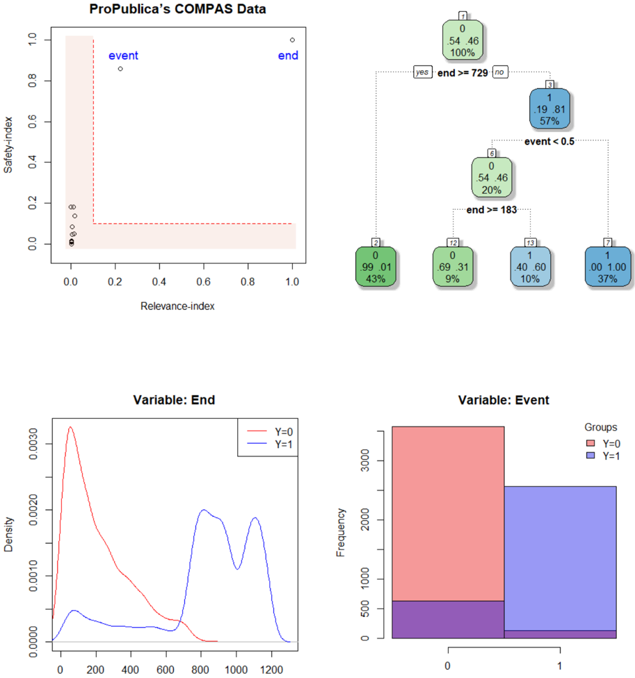
### Visual Description
## Scatter Plot: ProPublica’s COMPAS Data
### Overview
A scatter plot with two labeled points ("event" and "end") plotted on a coordinate system with axes labeled "Relevance-index" (x-axis) and "Safety-index" (y-axis). A pink shaded rectangle spans from (0,0) to (1,1), but the points lie outside this area.
### Components/Axes
- **X-axis**: Relevance-index (0 to 1)
- **Y-axis**: Safety-index (0 to 1)
- **Legend**: Not explicitly labeled, but points are marked with white circles and black dots.
- **Shaded Area**: Pink rectangle covering the lower-left quadrant (0 ≤ x ≤ 1, 0 ≤ y ≤ 1).
### Detailed Analysis
- **Event Point**: White circle at (0.2, 0.85).
- **End Point**: White circle at (0.95, 0.95).
- **Shaded Area**: Covers the lower-left quadrant, but both points are in the upper-right region.
### Key Observations
- The "event" and "end" points are positioned outside the shaded area, suggesting they may represent outliers or anomalies.
- The "end" point is closer to the top-right corner, indicating higher relevance and safety indices.
### Interpretation
The scatter plot highlights two distinct data points ("event" and "end") that deviate from the shaded region, which may represent critical thresholds or anomalies in the COMPAS data. The positioning of these points could indicate specific cases of interest in the dataset.
---
## Decision Tree: ProPublica’s COMPAS Data
### Overview
A decision tree with nodes labeled by values, percentages, and conditions. The tree splits based on "end" and "event" thresholds, with nodes colored green (Y=0) and blue (Y=1).
### Components/Axes
- **Root Node (1)**: 0, 54.46, 100%
- **Splits**:
- **Yes (end >=729)**: Leads to node 2.
- **No (event <0.5)**: Leads to node 3.
- **Leaf Nodes**:
- Node 2: 0, 99.01, 43% (Y=0)
- Node 12: 0, 0.69, 9% (Y=0)
- Node 13: 1, 0.40, 10% (Y=1)
- Node 14: 0, 0.00, 37% (Y=0)
- Node 15: 1, 1.00, 37% (Y=1)
- **Legend**: Green for Y=0, blue for Y=1 (top-right corner).
### Detailed Analysis
- **Root Node**: 100% of data starts here, with 54.46% of cases.
- **First Split**:
- **Yes (end >=729)**: 43% of data (Y=0).
- **No (event <0.5)**: 57% of data splits further.
- **Second Split (event <0.5)**:
- **Y=0 (green)**: 20% of data (node 6).
- **Y=1 (blue)**: 57% of data (node 7).
- **Final Splits**:
- Node 6 splits into Y=0 (9%) and Y=1 (10%).
- Node 7 splits into Y=0 (37%) and Y=1 (37%).
### Key Observations
- The tree prioritizes "end >=729" as a primary split, with 43% of data falling into this category.
- The "event <0.5" split leads to a mix of Y=0 and Y=1 outcomes, with Y=1 dominating in the final nodes.
- The purple bar in the bar chart (bottom-right) for Y=1 (~500) is not reflected in the decision tree, suggesting a potential inconsistency.
### Interpretation
The decision tree demonstrates how the COMPAS data is segmented based on "end" and "event" thresholds. The dominance of Y=1 in later nodes suggests that higher "end" values are more likely to correspond to Y=1, while lower "end" values are split between Y=0 and Y=1. The purple bar in the bar chart may indicate an unaccounted category or error in the data.
---
## Density Plot: Variable: End
### Overview
A density plot showing the distribution of the "End" variable for two groups (Y=0 and Y=1). The x-axis is labeled "Density," and the y-axis is also labeled "Density."
### Components/Axes
- **X-axis**: Density (0 to 1200)
- **Y-axis**: Density (0 to 0.003)
- **Legend**: Red for Y=0, blue for Y=1 (top-right corner).
### Detailed Analysis
- **Y=0 (Red Line)**: Peaks at ~200, with a gradual decline.
- **Y=1 (Blue Line)**: Peaks at ~800 and ~1000, with a secondary peak.
### Key Observations
- Y=0 has a narrower distribution centered around ~200.
- Y=1 has a bimodal distribution, with peaks at ~800 and ~1000.
### Interpretation
The density plot reveals that the "End" variable for Y=1 is more spread out and has higher values compared to Y=0. This suggests that Y=1 cases may involve more extreme or varied outcomes in the "End" variable.
---
## Bar Chart: Variable: Event
### Overview
A bar chart showing the frequency of the "Event" variable for two groups (Y=0 and Y=1). The x-axis is labeled "Groups" (0 and 1), and the y-axis is labeled "Frequency."
### Components/Axes
- **X-axis**: Groups (0 and 1)
- **Y-axis**: Frequency (0 to 3500)
- **Legend**: Red for Y=0, blue for Y=1 (top-right corner).
- **Additional Element**: A purple bar at the bottom for Y=1 (~500).
### Detailed Analysis
- **Y=0 (Red Bar)**: ~3000 frequency.
- **Y=1 (Blue Bar)**: ~2500 frequency.
- **Purple Bar**: ~500 frequency (unlabeled in the legend).
### Key Observations
- Y=0 has a higher frequency of events (~3000) compared to Y=1 (~2500).
- The purple bar for Y=1 (~500) is not explained by the legend, indicating a potential data inconsistency.
### Interpretation
The bar chart shows that Y=0 cases are more frequent in the "Event" variable than Y=1. However, the presence of the purple bar for Y=1 suggests an unaccounted category or error in the data, which may require further investigation.
</details>
## 3.2.4 Admissible Criminal Justice Risk Assessment
Example 10. ProPublica's COMPAS Data . COMPAS-an acronym for Correctional Offender Management Profiling for Alternative Sanctions-is a most widely used commercial algorithm within the criminal justice system for predicting recidivism risk (the likelihood of re-offending). The data 13 -complied by a team of journalists from ProPublica-constitute all criminal defendants who were subject to COMPAS screening in Broward County, Florida, during 2013 and 2014. For each defendant, p 14 features were gathered, including demographic information, criminal history, and other administrative information. Besides, the dataset also contains information on whether the defendant did in fact actually recidivate (or not) within two years of the COMPAS administration date (i.e., through the end of March 2016); and 3 additional sensitive attributes (gender, race, and age) for each case.
The goal is to develop a accurate and fairer algorithm to predict whether a defendant will engage in violent crime or fail to appear in court if released. Fig. 12 shows our results. Infogram selects event and end as the vital admissible features. The bottom row of Fig. 12 confirms their predictive power. Unfortunately, these two variables are not explicitly defined by ProPublica in the data repository. Based on Brennan et al. (2009), we feel that event indicates some kind of crime that resulted in a prison sentence during a past observation period (we suspect the assessments were conducted by local probation officers during some period between January 2001 and December 2004), and the variable end denotes the number of days under observation (first event or end of study, whichever occurred first). The associated FINEtree recidivism algorithm based on event and end reaches 93% accuracy with AUC 0 . 92 on a test set (consist of 20% of the data). Also see Appendix A.5.
## 3.2.5 FINEglm and Application to Marketing Campaign
We are interested in the following question: how does one systematically build fairnessenhancing parametric statistical algorithms, such as a generalized linear model (GLM)?
Example 11. Thera Bank Financial Marketing Campaign . This is a case study about Thera Bank, the majority of whose customers are liability customers (depositors) with varying sizes of deposits-and among them, very few are borrowers (asset customers). The bank wants to expand its client network to bring more loan business and in the process, earn more through the interest on loans. To test the viability of this business idea they ran a small marketing campaign with n 5000 customers where a 480 (= 9.6%) accepted the personal loan offer. Motivated by the healthy conversion rate, the marketing department wants to devise a much more targeted digital campaign to boost loan applications with a minimal budget.
13 Data: https://github.com/propublica/compas-analysis/raw/master/compas-scores-two-years.csv
Figure 13: Thera Bank marketing campaign data. Left: infogram. Right: scatter plot based on the two admissible features; the color blue and red indicate two different classes.
<details>
<summary>Image 13 Details</summary>
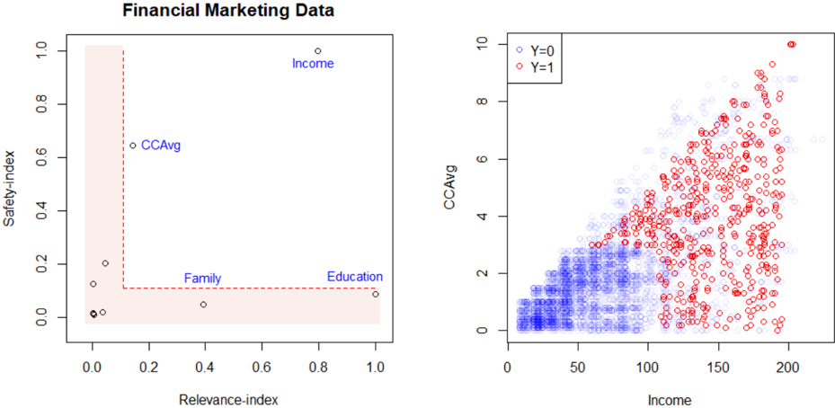
### Visual Description
## Scatter Plots: Financial Marketing Data and CCAvg vs Income
### Overview
The image contains two scatter plots. The left plot ("Financial Marketing Data") maps safety and relevance indices for four categories, while the right plot ("CCAvg vs Income") visualizes the relationship between CCAvg and Income, differentiated by a binary variable (Y=0/1). Both plots use Cartesian coordinates with distinct data point distributions.
---
### Components/Axes
#### Left Plot ("Financial Marketing Data")
- **X-axis**: Relevance-index (0.0 to 1.0)
- **Y-axis**: Safety-index (0.0 to 1.0)
- **Data Points**:
- **Income**: (0.9, 1.0) – Top-right corner
- **CCAvg**: (0.1, 0.6) – Mid-left
- **Family**: (0.3, 0.1) – Lower-middle
- **Education**: (0.9, 0.1) – Lower-right
- **Shaded Area**: Pink rectangle spanning (0,0) to (1,1), likely representing a target or acceptable range for both indices.
#### Right Plot ("CCAvg vs Income")
- **X-axis**: Income (0 to 200)
- **Y-axis**: CCAvg (0 to 10)
- **Legend**:
- **Blue**: Y=0 (lower-left cluster)
- **Red**: Y=1 (upper-right spread)
- **Data Distribution**:
- **Y=0 (Blue)**: Concentrated near (0–50, 0–2)
- **Y=1 (Red)**: Spread from (50–200, 2–10), with a single outlier at (200, 10).
---
### Detailed Analysis
#### Left Plot
- **Trends**:
- "Income" dominates the top-right quadrant, suggesting high relevance and safety.
- "CCAvg" is moderately relevant (0.1) but relatively safe (0.6).
- "Family" and "Education" cluster near the bottom, with "Education" having higher relevance (0.9) but low safety (0.1).
- **Shaded Area**: All data points lie within the shaded region, implying no outliers beyond the defined safety/relevance thresholds.
#### Right Plot
- **Trends**:
- **Y=0 (Blue)**: Dense cluster in the lower-left, indicating low CCAvg and Income.
- **Y=1 (Red)**: Points trend upward and rightward, showing a positive correlation between CCAvg and Income. The outlier at (200, 10) represents the maximum observed values.
- **Color Consistency**: All red points (Y=1) align with higher CCAvg and Income, confirming the legend’s accuracy.
---
### Key Observations
1. **Left Plot**:
- "Income" is the most relevant and safest category.
- "Education" has high relevance but low safety, potentially indicating risk despite importance.
- No data points exceed the shaded safety/relevance bounds.
2. **Right Plot**:
- **Y=1 (Red)** dominates higher CCAvg and Income ranges, suggesting a binary classification (e.g., high-risk vs. low-risk).
- The outlier at (200, 10) may represent an extreme case requiring further investigation.
---
### Interpretation
1. **Left Plot**:
- The data suggests a trade-off between relevance and safety. For example, "Education" is highly relevant but unsafe, while "Income" balances both.
- The shaded area might represent a strategic target for optimizing financial marketing efforts.
2. **Right Plot**:
- **Y=1 (Red)** likely represents a critical threshold (e.g., high-risk customers) with elevated CCAvg and Income. This could inform targeted interventions.
- The positive correlation between CCAvg and Income implies that higher financial metrics are associated with increased risk (Y=1), warranting further analysis of causal factors.
3. **Cross-Plot Insights**:
- The "Income" category in the left plot aligns with the high CCAvg/Income cluster (Y=1) in the right plot, reinforcing its significance in financial risk modeling.
- The "CCAvg" category (left plot) corresponds to mid-range values in the right plot, suggesting moderate risk.
---
### Conclusion
The plots collectively highlight the interplay between financial metrics (CCAvg, Income) and categorical factors (Family, Education, CCAvg). The right plot’s binary classification (Y=0/1) provides actionable insights for risk stratification, while the left plot contextualizes the safety/relevance of key financial categories. The outlier at (200, 10) warrants deeper scrutiny to validate data integrity or identify unique cases.
</details>
Data and the problem . For each of 5000 customers, we have binary response Y : customer response to the last personal loan campaign, and 12 other features like customer's annual income, family size, education level, value of house mortgage if any, etc. Among these 12 variables, there are two protected features: age and zip code . We consider zip code as a sensitive attribute, since it often acts as a proxy for race.
Based on this data, we want to devise an automatic and fair digital marketing campaign that will maximize the targeting effectiveness of the advertising campaign while minimizing the discriminatory impact on protected classes to avoid legal landmines.
Customer targeting using admissible machine learning . Our approach is summarized below:
Step 1 . Graphical tool for algorithmic risk management. Fig. 13 shows the infogram, which identifies two admissible features for loan decision: Income (annual income in $ 000), and CCAvg (Avg. spending on credit cards per month). However, the two highly predictive variables education (education level: undergraduate, graduate, or advanced) and family (family size of the customer) turn out to be inadmissible, even though they look completely 'reasonable' on the surface. Consequently, including these variables in a model can do more harm than good by discriminating against minority applicants.
Remark 16. It is evident that infogram can be used as an algorithmic risk management tool to quickly identify and combat unwanted hidden bias. Financial regulators can use infogram to quickly spot and remediate issues of historic discrimination; see Appendix A.3.
Remark 17. Infogram runs a 'combing operation' to distill down a large, complex problem to its core that holds the bulk of the 'admissible information.' In our problem, the useful information is mostly concentrated into two variables-Income and CCAvg, as seen in the scatter diagram.
Step 2 . FINE-Logistic model: We train a logistic regression model based on the two admissible features, leading to the following model:
$$\log i t \left \{ \mu ( x ) \right \} = - 6 . 1 3 + . 0 4 \, I n c o m e + . 0 6 \, C A v g ,$$
where µ p x q Pr p Y 1 | X x q . This simple model achieves 91% accuracy. It provides a clear understanding of the 'core' factors that are driving the model's recommendation.
Remark 18 (Trustworthy algorithmic decision-making) . FINEml models provide a transparent and self-explainable algorithmic decision-making system that comes with protection against unfair discrimination-which is essential for earning the trust and confidence of customers. The financial services industry can immensely benefit from this tool.
Step 3 . FINElasso . One natural question would be, How can we extend this idea to highdimensional glm models? In particular, we are interested in the following question: Is there any way we can directly embed 'admissibility' into the lasso regression model? The key idea is as follows: use adaptive regularization by choosing the weights to be the inverse of safety-indices, as computed in formula (3.6) of definition 4. Estimate FINElasso model by solving the following adaptive version:
$$\hat { \beta } _ { F I N E } = \arg \min _ { \beta } \sum _ { i = 1 } ^ { n } \left [ - y _ { i } ( x _ { i } ^ { T } \beta ) + \log \left ( 1 + e ^ { x _ { i } ^ { T } \beta } \right ) \right ] \, - \, \lambda \sum _ { j = 1 } ^ { p } w _ { j } \left | \beta _ { j } \right | ,$$
where the weights are defined as
$$w _ { j } ^ { - 1 } \, = M I \left ( Y , X _ { j } | \{ S _ { 1 } , \dots , S _ { q } \} \right ) .$$
The adaptive penalization in (3.12) acts as a bias-mitigation mechanism by dropping (that is, heavily penalizing) the variables with very low safety-indices. This whole procedure can be easily implemented using the penalty.factor argument of glmnet R-package (Friedman et al., 2010). No doubt a similar strategy can be adopted for other regularized methods such as ridge or elastic-net. For an excellent review on different kinds of regularization procedures, see Hastie (2020).
Remark 19. Afull lasso on X selects the strong surrogates (variables family and education ) as some of the top features due to their high predictive power, and hence carries enhanced risk of being discriminatory. On the other hand, an infogram-guided FINElasso provides an automatic defense mechanism for combating bias without significantly compromising accuracy.
Remark 20 (Towards A Systematic Recipe) . This idea of data-adaptive 're-weighting' as a bias mitigation strategy, can be easily translated to other types of machine learning models. For example, to incorporate fairness into the traditional random forest method, choose splitting variables at each node by performing weighted random sampling. The selection probability is determined by
$$P r ( s e l e c t i n g v a r i a b l e X _ { j } ) \, = \, \frac { F _ { j } } { \sum _ { j } F _ { j } } ,$$
where the F-values F j is defined in equation (3.6). This can be easily operationalized using the mtry.select.prob argument of the randomForest() function in iRF R-package. Following this line of thought, one can (re)design a variety of less-discriminatory ML techniques without changing a single architecture of the original algorithms.
## 4 Conclusion
Faced with the profound changes that AI technologies can produce, pressure for 'more' and 'tougher' regulation is probably inevitable. (Stone et al., 2019).
Over the last 60 years or so-since the early 1960s-there's been an explosion of powerful ML algorithms with increasing predictive performance. However, the challenge for the next few decades will be to develop sound theoretical principles and computational mechanisms that transform those conventional ML methods into more safe, reliable, and trustworthy ones.
The fact of the matter is that doing machine learning in a 'responsible' way is much harder than developing another complex ML technique. A highly accurate algorithm that does not comply with regulations is (or will soon be) unfit for deployment, especially in safetycritical areas that directly affect human lives. For example, the Algorithmic Accountability Act 14 (see Appx. A.2) introduced in April 2019 requires large corporations (including tech companies, as well as banks, insurance, retailers, and many other consumer businesses) to be
14 Also see, EU's 'Artificial Intelligence Act' released on April 21, 2021, whose key points are summarized in Appendix A.8.
cognizant of the potential for biased decision-making due to algorithmic methods; otherwise, civil lawsuits can be filed against those firms. As a result, it is becoming necessary to develop tools and methods that can provide ways to enhance interpretability and efficiency of classical ML models while guarding against bias. With this goal in mind, this paper introduces a new kind of statistical learning technology and information-theoretic automated monitoring tools that can guide a modeler to quickly build 'better' algorithms that are lessbiased, more-interpretable, and sufficiently accurate.
One thing is clear: rather than being passive recipients of complex automated ML technologies, we need more general-purpose statistical risk management tools for algorithmic accountability and oversight. This is critical to the responsible adoption of regulatorycompliant AI-systems. This paper has taken some important steps towards this goal by introducing the concepts and principles of 'Admissible Machine Learning.'
## Acknowledgement
The author thanks the editor, associate editor, and four anonymous reviewers for their helpful suggestions. I would like to specially thank Erin LeDell for bringing this problem to my attention. The author was benefited from many useful discussions with Michael Guerzhoy, Hany Farid, Julia Dressel, Beau Coker, and Hanchen Wang on demystifying some aspects of COMPASS data; Daniel Osei on the data pre-processing steps of Lending Club loan data. This research was supported by H2O.ai .
## References
- Allen, B., S. Agarwal, L. Coombs, C. Wald, and K. Dreyer (2021). 2020 ACR Data Science Institute Artificial Intelligence Survey. Journal of the American College of Radiology .
- Berrett, T. B., Y. Wang, R. F. Barber, and R. J. Samworth (2019). The conditional permutation test for independence while controlling for confounders. Journal of the Royal Statistical Society: Series B (Statistical Methodology) .
- Blattner, L. and S. Nelson (2021). How costly is noise? Data and disparities in consumer credit. arXiv preprint:2105.07554 .
- Breiman, L. et al. (2004). Population theory for boosting ensembles. The Annals of Statistics 32 (1), 1-11.
- Brennan, T., W. Dieterich, and B. Ehret (2009). Evaluating the predictive validity of the compas risk and needs assessment system. Criminal Justice and Behavior 36 (1), 21-40.
- Candes, E., Y. Fan, L. Janson, and J. Lv (2018). Panning for gold: 'model-x' knockoffs for high dimensional controlled variable selection. Journal of the Royal Statistical Society: Series B (Statistical Methodology) 80 (3), 551-577.
- Chouldechova, A. and A. Roth (2020). A snapshot of the frontiers of fairness in machine learning. Communications of the ACM 63 (5), 82-89.
- Fahner, G. (2018). Developing transparent credit risk scorecards more effectively: An explainable artificial intelligence approach. Data Anal 2018 , 17.
- Friedman, J., T. Hastie, and R. Tibshirani (2010). Regularization paths for generalized linear models via coordinate descent. Journal of statistical software 33 (1), 1.
- Friedman, J. H. (2001). Greedy function approximation: a gradient boosting machine. Annals of statistics , 1189-1232.
- Hastie, T. (2020). Ridge regularization: An essential concept in data science. Technometrics 62 (4), 426-433.
- Hastie, T., R. Tibshirani, and M. Wainwright (2015). Statistical learning with sparsity: the lasso and generalizations . CRC press.
- Hellman, D. (2020). Measuring algorithmic fairness. Va. L. Rev. 106 , 811.
- Kleinberg, J. (2018). Inherent trade-offs in algorithmic fairness. In Abstracts of the 2018 ACM International Conference on Measurement and Modeling of Computer Systems , pp. 40-40.
- Lakkaraju, H. and O. Bastani (2020). 'How do I fool you?' manipulating user trust via misleading black box explanations. In Proceedings of the AAAI/ACM Conference on AI, Ethics, and Society , pp. 79-85.
- Mukhopadhyay, S. and K. Wang (2020). Breiman's 'Two Cultures' revisited and reconciled. arXiv:2005.13596 , 1-51.
- Narayanan, A. (2018). Translation tutorial: 21 fairness definitions and their politics. In Proc. Conf. Fairness Accountability Transp., New York, USA , Volume 1170.
- Obermeyer, Z., B. Powers, C. Vogeli, and S. Mullainathan (2019). Dissecting racial bias in an algorithm used to manage the health of populations. Science 366 (6464), 447-453.
- Reardon, S. (2019). Rise of robot radiologists. Nature 576 (7787), S54.
- Rosenbaum, P. R. (1984). Conditional permutation tests and the propensity score in observational studies. Journal of the American Statistical Association 79 (387), 565-574.
- Stone, P., R. Brooks, E. Brynjolfsson, et al. (2019). One hundred year study on artificial intelligence. Stanford University; https://ai100.stanford.edu .
- Thrun, S. B., J. Bala, E. Bloedorn, I. Bratko, B. Cestnik, J. Cheng, K. De Jong, S. Dzeroski, S. E. Fahlman, D. Fisher, et al. (1991). The monk's problems a performance comparison of different learning algorithms.
- Wall, L. D. (2018). Some financial regulatory implications of artificial intelligence. Journal of Economics and Business 100 , 55-63.
- Wyner, A. D. (1978). A definition of conditional mutual information for arbitrary ensembles. Information and Control 38 (1), 51-59.
- Yeh, I.-C. and C.-h. Lien (2009). The comparisons of data mining techniques for the predictive accuracy of probability of default of credit card clients. Expert Systems with Applications 36 (2), 2473-2480.
- Zech, J. R., M. A. Badgeley, M. Liu, A. B. Costa, J. J. Titano, and E. K. Oermann (2018). Variable generalization performance of a deep learning model to detect pneumonia in chest radiographs: a cross-sectional study. PLoS medicine 15 (11), e1002683.
- Zhang, T. (2004). Statistical behavior and consistency of classification methods based on convex risk minimization. Annals of Statistics , 56-85.
## 5 Appendix
## A.1 Proof of Theorem 1
The conditional entropy H p Y | X , S q can be expressed as
$$H ( Y \, | \, X , S ) \ = \ & \ \iint H ( Y \, | \, X = x , S = s ) \, d F _ { x , s } \\ \ = \ & \ \iint \left \{ \ - \ \int _ { y } f _ { Y | X , S } ( y , x | S ) \log \left ( f _ { Y | X , S } ( y , x | S ) \right ) \, d y \right \} \, d F _ { x , s } \\ \ = \ & \ - \iint \log \left ( f _ { Y | X , S } ( y , x | S ) \right ) \, d F _ { x , s , y } .$$
Similarly,
$$\begin{array} { r l } { H ( Y | S ) } & { = } & { \int _ { s } H ( Y | S = s ) \, d F _ { s } } \\ & { = } & { \int _ { s } \left \{ - \int _ { y } f _ { Y | S } ( y | s ) \log \left ( f _ { Y | S } ( y | s ) \right ) \, d y \right \} \, d F _ { s } } \\ & { = } & { - \iint _ { x , s , y } \log \left ( f _ { Y | S } ( y | s ) \right ) \, d F _ { x , s , y } . } \end{array}$$
Take the difference H p Y | S q H p Y | X , S q by substituting (6.2) and (6.1) to complete the proof.
## A.2 The Algorithmic Accountability Act
This bill 15 was introduced by Senators Cory Booker (D-NJ) and Ron Wyden (D-OR) in the Senate and Rep. Yvette Clarke (D-N.Y.) in the House on April, 2019. It requires large companies to conduct automated decision system impact assessments of their algorithms. Entities that develop, acquire, and/or utilize AI must be cognizant of the potential for biased decision-making and outcomes resulting from its use, otherwise civil lawsuits can be filed against those firms. Interestingly, on Jan. 13, 2020, the Office of Management and Budget released a draft memorandum 16 to make sure the federal government doesn't over-regulate industry's AI to the extent that it hampers innovation and development.
15 https://www.congress.gov/bill/116th-congress/house-bill/2231/all-info
16 The draft memo is available at:whitehouse.gov/wp-content/uploads/2020/01/Draft-OMB-Memoon-Regulation-of-AI-1-7-19.pdf
## A.3 Fair Housing Act's Disparate Impact Standard
Detecting inadmissible (proxy) variables can be used as a first defense against algorithmic bias. Consider the Fair Housing Act's Disparate Impact Standard 17 (U.S. Aug. 19, 2019)according to § 100.500 (c)(2)(i) of the Act, a defendant can rebut a claim of discrimination by showing that 'none of the factors used in the algorithm rely in any material part on factors which are substitutes or close proxies for protected classes under the Fair Housing Act.' Therefore regulators, judges, and model developers can use infogram as a statistical diagnostic tool to keep a check on the algorithmic disparity of automated decision systems.
## A.4 Beware of The 'Spurious Bias' Problem
Using a real data example, here we alert practitioners some of the flaws of current fairness criteria and discuss their remedies. Consider the admission data shown in Table 1. We are interested to know: is there a gender bias in the admission process?
Marginal analysis: the overall acceptance rate in two departments for female applicants is 37%, whereas for male applicants it is roughly 50%. The disparity can be quantified using the adverse impact ratio (AIR), also known as disparate impact:
$$A I R ( Y , G ) = { \frac { P r ( Y = 1 | G = f e m a l e ) } { P r ( Y = 1 | G = m a l e ) } } = { \frac { . 3 7 } { . 5 0 } } = 0 . 7 4 < 0 . 8 0$$
The conventional '80% rule' 18 indicates that the admission process is biased.
The bias-reversal phenomena: admission chances within Department I: Male 63% (male), and female 68%; within Department II: Male 33%, and female F 35%. Thus, when we investigate the admissions by department, the discrimination against women vanishes; in fact, the bias gets reversed (in the favor of women)!
Department-specific 'subgroup' analysis: Here we investigate the adverse impact ratio (AIR) within each department.
For Dept I (no bias):
$$A I R ( Y , G | D = I ) \, = \, { \frac { P r ( Y = 1 | G = m a l e ) } { P r ( Y = 1 | G = f e m a l e ) } } \, = \, . 6 3 / . 6 8 = 0 . 9 2 \, > \, 0 . 8 0 . \quad ( 6 . 4 )$$
17 https://www.govinfo.gov/content/pkg/FR-2019-08-19/pdf/2019-17542.pdf
18 The US Equal Employment Opportunity Commission states that fair employment should abide the 80% rule: the acceptance rate for any group should be no less than 80% of that of the highest-accepted group.
Table 1: Admission data classified by gender and departments. This is actually a part of the 1973 UC Berkeley graduate admission data; here, for simplicity, we have taken the data of Departments B and D.
| Dept (D) | Gender (G) | Admitted ( y 1) | Rejected ( y 0) |
|------------|--------------|-----------------------------|-----------------------------|
| I | Male | 353 | 207 |
| I | Female | 17 | 8 |
| II | Male | 138 | 279 |
| II | Female | 131 | 244 |
For Dept II (no bias):
$$A I R ( Y , G \, | \, D = I I ) \ = \ \frac { \Pr ( Y = 1 \, | \, G = m a l e ) } { \Pr ( Y = 1 \, | \, G = f e n a l e ) } \ = \ . 3 3 / . 3 5 = 0 . 9 4 \, > \, 0 . 8 0 .$$
Eqs. (6.3)-(6.5) present us with a paradoxical situation. What will be our final conclusion on the fairness of the admission process? How to resolve it in a principled way?
A resolution: Compute a measure of overall (university-wide) discrimination by ALFAstatistic (see definition 5 for more details):
$$\alpha _ { Y } \colon = M I ( Y , G | D ) \ = \ \sum _ { d = 0 } ^ { 1 } P r ( D = d ) \, M I ( Y , G | D = d ) ,$$
where α -inadmissibility statistic measures the discrimination (how predictive the admission variable Y is based on gender G ) in a particular department's admission. Applying the formula (2.6) we get
$$\widehat { \alpha } _ { Y } = \widehat { M I } ( Y , G | D ) = 0 . 0 0 0 2 8 5 , w i t h p - v a l u e \colon 0 . 7 1 5 .$$
This suggests Y K K G | D , i.e., the gender contains no additional predictive information for admission beyond what is already captured by the department variable. The apparent gender bias can be 'explained away' by the choice of the department. Graphically, this can be represented as a Markov chain:
<details>
<summary>Image 14 Details</summary>
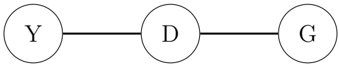
### Visual Description
## Diagram: Linear Flow Diagram with Three Nodes
### Overview
The image depicts a simple linear flow diagram consisting of three interconnected nodes labeled **Y**, **D**, and **G**. The nodes are represented as circles, and the connections between them are straight lines. There are no additional annotations, legends, or numerical data present.
### Components/Axes
- **Nodes**:
- **Y**: Leftmost circle, labeled with the uppercase letter "Y".
- **D**: Central circle, labeled with the uppercase letter "D".
- **G**: Rightmost circle, labeled with the uppercase letter "G".
- **Connections**:
- A straight line connects **Y** to **D**.
- A straight line connects **D** to **G**.
- **No legends, axes, or scales** are visible.
### Detailed Analysis
- **Textual Labels**:
- All labels are uppercase English letters: **Y**, **D**, **G**.
- No numerical values, units, or additional annotations are present.
- **Spatial Relationships**:
- Nodes are evenly spaced horizontally.
- Lines are straight and unidirectional, suggesting a sequential flow from **Y** → **D** → **G**.
### Key Observations
1. The diagram represents a linear sequence or process flow.
2. The absence of additional elements (e.g., arrows, colors, or labels) implies a minimalist design focused on node connectivity.
3. No outliers or anomalies are present due to the simplicity of the diagram.
### Interpretation
This diagram likely represents a conceptual or abstract process where:
- **Y** initiates a flow or action.
- **D** acts as an intermediate step or decision point.
- **G** represents the final outcome or endpoint.
The lack of directional arrows or additional context suggests the flow is assumed to be unidirectional and sequential. The simplicity of the diagram emphasizes the relationship between the three nodes without introducing complexity.
**Note**: The image contains no numerical data, trends, or contextual information beyond the labels and connections. Any interpretation relies on the structural arrangement of the nodes and lines.
</details>
Note that there is no direct link between the gender (G) and admission (Y). Conclusion: there is no evidence of any direct sex-discrimination in the admission process.
Improved AIR measure: one can generalize the (marginal) adverse impact ratio (6.3) to the following conditional one (which is similar in spirit to eq. (6.6)):
$$\text {CAIR} ( Y , G | D ) \ = \ \int A I R ( Y , G | D = d ) \, d F _ { D } ,$$
which, in this case, can be decomposed as
$$C A I R ( Y , G | D ) = \Pr ( D = I ) A I R ( Y , G | D = I ) + \Pr ( D = I ) A I R ( Y , G | D = I ) .$$
Applying (6.8) for our Berkeley example data yields the following estimate:
$$\widehat { C A I R } ( Y , G | D ) \ = \ 0 . 4 3 \times 0 . 9 2 + 0 . 5 7 \times 0 . 9 4 \\ \ = \ 0 . 9 3 \ > \ 0 . 8 0 .$$
This shows no evidence of sex bias in graduate admissions! The moral is: beware of spurious bias, and be aware of two types of errors that might occur due to an incorrect fairness-metric: falsely rejecting a fair algorithm as unfair (Type-I fairness error), and falsely accepting an unfair algorithm as fair (Type-II fairness error).
## A.5 Revisiting COMPAS Data
There is another version of the COMPAS data 19 (binarized features) that researchers have used for evaluating the accuracy of their algorithms. This dataset contains a list of handpicked p 22 features over n 10 , 747 criminal records. Goal is to build an interpretable and accurate recidivism prediction model. Infogram-selected COREtree is displayed below.
10-fold cross-validation shows p 72 1 . 50 q % classification accuracy of our model, which is close to the best known performance on this version of the COMPAS data.
## A.6 Two Cultures of Machine Learning
Black-box ML culture: it builds large complex models, keeping solely the predictive accuracy in mind. White-box ML culture: it directly builds interpretable models, often by enforcing domain-knowledge-based constraints on traditional ML algorithms like decision tree or neural net. Orthodox 'black-or-white thinkers' of each camp have been at loggerheads for some time. This raises the question: is there any way to get the best of both worlds? If so, how?
19 https://raw.githubusercontent.com/Jimmy-Lin/TreeBenchmark/master/datasets/compas/data.csv
Figure 14: Infogram-selected COREtree.
<details>
<summary>Image 15 Details</summary>
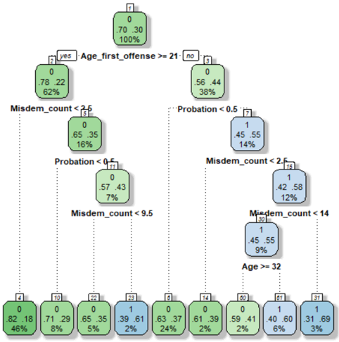
### Visual Description
## Decision Tree Diagram: Classification of Offenses Based on Age and Misdemeanor Count
### Overview
The image depicts a decision tree used for classifying individuals based on age and misdemeanor count. The tree splits data into branches using conditions like "Age_first_offense >= 21" and "Misdemeanor_count < 2.5", with nodes labeled with percentages and classifications. Green nodes represent one classification (likely "No Probation"), while blue nodes represent another (likely "Probation"). The tree includes numerical values, conditions, and spatial relationships between nodes.
---
### Components/Axes
- **Nodes**: Labeled with numbers (e.g., 1, 2, 3) and percentages (e.g., 70.30%, 65.35%).
- **Branches**: Labeled with conditions (e.g., "Age_first_offense >= 21", "Misdemeanor_count < 2.5").
- **Colors**:
- **Green**: Likely represents "No Probation" (e.g., nodes 1, 2, 3, 4, 5, 6, 7, 8, 9, 10, 11, 12, 13, 14, 15, 16, 17, 18, 19, 20, 21, 22, 23, 24, 25, 26, 27, 28, 29, 30, 31, 32).
- **Blue**: Likely represents "Probation" (e.g., nodes 7, 8, 9, 10, 11, 12, 13, 14, 15, 16, 17, 18, 19, 20, 21, 22, 23, 24, 25, 26, 27, 28, 29, 30, 31, 32).
- **Legend**: Not explicitly shown, but colors are inferred from node classifications.
---
### Detailed Analysis
#### Root Node (Node 1)
- **Condition**: Root (no condition).
- **Percentages**: 70.30% (green), 100% (blue).
*Note: The 100% may indicate the total population, while 70.30% represents the proportion in the left branch.*
#### First Split: Age_first_offense >= 21
- **Yes Branch (Node 2)**:
- **Condition**: Age_first_offense >= 21.
- **Percentages**: 78.22% (green), 62% (blue).
- **No Branch (Node 3)**:
- **Condition**: Age_first_offense < 21.
- **Percentages**: 56.44% (blue), 38% (green).
#### Second Split: Misdemeanor_count < 2.5
- **Yes Branch (Node 4)**:
- **Condition**: Misdemeanor_count < 2.5.
- **Percentages**: 65.35% (green), 16% (blue).
- **No Branch (Node 5)**:
- **Condition**: Misdemeanor_count >= 2.5.
- **Percentages**: 57.43% (green), 7% (blue).
#### Third Split: Probation < 0.5
- **Yes Branch (Node 6)**:
- **Condition**: Probation < 0.5.
- **Percentages**: 0% (green), 77% (blue).
- **No Branch (Node 7)**:
- **Condition**: Probation >= 0.5.
- **Percentages**: 45.55% (blue), 14% (green).
#### Fourth Split: Misdemeanor_count < 2.5 (again)
- **Yes Branch (Node 8)**:
- **Condition**: Misdemeanor_count < 2.5.
- **Percentages**: 45.55% (blue), 14% (green).
- **No Branch (Node 9)**:
- **Condition**: Misdemeanor_count >= 2.5.
- **Percentages**: 1% (blue), 9% (green).
#### Final Split: Age >= 32
- **Yes Branch (Node 10)**:
- **Condition**: Age >= 32.
- **Percentages**: 1% (blue), 9% (green).
- **No Branch (Node 11)**:
- **Condition**: Age < 32.
- **Percentages**: 31.69% (blue), 3% (green).
---
### Key Observations
1. **Age and Misdemeanor Count Correlation**:
- Individuals aged ≥21 with <2.5 misdemeanors (Node 4) have a high green percentage (65.35%), suggesting lower probation likelihood.
- Younger individuals (<21) with ≥2.5 misdemeanors (Node 5) show a higher blue percentage (57.43%), indicating higher probation likelihood.
2. **Probation Threshold**:
- Probation <0.5 (Node 6) has 0% green, implying no cases in this category meet the "No Probation" criteria.
- Probation >=0.5 (Node 7) splits into two sub-nodes, with Node 8 (Misdemeanor_count <2.5) showing 45.55% blue (probation) and 14% green (no probation).
3. **Age >=32**:
- Only 1% of cases in this group are classified as probation (blue), while 9% are not (green), suggesting older individuals are less likely to be on probation.
4. **Inconsistent Percentages**:
- The root node shows 70.30% and 100%, which may indicate a formatting error. The 100% likely represents the total population, while 70.30% is the proportion in the left branch (Age_first_offense >=21).
---
### Interpretation
- **Decision Logic**: The tree prioritizes age and misdemeanor count to determine probation status. Younger individuals with more misdemeanors are more likely to be on probation.
- **Outliers**: The root node's 100% label is ambiguous and may require clarification. The 0% green in Node 6 suggests no cases in that branch meet the "No Probation" criteria.
- **Trends**:
- Higher misdemeanor counts correlate with increased probation likelihood.
- Older age (≥32) correlates with lower probation likelihood.
- **Implications**: The model emphasizes age and misdemeanor count as key predictors of probation status, with younger, higher-risk individuals more likely to be classified as probationers.
---
### Spatial Grounding
- **Root Node (1)**: Top-center.
- **Branches**: Split left (Yes) and right (No) from the root.
- **Leaf Nodes**: Positioned at the bottom (e.g., Node 11 at bottom-right).
---
### Content Details
- **Textual Labels**:
- Conditions: "Age_first_offense >= 21", "Misdemeanor_count < 2.5", "Probation < 0.5", "Age >= 32".
- Percentages: 70.30%, 65.35%, 57.43%, 45.55%, 1%, 31.69%, etc.
- **Node Numbers**: 1–32, with green/blue color coding.
---
### Final Notes
The diagram uses a hierarchical structure to classify individuals based on age and misdemeanor count. While the root node's 100% label is ambiguous, the tree effectively demonstrates how these variables interact to predict probation status. Further validation of the data source and formatting is recommended to resolve inconsistencies.
</details>
An Integrated (third?) culture : In this paper, we have taken the middle path between two extremes. We leverage (instead of boycotting) the power (scalability and flexibility) of modern machine learning methods by viewing them as a heavy-duty 'toolkit' that can efficiently drill through big complex datasets to systematically search for the hidden admissible models.
## A.7 COREtree: Iris Data
The dataset includes three kinds of iris flowers (setosa, versicolor, or virginica) with 50 samples from each class. The task is to develop a model (preferably a compact model based on only important features) to accurately classify iris flowers based on their sepals and petals' length and width ( p 4). Before we start our analysis, it is important to be aware of the highly-correlated nature of the 4-features; the estimated 4 4 correlation matrix is displayed below:
$$\hat { \Sigma } _ { \rho } \ = \ & \begin{bmatrix} 1 . 0 0 0 & - 0 . 1 1 8 & 0 . 8 7 2 & 0 . 8 1 8 \\ - 0 . 1 1 8 & 1 . 0 0 0 & - 0 . 4 2 8 & - 0 . 3 6 6 \end{bmatrix}$$
The infogram for the iris data, constructed using the recipe given in section 3.1, is shown at the top-left corner of Fig. 15, which clearly identifies petal.length and petal.width as
the core relevant features. Since we have reduced the problem to a bivariate one (variables: petal.length and petal.width ), we can now simply plot the data. This is done in the top-right of Fig. 15. We can even visually draw the linear decision surfaces to separate the three classes; see the red and blue lines in the scatter plot. Finally, we train a decision tree classifier based on the selected core features: petal.length and petal.width . The estimated COREtree is shown in the bottom panel, which gives a beautifully crisp (readily interpretable) decision rule for classifying iris flowers.
## A.8 EU's Artificial Intelligence Act
On 21st April 2021, the European Union (EU) unveiled strict regulations 20 to govern highrisk AI systems, which provides one of the first formal and comprehensive regulatory frameworks on AI. Few key takeaways from the report:
A risk management system shall be established, implemented, documented and maintained in relation to high-risk AI systems.
In identifying the most appropriate risk management measures, the following shall be ensured: elimination or reduction of risks as far as possible through adequate design and development.
Bias monitoring, detection, and correction mechanism should be at place for high-risk AI systems in the pre-as well as the post-deployment stages.
High-risk AI systems shall be designed and developed in such a way to ensure that their operation is sufficiently transparent to enable users to interpret the system's output and use it appropriately.
High-risk AI systems should equip with appropriate human-machine interface toolswhich allows the system to be effectively overseen by natural persons during the period in which the AI system is in use.
High-risk AI technology providers shall ensure that their systems undergo regulatory compliant assessments. If the AI system is not in conformity with the requirements, they need to take the necessary corrective actions before putting them into service. Companies that fail to do so could face fines of up to 6% of their global sales.
20 The full report is available online at https://bit.ly/EUAI act. Also see the New York Times article https://www.nytimes.com/2021/04/16/business/artificial-intelligence-regulation.html
Figure 15: Iris data analysis. Top left: infogram; top right: the scatter plot of the data based on the selected core features; three different classes are indicated by red, green, and blue colors; bottom: the estimated decision tree classifier using the variables petal-length and petal-width.
<details>
<summary>Image 16 Details</summary>
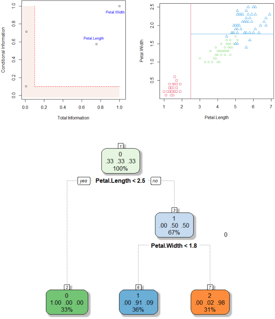
### Visual Description
## Scatter Plots and Decision Tree: Iris Petal Measurements and Classification
### Overview
The image contains two scatter plots and a decision tree. The left scatter plot visualizes "Total Information" vs. "Conditional Information" with labeled data points. The right scatter plot shows "Petal Length" vs. "Petal Width" with color-coded shapes. The decision tree below classifies data based on petal measurements, with node values and split conditions.
---
### Components/Axes
#### Left Scatter Plot
- **X-axis**: Total Information (0.0–1.0)
- **Y-axis**: Conditional Information (0.0–1.0)
- **Data Points**:
- (0.1, 0.7): Labeled "Petal Width"
- (0.8, 0.6): Labeled "Petal Length"
- (0.9, 0.9): Labeled "Petal Width"
- **Shaded Area**: Light pink rectangle spanning (0,0) to (1,0.5)
- **Dashed Line**: Red dashed line at y=0.5 (Conditional Information threshold)
#### Right Scatter Plot
- **X-axis**: Petal Length (1–7)
- **Y-axis**: Petal Width (0–2.5)
- **Data Points**:
- **Red Squares**: Clustered near (1–2, 0–1)
- **Blue Triangles**: Spread across (4–7, 1.5–2.5)
- **Green Circles**: Distributed between (3–5, 0.5–1.5)
- **Dashed Lines**:
- Vertical red line at x=3 (Petal Length threshold)
- Horizontal blue line at y=1.5 (Petal Width threshold)
- **Legend**: Top-right, associating colors with shapes (red=squares, blue=triangles, green=circles)
#### Decision Tree
- **Root Node (1)**:
- Condition: `Petal.Length < 2.5`
- Yes → Node 2 (green)
- No → Node 3 (blue)
- **Node 2**:
- Values: `[0, 33, 33, 33]`
- Percentage: 100%
- **Node 3**:
- Condition: `Petal.Width < 1.8`
- Yes → Node 6 (blue)
- No → Node 7 (orange)
- **Leaf Nodes**:
- Node 6: `[1, 0.00, 0.91, 0.09]`, 36%
- Node 7: `[2, 0.00, 0.02, 0.98]`, 31%
---
### Detailed Analysis
#### Left Scatter Plot
- **Trends**:
- Petal Width (0.1, 0.7) and Petal Length (0.8, 0.6) show high conditional information.
- Petal Width (0.9, 0.9) lies near the upper-right corner, suggesting maximum conditional information.
- **Shaded Area**: Indicates a region where conditional information is ≤0.5. Only Petal Length (0.8, 0.6) partially overlaps this area.
#### Right Scatter Plot
- **Trends**:
- **Red Squares**: Low petal length (1–2) and width (0–1), likely representing a specific class (e.g., Setosa).
- **Blue Triangles**: High petal length (4–7) and width (1.5–2.5), possibly Virginica.
- **Green Circles**: Intermediate values (3–5, 0.5–1.5), likely Versicolor.
- **Dashed Lines**: Thresholds at Petal Length=3 and Width=1.5 align with class separations.
#### Decision Tree
- **Splits**:
- Root splits on `Petal.Length < 2.5` (100% accuracy for Node 2).
- Node 3 splits on `Petal.Width < 1.8`, with 67% accuracy for Node 6 and 31% for Node 7.
- **Node Values**:
- Node 2: All values = 33 (100% confidence in a single class).
- Node 6: 1 instance of class 0, 91% class 1, 9% class 2.
- Node 7: 2 instances of class 0, 2% class 1, 98% class 2.
---
### Key Observations
1. **Feature Importance**: Petal Width has higher conditional information than Petal Length in the left plot.
2. **Class Separation**: The right plot shows distinct clusters for red squares (low length/width), blue triangles (high length/width), and green circles (intermediate).
3. **Decision Tree Logic**:
- Petal Length < 2.5 perfectly separates one class (Node 2).
- Petal Width < 1.8 further splits remaining data, with higher accuracy for shorter widths (Node 6).
---
### Interpretation
- **Data Relationships**:
- The left plot quantifies feature importance, showing Petal Width as more informative.
- The right plot visualizes class distributions, with clear separations along petal length and width.
- **Model Behavior**:
- The decision tree prioritizes Petal Length first, then Petal Width, reflecting their importance.
- Node 2’s 100% accuracy suggests a strong class boundary at Petal.Length < 2.5.
- **Anomalies**:
- Petal Width (0.9, 0.9) in the left plot has the highest conditional information, indicating it may be a critical feature for distinguishing classes.
- Node 7’s low accuracy (31%) suggests uncertainty in classifying samples with Petal.Length ≥2.5 and Width ≥1.8.
This analysis demonstrates how petal measurements correlate with classification confidence and how the decision tree leverages these features for prediction.
</details>