## fairadapt : Causal Reasoning for Fair Data Pre-processing
Drago Plečko ETH Zürich
Nicolas Bennett ETH Zürich
## Abstract
Machine learning algorithms are useful for various predictions tasks, but they can also learn how to discriminate, based on gender, race or other sensitive attributes. This realization gave rise to the field of fair machine learning, which aims to measure and mitigate such algorithmic bias. This manuscript describes the R -package fairadapt , which implements a causal inference pre-processing method. By making use of a causal graphical model and the observed data, the method can be used to address hypothetical questions of the form 'What would my salary have been, had I been of a different gender/race?'. Such individual level counterfactual reasoning can help eliminate discrimination and help justify fair decisions. We also discuss appropriate relaxations which assume certain causal pathways from the sensitive attribute to the outcome are not discriminatory.
Keywords : algorithmic fairness, causal inference, machine learning.
## 1. Introduction
Machine learning algorithms have become prevalent tools for decision-making in socially sensitive situations, such as determining credit-score ratings or predicting recidivism during parole. It has been recognized that algorithms are capable of learning societal biases, for example with respect to race (Larson, Mattu, Kirchner, and Angwin 2016) or gender (Lambrecht and Tucker 2019; Blau and Kahn 2003), and this realization seeded an important debate in the machine learning community about fairness of algorithms and their impact on decision-making.
In order to define and measure discrimination, existing intuitive notions have been statistically formalized, thereby providing fairness metrics. For example, demographic parity (Darlington 1971) requires the protected attribute A (gender/race/religion etc.) to be independent of a constructed classifier or regressor ̂ Y , written as ̂ Y ⊥ ⊥ A . Another notion, termed equality of odds (Hardt, Price, Srebro et al. 2016), requires equal false positive and false negative rates of classifier ̂ Y between different groups (females and males for example), written as ̂ Y ⊥ ⊥ A | Y . To this day, various different notions of fairness exist, which are sometimes incompatible (Corbett-Davies and Goel 2018), meaning not of all of them can be achieved for a predictor ̂ Y simultaneously. There is still no consensus on which notion of fairness is the correct one.
The discussion on algorithmic fairness is, however, not restricted to the machine learning domain. There are many legal and philosophical aspects that have arisen. For example, the legal distinction between disparate impact and disparate treatment (McGinley 2011) is important for assessing fairness from a judicial point of view. This in turn emphasizes the
Nicolai Meinshausen ETH Zürich
importance of the interpretation behind the decision-making process, which is often not the case with black-box machine learning algorithms. For this reason, research in fairness through a causal inference lens has gained attention.
A possible approach to fairness is the use of counterfactual reasoning (Galles and Pearl 1998), which allows for arguing what might have happened under different circumstances that never actually materialized, thereby providing a tool for understanding and quantifying discrimination. For example, one might ask how a change in sex would affect the probability of a specific candidate being accepted for a given job opening. This approach has motivated another notion of fairness, termed counterfactual fairness (Kusner, Loftus, Russell, and Silva 2017), which states that the decision made, should remain fixed, even if, hypothetically, some parameters such as race or gender were to be changed (this can be written succinctly as ̂ Y ( a ) = ̂ Y ( a ′ ) in the potential outcomes notation). Causal inference can also be used for decomposition of the parity gap measure (Zhang and Bareinboim 2018), /a80 ( ̂ Y = 1 | A = a ) -/a80 ( ̂ Y = 1 | A = a ′ ), into the direct, indirect and spurious components (yielding further insights into the demographic parity as a criterion), as well as the introduction of so-called resolving variables Kilbertus, Carulla, Parascandolo, Hardt, Janzing, and Schölkopf (2017), in order to relax the possibly prohibitively strong notion of demographic parity.
The following sections describe an implementation of the fair data adaptation method outlined in Plecko and Meinshausen (2020), which combines the notions of counterfactual fairness and resolving variables, and explicitly computes counterfactual values for individuals. The implementation is available as R -package fairadapt from CRAN. Currently there are only few packages distributed via CRAN that relate to fair machine learning. These include fairml (Scutari 2021), which implements the non-convex method of Komiyama, Takeda, Honda, and Shimao (2018), as well as packages fairness (Kozodoi and V. Varga 2021) and fairmodels (Wiśniewski and Biecek 2021), which serve as diagnostic tools for measuring algorithmic bias and provide several pre- and post-processing methods for bias mitigation. The only causal method, however, is presented by fairadapt . Even though theory in fair machine learning is being expanded at an accelerating pace, good quality implementations of the developed methods are often not available.
The rest of the manuscript is organized as follows: In Section 2 we describe the methodology behind fairadapt , together with quickly reviewing some important concepts of causal inference. In Section 3 we discuss implementation details and provide some general user guidance, followed by Section 4, which illustrates the usage of fairadapt through a large, real-world dataset and a hypothetical fairness application. Finally, in Section 5 we elaborate on some extensions, such as Semi-Markovian models and resolving variables.
## 2. Methodology
First, the intuition behind fairadapt is described using an example, followed by a more rigorous mathematical formulation, using Markovian structural causal models (SCMs). Some relevant extensions, such as the Semi-Markovian case and the introduction of so called resolving variables , are discussed in Section 5.
## 2.1. University Admission Example
Consider the example of university admission based on previous educational achievement and
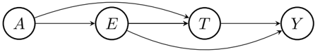
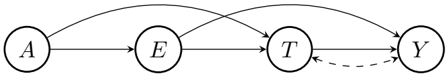
Figure 1: University admission based on previous educational achievement E combined with and an admissions test score T . The protected attribute A , encoding gender, has an unwanted causal effect on E , T , as well as Y , which represents the final score used for the admission decision.
<details>
<summary>Image 1 Details</summary>
### Visual Description
\n
## Diagram: State Transition Diagram
### Overview
The image depicts a state transition diagram with four states labeled A, E, T, and Y. Arrows indicate transitions between these states. The diagram shows a directed flow, with some states having multiple outgoing transitions and one state having a self-loop.
### Components/Axes
The diagram consists of four circular nodes representing states:
* **A**: Located on the left.
* **E**: Located in the center-left.
* **T**: Located in the center-right.
* **Y**: Located on the right.
Arrows connect the states, indicating transitions.
### Detailed Analysis or Content Details
The following transitions are present:
1. **A → E**: A direct transition from state A to state E.
2. **E → T**: A direct transition from state E to state T.
3. **T → Y**: A direct transition from state T to state Y.
4. **Y → A**: A transition from state Y back to state A, creating a loop.
5. **T → E**: A transition from state T back to state E.
### Key Observations
The diagram shows a cyclical flow between the states. State T has two outgoing transitions, while states A and E each have one. State Y transitions back to the beginning of the sequence (A). The presence of a loop from Y to A suggests a repeating pattern or a return to an initial state.
### Interpretation
This diagram likely represents a process or system with distinct states and defined transitions between them. The cyclical nature of the diagram suggests that the process can repeat indefinitely. The transitions from T to both E and Y indicate that the system can either continue along the main sequence (T → Y) or return to an earlier stage (T → E). Without further context, it's difficult to determine the specific meaning of each state or transition, but the diagram provides a clear visual representation of the system's possible states and how it moves between them. It could represent a finite state machine, a workflow, or a sequence of events. The diagram is a visual representation of a system's behavior, and the transitions define the rules governing its operation.
</details>
an admissions test. Variable A is the protected attribute, describing candidate gender, with A = a corresponding to females and A = a ′ to males. Furthermore, let E be educational achievement (measured for example by grades achieved in school) and T the result of an admissions test for further education. Finally, let Y be the outcome of interest (final score) upon which admission to further education is decided. Edges in the graph in Figure 1 indicate how variables affect one another.
Attribute A , gender, has a causal effect on variables E , T , as well as Y , and we wish to eliminate this effect. For each individual with observed values ( a, e, t, y ) we want to find a mapping
<!-- formula-not-decoded -->
which represents the value the person would have obtained in an alternative world where everyone was female. Explicitly, to a male person with education value e , we assign the transformed value e ( fp ) chosen such that
<!-- formula-not-decoded -->
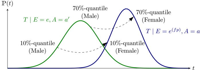
The key idea is that the relative educational achievement within the subgroup remains constant if the protected attribute gender is modified. If, for example, a male has a higher educational achievement value than 70% of males in the dataset, we assume that he would also be better than 70% of females had he been female 1 . After computing transformed educational achievement values corresponding to the female world ( E ( fp ) ), the transformed test score values T ( fp ) can be calculated in a similar fashion, but conditioned on educational achievement. That is, a male with values ( E,T ) = ( e, t ) is assigned a test score t ( fp ) such that
<!-- formula-not-decoded -->
where the value e ( fp ) was obtained in the previous step. This step can be visualized as shown in Figure 2.
As a final step, the outcome variable Y remains to be adjusted. The adaptation is based on the same principle as above, using transformed values of both education and the test score. The resulting value y ( fp ) of Y = y satisfies
<!-- formula-not-decoded -->
1 This assumption of course is not empirically testable, as it is impossible to observe both a female and a male version of the same individual.
fairadapt : Fair Data Adaptation
<details>
<summary>Image 2 Details</summary>
### Visual Description
\n
## Diagram: Probability Distribution Comparison - Male vs. Female
### Overview
The image presents a diagram comparing probability distributions for two groups: Male and Female. The distributions are represented by bell-shaped curves, indicating a normal distribution. The diagram highlights the 10th and 70th percentile values for each group along the time axis. The diagram is a visual representation of how the probability of an event occurring changes over time for each group.
### Components/Axes
* **Y-axis:** Labeled "P(t)", representing probability as a function of time. The scale is not explicitly marked, but it appears to be linear and positive.
* **X-axis:** Labeled "t", representing time. The scale is not explicitly marked, but it appears to be linear.
* **Curves:** Two bell-shaped curves are present:
* Green curve: Represents the distribution for "Male".
* Blue curve: Represents the distribution for "Female".
* **Labels:**
* "T | E = e, A = a'" (above the green curve)
* "T | E = e(fp), A = a" (above the blue curve)
* "70%-quantile (Male)" - points to the peak of the green curve.
* "70%-quantile (Female)" - points to the peak of the blue curve.
* "10%-quantile (Male)" - points to the left tail of the green curve.
* "10%-quantile (Female)" - points to the left tail of the blue curve.
* **Dashed Lines:** Dashed lines connect the 10th and 70th percentile points for each gender, visually comparing their spread.
### Detailed Analysis or Content Details
The green curve (Male) is centered slightly to the left of the blue curve (Female). This indicates that the peak probability for the event occurring is at a lower time value for males compared to females.
* **Male Distribution:**
* The 10th percentile appears to be at approximately t = 1.5.
* The 70th percentile appears to be at approximately t = 4.5.
* **Female Distribution:**
* The 10th percentile appears to be at approximately t = 2.5.
* The 70th percentile appears to be at approximately t = 6.5.
The female distribution appears to have a wider spread than the male distribution, as indicated by the larger distance between the 10th and 70th percentiles.
### Key Observations
* The distributions are both approximately normal, as indicated by their bell shapes.
* The male distribution is shifted to the left, suggesting an earlier peak probability.
* The female distribution is wider, indicating greater variability.
* The dashed lines visually emphasize the difference in the spread of the distributions.
### Interpretation
The diagram suggests that the event being modeled has a different timing and variability for males and females. The shift in the male distribution to the left implies that males tend to experience the event earlier in time. The wider spread of the female distribution suggests that there is more variation in the timing of the event for females.
The labels "T | E = e, A = a'" and "T | E = e(fp), A = a" suggest that the distributions are conditional probabilities. "T" likely represents time, "E" represents evidence, "A" represents age, and "fp" likely stands for false positive. The labels indicate that the probability of time is conditional on evidence and age, with different parameters for males and females. The diagram is likely illustrating a difference in the timing of an event based on gender, potentially related to a biological or physiological process. The use of quantiles (10th and 70th) allows for a comparison of the distributions beyond just their central tendency.
</details>
t
Figure 2: A graphical visualization of the quantile matching procedure. Given a male with a test score corresponding to the 70% quantile, we would hypothesize, that if the gender was changed, the individual would have achieved a test score corresponding to the 70% quantile of the female distribution.
This form of counterfactual correction is known as recursive substitution (Pearl 2009, Chapter 7) and is described more formally in the following sections. The reader who is satisfied with the intuitive notion provided by the above example is encouraged to go straight to Section 3.
## 2.2. Structural Causal Models
In order to describe the causal mechanisms of a system, a structural causal model (SCM) can be hypothesized, which fully encodes the assumed data-generating process. An SCM is represented by a 4-tuple 〈 V, U, F , /a80 ( u ) 〉 , where
- V = { V 1 , . . . , V n } is the set of observed (endogenous) variables.
- F = { f 1 , . . . , f n } is the set of functions determining V , v i ← f i (pa( v i ) , u i ), where pa( V i ) ⊂ V, U i ⊂ U are the functional arguments of f i and pa( V i ) denotes the parent vertices of V i .
- U = { U 1 , . . . , U n } are latent (exogenous) variables.
- /a80 ( u ) is a distribution over the exogenous variables U .
Any particular SCM is accompanied by a graphical model G (a directed acyclic graph), which summarizes which functional arguments are necessary for computing the values of each V i and therefore, how variables affect one another. We assume throughout, without loss of generality, that
- (i) f i (pa( v i ) , u i ) is increasing in u i for every fixed pa( v i ).
- (ii) Exogenous variables U i are uniformly distributed on [0 , 1].
In the following section, we discuss the Markovian case in which all exogenous variables U i are mutually independent. The Semi-Markovian case, where variables U i are allowed to have a mutual dependency structure, alongside the extension introducing resolving variables , are discussed in Section 5.
## 2.3. Markovian SCM Formulation
Let Y take values in ❘ and represent an outcome of interest and A be the protected attribute taking two values a, a ′ . The goal is to describe a pre-processing method which transforms the entire data V into its fair version V ( fp ) . This can be achieved by computing the counterfactual values V ( A = a ), which would have been observed if the protected attribute was fixed to a baseline value A = a for the entire sample.
More formally, going back to the university admission example above, we want to align the distributions
<!-- formula-not-decoded -->
meaning that the distribution of V i should be indistinguishable for both female and male applicants, for every variable V i . Since each function f i of the original SCM is reparametrized so that f i (pa( v i ) , u i ) is increasing in u i for every fixed pa( v i ), and also due to variables U i being uniformly distributed on [0 , 1], variables U i can be seen as the latent quantiles .
The algorithm proposed for data adaption proceeds by fixing A = a , followed by iterating over descendants of the protected attribute A , sorted in topological order. For each V i , the assignment function f i and the corresponding quantiles U i are inferred. Finally, transformed values V i ( fp ) are obtained by evaluating f i , using quantiles U i and the transformed parents pa( V i ) ( fp ) (see Algorithm 1).
```
```
The assignment functions f i of the SCM are of course unknown, but are non-parametrically inferred at each step. Algorithm 1 obtains the counterfactual values V ( A = a ) under the do ( A = a ) intervention for each individual, while keeping the latent quantiles U fixed. In the case of continuous variables, the latent quantiles U can be determined exactly, while for the discrete case, this is more subtle and described in Plecko and Meinshausen (2020, Section 5).
## 3. Implementation
In order to perform fair data adaption using the fairadapt package, the function fairadapt() is exported, which returns an object of class fairadapt . Implementations of the base R S3 generics print() , plot() and predict() , as well as the generic autoplot() , exported from ggplot2 (Wickham 2016), are provided for fairadapt objects, alongside fairadapt -specific implementations of S3 generics visualizeGraph() , adaptedData() and fairTwins() . Finally, an extension mechanism is available via the S3 generic function computeQuants() , which is used for performing the quantile learning step.
The following sections show how the listed methods relate to one another alongside their intended use, beginning with constructing a call to fairadapt() . The most important arguments of fairadapt() include:
- formula : Argument of type formula , specifying the dependent and explanatory variables.
- train.data and test.data : Both of type data.frame , representing the respective datasets.
- adj.mat : Argument of type matrix , encoding the adjacency matrix.
- prot.attr : Scalar-valued argument of type character identifying the protected attribute.
As a quick demonstration of fair data adaption using, we load the uni\_admission dataset provided by fairadapt , consisting of synthetic university admission data of 1000 students. We subset this data, using the first n\_samp rows as training data ( uni\_trn ) and the following n\_samp rows as testing data ( uni\_tst ). Furthermore, we construct an adjacency matrix uni\_adj with edges gender → edu , gender → test , edu → test , edu → score , and test → score . As the protected attribute, we choose gender .
```
```
```
```
The implicitly called print() method in the previous code block displays some information about how fairadapt() was called, such as number of variables, the protected attribute and also the total variation before and after adaptation, defined as
<!-- formula-not-decoded -->
respectively, where Y denotes the outcome variable. Total variation in the case of a binary outcome Y , corresponds to the parity gap.
## 3.1. Specifying the Graphical Model
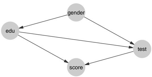
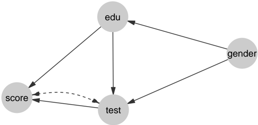
As the algorithm used for fair data adaption in fairadapt() requires access to the underlying graphical causal model G (see Algorithm 1), a corresponding adjacency matrix can be passed as adj.mat argument. The convenience function graphModel() turns a graph specified as an adjacency matrix into an annotated graph using the igraph package (Csardi and Nepusz 2006). While exported for the user to invoke manually, this function is called as part of the fairadapt() routine and the resulting igraph object can be visualized by calling the S3 generic visualizeGraph() , exported from fairadapt on an object of class fairadapt .
```
```
A visualization of the igraph object returned by graphModel() is available from Figure 3. The graph shown is equivalent to that of Figure 1 as they both represent the same causal model.
## 3.2. Quantile Learning Step
The training step in fairadapt() can be carried out in two slightly distinct ways: Either by specifying training and testing data simultaneously, or by only passing training data (and
Figure 3: The underlying graphical model corresponding to the university admission example (also shown in Figure 1).
<details>
<summary>Image 3 Details</summary>
### Visual Description
\n
## Diagram: Causal Relationship Network
### Overview
The image depicts a directed acyclic graph illustrating potential causal relationships between four variables: "edu", "gender", "test", and "score". The diagram uses circles to represent variables and arrows to indicate the direction of influence.
### Components/Axes
The diagram consists of four nodes labeled as follows:
* **edu**: Located on the left side of the diagram.
* **gender**: Located towards the top-center of the diagram.
* **test**: Located on the right side of the diagram.
* **score**: Located towards the bottom-center of the diagram.
Arrows connect these nodes, indicating hypothesized causal relationships. There are no axes or scales present.
### Detailed Analysis or Content Details
The following relationships are depicted:
1. **edu -> gender**: An arrow points from "edu" to "gender", suggesting education may influence gender (or the perception/reporting of it).
2. **edu -> test**: An arrow points from "edu" to "test", suggesting education influences test performance.
3. **gender -> test**: An arrow points from "gender" to "test", suggesting gender influences test performance.
4. **edu -> score**: An arrow points from "edu" to "score", suggesting education influences score.
5. **test -> score**: An arrow points from "test" to "score", suggesting test performance influences score.
### Key Observations
The diagram suggests a model where both education and gender directly influence test performance, and test performance directly influences the final score. Education also appears to have a direct influence on the score, independent of test performance. The relationship between education and gender is less conventional and may represent a confounding variable or a specific research hypothesis.
### Interpretation
This diagram represents a hypothesized causal model, likely used in statistical modeling or causal inference. The relationships are not necessarily proven, but rather represent assumptions about how these variables interact. The model suggests that to understand the score, one must consider the effects of both education and gender, as well as their influence on test performance. The inclusion of the "edu -> gender" link is unusual and warrants further investigation into the specific context of this model. It could represent a situation where educational attainment influences how individuals identify or are categorized by gender, or it could be a variable included to control for potential confounding effects. The diagram is a simplified representation of a complex system and does not account for other potential variables or interactions.
</details>
at a later stage calling predict() on the returned fairadapt object in order to perform data adaption on new test data). The advantage of the former option is that the quantile regression step is performed on a larger sample size, which can lead to more precise inference in practice.
The two data frames passed as train.data and test.data are required to have column names which also appear in the row and column names of the adjacency matrix, alongside the protected attribute A , passed as scalar-valued character vector prot.attr .
The quantile learning step of Algorithm 1 can in principle be carried out by several methods, three of which are implemented in fairadapt :
- Quantile Regression Forests (Meinshausen 2006; Wright and Ziegler 2015).
- Linear Quantile Regression (Koenker and Hallock 2001; Koenker, Portnoy, Ng, Zeileis, Grosjean, and Ripley 2018).
- Non-crossing quantile neural networks (Cannon 2018, 2015).
Using linear quantile regression is the most efficient option in terms of runtime, while for non-parametric models and mixed data, the random forest approach is well-suited, at the expense of a slight increase in runtime. The neural network approach is, substantially slower when compared to linear and random forest estimators and consequently does not scale well to large sample sizes. As default, the random forest based approach is implemented, due to its non-parametric nature and computational speed. However, for smaller sample sizes, the neural network approach can also demonstrate competitive performance. A quick summary outlining some differences between the three natively supported methods is available from Table 1.
The above set of methods is not exhaustive. Further options are conceivable and therefore fairadapt provides an extension mechanism to account for this. The fairadapt() argument quant.method expects a function to be passed, a call to which will be constructed with three unnamed arguments:
1. A data.frame containing data to be used for quantile regression. This will either be the data.frame passed as train.data , or depending on whether test.data was specified, a row-bound version of train and test datasets.
Table 1: Summary table of different quantile regression methods. n is the number of samples, p number of covariates, n epochs number of training epochs for the neural network. T ( n, 4) denotes the runtime of different methods on the university admission dataset, with n training and testing samples.
| | Random Forests | Neural Networks | Linear Regression |
|--------------------|-------------------------|----------------------------------------------|-------------------------------------------------------|
| R -package | ranger | qrnn | quantreg |
| quant.method | rangerQuants | mcqrnnQuants | linearQuants |
| complexity | O ( np log n ) | O ( npn epochs ) | O ( p 2 n ) |
| default parameters | ntrees = 500 mtry = √ p | 2-layer fully connected feed-forward network | "br" method of Barrodale and Roberts used for fitting |
| T (200 , 4) | 0 . 4 sec | 89 sec | 0 . 3 sec |
| T (500 , 4) | 0 . 9 sec | 202 sec | 0 . 5 sec |
2. A logical flag, indicating whether the protected attribute is the root node of the causal graph. If the attribute A is a root node, we know that /a80 ( X | do( A = a )) = /a80 ( X | A = a ). Therefore, the interventional and conditional distributions are in this case the same, and we can leverage this knowledge in the quantile learning procedure, by splitting the data into A = 0 and A = 1 groups.
3. A logical vector of length nrow(data) , indicating which rows in the data.frame passed as data correspond to samples with baseline values of the protected attribute.
Arguments passed as ... to fairadapt() will be forwarded to the function specified as quant.method and passed after the first three fixed arguments listed above. The return value of the function passed as quant.method is expected to be an S3-classed object. This object should represent the conditional distribution V i | pa( V i ) (see function rangerQuants() for an example). Additionally, the object should have an implementation of the S3 generic function computeQuants() available. For each row ( v i , pa( v i )) of the data argument, the computeQuants() function uses the S3 object to (i) infer the quantile of v i | pa( v i ); (ii) compute the counterfactual value v ( fp ) i under the change of protected attribute, using the counterfactual values of parents pa( v ( fp ) i ) computed in previous steps (values pa( v ( fp ) i ) are contained in the newdata argument). For an example, see computeQuants.ranger() method.
## 3.3. Fair-Twin Inspection
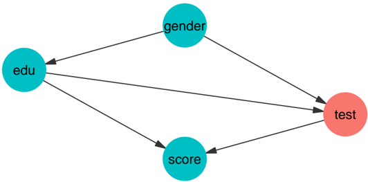
The university admission example presented in Section 2 demonstrates how to compute counterfactual values for an individual while preserving their relative educational achievement. Setting candidate gender as the protected attribute and gender level female as baseline value, for a male student with values ( a, e, t, y ), his fair-twin values ( a ( fp ) , e ( fp ) , t ( fp ) , y ( fp ) ), i.e., the values the student would have obtained, had he been female , are computed. These values can be retrieved from a fairadapt object by calling the S3-generic function fairTwins() as:
```
```
```
```
```
```
In this example, we compute the values in a female world. Therefore, for female applicants, the values remain fixed, while for male applicants the values are adapted, as can be seen from the output.
## 4. Illustration
As a hypothetical real-world use of fairadapt , suppose that after a legislative change the US government has decided to adjust the salary of all of its female employees in order to remove both disparate treatment and disparate impact effects. To this end, the government wants to compute the counterfactual salary values of all female employees, that is the salaries that female employees would obtain, had they been male.
To do this, the government is using data from the 2018 American Community Survey by the US Census Bureau, available in pre-processed form as a package dataset from fairadapt . Columns are grouped into demographic ( dem ), familial ( fam ), educational ( edu ) and occupational ( occ ) categories and finally, salary is selected as response ( res ) and sex as the protected attribute ( prt ):
```
```
<details>
<summary>Image 4 Details</summary>
### Visual Description
\n
## Diagram: Directed Acyclic Graph
### Overview
The image depicts a directed acyclic graph (DAG) consisting of seven nodes labeled A through Y. The nodes are connected by directed edges, indicating a flow or dependency relationship between them. The graph does not contain any cycles.
### Components/Axes
The diagram consists of the following nodes: A, F, E, W, D, and Y.
The edges represent directed relationships between the nodes. One edge is dashed.
### Detailed Analysis or Content Details
The following relationships are depicted:
* A -> F
* A -> E
* A -> D
* A -> W
* F -> E
* F -> W
* E -> W
* E -> Y
* W -> Y
* D -> Y
* D -> W
* A --(dashed)--> D
### Key Observations
The graph is relatively dense, with several nodes having multiple outgoing edges. Node A appears to be a central starting point, influencing multiple other nodes. Node Y is a terminal node, receiving input from D, E, and W. The dashed line from A to D suggests a potentially different or weaker relationship compared to the solid lines.
### Interpretation
This diagram likely represents a causal model, a workflow, or a dependency structure. The nodes could represent tasks, variables, or events, and the edges represent the order in which they must occur or the influence one has on another. The dashed line from A to D could indicate a conditional dependency or a less direct influence. The graph suggests that to reach Y, one must go through D, E, or W, and that A is a key driver of the system. The absence of cycles indicates that the process is not recursive or self-referential. Without further context, it's difficult to determine the specific meaning of the nodes and edges, but the structure provides a clear visual representation of the relationships between them.
</details>
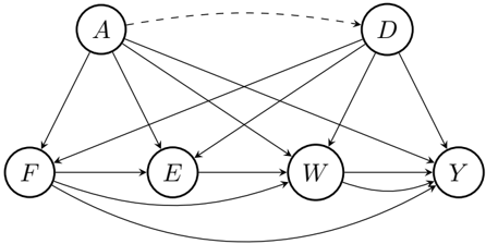
Figure 4: The causal graph for the government-census dataset. D are demographic features, A is gender, F represents marital and family information, E education, W work-related information and Y the salary, which is also the outcome of interest.
| 6: | 3 hours_worked | 1 weeks_worked | 18 occupation | industry | 0 28000 economic_region |
|------|------------------|------------------|-----------------|------------|---------------------------|
| 1: | 56 | 49 | 13-1081 | 928P | Southeast |
| 2: | 42 | 49 | 29-2061 | 6231 | Southeast |
| 3: | 50 | 49 | 25-1000 | 611M1 | Southeast |
| 4: | 50 | 49 | 25-1000 | 611M1 | Southeast |
| 5: | 40 | 49 | 27-1010 | 611M1 | Southeast |
| 6: | 40 | 49 | 43-6014 | 6111 | Southeast |
```
```
The hypothesized causal graph for the dataset is given in Figure 4. According to this, the causal graph can be specified as an adjacency matrix gov\_adj and as confounding matrix gov\_cfd :
```
```
```
```
Before applying fairadapt() , we first log-transform the salaries and look at respective densities by sex group. We subset the data by using n\_samp samples for training and n\_pred samples for predicting and plot the data before performing the adaption.
```
```
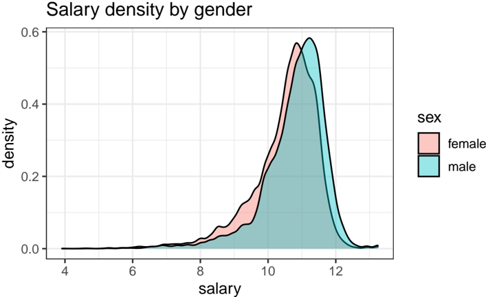
There is a clear shift between the two sexes, indicating that male employees are currently better compensated when compared to female employees. However, this differences in salary could, in principle, be attributed to factors apart form gender inequality, such as the economic region in which an employee works. This needs to be accounted for as well, i.e., we do not wish to remove differences in salary between economic regions.
```
```
After performing the adaptation, we can investigate whether the salary gap has shrunk. The densities after adaptation can be visualized using the ggplot2 -exported S3 generic function autoplot() :
```
```
- gender")
If we are provided with additional testing data, and wish to adapt this as well, we can use the base R S3 generic function predict() :
```
```
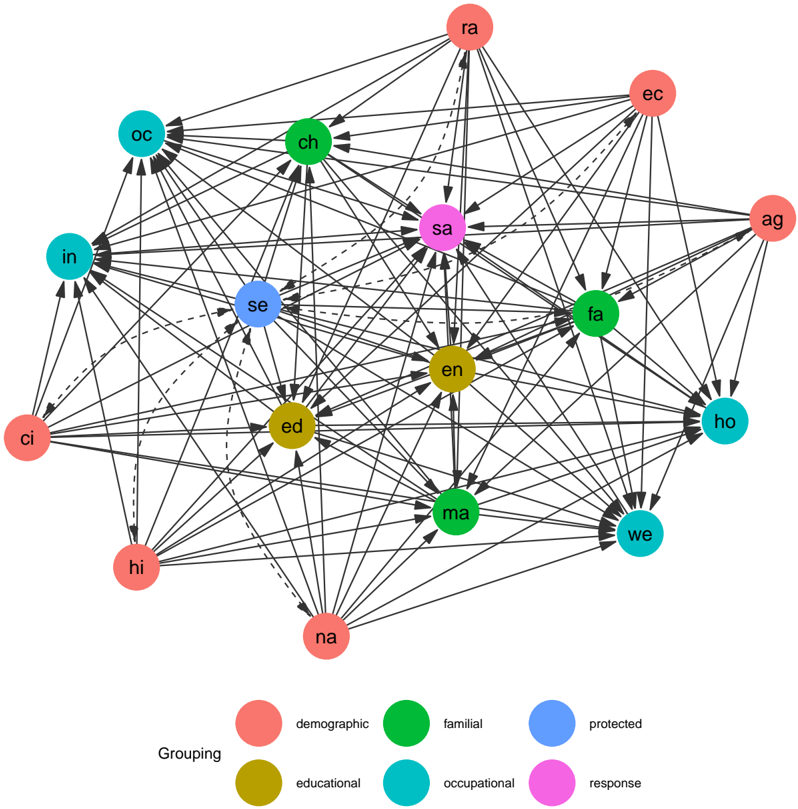
Figure 5: Full causal graph for the government census dataset, expanding the grouped view presented in Figure 4. Demographic features include age ( ag ), race ( ra ), whether an employee is of Hispanic origin ( hi ), is US citizen ( ci ), whether the citizenship is native ( na ), alongside the corresponding economic region ( ec ). Familial features are marital status ( ma ), family size ( fa ) and number of children ( ch ), educational features include education ( ed ) and English language levels ( en ), and occupational features, weekly working hours ( ho ), yearly working weeks ( we ), job ( oc ) and industry identifiers ( in ). Finally, the yearly salary ( sa ) is used as the response variable and employee sex ( se ) as the protected attribute variable.
<details>
<summary>Image 5 Details</summary>
### Visual Description
## Network Diagram: Social Network Analysis
### Overview
The image presents a network diagram illustrating relationships between various nodes categorized by color. The nodes are interconnected by lines, with line styles (solid, dashed, dotted) potentially indicating different types or strengths of relationships. The diagram appears to represent a social network or a system of interconnected entities, with nodes grouped into demographic, familial, protected, educational, occupational, and response categories.
### Components/Axes
The diagram consists of the following components:
* **Nodes:** Represented by circles, each labeled with a two-letter code (e.g., "ci", "ra", "en").
* **Edges:** Lines connecting the nodes, indicating relationships between them. Edge styles vary (solid, dashed, dotted).
* **Color Coding:** Nodes are colored to represent different groupings:
* Red: Demographic
* Green: Familial
* Blue: Protected
* Yellow: Educational
* Teal/Cyan: Occupational
* Purple: Response
* **Legend:** Located at the bottom of the image, providing a key to the color coding.
* **Node Labels:** Each node is labeled with a two-letter abbreviation.
### Detailed Analysis
The diagram contains 16 nodes, categorized as follows:
* **Demographic (Red):** ci, hi, na
* **Familial (Green):** ra, ch, fa, ag
* **Protected (Blue):** in, se, we, ho
* **Educational (Yellow):** oc, ed
* **Occupational (Teal/Cyan):** sa
* **Response (Purple):** en, ma
Here's a breakdown of the connections (approximate based on visual inspection):
* **ci (Demographic):** Connected to in, se, ed, hi.
* **hi (Demographic):** Connected to ci, na, ed.
* **na (Demographic):** Connected to hi, en, ma.
* **ra (Familial):** Connected to oc, ch, sa, ed, ag.
* **ch (Familial):** Connected to ra, oc, se, en.
* **fa (Familial):** Connected to en, we, ho, ag.
* **ag (Familial):** Connected to ra, fa, ho.
* **in (Protected):** Connected to ci, oc, se.
* **se (Protected):** Connected to in, ch, ci, ed, en.
* **we (Protected):** Connected to fa, en, ma, ho.
* **ho (Protected):** Connected to we, fa, ag.
* **oc (Educational):** Connected to ra, in, ch, ed.
* **ed (Educational):** Connected to oc, ci, hi, se.
* **sa (Occupational):** Connected to ra, en.
* **en (Response):** Connected to se, ch, fa, we, sa, na, ma.
* **ma (Response):** Connected to na, we, en.
The line styles appear to indicate relationship strength or type:
* **Solid Lines:** Represent the most frequent and potentially strongest connections.
* **Dashed Lines:** Represent less frequent or weaker connections.
* **Dotted Lines:** Represent the least frequent or weakest connections.
### Key Observations
* **en (Response)** is a highly connected node, linked to nodes from all categories except demographic. This suggests it acts as a central hub in the network.
* **se (Protected)** and **ch (Familial)** are also highly connected, indicating significant roles within the network.
* **sa (Occupational)** has the fewest connections, suggesting a more isolated role.
* The demographic nodes (ci, hi, na) are relatively less connected compared to other categories.
* The familial nodes (ra, ch, fa, ag) are well-connected within their group and to other categories.
### Interpretation
This network diagram likely represents a social network or a system of relationships between individuals or entities. The color coding allows for analysis of connections based on different attributes (demographics, family ties, protection status, education, occupation, and responses).
The central role of the "en" node suggests it represents a key factor influencing the network, potentially a central decision-maker or a common resource. The strong connections within the familial and protected groups indicate the importance of these relationships within the network. The relative isolation of the occupational node suggests a specialized role with limited interaction with other parts of the network.
The varying line styles suggest that relationships are not all equal in strength or importance. Further analysis could involve quantifying the number of connections for each node to determine its centrality within the network and analyzing the types of relationships represented by the different line styles. The diagram provides a visual representation of complex relationships, allowing for identification of key players, influential groups, and potential vulnerabilities within the network.
</details>
Figure 6: Visualization of salary densities grouped by employee sex, indicating a shift to higher values for male employees. This uses the US government-census dataset and shows the situation before applying fair data adaption, while Figure 7 presents transformed salary data.
<details>
<summary>Image 6 Details</summary>
### Visual Description
\n
## Density Plot: Salary density by gender
### Overview
The image presents a density plot illustrating the distribution of salaries for two genders: female and male. The plot visualizes the probability density of salaries, allowing for a comparison of salary distributions between the two groups.
### Components/Axes
* **Title:** "Salary density by gender" - positioned at the top-center of the image.
* **X-axis:** "salary" - ranging from approximately 4 to 12 (units not specified, assumed to be thousands of dollars). The axis is labeled at intervals of 2.
* **Y-axis:** "density" - ranging from 0.0 to 0.6. The axis is labeled at intervals of 0.2.
* **Legend:** Located in the top-right corner.
* "sex" - label for the legend.
* "female" - represented by a light red color.
* "male" - represented by a light teal color.
### Detailed Analysis
The plot shows two overlapping density curves.
* **Female (light red):** The density curve for females starts at a salary of approximately 8, rises to a peak density around 10.2, and then declines, approaching zero density around 12.5.
* **Male (light teal):** The density curve for males starts at a salary of approximately 8, rises to a peak density around 10.5, and then declines, approaching zero density around 12.5.
Both curves exhibit a similar shape, with a peak around the 10-11 salary range. The male density curve appears slightly higher than the female density curve around the peak, suggesting a higher concentration of males at that salary level. However, the curves are very close, indicating a relatively similar salary distribution for both genders.
### Key Observations
* The salary distributions for both genders are unimodal, with a single peak.
* The peak salary for both genders is approximately between 10 and 11.
* The male salary distribution appears to be slightly skewed towards higher salaries compared to the female salary distribution, but the difference is subtle.
* There is a noticeable overlap between the two distributions, indicating that there is a significant range of salaries where both genders are represented.
### Interpretation
The data suggests that while there is some difference in the salary distributions between males and females, the distributions are largely similar. The slight difference in peak density suggests that males may be slightly more likely to earn salaries in the 10-11 range, but this difference is not substantial. The overlapping distributions indicate that there is considerable overlap in the salaries earned by both genders.
The plot does not provide information about the *causes* of any observed differences. It is important to note that this plot only shows density, not absolute numbers of individuals at each salary level. Therefore, it is not possible to determine if any observed differences are statistically significant without additional information. The data does not suggest a large disparity in salary between genders, but further investigation may be warranted to explore potential underlying factors contributing to any observed differences.
</details>
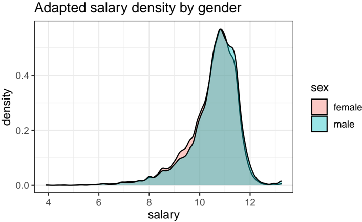
Figure 7: The salary gap between male and female employees of the US government according to the government-census dataset is clearly reduced when comparing raw data (see Figure 6) to transformed salary data as yielded by applying fair data adaption using employee sex as the protected attribute and assuming a causal graph as shown in Figure 5.
<details>
<summary>Image 7 Details</summary>
### Visual Description
\n
## Density Plot: Adapted Salary Density by Gender
### Overview
The image presents a density plot illustrating the distribution of salaries, differentiated by gender (male and female). The plot visualizes the probability density of salaries, allowing for a comparison of salary distributions between the two genders.
### Components/Axes
* **Title:** "Adapted salary density by gender" - positioned at the top-center of the image.
* **X-axis:** "salary" - ranging approximately from 4 to 12 (units not specified, assumed to be thousands of dollars or similar).
* **Y-axis:** "density" - ranging from 0.0 to 0.4.
* **Legend:** Located in the top-right corner.
* "sex" - label for the legend.
* "female" - represented by a light red color.
* "male" - represented by a light blue/cyan color.
* **Data Series:** Two overlapping density curves, one for each gender. A black line represents the combined density.
### Detailed Analysis
The plot shows two overlapping density curves. The male density curve (light blue) is generally higher than the female density curve (light red) across most of the salary range.
* **Female Density Curve (light red):**
* Starts at approximately salary 8, with a density of approximately 0.05.
* Increases to a peak density of approximately 0.35 at a salary of approximately 10.2.
* Decreases to approximately 0.1 at a salary of 11.5.
* Approaches 0 at a salary of 12.
* **Male Density Curve (light blue):**
* Starts at approximately salary 7.5, with a density of approximately 0.02.
* Increases to a peak density of approximately 0.4 at a salary of approximately 10.5.
* Decreases to approximately 0.2 at a salary of 11.8.
* Approaches 0 at a salary of 12.
* **Combined Density Curve (black):**
* Starts at approximately salary 7.5, with a density of approximately 0.02.
* Increases to a peak density of approximately 0.4 at a salary of approximately 10.5.
* Decreases to approximately 0.15 at a salary of 12.
### Key Observations
* The peak salary density for both genders is around a salary of 10.5.
* The male salary density is consistently higher than the female salary density across most of the salary range, suggesting a higher concentration of males at higher salary levels.
* The female salary distribution appears to be slightly skewed to the left compared to the male distribution.
* There is a noticeable overlap between the two distributions, indicating that some females earn salaries comparable to males, and vice versa.
### Interpretation
The data suggests a potential gender disparity in salary distribution. While both genders have a peak salary density around 10.5, the male distribution is shifted towards higher salaries, indicating that males are more likely to earn higher salaries than females. The higher density of males at higher salary levels suggests a possible wage gap or unequal opportunities. The overlap in distributions indicates that the disparity is not absolute, and some females do achieve high salaries. The plot does not provide information about the *causes* of this disparity, only that it *exists* in the observed data. Further investigation would be needed to determine the underlying factors contributing to this difference. The "Adapted" in the title suggests that the data may have been modified or processed in some way, which should be considered when interpreting the results.
</details>
```
```
Finally, we can do fair-twin inspection using the fairTwins() function of fairadapt , to retrieve counterfactual feature values:
```
```
Values are unchanged for female individuals (as female is used as baseline level), as is the case for age , which is not a descendant of the protected attribute sex (see Figure 5). However, variables education\_level and salary do change for males, as they are descendants of the protected attribute sex .
The variable hours\_worked is also a descendant of A , and one might argue that this variable should not be adapted in the procedure, i.e., it should remain the same, irrespective of
fairadapt : Fair Data Adaptation
employee sex. This is the idea behind resolving variables , which we discuss next, in Section 5.1. It is worth emphasizing that we are not trying to answer the question of which choice of resolving variables is the correct one in the above example - this choice is left to social scientists deeply familiar with context and specifics of the above described dataset.
## 5. Extensions
Several extensions to the basic Markovian SCM formulation introduced in Section 2.3 exist, some of which are available for use in fairadapt() and are outlined in the following sections.
## 5.1. Adding Resolving Variables
Kilbertus et al. (2017) discuss that in some situations the protected attribute A can affect variables in a non-discriminatory way. For instance, in the Berkeley admissions dataset (Bickel, Hammel, and O'Connell 1975) we observe that females often apply for departments with lower admission rates and consequently have a lower admission probability. However, we perhaps would not wish to account for this difference in the adaptation procedure, if we were to argue that applying to a certain department is a choice everybody is free to make. Such examples motivated the idea of resolving variables by Kilbertus et al. (2017). A variable R is called resolving if
- (i) R ∈ de( A ), where de( A ) are the descendants of A in the causal graph G .
- (ii) The causal effect of A on R is considered to be non-discriminatory.
In presence of resolving variables, computation of the counterfactual is carried out under the more involved intervention do( A = a, R = R ( a ′ )). The potential outcome value V ( A = a, R = R ( a ′ )) is obtained by setting A = a and computing the counterfactual while keeping the values of resolving variables to those they attained naturally . This is a nested counterfactual and the difference in Algorithm 1 is simply that resolving variables R are skipped in the forloop. In order to perform fair data adaptation with the variable test being resolving in the uni\_admission dataset used in Section 3, the string "test" can be passed as res.vars to fairadapt() .
```
```
Figure 8: Visualization of the causal graph corresponding to the university admissions example introduced in Section 1 with the variable test chosen as a resolving variable and therefore highlighted in red.
<details>
<summary>Image 8 Details</summary>
### Visual Description
\n
## Diagram: Causal Relationship Model
### Overview
The image depicts a directed acyclic graph illustrating potential causal relationships between four variables: "edu", "gender", "score", and "test". The nodes are represented as circles, and the relationships are shown as directed arrows. The diagram does not contain numerical data, but rather a structural representation of hypothesized influences.
### Components/Axes
The diagram consists of four labeled nodes:
* **edu**: Represented by a teal circle, positioned on the left side of the diagram.
* **gender**: Represented by a teal circle, positioned above and slightly to the right of "edu".
* **score**: Represented by a teal circle, positioned below and slightly to the right of "edu".
* **test**: Represented by a salmon-colored circle, positioned on the right side of the diagram.
Arrows connect these nodes, indicating the direction of the hypothesized causal influence.
### Detailed Analysis or Content Details
The following relationships are depicted:
1. **edu -> gender**: An arrow points from "edu" to "gender", suggesting that education level may influence gender (or the perception/reporting of gender).
2. **edu -> test**: An arrow points from "edu" to "test", suggesting that education level may influence the "test" outcome.
3. **gender -> test**: An arrow points from "gender" to "test", suggesting that gender may influence the "test" outcome.
4. **edu -> score**: An arrow points from "edu" to "score", suggesting that education level may influence the "score".
5. **score -> test**: An arrow points from "score" to "test", suggesting that the "score" may influence the "test" outcome.
### Key Observations
The diagram suggests a model where "test" is influenced by multiple factors: education, gender, and score. "Score" itself is influenced by education. "Gender" is influenced by education. The diagram does not specify the nature of the "test" or "score" variables.
### Interpretation
This diagram represents a hypothesized causal model. It suggests that education is a foundational variable influencing both gender and score, which in turn influence the test outcome. The inclusion of "gender" as a variable influenced by "edu" is unusual and may indicate a specific theoretical framework or research question. The model implies that understanding the relationship between education, gender, score, and test results requires considering the interconnectedness of these variables. The diagram is a structural representation and does not provide any quantitative information about the strength or direction of these relationships. It is a conceptual model for further investigation.
</details>
Number of independent variables:
Total variation (before adaptation):
-0.6757414
Total variation (after adaptation):
-0.4101386
As can be seen from the respective model summary outputs, the total variation after adaptation, in this case, is larger than in the basic example from Section 3, with no resolving variables. The intuitive reasoning here is that resolving variables allow for some discrimination, so we expect to see a larger total variation between the groups.
```
```
A visualization of the corresponding graph is available from Figure 8, which highlights the resolving variable test in red. Apart from color, the graphical model remains unchanged from what is shown in Figure 3.
## 5.2. Semi-Markovian and Topological Ordering Variant
Section 2 focuses on the Markovian case, which assumes that all exogenous variables U i are mutually independent. However, in practice this requirement is often not satisfied. If a mutual dependency structure between variables U i exists, this is called a Semi-Markovian model. In the university admission example, we could, for example, have U test /negationslash ⊥ ⊥ U score , i.e., latent variables corresponding to variables test and final score being correlated. Such dependencies between latent variables can be represented by dashed, bidirected arrows in the causal diagram, as shown in Figures 9 and 10.
There is an important difference in the adaptation procedure for Semi-Markovian case: when inferring the latent quantiles U i of variable V i , in the Markovian case, only the direct parents pa( V i ) are needed. In the Semi-Markovian case, due to correlation of latent variables, using only the pa( V i ) can lead to biased estimates of the U i . Instead, the set of direct parents needs to be extended, as described in more detail by Tian and Pearl (2002). A brief sketch of the argument goes as follows: Let the C-components be a partition of the set V , such that each C-component contains a set of variables which are mutually connected by bidirectional edges.
fairadapt : Fair Data Adaptation
Figure 9: Causal graphical model corresponding to a Semi-Markovian variant of the university admissions example, introduced in Section 3. and visualized in its basic form in Figures 1 and 3. Here, we allow for the possibility of a mutual dependency between the latent variables corresponding to variables test and final score.
<details>
<summary>Image 9 Details</summary>
### Visual Description
\n
## Diagram: State Transition Diagram
### Overview
The image depicts a state transition diagram with four states labeled A, E, T, and Y. Arrows indicate transitions between these states. One transition is depicted as dashed, suggesting a different type of transition or condition.
### Components/Axes
The diagram consists of four circular nodes representing states. The nodes are labeled with the letters A, E, T, and Y. Solid lines with arrowheads indicate transitions between states. A dashed line with an arrowhead also indicates a transition. There are no explicit axes or scales.
### Detailed Analysis or Content Details
* **State A:** Has two outgoing transitions. One solid line goes to state E, and one curved solid line goes to state T.
* **State E:** Has one outgoing transition, a solid line going to state T.
* **State T:** Has two outgoing transitions. One solid line goes to state Y, and one dashed line goes to state Y.
* **State Y:** Has no outgoing transitions; it is a terminal state.
The transitions can be described as follows:
1. A -> E
2. A -> T
3. E -> T
4. T -> Y (solid line)
5. T -> Y (dashed line)
### Key Observations
The diagram shows a flow from state A, potentially through state E, to state T, and finally to state Y. The dashed line from T to Y suggests a conditional or alternative transition. The diagram does not provide any information about the conditions that trigger these transitions.
### Interpretation
This diagram likely represents a process or system with four distinct states. The transitions between states represent changes in the system's condition. The dashed line suggests a special case or alternative path to the final state Y. Without further context, it's difficult to determine the specific meaning of the states and transitions. It could represent a simple workflow, a finite state machine, or a sequence of events. The diagram highlights that the system can reach state Y either directly from A or via E and T. The dashed line from T to Y could represent an error condition, a special case, or a less common path.
</details>
Let C ( V i ) denote the entire C-component of variable V i . We then define the set of extended parents as
<!-- formula-not-decoded -->
where an( V i ) is the set of ancestors of V i . The adaptation procedure in the Semi-Markovian case in principle remains the same as outlined in Algorithm 1, with the difference that the set of direct parents pa( V i ) is replaced by Pa( V i ) at each step.
To include the bidirectional confounding edges in the adaptation, we can pass a matrix as cfd.mat argument to fairadapt() such that:
- cfd.mat has the same dimension, column and row names as adj.mat .
- As is the case with the adjacency matrix passed as adj.mat , an entry cfd.mat[i, j] == 1 indicates that there is a bidirectional edge between variables i and j .
- cfd.mat is symmetric.
The following code performs fair data adaptation of the Semi-Markovian university admission variant with a mutual dependency between the variables representing test and final scores. For this, we create a matrix uni\_cfd with the same attributes as the adjacency matrix uni\_adj and set the entries representing the bidirected edge between vertices test and score to 1. Finally, we can pass this confounding matrix as cfd.mat to fairadapt() . A visualization of the resulting causal graph is available from Figure 10.
```
```
Alternatively, instead of using the extended parent set Pa( V i ), we could also use the entire set of ancestors an( V i ). This approach is implemented as well, and available by specifying a topological ordering. This is achieved by passing a character vector, containing the correct ordering of the names appearing in names(train.data) as top.ord argument to
Figure 10: Visualization of the causal graphical model also shown in Figure 9, obtained when passing a confounding matrix indicating a bidirectional edge between vertices test and score to fairadapt() . The resulting Semi-Markovian setting is also handled by fairadapt() , extending the basic Markovian formulation introduced in Section 2.3.
<details>
<summary>Image 10 Details</summary>
### Visual Description
\n
## Diagram: Causal Relationship Model
### Overview
The image depicts a directed acyclic graph illustrating potential causal relationships between four variables: "edu" (education), "gender", "test" (test score/performance), and "score" (outcome score). The diagram uses circles to represent variables and arrows to indicate the direction of influence. A dashed arrow indicates a potential, less direct, or hypothesized relationship.
### Components/Axes
The diagram consists of four nodes (circles) labeled:
* "edu" – positioned at the top-center.
* "gender" – positioned at the top-right.
* "test" – positioned at the bottom-center.
* "score" – positioned at the bottom-left.
There are five directed edges (arrows) connecting these nodes:
* "edu" -> "test"
* "edu" -> "gender"
* "gender" -> "test"
* "test" -> "score"
* "test" --(dashed)--> "score"
### Detailed Analysis or Content Details
The diagram shows the following relationships:
1. **Education ("edu") influences Test ("test")**: A solid arrow points from "edu" to "test", suggesting that education level impacts test performance.
2. **Education ("edu") influences Gender ("gender")**: A solid arrow points from "edu" to "gender", suggesting that education level impacts gender.
3. **Gender ("gender") influences Test ("test")**: A solid arrow points from "gender" to "test", suggesting that gender impacts test performance.
4. **Test ("test") influences Score ("score")**: A solid arrow points from "test" to "score", suggesting that test performance impacts the final score.
5. **Test ("test") potentially influences Score ("score")**: A dashed arrow points from "test" to "score", suggesting a possible, but less certain, direct influence of test performance on the final score. This could represent a confounding variable or a weaker relationship.
### Key Observations
The diagram highlights "test" as a central variable, influenced by both "edu" and "gender", and in turn influencing "score". The dashed arrow from "test" to "score" suggests a more nuanced relationship than a simple direct causal link. The diagram does not provide any quantitative data or specific values; it only illustrates the proposed relationships.
### Interpretation
This diagram represents a hypothesized causal model. It suggests that education and gender are factors that can affect test performance, and test performance, in turn, affects the final score. The dashed arrow indicates that the relationship between test and score might be more complex, potentially involving other unobserved variables or a weaker direct effect. This type of diagram is often used in causal inference and structural equation modeling to visually represent assumptions about the relationships between variables before conducting statistical analysis. The model implies that interventions aimed at improving education or addressing gender disparities could potentially impact test scores and ultimately, the final outcome score. The dashed line suggests that the relationship between test and score is not necessarily a direct causal one, and other factors may be at play.
</details>
fairadapt() . The benefit of using this option is that the specific edges of the causal model G need not be specified. However, in the linear case, specifying the edges of the graph, so that the quantiles are inferred using only the set of parents, will in principle have better performance.
## 5.3. Questions of Identifiability
So far we did not discuss whether it is always possible to carry out the counterfactual inference described in Section 2. In the causal literature, an intervention is termed identifiable if it can be computed uniquely using the data and the assumptions encoded in the graphical model G . An important result by Tian and Pearl (2002) states that an intervention do( X = x ) on a singleton variable X is identifiable if there is no bidirected path between X and ch( X ). Therefore, our intervention of interest is identifiable if one of the two following conditions are met:
- The model is Markovian.
- The model is Semi-Markovian and,
- (i) there is no bidirected path between A and ch( A ) and,
- (ii) there is no bidirected path between R i and ch( R i ) for any resolving variable R i .
Based on this, the fairadapt() function may return an error, if the specified intervention is not possible to compute. An additional limitation is that fairadapt currently does not support front-door identification (Pearl 2009, Chapter 3), meaning that certain special cases which are in principle identifiable are not currently handled. We hope to include this case in a future version.
## References
Bickel PJ, Hammel EA, O'Connell JW (1975). 'Sex Bias in Graduate Admissions: Data From Berkeley.' Science , 187 (4175), 398-404.
- Blau FD, Kahn LM (2003). 'Understanding International Differences in the Gender Pay Gap.' Journal of Labor Economics , 21 (1), 106-144.
- Cannon AJ (2015). qrnn : Quantile Regression Neural Network . R package version 2.0.5, URL https://cran.r-project.org/web/packages/qrnn .
- Cannon AJ (2018). 'Non-Crossing Nonlinear Regression Quantiles by Monotone Composite Quantile Regression Neural Network, With Application to Rainfall Extremes.' Stochastic Environmental Research and Risk Assessment , 32 (11), 3207-3225.
- Corbett-Davies S, Goel S (2018). 'The Measure and Mismeasure of Fairness: A Critical Review of Fair Machine Learning.' arXiv preprint arXiv:1808.00023 .
- Csardi G, Nepusz T (2006). 'The igraph Software Package for Complex Network Research.' InterJournal , Complex Systems , 1695. URL https://igraph.org .
- Darlington RB (1971). 'Another Look at Cultural Fairness.' Journal of Educational Measurement , 8 (2), 71-82.
- Galles D, Pearl J (1998). 'An Axiomatic Characterization of Causal Counterfactuals.' Foundations of Science , 3 (1), 151-182.
- Hardt M, Price E, Srebro N, et al. (2016). 'Equality of Opportunity in Supervised Learning.' In Advances in neural information processing systems , pp. 3315-3323.
- Kilbertus N, Carulla MR, Parascandolo G, Hardt M, Janzing D, Schölkopf B (2017). 'Avoiding Discrimination Through Causal Reasoning.' In Advances in Neural Information Processing Systems , pp. 656-666.
- Koenker R, Hallock KF (2001). 'Quantile Regression.' Journal of Economic Perspectives , 15 (4), 143-156.
- Koenker R, Portnoy S, Ng PT, Zeileis A, Grosjean P, Ripley BD (2018). quantreg : Quantile Regression . R package version 5.86.
- Komiyama J, Takeda A, Honda J, Shimao H (2018). 'Nonconvex Optimization for Regression with Fairness Constraints.' In International Conference on Machine Learning , pp. 27372746. PMLR.
- Kozodoi N, V Varga T (2021). fairness : Algorithmic Fairness Metrics . R package version 1.2.2, URL https://CRAN.R-project.org/package=fairness .
- Kusner MJ, Loftus J, Russell C, Silva R (2017). 'Counterfactual Fairness.' In Advances in Neural Information Processing Systems , pp. 4066-4076.
- Lambrecht A, Tucker C (2019). 'Algorithmic Bias? An Empirical Study of Apparent GenderBased Discrimination in the Display of STEM Career Ads.' Management Science , 65 (7), 2966-2981.
- Larson J, Mattu S, Kirchner L, Angwin J (2016). 'How We Analyzed the COMPAS Recidivism Algorithm.' ProPublica (5 2016) , 9 .
- McGinley AC (2011). 'Ricci v. DeStefano: Diluting Disparate Impact and Redefining Disparate Treatment.' Scholarly Works , 646 .
- Meinshausen N (2006). 'Quantile Regression Forests.' Journal of Machine Learning Research , 7 (Jun), 983-999.
- Pearl J (2009). Causality . Cambridge University Press.
- Plecko D, Meinshausen N (2020). 'Fair Data Adaptation with Quantile Preservation.' Journal of Machine Learning Research , 21 , 1-44.
- Scutari M (2021). fairml : Fair Models in Machine Learning . R package version 0.6, URL https://CRAN.R-project.org/package=fairml .
- Tian J, Pearl J (2002). 'A General Identification Condition for Causal Effects.' In Eighteenth National Conference on Artificial Intelligence , pp. 567-573. American Association for Artificial Intelligence, USA.
- Wickham H (2016). ggplot2 : Elegant Graphics for Data Analysis . Springer-Verlag New York. URL https://ggplot2.tidyverse.org .
- Wiśniewski J, Biecek P (2021). ' fairmodels : A Flexible Tool For Bias Detection.' arXiv preprint arXiv:2104.00507 .
- Wright MN, Ziegler A (2015). ' ranger : A Fast Implementation of Random Forests for High Dimensional Data in C++ and R.' arXiv preprint arXiv:1508.04409 .
- Zhang J, Bareinboim E (2018). 'Fairness in Decision-Making: The Causal Explanation Formula.' In Thirty-Second National Conference on Artificial Intelligence . American Association for Artificial Intelligence, USA.
## Affiliation:
Drago Plečko
ETH Zürich
Seminar for Statistics Rämistrasse 101 CH-8092 Zurich
E-mail:
drago.plecko@stat.math.ethz.ch
Nicolas Bennett
ETH Zürich
Seminar for Statistics Rämistrasse 101 CH-8092 Zurich
E-mail:
nicolas.bennett@stat.math.ethz.ch
Nicolai Meinshausen
ETH Zürich
Seminar for Statistics Rämistrasse 101 CH-8092 Zurich
E-mail:
meinshausen@stat.math.ethz.ch