## From implicit learning to explicit representations
Naomi Chaix-Eichel Inria Bordeaux Sud-Ouest Univ. Bordeaux, CNRS
Snigdha Dagar
Inria Bordeaux Sud-Ouest Univ. Bordeaux, CNRS
Thomas Boraud Univ. Bordeaux, CNRS
Quentin Lanneau
Inria Bordeaux Sud-Ouest Univ. Bordeaux, CNRS
Fr´ ed´ eric Alexandre Inria Bordeaux Sud-Ouest Univ. Bordeaux, CNRS
Abstract -Using the reservoir computing framework, we demonstrate how a simple model can solve an alternation task without an explicit working memory. To do so, a simple bot equipped with sensors navigates inside a 8-shaped maze and turns alternatively right and left at the same intersection in the maze. The analysis of the model's internal activity reveals that the memory is actually encoded inside the dynamics of the network. However, such dynamic working memory is not accessible such as to bias the behavior into one of the two attractors (left and right). To do so, external cues are fed to the bot such that it can follow arbitrary sequences, instructed by the cue. This model highlights the idea that procedural learning and its internal representation can be dissociated. If the former allows to produce behavior, it is not sufficient to allow for an explicit and fine-grained manipulation.
Index Terms -reservoir computing, robotics, simulation, working memory, procedural learning, implicit representation, explicit representation.
## I. INTRODUCTION
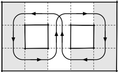
Suppose you want to study how an animal, when presented with two options A and B, can learn to alternatively choose A then B then A, etc. One typical lab setup to study such alternate decision task is the T-maze environment where the animal is confronted to a left or right turn and can be subsequently trained to display an alternate choice behavior. This task can be easily formalized using a block world as it is regularly done in the computational literature. Using such formalization, a simple solution is to negate (logically) a one bit memory each time the model reaches A or B such that, when located at the choice point, the model has only to read the value of this memory in order to decide to go to A or B. However, as simple as it is, this abstract formalization entails the elaboration of an explicit internal representation keeping track of the recent behavior, implemented in a working memory that can be updated when needed. But then, what could be the alternative? Let us consider a slightly different setup where the T-Maze is transformed into a closed 8-Maze (see figure 1-Left). Suppose that you can only observe the white area when the animal is evolving along the arrowed line (both in observable and non-observable areas). From the observer point of view, the animal is turning left one time out of two and turning right one time out of two. Said differently, the observer can infer an alternating behavior because of its
Karen Sobriel
Inria Bordeaux Sud-Ouest
Univ. Bordeaux, CNRS
Nicolas Rougier Inria Bordeaux Sud-Ouest Univ. Bordeaux, CNRS
<details>
<summary>Image 1 Details</summary>
### Visual Description
\n
## Diagram: Interconnected Rectangular Flow
### Overview
The image depicts a diagram illustrating a flow between two rectangular areas. The flow is represented by arrows indicating direction, and the rectangles are enclosed within a larger, shaded rectangular area. The diagram appears to represent a system with interconnected processes or components.
### Components/Axes
The diagram consists of the following components:
* **Two Rectangles:** Positioned side-by-side, forming the core of the flow.
* **Arrows:** Black arrows indicating the direction of flow. There are arrows circulating within each rectangle and arrows connecting the two rectangles.
* **Outer Rectangle:** A larger rectangle encompassing both inner rectangles, shaded in gray.
* **Grid:** A faint grid pattern in the background, likely for visual alignment.
There are no explicit axes or labels in the image.
### Detailed Analysis or Content Details
The diagram shows a cyclical flow within each rectangle.
* **Left Rectangle:** The flow within the left rectangle proceeds clockwise.
* **Right Rectangle:** The flow within the right rectangle also proceeds clockwise.
* **Interconnection:** Two arrows connect the left and right rectangles. One arrow points from the left rectangle to the right rectangle, and the other points from the right rectangle to the left rectangle. This indicates a bidirectional flow or exchange between the two rectangles.
* **Outer Shading:** The gray shading around the rectangles suggests a boundary or a common environment for the processes within.
### Key Observations
The diagram highlights a closed-loop system with interaction between two distinct components. The bidirectional arrows suggest a feedback mechanism or a continuous exchange of information or materials. The clockwise flow within each rectangle indicates a consistent process or cycle.
### Interpretation
This diagram likely represents a system with two interconnected processes or components operating in a cyclical manner. The bidirectional flow suggests a feedback loop, where the output of one process influences the other, and vice versa. The outer shading could represent a shared environment or a common constraint affecting both processes.
The diagram is abstract and does not provide specific details about the nature of the processes or the materials being exchanged. However, it effectively illustrates the concept of interconnectedness and cyclical flow within a system. It could be used to represent various systems, such as:
* **Control Systems:** Where feedback is used to regulate a process.
* **Biological Systems:** Where interconnected organs or processes maintain homeostasis.
* **Economic Systems:** Where supply and demand interact in a cyclical manner.
* **Chemical Processes:** Where reactants and products are continuously exchanged.
Without further context, the precise meaning of the diagram remains open to interpretation. However, the visual elements clearly convey the idea of a dynamic, interconnected system with cyclical processes.
</details>
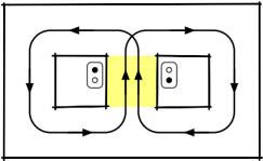
Fig. 1. Left: An expanded view of a T-Maze. An observer can infer an alternating behavior because of her partial view (white area) of the system. Right: 8-maze with cues. A cue (left or right) is given only when the bot is present inside the yellow area.
<details>
<summary>Image 2 Details</summary>
### Visual Description
\n
## Diagram: Electrical Wiring Configuration
### Overview
The image depicts a diagram illustrating the electrical wiring configuration between two electrical outlets. It shows the flow of current between the outlets, with a highlighted area indicating a potential issue or area of concern. The diagram is a simplified representation of a common electrical setup.
### Components/Axes
The diagram consists of the following components:
* **Two Electrical Outlets:** Represented as rectangular boxes with two circular openings each, indicating the sockets.
* **Current Flow Arrows:** Black arrows indicating the direction of electrical current flow around each outlet and between them.
* **Highlighted Area:** A yellow-colored area between the two outlets, suggesting a potential area of high current or a neutral connection.
* **Outer Rectangle:** A black rectangle outlining the entire diagram.
There are no axes or scales present in this diagram.
### Detailed Analysis or Content Details
The diagram shows a closed-loop current flow around each outlet. The arrows indicate that current enters one side of each outlet, flows through the device plugged into the outlet, and then returns to the other side of the outlet.
The key feature is the yellow highlighted area between the two outlets. Two upward-pointing arrows within this area suggest a direct current path between the neutral connections of the two outlets. This configuration is not standard and can cause issues.
The current flow around the left outlet is clockwise, while the current flow around the right outlet is also clockwise. The arrows connecting the two outlets indicate a current path between the neutral terminals.
### Key Observations
* The diagram highlights a potentially problematic wiring configuration where the neutral wires of the two outlets are directly connected.
* The closed-loop current flow around each outlet indicates a standard electrical circuit.
* The absence of any grounding wire representation is notable.
### Interpretation
The diagram likely illustrates a wiring error known as a "multi-wire branch circuit" issue, or potentially a bootleg neutral. This occurs when the neutral wires of two circuits are connected, creating a path for current to flow between them. This can lead to several problems:
* **Overloading:** If one circuit is heavily loaded, the current can flow through the neutral of the other circuit, potentially overloading it.
* **Voltage Imbalance:** Uneven loading can cause voltage imbalances, affecting the performance of connected devices.
* **Safety Hazard:** In some cases, this configuration can create a safety hazard, potentially leading to electrical shock or fire.
The yellow highlighted area emphasizes the problematic connection between the neutral wires. The diagram serves as a warning about the dangers of improper wiring and the importance of following electrical codes. The diagram is a simplified representation and does not include details like wire gauge, breaker size, or grounding. It is intended to illustrate a specific wiring issue rather than a complete electrical installation.
</details>
partial view of the system. The question is: does the animal really implement an explicit alternate behavior or is it merely following a mildly complex dynamic path? This is not a rhetorical question because depending on your hypothesis, you may search for neural correlates that actually do not exist. Furthermore, if the animal is following such mildly complex dynamic path, does this mean that it has no explicit access to (not to say no consciousness of) its own alternating behavior?
This question is tightly linked to the distinction between implicit learning (generally presented as sub-symbolic, associative and statistics-based) and explicit learning (symbolic, declarative and rule-based). Implicit learning refers to the nonconscious effects that prior information processing may exert on subsequent behavior [1]. It is implemented in associative sensorimotor procedural learning and also in model-free reinforcement learning, with biological counterparts in the motor and premotor cortex and in the basal ganglia. Explicit learning is associated with consciousness or awareness, and to the idea of building explicit mental representations [2] that can be used for flexible behavior, involving the prefrontal cortex and the hippocampus. This is what is proposed in model-based reinforcement learning and in other symbolic approaches for planning and reasoning. These strategies of learning are not independent but their relations and interdependencies are not clear today. Explicit learning is often observed in the early stages of learning whereas implicit learning appears on the long run, which can be explained as a way to decrease the cognitive load. But there is also a body of evidence, for example in sequence learning [3] or artificial grammar learning studies [4], that suggests that explicit learning is not a mandatory early step and that improvement in task performance are not necessarily accompanied by the ability to express the acquired knowledge in an explicit way [5].
Coming back to the task mentioned above, it is consequently not clear if we can learn rules without awareness and then to what extent can such implicit learning be projected to performance in an unconscious way? Furthermore, without turning these implicit rules into an explicit mental representation, is it possible to manipulate the rules, which is a fundamental trademark of flexible adaptable control of behavior?
Using the reservoir computing framework generally considered as a way to implement implicit learning, we first propose that a simple alternation or sequence learning task can be solved without an explicit pre-encoded representation of memory. However, to then be able to generate a new sequence or manipulate the rule learnt, we explain that inserting explicit cues in the decision process is needed. In a second series of experiments, we provide a proof of concept still using the reservoir computing framework, for the hypothesis that the recurrent network forms contextual representations from implicitly acquired rules over time. We then show that these representations can be considered explicit and necessary to be able to manipulate behaviour in a flexible manner.
In order to provide preliminary interpretation of what is observed here, it is reminded that recurrent networks, particularly models using the reservoir computing framework, are a suitable candidate to model the prefrontal cortex [6], also characterized by local and recurrent connections. Given their inherent sensitivity to temporal structure, it also makes these networks adaptable for sequence learning. This approach has been used to model complex sensorimotor couplings [7] from the egocentric view of an agent (or animal) that is situated in its environment and can autonomously demonstrate reactive behaviour from its sensory space [8], as we also do in the first series of experiments, for learning sensorimotor couplings by demonstration, or imitation. In the second series of experiment, we propose that the prefrontal cortex is the place where explicit representations can be elaborated when flexible behaviors are required.
## II. METHODS AND TASK
The objective is the creation of a reservoir computing network of type Echo State Network (ESN) that controls the movement of a robot [8], [9], which has to solve a decision-making task (alternately going right and left at an intersection) in the maze presented in figure 1.
## A. Model Architecture : Echo State Network
An ESN is a recurrent neural network (called reservoir) with randomly connected units, associated with an input layer and an output layer, in which only the output (also called readout) neurons are trained. The neurons have the following dynamics:
$$\begin{array} { r l r } { x [ n ] } & = } & { ( 1 - \alpha ) x [ n - 1 ] + \alpha \tilde { x } [ n ] } & { ( 1 ) } \end{array}$$
$$\begin{array} { r l r } { \tilde { x } [ n ] } & = } & { \tanh ( W x [ n - 1 ] + W _ { i n } [ 1 ; u [ n ] ] ) } & { ( 2 ) } \end{array}$$
$$\begin{array} { r l r } { y [ n ] } & { = } & { f ( W _ { o u t } [ 1 ; \tilde { x } ( n ) ] ) } & { ( 3 ) } \end{array}$$
where x ( n ) is a vector of neurons activation, ˜ x ( n ) its update, u ( n ) and y ( n ) are respectively the input and the output vectors, all at time n . W , W in , W out are respectively the reservoir, the input and the output weight matrices. The notation [ . ; . ] stands for the concatenation of two vectors. α corresponds to the leak rate. tanh corresponds to the hyperbolic tangent function and f to linear or piece-wise linear function.
The values in W , W in , W out are initially randomly chosen. While W , W in are kept fixed, the output weights W out are the only ones plastic (red arrows in Figure 2). In this model, the output weights are learnt with the ridge regression method (also known as Tikhonov regularization):
$$W _ { o u t } = Y ^ { t \arg e t } X ^ { T } ( X X ^ { T } + \beta I ) ^ { - 1 } \quad ( 4 )$$
where Y target is the target signal to approximate, X is the concatenation of 1, the input and the neurons activation vectors: [1; u ( n ); x ( n )] , β corresponds to the regularization coefficient and I the identity matrix.
## B. Experiment 1 : Uncued sequence learning
The class of tasks called spatial alternation has been widely used to study hippocampal and working memory functions [10]. For the purpose of our investigation, we simulated a continuous version of the same task, wherein the agent needs to alternate its choice at a decision point, and after the decision, it is led back to the central corridor, in essence following an 8shaped trace while moving (see figure 1-Left). This alternation task is widely believed to require a working memory such as to remember what was the previous choice in order to alternate it. Here we show that the ESN previously described is sufficient to learn the task without an explicit representation of the memory.
1) Tutor model: In order to generate data for learning, we implemented a simple Braintenberg vehicle where the robot moves automatically with a constant speed and changes its orientation according to the values of its sensors. At each time step the sensors measure the distance to the walls and the bot turns such as to avoid the walls. At each timestep, the position of the bot is updated as follows:
$$\begin{array} { r l r } { s k } & \quad } \\ { z e } & \quad } \\ { ( 5 ) } \end{array}$$
$$\begin{array} { r l r } { p ( n ) } & = } & { p ( n - 1 ) + 2 * \left ( \cos ( \theta ( n ) ) + \sin ( \theta ( n ) ) \right ) } & { ( 6 ) } \end{array}$$
where p ( n ) and p ( n +1) are the positions of the robot at time step n and n +1 , θ ( n ) is the orientation of the robot, calculated as the weighted sum ( α i ) of the values of the sensors s i . The norm of the movement is kept constant and fixed at 2.
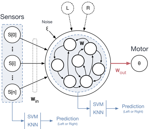
Fig. 2. Model Architecture with 8 sensor inputs, and a motor output (orientation). The black arrows are fixed while the red arrows are plastic and are trained. The reservoir states are used as the input to a classifier which is trained to make a prediction about the decision (going left or right) of the robot. A left (L) and right (R) cue can be fed to the model depending on the experiment (see Methods).
<details>
<summary>Image 3 Details</summary>
### Visual Description
\n
## Diagram: Neural Network with Prediction Outputs
### Overview
The image depicts a diagram of a neural network processing sensor input to produce a motor output and a prediction. The network is shown as a circular arrangement of interconnected nodes, with inputs from sensors, noise, and direct left/right signals. Outputs are directed towards a motor control signal and a prediction module utilizing SVM and KNN algorithms.
### Components/Axes
The diagram consists of the following components:
* **Sensors:** Represented by a blue rectangular box labeled "Sensors" containing a series of nodes labeled "S[0]", "S[i]", and "S[n]". The "i" and "n" suggest a sequence or index.
* **Neural Network:** A circular arrangement of interconnected nodes enclosed within a light blue shaded circle. The nodes are labeled "W".
* **Inputs:** Three input sources: "Noise" (labeled ξ), "L" (Left), and "R" (Right).
* **Weights:** Input weights are labeled "w<sub>in</sub>" and output weights are labeled "w<sub>out</sub>".
* **Motor:** Represented by a circle labeled "θ".
* **Prediction Module:** A block labeled "SVM KNN" with outputs labeled "Prediction (Left or Right)".
* **Arrows:** Indicate the flow of information between components.
### Detailed Analysis / Content Details
The diagram illustrates the following flow:
1. **Sensor Input:** Sensor data S[0] through S[n] is fed into the neural network.
2. **Noise Input:** Noise (ξ) is also fed into the neural network.
3. **Direct Inputs:** Direct signals for "Left" (L) and "Right" (R) are also fed into the neural network.
4. **Neural Network Processing:** The inputs are processed within the network (W), utilizing input weights (w<sub>in</sub>).
5. **Motor Output:** The processed signal is outputted as a motor control signal (θ) using output weights (w<sub>out</sub>).
6. **Prediction Output:** The output of the neural network is also fed into a prediction module utilizing Support Vector Machines (SVM) and K-Nearest Neighbors (KNN) algorithms. This module generates a prediction of "Left or Right".
The neural network itself appears to have a complex, fully connected structure within the circular arrangement. The arrows indicate bidirectional connections between nodes.
### Key Observations
* The diagram emphasizes the integration of sensor data, noise, and direct signals for decision-making.
* The use of both a motor output and a prediction output suggests a system that not only acts but also anticipates or classifies.
* The inclusion of SVM and KNN indicates a hybrid approach to prediction, potentially combining the strengths of both algorithms.
* The notation S[i] and S[n] suggests a time series or sequential data input from the sensors.
### Interpretation
This diagram represents a computational model for decision-making, likely in a robotic or control system. The neural network acts as a central processing unit, integrating various sources of information to generate both a motor command and a prediction. The inclusion of noise as an input suggests the system is designed to be robust to uncertainty. The use of SVM and KNN for prediction indicates a desire for accurate classification, potentially for error checking or adaptive control. The system appears to be designed to respond to external stimuli (Left/Right) while also learning from sensor data. The diagram is a high-level conceptual representation and does not provide specific details about the network architecture, learning algorithms, or performance metrics. It is a schematic illustration of a system's functional components and their interconnections.
</details>
Fig. 3. Generation of the 8-shape pathway with the addition of walls at the intersection points
<details>
<summary>Image 4 Details</summary>
### Visual Description
\n
## Diagram: Reflection and Refraction Scenarios
### Overview
The image presents a 2x2 grid of diagrams illustrating the concepts of reflection and refraction of light. Each diagram depicts a wavefront (represented by a series of radiating lines) encountering a boundary between two media, resulting in either reflection or refraction (or both). The diagrams are schematic and do not contain numerical data.
### Components/Axes
Each diagram contains the following components:
* **Wavefront:** A series of lines radiating outwards from a central point, representing a wave.
* **Boundary:** A red line representing the interface between two media.
* **Media:** Two distinct regions, one with a grid pattern and one with a dotted pattern, representing different optical properties.
* **Incident Point:** A white circle marking the point where the wavefront first encounters the boundary.
There are no explicit axes or legends.
### Detailed Analysis or Content Details
The diagrams can be described as follows:
* **Top-Left:** The wavefront approaches the boundary at an angle. A portion of the wavefront is reflected back into the grid medium, while the remaining portion is refracted into the dotted medium, bending *away* from the normal (an imaginary line perpendicular to the boundary).
* **Top-Right:** The wavefront approaches the boundary at a steeper angle. A larger portion of the wavefront is reflected back into the grid medium, and the refracted portion bends further away from the normal.
* **Bottom-Left:** The wavefront approaches the boundary at a shallow angle. A smaller portion of the wavefront is reflected, and the refracted portion bends slightly away from the normal.
* **Bottom-Right:** The wavefront approaches the boundary at an angle similar to the top-right diagram, but the refracted ray bends more sharply.
The angle of incidence (angle between the wavefront and the normal) varies in each diagram. The angle of reflection is approximately equal to the angle of incidence in each case. The angle of refraction is different from the angle of incidence, indicating a change in the speed of light as it enters the new medium.
### Key Observations
* The diagrams demonstrate the law of reflection (angle of incidence equals angle of reflection).
* The diagrams demonstrate the principle of refraction, where light bends when passing from one medium to another.
* The amount of reflection increases as the angle of incidence increases.
* The amount of bending (refraction) varies depending on the angle of incidence.
### Interpretation
These diagrams illustrate fundamental principles of optics. They demonstrate how light behaves when it encounters a boundary between two different media. The diagrams show that light can be both reflected and refracted, and that the amount of each depends on the angle at which the light strikes the boundary. The grid and dotted patterns represent media with different refractive indices, causing the bending of light during refraction. The diagrams are conceptual and do not provide quantitative data, but they effectively convey the qualitative behavior of light in these scenarios. The diagrams are useful for understanding how lenses and other optical devices work.
</details>
- 2) Training data: The ESN is trained using supervised learning, containing samples from the desired 8-shaped trajectory. Since the Braitenberg algorithm only aims to avoid obstacles, the robot is forced into the desired trajectory by adding walls at the intersection points as shown in figure 3. After generating the right pathway, the added walls are removed and the true sensor values are gathered as input. Gaussian noise is added to the position values of the robot at every time step in order to make the training more robust. Approximately 50,000 time steps were generated (equivalent to 71 complete 8-loops) and separated into training and testing sets.
3) Hyper parameters tuning: The ESN was built with the python library ReservoirPy [11] with the hyper-parameters presented in table I, column 'Without context'. The order
| Parameter | Without context | With context |
|------------------------|-------------------|----------------------------|
| Input size | 8 | 10 |
| Output size | 1 | 1 |
| Number of units | 1400 | 1400 |
| Input connectivity | 0.2 | 0.2 |
| Reservoir connectivity | 0.19 | 0.19 |
| Reservoir noise | 0.01 | 1e-2 |
| Input scaling | 1 | 1(sensors), 10.4695 (cues) |
| Spectral Radius | 1.4 | 1.505 |
| Leak Rate | 0.0181 | 0.06455 |
| Regularization | 4.1e-08 | 1e-3 |
TABLE I
PARAMETER CONFIGURATION FOR THE ESN
of magnitude of the hyper-parameters was first found using the Hyperopt python library [12], then these were fine tuned manually. The ESN receives as input the values of the 8 sensors and output the next orientation.
4) Model evaluation: The performance of the ESN has been calculated with the Normalized Root Mean Squared Error metrics ( NRMSE ) and the R square ( R 2 ) metrics, defined as follows :
$$N R M S E = \frac { \sqrt { \frac { \sum _ { i = 1 } ^ { n } ( y _ { i } - \hat { y } _ { i } ) ^ { 2 } } { n } } } { \sigma } \quad ( 7 )$$
$$R ^ { 2 } = 1 - \frac { \sum ( y _ { i } - \hat { y } _ { i } ) ^ { 2 } } { \sum ( y _ { i } - \bar { y } ) ^ { 2 } } \quad ( 8 )$$
where y i , ˆ y i and ¯ y are respectively the desired output, the predicted output and the mean of the desired output.
5) Reservoir state analysis: In this section the reservoir states are analysed such as to inspect to which extent they form an internal and hidden representation of the memory. To do so, we use Principal Component Analysis (PCA), a dimensionality reduction method enabling the identification of patterns and important features of the processed data. PCA is carried out on the reservoir states for each position of the robot during the 8-shape trajectory. We continued the analysis by doing a classification of the reservoir states. We made the assumption that it is possible to know the future direction of the robot observing the internal states of the reservoir. This implies that the reservoir states can be classified in two classes: one related to the prediction of going left and the other related to the prediction of going right. Two standard classifiers, the KNN (K-Nearest Neighbors) and the SVM (Support Vector Machine) were used. They take as input the reservoir state at each position of the bot while executing the 8-shape and predict the decision the robot will take at the next intersection (see figure 2). Since the classifiers are trained using supervised learning, the training data were generated in the central corridor of the maze (yellow area in figure 1Right), assuming that it is where the reservoir is in the state configuration in which it already knows which direction it will take at the next intersection. 900 data points were generated and separated into training and testing sets.
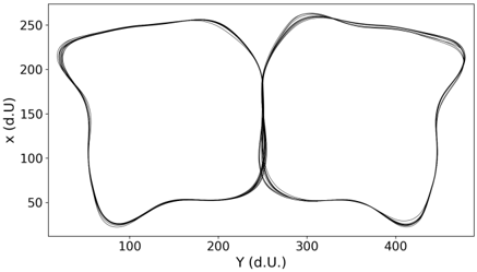
Fig. 4. The trajectory of the robot following the 8-trace in the cartesian map.
<details>
<summary>Image 5 Details</summary>
### Visual Description
\n
## Chart: Lissajous Curve Variation
### Overview
The image displays a series of curves resembling Lissajous figures, plotted on a two-dimensional Cartesian coordinate system. The curves appear to be variations of a figure-eight shape, with some exhibiting more pronounced distortions or asymmetry. There is no legend or explicit labeling of individual curves.
### Components/Axes
* **X-axis:** Labeled "Y (d.U.)". Scale ranges from approximately 50 to 450, with tick marks at intervals of 50.
* **Y-axis:** Labeled "x (d.U.)". Scale ranges from approximately 25 to 275, with tick marks at intervals of 50.
* **Curves:** Multiple black lines representing the plotted data. There are approximately 8-10 curves visible, varying in shape and position.
* **Background:** White background with a gray border.
### Detailed Analysis
The curves exhibit a general figure-eight pattern, but with significant variations.
* **Curve 1 (Leftmost):** Starts at approximately (75, 250), descends to (75, 50), rises to (150, 250), and returns to (75, 250).
* **Curve 2 (Slightly to the Right):** Similar to Curve 1, but slightly shifted to the right and with a more rounded lower loop. Starts at approximately (100, 250), descends to (100, 50), rises to (200, 250), and returns to (100, 250).
* **Curve 3 (Center):** Appears to be the most symmetrical figure-eight, centered around Y = 200 and X = 150. Starts at approximately (150, 250), descends to (150, 50), rises to (250, 250), and returns to (150, 250).
* **Curve 4 (Rightmost):** Similar to Curve 3, but shifted further to the right and with a slightly flattened upper loop. Starts at approximately (250, 250), descends to (250, 50), rises to (350, 250), and returns to (250, 250).
* **Remaining Curves:** The remaining curves fall between these extremes, exhibiting varying degrees of distortion and asymmetry. They appear to be intermediate forms between the leftmost and rightmost curves.
The curves generally trend from top-left to bottom-left, then to top-right, and back to top-left, forming the characteristic loops of a Lissajous figure. The variations in shape suggest different phase relationships or frequency ratios between the two sinusoidal motions that generate these curves.
### Key Observations
* The curves are not uniformly distributed; they cluster towards the left and right sides of the plot.
* There is a clear progression in shape from the leftmost to the rightmost curves, suggesting a systematic variation in the parameters that define the Lissajous figure.
* The curves do not intersect each other, indicating that the underlying sinusoidal motions are not perfectly synchronized.
### Interpretation
The image likely represents a visualization of Lissajous curves, which are generated by parametric equations involving sine and cosine functions with potentially different frequencies and phase shifts. The variations in the curves suggest that the parameters defining these equations (frequency ratio, phase difference) are being systematically altered.
The clustering of curves towards the left and right sides could indicate a specific range of parameter values being explored. The absence of a legend makes it difficult to determine the exact relationship between the curves and the underlying parameters. However, the systematic variation in shape suggests that the image is intended to demonstrate the effect of changing these parameters on the resulting Lissajous figure.
The "d.U." units on the axes are not standard units and likely represent arbitrary units specific to the experiment or simulation that generated the data. The image demonstrates the visual representation of complex harmonic motion and the impact of phase and frequency on the resulting patterns.
</details>
## C. Experiment 2 : 8 Maze Task with Contextual Inputs
In this experiment, we fed the reservoir with two additional inputs that represent the next decision, one being related to a right turn (R) and the other to a left turn (L) (see figure 2). They are binary values, switched to a value of 1 only when the bot is known to take the corresponding direction. We thus built a second ESN with the hyper-parameters presented in TABLE I, column 'With context'. The network is similar to the previous one, except that the contextual inputs are added with a different input scaling than the one used for the sensors inputs. During the data generation, the two additional inputs are set to 0 everywhere in the maze, except in the central corridor.
## III. RESULTS
## A. Motor sequence learning
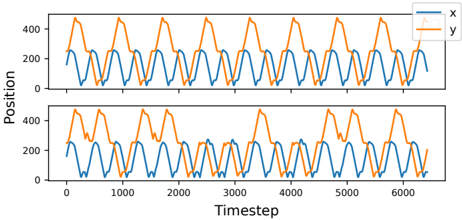
We first show that a recurrent neural network like the ESN can learn a rule-based trajectory in the continuous space, without an explicit memory or feedback connections. The score of the ESN is shown in TABLE II and the results for the trajectory predicted by the ESN are presented in figure 4 and in the top panel in figure 8. At each period of about 350 steps, a behavior or decision switch takes place, which is evident from the crests and troughs in the y-axis coordinates. It can be seen that the ESN correctly predicts the repeated alternating choice in the central arm of the maze. In addition to switching between the left and right loops, the robot also moves through the environment without colliding into obstacles.
| Performance of the ESN for 50 simulations | Performance of the ESN for 50 simulations | Performance of the ESN for 50 simulations | Performance of the ESN for 50 simulations |
|---------------------------------------------|---------------------------------------------|---------------------------------------------|---------------------------------------------|
| NRMSE | NRMSE | R 2 | R 2 |
| Mean | 0.0171 | Mean | 0.9962 |
| Variance | 5.4466e-06 | Variance | 1.0192e-06 |
TABLE II
NRMSE AND R 2 SCORE OF THE ESN WITH 8 INPUTS
## B. Reservoir State Prediction
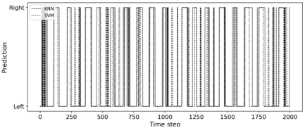
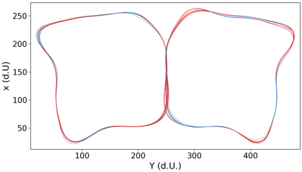
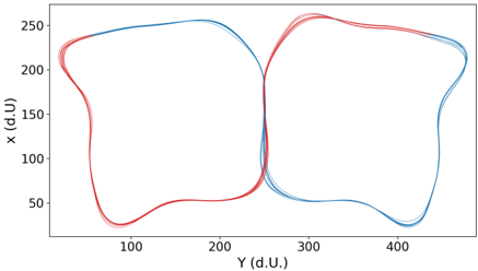
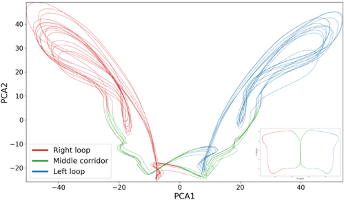
Next, we show that even a simple classifier such as SVM or KNN can observe the internal states of the reservoir and learn to predict the decision (whether to go left or right) of the network. The results of the predictions are presented in the top part of figure 5. As expected, there is a periodicity of choice in line with the position of the bot in the maze, showing that the classification is relevant. At each time step, both classifiers output the same prediction with a small discrepancy in time. The accuracy score obtained for both classifiers is 1. In the bottom part of figure 5, we can observe that the robot knows quite early which decision it will take at the next loop while we could expect that it would take its decision in the yellow corridor in figure 1. Here, we see that if the robot just turned right, the reservoir switches its internal state to go left next time only a few dozen time steps after. We tried the same classifiers but instead of the reservoir states as input, we used the sensors values. The results are shown in the figure 5. As expected, the classifications fail with an accuracy score of 0.57 for SVM and 0.43 for KNN; this randomness can be seen in both figures. Thus, we showed that by simply observing the internal states of the reservoir, it is possible to predict its next prediction. In essence, this is a proof of concept to show that second-order or observer networks, mimicking the role of the regions of the prefrontal cortex implementing contextual rules, can consolidate information linking sensory information to motor actions, to develop relevant contextual representations. Since the state space of the dynamic reservoir is highdimensional, using the Principal Component Analysis (PCA) on the states, we investigated if it is possible to observe subspace attractors. The result for the PCA analysis is presented in figure 7, where PCA was applied for 5000 time steps, which corresponds to 7 8-loops. The figure shows two symmetric sub-attractors, which are linearly separable, that correspond to the two parts of the 8-shape trajectory.
## C. Explicit rules with contextual inputs
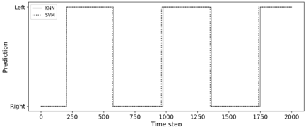
Finally, we demonstrate that although the ESN can learn a motor sequence without contextual inputs, it is limited by its internal representation to learn more complex sequences which may require a longer memory. Adding contextual or explicit information about the rule (which we propose are representations developed by the prefrontal cortex over time) can then bias the ESN to follow any arbitrary trajectory as in 8. With the additional contextual inputs, the ESN is able to reproduce the standard 8 sequence (the performance is shown in table III) but can also achieve more complex tasks by sending to it the proper contextual inputs. One example can be seen in figure 8: the top graph shows the positions of the bot while making the standard 8 sequence [ABABABAB...], the bottom one shows that the bot was able to achieve a more complex sequence [AABBAABBAABB...].
## IV. DISCUSSION
Using a simple reservoir model that learns to follow a specific path, we have shown how the resulting behavior could be
<details>
<summary>Image 6 Details</summary>
### Visual Description
\n
## Line Chart: Prediction over Time Step
### Overview
The image presents a line chart illustrating the predictions of three different machine learning models (KNN, SVM, and a model without a label) over 2000 time steps. The y-axis represents the prediction (categorized as "Left" or "Right"), and the x-axis represents the "Time step". The chart displays the models' predictions as oscillating lines between these two categories.
### Components/Axes
* **X-axis:** "Time step" ranging from 0 to 2000, with major ticks at intervals of 250.
* **Y-axis:** "Prediction" with two categories: "Left" and "Right".
* **Legend:** Located in the top-left corner, identifying the three lines:
* KNN (solid line)
* SVM (dashed line)
* Unnamed model (dotted line)
### Detailed Analysis
The chart shows a repeating pattern of predictions over time. All three models exhibit a cyclical behavior, alternating between predicting "Left" and "Right".
* **KNN (solid line):** The KNN model consistently predicts "Right" for approximately the first 100 time steps, then switches to "Left" for the next 100 time steps, and repeats this pattern throughout the entire 2000 time steps. The transitions between "Left" and "Right" appear relatively sharp.
* **SVM (dashed line):** The SVM model also exhibits the same cyclical pattern as KNN, alternating between "Right" and "Left" predictions every 100 time steps. However, the transitions are less abrupt than those of the KNN model, with some intermediate values.
* **Unnamed model (dotted line):** This model also follows the same cyclical pattern, alternating between "Right" and "Left" predictions every 100 time steps. The transitions are similar to the SVM model, showing some intermediate values.
Visually, the three models appear to be highly correlated, with all three lines following a similar trajectory. The models consistently predict "Right" between approximately time steps 0-100, 200-300, 400-500, 600-700, 800-900, 1000-1100, 1200-1300, 1400-1500, 1600-1700, 1800-1900. And consistently predict "Left" between approximately time steps 100-200, 300-400, 500-600, 700-800, 900-1000, 1100-1200, 1300-1400, 1500-1600, 1700-1800, 1900-2000.
### Key Observations
* All three models demonstrate a strong cyclical pattern in their predictions.
* The models are highly correlated, suggesting they are responding to the same underlying patterns in the data.
* The KNN model exhibits the most abrupt transitions between "Left" and "Right" predictions.
* The SVM and unnamed models show smoother transitions.
### Interpretation
The chart suggests that the underlying data has a periodic or cyclical nature, causing the models to consistently alternate between predicting "Left" and "Right". The high correlation between the models indicates that they are all capturing the same fundamental pattern. The differences in transition smoothness may reflect the models' sensitivity to noise or their decision boundaries. The consistent pattern suggests a deterministic or highly predictable system. The fact that all models perform similarly suggests that the choice of model may not be critical in this particular scenario, as long as it can capture the cyclical pattern. The absence of a label for the third model hinders a more detailed comparison and interpretation.
</details>
<details>
<summary>Image 7 Details</summary>
### Visual Description
\n
## Chart: Two-Dimensional Scatter Plot with Overlaid Curves
### Overview
The image presents a two-dimensional scatter plot displaying overlaid curves. The plot visualizes the relationship between two variables, 'Y (d.U.)' and 'X (d.U.)'. Two distinct sets of curves are visible, differentiated by color: red and blue. The curves appear to represent cyclical or periodic data, forming roughly figure-eight shaped patterns.
### Components/Axes
* **X-axis:** Labeled "Y (d.U.)", ranging from approximately 50 to 450. The scale appears linear.
* **Y-axis:** Labeled "X (d.U.)", ranging from approximately 20 to 270. The scale appears linear.
* **Curves:** Two sets of curves, one in red and one in blue. There is significant overlap between the curves within each set.
* **No Legend:** There is no explicit legend provided in the image.
### Detailed Analysis
The plot shows two distinct groups of curves.
**Red Curves:**
The red curves form two interconnected loops.
* The left loop has a minimum Y value of approximately 80 and a maximum X value of approximately 250.
* The right loop has a minimum Y value of approximately 80 and a maximum X value of approximately 420.
* The curves generally trend upwards from Y=80 to Y=250, then downwards.
* The curves appear to converge around Y=200.
**Blue Curves:**
The blue curves also form two interconnected loops, similar to the red curves.
* The left loop has a minimum Y value of approximately 60 and a maximum X value of approximately 230.
* The right loop has a minimum Y value of approximately 60 and a maximum X value of approximately 380.
* The curves generally trend upwards from Y=60 to Y=250, then downwards.
* The curves appear to converge around Y=200.
The blue curves are generally positioned slightly below the red curves across the entire range of Y values. The curves within each color group are closely clustered, indicating relatively low variance within each set.
### Key Observations
* The two sets of curves exhibit similar shapes and patterns, suggesting a common underlying process.
* There is a clear separation between the red and blue curves, indicating a difference in their characteristics.
* The convergence of the curves around Y=200 suggests a potential critical point or transition in the underlying process.
* The lack of a legend makes it difficult to definitively interpret the meaning of the red and blue colors.
### Interpretation
The data suggests two distinct but related cyclical processes. The 'X (d.U.)' and 'Y (d.U.)' variables likely represent some form of measurement or state within these processes. The similar shapes of the red and blue curves suggest that both processes share a common underlying mechanism, but the consistent offset between them indicates a difference in their parameters or conditions.
Without further context, it is difficult to determine the specific meaning of the data. However, the figure-eight shape of the curves could represent a hysteresis effect, a resonance phenomenon, or a limit cycle oscillation. The convergence point at Y=200 might represent a stable equilibrium or a bifurcation point.
The absence of a legend is a significant limitation, as it prevents a clear understanding of what the red and blue colors represent. It is possible that they represent different experimental conditions, different subjects, or different phases of the same process. Further investigation is needed to fully interpret the data.
</details>
Fig. 5. Prediction from sensors during 2000 time steps. Top figure shows the prediction of the KNN and SVM classifier, bottom figure shows the SVM prediction along the trajectory.
| Performance of the ESN for 50 runs | Performance of the ESN for 50 runs | Performance of the ESN for 50 runs | Performance of the ESN for 50 runs |
|--------------------------------------|--------------------------------------|--------------------------------------|--------------------------------------|
| NRMSE | NRMSE | R 2 | R 2 |
| Mean | 0.0050 | Mean | 0.9997 |
| Variance | 1.1994e-07 | Variance | 2.0220e-09 |
TABLE III
NRMSE AND R 2 SCORE OF THE ESN WITH THE TWO ADDITIONAL CONTEXTUAL INPUTS
interpreted as an alternating behavior by an external observer. However, we've also shown that from the point of view of the model and in the absence of associated cues, this behavior cannot be interpreted as such. Instead, the behavior results from the internal dynamics of the reservoir (and the learning procedure we implemented). Without external cues, the model is unable to escape its own behavior and is trapped inside an attractor. Only the cues can provide the model with the necessary and explicit information that in turn allows to bias its behavior in favor of option A or option B.
From a neuroscience perspective, as developed in more details in [13], it can be proposed that the reservoir model in the first experiment implements the premotor cortex learning sensorimotor associations in the anterior cortex. In the first experiment, this is made by supervised learning in a process of learning by imitation. In a different protocol, this is also classically be done by reinforcement learning, involving another region of the anterior cortex, the anterior cingulate cortex,
<details>
<summary>Image 8 Details</summary>
### Visual Description
\n
## Line Chart: Prediction over Time
### Overview
The image presents a line chart illustrating the predictions of two machine learning models, KNN and SVM, over time. The chart displays a binary prediction ("Left" or "Right") as a function of "Time step". The chart appears to show a cyclical pattern of predictions.
### Components/Axes
* **X-axis:** "Time step", ranging from approximately 0 to 2000.
* **Y-axis:** "Prediction", with two categories: "Left" and "Right". The Y-axis is not numerically scaled, but represents a categorical variable.
* **Legend:** Located in the top-left corner.
* "KNN" - represented by a solid line.
* "SVM" - represented by a dotted line.
### Detailed Analysis
The chart shows alternating predictions between "Left" and "Right" for both KNN and SVM models.
* **KNN (Solid Line):**
* From Time step 0 to approximately 250, the prediction is "Right".
* From approximately 250 to 750, the prediction is "Left".
* From approximately 750 to 1000, the prediction is "Right".
* From approximately 1000 to 1250, the prediction is "Left".
* From approximately 1250 to 1500, the prediction is "Right".
* From approximately 1500 to 1750, the prediction is "Left".
* From approximately 1750 to 2000, the prediction is "Right".
* **SVM (Dotted Line):**
* From Time step 0 to approximately 250, the prediction is "Right".
* From approximately 250 to 750, the prediction is "Left".
* From approximately 750 to 1000, the prediction is "Right".
* From approximately 1000 to 1250, the prediction is "Left".
* From approximately 1250 to 1500, the prediction is "Right".
* From approximately 1500 to 1750, the prediction is "Left".
* From approximately 1750 to 2000, the prediction is "Right".
Both models exhibit identical prediction patterns throughout the entire time step range. The predictions alternate between "Left" and "Right" approximately every 250 time steps.
### Key Observations
* Both KNN and SVM models produce the exact same predictions at every time step.
* The predictions are cyclical, alternating between "Left" and "Right" with a consistent period.
* There are no apparent discrepancies or variations in the predictions between the two models.
### Interpretation
The chart suggests that both the KNN and SVM models are performing identically on this particular dataset or task. The consistent, cyclical pattern of predictions indicates that the underlying data may have a periodic or alternating characteristic. The fact that both models agree perfectly could imply that the task is relatively simple, or that the models have converged to the same solution. It's also possible that the data is intentionally designed to produce this alternating pattern, perhaps for testing or demonstration purposes. Further investigation into the data and the specific task would be needed to understand the underlying reasons for this behavior. The lack of variation between the models doesn't necessarily indicate superiority of one over the other; it simply means they are both equally capable of capturing the pattern present in the data.
</details>
Time step
Fig. 6. Prediction from reservoir state during 2000 time steps. Top figure shows the predictions of the KNN and SVM classifier. Bottom figure shows the SVM prediction along the trajectory.
<details>
<summary>Image 9 Details</summary>
### Visual Description
\n
## Chart: X vs Y Scatter Plot with Two Series
### Overview
The image presents a scatter plot displaying two distinct series of data, represented by red and blue lines. The plot visualizes the relationship between two variables, 'X (d.U.)' and 'Y (d.U.)'. The data appears to trace closed loops, suggesting cyclical or periodic behavior.
### Components/Axes
* **X-axis:** Labeled "Y (d.U.)", ranging from approximately 50 to 450.
* **Y-axis:** Labeled "X (d.U.)", ranging from approximately 50 to 250.
* **Data Series 1:** Red lines, forming a closed loop.
* **Data Series 2:** Blue lines, also forming a closed loop.
* **No Legend:** There is no explicit legend provided in the image.
### Detailed Analysis
**Red Data Series:**
The red line begins at approximately (100, 250), decreases to a minimum of around (100, 50), then increases to approximately (300, 250), and finally returns to the starting point, completing a loop. The shape is roughly elliptical, but with significant distortion.
* Approximate Data Points (Red):
* (100, 250)
* (100, 50)
* (300, 50)
* (300, 250)
**Blue Data Series:**
The blue line starts at approximately (200, 250), decreases to a minimum of around (200, 50), then increases to approximately (400, 250), and finally returns to the starting point, completing a loop. Similar to the red line, it's an elliptical shape with distortion.
* Approximate Data Points (Blue):
* (200, 250)
* (200, 50)
* (400, 50)
* (400, 250)
Both series exhibit multiple lines, indicating either multiple trials or variations within the data. The lines are closely grouped, suggesting relatively consistent behavior within each series.
### Key Observations
* The two series exhibit distinct loop shapes, offset from each other along the Y-axis.
* Both series show a similar overall pattern of decreasing and increasing values for both X and Y.
* The loops are not perfectly symmetrical, indicating non-linear relationships.
* The data points are densely packed within each loop, suggesting a high sampling rate or a smooth, continuous process.
### Interpretation
The chart likely represents a cyclical process or a system exhibiting periodic behavior. The two series could represent different conditions, treatments, or measurements of the same system. The offset between the loops suggests a phase shift or a difference in the starting point of the cycles. The 'd.U.' unit is unknown, but it is consistent across both axes.
The shape of the loops suggests that the relationship between X and Y is not linear. The distortion of the loops could be due to external factors, measurement errors, or inherent complexities in the system being studied. The multiple lines within each series suggest that the process is not perfectly repeatable, but exhibits some degree of variability.
Without further context, it's difficult to determine the specific meaning of the data. However, the chart provides valuable insights into the cyclical nature of the system and the differences between the two series. Further investigation would be needed to understand the underlying mechanisms driving these patterns.
</details>
Fig. 7. The first two principal components of the reservoir state space after applying PCA on the reservoir states. On the bottom right is the corresponding map of the positions of the robot in the maze.
<details>
<summary>Image 10 Details</summary>
### Visual Description
\n
## Scatter Plot: PCA Projection of Trajectories
### Overview
The image presents a scatter plot visualizing trajectories projected onto the first two Principal Components (PCA1 and PCA2). The plot displays three distinct trajectory groups, likely representing different behavioral states or paths. The trajectories are represented as colored lines, with a legend identifying each group. A small inset plot in the bottom-right corner shows representative shapes of the trajectories.
### Components/Axes
* **X-axis:** PCA1 (ranging approximately from -45 to 25)
* **Y-axis:** PCA2 (ranging approximately from -25 to 45)
* **Legend:** Located in the top-left corner, identifying three trajectory groups:
* Right loop (Red)
* Middle corridor (Green)
* Left loop (Blue)
* **Inset Plot:** Located in the bottom-right corner, showing representative shapes of the trajectories. The inset plot has axes labeled "Time" (x-axis) and a value ranging from 0 to 400 (y-axis).
### Detailed Analysis
The plot shows a clear separation of the three trajectory groups based on their PCA1 and PCA2 values.
* **Right Loop (Red):** This group exhibits a wide range of PCA2 values (approximately -10 to 45) and PCA1 values concentrated between -40 and -10. The lines generally curve upwards and to the left. The trajectories appear to originate near PCA1=-20, PCA2=-10 and extend upwards and to the left.
* **Middle Corridor (Green):** This group is tightly clustered around PCA1 values between -20 and 0, and PCA2 values between -15 and 0. The lines are relatively short and appear to form a narrow corridor. The trajectories appear to originate near PCA1=-10, PCA2=-5.
* **Left Loop (Blue):** This group shows a range of PCA2 values (approximately -20 to 30) and PCA1 values concentrated between 0 and 25. The lines generally curve downwards and to the right. The trajectories appear to originate near PCA1=0, PCA2=0 and extend downwards and to the right.
The inset plot shows two representative shapes: one for the right loop (red) and one for the left loop (blue). The shapes are roughly similar, suggesting a cyclical pattern. The x-axis of the inset plot is labeled "Time" and ranges from 0 to 400. The y-axis is not labeled, but the values range from approximately -10 to 10.
### Key Observations
* The three trajectory groups are well-separated in the PCA space, suggesting distinct underlying behavioral patterns.
* The "Middle Corridor" trajectories are the most constrained, while the "Right Loop" and "Left Loop" trajectories exhibit more variability.
* The inset plot confirms the cyclical nature of the "Right Loop" and "Left Loop" trajectories.
* The trajectories all appear to converge near the origin (PCA1 ≈ 0, PCA2 ≈ 0).
### Interpretation
This PCA plot likely represents the dimensionality reduction of complex trajectory data, potentially from animal movement, robotic paths, or other time-series data. The three trajectory groups suggest three distinct behavioral states or modes of operation. The separation in PCA space indicates that these states are relatively independent. The convergence of trajectories near the origin could represent a transition point between these states or a common starting/ending point. The inset plot provides a visual confirmation of the cyclical nature of the "Right Loop" and "Left Loop" trajectories, suggesting repetitive movements or patterns. The "Middle Corridor" may represent a more direct or efficient path. Further analysis would be needed to determine the specific meaning of each trajectory group in the context of the original data. The use of PCA suggests an attempt to identify the most important variables driving the observed differences in trajectories.
</details>
Fig. 8. The coordinates of the agent for 7000 timesteps in the prediction phase. The plots in blue show the x axis coordinates while the ones in red show the y axis coordinates. The figure on top shows the results for the standard 8 sequence [ABABAB..], the figure at the bottom shows the results for a randomly generated sequence [AABAABBBABBAABAB], where 'A' is the left loop and 'B' is the right loop.
<details>
<summary>Image 11 Details</summary>
### Visual Description
\n
## Line Chart: Position vs. Timestep
### Overview
The image presents two identical line charts displaying the relationship between "Position" and "Timestep" for two variables, "x" and "y". Both charts exhibit periodic, wave-like patterns. The charts are stacked vertically, with the second chart mirroring the first.
### Components/Axes
* **X-axis:** Labeled "Timestep", ranging from approximately 0 to 6000, with tick marks at intervals of 1000.
* **Y-axis:** Labeled "Position", ranging from approximately 0 to 450, with tick marks at intervals of 100.
* **Legend:** Located in the top-right corner, identifying the lines as "x" (blue) and "y" (orange).
* **Data Series:** Two lines are plotted on each chart:
* "x" - Blue line
* "y" - Orange line
### Detailed Analysis
Each chart displays a similar pattern.
**Chart 1 (Top):**
* **Line "x" (Blue):** The line oscillates between approximately 100 and 300. The period of the oscillation is roughly 500 timesteps. The line starts at approximately 150, reaches a peak around 250 at timestep 250, returns to approximately 150 at timestep 500, and continues this pattern.
* **Line "y" (Orange):** The line oscillates between approximately 150 and 450. The period of the oscillation is also roughly 500 timesteps. The line starts at approximately 300, reaches a peak around 420 at timestep 250, returns to approximately 300 at timestep 500, and continues this pattern.
**Chart 2 (Bottom):**
* **Line "x" (Blue):** Identical pattern to the "x" line in the top chart. Oscillates between approximately 100 and 300 with a period of roughly 500 timesteps.
* **Line "y" (Orange):** Identical pattern to the "y" line in the top chart. Oscillates between approximately 150 and 450 with a period of roughly 500 timesteps.
The two charts are visually indistinguishable.
### Key Observations
* Both variables ("x" and "y") exhibit periodic behavior.
* The period of oscillation is approximately 500 timesteps for both variables.
* The amplitude of oscillation is different for "x" (approximately 150) and "y" (approximately 270).
* The two charts are identical, suggesting the same data is being displayed twice.
* There appears to be a phase shift between the two lines, with "y" reaching its peak approximately halfway through the period of "x".
### Interpretation
The data suggests two oscillating systems, represented by "x" and "y", that are coupled or related in some way. The consistent period and phase shift indicate a potential relationship, possibly a harmonic one. The fact that the two charts are identical suggests that the data represents a single experiment or simulation repeated or displayed in a redundant manner. The different amplitudes suggest that the two systems respond differently to the same driving force or have different inherent properties. Without further context, it's difficult to determine the exact nature of the relationship between "x" and "y", but the data strongly suggests a dynamic interaction. The "Timestep" variable likely represents discrete time intervals in a simulation or measurement process. The "Position" variable could represent physical location, state, or any other quantifiable property.
</details>
manipulating prediction of the outcome. Whereas both regions of the anterior cortex and present in mammals, [13] reports that another region, the lateral prefrontal cortex, is unique in primates and has been developed to implement the learning of contextual rules and to possibly act in a hierarchical way in the control of the other regions. We have proposed an elementary implementation of the lateral prefrontal cortex in the second experiment, adding explicit contextual inputs as a basis to form contextual rules. It was accordingly very important to observe that it was then possible to explicitly manipulate the rules and form flexible behavior, whereas in the previous case, rules were implicitly present in the memory but not manipulable.
This simple model shows that the interpretation of the behavior by an observer and the actual behavior might greatly differ even when we can make accurate prediction about the behavior. Such prediction can be incidentally true without actually revealing the true nature of the underlying mechanisms. Based on the reservoir computing framework which can be invoked for both premotor and prefrontal regions, we have implemented models which are structurally similar (as it is the case for that regions) and we have shown that a simple difference related to their inputs can orient then toward implicit or explicit learning as respectively observed in the premotor and lateral prefrontal regions. It will be important in future work to see how these regions are associated to combine both modes of learning and switch from on to the other depending on the complexity of the task.
## REFERENCES
- [1] A. Cleeremans, 'Implicit learning and implicit memory,' Encyclopedia of Consciousness , p. 369-381, 2009. [Online]. Available: http: //dx.doi.org/10.1016/B978-012373873-8.00047-5
- [2] A. Cleeremans, B. Timmermans, and A. Pasquali, 'Consciousness and metarepresentation: A computational sketch,' Neural Networks , vol. 20, no. 9, pp. 1032-1039, 2007.
- [3] B. A. Clegg, G. J. DiGirolamo, and S. W. Keele, 'Sequence learning,' Trends in cognitive sciences , vol. 2, no. 8, pp. 275-281, 1998.
- [4] A. S. Reber, Implicit Learning and Tacit Knowledge . Oxford University Press, Sep 1996. [Online]. Available: http://dx.doi.org/10.1093/acprof: oso/9780195106589.001.0001
- [5] Z. Dienes and D. Berry, 'Implicit learning: Below the subjective threshold,' Psychonomic bulletin & review , vol. 4, no. 1, pp. 3-23, 1997.
- [6] P. Dominey, M. Arbib, and J.-P. Joseph, 'A model of corticostriatal plasticity for learning oculomotor associations and sequences,' Journal of cognitive neuroscience , vol. 7, no. 3, pp. 311-336, 1995.
- [7] J. Tani and S. Nolfi, 'Learning to perceive the world as articulated: an approach for hierarchical learning in sensory-motor systems,' Neural Networks , vol. 12, no. 7-8, pp. 1131-1141, 1999.
- [8] E. Aislan Antonelo and B. Schrauwen, 'On learning navigation behaviors for small mobile robots with reservoir computing architectures,' IEEE Transactions on Neural Networks and Learning Systems , vol. 26, no. 4, p. 763-780, Apr 2015. [Online]. Available: http://dx.doi.org/10.1109/TNNLS.2014.2323247
- [9] E. Antonelo and B. Schrauwen, 'Learning slow features with reservoir computing for biologically-inspired robot localization,' Neural Networks , vol. 25, p. 178-190, Jan 2012. [Online]. Available: http://dx.doi.org/10.1016/j.neunet.2011.08.004
- [10] L. M. Frank, E. N. Brown, and M. Wilson, 'Trajectory encoding in the hippocampus and entorhinal cortex,' Neuron , vol. 27, no. 1, pp. 169178, 2000.
- [11] N. Trouvain, L. Pedrelli, T. T. Dinh, and X. Hinaut, 'ReservoirPy: An efficient and user-friendly library to design echo state networks,' in Artificial Neural Networks and Machine Learning -ICANN 2020 . Springer International Publishing, 2020, pp. 494-505. [Online]. Available: https://doi.org/10.1007/978-3-030-61616-8 40
- [12] J. Bergstra, B. Komer, C. Eliasmith, D. Yamins, and D. D. Cox, 'Hyperopt: a python library for model selection and hyperparameter optimization,' Computational Science & Discovery , vol. 8, no. 1, p. 014008, 2015.
- [13] E. Koechlin, 'An evolutionary computational theory of prefrontal executive function in decision-making.' Philosophical transactions of the Royal Society of London. Series B, Biological sciences , vol. 369, no. 1655, pp. 20 130 474+, Nov. 2014. [Online]. Available: http://dx.doi.org/10.1098/rstb.2013.0474