# Automatic Change-Point Detection in Time Series via Deep Learning
**Authors**: Jie Li111Addresses for correspondence: Jie Li, Department of Statistics, London School of Economics and Political Science, London, WC2A 2AE.Email: j.li196@lse.ac.uk, Paul Fearnhead, Piotr Fryzlewicz, Tengyao Wang
> Department of Statistics, London School of Economics and Political Science, London, UK
> Department of Mathematics and Statistics, Lancaster University, Lancaster, UK
Abstract
Detecting change-points in data is challenging because of the range of possible types of change and types of behaviour of data when there is no change. Statistically efficient methods for detecting a change will depend on both of these features, and it can be difficult for a practitioner to develop an appropriate detection method for their application of interest. We show how to automatically generate new offline detection methods based on training a neural network. Our approach is motivated by many existing tests for the presence of a change-point being representable by a simple neural network, and thus a neural network trained with sufficient data should have performance at least as good as these methods. We present theory that quantifies the error rate for such an approach, and how it depends on the amount of training data. Empirical results show that, even with limited training data, its performance is competitive with the standard CUSUM-based classifier for detecting a change in mean when the noise is independent and Gaussian, and can substantially outperform it in the presence of auto-correlated or heavy-tailed noise. Our method also shows strong results in detecting and localising changes in activity based on accelerometer data.
Keywords— Automatic statistician; Classification; Likelihood-free inference; Neural networks; Structural breaks; Supervised learning {textblock}
12.5[0,0](2,1) [To be read before The Royal Statistical Society at the Society’s 2023 annual conference held in Harrogate on Wednesday, September 6th, 2023, the President, Dr Andrew Garrett, in the Chair.] {textblock} 12.5[0,0](2,2) [Accepted (with discussion), to appear]
1 Introduction
Detecting change-points in data sequences is of interest in many application areas such as bioinformatics (Picard et al., 2005), climatology (Reeves et al., 2007), signal processing (Haynes et al., 2017) and neuroscience (Oh et al., 2005). In this work, we are primarily concerned with the problem of offline change-point detection, where the entire data is available to the analyst beforehand. Over the past few decades, various methodologies have been extensively studied in this area, see Killick et al. (2012); Jandhyala et al. (2013); Fryzlewicz (2014, 2023); Wang and Samworth (2018); Truong et al. (2020) and references therein. Most research on change-point detection has concentrated on detecting and localising different types of change, e.g. change in mean (Killick et al., 2012; Fryzlewicz, 2014), variance (Gao et al., 2019; Li et al., 2015), median (Fryzlewicz, 2021) or slope (Baranowski et al., 2019; Fearnhead et al., 2019), amongst many others. Many change-point detection methods are based upon modelling data when there is no change and when there is a single change, and then constructing an appropriate test statistic to detect the presence of a change (e.g. James et al., 1987; Fearnhead and Rigaill, 2020). The form of a good test statistic will vary with our modelling assumptions and the type of change we wish to detect. This can lead to difficulties in practice. As we use new models, it is unlikely that there will be a change-point detection method specifically designed for our modelling assumptions. Furthermore, developing an appropriate method under a complex model may be challenging, while in some applications an appropriate model for the data may be unclear but we may have substantial historical data that shows what patterns of data to expect when there is, or is not, a change. In these scenarios, currently a practitioner would need to choose the existing change detection method which seems the most appropriate for the type of data they have and the type of change they wish to detect. To obtain reliable performance, they would then need to adapt its implementation, for example tuning the choice of threshold for detecting a change. Often, this would involve applying the method to simulated or historical data. To address the challenge of automatically developing new change detection methods, this paper is motivated by the question: Can we construct new test statistics for detecting a change based only on having labelled examples of change-points? We show that this is indeed possible by training a neural network to classify whether or not a data set has a change of interest. This turns change-point detection in a supervised learning problem. A key motivation for our approach are results that show many common test statistics for detecting changes, such as the CUSUM test for detecting a change in mean, can be represented by simple neural networks. This means that with sufficient training data, the classifier learnt by such a neural network will give performance at least as good as classifiers corresponding to these standard tests. In scenarios where a standard test, such as CUSUM, is being applied but its modelling assumptions do not hold, we can expect the classifier learnt by the neural network to outperform it. There has been increasing recent interest in whether ideas from machine learning, and methods for classification, can be used for change-point detection. Within computer science and engineering, these include a number of methods designed for and that show promise on specific applications (e.g. Ahmadzadeh, 2018; De Ryck et al., 2021; Gupta et al., 2022; Huang et al., 2023). Within statistics, Londschien et al. (2022) and Lee et al. (2023) consider training a classifier as a way to estimate the likelihood-ratio statistic for a change. However these methods train the classifier in an un-supervised way on the data being analysed, using the idea that a classifier would more easily distinguish between two segments of data if they are separated by a change-point. Chang et al. (2019) use simulated data to help tune a kernel-based change detection method. Methods that use historical, labelled data have been used to train the tuning parameters of change-point algorithms (e.g. Hocking et al., 2015; Liehrmann et al., 2021). Also, neural networks have been employed to construct similarity scores of new observations to learned pre-change distributions for online change-point detection (Lee et al., 2023). However, we are unaware of any previous work using historical, labelled data to develop offline change-point methods. As such, and for simplicity, we focus on the most fundamental aspect, namely the problem of detecting a single change. Detecting and localising multiple changes is considered in Section 6 when analysing activity data. We remark that by viewing the change-point detection problem as a classification instead of a testing problem, we aim to control the overall misclassification error rate instead of handling the Type I and Type II errors separately. In practice, asymmetric treatment of the two error types can be achieved by suitably re-weighting misclassification in the two directions in the training loss function. The method we develop has parallels with likelihood-free inference methods Gourieroux et al. (1993); Beaumont (2019) in that one application of our work is to use the ability to simulate from a model so as to circumvent the need to analytically calculate likelihoods. However, the approach we take is very different from standard likelihood-free methods which tend to use simulation to estimate the likelihood function itself. By comparison, we directly target learning a function of the data that can discriminate between instances that do or do not contain a change (though see Gutmann et al., 2018, for likelihood-free methods based on re-casting the likelihood as a classification problem). For an introduction to the statistical aspects of neural network-based classification, albeit not specifically in a change-point context, see Ripley (1994). We now briefly introduce our notation. For any $n∈\mathbb{Z}^{+}$ , we define $[n]\coloneqq\{1,...,n\}$ . We take all vectors to be column vectors unless otherwise stated. Let $\boldsymbol{1}_{n}$ be the all-one vector of length $n$ . Let $\mathbbm{1}\{·\}$ represent the indicator function. The vertical symbol $|·|$ represents the absolute value or cardinality of $·$ depending on the context. For vector $\boldsymbol{x}=(x_{1},...,x_{n})^{→p}$ , we define its $p$ -norm as $\|\boldsymbol{x}\|_{p}\coloneqq\big{(}\sum_{i=1}^{n}|x_{i}|^{p}\big{)}^{1/p},p≥
1$ ; when $p=∞$ , define $\|\boldsymbol{x}\|_{∞}\coloneqq\max_{i}|x_{i}|$ . All proofs, as well as additional simulations and real data analyses appear in the supplement.
2 Neural networks
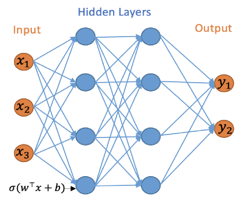
The initial focus of our work is on the binary classification problem for whether a change-point exists in a given time series. We will work with multilayer neural networks with Rectified Linear Unit (ReLU) activation functions and binary output. The multilayer neural network consists of an input layer, hidden layers and an output layer, and can be represented by a directed acyclic graph, see Figure 1.
<details>
<summary>x1.png Details</summary>
### Visual Description
## Diagram: Neural Network Architecture
### Overview
The image depicts a simplified architecture of a neural network. It illustrates the flow of information from the input layer, through hidden layers, to the output layer. The diagram highlights the connections between neurons in adjacent layers.
### Components/Axes
* **Layers:**
* **Input:** Labeled "Input" at the top-left. Contains three input nodes labeled x1, x2, and x3. The nodes are represented as orange circles.
* **Hidden Layers:** Labeled "Hidden Layers" at the top-center. Consists of two hidden layers, each containing three nodes. The nodes are represented as blue circles.
* **Output:** Labeled "Output" at the top-right. Contains two output nodes labeled y1 and y2. The nodes are represented as orange circles.
* **Connections:** Blue lines represent the connections between neurons in adjacent layers. Each neuron in one layer is connected to every neuron in the next layer.
* **Activation Function:** The expression "σ(wTx + b)" is shown at the bottom-left, representing the activation function applied to the weighted sum of inputs plus a bias term.
### Detailed Analysis
* **Input Layer:**
* Node 1: Labeled x1, located at the top of the input layer.
* Node 2: Labeled x2, located in the middle of the input layer.
* Node 3: Labeled x3, located at the bottom of the input layer.
* **Hidden Layer 1:**
* Three nodes are arranged vertically, each connected to all nodes in the input layer.
* **Hidden Layer 2:**
* Three nodes are arranged vertically, each connected to all nodes in the first hidden layer.
* **Output Layer:**
* Node 1: Labeled y1, located at the top of the output layer.
* Node 2: Labeled y2, located at the bottom of the output layer.
* **Connections:** Each node in the input layer is connected to each node in the first hidden layer. Each node in the first hidden layer is connected to each node in the second hidden layer. Each node in the second hidden layer is connected to each node in the output layer.
### Key Observations
* The diagram illustrates a fully connected neural network, where each neuron in one layer is connected to every neuron in the adjacent layer.
* The activation function σ(wTx + b) is a key component of the neural network, introducing non-linearity into the model.
* The diagram shows a simple network with two hidden layers, but neural networks can have many more layers.
### Interpretation
The diagram provides a visual representation of a basic neural network architecture. It demonstrates how information flows through the network, from the input layer, through the hidden layers, to the output layer. The connections between neurons represent the weights that are learned during training. The activation function introduces non-linearity, allowing the network to learn complex patterns in the data. This type of network can be used for various tasks, such as classification and regression. The diagram simplifies the complex mathematical operations occurring within each neuron and the overall learning process.
</details>
Figure 1: A neural network with 2 hidden layers and width vector $\mathbf{m}=(4,4)$ .
Let $L∈\mathbb{Z}^{+}$ represent the number of hidden layers and $\boldsymbol{m}={(m_{1},...,m_{L})}^{→p}$ the vector of the hidden layers widths, i.e. $m_{i}$ is the number of nodes in the $i$ th hidden layer. For a neural network with $L$ hidden layers we use the convention that $m_{0}=n$ and $m_{L+1}=1$ . For any bias vector $\boldsymbol{b}={(b_{1},b_{2},...,b_{r})}^{→p}∈\mathbb{R}^{r}$ , define the shifted activation function $\sigma_{\boldsymbol{b}}:\mathbb{R}^{r}→\mathbb{R}^{r}$ :
$$
\sigma_{\boldsymbol{b}}((y_{1},\ldots,y_{r})^{\top})=(\sigma(y_{1}-b_{1}),%
\ldots,\sigma(y_{r}-b_{r}))^{\top},
$$
where $\sigma(x)=\max(x,0)$ is the ReLU activation function. The neural network can be mathematically represented by the composite function $h:\mathbb{R}^{n}→\{0,1\}$ as
$$
h(\boldsymbol{x})\coloneqq\sigma^{*}_{\lambda}W_{L}\sigma_{\boldsymbol{b}_{L}}%
W_{L-1}\sigma_{\boldsymbol{b}_{L-1}}\cdots W_{1}\sigma_{\boldsymbol{b}_{1}}W_{%
0}\boldsymbol{x}, \tag{1}
$$
where $\sigma^{*}_{\lambda}(x)=\mathbbm{1}\{x>\lambda\}$ , $\lambda>0$ and $W_{\ell}∈\mathbb{R}^{m_{\ell+1}× m_{\ell}}$ for $\ell∈\{0,...,L\}$ represent the weight matrices. We define the function class $\mathcal{H}_{L,\boldsymbol{m}}$ to be the class of functions $h(\boldsymbol{x})$ with $L$ hidden layers and width vector $\boldsymbol{m}$ . The output layer in (1) employs the shifted heaviside function $\sigma^{*}_{\lambda}(x)$ , which is used for binary classification as the final activation function. This choice is guided by the fact that we use the 0-1 loss, which focuses on the percentage of samples assigned to the correct class, a natural performance criterion for binary classification. Besides its wide adoption in machine learning practice, another advantage of using the 0-1 loss is that it is possible to utilise the theory of the Vapnik–Chervonenkis (VC) dimension (see, e.g. Shalev-Shwartz and Ben-David, 2014, Definition 6.5) to bound the generalisation error of a binary classifier equipped with this loss; indeed, this is the approach we take in this work. The relevant results regarding the VC dimension of neural network classifiers are e.g. in Bartlett et al. (2019). As in Schmidt-Hieber (2020), we work with the exact minimiser of the empirical risk. In both binary or multiclass classification, it is possible to work with other losses which make it computationally easier to minimise the corresponding risk, see e.g. Bos and Schmidt-Hieber (2022), who use a version of the cross-entropy loss. However, loss functions different from the 0-1 loss make it impossible to use VC-dimension arguments to control the generalisation error, and more involved arguments, such as those using the covering number (Bos and Schmidt-Hieber, 2022) need to be used instead. We do not pursue these generalisations in the current work.
3 CUSUM-based classifier and its generalisations are neural networks
3.1 Change in mean
We initially consider the case of a single change-point with an unknown location $\tau∈[n-1]$ , $n≥ 2$ , in the model
| | $\displaystyle\boldsymbol{X}$ | $\displaystyle=\boldsymbol{\mu}+\boldsymbol{\xi},$ | |
| --- | --- | --- | --- |
where $\mu_{\mathrm{L}},\mu_{\mathrm{R}}$ are the unknown signal values before and after the change-point; $\boldsymbol{\xi}\sim N_{n}(0,I_{n})$ . The CUSUM test is widely used to detect mean changes in univariate data. For the observation $\boldsymbol{x}$ , the CUSUM transformation $\mathcal{C}:\mathbb{R}^{n}→\mathbb{R}^{n-1}$ is defined as $\mathcal{C}(\boldsymbol{x}):=(\boldsymbol{v}_{1}^{→p}\boldsymbol{x},...,%
\boldsymbol{v}_{n-1}^{→p}\boldsymbol{x})^{→p}$ , where $\boldsymbol{v}_{i}\coloneqq\bigl{(}\sqrt{\frac{n-i}{in}}\boldsymbol{1}_{i}^{%
→p},-\sqrt{\frac{i}{(n-i)n}}\boldsymbol{1}_{n-i}^{→p}\bigr{)}^{→p}$ for $i∈[n-1]$ . Here, for each $i∈[n-1]$ , $(\boldsymbol{v}_{i}^{→p}\boldsymbol{x})^{2}$ is the log likelihood-ratio statistic for testing a change at time $i$ against the null of no change (e.g. Baranowski et al., 2019). For a given threshold $\lambda>0$ , the classical CUSUM test for a change in the mean of the data is defined as
$$
h^{\mathrm{CUSUM}}_{\lambda}(\boldsymbol{x})=\mathbbm{1}\{\|\mathcal{C}(%
\boldsymbol{x})\|_{\infty}>\lambda\}.
$$
The following lemma shows that $h^{\mathrm{CUSUM}}_{\lambda}(\boldsymbol{x})$ can be represented as a neural network.
**Lemma 3.1**
*For any $\lambda>0$ , we have $h^{\mathrm{CUSUM}}_{\lambda}(\boldsymbol{x})∈\mathcal{H}_{1,2n-2}$ .*
The fact that the widely-used CUSUM statistic can be viewed as a simple neural network has far-reaching consequences: this means that given enough training data, a neural network architecture that permits the CUSUM-based classifier as its special case cannot do worse than CUSUM in classifying change-point versus no-change-point signals. This serves as the main motivation for our work, and a prelude to our next results.
3.2 Beyond the mean change model
We can generalise the simple change in mean model to allow for different types of change or for non-independent noise. In this section, we consider change-point models that can be expressed as a change in regression problem, where the model for data given a change at $\tau$ is of the form
$$
\boldsymbol{X}=\boldsymbol{Z}\boldsymbol{\beta}+\boldsymbol{c}_{\tau}\phi+%
\boldsymbol{\Gamma}\boldsymbol{\xi}, \tag{2}
$$
where for some $p≥ 1$ , $\boldsymbol{Z}$ is an $n× p$ matrix of covariates for the model with no change, $\boldsymbol{c}_{\tau}$ is an $n× 1$ vector of covariates specific to the change at $\tau$ , and the parameters $\boldsymbol{\beta}$ and $\phi$ are, respectively, a $p× 1$ vector and a scalar. The noise is defined in terms of an $n× n$ matrix $\boldsymbol{\Gamma}$ and an $n× 1$ vector of independent standard normal random variables, $\boldsymbol{\xi}$ . For example, the change in mean problem has $p=1$ , with $\boldsymbol{Z}$ a column vector of ones, and $\boldsymbol{c}_{\tau}$ being a vector whose first $\tau$ entries are zeros, and the remaining entries are ones. In this formulation $\beta$ is the pre-change mean, and $\phi$ is the size of the change. The change in slope problem Fearnhead et al. (2019) has $p=2$ with the columns of $\boldsymbol{Z}$ being a vector of ones, and a vector whose $i$ th entry is $i$ ; and $\boldsymbol{c}_{\tau}$ has $i$ th entry that is $\max\{0,i-\tau\}$ . In this formulation $\boldsymbol{\beta}$ defines the pre-change linear mean, and $\phi$ the size of the change in slope. Choosing $\boldsymbol{\Gamma}$ to be proportional to the identity matrix gives a model with independent, identically distributed noise; but other choices would allow for auto-correlation. The following result is a generalisation of Lemma 3.1, which shows that the likelihood-ratio test for (2), viewed as a classifier, can be represented by our neural network.
**Lemma 3.2**
*Consider the change-point model (2) with a possible change at $\tau∈[n-1]$ . Assume further that $\boldsymbol{\Gamma}$ is invertible. Then there is an $h^{*}∈\mathcal{H}_{1,2n-2}$ equivalent to the likelihood-ratio test for testing $\phi=0$ against $\phi≠ 0$ .*
Importantly, this result shows that for this much wider class of change-point models, we can replicate the likelihood-ratio-based classifier for change using a simple neural network. Other types of changes can be handled by suitably pre-transforming the data. For instance, squaring the input data would be helpful in detecting changes in the variance and if the data followed an AR(1) structure, then changes in autocorrelation could be handled by including transformations of the original input of the form $(x_{t}x_{t+1})_{t=1,...,n-1}$ . On the other hand, even if such transformations are not supplied as the input, a neural network of suitable depth is able to approximate these transformations and consequently successfully detect the change (Schmidt-Hieber, 2020, Lemma A.2). This is illustrated in Figure 7 of appendix, where we compare the performance of neural network based classifiers of various depths constructed with and without using the transformed data as inputs.
4 Generalisation error of neural network change-point classifiers
In Section 3, we showed that CUSUM and generalised CUSUM could be represented by a neural network. Therefore, with a large enough amount of training data, a trained neural network classifier that included CUSUM, or generalised CUSUM, as a special case, would perform no worse than it on unseen data. In this section, we provide generalisation bounds for a neural network classifier for the change-in-mean problem, given a finite amount of training data. En route to this main result, stated in Theorem 4.3, we provide generalisation bounds for the CUSUM-based classifier, in which the threshold has been chosen on a finite training data set. We write $P(n,\tau,\mu_{\mathrm{L}},\mu_{\mathrm{R}})$ for the distribution of the multivariate normal random vector $\boldsymbol{X}\sim N_{n}(\boldsymbol{\mu},I_{n})$ where $\boldsymbol{\mu}\coloneqq{(\mu_{\mathrm{L}}\mathbbm{1}\{i≤\tau\}+\mu_{%
\mathrm{R}}\mathbbm{1}\{i>\tau\})}_{i∈[n]}$ . Define $\eta\coloneqq\tau/n$ . Lemma 4.1 and Corollary 4.1 control the misclassification error of the CUSUM-based classifier.
**Lemma 4.1**
*Fix $\varepsilon∈(0,1)$ . Suppose $\boldsymbol{X}\sim P(n,\tau,\mu_{\mathrm{L}},\mu_{\mathrm{R}})$ for some $\tau∈\mathbb{Z}^{+}$ and $\mu_{\mathrm{L}},\mu_{\mathrm{R}}∈\mathbb{R}$ .
1. If $\mu_{\mathrm{L}}=\mu_{\mathrm{R}}$ , then $\mathbb{P}\bigl{\{}\|\mathcal{C}(\boldsymbol{X})\|_{∞}>\sqrt{2\log(n/%
\varepsilon)}\bigr{\}}≤\varepsilon.$
1. If $|\mu_{\mathrm{L}}-\mu_{\mathrm{R}}|\sqrt{\eta(1-\eta)}>\sqrt{8\log(n/%
\varepsilon)/n}$ , then $\mathbb{P}\bigl{\{}\|\mathcal{C}(\boldsymbol{X})\|_{∞}≤\sqrt{2\log(n/%
\varepsilon)}\bigr{\}}≤\varepsilon.$*
For any $B>0$ , define
$$
\Theta(B)\coloneqq\left\{(\tau,\mu_{\mathrm{L}},\mu_{\mathrm{R}})\in[n-1]%
\times\mathbb{R}\times\mathbb{R}:|\mu_{\mathrm{L}}-\mu_{\mathrm{R}}|\sqrt{\tau%
(n-\tau)}/n\in\{0\}\cup\left(B,\infty\right)\right\}.
$$
Here, $|\mu_{\mathrm{L}}-\mu_{\mathrm{R}}|\sqrt{\tau(n-\tau)}/n=|\mu_{\mathrm{L}}-\mu%
_{\mathrm{R}}|\sqrt{\eta(1-\eta)}$ can be interpreted as the signal-to-noise ratio of the mean change problem. Thus, $\Theta(B)$ is the parameter space of data distributions where there is either no change, or a single change-point in mean whose signal-to-noise ratio is at least $B$ . The following corollary controls the misclassification risk of a CUSUM statistics-based classifier:
**Corollary 4.1**
*Fix $B>0$ . Let $\pi_{0}$ be any prior distribution on $\Theta(B)$ , then draw $(\tau,\mu_{\mathrm{L}},\mu_{\mathrm{R}})\sim\pi_{0}$ and $\boldsymbol{X}\sim P(n,\tau,\mu_{\mathrm{L}},\mu_{\mathrm{R}})$ , and define $Y=\mathbbm{1}\{\mu_{\mathrm{L}}≠\mu_{\mathrm{R}}\}$ . For $\lambda=B\sqrt{n}/2$ , the classifier $h^{\mathrm{CUSUM}}_{\lambda}$ satisfies
$$
\mathbb{P}(h^{\mathrm{CUSUM}}_{\lambda}(\boldsymbol{X})\neq Y)\leq ne^{-nB^{2}%
/8}.
$$*
Theorem 4.2 below, which is based on Corollary 4.1, Bartlett et al. (2019, Theorem 7) and Mohri et al. (2012, Corollary 3.4), shows that the empirical risk minimiser in the neural network class $\mathcal{H}_{1,2n-2}$ has good generalisation properties over the class of change-point problems parameterised by $\Theta(B)$ . Given training data $(\boldsymbol{X}^{(1)},Y^{(1)}),...,(\boldsymbol{X}^{(N)},Y^{(N)})$ and any $h:\mathbb{R}^{n}→\{0,1\}$ , we define the empirical risk of $h$ as
$$
L_{N}(h)\coloneqq\frac{1}{N}\sum_{i=1}^{N}\mathbbm{1}\{Y^{(i)}\neq h(%
\boldsymbol{X}^{(i)})\}.
$$
**Theorem 4.2**
*Fix $B>0$ and let $\pi_{0}$ be any prior distribution on $\Theta(B)$ . We draw $(\tau,\mu_{\mathrm{L}},\mu_{\mathrm{R}})\sim\pi_{0}$ , $\boldsymbol{X}\sim P(n,\tau,\mu_{\mathrm{L}},\mu_{\mathrm{R}})$ , and set $Y=\mathbbm{1}\{\mu_{\mathrm{L}}≠\mu_{\mathrm{R}}\}$ . Suppose that the training data $\mathcal{D}:=\bigl{(}(\boldsymbol{X}^{(1)},Y^{(1)}),...,(\boldsymbol{X}^{(N%
)},Y^{(N)})\bigr{)}$ consist of independent copies of $(\boldsymbol{X},Y)$ and $h_{\mathrm{ERM}}\coloneqq\operatorname*{arg\,min}_{h∈\mathcal{H}_{1,2n-2}}L_%
{N}(h)$ is the empirical risk minimiser. There exists a universal constant $C>0$ such that for any $\delta∈(0,1)$ , (3) holds with probability $1-\delta$ .
$$
\mathbb{P}(h_{\mathrm{ERM}}(\boldsymbol{X})\neq Y\mid\mathcal{D})\leq ne^{-nB^%
{2}/8}+C\sqrt{\frac{n^{2}\log(n)\log(N)+\log(1/\delta)}{N}}. \tag{3}
$$*
The theoretical results derived for the neural network-based classifier, here and below, all rely on the fact that the training and test data are drawn from the same distribution. However, we observe that in practice, even when the training and test sets have different error distributions, neural network-based classifiers still provide accurate results on the test set; see our discussion of Figure 2 in Section 5 for more details. The misclassification error in (3) is bounded by two terms. The first term represents the misclassification error of CUSUM-based classifier, see Corollary 4.1, and the second term depends on the complexity of the neural network class measured in its VC dimension. Theorem 4.2 suggests that for training sample size $N\gg n^{2}\log n$ , a well-trained single-hidden-layer neural network with $2n-2$ hidden nodes would have comparable performance to that of the CUSUM-based classifier. However, as we will see in Section 5, in practice, a much smaller training sample size $N$ is needed for the neural network to be competitive in the change-point detection task. This is because the $2n-2$ hidden layer nodes in the neural network representation of $h^{\mathrm{CUSUM}}_{\lambda}$ encode the components of the CUSUM transformation $(±\boldsymbol{v}_{t}^{→p}\boldsymbol{x}:t∈[n-1])$ , which are highly correlated. By suitably pruning the hidden layer nodes, we can show that a single-hidden-layer neural network with $O(\log n)$ hidden nodes is able to represent a modified version of the CUSUM-based classifier with essentially the same misclassification error. More precisely, let $Q:=\lfloor\log_{2}(n/2)\rfloor$ and write $T_{0}:=\{2^{q}:0≤ q≤ Q\}\cup\{n-2^{q}:0≤ q≤ Q\}$ . We can then define
$$
h^{\mathrm{CUSUM}_{*}}_{\lambda^{*}}(\boldsymbol{X})=\mathbbm{1}\Bigl{\{}\max_%
{t\in T_{0}}|\boldsymbol{v}_{t}^{\top}\boldsymbol{X}|>\lambda^{*}\Bigr{\}}.
$$
By the same argument as in Lemma 3.1, we can show that $h^{\mathrm{CUSUM}_{*}}_{\lambda^{*}}∈\mathcal{H}_{1,4\lfloor\log_{2}(n)\rfloor}$ for any $\lambda^{*}>0$ . The following Theorem shows that high classification accuracy can be achieved under a weaker training sample size condition compared to Theorem 4.2.
**Theorem 4.3**
*Fix $B>0$ and let the training data $\mathcal{D}$ be generated as in Theorem 4.2. Let $h_{\mathrm{ERM}}\coloneqq\operatorname*{arg\,min}_{h∈\mathcal{H}_{L,%
\boldsymbol{m}}}L_{N}(h)$ be the empirical risk minimiser for a neural network with $L≥ 1$ layers and $\boldsymbol{m}=(m_{1},...,m_{L})^{→p}$ hidden layer widths. If $m_{1}≥ 4\lfloor\log_{2}(n)\rfloor$ and $m_{r}m_{r+1}=O(n\log n)$ for all $r∈[L-1]$ , then there exists a universal constant $C>0$ such that for any $\delta∈(0,1)$ , (4) holds with probability $1-\delta$ .
$$
\mathbb{P}(h_{\mathrm{ERM}}(\boldsymbol{X})\neq Y\mid\mathcal{D})\leq 2\lfloor%
\log_{2}(n)\rfloor e^{-nB^{2}/24}+C\sqrt{\frac{L^{2}n\log^{2}(Ln)\log(N)+\log(%
1/\delta)}{N}}. \tag{4}
$$*
Theorem 4.3 generalises the single hidden layer neural network representation in Theorem 4.2 to multiple hidden layers. In practice, multiple hidden layers help keep the misclassification error rate low even when $N$ is small, see the numerical study in Section 5. Theorems 4.2 and 4.3 are examples of how to derive generalisation errors of a neural network-based classifier in the change-point detection task. The same workflow can be employed in other types of changes, provided that suitable representation results of likelihood-based tests in terms of neural networks (e.g. Lemma 3.2) can be obtained. In a general result of this type, the generalisation error of the neural network will again be bounded by a sum of the error of the likelihood-based classifier together with a term originating from the VC-dimension bound of the complexity of the neural network architecture. We further remark that for simplicity of discussion, we have focused our attention on data models where the noise vector $\boldsymbol{\xi}=\boldsymbol{X}-\mathbb{E}\boldsymbol{X}$ has independent and identically distributed normal components. However, since CUSUM-based tests are available for temporally correlated or sub-Weibull data, with suitably adjusted test threshold values, the above theoretical results readily generalise to such settings. See Theorems A.3 and A.5 in appendix for more details.
5 Numerical study
We now investigate empirically our approach of learning a change-point detection method by training a neural network. Motivated by the results from the previous section we will fit a neural network with a single layer and consider how varying the number of hidden layers and the amount of training data affects performance. We will compare to a test based on the CUSUM statistic, both for scenarios where the noise is independent and Gaussian, and for scenarios where there is auto-correlation or heavy-tailed noise. The CUSUM test can be sensitive to the choice of threshold, particularly when we do not have independent Gaussian noise, so we tune its threshold based on training data. When training the neural network, we first standardise the data onto $[0,1]$ , i.e. $\tilde{\boldsymbol{x}}_{i}=((x_{ij}-x_{i}^{\mathrm{min}})/(x_{i}^{\mathrm{max}%
}-x_{i}^{\mathrm{min}}))_{j∈[n]}$ where $x_{i}^{\mathrm{max}}:=\max_{j}x_{ij},x_{i}^{\mathrm{min}}:=\min_{j}x_{ij}$ . This makes the neural network procedure invariant to either adding a constant to the data or scaling the data by a constant, which are natural properties to require. We train the neural network by minimising the cross-entropy loss on the training data. We run training for 200 epochs with a batch size of 32 and a learning rate of 0.001 using the Adam optimiser (Kingma and Ba, 2015). These hyperparameters are chosen based on a training dataset with cross-validation, more details can be found in Appendix B. We generate our data as follows. Given a sequence of length $n$ , we draw $\tau\sim\mathrm{Unif}\{2,...,n-2\}$ , set $\mu_{\mathrm{L}}=0$ and draw $\mu_{\mathrm{R}}|\tau\sim\mathrm{Unif}([-1.5b,-0.5b]\cup[0.5b,1.5b])$ , where $b:=\sqrt{\frac{8n\log(20n)}{\tau(n-\tau)}}$ is chosen in line with Lemma 4.1 to ensure a good range of signal-to-noise ratios. We then generate $\boldsymbol{x}_{1}=(\mu_{\mathrm{L}}\mathbbm{1}_{\{t≤\tau\}}+\mu_{\mathrm{R%
}}\mathbbm{1}_{\{t>\tau\}}+\varepsilon_{t})_{t∈[n]}$ , with the noise $(\varepsilon_{t})_{t∈[n]}$ following an $\mathrm{AR}(1)$ model with possibly time-varying autocorrelation $\varepsilon_{t}|\rho_{t}=\xi_{1}$ for $t=1$ and $\rho_{t}\varepsilon_{t-1}+\xi_{t}$ for $t≥ 2$ , where $(\xi_{t})_{t∈[n]}$ are independent, possibly heavy-tailed noise. The autocorrelations $\rho_{t}$ and innovations $\xi_{t}$ are from one of the three scenarios:
1. $n=100$ , $N∈\{100,200,...,700\}$ , $\rho_{t}=0$ and $\xi_{t}\sim N(0,1)$ .
1. $n=100$ , $N∈\{100,200,...,700\}$ , $\rho_{t}=0.7$ and $\xi_{t}\sim N(0,1)$ .
1. $n=100$ , $N∈\{100,200,...,1000\}$ , $\rho_{t}\sim\mathrm{Unif}([0,1])$ and $\xi_{t}\sim N(0,2)$ .
1. $n=100$ , $N∈\{100,200,...,1000\}$ , $\rho_{t}=0$ and $\xi_{t}\sim\text{Cauchy}(0,0.3)$ .
The above procedure is then repeated $N/2$ times to generate independent sequences $\boldsymbol{x}_{1},...,\boldsymbol{x}_{N/2}$ with a single change, and the associated labels are $(y_{1},...,y_{N/2})^{→p}=\mathbf{1}_{N/2}$ . We then repeat the process another $N/2$ times with $\mu_{\mathrm{R}}=\mu_{\mathrm{L}}$ to generate sequences without changes $\boldsymbol{x}_{N/2+1},...,\boldsymbol{x}_{N}$ with $(y_{N/2+1},...,y_{N})^{→p}=\mathbf{0}_{N/2}$ . The data with and without change $(\boldsymbol{x}_{i},y_{i})_{i∈[N]}$ are combined and randomly shuffled to form the training data. The test data are generated in a similar way, with a sample size $N_{\mathrm{test}}=30000$ and the slight modification that $\mu_{\mathrm{R}}|\tau\sim\mathrm{Unif}([-1.75b,-0.25b]\cup[0.25b,1.75b])$ when a change occurs. We note that the test data is drawn from the same distribution as the training set, though potentially having changes with signal-to-noise ratios outside the range covered by the training set. We have also conducted robustness studies to investigate the effect of training the neural networks on scenario S1 and test on S1 ${}^{\prime}$ , S2 or S3. Qualitatively similar results to Figure 2 have been obtained in this misspecified setting (see Figure 6 in appendix).
<details>
<summary>x2.png Details</summary>

### Visual Description
## Line Chart: MER Average vs. N
### Overview
The image is a line chart comparing the MER (Missing Error Rate) Average for different methods (CUSUM, m^(1), m^(2)) with varying parameter L, as a function of N. The x-axis represents N, ranging from 100 to 700. The y-axis represents the MER Average, ranging from 0.06 to 0.16. There are five lines on the chart, each representing a different method and parameter setting.
### Components/Axes
* **X-axis:** N, with markers at 100, 200, 300, 400, 500, 600, and 700.
* **Y-axis:** MER Average, with markers at 0.06, 0.08, 0.10, 0.12, 0.14, and 0.16.
* **Legend (top-right):**
* Blue line with circle markers: CUSUM
* Orange line with triangle markers: m^(1), L=1
* Green line with diamond markers: m^(2), L=1
* Red line with square markers: m^(1), L=5
* Purple line with double-circle markers: m^(1), L=10
### Detailed Analysis
* **CUSUM (Blue):** The line starts at approximately 0.06 at N=100, increases to approximately 0.085 at N=200, then decreases to approximately 0.065 at N=300 and N=400. It then increases to approximately 0.075 at N=500 and N=600, before decreasing to approximately 0.06 at N=700.
* **m^(1), L=1 (Orange):** The line starts at approximately 0.165 at N=100, decreases sharply to approximately 0.085 at N=200, then decreases gradually to approximately 0.07 at N=300, approximately 0.065 at N=400, approximately 0.063 at N=500, approximately 0.058 at N=600, and approximately 0.06 at N=700.
* **m^(2), L=1 (Green):** The line starts at approximately 0.13 at N=100, decreases sharply to approximately 0.085 at N=200, then decreases gradually to approximately 0.07 at N=300, approximately 0.065 at N=400, approximately 0.06 at N=500, approximately 0.052 at N=600, and approximately 0.06 at N=700.
* **m^(1), L=5 (Red):** The line starts at approximately 0.077 at N=100, decreases to approximately 0.075 at N=200, then decreases gradually to approximately 0.063 at N=300, approximately 0.057 at N=400, approximately 0.058 at N=500, approximately 0.052 at N=600, and approximately 0.054 at N=700.
* **m^(1), L=10 (Purple):** The line starts at approximately 0.062 at N=100, increases to approximately 0.075 at N=200, then decreases gradually to approximately 0.065 at N=300, approximately 0.06 at N=400, approximately 0.062 at N=500, approximately 0.052 at N=600, and approximately 0.056 at N=700.
### Key Observations
* The MER Average generally decreases as N increases for most methods, especially for m^(1), L=1 and m^(2), L=1.
* CUSUM shows a more fluctuating behavior compared to the other methods.
* m^(1), L=5 and m^(1), L=10 have relatively lower MER Average values compared to CUSUM, m^(1), L=1, and m^(2), L=1.
### Interpretation
The chart suggests that the methods m^(1), L=5 and m^(1), L=10 are more effective in reducing the Missing Error Rate (MER) compared to CUSUM, m^(1), L=1, and m^(2), L=1, especially as N increases. The fluctuating behavior of CUSUM indicates that it might be more sensitive to changes in N. The sharp decrease in MER Average for m^(1), L=1 and m^(2), L=1 as N increases from 100 to 200 suggests that these methods benefit significantly from an initial increase in N, but their performance plateaus afterward. The methods m^(1), L=5 and m^(1), L=10 appear to be more stable and consistently perform well across different values of N.
</details>
<details>
<summary>x3.png Details</summary>
### Visual Description
## Line Chart: MER Average vs N
### Overview
The image is a line chart comparing the MER (Match Error Rate) Average for different methods (CUSUM and m) with varying parameters (L) as a function of N. The chart displays five different data series, each represented by a distinct color and marker. The x-axis represents N, and the y-axis represents the MER Average.
### Components/Axes
* **Title:** There is no explicit title on the chart.
* **X-axis:**
* Label: "N"
* Scale: 100 to 700, with markers at 100, 200, 300, 400, 500, 600, and 700.
* **Y-axis:**
* Label: "MER Average"
* Scale: 0.18 to 0.32, with markers at 0.18, 0.20, 0.22, 0.24, 0.26, 0.28, 0.30, and 0.32.
* **Legend:** Located in the top-right corner of the chart.
* Blue: CUSUM
* Orange: m^(1), L=1
* Green: m^(2), L=1
* Red: m^(1), L=5
* Purple: m^(1), L=10
### Detailed Analysis
* **CUSUM (Blue, circle marker):** The line starts at approximately 0.29 at N=100, decreases to around 0.25 at N=200, remains relatively stable around 0.25 until N=500, then slightly increases to approximately 0.26 at N=500, and finally decreases to around 0.25 at N=700.
* **m^(1), L=1 (Orange, triangle marker):** The line starts at approximately 0.32 at N=100, decreases to around 0.25 at N=200, then decreases further to approximately 0.24 at N=300, remains relatively stable around 0.23 until N=500, and finally decreases to around 0.20 at N=700.
* **m^(2), L=1 (Green, diamond marker):** The line starts at approximately 0.31 at N=100, decreases to around 0.24 at N=200, then decreases further to approximately 0.22 at N=300, increases to approximately 0.23 at N=400, and finally decreases to around 0.19 at N=700.
* **m^(1), L=5 (Red, square marker):** The line starts at approximately 0.28 at N=100, decreases to around 0.21 at N=200, then decreases further to approximately 0.20 at N=300, increases to approximately 0.23 at N=400, and finally decreases to around 0.19 at N=700.
* **m^(1), L=10 (Purple, x marker):** The line starts at approximately 0.29 at N=100, decreases to around 0.21 at N=200, then decreases further to approximately 0.19 at N=300, increases to approximately 0.23 at N=400, and finally decreases to around 0.18 at N=700.
### Key Observations
* All methods show a decrease in MER Average as N increases from 100 to 200.
* The CUSUM method has the most stable MER Average across the range of N values.
* The m^(1), L=10 method generally has the lowest MER Average for N greater than 300.
* The m^(1), L=5 and m^(1), L=10 methods exhibit a similar trend, with a slight increase in MER Average around N=400.
### Interpretation
The chart compares the performance of different methods for reducing the Match Error Rate (MER) as the parameter N changes. The CUSUM method appears to be more stable, while the m methods, particularly m^(1) with L=10, tend to achieve lower MER averages at higher N values. The slight increase in MER Average for m^(1) methods around N=400 might indicate a specific characteristic or limitation of these methods in that range. Overall, the data suggests that the choice of method and parameters (L) can significantly impact the MER Average, and the optimal choice may depend on the specific value of N.
</details>
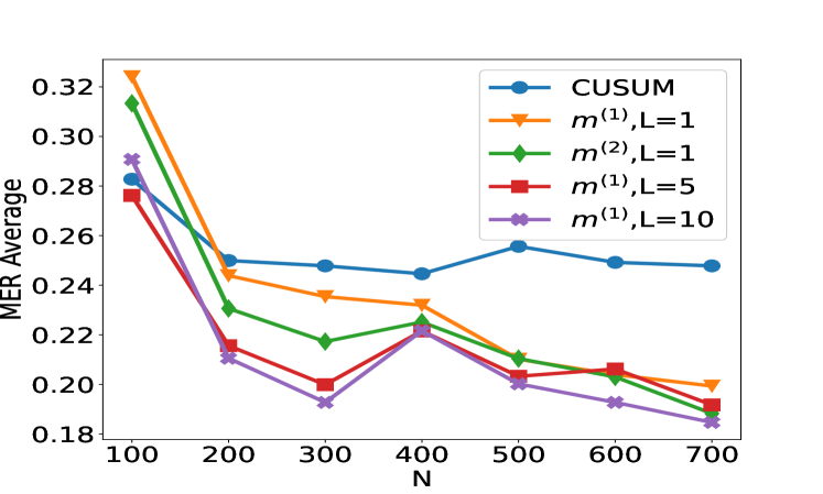
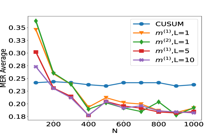
(a) Scenario S1 with $\rho_{t}=0$ (b) Scenario S1 ${}^{\prime}$ with $\rho_{t}=0.7$
<details>
<summary>x4.png Details</summary>
### Visual Description
## Line Chart: MER Average vs N
### Overview
The image is a line chart comparing the MER (Minimum Error Rate) Average for different methods (CUSUM, m^(1), m^(2)) with varying parameters (L=1, L=5, L=10) against the variable N. The chart displays how the MER Average changes as N increases from 0 to 1000.
### Components/Axes
* **X-axis:** N, ranging from 0 to 1000, with markers at 200, 400, 600, 800, and 1000.
* **Y-axis:** MER Average, ranging from 0.18 to 0.35, with markers at 0.18, 0.20, 0.23, 0.25, 0.28, 0.30, 0.33, and 0.35.
* **Legend (Top-Right):**
* Blue line with circle markers: CUSUM
* Orange line with triangle markers: m^(1), L=1
* Green line with diamond markers: m^(2), L=1
* Red line with square markers: m^(1), L=5
* Purple line with cross markers: m^(1), L=10
### Detailed Analysis
* **CUSUM (Blue):** The line is relatively flat, indicating a stable MER Average.
* At N=100, MER Average is approximately 0.24.
* At N=1000, MER Average is approximately 0.24.
* **m^(1), L=1 (Orange):** The line starts high and decreases sharply before leveling off.
* At N=100, MER Average is approximately 0.35.
* At N=400, MER Average is approximately 0.19.
* At N=1000, MER Average is approximately 0.20.
* **m^(2), L=1 (Green):** Similar to the orange line, it decreases sharply and then fluctuates.
* At N=100, MER Average is approximately 0.36.
* At N=400, MER Average is approximately 0.19.
* At N=1000, MER Average is approximately 0.20.
* **m^(1), L=5 (Red):** The line also decreases and then stabilizes.
* At N=100, MER Average is approximately 0.30.
* At N=400, MER Average is approximately 0.21.
* At N=1000, MER Average is approximately 0.19.
* **m^(1), L=10 (Purple):** This line shows a similar trend of decreasing and then stabilizing.
* At N=100, MER Average is approximately 0.28.
* At N=400, MER Average is approximately 0.18.
* At N=1000, MER Average is approximately 0.19.
### Key Observations
* The CUSUM method maintains a relatively constant MER Average across all values of N.
* The other methods (m^(1), m^(2)) show a significant decrease in MER Average as N increases from 100 to around 400, after which they stabilize.
* The MER Average for m^(1) with L=1, 5, and 10, and m^(2) with L=1 converge to similar values as N approaches 1000.
### Interpretation
The chart suggests that the CUSUM method provides a more stable MER Average regardless of the value of N. The other methods, particularly m^(1) and m^(2), are initially more sensitive to changes in N, but their performance stabilizes as N increases. The choice of method and parameters (L) may depend on the specific application and the desired trade-off between initial sensitivity and long-term stability. The convergence of m^(1) and m^(2) methods at higher N values indicates that the impact of the parameter L diminishes as N increases.
</details>
<details>
<summary>x5.png Details</summary>
### Visual Description
## Line Chart: MER Average vs. N
### Overview
The image is a line chart comparing the MER (Message Error Rate) Average for different methods as a function of N. The chart displays five different data series, each representing a different method or configuration. The x-axis represents N, and the y-axis represents the MER Average.
### Components/Axes
* **X-axis:** Labeled "N", with tick marks at 200, 400, 600, 800, and 1000.
* **Y-axis:** Labeled "MER Average", with tick marks at 0.25, 0.30, 0.35, 0.40, 0.45, and 0.50.
* **Legend:** Located in the top-right corner, it identifies the five data series:
* Blue: CUSUM
* Orange: m^(1), L=1
* Green: m^(2), L=1
* Red: m^(1), L=5
* Purple: m^(1), L=10
### Detailed Analysis
* **CUSUM (Blue):** The line starts at approximately 0.37 at N=100, decreases slightly to around 0.35 at N=400, and then remains relatively stable around 0.35, ending at approximately 0.36 at N=1000.
* **m^(1), L=1 (Orange):** The line starts at approximately 0.42 at N=100, decreases to approximately 0.35 at N=400, and then decreases further to approximately 0.28 at N=600, remaining relatively stable around 0.28-0.31 until N=1000.
* **m^(2), L=1 (Green):** The line starts at approximately 0.40 at N=100, decreases to approximately 0.31 at N=400, and then decreases further to approximately 0.27 at N=600, remaining relatively stable around 0.26-0.28 until N=1000.
* **m^(1), L=5 (Red):** The line starts at approximately 0.37 at N=100, decreases to approximately 0.29 at N=200, decreases further to approximately 0.28 at N=400, increases to approximately 0.31 at N=600, decreases to approximately 0.26 at N=800, and then increases to approximately 0.27 at N=1000.
* **m^(1), L=10 (Purple):** The line starts at approximately 0.34 at N=100, decreases to approximately 0.29 at N=200, increases to approximately 0.32 at N=400, decreases to approximately 0.28 at N=600, increases to approximately 0.30 at N=800, and then decreases to approximately 0.27 at N=1000.
### Key Observations
* The CUSUM method has the most stable MER Average across different values of N.
* The m^(1), L=1, m^(2), L=1, m^(1), L=5, and m^(1), L=10 methods all show a decreasing trend in MER Average as N increases from 100 to 600, after which they fluctuate.
* For N greater than 600, the m^(1), L=5 and m^(1), L=10 methods have similar MER Averages.
* For N greater than 600, the m^(2), L=1 method has the lowest MER Average.
### Interpretation
The chart compares the performance of different methods for reducing message error rate (MER) as the parameter N changes. The CUSUM method appears to be the most stable, maintaining a relatively consistent MER Average across different values of N. The other methods, particularly m^(1) and m^(2) with L=1, 5, and 10, show a decrease in MER Average as N increases initially, but then fluctuate. This suggests that increasing N may initially improve performance for these methods, but beyond a certain point, the improvement plateaus or becomes inconsistent. The choice of method and parameter L may depend on the specific application and the desired trade-off between stability and MER Average.
</details>
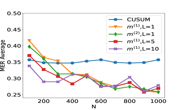
(c) Scenario S2 with $\rho_{t}\sim\text{Unif}([0,1])$ (d) Scenario S3 with Cauchy noise
Figure 2: Plot of the test set MER, computed on a test set of size $N_{\mathrm{test}}=30000$ , against training sample size $N$ for detecting the existence of a change-point on data series of length $n=100$ . We compare the performance of the CUSUM test and neural networks from four function classes: $\mathcal{H}_{1,m^{(1)}}$ , $\mathcal{H}_{1,m^{(2)}}$ , $\mathcal{H}_{5,m^{(1)}\mathbf{1}_{5}}$ and $\mathcal{H}_{10,m^{(1)}\mathbf{1}_{10}}$ where $m^{(1)}=4\lfloor\log_{2}(n)\rfloor$ and $m^{(2)}=2n-2$ respectively under scenarios S1, S1 ${}^{\prime}$ , S2 and S3 described in Section 5.
We compare the performance of the CUSUM-based classifier with the threshold cross-validated on the training data with neural networks from four function classes: $\mathcal{H}_{1,m^{(1)}}$ , $\mathcal{H}_{1,m^{(2)}}$ , $\mathcal{H}_{5,m^{(1)}\mathbf{1}_{5}}$ and $\mathcal{H}_{10,m^{(1)}\mathbf{1}_{10}}$ where $m^{(1)}=4\lfloor\log_{2}(n)\rfloor$ and $m^{(2)}=2n-2$ respectively (cf. Theorem 4.3 and Lemma 3.1). Figure 2 shows the test misclassification error rate (MER) of the four procedures in the four scenarios S1, S1 ${}^{\prime}$ , S2 and S3. We observe that when data are generated with independent Gaussian noise ( Figure 2 (a)), the trained neural networks with $m^{(1)}$ and $m^{(2)}$ single hidden layer nodes attain very similar test MER compared to the CUSUM-based classifier. This is in line with our Theorem 4.3. More interestingly, when noise has either autocorrelation ( Figure 2 (b, c)) or heavy-tailed distribution ( Figure 2 (d)), trained neural networks with $(L,\mathbf{m})$ : $(1,m^{(1)})$ , $(1,m^{(2)})$ , $(5,m^{(1)}\mathbf{1}_{5})$ and $(10,m^{(1)}\mathbf{1}_{10})$ outperform the CUSUM-based classifier, even after we have optimised the threshold choice of the latter. In addition, as shown in Figure 5 in the online supplement, when the first two layers of the network are set to carry out truncation, which can be seen as a composition of two ReLU operations, the resulting neural network outperforms the Wilcoxon statistics-based classifier (Dehling et al., 2015), which is a standard benchmark for change-point detection in the presence of heavy-tailed noise. Furthermore, from Figure 2, we see that increasing $L$ can significantly reduce the average MER when $N≤ 200$ . Theoretically, as the number of layers $L$ increases, the neural network is better able to approximate the optimal decision boundary, but it becomes increasingly difficult to train the weights due to issues such as vanishing gradients (He et al., 2016). A combination of these considerations leads us to develop deep neural network architecture with residual connections for detecting multiple changes and multiple change types in Section 6.
6 Detecting multiple changes and multiple change types – case study
From the previous section, we see that single and multiple hidden layer neural networks can represent CUSUM or generalised CUSUM tests and may perform better than likelihood-based test statistics when the model is misspecified. This prompted us to seek a general network architecture that can detect, and even classify, multiple types of change. Motivated by the similarities between signal processing and image recognition, we employed a deep convolutional neural network (CNN) (Yamashita et al., 2018) to learn the various features of multiple change-types. However, stacking more CNN layers cannot guarantee a better network because of vanishing gradients in training (He et al., 2016). Therefore, we adopted the residual block structure (He et al., 2016) for our neural network architecture. After experimenting with various architectures with different numbers of residual blocks and fully connected layers on synthetic data, we arrived at a network architecture with 21 residual blocks followed by a number of fully connected layers. Figure 9 shows an overview of the architecture of the final general-purpose deep neural network for change-point detection. The precise architecture and training methodology of this network $\widehat{NN}$ can be found in Appendix C. Neural Architecture Search (NAS) approaches (see Paaß and Giesselbach, 2023, Section 2.4.3) offer principled ways of selecting neural architectures. Some of these approaches could be made applicable in our setting. We demonstrate the power of our general purpose change-point detection network in a numerical study. We train the network on $N=10000$ instances of data sequences generated from a mixture of no change-point in mean or variance, change in mean only, change in variance only, no-change in a non-zero slope and change in slope only, and compare its classification performance on a test set of size $2500$ against that of oracle likelihood-based classifiers (where we pre-specify whether we are testing for change in mean, variance or slope) and adaptive likelihood-based classifiers (where we combine likelihood based tests using the Bayesian Information Criterion). Details of the data-generating mechanism and classifiers can be found in Appendix B. The classification accuracy of the three approaches in weak and strong signal-to-noise ratio settings are reported in Table 1. We see that the neural network-based approach achieves similar classification accuracy as adaptive likelihood based method for weak SNR and higher classification accuracy than the adaptive likelihood based method for strong SNR. We would not expect the neural network to outperform the oracle likelihood-based classifiers as it has no knowledge of the exact change-type of each time series.
Table 1: Test classification accuracy of oracle likelihood-ratio based method (LR ${}^{\mathrm{oracle}}$ ), adaptive likelihood ratio method (LR ${}^{\mathrm{adapt}}$ ) and our residual neural network (NN) classifier for setups with weak and strong signal-to-noise ratios (SNR). Data are generated as a mixture of no change-point in mean or variance (Class 1), change in mean only (Class 2), change in variance only (Class 3), no-change in a non-zero slope (Class 4), change in slope only (Class 5). We report the true positive rate of each class and the accuracy in the last row.
Weak SNR Strong SNR LR ${}^{\mathrm{oracle}}$ LR ${}^{\mathrm{adapt}}$ NN LR ${}^{\mathrm{oracle}}$ LR ${}^{\mathrm{adapt}}$ NN Class 1 0.9787 0.9457 0.8062 0.9787 0.9341 0.9651 Class 2 0.8443 0.8164 0.8882 1.0000 0.7784 0.9860 Class 3 0.8350 0.8291 0.8585 0.9902 0.9902 0.9705 Class 4 0.9960 0.9453 0.8826 0.9980 0.9372 0.9312 Class 5 0.8729 0.8604 0.8353 0.9958 0.9917 0.9147 Accuracy 0.9056 0.8796 0.8660 0.9924 0.9260 0.9672
We now consider an application to detecting different types of change. The HASC (Human Activity Sensing Consortium) project data contain motion sensor measurements during a sequence of human activities, including “stay”, “walk”, “jog”, “skip”, “stair up” and “stair down”. Complex changes in sensor signals occur during transition from one activity to the next (see Figure 3). We have 28 labels in HASC data, see Figure 10 in appendix. To agree with the dimension of the output, we drop two dense layers “Dense(10)” and “Dense(20)” in Figure 9. The resulting network can be effectively applied for change-point detection in sensory signals of human activities, and can achieve high accuracy in change-point classification tasks (Figure 12 in appendix). Finally, we remark that our neural network-based change-point detector can be utilised to detect multiple change-points. Algorithm 1 outlines a general scheme for turning a change-point classifier into a location estimator, where we employ an idea similar to that of MOSUM (Eichinger and Kirch, 2018) and repeatedly apply a classifier $\psi$ to data from a sliding window of size $n$ . Here, we require $\psi$ applied to each data segment $\boldsymbol{X}^{*}_{[i,i+n)}$ to output both the class label $L_{i}=0$ or $1$ if no change or a change is predicted and the corresponding probability $p_{i}$ of having a change. In our particular example, for each data segment $\boldsymbol{X}^{*}_{[i,i+n)}$ of length $n=700$ , we define $\psi(\boldsymbol{X}^{*}_{[i,i+n)})=0$ if $\widehat{NN}(\boldsymbol{X}^{*}_{[i,i+n)})$ predicts a class label in $\{0,4,8,12,16,22\}$ (see Figure 10 in appendix) and 1 otherwise. The thresholding parameter $\gamma∈\mathbb{Z}^{+}$ is chosen to be $1/2$ .
Input: new data $\boldsymbol{x}_{1}^{*},...,\boldsymbol{x}_{n^{*}}^{*}∈\mathbb{R}^{d}$ , a trained classifier $\psi:\mathbb{R}^{d× n}→\{0,1\}$ , $\gamma>0$ .
1 Form $\boldsymbol{X}_{[i,i+n)}^{*}:=(\boldsymbol{x}_{i}^{*},...,\boldsymbol{x}_{i%
+n-1})$ and compute $L_{i}←\psi(\boldsymbol{X}^{*}_{[i,i+n)})$ for all $i=1,...,n^{*}-n+1$ ;
2 Compute $\bar{L}_{i}← n^{-1}\sum_{j=i-n+1}^{i}L_{j}$ for $i=n,...,n^{*}-n+1$ ;
3 Let $\{[s_{1},e_{1}],...,[s_{\hat{\nu}},e_{\hat{\nu}}]\}$ be the set of all maximal segments such that $\bar{L}_{i}≥\gamma$ for all $i∈[s_{r},e_{r}]$ , $r∈[\hat{\nu}]$ ;
4 Compute $\hat{\tau}_{r}←\operatorname*{arg\,max}_{i∈[s_{r},e_{r}]}\bar{L}_{i}$ for all $r∈[\hat{\nu}]$ ;
Output: Estimated change-points $\hat{\tau}_{1},...,\hat{\tau}_{\hat{\nu}}$
Algorithm 1 Algorithm for change-point localisation
Figure 4 illustrates the result of multiple change-point detection in HASC data which provides evidence that the trained neural network can detect both the multiple change-types and multiple change-points.
<details>
<summary>x6.png Details</summary>
### Visual Description
## Time Series Chart: Accelerometer Data During Various Activities
### Overview
The image presents three time series plots, each representing accelerometer data along the x, y, and z axes. The data is segmented into different activities: stair descent, stationary periods, stair ascent, and walking. The x-axis represents time, ranging from 0 to 3500 units. The plots are annotated with dashed gray boxes and solid red boxes to highlight specific activity intervals.
### Components/Axes
* **Y-axes:**
* Top plot: Labeled "x", ranges from approximately -2 to 0.
* Middle plot: Labeled "y", ranges from approximately 0 to 2.
* Bottom plot: Labeled "z", ranges from approximately -4 to 0.
* **X-axis:** Shared across all three plots, ranging from 0 to 3500. Axis markers are present at 0, 500, 1000, 1500, 2000, 2500, 3000, and 3500.
* **Annotations:**
* Dashed gray boxes: Enclose regions of activity.
* Solid red boxes: Enclose periods of inactivity ("stay").
* Text annotations: "stair down", "stay", "stair up", "walk" indicate the activity within the corresponding region.
### Detailed Analysis
**Top Plot (x-axis accelerometer data):**
* Color: Blue
* Trend: The blue line shows oscillatory behavior during "stair down", "stair up", and "walk" periods, with relatively flat lines during "stay" periods.
* Stair Down (0-500): Oscillating between -1 and 0.
* Stay (1000-1500): Flat line at approximately -0.1.
* Stair Up (2000-2500): Oscillating between -1 and 0.
* Walk (3000-3500): Oscillating between -1 and 0.
**Middle Plot (y-axis accelerometer data):**
* Color: Orange
* Trend: The orange line shows oscillatory behavior during "stair down", "stair up", and "walk" periods, with relatively flat lines during "stay" periods.
* Stair Down (0-500): Oscillating between 0 and 1.5.
* Stay (1000-1500): Flat line at approximately 0.4.
* Stair Up (2000-2500): Oscillating between 0 and 1.
* Walk (3000-3500): Oscillating between 0 and 1.
**Bottom Plot (z-axis accelerometer data):**
* Color: Green
* Trend: The green line shows oscillatory behavior during "stair down", "stair up", and "walk" periods, with relatively flat lines during "stay" periods.
* Stair Down (0-500): Oscillating between -4 and -1.
* Stay (1000-1500): Flat line at approximately -0.5.
* Stair Up (2000-2500): Oscillating between -2 and 0.
* Walk (3000-3500): Oscillating between -1 and 0.
### Key Observations
* The "stay" periods are clearly distinguishable by the flat lines in all three plots.
* The "stair down" activity shows the most significant variation in the z-axis (green line).
* The x and y axes (blue and orange lines) show similar oscillatory patterns during the active periods.
### Interpretation
The data represents accelerometer readings during different physical activities. The x, y, and z axes capture movement in three dimensions. The "stay" periods indicate when the subject was stationary, resulting in minimal accelerometer variation. The oscillatory patterns during "stair down", "stair up", and "walk" reflect the repetitive movements associated with these activities. The z-axis data seems particularly sensitive to stair descent, possibly due to the vertical component of the motion. The consistent patterns across the x and y axes suggest coordinated movements in the horizontal plane during the active periods.
</details>
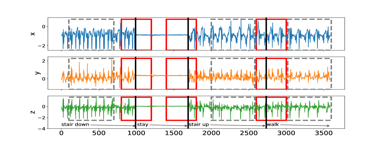
Figure 3: The sequence of accelerometer data in $x,y$ and $z$ axes. From left to right, there are 4 activities: “stair down”, “stay”, “stair up” and “walk”, their change-points are 990, 1691, 2733 respectively marked by black solid lines. The grey rectangles represent the group of “no-change” with labels: “stair down”, “stair up” and “walk”; The red rectangles represent the group of “one-change” with labels: “stair down $→$ stay”, “stay $→$ stair up” and “stair up $→$ walk”.
<details>
<summary>x7.png Details</summary>
### Visual Description
## Time Series Chart: Activity Signal Data
### Overview
The image is a time series chart displaying signal data across three axes (x, y, z) over a period of time. The chart is annotated with labels indicating different activities performed during the recording period, such as walking, skipping, staying, jogging, and going up or down stairs. The data appears to be sensor data, possibly from an accelerometer or similar device.
### Components/Axes
* **X-axis:** "Time", with a scale from 0 to 10000. Axis markers are present at 0, 2000, 4000, 6000, 8000, and 10000.
* **Y-axis:** "Signal", with a scale from -2 to 2. Axis markers are present at -2, -1, 0, 1, and 2.
* **Data Series:**
* **x (blue):** Varies between approximately 0 and 1.
* **y (orange):** Varies between approximately -2 and 0.
* **z (green):** Varies between approximately -2 and 2.
* **Activity Labels:** "walk", "skip", "stay", "jog", "stUp", "stDown" are placed above the chart, indicating the activity being performed during that time interval. These labels are separated by vertical lines.
* **Vertical Lines:** Red and blue vertical lines separate the different activity segments.
### Detailed Analysis
* **Walk (0-1000):**
* x (blue): Oscillates between approximately 0 and 1.
* y (orange): Oscillates between approximately -2 and -1.
* z (green): Oscillates between approximately -1 and 2.
* **Skip (1000-2000):**
* x (blue): Oscillates between approximately 0 and 1.
* y (orange): Oscillates between approximately -2 and -1.
* z (green): Oscillates between approximately -1 and 2.
* **Stay (2000-3000):**
* x (blue): Remains relatively constant at approximately 0.
* y (orange): Remains relatively constant at approximately -1.
* z (green): Remains relatively constant at approximately 0.5.
* **Jog (3000-4000):**
* x (blue): Oscillates between approximately 0 and 1.
* y (orange): Oscillates between approximately -2 and -1.
* z (green): Oscillates between approximately -1 and 2.
* **Walk (4000-5000):**
* x (blue): Oscillates between approximately 0 and 1.
* y (orange): Oscillates between approximately -2 and -1.
* z (green): Oscillates between approximately -1 and 2.
* **stUp (5000-6000):**
* x (blue): Oscillates between approximately 0 and 1.
* y (orange): Oscillates between approximately -2 and -1.
* z (green): Oscillates between approximately -1 and 2.
* **Stay (6000-7000):**
* x (blue): Remains relatively constant at approximately 0.
* y (orange): Remains relatively constant at approximately -1.
* z (green): Remains relatively constant at approximately 0.
* **stDown (7000-8000):**
* x (blue): Oscillates between approximately 0 and 1.
* y (orange): Oscillates between approximately -2 and -1.
* z (green): Oscillates between approximately -1 and 2.
* **Walk (8000-9000):**
* x (blue): Oscillates between approximately 0 and 1.
* y (orange): Oscillates between approximately -2 and -1.
* z (green): Oscillates between approximately -1 and 2.
* **Stay (9000-10000):**
* x (blue): Remains relatively constant at approximately 0.
* y (orange): Remains relatively constant at approximately -1.
* z (green): Remains relatively constant at approximately 0.
* **Jog (10000-):**
* x (blue): Oscillates between approximately 0 and 1.
* y (orange): Oscillates between approximately -2 and -1.
* z (green): Oscillates between approximately -1 and 2.
* **Skip (10000-):**
* x (blue): Oscillates between approximately 0 and 1.
* y (orange): Oscillates between approximately -2 and -1.
* z (green): Oscillates between approximately -1 and 2.
### Key Observations
* The "stay" activity segments are characterized by relatively constant signal values for all three axes.
* The "walk", "skip", "jog", "stUp", and "stDown" activities are characterized by oscillations in all three axes.
* The z-axis (green) shows the most significant variation during the active periods.
* The y-axis (orange) consistently shows negative values.
* The x-axis (blue) consistently shows values around 0.
### Interpretation
The chart visualizes sensor data that can be used to differentiate between different human activities. The "stay" activity serves as a baseline, while the other activities generate distinct oscillatory patterns in the signal data. The z-axis appears to be the most sensitive to movement, while the y-axis might be related to gravity or a constant force. The data suggests that it is possible to classify these activities using machine learning techniques based on the patterns observed in the signal data. The consistent patterns within each activity type suggest a degree of repeatability and reliability in the sensor readings.
</details>
Figure 4: Change-point detection in HASC data. The red vertical lines represent the underlying change-points, the blue vertical lines represent the estimated change-points. More details on multiple change-point detection can be found in Appendix C.
7 Discussion
Reliable testing for change-points and estimating their locations, especially in the presence of multiple change-points, other heterogeneities or untidy data, is typically a difficult problem for the applied statistician: they need to understand what type of change is sought, be able to characterise it mathematically, find a satisfactory stochastic model for the data, formulate the appropriate statistic, and fine-tune its parameters. This makes for a long workflow, with scope for errors at its every stage. In this paper, we showed how a carefully constructed statistical learning framework could automatically take over some of those tasks, and perform many of them ‘in one go’ when provided with examples of labelled data. This turned the change-point detection problem into a supervised learning problem, and meant that the task of learning the appropriate test statistic and fine-tuning its parameters was left to the ‘machine’ rather than the human user. The crucial question was that of choosing an appropriate statistical learning framework. The key factor behind our choice of neural networks was the discovery that the traditionally-used likelihood-ratio-based change-point detection statistics could be viewed as simple neural networks, which (together with bounds on generalisation errors beyond the training set) enabled us to formulate and prove the corresponding learning theory. However, there are a plethora of other excellent predictive frameworks, such as XGBoost, LightGBM or Random Forests (Chen and Guestrin, 2016; Ke et al., 2017; Breiman, 2001) and it would be of interest to establish whether and why they could or could not provide a viable alternative to neural nets here. Furthermore, if we view the neural network as emulating the likelihood-ratio test statistic, in that it will create test statistics for each possible location of a change and then amalgamate these into a single classifier, then we know that test statistics for nearby changes will often be similar. This suggests that imposing some smoothness on the weights of the neural network may be beneficial. A further challenge is to develop methods that can adapt easily to input data of different sizes, without having to train a different neural network for each input size. For changes in the structure of the mean of the data, it may be possible to use ideas from functional data analysis so that we pre-process the data, with some form of smoothing or imputation, to produce input data of the correct length. If historical labelled examples of change-points, perhaps provided by subject-matter experts (who are not necessarily statisticians) are not available, one question of interest is whether simulation can be used to obtain such labelled examples artificially, based on (say) a single dataset of interest. Such simulated examples would need to come in two flavours: one batch ‘likely containing no change-points’ and the other containing some artificially induced ones. How to simulate reliably in this way is an important problem, which this paper does not solve. Indeed, we can envisage situations in which simulating in this way may be easier than solving the original unsupervised change-point problem involving the single dataset at hand, with the bulk of the difficulty left to the ‘machine’ at the learning stage when provided with the simulated data. For situations where there is no historical data, but there are statistical models, one can obtain training data by simulation from the model. In this case, training a neural network to detect a change has similarities with likelihood-free inference methods in that it replaces analytic calculations associated with a model by the ability to simulate from the model. It is of interest whether ideas from that area of statistics can be used here. The main focus of our work was on testing for a single offline change-point, and we treated location estimation and extensions to multiple-change scenarios only superficially, via the heuristics of testing-based estimation in Section 6. Similar extensions can be made to the online setting once the neural network is trained, by retaining the final $n$ observations in an online stream in memory and applying our change-point classifier sequentially. One question of interest is whether and how these heuristics can be made more rigorous: equipped with an offline classifier only, how can we translate the theoretical guarantee of this offline classifier to that of the corresponding location estimator or online detection procedure? In addition to this approach, how else can a neural network, however complex, be trained to estimate locations or detect change-points sequentially? In our view, these questions merit further work.
Availability of data and computer code
The data underlying this article are available in http://hasc.jp/hc2011/index-en.html. The computer code and algorithm are available in Python Package: AutoCPD.
Acknowledgement
This work was supported by the High End Computing Cluster at Lancaster University, and EPSRC grants EP/V053590/1, EP/V053639/1 and EP/T02772X/1. We highly appreciate Yudong Chen’s contribution to debug our Python scripts and improve their readability.
Conflicts of Interest
We have no conflicts of interest to disclose.
References
- Ahmadzadeh (2018) Ahmadzadeh, F. (2018). Change point detection with multivariate control charts by artificial neural network. J. Adv. Manuf. Technol. 97 (9), 3179–3190.
- Aminikhanghahi and Cook (2017) Aminikhanghahi, S. and D. J. Cook (2017). Using change point detection to automate daily activity segmentation. In 2017 IEEE International Conference on Pervasive Computing and Communications Workshops (PerCom Workshops), pp. 262–267.
- Baranowski et al. (2019) Baranowski, R., Y. Chen, and P. Fryzlewicz (2019). Narrowest-over-threshold detection of multiple change points and change-point-like features. J. Roy. Stat. Soc., Ser. B 81 (3), 649–672.
- Bartlett et al. (2019) Bartlett, P. L., N. Harvey, C. Liaw, and A. Mehrabian (2019). Nearly-tight VC-dimension and pseudodimension bounds for piecewise linear neural networks. J. Mach. Learn. Res. 20 (63), 1–17.
- Beaumont (2019) Beaumont, M. A. (2019). Approximate Bayesian computation. Annu. Rev. Stat. Appl. 6, 379–403.
- Bengio et al. (1994) Bengio, Y., P. Simard, and P. Frasconi (1994). Learning long-term dependencies with gradient descent is difficult. IEEE T. Neural Networ. 5 (2), 157–166.
- Bos and Schmidt-Hieber (2022) Bos, T. and J. Schmidt-Hieber (2022). Convergence rates of deep ReLU networks for multiclass classification. Electron. J. Stat. 16 (1), 2724–2773.
- Breiman (2001) Breiman, L. (2001). Random forests. Mach. Learn. 45 (1), 5–32.
- Chang et al. (2019) Chang, W.-C., C.-L. Li, Y. Yang, and B. Póczos (2019). Kernel change-point detection with auxiliary deep generative models. In International Conference on Learning Representations.
- Chen and Gupta (2012) Chen, J. and A. K. Gupta (2012). Parametric Statistical Change Point Analysis: With Applications to Genetics, Medicine, and Finance (2nd ed.). New York: Birkhäuser.
- Chen and Guestrin (2016) Chen, T. and C. Guestrin (2016). XGBoost: A scalable tree boosting system. In Proceedings of the 22nd ACM SIGKDD International Conference on Knowledge Discovery and Data Mining, pp. 785–794.
- De Ryck et al. (2021) De Ryck, T., M. De Vos, and A. Bertrand (2021). Change point detection in time series data using autoencoders with a time-invariant representation. IEEE T. Signal Proces. 69, 3513–3524.
- Dehling et al. (2015) Dehling, H., R. Fried, I. Garcia, and M. Wendler (2015). Change-point detection under dependence based on two-sample U-statistics. In D. Dawson, R. Kulik, M. Ould Haye, B. Szyszkowicz, and Y. Zhao (Eds.), Asymptotic Laws and Methods in Stochastics: A Volume in Honour of Miklós Csörgő, pp. 195–220. New York, NY: Springer New York.
- Dürre et al. (2016) Dürre, A., R. Fried, T. Liboschik, and J. Rathjens (2016). robts: Robust Time Series Analysis. R package version 0.3.0/r251.
- Eichinger and Kirch (2018) Eichinger, B. and C. Kirch (2018). A MOSUM procedure for the estimation of multiple random change points. Bernoulli 24 (1), 526–564.
- Fearnhead et al. (2019) Fearnhead, P., R. Maidstone, and A. Letchford (2019). Detecting changes in slope with an $l_{0}$ penalty. J. Comput. Graph. Stat. 28 (2), 265–275.
- Fearnhead and Rigaill (2020) Fearnhead, P. and G. Rigaill (2020). Relating and comparing methods for detecting changes in mean. Stat 9 (1), 1–11.
- Fryzlewicz (2014) Fryzlewicz, P. (2014). Wild binary segmentation for multiple change-point detection. Ann. Stat. 42 (6), 2243–2281.
- Fryzlewicz (2021) Fryzlewicz, P. (2021). Robust narrowest significance pursuit: Inference for multiple change-points in the median. arXiv preprint, arxiv:2109.02487.
- Fryzlewicz (2023) Fryzlewicz, P. (2023). Narrowest significance pursuit: Inference for multiple change-points in linear models. J. Am. Stat. Assoc., to appear.
- Gao et al. (2019) Gao, Z., Z. Shang, P. Du, and J. L. Robertson (2019). Variance change point detection under a smoothly-changing mean trend with application to liver procurement. J. Am. Stat. Assoc. 114 (526), 773–781.
- Glorot and Bengio (2010) Glorot, X. and Y. Bengio (2010). Understanding the difficulty of training deep feedforward neural networks. In Proceedings of the Thirteenth International Conference on Artificial Intelligence and Statistics, pp. 249–256. JMLR Workshop and Conference Proceedings.
- Gourieroux et al. (1993) Gourieroux, C., A. Monfort, and E. Renault (1993). Indirect inference. J. Appl. Econom. 8 (S1), S85–S118.
- Gupta et al. (2022) Gupta, M., R. Wadhvani, and A. Rasool (2022). Real-time change-point detection: A deep neural network-based adaptive approach for detecting changes in multivariate time series data. Expert Syst. Appl. 209, 1–16.
- Gutmann et al. (2018) Gutmann, M. U., R. Dutta, S. Kaski, and J. Corander (2018). Likelihood-free inference via classification. Stat. Comput. 28 (2), 411–425.
- Haynes et al. (2017) Haynes, K., I. A. Eckley, and P. Fearnhead (2017). Computationally efficient changepoint detection for a range of penalties. J. Comput. Graph. Stat. 26 (1), 134–143.
- He and Sun (2015) He, K. and J. Sun (2015). Convolutional neural networks at constrained time cost. In Proceedings of the IEEE conference on computer vision and pattern recognition, pp. 5353–5360.
- He et al. (2016) He, K., X. Zhang, S. Ren, and J. Sun (2016, June). Deep residual learning for image recognition. In 2016 IEEE Conference on Computer Vision and Pattern Recognition (CVPR), pp. 770–778.
- Hocking et al. (2015) Hocking, T., G. Rigaill, and G. Bourque (2015). PeakSeg: constrained optimal segmentation and supervised penalty learning for peak detection in count data. In International Conference on Machine Learning, pp. 324–332. PMLR.
- Huang et al. (2023) Huang, T.-J., Q.-L. Zhou, H.-J. Ye, and D.-C. Zhan (2023). Change point detection via synthetic signals. In 8th Workshop on Advanced Analytics and Learning on Temporal Data.
- Ioffe and Szegedy (2015) Ioffe, S. and C. Szegedy (2015). Batch normalization: Accelerating deep network training by reducing internal covariate shift. In Proceedings of the 32nd International Conference on International Conference on Machine Learning - Volume 37, ICML’15, pp. 448–456. JMLR.org.
- James et al. (1987) James, B., K. L. James, and D. Siegmund (1987). Tests for a change-point. Biometrika 74 (1), 71–83.
- Jandhyala et al. (2013) Jandhyala, V., S. Fotopoulos, I. MacNeill, and P. Liu (2013). Inference for single and multiple change-points in time series. J. Time Ser. Anal. 34 (4), 423–446.
- Ke et al. (2017) Ke, G., Q. Meng, T. Finley, T. Wang, W. Chen, W. Ma, Q. Ye, and T.-Y. Liu (2017). LightGBM: A highly efficient gradient boosting decision tree. Adv. Neur. In. 30, 3146–3154.
- Killick et al. (2012) Killick, R., P. Fearnhead, and I. A. Eckley (2012). Optimal detection of changepoints with a linear computational cost. J. Am. Stat. Assoc. 107 (500), 1590–1598.
- Kingma and Ba (2015) Kingma, D. P. and J. Ba (2015). Adam: A method for stochastic optimization. In Y. Bengio and Y. LeCun (Eds.), ICLR (Poster).
- Kuchibhotla and Chakrabortty (2022) Kuchibhotla, A. K. and A. Chakrabortty (2022). Moving beyond sub-Gaussianity in high-dimensional statistics: Applications in covariance estimation and linear regression. Inf. Inference: A Journal of the IMA 11 (4), 1389–1456.
- Lee et al. (2023) Lee, J., Y. Xie, and X. Cheng (2023). Training neural networks for sequential change-point detection. In IEEE ICASSP 2023, pp. 1–5. IEEE.
- Li et al. (2015) Li, F., Z. Tian, Y. Xiao, and Z. Chen (2015). Variance change-point detection in panel data models. Econ. Lett. 126, 140–143.
- Li et al. (2023) Li, J., P. Fearnhead, P. Fryzlewicz, and T. Wang (2023). Automatic change-point detection in time series via deep learning. submitted, arxiv:2211.03860.
- Li et al. (2023) Li, M., Y. Chen, T. Wang, and Y. Yu (2023). Robust mean change point testing in high-dimensional data with heavy tails. arXiv preprint, arxiv:2305.18987.
- Liehrmann et al. (2021) Liehrmann, A., G. Rigaill, and T. D. Hocking (2021). Increased peak detection accuracy in over-dispersed ChIP-seq data with supervised segmentation models. BMC Bioinform. 22 (1), 1–18.
- Londschien et al. (2022) Londschien, M., P. Bühlmann, and S. Kovács (2022). Random forests for change point detection. arXiv preprint, arxiv:2205.04997.
- Mohri et al. (2012) Mohri, M., A. Rostamizadeh, and A. Talwalkar (2012). Foundations of Machine Learning. Adaptive Computation and Machine Learning Series. Cambridge, MA: MIT Press.
- Ng (2004) Ng, A. Y. (2004). Feature selection, l 1 vs. l 2 regularization, and rotational invariance. In Proceedings of the Twenty-First International Conference on Machine Learning, ICML ’04, New York, NY, USA, pp. 78. Association for Computing Machinery.
- Oh et al. (2005) Oh, K. J., M. S. Moon, and T. Y. Kim (2005). Variance change point detection via artificial neural networks for data separation. Neurocomputing 68, 239–250.
- Paaß and Giesselbach (2023) Paaß, G. and S. Giesselbach (2023). Foundation Models for Natural Language Processing: Pre-trained Language Models Integrating Media. Artificial Intelligence: Foundations, Theory, and Algorithms. Springer International Publishing.
- Picard et al. (2005) Picard, F., S. Robin, M. Lavielle, C. Vaisse, and J.-J. Daudin (2005). A statistical approach for array CGH data analysis. BMC Bioinform. 6 (1).
- Reeves et al. (2007) Reeves, J., J. Chen, X. L. Wang, R. Lund, and Q. Q. Lu (2007). A review and comparison of changepoint detection techniques for climate data. J. Appl. Meteorol. Clim. 46 (6), 900–915.
- Ripley (1994) Ripley, B. D. (1994). Neural networks and related methods for classification. J. Roy. Stat. Soc., Ser. B 56 (3), 409–456.
- Schmidt-Hieber (2020) Schmidt-Hieber, J. (2020). Nonparametric regression using deep neural networks with ReLU activation function. Ann. Stat. 48 (4), 1875–1897.
- Shalev-Shwartz and Ben-David (2014) Shalev-Shwartz, S. and S. Ben-David (2014). Understanding Machine Learning: From Theory to Algorithms. New York, NY, USA: Cambridge University Press.
- Truong et al. (2020) Truong, C., L. Oudre, and N. Vayatis (2020). Selective review of offline change point detection methods. Signal Process. 167, 107299.
- Verzelen et al. (2020) Verzelen, N., M. Fromont, M. Lerasle, and P. Reynaud-Bouret (2020). Optimal change-point detection and localization. arXiv preprint, arxiv:2010.11470.
- Wang and Samworth (2018) Wang, T. and R. J. Samworth (2018). High dimensional change point estimation via sparse projection. J. Roy. Stat. Soc., Ser. B 80 (1), 57–83.
- Yamashita et al. (2018) Yamashita, R., M. Nishio, R. K. G. Do, and K. Togashi (2018). Convolutional neural networks: an overview and application in radiology. Insights into Imaging 9 (4), 611–629.
This is the appendix for the main paper Li, Fearnhead, Fryzlewicz, and Wang (2023), hereafter referred to as the main text. We present proofs of our main lemmas and theorems. Various technical details, results of numerical study and real data analysis are also listed here.
Appendix A Proofs
A.1 The proof of Lemma 3.1
Define $W_{0}\coloneqq(\boldsymbol{v}_{1},...,\boldsymbol{v}_{n-1},-\boldsymbol{v}_%
{1},...,-\boldsymbol{v}_{n-1})^{→p}$ and $W_{1}\coloneqq\boldsymbol{1}_{2n-2}$ , $\boldsymbol{b}_{1}\coloneqq\lambda\boldsymbol{1}_{2n-2}$ and $b_{2}\coloneqq 0$ . Then $h(\boldsymbol{x})\coloneqq\sigma^{*}_{b_{2}}W_{1}\sigma_{\boldsymbol{b}_{1}}W_%
{0}\boldsymbol{x}∈\mathcal{H}_{1,2n-2}$ can be rewritten as
$$
h(\boldsymbol{x})=\mathbbm{1}\biggl{\{}\sum_{i=1}^{n-1}\bigl{\{}(\boldsymbol{v%
}_{i}^{\top}\boldsymbol{x}-\lambda)_{+}+(-\boldsymbol{v}_{i}^{\top}\boldsymbol%
{x}-\lambda)_{+}\bigr{\}}>b_{2}\biggr{\}}=\mathbbm{1}\{\|\mathcal{C}(%
\boldsymbol{x})\|_{\infty}>\lambda\}=h_{\lambda}^{\mathrm{CUSUM}}(\boldsymbol{%
x}),
$$
as desired.
A.2 The Proof of Lemma 3.2
As $\boldsymbol{\Gamma}$ is invertible, (2) in main text is equivalent to
$$
\boldsymbol{\Gamma}^{-1}\boldsymbol{X}=\boldsymbol{\Gamma}^{-1}\boldsymbol{Z}%
\boldsymbol{\beta}+\boldsymbol{\Gamma}^{-1}\boldsymbol{c}_{\tau}\phi+%
\boldsymbol{\xi}.
$$
Write $\tilde{\boldsymbol{X}}=\boldsymbol{\Gamma}^{-1}\boldsymbol{X}$ , $\tilde{\boldsymbol{Z}}=\boldsymbol{\Gamma}^{-1}\boldsymbol{Z}$ and $\tilde{\boldsymbol{c}}_{\tau}=\boldsymbol{\Gamma}^{-1}\boldsymbol{c}_{\tau}$ . If $\tilde{\boldsymbol{c}}_{\tau}$ lies in the column span of $\tilde{\boldsymbol{Z}}$ , then the model with a change at $\tau$ is equivalent to the model with no change, and the likelihood-ratio test statistic will be 0. Otherwise we can assume, without loss of generality that $\tilde{\boldsymbol{c}}_{\tau}$ is orthogonal to each column of $\tilde{\boldsymbol{Z}}$ : if this is not the case we can construct an equivalent model where we replace $\tilde{\boldsymbol{c}}_{\tau}$ with its projection to the space that is orthogonal to the column span of $\tilde{\boldsymbol{Z}}$ . As $\boldsymbol{\xi}$ is a vector of independent standard normal random variables, the likelihood-ratio statistic for a change at $\tau$ against no change is a monotone function of the reduction in the residual sum of squares of the model with a change at $\tau$ . The residual sum of squares of the no change model is
$$
\tilde{\boldsymbol{X}}^{\top}\tilde{\boldsymbol{X}}-\tilde{\boldsymbol{X}}^{%
\top}\tilde{\boldsymbol{Z}}(\tilde{\boldsymbol{Z}}^{\top}\tilde{\boldsymbol{Z}%
})^{-1}\tilde{\boldsymbol{Z}}^{\top}\tilde{\boldsymbol{X}}.
$$
The residual sum of squares for the model with a change at $\tau$ is
$$
\tilde{\boldsymbol{X}}^{\top}\tilde{\boldsymbol{X}}-\tilde{\boldsymbol{X}}^{%
\top}[\tilde{\boldsymbol{Z}},\tilde{\boldsymbol{c}}_{\tau}]([\tilde{%
\boldsymbol{Z}},\tilde{\boldsymbol{c}}_{\tau}]^{\top}[\tilde{\boldsymbol{Z}},%
\tilde{\boldsymbol{c}}_{\tau}])^{-1}[\tilde{\boldsymbol{Z}},\tilde{\boldsymbol%
{c}}_{\tau}]^{\top}\tilde{\boldsymbol{X}}=\tilde{\boldsymbol{X}}^{\top}\tilde{%
\boldsymbol{X}}-\tilde{\boldsymbol{X}}^{\top}\tilde{\boldsymbol{Z}}(\tilde{%
\boldsymbol{Z}}^{\top}\tilde{\boldsymbol{Z}})^{-1}\tilde{\boldsymbol{Z}}^{\top%
}\tilde{\boldsymbol{X}}-\tilde{\boldsymbol{X}}^{\top}\tilde{\boldsymbol{c}}_{%
\tau}(\tilde{\boldsymbol{c}}_{\tau}^{\top}\tilde{\boldsymbol{c}}_{\tau})^{-1}%
\tilde{\boldsymbol{c}}_{\tau}^{\top}\tilde{\boldsymbol{X}}.
$$
Thus, the reduction in residual sum of square of the model with the change at $\tau$ over the no change model is
$$
\tilde{\boldsymbol{X}}^{\top}\tilde{\boldsymbol{c}}_{\tau}(\tilde{\boldsymbol{%
c}}_{\tau}^{\top}\tilde{\boldsymbol{c}}_{\tau})^{-1}\tilde{\boldsymbol{c}}_{%
\tau}^{\top}\tilde{\boldsymbol{X}}=\left(\frac{1}{\sqrt{\tilde{\boldsymbol{c}}%
_{\tau}^{\top}\tilde{\boldsymbol{c}}_{\tau}}}\tilde{\boldsymbol{c}}_{\tau}^{%
\top}\tilde{\boldsymbol{X}}\right)^{2}
$$
Thus if we define
$$
\boldsymbol{v}_{\tau}=\frac{1}{\sqrt{\tilde{\boldsymbol{c}}_{\tau}^{\top}%
\tilde{\boldsymbol{c}}_{\tau}}}\tilde{\boldsymbol{c}}_{\tau}^{\top}\boldsymbol%
{\Gamma}^{-1,}
$$
then the likelihood-ratio test statistic is a monotone function of $|\boldsymbol{v}_{\tau}\boldsymbol{X}|$ . This is true for all $\tau$ so the likelihood-ratio test is equivalent to
$$
\max_{\tau\in[n-1]}|\boldsymbol{v}_{\tau}\boldsymbol{X}|>\lambda,
$$
for some $\lambda$ . This is of a similar form to the standard CUSUM test, except that the form of $\boldsymbol{v}_{\tau}$ is different. Thus, by the same argument as for Lemma 3.1 in main text, we can replicate this test with $h(\boldsymbol{x})∈\mathcal{H}_{1,2n-2}$ , but with different weights to represent the different form for $\boldsymbol{v}_{\tau}$ .
A.3 The Proof of Lemma 4.1
* Proof*
(a) For each $i∈[n-1]$ , since ${\|\boldsymbol{v}_{i}\|_{2}}=1$ , we have $\boldsymbol{v}_{i}^{→p}\boldsymbol{X}\sim N(0,1)$ . Hence, by the Gaussian tail bound and a union bound,
$$
\mathbb{P}\Bigl{\{}\|\mathcal{C}(\boldsymbol{X})\|_{\infty}>t\Bigr{\}}\leq\sum%
_{i=1}^{n-1}\mathbb{P}\left(\left|\boldsymbol{v}_{i}^{\top}\boldsymbol{X}%
\right|>t\right)\leq n\exp(-t^{2}/2).
$$
The result follows by taking $t=\sqrt{2\log(n/\varepsilon)}$ . (b) We write $\boldsymbol{X}=\boldsymbol{\mu}+\boldsymbol{Z}$ , where $\boldsymbol{Z}\sim N_{n}(0,I_{n})$ . Since the CUSUM transformation is linear, we have $\mathcal{C}(\boldsymbol{X})=\mathcal{C}(\boldsymbol{\mu})+\mathcal{C}(%
\boldsymbol{Z})$ . By part (a) there is an event $\Omega$ with probability at least $1-\varepsilon$ on which $\|\mathcal{C}(\boldsymbol{Z})\|_{∞}≤\sqrt{2\log(n/\varepsilon)}$ . Moreover, we have $\|\mathcal{C}(\boldsymbol{\mu})\|_{∞}=|\boldsymbol{v}_{\tau}^{→p}%
\boldsymbol{\mu}|=|\mu_{\mathrm{L}}-\mu_{\mathrm{R}}|\sqrt{n\eta(1-\eta)}$ . Hence on $\Omega$ , we have by the triangle inequality that
$$
\|\mathcal{C}(\boldsymbol{X})\|_{\infty}\geq\|\mathcal{C}(\boldsymbol{\mu})\|_%
{\infty}-\|\mathcal{C}(\boldsymbol{Z})\|_{\infty}\geq|\mu_{\mathrm{L}}-\mu_{%
\mathrm{R}}|\sqrt{n\eta(1-\eta)}-\sqrt{2\log(n/\varepsilon)}>\sqrt{2\log(n/%
\varepsilon)},
$$
as desired. ∎
A.4 The Proof of Corollary 4.1
* Proof*
From Lemma 4.1 in main text with $\varepsilon=ne^{-nB^{2}/8}$ , we have
$$
\mathbb{P}(h_{\lambda}^{\mathrm{CUSUM}}(\boldsymbol{X})\neq Y\mid\tau,\mu_{%
\mathrm{L}},\mu_{\mathrm{R}})\leq ne^{-nB^{2}/8},
$$
and the desired result follows by integrating over $\pi_{0}$ . ∎
A.5 Auxiliary Lemma
**Lemma A.1**
*Define $T^{\prime}\coloneqq\{t_{0}∈\mathbb{Z}^{+}:{\left\lvert t_{0}-\tau\right%
\rvert}≤\min(\tau,n-\tau)/2\}$ , for any $t_{0}∈ T^{\prime}$ , we have
$$
\min_{t_{0}\in T^{\prime}}|\boldsymbol{v}_{t_{0}}^{\top}\boldsymbol{\mu}|\geq%
\frac{\sqrt{3}}{3}|\mu_{\mathrm{L}}-\mu_{\mathrm{R}}|\sqrt{n\eta(1-\eta)}.
$$*
* Proof*
For simplicity, let $\Delta\coloneqq|\mu_{\mathrm{L}}-\mu_{\mathrm{R}}|$ , we can compute the CUSUM test statistics $a_{i}=|\boldsymbol{v}_{i}^{→p}\boldsymbol{\mu}|$ as:
$$
a_{i}=\begin{cases}\Delta\left(1-\eta\right)\sqrt{\frac{ni}{n-i}}&1\leq i\leq%
\tau\\
\Delta\eta\sqrt{\frac{n\left(n-i\right)}{i}}&\tau<i\leq n-1\end{cases}
$$
It is easy to verified that $a_{\tau}\coloneqq\max_{i}(a_{i})=\Delta\sqrt{n\eta(1-\eta)}$ when $i=\tau$ . Next, we only discuss the case of $1≤\tau≤\lfloor n/2\rfloor$ as one can obtain the same result when $\lceil n/2\rceil≤\tau≤ n$ by the similar discussion. When $1≤\tau≤\lfloor n/2\rfloor$ , ${\left\lvert t_{0}-\tau\right\rvert}≤\min(\tau,n-\tau)/2$ implies that $t_{l}≤ t_{0}≤ t_{u}$ where $t_{l}\coloneqq\lceil\tau/2\rceil,t_{u}\coloneqq\lfloor 3\tau/2\rfloor$ . Because $a_{i}$ is an increasing function of $i$ on $[1,\tau]$ and a decreasing function of $i$ on $[\tau+1,n-1]$ respectively, the minimum of $a_{t_{0}},t_{l}≤ t_{0}≤ t_{u}$ happens at either $t_{l}$ or $t_{u}$ . Hence, we have
| | $\displaystyle a_{t_{l}}$ | $\displaystyle≥ a_{\tau/2}=a_{\tau}\sqrt{\frac{n-\tau}{2n-\tau}}$ | |
| --- | --- | --- | --- |
Define $f(x)\coloneqq\sqrt{\frac{n-x}{2n-x}}$ and $g(x)\coloneqq\sqrt{\frac{2n-3x}{3(n-x)}}$ . We notice that $f(x)$ and $g(x)$ are both decreasing functions of $x∈[1,n]$ , therefore $f(\lfloor n/2\rfloor)≥ f(n/2)=\sqrt{3}/3$ and $g(\lfloor n/2\rfloor)≥ g(n/2)=\sqrt{3}/3$ as desired. ∎
A.6 The Proof of Theorem 4.2
* Proof*
Given any $L≥ 1$ and $\boldsymbol{m}=(m_{1},...,m_{L})^{→p}$ , let $m_{0}:=n$ and $m_{L+1}:=1$ and set $W^{*}=\sum_{r=1}^{L+1}m_{r-1}m_{r}$ . Let $d\coloneqq\mathrm{VCdim}(\mathcal{H}_{L,\boldsymbol{m}})$ , then by Bartlett et al. (2019, Theorem 7), we have $d=O(LW^{*}\log(W^{*}))$ . Thus, by Mohri et al. (2012, Corollary 3.4), for some universal constant $C>0$ , we have with probability at least $1-\delta$ that
$$
\mathbb{P}(h_{\mathrm{ERM}}(\boldsymbol{X})\neq Y\mid\mathcal{D})\leq\min_{h%
\in\mathcal{H}_{L,\boldsymbol{m}}}\mathbb{P}(h(\boldsymbol{X})\neq Y)+\sqrt{%
\frac{8d\log(2eN/d)+8\log(4/\delta)}{N}}. \tag{5}
$$
Here, we have $L=1$ , $m=2n-2$ , $W^{*}=O(n^{2})$ , so $d=O(n^{2}\log(n))$ . In addition, since $h^{\mathrm{CUSUM}}_{\lambda}∈\mathcal{H}_{1,2n-2}$ , we have $\min_{h∈\mathcal{H}_{L,\boldsymbol{m}}}≤\mathbb{P}(h^{\mathrm{CUSUM}}_{%
\lambda}(\boldsymbol{X})≠ Y)≤ ne^{-nB^{2}/8}$ . Substituting these bounds into (5) we arrive at the desired result. ∎
A.7 The Proof of Theorem 4.3
The following lemma, gives the misclassification for the generalised CUSUM test where we only test for changes on a grid of $O(\log n)$ values.
**Lemma A.2**
*Fix $\varepsilon∈(0,1)$ and suppose that $\boldsymbol{X}\sim P(n,\tau,\mu_{\mathrm{L}},\mu_{\mathrm{R}})$ for some $\tau∈[n-1]$ and $\mu_{\mathrm{L}},\mu_{\mathrm{R}}∈\mathbb{R}$ .
1. If $\mu_{\mathrm{L}}=\mu_{\mathrm{R}}$ , then
$$
\mathbb{P}\Bigl{\{}\max_{t\in T_{0}}|\boldsymbol{v}_{t}^{\top}\boldsymbol{X}|>%
\sqrt{2\log(|T_{0}|/\varepsilon)}\Bigr{\}}\leq\varepsilon.
$$
1. If $|\mu_{\mathrm{L}}-\mu_{\mathrm{R}}|\sqrt{\eta(1-\eta)}>\sqrt{24\log(|T_{0}|/%
\varepsilon)/n}$ , then we have
$$
\mathbb{P}\Bigl{\{}\max_{t\in T_{0}}|\boldsymbol{v}_{t}^{\top}\boldsymbol{X}|%
\leq\sqrt{2\log(|T_{0}|/\varepsilon)}\Bigr{\}}\leq\varepsilon.
$$*
* Proof*
(a) For each $t∈[n-1]$ , since ${\|\boldsymbol{v}_{t}\|_{2}}=1$ , we have $\boldsymbol{v}_{t}^{→p}\boldsymbol{X}\sim N(0,1)$ . Hence, by the Gaussian tail bound and a union bound,
$$
\mathbb{P}\Bigl{\{}\max_{t\in T_{0}}|\boldsymbol{v}_{t}^{\top}\boldsymbol{X}|>%
y\Bigr{\}}\leq\sum_{t\in T_{0}}\mathbb{P}\left(\left|\boldsymbol{v}_{t}^{\top}%
\boldsymbol{X}\right|>y\right)\leq|T_{0}|\exp(-y^{2}/2).
$$
The result follows by taking $y=\sqrt{2\log(|T_{0}|/\varepsilon)}$ . (b) There exists some $t_{0}∈ T_{0}$ such that $|t_{0}-\tau|≤\min\{\tau,n-\tau\}/2$ . By Lemma A.1, we have
$$
|\boldsymbol{v}_{t_{0}}^{\top}\mathbb{E}\boldsymbol{X}|\geq\frac{\sqrt{3}}{3}%
\|\mathcal{C}(\mathbb{E}\boldsymbol{X})\|_{\infty}\geq\frac{\sqrt{3}}{3}|\mu_{%
\mathrm{L}}-\mu_{\mathrm{R}}|\sqrt{n\eta(1-\eta)}\geq 2\sqrt{2\log(|T_{0}|/%
\varepsilon)}.
$$
Consequently, by the triangle inequality and result from part (a), we have with probability at least $1-\varepsilon$ that
$$
\max_{t\in T_{0}}|\boldsymbol{v}_{t}^{\top}\boldsymbol{X}|\geq|\boldsymbol{v}_%
{t_{0}}^{\top}\boldsymbol{X}|\geq|\boldsymbol{v}_{t_{0}}^{\top}\mathbb{E}%
\boldsymbol{X}|-|\boldsymbol{v}_{t_{0}}^{\top}(\boldsymbol{X}-\mathbb{E}%
\boldsymbol{X})|\geq\sqrt{2\log(|T_{0}|/\varepsilon)},
$$
as desired. ∎
Using the above lemma we have the following result.
**Corollary A.1**
*Fix $B>0$ . Let $\pi_{0}$ be any prior distribution on $\Theta(B)$ , then draw $(\tau,\mu_{\mathrm{L}},\mu_{\mathrm{R}})\sim\pi_{0}$ , $\boldsymbol{X}\sim P(n,\tau,\mu_{\mathrm{L}},\mu_{\mathrm{R}})$ , and define $Y=\mathbbm{1}\{\mu_{\mathrm{L}}≠\mu_{\mathrm{R}}\}$ . Then for $\lambda^{*}=B\sqrt{3n}/6$ , the test $h^{\mathrm{CUSUM}_{*}}_{\lambda^{*}}$ satisfies
$$
\mathbb{P}(h^{\mathrm{CUSUM}_{*}}_{\lambda^{*}}(\boldsymbol{X})\neq Y)\leq 2%
\lfloor\log_{2}(n)\rfloor e^{-nB^{2}/24}.
$$*
* Proof*
Setting $\varepsilon=|T_{0}|e^{-nB^{2}/24}$ in Lemma A.2, we have for any $(\tau,\mu_{\mathrm{L}},\mu_{\mathrm{R}})∈\Theta(B)$ that
$$
\mathbb{P}(h^{\mathrm{CUSUM}_{*}}_{\lambda^{*}}(\boldsymbol{X})\neq\mathbbm{1}%
\{\mu_{\mathrm{L}}\neq\mu_{\mathrm{R}}\})\leq|T_{0}|e^{-nB^{2}/24}.
$$
The result then follows by integrating over $\pi_{0}$ and the fact that $|T_{0}|=2\lfloor\log_{2}(n)\rfloor$ . ∎
* Proof ofTheorem4.3*
We follow the proof of Theorem 4.2 up to (5). From the conditions of the theorem, we have $W^{*}=O(Ln\log n)$ . Moreover, we have $h^{\mathrm{CUSUM}_{*}}_{\lambda^{*}}∈\mathcal{H}_{1,4\lfloor\log_{2}(n)%
\rfloor}⊂eq\mathcal{H}_{L,\boldsymbol{m}}$ . Thus,
| | $\displaystyle\mathbb{P}(h_{\mathrm{ERM}}(\boldsymbol{X})≠ Y\mid\mathcal{D})$ | $\displaystyle≤\mathbb{P}(h^{\mathrm{CUSUM}_{*}}_{\lambda^{*}}(\boldsymbol{X%
})≠ Y)+C\sqrt{\frac{L^{2}n\log n\log(Ln)\log(N)+\log(1/\delta)}{N}}$ | |
| --- | --- | --- | --- |
as desired. ∎
A.8 Generalisation to time-dependent or heavy-tailed observations
So far, for simplicity of exposition, we have primarily focused on change-point models with independent and identically distributed Gaussian observations. However, neural network based procedures can also be applied to time-dependent or heavy-tailed observations. We first considered the case where the noise series $\xi_{1},...,\xi_{n}$ is a centred stationary Gaussian process with short-ranged temporal dependence. Specifically, writing $K(u):=\mathrm{cov}(\xi_{t},\xi_{t+u})$ , we assume that
$$
\sum_{u=0}^{n-1}K(u)\leq D. \tag{6}
$$
**Theorem A.3**
*Fix $B>0$ , $n>0$ and let $\pi_{0}$ be any prior distribution on $\Theta(B)$ . We draw $(\tau,\mu_{\mathrm{L}},\mu_{\mathrm{R}})\sim\pi_{0}$ , set $Y:=\mathbbm{1}\{\mu_{\mathrm{L}}≠\mu_{\mathrm{R}}\}$ and generate $\boldsymbol{X}:=\boldsymbol{\mu}+\boldsymbol{\xi}$ such that $\boldsymbol{\mu}:=(\mu_{\mathrm{L}}\mathbbm{1}\{i≤\tau\}+\mu_{\mathrm{R}}%
\mathbbm{1}\{i>\tau\})_{i∈[n]}$ and $\boldsymbol{\xi}$ is a centred stationary Gaussian process satisfying (6). Suppose that the training data $\mathcal{D}:=\bigl{(}(\boldsymbol{X}^{(1)},Y^{(1)}),...,(\boldsymbol{X}^{(N%
)},Y^{(N)})\bigr{)}$ consist of independent copies of $(\boldsymbol{X},Y)$ and let $h_{\mathrm{ERM}}:=\operatorname*{arg\,min}_{h∈\mathcal{L}_{L,\boldsymbol{m}}%
}L_{N}(h)$ be the empirical risk minimiser for a neural network with $L≥ 1$ layers and $\boldsymbol{m}=(m_{1},...,m_{L})^{→p}$ hidden layer widths. If $m_{1}≥ 4\lfloor\log_{2}(n)\rfloor$ and $m_{r}m_{r+1}=O(n\log n)$ for all $r∈[L-1]$ , then for any $\delta∈(0,1)$ , we have with probability at least $1-\delta$ that
$$
\mathbb{P}(h_{\mathrm{ERM}}(\boldsymbol{X})\neq Y\mid\mathcal{D})\leq 2\lfloor%
\log_{2}(n)\rfloor e^{-nB^{2}/(48D)}+C\sqrt{\frac{L^{2}n\log^{2}(Ln)\log(N)+%
\log(1/\delta)}{N}}.
$$*
* Proof*
By the proof of Wang and Samworth (2018, supplementary Lemma 10),
$$
\mathbb{P}\bigl{\{}\max_{t\in T_{0}}|\boldsymbol{v}_{t}^{\top}\boldsymbol{\xi}%
|>B\sqrt{3n}/6\bigr{\}}\leq|T_{0}|e^{-nB^{2}/(48D)}.
$$
On the other hand, for $t_{0}$ defined in the proof of Lemma A.1, we have that $|\mu_{\mathrm{L}}-\mu_{\mathrm{R}}|\sqrt{\tau(n-\tau)}/n>B$ , then $|\boldsymbol{v}_{t_{0}}^{→p}\mathbb{E}X|≥ B\sqrt{3n}/3$ . Hence for $\lambda^{*}=B\sqrt{3n}/6$ , we have $h_{\lambda^{*}}^{\mathrm{CUSUM}_{*}}$ satisfying
$$
\mathbb{P}(h_{\lambda^{*}}^{\mathrm{CUSUM}_{*}}(\boldsymbol{X}\neq Y))\leq|T_{%
0}|e^{-nB^{2}/(48D)}.
$$
We can then complete the proof using the same arguments as in the proof of Theorem 4.3. ∎
We now turn to non-Gaussian distributions and recall that the Orlicz $\psi_{\alpha}$ -norm of a random variable $Y$ is defined as
$$
\|Y\|_{\psi_{\alpha}}:=\inf\{\eta:\mathbb{E}\exp(|Y/\eta|^{\alpha})\leq 2\}.
$$
For $\alpha∈(0,2)$ , the random variable $Y$ has heavier tail than a sub-Gaussian distribution. The following lemma is a direct consequence of Kuchibhotla and Chakrabortty (2022, Theorem 3.1) (We state the version used in Li et al. (2023, Proposition 14)).
**Lemma A.4**
*Fix $\alpha∈(0,2)$ . Suppose $\boldsymbol{\xi}=(\xi_{1},...,\xi_{n})^{→p}$ has independent components satisfying $\mathbb{E}\xi_{t}=0$ , $\mathrm{Var}(\xi_{t})=1$ and $\|\xi_{t}\|_{\psi_{\alpha}}≤ K$ for all $t∈[n]$ . There exists $c_{\alpha}>0$ , depending only on $\alpha$ , such that for any $1≤ t≤ n/2$ , we have
$$
\mathbb{P}\bigl{(}|\boldsymbol{v}_{t}^{\top}\boldsymbol{\xi}|\geq y\bigr{)}%
\leq\exp\biggl{\{}1-c_{\alpha}\min\biggl{\{}\biggl{(}\frac{y}{K}\biggr{)}^{2},%
\,\biggl{(}\frac{y}{K\|\boldsymbol{v}_{t}\|_{\beta(\alpha)}}\biggr{)}^{\alpha}%
\biggr{\}}\biggr{\}},
$$
where $\beta(\alpha)=∞$ for $\alpha≤ 1$ and $\beta(\alpha)=\alpha/(\alpha-1)$ when $\alpha>1$ .*
**Theorem A.5**
*Fix $\alpha∈(0,2)$ , $B>0$ , $n>0$ and let $\pi_{0}$ be any prior distribution on $\Theta(B)$ . We draw $(\tau,\mu_{\mathrm{L}},\mu_{\mathrm{R}})\sim\pi_{0}$ , set $Y:=\mathbbm{1}\{\mu_{\mathrm{L}}≠\mu_{\mathrm{R}}\}$ and generate $\boldsymbol{X}:=\boldsymbol{\mu}+\boldsymbol{\xi}$ such that $\boldsymbol{\mu}:=(\mu_{\mathrm{L}}\mathbbm{1}\{i≤\tau\}+\mu_{\mathrm{R}}%
\mathbbm{1}\{i>\tau\})_{i∈[n]}$ and $\boldsymbol{\xi}=(\xi_{1},...,\xi_{n})^{→p}$ satisfies $\mathbb{E}\xi_{i}=0$ , $\mathrm{Var}(\xi_{i})=1$ and $\|\xi_{i}\|_{\psi_{\alpha}}≤ K$ for all $i∈[n]$ . Suppose that the training data $\mathcal{D}:=\bigl{(}(\boldsymbol{X}^{(1)},Y^{(1)}),...,(\boldsymbol{X}^{(N%
)},Y^{(N)})\bigr{)}$ consist of independent copies of $(\boldsymbol{X},Y)$ and let $h_{\mathrm{ERM}}:=\operatorname*{arg\,min}_{h∈\mathcal{L}_{L,\boldsymbol{m}}%
}L_{N}(h)$ be the empirical risk minimiser for a neural network with $L≥ 1$ layers and $\boldsymbol{m}=(m_{1},...,m_{L})^{→p}$ hidden layer widths. If $m_{1}≥ 4\lfloor\log_{2}(n)\rfloor$ and $m_{r}m_{r+1}=O(n\log n)$ for all $r∈[L-1]$ , then there exists a constant $c_{\alpha}>0$ , depending only on $\alpha$ such that for any $\delta∈(0,1)$ , we have with probability at least $1-\delta$ that
$$
\mathbb{P}(h_{\mathrm{ERM}}(\boldsymbol{X})\neq Y\mid\mathcal{D})\leq 2\lfloor%
\log_{2}(n)\rfloor e^{1-c_{\alpha}(\sqrt{n}B/K)^{\alpha}}+C\sqrt{\frac{L^{2}n%
\log^{2}(Ln)\log(N)+\log(1/\delta)}{N}}.
$$*
* Proof*
For $\alpha∈(0,2)$ , we have $\beta(\alpha)>2$ , so $\|\boldsymbol{v}_{t}\|_{\beta(\alpha)}≥\|\boldsymbol{v}_{t}\|_{2}=1$ . Thus, from Lemma A.4, we have $\mathbb{P}(|\boldsymbol{v}_{t}^{→p}\boldsymbol{\xi}|≥ y)≤ e^{1-c_{%
\alpha}(y/K)^{\alpha}}$ . Thus, following the proof of Corollary A.1, we can obtain that $\mathbb{P}(h_{\lambda^{*}}^{\mathrm{CUSUM}_{*}}(\boldsymbol{X}≠ Y))≤ 2%
\lfloor\log_{2}(n)\rfloor e^{1-c_{\alpha}(\sqrt{n}B/K)^{\alpha}}$ . Finally, the desired conclusion follows from the same argument as in the proof of Theorem 4.3. ∎
A.9 Multiple change-point estimation
Algorithm 1 is a general scheme for turning a change-point classifier into a location estimator. While it is theoretically challenging to derive theoretical guarantees for the neural network based change-point location estimation error, we motivate this methodological proposal here by showing that Algorithm 1, applied in conjunction with a CUSUM-based classifier have optimal rate of convergence for the change-point localisation task. We consider the model $x_{i}=\mu_{i}+\xi_{i}$ , where $\xi_{i}\stackrel{{\scriptstyle\mathrm{iid}}}{{\sim}}N(0,1)$ for $i∈[n^{*}]$ . Moreover, for a sequence of change-points $0=\tau_{0}<\tau_{1}<·s<\tau_{\nu}<n=\tau_{\nu+1}$ satisfying $\tau_{r}-\tau_{r-1}≥ 2n$ for all $r∈[\nu+1]$ we have $\mu_{i}=\mu^{(r-1)}$ for all $i∈[\tau_{r-1},\tau_{r}]$ , $r∈[\nu+1]$ .
**Theorem A.6**
*Suppose data $x_{1},...,x_{n^{*}}$ are generated as above satisfying $|\mu^{(r)}-\mu^{(r-1)}|>2\sqrt{2}B$ for all $r∈[\nu]$ . Let $h_{\lambda^{*}}^{\mathrm{CUSUM}_{*}}$ be defined as in Corollary A.1. Let $\hat{\tau}_{1},...,\hat{\tau}_{\hat{\nu}}$ be the output of Algorithm 1 with input $x_{1},...,x_{n^{*}}$ , $\psi=h_{\lambda^{*}}^{\mathrm{CUSUM}_{*}}$ and $\gamma=\lfloor n/2\rfloor/n$ . Then we have
$$
\mathbb{P}\biggl{\{}\hat{\nu}=\nu\text{ and }|\tau_{i}-\hat{\tau}_{i}|\leq%
\frac{2B^{2}}{|\mu^{(r)}-\mu^{(r-1)}|^{2}}\biggr{\}}\geq 1-2n^{*}\lfloor\log_{%
2}(n)\rfloor e^{-nB^{2}/24}.
$$*
* Proof*
For simplicity of presentation, we focus on the case where $n$ is a multiple of 4, so $\gamma=1/2$ . Define
| | $\displaystyle I_{0}$ | $\displaystyle:=\{i:\mu_{i+n-1}=\mu_{i}\},$ | |
| --- | --- | --- | --- |
By Lemma A.2 and a union bound, the event
$$
\Omega=\bigl{\{}h_{\lambda^{*}}^{\mathrm{CUSUM}_{*}}(\boldsymbol{X}^{*}_{[i,i+%
n)})=k,\text{ for all $i\in I_{k}$, $k=0,1$}\bigr{\}}
$$
has probability at least $1-2n^{*}\lfloor\log_{2}(n)\rfloor e^{-nB^{2}/24}$ . We work on the event $\Omega$ henceforth. Denote $\Delta_{r}:=2B^{2}/|\mu^{(r)}-\mu^{(r-1)}|^{2}$ . Since $|\mu^{(r)}-\mu^{(r-1)}|>2\sqrt{2}B$ , we have $\Delta_{r}<n/4$ . Note that for each $r∈[\nu]$ , we have $\{i:\tau_{r-1}<i≤\tau_{r}-n\text{ or }\tau_{r}<i≤\tau_{r+1}-n\}⊂eq
I%
_{0}$ and $\{i:\tau_{r}-n+\Delta_{r}<i≤\tau_{r}-\Delta_{r}\}⊂eq I_{1}$ . Consequently, $\bar{L}_{i}$ defined in Algorithm 1 is below the threshold $\gamma=1/2$ for all $i∈(\tau_{r-1}+n/2,\tau_{r}-n/2]\cup(\tau_{r}+n/2,\tau_{r+1}-n/2]$ , monotonically increases for $i∈(\tau_{r}-n/2,\tau_{r}-\Delta]$ and monotonically decreases for $i∈(\tau_{r}+\Delta,\tau_{r}+n/2]$ and is above the threshold $\gamma$ for $i∈(\tau_{r}-\Delta,\tau_{r}+\Delta]$ . Thus, exactly one change-point, say $\hat{\tau}_{r}$ , will be identified on $(\tau_{r-1}+n/2,\tau_{r+1}-n/2]$ and $\hat{\tau}_{r}=\operatorname*{arg\,max}_{i∈(\tau_{r-1}+n/2,\tau_{r+1}-n/2]}%
\bar{L}_{i}∈(\tau_{r}-\Delta,\tau_{r}+\Delta]$ as desired. Since the above holds for all $r∈[\nu]$ , the proof is complete. ∎
Assuming that $\log(n^{*})\asymp\log(n)$ and choosing $B$ to be of order $\sqrt{\log n}$ , the above theorem shows that using the CUSUM-based change-point classifier $\psi=h_{\lambda^{*}}^{\mathrm{CUSUM}_{*}}$ in conjunction with Algorithm 1 allows for consistent estimation of both the number of locations of multiple change-points in the data stream. In fact, the rate of estimating each change-point, $2B^{2}/|\mu^{(r)}-\mu^{(r-1)}|^{2}$ , is minimax optimal up to logarithmic factors (see, e.g. Verzelen et al., 2020, Proposition 6). An inspection of the proof of Theorem A.6 reveals that the same result would hold for any $\psi$ for which the event $\Omega$ holds with high probability. In view of the representability of $h_{\lambda^{*}}^{\mathrm{CUSUM}_{*}}$ in the class of neural networks, one would intuitively expect that a similar theoretical guarantee as in Theorem A.6 would be available to the empirical risk minimiser in the corresponding neural network function class. However, the particular way in which we handle the generalisation error in the proof of Theorem 4.3 makes it difficult to proceed in this way, due to the fact that the distribution of the data segments obtained via sliding windows have complex dependence and no longer follow a common prior distribution $\pi_{0}$ used in Theorem 4.2.
Appendix B Simulation and Result
B.1 Simulation for Multiple Change-types
In this section, we illustrate the numerical study for one-change-point but with multiple change-types: change in mean, change in slope and change in variance. The data set with change/no-change in mean is generated from $P(n,\tau,\mu_{\mathrm{L}},\mu_{\mathrm{R}})$ . We employ the model of change in slope from Fearnhead et al. (2019), namely
$$
x_{t}=f_{t}+\xi_{t}=\begin{cases}\phi_{0}+\phi_{1}t+\xi_{t}&\quad\text{if }1%
\leq t\leq\tau\\
\phi_{0}+(\phi_{1}-\phi_{2})\tau+\phi_{2}t+\xi_{t}&\quad\tau+1\leq t\leq n,%
\end{cases}
$$
where $\phi_{0},\phi_{1}$ and $\phi_{2}$ are parameters that can guarantee the continuity of two pieces of linear function at time $t=\tau$ . We use the following model to generate the data set with change in variance.
$$
y_{t}=\begin{cases}\mu+\varepsilon_{t}\quad\varepsilon_{t}\sim N(0,\sigma_{1}^%
{2}),&\text{ if }t\leq\tau\\
\mu+\varepsilon_{t}\quad\varepsilon_{t}\sim N(0,\sigma_{2}^{2}),&\text{ %
otherwise }\end{cases}
$$
where $\sigma_{1}^{2},\sigma_{2}^{2}$ are the variances of two Gaussian distributions. $\tau$ is the change-point in variance. When $\sigma_{1}^{2}=\sigma_{2}^{2}$ , there is no-change in model. The labels of no change-point, change in mean only, change in variance only, no-change in variance and change in slope only are 0, 1, 2, 3, 4 respectively. For each label, we randomly generate $N_{sub}$ time series. In each replication of $N_{sub}$ , we update these parameters: $\tau,\mu_{\mathrm{L}},\mu_{\mathrm{R}},\sigma_{1},\sigma_{2},\alpha_{1},\phi_{%
1},\phi_{2}$ . To avoid the boundary effect, we randomly choose $\tau$ from the discrete uniform distribution $U(n^{\prime}+1,n-n^{\prime})$ in each replication, where $1≤ n^{\prime}<\lfloor n/2\rfloor,n^{\prime}∈\mathbb{N}$ . The other parameters are generated as follows:
- $\mu_{\mathrm{L}},\mu_{\mathrm{R}}\sim U(\mu_{l},\mu_{u})$ and $\mu_{dl}≤\left|\mu_{\mathrm{L}}-\mu_{\mathrm{R}}\right|≤\mu_{du}$ , where $\mu_{l},\mu_{u}$ are the lower and upper bounds of $\mu_{\mathrm{L}},\mu_{\mathrm{R}}$ . $\mu_{dl},\mu_{du}$ are the lower and upper bounds of $\left|\mu_{\mathrm{L}}-\mu_{\mathrm{R}}\right|$ .
- $\sigma_{1},\sigma_{2}\sim U(\sigma_{l},\sigma_{u})$ and $\sigma_{dl}≤\left|\sigma_{1}-\sigma_{2}\right|≤\sigma_{du}$ , where $\sigma_{l},\sigma_{u}$ are the lower and upper bounds of $\sigma_{1},\sigma_{2}$ . $\sigma_{dl},\sigma_{du}$ are the lower and upper bounds of $\left|\sigma_{1}-\sigma_{2}\right|$ .
- $\phi_{1},\phi_{2}\sim U(\phi_{l},\phi_{u})$ and $\phi_{dl}≤\left|\phi_{1}-\phi_{2}\right|≤\phi_{du}$ , where $\phi_{l},\phi_{u}$ are the lower and upper bounds of $\phi_{1},\phi_{2}$ . $\phi_{dl},\phi_{du}$ are the lower and upper bounds of $\left|\phi_{1}-\phi_{2}\right|$ .
Besides, we let $\mu=0$ , $\phi_{0}=0$ and the noise follows normal distribution with mean 0. For flexibility, we let the noise variance of change in mean and slope be $0.49$ and $0.25$ respectively. Both Scenarios 1 and 2 defined below use the neural network architecture displayed in Figure 9. Benchmark. Aminikhanghahi and Cook (2017) reviewed the methodologies for change-point detection in different types. To be simple, we employ the Narrowest-Over-Threshold (NOT) (Baranowski et al., 2019) and single variance change-point detection (Chen and Gupta, 2012) algorithms to detect the change in mean, slope and variance respectively. These two algorithms are available in R packages: not and changepoint. The oracle likelihood based tests $\text{LR}^{\mathrm{oracle}}$ means that we pre-specified whether we are testing for change in mean, variance or slope. For the construction of adaptive likelihood-ratio based test $\text{LR}^{\mathrm{adapt}}$ , we first separately apply 3 detection algorithms of change in mean, variance and slope to each time series, then we can compute 3 values of Bayesian information criterion (BIC) for each change-type based on the results of change-point detection. Lastly, the corresponding label of minimum of BIC values is treated as the predicted label. Scenario 1: Weak SNR. Let $n=400$ , $N_{sub}=2000$ and $n^{\prime}=40$ . The data is generated by the parameters settings in Table 2. We use the model architecture in Figure 9 to train the classifier. The learning rate is 0.001, the batch size is 64, filter size in convolution layer is 16, the kernel size is $(3,30)$ , the epoch size is 500. The transformations are ( $x,x^{2}$ ). We also use the inverse time decay technique to dynamically reduce the learning rate. The result which is displayed in Table 1 of main text shows that the test accuracy of $\text{LR}^{\mathrm{oracle}}$ , $\text{LR}^{\mathrm{adapt}}$ and NN based on 2500 test data sets are 0.9056, 0.8796 and 0.8660 respectively.
Table 2: The parameters for weak and strong signal-to-noise ratio (SNR).
Chang in mean $\mu_{l}$ $\mu_{u}$ $\mu_{dl}$ $\mu_{du}$ Weak SNR -5 5 0.25 0.5 Strong SNR -5 5 0.6 1.2 Chang in variance $\sigma_{l}$ $\sigma_{u}$ $\sigma_{dl}$ $\sigma_{du}$ Weak SNR 0.3 0.7 0.12 0.24 Strong SNR 0.3 0.7 0.2 0.4 Change in slope $\phi_{l}$ $\phi_{u}$ $\phi_{dl}$ $\phi_{du}$ Weak SNR -0.025 0.025 0.006 0.012 Strong SNR -0.025 0.025 0.015 0.03
Scenario 2: Strong SNR. The parameters for generating strong-signal data are listed in Table 2. The other hyperparameters are same as in Scenario 1. The test accuracy of $\text{LR}^{\mathrm{oracle}}$ , $\text{LR}^{\mathrm{adapt}}$ and NN based on 2500 test data sets are 0.9924, 0.9260 and 0.9672 respectively. We can see that the neural network-based approach achieves higher classification accuracy than the adaptive likelihood based method.
B.2 Some Additional Simulations
B.2.1 Simulation for simultaneous changes
In this simulation, we compare the classification accuracies of likelihood-based classifier and NN-based classifier under the circumstance of simultaneous changes. For simplicity, we only focus on two classes: no change-point (Class 1) and change in mean and variance at a same change-point (Class 2). The change-point location $\tau$ is randomly drawn from $\mathrm{Unif}\{40,...,n-41\}$ where $n=400$ is the length of time series. Given $\tau$ , to generate the data of Class 2, we use the parameter settings of change in mean and change in variance in Table 2 to randomly draw $\mu_{\mathrm{L}},\mu_{\mathrm{R}}$ and $\sigma_{1},\sigma_{2}$ respectively. The data before and after the change-point $\tau$ are generated from $N(\mu_{\mathrm{L}},\sigma_{1}^{2})$ and $N(\mu_{\mathrm{R}},\sigma_{2}^{2})$ respectively. To generate the data of Class 1, we just draw the data from $N(\mu_{\mathrm{L}},\sigma_{1}^{2})$ . Then, we repeat each data generation of Class 1 and 2 $2500$ times as the training dataset. The test dataset is generated in the same procedure as the training dataset, but the testing size is 15000. We use two classifiers: likelihood-ratio (LR) based classifier (Chen and Gupta, 2012, p.59) and a 21-residual-block neural network (NN) based classifier displayed in Figure 9 to evaluate the classification accuracy of simultaneous change v.s. no change. The result are displayed in Table 3. We can see that under weak SNR, the NN has a good performance than LR-based method while it performs as well as the LR-based method under strong SNR.
Table 3: Test classification accuracy of likelihood-ratio (LR) based classifier (Chen and Gupta, 2012, p.59) and our residual neural network (NN) based classifier with 21 residual blocks for setups with weak and strong signal-to-noise ratios (SNR). Data are generated as a mixture of no change-point (Class 1), change in mean and variance at a same change-point (Class 2). We report the true positive rate of each class and the accuracy in the last row. The optimal threshold value of LR is chosen by the grid search method on the training dataset.
Weak SNR Strong SNR LR NN LR NN Class 1 0.9823 0.9668 1.0000 0.9991 Class 2 0.8759 0.9621 0.9995 0.9992 Accuracy 0.9291 0.9645 0.9997 0.9991
B.2.2 Simulation for heavy-tailed noise
In this simulation, we compare the performance of Wilcoxon change-point test (Dehling et al., 2015), CUSUM, simple neural network $\mathcal{H}_{L,\boldsymbol{m}}$ as well as truncated $\mathcal{H}_{L,\boldsymbol{m}}$ for heavy-tailed noise. Consider the model: $X_{i}=\mu_{i}+\xi_{i},\quad i≥ 1,$ where $(\mu_{i})_{i≥ 1}$ are signals and $(\xi_{i})_{i≥ 1}$ is a stochastic process. To test the null hypothesis
$$
\mathbb{H}:\mu_{1}=\mu_{2}=\cdots=\mu_{n}
$$
against the alternative
$$
\mathbb{A}:~{}\text{There exists }1\leq k\leq n-1~{}\text{such that }\mu_{1}=%
\cdots=\mu_{k}\neq\mu_{k+1}=\cdots=\mu_{n}.
$$
Dehling et al. (2015) proposed the so-called Wilcoxon type of cumulative sum statistic
$$
T_{n}\coloneqq\max_{1\leq k<n}{\left\lvert\frac{2\sqrt{k(n-k)}}{n}\frac{1}{n^{%
3/2}}\sum_{i=1}^{k}\sum_{j=k+1}^{n}\left(\mathbf{1}_{\{X_{i}<X_{j}\}}-1/2%
\right)\right\rvert} \tag{7}
$$
to detect the change-point in time series with outlier or heavy tails. Under the null hypothesis $\mathbb{H}$ , the limit distribution of $T_{n}$ The definition of $T_{n}$ in Dehling et al. (2015, Theorem 3.1) does not include $2\sqrt{k(n-k)}/n$ . However, the repository of the R package robts (Dürre et al., 2016) normalises the Wilcoxon test by this item, for details see function wilcoxsuk in here. In this simulation, we adopt the definition of (7). can be approximately by the supreme of standard Brownian bridge process $(W^{(0)}(\lambda))_{0≤\lambda≤ 1}$ up to a scaling factor (Dehling et al., 2015, Theorem 3.1). In our simulation, we choose the optimal thresh value based on the training dataset by using the grid search method. The truncated simple neural network means that we truncate the data by the $z$ -score in data preprocessing step, i.e. given vector $\boldsymbol{x}=(x_{1},x_{2},...,x_{n})^{→p}$ , then $x_{i}[{\left\lvert x_{i}-\bar{x}\right\rvert}>Z\sigma_{x}]=\bar{x}+\text{sgn}(%
x_{i}-\bar{x})Z\sigma_{x}$ , $\bar{x}$ and $\sigma_{x}$ are the mean and standard deviation of $\boldsymbol{x}$ . The training dataset is generated by using the same parameter settings of Figure 2 (d) of the main text. The result of misclassification error rate (MER) of each method is reported in Figure 5. We can see that truncated simple neural network has the best performance. As expected, the Wilcoxon based test has better performance than the simple neural network based tests. However, we would like to mention that the main focus of Figure 2 of the main text is to demonstrate the point that simple neural networks can replicate the performance of CUSUM tests. Even though, the prior information of heavy-tailed noise is available, we still encourage the practitioner to use simple neural network by adding the $z$ -score truncation in data preprocessing step.
<details>
<summary>x8.png Details</summary>
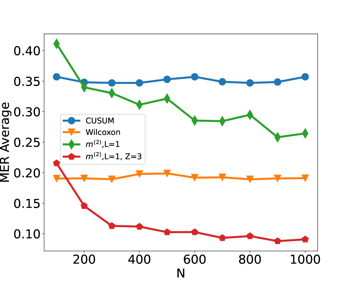
### Visual Description
## Line Chart: MER Average vs. N
### Overview
The image is a line chart comparing the MER (Mean Error Rate) Average for four different methods (CUSUM, Wilcoxon, m^(2), L=1, and m^(2), L=1, Z=3) as a function of N. The x-axis represents N, ranging from approximately 100 to 1000. The y-axis represents the MER Average, ranging from 0.10 to 0.40.
### Components/Axes
* **X-axis:** N, with tick marks at 200, 400, 600, 800, and 1000.
* **Y-axis:** MER Average, with tick marks at 0.10, 0.15, 0.20, 0.25, 0.30, 0.35, and 0.40.
* **Legend:** Located in the center-left of the chart, it identifies the four data series:
* Blue line with circle markers: CUSUM
* Orange line with inverted triangle markers: Wilcoxon
* Green line with diamond markers: m^(2), L=1
* Red line with square markers: m^(2), L=1, Z=3
### Detailed Analysis
* **CUSUM (Blue):** The CUSUM line starts at approximately 0.36 at N=100, decreases slightly to around 0.34 at N=200, then remains relatively stable between 0.34 and 0.36 for the rest of the range, ending at approximately 0.36 at N=1000.
* N=100, MER Average ≈ 0.36
* N=200, MER Average ≈ 0.34
* N=400, MER Average ≈ 0.35
* N=600, MER Average ≈ 0.36
* N=800, MER Average ≈ 0.35
* N=1000, MER Average ≈ 0.36
* **Wilcoxon (Orange):** The Wilcoxon line starts at approximately 0.19 at N=100, decreases slightly to around 0.19 at N=200, then remains relatively stable between 0.19 and 0.20 for the rest of the range, ending at approximately 0.19 at N=1000.
* N=100, MER Average ≈ 0.19
* N=200, MER Average ≈ 0.19
* N=400, MER Average ≈ 0.19
* N=600, MER Average ≈ 0.20
* N=800, MER Average ≈ 0.19
* N=1000, MER Average ≈ 0.19
* **m^(2), L=1 (Green):** The green line starts at approximately 0.41 at N=100, decreases to around 0.34 at N=200, then decreases to around 0.33 at N=300, then decreases to around 0.32 at N=400, then decreases to around 0.29 at N=600, then increases to around 0.29 at N=700, then increases to around 0.30 at N=800, then decreases to around 0.26 at N=900, then increases to around 0.27 at N=1000.
* N=100, MER Average ≈ 0.41
* N=200, MER Average ≈ 0.34
* N=400, MER Average ≈ 0.32
* N=600, MER Average ≈ 0.29
* N=800, MER Average ≈ 0.30
* N=1000, MER Average ≈ 0.27
* **m^(2), L=1, Z=3 (Red):** The red line starts at approximately 0.22 at N=100, decreases sharply to around 0.15 at N=200, then decreases to around 0.11 at N=300, then remains relatively stable between 0.09 and 0.11 for the rest of the range, ending at approximately 0.09 at N=1000.
* N=100, MER Average ≈ 0.22
* N=200, MER Average ≈ 0.15
* N=400, MER Average ≈ 0.11
* N=600, MER Average ≈ 0.10
* N=800, MER Average ≈ 0.10
* N=1000, MER Average ≈ 0.09
### Key Observations
* The m^(2), L=1, Z=3 method (red line) consistently has the lowest MER Average across the range of N values.
* The m^(2), L=1 method (green line) has the highest MER Average at lower N values, but decreases as N increases.
* The CUSUM (blue line) and Wilcoxon (orange line) methods have relatively stable MER Averages across the range of N values.
### Interpretation
The chart suggests that the m^(2), L=1, Z=3 method is the most effective in terms of minimizing the Mean Error Rate Average, especially as N increases. The m^(2), L=1 method performs worse at lower N values but improves as N increases, eventually performing better than CUSUM and Wilcoxon. The CUSUM and Wilcoxon methods provide relatively consistent performance regardless of the value of N. The parameter Z=3 appears to significantly improve the performance of the m^(2), L=1 method.
</details>
Figure 5: Scenario S3 with Cauchy noise by adding Wilcoxon type of change-point detection method (Dehling et al., 2015) and simple neural network with truncation in data preprocessing. The average misclassification error rate (MER) is computed on a test set of size $N_{\mathrm{test}}=15000$ , against training sample size $N$ for detecting the existence of a change-point on data series of length $n=100$ . We compare the performance of the CUSUM test, Wilcoxon test, $\mathcal{H}_{1,m^{(2)}}$ and $\mathcal{H}_{1,m^{(2)}}$ with $Z=3$ where $m^{(2)}=2n-2$ and $Z=3$ means the truncated $z$ -score, i.e. given vector $\boldsymbol{x}=(x_{1},x_{2},...,x_{n})^{→p}$ , then $x_{i}[{\left|x_{i}-\bar{x}\right|}>Z\sigma_{x}]=\bar{x}+\mathrm{sgn}(x_{i}-%
\bar{x})Z\sigma_{x}$ , $\bar{x}$ and $\sigma_{x}$ are the mean and standard deviation of $\boldsymbol{x}$ .
B.2.3 Robustness Study
This simulation is an extension of numerical study of Section 5 in main text. We trained our neural network using training data generated under scenario S1 with $\rho_{t}=0$ (i.e. corresponding to Figure 2 (a) of the main text), but generate the test data under settings corresponding to Figure 2 (a, b, c, d). In other words, apart the top-left panel, in the remaining panels of Figure 6, the trained network is misspecified for the test data. We see that the neural networks continue to work well in all panels, and in fact have performance similar to those in Figure 2 (b, c, d) of the main text. This indicates that the trained neural network has likely learned features related to the change-point rather than any distributional specific artefacts.
<details>
<summary>x9.png Details</summary>
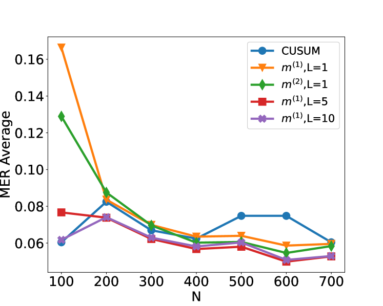
### Visual Description
## Line Chart: MER Average vs N
### Overview
The image is a line chart comparing the MER (Matching Error Rate) Average for different algorithms (CUSUM, m^(1), m^(2)) with varying parameters (L=1, L=5, L=10) as a function of N. The x-axis represents N, and the y-axis represents the MER Average.
### Components/Axes
* **X-axis:** N, with values ranging from 100 to 700 in increments of 100.
* **Y-axis:** MER Average, with values ranging from 0.06 to 0.16 in increments of 0.02.
* **Legend (Top-Right):**
* Blue line with circle markers: CUSUM
* Orange line with triangle markers: m^(1), L=1
* Green line with diamond markers: m^(2), L=1
* Red line with square markers: m^(1), L=5
* Purple line with pentagon markers: m^(1), L=10
### Detailed Analysis
* **CUSUM (Blue):** Starts at approximately 0.06 at N=100, increases to approximately 0.085 at N=200, decreases to approximately 0.06 at N=400, then increases and plateaus around 0.075 from N=500 to N=600, and finally decreases to approximately 0.06 at N=700.
* **m^(1), L=1 (Orange):** Starts at approximately 0.165 at N=100, decreases sharply to approximately 0.085 at N=200, then gradually decreases to approximately 0.06 at N=700.
* **m^(2), L=1 (Green):** Starts at approximately 0.13 at N=100, decreases sharply to approximately 0.085 at N=200, then gradually decreases to approximately 0.06 at N=700.
* **m^(1), L=5 (Red):** Starts at approximately 0.077 at N=100, decreases slightly to approximately 0.075 at N=200, then decreases to approximately 0.057 at N=400, increases slightly to approximately 0.06 at N=500, and then decreases to approximately 0.055 at N=700.
* **m^(1), L=10 (Purple):** Starts at approximately 0.062 at N=100, increases slightly to approximately 0.075 at N=200, then decreases to approximately 0.052 at N=600, and increases slightly to approximately 0.055 at N=700.
### Key Observations
* The algorithms m^(1), L=1 and m^(2), L=1 have the highest MER Average at N=100, but decrease sharply as N increases.
* The CUSUM algorithm has a relatively stable MER Average across different values of N, with a slight increase and plateau between N=500 and N=600.
* The algorithms m^(1), L=5 and m^(1), L=10 have the lowest MER Average across different values of N.
### Interpretation
The chart compares the performance of different algorithms in terms of MER Average as a function of N. The algorithms m^(1), L=1 and m^(2), L=1 initially have high error rates, but their performance improves significantly as N increases. The CUSUM algorithm has a more stable performance, while the algorithms m^(1), L=5 and m^(1), L=10 consistently have the lowest error rates. This suggests that the choice of algorithm and its parameters can significantly impact the MER Average. The optimal choice depends on the specific application and the desired trade-off between initial error rate and stability.
</details>
<details>
<summary>x10.png Details</summary>
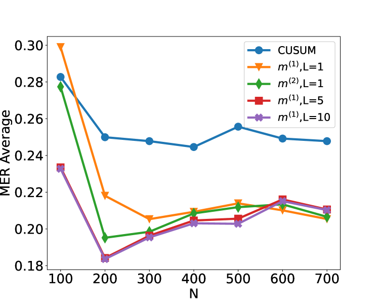
### Visual Description
## Line Chart: MER Average vs N
### Overview
The image is a line chart comparing the MER (Minimum Error Rate) Average for different methods (CUSUM, m^(1) with L=1, m^(2) with L=1, m^(1) with L=5, and m^(1) with L=10) as a function of N. The x-axis represents N, ranging from 100 to 700. The y-axis represents the MER Average, ranging from 0.18 to 0.30.
### Components/Axes
* **X-axis:** N, with tick marks at 100, 200, 300, 400, 500, 600, and 700.
* **Y-axis:** MER Average, with tick marks at 0.18, 0.20, 0.22, 0.24, 0.26, 0.28, and 0.30.
* **Legend (top-right):**
* Blue line with circle markers: CUSUM
* Orange line with triangle markers: m^(1), L=1
* Green line with diamond markers: m^(2), L=1
* Red line with square markers: m^(1), L=5
* Purple line with pentagon markers: m^(1), L=10
### Detailed Analysis
* **CUSUM (Blue, Circle):** Starts at approximately 0.28 at N=100, decreases to around 0.25 at N=200, remains relatively stable around 0.25 until N=500, increases slightly to approximately 0.255 at N=500, and then decreases slightly to approximately 0.248 at N=700.
* N=100: 0.28
* N=200: 0.25
* N=300: 0.248
* N=400: 0.245
* N=500: 0.255
* N=600: 0.25
* N=700: 0.248
* **m^(1), L=1 (Orange, Triangle):** Starts at approximately 0.30 at N=100, decreases sharply to around 0.22 at N=200, and then gradually increases to approximately 0.21 at N=500, and then increases slightly to approximately 0.215 at N=600, and then decreases slightly to approximately 0.208 at N=700.
* N=100: 0.30
* N=200: 0.22
* N=300: 0.205
* N=400: 0.208
* N=500: 0.21
* N=600: 0.215
* N=700: 0.208
* **m^(2), L=1 (Green, Diamond):** Starts at approximately 0.28 at N=100, decreases sharply to around 0.195 at N=200, and then gradually increases to approximately 0.208 at N=700.
* N=100: 0.28
* N=200: 0.195
* N=300: 0.198
* N=400: 0.205
* N=500: 0.21
* N=600: 0.212
* N=700: 0.208
* **m^(1), L=5 (Red, Square):** Starts at approximately 0.235 at N=100, decreases to around 0.185 at N=200, and then gradually increases to approximately 0.215 at N=600, and then decreases slightly to approximately 0.212 at N=700.
* N=100: 0.235
* N=200: 0.185
* N=300: 0.195
* N=400: 0.205
* N=500: 0.208
* N=600: 0.215
* N=700: 0.212
* **m^(1), L=10 (Purple, Pentagon):** Starts at approximately 0.235 at N=100, decreases to around 0.185 at N=200, and then gradually increases to approximately 0.212 at N=600, and then decreases slightly to approximately 0.21 at N=700.
* N=100: 0.235
* N=200: 0.185
* N=300: 0.198
* N=400: 0.202
* N=500: 0.203
* N=600: 0.212
* N=700: 0.21
### Key Observations
* CUSUM has the highest MER Average overall, and its performance is relatively stable across different values of N.
* The other methods (m^(1), L=1; m^(2), L=1; m^(1), L=5; and m^(1), L=10) have a similar trend: a sharp decrease in MER Average from N=100 to N=200, followed by a gradual increase as N increases.
* For N greater than 300, the MER Average for m^(1), L=5 and m^(1), L=10 are very similar.
* For N greater than 300, the MER Average for m^(1), L=1 and m^(2), L=1 are very similar.
### Interpretation
The chart compares the performance of different methods for a specific task, as measured by the MER Average. The CUSUM method appears to be less sensitive to changes in N compared to the other methods. The methods m^(1), L=1; m^(2), L=1; m^(1), L=5; and m^(1), L=10 show a significant improvement in MER Average as N increases from 100 to 200, suggesting that increasing N initially improves performance. However, after N=200, the improvement becomes less pronounced, and the MER Average plateaus or even slightly decreases. The similar trends of m^(1), L=5 and m^(1), L=10, and m^(1), L=1 and m^(2), L=1 suggest that the parameter L has a limited impact on performance for N greater than 300.
</details>
(a) Trained S1 ( $\rho_{t}=0$ ) $→$ S1 ( $\rho_{t}=0$ ) (b)Trained S1 ( $\rho_{t}=0$ ) $→$ S1 ${}^{\prime}$ ( $\rho_{t}=0.7$ )
<details>
<summary>x11.png Details</summary>
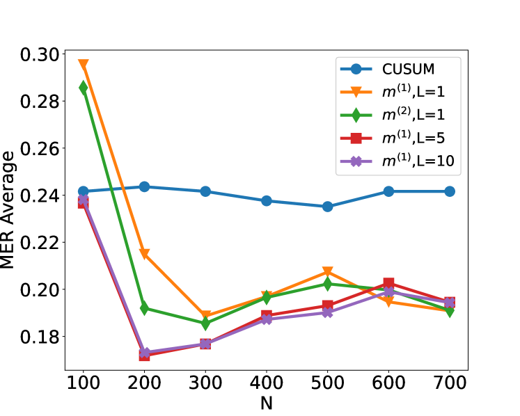
### Visual Description
## Line Chart: MER Average vs N
### Overview
The image is a line chart comparing the MER (Minimum Error Rate) Average for different algorithms (CUSUM, m^(1), m^(2)) with varying parameters (L=1, L=5, L=10) against the variable N. The chart displays how the MER Average changes as N increases from 100 to 700.
### Components/Axes
* **X-axis:** N, ranging from 100 to 700 in increments of 100.
* **Y-axis:** MER Average, ranging from 0.18 to 0.30 in increments of 0.02.
* **Legend (Top-Right):**
* Blue line with circle markers: CUSUM
* Orange line with triangle markers: m^(1), L=1
* Green line with diamond markers: m^(2), L=1
* Red line with square markers: m^(1), L=5
* Purple line with pentagon markers: m^(1), L=10
### Detailed Analysis
* **CUSUM (Blue):** The MER Average starts at approximately 0.24 at N=100, remains relatively stable between 0.24 and 0.235 from N=200 to N=500, then increases slightly to approximately 0.24 at N=600 and remains at 0.24 at N=700.
* N=100: 0.24
* N=200: 0.243
* N=300: 0.242
* N=400: 0.241
* N=500: 0.236
* N=600: 0.242
* N=700: 0.242
* **m^(1), L=1 (Orange):** The MER Average starts at approximately 0.29 at N=100, decreases sharply to approximately 0.215 at N=200, then decreases further to approximately 0.19 at N=300. It then increases to approximately 0.198 at N=400, then increases further to approximately 0.208 at N=500, then decreases to approximately 0.20 at N=600, and finally decreases to approximately 0.195 at N=700.
* N=100: 0.29
* N=200: 0.215
* N=300: 0.19
* N=400: 0.198
* N=500: 0.208
* N=600: 0.20
* N=700: 0.195
* **m^(2), L=1 (Green):** The MER Average starts at approximately 0.285 at N=100, decreases sharply to approximately 0.19 at N=200, then decreases slightly to approximately 0.185 at N=300. It then increases to approximately 0.198 at N=400, then increases slightly to approximately 0.198 at N=500, then increases slightly to approximately 0.20 at N=600, and finally decreases to approximately 0.19 at N=700.
* N=100: 0.285
* N=200: 0.19
* N=300: 0.185
* N=400: 0.198
* N=500: 0.198
* N=600: 0.20
* N=700: 0.19
* **m^(1), L=5 (Red):** The MER Average starts at approximately 0.235 at N=100, decreases sharply to approximately 0.17 at N=200, then increases slightly to approximately 0.177 at N=300. It then increases to approximately 0.188 at N=400, then increases slightly to approximately 0.19 at N=500, then increases to approximately 0.202 at N=600, and finally decreases to approximately 0.195 at N=700.
* N=100: 0.235
* N=200: 0.17
* N=300: 0.177
* N=400: 0.188
* N=500: 0.19
* N=600: 0.202
* N=700: 0.195
* **m^(1), L=10 (Purple):** The MER Average starts at approximately 0.238 at N=100, decreases sharply to approximately 0.172 at N=200, then increases slightly to approximately 0.177 at N=300. It then increases to approximately 0.188 at N=400, then increases slightly to approximately 0.19 at N=500, then increases to approximately 0.20 at N=600, and finally decreases to approximately 0.192 at N=700.
* N=100: 0.238
* N=200: 0.172
* N=300: 0.177
* N=400: 0.188
* N=500: 0.19
* N=600: 0.20
* N=700: 0.192
### Key Observations
* The CUSUM algorithm (blue line) has a relatively stable MER Average across the range of N values, with a slight increase at N=600.
* The m^(1), L=1 (orange line) and m^(2), L=1 (green line) algorithms show a sharp decrease in MER Average from N=100 to N=200, followed by a gradual increase and then a slight decrease.
* The m^(1), L=5 (red line) and m^(1), L=10 (purple line) algorithms show a sharp decrease in MER Average from N=100 to N=200, followed by a gradual increase and then a slight decrease.
* For N values greater than 200, the m^(1), L=5 and m^(1), L=10 algorithms have the lowest MER Average.
### Interpretation
The chart suggests that the CUSUM algorithm is more stable across different values of N, while the other algorithms (m^(1), m^(2)) are more sensitive to changes in N, particularly at lower values. The algorithms m^(1), L=5 and m^(1), L=10 appear to perform better (lower MER Average) for N values greater than 200. The initial sharp decrease in MER Average for m^(1) and m^(2) algorithms indicates that increasing N from 100 to 200 significantly improves their performance. The subsequent gradual increase and slight decrease suggest that there is an optimal range of N values for these algorithms.
</details>
<details>
<summary>x12.png Details</summary>
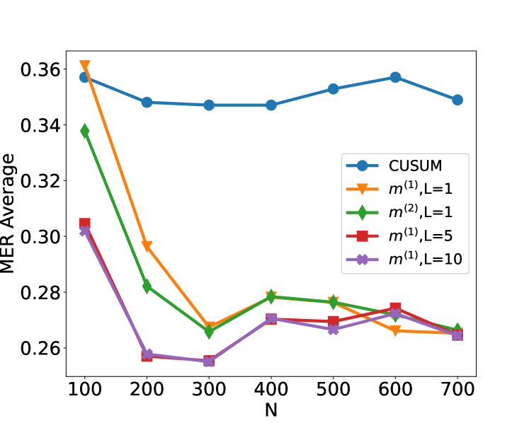
### Visual Description
## Line Chart: MER Average vs N
### Overview
The image is a line chart comparing the MER (Minimum Error Rate) Average for different methods against the parameter 'N'. The chart displays five different data series: CUSUM, m^(1), L=1, m^(2), L=1, m^(1), L=5, and m^(1), L=10. The x-axis represents 'N', and the y-axis represents 'MER Average'.
### Components/Axes
* **X-axis:** Labeled "N", with tick marks at 100, 200, 300, 400, 500, 600, and 700.
* **Y-axis:** Labeled "MER Average", with tick marks at 0.26, 0.28, 0.30, 0.32, 0.34, and 0.36.
* **Legend:** Located in the top-right of the chart, it identifies each line by color and label:
* Blue: CUSUM
* Orange: m^(1), L=1
* Green: m^(2), L=1
* Red: m^(1), L=5
* Purple: m^(1), L=10
### Detailed Analysis
* **CUSUM (Blue):** The line starts at approximately 0.358 at N=100, decreases to around 0.347 at N=300, increases slightly to approximately 0.355 at N=600, and then decreases to around 0.350 at N=700.
* **m^(1), L=1 (Orange):** The line starts at approximately 0.362 at N=100, decreases sharply to around 0.297 at N=200, then decreases further to approximately 0.266 at N=300, and remains relatively flat around 0.270 until N=700.
* **m^(2), L=1 (Green):** The line starts at approximately 0.338 at N=100, decreases to around 0.281 at N=200, then decreases further to approximately 0.266 at N=300, increases slightly to approximately 0.278 at N=400, and remains relatively flat around 0.275 until N=700.
* **m^(1), L=5 (Red):** The line starts at approximately 0.304 at N=100, decreases to around 0.257 at N=200, then remains relatively flat around 0.270 until N=700.
* **m^(1), L=10 (Purple):** The line starts at approximately 0.302 at N=100, decreases to around 0.256 at N=200, then remains relatively flat around 0.265 until N=700.
### Key Observations
* The CUSUM method has the highest MER Average across all values of N.
* The m^(1), L=1 method starts with a high MER Average but decreases sharply as N increases.
* The m^(1), L=5 and m^(1), L=10 methods have the lowest MER Average for N greater than 200.
* All methods except CUSUM converge to a similar MER Average as N increases.
### Interpretation
The chart compares the performance of different methods for minimizing error rate as the parameter 'N' changes. The CUSUM method consistently performs worse than the other methods. The m^(1), L=5 and m^(1), L=10 methods appear to be the most effective at minimizing the error rate for larger values of N. The initial high error rate of m^(1), L=1 suggests that it may require a larger N to stabilize. The convergence of the methods at higher N values suggests that increasing N beyond a certain point may not significantly improve performance.
</details>
(c) Trained S1 ( $\rho_{t}=0$ ) $→$ S2 (d) Trained S1 ( $\rho_{t}=0$ ) $→$ S3
Figure 6: Plot of the test set MER, computed on a test set of size $N_{\mathrm{test}}=30000$ , against training sample size $N$ for detecting the existence of a change-point on data series of length $n=100$ . We compare the performance of the CUSUM test and neural networks from four function classes: $\mathcal{H}_{1,m^{(1)}}$ , $\mathcal{H}_{1,m^{(2)}}$ , $\mathcal{H}_{5,m^{(1)}\mathbf{1}_{5}}$ and $\mathcal{H}_{10,m^{(1)}\mathbf{1}_{10}}$ where $m^{(1)}=4\lfloor\log_{2}(n)\rfloor$ and $m^{(2)}=2n-2$ respectively under scenarios S1, S1 ${}^{\prime}$ , S2 and S3 described in Section 5. The subcaption “A $→$ B” means that we apply the trained classifier “A” to target testing dataset “B”.
B.2.4 Simulation for change in autocorrelation
In this simulation, we discuss how we can use neural networks to recreate test statistics for various types of changes. For instance, if the data follows an AR(1) structure, then changes in autocorrelation can be handled by including transformations of the original input of the form $(x_{t}x_{t+1})_{t=1,...,n-1}$ . On the other hand, even if such transformations are not supplied as the input, a deep neural network of suitable depth is able to approximate these transformations and consequently successfully detect the change (Schmidt-Hieber, 2020, Lemma A.2). This is illustrated in Figure 7, where we compare the performance of neural network based classifiers of various depths constructed with and without using the transformed data as inputs.
<details>
<summary>x13.png Details</summary>
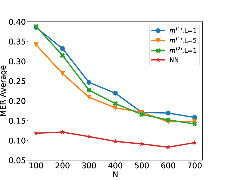
### Visual Description
## Line Chart: MER Average vs. N
### Overview
The image is a line chart comparing the MER (Minimum Edit Rate) Average for different models against the parameter 'N'. Four models are compared: m^(1),L=1; m^(1),L=5; m^(2),L=1; and NN. The x-axis represents 'N', and the y-axis represents 'MER Average'.
### Components/Axes
* **X-axis:** N, with values ranging from 100 to 700 in increments of 100.
* **Y-axis:** MER Average, with values ranging from 0.05 to 0.40 in increments of 0.05.
* **Legend (Top-Right):**
* Blue line with circle markers: m^(1),L=1
* Orange line with triangle markers: m^(1),L=5
* Green line with cross markers: m^(2),L=1
* Red line with star markers: NN
### Detailed Analysis
* **m^(1),L=1 (Blue):** The line starts at approximately (100, 0.39), decreases to (200, 0.33), then to (300, 0.25), then to (400, 0.22), then to (500, 0.17), then to (600, 0.16), and ends at approximately (700, 0.16). The trend is generally decreasing, with a slight plateau towards the end.
* **m^(1),L=5 (Orange):** The line starts at approximately (100, 0.35), decreases to (200, 0.27), then to (300, 0.22), then to (400, 0.19), then to (500, 0.17), then to (600, 0.15), and ends at approximately (700, 0.16). The trend is decreasing.
* **m^(2),L=1 (Green):** The line starts at approximately (100, 0.39), decreases to (200, 0.32), then to (300, 0.23), then to (400, 0.19), then to (500, 0.17), then to (600, 0.15), and ends at approximately (700, 0.14). The trend is decreasing.
* **NN (Red):** The line starts at approximately (100, 0.12), increases slightly to (200, 0.12), then decreases to (300, 0.11), then to (400, 0.10), then to (500, 0.09), then decreases to (600, 0.08), and ends at approximately (700, 0.10). The trend is relatively flat, with a slight dip in the middle.
### Key Observations
* The MER Average generally decreases as N increases for the models m^(1),L=1, m^(1),L=5, and m^(2),L=1.
* The NN model has a significantly lower MER Average compared to the other models across all values of N.
* The MER Average for the NN model is relatively stable across different values of N.
* The models m^(1),L=1 and m^(2),L=1 start with the highest MER Average, while the NN model starts with the lowest.
### Interpretation
The chart suggests that increasing the parameter 'N' generally improves the performance (reduces MER Average) of the models m^(1),L=1, m^(1),L=5, and m^(2),L=1. The NN model consistently outperforms the other models, indicating it is more effective in minimizing the Minimum Edit Rate. The relatively flat trend of the NN model suggests that its performance is less sensitive to changes in 'N' compared to the other models. The models m^(1),L=1, m^(1),L=5, and m^(2),L=1 converge to similar MER Average values as N increases, suggesting that the impact of 'N' diminishes at higher values.
</details>
<details>
<summary>x14.png Details</summary>
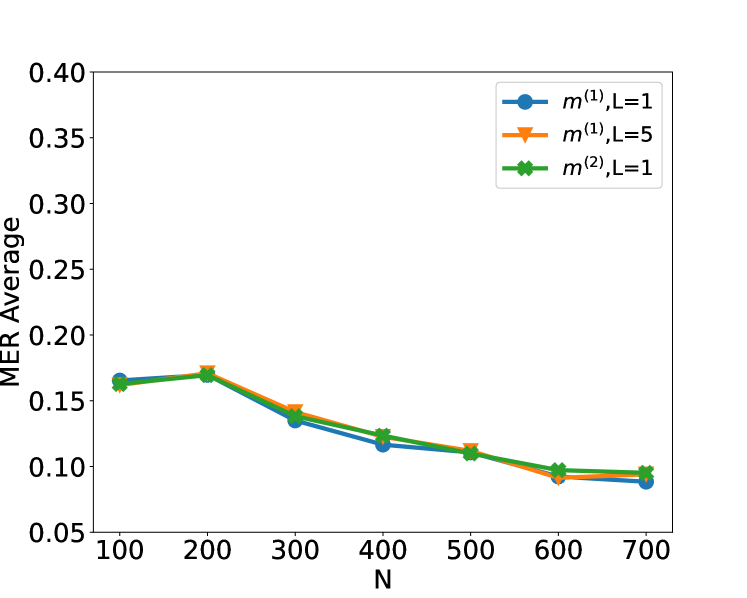
### Visual Description
## Line Chart: MER Average vs. N
### Overview
The image is a line chart that plots the MER (Minimum Error Rate) Average against the variable N. There are three data series represented by different colored lines with distinct markers: blue circles, orange triangles, and green diamonds. All three lines show a generally decreasing trend as N increases.
### Components/Axes
* **X-axis (Horizontal):** Labeled "N". The axis ranges from 100 to 700, with tick marks at intervals of 100 (100, 200, 300, 400, 500, 600, 700).
* **Y-axis (Vertical):** Labeled "MER Average". The axis ranges from 0.05 to 0.40, with tick marks at intervals of 0.05 (0.05, 0.10, 0.15, 0.20, 0.25, 0.30, 0.35, 0.40).
* **Legend (Top-Right):**
* Blue line with circle markers: m^(1), L=1
* Orange line with triangle markers: m^(1), L=5
* Green line with diamond markers: m^(2), L=1
### Detailed Analysis
* **Blue Line (m^(1), L=1):**
* Trend: Decreasing.
* Data Points:
* N=100, MER Average ≈ 0.165
* N=200, MER Average ≈ 0.17
* N=300, MER Average ≈ 0.135
* N=400, MER Average ≈ 0.118
* N=500, MER Average ≈ 0.11
* N=600, MER Average ≈ 0.095
* N=700, MER Average ≈ 0.088
* **Orange Line (m^(1), L=5):**
* Trend: Decreasing.
* Data Points:
* N=100, MER Average ≈ 0.165
* N=200, MER Average ≈ 0.172
* N=300, MER Average ≈ 0.14
* N=400, MER Average ≈ 0.122
* N=500, MER Average ≈ 0.11
* N=600, MER Average ≈ 0.095
* N=700, MER Average ≈ 0.095
* **Green Line (m^(2), L=1):**
* Trend: Decreasing.
* Data Points:
* N=100, MER Average ≈ 0.162
* N=200, MER Average ≈ 0.17
* N=300, MER Average ≈ 0.138
* N=400, MER Average ≈ 0.122
* N=500, MER Average ≈ 0.112
* N=600, MER Average ≈ 0.098
* N=700, MER Average ≈ 0.095
### Key Observations
* All three lines exhibit a similar decreasing trend, indicating that as N increases, the MER Average decreases.
* The lines are relatively close to each other, suggesting that the different configurations (m^(1), L=1; m^(1), L=5; m^(2), L=1) have a similar impact on the MER Average.
* The most significant drop in MER Average occurs between N=200 and N=300 for all three lines.
* The lines converge as N approaches 700, indicating that the differences between the configurations become less pronounced at higher values of N.
### Interpretation
The chart suggests that increasing the value of 'N' leads to a reduction in the Minimum Error Rate (MER) Average, regardless of the specific configuration of 'm' and 'L' tested. The convergence of the lines at higher 'N' values implies that the impact of 'm' and 'L' on MER diminishes as 'N' increases. The initial rapid decrease in MER suggests that there are diminishing returns to increasing 'N', as the rate of improvement slows down at higher values. The data indicates that optimizing 'N' is crucial for minimizing error rates, and that beyond a certain point, further increases in 'N' may not yield significant improvements.
</details>
(a) Original Input (b) Original and $x_{t}x_{t+1}$ Input
Figure 7: Plot of the test set MER, computed on a test set of size $N_{\mathrm{test}}=30000$ , against training sample size $N$ for detecting the existence of a change-point on data series of length $n=100$ . We compare the performance of neural networks from four function classes: $\mathcal{H}_{1,m^{(1)}}$ , $\mathcal{H}_{1,m^{(2)}}$ , $\mathcal{H}_{5,m^{(1)}\mathbf{1}_{5}}$ and neural network with 21 residual blocks where $m^{(1)}=4\lfloor\log_{2}(n)\rfloor$ and $m^{(2)}=2n-2$ respectively. The change-points are randomly chosen from $\mathrm{Unif}\{10,...,89\}$ . Given change-point $\tau$ , data are generated from the autoregressive model $x_{t}=\alpha_{t}x_{t-1}+\epsilon_{t}$ for $\epsilon_{t}\stackrel{{\scriptstyle\mathrm{iid}}}{{\sim}}N(0,0.25^{2})$ and $\alpha_{t}=0.2\mathbf{1}_{\{t<\tau\}}+0.8\mathbf{1}_{\{t≥\tau\}}$ .
B.2.5 Simulation on change-point location estimation
Here, we describe simulation results on the performance of change-point location estimator constructed using a combination of simple neural network-based classifier and Algorithm 1 from the main text. Given a sequence of length $n^{\prime}=2000$ , we draw $\tau\sim\text{Unif}\{750,...,1250\}$ . Set $\mu_{L}=0$ and draw $\mu_{R}|\tau$ from 2 different uniform distributions: $\text{Unif}([-1.5b,-0.5b]\cup[0.5b,1.5b])$ (Weak) and $\text{Unif}([-3b,-b]\cup[b,3b])$ (Strong), where $b\coloneqq\sqrt{\frac{8n^{\prime}\log(20n^{\prime})}{\tau(n^{\prime}-\tau)}}$ is chosen in line with Lemma 4.1 to ensure a good range of signal-to-noise ratio. We then generate $\boldsymbol{x}=(\mu_{\mathrm{L}}\mathbbm{1}_{\{t≤\tau\}}+\mu_{\mathrm{R}}%
\mathbbm{1}_{\{t>\tau\}}+\varepsilon_{t})_{t∈[n^{\prime}]}$ , with the noise $\boldsymbol{\varepsilon}=(\varepsilon_{t})_{t∈[n^{\prime}]}\sim N_{n^{\prime%
}}(0,I_{n^{\prime}})$ . We then draw independent copies $\boldsymbol{x}_{1},...,\boldsymbol{x}_{N^{\prime}}$ of $\boldsymbol{x}$ . For each $\boldsymbol{x}_{k}$ , we randomly choose 60 segments with length $n∈\{300,400,500,600\}$ , the segments which include $\tau_{k}$ are labelled ‘1’, others are labelled ‘0’. The training dataset size is $N=60N^{\prime}$ where $N^{\prime}=500$ . We then draw another $N_{\text{test}}=3000$ independent copies of $\boldsymbol{x}$ as our test data for change-point location estimation. We study the performance of change-point location estimator produced by using Algorithm 1 together with a single-layer neural network, and compare it with the performance of CUSUM, MOSUM and Wilcoxon statistics-based estimators. As we can see from the Figure 8, under Gaussian models where CUSUM is known to work well, our simple neural network-based procedure is competitive. On the other hand, when the noise is heavy-tailed, our simple neural network-based estimator greatly outperforms CUSUM-based estimator.
<details>
<summary>x15.png Details</summary>
### Visual Description
## Line Chart: RMSE vs. n for Different Algorithms
### Overview
The image is a line chart comparing the Root Mean Squared Error (RMSE) of three algorithms (CUSUM, MOSUM, and Alg. 1) as a function of 'n'. The x-axis represents 'n', and the y-axis represents RMSE. The chart displays how the RMSE changes for each algorithm as 'n' increases.
### Components/Axes
* **Title:** Implicit, but the chart compares RMSE vs. n for different algorithms.
* **X-axis:**
* Label: "n"
* Scale: 300 to 600, with markers at 300, 350, 400, 450, 500, 550, and 600.
* **Y-axis:**
* Label: "RMSE"
* Scale: 50 to 250, with implicit markers at 50, 100, 150, 200, and 250.
* **Legend:** Located at the top-right of the chart.
* CUSUM (blue line with circle markers)
* MOSUM (orange line with triangle markers)
* Alg. 1 (green line with cross markers)
### Detailed Analysis
* **CUSUM (blue):** The line is relatively flat, indicating a stable RMSE across different values of 'n'.
* n = 300: RMSE ≈ 60
* n = 400: RMSE ≈ 55
* n = 500: RMSE ≈ 70
* n = 600: RMSE ≈ 60
* **MOSUM (orange):** The line slopes downward, indicating a decreasing RMSE as 'n' increases.
* n = 300: RMSE ≈ 275
* n = 400: RMSE ≈ 200
* n = 500: RMSE ≈ 175
* n = 600: RMSE ≈ 150
* **Alg. 1 (green):** The line slopes downward, indicating a decreasing RMSE as 'n' increases.
* n = 300: RMSE ≈ 98
* n = 400: RMSE ≈ 72
* n = 500: RMSE ≈ 72
* n = 600: RMSE ≈ 62
### Key Observations
* MOSUM has the highest RMSE values across the range of 'n' values.
* CUSUM has the lowest RMSE values and remains relatively stable.
* Alg. 1 starts with a higher RMSE than CUSUM but decreases to a similar level as 'n' increases.
* All algorithms show a general trend of decreasing or stable RMSE as 'n' increases, except for CUSUM which increases slightly between n=400 and n=500.
### Interpretation
The chart suggests that CUSUM is the most stable algorithm in terms of RMSE across the tested range of 'n' values. MOSUM has the highest error, while Alg. 1's performance improves as 'n' increases, eventually approaching the performance of CUSUM. The choice of algorithm would depend on the specific requirements of the application and the importance of minimizing RMSE for different values of 'n'. The data indicates that increasing 'n' generally leads to a reduction in RMSE for MOSUM and Alg. 1, but has little impact on CUSUM.
</details>
<details>
<summary>x16.png Details</summary>
### Visual Description
## Line Chart: RMSE vs. n for Different Algorithms
### Overview
The image is a line chart comparing the Root Mean Squared Error (RMSE) of three algorithms (CUSUM, MOSUM, and Alg. 1) as a function of the variable 'n'. The chart displays how the RMSE changes for each algorithm as 'n' varies from 300 to 600.
### Components/Axes
* **X-axis:** 'n', with values ranging from 300 to 600 in increments of 50 or 100. Axis markers are present at 300, 350, 400, 450, 500, 550, and 600.
* **Y-axis:** 'RMSE', with values ranging from 10 to 60. Axis markers are present at 10, 20, 30, 40, 50, and 60.
* **Legend:** Located in the top-right corner, it identifies the three algorithms:
* Blue line with circle markers: CUSUM
* Orange line with triangle markers: MOSUM
* Green line with cross markers: Alg. 1
### Detailed Analysis
* **CUSUM (Blue):** The RMSE is relatively stable.
* At n=300, RMSE ≈ 12
* At n=400, RMSE ≈ 13.5
* At n=500, RMSE ≈ 12.5
* At n=600, RMSE ≈ 12
* **MOSUM (Orange):** The RMSE decreases significantly from n=300 to n=400, then slightly increases from n=400 to n=500, and then decreases again from n=500 to n=600.
* At n=300, RMSE ≈ 65
* At n=400, RMSE ≈ 26
* At n=500, RMSE ≈ 27
* At n=600, RMSE ≈ 17
* **Alg. 1 (Green):** The RMSE is relatively stable, with a slight increase from n=300 to n=500, and then a slight increase from n=500 to n=600.
* At n=300, RMSE ≈ 16.5
* At n=400, RMSE ≈ 18
* At n=500, RMSE ≈ 18
* At n=600, RMSE ≈ 19.5
### Key Observations
* MOSUM has the highest RMSE at n=300, but it decreases significantly as n increases.
* CUSUM has the lowest and most stable RMSE across the range of n values.
* Alg. 1 has a relatively stable RMSE, slightly higher than CUSUM.
### Interpretation
The chart compares the performance of three algorithms based on their RMSE values for different values of 'n'. The results suggest that CUSUM is the most stable and accurate algorithm across the tested range of 'n' values, as it consistently exhibits the lowest RMSE. MOSUM, while initially having a high RMSE, improves significantly as 'n' increases, eventually approaching the performance of Alg. 1. Alg. 1 shows a consistent performance, but it is generally less accurate than CUSUM. The choice of algorithm would depend on the specific requirements of the application and the expected range of 'n' values. If stability and low error are critical, CUSUM would be the preferred choice. If 'n' is expected to be large, MOSUM could be a viable option.
</details>
(a) S1 with $\rho_{t}=0$ , weak SNR (b) S1 with $\rho_{t}=0$ , strong SNR
<details>
<summary>x17.png Details</summary>
### Visual Description
## Line Chart: RMSE vs. n for Different Algorithms
### Overview
The image is a line chart comparing the Root Mean Squared Error (RMSE) of four different algorithms (CUSUM, MOSUM, Alg. 1, and Wilcoxon) as a function of 'n'. The x-axis represents 'n', and the y-axis represents RMSE.
### Components/Axes
* **X-axis:** 'n', with values ranging from 300 to 600 in increments of 100.
* **Y-axis:** 'RMSE', with values ranging from 0 to 175 in increments of 25.
* **Legend:** Located in the top-right quadrant of the chart, it identifies the algorithms and their corresponding line colors:
* CUSUM (blue line with circle markers)
* MOSUM (orange line with triangle markers)
* Alg. 1 (green line with 'x' markers)
* Wilcoxon (red line with star markers)
### Detailed Analysis
* **CUSUM (blue):** The line starts at approximately RMSE = 160 when n = 300. It increases to about RMSE = 170 at n = 400, then to approximately RMSE = 175 at n = 500, and decreases to about RMSE = 165 at n = 600.
* **MOSUM (orange):** The line starts at approximately RMSE = 93 when n = 300. It increases to about RMSE = 98 at n = 400, then to approximately RMSE = 101 at n = 500, and decreases to about RMSE = 88 at n = 600.
* **Alg. 1 (green):** The line starts at approximately RMSE = 8 when n = 300. It increases to about RMSE = 10 at n = 400, then to approximately RMSE = 11 at n = 500, and increases to about RMSE = 14 at n = 600.
* **Wilcoxon (red):** The line remains relatively constant at approximately RMSE = 1 for all values of 'n'.
### Key Observations
* CUSUM has the highest RMSE values across the range of 'n' values.
* Wilcoxon has the lowest RMSE values and remains relatively stable.
* Alg. 1 has low RMSE values, but they increase slightly with 'n'.
* MOSUM has intermediate RMSE values.
### Interpretation
The chart compares the performance of four algorithms based on their RMSE as 'n' varies. CUSUM exhibits the highest error, while Wilcoxon demonstrates the lowest and most stable error. Alg. 1 shows a slight increase in error as 'n' increases. MOSUM's error is in between CUSUM and Alg. 1, and it also varies with 'n'. The data suggests that for the given scenario, the Wilcoxon algorithm is the most accurate, while CUSUM is the least accurate. The choice of algorithm would depend on the specific requirements of the application, considering the trade-offs between accuracy and computational complexity.
</details>
<details>
<summary>x18.png Details</summary>
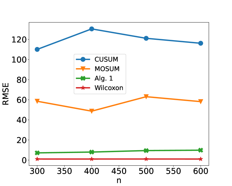
### Visual Description
## Line Chart: RMSE vs. n for Different Algorithms
### Overview
The image is a line chart comparing the Root Mean Squared Error (RMSE) of four different algorithms (CUSUM, MOSUM, Alg. 1, and Wilcoxon) as a function of 'n'. The x-axis represents 'n', and the y-axis represents RMSE.
### Components/Axes
* **Title:** There is no explicit title on the chart.
* **X-axis:**
* Label: "n"
* Scale: 300 to 600, with markers at 300, 400, 500, and 600.
* **Y-axis:**
* Label: "RMSE"
* Scale: 0 to 120, with implicit markers every 20 units.
* **Legend:** Located on the right side of the chart.
* CUSUM (blue line with circle markers)
* MOSUM (orange line with triangle markers)
* Alg. 1 (green line with 'x' markers)
* Wilcoxon (red line with star markers)
### Detailed Analysis
* **CUSUM (blue):** The line starts at approximately 110 at n=300, increases to approximately 130 at n=400, and then decreases to approximately 120 at n=500 and approximately 117 at n=600.
* (300, 110)
* (400, 130)
* (500, 120)
* (600, 117)
* **MOSUM (orange):** The line starts at approximately 60 at n=300, decreases to approximately 48 at n=400, increases to approximately 63 at n=500, and decreases slightly to approximately 59 at n=600.
* (300, 60)
* (400, 48)
* (500, 63)
* (600, 59)
* **Alg. 1 (green):** The line remains relatively flat, starting at approximately 7 at n=300, increasing slightly to approximately 9 at n=500, and then increasing slightly to approximately 10 at n=600.
* (300, 7)
* (400, 8)
* (500, 9)
* (600, 10)
* **Wilcoxon (red):** The line remains relatively flat and close to zero.
* (300, 1)
* (400, 1)
* (500, 1)
* (600, 1)
### Key Observations
* CUSUM has the highest RMSE values overall.
* MOSUM has a fluctuating RMSE, decreasing initially and then increasing.
* Alg. 1 and Wilcoxon have significantly lower RMSE values compared to CUSUM and MOSUM.
* Wilcoxon has the lowest RMSE values, close to zero across all 'n' values.
### Interpretation
The chart compares the performance of four algorithms based on their RMSE as 'n' varies. CUSUM performs the worst, with the highest RMSE. MOSUM's performance fluctuates. Alg. 1 and Wilcoxon perform significantly better, with Wilcoxon showing the best performance, indicated by its consistently low RMSE values. The data suggests that for the range of 'n' values considered, Wilcoxon is the most accurate algorithm, followed by Alg. 1. CUSUM is the least accurate. The specific meaning of 'n' is not provided, but it is likely a parameter or input size affecting the algorithms' performance.
</details>
(c) S3, weak SNR (d) S3, strong SNR
Figure 8: Plot of the root mean square error (RMSE) of change-point estimation (S1 with $\rho_{t}=0$ and S3), computed on a test set of size $N_{\text{test}}=3000$ , against bandwidth $n$ for detecting the existence of a change-point on data series of length $n^{*}=2000$ . We compare the performance of the change-point detection by CUSUM, MOSUM, Algorithm 1 and Wilcoxon (only for S3) respectively. The RMSE here is defined by $\sqrt{1/N\sum_{i=1}^{N}(\hat{\tau}_{i}-\tau_{i})^{2}}$ where $\hat{\tau}_{i}$ is the estimator of change-point for the $i$ -th observation and $\tau_{i}$ is the true change-point. The weak and strong signal-to-noise ratio (SNR) correspond to $\mu_{R}|\tau\sim\text{Unif}([-1.5b,-0.5b]\cup[0.5b,1.5b])$ and $\mu_{R}|\tau\sim\text{Unif}([-3b,-b]\cup[b,3b])$ respectively.
Appendix C Real Data Analysis
The HASC (Human Activity Sensing Consortium) project aims at understanding the human activities based on the sensor data. This data includes 6 human activities: “stay”, “walk”, “jog”, “skip”, “stair up” and “stair down”. Each activity lasts at least 10 seconds, the sampling frequency is 100 Hz.
C.1 Data Cleaning
The HASC offers sequential data where there are multiple change-types and multiple change-points, see Figure 3 in main text. Hence, we can not directly feed them into our deep convolutional residual neural network. The training data fed into our neural network requires fixed length $n$ and either one change-point or no change-point existence in each time series. Next, we describe how to obtain this kind of training data from HASC sequential data. In general, Let $\boldsymbol{x}={(x_{1},x_{2},...,x_{d})}^{→p},d≥ 1$ be the $d$ -channel vector. Define $\boldsymbol{X}\coloneqq(\boldsymbol{x}_{t_{1}},\boldsymbol{x}_{t_{2}},...,%
\boldsymbol{x}_{t_{n^{*}}})$ as a realization of $d$ -variate time series where $\boldsymbol{x}_{t_{j}},j=1,2,...,n^{*}$ are the observations of $\boldsymbol{x}$ at $n^{*}$ consecutive time stamps $t_{1},t_{2},...,t_{n^{*}}$ . Let $\boldsymbol{X}_{i},i=1,2,...,N^{*}$ represent the observation from the $i$ -th subject. $\boldsymbol{\tau}_{i}\coloneqq(\tau_{i,1},\tau_{i,2},...,\tau_{i,K})^{→p}%
,K∈\mathbb{Z}^{+},\tau_{i,k}∈[2,n^{*}-1],1≤ k≤ K$ with convention $\tau_{i,0}=0$ and $\tau_{i,K+1}=n^{*}$ represents the change-points of the $i$ -th observation which are well-labelled in the sequential data sets. Furthermore, define $n\coloneqq\min_{i∈[N^{*}]}\min_{k∈[K+1]}(\tau_{i,k}-\tau_{i,k-1})$ . In practice, we require that $n$ is not too small, this can be achieved by controlling the sampling frequency in experiment, see HASC data. We randomly choose $q$ sub-segments with length $n$ from $\boldsymbol{X}_{i}$ like the gray dash rectangles in Figure 3 of main text. By the definition of $n$ , there is at most one change-point in each sub-segment. Meanwhile, we assign the label to each sub-segment according to the type and existence of change-point. After that, we stack all the sub-segments to form a tensor $\mathcal{X}$ with dimensions of $(N^{*}q,d,n)$ . The label vector is denoted as $\mathcal{Y}$ with length $N^{*}q$ . To guarantee that there is at most one change-point in each segment, we set the length of segment $n=700$ . Let $q=15$ , as the change-points are well labelled, it is easy to draw 15 segments without any change-point, i.e., the segments with labels: “stay”, “walk”, “jog”, “skip”, “stair up” and “stair down”. Next, we randomly draw 15 segments (the red rectangles in Figure 3 of main text) for each transition point.
C.2 Transformation
Section 3 in main text suggests that changes in the mean/signal may be captured by feeding the raw data directly. For other type of change, we recommend appropriate transformations before training the model depending on the interest of change-type. For instance, if we are interested in changes in the second order structure, we suggest using the square transformation; for change in auto-correlation with order $p$ we could input the cross-products of data up to a $p$ -lag. In multiple change-types, we allow applying several transformations to the data in data pre-processing step. The mixture of raw data and transformed data is treated as the training data. We employ the square transformation here. All the segments are mapped onto scale $[-1,1]$ after the transformation. The frequency of training labels are list in Figure 11. Finally, the shapes of training and test data sets are $(4875,6,700)$ and $(1035,6,700)$ respectively.
C.3 Network Architecture
We propose a general deep convolutional residual neural network architecture to identify the multiple change-types based on the residual block technique (He et al., 2016) (see Figure 9). There are two reasons to explain why we choose residual block as the skeleton frame.
- The problem of vanishing gradients (Bengio et al., 1994; Glorot and Bengio, 2010). As the number of convolution layers goes significantly deep, some layer weights might vanish in back-propagation which hinders the convergence. Residual block can solve this issue by the so-called “shortcut connection”, see the flow chart in Figure 9.
- Degradation. He et al. (2016) has pointed out that when the number of convolution layers increases significantly, the accuracy might get saturated and degrade quickly. This phenomenon is reported and verified in He and Sun (2015) and He et al. (2016).
<details>
<summary>x19.png Details</summary>
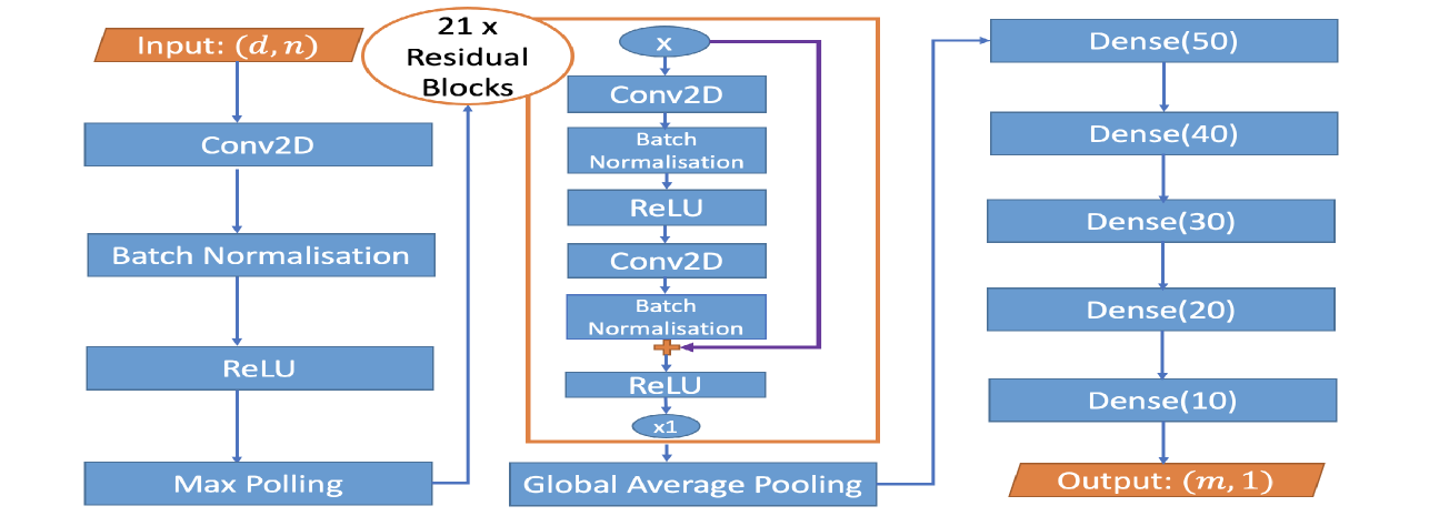
### Visual Description
## Diagram: CNN Architecture with Residual Blocks
### Overview
The image is a diagram illustrating the architecture of a Convolutional Neural Network (CNN) that incorporates residual blocks. The diagram shows the flow of data through various layers, including convolutional layers (Conv2D), batch normalization, ReLU activation, max pooling, global average pooling, and dense layers. The network takes an input of size (d, n) and produces an output of size (m, 1).
### Components/Axes
* **Input:** Labeled "Input: (d, n)" in an orange box at the top-left.
* **Conv2D:** Convolutional Layer.
* **Batch Normalisation:** Batch Normalization Layer.
* **ReLU:** Rectified Linear Unit Activation Function.
* **Max Pooling:** Max Pooling Layer.
* **Global Average Pooling:** Global Average Pooling Layer.
* **Residual Blocks:** A brown rounded rectangle labeled "21 x Residual Blocks" encloses a repeating block of layers.
* **Dense(X):** Fully connected (Dense) layers with X neurons. The values of X are 50, 40, 30, 20, and 10.
* **Output:** Labeled "Output: (m, 1)" in an orange box at the bottom-right.
* **Skip Connection:** A purple line represents a skip connection within the residual block.
### Detailed Analysis or ### Content Details
1. **Input Layer:** The network starts with an input layer denoted as "Input: (d, n)".
2. **Initial Layers:** The input is fed into a sequence of layers:
* Conv2D
* Batch Normalisation
* ReLU
* Max Pooling
3. **Residual Blocks:** The output of the Max Pooling layer is then fed into a series of 21 residual blocks. Each residual block consists of the following layers:
* Conv2D
* Batch Normalisation
* ReLU
* Conv2D
* Batch Normalisation
* ReLU
* A skip connection (represented by a purple line) adds the input of the first Conv2D layer to the output of the second ReLU layer (element-wise addition, denoted by a plus sign inside a circle).
* The output of the addition is multiplied by x1 (denoted by "x1" inside an oval).
4. **Global Average Pooling:** After the residual blocks, a Global Average Pooling layer is applied.
5. **Dense Layers:** The output of the Global Average Pooling layer is fed into a series of fully connected (Dense) layers:
* Dense(50)
* Dense(40)
* Dense(30)
* Dense(20)
* Dense(10)
6. **Output Layer:** The final layer is an output layer denoted as "Output: (m, 1)".
### Key Observations
* The diagram illustrates a deep CNN architecture with residual connections.
* The residual blocks are a key component of the network, allowing for the training of deeper networks by mitigating the vanishing gradient problem.
* The skip connection within the residual block adds the input of the block to its output, enabling the network to learn identity mappings.
* The network uses a combination of convolutional, pooling, and fully connected layers to extract features and make predictions.
### Interpretation
The diagram represents a CNN architecture designed for a specific task, likely involving image or feature processing. The use of residual blocks suggests that the task requires a deep network to capture complex patterns in the input data. The architecture is structured to learn hierarchical representations of the input, with convolutional layers extracting local features, pooling layers reducing the dimensionality of the feature maps, and fully connected layers combining the features to make a final prediction. The skip connections in the residual blocks facilitate the flow of information through the network, enabling the training of deeper and more powerful models. The final output layer "Output: (m, 1)" suggests that the network is designed to produce a single output value or a vector of 'm' values.
</details>
Figure 9: Architecture of our general-purpose change-point detection neural network. The left column shows the standard layers of neural network with input size $(d,n)$ , $d$ may represent the number of transformations or channels; We use 21 residual blocks and one global average pooling in the middle column; The right column includes 5 dense layers with nodes in bracket and output layer. More details of the neural network architecture appear in the supplement.
There are 21 residual blocks in our deep neural network, each residual block contains 2 convolutional layers. Like the suggestion in Ioffe and Szegedy (2015) and He et al. (2016), each convolution layer is followed by one Batch Normalization (BN) layer and one ReLU layer. Besides, there exist 5 fully-connected convolution layers right after the residual blocks, see the third column of Figure 9. For example, Dense(50) means that the dense layer has 50 nodes and is connected to a dropout layer with dropout rate 0.3. To further prevent the effect of overfitting, we also implement the $L_{2}$ regularization in each fully-connected layer (Ng, 2004). As the number of labels in HASC is 28, see Figure 10, we drop the dense layers “Dense(20)” and “Dense(10)” in Figure 9. The output layer has size $(28,1)$ . We remark two discussable issues here. (a) For other problems, the number of residual blocks, dense layers and the hyperparameters may vary depending on the complexity of the problem. In Section 6 of main text, the architecture of neural network for both synthetic data and real data has 21 residual blocks considering the trade-off between time complexity and model complexity. Like the suggestion in He et al. (2016), one can also add more residual blocks into the architecture to improve the accuracy of classification. (b) In practice, we would not have enough training data; but there would be potential ways to overcome this via either using Data Argumentation or increasing $q$ . In some extreme cases that we only mainly have data with no-change, we can artificially add changes into such data in line with the type of change we want to detect.
C.4 Training and Detection
<details>
<summary>x20.png Details</summary>
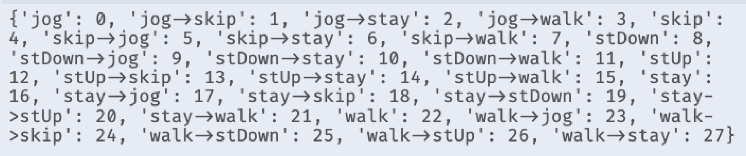
### Visual Description
## Data Structure: Mapping of Actions to Numerical Values
### Overview
The image presents a data structure, specifically a dictionary or mapping, that associates various actions or states with numerical values. The actions involve movements like jogging, skipping, walking, standing up (stUp), standing down (stDown), and staying. The structure maps both individual actions and transitions between actions to integer values.
### Components/Axes
* **Keys:** String representations of actions or transitions between actions (e.g., 'jog', 'jog->skip', 'walk->stay').
* **Values:** Integer numbers assigned to each action or transition.
### Detailed Analysis or ### Content Details
The data structure maps the following actions and transitions to numerical values:
* 'jog': 0
* 'jog->skip': 1
* 'jog->stay': 2
* 'jog->walk': 3
* 'skip': 4
* 'skip->jog': 5
* 'skip->stay': 6
* 'skip->walk': 7
* 'stDown': 8
* 'stDown->jog': 9
* 'stDown->stay': 10
* 'stDown->walk': 11
* 'stUp': 12
* 'stUp->skip': 13
* 'stUp->stay': 14
* 'stUp->walk': 15
* 'stay': 16
* 'stay->jog': 17
* 'stay->skip': 18
* 'stay->stDown': 19
* 'stay->stUp': 20
* 'stay->walk': 21
* 'walk': 22
* 'walk->jog': 23
* 'walk->skip': 24
* 'walk->stDown': 25
* 'walk->stUp': 26
* 'walk->stay': 27
### Key Observations
* The mapping covers a range of basic actions (jog, skip, walk, stUp, stDown, stay) and transitions between them.
* The numerical values assigned appear to be sequential, starting from 0 and incrementing by 1 for each new action or transition.
### Interpretation
This data structure likely serves as an encoding scheme, where each action or transition is represented by a unique integer. This could be used in a variety of applications, such as:
* **Machine Learning:** Representing actions in a numerical format suitable for training models.
* **Animation/Simulation:** Indexing different states or animations of a character or system.
* **Data Compression:** Encoding a sequence of actions using these numerical values to reduce storage space.
The specific choice of numerical values (0 to 27) and the order in which actions are assigned values may be significant depending on the application. For example, the order might reflect the frequency of occurrence or the logical sequence of actions.
</details>
Figure 10: Label Dictionary
<details>
<summary>x21.png Details</summary>
### Visual Description
## Data Structure: Counter Object
### Overview
The image shows a Python `Counter` object, which is a dictionary-like structure that stores elements as keys and their counts as values. The data represents counts associated with different activities ('walk', 'stay', 'jog', 'skip', 'stDown', 'stUp') and transitions between them (e.g., 'walk→stay').
### Components/Axes
* **Keys:** Strings representing activities or transitions between activities. Activities include 'walk', 'stay', 'jog', 'skip', 'stDown' (presumably "step down"), and 'stUp' (presumably "step up"). Transitions are represented as 'activity1→activity2'.
* **Values:** Integers representing the counts or frequencies of each activity or transition.
### Detailed Analysis or ### Content Details
The `Counter` object contains the following key-value pairs:
* `'walk'`: 570
* `'stay'`: 525
* `'jog'`: 495
* `'skip'`: 405
* `'stDown'`: 225
* `'stUp'`: 225
* `'walk→jog'`: 210
* `'stay→stDown'`: 180
* `'walk→stay'`: 180
* `'stay→skip'`: 180
* `'jog→walk'`: 165
* `'jog→stay'`: 150
* `'walk→stUp'`: 120
* `'skip→stay'`: 120
* `'stay→jog'`: 120
* `'stDown→stay'`: 105
* `'stay→stUp'`: 105
* `'stUp→walk'`: 105
* `'jog→skip'`: 105
* `'skip→walk'`: 105
* `'walk→skip'`: 75
* `'stUp→stay'`: 75
* `'stDown→walk'`: 75
* `'skip→jog'`: 75
* `'stUp→skip'`: 45
* `'stay→walk'`: 45
* `'walk→stDown'`: 45
* `'stDown→jog'`: 45
### Key Observations
* The activities 'walk', 'stay', 'jog', and 'skip' have significantly higher counts than 'stDown' and 'stUp'.
* The transition counts are generally lower than the individual activity counts.
* The most frequent transition is 'walk→jog' with a count of 210.
* Several transitions have the same count (e.g., 'stay→stDown', 'walk→stay', 'stay→skip' all have a count of 180).
* The least frequent transitions are 'stUp→skip', 'stay→walk', 'walk→stDown', and 'stDown→jog', all with a count of 45.
### Interpretation
The data suggests the relative frequency of different activities and transitions between them. 'Walk' is the most frequent activity, followed by 'stay', 'jog', and 'skip'. The transitions indicate how often the subject switches between these activities. The higher counts for 'walk', 'stay', 'jog', and 'skip' compared to 'stDown' and 'stUp' suggest that the subject spends more time in these activities than stepping up or down. The transition counts provide insights into the common sequences of activities. For example, the relatively high count for 'walk→jog' suggests that jogging often follows walking. The low counts for transitions involving 'stDown' and 'stUp' may indicate that these actions are less common or occur in specific contexts not captured by the other transitions.
</details>
Figure 11: Label Frequency
<details>
<summary>x22.png Details</summary>
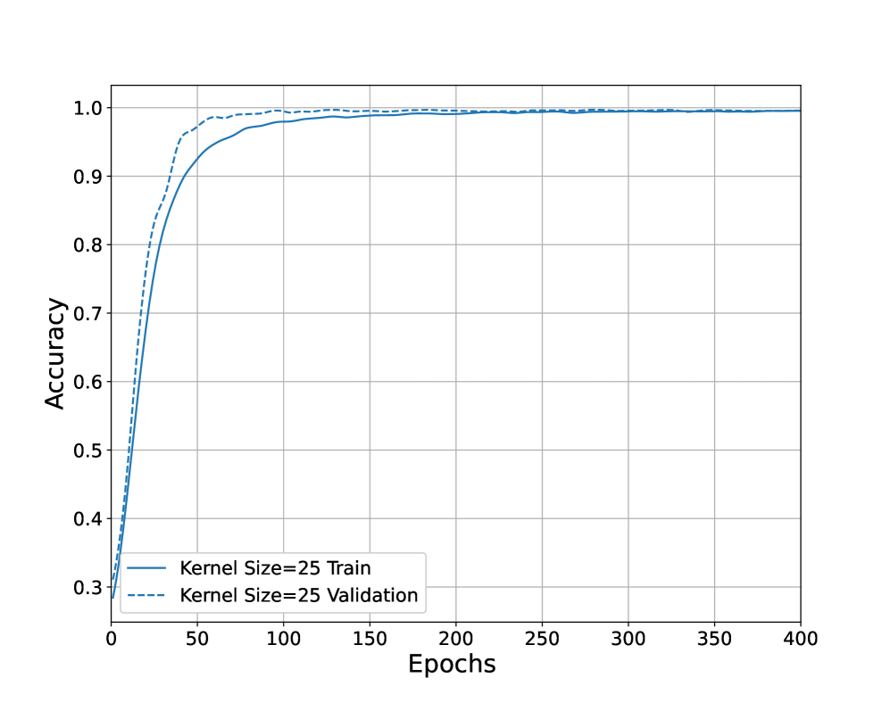
### Visual Description
## Line Chart: Accuracy vs. Epochs for Kernel Size=25
### Overview
The image is a line chart showing the accuracy of a model during training and validation over 400 epochs. The chart compares the performance of the model on the training dataset (solid blue line) and the validation dataset (dashed blue line). Both lines show a rapid increase in accuracy initially, followed by a plateau as the number of epochs increases.
### Components/Axes
* **X-axis:** Epochs, ranging from 0 to 400 in increments of 50.
* **Y-axis:** Accuracy, ranging from 0.3 to 1.0 in increments of 0.1.
* **Legend (bottom-left):**
* Solid Blue Line: "Kernel Size=25 Train"
* Dashed Blue Line: "Kernel Size=25 Validation"
* **Gridlines:** Present on the chart for both x and y axes.
### Detailed Analysis
* **Kernel Size=25 Train (Solid Blue Line):**
* The training accuracy starts at approximately 0.3 at epoch 0.
* It increases rapidly to approximately 0.9 by epoch 50.
* It continues to increase, but at a slower rate, reaching approximately 0.97 by epoch 100.
* The accuracy plateaus around 0.99 after approximately 200 epochs.
* The final accuracy at epoch 400 is approximately 0.99.
* **Kernel Size=25 Validation (Dashed Blue Line):**
* The validation accuracy starts at approximately 0.35 at epoch 0.
* It increases rapidly to approximately 0.95 by epoch 50.
* It continues to increase, but at a slower rate, reaching approximately 0.98 by epoch 100.
* The accuracy plateaus around 0.99 after approximately 150 epochs.
* The final accuracy at epoch 400 is approximately 0.99.
### Key Observations
* Both training and validation accuracy increase rapidly in the initial epochs.
* The validation accuracy is slightly higher than the training accuracy in the initial epochs (0-50).
* Both accuracies plateau around 0.99 after approximately 200 epochs.
* There is a small gap between the training and validation accuracy curves, especially in the early epochs, but they converge as the number of epochs increases.
### Interpretation
The chart demonstrates the learning curve of a model with a kernel size of 25 during training and validation. The rapid increase in accuracy during the initial epochs indicates that the model is quickly learning relevant features from the data. The plateauing of accuracy suggests that the model has reached its maximum performance on the given dataset and architecture, and further training may not significantly improve the results. The close proximity of the training and validation curves indicates that the model is generalizing well to unseen data and is not overfitting to the training data. The slight difference between the training and validation accuracy in the early epochs could be due to the validation set being slightly easier or having different characteristics than the training set.
</details>
Figure 12: The Accuracy Curves
<details>
<summary>x23.png Details</summary>
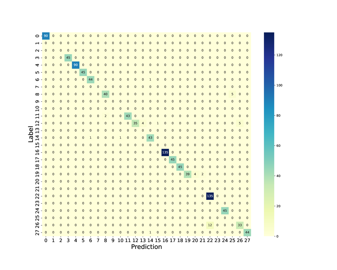
### Visual Description
## Confusion Matrix: Label vs Prediction
### Overview
The image is a confusion matrix, visually represented as a heatmap. It displays the performance of a classification model by showing the counts of true positive, true negative, false positive, and false negative predictions for each class. The matrix has "Label" on the y-axis and "Prediction" on the x-axis, both ranging from 0 to 27. The color intensity of each cell corresponds to the number of instances, with darker colors indicating higher counts. A color bar on the right provides a scale for the counts.
### Components/Axes
* **X-axis:** Prediction, with labels from 0 to 27.
* **Y-axis:** Label, with labels from 0 to 27.
* **Color Bar:** Ranges from 0 to approximately 135, with a color gradient from light yellow to dark blue.
* **Labels:** "Label" (y-axis), "Prediction" (x-axis).
### Detailed Analysis
The matrix is a 28x28 grid. Each cell (i, j) represents the number of times an instance of class i (label) was predicted as class j.
Here's a breakdown of the values:
* **Diagonal (True Positives):**
* (0, 0): 90
* (4, 4): 90
* (16, 16): 135
* (22, 22): 135
* (27, 27): 44
* (3, 3): 45
* (5, 5): 45
* (6, 6): 44
* (8, 8): 40
* (11, 11): 43
* (12, 12): 35
* (17, 17): 45
* (18, 18): 45
* (19, 19): 39
* (26, 26): 33
* **Off-Diagonal (Errors):**
* (10, 11): 43
* (19, 20): 4
* (19, 21): 2
* (12, 13): 4
* (24, 25): 45
* (7, 25): 5
* (9, 25): 5
* (11, 13): 4
* (14, 15): 43
* (15, 16): 43
* (26, 27): 12
* (6, 15): 1
All other cells appear to have a value of 0.
### Key Observations
* The diagonal elements have non-zero values, indicating correct classifications.
* The model performs well for classes 0, 4, 16, and 22, with high counts on the diagonal.
* There are some misclassifications, as indicated by the off-diagonal elements. For example, class 10 is often misclassified as class 11.
* Most of the off-diagonal elements are zero, indicating that the model rarely confuses most of the classes.
### Interpretation
The confusion matrix provides a detailed view of the classification model's performance. The high values along the diagonal suggest that the model is generally accurate. However, the off-diagonal elements reveal specific areas where the model struggles. For instance, the confusion between classes 10 and 11 indicates that these classes may have similar features or that the model needs further refinement to distinguish between them. The matrix can be used to identify which classes are most often confused and to guide efforts to improve the model's accuracy. The model seems to perform well on classes 0, 4, 16, and 22, while other classes have lower accuracy.
</details>
Figure 13: Confusion Matrix of Real Test Dataset
<details>
<summary>x24.png Details</summary>
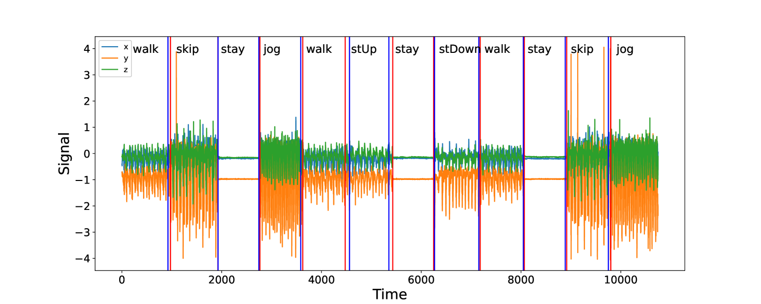
### Visual Description
## Time Series Chart: Signal Data for Various Activities
### Overview
The image is a time series chart displaying signal data across three dimensions (x, y, and z) over time. The chart visualizes how these signals change during different activities such as walking, skipping, staying, jogging, standing up (stUp), and standing down (stDown). Vertical lines mark the transitions between these activities.
### Components/Axes
* **X-axis (Horizontal):** "Time" ranging from 0 to 10000. Axis markers are present at intervals of 2000 (0, 2000, 4000, 6000, 8000, 10000).
* **Y-axis (Vertical):** "Signal" ranging from -4 to 4. Axis markers are present at intervals of 1 (-4, -3, -2, -1, 0, 1, 2, 3, 4).
* **Legend (Top-Left):**
* Blue line: "x walk"
* Orange line: "y"
* Green line: "z"
* **Vertical Lines:** Indicate transitions between activities. The activities are labeled above the chart, aligned with the corresponding vertical lines.
* Blue lines: skip, jog, walk, stay, skip, jog
* Red lines: stUp, stDown
* Purple lines: stay, stay, stay
### Detailed Analysis
The chart displays three data series (x, y, and z) over time, with vertical lines indicating different activities.
* **x walk (Blue):** The blue line represents the "x walk" signal. It generally fluctuates around 0, with some spikes during walking and jogging activities.
* **y (Orange):** The orange line represents the "y" signal. It shows significant fluctuations, particularly during jogging and skipping activities, where it oscillates between approximately -3 and 4. During "stay" periods, the y signal is approximately -1.
* **z (Green):** The green line represents the "z" signal. It remains relatively stable around 0 during "stay" periods. It shows some fluctuations during walking, jogging, and skipping activities, but less extreme than the "y" signal.
**Activity-Specific Observations:**
* **Walk:** The "x walk" signal (blue) shows moderate fluctuations. The "y" signal (orange) oscillates between approximately -2 and 1. The "z" signal (green) shows moderate fluctuations.
* **Skip:** The "y" signal (orange) shows large oscillations between approximately -3 and 4. The "x walk" signal (blue) and "z" signal (green) also show fluctuations.
* **Stay:** All three signals ("x walk," "y," and "z") are relatively stable. The "y" signal (orange) is approximately -1.
* **Jog:** The "y" signal (orange) shows large oscillations between approximately -3 and 4. The "x walk" signal (blue) and "z" signal (green) also show fluctuations.
* **stUp (Stand Up):** The "y" signal (orange) shows a sharp spike upward.
* **stDown (Stand Down):** The "y" signal (orange) shows a sharp spike downward.
### Key Observations
* The "y" signal (orange) is the most sensitive to changes in activity, showing large oscillations during dynamic activities like jogging and skipping.
* The "z" signal (green) is relatively stable, especially during "stay" periods.
* The vertical lines accurately mark the transitions between different activities.
* The "stUp" and "stDown" activities are characterized by sharp spikes in the "y" signal (orange).
### Interpretation
The chart provides a clear visualization of how different activities affect the signal data in three dimensions. The "y" signal appears to be the most indicative of movement and activity intensity. The "stay" periods are characterized by stable signals, particularly in the "z" dimension. The spikes during "stUp" and "stDown" suggest a rapid change in the "y" dimension during these transitions. The data suggests that these signals could be used to classify or recognize different activities based on their unique signal patterns.
</details>
Figure 14: Change-point Detection of Real Dataset for Person 7 (2nd sequence). The red line at 4476 is the true change-point, the blue line on its right is the estimator. The difference between them is caused by the similarity of “Walk” and “StairUp”.
<details>
<summary>x25.png Details</summary>
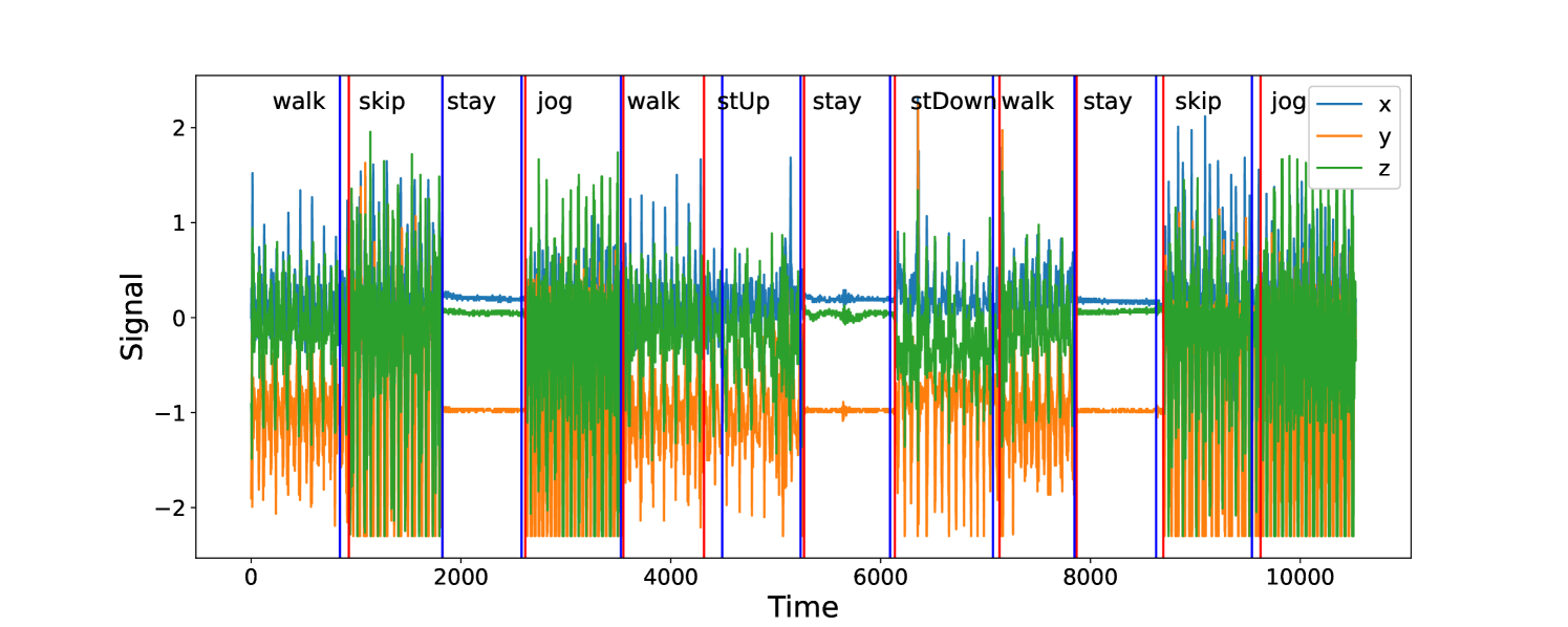
### Visual Description
## Time Series Chart: Activity Recognition Signals
### Overview
The image is a time series chart displaying signal data from three axes (x, y, z) over a period of time, with different activities labeled along the x-axis. The chart shows how the signal values change during various activities like walking, skipping, staying, jogging, and stair climbing. Vertical lines mark the transitions between these activities.
### Components/Axes
* **X-axis:** Represents time, ranging from 0 to 10000. Axis markers are present at 0, 2000, 4000, 6000, 8000, and 10000.
* **Y-axis:** Represents the signal value, ranging from -2 to 2. Axis markers are present at -2, -1, 0, 1, and 2.
* **Data Series:**
* **x (blue):** Varies between approximately 0 and 1.8 during active periods and remains relatively constant around 0.3 during "stay" periods.
* **y (orange):** Varies between approximately -2.2 and 0.2 during active periods and remains relatively constant around -1 during "stay" periods.
* **z (green):** Varies between approximately -0.8 and 1.5 during active periods and remains relatively constant around 0.2 during "stay" periods.
* **Legend:** Located in the top-right corner, indicating the color-coded axes:
* Blue: x
* Orange: y
* Green: z
* **Activity Labels:** Placed above the chart, indicating the activity performed during that time interval. The activities are: walk, skip, stay, jog, walk, stUp (stair up), stay, stDown (stair down), walk, stay, skip, jog.
* **Vertical Lines:** Blue vertical lines separate the different activities. Red vertical lines appear to mark the end of "skip" and "stUp" activities.
### Detailed Analysis
* **Walk:** The "walk" segments show moderate fluctuations in all three axes (x, y, z). The x-axis (blue) varies between 0 and 1.8, the y-axis (orange) varies between -2.2 and 0.2, and the z-axis (green) varies between -0.8 and 1.5.
* **Skip:** The "skip" segments show high-frequency fluctuations in all three axes. The x-axis (blue) varies between 0 and 1.8, the y-axis (orange) varies between -2.2 and 0.2, and the z-axis (green) varies between -0.8 and 1.5.
* **Stay:** The "stay" segments show relatively constant values for all three axes. The x-axis (blue) remains around 0.3, the y-axis (orange) remains around -1, and the z-axis (green) remains around 0.2.
* **Jog:** The "jog" segments show high-frequency fluctuations in all three axes, similar to the "skip" segments. The x-axis (blue) varies between 0 and 1.8, the y-axis (orange) varies between -2.2 and 0.2, and the z-axis (green) varies between -0.8 and 1.5.
* **stUp (Stair Up):** The "stUp" segment shows a distinct pattern, with the y-axis (orange) showing a sharp increase. The x-axis (blue) varies between 0 and 1.8, the y-axis (orange) varies between -2.2 and 0.2, and the z-axis (green) varies between -0.8 and 1.5.
* **stDown (Stair Down):** The "stDown" segment shows a distinct pattern, with the y-axis (orange) showing a sharp decrease. The x-axis (blue) varies between 0 and 1.8, the y-axis (orange) varies between -2.2 and 0.2, and the z-axis (green) varies between -0.8 and 1.5.
### Key Observations
* The "stay" activity is easily distinguishable from other activities due to the relatively constant signal values.
* "Skip" and "Jog" activities have similar signal patterns, characterized by high-frequency fluctuations.
* "stUp" and "stDown" activities show distinct patterns in the y-axis (orange), indicating changes in vertical movement.
* The x-axis (blue) and z-axis (green) show similar patterns during "walk", "skip", and "jog" activities.
### Interpretation
The chart demonstrates how different activities can be recognized based on the signal data from the x, y, and z axes. The "stay" activity serves as a baseline, while the other activities show distinct patterns of fluctuation. The "stUp" and "stDown" activities highlight the importance of the y-axis in detecting vertical movements. The similarity between "skip" and "jog" suggests that additional features or analysis might be needed to differentiate these activities. The data suggests that a combination of signal amplitude and frequency can be used to classify different human activities.
</details>
Figure 15: Change-point Detection of Real Dataset for Person 7 (3rd sequence). The red vertical lines represent the underlying change-points, the blue vertical lines represent the estimated change-points.
There are 7 persons observations in this dataset. The first 6 persons sequential data are treated as the training dataset, we use the last person’s data to validate the trained classifier. Each person performs each of 6 activities: “stay”, “walk”, “jog”, “skip”, “stair up” and “stair down” at least 10 seconds. The transition point between two consecutive activities can be treated as the change-point. Therefore, there are 30 possible types of change-point. The total number of labels is 36 (6 activities and 30 possible transitions). However, we only found 28 different types of label in this real dataset, see Figure 10. The initial learning rate is 0.001, the epoch size is 400. Batch size is 16, the dropout rate is 0.3, the filter size is 16 and the kernel size is $(3,25)$ . Furthermore, we also use 20% of the training dataset to validate the classifier during training step. Figure 12 shows the accuracy curves of training and validation. After 150 epochs, both solid and dash curves approximate to 1. The test accuracy is 0.9623, see the confusion matrix in Figure 13. These results show that our neural network classifier performs well both in the training and test datasets. Next, we apply the trained classifier to 3 repeated sequential datasets of Person 7 to detect the change-points. The first sequential dataset has shape $(3,10743)$ . First, we extract the $n$ -length sliding windows with stride 1 as the input dataset. The input size becomes $(9883,6,700)$ . Second, we use Algorithm 1 to detect the change-points where we relabel the activity label as “no-change” label and transition label as “one-change” label respectively. Figures 14 and 15 show the results of multiple change-point detection for other 2 sequential data sets from the 7-th person.