# Automatic Change-Point Detection in Time Series via Deep Learning
**Authors**: Jie Li111Addresses for correspondence: Jie Li, Department of Statistics, London School of Economics and Political Science, London, WC2A 2AE.Email: j.li196@lse.ac.uk, Paul Fearnhead, Piotr Fryzlewicz, Tengyao Wang
> Department of Statistics, London School of Economics and Political Science, London, UK
> Department of Mathematics and Statistics, Lancaster University, Lancaster, UK
## Abstract
Detecting change-points in data is challenging because of the range of possible types of change and types of behaviour of data when there is no change. Statistically efficient methods for detecting a change will depend on both of these features, and it can be difficult for a practitioner to develop an appropriate detection method for their application of interest. We show how to automatically generate new offline detection methods based on training a neural network. Our approach is motivated by many existing tests for the presence of a change-point being representable by a simple neural network, and thus a neural network trained with sufficient data should have performance at least as good as these methods. We present theory that quantifies the error rate for such an approach, and how it depends on the amount of training data. Empirical results show that, even with limited training data, its performance is competitive with the standard CUSUM-based classifier for detecting a change in mean when the noise is independent and Gaussian, and can substantially outperform it in the presence of auto-correlated or heavy-tailed noise. Our method also shows strong results in detecting and localising changes in activity based on accelerometer data.
Keywords— Automatic statistician; Classification; Likelihood-free inference; Neural networks; Structural breaks; Supervised learning
12.5[0,0](2,1) [To be read before The Royal Statistical Society at the Society’s 2023 annual conference held in Harrogate on Wednesday, September 6th, 2023, the President, Dr Andrew Garrett, in the Chair.] 12.5[0,0](2,2) [Accepted (with discussion), to appear]
## 1 Introduction
Detecting change-points in data sequences is of interest in many application areas such as bioinformatics (Picard et al., 2005), climatology (Reeves et al., 2007), signal processing (Haynes et al., 2017) and neuroscience (Oh et al., 2005). In this work, we are primarily concerned with the problem of offline change-point detection, where the entire data is available to the analyst beforehand. Over the past few decades, various methodologies have been extensively studied in this area, see Killick et al. (2012); Jandhyala et al. (2013); Fryzlewicz (2014, 2023); Wang and Samworth (2018); Truong et al. (2020) and references therein. Most research on change-point detection has concentrated on detecting and localising different types of change, e.g. change in mean (Killick et al., 2012; Fryzlewicz, 2014), variance (Gao et al., 2019; Li et al., 2015), median (Fryzlewicz, 2021) or slope (Baranowski et al., 2019; Fearnhead et al., 2019), amongst many others. Many change-point detection methods are based upon modelling data when there is no change and when there is a single change, and then constructing an appropriate test statistic to detect the presence of a change (e.g. James et al., 1987; Fearnhead and Rigaill, 2020). The form of a good test statistic will vary with our modelling assumptions and the type of change we wish to detect. This can lead to difficulties in practice. As we use new models, it is unlikely that there will be a change-point detection method specifically designed for our modelling assumptions. Furthermore, developing an appropriate method under a complex model may be challenging, while in some applications an appropriate model for the data may be unclear but we may have substantial historical data that shows what patterns of data to expect when there is, or is not, a change. In these scenarios, currently a practitioner would need to choose the existing change detection method which seems the most appropriate for the type of data they have and the type of change they wish to detect. To obtain reliable performance, they would then need to adapt its implementation, for example tuning the choice of threshold for detecting a change. Often, this would involve applying the method to simulated or historical data. To address the challenge of automatically developing new change detection methods, this paper is motivated by the question: Can we construct new test statistics for detecting a change based only on having labelled examples of change-points? We show that this is indeed possible by training a neural network to classify whether or not a data set has a change of interest. This turns change-point detection in a supervised learning problem. A key motivation for our approach are results that show many common test statistics for detecting changes, such as the CUSUM test for detecting a change in mean, can be represented by simple neural networks. This means that with sufficient training data, the classifier learnt by such a neural network will give performance at least as good as classifiers corresponding to these standard tests. In scenarios where a standard test, such as CUSUM, is being applied but its modelling assumptions do not hold, we can expect the classifier learnt by the neural network to outperform it. There has been increasing recent interest in whether ideas from machine learning, and methods for classification, can be used for change-point detection. Within computer science and engineering, these include a number of methods designed for and that show promise on specific applications (e.g. Ahmadzadeh, 2018; De Ryck et al., 2021; Gupta et al., 2022; Huang et al., 2023). Within statistics, Londschien et al. (2022) and Lee et al. (2023) consider training a classifier as a way to estimate the likelihood-ratio statistic for a change. However these methods train the classifier in an un-supervised way on the data being analysed, using the idea that a classifier would more easily distinguish between two segments of data if they are separated by a change-point. Chang et al. (2019) use simulated data to help tune a kernel-based change detection method. Methods that use historical, labelled data have been used to train the tuning parameters of change-point algorithms (e.g. Hocking et al., 2015; Liehrmann et al., 2021). Also, neural networks have been employed to construct similarity scores of new observations to learned pre-change distributions for online change-point detection (Lee et al., 2023). However, we are unaware of any previous work using historical, labelled data to develop offline change-point methods. As such, and for simplicity, we focus on the most fundamental aspect, namely the problem of detecting a single change. Detecting and localising multiple changes is considered in Section 6 when analysing activity data. We remark that by viewing the change-point detection problem as a classification instead of a testing problem, we aim to control the overall misclassification error rate instead of handling the Type I and Type II errors separately. In practice, asymmetric treatment of the two error types can be achieved by suitably re-weighting misclassification in the two directions in the training loss function. The method we develop has parallels with likelihood-free inference methods Gourieroux et al. (1993); Beaumont (2019) in that one application of our work is to use the ability to simulate from a model so as to circumvent the need to analytically calculate likelihoods. However, the approach we take is very different from standard likelihood-free methods which tend to use simulation to estimate the likelihood function itself. By comparison, we directly target learning a function of the data that can discriminate between instances that do or do not contain a change (though see Gutmann et al., 2018, for likelihood-free methods based on re-casting the likelihood as a classification problem). For an introduction to the statistical aspects of neural network-based classification, albeit not specifically in a change-point context, see Ripley (1994). We now briefly introduce our notation. For any $n∈ℤ^+$ , we define $[n]\coloneqq\{1,…,n\}$ . We take all vectors to be column vectors unless otherwise stated. Let $\boldsymbol{1}_n$ be the all-one vector of length $n$ . Let $\mathbbm{1}\{·\}$ represent the indicator function. The vertical symbol $|·|$ represents the absolute value or cardinality of $·$ depending on the context. For vector $\boldsymbol{x}=(x_1,…,x_n)^⊤$ , we define its $p$ -norm as $\|\boldsymbol{x}\|_p\coloneqq\big{(}∑_i=1^n|x_i|^p\big{)}^1/p,p≥ 1$ ; when $p=∞$ , define $\|\boldsymbol{x}\|_∞\coloneqq\max_i|x_i|$ . All proofs, as well as additional simulations and real data analyses appear in the supplement.
## 2 Neural networks
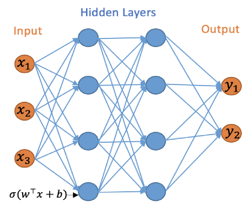
The initial focus of our work is on the binary classification problem for whether a change-point exists in a given time series. We will work with multilayer neural networks with Rectified Linear Unit (ReLU) activation functions and binary output. The multilayer neural network consists of an input layer, hidden layers and an output layer, and can be represented by a directed acyclic graph, see Figure 1.
<details>
<summary>x1.png Details</summary>
### Visual Description
## Neural Network Architecture Diagram: Feedforward Network with Two Hidden Layers
### Overview
The image is a technical diagram illustrating the architecture of a feedforward artificial neural network. It visually represents the flow of data from an input layer, through two hidden layers, to an output layer, with all nodes in consecutive layers fully connected. The diagram uses color-coding and mathematical notation to define the network's structure and computational operation.
### Components/Axes
The diagram is organized into three distinct vertical sections, labeled at the top:
1. **Input Layer (Left):** Labeled "Input" in orange text. Contains three nodes (circles) colored orange, labeled `x₁`, `x₂`, and `x₃` from top to bottom.
2. **Hidden Layers (Center):** Labeled "Hidden Layers" in blue text. Contains two vertical columns of nodes, each with four blue circles. The columns represent two sequential hidden layers.
3. **Output Layer (Right):** Labeled "Output" in orange text. Contains two nodes (circles) colored orange, labeled `y₁` and `y₂` from top to bottom.
**Connections:** Blue arrows connect every node in the Input layer to every node in the first Hidden Layer, every node in the first Hidden Layer to every node in the second Hidden Layer, and every node in the second Hidden Layer to every node in the Output layer. This depicts a "fully connected" or "dense" network topology.
**Mathematical Notation:** At the bottom-left corner, near the input layer, the expression `σ(wᵀx + b)` is written in black text. An arrow points from this expression toward the first hidden layer, indicating the fundamental computation performed at each neuron.
### Detailed Analysis
* **Layer Dimensions:**
* Input Layer: 3 nodes (features: `x₁`, `x₂`, `x₃`).
* First Hidden Layer: 4 nodes.
* Second Hidden Layer: 4 nodes.
* Output Layer: 2 nodes (predictions: `y₁`, `y₂`).
* **Topology:** The network is a multilayer perceptron (MLP) with a 3-4-4-2 architecture. The connectivity is exhaustive, with no skipped connections, defining it as a standard feedforward network.
* **Activation Function:** The notation `σ(wᵀx + b)` specifies the operation for a single neuron. Here, `x` is the input vector, `w` is the weight vector, `b` is the bias term, `wᵀx` is the dot product, and `σ` (sigma) represents a non-linear activation function (commonly sigmoid, tanh, or ReLU in practice).
### Key Observations
1. **Color Coding:** A consistent color scheme is used: orange for the external interface layers (Input and Output) and blue for the internal processing layers (Hidden Layers). This visually separates the network's boundary from its internal representation.
2. **Symmetry and Density:** The two hidden layers are symmetric in size (4 nodes each). The dense web of blue connection lines emphasizes the high degree of parameterization and the potential for complex feature transformation within the hidden layers.
3. **Notation Placement:** The mathematical formula is placed at the input side, conceptually indicating that this operation is applied as data flows into the first hidden layer and, by extension, to subsequent layers.
### Interpretation
This diagram is a canonical representation of a deep neural network's architecture, serving as a blueprint for its information processing pathway.
* **Function:** The network is designed to take a 3-dimensional input vector (`x₁, x₂, x₃`), transform it through two successive layers of 4-dimensional non-linear representations, and finally map it to a 2-dimensional output (`y₁, y₂`). This structure is suitable for tasks like binary classification (where `y₁` and `y₂` could represent class probabilities) or regression with two target variables.
* **Underlying Principle:** The expression `σ(wᵀx + b)` is the core computational unit. It shows that each blue node computes a weighted sum of its inputs, adds a bias, and then applies a non-linear activation function `σ`. This non-linearity is what allows the network to learn complex, non-linear relationships in data. The repeated application of this operation across layers enables hierarchical feature learning.
* **Implied Complexity:** While the diagram is abstract, the dense connectivity implies a large number of trainable parameters (weights and biases). For this specific 3-4-4-2 network, the total number of weights would be (3*4) + (4*4) + (4*2) = 12 + 16 + 8 = 36, plus biases for the 10 non-input nodes, totaling 46 parameters. This highlights the model's capacity to fit intricate patterns.
* **Purpose of the Diagram:** It is a pedagogical or design tool meant to communicate the network's structure unambiguously. It abstracts away specific data values and training details to focus purely on the topology and the fundamental mathematical operation that defines a neuron's function.
</details>
Figure 1: A neural network with 2 hidden layers and width vector $m=(4,4)$ .
Let $L∈ℤ^+$ represent the number of hidden layers and $\boldsymbol{m}={(m_1,…,m_L)}^⊤$ the vector of the hidden layers widths, i.e. $m_i$ is the number of nodes in the $i$ th hidden layer. For a neural network with $L$ hidden layers we use the convention that $m_0=n$ and $m_L+1=1$ . For any bias vector $\boldsymbol{b}={(b_1,b_2,…,b_r)}^⊤∈ℝ^r$ , define the shifted activation function $σ_\boldsymbol{b}:ℝ^r→ℝ^r$ :
$$
σ_\boldsymbol{b}((y_1,…,y_r)^⊤)=(σ(y_1-b_1),
…,σ(y_r-b_r))^⊤,
$$
where $σ(x)=\max(x,0)$ is the ReLU activation function. The neural network can be mathematically represented by the composite function $h:ℝ^n→\{0,1\}$ as
$$
h(\boldsymbol{x})\coloneqqσ^*_λW_Lσ_\boldsymbol{b_L}
W_L-1σ_\boldsymbol{b_L-1}⋯ W_1σ_\boldsymbol{b_1}W_
0\boldsymbol{x}, \tag{1}
$$
where $σ^*_λ(x)=\mathbbm{1}\{x>λ\}$ , $λ>0$ and $W_\ell∈ℝ^m_\ell+1× m_\ell$ for $\ell∈\{0,…,L\}$ represent the weight matrices. We define the function class $H_L,\boldsymbol{m}$ to be the class of functions $h(\boldsymbol{x})$ with $L$ hidden layers and width vector $\boldsymbol{m}$ . The output layer in (1) employs the shifted heaviside function $σ^*_λ(x)$ , which is used for binary classification as the final activation function. This choice is guided by the fact that we use the 0-1 loss, which focuses on the percentage of samples assigned to the correct class, a natural performance criterion for binary classification. Besides its wide adoption in machine learning practice, another advantage of using the 0-1 loss is that it is possible to utilise the theory of the Vapnik–Chervonenkis (VC) dimension (see, e.g. Shalev-Shwartz and Ben-David, 2014, Definition 6.5) to bound the generalisation error of a binary classifier equipped with this loss; indeed, this is the approach we take in this work. The relevant results regarding the VC dimension of neural network classifiers are e.g. in Bartlett et al. (2019). As in Schmidt-Hieber (2020), we work with the exact minimiser of the empirical risk. In both binary or multiclass classification, it is possible to work with other losses which make it computationally easier to minimise the corresponding risk, see e.g. Bos and Schmidt-Hieber (2022), who use a version of the cross-entropy loss. However, loss functions different from the 0-1 loss make it impossible to use VC-dimension arguments to control the generalisation error, and more involved arguments, such as those using the covering number (Bos and Schmidt-Hieber, 2022) need to be used instead. We do not pursue these generalisations in the current work.
## 3 CUSUM-based classifier and its generalisations are neural networks
### 3.1 Change in mean
We initially consider the case of a single change-point with an unknown location $τ∈[n-1]$ , $n≥ 2$ , in the model
| | $\displaystyle\boldsymbol{X}$ | $\displaystyle=\boldsymbol{μ}+\boldsymbol{ξ},$ | |
| --- | --- | --- | --- |
where $μ_L,μ_R$ are the unknown signal values before and after the change-point; $\boldsymbol{ξ}∼ N_n(0,I_n)$ . The CUSUM test is widely used to detect mean changes in univariate data. For the observation $\boldsymbol{x}$ , the CUSUM transformation $C:ℝ^n→ℝ^n-1$ is defined as $C(\boldsymbol{x}):=(\boldsymbol{v}_1^⊤\boldsymbol{x},…, \boldsymbol{v}_n-1^⊤\boldsymbol{x})^⊤$ , where $\boldsymbol{v}_i\coloneqq\bigl{(}√{\frac{n-i}{in}}\boldsymbol{1}_i^ ⊤,-√{\frac{i}{(n-i)n}}\boldsymbol{1}_n-i^⊤\bigr{)}^⊤$ for $i∈[n-1]$ . Here, for each $i∈[n-1]$ , $(\boldsymbol{v}_i^⊤\boldsymbol{x})^2$ is the log likelihood-ratio statistic for testing a change at time $i$ against the null of no change (e.g. Baranowski et al., 2019). For a given threshold $λ>0$ , the classical CUSUM test for a change in the mean of the data is defined as
$$
h^CUSUM_λ(\boldsymbol{x})=\mathbbm{1}\{\|C(
\boldsymbol{x})\|_∞>λ\}.
$$
The following lemma shows that $h^CUSUM_λ(\boldsymbol{x})$ can be represented as a neural network.
**Lemma 3.1**
*For any $λ>0$ , we have $h^CUSUM_λ(\boldsymbol{x})∈H_1,2n-2$ .*
The fact that the widely-used CUSUM statistic can be viewed as a simple neural network has far-reaching consequences: this means that given enough training data, a neural network architecture that permits the CUSUM-based classifier as its special case cannot do worse than CUSUM in classifying change-point versus no-change-point signals. This serves as the main motivation for our work, and a prelude to our next results.
### 3.2 Beyond the mean change model
We can generalise the simple change in mean model to allow for different types of change or for non-independent noise. In this section, we consider change-point models that can be expressed as a change in regression problem, where the model for data given a change at $τ$ is of the form
$$
\boldsymbol{X}=\boldsymbol{Z}\boldsymbol{β}+\boldsymbol{c}_τφ+
\boldsymbol{Γ}\boldsymbol{ξ}, \tag{2}
$$
where for some $p≥ 1$ , $\boldsymbol{Z}$ is an $n× p$ matrix of covariates for the model with no change, $\boldsymbol{c}_τ$ is an $n× 1$ vector of covariates specific to the change at $τ$ , and the parameters $\boldsymbol{β}$ and $φ$ are, respectively, a $p× 1$ vector and a scalar. The noise is defined in terms of an $n× n$ matrix $\boldsymbol{Γ}$ and an $n× 1$ vector of independent standard normal random variables, $\boldsymbol{ξ}$ . For example, the change in mean problem has $p=1$ , with $\boldsymbol{Z}$ a column vector of ones, and $\boldsymbol{c}_τ$ being a vector whose first $τ$ entries are zeros, and the remaining entries are ones. In this formulation $β$ is the pre-change mean, and $φ$ is the size of the change. The change in slope problem Fearnhead et al. (2019) has $p=2$ with the columns of $\boldsymbol{Z}$ being a vector of ones, and a vector whose $i$ th entry is $i$ ; and $\boldsymbol{c}_τ$ has $i$ th entry that is $\max\{0,i-τ\}$ . In this formulation $\boldsymbol{β}$ defines the pre-change linear mean, and $φ$ the size of the change in slope. Choosing $\boldsymbol{Γ}$ to be proportional to the identity matrix gives a model with independent, identically distributed noise; but other choices would allow for auto-correlation. The following result is a generalisation of Lemma 3.1, which shows that the likelihood-ratio test for (2), viewed as a classifier, can be represented by our neural network.
**Lemma 3.2**
*Consider the change-point model (2) with a possible change at $τ∈[n-1]$ . Assume further that $\boldsymbol{Γ}$ is invertible. Then there is an $h^*∈H_1,2n-2$ equivalent to the likelihood-ratio test for testing $φ=0$ against $φ≠ 0$ .*
Importantly, this result shows that for this much wider class of change-point models, we can replicate the likelihood-ratio-based classifier for change using a simple neural network. Other types of changes can be handled by suitably pre-transforming the data. For instance, squaring the input data would be helpful in detecting changes in the variance and if the data followed an AR(1) structure, then changes in autocorrelation could be handled by including transformations of the original input of the form $(x_tx_t+1)_t=1,…,n-1$ . On the other hand, even if such transformations are not supplied as the input, a neural network of suitable depth is able to approximate these transformations and consequently successfully detect the change (Schmidt-Hieber, 2020, Lemma A.2). This is illustrated in Figure 7 of appendix, where we compare the performance of neural network based classifiers of various depths constructed with and without using the transformed data as inputs.
## 4 Generalisation error of neural network change-point classifiers
In Section 3, we showed that CUSUM and generalised CUSUM could be represented by a neural network. Therefore, with a large enough amount of training data, a trained neural network classifier that included CUSUM, or generalised CUSUM, as a special case, would perform no worse than it on unseen data. In this section, we provide generalisation bounds for a neural network classifier for the change-in-mean problem, given a finite amount of training data. En route to this main result, stated in Theorem 4.3, we provide generalisation bounds for the CUSUM-based classifier, in which the threshold has been chosen on a finite training data set. We write $P(n,τ,μ_L,μ_R)$ for the distribution of the multivariate normal random vector $\boldsymbol{X}∼ N_n(\boldsymbol{μ},I_n)$ where $\boldsymbol{μ}\coloneqq{(μ_L\mathbbm{1}\{i≤τ\}+μ_ R\mathbbm{1}\{i>τ\})}_i∈[n]$ . Define $η\coloneqqτ/n$ . Lemma 4.1 and Corollary 4.1 control the misclassification error of the CUSUM-based classifier.
**Lemma 4.1**
*Fix $ε∈(0,1)$ . Suppose $\boldsymbol{X}∼ P(n,τ,μ_L,μ_R)$ for some $τ∈ℤ^+$ and $μ_L,μ_R∈ℝ$ .
1. If $μ_L=μ_R$ , then $ℙ\bigl{\{}\|C(\boldsymbol{X})\|_∞>√{2\log(n/ ε)}\bigr{\}}≤ε.$
1. If $|μ_L-μ_R|√{η(1-η)}>√{8\log(n/ ε)/n}$ , then $ℙ\bigl{\{}\|C(\boldsymbol{X})\|_∞≤√{2\log(n/ ε)}\bigr{\}}≤ε.$*
For any $B>0$ , define
$$
Θ(B)\coloneqq≤ft\{(τ,μ_L,μ_R)∈[n-1]
×ℝ×ℝ:|μ_L-μ_R|√{τ
(n-τ)}/n∈\{0\}∪≤ft(B,∞\right)\right\}.
$$
Here, $|μ_L-μ_R|√{τ(n-τ)}/n=|μ_L-μ _R|√{η(1-η)}$ can be interpreted as the signal-to-noise ratio of the mean change problem. Thus, $Θ(B)$ is the parameter space of data distributions where there is either no change, or a single change-point in mean whose signal-to-noise ratio is at least $B$ . The following corollary controls the misclassification risk of a CUSUM statistics-based classifier:
**Corollary 4.1**
*Fix $B>0$ . Let $π_0$ be any prior distribution on $Θ(B)$ , then draw $(τ,μ_L,μ_R)∼π_0$ and $\boldsymbol{X}∼ P(n,τ,μ_L,μ_R)$ , and define $Y=\mathbbm{1}\{μ_L≠μ_R\}$ . For $λ=B√{n}/2$ , the classifier $h^CUSUM_λ$ satisfies
$$
ℙ(h^CUSUM_λ(\boldsymbol{X})≠ Y)≤ ne^-nB^{2
/8}.
$$*
Theorem 4.2 below, which is based on Corollary 4.1, Bartlett et al. (2019, Theorem 7) and Mohri et al. (2012, Corollary 3.4), shows that the empirical risk minimiser in the neural network class $H_1,2n-2$ has good generalisation properties over the class of change-point problems parameterised by $Θ(B)$ . Given training data $(\boldsymbol{X}^(1),Y^(1)),…,(\boldsymbol{X}^(N),Y^(N))$ and any $h:ℝ^n→\{0,1\}$ , we define the empirical risk of $h$ as
$$
L_N(h)\coloneqq\frac{1}{N}∑_i=1^N\mathbbm{1}\{Y^(i)≠ h(
\boldsymbol{X}^(i))\}.
$$
**Theorem 4.2**
*Fix $B>0$ and let $π_0$ be any prior distribution on $Θ(B)$ . We draw $(τ,μ_L,μ_R)∼π_0$ , $\boldsymbol{X}∼ P(n,τ,μ_L,μ_R)$ , and set $Y=\mathbbm{1}\{μ_L≠μ_R\}$ . Suppose that the training data $D:=\bigl{(}(\boldsymbol{X}^(1),Y^(1)),…,(\boldsymbol{X}^(N ),Y^(N))\bigr{)}$ consist of independent copies of $(\boldsymbol{X},Y)$ and $h_ERM\coloneqq\operatorname*{arg min}_h∈H_1,2n-2L_ {N}(h)$ is the empirical risk minimiser. There exists a universal constant $C>0$ such that for any $δ∈(0,1)$ , (3) holds with probability $1-δ$ .
$$
ℙ(h_ERM(\boldsymbol{X})≠ Y\midD)≤ ne^-nB^
{2/8}+C√{\frac{n^2\log(n)\log(N)+\log(1/δ)}{N}}. \tag{3}
$$*
The theoretical results derived for the neural network-based classifier, here and below, all rely on the fact that the training and test data are drawn from the same distribution. However, we observe that in practice, even when the training and test sets have different error distributions, neural network-based classifiers still provide accurate results on the test set; see our discussion of Figure 2 in Section 5 for more details. The misclassification error in (3) is bounded by two terms. The first term represents the misclassification error of CUSUM-based classifier, see Corollary 4.1, and the second term depends on the complexity of the neural network class measured in its VC dimension. Theorem 4.2 suggests that for training sample size $N\gg n^2\log n$ , a well-trained single-hidden-layer neural network with $2n-2$ hidden nodes would have comparable performance to that of the CUSUM-based classifier. However, as we will see in Section 5, in practice, a much smaller training sample size $N$ is needed for the neural network to be competitive in the change-point detection task. This is because the $2n-2$ hidden layer nodes in the neural network representation of $h^CUSUM_λ$ encode the components of the CUSUM transformation $(±\boldsymbol{v}_t^⊤\boldsymbol{x}:t∈[n-1])$ , which are highly correlated. By suitably pruning the hidden layer nodes, we can show that a single-hidden-layer neural network with $O(\log n)$ hidden nodes is able to represent a modified version of the CUSUM-based classifier with essentially the same misclassification error. More precisely, let $Q:=\lfloor\log_2(n/2)\rfloor$ and write $T_0:=\{2^q:0≤ q≤ Q\}∪\{n-2^q:0≤ q≤ Q\}$ . We can then define
$$
h^CUSUM_*_λ^*(\boldsymbol{X})=\mathbbm{1}\Bigl{\{}\max_
{t∈ T_0}|\boldsymbol{v}_t^⊤\boldsymbol{X}|>λ^*\Bigr{\}}.
$$
By the same argument as in Lemma 3.1, we can show that $h^CUSUM_*_λ^*∈H_1,4\lfloor\log_{2(n)\rfloor}$ for any $λ^*>0$ . The following Theorem shows that high classification accuracy can be achieved under a weaker training sample size condition compared to Theorem 4.2.
**Theorem 4.3**
*Fix $B>0$ and let the training data $D$ be generated as in Theorem 4.2. Let $h_ERM\coloneqq\operatorname*{arg min}_h∈H_L, \boldsymbol{m}L_N(h)$ be the empirical risk minimiser for a neural network with $L≥ 1$ layers and $\boldsymbol{m}=(m_1,…,m_L)^⊤$ hidden layer widths. If $m_1≥ 4\lfloor\log_2(n)\rfloor$ and $m_rm_r+1=O(n\log n)$ for all $r∈[L-1]$ , then there exists a universal constant $C>0$ such that for any $δ∈(0,1)$ , (4) holds with probability $1-δ$ .
$$
ℙ(h_ERM(\boldsymbol{X})≠ Y\midD)≤ 2\lfloor
\log_2(n)\rfloor e^-nB^{2/24}+C√{\frac{L^2n\log^2(Ln)\log(N)+\log(
1/δ)}{N}}. \tag{4}
$$*
Theorem 4.3 generalises the single hidden layer neural network representation in Theorem 4.2 to multiple hidden layers. In practice, multiple hidden layers help keep the misclassification error rate low even when $N$ is small, see the numerical study in Section 5. Theorems 4.2 and 4.3 are examples of how to derive generalisation errors of a neural network-based classifier in the change-point detection task. The same workflow can be employed in other types of changes, provided that suitable representation results of likelihood-based tests in terms of neural networks (e.g. Lemma 3.2) can be obtained. In a general result of this type, the generalisation error of the neural network will again be bounded by a sum of the error of the likelihood-based classifier together with a term originating from the VC-dimension bound of the complexity of the neural network architecture. We further remark that for simplicity of discussion, we have focused our attention on data models where the noise vector $\boldsymbol{ξ}=\boldsymbol{X}-E\boldsymbol{X}$ has independent and identically distributed normal components. However, since CUSUM-based tests are available for temporally correlated or sub-Weibull data, with suitably adjusted test threshold values, the above theoretical results readily generalise to such settings. See Theorems A.3 and A.5 in appendix for more details.
## 5 Numerical study
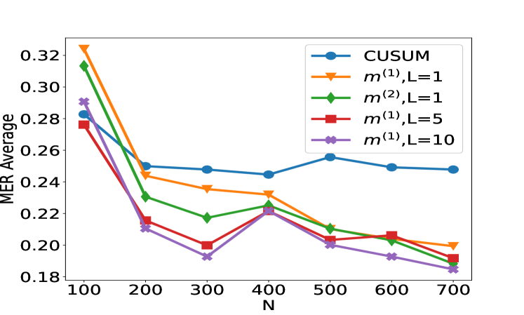
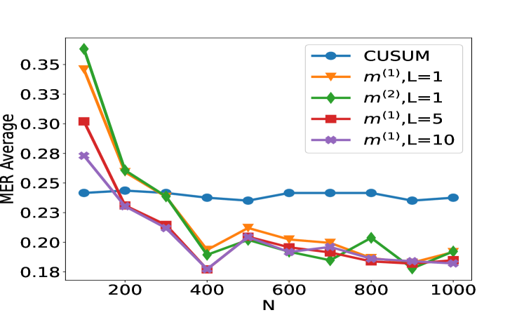
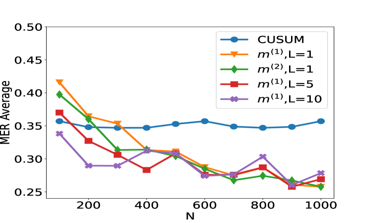
We now investigate empirically our approach of learning a change-point detection method by training a neural network. Motivated by the results from the previous section we will fit a neural network with a single layer and consider how varying the number of hidden layers and the amount of training data affects performance. We will compare to a test based on the CUSUM statistic, both for scenarios where the noise is independent and Gaussian, and for scenarios where there is auto-correlation or heavy-tailed noise. The CUSUM test can be sensitive to the choice of threshold, particularly when we do not have independent Gaussian noise, so we tune its threshold based on training data. When training the neural network, we first standardise the data onto $[0,1]$ , i.e. $\tilde{\boldsymbol{x}}_i=((x_ij-x_i^min)/(x_i^max -x_i^min))_j∈[n]$ where $x_i^max:=\max_jx_ij,x_i^min:=\min_jx_ij$ . This makes the neural network procedure invariant to either adding a constant to the data or scaling the data by a constant, which are natural properties to require. We train the neural network by minimising the cross-entropy loss on the training data. We run training for 200 epochs with a batch size of 32 and a learning rate of 0.001 using the Adam optimiser (Kingma and Ba, 2015). These hyperparameters are chosen based on a training dataset with cross-validation, more details can be found in Appendix B. We generate our data as follows. Given a sequence of length $n$ , we draw $τ∼Unif\{2,…,n-2\}$ , set $μ_L=0$ and draw $μ_R|τ∼Unif([-1.5b,-0.5b]∪[0.5b,1.5b])$ , where $b:=√{\frac{8n\log(20n)}{τ(n-τ)}}$ is chosen in line with Lemma 4.1 to ensure a good range of signal-to-noise ratios. We then generate $\boldsymbol{x}_1=(μ_L\mathbbm{1}_\{t≤τ\}+μ_R \mathbbm{1}_\{t>τ\}+ε_t)_t∈[n]$ , with the noise $(ε_t)_t∈[n]$ following an $AR(1)$ model with possibly time-varying autocorrelation $ε_t|ρ_t=ξ_1$ for $t=1$ and $ρ_tε_t-1+ξ_t$ for $t≥ 2$ , where $(ξ_t)_t∈[n]$ are independent, possibly heavy-tailed noise. The autocorrelations $ρ_t$ and innovations $ξ_t$ are from one of the three scenarios:
1. $n=100$ , $N∈\{100,200,…,700\}$ , $ρ_t=0$ and $ξ_t∼ N(0,1)$ .
1. $n=100$ , $N∈\{100,200,…,700\}$ , $ρ_t=0.7$ and $ξ_t∼ N(0,1)$ .
1. $n=100$ , $N∈\{100,200,…,1000\}$ , $ρ_t∼Unif([0,1])$ and $ξ_t∼ N(0,2)$ .
1. $n=100$ , $N∈\{100,200,…,1000\}$ , $ρ_t=0$ and $ξ_t∼Cauchy(0,0.3)$ .
The above procedure is then repeated $N/2$ times to generate independent sequences $\boldsymbol{x}_1,…,\boldsymbol{x}_N/2$ with a single change, and the associated labels are $(y_1,…,y_N/2)^⊤=1_N/2$ . We then repeat the process another $N/2$ times with $μ_R=μ_L$ to generate sequences without changes $\boldsymbol{x}_N/2+1,…,\boldsymbol{x}_N$ with $(y_N/2+1,…,y_N)^⊤=0_N/2$ . The data with and without change $(\boldsymbol{x}_i,y_i)_i∈[N]$ are combined and randomly shuffled to form the training data. The test data are generated in a similar way, with a sample size $N_test=30000$ and the slight modification that $μ_R|τ∼Unif([-1.75b,-0.25b]∪[0.25b,1.75b])$ when a change occurs. We note that the test data is drawn from the same distribution as the training set, though potentially having changes with signal-to-noise ratios outside the range covered by the training set. We have also conducted robustness studies to investigate the effect of training the neural networks on scenario S1 and test on S1 ${}^\prime$ , S2 or S3. Qualitatively similar results to Figure 2 have been obtained in this misspecified setting (see Figure 6 in appendix).
<details>
<summary>x2.png Details</summary>

### Visual Description
## Line Chart: MER Average vs. N for Different Methods
### Overview
The image displays a line chart comparing the performance of five different statistical or machine learning methods. The performance metric is "MER Average" (likely Mean Error Rate or a similar average error measure), plotted against a variable "N" (likely sample size, number of observations, or a similar parameter). The chart shows how the average error for each method changes as N increases from 100 to 700.
### Components/Axes
* **X-Axis:** Labeled "N". It has major tick marks and labels at N = 100, 200, 300, 400, 500, 600, and 700.
* **Y-Axis:** Labeled "MER Average". It has major tick marks and labels at 0.06, 0.08, 0.10, 0.12, 0.14, and 0.16.
* **Legend:** Positioned in the top-right corner of the plot area. It contains five entries, each with a unique color, marker, and label:
1. Blue line with circle markers: `CUSUM`
2. Orange line with downward-pointing triangle markers: `m^(1),L=1`
3. Green line with diamond markers: `m^(2),L=1`
4. Red line with square markers: `m^(1),L=5`
5. Purple line with left-pointing triangle markers: `m^(1),L=10`
### Detailed Analysis
**Trend Verification & Data Point Extraction (Approximate Values):**
1. **CUSUM (Blue, Circles):**
* **Trend:** Starts low, increases to a peak around N=500-600, then decreases.
* **Points:** N=100: ~0.060 | N=200: ~0.082 | N=300: ~0.068 | N=400: ~0.060 | N=500: ~0.075 | N=600: ~0.075 | N=700: ~0.060
2. **m^(1),L=1 (Orange, Down-Triangles):**
* **Trend:** Starts very high, drops sharply until N=300, then declines more gradually.
* **Points:** N=100: ~0.168 | N=200: ~0.085 | N=300: ~0.069 | N=400: ~0.064 | N=500: ~0.064 | N=600: ~0.059 | N=700: ~0.060
3. **m^(2),L=1 (Green, Diamonds):**
* **Trend:** Starts high, drops sharply until N=300, then declines gradually, converging with others.
* **Points:** N=100: ~0.129 | N=200: ~0.089 | N=300: ~0.070 | N=400: ~0.062 | N=500: ~0.059 | N=600: ~0.054 | N=700: ~0.060
4. **m^(1),L=5 (Red, Squares):**
* **Trend:** Starts moderate, shows a slight dip and rise, generally trends downward with some fluctuation.
* **Points:** N=100: ~0.077 | N=200: ~0.074 | N=300: ~0.062 | N=400: ~0.057 | N=500: ~0.058 | N=600: ~0.050 | N=700: ~0.053
5. **m^(1),L=10 (Purple, Left-Triangles):**
* **Trend:** Starts the lowest, rises to a peak at N=200, then generally declines.
* **Points:** N=100: ~0.061 | N=200: ~0.074 | N=300: ~0.063 | N=400: ~0.058 | N=500: ~0.060 | N=600: ~0.053 | N=700: ~0.053
### Key Observations
1. **Initial Disparity:** At the smallest sample size (N=100), there is a large spread in performance. The methods `m^(1),L=1` and `m^(2),L=1` have significantly higher MER (~0.168 and ~0.129) compared to the others (~0.06-0.08).
2. **Convergence with Increasing N:** As N increases, the performance of all five methods converges. By N=700, all methods have an MER Average within a narrow band of approximately 0.053 to 0.060.
3. **CUSUM Anomaly:** The `CUSUM` method shows a distinct, non-monotonic trend, with its MER increasing to form a plateau between N=500 and N=600 before falling again. This is an outlier compared to the generally decreasing trends of the other methods.
4. **Effect of Parameter L:** For the `m^(1)` family of methods, increasing the parameter `L` from 1 to 5 to 10 appears to improve (lower) the initial MER at N=100. The `m^(1),L=10` method starts with the lowest error.
### Interpretation
This chart likely evaluates the sample efficiency or consistency of different change-point detection or sequential analysis algorithms. "MER" could stand for "Missed Event Rate" or "Mean Error Ratio."
* **What the data suggests:** The methods `m^(1),L=1` and `m^(2),L=1` are highly sensitive to small sample sizes (low N), performing poorly. However, they improve rapidly and become competitive as more data (higher N) becomes available. In contrast, `CUSUM` and the `m^(1)` methods with higher `L` values (5, 10) are more robust and perform better with limited data.
* **Relationship between elements:** The parameter `L` in the `m^(1)` methods seems to act as a tuning parameter that trades off initial performance for stability. A higher `L` leads to better initial MER. The convergence of all lines suggests that given sufficient data (N > 400), the choice of method becomes less critical for this specific metric.
* **Notable anomaly:** The `CUSUM` method's performance degradation (increasing MER) in the mid-range of N (500-600) is curious. It could indicate a specific vulnerability or a phase where the method's assumptions are less valid for the underlying data generating process at that scale. This would be a key point for further investigation.
* **Underlying message:** The choice of method should be informed by the expected operational sample size. For scenarios with limited data, `m^(1),L=10` or `CUSUM` are preferable. For scenarios with abundant data, all methods perform similarly, and other factors like computational cost might become the deciding factor.
</details>
<details>
<summary>x3.png Details</summary>
### Visual Description
## Line Chart: Performance Comparison of Statistical Methods vs. Sample Size (N)
### Overview
The image displays a line chart comparing the performance of five different statistical methods or algorithms as a function of sample size (N). The performance metric is "MER Average," where lower values appear to indicate better performance. All methods show a general trend of decreasing MER Average as N increases, with the most significant improvement occurring between N=100 and N=200.
### Components/Axes
* **Chart Type:** Multi-series line chart with markers.
* **X-Axis:**
* **Label:** `N` (likely representing sample size or number of observations).
* **Scale:** Linear, with major tick marks at 100, 200, 300, 400, 500, 600, and 700.
* **Y-Axis:**
* **Label:** `MER Average` (likely an error or performance metric, e.g., Mean Error Rate).
* **Scale:** Linear, ranging from approximately 0.18 to 0.32, with major tick marks at intervals of 0.02.
* **Legend:** Positioned in the **top-right corner** of the plot area. It contains five entries, each associating a color, line style, and marker with a method name.
1. **Blue line with circle markers:** `CUSUM`
2. **Orange line with downward-pointing triangle markers:** `m^(1),L=1`
3. **Green line with diamond markers:** `m^(2),L=1`
4. **Red line with square markers:** `m^(1),L=5`
5. **Purple line with 'x' (cross) markers:** `m^(1),L=10`
### Detailed Analysis
The following data points are approximate, read from the chart's visual position.
**Trend Verification:** All five data series exhibit a clear downward trend from left to right, indicating that the MER Average decreases as N increases. The slope is steepest between N=100 and N=200 for all series.
**Data Series Points (Approximate MER Average vs. N):**
| N | CUSUM (Blue, ○) | m^(1),L=1 (Orange, ▽) | m^(2),L=1 (Green, ◇) | m^(1),L=5 (Red, □) | m^(1),L=10 (Purple, ×) |
| :-- | :-------------- | :-------------------- | :------------------- | :----------------- | :--------------------- |
| 100 | 0.280 | 0.325 | 0.315 | 0.275 | 0.290 |
| 200 | 0.250 | 0.245 | 0.230 | 0.215 | 0.210 |
| 300 | 0.248 | 0.235 | 0.218 | 0.200 | 0.192 |
| 400 | 0.245 | 0.232 | 0.225 | 0.220 | 0.220 |
| 500 | 0.255 | 0.210 | 0.210 | 0.202 | 0.200 |
| 600 | 0.250 | 0.205 | 0.202 | 0.205 | 0.192 |
| 700 | 0.248 | 0.200 | 0.188 | 0.190 | 0.185 |
**Component Isolation & Spatial Grounding:**
* **Header Region (Top):** Contains the legend in the top-right. The highest initial data point (N=100) belongs to the orange line (`m^(1),L=1`), positioned at the very top of the y-axis range.
* **Main Chart Region:** The five lines are densely clustered between N=200 and N=700. The blue line (`CUSUM`) remains the highest (worst performing) from N=300 onward, forming a relatively flat plateau. The purple (`m^(1),L=10`) and green (`m^(2),L=1`) lines compete for the lowest (best) position at N=700, with purple appearing marginally lower.
* **Footer Region (Bottom):** The x-axis labels are clearly positioned below their corresponding tick marks.
### Key Observations
1. **Universal Improvement with N:** All methods benefit from increased sample size, with the most dramatic gains occurring early (N=100 to 200).
2. **CUSUM Plateau:** The `CUSUM` method shows the least continued improvement after N=200, maintaining a nearly constant MER Average around 0.25.
3. **Impact of Parameter L:** For the `m^(1)` family of methods, increasing the parameter `L` from 1 to 5 to 10 generally leads to better (lower) MER Average at larger N (N≥500). The `m^(1),L=10` series achieves the lowest overall value at N=700.
4. **Performance Crossover:** At N=100, `m^(1),L=1` (orange) performs worst. By N=700, it is outperformed by all methods except `CUSUM`. The ranking of methods changes significantly across the x-axis.
5. **Anomaly at N=400:** Several series (`m^(2),L=1`, `m^(1),L=5`, `m^(1),L=10`) show a slight increase or plateau in MER Average at N=400 before resuming their downward trend. This could indicate a specific characteristic of the data or algorithm at that sample size.
### Interpretation
This chart likely evaluates change-point detection algorithms or sequential analysis methods, where `CUSUM` (Cumulative Sum) is a classic benchmark. The `m^(k),L` notation suggests variants of a proposed method with different model orders (`k=1,2`) and a lookback or window parameter (`L`).
The data suggests that the proposed methods (`m^(k),L`) generally outperform the standard `CUSUM` as the sample size grows, especially when configured with a larger `L` parameter. The `m^(1),L=10` configuration appears most effective for large N. The initial steep drop indicates that all methods require a minimum amount of data (around N=200) to stabilize their performance. The plateau of `CUSUM` implies it may have a fundamental performance limit that the other methods overcome with more data. The anomaly at N=400 warrants investigation—it could be a chart artifact, or it might reveal a point where the methods' assumptions are temporarily less valid for the underlying data generating process. Overall, the chart makes a case for the superiority of the `m^(k),L` methods in scenarios where large sample sizes are available.
</details>
(a) Scenario S1 with $ρ_t=0$ (b) Scenario S1 ${}^\prime$ with $ρ_t=0.7$
<details>
<summary>x4.png Details</summary>
### Visual Description
## Line Chart: MER Average vs. N for Different Methods
### Overview
The image is a line chart comparing the performance of five different statistical methods or algorithms. The performance metric is "MER Average" plotted against a variable "N". The chart shows how the average MER (likely Mean Error Rate or a similar metric) changes as N increases for each method.
### Components/Axes
* **Chart Type:** Multi-line chart with markers.
* **X-Axis:**
* **Label:** `N`
* **Scale:** Linear, ranging from approximately 100 to 1000.
* **Major Ticks:** 200, 400, 600, 800, 1000.
* **Y-Axis:**
* **Label:** `MER Average`
* **Scale:** Linear, ranging from approximately 0.18 to 0.35.
* **Major Ticks:** 0.18, 0.20, 0.23, 0.25, 0.28, 0.30, 0.33, 0.35.
* **Legend:** Located in the top-right quadrant of the chart area. It contains five entries, each associating a color and marker shape with a method name.
1. **Blue line with circle markers:** `CUSUM`
2. **Orange line with downward-pointing triangle markers:** `m^(1),L=1`
3. **Green line with diamond markers:** `m^(2),L=1`
4. **Red line with square markers:** `m^(1),L=5`
5. **Purple line with pentagon (or star-like) markers:** `m^(1),L=10`
### Detailed Analysis
The chart plots five data series. Below is an analysis of each, including approximate data points extracted by visual inspection. Values are approximate due to the resolution of the image.
**1. CUSUM (Blue, Circle Markers)**
* **Trend:** Nearly flat, showing very stable performance across all values of N.
* **Data Points (Approximate):**
* N=100: ~0.24
* N=200: ~0.24
* N=300: ~0.24
* N=400: ~0.24
* N=500: ~0.24
* N=600: ~0.24
* N=700: ~0.24
* N=800: ~0.24
* N=900: ~0.24
* N=1000: ~0.24
**2. m^(1),L=1 (Orange, Downward Triangle Markers)**
* **Trend:** Starts very high, drops sharply until N=400, then fluctuates with a slight downward trend.
* **Data Points (Approximate):**
* N=100: ~0.35
* N=200: ~0.27
* N=300: ~0.24
* N=400: ~0.20
* N=500: ~0.21
* N=600: ~0.20
* N=700: ~0.20
* N=800: ~0.19
* N=900: ~0.19
* N=1000: ~0.19
**3. m^(2),L=1 (Green, Diamond Markers)**
* **Trend:** Starts the highest, drops very sharply until N=400, then fluctuates with a slight downward trend, often crossing the orange line.
* **Data Points (Approximate):**
* N=100: ~0.36
* N=200: ~0.27
* N=300: ~0.24
* N=400: ~0.19
* N=500: ~0.21
* N=600: ~0.20
* N=700: ~0.19
* N=800: ~0.21
* N=900: ~0.18
* N=1000: ~0.20
**4. m^(1),L=5 (Red, Square Markers)**
* **Trend:** Starts moderately high, drops steadily until N=400, then continues a slow, steady decline.
* **Data Points (Approximate):**
* N=100: ~0.30
* N=200: ~0.24
* N=300: ~0.22
* N=400: ~0.19
* N=500: ~0.20
* N=600: ~0.19
* N=700: ~0.19
* N=800: ~0.19
* N=900: ~0.19
* N=1000: ~0.19
**5. m^(1),L=10 (Purple, Pentagon Markers)**
* **Trend:** Starts the lowest among the non-CUSUM methods, drops to the lowest point on the chart at N=400, then rises slightly and stabilizes.
* **Data Points (Approximate):**
* N=100: ~0.28
* N=200: ~0.24
* N=300: ~0.22
* N=400: ~0.18
* N=500: ~0.20
* N=600: ~0.19
* N=700: ~0.19
* N=800: ~0.19
* N=900: ~0.19
* N=1000: ~0.19
### Key Observations
1. **Performance Hierarchy at Low N:** At N=100, there is a clear hierarchy. `m^(2),L=1` performs worst (highest MER), followed by `m^(1),L=1`, `m^(1),L=5`, `m^(1),L=10`, with `CUSUM` performing best (lowest MER).
2. **Convergence:** All methods except `CUSUM` show a significant improvement (decrease in MER) as N increases from 100 to 400. After N=400, their performance differences become much smaller.
3. **CUSUM Stability:** The `CUSUM` method is remarkably stable, showing almost no sensitivity to the value of N within the tested range.
4. **Optimal Point:** The lowest MER value on the chart (~0.18) is achieved by `m^(1),L=10` at N=400.
5. **Parameter L Impact:** For the `m^(1)` family, increasing the parameter L from 1 to 5 to 10 generally leads to better (lower) MER, especially at lower N values. At higher N (≥600), the performance of `m^(1),L=5` and `m^(1),L=10` is nearly identical.
6. **Method `m^(2)` vs `m^(1)`:** At L=1, `m^(2)` starts worse than `m^(1)` but achieves a slightly better minimum MER at N=400 and N=900, though with more volatility.
### Interpretation
This chart likely evaluates change-point detection or sequential analysis algorithms, where `N` represents sample size or time horizon, and `MER` is an error metric (e.g., Missed Event Rate, Mean Error Ratio).
* **The data suggests a fundamental trade-off.** The `CUSUM` algorithm provides consistent, reliable performance regardless of sample size but does not achieve the lowest possible error rates. In contrast, the `m` family of methods (likely variants of a different algorithm, perhaps a multi-cusum or window-based method) are highly sensitive to sample size. They perform poorly with little data (`N=100`) but can significantly outperform `CUSUM` when given sufficient data (`N≥400`).
* **The parameter `L` is a tuning knob for the `m` methods.** A larger `L` (e.g., 10) appears to provide better regularization or smoothing, leading to lower error rates, particularly in data-scarce regimes. This suggests `L` might control memory length or window size.
* **The volatility of `m^(2),L=1`** after N=400 indicates it may be less robust or more sensitive to specific data patterns than its `m^(1)` counterparts, despite occasionally hitting low error values.
* **Practical Implication:** If the operational context guarantees a large `N` (e.g., N > 400), using an `m` method with a tuned `L` (like 5 or 10) is preferable for minimizing MER. If `N` is small, variable, or unknown, `CUSUM` is the safer, more predictable choice. The chart provides the empirical evidence needed to make that design decision based on the expected range of `N`.
</details>
<details>
<summary>x5.png Details</summary>
### Visual Description
\n
## Line Chart: Performance Comparison of CUSUM and Modified Methods (MER Average vs. N)
### Overview
The image is a line chart comparing the performance of five different statistical or algorithmic methods. The performance metric is "MER Average" (likely Mean Error Rate or a similar average error metric), plotted against a variable "N" (likely sample size, number of observations, or time steps). The chart shows how the average error changes for each method as N increases from approximately 100 to 1000.
### Components/Axes
* **Chart Type:** Multi-line chart with markers.
* **X-Axis:**
* **Label:** `N`
* **Scale:** Linear scale.
* **Markers/Ticks:** Major ticks are labeled at 200, 400, 600, 800, and 1000. The axis starts slightly before 100 and ends at 1000.
* **Y-Axis:**
* **Label:** `MER Average`
* **Scale:** Linear scale.
* **Range:** 0.25 to 0.50.
* **Markers/Ticks:** Major ticks are labeled at 0.25, 0.30, 0.35, 0.40, 0.45, and 0.50.
* **Legend:**
* **Position:** Top-right corner of the plot area.
* **Entries (with color and marker):**
1. `CUSUM` - Blue line with circle markers.
2. `m^{(1)}, L=1` - Orange line with downward-pointing triangle markers.
3. `m^{(2)}, L=1` - Green line with diamond markers.
4. `m^{(1)}, L=5` - Red line with square markers.
5. `m^{(1)}, L=10` - Purple line with 'X' (cross) markers.
### Detailed Analysis
**Trend Verification & Data Point Extraction (Approximate Values):**
1. **CUSUM (Blue, Circles):**
* **Trend:** Relatively flat and stable across all N values, showing only minor fluctuations. It does not exhibit a strong downward or upward slope.
* **Approximate Data Points:**
* N≈100: ~0.36
* N≈200: ~0.35
* N≈300: ~0.35
* N≈400: ~0.35
* N≈500: ~0.355
* N≈600: ~0.36
* N≈700: ~0.35
* N≈800: ~0.35
* N≈900: ~0.35
* N≈1000: ~0.36
2. **m^{(1)}, L=1 (Orange, Downward Triangles):**
* **Trend:** Shows a strong, consistent downward trend as N increases. It starts as the highest error method at low N and converges with the others at high N.
* **Approximate Data Points:**
* N≈100: ~0.42 (Highest initial point)
* N≈200: ~0.365
* N≈300: ~0.355
* N≈400: ~0.315
* N≈500: ~0.31
* N≈600: ~0.29
* N≈700: ~0.275
* N≈800: ~0.275
* N≈900: ~0.26
* N≈1000: ~0.265
3. **m^{(2)}, L=1 (Green, Diamonds):**
* **Trend:** Also shows a strong downward trend, very similar in shape to the orange line (m^{(1)}, L=1), but consistently slightly lower in error for most N values.
* **Approximate Data Points:**
* N≈100: ~0.40
* N≈200: ~0.36
* N≈300: ~0.315
* N≈400: ~0.315
* N≈500: ~0.305
* N≈600: ~0.285
* N≈700: ~0.27
* N≈800: ~0.275
* N≈900: ~0.265
* N≈1000: ~0.26
4. **m^{(1)}, L=5 (Red, Squares):**
* **Trend:** General downward trend, but with more volatility (ups and downs) compared to the L=1 variants. It starts lower than the L=1 methods at N=100.
* **Approximate Data Points:**
* N≈100: ~0.37
* N≈200: ~0.33
* N≈300: ~0.31
* N≈400: ~0.285
* N≈500: ~0.305
* N≈600: ~0.28
* N≈700: ~0.28
* N≈800: ~0.29
* N≈900: ~0.26
* N≈1000: ~0.27
5. **m^{(1)}, L=10 (Purple, Crosses):**
* **Trend:** Shows the most volatile behavior. It starts with the lowest error at N=100, drops sharply, then fluctuates significantly, rising notably at N=400 and N=800 before dropping again.
* **Approximate Data Points:**
* N≈100: ~0.34 (Lowest initial point)
* N≈200: ~0.29
* N≈300: ~0.29
* N≈400: ~0.315
* N≈500: ~0.31
* N≈600: ~0.275
* N≈700: ~0.275
* N≈800: ~0.305
* N≈900: ~0.265
* N≈1000: ~0.28
### Key Observations
1. **Convergence:** All four `m` methods (orange, green, red, purple) show a general trend of decreasing MER Average as N increases, converging into a narrow band between approximately 0.26 and 0.28 by N=1000.
2. **CUSUM Stability:** The CUSUM method (blue) is distinct, maintaining a nearly constant error rate (~0.35-0.36) regardless of N, making it the worst-performing method for N > 300.
3. **Impact of L:** For the `m^{(1)}` family, increasing the parameter `L` from 1 to 5 to 10 changes the behavior:
* `L=1` (orange): Smooth, steady decline.
* `L=5` (red): More volatile decline.
* `L=10` (purple): Highly volatile, with significant local maxima at N=400 and N=800.
4. **Initial Performance:** At the smallest N (~100), the methods rank from highest to lowest error: `m^{(1)}, L=1` > `m^{(2)}, L=1` > `m^{(1)}, L=5` > `CUSUM` > `m^{(1)}, L=10`.
5. **Final Performance:** At the largest N (1000), the `m` methods are tightly clustered, while CUSUM remains an outlier with significantly higher error.
### Interpretation
This chart likely evaluates change-point detection or sequential analysis algorithms. "MER Average" probably stands for Mean Detection Error Rate or a similar metric combining false alarms and missed detections. "N" represents the amount of data processed.
The data suggests that the proposed `m` methods (variants with parameters `m` and `L`) are **adaptive and improve with more data**, learning to reduce their error rate as N grows. In contrast, the standard CUSUM algorithm appears **non-adaptive** in this context, with a fixed performance profile that does not benefit from increased sample size within this range.
The parameter `L` seems to control a **memory or window length**. A smaller `L` (L=1) leads to stable, predictable improvement. A larger `L` (L=10) introduces volatility, suggesting the algorithm might be overfitting to local patterns or experiencing delayed reactions, causing temporary performance degradation (the peaks at N=400 and 800) before correcting. The `m^{(2)}` variant (green) performs very similarly to `m^{(1)}, L=1` (orange), indicating that the change from `m^{(1)}` to `m^{(2)}` has a minor effect compared to changing `L`.
**In essence:** For large datasets (high N), the adaptive `m` methods are superior to CUSUM. If stability is crucial, a lower `L` value is preferable. If the lowest possible error at very small N is the goal, a high `L` value (`L=10`) might be chosen, accepting its subsequent volatility.
</details>
(c) Scenario S2 with $ρ_t∼Unif([0,1])$ (d) Scenario S3 with Cauchy noise
Figure 2: Plot of the test set MER, computed on a test set of size $N_test=30000$ , against training sample size $N$ for detecting the existence of a change-point on data series of length $n=100$ . We compare the performance of the CUSUM test and neural networks from four function classes: $H_1,m^(1)$ , $H_1,m^(2)$ , $H_5,m^(1)1_5$ and $H_10,m^(1)1_10$ where $m^(1)=4\lfloor\log_2(n)\rfloor$ and $m^(2)=2n-2$ respectively under scenarios S1, S1 ${}^\prime$ , S2 and S3 described in Section 5.
We compare the performance of the CUSUM-based classifier with the threshold cross-validated on the training data with neural networks from four function classes: $H_1,m^(1)$ , $H_1,m^(2)$ , $H_5,m^(1)1_5$ and $H_10,m^(1)1_10$ where $m^(1)=4\lfloor\log_2(n)\rfloor$ and $m^(2)=2n-2$ respectively (cf. Theorem 4.3 and Lemma 3.1). Figure 2 shows the test misclassification error rate (MER) of the four procedures in the four scenarios S1, S1 ${}^\prime$ , S2 and S3. We observe that when data are generated with independent Gaussian noise ( Figure 2 (a)), the trained neural networks with $m^(1)$ and $m^(2)$ single hidden layer nodes attain very similar test MER compared to the CUSUM-based classifier. This is in line with our Theorem 4.3. More interestingly, when noise has either autocorrelation ( Figure 2 (b, c)) or heavy-tailed distribution ( Figure 2 (d)), trained neural networks with $(L,m)$ : $(1,m^(1))$ , $(1,m^(2))$ , $(5,m^(1)1_5)$ and $(10,m^(1)1_10)$ outperform the CUSUM-based classifier, even after we have optimised the threshold choice of the latter. In addition, as shown in Figure 5 in the online supplement, when the first two layers of the network are set to carry out truncation, which can be seen as a composition of two ReLU operations, the resulting neural network outperforms the Wilcoxon statistics-based classifier (Dehling et al., 2015), which is a standard benchmark for change-point detection in the presence of heavy-tailed noise. Furthermore, from Figure 2, we see that increasing $L$ can significantly reduce the average MER when $N≤ 200$ . Theoretically, as the number of layers $L$ increases, the neural network is better able to approximate the optimal decision boundary, but it becomes increasingly difficult to train the weights due to issues such as vanishing gradients (He et al., 2016). A combination of these considerations leads us to develop deep neural network architecture with residual connections for detecting multiple changes and multiple change types in Section 6.
## 6 Detecting multiple changes and multiple change types – case study
From the previous section, we see that single and multiple hidden layer neural networks can represent CUSUM or generalised CUSUM tests and may perform better than likelihood-based test statistics when the model is misspecified. This prompted us to seek a general network architecture that can detect, and even classify, multiple types of change. Motivated by the similarities between signal processing and image recognition, we employed a deep convolutional neural network (CNN) (Yamashita et al., 2018) to learn the various features of multiple change-types. However, stacking more CNN layers cannot guarantee a better network because of vanishing gradients in training (He et al., 2016). Therefore, we adopted the residual block structure (He et al., 2016) for our neural network architecture. After experimenting with various architectures with different numbers of residual blocks and fully connected layers on synthetic data, we arrived at a network architecture with 21 residual blocks followed by a number of fully connected layers. Figure 9 shows an overview of the architecture of the final general-purpose deep neural network for change-point detection. The precise architecture and training methodology of this network $\widehat{NN}$ can be found in Appendix C. Neural Architecture Search (NAS) approaches (see Paaß and Giesselbach, 2023, Section 2.4.3) offer principled ways of selecting neural architectures. Some of these approaches could be made applicable in our setting. We demonstrate the power of our general purpose change-point detection network in a numerical study. We train the network on $N=10000$ instances of data sequences generated from a mixture of no change-point in mean or variance, change in mean only, change in variance only, no-change in a non-zero slope and change in slope only, and compare its classification performance on a test set of size $2500$ against that of oracle likelihood-based classifiers (where we pre-specify whether we are testing for change in mean, variance or slope) and adaptive likelihood-based classifiers (where we combine likelihood based tests using the Bayesian Information Criterion). Details of the data-generating mechanism and classifiers can be found in Appendix B. The classification accuracy of the three approaches in weak and strong signal-to-noise ratio settings are reported in Table 1. We see that the neural network-based approach achieves similar classification accuracy as adaptive likelihood based method for weak SNR and higher classification accuracy than the adaptive likelihood based method for strong SNR. We would not expect the neural network to outperform the oracle likelihood-based classifiers as it has no knowledge of the exact change-type of each time series.
Table 1: Test classification accuracy of oracle likelihood-ratio based method (LR ${}^oracle$ ), adaptive likelihood ratio method (LR ${}^adapt$ ) and our residual neural network (NN) classifier for setups with weak and strong signal-to-noise ratios (SNR). Data are generated as a mixture of no change-point in mean or variance (Class 1), change in mean only (Class 2), change in variance only (Class 3), no-change in a non-zero slope (Class 4), change in slope only (Class 5). We report the true positive rate of each class and the accuracy in the last row.
Weak SNR Strong SNR LR ${}^oracle$ LR ${}^adapt$ NN LR ${}^oracle$ LR ${}^adapt$ NN Class 1 0.9787 0.9457 0.8062 0.9787 0.9341 0.9651 Class 2 0.8443 0.8164 0.8882 1.0000 0.7784 0.9860 Class 3 0.8350 0.8291 0.8585 0.9902 0.9902 0.9705 Class 4 0.9960 0.9453 0.8826 0.9980 0.9372 0.9312 Class 5 0.8729 0.8604 0.8353 0.9958 0.9917 0.9147 Accuracy 0.9056 0.8796 0.8660 0.9924 0.9260 0.9672
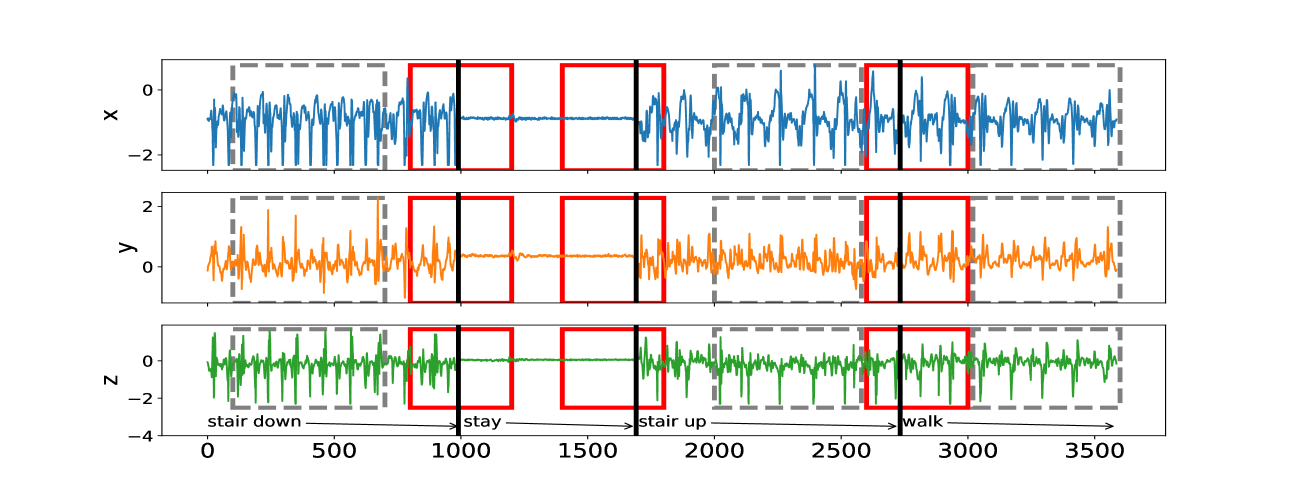
We now consider an application to detecting different types of change. The HASC (Human Activity Sensing Consortium) project data contain motion sensor measurements during a sequence of human activities, including “stay”, “walk”, “jog”, “skip”, “stair up” and “stair down”. Complex changes in sensor signals occur during transition from one activity to the next (see Figure 3). We have 28 labels in HASC data, see Figure 10 in appendix. To agree with the dimension of the output, we drop two dense layers “Dense(10)” and “Dense(20)” in Figure 9. The resulting network can be effectively applied for change-point detection in sensory signals of human activities, and can achieve high accuracy in change-point classification tasks (Figure 12 in appendix). Finally, we remark that our neural network-based change-point detector can be utilised to detect multiple change-points. Algorithm 1 outlines a general scheme for turning a change-point classifier into a location estimator, where we employ an idea similar to that of MOSUM (Eichinger and Kirch, 2018) and repeatedly apply a classifier $ψ$ to data from a sliding window of size $n$ . Here, we require $ψ$ applied to each data segment $\boldsymbol{X}^*_[i,i+n)$ to output both the class label $L_i=0$ or $1$ if no change or a change is predicted and the corresponding probability $p_i$ of having a change. In our particular example, for each data segment $\boldsymbol{X}^*_[i,i+n)$ of length $n=700$ , we define $ψ(\boldsymbol{X}^*_[i,i+n))=0$ if $\widehat{NN}(\boldsymbol{X}^*_[i,i+n))$ predicts a class label in $\{0,4,8,12,16,22\}$ (see Figure 10 in appendix) and 1 otherwise. The thresholding parameter $γ∈ℤ^+$ is chosen to be $1/2$ .
Input: new data $\boldsymbol{x}_1^*,…,\boldsymbol{x}_n^*^*∈ℝ^d$ , a trained classifier $ψ:ℝ^d× n→\{0,1\}$ , $γ>0$ .
1 Form $\boldsymbol{X}_[i,i+n)^*:=(\boldsymbol{x}_i^*,…,\boldsymbol{x}_i +n-1)$ and compute $L_i←ψ(\boldsymbol{X}^*_[i,i+n))$ for all $i=1,…,n^*-n+1$ ;
2 Compute $\bar{L}_i← n^-1∑_j=i-n+1^iL_j$ for $i=n,…,n^*-n+1$ ;
3 Let $\{[s_1,e_1],…,[s_\hat{ν},e_\hat{ν}]\}$ be the set of all maximal segments such that $\bar{L}_i≥γ$ for all $i∈[s_r,e_r]$ , $r∈[\hat{ν}]$ ;
4 Compute $\hat{τ}_r←\operatorname*{arg max}_i∈[s_{r,e_r]}\bar{L}_i$ for all $r∈[\hat{ν}]$ ;
Output: Estimated change-points $\hat{τ}_1,…,\hat{τ}_\hat{ν}$
Algorithm 1 Algorithm for change-point localisation
Figure 4 illustrates the result of multiple change-point detection in HASC data which provides evidence that the trained neural network can detect both the multiple change-types and multiple change-points.
<details>
<summary>x6.png Details</summary>
### Visual Description
## Time-Series Chart: Multi-Axis Movement Data with Activity Segmentation
### Overview
The image displays a three-panel time-series chart showing synchronized data from three axes (labeled x, y, z) over a common time axis. The data appears to represent movement or acceleration signals, segmented into four distinct activity phases: "stair down," "stay," "stair up," and "walk." Specific time intervals within these phases are highlighted with colored rectangular boxes.
### Components/Axes
* **Chart Type:** Three vertically stacked line charts (subplots) sharing a common x-axis.
* **X-Axis (Common):**
* **Label:** Not explicitly labeled with a title, but represents time or sample index.
* **Scale:** Linear, ranging from 0 to 3500.
* **Major Ticks:** 0, 500, 1000, 1500, 2000, 2500, 3000, 3500.
* **Y-Axes (Individual):**
* **Top Subplot:** Labeled "x". Scale ranges approximately from -2 to +1.
* **Middle Subplot:** Labeled "y". Scale ranges approximately from -1 to +2.
* **Bottom Subplot:** Labeled "z". Scale ranges approximately from -4 to +1.
* **Data Series (Lines):**
* **Top (x-axis):** Blue line.
* **Middle (y-axis):** Orange line.
* **Bottom (z-axis):** Green line.
* **Activity Phase Labels & Annotations (Bottom of Chart):**
* Text labels with arrows indicating temporal duration, placed below the bottom subplot's x-axis.
* **"stair down"**: Arrow spans from ~0 to ~1000.
* **"stay"**: Arrow spans from ~1000 to ~1700.
* **"stair up"**: Arrow spans from ~1700 to ~2700.
* **"walk"**: Arrow spans from ~2700 to ~3500.
* **Highlight Boxes (Overlaid on all three subplots):**
* **Red Solid-Line Rectangles:** Appear at approximately:
1. x=800 to x=1000 (within "stair down").
2. x=1400 to x=1700 (within "stay").
3. x=2600 to x=2800 (within "stair up" / transition to "walk").
* **Gray Dashed-Line Rectangles:** Appear at approximately:
1. x=100 to x=700 (within "stair down").
2. x=2000 to x=2600 (within "stair up").
3. x=2800 to x=3500 (within "walk").
### Detailed Analysis
**Trend Verification per Activity Phase:**
1. **"stair down" (0 - ~1000):**
* **x (Blue):** High-amplitude, high-frequency oscillations. Trend is consistently variable.
* **y (Orange):** Moderate-amplitude, high-frequency oscillations. Trend is consistently variable.
* **z (Green):** High-amplitude, high-frequency oscillations with a slight negative bias. Trend is consistently variable.
* **Segmentation:** Contains a gray dashed box (early phase) and a red solid box (late phase).
2. **"stay" (~1000 - ~1700):**
* **x (Blue):** Signal becomes very flat, near zero. Trend is stable with minimal noise.
* **y (Orange):** Signal becomes very flat, near zero. Trend is stable with minimal noise.
* **z (Green):** Signal becomes very flat, near zero. Trend is stable with minimal noise.
* **Segmentation:** Contains a red solid box in the latter half.
3. **"stair up" (~1700 - ~2700):**
* **x (Blue):** Resumes high-amplitude, high-frequency oscillations, similar to "stair down".
* **y (Orange):** Resumes moderate-amplitude, high-frequency oscillations.
* **z (Green):** Resumes high-amplitude oscillations, but appears slightly less negative than during "stair down".
* **Segmentation:** Contains a gray dashed box (middle phase) and a red solid box at the very end, overlapping the transition to "walk".
4. **"walk" (~2700 - 3500):**
* **x (Blue):** Oscillations continue but appear slightly more regular/rhythmic compared to stair activities.
* **y (Orange):** Oscillations continue with a consistent pattern.
* **z (Green):** Oscillations continue, centered near zero.
* **Segmentation:** Contains a gray dashed box covering the entire phase.
### Key Observations
* **Clear State Differentiation:** The "stay" period is visually distinct from all other activities across all three axes, showing near-zero signal.
* **Activity Similarity:** The signal patterns for "stair down," "stair up," and "walk" are broadly similar (high variability), suggesting they are all dynamic locomotion activities. Subtle differences in amplitude or offset (especially in the z-axis) may differentiate them.
* **Synchronized Highlighting:** The red and gray boxes are applied identically across all three subplots (x, y, z) at the same time intervals, indicating they mark specific events or segments of interest in the overall movement, not specific to one axis.
* **Transition Marker:** The final red box (~2600-2800) straddles the labeled boundary between "stair up" and "walk," potentially highlighting a transition event.
### Interpretation
This chart visualizes tri-axial accelerometer (or similar inertial sensor) data from a device, likely worn by a person, during a sequence of activities. The data demonstrates clear, learnable patterns for activity recognition:
1. **Stationary vs. Dynamic:** The most fundamental classification is between stationary ("stay") and dynamic (all other) states.
2. **Activity Segmentation:** The labeled phases and highlighted boxes suggest this data is prepared for a machine learning task, where the goal is to automatically segment and classify time-series data into predefined activity classes. The red and gray boxes likely represent specific training examples, validation windows, or events of interest (e.g., start/stop of a movement) within the broader activity classes.
3. **Sensor Orientation:** The consistent negative bias in the z-axis during "stair down" versus its centering during "walk" could indicate the sensor's orientation relative to gravity changes with the activity (e.g., leaning forward while descending stairs).
4. **Investigative Reading:** The precise alignment of the red boxes with activity boundaries (especially the one at ~1000 marking the end of "stair down" and start of "stay") implies they may be manually annotated "ground truth" labels used to train or evaluate an algorithm. The gray boxes might represent automatically detected segments or regions of consistent signal characteristics.
**In summary, this is a technical visualization of labeled sensor data, primed for developing or validating algorithms that automatically detect and classify human physical activities based on movement signatures.**
</details>
Figure 3: The sequence of accelerometer data in $x,y$ and $z$ axes. From left to right, there are 4 activities: “stair down”, “stay”, “stair up” and “walk”, their change-points are 990, 1691, 2733 respectively marked by black solid lines. The grey rectangles represent the group of “no-change” with labels: “stair down”, “stair up” and “walk”; The red rectangles represent the group of “one-change” with labels: “stair down $→$ stay”, “stay $→$ stair up” and “stair up $→$ walk”.
<details>
<summary>x7.png Details</summary>
### Visual Description
\n
## Time-Series Chart: Multi-Signal Activity Segmentation
### Overview
The image displays a time-series plot containing three continuous signals (x, y, z) recorded over a period of approximately 10,500 time units. The data is segmented into distinct temporal regions, each labeled with a specific physical activity. Vertical lines of different colors demarcate the boundaries between these activity segments.
### Components/Axes
* **Chart Type:** Multi-line time-series plot with activity segmentation.
* **X-Axis:** Labeled "Time". The scale runs from 0 to just beyond 10,000, with major tick marks at 0, 2000, 4000, 6000, 8000, and 10000.
* **Y-Axis:** Labeled "Signal". The scale runs from -2 to 2, with major tick marks at -2, -1, 0, 1, and 2.
* **Legend:** Located in the top-right corner of the plot area. It defines three data series:
* `x` (blue line)
* `y` (orange line)
* `z` (green line)
* **Activity Segments & Boundaries:** The plot is divided by vertical lines. The color of the line appears to correspond to the activity type. The segments, from left to right, are:
1. **walk** (Start ~0, End ~1200). Bounded by a red vertical line on the right.
2. **skip** (Start ~1200, End ~2000). Bounded by a blue vertical line on the right.
3. **stay** (Start ~2000, End ~2800). Bounded by a red vertical line on the right.
4. **jog** (Start ~2800, End ~3800). Bounded by a blue vertical line on the right.
5. **walk** (Start ~3800, End ~4800). Bounded by a purple vertical line on the right.
6. **stUp** (Start ~4800, End ~5600). Bounded by a purple vertical line on the right.
7. **stay** (Start ~5600, End ~6400). Bounded by a red vertical line on the right.
8. **stDown** (Start ~6400, End ~7200). Bounded by a blue vertical line on the right.
9. **walk** (Start ~7200, End ~8000). Bounded by a purple vertical line on the right.
10. **stay** (Start ~8000, End ~8800). Bounded by a red vertical line on the right.
11. **skip** (Start ~8800, End ~9600). Bounded by a blue vertical line on the right.
12. **jog** (Start ~9600, End ~10500+).
### Detailed Analysis
**Signal Behavior by Activity Segment:**
1. **walk (0-1200):**
* **z (green):** High-amplitude, regular oscillations between approx. -1.5 and +1.5.
* **y (orange):** Consistently negative, oscillating between approx. -1.0 and -2.0.
* **x (blue):** Low-amplitude noise centered around 0.
2. **skip (1200-2000):**
* **z (green):** Very high-amplitude, dense oscillations, frequently exceeding the plot limits (clipping at ±2).
* **y (orange):** Similar to the first walk segment, negative and oscillating.
* **x (blue):** Low-amplitude noise around 0.
3. **stay (2000-2800):**
* **All signals (x, y, z):** Flat lines with minimal noise. `z` and `x` are near 0. `y` is stable at approximately -1.1.
4. **jog (2800-3800):**
* **z (green):** Extremely high-frequency, high-amplitude oscillations, consistently clipping at the plot limits (±2).
* **y (orange):** High-amplitude oscillations, ranging from approx. -2.0 to 0.
* **x (blue):** Shows more activity than in walk/skip, with oscillations between approx. -0.5 and +0.5.
5. **walk (3800-4800):**
* Similar pattern to the first walk segment. `z` oscillates strongly, `y` is negative, `x` is low-noise.
6. **stUp (4800-5600):**
* **z (green):** Moderate oscillations, amplitude lower than walking.
* **y (orange):** Shows a distinct pattern: a sharp negative spike at the start, followed by oscillations between approx. -1.5 and -0.5.
* **x (blue):** Low-amplitude oscillations.
7. **stay (5600-6400):**
* Flat lines, nearly identical to the first "stay" segment. `y` holds at ~-1.1.
8. **stDown (6400-7200):**
* **z (green):** Moderate oscillations.
* **y (orange):** Distinct pattern with a positive spike at the start, followed by oscillations between approx. -1.5 and 0.
* **x (blue):** Low-amplitude oscillations.
9. **walk (7200-8000):**
* Consistent with previous walk segments.
10. **stay (8000-8800):**
* Flat lines, consistent with previous stay segments.
11. **skip (8800-9600):**
* Consistent with the first skip segment: very high-amplitude `z` and `y` signals.
12. **jog (9600-10500+):**
* Consistent with the first jog segment: maximum amplitude, high-frequency oscillations in `z` and `y`.
### Key Observations
* **Clear Signal Differentiation:** Each activity produces a distinct signature across the three signal axes. "Stay" is characterized by flat lines. "Walk," "skip," and "jog" show progressively higher amplitude and frequency in the `z` (green) signal.
* **Consistent `y` (orange) Offset:** During all dynamic activities (walk, skip, jog, stUp, stDown), the `y` signal is predominantly negative. During static "stay" periods, it holds a stable negative value (~-1.1).
* **Segment Boundary Precision:** The transitions between activities are abrupt, as indicated by the immediate change in signal patterns at the vertical boundary lines.
* **Signal Clipping:** The `z` signal during "skip" and "jog" activities frequently exceeds the plotted range of -2 to 2, indicating the sensor's output may have saturated.
### Interpretation
This chart almost certainly represents **tri-axial accelerometer data** (where x, y, z correspond to physical axes) collected during a sequence of human activities. The data is likely from a wearable sensor (e.g., on the waist or wrist).
* **What the data demonstrates:** The distinct signal patterns serve as a "fingerprint" for each activity. This is the foundational data used to train machine learning models for **Human Activity Recognition (HAR)**. The clear segmentation suggests this is either labeled training data or the output of a perfect activity classifier.
* **Relationship between elements:** The vertical lines and labels provide the "ground truth" annotation for the raw sensor signals. The `y` axis's consistent negative bias during movement might indicate the sensor's orientation relative to gravity. The `z` axis appears to be the primary axis of motion for these activities.
* **Notable patterns/anomalies:**
* The "stUp" (stand up) and "stDown" (sit/lie down) segments show unique transient spikes in the `y` signal, capturing the specific motion of changing posture.
* The near-perfect flatness during "stay" segments indicates the subject was completely still, which is ideal for calibration.
* The clipping during "jog" and "skip" is a practical data quality issue; in a real-world application, this would necessitate adjusting the sensor's measurement range.
</details>
Figure 4: Change-point detection in HASC data. The red vertical lines represent the underlying change-points, the blue vertical lines represent the estimated change-points. More details on multiple change-point detection can be found in Appendix C.
## 7 Discussion
Reliable testing for change-points and estimating their locations, especially in the presence of multiple change-points, other heterogeneities or untidy data, is typically a difficult problem for the applied statistician: they need to understand what type of change is sought, be able to characterise it mathematically, find a satisfactory stochastic model for the data, formulate the appropriate statistic, and fine-tune its parameters. This makes for a long workflow, with scope for errors at its every stage. In this paper, we showed how a carefully constructed statistical learning framework could automatically take over some of those tasks, and perform many of them ‘in one go’ when provided with examples of labelled data. This turned the change-point detection problem into a supervised learning problem, and meant that the task of learning the appropriate test statistic and fine-tuning its parameters was left to the ‘machine’ rather than the human user. The crucial question was that of choosing an appropriate statistical learning framework. The key factor behind our choice of neural networks was the discovery that the traditionally-used likelihood-ratio-based change-point detection statistics could be viewed as simple neural networks, which (together with bounds on generalisation errors beyond the training set) enabled us to formulate and prove the corresponding learning theory. However, there are a plethora of other excellent predictive frameworks, such as XGBoost, LightGBM or Random Forests (Chen and Guestrin, 2016; Ke et al., 2017; Breiman, 2001) and it would be of interest to establish whether and why they could or could not provide a viable alternative to neural nets here. Furthermore, if we view the neural network as emulating the likelihood-ratio test statistic, in that it will create test statistics for each possible location of a change and then amalgamate these into a single classifier, then we know that test statistics for nearby changes will often be similar. This suggests that imposing some smoothness on the weights of the neural network may be beneficial. A further challenge is to develop methods that can adapt easily to input data of different sizes, without having to train a different neural network for each input size. For changes in the structure of the mean of the data, it may be possible to use ideas from functional data analysis so that we pre-process the data, with some form of smoothing or imputation, to produce input data of the correct length. If historical labelled examples of change-points, perhaps provided by subject-matter experts (who are not necessarily statisticians) are not available, one question of interest is whether simulation can be used to obtain such labelled examples artificially, based on (say) a single dataset of interest. Such simulated examples would need to come in two flavours: one batch ‘likely containing no change-points’ and the other containing some artificially induced ones. How to simulate reliably in this way is an important problem, which this paper does not solve. Indeed, we can envisage situations in which simulating in this way may be easier than solving the original unsupervised change-point problem involving the single dataset at hand, with the bulk of the difficulty left to the ‘machine’ at the learning stage when provided with the simulated data. For situations where there is no historical data, but there are statistical models, one can obtain training data by simulation from the model. In this case, training a neural network to detect a change has similarities with likelihood-free inference methods in that it replaces analytic calculations associated with a model by the ability to simulate from the model. It is of interest whether ideas from that area of statistics can be used here. The main focus of our work was on testing for a single offline change-point, and we treated location estimation and extensions to multiple-change scenarios only superficially, via the heuristics of testing-based estimation in Section 6. Similar extensions can be made to the online setting once the neural network is trained, by retaining the final $n$ observations in an online stream in memory and applying our change-point classifier sequentially. One question of interest is whether and how these heuristics can be made more rigorous: equipped with an offline classifier only, how can we translate the theoretical guarantee of this offline classifier to that of the corresponding location estimator or online detection procedure? In addition to this approach, how else can a neural network, however complex, be trained to estimate locations or detect change-points sequentially? In our view, these questions merit further work.
## Availability of data and computer code
The data underlying this article are available in http://hasc.jp/hc2011/index-en.html. The computer code and algorithm are available in Python Package: AutoCPD.
## Acknowledgement
This work was supported by the High End Computing Cluster at Lancaster University, and EPSRC grants EP/V053590/1, EP/V053639/1 and EP/T02772X/1. We highly appreciate Yudong Chen’s contribution to debug our Python scripts and improve their readability.
## Conflicts of Interest
We have no conflicts of interest to disclose.
## References
- Ahmadzadeh (2018) Ahmadzadeh, F. (2018). Change point detection with multivariate control charts by artificial neural network. J. Adv. Manuf. Technol. 97 (9), 3179–3190.
- Aminikhanghahi and Cook (2017) Aminikhanghahi, S. and D. J. Cook (2017). Using change point detection to automate daily activity segmentation. In 2017 IEEE International Conference on Pervasive Computing and Communications Workshops (PerCom Workshops), pp. 262–267.
- Baranowski et al. (2019) Baranowski, R., Y. Chen, and P. Fryzlewicz (2019). Narrowest-over-threshold detection of multiple change points and change-point-like features. J. Roy. Stat. Soc., Ser. B 81 (3), 649–672.
- Bartlett et al. (2019) Bartlett, P. L., N. Harvey, C. Liaw, and A. Mehrabian (2019). Nearly-tight VC-dimension and pseudodimension bounds for piecewise linear neural networks. J. Mach. Learn. Res. 20 (63), 1–17.
- Beaumont (2019) Beaumont, M. A. (2019). Approximate Bayesian computation. Annu. Rev. Stat. Appl. 6, 379–403.
- Bengio et al. (1994) Bengio, Y., P. Simard, and P. Frasconi (1994). Learning long-term dependencies with gradient descent is difficult. IEEE T. Neural Networ. 5 (2), 157–166.
- Bos and Schmidt-Hieber (2022) Bos, T. and J. Schmidt-Hieber (2022). Convergence rates of deep ReLU networks for multiclass classification. Electron. J. Stat. 16 (1), 2724–2773.
- Breiman (2001) Breiman, L. (2001). Random forests. Mach. Learn. 45 (1), 5–32.
- Chang et al. (2019) Chang, W.-C., C.-L. Li, Y. Yang, and B. Póczos (2019). Kernel change-point detection with auxiliary deep generative models. In International Conference on Learning Representations.
- Chen and Gupta (2012) Chen, J. and A. K. Gupta (2012). Parametric Statistical Change Point Analysis: With Applications to Genetics, Medicine, and Finance (2nd ed.). New York: Birkhäuser.
- Chen and Guestrin (2016) Chen, T. and C. Guestrin (2016). XGBoost: A scalable tree boosting system. In Proceedings of the 22nd ACM SIGKDD International Conference on Knowledge Discovery and Data Mining, pp. 785–794.
- De Ryck et al. (2021) De Ryck, T., M. De Vos, and A. Bertrand (2021). Change point detection in time series data using autoencoders with a time-invariant representation. IEEE T. Signal Proces. 69, 3513–3524.
- Dehling et al. (2015) Dehling, H., R. Fried, I. Garcia, and M. Wendler (2015). Change-point detection under dependence based on two-sample U-statistics. In D. Dawson, R. Kulik, M. Ould Haye, B. Szyszkowicz, and Y. Zhao (Eds.), Asymptotic Laws and Methods in Stochastics: A Volume in Honour of Miklós Csörgő, pp. 195–220. New York, NY: Springer New York.
- Dürre et al. (2016) Dürre, A., R. Fried, T. Liboschik, and J. Rathjens (2016). robts: Robust Time Series Analysis. R package version 0.3.0/r251.
- Eichinger and Kirch (2018) Eichinger, B. and C. Kirch (2018). A MOSUM procedure for the estimation of multiple random change points. Bernoulli 24 (1), 526–564.
- Fearnhead et al. (2019) Fearnhead, P., R. Maidstone, and A. Letchford (2019). Detecting changes in slope with an $l_0$ penalty. J. Comput. Graph. Stat. 28 (2), 265–275.
- Fearnhead and Rigaill (2020) Fearnhead, P. and G. Rigaill (2020). Relating and comparing methods for detecting changes in mean. Stat 9 (1), 1–11.
- Fryzlewicz (2014) Fryzlewicz, P. (2014). Wild binary segmentation for multiple change-point detection. Ann. Stat. 42 (6), 2243–2281.
- Fryzlewicz (2021) Fryzlewicz, P. (2021). Robust narrowest significance pursuit: Inference for multiple change-points in the median. arXiv preprint, arxiv:2109.02487.
- Fryzlewicz (2023) Fryzlewicz, P. (2023). Narrowest significance pursuit: Inference for multiple change-points in linear models. J. Am. Stat. Assoc., to appear.
- Gao et al. (2019) Gao, Z., Z. Shang, P. Du, and J. L. Robertson (2019). Variance change point detection under a smoothly-changing mean trend with application to liver procurement. J. Am. Stat. Assoc. 114 (526), 773–781.
- Glorot and Bengio (2010) Glorot, X. and Y. Bengio (2010). Understanding the difficulty of training deep feedforward neural networks. In Proceedings of the Thirteenth International Conference on Artificial Intelligence and Statistics, pp. 249–256. JMLR Workshop and Conference Proceedings.
- Gourieroux et al. (1993) Gourieroux, C., A. Monfort, and E. Renault (1993). Indirect inference. J. Appl. Econom. 8 (S1), S85–S118.
- Gupta et al. (2022) Gupta, M., R. Wadhvani, and A. Rasool (2022). Real-time change-point detection: A deep neural network-based adaptive approach for detecting changes in multivariate time series data. Expert Syst. Appl. 209, 1–16.
- Gutmann et al. (2018) Gutmann, M. U., R. Dutta, S. Kaski, and J. Corander (2018). Likelihood-free inference via classification. Stat. Comput. 28 (2), 411–425.
- Haynes et al. (2017) Haynes, K., I. A. Eckley, and P. Fearnhead (2017). Computationally efficient changepoint detection for a range of penalties. J. Comput. Graph. Stat. 26 (1), 134–143.
- He and Sun (2015) He, K. and J. Sun (2015). Convolutional neural networks at constrained time cost. In Proceedings of the IEEE conference on computer vision and pattern recognition, pp. 5353–5360.
- He et al. (2016) He, K., X. Zhang, S. Ren, and J. Sun (2016, June). Deep residual learning for image recognition. In 2016 IEEE Conference on Computer Vision and Pattern Recognition (CVPR), pp. 770–778.
- Hocking et al. (2015) Hocking, T., G. Rigaill, and G. Bourque (2015). PeakSeg: constrained optimal segmentation and supervised penalty learning for peak detection in count data. In International Conference on Machine Learning, pp. 324–332. PMLR.
- Huang et al. (2023) Huang, T.-J., Q.-L. Zhou, H.-J. Ye, and D.-C. Zhan (2023). Change point detection via synthetic signals. In 8th Workshop on Advanced Analytics and Learning on Temporal Data.
- Ioffe and Szegedy (2015) Ioffe, S. and C. Szegedy (2015). Batch normalization: Accelerating deep network training by reducing internal covariate shift. In Proceedings of the 32nd International Conference on International Conference on Machine Learning - Volume 37, ICML’15, pp. 448–456. JMLR.org.
- James et al. (1987) James, B., K. L. James, and D. Siegmund (1987). Tests for a change-point. Biometrika 74 (1), 71–83.
- Jandhyala et al. (2013) Jandhyala, V., S. Fotopoulos, I. MacNeill, and P. Liu (2013). Inference for single and multiple change-points in time series. J. Time Ser. Anal. 34 (4), 423–446.
- Ke et al. (2017) Ke, G., Q. Meng, T. Finley, T. Wang, W. Chen, W. Ma, Q. Ye, and T.-Y. Liu (2017). LightGBM: A highly efficient gradient boosting decision tree. Adv. Neur. In. 30, 3146–3154.
- Killick et al. (2012) Killick, R., P. Fearnhead, and I. A. Eckley (2012). Optimal detection of changepoints with a linear computational cost. J. Am. Stat. Assoc. 107 (500), 1590–1598.
- Kingma and Ba (2015) Kingma, D. P. and J. Ba (2015). Adam: A method for stochastic optimization. In Y. Bengio and Y. LeCun (Eds.), ICLR (Poster).
- Kuchibhotla and Chakrabortty (2022) Kuchibhotla, A. K. and A. Chakrabortty (2022). Moving beyond sub-Gaussianity in high-dimensional statistics: Applications in covariance estimation and linear regression. Inf. Inference: A Journal of the IMA 11 (4), 1389–1456.
- Lee et al. (2023) Lee, J., Y. Xie, and X. Cheng (2023). Training neural networks for sequential change-point detection. In IEEE ICASSP 2023, pp. 1–5. IEEE.
- Li et al. (2015) Li, F., Z. Tian, Y. Xiao, and Z. Chen (2015). Variance change-point detection in panel data models. Econ. Lett. 126, 140–143.
- Li et al. (2023) Li, J., P. Fearnhead, P. Fryzlewicz, and T. Wang (2023). Automatic change-point detection in time series via deep learning. submitted, arxiv:2211.03860.
- Li et al. (2023) Li, M., Y. Chen, T. Wang, and Y. Yu (2023). Robust mean change point testing in high-dimensional data with heavy tails. arXiv preprint, arxiv:2305.18987.
- Liehrmann et al. (2021) Liehrmann, A., G. Rigaill, and T. D. Hocking (2021). Increased peak detection accuracy in over-dispersed ChIP-seq data with supervised segmentation models. BMC Bioinform. 22 (1), 1–18.
- Londschien et al. (2022) Londschien, M., P. Bühlmann, and S. Kovács (2022). Random forests for change point detection. arXiv preprint, arxiv:2205.04997.
- Mohri et al. (2012) Mohri, M., A. Rostamizadeh, and A. Talwalkar (2012). Foundations of Machine Learning. Adaptive Computation and Machine Learning Series. Cambridge, MA: MIT Press.
- Ng (2004) Ng, A. Y. (2004). Feature selection, l 1 vs. l 2 regularization, and rotational invariance. In Proceedings of the Twenty-First International Conference on Machine Learning, ICML ’04, New York, NY, USA, pp. 78. Association for Computing Machinery.
- Oh et al. (2005) Oh, K. J., M. S. Moon, and T. Y. Kim (2005). Variance change point detection via artificial neural networks for data separation. Neurocomputing 68, 239–250.
- Paaß and Giesselbach (2023) Paaß, G. and S. Giesselbach (2023). Foundation Models for Natural Language Processing: Pre-trained Language Models Integrating Media. Artificial Intelligence: Foundations, Theory, and Algorithms. Springer International Publishing.
- Picard et al. (2005) Picard, F., S. Robin, M. Lavielle, C. Vaisse, and J.-J. Daudin (2005). A statistical approach for array CGH data analysis. BMC Bioinform. 6 (1).
- Reeves et al. (2007) Reeves, J., J. Chen, X. L. Wang, R. Lund, and Q. Q. Lu (2007). A review and comparison of changepoint detection techniques for climate data. J. Appl. Meteorol. Clim. 46 (6), 900–915.
- Ripley (1994) Ripley, B. D. (1994). Neural networks and related methods for classification. J. Roy. Stat. Soc., Ser. B 56 (3), 409–456.
- Schmidt-Hieber (2020) Schmidt-Hieber, J. (2020). Nonparametric regression using deep neural networks with ReLU activation function. Ann. Stat. 48 (4), 1875–1897.
- Shalev-Shwartz and Ben-David (2014) Shalev-Shwartz, S. and S. Ben-David (2014). Understanding Machine Learning: From Theory to Algorithms. New York, NY, USA: Cambridge University Press.
- Truong et al. (2020) Truong, C., L. Oudre, and N. Vayatis (2020). Selective review of offline change point detection methods. Signal Process. 167, 107299.
- Verzelen et al. (2020) Verzelen, N., M. Fromont, M. Lerasle, and P. Reynaud-Bouret (2020). Optimal change-point detection and localization. arXiv preprint, arxiv:2010.11470.
- Wang and Samworth (2018) Wang, T. and R. J. Samworth (2018). High dimensional change point estimation via sparse projection. J. Roy. Stat. Soc., Ser. B 80 (1), 57–83.
- Yamashita et al. (2018) Yamashita, R., M. Nishio, R. K. G. Do, and K. Togashi (2018). Convolutional neural networks: an overview and application in radiology. Insights into Imaging 9 (4), 611–629.
This is the appendix for the main paper Li, Fearnhead, Fryzlewicz, and Wang (2023), hereafter referred to as the main text. We present proofs of our main lemmas and theorems. Various technical details, results of numerical study and real data analysis are also listed here.
## Appendix A Proofs
### A.1 The proof of Lemma 3.1
Define $W_0\coloneqq(\boldsymbol{v}_1,…,\boldsymbol{v}_n-1,-\boldsymbol{v}_ {1},…,-\boldsymbol{v}_n-1)^⊤$ and $W_1\coloneqq\boldsymbol{1}_2n-2$ , $\boldsymbol{b}_1\coloneqqλ\boldsymbol{1}_2n-2$ and $b_2\coloneqq 0$ . Then $h(\boldsymbol{x})\coloneqqσ^*_b_2W_1σ_\boldsymbol{b_1}W_ {0}\boldsymbol{x}∈H_1,2n-2$ can be rewritten as
$$
h(\boldsymbol{x})=\mathbbm{1}\biggl{\{}∑_i=1^n-1\bigl{\{}(\boldsymbol{v
}_i^⊤\boldsymbol{x}-λ)_++(-\boldsymbol{v}_i^⊤\boldsymbol
{x}-λ)_+\bigr{\}}>b_2\biggr{\}}=\mathbbm{1}\{\|C(
\boldsymbol{x})\|_∞>λ\}=h_λ^CUSUM(\boldsymbol{
x}),
$$
as desired.
### A.2 The Proof of Lemma 3.2
As $\boldsymbol{Γ}$ is invertible, (2) in main text is equivalent to
$$
\boldsymbol{Γ}^-1\boldsymbol{X}=\boldsymbol{Γ}^-1\boldsymbol{Z}
\boldsymbol{β}+\boldsymbol{Γ}^-1\boldsymbol{c}_τφ+
\boldsymbol{ξ}.
$$
Write $\tilde{\boldsymbol{X}}=\boldsymbol{Γ}^-1\boldsymbol{X}$ , $\tilde{\boldsymbol{Z}}=\boldsymbol{Γ}^-1\boldsymbol{Z}$ and $\tilde{\boldsymbol{c}}_τ=\boldsymbol{Γ}^-1\boldsymbol{c}_τ$ . If $\tilde{\boldsymbol{c}}_τ$ lies in the column span of $\tilde{\boldsymbol{Z}}$ , then the model with a change at $τ$ is equivalent to the model with no change, and the likelihood-ratio test statistic will be 0. Otherwise we can assume, without loss of generality that $\tilde{\boldsymbol{c}}_τ$ is orthogonal to each column of $\tilde{\boldsymbol{Z}}$ : if this is not the case we can construct an equivalent model where we replace $\tilde{\boldsymbol{c}}_τ$ with its projection to the space that is orthogonal to the column span of $\tilde{\boldsymbol{Z}}$ . As $\boldsymbol{ξ}$ is a vector of independent standard normal random variables, the likelihood-ratio statistic for a change at $τ$ against no change is a monotone function of the reduction in the residual sum of squares of the model with a change at $τ$ . The residual sum of squares of the no change model is
$$
\tilde{\boldsymbol{X}}^⊤\tilde{\boldsymbol{X}}-\tilde{\boldsymbol{X}}^
⊤\tilde{\boldsymbol{Z}}(\tilde{\boldsymbol{Z}}^⊤\tilde{\boldsymbol{Z}
})^-1\tilde{\boldsymbol{Z}}^⊤\tilde{\boldsymbol{X}}.
$$
The residual sum of squares for the model with a change at $τ$ is
$$
\tilde{\boldsymbol{X}}^⊤\tilde{\boldsymbol{X}}-\tilde{\boldsymbol{X}}^
⊤[\tilde{\boldsymbol{Z}},\tilde{\boldsymbol{c}}_τ]([\tilde{
\boldsymbol{Z}},\tilde{\boldsymbol{c}}_τ]^⊤[\tilde{\boldsymbol{Z}},
\tilde{\boldsymbol{c}}_τ])^-1[\tilde{\boldsymbol{Z}},\tilde{\boldsymbol
{c}}_τ]^⊤\tilde{\boldsymbol{X}}=\tilde{\boldsymbol{X}}^⊤\tilde{
\boldsymbol{X}}-\tilde{\boldsymbol{X}}^⊤\tilde{\boldsymbol{Z}}(\tilde{
\boldsymbol{Z}}^⊤\tilde{\boldsymbol{Z}})^-1\tilde{\boldsymbol{Z}}^⊤
\tilde{\boldsymbol{X}}-\tilde{\boldsymbol{X}}^⊤\tilde{\boldsymbol{c}}_
τ(\tilde{\boldsymbol{c}}_τ^⊤\tilde{\boldsymbol{c}}_τ)^-1
\tilde{\boldsymbol{c}}_τ^⊤\tilde{\boldsymbol{X}}.
$$
Thus, the reduction in residual sum of square of the model with the change at $τ$ over the no change model is
$$
\tilde{\boldsymbol{X}}^⊤\tilde{\boldsymbol{c}}_τ(\tilde{\boldsymbol{
c}}_τ^⊤\tilde{\boldsymbol{c}}_τ)^-1\tilde{\boldsymbol{c}}_
τ^⊤\tilde{\boldsymbol{X}}=≤ft(\frac{1}{√{\tilde{\boldsymbol{c}}
_τ^⊤\tilde{\boldsymbol{c}}_τ}}\tilde{\boldsymbol{c}}_τ^
⊤\tilde{\boldsymbol{X}}\right)^2
$$
Thus if we define
$$
\boldsymbol{v}_τ=\frac{1}{√{\tilde{\boldsymbol{c}}_τ^⊤
\tilde{\boldsymbol{c}}_τ}}\tilde{\boldsymbol{c}}_τ^⊤\boldsymbol
{Γ}^-1,
$$
then the likelihood-ratio test statistic is a monotone function of $|\boldsymbol{v}_τ\boldsymbol{X}|$ . This is true for all $τ$ so the likelihood-ratio test is equivalent to
$$
\max_τ∈[n-1]|\boldsymbol{v}_τ\boldsymbol{X}|>λ,
$$
for some $λ$ . This is of a similar form to the standard CUSUM test, except that the form of $\boldsymbol{v}_τ$ is different. Thus, by the same argument as for Lemma 3.1 in main text, we can replicate this test with $h(\boldsymbol{x})∈H_1,2n-2$ , but with different weights to represent the different form for $\boldsymbol{v}_τ$ .
### A.3 The Proof of Lemma 4.1
* Proof*
(a) For each $i∈[n-1]$ , since ${\|\boldsymbol{v}_i\|_2}=1$ , we have $\boldsymbol{v}_i^⊤\boldsymbol{X}∼ N(0,1)$ . Hence, by the Gaussian tail bound and a union bound,
$$
ℙ\Bigl{\{}\|C(\boldsymbol{X})\|_∞>t\Bigr{\}}≤∑
_i=1^n-1ℙ≤ft(≤ft|\boldsymbol{v}_i^⊤\boldsymbol{X}
\right|>t\right)≤ n\exp(-t^2/2).
$$
The result follows by taking $t=√{2\log(n/ε)}$ . (b) We write $\boldsymbol{X}=\boldsymbol{μ}+\boldsymbol{Z}$ , where $\boldsymbol{Z}∼ N_n(0,I_n)$ . Since the CUSUM transformation is linear, we have $C(\boldsymbol{X})=C(\boldsymbol{μ})+C( \boldsymbol{Z})$ . By part (a) there is an event $Ω$ with probability at least $1-ε$ on which $\|C(\boldsymbol{Z})\|_∞≤√{2\log(n/ε)}$ . Moreover, we have $\|C(\boldsymbol{μ})\|_∞=|\boldsymbol{v}_τ^⊤ \boldsymbol{μ}|=|μ_L-μ_R|√{nη(1-η)}$ . Hence on $Ω$ , we have by the triangle inequality that
$$
\|C(\boldsymbol{X})\|_∞≥\|C(\boldsymbol{μ})\|_
{∞}-\|C(\boldsymbol{Z})\|_∞≥|μ_L-μ_
R|√{nη(1-η)}-√{2\log(n/ε)}>√{2\log(n/
ε)},
$$
as desired. ∎
### A.4 The Proof of Corollary 4.1
* Proof*
From Lemma 4.1 in main text with $ε=ne^-nB^{2/8}$ , we have
$$
ℙ(h_λ^CUSUM(\boldsymbol{X})≠ Y\midτ,μ_
L,μ_R)≤ ne^-nB^{2/8},
$$
and the desired result follows by integrating over $π_0$ . ∎
### A.5 Auxiliary Lemma
**Lemma A.1**
*Define $T^\prime\coloneqq\{t_0∈ℤ^+:{≤ft\lvert t_0-τ\right \rvert}≤\min(τ,n-τ)/2\}$ , for any $t_0∈ T^\prime$ , we have
$$
\min_t_{0∈ T^\prime}|\boldsymbol{v}_t_0^⊤\boldsymbol{μ}|≥
\frac{√{3}}{3}|μ_L-μ_R|√{nη(1-η)}.
$$*
* Proof*
For simplicity, let $Δ\coloneqq|μ_L-μ_R|$ , we can compute the CUSUM test statistics $a_i=|\boldsymbol{v}_i^⊤\boldsymbol{μ}|$ as:
$$
a_i=\begin{cases}Δ≤ft(1-η\right)√{\frac{ni}{n-i}}&1≤ i≤
τ\\
Δη√{\frac{n≤ft(n-i\right)}{i}}&τ<i≤ n-1\end{cases}
$$
It is easy to verified that $a_τ\coloneqq\max_i(a_i)=Δ√{nη(1-η)}$ when $i=τ$ . Next, we only discuss the case of $1≤τ≤\lfloor n/2\rfloor$ as one can obtain the same result when $\lceil n/2\rceil≤τ≤ n$ by the similar discussion. When $1≤τ≤\lfloor n/2\rfloor$ , ${≤ft\lvert t_0-τ\right\rvert}≤\min(τ,n-τ)/2$ implies that $t_l≤ t_0≤ t_u$ where $t_l\coloneqq\lceilτ/2\rceil,t_u\coloneqq\lfloor 3τ/2\rfloor$ . Because $a_i$ is an increasing function of $i$ on $[1,τ]$ and a decreasing function of $i$ on $[τ+1,n-1]$ respectively, the minimum of $a_t_0,t_l≤ t_0≤ t_u$ happens at either $t_l$ or $t_u$ . Hence, we have
| | $\displaystyle a_t_{l}$ | $\displaystyle≥ a_τ/2=a_τ√{\frac{n-τ}{2n-τ}}$ | |
| --- | --- | --- | --- |
Define $f(x)\coloneqq√{\frac{n-x}{2n-x}}$ and $g(x)\coloneqq√{\frac{2n-3x}{3(n-x)}}$ . We notice that $f(x)$ and $g(x)$ are both decreasing functions of $x∈[1,n]$ , therefore $f(\lfloor n/2\rfloor)≥ f(n/2)=√{3}/3$ and $g(\lfloor n/2\rfloor)≥ g(n/2)=√{3}/3$ as desired. ∎
### A.6 The Proof of Theorem 4.2
* Proof*
Given any $L≥ 1$ and $\boldsymbol{m}=(m_1,…,m_L)^⊤$ , let $m_0:=n$ and $m_L+1:=1$ and set $W^*=∑_r=1^L+1m_r-1m_r$ . Let $d\coloneqqVCdim(H_L,\boldsymbol{m})$ , then by Bartlett et al. (2019, Theorem 7), we have $d=O(LW^*\log(W^*))$ . Thus, by Mohri et al. (2012, Corollary 3.4), for some universal constant $C>0$ , we have with probability at least $1-δ$ that
$$
ℙ(h_ERM(\boldsymbol{X})≠ Y\midD)≤\min_h
∈H_L,\boldsymbol{m}ℙ(h(\boldsymbol{X})≠ Y)+√{
\frac{8d\log(2eN/d)+8\log(4/δ)}{N}}. \tag{5}
$$
Here, we have $L=1$ , $m=2n-2$ , $W^*=O(n^2)$ , so $d=O(n^2\log(n))$ . In addition, since $h^CUSUM_λ∈H_1,2n-2$ , we have $\min_h∈H_L,\boldsymbol{m}≤ℙ(h^CUSUM_ λ(\boldsymbol{X})≠ Y)≤ ne^-nB^{2/8}$ . Substituting these bounds into (5) we arrive at the desired result. ∎
### A.7 The Proof of Theorem 4.3
The following lemma, gives the misclassification for the generalised CUSUM test where we only test for changes on a grid of $O(\log n)$ values.
**Lemma A.2**
*Fix $ε∈(0,1)$ and suppose that $\boldsymbol{X}∼ P(n,τ,μ_L,μ_R)$ for some $τ∈[n-1]$ and $μ_L,μ_R∈ℝ$ .
1. If $μ_L=μ_R$ , then
$$
ℙ\Bigl{\{}\max_t∈ T_0|\boldsymbol{v}_t^⊤\boldsymbol{X}|>
√{2\log(|T_0|/ε)}\Bigr{\}}≤ε.
$$
1. If $|μ_L-μ_R|√{η(1-η)}>√{24\log(|T_0|/ ε)/n}$ , then we have
$$
ℙ\Bigl{\{}\max_t∈ T_0|\boldsymbol{v}_t^⊤\boldsymbol{X}|
≤√{2\log(|T_0|/ε)}\Bigr{\}}≤ε.
$$*
* Proof*
(a) For each $t∈[n-1]$ , since ${\|\boldsymbol{v}_t\|_2}=1$ , we have $\boldsymbol{v}_t^⊤\boldsymbol{X}∼ N(0,1)$ . Hence, by the Gaussian tail bound and a union bound,
$$
ℙ\Bigl{\{}\max_t∈ T_0|\boldsymbol{v}_t^⊤\boldsymbol{X}|>
y\Bigr{\}}≤∑_t∈ T_0ℙ≤ft(≤ft|\boldsymbol{v}_t^⊤
\boldsymbol{X}\right|>y\right)≤|T_0|\exp(-y^2/2).
$$
The result follows by taking $y=√{2\log(|T_0|/ε)}$ . (b) There exists some $t_0∈ T_0$ such that $|t_0-τ|≤\min\{τ,n-τ\}/2$ . By Lemma A.1, we have
$$
|\boldsymbol{v}_t_0^⊤E\boldsymbol{X}|≥\frac{√{3}}{3}
\|C(E\boldsymbol{X})\|_∞≥\frac{√{3}}{3}|μ_
L-μ_R|√{nη(1-η)}≥ 2√{2\log(|T_0|/
ε)}.
$$
Consequently, by the triangle inequality and result from part (a), we have with probability at least $1-ε$ that
$$
\max_t∈ T_0|\boldsymbol{v}_t^⊤\boldsymbol{X}|≥|\boldsymbol{v}_
{t_0}^⊤\boldsymbol{X}|≥|\boldsymbol{v}_t_0^⊤E
\boldsymbol{X}|-|\boldsymbol{v}_t_0^⊤(\boldsymbol{X}-E
\boldsymbol{X})|≥√{2\log(|T_0|/ε)},
$$
as desired. ∎
Using the above lemma we have the following result.
**Corollary A.1**
*Fix $B>0$ . Let $π_0$ be any prior distribution on $Θ(B)$ , then draw $(τ,μ_L,μ_R)∼π_0$ , $\boldsymbol{X}∼ P(n,τ,μ_L,μ_R)$ , and define $Y=\mathbbm{1}\{μ_L≠μ_R\}$ . Then for $λ^*=B√{3n}/6$ , the test $h^CUSUM_*_λ^*$ satisfies
$$
ℙ(h^CUSUM_*_λ^*(\boldsymbol{X})≠ Y)≤ 2
\lfloor\log_2(n)\rfloor e^-nB^{2/24}.
$$*
* Proof*
Setting $ε=|T_0|e^-nB^{2/24}$ in Lemma A.2, we have for any $(τ,μ_L,μ_R)∈Θ(B)$ that
$$
ℙ(h^CUSUM_*_λ^*(\boldsymbol{X})≠\mathbbm{1}
\{μ_L≠μ_R\})≤|T_0|e^-nB^{2/24}.
$$
The result then follows by integrating over $π_0$ and the fact that $|T_0|=2\lfloor\log_2(n)\rfloor$ . ∎
* Proof ofTheorem4.3*
We follow the proof of Theorem 4.2 up to (5). From the conditions of the theorem, we have $W^*=O(Ln\log n)$ . Moreover, we have $h^CUSUM_*_λ^*∈H_1,4\lfloor\log_{2(n) \rfloor}⊆H_L,\boldsymbol{m}$ . Thus,
| | $\displaystyleℙ(h_ERM(\boldsymbol{X})≠ Y\midD)$ | $\displaystyle≤ℙ(h^CUSUM_*_λ^*(\boldsymbol{X })≠ Y)+C√{\frac{L^2n\log n\log(Ln)\log(N)+\log(1/δ)}{N}}$ | |
| --- | --- | --- | --- |
as desired. ∎
### A.8 Generalisation to time-dependent or heavy-tailed observations
So far, for simplicity of exposition, we have primarily focused on change-point models with independent and identically distributed Gaussian observations. However, neural network based procedures can also be applied to time-dependent or heavy-tailed observations. We first considered the case where the noise series $ξ_1,…,ξ_n$ is a centred stationary Gaussian process with short-ranged temporal dependence. Specifically, writing $K(u):=cov(ξ_t,ξ_t+u)$ , we assume that
$$
∑_u=0^n-1K(u)≤ D. \tag{6}
$$
**Theorem A.3**
*Fix $B>0$ , $n>0$ and let $π_0$ be any prior distribution on $Θ(B)$ . We draw $(τ,μ_L,μ_R)∼π_0$ , set $Y:=\mathbbm{1}\{μ_L≠μ_R\}$ and generate $\boldsymbol{X}:=\boldsymbol{μ}+\boldsymbol{ξ}$ such that $\boldsymbol{μ}:=(μ_L\mathbbm{1}\{i≤τ\}+μ_R \mathbbm{1}\{i>τ\})_i∈[n]$ and $\boldsymbol{ξ}$ is a centred stationary Gaussian process satisfying (6). Suppose that the training data $D:=\bigl{(}(\boldsymbol{X}^(1),Y^(1)),…,(\boldsymbol{X}^(N ),Y^(N))\bigr{)}$ consist of independent copies of $(\boldsymbol{X},Y)$ and let $h_ERM:=\operatorname*{arg min}_h∈L_L,\boldsymbol{m }L_N(h)$ be the empirical risk minimiser for a neural network with $L≥ 1$ layers and $\boldsymbol{m}=(m_1,…,m_L)^⊤$ hidden layer widths. If $m_1≥ 4\lfloor\log_2(n)\rfloor$ and $m_rm_r+1=O(n\log n)$ for all $r∈[L-1]$ , then for any $δ∈(0,1)$ , we have with probability at least $1-δ$ that
$$
ℙ(h_ERM(\boldsymbol{X})≠ Y\midD)≤ 2\lfloor
\log_2(n)\rfloor e^-nB^{2/(48D)}+C√{\frac{L^2n\log^2(Ln)\log(N)+
\log(1/δ)}{N}}.
$$*
* Proof*
By the proof of Wang and Samworth (2018, supplementary Lemma 10),
$$
ℙ\bigl{\{}\max_t∈ T_0|\boldsymbol{v}_t^⊤\boldsymbol{ξ}
|>B√{3n}/6\bigr{\}}≤|T_0|e^-nB^{2/(48D)}.
$$
On the other hand, for $t_0$ defined in the proof of Lemma A.1, we have that $|μ_L-μ_R|√{τ(n-τ)}/n>B$ , then $|\boldsymbol{v}_t_0^⊤EX|≥ B√{3n}/3$ . Hence for $λ^*=B√{3n}/6$ , we have $h_λ^*^CUSUM_*$ satisfying
$$
ℙ(h_λ^*^CUSUM_*(\boldsymbol{X}≠ Y))≤|T_
0|e^-nB^{2/(48D)}.
$$
We can then complete the proof using the same arguments as in the proof of Theorem 4.3. ∎
We now turn to non-Gaussian distributions and recall that the Orlicz $ψ_α$ -norm of a random variable $Y$ is defined as
$$
\|Y\|_ψ_{α}:=∈f\{η:E\exp(|Y/η|^α)≤ 2\}.
$$
For $α∈(0,2)$ , the random variable $Y$ has heavier tail than a sub-Gaussian distribution. The following lemma is a direct consequence of Kuchibhotla and Chakrabortty (2022, Theorem 3.1) (We state the version used in Li et al. (2023, Proposition 14)).
**Lemma A.4**
*Fix $α∈(0,2)$ . Suppose $\boldsymbol{ξ}=(ξ_1,…,ξ_n)^⊤$ has independent components satisfying $Eξ_t=0$ , $Var(ξ_t)=1$ and $\|ξ_t\|_ψ_{α}≤ K$ for all $t∈[n]$ . There exists $c_α>0$ , depending only on $α$ , such that for any $1≤ t≤ n/2$ , we have
$$
ℙ\bigl{(}|\boldsymbol{v}_t^⊤\boldsymbol{ξ}|≥ y\bigr{)}
≤\exp\biggl{\{}1-c_α\min\biggl{\{}\biggl{(}\frac{y}{K}\biggr{)}^2,
\biggl{(}\frac{y}{K\|\boldsymbol{v}_t\|_β(α)}\biggr{)}^α
\biggr{\}}\biggr{\}},
$$
where $β(α)=∞$ for $α≤ 1$ and $β(α)=α/(α-1)$ when $α>1$ .*
**Theorem A.5**
*Fix $α∈(0,2)$ , $B>0$ , $n>0$ and let $π_0$ be any prior distribution on $Θ(B)$ . We draw $(τ,μ_L,μ_R)∼π_0$ , set $Y:=\mathbbm{1}\{μ_L≠μ_R\}$ and generate $\boldsymbol{X}:=\boldsymbol{μ}+\boldsymbol{ξ}$ such that $\boldsymbol{μ}:=(μ_L\mathbbm{1}\{i≤τ\}+μ_R \mathbbm{1}\{i>τ\})_i∈[n]$ and $\boldsymbol{ξ}=(ξ_1,…,ξ_n)^⊤$ satisfies $Eξ_i=0$ , $Var(ξ_i)=1$ and $\|ξ_i\|_ψ_{α}≤ K$ for all $i∈[n]$ . Suppose that the training data $D:=\bigl{(}(\boldsymbol{X}^(1),Y^(1)),…,(\boldsymbol{X}^(N ),Y^(N))\bigr{)}$ consist of independent copies of $(\boldsymbol{X},Y)$ and let $h_ERM:=\operatorname*{arg min}_h∈L_L,\boldsymbol{m }L_N(h)$ be the empirical risk minimiser for a neural network with $L≥ 1$ layers and $\boldsymbol{m}=(m_1,…,m_L)^⊤$ hidden layer widths. If $m_1≥ 4\lfloor\log_2(n)\rfloor$ and $m_rm_r+1=O(n\log n)$ for all $r∈[L-1]$ , then there exists a constant $c_α>0$ , depending only on $α$ such that for any $δ∈(0,1)$ , we have with probability at least $1-δ$ that
$$
ℙ(h_ERM(\boldsymbol{X})≠ Y\midD)≤ 2\lfloor
\log_2(n)\rfloor e^1-c_α(√{nB/K)^α}+C√{\frac{L^2n
\log^2(Ln)\log(N)+\log(1/δ)}{N}}.
$$*
* Proof*
For $α∈(0,2)$ , we have $β(α)>2$ , so $\|\boldsymbol{v}_t\|_β(α)≥\|\boldsymbol{v}_t\|_2=1$ . Thus, from Lemma A.4, we have $ℙ(|\boldsymbol{v}_t^⊤\boldsymbol{ξ}|≥ y)≤ e^1-c_ α(y/K)^{α}$ . Thus, following the proof of Corollary A.1, we can obtain that $ℙ(h_λ^*^CUSUM_*(\boldsymbol{X}≠ Y))≤ 2 \lfloor\log_2(n)\rfloor e^1-c_α(√{nB/K)^α}$ . Finally, the desired conclusion follows from the same argument as in the proof of Theorem 4.3. ∎
### A.9 Multiple change-point estimation
Algorithm 1 is a general scheme for turning a change-point classifier into a location estimator. While it is theoretically challenging to derive theoretical guarantees for the neural network based change-point location estimation error, we motivate this methodological proposal here by showing that Algorithm 1, applied in conjunction with a CUSUM-based classifier have optimal rate of convergence for the change-point localisation task. We consider the model $x_i=μ_i+ξ_i$ , where $ξ_i\stackrel{{\scriptstyleiid}}{{∼}}N(0,1)$ for $i∈[n^*]$ . Moreover, for a sequence of change-points $0=τ_0<τ_1<⋯<τ_ν<n=τ_ν+1$ satisfying $τ_r-τ_r-1≥ 2n$ for all $r∈[ν+1]$ we have $μ_i=μ^(r-1)$ for all $i∈[τ_r-1,τ_r]$ , $r∈[ν+1]$ .
**Theorem A.6**
*Suppose data $x_1,…,x_n^*$ are generated as above satisfying $|μ^(r)-μ^(r-1)|>2√{2}B$ for all $r∈[ν]$ . Let $h_λ^*^CUSUM_*$ be defined as in Corollary A.1. Let $\hat{τ}_1,…,\hat{τ}_\hat{ν}$ be the output of Algorithm 1 with input $x_1,…,x_n^*$ , $ψ=h_λ^*^CUSUM_*$ and $γ=\lfloor n/2\rfloor/n$ . Then we have
$$
ℙ\biggl{\{}\hat{ν}=ν and |τ_i-\hat{τ}_i|≤
\frac{2B^2}{|μ^(r)-μ^(r-1)|^2}\biggr{\}}≥ 1-2n^*\lfloor\log_
2(n)\rfloor e^-nB^{2/24}.
$$*
* Proof*
For simplicity of presentation, we focus on the case where $n$ is a multiple of 4, so $γ=1/2$ . Define
| | $\displaystyle I_0$ | $\displaystyle:=\{i:μ_i+n-1=μ_i\},$ | |
| --- | --- | --- | --- |
By Lemma A.2 and a union bound, the event
$$
Ω=\bigl{\{}h_λ^*^CUSUM_*(\boldsymbol{X}^*_[i,i+
n))=k, for all $i∈ I_k$, $k=0,1$\bigr{\}}
$$
has probability at least $1-2n^*\lfloor\log_2(n)\rfloor e^-nB^{2/24}$ . We work on the event $Ω$ henceforth. Denote $Δ_r:=2B^2/|μ^(r)-μ^(r-1)|^2$ . Since $|μ^(r)-μ^(r-1)|>2√{2}B$ , we have $Δ_r<n/4$ . Note that for each $r∈[ν]$ , we have $\{i:τ_r-1<i≤τ_r-n or τ_r<i≤τ_r+1-n\}⊆ I _0$ and $\{i:τ_r-n+Δ_r<i≤τ_r-Δ_r\}⊆ I_1$ . Consequently, $\bar{L}_i$ defined in Algorithm 1 is below the threshold $γ=1/2$ for all $i∈(τ_r-1+n/2,τ_r-n/2]∪(τ_r+n/2,τ_r+1-n/2]$ , monotonically increases for $i∈(τ_r-n/2,τ_r-Δ]$ and monotonically decreases for $i∈(τ_r+Δ,τ_r+n/2]$ and is above the threshold $γ$ for $i∈(τ_r-Δ,τ_r+Δ]$ . Thus, exactly one change-point, say $\hat{τ}_r$ , will be identified on $(τ_r-1+n/2,τ_r+1-n/2]$ and $\hat{τ}_r=\operatorname*{arg max}_i∈(τ_{r-1+n/2,τ_r+1-n/2]} \bar{L}_i∈(τ_r-Δ,τ_r+Δ]$ as desired. Since the above holds for all $r∈[ν]$ , the proof is complete. ∎
Assuming that $\log(n^*)\asymp\log(n)$ and choosing $B$ to be of order $√{\log n}$ , the above theorem shows that using the CUSUM-based change-point classifier $ψ=h_λ^*^CUSUM_*$ in conjunction with Algorithm 1 allows for consistent estimation of both the number of locations of multiple change-points in the data stream. In fact, the rate of estimating each change-point, $2B^2/|μ^(r)-μ^(r-1)|^2$ , is minimax optimal up to logarithmic factors (see, e.g. Verzelen et al., 2020, Proposition 6). An inspection of the proof of Theorem A.6 reveals that the same result would hold for any $ψ$ for which the event $Ω$ holds with high probability. In view of the representability of $h_λ^*^CUSUM_*$ in the class of neural networks, one would intuitively expect that a similar theoretical guarantee as in Theorem A.6 would be available to the empirical risk minimiser in the corresponding neural network function class. However, the particular way in which we handle the generalisation error in the proof of Theorem 4.3 makes it difficult to proceed in this way, due to the fact that the distribution of the data segments obtained via sliding windows have complex dependence and no longer follow a common prior distribution $π_0$ used in Theorem 4.2.
## Appendix B Simulation and Result
### B.1 Simulation for Multiple Change-types
In this section, we illustrate the numerical study for one-change-point but with multiple change-types: change in mean, change in slope and change in variance. The data set with change/no-change in mean is generated from $P(n,τ,μ_L,μ_R)$ . We employ the model of change in slope from Fearnhead et al. (2019), namely
$$
x_t=f_t+ξ_t=\begin{cases}φ_0+φ_1t+ξ_t& if 1
≤ t≤τ\\
φ_0+(φ_1-φ_2)τ+φ_2t+ξ_t& τ+1≤ t≤ n,
\end{cases}
$$
where $φ_0,φ_1$ and $φ_2$ are parameters that can guarantee the continuity of two pieces of linear function at time $t=τ$ . We use the following model to generate the data set with change in variance.
$$
y_t=\begin{cases}μ+ε_t ε_t∼ N(0,σ_1^
{2}),& if t≤τ\\
μ+ε_t ε_t∼ N(0,σ_2^2),&
otherwise \end{cases}
$$
where $σ_1^2,σ_2^2$ are the variances of two Gaussian distributions. $τ$ is the change-point in variance. When $σ_1^2=σ_2^2$ , there is no-change in model. The labels of no change-point, change in mean only, change in variance only, no-change in variance and change in slope only are 0, 1, 2, 3, 4 respectively. For each label, we randomly generate $N_sub$ time series. In each replication of $N_sub$ , we update these parameters: $τ,μ_L,μ_R,σ_1,σ_2,α_1,φ_ 1,φ_2$ . To avoid the boundary effect, we randomly choose $τ$ from the discrete uniform distribution $U(n^\prime+1,n-n^\prime)$ in each replication, where $1≤ n^\prime<\lfloor n/2\rfloor,n^\prime∈ℕ$ . The other parameters are generated as follows:
- $μ_L,μ_R∼ U(μ_l,μ_u)$ and $μ_dl≤≤ft|μ_L-μ_R\right|≤μ_du$ , where $μ_l,μ_u$ are the lower and upper bounds of $μ_L,μ_R$ . $μ_dl,μ_du$ are the lower and upper bounds of $≤ft|μ_L-μ_R\right|$ .
- $σ_1,σ_2∼ U(σ_l,σ_u)$ and $σ_dl≤≤ft|σ_1-σ_2\right|≤σ_du$ , where $σ_l,σ_u$ are the lower and upper bounds of $σ_1,σ_2$ . $σ_dl,σ_du$ are the lower and upper bounds of $≤ft|σ_1-σ_2\right|$ .
- $φ_1,φ_2∼ U(φ_l,φ_u)$ and $φ_dl≤≤ft|φ_1-φ_2\right|≤φ_du$ , where $φ_l,φ_u$ are the lower and upper bounds of $φ_1,φ_2$ . $φ_dl,φ_du$ are the lower and upper bounds of $≤ft|φ_1-φ_2\right|$ .
Besides, we let $μ=0$ , $φ_0=0$ and the noise follows normal distribution with mean 0. For flexibility, we let the noise variance of change in mean and slope be $0.49$ and $0.25$ respectively. Both Scenarios 1 and 2 defined below use the neural network architecture displayed in Figure 9. Benchmark. Aminikhanghahi and Cook (2017) reviewed the methodologies for change-point detection in different types. To be simple, we employ the Narrowest-Over-Threshold (NOT) (Baranowski et al., 2019) and single variance change-point detection (Chen and Gupta, 2012) algorithms to detect the change in mean, slope and variance respectively. These two algorithms are available in R packages: not and changepoint. The oracle likelihood based tests $LR^oracle$ means that we pre-specified whether we are testing for change in mean, variance or slope. For the construction of adaptive likelihood-ratio based test $LR^adapt$ , we first separately apply 3 detection algorithms of change in mean, variance and slope to each time series, then we can compute 3 values of Bayesian information criterion (BIC) for each change-type based on the results of change-point detection. Lastly, the corresponding label of minimum of BIC values is treated as the predicted label. Scenario 1: Weak SNR. Let $n=400$ , $N_sub=2000$ and $n^\prime=40$ . The data is generated by the parameters settings in Table 2. We use the model architecture in Figure 9 to train the classifier. The learning rate is 0.001, the batch size is 64, filter size in convolution layer is 16, the kernel size is $(3,30)$ , the epoch size is 500. The transformations are ( $x,x^2$ ). We also use the inverse time decay technique to dynamically reduce the learning rate. The result which is displayed in Table 1 of main text shows that the test accuracy of $LR^oracle$ , $LR^adapt$ and NN based on 2500 test data sets are 0.9056, 0.8796 and 0.8660 respectively.
Table 2: The parameters for weak and strong signal-to-noise ratio (SNR).
Chang in mean $μ_l$ $μ_u$ $μ_dl$ $μ_du$ Weak SNR -5 5 0.25 0.5 Strong SNR -5 5 0.6 1.2 Chang in variance $σ_l$ $σ_u$ $σ_dl$ $σ_du$ Weak SNR 0.3 0.7 0.12 0.24 Strong SNR 0.3 0.7 0.2 0.4 Change in slope $φ_l$ $φ_u$ $φ_dl$ $φ_du$ Weak SNR -0.025 0.025 0.006 0.012 Strong SNR -0.025 0.025 0.015 0.03
Scenario 2: Strong SNR. The parameters for generating strong-signal data are listed in Table 2. The other hyperparameters are same as in Scenario 1. The test accuracy of $LR^oracle$ , $LR^adapt$ and NN based on 2500 test data sets are 0.9924, 0.9260 and 0.9672 respectively. We can see that the neural network-based approach achieves higher classification accuracy than the adaptive likelihood based method.
### B.2 Some Additional Simulations
#### B.2.1 Simulation for simultaneous changes
In this simulation, we compare the classification accuracies of likelihood-based classifier and NN-based classifier under the circumstance of simultaneous changes. For simplicity, we only focus on two classes: no change-point (Class 1) and change in mean and variance at a same change-point (Class 2). The change-point location $τ$ is randomly drawn from $Unif\{40,…,n-41\}$ where $n=400$ is the length of time series. Given $τ$ , to generate the data of Class 2, we use the parameter settings of change in mean and change in variance in Table 2 to randomly draw $μ_L,μ_R$ and $σ_1,σ_2$ respectively. The data before and after the change-point $τ$ are generated from $N(μ_L,σ_1^2)$ and $N(μ_R,σ_2^2)$ respectively. To generate the data of Class 1, we just draw the data from $N(μ_L,σ_1^2)$ . Then, we repeat each data generation of Class 1 and 2 $2500$ times as the training dataset. The test dataset is generated in the same procedure as the training dataset, but the testing size is 15000. We use two classifiers: likelihood-ratio (LR) based classifier (Chen and Gupta, 2012, p.59) and a 21-residual-block neural network (NN) based classifier displayed in Figure 9 to evaluate the classification accuracy of simultaneous change v.s. no change. The result are displayed in Table 3. We can see that under weak SNR, the NN has a good performance than LR-based method while it performs as well as the LR-based method under strong SNR.
Table 3: Test classification accuracy of likelihood-ratio (LR) based classifier (Chen and Gupta, 2012, p.59) and our residual neural network (NN) based classifier with 21 residual blocks for setups with weak and strong signal-to-noise ratios (SNR). Data are generated as a mixture of no change-point (Class 1), change in mean and variance at a same change-point (Class 2). We report the true positive rate of each class and the accuracy in the last row. The optimal threshold value of LR is chosen by the grid search method on the training dataset.
Weak SNR Strong SNR LR NN LR NN Class 1 0.9823 0.9668 1.0000 0.9991 Class 2 0.8759 0.9621 0.9995 0.9992 Accuracy 0.9291 0.9645 0.9997 0.9991
#### B.2.2 Simulation for heavy-tailed noise
In this simulation, we compare the performance of Wilcoxon change-point test (Dehling et al., 2015), CUSUM, simple neural network $H_L,\boldsymbol{m}$ as well as truncated $H_L,\boldsymbol{m}$ for heavy-tailed noise. Consider the model: $X_i=μ_i+ξ_i, i≥ 1,$ where $(μ_i)_i≥ 1$ are signals and $(ξ_i)_i≥ 1$ is a stochastic process. To test the null hypothesis
$$
H:μ_1=μ_2=⋯=μ_n
$$
against the alternative
$$
A:~{}There exists 1≤ k≤ n-1~{}such that μ_1=
⋯=μ_k≠μ_k+1=⋯=μ_n.
$$
Dehling et al. (2015) proposed the so-called Wilcoxon type of cumulative sum statistic
$$
T_n\coloneqq\max_1≤ k<n{≤ft\lvert\frac{2√{k(n-k)}}{n}\frac{1}{n^
3/2}∑_i=1^k∑_j=k+1^n≤ft(1_\{X_{i<X_j\}}-1/2
\right)\right\rvert} \tag{7}
$$
to detect the change-point in time series with outlier or heavy tails. Under the null hypothesis $H$ , the limit distribution of $T_n$ The definition of $T_n$ in Dehling et al. (2015, Theorem 3.1) does not include $2√{k(n-k)}/n$ . However, the repository of the R package robts (Dürre et al., 2016) normalises the Wilcoxon test by this item, for details see function wilcoxsuk in here. In this simulation, we adopt the definition of (7). can be approximately by the supreme of standard Brownian bridge process $(W^(0)(λ))_0≤λ≤ 1$ up to a scaling factor (Dehling et al., 2015, Theorem 3.1). In our simulation, we choose the optimal thresh value based on the training dataset by using the grid search method. The truncated simple neural network means that we truncate the data by the $z$ -score in data preprocessing step, i.e. given vector $\boldsymbol{x}=(x_1,x_2,…,x_n)^⊤$ , then $x_i[{≤ft\lvert x_i-\bar{x}\right\rvert}>Zσ_x]=\bar{x}+sgn( x_i-\bar{x})Zσ_x$ , $\bar{x}$ and $σ_x$ are the mean and standard deviation of $\boldsymbol{x}$ . The training dataset is generated by using the same parameter settings of Figure 2 (d) of the main text. The result of misclassification error rate (MER) of each method is reported in Figure 5. We can see that truncated simple neural network has the best performance. As expected, the Wilcoxon based test has better performance than the simple neural network based tests. However, we would like to mention that the main focus of Figure 2 of the main text is to demonstrate the point that simple neural networks can replicate the performance of CUSUM tests. Even though, the prior information of heavy-tailed noise is available, we still encourage the practitioner to use simple neural network by adding the $z$ -score truncation in data preprocessing step.
<details>
<summary>x8.png Details</summary>
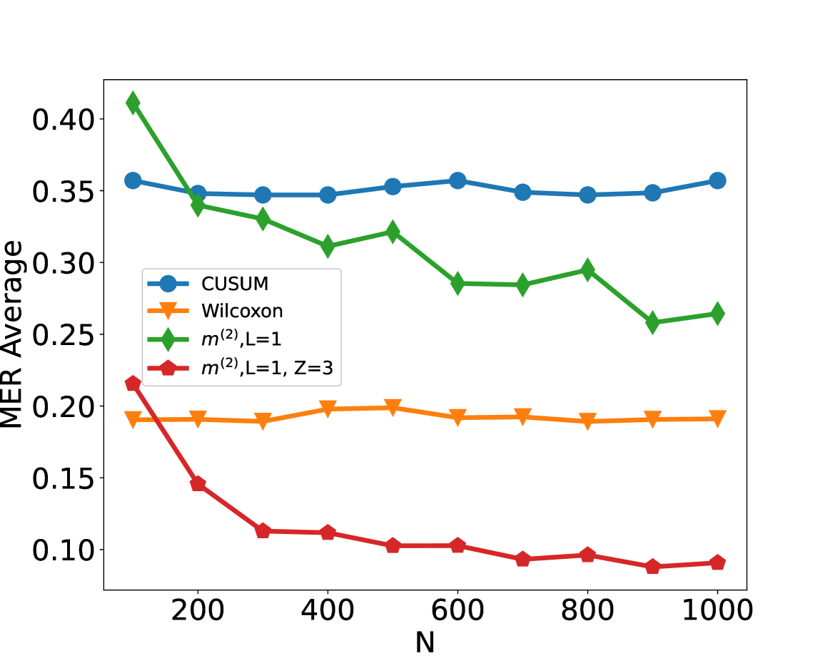
### Visual Description
## Line Chart: MER Average vs. N
### Overview
The image displays a line chart comparing the performance of four different statistical methods or algorithms. The performance metric is "MER Average" plotted against a variable "N," which likely represents sample size, number of observations, or a similar parameter. The chart shows how the average MER (a metric whose exact definition is not provided) changes for each method as N increases from approximately 100 to 1000.
### Components/Axes
* **X-Axis:** Labeled **"N"**. The axis has major tick marks at 200, 400, 600, 800, and 1000. The data points appear to be plotted at intervals of 100, starting from N=100.
* **Y-Axis:** Labeled **"MER Average"**. The axis has major tick marks at 0.10, 0.15, 0.20, 0.25, 0.30, 0.35, and 0.40.
* **Legend:** Located in the **top-left quadrant** of the chart area. It contains four entries, each associating a color, marker shape, and label:
1. **Blue line with circle markers:** `CUSUM`
2. **Orange line with downward-pointing triangle markers:** `Wilcoxon`
3. **Green line with diamond markers:** `m^(2), L=1`
4. **Red line with pentagon markers:** `m^(2), L=1, Z=3`
### Detailed Analysis
**Data Series Trends and Approximate Values:**
1. **CUSUM (Blue, Circles):**
* **Trend:** The line is remarkably flat and stable across all values of N.
* **Data Points (Approximate):** Starts at ~0.36 (N=100), remains between ~0.35 and ~0.36 for all subsequent points (N=200 to N=1000).
2. **Wilcoxon (Orange, Triangles):**
* **Trend:** Also very stable, forming a nearly horizontal line, but at a significantly lower MER Average than CUSUM.
* **Data Points (Approximate):** Hovers consistently around ~0.19 to ~0.20 from N=100 to N=1000.
3. **m^(2), L=1 (Green, Diamonds):**
* **Trend:** Shows a clear downward trend. It starts as the highest value and decreases as N increases, with some minor fluctuations (e.g., a slight rise at N=500 and N=800).
* **Data Points (Approximate):** Starts at ~0.41 (N=100), drops to ~0.34 (N=200), ~0.33 (N=300), ~0.31 (N=400), ~0.32 (N=500), ~0.29 (N=600), ~0.29 (N=700), ~0.30 (N=800), ~0.26 (N=900), and ends at ~0.27 (N=1000).
4. **m^(2), L=1, Z=3 (Red, Pentagons):**
* **Trend:** Exhibits the most pronounced downward trend, especially for smaller N. It starts at a moderate level and decreases rapidly before leveling off at a very low MER Average.
* **Data Points (Approximate):** Starts at ~0.22 (N=100), drops sharply to ~0.15 (N=200), ~0.11 (N=300), ~0.11 (N=400), ~0.10 (N=500), ~0.10 (N=600), ~0.09 (N=700), ~0.10 (N=800), ~0.09 (N=900), and ends at ~0.09 (N=1000).
### Key Observations
* **Performance Hierarchy:** For all N > 100, the methods rank from highest to lowest MER Average as: CUSUM > m^(2), L=1 > Wilcoxon > m^(2), L=1, Z=3.
* **Stability vs. Improvement:** CUSUM and Wilcoxon show stable performance independent of N. In contrast, both `m^(2)` variants show improvement (decreasing MER Average) as N increases.
* **Impact of Z Parameter:** The addition of the `Z=3` parameter to the `m^(2), L=1` method (red line) dramatically improves its performance, lowering its MER Average significantly compared to the base version (green line) across all N.
* **Convergence:** The red line (`m^(2), L=1, Z=3`) appears to converge to a floor value of approximately 0.09 for N ≥ 700.
### Interpretation
This chart likely evaluates the efficiency or error rate (where lower MER is better) of different change-point detection or statistical testing algorithms as the amount of data (N) grows.
* The **CUSUM** method is robust and consistent but has a relatively high average MER, suggesting it may be less sensitive or have a higher baseline error in this specific context.
* The **Wilcoxon** method is also stable but performs better than CUSUM, indicating it might be a more suitable non-parametric test for this scenario.
* The **`m^(2)`** methods demonstrate a desirable property: their performance improves with more data. The base `m^(2), L=1` starts poorly but becomes competitive with Wilcoxon for large N.
* The most significant finding is the **superior performance of `m^(2), L=1, Z=3`**. The `Z=3` parameter (which could represent a threshold, window size, or tuning parameter) is crucial, transforming the method into the best-performing one for all N > 100. It achieves the lowest MER Average and shows the fastest rate of improvement, making it the most effective algorithm among those compared for this task, especially when sufficient data is available. The chart makes a strong case for using this specific parameterization of the `m^(2)` method.
</details>
Figure 5: Scenario S3 with Cauchy noise by adding Wilcoxon type of change-point detection method (Dehling et al., 2015) and simple neural network with truncation in data preprocessing. The average misclassification error rate (MER) is computed on a test set of size $N_test=15000$ , against training sample size $N$ for detecting the existence of a change-point on data series of length $n=100$ . We compare the performance of the CUSUM test, Wilcoxon test, $H_1,m^(2)$ and $H_1,m^(2)$ with $Z=3$ where $m^(2)=2n-2$ and $Z=3$ means the truncated $z$ -score, i.e. given vector $\boldsymbol{x}=(x_1,x_2,…,x_n)^⊤$ , then $x_i[{≤ft|x_i-\bar{x}\right|}>Zσ_x]=\bar{x}+sgn(x_i- \bar{x})Zσ_x$ , $\bar{x}$ and $σ_x$ are the mean and standard deviation of $\boldsymbol{x}$ .
#### B.2.3 Robustness Study
This simulation is an extension of numerical study of Section 5 in main text. We trained our neural network using training data generated under scenario S1 with $ρ_t=0$ (i.e. corresponding to Figure 2 (a) of the main text), but generate the test data under settings corresponding to Figure 2 (a, b, c, d). In other words, apart the top-left panel, in the remaining panels of Figure 6, the trained network is misspecified for the test data. We see that the neural networks continue to work well in all panels, and in fact have performance similar to those in Figure 2 (b, c, d) of the main text. This indicates that the trained neural network has likely learned features related to the change-point rather than any distributional specific artefacts.
<details>
<summary>x9.png Details</summary>
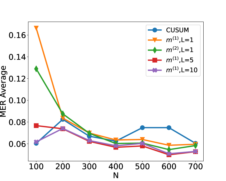
### Visual Description
## Line Chart: MER Average vs. N for Different Methods
### Overview
This is a line chart comparing the performance of five different statistical methods or parameter settings. The chart plots the "MER Average" (y-axis) against a variable "N" (x-axis), which likely represents sample size, number of observations, or a similar parameter. The general trend shows that the MER Average decreases for most methods as N increases, suggesting improved performance with larger N.
### Components/Axes
* **Chart Type:** Multi-series line chart with markers.
* **X-Axis:**
* **Label:** `N`
* **Scale:** Linear, ranging from 100 to 700.
* **Tick Marks:** 100, 200, 300, 400, 500, 600, 700.
* **Y-Axis:**
* **Label:** `MER Average`
* **Scale:** Linear, ranging from approximately 0.05 to 0.17.
* **Tick Marks:** 0.06, 0.08, 0.10, 0.12, 0.14, 0.16.
* **Legend:** Located in the top-right corner of the plot area. It defines five data series:
1. `CUSUM` (Blue line, circle marker)
2. `m^(1),L=1` (Orange line, downward-pointing triangle marker)
3. `m^(2),L=1` (Green line, diamond marker)
4. `m^(1),L=5` (Red line, square marker)
5. `m^(1),L=10` (Purple line, 'x' or cross marker)
### Detailed Analysis
**Data Series Trends and Approximate Values:**
1. **CUSUM (Blue, Circles):**
* **Trend:** Starts low, increases to a peak, then declines. It is the only series that shows a significant increase in the middle range of N.
* **Approximate Values:**
* N=100: ~0.060
* N=200: ~0.082
* N=300: ~0.068
* N=400: ~0.062
* N=500: ~0.075
* N=600: ~0.075
* N=700: ~0.060
2. **m^(1),L=1 (Orange, Triangles):**
* **Trend:** Starts at the highest point on the chart and exhibits a steep, consistent decline as N increases, flattening out for N > 400.
* **Approximate Values:**
* N=100: ~0.167
* N=200: ~0.088
* N=300: ~0.070
* N=400: ~0.064
* N=500: ~0.064
* N=600: ~0.059
* N=700: ~0.060
3. **m^(2),L=1 (Green, Diamonds):**
* **Trend:** Starts at the second-highest point and follows a steep decline similar to `m^(1),L=1`, converging with it at higher N.
* **Approximate Values:**
* N=100: ~0.129
* N=200: ~0.085
* N=300: ~0.069
* N=400: ~0.060
* N=500: ~0.059
* N=600: ~0.055
* N=700: ~0.059
4. **m^(1),L=5 (Red, Squares):**
* **Trend:** Starts at a moderate level and shows a gradual, relatively steady decline across all N values.
* **Approximate Values:**
* N=100: ~0.077
* N=200: ~0.074
* N=300: ~0.062
* N=400: ~0.057
* N=500: ~0.059
* N=600: ~0.050
* N=700: ~0.054
5. **m^(1),L=10 (Purple, Crosses):**
* **Trend:** Starts at a low level, similar to CUSUM, and shows a very gradual decline, remaining the lowest or among the lowest series for most N values.
* **Approximate Values:**
* N=100: ~0.062
* N=200: ~0.074
* N=300: ~0.063
* N=400: ~0.058
* N=500: ~0.058
* N=600: ~0.050
* N=700: ~0.054
### Key Observations
1. **Convergence:** All five methods converge to a narrow range of MER Average values (approximately 0.050 to 0.060) as N approaches 700.
2. **Initial Performance Disparity:** At low N (100), there is a large disparity in performance. The `m^(1),L=1` method has a very high MER (~0.167), while `CUSUM` and `m^(1),L=10` are much lower (~0.06).
3. **CUSUM Anomaly:** The `CUSUM` method is the only one that does not follow a strictly decreasing trend. It shows a notable increase in MER Average between N=400 and N=500, creating a local peak.
4. **Effect of Parameter L:** For the `m^(1)` family of methods, increasing the parameter `L` (from 1 to 5 to 10) appears to lower the initial MER Average at N=100 and results in a flatter, more stable performance curve across all N.
5. **Steep Initial Descent:** The methods with `L=1` (`m^(1),L=1` and `m^(2),L=1`) show the most dramatic improvement (steepest negative slope) as N increases from 100 to 300.
### Interpretation
The chart demonstrates the relationship between sample size (N) and the average Misclassification Error Rate (MER) for different change-point detection or sequential analysis algorithms. The key takeaway is that **larger sample sizes (N) generally lead to lower error rates for all tested methods**, with the most significant gains occurring as N increases from 100 to about 400.
The data suggests a trade-off controlled by the parameter `L`. Methods with a small `L` (L=1) are highly sensitive and perform poorly with little data but improve rapidly. Methods with a larger `L` (L=5, L=10) are more robust to small sample sizes, starting with lower error, but their rate of improvement is slower. The `CUSUM` method, a classic benchmark, shows non-monotonic behavior, indicating potential instability or a specific sensitivity in the mid-range of N for this particular experimental setup.
The convergence of all lines at high N implies that with sufficient data, the choice of method or parameter `L` becomes less critical for achieving a low MER. The critical decision point is for applications where N is small or moderate (100-400), where method selection has a substantial impact on performance.
</details>
<details>
<summary>x10.png Details</summary>
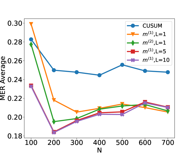
### Visual Description
\n
## Line Chart: MER Average vs. N for Different Methods
### Overview
The image is a line chart comparing the performance of five different statistical methods or algorithms. The performance metric is "MER Average," plotted against a parameter "N" (likely sample size or number of observations). The chart shows how the average Mean Error Rate (MER) changes as N increases from 100 to 700 for each method.
### Components/Axes
* **Chart Type:** Multi-series line chart with markers.
* **X-Axis:**
* **Label:** `N`
* **Scale:** Linear, ranging from 100 to 700.
* **Tick Marks:** At intervals of 100 (100, 200, 300, 400, 500, 600, 700).
* **Y-Axis:**
* **Label:** `MER Average`
* **Scale:** Linear, ranging from approximately 0.18 to 0.30.
* **Tick Marks:** At intervals of 0.02 (0.18, 0.20, 0.22, 0.24, 0.26, 0.28, 0.30).
* **Legend:** Positioned in the top-right corner of the plot area. It contains five entries, each with a unique color, marker shape, and label.
1. **Blue line with circle markers:** `CUSUM`
2. **Orange line with inverted triangle markers:** `m^(1),L=1`
3. **Green line with diamond markers:** `m^(2),L=1`
4. **Red line with square markers:** `m^(1),L=5`
5. **Purple line with 'x' (cross) markers:** `m^(1),L=10`
### Detailed Analysis
The following data points are approximate values extracted from the chart. The trend for each series is described first, followed by the estimated values at each N.
**1. CUSUM (Blue, Circle Markers)**
* **Trend:** Starts highest, drops sharply between N=100 and N=200, then fluctuates with a slight overall downward trend, remaining the highest series after N=200.
* **Approximate Data Points:**
* N=100: ~0.282
* N=200: ~0.250
* N=300: ~0.248
* N=400: ~0.245
* N=500: ~0.255
* N=600: ~0.249
* N=700: ~0.248
**2. m^(1),L=1 (Orange, Inverted Triangle Markers)**
* **Trend:** Starts very high, drops dramatically between N=100 and N=300, then shows a gradual, slight upward trend from N=300 to N=700.
* **Approximate Data Points:**
* N=100: ~0.300 (Highest initial point)
* N=200: ~0.219
* N=300: ~0.206
* N=400: ~0.210
* N=500: ~0.214
* N=600: ~0.211
* N=700: ~0.206
**3. m^(2),L=1 (Green, Diamond Markers)**
* **Trend:** Starts high, drops very sharply to its minimum at N=200, then shows a steady, gradual upward trend for the remainder of the chart.
* **Approximate Data Points:**
* N=100: ~0.278
* N=200: ~0.195
* N=300: ~0.199
* N=400: ~0.209
* N=500: ~0.211
* N=600: ~0.215
* N=700: ~0.207
**4. m^(1),L=5 (Red, Square Markers)**
* **Trend:** Starts relatively low, drops to a minimum at N=200, then increases gradually, closely following the path of the purple line (`m^(1),L=10`).
* **Approximate Data Points:**
* N=100: ~0.233
* N=200: ~0.184
* N=300: ~0.196
* N=400: ~0.205
* N=500: ~0.206
* N=600: ~0.217
* N=700: ~0.211
**5. m^(1),L=10 (Purple, 'X' Markers)**
* **Trend:** Nearly identical to the red line (`m^(1),L=5`). Starts low, drops to a minimum at N=200, then increases gradually. The two lines are often overlapping or very close.
* **Approximate Data Points:**
* N=100: ~0.233
* N=200: ~0.183
* N=300: ~0.196
* N=400: ~0.203
* N=500: ~0.203
* N=600: ~0.214
* N=700: ~0.210
### Key Observations
1. **Universal Initial Drop:** All five methods show their highest MER Average at N=100 and experience a significant drop by N=200.
2. **Performance Hierarchy:** After the initial drop (N>=200), a clear performance hierarchy emerges and persists:
* **Highest MER (Worst):** `CUSUM` (Blue)
* **Middle Tier:** `m^(1),L=1` (Orange) and `m^(2),L=1` (Green) are generally close, with Green often slightly lower than Orange after N=300.
* **Lowest MER (Best):** `m^(1),L=5` (Red) and `m^(1),L=10` (Purple) are consistently the lowest and nearly indistinguishable from each other.
3. **Convergence at Low N:** At N=200, the red (`m^(1),L=5`) and purple (`m^(1),L=10`) lines reach the absolute lowest point on the chart (~0.183-0.184).
4. **Diverging Trends Post-N=200:** After N=200, the trends diverge:
* `CUSUM` fluctuates but stays relatively flat.
* `m^(1),L=1` (Orange) and `m^(2),L=1` (Green) show a slight upward trend.
* `m^(1),L=5` (Red) and `m^(1),L=10` (Purple) also show a slight upward trend, maintaining their performance advantage.
### Interpretation
This chart likely compares the efficiency or accuracy of different change-point detection or sequential analysis algorithms. "MER" could stand for "Mean Error Rate" or a similar metric where lower values are better.
* **The parameter `L` appears critical:** For the `m^(1)` family of methods, increasing `L` from 1 to 5 or 10 dramatically improves performance (lowers MER). The difference between `L=5` and `L=10` is negligible, suggesting diminishing returns beyond a certain `L` value.
* **Method `m^(2)` vs. `m^(1)` at L=1:** The `m^(2),L=1` method (Green) generally outperforms the `m^(1),L=1` method (Orange) for N > 200, indicating that the `m^(2)` formulation may be more efficient than `m^(1)` when the parameter `L` is small.
* **CUSUM as a Baseline:** The CUSUM (Cumulative Sum) method, a classic algorithm for change detection, serves as a baseline. All proposed `m` methods (with any `L` value) significantly outperform CUSUM for N >= 200 in this evaluation.
* **The "Sweet Spot" at N=200:** The most dramatic performance gains for all methods occur between N=100 and N=200. The optimal performance (lowest MER) for the best methods is achieved at N=200, after which there is a slight degradation (increase in MER) as N grows to 700. This could indicate that these methods are particularly well-tuned for problems of that scale, or that the difficulty of the task increases with N in a way that slightly impacts all algorithms.
**In summary,** the data suggests that the proposed `m` methods, especially with higher `L` values (5 or 10), offer a substantial improvement over the standard CUSUM approach for the task measured by MER Average, with the most significant advantage appearing for sample sizes (N) of 200 and above.
</details>
(a) Trained S1 ( $ρ_t=0$ ) $→$ S1 ( $ρ_t=0$ ) (b)Trained S1 ( $ρ_t=0$ ) $→$ S1 ${}^\prime$ ( $ρ_t=0.7$ )
<details>
<summary>x11.png Details</summary>
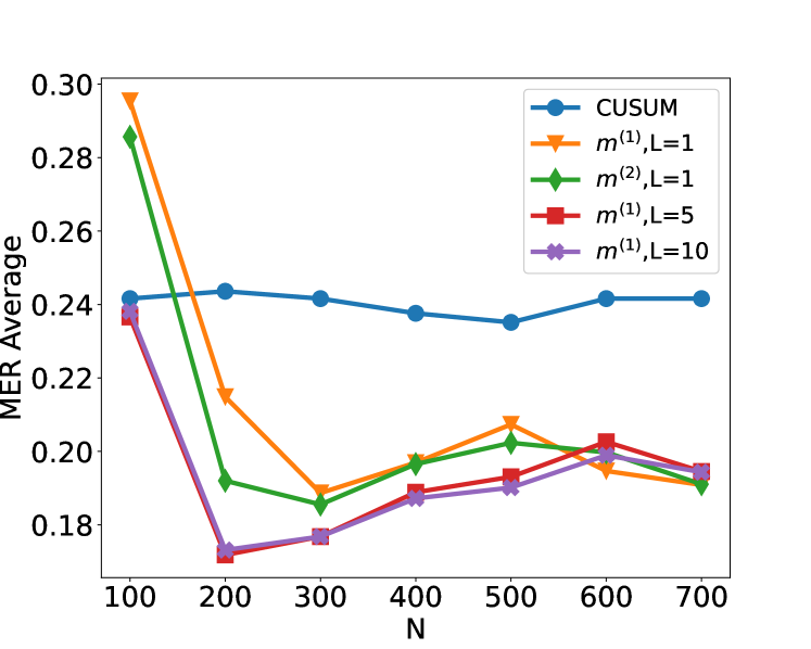
### Visual Description
\n
## Line Chart: MER Average vs. N for Different Algorithms
### Overview
The image is a line chart comparing the performance of five different algorithms or methods. The performance metric is "MER Average" plotted against a parameter "N". The chart shows how the average MER (likely Mean Error Rate or a similar metric) changes as N increases from 100 to 700 for each method.
### Components/Axes
* **X-Axis:** Labeled "N". It has major tick marks at intervals of 100, ranging from 100 to 700.
* **Y-Axis:** Labeled "MER Average". It has major tick marks at intervals of 0.02, ranging from 0.18 to 0.30.
* **Legend:** Located in the top-right corner of the plot area. It contains five entries, each with a unique color, marker, and label:
1. Blue line with circle markers: `CUSUM`
2. Orange line with downward-pointing triangle markers: `m^{(1)}, L=1`
3. Green line with diamond markers: `m^{(2)}, L=1`
4. Red line with square markers: `m^{(1)}, L=5`
5. Purple line with 'x' markers: `m^{(1)}, L=10`
### Detailed Analysis
**Trend Verification & Data Point Extraction (Approximate Values):**
1. **CUSUM (Blue, Circle):**
* **Trend:** The line is relatively flat, showing only minor fluctuations. It starts around 0.24, dips slightly around N=500, and ends near its starting value.
* **Data Points:**
* N=100: ~0.242
* N=200: ~0.244
* N=300: ~0.242
* N=400: ~0.238
* N=500: ~0.235
* N=600: ~0.242
* N=700: ~0.242
2. **m^{(1)}, L=1 (Orange, Downward Triangle):**
* **Trend:** Starts very high, drops sharply until N=300, then exhibits a fluctuating pattern with a local peak at N=500 before declining again.
* **Data Points:**
* N=100: ~0.296 (Highest point on the chart)
* N=200: ~0.216
* N=300: ~0.190
* N=400: ~0.198
* N=500: ~0.208
* N=600: ~0.195
* N=700: ~0.192
3. **m^{(2)}, L=1 (Green, Diamond):**
* **Trend:** Starts high, drops sharply until N=300, then shows a gradual, slightly fluctuating increase.
* **Data Points:**
* N=100: ~0.286
* N=200: ~0.192
* N=300: ~0.185
* N=400: ~0.196
* N=500: ~0.202
* N=600: ~0.198
* N=700: ~0.190
4. **m^{(1)}, L=5 (Red, Square):**
* **Trend:** Starts moderately high, drops sharply to a minimum at N=200, then shows a steady, gradual increase.
* **Data Points:**
* N=100: ~0.236
* N=200: ~0.171 (Lowest point on the chart)
* N=300: ~0.177
* N=400: ~0.189
* N=500: ~0.192
* N=600: ~0.203
* N=700: ~0.195
5. **m^{(1)}, L=10 (Purple, 'x'):**
* **Trend:** Follows a very similar path to the red line (m^{(1)}, L=5), starting at a similar point, dropping to a minimum at N=200, and then gradually increasing, though it remains slightly below the red line for most points after N=300.
* **Data Points:**
* N=100: ~0.238
* N=200: ~0.173
* N=300: ~0.177
* N=400: ~0.187
* N=500: ~0.190
* N=600: ~0.200
* N=700: ~0.194
### Key Observations
1. **Initial Performance Gap:** At the smallest N (100), there is a wide spread in performance. The `m^{(1)}, L=1` method has the highest MER (~0.296), while `CUSUM` and the `L=5`/`L=10` variants are clustered around ~0.24.
2. **Convergence at Low N:** All methods except `CUSUM` show a dramatic improvement (decrease in MER) as N increases from 100 to 200 or 300. The lowest overall MER values are achieved around N=200-300.
3. **CUSUM Stability:** The `CUSUM` method is an outlier in its behavior. It shows very little sensitivity to the parameter N, maintaining a nearly constant MER average between ~0.235 and ~0.244 across the entire range.
4. **Post-Convergence Behavior:** After N=300, the methods diverge again. The `m^{(1)}` variants (L=1,5,10) and `m^{(2)}, L=1` show a general trend of slightly increasing MER with N, while `CUSUM` remains flat.
5. **Effect of Parameter L:** For the `m^{(1)}` family, increasing L from 1 to 5 or 10 significantly improves performance (lowers MER) at small N (100-200). At larger N (≥400), the differences between L=5 and L=10 are minimal, and both are generally outperformed by `m^{(2)}, L=1`.
### Interpretation
This chart likely compares the performance of different change-point detection or sequential analysis algorithms. "MER Average" is probably a measure of error or detection delay, where lower is better. "N" could represent sample size, sequence length, or a similar parameter.
The data suggests a clear trade-off:
* **CUSUM** is robust and stable, providing predictable, moderate performance regardless of N. It doesn't excel at any point but also doesn't degrade.
* The **`m` methods** (likely referring to some multi-customer or multi-stream variant) are highly sensitive to N. They can achieve significantly lower error rates than CUSUM (especially `m^{(2)}, L=1` and `m^{(1)}, L=5/10` around N=200-300), but their performance deteriorates if N is too small or, to a lesser extent, too large.
* The **parameter L** (possibly a window size or memory length) is crucial for the `m^{(1)}` method. A larger L (5 or 10) provides much better initial performance than L=1, suggesting that incorporating more history is beneficial when data is scarce (low N).
* The **`m^{(2)}` variant** with L=1 shows a compelling profile: it starts with high error but quickly drops to become one of the best-performing methods for N≥200, often matching or beating the `m^{(1)}` methods with larger L values.
**In summary:** The choice of algorithm depends heavily on the expected operating range of N. For a wide, unpredictable range of N, CUSUM offers safety. If N can be controlled or is known to be in the 200-400 range, the `m` methods (particularly `m^{(2)}, L=1` or `m^{(1)}, L=5`) offer superior performance. The chart demonstrates that algorithmic parameters (like L) must be tuned relative to the problem scale (N).
</details>
<details>
<summary>x12.png Details</summary>
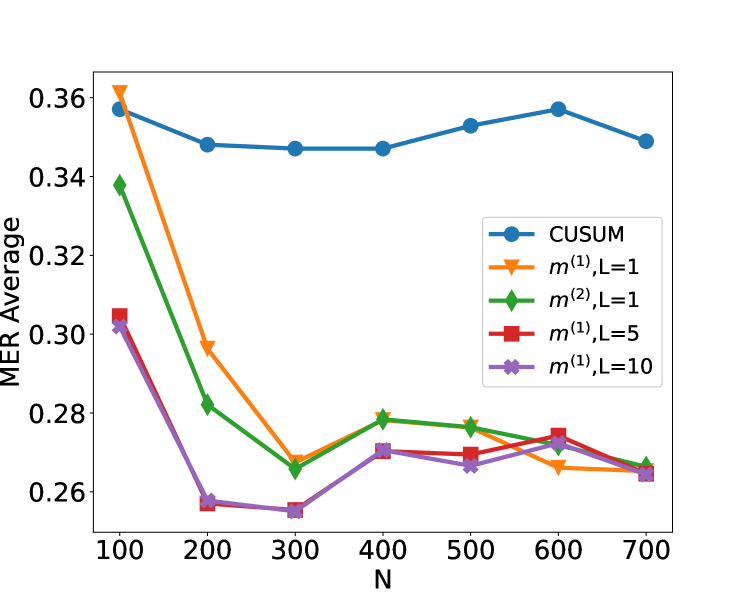
### Visual Description
\n
## Line Chart: MER Average vs. N for Different Methods
### Overview
The image displays a line chart comparing the performance of five different statistical methods or parameter settings. The performance metric is "MER Average," plotted against a variable "N" (likely sample size or number of observations). The chart shows how the average MER (Misclassification Error Rate, or a similar metric) changes for each method as N increases from 100 to 700.
### Components/Axes
* **Chart Type:** Multi-line chart with markers.
* **X-Axis:**
* **Label:** `N`
* **Scale:** Linear, from 100 to 700.
* **Tick Markers:** 100, 200, 300, 400, 500, 600, 700.
* **Y-Axis:**
* **Label:** `MER Average`
* **Scale:** Linear, from approximately 0.26 to 0.36.
* **Tick Markers:** 0.26, 0.28, 0.30, 0.32, 0.34, 0.36.
* **Legend:** Located in the top-right quadrant of the chart area. It contains five entries, each associating a line color and marker shape with a method label.
1. **Blue line with circle markers:** `CUSUM`
2. **Orange line with downward-pointing triangle markers:** `m^(1), L=1`
3. **Green line with diamond markers:** `m^(2), L=1`
4. **Red line with square markers:** `m^(1), L=5`
5. **Purple line with pentagon (or star-like) markers:** `m^(1), L=10`
### Detailed Analysis
The following describes the trend and approximate data points for each series. Values are estimated from the chart's grid.
1. **CUSUM (Blue, Circle):**
* **Trend:** Relatively flat and stable across all N values, showing only minor fluctuations. It maintains the highest MER Average among all methods for most of the range.
* **Approximate Data Points:**
* N=100: ~0.358
* N=200: ~0.348
* N=300: ~0.347
* N=400: ~0.347
* N=500: ~0.353
* N=600: ~0.357
* N=700: ~0.349
2. **m^(1), L=1 (Orange, Downward Triangle):**
* **Trend:** Starts very high, experiences a sharp, significant drop between N=100 and N=300, then fluctuates with a slight downward trend towards N=700.
* **Approximate Data Points:**
* N=100: ~0.361 (Highest point on the entire chart)
* N=200: ~0.298
* N=300: ~0.268
* N=400: ~0.279
* N=500: ~0.277
* N=600: ~0.266
* N=700: ~0.265
3. **m^(2), L=1 (Green, Diamond):**
* **Trend:** Similar shape to the orange line but starts lower. It shows a steep decline from N=100 to N=300, a slight rise at N=400, and then a gradual decline.
* **Approximate Data Points:**
* N=100: ~0.338
* N=200: ~0.282
* N=300: ~0.265
* N=400: ~0.279
* N=500: ~0.276
* N=600: ~0.272
* N=700: ~0.267
4. **m^(1), L=5 (Red, Square):**
* **Trend:** Starts at a moderate level, drops to a minimum at N=300, then shows a slight, steady increase before a final dip at N=700.
* **Approximate Data Points:**
* N=100: ~0.305
* N=200: ~0.257
* N=300: ~0.255 (Lowest point for this series)
* N=400: ~0.271
* N=500: ~0.270
* N=600: ~0.275
* N=700: ~0.264
5. **m^(1), L=10 (Purple, Pentagon):**
* **Trend:** Follows a path very similar to the red line (`m^(1), L=5`), often overlapping or running just below it. It also reaches its minimum at N=300.
* **Approximate Data Points:**
* N=100: ~0.302
* N=200: ~0.258
* N=300: ~0.254 (Appears to be the lowest data point on the entire chart)
* N=400: ~0.270
* N=500: ~0.267
* N=600: ~0.272
* N=700: ~0.264
### Key Observations
1. **Performance Hierarchy:** For N > 200, the methods `m^(1), L=5` and `m^(1), L=10` consistently achieve the lowest (best) MER Average, followed closely by `m^(2), L=1` and `m^(1), L=1`. The `CUSUM` method consistently has the highest (worst) MER Average.
2. **Critical Transition at N=200-300:** All methods except `CUSUM` show a dramatic improvement (decrease in MER) as N increases from 100 to 300. The most significant drop occurs between N=100 and N=200.
3. **Convergence:** At the highest measured value (N=700), the performance of the four non-CUSUM methods converges to a narrow band between approximately 0.264 and 0.267.
4. **CUSUM Stability:** The `CUSUM` method exhibits remarkable stability, with its MER Average varying within a very narrow range (~0.347 to ~0.358) across the entire span of N.
5. **Parameter Sensitivity (L):** For the `m^(1)` method, increasing the parameter `L` from 1 to 5 or 10 results in significantly better performance (lower MER), especially at lower N values (N=100, 200).
### Interpretation
This chart likely evaluates change-point detection or sequential analysis algorithms. "MER" probably stands for "Missed Event Rate" or "Misclassification Error Rate," where a lower value is better. "N" represents the number of data points or observations.
The data suggests that the `CUSUM` (Cumulative Sum) algorithm, a classic method, is robust and stable but may have a higher baseline error rate in this specific scenario. The other methods, denoted `m^(1)` and `m^(2)` with different `L` parameters, appear to be alternative or modified algorithms.
The key finding is that these alternative methods, particularly `m^(1)` with a larger `L` value (5 or 10), significantly outperform `CUSUM` as the sample size (N) grows beyond 100. Their performance improves rapidly with more data and converges to a similar, low error rate. The parameter `L` seems to control a memory or window length; a larger `L` provides better performance, likely by incorporating more historical data for decision-making, which is especially beneficial when N is small. The chart demonstrates a clear trade-off: `CUSUM` offers predictability, while the `m` methods offer superior asymptotic performance that is sensitive to parameter tuning.
</details>
(c) Trained S1 ( $ρ_t=0$ ) $→$ S2 (d) Trained S1 ( $ρ_t=0$ ) $→$ S3
Figure 6: Plot of the test set MER, computed on a test set of size $N_test=30000$ , against training sample size $N$ for detecting the existence of a change-point on data series of length $n=100$ . We compare the performance of the CUSUM test and neural networks from four function classes: $H_1,m^(1)$ , $H_1,m^(2)$ , $H_5,m^(1)1_5$ and $H_10,m^(1)1_10$ where $m^(1)=4\lfloor\log_2(n)\rfloor$ and $m^(2)=2n-2$ respectively under scenarios S1, S1 ${}^\prime$ , S2 and S3 described in Section 5. The subcaption “A $→$ B” means that we apply the trained classifier “A” to target testing dataset “B”.
#### B.2.4 Simulation for change in autocorrelation
In this simulation, we discuss how we can use neural networks to recreate test statistics for various types of changes. For instance, if the data follows an AR(1) structure, then changes in autocorrelation can be handled by including transformations of the original input of the form $(x_tx_t+1)_t=1,…,n-1$ . On the other hand, even if such transformations are not supplied as the input, a deep neural network of suitable depth is able to approximate these transformations and consequently successfully detect the change (Schmidt-Hieber, 2020, Lemma A.2). This is illustrated in Figure 7, where we compare the performance of neural network based classifiers of various depths constructed with and without using the transformed data as inputs.
<details>
<summary>x13.png Details</summary>
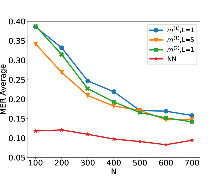
### Visual Description
## Line Chart: MER Average vs. N for Different Methods
### Overview
The image is a line chart plotting the "MER Average" (y-axis) against a variable "N" (x-axis) for four different computational methods or models. The chart demonstrates how the average Metric Error Rate (MER) changes as the parameter N increases from 100 to 700.
### Components/Axes
* **X-Axis:** Labeled "N". It has major tick marks at intervals of 100, ranging from 100 to 700.
* **Y-Axis:** Labeled "MER Average". It has major tick marks at intervals of 0.05, ranging from 0.05 to 0.40.
* **Legend:** Located in the top-right corner of the plot area. It contains four entries:
1. Blue line with circle markers: `m^(1), L=1`
2. Orange line with downward-pointing triangle markers: `m^(1), L=5`
3. Green line with 'X' (cross) markers: `m^(2), L=1`
4. Red line with star markers: `NN`
### Detailed Analysis
**Data Series and Trends:**
1. **`m^(1), L=1` (Blue, Circles):**
* **Trend:** Shows a strong, consistent downward slope as N increases.
* **Data Points (Approximate):**
* N=100: ~0.39
* N=200: ~0.33
* N=300: ~0.25
* N=400: ~0.22
* N=500: ~0.17
* N=600: ~0.17
* N=700: ~0.16
2. **`m^(1), L=5` (Orange, Triangles):**
* **Trend:** Also shows a strong downward slope, starting lower than the L=1 variant but converging with it at higher N.
* **Data Points (Approximate):**
* N=100: ~0.34
* N=200: ~0.27
* N=300: ~0.21
* N=400: ~0.18
* N=500: ~0.17
* N=600: ~0.15
* N=700: ~0.15
3. **`m^(2), L=1` (Green, Crosses):**
* **Trend:** Follows a very similar downward trajectory to the blue line (`m^(1), L=1`), but is consistently slightly lower.
* **Data Points (Approximate):**
* N=100: ~0.39 (nearly identical to blue)
* N=200: ~0.32
* N=300: ~0.23
* N=400: ~0.19
* N=500: ~0.16
* N=600: ~0.15
* N=700: ~0.14
4. **`NN` (Red, Stars):**
* **Trend:** Exhibits a very shallow, nearly flat downward trend, remaining significantly lower than the other three series across all values of N.
* **Data Points (Approximate):**
* N=100: ~0.12
* N=200: ~0.12
* N=300: ~0.11
* N=400: ~0.10
* N=500: ~0.09
* N=600: ~0.08
* N=700: ~0.09
### Key Observations
1. **Performance Hierarchy:** The Neural Network (`NN`) method consistently achieves the lowest MER Average across all tested values of N, indicating superior performance in this metric.
2. **Convergence:** The three non-NN methods (`m^(1), L=1`, `m^(1), L=5`, `m^(2), L=1`) start with higher error rates but show significant improvement (decreasing MER) as N increases. Their performance converges to a similar range (approximately 0.14-0.16) at N=700.
3. **Effect of L:** For the `m^(1)` method, using `L=5` (orange) results in a lower initial error rate at N=100 compared to `L=1` (blue), but the advantage diminishes as N grows.
4. **Effect of Model Type:** The `m^(2)` model (green) performs slightly better than the `m^(1)` model (blue) when both use `L=1`, suggesting the `m^(2)` architecture may be more efficient.
5. **Sensitivity to N:** The `NN` model is relatively insensitive to changes in N, while the other models are highly sensitive, showing dramatic improvements with larger N.
### Interpretation
This chart likely compares the performance of different algorithmic or model approaches (variants of a method `m` and a Neural Network `NN`) on a task where `N` represents a key resource or complexity parameter (e.g., number of samples, training iterations, or model size). The "MER Average" is an error metric to be minimized.
The data suggests a fundamental trade-off: The specialized `m` methods require a larger `N` to achieve low error rates, but they do improve predictably with more resources. The `NN` method, in contrast, starts with a much lower error rate and is robust to changes in `N`, implying it may be a more data-efficient or inherently powerful model for this specific task. The convergence of the `m` methods at high `N` indicates a performance ceiling for that class of models under these conditions. The investigation would benefit from knowing what `m`, `L`, and `N` specifically represent to fully contextualize these results.
</details>
<details>
<summary>x14.png Details</summary>
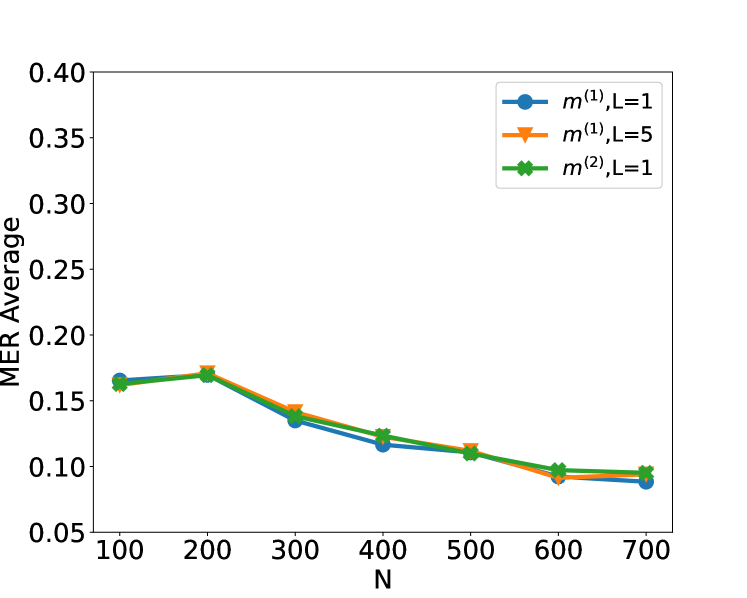
### Visual Description
\n
## Line Chart: MER Average vs. N
### Overview
The image displays a line chart plotting the "MER Average" on the y-axis against a variable "N" on the x-axis. Three distinct data series, differentiated by color and marker style, are shown. All three series exhibit a similar overall downward trend as N increases, with values tightly clustered throughout the range.
### Components/Axes
* **Chart Type:** Line chart with markers.
* **X-Axis:**
* **Label:** "N"
* **Scale:** Linear, ranging from 100 to 700.
* **Tick Markers:** 100, 200, 300, 400, 500, 600, 700.
* **Y-Axis:**
* **Label:** "MER Average"
* **Scale:** Linear, ranging from 0.05 to 0.40.
* **Tick Markers:** 0.05, 0.10, 0.15, 0.20, 0.25, 0.30, 0.35, 0.40.
* **Legend:**
* **Position:** Top-right corner of the plot area.
* **Series 1:** Blue line with circle markers, labeled `m^(1), L=1`.
* **Series 2:** Orange line with downward-pointing triangle markers, labeled `m^(1), L=5`.
* **Series 3:** Green line with 'X' (cross) markers, labeled `m^(2), L=1`.
### Detailed Analysis
**Trend Verification:** All three lines follow a consistent visual pattern: they start at a moderate value at N=100, rise slightly to a peak at N=200, and then decline steadily as N increases to 700.
**Data Point Extraction (Approximate Values):**
* **At N=100:**
* `m^(1), L=1` (Blue, Circle): ~0.165
* `m^(1), L=5` (Orange, Triangle): ~0.165
* `m^(2), L=1` (Green, X): ~0.165
* *Note: All three points are nearly coincident.*
* **At N=200 (Peak for all series):**
* `m^(1), L=1` (Blue, Circle): ~0.170
* `m^(1), L=5` (Orange, Triangle): ~0.172
* `m^(2), L=1` (Green, X): ~0.170
* **At N=300:**
* `m^(1), L=1` (Blue, Circle): ~0.135
* `m^(1), L=5` (Orange, Triangle): ~0.145
* `m^(2), L=1` (Green, X): ~0.140
* **At N=400:**
* `m^(1), L=1` (Blue, Circle): ~0.118
* `m^(1), L=5` (Orange, Triangle): ~0.125
* `m^(2), L=1` (Green, X): ~0.125
* **At N=500:**
* `m^(1), L=1` (Blue, Circle): ~0.110
* `m^(1), L=5` (Orange, Triangle): ~0.112
* `m^(2), L=1` (Green, X): ~0.110
* **At N=600:**
* `m^(1), L=1` (Blue, Circle): ~0.092
* `m^(1), L=5` (Orange, Triangle): ~0.092
* `m^(2), L=1` (Green, X): ~0.098
* **At N=700:**
* `m^(1), L=1` (Blue, Circle): ~0.088
* `m^(1), L=5` (Orange, Triangle): ~0.090
* `m^(2), L=1` (Green, X): ~0.095
### Key Observations
1. **Dominant Trend:** The primary pattern is a clear, monotonic decrease in MER Average for all series as N increases beyond 200.
2. **Initial Rise:** There is a slight but consistent increase in MER Average from N=100 to N=200 for all configurations.
3. **Tight Clustering:** The three data series are remarkably close in value across the entire range of N. The maximum visible separation between any two lines at a given N point is small (estimated at ≤0.01 on the MER Average scale).
4. **Minimal Parameter Impact:** The variations in parameters `m` (1 vs. 2) and `L` (1 vs. 5) appear to have a very minor effect on the MER Average compared to the effect of changing N. The orange line (`m^(1), L=5`) is occasionally slightly higher than the others (e.g., at N=300, N=400), but the difference is not dramatic.
5. **Convergence at High N:** At the highest N values (600, 700), the lines remain distinct but very close, with the green line (`m^(2), L=1`) ending marginally higher than the other two.
### Interpretation
The chart demonstrates a strong inverse relationship between the variable N and the metric "MER Average." As N increases from 200 to 700, the average MER consistently improves (decreases). This suggests that whatever system or process is being measured benefits significantly from a larger N value within this range.
The near-overlap of the three lines indicates that, for the conditions tested, the choice between the model variants `m^(1)` and `m^(2)`, or the parameter `L=1` versus `L=5`, is not a primary driver of performance. The system's sensitivity to N vastly outweighs its sensitivity to these specific parameter changes. The slight peak at N=200 could indicate a transitional point or an optimal setting before the benefits of increasing N become dominant. The consistent ranking (with `m^(1), L=5` often slightly higher) might hint at a very subtle performance cost for increasing L, but the data is too clustered to draw a firm conclusion without more precise values. The overall message is that increasing N is the most effective lever for reducing MER Average in this scenario.
</details>
(a) Original Input (b) Original and $x_tx_t+1$ Input
Figure 7: Plot of the test set MER, computed on a test set of size $N_test=30000$ , against training sample size $N$ for detecting the existence of a change-point on data series of length $n=100$ . We compare the performance of neural networks from four function classes: $H_1,m^(1)$ , $H_1,m^(2)$ , $H_5,m^(1)1_5$ and neural network with 21 residual blocks where $m^(1)=4\lfloor\log_2(n)\rfloor$ and $m^(2)=2n-2$ respectively. The change-points are randomly chosen from $Unif\{10,…,89\}$ . Given change-point $τ$ , data are generated from the autoregressive model $x_t=α_tx_t-1+ε_t$ for $ε_t\stackrel{{\scriptstyleiid}}{{∼}}N(0,0.25^2)$ and $α_t=0.21_\{t<τ\}+0.81_\{t≥τ\}$ .
#### B.2.5 Simulation on change-point location estimation
Here, we describe simulation results on the performance of change-point location estimator constructed using a combination of simple neural network-based classifier and Algorithm 1 from the main text. Given a sequence of length $n^\prime=2000$ , we draw $τ∼Unif\{750,…,1250\}$ . Set $μ_L=0$ and draw $μ_R|τ$ from 2 different uniform distributions: $Unif([-1.5b,-0.5b]∪[0.5b,1.5b])$ (Weak) and $Unif([-3b,-b]∪[b,3b])$ (Strong), where $b\coloneqq√{\frac{8n^\prime\log(20n^\prime)}{τ(n^\prime-τ)}}$ is chosen in line with Lemma 4.1 to ensure a good range of signal-to-noise ratio. We then generate $\boldsymbol{x}=(μ_L\mathbbm{1}_\{t≤τ\}+μ_R \mathbbm{1}_\{t>τ\}+ε_t)_t∈[n^\prime]$ , with the noise $\boldsymbol{ε}=(ε_t)_t∈[n^\prime]∼ N_n^\prime (0,I_n^\prime)$ . We then draw independent copies $\boldsymbol{x}_1,…,\boldsymbol{x}_N^\prime$ of $\boldsymbol{x}$ . For each $\boldsymbol{x}_k$ , we randomly choose 60 segments with length $n∈\{300,400,500,600\}$ , the segments which include $τ_k$ are labelled ‘1’, others are labelled ‘0’. The training dataset size is $N=60N^\prime$ where $N^\prime=500$ . We then draw another $N_test=3000$ independent copies of $\boldsymbol{x}$ as our test data for change-point location estimation. We study the performance of change-point location estimator produced by using Algorithm 1 together with a single-layer neural network, and compare it with the performance of CUSUM, MOSUM and Wilcoxon statistics-based estimators. As we can see from the Figure 8, under Gaussian models where CUSUM is known to work well, our simple neural network-based procedure is competitive. On the other hand, when the noise is heavy-tailed, our simple neural network-based estimator greatly outperforms CUSUM-based estimator.
<details>
<summary>x15.png Details</summary>
### Visual Description
\n
## Line Chart: RMSE vs. Sample Size (n) for Three Algorithms
### Overview
The image is a line chart comparing the Root Mean Square Error (RMSE) of three different algorithms—CUSUM, MOSUM, and Alg. 1—as a function of the sample size or parameter `n`. The chart demonstrates how the error metric changes for each method as `n` increases from 300 to 600.
### Components/Axes
* **Chart Type:** Line chart with markers.
* **X-Axis:**
* **Label:** `n`
* **Scale:** Linear, ranging from 300 to 600.
* **Major Tick Marks:** 300, 350, 400, 450, 500, 550, 600.
* **Y-Axis:**
* **Label:** `RMSE`
* **Scale:** Linear, ranging from approximately 50 to 280.
* **Major Tick Marks:** 50, 100, 150, 200, 250.
* **Legend:**
* **Position:** Top-right corner of the chart area.
* **Entries:**
1. **CUSUM:** Blue line with circle markers.
2. **MOSUM:** Orange line with downward-pointing triangle markers.
3. **Alg. 1:** Green line with star (pentagon) markers.
### Detailed Analysis
**Data Series and Trends:**
1. **MOSUM (Orange Line, Triangle Markers):**
* **Trend:** Shows a strong, consistent downward slope. RMSE decreases significantly as `n` increases.
* **Data Points (Approximate):**
* n=300: RMSE ≈ 280
* n=400: RMSE ≈ 200
* n=500: RMSE ≈ 175
* n=600: RMSE ≈ 150
2. **Alg. 1 (Green Line, Star Markers):**
* **Trend:** Shows a general downward trend, but with a slight increase between n=400 and n=500 before decreasing again.
* **Data Points (Approximate):**
* n=300: RMSE ≈ 100
* n=400: RMSE ≈ 70
* n=500: RMSE ≈ 75
* n=600: RMSE ≈ 60
3. **CUSUM (Blue Line, Circle Markers):**
* **Trend:** Relatively flat with minor fluctuations. It shows the lowest overall RMSE across all values of `n`.
* **Data Points (Approximate):**
* n=300: RMSE ≈ 60
* n=400: RMSE ≈ 55
* n=500: RMSE ≈ 70
* n=600: RMSE ≈ 55
### Key Observations
* **Performance Hierarchy:** For all tested values of `n`, the algorithms rank in performance (from lowest to highest RMSE) as: CUSUM < Alg. 1 < MOSUM.
* **Rate of Improvement:** MOSUM shows the most dramatic improvement (steepest negative slope) as `n` increases. CUSUM shows the least change.
* **Convergence:** The gap between MOSUM and the other two algorithms narrows as `n` increases, but MOSUM's RMSE remains substantially higher.
* **Anomaly:** Alg. 1 exhibits a non-monotonic behavior, with its RMSE increasing slightly at n=500 compared to n=400, before falling again at n=600. CUSUM also shows a small peak at n=500.
### Interpretation
This chart likely evaluates the statistical efficiency or estimation accuracy of three change-point detection or estimation algorithms. The RMSE is a measure of error, so lower values are better.
* **CUSUM** appears to be the most accurate and stable estimator across the range of sample sizes tested, with its error remaining consistently low and relatively unaffected by `n`.
* **MOSUM** is the least accurate but benefits the most from larger sample sizes. Its high initial error suggests it may require more data to perform well, but its strong downward trend indicates it could potentially converge toward the performance of the others with sufficiently large `n`.
* **Alg. 1** occupies a middle ground. Its performance is better than MOSUM but worse than CUSUM. The slight increase in error at n=500 could be due to statistical noise in the experiment or a specific characteristic of the algorithm at that sample size.
The overall message is that algorithm choice significantly impacts error, and the relative advantage of one method over another can depend on the available sample size `n`. CUSUM is robust and accurate for this range, while MOSUM is highly sensitive to `n`.
</details>
<details>
<summary>x16.png Details</summary>
### Visual Description
\n
## Line Chart: Performance Comparison of Change-Point Detection Algorithms
### Overview
The image is a line chart comparing the Root Mean Square Error (RMSE) performance of three different algorithms (CUSUM, MOSUM, and Alg. 1) as a function of sample size, denoted by `n`. The chart demonstrates how the error metric for each algorithm changes as the amount of data increases.
### Components/Axes
* **X-Axis:** Labeled "n". It represents the sample size or number of data points. The axis has major tick marks and labels at the values: 300, 350, 400, 450, 500, 550, and 600.
* **Y-Axis:** Labeled "RMSE". It represents the Root Mean Square Error, a standard measure of prediction or estimation error. The axis has major tick marks and labels at intervals of 10, ranging from 10 to 60.
* **Legend:** Positioned in the top-right corner of the chart area. It contains three entries:
* **CUSUM:** Represented by a blue line with circular markers.
* **MOSUM:** Represented by an orange line with downward-pointing triangle markers.
* **Alg. 1:** Represented by a green line with star (asterisk) markers.
### Detailed Analysis
The chart plots three distinct data series. Below is an analysis of each, including approximate data points extracted from the visual positions of the markers.
**1. CUSUM (Blue line, circle markers)**
* **Trend:** The line is relatively flat and stable, showing only minor fluctuations across the range of `n`. It exhibits a very slight downward trend from n=400 to n=600.
* **Approximate Data Points:**
* n = 300: RMSE ≈ 12
* n = 400: RMSE ≈ 13.5
* n = 500: RMSE ≈ 12.5
* n = 600: RMSE ≈ 12
**2. MOSUM (Orange line, triangle markers)**
* **Trend:** This series shows the most dramatic change. It starts with a very high RMSE at the smallest sample size (n=300), drops sharply by n=400, rises slightly at n=500, and then decreases again by n=600. The overall trend is a significant reduction in error as `n` increases.
* **Approximate Data Points:**
* n = 300: RMSE ≈ 66 (This is the highest value on the chart)
* n = 400: RMSE ≈ 25.5
* n = 500: RMSE ≈ 27
* n = 600: RMSE ≈ 16.5
**3. Alg. 1 (Green line, star markers)**
* **Trend:** This line shows a gentle, consistent upward trend. The RMSE increases slowly but steadily as the sample size `n` grows.
* **Approximate Data Points:**
* n = 300: RMSE ≈ 16.5
* n = 400: RMSE ≈ 18
* n = 500: RMSE ≈ 18
* n = 600: RMSE ≈ 19.5
### Key Observations
1. **Performance Hierarchy at Small n (300):** There is a vast difference in performance. MOSUM has a very high error (~66), while CUSUM (~12) and Alg. 1 (~16.5) are much lower and closer to each other.
2. **Convergence at Large n (600):** The performance gap narrows significantly. At n=600, the RMSE values are: CUSUM (~12), MOSUM (~16.5), and Alg. 1 (~19.5). MOSUM's error has decreased to a level comparable to the others.
3. **Intersection Point:** The lines for MOSUM and Alg. 1 intersect between n=550 and n=600. At n=600, MOSUM's RMSE (~16.5) is lower than Alg. 1's (~19.5), indicating it has become the better-performing algorithm of the two for this sample size.
4. **Stability vs. Improvement:** CUSUM is the most stable algorithm, with minimal sensitivity to sample size in this range. MOSUM shows the greatest capacity for improvement with more data. Alg. 1 shows a slight degradation in performance (increasing error) with more data.
### Interpretation
This chart likely illustrates a benchmark study for change-point detection algorithms. The data suggests:
* **Algorithm Suitability Depends on Data Volume:** MOSUM appears ill-suited for small datasets (n=300) but becomes competitive and even superior to Alg. 1 as the dataset grows to n=600. Its high initial error might be due to a longer initialization period or a requirement for more data to estimate parameters reliably.
* **Robustness of CUSUM:** The CUSUM algorithm demonstrates robust and consistent performance across the tested range of sample sizes. It is the best performer (lowest RMSE) at n=300, n=500, and n=600, making it a reliable choice if sample size is variable or unknown.
* **Potential Scaling Issue for Alg. 1:** The gentle upward trend for Alg. 1 is noteworthy. It suggests that, within this range, its error does not decrease with more data and may even increase slightly. This could indicate a bias in the algorithm or that its assumptions become less valid as `n` grows, which would be a critical finding for its application on large datasets.
* **The "Peircean" Reading:** The chart tells a story of trade-offs. There is no single "best" algorithm. The choice depends on the expected data regime. For scarce data, CUSUM is optimal. For abundant data (n≥600), MOSUM may be preferable to Alg. 1, and CUSUM remains a strong, stable contender. The investigation would next ask *why* MOSUM improves and Alg. 1 degrades—likely pointing to differences in their underlying statistical models or estimation procedures.
</details>
(a) S1 with $ρ_t=0$ , weak SNR (b) S1 with $ρ_t=0$ , strong SNR
<details>
<summary>x17.png Details</summary>
### Visual Description
## Line Chart: RMSE vs. Sample Size (n) for Four Statistical Methods
### Overview
The image displays a line chart comparing the Root Mean Square Error (RMSE) of four different statistical methods—CUSUM, MOSUM, Alg. 1, and Wilcoxon—across varying sample sizes (n). The chart illustrates how the estimation error of each method changes as the sample size increases from 300 to 600.
### Components/Axes
* **Chart Type:** Multi-line chart with markers.
* **X-Axis:**
* **Label:** `n` (representing sample size).
* **Scale:** Linear, ranging from 300 to 600.
* **Tick Marks:** 300, 350, 400, 450, 500, 550, 600.
* **Y-Axis:**
* **Label:** `RMSE` (Root Mean Square Error).
* **Scale:** Linear, ranging from 0 to 175.
* **Tick Marks:** 0, 25, 50, 75, 100, 125, 150, 175.
* **Legend:**
* **Position:** Top-left quadrant of the plot area.
* **Entries (with corresponding visual markers):**
1. `CUSUM` - Blue line with circle markers.
2. `MOSUM` - Orange line with downward-pointing triangle markers.
3. `Alg. 1` - Green line with 'X' (cross) markers.
4. `Wilcoxon` - Red line with star markers.
### Detailed Analysis
The chart plots four distinct data series. Below is an analysis of each, including approximate data points extracted from the visual positions of the markers.
**1. CUSUM (Blue Line, Circle Markers)**
* **Trend:** The line shows an initial increase, peaks at n=500, and then decreases. It consistently has the highest RMSE values.
* **Approximate Data Points:**
* n=300: RMSE ≈ 160
* n=400: RMSE ≈ 170
* n=500: RMSE ≈ 175 (peak)
* n=600: RMSE ≈ 165
**2. MOSUM (Orange Line, Triangle Markers)**
* **Trend:** Similar to CUSUM, it increases to a peak at n=500 before declining. Its RMSE values are significantly lower than CUSUM but higher than the other two methods.
* **Approximate Data Points:**
* n=300: RMSE ≈ 92
* n=400: RMSE ≈ 98
* n=500: RMSE ≈ 100 (peak)
* n=600: RMSE ≈ 88
**3. Alg. 1 (Green Line, 'X' Markers)**
* **Trend:** Shows a very slight, steady upward trend across the sample sizes. Its RMSE is an order of magnitude lower than CUSUM and MOSUM.
* **Approximate Data Points:**
* n=300: RMSE ≈ 8
* n=400: RMSE ≈ 10
* n=500: RMSE ≈ 12
* n=600: RMSE ≈ 15
**4. Wilcoxon (Red Line, Star Markers)**
* **Trend:** The line is nearly flat, hovering just above zero. It demonstrates the lowest and most stable RMSE across all tested sample sizes.
* **Approximate Data Points:**
* n=300: RMSE ≈ 1
* n=400: RMSE ≈ 1
* n=500: RMSE ≈ 1
* n=600: RMSE ≈ 1
### Key Observations
1. **Performance Hierarchy:** There is a clear and consistent hierarchy in performance (lower RMSE is better): Wilcoxon >> Alg. 1 >> MOSUM >> CUSUM.
2. **Scale of Difference:** The difference in RMSE between the top-performing method (Wilcoxon) and the worst (CUSUM) is vast, spanning over two orders of magnitude.
3. **Trend Divergence:** While CUSUM and MOSUM show a non-monotonic trend (increasing then decreasing error with sample size), Alg. 1 shows a slight monotonic increase, and Wilcoxon shows no discernible trend (constant low error).
4. **Peak Error:** Both CUSUM and MOSUM exhibit their highest error at the intermediate sample size of n=500, not at the smallest (n=300) or largest (n=600) tested.
### Interpretation
This chart likely compares the accuracy of different change-point detection or statistical testing algorithms. The RMSE probably measures the error in estimating a parameter or the location of a change point.
* **Wilcoxon's Superiority:** The Wilcoxon method's consistently near-zero RMSE suggests it is highly accurate and robust to changes in sample size within this range. This could indicate it is a non-parametric method well-suited to the underlying data distribution of the test.
* **CUSUM and MOSUM Behavior:** The hump-shaped error curve for CUSUM and MOSUM is intriguing. It suggests these methods may have an optimal operational range around n=500 for this specific scenario, with performance degrading for both smaller and larger samples. This could be due to sensitivity to tuning parameters or assumptions about the signal-to-noise ratio that are best met at n=500.
* **Alg. 1's Gradual Increase:** The slight upward trend for Alg. 1 might indicate that its error accumulates or its assumptions become slightly less valid as the sample size grows, though the absolute error remains low.
* **Practical Implication:** For the task represented by this chart, the Wilcoxon method is the clear choice for minimizing error. The significant performance gap suggests that the choice of algorithm is far more critical than simply increasing the sample size from 300 to 600, especially when using CUSUM or MOSUM.
</details>
<details>
<summary>x18.png Details</summary>
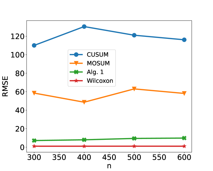
### Visual Description
\n
## Line Chart: RMSE Comparison of Four Methods Across Sample Sizes (n)
### Overview
The image displays a line chart comparing the Root Mean Square Error (RMSE) of four different statistical or algorithmic methods as a function of sample size, denoted by `n`. The chart illustrates how the performance (error) of each method changes as the amount of data increases from 300 to 600 samples.
### Components/Axes
* **Chart Type:** Multi-line chart with markers.
* **X-Axis:**
* **Label:** `n` (representing sample size).
* **Scale:** Linear, ranging from 300 to 600.
* **Major Tick Marks:** 300, 350, 400, 450, 500, 550, 600.
* **Y-Axis:**
* **Label:** `RMSE` (Root Mean Square Error).
* **Scale:** Linear, ranging from 0 to approximately 130.
* **Major Tick Marks:** 0, 20, 40, 60, 80, 100, 120.
* **Legend:**
* **Position:** Center-left of the plot area, slightly overlapping the data lines.
* **Content:** Four entries, each with a unique color, marker, and label.
1. **Blue line with circle markers:** `CUSUM`
2. **Orange line with downward-pointing triangle markers:** `MOSUM`
3. **Green line with 'X' (cross) markers:** `Alg. 1`
4. **Red line with star markers:** `Wilcoxon`
### Detailed Analysis
Data points are approximate, read from the chart's grid.
**1. CUSUM (Blue, Circles):**
* **Trend:** Increases to a peak at n=400, then gradually decreases.
* **Data Points:**
* n=300: RMSE ≈ 110
* n=400: RMSE ≈ 130 (Peak)
* n=500: RMSE ≈ 120
* n=600: RMSE ≈ 115
**2. MOSUM (Orange, Triangles):**
* **Trend:** Fluctuates; dips at n=400, peaks at n=500.
* **Data Points:**
* n=300: RMSE ≈ 60
* n=400: RMSE ≈ 50 (Local minimum)
* n=500: RMSE ≈ 65 (Local maximum)
* n=600: RMSE ≈ 60
**3. Alg. 1 (Green, Crosses):**
* **Trend:** Very slight, steady increase; nearly flat.
* **Data Points:**
* n=300: RMSE ≈ 8
* n=400: RMSE ≈ 9
* n=500: RMSE ≈ 10
* n=600: RMSE ≈ 10
**4. Wilcoxon (Red, Stars):**
* **Trend:** Essentially flat and constant at a very low value.
* **Data Points:**
* n=300: RMSE ≈ 1
* n=400: RMSE ≈ 1
* n=500: RMSE ≈ 1
* n=600: RMSE ≈ 1
### Key Observations
1. **Performance Hierarchy:** There is a clear and consistent separation in performance. `Wilcoxon` has the lowest error by a large margin, followed by `Alg. 1`, then `MOSUM`, with `CUSUM` exhibiting the highest error across all sample sizes.
2. **Stability:** `Wilcoxon` and `Alg. 1` show highly stable performance (low variance) as `n` increases. `MOSUM` shows moderate fluctuation, while `CUSUM` shows the most significant change in error with sample size.
3. **Peak Error:** The `CUSUM` method's error peaks at the intermediate sample size of n=400 before improving slightly.
4. **Scale Difference:** The RMSE values for `CUSUM` and `MOSUM` are an order of magnitude larger than those for `Alg. 1` and `Wilcoxon`.
### Interpretation
This chart likely compares the accuracy of different change-point detection algorithms or statistical tests (`CUSUM`, `MOSUM`, a proposed `Alg. 1`, and the `Wilcoxon` rank-sum test) in estimating a parameter or detecting a shift, where RMSE measures the estimation error.
* **What the data suggests:** The `Wilcoxon` method is vastly superior in terms of accuracy (lowest RMSE) for this specific task and is unaffected by the sample sizes tested. `Alg. 1` also performs very well and stably. The traditional `CUSUM` and `MOSUM` methods have significantly higher errors, suggesting they may be less suitable for the underlying data generating process or the specific metric being measured here.
* **Relationship between elements:** The chart directly contrasts established methods (`CUSUM`, `MOSUM`, `Wilcoxon`) with a new one (`Alg. 1`). The visual grouping shows `Alg. 1` performing much closer to the robust `Wilcoxon` test than to the other change-point methods.
* **Notable anomalies:** The non-monotonic behavior of `CUSUM` (error increasing then decreasing) is notable. It suggests that for this particular problem, simply increasing sample size does not guarantee improved performance for `CUSUM` within this range, possibly due to model misspecification or sensitivity to certain data characteristics at n=400. The consistently flat line for `Wilcoxon` indicates it is a very robust estimator for this scenario.
</details>
(c) S3, weak SNR (d) S3, strong SNR
Figure 8: Plot of the root mean square error (RMSE) of change-point estimation (S1 with $ρ_t=0$ and S3), computed on a test set of size $N_test=3000$ , against bandwidth $n$ for detecting the existence of a change-point on data series of length $n^*=2000$ . We compare the performance of the change-point detection by CUSUM, MOSUM, Algorithm 1 and Wilcoxon (only for S3) respectively. The RMSE here is defined by $√{1/N∑_i=1^N(\hat{τ}_i-τ_i)^2}$ where $\hat{τ}_i$ is the estimator of change-point for the $i$ -th observation and $τ_i$ is the true change-point. The weak and strong signal-to-noise ratio (SNR) correspond to $μ_R|τ∼Unif([-1.5b,-0.5b]∪[0.5b,1.5b])$ and $μ_R|τ∼Unif([-3b,-b]∪[b,3b])$ respectively.
## Appendix C Real Data Analysis
The HASC (Human Activity Sensing Consortium) project aims at understanding the human activities based on the sensor data. This data includes 6 human activities: “stay”, “walk”, “jog”, “skip”, “stair up” and “stair down”. Each activity lasts at least 10 seconds, the sampling frequency is 100 Hz.
### C.1 Data Cleaning
The HASC offers sequential data where there are multiple change-types and multiple change-points, see Figure 3 in main text. Hence, we can not directly feed them into our deep convolutional residual neural network. The training data fed into our neural network requires fixed length $n$ and either one change-point or no change-point existence in each time series. Next, we describe how to obtain this kind of training data from HASC sequential data. In general, Let $\boldsymbol{x}={(x_1,x_2,…,x_d)}^⊤,d≥ 1$ be the $d$ -channel vector. Define $\boldsymbol{X}\coloneqq(\boldsymbol{x}_t_1,\boldsymbol{x}_t_2,…, \boldsymbol{x}_t_{n^*})$ as a realization of $d$ -variate time series where $\boldsymbol{x}_t_{j},j=1,2,…,n^*$ are the observations of $\boldsymbol{x}$ at $n^*$ consecutive time stamps $t_1,t_2,…,t_n^*$ . Let $\boldsymbol{X}_i,i=1,2,…,N^*$ represent the observation from the $i$ -th subject. $\boldsymbol{τ}_i\coloneqq(τ_i,1,τ_i,2,…,τ_i,K)^⊤ ,K∈ℤ^+,τ_i,k∈[2,n^*-1],1≤ k≤ K$ with convention $τ_i,0=0$ and $τ_i,K+1=n^*$ represents the change-points of the $i$ -th observation which are well-labelled in the sequential data sets. Furthermore, define $n\coloneqq\min_i∈[N^*]\min_k∈[K+1](τ_i,k-τ_i,k-1)$ . In practice, we require that $n$ is not too small, this can be achieved by controlling the sampling frequency in experiment, see HASC data. We randomly choose $q$ sub-segments with length $n$ from $\boldsymbol{X}_i$ like the gray dash rectangles in Figure 3 of main text. By the definition of $n$ , there is at most one change-point in each sub-segment. Meanwhile, we assign the label to each sub-segment according to the type and existence of change-point. After that, we stack all the sub-segments to form a tensor $X$ with dimensions of $(N^*q,d,n)$ . The label vector is denoted as $Y$ with length $N^*q$ . To guarantee that there is at most one change-point in each segment, we set the length of segment $n=700$ . Let $q=15$ , as the change-points are well labelled, it is easy to draw 15 segments without any change-point, i.e., the segments with labels: “stay”, “walk”, “jog”, “skip”, “stair up” and “stair down”. Next, we randomly draw 15 segments (the red rectangles in Figure 3 of main text) for each transition point.
### C.2 Transformation
Section 3 in main text suggests that changes in the mean/signal may be captured by feeding the raw data directly. For other type of change, we recommend appropriate transformations before training the model depending on the interest of change-type. For instance, if we are interested in changes in the second order structure, we suggest using the square transformation; for change in auto-correlation with order $p$ we could input the cross-products of data up to a $p$ -lag. In multiple change-types, we allow applying several transformations to the data in data pre-processing step. The mixture of raw data and transformed data is treated as the training data. We employ the square transformation here. All the segments are mapped onto scale $[-1,1]$ after the transformation. The frequency of training labels are list in Figure 11. Finally, the shapes of training and test data sets are $(4875,6,700)$ and $(1035,6,700)$ respectively.
### C.3 Network Architecture
We propose a general deep convolutional residual neural network architecture to identify the multiple change-types based on the residual block technique (He et al., 2016) (see Figure 9). There are two reasons to explain why we choose residual block as the skeleton frame.
- The problem of vanishing gradients (Bengio et al., 1994; Glorot and Bengio, 2010). As the number of convolution layers goes significantly deep, some layer weights might vanish in back-propagation which hinders the convergence. Residual block can solve this issue by the so-called “shortcut connection”, see the flow chart in Figure 9.
- Degradation. He et al. (2016) has pointed out that when the number of convolution layers increases significantly, the accuracy might get saturated and degrade quickly. This phenomenon is reported and verified in He and Sun (2015) and He et al. (2016).
<details>
<summary>x19.png Details</summary>
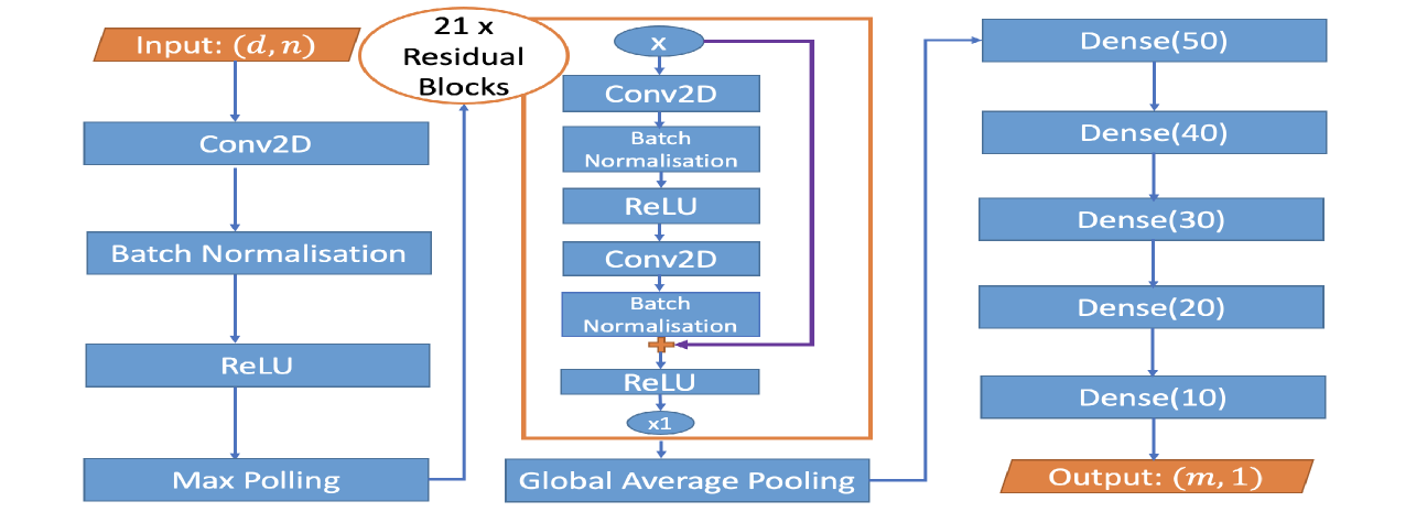
### Visual Description
\n
## Neural Network Architecture Diagram: Deep Convolutional Network with Residual Blocks
### Overview
The image displays a flowchart-style block diagram illustrating the architecture of a deep convolutional neural network (CNN). The model processes an input of shape `(d, n)` through an initial convolutional block, followed by a stack of 21 residual blocks, and concludes with a series of fully connected (dense) layers to produce an output of shape `(m, 1)`. The diagram uses color-coded blocks (blue for processing layers, orange for input/output and the residual block container) and directional arrows to indicate data flow.
### Components/Axes
The diagram is organized into three primary vertical sections, flowing from left to right:
1. **Initial Processing Path (Left Column):**
* **Input:** An orange parallelogram labeled `Input: (d, n)`.
* **Layer 1:** A blue rectangle labeled `Conv2D`.
* **Layer 2:** A blue rectangle labeled `Batch Normalisation`.
* **Layer 3:** A blue rectangle labeled `ReLU`.
* **Layer 4:** A blue rectangle labeled `Max Polling` (Note: Likely a typo for "Pooling").
* An arrow connects the output of `Max Polling` to the next section.
2. **Residual Block Stack (Center Column):**
* **Container:** An orange-bordered rectangle encloses the structure of a single residual block. A label above it reads `21 x Residual Blocks`, indicating this block is repeated 21 times sequentially.
* **Internal Structure of One Residual Block:**
* **Input Node:** A blue oval labeled `x`.
* **Main Path:**
1. `Conv2D` (blue rectangle)
2. `Batch Normalisation` (blue rectangle)
3. `ReLU` (blue rectangle)
4. `Conv2D` (blue rectangle)
5. `Batch Normalisation` (blue rectangle)
* **Skip Connection:** A purple arrow originates from the input node `x`, bypasses the main path layers, and connects to an addition operation (represented by a small orange plus symbol `+`) after the second `Batch Normalisation`.
* **Final Activation:** A `ReLU` (blue rectangle) applied after the addition.
* **Output Node:** A blue oval labeled `x1`.
* The output of the 21st residual block (`x1`) flows to the next stage.
3. **Classification Head (Right Column):**
* **Pooling Layer:** A blue rectangle labeled `Global Average Pooling`. It receives the output from the residual stack.
* **Dense Layers:** A vertical stack of five blue rectangles, each representing a fully connected layer with a specified number of neurons:
1. `Dense(50)`
2. `Dense(40)`
3. `Dense(30)`
4. `Dense(20)`
5. `Dense(10)`
* **Output:** An orange parallelogram labeled `Output: (m, 1)`.
### Detailed Analysis
* **Data Flow:** The data flows unidirectionally from the `Input (d, n)` at the top-left, down through the initial block, then into the stack of 21 residual blocks, through global average pooling, down through the five dense layers, and finally to the `Output (m, 1)` at the bottom-right.
* **Layer Specifications:**
* **Convolutional Layers:** The diagram specifies `Conv2D` layers but does not provide kernel size, stride, or padding parameters.
* **Normalization:** `Batch Normalisation` is used consistently after convolutional layers.
* **Activation:** `ReLU` is the specified activation function, used both within the residual blocks and after the initial convolution.
* **Pooling:** Two types are used: `Max Polling` (likely 2D max pooling) early in the network and `Global Average Pooling` after the residual stack to reduce spatial dimensions before the dense layers.
* **Residual Block:** The block follows a standard pre-activation design (Conv->BN->ReLU->Conv->BN) with a skip connection that adds the original input `x` to the output of the second BN layer, followed by a final ReLU. The output is denoted `x1`.
* **Dense Layers:** The network progressively reduces the feature dimension through dense layers with neuron counts: 50 -> 40 -> 30 -> 20 -> 10.
* **Dimensions:**
* **Input:** `(d, n)` - This suggests a 2D input, possibly (height, width) for a single-channel image or (features, time) for a signal.
* **Output:** `(m, 1)` - This suggests a vector of `m` output values, typical for regression or multi-label classification tasks. The value of `m` is not specified.
### Key Observations
1. **Deep Residual Core:** The architecture's defining feature is the very deep stack of **21 identical residual blocks**. This is a significant depth, designed to learn highly complex, hierarchical features.
2. **Architectural Consistency:** The residual block design is uniform throughout the stack, with no variation in the number of filters or internal structure mentioned.
3. **Dimensionality Reduction:** The network employs a clear strategy for reducing spatial/feature dimensions: early max pooling, followed by global average pooling after the deep feature extractor, and finally a tapering sequence of dense layers.
4. **Potential Typo:** The label `Max Polling` is almost certainly a misspelling of `Max Pooling`.
5. **Lack of Specifics:** The diagram is a high-level architectural schematic. It omits critical implementation details such as the number of convolutional filters, kernel sizes, stride, padding, dropout rates, and the specific value of `m` for the output.
### Interpretation
This diagram represents a deep, purpose-built convolutional neural network designed for a task requiring the extraction of complex patterns from structured 2D input data (e.g., image analysis, spectrogram processing, or certain types of sensor data).
* **Purpose of Residual Blocks:** The use of 21 residual blocks with skip connections is a direct application of deep residual learning principles. This design mitigates the vanishing gradient problem, allowing the training of an extremely deep network. The network can learn identity mappings easily via the skip connections, enabling it to focus on learning residual functions that improve performance.
* **Feature Processing Pipeline:** The architecture follows a classic pattern: a shallow initial feature extraction (`Conv2D` -> `BN` -> `ReLU` -> `Max Pooling`), followed by a very deep feature refinement stage (the residual stack), and concluding with a task-specific regression/classification head (the dense layers). The `Global Average Pooling` layer is crucial for making the network invariant to spatial translations of features in the final feature map and for drastically reducing the number of parameters before the dense layers.
* **Output Implication:** The output shape `(m, 1)` suggests the model is designed for a task like multi-output regression (predicting `m` continuous values) or multi-label classification (predicting `m` independent binary labels). It is not structured for standard single-class classification (which would typically end with a softmax layer of size `C`).
* **Inferred Complexity:** The depth (21 residual blocks) implies this model is intended for a complex problem where a shallower network would underfit. However, the lack of specified filter counts makes it impossible to gauge the total parameter count and computational cost accurately. The tapering dense layers (50->10 neurons) suggest a deliberate compression of the high-level feature representation into a compact final vector for prediction.
</details>
Figure 9: Architecture of our general-purpose change-point detection neural network. The left column shows the standard layers of neural network with input size $(d,n)$ , $d$ may represent the number of transformations or channels; We use 21 residual blocks and one global average pooling in the middle column; The right column includes 5 dense layers with nodes in bracket and output layer. More details of the neural network architecture appear in the supplement.
There are 21 residual blocks in our deep neural network, each residual block contains 2 convolutional layers. Like the suggestion in Ioffe and Szegedy (2015) and He et al. (2016), each convolution layer is followed by one Batch Normalization (BN) layer and one ReLU layer. Besides, there exist 5 fully-connected convolution layers right after the residual blocks, see the third column of Figure 9. For example, Dense(50) means that the dense layer has 50 nodes and is connected to a dropout layer with dropout rate 0.3. To further prevent the effect of overfitting, we also implement the $L_2$ regularization in each fully-connected layer (Ng, 2004). As the number of labels in HASC is 28, see Figure 10, we drop the dense layers “Dense(20)” and “Dense(10)” in Figure 9. The output layer has size $(28,1)$ . We remark two discussable issues here. (a) For other problems, the number of residual blocks, dense layers and the hyperparameters may vary depending on the complexity of the problem. In Section 6 of main text, the architecture of neural network for both synthetic data and real data has 21 residual blocks considering the trade-off between time complexity and model complexity. Like the suggestion in He et al. (2016), one can also add more residual blocks into the architecture to improve the accuracy of classification. (b) In practice, we would not have enough training data; but there would be potential ways to overcome this via either using Data Argumentation or increasing $q$ . In some extreme cases that we only mainly have data with no-change, we can artificially add changes into such data in line with the type of change we want to detect.
### C.4 Training and Detection
<details>
<summary>x20.png Details</summary>
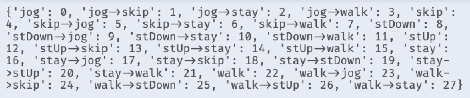
### Visual Description
## Text Block: Movement State Transition Dictionary
### Overview
The image displays a single line of text formatted as a Python dictionary. It maps string keys representing human movement states and transitions between those states to integer values (indices). The text is presented in a monospaced font against a light gray background, suggesting it is a code snippet or data structure definition.
### Components/Axes
The content is a single dictionary with 28 key-value pairs. The keys are strings describing either a static movement state (e.g., `'jog'`) or a transition from one state to another (e.g., `'jog→skip'`). The values are sequential integers starting from 0. The arrow symbol `→` is used to denote a transition.
### Detailed Analysis
The dictionary entries are as follows, transcribed exactly as they appear:
```python
{'jog': 0, 'jog→skip': 1, 'jog→stay': 2, 'jog→walk': 3, 'skip': 4, 'skip→jog': 5, 'skip→stay': 6, 'skip→walk': 7, 'stDown': 8, 'stDown→jog': 9, 'stDown→stay': 10, 'stDown→walk': 11, 'stUp': 12, 'stUp→skip': 13, 'stUp→stay': 14, 'stUp→walk': 15, 'stay': 16, 'stay→jog': 17, 'stay→skip': 18, 'stay→stDown': 19, 'stay→stUp': 20, 'stay→walk': 21, 'walk': 22, 'walk→jog': 23, 'walk→skip': 24, 'walk→stDown': 25, 'walk→stUp': 26, 'walk→stay': 27}
```
**Structure Breakdown:**
* **Static States:** There are 6 base movement states, each assigned an index:
* `jog`: 0
* `skip`: 4
* `stDown`: 8 (Likely an abbreviation for "stand down" or a crouching position)
* `stUp`: 12 (Likely an abbreviation for "stand up")
* `stay`: 16 (Likely meaning "stationary" or "idle")
* `walk`: 22
* **Transitions:** The remaining 22 entries are transitions *from* one of the base states *to* another (or possibly to itself, though none are listed). The transition key format is `'StateA→StateB'`.
### Key Observations
1. **Sequential Indexing:** The integers are assigned sequentially from 0 to 27, with no gaps. The static states are not grouped together numerically; they are interspersed with their outgoing transitions (e.g., `jog` is 0, followed by its transitions `jog→skip` (1), `jog→stay` (2), `jog→walk` (3), before the next static state `skip` (4)).
2. **Transition Coverage:** Not all possible transitions between the 6 states are present. For example, there is no `jog→stDown` or `walk→jog` (wait, correction: `walk→jog` is present as 23). A full cross-product would yield 30 transitions (6 states * 5 possible destination states each). This list contains 22 transitions, indicating some transitions are either not observed, not labeled, or considered invalid in the underlying dataset or model.
3. **Abbreviations:** The terms `stDown` and `stUp` are abbreviations. Their meaning is context-dependent but strongly suggests postural changes.
### Interpretation
This dictionary serves as a **label encoding schema** for a time-series classification task, most likely in the domain of human activity recognition (HAR) or motion analysis.
* **Purpose:** It translates descriptive, human-readable labels of movement and movement changes into a numerical format suitable for training machine learning models (e.g., a neural network classifier) or for indexing into a data array.
* **Data Structure Implication:** The sequential, non-grouped indexing suggests the original data might be structured as a single sequence of these 28 classes. A model would be trained to predict one of these 28 labels for each time window in a sensor data stream (e.g., from accelerometers or video).
* **Investigative Insight:** The specific set of transitions included reveals the focus of the study or system. The absence of certain transitions (like direct transitions between `stDown` and `stUp`, or from `stay` to itself) implies the dataset or task design considers only a specific, possibly realistic, subset of movement dynamics. The inclusion of transitions like `stay→stDown` and `stay→stUp` highlights the importance of capturing the initiation of movement from a stationary posture.
</details>
Figure 10: Label Dictionary
<details>
<summary>x21.png Details</summary>
### Visual Description
\n
## Data Table: Activity and Transition Frequency Counter
### Overview
The image displays the output of a Python `Counter` object, which is a dictionary subclass for counting hashable objects. It presents a frequency distribution of discrete activities and transitions between those activities. The data appears to be from a dataset tracking human movement or exercise patterns.
### Components/Axes
* **Format:** A single line of text formatted as a Python `Counter` object.
* **Language:** English. The text uses standard English activity names and the arrow symbol (`→`) to denote a transition from one state to another.
* **Structure:** A set of key-value pairs enclosed in curly braces `{}`. Each key is a string representing an activity or a transition, and each value is an integer representing its count or frequency.
* **Data Keys:**
* **Single Activities:** `walk`, `stay`, `jog`, `skip`, `stDown`, `stUp`.
* **Transitions:** Formatted as `[activity1]→[activity2]`, e.g., `walk→jog`, `stay→stDown`.
### Detailed Analysis
The following is a complete transcription of all key-value pairs from the Counter, listed in descending order of frequency as they appear in the image.
**Single Activity Counts:**
1. `walk`: 570
2. `stay`: 525
3. `jog`: 495
4. `skip`: 405
5. `stDown`: 225
6. `stUp`: 225
**Transition Counts (from highest to lowest frequency):**
1. `walk→jog`: 210
2. `stay→stDown`: 180
3. `walk→stay`: 180
4. `stay→skip`: 180
5. `jog→walk`: 165
6. `jog→stay`: 150
7. `walk→stUp`: 120
8. `skip→stay`: 120
9. `stay→jog`: 120
10. `stDown→stay`: 105
11. `stay→stUp`: 105
12. `stUp→walk`: 105
13. `jog→skip`: 105
14. `skip→walk`: 105
15. `walk→skip`: 75
16. `stUp→stay`: 75
17. `stDown→walk`: 75
18. `skip→jog`: 75
19. `stUp→skip`: 45
20. `stay→walk`: 45
21. `walk→stDown`: 45
22. `stDown→jog`: 45
### Key Observations
* **Activity Hierarchy:** The single activity `walk` is the most frequent state (570), followed closely by `stay` (525). The least frequent single states are the postural transitions `stDown` and `stUp`, which have identical counts (225).
* **Transition Patterns:** The most common transition is from `walk` to `jog` (210). There is a three-way tie for the second-most common transition at 180 counts: `stay→stDown`, `walk→stay`, and `stay→skip`.
* **Symmetry and Asymmetry:** Some transitions are symmetric in count but not in direction. For example, `walk→stay` (180) is much more frequent than `stay→walk` (45). Conversely, `stDown→stay` (105) and `stay→stUp` (105) have equal counts.
* **Low-Frequency Transitions:** The least frequent transitions, all with 45 counts, involve movements to or from `stDown` and `stUp` (e.g., `stUp→skip`, `stay→walk`, `walk→stDown`, `stDown→jog`).
### Interpretation
This data suggests a structured observation of movement patterns, likely from a video analysis, sensor data, or annotated dataset. The high counts for `walk` and `stay` indicate these are the primary, sustained states. The transitions represent the moments of change between these states.
The frequency hierarchy implies a logical flow: `walk` is a common precursor to more intense activity (`jog`) or a return to rest (`stay`). The low counts for transitions involving `stDown` and `stUp` suggest these are brief, specific postural changes (like sitting down or standing up) that occur less frequently within the observed sequence and are less commonly followed by a wide variety of other actions.
The asymmetry in transition counts (e.g., `walk→stay` vs. `stay→walk`) is particularly insightful. It may indicate the context of the observation—for instance, if the subject is more likely to stop (`walk→stay`) after a period of walking than to spontaneously start walking from a standstill (`stay→walk`) within the recorded segments. This could reflect the natural structure of an exercise routine or daily activity log. The data provides a quantitative map of behavioral dynamics, highlighting which state changes are most characteristic of the observed subject or scenario.
</details>
Figure 11: Label Frequency
<details>
<summary>x22.png Details</summary>
### Visual Description
## Line Chart: Model Training Accuracy vs. Epochs
### Overview
The image displays a line chart plotting the accuracy of a machine learning model over the course of its training. It compares the performance on the training dataset against a validation dataset for a model configured with a kernel size of 25. The chart demonstrates the learning progression and final performance convergence.
### Components/Axes
* **Chart Type:** 2D Line Chart.
* **X-Axis (Horizontal):**
* **Label:** "Epochs"
* **Scale:** Linear scale from 0 to 400.
* **Major Tick Marks:** 0, 50, 100, 150, 200, 250, 300, 350, 400.
* **Y-Axis (Vertical):**
* **Label:** "Accuracy"
* **Scale:** Linear scale from 0.3 to 1.0.
* **Major Tick Marks:** 0.3, 0.4, 0.5, 0.6, 0.7, 0.8, 0.9, 1.0.
* **Legend:**
* **Position:** Bottom-left corner of the plot area.
* **Entry 1:** A solid blue line labeled "Kernel Size=25 Train".
* **Entry 2:** A dashed blue line labeled "Kernel Size=25 Validation".
* **Grid:** A light gray grid is present, aligned with the major tick marks on both axes.
### Detailed Analysis
**Data Series 1: Kernel Size=25 Train (Solid Blue Line)**
* **Trend:** The line shows a classic learning curve. It starts at a low accuracy (approximately 0.28 at epoch 0), rises very steeply until around epoch 50, then the rate of increase slows, and it asymptotically approaches a plateau near 1.0.
* **Key Data Points (Approximate):**
* Epoch 0: ~0.28
* Epoch 25: ~0.75
* Epoch 50: ~0.92
* Epoch 100: ~0.97
* Epoch 200: ~0.99
* Epoch 400: ~0.998 (very close to 1.0)
**Data Series 2: Kernel Size=25 Validation (Dashed Blue Line)**
* **Trend:** This line follows a similar trajectory to the training line but exhibits a slightly different initial behavior. It starts at a marginally higher accuracy than the training set, rises even more sharply in the very early epochs, and then converges to the same plateau as the training accuracy.
* **Key Data Points (Approximate):**
* Epoch 0: ~0.30
* Epoch 25: ~0.85
* Epoch 50: ~0.96
* Epoch 100: ~0.985
* Epoch 200: ~0.995
* Epoch 400: ~0.998 (indistinguishable from the training line)
**Relationship Between Series:**
* The validation accuracy (dashed line) is consistently at or slightly above the training accuracy (solid line) for the first ~75 epochs.
* After approximately epoch 100, the two lines become nearly superimposed, indicating the model's performance on unseen data (validation) matches its performance on the training data.
### Key Observations
1. **Rapid Initial Learning:** The most significant gains in accuracy occur within the first 50 epochs for both datasets.
2. **High Final Accuracy:** Both training and validation accuracy converge to a value extremely close to 1.0 (100%), suggesting near-perfect performance on the given task.
3. **No Overfitting:** The validation accuracy does not degrade as training progresses; it tracks the training accuracy perfectly after the initial phase. This is a strong indicator that the model is generalizing well and not memorizing the training data.
4. **Stable Convergence:** After epoch 200, both lines show minimal fluctuation, indicating the training process has stabilized.
### Interpretation
This chart demonstrates a highly successful model training run. The key takeaways are:
* **Effective Learning:** The model architecture (with kernel size 25) is well-suited to the problem, as evidenced by the rapid and sustained increase in accuracy.
* **Excellent Generalization:** The fact that validation accuracy matches training accuracy so closely, and even starts slightly higher, suggests the training and validation datasets are well-representative of the same underlying data distribution. There is no sign of overfitting, which is a common pitfall in machine learning.
* **Sufficient Training Duration:** The plateau in accuracy after ~200 epochs indicates that further training beyond 400 epochs is unlikely to yield significant improvements. The model has reached its performance capacity for this configuration.
* **Potential for Optimization:** While the results are excellent, the near-identical curves might prompt an investigation into whether the validation set is sufficiently challenging or distinct from the training set. The extremely high final accuracy (>99.8%) could also warrant a check for data leakage or an overly simplistic task.
In summary, the image provides clear, quantitative evidence of a model that learns quickly, generalizes perfectly, and achieves maximum performance on its designated task within about 200 training epochs.
</details>
Figure 12: The Accuracy Curves
<details>
<summary>x23.png Details</summary>
### Visual Description
## Heatmap: Confusion Matrix for 28-Class Classification
### Overview
The image displays a confusion matrix, a type of heatmap used to evaluate the performance of a classification model. The matrix compares the true "Label" (ground truth) against the model's "Prediction" for 28 distinct classes, numbered 0 through 27. The primary language in the image is English.
### Components/Axes
* **Y-Axis (Vertical):** Labeled "Label". It lists the true class identifiers from 0 at the top to 27 at the bottom.
* **X-Axis (Horizontal):** Labeled "Prediction". It lists the predicted class identifiers from 0 on the left to 27 on the right.
* **Color Scale/Legend:** A vertical color bar is positioned on the right side of the chart. It maps numerical values within the matrix cells to a color gradient.
* **Scale Range:** Approximately 0 to over 120.
* **Color Gradient:** Transitions from a pale yellow (low values, ~0) through teal and cyan to a deep blue (high values, ~135).
* **Tick Marks:** The bar has labeled tick marks at 0, 20, 40, 60, 80, 100, and 120.
* **Matrix Grid:** A 28x28 grid of cells. Each cell's color corresponds to the count of samples where the true class was the row label and the predicted class was the column label. The numerical count is also printed inside each cell.
### Detailed Analysis
The matrix is predominantly filled with zeros (pale yellow cells), indicating that for most class pairs, there were no samples. The non-zero values are concentrated along the main diagonal (from top-left to bottom-right), which represents correct classifications (where Label = Prediction).
**Non-Zero Data Points (True Label, Prediction, Count):**
* **Diagonal (Correct Predictions):**
* (0, 0): 90
* (3, 3): 45
* (4, 4): 90
* (5, 5): 45
* (6, 6): 44
* (8, 8): 40
* (11, 11): 43
* (12, 12): 35
* (14, 14): 43
* (16, 16): 135 (Highest value on the diagonal)
* (17, 17): 45
* (18, 18): 45
* (19, 19): 39
* (22, 22): 135 (Tied for highest value)
* (24, 24): 45
* (26, 26): 33
* (27, 27): 44
* **Off-Diagonal (Misclassifications):**
* (6, 13): 1
* (8, 25): 5
* (11, 9): 2
* (12, 13): 4
* (12, 15): 1
* (12, 25): 5
* (14, 8): 1
* (14, 10): 1
* (19, 20): 4
* (19, 21): 2
* (26, 22): 12
* (27, 14): 1
### Key Observations
1. **Strong Diagonal Dominance:** The vast majority of non-zero counts lie on the main diagonal, indicating the model has high accuracy for most classes.
2. **High-Performing Classes:** Classes 16 and 22 have the highest correct prediction counts (135 each). Classes 0 and 4 also show strong performance (90 each).
3. **Specific Misclassification Patterns:**
* Class 12 is most often misclassified as class 13 (4 instances) and class 25 (5 instances).
* Class 26 has a notable misclassification as class 22 (12 instances).
* Class 8 is misclassified as class 25 (5 instances).
* Class 19 shows minor confusion with classes 20 and 21.
4. **Sparse Errors:** Misclassifications are generally low-count (mostly 1-5 instances), except for the (26, 22) pair.
5. **Class Imbalance:** The number of samples per class varies significantly, as seen in the diagonal values (e.g., 135 vs. 33).
### Interpretation
This confusion matrix provides a detailed diagnostic view of a multi-class classifier's performance. The strong diagonal indicates the model has learned the primary features of most classes effectively. The off-diagonal elements reveal specific, systematic errors.
The most significant finding is the model's confusion between **class 26 and class 22** (12 instances). This suggests these two classes share visual or feature-space similarities that the model struggles to distinguish. Similarly, the confusion between **class 12 and classes 13/25** points to potential ambiguity in the defining characteristics of these groups.
The variation in diagonal values (from 33 to 135) strongly suggests the underlying dataset is imbalanced, with some classes having far more training examples than others. This imbalance likely contributes to the model's varying confidence and accuracy across classes.
For a technical document, this analysis highlights which class pairs require further investigation—either through collecting more distinct training data, feature engineering, or adjusting the model's loss function to penalize these specific errors more heavily. The matrix serves as a roadmap for targeted model improvement.
</details>
Figure 13: Confusion Matrix of Real Test Dataset
<details>
<summary>x24.png Details</summary>
### Visual Description
## Time-Series Activity Recognition Plot
### Overview
The image displays a time-series plot of three-axis signal data (likely from an accelerometer or similar sensor) recorded over a period of approximately 10,500 time units. The plot is segmented into distinct periods, each labeled with a specific physical activity. The data shows clear, repeating patterns of signal amplitude and variability that correspond to the different activities.
### Components/Axes
* **Y-Axis:** Labeled "Signal". The scale ranges from -4 to +4, with major tick marks at intervals of 1 unit.
* **X-Axis:** Labeled "Time". The scale ranges from 0 to over 10,000, with major tick marks at 0, 2000, 4000, 6000, 8000, and 10000.
* **Legend:** Located in the top-left corner. It defines three data series:
* `x` (blue line)
* `y` (orange line)
* `z` (green line)
* **Activity Segments:** The plot is divided by vertical lines (alternating blue and red) into 13 distinct segments. Each segment is labeled at the top with an activity name. The labels, in order from left to right, are:
1. `walk`
2. `skip`
3. `stay`
4. `jog`
5. `walk`
6. `stUp`
7. `stay`
8. `stDown`
9. `walk`
10. `stay`
11. `skip`
12. `jog`
(Note: The final segment after the last vertical line is unlabeled but appears to be a continuation of `jog`).
### Detailed Analysis
The signal patterns are highly characteristic for each labeled activity:
* **`walk` (Segments 1, 5, 9):** The `x` (blue) and `z` (green) signals show moderate, rhythmic oscillations centered near 0. The `y` (orange) signal is consistently negative, oscillating roughly between -0.5 and -1.5. The overall amplitude is moderate.
* **`skip` (Segments 2, 11):** This activity shows the highest signal variability and amplitude. The `y` (orange) signal exhibits large, sharp negative spikes reaching down to approximately -4. The `z` (green) signal also shows high-amplitude oscillations, frequently exceeding +1. The `x` (blue) signal is more variable than during `walk`.
* **`stay` (Segments 3, 7, 10):** All three signals (`x`, `y`, `z`) are nearly flat lines with minimal noise. The `y` (orange) signal holds a steady value near -1. This indicates a stationary, static posture.
* **`jog` (Segments 4, 12, and final unlabeled segment):** Similar to `walk` but with noticeably higher amplitude and frequency of oscillation in all three axes. The `y` (orange) signal remains negative but fluctuates more widely, between approximately -0.5 and -2.5.
* **`stUp` (Segment 6):** This short segment shows a distinct transition. The signals, particularly `y` (orange), move from the flat "stay" pattern to a more active state, resembling the beginning of a `walk` pattern.
* **`stDown` (Segment 8):** This is the inverse of `stUp`. The active, oscillating signals transition back to the flat, static pattern characteristic of `stay`.
### Key Observations
1. **Activity Signatures:** Each activity has a unique and repeatable "signature" across the three signal axes. `skip` is the most energetic, `stay` is the least.
2. **Consistency:** The patterns for repeated activities (e.g., the first and second `walk`) are visually consistent, suggesting reliable sensor data and distinct movement profiles.
3. **`y`-Axis Bias:** The `y` (orange) signal is predominantly negative across all active movements (`walk`, `skip`, `jog`). This likely reflects the sensor's orientation relative to gravity during these activities.
4. **Transition Clarity:** The `stUp` and `stDown` segments clearly capture the dynamic transition between static (`stay`) and dynamic (`walk`) states.
### Interpretation
This plot is almost certainly data from a wearable inertial measurement unit (IMU) used for **Human Activity Recognition (HAR)**. The three axes (`x`, `y`, `z`) correspond to accelerometer readings.
* **What the data demonstrates:** The plot successfully demonstrates that basic physical activities can be classified based on the temporal patterns of accelerometer data. The clear segmentation shows that a model or algorithm could reliably distinguish between stationary (`stay`), low-intensity (`walk`), and high-intensity (`skip`, `jog`) activities, as well as detect postural transitions (`stUp`, `stDown`).
* **Relationship between elements:** The vertical lines and labels represent the "ground truth" activity annotations. The underlying signal data is the raw input feature for a HAR system. The strong correlation between the label and the signal pattern validates the use of this data for training or testing a classifier.
* **Notable patterns/anomalies:** The most notable pattern is the distinct negative bias and high-amplitude spikes in the `y`-axis during dynamic activities. This is not an anomaly but a critical feature, likely indicating the vertical axis (aligned with gravity) on a body-worn sensor (e.g., on the waist or chest). The consistency of this pattern across different `walk` and `jog` segments is a key finding for feature engineering in an activity recognition pipeline.
</details>
Figure 14: Change-point Detection of Real Dataset for Person 7 (2nd sequence). The red line at 4476 is the true change-point, the blue line on its right is the estimator. The difference between them is caused by the similarity of “Walk” and “StairUp”.
<details>
<summary>x25.png Details</summary>
### Visual Description
## Time-Series Plot: Multi-Axis Signal During Labeled Physical Activities
### Overview
The image is a time-series plot displaying three signal channels (x, y, z) over a continuous time period. The plot is segmented by vertical lines into distinct phases, each labeled with a specific physical activity. The data appears to represent sensor readings (likely from an accelerometer or gyroscope) during a sequence of movements.
### Components/Axes
* **Chart Type:** Multi-line time-series plot.
* **X-Axis:** Labeled **"Time"**. The scale runs from 0 to slightly beyond 10,000 units (likely samples or milliseconds). Major tick marks are at 0, 2000, 4000, 6000, 8000, and 10000.
* **Y-Axis:** Labeled **"Signal"**. The scale ranges from approximately -2.5 to +2.5, with major tick marks at -2, -1, 0, 1, and 2.
* **Legend:** Located in the **top-right corner**. It defines three data series:
* **x** (blue line)
* **y** (orange line)
* **z** (green line)
* **Activity Segments:** The plot is divided by **vertical red and blue lines**. Each segment is labeled at the top with an activity name. The sequence from left to right is:
1. `walk`
2. `skip`
3. `stay`
4. `jog`
5. `walk`
6. `stUp` (likely "stand up")
7. `stay`
8. `stDown` (likely "sit down" or "stand down")
9. `walk`
10. `stay`
11. `skip`
12. `jog`
### Detailed Analysis
**Signal Behavior by Activity Segment:**
1. **`walk` (Segments 1, 5, 9):**
* **Trend:** All three signals show regular, moderate-amplitude oscillations.
* **Data Points:** The blue (x) and green (z) signals oscillate roughly between -1 and +1. The orange (y) signal oscillates with a negative bias, primarily between -2 and 0.
2. **`skip` (Segments 2, 11):**
* **Trend:** Signals exhibit high-amplitude, high-frequency oscillations, more intense than walking.
* **Data Points:** The blue (x) and green (z) signals show peaks reaching near +2 and troughs near -2. The orange (y) signal shows deep negative spikes, consistently reaching or exceeding -2.
3. **`stay` (Segments 3, 7, 10):**
* **Trend:** Signals are largely static with minimal noise.
* **Data Points:** The blue (x) and green (z) signals hover near 0 (approximately 0.1 to 0.2). The orange (y) signal is stable at a distinct negative offset, approximately -1.0.
4. **`jog` (Segments 4, 12):**
* **Trend:** Very high-frequency, high-amplitude oscillations, appearing denser than `skip`.
* **Data Points:** Similar range to `skip`, with signals frequently spanning from -2 to +2. The pattern is more continuous and less burst-like than `skip`.
5. **`stUp` (Segment 6):**
* **Trend:** A brief, distinct pattern. The blue (x) signal shows a sharp positive spike followed by a return to oscillatory behavior. The orange (y) and green (z) signals show a corresponding dip and recovery.
* **Data Points:** The blue spike reaches approximately +1.5. The orange signal dips to near -1.5.
6. **`stDown` (Segment 8):**
* **Trend:** Similar to `stUp` but with an inverted initial movement. The blue (x) signal shows a sharp negative spike.
* **Data Points:** The blue spike reaches approximately -1.5. The orange signal shows a positive spike to near +0.5.
### Key Observations
* **Signal Differentiation:** The three axes (x, y, z) show clearly different baselines and amplitudes during static (`stay`) periods, suggesting the sensor's orientation is fixed relative to gravity. The y-axis (orange) has a consistent negative offset during rest.
* **Activity Signatures:** Each activity produces a unique "signature" in the signal's amplitude, frequency, and inter-axis correlation. `stay` is flat, `walk` is rhythmic, `skip` and `jog` are vigorous, and `stUp`/`stDown` are transient events.
* **Temporal Sequence:** The activities are performed in a specific, non-random order, suggesting a structured data collection protocol.
* **Visual Clarity:** The use of distinct colors (blue, orange, green) and clear vertical segmentation makes the different phases and signals easy to distinguish.
### Interpretation
This plot visualizes **inertial measurement unit (IMU) data** from a sensor worn on a person's body (e.g., on the waist or chest) during a controlled sequence of movements. The data is likely used for **Human Activity Recognition (HAR)**.
* **What the data demonstrates:** It shows how raw accelerometer/gyroscope signals can be used to classify physical activities. The distinct patterns for each label (`walk`, `skip`, etc.) are the features a machine learning model would learn to recognize.
* **Relationship between elements:** The vertical lines and labels provide the "ground truth" annotation for the time-series data. The three signal lines (x, y, z) represent the multi-dimensional nature of movement. The `stay` segments act as a baseline, showing the sensor's static orientation.
* **Notable patterns/anomalies:**
* The `stUp` and `stDown` segments are very short, indicating quick transitional movements.
* The consistency of the `stay` signal across three separate instances (segments 3, 7, 10) confirms the reliability of the baseline.
* The `y` (orange) signal's strong negative bias during all activities is a key characteristic, likely indicating the sensor's primary axis is aligned with the direction of gravity when the subject is upright.
**Language:** All text in the image is in English.
</details>
Figure 15: Change-point Detection of Real Dataset for Person 7 (3rd sequence). The red vertical lines represent the underlying change-points, the blue vertical lines represent the estimated change-points.
There are 7 persons observations in this dataset. The first 6 persons sequential data are treated as the training dataset, we use the last person’s data to validate the trained classifier. Each person performs each of 6 activities: “stay”, “walk”, “jog”, “skip”, “stair up” and “stair down” at least 10 seconds. The transition point between two consecutive activities can be treated as the change-point. Therefore, there are 30 possible types of change-point. The total number of labels is 36 (6 activities and 30 possible transitions). However, we only found 28 different types of label in this real dataset, see Figure 10. The initial learning rate is 0.001, the epoch size is 400. Batch size is 16, the dropout rate is 0.3, the filter size is 16 and the kernel size is $(3,25)$ . Furthermore, we also use 20% of the training dataset to validate the classifier during training step. Figure 12 shows the accuracy curves of training and validation. After 150 epochs, both solid and dash curves approximate to 1. The test accuracy is 0.9623, see the confusion matrix in Figure 13. These results show that our neural network classifier performs well both in the training and test datasets. Next, we apply the trained classifier to 3 repeated sequential datasets of Person 7 to detect the change-points. The first sequential dataset has shape $(3,10743)$ . First, we extract the $n$ -length sliding windows with stride 1 as the input dataset. The input size becomes $(9883,6,700)$ . Second, we use Algorithm 1 to detect the change-points where we relabel the activity label as “no-change” label and transition label as “one-change” label respectively. Figures 14 and 15 show the results of multiple change-point detection for other 2 sequential data sets from the 7-th person.