# CausalCite: A Causal Formulation of Paper Citations
> Equal contribution.
## Abstract
Citation count of a paper is a commonly used proxy for evaluating the significance of a paper in the scientific community. Yet citation measures are widely criticized for failing to accurately reflect the true impact of a paper. Thus, we propose CausalCite, a new way to measure the significance of a paper by assessing the causal impact of the paper on its follow-up papers. CausalCite is based on a novel causal inference method, TextMatch, which adapts the traditional matching framework to high-dimensional text embeddings. TextMatch encodes each paper using text embeddings from large language models (LLMs), extracts similar samples by cosine similarity, and synthesizes a counterfactual sample as the weighted average of similar papers according to their similarity values. We demonstrate the effectiveness of CausalCite on various criteria, such as high correlation with paper impact as reported by scientific experts on a previous dataset of 1K papers, (test-of-time) awards for past papers, and its stability across various subfields of AI. We also provide a set of findings that can serve as suggested ways for future researchers to use our metric for a better understanding of the quality of a paper. Our code is available at https://github.com/causalNLP/causal-cite.
## 1 Introduction
Recent years have seen explosive growth in the number of scientific publications, making it increasingly challenging for scientists to navigate the vast landscape of scientific literature. Therefore, identifying a good paper has become a crucial challenge for the scientific community, not only for technical research purposes, but also for making decisions, such as funding allocation (Carlsson, 2009), research evaluation (Moed, 2006), recruitment (Gary Holden and Barker, 2005), and university ranking and evaluation (Piro and Sivertsen, 2016).
<details>
<summary>x1.png Details</summary>
### Visual Description
## Diagram: Counterfactual Analysis Framework for Academic Paper Impact
### Overview
The image is a conceptual diagram illustrating a methodology for determining the causal impact of a source academic paper (labeled "Paper *a*") on a subsequent "followup study" (labeled "Paper *b*"). It contrasts an observed reality with a hypothetical counterfactual scenario to isolate the specific influence of the source paper.
### Components/Axes
The diagram is divided into two primary horizontal sections, connected by a downward-pointing arrow.
**Top Section (Observed Reality):**
* **Left:** A red oval labeled "Paper *a*".
* **Center:** An arrow pointing from "Paper *a*" to "Paper *b*", labeled "Causal Effect".
* **Right:** A blue oval labeled "Paper *b*".
* **Attributes List (associated with Paper *b*):**
* "Attributes" (Header)
* "Paper topic"
* "Publication year"
* "..." (Ellipsis indicating other potential attributes)
* "Success metric: *y*"
**Middle Section:**
* **Header:** "We make a counterfactual situation"
* **Transition:** A large blue downward-pointing arrow.
**Bottom Section (Counterfactual Scenario):**
* **Left:** A red oval labeled "Paper *a*" with a large red "X" superimposed over it.
* **Center:** An arrow pointing from the crossed-out "Paper *a*" to "Paper *b*".
* **Right:** A blue oval labeled "Paper *b*".
* **Attributes List (associated with Paper *b*):**
* "Attributes" (Header)
* "Paper topic"
* "Publication year"
* "..."
* "Success metric: *y'*"
**Textual Annotations:**
* **Top Header:** "What is the impact of Paper *a* on its followup study *b*?"
* **Bottom Left:** "Had Paper *a* not existed..."
* **Bottom Right:** "Yet Paper *b* still has the same topic, year, etc."
* **Bottom Footer:** "What would the counterfactual success metric *y'* be?"
### Detailed Analysis
* **Causal Logic:** The diagram establishes a baseline where "Paper *a*" exerts a "Causal Effect" on "Paper *b*". The success of "Paper *b*" is measured by the variable *y*.
* **Counterfactual Construction:** The bottom section illustrates the hypothetical state where "Paper *a*" is removed from the timeline (indicated by the red "X").
* **Control Variables:** The text "Yet Paper *b* still has the same topic, year, etc." indicates that the counterfactual model assumes the target paper (*b*) remains constant in its fundamental characteristics, allowing for a controlled comparison.
* **Variable Shift:** The success metric shifts from *y* (observed) to *y'* (counterfactual). The diagram poses the research question: how does *y'* differ from *y*?
### Key Observations
* **Color Coding:** The diagram consistently uses red for the source paper (*a*) and blue for the target paper (*b*), maintaining visual continuity across both scenarios.
* **The "X" Symbol:** The red "X" is the primary visual indicator of the counterfactual condition, signifying the removal of the causal agent.
* **Implicit Methodology:** The inclusion of "Attributes" (topic, year) suggests that the underlying methodology likely involves matching or propensity score analysis, where "Paper *b*" is compared against a control group of papers that share similar attributes but were not influenced by "Paper *a*".
### Interpretation
This diagram represents a standard **Causal Inference framework** applied to bibliometrics or citation analysis.
* **The Fundamental Problem:** The diagram addresses the "fundamental problem of causal inference"—that we cannot observe the same paper (*b*) in two states simultaneously (one with the influence of *a*, and one without).
* **The Goal:** The goal of the analysis is to estimate *y'* (the counterfactual success metric). By comparing *y* (the actual observed success) with the estimated *y'*, researchers can quantify the "causal effect" of "Paper *a*".
* **Significance:** This approach is used to move beyond simple correlation (e.g., "Paper *b* cites *a*") to determine if "Paper *b*" would have been less successful (or different) had "Paper *a*" never been published. The difference between *y* and *y'* represents the "treatment effect" of the source paper.
</details>
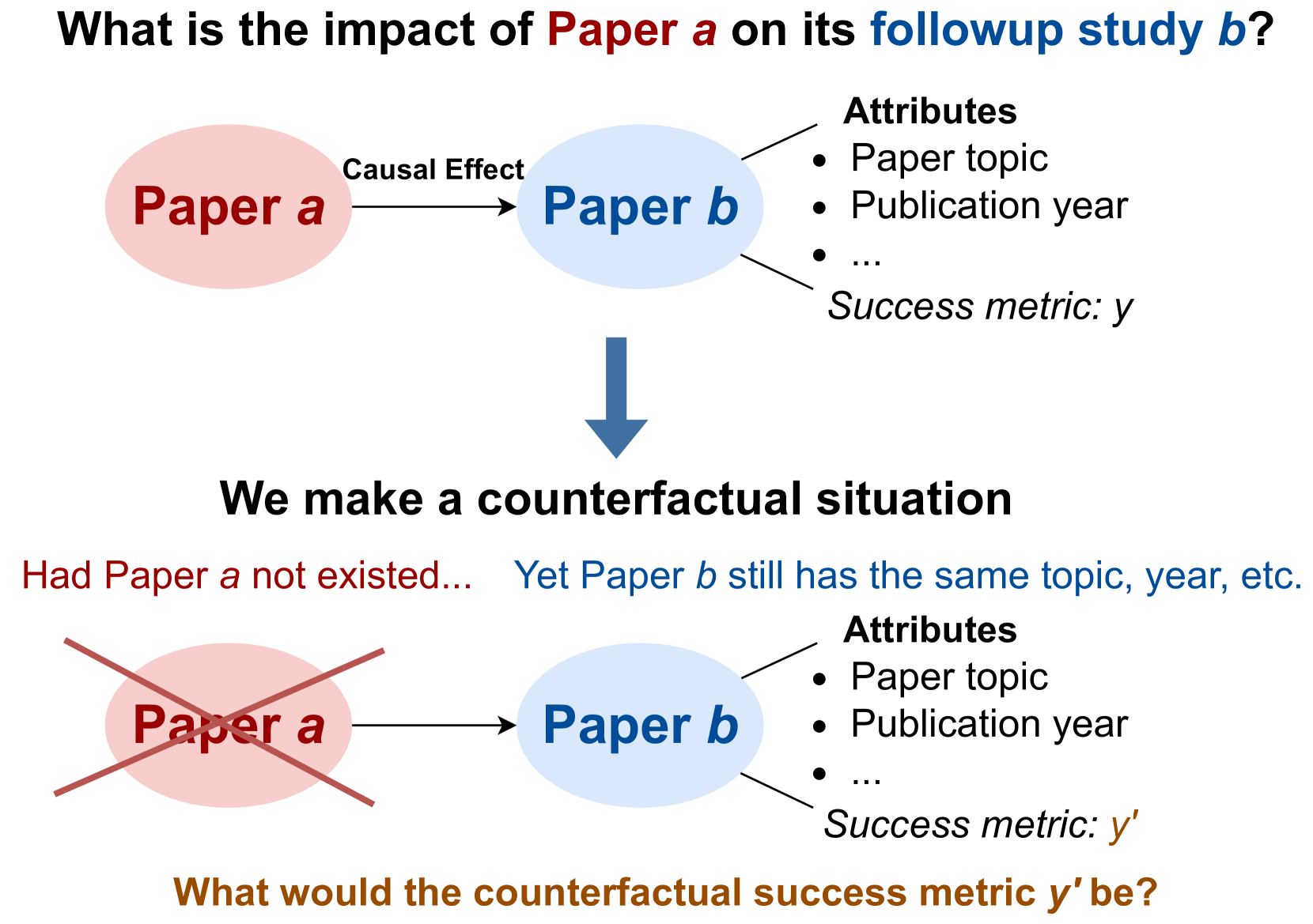
Figure 1: An overview of our research question.
A traditional approach to recognize paper quality is peer review, a mechanism that requires large efforts, and yet has inherent randomness and flaws (Cortes and Lawrence, 2021; Rogers et al., 2023; Shah, 2022; Prechelt et al., 2018; Resnik et al., 2008). Moreover, the number of papers after peer review is still overwhelmingly large for researchers to read, leaving the challenge of identifying truly impactful research unaddressed. Another commonly used metric is citations. However, this metric faces criticism for biases, such as a preference for survey, toolkit, and dataset papers (Zhu et al., 2015; Valenzuela-Escarcega et al., 2015). Together with altmetrics (Wilsdon et al., 2015), which incorporates social media attention to a paper, both metrics also bias towards papers from major publishing countries (Rungta et al., 2022; Gomez et al., 2022), with extensive publicity and promotion, and authored by established figures.
To provide a more equitable assessment of paper quality, we employ the causal inference framework (Hernán and Robins, 2010) to quantify a paper’s impact by how much of the academic success in the follow-up papers should be causally attributed to this paper. We introduce CausalCite, an enhanced citation based metric that poses the following counterfactual question (also shown in Figure 1): “ had this paper never been published, what would have happened to its follow-up studies? ” To compute the causal attribution of each follow-up paper, we contrast its citations (the treatment group) with citations of papers that address a similar topic, but are not built on the paper of interest (the control group).
Traditionally, this problem is solved by using the matching method Rosenbaum and Rubin (1983) in causal inference, which discretizes the value of the confounder variable, and compares the treatment and control groups with regard to each discretized value of the confounder variable. However, this approach does not apply when the confounder variable is high-dimensional, e.g., text data, such as the content of the paper. Thus, we improve the matching method to adapt for textual confounders, by marrying recent advancement of large language models (LLMs) with traditional causal inference. Specifically, we propose TextMatch, which uses LLMs to encode an academic paper as a high-dimensional text embedding to represent the confounders, and then, instead of iterating over discretized values of the confounder, we match each paper in the treatment group with papers from the control group with high cosine similarity by the text embeddings.
TextMatch makes contributions in three different aspects: (1) it relaxes the previous constraint that the confounder variable should be binned into a limited set of intervals, and makes the matching method applicable for high-dimensional continuous variable type for the confounder; (2) since there are millions of papers, we enable efficient matching via a matching-and-reranking approach, first using information retrieval (IR) (Manning et al., 2008) to extract a small set of candidates, and then applying semantic textual similarity (STS) (Majumder et al., 2016; Chandrasekaran and Mago, 2022) for fine-grained reranking; and (3) we enable a more stable causal effect estimation by leveraging all the close matches to synthesize the counterfactual citation score by a weighted average according to the similarity scores of the matched papers.
CausalCite quantifies scientific impact via a causal lens, offering an alternative understanding of a paper’s impact within the academic community. To test its effectiveness, we conduct extensive experiments using the Semantic Scholar corpus (Lo et al., 2020; Kinney et al., 2023), comprising of $206$ M papers and $2.4$ B citation links. We empirically validate CausalCite by showing higher predictive accuracy of paper impact (as judged by scientific experts on a past dataset of 1K papers (Zhu et al., 2015)) compared to citations and other previous impact assessment metrics. We further show a stronger correlation of the metric with the test-of-time (ToT) paper awards. We find that, unlike citation counts, our metric exhibits a greater balance across various research domains in AI, e.g., general AI, NLP, and computer vision (CV). While citation numbers for papers in these domains vary significantly – for example, while an average CV paper has many more citations than an average NLP paper, CausalCite scores papers across AI sub-fields more similarly.
After demonstrating the desirable properties of our metric, we also present several case studies of its applications. Our findings reveal that the quality of conference best papers is noisier on average than that of ToT papers (Section 5.1). We then showcase and present CausalCite for several well-known papers (Section 5.3) and utilize CausalCite to identify high-quality papers that are less recognized by citation counts (Section 5.4).
In conclusion, our contributions are as follows:
1. We introduce CausalCite, a counterfactual causal effect-based formulation for paper citations.
1. We develop TextMatch, a new method that leverages LLMs and causal inference to estimate the counterfactual causal effect of a paper.
1. We conduct comprehensive analyses, including various performance evaluations and present new findings using our metric.
## 2 Problem Formulation
Our problem formulation involves a citation graph and a causal graph. We use lowercase letters for specific papers and uppercase for an arbitrary paper treated as a random variable.
2.0.0.0.1 Citation Graph
In the citation graph $\mathbb{G}\coloneqq(\mathbb{P},\mathbb{L})$ , $\mathbb{P}$ is a set of papers, and each edge $\ell_{i,j}\in\mathbb{L}$ indicates that an earlier paper ${p}_{i}$ influences (i.e., is cited by) a follow-up paper ${p}_{j}$ . To obtain the citation graph, we use the Semantic Scholar Academic Graph dataset (Kinney et al., 2023) with 206M papers and 2.4B citation edges.
<details>
<summary>x2.png Details</summary>
### Visual Description
## Diagram: Causal Inference Framework for Academic Research
### Overview
The image is a conceptual diagram illustrating the methodology for identifying the causal effect size of one research paper ("Paper b") building upon another ("Paper a"). It serves as a guide for researchers to determine which variables should be controlled for (confounders) and which should be excluded (mediators and colliders) when performing causal analysis on academic bibliometric data.
### Components/Axes
The diagram is divided into two main sections:
1. **Top Section (Target):** Defines the research question.
2. **Bottom Section (Causal Graph):** A directed acyclic graph (DAG) mapping the relationships between variables.
**Color Coding & Legend:**
* **Blue Ovals:** Treatment variables (Treatment T).
* **Orange Ovals:** Outcome variables (Effect Y).
* **Green Oval:** Variables that *should* be controlled for (Confounders).
* **Red Ovals:** Variables that *should not* be controlled for (Mediators and Colliders).
* **Grey Ovals:** Ancestor variables (exogenous factors).
* **Icons:**
* **Syringe:** Represents "Treatment".
* **Question Mark:** Represents uncertainty/causal inquiry.
* **Medal:** Represents "Success" or "Effect".
* **Green Checkmark:** Indicates a recommended action (Control).
* **Red X:** Indicates a prohibited action (Do not control).
### Detailed Analysis
#### 1. Top Section: The Target
* **Text:** "Target: What is the causal effect size?"
* **Visual Flow:** A blue oval labeled "Treatment T: Building Paper b on Paper a" points via an arrow to an orange oval labeled "Effect Y: Success of Paper b".
* **Context:** A syringe icon sits above the Treatment, and a medal icon sits above the Effect. A thought bubble with a question mark sits between them, symbolizing the unknown causal link.
#### 2. Bottom Section: The Causal Graph
This section details the variables influencing the relationship between Treatment T and Effect Y.
* **Confounders X (Top-Center, Green):**
* **Content:** "Title+Abstract", "Year", "incl., topic, research question".
* **Relationship:** Arrows point from this node to both "Treatment T" and "Effect Y".
* **Action:** Marked with a green checkmark and the text "Should be controlled for".
* **T's Ancestors (Top-Left, Grey):**
* **Content:** "Paper a's venue, publicity, ...".
* **Relationship:** Arrow points to "Treatment T".
* **Y's Ancestors (Top-Right, Grey):**
* **Content:** "Paper b's efforts into PR", "...".
* **Relationship:** Arrow points to "Effect Y".
* **Mediators (Center, Red):**
* **Content:** "Performance e.g., '90%'", "Venue e.g., 'ACL'", "...".
* **Relationship:** Arrow points from "Treatment T" to "Mediators", and from "Mediators" to "Effect Y".
* **Action:** Marked with a red 'X' and the text "Should not be controlled for".
* **Colliders (Bottom-Center, Red):**
* **Content:** "Post-Hoc Award ...", "e.g., 'Test of Time'".
* **Relationship:** Arrows point from "Treatment T" and "Effect Y" to "Colliders".
* **Action:** Marked with a red 'X' and the text "Should not be controlled for".
### Key Observations
* **Directionality:** The graph clearly distinguishes between variables that precede the treatment (Confounders/Ancestors), variables that exist on the causal path (Mediators), and variables that are downstream consequences of both the treatment and the effect (Colliders).
* **Strategic Exclusion:** The diagram explicitly warns against controlling for Mediators and Colliders. Controlling for Mediators would block the causal path, while controlling for Colliders would introduce selection bias.
* **Strategic Inclusion:** Only the "Confounders X" node is marked for control, as these variables influence both the treatment and the outcome, creating spurious correlations that must be adjusted to isolate the true causal effect.
### Interpretation
This diagram is a pedagogical tool for causal inference in bibliometrics. It demonstrates that simply including all available variables in a regression model is incorrect.
* **The "Why":**
* **Confounders** must be controlled to remove "backdoor" paths that create false associations.
* **Mediators** must be left alone because they represent the mechanism *through which* the treatment causes the effect; controlling for them would hide the effect you are trying to measure.
* **Colliders** must be left alone because conditioning on them creates a statistical association between the treatment and the outcome that does not exist in reality (collider bias).
The diagram effectively communicates that "Success" (Effect Y) is a complex outcome influenced by both the treatment (building on a paper) and external factors (PR, ancestors), and that rigorous causal analysis requires careful selection of variables based on their position in the causal chain.
</details>
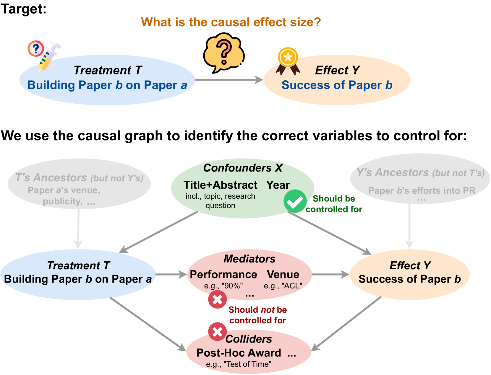
Figure 2: The causal graph of our study.
2.0.0.0.2 Causal Graph.
The causal graph, shown in Figure 2, highlights the contribution of a paper $a$ to a follow-up paper $b$ . We use a binary variable $T$ to indicate if $a$ influences $b$ and an effect variable $Y$ to represent the success of $b$ . We use $\log_{10}$ of citation counts to quantify $Y$ , although other transformations can also be used. We introduce two sets of variables in this causal graph: (i) The set of confounders, which are the common causes of $T$ and $Y$ . For instance, the research area of $b$ impacts both the likelihood of a paper citing $a$ and its own citation count. (ii) Descendants of the treatment, comprising mediators (e.g., paper $a$ influencing the quality of paper $b$ and subsequently influencing its citations) and colliders (e.g., both the influence from $a$ and the citations of $b$ influencing later awards received by $b$ ).
### 2.1 CausalCite Indices
In this section, we introduce various indices that measure the causal impact of a paper.
2.1.0.0.1 Two-Paper Interaction: Pairwise Causal Impact (PCI).
To examine the causal impact of a paper $a$ on a follow-up paper $b$ , we define the pairwise causal impact $\mathrm{PCI}(a,b)$ by unit-level causal effect:
$$
\displaystyle\mathrm{PCI}(a,b)\coloneqq y^{t=1}-y^{t=0}~{}, \tag{1}
$$
where we compare the outcomes $Y$ of the paper $b$ had it been influenced by paper $a$ or not, denoted as the actual $y^{t=1}$ and the counterfactual $y^{t=0}$ , respectively. Note that the counterfactual $y^{t=0}$ can never be observed, but only estimated by statistical methods, as we will discuss in Section 3.2.
2.1.0.0.2 Single-Paper Quality Metrics: Total Causal Impact (TCI) and Average Causal Impact (ACI).
Let $\bm{S}$ denote the set of all follow-up studies of paper $a$ . We define total causal impact $\mathrm{TCI}(a)$ as the sum of the pairwise causal impact index $\mathrm{PCI}(a,b)$ across all $b\in\bm{S}$ . That is,
$$
\mathrm{TCI}(a)\coloneqq\sum_{b\in\bm{S}}\mathrm{PCI}(a,b)~{}. \tag{2}
$$
This definition provides an aggregated measure of a paper’s influence across all its follow-up papers.
As the causal inference literature is usually interested in the average treatment effect, we further define the average causal impact (ACI) index as the average per paper PCI:
$$
\mathrm{ACI}(a)\coloneqq\frac{\mathrm{TCI}(a)}{|\bm{S}|}=\frac{1}{|\bm{S}|}
\sum_{b\in\bm{S}}\left(y^{t=1}-y^{t=0}\right)~{}. \tag{3}
$$
We note that $\mathrm{ACI}(a)$ is equal to the a verage t reatment effect on the t reated (ATT) of paper $a$ (Pearl, 2009).
## 3 The TextMatch Method
As illustrated in Figure 1, the objective of our study is to quantify the causal effect of the treatment $T$ (i.e., whether paper $b$ is built on paper $a$ ) on the effect $Y$ (i.e., the outcome of paper $b$ ). To approach this, we envision a counterfactual scenario: what if paper $a$ had never been published, yet certain key characteristics of paper $b$ remain unchanged? The critical question then becomes: which key characteristics of paper $b$ should be controlled for in this hypothetical situation?
### 3.1 What Does Causal Inference Tell Us about What Variables to Control for, and What Not?
In causal inference, selecting the appropriate variables for control is a delicate and crucial process that affects the accuracy of the analysis. Pearl’s seminal work on causality guides us in differentiating between various types of variables Pearl (2009).
Firstly, we must control for confounders – variables that influence both the treatment and the outcome. Confounders can create spurious correlations; if not controlled, they can lead us to mistakenly attribute the effect of these external factors to the treatment itself. For example, in assessing the impact of one paper on another, if both papers are in a trending research area, the apparent influence might be due to the popularity of the topic rather than the papers’ content.
However, not all variables warrant control. Mediators and colliders should be explicitly avoided in control. Mediators are part of the causal pathway between the treatment and outcome. By controlling them, we would block the very effect we are trying to measure. Colliders, affected by both the treatment and the outcome, can introduce bias when controlled. Controlling a collider can inadvertently create associations that do not naturally exist. In general, this also includes not controlling for the descendants of the treatment, as it could obscure the direct impact we intend to study.
Lastly, variables that do not share a causal path with both the treatment and outcome, known as unshared ancestors, are less critical in our analysis. They do not contribute to or confound the causal relationship we are exploring, and thus, controlling for them does not add value to our causal understanding.
### 3.2 Can Existing Causal Inference Methods Handle This Control?
Several causal inference methods have been proposed to address the problem of estimating treatment effects while controlling for confounders. Next, we will discuss the workings and limitations of three classical methods.
3.2.0.0.1 Randomized Control Trials (RCTs) Assumes Intervenability.
The ideal way to obtain causal effects is through randomized control trials (RCTs). For example, when testing a drug, we randomly split all patients into two groups, the control group and the treatment group, where the random splitting ensures the same distribution of the confounders across the two groups such as gender and age. However, RCTs are usually not easily achievable, in some cases too expensive (e.g., tracking hundreds of people’s daily lives for 50 years), and in other cases unethical (e.g., forcing a random person to smoke), or infeasible (e.g., getting a time machine to change a past event in history).
For our research question on a paper’s impact, utilizing RCTs is impractical as it is infeasible to randomly divide researchers into two groups, instructing one group to base their research on a specific paper $a$ while the other group does not, and then observe the citation count of their papers years later.
3.2.0.0.2 Ratio Matching Iterates over Discretized Confounder Values.
In the absence of RCTs, matching is as an alternate method for determining causal effects from observational data. In this case, we can let the treatment assignment happen naturally, such as taking the naturally existing set of papers and running causal inference by adjusting for the variables that block all paths. Given a set of naturally observed papers, one of the most commonly used causal inference methods is ratio matching (Rosenbaum and Rubin, 1983), whose basic idea is to iterate over all possible values $\bm{x}$ of the adjustment variables $\bm{X}$ and obtain the difference between the treatment group $\mathcal{T}$ and control group $\mathcal{C}$ :
$$
\widehat{\mathrm{ACI}}(a)=\sum_{\bm{x}}P(\bm{x})\left(\frac{1}{|\mathcal{T}_{
\bm{x}}|}\sum_{i\in\mathcal{T}_{\bm{x}}}y_{i}-\frac{1}{|\mathcal{C}_{\bm{x}}|}
\sum_{j\in\mathcal{C}_{\bm{x}}}y_{j}\right)~{}, \tag{4}
$$
where for each value $\bm{x}$ , we extract all the units corresponding to this value in the treatment and control sets, compute the average of the effect variable $Y$ for each set, and obtain the difference.
While ratio matching is practical when there is a small set of values for the adjustment variables to sum over, its applicability dwindles with high-dimensional variables like text embeddings in our context. This scenario may generate numerous intervals to sum over, presenting numerical challenges and potential breaches of the positivity assumption.
3.2.0.0.3 One-to-One Matching Is Susceptible to Variance.
To handle high-dimensional adjustment variables, one possible way is to avoid pre-defining all their possible intervals, but, instead, iterating over each unit in the treatment group to match for its closest control unit (e.g., McGue et al., 2010; Sato et al., 2022). Consider a given follow-up paper $b$ , and a set of candidate control papers $\bm{C}$ , where each paper $c_{i}$ has a citation count $y_{i}$ , and vector representation $\bm{t}_{i}$ of the confounders (e.g., research topic). One-to-one matching estimates PCI as
$$
\begin{split}\widehat{\mathrm{PCI}}(a,b)&=y_{b}-y_{\operatorname*{argmax}_{c_{
i}\in\bm{C}}m_{i}}\\
&=y_{b}-y_{\operatorname*{argmax}_{c_{i}\in\bm{C}}\mathrm{sim}(\bm{t}_{b},\bm{
t}_{i})}~{},\end{split} \tag{5}
$$
where we approximate the counterfactual sample by the paper $c_{i}\in\bm{C}$ which is the most similar to paper $b$ by the matching score $m_{i}$ , which is obtained by the cosine similarity $\mathrm{sim}$ of the confounder vectors. A limitation of the one-to-one matching method is that it might induce large instability in the result, as only taking one paper with similar contents may have a large variance in citations when the matched paper slightly differs.
### 3.3 How Do We Extending Causal Inference to Text Variables?
#### 3.3.1 Theoretical Formulation of TextMatch : Stabilizing Text Matching by Synthesis
To fill in the aforementioned gap in the existing matching methods, we propose TextMatch, which mitigates the instability issue of one-to-one matching by replacing it with a convex combination of a set of matched samples to form a synthetic counterfactual sample. Specifically, we identify a set of papers $c_{i}\in\bm{C}$ with high matching scores $m_{i}$ to the paper $b$ , and synthesize the counterfactual sample by an interpolation of them:
$$
\displaystyle\widehat{\mathrm{PCI}}(a,b)=y_{b}-\sum_{c_{i}\in\bm{C}}w_{i}y_{i}
=y_{b}-\sum_{c_{i}\in\bm{C}}\frac{m_{i}}{\sum_{c_{i}\in\bm{C}}m_{i}}y_{i}~{}, \tag{6}
$$
where the weight $w_{i}$ of each paper $c_{i}$ is proportional to the matching score $m_{i}$ and normalized.
The contributions of our method are as follows: (1) we adapt the traditional matching methods from low-dimensional covariates to any high-dimensional variables such as text embeddings; (2) different from the ratio matching, we do not stratify the covariates, but synthesize a counterfactual sample for each observed treated units; (3) due to this iteration over each treated unit instead of taking the population-level statistics, we closely control for exogenous variables for the ATT estimation, which circumvents that need for the structural causal models; (4) we further stabilize the estimand by a convex combination of a set of similar papers. Note that the contribution of Eq. 6 might seem to bear similarity with synthetic control Abadie and Gardeazabal (2003); Abadie et al. (2010), but they are fundamentally different, in that synthetic control runs on time series, and fit for the weights $w_{i}$ by linear regression between the time series of the treated unit and a set of time series from the control units, using each time step’s values in the regression loss function.
#### 3.3.2 Overall Algorithm
To operationalize our theoretical formulation above, we introduce our overall algorithm in Algorithm 1. We briefly give an overview of the the algorithm with more details to be elaborated in later sections. We use the weighted average of the matched samples following our TextMatch method in Eq. 6 through 27, 28, 29, 30, 31, 32, 33, 34, 35 and 36. In our experiments, we use the interpolation of up to top 10 matched papers. We encourage future work to explore other hyperparameter settings too. Given the PCI estimation, the main spirit of the $\textsc{GetACIandTCI}(a)$ function is to average or sum over all the follow-up studies of paper $a$ , following the theoretical formulation in Eqs. 2 and 3 and implemented in our algorithm through 7, 8, 9, 10, 11 and 12.
Algorithm 1 Get causal impact indices $\mathrm{ACI}$ and $\mathrm{TCI}$
1: Input: Paper $a$ .
2: procedure GetACIandTCI ( $a$ )
3: $\bm{D}\leftarrow\mathrm{GetDesc}(a)$ $\triangleright$ Get descendants by DFS
4: $\bm{B}\leftarrow\mathrm{GetChildren}(a)$
5: $\bm{B}^{\prime}\leftarrow\mathrm{SampleSubset}(\bm{B})$ $\triangleright$ See Section 3.3.3
6: $\bm{C}\leftarrow\mathrm{EntireSet}\backslash\{\bm{D}\cup\{a\}\}$ $\triangleright$ Get non-descendants
7: $\mathrm{ACI}\leftarrow 0$
8: for each $b_{i}$ in $\bm{B}^{\prime}$ do
9: $I_{i}\leftarrow\textsc{GetPCI}(a,b_{i},\bm{C})$
10: $\mathrm{ACI}\leftarrow\mathrm{ACI}+\frac{1}{|\bm{B}^{\prime}|}\cdot I_{i}$
11: end for
12: $\mathrm{TCI}\leftarrow\mathrm{ACI}\cdot|\bm{B}|$
13: return $\mathrm{ACI}$ and $\mathrm{TCI}$
14: end procedure
15:
16: procedure GetPCI ( $a,b,\bm{C}$ )
17: $\bm{C}_{\mathrm{sameYear}}\leftarrow\mathrm{FilterByYear}(\bm{C},b_{\mathrm{ year}})$
18: for each $p_{i}$ in $\bm{C}_{\mathrm{sameYear}}\cup\{b\}$ do
19: $\bm{t}_{i}\leftarrow\mathrm{RemoveMediator}(\mathrm{TitleAbstract}_{i})$
20: end for
21: $\bm{C}_{\mathrm{coarse}}\leftarrow\mathrm{BM25}(b,\bm{C}_{\mathrm{sameYear}}, \text{topk}=100)$
22: for each $c_{i}$ in $\bm{C}_{\mathrm{coarse}}$ do
23: $m_{i}\leftarrow\mathrm{Sim}(\bm{t}_{b},\bm{t}_{i})$
24: end for
25: $\bm{C}_{\mathrm{top10}}\leftarrow\mathrm{argmax10}_{m}(\bm{C}_{\mathrm{coarse}})$
26:
27: $M\leftarrow 0$
28: for each $c_{i}$ in $\bm{C}_{\mathrm{top10}}$ do $\triangleright$ For the normalization later
29: $M\leftarrow M+m_{i}$
30: end for
31: $\hat{y}^{t=0}\leftarrow 0$
32: for each $c_{i}$ in $\bm{C}_{\mathrm{top10}}$ do
33: $w_{i}\leftarrow\frac{m_{i}}{M}$
34: $\hat{y}^{t=0}\leftarrow\hat{y}^{t=0}+w_{i}\cdot y_{i}$ $\triangleright$ Apply Eq. 6
35: end for
36: return $y_{b}-\hat{y}^{t=0}$
37: end procedure
#### 3.3.3 Key Challenges and Mitigation Methods
We address several technical challenges below.
Confounders of Various Types First, as we mentioned in the causal graph in Figure 2, the confounder set consists of a text variable (title and abstract concatenated together) and an ordinal variable (publication year). Therefore, the similarity operation $\mathrm{Sim}$ between two papers should be customized. For our specific use case, we first filter by the publication year in 17, as it is not fair to compare the citations of papers published in different years. Then, we apply the cosine similarity method paper embeddings as in 23. As a general solution, we recommend to separate hard logical constraints, and soft matching preferences, where the hard constraints should be imposed to filter the data first, and then all the rest of the variables can be concatenated to apply the similarity metric on.
Excluding the Mediators from Confounders Another key challenge to highlight is that the text variable we use for the confounder might accidentally include some mediator information. For example, the quality or performance of a paper could be expressed in the abstract, such as “we achieved 90% accuracy.” Therefore, we conduct a specific preprocessing procedure before feeding the text variable to the similarity function. For the $\mathrm{RemoveMediator}$ function in 19, we exclude all numerical expressions such as percentage numbers, as well as descriptions such as “state-of-the-art.” For generalizability, the essence of this step is a entanglement action to separate the confounder variable (in this case, the research content) and all the descendants of the treatment variable (in this case, mentions of the performance). For more complicated cases in future work, we recommend a separate disentanglement model to be applied here.
Efficient Matching-and-Reranking Method Since we use one of the largest available paper databases, the Semantic Scholar dataset (Kinney et al., 2023) containing 206M papers, we need to optimize our algorithm for large-scale paper matching. For example, after we filter by the publication year, the number of candidate papers $\bm{C}_{\mathrm{sameYear}}$ could be up to 8.8M. In order to conduct text matching across millions of papers, we use a matching-and-reranking approach, by combining two NLP tasks, information retrieval (IR) (Manning et al., 2008) and semantic textual similarity (STS) (Majumder et al., 2016; Chandrasekaran and Mago, 2022).
Specifically, we first run large-scale matching to obtain 100 candidates papers (21) using the common IR method, BM25 (Robertson and Zaragoza, 2009). Briefly, BM25 is a bag-of-words retrieval function that uses term frequencies and document lengths to estimate relevancy between two text documents. Deploying this method, we can find a set of candidate papers for, for example, two million papers, at a speed 250x faster than the text embedding cosine similarity matching. Then, we conduct a fine-grained reranking using cosine similarity (22, 23 and 24). In the cosine similarity matching process, we use the MPNet model Song et al. (2020) to encode the text of each paper $c_{i}$ into an embedding $\bm{t}_{i}$ , with which we get the matching score $m_{i}$ according to Eq. 5 in 23, and the normalized weight $w_{i}$ by Eq. 6 in 33.
Numerical Estimation Given the large number of papers, it is numerically challenging to aggregate the TCI from individual PCIs, because the number of follow-up papers for a study can be up to tens of thousands, such as the 57,200 citations by 2023 for the ImageNet paper (Deng et al., 2009). To avoid extensively running PCI for all follow-up papers, we propose a new numerical estimation method using a carefully designed random paper subset.
A naive way to achieve this aggregation is Monte Carlo (MC) sampling. However, unfortunately, MC sampling requires very large sample sizes when it comes to estimating long-tailed distributions, which is the usual case of citations. Since citations are more likely to be concentrated in the head part of the distribution, we cannot afford the computational budget for huge sample sizes that cover the tails of the distribution. Instead, we propose a novel numerical estimation method for sampling the follow-up papers, inspired by importance sampling (Singh, 2014; Kloek and van Dijk, 1976).
Our numerical estimation method works as follows: First, we propose the formulation that the relation between ACI and TCI is an integral over all possible paper $b$ ’s. Then, we formulated the above sampling problem as integral estimation or area-under-the-curve estimation. We draw inspiration from Simpson’s method, which estimates integrals by binning the input variable into small intervals. Analogously, although we cannot run through all PCIs, we use citations as a proxy, bin the large set of follow-up papers according to their citations into $n$ equally-sized intervals, and perform random sampling over each bin, which we then sum over. In this way, we make sure that our samples come from all parts of the long-tailed distribution and are a more accurate numerical estimate for the actual TCI.
## 4 Performance Evaluation
The contribution of a paper is inherently multi-dimensional, making it infeasible to encapsulate its richness fully through a scalar. Yet the demand for a single, comprehensible metric for research impact persists, fueling the continued use of traditional citations despite their known limitations. In this section, we show how our new metrics significantly improve upon traditional citations by providing quantitative evaluations comparing the effectiveness of citations, Semantic Scholar’s highly influential (SSHI) citations (Valenzuela-Escarcega et al., 2015), and our CausalCite metric.
### 4.1 Experimental Setup
Dataset We use the Semantic Scholar dataset (Lo et al., 2020; Kinney et al., 2023) https://api.semanticscholar.org/api-docs/datasets which includes a corpus of 206M scientific papers, and a citation graph of 2.4B+ citation edges. For each paper, we obtain the title and abstract for the matching process. We list some more details of the dataset in Appendix B, such as the number of papers reaching 8M per year after 2012.
4.1.0.0.1 Selecting the Text Encoder
When projecting the text into the vector space, we need a text encoder with a strong representation power for scientific publications, and is sensitive towards two-paper similarity comparisons regarding their abstracts containing key information such as the research topics. For the representation power for scientific publications, instead of general-domain models such as BERT (Devlin et al., 2019) and RoBERTa (Liu et al., 2019), we consider LLM variants Note that we follow the standard notion by Yang et al. (2023) to refer to BERT and its variants as LLMs. pretrained on large-scale scientific text, such as SciBERT (Beltagy et al., 2019), SPECTER (Cohan et al., 2020), and MPNet (Song et al., 2020).
To check the quality of two-paper similarity measures, we conduct a small-scale empirical study comparing human-ranked paper similarity and model-identified semantic similarity in Section A.3, according to which MPNet outperforms the other two models.
Implementation Details We deploy the all-mpnet-base-v2 checkpoint of the MPNet using the transformers Python package (Wolf et al., 2020), and set the batch size to be 32. For the set of matched papers, we consider papers with cosine similarity scores higher than 0.81, which we optimize empirically on 100 random paper pairs. We the top ten most similar papers above the threshold. In special cases where there is no matched paper above the threshold, it means that no other paper works on the same idea as Paper $b$ , and we make the counterfactual citation number to be zero, which also reflects the quality of Paper $b$ as its novelty is high.
To enable efficient operations on the large-scale citation graph, we use the Dask framework, https://dask.org/ which optimizes for data processing and distributed computing. We optimize our program to take around 100GB RAM, and on average 25 minutes for each $\mathrm{PCI}(a,b)$ after matching against up to millions of candidates. More implementation details are in Section A.1. For the estimation of TCI, we empirically select the sample size to be 40, which is a balance between the computational time and performance, as found in Section A.2.
### 4.2 Author-Identified Paper Impact
In this experiment, we follow the evaluation setup in Valenzuela-Escarcega et al. (2015) to use an annotated dataset (Zhu et al., 2015) comprised of 1,037 papers, annotated according to whether they serve as significant prior work for a given follow-up study. Although paper quality evaluation can be tricky, this dataset was cleverly annotated by first collecting a set of follow-up studies and letting one of the authors of each paper go through the references they cite and select the ones that significantly impact their work. In other words, for a given paper $b$ , each reference $a$ is annotated as whether $a$ has significantly impacted $b$ or not.
Table 1 reports the accuracy of our CausalCite metric, together with two existing citation metrics: citations, and SSHI citations (Valenzuela-Escarcega et al., 2015). See the detailed derivation of the accuracy scores in Section C.2. From this table, we can see that our CausalCite metric achieves the highest accuracy, 80.29%, which is 5 points higher than SSHI, and 9 points higher than the traditional citations.
### 4.3 Test-of-Time Paper Analysis
| Metric | Accuracy |
| --- | --- |
| Citations | 71.33 |
| SSHI Citations | 75.25 |
| CausalCite | 80.29 |
Table 1: Accuracy of all three citation metrics.
| Metric | Corr. Coef. |
| --- | --- |
| Citations | 0.491 |
| SSHI Citations | 0.317 |
| TCI | 0.640 |
Table 2: Correlation coefficients of each metric and ToT paper award by Point Biserial Correlation (Tate, 1954).
<details>
<summary>x3.png Details</summary>
### Visual Description
## Violin Plot: CausalCite Distribution for ToT vs. Non-ToT Papers
### Overview
This image is a violin plot comparing the distribution of "CausalCite" (likely citation counts) between two distinct groups of academic papers: "Non-ToT Papers" and "ToT Papers." The plot illustrates that papers categorized as "ToT" (Tree of Thoughts) exhibit a significantly higher citation distribution and a wider range of citation counts compared to the "Non-ToT" control group.
### Components/Axes
* **Y-Axis:** Labeled "CausalCite." The scale is numerical, ranging from 0 to 7000, with major tick marks at intervals of 1000.
* **X-Axis:** Categorical, displaying two groups:
* **Non-ToT Papers:** Positioned on the left.
* **ToT Papers:** Positioned on the right.
* **Visual Elements:**
* **Violin Shapes:** Represent the probability density of the data.
* **Non-ToT Papers:** Filled with a light pink color.
* **ToT Papers:** Filled with a light blue/purple color.
* **Vertical Lines:** Represent the range of the data (whiskers).
* **Horizontal Lines:** Represent the central tendency (median) of the data within each group.
### Detailed Analysis
* **Non-ToT Papers (Left, Pink):**
* **Trend:** The distribution is heavily skewed toward the bottom. The vast majority of the density is concentrated near the 0 mark on the Y-axis.
* **Range:** The vertical line extends from approximately 0 to 4500.
* **Median:** The horizontal line is positioned very low, likely below 200, indicating that the median citation count for this group is quite small.
* **ToT Papers (Right, Blue):**
* **Trend:** The distribution is much broader and extends significantly higher up the Y-axis compared to the Non-ToT group. The "belly" of the violin is wider and positioned higher.
* **Range:** The vertical line extends from near 0 up to nearly 7000.
* **Median:** The horizontal line is positioned significantly higher than the Non-ToT group, appearing to be approximately 1200–1300.
### Key Observations
* **Distribution Shift:** There is a clear upward shift in the ToT distribution. While both groups have a density peak near 0, the ToT group maintains a much thicker "body" as it moves up the Y-axis.
* **Outlier/Max Range:** The maximum citation count for ToT papers (approaching 7000) is notably higher than the maximum for Non-ToT papers (approximately 4500).
* **Variance:** The ToT group shows higher variance in citation counts, as evidenced by the wider violin shape and the extended range of the vertical line.
### Interpretation
The data suggests a strong positive correlation between the "ToT" (Tree of Thoughts) methodology and citation counts.
* **Impact:** Papers utilizing the ToT framework appear to be significantly more impactful or highly cited than those that do not.
* **Distributional Difference:** The Non-ToT group follows a "long tail" distribution where the vast majority of papers receive very few citations. In contrast, the ToT group, while still having a lower tail, demonstrates a much higher probability of achieving moderate to high citation counts.
* **Inference:** This could imply that the ToT methodology is either inherently more influential, attracts more attention within the research community, or is published in higher-impact venues compared to the Non-ToT baseline. The visual evidence strongly supports the conclusion that "ToT" papers outperform "Non-ToT" papers in terms of citation metrics.
</details>
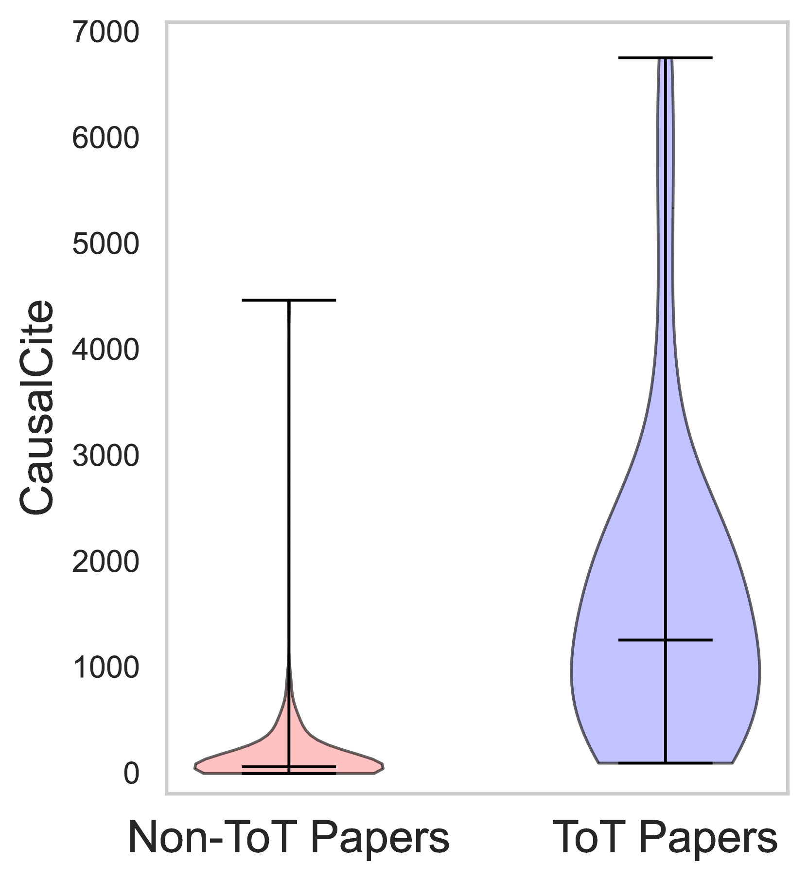
Figure 3: Distributions of ToT (mean: 142) and non-ToT papers (mean: 1,623).
<details>
<summary>x4.png Details</summary>
### Visual Description
## Scatter Plot: CausalCite Comparison by Methodology
### Overview
The image is a scatter plot visualizing "CausalCite" values across three distinct academic categories. The chart compares two methodologies: "ToT" (Tree of Thoughts) and "Non-ToT" (Non-Tree of Thoughts). The Y-axis uses a logarithmic scale, indicating that the differences between data points represent orders of magnitude.
### Components/Axes
* **Y-Axis:** Labeled "CausalCite". The scale is logarithmic, with major ticks at $10^1$, $10^2$, $10^3$, and $10^4$.
* **X-Axis:** Contains three categorical labels representing specific research papers/datasets:
1. "Random Features for Large-Scale Kernel Machines (NeurIPS 2017)"
2. "BLEU Metric (NAACL 2018)"
3. "ImageNet Dataset (CVPR 2019)"
* **Legend (Top-Right):**
* **Red Circle:** "Non-ToT"
* **Blue Circle:** "ToT"
### Detailed Analysis
The data is segmented into three vertical regions corresponding to the X-axis categories.
**1. Random Features for Large-Scale Kernel Machines (NeurIPS 2017)**
* **ToT (Blue):** A single data point is positioned at approximately $3 \times 10^3$.
* **Non-ToT (Red):** A cluster of approximately 6 data points is visible, ranging from roughly $2 \times 10^1$ to $1.5 \times 10^2$.
**2. BLEU Metric (NAACL 2018)**
* **ToT (Blue):** A single data point is positioned at approximately $7 \times 10^3$.
* **Non-ToT (Red):** A cluster of approximately 7 data points is visible, ranging from roughly $1 \times 10^1$ to $2.5 \times 10^2$.
**3. ImageNet Dataset (CVPR 2019)**
* **ToT (Blue):** A single data point is positioned at approximately $3 \times 10^4$.
* **Non-ToT (Red):** A cluster of approximately 6 data points is visible, ranging from roughly $8 \times 10^0$ to $5 \times 10^2$.
### Key Observations
* **Consistent Outperformance:** In every category, the "ToT" (Blue) data point is significantly higher than the entire cluster of "Non-ToT" (Red) data points.
* **Logarithmic Gap:** The gap between the ToT and Non-ToT groups is consistently at least one order of magnitude (10x) and often approaches two orders of magnitude (100x).
* **Upward Trend:** The "ToT" data points show an upward trend from left to right, increasing from $\approx 3,000$ to $\approx 30,000$ across the three categories.
* **Non-ToT Stability:** The "Non-ToT" clusters remain relatively stable in their distribution, consistently staying below the $10^3$ threshold, though the upper bound of the cluster increases slightly in the third category.
### Interpretation
* **Methodological Impact:** The data strongly suggests that the "ToT" (Tree of Thoughts) methodology is associated with significantly higher "CausalCite" values compared to the "Non-ToT" baseline methods.
* **Metric Significance:** Assuming "CausalCite" is a metric for citation impact or influence, this chart serves as evidence that the ToT approach yields research or results that are cited far more frequently than the baseline methods in these specific fields.
* **Scaling:** The fact that the ToT value increases as the categories progress (from NeurIPS 2017 to CVPR 2019) might suggest that the ToT methodology scales well or is applied to increasingly impactful research areas over time.
* **Outliers:** There are no "ToT" outliers; the single data point per category is consistently the maximum value in its respective column, reinforcing the superiority of the ToT method within this dataset.
</details>
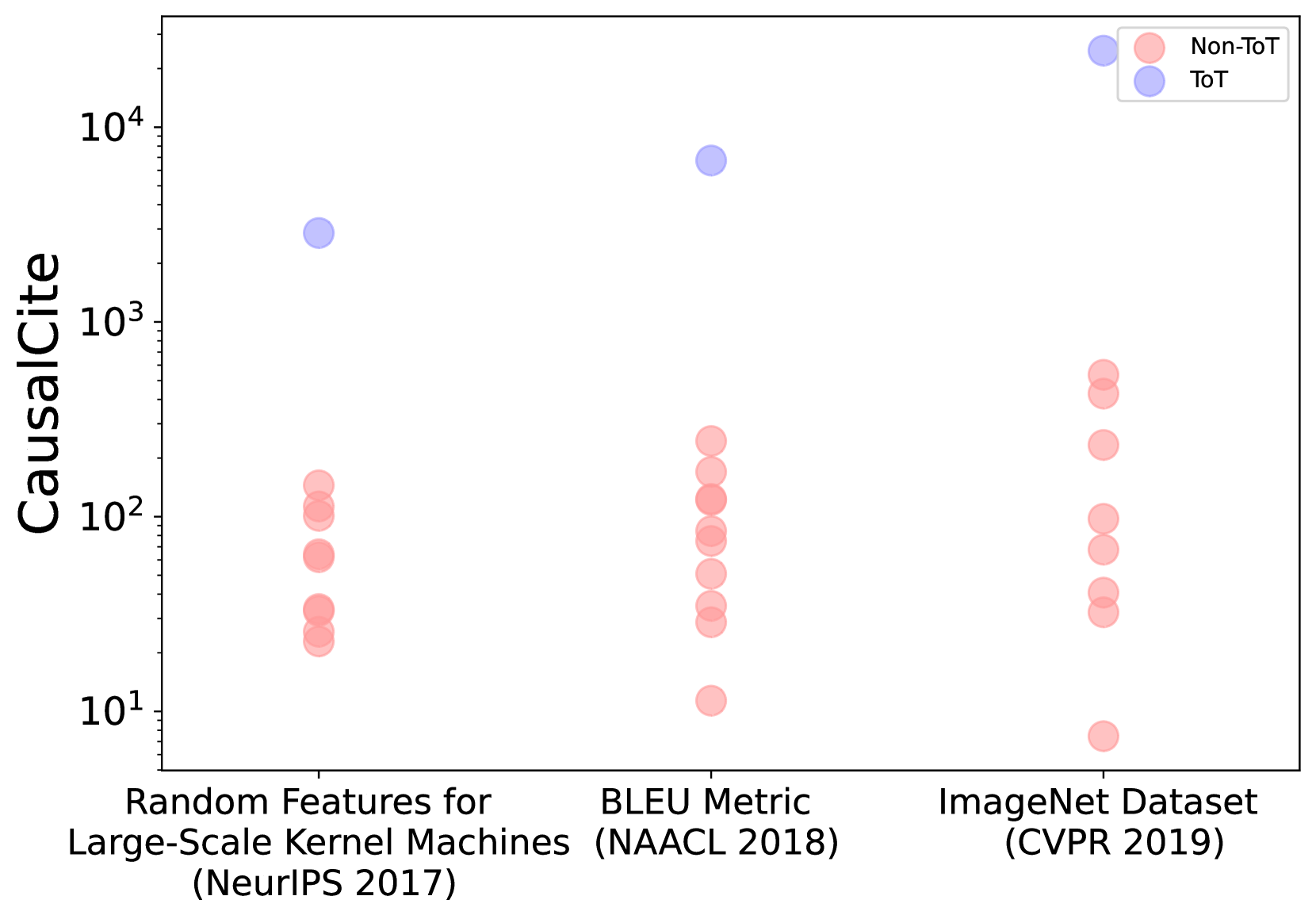
Figure 4: The CausalCite values of three example ToT papers from general AI, NLP, and CV.
The test-of-time (ToT) paper award is a prestigious honor bestowed upon papers that have made substantial and enduring impacts in their field. In this section, we collect a dataset of $792$ papers, including $72$ ToT papers, and a control group of $10$ randomly selected non-ToT papers from the same conference and year as each ToT paper. To collect this ToT paper dataset, we look into ten leading AI conferences spanning general AI (NeurIPS, ICLR, ICML, and AAAI), NLP (ACL, EMNLP, and NAACL), and CV (CVPR, ECCV, and ICCV), for which we go through each of their websites to identify all available ToT papers. We get this list by selecting the top conferences on Google Scholar using the h5-Index ranking in each of the above domains: general AI (link), CV (link), and NLP (link).
In Table 2, we show the correlations of various metrics with the ToT awards. In this table, CausalCite achieves the highest correlation of 0.639, which is +30.14% better than that of citations. Furthermore, we visualize the correspondence of our metric and ToT, and observe a substantial difference between the CausalCite distributions of ToT vs. non-ToT papers in Figure 4. We also show three examples of ToT papers in Figure 4, where the ToT papers differ from the non-ToT papers by one or two orders of magnitude.
### 4.4 Topic Invariance of CausalCite
| Research Area | ACI | Citations | SSHI |
| --- | --- | --- | --- |
| General AI (n=16) | 0.748 | 2,024 | 267 |
| CV (n=36) | 0.734 | 7,238 | 1,088 |
| NLP (n=20) | 0.763 | 1,785 | 461 |
Table 3: The average of each metric by research area on our collected set of 72 ToT papers.
A well-known issue with citations is their inconsistency across different fields. What might be considered a large number of citations in one field might be seen as average in another. In contrast, we show that our ACI index does not suffer from this issue. We show this using our ToT dataset, where we control for the quality of the papers to be ToT but vary the domain by the three fields: general AI, CV, and NLP. We observe in Table 3 that even though some domains have significantly more citations (for instance, CV ToT papers have, on average, $4.05$ times more citations than NLP), the ACI remains consistent across various fields.
## 5 Findings
Having demonstrated the effectiveness of our metrics, we now explore some open-ended questions: (1) Do best papers have high causal impact? (Section 5.1) (2) How does the CausalCite value distribute across papers? (Section 5.2) (3) What is the impact of some famous papers evaluated by CausalCite? (Section 5.3) (4) Can we use this metric to correct for citations? (Section 5.4).
### 5.1 Do Best Papers Have High Causal Impact?
Selecting best paper awards is an arguably much harder task than ToT papers, as it is difficult to predict of the impact of a paper when it is just newly published. Therefore, we are interested in the actual causal impact of best papers. Similar to our study on ToT papers, we collect a dataset of $444$ papers including $74$ best papers and a control set of random $5$ non-best papers from the same conference in the same year, using the same set of the top ten leading AI conferences. We find that the correlation of the CausalCite metric with best papers is $0.348$ , which is very low compared to the $0.639$ correlation with the ToT papers. This shows that the best papers do not necessarily have a high causal impact. One interpretation can be that the best paper evaluation is a forecasting task, which is much more challenging than the retrospective task of ToT paper selection.
### 5.2 What Is the Nature of the CausalCite Distribution?
<details>
<summary>x5.png Details</summary>
### Visual Description
## Bar Chart: TCI Distribution by Percentile
### Overview
The image displays a bar chart representing the distribution of a metric labeled "TCI" across a population sorted by percentile. The chart illustrates a highly skewed, "long-tail" distribution where a very small fraction of the population accounts for a disproportionately large share of the total TCI value.
### Components/Axes
* **Y-Axis (Vertical):** Labeled "TCI". The scale ranges from 0 to 700, with major tick marks at intervals of 100.
* **X-Axis (Horizontal):** Labeled "Percentile". The scale ranges from 0 to 100, with major tick marks at 0, 25, 50, 75, and 100.
* **Data Series:** Represented by dark blue vertical bars. The bars are sorted in descending order of TCI value from left to right.
* **Layout:** The chart is oriented with the Y-axis on the left and the X-axis at the bottom. The data fills the central plotting area.
### Detailed Analysis
The data follows a steep, non-linear decay pattern.
* **Trend Verification:** The bars are strictly sorted in descending order. The trend is a rapid, exponential-like decay from the 0th percentile, transitioning into a very gradual, linear-like decline as it approaches the 100th percentile.
* **Data Point Estimates:**
* **0th - 2nd Percentile:** There are two distinct, very tall bars at the far left. These represent the maximum values, reaching approximately 700 TCI.
* **2nd - 10th Percentile:** A sharp, immediate drop occurs. The values fall rapidly from approximately 120 down to roughly 80.
* **10th - 25th Percentile:** The decline continues but begins to flatten, moving from approximately 80 down to roughly 40.
* **25th - 75th Percentile:** The slope is much shallower. Values decrease gradually from approximately 40 down to roughly 10.
* **75th - 100th Percentile:** The values approach zero. At the extreme right (near the 100th percentile), the bars appear to dip slightly below the X-axis, indicating negative TCI values (approximately -10 to -20).
### Key Observations
* **Extreme Skewness:** The distribution is heavily right-skewed. The top 2% of the data accounts for a massive portion of the total TCI, while the vast majority of the population (the 25th to 100th percentile) has relatively low TCI values.
* **Negative Outliers:** The presence of bars below the X-axis at the 100th percentile suggests that the TCI metric can result in negative values, representing a net loss or inverse performance for the lowest-ranked entities.
* **Data Density:** The chart appears to plot individual data points or very small bins, given the high number of individual bars visible across the X-axis.
### Interpretation
This chart demonstrates a classic "winner-take-all" or Pareto distribution.
* **What the data suggests:** The "TCI" metric is not evenly distributed. A tiny minority of the population (the extreme left) possesses an exceptionally high TCI, while the majority of the population clusters at the lower end of the spectrum.
* **Why it matters:** If TCI represents a resource, wealth, or performance metric, this chart indicates extreme inequality or concentration. The system is dominated by a few high-performing or high-value entities.
* **Peircean Investigative Note:** The transition from positive to negative values at the extreme right suggests that the TCI metric is not bounded by zero. This implies that the underlying process generating TCI allows for "debt" or "negative performance," which is a critical detail for understanding the nature of the metric being measured. The sharp drop-off at the start suggests that the "high-TCI" state is difficult to achieve or maintain, acting as a significant outlier compared to the rest of the dataset.
</details>
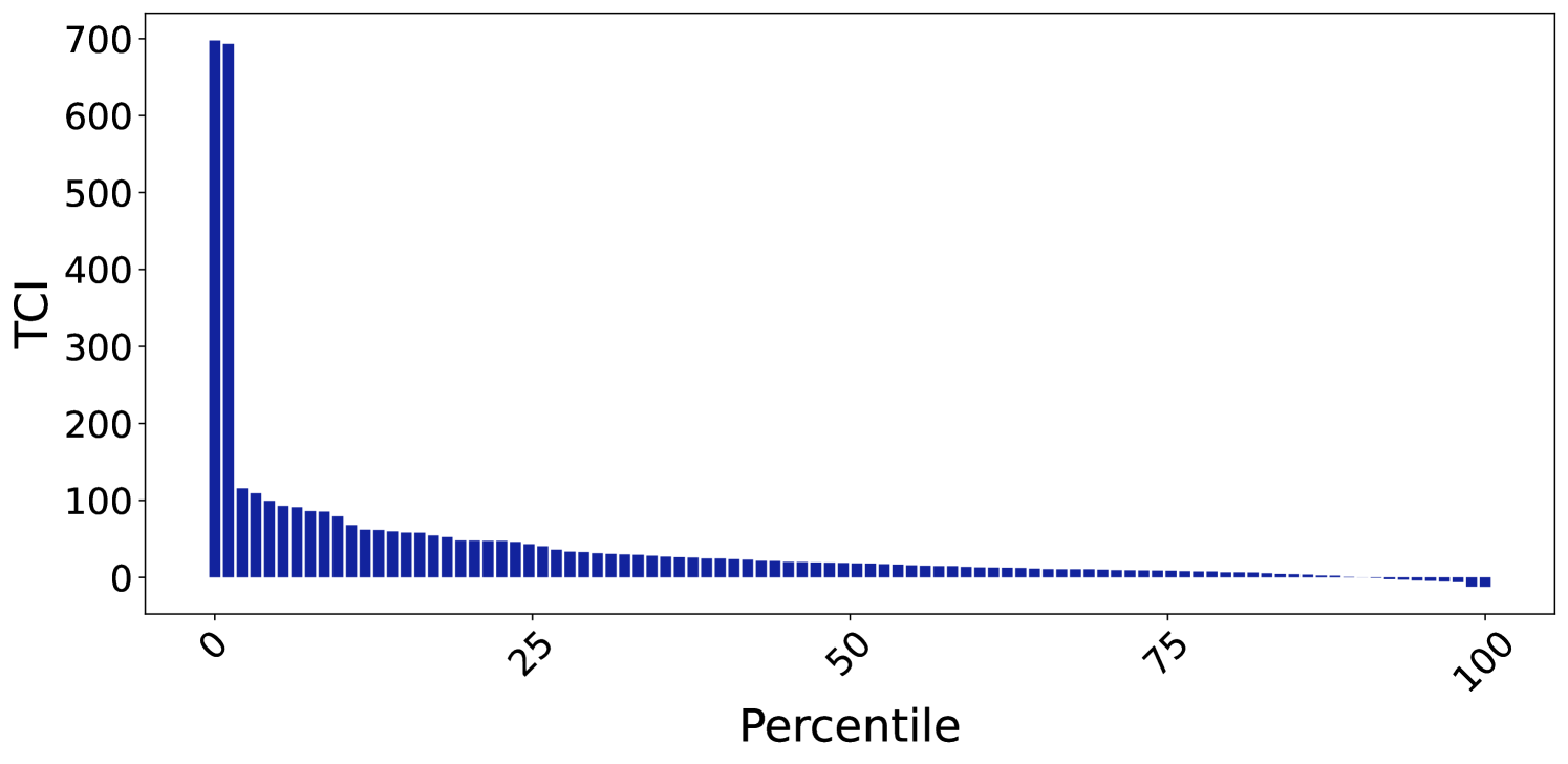
Figure 5: The distribution of TCI values by percentile of 100 random papers, which shows a long tail indicating that high impact is concentrated in a relatively small portion of papers.
We explore how the CausalCite scores are distributed across papers in general. We plot Figure 5 using a random set of 100 papers from the Semantic Scholar dataset, which is a reasonably large size given the computation budget mentioned in 4.1.0.0.1. From this plot, we can see a power law distribution with a long tail, echoing with the common belief that the paper impact follows the power law, with high impact concentrated in a relatively small portion of papers.
### 5.3 Selected Paper Case Study
| Paper Name | TCI | Citations | ACI |
| --- | --- | --- | --- |
| Transformers | 52,507 | 68,064 | 0.771 |
| BERT | 40,675 | 59,486 | 0.683 |
| RoBERTa | 6,932 | 14,434 | 0.480 |
Table 4: Case study of some selected NLP papers.
In addition to the shape of the overall distribution, we also look at our metric’s correspondence to some selected papers shown in Table 4. For example, we know that the Transformer paper (Vaswani et al., 2017) is a more foundational work than its follow-up work BERT (Devlin et al., 2019), and BERT is more foundational than its later variant, RoBERTa (Liu et al., 2019). This monotonic trend is confirmed in their TCI and ACI values too. Again, this is a preliminary case study, and we welcome future work to cover more papers.
### 5.4 Discovering Quality Papers beyond Citations
Another important contribution of our metric is that it can help discover papers that are traditionally overlooked by citations. To achieve the discovery, we formulate the problem as outlier detection, where we first use a linear projection to handle the trivial alignment of citations and CausalCite, and then analyze the outliers using the interquartile range (IQR) method (Smiti, 2020). See the exact calculation in Section C.1. We show the three subsets of papers in Table 5, where the two outlier categories, the overcited and undercited papers, correspond to the false positive and false negative oversight by citations, respectively. An additional note is that, when we look into some characteristics of the three categories, we find that the citation frequency in result section, i.e., the percentage of times they are cited in results section compared to all the citations, correlates with these categories. Specifically, we find that the undercited papers tend to have more of their citations concentrated in the results section, which usually indicates that this paper constitutes an important baseline for a follow-up study, while the overcited papers tend to be cited out of the results section, which tends to imply a less significant citation.
| Paper Category | Result Citations | Residual |
| --- | --- | --- |
| Overcited Papers (7.04%) | 1.26 | -1.792 |
| Aligned Papers (91.20%) | 1.51 | 0.118 |
| Undercited Papers (1.76%) | 1.90 | 1.047 |
Table 5: We use our CausalCite metric to discover outlier papers that are overlooked by citations. For each paper category, we include their portion relative to the entire population, the percentage of citations occurred in the result section (Result Citations), and average residual value by linear regression.
## 6 Related Work
The quantification of scientific impact has a rich history and continuously evolves with technology. Bibliometric analysis has been largely influenced by early methods that relied on citation counts (Garfield et al., 1964; Garfield, 1972, 1964). Hou (2017) investigate the evolution of citation analysis, employing reference publication year spectroscopy (RPYS) to trace its historical development in scientometrics. Donthu et al. (2021) provide practical guidelines for conducting bibliometric analysis, focusing on robust methodologies to analyze scientific data and identify emerging research trends.
Indices such as the h-index, introduced by Hirsch (2005), are established tools for measuring research impact. The more recent Relative Citation Ratio (RCR), developed by Hutchins et al. (2016), provides a field-normalized alternative to traditional metrics. Valenzuela-Escarcega et al. (2015) introduced SSHI, an approach to identify meaningful citations in scholarly literature. However, these metrics are not without limitations. As Wróblewska (2021) discussed, conventional citation-based metrics often fail to capture the multidimensional nature of research impact. In this context, Elmore (2018) discussed the Altmetric Attention Score, which evaluates the broader societal and online impact of research.
With the increasing availability of large datasets and the advent of digital technologies, new opportunities for bibliometric analysis have emerged. Iqbal et al. (2021) highlighted the role of NLP and machine learning in enhancing in-text citation analysis. Similarly, Umer et al. (2021) explored the use of textual features and SMOTE resampling techniques in scientific paper citation analysis. Jebari et al. (2021) analyzed citation context to detect research topic evolution, showcasing data analysis for scientific discourse. Chang et al. (2023) explored augmenting citations in scientific papers with historical context, offering a novel perspective on citation analysis. Manghi et al. (2021) introduced scientific knowledge graphs, an innovative method for evaluating research impact. Bittmann et al. (2021) explored statistical matching in bibliometrics, discussing its utility and challenges in post-matching analysis. The use of AI in bibliometric analysis is highlighted in research by Chubb et al. (2022) and the systematic review of AI in information systems by Collins et al. (2021). Network analysis approaches, as discussed by Chakraborty et al. (2020) in the context of patent citations and by Dawson et al. (2014) in learning analytics, further illustrate the diverse applications of advanced methodologies in understanding citation patterns.
## 7 Conclusion
In this study, we propose CausalCite, a novel causal formulation for paper citations. Our method combines traditional causal inference methods with the recent advancement of NLP in LLMs to provide a new causal outlook on paper impact by answering the causal question: ”Had this paper never been published, what would be the impact on this paper’s current follow-up studies?”. With extensive experiments and analyses using expert ratings and test-of-time papers as criteria for impact, our new CausalCite metric demonstrates clear improvements over the traditional citation metrics. Finally, we use this metric to investigate several open-ended questions like “Do best papers have high causal impact?”, conduct a case study of famous papers, and suggest future usage of our metric for discovering good papers less recognized by citations for the scientific community.
## Limitations and Future Work
There are several limitations for our work. For example, as mentioned previously, our metric has a high computational budget. Future work can explore more efficient optimization methods. Also, we model the content of the paper by its title and abstract, it could also be possible for future work to benefit from modeling the full text, given appropriate license permissions.
As for another limitation, our study is based on data provided by the Semantic Scholar corpus. This corpora has certain properties such as being more comprehensive with computer science papers, but less so in other disciplines. Its citation data also has a delay compared to Google Scholar, so for the newest papers, the citation score may not be accurate, making it more difficult to calculate our metric.
Additionally, our study provides a general framework for causal inference given a causal graph that involves text. It is totally possible that for a more fine-grained problem, the causal graph will change, in which case, we undersuggest future researchers to derive the new backdoor adjustment set, and then adjust the algorithm accordingly. An example of such a variable could be the author information, which might also be a confounder.
Finally, since quality evaluation of a paper is a multi-faceted task, theoretically, a single number can never give more than a rough approximation, because it collapses multiple dimensions into one and loses information. Our argument in this paper is just to show that our formulation is theoretically more accurate than the citation formulation. We take one step further, instead of solving the quality evaluation problem which is much more nuanced. Some intrinsic problems in citations that we can also not solve (because our metrics still rely on using citations, just contrasting them in the right away) include (1) if a paper is newly published, with zero citations, there is no way to obtain a positive causal index, and (2) we do not solve the fair attribution problem when multiple authors share credit of a paper, as our metric is not sensitive towards authors.
## Ethical Considerations
Data Collection and Privacy The data used in this work are all from Open Source Semantic Scholar data, with no user privacy concerns. The potential use of this work is for finding papers that are unique and innovative but do not get enough citations due to loack of popularity or awareness of the field. This metric can act as an aid when deciding impact of papers, but we do not suggest its usage without expert involvement. Through this work, we are not trying to demean or criticize anyone’s work we only intend to find more papers that have made a valuable contribution to the field.
CS-Centric Perspective The authors of this paper work in Computer Science (mostly Machine Learning) hence a lot of analysis done on the quality of papers that required sanity checks are done on ML papers. The conferences selected for doing the ToT evaluation were also CS Top conferences, hence they might have induced some biases. The metric in general has been created generically and should be applicable to other domains as well, the Author Identified Most Influential Papers study is also done on a generalized dataset, but we encourage readers in other disciplines to try out the metric on papers from their field.
## Author Contributions
This project originates as part of the AI Scholar series of projects that Zhijing Jin started since 2021, as she identified that causal inference over papers is a valuable research setting with sufficient data and rich causal phenomena. Bernhard Schölkopf came up with the formulation that the action of citation itself has a causal nature, and can thus be formulated as a causal inference question. Zhijing, Bernhard, and Siyuan Guo settled down the overall project design.
After the initial idea formulation, Ishan Kumar and Zhijing Jin operationalized the entire project, with vast efforts in identifying the data source; improving the theoretical formulation (together with Ehsan Mokhtarian, and Bernhard); speeding up the code efficiency; designing the evaluation and analysis protocols (with the insightful supervision from Mrinmaya Sachan and Bernhard, and suggestions from Siyuan); and implementing all the evaluations (with the help of Yuen Chen). In the writing stage, Mrinmaya gave substantial guidance to structure the storyline of the paper, and Zhijing, Ehsan, Ishan, and Mrinmaya contributed significantly to the writing, with various help and suggestions from all the other authors.
## Acknowledgment
During the idea formulation stage, we are grateful for the research discussions with Kun Zhang on the vision of the AI Scholar series of projects. During the implementation of our paper, we thank Zhiheng Lyu for his suggestions on efficient computer algorithm over massive graphs and large data. We also thank labmates from Max Planck Institute for constructive feedback and help on data annotation. We thank Vincent Berenz, Felix Leeb, and Luigi Gresele for their generous support with computation resources.
This material is based in part upon works supported by the German Federal Ministry of Education and Research (BMBF): Tübingen AI Center, FKZ: 01IS18039B; by the Machine Learning Cluster of Excellence, EXC number 2064/1 – Project number 390727645; by the John Templeton Foundation (grant #61156); by a Responsible AI grant by the Haslerstiftung; and an ETH Grant (ETH-19 21-1). Zhijing Jin is supported by PhD fellowships from the Future of Life Institute and Open Philanthropy, as well as the travel support from ELISE (GA no 951847) for the ELLIS program.
## References
- Abadie et al. (2010) Alberto Abadie, Alexis Diamond, and Jens Hainmueller. 2010. Synthetic control methods for comparative case studies: Estimating the effect of california’s tobacco control program. Journal of the American statistical Association, 105(490):493–505.
- Abadie and Gardeazabal (2003) Alberto Abadie and Javier Gardeazabal. 2003. The economic costs of conflict: A case study of the basque country. American economic review, 93(1):113–132.
- Beltagy et al. (2019) Iz Beltagy, Kyle Lo, and Arman Cohan. 2019. SciBERT: A pretrained language model for scientific text. In Proceedings of the 2019 Conference on Empirical Methods in Natural Language Processing and the 9th International Joint Conference on Natural Language Processing (EMNLP-IJCNLP), pages 3615–3620, Hong Kong, China. Association for Computational Linguistics.
- Bittmann et al. (2021) Felix Bittmann, Alexander Tekles, and Lutz Bornmann. 2021. Applied usage and performance of statistical matching in bibliometrics: The comparison of milestone and regular papers with multiple measurements of disruptiveness as an empirical example. Quantitative Science Studies, 2(4):1246–1270.
- Brown et al. (2020) Tom B. Brown, Benjamin Mann, Nick Ryder, Melanie Subbiah, Jared Kaplan, Prafulla Dhariwal, Arvind Neelakantan, Pranav Shyam, Girish Sastry, Amanda Askell, Sandhini Agarwal, Ariel Herbert-Voss, Gretchen Krueger, T. J. Henighan, Rewon Child, Aditya Ramesh, Daniel M. Ziegler, Jeff Wu, Clemens Winter, Christopher Hesse, Mark Chen, Eric Sigler, Mateusz Litwin, Scott Gray, Benjamin Chess, Jack Clark, Christopher Berner, Sam McCandlish, Alec Radford, Ilya Sutskever, and Dario Amodei. 2020. Language models are few-shot learners. ArXiv, abs/2005.14165.
- Carlsson (2009) Håkan Carlsson. 2009. Allocation of research funds using bibliometric indicators–asset and challenge to swedish higher education sector.
- Chakraborty et al. (2020) Manajit Chakraborty, Maksym Byshkin, and Fabio Crestani. 2020. Patent citation network analysis: A perspective from descriptive statistics and ergms. Plos one, 15(12):e0241797.
- Chandrasekaran and Mago (2022) Dhivya Chandrasekaran and Vijay Mago. 2022. Evolution of semantic similarity - A survey. ACM Comput. Surv., 54(2):41:1–41:37.
- Chang et al. (2023) Joseph Chee Chang, Amy X Zhang, Jonathan Bragg, Andrew Head, Kyle Lo, Doug Downey, and Daniel S Weld. 2023. Citesee: Augmenting citations in scientific papers with persistent and personalized historical context. In Proceedings of the 2023 CHI Conference on Human Factors in Computing Systems, pages 1–15.
- Chowdhery et al. (2022) Aakanksha Chowdhery, Sharan Narang, Jacob Devlin, Maarten Bosma, Gaurav Mishra, Adam Roberts, Paul Barham, Hyung Won Chung, Charles Sutton, Sebastian Gehrmann, Parker Schuh, Kensen Shi, Sasha Tsvyashchenko, Joshua Maynez, Abhishek Rao, Parker Barnes, Yi Tay, Noam M. Shazeer, Vinodkumar Prabhakaran, Emily Reif, Nan Du, Benton C. Hutchinson, Reiner Pope, James Bradbury, Jacob Austin, Michael Isard, Guy Gur-Ari, Pengcheng Yin, Toju Duke, Anselm Levskaya, Sanjay Ghemawat, Sunipa Dev, Henryk Michalewski, Xavier García, Vedant Misra, Kevin Robinson, Liam Fedus, Denny Zhou, Daphne Ippolito, David Luan, Hyeontaek Lim, Barret Zoph, Alexander Spiridonov, Ryan Sepassi, David Dohan, Shivani Agrawal, Mark Omernick, Andrew M. Dai, Thanumalayan Sankaranarayana Pillai, Marie Pellat, Aitor Lewkowycz, Erica Moreira, Rewon Child, Oleksandr Polozov, Katherine Lee, Zongwei Zhou, Xuezhi Wang, Brennan Saeta, Mark Díaz, Orhan Firat, Michele Catasta, Jason Wei, Kathleen S. Meier-Hellstern, Douglas Eck, Jeff Dean, Slav Petrov, and Noah Fiedel. 2022. Palm: Scaling language modeling with pathways. J. Mach. Learn. Res., 24:240:1–240:113.
- Chubb et al. (2022) Jennifer Chubb, Peter Cowling, and Darren Reed. 2022. Speeding up to keep up: exploring the use of ai in the research process. AI & society, 37(4):1439–1457.
- Cohan et al. (2020) Arman Cohan, Sergey Feldman, Iz Beltagy, Doug Downey, and Daniel S. Weld. 2020. SPECTER: Document-level Representation Learning using Citation-informed Transformers. In ACL.
- Collins et al. (2021) Christopher Collins, Denis Dennehy, Kieran Conboy, and Patrick Mikalef. 2021. Artificial intelligence in information systems research: A systematic literature review and research agenda. International Journal of Information Management, 60:102383.
- Cortes and Lawrence (2021) Corinna Cortes and Neil D. Lawrence. 2021. Inconsistency in conference peer review: Revisiting the 2014 neurips experiment. CoRR, abs/2109.09774.
- Courant et al. (1952) Ernest D. Courant, Milton Stanley Livingston, and Hartland S. Snyder. 1952. The strong-focusing synchrotron-a new high energy accelerator. Physical Review, 88:1190–1196.
- Dawson et al. (2014) Shane Dawson, Dragan Gašević, George Siemens, and Srecko Joksimovic. 2014. Current state and future trends: A citation network analysis of the learning analytics field. In Proceedings of the fourth international conference on learning analytics and knowledge, pages 231–240.
- Deng et al. (2009) Jia Deng, Wei Dong, Richard Socher, Li-Jia Li, Kai Li, and Li Fei-Fei. 2009. ImageNet: A large-scale hierarchical image database. In Computer Vision and Pattern Recognition (CVPR), pages 248–255.
- Devlin et al. (2019) Jacob Devlin, Ming-Wei Chang, Kenton Lee, and Kristina Toutanova. 2019. BERT: Pre-training of deep bidirectional transformers for language understanding. In Proceedings of the 2019 Conference of the North American Chapter of the Association for Computational Linguistics: Human Language Technologies, Volume 1 (Long and Short Papers), pages 4171–4186, Minneapolis, Minnesota. Association for Computational Linguistics.
- Donthu et al. (2021) Naveen Donthu, Satish Kumar, Debmalya Mukherjee, Nitesh Pandey, and Weng Marc Lim. 2021. How to conduct a bibliometric analysis: An overview and guidelines. Journal of business research, 133:285–296.
- Elmore (2018) Susan A Elmore. 2018. The altmetric attention score: what does it mean and why should i care?
- Fang and Zhan (2015) Xing Fang and Justin Zhijun Zhan. 2015. Sentiment analysis using product review data. Journal of Big Data, 2:1–14.
- Garfield (1964) Eugene Garfield. 1964. " science citation index"—a new dimension in indexing: This unique approach underlies versatile bibliographic systems for communicating and evaluating information. Science, 144(3619):649–654.
- Garfield (1972) Eugene Garfield. 1972. Citation analysis as a tool in journal evaluation: Journals can be ranked by frequency and impact of citations for science policy studies. Science, 178(4060):471–479.
- Garfield et al. (1964) Eugene Garfield, Irving H Sher, Richard J Torpie, et al. 1964. The use of citation data in writing the history of science.
- Gary Holden and Barker (2005) Gary Rosenberg Gary Holden and Kathleen Barker. 2005. Bibliometrics. Social Work in Health Care, 41(3-4):67–92.
- Gomez et al. (2022) Charles J Gomez, Andrew C Herman, and Paolo Parigi. 2022. Leading countries in global science increasingly receive more citations than other countries doing similar research. Nature Human Behaviour, 6(7):919–929.
- Hernán and Robins (2010) Miguel A Hernán and James M Robins. 2010. Causal inference.
- Hirsch (2005) Jorge E Hirsch. 2005. An index to quantify an individual’s scientific research output. Proceedings of the National academy of Sciences, 102(46):16569–16572.
- Hou (2017) Jianhua Hou. 2017. Exploration into the evolution and historical roots of citation analysis by referenced publication year spectroscopy. Scientometrics, 110:1437–1452.
- Hutchins et al. (2016) B Ian Hutchins, Xin Yuan, James M Anderson, and George M Santangelo. 2016. Relative citation ratio (rcr): a new metric that uses citation rates to measure influence at the article level. PLoS biology, 14(9):e1002541.
- Iqbal et al. (2021) Sehrish Iqbal, Saeed-Ul Hassan, Naif Radi Aljohani, Salem Alelyani, Raheel Nawaz, and Lutz Bornmann. 2021. A decade of in-text citation analysis based on natural language processing and machine learning techniques: An overview of empirical studies. Scientometrics, 126(8):6551–6599.
- Jebari et al. (2021) Chaker Jebari, Enrique Herrera-Viedma, and Manuel Jesus Cobo. 2021. The use of citation context to detect the evolution of research topics: a large-scale analysis. Scientometrics, 126(4):2971–2989.
- Kinney et al. (2023) Rodney Kinney, Chloe Anastasiades, Russell Authur, Iz Beltagy, Jonathan Bragg, Alexandra Buraczynski, Isabel Cachola, Stefan Candra, Yoganand Chandrasekhar, Arman Cohan, Miles Crawford, Doug Downey, Jason Dunkelberger, Oren Etzioni, Rob Evans, Sergey Feldman, Joseph Gorney, David Graham, Fangzhou Hu, Regan Huff, Daniel King, Sebastian Kohlmeier, Bailey Kuehl, Michael Langan, Daniel Lin, Haokun Liu, Kyle Lo, Jaron Lochner, Kelsey MacMillan, Tyler Murray, Chris Newell, Smita Rao, Shaurya Rohatgi, Paul Sayre, Zejiang Shen, Amanpreet Singh, Luca Soldaini, Shivashankar Subramanian, Amber Tanaka, Alex D. Wade, Linda Wagner, Lucy Lu Wang, Chris Wilhelm, Caroline Wu, Jiangjiang Yang, Angele Zamarron, Madeleine van Zuylen, and Daniel S. Weld. 2023. The semantic scholar open data platform. CoRR, abs/2301.10140.
- Kloek and van Dijk (1976) Teun Kloek and Herman K. van Dijk. 1976. Bayesian estimates of equation system parameters, an application of integration by monte carlo. Econometrica, 46:1–19.
- Liu et al. (2019) Yinhan Liu, Myle Ott, Naman Goyal, Jingfei Du, Mandar Joshi, Danqi Chen, Omer Levy, Mike Lewis, Luke Zettlemoyer, and Veselin Stoyanov. 2019. RoBERTa: A robustly optimized BERT pretraining approach. arXiv preprint arXiv:1907.11692.
- Lo et al. (2020) Kyle Lo, Lucy Lu Wang, Mark Neumann, Rodney Kinney, and Daniel Weld. 2020. S2ORC: The semantic scholar open research corpus. In Proceedings of the 58th Annual Meeting of the Association for Computational Linguistics, pages 4969–4983, Online. Association for Computational Linguistics.
- Majumder et al. (2016) Goutam Majumder, Partha Pakray, Alexander Gelbukh, and David Pinto. 2016. Semantic textual similarity methods, tools, and applications: A survey. Computación y Sistemas, 20.
- Manghi et al. (2021) Paolo Manghi, Andrea Mannocci, Francesco Osborne, Dimitris Sacharidis, Angelo Salatino, and Thanasis Vergoulis. 2021. New trends in scientific knowledge graphs and research impact assessment.
- Manning et al. (2008) Christopher D. Manning, Prabhakar Raghavan, and Hinrich Schütze. 2008. Introduction to information retrieval. In J. Assoc. Inf. Sci. Technol.
- McGue et al. (2010) Matt McGue, Merete Osler, and Kaare Christensen. 2010. Causal inference and observational research: The utility of twins. Perspectives on psychological science, 5(5):546–556.
- Moed (2006) Henk F Moed. 2006. Citation analysis in research evaluation, volume 9. Springer Science & Business Media.
- Pearl (2009) Judea Pearl. 2009. Causality. Cambridge University Press.
- Piro and Sivertsen (2016) Fredrik Niclas Piro and Gunnar Sivertsen. 2016. How can differences in international university rankings be explained? Scientometrics, 109(3):2263–2278.
- Prechelt et al. (2018) Lutz Prechelt, Daniel Graziotin, and Daniel Méndez Fernández. 2018. A community’s perspective on the status and future of peer review in software engineering. Information and Software Technology, 95:75–85.
- Radford and Narasimhan (2018) Alec Radford and Karthik Narasimhan. 2018. Improving language understanding by generative pre-training.
- Radford et al. (2019) Alec Radford, Jeff Wu, Rewon Child, David Luan, Dario Amodei, and Ilya Sutskever. 2019. Language models are unsupervised multitask learners.
- Reimers and Gurevych (2019) Nils Reimers and Iryna Gurevych. 2019. Sentence-bert: Sentence embeddings using siamese bert-networks. In Conference on Empirical Methods in Natural Language Processing.
- Resnik et al. (2008) David B Resnik, Christina Gutierrez-Ford, and Shyamal Peddada. 2008. Perceptions of ethical problems with scientific journal peer review: an exploratory study. Science and engineering ethics, 14(3):305–310.
- Robertson and Zaragoza (2009) Stephen E. Robertson and Hugo Zaragoza. 2009. The probabilistic relevance framework: Bm25 and beyond. Found. Trends Inf. Retr., 3:333–389.
- Rogers et al. (2023) Anna Rogers, Marzena Karpinska, Jordan Boyd-Graber, and Naoaki Okazaki. 2023. Program chairs’ report on peer review at acl 2023. In Proceedings of the 61st Annual Meeting of the Association for Computational Linguistics (Volume 1: Long Papers), pages xl–lxxv, Toronto, Canada. Association for Computational Linguistics.
- Rombach et al. (2021) Robin Rombach, A. Blattmann, Dominik Lorenz, Patrick Esser, and Björn Ommer. 2021. High-resolution image synthesis with latent diffusion models. 2022 IEEE/CVF Conference on Computer Vision and Pattern Recognition (CVPR), pages 10674–10685.
- Rosenbaum and Rubin (1983) Paul R Rosenbaum and Donald B Rubin. 1983. The central role of the propensity score in observational studies for causal effects. Biometrika, 70(1):41–55.
- Rungta et al. (2022) Mukund Rungta, Janvijay Singh, Saif M. Mohammad, and Diyi Yang. 2022. Geographic citation gaps in NLP research. In Proceedings of the 2022 Conference on Empirical Methods in Natural Language Processing, pages 1371–1383, Abu Dhabi, United Arab Emirates. Association for Computational Linguistics.
- Sato et al. (2022) Ryoma Sato, Makoto Yamada, and Hisashi Kashima. 2022. Twin papers: A simple framework of causal inference for citations via coupling. In Proceedings of the 31st ACM International Conference on Information & Knowledge Management, Atlanta, GA, USA, October 17-21, 2022, pages 4444–4448. ACM.
- Shah (2022) Nihar B Shah. 2022. An overview of challenges, experiments, and computational solutions in peer review. Communications of the ACM, 65(6):76–87.
- Singh (2014) Surya Nath Singh. 2014. Sampling techniques & determination of sample size in applied statistics research : an overview.
- Smiti (2020) Abir Smiti. 2020. A critical overview of outlier detection methods. Computer Science Review, 38:100306.
- Song et al. (2020) Kaitao Song, Xu Tan, Tao Qin, Jianfeng Lu, and Tie-Yan Liu. 2020. Mpnet: Masked and permuted pre-training for language understanding. arXiv preprint arXiv:2004.09297.
- Tate (1954) Robert F. Tate. 1954. Correlation between a discrete and a continuous variable. point-biserial correlation. Annals of Mathematical Statistics, 25:603–607.
- Umer et al. (2021) Muhammad Umer, Saima Sadiq, Malik Muhammad Saad Missen, Zahid Hameed, Zahid Aslam, Muhammad Abubakar Siddique, and Michele Nappi. 2021. Scientific papers citation analysis using textual features and smote resampling techniques. Pattern Recognition Letters, 150:250–257.
- Valenzuela et al. (2015) Marco Valenzuela, Vu Ha, and Oren Etzioni. 2015. Identifying meaningful citations. In Scholarly Big Data: AI Perspectives, Challenges, and Ideas, Papers from the 2015 AAAI Workshop, Austin, Texas, USA, January, 2015, volume WS-15-13 of AAAI Technical Report. AAAI Press.
- Valenzuela-Escarcega et al. (2015) Marco Antonio Valenzuela-Escarcega, Vu A. Ha, and Oren Etzioni. 2015. Identifying meaningful citations. In AAAI Workshop: Scholarly Big Data.
- Vaswani et al. (2017) Ashish Vaswani, Noam Shazeer, Niki Parmar, Jakob Uszkoreit, Llion Jones, Aidan N. Gomez, Lukasz Kaiser, and Illia Polosukhin. 2017. Attention is all you need. In Advances in Neural Information Processing Systems 30: Annual Conference on Neural Information Processing Systems 2017, December 4-9, 2017, Long Beach, CA, USA, pages 5998–6008.
- Wilsdon et al. (2015) James Wilsdon, Liz Allen, Eleonora Belfiore, Philip Campbell, Stephen Curry, Steven A. Hill, Richard Jones, Roger J. P. Kain, Simon Kerridge, Mike A Thelwall, Jane Tinkler, Ian Viney, Paul Wouters, Jude Hill, and Brandon Johnson. 2015. The metric tide: report of the independent review of the role of metrics in research assessment and management.
- Wolf et al. (2020) Thomas Wolf, Lysandre Debut, Victor Sanh, Julien Chaumond, Clement Delangue, Anthony Moi, Pierric Cistac, Tim Rault, Remi Louf, Morgan Funtowicz, Joe Davison, Sam Shleifer, Patrick von Platen, Clara Ma, Yacine Jernite, Julien Plu, Canwen Xu, Teven Le Scao, Sylvain Gugger, Mariama Drame, Quentin Lhoest, and Alexander Rush. 2020. Transformers: State-of-the-art natural language processing. In Proceedings of the 2020 Conference on Empirical Methods in Natural Language Processing: System Demonstrations, pages 38–45, Online. Association for Computational Linguistics.
- Wróblewska (2021) Marta Natalia Wróblewska. 2021. Research impact evaluation and academic discourse. Humanities and Social Sciences Communications, 8(1):1–12.
- Yang et al. (2023) Jingfeng Yang, Hongye Jin, Ruixiang Tang, Xiaotian Han, Qizhang Feng, Haoming Jiang, Bing Yin, and Xia Hu. 2023. Harnessing the power of llms in practice: A survey on chatgpt and beyond. ArXiv, abs/2304.13712.
- Zainuddin and Selamat (2014) Nurulhuda Zainuddin and Ali Selamat. 2014. Sentiment analysis using support vector machine. 2014 International Conference on Computer, Communications, and Control Technology (I4CT), pages 333–337.
- Zhu et al. (2015) Xiao-Dan Zhu, Peter D. Turney, Daniel Lemire, and André Vellino. 2015. Measuring academic influence: Not all citations are equal. Journal of the Association for Information Science and Technology, 66.
Appendix
## Appendix A Additional Implementation Details
### A.1 Time and Space Complexity Details
For the time cost of running the causal impact indices, each $\mathrm{PCI}(a,b)$ takes around 1,500 seconds, or 25 minutes. Multiplying this by 40 samples per paper $a$ , we spend 16.67 hours to calculate each ACI or TCI for the paper’s overall impact. For a fine-grained division into the time cost, the majority of the time is spend on the BM25 indexing (800s) and the sentence embedding cosine similarities calculation (400s). The rest of the time-consuming steps are the BFS search (150-200s every time) to identify descendants and non-descendants of a paper.
For the space complexity, we loaded the 2.4B edges of the citation graph into a parquet gzip format for faster loading, and use Dask’s lazy load operation to load it part by part to RAM for better parallelization. The program can fit into different sizes of RAMs by modifying the number of partitions and reducing the number of workers in Dask, at the cost of an increased computation time. On the hard disk, citation graph takes up 19G space, and paper data takes 11G.
### A.2 Numerical Estimation Method: Finding the Sample Size
For our numerical estimation method, we first calculate the ACI on a subset of carefully sampled papers and then aggregate it to TCI. One design choice question is how to decide the size of this random subset. In our case, we need to balance both the computation time (25 minutes per pairwise paper impact) and the estimation accuracy. To identify the best sample size, we conduct a small-scale study, first obtaining the TCI using our upper-bound budget of $n=100$ samples and then gradually decreasing the number of samples to see if there is a stable point in the middle which also leads to a result close to that obtained with 100 samples. In Figure 6, we show the trade-off of the two curves, the error curve and time cost, where we can see $n=40$ seems to be a good point balancing the two. It is at the elbow of the arrow curve, making it relatively close to the estimation result of $n=100$ , and also in the meantime vastly saving our computational budget, enabling us to run efficient experiments for more analyses. $0 0$ $20$ $40$ $60$ $80$ $100$ $0 0$ $50$ $100$ $150$ Sample Size $n$ Error Percentage TCI error $0 0$ $1{,}000$ $2{,}000$ $3{,}000$ Minutes Computational time
Figure 6: We show the trade-off of two curves: the error curve (orange), and the time cost curve (blue). For the error curve, we see an elbow point at around $n=40$ , when the error starts to be small. The curve for the computational time is linear, taking 25 minutes for each paper. Balancing the trade-offs, we decided to choose the sample size $n=40$ .
### A.3 Experiment to Select the Best Embedding Method
When selecting the text encoder for our TextMatch method, we compare among the three LLMs pre-trained on scientific papers, SciBERT, MPNet, and SPECTER. Specifically, we conduct a small-scale experiment to see how much the similarities scores based on the embedding of each model align with human annotations. As for the annotation process, we first collect a set of random papers, and for each such paper (which we call a pivot paper), we identify ten papers, from the most similar to the least, with monotonically decreasing similarity. We collect a total of 100 papers consisting of ten such collections, for which we show an example in Table 6. Then we see how the resulting similarity scores conform to this order by deducting the percentage of papers that are out of place in the ranking.
We find that MPNet correlates the best with human judgments, achieving an accuracy of 82%, which is 10 points better the second best one, SPECTER, which gets 72%, and 18 points better than SciBERT with a score of 64%. It also gives more distinct scores to papers with different levels of similarity. This capability advantage may be attributed to its Siamese network objectives in the training process (Song et al., 2020). We open-sourced our annotated data in the codebase.
| Paper Index | Title | SciBERT | SPECTER | MPNet |
| --- | --- | --- | --- | --- |
| Pivot Paper: GPT-3 (Brown et al., 2020) | | | | |
| 1 (Most similar) | PaLM (Chowdhery et al., 2022) | 0.9787 | 0.8689 | 0.7679 |
| 2 | GPT-2 (Radford et al., 2019) | 0.9346 | 0.9064 | 0.8196 |
| 3 | GPT (Radford and Narasimhan, 2018) | 0.9488 | 0.8778 | 0.7790 |
| 4 | BERT (Devlin et al., 2019) | 0.9430 | 0.8321 | 0.6784 |
| 5 | Transformers (Vaswani et al., 2017) | 0.9202 | 0.8644 | 0.6385 |
| 6 | SciBERT (Beltagy et al., 2019) | 0.8396 | 0.8112 | 0.5667 |
| 7 | Latent Diffusion Models (Rombach et al., 2021) | 0.9586 | 0.7755 | 0.4567 |
| 8 | Sentiment Analysis Using DL (Fang and Zhan, 2015) | 0.7775 | 0.7298 | 0.2911 |
| 9 | Sentiment Analysis Using ML (Zainuddin and Selamat, 2014) | 0.6462 | 0.6403 | 0.2563 |
| 10 (Least similar) | New High Energy Accelerator (Courant et al., 1952) | 0.8033 | 0.5617 | 0.0359 |
Table 6: An example collection of papers with monotonically decreasing similarity to the pivot paper. As can be seen from the similarities scores produced by the three text embedding methods, MPNet corresponds to the ground truth the most, and also shows clear score distinctions between less similar and more similar papers.
## Appendix B Dataset Overview
<details>
<summary>extracted/5624611/fig/paperVsYearTitles.png Details</summary>
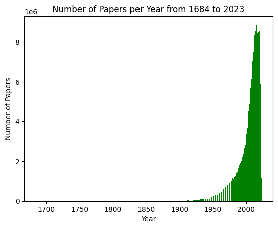
### Visual Description
## Bar Chart: Number of Papers per Year from 1684 to 2023
### Overview
This image is a bar chart illustrating the annual volume of academic or scientific papers published over a period spanning from 1684 to 2023. The chart displays a clear, exponential growth trend, characterized by a long period of negligible output followed by a massive surge in publication volume starting in the mid-20th century.
### Components/Axes
* **Title:** "Number of Papers per Year from 1684 to 2023" (Centered at the top).
* **X-Axis:** Labeled "Year". The axis spans from approximately 1684 to 2023. Major tick marks are provided at 50-year intervals: 1700, 1750, 1800, 1850, 1900, 1950, and 2000.
* **Y-Axis:** Labeled "Number of Papers". The scale is in scientific notation, indicated by "1e6" at the top left, meaning the values on the axis (0, 2, 4, 6, 8) represent millions (0, 2,000,000, 4,000,000, 6,000,000, 8,000,000).
* **Data Series:** Represented by green vertical bars. Each bar corresponds to the number of papers published in a specific year.
### Detailed Analysis
* **Trend Verification:**
* **1684–1900:** The bars are barely visible, indicating that the number of papers published annually was statistically insignificant compared to modern figures (likely near zero on this scale).
* **1900–1950:** A slow, gradual upward slope begins. The bars become visible but remain low relative to the total scale.
* **1950–2022:** A dramatic, exponential upward curve. The height of the bars increases rapidly, accelerating significantly after the year 2000.
* **2023:** A sharp, anomalous drop-off occurs at the final data point.
* **Estimated Data Points:**
* **~1950:** The volume is approximately 0.2 to 0.3 million (200,000–300,000) papers.
* **~1980:** The volume reaches approximately 1 million papers.
* **~2000:** The volume is approximately 2 million papers.
* **~2010:** The volume is approximately 4 to 5 million papers.
* **~2022:** The peak of the chart, reaching approximately 8.5 to 9 million papers.
* **2023:** The final bar drops significantly, likely to under 2 million, indicating incomplete data for the current year.
### Key Observations
* **Exponential Growth:** The chart demonstrates a classic "hockey stick" growth pattern, typical of data representing the expansion of scientific research, digital publishing, and global academic participation.
* **Data Truncation:** The final bar (2023) is significantly lower than the preceding years. This is a critical visual artifact indicating that the data for 2023 is partial (likely the chart was generated before the end of the year).
* **Scale Magnitude:** The jump from near-zero to nearly 9 million papers per year highlights the massive scale of modern knowledge production compared to the pre-industrial and early industrial eras.
### Interpretation
The data suggests a profound transformation in the global research landscape. The transition from a flat line to a near-vertical ascent indicates that the vast majority of human scientific output has been produced in the last 50–70 years.
This trend is likely driven by several factors:
1. **Institutionalization:** The professionalization of science and the increase in the number of universities and research institutions globally.
2. **"Publish or Perish":** The increasing pressure on academics to produce frequent publications for career advancement.
3. **Digitalization:** The shift from print to digital publishing, which lowered the barriers to entry and increased the speed of dissemination.
4. **Global Participation:** The expansion of the scientific community beyond Western nations to include significant contributions from Asia and other developing regions.
The sharp drop at the end of the chart is a cautionary note regarding data interpretation; it serves as a reminder that the most recent data point in a time-series chart often represents an incomplete period rather than a genuine decline in productivity.
</details>
Figure 7: The number of papers published per year from 1684 to 2023. We can see that in recent years since 2010, there are more than 7 million papers each year.
<details>
<summary>extracted/5624611/fig/yearwise_average_referenceCount.png Details</summary>
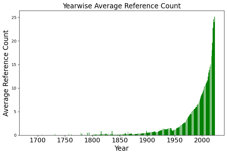
### Visual Description
## Bar Chart: Yearwise Average Reference Count
### Overview
The image is a vertical bar chart titled "Yearwise Average Reference Count." It visualizes the growth of average reference counts over time, spanning from the year 1700 to approximately 2020. The chart displays a clear, long-term trend of exponential growth, particularly accelerating in the latter half of the 20th century.
### Components/Axes
* **Title:** "Yearwise Average Reference Count" (centered at the top).
* **X-Axis:** Labeled "Year". The scale spans from 1700 to 2000+, with major tick marks at 50-year intervals (1700, 1750, 1800, 1850, 1900, 1950, 2000).
* **Y-Axis:** Labeled "Average Reference Count". The scale ranges from 0 to 25, with major tick marks at intervals of 5 (0, 5, 10, 15, 20, 25).
* **Data Series:** Represented by solid green vertical bars for each year.
### Detailed Analysis
The chart can be segmented into three distinct temporal phases based on the visual density and height of the bars:
1. **1700–1850 (The Stagnant Phase):**
* **Trend:** The bars are extremely sparse and very low in height, often appearing as thin lines or gaps.
* **Values:** The average reference count is effectively near zero, with only minor, sporadic spikes.
2. **1850–1950 (The Incubation Phase):**
* **Trend:** The bars become more consistent and begin to show a very slight, gradual upward slope.
* **Values:** By 1900, the average count is approximately 0.5 to 1.0. By 1950, the count has risen to approximately 1.5 to 2.0.
3. **1950–2020 (The Exponential Growth Phase):**
* **Trend:** The chart exhibits a sharp, continuous upward curve (a "hockey stick" pattern).
* **Values:**
* **1975:** The average reference count reaches approximately 5.
* **2000:** The average reference count reaches approximately 10.
* **2010:** The average reference count reaches approximately 15.
* **2020:** The average reference count reaches its peak on the chart, approximately 25.
### Key Observations
* **Exponential Acceleration:** The most striking feature is the rapid acceleration of the reference count starting around 1950. The growth is not linear; it compounds over time.
* **Data Sparsity:** The lack of consistent data points before 1850 suggests either a lack of digitized records, a very low volume of academic publishing, or a different citation culture in earlier centuries.
* **Consistency:** The growth curve is remarkably smooth, suggesting a systemic change in how references are utilized or recorded in literature rather than isolated anomalies.
### Interpretation
This data is a classic visualization of the "information explosion" or the exponential growth of scientific and academic literature.
* **What the data demonstrates:** The chart likely tracks the average number of citations or references per academic paper or document. The shift post-1950 correlates strongly with the post-WWII expansion of higher education, the proliferation of scientific journals, and the eventual digitization of academic databases.
* **Why it matters:** The transition from an average of ~2 references per document in 1950 to ~25 in 2020 indicates a fundamental shift in research methodology. It suggests that modern research is increasingly interconnected, requiring a broader synthesis of existing knowledge, or perhaps that citation practices have become more rigorous and extensive over time.
* **Peircean Investigative Note:** The "gap" in the early years (1700-1850) is as informative as the growth in the later years. It highlights the limitations of historical data collection or the infancy of the "reference" as a standardized academic unit during that era.
</details>
Figure 8: The year-wise average of the number of references per paper, also with a sharply increasing trend.
For the Semantic Scholar dataset (Kinney et al., 2023; Lo et al., 2020), we obtain the set of 206M papers using the “Papers” endpoint to get the Paper Id, Title, Abstract, Year, Citation Count, Influential Citation Count (Valenzuela et al., 2015),and the Reference Count for each paper. The papers come from a variety of fields such as law, computer science, and linguistics, chemistry, material science, physics, geology etc. For the citation network with 2.4B edges, we use the Semantic Scholar Citations API to get each edge of the citation graph in a triplet format of (fromPaper, toPaper, isInfluentialCitations).
In general, the number of publications shows an explosive increase in recent years. Figure 7 shows the number of papers publish the per year, which reaches on average 7.5M per year since 2010. Figure 8 shows the number of references each paper cites, which also increases from less than five before 1970s, to around 25 in recent years. Both statistics support the need of our paper, which helps distinguish the quality of scientific studies given such massive growths of papers.
## Appendix C Additional Analyses
### C.1 Citation Outlier Analysis
For the outlier detection, we first visualize the scatter plot between our CausalCite and citations. Then, we fit a log-linear regression to learn the line $\log(\mathrm{TCI})=1.026\log(\mathrm{Cit})-0.541$ , as shown in Figure 9, with a root mean squared error (RMSE) of 0.6807. After fitting the function, we use the interquartile range (IQR) method (Smiti, 2020), which identify as outliers any samples that are either lower than the first quartile by over 1.5 IQR, or higher than the third quartile by more than 1.5 IQR, where IQR is the difference between the first and third quartile.
We denote as overcited papers the ones that are identified as outliers by the IQR method due to too many citations than what it should have deserved given the CausalCite value. Symmetrically, we denote as undercited papers the ones that are identified as outliers by the IQR method due to too few citations than what it should have deserved given the CausalCite value. And we denote the non-outlier papers as the aligned ones.
<details>
<summary>x6.png Details</summary>
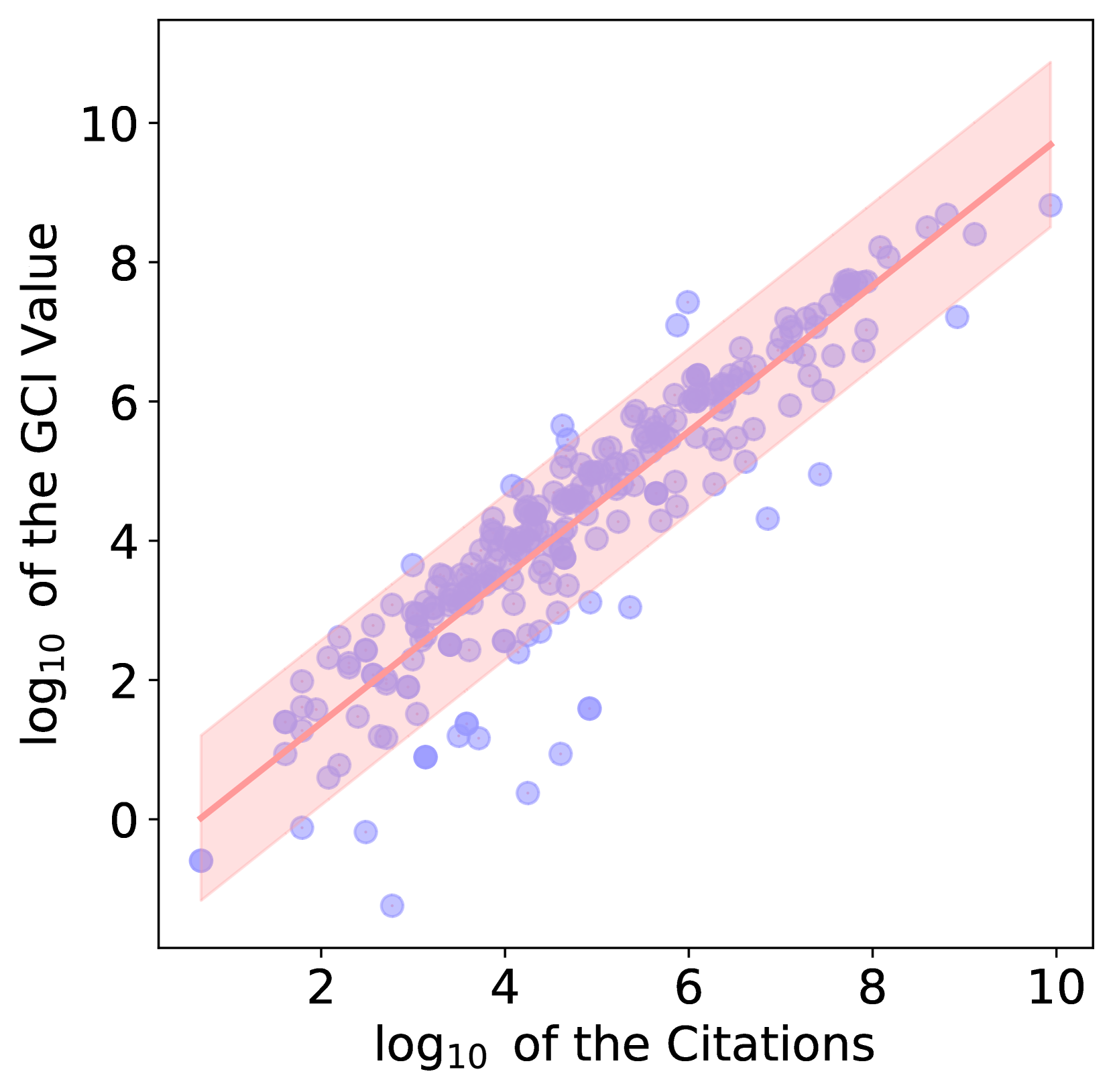
### Visual Description
## Scatter Plot: Correlation between log10 Citations and log10 GCI Value
### Overview
The image is a scatter plot visualizing the relationship between two variables: the "log10 of the Citations" (x-axis) and the "log10 of the GCI Value" (y-axis). The plot features a linear regression line (solid red) surrounded by a shaded confidence interval (light red), indicating a strong positive correlation between the two metrics. The data points are represented by semi-transparent blue circles.
### Components/Axes
* **X-Axis:** Labeled "log10 of the Citations". The scale ranges from approximately 1 to 10, with major tick marks at 2, 4, 6, 8, and 10.
* **Y-Axis:** Labeled "log10 of the GCI Value". The scale ranges from approximately -1 to 11, with major tick marks at 0, 2, 4, 6, 8, and 10.
* **Data Series:**
* **Scatter Points:** Semi-transparent blue circles distributed across the plot area.
* **Regression Line:** A solid red line running diagonally from the bottom-left to the top-right.
* **Confidence Interval:** A light red shaded region encompassing the regression line, representing the uncertainty or variance of the fit.
### Detailed Analysis
* **Trend Verification:** The red regression line exhibits a clear, consistent upward slope from the bottom-left (near x=0.5, y=0) to the top-right (near x=10, y=9.5). This confirms a positive linear relationship between the log-transformed variables.
* **Data Distribution:**
* **Density:** The highest concentration of blue data points occurs between x=3 and x=7, and y=2 and y=7.
* **Regression Line Path:** The line originates near the origin (0,0) and terminates near (10, 9.5).
* **Confidence Interval:** The shaded region is narrowest in the center (around x=4 to 6) and widens slightly at the lower and upper extremes, indicating higher uncertainty in the model's prediction at the edges of the data range.
* **Outliers and Anomalies:**
* **Below the Line:** There is a cluster of outliers in the lower-left quadrant (x=2 to 5, y=0 to 2) that fall significantly below the regression line. These represent data points with lower-than-predicted GCI values relative to their citation counts.
* **Above the Line:** There are fewer outliers above the regression line. A notable example is located near x=6, y=7.5, which sits above the main cluster and the regression line.
### Key Observations
* **Strong Correlation:** The tight clustering of points around the regression line indicates a robust correlation between citation counts and GCI values.
* **Log-Log Relationship:** Because both axes are log-transformed, the linear relationship suggests that the underlying raw data likely follows a power-law distribution.
* **Variance:** While the correlation is strong, there is visible variance, particularly in the lower citation range, suggesting that for lower-impact items, the GCI value is less predictable based solely on citation count.
### Interpretation
* **What the data demonstrates:** The plot demonstrates that citation count is a highly reliable predictor of the GCI value. As citations increase, the GCI value increases proportionally on a logarithmic scale.
* **Why it matters:** In bibliometrics or research evaluation, this relationship is critical for normalizing impact metrics. It suggests that the GCI is likely derived from or heavily influenced by citation counts, or that both metrics are measuring the same underlying phenomenon of "academic impact."
* **Peircean Investigative Insight:** The presence of outliers—specifically those below the regression line—is significant. These points represent "under-performing" entities where high citation counts do not translate into proportionally high GCI values. Conversely, the points above the line represent "over-performing" entities where the GCI value is higher than what the citation count alone would predict. This suggests that while citations are a primary driver of the GCI, there are secondary factors influencing the GCI score that cause these deviations.
</details>
Figure 9: The scatter plot between our CausalCite and citations, with the fitted function as $\log(\mathrm{TCI})=1.026*\log(\mathrm{Cit})-0.541$ , and a non-outlier band width of 0.8809.
### C.2 Additional Information for the Author-Identified Paper Impact Experiment
As mentioned in the main paper, the dataset is annotated by pivoting on each paper $b$ , and going through each of its references $a$ to label whether $a$ has a significant influence on $b$ or not. We show an example of paper $b$ and all its 31 references in Table 7. We calculate the accuracy of each metric with the spirit that each non-significant paper’s impact value should be lower than a significant paper’s. Specifically, we go through the score of each non-significant paper, and count its accuracy as 100% if it is lower than all the significant papers’, or the more general form $n_{\mathrm{lower}}/|\mathrm{Sig}|$ of conformity, where $n_{\mathrm{lower}}$ is the number of significant papers which it is lower than, and $|\mathrm{Sig}|$ is the total number of significant papers. Then we report the overall accuracy for each score by averaging the accuracy numbers on each non-significant paper. To illustrate the idea better, we show the calculated accuracy numbers for all three metrics on our example batch in Table 7.
| References of the Paper “Sorting improves word-aligned bitmap indexes” | Label | PCI | Citations | SSHI |
| --- | --- | --- | --- | --- |
| - A Quantitative Analysis and Performance Study for Similarity-Search Methods in High-Dimensional Spaces | 0 | 3.519 | 1777 | 156 |
| - Optimizing bitmap indices with efficient compression | 0 | 3.519 | 375 | 40 |
| - Data Warehouses And Olap: Concepts, Architectures And Solutions | 0 | 3.526 | 187 | 11 |
| - Histogram-aware sorting for enhanced word-aligned compression in bitmap indexes | 0 | 3.543 | 17 | 1 |
| - CubiST++: Evaluating Ad-Hoc CUBE Queries Using Statistics Trees | 0 | 3.543 | 5 | 1 |
| - Improving Performance of Sparse Matrix-Vector Multiplication | 0 | 3.543 | 114 | 11 |
| - Binary Gray Codes with Long Bit Runs | 0 | 3.543 | 53 | 4 |
| - Analysis of Basic Data Reordering Techniques | 0 | 3.543 | 16 | 1 |
| - Tree Based Indexes Versus Bitmap Indexes: A Performance Study | 0 | 3.543 | 24 | 0 |
| - Secondary indexing in one dimension: beyond b-trees and bitmap indexes | 0 | 3.543 | 10 | 1 |
| - A comparison of five probabilistic view-size estimation techniques in OLAP | 0 | 3.543 | 24 | 1 |
| - Compression techniques for fast external sorting | 0 | 3.543 | 16 | 0 |
| - A Note on Graph Coloring Extensions and List-Colorings | 0 | 3.543 | 33 | 1 |
| - Using Multiset Discrimination to Solve Language Processing Problems Without Hashing | 0 | 3.543 | 52 | 2 |
| - Monotone Gray Codes and the Middle Levels Problem | 0 | 3.543 | 80 | 5 |
| - The Art in Computer Programming | 0 | 3.543 | 9242 | 678 |
| - An Efficient Multi-Component Indexing Embedded Bitmap Compression for Data Reorganization | 0 | 3.543 | 8 | 2 |
| - The LitOLAP Project: Data Warehousing with Literature | 0 | 3.543 | 8 | 0 |
| - Multi-resolution bitmap indexes for scientific data | 0 | 3.583 | 96 | 3 |
| - Notes on design and implementation of compressed bit vectors | 0 | 3.583 | 81 | 12 |
| - Compressing Large Boolean Matrices using Reordering Techniques | 0 | 3.595 | 88 | 7 |
| - Compressing bitmap indices by data reorganization | 1 | 3.595 | 53 | 4 |
| - Model 204 Architecture and Performance | 0 | 3.635 | 238 | 10 |
| - On the performance of bitmap indices for high cardinality attributes | 1 | 3.654 | 196 | 10 |
| - A performance comparison of bitmap indexes | 0 | 3.655 | 86 | 9 |
| - Minimizing I/O Costs of Multi-Dimensional Queries with Bitmap Indices | 0 | 3.692 | 16 | 0 |
| - Evaluation Strategies for Bitmap Indices with Binning | 0 | 3.692 | 69 | 3 |
| - C-Store: A Column-oriented DBMS | 0 | 3.710 | 1241 | 111 |
| - Byte-aligned bitmap compression | 0 | 3.793 | 209 | 48 |
| - Bit Transposed Files | 0 | 3.837 | 84 | 10 |
| - Space efficient bitmap indexing | 0 | 4.011 | 96 | 16 |
Table 7: All the reference papers for a given study “Sorting improves word-aligned bitmap indexes.” Among all its 31 references, we boldface the reference papers that are annotated to be significant influencers. For the three metrics, PCI, citations, and SSHI, we report their impact scores for each reference paper on the given study, where we mark a score in green when it conforms to the rule that a non-significant paper’s value should be lower than that of a significant paper, and mark a score in dark green if it conforms to the rule to have a lower score than one of the significant paper, but violates the rule, i.e., having a higher score than the other significant paper. In this example, our PCI metric has an accuracy score of 79.3%, which is higher than both citations (68.1%), and SSHI (65.0%).
### C.3 Step Curve for PCI Values Given a Fixed Paper $b$
Apart from the long-tailed curve shape of TCI in Section 5.2, we also look into the pairwise paper impacts by PCI. If we fix the paper $b$ , we can see that $\mathrm{PCI}(\cdot,b)$ often has a step curve shape in Figure 10. The reason behind it lies in the nature of PCI, which is calculated based on the top K papers that are similar in content with paper $b$ , but do not cite paper $a$ . When we go through different references, e.g., from $a_{1}$ to $a_{2}$ of the same paper $b$ , the semantically matched top K papers could still be largely the same pool, and only change when some papers in the pool need to be swapped when releasing the constraint to be that they can cite $a_{1}$ , and adding the constraint that they cannot cite $a_{2}$ .
<details>
<summary>x7.png Details</summary>
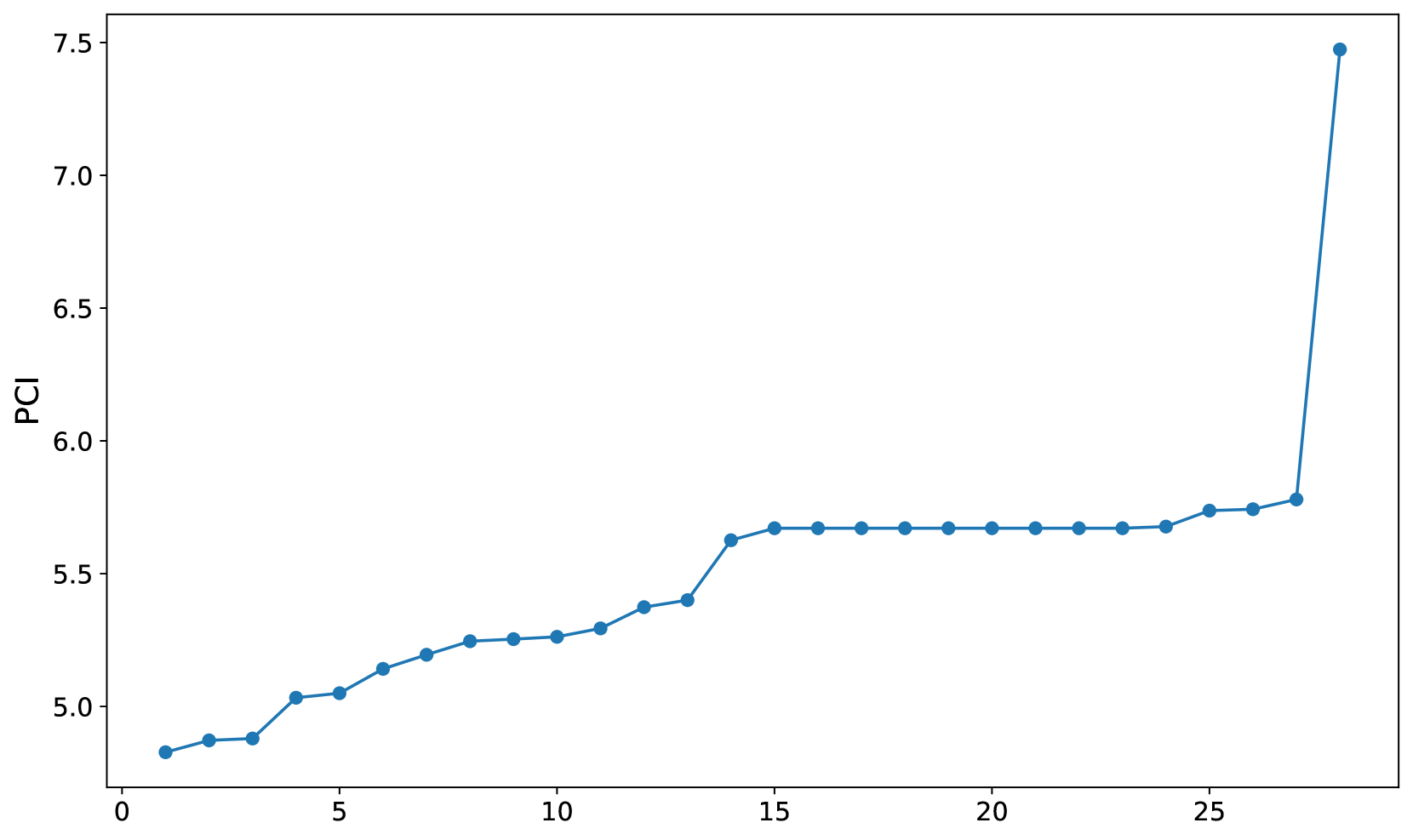
### Visual Description
## Line Chart: PCI Values over Sequence
### Overview
The image displays a line chart with a single data series plotted against an unlabeled sequential index. The chart illustrates a monotonic increase in "PCI" values, characterized by a gradual initial rise, a significant plateau in the middle range, and a sharp, extreme outlier at the final data point.
### Components/Axes
* **Y-Axis:** Labeled "PCI". The scale ranges from 4.5 to 7.5, with major tick marks at intervals of 0.5.
* **X-Axis:** Unlabeled. The scale ranges from 0 to 25, with major tick marks at intervals of 5.
* **Data Series:** A single blue line connecting 28 distinct circular data points.
* **Spatial Positioning:**
* The "PCI" label is centered vertically on the left Y-axis.
* The X-axis labels (0, 5, 10, 15, 20, 25) are positioned along the bottom.
* The data series spans from X=1 to X=28.
### Detailed Analysis
The data appears to be sorted in ascending order, which is a common technique for visualizing the distribution of a dataset. Below is the approximate extraction of the Y-values (PCI) for each sequential X-index.
| X-Index | Approximate PCI Value |
| :--- | :--- |
| 1 | 4.83 |
| 2 | 4.88 |
| 3 | 4.89 |
| 4 | 5.03 |
| 5 | 5.05 |
| 6 | 5.15 |
| 7 | 5.20 |
| 8 | 5.25 |
| 9 | 5.26 |
| 10 | 5.27 |
| 11 | 5.30 |
| 12 | 5.38 |
| 13 | 5.41 |
| 14 | 5.64 |
| 15 | 5.68 |
| 16 | 5.68 |
| 17 | 5.68 |
| 18 | 5.68 |
| 19 | 5.68 |
| 20 | 5.68 |
| 21 | 5.68 |
| 22 | 5.68 |
| 23 | 5.68 |
| 24 | 5.69 |
| 25 | 5.74 |
| 26 | 5.75 |
| 27 | 5.78 |
| 28 | 7.48 |
### Key Observations
* **Trend:** The data exhibits a clear upward trend.
* **Plateau:** There is a distinct, flat region between X=15 and X=23, where the PCI value remains constant at approximately 5.68. This indicates that a significant portion of the dataset (roughly 32% of the points) shares an identical value.
* **Outlier:** The final data point (X=28) represents a significant deviation from the trend. While the previous point (X=27) is at ~5.78, the final point jumps to ~7.48. This is a ~29% increase from the previous value, marking it as a severe outlier.
### Interpretation
* **Data Nature:** This chart is likely a "sorted plot" or a cumulative distribution visualization. By sorting the data, the creator is likely trying to show the distribution of PCI scores across a sample of 28 items.
* **Performance Clustering:** The long plateau (X=15 to X=23) suggests that the majority of the items in this set have very similar performance characteristics. This could represent a "standard" or "baseline" performance level for the items being measured.
* **The Outlier:** The extreme spike at X=28 is highly anomalous. In a technical context, this could represent:
* A "best-in-class" item that significantly outperforms the rest of the group.
* A data entry error or a measurement artifact.
* A different category of item that was included in the same dataset.
* **Conclusion:** The data suggests a system where most items perform within a narrow, predictable band (4.8 to 5.8), with one singular, high-performing exception.
</details>
Figure 10: We take an example paper $b$ , Sentence BERT (Reimers and Gurevych, 2019), and plot its PCI values with all its reference paper $a$ ’s. We can see clearly that there is a plateau in the curve, showing a step function-like nature.