# The Case for Co-Designing Model Architectures with Hardware
**Authors**: Quentin Anthony, Jacob Hatef, Deepak Narayanan, Stella Biderman, Stas BekmanJunqi Yin, Aamir Shafi, Hari Subramoni, Dhabaleswar K. Panda
> EleutherAI Ohio State University
> NVIDIA
> EleutherAI
> Contextual AI Oak Ridge National Lab
> Ohio State University
## Abstract
While GPUs are responsible for training the vast majority of state-of-the-art deep learning models, the implications of their architecture are often overlooked when designing new deep learning (DL) models. As a consequence, modifying a DL model to be more amenable to the target hardware can significantly improve the runtime performance of DL training and inference. In this paper, we provide a set of guidelines for users to maximize the runtime performance of their transformer models. These guidelines have been created by carefully considering the impact of various model hyperparameters controlling model shape on the efficiency of the underlying computation kernels executed on the GPU. We find the throughput of models with “efficient” model shapes is up to 39% higher while preserving accuracy compared to models with a similar number of parameters but with unoptimized shapes.
## I Introduction
Transformer-based [37] language models have become widely popular for language and sequence modeling tasks. Consequently, it is extremely important to train and serve large transformer models such as GPT-3 [6] and Codex as efficiently as possible given their scale and wide use. At the immense scales that are in widespread use today, efficiently using computational resources becomes a complex problem and small drops in hardware utilization can lead to enormous amounts of wasted compute, funding, and time. In this paper, we tackle a frequently ignored aspect of training large transformer models: how the shape of the model can impact runtime performance. We use first principles of GEMM optimization to optimize individual parts of the transformer model (which translates to improved end-to-end runtime performance as well). Throughout the paper, we illustrate our points with extensive computational experiments demonstrating how low-level GPU phenomenon impact throughput throughout the language model architecture.
Many of the phenomena remarked on in this paper have been previously documented, but continue to plague large language model (LLM) designers to this day. We hypothesize that there are three primary causes of this:
1. Few resources trace the performance impacts of a transformer implementation all the way to the underlying computation kernels executed on the GPU.
1. The existing documentation on how transformer hyperparameters map to these kernels is not always in the most accessible formats, including tweets [19, 18], footnotes [33], and in comments in training libraries [3].
1. It is convenient to borrow architectures from other papers and researchers rarely give substantial thought to whether those choices of model shapes are optimal.
This work attempts to simplify performance tuning for transformer models by carefully considering the architecture of modern GPUs. This paper is also a demonstration of our thesis that model dimensions should be chosen with hardware details in mind to an extent far greater than is typical in deep learning research today.
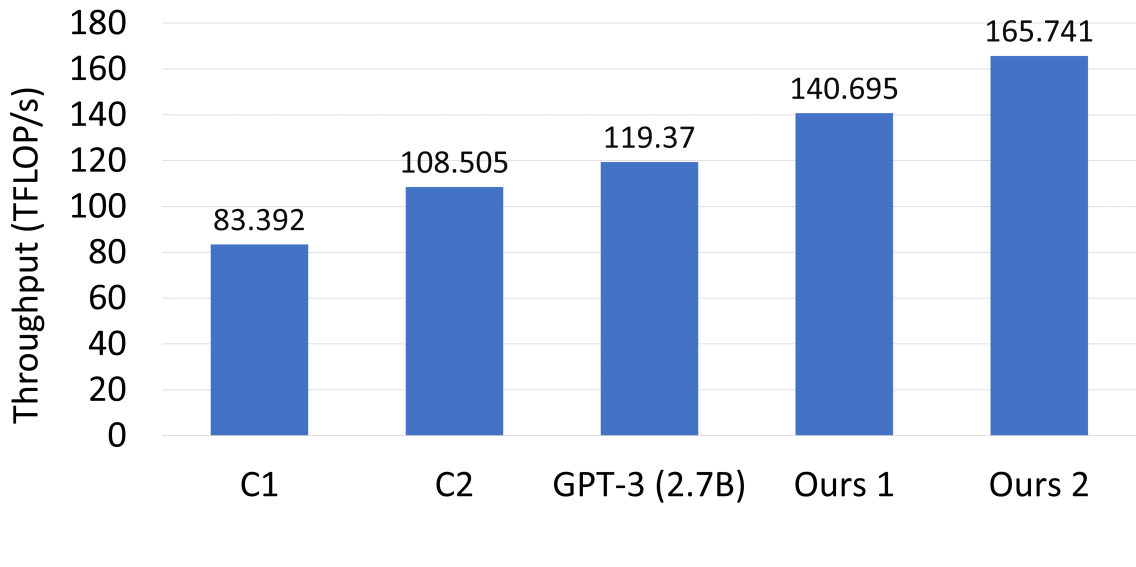
As shown in Figure 1, the runtimes of models with a nearly identical number of parameters but different shapes can vary wildly. In this figure, the “standard architecture” for a 2.7B transformer model defined by GPT-3 [6] has been used by OPT [43], GPT-Neo [5], Cerebras-GPT [13], RedPajama-INCITE [1], and Pythia [4]. Unfortunately the knowledge of how to optimally shape transformer architectures is not widely known, resulting in people often making sub-optimal design decisions. This is exacerbated by the fact that researchers often deliberately copy hyperparameters from other papers for cleaner comparisons, resulting in these sub-optimal choices becoming locked in as the standard. As one example of this, we show that the 2.7 billion parameter model described in [6] can be trained almost 20% faster than the default architecture through minor tweaking of the model shape.
<details>
<summary>x1.png Details</summary>
### Visual Description
## Bar Chart: Throughput Comparison
### Overview
The image is a vertical bar chart illustrating the performance throughput (measured in TFLOP/s) of five distinct configurations or models. The chart displays a clear, ascending progression in performance from left to right, with the "Ours" configurations demonstrating the highest throughput values.
### Components/Axes
* **Y-Axis (Vertical):** Labeled "Throughput (TFLOP/s)". The scale ranges from 0 to 180, with horizontal grid lines marking increments of 20.
* **X-Axis (Horizontal):** Categorical labels for the five data points, listed from left to right: "C1", "C2", "GPT-3 (2.7B)", "Ours 1", and "Ours 2".
* **Data Series:** A single series of blue bars representing the throughput value for each category. The numerical value for each bar is printed directly above it.
### Detailed Analysis
The data is presented in ascending order of throughput. Below are the specific values extracted from the chart:
1. **C1 (Far Left):** The baseline configuration.
* **Value:** 83.392 TFLOP/s
2. **C2 (Second from Left):**
* **Value:** 108.505 TFLOP/s
3. **GPT-3 (2.7B) (Center):** A reference model benchmark.
* **Value:** 119.37 TFLOP/s
4. **Ours 1 (Second from Right):**
* **Value:** 140.695 TFLOP/s
5. **Ours 2 (Far Right):** The highest-performing configuration.
* **Value:** 165.741 TFLOP/s
### Key Observations
* **Trend:** There is a consistent, monotonic upward trend across all five categories.
* **Performance Gap:** The difference between the lowest performer ("C1") and the highest performer ("Ours 2") is 82.349 TFLOP/s, representing an approximate 98.7% increase in throughput.
* **Incremental Gains:**
* The jump from "C1" to "C2" is ~25.1 TFLOP/s.
* The jump from "C2" to "GPT-3 (2.7B)" is ~10.9 TFLOP/s.
* The jump from "GPT-3 (2.7B)" to "Ours 1" is ~21.3 TFLOP/s.
* The jump from "Ours 1" to "Ours 2" is ~25.0 TFLOP/s.
### Interpretation
This chart is a performance benchmark likely intended to demonstrate the efficacy of the authors' proposed methods ("Ours 1" and "Ours 2").
* **Benchmarking:** By including "GPT-3 (2.7B)" as a reference point, the authors provide a standard industry metric to contextualize their results.
* **Efficacy:** The fact that both "Ours" configurations significantly outperform the "GPT-3 (2.7B)" benchmark and the baseline "C1/C2" configurations suggests that the proposed methods offer substantial improvements in computational throughput.
* **Scaling:** The relatively consistent step-up in performance between the "Ours" variants suggests that the optimization techniques used are scalable or additive.
</details>
Figure 1: Transformer single-layer throughput of various architectures for a 2.7 billion parameter model (C1 and C2 are defined by this paper as C1: $h=2560,a=64$ , C2: $h=2560,a=40$ ).
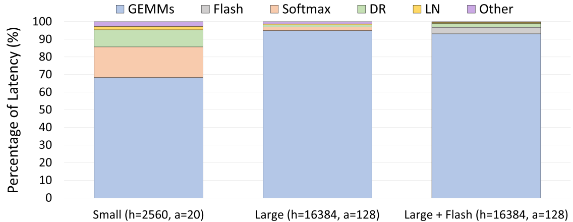
Our analysis makes use of the fact that General Matrix Multiplications (GEMMs) are the lifeblood of modern deep learning. Most widely-used compute-intensive layers in deep learning explicitly use GEMMs (e.g., linear layers or attention layers) or use operators that are eventually lowered into GEMMs (e.g., convolutions). For transformer models, our experiments from Figure 2 show that GEMM kernels regularly account for $68.3\$ and $94.9\$ of the total model latency for medium- and large-sized models, respectively. As a result, understanding the performance of GEMMs is crucial to understanding the runtime performance of end-to-end models; this only becomes more important as model size increases.
<details>
<summary>x2.png Details</summary>
### Visual Description
## Stacked Bar Chart: Latency Distribution by Model Configuration
### Overview
This image is a stacked bar chart comparing the percentage of latency attributed to different computational operations across three distinct model configurations. The chart illustrates how the distribution of latency shifts as model parameters (hidden size `h` and attention heads `a`) scale up and as specific optimizations (Flash) are applied.
### Components/Axes
* **Y-Axis:** "Percentage of Latency (%)", scaled from 0 to 100 in increments of 10.
* **X-Axis:** Three categorical configurations:
1. **Small (h=2560, a=20)**
2. **Large (h=16384, a=128)**
3. **Large + Flash (h=16384, a=128)**
* **Legend (Positioned at the top):**
* **GEMMs** (Blue)
* **Flash** (Grey)
* **Softmax** (Peach/Light Orange)
* **DR** (Light Green)
* **LN** (Yellow)
* **Other** (Purple)
### Detailed Analysis
The chart displays three vertical bars, each representing 100% of the latency for that specific configuration.
**1. Small (h=2560, a=20)**
* **Trend:** This bar shows the most diverse distribution of latency.
* **GEMMs (Blue):** Occupies the base, extending from 0% to approximately 68%.
* **Softmax (Peach):** Sits above GEMMs, extending from ~68% to ~85% (approx. 17% of total).
* **DR (Green):** Sits above Softmax, extending from ~85% to ~95% (approx. 10% of total).
* **LN (Yellow):** Sits above DR, extending from ~95% to ~97% (approx. 2% of total).
* **Other (Purple):** The top segment, extending from ~97% to 100% (approx. 3% of total).
**2. Large (h=16384, a=128)**
* **Trend:** A massive shift toward GEMMs dominance.
* **GEMMs (Blue):** Occupies the base, extending from 0% to approximately 95%.
* **Softmax (Peach):** Significantly reduced, extending from ~95% to ~97% (approx. 2% of total).
* **DR (Green):** Reduced, extending from ~97% to ~98% (approx. 1% of total).
* **LN (Yellow):** Reduced, extending from ~98% to ~99% (approx. 1% of total).
* **Other (Purple):** The top segment, extending from ~99% to 100% (approx. 1% of total).
* *Note:* The "Flash" (Grey) category is absent in this configuration.
**3. Large + Flash (h=16384, a=128)**
* **Trend:** Similar to the "Large" configuration, but with the introduction of the "Flash" component.
* **GEMMs (Blue):** Occupies the base, extending from 0% to approximately 93%.
* **Flash (Grey):** Appears here, extending from ~93% to ~97% (approx. 4% of total).
* **DR (Green):** Extends from ~97% to ~98% (approx. 1% of total).
* **LN (Yellow):** Extends from ~98% to ~99% (approx. 1% of total).
* **Other (Purple):** The top segment, extending from ~99% to 100% (approx. 1% of total).
* *Note:* The "Softmax" (Peach) category is effectively absent or negligible in this configuration.
### Key Observations
* **GEMM Dominance:** GEMMs (General Matrix Multiplies) are the primary latency bottleneck in all configurations, accounting for at least 68% of latency in the smallest model and rising to ~95% in the larger models.
* **Scaling Effect:** As the model scales from "Small" to "Large," the relative latency of non-GEMM operations (specifically Softmax and DR) drops precipitously.
* **Flash Integration:** The introduction of "Flash" (likely referring to FlashAttention) in the third configuration consumes ~4% of the latency budget. Notably, its introduction correlates with the disappearance of the "Softmax" segment, suggesting that FlashAttention replaces or optimizes the standard Softmax operation.
### Interpretation
The data demonstrates that as Transformer-based models scale up in size (increasing hidden dimension and attention heads), the computational workload becomes increasingly dominated by matrix multiplications (GEMMs). In smaller models, overhead operations like Softmax and DR are significant contributors to latency. However, in larger models, these operations become negligible relative to the GEMM workload. The "Large + Flash" configuration indicates that while the Flash optimization introduces its own latency cost (~4%), it likely provides a more efficient implementation of the attention mechanism, effectively absorbing or replacing the traditional Softmax operation, which is no longer visible in the third bar. This suggests that for large models, optimizing GEMMs is the most critical path for performance, while FlashAttention is a necessary optimization for the attention mechanism.
</details>
Figure 2: The proportion of latency from each transformer component for one layer of various model sizes
On account of their parallel architecture, GPUs are a natural hardware platform for GEMMs. However, the observed throughput for these GEMMs depends on the matrix dimensions due to how the computation is mapped onto the execution units of the GPU (called streaming multiprocessors or SMs for short). As a result, GPU efficiency is sensitive to the model depth and width, which control the arithmetic efficiency of the computation, SM utilization, kernel choice, and the usage of tensor cores versus slower cuda cores. This work tries to determine how best to size models to ensure good performance on GPUs, taking these factors into account. Optimizing model shapes for efficient GEMMs will increase throughput for the entire lifetime of the model, decreasing training time and inference costs We expect best results when the inference GPU is the same as the training GPU, but the guidelines we present could also be useful when the two are different. for production models.
### I-A Contributions
Our contributions are as follows:
- We map the transformer model to its underlying matrix multiplications / GEMMs, and show how each component of the transformer model can suffer from using sub-optimal transformer dimensions.
- We compile a list of GPU performance factors into one document and explain how to choose optimal GEMM dimensions.
- We define rules to ensure transformer models are composed of efficient GEMMs.
## II Related Work
### II-A GPU Characterization of DNNs
DL model training involves the heavy use of GPU kernels, and the characterization of such kernel behavior constitutes a large body of prior work that this paper builds upon. GPU kernels, especially GEMM kernels, are key to improving DL training and inference performance. Therefore, characterizing [20] and optimizing [42, 2, 16, 15] these kernels have received a lot of attention in recent work [22].
Beyond GPU kernels, new algorithms and DL training techniques have been developed to optimize I/O [10, 9] and leverage hardware features like Tensor Cores [40, 31] as efficiently as possible. In addition to the above studies for DL training, exploiting Tensor Core properties has also shown excellent speedups for scientific applications such as iterative solvers [17] and sparse linear algebra subroutines [36].
### II-B Comparison Across DL Accelerators
In recent years, there has emerged a range of acceleration strategies such as wafer-scale (Cerebras), GPUs (AMD and NVIDIA), and tensor processing units (Google). Given this diverse array of new AI accelerators, many pieces of work perform cross-generation and cross-accelerator comparison that have helped elucidate the strengths and weaknesses of each accelerator. Cross-accelerator studies such as [14, 39, 23] enable HPC and cloud customers to choose an appropriate accelerator for their DL workload. We seek to extend this particular line of work by evaluating across various datacenter-class NVIDIA (V100, A100, and H100) and AMD GPUs (MI250X).
### II-C DL Training Performance Guides
The most similar effort to our work is a GPU kernel characterization study for RNNs and CNNs performed in [41]. Since the transformer architecture differs greatly compared to RNNs and CNNs, we believe that our work provides a timely extension. Further, our focus on creating a practical performance guide is similar in nature to the 3D-parallelism optimization for distributed GPU architectures presented in [25].
From the above discussion, one can posit that while many papers exist to optimize DL performance on GPUs [22], such papers tend to neglect the fundamental effects that GPU properties (e.g. Tensor Cores, tiling, wave quantization, etc.) have on model training. Because of this omission, many disparate DL training groups have rediscovered a similar set of model sizing takeaways [19, 18, 33, 3]. We seek to provide explanations for these takeaways from the perspective of fundamental GPU first-principles, and to aggregate these explanations into a concise set of takeaways for efficient transformer training and inference.
## III Background
We will now discuss some of the necessary prerequisite material to understand the performance characteristics of the GPU kernels underlying transformer models.
### III-A GPU Kernels
General Matrix Multiplications (GEMMs) serve as a crucial component for many functions in neural networks, including fully-connected layers, recurrent layers like RNNs, LSTMs, GRUs, and convolutional layers. If $A$ is an $m× k$ matrix and $B$ is a $k× n$ matrix, then the matrix product $AB$ is a simple GEMM. We can then generalize this to $C=α AB+β C$ (in the previous example, $α$ is 1, and $β$ is 0). In a fully-connected layer’s forward pass, the weight matrix would be argument $A$ and input activations would be argument $B$ ( $α$ and $β$ would typically be 1 and 0 as before; $β$ can be 1 in certain scenarios, such as when adding a skip-connection with a linear operation).
Matrix-matrix multiplication is a fundamental operation in numerous scientific and engineering applications, particularly in the realm of deep learning. It is a computationally intensive task that requires significant computational resources for large-scale problems. To address this, various algorithms and computational techniques have been developed to optimize matrix-matrix multiplication operations.
Matrix multiplication variants like batched matrix-matrix (BMM) multiplication kernels have also been introduced to improve the throughput of certain common DL operators like attention [37]. A general formula for a BMM operation is given by Equation 1 below, where $\{A_i\}$ and $\{B_i\}$ are a batch of matrix inputs, $α$ and $β$ are scalar inputs, and $\{C_i\}$ is a batch of output matrices.
$$
C_i=α A_iB_i+β C_i, i=1,...N \tag{1}
$$
### III-B NVIDIA GEMM Implementation and Performance Factors
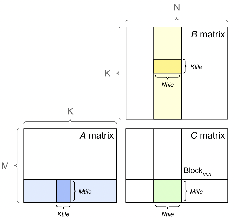
There are a number of performance factors to consider when analyzing GEMMs on NVIDIA GPU architectures. NVIDIA GPUs divide the output matrix into regions or tiles as shown in Figure 3 and schedule them to one of the available streaming multiprocessors (SM) on the GPU (e.g., A100 GPUs have 108 SMs). Each tile or thread block is processed in a Tensor Core, which NVIDIA introduced for fast tensor operations. NVIDIA Tensor Cores are only available for GEMMs with appropriate dimensions. Tensor Cores can be fully utilized when GEMM dimensions $m$ , $k$ , and $n$ are multiples of 16 bytes and 128 bytes for V100 and A100 GPUs, respectively. Since a FP16 element is 2 bytes, this corresponds to dimension sizes that are multiples of 8 and 64 elements, respectively. If these dimension sizes are not possible, Tensor Cores perform better with larger multiples of 2 bytes.
<details>
<summary>extracted/5378885/figures/tiling.png Details</summary>
### Visual Description
## Diagram: Matrix Multiplication Tiling (Blocking)
### Overview
This diagram illustrates the concept of matrix multiplication using tiling (also known as blocking), a common optimization technique in high-performance computing and linear algebra. It visually demonstrates how a specific sub-block in a result matrix $C$ is computed by multiplying a corresponding row-tile from matrix $A$ and a column-tile from matrix $B$.
### Components/Axes
The diagram consists of three matrices arranged to represent the operation $C = A \times B$:
* **Matrix A (Bottom-Left):** Represents the left-hand operand.
* **Dimensions:** $M$ (height) $\times K$ (width).
* **Highlighted Region:** A horizontal strip containing a darker blue vertical block.
* **Labels:** $M$ (left axis), $K$ (top axis), $M_{tile}$ (height of the blue block), $K_{tile}$ (width of the blue block).
* **Matrix B (Top-Right):** Represents the right-hand operand.
* **Dimensions:** $K$ (height) $\times N$ (width).
* **Highlighted Region:** A vertical strip containing a darker yellow horizontal block.
* **Labels:** $K$ (left axis), $N$ (top axis), $K_{tile}$ (height of the yellow block), $N_{tile}$ (width of the yellow block).
* **Matrix C (Bottom-Right):** Represents the result matrix.
* **Dimensions:** $M$ (height) $\times N$ (width).
* **Highlighted Region:** A green square/rectangular block.
* **Labels:** $Block_{m,n}$ (the specific block being computed), $M_{tile}$ (height of the green block), $N_{tile}$ (width of the green block).
### Detailed Analysis
The diagram maps the relationship between the dimensions of the input matrices and the output matrix:
1. **Matrix A (Blue):** The diagram highlights a vertical block of size $M_{tile} \times K_{tile}$. This block represents a segment of the row-space of $A$ that is being processed.
2. **Matrix B (Yellow):** The diagram highlights a horizontal block of size $K_{tile} \times N_{tile}$. This block represents a segment of the column-space of $B$ that is being processed.
3. **Matrix C (Green):** The diagram highlights a block of size $M_{tile} \times N_{tile}$. This is the resulting sub-matrix $Block_{m,n}$.
**Dimensional Consistency:**
* The height of the block in $A$ ($M_{tile}$) matches the height of the block in $C$ ($M_{tile}$).
* The width of the block in $B$ ($N_{tile}$) matches the width of the block in $C$ ($N_{tile}$).
* The width of the block in $A$ ($K_{tile}$) matches the height of the block in $B$ ($K_{tile}$), satisfying the inner dimension requirement for matrix multiplication.
### Key Observations
* **Spatial Arrangement:** The matrices are positioned to mimic the standard mathematical notation for matrix multiplication: $A$ is placed to the left of $C$, and $B$ is placed above $C$.
* **Color Coding:**
* **Blue:** Associated with Matrix $A$ (the multiplicand).
* **Yellow:** Associated with Matrix $B$ (the multiplier).
* **Green:** Associated with Matrix $C$ (the product).
* **Tiling Logic:** The diagram explicitly shows that the computation of a single block in $C$ does not require the entire matrices $A$ and $B$, but rather specific tiles of size $K_{tile}$.
### Interpretation
This diagram is a fundamental representation of **Cache-Oblivious or Cache-Aware Tiling**.
* **Why it matters:** In standard matrix multiplication, accessing memory in a non-contiguous way (e.g., traversing columns of $B$) causes cache misses, which significantly degrades performance. By breaking the matrices into smaller tiles ($M_{tile} \times K_{tile}$ and $K_{tile} \times N_{tile}$), the algorithm ensures that the data fits into the CPU's L1/L2 cache.
* **Data Flow:** The diagram demonstrates that the green block in $C$ is the accumulation of the product of the blue block in $A$ and the yellow block in $B$. This implies that the algorithm iterates through the $K$ dimension, accumulating the result into the green block.
* **Peircean Investigative Note:** The diagram simplifies the complex operation of matrix multiplication into a geometric relationship. It suggests that the "cost" of the operation is localized to these tiles, allowing for parallelization—multiple blocks in $C$ can be computed independently if the tiling strategy is implemented correctly.
</details>
Figure 3: GEMM tiling [26].
There are multiple tile sizes that the kernel can choose from. If the GEMM size does not divide evenly into the tile size, there will be wasted compute, where the thread block must execute fully on the SM, but only part of the output is necessary. This is called the tile quantization effect, as the output is quantized into discrete tiles.
Another quantization effect is called wave quantization. As the thread blocks are scheduled to SMs, only 108 thread blocks at a time may be scheduled. If, for example, 109 thread blocks must be scheduled, two rounds, or waves, of thread blocks must be scheduled to GPU. The first wave will have 108 thread blocks, and the second wave will have 1. The second wave will have almost the same latency as the first, but with a small fraction of the useful compute. As the matrix size increases, the last or tail wave grows. The throughput will increase, until a new wave is required. Then, the throughput will drop.
### III-C Transformer Models
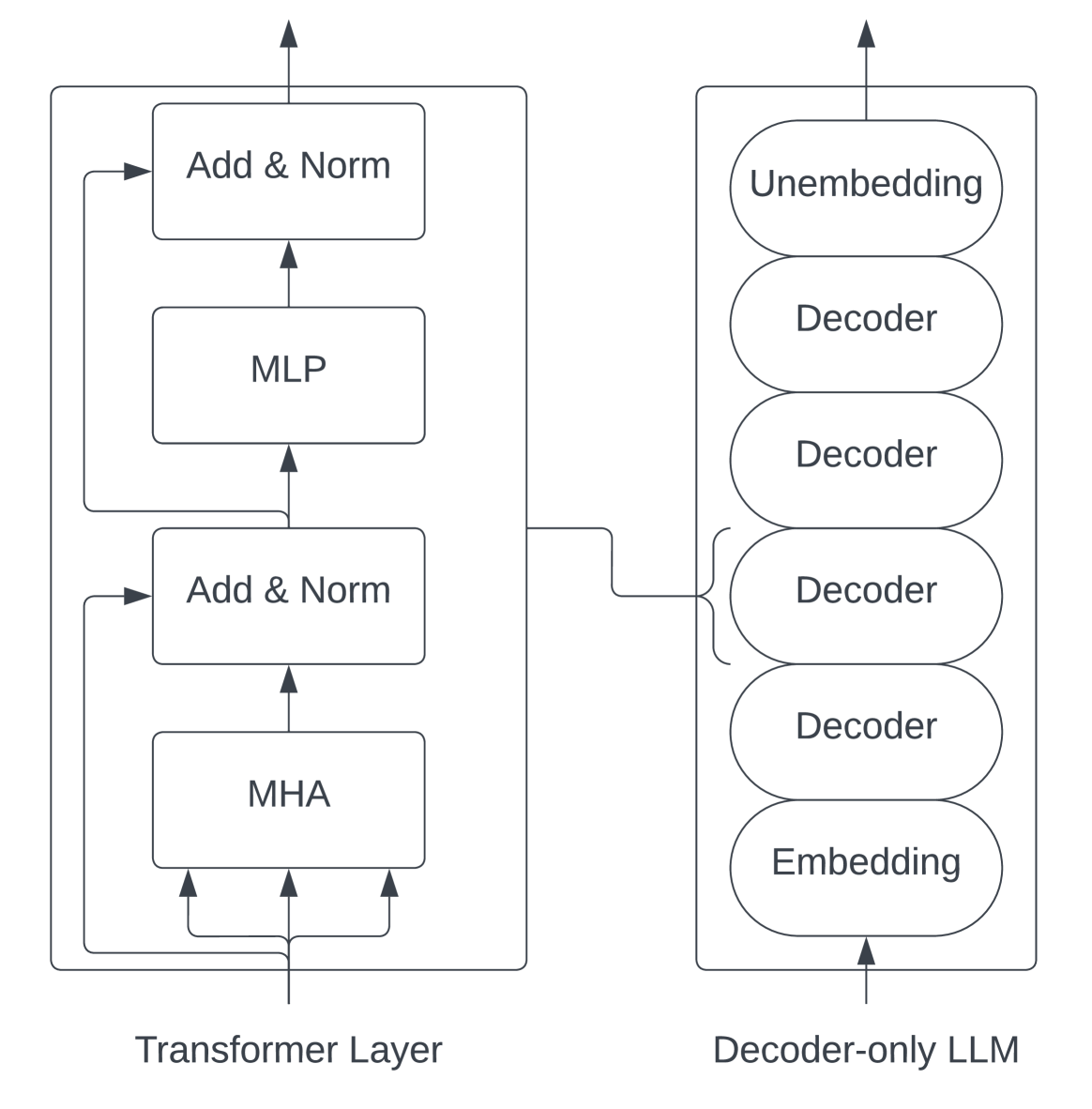
In this study, we examine a decoder-only transformer architecture popularized by GPT-2 [29]. We focus on this architecture due to its popularity for training very large models [6, 7, 34] , but most of our conclusions also apply to encoder-only models [12, 21]. Due to the nature of the transition between the encoder and decoder, our analysis will largely not apply to encoder-decoder models [37, 30].
<details>
<summary>x3.png Details</summary>
### Visual Description
## Diagram: Architecture of a Transformer Layer and its relation to a Decoder-only LLM
### Overview
The image presents a two-part architectural diagram. On the left, it details the internal structure of a single "Transformer Layer." On the right, it provides a high-level overview of a "Decoder-only LLM" (Large Language Model) stack. A connecting line indicates that the Transformer Layer on the left is the fundamental building block that constitutes the "Decoder" blocks shown on the right.
### Components/Axes
**Left Box: Transformer Layer**
* **Structure:** A vertical stack of four processing blocks enclosed in a rectangular frame.
* **Bottom Block:** "MHA" (Multi-Head Attention).
* **Second Block (from bottom):** "Add & Norm".
* **Third Block (from bottom):** "MLP" (Multi-Layer Perceptron).
* **Top Block:** "Add & Norm".
* **Flow:** Data enters at the bottom, flows upward through the blocks, and exits at the top.
* **Residual Connections:** Two distinct lines loop back from the output of the MHA and MLP stages to the inputs of the subsequent "Add & Norm" blocks, representing residual (skip) connections.
**Right Box: Decoder-only LLM**
* **Structure:** A vertical stack of six oval-shaped blocks enclosed in a rectangular frame.
* **Bottom Block:** "Embedding".
* **Middle Blocks (4 total):** "Decoder".
* **Top Block:** "Unembedding".
* **Flow:** Data enters at the bottom, passes through the Embedding layer, the stack of four Decoder blocks, and finally the Unembedding layer, exiting at the top.
**Connecting Element**
* A line originates from the top of the "Transformer Layer" box and points to a bracket that encompasses all four "Decoder" blocks in the "Decoder-only LLM" box.
### Detailed Analysis
* **Transformer Layer (Left):**
* The architecture follows a standard Transformer block design.
* The input is processed by the **MHA** (Multi-Head Attention) mechanism.
* The output of the MHA is fed into the first **Add & Norm** block, which also receives the original input via a residual connection.
* The output of this normalization is then fed into the **MLP** (Multi-Layer Perceptron) block.
* The output of the MLP is fed into the final **Add & Norm** block, which also receives the input from the previous stage via a second residual connection.
* The final output is the result of this sequence.
* **Decoder-only LLM (Right):**
* This represents the macro-architecture of the model.
* **Embedding:** Converts input tokens into vector representations.
* **Decoder Stack:** A sequence of four identical "Decoder" blocks.
* **Unembedding:** Converts the final vector representations back into token probabilities (logits).
### Key Observations
* **Modular Composition:** The diagram explicitly defines the "Decoder" block in the LLM as an abstraction of the "Transformer Layer" detailed on the left.
* **Residual Connections:** The presence of the looping arrows in the Transformer Layer highlights the importance of residual connections, which are essential for training deep neural networks by mitigating the vanishing gradient problem.
* **Sequential Processing:** Both diagrams emphasize a strictly sequential, bottom-to-top flow of information.
### Interpretation
This diagram serves as a bridge between the micro-architecture (the mathematical operations within a single layer) and the macro-architecture (the overall model structure) of modern LLMs.
* **The "Decoder-only" Paradigm:** The right side of the diagram illustrates why these models are called "Decoder-only." They lack an "Encoder" component (which would typically process input sequences separately). Instead, they rely on a stack of Decoders that process the input and generate output autoregressively.
* **The Role of the Transformer Layer:** By linking the Transformer Layer to the Decoder blocks, the diagram clarifies that the "Decoder" is not a single operation, but a complex block containing Attention (MHA) and Feed-Forward (MLP) mechanisms.
* **Scalability:** The representation of the Decoder as a stack of four blocks suggests that the capacity of the LLM can be scaled by simply increasing the number of these Transformer Layers (depth).
* **Peircean Investigative Note:** The diagram is a classic example of "zooming" in technical documentation. It moves from the *system* (the LLM) to the *sub-system* (the Transformer Layer), allowing the viewer to understand that the "Decoder" is a recursive, repeating unit. The residual connections are the most critical "hidden" detail here, as they are the architectural feature that allows these models to be stacked so deeply without losing signal integrity.
</details>
Figure 4: The transformer architecture [29].
For a mapping from variables to their definitions, see Table I. Initially, the network takes in raw input tokens which are then fed into a word embedding table of size $v× h$ . These token embeddings are then merged with learned positional embeddings of size $s× h$ . The output from the embedding layer, which serves as the input for the transformer block, is a 3-D tensor of size $s× b× h$ . Each layer of the transformer comprises a self-attention block with attention heads, followed by a two-layer multi-layer perceptron (MLP) that expands the hidden size to $4h$ before reducing it back to $h$ . The input and output sizes for each transformer layer remain consistent at $s× b× h$ . The final output from the last transformer layer is projected back into the vocabulary dimension to compute the cross-entropy loss.
| a b h | Number of attention heads Microbatch size Hidden dimension size | s t v | Sequence length Tensor-parallel size Vocabulary size |
| --- | --- | --- | --- |
| L | Number of transformer layers | | |
TABLE I: Variable names.
Each transformer layer consists of the following matrix multiplication operators:
1. Attention key, value, query transformations: These can be expressed as a single matrix multiplication of size: $(b· s,h)×(h,\frac{3h}{t})$ . Output is of size $(b· s,\frac{3h}{t})$ .
1. Attention score computation: $b· a/t$ batched matrix multiplications (BMMs), each of size $(s,\frac{h}{a})×(\frac{h}{a},s)$ . Output is of size $(\frac{b· a}{t},s,s)$ .
1. Attention over value computation: $\frac{b· a}{t}$ batched matrix multiplications of size $(s,s)×(s,\frac{h}{a})$ . Output is of size $(\frac{b· a}{t},s,\frac{h}{a})$ .
1. Post-attention linear projection: a single matrix multiplication of size $(b· s,\frac{h}{t})×(\frac{h}{t},h)$ . Output is of size $(b· s,h)$ .
1. Matrix multiplications in the MLP block of size $(b· s,h)×(h,\frac{4h}{t})$ and $(b· s,\frac{4h}{t})×(\frac{4h}{t},h)$ . Outputs are of size $(b· s,\frac{4h}{t})$ and $(b· s,h)$ .
The total number of parameters in a transformer can be calculated using the formula $P=12h^2L+13hL+(v+s)h$ . This is commonly approximated as $P=12h^2L$ , omitting the lower-order terms.
| Module Input Embedding Layer Norm 1 | GEMM Size — — | Figure — — |
| --- | --- | --- |
| $QKV$ Transform | $(b· s,h)×(h,\frac{3h}{t})$ | 16 |
| Attention Score | $(\frac{b· a}{t},s,\frac{h}{a})×(\frac{b· a}{t},\frac{h}{a},s)$ | 7a 8 |
| Attn over Value | $(\frac{b· a}{t},s,s)×(\frac{b· a}{t},s,\frac{h}{a})$ | 7b 9 |
| Linear Projection | $(b· s,\frac{h}{t})×(\frac{h}{t},h)$ | 19 |
| Layer Norm 2 | — | — |
| MLP $h$ to $4h$ | $(b· s,h)×(h,\frac{4h}{t})$ | 10a |
| MLP $4h$ to $h$ | $(b· s,\frac{4h}{t})×(\frac{4h}{t},h)$ | 10b |
| Linear Output | $(b· s,v)×(v,h)$ | 20 |
TABLE II: Summary of operators in the transformer layer considered in this paper, along with the size of the GEMMs used to execute these operators.
Here, we make the assumption that the projection weight dimension in the multi-headed attention block is $h/a$ , which is the default in existing implementations like Megatron [33] and GPT-NeoX [3].
The total number of compute operations needed to perform a forward pass for training is then $24bsh^2+4bs^2h=24bsh^2≤ft(1+\frac{s}{6h}\right)$ .
Parallelization Across GPUs. Due to the extreme size of modern transformer models, and the additional buffers and activations needed for training, it is common to split transformers across multiple GPUs using tensor and pipeline parallelism [33, 25]. Since this paper focuses on the computations being done on a single GPU, we will largely ignore parallelism. When we speak of the hidden size of a model, that should be understood to mean the hidden size per GPU. For example, with $t$ -way tensor parallelism, the hidden size per GPU is typically $h/t$ . We leave an analysis of the implications of pipeline and sequence parallelism on optimal model shapes to future work.
| AWS p4d ORNL Summit SDSC Expanse | NVIDIA NVIDIA NVIDIA | 8x(A100 40GB) 6x(V100 16GB) 4x(V100 32GB) | Intel Cascade Lake 8275CL IBM POWER9 AMD EPYC 7742 | Amazon EFA [400 Gbps] InfiniBand EDR [200 Gbps] InfiniBand HDR [200 Gbps] | NVLINK [600 GBps] NVLINK (2x3) [100 GBps] NVLINK [100 GBps] |
| --- | --- | --- | --- | --- | --- |
TABLE III: Hardware systems used in this paper.
## IV Experimental Setup
### IV-A Hardware Setup
All experimental results were measured on one of the systems described in Table III. We used compute from a wide variety of sources such as Oak Ridge National Laboratory (ORNL), the San Diego Supercomputing Center (SDSC), and cloud providers such as AWS and Cirrascale. In order to increase the coverage of our takeaways as much as possible, we have included a diverse range of systems in this study.
### IV-B Software Setup
Each hardware setup has used slightly different software. For the V100 experiments, we used PyTorch 1.12.1 and CUDA 11.3. For the A100 experiments, we used PyTorch 1.13.1, CUDA 11.7. For H100 experiments, we used PyTorch 2.1.0 and CUDA 12.2.2. For MI250X experiments, we used PyTorch 2.1.1 and ROCM 5.6.0. All transformer implementations are ported from GPT-NeoX [3].
## V GEMM Results
<details>
<summary>extracted/5378885/figures/mm/basicGemmMSweep.png Details</summary>
### Visual Description
## Line Chart: Throughput Comparison of A100 vs V100 GPUs
### Overview
This image displays a line chart comparing the computational throughput (measured in TFLOP/s) of two NVIDIA GPU architectures, the A100 and the V100, across a range of input sizes denoted by the variable 'm'. The chart demonstrates that the A100 architecture achieves significantly higher throughput than the V100 as the input size increases.
### Components/Axes
* **Y-Axis:** Labeled "Throughput (TFLOP/s)". The scale starts at 0 and increases to 200, with major tick marks at 0, 100, and 200.
* **X-Axis:** Labeled "m". The scale starts at 0 and increases to 8000, with major tick marks at 0, 2000, 4000, 6000, and 8000.
* **Legend:** Located in the bottom-right quadrant of the chart area.
* **Blue Line:** Labeled "A100" (represented by blue circular markers).
* **Orange Line:** Labeled "V100" (represented by orange circular markers).
### Detailed Analysis
The X-axis data points appear to follow a logarithmic progression (likely powers of 2: 64, 128, 256, 512, 1024, 2048, 4096, 8192).
**Trend Verification:**
* **A100 (Blue Line):** The line slopes upward consistently from left to right. The slope is steepest between m=512 and m=4096, indicating rapid performance scaling.
* **V100 (Orange Line):** The line slopes upward but exhibits a diminishing rate of return (concave shape), flattening out significantly as 'm' increases beyond 4096.
**Data Extraction (Approximate Values):**
| Input Size (m) | A100 Throughput (TFLOP/s) | V100 Throughput (TFLOP/s) |
| :--- | :--- | :--- |
| ~1024 | ~75 | ~50 |
| ~2048 | ~120 | ~65 |
| ~4096 | ~170 | ~85 |
| ~8192 | ~210 | ~90 |
*Note: Values are estimated based on visual alignment with the Y-axis grid lines.*
### Key Observations
* **Performance Gap:** At low values of 'm' (near 0), the performance difference between the two GPUs is negligible. As 'm' increases, the gap widens dramatically.
* **Scaling Efficiency:** The A100 continues to scale its throughput effectively up to the maximum tested value (m=8192).
* **Saturation Point:** The V100 appears to reach a performance saturation point or "plateau" around m=4096, where throughput gains become marginal (increasing only slightly from ~85 to ~90 TFLOP/s by m=8192).
### Interpretation
This chart likely represents a benchmark of a compute-intensive operation, such as matrix multiplication (GEMM), where throughput is highly dependent on the size of the input matrices.
* **Architectural Superiority:** The A100 architecture demonstrates superior hardware utilization and memory bandwidth compared to the V100 for larger workloads.
* **Bottlenecks:** The flattening of the V100 curve suggests that it hits a hardware bottleneck (likely memory bandwidth or compute unit saturation) much earlier than the A100.
* **Use Case Implications:** For small batch sizes or small matrix operations, the choice of GPU may not significantly impact performance. However, for large-scale deep learning or scientific computing tasks (high 'm'), the A100 provides a substantial performance advantage, more than doubling the throughput of the V100 at the highest tested input size.
</details>
(a) $(m,4096)×(4096,m)$
<details>
<summary>extracted/5378885/figures/mm/basicGemmKSweep.png Details</summary>
### Visual Description
## Line Chart: GPU Throughput vs. k
### Overview
This image displays a line chart comparing the computational throughput (measured in TFLOP/s) of two NVIDIA GPU architectures, the A100 and the V100, across a range of values for a variable labeled 'k'. The chart illustrates a distinct "sawtooth" performance pattern for both hardware units, indicating periodic efficiency fluctuations.
### Components/Axes
* **Y-Axis:** Labeled "Throughput (TFLOP/s)". The scale ranges from 0 to 150+, with major grid markers at 0, 50, 100, and 150.
* **X-Axis:** Labeled "k". The scale ranges from approximately 50 to 512, with major grid markers at 200, 300, 400, and 500.
* **Legend:** Located in the bottom-right quadrant of the chart area.
* **Blue line with circular markers:** Labeled "A100".
* **Orange line with circular markers:** Labeled "V100".
### Detailed Analysis
The chart displays two data series, both exhibiting a repeating sawtooth trend: a steady upward slope followed by a sharp, vertical drop, repeating twice across the x-axis.
**1. A100 (Blue Series)**
* **Trend:** The A100 consistently maintains higher throughput than the V100.
* **Data Points:**
* Starts at approximately 95 TFLOP/s at k ≈ 60.
* Increases steadily to a peak of ~165 TFLOP/s at k ≈ 260.
* Drops sharply to ~125 TFLOP/s.
* Increases steadily to a peak of ~175 TFLOP/s at k ≈ 390.
* Drops sharply to ~140 TFLOP/s.
* Increases steadily to a final peak of ~180 TFLOP/s at k ≈ 512.
**2. V100 (Orange Series)**
* **Trend:** The V100 follows the same structural pattern as the A100 but at a lower absolute throughput.
* **Data Points:**
* Starts at approximately 10 TFLOP/s at k ≈ 60.
* Increases steadily to a peak of ~75 TFLOP/s at k ≈ 260.
* Drops sharply to ~55 TFLOP/s.
* Increases steadily to a peak of ~78 TFLOP/s at k ≈ 390.
* Drops sharply to ~65 TFLOP/s.
* Increases steadily to a final peak of ~85 TFLOP/s at k ≈ 512.
### Key Observations
* **Synchronized Drops:** The sharp performance drops occur at the exact same x-axis values (k ≈ 260 and k ≈ 390) for both GPU models. This indicates that the performance bottleneck is tied to the input parameter 'k' rather than the specific GPU architecture.
* **Performance Gap:** The A100 consistently provides more than double the throughput of the V100 across the entire range of 'k'.
* **Scaling:** Despite the periodic drops, both GPUs show a general upward trend in throughput as 'k' increases.
### Interpretation
The data suggests this chart represents the performance of a matrix multiplication or tensor operation kernel on GPUs.
The "sawtooth" pattern is a classic indicator of **tiling or memory alignment issues**. In GPU computing, operations are often broken into "tiles" or blocks of a fixed size (e.g., 256 or 384).
* When 'k' is a multiple of the tile size, the GPU achieves peak efficiency because the workload fits perfectly into the hardware's execution units.
* When 'k' increases slightly beyond a tile boundary, the GPU must process a "remainder" or an incomplete tile, which is significantly less efficient, causing the sharp drop in throughput.
This visualization is critical for software engineers and researchers optimizing deep learning models; it demonstrates that choosing specific values for 'k' (e.g., batch sizes or hidden layer dimensions) can result in massive performance swings. To maximize hardware utilization, one should align 'k' with the hardware's optimal tile sizes to avoid these "cliffs."
</details>
(b) $(27648,4096)×(4096,k)$
<details>
<summary>extracted/5378885/figures/mm/basicGemmLargeKSweep.png Details</summary>
### Visual Description
## Line Chart: Throughput Comparison of A100 and V100 GPUs
### Overview
The image displays a line chart comparing the computational throughput (measured in TFLOP/s) of two GPU architectures, the A100 and the V100, across a variable range labeled 'k'. The chart illustrates that the A100 consistently achieves higher throughput than the V100, though it exhibits a distinct, periodic "sawtooth" performance pattern, whereas the V100 maintains a more stable, albeit lower, performance profile.
### Components/Axes
* **Y-Axis:** Labeled "Throughput (TFLOP/s)". The scale ranges from 0 to 150+, with major tick marks at 0, 50, 100, and 150.
* **X-Axis:** Labeled "k". The scale ranges from approximately 1500 to 6000, with major tick marks at 2000, 3000, 4000, 5000, and 6000.
* **Legend:** Located in the bottom-right quadrant of the chart area.
* **Blue line with circular markers:** Labeled "A100".
* **Orange line with circular markers:** Labeled "V100".
### Detailed Analysis
#### A100 Series (Blue Line)
* **Visual Trend:** The line begins at a low value (~5 TFLOP/s) at the start of the x-axis (~1500k), then spikes sharply to ~115 TFLOP/s. Following this, the line exhibits a "sawtooth" pattern: it trends upward, reaches a local peak, drops sharply, and repeats.
* **Data Points/Behavior:**
* **Initial Jump:** Rises from ~5 to ~115 TFLOP/s.
* **Periodic Drops:** Sharp performance regressions occur at approximately k=2300, k=3300, and k=4700.
* **Peak Performance:** The series trends upward between drops, reaching a maximum of approximately 180 TFLOP/s at the far right of the chart (k ≈ 6000).
#### V100 Series (Orange Line)
* **Visual Trend:** The line begins at a low value (~10 TFLOP/s) at the start of the x-axis (~1500k), then jumps to ~65 TFLOP/s. After this initial jump, the line remains relatively flat and stable, with minor fluctuations, showing no significant upward or downward trend.
* **Data Points/Behavior:**
* **Initial Jump:** Rises from ~10 to ~65 TFLOP/s.
* **Stability:** The throughput oscillates slightly between ~65 TFLOP/s and ~90 TFLOP/s throughout the remainder of the x-axis range.
### Key Observations
* **Performance Gap:** The A100 significantly outperforms the V100 across the entire measured range. Once the initial jump occurs, the A100's lowest performance points (after the drops) are generally comparable to or higher than the V100's peak performance.
* **Pattern Divergence:** The A100 exhibits high sensitivity to the 'k' parameter, characterized by the periodic sawtooth drops. This suggests a cyclical bottleneck, such as memory allocation, cache flushing, or kernel re-compilation/re-launching that occurs at specific intervals of 'k'.
* **Stability:** The V100 is remarkably stable, suggesting it is less affected by the specific variable 'k' or that it hits a different, more consistent hardware bottleneck (likely compute-bound) that prevents the performance scaling seen in the A100.
### Interpretation
The data suggests a performance benchmark of a computational workload (likely matrix multiplication or a similar tensor operation) where 'k' represents a dimension size (e.g., sequence length, batch size, or hidden dimension).
* **A100 Behavior:** The sawtooth pattern is a classic indicator of "tiling" or "blocking" strategies in GPU programming. As 'k' increases, the GPU utilizes its resources more efficiently until a threshold is reached where the workload no longer fits perfectly into the cache or register file, forcing a less efficient execution path (the sharp drop), after which it begins to scale efficiently again.
* **V100 Behavior:** The V100's flat performance suggests it is operating in a regime where it is consistently compute-bound or memory-bandwidth-bound, regardless of the specific 'k' value, or that its architecture handles these specific 'k' increments with less overhead variation than the A100.
* **Conclusion:** The A100 is the superior architecture for this workload, providing roughly 2x the throughput of the V100, despite the periodic performance regressions.
</details>
(c) $(2304,4096)×(4096,k)$ .
Figure 5: Throughput (in teraFLOP/s) for matrix multiplication computations of various sizes.
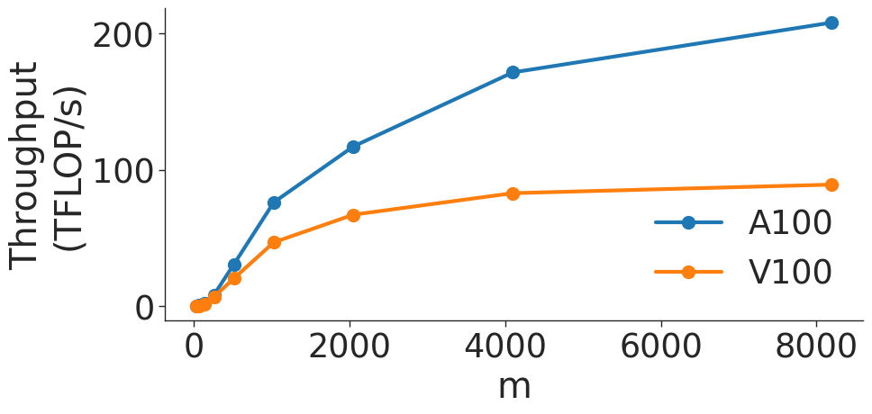
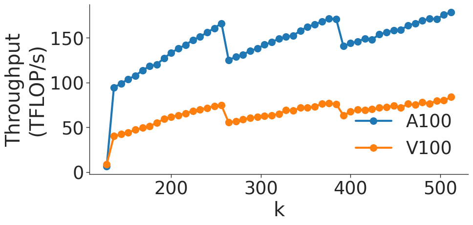
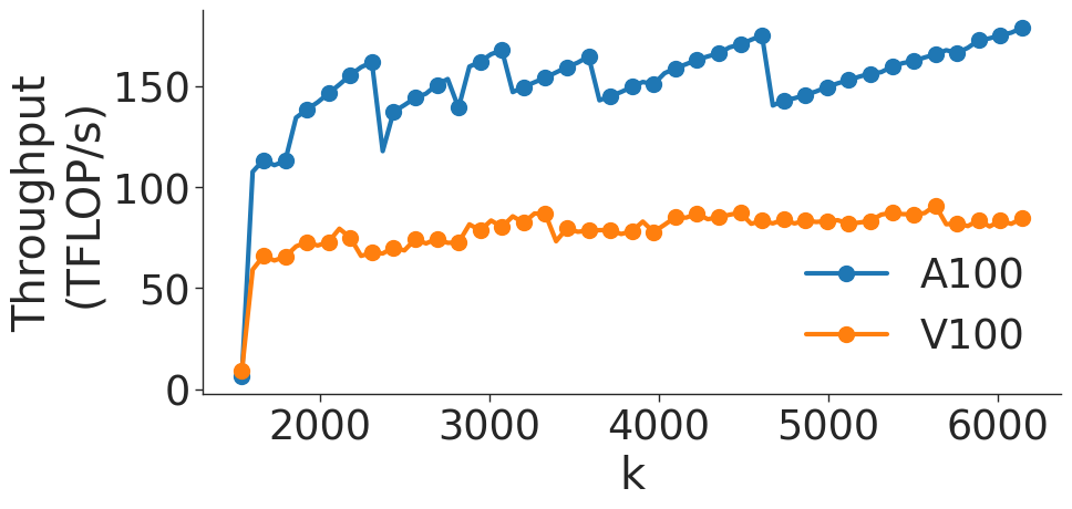
Figure 5 shows the throughput (in teraFLOP/s) of matrix multiplication computations of various sizes on two types of NVIDIA GPUs. As the GEMM size increases, the operation becomes more computationally intensive and uses memory more efficiently (GEMMs are memory-bound for small matrices). As shown in Figure 5 a, throughput of the GEMM kernel increases with matrix size as the kernel becomes compute-bound. However, wave quantization inefficiencies reduce the throughput when the GEMM size crosses certain thresholds. The effects of wave quantization can be seen clearly in Figure 5 b. Additionally, when the size of the GEMM is sufficiently large, PyTorch may automatically choose a tile size that decreases quantization effects. In Figure 5 c, the effects of wave quantization are lessened, as PyTorch is able to better balance the improvements from GEMM parallelization and inefficiencies from wave quantization to improve throughput.
<details>
<summary>extracted/5378885/figures/bmm/v100/b_sweep.png Details</summary>
### Visual Description
## Line Chart: Throughput vs. Batch Size (b) for varying Matrix Dimensions (m)
### Overview
This image displays a line chart illustrating the relationship between throughput (measured in TFLOP/s) and a variable 'b' (likely batch size) across four different matrix dimensions 'm' (1024, 2048, 4096, 8192). The chart demonstrates how throughput performance scales as the batch size increases for different problem sizes.
### Components/Axes
* **Y-Axis**: Labeled "Throughput (TFLOP/s)". The scale ranges from 0 to 100, with major tick marks at 0, 25, 50, 75, and 100.
* **X-Axis**: Labeled "b". The scale is logarithmic. While only $2^1$, $2^3$, and $2^5$ are explicitly labeled, the chart contains 6 data points per series, corresponding to $2^0$ (1), $2^1$ (2), $2^2$ (4), $2^3$ (8), $2^4$ (16), and $2^5$ (32).
* **Legend**: Located in the bottom-right quadrant of the chart area.
* **Blue line**: $m=1024$
* **Orange line**: $m=2048$
* **Green line**: $m=4096$
* **Red line**: $m=8192$
### Detailed Analysis
The chart plots four distinct series. Below are the approximate values for each data point (x-axis values inferred as $2^0$ to $2^5$):
| x-axis ($b$) | Blue ($m=1024$) | Orange ($m=2048$) | Green ($m=4096$) | Red ($m=8192$) |
| :--- | :--- | :--- | :--- | :--- |
| **1 ($2^0$)** | ~35 | ~69 | ~93 | ~100 |
| **2 ($2^1$)** | ~50 | ~67 | ~73 | ~72 |
| **4 ($2^2$)** | ~53 | ~71 | ~71 | ~72 |
| **8 ($2^3$)** | ~60 | ~73 | ~71 | ~71 |
| **16 ($2^4$)** | ~66 | ~74 | ~71 | ~70 |
| **32 ($2^5$)** | ~69 | ~73 | ~70 | ~70 |
**Trend Verification:**
* **Blue ($m=1024$)**: Slopes upward consistently. It starts at the lowest throughput and shows the most significant growth as 'b' increases, though the rate of growth slows down.
* **Orange ($m=2048$)**: Starts at ~69, dips slightly at $b=2$, then rises to a plateau around 73-74.
* **Green ($m=4096$)**: Starts high (~93), drops sharply at $b=2$ to ~73, then remains relatively flat, slightly declining toward 70.
* **Red ($m=8192$)**: Starts at the highest point (~100), drops sharply at $b=2$ to ~72, then remains relatively flat, slightly declining toward 70.
### Key Observations
* **Convergence**: All four series converge toward a throughput range of 69–73 TFLOP/s as 'b' increases to 32.
* **Inversion of Performance**: At low batch sizes ($b=1$), larger matrix dimensions ($m=8192$) provide significantly higher throughput. However, as the batch size increases, this advantage disappears, and the performance of all 'm' values becomes nearly identical.
* **Blue Line Anomaly**: The $m=1024$ series is the only one that benefits significantly from increasing the batch size 'b'. The other three series ($m=2048, 4096, 8192$) reach their peak performance almost immediately or experience a performance penalty when moving from $b=1$ to $b=2$.
### Interpretation
This data is characteristic of a GPU performance benchmark, likely for matrix multiplication kernels.
* **Small 'm' (1024)**: At small batch sizes, the workload is likely too small to saturate the GPU's compute units, leading to low throughput. Increasing the batch size allows for better parallelization and occupancy, hence the steady upward trend.
* **Large 'm' (4096, 8192)**: These configurations are large enough to saturate the GPU compute units even at $b=1$, achieving very high throughput (near peak). The sharp drop at $b=2$ suggests that increasing the batch size introduces overhead (e.g., memory management, kernel launch overhead, or cache thrashing) that outweighs the benefits of increased parallelism.
* **Saturation Point**: The convergence at $b=32$ suggests that the hardware has reached a theoretical throughput limit (a "ceiling") where the specific matrix size 'm' no longer dictates performance, and the system is likely compute-bound.
</details>
(a) $(b,m,m)×(b,m,m)$ BMM on V100 GPU.
<details>
<summary>extracted/5378885/figures/bmm/a100/b_sweep.png Details</summary>
### Visual Description
## Line Chart: Throughput vs. Block Size (b) for varying Matrix Sizes (m)
### Overview
This image is a line chart illustrating the relationship between computational throughput (measured in TFLOP/s) and a variable 'b' (likely block size or a parallelization parameter) across four different matrix sizes 'm' (1024, 2048, 4096, 8192). The chart demonstrates how throughput scales as 'b' increases, with different behaviors observed depending on the value of 'm'.
### Components/Axes
* **Y-Axis:** Labeled "Throughput (TFLOP/s)". The scale ranges from 0 to 300, with major grid lines at intervals of 50.
* **X-Axis:** Labeled "b". The scale is logarithmic, with explicit markers at $2^1$, $2^3$, and $2^5$.
* **Legend:** Located in the center-right area of the chart.
* **Blue line:** $m=1024$
* **Orange line:** $m=2048$
* **Green line:** $m=4096$
* **Red line:** $m=8192$
### Detailed Analysis
The chart contains four data series, each consisting of 7 data points.
**1. Blue Line ($m=1024$)**
* **Trend:** This line shows a consistent, steady upward trend across the entire X-axis range.
* **Data Points (Approximate):**
* Starts at $b \approx 2^0$ with a throughput of $\approx 60$ TFLOP/s.
* Increases steadily through $b \approx 2^1$ ($\approx 80$), $b \approx 2^2$ ($\approx 115$), and $b \approx 2^3$ ($\approx 135$).
* Shows a sharper increase between $b \approx 2^3$ and $b \approx 2^4$, reaching $\approx 200$ TFLOP/s.
* Flattens out at the end near $\approx 220$ TFLOP/s.
**2. Orange Line ($m=2048$)**
* **Trend:** Starts with a sharp upward slope, then transitions to a gradual, shallow upward trend, eventually saturating.
* **Data Points (Approximate):**
* Starts at $b \approx 2^0$ with a throughput of $\approx 170$ TFLOP/s.
* Jumps to $\approx 215$ TFLOP/s at $b \approx 2^1$.
* Continues a slow, steady climb from $\approx 225$ TFLOP/s to $\approx 240$ TFLOP/s as 'b' increases toward $2^5$.
**3. Green Line ($m=4096$)**
* **Trend:** Starts high and remains stable (flat) for the first half of the X-axis, then experiences a sharp drop-off.
* **Data Points (Approximate):**
* Starts at $b \approx 2^0$ with a throughput of $\approx 245$ TFLOP/s.
* Remains stable at $\approx 245$ TFLOP/s until $b \approx 2^4$.
* Drops sharply at the final data point ($b \approx 2^5$) to $\approx 200$ TFLOP/s.
**4. Red Line ($m=8192$)**
* **Trend:** Starts at the highest throughput value, drops sharply immediately, and then remains stable (flat).
* **Data Points (Approximate):**
* Starts at $b \approx 2^0$ with a throughput of $\approx 260$ TFLOP/s.
* Drops sharply to $\approx 210$ TFLOP/s at $b \approx 2^1$.
* Remains stable at $\approx 210$ TFLOP/s for the remainder of the X-axis range.
### Key Observations
* **Crossover Points:** There is a significant convergence of performance around the $b \approx 2^4$ to $2^5$ range, where all four lines cluster between 200 and 240 TFLOP/s.
* **Performance Inversion:** At low 'b' values, larger 'm' values (8192, 4096) provide significantly higher throughput than smaller 'm' values (1024). However, as 'b' increases, the smaller 'm' values catch up, and the larger 'm' values actually see a performance degradation (the "cliff" in the Red and Green lines).
* **Saturation:** The Orange ($m=2048$) and Blue ($m=1024$) lines appear to be approaching a saturation point, suggesting that increasing 'b' further may yield diminishing returns.
### Interpretation
This data likely represents a performance benchmark for a parallel computing operation, such as matrix multiplication on a GPU or similar accelerator.
* **The "m" variable:** Likely represents the matrix size. Larger matrices (8192) are more efficient at low block sizes ('b') because they can better saturate the hardware's compute units.
* **The "b" variable:** Likely represents a block size or tiling factor.
* **The "Cliff" (Red/Green lines):** The sharp drop in throughput for larger matrices as 'b' increases suggests that the block size has become too large, likely causing cache thrashing, memory bandwidth bottlenecks, or overhead in the parallelization logic.
* **The "Growth" (Blue line):** The smaller matrix ($m=1024$) requires a larger block size ('b') to achieve optimal hardware utilization, which is why it shows a positive slope while the others are flat or declining.
In summary, there is an "optimal" 'b' for each 'm'. For smaller matrices, you need a larger 'b' to reach peak performance; for larger matrices, a smaller 'b' is preferred to avoid performance penalties.
</details>
(b) $(b,m,m)×(b,m,m)$ BMM on A100 GPU.
<details>
<summary>extracted/5378885/figures/bmm/v100/BmmMSweep.png Details</summary>
### Visual Description
## Line Chart: Throughput vs. Matrix Dimension (m)
### Overview
This image displays a line chart illustrating the relationship between computational throughput (measured in TFLOP/s) and a parameter 'm' (likely representing matrix dimension or problem size). The chart compares performance across three different batch sizes ('b'), denoted as $b=1$, $b=4$, and $b=16$. The x-axis is logarithmic, representing powers of 2.
### Components/Axes
* **Y-Axis:** Labeled "Throughput (TFLOP/s)". The scale is linear, ranging from 0 to 100.
* **X-Axis:** Labeled "m". The scale is logarithmic, with major tick marks at $2^6$, $2^8$, $2^{10}$, and $2^{12}$. Data points are plotted at intervals of $2^6, 2^7, 2^8, 2^9, 2^{10}, 2^{11}, 2^{12}, 2^{13}$.
* **Legend:** Located in the top-left quadrant.
* **Blue line:** $b=1$
* **Orange line:** $b=4$
* **Green line:** $b=16$
### Detailed Analysis
The chart plots three distinct series. Below are the approximate values for each data point based on visual estimation:
| X-axis ($m$) | Blue ($b=1$) | Orange ($b=4$) | Green ($b=16$) |
| :--- | :--- | :--- | :--- |
| $2^6$ | ~1 TFLOP/s | ~1 TFLOP/s | ~2 TFLOP/s |
| $2^7$ | ~2 TFLOP/s | ~5 TFLOP/s | ~6 TFLOP/s |
| $2^8$ | ~12 TFLOP/s | ~20 TFLOP/s | ~45 TFLOP/s |
| $2^9$ | ~32 TFLOP/s | ~45 TFLOP/s | ~65 TFLOP/s |
| $2^{10}$ | ~60 TFLOP/s | ~65 TFLOP/s | ~72 TFLOP/s |
| $2^{11}$ | ~75 TFLOP/s | ~75 TFLOP/s | ~73 TFLOP/s |
| $2^{12}$ | ~95 TFLOP/s | ~72 TFLOP/s | ~71 TFLOP/s |
| $2^{13}$ | ~100 TFLOP/s | ~71 TFLOP/s | ~70 TFLOP/s |
**Trend Verification:**
* **Blue ($b=1$):** Starts with the lowest throughput. It exhibits a slow growth initially, followed by a steep, near-linear increase starting around $2^8$, eventually surpassing the other two series at $2^{11}$ and continuing to climb toward 100 TFLOP/s.
* **Orange ($b=4$):** Follows a trajectory similar to the blue line but shifted to the left (earlier performance gains). It plateaus around $2^{11}$ and experiences a slight decline thereafter.
* **Green ($b=16$):** Shows the highest initial throughput at small 'm' values. It rises sharply and plateaus the earliest (around $2^{10}$), after which it remains relatively flat with a slight downward trend.
### Key Observations
* **Crossover Point:** There is a clear crossover at approximately $m = 2^{11}$ (2048). Below this value, higher batch sizes ($b=16$) provide superior throughput. Above this value, the smallest batch size ($b=1$) provides superior throughput.
* **Saturation:** The $b=16$ and $b=4$ configurations appear to hit a performance ceiling (saturation point) around 70-75 TFLOP/s.
* **Scalability:** The $b=1$ configuration demonstrates better scalability for larger 'm' values, as it does not plateau within the visible range of the chart, unlike the $b=4$ and $b=16$ configurations.
### Interpretation
This data is characteristic of a hardware performance benchmark, likely for a GPU or accelerator performing matrix multiplication.
* **Efficiency vs. Overhead:** The higher throughput of $b=16$ at smaller 'm' values suggests that larger batch sizes are more efficient at hiding latency or overhead when the workload is small.
* **Resource Utilization:** The plateauing of $b=4$ and $b=16$ suggests that these configurations hit a hardware bottleneck (likely memory bandwidth or compute unit saturation) earlier than $b=1$.
* **Optimal Configuration:** The choice of 'b' depends heavily on the problem size 'm'. If the workload involves small matrices ($m < 2^{11}$), $b=16$ is optimal. If the workload involves large matrices ($m > 2^{11}$), $b=1$ is significantly more performant. The data suggests that $b=1$ is better optimized for large-scale compute tasks, whereas $b=16$ is better for smaller, latency-sensitive tasks.
</details>
(c) $(b,m,4096)×(b,4096,m)$ BMM on V100 GPU.
<details>
<summary>extracted/5378885/figures/bmm/a100/BmmMSweep.png Details</summary>
### Visual Description
## Line Chart: Throughput vs. Parameter 'm'
### Overview
This image displays a line chart illustrating the relationship between a variable 'm' (plotted on a logarithmic x-axis) and system throughput measured in TFLOP/s (y-axis). The chart compares performance across three different configurations of a parameter 'b' (b=1, b=4, b=16). The data demonstrates how increasing the 'b' parameter shifts the performance curve, allowing for higher throughput at smaller values of 'm'.
### Components/Axes
* **Y-Axis:** Labeled "Throughput (TFLOP/s)". The scale is linear, ranging from 0 to 300.
* **X-Axis:** Labeled "m". The scale is logarithmic, with major tick marks at powers of 2 ($2^6, 2^8, 2^{10}, 2^{12}$).
* **Legend:** Positioned in the top-left area.
* **Blue line:** $b=1$
* **Orange line:** $b=4$
* **Green line:** $b=16$
### Detailed Analysis
The chart plots three distinct data series. All series exhibit a sigmoidal (S-curve) growth pattern, where throughput starts near zero, accelerates, and eventually plateaus.
**1. Blue Line ($b=1$):**
* **Trend:** This series shows the slowest growth. It remains near 0 TFLOP/s until $m \approx 2^8$, then begins a steady, steep climb.
* **Data Points (Approximate):**
* $m=2^6$ to $2^8$: $\approx 0-5$ TFLOP/s
* $m=2^9$: $\approx 15$ TFLOP/s
* $m=2^{10}$: $\approx 50$ TFLOP/s
* $m=2^{11}$: $\approx 125$ TFLOP/s
* $m=2^{12}$: $\approx 200$ TFLOP/s
* $m=2^{13}$: $\approx 255$ TFLOP/s (Highest peak of all series)
**2. Orange Line ($b=4$):**
* **Trend:** This series is shifted to the left compared to $b=1$, indicating better performance at lower values of $m$.
* **Data Points (Approximate):**
* $m=2^6$: $\approx 0$ TFLOP/s
* $m=2^7$: $\approx 5$ TFLOP/s
* $m=2^8$: $\approx 15$ TFLOP/s
* $m=2^9$: $\approx 60$ TFLOP/s
* $m=2^{10}$: $\approx 90$ TFLOP/s
* $m=2^{11}$: $\approx 175$ TFLOP/s
* $m=2^{12}$: $\approx 240$ TFLOP/s
**3. Green Line ($b=16$):**
* **Trend:** This series shows the fastest initial growth, reaching high throughput at the lowest $m$ values. However, it exhibits a performance regression (drop) at the highest $m$ value.
* **Data Points (Approximate):**
* $m=2^6$: $\approx 5$ TFLOP/s
* $m=2^7$: $\approx 15$ TFLOP/s
* $m=2^8$: $\approx 50$ TFLOP/s
* $m=2^9$: $\approx 95$ TFLOP/s
* $m=2^{10}$: $\approx 170$ TFLOP/s
* $m=2^{11}$: $\approx 230$ TFLOP/s
* $m=2^{12}$: $\approx 245$ TFLOP/s
* $m=2^{13}$: $\approx 210$ TFLOP/s (Significant drop)
### Key Observations
* **Shift in Saturation:** As the parameter $b$ increases (from 1 to 16), the "knee" of the curve (the point where throughput begins to rise sharply) shifts to the left. This implies that larger $b$ values are more efficient at utilizing hardware resources for smaller problem sizes ($m$).
* **Performance Regression:** The green line ($b=16$) is the only series that shows a clear performance degradation at the largest $m$ value ($2^{13}$), dropping from $\approx 245$ to $\approx 210$ TFLOP/s.
* **Crossover:** The blue line ($b=1$) eventually overtakes the green line at the highest $m$ value, suggesting that while $b=16$ is better for small $m$, $b=1$ is more stable or efficient for very large $m$.
### Interpretation
This chart likely represents a performance benchmark for a computational kernel (such as matrix multiplication or a neural network layer) on a GPU or similar accelerator.
* **Parameter 'm':** Likely represents the matrix dimension or input size.
* **Parameter 'b':** Likely represents the batch size or block size.
* **The "Why":**
* **Small $m$:** Larger batch sizes ($b=16$) are necessary to saturate the compute units. With $b=1$, the workload is too small to keep the hardware busy, resulting in low throughput.
* **Large $m$:** The drop-off in the $b=16$ line at $m=2^{13}$ is a classic indicator of memory bandwidth bottlenecks or cache thrashing. When the batch size is too large combined with a large matrix dimension, the memory footprint likely exceeds the cache capacity, forcing the system to fetch data from slower main memory, thereby reducing throughput.
* **Conclusion:** The optimal configuration depends on the problem size $m$. For smaller $m$, $b=16$ is superior. For very large $m$, $b=1$ is more robust.
</details>
(d) $(b,m,4096)×(b,4096,m)$ BMM on A100 GPU.
Figure 6: Throughput (in teraFLOP/s) for batched matrix multiplication (BMM) computations with various dimensions.
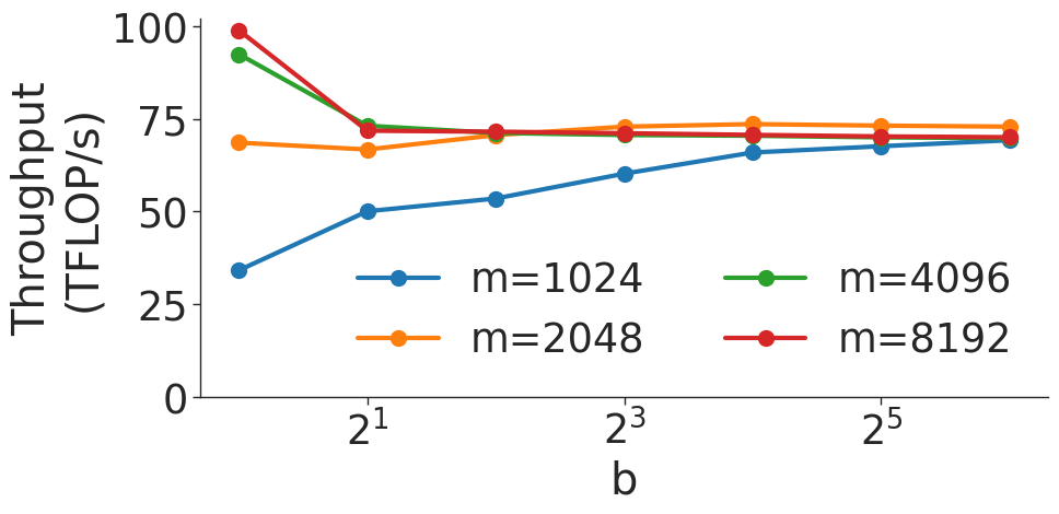
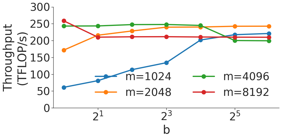
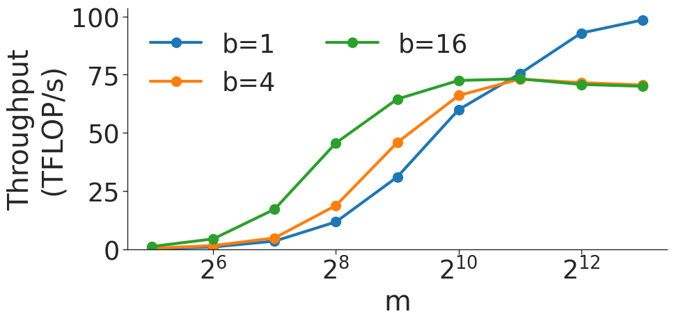
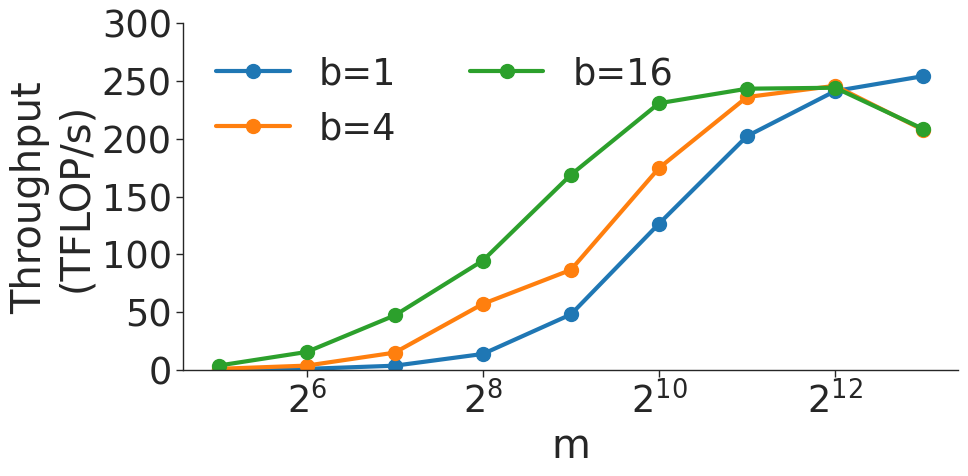
Figure 6 shows the throughput (in teraFLOP/s) of batched matrix multiplication (BMMs) computations of various sizes. Since BMMs are composed of GEMMs, the same wave quantization effects would apply (though they do not for these BMM sizes and on these GPU architectures). BMM throughput also increases as the size of the BMM and arithmetic intensity increases.
## VI Transformer Results
### VI-A Transformer as a Series of GEMMs
The settings of the various hyperparameters in the transformer layer controlling its shape all have an impact on its observed end-to-end throughput. Some of these hyperparameters can affect performance in subtle ways. The purpose of this section is to map GEMM performance to transformer throughput, use these mappings to explain the performance effects of relevant hyperparameters, and finally to boil down these effects into a series of practical takeaways.
<details>
<summary>extracted/5378885/figures/transformer/spikeless_sweeps/attention_key_query_problem_a32.png Details</summary>
### Visual Description
## Line Chart: Attention Key Query Score, a=32
### Overview
This chart illustrates the relationship between "Hidden Size" (x-axis) and "Throughput (TFLOP/s)" (y-axis) for various "h / a" ratios. The data demonstrates that throughput generally increases as the hidden size increases, with higher "h / a" ratios consistently achieving significantly higher throughput levels.
### Components/Axes
* **Title:** "Attention Key Query Score, a=32"
* **X-Axis:** "Hidden Size". The scale ranges from 0 to 32768, with major tick marks at intervals of 4096 (0, 4096, 8192, 12288, 16384, 20480, 24576, 28672, 32768).
* **Y-Axis:** "Throughput (TFLOP/s)". The scale ranges from 0 to slightly above 200, with major tick marks at 0, 50, 100, 150, and 200.
* **Legend:** Located on the right side of the chart. It defines the "h / a" ratio for seven distinct data series, color-coded as follows:
* **Blue:** 1
* **Orange:** 2
* **Green:** 4
* **Red:** 8
* **Purple:** 16
* **Brown:** 32
* **Pink:** 64
### Detailed Analysis
The data series can be categorized into three distinct performance tiers based on their throughput trajectories:
1. **Low Throughput Tier (Blue):**
* **Trend:** The line slopes upward steadily but remains the lowest performer throughout the entire range.
* **Values:** It reaches approximately 50 TFLOP/s at a hidden size of ~4096 and plateaus just below 100 TFLOP/s by the end of the x-axis.
2. **Mid Throughput Tier (Orange, Green):**
* **Trend:** Both lines are nearly perfectly overlapping, indicating identical performance. They show a steep initial rise followed by a gradual, consistent upward slope.
* **Values:** They reach ~75 TFLOP/s at a hidden size of 4096 and climb to approximately 150 TFLOP/s by the end of the range.
3. **High Throughput Tier (Red, Purple, Brown, Pink):**
* **Trend:** These lines show the steepest initial growth, reaching ~150 TFLOP/s very quickly (before a hidden size of 8192). They then plateau or continue to rise slowly toward ~200-215 TFLOP/s.
* **Volatility:** The **Red (h/a=8)** line is notably volatile compared to the others, exhibiting several sharp, sudden dips in throughput (e.g., around 20,000 hidden size).
* **Values:** The **Brown (h/a=32)** and **Pink (h/a=64)** lines are the most stable and reach the highest throughput, consistently staying above 200 TFLOP/s after the initial ramp-up.
### Key Observations
* **Saturation Point:** For all series, the most significant gains in throughput occur between a hidden size of 0 and 8192. Beyond 12,000, the rate of improvement (slope) decreases significantly, indicating a saturation point in hardware utilization.
* **Performance Clustering:** There is a clear performance gap between the "h/a" ratios. Ratios of 16, 32, and 64 provide a massive throughput advantage over ratios of 1, 2, and 4.
* **Red Line Anomaly:** The Red line (h/a=8) is an outlier in terms of stability. While it achieves high throughput, it suffers from intermittent performance drops, suggesting potential memory alignment or cache thrashing issues at specific hidden size intervals that do not affect the higher ratios (16, 32, 64) as severely.
### Interpretation
This chart likely represents a performance benchmark for an attention mechanism implementation (such as FlashAttention) on a GPU.
* **Efficiency:** The "h/a" ratio appears to be a critical hyperparameter. Higher ratios (16+) allow the system to saturate the GPU's compute units more effectively, likely due to better parallelization or memory access patterns.
* **Diminishing Returns:** The flattening of the curves suggests that increasing the hidden size beyond ~16,000 provides diminishing returns on throughput.
* **Optimization Insight:** The volatility of the Red line (h/a=8) suggests that certain configurations are "unstable" or sensitive to specific memory layouts. If a developer were choosing parameters, they would likely avoid h/a=8 in favor of 16, 32, or 64 to ensure both high throughput and consistent performance. The near-perfect overlap of the Orange and Green lines suggests that for those specific ratios, the performance difference is negligible, and one might choose the lower ratio (2) if it saves memory or compute resources.
</details>
(a) Attention key-query score GEMM throughput for 32 attention heads.
<details>
<summary>extracted/5378885/figures/transformer/spikeless_sweeps/attention_problem_times_values_a32.png Details</summary>
### Visual Description
## Line Chart: Attention over Values, a=32
### Overview
This image displays a performance benchmark line chart titled "Attention over Values, a=32". It plots the throughput (measured in TFLOP/s) against the "Hidden Size" of a computational model (likely a Transformer-based architecture). The chart illustrates how different ratios of attention heads to attention dimension ($h/a$) affect computational throughput as the hidden size increases.
### Components/Axes
* **Title:** "Attention over Values, a=32" (Top center).
* **Y-Axis:** "Throughput (TFLOP/s)". The scale ranges from 0 to 200+, with major grid lines at 0, 50, 100, 150, and 200.
* **X-Axis:** "Hidden Size". The scale ranges from 0 to 32768. Major tick marks are provided at intervals of 4096: 0, 4096, 8192, 12288, 16384, 20480, 24576, 28672, 32768.
* **Legend:** Located on the right side, labeled "h / a". It maps seven distinct colors to specific ratios:
* **Blue:** 1
* **Orange:** 2
* **Green:** 4
* **Red:** 8
* **Purple:** 16
* **Brown:** 32
* **Pink:** 64
### Detailed Analysis
The chart displays seven data series, all exhibiting a general upward trend with a distinct "sawtooth" pattern characterized by sharp, periodic drops in throughput.
* **Blue Series (h/a = 1):**
* **Trend:** This is the lowest-performing series. It starts at 0 and climbs to approximately 100 TFLOP/s at the maximum hidden size.
* **Behavior:** It exhibits frequent, sharp drops in throughput, most notably around
</details>
(b) Attention over value GEMM throughput for 32 attention heads.
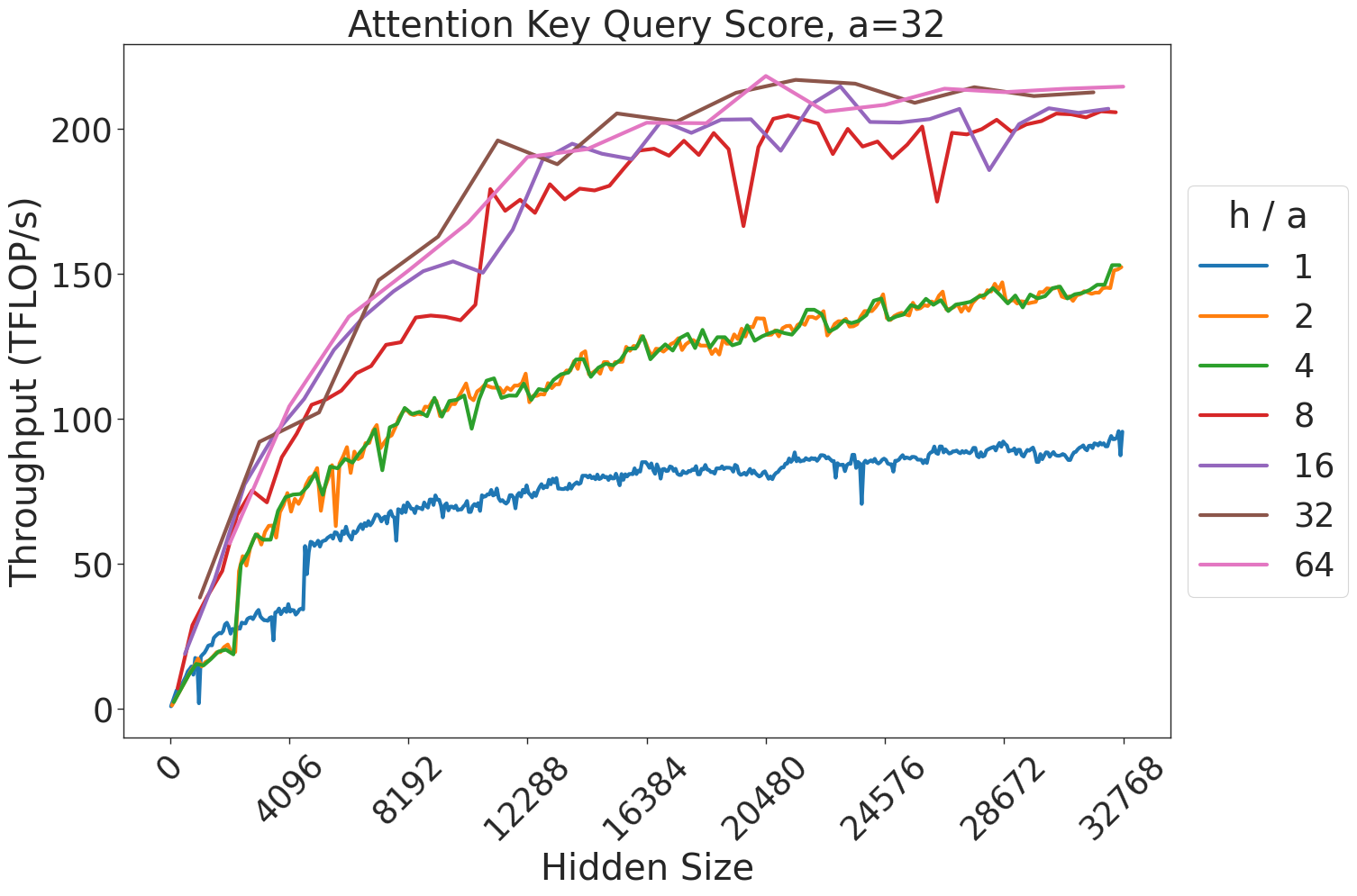
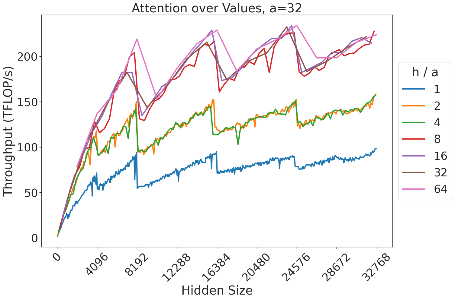
Figure 7: Attention GEMM performance on A100 GPUs. Each plot is a single series (i.e. if we didn’t split, there would be three regions with spikes), but split by the largest power of two that divides $h/a$ to demonstrate that more powers of two leads to better performance up to $h/a=64$ .
<details>
<summary>extracted/5378885/figures/transformer/spikeless_sweeps/attention_key_query_problem_ha64_hdim16384.png Details</summary>
### Visual Description
## Line Chart: Attention Key Query Score (h/a = 64)
### Overview
This image is a multi-series line chart illustrating the relationship between "Hidden Size" (x-axis) and "Throughput (TFLOP/s)" (y-axis) for various attention head configurations, denoted by the variable 'a'. The chart is divided into three vertical background regions representing different model parameter scales: 0-1B (green), 1B-10B (blue), and 10B-300B (pink).
### Components/Axes
* **Title:** "Attention Key Query Score (h/a = 64)" (Top center).
* **Y-Axis:** "Throughput (TFLOP/s)". Scale ranges from 50 to 225, with major ticks every 25 units.
* **X-Axis:** "Hidden Size". Scale ranges from 0 to 16384, with major ticks at 0, 2048, 4096, 6144, 8192, 10240, 12288, 14336, 16384.
* **Background Regions:**
* **Green (Left):** 0-1B parameters.
* **Blue (Center):** 1B-10B parameters.
* **Pink (Right):** 10B-300B parameters.
* **Legend (Bottom-Right):**
* **Left Column:**
* `a: 12` (Blue line)
* `a: 24` (Orange line)
* `a: 32` (Green line)
* `a: 40` (Red line)
* **Right Column:**
* `a: 64` (Purple line)
* `a: 80` (Brown line)
* `a: 96` (Pink line)
### Detailed Analysis
The chart displays seven distinct data series, each representing a specific 'a' value. All series exhibit a positive correlation: as Hidden Size increases, Throughput (TFLOP/s) increases.
**Trend Verification & Data Points:**
1. **a: 12 (Blue Line):**
* **Trend:** Steepest upward slope. Starts at ~58 TFLOP/s (Hidden Size ~1024) and climbs steadily to ~235 TFLOP/s (Hidden Size 16384).
* **Note:** Shows a significant inflection point/jump in throughput when transitioning from the Blue (1B-10B) to the Pink (10B-300B) region (around Hidden Size 6144).
2. **a: 24 (Orange Line):**
* **Trend:** Strong upward slope. Starts at ~60 TFLOP/s (Hidden Size ~1536) and reaches ~208 TFLOP/s (Hidden Size 14336).
3. **a: 32 (Green Line):**
* **Trend:** Consistent upward slope. Starts at ~58 TFLOP/s (Hidden Size ~1536) and reaches ~202 TFLOP/s (Hidden Size 16384).
4. **a: 40 (Red Line):**
* **Trend:** Moderate upward slope. Starts at ~58 TFLOP/s (Hidden Size ~2048) and reaches ~190 TFLOP/s (Hidden Size 14336).
5. **a: 64 (Purple Line):**
* **Trend:** Starts later than others (Hidden Size ~4096) at ~58 TFLOP/s. Climbs to ~148 TFLOP/s (Hidden Size 16384).
6. **a: 80 (Brown Line):**
* **Trend:** Starts at ~58 TFLOP/s (Hidden Size ~4096). Climbs to ~138 TFLOP/s (Hidden Size 12288).
7. **a: 96 (Pink Line):**
* **Trend:** Shallowest slope. Starts at ~62 TFLOP/s (Hidden Size ~6144) and reaches ~110 TFLOP/s (Hidden Size 12288).
### Key Observations
* **Inverse Efficiency:** There is a clear inverse relationship between the 'a' value and throughput. Lower 'a' values (12, 24) consistently achieve higher TFLOP/s than higher 'a' values (64, 80, 96) at any given Hidden Size.
* **Scaling Efficiency:** Throughput generally scales well with Hidden Size across all configurations.
* **Region Transitions:** The transition from the Blue (1B-10B) to the Pink (10B-300B) region (around Hidden Size 6144) appears to be a critical performance threshold, particularly for the lower 'a' value series, which show steeper gains after this point.
* **Data Sparsity:** Higher 'a' values (64, 80, 96) have fewer data points plotted, suggesting these configurations may not be tested or applicable at smaller Hidden Sizes.
### Interpretation
This chart demonstrates the performance trade-offs in attention mechanism design for Large Language Models (LLMs). The variable 'a' likely represents the number of attention heads.
* **Performance Implications:** The data suggests that for a fixed "h/a = 64" (hidden size per head), using fewer attention heads (lower 'a') results in significantly higher computational throughput. This is likely due to reduced overhead in managing attention head parallelism or more efficient memory access patterns on the underlying hardware (e.g., GPU/TPU).
* **Scaling:** The upward trend across all lines confirms that increasing the Hidden Size is an effective way to increase TFLOP/s, likely by saturating the compute units more effectively as the matrix operations become larger.
* **Strategic Design:** The chart serves as a guide for model architects: if maximizing throughput is the primary goal, lower 'a' values are preferable. However, the choice of 'a' is usually constrained by model architecture requirements (e.g., model capacity, training stability), so this chart highlights the "cost" in throughput for choosing higher head counts.
</details>
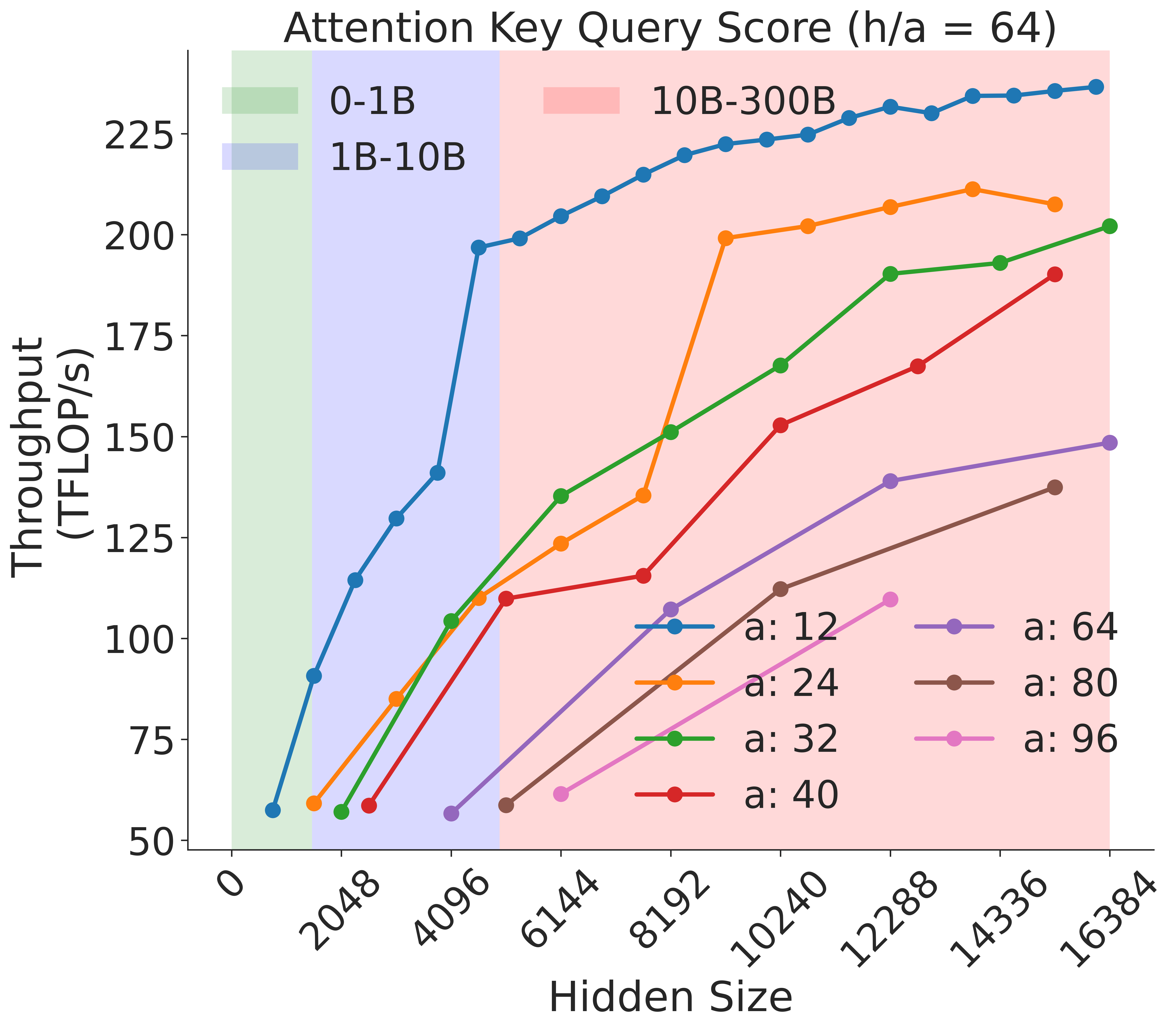
Figure 8: Attention key-query score GEMM throughput assuming fixed ratio of $\frac{h}{a}=64$ on A100 GPU
<details>
<summary>extracted/5378885/figures/transformer/spikeless_sweeps/attention_problem_times_values_ha64_hdim16384.png Details</summary>
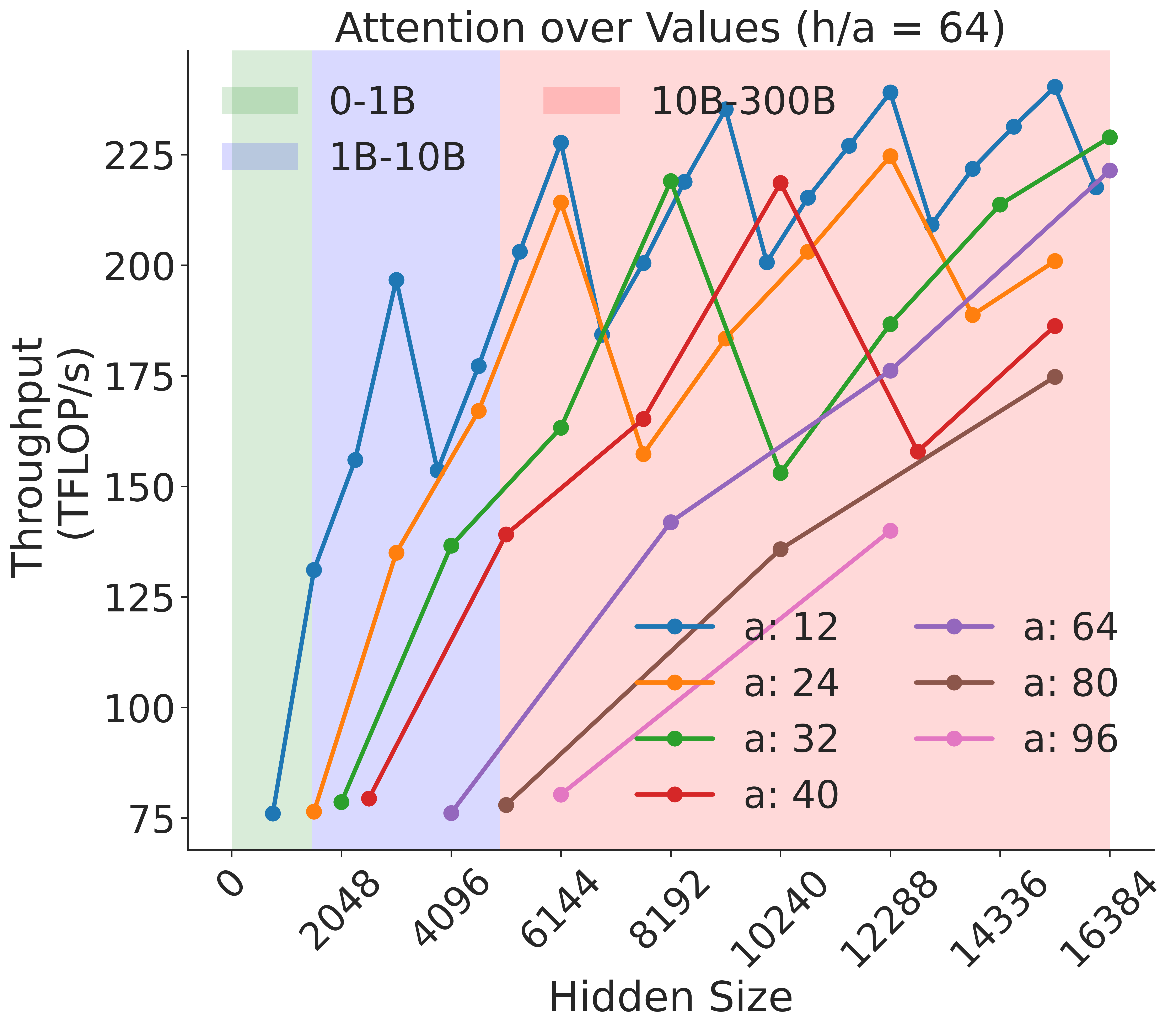
### Visual Description
## Line Chart: Attention over Values (h/a = 64)
### Overview
This image is a multi-series line chart illustrating the relationship between "Hidden Size" (x-axis) and "Throughput (TFLOP/s)" (y-axis) for various attention head configurations. The chart features a "sawtooth" pattern across all data series, indicating periodic performance fluctuations. The background is divided into three vertical color-coded regions representing different model size ranges (0-1B, 1B-10B, 10B-300B).
### Components/Axes
* **Title:** "Attention over Values (h/a = 64)" located at the top center.
* **Y-Axis:** Labeled "Throughput (TFLOP/s)". The scale ranges from 75 to 225, with major tick marks every 25 units.
* **X-Axis:** Labeled "Hidden Size". The scale ranges from 0 to 16384, with major tick marks at 0, 2048, 4096, 6144, 8192, 10240, 12288, 14336, and 16384.
* **Background Regions (Spatial Grounding):**
* **Green Region (Top-Left):** Spans from x ≈ 500 to x ≈ 1500. Represents "0-1B" models.
* **Blue Region (Center-Left):** Spans from x ≈ 1500 to x ≈ 5500. Represents "1B-10B" models.
* **Red Region (Center-Right):** Spans from x ≈ 5500 to x ≈ 16384. Represents "10B-300B" models.
* **Legend 1 (Top-Left):** Defines the background regions:
* Green box: "0-1B"
* Blue box: "1B-10B"
* Red box: "10B-300B"
* **Legend 2 (Bottom-Right):** Defines the data series by the number of attention heads ('a'):
* Blue line: "a: 12"
* Orange line: "a: 24"
* Green line: "a: 32"
* Red line: "a: 40"
* Purple line: "a: 64"
* Brown line: "a: 80"
* Pink line: "a: 96"
### Detailed Analysis
The chart displays seven distinct data series, each representing a different number of attention heads ('a'). All series exhibit a general upward trend in throughput as the hidden size increases, but they are characterized by significant volatility (the "sawtooth" pattern).
**Trend Verification:**
* **Inverse Correlation:** There is a clear inverse relationship between the number of attention heads ('a') and the throughput. The series with the fewest heads ("a: 12", blue) consistently achieves the highest throughput, while the series with the most heads ("a: 96", pink) achieves the lowest throughput.
* **Sawtooth Pattern:** Every line exhibits sharp drops in throughput at specific intervals. These drops appear to be synchronized across different series, suggesting hardware-level constraints (e.g., memory alignment or cache misses) that trigger at specific hidden size values.
**Data Series Characteristics:**
* **Blue (a: 12):** The highest performing series. It starts at ~75 TFLOP/s and reaches peaks near 240 TFLOP/s. It shows the most frequent volatility.
* **Orange (a: 24):** Generally follows the blue line but at a lower throughput, peaking around 225 TFLOP/s.
* **Green (a: 32):** Follows a similar trajectory to the orange line, peaking near 220 TFLOP/s.
* **Red (a: 40):** Shows a more moderate upward slope, peaking below 200 TFLOP/s.
* **Purple (a: 64):** Starts later (around x=4096) and shows a steady climb, reaching ~220 TFLOP/s at the far right.
* **Brown (a: 80):** Starts around x=4096, showing a lower throughput profile than the purple line.
* **Pink (a: 96):** The lowest performing series, starting around x=6144 and showing the lowest throughput values on the chart.
### Key Observations
* **Performance Volatility:** The "sawtooth" pattern is the most notable feature. The throughput does not scale linearly; it oscillates. This is typical of GPU kernel performance where specific hidden sizes align perfectly with the GPU's warp/block size, while others cause inefficient memory access patterns.
* **Head Count Impact:** Increasing the number of attention heads ('a') consistently reduces the maximum achievable throughput for a given hidden size.
* **Data Density:** The data points are more densely packed as the hidden size increases, particularly in the red background region (10B-300B models).
### Interpretation
This chart is likely a performance benchmark for Large Language Model (LLM) attention mechanisms on GPU hardware.
1. **Hardware Alignment:** The "sawtooth" pattern strongly suggests that the underlying compute kernels are sensitive to the alignment of the "Hidden Size" with the GPU's architecture (e.g., memory coalescing or shared memory bank conflicts). Developers optimizing these models would likely avoid the "troughs" in this chart to maximize efficiency.
2. **Efficiency Trade-off:** The inverse relationship between the number of attention heads ('a') and throughput suggests that while more attention heads might be beneficial for model capacity or training stability, they come at a significant computational cost in terms of raw TFLOP/s.
3. **Model Scaling:** The background regions suggest that as models grow in parameter count (from 0-1B to 10B-300B), the performance characteristics remain volatile, but the absolute throughput ceiling is generally higher for smaller head counts. The chart serves as a guide for selecting the optimal "Hidden Size" and "Attention Head" configuration to maximize hardware utilization.
</details>
Figure 9: Attention over value GEMM throughput assuming fixed ratio of $\frac{h}{a}=64$ on A100 GPU.
<details>
<summary>extracted/5378885/figures/transformer/mlp_h_to_4h.png Details</summary>
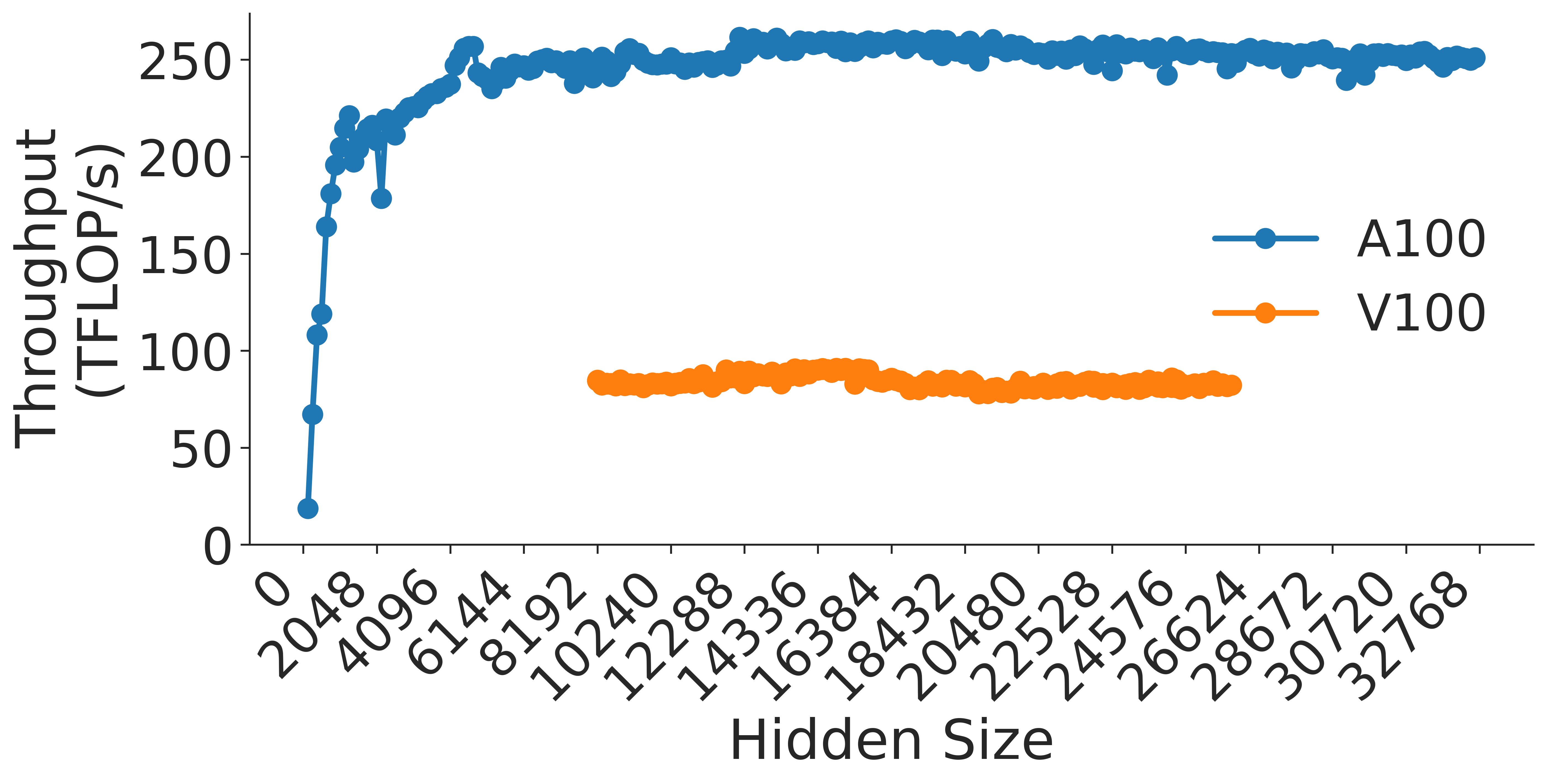
### Visual Description
## Line Chart: Throughput Comparison of A100 vs. V100 GPUs
### Overview
This image is a line chart comparing the computational throughput (measured in TFLOP/s) of two GPU architectures, the NVIDIA A100 and the NVIDIA V100, as a function of "Hidden Size." The chart demonstrates that the A100 provides significantly higher throughput and a wider operational range compared to the V100.
### Components/Axes
* **Y-Axis (Vertical):** Labeled "Throughput (TFLOP/s)". The scale ranges from 0 to 250, with major tick marks every 50 units.
* **X-Axis (Horizontal):** Labeled "Hidden Size". The scale ranges from 0 to 32768. The specific tick marks are: 0, 2048, 4096, 6144, 8192, 10240, 12288, 14336, 16384, 18432, 20480, 22528, 24576, 26624, 30720, 32768.
* **Legend:** Located on the right-center of the chart area.
* **Blue line with circular markers:** Labeled "A100".
* **Orange line with circular markers:** Labeled "V100".
### Detailed Analysis
#### A100 Series (Blue Line)
* **Trend:** The A100 series shows a rapid, near-linear increase in throughput starting from 0 hidden size, reaching a plateau around 250 TFLOP/s.
* **Data Points:**
* **Start:** Begins at (0, ~20 TFLOP/s).
* **Growth Phase:** Throughput climbs steeply, reaching ~200 TFLOP/s by a hidden size of ~1500.
* **Anomaly/Jitter:** There is a notable, sharp dip in performance between hidden sizes 3000 and 4000, where throughput drops from approximately 220 TFLOP/s down to ~180 TFLOP/s before recovering.
* **Plateau:** After the recovery (post-4096), the throughput stabilizes, oscillating slightly between 240 and 255 TFLOP/s for the remainder of the X-axis range up to 32768.
#### V100 Series (Orange Line)
* **Trend:** The V100 series shows a flat, stable performance profile. It does not appear to have a "warm-up" phase visible on this chart, as it starts directly at a high throughput level.
* **Data Points:**
* **Range:** The data series begins at a hidden size of 10240 and terminates at 26624.
* **Throughput:** The values remain consistently between 80 and 90 TFLOP/s throughout the entire duration of the series.
### Key Observations
* **Performance Gap:** The A100 consistently outperforms the V100 by a factor of approximately 3x (250 TFLOP/s vs. ~85 TFLOP/s).
* **Operational Range:** The A100 was tested across the full spectrum of hidden sizes (0 to 32768), whereas the V100 data is truncated, likely due to memory limitations (Out of Memory errors) at higher hidden sizes or simply not being tested beyond 26624.
* **Stability:** The A100 exhibits a "warm-up" curve and a specific performance dip at lower hidden sizes, whereas the V100 maintains a very steady, flat performance profile within its tested range.
### Interpretation
The data suggests that the A100 is significantly more efficient and powerful for the workload being tested (likely a neural network layer operation, given the "Hidden Size" terminology).
The "warm-up" phase of the A100 indicates that at very small hidden sizes, the GPU is likely underutilized or bound by kernel launch overheads rather than raw compute power. The dip around 3000-4000 hidden size is an interesting anomaly; it may represent a transition point where the workload switches from one compute kernel to another, or where memory access patterns become less efficient before optimizing again at larger sizes.
The V100's flat line suggests it is compute-bound immediately upon entering the tested range, and its inability to scale to the higher hidden sizes (where the A100 continues to operate) strongly implies that the V100 lacks the memory capacity (HBM) to handle the larger tensors required for those hidden sizes.
</details>
(a) MLP h to 4h Block
<details>
<summary>extracted/5378885/figures/transformer/mlp_4h_to_h.png Details</summary>
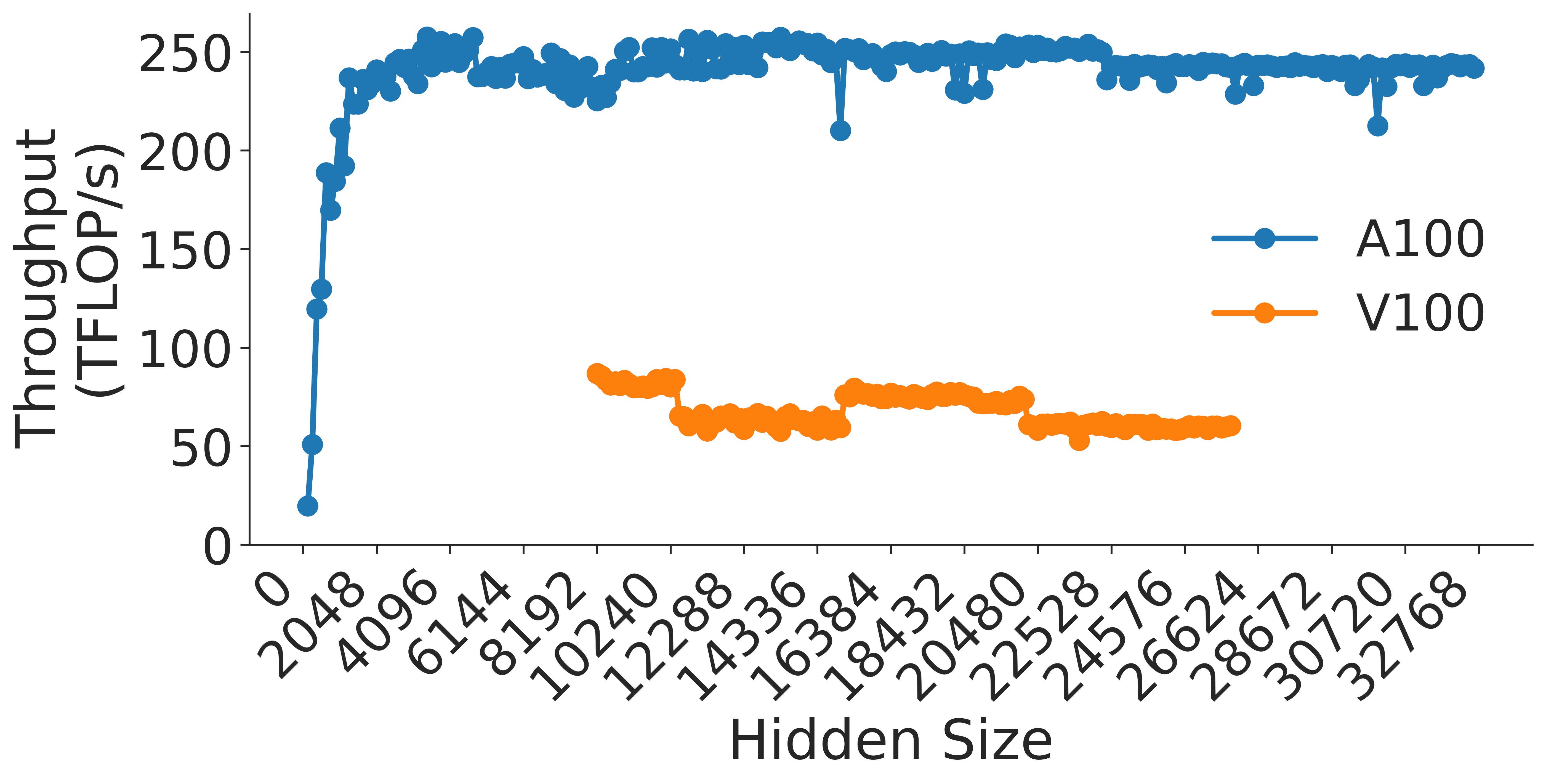
### Visual Description
## Line Chart: GPU Throughput vs. Hidden Size
### Overview
This image displays a line chart comparing the computational throughput (measured in TFLOP/s) of two NVIDIA GPU architectures, the A100 and the V100, across a range of "Hidden Size" parameters. The chart illustrates that the A100 provides significantly higher and more stable throughput compared to the V100, which exhibits performance volatility across different hidden sizes.
### Components/Axes
* **Y-Axis:** Labeled "Throughput (TFLOP/s)". The scale ranges from 0 to 250, with major tick marks every 50 units.
* **X-Axis:** Labeled "Hidden Size". The scale ranges from 0 to 32768. The axis uses increments of 2048. The labels are rotated 45 degrees for readability.
* **Legend:** Located on the right-center of the chart area.
* **Blue line with circle markers:** Labeled "A100"
* **Orange line with circle markers:** Labeled "V100"
### Detailed Analysis
#### A100 (Blue Series)
* **Trend:** The A100 series shows a very sharp, near-vertical increase in throughput from 0 to approximately 240 TFLOP/s between hidden sizes 0 and 2048. Following this initial ramp-up, the throughput plateaus, maintaining a high level of performance between 240 and 250 TFLOP/s for the remainder of the x-axis range.
* **Stability:** The performance is remarkably stable. There are minor, isolated dips (e.g., at hidden size 16384 and 28672) where throughput drops momentarily to approximately 210–220 TFLOP/s, but it consistently recovers to the ~240 TFLOP/s range.
#### V100 (Orange Series)
* **Trend:** The V100 data series begins at a hidden size of 10240. Unlike the A100, the V100 exhibits a distinct "staircase" or segmented pattern, indicating performance sensitivity to specific hidden size values.
* **Segmented Data Points:**
* **10240 to 12288:** Throughput is relatively high, hovering between 80 and 85 TFLOP/s.
* **12288 to 16384:** Throughput drops to a lower plateau of approximately 60–65 TFLOP/s.
* **16384 to 22528:** Throughput increases again to a plateau of approximately 75–80 TFLOP/s.
* **22528 to 28672:** Throughput drops back down to approximately 60 TFLOP/s.
### Key Observations
* **Performance Gap:** The A100 consistently outperforms the V100 by a factor of roughly 3x to 4x across the entire range where both are plotted.
* **Architectural Sensitivity:** The V100's performance is highly variable, suggesting that the workload is sensitive to memory alignment, tiling, or kernel optimization boundaries specific to the V100 architecture.
* **Saturation:** The A100 reaches its peak performance very early (at hidden size 2048), suggesting that for this specific operation, the GPU is compute-bound rather than memory-bound for the vast majority of the tested range.
### Interpretation
The data suggests that the A100 architecture is significantly more efficient and robust for this specific computational task than the V100. The "staircase" pattern observed in the V100 data is a classic indicator of GPU kernel performance cliffs, where specific input sizes (hidden sizes) align poorly with the GPU's memory architecture (e.g., shared memory bank conflicts or inefficient warp utilization). The A100's ability to maintain a flat, high-throughput line suggests that its hardware or the associated software kernels are better optimized to handle varying hidden sizes without incurring the performance penalties seen on the V100.
</details>
(b) MLP 4h to h Block
Figure 10: Throughput (in teraFLOP/s) for multilayer perceptrons (MLP) for each transformer layer as a function of hidden dimension for $a=128$ .
For example, let us consider the attention block on an A100 GPU. The number of attention heads affects the number of independent matrix multiplications in the BMM, as well as the size of each matrix multiplication computation. Figure 6 shows the effect of the number of attention heads and the hidden size on the throughput of the BMM used in attention key-query score computation and attention over value computation. NVIDIA Tensor Cores are more efficient when the dimensions of the matrices $m$ , $n$ , and $k$ are multiples of 128 bytes for A100 GPUs. Therefore, efficiency is maximized when matrix sizes are multiples of 64 FP16 elements. If this cannot be achieved, sizes that are multiples of larger powers of 2 perform better, as shown in Figures 7a and 7b, where the matrix dimension of interest is of size $h/a$ . Figures 8 and 9 show how decreasing the number of attention heads for any given hidden size results in more efficient GEMMs. Because a decrease in $a$ is an increase in $h/a$ and these two GEMMs are memory bound, an increase in component matrices size creates much more efficient GEMMs. Figure 9 also clearly shows the effects of wave quantization in the peaks and valleys within any given line. Since each line moves in steps of $64h/a$ , the BMMs corresponding to each line grow at different rates. This causes the period of the wave quantization effect to appear different for each $a$ value.
<details>
<summary>x4.png Details</summary>
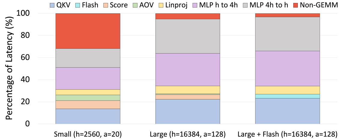
### Visual Description
## Stacked Bar Chart: Latency Distribution by Model Configuration
### Overview
This image displays a stacked bar chart comparing the percentage of latency attributed to various computational components across three different model configurations. The chart illustrates how the distribution of latency shifts as model size increases and when specific optimizations (Flash) are applied.
### Components/Axes
* **Y-Axis:** "Percentage of Latency (%)", ranging from 0 to 100.
* **X-Axis:** Three distinct model configurations:
1. **Small (h=2560, a=20)**
2. **Large (h=16384, a=128)**
3. **Large + Flash (h=16384, a=128)**
* **Legend (Top):**
* **QKV:** Light Blue
* **Flash:** Cyan
* **Score:** Peach
* **AOV:** Light Green
* **Linproj:** Yellow
* **MLP h to 4h:** Light Purple
* **MLP 4h to h:** Light Grey
* **Non-GEMM:** Red
### Detailed Analysis
The chart is divided into three vertical bars, each representing 100% of the latency for that specific configuration.
#### 1. Small (h=2560, a=20)
* **Trend:** This bar is dominated by the "Non-GEMM" component at the top.
* **Data Points (approximate):**
* **Non-GEMM (Red):** ~32% (occupies the top segment, from ~68% to 100%)
* **MLP 4h to h (Grey):** ~17% (from ~51% to 68%)
* **MLP h to 4h (Purple):** ~20% (from ~31% to 51%)
* **Linproj (Yellow):** ~5% (from ~26% to 31%)
* **AOV (Green):** ~5% (from ~21% to 26%)
* **Score (Peach):** ~7% (from ~14% to 21%)
* **QKV (Blue):** ~14% (from 0% to 14%)
#### 2. Large (h=16384, a=128)
* **Trend:** The "Non-GEMM" component shrinks drastically compared to the Small model. The MLP components (Purple and Grey) become the dominant contributors to latency.
* **Data Points (approximate):**
* **Non-GEMM (Red):** ~5% (from ~95% to 100%)
* **MLP 4h to h (Grey):** ~31% (from ~64% to 95%)
* **MLP h to 4h (Purple):** ~30% (from ~34% to 64%)
* **Linproj (Yellow):** ~8% (from ~26% to 34%)
* **AOV (Green):** ~1% (from ~25% to 26%)
* **Score (Peach):** ~3% (from ~22% to 25%)
* **QKV (Blue):** ~22% (from 0% to 22%)
#### 3. Large + Flash (h=16384, a=128)
* **Trend:** Very similar to the "Large" configuration, but with the introduction of a "Flash" component.
* **Data Points (approximate):**
* **Non-GEMM (Red):** ~3% (from ~97% to 100%)
* **MLP 4h to h (Grey):** ~31% (from ~66% to 97%)
* **MLP h to 4h (Purple):** ~32% (from ~34% to 66%)
* **Linproj (Yellow):** ~5% (from ~29% to 34%)
* **AOV (Green):** ~1% (from ~28% to 29%)
* **Score (Peach):** ~1% (from ~27% to 28%)
* **Flash (Cyan):** ~4% (from ~23% to 27%)
* **QKV (Blue):** ~23% (from 0% to 23%)
### Key Observations
* **Non-GEMM Bottleneck:** In the "Small" model, "Non-GEMM" operations are the single largest source of latency. As the model scales to "Large," this component becomes negligible.
* **MLP Dominance:** In larger models, the two MLP (Multi-Layer Perceptron) components ("h to 4h" and "4h to h") combined account for over 60% of the total latency.
* **QKV Scaling:** The latency contribution of the "QKV" component increases as the model size increases (from ~14% to ~23%).
* **Flash Integration:** The "Flash" component (likely referring to FlashAttention) appears only in the third configuration, consuming a small portion (~4%) of the latency budget, effectively displacing some of the "Linproj" and "Score" latency.
### Interpretation
This data suggests a fundamental shift in computational bottlenecks as Transformer models scale.
1. **Small Models are Memory/Overhead Bound:** The high percentage of "Non-GEMM" latency in the "Small" model suggests that for smaller hidden dimensions, the overhead of launching kernels, memory movement, or non-matrix-multiplication operations dominates the execution time.
2. **Large Models are Compute Bound:** In the "Large" configuration, the dominance of the MLP layers (which are typically heavy GEMM/Matrix Multiplication operations) indicates that the model is compute-bound. The hardware is spending the vast majority of its time performing the heavy lifting of the neural network layers rather than managing overhead.
3. **Optimization Efficacy:** The "Large + Flash" configuration demonstrates that introducing specialized kernels (like FlashAttention) allows for a slight redistribution of latency, but the overall profile remains dominated by the MLP layers. This confirms that for large models, optimizing the MLP layers is the most critical path for performance improvement.
</details>
Figure 11: The proportion of latency of each GEMM module for one layer of various model sizes.
Figure 11 shows the proportion of latency spent in each transformer GEMM; consequently, it also shows the most relevant GEMMs to optimize in the transformer module. As the size of the model grows, it is even more important to optimize GEMM operations. For the largest models, the $QKV$ transformation in the attention block along with the MLP block are the most prevalent GEMMs. Therefore, the overall latency of the model would benefit most from optimizing these kernels. Attention over value (AOV) computation is the smallest GEMM computation in large transformer models; however, optimizing attention key-query score computation will have similar benefits to attention over value computation, so both can be optimized at the same time.
### VI-B Analysis
To recap, we have the following requirements to efficiently run GEMMs on NVIDIA GPUs:
- Tensor Core Requirement: Ensure the inner and outer dimension of the GEMM is divisible by 128 bytes (64 FP16 elements).
- Tile Quantization: To use the most efficient tile size ensure that the output matrix is divisible into $128× 256$ blocks.
- Wave Quantization: Ensure that the number of blocks that the output matrix is divided into is divisible by the number of streaming multiprocessors (80 for V100s, 108 for A100s, and 144 for H100s).
While tile quantization is relevant to GEMM performance, tile quantization is hard to observe by the user. If the GEMM does not divide evenly into the tile size, a tile without a full compute load will execute. However, this tile will execute concurrently with other tiles in the same wave. In effect, the kernel will run with the same latency as a kernel with a larger problem size.
Wave quantization is more easily observable. There will be no wave quantization inefficiency when a matrix of size $(X,Y)$ satisfies the following constraints on its size (assuming a tile size of $t_1× t_2$ ):
$$
≤ft\lceil{\frac{X}{t_1}}\right\rceil·≤ft\lceil{\frac{Y}{t_2}}
\right\rceil≡ 0 or ≤ft\lceil{\frac{X}{t_2}}\right\rceil·
≤ft\lceil{\frac{Y}{t_1}}\right\rceil≡ 0±od{\#SMs}
$$
Assuming a tile size of $128× 256$ which is the most efficient, there is not a transformer configuration with GEMMs that fill tensor core requirements without wave quantization inefficiency. Further, PyTorch’s linear algebra backend can use different tile sizes for each GEMM. Therefore, PyTorch is unable to efficiently overcome the effects of wave quantization.
Therefore to ensure the best performance from transformer models, ensure:
- The vocabulary size should be divisible by $64$ .
- The microbatch size $b$ should be as large as possible [24].
- $b· s$ , $\frac{h}{a}$ , and $\frac{h}{t}$ should be divisible by a power of two, though there is no further benefit to going beyond $64$ .
- $(b· a)/t$ should be an integer.
- $t$ should be as small as possible [25].
Importantly, the microbatch size $b$ does not itself need to be divisible by a large power of 2 since the sequence length $s$ is a large power of two.
Whether it is optimal to train using pipeline parallelism depends on additional details of the computing set-up, most notable the speed and bandwidth of internode connections. We note that this is further evidence for our thesis that model dimensions should be chosen with hardware details in mind, but leave an analysis of this phenomenon to future work. In all cases it is optimal for the number of layers to be divisible by the number of pipeline parallel stages.
Using these recommendations we can achieve a 1.18 $×$ speed-up on a widely used model architecture introduced by [6]. GPT-3 2.7B’s architecture was copied for many other models including GPT-Neo 2.7B [5], OPT 2.7B [43], RedPajama 3B [8], and Pythia 2.8B [4], but possesses an inefficiency. It features $32$ attention heads and a hidden dimension of $2560$ , resulting in a head dimension of $h/a=2560/32=80$ which is not a multiple of $64$ . This can be addressed either by increasing the side of the hidden dimension to $4096$ or by decreasing the number of heads to $20$ . Increasing the hidden dimension to $4096$ doubles the number of parameters to $6.7$ billion, so instead we decrease the number of heads. These results are shown in Figure 1.
To raise $h/a$ , the easiest solution is to decrease $a$ , but decreasing $a$ may lead to a drop in model accuracy. Fortunately, as shown in Figure 11, only a small portion of the latency of large models is the attention score computation and attention over value computation GEMMs, so an increase in the latency of these components will have only a small effect on the end-to-end model performance. Therefore, we recommend either using FlashAttention v2 (see Section VI-C 3) for small models to mitigate these effects, or increasing $h$ as much as possible to reach the saturation point shown in Figures 10a and 10b.
### VI-C Architectural Modifications
While decoder-only architectures are largely standardized and follow the GPT-2 architecture [29] described in the previous section, there are some architectural modifications that are popular in recent work. Here we briefly describe them and how they affect our overall discussion.
#### VI-C 1 Parallel Layers
Parallel attention and MLP layers were introduced by [38]. Instead of computing attention and MLPs sequentially ( $y=x+MLP(Norm(x+Attn(Norm(x))))$ ), the transformer block is formulated as:
$$
y=x+MLP(Norm(x))+Attn(Norm(x)).
$$
While this computation is represented as being in parallel, in practice the two branches are not computed simultaneously. Instead, a speed-up is achieved by fusing the MLP and Attention blocks into a single kernel. We recommend using parallel attention as the default best practice, though it does not impact our analysis at all.
#### VI-C 2 Alternative Positional Embeddings
While the original positional embeddings used in transformers are pointwise operations [37], today other approaches such as Rotary [35] and ALiBi [28] embeddings are more popular. While point-wise operations are slightly faster than the GEMM necessary for Rotary and ALiBi embeddings, the improved model accuracy that Rotary or ALiBi embeddings bring are generally considered well worth it. Recently, custom kernels for rotary embeddings have been introduced, further reducing their costs. We recommend using rotary or ALiBi embeddings as best practice. Using these embeddings again does not impact our analysis.
#### VI-C 3 FlashAttention
<details>
<summary>extracted/5378885/figures/transformer/flash_v2.png Details</summary>
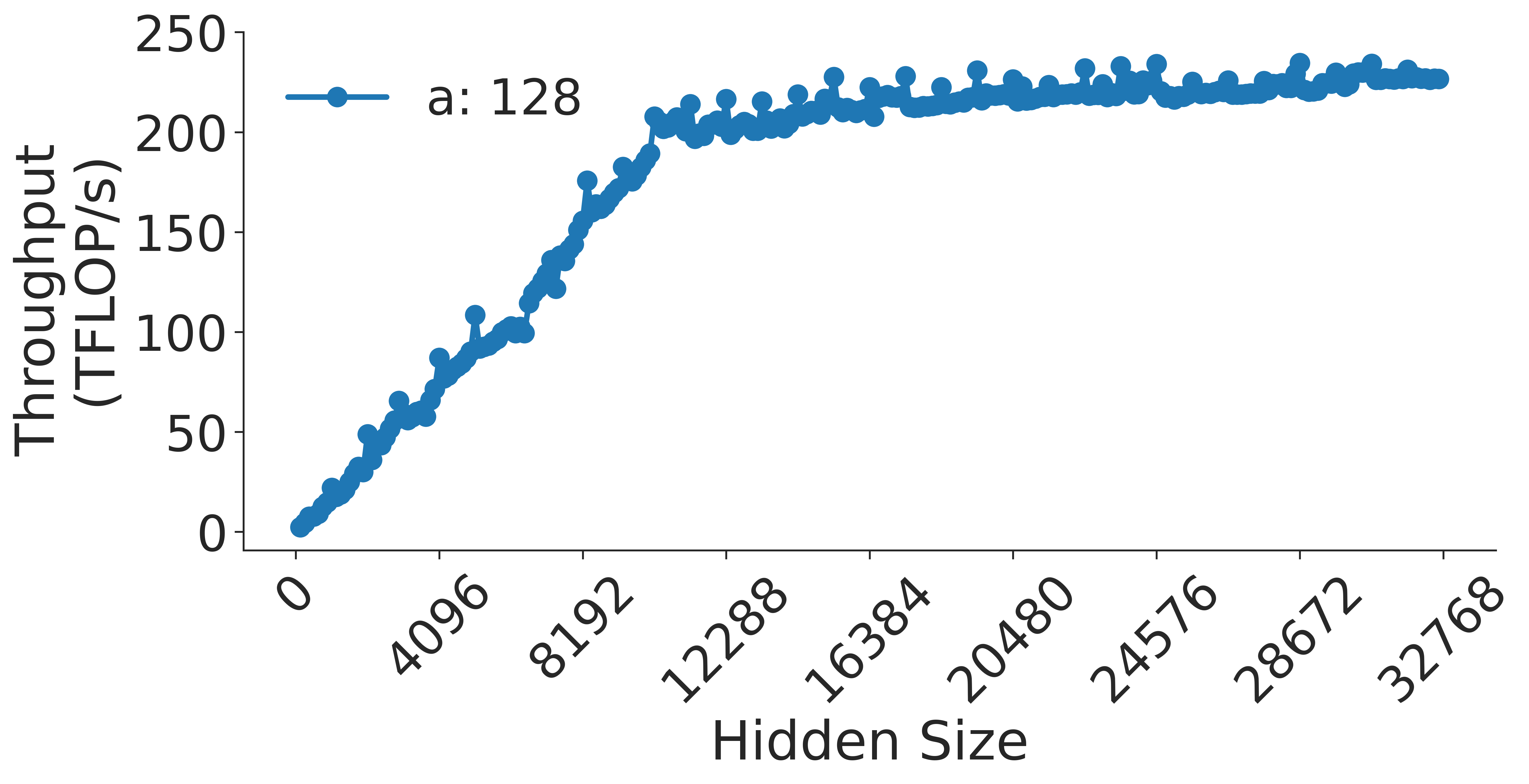
### Visual Description
## Line Chart: Throughput vs. Hidden Size
### Overview
This image displays a performance benchmark chart illustrating the relationship between "Hidden Size" (likely a parameter of a neural network layer) and "Throughput" measured in TFLOP/s (Tera Floating Point Operations per second). The chart shows a single data series, labeled "a: 128," which exhibits a characteristic "knee" curve, indicating an initial linear growth phase followed by a saturation phase.
### Components/Axes
* **Y-Axis (Vertical):** Labeled "Throughput (TFLOP/s)". The scale ranges from 0 to 250, with major tick marks at intervals of 50.
* **X-Axis (Horizontal):** Labeled "Hidden Size". The scale ranges from 0 to 32,768, with major tick marks at 0, 4096, 8192, 12288, 16384, 20480, 24576, 28672, and 32768.
* **Legend:** Located in the top-left corner. It displays a blue line with a circular marker next to the text "a: 128".
* **Data Series:** A single blue line connecting circular data points, representing the performance metrics for the configuration "a: 128".
### Detailed Analysis
The data series follows a distinct three-phase trend:
1. **Linear Growth Phase (Hidden Size 0 to ~10,000):**
* The line starts at the origin (0, 0).
* It slopes upward steeply and consistently.
* At Hidden Size ~4,096, the throughput is approximately 60–70 TFLOP/s.
* **Anomaly:** There is a notable, sharp upward spike at a Hidden Size of approximately 5,000, where throughput jumps to roughly 110 TFLOP/s before returning to the trend line.
* At Hidden Size ~8,192, the throughput reaches approximately 160 TFLOP/s.
2. **Transition/Knee Phase (Hidden Size ~10,000 to ~14,000):**
* The slope begins to flatten significantly.
* At Hidden Size ~12,288, the throughput is approximately 200 TFLOP/s.
3. **Saturation Phase (Hidden Size ~14,000 to 32,768):**
* The curve enters a plateau. The rate of increase slows drastically, indicating diminishing returns on throughput as the Hidden Size increases.
* At Hidden Size ~16,384, the throughput is approximately 210–215 TFLOP/s.
* At the maximum Hidden Size of 32,768, the throughput reaches approximately 230 TFLOP/s.
### Key Observations
* **Saturation Point:** The system reaches near-peak performance (the "knee") at a Hidden Size of approximately 12,000 to 14,000. Beyond this point, increasing the Hidden Size yields minimal gains in throughput.
* **Outlier:** The spike at ~5,000 Hidden Size is an anomaly. It suggests a potential non-linear behavior in the underlying hardware or software kernel execution at that specific parameter size (possibly related to cache alignment or memory access patterns).
* **Consistency:** Despite the saturation, the line maintains a very slight, positive upward drift, suggesting that while the system is largely saturated, it is not strictly capped at a hard limit.
### Interpretation
This chart demonstrates the efficiency scaling of a computational workload (likely a matrix multiplication or neural network layer) on hardware.
* **Efficiency Scaling:** The initial linear phase represents the "compute-bound" or "memory-latency-bound" region where increasing the workload size directly improves hardware utilization.
* **Saturation:** The plateau indicates that the hardware has reached its peak operational capacity (likely memory bandwidth or compute unit saturation).
* **Technical Insight:** The "a: 128" label likely refers to a batch size or a specific kernel configuration. The data suggests that for this specific configuration, there is little benefit to increasing the "Hidden Size" beyond ~14,000, as the throughput gains become negligible compared to the increased memory/compute requirements. The outlier at ~5,000 is a "micro-optimization" artifact—a specific point where the workload size perfectly aligns with the hardware's cache or register file architecture, allowing for a temporary burst in efficiency.
</details>
Figure 12: Sweep over hidden dimension for FlashAttention (v2) [9] on NVIDIA A100 GPU.
FlashAttention [10] and FlashAttention 2 [9] are novel attention kernels that are widely popular for training large language models. In order to see its impact on the attention calculation sizing, we set $a=128$ and sweep over the hidden dimension in Figure 12. We find that FlashAttention follows a roofline model, which simplifies our attention takeaways to only require that $h$ be as large as possible; the takeaways for MLPs remain unchanged.
#### VI-C 4 SwiGLU and $8h/3$ MLPs
Models such as PaLM, LLaMA, and Mistral use the SwiGLU [32] activation function in place of the more common GLU activation function. While the choice of activation function is generally irrelevant to our analysis, this activation function has an extra parameter compared to other commonly used options. Consequently, its common to adjust the projection factor for the MLP block from $dim_MLP=4· dim_Attn$ to $dim_MLP=\frac{8}{3}· dim_Attn$ to preserve the ratio of the total number of parameters in the attention and MLP blocks. This change has substantial implications for our analysis, which we discuss it detail in Section VII-B.
## VII Case Studies
Finally, we present a series of case studies illustrating how we use the principles described in this paper in practice. These demonstrate real-world challenges we have encountered in training large language models with tens of billions of parameters.
### VII-A 6-GPU Nodes
While the most common data-center scale computing set-up is to have 8 GPUs per node, some machines such as Oak Ridge National Lab’s Summit supercomputer feature six. This presents a multi-layer challenge to training language models when the tensor parallel degree is equal to the number of GPUs on a single node, which is commonly the most efficient 3D-parallelism scheme [25]. This often causes $h/t$ to no longer have a factor of some power of two, which greatly improves performance as we demonstrated above. Therefore:
1. Model architectures common on 8-GPU nodes may not be possible on 6-GPU nodes.
1. Even when they are possible, model architectures common on 8-GPU nodes may not be efficient on 6-GPU nodes.
1. If concessions are made to ameliorate #1 and #2, they may cause problems in deployment if downstream users wish to use the model designed for a 6-GPU node on a 2-GPU, 4-GPU, or 8-GPU node.
Several large transformers on Summit have been trained, such as the INCITE RedPajama 3B and 7B [8], and such model designers must make a choice. Does one choose the most efficient hyperparameters for pretraining only (which would involve a tensor-parallel degree of 6 and therefore a hidden dimension divisible by 6 and 64), or should the pretraining team choose a set of hyperparameters that are more amenable to the node architectures commonly used for finetuning or inference?
### VII-B SwiGLU Activation Functions
Recently the SwiGLU activation function has become popular for training language models. The SwiGLU function contains an additional learned matrix in its activation function, so that now the MLP block contains 3 matrices instead of the original 2. To preserve the total number of parameters in the MLP block the paper that introduces SwiGLU proposes to use $d_ff=\frac{8}{3}h$ instead of the typical $d_ff=4h$ .
If you followed the recommendations in this paper for finding the value of $h$ that would lead to the best $matmul$ performance, you will realize that $\frac{8}{3}h$ is likely to result in a much slower MLP block, because $\frac{1}{3}$ will break all the alignments.
In order to overcome this problem one only needs to realize that the $\frac{8}{3}$ coefficient is only a suggestion and thus it’s possible to find other coefficients that would lead to better-shaped MLP matrices. In fact if you look at the publicly available LLama-2 models, its 7B variant uses $\frac{11008}{4096}=2.6875$ as a coefficient, which is quite close to $\frac{8}{3}=2.667$ , and its 70B variant uses a much larger $\frac{28672}{8192}=3.5$ coefficient. Here the 70B variant ended up with an MLP block that contains significantly more parameters than a typical transformer block that doesn’t use SwiGLU.
Now that we know the recommended coefficient isn’t exact and since a good $h$ has already been chosen, one can now search for a good nearby number that still leads to high-performance GEMMs in the MLP. Running a brute-force search reveals that Llama-2-7B’s intermediate size is indeed one of the best performing sizes in its range.
### VII-C Inference
In order to demonstrate that 1) models trained efficiently on a given GPU will also infer efficiently on the same GPU, since the underlying forward-pass GEMMs are the same, and 2) our sizing recommendations are kernel-invariant, we have run inference benchmarks using DeepSpeed-MII [11] and the Pythia [4] suite. We show in Figure 13 that Pythia-1B is significantly more efficient at inference time than Pythia-410M due to its fewer attention heads and layers than Pythia-410M, and a larger hidden dimension. Despite these architectural changes, the test loss of Pythia-1B is on-trend with the rest of the suite while having significantly higher training and inference throughput.
<details>
<summary>extracted/5378885/figures/inference-line.png Details</summary>
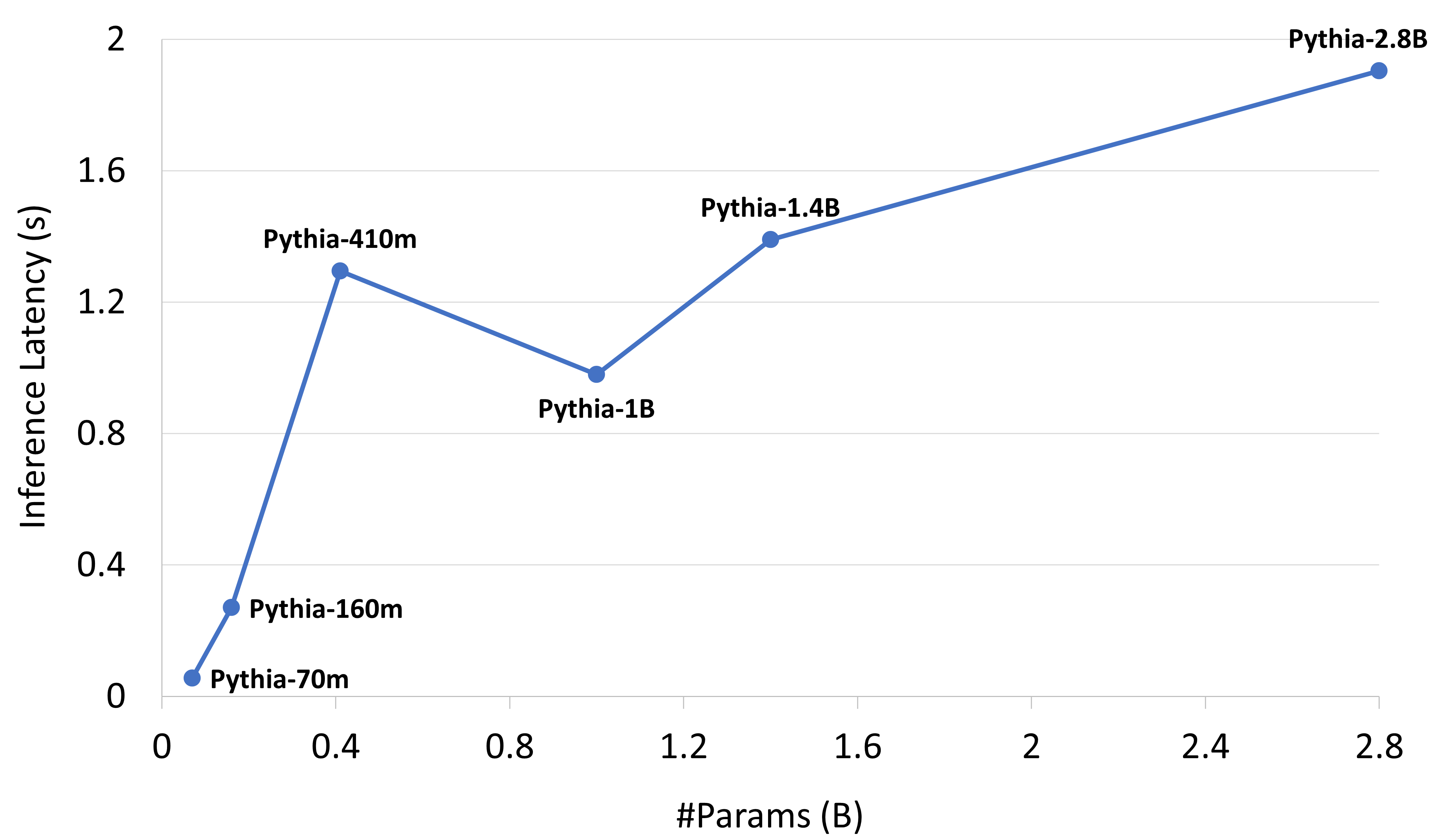
### Visual Description
## Line Chart: Inference Latency vs. Model Size (Pythia Models)
### Overview
This image displays a line chart illustrating the relationship between the size of various Pythia language models (measured in billions of parameters) and their corresponding inference latency (measured in seconds). The chart plots six distinct data points connected by a line, showing non-linear performance characteristics.
### Components/Axes
* **X-Axis:** Labeled "#Params (B)" (Number of Parameters in Billions). The scale ranges from 0 to 2.8, with major grid lines at intervals of 0.4.
* **Y-Axis:** Labeled "Inference Latency (s)" (Seconds). The scale ranges from 0 to 2.0, with major grid lines at intervals of 0.4.
* **Data Series:** A single blue line connecting six data points, each labeled with the specific Pythia model name.
### Detailed Analysis
The data points are plotted as follows (approximate values based on visual estimation):
| Model Name | X-Axis (#Params in B) | Y-Axis (Latency in s) | Trend Description |
| :--- | :--- | :--- | :--- |
| **Pythia-70m** | ~0.07 | ~0.06 | Starting point, near origin. |
| **Pythia-160m** | ~0.16 | ~0.28 | Upward slope from 70m. |
| **Pythia-410m** | ~0.41 | ~1.30 | Sharp upward spike from 160m. |
| **Pythia-1B** | ~1.00 | ~0.98 | Significant downward dip from 410m. |
| **Pythia-1.4B** | ~1.40 | ~1.40 | Upward slope from 1B. |
| **Pythia-2.8B** | ~2.80 | ~1.90 | Upward slope from 1.4B to the maximum value. |
**Trend Verification:**
1. **0.07B to 0.41B:** The line exhibits a steep positive slope, indicating a rapid increase in latency as model size increases in this range.
2. **0.41B to 1.0B:** The line exhibits a sharp negative slope (a dip), indicating that the 1B model has lower inference latency than the 410m model.
3. **1.0B to 2.8B:** The line exhibits a positive slope, indicating that latency increases as model size increases beyond 1B, though the rate of increase appears less steep than the initial jump from 160m to 410m.
### Key Observations
* **Non-Linearity:** Inference latency does not scale linearly with the number of parameters.
* **The 410m Anomaly:** The Pythia-410m model represents a significant outlier. It has a higher inference latency (~1.3s) than the larger Pythia-1B model (~0.98s).
* **Scaling:** After the 1B mark, the latency increases steadily as the model size increases to 1.4B and 2.8B.
### Interpretation
The data suggests that inference latency is not strictly a function of parameter count. The significant dip in latency at the 1B parameter mark compared to the 410m mark is counter-intuitive if one assumes that larger models are always slower.
**Potential Explanations:**
* **Architectural Differences:** The Pythia-410m model may have a different architecture (e.g., different number of layers, attention heads, or hidden dimension sizes) that is less optimized for the specific hardware used for testing compared to the 1B model.
* **Hardware/Software Optimization:** The 1B model might benefit from specific hardware optimizations (e.g., tensor core utilization, memory alignment) that the 410m model does not trigger.
* **Measurement Artifacts:** It is possible that the latency measurement for the 410m model was taken under different conditions or that the model's specific configuration causes a bottleneck that is resolved in the 1B architecture.
This chart serves as a warning against assuming that smaller models are universally faster than larger models in all deployment scenarios.
</details>
Figure 13: Inference latency of Pythia suite using DeepSpeed-MII [11]. Pythia-410M / Pythia-1B are off-trend due to their sizing.
## VIII Discussion
In the current landscape of AI hardware, Transformer workloads stand out as a pivotal target. They constitute a significant component (e.g., BERT, GPT-3) of the MLCommons benchmarks, capturing the attention of major hardware vendors and data centers. Notably, these benchmarks have been integrated as a crucial metric for procurement [27] in the upcoming Exascale supercomputer at Oak Ridge Leadership Computing Facility. Our analysis strongly suggests that leveraging representative GEMM kernels holds promise as a reliable performance indicator for Transformer-based workloads. Consequently, these kernels should be embraced as a benchmarking tool for hardware co-design. The advantages stem from several key points:
1. The optimizations made at the GEMM level exhibit a demonstrable transferability to various applications, as evidenced in Sec. VI.
1. Benchmarking at the kernel level proves to be more cost-effective and time-efficient.
1. This approach remains model-agnostic, accommodating diverse architectures like GPT-NeoX, Pythia, and OPT, as long as they are based on the Transformer architecture.
This assertion finds partial validation in the observed correlation between MLCommons benchmarks and our findings. To illustrate, consider the performance of BERT benchmarks, which demonstrates a consistent 3:1 ratio between H100- and A100-based systems. Notably, this aligns harmoniously with our observed kernel throughput for the respective hardware configurations (see Sec. V).
## IX Conclusion
State-of-the-art deep learning (DL) models are driving breakthroughs in existing fields and paving the way towards new areas of study. However, while the transformer model is at the forefront of this DL explosion, few transformer architectures consider their underlying hardware. We believe that instead of creating new designs to improve efficiency, many practitioners would be better served by slightly modifying their existing architectures to maximally utilize the underlying hardware. Well informed hyperparameter choices improve training and inference throughput throughout a model’s lifetime. We demonstrate that minor modifications to the model architecture improve GPU throughput by up to 38.9% while maintaining accuracy. Since we have explained how to motivate model hyperparameters from a GPU architecture standpoint, this paper can be used to guide future model design while clarifying the relevant first principles necessary to extend such hyperparameter choices to future architectures.
## X Acknowledgements
We are grateful to Stability AI for providing the compute required for A100 evaluations, Oak Ridge National Lab (ORNL) for providing the compute required for 6-V100 special-case evaluations, and the San Diego Supercomputing Center (SDSC) for providing the compute required for general V100 evalutions.
We thank Horace He and various members of the EleutherAI Discord Server for their feedback.
## References
- [1] Together AI “Releasing 3B and 7B RedPajama-INCITE family of models including base, instruction-tuned & chat models”, 2023 URL: https://www.together.ai/blog/redpajama-models-v1
- [2] Reza Yazdani Aminabadi et al. “DeepSpeed Inference: Enabling Efficient Inference of Transformer Models at Unprecedented Scale”, 2022 arXiv: 2207.00032 [cs.LG]
- [3] Alex Andonian et al. “GPT-NeoX: Large Scale Autoregressive Language Modeling in PyTorch”, GitHub Repo, 2023 URL: https://www.github.com/eleutherai/gpt-neox
- [4] Stella Biderman et al. “Pythia: A suite for analyzing large language models across training and scaling” In International Conference on Machine Learning, 2023, pp. 2397–2430 PMLR
- [5] Sid Black et al. “GPT-Neo: Large scale autoregressive language modeling with mesh-tensorflow” In If you use this software, please cite it using these metadata 58, 2021
- [6] Tom Brown et al. “Language Models are Few-Shot Learners” In Advances in Neural Information Processing Systems 33, 2020, pp. 1877–1901
- [7] Aakanksha Chowdhery et al. “PaLM: Scaling Language Modeling with Pathways” Version 5 In Computing Research Repository, 2022 URL: https://arxiv.org/abs/2204.02311v5
- [8] Together Computer “RedPajama: an Open Dataset for Training Large Language Models”, 2023 URL: https://github.com/togethercomputer/RedPajama-Data
- [9] Tri Dao “Flashattention-2: Faster attention with better parallelism and work partitioning” In arXiv preprint arXiv:2307.08691, 2023
- [10] Tri Dao et al. “Flashattention: Fast and memory-efficient exact attention with io-awareness” In Advances in Neural Information Processing Systems 35, 2022, pp. 16344–16359
- [11] “DeepSpeed-MII”, https://github.com/microsoft/DeepSpeed-MII, 2022
- [12] Jacob Devlin, Ming-Wei Chang, Kenton Lee and Kristina Toutanova “BERT: Pre-training of Deep Bidirectional Transformers for Language Understanding”, 2019 arXiv: 1810.04805 [cs.CL]
- [13] Nolan Dey et al. “Cerebras-GPT: Open Compute-Optimal Language Models Trained on the Cerebras Wafer-Scale Cluster”, 2023 arXiv: 2304.03208 [cs.LG]
- [14] Murali Emani et al. “A Comprehensive Evaluation of Novel AI Accelerators for Deep Learning Workloads” In 2022 IEEE/ACM International Workshop on Performance Modeling, Benchmarking and Simulation of High Performance Computer Systems (PMBS), 2022, pp. 13–25
- [15] Jiarui Fang, Yang Yu, Chengduo Zhao and Jie Zhou “TurboTransformers: An Efficient GPU Serving System for Transformer Models” In Proceedings of the 26th ACM SIGPLAN Symposium on Principles and Practice of Parallel Programming, PPoPP ’21 Virtual Event, Republic of Korea: Association for Computing Machinery, 2021, pp. 389–402 URL: https://doi.org/10.1145/3437801.3441578
- [16] “FasterTransformer”, https://github.com/NVIDIA/FasterTransformer, 2021
- [17] Azzam Haidar, Stanimire Tomov, Jack Dongarra and Nicholas J. Higham “Harnessing GPU Tensor Cores for Fast FP16 Arithmetic to Speed up Mixed-Precision Iterative Refinement Solvers” In SC18: International Conference for High Performance Computing, Networking, Storage and Analysis, 2018, pp. 603–613
- [18] Horace He “Let’s talk about a detail that occurs during PyTorch 2.0’s codegen - tiling.” Twitter, 2023 URL: https://x.com/cHHillee/status/1620878972547665921
- [19] Andrej Karpathy “The most dramatic optimization to nanoGPT so far ( 25% speedup) is to simply increase vocab size from 50257 to 50304 (nearest multiple of 64).” Twitter, 2023 URL: https://x.com/karpathy/status/1621578354024677377
- [20] C. Li et al. “XSP: Across-Stack Profiling and Analysis of Machine Learning Models on GPUs” In 2020 IEEE International Parallel and Distributed Processing Symposium (IPDPS) Los Alamitos, CA, USA: IEEE Computer Society, 2020, pp. 326–327 URL: https://doi.ieeecomputersociety.org/10.1109/IPDPS47924.2020.00042
- [21] Yinhan Liu et al. “Roberta: A robustly optimized bert pretraining approach” In arXiv preprint arXiv:1907.11692, 2019
- [22] Sparsh Mittal and Shraiysh Vaishay “A survey of techniques for optimizing deep learning on GPUs” In Journal of Systems Architecture 99, 2019, pp. 101635
- [23] “MLPerf” Accessed: January 30, 2024, https://mlperf.org/, 2023
- [24] Zachary Nado et al. “A Large Batch Optimizer Reality Check: Traditional, Generic Optimizers Suffice Across Batch Sizes”, 2021 arXiv: 2102.06356 [cs.LG]
- [25] Deepak Narayanan et al. “Efficient Large-Scale Language Model Training on GPU Clusters using Megatron-LM” In Proceedings of the International Conference for High Performance Computing, Networking, Storage and Analysis, 2021
- [26] NVIDIA “Matrix Multiplication Background”, User’s Guide — NVIDIA Docs, 2023 URL: https://docs.nvidia.com/deeplearning/performance/dl-performance-matrix-multiplication/index.html
- [27] OLCF “OLCF6 Technical Requirements and Benchmarks”, 2023
- [28] Ofir Press, Noah Smith and Mike Lewis “Train Short, Test Long: Attention with Linear Biases Enables Input Length Extrapolation” In International Conference on Learning Representations, 2021
- [29] Alec Radford et al. “Language models are unsupervised multitask learners” In OpenAI blog 1.8, 2019, pp. 9
- [30] Colin Raffel et al. “Exploring the limits of transfer learning with a unified text-to-text transformer” In The Journal of Machine Learning Research 21.1 JMLRORG, 2020, pp. 5485–5551
- [31] Md Aamir Raihan, Negar Goli and Tor M. Aamodt “Modeling Deep Learning Accelerator Enabled GPUs” In 2019 IEEE International Symposium on Performance Analysis of Systems and Software (ISPASS), 2018, pp. 79–92 URL: https://api.semanticscholar.org/CorpusID:53783076
- [32] Noam Shazeer “Glu variants improve transformer” In arXiv preprint arXiv:2002.05202, 2020
- [33] Mohammad Shoeybi et al. “Megatron-LM: Training Multi-Billion Parameter Language Models using GPU Model Parallelism” In arXiv preprint arXiv:1909.08053, 2019
- [34] Shaden Smith et al. “Using deepspeed and megatron to train megatron-turing nlg 530b, a large-scale generative language model” In arXiv preprint arXiv:2201.11990, 2022
- [35] Jianlin Su et al. “Roformer: Enhanced transformer with rotary position embedding” In arXiv preprint arXiv:2104.09864, 2021
- [36] Yuhsiang Mike Tsai, Terry Cojean and Hartwig Anzt “Evaluating the Performance of NVIDIA’s A100 Ampere GPU for Sparse Linear Algebra Computations”, 2020 arXiv: 2008.08478 [cs.MS]
- [37] Ashish Vaswani et al. “Attention is All You Need” In Advances in Neural Information Processing Systems 30, 2017
- [38] Ben Wang and Aran Komatsuzaki “GPT-J-6B: A 6 Billion Parameter Autoregressive Language Model”, 2021
- [39] Yu Emma Wang, Gu-Yeon Wei and David M. Brooks “Benchmarking TPU, GPU, and CPU Platforms for Deep Learning” In ArXiv abs/1907.10701, 2019 URL: https://api.semanticscholar.org/CorpusID:198894674
- [40] Da Yan, Wei Wang and Xiaowen Chu “Demystifying Tensor Cores to Optimize Half-Precision Matrix Multiply” In 2020 IEEE International Parallel and Distributed Processing Symposium (IPDPS), 2020, pp. 634–643
- [41] Junqi Yin et al. “Comparative evaluation of deep learning workloads for leadership-class systems” In BenchCouncil Transactions on Benchmarks, Standards and Evaluations 1.1, 2021, pp. 100005 URL: https://www.sciencedirect.com/science/article/pii/S2772485921000053
- [42] Y. Zhai et al. “ByteTransformer: A High-Performance Transformer Boosted for Variable-Length Inputs” In 2023 IEEE International Parallel and Distributed Processing Symposium (IPDPS) Los Alamitos, CA, USA: IEEE Computer Society, 2023, pp. 344–355
- [43] Susan Zhang et al. “Opt: Open pre-trained transformer language models” In arXiv preprint arXiv:2205.01068, 2022
## Appendix A Misc
When using PyTorch to invoke GEMMs, we use torch.nn.functional.linear. This function accepts 2 tensors as parameters, where one tensor can be 3 dimensional. Figure 14 shows how the ordering of a tensor’s dimensions impacts performance. We benchmark GEMMs of size $(2048,4,n)×(n,3n)$ , $(4,2048,n)×(n,3n)$ , and $(8192,n)×(n,3n)$ . This shows that the ordering of the batched dimension does not affect performance. The batched implementation is also the same speed as a 2-dimensional GEMM, so these implementation details do not affect performance. Therefore we can represent GEMMs between 3 and 2 dimensional tensors as GEMMs between two 2-dimensional tensors.
<details>
<summary>extracted/5378885/figures/mm/nnlinear_eq_mm.png Details</summary>
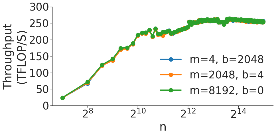
### Visual Description
## Line Chart: Throughput vs. Input Size (n)
### Overview
This chart illustrates the computational throughput (measured in TFLOP/S) as a function of input size 'n' for three distinct parameter configurations (m, b). The chart demonstrates that throughput increases rapidly with input size before reaching a saturation point (plateau) at higher values of 'n'. Notably, the three configurations yield nearly identical performance results across the entire range.
### Components/Axes
* **Y-Axis:** Labeled "Throughput (TFLOP/S)". The scale is linear, ranging from 0 to 300, with major tick marks every 50 units.
* **X-Axis:** Labeled "n". The scale is logarithmic, with major tick marks at $2^8$, $2^{10}$, $2^{12}$, and $2^{14}$. The data series begins at approximately $2^7$.
* **Legend:** Positioned in the center-right area of the chart.
* **Blue line:** m=4, b=2048
* **Orange line:** m=2048, b=4
* **Green line:** m=8192, b=0
### Detailed Analysis
**Trend Verification:**
All three data series exhibit an identical trend:
1. **Growth Phase:** A steep, monotonic upward slope from $n \approx 2^7$ to $n \approx 2^{11}$.
2. **Saturation Phase:** A transition to a plateau starting around $n \approx 2^{12}$, where throughput stabilizes between 250 and 265 TFLOP/S.
3. **Stability:** From $n \approx 2^{13}$ to $n \approx 2^{15}$, the throughput remains relatively flat with minor fluctuations.
**Data Points (Approximate):**
| Input Size (n) | Throughput (TFLOP/S) |
| :--- | :--- |
| $2^7$ (128) | $\approx 25$ |
| $2^8$ (256) | $\approx 70$ |
| $2^9$ (512) | $\approx 125$ |
| $2^{10}$ (1024) | $\approx 175$ |
| $2^{11}$ (2048) | $\approx 220$ |
| $2^{12}$ (4096) | $\approx 240$ |
| $2^{13}$ (8192) | $\approx 260$ |
| $2^{15}$ (32768) | $\approx 255$ |
### Key Observations
* **Configuration Invariance:** The most significant observation is the near-perfect overlap of the blue, orange, and green lines. This indicates that the throughput is invariant to the specific combinations of 'm' and 'b' tested.
* **Performance Saturation:** The "knee" of the curve occurs between $n=2^{11}$ and $n=2^{12}$. Beyond this point, increasing the input size 'n' provides diminishing returns, suggesting the system has reached its peak computational capacity or memory bandwidth limit.
* **Minor Instability:** There is a slight, localized fluctuation (a small dip and recovery) around $n=2^{11}$, which is consistent across all three configurations.
### Interpretation
The data suggests that the underlying computational kernel is robust to the variations in parameters 'm' and 'b'. Whether 'm' and 'b' represent tiling factors, memory offsets, or batch sizes, they do not appear to be the primary bottleneck for this specific operation.
The saturation behavior is characteristic of compute-bound operations on hardware accelerators (like GPUs). At smaller 'n', the overhead of launching kernels or insufficient parallelism limits throughput. As 'n' increases, the hardware occupancy improves, leading to higher throughput. Once 'n' is large enough to fully saturate the compute units, throughput plateaus. The slight decline after the peak ($n > 2^{13}$) might indicate cache thrashing or increased memory management overhead as the problem size exceeds the optimal cache footprint.
</details>
Figure 14: GEMMs with different ordering of dimensions.
A series of benchmarks are shown in Figure 16 through Figure 20. These figures show the performance of transformer GEMMs listed in Table II. In each of the figures, throughput for a transformer with 128 attention heads is plotted against hidden size. Performance generally increases with hidden size, as the size of each GEMM is growing. However, in GEMMs where one dimension is of size $h/a$ , Attention Score Computation and Attention Over Value, throughput depends on the highest power of 2 that divides $h/a$ , as described in secion VI.A.
<details>
<summary>extracted/5378885/figures/transformer/attention_key_value_query_transform.png Details</summary>
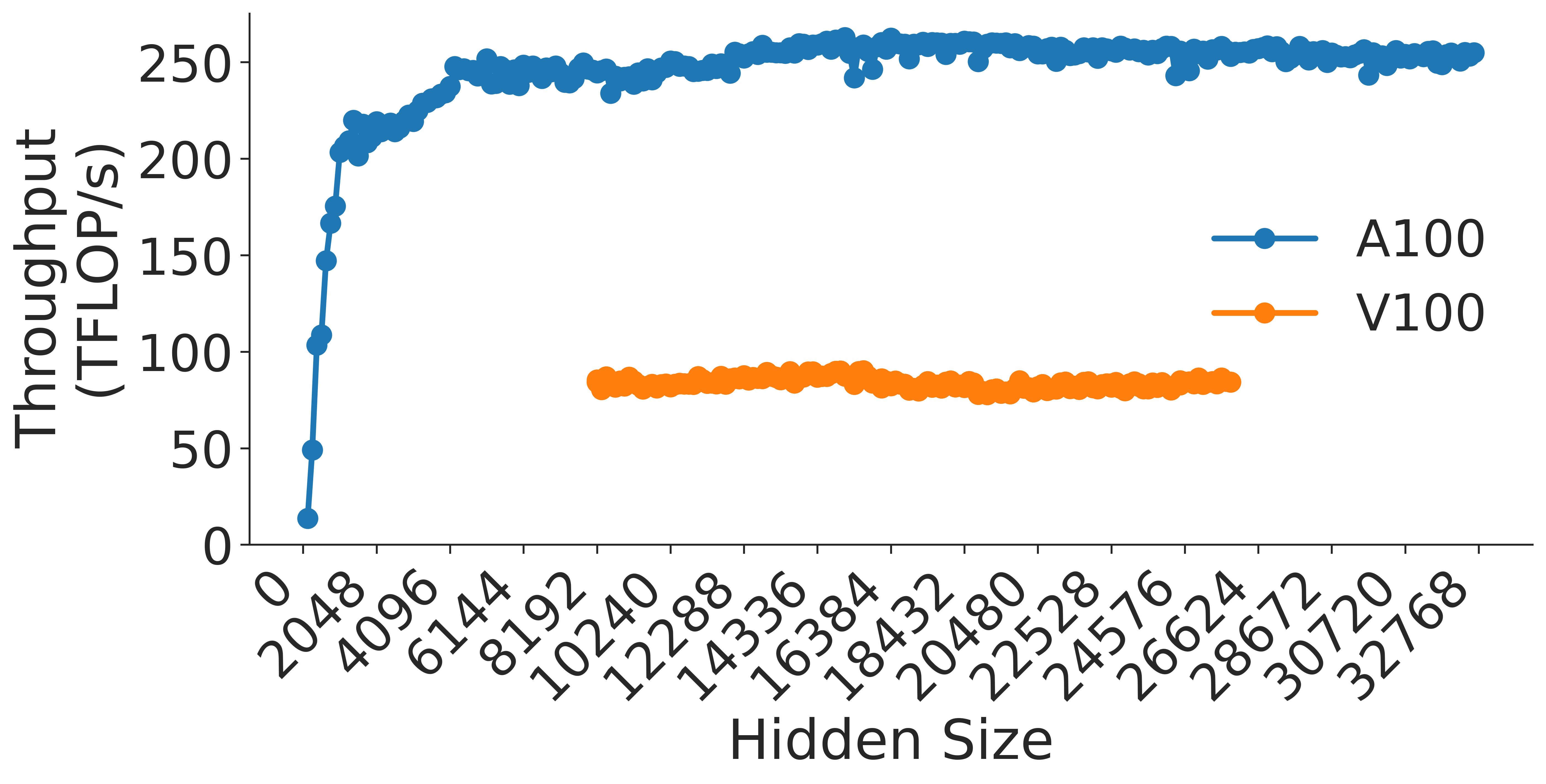
### Visual Description
## Line Chart: GPU Throughput vs. Hidden Size
### Overview
This image is a line chart comparing the computational throughput (measured in TFLOP/s) of two NVIDIA GPU architectures, the **A100** and the **V100**, across a range of "Hidden Size" parameters. The chart demonstrates that the A100 provides significantly higher throughput than the V100 and exhibits a distinct performance ramp-up phase at lower hidden sizes.
### Components/Axes
* **Y-Axis (Vertical):** Labeled "Throughput (TFLOP/s)". The scale ranges from 0 to 250 in increments of 50.
* **X-Axis (Horizontal):** Labeled "Hidden Size". The scale ranges from 0 to 32768. The labels are rotated 45 degrees for readability. The specific markers are: 0, 2048, 4096, 6144, 8192, 10240, 12288, 14336, 16384, 18432, 20480, 22528, 24576, 26624, 28672, 30720, 32768.
* **Legend:** Located in the middle-right area of the chart.
* **Blue line with blue circles:** Labeled "A100".
* **Orange line with orange circles:** Labeled "V100".
### Detailed Analysis
#### Data Series 1: A100 (Blue)
* **Trend:** The A100 series shows a steep, near-vertical upward slope from a hidden size of 0 to approximately 2048. Following this initial ramp-up, the trend transitions into a plateau, maintaining a relatively stable throughput for the remainder of the X-axis.
* **Values:**
* Starts at approximately 15 TFLOP/s at a hidden size of 0.
* Reaches approximately 200 TFLOP/s at a hidden size of 2048.
* Plateaus between 240 and 260 TFLOP/s for all hidden sizes greater than 4096.
#### Data Series 2: V100 (Orange)
* **Trend:** The V100 series is characterized by a flat, horizontal trend. It does not appear on the chart until a hidden size of approximately 10240.
* **Values:**
* The data points consistently hover between 80 and 90 TFLOP/s across the entire range (from 10240 to 28672).
### Key Observations
* **Performance Gap:** The A100 consistently outperforms the V100 by a factor of approximately 3x (roughly 250 TFLOP/s vs. 85 TFLOP/s).
* **Data Availability:** The V100 data is only plotted for larger hidden sizes (starting at 10240), whereas the A100 data covers the full range from 0 to 32768.
* **Stability:** Both GPUs show relatively stable performance once they reach their respective operational thresholds, with the A100 showing minor fluctuations around the 250 TFLOP/s mark.
### Interpretation
This chart serves as a performance benchmark for deep learning or matrix multiplication workloads.
* **Efficiency Ramp-up:** The A100's sharp rise at the beginning suggests that it requires a certain minimum "Hidden Size" (workload complexity) to saturate its compute units and reach peak efficiency.
* **Hardware Capability:** The A100 is clearly the superior hardware for this specific workload, offering significantly higher throughput.
* **Workload Suitability:** The V100's flat performance suggests it is likely compute-bound or memory-bandwidth-bound at a lower ceiling than the A100. The absence of V100 data at lower hidden sizes might imply that the testing methodology or the specific kernel implementation used for the V100 was not optimized or applicable for smaller hidden sizes.
* **Peircean Investigative Note:** The visual "gap" between the two lines is the most salient feature. The A100 is not just faster; it operates in an entirely different performance tier. The plateauing of both lines suggests that for hidden sizes above ~10,000, the throughput is no longer scaling significantly with the hidden size, indicating that the GPUs have reached their maximum throughput capacity for this specific operation.
</details>
Figure 15: Attention $QKV$ transform.
<details>
<summary>extracted/5378885/figures/transformer/tp_sweep.png Details</summary>
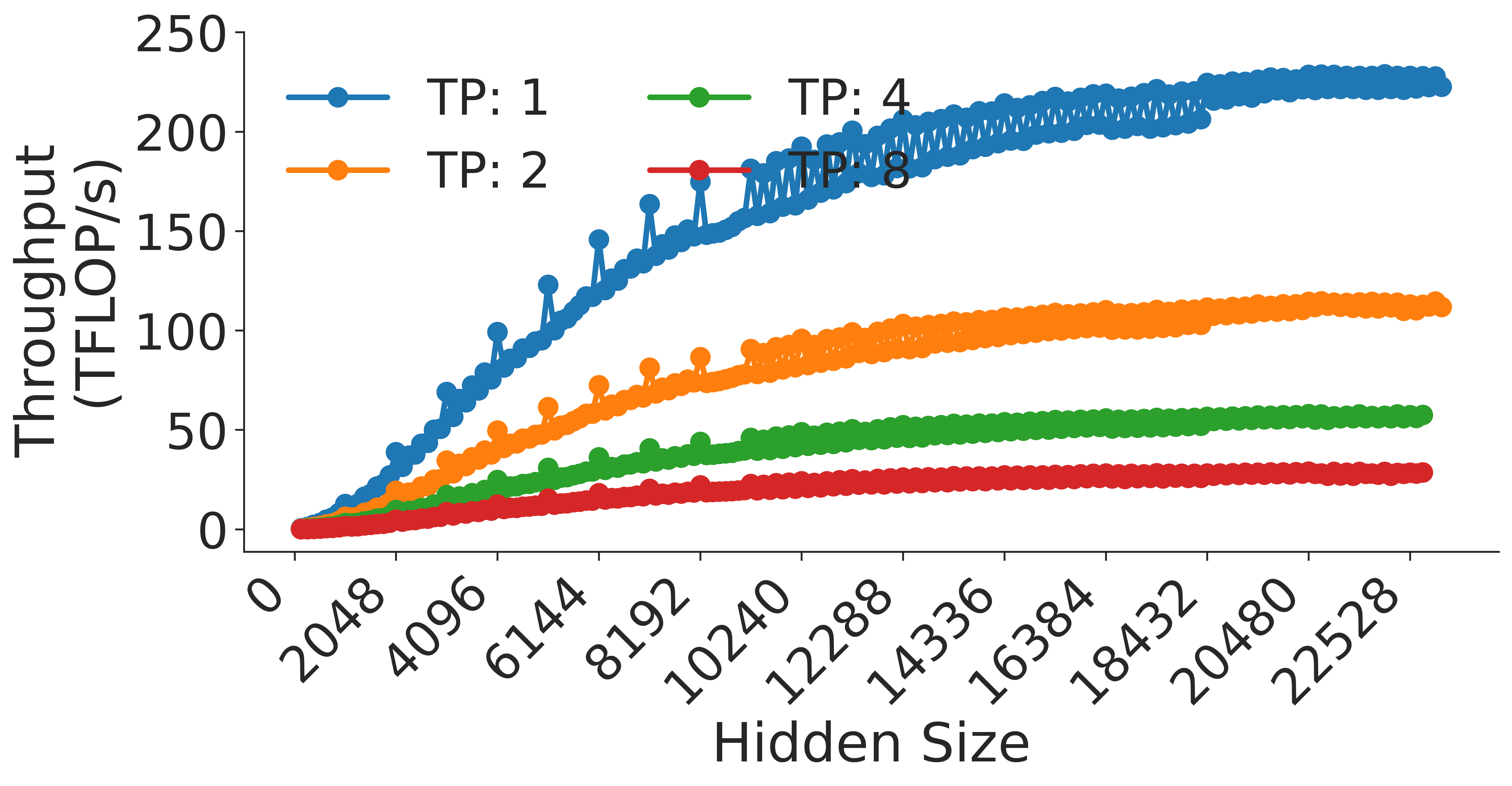
### Visual Description
## Line Chart: Throughput vs. Hidden Size for Different Tensor Parallelism (TP) Settings
### Overview
This chart illustrates the performance characteristics of a computational workload (likely a neural network model) by plotting "Throughput (TFLOP/s)" against "Hidden Size." The data is segmented into four distinct series representing different Tensor Parallelism (TP) configurations: TP: 1, TP: 2, TP: 4, and TP: 8.
### Components/Axes
* **Y-Axis (Vertical):** Labeled "Throughput (TFLOP/s)". The scale ranges from 0 to 250, with major tick marks every 50 units.
* **X-Axis (Horizontal):** Labeled "Hidden Size". The scale ranges from 0 to 22528. The axis markers are spaced at intervals of 2048 (0, 2048, 4096, 6144, 8192, 10240, 12288, 14336, 16384, 18432, 20480, 22528).
* **Legend:** Positioned in the top-left quadrant of the chart area.
* **Blue line with circular markers:** TP: 1
* **Orange line with circular markers:** TP: 2
* **Green line with circular markers:** TP: 4
* **Red line with circular markers:** TP: 8
### Detailed Analysis
The chart displays four data series, all of which exhibit a positive correlation: as the Hidden Size increases, the Throughput (TFLOP/s) increases. However, the rate of increase diminishes as the Hidden Size grows, indicating a saturation point for all configurations.
**Trend Verification & Data Points (Approximate):**
* **TP: 1 (Blue Line):**
* **Trend:** This series shows the highest throughput but also the highest volatility. It slopes upward steeply until approximately 8192, then continues to rise at a slower rate.
* **Values:**
* At Hidden Size 4096: ~50 TFLOP/s.
* At Hidden Size 8192: ~150 TFLOP/s.
* At Hidden Size 12288: ~175 TFLOP/s.
* At Hidden Size 22528: ~225 TFLOP/s.
* **Note:** There are distinct, sharp spikes in the data between Hidden Size 6144 and 12288, suggesting performance instability or specific kernel optimization behaviors at these sizes.
* **TP: 2 (Orange Line):**
* **Trend:** Consistent upward slope, significantly lower throughput than TP: 1.
* **Values:**
* At Hidden Size 4096: ~30 TFLOP/s.
* At Hidden Size 8192: ~75 TFLOP/s.
* At Hidden Size 22528: ~110 TFLOP/s.
* **TP: 4 (Green Line):**
* **Trend:** Steady, moderate upward slope.
* **Values:**
* At Hidden Size 4096: ~15 TFLOP/s.
* At Hidden Size 8192: ~40 TFLOP/s.
* At Hidden Size 22528: ~60 TFLOP/s.
* **TP: 8 (Red Line):**
* **Trend:** The lowest throughput, with the most stable and linear growth pattern.
* **Values:**
* At Hidden Size 4096: ~10 TFLOP/s.
* At Hidden Size 8192: ~20 TFLOP/s.
* At Hidden Size 22528: ~30 TFLOP/s.
### Key Observations
1. **Inverse Efficiency:** There is a clear inverse relationship between the degree of Tensor Parallelism (TP) and the achieved throughput. TP: 1 achieves the highest throughput, while TP: 8 achieves the lowest.
2. **Volatility:** The TP: 1 configuration exhibits significant "jitter" or spikes in performance, particularly in the mid-range of the hidden sizes (6144–12288). The other configurations (TP: 2, 4, 8) are much smoother.
3. **Diminishing Returns:** All four lines show a "knee" in the curve, where the slope flattens as the hidden size increases, suggesting that the system reaches a compute or memory bandwidth limit.
### Interpretation
* **What the data demonstrates:** This chart likely depicts the performance of a Large Language Model (LLM) training or inference workload on a GPU cluster. Tensor Parallelism (TP) is a technique used to split a model across multiple GPUs to fit larger models into memory.
* **The Trade-off:** The data clearly demonstrates the "cost" of Tensor Parallelism. While increasing TP allows for larger models (or larger hidden sizes) to be processed, it introduces significant communication overhead (all-reduce operations between GPUs), which drastically reduces the effective throughput.
* **Performance Anomalies:** The volatility in the TP: 1 line suggests that at certain hidden sizes, the GPU kernels are not perfectly optimized, or there are memory alignment issues (e.g., non-optimal matrix dimensions for the hardware's tensor cores). The smoother lines for higher TP values suggest that the communication overhead dominates the execution time, masking the underlying kernel-level inefficiencies seen in the TP: 1 configuration.
</details>
Figure 16: Attention $QKV$ transform with different TP sizes.
<details>
<summary>extracted/5378885/figures/transformer/attention_key_query_prob.png Details</summary>
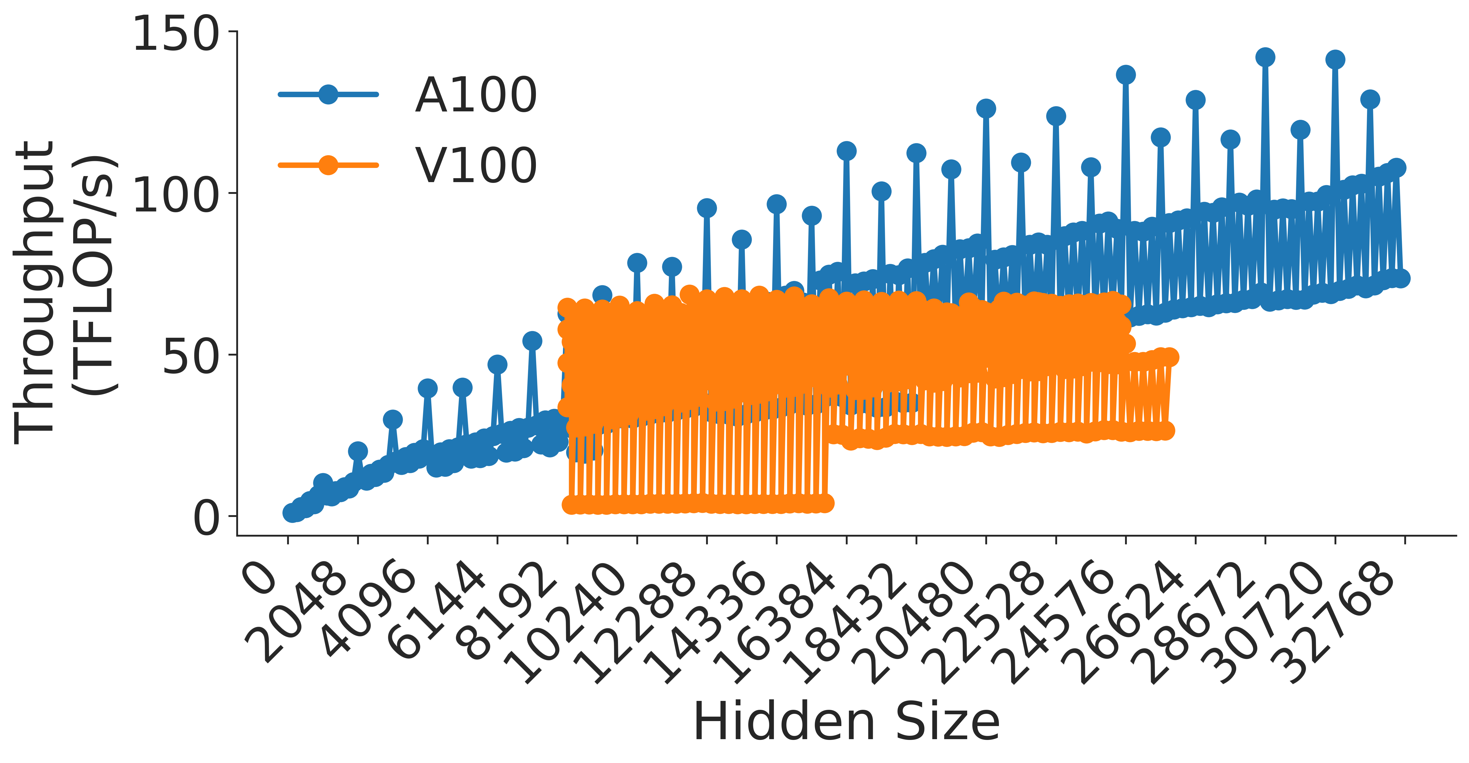
### Visual Description
## Scatter/Stem Plot: GPU Throughput vs. Hidden Size
### Overview
This image is a performance benchmark chart comparing the throughput (measured in TFLOP/s) of two NVIDIA GPU architectures, the **A100** and the **V100**, across varying "Hidden Size" parameters. The chart uses a stem-plot (or "lollipop") style visualization to represent data points, highlighting significant variance in performance at specific hidden size increments.
### Components/Axes
* **Y-Axis:** Labeled "Throughput (TFLOP/s)". The scale ranges from 0 to 150, with major increments every 50 units.
* **X-Axis:** Labeled "Hidden Size". The scale ranges from 0 to 32,768. The labels are rotated 45 degrees for readability.
* **Legend:** Located in the top-left corner.
* **Blue line/dot:** Represents the **A100** GPU.
* **Orange line/dot:** Represents the **V100** GPU.
### Detailed Analysis
The chart displays two distinct data series with different behaviors:
**1. A100 (Blue Series)**
* **Trend:** The A100 series shows a clear, positive upward trend as the Hidden Size increases.
* **Pattern:** It exhibits a "comb" or "sawtooth" pattern. At every hidden size increment, there is a vertical line connecting a lower baseline value to a significantly higher peak value.
* **Values:**
* At lower hidden sizes (near 2,048), the peaks are around 20–30 TFLOP/s.
* As hidden size increases toward 32,768, the peaks climb steadily, reaching approximately 140–145 TFLOP/s.
* The "troughs" (the base of the vertical lines) also rise gradually, moving from near 0 TFLOP/s to approximately 70–80 TFLOP/s at the highest hidden sizes.
**2. V100 (Orange Series)**
* **Trend:** The V100 series is relatively flat and does not exhibit the same upward scaling as the A100.
* **Pattern:** It appears as a dense, rectangular block of data points.
* **Range:**
* **X-Axis Coverage:** The data starts at a hidden size of 10,240 and terminates at 26,624.
* **Y-Axis Coverage:** The throughput is constrained between a floor of approximately 5–10 TFLOP/s and a ceiling of approximately 60–70 TFLOP/s.
* **Density:** The V100 data is highly clustered, suggesting that for this specific workload, the V100 performance is largely independent of the hidden size within the tested range.
### Key Observations
* **Performance Gap:** The A100 significantly outperforms the V100 across all overlapping hidden sizes. Even at the V100's peak performance (~70 TFLOP/s), the A100 is already operating at a higher throughput level for similar hidden sizes.
* **Scaling:** The A100 demonstrates effective scaling with increased hidden size, whereas the V100 hits a performance plateau.
* **Data Gaps:** The V100 data is absent for hidden sizes below 10,240 and above 26,624.
* **Variance:** The "comb" pattern in the A100 data suggests that the throughput is highly sensitive to the specific hidden size value, likely due to memory alignment, tile size optimizations, or kernel execution efficiency on the A100 architecture.
### Interpretation
This chart demonstrates the architectural performance advantage of the NVIDIA A100 (Ampere architecture) over the V100 (Volta architecture) for this specific computational task (likely matrix multiplication or a neural network layer operation).
* **Why it matters:** The A100's ability to scale throughput as the hidden size increases indicates better utilization of its tensor cores and memory bandwidth compared to the V100.
* **Reading between the lines:** The "comb" pattern in the A100 data is a classic indicator of "kernel tuning" or "alignment" issues. The peaks likely represent hidden sizes that are multiples of the GPU's optimal tile size (e.g., multiples of 8, 16, or 32), allowing for maximum occupancy. The troughs represent "misaligned" sizes where the GPU cannot utilize its full parallel processing capability. The V100's dense, flat block suggests it may be hitting a hardware bottleneck (memory bandwidth or compute limit) that prevents it from scaling, regardless of the hidden size.
</details>
Figure 17: Attention key-query score computation ( $KQ^T$ ).
<details>
<summary>extracted/5378885/figures/transformer/attention_prob_times_values.png Details</summary>
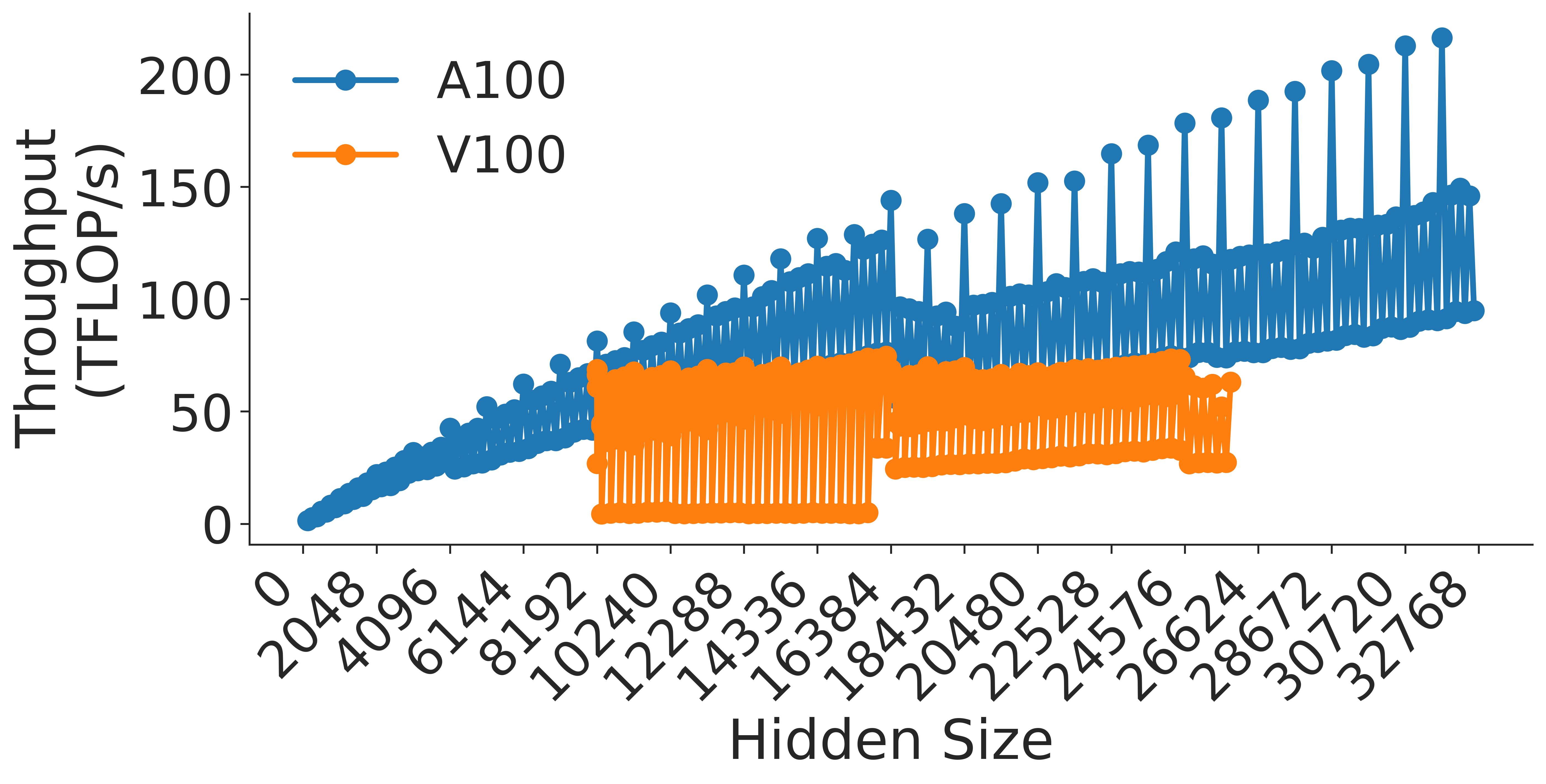
### Visual Description
## Line Chart: Throughput vs. Hidden Size for A100 and V100 GPUs
### Overview
This image is a performance benchmark chart comparing the computational throughput (measured in TFLOP/s) of two NVIDIA GPU architectures, the A100 and the V100, across varying "Hidden Size" parameters. The chart illustrates a "sawtooth" performance pattern for both GPUs, indicating that throughput is highly dependent on specific hidden size values, likely due to memory alignment or kernel execution efficiency.
### Components/Axes
* **Y-Axis (Vertical):** Labeled "Throughput (TFLOP/s)". The scale is linear, ranging from 0 to 200, with major tick marks every 50 units.
* **X-Axis (Horizontal):** Labeled "Hidden Size". The scale is linear, ranging from 0 to 32768. The axis markers are provided in increments of 2048 (0, 2048, 4096, 6144, 8192, 10240, 12288, 14336, 16384, 18432, 20480, 22528, 24576, 26624, 28672, 30720, 32768).
* **Legend:** Located in the top-left quadrant of the chart area.
* **Blue line with circular markers:** Labeled "A100".
* **Orange line with circular markers:** Labeled "V100".
### Detailed Analysis
#### A100 (Blue Series)
* **Trend:** The A100 series shows a general upward trend in throughput as the hidden size increases. The data exhibits a distinct "sawtooth" pattern, where throughput rises and falls sharply across adjacent hidden size values.
* **Range:** Starts at 0 TFLOP/s (at hidden size 0) and reaches a peak of approximately 210 TFLOP/s at the maximum hidden size of 32768.
* **Discontinuity:** There is a notable performance drop at hidden size 16384. Prior to this point, the throughput peaks around 145 TFLOP/s. Immediately following 16384, the throughput resets to a lower baseline (approximately 80 TFLOP/s) before resuming its upward trajectory.
#### V100 (Orange Series)
* **Trend:** The V100 series also exhibits a "sawtooth" pattern, but with a much higher frequency of oscillation compared to the A100. It is confined to a specific range of hidden sizes.
* **Range:** The data begins at hidden size 10240 and terminates at hidden size 26624. Throughput oscillates between approximately 5 TFLOP/s and 75 TFLOP/s.
* **Discontinuity:** Similar to the A100, there is a shift at hidden size 16384. Before this point, the lower bound of the oscillations is near 5 TFLOP/s. After 16384, the lower bound of the oscillations shifts upward to approximately 30 TFLOP/s, while the upper bound remains relatively consistent around 75 TFLOP/s.
### Key Observations
* **Performance Gap:** The A100 consistently outperforms the V100 across all overlapping hidden sizes.
* **Shared Discontinuity:** Both GPU series exhibit a structural change in performance at hidden size 16384. This suggests a change in the underlying computational kernel, memory tiling strategy, or hardware resource allocation that occurs at this specific threshold.
* **Sawtooth Pattern:** The high-frequency oscillations (sawtooth pattern) are characteristic of GPU kernels where performance is sensitive to whether the hidden size is a multiple of the warp size or the tile size used in matrix multiplication.
### Interpretation
The data demonstrates that computational throughput on these GPUs is not a smooth function of hidden size but is instead highly sensitive to specific architectural alignments.
The "sawtooth" pattern indicates that for certain hidden sizes, the GPU kernels are highly efficient (peaks), while for others, they are inefficient (troughs), likely due to memory bank conflicts or under-utilization of the GPU's streaming multiprocessors. The discontinuity at 16384 is a critical "cliff" in the data, suggesting that the software implementation likely switches to a different algorithm or memory access pattern at this size to handle larger workloads, which initially incurs a performance penalty before scaling up again. The A100's superior performance and ability to scale to higher throughputs confirm its architectural advantage over the V100 for these specific operations.
</details>
Figure 18: Attention score times values.
<details>
<summary>extracted/5378885/figures/transformer/attention_linear_projection.png Details</summary>
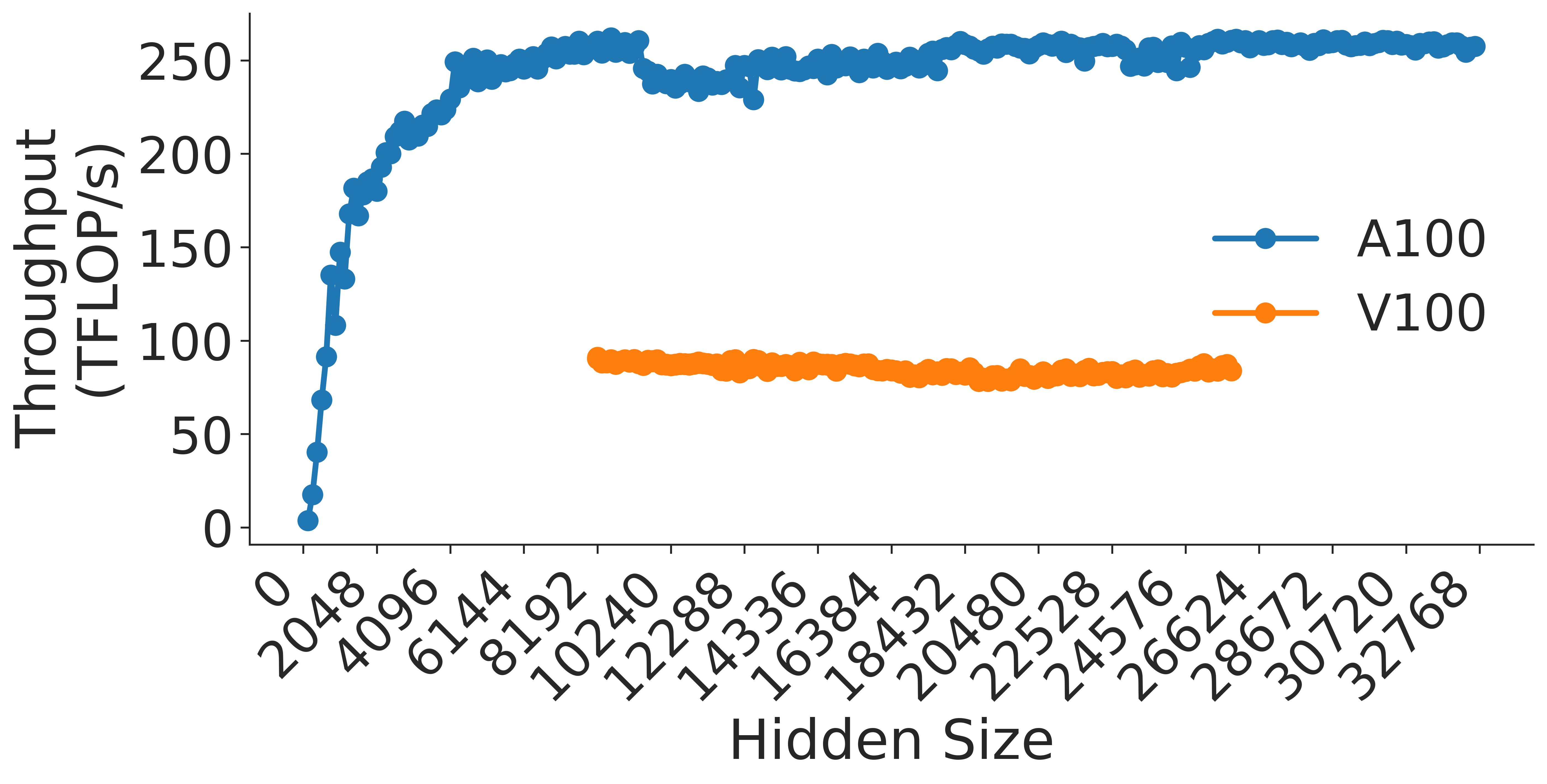
### Visual Description
## Line Chart: GPU Throughput vs. Hidden Size
### Overview
This chart illustrates the performance comparison between two GPU architectures, the NVIDIA A100 and the NVIDIA V100, by plotting their throughput (measured in TFLOP/s) against varying "Hidden Size" parameters. The chart demonstrates that the A100 architecture achieves significantly higher throughput and requires a "warm-up" period at lower hidden sizes, whereas the V100 maintains a lower, stable throughput across the tested range.
### Components/Axes
* **Y-Axis (Vertical):** Labeled "Throughput (TFLOP/s)". The scale ranges from 0 to 250, with major tick marks at intervals of 50.
* **X-Axis (Horizontal):** Labeled "Hidden Size". The scale ranges from 0 to 32768. The specific tick labels are: 0, 2048, 4096, 6144, 8192, 10240, 12288, 14336, 16384, 18432, 20480, 22528, 24576, 26624, 28672, 30720, 32768.
* **Legend:** Positioned on the right-center of the chart area.
* **Blue line/dots:** Labeled "A100".
* **Orange line/dots:** Labeled "V100".
### Detailed Analysis
#### Data Series: A100 (Blue)
* **Trend Verification:** The A100 series exhibits a steep, near-linear upward slope starting from 0, reaching a plateau around a hidden size of 6144. Following this, the trend remains relatively flat with minor fluctuations.
* **Data Points:**
* **0 to ~6144:** Rapid growth. Throughput rises from ~5 TFLOP/s at the origin to ~250 TFLOP/s.
* **~6144 to 32768:** The throughput plateaus. It oscillates slightly between approximately 230 TFLOP/s and 260 TFLOP/s for the remainder of the X-axis range.
#### Data Series: V100 (Orange)
* **Trend Verification:** The V100 series begins at a hidden size of 10240. The trend is essentially flat, showing very little variance across the entire range.
* **Data Points:**
* **10240 to 26624:** The throughput remains consistently between approximately 80 TFLOP/s and 90 TFLOP/s. There is no significant upward or downward slope; it is a stable performance profile.
### Key Observations
* **Performance Gap:** The A100 consistently outperforms the V100 by a factor of approximately 3x (roughly 250 TFLOP/s vs. 85 TFLOP/s).
* **Warm-up Phase:** The A100 shows a distinct "warm-up" phase where throughput increases with hidden size until it saturates the compute units around a hidden size of 6144.
* **Data Availability:** The V100 data is only plotted for hidden sizes 10240 and above, suggesting either the test did not run for smaller sizes or the hardware/software configuration for the V100 was not applicable below that threshold.
* **Stability:** The A100 shows slightly more volatility (fluctuations in the 230-260 range) compared to the V100, which maintains a very tight, consistent performance band.
### Interpretation
The data demonstrates a clear generational performance leap between the V100 and A100 architectures.
1. **Compute Saturation:** The A100's sharp initial rise indicates that it requires a minimum workload size (hidden size > 6000) to fully utilize its parallel processing capabilities. Below this, the overhead of the operation likely dominates the execution time.
2. **Architectural Ceiling:** The V100's flat line suggests that it hits its peak performance ceiling much earlier and maintains that throughput regardless of the increase in hidden size. It is likely memory-bandwidth bound or compute-bound at a lower threshold than the A100.
3. **Efficiency:** The A100 is significantly more efficient for large-scale matrix operations (implied by "Hidden Size"), making it the superior choice for workloads requiring high throughput, provided the hidden size is large enough to overcome the initial warm-up latency.
</details>
Figure 19: Post-attention linear projection.
Figure 20 shows how the size of the vocab and the hidden dimension affects the logit layer, which is a linear layer at the end of the transformer model. The performance of the logit layer is maximized when $v$ is a multiple of 64, therefore it is best to pad the vocab size to the nearest multiple of 64. Likewise, the layer also performs best with a hidden size that is a multiple of 64.
<details>
<summary>extracted/5378885/figures/transformer/vocab_v_sweep.png Details</summary>
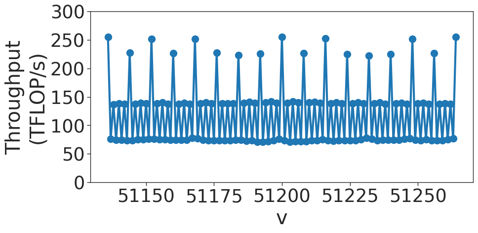
### Visual Description
## Line Chart: Throughput vs. V
### Overview
The image displays a line chart plotting "Throughput (TFLOP/s)" on the Y-axis against a variable "V" on the X-axis. The data exhibits a highly regular, periodic oscillatory pattern, characterized by distinct high-throughput spikes and a consistent lower-throughput baseline.
### Components/Axes
* **Y-Axis:** Labeled "Throughput (TFLOP/s)". The scale ranges from 0 to 300, with major tick marks at intervals of 50.
* **X-Axis:** Labeled "V". The scale ranges from approximately 51130 to 51270. Major tick marks are provided at 51150, 51175, 51200, 51225, and 51250.
* **Data Series:** A single blue line connecting circular data points. The line exhibits a "sawtooth" or "zig-zag" pattern, indicating rapid fluctuations in throughput.
### Detailed Analysis
* **Trend Verification:** The data is not a smooth curve. It follows a repeating, deterministic pattern of rapid oscillations. The line moves vertically between three distinct performance tiers.
* **Data Tiers (Approximate Values):**
* **High Peaks:** The highest points reach approximately 250–260 TFLOP/s. These occur at regular intervals across the X-axis.
* **Mid-range Points:** These points oscillate between approximately 130 and 140 TFLOP/s.
* **Low-range Baseline:** The lowest points form a consistent floor, oscillating slightly around 75 TFLOP/s.
* **Periodicity:** The pattern repeats with high consistency. The distance between the high peaks is roughly 10–15 units on the X-axis.
### Key Observations
* **Three-Tiered Structure:** The data is clearly stratified into three horizontal bands: a high band (~250 TFLOP/s), a middle band (~135 TFLOP/s), and a low band (~75 TFLOP/s).
* **Deterministic Behavior:** The extreme regularity of the oscillations suggests that the throughput is governed by a strict, repeating process rather than random noise.
* **Sawtooth Pattern:** The line connects these tiers in a rapid, alternating fashion, suggesting that the system being measured is switching between different states or execution paths very quickly as the variable "V" increments.
### Interpretation
* **What the data demonstrates:** This chart likely represents the performance profile of a computational process—such as a GPU kernel, a specific algorithm, or a memory access pattern—where the variable "V" (potentially representing a vector size, memory address, or loop index) causes the system to cycle through different execution efficiencies.
* **Why it matters:** The distinct three-tiered performance suggests the presence of "best-case," "average-case," and "worst-case" scenarios occurring within a tight loop.
* The **high peaks** likely represent optimal conditions, such as perfect cache alignment, full vectorization, or efficient memory coalescing.
* The **low baseline** likely represents performance bottlenecks, such as cache misses, scalar operations, or memory stalls.
* **Reading between the lines:** The high frequency of these oscillations indicates that the performance variance is likely tied to hardware-level architecture (e.g., memory bank conflicts or cache line boundaries) rather than high-level software logic. The variable "V" is almost certainly a parameter that cycles through specific alignments or strides, causing the performance to fluctuate predictably as the alignment changes.
</details>
(a) Sweep over vocabulary size
<details>
<summary>extracted/5378885/figures/transformer/vocab_h_sweep.png Details</summary>
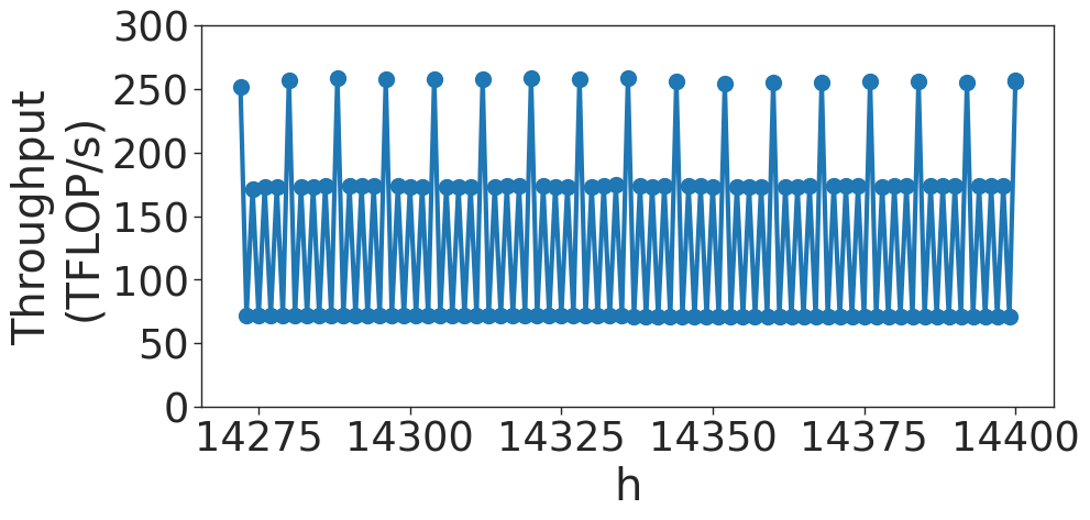
### Visual Description
## Line Chart: Throughput vs. h
### Overview
The image displays a line chart with markers representing "Throughput (TFLOP/s)" on the y-axis plotted against a variable "h" on the x-axis. The data exhibits a highly periodic, repeating pattern of throughput values over the range of approximately 14,275 to 14,400. The chart shows a deterministic, oscillating performance profile.
### Components/Axes
* **Y-Axis:** Labeled "Throughput (TFLOP/s)". The scale ranges from 0 to 300, with major grid lines marked at intervals of 50 (0, 50, 100, 150, 200, 250, 300).
* **X-Axis:** Labeled "h". The scale ranges from 14,275 to 14,400, with major grid lines marked at intervals of 25 (14275, 14300, 14325, 14350, 14375, 14400).
* **Data Series:** A single blue line connecting blue circular markers. The line creates a repeating, sawtooth-like wave pattern.
### Detailed Analysis
The data series displays a consistent, repeating cycle across the entire x-axis. The trend is not linear but oscillatory, characterized by three distinct throughput levels:
* **High Peaks:** The highest points in the cycle reach approximately **255–260 TFLOP/s**. These occur at regular intervals.
* **Mid-Level Points:** Following the high peaks, the throughput drops to a secondary plateau of approximately **170–175 TFLOP/s**.
* **Low Points:** The lowest points in the cycle drop to approximately **70–75 TFLOP/s**.
**Trend Verification:**
The visual pattern is a repeating sequence: [High Peak] -> [Mid-Level] -> [Low Point] -> [Mid-Level] -> [High Peak]. This sequence repeats consistently across the entire visible range of the x-axis. There is no visible drift, degradation, or increase in the throughput levels, indicating a highly stable system state.
### Key Observations
* **High Periodicity:** The system exhibits extremely consistent, rhythmic behavior.
* **Three-Tiered Structure:** The throughput does not fluctuate randomly; it strictly adheres to three distinct operational states (High, Mid, Low).
* **Stability:** The peaks and troughs are remarkably stable across the entire x-axis range shown. There is no visible noise or variance in the performance levels.
### Interpretation
* **What the data demonstrates:** This is likely a performance trace of a computing system (such as a GPU or TPU) executing a specific, repetitive kernel or workload. The extreme regularity suggests a deterministic process rather than a stochastic one.
* **How elements relate:** The "h" on the x-axis likely represents a time step, iteration count, or a specific hardware counter index. The throughput levels are tied directly to the execution of specific instructions within a loop.
* **Reading between the lines:**
* The **High Peak (~260 TFLOP/s)** likely represents a burst of heavy computation or a specific high-throughput instruction set being executed.
* The **Mid (~175 TFLOP/s)** and **Low (~75 TFLOP/s)** levels likely represent overhead, memory access, synchronization, or idle states within the execution loop.
* The lack of noise implies this is likely a micro-benchmark or a highly optimized, deterministic compute kernel, rather than a real-world application with variable data, which would typically show more variance. The chart captures a "steady state" of a repeating operation.
</details>
(b) Zoomed-in sweep over vocabulary size
Figure 20: Vocabulary embedding transformation.
## Appendix B A100 Results
Figures 21 through 47 show the performance of the Attention Key-Query Score and Attention Over Value computations for various numbers of attention heads. In each of these figures, we highlight the trend observed when using tensor cores. Each color is represented in the legend as a power of 2, which designates the highest power of 2 that divides $h/a$ . This shows how using a value of $h/a$ where the highest power of 2 multiple is 3 or less can impact performance greatly. Figures 34 and 9 show that in general, throughput increases with hidden size and decreases with the number of attention heads. Some of these figures also show the effects of wave quantization.
<details>
<summary>extracted/5378885/figures/transformer/spikeless_sweeps/attention_key_query_problem_a8.png Details</summary>
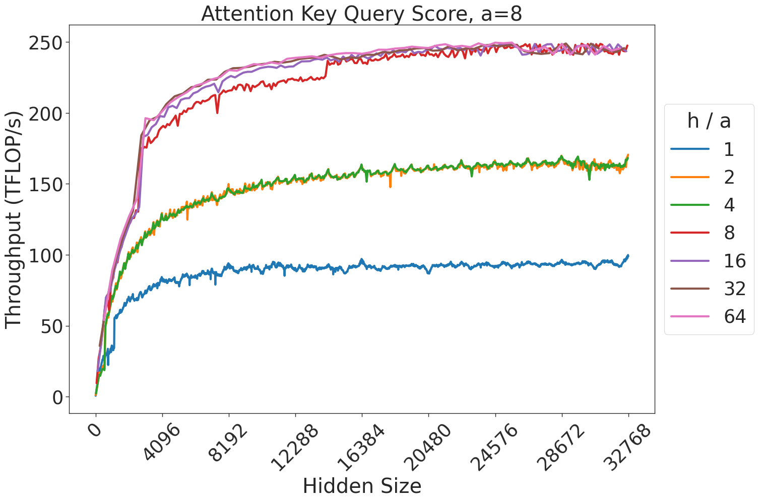
### Visual Description
## Line Chart: Attention Key Query Score, a=8
### Overview
This chart illustrates the relationship between "Hidden Size" (x-axis) and "Throughput (TFLOP/s)" (y-axis) for an attention mechanism, parameterized by different "h / a" ratios. The data shows a clear logarithmic-style growth curve for all configurations, where throughput increases rapidly at lower hidden sizes before plateauing as the hidden size increases.
### Components/Axes
* **Title:** "Attention Key Query Score, a=8" (Centered at the top).
* **Y-Axis:** "Throughput (TFLOP/s)". The scale ranges from 0 to 250, with major tick marks every 50 units.
* **X-Axis:** "Hidden Size". The scale ranges from 0 to 32768, with major tick marks every 4096 units.
* **Legend:** Located on the right side of the chart. It defines the "h / a" ratio, with corresponding line colors:
* **Blue:** 1
* **Orange:** 2
* **Green:** 4
* **Red:** 8
* **Purple:** 16
* **Brown:** 32
* **Pink:** 64
### Detailed Analysis
The data series cluster into three distinct performance tiers based on the "h / a" ratio. All lines exhibit a steep upward slope from 0 to approximately 4096 hidden size, followed by a gradual plateau.
**1. Tier 1 (Lowest Performance):**
* **Series:** h/a = 1 (Blue).
* **Trend:** Starts at 0, rises steeply to ~60 TFLOP/s at a hidden size of ~2000. It continues to climb at a slower rate, plateauing between 90 and 100 TFLOP/s for the remainder of the x-axis.
**2. Tier 2 (Intermediate Performance):**
* **Series:** h/a = 2 (Orange) and h/a = 4 (Green).
* **Trend:** These two lines are nearly identical and overlap significantly. They rise steeply to ~120 TFLOP/s at a hidden size of ~2000. They continue to climb, plateauing between 160 and 170 TFLOP/s.
**3. Tier 3 (Highest Performance):**
* **Series:** h/a = 8 (Red), 16 (Purple), 32 (Brown), 64 (Pink).
* **Trend:** These lines form the top cluster. They rise very steeply to ~180-200 TFLOP/s at a hidden size of ~2000.
* **Observation:** The Red line (h/a=8) shows slightly lower performance than the others in the 4096 to 12288 range, but eventually converges with the Purple, Brown, and Pink lines. The entire group plateaus between 240 and 250 TFLOP/s.
### Key Observations
* **Diminishing Returns:** Regardless of the "h/a" ratio, there is a clear "knee" in the curve around a hidden size of 4096. Increasing the hidden size beyond this point yields minimal throughput gains.
* **Clustering:** The performance is not linearly dependent on the "h/a" ratio. Instead, it groups into three distinct performance bands, suggesting that the hardware architecture has specific "sweet spots" for parallelization efficiency.
* **Noise:** There is high-frequency jitter (noise) present in all lines, particularly in the plateau regions, which is common in hardware performance benchmarking.
### Interpretation
The data demonstrates that the "h/a" ratio is a critical factor in maximizing computational throughput for this specific attention mechanism.
* **Efficiency Gains:** Increasing the "h/a" ratio from 1 to 8 provides a massive performance boost (roughly 2.5x increase in peak throughput). However, increasing the ratio beyond 8 (to 16, 32, or 64) provides negligible additional throughput, suggesting that the hardware reaches a saturation point in its ability to utilize parallel attention heads.
* **Bottleneck Analysis:** The rapid plateauing after a hidden size of 4096 suggests that the system is likely memory-bandwidth bound or compute-bound once the hidden size is large enough to saturate the available execution units.
* **Peircean Investigative Note:** The fact that the Red line (h/a=8) lags slightly behind the higher ratios (16, 32, 64) before converging suggests that while 8 is sufficient to reach peak performance, higher ratios might reach that peak slightly more efficiently or with less variance in specific intermediate hidden size ranges.
</details>
Figure 21: Attention key-query score GEMM throughput for 8 attention heads.
<details>
<summary>extracted/5378885/figures/transformer/spikeless_sweeps/attention_key_query_problem_a12.png Details</summary>
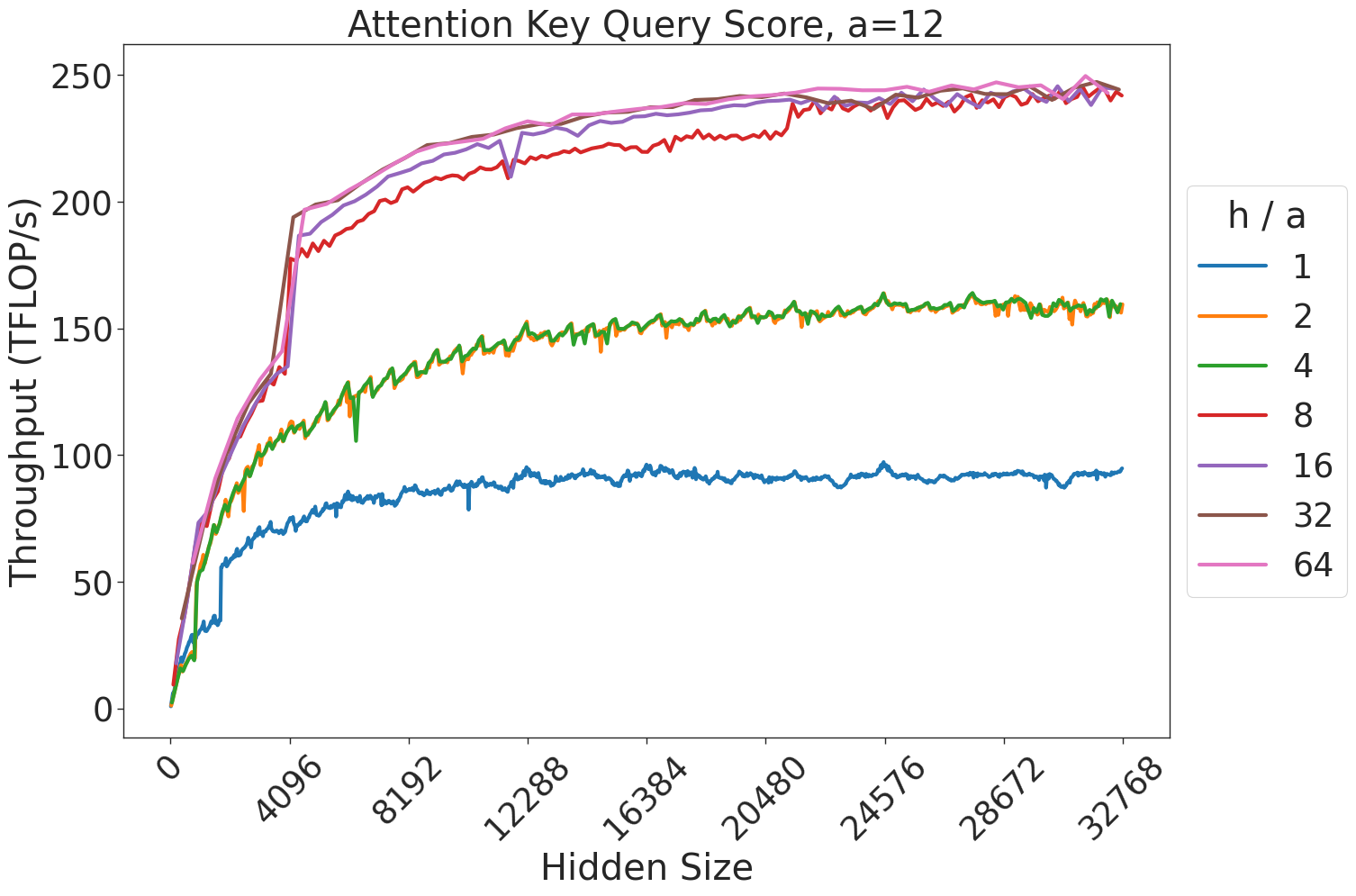
### Visual Description
## Line Chart: Attention Key Query Score, a=12
### Overview
This image displays a line chart illustrating the relationship between "Hidden Size" (x-axis) and "Throughput (TFLOP/s)" (y-axis) for varying "h / a" ratios. The chart demonstrates that as the hidden size increases, the throughput (measured in TFLOP/s) increases rapidly before plateauing, with higher "h / a" ratios generally resulting in higher throughput.
### Components/Axes
* **Title:** "Attention Key Query Score, a=12" (Centered at the top).
* **Y-Axis:**
* **Label:** "Throughput (TFLOP/s)"
* **Scale:** 0 to 250, with major grid lines at intervals of 50.
* **X-Axis:**
* **Label:** "Hidden Size"
* **Scale:** 0 to 32768.
* **Ticks:** 0, 4096, 8192, 12288, 16384, 20480, 24576, 28672, 32768.
* **Legend:**
* **Position:** Located on the right side of the chart area.
* **Title:** "h / a"
* **Categories/Colors:**
* **1:** Blue
* **2:** Orange
* **4:** Green
* **8:** Red
* **16:** Purple
* **32:** Brown
* **64:** Pink
### Detailed Analysis
The chart displays seven distinct data series, which can be grouped into four performance tiers based on their throughput behavior:
1. **Tier 1 (Lowest Performance - Blue, h/a=1):**
* **Trend:** Starts at 0, rises steeply to ~50 TFLOP/s at a hidden size of ~1000, then continues a slow, jagged climb, plateauing around 90-95 TFLOP/s at the maximum hidden size.
2. **Tier 2 (Mid Performance - Orange, h/a=2; Green, h/a=4):**
* **Trend:** These two lines track almost identically. They rise to ~100 TFLOP/s at a hidden size of 4096 and plateau around 160 TFLOP/s.
3. **Tier 3 (High Performance - Red, h/a=8):**
* **Trend:** Rises sharply to ~180 TFLOP/s at a hidden size of 4096. It continues to climb, plateauing near 240 TFLOP/s.
* **Anomaly:** There is a notable, sharp downward spike in the red line around the 12288 hidden size mark, followed by an immediate recovery.
4. **Tier 4 (Peak Performance - Purple, h/a=16; Brown, h/a=32; Pink, h/a=64):**
* **Trend:** These three lines are tightly clustered at the top of the chart. They rise very sharply to ~190-200 TFLOP/s at a hidden size of 4096. From there, they exhibit a slow, steady growth, converging toward ~250 TFLOP/s at the maximum hidden size.
### Key Observations
* **Saturation Point:** Across all series, the most significant gains in throughput occur between a hidden size of 0 and 8192. Beyond 8192, the curves flatten significantly, indicating diminishing returns on throughput as hidden size increases.
* **Clustering:** The performance gap between the "h/a" ratios decreases as the ratio increases. The difference between h/a=1 and h/a=2 is substantial, whereas the difference between h/a=16, 32, and 64 is negligible, suggesting that the system reaches a hardware or algorithmic throughput ceiling at higher ratios.
* **Data Noise:** The lines exhibit "jitter" or high-frequency noise, particularly in the lower-performing series (Blue, Orange, Green), suggesting variability in the measurement or execution environment.
### Interpretation
This data likely represents a performance benchmark for a Transformer-based neural network architecture, where "Hidden Size" is a primary model dimension and "h/a" likely represents the ratio of attention heads to a constant factor 'a' (given the title "a=12").
The "knee" in the curves suggests that for smaller hidden sizes, the operation is likely memory-bound or latency-bound. As the hidden size increases, the operation becomes compute-bound, allowing the hardware to reach its peak TFLOP/s capacity. The convergence of the top three lines (16, 32, 64) is particularly telling; it implies that increasing the number of attention heads (or the h/a ratio) beyond a certain point provides no additional throughput benefit, likely because the hardware execution units are fully saturated or the overhead of managing more heads offsets the computational gains.
</details>
Figure 22: Attention key-query score GEMM throughput for 12 attention heads.
<details>
<summary>extracted/5378885/figures/transformer/spikeless_sweeps/attention_key_query_problem_a16.png Details</summary>
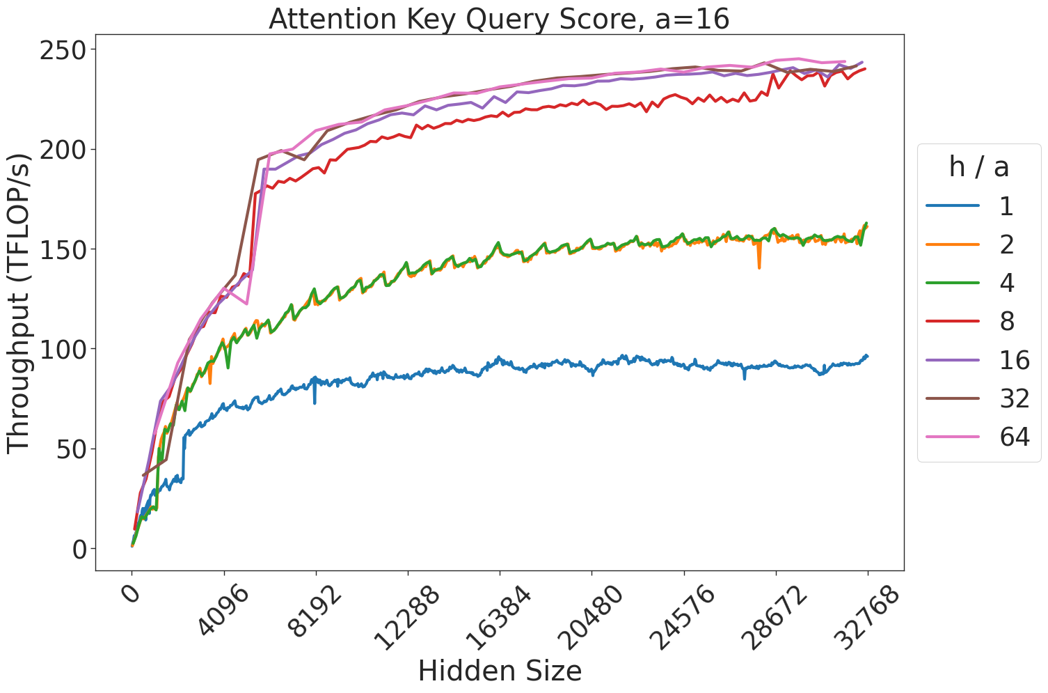
### Visual Description
## Line Chart: Attention Key Query Score Performance
### Overview
This chart illustrates the relationship between the "Hidden Size" of a computational model and its "Throughput (TFLOP/s)" across various "h / a" (head-to-attention dimension) ratios. The data demonstrates how computational efficiency scales as the model size increases, revealing distinct performance tiers and saturation points.
### Components/Axes
* **Title:** "Attention Key Query Score, a=16"
* **Y-Axis:** "Throughput (TFLOP/s)". The scale ranges from 0 to 250, with major grid lines at 50-unit intervals.
* **X-Axis:** "Hidden Size". The scale ranges from 0 to 32768, with major tick marks at intervals of 4096.
* **Legend:** Positioned on the right side of the chart. It defines the "h / a" ratio for seven distinct data series, color-coded as follows:
* **Blue:** 1
* **Orange:** 2
* **Green:** 4
* **Red:** 8
* **Purple:** 16
* **Brown:** 32
* **Pink:** 64
### Detailed Analysis
The data series exhibit a consistent logarithmic-style growth pattern, characterized by a steep initial increase followed by a gradual leveling off (saturation) as the Hidden Size increases.
**Trend Verification & Data Points:**
* **Initial Phase (0 to ~4096):** All lines show a steep, nearly linear upward slope.
* At Hidden Size ~4096, the throughput values are approximately:
* h/a=1 (Blue): ~60 TFLOP/s
* h/a=2, 4 (Orange, Green): ~100 TFLOP/s
* h/a=8 (Red): ~180 TFLOP/s
* h/a=16, 32, 64 (Purple, Brown, Pink): ~190–200 TFLOP/s
* **Saturation Phase (~4096 to 32768):** After the 4096 mark, the rate of throughput increase slows significantly for all series.
* At Hidden Size ~32768, the throughput values are approximately:
* h/a=1 (Blue): ~95 TFLOP/s
* h/a=2, 4 (Orange, Green): ~160 TFLOP/s
* h/a=8 (Red): ~240 TFLOP/s
* h/a=16, 32, 64 (Purple, Brown, Pink): ~245 TFLOP/s
### Key Observations
* **Performance Clustering:** The data series cluster into three distinct performance bands:
1. **Low Tier:** h/a = 1.
2. **Mid Tier:** h/a = 2 and 4 (these lines overlap almost perfectly).
3. **High Tier:** h/a = 8, 16, 32, and 64.
* **Diminishing Returns:** The difference in throughput between h/a=16, 32, and 64 is negligible, indicating that increasing the h/a ratio beyond 16 yields almost no additional performance benefit.
* **Inflection Point:** There is a sharp, distinct inflection point at a Hidden Size of 4096 for the higher-performing series (h/a ≥ 8). This suggests a transition in how the underlying hardware or software kernel handles the workload (e.g., switching to a more optimized tiling strategy or memory access pattern).
### Interpretation
This chart likely represents the performance profiling of a GPU-accelerated attention mechanism (such as FlashAttention).
* **Hardware/Software Efficiency:** The clustering of the higher h/a ratios (16, 32, 64) suggests that the hardware is reaching a compute-bound or memory-bandwidth-bound limit. Once the h/a ratio reaches 16, the system is likely fully utilizing the available resources, making further increases in the ratio redundant.
* **The "4096" Threshold:** The sharp jump at 4096 is highly significant. It implies that for smaller hidden sizes, the workload is too small to effectively parallelize across the GPU cores. At 4096, the workload size becomes sufficient to saturate the GPU's execution units, leading to the observed jump in throughput.
* **Practical Application:** For developers or researchers optimizing these models, this data suggests that there is little benefit to tuning the h/a ratio beyond 16, and that performance is most sensitive to changes in Hidden Size below 8192.
</details>
Figure 23: Attention key-query score GEMM throughput for 16 attention heads.
<details>
<summary>extracted/5378885/figures/transformer/spikeless_sweeps/attention_key_query_problem_a20.png Details</summary>
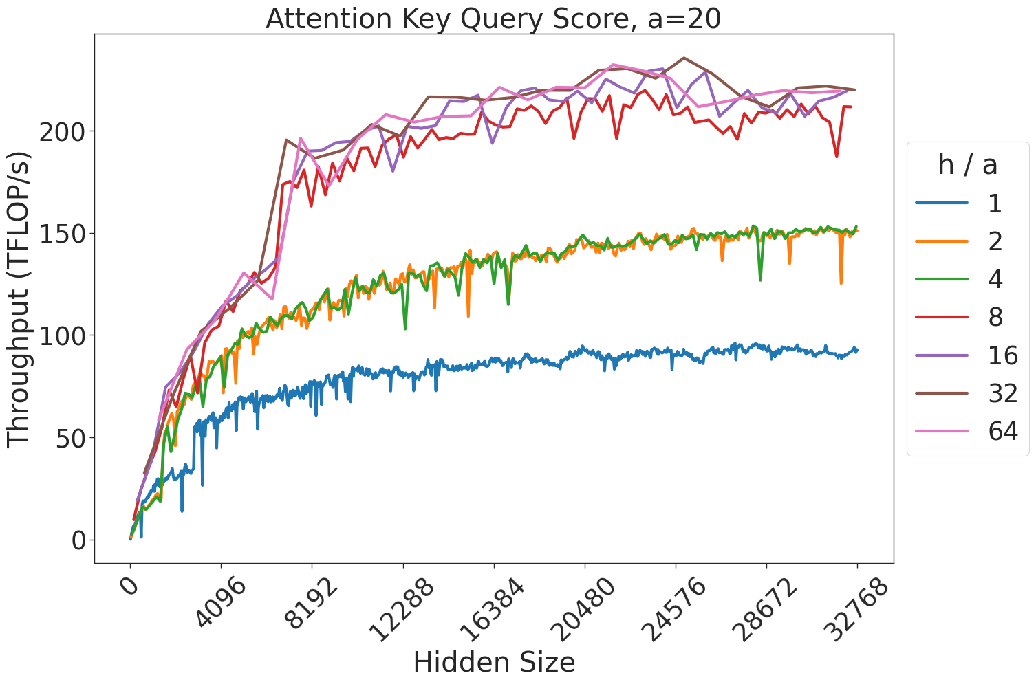
### Visual Description
## Line Chart: Attention Key Query Score Performance
### Overview
This chart illustrates the relationship between "Hidden Size" (x-axis) and "Throughput (TFLOP/s)" (y-axis) for various "h / a" ratios. The data demonstrates how computational throughput scales as the hidden size of the model increases, with distinct performance tiers emerging based on the "h / a" parameter.
### Components/Axes
* **Title:** "Attention Key Query Score, a=20" (Centered at the top).
* **Y-Axis:** "Throughput (TFLOP/s)". The scale ranges from 0 to slightly above 200, with major tick marks at 0, 50, 100, 150, and 200.
* **X-Axis:** "Hidden Size". The scale ranges from 0 to 32768, with major tick marks at 0, 4096, 8192, 12288, 16384, 20480, 24576, 28672, and 32768.
* **Legend:** Positioned on the right side of the chart. It maps "h / a" ratios to specific line colors:
* **Blue:** 1
* **Orange:** 2
* **Green:** 4
* **Red:** 8
* **Purple:** 16
* **Brown:** 32
* **Pink:** 64
### Detailed Analysis
The chart displays three distinct performance clusters based on the "h / a" ratio. All lines exhibit a similar trend: a steep, near-linear increase in throughput for smaller hidden sizes (0 to ~8192), followed by a gradual plateauing effect as the hidden size increases toward 32768.
* **Cluster 1 (Low Performance - Blue):**
* **Trend:** The blue line (h/a=1) is the lowest performer. It rises sharply from 0 to approximately 50 TFLOP/s at a hidden size of 4096.
* **Plateau:** It continues to rise slowly, plateauing at approximately 90–95 TFLOP/s for hidden sizes above 16384.
* **Cluster 2 (Mid Performance - Orange, Green):**
* **Trend:** The orange (h/a=2) and green (h/a=4) lines overlap significantly. They rise to approximately 100 TFLOP/s at a hidden size of 4096.
* **Plateau:** They plateau at approximately 150 TFLOP/s for hidden sizes above 16384.
* **Cluster 3 (High Performance - Red, Purple, Brown, Pink):**
* **Trend:** The red (h/a=8), purple (h/a=16), brown (h/a=32), and pink (h/a=64) lines are tightly clustered at the top. They rise sharply to approximately 175 TFLOP/s at a hidden size of 4096.
* **Plateau:** They plateau at approximately 220–230 TFLOP/s for hidden sizes above 16384.
* **Note:** There is significant high-frequency noise (jitter) in the lines, particularly in the lower hidden size ranges, indicating potential measurement variance or computational instability during the initial scaling phase.
### Key Observations
* **Saturation Point:** Regardless of the "h / a" ratio, throughput gains diminish significantly once the hidden size exceeds 16384.
* **Diminishing Returns:** Increasing the "h / a" ratio beyond 8 (i.e., moving from 8 to 16, 32, or 64) provides negligible improvements in throughput, as the red, purple, brown, and pink lines are nearly indistinguishable.
* **Performance Tiers:** The system exhibits clear "step-function" behavior where performance jumps to a higher tier as the "h / a" ratio increases, but these tiers are capped.
### Interpretation
The data suggests that the "h / a" ratio is a critical hyperparameter for optimizing throughput, but only up to a point.
1. **Optimal Configuration:** An "h / a" ratio of 8 appears to be the "sweet spot." It achieves the maximum performance tier (approx. 220-230 TFLOP/s). Increasing the ratio further (to 16, 32, or 64) does not yield meaningful throughput gains, suggesting that the computational overhead or memory bandwidth limits are reached at h/a=8.
2. **Bottlenecking:** The plateau observed across all lines suggests that the system hits a hardware or memory bandwidth bottleneck as the hidden size increases. Once the hidden size is large enough (roughly 16384+), the throughput is constrained by the hardware's maximum capacity rather than the model's configuration.
3. **Efficiency:** For smaller models (hidden size < 8192), the choice of "h / a" is highly impactful. For larger models, the choice of "h / a" (provided it is 8 or higher) is less critical for throughput, as the system is likely saturated.
</details>
Figure 24: Attention key-query score GEMM throughput for 20 attention heads.
<details>
<summary>extracted/5378885/figures/transformer/spikeless_sweeps/attention_key_query_problem_a24.png Details</summary>
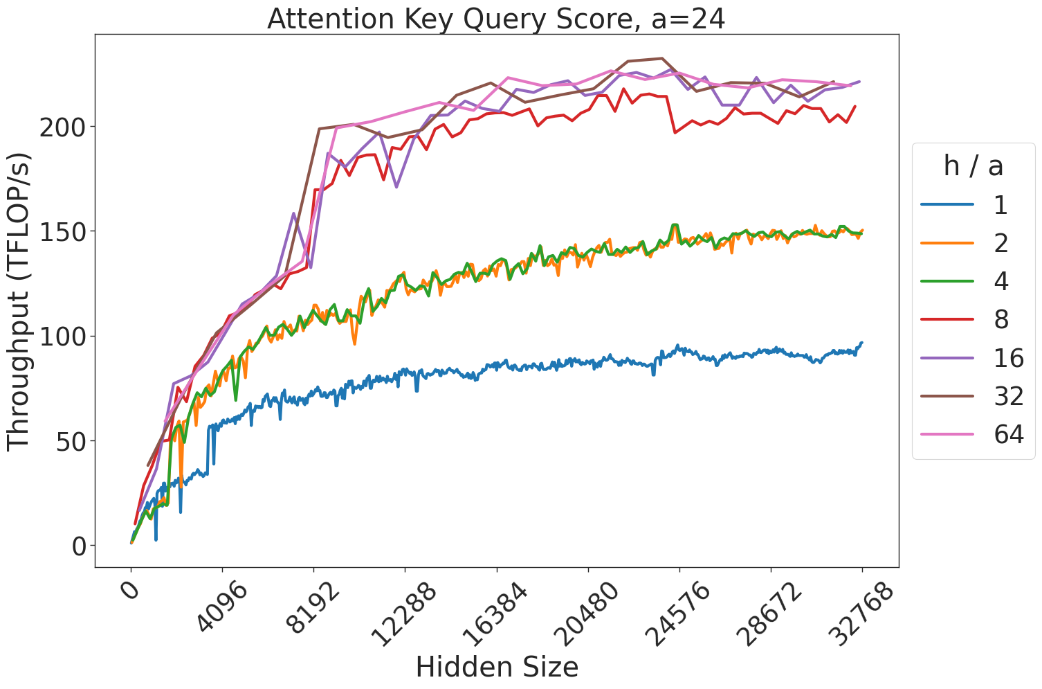
### Visual Description
## Line Chart: Attention Key Query Score, a=24
### Overview
This chart illustrates the relationship between "Hidden Size" (x-axis) and "Throughput (TFLOP/s)" (y-axis) for an attention mechanism, specifically parameterized with a constant `a=24`. The chart displays seven distinct data series, each representing a different "h / a" ratio. The data demonstrates how computational throughput scales as the hidden size increases, with distinct performance tiers based on the "h / a" ratio.
### Components/Axes
* **Title:** "Attention Key Query Score, a=24"
* **Y-Axis:** "Throughput (TFLOP/s)". The scale ranges from 0 to 250, with major tick marks at 0, 50, 100, 150, 200.
* **X-Axis:** "Hidden Size". The scale ranges from 0 to 32768, with major tick marks at 0, 4096, 8192, 12288, 16384, 20480, 24576, 28672, 32768.
* **Legend:** Located on the right side of the chart. It is titled "h / a" and maps colors to specific ratios:
* **Blue:** 1
* **Orange:** 2
* **Green:** 4
* **Red:** 8
* **Purple:** 16
* **Brown:** 32
* **Pink:** 64
### Detailed Analysis
The data series exhibit a consistent trend: a sharp, near-linear increase in throughput as the hidden size increases from 0 to approximately 8192, followed by a plateau or a much slower rate of growth as the hidden size continues to increase toward 32768.
The data series cluster into four distinct performance tiers:
1. **Tier 1 (Lowest Throughput):**
* **Series:** Blue (h/a = 1).
* **Trend:** Starts at 0, rises to ~60 TFLOP/s at 4096, and plateaus around 80–90 TFLOP/s for the remainder of the x-axis.
2. **Tier 2 (Mid-Low Throughput):**
* **Series:** Orange (h/a = 2) and Green (h/a = 4).
* **Trend:** These two lines are almost perfectly overlapping. They rise to ~100 TFLOP/s at 8192 and plateau around 150 TFLOP/s.
3. **Tier 3 (Mid-High Throughput):**
* **Series:** Red (h/a = 8).
* **Trend:** Rises to ~130 TFLOP/s at 8192 and plateaus around 200–210 TFLOP/s. This line exhibits more volatility (noise) compared to the others.
4. **Tier 4 (Highest Throughput):**
* **Series:** Purple (h/a = 16), Brown (h/a = 32), and Pink (h/a = 64).
* **Trend:** These three lines are tightly clustered. They rise very sharply to ~200 TFLOP/s at 8192 and plateau between 220–230 TFLOP/s.
### Key Observations
* **Saturation Point:** There is a clear "knee" in the curves at a Hidden Size of approximately 8192. Beyond this point, increasing the hidden size yields diminishing returns in throughput, suggesting a hardware bottleneck (likely memory bandwidth or cache capacity).
* **Clustering:** The performance is not linear with respect to the "h/a" ratio. The gap between h/a=1 and h/a=2 is significant, as is the gap between h/a=4 and h/a=8. However, the performance difference between h/a=16, 32, and 64 is negligible, indicating that the system reaches peak efficiency at an h/a ratio of 16.
* **Volatility:** The Red line (h/a=8) shows higher variance in its throughput measurements compared to the smoother curves of the other series.
### Interpretation
This chart likely represents a performance benchmark for a Transformer attention kernel (such as FlashAttention).
* **"h/a" Ratio:** This likely represents the ratio of the number of attention heads (h) to the attention dimension (a).
* **Hardware Constraints:** The plateauing behavior is characteristic of GPU memory hierarchy limitations. The initial steep rise represents the compute-bound phase where the GPU is effectively utilized. The plateau represents the memory-bound phase where the GPU is waiting for data, or the compute units are saturated.
* **Optimization Insight:** The clustering of the top three lines (16, 32, 64) suggests that for this specific hardware configuration and attention implementation, increasing the number of heads beyond a certain point (relative to the attention dimension) provides no additional throughput benefit. Engineers should target an h/a ratio of 16 to maximize efficiency without wasting resources on higher ratios that do not improve performance.
</details>
Figure 25: Attention key-query score GEMM throughput for 24 attention heads.
<details>
<summary>extracted/5378885/figures/transformer/spikeless_sweeps/attention_key_query_problem_a32.png Details</summary>

### Visual Description
## Line Chart: Attention Key Query Score, a=32
### Overview
This chart illustrates the relationship between "Hidden Size" (x-axis) and "Throughput (TFLOP/s)" (y-axis) for various "h / a" ratios. The data demonstrates that throughput generally increases as the hidden size increases, with higher "h / a" ratios consistently achieving significantly higher throughput levels.
### Components/Axes
* **Title:** "Attention Key Query Score, a=32"
* **X-Axis:** "Hidden Size". The scale ranges from 0 to 32768, with major tick marks at intervals of 4096 (0, 4096, 8192, 12288, 16384, 20480, 24576, 28672, 32768).
* **Y-Axis:** "Throughput (TFLOP/s)". The scale ranges from 0 to slightly above 200, with major tick marks at 0, 50, 100, 150, and 200.
* **Legend:** Located on the right side of the chart. It defines the "h / a" ratio for seven distinct data series, color-coded as follows:
* **Blue:** 1
* **Orange:** 2
* **Green:** 4
* **Red:** 8
* **Purple:** 16
* **Brown:** 32
* **Pink:** 64
### Detailed Analysis
The data series can be categorized into three distinct performance tiers based on their throughput trajectories:
1. **Low Throughput Tier (Blue):**
* **Trend:** The line slopes upward steadily but remains the lowest performer throughout the entire range.
* **Values:** It reaches approximately 50 TFLOP/s at a hidden size of ~4096 and plateaus just below 100 TFLOP/s by the end of the x-axis.
2. **Mid Throughput Tier (Orange, Green):**
* **Trend:** Both lines are nearly perfectly overlapping, indicating identical performance. They show a steep initial rise followed by a gradual, consistent upward slope.
* **Values:** They reach ~75 TFLOP/s at a hidden size of 4096 and climb to approximately 150 TFLOP/s by the end of the range.
3. **High Throughput Tier (Red, Purple, Brown, Pink):**
* **Trend:** These lines show the steepest initial growth, reaching ~150 TFLOP/s very quickly (before a hidden size of 8192). They then plateau or continue to rise slowly toward ~200-215 TFLOP/s.
* **Volatility:** The **Red (h/a=8)** line is notably volatile compared to the others, exhibiting several sharp, sudden dips in throughput (e.g., around 20,000 hidden size).
* **Values:** The **Brown (h/a=32)** and **Pink (h/a=64)** lines are the most stable and reach the highest throughput, consistently staying above 200 TFLOP/s after the initial ramp-up.
### Key Observations
* **Saturation Point:** For all series, the most significant gains in throughput occur between a hidden size of 0 and 8192. Beyond 12,000, the rate of improvement (slope) decreases significantly, indicating a saturation point in hardware utilization.
* **Performance Clustering:** There is a clear performance gap between the "h/a" ratios. Ratios of 16, 32, and 64 provide a massive throughput advantage over ratios of 1, 2, and 4.
* **Red Line Anomaly:** The Red line (h/a=8) is an outlier in terms of stability. While it achieves high throughput, it suffers from intermittent performance drops, suggesting potential memory alignment or cache thrashing issues at specific hidden size intervals that do not affect the higher ratios (16, 32, 64) as severely.
### Interpretation
This chart likely represents a performance benchmark for an attention mechanism implementation (such as FlashAttention) on a GPU.
* **Efficiency:** The "h/a" ratio appears to be a critical hyperparameter. Higher ratios (16+) allow the system to saturate the GPU's compute units more effectively, likely due to better parallelization or memory access patterns.
* **Diminishing Returns:** The flattening of the curves suggests that increasing the hidden size beyond ~16,000 provides diminishing returns on throughput.
* **Optimization Insight:** The volatility of the Red line (h/a=8) suggests that certain configurations are "unstable" or sensitive to specific memory layouts. If a developer were choosing parameters, they would likely avoid h/a=8 in favor of 16, 32, or 64 to ensure both high throughput and consistent performance. The near-perfect overlap of the Orange and Green lines suggests that for those specific ratios, the performance difference is negligible, and one might choose the lower ratio (2) if it saves memory or compute resources.
</details>
Figure 26: Attention key-query score GEMM throughput for 32 attention heads.
<details>
<summary>extracted/5378885/figures/transformer/spikeless_sweeps/attention_key_query_problem_a40.png Details</summary>
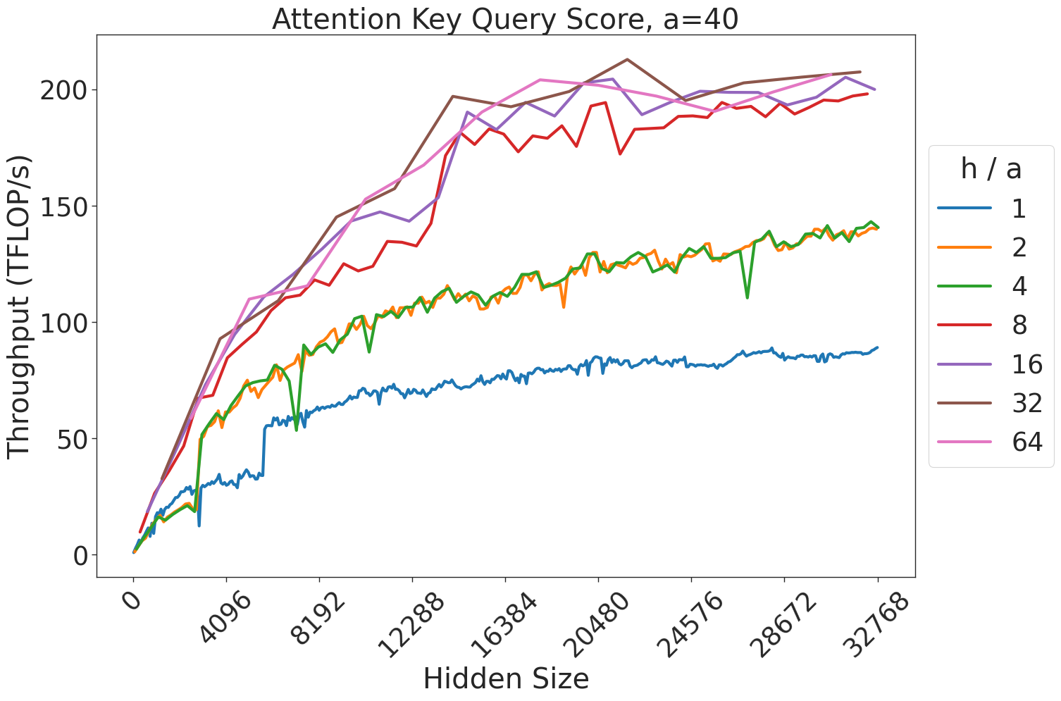
### Visual Description
## Line Chart: Attention Key Query Score, a=40
### Overview
This image is a line chart illustrating the relationship between "Hidden Size" (x-axis) and "Throughput (TFLOP/s)" (y-axis) for various "h/a" ratios. The chart demonstrates how computational throughput scales as the hidden size of a model increases, with different performance profiles based on the "h/a" parameter.
### Components/Axes
* **Title:** "Attention Key Query Score, a=40" (Top center).
* **X-Axis:** "Hidden Size". Scale ranges from 0 to 32768, with major ticks at 0, 4096, 8192, 12288, 16384, 20480, 24576, 28672, and 32768.
* **Y-Axis:** "Throughput (TFLOP/s)". Scale ranges from 0 to 200+, with major ticks at 0, 50, 100, 150, 200.
* **Legend:** Located on the right side. Labeled "h / a".
* **Blue:** 1
* **Orange:** 2
* **Green:** 4
* **Red:** 8
* **Purple:** 16
* **Brown:** 32
* **Pink:** 64
### Detailed Analysis
The chart displays seven distinct data series, which can be grouped into two performance tiers based on their throughput saturation levels.
**Trend Verification:**
All seven lines originate at (0,0) and exhibit a positive, non-linear (concave) growth trend. The rate of throughput increase is highest between Hidden Size 0 and 12,288, after which the curves begin to flatten (saturate).
**Data Series Extraction:**
* **Lower Tier (h/a = 1, 2, 4):**
* **Blue (h/a=1):** The lowest performing series. It rises slowly, reaching approximately 80-90 TFLOP/s at a Hidden Size of 32,768.
* **Orange (h/a=2):** Performs significantly better than Blue. It rises to approximately 140 TFLOP/s at a Hidden Size of 32,768.
* **Green (h/a=4):** Tracks very closely with the Orange line. It exhibits a notable, sharp dip/anomaly around Hidden Size 8,192, dropping briefly before recovering to match the Orange line's trajectory, ending at approximately 140 TFLOP/s.
* **Higher Tier (h/a = 8, 16, 32, 64):**
* **Red (h/a=8):** Shows a steeper initial slope than the lower tier. It reaches approximately 200 TFLOP/s at a Hidden Size of 32,768.
* **Purple (h/a=16):** Follows a similar trajectory to the Red line, slightly outperforming it in the mid-range (12,288 to 20,480), ending at approximately 200 TFLOP/s.
* **Brown (h/a=32):** The highest performing series. It consistently stays at or above the other lines, peaking at approximately 210 TFLOP/s near Hidden Size 20,480, then slightly tapering or stabilizing.
* **Pink (h/a=64):** Closely tracks the Purple and Brown lines, ending at approximately 200 TFLOP/s.
### Key Observations
* **Performance Clustering:** There is a distinct performance gap between the "h/a" ratios of 1, 2, 4 and the ratios of 8, 16, 32, 64. The latter group achieves roughly 40-50% higher throughput than the former.
* **Saturation Point:** The "knee" of the curves—where throughput gains begin to diminish significantly—occurs consistently between Hidden Size 12,288 and 16,384 for all series.
* **Anomalies:** The Green line (h/a=4) contains a sharp, localized drop in throughput at Hidden Size 8,192, which is not present in the other series.
### Interpretation
This chart likely represents a performance benchmark for a GPU-accelerated attention kernel (such as FlashAttention).
* **Hardware Utilization:** The "h/a" ratio likely represents the ratio of the number of attention heads to the head dimension (or a similar architectural parameter). The data suggests that higher "h/a" ratios allow the hardware to achieve much higher TFLOP/s utilization.
* **Bottlenecks:** The saturation observed after a Hidden Size of ~16,384 suggests that the compute units are reaching their maximum theoretical throughput, or that the operation becomes memory-bandwidth bound beyond this point.
* **Optimization:** For developers or researchers, this data indicates that choosing an "h/a" ratio of 8 or higher is critical for maximizing hardware efficiency on this specific architecture, as the performance gains from increasing the ratio diminish significantly once the ratio is 8 or greater (the lines for 8, 16, 32, and 64 are tightly clustered).
</details>
Figure 27: Attention key-query score GEMM throughput for 40 attention heads.
<details>
<summary>extracted/5378885/figures/transformer/spikeless_sweeps/attention_key_query_problem_a64.png Details</summary>
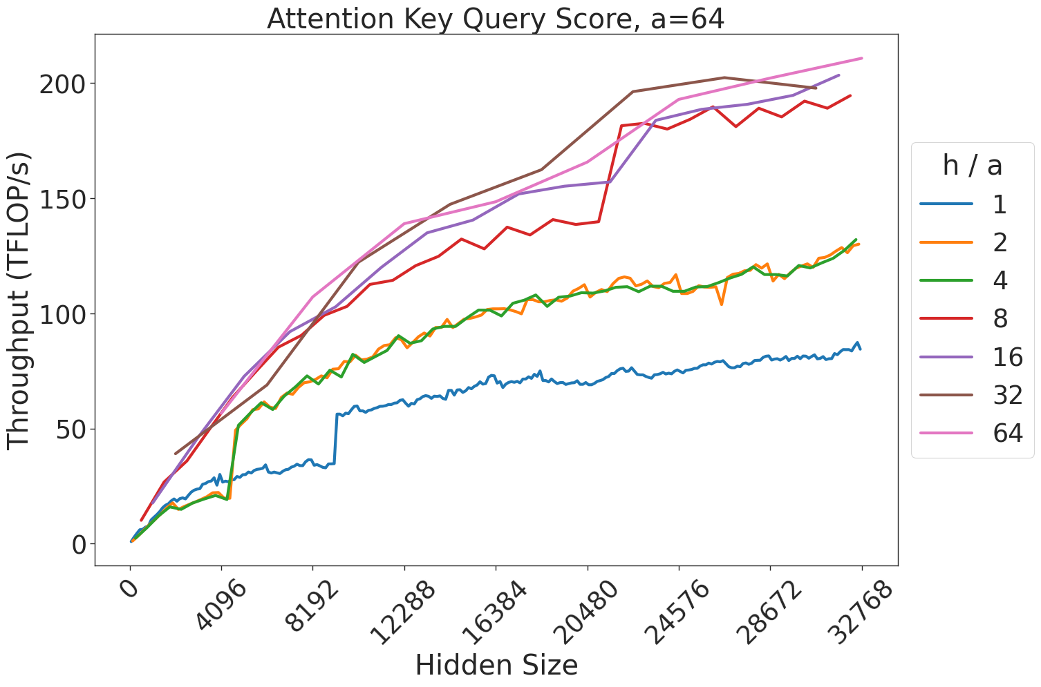
### Visual Description
## Line Chart: Attention Key Query Score, a=64
### Overview
This image displays a line chart illustrating the performance (throughput in TFLOP/s) of an attention mechanism relative to the "Hidden Size" of a model. The chart compares different ratios of heads to attention dimension ($h/a$), ranging from 1 to 64. The data suggests that higher $h/a$ ratios generally correlate with higher throughput, though with diminishing returns at the highest values.
### Components/Axes
* **Title:** "Attention Key Query Score, a=64" (Top center).
* **Y-Axis:** "Throughput (TFLOP/s)". The scale ranges from 0 to 200, with major ticks at 0, 50, 100, 150, and 200.
* **X-Axis:** "Hidden Size". The scale ranges from 0 to 32768, with major ticks at 0, 4096, 8192, 12288, 16384, 20480, 24576, 28672, and 32768.
* **Legend:** Located on the right side, labeled "h / a". It maps colors to specific ratios:
* **Blue:** 1
* **Orange:** 2
* **Green:** 4
* **Red:** 8
* **Purple:** 16
* **Brown:** 32
* **Pink:** 64
### Detailed Analysis
The chart plots seven distinct data series. Below is the trend analysis for each, moving from the lowest throughput to the highest:
* **h/a = 1 (Blue):** This line represents the lowest throughput. It shows a steady, gradual upward slope, ending at approximately 85-90 TFLOP/s at a hidden size of 32768. There is a notable vertical "step" increase around the 10,000 hidden size mark.
* **h/a = 2 (Orange) & h/a = 4 (Green):** These two lines are nearly identical, overlapping almost perfectly throughout the entire range. They show a steady upward trend, ending at approximately 130 TFLOP/s at a hidden size of 32768.
* **h/a = 8 (Red):** This line shows a steeper upward trend than the previous series. It exhibits a significant, sharp jump in throughput around the 20,000 hidden size mark, eventually reaching approximately 195 TFLOP/s.
* **h/a = 16 (Purple):** This line follows a similar trajectory to the red line but maintains a slightly higher throughput for most of the range, ending at approximately 200 TFLOP/s.
* **h/a = 32 (Brown):** This line rises very sharply in the early stages (0 to 20,000). It hits a peak of approximately 200 TFLOP/s around the 24,000 mark, after which it plateaus and shows a slight downward trend or stagnation.
* **h/a = 64 (Pink):** This line represents the highest throughput. It shows a consistent, strong upward slope throughout the entire range, ending as the highest data point at approximately 210-215 TFLOP/s.
### Key Observations
* **Performance Saturation:** The lines for $h/a$ values of 32 and 64 begin to converge and plateau as the hidden size increases, suggesting that the hardware or kernel implementation reaches a compute-bound limit.
* **Discontinuities:** Several lines (notably Red, Purple, and Blue) exhibit sharp, vertical jumps at specific hidden sizes (e.g., around 20,000 for Red/Purple). This is characteristic of GPU kernel switching or changes in tiling strategies where the algorithm adapts to the memory constraints of the specific hidden size.
* **Clustering:** The data series cluster into three distinct performance tiers:
1. Low tier: $h/a = 1$
2. Mid tier: $h/a = 2$ and $4$
3. High tier: $h/a = 8, 16, 32, 64$
### Interpretation
This chart is a performance benchmark for Transformer attention kernels, likely running on a GPU. The "Hidden Size" represents the dimensionality of the model's internal representation, and the $h/a$ ratio represents the configuration of attention heads relative to the attention dimension.
The data demonstrates that increasing the $h/a$ ratio generally improves throughput, likely due to better parallelization and occupancy of the GPU's compute units. However, the "steps" in the lines indicate that performance is not strictly linear; it is highly dependent on specific hidden size thresholds where the underlying kernel implementation likely changes (e.g., switching from a smaller tile size to a larger one to optimize memory access). The convergence of the higher $h/a$ lines at the right side of the chart suggests that at very large hidden sizes, the performance gains from increasing the head-to-dimension ratio diminish, as the system becomes limited by other factors such as memory bandwidth or total compute capacity.
</details>
Figure 28: Attention key-query score GEMM throughput for 64 attention heads.
<details>
<summary>extracted/5378885/figures/transformer/spikeless_sweeps/attention_key_query_problem_a80.png Details</summary>
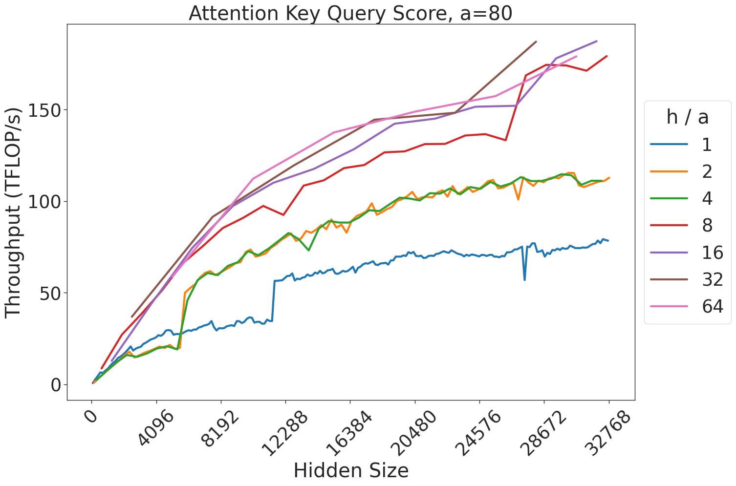
### Visual Description
## Line Chart: Attention Key Query Score, a=80
### Overview
This chart illustrates the relationship between the "Hidden Size" of a neural network model (x-axis) and the resulting "Throughput" in TFLOP/s (y-axis). The data is segmented by different "h / a" ratios, which appear to represent architectural configurations of an attention mechanism. The chart demonstrates that throughput generally increases with hidden size, but the rate of improvement varies significantly based on the "h / a" ratio.
### Components/Axes
* **Title:** "Attention Key Query Score, a=80" (Centered at the top).
* **X-Axis:** "Hidden Size". The scale ranges from 0 to 32768, with major tick marks at intervals of 4096 (0, 4096, 8192, 12288, 16384, 20480, 24576, 28672, 32768).
* **Y-Axis:** "Throughput (TFLOP/s)". The scale ranges from 0 to 150+, with major tick marks at 0, 50, 100, and 150.
* **Legend:** Positioned on the right side of the chart. It defines the "h / a" ratio for seven distinct data series, color-coded as follows:
* **Blue:** 1
* **Orange:** 2
* **Green:** 4
* **Red:** 8
* **Purple:** 16
* **Brown:** 32
* **Pink:** 64
### Detailed Analysis
The chart displays seven distinct lines, all showing a positive correlation between Hidden Size and Throughput.
* **Trend Verification:** All lines slope upward from left to right.
* **Data Series Groupings:**
* **Low Throughput Group (Blue, h/a=1):** This line is the lowest on the chart. It rises steadily until a hidden size of approximately 12288, where it exhibits a sharp, vertical jump in throughput (from ~35 to ~60 TFLOP/s). It continues to rise, ending at approximately 80 TFLOP/s at a hidden size of 32768.
* **Mid Throughput Group (Orange, h/a=2; Green, h/a=4):** These two lines are nearly identical and overlap significantly throughout the entire range. They rise to approximately 60 TFLOP/s at a hidden size of 8192, and end at approximately 110-115 TFLOP/s at a hidden size of 32768.
* **High Throughput Group (Red, h/a=8; Purple, h/a=16; Brown, h/a=32; Pink, h/a=64):** These lines show the highest performance.
* **Red (h/a=8):** Rises steadily, ending at approximately 175-180 TFLOP/s.
* **Purple (h/a=16), Brown (h/a=32), Pink (h/a=64):** These three lines are tightly clustered at the top of the chart. They show the highest throughput, all converging near 185-190 TFLOP/s at the maximum hidden size.
### Key Observations
* **Diminishing Returns:** As the "h / a" ratio increases, the marginal gain in throughput decreases. The jump from h/a=1 to 2 is significant, as is the jump from 4 to 8. However, the difference between h/a=16, 32, and 64 is negligible, suggesting the system reaches a saturation point for throughput at these configurations.
* **Kernel Optimization Anomaly:** The sharp vertical jump in the Blue line (h/a=1) at a hidden size of 12288 is a notable anomaly. This likely indicates a change in the underlying computational kernel or memory access strategy triggered at that specific hidden size threshold.
* **Clustering:** The data naturally clusters into three performance tiers: the lowest tier (h/a=1), the middle tier (h/a=2, 4), and the high-performance tier (h/a=8, 16, 32, 64).
### Interpretation
This chart is a performance benchmark for an attention mechanism implementation (likely a GPU kernel). The "h / a" ratio likely represents the ratio of attention heads to the attention dimension.
The data suggests that for this specific hardware/software implementation, increasing the "h / a" ratio beyond 8 provides very little benefit in terms of raw throughput (TFLOP/s). The system is likely compute-bound or memory-bandwidth-bound at these higher ratios. The distinct jump in the blue line suggests that the implementation is not perfectly smooth across all hidden sizes, and there are specific "sweet spots" or threshold-based optimizations in the code that handle different hidden sizes differently. Engineers using this data would likely choose an "h / a" ratio of 8 to maximize throughput while avoiding the overhead or complexity of higher ratios that yield no additional performance.
</details>
Figure 29: Attention key-query score GEMM throughput for 80 attention heads.
<details>
<summary>extracted/5378885/figures/transformer/spikeless_sweeps/attention_key_query_problem_a96.png Details</summary>
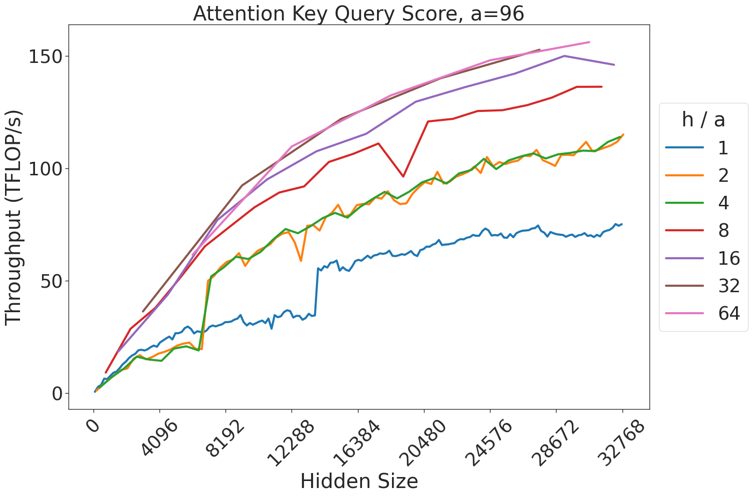
### Visual Description
## Line Chart: Attention Key Query Score, a=96
### Overview
This image is a performance benchmark line chart illustrating the relationship between "Hidden Size" (x-axis) and "Throughput (TFLOP/s)" (y-axis) for an attention mechanism, likely within a Transformer-based neural network architecture. The chart displays seven distinct data series, each representing a different "h / a" ratio (the ratio of attention heads to the attention key/query dimension).
### Components/Axes
* **Title:** "Attention Key Query Score, a=96" (Centered at the top).
* **X-Axis:** Labeled "Hidden Size". The scale ranges from 0 to 32768. Major tick marks are provided at intervals of 4096 (0, 4096, 8192, 12288, 16384, 20480, 24576, 28672, 32768).
* **Y-Axis:** Labeled "Throughput (TFLOP/s)". The scale ranges from 0 to 150+. Major tick marks are provided at 0, 50, 100, and 150.
* **Legend:** Positioned on the right-hand side. It is titled "h / a" and maps colors to specific ratios:
* **Blue:** 1
* **Orange:** 2
* **Green:** 4
* **Red:** 8
* **Purple:** 16
* **Brown:** 32
* **Pink:** 64
### Detailed Analysis
The chart plots seven lines, all showing a general upward trend where throughput increases as the hidden size increases.
* **h/a = 1 (Blue):** This line shows the lowest throughput. It exhibits a distinct "step" or jump in performance around the 14,000–15,000 hidden size mark, where throughput jumps from approximately 35 TFLOP/s to 55 TFLOP/s. It ends at approximately 75 TFLOP/s.
* **h/a = 2 (Orange) & h/a = 4 (Green):** These two lines are nearly identical, overlapping for the majority of the chart. They show a steady, slightly jagged upward trend, ending at approximately 115 TFLOP/s.
* **h/a = 8 (Red):** This line shows higher throughput than the 2 and 4 ratios. It exhibits a notable instability (a sharp dip and recovery) around the 20,000 hidden size mark. It ends at approximately 135 TFLOP/s.
* **h/a = 16 (Purple):** This line shows a smooth, consistent upward trend, ending at approximately 145 TFLOP/s.
* **h/a = 32 (Brown) & h/a = 64 (Pink):** These two lines represent the highest throughput. They are very close to each other, almost overlapping entirely. They show the highest performance, ending at approximately 155+ TFLOP/s.
### Key Observations
* **Diminishing Returns:** As the "h/a" ratio increases, the performance gains decrease. The gap between 1 and 2 is significant, whereas the gap between 32 and 64 is negligible.
* **Algorithmic Shifts:** The sharp, discontinuous jump in the blue line (h/a=1) suggests a change in the underlying kernel execution strategy (e.g., switching from a standard attention implementation to a more optimized, tiled, or fused kernel) at that specific hidden size.
* **Performance Instability:** The red line (h/a=8) displays a localized performance degradation around 20,000 hidden size, which may indicate a cache thrashing event or a specific memory bottleneck for that configuration.
### Interpretation
This data demonstrates the efficiency scaling of attention mechanisms relative to model architecture parameters.
1. **Scaling Efficiency:** The chart suggests that increasing the "h/a" ratio improves throughput, but the system hits a saturation point where increasing the ratio further (beyond 32) yields minimal additional performance benefits.
2. **Kernel Optimization:** The "step" observed in the blue line is a classic indicator of a "kernel switch." In high-performance computing, different algorithms are often used for different input sizes to maximize hardware utilization. The system likely switches to a more efficient kernel at a hidden size of ~14k for the h/a=1 configuration.
3. **Hardware/Memory Bottlenecks:** The dip in the red line (h/a=8) is an anomaly—it is a sign that the system is not scaling linearly due to an external constraint, likely related to memory bandwidth or register pressure, which temporarily disrupts the throughput at that specific configuration.
</details>
Figure 30: Attention key-query score GEMM throughput for 96 attention heads.
<details>
<summary>extracted/5378885/figures/transformer/spikeless_sweeps/attention_key_query_problem_a128.png Details</summary>
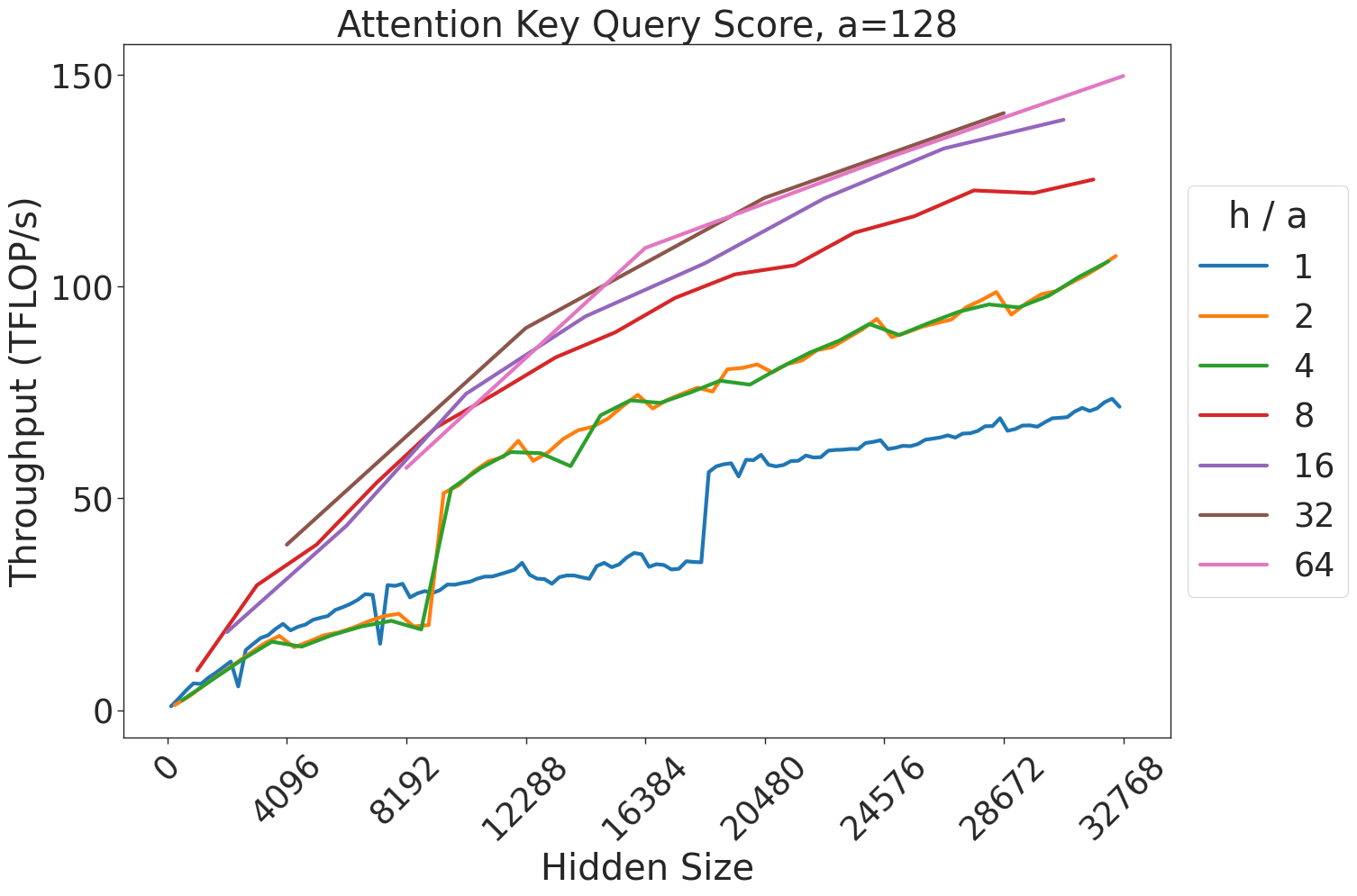
### Visual Description
## Line Chart: Attention Key Query Score, a=128
### Overview
This image is a line chart illustrating the relationship between "Hidden Size" (x-axis) and "Throughput (TFLOP/s)" (y-axis) for an attention mechanism, parameterized by a fixed value "a=128". The chart displays seven distinct data series, each representing a different "h / a" ratio.
### Components/Axes
* **Title:** "Attention Key Query Score, a=128"
* **X-Axis:** Labeled "Hidden Size". The scale ranges from 0 to 32768, with major tick marks at 0, 4096, 8192, 12288, 16384, 20480, 24576, 28672, and 32768.
* **Y-Axis:** Labeled "Throughput (TFLOP/s)". The scale ranges from 0 to 150, with major tick marks at 0, 50, 100, and 150.
* **Legend:** Positioned on the right side of the chart. It is labeled "h / a" and lists seven values corresponding to the line colors:
* **Blue:** 1
* **Orange:** 2
* **Green:** 4
* **Red:** 8
* **Purple:** 16
* **Brown:** 32
* **Pink:** 64
### Detailed Analysis
The chart displays seven data series, all showing a general upward trend (positive correlation) between Hidden Size and Throughput.
* **h/a = 1 (Blue Line):**
* **Trend:** Starts at 0, rises gradually.
* **Anomaly:** There is a sharp, vertical discontinuity (step-up) at a Hidden Size of approximately 18,000, where throughput jumps from ~35 TFLOP/s to ~60 TFLOP/s.
* **End Point:** Reaches approximately 70 TFLOP/s at a Hidden Size of 32,768.
* **h/a = 2 (Orange Line) & h/a = 4 (Green Line):**
* **Trend:** These two lines are nearly identical and overlap significantly throughout the entire range.
* **End Point:** Both reach approximately 105–110 TFLOP/s at a Hidden Size of 32,768.
* **h/a = 8 (Red Line):**
* **Trend:** Consistently higher throughput than the 1, 2, and 4 series.
* **End Point:** Reaches approximately 125 TFLOP/s at a Hidden Size of 32,768.
* **h/a = 16 (Purple Line) & h/a = 32 (Brown Line):**
* **Trend:** These two lines are very close to each other, with the Brown line (32) slightly higher than the Purple line (16) in the mid-range.
* **End Point:** Both lines terminate around a Hidden Size of 28,672, reaching approximately 140 TFLOP/s.
* **h/a = 64 (Pink Line):**
* **Trend:** This line represents the highest throughput across the entire range.
* **End Point:** Reaches approximately 150 TFLOP/s at a Hidden Size of 32,768.
### Key Observations
* **Positive Correlation:** Increasing the "h/a" ratio generally results in higher throughput for a given hidden size.
* **Kernel/Algorithm Switch:** The sharp discontinuity in the Blue line (h/a=1) at ~18,000 Hidden Size strongly suggests a change in the underlying computational kernel or memory management strategy (e.g., switching from a standard attention implementation to a more optimized one) at that specific threshold.
* **Diminishing Returns/Clustering:** The performance gap between the lines decreases as the "h/a" ratio increases. The lines for 2/4 and 16/32 are tightly clustered, suggesting that increasing the ratio beyond certain points yields diminishing performance gains.
### Interpretation
This chart is a performance benchmark for an attention mechanism, likely running on a GPU. The "a=128" likely refers to the attention head dimension. The "h/a" ratio likely represents the number of heads relative to the attention dimension.
The data demonstrates that throughput is highly sensitive to the configuration of the attention mechanism. The most notable finding is the non-linear behavior of the "h/a=1" configuration, which indicates that the system likely employs different execution paths or optimizations based on the input size. The clustering of the other lines suggests that while increasing the head count (or ratio) improves performance, there is a saturation point where hardware utilization is maximized, and further increases in the ratio provide negligible throughput improvements. The termination of the 16 and 32 lines before the maximum x-axis value may indicate memory constraints or unsupported configurations for those specific parameters at higher hidden sizes.
</details>
Figure 31: Attention key-query score GEMM throughput for 128 attention heads.
<details>
<summary>extracted/5378885/figures/transformer/spikeless_sweeps/attention_key_query_problem_a256.png Details</summary>
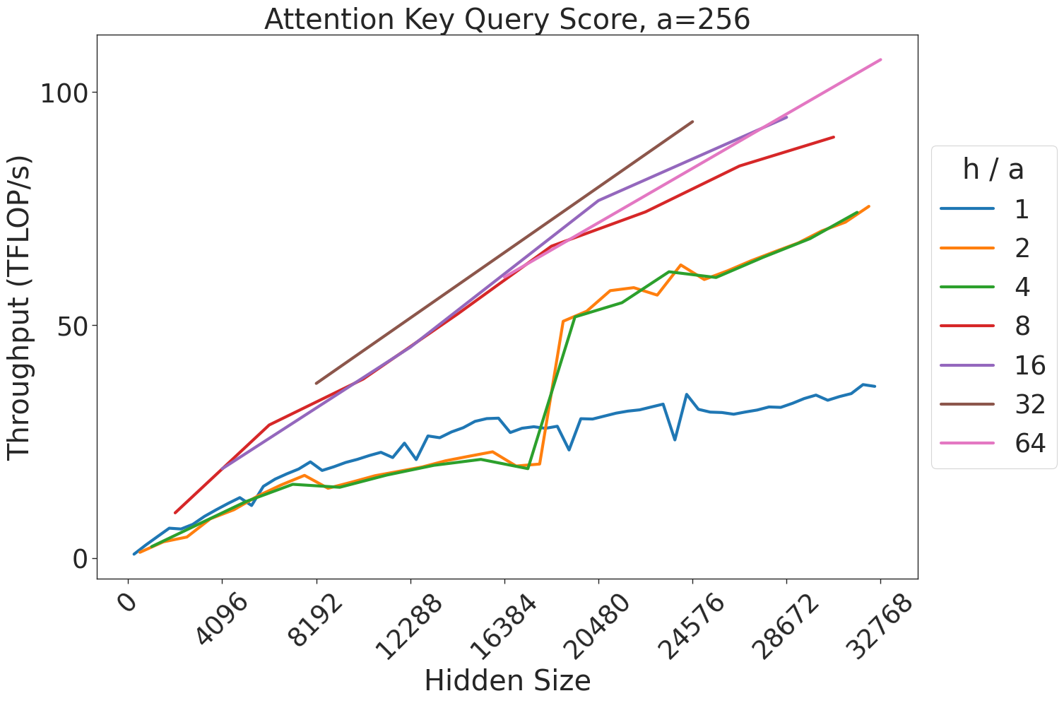
### Visual Description
## Line Chart: Attention Key Query Score, a=256
### Overview
This chart illustrates the relationship between "Hidden Size" (x-axis) and "Throughput (TFLOP/s)" (y-axis) for various "h / a" ratios. The chart demonstrates how computational throughput scales as the hidden size increases, with distinct performance profiles based on the "h / a" parameter.
### Components/Axes
* **Title:** Attention Key Query Score, a=256
* **X-Axis:** "Hidden Size". The scale ranges from 0 to 32768. Markers are provided at intervals of 4096 (0, 4096, 8192, 12288, 16384, 20480, 24576, 28672, 32768).
* **Y-Axis:** "Throughput (TFLOP/s)". The scale ranges from 0 to 100+.
* **Legend:** Located on the right side of the chart. It defines the "h / a" ratio, with seven distinct series represented by colors:
* Blue: 1
* Orange: 2
* Green: 4
* Red: 8
* Purple: 16
* Brown: 32
* Pink: 64
### Detailed Analysis
The chart displays seven data series. Below is the trend verification and approximate data extraction for each:
* **Blue (h/a=1):**
* *Trend:* Slopes upward steadily but remains the lowest performing series throughout the entire range.
* *Data:* Starts at (0,0), reaches ~20 TFLOP/s at 12288, and ends at ~35 TFLOP/s at 32768.
* **Orange (h/a=2) & Green (h/a=4):**
* *Trend:* These two lines are almost perfectly overlapping. They exhibit a slow, steady upward trend until a hidden size of ~16384, at which point there is a **massive, near-vertical discontinuity (jump)** in throughput, followed by a continued upward trend.
* *Data:* Starts at (0,0). At 16384, throughput is ~20 TFLOP/s. Immediately after, it jumps to ~50 TFLOP/s. It ends at ~70 TFLOP/s at 32768.
* **Red (h/a=8):**
* *Trend:* Slopes upward consistently.
* *Data:* Starts at ~10 TFLOP/s (at ~2048), reaches ~50 TFLOP/s at 16384, and ends at ~85 TFLOP/s at 28672.
* **Purple (h/a=16):**
* *Trend:* Slopes upward consistently, slightly steeper than the Red line.
* *Data:* Starts at ~10 TFLOP/s (at ~2048), reaches ~60 TFLOP/s at 16384, and ends at ~95 TFLOP/s at 24576.
* **Brown (h/a=32):**
* *Trend:* Slopes upward consistently. This series is truncated; it does not start at 0 and does not reach the maximum x-axis value.
* *Data:* Starts at ~40 TFLOP/s (at ~8192) and ends at ~95 TFLOP/s (at ~24576).
* **Pink (h/a=64):**
* *Trend:* The steepest upward slope, representing the highest throughput.
* *Data:* Starts at ~10 TFLOP/s (at ~2048), reaches ~70 TFLOP/s at 16384, and ends at ~110 TFLOP/s at 32768.
### Key Observations
* **Performance Correlation:** There is a clear positive correlation between the "h / a" ratio and throughput. Higher ratios consistently yield higher TFLOP/s.
* **The Discontinuity Anomaly:** The most notable feature is the sharp vertical jump in the Orange (2) and Green (4) lines between 16384 and 20480. This suggests a change in the underlying computational kernel, memory tiling strategy, or algorithm execution path that suddenly becomes much more efficient at larger hidden sizes.
* **Truncation:** The Brown (32) series is incomplete compared to the others, suggesting that the specific configuration or hardware limitations prevented data collection for this ratio at the lower and higher ends of the hidden size spectrum.
### Interpretation
This chart is likely a performance benchmark for an attention mechanism implementation (such as FlashAttention) on a GPU.
* **Kernel Switching:** The discontinuity in the Orange and Green lines strongly implies that the software implementation switches to a more optimized kernel or tiling strategy once the hidden size exceeds 16384.
* **Efficiency Scaling:** The fact that higher "h / a" ratios (like 64) achieve higher throughput suggests that the implementation is better optimized for larger head counts or specific memory access patterns associated with those ratios.
* **Hardware/Software Limits:** The truncation of the Brown line and the varying start/end points of the lines suggest that certain configurations are only valid or performant within specific "Hidden Size" ranges, likely due to memory constraints (VRAM) or kernel compatibility.
</details>
Figure 32: Attention key-query score GEMM throughput for 256 attention heads.
<details>
<summary>extracted/5378885/figures/transformer/spikeless_sweeps/attention_key_query_problem_a512.png Details</summary>
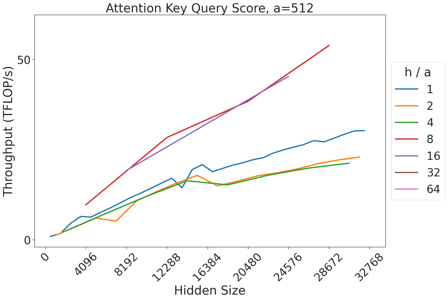
### Visual Description
## Line Chart: Attention Key Query Score, a=512
### Overview
This image displays a line chart illustrating the relationship between "Hidden Size" (x-axis) and "Throughput (TFLOP/s)" (y-axis) for various "h / a" ratios. The chart is titled "Attention Key Query Score, a=512," suggesting it is a performance benchmark for a specific computational kernel (likely related to Transformer attention mechanisms) where the attention dimension ($a$) is fixed at 512.
### Components/Axes
* **Title:** "Attention Key Query Score, a=512" (Top center).
* **X-Axis:** Labeled "Hidden Size". The scale ranges from 0 to 32768. Major tick marks are provided at intervals of 4096 (0, 4096, 8192, 12288, 16384, 20480, 24576, 28672, 32768). The labels are rotated 45 degrees.
* **Y-Axis:** Labeled "Throughput (TFLOP/s)". The scale ranges from 0 to 50+.
* **Legend:** Located on the right side of the chart. It lists "h / a" (Heads / Attention dimension ratio) with the following color-coded values:
* **Blue:** 1
* **Orange:** 2
* **Green:** 4
* **Red:** 8
* **Purple:** 16
* **Brown:** 32
* **Pink:** 64
### Detailed Analysis
The chart plots five distinct data series corresponding to the "h / a" ratios 1, 2, 4, 8, and 16. Note that the legend includes values for 32 and 64, but no corresponding lines are plotted for these values.
**Data Series Trends:**
1. **Blue (h/a = 1):**
* **Trend:** Starts at (0,0) and slopes upward.
* **Behavior:** Shows significant volatility between Hidden Size 12288 and 16384, characterized by a sharp spike followed by a dip, before resuming a steady upward trajectory.
* **End Point:** At Hidden Size 32768, throughput is approximately 25 TFLOP/s.
2. **Orange (h/a = 2):**
* **Trend:** Starts at (0,0) and slopes upward.
* **Behavior:** Exhibits a dip around Hidden Size 8192, a peak around 14000, and another dip before continuing upward.
* **End Point:** At Hidden Size 32768, throughput is approximately 22 TFLOP/s.
3. **Green (h/a = 4):**
* **Trend:** Starts at (0,0) and slopes upward.
* **Behavior:** This is the smoothest line among the lower-throughput series. It generally tracks slightly below the Orange line.
* **End Point:** At Hidden Size 28672, throughput is approximately 20 TFLOP/s.
4. **Red (h/a = 8):**
* **Trend:** Starts at Hidden Size ~4096 with a throughput of ~10 TFLOP/s. It slopes steeply upward.
* **Behavior:** This series provides the highest throughput on the chart.
* **End Point:** At Hidden Size 28672, throughput is approximately 55 TFLOP/s.
5. **Purple (h/a = 16):**
* **Trend:** Starts at Hidden Size ~4096 with a throughput of ~10 TFLOP/s. It slopes steeply upward.
* **Behavior:** Tracks very closely with the Red line, though it appears to terminate slightly earlier (around Hidden Size 24576) at a throughput of ~45 TFLOP/s.
### Key Observations
* **Performance Disparity:** There is a clear performance bifurcation. The configurations with higher "h/a" ratios (8 and 16) achieve significantly higher throughput (reaching >50 TFLOP/s) compared to the lower ratios (1, 2, and 4), which struggle to exceed 25 TFLOP/s.
* **Missing Data:** The legend includes "32" and "64," but these are absent from the plot. This implies that these configurations were either not tested, failed to execute, or are not supported by the current implementation.
* **Volatility:** The lower "h/a" ratios (1 and 2) exhibit non-linear, volatile behavior in the 12k–16k Hidden Size range, suggesting potential cache thrashing, kernel switching, or memory alignment issues at these specific sizes.
### Interpretation
This chart demonstrates the efficiency of different attention head configurations relative to the hidden size of a model.
* **Optimal Configuration:** The data suggests that higher "h/a" ratios (8 and 16) are significantly more efficient for the hardware being tested. This is likely because higher ratios allow for better utilization of GPU tensor cores or memory bandwidth, whereas lower ratios (1, 2, 4) may be bottlenecked by memory access patterns or insufficient parallelism.
* **Hardware/Software Limits:** The absence of lines for 32 and 64 suggests a hard limit in the implementation or hardware constraints where these configurations become invalid or perform so poorly they were excluded.
* **Peircean Investigative Note:** The "bump" in the Blue and Orange lines around the 12k–16k mark is a classic indicator of a "cliff" or "sweet spot" in GPU kernel performance. It suggests that at these specific hidden sizes, the memory access pattern changes (perhaps due to tiling or block size limits), causing a temporary performance degradation before the kernel adapts to the larger size.
</details>
Figure 33: Attention key-query score GEMM throughput for 512 attention heads.
<details>
<summary>extracted/5378885/figures/transformer/spikeless_sweeps/attention_key_query_problem_ha64.png Details</summary>
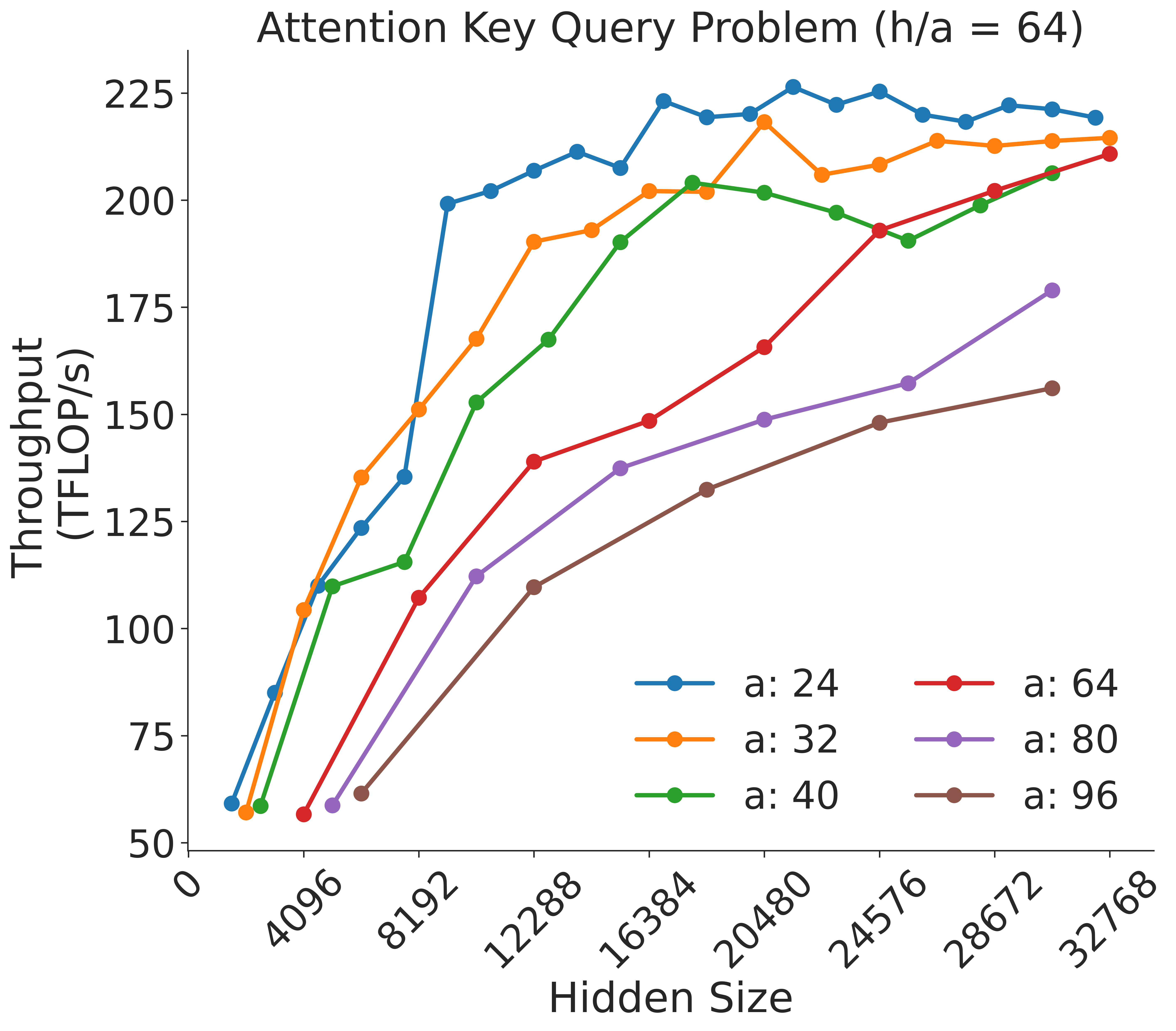
### Visual Description
## Line Chart: Attention Key Query Problem (h/a = 64)
### Overview
This image displays a line chart illustrating the relationship between "Hidden Size" (x-axis) and "Throughput (TFLOP/s)" (y-axis) for six different configurations of a parameter labeled "a" (ranging from 24 to 96). The chart demonstrates how throughput performance scales as the hidden size increases, with distinct performance curves for each "a" value.
### Components/Axes
* **Title:** "Attention Key Query Problem (h/a = 64)" located at the top center.
* **X-Axis:** Labeled "Hidden Size". The scale ranges from 0 to 32768, with major ticks at 4096, 8192, 12288, 16384, 20480, 24576, 28672, and 32768.
* **Y-Axis:** Labeled "Throughput (TFLOP/s)". The scale ranges from 50 to 225, with increments of 25.
* **Legend:** Located in the bottom-right quadrant. It maps colors to "a" values:
* **Blue:** a: 24
* **Orange:** a: 32
* **Green:** a: 40
* **Red:** a: 64
* **Purple:** a: 80
* **Brown:** a: 96
### Detailed Analysis
The chart plots six data series. Below is the trend verification and approximate data extraction for each:
* **Blue (a: 24):**
* *Trend:* Sharp upward slope from the origin, reaching a plateau very early (around hidden size 8192).
* *Data Points:* Starts at ~60 TFLOP/s. Reaches ~125 at 4096, ~200 at 8192, and plateaus between 200 and 225 TFLOP/s for the remainder of the x-axis.
* **Orange (a: 32):**
* *Trend:* Similar to Blue, but with a slightly lower throughput ceiling and a slightly delayed rise.
* *Data Points:* Starts at ~58 TFLOP/s. Reaches ~105 at 4096, ~150 at 8192, ~190 at 12288, and plateaus between 200 and 215 TFLOP/s.
* **Green (a: 40):**
* *Trend:* Steeper rise than Red/Purple/Brown, but slower than Blue/Orange.
* *Data Points:* Starts at ~58 TFLOP/s. Reaches ~110 at 4096, ~115 at 8192, ~168 at 12288, ~190 at 14000, and plateaus around 200-205 TFLOP/s.
* **Red (a: 64):**
* *Trend:* Steady, consistent upward slope across the entire x-axis.
* *Data Points:* Starts at ~58 TFLOP/s. Reaches ~108 at 8192, ~140 at 12288, ~165 at 20480, and ~210 at 32768.
* **Purple (a: 80):**
* *Trend:* Steady upward slope, consistently lower throughput than the Red series.
* *Data Points:* Starts at ~60 TFLOP/s. Reaches ~112 at 12288, ~150 at 20480, and ~180 at 32768.
* **Brown (a: 96):**
* *Trend:* The slowest growth rate; it has the lowest throughput across all hidden sizes.
* *Data Points:* Starts at ~62 TFLOP/s. Reaches ~110 at 12288, ~133 at 20480, and ~155 at 32768.
### Key Observations
* **Inverse Efficiency:** There is a clear inverse relationship between the value of "a" and the throughput at lower hidden sizes. Lower "a" values (24, 32) achieve high throughput much faster than higher "a" values (80, 96).
* **Saturation Point:** The "knee" of the curve (where throughput begins to plateau) shifts to the right as the value of "a" increases.
* **Throughput Ceiling:** Higher "a" values appear to have a lower maximum throughput potential within the tested hidden size range. For example, "a: 96" is still trending upward at 32768, whereas "a: 24" saturated long before that point.
### Interpretation
This chart likely represents a performance benchmark for a Transformer-based attention mechanism, where "a" represents the attention head dimension (or a related parameter like the number of heads or sequence length partitioning).
The data suggests that smaller attention head dimensions (a=24, 32) are significantly more efficient at utilizing hardware throughput at smaller hidden sizes. As the hidden size increases, the overhead associated with larger attention head dimensions (a=80, 96) becomes a bottleneck, preventing the system from reaching the high TFLOP/s throughput seen with smaller "a" configurations. This implies that for smaller models (lower hidden sizes), smaller "a" values are optimal, while larger models may require different tuning or hardware utilization strategies to overcome the performance degradation observed with higher "a" values.
</details>
Figure 34: Attention key-query score GEMM throughput assuming fixed ratio of $\frac{h}{a}=64$ .
<details>
<summary>extracted/5378885/figures/transformer/spikeless_sweeps/attention_problem_times_values_a8.png Details</summary>
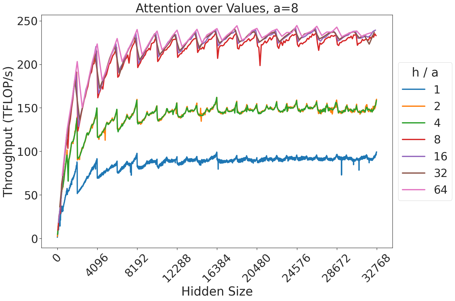
### Visual Description
## Line Chart: Attention over Values, a=8
### Overview
This image displays a line chart illustrating the relationship between "Hidden Size" (x-axis) and "Throughput (TFLOP/s)" (y-axis) for different "h / a" ratios. The chart demonstrates how computational throughput scales as the hidden size increases, with distinct performance tiers based on the "h / a" ratio.
### Components/Axes
* **Title:** "Attention over Values, a=8" (Centered at the top).
* **Y-Axis:** "Throughput (TFLOP/s)". The scale ranges from 0 to 250, with major tick marks every 50 units.
* **X-Axis:** "Hidden Size". The scale ranges from 0 to 32768, with major tick marks every 4096 units.
* **Legend:** Located on the right side of the chart. It defines the "h / a" ratio using color-coded lines:
* **Blue:** 1
* **Orange:** 2
* **Green:** 4
* **Red:** 8
* **Purple:** 16
* **Brown:** 32
* **Pink:** 64
### Detailed Analysis
#### Trend Verification
* **General Trend:** All data series exhibit a steep, near-linear increase in throughput at low hidden sizes (0 to ~4096), followed by a logarithmic-style plateau as hidden size increases toward 32768.
* **Periodic Pattern:** Every data series exhibits a consistent "sawtooth" pattern. This consists of a sharp, sudden drop in throughput followed by a gradual recovery/increase. This pattern repeats frequently across the x-axis.
* **Clustering:** The data series are grouped into three distinct performance tiers:
1. **Low Tier (Blue):** Consistently the lowest throughput.
2. **Mid Tier:** (Remaining lines)
</details>
Figure 35: Attention over value GEMM throughput for 8 attention heads.
<details>
<summary>extracted/5378885/figures/transformer/spikeless_sweeps/attention_problem_times_values_a12.png Details</summary>
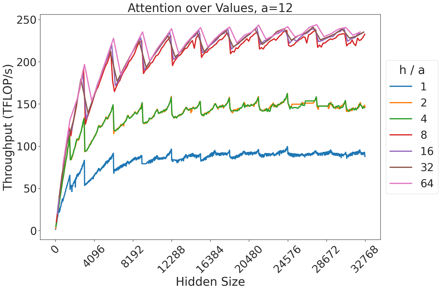
### Visual Description
## Line Chart: Attention over Values, a=12
### Overview
This chart illustrates the relationship between "Hidden Size" and "Throughput (TFLOP/s)" for varying ratios of `h / a` (where `a=12`). The data shows a general upward trend in throughput as the hidden size increases, characterized by a distinct "sawtooth" pattern of periodic performance drops. The performance is grouped into three distinct tiers based on the `h / a` ratio.
### Components/Axes
* **Title:** "Attention over Values, a=12" (Top center).
* **Y-Axis:** "Throughput (TFLOP/s)". The scale ranges from 0 to 250.
* **X-Axis:** "Hidden Size". The scale ranges from 0 to 32768, with major tick marks at intervals of 4096 (0, 4096, 8192, 12288, 16384, 20480, 24576, 28672, 32768).
* **Legend:** Located on the right side of the chart. It defines the `h / a` ratio for seven data series, color-coded as follows:
* **Blue:** 1
* **Orange:** 2
* **Green:** 4
* **Red:** 8
* **Purple:** 16
* **Brown:** 32
* **Pink:** 64
### Detailed Analysis
The chart displays seven distinct data series, all originating from the origin (0,0).
**Trend Verification:**
All seven lines exhibit a sharp, near-linear increase in throughput during the initial phase (Hidden Size 0 to ~4096). Following this, all lines transition into a "sawtooth" pattern, where throughput rises steadily and then drops sharply at regular intervals.
**Data Grouping:**
The lines cluster into three distinct performance tiers:
1. **Tier 1 (Lowest Performance):** Represented by the **Blue** line (`h/a = 1`). It remains significantly below the other lines, peaking at approximately 90-100 TFLOP/s.
2. **Tier 2 (Intermediate Performance):** Represented by the **Orange** (`h/a = 2`) and **Green** (`h/a = 4`) lines. These lines track closely together, peaking at approximately 150-160 TFLOP/s.
3. **Tier 3 (Highest Performance):** Represented by the **Red** (`h/a = 8`), **Purple** (`h/a = 16`), **Brown** (`h/a = 32`), and **Pink** (`h/a = 64`) lines. These four lines are tightly clustered at the top of the chart, reaching peak throughput values between 230 and 250 TFLOP/s.
### Key Observations
* **Diminishing Returns:** There is a clear saturation point. Increasing the `h/a` ratio from 1 to 4 provides substantial throughput gains. However, increasing the ratio from 8 to 64 yields negligible improvements, as the lines for 8, 16, 32, and 64 are nearly overlapping.
* **Sawtooth Pattern:** The periodic drops in throughput are consistent across all series. This is a classic indicator of memory alignment, cache blocking, or tiling strategies in GPU kernel execution, where performance efficiency resets when data sizes cross specific power-of-two or memory-boundary thresholds.
* **Saturation:** The system appears to reach a compute-bound state at higher `h/a` ratios, where further increasing the ratio does not improve throughput.
### Interpretation
This chart likely represents a performance benchmark for a GPU-accelerated attention mechanism (common in Transformer models).
* **The "Sawtooth" Effect:** The periodic drops suggest that the underlying implementation uses a tiling strategy. When the "Hidden Size" is not a perfect multiple of the tile size, the kernel likely incurs overhead or underutilizes the GPU cores, leading to the observed drops.
* **Optimal Configuration:** The data suggests that for this specific hardware/software configuration, an `h/a` ratio of 8 is the "sweet spot." It achieves the maximum performance tier, and increasing the ratio further (to 16, 32, or 64) provides no additional throughput benefit, likely wasting resources.
* **Scalability:** The throughput scales well with "Hidden Size" up to a point, but the sawtooth pattern indicates that performance is sensitive to specific input dimensions. Users of this system should ideally align their hidden sizes with the peaks of these sawtooth waves to maximize efficiency.
</details>
Figure 36: Attention over value GEMM throughput for 12 attention heads.
<details>
<summary>extracted/5378885/figures/transformer/spikeless_sweeps/attention_problem_times_values_a16.png Details</summary>
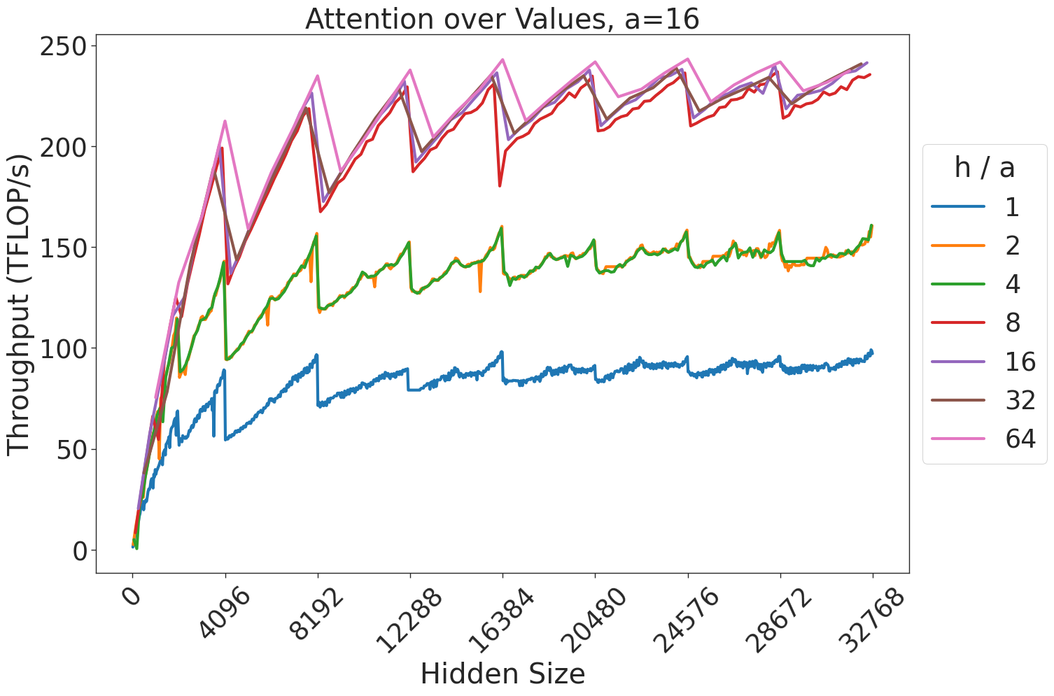
### Visual Description
## Line Chart: Attention over Values, a=16
### Overview
This image is a performance benchmark line chart illustrating the relationship between "Hidden Size" and "Throughput (TFLOP/s)" for different "h / a" ratios. The chart displays a distinct "sawtooth" pattern across all data series, indicating periodic performance drops followed by recovery as the hidden size increases.
### Components/Axes
* **Title:** "Attention over Values, a=16" (Centered at the top).
* **X-Axis:** Labeled "Hidden Size". The scale ranges from 0 to 32768. Major tick marks are provided at intervals of 4096 (0, 4096, 8192, 12288, 16384, 20480, 24576, 28672, 32768). The labels are rotated 45 degrees.
* **Y-Axis:** Labeled "Throughput (TFLOP/s)". The scale ranges from 0 to 250, with major grid lines at intervals of 50.
* **Legend:** Located on the right side of the chart. It is titled "h / a" and lists seven categories corresponding to different colored lines:
* **Blue:** 1
* **Orange:** 2
* **Green:** 4
* **Red:** 8
* **Purple:** 16
* **Brown:** 32
* **Pink:** 64
### Detailed Analysis
The chart displays seven data series, which can be grouped into three distinct performance tiers based on their throughput values.
**Trend Verification:**
All seven lines exhibit a general upward trend as the Hidden Size increases. However, every line is characterized by a recurring "sawtooth" pattern: a sharp, near-vertical drop in throughput followed by a steep, linear-like recovery.
**Data Series Grouping and Values:**
1. **Bottom Tier (Blue line, h/a=1):**
* **Trend:** This line is the lowest performer. It starts near 0 and climbs to approximately 100 TFLOP/s at a Hidden Size of 32768.
* **Sawtooth behavior:** The drops are frequent and distinct, often dipping by 10-20 TFLOP/s.
2. **Middle Tier (Orange and Green lines, h/a=2 and 4):**
* **Trend:** These two lines overlap significantly. They show higher throughput than the blue line, reaching approximately 150-160 TFLOP/s at the maximum Hidden Size.
* **Sawtooth behavior:** The drops are more pronounced than the blue line, often dipping by 20-30 TFLOP/s.
3. **Top Tier (Red, Purple, Brown, Pink lines, h/a=8, 16, 32, 64):**
* **Trend:** These four lines are tightly clustered at the top of the chart. They show the highest performance, reaching approximately 230-240 TFLOP/s at the maximum Hidden Size.
* **Sawtooth behavior:** These lines exhibit the most dramatic drops, often falling from ~240 TFLOP/s down to ~180-200 TFLOP/s before recovering.
### Key Observations
* **Clustering:** There is a clear saturation point. Increasing the "h/a" ratio beyond 8 yields diminishing returns, as the lines for 8, 16, 32, and 64 are nearly indistinguishable.
* **Periodic Drops:** The "sawtooth" drops occur at regular intervals along the X-axis. These intervals appear to align with powers of 2 or specific block-size boundaries (e.g., around 4096, 8192, etc.).
* **Performance Ceiling:** The maximum throughput across all configurations appears to be capped around 240-250 TFLOP/s.
### Interpretation
This chart likely represents a performance benchmark for a GPU-accelerated attention mechanism (such as FlashAttention).
* **The "Sawtooth" Effect:** The periodic drops in throughput are characteristic of memory tiling or block-size limitations in GPU kernels. When the "Hidden Size" exceeds a specific memory block boundary, the kernel must re-allocate or change its tiling strategy, causing a temporary performance penalty.
* **h/a Ratio:** The "h/a" ratio likely represents the number of attention heads (h) relative to a parameter 'a' (which is fixed at 16). The data suggests that increasing the number of heads (or the ratio) improves throughput up to a point (h/a=8), after which the hardware is likely compute-bound or memory-bandwidth-bound, resulting in the observed clustering of the top four lines.
* **Optimization Insight:** For developers or researchers, this chart demonstrates that choosing an "h/a" ratio of 8 or higher provides optimal throughput, but one must be aware of the "sawtooth" performance dips at specific hidden size boundaries to avoid performance instability in production workloads.
</details>
Figure 37: Attention over value GEMM throughput for 16 attention heads.
<details>
<summary>extracted/5378885/figures/transformer/spikeless_sweeps/attention_problem_times_values_a20.png Details</summary>
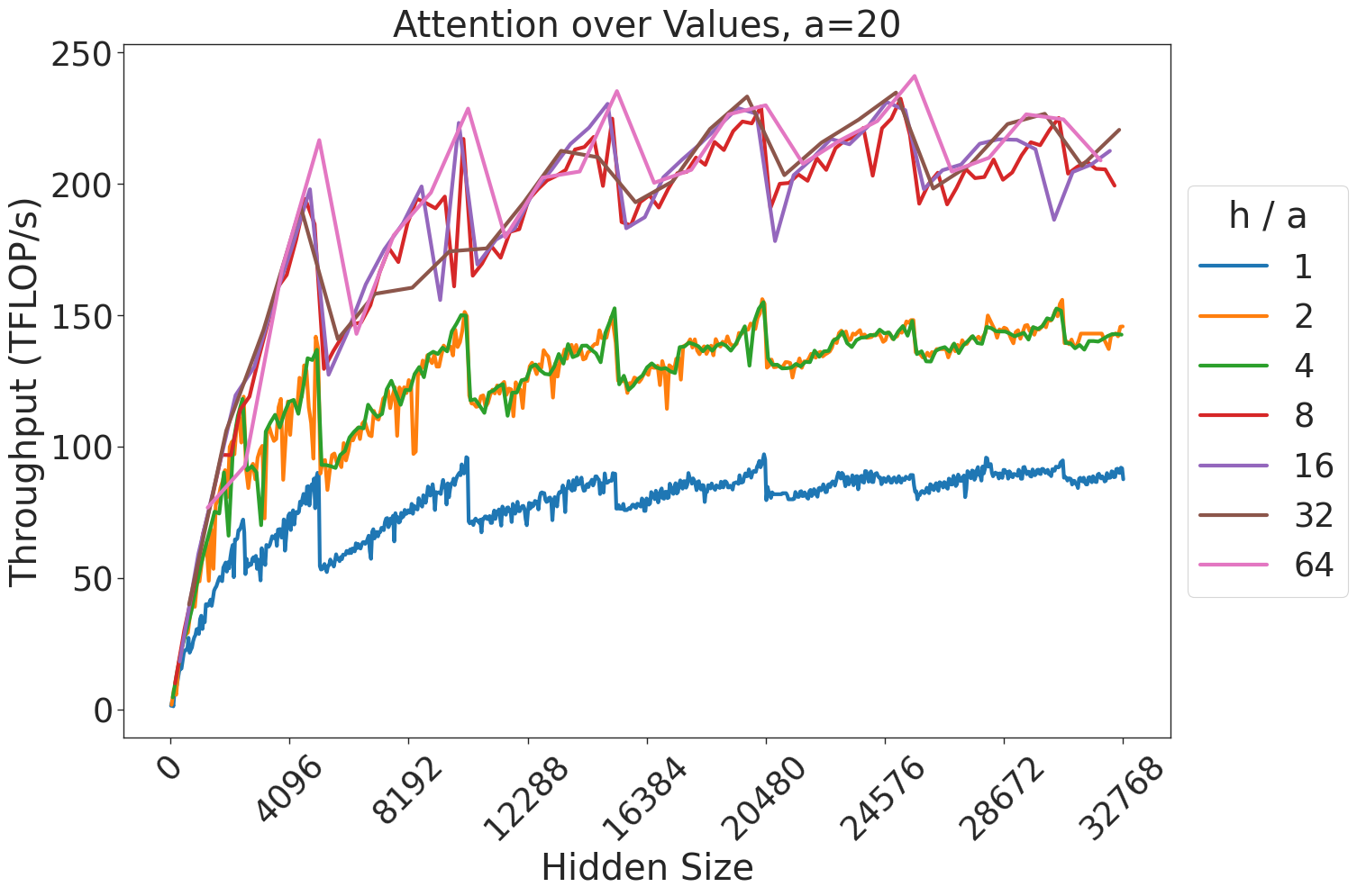
### Visual Description
## Line Chart: Attention over Values, a=20
### Overview
This chart illustrates the throughput performance (measured in TFLOP/s) of a computational process—likely a neural network attention mechanism—as a function of "Hidden Size." The data is segmented by different "h / a" ratios, ranging from 1 to 64. The chart reveals a general upward trend in throughput as the hidden size increases, characterized by significant, periodic performance drops (sawtooth patterns) across all data series.
### Components/Axes
* **Title:** "Attention over Values, a=20" (Centered at the top).
* **Y-Axis:** "Throughput (TFLOP/s)". The scale ranges from 0 to 250.
* **X-Axis:** "Hidden Size". The scale ranges from 0 to 32768, with major tick marks at intervals of 4096 (0, 4096, 8192, 12288, 16384, 20480, 24576, 28672, 32768).
* **Legend:** Positioned on the right side of the chart. It maps "h / a" ratios to specific line colors:
* **Blue:** 1
* **Orange:** 2
* **Green:** 4
* **Red:** 8
* **Purple:** 16
* **Brown:** 32
* **Pink:** 64
### Detailed Analysis
The data series can be grouped into three distinct performance tiers based on their throughput levels:
1. **Low Performance Tier (Blue, h/a=1):**
* **Trend:** Slopes upward from 0 to ~90 TFLOP/s at the maximum hidden size.
* **Characteristics:** This line is consistently the lowest. It exhibits frequent, smaller sawtooth drops compared to the higher tiers.
2. **Medium Performance Tier (Orange, h/a=2; Green, h/a=4):**
* **Trend:** These two lines are almost perfectly overlapping. They rise sharply from 0 to ~100 TFLOP/s at a hidden size of ~4000, then continue a slower, oscillating climb to ~140-150 TFLOP/s at the maximum hidden size.
* **Characteristics:** The overlap suggests that for this specific operation, the performance difference between h/a=2 and h/a=4 is negligible.
3. **High Performance Tier (Red, h/a=8; Purple, h/a=16; Brown, h/a=32; Pink, h/a=64):**
* **Trend:** These lines are tightly clustered at the top of the chart. They show the steepest initial growth, reaching ~200 TFLOP/s quickly, and peak near 240 TFLOP/s.
* **Characteristics:** These lines exhibit the most pronounced and regular "sawtooth" patterns. The performance drops are sharp and occur at regular intervals, indicating significant sensitivity to specific hidden size values.
### Key Observations
* **Sawtooth Pattern:** Every data series exhibits periodic, sharp drops in throughput. These drops are highly regular, suggesting that the performance is constrained by hardware-specific alignment (e.g., memory block sizes, warp/wavefront sizes, or cache line boundaries).
* **Diminishing Returns:** While increasing the "h/a" ratio from 1 to 8 yields significant throughput gains, increasing the ratio beyond 8 (to 16, 32, or 64) results in minimal additional performance improvement, as these lines are clustered very closely together.
* **Saturation:** The overall throughput growth rate slows down as the hidden size increases, suggesting the system approaches a compute-bound state at higher hidden sizes.
### Interpretation
The data demonstrates that this specific attention kernel is highly sensitive to the "Hidden Size" parameter. The "sawtooth" behavior is a classic indicator of memory alignment or block-size efficiency issues in GPU/accelerator programming.
The clustering of the higher "h/a" ratios (8 through 64) suggests that once a certain ratio is achieved, the system is likely compute-bound, and further increasing the ratio provides little benefit. Conversely, the performance gap between the "Low" and "High" tiers indicates that the "h/a" ratio is a critical hyperparameter for optimizing throughput. Users of this system should avoid hidden sizes that fall into the "valleys" of the sawtooth pattern to maintain peak performance.
</details>
Figure 38: Attention over value GEMM throughput for 20 attention heads.
<details>
<summary>extracted/5378885/figures/transformer/spikeless_sweeps/attention_problem_times_values_a24.png Details</summary>
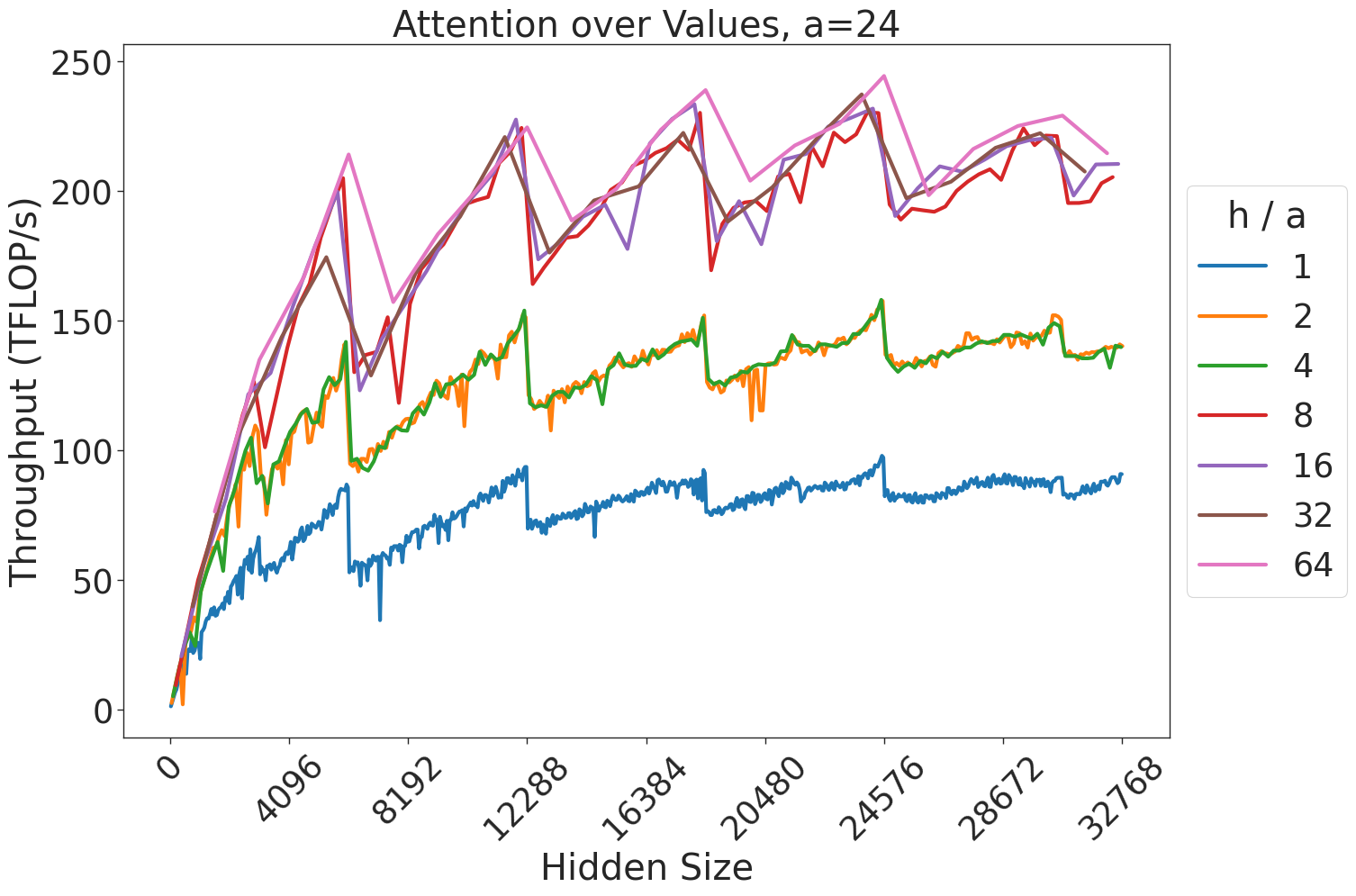
### Visual Description
## Line Chart: Attention over Values, a=24
### Overview
This chart illustrates the performance throughput (measured in TFLOP/s) of an attention mechanism operation as a function of "Hidden Size." The data is segmented by the ratio "h / a" (heads divided by the attention parameter 'a'). The chart demonstrates a general upward trend in throughput as the hidden size increases, punctuated by periodic, sharp performance drops (sawtooth pattern), likely indicating hardware or memory alignment constraints.
### Components/Axes
* **Title:** "Attention over Values, a=24" (Centered at the top).
* **X-Axis:** Labeled "Hidden Size". The scale ranges from 0 to 32768. Major tick marks are provided at intervals of 4096 (0, 4096, 8192, 12288, 16384, 20480, 24576, 28672, 32768).
* **Y-Axis:** Labeled "Throughput (TFLOP/s)". The scale ranges from 0 to 250. Major tick marks are provided at intervals of 50 (0, 50, 100, 150, 200, 250).
* **Legend:** Positioned on the right side of the chart. The title is "h / a". The legend maps colors to specific ratios:
* **Blue:** 1
* **Orange:** 2
* **Green:** 4
* **Red:** 8
* **Purple:** 16
* **Brown:** 32
* **Pink:** 64
### Detailed Analysis
The data series are grouped into three distinct performance tiers based on the "h / a" ratio.
**1. Trend Verification:**
* **General Trend:** All seven lines exhibit a steep, non-linear increase in throughput from 0 to ~4096 hidden size, followed by a slower, oscillating growth trend as hidden size increases toward 32768.
* **Sawtooth Pattern:** Every line displays periodic, sharp vertical drops. These drops occur at consistent intervals along the x-axis, suggesting performance "cliffs" related to memory alignment, cache boundaries, or tiling strategies in the underlying compute kernel.
**2. Data Series Grouping:**
* **Bottom Tier (Blue, h/a=1):** This line is the lowest performer, consistently staying below 100 TFLOP/s. It peaks near 90-95 TFLOP/s at the highest hidden sizes.
* **Middle Tier (Orange, h/a=2; Green, h/a=4):** These two lines are tightly coupled and overlap significantly. They show a clear performance advantage over the blue line, peaking between 140 and 150 TFLOP/s.
* **Top Tier (Red, h/a=8; Purple, h/a=16; Brown, h/a=32; Pink, h/a=64):** These four lines are clustered closely together at the top of the chart. They exhibit the highest throughput, frequently reaching peaks between 220 and 245 TFLOP/s. The Pink line (64) often occupies the highest position within this cluster.
**3. Approximate Values:**
* **At Hidden Size ~4096:**
* Blue: ~60 TFLOP/s
* Orange/Green: ~100 TFLOP/s
* Top Cluster: ~150-170 TFLOP/s
* **At Hidden Size ~32768:**
* Blue: ~90 TFLOP/s
* Orange/Green: ~140 TFLOP/s
* Top Cluster: ~210-220 TFLOP/s
### Key Observations
* **Diminishing Returns:** While increasing the "h/a" ratio from 1 to 8 provides a significant jump in throughput, increasing the ratio further (from 8 to 64) yields marginal gains, as the lines for 8, 16, 32, and 64 are tightly packed.
* **Performance Cliffs:** The periodic drops are synchronized across all lines, indicating that the hardware constraint causing these drops is independent of the "h/a" ratio and is likely tied to the "Hidden Size" parameter itself (e.g., memory bank conflicts or tile size limits).
* **Saturation:** The throughput appears to be approaching a saturation point or a hardware limit, as the slope of the curves flattens significantly after a hidden size of 16384.
### Interpretation
This chart is a classic performance profile of a GPU-accelerated attention kernel (likely FlashAttention or a similar optimized implementation).
* **The "a=24" context:** This likely refers to a fixed head dimension or a specific hardware-related constant.
* **The "h/a" ratio:** This represents the number of attention heads relative to the attention parameter. The data suggests that higher head counts (relative to the parameter) are significantly more efficient, likely due to better occupancy of the GPU's compute units.
* **The Sawtooth Pattern:** This is a hallmark of GPU kernel performance. When the "Hidden Size" increases, the kernel likely switches between different tiling strategies or memory access patterns. When the hidden size hits a boundary (e.g., a multiple of the warp size or shared memory capacity), the kernel may be forced to use a less efficient execution path, causing the sudden drop in TFLOP/s.
* **Conclusion:** For optimal performance, developers should aim for an "h/a" ratio of at least 8. Increasing the ratio beyond 8 provides minimal throughput benefits, suggesting that the compute resources are already well-utilized at that point.
</details>
Figure 39: Attention over value GEMM throughput for 24 attention heads.
<details>
<summary>extracted/5378885/figures/transformer/spikeless_sweeps/attention_problem_times_values_a32.png Details</summary>

### Visual Description
## Line Chart: Attention over Values, a=32
### Overview
This image displays a performance benchmark line chart titled "Attention over Values, a=32". It plots the throughput (measured in TFLOP/s) against the "Hidden Size" of a computational model (likely a Transformer-based architecture). The chart illustrates how different ratios of attention heads to attention dimension ($h/a$) affect computational throughput as the hidden size increases.
### Components/Axes
* **Title:** "Attention over Values, a=32" (Top center).
* **Y-Axis:** "Throughput (TFLOP/s)". The scale ranges from 0 to 200+, with major grid lines at 0, 50, 100, 150, and 200.
* **X-Axis:** "Hidden Size". The scale ranges from 0 to 32768. Major tick marks are provided at intervals of 4096: 0, 4096, 8192, 12288, 16384, 20480, 24576, 28672, 32768.
* **Legend:** Located on the right side, labeled "h / a". It maps seven distinct colors to specific ratios:
* **Blue:** 1
* **Orange:** 2
* **Green:** 4
* **Red:** 8
* **Purple:** 16
* **Brown:** 32
* **Pink:** 64
### Detailed Analysis
The chart displays seven data series, all exhibiting a general upward trend with a distinct "sawtooth" pattern characterized by sharp, periodic drops in throughput.
* **Blue Series (h/a = 1):**
* **Trend:** This is the lowest-performing series. It starts at 0 and climbs to approximately 100 TFLOP/s at the maximum hidden size.
* **Behavior:** It exhibits frequent, sharp drops in throughput, most notably around
</details>
Figure 40: Attention over value GEMM throughput for 32 attention heads.
<details>
<summary>extracted/5378885/figures/transformer/spikeless_sweeps/attention_problem_times_values_a40.png Details</summary>
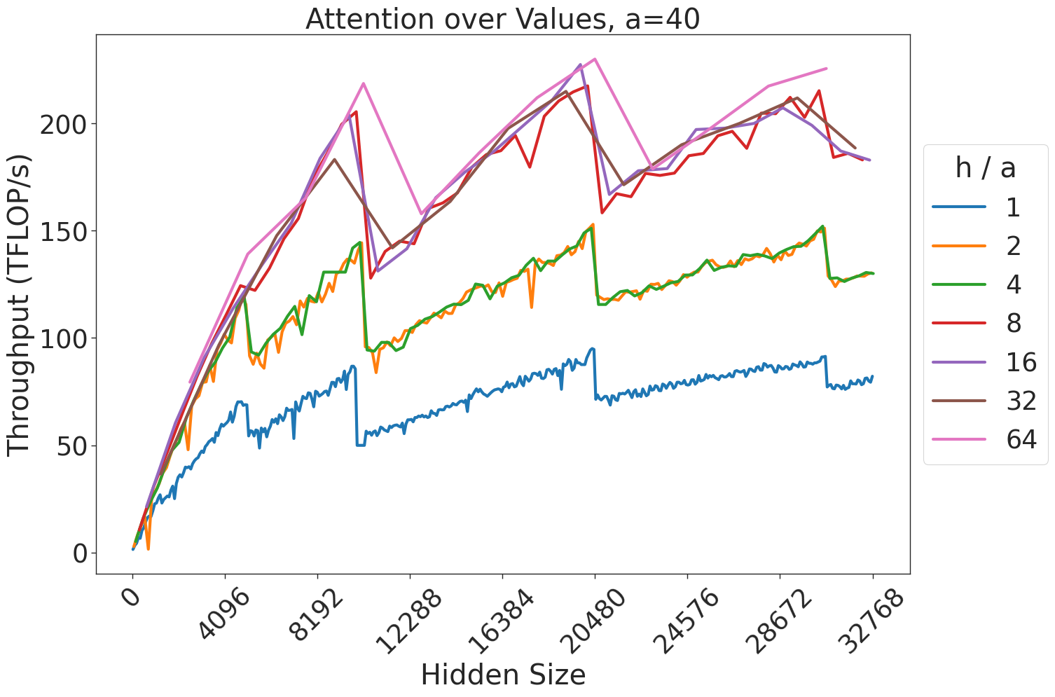
### Visual Description
## Line Chart: Attention over Values, a=40
### Overview
This image displays a line chart illustrating the relationship between "Hidden Size" (x-axis) and "Throughput (TFLOP/s)" (y-axis) for an attention mechanism, parameterized by different "h / a" ratios. The chart demonstrates that throughput generally increases with hidden size but is subject to significant, periodic performance drops (a "sawtooth" pattern), likely indicative of memory alignment or kernel switching thresholds in computational hardware.
### Components/Axes
* **Title:** "Attention over Values, a=40" (centered at the top).
* **X-Axis:** Labeled "Hidden Size". The scale ranges from 0 to 32768. Major tick marks are provided at intervals of 4096 (0, 4096, 8192, 12288, 16384, 20480, 24576, 28672, 32768).
* **Y-Axis:** Labeled "Throughput (TFLOP/s)". The scale ranges from 0 to approximately 230 TFLOP/s, with major grid lines at 0, 50, 100, 150, 200.
* **Legend:** Positioned on the right side of the chart. It defines the "h / a" ratio for seven distinct data series, color-coded as follows:
* **Blue:** h / a = 1
* **Orange:** h / a = 2
* **Green:** h / a = 4
* **Red:** h / a = 8
* **Purple:** h / a = 16
* **Brown:** h / a = 32
* **Pink:** h / a = 64
### Detailed Analysis
The data series exhibit a strong positive correlation between Hidden Size and Throughput, though performance is heavily segmented by the "h / a" ratio.
**1. Trend Verification & Grouping:**
* **Group 1 (Lowest Throughput):** The **Blue** line (h/a=1) consistently performs the lowest, peaking just below 100 TFLOP/s.
* **Group 2 (Mid-Tier Throughput):** The **Orange** (h/a=2) and **Green** (h/a=4) lines are nearly identical, overlapping almost perfectly throughout the entire range. They peak around 150 TFLOP/s.
* **Group 3 (Highest Throughput):** The **Red** (h/a=8), **Purple** (h/a=16), **Brown** (h/a=32), and **Pink** (h/a=64) lines cluster together at the top. These lines show the highest performance, frequently exceeding 200 TFLOP/s.
**2. Sawtooth Pattern Analysis:**
All lines exhibit sharp, vertical drops in throughput at specific Hidden Size intervals.
* **First Major Drop:** Occurs between Hidden Size ~10,000 and ~12,000. For example, the Blue line drops from ~90 TFLOP/s to ~50 TFLOP/s.
* **Second Major Drop:** Occurs between Hidden Size ~20,000 and ~21,000. For example, the Pink line drops from ~230 TFLOP/s to ~160 TFLOP/s.
### Key Observations
* **Performance Clustering:** The "h / a" ratio acts as a multiplier for throughput efficiency. Increasing the ratio from 1 to 2 yields a significant jump, as does the jump from 4 to 8. However, the performance gains diminish as the ratio increases beyond 8 (the lines for 8, 16, 32, and 64 are tightly packed).
* **Hardware/Software Thresholds:** The consistent "sawtooth" drops across all lines suggest that the underlying computational kernel or memory allocation strategy changes at specific Hidden Size boundaries. These are likely "cliff" points where the system switches from an optimized small-matrix kernel to a less efficient large-matrix kernel, or where memory alignment requirements force a performance penalty.
* **Outliers:** There are no significant outliers; the data is highly structured and consistent across all series.
### Interpretation
This chart is a classic representation of performance benchmarking for GPU-accelerated attention mechanisms (likely in a Transformer architecture).
* **What the data demonstrates:** The "h / a" ratio is a critical hyperparameter for throughput. Higher ratios allow the system to utilize the hardware more effectively, likely by better saturating the GPU's compute units.
* **Why it matters:** The "sawtooth" behavior is a critical insight for system architects. If a user is choosing a "Hidden Size" for a model, they should avoid the "cliff" points (e.g., just above 10,000 or 20,000) where throughput drops precipitously. A slightly smaller Hidden Size might actually yield significantly higher throughput than a slightly larger one, due to these architectural bottlenecks.
* **Peircean Investigative Note:** The convergence of the Orange/Green lines and the Red/Purple/Brown/Pink lines suggests that there are diminishing returns on increasing the "h / a" ratio. Once the ratio reaches 8, the hardware is likely already operating near its peak efficiency for the given memory bandwidth, and further increasing the ratio provides negligible throughput benefits.
</details>
Figure 41: Attention over value GEMM throughput for 40 attention heads.
<details>
<summary>extracted/5378885/figures/transformer/spikeless_sweeps/attention_problem_times_values_a64.png Details</summary>
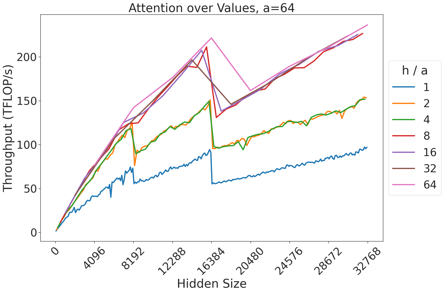
### Visual Description
## Line Chart: Attention over Values, a=64
### Overview
This chart illustrates the performance characteristics of an attention mechanism, specifically measuring "Throughput (TFLOP/s)" against "Hidden Size." The data is segmented by the ratio "h / a" (heads divided by attention dimension). The chart displays a distinct sawtooth pattern, indicating periodic performance drops as the hidden size increases, suggesting hardware or kernel-level memory alignment constraints.
### Components/Axes
* **Title:** "Attention over Values, a=64" (Top center).
* **Y-axis:** "Throughput (TFLOP/s)". The scale ranges from 0 to 200+, with major grid lines at 50, 100, 150, and 200.
* **X-axis:** "Hidden Size". The scale ranges from 0 to 32768, with markers at 4096, 8192, 12288, 16384, 20480, 24576, 28672, and 32768.
* **Legend:** Located on the right side of the chart. It defines the "h / a" ratio for seven distinct data series, color-coded as follows:
* **Blue:** 1
* **Orange:** 2
* **Green:** 4
* **Red:** 8
* **Purple:** 16
* **Brown:** 32
* **Pink:** 64
### Detailed Analysis
The chart displays seven lines representing different "h / a" ratios. All lines exhibit a general upward trend (positive slope) interrupted by sharp, vertical drops (negative spikes) at specific hidden size intervals.
**Trend Verification & Grouping:**
The data series cluster into three distinct performance tiers:
1. **Tier 1 (Lowest Performance):** The **Blue** line (h/a = 1). It consistently maintains the lowest throughput across all hidden sizes.
2. **Tier 2 (Mid Performance):** The **Orange** (h/a = 2) and **Green** (h/a = 4) lines. These two lines are almost perfectly overlapping, showing identical performance characteristics.
3. **Tier 3 (Highest Performance):** The **Red** (8), **Purple** (16), **Brown** (32), and **Pink** (64) lines. These lines are tightly clustered, particularly at higher hidden sizes, showing the highest throughput.
**Data Point Extraction (Approximations):**
* **Performance Drops (The "Cliffs"):**
* **At Hidden Size ~8192:** All lines experience a sharp drop.
* Blue drops from ~60 TFLOP/s to ~50 TFLOP/s.
* Orange/Green drop from ~120 TFLOP/s to ~80 TFLOP/s.
* Higher ratios (Red/Purple/Brown/Pink) drop from ~140 TFLOP/s to ~125 TFLOP/s.
* **At Hidden Size ~16384:** A more severe drop occurs.
* Blue drops from ~95 TFLOP/s to ~55 TFLOP/s.
* Orange/Green drop from ~150 TFLOP/s to ~95 TFLOP/s.
* Higher ratios drop from ~220 TFLOP/s to ~130 TFLOP/s.
* **End-of-Scale Performance (Hidden Size 32768):**
* Blue: ~100 TFLOP/s.
* Orange/Green: ~150 TFLOP/s.
* Higher ratios: ~230 TFLOP/s.
### Key Observations
* **Sawtooth Pattern:** The performance is not linear. The sharp drops at 8192 and 16384 suggest that the underlying kernel implementation hits a memory or tile-size boundary at these specific hidden sizes, forcing a less efficient execution path.
* **Diminishing Returns:** Increasing the "h/a" ratio provides significant throughput gains when moving from 1 to 2, and 2 to 4. However, as the ratio increases from 8 to 64, the performance gains become marginal, with the lines becoming increasingly indistinguishable.
* **Clustering:** The tight grouping of the higher ratios (8, 16, 32, 64) suggests that once a certain level of parallelism or head-count is reached, the hardware becomes compute-bound rather than memory-bound, or the kernel reaches its maximum efficiency.
### Interpretation
This chart is a classic representation of GPU kernel performance benchmarking, likely for an attention mechanism (such as FlashAttention).
* **The "Why":** The "cliffs" at 8192 and 16384 are likely caused by the kernel exceeding the capacity of the GPU's fast on-chip memory (SRAM). When the hidden size exceeds these thresholds, the kernel must spill data to the slower off-chip memory (HBM/VRAM), causing the observed throughput collapse.
* **Strategic Insight:** For developers or engineers optimizing models, this data suggests that "Hidden Size" should be chosen carefully. If a model's hidden size is just above a "cliff" (e.g., 16385), it might be significantly slower than a model with a slightly smaller hidden size (e.g., 16383).
* **Optimization:** The data demonstrates that higher "h/a" ratios are generally superior for throughput, but there is a clear saturation point. Beyond a ratio of 8, the performance benefits of increasing the head-to-dimension ratio are minimal, suggesting that resources might be better allocated elsewhere.
</details>
Figure 42: Attention over value GEMM throughput for 64 attention heads.
<details>
<summary>extracted/5378885/figures/transformer/spikeless_sweeps/attention_problem_times_values_a80.png Details</summary>
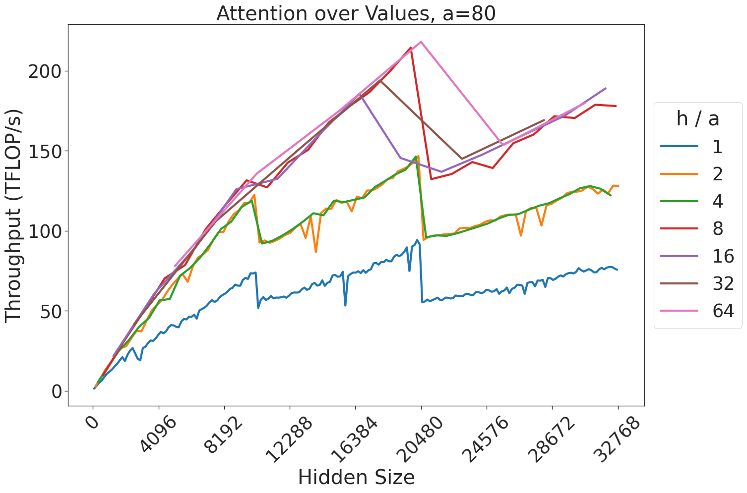
### Visual Description
## Line Chart: Attention over Values, a=80
### Overview
This image is a line chart titled "Attention over Values, a=80". It illustrates the relationship between "Hidden Size" (x-axis) and "Throughput (TFLOP/s)" (y-axis) across various "h/a" ratios (represented by different colored lines). The chart demonstrates how computational throughput scales with model size and how different head-to-attention-dimension ratios impact performance, including notable performance drops (sawtooth patterns) at specific hidden size intervals.
### Components/Axes
* **Title:** "Attention over Values, a=80" (Top center).
* **X-Axis:** Labeled "Hidden Size". The scale ranges from 0 to 32768. Major tick marks are provided at 0, 4096, 8192, 12288, 16384, 20480, 24576, 28672, and 32768.
* **Y-Axis:** Labeled "Throughput (TFLOP/s)". The scale ranges from 0 to slightly above 200. Major tick marks are provided at 0, 50, 100, 150, and 200.
* **Legend:** Located on the right side of the chart. It is titled "h / a" and maps colors to specific ratios:
* **Blue:** 1
* **Orange:** 2
* **Green:** 4
* **Red:** 8
* **Purple:** 16
* **Brown:** 32
* **Pink:** 64
### Detailed Analysis
The chart displays a general upward trend for all data series, indicating that throughput increases as the hidden size increases. However, all lines exhibit a "sawtooth" pattern, characterized by periodic, sharp drops in throughput followed by a resumption of the upward trend.
**Trend Verification & Data Points:**
* **General Trend:** All lines slope upward from the origin (0,0).
* **Sawtooth Drops:** There are consistent, sharp drops in throughput occurring at specific intervals, most notably around the 10,000 and 20,000 hidden size marks. These suggest kernel switching or memory alignment boundaries.
* **Series Groupings:**
* **Low Ratios (Blue, Orange, Green):**
* **Blue (h/a=1):** Consistently the lowest throughput, ending at approximately 75-80 TFLOP/s.
* **Orange (h/a=2) and Green (h/a=4):** These two lines are nearly identical, overlapping almost perfectly throughout the entire range. They reach approximately 125-130 TFLOP/s at the maximum hidden size.
* **High Ratios (Red, Purple, Brown, Pink):**
* **Red (h/a=8) and Purple (h/a=16):** These lines track closely together, generally outperforming the lower ratios. They end at approximately 175-190 TFLOP/s.
* **Brown (h/a=32) and Pink (h/a=64):** These lines achieve the highest throughput, peaking at over 200 TFLOP/s at a hidden size of 20,480.
* **The 20,480 Cliff:** Immediately following the 20,480 mark, both the Brown and Pink lines experience a dramatic, sharp drop in throughput (falling from >200 TFLOP/s to ~140-150 TFLOP/s). After this drop, they resume an upward trend, with the Pink line (64) recovering to approximately 190 TFLOP/s and the Brown line (32) recovering to approximately 175 TFLOP/s.
### Key Observations
* **Performance Ceiling/Cliff:** The most significant anomaly is the sharp performance degradation for the highest ratios (32 and 64) immediately after the hidden size of 20,480. This suggests a hard limit in the underlying implementation (e.g., shared memory capacity or register pressure) that is triggered at this specific size.
* **Redundancy:** The performance of h/a=2 and h/a=4 is indistinguishable, suggesting that within this specific implementation, increasing the ratio from 2 to 4 provides no throughput benefit.
* **Scaling Efficiency:** Higher h/a ratios generally yield higher throughput, but they are also more susceptible to the performance cliffs observed at the 20,480 mark.
### Interpretation
This chart is likely a performance benchmark for a GPU-accelerated attention mechanism (such as FlashAttention).
* **What the data demonstrates:** The "sawtooth" pattern is characteristic of GPU kernel execution where the implementation switches algorithms or tiling strategies based on the input size to optimize memory access.
* **Why it matters:** The sharp drop at 20,480 for high h/a ratios indicates a "performance cliff." For developers or researchers, this means that choosing a hidden size of 20,480 or slightly higher might be suboptimal for high-head-count models, as it forces the system into a less efficient execution path.
* **Reading between the lines:** The convergence of the Orange (2) and Green (4) lines suggests that the hardware/software is not utilizing the additional capacity provided by the higher ratio, or that the bottleneck is elsewhere (e.g., compute-bound vs. memory-bound). The fact that the Pink (64) and Brown (32) lines recover after the cliff suggests that the implementation is capable of handling larger sizes, but the transition at 20,480 is inefficient.
</details>
Figure 43: Attention over value GEMM throughput for 80 attention heads.
<details>
<summary>extracted/5378885/figures/transformer/spikeless_sweeps/attention_problem_times_values_a96.png Details</summary>
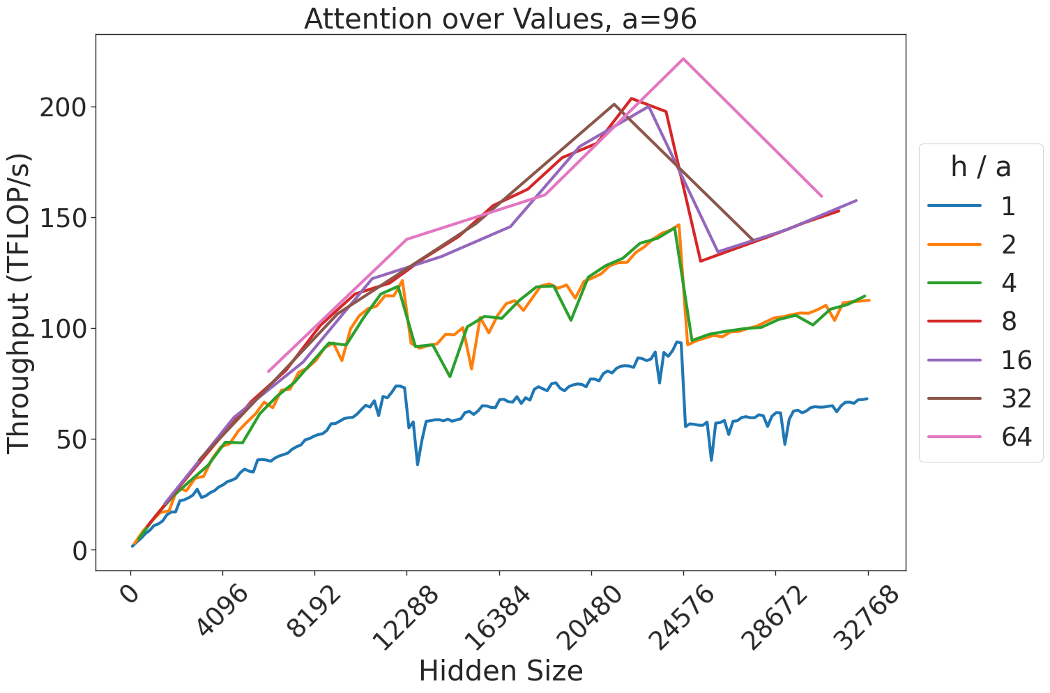
### Visual Description
## Line Chart: Attention over Values, a=96
### Overview
This image displays a line chart titled "Attention over Values, a=96". It plots the performance (Throughput in TFLOP/s) of an attention mechanism against varying "Hidden Size" parameters. The chart illustrates how different ratios of "h / a" (heads per attention block) affect computational throughput, revealing significant performance volatility at specific hidden size intervals.
### Components/Axes
* **Title:** "Attention over Values, a=96" (Centered at the top).
* **X-Axis:** Labeled "Hidden Size".
* Scale: 0, 4096, 8192, 12288, 16384, 20480, 24576, 28672, 32768.
* **Y-Axis:** Labeled "Throughput (TFLOP/s)".
* Scale: 0, 50, 100, 150, 200.
* **Legend:** Located on the right side of the chart. The legend title is "h / a".
* **Blue:** 1
* **Orange:** 2
* **Green:** 4
* **Red:** 8
* **Purple:** 16
* **Brown:** 32
* **Pink:** 64
### Detailed Analysis
The chart displays seven distinct data series representing different "h / a" ratios.
**Trend Verification:**
* **General Trend:** All lines exhibit a positive slope (upward trend) as the Hidden Size increases, indicating that larger hidden sizes generally allow for higher throughput, up to specific thresholds.
* **Sawtooth Pattern:** There are two distinct, sharp drops in throughput across almost all lines at Hidden Size **12288** and **24576**.
* **Clustering:** The lines are grouped into three performance tiers:
1. **Low Tier (Blue/1):** Consistently the lowest throughput, peaking just below 100 TFLOP/s.
2. **Mid Tier (Orange/2, Green/4):** These lines track closely together, peaking near 150 TFLOP/s before the drop at 24576.
3. **High Tier (Red/8, Purple/16, Brown/32, Pink/64):** These lines track together for the majority of the chart, achieving the highest throughput (exceeding 200 TFLOP/s).
**Data Point Observations:**
* **The 24576 Drop:** This is the most significant anomaly.
* The **Pink (64)** line reaches the highest peak on the chart (approx. 225 TFLOP/s) just before 24576, then drops sharply to approximately 130 TFLOP/s.
* The **Brown (32)** line follows a similar trajectory, peaking near 200 TFLOP/s and dropping to ~130 TFLOP/s.
* The **Red (8)** and **Purple (16)** lines also show a sharp decline at this point.
* **The 12288 Drop:** A smaller, but noticeable, drop occurs for all lines at this hidden size. For example, the Blue line drops from ~75 TFLOP/s to ~40 TFLOP/s.
### Key Observations
* **Performance Cliffs:** The sharp drops at 12288 and 24576 suggest that the underlying hardware or software kernel is highly sensitive to specific memory alignment or tiling boundaries. When the hidden size exceeds these multiples, the efficiency of the attention operation degrades significantly.
* **Diminishing Returns/Volatility:** While higher "h / a" ratios (32, 64) achieve higher peak throughput, they are also subject to the most dramatic performance penalties when the hidden size crosses the 24576 threshold.
* **Consistency:** The "h / a" ratio of 1 (Blue) is the most stable, showing the least amount of volatility, but it is also the least performant.
### Interpretation
This chart is a classic representation of a GPU kernel performance benchmark, likely for a FlashAttention-style implementation.
* **The "a=96" constraint:** This likely refers to a fixed block size or head dimension.
* **The "h/a" ratio:** This represents the number of heads relative to the block size. The data demonstrates that increasing the number of heads generally improves throughput by better saturating the GPU's compute units.
* **The "Cliffs":** The drops at 12288 and 24576 are almost certainly related to memory tiling. When the hidden size is a multiple of the tile size, the kernel runs efficiently. When the hidden size is slightly larger than a multiple, the kernel likely has to perform "remainder" operations or inefficient memory access patterns, causing the throughput to plummet.
* **Conclusion:** For optimal performance, developers should avoid hidden sizes that fall just past these "cliff" points (12288 and 24576). If a model requires a hidden size near these values, it may be more efficient to pad the hidden size to the next optimal boundary or reduce it to the previous one to maintain high throughput.
</details>
Figure 44: Attention over value GEMM throughput for 96 attention heads.
<details>
<summary>extracted/5378885/figures/transformer/spikeless_sweeps/attention_problem_times_values_a128.png Details</summary>
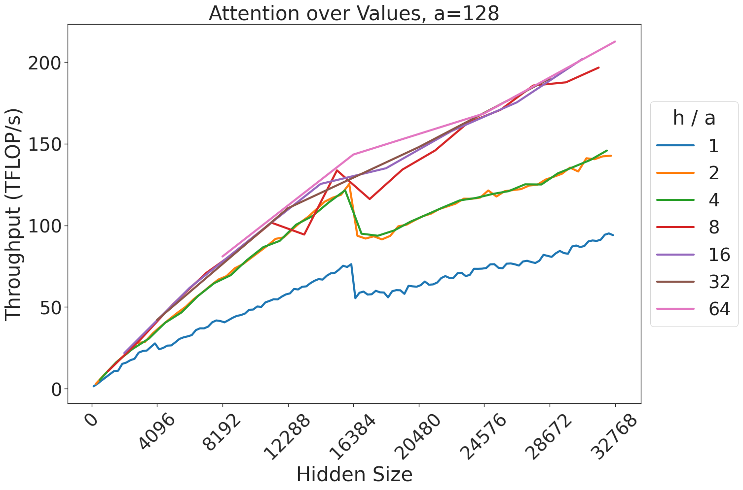
### Visual Description
## Line Chart: Attention over Values, a=128
### Overview
This image displays a performance benchmark chart illustrating the throughput (measured in TFLOP/s) of an attention mechanism relative to the "Hidden Size" of a model. The chart demonstrates how different ratios of heads to attention dimension (`h / a`) affect computational throughput. A critical feature of this chart is a consistent, sharp discontinuity in performance occurring at a Hidden Size of 16384 across all data series.
### Components/Axes
* **Title:** "Attention over Values, a=128" (Top center).
* **X-Axis:** "Hidden Size". The scale is linear, with major ticks at 0, 4096, 8192, 12288, 16384, 20480, 24576, 28672, and 32768.
* **Y-Axis:** "Throughput (TFLOP/s)". The scale is linear, with major ticks at 0, 50, 100, 150, and 200.
* **Legend:** Positioned on the right-center. It defines the `h / a` ratio (heads divided by attention dimension) using color-coded lines:
* **Blue:** 1
* **Orange:** 2
* **Green:** 4
* **Red:** 8
* **Purple:** 16
* **Brown:** 32
* **Pink:** 64
### Detailed Analysis
The chart plots seven distinct data series. All series exhibit a general upward trend, indicating that throughput increases as the Hidden Size increases, until the discontinuity at 16384.
**Trend Verification and Data Points:**
* **Blue (h/a = 1):** The lowest performing series. It slopes upward steadily from 0 to ~75 TFLOP/s at x=16384. At 16384, it drops sharply to ~55 TFLOP/s, then resumes a slow upward trend, ending near 95 TFLOP/s at x=32768.
* **Orange (h/a = 2) & Green (h/a = 4):** These two lines are nearly identical and overlap significantly. They slope upward to ~125 TFLOP/s at x=16384. At 16384, they drop sharply to ~95 TFLOP/s, then resume an upward trend, ending near 145 TFLOP/s at x=32768.
* **Red (h/a = 8):** This line slopes upward to ~135 TFLOP/s at x=16384. It experiences a sharp drop to ~115 TFLOP/s, then continues an upward trend, ending near 200 TFLOP/s at x=32768.
* **Purple (h/a = 16) & Brown (h/a = 32):** These two lines are nearly identical and overlap significantly. They slope upward to ~130 TFLOP/s at x=16384. They experience a minor drop to ~125 TFLOP/s, then continue a strong upward trend, ending near 190 TFLOP/s at x=32768.
* **Pink (h/a = 64):** The highest performing series. It slopes upward to ~140 TFLOP/s at x=16384. It shows the least significant drop at 16384 (appearing almost as a plateau or slight dip), then continues a strong upward trend, ending at the highest point on the chart, approximately 215 TFLOP/s at x=32768.
### Key Observations
1. **The 16384 Discontinuity:** Every single data series experiences a performance drop at exactly 16384 on the x-axis. This suggests a hardware or software architectural boundary (e.g., a cache limit, memory tiling threshold, or kernel switch) that triggers a less efficient execution path once the Hidden Size exceeds this value.
2. **Performance Clustering:** The data series cluster into groups. The `h/a` ratios of 2 and 4 perform similarly, as do 16 and 32.
3. **Efficiency Scaling:** Higher `h/a` ratios generally yield higher throughput. The pink line (h/a=64) consistently outperforms the others, while the blue line (h/a=1) is significantly less efficient.
4. **Drop Magnitude:** The magnitude of the performance drop at 16384 is inversely proportional to the `h/a` ratio. The lower the `h/a` ratio (e.g., Blue/1), the more severe the percentage drop in throughput.
### Interpretation
The data demonstrates that throughput in this attention mechanism is highly sensitive to the "Hidden Size" parameter, specifically regarding memory or compute tiling boundaries. The sharp drop at 16384 is a classic indicator of a "cliff" in performance, likely caused by the system switching from a highly optimized kernel (which fits within a specific cache or register limit) to a more generalized, slower kernel when the hidden size exceeds 16384.
The fact that higher `h/a` ratios (64) maintain higher throughput and suffer less from the 16384 boundary suggests that higher head counts allow for better parallelization or more efficient memory access patterns that are less impacted by the specific bottleneck occurring at 16384. This chart would be critical for an engineer optimizing model architecture, as it identifies a "sweet spot" or a "danger zone" for hidden size configuration.
</details>
Figure 45: Attention over value GEMM throughput for 128 attention heads.
<details>
<summary>extracted/5378885/figures/transformer/spikeless_sweeps/attention_problem_times_values_a256.png Details</summary>
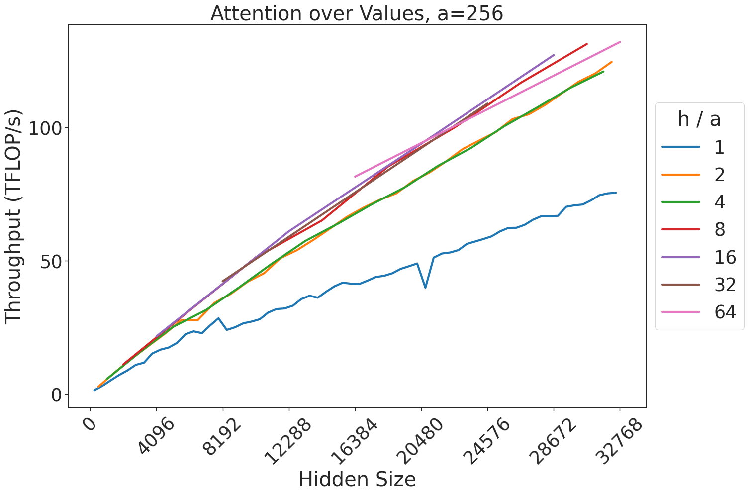
### Visual Description
## Line Chart: Attention over Values, a=256
### Overview
This image is a line chart illustrating the relationship between "Hidden Size" (x-axis) and "Throughput (TFLOP/s)" (y-axis) for an attention mechanism, likely within a neural network architecture. The chart displays multiple data series, each representing a different ratio of "h / a" (heads to attention dimension). The chart demonstrates that throughput generally increases with hidden size, but the rate of increase and the maximum throughput achieved vary significantly based on the "h / a" ratio.
### Components/Axes
* **Title:** "Attention over Values, a=256" (Top center).
* **X-Axis:** Labeled "Hidden Size". The scale ranges from 0 to 32768. Major ticks are at 0, 4096, 8192, 12288, 16384, 20480, 24576, 28672, 32768.
* **Y-Axis:** Labeled "Throughput (TFLOP/s)". The scale ranges from 0 to >100. Major ticks are at 0, 50, 100.
* **Legend:** Located on the right side of the chart. It defines the "h / a" ratio for each colored line:
* **Blue:** 1
* **Orange:** 2
* **Green:** 4
* **Red:** 8
* **Purple:** 16
* **Brown:** 32
* **Pink:** 64
### Detailed Analysis
The chart displays seven distinct data series. All series exhibit a positive correlation between Hidden Size and Throughput.
* **Blue Line (h/a = 1):**
* **Trend:** Starts at (0,0) and slopes upward. It is the lowest-performing series across the entire range.
* **Data Points:** Reaches ~25 TFLOP/s at 8192, ~40 TFLOP/s at 16384, and ends at ~75 TFLOP/s at 32768.
* **Anomaly:** There is a sharp, distinct dip in throughput at Hidden Size 20480, where the value drops significantly before recovering.
* **Orange (h/a = 2) and Green (h/a = 4) Lines:**
* **Trend:** These two lines are nearly identical and overlap significantly. They start at (0,0) and rise steadily.
* **Data Points:** They reach ~50 TFLOP/s at 8192, ~100 TFLOP/s at 24576, and end at ~125 TFLOP/s at 32768.
* **Red (h/a = 8), Purple (h/a = 16), and Brown (h/a = 32) Lines:**
* **Trend:** These lines start at higher Hidden Sizes (approximately 4096 to 8192) and exhibit a steeper upward slope than the blue, orange, and green lines.
* **Data Points:** They converge toward the top right of the chart, ending at approximately 130–135 TFLOP/s at 32768.
* **Pink Line (h/a = 64):**
* **Trend:** This line starts at the highest Hidden Size relative to the others (starts at 16384).
* **Data Points:** It shows the highest throughput at the end of the range, reaching ~135 TFLOP/s at 32768.
### Key Observations
* **Performance Saturation:** As the "h / a" ratio increases, the throughput increases, but the marginal gains diminish. The lines for h/a = 8, 16, 32, and 64 are clustered very closely together at the top of the chart.
* **The "Blue" Outlier:** The h/a = 1 configuration is significantly less efficient than all other configurations.
* **The Dip:** The sharp drop in the blue line at 20480 is a notable anomaly, suggesting a specific hardware or software bottleneck (e.g., cache alignment or memory access pattern) occurring at that specific hidden size for that specific configuration.
* **Starting Points:** Higher "h / a" ratios appear to require a minimum "Hidden Size" threshold before they can be utilized or plotted, as evidenced by the lines starting further to the right on the x-axis.
### Interpretation
This chart is a performance benchmark for a GPU-accelerated attention kernel.
* **"a=256"** likely refers to the dimension of the attention head.
* **"h"** refers to the number of attention heads.
* **"h/a"** represents the ratio of heads to the head dimension.
The data demonstrates that for a fixed head dimension (a=256), increasing the number of heads (h) generally improves throughput, likely due to better parallelization and occupancy on the GPU. However, this improvement hits a point of diminishing returns where increasing the ratio further (e.g., from 32 to 64) yields negligible performance gains. The anomaly at 20480 for h/a=1 is a classic indicator of a "cliff" in performance, often caused by memory bank conflicts or non-optimal thread block scheduling for that specific matrix size.
</details>
Figure 46: Attention over value GEMM throughput for 256 attention heads.
<details>
<summary>extracted/5378885/figures/transformer/spikeless_sweeps/attention_problem_times_values_a512.png Details</summary>
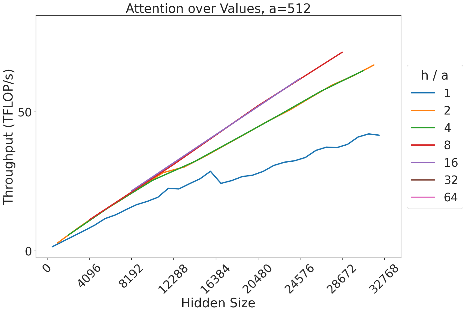
### Visual Description
## Line Chart: Attention over Values, a=512
### Overview
This image is a line chart illustrating the relationship between "Hidden Size" (x-axis) and "Throughput (TFLOP/s)" (y-axis) for various `h/a` ratios. The chart demonstrates how different configurations of attention mechanisms affect computational throughput as the hidden size of the model increases.
### Components/Axes
* **Title:** "Attention over Values, a=512" (Top center)
* **X-Axis:** "Hidden Size". The scale ranges from 0 to 32768, with major tick marks at intervals of 4096 (0, 4096, 8192, 12288, 16384, 20480, 24576, 28672, 32768).
* **Y-Axis:** "Throughput (TFLOP/s)". The scale ranges from 0 to slightly above 50 (implied by the tick mark at 50, with the graph extending higher).
* **Legend:** Located on the right side, vertically centered. It is titled "h / a" and lists the following ratios with corresponding line colors:
* **1**: Blue
* **2**: Orange
* **4**: Green
* **8**: Red
* **16**: Purple
* **32**: Brown
* **64**: Pink
### Detailed Analysis
The chart displays five visible data series. Note that the legend includes values for 32 (Brown) and 64 (Pink), but these lines are not visible on the plot, suggesting they may not have been successfully computed or plotted.
**Trend Verification & Data Points:**
* **Blue Line (h/a = 1):**
* *Trend:* Slopes upward consistently from 0 to 32768. The line is notably jagged/noisy compared to the others.
* *Values:* Starts at 0. At 16384, it is approximately 25 TFLOP/s. At 32768, it reaches approximately 40 TFLOP/s.
* **Orange Line (h/a = 2):**
* *Trend:* Slopes upward linearly.
* *Values:* At 16384, it is approximately 40 TFLOP/s. At 32768, it reaches approximately 75 TFLOP/s.
* **Green Line (h/a = 4):**
* *Trend:* Slopes upward linearly, tracking very closely with the Orange line.
* *Values:* At 16384, it is approximately 40 TFLOP/s. At 32768, it reaches approximately 75 TFLOP/s.
* **Red Line (h/a = 8):**
* *Trend:* Slopes upward linearly. It terminates at approximately 28672.
* *Values:* At 16384, it is approximately 45 TFLOP/s. At 28672, it reaches approximately 85 TFLOP/s.
* **Purple Line (h/a = 16):**
* *Trend:* Slopes upward linearly. It terminates earlier than the Red line, at approximately 24576.
* *Values:* At 16384, it is approximately 45 TFLOP/s. At 24576, it reaches approximately 85 TFLOP/s.
### Key Observations
1. **Termination Points (OOM):** The lines for higher `h/a` ratios (8 and 16) terminate before reaching the maximum hidden size of 32768. This is a classic indicator of "Out of Memory" (OOM) errors, where the computational requirements for these configurations exceed the available hardware memory as the hidden size increases.
2. **Throughput Efficiency:** Higher `h/a` ratios yield higher throughput (TFLOP/s) for a given hidden size. The Red (8) and Purple (16) lines show the highest throughput before they terminate.
3. **Noise:** The Blue line (h/a = 1) exhibits significant "stair-stepping" or jagged behavior, suggesting instability or inefficient utilization of the compute units compared to the smoother, higher-throughput lines.
4. **Missing Data:** The legend entries for 32 and 64 are not represented by any lines on the graph, implying that these configurations were likely unable to run at all on the tested hardware.
### Interpretation
The data demonstrates a clear trade-off between computational throughput and memory capacity.
* **Performance vs. Capacity:** Increasing the `h/a` ratio significantly boosts throughput (the slope of the lines is steeper for higher ratios). However, this comes at the cost of memory footprint; as the hidden size increases, the configurations with higher `h/a` ratios run out of memory and crash (terminate) earlier.
* **Stability:** The Blue line (h/a = 1) is the only configuration capable of running across the entire range of hidden sizes (up to 32768), making it the most "stable" or "robust" configuration, albeit with the lowest performance.
* **Optimization:** The convergence of the Orange (2) and Green (4) lines suggests that beyond a certain point, increasing the `h/a` ratio provides diminishing returns in terms of throughput, or that the hardware is hitting a bottleneck that limits the performance gains of higher ratios.
</details>
Figure 47: Attention over value GEMM throughput for 512 attention heads.