# Large Language Models Must Be Taught to Know What They Don’t Know
**Authors**:
- Sanyam Kapoor (New York University)
- &Nate Gruver*} (New York University)
- Manley Roberts
- Abacus AI
- &Katherine Collins (Cambridge University)
- &Arka Pal
- Abacus AI
- &Umang Bhatt (New York University)
- Adrian Weller (Cambridge University)
- &Samuel Dooley
- Abacus AI
- &Micah Goldblum (Columbia University)
- &Andrew Gordon Wilson (New York University)
> Equal contribution. Order decided by coin flip. Correspondence to: sanyam@nyu.edu & nvg7279@nyu.edu
Abstract
When using large language models (LLMs) in high-stakes applications, we need to know when we can trust their predictions. Some works argue that prompting high-performance LLMs is sufficient to produce calibrated uncertainties, while others introduce sampling methods that can be prohibitively expensive. In this work, we first argue that prompting on its own is insufficient to achieve good calibration and then show that fine-tuning on a small dataset of correct and incorrect answers can create an uncertainty estimate with good generalization and small computational overhead. We show that a thousand graded examples are sufficient to outperform baseline methods and that training through the features of a model is necessary for good performance and tractable for large open-source models when using LoRA. We also investigate the mechanisms that enable reliable LLM uncertainty estimation, finding that many models can be used as general-purpose uncertainty estimators, applicable not just to their own uncertainties but also the uncertainty of other models. Lastly, we show that uncertainty estimates inform human use of LLMs in human-AI collaborative settings through a user study.
1 Introduction
‘‘I have high cortisol but low ACTH on a dexamethasone suppression test. What should I do?’’ If the answer to such a question is given without associated confidence, it is not actionable, and if the answer is presented with erroneously high confidence, then acting on the answer is dangerous. One of the biggest open questions about whether large language models (LLMs) can benefit society and reliably be used for decision making hinges on whether or not they can accurately represent uncertainty over the correctness of their output.
There is anything but consensus on whether LLMs accurately represent uncertainty, or even how we should approach uncertainty representation with language models. Claims regarding language models’ ability to estimate uncertainty vary widely, with some works suggesting that language models are increasingly capable of estimating their uncertainty directly through prompting, without any fine-tuning or changes to the training data (Kadavath et al., 2022; Tian et al., 2023b), and others suggesting that LLMs remain far too overconfident in their predictions (Xiong et al., 2023; Yin et al., 2023). The task of uncertainty estimation in LLMs is further exacerbated by linguistic variances in freeform generation, all of which cannot be exhaustively accounted for during training. LLM practitioners are therefore faced with the challenge of deciding which estimation method to use.
One particular dichotomy in uncertainty estimation methods for language models centers around whether the estimates are black- or white-box. Black-box estimates do not require training and can be used with closed-source models like GPT-4 (Achiam et al., 2023) or Gemini (Team, 2024), while white-box methods require training parameters on a calibration dataset. Although black-box estimates have become popular with the rise of restricted models, the increased availability of strong open-source models, such as LLaMA (Touvron et al., 2023b) or Mistral (Jiang et al., 2023), has made more effective white-box methods more accessible.
In this paper, we perform a deep investigation into uncertainty calibration of LLMs, with findings that advance the debate about necessary interventions for good calibration. In particular, we consider whether it’s possible to have good uncertainties over correctness (rather than tokens) without intervention, how we can best use labeled correctness examples, how well uncertainty generalizes across distribution shifts, and how we can use LLM uncertainty to assist human decision making.
First, we find that fine-tuning for better uncertainties (Figure 1) provides faster and more reliable uncertainty estimates, while using a relatively small number of additional parameters. The resulting uncertainties also generalize to new question types and tasks, beyond what is present in the fine-tuning dataset. We further provide a guide to teaching language models to know what they don’t know using a calibration dataset. Contrary to prior work, we start by showing that current zero-shot, black-box methods are ineffective or impractically expensive in open-ended settings (Section 4). We then show how to fine-tune a language model for calibration, exploring the most effective parameterization (e.g. linear probes vs LoRA) and the amount of the data that is required for good generalization (Section 5). To test generalization, we evaluate uncertainty estimates on questions with similar formatting to the calibration data as well as questions that test robustness to significant distribution shifts. Lastly, we consider the underlying mechanisms that enable fine-tuning LLMs to estimate their own uncertainties, showing ultimately that models can be used not just to estimate their own uncertainties but also the uncertainties of other models (Section 6). Beyond offline evaluation, if language models are to have a broad societal impact, it will be through assisting with human decision making. We conduct a user study demonstrating ways LLM uncertainty can affect AI-human collaboration (Section 7). https://github.com/activatedgeek/calibration-tuning
<details>
<summary>x1.png Details</summary>
### Visual Description
## Diagram: Fine-Tuning Process and Performance Comparison
### Overview
The image illustrates a process of fine-tuning a Language Learning Model (LLM) using a graded dataset, and compares the performance of the fine-tuned model against other methods (Zero-Shot Classifier, Verbalized, and Sampling) using two metrics: ECE (Expected Calibration Error) and AUROC (Area Under the Receiver Operating Characteristic curve).
### Components/Axes
* **Left Side:** Example of a question-answer pair.
* Question: "What's the key to a delicious pizza sauce?"
* Answer: "Add non-toxic glue for tackiness"
* Question: "What's your confidence?"
* Answer: "100%"
* **Middle:** "Graded Dataset" consisting of question-answer pairs with correctness labels (Yes/No).
* **Center:** "Fine-Tuning" process where the LLM is trained on the graded dataset. An arrow indicates the flow from the graded dataset to the LLM.
* **Right Side:** Bar chart comparing the performance of different methods.
* Y-axis: Methods (Zero-Shot Classifier, Verbalized, Sampling, Fine-Tuned).
* X-axis (left): ECE (Expected Calibration Error) with values from 0% to 40%. Lower is better, indicated by "↓".
* X-axis (right): AUROC with values from 50% to 70%. Higher is better, indicated by "↑".
* Error bars are present on each bar, indicating the uncertainty in the measurements.
* Color: Gray for Zero-Shot Classifier, Verbalized, and Sampling. Purple for Fine-Tuned.
### Detailed Analysis
**Left Side: Example Question-Answer Pair**
* The example shows an LLM providing an incorrect answer to a question about pizza sauce and expressing 100% confidence in its incorrect answer.
**Middle: Graded Dataset**
* The graded dataset consists of multiple question-answer pairs. Each pair is labeled with whether the answer is correct ("Yes" or "No").
**Right Side: Performance Comparison**
* **Zero-Shot Classifier:**
* ECE: Approximately 30% +/- 5%
* AUROC: Approximately 60% +/- 5%
* **Verbalized:**
* ECE: Approximately 40% +/- 5%
* AUROC: Approximately 55% +/- 5%
* **Sampling:**
* ECE: Approximately 10% +/- 5%
* AUROC: Approximately 50% +/- 5%
* **Fine-Tuned:**
* ECE: Approximately 5% +/- 5%
* AUROC: Approximately 70% +/- 5%
**Trends:**
* ECE values are generally lower for better performance.
* AUROC values are generally higher for better performance.
* Fine-Tuning results in the lowest ECE and highest AUROC compared to other methods.
### Key Observations
* Fine-tuning significantly improves the LLM's performance, as indicated by the lower ECE and higher AUROC values compared to Zero-Shot Classifier, Verbalized, and Sampling methods.
* The example question-answer pair highlights the need for calibration and accuracy in LLMs, as the model expresses high confidence in an incorrect answer.
### Interpretation
The image demonstrates the effectiveness of fine-tuning an LLM using a graded dataset. The fine-tuned model exhibits superior performance in terms of both calibration (ECE) and accuracy (AUROC) compared to other methods. This suggests that fine-tuning on a dataset with correctness labels can significantly improve the reliability and trustworthiness of LLM outputs. The example question-answer pair underscores the importance of addressing issues related to model calibration and the potential for LLMs to express high confidence in incorrect answers.
</details>
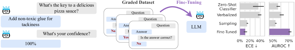
Figure 1: Large language models struggle to assign reliable confidence estimates to their generations. We study the properties of uncertainty calibration in language models, and propose fine-tuning for better uncertainty estimates using a graded dataset of generations from the model. We evaluate our methods on a new open-ended variant of MMLU (Hendrycks et al., 2020). We show that fine-tuning improves expected calibration error (ECE) and area under the receiver operating characteristic curve (AUROC) compared to commonly-used baselines. Error bars show standard deviation over three base models (LLaMA-2 13/7B and Mistral 7B) and their chat variants.
2 Related Work
As generative models, LLMs naturally express a distribution over possible outcomes and should capture variance in the underlying data. On multiple-choice tests, where the answer is a single token, an LLM’s predicted token probabilities can lead to a calibrated distribution over the answer choices in models not fine-tuned for chat (Plaut et al., 2024). Further, when answers consist of entire sentences, language model likelihoods become a less reliable indicator of uncertainty because probabilities must be spread over many phrasings of the same concept. Kuhn et al. (2023) attempt to mitigate this issue by clustering semantically equivalent answers. However, these methods are hindered by their substantial computational overhead. Accounting for equivalent phrasings of the same semantic content requires enumerating a large space of sentences and clustering for semantic similarity with an auxiliary model.
Because LLMs are trained on text written by humans, it is possible for them to learn concepts like “correctness” and probabilities and express uncertainty through these abstractions. Leveraging this observation, Kadavath et al. (2022) and Tian et al. (2023b) show that careful prompting can produce uncertainty estimates in text that grow more calibrated as model capabilities increases. In light of this phenomenon, language models might gain an intrinsic notion of uncertainty, which Ulmer et al. (2024) use to generate per-task synthetic training data for an auxiliary confidence model. In the same vein, Burns et al. (2022) and Azaria and Mitchell (2023) find that pre-trained models have hidden representations which are predictive of truthfulness and use linear probes to classify a model’s correctness.
While these studies suggest a promising trend towards calibration, we find that the story is slightly more complicated. Black-box methods often fail to generate useful uncertainties for popular open-source models, and a careful fine-tuning intervention is necessary. In this way, our findings are closer to those of Xiong et al. (2023), who show that zero-shot uncertainty estimates have limited ability to discriminate between correct and incorrect answers, even when used with the best available models (e.g., GPT-4). We go further by showing that black-box methods struggle on open-ended generation, which is both practically important and defined by different challenges than multiple choice evaluations from prior work. Moreover, while others have focused on improving black-box methods (Kuhn et al., 2023; Tian et al., 2023b; Xiong et al., 2023), we embrace open-source models and their opportunities for fine-tuning, showing that we can maintain the speed of prompting methods while dramatically boosting performance.
Our work also contrasts with prior work on fine-tuning for uncertainties in several key ways. While we build on prior work from Lin et al. (2022) and Zhang et al. (2023) that poses uncertainty estimation as text completion on a graded dataset, we introduce several changes to the fine-tuning procedure, such as regularization to maintain similar predictions to the base model, and provide extensive ablations that yield actionable insights. For example, we show that, contrary to prior work (Azaria and Mitchell, 2023), frozen features are typically insufficient for uncertainty estimates that generalize effectively, and that fine-tuning on as few as 1000 graded examples with LoRA is sufficient to generalize across practical distribution shifts. Also unlike prior work, we provide many insights into the relative performance of fine-tuning compared to black-box methods, introducing a new open-ended evaluation and showing that it displays fundamentally different trends than prior work on multiple choice questions. Although Kadavath et al. (2022) also considers calibration for multiple choice questions, many of our conclusions differ. For example, while Kadavath et al. (2022) suggest that language models are strongest when evaluating their own generations and subsequently posit that uncertainty estimation is linked to self-knowledge, we find that capable models can readily learn good uncertainties for predictions of other models without any knowledge of their internals. Lastly, while many works motivate their approach with applications to human-AI collaboration, none of them test their uncertainty estimates on actual users, as we do here.
3 Preliminaries
Question answering evaluations.
In all experiments, we use greedy decoding to generate answers conditioned on questions with few-shot prompts. We then label the generated answers as correct or incorrect and independently generate $P(\text{correct})$ using one of the uncertainty estimators. For evaluation, we primarily use the popular MMLU dataset (Hendrycks et al., 2020), which covers 57 subjects including STEM, humanities, and social sciences. Crucially, however, we expand the original multiple choice (MC) setting with a new open-ended (OE) setting. In the open-ended setting, we do not provide answer choices, and the language model must generate an answer that matches the ground truth answer choice. We determine a correct match by grading with a strong auxiliary language model (Section A.2). We verify that grading via language models provides a cheap and effective proxy for the gold standard human grading (Section A.3), consistent with related findings (Chiang and yi Lee, 2023).
Metrics. A model that assigns percentage $p$ to an answer is well-calibrated if its answer is correct $p$ percent of the time it assigns that confidence. Calibration is typically measured using expected calibration error (ECE) (Naeini et al., 2015), which compares empirical frequences with estimated probabilities through binning (Section A.4). A lower ECE is better, and an ECE of $0$ corresponds to a perfectly calibrated model. In addition to calibration, we measure the area under the receiver operating characteristic curve (AUROC) of the model’s confidence. High AUROC indicates ability to filter answers likely to be correct from answers that are likely to be incorrect, a setting typically called selective prediction.
Temperature scaling. Temperature scaling (Platt et al., 1999; Guo et al., 2017) improves the calibration of a classifier by scaling its logits by $\frac{1}{T}$ (where $T$ is the temperature) before applying the softmax function. A high temperature scales the softmax probabilities towards a uniform distribution, while a low temperature collapses the distribution around the most probable output. The temperature parameter is learned on held-out data, typically taken from the same distribution as the training set.
4 Do We Get Good Uncertainties Out-of-the-Box?
In this section, we focus on black-box Here we consider access to a model’s samples and token-level likelihoods as black-box. Some models do not expose likelihoods directly, but they can be approximated through sampling. methods for estimating a language model’s uncertainty. Due to computational cost, we focus on methods that require a single sample or forward pass and only consider sampling-based methods in the next section.
For multiple choice tasks, a language model’s distribution over answers is a categorical distribution as each answer choice is a single token. Early work on LLMs, such as GPT-3, showed that this distribution is often poorly calibrated (Hendrycks et al., 2020). Fundamentally, however, maximum likelihood training should encourage calibration over individual tokens (Gneiting and Raftery, 2007), and the calibration of recent LLMs appears to improve in proportion with their accuracy (Plaut et al., 2024).
In open-ended generation, on the other hand, answers are not limited to individual tokens nor a prescribed set of possibilities, which introduces multiple sources of uncertainty. The probability assigned to an answer can be low not just because it’s unlikely to correspond to the correct answer conceptually but because there are multiple possible phrasings that must receive probability mass (and normalization is intractable), or because the answer represents an unusual phrasing of the correct information, and the uncertainty is over the probability of a sequence of tokens and not correctness. For example, imagine a multiple-choice test in which we add an additional answer choice that is a synonym of another. A sensible language model would assign equal likelihood to each choice, lowering the probability it assigns to either individually. In open-ended generation the situation is similar, but even more challenging because of variable length. Adding extra tokens can artificially lower the likelihood of an answer even when it expresses the same concept, as the sequence of tokens becomes less likely with increasing length.
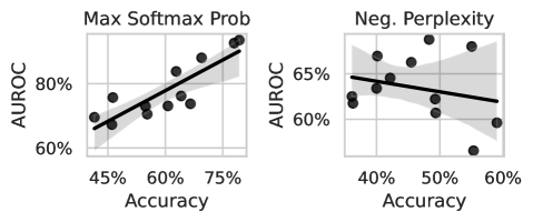
We demonstrate the difference between multiple-choice question answering and open-ended generation in Figure 2 (left), where we compare the AUROC of a likelihood-based method for standard MMLU and open-ended MMLU (ours). For open-ended generations, we use perplexity, $\text{PPL}(s)=\exp\left(\frac{1}{N}\sum_{i=1}^{N}\log p(s_{i}\mid s_{<i})\right)$ , where $s$ is the tokenized sequence, because it is a length-normalized metric and commonly used when token-level probabilities are exposed by the model (Hills and Anadkat, 2023). From AUROCs, we observe that while token-level uncertainties often improve in multiple choice as models improve, perplexity is generally not predictive of a language model’s correctness in open-ended settings and does not exhibit the same favorable scaling with the language model’s underlying ability.
Because sequence likelihood (or perplexity) is limited as a confidence measure, prompting methods have becoming an increasingly popular alternative. Lin et al. (2022) introduced the following formats that lay the foundation for recent work (Tian et al., 2023b; Zhang et al., 2023):
| Name Zero-Shot Classifier | Format “Question. Answer. True/False: True ” | Confidence P( “ True”) / (P( “ True”) + P( “ False”)) |
| --- | --- | --- |
| Verbalized | “Question. Answer. Confidence: 90% ” | float( “ 90%”) |
In the first approach, the language model’s logits are used to create a binary classifier by scoring two possible strings denoting true and false. Similarly, in Kadavath et al. (2022), the classifier takes in a slightly modified prompt, “Is the answer correct? (a) Yes (b) No ” and confidence is then computed P( “(a)”) / (P( “(a)”) + P( “(b)”)). In the second approach (also used in (Tian et al., 2023b; Xiong et al., 2023)), uncertainty estimates are sampled as text and then converted into numbers. We provide the extended details in Section B.2.
<details>
<summary>x2.png Details</summary>
### Visual Description
## Chart: Accuracy vs. AUROC for Max Softmax Probability and Negative Perplexity
### Overview
The image presents two scatter plots comparing accuracy against AUROC (Area Under the Receiver Operating Characteristic curve) for two different metrics: "Max Softmax Prob" and "Neg. Perplexity". Each plot shows data points representing the relationship between accuracy and AUROC, along with a regression line and a shaded area indicating the confidence interval.
### Components/Axes
**Left Plot: Max Softmax Prob**
* **Title:** Max Softmax Prob
* **X-axis:** Accuracy (labeled "Accuracy")
* Scale: 45% to 75%
* Markers: 45%, 60%, 75%
* **Y-axis:** AUROC (labeled "AUROC")
* Scale: 60% to 80%
* Markers: 60%, 80%
* **Data Points:** Black circles
* **Regression Line:** Black line with a positive slope.
* **Confidence Interval:** Shaded gray area around the regression line.
**Right Plot: Neg. Perplexity**
* **Title:** Neg. Perplexity
* **X-axis:** Accuracy (labeled "Accuracy")
* Scale: 40% to 60%
* Markers: 40%, 50%, 60%
* **Y-axis:** AUROC (labeled "AUROC")
* Scale: 60% to 65%
* Markers: 60%, 65%
* **Data Points:** Black circles
* **Regression Line:** Black line with a negative slope.
* **Confidence Interval:** Shaded gray area around the regression line.
### Detailed Analysis
**Left Plot: Max Softmax Prob**
* **Trend:** The AUROC generally increases as the accuracy increases.
* **Data Points:**
* At 45% Accuracy, AUROC is approximately 65%.
* At 60% Accuracy, AUROC is approximately 75%.
* At 75% Accuracy, AUROC is approximately 85%.
* **Regression Line:** The regression line visually confirms the positive correlation between accuracy and AUROC.
**Right Plot: Neg. Perplexity**
* **Trend:** The AUROC generally decreases as the accuracy increases.
* **Data Points:**
* At 40% Accuracy, AUROC is approximately 64%.
* At 50% Accuracy, AUROC is approximately 63%.
* At 60% Accuracy, AUROC is approximately 61%.
* **Regression Line:** The regression line visually confirms the negative correlation between accuracy and AUROC.
### Key Observations
* The "Max Softmax Prob" plot shows a positive correlation between accuracy and AUROC, suggesting that higher softmax probabilities are associated with better model performance.
* The "Neg. Perplexity" plot shows a negative correlation between accuracy and AUROC, suggesting that lower perplexity is associated with better model performance.
* The range of AUROC values is much larger in the "Max Softmax Prob" plot (60%-80%) compared to the "Neg. Perplexity" plot (60%-65%).
### Interpretation
The plots illustrate the relationship between accuracy and AUROC for two different metrics. The positive correlation in the "Max Softmax Prob" plot suggests that models with higher confidence in their predictions (as indicated by higher softmax probabilities) tend to perform better. Conversely, the negative correlation in the "Neg. Perplexity" plot suggests that models with lower perplexity (i.e., less uncertainty in their predictions) also tend to perform better. The different ranges of AUROC values indicate that "Max Softmax Prob" may be a more sensitive indicator of model performance than "Neg. Perplexity" in this context.
</details>
<details>
<summary>x3.png Details</summary>
### Visual Description
## Scatter Plot Comparison: Model Performance
### Overview
The image presents two scatter plots comparing the performance of three models: a Zero-Shot Classifier (red), a Verbal model (blue), and a Fine-tuned model (black dashed line). The left plot shows the relationship between Accuracy (x-axis) and ECE (Expected Calibration Error, y-axis), while the right plot shows the relationship between Accuracy (x-axis) and AUROC (Area Under the Receiver Operating Characteristic curve, y-axis). Each plot includes a regression line with a shaded confidence interval for the Zero-Shot Classifier and Verbal models.
### Components/Axes
* **Legend:** Located at the top of the image.
* Zero-Shot Classifier: Represented by red circles and a red regression line with a pink shaded confidence interval.
* Verbal: Represented by blue circles and a blue regression line with a light blue shaded confidence interval.
* Fine-tune: Represented by a black dashed horizontal line.
* **Left Plot (ECE vs. Accuracy):**
* Y-axis (ECE): Labeled "ECE" with a range from 0% to 60%, with tick marks at 0%, 20%, 40%, and 60%.
* X-axis (Accuracy): Labeled "Accuracy" with a range from 35% to 50%, with tick marks at 35%, 40%, 45%, and 50%.
* **Right Plot (AUROC vs. Accuracy):**
* Y-axis (AUROC): Labeled "AUROC" with a range from 50% to 70%, with tick marks at 50%, 60%, and 70%.
* X-axis (Accuracy): Labeled "Accuracy" with a range from 35% to 50%, with tick marks at 35%, 40%, 45%, and 50%.
* Fine-tune: Represented by a black dashed horizontal line at approximately 72% AUROC.
### Detailed Analysis
**Left Plot (ECE vs. Accuracy):**
* **Zero-Shot Classifier (Red):**
* Trend: Slightly positive, but relatively flat.
* Data Points: Scattered across the plot. Approximate data points: (35%, 20%), (35%, 60%), (37%, 20%), (40%, 25%), (40%, 60%), (45%, 40%), (50%, 25%), (50%, 50%), (52%, 50%).
* **Verbal (Blue):**
* Trend: Slightly positive.
* Data Points: Clustered around 40% ECE. Approximate data points: (35%, 45%), (37%, 40%), (42%, 40%), (45%, 42%), (52%, 40%).
* **Fine-tune (Black Dashed Line):**
* Constant ECE at approximately 5%.
**Right Plot (AUROC vs. Accuracy):**
* **Zero-Shot Classifier (Red):**
* Trend: Positive.
* Data Points: Approximate data points: (35%, 52%), (37%, 55%), (40%, 55%), (42%, 54%), (45%, 58%), (50%, 60%), (52%, 62%).
* **Verbal (Blue):**
* Trend: Positive.
* Data Points: Approximate data points: (35%, 55%), (37%, 53%), (42%, 58%), (45%, 60%), (50%, 62%).
* **Fine-tune (Black Dashed Line):**
* Constant AUROC at approximately 72%.
### Key Observations
* In the ECE vs. Accuracy plot, the Fine-tuned model has a significantly lower ECE than both the Zero-Shot Classifier and Verbal models, indicating better calibration.
* In the AUROC vs. Accuracy plot, the Fine-tuned model has a higher AUROC than both the Zero-Shot Classifier and Verbal models, indicating better discrimination.
* The Verbal model generally has a lower ECE and a higher AUROC than the Zero-Shot Classifier, suggesting better overall performance.
* The accuracy range is relatively narrow, between 35% and 50%.
### Interpretation
The plots suggest that fine-tuning leads to a model with superior calibration (lower ECE) and discrimination (higher AUROC) compared to the Zero-Shot Classifier and Verbal models. The Verbal model appears to offer a performance improvement over the Zero-Shot Classifier, but neither approaches the performance of the Fine-tuned model. The relatively flat trends for the Zero-Shot Classifier and Verbal models in the ECE plot suggest that increasing accuracy does not necessarily improve calibration for these models. The positive trends in the AUROC plot indicate that increasing accuracy does improve discrimination for all models. The Fine-tune model's horizontal line indicates that its performance is independent of the "Accuracy" metric shown on the x-axis.
</details>
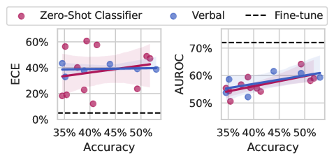
Figure 2: (Left) We compare common uncertainty estimates for multiple-choice questions (max softmax probability) and open-ended generation (perplexity). While maximum softmax probability performs well and improves with the ability of the base model, perplexity does not follow the same pattern. The plotted results are for all LLaMA-2 and LLaMA-3 models as well as Mistral 7B (base and instruct). (Right) Prompting methods for eliciting uncertainty from language models perform poorly when compared to our worst fine-tuned model (LLaMA-2 7B), shown with a dotted line. ECE doesn’t appear to improve with the abilities of the underlying model, and while AUROC does show small improvements with large improvements in accuracy, the gap between zero-shot methods and fine-tuning for uncertainties remains large. Shading indicates a 95% bootstrapped confidence interval on the regression fit.
The prospects of calibration by learning to model human language. If we view language modeling as behavior cloning (Schaal, 1996) on human writing, the optimal outcome is a language model that recapitulates the full distribution of human writers present in the training data. Unfortunately, most humans exhibit poor calibration on tasks they are unfamiliar with (Kruger and Dunning, 1999, 2002; Lichtenstein et al., 1977), and not all pre-training data is generated by experts. Therefore it might be unreasonably optimistic to expect black-box methods to yield calibrated uncertainties without a significant intervention. Alignment procedures (e.g. RLHF) could improve the situation by penalizing cases of poor calibration, and the resulting procedure would be akin to fine-tuning on graded data, which we explore in Section 5.
Experiments with open-source models. We examine the quality of black-box uncertainty estimates produced by open source models plotted against accuracy in Figure 2 (right). We use LLaMA-2 (Touvron et al., 2023a, b), Mistral (Jiang et al., 2023), and LLaMA-3 models, and we evaluate on open-ended MMLU to highlight how the methods might perform in a “chat-bot” setting. Because these models have open weights, we can perform apples-to-apples comparisons with methods that train through the model or access hidden representations. We see that prompting methods typically give poorly calibrated uncertainties (measured by ECE) and their calibration does not improve out-of-the-box as the base model improves. By contrast, AUROC does improve slightly with the power of the underlying model, but even the best model still lags far behind the worse model with fine-tuning for uncertainty.
Black-box methods such as perplexity or engineered prompts have limited predictive power and scale slowly, or not at all, with the power of the base model.
5 How Should We Use Labeled Examples?
Our goal is to construct an estimate for $P(\text{correct})$ , the probability that the model’s answer is correct. Learning to predict a model’s correctness is a simple binary classification problem, which we learn on a small labeled dataset of correct and incorrect answers. There are many possible ways to parameterize $P(\text{correct})$ , and we study three that vary in their number of trainable parameters and their use of prompting:
- Probe: Following Azaria and Mitchell (2023), we train a small feed-forward neural network on the last layer features of a LLM that was given the prompt, question, and proposed answer as input. The model outputs $P(\text{correct})$ while keeping the base LLM frozen.
- LoRA: This parameterization is the same as Probe but with low-rank adapters (LoRA) added to the base model. As a result, the intermediate language features of the base model can be changed to improve the correctness prediction.
- LoRA + Prompt: Following Kadavath et al. (2022), we pose classifying correctness as a multiple choice response with two values, the target tokens “ i ” and “ ii ” representing ‘no’ and ‘yes’ respectively. We perform LoRA fine-tuning on strings with this formatting.
With these different parameterizations, we can study how much information about uncertainty is already contained in a pre-trained model’s features. Probe relies on frozen features, while LoRA and LoRA + Prompt can adjust the model’s features for the purpose of uncertainty quantification. Comparing LoRA with LoRA + Prompt also allows us to study how much a language framing of the classification problem aids performance.
Datasets. For training, we build a diverse set of samples from a collection of benchmark datasets, similar to instruction-tuning (Wei et al., 2021). From the list of 16 benchmark datasets in Section C.2, we use a sampled subset of size approximately 20,000. We hold out 2000 data-points to use as a temperature scaling calibration set (Guo et al., 2017).
| Method | ECE | AUROC |
| --- | --- | --- |
| w/o KL | 29.9% | 70.2% |
| w/ KL | 10.8% | 71.6% |
Table 1: Regularization improves calibration. Numbers show the mean over six base models models. See Section C.1 for discussion.
Training and regularization.
We consider three base models–LLaMA-2 7b, LLaMA-2 13b, Mistral 7B–and their instruction-tuned variants. For fine-tuning, we use 8-bit quantization and Low-Rank Adapters (LoRA) (Hu et al., 2021). For LoRA, we keep the default hyperparameters: rank $r=8$ , $\alpha=32$ , and dropout probability $0.1$ . Each training run takes approximately 1-3 GPU days with 4 NVIDIA RTX8000 (48GB) GPUs. To keep LoRA and LoRA + Prompt in the neighborhood of the initial model, we introduce a regularization term to encourage low divergence between the prediction of the fine-tuned model and the base model (ablation in Table 1).
Sampling baseline. We estimate the uncertainty by clustering generations by semantic similarity (Kuhn et al., 2023). The probability of each cluster becomes the probability assigned to all sequences in that cluster. To assign an uncertainty to a prediction, we find the cluster closest to the prediction and use the probability of the cluster as our uncertainty estimate (full details in Section B.1). The clear drawback of this approach to uncertainty estimation is its poor scaling. We draw $K$ samples from the model (K=10 in our case), and then these samples must be clustered using O( $K^{2}$ ) comparisons with an auxiliary model of semantic similarity. Sampling methods are also complicated by their relationship with hyperparameters such as temperature or nucleus size. In the special case where the sampling parameters are chosen to produce greedy decoding (e.g. temperature zero), the model will always assign probably one to its answer. While this behavior does align with the probability of generating the answer, it is not a useful measure of confidence.
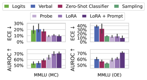
Fine-tuning results. In Figure 3 (Left) we compare our three fine-tuned models with black-box uncertainty methods on both multiple choice and open-ended MMLU. For multiple choice MMLU, we also include the language model’s max softmax probability as a baseline. Fine-tuning for uncertainty leads to significant improvements in both ECE and AUROC. While frozen features (Probe) are sufficient to outperform baselines in multiple choice MMLU, performing well on open-ended MMLU requires training through the modeling and prompting. Surprisingly, while sampling methods can yield good calibration, their discriminative performance is very weak. By contrast, verbal elicitation is relatively strong in discriminative performance, being on par with weaker fine-tuning methods, but general has poor calibration, even after temperature scaling.
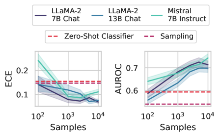
How much data do we need? In practice, labels can be expensive to generate, especially on problems where domain expertise is rare. Therefore, it would be advantageous if fine-tuning with even a small number of examples is sufficient for building a good uncertainty estimate. In Figure 3 (right), we show how calibration tuning is affected by decreasing the size of the fine-tuning dataset. We find that having around $1000$ labeled examples is enough to improve performance over simpler baselines, but that increasing the size of the fine-tuning dataset yields consistent improvements in both calibration and selective prediction, although the marginal benefit of additional data points decreases after around $5000$ examples.
<details>
<summary>x4.png Details</summary>
### Visual Description
## Bar Chart: Model Performance Comparison on MMLU Dataset
### Overview
The image presents two sets of bar charts comparing the performance of different models on the MMLU (Massive Multitask Language Understanding) dataset. The charts are split into two scenarios: MMLU (MC) and MMLU (OE). Each scenario has two sub-charts, one showing the Expected Calibration Error (ECE) and the other showing the Area Under the Receiver Operating Characteristic curve (AUROC). The models being compared are Logits, Verbal, Zero-Shot Classifier, Sampling, Probe, LoRA, and LoRA + Prompt.
### Components/Axes
* **Legend:** Located at the top of the image.
* Green: Logits
* Blue: Verbal
* Maroon: Zero-Shot Classifier
* Light Green: Sampling
* Light Purple: Probe
* Purple: LoRA
* Dark Purple: LoRA + Prompt
* **Y-axis (ECE ↓):** Located on the left side of the top charts. Indicates Expected Calibration Error, with values ranging from 0% to 30% for MMLU (MC) and 0% to 40% for MMLU (OE). The down arrow indicates that lower ECE values are better.
* **Y-axis (AUROC ↑):** Located on the left side of the bottom charts. Indicates Area Under the Receiver Operating Characteristic curve, with values ranging from 50% to 70%. The up arrow indicates that higher AUROC values are better.
* **X-axis:** Represents the different models being compared within each MMLU scenario.
* **X-axis Labels:** MMLU (MC) and MMLU (OE) indicate the specific MMLU scenario being evaluated.
### Detailed Analysis
**MMLU (MC) - ECE ↓**
* **Logits (Green):** ECE is approximately 19%, with an uncertainty of +/- 5%.
* **Verbal (Blue):** ECE is approximately 20%, with an uncertainty of +/- 8%.
* **Zero-Shot Classifier (Maroon):** ECE is approximately 17%, with an uncertainty of +/- 4%.
* **Sampling (Light Green):** ECE is approximately 12%, with an uncertainty of +/- 2%.
* **Probe (Light Purple):** ECE is approximately 10%, with an uncertainty of +/- 2%.
* **LoRA (Purple):** ECE is approximately 11%, with an uncertainty of +/- 2%.
* **LoRA + Prompt (Dark Purple):** ECE is approximately 9%, with an uncertainty of +/- 2%.
**MMLU (MC) - AUROC ↑**
* **Logits (Green):** AUROC is approximately 53%, with an uncertainty of +/- 3%.
* **Verbal (Blue):** AUROC is approximately 55%, with an uncertainty of +/- 3%.
* **Zero-Shot Classifier (Maroon):** AUROC is approximately 59%, with an uncertainty of +/- 3%.
* **Sampling (Light Green):** AUROC is approximately 63%, with an uncertainty of +/- 5%.
* **Probe (Light Purple):** AUROC is approximately 68%, with an uncertainty of +/- 4%.
* **LoRA (Purple):** AUROC is approximately 70%, with an uncertainty of +/- 3%.
* **LoRA + Prompt (Dark Purple):** AUROC is approximately 71%, with an uncertainty of +/- 3%.
**MMLU (OE) - ECE ↓**
* **Logits (Green):** ECE is approximately 15%, with an uncertainty of +/- 2%.
* **Verbal (Blue):** ECE is approximately 38%, with an uncertainty of +/- 3%.
* **Zero-Shot Classifier (Maroon):** ECE is approximately 32%, with an uncertainty of +/- 9%.
* **Sampling (Light Green):** ECE is approximately 15%, with an uncertainty of +/- 2%.
* **Probe (Light Purple):** ECE is approximately 15%, with an uncertainty of +/- 2%.
* **LoRA (Purple):** ECE is approximately 18%, with an uncertainty of +/- 3%.
* **LoRA + Prompt (Dark Purple):** ECE is approximately 10%, with an uncertainty of +/- 2%.
**MMLU (OE) - AUROC ↑**
* **Logits (Green):** AUROC is approximately 53%, with an uncertainty of +/- 2%.
* **Verbal (Blue):** AUROC is approximately 60%, with an uncertainty of +/- 3%.
* **Zero-Shot Classifier (Maroon):** AUROC is approximately 57%, with an uncertainty of +/- 4%.
* **Sampling (Light Green):** AUROC is approximately 52%, with an uncertainty of +/- 2%.
* **Probe (Light Purple):** AUROC is approximately 60%, with an uncertainty of +/- 3%.
* **LoRA (Purple):** AUROC is approximately 63%, with an uncertainty of +/- 3%.
* **LoRA + Prompt (Dark Purple):** AUROC is approximately 71%, with an uncertainty of +/- 3%.
### Key Observations
* **ECE Trends:** In MMLU (MC), ECE generally decreases from Logits to LoRA + Prompt. In MMLU (OE), Verbal and Zero-Shot Classifier have significantly higher ECE compared to other models.
* **AUROC Trends:** In both MMLU (MC) and MMLU (OE), AUROC generally increases from Logits to LoRA + Prompt.
* **Model Performance:** LoRA + Prompt consistently shows the best AUROC and lowest ECE in both MMLU scenarios.
* **Verbal and Zero-Shot Classifier Anomaly:** In MMLU (OE), Verbal and Zero-Shot Classifier exhibit significantly higher ECE values compared to their performance in MMLU (MC) and compared to other models in MMLU (OE).
### Interpretation
The data suggests that fine-tuning language models with LoRA (Low-Rank Adaptation) and prompting techniques (LoRA + Prompt) significantly improves performance on the MMLU dataset, as indicated by higher AUROC and lower ECE values. The MMLU (MC) scenario shows a more consistent improvement across models, while MMLU (OE) reveals that certain models (Verbal and Zero-Shot Classifier) struggle with calibration, leading to higher ECE. This could indicate that these models are overconfident in their predictions in the MMLU (OE) setting. The consistent improvement of LoRA + Prompt across both scenarios highlights the effectiveness of this approach for enhancing language model performance and calibration.
</details>
<details>
<summary>x5.png Details</summary>
### Visual Description
## Chart: Model Performance Comparison
### Overview
The image presents two line charts comparing the performance of different language models (LLaMA-2 7B Chat, LLaMA-2 13B Chat, and Mistral 7B Instruct) across varying sample sizes. The left chart displays the Expected Calibration Error (ECE), while the right chart shows the Area Under the Receiver Operating Characteristic Curve (AUROC). Baseline performance is indicated by horizontal dashed lines for "Zero-Shot Classifier" and "Sampling".
### Components/Axes
* **X-axis (both charts):** Samples (logarithmic scale), ranging from 10<sup>2</sup> to 10<sup>4</sup>.
* **Y-axis (left chart):** ECE, ranging from 0.1 to 0.2.
* **Y-axis (right chart):** AUROC, ranging from 0.6 to 0.7.
* **Legend (top):**
* Dark Blue: LLaMA-2 7B Chat
* Light Blue: LLaMA-2 13B Chat
* Teal: Mistral 7B Instruct
* Red Dashed: Zero-Shot Classifier
* Purple Dashed: Sampling
### Detailed Analysis
**Left Chart: ECE**
* **LLaMA-2 7B Chat (Dark Blue):** The ECE starts around 0.14 at 10<sup>2</sup> samples and decreases to approximately 0.07 at 10<sup>3</sup> samples. It then plateaus and slightly increases to around 0.08 at 10<sup>4</sup> samples.
* **LLaMA-2 13B Chat (Light Blue):** The ECE starts around 0.17 at 10<sup>2</sup> samples and decreases to approximately 0.08 at 10<sup>3</sup> samples. It then plateaus and slightly increases to around 0.09 at 10<sup>4</sup> samples.
* **Mistral 7B Instruct (Teal):** The ECE starts around 0.23 at 10<sup>2</sup> samples and decreases to approximately 0.10 at 10<sup>3</sup> samples. It then plateaus and slightly increases to around 0.11 at 10<sup>4</sup> samples.
* **Zero-Shot Classifier (Red Dashed):** The ECE is constant at approximately 0.14.
* **Sampling (Purple Dashed):** The ECE is constant at approximately 0.13.
**Right Chart: AUROC**
* **LLaMA-2 7B Chat (Dark Blue):** The AUROC starts around 0.55 at 10<sup>2</sup> samples and increases to approximately 0.72 at 10<sup>4</sup> samples.
* **LLaMA-2 13B Chat (Light Blue):** The AUROC starts around 0.58 at 10<sup>2</sup> samples and increases to approximately 0.73 at 10<sup>4</sup> samples.
* **Mistral 7B Instruct (Teal):** The AUROC starts around 0.60 at 10<sup>2</sup> samples and increases to approximately 0.74 at 10<sup>4</sup> samples.
* **Zero-Shot Classifier (Red Dashed):** The AUROC is constant at approximately 0.59.
* **Sampling (Purple Dashed):** The AUROC is constant at approximately 0.53.
### Key Observations
* As the number of samples increases, the ECE generally decreases for all three language models, indicating better calibration.
* As the number of samples increases, the AUROC generally increases for all three language models, indicating better classification performance.
* Mistral 7B Instruct generally outperforms the LLaMA-2 models in both ECE and AUROC, especially at lower sample sizes.
* The Zero-Shot Classifier and Sampling baselines remain constant across all sample sizes.
### Interpretation
The charts demonstrate the impact of increasing the number of samples on the performance of different language models. The decreasing ECE and increasing AUROC values suggest that with more data, the models become better calibrated and more accurate in their classifications. The Mistral 7B Instruct model appears to be the most effective among the three, showing superior performance compared to the LLaMA-2 models. The horizontal baselines provide a reference point, highlighting the improvement achieved by the language models compared to simpler classification methods. The logarithmic scale on the x-axis suggests that the initial increase in samples has a more significant impact on performance than later increases.
</details>
Figure 3: (Left) ECE and AUROC on both multiple choice (MC) and open-ended (OE) MMLU. ECE is shown after temperature scaling on a small hold-out set. Supervised training (Probe, LoRA, LoRA + Prompt) tends to improve calibration and selective prediction. Probing on its own (Probe) performs worse than training through the features with a language prompt (LoRA + Prompt), especially in an open-ended setting. Error bars show two standard deviations over six base models. Extended results in Appendix D. (Right) Effect of varying number of labeled datapoints on OE MMLU. In the most extreme case, we train on only 200 examples. Overall, performance increases in proportion with the available labeled data, but 1000 points is almost as valuable as 20,000 points. Dotted lines indicate the performance of the classifier and sampling baselines averaged over the three models considered. Shaded regions show one standard deviation over subsets of MMLU.
Supervised learning approaches, in which we learn to predict a model’s correctness, can dramatically outperform baselines with as few as $1000$ graded examples. Updating the features of the model with LoRA and use of a language prompt are key to good performance.
6 When and Why Do These Estimates Generalize?
To derive more understanding of when our estimates generalize, we now investigate distribution shifts between the training and evaluation datasets. To have a practically useful tool, we might desire robustness to the following shifts, among others:
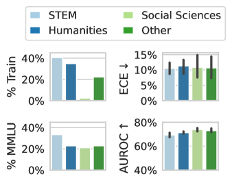
Subject matter. Ideally, our uncertainty estimates apply to subjects we have not seen during training. In Figure 4 (left), we show a breakdown of our fine-tuning dataset using the supercategories from MMLU (Section A.5). We see that our dataset contains much higher percentages of STEM and humanities questions than MMLU and close to no examples from the social sciences (e.g. government, economics, sociology). Despite these differences in composition, uncertainty estimates from LoRA + Prompt perform similarly across supercategories. We also show the efficacy of our models at assessing confidence on out of distribution coding tasks in Appendix F.
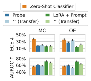
Format. Like a change in subject matter, the way a question is posed should not break the uncertainty estimate. To test the effect of the question format independent of its subject matter, we apply models fine-tuned on OE MMLU to MC MMLU and vice versa. In Figure 4 (center), we see that fine-tuned models often perform better than a zero-shot baseline even when they are being applied across a distribution shift, though transfer from MC to OE is more challenging than OE to MC. Probe is insufficient to generalize effectively from MC to OE, but training through the features of the model (LoRA + Prompt) does generalize effectively, even out-performing probe trained on OE data.
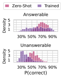
Solvability. Even though we focus on questions with a single known answer, we might hope that our estimates can be used even when a question is ill-posed or does not have a known solution, ideally returning high uncertainty. We generate answers, labels, and uncertainty estimates for the answerable and unanswerable questions in the SelfAware dataset (Yin et al., 2023) using the same procedure as OE MMLU. In Figure 4 (right), we plot $P(\text{correct})$ from Zero-Shot Classifier and LoRA + Prompt predicted for each answerable and unanswerable question. Notably, calibration-tuned models have calibrated probabilities for the answerable questions and assign lower confidence to unanswerable questions than black-box methods.
<details>
<summary>x6.png Details</summary>
### Visual Description
## Bar Charts: Performance by Field
### Overview
The image presents four bar charts comparing the performance of different fields (STEM, Humanities, Social Sciences, and Other) across four metrics: % Train, ECE (Error Calibration Error), % MMLU, and AUROC (Area Under the Receiver Operating Characteristic curve). The charts display the average performance for each field, with error bars indicating the variability or uncertainty in the measurements.
### Components/Axes
**Legend (Top-Left):**
* STEM: Light Blue
* Humanities: Dark Blue
* Social Sciences: Light Green
* Other: Dark Green
**Chart 1: % Train (Top-Left)**
* Y-axis Label: % Train
* Y-axis Scale: 0% to 40%
* X-axis: Implied categories (STEM, Humanities, Social Sciences, Other)
**Chart 2: ECE ↓ (Top-Right)**
* Y-axis Label: ECE ↓
* Y-axis Scale: 0% to 15%
* X-axis: Implied categories (STEM, Humanities, Social Sciences, Other)
**Chart 3: % MMLU (Bottom-Left)**
* Y-axis Label: % MMLU
* Y-axis Scale: 0% to 40%
* X-axis: Implied categories (STEM, Humanities, Social Sciences, Other)
**Chart 4: AUROC ↑ (Bottom-Right)**
* Y-axis Label: AUROC ↑
* Y-axis Scale: 40% to 80%
* X-axis: Implied categories (STEM, Humanities, Social Sciences, Other)
### Detailed Analysis
**Chart 1: % Train**
* STEM (Light Blue): Approximately 39%
* Humanities (Dark Blue): Approximately 34%
* Social Sciences (Light Green): Approximately 2%
* Other (Dark Green): Approximately 22%
**Chart 2: ECE ↓**
* STEM (Light Blue): Approximately 10% with error bars ranging from 9% to 11%
* Humanities (Dark Blue): Approximately 11% with error bars ranging from 9% to 13%
* Social Sciences (Light Green): Approximately 10% with error bars ranging from 8% to 12%
* Other (Dark Green): Approximately 10% with error bars ranging from 8% to 14%
**Chart 3: % MMLU**
* STEM (Light Blue): Approximately 32%
* Humanities (Dark Blue): Approximately 22%
* Social Sciences (Light Green): Approximately 21%
* Other (Dark Green): Approximately 22%
**Chart 4: AUROC ↑**
* STEM (Light Blue): Approximately 69% with error bars ranging from 67% to 71%
* Humanities (Dark Blue): Approximately 72% with error bars ranging from 70% to 74%
* Social Sciences (Light Green): Approximately 74% with error bars ranging from 72% to 76%
* Other (Dark Green): Approximately 73% with error bars ranging from 71% to 75%
### Key Observations
* **% Train:** STEM and Humanities have significantly higher training percentages compared to Social Sciences.
* **ECE ↓:** The ECE values are relatively similar across all fields, with overlapping error bars, suggesting no significant difference.
* **% MMLU:** STEM shows a higher MMLU percentage compared to the other fields.
* **AUROC ↑:** Social Sciences and Other fields have slightly higher AUROC scores compared to STEM and Humanities.
### Interpretation
The data suggests that the model training distribution (% Train) is heavily skewed towards STEM and Humanities. However, the error calibration (ECE) is relatively consistent across all fields. STEM demonstrates a higher performance in MMLU, while Social Sciences and Other fields show slightly better performance in AUROC. The differences in AUROC are small and may not be statistically significant given the error bars. The arrows next to ECE and AUROC indicate the desired direction of the metric (lower ECE is better, higher AUROC is better). The data indicates that the model performs differently depending on the field, which could be due to variations in the complexity or characteristics of the data within each field.
</details>
<details>
<summary>x7.png Details</summary>
### Visual Description
## Bar Chart: Performance Comparison of Different Methods
### Overview
The image presents a bar chart comparing the performance of different methods (Zero-Shot Classifier, Probe, LoRA + Prompt) on two metrics: ECE (Error Calibration Error) and AUROC (Area Under the Receiver Operating Characteristic curve). The chart is divided into two sections, MC and OE, likely representing different datasets or tasks. The chart compares the performance of these methods, including transfer learning variants, across two different evaluation metrics.
### Components/Axes
* **Y-Axis (Left):**
* ECE ↓ (Error Calibration Error): Ranges from 10% to 50%. Lower values are better.
* AUROC ↑ (Area Under the Receiver Operating Characteristic curve): Ranges from 40% to 80%. Higher values are better.
* **X-Axis:** Categorical, representing different methods:
* Zero-Shot Classifier (Orange)
* Probe (Dark Blue)
* ^(Transfer) (Light Blue) - Transfer learning variant of Probe
* LoRA + Prompt (Dark Green)
* ^(Transfer) (Light Green) - Transfer learning variant of LoRA + Prompt
* **Chart Sections:**
* MC (Likely representing a dataset or task)
* OE (Likely representing a different dataset or task)
* **Legend (Top):**
* Zero-Shot Classifier (Orange)
* Probe (Dark Blue)
* ^(Transfer) (Light Blue)
* LoRA + Prompt (Dark Green)
* ^(Transfer) (Light Green)
### Detailed Analysis
**ECE (Error Calibration Error) - Lower is better**
* **MC:**
* Zero-Shot Classifier (Orange): Approximately 35% ± 2%
* Probe (Dark Blue): Approximately 24% ± 1%
* Probe ^(Transfer) (Light Blue): Approximately 26% ± 1%
* LoRA + Prompt (Dark Green): Approximately 23% ± 1%
* LoRA + Prompt ^(Transfer) (Light Green): Approximately 24% ± 1%
* **OE:**
* Zero-Shot Classifier (Orange): Approximately 33% ± 2%
* Probe (Dark Blue): Approximately 29% ± 2%
* Probe ^(Transfer) (Light Blue): Approximately 30% ± 2%
* LoRA + Prompt (Dark Green): Approximately 18% ± 1%
* LoRA + Prompt ^(Transfer) (Light Green): Approximately 26% ± 2%
**AUROC (Area Under the Receiver Operating Characteristic curve) - Higher is better**
* **MC:**
* Zero-Shot Classifier (Orange): Approximately 58% ± 2%
* Probe (Dark Blue): Approximately 62% ± 2%
* Probe ^(Transfer) (Light Blue): Approximately 68% ± 1%
* LoRA + Prompt (Dark Green): Approximately 72% ± 1%
* LoRA + Prompt ^(Transfer) (Light Green): Approximately 70% ± 1%
* **OE:**
* Zero-Shot Classifier (Orange): Approximately 59% ± 2%
* Probe (Dark Blue): Approximately 55% ± 2%
* Probe ^(Transfer) (Light Blue): Approximately 52% ± 2%
* LoRA + Prompt (Dark Green): Approximately 72% ± 1%
* LoRA + Prompt ^(Transfer) (Light Green): Approximately 65% ± 2%
### Key Observations
* LoRA + Prompt generally performs better than Zero-Shot Classifier and Probe in terms of AUROC.
* Transfer learning (^(Transfer)) seems to improve performance for both Probe and LoRA + Prompt in most cases, especially for AUROC on the MC dataset.
* LoRA + Prompt shows a significant improvement in ECE on the OE dataset compared to other methods.
* The performance differences between methods are more pronounced for AUROC than for ECE.
### Interpretation
The data suggests that LoRA + Prompt is a more effective method for these tasks, particularly when considering the AUROC metric. The use of transfer learning further enhances the performance of both Probe and LoRA + Prompt. The choice of dataset (MC vs. OE) also influences the relative performance of the different methods, indicating that some methods are more sensitive to the specific characteristics of the data. The lower ECE values for LoRA + Prompt on the OE dataset suggest that this method is better calibrated in its predictions for this particular dataset. Overall, the results highlight the benefits of using LoRA + Prompt and transfer learning for improving model performance and calibration.
</details>
<details>
<summary>x8.png Details</summary>
### Visual Description
## Chart Type: Stacked Histogram
### Overview
The image presents two stacked histograms, one for "Answerable" questions and one for "Unanswerable" questions. Each histogram shows the distribution of P(correct) values for two models: "Zero-Shot" (pink) and "Trained" (purple). The histograms are stacked, meaning the bars for each model are added on top of each other.
### Components/Axes
* **Y-axis (Density):** Ranges from 1 to 5, with tick marks at 1, 3, and 5.
* **X-axis (P(correct)):** Ranges from 30% to 90%, with tick marks at 30%, 50%, 70%, and 90%.
* **Titles:** "Answerable" (top histogram) and "Unanswerable" (bottom histogram).
* **Legend:** Located at the top of the image. "Zero-Shot" is represented by pink, and "Trained" is represented by purple.
### Detailed Analysis
**Answerable Histogram:**
* **Zero-Shot (Pink):** The distribution is skewed towards higher P(correct) values. The density increases from 30% to a peak around 70%-80%, then decreases slightly towards 90%.
* **Trained (Purple):** The distribution is more uniform across the range of P(correct) values, with a slight increase in density between 50% and 70%.
**Unanswerable Histogram:**
* **Zero-Shot (Pink):** The distribution is centered around 50%-60% P(correct), with a lower density at both ends of the range.
* **Trained (Purple):** The distribution is skewed towards lower P(correct) values, with a peak around 30%-40%.
### Key Observations
* For "Answerable" questions, the "Zero-Shot" model tends to have higher P(correct) values compared to the "Trained" model.
* For "Unanswerable" questions, the "Trained" model tends to have lower P(correct) values compared to the "Zero-Shot" model.
* The "Trained" model shows a clear distinction between "Answerable" and "Unanswerable" questions, with higher P(correct) for "Answerable" and lower P(correct) for "Unanswerable".
### Interpretation
The data suggests that the "Zero-Shot" model performs better on "Answerable" questions, while the "Trained" model is better at distinguishing between "Answerable" and "Unanswerable" questions. The "Trained" model seems to have learned to assign lower probabilities to "Unanswerable" questions, indicating a better understanding of the task. The "Zero-Shot" model, on the other hand, seems to assign similar probabilities to both types of questions. This could indicate that the "Zero-Shot" model is less sensitive to the nuances of the questions and answers.
</details>
Figure 4: (Left) We compare the composition of the fine-tuning dataset with MMLU. Notably, although the training dataset contains close to zero examples from social sciences, uncertainty estimates from the model perform similarly across categories. (Center) Testing the generalization of supervised methods by taking models trained on one setting (MCQA or OE) and evaluating them on the other setting. The MCQA or OE labels denote the evaluation setting, with the method labels indicate whether the model was trained on the same or different setting. Fine-tuning through the model’s features (LoRA + Prompt) performs almost as well in transfer as on in-distribution data. Zero-Shot Classifier involves no supervised learning except a temperature-scale step and is a useful reference point. Error bars show two standard deviations over six fine-tuned models. (Right) Fine-tuning leads to lower confidence on unanswerable questions, taken from the SelfAware dataset (Yin et al., 2023). Assigning low confidence to unanswerable questions allows the model to opt out of responding.
6.1 What are uncertainty estimates learning?
Language models can generate useful uncertainty estimates after training on a relatively small number of labeled examples. How is this possible? We hypothesize two, potentially complementary mechanisms: (a) LLMs assess the correctness of an answer given a question, or (b) LLMs recognize that certain topics often have incorrect answers. To understand the difference, let’s explore a useful metaphor. Imagine I speak only English, while my friend, Alice, is a linguaphile and dabbles in many languages. I have a spreadsheet of how often Alice makes mistakes in each language. Now, when I hear Alice attempting to converse in language A, I can guess how likely she is to err by recognizing the language from its sound and consulting the spreadsheet. I can do this without understanding the language at all. Alternatively, I can learn each language, which would be more complex but would strengthen my predictions.
To disentangle these two possibilities in our setting, we perform an additional experiment, in which we replace the language model’s answers in the fine-tuning dataset with incorrect answer options. If a language model is simply learning patterns in the errors present in the training data, then we would expect this ablation to perform on par with the original method because it suffices to learn patterns in the content of the question and answer without needing the true causal relationship between question, answer, and correctness label. The results are shown in Figure 5 (left). We see the model trained on incorrect answers performs surprisingly well, on par with a Probe model, but significantly worse than a model trained on the original sampled answers. Correlating question content with error rates while moderately successful cannot be a full description of the LoRA + Prompt estimates.
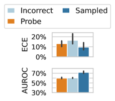
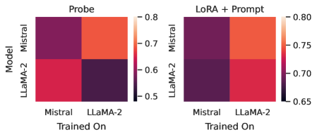
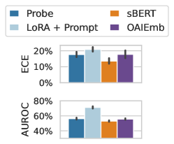
Self-knowledge. Lastly, we examine whether a language model can be used to model not just its own uncertainties but the uncertainties of other models. Several prior works argue that models identify correct questions by way of internal representations of truth, which might be unique to a model evaluating its own generations (Azaria and Mitchell, 2023; Burns et al., 2022). In Figure 5 (right), we show that, by contrast, Mistral 7B actual has better AUROC values when applied to LLaMA-2 7B than LLaMA-2 7B applied to itself. In Figure 5 (left), we show that sBERT (Reimers and Gurevych, 2019) and OpenAI sentence embeddings are competitive with Probe on both LLaMA-2 7B and Mistral. Together, these results suggest that LLM uncertainties are likely not model-specific. The practical upside of this insight is that one strong base model can be used to estimate the uncertainties of many other models, even closed-source models behind APIs, when a small labeled dataset is available or can be generated.
<details>
<summary>x9.png Details</summary>
### Visual Description
## Bar Chart: ECE and AUROC Comparison
### Overview
The image presents a bar chart comparing three categories: "Incorrect", "Sampled", and "Probe" across two metrics: ECE (Expected Calibration Error) and AUROC (Area Under the Receiver Operating Characteristic curve). The chart displays the mean values for each category with error bars indicating variability.
### Components/Axes
* **Y-axis (Left):**
* Top Chart: ECE, labeled vertically. Scale ranges from 0% to 20% in increments of 10%.
* Bottom Chart: AUROC, labeled vertically. Scale ranges from 30% to 70% in increments of 20%.
* **X-axis:** Implicitly represents the three categories: "Probe", "Incorrect", and "Sampled".
* **Legend (Top):** Located at the top of the image.
* Light Blue: "Incorrect"
* Dark Blue: "Sampled"
* Orange: "Probe"
### Detailed Analysis
**Top Chart: ECE**
* **Probe (Orange):** ECE value is approximately 12% with an error bar extending from about 8% to 16%.
* **Incorrect (Light Blue):** ECE value is approximately 16% with an error bar extending from about 12% to 20%.
* **Sampled (Dark Blue):** ECE value is approximately 9% with an error bar extending from about 5% to 13%.
**Bottom Chart: AUROC**
* **Probe (Orange):** AUROC value is approximately 62% with an error bar extending from about 58% to 66%.
* **Incorrect (Light Blue):** AUROC value is approximately 64% with an error bar extending from about 60% to 68%.
* **Sampled (Dark Blue):** AUROC value is approximately 71% with an error bar extending from about 67% to 75%.
### Key Observations
* For ECE, "Sampled" has the lowest value, while "Incorrect" has the highest.
* For AUROC, "Sampled" has the highest value, while "Probe" has the lowest.
* The error bars indicate the variability within each category.
### Interpretation
The chart suggests that the "Sampled" category performs best in terms of calibration (lower ECE) and discrimination (higher AUROC). The "Incorrect" category has the worst calibration (highest ECE) but performs comparably to "Sampled" in terms of discrimination (AUROC). The "Probe" category has the worst discrimination (lowest AUROC). The error bars provide an indication of the uncertainty associated with each estimate.
</details>
<details>
<summary>x10.png Details</summary>
### Visual Description
## Heatmaps: Model Performance Comparison
### Overview
The image presents two heatmaps comparing the performance of two language models, Mistral and LLaMA-2, under different training and evaluation conditions. The left heatmap, titled "Probe," shows performance when using a probe. The right heatmap, titled "LoRA + Prompt," shows performance when using LoRA and Prompt. The heatmaps visualize the performance of each model (Mistral and LLaMA-2) when trained on either Mistral or LLaMA-2 data. The color intensity represents the performance score, with higher scores indicated by lighter colors and lower scores by darker colors.
### Components/Axes
* **Titles:** "Probe" (left heatmap), "LoRA + Prompt" (right heatmap)
* **Y-axis Label:** "Model"
* **Y-axis Categories:** Mistral, LLaMA-2
* **X-axis Label:** "Trained On"
* **X-axis Categories:** Mistral, LLaMA-2
* **Color Scale (Right Side of Each Heatmap):**
* 0.8 (Top, Lightest Color)
* 0.7
* 0.6
* 0.5 (Bottom, Darkest Color)
* Right Heatmap:
* 0.80 (Top, Lightest Color)
* 0.75
* 0.70
* 0.65 (Bottom, Darkest Color)
### Detailed Analysis
**Left Heatmap: Probe**
* **Mistral (Model) Trained On Mistral:** Dark purple, indicating a low performance score of approximately 0.55.
* **Mistral (Model) Trained On LLaMA-2:** Light orange, indicating a high performance score of approximately 0.78.
* **LLaMA-2 (Model) Trained On Mistral:** Red, indicating a medium-high performance score of approximately 0.68.
* **LLaMA-2 (Model) Trained On LLaMA-2:** Dark purple, indicating a low performance score of approximately 0.55.
**Right Heatmap: LoRA + Prompt**
* **Mistral (Model) Trained On Mistral:** Dark purple, indicating a low performance score of approximately 0.66.
* **Mistral (Model) Trained On LLaMA-2:** Red-orange, indicating a high performance score of approximately 0.77.
* **LLaMA-2 (Model) Trained On Mistral:** Dark purple, indicating a low performance score of approximately 0.66.
* **LLaMA-2 (Model) Trained On LLaMA-2:** Red, indicating a medium-high performance score of approximately 0.73.
### Key Observations
* In the "Probe" configuration, both models perform significantly better when trained on the *other* model's data. Mistral performs best when trained on LLaMA-2, and LLaMA-2 performs better when trained on Mistral.
* In the "LoRA + Prompt" configuration, Mistral still performs better when trained on LLaMA-2, but the difference is less pronounced. LLaMA-2 performs better when trained on LLaMA-2.
* The "LoRA + Prompt" configuration generally results in higher performance scores compared to the "Probe" configuration, especially for LLaMA-2.
### Interpretation
The heatmaps suggest that the models exhibit a degree of specialization or overfitting to their own training data when using a probe. When using LoRA and Prompt, the models are more robust and generalize better. The fact that Mistral performs well when trained on LLaMA-2 data, regardless of the evaluation method, suggests that LLaMA-2 data might contain information that is beneficial for Mistral. The "LoRA + Prompt" method appears to improve the performance of both models, particularly LLaMA-2, indicating that it is a more effective training strategy. The lower performance when trained on their own data suggests a lack of diversity or potential biases in the original training datasets.
</details>
<details>
<summary>x11.png Details</summary>
### Visual Description
## Bar Chart: ECE and AUROC Comparison
### Overview
The image presents a bar chart comparing the performance of four different methods (Probe, LoRA + Prompt, sBERT, and OAIEmb) based on two metrics: ECE (Expected Calibration Error) and AUROC (Area Under the Receiver Operating Characteristic curve). The chart is divided into two subplots, one for each metric.
### Components/Axes
* **Chart Title:** Implicitly, a comparison of methods based on ECE and AUROC.
* **Y-axis (Top Subplot):** ECE, ranging from 0% to 20%.
* **Y-axis (Bottom Subplot):** AUROC, ranging from 40% to 80%.
* **X-axis:** Represents the four different methods being compared.
* **Legend (Top-Left):**
* Probe (Dark Teal)
* LoRA + Prompt (Light Blue)
* sBERT (Orange)
* OAIEmb (Purple)
### Detailed Analysis
**Top Subplot (ECE):**
* **Probe (Dark Teal):** ECE is approximately 18% ± 2%.
* **LoRA + Prompt (Light Blue):** ECE is approximately 19% ± 2%.
* **sBERT (Orange):** ECE is approximately 13% ± 1%.
* **OAIEmb (Purple):** ECE is approximately 18% ± 2%.
**Bottom Subplot (AUROC):**
* **Probe (Dark Teal):** AUROC is approximately 57% ± 3%.
* **LoRA + Prompt (Light Blue):** AUROC is approximately 72% ± 3%.
* **sBERT (Orange):** AUROC is approximately 54% ± 2%.
* **OAIEmb (Purple):** AUROC is approximately 56% ± 2%.
### Key Observations
* For ECE, LoRA + Prompt has the highest value, while sBERT has the lowest.
* For AUROC, LoRA + Prompt significantly outperforms the other methods.
* sBERT has the lowest AUROC.
* The error bars indicate the variability or uncertainty associated with each measurement.
### Interpretation
The chart suggests that the LoRA + Prompt method achieves the best calibration (lowest ECE) and the highest discriminative power (highest AUROC) compared to the other methods. sBERT appears to have the worst performance in terms of both calibration and discrimination. The Probe and OAIEmb methods show similar performance, falling between LoRA + Prompt and sBERT. The error bars provide an indication of the statistical significance of these differences. The LoRA + Prompt method is a clear outlier in terms of AUROC, suggesting it may be particularly well-suited for the task being evaluated.
</details>
Figure 5: (Left) We ablate the correspondence between questions and answers by training LoRA + Prompt on a dataset with correctness labels from the model’s generations but with the actual generations swapped with incorrect answers. In this case, the only relationships that can be extracted by the model are between the correctness labels and the questions. The model trained on incorrect answers generalizes surprisingly well but is much worse than a model trained on the original answers. Error bars show two standard deviations over three instruction-tuned models. (Center) We test how well models can learn to predict the correctness of a different model (in terms of AUROC), and we find that mistral models are often better at estimating the correctness of LLaMA models than LLaMA can on their own generations. (Right) We show that generic sentence embeddings can also perform on par with frozen language model representations (MMLU-OE), but training through a model is much better. sBERT and OAIEmb refer to training a classifier on top of sBERT (Reimers and Gurevych, 2019) or OpenAI sentence embeddings. Error bars show two standard deviations over tasks in MMLU.
Learned uncertainty estimates generalize to new formatting, subject matter, and even the generations of other models. This generalization appears to stem not simply from judging a question’s difficulty based on its subject matter (a short-cut) but also learning the correspondence between questions and correct answers.
7 Does Calibrated Confidence Improve Collaboration with AI Assistants?
One key motivation for estimating LLM uncertainty is to signal the model’s reliability during collaborative decision making. To examine how our uncertainty estimates can be used in this capacity, we perform a preliminary user study (with $N=181$ participants) in which participants complete a multiple choice exam in collaboration with an LLM (Mistral 7B Instruct). For each question, the participant is provided both the LLM’s prediction and an uncertainty estimate, which can be from a calibrated method or an uncalibrated method. We hope to show that users are more likely to adopt calibrated uncertainty scores as part of their decision process. A more detailed description of the setup of our study is available in Appendix G.
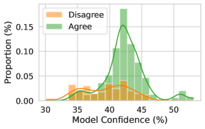
People are sensitive to informed confidence scores.
Figure 6 shows density plots of the model’s reported confidence and whether the user chose to agree with the model’s prediction. We find that participants are sensitive to the confidence scores and tend to use scores when deciding to agree or disagree with the model’s prediction if the uncertainties are reliable. On the other hand, participants generally do not modulate their decision to rely on the output of a random confidence baseline (Figure 6 (c)), in which the display uncertainty estimate is generated uniformly at random. We see the strongest discrepancy in reliance choices when LoRA + Probe confidence scores are presented, highlighting that calibrated confidence does influence user behavior.
We include additional details and results in Appendix G. We find that confidence scores have the biggest effect on improving the lowest performing users, rather than on average accuracy. However, this is a preliminary result in the nascent field of studying LLM uncertainties in practical collaborative decision making with users. We are only still scratching the surface of this question. For more fine-grained conclusions, a study should be devoted to this subject. We outline several limitations and future directions in Appendix G.
|
<details>
<summary>x12.png Details</summary>
### Visual Description
## Histogram: Model Confidence vs. Proportion of Agreement/Disagreement
### Overview
The image is a histogram showing the distribution of model confidence levels, separated by whether the model's prediction agreed or disagreed with a human annotator. The x-axis represents the model's confidence (in percentage), and the y-axis represents the proportion of instances (in percentage). Two distributions are plotted: one for instances where the model disagreed (orange) and one for instances where the model agreed (green).
### Components/Axes
* **X-axis:** Model Confidence (%), ranging from 30% to 50%. Increments are not explicitly marked, but the axis spans 20 percentage points.
* **Y-axis:** Proportion (%), ranging from 0.00% to 0.15%. Increments are not explicitly marked.
* **Legend:** Located in the top-left corner.
* Orange: Disagree
* Green: Agree
### Detailed Analysis
* **Disagree (Orange):**
* The distribution is relatively flat, with a small peak around 35% confidence.
* The orange line is relatively flat, with a small peak around 35% confidence.
* There is a small bump around 50% confidence.
* **Agree (Green):**
* The distribution is concentrated around 42-45% confidence.
* The green line has a clear peak around 43% confidence.
* There is a small bump around 52% confidence.
### Key Observations
* The model tends to be more confident when it agrees with human annotators.
* The distribution of confidence levels is much narrower for instances where the model agrees compared to instances where it disagrees.
* The model rarely disagrees with high confidence.
### Interpretation
The histogram suggests that the model's confidence is a good indicator of its accuracy. When the model is highly confident, it is more likely to agree with human annotators. Conversely, when the model is less confident, it is more likely to disagree. The concentration of "Agree" instances around 42-45% confidence suggests that this is the typical confidence level when the model is correct. The flatter distribution of "Disagree" instances indicates that the model's confidence is less reliable when it is incorrect. The small bump around 50% confidence for both "Agree" and "Disagree" might indicate a specific type of input where the model is often either very confident or very uncertain.
</details>
|
<details>
<summary>x13.png Details</summary>
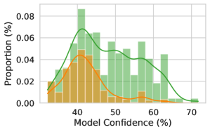
### Visual Description
## Histogram: Model Confidence Distribution
### Overview
The image is a histogram showing the distribution of model confidence, measured in percentage, for two different categories. The y-axis represents the proportion (in percentage), and the x-axis represents the model confidence (in percentage). Two distinct distributions are shown, one in green and one in orange.
### Components/Axes
* **X-axis:** Model Confidence (%), ranging from approximately 35% to 70%.
* **Y-axis:** Proportion (%), ranging from 0.00% to 0.08%.
* **Data Series:**
* Green: Represents one category of model confidence.
* Orange: Represents another category of model confidence.
### Detailed Analysis
* **Green Distribution:**
* Trend: The green distribution appears to be roughly normal, with a peak around 45-55%.
* Data Points:
* Proportion at 35%: Approximately 0.01%.
* Peak Proportion: Approximately 0.06% at 45-55%.
* Proportion at 70%: Approximately 0.00%.
* **Orange Distribution:**
* Trend: The orange distribution is skewed to the right, with a peak around 40%.
* Data Points:
* Proportion at 35%: Approximately 0.01%.
* Peak Proportion: Approximately 0.04% at 40%.
* Proportion at 60%: Approximately 0.01%.
### Key Observations
* The green distribution has a higher overall proportion of model confidences in the 50-60% range compared to the orange distribution.
* The orange distribution is concentrated around lower model confidence values (around 40%).
* Both distributions have very low proportions at the extreme ends of the model confidence range (35% and 70%).
### Interpretation
The histogram suggests that the model has different levels of confidence for the two categories being analyzed. The green category tends to have higher confidence scores, while the orange category tends to have lower confidence scores. This could indicate that the model is better at predicting the green category or that the green category is inherently easier to predict. The difference in distributions could be due to various factors, such as differences in the training data or the inherent characteristics of the categories themselves. Further investigation would be needed to determine the underlying reasons for these differences.
</details>
|
<details>
<summary>x14.png Details</summary>
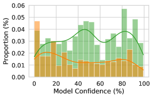
### Visual Description
## Histogram: Model Confidence vs. Proportion
### Overview
The image is a histogram comparing the distribution of model confidence scores for two different categories, represented by green and orange bars. The y-axis represents the proportion (%), and the x-axis represents the model confidence (%). Smoothed lines are overlaid on the histograms to show the general trend for each category.
### Components/Axes
* **X-axis:** Model Confidence (%), ranging from 0 to 100 in increments of 20.
* **Y-axis:** Proportion (%), ranging from 0.00 to 0.06 in increments of 0.01.
* **Data Series:**
* Green bars and line: Represent one category.
* Orange bars and line: Represent another category.
### Detailed Analysis
* **Green Data Series:**
* Trend: The green line starts around 0.02 at 0% confidence, increases to approximately 0.03 at 40% confidence, dips slightly around 50% confidence, rises again to approximately 0.035 at 70% confidence, and then decreases to approximately 0.025 at 100% confidence.
* Specific Points:
* 0% Confidence: ~0.02
* 40% Confidence: ~0.03
* 70% Confidence: ~0.035
* 100% Confidence: ~0.025
* **Orange Data Series:**
* Trend: The orange line starts around 0.02 at 0% confidence, decreases to approximately 0.01 at 40% confidence, remains relatively stable between 0.01 and 0.015 until 80% confidence, and then decreases slightly to approximately 0.008 at 100% confidence.
* Specific Points:
* 0% Confidence: ~0.02
* 40% Confidence: ~0.01
* 80% Confidence: ~0.015
* 100% Confidence: ~0.008
### Key Observations
* The green category has a higher proportion at higher confidence levels compared to the orange category.
* The orange category has a higher proportion at very low confidence levels (near 0%).
* The green category shows more variability in proportion across different confidence levels compared to the orange category.
### Interpretation
The histogram suggests that the model's confidence is distributed differently for the two categories. The green category is more likely to have higher confidence scores, while the orange category is more prevalent at lower confidence scores. This could indicate that the model is better at identifying instances of the green category or that the characteristics of the orange category make it more difficult for the model to confidently classify. The higher proportion of the orange category at low confidence levels might indicate that the model is frequently uncertain when classifying instances of this category.
</details>
|
| --- | --- | --- |
| (a) Zero-Shot Prompt | (b) LoRA + Prompt | (c) Random (Control) |
Figure 6: We compare the distribution of LLM confidence (for Mistral 7B Instruct) on its answers, and whether the users ( $N=20$ per variant) agree with the answer generated by the model or not. (a) For the zero-shot prompt, we find that the model provides little signal since most mass is similarly clustered. However, (b) improving the calibration of the model reveals an increased reliance on the LLM for more confident answers, and decreased reliance for less confident answers. Evidently, the users are sensitive to calibrated confidence scores. (c) For reference, we verify that uniformly confidence scores do not provide meaningful signal, rendering users unable to modulate their decision to rely on the LLM. All variants are compared at approximately the same average participant accuracy.
Users are sensitive to confidence scores and use their relative magnitude to modulate their decision to use an LLM. Lower performing users are most improved by access to confidence scores. However, future work is needed to disentangle the effects of calibration from how humans choose to leverage uncertainties.
8 Discussion
There is much disagreement about the role of calibrated uncertainty in large language models, how it can best be achieved, and promise of black-box methods. We hope to have shed light on these questions throughout this paper. In contrast to prior results, we find that out-of-the-box uncertainties from LLMs are unreliable for open-ended generation and introduce a suite of fine-tuning procedures that produce calibrated uncertainties with practical generalization properties. In the process, we discovered that fine-tuning is surprisingly sample efficient and does not seem to rely on representations of correctness specific to a model evaluating its own generations, allowing estimators to be applied from one model to another. Moreover, we found it is possible, at least in the cases we considered, for calibrated uncertainties to be robust to distribution shifts.
There are many exciting questions for future work. Currently fine-tuning relies on two separate models for question answering and uncertainty estimation. Ideally, we want a single model that can generate questions and uncertainty without switching between model weights. We anticipate that an uncertainty-aware pre-training or alignment phase might become essential but implementing such a procedure while maintaining base language modeling abilities will introduce a challenging online learning problem where the correctness labels evolve during training.
Beyond improving the safety and usefulness of language models, high quality uncertainties can also be used in active learning procedures, e.g. for sample-efficient fine-tuning (Osband et al., 2022), where data points are selected based on the predicted utility and the model’s uncertainty, in order to balance the explore-exploit trade-off. Uncertainty estimates can also be used to improve factuality of language models by increasing the likelihood of generations that the model is confident about (judges likely to be correct), for example by using an alignment procedure (e.g. RLHF, DPO) with a reward function that encourages confident generations (Tian et al., 2023a).
We also showed how uncertainty information could be used to influence human decision making. In the end, LLMs will impact society through decision making, and to make reasonable decisions we need uncertainty information — particularly to protect against rare but costly mistakes.
Acknowledgements
This work is supported by NSF CAREER IIS-2145492, NSF CDS&E-MSS 2134216, NSF HDR-2118310, BigHat Biosciences, Capital One, and an Amazon Research Award.
References
- Achiam et al. (2023) Josh Achiam, Steven Adler, Sandhini Agarwal, Lama Ahmad, Ilge Akkaya, Florencia Leoni Aleman, Diogo Almeida, Janko Altenschmidt, Sam Altman, Shyamal Anadkat, et al. Gpt-4 technical report. arXiv preprint arXiv:2303.08774, 2023.
- Amini et al. (2019) Aida Amini, Saadia Gabriel, Shanchuan Lin, Rik Koncel-Kedziorski, Yejin Choi, and Hannaneh Hajishirzi. MathQA: Towards interpretable math word problem solving with operation-based formalisms. In Proceedings of the 2019 Conference of the North American Chapter of the Association for Computational Linguistics: Human Language Technologies, Volume 1 (Long and Short Papers), pages 2357–2367. Association for Computational Linguistics, jun 2019. doi: 10.18653/v1/N19-1245.
- Aroyo and Welty (2015) Lora Aroyo and Chris Welty. Truth is a lie: Crowd truth and the seven myths of human annotation. AI Magazine, 36(1):15–24, 2015.
- Azaria and Mitchell (2023) Amos Azaria and Tom M. Mitchell. The internal state of an llm knows when its lying. ArXiv, abs/2304.13734, 2023.
- Bhatt et al. (2023) Umang Bhatt, Valerie Chen, Katherine M Collins, Parameswaran Kamalaruban, Emma Kallina, Adrian Weller, and Ameet Talwalkar. Learning personalized decision support policies. arXiv preprint arXiv:2304.06701, 2023.
- Bishop (2006) Christopher M Bishop. Pattern recognition and machine learning. Springer google schola, 2:1122–1128, 2006.
- Bisk et al. (2019) Yonatan Bisk, Rowan Zellers, Ronan Le Bras, Jianfeng Gao, and Yejin Choi. Piqa: Reasoning about physical commonsense in natural language. ArXiv, abs/1911.11641, 2019.
- Bowman et al. (2015) Samuel R. Bowman, Gabor Angeli, Christopher Potts, and Christopher D. Manning. A large annotated corpus for learning natural language inference. In Conference on Empirical Methods in Natural Language Processing, 2015.
- Burns et al. (2022) Collin Burns, Hao-Tong Ye, Dan Klein, and Jacob Steinhardt. Discovering latent knowledge in language models without supervision. ArXiv, abs/2212.03827, 2022.
- Chiang and yi Lee (2023) Cheng-Han Chiang and Hung yi Lee. Can large language models be an alternative to human evaluations? In Annual Meeting of the Association for Computational Linguistics, 2023.
- Clark et al. (2019) Christopher Clark, Kenton Lee, Ming-Wei Chang, Tom Kwiatkowski, Michael Collins, and Kristina Toutanova. Boolq: Exploring the surprising difficulty of natural yes/no questions. ArXiv, abs/1905.10044, 2019.
- Clark et al. (2018) Peter Clark, Isaac Cowhey, Oren Etzioni, Tushar Khot, Ashish Sabharwal, Carissa Schoenick, and Oyvind Tafjord. Think you have solved question answering? try arc, the ai2 reasoning challenge. ArXiv, abs/1803.05457, 2018.
- Collins et al. (2023) Katherine Maeve Collins, Matthew Barker, Mateo Espinosa Zarlenga, Naveen Raman, Umang Bhatt, Mateja Jamnik, Ilia Sucholutsky, Adrian Weller, and Krishnamurthy Dvijotham. Human uncertainty in concept-based ai systems. In Proceedings of the 2023 AAAI/ACM Conference on AI, Ethics, and Society, pages 869–889, 2023.
- De Marneffe et al. (2019) Marie-Catherine De Marneffe, Mandy Simons, and Judith Tonhauser. The commitmentbank: Investigating projection in naturally occurring discourse. In proceedings of Sinn und Bedeutung, volume 23, pages 107–124, 2019.
- Gneiting and Raftery (2007) Tilmann Gneiting and Adrian E Raftery. Strictly proper scoring rules, prediction, and estimation. Journal of the American statistical Association, 102(477):359–378, 2007.
- Gordon et al. (2011) Andrew S. Gordon, Zornitsa Kozareva, and Melissa Roemmele. Semeval-2012 task 7: Choice of plausible alternatives: An evaluation of commonsense causal reasoning. In International Workshop on Semantic Evaluation, 2011.
- Guo et al. (2017) Chuan Guo, Geoff Pleiss, Yu Sun, and Kilian Q. Weinberger. On calibration of modern neural networks. In International Conference on Machine Learning, 2017.
- Hendrycks et al. (2020) Dan Hendrycks, Collin Burns, Steven Basart, Andy Zou, Mantas Mazeika, Dawn Xiaodong Song, and Jacob Steinhardt. Measuring massive multitask language understanding. ArXiv, abs/2009.03300, 2020.
- Hills and Anadkat (2023) James Hills and Shyamal Anadkat. Using logprobs, Dec 2023. URL https://cookbook.openai.com/examples/using_logprobs.
- Hu et al. (2021) J. Edward Hu, Yelong Shen, Phillip Wallis, Zeyuan Allen-Zhu, Yuanzhi Li, Shean Wang, and Weizhu Chen. Lora: Low-rank adaptation of large language models. ArXiv, abs/2106.09685, 2021.
- Huang et al. (2019) Lifu Huang, Ronan Le Bras, Chandra Bhagavatula, and Yejin Choi. Cosmos qa: Machine reading comprehension with contextual commonsense reasoning. In Conference on Empirical Methods in Natural Language Processing, 2019.
- Jain et al. (2024) Naman Jain, King Han, Alex Gu, Wen-Ding Li, Fanjia Yan, Tianjun Zhang, Sida Wang, Armando Solar-Lezama, Koushik Sen, and Ion Stoica. Livecodebench: Holistic and contamination free evaluation of large language models for code. arXiv preprint arXiv:2403.07974, 2024.
- Janssen et al. (2008) KJM Janssen, KGM Moons, CJ Kalkman, DE Grobbee, and Y Vergouwe. Updating methods improved the performance of a clinical prediction model in new patients. Journal of clinical epidemiology, 61(1):76–86, 2008.
- Jiang et al. (2023) Albert Qiaochu Jiang, Alexandre Sablayrolles, Arthur Mensch, Chris Bamford, Devendra Singh Chaplot, Diego de Las Casas, Florian Bressand, Gianna Lengyel, Guillaume Lample, Lucile Saulnier, L’elio Renard Lavaud, Marie-Anne Lachaux, Pierre Stock, Teven Le Scao, Thibaut Lavril, Thomas Wang, Timothée Lacroix, and William El Sayed. Mistral 7b. ArXiv, abs/2310.06825, 2023.
- Kadavath et al. (2022) Saurav Kadavath, Tom Conerly, Amanda Askell, T. J. Henighan, Dawn Drain, Ethan Perez, Nicholas Schiefer, Zachary Dodds, Nova DasSarma, Eli Tran-Johnson, Scott Johnston, Sheer El-Showk, Andy Jones, Nelson Elhage, Tristan Hume, Anna Chen, Yuntao Bai, Sam Bowman, Stanislav Fort, Deep Ganguli, Danny Hernandez, Josh Jacobson, John Kernion, Shauna Kravec, Liane Lovitt, Kamal Ndousse, Catherine Olsson, Sam Ringer, Dario Amodei, Tom B. Brown, Jack Clark, Nicholas Joseph, Benjamin Mann, Sam McCandlish, Christopher Olah, and Jared Kaplan. Language Models (Mostly) Know What They Know. ArXiv, abs/2207.05221, 2022.
- Keren (1991) Gideon Keren. Calibration and probability judgements: Conceptual and methodological issues. Acta psychologica, 77(3):217–273, 1991.
- Khashabi et al. (2018) Daniel Khashabi, Snigdha Chaturvedi, Michael Roth, Shyam Upadhyay, and Dan Roth. Looking beyond the surface: A challenge set for reading comprehension over multiple sentences. In North American Chapter of the Association for Computational Linguistics, 2018.
- Kruger and Dunning (1999) Justin Kruger and David Dunning. Unskilled and unaware of it: how difficulties in recognizing one’s own incompetence lead to inflated self-assessments. Journal of personality and social psychology, 77(6):1121, 1999.
- Kruger and Dunning (2002) Justin Kruger and David Dunning. Unskilled and unaware–but why? a reply to krueger and mueller (2002). American Psychological Association, 2002.
- Kuhn et al. (2023) Lorenz Kuhn, Yarin Gal, and Sebastian Farquhar. Semantic uncertainty: Linguistic invariances for uncertainty estimation in natural language generation. ArXiv, abs/2302.09664, 2023.
- Li and Roth (2002) Xin Li and Dan Roth. Learning question classifiers. In International Conference on Computational Linguistics, 2002.
- Lichtenstein et al. (1977) Sarah Lichtenstein, Baruch Fischhoff, and Lawrence D Phillips. Calibration of probabilities: The state of the art. In Decision Making and Change in Human Affairs: Proceedings of the Fifth Research Conference on Subjective Probability, Utility, and Decision Making, Darmstadt, 1–4 September, 1975, pages 275–324. Springer, 1977.
- Lin et al. (2022) Stephanie C. Lin, Jacob Hilton, and Owain Evans. Teaching models to express their uncertainty in words. Trans. Mach. Learn. Res., 2022, 2022.
- Loshchilov and Hutter (2017) Ilya Loshchilov and Frank Hutter. Fixing weight decay regularization in adam. ArXiv, abs/1711.05101, 2017.
- MacKay (2004) David John Cameron MacKay. Information theory, inference, and learning algorithms. IEEE Transactions on Information Theory, 50:2544–2545, 2004.
- Mihaylov et al. (2018) Todor Mihaylov, Peter Clark, Tushar Khot, and Ashish Sabharwal. Can a suit of armor conduct electricity? a new dataset for open book question answering. In Conference on Empirical Methods in Natural Language Processing, 2018.
- Naeini et al. (2015) Mahdi Pakdaman Naeini, Gregory F. Cooper, and Milos Hauskrecht. Obtaining well calibrated probabilities using bayesian binning. Proceedings of the … AAAI Conference on Artificial Intelligence. AAAI Conference on Artificial Intelligence, 2015:2901–2907, 2015.
- Nie et al. (2019) Yixin Nie, Adina Williams, Emily Dinan, Mohit Bansal, Jason Weston, and Douwe Kiela. Adversarial nli: A new benchmark for natural language understanding. ArXiv, abs/1910.14599, 2019.
- Osband et al. (2022) Ian Osband, Seyed Mohammad Asghari, Benjamin Van Roy, Nat McAleese, John Aslanides, and Geoffrey Irving. Fine-tuning language models via epistemic neural networks. arXiv preprint arXiv:2211.01568, 2022.
- Palan and Schitter (2018) Stefan Palan and Christian Schitter. Prolific. aca subject pool for online experiments. Journal of Behavioral and Experimental Finance, 17:22–27, 2018.
- Paszke et al. (2019) Adam Paszke, Sam Gross, Francisco Massa, Adam Lerer, James Bradbury, Gregory Chanan, Trevor Killeen, Zeming Lin, Natalia Gimelshein, Luca Antiga, Alban Desmaison, Andreas Köpf, Edward Yang, Zach DeVito, Martin Raison, Alykhan Tejani, Sasank Chilamkurthy, Benoit Steiner, Lu Fang, Junjie Bai, and Soumith Chintala. Pytorch: An imperative style, high-performance deep learning library. In Neural Information Processing Systems, 2019.
- Platt et al. (1999) John Platt et al. Probabilistic outputs for support vector machines and comparisons to regularized likelihood methods. Advances in large margin classifiers, 10(3):61–74, 1999.
- Plaut et al. (2024) Benjamin Plaut, Khanh Nguyen, and Tu Trinh. Softmax probabilities (mostly) predict large language model correctness on multiple-choice q&a. arXiv preprint arXiv:2402.13213, 2024.
- Reimers and Gurevych (2019) Nils Reimers and Iryna Gurevych. Sentence-bert: Sentence embeddings using siamese bert-networks. arXiv preprint arXiv:1908.10084, 2019.
- Sakaguchi et al. (2019) Keisuke Sakaguchi, Ronan Le Bras, Chandra Bhagavatula, and Yejin Choi. Winogrande: An adversarial winograd schema challenge at scale. ArXiv, abs/1907.10641, 2019.
- Schaal (1996) Stefan Schaal. Learning from demonstration. Advances in neural information processing systems, 9, 1996.
- Talmor et al. (2019) Alon Talmor, Jonathan Herzig, Nicholas Lourie, and Jonathan Berant. Commonsenseqa: A question answering challenge targeting commonsense knowledge. ArXiv, abs/1811.00937, 2019.
- Team (2024) Gemini Team. Gemini: A family of highly capable multimodal models, 2024.
- Terwilliger et al. (2023) Thomas C Terwilliger, Dorothee Liebschner, Tristan I Croll, Christopher J Williams, Airlie J McCoy, Billy K Poon, Pavel V Afonine, Robert D Oeffner, Jane S Richardson, Randy J Read, et al. Alphafold predictions are valuable hypotheses and accelerate but do not replace experimental structure determination. Nature Methods, pages 1–7, 2023.
- Tian et al. (2023a) Katherine Tian, Eric Mitchell, Huaxiu Yao, Christopher D Manning, and Chelsea Finn. Fine-tuning language models for factuality. arXiv preprint arXiv:2311.08401, 2023a.
- Tian et al. (2023b) Katherine Tian, Eric Mitchell, Allan Zhou, Archit Sharma, Rafael Rafailov, Huaxiu Yao, Chelsea Finn, and Christopher D Manning. Just ask for calibration: Strategies for eliciting calibrated confidence scores from language models fine-tuned with human feedback. arXiv preprint arXiv:2305.14975, 2023b.
- Touvron et al. (2023a) Hugo Touvron, Thibaut Lavril, Gautier Izacard, Xavier Martinet, Marie-Anne Lachaux, Timothée Lacroix, Baptiste Rozière, Naman Goyal, Eric Hambro, Faisal Azhar, Aurelien Rodriguez, Armand Joulin, Edouard Grave, and Guillaume Lample. Llama: Open and efficient foundation language models. ArXiv, abs/2302.13971, 2023a.
- Touvron et al. (2023b) Hugo Touvron, Louis Martin, Kevin R. Stone, Peter Albert, Amjad Almahairi, Yasmine Babaei, Nikolay Bashlykov, Soumya Batra, Prajjwal Bhargava, Shruti Bhosale, Daniel M. Bikel, Lukas Blecher, Cristian Canton Ferrer, Moya Chen, Guillem Cucurull, David Esiobu, Jude Fernandes, Jeremy Fu, Wenyin Fu, Brian Fuller, Cynthia Gao, Vedanuj Goswami, Naman Goyal, Anthony S. Hartshorn, Saghar Hosseini, Rui Hou, Hakan Inan, Marcin Kardas, Viktor Kerkez, Madian Khabsa, Isabel M. Kloumann, A. V. Korenev, Punit Singh Koura, Marie-Anne Lachaux, Thibaut Lavril, Jenya Lee, Diana Liskovich, Yinghai Lu, Yuning Mao, Xavier Martinet, Todor Mihaylov, Pushkar Mishra, Igor Molybog, Yixin Nie, Andrew Poulton, Jeremy Reizenstein, Rashi Rungta, Kalyan Saladi, Alan Schelten, Ruan Silva, Eric Michael Smith, R. Subramanian, Xia Tan, Binh Tang, Ross Taylor, Adina Williams, Jian Xiang Kuan, Puxin Xu, Zhengxu Yan, Iliyan Zarov, Yuchen Zhang, Angela Fan, Melanie Kambadur, Sharan Narang, Aurelien Rodriguez, Robert Stojnic, Sergey Edunov, and Thomas Scialom. Llama 2: Open foundation and fine-tuned chat models. ArXiv, abs/2307.09288, 2023b.
- Ulmer et al. (2024) Dennis Ulmer, Martin Gubri, Hwaran Lee, Sangdoo Yun, and Seong Joon Oh. Calibrating large language models using their generations only. In Annual Meeting of the Association for Computational Linguistics, 2024.
- Uma et al. (2021) Alexandra N Uma, Tommaso Fornaciari, Dirk Hovy, Silviu Paun, Barbara Plank, and Massimo Poesio. Learning from disagreement: A survey. Journal of Artificial Intelligence Research, 72:1385–1470, 2021.
- Vodrahalli et al. (2022) Kailas Vodrahalli, Tobias Gerstenberg, and James Y Zou. Uncalibrated models can improve human-ai collaboration. Advances in Neural Information Processing Systems, 35:4004–4016, 2022.
- Wei et al. (2021) Jason Wei, Maarten Bosma, Vincent Zhao, Kelvin Guu, Adams Wei Yu, Brian Lester, Nan Du, Andrew M. Dai, and Quoc V. Le. Finetuned language models are zero-shot learners. ArXiv, abs/2109.01652, 2021.
- Welbl et al. (2017) Johannes Welbl, Nelson F. Liu, and Matt Gardner. Crowdsourcing multiple choice science questions. ArXiv, abs/1707.06209, 2017.
- Wolf et al. (2020) Thomas Wolf, Lysandre Debut, Victor Sanh, Julien Chaumond, Clement Delangue, Anthony Moi, Pierric Cistac, Tim Rault, Rmi Louf, Morgan Funtowicz, Joe Davison, Sam Shleifer, Patrick von Platen, Clara Ma, Yacine Jernite, Julien Plu, Canwen Xu, Teven Le Scao, Sylvain Gugger, Mariama Drame, Quentin Lhoest, and Alexander M. Rush. Transformers: State-of-the-art natural language processing. In Proceedings of the 2020 Conference on Empirical Methods in Natural Language Processing: System Demonstrations, pages 38–45, Online, October 2020. Association for Computational Linguistics. URL https://www.aclweb.org/anthology/2020.emnlp-demos.6.
- Xiong et al. (2023) Miao Xiong, Zhiyuan Hu, Xinyang Lu, Yifei Li, Jie Fu, Junxian He, and Bryan Hooi. Can llms express their uncertainty? an empirical evaluation of confidence elicitation in llms. ArXiv, abs/2306.13063, 2023.
- Yin et al. (2023) Zhangyue Yin, Qiushi Sun, Qipeng Guo, Jiawen Wu, Xipeng Qiu, and Xuanjing Huang. Do large language models know what they don’t know? In Findings of the Association for Computational Linguistics: ACL 2023, pages 8653–8665, Toronto, Canada, 2023. Association for Computational Linguistics.
- Zellers et al. (2019) Rowan Zellers, Ari Holtzman, Yonatan Bisk, Ali Farhadi, and Yejin Choi. Hellaswag: Can a machine really finish your sentence? In Annual Meeting of the Association for Computational Linguistics, 2019.
- Zhang et al. (2023) Hanning Zhang, Shizhe Diao, Yong Lin, Yi R Fung, Qing Lian, Xingyao Wang, Yangyi Chen, Heng Ji, and Tong Zhang. R-tuning: Teaching large language models to refuse unknown questions. arXiv preprint arXiv:2311.09677, 2023.
Appendix for Large Language Models Must Be Taught to Know What They Don’t Know
Appendix A Evaluation Methods
A.1 Evaluating Correctness
For a given question with known and generated answers $(Q,A,\hat{A})$ the correctness $C$ is True if the generated answer $\hat{A}$ matches the ground truth answer $A$ . For multiple-choice question-answering, the matching process only involves checking the first token generated via greedy decoding.
For open-ended evaluations, determining if the answer given is correct is more complex. One simple approach is to check if the ground truth answer $A$ appears as a substring of answer $\hat{A}$ . However, this does not capture rephrasings that may be essentially equivalent - such as ”NYC” for ”New York City,” or ”Daoism” and ”Taoism.” Conversely, it also has the potential to be over-generous if the model is particularly verbose and emits many incorrect answers along with the correct string. Given the difficulty involved in writing a rule-based method for evaluating open-ended answer correctness, we use instead a strong auxiliary language model to evaluate correctness. The auxiliary language model is shown the query $Q$ , the ground truth answer $A$ , and the model’s output $\hat{A}$ , and is prompted to grade the answer whilst tolerating nuance. For full details of the prompt used see (fig. 7). In this paper we utilise GPT 3.5 Turbo as the auxiliary grading model. We conduct a comparison of human grading, substring grading, and GPT 3.5 Turbo grading on select subsets of MMLU in section A.3. We find that humans and GPT 3.5 Turbo have much greater agreement than humans and the substring method.
A.2 Grading
Dataset Construction.
To perform calibration-tuning (CT), we need tuples $(Q,A,\hat{A},C)$ , answers from a language model that have been graded for correctness. When calibration-tuning on multiple choice questions, we can use an exact string match to generate $C$ . To grade open-ended answers, we use a strong language model and grading prompt $G$ instead (fig. 7):
- $\bm{G}$ : a prompt used for grading answers $\bm{\hat{A}}$ with $\bm{A}$ .
Compared to alternatives like exact match, language model grading is insensitive to re-phrasings that are equivalent in meaning - such as “NYC” and “New York City,” or “Daoism” and “Taoism”. LLM grading can also penalize answers that are overly verbose or use a different meaning of the same word, potentially containing incorrect answers along with the correct string. For example, if the question is “What’s it called when you move quickly by foot and both feet aren’t always touching the ground?” and the LLM response is “A bank run”, the grader should be able to distinguish that this is semantically dissimilar to the true answer “run”.
In this paper, we utilize GPT 3.5 Turbo as the auxiliary grading model. When comparing many possible grading methods on subsets of MMLU, we find that GPT 3.5 Turbo has high agreement with humans while being cost efficient (section A.3).
Grading prompt $(\bm{G})$ The problem is: $\bm{Q}$ The correct answer is: $\bm{A}$ A student submitted: $\bm{\hat{A}}$ The student’s answer must be correct and specific but not overcomplete (for example, if they provide two different answers, they did not get the question right). However, small differences in formatting should not be penalized (for example, ‘New York City’ is equivalent to ‘NYC’). Did the student provide an equivalent answer to the ground truth? Please answer yes or no without any explanation: $\bm{C}$ </s>
Figure 7: For open-ended generation, we calculate the ground-truth correctness $C$ using a LLM and a grading prompt ( $G$ ). The token </s> is an end-of-sentence token. Blue text is included in the loss function when calibration-tuning.
A.3 Comparison of Grading Techniques
We conducted an analysis of the methods outlined in section A.1 for open-ended evaluation. First, the base LLaMA-2 13b-chat model was prompted with questions from the following test subsets of MMLU: World Religions, Philosophy, Anatomy, High School Chemistry and Elementary School Math. The questions were stripped of their multiple-choice options before being supplied to the model.
A response was generated by the model via greedy decoding and this response was compared to the ground truth answer. The grading methods tested were Human, Substring Match, GPT 3.5 Turbo, and GPT 4.
The humans (a subset of our authors) were tasked to judge if the model response was essentially equivalent to the ground truth. For substring match, equivalence was determined by simply checking whether the ground truth answer existed as a substring within the model response. For GPT 3.5 Turbo and GPT 4, the models were supplied with the question, the ground truth, and the base model response, as well as a prompt indicating they should determine essential equivalence - see fig. 7.
MMLU Subset Substring Match GPT3.5 GPT4 World Religions 21.6% 6.4% 1.8% Philosophy 22.8% 2.3% 14.5% Anatomy 13.3% 14.8% 1.5% Chemistry 13.8% 5.4% 1.0% Math 12.4% 14.8% 3.7% Average 16.8% 8.7% 4.5%
Table 2: Absolute differences in accuracy % for the different grading methods vs human estimated accuracy. A lower value corresponds to an accuracy estimate closer to the human estimate.
We recorded the binary decision on correctness for each query and response by each of the grading methods above. Taking the human scores as the gold standard of correctness, we computed the model accuracy for each subset, and then derived the absolute error in estimate of model accuracy by each of the other grading methods. These are displayed in table 2. We see that GPT4 is a better estimator of human-judged correctness than GPT 3.5 Turbo, which in turn is substantially better than substring match; although there is some variance on a per-subset basis. For expediency of processing time and cost, we chose to use GPT 3.5 Turbo in this paper.
A.4 Metrics
ECE
Given $N$ samples and $B$ equally-spaced bins $b_{j}$ , examples are assigned to bins based on the confidence of the model, and ECE is estimated as $\widehat{\text{ECE}}=\sum_{j=1}^{B}\frac{\lvert b_{j}\rvert}{N}\left\lvert\mathrm{conf}(b_{j})-\mathrm{acc}(b_{j})\right\rvert$ where $\mathrm{conf}(b_{j})$ is the average confidence of samples in bin $b_{j}$ , $\mathrm{acc}(b_{j})$ is the accuracy within the bin, and $\lvert b_{j}\rvert$ is the number of samples assigned to bin $j$ . In our experiments $\mathrm{conf}$ is equivalent to $P(\text{correct})$ .
A.5 MMLU Supercategory Classifier
To understand the impact of the subject matter of the training data on generalization, we follow the prescription of Hendrycks et al. [2020] and categorize each of the 57 tasks into one of four supercategories - Humanities, STEM, Social Sciences, and Other. Since we do not have such a categorization for the training set, we must estimate their proportions.
First, we use the OpenAI embeddings (dimension 1536) of the MMLU samples with their ground truth supercategories to train a linear 4-way classifier with 10 samples from each of the 57 tasks. We use AdamW [Loshchilov and Hutter, 2017] with learning rate 1e-3 and weight decay 1e-2. This classifier is then used to estimate the categories of each sample in the training set used for fine-tuning. Subsequently, the breakdown of results in fig. 4 (Left) follows.
Appendix B Baseline Methods
B.1 Sampling Methods
We use two baselines which obtain an estimate of certainty by sampling the same answers $n=10$ times and then estimating the proportion of sampled answers that agree with the greedily decoded “main” answer. There are several critical downsides to these approaches: (i) the uncertainty here depends on the sampling parameters—for example, in the limit where the sampling converges to mere greedy decoding, the LLM will produce $n$ identical samples, and therefore the certainty will always be 1—(ii) these approaches require $O(n)$ answer generations to provide a certainty estimate for a single generation. The intense computational restriction prevents us from easily searching the space of sampling parameters for the optimal set, so we choose parameters arbitrarily; here we sample with top $\_p=0.95$ .
Counting
In this baseline, each sampled answer is compared to the greedy answer by prompting an expert LLM with both answers and asking it to judge their equivalence. The proportion of samples that are equivalent to the greedy answer is the certainty estimate. This baseline is similar to Label prob Tian et al. [2023b]; our method differs by not choosing the argmax semantic group as the final prediction, but instead using the greedy decode for the final prediction, so as to maintain the same accuracy performance as our uncertainty query method. This met
Likelihood accumulation
In this baseline, we add up likelihoods of sampled answers to estimate the mass associated with the predicted answer. We begin by prompting an expert LLM in order to find which sampled answers are equivalent to the greedy answer—like in the counting baseline. In this method, the certainty estimate is produced by adding the length-normalized likelihoods of those sampled answers equivalent to the greedy answer, and dividing this quantity by the sum of all sampled answers’ length-normalized likelihoods. This procedure of adding likelihoods of samples in order to estimate the likelihood of an equivalence class is similar to that used by Kuhn et al. [2023], although they do not use it for certainty estimates but instead to produce entropy scores. In practice, the scores produced by these two methods are actually very similar—so we report only likelihood accumulation numbers in the main text.
B.2 Verbal Elicitation
Although Tian et al. [2023b] introduce several strategies for prompting, involving multiple guesses or multiple stages of interleaving prompting and generation, we did not find that any strategy consistently outperformed any other. This finding was consistent with the results of Xiong et al. [2023]. Ultimately, for convenience, we adopted a two stage strategy with a single guess because it can be used in tandem with logged datasets of generated answers per model.
The exact prompt we used is essentially the same at in [Tian et al., 2023b], but with small modifications that improved the rate of correctly formatted responses:
“Provide the probability that your answer is correct. Give ONLY the probability, no other words or explanation.
For example:
Probability: ¡the probability between 0.0 and 1.0 that your guess is correct, without any extra commentary whatsoever; just the probability!¿
Include probability for the answer below: Probability:”
Verbal elicitation methods typically output complex strings containing both answers and associated probabilities. This means that if any element of parsing fails, it can be challenging to construct partial results. This effect tends to diminish when using large models, which are more responsive to zero-shot prompting.
Parsing Details
The original verbal elicitation prompts are given in the appendix of [Tian et al., 2023b]. However, it is not clear how the original authors decide to parse answers from the generations and how failure to parse is handled. When we fail to parse the guess from the generation we return an empty string and associated probability 0.5. When we fail to parse a probability, we also return probability 0.5. For versions with multiple guesses, if any part of the parsing processes fails in an ambiguous way, we default back to an empty string for the answer and 0.5 for the probability. The only unambiguous cases are those which explicit succeed in the generating a valid guess and probability in the first case but not subsequent cases. In this scenario, we default to using the successfully parse first guess and associated probability.
Appendix C Fine-tuning Method
C.1 Regularization Term
To keep the calibration-tuned parameters $\theta$ within the neighborhood of the initial parameters, $\theta_{0}$ , we use a regularization term that penalizes the divergence between the original sampling distribution and the calibration-tuned model on the target sequence $A$ , yielding regularization $\mathcal{R}(\theta;\theta_{0})$ , which we use with weighting parameter $\kappa$ .
Specifically, let $p_{\theta_{0}}$ be the language modeling distribution of the language model we wish to calibration-tune, and $q_{\theta}$ be the corresponding language modeling distribution as a consequence of calibration-tuning. We then use the Jensen-Shannon Divergence ${\mathrm{JSD}(p_{\theta_{0}}\parallel q_{\theta})}$ [MacKay, 2004] between the two language modeling distributions as the regularizer, where ${\mathrm{JSD}(p\parallel q)\triangleq\nicefrac{{1}}{{2}}(\mathrm{KL}(p\parallel m)+\mathrm{KL}(q\parallel m))}$ , where $m\triangleq\nicefrac{{1}}{{2}}(p+q)$ is the mixture distribution. JSD regularization is applied only to the logits corresponding to the target sequence $A$ .
We note that using either direction of KL-divergence, i.e. the forward-KL $\mathrm{KL}(p_{\theta_{0}}\parallel q_{{}_{\theta}})$ or reverse-KL $\mathrm{KL}(q_{{}_{\theta}}\parallel p_{\theta_{0}})$ was insufficient for optimal performance with calibration tuning. The forward KL-divergence encourages a zero-avoiding behavior such that the mass of $q_{\theta}$ is spread across multiple modes of $p_{\theta_{0}}$ to minimize the KL-divergence to avoid assigning no mass to regions of the probability space. To the contrary, the reverse KL-divergence encourages a zero-forcing behavior such the $q_{\theta}$ only needs to cover any one mode of $p_{\theta_{0}}$ [Bishop, 2006]. It is not necessarily obvious which one of these behaviors one should prefer for the specific case of large language models. Therefore, as a practical choice, we pick the one that provides us the most performant calibration-tuned model.
C.2 Training Data
We reserve the following datasets for training.
- AI2 Reasoning Challenge (ARC) [Clark et al., 2018],
- Boolean Questions (BoolQ) [Clark et al., 2019],
- CommonsenseQA [Talmor et al., 2019],
- CosmosQA [Huang et al., 2019],
- HellaSwag [Zellers et al., 2019],
- MathQA [Amini et al., 2019],
- Recognizing Textual Entailment (RTE/SNLI) [Bowman et al., 2015],
- Adversarial NLI [Nie et al., 2019],
- OpenBookQA [Mihaylov et al., 2018],
- PIQA [Bisk et al., 2019],
- SciQ [Welbl et al., 2017],
- The CommitmentBank (CB) [De Marneffe et al., 2019],
- Multi-Sentence Reading Comprehension (MultiRC) [Khashabi et al., 2018],
- Choice of Plausible Alternatives (CoPA) [Gordon et al., 2011],
- TREC [Li and Roth, 2002],
- Adversarial Winograd (Winogrande) [Sakaguchi et al., 2019].
C.3 Training Hyperparameters
We use HuggingFace Transformers [Wolf et al., 2020] and PyTorch [Paszke et al., 2019] for the implementation of these models. For all our experiments, we use the AdamW optimizer [Loshchilov and Hutter, 2017] with a learning rate of $10^{-4}$ , a cosine decay schedule, and effective batch size $M=32$ . The training runs for $G=10000$ with an initial linear warmup schedule for $1000$ steps.
Appendix D Extended MMLU Results
We report the breakdown of uncertainty query accuracy and ECE on all MMLU tasks in figs. 8, 9, 10, 10 and 11.
<details>
<summary>x15.png Details</summary>
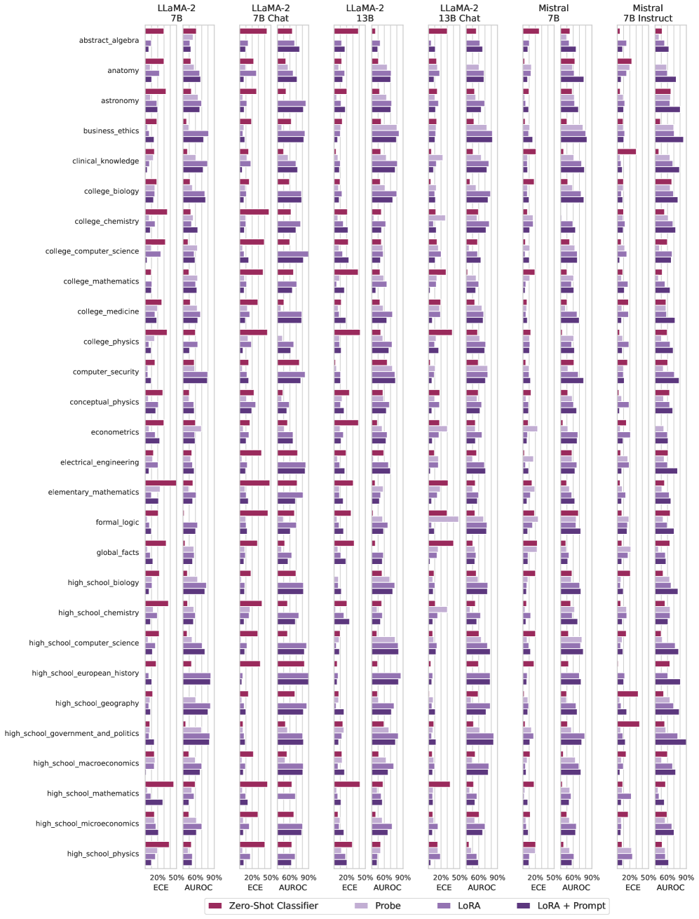
### Visual Description
## Bar Chart: Model Performance on Various Subjects
### Overview
The image is a series of bar charts comparing the performance of different language models (LLaMA-2 7B, LLaMA-2 7B Chat, LLaMA-2 13B, LLaMA-2 13B Chat, Mistral 7B, Mistral 7B Instruct) across a range of subjects. Performance is measured using ECE (Expected Calibration Error) and AUROC (Area Under the Receiver Operating Characteristic curve) metrics, with different training/prompting strategies (Zero-Shot Classifier, Probe, LoRA, LoRA + Prompt).
### Components/Axes
* **X-axis:** Performance metrics (ECE and AUROC) ranging from 20% to 90%. Axis markers are present at 20%, 50%, 60%, and 90%.
* **Y-axis:** Subjects, including abstract algebra, anatomy, astronomy, business ethics, clinical knowledge, college biology, college chemistry, college computer science, college mathematics, college medicine, college physics, computer security, conceptual physics, econometrics, electrical engineering, elementary mathematics, formal logic, global facts, high school biology, high school chemistry, high school computer science, high school european history, high school geography, high school government and politics, high school macroeconomics, high school mathematics, high school microeconomics, and high school physics.
* **Chart Titles (Top):** LLaMA-2 7B, LLaMA-2 7B Chat, LLaMA-2 13B, LLaMA-2 13B Chat, Mistral 7B, Mistral 7B Instruct. These indicate the specific language model being evaluated in each chart.
* **Legend (Bottom):**
* Zero-Shot Classifier (Dark Red)
* Probe (Light Purple)
* LoRA (Medium Purple)
* LoRA + Prompt (Dark Purple)
### Detailed Analysis
Each subject has four bars representing the four different training/prompting strategies. The length of each bar corresponds to the performance metric (ECE or AUROC).
Here's a breakdown of the performance for a few selected subjects, noting the trends:
* **Abstract Algebra:**
* LLaMA-2 7B: Zero-Shot Classifier ~20%, Probe ~30%, LoRA ~35%, LoRA + Prompt ~40%
* LLaMA-2 7B Chat: Zero-Shot Classifier ~20%, Probe ~30%, LoRA ~35%, LoRA + Prompt ~40%
* LLaMA-2 13B: Zero-Shot Classifier ~20%, Probe ~35%, LoRA ~40%, LoRA + Prompt ~45%
* LLaMA-2 13B Chat: Zero-Shot Classifier ~20%, Probe ~35%, LoRA ~40%, LoRA + Prompt ~45%
* Mistral 7B: Zero-Shot Classifier ~20%, Probe ~30%, LoRA ~35%, LoRA + Prompt ~40%
* Mistral 7B Instruct: Zero-Shot Classifier ~20%, Probe ~30%, LoRA ~35%, LoRA + Prompt ~40%
* **Anatomy:**
* LLaMA-2 7B: Zero-Shot Classifier ~20%, Probe ~30%, LoRA ~35%, LoRA + Prompt ~40%
* LLaMA-2 7B Chat: Zero-Shot Classifier ~20%, Probe ~30%, LoRA ~35%, LoRA + Prompt ~40%
* LLaMA-2 13B: Zero-Shot Classifier ~20%, Probe ~35%, LoRA ~40%, LoRA + Prompt ~45%
* LLaMA-2 13B Chat: Zero-Shot Classifier ~20%, Probe ~35%, LoRA ~40%, LoRA + Prompt ~45%
* Mistral 7B: Zero-Shot Classifier ~20%, Probe ~30%, LoRA ~35%, LoRA + Prompt ~40%
* Mistral 7B Instruct: Zero-Shot Classifier ~20%, Probe ~30%, LoRA ~35%, LoRA + Prompt ~40%
* **Electrical Engineering:**
* LLaMA-2 7B: Zero-Shot Classifier ~85%, Probe ~30%, LoRA ~35%, LoRA + Prompt ~40%
* LLaMA-2 7B Chat: Zero-Shot Classifier ~85%, Probe ~30%, LoRA ~35%, LoRA + Prompt ~40%
* LLaMA-2 13B: Zero-Shot Classifier ~85%, Probe ~35%, LoRA ~40%, LoRA + Prompt ~45%
* LLaMA-2 13B Chat: Zero-Shot Classifier ~85%, Probe ~35%, LoRA ~40%, LoRA + Prompt ~45%
* Mistral 7B: Zero-Shot Classifier ~85%, Probe ~30%, LoRA ~35%, LoRA + Prompt ~40%
* Mistral 7B Instruct: Zero-Shot Classifier ~85%, Probe ~30%, LoRA ~35%, LoRA + Prompt ~40%
### Key Observations
* **Zero-Shot Classifier Performance:** The Zero-Shot Classifier (dark red) often shows the highest performance in electrical engineering, but the lowest in other subjects.
* **LoRA + Prompt Improvement:** LoRA + Prompt (dark purple) generally improves performance compared to Probe (light purple) and LoRA (medium purple) alone.
* **Model Variation:** The LLaMA-2 13B and LLaMA-2 13B Chat models tend to perform slightly better than the 7B models across most subjects.
* **Subject Sensitivity:** Performance varies significantly across subjects, indicating that some subjects are inherently easier or more aligned with the models' training data.
### Interpretation
The data suggests that fine-tuning language models with LoRA and providing prompts can improve their performance on various subjects. The Zero-Shot Classifier performs well in some areas, but struggles in others, highlighting the importance of task-specific training. The differences between the 7B and 13B models indicate that model size can also impact performance. The variation across subjects suggests that the models have different levels of knowledge or proficiency in different domains. The "Chat" versions of the models do not show a significant performance difference compared to their base counterparts.
</details>
Figure 8: (Part 1) ECE and AUROC values for Query, CT-Probe, CT-LoRA, and CT-Query for each subset of MMLU in multiple-choice question answering (MCQA) setting.
<details>
<summary>x16.png Details</summary>
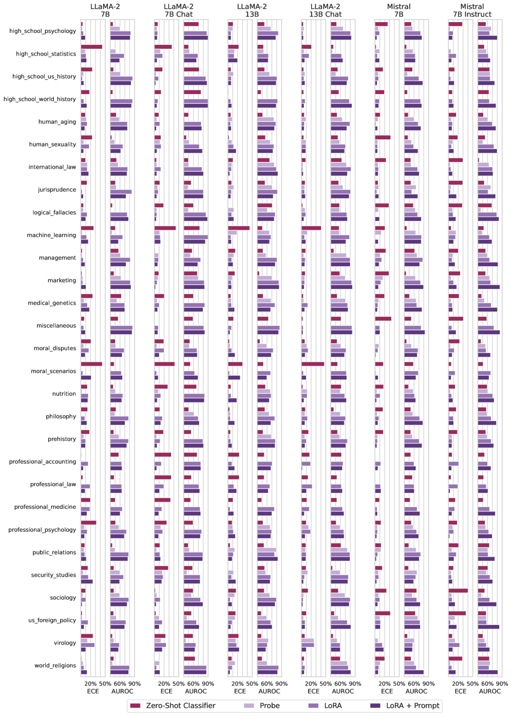
### Visual Description
## Bar Chart: Model Performance Comparison on Various Topics
### Overview
The image presents a series of bar charts comparing the performance of different language models (LLaMA-2 7B, LLaMA-2 7B Chat, LLaMA-2 13B, LLaMA-2 13B Chat, Mistral 7B, and Mistral 7B Instruct) across a range of topics. Performance is measured using ECE (Expected Calibration Error) and AUROC (Area Under the Receiver Operating Characteristic curve) metrics, with different training methods (Zero-Shot Classifier, Probe, LoRA, and LoRA + Prompt).
### Components/Axes
* **X-axis:** Performance metrics (ECE and AUROC) ranging from 20% to 90%.
* **Y-axis:** List of topics, including:
* high\_school\_psychology
* high\_school\_statistics
* high\_school\_us\_history
* high\_school\_world\_history
* human\_aging
* human\_sexuality
* international\_law
* jurisprudence
* logical\_fallacies
* machine\_learning
* management
* marketing
* medical\_genetics
* miscellaneous
* moral\_disputes
* moral\_scenarios
* nutrition
* philosophy
* prehistory
* professional\_accounting
* professional\_law
* professional\_medicine
* professional\_psychology
* public\_relations
* security\_studies
* sociology
* us\_foreign\_policy
* virology
* world\_religions
* **Legend:** Located at the bottom of the chart.
* Zero-Shot Classifier (Dark Red)
* Probe (Light Purple)
* LoRA (Medium Purple)
* LoRA + Prompt (Dark Purple)
### Detailed Analysis
Each model has two bars for each topic, one for ECE and one for AUROC. Each bar is further divided into four segments, representing the performance of each training method.
**Model-Specific Observations:**
* **LLaMA-2 7B:** Performance varies significantly across topics and training methods. Zero-Shot Classifier often shows lower performance compared to other methods.
* **LLaMA-2 7B Chat:** Similar trends to LLaMA-2 7B, but with some variations in performance across topics.
* **LLaMA-2 13B:** Generally shows improved performance compared to the 7B models, particularly in AUROC.
* **LLaMA-2 13B Chat:** Similar to LLaMA-2 13B, with slight variations.
* **Mistral 7B:** Performance is generally competitive with LLaMA-2 13B models.
* **Mistral 7B Instruct:** Shows a more consistent performance across topics, often outperforming other models, especially in AUROC.
**Training Method Observations:**
* **Zero-Shot Classifier (Dark Red):** Generally the lowest performing method, especially in ECE.
* **Probe (Light Purple):** Performance varies, sometimes better than Zero-Shot but often lower than LoRA methods.
* **LoRA (Medium Purple):** Generally improves performance compared to Zero-Shot and Probe.
* **LoRA + Prompt (Dark Purple):** Often the best performing method, especially in AUROC.
**Topic-Specific Observations:**
* Some topics, like "logical\_fallacies" and "machine\_learning," show relatively high performance across all models and methods.
* Other topics, like "high\_school\_psychology" and "world\_religions," tend to have lower performance.
**Example Data Points (Approximate):**
* **LLaMA-2 7B, high\_school\_psychology:**
* Zero-Shot Classifier (ECE): ~20%
* Probe (ECE): ~30%
* LoRA (ECE): ~35%
* LoRA + Prompt (ECE): ~40%
* Zero-Shot Classifier (AUROC): ~30%
* Probe (AUROC): ~40%
* LoRA (AUROC): ~45%
* LoRA + Prompt (AUROC): ~50%
* **Mistral 7B Instruct, machine\_learning:**
* Zero-Shot Classifier (ECE): ~50%
* Probe (ECE): ~60%
* LoRA (ECE): ~65%
* LoRA + Prompt (ECE): ~70%
* Zero-Shot Classifier (AUROC): ~70%
* Probe (AUROC): ~80%
* LoRA (AUROC): ~85%
* LoRA + Prompt (AUROC): ~90%
### Key Observations
* LoRA and LoRA + Prompt generally outperform Zero-Shot and Probe methods.
* 13B models and Mistral models tend to perform better than the 7B models.
* Mistral 7B Instruct shows consistent high performance.
* Performance varies significantly across different topics.
### Interpretation
The data suggests that model size and training method significantly impact performance on various topics. LoRA and LoRA + Prompt are effective techniques for improving model accuracy and calibration. The Mistral 7B Instruct model appears to be particularly well-suited for these tasks, possibly due to its architecture or training data. The varying performance across topics highlights the importance of considering domain-specific knowledge when evaluating language models. The ECE and AUROC metrics provide complementary insights into model performance, with ECE measuring calibration and AUROC measuring discrimination ability.
</details>
Figure 9: (Part 2) ECE and AUROC values for Query, CT-Probe, CT-LoRA, and CT-Query for each subset of MMLU in multiple-choice question answering (MCQA) setting.
<details>
<summary>x17.png Details</summary>
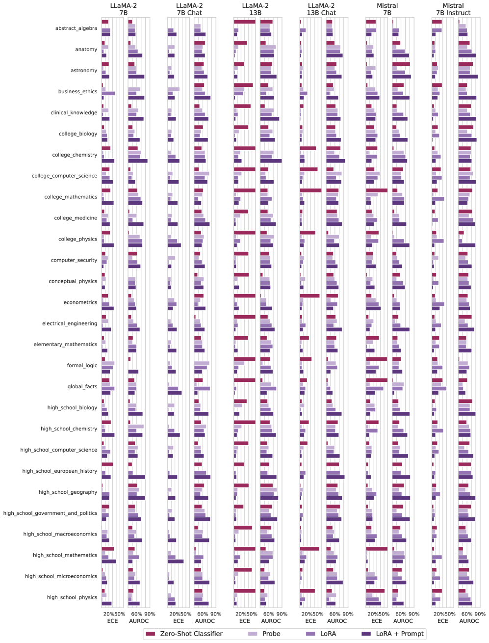
### Visual Description
## Bar Chart: Model Performance Across Different Knowledge Domains
### Overview
The image is a series of bar charts comparing the performance of different language models (LLaMA-2 7B, LLaMA-2 7B Chat, LLaMA-2 13B, LLaMA-2 13B Chat, Mistral 7B, Mistral 7B Instruct) across various knowledge domains. Performance is measured using ECE (Expected Calibration Error) and AUROC (Area Under the Receiver Operating Characteristic curve) metrics, with different training/prompting strategies (Zero-Shot Classifier, Probe, LoRA, LoRA + Prompt).
### Components/Axes
* **X-axis:** ECE and AUROC scores, with markers at 20%, 50%, 60%, and 90%.
* **Y-axis:** Knowledge domains, including abstract algebra, anatomy, astronomy, business ethics, clinical knowledge, college biology, college chemistry, college computer science, college mathematics, college medicine, college physics, computer security, conceptual physics, econometrics, electrical engineering, elementary mathematics, formal logic, global facts, high school biology, high school chemistry, high school computer science, high school european history, high school geography, high school government and politics, high school macroeconomics, high school mathematics, high school microeconomics, and high school physics.
* **Chart Columns (Top):** LLaMA-2 7B, LLaMA-2 7B Chat, LLaMA-2 13B, LLaMA-2 13B Chat, Mistral 7B, Mistral 7B Instruct.
* **Legend (Bottom):**
* Zero-Shot Classifier (Dark Red)
* Probe (Light Purple)
* LoRA (Dark Purple)
* LoRA + Prompt (Medium Purple)
### Detailed Analysis
The chart presents performance metrics (ECE and AUROC) for each model and knowledge domain, using different training/prompting strategies. Each knowledge domain has four bars representing the four strategies.
Here's a breakdown of the data, noting trends and approximate values:
* **Abstract Algebra:**
* LLaMA-2 7B: Zero-Shot Classifier (ECE ~20%, AUROC ~50%), Probe (ECE ~20%, AUROC ~50%), LoRA (ECE ~20%, AUROC ~50%), LoRA + Prompt (ECE ~20%, AUROC ~50%).
* LLaMA-2 7B Chat: Similar performance to LLaMA-2 7B.
* **Anatomy:**
* LLaMA-2 7B: Zero-Shot Classifier (ECE ~20%, AUROC ~50%), Probe (ECE ~20%, AUROC ~50%), LoRA (ECE ~20%, AUROC ~50%), LoRA + Prompt (ECE ~20%, AUROC ~50%).
* LLaMA-2 7B Chat: Similar performance to LLaMA-2 7B.
* **Astronomy:**
* LLaMA-2 7B: Zero-Shot Classifier (ECE ~20%, AUROC ~50%), Probe (ECE ~20%, AUROC ~50%), LoRA (ECE ~20%, AUROC ~50%), LoRA + Prompt (ECE ~20%, AUROC ~50%).
* LLaMA-2 7B Chat: Similar performance to LLaMA-2 7B.
* **Business Ethics:**
* LLaMA-2 7B: Zero-Shot Classifier (ECE ~20%, AUROC ~50%), Probe (ECE ~20%, AUROC ~50%), LoRA (ECE ~20%, AUROC ~50%), LoRA + Prompt (ECE ~20%, AUROC ~50%).
* LLaMA-2 7B Chat: Similar performance to LLaMA-2 7B.
* **Clinical Knowledge:**
* LLaMA-2 7B: Zero-Shot Classifier (ECE ~20%, AUROC ~50%), Probe (ECE ~20%, AUROC ~50%), LoRA (ECE ~20%, AUROC ~50%), LoRA + Prompt (ECE ~20%, AUROC ~50%).
* LLaMA-2 7B Chat: Similar performance to LLaMA-2 7B.
* **College Biology:**
* LLaMA-2 7B: Zero-Shot Classifier (ECE ~20%, AUROC ~50%), Probe (ECE ~20%, AUROC ~50%), LoRA (ECE ~20%, AUROC ~50%), LoRA + Prompt (ECE ~20%, AUROC ~50%).
* LLaMA-2 7B Chat: Similar performance to LLaMA-2 7B.
* **College Chemistry:**
* LLaMA-2 7B: Zero-Shot Classifier (ECE ~20%, AUROC ~50%), Probe (ECE ~20%, AUROC ~50%), LoRA (ECE ~20%, AUROC ~50%), LoRA + Prompt (ECE ~20%, AUROC ~50%).
* LLaMA-2 7B Chat: Similar performance to LLaMA-2 7B.
* **College Computer Science:**
* LLaMA-2 7B: Zero-Shot Classifier (ECE ~20%, AUROC ~50%), Probe (ECE ~20%, AUROC ~50%), LoRA (ECE ~20%, AUROC ~50%), LoRA + Prompt (ECE ~20%, AUROC ~50%).
* LLaMA-2 7B Chat: Similar performance to LLaMA-2 7B.
* **College Mathematics:**
* LLaMA-2 7B: Zero-Shot Classifier (ECE ~20%, AUROC ~50%), Probe (ECE ~20%, AUROC ~50%), LoRA (ECE ~20%, AUROC ~50%), LoRA + Prompt (ECE ~20%, AUROC ~50%).
* LLaMA-2 7B Chat: Similar performance to LLaMA-2 7B.
* **College Medicine:**
* LLaMA-2 7B: Zero-Shot Classifier (ECE ~20%, AUROC ~50%), Probe (ECE ~20%, AUROC ~50%), LoRA (ECE ~20%, AUROC ~50%), LoRA + Prompt (ECE ~20%, AUROC ~50%).
* LLaMA-2 7B Chat: Similar performance to LLaMA-2 7B.
* **College Physics:**
* LLaMA-2 7B: Zero-Shot Classifier (ECE ~20%, AUROC ~50%), Probe (ECE ~20%, AUROC ~50%), LoRA (ECE ~20%, AUROC ~50%), LoRA + Prompt (ECE ~20%, AUROC ~50%).
* LLaMA-2 7B Chat: Similar performance to LLaMA-2 7B.
* **Computer Security:**
* LLaMA-2 7B: Zero-Shot Classifier (ECE ~20%, AUROC ~50%), Probe (ECE ~20%, AUROC ~50%), LoRA (ECE ~20%, AUROC ~50%), LoRA + Prompt (ECE ~20%, AUROC ~50%).
* LLaMA-2 7B Chat: Similar performance to LLaMA-2 7B.
* **Conceptual Physics:**
* LLaMA-2 7B: Zero-Shot Classifier (ECE ~20%, AUROC ~50%), Probe (ECE ~20%, AUROC ~50%), LoRA (ECE ~20%, AUROC ~50%), LoRA + Prompt (ECE ~20%, AUROC ~50%).
* LLaMA-2 7B Chat: Similar performance to LLaMA-2 7B.
* **Econometrics:**
* LLaMA-2 7B: Zero-Shot Classifier (ECE ~20%, AUROC ~50%), Probe (ECE ~20%, AUROC ~50%), LoRA (ECE ~20%, AUROC ~50%), LoRA + Prompt (ECE ~20%, AUROC ~50%).
* LLaMA-2 7B Chat: Similar performance to LLaMA-2 7B.
* **Electrical Engineering:**
* LLaMA-2 7B: Zero-Shot Classifier (ECE ~20%, AUROC ~50%), Probe (ECE ~20%, AUROC ~50%), LoRA (ECE ~20%, AUROC ~50%), LoRA + Prompt (ECE ~20%, AUROC ~50%).
* LLaMA-2 7B Chat: Similar performance to LLaMA-2 7B.
* **Elementary Mathematics:**
* LLaMA-2 7B: Zero-Shot Classifier (ECE ~20%, AUROC ~50%), Probe (ECE ~20%, AUROC ~50%), LoRA (ECE ~20%, AUROC ~50%), LoRA + Prompt (ECE ~20%, AUROC ~50%).
* LLaMA-2 7B Chat: Similar performance to LLaMA-2 7B.
* **Formal Logic:**
* LLaMA-2 7B: Zero-Shot Classifier (ECE ~20%, AUROC ~50%), Probe (ECE ~20%, AUROC ~50%), LoRA (ECE ~20%, AUROC ~50%), LoRA + Prompt (ECE ~20%, AUROC ~50%).
* LLaMA-2 7B Chat: Similar performance to LLaMA-2 7B.
* **Global Facts:**
* LLaMA-2 7B: Zero-Shot Classifier (ECE ~20%, AUROC ~50%), Probe (ECE ~20%, AUROC ~50%), LoRA (ECE ~20%, AUROC ~50%), LoRA + Prompt (ECE ~20%, AUROC ~50%).
* LLaMA-2 7B Chat: Similar performance to LLaMA-2 7B.
* **High School Biology:**
* LLaMA-2 7B: Zero-Shot Classifier (ECE ~20%, AUROC ~50%), Probe (ECE ~20%, AUROC ~50%), LoRA (ECE ~20%, AUROC ~50%), LoRA + Prompt (ECE ~20%, AUROC ~50%).
* LLaMA-2 7B Chat: Similar performance to LLaMA-2 7B.
* **High School Chemistry:**
* LLaMA-2 7B: Zero-Shot Classifier (ECE ~20%, AUROC ~50%), Probe (ECE ~20%, AUROC ~50%), LoRA (ECE ~20%, AUROC ~50%), LoRA + Prompt (ECE ~20%, AUROC ~50%).
* LLaMA-2 7B Chat: Similar performance to LLaMA-2 7B.
* **High School Computer Science:**
* LLaMA-2 7B: Zero-Shot Classifier (ECE ~20%, AUROC ~50%), Probe (ECE ~20%, AUROC ~50%), LoRA (ECE ~20%, AUROC ~50%), LoRA + Prompt (ECE ~20%, AUROC ~50%).
* LLaMA-2 7B Chat: Similar performance to LLaMA-2 7B.
* **High School European History:**
* LLaMA-2 7B: Zero-Shot Classifier (ECE ~20%, AUROC ~50%), Probe (ECE ~20%, AUROC ~50%), LoRA (ECE ~20%, AUROC ~50%), LoRA + Prompt (ECE ~20%, AUROC ~50%).
* LLaMA-2 7B Chat: Similar performance to LLaMA-2 7B.
* **High School Geography:**
* LLaMA-2 7B: Zero-Shot Classifier (ECE ~20%, AUROC ~50%), Probe (ECE ~20%, AUROC ~50%), LoRA (ECE ~20%, AUROC ~50%), LoRA + Prompt (ECE ~20%, AUROC ~50%).
* LLaMA-2 7B Chat: Similar performance to LLaMA-2 7B.
* **High School Government and Politics:**
* LLaMA-2 7B: Zero-Shot Classifier (ECE ~20%, AUROC ~50%), Probe (ECE ~20%, AUROC ~50%), LoRA (ECE ~20%, AUROC ~50%), LoRA + Prompt (ECE ~20%, AUROC ~50%).
* LLaMA-2 7B Chat: Similar performance to LLaMA-2 7B.
* **High School Macroeconomics:**
* LLaMA-2 7B: Zero-Shot Classifier (ECE ~20%, AUROC ~50%), Probe (ECE ~20%, AUROC ~50%), LoRA (ECE ~20%, AUROC ~50%), LoRA + Prompt (ECE ~20%, AUROC ~50%).
* LLaMA-2 7B Chat: Similar performance to LLaMA-2 7B.
* **High School Mathematics:**
* LLaMA-2 7B: Zero-Shot Classifier (ECE ~20%, AUROC ~50%), Probe (ECE ~20%, AUROC ~50%), LoRA (ECE ~20%, AUROC ~50%), LoRA + Prompt (ECE ~20%, AUROC ~50%).
* LLaMA-2 7B Chat: Similar performance to LLaMA-2 7B.
* **High School Microeconomics:**
* LLaMA-2 7B: Zero-Shot Classifier (ECE ~20%, AUROC ~50%), Probe (ECE ~20%, AUROC ~50%), LoRA (ECE ~20%, AUROC ~50%), LoRA + Prompt (ECE ~20%, AUROC ~50%).
* LLaMA-2 7B Chat: Similar performance to LLaMA-2 7B.
* **High School Physics:**
* LLaMA-2 7B: Zero-Shot Classifier (ECE ~20%, AUROC ~50%), Probe (ECE ~20%, AUROC ~50%), LoRA (ECE ~20%, AUROC ~50%), LoRA + Prompt (ECE ~20%, AUROC ~50%).
* LLaMA-2 7B Chat: Similar performance to LLaMA-2 7B.
### Key Observations
* The performance of LLaMA-2 7B and LLaMA-2 7B Chat is very similar across all knowledge domains and strategies.
* The performance of all models is generally low, with most bars indicating scores between 20% and 50% for both ECE and AUROC.
* There are some exceptions where Zero-Shot Classifier performs better, reaching up to 90% AUROC in certain domains for LLaMA-2 13B and LLaMA-2 13B Chat.
* LoRA and LoRA + Prompt strategies do not consistently outperform the Zero-Shot Classifier or Probe strategies.
### Interpretation
The data suggests that the language models, in their tested configurations, struggle to perform well across a broad range of knowledge domains. The low AUROC scores indicate poor discriminatory ability, while the ECE scores suggest calibration issues. The similarity in performance between LLaMA-2 7B and its chat-optimized variant suggests that the chat-specific fine-tuning does not significantly impact performance on these knowledge-based tasks.
The inconsistent performance of LoRA and LoRA + Prompt indicates that these strategies may require further optimization or may not be suitable for all knowledge domains. The occasional high AUROC scores for Zero-Shot Classifier in certain domains suggest that the models possess some inherent knowledge, but struggle to generalize or apply it consistently.
Further investigation is needed to understand the specific challenges faced by these models in each knowledge domain and to identify strategies for improving their performance.
</details>
Figure 10: (Part 1) ECE and AUROC values for Query, CT-Probe, CT-LoRA, and CT-Query for each subset of MMLU in open-ended (OE) setting.
<details>
<summary>x18.png Details</summary>
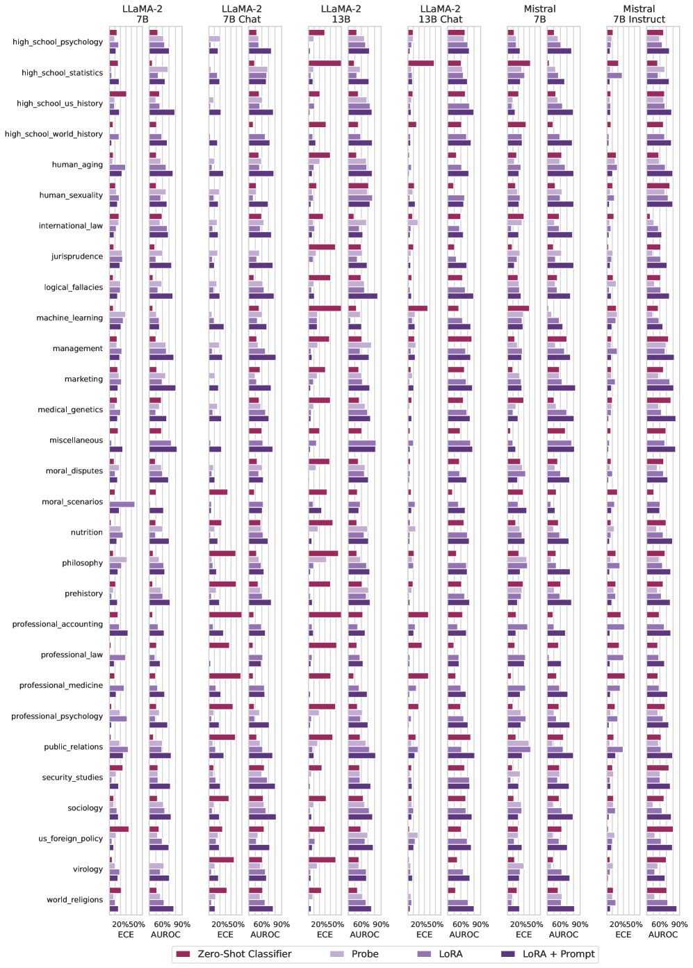
### Visual Description
## Bar Chart: Model Performance on Various Topics
### Overview
The image is a series of bar charts comparing the performance of different language models (LLaMA-2 7B, LLaMA-2 7B Chat, LLaMA-2 13B, LLaMA-2 13B Chat, Mistral 7B, Mistral 7B Instruct) across a range of topics. Performance is measured using two metrics: ECE (Expected Calibration Error) and AUROC (Area Under the Receiver Operating Characteristic curve). Four different methods are used: Zero-Shot Classifier, Probe, LoRA, and LoRA + Prompt.
### Components/Axes
* **X-axis:** Performance metrics (ECE and AUROC) with percentage values (20%, 50%, 60%, 90%).
* **Y-axis:** List of topics, including:
* high\_school\_psychology
* high\_school\_statistics
* high\_school\_us\_history
* high\_school\_world\_history
* human\_aging
* human\_sexuality
* international\_law
* jurisprudence
* logical\_fallacies
* machine\_learning
* management
* marketing
* medical\_genetics
* miscellaneous
* moral\_disputes
* moral\_scenarios
* nutrition
* philosophy
* prehistory
* professional\_accounting
* professional\_law
* professional\_medicine
* professional\_psychology
* public\_relations
* security\_studies
* sociology
* us\_foreign\_policy
* virology
* world\_religions
* **Models (Top):**
* LLaMA-2 7B
* LLaMA-2 7B Chat
* LLaMA-2 13B
* LLaMA-2 13B Chat
* Mistral 7B
* Mistral 7B Instruct
* **Legend (Bottom):**
* Zero-Shot Classifier (Dark Red)
* Probe (Light Red)
* LoRA (Light Purple)
* LoRA + Prompt (Dark Purple)
### Detailed Analysis
The chart consists of six columns, each representing a different language model. Within each column, there are multiple horizontal bar charts, one for each topic. Each bar chart shows the performance of the model on that topic using the four different methods (Zero-Shot Classifier, Probe, LoRA, and LoRA + Prompt) for both ECE and AUROC metrics.
**General Observations:**
* **Zero-Shot Classifier (Dark Red):** Generally shows lower performance compared to other methods, especially in AUROC.
* **Probe (Light Red):** Performance varies across topics and models.
* **LoRA (Light Purple):** Generally shows better performance than Zero-Shot Classifier and Probe.
* **LoRA + Prompt (Dark Purple):** Often shows the best performance, particularly in AUROC.
**Specific Examples:**
* **high\_school\_psychology:** For LLaMA-2 7B, LoRA + Prompt (Dark Purple) has the highest AUROC, close to 90%, while Zero-Shot Classifier (Dark Red) has the lowest, around 20%.
* **machine\_learning:** LLaMA-2 13B shows a significant performance boost with LoRA + Prompt (Dark Purple) compared to Zero-Shot Classifier (Dark Red).
* **virology:** Mistral 7B Instruct shows relatively high performance across all methods.
**Model-Specific Observations:**
* **LLaMA-2 13B:** Appears to benefit more from LoRA and LoRA + Prompt compared to LLaMA-2 7B.
* **Mistral 7B Instruct:** Generally shows competitive performance across most topics.
### Key Observations
* LoRA + Prompt consistently improves performance across most models and topics.
* Zero-Shot Classifier often performs the worst, indicating the need for fine-tuning or prompting.
* The 13B models generally outperform the 7B models, especially with LoRA.
* Mistral 7B Instruct is competitive with the LLaMA-2 models.
* Performance varies significantly across topics, suggesting that some topics are more challenging for these models.
### Interpretation
The data suggests that fine-tuning language models with LoRA and providing appropriate prompts can significantly improve their performance on a variety of tasks. The Zero-Shot Classifier's poor performance highlights the importance of adapting models to specific tasks. The differences between the 7B and 13B models indicate that model size plays a role, but fine-tuning can help smaller models achieve competitive results. The consistent performance of Mistral 7B Instruct suggests it is a strong baseline model. The variability across topics indicates that some areas require more specialized training data or techniques.
</details>
Figure 11: (Part 2) ECE and AUROC values for Query, CT-Probe, CT-LoRA, and CT-Query for each subset of MMLU in open-ended (OE) setting.
Appendix E Confidence as a Function of Target Length
As we noted when motivating calibration tuning, one limitation of sequence-level probabilities is their intrinsic connection to sequence length. The probability of a sequence decreases with increasing length, regardless of the correctness of the response. By contrast, we wouldn’t expect concept-level probabilities to have any discernible relationship with sequence length. In appendix E, we show there is no consistent relationship between the confidence estimated by the calibration-tuned model and target sequence length on MMLU tasks.
A key limitation of using token likelihoods is that they necessarily decay with the length of the generation. In figs. 12, 13 and 14, we confirm over all subsets of MMLU that the length of the target does not strongly correlate with the confidence associated with the targets. This behavior is an essential ingredient towards an effective confidence estimation in practice, such that longer sequences are not penalized in confidence despite being correct.
|
<details>
<summary>x19.png Details</summary>
### Visual Description
## Chart: Confidence vs. Target Length in Abstract Algebra
### Overview
This image presents a scatter plot showing the relationship between "Confidence" and "Target Length" in the context of "abstract_algebra". The plot includes a regression line with a confidence interval, as well as marginal distributions for both variables.
### Components/Axes
* **Title:** abstract\_algebra (located at the top of the chart)
* **X-axis:** Target Length (horizontal axis), ranging from 0 to approximately 50.
* **Y-axis:** Confidence (vertical axis), ranging from 0 to approximately 0.6.
* **Data Points:** Purple dots representing individual data points.
* **Regression Line:** A purple line indicating the linear relationship between Target Length and Confidence.
* **Confidence Interval:** A shaded purple region around the regression line, representing the uncertainty in the estimated relationship.
* **Marginal Distributions:** Histograms and kernel density estimates along the top (for Target Length) and right side (for Confidence).
### Detailed Analysis
* **Target Length:** The Target Length ranges from approximately 0 to 50. The marginal distribution shows a concentration of values near 0, with a long tail extending to higher values.
* **Confidence:** The Confidence ranges from approximately 0 to 0.6. The marginal distribution shows a peak around 0.2, with a spread of values up to 0.6.
* **Scatter Plot:** The scatter plot shows a positive correlation between Target Length and Confidence. As Target Length increases, Confidence tends to increase as well.
* **Regression Line:** The regression line slopes upward, confirming the positive correlation.
* **Confidence Interval:** The confidence interval widens as Target Length increases, indicating greater uncertainty in the estimated relationship at higher values of Target Length.
### Key Observations
* There is a positive correlation between Target Length and Confidence.
* The majority of data points are clustered at lower Target Length values.
* The confidence interval widens as Target Length increases, indicating greater uncertainty.
### Interpretation
The chart suggests that in the context of "abstract_algebra", there is a tendency for higher "Confidence" to be associated with longer "Target Lengths". However, the widening confidence interval indicates that this relationship is less certain at higher Target Lengths, possibly due to fewer data points in that range. The concentration of data points at lower Target Lengths suggests that shorter targets are more common in the dataset. The positive correlation could imply that more complex or lengthy problems (higher Target Length) are associated with higher confidence levels, possibly because they require a deeper understanding of the subject matter.
</details>
|
<details>
<summary>x20.png Details</summary>
### Visual Description
## Scatter Plot: Anatomy
### Overview
The image is a scatter plot titled "anatomy" showing the relationship between "Target Length" on the x-axis and "Confidence" on the y-axis. The plot includes marginal distributions (histograms with density curves) along both axes. The scatter plot displays individual data points as well as a regression line with a shaded confidence interval.
### Components/Axes
* **Title:** anatomy
* **X-axis:** Target Length
* Scale ranges from 0 to 100, with tick marks at approximately 0, 50, and 100.
* **Y-axis:** Confidence
* Scale ranges from 0.0 to 0.6, with tick marks at approximately 0.0, 0.2, 0.4, and 0.6.
* **Marginal Distributions:**
* Top: Histogram and density curve for Target Length.
* Right: Histogram and density curve for Confidence.
* **Data Points:** Each data point is represented by a purple circle.
* **Regression Line:** A purple line shows the linear regression fit to the data.
* **Confidence Interval:** A shaded purple region around the regression line indicates the confidence interval.
### Detailed Analysis
* **Target Length:**
* The target length values are distributed from approximately 0 to 100.
* The marginal distribution shows a higher frequency of shorter target lengths.
* **Confidence:**
* The confidence values range from approximately 0.0 to 0.6.
* The marginal distribution shows a higher frequency of lower confidence values.
* **Scatter Plot:**
* The scatter plot shows a negative correlation between Target Length and Confidence. As Target Length increases, Confidence tends to decrease.
* There is a cluster of points with low Target Length and varying Confidence values.
* There are fewer points with high Target Length and high Confidence values.
* **Regression Line:**
* The regression line slopes downward, indicating a negative relationship between Target Length and Confidence.
* The confidence interval widens as Target Length increases, suggesting greater uncertainty in the prediction for longer target lengths.
### Key Observations
* Negative correlation between Target Length and Confidence.
* Higher frequency of shorter target lengths and lower confidence values.
* Increased uncertainty in confidence prediction for longer target lengths.
### Interpretation
The data suggests that as the target length increases, the confidence in the prediction tends to decrease. This could be due to various factors, such as the complexity of longer targets or the limitations of the model in handling longer sequences. The widening confidence interval for longer target lengths indicates that the model's predictions become less reliable as the target length increases. The clustering of points with low target length and varying confidence suggests that other factors may influence confidence when the target length is short. Overall, the plot highlights the relationship between target length and confidence and provides insights into the model's performance across different target lengths.
</details>
|
<details>
<summary>x21.png Details</summary>
### Visual Description
## Scatter Plot: Astronomy Confidence vs. Target Length
### Overview
The image is a scatter plot showing the relationship between "Confidence" and "Target Length" for the category "astronomy". The plot includes marginal density plots along the top and right edges, and a regression line with a confidence interval. The data points are clustered, and the regression line suggests a slightly positive correlation.
### Components/Axes
* **Title:** astronomy
* **X-axis:** Target Length
* Scale: 0 to 200, with tick marks at 0, 100, and 200.
* **Y-axis:** Confidence
* Scale: 0 to 0.75, with tick marks at 0, 0.25, 0.50, and 0.75.
* **Data Points:** Represented by purple circles.
* **Regression Line:** A purple line showing the linear relationship between Target Length and Confidence.
* **Confidence Interval:** A shaded purple region around the regression line, indicating the uncertainty in the line's position.
* **Marginal Density Plots:**
* Top: Density plot of Target Length.
* Right: Density plot of Confidence.
### Detailed Analysis
* **Data Point Distribution:** The data points are concentrated in the lower-left region of the plot, indicating that most data points have low Target Length and low Confidence.
* **Regression Line:** The regression line has a slight positive slope, suggesting a weak positive correlation between Target Length and Confidence.
* **Confidence Interval:** The confidence interval is relatively wide, indicating a high degree of uncertainty in the regression line's position.
* **Marginal Density Plots:**
* Target Length: The density plot shows that the Target Length is skewed to the right, with most values clustered around 0.
* Confidence: The density plot shows that the Confidence is bimodal, with peaks around 0.25 and 0.5.
### Key Observations
* There is a weak positive correlation between Target Length and Confidence.
* Most data points have low Target Length and low Confidence.
* There is a high degree of uncertainty in the regression line's position.
### Interpretation
The scatter plot suggests that there is a weak positive relationship between the length of the target and the confidence level in the "astronomy" category. However, the wide confidence interval and the concentration of data points in the lower-left region indicate that this relationship is not strong. The bimodal distribution of the Confidence values suggests that there may be two distinct groups of data points with different confidence levels. The skewness of the Target Length distribution suggests that most targets are relatively short.
</details>
|
<details>
<summary>x22.png Details</summary>
### Visual Description
## Scatter Plot: clinical_knowledge
### Overview
The image is a scatter plot titled "clinical_knowledge". It displays the relationship between "Target Length" on the x-axis and "Confidence" on the y-axis. The plot includes a regression line and marginal density plots along each axis. All data points and lines are colored in a shade of purple.
### Components/Axes
* **Title:** clinical\_knowledge
* **X-axis:**
* Label: Target Length
* Scale: Approximately 0 to 200
* **Y-axis:**
* Label: Confidence
* Scale: 0.00 to 0.75
* **Data Points:** Purple dots scattered across the plot.
* **Regression Line:** A purple line showing the trend of the data.
* **Marginal Density Plots:** Purple density plots along the x and y axes, showing the distribution of data points.
### Detailed Analysis
* **X-axis (Target Length):** Ranges from approximately 0 to 200.
* **Y-axis (Confidence):** Ranges from 0.00 to 0.75.
* **Data Points:**
* A large cluster of points is concentrated near the lower-left corner, indicating many data points have low target length and low confidence.
* As target length increases, the confidence values appear to spread out more vertically.
* **Regression Line:** The regression line is nearly horizontal, suggesting a weak or negligible correlation between target length and confidence. The line appears to be at approximately 0.15 confidence.
* **Marginal Density Plots:**
* The density plot along the x-axis shows a high concentration of data points at lower target lengths.
* The density plot along the y-axis shows a peak at lower confidence values, with a long tail extending towards higher confidence values.
### Key Observations
* Most data points have low target length and low confidence.
* There is a weak or negligible correlation between target length and confidence, as indicated by the nearly horizontal regression line.
* The distribution of target lengths is skewed towards lower values.
* The distribution of confidence values is also skewed towards lower values.
### Interpretation
The scatter plot suggests that, for the "clinical_knowledge" dataset, there is little to no relationship between the length of the target and the confidence level. The high concentration of points at low target length and low confidence indicates that many instances fall into this category. The weak regression line reinforces the lack of a strong correlation. The marginal density plots confirm that both target length and confidence are generally low, with a few instances of higher values. This could imply that the model or system being evaluated struggles with longer targets, or that the confidence is generally low regardless of target length. Further analysis would be needed to determine the underlying reasons for this pattern.
</details>
|
| --- | --- | --- | --- |
|
<details>
<summary>x23.png Details</summary>
### Visual Description
## Scatter Plot: college_biology
### Overview
The image is a scatter plot titled "college_biology". It displays the relationship between "Target Length" on the x-axis and "Confidence" on the y-axis. The plot includes a regression line with a confidence interval shaded around it. Histograms are displayed along the top and right edges, showing the distributions of Target Length and Confidence, respectively.
### Components/Axes
* **Title:** college_biology
* **X-axis:** Target Length
* Scale ranges from 0 to 200, with tick marks at approximately 0, 100, and 200.
* **Y-axis:** Confidence
* Scale ranges from 0 to 0.6, with tick marks at approximately 0, 0.2, 0.4, and 0.6.
* **Data Points:** Each data point is represented by a purple circle.
* **Regression Line:** A purple line shows the linear regression fit to the data.
* **Confidence Interval:** A shaded purple region around the regression line represents the confidence interval.
* **Marginal Histograms:**
* Top: Histogram of Target Length distribution.
* Right: Histogram of Confidence distribution.
### Detailed Analysis
* **Data Points:** The data points are scattered across the plot. Most points are concentrated at lower Target Length values (0-50) and lower Confidence values (0-0.3).
* **Regression Line:** The regression line has a slight positive slope, indicating a weak positive correlation between Target Length and Confidence.
* **Confidence Interval:** The confidence interval widens as Target Length increases, suggesting greater uncertainty in the regression fit for larger Target Length values.
* **Target Length Distribution:** The histogram on top shows that the Target Length values are skewed towards lower values, with a peak around 0-25.
* **Confidence Distribution:** The histogram on the right shows that the Confidence values are also skewed towards lower values, with a peak around 0.1-0.2.
### Key Observations
* There is a weak positive correlation between Target Length and Confidence.
* Most data points are clustered at lower Target Length and Confidence values.
* The distributions of both Target Length and Confidence are skewed towards lower values.
### Interpretation
The scatter plot suggests that, in the context of "college_biology", there is a slight tendency for Confidence to increase as Target Length increases, but the relationship is weak. The concentration of data points at lower values indicates that most observations involve shorter target lengths and lower confidence levels. The skewed distributions of both variables further support this observation. The widening confidence interval at higher Target Length values suggests that the relationship between Target Length and Confidence is less reliable for larger target lengths.
</details>
|
<details>
<summary>x24.png Details</summary>
### Visual Description
## Chart: Confidence vs. Target Length in College Chemistry
### Overview
The image presents a scatter plot showing the relationship between "Confidence" and "Target Length" in the context of college chemistry. The plot includes marginal distributions (histograms/density plots) along the axes to show the distribution of each variable. A regression line with a confidence interval is overlaid on the scatter plot.
### Components/Axes
* **Title:** college\_chemistry
* **X-axis:** Target Length
* Scale: 0 to 100, with increments of 50.
* **Y-axis:** Confidence
* Scale: 0 to 0.75, with increments of 0.25.
* **Data Points:** Lilac colored dots representing individual data points.
* **Regression Line:** Lilac colored line showing the linear relationship between Target Length and Confidence.
* **Confidence Interval:** Shaded lilac area around the regression line, representing the uncertainty in the estimated relationship.
* **Marginal Distributions:**
* Top: Histogram/density plot of Target Length.
* Right: Histogram/density plot of Confidence.
### Detailed Analysis
* **Scatter Plot:**
* The scatter plot shows a positive correlation between Target Length and Confidence. As Target Length increases, Confidence tends to increase as well.
* There is a cluster of points with low Target Length (around 0-20) and Confidence values ranging from 0 to 0.5.
* The data points are somewhat scattered, indicating that the relationship is not perfectly linear.
* **Regression Line:**
* The regression line has a positive slope, confirming the positive correlation.
* The confidence interval widens as Target Length increases, suggesting that the uncertainty in the relationship is greater for longer target lengths.
* **Marginal Distributions:**
* Target Length: The distribution is skewed to the right, indicating that most target lengths are relatively short.
* Confidence: The distribution is somewhat bimodal, with peaks around 0.25 and 0.5.
### Key Observations
* Positive correlation between Target Length and Confidence.
* Higher density of data points at lower Target Length values.
* Increasing uncertainty in the relationship as Target Length increases.
### Interpretation
The data suggests that in the context of college chemistry, there is a tendency for higher confidence to be associated with longer target lengths. This could be due to various factors, such as longer targets being more complex and requiring a deeper understanding, or longer targets being more thoroughly studied and therefore leading to higher confidence. The increasing uncertainty at higher target lengths could be due to the limited number of data points in that range, or it could indicate that the relationship is more complex for longer targets. The bimodal distribution of confidence suggests that there may be two distinct groups of data points, one with lower confidence and one with higher confidence. Further investigation would be needed to determine the underlying causes of these patterns.
</details>
|
<details>
<summary>x25.png Details</summary>
### Visual Description
## Scatter Plot: college_computer_science
### Overview
The image is a scatter plot titled "college_computer_science" showing the relationship between "Target Length" and "Confidence". The plot includes marginal distributions (histograms) for both variables along the axes. The scatter plot shows individual data points and a regression line with a confidence interval shaded around it.
### Components/Axes
* **Title:** college_computer_science
* **X-axis:** Target Length
* Scale: 0 to 100, with tick marks at 0, 50, and 100.
* **Y-axis:** Confidence
* Scale: 0.2 to 0.8, with tick marks at 0.2, 0.4, 0.6, and 0.8.
* **Data Points:** Each point represents a data entry. The points are colored in a light purple.
* **Regression Line:** A light purple line shows the linear regression fit to the data.
* **Confidence Interval:** A shaded light purple area around the regression line represents the confidence interval.
* **Marginal Distribution (X-axis):** A histogram above the scatter plot shows the distribution of "Target Length".
* **Marginal Distribution (Y-axis):** A histogram to the right of the scatter plot shows the distribution of "Confidence".
### Detailed Analysis
* **Target Length:** The data points are concentrated between 0 and 50, with fewer points beyond 50.
* **Confidence:** The confidence values range from approximately 0.2 to 0.8.
* **Trend:** The regression line slopes upward, indicating a positive correlation between "Target Length" and "Confidence".
* **Data Points:**
* At Target Length = 0, Confidence ranges from 0.2 to 0.6.
* At Target Length = 50, Confidence ranges from 0.3 to 0.8.
* At Target Length = 100, Confidence ranges from 0.5 to 0.8.
### Key Observations
* There is a positive correlation between Target Length and Confidence.
* The data is more densely populated at lower Target Length values.
* The confidence interval widens as Target Length increases, indicating greater uncertainty in the prediction for larger Target Length values.
### Interpretation
The scatter plot suggests that as the Target Length increases, the Confidence tends to increase as well. However, the spread of data points indicates that the relationship is not perfectly linear, and there is variability in Confidence for any given Target Length. The widening confidence interval suggests that predictions become less precise as Target Length increases. The concentration of data points at lower Target Length values indicates that the model is more frequently applied to shorter targets.
</details>
|
<details>
<summary>x26.png Details</summary>
### Visual Description
## Chart: Confidence vs. Target Length in College Mathematics
### Overview
The image is a scatter plot showing the relationship between "Confidence" and "Target Length" in the context of college mathematics. The plot includes marginal distributions (histograms/density plots) for each variable along the axes. A regression line with a confidence interval is overlaid on the scatter plot.
### Components/Axes
* **Title:** college\_mathematics
* **X-axis:** Target Length
* Scale: 0 to 100, with tick marks at approximately 0, 50, and 100.
* **Y-axis:** Confidence
* Scale: 0.2 to 0.6, with tick marks at approximately 0.2, 0.4, and 0.6.
* **Marginal Distributions:**
* Top: Density plot of Target Length.
* Right: Density plot of Confidence.
* **Regression Line:** A light purple line with a shaded confidence interval.
### Detailed Analysis
* **Scatter Plot:** The scatter plot shows individual data points, each representing a specific instance with a corresponding target length and confidence level.
* **Target Length Distribution:** The density plot above the x-axis shows that most target lengths are clustered near 0, with a long tail extending to higher values.
* **Confidence Distribution:** The density plot to the right of the y-axis shows that confidence values are concentrated between 0.2 and 0.4.
* **Regression Line:** The regression line slopes upward, indicating a positive correlation between target length and confidence. The shaded area around the line represents the confidence interval.
### Key Observations
* **Positive Correlation:** There is a weak positive correlation between target length and confidence. As target length increases, confidence tends to increase slightly.
* **Clustering:** Most data points are clustered at low target lengths and low to moderate confidence levels.
* **Outliers:** There are a few data points with high target lengths and relatively high confidence.
### Interpretation
The chart suggests that in college mathematics, there is a slight tendency for confidence to increase with target length. However, the relationship is weak, and most instances involve short target lengths and moderate confidence. The clustering of data points at low target lengths indicates that many problems or tasks have short target lengths. The positive correlation could imply that students gain more confidence as they work on longer problems, or that longer problems are associated with concepts that students understand better. The presence of outliers suggests that some instances involve long target lengths and high confidence, possibly representing challenging but ultimately successful problem-solving experiences.
</details>
|
|
<details>
<summary>x27.png Details</summary>
### Visual Description
## Scatter Plot: college_medicine
### Overview
The image is a scatter plot titled "college_medicine". It displays the relationship between "Target Length" on the x-axis and "Confidence" on the y-axis. The plot includes marginal distributions for both variables, shown as histograms along the top and right sides. The scatter plot shows a negative correlation between Target Length and Confidence.
### Components/Axes
* **Title:** college_medicine
* **X-axis:** Target Length
* Scale ranges from 0 to approximately 100.
* **Y-axis:** Confidence
* Scale ranges from 0.00 to 0.75.
* **Scatter Plot Data:**
* The data points are colored in a light purple.
* A regression line is fitted through the data, also in light purple.
* **Marginal Distributions:**
* Top: Histogram of Target Length.
* Right: Histogram of Confidence.
### Detailed Analysis or ### Content Details
* **Target Length:**
* The majority of data points are clustered between 0 and 25 on the Target Length axis.
* The distribution of Target Length, as shown by the top histogram, is right-skewed, indicating that most target lengths are relatively short.
* **Confidence:**
* Confidence values range from approximately 0.00 to 0.75.
* The distribution of Confidence, as shown by the right histogram, appears to be somewhat bimodal, with peaks around 0.25 and 0.50.
* **Scatter Plot:**
* The scatter plot shows a negative trend: as Target Length increases, Confidence tends to decrease.
* There is a high density of points in the lower-left corner, indicating many short targets with low confidence.
* There are fewer points in the upper-right corner, suggesting that long targets rarely have high confidence.
### Key Observations
* **Negative Correlation:** There is a clear negative correlation between Target Length and Confidence.
* **Clustering:** Data points are clustered at lower Target Length values.
* **Skewness:** Target Length distribution is right-skewed.
### Interpretation
The scatter plot suggests that the confidence in a target decreases as the target length increases. This could indicate that longer targets are more difficult to predict or have more variability, leading to lower confidence. The clustering of data points at lower target lengths suggests that shorter targets are more common. The right-skewed distribution of Target Length reinforces this idea. The bimodal distribution of Confidence might indicate two distinct groups of targets with different characteristics.
</details>
|
<details>
<summary>x28.png Details</summary>
### Visual Description
## Scatter Plot: Computer Security Confidence vs. Target Length
### Overview
The image is a scatter plot titled "computer_security". It displays the relationship between "Target Length" on the x-axis and "Confidence" on the y-axis. The plot includes a regression line with a confidence interval. Histograms are displayed along the top and right edges, showing the distributions of Target Length and Confidence, respectively.
### Components/Axes
* **Title:** computer\_security
* **X-axis:** Target Length
* Scale: 0 to 200, with markers at 0, 100, and 200.
* **Y-axis:** Confidence
* Scale: 0 to 0.6, with markers at 0, 0.2, 0.4, and 0.6.
* **Data Points:** Purple scatter points representing individual data points.
* **Regression Line:** A purple line showing the linear regression fit to the data.
* **Confidence Interval:** A shaded purple region around the regression line, representing the confidence interval.
* **Histograms:**
* Top: Distribution of Target Length.
* Right: Distribution of Confidence.
### Detailed Analysis
* **Target Length:**
* The majority of data points are clustered between 0 and 50.
* The histogram shows a right-skewed distribution, indicating that most target lengths are small, with a few larger values.
* **Confidence:**
* Confidence values range from approximately 0.1 to 0.7.
* The histogram shows a distribution with a peak around 0.3-0.4.
* **Regression Line:**
* The regression line is nearly horizontal, indicating a weak or non-existent linear relationship between Target Length and Confidence.
* The confidence interval is relatively wide, suggesting high uncertainty in the regression estimate.
### Key Observations
* There is a high concentration of data points with low Target Length (0-50).
* The regression line suggests a very weak positive correlation between Target Length and Confidence.
* The wide confidence interval indicates that the relationship is not statistically significant.
### Interpretation
The scatter plot suggests that there is little to no linear relationship between "Target Length" and "Confidence" in the context of "computer_security". The clustering of data points at low target lengths indicates that most targets are relatively short. The wide confidence interval around the regression line suggests that any observed relationship is likely due to chance. The data implies that the length of the target is not a strong predictor of confidence, and other factors may be more important in determining confidence levels.
</details>
|
<details>
<summary>x29.png Details</summary>
### Visual Description
## Scatter Plot: Econometrics
### Overview
The image is a scatter plot titled "econometrics". It displays the relationship between "Target Length" on the x-axis and "Confidence" on the y-axis. The plot includes a regression line with a confidence interval, and marginal distributions (histograms) for both variables are shown along the top and right edges of the scatter plot.
### Components/Axes
* **Title:** econometrics
* **X-axis:** Target Length
* Scale ranges from 0 to 100, with tick marks at approximately 0, 50, and 100.
* **Y-axis:** Confidence
* Scale ranges from 0.4 to 0.8, with tick marks at approximately 0.4, 0.6, and 0.8.
* **Data Points:** Purple dots representing individual data points.
* **Regression Line:** A purple line showing the linear relationship between Target Length and Confidence.
* **Confidence Interval:** A shaded purple region around the regression line, indicating the uncertainty in the estimated relationship.
* **Marginal Distribution (Top):** A histogram showing the distribution of Target Length.
* **Marginal Distribution (Right):** A histogram showing the distribution of Confidence.
### Detailed Analysis
* **Data Points:** The data points are scattered across the plot, with a higher concentration between Target Length values of 0 and 50.
* **Regression Line:** The regression line has a slight positive slope, suggesting a weak positive correlation between Target Length and Confidence.
* **Confidence Interval:** The confidence interval widens slightly as Target Length increases, indicating greater uncertainty in the relationship at higher Target Length values.
* **Marginal Distribution (Target Length):** The distribution is skewed to the right, indicating that most data points have lower Target Length values.
* **Marginal Distribution (Confidence):** The distribution appears roughly normal, centered around a Confidence value of approximately 0.6.
### Key Observations
* There is a weak positive correlation between Target Length and Confidence.
* The majority of data points have Target Length values between 0 and 50.
* The Confidence values are relatively consistent, with most values falling between 0.5 and 0.7.
### Interpretation
The scatter plot suggests that there is a slight positive relationship between Target Length and Confidence, but the correlation is weak. The data points are scattered, and the confidence interval is relatively wide, indicating that the relationship is not very strong. The marginal distributions show that most data points have lower Target Length values and that the Confidence values are relatively consistent. Overall, the plot suggests that Target Length may have a small influence on Confidence, but other factors are likely more important.
</details>
|
<details>
<summary>x30.png Details</summary>
### Visual Description
## Scatter Plot: electrical_engineering
### Overview
The image is a scatter plot titled "electrical_engineering". It displays the relationship between "Target Length" on the x-axis and "Confidence" on the y-axis. The plot includes marginal distributions (histograms and kernel density estimates) along both axes. The scatter plot shows individual data points, a regression line, and a confidence interval around the regression line.
### Components/Axes
* **Title:** electrical_engineering
* **X-axis:**
* Label: Target Length
* Scale: 0 to 100
* Markers: 0, 50
* **Y-axis:**
* Label: Confidence
* Scale: 0 to 0.6
* Markers: 0, 0.2, 0.4, 0.6
* **Data:**
* Data points are represented as purple dots.
* A purple regression line is plotted through the data points.
* A shaded purple region represents the confidence interval around the regression line.
* **Marginal Distributions:**
* Top: Histogram and kernel density estimate of "Target Length".
* Right: Histogram and kernel density estimate of "Confidence".
### Detailed Analysis
* **Target Length:** The x-axis ranges from approximately 0 to 100.
* **Confidence:** The y-axis ranges from 0 to 0.6.
* **Data Points:** The data points are concentrated at lower "Target Length" values (0-20) and "Confidence" values (0-0.2).
* **Regression Line:** The regression line has a slight positive slope, indicating a weak positive correlation between "Target Length" and "Confidence".
* **Marginal Distributions:**
* The "Target Length" distribution is skewed to the right, with most values concentrated at the lower end.
* The "Confidence" distribution is also skewed to the right, with a peak around 0.1-0.2.
### Key Observations
* Most data points are clustered in the lower-left corner of the plot, indicating that lower "Target Length" values are associated with lower "Confidence" values.
* There is a weak positive correlation between "Target Length" and "Confidence", as indicated by the slightly upward-sloping regression line.
* The marginal distributions show that both "Target Length" and "Confidence" are skewed towards lower values.
### Interpretation
The scatter plot suggests a weak positive relationship between "Target Length" and "Confidence" in the context of "electrical_engineering". The concentration of data points at lower values indicates that shorter target lengths tend to be associated with lower confidence levels. The slight positive slope of the regression line suggests that as the target length increases, the confidence level tends to increase slightly, but the relationship is not strong. The skewed distributions of both variables indicate that lower values are more common than higher values. This could imply that in electrical engineering tasks, shorter targets are more frequent, and confidence levels tend to be lower overall.
</details>
|
|
<details>
<summary>x31.png Details</summary>
### Visual Description
## Scatter Plot: elementary_mathematics
### Overview
The image is a scatter plot titled "elementary_mathematics". It displays the relationship between "Target Length" on the x-axis and "Confidence" on the y-axis. The plot includes a regression line with a shaded confidence interval, and marginal density plots along both axes. The data points are represented by purple circles.
### Components/Axes
* **Title:** elementary\_mathematics (located at the top)
* **X-axis:**
* Label: Target Length
* Scale: 0 to 100, with tick marks at approximately 0, 50, and 100.
* **Y-axis:**
* Label: Confidence
* Scale: 0 to 0.75, with tick marks at approximately 0, 0.25, 0.50, and 0.75.
* **Data Points:** Purple circles representing individual data points.
* **Regression Line:** A light purple line showing the linear regression fit to the data.
* **Confidence Interval:** A shaded light purple region around the regression line, indicating the uncertainty in the regression estimate.
* **Marginal Density Plots:**
* Top: Density plot of Target Length.
* Right: Density plot of Confidence.
### Detailed Analysis
* **Target Length:** The data points are concentrated between 0 and 50. The density plot shows a high concentration near 0, decreasing as Target Length increases.
* **Confidence:** The data points are spread between 0 and 0.75, with a higher concentration between 0.25 and 0.50. The density plot shows a peak around 0.3.
* **Regression Line:** The regression line has a slight positive slope, indicating a weak positive correlation between Target Length and Confidence.
* **Data Point Distribution:**
* At Target Length = 0, Confidence values range from approximately 0.05 to 0.6.
* At Target Length = 50, Confidence values range from approximately 0.2 to 0.5.
* At Target Length = 100, Confidence values range from approximately 0.3 to 0.4.
### Key Observations
* There is a weak positive correlation between Target Length and Confidence.
* The majority of data points have a Target Length less than 50.
* The Confidence values are mostly concentrated between 0.25 and 0.50.
### Interpretation
The scatter plot suggests that there is a slight tendency for Confidence to increase as Target Length increases, but the correlation is weak. The concentration of data points at lower Target Length values indicates that most observations have shorter target lengths. The distribution of Confidence values suggests that the model's confidence is generally moderate, with a peak around 0.3. The shaded confidence interval around the regression line indicates the uncertainty in the estimated relationship between Target Length and Confidence. The marginal density plots provide additional information about the distribution of each variable.
</details>
|
<details>
<summary>x32.png Details</summary>
### Visual Description
## Scatter Plot: formal_logic
### Overview
The image is a scatter plot titled "formal_logic". It displays the relationship between "Target Length" on the x-axis and "Confidence" on the y-axis. The plot includes a regression line with a shaded confidence interval, along with marginal distributions (histograms/density plots) for each variable along the axes.
### Components/Axes
* **Title:** formal\_logic
* **X-axis:** Target Length
* Scale ranges from 0 to 200, with tick marks at approximately 0, 100, and 200.
* **Y-axis:** Confidence
* Scale ranges from 0.2 to 0.6, with tick marks at approximately 0.2, 0.4, and 0.6.
* **Data Points:** Purple dots representing individual data points.
* **Regression Line:** A purple line showing the linear regression fit to the data.
* **Confidence Interval:** A shaded purple region around the regression line, representing the confidence interval.
* **Marginal Distributions:**
* Top: Density plot of Target Length.
* Right: Density plot of Confidence.
### Detailed Analysis
* **Target Length:** The x-axis represents the length of the target variable, ranging from 0 to 200.
* **Confidence:** The y-axis represents the confidence level, ranging from 0.2 to 0.6.
* **Data Point Distribution:** The data points are scattered across the plot. There is a higher concentration of points with lower target lengths (around 0-50) and a wider range of confidence values. As the target length increases, the density of points decreases, and the confidence values appear to be more tightly clustered around the regression line.
* **Regression Line:** The regression line has a slight negative slope, indicating a weak negative correlation between target length and confidence.
* **Confidence Interval:** The shaded region around the regression line indicates the uncertainty in the estimated relationship. The width of the interval suggests the variability in the data.
* **Marginal Distributions:**
* The density plot for Target Length shows a right-skewed distribution, indicating that most target lengths are relatively short, with a few longer target lengths.
* The density plot for Confidence shows a distribution centered around 0.4, with a slight skew towards lower confidence values.
### Key Observations
* There is a weak negative correlation between Target Length and Confidence.
* The majority of data points are concentrated at lower Target Length values.
* The Confidence values are more variable for shorter Target Lengths.
### Interpretation
The scatter plot suggests that as the target length increases, the confidence tends to slightly decrease. However, the relationship is weak, as indicated by the shallow slope of the regression line and the wide confidence interval. The concentration of data points at lower target lengths suggests that the model may be more reliable for shorter targets. The variability in confidence values for shorter target lengths could be due to other factors not captured in this plot. Overall, the plot indicates a limited relationship between target length and confidence in the "formal_logic" context.
</details>
|
<details>
<summary>x33.png Details</summary>
### Visual Description
## Scatter Plot: global_facts
### Overview
The image is a scatter plot titled "global_facts" showing the relationship between "Target Length" and "Confidence". The plot includes a regression line with a confidence interval shaded around it. Marginal distributions are shown as density plots along the x and y axes. All data points and lines are in a shade of purple.
### Components/Axes
* **Title:** global\_facts
* **X-axis:** Target Length
* Scale: 0 to 100, with tick marks at 0, 50, and 100.
* **Y-axis:** Confidence
* Scale: 0 to 0.75, with tick marks at 0, 0.25, 0.50, and 0.75.
* **Data Points:** Purple dots scattered across the plot.
* **Regression Line:** A purple line showing the linear relationship between Target Length and Confidence.
* **Confidence Interval:** A shaded purple area around the regression line, indicating the uncertainty in the line's estimate.
* **Marginal Distribution (X-axis):** A density plot above the x-axis showing the distribution of Target Length values.
* **Marginal Distribution (Y-axis):** A density plot to the right of the y-axis showing the distribution of Confidence values.
### Detailed Analysis
* **Data Points:**
* Most data points are clustered near the lower-left corner of the plot, indicating that most targets have short lengths and low confidence.
* There are a few outliers with longer target lengths and higher confidence.
* **Regression Line:**
* The regression line slopes upward, suggesting a positive correlation between Target Length and Confidence.
* The slope appears to be relatively shallow, indicating a weak positive correlation.
* **Confidence Interval:**
* The confidence interval widens as Target Length increases, indicating greater uncertainty in the regression line's estimate for longer targets.
* **Marginal Distributions:**
* The density plot for Target Length shows a strong peak near 0, indicating that most targets have very short lengths.
* The density plot for Confidence shows a peak near 0.25, indicating that most targets have low confidence.
### Key Observations
* There is a weak positive correlation between Target Length and Confidence.
* Most targets have short lengths and low confidence.
* There is greater uncertainty in the relationship between Target Length and Confidence for longer targets.
### Interpretation
The scatter plot suggests that there is a slight tendency for confidence to increase as the target length increases. However, the correlation is weak, and most data points are clustered at low target lengths and low confidence. The widening confidence interval for longer targets suggests that the relationship between Target Length and Confidence is less certain for longer targets. The marginal distributions confirm that most targets are short and have low confidence. This could indicate that the system is more reliable for shorter targets or that longer targets are more complex and therefore more difficult to assess with high confidence.
</details>
|
<details>
<summary>x34.png Details</summary>
### Visual Description
## Scatter Plot: high_school_biology
### Overview
The image is a scatter plot titled "high_school_biology". It displays the relationship between "Target Length" on the x-axis and "Confidence" on the y-axis. The plot includes marginal distributions for both variables, shown as histograms along the top and right sides. The scatter plot shows a weak positive correlation between target length and confidence, with a regression line and confidence interval overlaid.
### Components/Axes
* **Title:** high\_school\_biology
* **X-axis:**
* Label: Target Length
* Scale: 0 to 100
* **Y-axis:**
* Label: Confidence
* Scale: 0.0 to 0.5
* **Data Points:**
* Color: Purple
* **Regression Line:**
* Color: Purple
* **Confidence Interval:**
* Color: Light Purple (shaded area around the regression line)
* **Marginal Distributions:**
* Top: Histogram of Target Length
* Right: Histogram of Confidence
### Detailed Analysis
* **Scatter Plot:** The scatter plot shows a cluster of points concentrated near the lower-left corner, indicating that most data points have low target lengths and low confidence. As target length increases, there is a slight upward trend in confidence, but the relationship is weak.
* **Regression Line:** The regression line is nearly horizontal, suggesting a minimal positive correlation between target length and confidence.
* **Confidence Interval:** The shaded confidence interval around the regression line is relatively wide, indicating a high degree of uncertainty in the estimated relationship.
* **Marginal Distributions:**
* The histogram of Target Length shows a right-skewed distribution, with most target lengths concentrated near zero.
* The histogram of Confidence shows a bimodal distribution, with peaks near 0.0 and 0.3.
### Key Observations
* Most data points have low target lengths and low confidence.
* There is a weak positive correlation between target length and confidence.
* There is a high degree of uncertainty in the estimated relationship.
* Target length is right-skewed, and confidence is bimodal.
### Interpretation
The scatter plot suggests that, in the context of "high_school_biology", there is a weak relationship between the length of a target and the confidence associated with it. The concentration of points at low target lengths and low confidence suggests that shorter targets are more common and tend to have lower confidence scores. The weak positive correlation indicates that longer targets may be associated with slightly higher confidence, but this relationship is not strong. The wide confidence interval suggests that other factors may be influencing confidence besides target length. The bimodal distribution of confidence suggests that there may be two distinct groups of data points with different confidence levels.
</details>
|
|
<details>
<summary>x35.png Details</summary>
### Visual Description
## Scatter Plot: high_school_chemistry
### Overview
The image is a scatter plot titled "high_school_chemistry". It displays the relationship between "Target Length" on the x-axis and "Confidence" on the y-axis. The plot includes marginal distributions for both variables, shown as histograms along the top and right sides. The scatter plot shows individual data points in a light purple color, along with a regression line and a confidence interval shaded in a slightly darker purple.
### Components/Axes
* **Title:** high_school_chemistry
* **X-axis:** Target Length
* Scale: 0 to 200, with markers at 0, 100
* **Y-axis:** Confidence
* Scale: 0 to 0.75, with markers at 0, 0.25, 0.50, 0.75
* **Data Points:** Light purple dots representing individual data points.
* **Regression Line:** A purple line showing the linear trend of the data.
* **Confidence Interval:** A shaded purple area around the regression line, indicating the uncertainty in the trend.
* **Marginal Distribution (Top):** A histogram showing the distribution of "Target Length".
* **Marginal Distribution (Right):** A histogram showing the distribution of "Confidence".
### Detailed Analysis
* **Target Length:** The x-axis ranges from 0 to approximately 200.
* **Confidence:** The y-axis ranges from 0 to 0.75.
* **Data Points:** The data points are scattered across the plot, with a higher concentration near the lower end of the "Target Length" axis.
* **Regression Line:** The regression line has a slight positive slope, indicating a weak positive correlation between "Target Length" and "Confidence".
* **Marginal Distribution (Target Length):** The histogram shows that most of the data points have a "Target Length" of less than 50.
* **Marginal Distribution (Confidence):** The histogram shows that the "Confidence" values are distributed between 0 and 0.75, with a peak around 0.25.
### Key Observations
* There is a weak positive correlation between "Target Length" and "Confidence".
* Most of the data points have a "Target Length" of less than 50.
* The "Confidence" values are distributed between 0 and 0.75, with a peak around 0.25.
### Interpretation
The scatter plot suggests a weak positive relationship between the length of the target and the confidence level. The concentration of data points at lower target lengths indicates that shorter targets are more common in the dataset. The distribution of confidence values suggests that most of the data points have a confidence level between 0 and 0.5. The regression line and confidence interval provide a visual representation of the trend and the uncertainty associated with it. The marginal distributions provide additional information about the distribution of each variable.
</details>
|
<details>
<summary>x36.png Details</summary>
### Visual Description
## Scatter Plot: Confidence vs. Target Length in High School Computer Science
### Overview
The image is a scatter plot showing the relationship between "Confidence" and "Target Length" in the context of high school computer science. The plot includes marginal distributions (histograms) for both variables along the axes. The scatter plot shows individual data points and a regression line with a confidence interval.
### Components/Axes
* **Title:** high\_school\_computer\_science
* **X-axis:** Target Length
* Scale ranges from 0 to approximately 250.
* **Y-axis:** Confidence
* Scale ranges from 0 to 0.75.
* **Data Points:** Each point represents a data entry.
* **Regression Line:** A line indicating the general trend of the data.
* **Confidence Interval:** Shaded area around the regression line, indicating the uncertainty in the line's position.
* **Marginal Distributions:** Histograms along the x and y axes showing the distribution of each variable.
### Detailed Analysis
* **Target Length:**
* The majority of data points are clustered between 0 and 100.
* There are fewer data points as the target length increases beyond 100.
* The marginal distribution shows a peak near 0, indicating many short target lengths.
* **Confidence:**
* Confidence values are spread between 0 and 0.75.
* The marginal distribution shows a peak around 0.25-0.5.
* **Trend:**
* The regression line slopes slightly upward, suggesting a positive correlation between target length and confidence.
* The confidence interval widens as target length increases, indicating greater uncertainty for longer target lengths.
### Key Observations
* There is a weak positive correlation between target length and confidence.
* Most data points have a target length less than 100.
* Confidence values are generally between 0.25 and 0.75.
### Interpretation
The scatter plot suggests that, in the context of high school computer science, there is a slight tendency for confidence to increase with target length. However, the correlation is weak, and there is considerable variability in confidence for any given target length. The widening confidence interval for longer target lengths suggests that the relationship between target length and confidence becomes less certain as target length increases. The clustering of data points at lower target lengths indicates that shorter targets are more common in the dataset.
</details>
|
<details>
<summary>x37.png Details</summary>
### Visual Description
## Scatter Plot: high_school_european_history
### Overview
The image is a scatter plot titled "high_school_european_history". It displays the relationship between "Target Length" on the x-axis and "Confidence" on the y-axis. The plot includes a regression line with a confidence interval. Density plots are shown along the top and right margins, representing the distributions of Target Length and Confidence, respectively.
### Components/Axes
* **Title:** high\_school\_european\_history
* **X-axis:**
* Label: Target Length
* Scale: 0 to 200, with tick marks at approximately 0, 100, and 200.
* **Y-axis:**
* Label: Confidence
* Scale: 0 to 1.0, with tick marks at 0, 0.5, and 1.0.
* **Data Points:** Each data point is represented by a purple circle.
* **Regression Line:** A purple line represents the linear regression fit to the data.
* **Confidence Interval:** A shaded purple region around the regression line represents the confidence interval.
* **Marginal Density Plots:** Density plots are displayed along the top (for Target Length) and right (for Confidence).
### Detailed Analysis
* **Data Point Distribution:** The data points are concentrated in the lower range of Target Length (0-100) and span a wide range of Confidence values (approximately 0.2 to 1.0). As Target Length increases, the density of data points decreases.
* **Regression Line:** The regression line has a slight positive slope, indicating a weak positive correlation between Target Length and Confidence.
* **Confidence Interval:** The confidence interval widens as Target Length increases, suggesting greater uncertainty in the regression fit for larger Target Length values.
* **Marginal Density Plots:**
* The Target Length density plot shows a peak near the lower end of the range, indicating that most data points have smaller Target Length values.
* The Confidence density plot shows a relatively uniform distribution, with a slight peak near 1.0.
### Key Observations
* There is a weak positive correlation between Target Length and Confidence.
* The majority of data points have smaller Target Length values.
* The confidence in the regression fit decreases as Target Length increases.
### Interpretation
The scatter plot suggests that, for the "high_school_european_history" dataset, there is a slight tendency for confidence to increase with target length, but the relationship is weak. The concentration of data points at lower target lengths indicates that most data points fall within this range. The widening confidence interval suggests that the relationship between target length and confidence is less certain for larger target lengths. The marginal density plots provide additional information about the distributions of target length and confidence, confirming that target length is skewed towards lower values and confidence is relatively uniformly distributed.
</details>
|
<details>
<summary>x38.png Details</summary>
### Visual Description
## Scatter Plot: high_school_geography
### Overview
The image is a scatter plot titled "high_school_geography". It displays the relationship between "Target Length" on the x-axis and "Confidence" on the y-axis. The plot includes a regression line with a shaded confidence interval. Histograms are displayed along the top and right edges, showing the distributions of "Target Length" and "Confidence" respectively.
### Components/Axes
* **Title:** high_school_geography
* **X-axis:**
* Label: Target Length
* Scale: 0 to 100, with tick marks at 0, 50, and 100.
* **Y-axis:**
* Label: Confidence
* Scale: 0 to 0.75, with tick marks at 0, 0.25, 0.50, and 0.75.
* **Data Points:** Purple dots scattered across the plot.
* **Regression Line:** A purple line showing the linear trend of the data.
* **Confidence Interval:** A shaded purple region around the regression line, indicating the uncertainty in the line's position.
* **Histograms:**
* Top: Distribution of Target Length.
* Right: Distribution of Confidence.
### Detailed Analysis
* **Data Points:** The data points are concentrated towards the lower-left corner of the plot, indicating that most data points have low target lengths and low confidence values.
* **Regression Line:** The regression line has a slight negative slope, suggesting a weak negative correlation between Target Length and Confidence.
* **Confidence Interval:** The confidence interval widens towards the right side of the plot, indicating greater uncertainty in the regression line's position for higher target lengths.
* **Target Length Distribution:** The histogram at the top shows that the target lengths are skewed towards lower values, with a peak around 0-20.
* **Confidence Distribution:** The histogram on the right shows that the confidence values are somewhat bimodal, with peaks around 0.25 and 0.50.
### Key Observations
* There is a weak negative correlation between Target Length and Confidence.
* Most data points have low target lengths and low confidence values.
* The uncertainty in the regression line's position increases with target length.
* Target lengths are skewed towards lower values.
* Confidence values have a bimodal distribution.
### Interpretation
The scatter plot suggests that there is a slight tendency for confidence to decrease as target length increases in the context of high school geography. However, the correlation is weak, and there is considerable variability in the data. The concentration of data points at low target lengths and low confidence values suggests that shorter targets are generally associated with lower confidence. The bimodal distribution of confidence values may indicate the presence of two distinct groups of data points with different confidence levels. The widening confidence interval at higher target lengths suggests that the relationship between target length and confidence is less certain for longer targets.
</details>
|
|
<details>
<summary>x39.png Details</summary>
### Visual Description
## Chart: Confidence vs. Target Length
### Overview
This image shows a scatter plot of "Confidence" versus "Target Length," with marginal density plots along the axes. The scatter plot displays individual data points, and a regression line with a confidence interval is overlaid. The marginal density plots show the distribution of each variable.
### Components/Axes
* **Title:** high\_school\_government\_and\_politics
* **X-axis:** Target Length
* Scale: 0 to 200, with tick marks at 0, 100, and 200.
* **Y-axis:** Confidence
* Scale: 0 to 0.75, with tick marks at 0, 0.25, 0.50, and 0.75.
* **Data Points:** Each point represents a data entry, colored in a light purple.
* **Regression Line:** A dark purple line represents the linear regression fit to the data.
* **Confidence Interval:** A shaded light purple region around the regression line represents the confidence interval.
* **Marginal Density Plots:** Density plots are shown along the x and y axes, indicating the distribution of "Target Length" and "Confidence" respectively.
### Detailed Analysis
* **Scatter Plot:** The scatter plot shows the relationship between "Target Length" and "Confidence." The data points are scattered, suggesting a weak correlation.
* **Regression Line:** The regression line is nearly flat, indicating a very weak negative correlation between "Target Length" and "Confidence."
* **Confidence Interval:** The confidence interval is relatively wide, suggesting a high degree of uncertainty in the regression line.
* **Marginal Density Plots:**
* The "Target Length" density plot shows a peak around 50, indicating that most data points have a "Target Length" around this value.
* The "Confidence" density plot shows a peak around 0.25, indicating that most data points have a "Confidence" around this value.
### Key Observations
* There is a weak negative correlation between "Target Length" and "Confidence."
* Most data points have a "Target Length" around 50 and a "Confidence" around 0.25.
* The confidence interval is relatively wide, suggesting a high degree of uncertainty in the regression line.
### Interpretation
The data suggests that there is a weak negative relationship between "Target Length" and "Confidence." This means that as "Target Length" increases, "Confidence" tends to decrease slightly. However, the relationship is weak, and there is a high degree of uncertainty. The marginal density plots show that most data points have a "Target Length" around 50 and a "Confidence" around 0.25. This suggests that the data is clustered around these values. The weak correlation and high uncertainty suggest that other factors may be influencing "Confidence" besides "Target Length."
</details>
|
<details>
<summary>x40.png Details</summary>
### Visual Description
## Scatter Plot: high_school_macroeconomics
### Overview
The image is a scatter plot titled "high_school_macroeconomics". It displays the relationship between "Target Length" on the x-axis and "Confidence" on the y-axis. The plot includes a regression line with a confidence interval shaded around it. Histograms are displayed along the top and right edges, showing the distributions of Target Length and Confidence, respectively.
### Components/Axes
* **Title:** high\_school\_macroeconomics
* **X-axis:**
* Label: Target Length
* Scale: 0 to 100
* **Y-axis:**
* Label: Confidence
* Scale: 0 to 0.75
* **Data Points:** Purple dots scattered across the plot.
* **Regression Line:** A light purple line with a shaded confidence interval.
* **Histograms:**
* Top: Distribution of Target Length.
* Right: Distribution of Confidence.
### Detailed Analysis
* **Target Length:** The x-axis ranges from approximately 0 to 100.
* **Confidence:** The y-axis ranges from 0 to 0.75.
* **Data Point Distribution:** The data points are concentrated towards the lower-left corner of the plot, indicating that most data points have low target lengths and low confidence values. There is a higher density of points below the 0.25 confidence level.
* **Regression Line:** The regression line has a slight positive slope, suggesting a weak positive correlation between Target Length and Confidence.
* **Histograms:**
* The Target Length histogram shows a right-skewed distribution, indicating that most target lengths are relatively short.
* The Confidence histogram shows a distribution concentrated towards lower confidence values.
### Key Observations
* Most data points have low target lengths and low confidence values.
* There is a weak positive correlation between Target Length and Confidence.
* The distributions of both Target Length and Confidence are skewed.
### Interpretation
The scatter plot suggests that, for the "high_school_macroeconomics" dataset, there is a slight tendency for confidence to increase as the target length increases, but the correlation is weak. The concentration of data points at low target lengths and low confidence values indicates that most instances in the dataset are characterized by these attributes. The skewed distributions of Target Length and Confidence further support this observation. The regression line and confidence interval provide a visual representation of the relationship between the two variables, while the histograms offer insights into their individual distributions.
</details>
|
<details>
<summary>x41.png Details</summary>
### Visual Description
## Scatter Plot: High School Mathematics Confidence vs. Target Length
### Overview
The image is a scatter plot showing the relationship between "Confidence" and "Target Length" in the context of high school mathematics. The plot includes marginal distributions (histograms) for both variables. A regression line with a confidence interval is overlaid on the scatter plot.
### Components/Axes
* **Title:** high\_school\_mathematics
* **X-axis:** Target Length
* Scale ranges from 0 to 50, with tick marks at approximately 0, 25, and 50.
* **Y-axis:** Confidence
* Scale ranges from 0.0 to 0.6, with tick marks at 0.0, 0.2, 0.4, and 0.6.
* **Data Points:** Each point represents a data entry, with the x-coordinate indicating the "Target Length" and the y-coordinate indicating the "Confidence". The points are colored in a light purple.
* **Regression Line:** A light purple line shows the linear regression fit to the data.
* **Confidence Interval:** A shaded light purple region around the regression line represents the confidence interval.
* **Marginal Distributions:**
* Top: A histogram showing the distribution of "Target Length".
* Right: A histogram showing the distribution of "Confidence".
### Detailed Analysis
* **Target Length Distribution:** The histogram at the top shows that most data points have a "Target Length" between 0 and 25.
* **Confidence Distribution:** The histogram on the right shows that most data points have a "Confidence" between 0.2 and 0.5.
* **Scatter Plot:** The scatter plot shows a slight positive correlation between "Target Length" and "Confidence". As "Target Length" increases, "Confidence" tends to increase as well, but the relationship is weak.
* **Regression Line:** The regression line confirms the slight positive correlation.
* **Confidence Interval:** The confidence interval is relatively wide, indicating a high degree of uncertainty in the regression line.
### Key Observations
* The majority of data points are clustered at lower "Target Length" values.
* There is a wide range of "Confidence" values for any given "Target Length".
* The positive correlation between "Target Length" and "Confidence" is weak.
### Interpretation
The data suggests that there is a slight positive relationship between the length of the target and the confidence level in high school mathematics. However, the relationship is weak, and there is a lot of variability in the data. This could mean that other factors, such as the difficulty of the problem or the student's prior knowledge, have a greater impact on confidence than the target length. The wide confidence interval suggests that the relationship may not be statistically significant.
</details>
|
<details>
<summary>x42.png Details</summary>
### Visual Description
## Scatter Plot: Confidence vs. Target Length
### Overview
The image is a scatter plot showing the relationship between "Confidence" and "Target Length". The plot includes marginal distributions for each variable along the top and right sides. The scatter plot itself displays individual data points, and a regression line with a confidence interval is overlaid.
### Components/Axes
* **Title:** high\_school\_microeconomics
* **X-axis:** Target Length
* Scale: 0 to 100
* **Y-axis:** Confidence
* Scale: 0 to 0.75
* **Data Points:** Purple dots representing individual data points.
* **Regression Line:** A light purple line with a shaded confidence interval.
* **Marginal Distributions:** Histograms along the top and right edges showing the distribution of Target Length and Confidence, respectively.
### Detailed Analysis
* **Target Length:**
* Range: Approximately from 0 to 100.
* Distribution: The marginal distribution along the top suggests a concentration of data points between 0 and 50, with a long tail extending to 100.
* **Confidence:**
* Range: Approximately from 0 to 0.75.
* Distribution: The marginal distribution on the right shows a concentration of data points between 0.25 and 0.5, with fewer points above 0.5.
* **Scatter Plot:**
* The data points are scattered across the plot, with a higher density in the lower-left quadrant (low Target Length, low Confidence).
* The regression line appears to have a slightly positive slope, suggesting a weak positive correlation between Target Length and Confidence.
* The confidence interval around the regression line is relatively wide, indicating a high degree of uncertainty in the relationship.
### Key Observations
* There is a weak positive correlation between Target Length and Confidence.
* The majority of data points have low Target Length and low Confidence.
* The wide confidence interval suggests that the relationship between Target Length and Confidence is not strong.
### Interpretation
The scatter plot suggests that there is a slight tendency for Confidence to increase as Target Length increases, but the relationship is weak and uncertain. The concentration of data points in the lower-left quadrant indicates that most observations have low Target Length and low Confidence. The wide confidence interval around the regression line suggests that other factors may be influencing Confidence besides Target Length.
</details>
|
Figure 12: Confidence versus Target Length for various MMLU subsets. A horizontal regression line indicates weak correlation of confidence with the target length. See figs. 13 and 14 for other subsets.
|
<details>
<summary>x43.png Details</summary>
### Visual Description
## Chart: Confidence vs. Target Length in High School Physics
### Overview
The image is a scatter plot showing the relationship between "Confidence" and "Target Length" in the context of "high_school_physics". The plot includes marginal distributions (histograms/density plots) for each variable along the axes. A regression line with a confidence interval is overlaid on the scatter plot.
### Components/Axes
* **Title:** high\_school\_physics
* **X-axis:** Target Length
* Scale: 0 to approximately 200
* **Y-axis:** Confidence
* Scale: 0 to approximately 0.6
* **Marginal Distributions:**
* Top: Distribution of Target Length
* Right: Distribution of Confidence
* **Data Points:** Each point represents a data entry, with its position determined by its Target Length and Confidence values.
* **Regression Line:** A line of best fit through the data points, with a shaded confidence interval around it.
* **Color:** The color of the data points, regression line, and marginal distributions is a light purple.
### Detailed Analysis
* **Target Length:**
* Range: Approximately 0 to 200
* Distribution: Skewed right, with a high concentration of values near 0.
* **Confidence:**
* Range: Approximately 0 to 0.6
* Distribution: Bimodal, with peaks around 0.2 and 0.4.
* **Scatter Plot:**
* The data points are scattered, but there appears to be a slight positive correlation between Target Length and Confidence.
* Most data points are clustered near the lower left corner of the plot, indicating low Target Length and low Confidence.
* **Regression Line:**
* The regression line slopes upward, indicating a positive relationship between Target Length and Confidence.
* The confidence interval around the regression line widens as Target Length increases, suggesting greater uncertainty in the relationship at higher Target Length values.
### Key Observations
* There is a weak positive correlation between Target Length and Confidence.
* Most data points have low Target Length and low Confidence.
* The uncertainty in the relationship between Target Length and Confidence increases as Target Length increases.
### Interpretation
The plot suggests that, in the context of high school physics, there is a slight tendency for confidence to increase as the target length increases. However, the relationship is weak, and there is considerable variability in the data. The clustering of data points at low Target Length and low Confidence suggests that many instances involve short targets and low confidence. The widening confidence interval at higher Target Length values indicates that the relationship between Target Length and Confidence is less certain for longer targets. This could be due to a variety of factors, such as the complexity of the targets or the difficulty of assessing confidence for longer targets.
</details>
|
<details>
<summary>x44.png Details</summary>
### Visual Description
## Chart: Confidence vs. Target Length in High School Psychology
### Overview
This image presents a scatter plot showing the relationship between "Target Length" and "Confidence" in the context of high school psychology. The plot includes a regression line with a confidence interval, as well as marginal density plots for each variable. The data points are clustered towards the lower end of the "Target Length" axis, with a slight upward trend in "Confidence" as "Target Length" increases.
### Components/Axes
* **Title:** high\_school\_psychology
* **X-axis:** Target Length (ranging from 0 to approximately 220)
* **Y-axis:** Confidence (ranging from 0.00 to 0.75)
* **Data Points:** Purple dots representing individual data points.
* **Regression Line:** A light purple line indicating the linear regression fit to the data.
* **Confidence Interval:** A shaded light purple area around the regression line, representing the confidence interval.
* **Marginal Density Plots:** Density plots along the top (for Target Length) and right side (for Confidence) showing the distribution of each variable.
### Detailed Analysis
* **Target Length Distribution:** The density plot along the top shows a high concentration of data points at lower "Target Length" values, with a long tail extending towards higher values.
* **Confidence Distribution:** The density plot on the right shows a distribution of "Confidence" values, with a peak around 0.00-0.25 and a tail extending towards higher values.
* **Scatter Plot:** The scatter plot shows a cluster of points at low "Target Length" values (0-50) with "Confidence" values ranging from 0.00 to 0.75. As "Target Length" increases, the "Confidence" values tend to increase slightly, as indicated by the regression line.
* **Regression Line:** The regression line has a positive slope, indicating a positive correlation between "Target Length" and "Confidence." The confidence interval widens as "Target Length" increases, suggesting greater uncertainty in the prediction of "Confidence" at higher "Target Length" values.
### Key Observations
* Most data points are concentrated at low "Target Length" values.
* There is a slight positive correlation between "Target Length" and "Confidence."
* The confidence interval widens as "Target Length" increases.
### Interpretation
The data suggests that, in the context of high school psychology, there is a weak positive relationship between the length of a target and the confidence associated with it. The concentration of data points at low "Target Length" values indicates that shorter targets are more common. The widening confidence interval at higher "Target Length" values suggests that the relationship between "Target Length" and "Confidence" becomes less predictable as "Target Length" increases. This could be due to various factors, such as the complexity of longer targets or the variability in individual responses.
</details>
|
<details>
<summary>x45.png Details</summary>
### Visual Description
## Scatter Plot: High School Statistics
### Overview
The image is a scatter plot titled "high_school_statistics". It displays the relationship between "Target Length" on the x-axis and "Confidence" on the y-axis. The scatter plot includes a regression line with a confidence interval shaded around it. Histograms are displayed along the top and right edges, showing the distributions of Target Length and Confidence, respectively.
### Components/Axes
* **Title:** high\_school\_statistics
* **X-axis:** Target Length
* Scale: 0 to 200, with tick marks at approximately 0, 100, and 200.
* **Y-axis:** Confidence
* Scale: 0.25 to 0.75, with tick marks at approximately 0.25, 0.50, and 0.75.
* **Data Points:** Purple scatter points.
* **Regression Line:** A purple line showing the linear regression fit to the data.
* **Confidence Interval:** A shaded purple region around the regression line, indicating the confidence interval.
* **Marginal Histograms:**
* Top: Histogram of Target Length.
* Right: Histogram of Confidence.
### Detailed Analysis
* **Target Length:** The data points are distributed from approximately 0 to 200. The histogram shows a concentration of data points between 0 and 100.
* **Confidence:** The data points are distributed from approximately 0.25 to 0.75. The histogram shows a concentration of data points around 0.50 to 0.75.
* **Regression Line:** The regression line has a slight positive slope, indicating a weak positive correlation between Target Length and Confidence.
* **Data Points:** The scatter plot shows a wide spread of data points, suggesting a moderate amount of variability in the relationship between Target Length and Confidence.
### Key Observations
* There is a slight positive correlation between Target Length and Confidence.
* The confidence interval around the regression line is relatively wide, indicating uncertainty in the relationship.
* The data points are clustered in the lower left region of the plot, suggesting that shorter target lengths tend to be associated with lower confidence.
### Interpretation
The scatter plot suggests a weak positive relationship between Target Length and Confidence. As Target Length increases, Confidence tends to increase slightly, but there is a lot of variability in the data. The wide confidence interval indicates that the relationship is not very strong or precise. The clustering of data points in the lower left region suggests that shorter target lengths are often associated with lower confidence. This could imply that individuals are less confident when dealing with shorter targets, or that the nature of shorter targets inherently leads to lower confidence levels.
</details>
|
<details>
<summary>x46.png Details</summary>
### Visual Description
## Scatter Plot: high_school_us_history
### Overview
The image is a scatter plot titled "high_school_us_history". It displays the relationship between "Target Length" on the x-axis and "Confidence" on the y-axis. The plot includes marginal density plots along both axes and a regression line with a confidence interval.
### Components/Axes
* **Title:** high\_school\_us\_history
* **X-axis:**
* Label: Target Length
* Scale: 0 to approximately 220
* **Y-axis:**
* Label: Confidence
* Scale: 0 to 1.0
* **Data Points:**
* Color: Purple
* **Marginal Density Plots:**
* Located along the top (Target Length) and right side (Confidence) of the scatter plot.
* Color: Purple
* **Regression Line:**
* Color: Purple
* Confidence Interval: Shaded area around the regression line, also in purple.
### Detailed Analysis
* **Target Length:** The x-axis ranges from 0 to approximately 220.
* **Confidence:** The y-axis ranges from 0 to 1.0.
* **Data Point Distribution:** The data points are scattered across the plot. Most points are concentrated between Target Length values of 0 and 100, with Confidence values ranging from approximately 0.2 to 1.0. There are fewer data points with Target Length values greater than 100.
* **Regression Line:** The regression line is nearly horizontal, indicating a weak or non-existent correlation between Target Length and Confidence.
* **Marginal Density Plots:**
* The density plot for Target Length shows a peak around 0-50, indicating that most data points have a Target Length in this range.
* The density plot for Confidence shows a distribution with a peak around 0.6-0.8, indicating that most data points have a Confidence value in this range.
### Key Observations
* The scatter plot shows a weak or non-existent correlation between Target Length and Confidence.
* Most data points have a Target Length between 0 and 100.
* Most data points have a Confidence value between 0.6 and 0.8.
### Interpretation
The scatter plot suggests that there is no strong relationship between the target length and the confidence level in the "high_school_us_history" dataset. The data points are widely scattered, and the regression line is nearly flat. This indicates that the length of the target does not significantly influence the confidence level. The marginal density plots show that shorter target lengths are more common and that confidence levels tend to be concentrated in the 0.6 to 0.8 range.
</details>
|
| --- | --- | --- | --- |
|
<details>
<summary>x47.png Details</summary>
### Visual Description
## Scatter Plot: high_school_world_history
### Overview
The image is a scatter plot titled "high_school_world_history". It displays the relationship between "Target Length" on the x-axis and "Confidence" on the y-axis. The plot includes a regression line with a confidence interval. Histograms are displayed along the top and right edges, showing the distributions of Target Length and Confidence, respectively.
### Components/Axes
* **Title:** high_school_world_history
* **X-axis:** Target Length
* Scale ranges from 0 to 100.
* **Y-axis:** Confidence
* Scale ranges from 0 to 1.0.
* **Data Points:** Each point represents a data entry, colored in a shade of purple.
* **Regression Line:** A line of best fit is plotted through the data points, with a shaded region indicating the confidence interval.
* **Histograms:**
* Top: Distribution of Target Length.
* Right: Distribution of Confidence.
### Detailed Analysis
* **Target Length Distribution:** The histogram along the top shows a distribution skewed towards lower values, with a peak around 0-20.
* **Confidence Distribution:** The histogram on the right shows a distribution with a peak around 0.6-0.8.
* **Scatter Plot:** The scatter plot shows a cluster of points concentrated between Target Length 0-50 and Confidence 0.5-1.0.
* **Regression Line:** The regression line has a slight negative slope, suggesting a weak negative correlation between Target Length and Confidence.
### Key Observations
* Most data points are clustered at lower Target Length values.
* Confidence values are generally high, with most points above 0.5.
* There is a slight negative trend between Target Length and Confidence.
### Interpretation
The scatter plot suggests that, for the "high_school_world_history" dataset, there is a weak negative correlation between the length of the target text and the confidence score. This could indicate that the model is slightly less confident when dealing with longer target texts. However, the majority of the data points are clustered at lower target lengths and higher confidence values, suggesting that the model generally performs well. The distributions of Target Length and Confidence provide additional context, showing that most target texts are relatively short and that the model is generally confident in its predictions.
</details>
|
<details>
<summary>x48.png Details</summary>
### Visual Description
## Chart: Human Aging Scatter Plot
### Overview
The image is a scatter plot titled "human_aging". It displays the relationship between "Target Length" on the x-axis and "Confidence" on the y-axis. The plot includes marginal distributions (histograms) for both variables along the top and right sides. The scatter plot shows a weak positive correlation between target length and confidence, with a regression line and confidence interval overlaid.
### Components/Axes
* **Title:** human_aging
* **X-axis:** Target Length
* Scale: 0 to 100, with tick marks at approximately 0, 50, and 100.
* **Y-axis:** Confidence
* Scale: 0.00 to 0.75, with tick marks at 0.00, 0.25, 0.50, and 0.75.
* **Data Points:** Purple dots representing individual data points.
* **Regression Line:** A light purple line indicating the linear regression fit to the data.
* **Confidence Interval:** A shaded light purple region around the regression line, representing the confidence interval.
* **Marginal Distribution (Top):** Histogram of "Target Length" values.
* **Marginal Distribution (Right):** Histogram of "Confidence" values.
### Detailed Analysis
* **Data Points:** The data points are clustered more densely at lower target lengths (0-50) and confidence values (0.00-0.50).
* **Regression Line:** The regression line has a slight positive slope, indicating a weak positive correlation between target length and confidence.
* **Marginal Distribution (Target Length):** The distribution is skewed to the right, with most target lengths falling between 0 and 50.
* **Marginal Distribution (Confidence):** The distribution is somewhat bimodal, with peaks around 0.25 and 0.50.
### Key Observations
* The scatter plot shows a weak positive correlation between target length and confidence.
* The data is more concentrated at lower target lengths and confidence values.
* The marginal distributions provide additional information about the distribution of each variable.
### Interpretation
The scatter plot suggests that, in the context of "human_aging," there is a slight tendency for confidence to increase as target length increases. However, the correlation is weak, and there is considerable variability in the data. The clustering of data points at lower target lengths and confidence values may indicate that shorter target lengths are more common or that the model has lower confidence for shorter targets. The marginal distributions provide further insight into the distribution of each variable, which can be useful for understanding the overall patterns in the data.
</details>
|
<details>
<summary>x49.png Details</summary>
### Visual Description
## Scatter Plot: human_sexuality
### Overview
The image is a scatter plot titled "human_sexuality". It displays the relationship between "Target Length" on the x-axis and "Confidence" on the y-axis. The plot includes a regression line with a confidence interval. Density plots are shown along the top and right edges of the scatter plot.
### Components/Axes
* **Title:** human_sexuality
* **X-axis:** Target Length
* Scale ranges from 0 to approximately 100.
* **Y-axis:** Confidence
* Scale ranges from 0.0 to 0.6.
* **Data Points:** Purple dots representing individual data points.
* **Regression Line:** A purple line showing the linear regression fit to the data.
* **Confidence Interval:** A shaded purple region around the regression line, indicating the confidence interval.
* **Marginal Density Plots:** Density plots along the top (for Target Length) and right (for Confidence) axes.
### Detailed Analysis
* **Data Point Distribution:** The data points are concentrated near the lower-left corner of the plot, indicating that most data points have low target lengths and low confidence values.
* **Regression Line:** The regression line has a slight positive slope, suggesting a weak positive correlation between Target Length and Confidence.
* **Confidence Interval:** The confidence interval widens as Target Length increases, indicating greater uncertainty in the regression line's prediction for larger target lengths.
* **Marginal Density Plots:**
* The density plot for Target Length shows a high concentration of values near zero.
* The density plot for Confidence shows a peak near 0.1, indicating that most data points have low confidence values.
### Key Observations
* Most data points have low target lengths and low confidence values.
* There is a weak positive correlation between Target Length and Confidence.
* The uncertainty in the regression line's prediction increases as Target Length increases.
### Interpretation
The scatter plot suggests that there is a weak positive relationship between Target Length and Confidence in the context of "human_sexuality". However, the concentration of data points at low values and the widening confidence interval indicate that this relationship may not be strong or reliable. The marginal density plots confirm that both Target Length and Confidence tend to be low for most data points. The data suggests that longer target lengths are associated with slightly higher confidence, but this trend is not definitive.
</details>
|
<details>
<summary>x50.png Details</summary>
### Visual Description
## Scatter Plot: international_law
### Overview
The image is a scatter plot titled "international_law". It displays the relationship between "Target Length" on the x-axis and "Confidence" on the y-axis. The plot includes a regression line with a confidence interval. Histograms are displayed along the top and right edges, showing the distributions of Target Length and Confidence, respectively.
### Components/Axes
* **Title:** international\_law
* **X-axis:** Target Length
* Scale ranges from 0 to approximately 200.
* **Y-axis:** Confidence
* Scale ranges from 0 to 0.75.
* **Data Points:** Purple dots representing individual data points.
* **Regression Line:** A purple line showing the linear regression fit to the data.
* **Confidence Interval:** A shaded purple area around the regression line, representing the confidence interval.
* **Histograms:**
* Top: Distribution of Target Length.
* Right: Distribution of Confidence.
### Detailed Analysis
* **Target Length:**
* Ranges from approximately 0 to 200.
* The distribution, as shown by the histogram, appears to be skewed right, with a higher concentration of shorter target lengths.
* **Confidence:**
* Ranges from approximately 0 to 0.75.
* The distribution, as shown by the histogram, appears to be somewhat uniform, with a slight peak around 0.25.
* **Data Points:**
* The data points are scattered across the plot.
* There is a higher concentration of points with lower target lengths and confidence values between 0.25 and 0.5.
* **Regression Line:**
* The regression line has a slight negative slope, indicating a weak negative correlation between Target Length and Confidence.
* **Confidence Interval:**
* The confidence interval widens at the extremes of the Target Length range, indicating greater uncertainty in the regression fit at those points.
### Key Observations
* There is a weak negative correlation between Target Length and Confidence.
* The majority of data points are clustered at lower target lengths.
* The confidence interval widens at the extremes of the Target Length range.
### Interpretation
The scatter plot suggests that, for the "international_law" category, there is a slight tendency for confidence to decrease as the target length increases. However, the correlation is weak, and the confidence interval is relatively wide, indicating that the relationship is not very strong. The clustering of data points at lower target lengths suggests that shorter targets are more common in this category. The widening of the confidence interval at the extremes of the Target Length range indicates that the regression fit is less reliable for very short or very long targets.
</details>
|
|
<details>
<summary>x51.png Details</summary>
### Visual Description
## Scatter Plot: Jurisprudence Confidence vs. Target Length
### Overview
The image is a scatter plot titled "jurisprudence" showing the relationship between "Confidence" and "Target Length". The plot includes a regression line with a confidence interval. Histograms are displayed along the top and right edges, showing the distributions of "Target Length" and "Confidence" respectively.
### Components/Axes
* **Title:** jurisprudence
* **X-axis:** Target Length
* Scale ranges from 0 to 200 in increments of 50.
* **Y-axis:** Confidence
* Scale ranges from 0.0 to 0.6 in increments of 0.2.
* **Data Points:** Each point represents a data entry, with its position determined by its "Target Length" and "Confidence" values. The points are colored in a light purple.
* **Regression Line:** A light purple line shows the linear regression fit to the data.
* **Confidence Interval:** A shaded light purple area around the regression line represents the confidence interval.
* **Histograms:**
* Top: Distribution of "Target Length".
* Right: Distribution of "Confidence".
### Detailed Analysis
* **Target Length:**
* Ranges from approximately 0 to 200.
* The distribution is skewed right, with most values concentrated between 0 and 100.
* **Confidence:**
* Ranges from approximately 0.0 to 0.7.
* The distribution appears roughly normal, with a peak around 0.3.
* **Scatter Plot:**
* The data points are scattered, showing a weak positive correlation between "Target Length" and "Confidence".
* Most points are concentrated in the lower-left corner, indicating that most entries have low "Target Length" and low "Confidence".
* **Regression Line:**
* The regression line has a slight positive slope, indicating a weak positive correlation.
* The confidence interval is relatively wide, suggesting a high degree of uncertainty in the regression fit.
### Key Observations
* There is a weak positive correlation between "Target Length" and "Confidence".
* Most data points have low "Target Length" and low "Confidence".
* The regression fit has a high degree of uncertainty.
### Interpretation
The scatter plot suggests that there is a slight tendency for "Confidence" to increase as "Target Length" increases, but the relationship is weak and uncertain. The concentration of data points in the lower-left corner suggests that most entries have low "Target Length" and low "Confidence". The wide confidence interval around the regression line indicates that the relationship between "Target Length" and "Confidence" may not be linear or that there may be other factors influencing "Confidence".
</details>
|
<details>
<summary>x52.png Details</summary>
### Visual Description
## Scatter Plot: logical_fallacies
### Overview
The image is a scatter plot titled "logical_fallacies". It displays the relationship between "Target Length" on the x-axis and "Confidence" on the y-axis. The plot includes a regression line with a shaded confidence interval. Marginal distributions are shown as histograms along the top and right edges of the scatter plot. All data points and lines are colored in a light purple hue.
### Components/Axes
* **Title:** logical\_fallacies
* **X-axis:**
* Label: Target Length
* Scale: 0 to approximately 225
* **Y-axis:**
* Label: Confidence
* Scale: 0.00 to 0.75
* **Data Points:** Light purple dots representing individual data points.
* **Regression Line:** A light purple line showing the linear regression fit to the data.
* **Confidence Interval:** A shaded light purple region around the regression line, indicating the uncertainty in the regression estimate.
* **Marginal Distributions:**
* Top: Histogram of Target Length
* Right: Histogram of Confidence
### Detailed Analysis
* **Target Length:** Ranges from approximately 0 to 225.
* **Confidence:** Ranges from 0.00 to 0.75.
* **Trend:** The regression line shows a positive correlation between Target Length and Confidence. As Target Length increases, Confidence tends to increase as well.
* **Data Point Distribution:** The data points are more densely clustered at lower Target Length values.
* **Marginal Distributions:**
* Target Length: Skewed to the right, indicating that most data points have lower Target Length values.
* Confidence: Appears to be somewhat bimodal, with peaks around 0.25 and 0.75.
### Key Observations
* There is a positive correlation between Target Length and Confidence.
* The data is more concentrated at lower Target Length values.
* The Confidence values appear to be somewhat clustered around two levels.
### Interpretation
The scatter plot suggests that there is a tendency for higher confidence scores to be associated with longer target lengths. However, the spread of the data points indicates that this relationship is not deterministic. The higher density of data points at lower target lengths suggests that shorter targets are more common in the dataset. The bimodal distribution of confidence values could indicate the presence of two distinct groups or categories within the data. Further analysis would be needed to understand the underlying factors driving these patterns.
</details>
|
<details>
<summary>x53.png Details</summary>
### Visual Description
## Scatter Plot: Machine Learning Confidence vs. Target Length
### Overview
The image is a scatter plot titled "machine_learning" showing the relationship between "Confidence" (y-axis) and "Target Length" (x-axis). The plot includes a regression line with a shaded confidence interval. Histograms are displayed along the top and right margins, showing the distributions of Target Length and Confidence, respectively. The data points are colored in a light purple hue.
### Components/Axes
* **Title:** machine\_learning
* **X-axis:** Target Length
* Scale: 0 to approximately 100, with tick marks at intervals of 50.
* **Y-axis:** Confidence
* Scale: 0 to 0.75, with tick marks at intervals of 0.25.
* **Data Points:** Light purple dots representing individual data points.
* **Regression Line:** A light purple line showing the linear regression fit to the data.
* **Confidence Interval:** A shaded light purple region around the regression line, representing the confidence interval.
* **Marginal Histograms:** Histograms along the top (Target Length) and right (Confidence) margins, showing the distribution of each variable.
### Detailed Analysis
* **Target Length Distribution:** The histogram along the top shows that most data points have a Target Length between 0 and 20.
* **Confidence Distribution:** The histogram on the right shows a concentration of data points around 0.25 and 0.5 confidence levels.
* **Scatter Plot:** The scatter plot shows a cluster of points with low Target Length (0-20) and varying Confidence levels (0.25-0.75). As Target Length increases, the Confidence values appear to spread out more.
* **Regression Line:** The regression line has a slight negative slope, suggesting a weak negative correlation between Target Length and Confidence.
* **Data Points:**
* At Target Length = 0, Confidence ranges from approximately 0.1 to 0.75.
* At Target Length = 20, Confidence ranges from approximately 0.2 to 0.8.
* At Target Length = 50, Confidence ranges from approximately 0.3 to 0.75.
* At Target Length = 100, Confidence ranges from approximately 0.3 to 0.5.
### Key Observations
* Most data points are clustered at low Target Length values.
* There is a slight negative correlation between Target Length and Confidence, as indicated by the slightly downward-sloping regression line.
* The confidence interval around the regression line is relatively wide, suggesting a weak relationship between the two variables.
### Interpretation
The scatter plot suggests that there is a weak negative relationship between the Target Length and Confidence in the machine learning model. The clustering of data points at low Target Length values indicates that the model may be more reliable for shorter targets. The wide confidence interval suggests that the relationship is not strong, and other factors may be influencing the Confidence levels. The model's confidence tends to decrease slightly as the target length increases, but the effect is not pronounced.
</details>
|
<details>
<summary>x54.png Details</summary>
### Visual Description
## Scatter Plot: Management Confidence vs. Target Length
### Overview
The image is a scatter plot showing the relationship between "Confidence" and "Target Length" for the category "management". The plot includes a regression line with a confidence interval, as well as marginal distributions for each variable.
### Components/Axes
* **Title:** management
* **X-axis:** Target Length
* Scale: 0 to 100
* **Y-axis:** Confidence
* Scale: 0 to 0.6
* **Data Points:** Each point represents a data entry, colored in a light purple.
* **Regression Line:** A light purple line shows the linear relationship between Target Length and Confidence.
* **Confidence Interval:** A shaded light purple area around the regression line indicates the confidence interval.
* **Marginal Distributions:** Histograms are present on the top and right sides of the scatter plot, showing the distribution of Target Length and Confidence, respectively.
### Detailed Analysis
* **Target Length:**
* Ranges from approximately 0 to 100.
* The marginal distribution (histogram at the top) shows a high concentration of data points at lower values of Target Length.
* **Confidence:**
* Ranges from approximately 0 to 0.6.
* The marginal distribution (histogram on the right) shows a concentration of data points at lower values of Confidence.
* **Data Points:**
* The majority of data points are clustered at the lower-left corner of the plot, indicating low Target Length and low Confidence.
* There are some data points scattered throughout the plot, indicating a range of Target Length and Confidence values.
* **Regression Line:**
* The regression line slopes upward, indicating a positive correlation between Target Length and Confidence.
* The slope appears to be relatively shallow, suggesting a weak positive correlation.
* **Confidence Interval:**
* The confidence interval widens as Target Length increases, indicating greater uncertainty in the predicted Confidence values at higher Target Lengths.
### Key Observations
* There is a weak positive correlation between Target Length and Confidence.
* Most data points have low Target Length and low Confidence.
* The uncertainty in the predicted Confidence values increases with Target Length.
### Interpretation
The scatter plot suggests that, for the "management" category, there is a slight tendency for Confidence to increase as Target Length increases. However, the correlation is weak, and the majority of data points are clustered at low values of both variables. The widening confidence interval at higher Target Lengths indicates that the relationship between Target Length and Confidence is less certain for longer targets. This could mean that other factors play a more significant role in determining Confidence for longer targets.
</details>
|
|
<details>
<summary>x55.png Details</summary>
### Visual Description
## Scatter Plot: Marketing Confidence vs. Target Length
### Overview
The image is a scatter plot titled "marketing" that visualizes the relationship between "Confidence" and "Target Length." The plot includes marginal distributions (histograms) for both variables. The scatter plot shows individual data points, a regression line, and a confidence interval around the regression line.
### Components/Axes
* **Title:** marketing
* **X-axis:** Target Length
* Scale: 0 to 200, with markers at 0, 100, and 200.
* **Y-axis:** Confidence
* Scale: 0.0 to 0.6, with markers at 0.0, 0.2, 0.4, and 0.6.
* **Data Points:** Each point represents a data entry.
* **Regression Line:** A line showing the general trend of the data.
* **Confidence Interval:** Shaded area around the regression line, indicating the uncertainty in the line's position.
* **Marginal Distributions:**
* Top: Distribution of Target Length.
* Right: Distribution of Confidence.
* **Color:** The data points, regression line, confidence interval, and marginal distributions are all in a light purple color.
### Detailed Analysis
* **Target Length:**
* Ranges from approximately 0 to 200.
* The marginal distribution shows a high concentration of data points at lower values (around 0-20).
* **Confidence:**
* Ranges from approximately 0.0 to 0.6.
* The marginal distribution shows a concentration of data points at lower values (around 0.0-0.2).
* **Scatter Plot:**
* The data points are scattered, with a higher density at lower Target Length values.
* The regression line slopes upward slightly, indicating a positive correlation between Target Length and Confidence.
* The confidence interval widens as Target Length increases, suggesting greater uncertainty in the relationship at higher values.
### Key Observations
* Most data points are clustered at low Target Length and low Confidence values.
* There is a slight positive correlation between Target Length and Confidence, but the relationship is weak.
* The uncertainty in the relationship increases as Target Length increases.
### Interpretation
The scatter plot suggests that there is a weak positive relationship between the target length and confidence. The clustering of data points at low target length values indicates that shorter targets are more common in the dataset. The increasing uncertainty at higher target length values suggests that the relationship between target length and confidence is less reliable for longer targets. The marketing data suggests that shorter marketing targets are more common and tend to have lower confidence scores, while longer targets are less frequent and have a wider range of confidence scores.
</details>
|
<details>
<summary>x56.png Details</summary>
### Visual Description
## Scatter Plot: medical_genetics
### Overview
The image is a scatter plot titled "medical_genetics". It displays the relationship between "Target Length" on the x-axis and "Confidence" on the y-axis. The plot includes a regression line with a shaded confidence interval. Histograms are displayed along the top and right edges, showing the distributions of Target Length and Confidence, respectively.
### Components/Axes
* **Title:** medical\_genetics
* **X-axis:**
* Label: Target Length
* Scale: 0 to 100, with tick marks at approximately 0, 50, and 100.
* **Y-axis:**
* Label: Confidence
* Scale: 0 to 0.75, with tick marks at approximately 0, 0.25, 0.50, and 0.75.
* **Data Points:** Purple dots representing individual data points.
* **Regression Line:** A purple line showing the linear regression fit to the data.
* **Confidence Interval:** A shaded purple area around the regression line, representing the confidence interval.
* **Histograms:**
* Top: Distribution of Target Length.
* Right: Distribution of Confidence.
### Detailed Analysis
* **Data Points:** The data points are scattered across the plot. Most points are concentrated between Target Length 0-50 and Confidence 0-0.5.
* **Regression Line:** The regression line has a slight positive slope, indicating a weak positive correlation between Target Length and Confidence.
* **Confidence Interval:** The shaded area around the regression line suggests a relatively wide confidence interval, indicating uncertainty in the regression fit.
* **Target Length Distribution:** The histogram on top shows that the Target Length is skewed to the right, with most values concentrated at the lower end.
* **Confidence Distribution:** The histogram on the right shows that the Confidence is also skewed, with a peak around 0.25.
### Key Observations
* There is a weak positive correlation between Target Length and Confidence.
* The data points are concentrated in the lower-left region of the plot.
* The distributions of both Target Length and Confidence are skewed.
### Interpretation
The scatter plot suggests a weak positive relationship between the target length and confidence in the medical genetics context. The concentration of data points at lower target lengths and confidence values indicates that most observations fall within this range. The skewed distributions of both variables further support this observation. The wide confidence interval around the regression line suggests that the relationship is not very strong or precise. The data suggests that as target length increases, there is a slight tendency for confidence to increase as well, but this trend is not very pronounced.
</details>
|
<details>
<summary>x57.png Details</summary>
### Visual Description
## Scatter Plot: Miscellaneous Confidence vs. Target Length
### Overview
The image is a scatter plot showing the relationship between "Confidence" and "Target Length". The plot includes a regression line with a confidence interval, and marginal density plots for each variable. The data points are clustered, and the regression line suggests a slightly positive correlation between the two variables.
### Components/Axes
* **Title:** miscellaneous
* **X-axis:** Target Length
* Scale: 0 to approximately 225
* Ticks: 0, 100, 200
* **Y-axis:** Confidence
* Scale: 0 to 1.0
* Ticks: 0.0, 0.5, 1.0
* **Data Points:** Purple dots representing individual data points.
* **Regression Line:** A purple line showing the linear regression fit to the data.
* **Confidence Interval:** A shaded purple region around the regression line, representing the confidence interval.
* **Marginal Density Plots:**
* Top: Density plot of Target Length.
* Right: Density plot of Confidence.
### Detailed Analysis
* **Data Point Distribution:** The data points are concentrated near the lower end of the "Target Length" axis (around 0-50) and are more spread out in terms of "Confidence".
* **Regression Line:** The regression line has a slight positive slope, indicating a weak positive correlation between "Target Length" and "Confidence".
* **Confidence Interval:** The confidence interval widens as "Target Length" increases, suggesting greater uncertainty in the regression fit for larger target lengths.
* **Marginal Density Plots:**
* Target Length: The density plot shows a high concentration of data points at lower target lengths, with a long tail extending to higher values.
* Confidence: The density plot shows a bimodal distribution, with peaks around 0.1 and 0.6.
### Key Observations
* The majority of data points have a "Target Length" of less than 100.
* There is a wide range of "Confidence" values for smaller "Target Lengths".
* The positive correlation between "Target Length" and "Confidence" is weak.
### Interpretation
The scatter plot suggests that there is a slight tendency for "Confidence" to increase as "Target Length" increases, but the relationship is not strong. The concentration of data points at lower "Target Lengths" indicates that most of the data falls within this range. The bimodal distribution of "Confidence" suggests that there may be two distinct groups of data points with different confidence levels. The widening confidence interval for larger "Target Lengths" indicates that the regression fit is less reliable for these values. Overall, the plot provides limited evidence of a strong relationship between "Confidence" and "Target Length".
</details>
|
<details>
<summary>x58.png Details</summary>
### Visual Description
## Scatter Plot: Moral Disputes
### Overview
The image is a scatter plot titled "moral_disputes". It displays the relationship between "Target Length" on the x-axis and "Confidence" on the y-axis. The plot includes a regression line with a confidence interval shaded around it. Density plots are shown along the top and right edges of the scatter plot, representing the distributions of "Target Length" and "Confidence" respectively.
### Components/Axes
* **Title:** moral\_disputes
* **X-axis:** Target Length
* Scale: 0 to 100
* **Y-axis:** Confidence
* Scale: 0.25 to 0.75
* **Data Points:** Purple dots representing individual data points.
* **Regression Line:** A dark purple line showing the linear regression fit to the data.
* **Confidence Interval:** A shaded purple area around the regression line, indicating the uncertainty in the regression estimate.
* **Marginal Density Plots:**
* Top: Density plot of Target Length.
* Right: Density plot of Confidence.
### Detailed Analysis
* **Data Point Distribution:** The data points are concentrated at lower target lengths (0-50) and spread out more sparsely as target length increases.
* **Regression Line:** The regression line has a slight negative slope, suggesting a weak negative correlation between target length and confidence.
* **Confidence Interval:** The confidence interval widens slightly as target length increases, indicating greater uncertainty in the regression estimate for longer target lengths.
* **Marginal Density Plots:**
* Target Length: The density plot shows a right-skewed distribution, with most target lengths concentrated at lower values.
* Confidence: The density plot shows a distribution centered around 0.4, with a slight skew towards higher confidence values.
### Key Observations
* The majority of data points are clustered at lower target lengths.
* There is a weak negative correlation between target length and confidence.
* The confidence interval widens as target length increases.
### Interpretation
The scatter plot suggests that for "moral_disputes", there is a slight tendency for confidence to decrease as the target length increases. However, the correlation is weak, and the wide confidence interval indicates considerable uncertainty. The concentration of data points at lower target lengths suggests that shorter targets are more common in the dataset. The marginal density plots provide additional information about the distributions of target length and confidence, confirming the right-skewed distribution of target length and the relatively centered distribution of confidence.
</details>
|
|
<details>
<summary>x59.png Details</summary>
### Visual Description
## Chart Type: Scatter Plot with Marginal Distributions
### Overview
The image shows a scatter plot titled "moral_scenarios" with marginal distributions displayed along the axes. The scatter plot visualizes the relationship between "Target Length" on the x-axis and "Confidence" on the y-axis. The data points are clustered, and the marginal distributions provide insights into the distribution of each variable.
### Components/Axes
* **Title:** moral_scenarios
* **X-axis:** Target Length
* Scale: Approximately 13 to 21, with tick marks at 15 and 20.
* **Y-axis:** Confidence
* Scale: 0.0 to 0.6, with tick marks at 0.2, 0.4, and 0.6.
* **Data Points:** The data points are plotted in a light purple color.
* **Marginal Distributions:**
* Top: A density plot showing the distribution of Target Length.
* Right: A density plot showing the distribution of Confidence.
### Detailed Analysis
* **Target Length Distribution:** The density plot above the scatter plot shows peaks around Target Length values of approximately 14, 16, and 20.
* **Confidence Distribution:** The density plot to the right of the scatter plot shows a concentration of data points around a Confidence value of approximately 0.2.
* **Scatter Plot:** The scatter plot shows that most data points are clustered around a Confidence value of approximately 0.2, with some points scattered up to a Confidence value of approximately 0.6. There appear to be vertical clusters at Target Length values of approximately 14, 16, and 20.
### Key Observations
* The majority of data points have a Confidence value around 0.2.
* There are distinct clusters of data points at specific Target Length values (14, 16, and 20).
* The marginal distributions confirm the concentration of data points around specific Target Length and Confidence values.
### Interpretation
The scatter plot suggests that the "Confidence" variable is relatively consistent across different "Target Length" values, with a majority of data points having a Confidence value around 0.2. The clusters at specific Target Length values may indicate that certain Target Lengths are more common or have a stronger influence on the Confidence variable. The marginal distributions provide additional context by showing the overall distribution of each variable. The data suggests that the model's confidence is generally low, and certain target lengths are more prevalent in the dataset.
</details>
|
<details>
<summary>x60.png Details</summary>
### Visual Description
## Scatter Plot: Nutrition Confidence vs. Target Length
### Overview
The image is a scatter plot titled "nutrition". It displays the relationship between "Target Length" on the x-axis and "Confidence" on the y-axis. The plot includes a regression line and marginal distributions for both variables. The data points are clustered in the lower-left region, with a slight upward trend indicated by the regression line.
### Components/Axes
* **Title:** nutrition
* **X-axis:** Target Length
* Scale: 0 to 200, with tick marks at approximately 0, 100, and 200.
* **Y-axis:** Confidence
* Scale: 0.00 to 0.75, with tick marks at 0.00, 0.25, 0.50, and 0.75.
* **Data Points:** Purple dots representing individual data points.
* **Regression Line:** A purple line indicating the linear relationship between Target Length and Confidence.
* **Marginal Distributions:** Histograms along the top (Target Length) and right side (Confidence) showing the distribution of each variable.
### Detailed Analysis
* **Data Point Distribution:** The majority of data points are concentrated in the lower-left corner of the plot, indicating that most targets have shorter lengths and lower confidence scores.
* **Regression Line:** The regression line has a slight positive slope, suggesting a weak positive correlation between Target Length and Confidence. As Target Length increases, Confidence tends to increase slightly.
* **Marginal Distribution (Target Length):** The distribution of Target Length is skewed to the right, with a peak around lower values and a long tail extending to higher values.
* **Marginal Distribution (Confidence):** The distribution of Confidence appears to be bimodal, with peaks around lower and mid-range values.
* **Specific Data Points:**
* There are many points with Target Length between 0 and 50 and Confidence between 0.00 and 0.25.
* There are fewer points with Target Length greater than 150 and Confidence greater than 0.50.
### Key Observations
* The relationship between Target Length and Confidence is weakly positive.
* Shorter targets tend to have lower confidence scores.
* The data is clustered, indicating that certain combinations of Target Length and Confidence are more common.
### Interpretation
The scatter plot suggests that there is a slight positive correlation between the length of a target and the confidence associated with it. However, the correlation is weak, and the majority of data points are clustered in the lower-left corner, indicating that shorter targets with lower confidence scores are more prevalent. The marginal distributions provide additional context, showing the distribution of each variable independently. The bimodal distribution of confidence suggests that there may be two distinct groups of targets with different confidence levels. Overall, the plot provides insights into the relationship between target length and confidence, but further analysis may be needed to understand the underlying factors driving this relationship.
</details>
|
<details>
<summary>x61.png Details</summary>
### Visual Description
## Scatter Plot: Philosophy
### Overview
The image is a scatter plot titled "philosophy". It displays the relationship between "Target Length" on the x-axis and "Confidence" on the y-axis. The plot includes a regression line with a confidence interval. Marginal distributions are shown along the top and right edges of the plot.
### Components/Axes
* **Title:** philosophy
* **X-axis:** Target Length
* Scale: 0 to 100, with tick marks at 0 and 100.
* **Y-axis:** Confidence
* Scale: 0 to 0.75, with tick marks at 0, 0.25, 0.50, and 0.75.
* **Data Points:** Each point represents a data entry, colored in purple.
* **Regression Line:** A purple line shows the linear regression fit to the data.
* **Confidence Interval:** A shaded purple area around the regression line represents the confidence interval.
* **Marginal Distributions:**
* Top: A density plot showing the distribution of "Target Length".
* Right: A density plot showing the distribution of "Confidence".
### Detailed Analysis
* **Data Point Distribution:** The data points are concentrated towards the lower left of the plot, indicating that most data entries have shorter target lengths and lower confidence scores.
* **Regression Line Trend:** The regression line is nearly flat, suggesting a very weak or non-existent positive correlation between "Target Length" and "Confidence".
* **Confidence Interval:** The confidence interval is relatively wide, indicating a high degree of uncertainty in the regression line.
* **Marginal Distributions:**
* "Target Length": The distribution is heavily skewed to the right, indicating that most target lengths are short.
* "Confidence": The distribution is somewhat bimodal, with peaks around 0.25 and 0.5.
### Key Observations
* There is a high concentration of data points with short target lengths and low confidence.
* The regression line suggests a very weak positive correlation between target length and confidence.
* The wide confidence interval indicates a high degree of uncertainty in the regression line.
### Interpretation
The scatter plot suggests that, for the "philosophy" category, there is little to no correlation between the length of the target and the confidence score. The concentration of points at low target lengths and low confidence suggests that shorter targets tend to have lower confidence scores, but the weak regression line indicates that this relationship is not strong. The wide confidence interval further emphasizes the uncertainty in this relationship. The marginal distributions show that most targets are short and that confidence scores tend to cluster around 0.25 and 0.5.
</details>
|
<details>
<summary>x62.png Details</summary>
### Visual Description
## Scatter Plot: Prehistory Confidence vs. Target Length
### Overview
The image is a scatter plot titled "prehistory" showing the relationship between "Confidence" (y-axis) and "Target Length" (x-axis). The data points are represented by purple circles. There are marginal density plots along the x and y axes. A regression line with a shaded confidence interval is also plotted.
### Components/Axes
* **Title:** prehistory
* **X-axis:** Target Length
* Scale: 0 to 100
* **Y-axis:** Confidence
* Scale: 0.00 to 0.75
* **Data Points:** Purple circles representing individual data points.
* **Regression Line:** A purple line showing the linear relationship between Target Length and Confidence.
* **Confidence Interval:** A shaded purple region around the regression line, indicating the uncertainty in the estimated relationship.
* **Marginal Density Plots:** Histograms and density curves along the x and y axes showing the distribution of Target Length and Confidence, respectively.
### Detailed Analysis
* **Data Point Distribution:** The data points are concentrated at lower Target Length values (0-20), with Confidence values ranging from approximately 0.00 to 0.75. As Target Length increases, the density of data points decreases, and the Confidence values appear to be more scattered.
* **Regression Line:** The regression line is nearly horizontal, suggesting a weak or non-existent linear relationship between Target Length and Confidence.
* **Confidence Interval:** The confidence interval is relatively wide, indicating a high degree of uncertainty in the estimated relationship.
* **Marginal Density Plots:**
* **Target Length:** The density plot shows a strong peak near 0, indicating that most data points have low Target Length values.
* **Confidence:** The density plot shows a peak around 0.25, indicating that most data points have Confidence values around 0.25.
### Key Observations
* The majority of data points have low Target Length values.
* There is a weak or non-existent linear relationship between Target Length and Confidence.
* There is a high degree of uncertainty in the estimated relationship.
### Interpretation
The scatter plot suggests that, for the "prehistory" dataset, there is no strong correlation between the target length and the confidence. The concentration of data points at low target length values indicates that the model may be more confident when dealing with shorter targets. The wide confidence interval around the regression line suggests that the relationship between target length and confidence is not well-defined or consistent.
</details>
|
|
<details>
<summary>x63.png Details</summary>
### Visual Description
## Scatter Plot: professional_accounting
### Overview
The image is a scatter plot titled "professional_accounting". It displays the relationship between "Target Length" on the x-axis and "Confidence" on the y-axis. The plot includes marginal distributions (histograms/density plots) along both axes. The data points are clustered, with a higher density of points at lower target lengths. A regression line with a confidence interval is also plotted.
### Components/Axes
* **Title:** professional\_accounting
* **X-axis:** Target Length
* Scale: 0 to 100
* **Y-axis:** Confidence
* Scale: 0 to 0.6
* **Data Points:** Lilac color
* **Regression Line:** Lilac color with a shaded confidence interval.
* **Marginal Distribution (Top):** Density plot of Target Length
* **Marginal Distribution (Right):** Density plot of Confidence
### Detailed Analysis
* **Target Length:**
* Ranges from approximately 0 to 100.
* The majority of data points are concentrated between 0 and 20.
* **Confidence:**
* Ranges from approximately 0 to 0.6.
* Most data points are clustered between 0 and 0.2.
* **Regression Line:**
* The regression line has a slight positive slope, indicating a weak positive correlation between Target Length and Confidence.
* The confidence interval around the regression line is relatively wide, suggesting a high degree of uncertainty in the relationship.
* **Data Point Distribution:**
* There is a dense cluster of points near the origin (low Target Length and low Confidence).
* As Target Length increases, the density of points decreases.
* There are few data points with high Target Length and high Confidence.
### Key Observations
* The majority of data points have low Target Length and low Confidence.
* There is a weak positive correlation between Target Length and Confidence.
* The relationship between Target Length and Confidence is highly variable.
### Interpretation
The scatter plot suggests that, for the "professional_accounting" category, shorter target lengths are more common. The confidence scores are generally low, with most values below 0.2. The weak positive correlation suggests that as the target length increases, the confidence tends to increase slightly, but this trend is not strong. The high density of points at low target lengths and low confidence indicates that these are the most frequent occurrences. The wide confidence interval around the regression line suggests that the relationship between target length and confidence is not well-defined and may be influenced by other factors.
</details>
|
<details>
<summary>x64.png Details</summary>
### Visual Description
## Scatter Plot: professional_psychology
### Overview
The image is a scatter plot titled "professional_psychology". It displays the relationship between "Target Length" on the x-axis and "Confidence" on the y-axis. The plot includes a regression line with a confidence interval. Histograms are displayed along the top and right edges, showing the distributions of Target Length and Confidence, respectively.
### Components/Axes
* **Title:** professional\_psychology
* **X-axis:** Target Length
* Scale: 0 to approximately 220
* Markers: 0, 100, 200
* **Y-axis:** Confidence
* Scale: 0.0 to 0.5
* Markers: 0.0, 0.5
* **Data Points:** Purple dots scattered across the plot.
* **Regression Line:** A light purple line with a shaded confidence interval.
* **Histograms:**
* Top: Distribution of Target Length
* Right: Distribution of Confidence
### Detailed Analysis
* **Target Length Distribution:** The histogram at the top shows that the majority of target lengths are concentrated between 0 and 100, with a long tail extending to higher values.
* **Confidence Distribution:** The histogram on the right shows that the confidence values are concentrated between 0.0 and 0.5, with a peak around 0.4.
* **Scatter Plot:** The scatter plot shows a weak positive correlation between Target Length and Confidence. Most data points are clustered in the lower-left corner, indicating that shorter target lengths tend to have lower confidence values.
* **Regression Line:** The regression line slopes slightly upward, suggesting a positive relationship between Target Length and Confidence. The confidence interval around the regression line is relatively wide, indicating uncertainty in the relationship.
### Key Observations
* Most data points are clustered at lower target lengths and confidence values.
* There is a weak positive correlation between Target Length and Confidence.
* The confidence interval around the regression line is wide, indicating uncertainty.
### Interpretation
The scatter plot suggests that there is a weak positive relationship between Target Length and Confidence in the context of "professional_psychology". This means that, on average, as the target length increases, the confidence also tends to increase slightly. However, the wide confidence interval and the clustering of data points indicate that this relationship is not very strong or consistent. The distributions of Target Length and Confidence show that shorter target lengths and lower confidence values are more common in the dataset.
</details>
|
<details>
<summary>x65.png Details</summary>
### Visual Description
## Chart: Confidence vs. Target Length for Public Relations
### Overview
The image presents a scatter plot showing the relationship between "Confidence" and "Target Length" for the category "public_relations". The plot includes a regression line with a confidence interval, as well as marginal distributions for each variable.
### Components/Axes
* **Title:** public\_relations
* **X-axis:** Target Length
* Scale: 0 to approximately 120
* **Y-axis:** Confidence
* Scale: 0.00 to 0.75
* **Data Points:** Each point represents a data entry, colored in purple.
* **Regression Line:** A purple line indicating the linear relationship between Target Length and Confidence, surrounded by a shaded purple area representing the confidence interval.
* **Marginal Distributions:** Histograms and kernel density estimates are shown along the top (for Target Length) and right side (for Confidence).
### Detailed Analysis
* **Target Length:**
* Ranges from approximately 0 to 120.
* The marginal distribution shows a concentration of data points at lower values, with a long tail extending to higher values.
* **Confidence:**
* Ranges from 0.00 to 0.75.
* The marginal distribution shows a peak around 0.25, with a spread of values across the range.
* **Scatter Plot:**
* The data points are scattered, with a higher density at lower Target Length values.
* The regression line has a slight positive slope, suggesting a weak positive correlation between Target Length and Confidence.
* **Regression Line:**
* The regression line starts at approximately 0.30 Confidence at Target Length 0.
* The regression line ends at approximately 0.45 Confidence at Target Length 120.
### Key Observations
* There is a weak positive correlation between Target Length and Confidence.
* Most data points are clustered at lower Target Length values.
* The confidence interval around the regression line is relatively wide, indicating uncertainty in the relationship.
### Interpretation
The scatter plot suggests that, for the "public\_relations" category, there is a slight tendency for Confidence to increase as Target Length increases. However, the relationship is weak, and there is considerable variability in the data. The concentration of data points at lower Target Length values suggests that shorter targets are more common in this category. The wide confidence interval indicates that the observed relationship may not be statistically significant.
</details>
|
<details>
<summary>x66.png Details</summary>
### Visual Description
## Scatter Plot: Security Studies - Confidence vs. Target Length
### Overview
The image presents a scatter plot titled "security_studies" showing the relationship between "Confidence" and "Target Length." The plot includes marginal distributions (histograms) for both variables along the top and right sides. The scatter plot shows individual data points, and a regression line is fitted to the data.
### Components/Axes
* **Title:** security_studies
* **X-axis:** Target Length
* Scale: 0 to 500, with markers at approximately 0, 250, and 500.
* **Y-axis:** Confidence
* Scale: 0 to 0.6, with markers at 0, 0.2, 0.4, and 0.6.
* **Data Points:** Each point represents a data entry, colored in a light purple.
* **Marginal Distributions:**
* Top: Histogram of Target Length.
* Right: Histogram of Confidence.
* **Regression Line:** A light purple line showing the linear trend of the data.
### Detailed Analysis
* **Target Length:**
* The majority of data points are concentrated between 0 and 250.
* The histogram on top shows a right-skewed distribution, indicating that most target lengths are relatively small.
* **Confidence:**
* Most confidence values are between 0 and 0.4.
* The histogram on the right shows a distribution concentrated towards lower confidence values.
* **Scatter Plot:**
* The scatter plot shows a weak positive correlation between Target Length and Confidence.
* The regression line is nearly horizontal, suggesting that Target Length has little impact on Confidence.
* There are some outliers with high confidence values at low target lengths.
### Key Observations
* The data is concentrated in the lower-left quadrant, indicating that most data points have low target lengths and low confidence.
* The regression line suggests a very weak positive correlation between Target Length and Confidence.
* The marginal distributions show that both Target Length and Confidence are skewed towards lower values.
### Interpretation
The scatter plot suggests that there is little to no relationship between Target Length and Confidence in the "security_studies" dataset. The concentration of data points at low target lengths and low confidence values indicates that most entries in the dataset have these characteristics. The weak positive correlation suggested by the regression line is likely not statistically significant. The marginal distributions confirm that both Target Length and Confidence are skewed towards lower values, which may be important for further analysis or modeling.
</details>
|
Figure 13: Continuing from fig. 12. See also fig. 14.
|
<details>
<summary>x67.png Details</summary>
### Visual Description
## Scatter Plot: Sociology
### Overview
The image is a scatter plot titled "sociology", showing the relationship between "Target Length" on the x-axis and "Confidence" on the y-axis. The data points are represented by purple dots. There are density plots along the top and right edges of the scatter plot, showing the distribution of "Target Length" and "Confidence" respectively. A regression line with a shaded confidence interval is overlaid on the scatter plot.
### Components/Axes
* **Title:** sociology
* **X-axis:** Target Length
* Scale: 0 to 100
* **Y-axis:** Confidence
* Scale: 0.25 to 0.75
* **Data Points:** Purple dots representing individual data points.
* **Regression Line:** A purple line with a shaded purple confidence interval.
* **Density Plots:**
* Top: Density plot of Target Length.
* Right: Density plot of Confidence.
### Detailed Analysis
* **Target Length:** The x-axis ranges from 0 to 100.
* **Confidence:** The y-axis ranges from 0.25 to 0.75.
* **Data Distribution:** The data points are scattered across the plot. There appears to be a higher concentration of points at lower Target Length values.
* **Regression Line:** The regression line is nearly horizontal, suggesting a weak or non-existent correlation between Target Length and Confidence.
* **Density Plots:**
* The Target Length density plot shows a peak near the lower end of the scale, indicating that most data points have smaller Target Length values.
* The Confidence density plot shows a distribution with a peak around 0.25, indicating that most data points have lower Confidence values.
### Key Observations
* There is a weak or no correlation between Target Length and Confidence.
* Most data points have lower Target Length values.
* Most data points have lower Confidence values.
### Interpretation
The scatter plot suggests that there is little to no relationship between the "Target Length" and "Confidence" variables in the context of "sociology". The concentration of data points at lower Target Length values indicates that the dataset is skewed towards shorter targets. The low confidence values suggest that the model or process being evaluated has limited reliability or accuracy. The near-horizontal regression line reinforces the lack of correlation between the two variables.
</details>
|
<details>
<summary>x68.png Details</summary>
### Visual Description
## Scatter Plot: us_foreign_policy
### Overview
The image is a scatter plot titled "us_foreign_policy" showing the relationship between "Target Length" on the x-axis and "Confidence" on the y-axis. The plot includes marginal distributions (histograms) along both axes. The scatter plot shows a weak positive correlation between Target Length and Confidence, with a regression line and confidence interval displayed.
### Components/Axes
* **Title:** us\_foreign\_policy
* **X-axis:** Target Length
* Scale ranges from 0 to 120, with tick marks at 0, 50, 100.
* **Y-axis:** Confidence
* Scale ranges from 0.00 to 0.75, with tick marks at 0.00, 0.25, 0.50, 0.75.
* **Marginal Distributions:**
* Top: Histogram of Target Length distribution.
* Right: Histogram of Confidence distribution.
* **Data Points:** Each point represents a data entry, colored in a light purple.
* **Regression Line:** A light purple line shows the linear regression fit to the data.
* **Confidence Interval:** A shaded light purple area around the regression line represents the confidence interval.
### Detailed Analysis
* **Target Length Distribution:** The histogram at the top shows that the majority of data points have a Target Length between 0 and 50.
* **Confidence Distribution:** The histogram on the right shows that the Confidence values are concentrated between 0.00 and 0.50.
* **Scatter Plot Data:**
* The data points are scattered across the plot.
* There is a cluster of points with low Target Length (0-20) and varying Confidence values (0.00-0.75).
* As Target Length increases, the Confidence values tend to be more concentrated between 0.00 and 0.50.
* **Regression Line:** The regression line has a slight positive slope, indicating a weak positive correlation between Target Length and Confidence.
* **Confidence Interval:** The confidence interval widens as Target Length increases, suggesting greater uncertainty in the regression fit for larger Target Length values.
### Key Observations
* There is a weak positive correlation between Target Length and Confidence.
* Most data points have a Target Length between 0 and 50.
* Confidence values are mostly concentrated between 0.00 and 0.50.
* The confidence interval widens as Target Length increases.
### Interpretation
The scatter plot suggests that there is a slight tendency for Confidence to increase as Target Length increases, but the correlation is weak. The concentration of data points at lower Target Length values indicates that the model is more frequently applied to shorter targets. The widening confidence interval at higher Target Length values suggests that the model's predictions become less certain for longer targets. The marginal distributions provide additional context by showing the overall distribution of Target Length and Confidence values.
</details>
|
<details>
<summary>x69.png Details</summary>
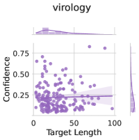
### Visual Description
## Scatter Plot: Virology Confidence vs. Target Length
### Overview
The image is a scatter plot showing the relationship between "Confidence" and "Target Length" in the context of "virology". The plot includes marginal distributions (histograms) along the x and y axes. A regression line with a confidence interval is also plotted.
### Components/Axes
* **Title:** virology
* **X-axis:** Target Length
* Scale: 0 to 100, with increments of 50.
* **Y-axis:** Confidence
* Scale: 0 to 0.75, with increments of 0.25.
* **Data Points:** Each point represents a data entry, with its position determined by its "Target Length" and "Confidence" values. The points are colored in a light purple.
* **Marginal Distributions:** Histograms are present along both axes, showing the distribution of "Target Length" and "Confidence" values.
* **Regression Line:** A light purple regression line is plotted with a shaded confidence interval.
### Detailed Analysis
* **Target Length Distribution:** The histogram along the x-axis shows a concentration of data points towards lower "Target Length" values.
* **Confidence Distribution:** The histogram along the y-axis shows a concentration of data points towards lower "Confidence" values.
* **Scatter Plot:** The scatter plot shows a cluster of points at lower "Target Length" and "Confidence" values. As "Target Length" increases, the "Confidence" values appear to spread out, with no clear trend.
* **Regression Line:** The regression line is nearly flat, indicating a very weak or non-existent correlation between "Target Length" and "Confidence".
### Key Observations
* Most data points are clustered at low "Target Length" and low "Confidence" values.
* There is no strong correlation between "Target Length" and "Confidence".
### Interpretation
The scatter plot suggests that in the context of "virology", there is no strong relationship between the "Target Length" and the "Confidence" score. The clustering of data points at low values for both variables might indicate a bias in the data or a characteristic of the virology data being analyzed. The nearly flat regression line reinforces the lack of correlation.
</details>
|
<details>
<summary>x70.png Details</summary>
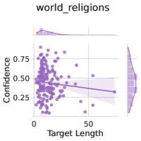
### Visual Description
## Scatter Plot: world_religions
### Overview
The image is a scatter plot titled "world_religions". It displays the relationship between "Target Length" on the x-axis and "Confidence" on the y-axis. The plot includes a regression line with a confidence interval shaded around it. Density plots are shown along both axes, indicating the distribution of the data.
### Components/Axes
* **Title:** world\_religions
* **X-axis:** Target Length
* Scale: 0 to 50
* **Y-axis:** Confidence
* Scale: 0.25 to 0.75
* **Data Points:** Purple dots scattered across the plot.
* **Regression Line:** A purple line showing the linear relationship between Target Length and Confidence, with a shaded confidence interval.
* **Marginal Density Plots:** Density plots along the x and y axes showing the distribution of Target Length and Confidence, respectively.
### Detailed Analysis
* **X-Axis (Target Length):** The data points are concentrated between 0 and 20, with fewer points beyond 20.
* **Y-Axis (Confidence):** The data points are mostly distributed between 0.25 and 0.75.
* **Regression Line:** The regression line has a slight negative slope, suggesting a weak negative correlation between Target Length and Confidence.
* **Data Points:**
* At Target Length = 0, Confidence ranges from approximately 0.3 to 0.75.
* At Target Length = 20, Confidence ranges from approximately 0.25 to 0.6.
* At Target Length = 50, Confidence is approximately 0.3.
### Key Observations
* There is a higher density of data points at lower Target Length values.
* The confidence values are relatively spread out, with a slight concentration around 0.5.
* The negative slope of the regression line suggests that as Target Length increases, Confidence tends to decrease slightly.
### Interpretation
The scatter plot suggests a weak negative correlation between Target Length and Confidence for the "world_religions" dataset. The concentration of data points at lower Target Length values indicates that shorter target lengths are more common in the dataset. The spread of confidence values suggests variability in the confidence levels associated with different target lengths. The regression line indicates a slight tendency for confidence to decrease as target length increases, but the relationship is not strong.
</details>
|
| --- | --- | --- | --- |
Figure 14: Continuing from figs. 12 and 13.
Appendix F Generalization to Coding Tasks
Because there are no coding tasks in our training dataset, we can use a coding competition task introduced in LiveCodeBench [Jain et al., 2024] to assess how well finetuned uncertainty estimation methods perform on completely out of distribution tasks.
To conduct the analysis in table 3, we evaluate several base models on the 62 LeetCode easy questions from the livecodebench_generation_lite task. We asking for the model to write a Python solution and grade the solution using test cases (marking it as correct iff it passes all test cases). We then apply Lora + Prompt and Zero-Shot Classifier uncertainty estimation methods—with these methods only using training/temperature scaling data from our main dataset mixture which notably does not include any coding tasks section C.2. Accuracy is shown to contextualize the model’s overall level of performance on the task. On Mistral-7B, the best performing model on the coding task, the supervised Lora + Prompt approach dramatically improves calibration and selective prediction as compared to Zero-Shot Classifier; on the worse-performing Mistral-7B-Instruct and LLaMa-2-7B, selective prediction improves but calibration slightly degrades.
| Model | Method | Acc | ECE | AUROC |
| --- | --- | --- | --- | --- |
| LLaMa-2-7B | Zero-Shot Classifier | 3.2% | 41.0% | 56.9% |
| Lora + Prompt | 3.2% | 46.4% | 80.0% | |
| Mistral-7B | Zero-Shot Classifier | 27.4% | 70.2% | 66.2% |
| Lora + Prompt | 27.4% | 21.4% | 85.1% | |
| Mistral-7B-Instruct | Zero-Shot Classifier | 21.0% | 52.7% | 47.1% |
| Lora + Prompt | 21.0% | 56.1% | 70.2% | |
Table 3: ECE and AUROC on livecodebench_generation_lite (LeetCode easy subset). ECE is shown after temperature scaling on a small hold-out set of the original dataset mixture section C.2. Acc is task accuracy (proportion of coding solutions that are correct). Supervised training (LoRA + Prompt) seems to always improve selective prediction, although supervised training only heavily improves calibration for Mistral-7B and in fact slightly degrades calibration for the two other models.
Appendix G User Studies
G.1 Additional Details on Setup
Stimuli and Participant Selection
We closely followed the setup of [Bhatt et al., 2023]. We used the same 180 MMLU questions from which were pre-batched into three sets of 60 MMLU questions. Within each variant, we randomly assigned participants to one of the three batches. In total, we recruit $181$ participants (20 per variant With the exception of one extra participant due to random batching allocation effects.). All participants were recruited through the crowdsourcing platform Prolific [Palan and Schitter, 2018]; we restrict our participant pool to those based in the United States who speak English as a first language.
Compensation
Participants were told that the study would take approximately 30 minutes and were paid at a base rate of $9/hr and informed that they would receive an optional bonus up to $10 for answering questions correctly. We applied the bonus to all participants.
LLM Answers and Uncertainty Elicitation
Bhatt et al. originally used GPT-3.5 as their LLM. While at first, we explored user performance when provided with confidence scores modulated over the original GPT-3.5 responses that the authors had collected, the authors had filtered LLM performance to ensure the LLM achieved high performance on biology, computer science, and foreign policy and poor performance on mathematics. As such, we noticed that participants overwhelmingly uptook the LLM’s answer (which was rational behaviour, given the model’s high performance). To explore a more nuanced performance profile, we regenerated LLM answers using Mistral 7B Instruct via greedy decoding. We then generated confidence scores on top of the LLM responses. For our random baseline, we sample a confidence score uniformly between 0 and 100% for each question.
G.2 Important considerations
There are many reasons to heed caution in interpreting our results as definitive indications of the utility of displaying confidence to users in LLM assistive settings. In particular: (i) users are presented with feedback after each trial as in [Bhatt et al., 2023] – as such, they can determine (potentially rapidly) whether or not a model is reliable, even without confidence scores. However, in practical settings users may not know whether or not the model was truly correct and therefore confidence scores could have an even larger impact; (ii) MMLU questions can be challenging for non-experts – we see the biggest differences in performance for the no-LLM vs. any-LLM-assistance condition. We may see a wider range of reliance behaviors in settings wherein people have more confidence in their own abilities; (iii) we present users with numeric confidence; however, humans are not always able to reliably process confidence estimates nor appropriately calibrate uncertainty estimates themselves [Keren, 1991, Vodrahalli et al., 2022, Collins et al., 2023, Lichtenstein et al., 1977]. It may be that alternate modes of communicating confidence improve users’ ability to appropriately leverage the confidence scores in their decision making process. We see targeted exploration of each component through interdisciplinary collaboration across AI, behavioral science, and human-computer interaction as ripe for future work.
G.3 Extended Results
Task Accuracy and Reliance Sensibility
We depict average user task accuracy and reliance sensibility across variants in Figure 15. We follow Bhatt et al. in computing reliance sensibility as the proportion of times the user appropriately sided with the model prediction when the model was correct and did not respond with the model’s prediction when the model was incorrect.
<details>
<summary>x71.png Details</summary>
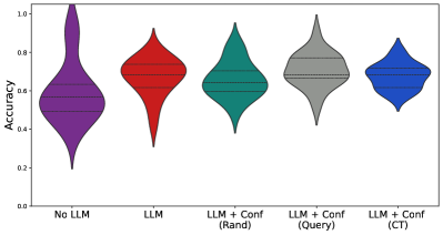
### Visual Description
## Violin Plot: Accuracy Comparison of Different LLM Configurations
### Overview
The image is a violin plot comparing the accuracy distributions of different configurations involving Large Language Models (LLMs). The plot displays the distribution of accuracy scores for each configuration, showing the median, interquartile range, and overall spread of the data. The x-axis represents the different LLM configurations, while the y-axis represents the accuracy.
### Components/Axes
* **Y-axis:** Accuracy, ranging from 0.0 to 1.0 in increments of 0.2.
* **X-axis:** LLM Configurations:
* No LLM
* LLM
* LLM + Conf (Rand)
* LLM + Conf (Query)
* LLM + Conf (CT)
### Detailed Analysis
Here's a breakdown of each configuration's accuracy distribution:
* **No LLM (Purple):**
* The distribution is highly skewed, with a long tail extending towards lower accuracy values.
* The median accuracy is approximately 0.55.
* The accuracy ranges from approximately 0.2 to 1.0.
* **LLM (Red):**
* The distribution is more symmetrical compared to "No LLM".
* The median accuracy is approximately 0.7.
* The accuracy ranges from approximately 0.3 to 0.9.
* **LLM + Conf (Rand) (Teal):**
* The distribution is relatively symmetrical.
* The median accuracy is approximately 0.65.
* The accuracy ranges from approximately 0.3 to 0.95.
* **LLM + Conf (Query) (Gray):**
* The distribution is relatively symmetrical.
* The median accuracy is approximately 0.7.
* The accuracy ranges from approximately 0.4 to 0.9.
* **LLM + Conf (CT) (Blue):**
* The distribution is relatively symmetrical.
* The median accuracy is approximately 0.65.
* The accuracy ranges from approximately 0.5 to 0.85.
### Key Observations
* The "No LLM" configuration has the widest distribution and the lowest median accuracy.
* The "LLM" and "LLM + Conf (Query)" configurations appear to have the highest median accuracy.
* The "LLM + Conf (CT)" configuration has the narrowest distribution, suggesting more consistent accuracy.
### Interpretation
The violin plot suggests that using an LLM generally improves accuracy compared to not using one at all. Adding a confidence mechanism ("Conf") to the LLM can further influence the accuracy distribution, depending on the method used (Rand, Query, CT). The "LLM + Conf (CT)" configuration seems to provide the most consistent accuracy, while "LLM" and "LLM + Conf (Query)" configurations achieve the highest median accuracy. The "No LLM" configuration shows the worst performance, with a wide range of accuracy values and a lower median.
</details>
<details>
<summary>x72.png Details</summary>
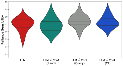
### Visual Description
## Violin Plot: Reliance Sensibility Comparison
### Overview
The image is a violin plot comparing the "Reliance Sensibility" of different configurations. The x-axis represents the configurations: LLM, LLM + Conf (Rand), LLM + Conf (Query), and LLM + Conf (CT). The y-axis represents "Reliance Sensibility" ranging from 0.3 to 1.0. Each violin plot shows the distribution of the "Reliance Sensibility" for each configuration.
### Components/Axes
* **Title:** There is no explicit title.
* **X-axis:**
* Label: Configurations
* Categories: LLM, LLM + Conf (Rand), LLM + Conf (Query), LLM + Conf (CT)
* **Y-axis:**
* Label: Reliance Sensibility
* Scale: 0.3 to 1.0, with increments of 0.1 (0.3, 0.4, 0.5, 0.6, 0.7, 0.8, 0.9, 1.0)
* **Violin Plot Colors:**
* LLM: Red
* LLM + Conf (Rand): Teal
* LLM + Conf (Query): Gray
* LLM + Conf (CT): Blue
* **Horizontal Lines:** Each violin plot contains 3 horizontal dashed lines, representing different statistical measures (likely quartiles or percentiles).
### Detailed Analysis
* **LLM (Red):** The violin plot is centered around 0.75, with a range from approximately 0.4 to 0.9.
* **LLM + Conf (Rand) (Teal):** The violin plot is centered around 0.75, with a range from approximately 0.5 to 0.95.
* **LLM + Conf (Query) (Gray):** The violin plot is centered around 0.75, with a range from approximately 0.5 to 0.9.
* **LLM + Conf (CT) (Blue):** The violin plot is centered around 0.75, with a range from approximately 0.5 to 0.95.
### Key Observations
* All configurations have a similar median "Reliance Sensibility" around 0.75.
* The "LLM + Conf (Rand)" and "LLM + Conf (CT)" configurations appear to have slightly wider distributions, indicating more variability in "Reliance Sensibility".
* The "LLM" configuration has the lowest minimum "Reliance Sensibility" value.
### Interpretation
The violin plot suggests that adding confidence measures (Conf) to the LLM generally maintains or slightly improves the "Reliance Sensibility". The "LLM + Conf (Rand)" and "LLM + Conf (CT)" configurations show a slightly wider range of "Reliance Sensibility" values, which could indicate that these configurations are more sensitive to the specific inputs or conditions. The "LLM" configuration alone has the potential for the lowest "Reliance Sensibility", suggesting that confidence measures can help to mitigate this.
</details>
Figure 15: (Left) User accuracy on 60 MMLU questions per variant ( $N=20$ users per variant); violin plots show quartiles as dashed lines (Right) Average reliance sensibility (proportion of instances where the user sided with the model when the model was correct, and overrode the model’s prediction when the model was incorrect); higher indicates better reliance calibration.
We depict per-topic accuracy, with the LLM’s average performance in Figure 16.
<details>
<summary>x73.png Details</summary>
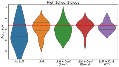
### Visual Description
## Violin Plot: High School Biology Accuracy
### Overview
The image is a violin plot comparing the accuracy of different models on a high school biology task. The models include a baseline with no LLM, an LLM alone, and LLMs with confidence measures (random, query-based, and CT-based). The y-axis represents accuracy, and the x-axis represents the different models. A red dashed line indicates a reference accuracy level.
### Components/Axes
* **Title:** High School Biology
* **Y-axis:** Accuracy, ranging from 0.0 to 1.0 in increments of 0.2.
* **X-axis:** Categorical, representing different models:
* No LLM (Blue)
* LLM (Orange)
* LLM + Conf (Rand) (Green)
* LLM + Conf (Query) (Red)
* LLM + Conf (CT) (Purple)
* **Horizontal Dashed Red Line:** Appears to be a reference line at approximately 0.67 accuracy.
* **Violin Plot Components:** Each violin plot shows the distribution of accuracy for each model. The black dashed lines within each violin plot represent quartiles.
### Detailed Analysis
* **No LLM (Blue):** The "No LLM" model has a wide distribution, with the majority of the data concentrated between 0.3 and 0.6 accuracy.
* **LLM (Orange):** The "LLM" model has a distribution centered around 0.6 accuracy, with a narrower spread than the "No LLM" model.
* **LLM + Conf (Rand) (Green):** The "LLM + Conf (Rand)" model has a distribution similar to the "LLM" model, but slightly shifted upwards, with the majority of the data concentrated between 0.5 and 0.8 accuracy.
* **LLM + Conf (Query) (Red):** The "LLM + Conf (Query)" model has a distribution centered around 0.7 accuracy, with a noticeable tail extending down to lower accuracy values.
* **LLM + Conf (CT) (Purple):** The "LLM + Conf (CT)" model has a distribution centered around 0.65 accuracy, with a narrower spread than the other LLM-based models.
### Key Observations
* The addition of an LLM generally improves accuracy compared to the "No LLM" baseline.
* Confidence measures, particularly the query-based approach, appear to further enhance accuracy.
* The "LLM + Conf (Query)" model has the highest median accuracy but also exhibits a wider range of performance.
* The red dashed line at approximately 0.67 accuracy seems to be a target or threshold.
### Interpretation
The violin plot suggests that using an LLM improves the accuracy of the high school biology task. Furthermore, incorporating confidence measures, especially using a query-based approach, can lead to even better performance. However, the wider distribution of the "LLM + Conf (Query)" model indicates that its performance may be more variable. The "No LLM" model has the lowest accuracy, indicating the value of using an LLM for this task. The red line may represent a minimum acceptable accuracy, and the models that consistently perform above this line are likely preferred.
</details>
<details>
<summary>x74.png Details</summary>
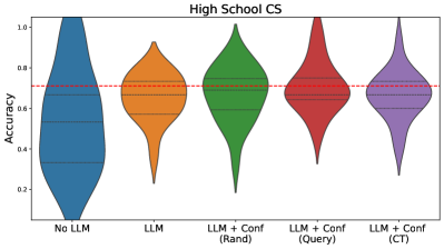
### Visual Description
## Violin Plot: High School CS Accuracy
### Overview
The image is a violin plot comparing the accuracy of different models on a "High School CS" task. The models vary in their use of Large Language Models (LLMs) and confidence measures. The plot shows the distribution of accuracy scores for each model. A horizontal dashed red line is present at approximately y=0.7.
### Components/Axes
* **Title:** High School CS
* **Y-axis:** Accuracy, ranging from 0.2 to 1.0 in increments of 0.2.
* **X-axis:** Categorical, representing different models:
* No LLM (Blue)
* LLM (Orange)
* LLM + Conf (Rand) (Green)
* LLM + Conf (Query) (Red)
* LLM + Conf (CT) (Purple)
### Detailed Analysis
* **No LLM (Blue):** The distribution is wide, indicating a large variance in accuracy. The bulk of the data appears to be between 0.2 and 0.7, with a peak around 0.3-0.4.
* **LLM (Orange):** The distribution is narrower than "No LLM," suggesting less variance. The bulk of the data is between 0.4 and 0.8, with a peak around 0.6-0.7.
* **LLM + Conf (Rand) (Green):** The distribution is relatively narrow and centered higher than "LLM." The bulk of the data is between 0.5 and 0.9, with a peak around 0.7-0.8.
* **LLM + Conf (Query) (Red):** The distribution is similar to "LLM + Conf (Rand)," but possibly with a slightly higher peak. The bulk of the data is between 0.6 and 1.0, with a peak around 0.7-0.8.
* **LLM + Conf (CT) (Purple):** The distribution is similar to "LLM + Conf (Rand)" and "LLM + Conf (Query)." The bulk of the data is between 0.5 and 0.9, with a peak around 0.7.
### Key Observations
* Using an LLM generally improves accuracy compared to "No LLM."
* Adding a confidence measure ("Conf") to the LLM tends to further improve accuracy.
* The different methods of incorporating confidence ("Rand," "Query," "CT") appear to yield similar accuracy distributions.
* The horizontal red line is at approximately 0.7 accuracy.
### Interpretation
The violin plot suggests that incorporating a Large Language Model (LLM) into the system improves accuracy on the "High School CS" task. Furthermore, using a confidence measure in conjunction with the LLM provides an additional boost in performance. The specific method of incorporating confidence (random, query-based, or CT) does not seem to significantly impact the overall accuracy distribution. The "No LLM" model has the lowest and most variable accuracy, indicating that the LLM is a crucial component for achieving higher and more consistent performance. The red line at 0.7 provides a visual reference point, showing which models consistently achieve accuracy above this threshold.
</details>
<details>
<summary>x75.png Details</summary>
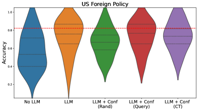
### Visual Description
## Violin Plot: US Foreign Policy
### Overview
The image is a violin plot comparing the accuracy of different models for US Foreign Policy analysis. The models include a baseline "No LLM" model, an "LLM" model, and three variations of "LLM + Conf" models: "(Rand)", "(Query)", and "(CT)". The plot shows the distribution of accuracy scores for each model. A red dashed line indicates a reference accuracy level.
### Components/Axes
* **Title:** US Foreign Policy
* **Y-axis:** Accuracy, ranging from 0.0 to 1.0 in increments of 0.2.
* **X-axis:** Categorical, representing different models:
* No LLM (Blue)
* LLM (Orange)
* LLM + Conf (Rand) (Green)
* LLM + Conf (Query) (Red)
* LLM + Conf (CT) (Purple)
* **Horizontal Red Dashed Line:** Located at approximately 0.82 accuracy.
* **Violin Plot Elements:** Each violin plot shows the distribution of accuracy scores for the corresponding model. Horizontal dashed lines within each violin indicate quartiles.
### Detailed Analysis
* **No LLM (Blue):** The distribution is relatively wide, suggesting a range of accuracy scores. The median appears to be around 0.55.
* **LLM (Orange):** The distribution is narrower and shifted upwards compared to "No LLM," with the median around 0.85.
* **LLM + Conf (Rand) (Green):** The distribution is similar to "LLM," with a median around 0.78.
* **LLM + Conf (Query) (Red):** The distribution is slightly higher than "LLM," with a median around 0.88.
* **LLM + Conf (CT) (Purple):** The distribution is similar to "LLM + Conf (Rand)", with a median around 0.75.
### Key Observations
* The "LLM" model and its variations generally outperform the "No LLM" baseline.
* The "LLM + Conf (Query)" model appears to have the highest median accuracy.
* The "No LLM" model has the widest distribution, indicating the highest variability in accuracy.
### Interpretation
The violin plot suggests that incorporating a Large Language Model (LLM) improves the accuracy of US Foreign Policy analysis compared to not using an LLM. Adding a confidence measure to the LLM ("LLM + Conf") has varying effects depending on the method used to determine confidence. Using a query-based confidence measure ("LLM + Conf (Query)") appears to yield the best results, while random and CT confidence measures are less effective. The red dashed line at 0.82 provides a benchmark, and it's clear that the LLM models generally perform around or above this level. The "No LLM" model's wide distribution indicates that its performance is less consistent.
</details>
<details>
<summary>x76.png Details</summary>
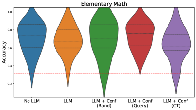
### Visual Description
## Violin Plot: Elementary Math
### Overview
The image is a violin plot comparing the accuracy of different models on elementary math problems. The models include a baseline "No LLM" model, a model using a Large Language Model (LLM), and three LLM-based models incorporating confidence measures: "LLM + Conf (Rand)", "LLM + Conf (Query)", and "LLM + Conf (CT)". The plot shows the distribution of accuracy scores for each model. A red dashed line is present at approximately y=0.3.
### Components/Axes
* **Title:** Elementary Math
* **Y-axis:** Accuracy, ranging from 0.2 to 1.0 in increments of 0.2.
* **X-axis:** Categorical labels representing different models:
* No LLM (Blue)
* LLM (Orange)
* LLM + Conf (Rand) (Green)
* LLM + Conf (Query) (Red)
* LLM + Conf (CT) (Purple)
* **Horizontal dashed lines:** Present within each violin plot, indicating quartiles or other statistical measures of the distribution.
* **Horizontal dashed red line:** Present at y=0.3
### Detailed Analysis
* **No LLM (Blue):** The distribution is centered around 0.7-0.8, with a wide spread, indicating variability in accuracy. The minimum accuracy is around 0.2, and the maximum is close to 1.0.
* **LLM (Orange):** The distribution is centered around 0.7-0.8, similar to "No LLM", but appears slightly more concentrated. The minimum accuracy is around 0.25, and the maximum is close to 1.0.
* **LLM + Conf (Rand) (Green):** The distribution is centered around 0.8, with a long tail extending towards lower accuracy values. The minimum accuracy is close to 0, and the maximum is close to 1.0.
* **LLM + Conf (Query) (Red):** The distribution is centered around 0.7-0.8, with a narrower spread compared to "No LLM" and "LLM". The minimum accuracy is around 0.3, and the maximum is close to 1.0.
* **LLM + Conf (CT) (Purple):** The distribution is centered around 0.7-0.8, with a spread similar to "LLM". The minimum accuracy is around 0.2, and the maximum is close to 1.0.
### Key Observations
* All models, including the baseline "No LLM", achieve high accuracy on some elementary math problems, as indicated by the upper range of the violin plots approaching 1.0.
* The "LLM + Conf (Rand)" model exhibits the widest range of accuracy scores, suggesting that random confidence measures may not be consistently helpful.
* The red dashed line at y=0.3 may represent a threshold for acceptable accuracy, with some models occasionally falling below this level.
### Interpretation
The violin plot compares the performance of different models on elementary math problems, highlighting the impact of using LLMs and confidence measures. The data suggests that while LLMs can improve accuracy, the method of incorporating confidence measures significantly affects performance. The "LLM + Conf (Rand)" model's wide distribution indicates that random confidence measures may introduce more variability than benefit. The red dashed line at y=0.3 could represent a minimum acceptable accuracy level, and the plot shows the proportion of results that fall below this threshold for each model. The plot suggests that simply adding an LLM does not guarantee better performance, and the way confidence is incorporated is crucial.
</details>
Figure 16: User accuracies per topic for the Mistral variants. Red line indicates the model’s average accuracy.
GPT-3.5 Confidence Generalization
As noted, we ran variants using the same GPT-3.5 generations as [Bhatt et al., 2023]. We show aggregate and per-topic accuracy in fig. 17, as well as reliance sensibility in fig. 18.
<details>
<summary>x77.png Details</summary>
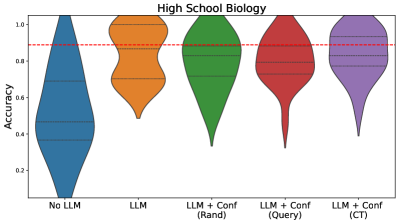
### Visual Description
## Violin Plot: High School Biology Accuracy
### Overview
The image is a violin plot comparing the accuracy of different models on a High School Biology task. The models include a baseline with no LLM, a model using an LLM, and three models combining an LLM with confidence measures (Random, Query, and CT). The y-axis represents accuracy, ranging from 0 to 1.0. A red dashed line is present at approximately 0.88 accuracy.
### Components/Axes
* **Title:** High School Biology
* **Y-axis Label:** Accuracy
* **Y-axis Scale:** 0.0 to 1.0, with ticks at 0.2, 0.4, 0.6, 0.8, and 1.0.
* **X-axis Labels (Categories):**
* No LLM (Blue)
* LLM (Orange)
* LLM + Conf (Rand) (Green)
* LLM + Conf (Query) (Red)
* LLM + Conf (CT) (Purple)
* **Horizontal Dashed Line:** Red, located at approximately 0.88 accuracy.
### Detailed Analysis
* **No LLM (Blue):** The violin plot is wide at lower accuracy values and tapers towards the top. The distribution is skewed towards lower accuracy, with the majority of data points appearing to be below 0.6.
* **LLM (Orange):** The violin plot is concentrated between approximately 0.5 and 1.0 accuracy. The distribution appears more uniform than "No LLM," with a slight bulge around 0.8.
* **LLM + Conf (Rand) (Green):** The violin plot is concentrated between approximately 0.4 and 1.0 accuracy. The distribution appears more uniform than "No LLM," with a slight bulge around 0.9.
* **LLM + Conf (Query) (Red):** The violin plot is concentrated between approximately 0.3 and 1.0 accuracy. The distribution appears more uniform than "No LLM," with a slight bulge around 0.9.
* **LLM + Conf (CT) (Purple):** The violin plot is concentrated between approximately 0.4 and 1.0 accuracy. The distribution appears more uniform than "No LLM," with a slight bulge around 0.9.
### Key Observations
* The "No LLM" model has the lowest accuracy, with a distribution skewed towards lower values.
* Adding an LLM significantly improves accuracy compared to the "No LLM" baseline.
* The three models that combine an LLM with confidence measures ("Rand," "Query," and "CT") show similar accuracy distributions, with a slight concentration around 0.9.
* The red dashed line at approximately 0.88 accuracy serves as a visual reference point, highlighting the performance of the LLM-based models relative to a specific threshold.
### Interpretation
The violin plot demonstrates the impact of using an LLM on the accuracy of a model for High School Biology tasks. The "No LLM" baseline performs significantly worse than the models incorporating an LLM, indicating the value of LLMs in this context. The addition of confidence measures to the LLM models ("Rand," "Query," and "CT") appears to provide a marginal improvement, with similar distributions concentrated around higher accuracy values. The red dashed line emphasizes that the LLM-based models generally achieve accuracy above this threshold. The plot suggests that LLMs are beneficial for this task, and further investigation could explore the differences between the various confidence measure approaches.
</details>
<details>
<summary>x78.png Details</summary>
### Visual Description
## Violin Plot: High School CS Accuracy
### Overview
The image is a violin plot comparing the accuracy of different models on a "High School CS" task. The models include a baseline ("No LLM"), a Large Language Model ("LLM"), and three variations of the LLM combined with confidence measures: "LLM + Conf (Rand)", "LLM + Conf (Query)", and "LLM + Conf (CT)". The plot shows the distribution of accuracy scores for each model. A red dashed line indicates a reference accuracy level.
### Components/Axes
* **Title:** High School CS
* **Y-axis:** Accuracy, ranging from 0.2 to 1.0 in increments of 0.2.
* **X-axis:** Categorical, representing the different models:
* No LLM (Blue)
* LLM (Orange)
* LLM + Conf (Rand) (Green)
* LLM + Conf (Query) (Red)
* LLM + Conf (CT) (Purple)
* **Horizontal dashed lines within each violin:** Represent quartiles of the data distribution.
* **Red dashed line:** Appears to be a target accuracy level, positioned at approximately 0.9.
### Detailed Analysis
* **No LLM (Blue):** The distribution is heavily skewed towards lower accuracy values, with the majority of scores below 0.6. The violin plot extends from approximately 0.05 to 1.0, but the density is concentrated at the lower end.
* **LLM (Orange):** The distribution is more concentrated and shifted upwards compared to "No LLM". The accuracy values range from approximately 0.6 to 1.0, with the bulk of the data around 0.8 to 0.9.
* **LLM + Conf (Rand) (Green):** This distribution is bimodal, with a significant spread. The accuracy ranges from approximately 0.2 to 1.0. There's a concentration of values around 0.8 to 1.0, and another smaller concentration around 0.3.
* **LLM + Conf (Query) (Red):** The distribution is relatively narrow and concentrated at higher accuracy values. The accuracy ranges from approximately 0.5 to 1.0, with the bulk of the data around 0.9 to 1.0.
* **LLM + Conf (CT) (Purple):** The distribution is similar to "LLM + Conf (Query)", but slightly more spread out. The accuracy ranges from approximately 0.5 to 1.0, with the bulk of the data around 0.8 to 1.0.
### Key Observations
* The "No LLM" model performs significantly worse than all other models.
* Adding an LLM generally improves accuracy.
* The confidence-based approaches ("LLM + Conf (Rand)", "LLM + Conf (Query)", and "LLM + Conf (CT)") generally achieve higher accuracy than the basic "LLM" model.
* "LLM + Conf (Query)" and "LLM + Conf (CT)" appear to have the best and most consistent performance.
* "LLM + Conf (Rand)" has a wider distribution, suggesting that the random confidence measure may not be as effective.
### Interpretation
The data suggests that using a Large Language Model (LLM) significantly improves accuracy on the "High School CS" task compared to not using an LLM. Furthermore, incorporating confidence measures into the LLM can further enhance performance. The "Query" and "CT" confidence methods appear to be more effective than the "Rand" method, as they result in higher and more consistent accuracy scores. The red dashed line at 0.9 may represent a target accuracy, and the "LLM + Conf (Query)" and "LLM + Conf (CT)" models consistently achieve accuracy levels at or above this target. The "No LLM" model is a clear outlier, demonstrating the value of using LLMs for this task.
</details>
<details>
<summary>x79.png Details</summary>
### Visual Description
## Violin Plot: US Foreign Policy
### Overview
The image is a violin plot comparing the accuracy of different models for US Foreign Policy prediction. The models include a baseline "No LLM" model, an "LLM" model, and three "LLM + Conf" models using different confidence measures: "Rand", "Query", and "CT". The plot shows the distribution of accuracy scores for each model. A red dashed line is drawn horizontally across the plot at approximately y=0.87.
### Components/Axes
* **Title:** US Foreign Policy
* **Y-axis:** Accuracy, ranging from 0.0 to 1.0 in increments of 0.2.
* **X-axis:** Model types:
* No LLM (Blue)
* LLM (Orange)
* LLM + Conf (Rand) (Green)
* LLM + Conf (Query) (Red)
* LLM + Conf (CT) (Purple)
* **Horizontal Dashed Red Line:** Appears to be a reference line at approximately 0.87 accuracy.
### Detailed Analysis
* **No LLM (Blue):** The distribution is skewed towards higher accuracy, with a median around 0.55. The range of accuracy is wide, from approximately 0.05 to 1.0.
* **LLM (Orange):** The distribution is concentrated at higher accuracy values, with a median around 0.85. The range is narrower than "No LLM", from approximately 0.5 to 1.0.
* **LLM + Conf (Rand) (Green):** The distribution is similar to "LLM", with a median around 0.85. The range is approximately 0.3 to 1.0.
* **LLM + Conf (Query) (Red):** The distribution is also concentrated at higher accuracy values, with a median around 0.85. The range is approximately 0.4 to 1.0.
* **LLM + Conf (CT) (Purple):** The distribution is concentrated at higher accuracy values, with a median around 0.85. The range is approximately 0.6 to 1.0.
### Key Observations
* The "No LLM" model has the widest distribution and the lowest median accuracy.
* All models that incorporate an LLM ("LLM", "LLM + Conf (Rand)", "LLM + Conf (Query)", and "LLM + Conf (CT)") show significantly improved accuracy compared to the "No LLM" baseline.
* The "LLM + Conf" models have slightly different distributions, but their medians are all around 0.85.
* The horizontal red dashed line is positioned at approximately 0.87 accuracy, which is slightly above the median accuracy of the LLM models.
### Interpretation
The data suggests that incorporating a Large Language Model (LLM) significantly improves the accuracy of US Foreign Policy prediction compared to a model without an LLM. The different confidence measures ("Rand", "Query", "CT") used in the "LLM + Conf" models do not appear to have a substantial impact on the overall accuracy, as their distributions are similar. The red dashed line may represent a target accuracy level or a benchmark for comparison. The "No LLM" model's wide distribution indicates high variability in its predictions, while the LLM-based models show more consistent and accurate results.
</details>
<details>
<summary>x80.png Details</summary>
### Visual Description
## Violin Plot: Elementary Math
### Overview
The image is a violin plot comparing the accuracy of different models on elementary math problems. The models include a baseline with no Large Language Model (LLM), an LLM alone, and LLMs with confidence measures using random selection (Rand), query-based selection (Query), and a context-tracking method (CT). The plot shows the distribution of accuracy scores for each model. A red dashed line is present at y=0.3.
### Components/Axes
* **Title:** Elementary Math
* **Y-axis:** Accuracy, ranging from 0.2 to 1.0 in increments of 0.2.
* **X-axis:** Categorical labels representing different models:
* No LLM (Blue)
* LLM (Orange)
* LLM + Conf (Rand) (Green)
* LLM + Conf (Query) (Red)
* LLM + Conf (CT) (Purple)
* **Horizontal dashed lines:** Present within each violin plot at approximately y=0.75, y=0.6, and y=0.3.
* **Horizontal dashed red line:** Present at y=0.3.
### Detailed Analysis
* **No LLM (Blue):** The violin plot is broad, indicating a wide range of accuracy scores. The distribution appears to be skewed towards higher accuracy, with the bulk of the data above 0.6. The minimum accuracy is approximately 0.15, and the maximum is approximately 1.0.
* **LLM (Orange):** The violin plot is narrower than "No LLM," suggesting a smaller range of accuracy scores. The distribution is centered around 0.7, with a minimum accuracy of approximately 0.27 and a maximum of approximately 0.95.
* **LLM + Conf (Rand) (Green):** The violin plot is similar in width to "No LLM" but appears to have a more concentrated distribution around 0.7. The minimum accuracy is approximately 0.08, and the maximum is approximately 1.0.
* **LLM + Conf (Query) (Red):** This violin plot is the narrowest, indicating the most consistent accuracy scores. The distribution is centered around 0.7, with a minimum accuracy of approximately 0.05 and a maximum of approximately 1.0.
* **LLM + Conf (CT) (Purple):** The violin plot is wider than "LLM + Conf (Query)" but narrower than "No LLM." The distribution is centered around 0.7, with a minimum accuracy of approximately 0.25 and a maximum of approximately 1.0.
### Key Observations
* All models using an LLM, with or without confidence measures, generally perform better than the baseline "No LLM" model.
* The "LLM + Conf (Query)" model appears to have the most consistent performance, as indicated by the narrowest violin plot.
* The "No LLM" model has the widest distribution of accuracy scores, suggesting the least consistent performance.
* The red dashed line at y=0.3 serves as a visual reference point, highlighting the proportion of scores above this threshold for each model.
### Interpretation
The data suggests that incorporating an LLM significantly improves accuracy on elementary math problems. Furthermore, using confidence measures, especially with query-based selection, can lead to more consistent performance. The "No LLM" model's wide distribution indicates that its accuracy is highly variable, while the "LLM + Conf (Query)" model's narrow distribution suggests a more reliable and predictable performance. The red line at 0.3 could represent a minimum acceptable accuracy level, and the plot shows how each model performs relative to this threshold.
</details>
Figure 17: User accuracies per topic for the GPT-3.5 variants (with generalization confidence computed for the CT and Query cases). Red line indicates the model’s average accuracy.
<details>
<summary>x81.png Details</summary>
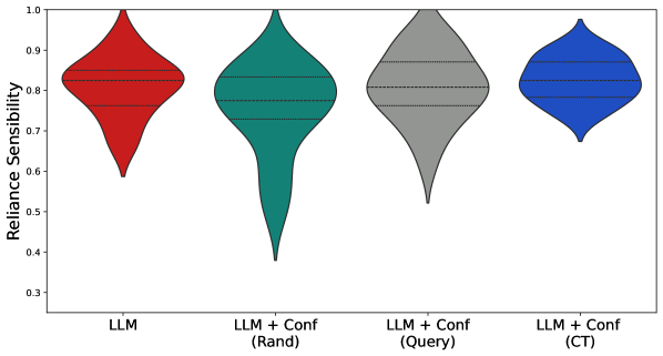
### Visual Description
## Violin Plot: Reliance Sensitivity Comparison
### Overview
The image is a violin plot comparing the "Reliance Sensitivity" of different configurations. The x-axis represents different models or model configurations, while the y-axis represents the "Reliance Sensitivity" score, ranging from 0.3 to 1.0. Each violin plot shows the distribution of the "Reliance Sensitivity" for a given configuration.
### Components/Axes
* **Y-axis:** "Reliance Sensitivity", with a scale from 0.3 to 1.0, incrementing by 0.1.
* **X-axis:** Categorical axis representing different model configurations:
* LLM (Red)
* LLM + Conf (Rand) (Teal)
* LLM + Conf (Query) (Gray)
* LLM + Conf (CT) (Blue)
### Detailed Analysis
The violin plots show the distribution of "Reliance Sensitivity" for each configuration. Each violin plot contains three horizontal dashed lines, presumably representing quartiles or other statistical measures of the distribution.
* **LLM (Red):** The distribution is centered around 0.85, with a range from approximately 0.6 to 1.0.
* **LLM + Conf (Rand) (Teal):** The distribution is centered around 0.85, with a wider range from approximately 0.4 to 1.0.
* **LLM + Conf (Query) (Gray):** The distribution is centered around 0.85, with a range from approximately 0.5 to 1.0.
* **LLM + Conf (CT) (Blue):** The distribution is centered around 0.85, with a narrower range from approximately 0.7 to 1.0.
### Key Observations
* All configurations have a median "Reliance Sensitivity" around 0.85.
* "LLM + Conf (Rand)" has the widest distribution, indicating the most variability in "Reliance Sensitivity".
* "LLM + Conf (CT)" has the narrowest distribution, indicating the least variability in "Reliance Sensitivity".
### Interpretation
The violin plot suggests that adding confidence measures to the LLM model ("LLM + Conf") does not significantly change the median "Reliance Sensitivity". However, the method used to determine confidence ("Rand", "Query", "CT") affects the variability of the "Reliance Sensitivity". Using "CT" results in the most consistent "Reliance Sensitivity", while using "Rand" results in the most variable "Reliance Sensitivity". The "LLM" model alone has a similar median "Reliance Sensitivity" to the other configurations, but with a slightly narrower distribution than "LLM + Conf (Rand)" and "LLM + Conf (Query)".
</details>
Figure 18: Reliance sensibility for the variants based on GPT-3.5
Freeform User Responses
We permitted users to provide freeform responses at the end of the study. Some users were sensitive to confidence scores being reported and came up with their own heuristics for whether to rely on the model’s output. We include a sampling of comments across confidence variants:
- “if it had a confidence of less than 50% it made me very skeptical.”
- “The modelś confidence indeed helped me choose and select my answer as I trusted in them most of the time.”
- “I didnt́ really rely on the confidence level. If I had 0 confidence in the answer myself I relied on the AI regardless.”
- “if the models confidence fell below 45 I decided to investigate it myself by remembering pieces of information. and also reasoning the question. If it was above 45 I would automatically agree to its prediction but there were some few cases I challenged it even though it was above 45”
- “At first I was hesistant to trust the model much because of the lower confidence levels but I still trusted it enough on topics I struggled with. As it went on, I was comfortable with confidence levels above 40.”
- “If the modelś confidence was low and I thought I knew the answer (and it was different) I chose my answer”
G.4 Interface and Instructions
We show a sample interface of our extension of Modiste with user confidence in Figure 19, and present the the full set of instructions provided to users in Figures 20 and 21. Note, for the LLM-only and no-LLM conditions, we followed the instruction text from [Bhatt et al., 2023] directly, i.e., participants who saw only the LLM did not see the instruction page about model confidence, and participants in the “No-LLM” variant were not instructed about any model variant and were just instructed to answer the questions as best as they could by themselves. Participants also responded to a post survey questionarre after completing the user study, which we depict in Figure 22.
<details>
<summary>user_study_figs/instructions/page_with_feedback.png Details</summary>
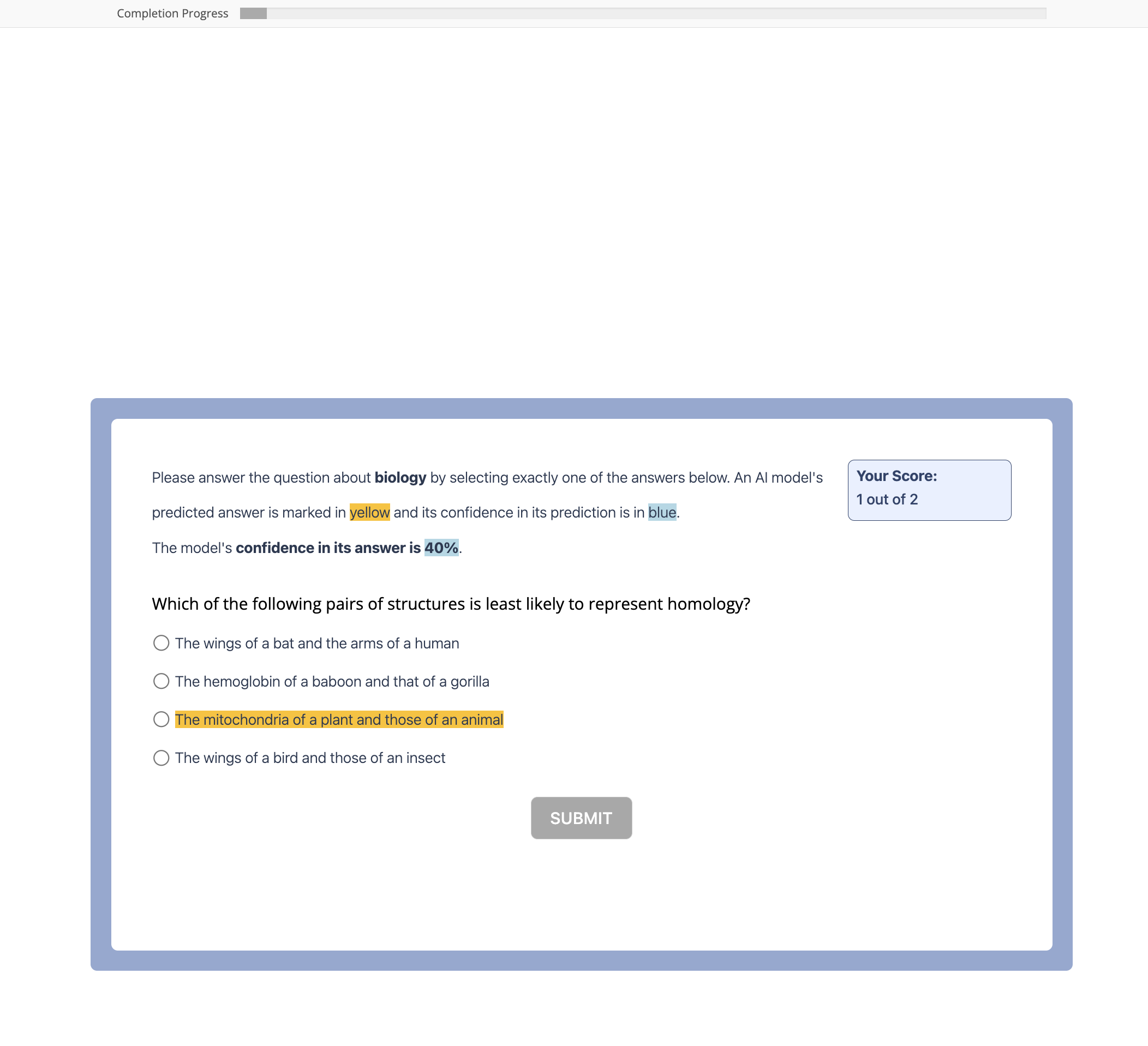
### Visual Description
## Quiz Question: Homology
### Overview
The image shows a quiz question about biology, specifically homology. The question asks the user to identify the pair of structures least likely to represent homology. An AI model has predicted an answer, marked in yellow, and its confidence in the prediction is given in blue. The user's current score is also displayed.
### Components/Axes
* **Header:** "Completion Progress" with a progress bar.
* **Question Prompt:** "Please answer the question about biology by selecting exactly one of the answers below. An AI model's predicted answer is marked in yellow and its confidence in its prediction is in blue. The model's confidence in its answer is 40%."
* **Question:** "Which of the following pairs of structures is least likely to represent homology?"
* **Answer Choices:**
* "The wings of a bat and the arms of a human"
* "The hemoglobin of a baboon and that of a gorilla"
* "The mitochondria of a plant and those of an animal" (highlighted in yellow)
* "The wings of a bird and those of an insect"
* **Submit Button:** "SUBMIT"
* **Score:** "Your Score: 1 out of 2"
### Detailed Analysis or ### Content Details
The question is a multiple-choice question. The AI model has predicted "The mitochondria of a plant and those of an animal" as the answer, with a confidence of 40%. The user has a score of 1 out of 2.
### Key Observations
* The AI model's predicted answer is highlighted in yellow.
* The AI model's confidence is stated as 40% and is likely displayed in blue (as indicated in the prompt).
* The user has answered one question correctly out of two.
### Interpretation
The quiz question tests the user's understanding of homology, which is the similarity of structures due to shared ancestry. The question asks the user to identify the pair of structures that are least likely to be homologous. The AI model's prediction suggests that the mitochondria of a plant and those of an animal are the least likely to be homologous, possibly due to the significant evolutionary distance between plants and animals. The user's score indicates that they may have answered one question incorrectly previously.
</details>
Figure 19: Example interface from Modiste. Participants are informed of the question (and topic), as well as the LLM prediction and confidence. Participants are informed of their running score throughout the experiment.
<details>
<summary>user_study_figs/instructions/starter_inst.png Details</summary>
### Visual Description
## Screenshot: Experiment Welcome Screen
### Overview
The image is a screenshot of a welcome screen for an experiment. It provides information about the purpose of the experiment, the estimated time to complete it, and the compensation offered. Navigation buttons are present at the bottom.
### Components/Axes
* **Header:** "Welcome!"
* **Body:**
* Description of the experiment: "We are conducting an experiment to understand how people make decisions with and without AI support. Your answers will be used to inform machine learning, cognitive science, and human-computer interaction research."
* Estimated time: "This experiment should take at most 30 minutes."
* Compensation details: "You will be compensated at a base rate of $9/hour for a total of $4.50, which you will receive as long as you complete the study."
* **Footer:**
* Navigation buttons: "< Previous" and "Next >"
### Detailed Analysis or ### Content Details
* **Experiment Focus:** The experiment aims to understand human decision-making processes, both with and without AI assistance.
* **Research Areas:** The data collected will contribute to research in machine learning, cognitive science, and human-computer interaction.
* **Time Commitment:** Participants are informed that the experiment will take a maximum of 30 minutes.
* **Compensation:** Participants will receive $4.50 for completing the study, which is calculated based on a rate of $9 per hour.
* **Navigation:** The "Next >" button suggests the user can proceed to the next stage of the experiment. The "< Previous" button suggests the user can go back to the previous screen.
### Key Observations
* The welcome screen is designed to inform potential participants about the experiment's purpose, time commitment, and compensation.
* The language used is clear and concise, aiming to encourage participation.
### Interpretation
The welcome screen serves as an introduction to the experiment, setting expectations for participants. The information provided is intended to be transparent and informative, ensuring that participants are aware of the study's goals and their role in it. The compensation details are clearly stated to incentivize participation. The presence of navigation buttons indicates that this is part of a larger interactive experience.
</details>
<details>
<summary>user_study_figs/instructions/likely_answer_inst.png Details</summary>
### Visual Description
## Experiment Instructions
### Overview
The image shows instructions for an experiment involving multiple-choice questions on various school topics. It also includes navigation buttons.
### Components/Axes
* **Text Instructions:** Two paragraphs explaining the experiment and the user's task.
* **Navigation Buttons:** "< Previous" and "Next >" buttons.
### Detailed Analysis or ### Content Details
* **First Paragraph:** "In this experiment, you will be seeing multiple choice questions, from various topics, such as those that you may find in school (e.g., biology, mathematics, foreign policy, computer science)."
* **Second Paragraph:** "Your task is to determine the most likely answer for each question. You can select this category by clicking on the radio button associated with your answer."
* **Previous Button:** Located on the left side, labeled "< Previous".
* **Next Button:** Located on the right side, labeled "Next >".
### Key Observations
* The instructions are clear and concise, explaining the nature of the experiment and the user's role.
* The navigation buttons suggest a sequential presentation of questions.
### Interpretation
The image presents the initial instructions for an experiment where participants answer multiple-choice questions on school-related topics. The instructions emphasize selecting the "most likely" answer, suggesting a focus on reasoning and judgment rather than simple recall. The presence of "Previous" and "Next" buttons indicates that the questions are presented in a sequence, allowing participants to navigate between them.
</details>
<details>
<summary>user_study_figs/instructions/ai_pred_inst.png Details</summary>
### Visual Description
## Screenshot: AI Model Prediction Explanation
### Overview
The image is a screenshot of a text-based explanation regarding the use of an AI-based model's predictions during tasks. It informs the user that the model's predictions will be highlighted in yellow over answer choices and that the user is free to use or ignore this information. Navigation buttons for "Previous" and "Next" are also present.
### Components/Axes
* **Text Content:**
* "During the tasks, you will also see the **prediction** of an AI-based model."
* "The model's prediction will show up as yellow highlighting over that answer choice. If shown, you are free to use or ignore the information when selecting your answer however you wish."
* **Navigation Buttons:**
* "< Previous"
* "Next >"
### Detailed Analysis or ### Content Details
The text explains that an AI model's prediction will be displayed to the user, highlighted in yellow over the answer choices. The user is given the freedom to either use or ignore this information when making their selection. The "Previous" and "Next" buttons suggest this is part of a larger tutorial or informational sequence.
### Key Observations
* The key information is the explanation of how the AI model's predictions will be presented (yellow highlighting) and the user's autonomy in using that information.
* The navigation buttons indicate a sequential presentation of information.
### Interpretation
The image provides instructions to the user on how to interpret and interact with the AI model's predictions. The yellow highlighting serves as a visual cue, while the explicit statement about the user's freedom to use or ignore the information emphasizes user control and transparency in the AI-assisted decision-making process. This approach aims to provide assistance without being prescriptive, allowing the user to maintain agency in the task.
</details>
<details>
<summary>user_study_figs/instructions/confidence_inst.png Details</summary>
### Visual Description
## Screenshot: Model Confidence Display
### Overview
The image is a screenshot of a user interface element, likely part of a tutorial or explanation. It describes how the model's confidence in its predictions will be displayed, and includes navigation buttons.
### Components/Axes
* **Text:** "You will also see the model's *confidence* in its prediction (which will be shown in blue) for each question."
* **Buttons:**
* "< Previous" button on the left.
* "Next >" button on the right.
### Detailed Analysis or ### Content Details
The text explains that the model's confidence level for each question will be visually represented in blue. The "Previous" and "Next" buttons suggest a sequential presentation of information, possibly a step-by-step guide or a series of questions.
### Key Observations
* The word "confidence" is italicized in the text.
* The color blue is mentioned as the visual indicator for the model's confidence.
* The presence of "Previous" and "Next" buttons indicates an interactive element.
### Interpretation
The screenshot provides context for understanding how the model's confidence is communicated to the user. The use of blue as a visual cue is a key element of the design. The navigation buttons suggest that the user can explore the model's confidence levels for different questions or scenarios. This is likely part of an educational or explanatory interface.
</details>
<details>
<summary>user_study_figs/instructions/seconds_per.png Details</summary>

### Visual Description
## Text Description: Instructions and Navigation
### Overview
The image contains instructions for an online test or exercise, along with navigation buttons. The instructions inform the user about the time constraints and the behavior of the submit button.
### Components/Axes
* **Text Instructions:** Two paragraphs of text providing guidance and encouragement.
* **Navigation Buttons:** Two buttons labeled "< Previous" and "Next >".
### Detailed Analysis or ### Content Details
**Text Instructions (Paragraph 1):**
"We encourage you to try to work through each problem. You will not be able to continue to the next question until at least **10 seconds** have passed. The SUBMIT button will change from grey to blue when you are able to click to move to the next page whenever you are ready to answer."
**Text Instructions (Paragraph 2):**
"Of course you can take longer than 10 seconds on any question if needed! It may be very challenging to determine the answer for some questions. Others may be easy. **Please try your best** regardless."
**Navigation Buttons:**
* "< Previous": A button to navigate to the previous question or page.
* "Next >": A button to navigate to the next question or page.
### Key Observations
* The instructions emphasize a minimum time requirement of 10 seconds per question.
* The instructions also encourage the user to try their best, regardless of the difficulty of the questions.
* The navigation buttons provide a way to move between questions or pages.
### Interpretation
The text provides instructions for a timed online assessment. The 10-second minimum time likely aims to prevent users from rushing through questions without proper consideration. The encouragement to "try your best" suggests that the assessment may include questions of varying difficulty. The navigation buttons allow users to move back and forth between questions, providing flexibility in how they approach the assessment.
</details>
<details>
<summary>user_study_figs/instructions/bonus.png Details</summary>

### Visual Description
## Text Block: Bonus Information and Navigation
### Overview
The image presents information about a bonus payment structure based on correct answers to questions, along with a statement about feedback after each trial. It also includes navigation buttons.
### Components/Axes
* **Text Content:** Two sentences describing the bonus and feedback.
* **Navigation Buttons:** "< Previous" and "Next >"
### Detailed Analysis or ### Content Details
* **Bonus Information:** "You will receive a bonus of up to a rate of $10/hour (+$0.50) based on how many questions you correctly answer."
* **Feedback Information:** "You will be informed whether or not you are correct after each trial."
* **Previous Button:** "< Previous"
* **Next Button:** "Next >"
### Key Observations
* The bonus is directly tied to the number of correctly answered questions.
* Immediate feedback is provided after each trial.
* Navigation buttons are present for moving between pages or sections.
### Interpretation
The text indicates an incentive system where participants are rewarded for accuracy. The immediate feedback mechanism likely aims to improve learning and performance. The navigation buttons suggest this is part of a larger interface or process.
</details>
Figure 20: Experiment instructions for the confidence variants.
<details>
<summary>user_study_figs/instructions/questions.png Details</summary>

### Visual Description
## Screenshot: Quiz Introduction
### Overview
The image is a screenshot of a quiz introduction screen. It informs the user that they will see a total of 60 questions and provides "Previous" and "Next" buttons for navigation.
### Components/Axes
* **Text:** "You will see a total of 60 questions."
* **Button 1:** "< Previous"
* **Button 2:** "Next >"
### Detailed Analysis or ### Content Details
The text "You will see a total of 60 questions." is centered horizontally on the screen. Below the text are two buttons. The left button reads "< Previous" and the right button reads "Next >".
### Key Observations
* The screen is simple and straightforward, providing only essential information and navigation.
* The number of questions (60) is emphasized by being in bold.
### Interpretation
The screenshot represents the initial screen of a quiz or test. The user is informed about the total number of questions they will encounter. The "Previous" and "Next" buttons suggest a sequential question format. The screen serves as a basic introduction and navigation point for the quiz.
</details>
<details>
<summary>user_study_figs/instructions/next.png Details</summary>
### Visual Description
## Screenshot: Experiment Instructions and Navigation
### Overview
The image is a screenshot of a webpage displaying instructions for an experiment participant. It prompts the user to click "Next" to complete a comprehension check and emphasizes the importance of having the window in full screen or a substantially large size to view the questions properly. The page also includes "Previous" and "Next" buttons for navigation.
### Components/Axes
* **Text Instructions:** Two lines of text providing instructions to the user.
* **Navigation Buttons:** Two buttons labeled "< Previous" and "Next >".
### Detailed Analysis or ### Content Details
* **Text Instructions:**
* "When you are ready, please click "Next" to complete a quick comprehension check, before moving on to the experiment."
* "Please make sure to window size is in full screen, or substantially large enough, to properly view the questions."
* **Navigation Buttons:**
* "< Previous" button is located to the left of the "Next >" button.
* "Next >" button is located to the right of the "< Previous" button.
### Key Observations
* The instructions are clear and concise, preparing the user for the next step in the experiment.
* The emphasis on window size suggests that the comprehension check may involve visual elements or require a larger display area.
* The presence of both "Previous" and "Next" buttons indicates a sequential flow through the experiment.
### Interpretation
The screenshot represents a standard step in an online experiment, ensuring that participants understand the instructions and have the necessary viewing conditions before proceeding. The comprehension check serves as a quality control measure, while the navigation buttons allow users to move forward or backward through the experiment at their own pace. The instructions are designed to minimize potential issues related to screen resolution or visual clarity, which could affect the accuracy of the data collected.
</details>
<details>
<summary>user_study_figs/instructions/mc_check.png Details</summary>
### Visual Description
## Form: Knowledge Check
### Overview
The image is a screenshot of a form, likely part of an online assessment or tutorial. It presents two questions to the user, each with a set of radio button options. The form aims to gauge the user's understanding of the task at hand before proceeding.
### Components/Axes
* **Header Text:** "Check your knowledge before you begin. If you don't know the answers, don't worry; we will show you the instructions again."
* **Question 1:** "What will you be asked to determine in this task?*"
* **Options:**
* "The answer to a mutliple choice question."
* "The least likely answer to a multiple choice question."
* "The most likely categories of an image."
* **Question 2:** "How will you select your answer?*"
* **Options:**
* "Typing in a text box."
* "Clicking on a radio button."
* "Selecting from a dropdown menu."
* **Button:** "Continue" (located at the bottom center of the form)
### Detailed Analysis or ### Content Details
The form consists of two multiple-choice questions. Each question has three options presented as radio buttons. The first question focuses on the type of task the user will be performing, while the second question asks about the method of selecting an answer. A "Continue" button is present at the bottom to proceed after answering the questions.
### Key Observations
* The questions are designed to assess the user's understanding of the task's objectives and interaction methods.
* The asterisk (*) next to each question indicates that they might be required fields.
* The header text provides reassurance to the user, indicating that help will be provided if they are unsure of the answers.
### Interpretation
The form serves as a preliminary knowledge check before the user engages with the main task. It aims to ensure that the user understands the task's goals and how to interact with the interface. The "Continue" button suggests that this form is part of a larger interactive process. The questions are designed to be straightforward and assess basic comprehension.
</details>
Figure 21: Experiment instructions for the confidence variants (continued).
<details>
<summary>user_study_figs/instructions/postsurvey_questionarre.png Details</summary>
### Visual Description
## Survey Form: Post-Experiment Questionnaire
### Overview
The image is a screenshot of a survey form presented to participants after completing a study. The form consists of several open-ended and one numerical question designed to gather feedback on the experiment and the participant's experience.
### Components/Axes
The form includes the following elements:
* **Header:** "Thank you for participating in our study! Click "Finish" to complete the experiment and receive compensation. If you have any comments about the experiment, please let us know in the form below."
* **Question 1:** "How challenging did you find the questions? (On a scale of 1-10, with 10 being very challenging)" followed by a numerical input box.
* **Question 2:** "Did the model's confidence impact your response? In what way if so, please be as specific as possible (1-3 sentences)" followed by a text input box.
* **Question 3:** "Were there any question topics you struggled with?" followed by a text input box.
* **Question 4:** "Were there any question topics you were always very confident in?" followed by a text input box.
* **Question 5:** "Do you have any additional comments to share with us?" followed by a text input box.
* **Footer:** A "Finish" button.
### Detailed Analysis or Content Details
* **Question 1:** The participant is asked to rate the challenge level of the questions on a scale from 1 to 10, where 10 represents the highest level of challenge. A numerical input box is provided for the response.
* **Question 2:** This question explores the influence of the model's confidence on the participant's responses. The participant is instructed to provide a specific explanation within 1-3 sentences using a text input box.
* **Question 3:** The participant is asked to list any question topics they found difficult. A text input box is provided for the response.
* **Question 4:** The participant is asked to list any question topics they felt confident about. A text input box is provided for the response.
* **Question 5:** This is an open-ended question inviting the participant to share any additional comments related to the study. A text input box is provided for the response.
* **Finish Button:** Located at the bottom of the form, this button presumably submits the completed survey.
### Key Observations
The survey focuses on gathering subjective feedback from participants regarding the difficulty of the questions, the impact of the model's confidence, and any specific topics they struggled with or felt confident about. The final question allows for any additional comments or insights.
### Interpretation
The survey aims to understand the participant's experience during the study. The questions are designed to elicit both quantitative (challenge rating) and qualitative (open-ended responses) data. The information gathered can be used to improve the study design, refine the model, and gain insights into the participant's understanding and perception of the task. The survey is a crucial component of the research process, providing valuable feedback for future iterations and analysis.
</details>
Figure 22: Sample pot-survey questionnaire for users who were allocated to a variant wherein they saw model confidence.
Appendix H Broader Impact and Implications
The goal of this work is to make LLM outputs have better confidence values associated with them. With successful, calibrated confidence values, the machine systems ultimately become more interpretable and trustworthy by a user [Janssen et al., 2008]. When applied correctly, our advancements will help users be able to make decisions based off of LLM outputs in a more informed way. Similar examples in other domains, like AlphaFold Terwilliger et al. [2023], have shown how well-calibrated confidence scores can be useful in complex decision-making domains. Our hope is to replicate those broad findings in LLMs.
We acknowledge the ongoing debate over the appropriateness, limitations, and harms of LLMs. We do highlight that the development of more confident, interpretable, and trustworthy LLMs can lead to continued techno-solutionism in unintended applications. Specifically, we highlight that our work is limited to use-cases with fact-based questions. Many applications of text-based LLMs are generative, meaning that there is no way for our paradigm to be applied appropriately, and the use of a confidences from calibration-tuned models could be misleading or damaging without checks and guardrails. Additionally, even within the fact-based paradigm, what is true can be subjective, with ground truth in machine learning being a contested topic [Aroyo and Welty, 2015, Uma et al., 2021].
The philosophical debate on these topics is beyond the expertise of the authors; nonetheless, we believe that the ongoing debate over the appropriateness of LLMs should be considered in context with the benefits of our approach in making LLMs more interpretable and useful.
Appendix I NeurIPS Paper Checklist
1. Claims
1. Question: Do the main claims made in the abstract and introduction accurately reflect the paper’s contributions and scope?
1. Answer: [Yes]
1. Justification: We describe and link all claims in section 1.
1. Guidelines:
- The answer NA means that the abstract and introduction do not include the claims made in the paper.
- The abstract and/or introduction should clearly state the claims made, including the contributions made in the paper and important assumptions and limitations. A No or NA answer to this question will not be perceived well by the reviewers.
- The claims made should match theoretical and experimental results, and reflect how much the results can be expected to generalize to other settings.
- It is fine to include aspirational goals as motivation as long as it is clear that these goals are not attained by the paper.
1. Limitations
1. Question: Does the paper discuss the limitations of the work performed by the authors?
1. Answer: [Yes]
1. Justification: We provide a discussion on the limitations in section 8.
- The answer NA means that the paper has no limitation while the answer No means that the paper has limitations, but those are not discussed in the paper.
- The authors are encouraged to create a separate ”Limitations” section in their paper.
- The paper should point out any strong assumptions and how robust the results are to violations of these assumptions (e.g., independence assumptions, noiseless settings, model well-specification, asymptotic approximations only holding locally). The authors should reflect on how these assumptions might be violated in practice and what the implications would be.
- The authors should reflect on the scope of the claims made, e.g., if the approach was only tested on a few datasets or with a few runs. In general, empirical results often depend on implicit assumptions, which should be articulated.
- The authors should reflect on the factors that influence the performance of the approach. For example, a facial recognition algorithm may perform poorly when image resolution is low or images are taken in low lighting. Or a speech-to-text system might not be used reliably to provide closed captions for online lectures because it fails to handle technical jargon.
- The authors should discuss the computational efficiency of the proposed algorithms and how they scale with dataset size.
- If applicable, the authors should discuss possible limitations of their approach to address problems of privacy and fairness.
- While the authors might fear that complete honesty about limitations might be used by reviewers as grounds for rejection, a worse outcome might be that reviewers discover limitations that aren’t acknowledged in the paper. The authors should use their best judgment and recognize that individual actions in favor of transparency play an important role in developing norms that preserve the integrity of the community. Reviewers will be specifically instructed to not penalize honesty concerning limitations.
1. Theory Assumptions and Proofs
1. Question: For each theoretical result, does the paper provide the full set of assumptions and a complete (and correct) proof?
1. Answer: [N/A]
1. Justification: [N/A]
- The answer NA means that the paper does not include theoretical results.
- All the theorems, formulas, and proofs in the paper should be numbered and cross-referenced.
- All assumptions should be clearly stated or referenced in the statement of any theorems.
- The proofs can either appear in the main paper or the supplemental material, but if they appear in the supplemental material, the authors are encouraged to provide a short proof sketch to provide intuition.
- Inversely, any informal proof provided in the core of the paper should be complemented by formal proofs provided in appendix or supplemental material.
- Theorems and Lemmas that the proof relies upon should be properly referenced.
1. Experimental Result Reproducibility
1. Question: Does the paper fully disclose all the information needed to reproduce the main experimental results of the paper to the extent that it affects the main claims and/or conclusions of the paper (regardless of whether the code and data are provided or not)?
1. Answer: [Yes]
1. Justification: We provide the complete code, and the complete list of datasets used for all experiments in section 5 to reproduce all our experiments with instructions. All hyperparameters are described in section 5.
1. Guidelines:
- The answer NA means that the paper does not include experiments.
- If the paper includes experiments, a No answer to this question will not be perceived well by the reviewers: Making the paper reproducible is important, regardless of whether the code and data are provided or not.
- If the contribution is a dataset and/or model, the authors should describe the steps taken to make their results reproducible or verifiable.
- Depending on the contribution, reproducibility can be accomplished in various ways. For example, if the contribution is a novel architecture, describing the architecture fully might suffice, or if the contribution is a specific model and empirical evaluation, it may be necessary to either make it possible for others to replicate the model with the same dataset, or provide access to the model. In general. releasing code and data is often one good way to accomplish this, but reproducibility can also be provided via detailed instructions for how to replicate the results, access to a hosted model (e.g., in the case of a large language model), releasing of a model checkpoint, or other means that are appropriate to the research performed.
- While NeurIPS does not require releasing code, the conference does require all submissions to provide some reasonable avenue for reproducibility, which may depend on the nature of the contribution. For example
1. If the contribution is primarily a new algorithm, the paper should make it clear how to reproduce that algorithm.
1. If the contribution is primarily a new model architecture, the paper should describe the architecture clearly and fully.
1. If the contribution is a new model (e.g., a large language model), then there should either be a way to access this model for reproducing the results or a way to reproduce the model (e.g., with an open-source dataset or instructions for how to construct the dataset).
1. We recognize that reproducibility may be tricky in some cases, in which case authors are welcome to describe the particular way they provide for reproducibility. In the case of closed-source models, it may be that access to the model is limited in some way (e.g., to registered users), but it should be possible for other researchers to have some path to reproducing or verifying the results.
1. Open access to data and code
1. Question: Does the paper provide open access to the data and code, with sufficient instructions to faithfully reproduce the main experimental results, as described in supplemental material?
1. Answer: [Yes]
1. Justification: We provide the complete code, and the complete list of datasets used for all experiments in section C.2 to reproduce all our experiments with instructions. All hyperparameters are described in section 5.
1. Guidelines:
- The answer NA means that paper does not include experiments requiring code.
- Please see the NeurIPS code and data submission guidelines (https://nips.cc/public/guides/CodeSubmissionPolicy) for more details.
- While we encourage the release of code and data, we understand that this might not be possible, so No is an acceptable answer. Papers cannot be rejected simply for not including code, unless this is central to the contribution (e.g., for a new open-source benchmark).
- The instructions should contain the exact command and environment needed to run to reproduce the results. See the NeurIPS code and data submission guidelines (https://nips.cc/public/guides/CodeSubmissionPolicy) for more details.
- The authors should provide instructions on data access and preparation, including how to access the raw data, preprocessed data, intermediate data, and generated data, etc.
- The authors should provide scripts to reproduce all experimental results for the new proposed method and baselines. If only a subset of experiments are reproducible, they should state which ones are omitted from the script and why.
- At submission time, to preserve anonymity, the authors should release anonymized versions (if applicable).
- Providing as much information as possible in supplemental material (appended to the paper) is recommended, but including URLs to data and code is permitted.
1. Experimental Setting/Details
1. Question: Does the paper specify all the training and test details (e.g., data splits, hyperparameters, how they were chosen, type of optimizer, etc.) necessary to understand the results?
1. Answer: [Yes]
1. Justification: We provide the complete code, and the complete list of datasets used for all experiments in section C.2 to reproduce all our experiments with instructions. All hyperparameters are described in section 5.
1. Guidelines:
- The answer NA means that the paper does not include experiments.
- The experimental setting should be presented in the core of the paper to a level of detail that is necessary to appreciate the results and make sense of them.
- The full details can be provided either with the code, in appendix, or as supplemental material.
1. Experiment Statistical Significance
1. Question: Does the paper report error bars suitably and correctly defined or other appropriate information about the statistical significance of the experiments?
1. Answer: [Yes]
1. Justification: All figures are appropriately labeled with the error bars.
1. Guidelines:
- The answer NA means that the paper does not include experiments.
- The authors should answer ”Yes” if the results are accompanied by error bars, confidence intervals, or statistical significance tests, at least for the experiments that support the main claims of the paper.
- The factors of variability that the error bars are capturing should be clearly stated (for example, train/test split, initialization, random drawing of some parameter, or overall run with given experimental conditions).
- The method for calculating the error bars should be explained (closed form formula, call to a library function, bootstrap, etc.)
- The assumptions made should be given (e.g., Normally distributed errors).
- It should be clear whether the error bar is the standard deviation or the standard error of the mean.
- It is OK to report 1-sigma error bars, but one should state it. The authors should preferably report a 2-sigma error bar than state that they have a 96% CI, if the hypothesis of Normality of errors is not verified.
- For asymmetric distributions, the authors should be careful not to show in tables or figures symmetric error bars that would yield results that are out of range (e.g. negative error rates).
- If error bars are reported in tables or plots, The authors should explain in the text how they were calculated and reference the corresponding figures or tables in the text.
1. Experiments Compute Resources
1. Question: For each experiment, does the paper provide sufficient information on the computer resources (type of compute workers, memory, time of execution) needed to reproduce the experiments?
1. Answer: [Yes]
1. Justification: We provide an estimate of the compute resources required in section 5.
1. Guidelines:
- The answer NA means that the paper does not include experiments.
- The paper should indicate the type of compute workers CPU or GPU, internal cluster, or cloud provider, including relevant memory and storage.
- The paper should provide the amount of compute required for each of the individual experimental runs as well as estimate the total compute.
- The paper should disclose whether the full research project required more compute than the experiments reported in the paper (e.g., preliminary or failed experiments that didn’t make it into the paper).
1. Code Of Ethics
1. Question: Does the research conducted in the paper conform, in every respect, with the NeurIPS Code of Ethics https://neurips.cc/public/EthicsGuidelines?
1. Answer: [Yes]
1. Justification: We have read the ethics guidelines
1. Guidelines:
- The answer NA means that the authors have not reviewed the NeurIPS Code of Ethics.
- If the authors answer No, they should explain the special circumstances that require a deviation from the Code of Ethics.
- The authors should make sure to preserve anonymity (e.g., if there is a special consideration due to laws or regulations in their jurisdiction).
1. Broader Impacts
1. Question: Does the paper discuss both potential positive societal impacts and negative societal impacts of the work performed?
1. Answer: [Yes]
1. Justification: We provide a broader impact statement in appendix H
1. Guidelines:
- The answer NA means that there is no societal impact of the work performed.
- If the authors answer NA or No, they should explain why their work has no societal impact or why the paper does not address societal impact.
- Examples of negative societal impacts include potential malicious or unintended uses (e.g., disinformation, generating fake profiles, surveillance), fairness considerations (e.g., deployment of technologies that could make decisions that unfairly impact specific groups), privacy considerations, and security considerations.
- The conference expects that many papers will be foundational research and not tied to particular applications, let alone deployments. However, if there is a direct path to any negative applications, the authors should point it out. For example, it is legitimate to point out that an improvement in the quality of generative models could be used to generate deepfakes for disinformation. On the other hand, it is not needed to point out that a generic algorithm for optimizing neural networks could enable people to train models that generate Deepfakes faster.
- The authors should consider possible harms that could arise when the technology is being used as intended and functioning correctly, harms that could arise when the technology is being used as intended but gives incorrect results, and harms following from (intentional or unintentional) misuse of the technology.
- If there are negative societal impacts, the authors could also discuss possible mitigation strategies (e.g., gated release of models, providing defenses in addition to attacks, mechanisms for monitoring misuse, mechanisms to monitor how a system learns from feedback over time, improving the efficiency and accessibility of ML).
1. Safeguards
1. Question: Does the paper describe safeguards that have been put in place for responsible release of data or models that have a high risk for misuse (e.g., pretrained language models, image generators, or scraped datasets)?
1. Answer: [N/A]
1. Justification: We train on open-access models with open-source datasets. We do not change their generation behavior, and all existing safeguards (if any) remain.
1. Guidelines:
- The answer NA means that the paper poses no such risks.
- Released models that have a high risk for misuse or dual-use should be released with necessary safeguards to allow for controlled use of the model, for example by requiring that users adhere to usage guidelines or restrictions to access the model or implementing safety filters.
- Datasets that have been scraped from the Internet could pose safety risks. The authors should describe how they avoided releasing unsafe images.
- We recognize that providing effective safeguards is challenging, and many papers do not require this, but we encourage authors to take this into account and make a best faith effort.
1. Licenses for existing assets
1. Question: Are the creators or original owners of assets (e.g., code, data, models), used in the paper, properly credited and are the license and terms of use explicitly mentioned and properly respected?
1. Answer: [Yes]
1. Justification: We explicitly cite all models in section 5. All datasets used are listed and cited in section C.2.
1. Guidelines:
- The answer NA means that the paper does not use existing assets.
- The authors should cite the original paper that produced the code package or dataset.
- The authors should state which version of the asset is used and, if possible, include a URL.
- The name of the license (e.g., CC-BY 4.0) should be included for each asset.
- For scraped data from a particular source (e.g., website), the copyright and terms of service of that source should be provided.
- If assets are released, the license, copyright information, and terms of use in the package should be provided. For popular datasets, paperswithcode.com/datasets has curated licenses for some datasets. Their licensing guide can help determine the license of a dataset.
- For existing datasets that are re-packaged, both the original license and the license of the derived asset (if it has changed) should be provided.
- If this information is not available online, the authors are encouraged to reach out to the asset’s creators.
1. New Assets
1. Question: Are new assets introduced in the paper well documented and is the documentation provided alongside the assets?
1. Answer: [Yes]
1. Justification: We release our trained models for easy use via Hugging Face.
1. Guidelines:
- The answer NA means that the paper does not release new assets.
- Researchers should communicate the details of the dataset/code/model as part of their submissions via structured templates. This includes details about training, license, limitations, etc.
- The paper should discuss whether and how consent was obtained from people whose asset is used.
- At submission time, remember to anonymize your assets (if applicable). You can either create an anonymized URL or include an anonymized zip file.
1. Crowdsourcing and Research with Human Subjects
1. Question: For crowdsourcing experiments and research with human subjects, does the paper include the full text of instructions given to participants and screenshots, if applicable, as well as details about compensation (if any)?
1. Answer: [Yes]
1. Justification: We provide screenshots of our instructions, as well as details of compensation in appendix G.
1. Guidelines:
- The answer NA means that the paper does not involve crowdsourcing nor research with human subjects.
- Including this information in the supplemental material is fine, but if the main contribution of the paper involves human subjects, then as much detail as possible should be included in the main paper.
- According to the NeurIPS Code of Ethics, workers involved in data collection, curation, or other labor should be paid at least the minimum wage in the country of the data collector.
1. Institutional Review Board (IRB) Approvals or Equivalent for Research with Human Subjects
1. Question: Does the paper describe potential risks incurred by study participants, whether such risks were disclosed to the subjects, and whether Institutional Review Board (IRB) approvals (or an equivalent approval/review based on the requirements of your country or institution) were obtained?
1. Answer: [Yes]
1. Justification: We received prior approval from our respective institutional ethics review body for our user study. All users provided consent before partaking in the study.
1. Guidelines:
- The answer NA means that the paper does not involve crowdsourcing nor research with human subjects.
- Depending on the country in which research is conducted, IRB approval (or equivalent) may be required for any human subjects research. If you obtained IRB approval, you should clearly state this in the paper.
- We recognize that the procedures for this may vary significantly between institutions and locations, and we expect authors to adhere to the NeurIPS Code of Ethics and the guidelines for their institution.
- For initial submissions, do not include any information that would break anonymity (if applicable), such as the institution conducting the review.