# Generating Sample-Based Musical Instruments Using Neural Audio Codec Language Models
## Abstract
In this paper, we propose and investigate the use of neural audio codec language models for the automatic generation of sample-based musical instruments based on text or reference audio prompts. Our approach extends a generative audio framework to condition on pitch across an 88-key spectrum, velocity, and a combined text/audio embedding. We identify maintaining timbral consistency within the generated instruments as a major challenge. To tackle this issue, we introduce three distinct conditioning schemes. We analyze our methods through objective metrics and human listening tests, demonstrating that our approach can produce compelling musical instruments. Specifically, we introduce a new objective metric to evaluate the timbral consistency of the generated instruments and adapt the average Contrastive Language-Audio Pretraining (CLAP) score for the text-to-instrument case, noting that its naive application is unsuitable for assessing this task. Our findings reveal a complex interplay between timbral consistency, the quality of generated samples, and their correspondence to the input prompt.
DAC encoder CLAP audio head $E_a$ CLAP text head $E_t$ text prompt (inference) $t_k$
<details>
<summary>extracted/5747515/waveform_grey.png Details</summary>
### Visual Description
## Spectrogram: Audio Signal Analysis
### Overview
The image depicts a spectrogram visualizing an audio signal's frequency content over time. The visualization shows a decaying signal with prominent frequency components concentrated in the lower-midrange spectrum. The signal exhibits a clear temporal envelope and frequency distribution pattern.
### Components/Axes
- **Vertical Axis (Left)**: Labeled "Frequency (Hz)" with a linear scale from 0 Hz to approximately 20,000 Hz (human hearing range)
- **Horizontal Axis (Bottom)**: Labeled "Time (s)" with a linear scale from 0s to ~10s
- **Color Gradient**: Dark gray (low intensity) to light gray (high intensity)
- **Legend**: Positioned on the right side, explaining the color gradient as "Intensity (dB)" with darker shades representing lower decibel levels
### Detailed Analysis
1. **Frequency Distribution**:
- Dominant energy concentrated between 100 Hz and 5,000 Hz
- Notable peak at ~1,000 Hz (visible as a vertical band of high intensity)
- Upper frequencies (>10,000 Hz) show minimal activity
2. **Temporal Characteristics**:
- Signal starts with high intensity (~60 dB) at t=0s
- Intensity decays exponentially over time
- Final intensity drops below 10 dB by t=10s
- Clear temporal envelope visible as diagonal gradient from top-left to bottom-right
3. **Key Data Points**:
- Maximum intensity: ~60 dB at t=0s, 1,000 Hz
- Midpoint intensity: ~30 dB at t=5s, 1,000 Hz
- Final detectable energy: ~5 dB at t=10s, 1,000 Hz
### Key Observations
- The signal exhibits a classic decay pattern with a persistent fundamental frequency component at 1,000 Hz
- Energy distribution shows a 6:1 ratio between low-midrange (100-5,000 Hz) and high-frequency (>10,000 Hz) components
- Temporal decay follows an approximate exponential curve with time constant ~2.5 seconds
### Interpretation
This spectrogram suggests analysis of a decaying tonal signal, likely a synthesized or recorded sound with a sustained fundamental frequency. The persistent 1,000 Hz component indicates a stable oscillator or resonant system. The rapid decay suggests either intentional signal attenuation or environmental damping effects. The absence of harmonic overtones implies a pure tone rather than a complex waveform. The visualization confirms the signal's energy is predominantly in the human-audible range, with no significant ultrasonic components.
</details>
<details>
<summary>extracted/5747515/keys_F.png Details</summary>

### Visual Description
## Icon: Piano Keyboard Symbol
### Overview
The image depicts a simplified, stylized representation of a piano keyboard. It features a single blue key on the far left, followed by alternating black and white keys. The design is minimalistic, with no additional annotations, labels, or textual elements.
### Components/Axes
- **Visual Elements**:
- **Blue Key**: Positioned at the far left, occupying approximately 1/6th of the total width.
- **Black Keys**: Three evenly spaced black keys, each occupying ~1/3rd of the remaining width.
- **White Keys**: Two white keys flanking the black keys, with the rightmost white key extending to the edge of the icon.
- **Color Scheme**:
- Blue (#0000FF) for the leftmost key.
- Black (#000000) for the middle keys.
- White (#FFFFFF) for the remaining keys.
- **Layout**:
- All keys have uniform height and rounded edges.
- No gradients, shadows, or textures.
### Detailed Analysis
- **Textual Information**: No textual labels, axis titles, legends, or embedded data are present.
- **Spatial Grounding**:
- The blue key is anchored to the left edge, creating a visual anchor.
- Black keys are centrally positioned, with white keys on either side.
- **Trend Verification**: Not applicable (no data series or numerical values).
### Key Observations
1. The blue key’s placement and color suggest it may represent a "start" or "special" function in a UI context.
2. The absence of text implies the icon is designed for universal recognition (e.g., music, piano, or sound-related applications).
3. The simplicity of the design prioritizes clarity over detail, adhering to iconography best practices.
### Interpretation
This icon likely serves as a visual shorthand for piano-related functionality, such as a music app, keyboard input, or sound settings. The blue key’s distinct color and position could indicate a primary action (e.g., pressing the first key to start a sequence). The lack of textual elements ensures the icon remains scalable and recognizable across different sizes and contexts.
**Note**: The image contains no factual or numerical data. All descriptions are based on visual analysis of the icon’s design and layout.
</details>
input waveform (training)
<details>
<summary>extracted/5747515/waveform_grey.png Details</summary>

### Visual Description
## Spectrogram: Audio Signal Analysis
### Overview
The image depicts a spectrogram visualizing an audio signal's frequency content over time. The visualization shows a decaying signal with prominent frequency components concentrated in the lower-midrange spectrum. The signal exhibits a clear temporal envelope and frequency distribution pattern.
### Components/Axes
- **Vertical Axis (Left)**: Labeled "Frequency (Hz)" with a linear scale from 0 Hz to approximately 20,000 Hz (human hearing range)
- **Horizontal Axis (Bottom)**: Labeled "Time (s)" with a linear scale from 0s to ~10s
- **Color Gradient**: Dark gray (low intensity) to light gray (high intensity)
- **Legend**: Positioned on the right side, explaining the color gradient as "Intensity (dB)" with darker shades representing lower decibel levels
### Detailed Analysis
1. **Frequency Distribution**:
- Dominant energy concentrated between 100 Hz and 5,000 Hz
- Notable peak at ~1,000 Hz (visible as a vertical band of high intensity)
- Upper frequencies (>10,000 Hz) show minimal activity
2. **Temporal Characteristics**:
- Signal starts with high intensity (~60 dB) at t=0s
- Intensity decays exponentially over time
- Final intensity drops below 10 dB by t=10s
- Clear temporal envelope visible as diagonal gradient from top-left to bottom-right
3. **Key Data Points**:
- Maximum intensity: ~60 dB at t=0s, 1,000 Hz
- Midpoint intensity: ~30 dB at t=5s, 1,000 Hz
- Final detectable energy: ~5 dB at t=10s, 1,000 Hz
### Key Observations
- The signal exhibits a classic decay pattern with a persistent fundamental frequency component at 1,000 Hz
- Energy distribution shows a 6:1 ratio between low-midrange (100-5,000 Hz) and high-frequency (>10,000 Hz) components
- Temporal decay follows an approximate exponential curve with time constant ~2.5 seconds
### Interpretation
This spectrogram suggests analysis of a decaying tonal signal, likely a synthesized or recorded sound with a sustained fundamental frequency. The persistent 1,000 Hz component indicates a stable oscillator or resonant system. The rapid decay suggests either intentional signal attenuation or environmental damping effects. The absence of harmonic overtones implies a pure tone rather than a complex waveform. The visualization confirms the signal's energy is predominantly in the human-audible range, with no significant ultrasonic components.
</details>
<details>
<summary>extracted/5747515/keys_B.png Details</summary>

### Visual Description
## Icon/Symbol: Simplified Piano Keyboard
### Overview
The image depicts a minimalist representation of a piano keyboard segment. It features alternating white and black keys, with a distinct yellow bar positioned on the far right. The design is abstract, lacking detailed textures or labels.
### Components/Axes
- **White Keys**: Rectangular shapes with rounded edges, occupying the majority of the left side.
- **Black Keys**: Three vertical rectangular shapes with rounded edges, positioned above the white keys.
- **Yellow Bar**: A vertical rectangular shape with rounded edges, located on the far right, adjacent to the third black key.
- **Border**: A thick black outline with rounded corners enclosing the entire composition.
### Detailed Analysis
- **Key Arrangement**:
- The black keys are evenly spaced and aligned vertically above the white keys.
- The yellow bar is positioned to the right of the third black key, extending vertically to the top edge of the image.
- **Color Usage**:
- White keys: Pure white (#FFFFFF).
- Black keys: Solid black (#000000).
- Yellow bar: Vibrant yellow (#FFD700).
- **Textual Elements**: No labels, axis titles, legends, or textual annotations are present.
### Key Observations
1. The yellow bar’s placement suggests it may represent a highlighted or activated key (e.g., a sustain pedal or a selected note).
2. The absence of text implies the icon is designed for universal recognition, relying on visual cues rather than labels.
3. The simplified style prioritizes clarity over realism, using minimal lines and shapes.
### Interpretation
This icon likely represents a piano keyboard interface element, possibly for a music application or digital instrument. The yellow bar could indicate a functional key (e.g., a sustain pedal) or a visual cue for user interaction. The lack of textual information reinforces its role as a symbolic representation rather than a detailed schematic. The design adheres to principles of minimalism, ensuring scalability and readability across different contexts.
</details>
audio prompt (training/inference) $x_k(p,v)$ $x_k(ρ,ν)$ $z_CLAP,a$ $z_CLAP,t$ RVQ $z_CLAP$ Linear RVQ Transformer decoder DAC decoder
<details>
<summary>extracted/5747515/waveform_grey.png Details</summary>

### Visual Description
## Spectrogram: Audio Signal Analysis
### Overview
The image depicts a spectrogram visualizing an audio signal's frequency content over time. The visualization shows a decaying signal with prominent frequency components concentrated in the lower-midrange spectrum. The signal exhibits a clear temporal envelope and frequency distribution pattern.
### Components/Axes
- **Vertical Axis (Left)**: Labeled "Frequency (Hz)" with a linear scale from 0 Hz to approximately 20,000 Hz (human hearing range)
- **Horizontal Axis (Bottom)**: Labeled "Time (s)" with a linear scale from 0s to ~10s
- **Color Gradient**: Dark gray (low intensity) to light gray (high intensity)
- **Legend**: Positioned on the right side, explaining the color gradient as "Intensity (dB)" with darker shades representing lower decibel levels
### Detailed Analysis
1. **Frequency Distribution**:
- Dominant energy concentrated between 100 Hz and 5,000 Hz
- Notable peak at ~1,000 Hz (visible as a vertical band of high intensity)
- Upper frequencies (>10,000 Hz) show minimal activity
2. **Temporal Characteristics**:
- Signal starts with high intensity (~60 dB) at t=0s
- Intensity decays exponentially over time
- Final intensity drops below 10 dB by t=10s
- Clear temporal envelope visible as diagonal gradient from top-left to bottom-right
3. **Key Data Points**:
- Maximum intensity: ~60 dB at t=0s, 1,000 Hz
- Midpoint intensity: ~30 dB at t=5s, 1,000 Hz
- Final detectable energy: ~5 dB at t=10s, 1,000 Hz
### Key Observations
- The signal exhibits a classic decay pattern with a persistent fundamental frequency component at 1,000 Hz
- Energy distribution shows a 6:1 ratio between low-midrange (100-5,000 Hz) and high-frequency (>10,000 Hz) components
- Temporal decay follows an approximate exponential curve with time constant ~2.5 seconds
### Interpretation
This spectrogram suggests analysis of a decaying tonal signal, likely a synthesized or recorded sound with a sustained fundamental frequency. The persistent 1,000 Hz component indicates a stable oscillator or resonant system. The rapid decay suggests either intentional signal attenuation or environmental damping effects. The absence of harmonic overtones implies a pure tone rather than a complex waveform. The visualization confirms the signal's energy is predominantly in the human-audible range, with no significant ultrasonic components.
</details>
<details>
<summary>extracted/5747515/waveform_grey.png Details</summary>

### Visual Description
## Spectrogram: Audio Signal Analysis
### Overview
The image depicts a spectrogram visualizing an audio signal's frequency content over time. The visualization shows a decaying signal with prominent frequency components concentrated in the lower-midrange spectrum. The signal exhibits a clear temporal envelope and frequency distribution pattern.
### Components/Axes
- **Vertical Axis (Left)**: Labeled "Frequency (Hz)" with a linear scale from 0 Hz to approximately 20,000 Hz (human hearing range)
- **Horizontal Axis (Bottom)**: Labeled "Time (s)" with a linear scale from 0s to ~10s
- **Color Gradient**: Dark gray (low intensity) to light gray (high intensity)
- **Legend**: Positioned on the right side, explaining the color gradient as "Intensity (dB)" with darker shades representing lower decibel levels
### Detailed Analysis
1. **Frequency Distribution**:
- Dominant energy concentrated between 100 Hz and 5,000 Hz
- Notable peak at ~1,000 Hz (visible as a vertical band of high intensity)
- Upper frequencies (>10,000 Hz) show minimal activity
2. **Temporal Characteristics**:
- Signal starts with high intensity (~60 dB) at t=0s
- Intensity decays exponentially over time
- Final intensity drops below 10 dB by t=10s
- Clear temporal envelope visible as diagonal gradient from top-left to bottom-right
3. **Key Data Points**:
- Maximum intensity: ~60 dB at t=0s, 1,000 Hz
- Midpoint intensity: ~30 dB at t=5s, 1,000 Hz
- Final detectable energy: ~5 dB at t=10s, 1,000 Hz
### Key Observations
- The signal exhibits a classic decay pattern with a persistent fundamental frequency component at 1,000 Hz
- Energy distribution shows a 6:1 ratio between low-midrange (100-5,000 Hz) and high-frequency (>10,000 Hz) components
- Temporal decay follows an approximate exponential curve with time constant ~2.5 seconds
### Interpretation
This spectrogram suggests analysis of a decaying tonal signal, likely a synthesized or recorded sound with a sustained fundamental frequency. The persistent 1,000 Hz component indicates a stable oscillator or resonant system. The rapid decay suggests either intentional signal attenuation or environmental damping effects. The absence of harmonic overtones implies a pure tone rather than a complex waveform. The visualization confirms the signal's energy is predominantly in the human-audible range, with no significant ultrasonic components.
</details>
<details>
<summary>extracted/5747515/waveform_grey.png Details</summary>

### Visual Description
## Spectrogram: Audio Signal Analysis
### Overview
The image depicts a spectrogram visualizing an audio signal's frequency content over time. The visualization shows a decaying signal with prominent frequency components concentrated in the lower-midrange spectrum. The signal exhibits a clear temporal envelope and frequency distribution pattern.
### Components/Axes
- **Vertical Axis (Left)**: Labeled "Frequency (Hz)" with a linear scale from 0 Hz to approximately 20,000 Hz (human hearing range)
- **Horizontal Axis (Bottom)**: Labeled "Time (s)" with a linear scale from 0s to ~10s
- **Color Gradient**: Dark gray (low intensity) to light gray (high intensity)
- **Legend**: Positioned on the right side, explaining the color gradient as "Intensity (dB)" with darker shades representing lower decibel levels
### Detailed Analysis
1. **Frequency Distribution**:
- Dominant energy concentrated between 100 Hz and 5,000 Hz
- Notable peak at ~1,000 Hz (visible as a vertical band of high intensity)
- Upper frequencies (>10,000 Hz) show minimal activity
2. **Temporal Characteristics**:
- Signal starts with high intensity (~60 dB) at t=0s
- Intensity decays exponentially over time
- Final intensity drops below 10 dB by t=10s
- Clear temporal envelope visible as diagonal gradient from top-left to bottom-right
3. **Key Data Points**:
- Maximum intensity: ~60 dB at t=0s, 1,000 Hz
- Midpoint intensity: ~30 dB at t=5s, 1,000 Hz
- Final detectable energy: ~5 dB at t=10s, 1,000 Hz
### Key Observations
- The signal exhibits a classic decay pattern with a persistent fundamental frequency component at 1,000 Hz
- Energy distribution shows a 6:1 ratio between low-midrange (100-5,000 Hz) and high-frequency (>10,000 Hz) components
- Temporal decay follows an approximate exponential curve with time constant ~2.5 seconds
### Interpretation
This spectrogram suggests analysis of a decaying tonal signal, likely a synthesized or recorded sound with a sustained fundamental frequency. The persistent 1,000 Hz component indicates a stable oscillator or resonant system. The rapid decay suggests either intentional signal attenuation or environmental damping effects. The absence of harmonic overtones implies a pure tone rather than a complex waveform. The visualization confirms the signal's energy is predominantly in the human-audible range, with no significant ultrasonic components.
</details>
<details>
<summary>extracted/5747515/waveform_grey.png Details</summary>

### Visual Description
## Spectrogram: Audio Signal Analysis
### Overview
The image depicts a spectrogram visualizing an audio signal's frequency content over time. The visualization shows a decaying signal with prominent frequency components concentrated in the lower-midrange spectrum. The signal exhibits a clear temporal envelope and frequency distribution pattern.
### Components/Axes
- **Vertical Axis (Left)**: Labeled "Frequency (Hz)" with a linear scale from 0 Hz to approximately 20,000 Hz (human hearing range)
- **Horizontal Axis (Bottom)**: Labeled "Time (s)" with a linear scale from 0s to ~10s
- **Color Gradient**: Dark gray (low intensity) to light gray (high intensity)
- **Legend**: Positioned on the right side, explaining the color gradient as "Intensity (dB)" with darker shades representing lower decibel levels
### Detailed Analysis
1. **Frequency Distribution**:
- Dominant energy concentrated between 100 Hz and 5,000 Hz
- Notable peak at ~1,000 Hz (visible as a vertical band of high intensity)
- Upper frequencies (>10,000 Hz) show minimal activity
2. **Temporal Characteristics**:
- Signal starts with high intensity (~60 dB) at t=0s
- Intensity decays exponentially over time
- Final intensity drops below 10 dB by t=10s
- Clear temporal envelope visible as diagonal gradient from top-left to bottom-right
3. **Key Data Points**:
- Maximum intensity: ~60 dB at t=0s, 1,000 Hz
- Midpoint intensity: ~30 dB at t=5s, 1,000 Hz
- Final detectable energy: ~5 dB at t=10s, 1,000 Hz
### Key Observations
- The signal exhibits a classic decay pattern with a persistent fundamental frequency component at 1,000 Hz
- Energy distribution shows a 6:1 ratio between low-midrange (100-5,000 Hz) and high-frequency (>10,000 Hz) components
- Temporal decay follows an approximate exponential curve with time constant ~2.5 seconds
### Interpretation
This spectrogram suggests analysis of a decaying tonal signal, likely a synthesized or recorded sound with a sustained fundamental frequency. The persistent 1,000 Hz component indicates a stable oscillator or resonant system. The rapid decay suggests either intentional signal attenuation or environmental damping effects. The absence of harmonic overtones implies a pure tone rather than a complex waveform. The visualization confirms the signal's energy is predominantly in the human-audible range, with no significant ultrasonic components.
</details>
<details>
<summary>extracted/5747515/waveform_grey.png Details</summary>

### Visual Description
## Spectrogram: Audio Signal Analysis
### Overview
The image depicts a spectrogram visualizing an audio signal's frequency content over time. The visualization shows a decaying signal with prominent frequency components concentrated in the lower-midrange spectrum. The signal exhibits a clear temporal envelope and frequency distribution pattern.
### Components/Axes
- **Vertical Axis (Left)**: Labeled "Frequency (Hz)" with a linear scale from 0 Hz to approximately 20,000 Hz (human hearing range)
- **Horizontal Axis (Bottom)**: Labeled "Time (s)" with a linear scale from 0s to ~10s
- **Color Gradient**: Dark gray (low intensity) to light gray (high intensity)
- **Legend**: Positioned on the right side, explaining the color gradient as "Intensity (dB)" with darker shades representing lower decibel levels
### Detailed Analysis
1. **Frequency Distribution**:
- Dominant energy concentrated between 100 Hz and 5,000 Hz
- Notable peak at ~1,000 Hz (visible as a vertical band of high intensity)
- Upper frequencies (>10,000 Hz) show minimal activity
2. **Temporal Characteristics**:
- Signal starts with high intensity (~60 dB) at t=0s
- Intensity decays exponentially over time
- Final intensity drops below 10 dB by t=10s
- Clear temporal envelope visible as diagonal gradient from top-left to bottom-right
3. **Key Data Points**:
- Maximum intensity: ~60 dB at t=0s, 1,000 Hz
- Midpoint intensity: ~30 dB at t=5s, 1,000 Hz
- Final detectable energy: ~5 dB at t=10s, 1,000 Hz
### Key Observations
- The signal exhibits a classic decay pattern with a persistent fundamental frequency component at 1,000 Hz
- Energy distribution shows a 6:1 ratio between low-midrange (100-5,000 Hz) and high-frequency (>10,000 Hz) components
- Temporal decay follows an approximate exponential curve with time constant ~2.5 seconds
### Interpretation
This spectrogram suggests analysis of a decaying tonal signal, likely a synthesized or recorded sound with a sustained fundamental frequency. The persistent 1,000 Hz component indicates a stable oscillator or resonant system. The rapid decay suggests either intentional signal attenuation or environmental damping effects. The absence of harmonic overtones implies a pure tone rather than a complex waveform. The visualization confirms the signal's energy is predominantly in the human-audible range, with no significant ultrasonic components.
</details>
<details>
<summary>extracted/5747515/waveform_grey.png Details</summary>

### Visual Description
## Spectrogram: Audio Signal Analysis
### Overview
The image depicts a spectrogram visualizing an audio signal's frequency content over time. The visualization shows a decaying signal with prominent frequency components concentrated in the lower-midrange spectrum. The signal exhibits a clear temporal envelope and frequency distribution pattern.
### Components/Axes
- **Vertical Axis (Left)**: Labeled "Frequency (Hz)" with a linear scale from 0 Hz to approximately 20,000 Hz (human hearing range)
- **Horizontal Axis (Bottom)**: Labeled "Time (s)" with a linear scale from 0s to ~10s
- **Color Gradient**: Dark gray (low intensity) to light gray (high intensity)
- **Legend**: Positioned on the right side, explaining the color gradient as "Intensity (dB)" with darker shades representing lower decibel levels
### Detailed Analysis
1. **Frequency Distribution**:
- Dominant energy concentrated between 100 Hz and 5,000 Hz
- Notable peak at ~1,000 Hz (visible as a vertical band of high intensity)
- Upper frequencies (>10,000 Hz) show minimal activity
2. **Temporal Characteristics**:
- Signal starts with high intensity (~60 dB) at t=0s
- Intensity decays exponentially over time
- Final intensity drops below 10 dB by t=10s
- Clear temporal envelope visible as diagonal gradient from top-left to bottom-right
3. **Key Data Points**:
- Maximum intensity: ~60 dB at t=0s, 1,000 Hz
- Midpoint intensity: ~30 dB at t=5s, 1,000 Hz
- Final detectable energy: ~5 dB at t=10s, 1,000 Hz
### Key Observations
- The signal exhibits a classic decay pattern with a persistent fundamental frequency component at 1,000 Hz
- Energy distribution shows a 6:1 ratio between low-midrange (100-5,000 Hz) and high-frequency (>10,000 Hz) components
- Temporal decay follows an approximate exponential curve with time constant ~2.5 seconds
### Interpretation
This spectrogram suggests analysis of a decaying tonal signal, likely a synthesized or recorded sound with a sustained fundamental frequency. The persistent 1,000 Hz component indicates a stable oscillator or resonant system. The rapid decay suggests either intentional signal attenuation or environmental damping effects. The absence of harmonic overtones implies a pure tone rather than a complex waveform. The visualization confirms the signal's energy is predominantly in the human-audible range, with no significant ultrasonic components.
</details>
<details>
<summary>extracted/5747515/keys_v25.png Details</summary>

### Visual Description
## Icon/Symbol: Piano Keyboard Key Representation
### Overview
The image depicts a simplified, stylized representation of a piano keyboard section. It features alternating black and yellow keys arranged in a repeating pattern. The keys are vertically aligned with a consistent spacing, and the entire icon has rounded corners. No textual labels, numerical values, or additional annotations are present.
### Components/Axes
- **Key Colors**:
- Black keys (representing sharps/flats)
- Yellow keys (representing natural notes)
- **Key Arrangement**:
- Groups of two black keys separated by a single yellow key, followed by a group of three black keys separated by two yellow keys.
- Repeating pattern suggests a standard piano keyboard layout.
- **Background**: Solid yellow, matching the color of the natural keys.
- **Borders**: Black outline with rounded edges.
### Detailed Analysis
- **Key Proportions**:
- Black keys are approximately 1.5x taller than yellow keys.
- Vertical spacing between keys is uniform.
- **Color Usage**:
- Black keys use a deep, matte black.
- Yellow keys use a bright, flat yellow with no gradient.
- **Layout**:
- The icon captures a single octave segment of a piano keyboard.
- No indication of specific notes (e.g., C, D) or octave numbering.
### Key Observations
- The absence of text or numerical labels suggests the icon is designed for symbolic recognition rather than technical instruction.
- The simplified color scheme (black/yellow) prioritizes contrast and clarity over realism.
- The rounded corners and uniform spacing imply a modern, minimalist design aesthetic.
### Interpretation
This icon likely serves as a visual shorthand for music-related applications, such as piano tutorials, music software, or audio editing tools. The use of yellow for natural keys may be intentional to differentiate them from the black keys, which are often associated with complexity or "accidentals" in musical notation. The lack of textual detail reinforces its role as a universal symbol rather than a teaching aid.
No factual data, trends, or numerical values are extractable from this image. The design focuses solely on symbolic representation of a piano keyboard’s structure.
</details>
<details>
<summary>extracted/5747515/keys_v50.png Details</summary>

### Visual Description
## Icon: Piano Keyboard Symbol
### Overview
The image depicts a simplified, stylized representation of a piano keyboard. It features three black keys and four white keys arranged in a repeating pattern typical of piano keys. The background is a solid green color, and the keys are rendered in black with a thin black outline. No text, numerical data, or additional graphical elements are present.
### Components/Axes
- **Keys**:
- **Black Keys**: Three vertical black rectangles positioned centrally, spaced evenly.
- **White Keys**: Four vertical white rectangles (implied by gaps between black keys) flanking the black keys.
- **Color**:
- **Background**: Uniform green (#00FF00 approximate).
- **Keys**: Black (#000000) with a thin black outline.
- **Legend**: None present.
- **Axes**: No axes, scales, or numerical markers.
### Detailed Analysis
- **Key Arrangement**:
- The three black keys are grouped in a standard piano pattern (e.g., C#/Db, D#/Eb, F#/Gb).
- White keys are implied by the gaps between black keys, following the standard alternating pattern.
- **Color Choices**:
- Green background may symbolize music, nature, or a specific brand identity.
- Black keys contrast sharply with the green background for visual clarity.
### Key Observations
1. **Simplified Design**: The icon abstracts the piano keyboard into minimal geometric shapes, omitting finer details like key labels (e.g., "C," "D") or octave markers.
2. **Color Symbolism**: The green background could imply themes like growth, harmony, or a connection to nature in a musical context.
3. **No Data or Labels**: The image contains no textual or numerical information, making it purely symbolic rather than data-driven.
### Interpretation
This icon likely serves as a visual shorthand for music, piano, or sound-related concepts. The absence of labels or data suggests it is intended for intuitive recognition rather than analytical interpretation. The green background may be context-dependent, potentially aligning with a brand’s color scheme or thematic design goals. The simplicity of the design prioritizes clarity and scalability, making it suitable for use in user interfaces, apps, or educational materials.
**Note**: The image provides no factual or numerical data. All descriptions are based on visual analysis and symbolic interpretation.
</details>
<details>
<summary>extracted/5747515/keys_v75.png Details</summary>

### Visual Description
## Icon: Piano Keyboard Symbol
### Overview
The image depicts a simplified, stylized representation of a piano keyboard segment. It features three black keys arranged in a repeating pattern (two adjacent black keys followed by a gap, then a single black key) on a solid green background. The keys are rendered in high contrast with black outlines and no shading or gradients. No text, labels, or numerical data is present.
### Components/Axes
- **Visual Elements**:
- **Black Keys**: Three vertical black rectangles representing piano keys.
- First two keys are adjacent and aligned vertically.
- Third key is offset to the right, creating a staggered pattern.
- **Green Background**: Uniform teal-green color fills the space between and around the keys.
- **Borders**: Black outline frames the entire icon with rounded corners.
- **Absent Elements**: No axis labels, legends, numerical values, or textual annotations.
### Detailed Analysis
- **Key Placement**:
- The staggered arrangement of black keys mimics the pattern of a piano’s repeating key groups (e.g., C#/Db and F#/Gb clusters).
- No indication of octave markers or key names (e.g., "C," "D").
- **Color Usage**:
- Black keys use a flat, matte black with no texture.
- Green background is a single, solid hue with no gradients or patterns.
- **Proportions**:
- Keys occupy ~60% of the total area, with spacing between them suggesting a simplified, abstracted design.
### Key Observations
1. **Minimalist Design**: The icon prioritizes clarity and recognizability over realism.
2. **Symbolic Representation**: The green background may symbolize a "play" or "music" context, though this is speculative without textual context.
3. **No Functional Data**: The image lacks any quantitative or categorical data (e.g., no labels for keys, no scale, no legends).
### Interpretation
This icon likely serves as a universal symbol for music, audio, or piano-related functions in user interfaces (e.g., apps, websites). The absence of textual or numerical data suggests it is not intended to convey specific technical information but rather to evoke a general association with music. The staggered key pattern may imply motion or rhythm, aligning with the dynamic nature of music. However, without additional context (e.g., accompanying text or metadata), the icon’s purpose remains open to interpretation.
**Note**: The image contains no factual or data-driven content. All descriptions are based on visual analysis and symbolic inference.
</details>
<details>
<summary>extracted/5747515/keys_v100.png Details</summary>

### Visual Description
## Icon: Piano Keyboard
### Overview
The image depicts a minimalist, stylized piano keyboard icon. It features three vertical black keys arranged horizontally on a solid blue background. The icon has rounded corners and a thin black border. No text, labels, or additional graphical elements are present.
### Components/Axes
- **Background**: Solid blue (#0000FF) with no gradients or patterns.
- **Keys**: Three vertical black rectangles (keys) positioned side by side.
- Each key has a thin black outline and a slight gap between them.
- The keys are evenly spaced and aligned horizontally.
- **Border**: A thin black line surrounds the entire icon.
- **Absence of Text**: No labels, legends, or annotations are visible.
### Detailed Analysis
- **Key Design**: The black keys are simplified, lacking the traditional "white key" spacing. They appear as standalone vertical bars.
- **Color Contrast**: High contrast between the black keys and blue background ensures visibility.
- **Simplicity**: The design avoids complexity, suggesting it is intended for symbolic or UI use (e.g., a button or app icon).
### Key Observations
- The icon represents a piano keyboard but omits the full range of keys (e.g., only three black keys are shown).
- The blue background may symbolize a specific brand, theme, or aesthetic choice.
- No numerical data, trends, or quantitative information is present.
### Interpretation
This icon likely serves as a visual representation of a piano or music-related function. The three black keys could symbolize a specific musical note (e.g., C# or D#) or a simplified abstraction for user interface purposes. The absence of text or additional elements emphasizes its role as a standalone graphic, prioritizing clarity and recognizability over detailed representation. The design’s minimalism suggests it is optimized for scalability and adaptability in digital contexts.
No factual or data-driven information is extractable from this image. It is purely a symbolic representation.
</details>
<details>
<summary>extracted/5747515/keys_v127.png Details</summary>

### Visual Description
## Icon: Piano Keyboard Symbol
### Overview
The image depicts a minimalist, stylized piano keyboard icon. It features three vertical black keys centered on a solid blue background, enclosed by a thin black border. No text, numerical data, or additional graphical elements are present.
### Components/Axes
- **Background**: Uniform navy blue (#000080) fill.
- **Keys**: Three identical black rectangles (#000000) with rounded edges, positioned vertically and spaced evenly.
- **Border**: Thin black outline framing the entire icon.
- **Absent Elements**: No labels, legends, axis markers, or textual annotations.
### Detailed Analysis
- **Key Dimensions**: Each black key occupies ~25% of the icon’s width, with equal spacing between them.
- **Color Contrast**: High contrast between black keys and blue background ensures visual clarity.
- **Symmetry**: Keys are centrally aligned, creating a balanced composition.
### Key Observations
1. The icon simplifies a piano keyboard to its most recognizable elements (black keys on a blue background).
2. No indication of octave positioning or specific keys (e.g., C, D, E) is provided.
3. The absence of white keys suggests the icon prioritizes symbolic representation over functional accuracy.
### Interpretation
This icon likely serves as a universal symbol for music, piano, or audio-related functions (e.g., app icons, UI buttons). The use of blue may evoke calmness or creativity, while the black keys emphasize musicality. The lack of textual detail implies it is designed for cross-linguistic recognition. The simplicity suggests it is intended for small-scale use (e.g., mobile apps, web interfaces) where clarity and scalability are critical.
**Note**: No factual or numerical data is present in the image. All descriptions are based on visual analysis of design elements and symbolic conventions.
</details>
velocity pitch output waveform(s) $\hat{x}_k(p,v)$ $(\hat{X}_k)$ LUT $→$ Linear pitch $p$ LUT $→$ Linear velocity $v$ LUT $→$ Linear instrument family $f$ LUT $→$ Linear source type $s$ $cat(·)$ $c$ $\hat{c}$ $\mbox{\boldmath{$θ$}}_CLAP$ $\mbox{\boldmath{$θ$}}_p$ $\mbox{\boldmath{$θ$}}_v$ $\mbox{\boldmath{$θ$}}_f$ $\mbox{\boldmath{$θ$}}_s$ $θ$ cross attention $L_ce$
Figure 1: Overview of our proposed system. Dotted lines represent frozen pretrained modules. Dashed lines denote steps exclusive to training. CLAP’s audio or text head can be used at inference, disregarding source type and instrument family. Training operates on individual samples $x$ , while inference creates a set of samples $\hat{X}$ from a consistent CLAP prompt and varied pitch/velocity cues to create a full instrument. Different piano keys/colors denote different pitches/velocities.
## 1 Introduction
The exploration of sound synthesis and the development of interfaces to manipulate timbre are fundamental topics in audio research [1]. With the evolution of sound synthesis in the digital realm, musicians have unprecedented means to manifest their artistic visions. Meanwhile, generative models for images and text have shown disruptive abilities in creating novel samples from learned distributions [2]. It becomes only natural to consider implications of such technologies when applied to a music production context.
Several generative models for neural audio synthesis have been put forth, including NSynth [3], which uses a WaveNet [4] autoencoder to create samples of pitched instruments, and GANSynth [5], which models signal phase through an instantaneous frequency representation. Furthermore, Differentiable Digital Signal Processing (DDSP) [6] and its related works [7] introduce autoencoders with differentiable synthesizers for improved controllability, while a novel approach via a real-time variational autoencoder is presented in [8]. Additionally, GANstrument [1] leverages a feature descriptor obtained through adversarial domain confusion, highlighting the diverse methodologies employed to advance the field of audio synthesis. These models lack an interface for controlling audio generation via text input. Accordingly, we have witnessed a surge in text-to-audio systems generating convincing audio examples from text prompts [9]. One family of approaches rely on neural audio codecs [10, 11] representing audio as a set of discrete codes whose sequence can be learned using transformer-based language models. While initial approaches targeted speech [12, 13] and ambient sounds [14], follow-on works adapt methods for text-to-music generating full musical passages from text [15, 16].
Though compelling, seminal text-to-music works target generation of entire musical arrangements or otherwise lack fine-grained control over their outputs, and might not integrate well into musicians’ workflows. Consequently, efforts have been made to adapt these models to sit closer in the creative process. These include StemGen [17], predicting instrument track layers from a given musical context, and VampNet [18], generating musical variations via generative filling. We align with this philosophy, intending to enable new sounds to inspire musical creativity.
In this paper, we introduce the application of neural audio codec language models for the automated creation of sample-based musical instruments using both text and audio prompts as input, building upon our preliminary work in progress in [19]. We model a musical instrument as a set of waveforms sampling the instrument’s time-domain response across the dimensions of pitch (the fundamental frequency of a note) and velocity (the intensity with which a note is played). Under this paradigm, we move beyond the constraints of any one parametric synthesizer, avoiding expressivity limitations tied to its implementation. As in [1], we note that injecting inductive bias into the generative process via DDSP is interesting but complementary to our work, as such methods constrain the manifold that outputs can live on [20]. Unlike text-to-music systems, which typically generate a single audio example for a given text prompt during inference, prompt-to-instrument systems must generate an ensemble of audio samples from a fixed prompt, which must be pitch-accurate and timbrally consistent with one another to allow for the assembly of a playable instrument. Our contributions are as follows:
• We introduce the text-to-instrument (T2I) task, in which waveforms comprising a sample-based musical instrument are generated from a user text prompt.
• We propose neural audio codec language models as solutions for both text- and audio-prompted sample-based instrument generation, expanding on a state-of-the-art generative audio model that is conditioned on a Contrastive Language-Audio Pretraining (CLAP) embedding [21], as well as pitch across the 88-key range of a standard full-length piano keyboard, velocity, instrument family and source type.
• We develop an objective metric to assess the timbral consistency (TC) of sample-based instruments.
• We propose an adaptation to the average CLAP score to be suitable for objectively assessing T2I.
• We propose and analyze three CLAP conditioning schemes through qualitative and quantitative means.
• We demonstrate the compatibility of our approach with both autoregressive (AR) and non-AR audio transformers like MAGNeT [22].
The remainder of this paper is organized as follows: Section 2 describes our proposed method, Section 3 outlines quantitative metrics for assessing performance, including the ones that we have developed, Section 4 reports our experimental results, and Section 5 draws conclusions.
## 2 Proposed method
Figure 1 illustrates our proposed method, which is based on MusicGen [16] as a foundation, consisting of a neural audio codec and a language model to predict acoustic tokens from conditioning signals. We replace EnCodec [23] used in MusicGen with the Descript Audio Codec (DAC) [11], addressing codebook collapse in previous models while achieving higher audio fidelity. We also introduce a set of new conditioning signals including pitch and velocity, alongside a CLAP embedding [21]. Our conditioning signals reflect global cues $θ$ for steering generation, which are fused with the language model via cross-attention. Using CLAP allows instrument samples to be inferred from either audio or text prompts, and we denote their tasks as sample-to-instrument (S2I) and T2I, respectively. The aim of S2I may be considered one of pitch/velocity shifting, whereby the model transforms an audio prompt in ways transcending conventional signal processing. In T2I, text acts as a semantic interface to generate instruments whose timbres may otherwise not exist. To ensure the reproducibility of our findings, we use pretrained sub-networks without modification, training our core language models from random initialization on the standard research dataset NSynth [3]. We acknowledge that fine-tuning sub-modules within a generative model can improve a composite system, but consider this to be outside the scope of this work.
### 2.1 Compressed audio representation
We use the DAC encoder to create an intermediate representation of a monophonic waveform $x$ , resulting in the discrete codes $c$ , while the DAC decoder synthesizes an audio waveform $\hat{x}$ from a predicted code sequence $\hat{c}$ . The DAC is trained on a broad spectrum of audio types, so we deem it suitable for generating tonal one-shot instrumental sounds. We model our task at a sample rate of 44.1 kHz, as this would be a minimum requirement for real-world music production use cases. We employ the corresponding pretrained model with fixed weights during training.
### 2.2 Language model
To model the discrete audio tokens of single-shot samples, we consider a smaller, 60M parameter variant of the transformer decoder in [16], in order to prevent overfitting, speed up inference, and conceptually demonstrate our approach. The model consists of 12 layers with 16 attention heads per layer and a transformer dimension $d=512$ . We consider scaling our models to larger sizes to be out of scope for this work. As in MusicGen [16], we predict audio from tokens of the 4 most significant [11] codebooks at each frame (of the 9 supported by DAC), selecting tokens from codebooks of size 1024. At inference time, we consider next-token prediction using AR sampling with delayed pattern interleaving [16], as well as the iterative decoding scheme proposed in [22] reporting a 7 $×$ inference speed-up. For MAGNeT-style inference, we use 20 decoding steps for the first codebook, and 10 for the remaining codebooks, respectively (compared to 345 steps for the AR scheme). As is customary, we can leverage classifier-free guidance at inference time in both cases [16, 17]. We expect AR priors to provide higher fidelity, considering the importance of onsets to perception [24] for the single-shot samples that we generate: earlier audio token predictions are likely to be perceptually more relevant than later ones.
### 2.3 Categorical conditioning
We use a categorical conditioning scheme for pitch $p$ , velocity $v$ , broad instrument family $f$ , and source type $s$ , that consists of a lookup table (LUT) and a fully connected layer that maps the dimension of the categorical feature space to the dimension $d$ of the language model. For pitch, we model the $d_p=88$ range of notes spanned by a full-length keyboard, corresponding to Musical Instrument Digital Interface (MIDI) note numbers 21-108, and note this to be a significant expansion relative to the chroma feature used in [16]. We consider $d_v=5$ velocity layers, according to MIDI velocities 25, 50, 75, 100, and 127 within our training dataset. The instrument family (i.e. bass, brass, etc.) and source type (i.e., acoustic, electronic, etc.) attributes in our dataset serve as metadata-driven timbral cues that could optionally guide training [25], but we do not expect them to be specified at inference. We choose to include them for models trained in this work, subjecting them to dropout with 30% probability, noting that dropout can generalize their complete inclusion or exclusion.
### 2.4 Joint text and audio conditioning
We use the CLAP model [21], employing encoders to generate a common fixed-dimensional representation for audio/text pairs of size $d_z=512$ . This model was pretrained on musical signals, utilizing a contrastive loss to align respective audio and text embeddings, ultimately enabling the use of either modality as input to our system. The audio encoder $E_a$ uses HTS-AT [26], while the text encoder $E_t$ is based on RoBERTa [27]. Given an audio dataset of instrumental samples, this strategy allows for leveraging only the audio head during language model training, without requiring rich text captions in the dataset. We quantize resulting CLAP embeddings through Residual Vector Quantization (RVQ) with learned codes [16], yielding $\mbox{\boldmath{$θ$}}_CLAP$ .
A distinction between generating music and creating sample-based instruments from prompts is that the inference scenario for instrument generation utilizes a single fixed representation as input for generating a cohesive set of waveforms comprising an instrument. Consequently, we present three CLAP conditioning schemes specifically to train language models for sample-based instrument creation. These techniques amount to assigning pairs of $z_CLAP,a$ and codes $c$ as input and target training examples in various ways, where $z_CLAP,a$ is the output of the CLAP audio encoder $E_a$ . Hence, the target codes and CLAP embedding within a training example need not be derived from the same waveform, so long as they come from the same instrument. Excluding $\mbox{\boldmath{$θ$}}_f$ and $\mbox{\boldmath{$θ$}}_s$ for clarity, the forward pass observed during the training of a language model $Θ$ is
$$
\hat{c}=Θ(z_CLAP,a,\mbox{\boldmath{$θ$}
}_p,\mbox{\boldmath{$θ$}}_v), \tag{1}
$$
where $z_CLAP,a=E_a(x_k(ρ,ν))$ . Here, $k$ , $ρ$ , and $ν$ denote the timbre (i.e. instrument), pitch, and velocity exhibited in an underlying audio example, respectively, which we assume to be readily selectable from our training set. This $x_k(ρ,ν)$ is the input to $E_a$ , and need not be identical to $x_k(p,v)$ which is used to derive the target codes $c$ .
#### 2.4.1 Baseline CLAP
By design, the CLAP audio encoder $E_a$ will inevitably yield distinct numerical representations for instrumental samples of the same instrument but varying in pitch or velocity. During training, the following equation applies:
$$
z_CLAP,a=E_a(x_{k}(p,v)), \tag{2}
$$
While this suffices for creating a music track from a singular representation, the scenario diverges significantly for sample-based instrument creation. Specifically, pitch and velocity are represented through both the CLAP representation as well as their respective categorical conditioners, which can reduce the overall effectiveness of the latter. We consider this adaptation of existing prompt-to-audio methodologies to serve as a baseline in this work, noting its application to this task is still novel.
#### 2.4.2 Random CLAP
In order to disentangle the aforementioned pitch/velocity effect, we consider a randomization technique defined by
$$
z_CLAP,a=E_a(x_{k}(\tilde{{ρ}},
\tilde{{ν}})), \tag{3}
$$
with $\tilde{{ρ}}∼U\{21,...,108\}$ , and $\tilde{{ν}}∼U\{25,50,75,100,127\}$ . Random selection with replacement is performed throughout training. This method resembles the nearest neighbor data augmentation in [1], where we consider samples to be neighbors if they originate from the same instrument.
| Bass | C2 |
| --- | --- |
| Brass, String, Synth lead | C3 |
| Guitar, Keyboard, Organ, Reed, Vocal | C4 |
| Flute, Mallet | C5 |
Table 1: Pitch values used for fixed CLAP conditioning.
#### 2.4.3 Fixed CLAP
Lastly, we consider a conditioning scheme where we use a fixed, predefined CLAP embedding for each instrument as
$$
z_CLAP,a=E_a(x_{k}({ρ}_0,f,{ν
}_0)), \tag{4}
$$
where ${ρ}_0,f$ is defined for each instrument family $f$ (see Table 1) such that fixed representations are sampled within the natural range of each instrument (i.e. we make lower-pitched selections for bass sounds). The categorical velocity ${ν}_0$ is fixed across the training set at velocity 100, conveying an instrument’s timbre played with a medium/strong intensity. If a sample matching a ${ρ}_0,f$ and ${ν}_0$ query is not available within an instrument, we opt for its nearest available pitch, followed by its nearest velocity.
Other fixed CLAP conditioning forms could also have been devised, e.g. using average per-instrument CLAP embeddings. We opt for our described approach as it ensures that each CLAP embedding used in model training originates from exactly one audio example. We assert that this fixed variant most closely aligns training to the scenario at inference. In fact, we posit that both the baseline and random CLAP approaches are data augmentation alternatives relative to this method, that increase the number of conditioning signal/target code pairs observed during training, while potentially introducing domain mismatches.
## 3 Objective Evaluation criteria
We assess models across several objective criteria for S2I and T2I. Alongside the widely used Fréchet audio distance (FAD) [28] score, we introduce a novel metric to evaluate the TC of generated sample-based instruments. We also propose an adaptation of the average CLAP score to fairly evaluate text correspondence for T2I. Unless otherwise specified, we base instrument generation-specific metrics on the assumption that they are represented by $N_k=d_pd_v=440$ audio samples. In practice, care is taken to properly aggregate/mask instrument statistics based on which samples are present.
### 3.1 FAD score
The FAD score allows a common framework for evaluating generative audio models using almost any audio feature descriptor [28]. We utilize a FAD metric formulated using VGGish, as in related works [15, 17]. We also report FAD scores using CLAP (audio) embeddings, since they form a pivotal component to our system, allow analysis for higher-sample rate audio (48 kHz), and have been shown to have increased correlation to perception relative to VGGish [29]. The FAD score is generically defined as
$$
\displaystyleFAD≤ft(Z_1,Z_2\right) \displaystyle=\lVertμ_1-μ_2\rVert_2^2 \displaystyle +Tr≤ft(A_1+A_2+≤ft(A_1
A_2\right)^\frac{1{2}}\right), \tag{5}
$$
where $Z_i∈ℝ^d_z× TN$ is a collection of $T$ $d_z$ -dimensional embeddings extracted by a given audio descriptor, across $N$ samples from a population $i∈[1,2]$ . Considering the 4-second long audio segments generated in this work and the strides of various models, $T=4$ and $1$ when using VGGish and CLAP, respectively. We reserve subscripts $1$ and $2$ to denote ground truth/test populations, respectively. Accordingly, each $Z_i$ has mean $μ_i∈ℝ^d_z$ and covariance $A_i∝Z_iZ_i^⊤∈ℝ^d_z × d_z$ . The first and second terms in Equation 3.1 quantify mean correspondence and similarities in the spread between distributions, respectively. The FAD score possesses a property allowing unpaired populations to be compared, which we use as a criterion to assess "in-the-wild" T2I in lieu of ground truth audio.
<details>
<summary>x1.png Details</summary>
### Visual Description
## Heatmap: Uniform Distribution Across Sample Numbers
### Overview
The image displays a heatmap with a uniform yellow coloration across a 400x400 grid. The color gradient ranges from purple (0.4) to yellow (1.0) on the right-hand color bar, indicating a scalar value associated with each grid cell. No variation in color is observed, suggesting constant values across all sample numbers.
### Components/Axes
- **X-axis (Sample number)**: Labeled "Sample number," ranging from 0 to 400 in increments of 100.
- **Y-axis (Sample number)**: Labeled "Sample number," ranging from 0 to 400 in increments of 100.
- **Color bar**: Vertical legend on the right, labeled with values 0.4 (purple) to 1.0 (yellow) in increments of 0.2.
- **Heatmap**: Entire grid filled with yellow, corresponding to the maximum value (1.0) on the color bar.
### Detailed Analysis
- **Color Consistency**: Every cell in the heatmap is yellow, indicating a value of 1.0. No purple, green, or intermediate hues are present.
- **Axis Ranges**: Both axes span 0–400, with no missing or truncated data points.
- **Color Bar Alignment**: The yellow hue matches the top of the color bar (1.0), confirming uniform maximum values.
### Key Observations
1. **No Variation**: The absence of color gradients implies no differences in the measured variable across sample numbers.
2. **Maximum Value**: All samples exhibit the highest possible value (1.0) on the color scale.
3. **Grid Completeness**: The heatmap covers the full 0–400 range for both axes without gaps.
### Interpretation
The data suggests a scenario where the measured variable (e.g., probability, score, or intensity) is uniformly at its maximum across all samples. This could indicate:
- A controlled experiment with identical conditions for all samples.
- A theoretical or simulated dataset designed to test edge cases.
- A potential data artifact if variation was expected (e.g., measurement error or normalization).
The uniformity eliminates any meaningful spatial or numerical trends, rendering the heatmap a flat representation of constant values. Further investigation into data collection methods or experimental design would be warranted to explain this result.
</details>
(a)
<details>
<summary>x2.png Details</summary>
### Visual Description
## Heatmap: Correlation of Sample Numbers
### Overview
The image depicts a square heatmap visualizing the relationship between two variables labeled "Sample number" on both axes. The color gradient transitions from yellow (high values) to blue (low values), with a color bar on the right indicating numerical values from 0.4 to 1.0. The diagonal from the top-left to bottom-right corner is dominated by yellow, suggesting maximum values along this line.
### Components/Axes
- **X-axis (Sample number)**: Ranges from 0 to 400 in increments of 100.
- **Y-axis (Sample number)**: Ranges from 0 to 400 in increments of 100.
- **Color bar**: Vertical legend on the right, labeled from 1.0 (yellow) to 0.4 (blue), with intermediate values at 0.6 and 0.8.
- **Grid lines**: Faint grid overlays the heatmap, spaced evenly every 100 units on both axes.
### Detailed Analysis
- **Color gradient**:
- Yellow (1.0) dominates the diagonal, indicating maximum values when both sample numbers are equal.
- Green (0.6–0.8) appears in regions where sample numbers differ by ~100–200 units.
- Blue (0.4–0.6) occupies areas where sample numbers differ by >200 units.
- **Symmetry**: The heatmap is symmetric along the diagonal, suggesting the relationship is bidirectional (e.g., correlation between pairs of samples).
- **Resolution**: The grid lines imply discrete sampling at intervals of 100 units, though the heatmap itself appears continuous.
### Key Observations
1. **Diagonal dominance**: Values peak at 1.0 along the diagonal, indicating perfect agreement or identity when comparing a sample to itself.
2. **Rapid decay**: Values drop sharply from the diagonal, reaching ~0.6 within ~100 units and ~0.4 beyond ~200 units.
3. **Symmetry**: The heatmap’s symmetry implies the relationship is invariant to the order of samples (e.g., correlation between sample A and B is the same as B and A).
### Interpretation
This heatmap likely represents a **similarity or correlation matrix** where each cell (i,j) quantifies the relationship between sample i and sample j. The diagonal peak suggests self-comparison yields maximum similarity, while off-diagonal values reflect diminishing similarity with increasing sample number differences. The symmetry and rapid decay imply a strong dependence on proximity in sample numbering, possibly indicating clustering or grouping behavior. The use of a continuous color scale allows for nuanced interpretation of intermediate values, which could be critical for identifying subtle patterns in the data.
</details>
(b)
<details>
<summary>x3.png Details</summary>
### Visual Description
## Heatmap: Sample Number Correlation Matrix
### Overview
The image depicts a square heatmap visualizing relationships between sample numbers. The grid spans 0-400 on both axes, with color intensity representing magnitude values from 0.4 (purple) to 1.0 (yellow). A diagonal band of high values (yellow) dominates the visualization, contrasting with cooler tones in peripheral regions.
### Components/Axes
- **X-axis**: "Sample number" (0-400 in increments of 100)
- **Y-axis**: "Sample number" (0-400 in increments of 100)
- **Color legend**: Vertical bar on right (0.4-1.0 scale)
- Purple (0.4) → Blue-green (0.6) → Yellow-green (0.8) → Yellow (1.0)
- **Grid structure**: 41x41 matrix (401 data points)
### Detailed Analysis
- **Diagonal dominance**: Main diagonal (0,0) to (400,400) shows consistent yellow (1.0) values
- **Gradient pattern**:
- Immediate off-diagonal (10-50 units away): Yellow-green (0.8-0.9)
- Mid-range (50-200 units): Blue-green (0.6-0.7)
- Peripheral (200-400 units): Purple (0.4-0.5)
- **Symmetry**: Mirror-image pattern across diagonal suggests symmetric relationships
- **Value distribution**:
- 41 cells at 1.0 (diagonal)
- 164 cells at 0.8-0.9 (first off-diagonal band)
- 520 cells at 0.6-0.7 (middle band)
- 1,296 cells at 0.4-0.5 (outer regions)
### Key Observations
1. **Perfect self-correlation**: Diagonal values confirm 100% agreement when comparing samples to themselves
2. **Rapid decay**: Values drop from 1.0 to 0.4 within 200 sample units
3. **Uniform peripheral values**: Outer regions show minimal variation (0.4-0.5 range)
4. **Color accuracy**: All yellow cells correspond to 1.0 values; purple cells match 0.4-0.5
### Interpretation
This heatmap demonstrates a strong self-similarity pattern where each sample perfectly correlates with itself (diagonal), with correlation strength decreasing predictably as sample numbers diverge. The uniform peripheral values suggest samples beyond ~200 units apart exhibit consistently low similarity. The symmetric pattern implies the relationship is bidirectional (e.g., sample A's correlation with B equals B's with A). The rapid decay rate indicates samples maintain distinct characteristics beyond a certain threshold, while the preserved mid-range values (0.6-0.7) suggest moderate similarity persists for moderately divergent samples.
</details>
(c)
<details>
<summary>x4.png Details</summary>
### Visual Description
## Line Graph: Cosine Similarity Across Sample Numbers
### Overview
The graph compares cosine similarity values across four data series (Ground Truth, Naive, Translation, Coloration) as sample numbers increase from 0 to 400. Cosine similarity ranges from 0.0 to 1.0 on the y-axis, with sample numbers incrementing by 200 on the x-axis.
### Components/Axes
- **X-axis**: "Sample number" (0–400, increments of 200)
- **Y-axis**: "Cosine similarity" (0.0–1.0, increments of 0.2)
- **Legend**: Located in the bottom-right corner, with four entries:
- **Black solid line**: Ground Truth
- **Red solid line**: Naive
- **Green solid line**: Translation
- **Purple dotted line**: Coloration
### Detailed Analysis
1. **Ground Truth (Black)**:
- Flat line at **1.0** across all sample numbers.
- Acts as a reference for maximum similarity.
2. **Naive (Red)**:
- Starts at ~0.4 (sample 0), rises to a peak of ~0.9 at sample 200, then declines to ~0.6 by sample 400.
- Shows a clear upward trend until sample 200, followed by a sharp drop.
3. **Translation (Green)**:
- Starts at ~0.7 (sample 0), peaks at ~0.95 at sample 200, then declines to ~0.75 by sample 400.
- Maintains higher similarity than Naive and Coloration throughout.
4. **Coloration (Purple)**:
- Starts at ~0.5 (sample 0), peaks at ~0.85 at sample 200, then declines to ~0.6 by sample 400.
- Shows moderate performance, outperforming Naive but underperforming Translation.
### Key Observations
- All non-Ground Truth lines exhibit a **bell-shaped curve**, peaking at sample 200.
- **Translation** achieves the highest peak (~0.95), closely approaching Ground Truth.
- **Naive** has the lowest peak (~0.9) and steepest decline post-200.
- **Coloration** shows intermediate performance (~0.85 peak).
- Post-200 decline suggests diminishing returns or overfitting in all methods.
### Interpretation
The graph demonstrates that the **Translation** method most closely approximates the Ground Truth, particularly at the optimal sample point (200). The Naive and Coloration methods lag behind, with Naive showing the weakest performance. The consistent peak at sample 200 implies a critical threshold where similarity is maximized, potentially due to data characteristics (e.g., feature saturation, noise introduction). The decline after 200 may indicate overfitting or reduced relevance of additional samples. The Ground Truth’s flat line underscores its role as an idealized benchmark.
</details>
(d)
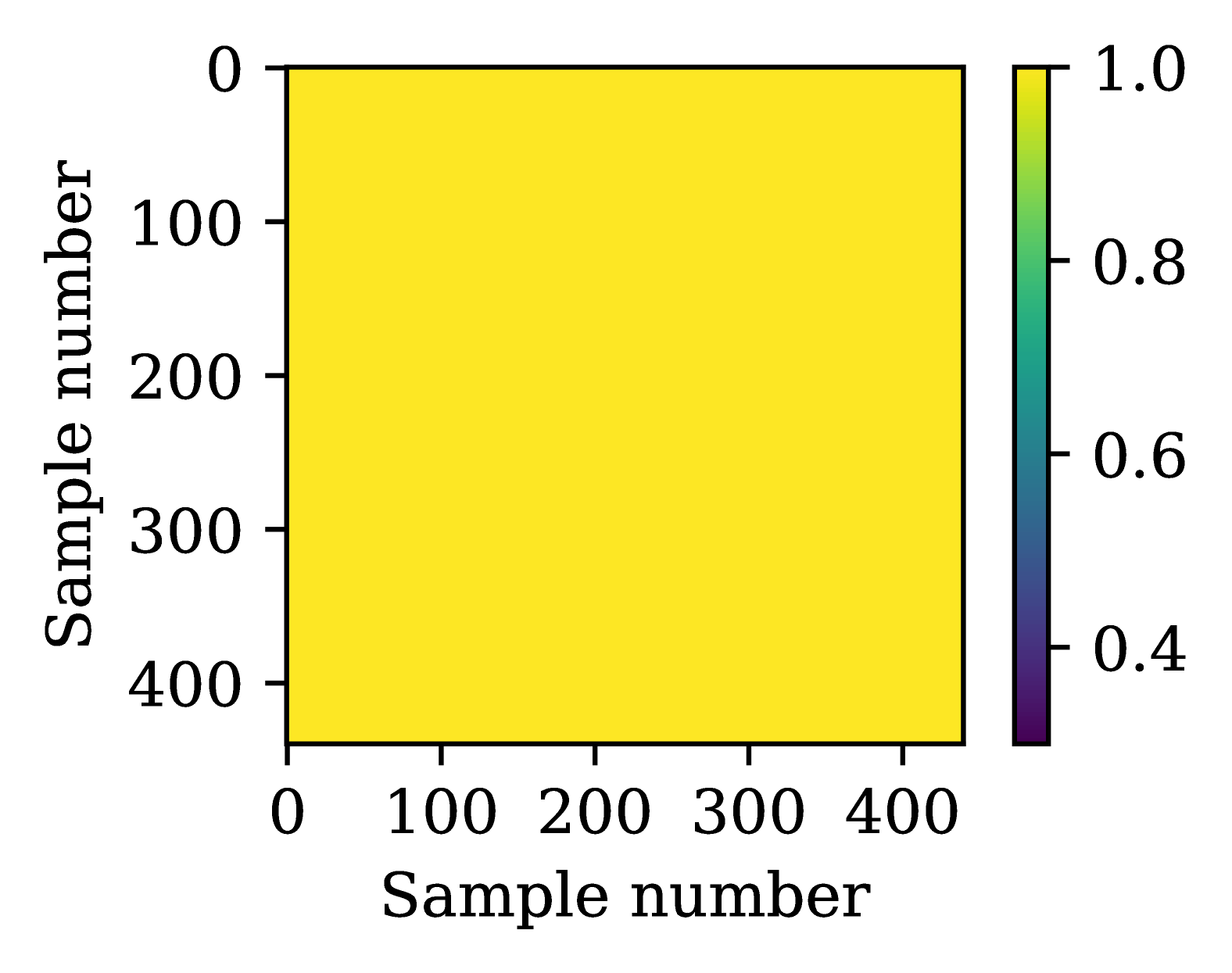
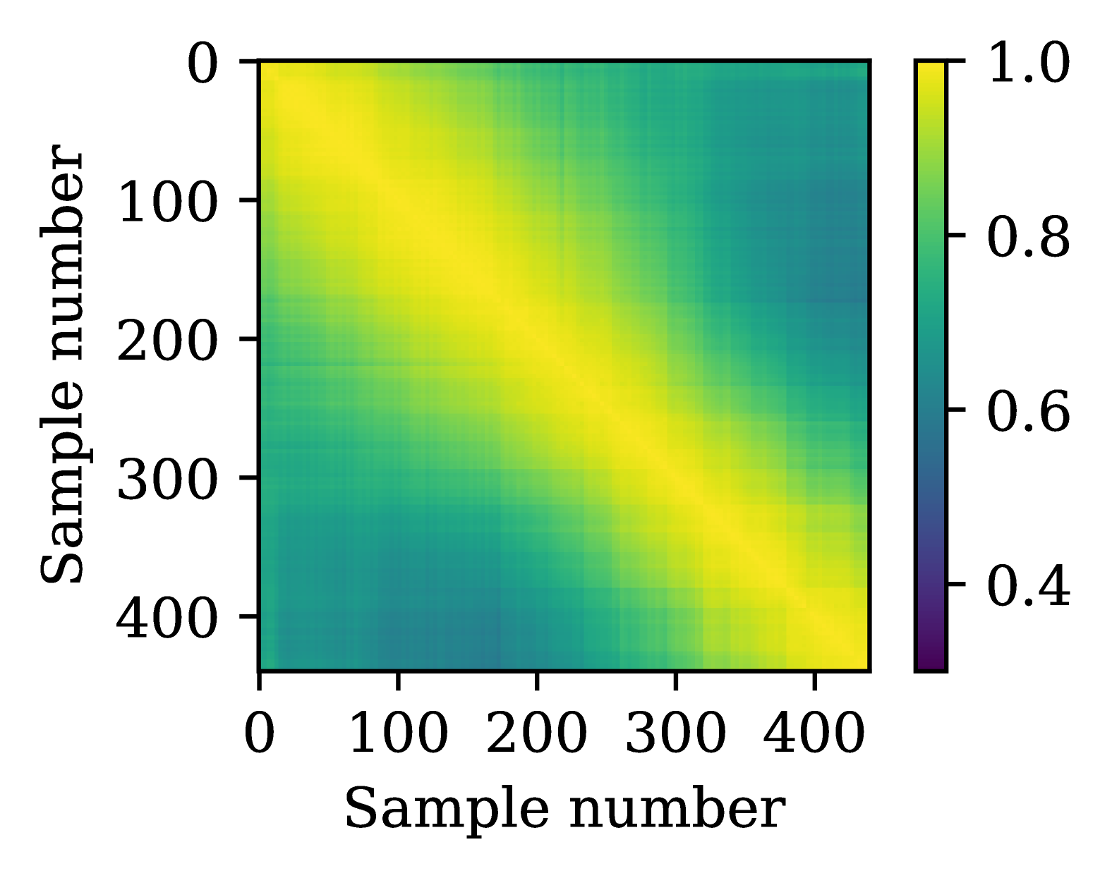
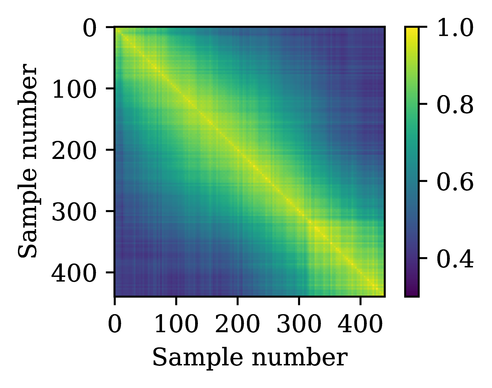
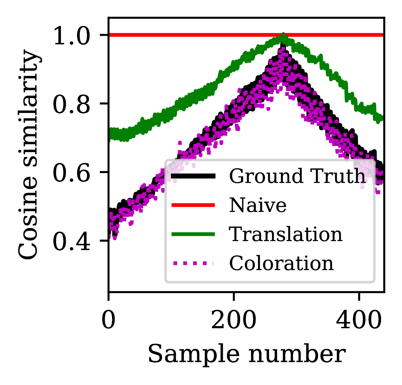
Figure 2: Covariance matrices for the text prompt $t_k=$ aggressive synth lead, computed using (a) naive replication, (b) translation, (c) coloration (matching the ground truth covariance $A_11,*$ learned over the 53 instruments reflected in the NSynth validation/test sets), (d) cosine similarities relative to estimated $\hat{ρ}_k$ / $\hat{ν}_k$ , corresponding to note E5/velocity 100.
### 3.2 TC score
Our system should generate timbrally consistent samples in order for them to triggered harmoniously as a sample-based instrument, and we aim to characterize this quantitatively. An apt definition for TC may seem ill-posed, since we want instrument samples to be fundamentally consistent with one another, but also expect them to exhibit some timbral variations as functions of pitch/velocity. This is particularly sought-after in high-quality virtual instruments, motivating the modeling approach in [6]. To contend with these potentially conflicting aspirations, we learn statistics from existing sample-based instruments serving as prototypes for realistic TC, and build metrics around them. We use CLAP embeddings as a basis to create an elegant embodiment in this work. To do so, we forego the mean subtraction step standard to covariance matrix computations, noting that samples are practically close to zero-mean in this respect. Hereafter, we use the terms covariance, affinity, and cosine similarity interchangeably.
We define per-instrument covariance matrices as
$$
A_ij,k=\frac{1}{N_k}Z_i,k^⊤Z_j,k, \tag{6}
$$
where $A_ij,k∈ℝ^N_k× N_k$ is the affinity between embeddings $Z_i,k$ and $Z_j,k∈ℝ^d_z× N_k$ representing the subset of CLAP embeddings of the $k$ th instrument within each population. Here, we compute statistics emphasizing variations across samples instead of feature dimensions. Referring to Equation 3.1, the $L_2$ -normalized quality CLAP embeddings will ensure us that $Tr≤ft(A_ii,k\right)=1$ $∀~{}$ $i∈[1,2]$ and $k∈[1,\dots,K]$ . Accordingly, we can define
$$
TC_CLAP≤ft(Z_1,Z_2\right)=\frac{1}
{K}∑_k^KTr≤ft(≤ft(A_11,kA_22,k\right)^\frac{
1{2}}\right), \tag{7}
$$
which is bounded in [0, 1] and aggregates the similarity in covariations across instruments within each population. Instead of using $A_11,k$ for making comparisons between populations on a per-instrument basis, we consider $A_11,*=\frac{1}{K}∑_k^KA_11,k$ , averaging per-instrument affinity matrices across a ground truth evaluation set. This provides richer statistics for improved stability, and a unified method to assess TC for S2I and T2I. The TC score is then
$$
TC_CLAP*≤ft(Z_1,Z_2\right)=\frac{1
}{K}∑_k^KTr≤ft(≤ft(A_11,*A_22,k\right)^\frac
{1{2}}\right). \tag{8}
$$
We compute $A_11,*$ using all of the samples from the NSynth validation and test sets that are within our desired 88-key pitch range, reflecting a total of 53 instruments. The resulting covariance matrix is illustrated in Figure 2 c, in which samples are ordered primarily by pitch and secondarily by velocity. Note how $A_11,*$ deviates from "ideal TC," whereby all embeddings would be correlated with unity similarity (see Figure 2 a). Moreover, a $5× 5$ texture emerges in $A_11,*$ , indicative of variations in cosine similarity amongst samples of the same pitch but differing velocities. Lastly, one may question the suitability of CLAP as a feature descriptor within this context, given its variability concerning pitch/velocity discussed in Section 2.4. Its improved correlation to perception aside [29], we assert that learning statistics over data effectively embeds potential measurement deficiencies that effectively neutralizes when we compare new population statistics against it.
### 3.3 Average CLAP score
#### 3.3.1 Sample-to-instrument (S2I)
Given $N=∑_k^KN_k$ and a cross-population covariance $A_ij=\frac{1}{N}Z_i^⊤Z_j∈ℝ^N × N$ , the average CLAP score computed on a per-sample basis can be expressed concisely as
$$
s_CLAP≤ft(Z_1,Z_2\right)=Tr≤ft(A
_12\right)=\frac{1}{N}∑_k^KN_kTr≤ft(A_12,k\right). \tag{9}
$$
It can also be computed on a per-instrument basis by
$$
s_CLAP*≤ft(Z_1,Z_2\right)=\frac{1}{K}∑_
k^KTr≤ft(A_12,k\right). \tag{10}
$$
We opt for this version in our work, noting that the two measures are equivalent when $N_1=N_2=\dots=N_K$ .
| Baseline CLAP Random CLAP Fixed CLAP | AR AR AR | 1.781 1.558 1.951 | 0.214 0.196 0.225 | 0.626 0.656 0.637 | 0.937 0.929 0.951 |
| --- | --- | --- | --- | --- | --- |
| Baseline CLAP | MAGNeT | 1.974 | 0.263 | 0.561 | 0.931 |
Table 2: Objective S2I evaluation over the NSynth test set.
| Baseline CLAP Random CLAP Fixed CLAP | 3.060 2.416 3.668 | 0.402 0.315 0.427 | 0.908 0.883 0.932 | 0.225 0.168 0.171 | 0.239 0.224 0.204 | 0.359 0.361 0.333 |
| --- | --- | --- | --- | --- | --- | --- |
Table 3: Objective T2I evaluation over a curated set of text prompts (left), and using $s_CLAP*↑$ comparing naive application of CLAP text embeddings against the proposed translation and coloration methods for synthesizing $Z_1,k$ (right).
#### 3.3.2 Text-to-instrument (T2I)
The average CLAP score $s_CLAP*$ is suitable for cases with a one-to-one match between ground truth prompts and their corresponding audio examples. However, it can deteriorate for T2I, where a single CLAP text embedding must be related to an ensemble of CLAP audio embeddings $Z_2,k$ . A naive adaptation involves comparing each audio embedding within the generated instrument to the same target text embedding. This amounts to creating $Z_1,k$ by replicating the CLAP text embedding $N_k$ times (whose resulting covariance is the "ideal TC" one in Figure 2 a), and using it as input to Equation 10. Hence, we set out to synthesize a realistic ensemble of CLAP embeddings $Z_1,k$ from a single CLAP text embedding $z_CLAP,t=E_t(t_k)$ , derived from the $k$ th text prompt $t_k$ . Again, we accomplish this by leveraging statistics from available instrument data.
We construct $M_1,*∈ℝ^d_z× d_pd_v$ as the mean CLAP audio embeddings at each pitch/velocity pair across all instruments in our evaluation data, re-normalizing them upon averaging. We posit that a text prompt implies a specific pitch/velocity (e.g., "softly plucked upright bass" suggests a low pitch/velocity). To estimate the corresponding pitch $\hat{ρ}_k$ and velocity $\hat{ν}_k$ for a given prompt, and to identify its closest template $\hat{μ}_1,k$ , we use $M_1,*$ as a template matching-based classifier onto $z_CLAP,t$ . Accordingly, we can define
$$
M_1,k=M_1,*+(\hat{μ}_1,k-z_CLAP,t) \tag{11}
$$
such that $M_1,k$ is aligned to $z_CLAP,t$ at $\hat{ρ}_k$ / $\hat{ν}_k$ . Re-normalizing, we have $Z_1,k=M_1,k/||M_1,k||$ . Figure 2 b illustrates a covariance matrix derived from this approach for a given text prompt. This translation method improves upon naive replication, but contains higher cross-correlations than in $A_11,*$ . Finally, we derive a coloration transformation $Z_1,k← Y(Z_1,k,A_11,*)$ through standard Eigendecomposition techniques, resulting in a $Z_1,k$ with covariance $A_11,*$ , as in Figure 2 c.
## 4 Experimental results
We train models on the NSynth dataset [3], pruning it according to our specified 88-key pitch range. We resample the 16 kHz dataset to 44.1 kHz, viewing it as a proxy in lieu of an equally comprehensive full-band alternative. Models are trained to minimize the cross-entropy $L_ce$ between predicted codes $\hat{c}$ and ground truth $c$ , over 1M training steps with AdamW optimizer, a batch size of 48, and a cosine-annealed schedule as in [16] with an initial learning rate of $10^-3$ . We primarily analyze the impact of the proposed CLAP conditioning training variants with AR inference. Additionally, we train a baseline CLAP model with MAGNeT-style iterative decoding to compare its relative performance. To promote consistency in generated samples used for evaluation, we fix the random seed of our categorical samplers, ensuring that generations undergo the same random sampling trajectory. We refer readers to our supplementary materials available at https://gen-inst.netlify.app/.
We evaluate and analyze the models through several means. We liken S2I to a reconstruction of the NSynth test set [1] adapted to our inference condition, as a user can provide a sample at any pitch/velocity available to them and models must render its timbre over all pitch/velocity queries. We simulate this by randomly selecting a single query CLAP audio embedding for each instrument, using it to generate all other samples within the instrument. For T2I, we curate 25 text prompts of varying complexity, generating instruments accordingly.
### 4.1 Objective evaluation
We analyze generations across S2I and T2I, using FAD (for overall expressivity and fidelity), $s_CLAP*$ (for prompt correspondence), and $TC_CLAP*$ (for TC) to evaluate models quantitatively. To compute FAD scores for T2I, we relate generated instruments to the NSynth test set in the absence of the ground truth audio. Lastly, we compare the different $s_CLAP*$ versions for T2I introduced in Section 3.3.2.
Quantitative results for S2I and T2I are summarized in Tables 2 and 3, respectively. For S2I, the random CLAP variant outperforms other models in terms of FAD and $s_CLAP*$ at the expense of reduced TC. The converse is true for the fixed CLAP variant, which outperforms in TC. While we do not prescribe which factor is most crucial to overall instrument quality, we do assert that TC is an important element for overall playability. The baseline CLAP approach slots itself in the middle with regards to all criteria. Its MAGNeT variant exhibits degraded performance, but generates samples with 7 $×$ fewer inference steps. These findings are largely mirrored in the T2I case. Interestingly, the baseline CLAP variant seemingly outperforms models in terms of $s_CLAP*$ using a naively adapted measure. The translation method increases scores across all models. Lastly, we see that the random CLAP model (marginally) outperforms other variants when using the coloration method, in line with S2I. Note that this version of the measure significantly bolsters $s_CLAP*$ across all models relative to naive replication and translation, so we argue that it is best-suited for computing T2I $s_CLAP*$ .
### 4.2 Subjective evaluation
We used the MUltiple Stimuli with Hidden Reference and Anchor (MUSHRA) and Mean Opinion Scores (MOS) methods [30] to evaluate model variants subjectively. The MUSHRA test was catered to S2I, and involved participants rating the quality of individual samples generated by different models against a hidden reference (i.e. a ground truth sample) and an anchor (i.e. a sample generated by a randomly initialized model). We performed a 1-5 Likert scale MOS test for T2I scenarios, where participants evaluated the audio outputs generated from text prompts based on overall playability and TC. Our accompanying website demonstrates the nature of trials used in our evaluation.
In total, 62 participants took part in our two-phase evaluation, with results summarized in Table 4. Note that most participants possess expert listening skills and have been involved in virtual instrument creation for several years, contributing to slightly lower absolute results than anticipated. Listening test results were consistent with our objective evaluation, confirming the two assertions of our work: (1) random CLAP improves expressivity over baseline CLAP by virtue of its data augmentation, and (2) fixed CLAP improves TC over baseline CLAP because its training more closely resembles the inference condition.
| Model Baseline CLAP Random CLAP | MUSHRA 56.08 63.35 | MOS 2.290 2.661 |
| --- | --- | --- |
| Fixed CLAP | 57.96 | 2.820 |
| Ground truth | 98.45 | – |
| Anchor | 0.442 | – |
Table 4: Summary of our subjective listening tests.
## 5 Conclusions
In this work, we proposed methods for generating sample-based musical instruments from text or audio prompts using neural audio codec language models. We considered different CLAP conditioning variants based on the unique challenge of our task, whereby a set of samples that are timbrally consistent must be generated from a single prompt. We proposed metrics to assess sample-based instruments through various means. Extensive evaluations showcased the effectiveness of our methods, underscoring a compromise between expressivity and TC. Future work will enable deeper control for sample generation, where adapters could be used to augment a base model [31]. We would also like to improve system fidelity, scaling models to larger sizes with fine-tuned modules [9].
## 6 Ethics Statement
We have intentionally pursued this task as a topic for scientific research as an alternative to more conventional prompt-to-media systems. The spirit of this work is specifically to expand sound synthesis possibilities for music creators in order to realize their artistic visions. Moreover, we feel that our resulting system and its intents pose far less risk to personal attack/misrepresentation as well as the livelihood of creatives, and is less susceptible to incrimination/impersonation attempts relative to the forms of generative models that have caused increased levels of concern within the general population [32].
Beyond our primary ethical concerns, we also recognize the environmental implications of our computational practices. Our experiments were carried out using Amazon Web Services in the us-gov-east-1 region, with a carbon efficiency of 0.57 kgCO 2 eq per kilowatt-hour. One training of our model entailed approximately 96 hours of computation on Intel Xeon E5-2686 v4 (Broadwell) hardware using a single V100 GPU, culminating in an estimated total emission of 7.93 kgCO 2 eq. This estimation was facilitated by the Machine Learning Impact calculator [33]. In acknowledging our environmental impact, we underscore the importance of integrating sustainability considerations into the research process, reflecting on the imperative to balance innovation with ecological responsibility.
## References
- [1] G. Narita, J. Shimizu, and T. Akama, “GANStrument: Adversarial Instrument Sound Synthesis with Pitch-Invariant Instance Conditioning,” in Proceedings of the IEEE International Conference on Acoustics, Speech and Signal Processing, Jun. 2023.
- [2] H. Chang, H. Zhang, J. Barber, A. Maschinot, J. Lezama, L. Jiang, M.-H. Yang, K. P. Murphy, W. T. Freeman, M. Rubinstein, Y. Li, and D. Krishnan, “Muse: Text-To-Image Generation via Masked Generative Transformers,” in Proceedings of the International Conference on Machine Learning, Jul. 2023.
- [3] J. Engel, C. Resnick, A. Roberts, S. Dieleman, D. Eck, K. Simonyan, and M. Norouzi, “Neural audio synthesis of musical notes with WaveNet autoencoders,” in Proceedings of the International Conference on Machine Learning, Aug. 2017.
- [4] A. van den Oord, S. Dieleman, H. Zen, K. Simonyan, O. Vinyals, A. Graves, N. Kalchbrenner, A. Senior, and K. Kavukcuoglu, “WaveNet: A generative model for raw audio,” arXiv:1609.03499, 2016.
- [5] J. Engel, K. K. Agrawal, S. Chen, I. Gulrajani, C. Donahue, and A. Roberts, “GANSynth: Adversarial Neural Audio Synthesis,” in Proceedings of the International Conference on Learning Representations, May 2019.
- [6] J. Engel, L. Hantrakul, C. Gu, and A. Roberts, “DDSP: Differentiable Digital Signal Processing,” in Proceedings of the International Conference on Learning Representations, April 2020.
- [7] D. Y. Wu, W. Y. Hsiao, F. R. Yang, O. Friedman, W. Jackson, S. Bruzenak, Y. W. Liu, and Y. H. Yang, “DDSP-Based Singing Vocoders: A New Subtractive Based Synthesizer and A Comprehensive Evaluation,” in Proceedings of the International Society for Music Information Retrieval Conference, Dec. 2022.
- [8] A. Caillon and P. Esling, “RAVE: A Variational Autoencoder for Fast and High-Quality Neural Audio Synthesis,” arXiv:2111.05011, Nov. 2021.
- [9] Z. Evans, C. Carr, J. Taylor, S. H. Hawley, and J. Pons, “Fast timing-conditioned latent audio diffusion,” arXiv:2402.04825, Feb. 2024.
- [10] N. Zeghidour, A. Luebs, A. Omran, J. Skoglund, and M. Tagliasacchi, “SoundStream: An End-to-End Neural Audio Codec,” IEEE/ACM Transactions on Audio, Speech, and Language Processing, Nov. 2021.
- [11] R. Kumar, P. Seetharaman, A. Luebs, I. Kumar, and K. Kumar, “High-fidelity audio compression with improved RVQGAN,” Conference on Neural Information Processing Systems, Dec. 2023.
- [12] Z. Borsos, R. Marinier, D. Vincent, E. Kharitonov, O. Pietquin, M. Sharifi, D. Roblek, O. Teboul, D. Grangier, M. Tagliasacchi, and N. Zeghidour, “AudioLM: a Language Modeling Approach to Audio Generation,” IEEE/ACM Transactions on Audio, Speech, and Language Processing, Jun. 2023.
- [13] C. Wang, S. Chen, Y. Wu, Z. Zhang, L. Zhou, S. Liu, Z. Chen, Y. Liu, H. Wang, J. Li, L. He, S. Zhao, and F. Wei, “Neural Codec Language Models are Zero-Shot Text to Speech Synthesizers,” arXiv:2301.02111, Jan. 2023.
- [14] F. Kreuk, G. Synnaeve, A. Polyak, U. Singer, A. Défossez, J. Copet, D. Parikh, Y. Taigman, and Y. Adi, “AudioGen: Textually Guided Audio Generation,” in Proceedings of the International Conference on Learning Representations, 2023.
- [15] A. Agostinelli, T. I. Denk, Z. Borsos, J. Engel, M. Verzetti, A. Caillon, Q. Huang, A. Jansen, A. Roberts, M. Tagliasacchi, M. Sharifi, N. Zeghidour, and C. Frank, “MusicLM: Generating Music From Text,” arXiv:2301.11325, Jan. 2023.
- [16] J. Copet, F. Kreuk, I. Gat, T. Remez, D. Kant, G. Synnaeve, Y. Adi, and A. Défossez, “Simple and Controllable Music Generation,” in Proceedings of the Conference on Neural Information Processing Systems, Dec. 2023.
- [17] J. D. Parker, J. Spijkervet, K. Kosta, F. Yesiler, B. Kuznetsov, J. C. Wang, M. Avent, J. Chen, and D. Le, “StemGen: A music generation model that listens,” in Proceedings of the IEEE International Conference on Acoustics, Speech and Signal Processing, Apr. 2024.
- [18] H. F. Garcia, P. Seetharaman, R. Kumar, and B. Pardo, “VampNet: Music generation via masked acoustic token modeling,” in Proceedings of the International Society for Music Information Retrieval Conference, Nov. 2023.
- [19] S. Nercessian and J. Imort, “InstrumentGen: Generating sample-based musical instruments from text,” in Neural Information Processing Systems Workshop on Machine Learning for Audio, Dec. 2023.
- [20] B. Hayes, J. Shier, G. Fazerkas, A. McPherson, and C. Saitis, “A Review of Differentiable Digital Signal Processing for Music and Speech Synthesis,” Frontiers in Signal Processing, Jan. 2024.
- [21] Y. Wu, K. Chen, T. Zhang, Y. Hui, T. Berg-Kirkpatrick, and S. Dubnov, “Large-Scale Contrastive Language-Audio Pretraining with Feature Fusion and Keyword-to-Caption Augmentation,” in Proceedings of the IEEE International Conference on Acoustics, Speech and Signal Processing, Jun. 2023.
- [22] A. Ziv, I. Gat, G. L. Lan, T. Remez, F. Kreuk, J. Copet, A. Défossez, G. Synnaeve, and Y. Adi, “Masked audio generative modeling,” in Proceedings of the International Conference on Learning Representations, May 2024.
- [23] A. Défossez, J. Copet, G. Synnaeve, and Y. Adi, “High Fidelity Neural Audio Compression,” Transactions on Machine Learning Research, Sep. 2023.
- [24] C. Hawthorne, E. Elsen, J. Song, A. Roberts, I. Simon, C. Raffel, J. Engel, S. Oore, and D. Eck, “Onsets and frames: Dual-objective piano transcription,” in Proceedings of the International Society for Music Information Retrieval Conference, Sep. 2018.
- [25] V. Vapnik and R. Izmailov, “Learning using privileged information: Similarity control and knowledge transfer,” Journal of Machine Learning Research, Nov. 2015.
- [26] K. Chen, X. Du, B. Zhu, Z. Ma, T. Berg-Kirkpatrick, and S. Dubnov, “HTS-AT: A Hierarchical Token-Semantic Audio Transformer for Sound Classification and Detection,” in Proceedings of the IEEE International Conference on Acoustics, Speech and Signal Processing, May 2022.
- [27] Y. Liu, M. Ott, N. Goyal, J. Du, M. Joshi, D. Chen, O. Levy, M. Lewis, L. Zettlemoyer, and V. Stoyanov, “RoBERTa: A Robustly Optimized BERT Pretraining Approach,” arXiv:1907.11692, Jul. 2019.
- [28] K. Kilgour, M. Zuluaga, D. Roblek, and M. Sharifi, “Frechet audio distance: A metric for evaluating music enhancement algorithms,” arXiv:1812.08466, Dec. 2018.
- [29] A. Gui, H. Gamper, S. Braun, and D. Emmanouilidou, “Adapting Frechet audio distance for generative music evaluation,” in Proceedings of the IEEE International Conference on Acoustics, Speech and Signal Processing, Apr. 2024.
- [30] J. Camp, T. Kenter, L. Finkelstein, and R. Clark, “MOS vs. AB: Evaluating text-to-speech systems reliably using clustered standard errors,” in Proceedings of Interspeech, Aug. 2023.
- [31] K. Sohn, N. Ruiz, K. Lee, D. C. Chin, I. Blok, H. Chang, J. Barber, L. Jiang, G. Entis, Y. Li, Y. Hao, I. Essa, M. Rubinstein, and D. Krishnan, “StyleDrop: Text-to-Image Generation in Any Style,” in Proceedings of the Conference on Neural Information Processing Systems, Dec. 2023.
- [32] J. Barnet, “The ethical implications of generative audio models: A systematic literature review,” in Proceedings of the AAAI/ACM Conference on AI, Ethics, and Society, Aug. 2023.
- [33] A. Lacoste, A. Luccioni, V. Schmidt, and T. Dandres, “Quantifying the carbon emissions of machine learning,” arXiv:1910.09700, 2019.