# Nearest-Neighbours Neural Network architecture for efficient sampling of statistical physics models
**Authors**: Luca Maria Del Bono, Federico Ricci-Tersenghi, Francesco Zamponi
> Dipartimento di Fisica, Sapienza Università di Roma, Piazzale Aldo Moro 5, Rome 00185, ItalyCNR-Nanotec, Rome unit, Piazzale Aldo Moro 5, Rome 00185, Italy
> Dipartimento di Fisica, Sapienza Università di Roma, Piazzale Aldo Moro 5, Rome 00185, ItalyCNR-Nanotec, Rome unit, Piazzale Aldo Moro 5, Rome 00185, ItalyINFN, sezione di Roma1, Piazzale Aldo Moro 5, Rome 00185, Italy
> Dipartimento di Fisica, Sapienza Università di Roma, Piazzale Aldo Moro 5, Rome 00185, Italy
thanks: Corresponding author: lucamaria.delbono@uniroma1.it
Abstract
The task of sampling efficiently the Gibbs-Boltzmann distribution of disordered systems is important both for the theoretical understanding of these models and for the solution of practical optimization problems. Unfortunately, this task is known to be hard, especially for spin-glass-like problems at low temperatures. Recently, many attempts have been made to tackle the problem by mixing classical Monte Carlo schemes with newly devised Neural Networks that learn to propose smart moves. In this article, we introduce the Nearest-Neighbours Neural Network (4N) architecture, a physically interpretable deep architecture whose number of parameters scales linearly with the size of the system and that can be applied to a large variety of topologies. We show that the 4N architecture can accurately learn the Gibbs-Boltzmann distribution for a prototypical spin-glass model, the two-dimensional Edwards-Anderson model, and specifically for some of its most difficult instances. In particular, it captures properties such as the energy, the correlation function and the overlap probability distribution. Finally, we show that the 4N performance increases with the number of layers, in a way that clearly connects to the correlation length of the system, thus providing a simple and interpretable criterion to choose the optimal depth.
Introduction
A central problem in many fields of science, from statistical physics to computer science and artificial intelligence, is that of sampling from a complex probability distribution over a large number of variables. More specifically, a very common such probability is a Gibbs-Boltzmann distribution. Given a set of $N\gg 1$ random variables $\boldsymbol{\sigma}=\{\sigma_{1},·s,\sigma_{N}\}$ , such a distribution is written in the form
$$
P_{\text{GB}}(\boldsymbol{\sigma})=\frac{e^{-\beta\mathcal{H}(\boldsymbol{%
\sigma})}}{\mathcal{Z}(\beta)}\ . \tag{1}
$$
In statistical physics language, the normalization constant $\mathcal{Z}(\beta)$ is called partition function, $\mathcal{H}(\boldsymbol{\sigma})$ is called the Hamiltonian function and $\beta=1/T$ is the inverse temperature, corresponding to a global rescaling of $\mathcal{H}(\boldsymbol{\sigma})$ .
While Eq. (1) is simply a trivial definition, i.e. $\mathcal{H}(\boldsymbol{\sigma})=-\frac{1}{\beta}\log P_{\text{GB}}(%
\boldsymbol{\sigma})+\text{const}$ , the central idea of Gibbs-Boltzmann distributions is that $\mathcal{H}(\boldsymbol{\sigma})$ is expanded as a sum of ‘local’ interactions. For instance, in the special case of binary (Ising) variables, $\sigma_{i}∈\{-1,+1\}$ , one can always write
$$
\mathcal{H}=-\sum_{i}H_{i}\sigma_{i}-\sum_{i<j}J_{ij}\sigma_{i}\sigma_{j}-\sum%
_{i<j<k}J_{ijk}\sigma_{i}\sigma_{j}\sigma_{k}+\cdots \tag{2}
$$
In many applications, like in physics (i.e. spin glasses), inference (i.e. maximum entropy models) and artificial intelligence (i.e. Boltzmann machines), the expansion in Eq. (2) is truncated to the pairwise terms, thus neglecting higher-order interactions. This leads to a Hamiltonian
$$
\mathcal{H}=-\sum_{i}H_{i}\sigma_{i}-\sum_{i<j}J_{ij}\sigma_{i}\sigma_{j} \tag{3}
$$
parametrized by ‘local external fields’ $H_{i}$ and ‘pairwise couplings’ $J_{ij}$ . In physics applications such as spin glasses, these are often chosen to be independent and identically distributed random variables, e.g. $H_{i}\sim\mathcal{N}(0,H^{2})$ and $J_{ij}\sim\mathcal{N}(0,J^{2}/N)$ . In Boltzmann Machines, instead, the fields and couplings are learned by maximizing the likelihood of a given training set.
In many cases, dealing with Eq. (1) analytically, e.g. computing expectation values of interesting quantities, is impossible, and one resorts to numerical computations. A universal strategy is to use local Markov Chain Monte Carlo (MCMC) methods, which have the advantage of being applicable to a wide range of different systems. In these methods, one proposes a local move, typically flipping a single spin, $\sigma_{i}→-\sigma_{i}$ , and accepts or rejects the move in such a way to guarantee that after many iterations, the configuration $\boldsymbol{\sigma}$ is distributed according to Eq. (1). Unfortunately, these methods are difficult (if not altogether impossible) to apply in many hard-to-sample problems for which the convergence time is very large, which, in practice, ends up requiring a huge amount of computational time. For instance, finding the ground state of the Sherrington-Kirkpatrick model (a particular case of sampling at $T→ 0$ ) is known to be a NP-hard problem; sampling a class of optimization problems is known to take a time scaling exponentially with $N$ . The training of Boltzmann Machines is also known to suffer from this kind of problems.
These inconveniences can be avoided by using system-specific global algorithms that leverage properties of the system under examination in order to gain a significant speedup. Instead of flipping one spin at a time, these methods are able to construct smart moves, which update simultaneously a large number of spins. An example is the Wolff algorithm [1] for the Ising model. Another class of algorithms uses unphysical moves or extended variable spaces, such as the Swap Monte Carlo for glass-forming models of particles [2]. The downside of these algorithms is that they cannot generally be transferred from one system to another, meaning that one has to develop new techniques specifically for each system of interest. Yet another class is Parallel Tempering (PT) [3], or one of its modifications [4], which considers a group of systems at different temperatures and alternates between simple MCMC moves and moves that swap the systems at two different temperatures. While PT is a universal strategy, its drawback is that, in order to produce low-temperature configurations, one has to simulate the system at a ladder of higher temperatures, which can be computationally expensive and redundant.
The rise of machine learning technology has sparked a new line of research aimed at using Neural Networks to enhance Monte Carlo algorithms, in the wake of similar approaches in many-body quantum physics [5], molecular dynamics [6] and the study of glasses [7, 8, 9]. The key idea is to use the network to propose new states with a probability $P_{\text{NN}}$ that (i) can be efficiently sampled and (ii) is close to the Gibbs-Boltzmann distribution, e.g., with respect to the Kullback-Leibler (KL) divergence $D_{\text{KL}}$ :
$$
D_{\text{KL}}(P_{\text{GB}}\parallel P_{\text{NN}})=\sum_{\boldsymbol{\sigma}}%
P_{\text{GB}}(\boldsymbol{\sigma})\log\frac{P_{\text{GB}}(\boldsymbol{\sigma})%
}{P_{\text{NN}}(\boldsymbol{\sigma})}\ . \tag{4}
$$
The proposed configurations can be used in a Metropolis scheme, accepting them with probability:
$$
\begin{split}\text{Acc}\left[\boldsymbol{\sigma}\rightarrow\boldsymbol{\sigma}%
^{\prime}\right]&=\min\left[1,\frac{P_{\text{GB}}(\boldsymbol{\sigma}^{\prime}%
)\times P_{\text{NN}}(\boldsymbol{\sigma})}{P_{\text{GB}}(\boldsymbol{\sigma})%
\times P_{\text{NN}}(\boldsymbol{\sigma}^{\prime})}\right]\\
&=\min\left[1,\frac{e^{-\beta\mathcal{H}(\boldsymbol{\sigma}^{\prime})}\times P%
_{\text{NN}}(\boldsymbol{\sigma})}{e^{-\beta\mathcal{H}(\boldsymbol{\sigma})}%
\times P_{\text{NN}}(\boldsymbol{\sigma}^{\prime})}\right].\end{split} \tag{5}
$$
Because $\mathcal{H}$ can be computed in polynomial time and $P_{\text{NN}}$ can be sampled efficiently by hypothesis, this approach ensures an efficient sampling of the Gibbs-Boltzmann probability, as long as (i) $P_{\text{NN}}$ covers well the support of $P_{\text{GB}}$ (i.e., the so-called mode collapse is avoided) and (ii) the acceptance probability in Eq. (5) is significantly different from zero for most of the generated configurations. This scheme can also be combined with standard local Monte Carlo moves to improve efficiency [10].
The main problem is how to train the Neural Network to minimize Eq. (4); in fact, the computation of $D_{\rm KL}$ requires sampling from $P_{\text{GB}}$ . A possible solution is to use $D_{\text{KL}}(P_{\text{NN}}\parallel P_{\text{GB}})$ instead [11], but this has been shown to be prone to mode collapse [12]. Another proposed solution is to set up an iterative procedure, called ‘Sequential Tempering’ (ST), in which one first learns $P_{\text{NN}}$ at high temperature where sampling from $P_{\text{GB}}$ is possible, then gradually decreases the temperature, updating $P_{\text{NN}}$ slowly [13]. A variety of new methods and techniques have thus been proposed to tackle the problem, such as autoregressive models [11, 13, 14], normalizing flows [15, 10, 16, 17], and diffusion models [18]. It is still unclear whether this kind of strategies actually performs well on hard problems and challenges already-existing algorithms [12]. The first steps in a theoretical understanding of the performances of such algorithms are just being made [19, 20]. The main drawback of these architectures is that the number of parameters scales poorly with the system size, typically as $N^{\alpha}$ with $\alpha>1$ , while local Monte Carlo requires a number of operations scaling linearly in $N$ . Furthermore, these architectures – with the notable exception of TwoBo [21] that directly inspired our work – are not informed about the physical properties of the model, and in particular about the structure of its interaction graph and correlations. It should be noted that the related problem of finding the ground state of the system (which coincides with zero-temperature sampling) has been tackled using similar ideas, again with positive [22, 23, 24, 25, 26] and negative results [27, 28, 29, 30].
In this paper, we introduce the Nearest Neighbours Neural Network, or 4N for short, a Graph Neural Network-inspired architecture that implements an autoregressive scheme to learn the Gibbs-Boltzmann distribution. This architecture has a number of parameters scaling linearly in the system size and can sample new configurations in $\mathcal{O}(N)$ time, thus achieving the best possible scaling one could hope for such architectures. Moreover, 4N has a straightforward physical interpretation. In particular, the choice of the number of layers can be directly linked to the correlation length of the model under study. Finally, the architecture can easily be applied to essentially any statistical system, such as lattices in higher dimensions or random graphs, and it is thus more general than other architectures. As a proof of concept, we evaluate the 4N architecture on the two-dimensional Edwards-Anderson spin glass model, a standard benchmark also used in previous work [13, 12]. We demonstrate that the model succeeds in accurately learning the Gibbs-Boltzmann distribution, especially for some of the most challenging model instances. Notably, it precisely captures properties such as energy, the correlation function, and the overlap probability distribution.
State of the art
Some common architectures used for $P_{\text{NN}}$ are normalizing flows [15, 10, 16, 17] and diffusion models [18]. In this paper, we will however focus on autoregressive models [11], which make use of the factorization:
$$
\begin{split}&P_{\text{GB}}(\boldsymbol{\sigma})=P(\sigma_{1})P(\sigma_{2}\mid%
\sigma_{1})P(\sigma_{3}\mid\sigma_{1},\sigma_{2})\times\\
&\times\cdots P(\sigma_{n}\mid\sigma_{1},\cdots,\sigma_{n-1})=\prod_{i=1}^{N}P%
(\sigma_{i}\mid\boldsymbol{\sigma}_{<i})\ ,\end{split} \tag{6}
$$
where $\boldsymbol{\sigma}_{<i}=(\sigma_{1},\sigma_{2},...,\sigma_{i-1})$ , so that states can then be generated using ancestral sampling, i.e. generating first $\sigma_{1}$ , then $\sigma_{2}$ conditioned on the sampled value of $\sigma_{1}$ , then $\sigma_{3}$ conditioned to $\sigma_{1}$ and $\sigma_{2}$ and so on. The factorization in (6) is exact, but computing $P(\sigma_{i}\mid\boldsymbol{\sigma}_{<i})$ exactly generally requires a number of operations scaling exponentially with $N$ . Hence, in practice, $P_{\text{GB}}$ is approximated by $P_{\text{NN}}$ that takes the form in Eq. (6) where each individual term $P(\sigma_{i}\mid\boldsymbol{\sigma}_{<i})$ is approximated using a small set of parameters. Note that the unsupervised problem of approximating $P_{\text{GB}}$ is now formally translated into a supervised problem of learning the output, i.e. the probability $\pi_{i}\equiv P(\sigma_{i}=+1\mid\boldsymbol{\sigma}_{<i})$ , as a function of the input $\boldsymbol{\sigma}_{<i}$ . The specific way in which this approximation is carried out depends on the architecture. In this section, we will describe some common autoregressive architectures found in literature, for approximating the function $\pi_{i}(\boldsymbol{\sigma}_{<i})$ .
- In the Neural Autoregressive Distribution Estimator (NADE) architecture [13], the input $\boldsymbol{\sigma}_{<i}$ is encoded into a vector $\mathbf{y}_{i}$ of size $N_{h}$ using
$$
\mathbf{y}_{i}=\Psi\left(\underline{\underline{A}}\boldsymbol{\sigma}_{<i}+%
\mathbf{B}\right), \tag{7}
$$
where $\mathbf{y}_{i}∈\mathbb{R}^{N_{h}}$ , $\underline{\underline{A}}∈\mathbb{R}^{N_{h}× N}$ and $\boldsymbol{\sigma}_{<i}$ is the vector of the spins in which the spins $l≥ i$ have been masked, i.e. $\mathbf{\sigma}_{<i}=(\sigma_{1},\sigma_{2},...,\sigma_{i-1},0,...,0)$ . $\mathbf{B}∈\mathbb{R}^{N_{h}}$ is the bias vector and $\Psi$ is an element-wise activation function. Note that $\underline{\underline{A}}$ and $\mathbf{B}$ do not depend on the index $i$ , i.e. they are shared across all spins. The information from the hidden layer is then passed to a fully connected layer
$$
{\color[rgb]{0,0,0}\psi_{i}}=\Psi\left(\mathbf{V}_{i}\cdot\mathbf{y}_{i}+C_{i}\right) \tag{8}
$$
where $\mathbf{V}_{i}∈\mathbb{R}^{N_{h}}$ and $C_{i}∈\mathbb{R}$ . Finally, the output probability is obtained by applying a sigmoid function to the output, $\pi_{i}=S({\color[rgb]{0,0,0}\psi_{i}})$ . The Nade Architecture uses $\mathcal{O}(N× N_{h})$ parameters. However, the choice of the hidden dimension $N_{h}$ and how it should be related to $N$ is not obvious. For this architecture to work well in practical applications, $N_{h}$ needs to be $\mathcal{O}(N)$ , thus leading to $\mathcal{O}(N^{2})$ parameters [13].
- The Masked Autoencoder for Distribution Estimator (MADE) [31] is a generic dense architecture with the addition of the autoregressive requirement, obtained by setting, for all layers $l$ in the network, the weights $W^{l}_{ij}$ between node $j$ at layer $l$ and node $i$ at layer $l+1$ equal to 0 when $i≥ j$ . Between one layer and the next one adds nonlinear activation functions and the width of the hidden layers can also be increased. The MADE architecture, despite having high expressive power, has at least $\mathcal{O}(N^{2})$ parameters, which makes it poorly scalable.
- Autoregressive Convolutional Neural Network (CNN) architectures, such as PixelCNN [32, 33], are networks that implement a CNN structure but superimpose the autoregressive property. These architectures typically use translationally invariant kernels ill-suited to study disordered models.
- The TwoBo (two-body interaction) architecture [21] is derived from the observation that, given the Gibbs-Boltzmann probability in Eq. (1) and the Hamiltonian in Eq. (3), the probability $\pi_{i}$ can be exactly rewritten as [34]
$$
\pi_{i}(\boldsymbol{\sigma}_{<i})=S\left(2\beta h^{i}_{i}+2\beta H_{i}+\rho_{i%
}(\boldsymbol{h}^{i})\right), \tag{9}
$$
where $S$ is the sigmoid function, $\rho_{i}$ is a highly non-trivial function and the $\boldsymbol{h}^{i}=\{h^{i}_{i},h^{i}_{i+1},·s h^{i}_{N}\}$ are defined as:
$$
h^{i}_{l}=\sum_{f<i}J_{lf}\sigma_{f}\quad\text{for}\quad l\geq i. \tag{10}
$$
Therefore, the TwoBo architecture first computes the vector $\boldsymbol{h}^{i}$ , then approximates $\rho_{i}(\boldsymbol{h}^{i})$ using a Neural Network (for instance, a Multilayer Perceptron) and finally computes Eq. (9) using a skip connection (for the term $2\beta h^{i}_{i}$ ) and a sigmoid activation. By construction, in a two-dimensional model with $N=L^{2}$ variables and nearest-neighbor interactions, for given $i$ only $\mathcal{O}(L=\sqrt{N})$ of the $h^{i}_{l}$ are non-zero, see Ref. [21, Fig.1]. Therefore, the TwoBo architecture has $\mathcal{O}(N^{\frac{3}{2}})$ parameters in the two-dimensional case. However, the scaling becomes worse in higher dimensions $d$ , i.e. $\mathcal{O}(N^{\frac{2d-1}{d}})$ and becomes the same as MADE (i.e. $\mathcal{O}(N^{2})$ ) for random graphs. Additionally, the choice of the $h^{i}_{l}$ , although justified mathematically, does not have a clear physical interpretation: the TwoBo architecture takes into account far away spins which, however, should not matter much when $N$ is large.
To summarize, the NADE, MADE and TwoBo architectures all need $\mathcal{O}(N^{2})$ parameters for generic models defined on random graph structures. TwoBo has less parameters for models defined on $d$ -dimensional lattices, but still $\mathcal{O}(N^{\frac{2d-1}{d}})\gg\mathcal{O}(N)$ . CNN architectures with translationally invariant kernels have fewer parameters, but are not suitable for disordered systems, are usually applied to $d=2$ and remain limited to $d≤ 3$ .
To solve these problems, we present here the new, physically motivated 4N architecture that has $\mathcal{O}(\mathcal{A}N)$ parameters, with a prefactor $\mathcal{A}$ that remains finite for $N→∞$ and is interpreted as the correlation length of the system, as we show in the next section.
<details>
<summary>x1.png Details</summary>
### Visual Description
\n
## Diagram: Neural Network Architecture for Spin Configuration
### Overview
This diagram illustrates the architecture of a neural network designed to process spin configurations. The network takes an input representing a spin lattice, processes it through Graph Neural Network (GNN) layers, and outputs a prediction about the spin state of a specific site 'i'. The diagram is segmented into input, intermediate processing stages, and output.
### Components/Axes
The diagram is labeled with the following components:
* **(a) Input:** Represents the initial spin configuration. The color scale indicates spin values: +1 (red), -1 (black), and Unf. (unfilled/white).
* **(b) Color Scale:** A gradient from red to blue, representing values from +1 to -1, with 0 in the middle.
* **(c) GNN layer:** Indicates a Graph Neural Network layer. There are two GNN layers shown.
* **(d) Node 'i':** Represents a specific spin site being analyzed.
* **(e) Output:** The final prediction of the spin state of site 'i'.
* **'+' symbol:** Represents a summation operation.
* **'S' symbol:** Represents a sigmoid function.
* **Pᵢ(σᵢ = +1):** The probability that spin 'i' is +1.
### Detailed Analysis or Content Details
The input (a) is a grid of squares, colored in red, black, and white. The red squares represent spin +1, black squares represent spin -1, and white squares represent an undefined or unfilled state. A highlighted square labeled 'i' is present within the input grid.
The input is fed into a GNN layer (c). The output of this layer is a set of nodes, colored red and blue, connected by lines. The node 'i' is highlighted in purple. The nodes are then fed into summation operations ('+') and subsequently into another GNN layer. This process is repeated multiple times, as indicated by the ellipsis ("...").
The final output (e) is a single node representing the prediction for spin 'i'. The output is associated with the equation Pᵢ(σᵢ = +1), which represents the probability that the spin at site 'i' is +1.
The nodes in the intermediate layers are colored based on their value, with red indicating a positive value and blue indicating a negative value. The intensity of the color likely corresponds to the magnitude of the value. The connections between nodes represent the graph structure used by the GNN.
### Key Observations
* The network architecture involves multiple GNN layers, suggesting a deep learning approach.
* The summation operations likely aggregate information from neighboring nodes in the graph.
* The sigmoid function 'S' is used to map the output of the network to a probability between 0 and 1.
* The input spin configuration is represented as a grid, which is then transformed into a graph structure for processing by the GNN.
* The network focuses on predicting the spin state of a single site 'i', suggesting a task of spin state classification or prediction.
### Interpretation
This diagram depicts a neural network designed to learn the relationships between spin configurations and the resulting spin state of a particular site. The use of GNNs is appropriate because spin systems naturally exhibit graph-like structures, where spins interact with their neighbors. The network learns to extract features from the input spin configuration and use them to predict the spin state of the target site 'i'. The output probability Pᵢ(σᵢ = +1) provides a measure of confidence in the prediction. The repeated GNN layers suggest that the network is capable of capturing complex interactions between spins. The diagram does not provide specific data or numerical values, but rather illustrates the overall architecture and flow of information within the network. The diagram suggests a model for solving the Ising model or similar spin-based problems. The network is designed to learn the correlations between spins and predict the state of a given spin based on its environment.
</details>
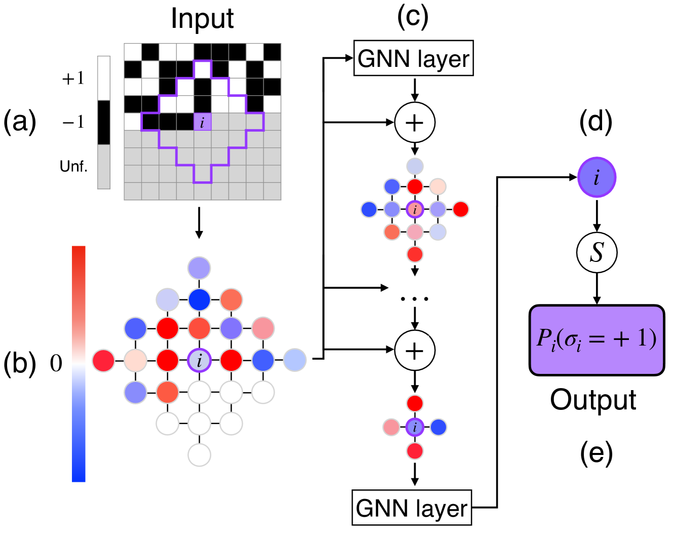
Figure 1: Schematic representation of the 4N architecture implemented on a two-dimensional lattice model with nearest-neighbors interactions. (a) We want to estimate the probability $\pi_{i}\equiv P(\sigma_{i}=+1\mid\boldsymbol{\sigma}_{<i})$ that the spin $i$ (in purple) has value $+1$ given the spins $<i$ (in black and white). The spins $>i$ (in grey) have not yet been fixed. (b) We compute the values of the local fields $h_{l}^{i,(0)}$ as in Eq. (10), for $l$ in a neighborhood of $i$ of size $\ell$ , indicated by a purple contour in (a). Notice that spins $l$ that are not in the neighborhood of one of the fixed spin have $h_{l}^{i,(0)}=0$ and are indicated in white in (b). (c) In the main cycle of the algorithm, we apply a series of $\ell$ GNN layers with the addition of skip connections. (d) The final GNN layer is not followed by a skip connection and yields the final values of the field $h_{i}^{i,(\ell)}$ . (e) $\pi_{i}$ is estimated by applying a sigmoid function to $h_{i}^{i,(\ell)}$ . Periodic (or other) boundary conditions can be considered, but are not shown here for clarity.
Results
The 4N architecture
The 4N architecture (Fig. 1) computes the probability $\pi_{i}\equiv P(\sigma_{i}=+1\mid\boldsymbol{\sigma}_{<i})$ by propagating the $h_{l}^{i}$ , defined as in TwoBo, Eq. (10), through a Graph Neural Network (GNN) architecture. The variable $h_{l}^{i}$ is interpreted as the local field induced by the frozen variables $\boldsymbol{\sigma}_{<i}$ on spin $l$ . Note that in 4N, we consider all possible values of $l=1,·s,N$ , not only $l≥ i$ as in TwoBo. The crucial difference with TwoBo is that only the fields in a finite neighborhood of variable $i$ need to be considered, because the initial values of the fields are propagated through a series of GNN layers that take into account the locality of the physical problem. During propagation, fields are combined with layer- and edge-dependent weights together with the couplings $J_{ij}$ and the inverse temperature $\beta$ . After each layer of the network (except the final one), a skip connection to the initial configuration is added. After the final layer, a sigmoidal activation is applied to find $\pi_{i}$ . The network has a total number of parameters equal to $(c+1)×\ell× N$ , where $c$ is the average number of neighbors for each spin. Details are given in the Methods section.
More precisely, because GNN updates are local, and there are $\ell$ of them, in order to compute the final field on site $i$ , hence $\pi_{i}$ , we only need to consider the set of fields corresponding to sites at distance at most $\ell$ , hence the number of operations scales proportionally to the number of such sites which we call $\mathcal{B}(\ell)$ . Because we need to compute $\pi_{i}$ for each of the $N$ sites, the generation of a new configuration then requires $\mathcal{O}(\mathcal{B}(\ell)× N)$ steps. We recall that in a $d-$ dimensional lattice $\mathcal{B}(\ell)\propto\ell^{d}$ , while for random graphs $\mathcal{B}(\ell)\propto c^{\ell}$ . It is therefore crucial to assess how the number of layers $\ell$ should scale with the system size $N$ .
<details>
<summary>x2.png Details</summary>
### Visual Description
## Line Chart: Energy Difference vs. Beta
### Overview
The image presents a line chart illustrating the relationship between energy difference (relative) and a parameter denoted as β (beta). The chart displays four lines, each representing a different value of 'l' (2, 4, 6, and 10). Each line is accompanied by a shaded region, likely representing a confidence interval or standard deviation.
### Components/Axes
* **X-axis:** Labeled "β" (beta), ranging from approximately 0.3 to 3.2. The scale is linear.
* **Y-axis:** Labeled "Energy difference (relative)", ranging from 0.000 to 0.040. The scale is linear.
* **Legend:** Located in the top-right corner of the chart. It maps colors to the 'l' values:
* Yellow: l = 2
* Teal: l = 4
* Maroon: l = 6
* Green: l = 10
* **Gridlines:** A grid is present, aiding in the reading of values.
### Detailed Analysis
The chart shows the energy difference as a function of β for different values of l. Each line represents the mean energy difference, and the shaded area around each line represents the uncertainty.
* **l = 2 (Yellow):** The line starts at approximately 0.002 at β = 0.3, then rapidly increases to approximately 0.028 at β = 1.0. It continues to increase, reaching approximately 0.035 at β = 3.0. The shaded region indicates a relatively large uncertainty, especially at higher β values.
* **l = 4 (Teal):** The line begins at approximately 0.001 at β = 0.3, increases to approximately 0.012 at β = 1.0, and plateaus around 0.015 at β = 3.0. The shaded region is smaller than that of l = 2, suggesting lower uncertainty.
* **l = 6 (Maroon):** The line starts at approximately 0.0005 at β = 0.3, increases to approximately 0.008 at β = 1.0, and plateaus around 0.010 at β = 3.0. The shaded region is relatively small.
* **l = 10 (Green):** The line starts at approximately 0.0005 at β = 0.3, increases to approximately 0.006 at β = 1.0, and plateaus around 0.007 at β = 3.0. The shaded region is the smallest, indicating the lowest uncertainty.
All lines exhibit an initial increase in energy difference as β increases, followed by a plateau. The rate of increase and the plateau value depend on the value of 'l'.
### Key Observations
* The energy difference increases more rapidly with β for smaller values of 'l' (2 and 4).
* As 'l' increases (6 and 10), the energy difference remains relatively low and plateaus quickly.
* The uncertainty (represented by the shaded regions) is largest for l = 2 and smallest for l = 10.
* All lines converge towards a similar energy difference value as β approaches 3.0.
### Interpretation
The data suggests that the energy difference is sensitive to the parameter β, particularly for lower values of 'l'. As 'l' increases, the system becomes less sensitive to changes in β, and the energy difference stabilizes. The uncertainty associated with the energy difference decreases as 'l' increases, indicating a more stable and predictable system.
The plateau observed for higher values of 'l' suggests that there is a limit to the energy difference that can be achieved, regardless of the value of β. This could be due to saturation effects or other physical constraints within the system. The convergence of the lines at high β values indicates that the system's behavior becomes independent of 'l' under those conditions.
The parameter 'l' likely represents a physical property of the system, such as a length scale or a quantum number. The parameter β could represent an external field or a control parameter. The chart provides insights into how the energy of the system responds to changes in β, depending on the value of 'l'.
</details>
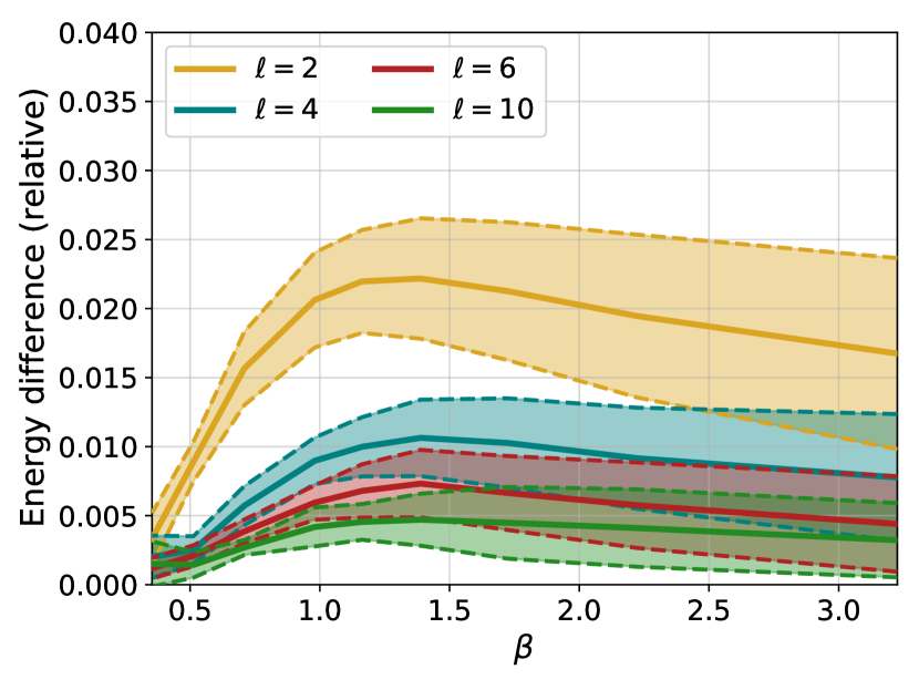
Figure 2: Relative difference in mean energy between the configurations generated by the 4N architecture and by PT, for different numbers of layers $\ell$ and different values of the inverse temperature $\beta$ . Solid lines indicate averages over 10 different instances, while the dashed lines and the colored area identify the region corresponding to plus or minus one standard deviation.
The benchmark Gibbs-Boltzmann distribution
In this paper, in order to test the 4N architecture on a prototypically hard-to-sample problem, we will consider the Edwards-Anderson spin glass model, described by the Hamiltonian in Eq. (3) for Ising spins, where we set $H_{i}=0$ for simplicity. The couplings are chosen to be non-zero only for neighboring pairs $\langle i,j\rangle$ on a two-dimensional square lattice. Non-zero couplings $J_{ij}$ are independent random variables, identically distributed according to either a normal or a Rademacher distribution. This model was also used as a benchmark in Refs. [13, 12]. All the results reported in the rest of the section are for a $16× 16$ square lattice, hence with $N=256$ spins, which guarantees a large enough system to investigate correlations at low temperatures while keeping the problem tractable. In the SI we also report some data for a $32× 32$ lattice.
While this model has no finite-temperature spin glass transition, sampling it via standard local MCMC becomes extremely hard for $\beta\gtrsim 1.5$ [12]. To this day, the best option for sampling this model at lower temperatures is parallel tempering (PT), which we used to construct a sample of $M=2^{16}$ equilibrium configurations for several instances of the model and at several temperatures. Details are given in the Methods section.
The PT-generated training set is used to train the 4N architecture, independently for each instance and each temperature. Remember that the goal here is to test the expressivity of the architecture, which is why we train it in the best possible situation, i.e. by maximizing the likelihood of equilibrium configurations at each temperature. Once the 4N model has been trained, we perform several comparisons that are reported in the following.
Energy
We begin by comparing the mean energy of the configurations generated by the model with the mean energy of the configurations generated via parallel tempering, which is important because the energy plays a central role in the Metropolis reweighing scheme of Eq. (5). Fig. 2 shows the relative energy difference, as a function of inverse temperature $\beta$ and number of layers $\ell$ , averaged over 10 different instances of the disorder. First, it is clear that adding layers improves results remarkably. We stress that, since the activation functions of our network are linear, adding layers only helps in taking into account spins that are further away. Second, we notice that the relative error found when using 6 layers or more is small for all temperatures considered. Finally, we notice that the behaviour of the error is non-monotonic, and indeed appears to decrease for low temperatures even for networks with few layers.
<details>
<summary>x3.png Details</summary>
### Visual Description
## Chart: Log Probability Ratio vs. Number of Layers
### Overview
The image presents a chart illustrating the relationship between the log probability ratio (⟨log P<sup>ℓ</sup><sub>AR</sub>⟩<sub>data</sub>/S) and the number of layers (ℓ) for different values of a parameter T. The chart displays multiple data series, each representing a specific T value, plotted as discrete points connected by dashed lines.
### Components/Axes
* **X-axis:** Number of layers (ℓ), ranging from approximately 2 to 10. The axis is labeled "Number of layers, ℓ".
* **Y-axis:** Log probability ratio (⟨log P<sup>ℓ</sup><sub>AR</sub>⟩<sub>data</sub>/S), ranging from approximately 1.00 to 1.08. The axis is labeled "⟨log P<sup>ℓ</sup><sub>AR</sub>⟩<sub>data</sub>/S".
* **Legend:** Located in the top-right corner of the chart. It identifies each data series with a corresponding color and T value. The T values are: 0.58 (dark blue), 0.72 (blue), 0.86 (purple), 1.02 (magenta), 1.41 (red), 1.95 (orange), and 2.83 (yellow).
* **Title:** "(a)" is present in the top-left corner, likely indicating this is a sub-figure within a larger figure.
* **Gridlines:** Horizontal and vertical gridlines are present to aid in reading values.
### Detailed Analysis
The chart contains seven data series, each corresponding to a different T value.
* **T = 0.58 (Dark Blue):** The line slopes downward sharply from ℓ = 2 to ℓ = 4, then levels off with a slight downward trend.
* ℓ = 2: Approximately 1.078
* ℓ = 3: Approximately 1.065
* ℓ = 4: Approximately 1.045
* ℓ = 5: Approximately 1.035
* ℓ = 6: Approximately 1.030
* ℓ = 7: Approximately 1.027
* ℓ = 8: Approximately 1.025
* ℓ = 9: Approximately 1.024
* ℓ = 10: Approximately 1.023
* **T = 0.72 (Blue):** The line slopes downward, but less steeply than T = 0.58.
* ℓ = 2: Approximately 1.065
* ℓ = 3: Approximately 1.050
* ℓ = 4: Approximately 1.038
* ℓ = 5: Approximately 1.030
* ℓ = 6: Approximately 1.025
* ℓ = 7: Approximately 1.023
* ℓ = 8: Approximately 1.022
* ℓ = 9: Approximately 1.021
* ℓ = 10: Approximately 1.020
* **T = 0.86 (Purple):** The line slopes downward, but less steeply than T = 0.72.
* ℓ = 2: Approximately 1.045
* ℓ = 3: Approximately 1.035
* ℓ = 4: Approximately 1.028
* ℓ = 5: Approximately 1.024
* ℓ = 6: Approximately 1.022
* ℓ = 7: Approximately 1.021
* ℓ = 8: Approximately 1.020
* ℓ = 9: Approximately 1.020
* ℓ = 10: Approximately 1.019
* **T = 1.02 (Magenta):** The line is relatively flat, with a slight downward trend.
* ℓ = 2: Approximately 1.025
* ℓ = 3: Approximately 1.020
* ℓ = 4: Approximately 1.017
* ℓ = 5: Approximately 1.015
* ℓ = 6: Approximately 1.014
* ℓ = 7: Approximately 1.013
* ℓ = 8: Approximately 1.013
* ℓ = 9: Approximately 1.012
* ℓ = 10: Approximately 1.012
* **T = 1.41 (Red):** The line is nearly flat, fluctuating around 1.00.
* ℓ = 2: Approximately 1.010
* ℓ = 3: Approximately 1.007
* ℓ = 4: Approximately 1.005
* ℓ = 5: Approximately 1.004
* ℓ = 6: Approximately 1.003
* ℓ = 7: Approximately 1.003
* ℓ = 8: Approximately 1.002
* ℓ = 9: Approximately 1.002
* ℓ = 10: Approximately 1.002
* **T = 1.95 (Orange):** The line is almost perfectly flat, hovering around 1.00.
* ℓ = 2: Approximately 1.003
* ℓ = 3: Approximately 1.002
* ℓ = 4: Approximately 1.002
* ℓ = 5: Approximately 1.002
* ℓ = 6: Approximately 1.002
* ℓ = 7: Approximately 1.002
* ℓ = 8: Approximately 1.002
* ℓ = 9: Approximately 1.002
* ℓ = 10: Approximately 1.002
* **T = 2.83 (Yellow):** The line is almost perfectly flat, hovering around 1.00.
* ℓ = 2: Approximately 1.002
* ℓ = 3: Approximately 1.002
* ℓ = 4: Approximately 1.002
* ℓ = 5: Approximately 1.002
* ℓ = 6: Approximately 1.002
* ℓ = 7: Approximately 1.002
* ℓ = 8: Approximately 1.002
* ℓ = 9: Approximately 1.002
* ℓ = 10: Approximately 1.002
### Key Observations
* The log probability ratio decreases with increasing number of layers for lower T values (0.58, 0.72, 0.86, and 1.02).
* For higher T values (1.41, 1.95, and 2.83), the log probability ratio remains relatively constant around 1.00, showing minimal change with increasing layers.
* The rate of decrease in log probability ratio is most pronounced for T = 0.58.
* The lines converge as the number of layers increases, suggesting a diminishing effect of adding more layers for all T values.
### Interpretation
The chart suggests that the impact of increasing the number of layers on the log probability ratio is dependent on the value of the parameter T. For lower T values, adding layers initially leads to a significant decrease in the log probability ratio, indicating improved model performance or a better fit to the data. However, this effect diminishes as the number of layers increases. For higher T values, adding layers has a negligible effect on the log probability ratio, suggesting that the model has already reached a point of saturation or that the additional layers do not contribute meaningfully to the model's performance. This could indicate that the optimal number of layers is dependent on the value of T, and that there is a trade-off between model complexity (number of layers) and performance. The convergence of the lines at higher layer counts suggests a limit to the benefits of increasing model depth beyond a certain point.
</details>
<details>
<summary>x4.png Details</summary>
### Visual Description
## Chart: Difference in Log Probabilities vs. Number of Layers
### Overview
The image presents a line chart illustrating the difference between the log probability of the area ratio (logP<sup>l</sup><sub>AR</sub>) data and a reference value, plotted against the number of layers (ℓ). Multiple lines represent different values of a parameter 'T'. Error bars are present for each data point, indicating the uncertainty in the measurements.
### Components/Axes
* **X-axis:** Number of layers (ℓ), ranging from approximately 2 to 10. Labeled as "Number of layers, ℓ".
* **Y-axis:** Difference in log probabilities: ⟨logP<sup>l</sup><sub>AR</sub> data - ⟨logP<sup>l</sup><sub>AR</sub>⟩data⟩, ranging from approximately 0 to 2. Labeled as "⟨logP<sup>l</sup><sub>AR</sub> data - ⟨logP<sup>l</sup><sub>AR</sub>⟩data⟩".
* **Legend:** Located in the top-right corner, listing the values of 'T' corresponding to each line:
* T = 0.58 (Dark Blue)
* T = 0.72 (Medium Blue)
* T = 0.86 (Purple)
* T = 1.02 (Magenta)
* T = 1.41 (Red)
* T = 1.95 (Orange)
* T = 2.83 (Yellow)
* **Title:** "(b)" located in the top-left corner.
### Detailed Analysis
The chart displays seven distinct lines, each representing a different value of 'T'. All lines exhibit a decreasing trend as the number of layers (ℓ) increases. The initial values and rates of decrease vary significantly between the lines.
* **T = 0.58 (Dark Blue):** The line starts at approximately 1.85 at ℓ = 2 and decreases rapidly, approaching 0 around ℓ = 8. Error bars are visible and relatively large at lower ℓ values, decreasing as ℓ increases.
* **T = 0.72 (Medium Blue):** Starts at approximately 1.55 at ℓ = 2, decreasing more slowly than T = 0.58. Approaches 0 around ℓ = 9. Error bars are similar in size to T = 0.58.
* **T = 0.86 (Purple):** Starts at approximately 1.2 at ℓ = 2, decreasing at a rate between T = 0.72 and T = 1.02. Approaches 0 around ℓ = 9. Error bars are similar in size to T = 0.58.
* **T = 1.02 (Magenta):** Starts at approximately 0.85 at ℓ = 2, decreasing at a slower rate than the previous lines. Approaches 0 around ℓ = 9. Error bars are similar in size to T = 0.58.
* **T = 1.41 (Red):** Starts at approximately 0.3 at ℓ = 2, and decreases slowly. Approaches 0 around ℓ = 6. Error bars are relatively small.
* **T = 1.95 (Orange):** Starts at approximately 0.15 at ℓ = 2, and decreases very slowly. Approaches 0 around ℓ = 6. Error bars are relatively small.
* **T = 2.83 (Yellow):** Starts at approximately 0.05 at ℓ = 2, and remains close to 0 throughout the plotted range. Error bars are relatively small.
### Key Observations
* The difference in log probabilities decreases with increasing number of layers for all values of 'T'.
* Lower values of 'T' (0.58, 0.72, 0.86, 1.02) exhibit a more significant initial difference and a more pronounced decrease compared to higher values of 'T' (1.41, 1.95, 2.83).
* The error bars suggest greater uncertainty in the measurements for lower values of 'T' and at smaller values of ℓ.
* The lines for T = 1.95 and T = 2.83 are consistently close to zero, indicating a minimal difference in log probabilities for these values of 'T'.
### Interpretation
This chart likely represents the convergence of a model or algorithm as the number of layers increases. The parameter 'T' could represent a control parameter or a characteristic of the input data. The decreasing trend suggests that as the number of layers increases, the model's output becomes more consistent or approaches a stable state. The different lines for different values of 'T' indicate that the convergence rate and initial difference are sensitive to the value of 'T'.
The larger error bars for lower 'T' values suggest that the model is more sensitive to variations in the input data or initial conditions when 'T' is small. The fact that the lines for higher 'T' values are closer to zero and have smaller error bars suggests that the model is more robust and converges more quickly for these values of 'T'. The chart demonstrates a clear relationship between the parameter 'T', the number of layers, and the difference in log probabilities, providing insights into the behavior and convergence properties of the underlying model.
</details>
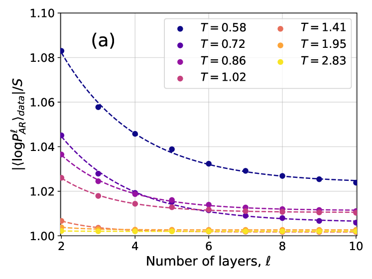
Figure 3: (a) Ratio between the cross-entropy $|\langle\log P^{\ell}_{\text{NN}}\rangle_{\text{data}}|$ and the Gibbs-Boltzmann entropy $S_{\text{GB}}$ for different values of the temperature $T$ and of the number of layers $\ell$ . Both $|\langle\log P^{\ell}_{\text{NN}}\rangle_{\text{data}}|$ and $S_{\text{GB}}$ are averaged over 10 samples. Dashed lines are exponential fits in the form $Ae^{-\ell/\overline{\ell}}+C$ . (b) Absolute difference between $\langle\log P^{\ell}_{\text{NN}}\rangle_{\text{data}}$ at various $\ell$ and at $\ell=10$ . Dashed lines are exponential fits in the form $Ae^{-\ell/\overline{\ell}}$ .
<details>
<summary>x5.png Details</summary>
### Visual Description
## Chart: Probability Distribution of q for Different l Values
### Overview
The image presents a line chart illustrating the probability distribution of a variable 'q' for different values of 'l'. The chart is labeled with "T = 1.95, Instance 1" indicating specific parameters for the data. The y-axis represents the probability P(q), and the x-axis represents the variable q. Four different lines are plotted, each corresponding to a different value of 'l' (2, 4, 6, and 10).
### Components/Axes
* **Title:** T = 1.95, Instance 1 (top-center)
* **X-axis Label:** q (bottom-center)
* Scale: -1.00 to 1.00, with markers at -0.75, -0.50, -0.25, 0.00, 0.25, 0.50, 0.75, 1.00
* **Y-axis Label:** P(q) (left-center)
* Scale: 0.0 to 4.5, with markers at 0.0, 0.5, 1.0, 1.5, 2.0, 2.5, 3.0, 3.5, 4.0, 4.5
* **Legend:** Located in the top-right corner.
* l = 2 (Purple)
* l = 4 (Blue)
* l = 6 (Green)
* l = 10 (Yellow)
### Detailed Analysis
The chart displays four probability distributions.
* **l = 2 (Purple):** The line starts at approximately P(q) = 0.0 at q = -1.00. It rises to a peak at approximately q = 0.0, reaching a maximum P(q) of approximately 4.1. It then declines back to approximately P(q) = 0.0 at q = 1.00. The distribution is relatively narrow and symmetrical around q = 0.
* **l = 4 (Blue):** This line also starts at approximately P(q) = 0.0 at q = -1.00. It rises to a peak at approximately q = 0.0, reaching a maximum P(q) of approximately 4.0. It then declines back to approximately P(q) = 0.0 at q = 1.00. This distribution is also narrow and symmetrical, but slightly broader than the l = 2 distribution.
* **l = 6 (Green):** Similar to the previous lines, it starts at approximately P(q) = 0.0 at q = -1.00. It peaks at approximately q = 0.0, reaching a maximum P(q) of approximately 3.8. It declines back to approximately P(q) = 0.0 at q = 1.00. This distribution is broader than the l = 4 distribution.
* **l = 10 (Yellow):** This line starts at approximately P(q) = 0.0 at q = -1.00. It peaks at approximately q = 0.0, reaching a maximum P(q) of approximately 3.5. It declines back to approximately P(q) = 0.0 at q = 1.00. This distribution is the broadest of the four.
All four lines exhibit a bell-shaped curve, characteristic of a probability distribution. The peak of each curve is located at q = 0.0.
### Key Observations
* As 'l' increases, the peak of the probability distribution decreases.
* As 'l' increases, the width of the probability distribution increases.
* All distributions are symmetrical around q = 0.0.
* The distributions are centered around q = 0.
### Interpretation
The chart demonstrates how the probability distribution of 'q' changes as the parameter 'l' varies, while keeping 'T' constant at 1.95. The decreasing peak height and increasing width of the distributions as 'l' increases suggest that as 'l' grows, the values of 'q' become more dispersed and less concentrated around the central value of 0. This could indicate increasing uncertainty or variability in 'q' as 'l' increases. The parameter 'T' likely represents a temperature or a scaling factor, and the instance number suggests this is one realization of a stochastic process. The relationship between 'l' and the distribution of 'q' could be related to a statistical model where 'l' controls the degrees of freedom or the precision of the distribution. The distributions are likely normalized, as the area under each curve represents the total probability, which is equal to 1.
</details>
<details>
<summary>x6.png Details</summary>
### Visual Description
## Chart: Probability Distribution of q for Different l Values
### Overview
The image presents a line chart illustrating the probability distribution of a variable 'q' for different values of 'l'. The chart displays four distinct curves, each representing a specific 'l' value (2, 4, 6, and 10). The chart is labeled with "T = 0.72, Instance 1" at the top, indicating specific parameters for the data. The y-axis represents P(q), the probability, and the x-axis represents the value of q, ranging from -1.00 to 1.00.
### Components/Axes
* **Title:** T = 0.72, Instance 1
* **X-axis Label:** q
* **Y-axis Label:** P(q)
* **Legend:** Located in the top-right corner.
* l = 2 (Purple, dashed line)
* l = 4 (Blue, solid line)
* l = 6 (Green, solid line)
* l = 10 (Yellow, solid line)
* **X-axis Scale:** Ranges from -1.00 to 1.00, with markings at -0.75, -0.50, -0.25, 0.00, 0.25, 0.50, 0.75, and 1.00.
* **Y-axis Scale:** Ranges from 0.00 to 2.00, with markings at 0.25, 0.50, 0.75, 1.00, 1.25, 1.50, 1.75, and 2.00.
* **Label (b):** Located in the top-left corner.
### Detailed Analysis
Let's analyze each line individually, noting approximate values:
* **l = 2 (Purple, dashed):** This line exhibits a relatively broad distribution, peaking around q = 0.00 with a maximum probability of approximately 1.10. It descends symmetrically on both sides, reaching approximately 0.00 at q = -0.75 and q = 0.75.
* **l = 4 (Blue, solid):** This line is more concentrated around q = 0.00, with a peak probability of approximately 1.25. It descends more rapidly than the l=2 line, reaching approximately 0.00 at q = -0.50 and q = 0.50.
* **l = 6 (Green, solid):** This line is even more concentrated, peaking at approximately q = 0.00 with a maximum probability of around 1.60. It reaches approximately 0.00 at q = -0.25 and q = 0.25.
* **l = 10 (Yellow, solid):** This line is the most concentrated, with a sharp peak at approximately q = 0.00 and a maximum probability of around 1.75. It approaches 0.00 at approximately q = -0.10 and q = 0.10.
All lines are roughly symmetrical around q = 0.00. As 'l' increases, the distribution becomes narrower and taller, indicating a higher probability concentrated around q = 0.00.
### Key Observations
* The distributions become more peaked as 'l' increases.
* The width of the distributions decreases as 'l' increases.
* The maximum probability value increases as 'l' increases.
* All distributions are centered around q = 0.00.
* The dashed line (l=2) is qualitatively different from the solid lines.
### Interpretation
The chart demonstrates how the probability distribution of 'q' changes with varying values of 'l', while keeping 'T' constant at 0.72. The parameter 'l' appears to control the concentration or spread of the distribution. Higher values of 'l' lead to a more focused distribution around q = 0.00, suggesting that as 'l' increases, the variable 'q' is more likely to be close to zero. This could represent a narrowing of possible outcomes or a reduction in uncertainty. The dashed line for l=2 suggests a different underlying process or a qualitatively different behavior compared to the other values of 'l'. The parameter 'T' likely influences the overall shape and scale of the distributions, but its specific role isn't directly apparent from this single chart. The "Instance 1" label suggests that this is one realization of a stochastic process, and other instances might exhibit different distributions.
</details>
<details>
<summary>x7.png Details</summary>
### Visual Description
\n
## Line Chart: Probability Distribution of q for Different l Values
### Overview
This image presents a line chart illustrating the probability distribution of a variable 'q' for different values of 'l' (2, 4, 6, and 10) under a fixed parameter 'T' of 0.31, for Instance 1. The chart displays the probability density, P(q), as a function of q, ranging from -1.00 to 1.00. The lines are plotted with varying styles (solid, dashed) and colors to distinguish between the different 'l' values.
### Components/Axes
* **Title:** T = 0.31, Instance 1 (located at the top-right)
* **X-axis Label:** q (located at the bottom-center)
* Scale: -1.00 to 1.00, with markers at -1.00, -0.75, -0.50, -0.25, 0.00, 0.25, 0.50, 0.75, 1.00
* **Y-axis Label:** P(q) (located at the left-center)
* Scale: 0.0 to 1.6, with gridlines at 0.2 intervals.
* **Legend:** Located at the top-right, identifying each line by its 'l' value and color.
* l = 2 (Purple, solid line)
* l = 4 (Blue, solid line)
* l = 6 (Teal, solid line)
* l = 10 (Yellow, solid line)
* Dashed black line: appears to be a reference or average.
### Detailed Analysis
The chart shows four distinct probability distributions, each corresponding to a different value of 'l'. A dashed black line is also present, potentially representing an average or baseline.
* **l = 2 (Purple):** The line starts at approximately P(q) = 0.0 at q = -1.00, rises to a peak of approximately P(q) = 0.75 at q = -0.25, then declines to approximately P(q) = 0.0 at q = 1.00. The distribution is relatively narrow and centered around q = -0.25.
* **l = 4 (Blue):** The line starts at approximately P(q) = 0.0 at q = -1.00, rises to a peak of approximately P(q) = 0.85 at q = 0.00, then declines to approximately P(q) = 0.0 at q = 1.00. The distribution is centered around q = 0.00.
* **l = 6 (Teal):** The line starts at approximately P(q) = 0.0 at q = -1.00, rises to a peak of approximately P(q) = 0.90 at q = 0.25, then declines to approximately P(q) = 0.0 at q = 1.00. The distribution is centered around q = 0.25.
* **l = 10 (Yellow):** The line starts at approximately P(q) = 0.0 at q = -1.00, rises to a peak of approximately P(q) = 0.70 at q = 0.50, then declines to approximately P(q) = 0.0 at q = 1.00. The distribution is centered around q = 0.50.
* **Dashed Black Line:** This line starts at approximately P(q) = 0.0 at q = -1.00, rises to a peak of approximately P(q) = 0.80 at q = 0.00, then declines to approximately P(q) = 0.0 at q = 1.00.
The distributions appear to shift towards positive 'q' values as 'l' increases.
### Key Observations
* The distributions are generally unimodal (single peak).
* The peak of the distribution shifts to the right (positive q values) as 'l' increases.
* The dashed black line appears to represent a central tendency or average of the distributions.
* The distributions are not symmetrical.
### Interpretation
The chart demonstrates how the probability distribution of 'q' changes with varying values of 'l' under a fixed 'T' value. The shift in the peak of the distribution suggests that as 'l' increases, the most probable value of 'q' also increases. This could indicate a relationship between 'l' and 'q', where higher 'l' values are associated with higher 'q' values. The dashed black line might represent the distribution for a specific 'l' value or an average distribution across different 'l' values. The data suggests a systematic change in the distribution of 'q' as 'l' varies, potentially indicating a parameter influencing the central tendency of the variable. The fact that the distributions are not symmetrical suggests that the underlying process generating 'q' is not symmetrical. Further analysis would be needed to understand the specific meaning of 'l', 'q', and 'T' within the context of the problem being studied.
</details>
<details>
<summary>x8.png Details</summary>
### Visual Description
\n
## Chart: Probability Distribution for Different 'l' Values
### Overview
The image presents a line chart illustrating the probability distribution, P(q), as a function of 'q' for different values of 'l'. The chart is labeled with "T = 0.31, Instance 2" indicating specific parameters for the data. The chart appears to show how the shape of the probability distribution changes with varying 'l' values.
### Components/Axes
* **X-axis:** Labeled 'q', ranging from -1.00 to 1.00 with increments of 0.25.
* **Y-axis:** Labeled 'P(q)', ranging from 0.0 to 1.6 with increments of 0.2.
* **Title:** "T = 0.31, Instance 2" positioned at the top-center of the chart.
* **Legend:** Located in the top-right corner, listing the 'l' values and their corresponding line colors:
* l = 2 (Purple)
* l = 4 (Blue)
* l = 6 (Teal)
* l = 10 (Yellow)
* **Label (d):** Located in the top-left corner.
### Detailed Analysis
The chart displays four distinct lines, each representing a different 'l' value.
* **l = 2 (Purple):** The line exhibits a roughly symmetrical, bell-shaped curve. It peaks around q = -0.75 and q = 0.75, reaching a maximum P(q) of approximately 0.85. The curve dips to a minimum of approximately 0.15 around q = 0.
* **l = 4 (Blue):** This line also shows a bell-shaped curve, but it is broader and flatter than the l=2 line. It peaks around q = -0.5 and q = 0.5, reaching a maximum P(q) of approximately 0.8. The minimum value is around 0.2 at q = 0.
* **l = 6 (Teal):** The teal line continues the trend of broadening and flattening. It peaks around q = -0.25 and q = 0.25, reaching a maximum P(q) of approximately 0.7. The minimum value is around 0.3 at q = 0.
* **l = 10 (Yellow):** This line is the broadest and flattest of the four. It peaks around q = 0, reaching a maximum P(q) of approximately 0.6. The minimum value is around 0.4 at q = -0.75 and q = 0.75.
All lines exhibit a roughly symmetrical shape around q = 0. As 'l' increases, the peak of the distribution becomes less pronounced and the curve flattens.
### Key Observations
* The probability distributions become wider and flatter as 'l' increases.
* The peak probability decreases as 'l' increases.
* The minimum probability increases as 'l' increases.
* The distributions appear to be centered around q = 0, although there is a slight shift towards negative values for lower 'l' values.
### Interpretation
The data suggests that the parameter 'l' controls the spread or variance of the probability distribution. Higher values of 'l' lead to a more uniform distribution, indicating greater uncertainty or a wider range of possible values for 'q'. Lower values of 'l' result in a more peaked distribution, indicating a higher probability of observing values of 'q' closer to the peak. The parameter 'T = 0.31' and 'Instance 2' likely define the specific conditions under which these distributions are observed. The distributions could represent the probability of a certain state or outcome given a specific value of 'q', and 'l' might be related to the number of degrees of freedom or the amount of information available. The 'd' label could indicate a specific experimental setup or condition. The consistent trend across all 'l' values suggests a systematic relationship between 'l' and the shape of the probability distribution.
</details>
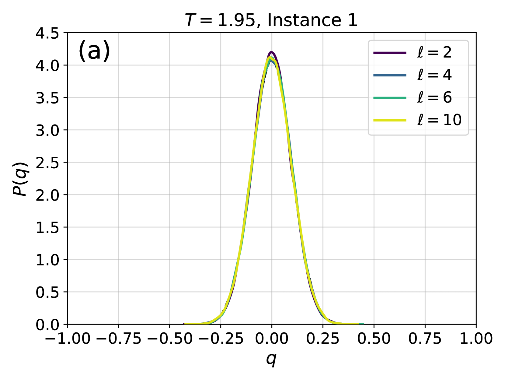
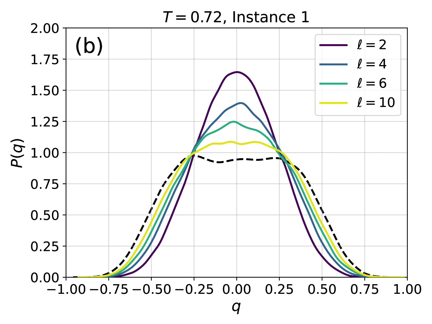
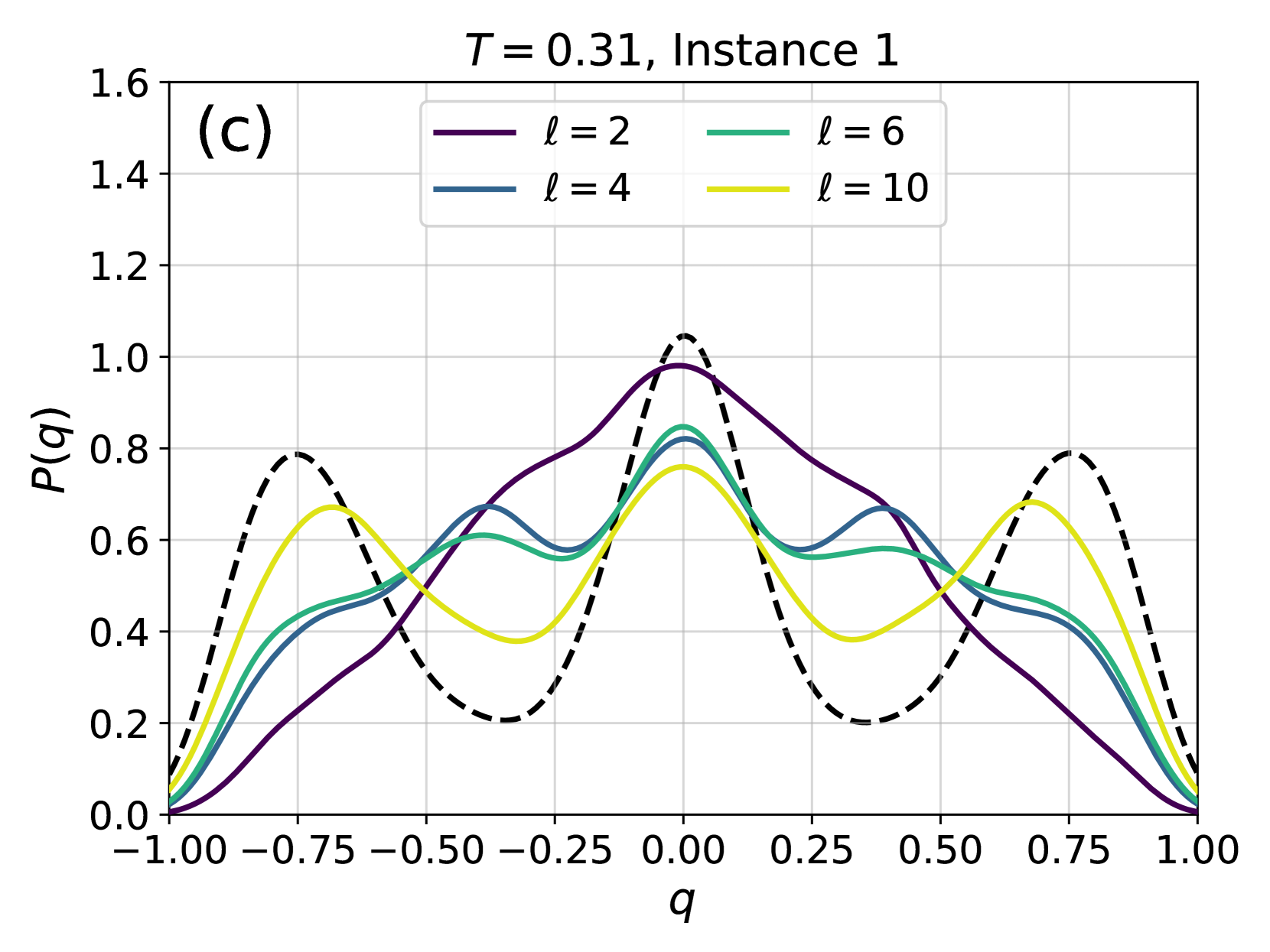
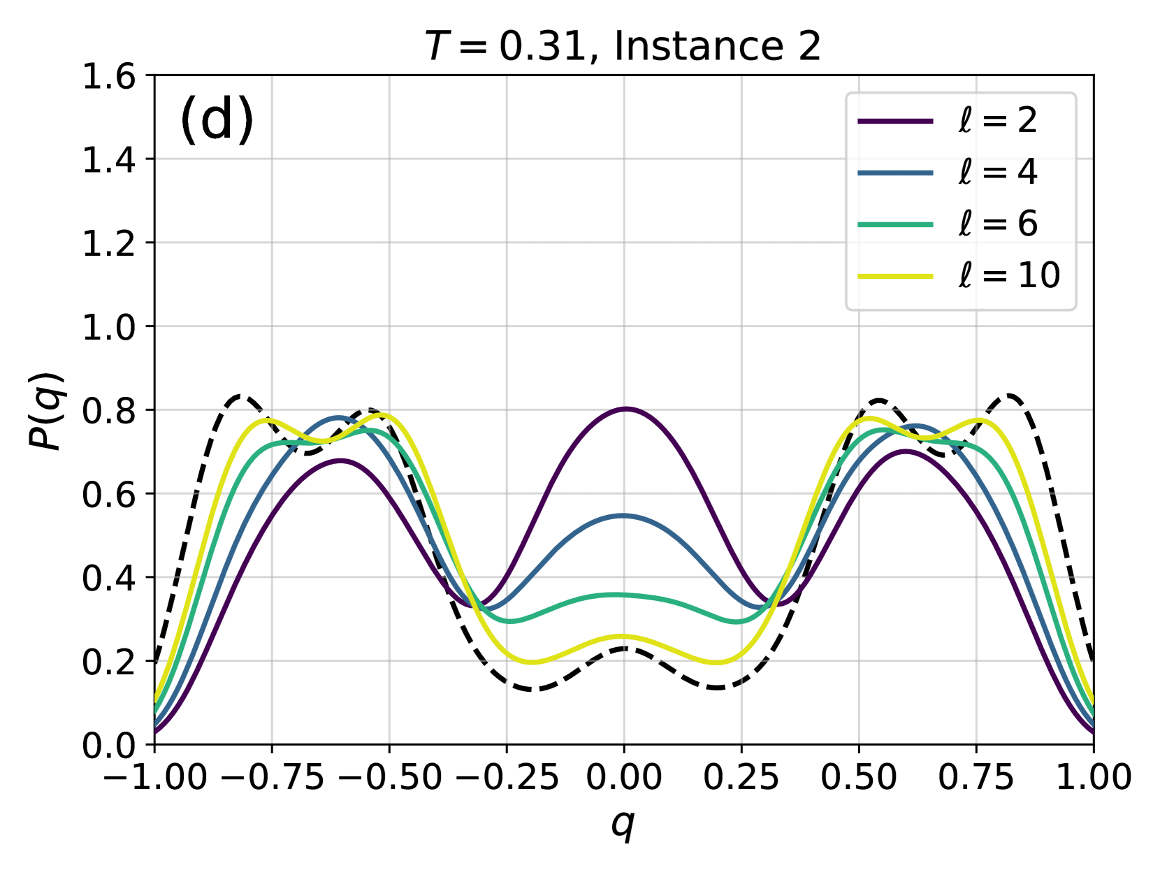
Figure 4: Examples of the probability distribution of the overlap, $P(q)$ , for different instances of the disorder and different temperatures. Solid color lines correspond to configurations generated using 4N, while dashed black lines correspond to the $P(q)$ obtained from equilibrium configurations generated via PT. (a) At high temperature, even a couple of layers are enough to reproduce well the distribution. (b) At lower temperatures more layers are required, as expected because of the increase of the correlation length and of the complexity of the Gibbs-Boltzmann distribution. (c) Even lower temperature for the same instance. (d) A test on a more complex instance shows that 4N is capable to learn even non-trivial forms of $P(q)$ .
Entropy and Kullback-Leibler divergence
Next, we consider the Kullback-Leibler divergence between the learned probability distribution $P_{\text{NN}}$ and the target probability distribution, $D_{\text{KL}}(P_{\text{GB}}\parallel P_{\text{NN}})$ . Indicating with $\langle\,·\,\rangle_{\text{GB}}$ the average with respect to $P_{\text{GB}}$ , we have
$$
D_{\text{KL}}(P_{\text{GB}}\parallel P_{\text{NN}})=\langle\log P_{\text{GB}}%
\rangle_{\text{GB}}-\langle\log P_{\text{NN}}\rangle_{\text{GB}}\ . \tag{11}
$$
The first term $\langle\log P_{\text{GB}}\rangle_{\text{GB}}=-S_{\text{GB}}(T)$ is minus the entropy of the Gibbs-Boltzmann distribution and does not depend on $P_{\text{NN}}$ , hence we focus on the cross-entropy $-\langle\log P_{\text{NN}}\rangle_{\text{GB}}$ as a function of the number of layers for different temperatures. Minimizing this quantity corresponds to minimizing the KL divergence. In the case of perfect learning, i.e. $D_{\text{KL}}=0$ , we have $-\langle\log P_{\text{NN}}\rangle_{\text{GB}}=S_{\text{GB}}(T)$ . In Fig. 3 we compare the cross-entropy, estimated as $-\langle\log P_{\text{NN}}\rangle_{\text{data}}$ on the data generated by PT, with $S_{\text{GB}}(T)$ computed using thermodynamic integration. We find a good match for large enough $\ell$ , indicating an accurate training of the 4N model that does not suffer from mode collapse.
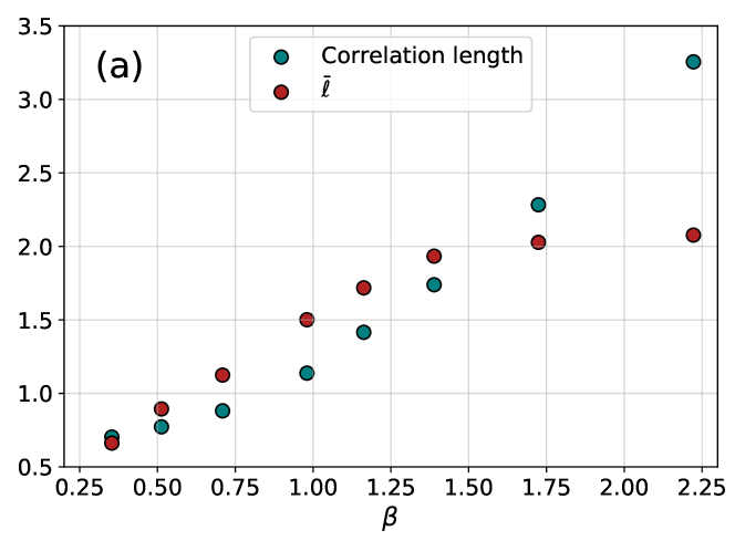
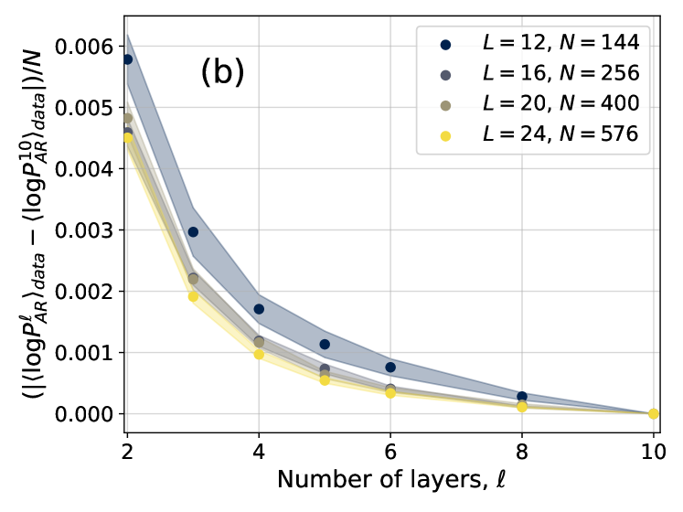
In order to study more carefully how changing the number of layers affects the accuracy of the training, in Fig. 3 we have also shown the difference $|\langle\log P^{\ell}_{AR}\rangle_{data}-\langle\log P^{10}_{AR}\rangle_{data}|$ as a function of the number of layers $\ell$ for different temperatures. The plots are compatible with an exponential decay in the form $Ae^{-\ell/\overline{\ell}}$ , with $\overline{\ell}$ thus being an estimate of the number of layers above which the 4N architecture becomes accurate. We thus need to understand how $\overline{\ell}$ changes with temperature and system size. To do so, we need to introduce appropriate correlation functions, as we do next.
<details>
<summary>x9.png Details</summary>
### Visual Description
## Log-Log Plot: Correlation Function vs. Distance
### Overview
The image presents a log-log plot illustrating the correlation function (G) as a function of distance (r) for different values of 'l'. A dashed black line represents "Data", while solid lines represent theoretical curves for l = 2, 4, 6, and 10. The plot is labeled with 'T = 1.02' at the top-right and '(a)' at the top-right corner. The y-axis is logarithmic, ranging from 10⁰ to 10⁻². The x-axis, also representing distance, ranges from 0 to 7.
### Components/Axes
* **X-axis:** 'r' (Distance), ranging from 0 to 7, with tick marks at integer values.
* **Y-axis:** 'G' (Correlation Function), on a logarithmic scale from 10⁰ (1) to 10⁻² (0.01), with tick marks at 10⁰, 10⁻¹, and 10⁻².
* **Legend:** Located in the bottom-left corner, listing the following:
* 'Data' - Dashed black line
* 'l = 2' - Dark purple line
* 'l = 4' - Gray line
* 'l = 6' - Green line
* 'l = 10' - Yellow line
* **Title/Label:** 'T = 1.02' positioned at the top-right.
* **Annotation:** '(a)' positioned at the top-right.
### Detailed Analysis
The plot shows the decay of the correlation function 'G' with increasing distance 'r'. The 'Data' line (dashed black) exhibits a relatively steep decay. The solid lines represent theoretical predictions for different values of 'l'.
* **Data (Dashed Black):** The line slopes downward, starting at approximately G = 0.8 at r = 0 and decreasing to approximately G = 0.02 at r = 7.
* **l = 2 (Dark Purple):** This line starts at approximately G = 0.9 at r = 0 and decreases to approximately G = 0.03 at r = 7. It is slightly above the 'Data' line.
* **l = 4 (Gray):** This line starts at approximately G = 0.7 at r = 0 and decreases to approximately G = 0.025 at r = 7. It is close to the 'Data' line.
* **l = 6 (Green):** This line starts at approximately G = 0.6 at r = 0 and decreases to approximately G = 0.02 at r = 7. It is below the 'Data' line.
* **l = 10 (Yellow):** This line starts at approximately G = 0.5 at r = 0 and decreases to approximately G = 0.015 at r = 7. It is the lowest of the theoretical curves.
All lines exhibit a generally linear decay on this log-log scale, indicating a power-law relationship between G and r. The slope of each line varies, corresponding to the different values of 'l'.
### Key Observations
* The 'Data' line falls between the curves for l = 4 and l = 6.
* As 'l' increases, the correlation function decays more rapidly with distance.
* All curves show a similar trend of decreasing correlation with increasing distance.
* The logarithmic scale emphasizes the rate of decay, making it easier to compare the different curves.
### Interpretation
This plot likely represents the spatial correlation of some quantity within a system, possibly a fluid or a material. The correlation function 'G' quantifies how strongly the value of the quantity at one point is related to its value at another point, separated by a distance 'r'. The parameter 'l' likely represents a characteristic length scale within the system.
The fact that the 'Data' line falls between the curves for l = 4 and l = 6 suggests that the characteristic length scale of the system is somewhere between 4 and 6. The value of T = 1.02 could represent a temperature or another relevant parameter of the system. The plot demonstrates how the correlation function decays with distance, and how this decay is influenced by the characteristic length scale 'l'. The use of a log-log plot allows for the identification of power-law behavior, which is common in many physical systems. The annotation '(a)' suggests this is part of a larger figure with multiple panels.
</details>
<details>
<summary>x10.png Details</summary>
### Visual Description
## Chart: G vs. r with varying l values
### Overview
The image presents a log-log plot showing the relationship between two variables, G and r, for different values of a parameter 'l'. A dashed black line represents experimental "Data", while solid colored lines represent theoretical curves for l = 2, 4, 6, and 10. The plot is labeled with T = 0.45 in the top-right corner and a label "(b)" in the top-right corner. The y-axis is logarithmic, ranging from 10⁰ to 10⁻¹. The x-axis, 'r', ranges from 0 to 7.
### Components/Axes
* **X-axis:** 'r' (ranging from 0 to 7, linear scale)
* **Y-axis:** 'G' (logarithmic scale, ranging from 10⁰ to 10⁻¹)
* **Title:** None explicitly present, but the chart depicts G vs. r.
* **Legend:** Located in the bottom-left corner.
* Data (dashed black line)
* l = 2 (purple line)
* l = 4 (blue line)
* l = 6 (green line)
* l = 10 (yellow line)
* **Parameter:** T = 0.45 (displayed at the top-center)
### Detailed Analysis
The chart displays five lines, each representing a different relationship between G and r.
* **Data (dashed black line):** This line slopes downward, approximately linearly on this log-log scale.
* At r = 0, G ≈ 1.0
* At r = 7, G ≈ 0.15
* **l = 2 (purple line):** This line starts at a higher G value than the 'Data' line and has a steeper negative slope.
* At r = 0, G ≈ 2.0
* At r = 7, G ≈ 0.05
* **l = 4 (blue line):** This line has a slope between the 'Data' line and the l=2 line.
* At r = 0, G ≈ 1.5
* At r = 7, G ≈ 0.1
* **l = 6 (green line):** This line has a slope less steep than the l=4 line, and is below the 'Data' line for r > ~2.
* At r = 0, G ≈ 1.2
* At r = 7, G ≈ 0.2
* **l = 10 (yellow line):** This line has the least steep slope and is below the 'Data' line for r > ~1.
* At r = 0, G ≈ 1.1
* At r = 7, G ≈ 0.3
All lines exhibit a decreasing trend as 'r' increases. The slopes of the lines vary depending on the value of 'l', with larger 'l' values resulting in shallower slopes.
### Key Observations
* The 'Data' line falls between the theoretical curves for l = 6 and l = 10.
* The theoretical curves converge as 'r' increases.
* The y-axis is logarithmic, indicating a power-law relationship between G and r.
* The parameter T = 0.45 is constant for all curves.
### Interpretation
The chart likely represents a comparison between experimental data and theoretical predictions for a physical system. The parameter 'l' likely represents a characteristic length or scale within the system, and 'r' represents a radial distance. The variable 'G' could represent a correlation function, a structure factor, or some other measure of spatial order.
The fact that the 'Data' line falls between the l = 6 and l = 10 curves suggests that the actual value of 'l' in the system is somewhere between these two values. The convergence of the theoretical curves as 'r' increases indicates that the system becomes more homogeneous at larger distances. The logarithmic scale suggests that the correlation between variables decays as a power law. The constant value of T = 0.45 may represent a temperature or other control parameter of the system.
The chart demonstrates how theoretical models can be used to interpret experimental data and gain insights into the underlying physics of a system. The discrepancies between the 'Data' line and the theoretical curves could indicate limitations of the model or the presence of additional factors not accounted for in the theory.
</details>
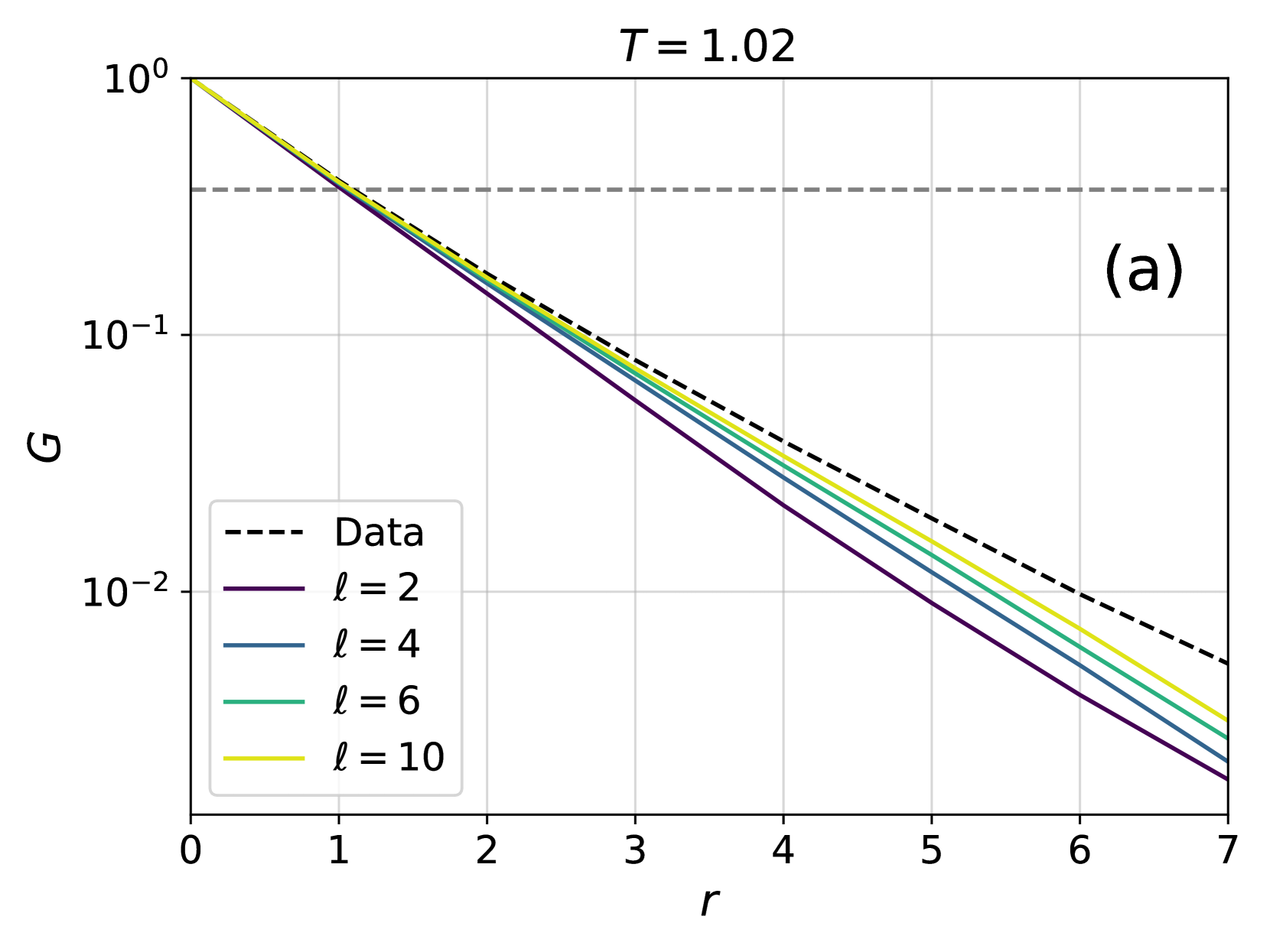
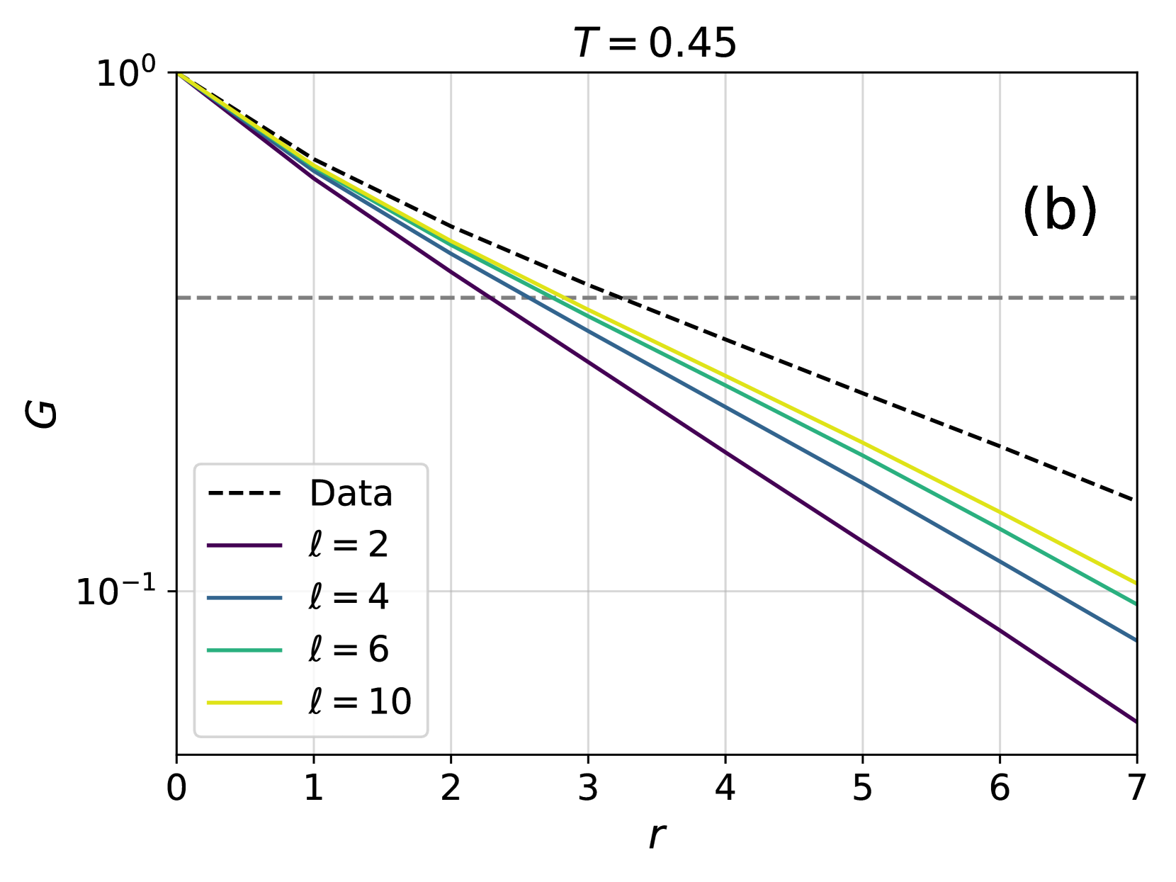
Figure 5: Comparison between the spatial correlation functions obtained from 4N and those obtained from PT, at different high (a) and low (b) temperatures and for different number of layers. The grey dashed lines correspond to the value $1/e$ that defines the correlation length $\xi$ . Data are averaged over 10 instances.
Overlap distribution function
In order to show that the 4N architecture is able to capture more complex features of the Gibbs-Boltzmann distribution, we have considered a more sensitive observable: the probability distribution of the overlap, $P(q)$ . The overlap $q$ between two configurations of spins $\ \boldsymbol{\sigma}^{1}=\{\sigma^{1}_{1},\sigma^{1}_{2},...\sigma^{1}_{N}\}$ and $\ \boldsymbol{\sigma}^{2}=\{\sigma^{2}_{1},\sigma^{2}_{2},...\sigma^{2}_{N}\}$ is a central quantity in spin glass physics, and is defined as:
$$
q_{12}=\frac{1}{N}\boldsymbol{\sigma}^{1}\cdot\boldsymbol{\sigma}^{2}=\frac{1}%
{N}\sum_{i=1}^{N}\sigma^{1}_{i}\sigma^{2}_{i}. \tag{12}
$$
The histogram of $P(q)$ is obtained by considering many pairs of configurations, independently taken from either the PT-generated training set, or by generating them with the 4N architecture. Examples for two different instances at several temperatures are shown in Fig. 4. At high temperatures, even very few layers are able to reproduce the distribution of the overlaps. When going to lower temperatures, and to more complex shapes of $P(q)$ , however, the number of layers that is required to have a good approximation of $P(q)$ increases. This result is compatible with the intuitive idea that an increasing number of layers is required to reproduce a system at low temperatures, where the correlation length is large.
As shown in the SI, the performance of 4N is on par with that of other algorithms with more parameters. Moreover, with a suitable increase of the number of layers, 4N is also able to achieve satisfactory results when system’s size increases.
<details>
<summary>x11.png Details</summary>
### Visual Description
## Scatter Plot: Correlation Length vs. Beta
### Overview
The image presents a scatter plot illustrating the relationship between a parameter denoted as "β" (beta) on the x-axis and two different measures of length on the y-axis: "Correlation length" and a variable represented by "l̄" (l-bar). The plot appears to explore how these length measures change as beta varies.
### Components/Axes
* **X-axis:** Labeled "β" (beta), ranging from approximately 0.25 to 2.25 with increments of 0.25.
* **Y-axis:** Ranges from approximately 0.5 to 3.5 with increments of 0.5. No explicit label is provided, but the data points represent length measurements.
* **Legend:** Located in the top-right corner.
* "Correlation length" - represented by teal/cyan circles.
* "l̄" (l-bar) - represented by maroon/red circles.
* **Title:** "(a)" in the top-left corner, likely indicating this is part of a larger figure.
* **Grid:** A light gray grid is present, aiding in the visual estimation of data point values.
### Detailed Analysis
The plot contains approximately 12 data points for each series (Correlation length and l̄).
**Correlation Length (Teal/Cyan Circles):**
The trend for Correlation length is generally upward.
* β ≈ 0.25: Correlation length ≈ 0.6
* β ≈ 0.50: Correlation length ≈ 0.75
* β ≈ 0.75: Correlation length ≈ 1.0
* β ≈ 1.00: Correlation length ≈ 1.4
* β ≈ 1.25: Correlation length ≈ 1.8
* β ≈ 1.50: Correlation length ≈ 2.1
* β ≈ 1.75: Correlation length ≈ 2.3
* β ≈ 2.00: Correlation length ≈ 3.1
* β ≈ 2.25: Correlation length ≈ 3.1
**l̄ (Maroon/Red Circles):**
The trend for l̄ is also generally upward, but appears less linear and more scattered than the Correlation length data.
* β ≈ 0.25: l̄ ≈ 0.6
* β ≈ 0.50: l̄ ≈ 0.8
* β ≈ 0.75: l̄ ≈ 1.2
* β ≈ 1.00: l̄ ≈ 1.5
* β ≈ 1.25: l̄ ≈ 1.8
* β ≈ 1.50: l̄ ≈ 1.9
* β ≈ 1.75: l̄ ≈ 2.0
* β ≈ 2.00: l̄ ≈ 2.1
* β ≈ 2.25: l̄ ≈ 2.1
### Key Observations
* Both Correlation length and l̄ generally increase with increasing β.
* The Correlation length data appears to have a stronger positive correlation with β than the l̄ data.
* The Correlation length data shows a more pronounced increase in the higher β range (β > 1.5).
* The l̄ data is more scattered, suggesting a weaker or more complex relationship with β.
* At β ≈ 0.25, the values for Correlation length and l̄ are nearly identical.
### Interpretation
The plot suggests that as the parameter β increases, both the correlation length and the length represented by l̄ tend to increase. However, the correlation length appears to be more directly and consistently influenced by β than l̄. This could indicate that the correlation length is a more sensitive measure of the underlying system's behavior as β changes. The scattering of the l̄ data might suggest that other factors are influencing its value, or that the relationship between l̄ and β is non-linear and more complex. The initial similarity in values at low β suggests that at small values of β, these two length scales are closely related, but diverge as β increases. The "(a)" label suggests this is part of a larger study, and further plots might reveal the context and significance of these observations.
</details>
<details>
<summary>x12.png Details</summary>
### Visual Description
\n
## Chart: Convergence of Log Probability Ratio
### Overview
The image presents a line chart illustrating the convergence of the log probability ratio as a function of the number of layers. The chart displays four data series, each representing a different system size, with shaded regions indicating the uncertainty or variance around each line. The y-axis represents the average log probability ratio difference, normalized by the system size (N), while the x-axis represents the number of layers (l).
### Components/Axes
* **Title:** (b) - likely a sub-figure identifier.
* **X-axis Label:** Number of layers, *l* (ranging from approximately 2 to 10).
* **Y-axis Label:** ⟨(log *P*<sub>*AR*</sub><sup>*l*</sup><sub>data</sub> - (log *P*<sub>*AR*</sub><sup>10</sup><sub>data</sub>))/N⟩ (ranging from approximately 0.000 to 0.006).
* **Legend:** Located in the top-right corner.
* Dark Blue: L = 12, N = 144
* Gray: L = 16, N = 256
* Light Gray: L = 20, N = 400
* Yellow: L = 24, N = 576
* **Data Series:** Four lines representing different system sizes (L and N values).
* **Shaded Regions:** Lightly shaded areas around each line, representing the uncertainty or standard deviation.
* **Gridlines:** Vertical gridlines are present to aid in reading values on the x-axis.
### Detailed Analysis
The chart shows a clear downward trend for all data series. As the number of layers (*l*) increases, the average log probability ratio difference decreases, indicating convergence.
* **L = 12, N = 144 (Dark Blue):**
* At *l* = 2, the value is approximately 0.0058.
* At *l* = 4, the value is approximately 0.0035.
* At *l* = 6, the value is approximately 0.0018.
* At *l* = 8, the value is approximately 0.0008.
* At *l* = 10, the value is approximately 0.0002.
* **L = 16, N = 256 (Gray):**
* At *l* = 2, the value is approximately 0.0055.
* At *l* = 4, the value is approximately 0.0032.
* At *l* = 6, the value is approximately 0.0016.
* At *l* = 8, the value is approximately 0.0007.
* At *l* = 10, the value is approximately 0.0002.
* **L = 20, N = 400 (Light Gray):**
* At *l* = 2, the value is approximately 0.0052.
* At *l* = 4, the value is approximately 0.0030.
* At *l* = 6, the value is approximately 0.0015.
* At *l* = 8, the value is approximately 0.0006.
* At *l* = 10, the value is approximately 0.0001.
* **L = 24, N = 576 (Yellow):**
* At *l* = 2, the value is approximately 0.0050.
* At *l* = 4, the value is approximately 0.0028.
* At *l* = 6, the value is approximately 0.0014.
* At *l* = 8, the value is approximately 0.0005.
* At *l* = 10, the value is approximately 0.0001.
The shaded regions around each line indicate some variability in the data, but the overall trend remains consistent across all system sizes. The lines appear to converge towards a value close to zero as the number of layers increases.
### Key Observations
* All data series exhibit a similar downward trend, suggesting that the convergence behavior is independent of the system size (within the range tested).
* The convergence appears to be faster initially (between *l* = 2 and *l* = 6) and then slows down as the number of layers increases.
* The values for larger system sizes (L=24, N=576) are consistently slightly lower than those for smaller system sizes, although the difference is small.
### Interpretation
This chart demonstrates the convergence of a certain property (represented by the log probability ratio) as the number of layers in a system increases. The convergence suggests that the system is approaching a stable state or equilibrium. The normalization by the system size (N) indicates that the convergence rate is independent of the absolute size of the system. The shaded regions represent the uncertainty in the measurements, which could be due to statistical fluctuations or other sources of noise. The fact that all lines converge to approximately zero suggests that the property being measured becomes negligible as the number of layers increases. This could be indicative of a well-behaved system that reaches a stable configuration with sufficient layers. The consistent trend across different system sizes suggests that the observed behavior is a general property of the system and not an artifact of a specific size.
</details>
Figure 6: (a) Comparison between the correlation length $\xi$ and the decay parameter $\overline{\ell}$ of the exponential fit as a function of the inverse temperature $\beta$ . Both data sets are averaged over 10 instances. The data are limited to $T≥ 0.45$ because below that temperature the finite size of the sample prevents us to obtain a reliable proper estimate of the correlation length. (b) Absolute difference between $\langle\log P^{\ell}_{\text{NN}}\rangle_{\text{data}}$ at various $\ell$ and at $\ell=10$ for $T=1.02$ and different system sizes. Data are averaged over ten different instances of the disorder and the colored areas identify regions corresponding to plus or minus one standard deviation. A version of this plot in linear-logarithmic scale is available in the SI.
Spatial correlation function
To better quantify spatial correlations, from the overlap field, a proper correlation function for a spin glass system can be defined as [35]
$$
G(r)=\frac{1}{{\color[rgb]{0,0,0}\mathcal{N}(r)}}\sum_{i,j:d_{ij}=r}\overline{%
\langle q_{i}q_{j}\rangle}\ , \tag{13}
$$
where $r=d_{ij}$ is the lattice distance of sites $i,j$ , ${q_{i}=\sigma^{1}_{i}\sigma^{2}_{i}}$ is the local overlap, and $\mathcal{N}(r)=\sum_{i,j:d_{ij}=r}1$ is the number of pairs of sites at distance $r$ . Note that in this way $G(0)=1$ by construction. Results for $G(r)$ at various temperatures are shown in Fig. 5. It is clear that increasing the number of layers leads to a better agreement at lower temperatures. Interestingly, architectures with a lower numbers of layers produce a smaller correlation function at any distance, which shows that upon increasing the number of layers the 4N architecture is effectively learning the correlation of the Gibbs-Boltzmann measure.
To quantify this intuition, we extract from the exact $G(r)$ of the EA model a correlation length $\xi$ , from the relation $G(\xi)=1/e$ . Then, we compare $\xi$ with $\overline{\ell}$ , i.e. the number of layers above which the model becomes accurate, extracted from Fig. 3. These two quantities are compared in Fig. 6 as a function of temperature, showing that they are roughly proportional. Actually $\overline{\ell}$ seems to grow even slower than $\xi$ at low temperatures. In Fig. 6 we also reproduce the results of Fig. 3b for different sizes of the system. The curves coincide for large enough values of $N$ , showing that the value of $\ell$ saturates to a system-independent value when increasing the system size. We are thus able to introduce a physical criterion to fix the optimal number of layers needed for the 4N architecture to perform well: $\ell$ must be of the order of the correlation length $\xi$ of the model at that temperature.
We recall that the 4N architecture requires $(c+1)×\ell× N$ parameters, where $c$ is the average connectivity of the graph ( $c=2d$ for a $d$ -dimensional lattice), and $\mathcal{O}(\mathcal{B}(\ell)× N)$ operations to generate a new configuration. We thus conclude that, for a model with a correlation length $\xi$ that remains finite for $N→∞$ , we can choose $\ell$ proportional to $\xi$ , hence achieving the desired linear scaling with system size both for the number of parameters and the number of operations.
Discussion
In this work we have introduced a new, physics-inspired 4N architecture for the approximation of the Gibbs-Boltzmann probability distribution of a spin glass system of $N$ spins. The 4N architecture is inspired by the previously introduced TwoBo [21], but it implements explicitly the locality of the physical model via a Graph Neural Network structure.
The 4N network possesses many desirable properties. (i) The architecture has a physical interpretation, with the required number of layers being directly linked to the correlation length of the original data. (ii) As a consequence, if the correlation length of the model is finite, the required number of parameters for a good fit scales linearly in the number of spins, thus greatly improving the scalability with respect to previous architectures. (iii) The architecture is very general, and can be applied to lattices in all dimensions as well as arbitrary interaction graphs without losing the good scaling of the number of parameters, as long as the average connectivity remains finite. It can also be generalized to systems with more than two-body interactions by using a factor graph representation in the GNN layers.
As a benchmark study, we have tested that the 4N architecture is powerful enough to reproduce key properties of the two-dimensional Edwards-Anderson spin glass model, such as the energy, the correlation function and the probability distribution of the overlap.
Having tested that 4N achieves the best possible scaling with system size while being expressive enough, the next step is to check whether it is possible to apply an iterative, self-consistent procedure to automatically train the network at lower and lower temperatures without the aid of training data generated with a different algorithm (here, parallel tempering). This would allow to set up a simulated tempering procedure with a good scaling in the number of variables, with applications not only in the simulation of disordered systems but in the solution of optimization problems as well. Whether setting up such a procedure is actually possible will be the focus of future work.
Methods
Details of the 4N architecture
The Nearest Neighbors Neural Network (4N) architecture uses a GNN structure to respect the locality of the problem, as illustrated in Fig. 1. The input, given by the local fields computed from the already fixed spins, is passed through $\ell$ layers of weights $W_{ij}^{k}$ . Each weight corresponds to a directed nearest neighbor link $i← j$ (including $i=j$ ) and $k=1,...,\ell$ , therefore the network has a total number of parameters equal to $(c+1)×\ell× N$ , i.e. linear in $N$ as long as the number of layers and the model connectivity remain finite. A showcase of the real wall-clock times required for the training of the network and for the generation of new configurations is shown in the SI.
The operations performed in order to compute ${\pi_{i}=P(\sigma_{i}=1\mid\boldsymbol{\sigma}_{<i})}$ are the following:
1. initialize the local fields from the input spins $\boldsymbol{\sigma}_{<i}$ :
$$
h_{l}^{i,(0)}=\sum_{f(<i)}J_{lf}\sigma_{f}\ ,\qquad\forall l:|i-l|\leq\ell\ . \tag{0}
$$
1. iterate the GNN layers $∀ k=1,·s,\ell-1$ :
$$
h_{l}^{i,(k)}=\phi^{k}\left[\beta W_{ll}^{k}h_{l}^{i,(k-1)}+\sum_{j\in\partial
l%
}\beta J_{lj}W_{lj}^{k}h_{j}^{i,(k-1)}\right]+h_{l}^{i,(0)}\ , \tag{0}
$$
where the sum over $j∈∂ l$ runs over the neighbors of site $l$ . The fields are computed $∀ l:|i-l|≤\ell-k$ , see Fig. 1.
1. compute the field on site $i$ at the final layer,
$$
h_{i}^{i,(\ell)}=\phi^{\ell}\left[\beta W_{ii}^{\ell}h_{i}^{i,(\ell-1)}+\sum_{%
j\in\partial i}\beta J_{ij}W_{ij}^{\ell}h_{j}^{i,(\ell-1)}\right]\ .
$$
1. output $\pi_{i}=P(\sigma_{i}=1|\boldsymbol{\sigma}_{<i})=S[2h_{i}^{i,(\ell)}]$ .
Here $S(x)=1/(1+e^{-x})$ is the sigmoid function and $\phi^{k}(x)$ are layer-specific functions that can be used to introduce non-linearities in the system. The fields $h_{l}^{i,(0)}=\xi_{il}$ in the notation of the TwoBo architecture. Differently from TwoBo, however, 4N uses all the $h_{l}^{i,(0)}$ , instead of the ones corresponding to spins that have not yet been fixed.
In practice, we have observed that the network with identity functions, i.e. $\phi^{k}(x)=x$ for all $k$ , is sufficiently expressive, and using non-linearities does not seem to improve the results. Moreover, linear functions have the advantage of being easily explainable and faster, therefore we have chosen to use them in this work.
Spin update order
Autoregressive models such as 4N are based on an ordering of spins to implement Eq. (6). One can choose a simple raster scan (i.e., from left to right on one row and updating each row from top to bottom sequentially) or any other scheme of choice, see e.g. Refs. [14, 36] for a discussion. In this work, we have adopted a spiral scheme, in which the spins at the edges of the system are updated first, and then one moves in spirals towards the central spins. As shown in the SI, it appears as 4N performs better, for equal training conditions, when the spins are updated following a spiral scheme with respect to, for instance, a raster scheme.
Building the training data
We use a training set of $M=2^{16}$ configurations obtained at several temperatures using a Parallel Tempering algorithm for different instances of the couplings $J_{ij}$ , and for a 16x16 two-dimensional square lattice with open boundary conditions. Data where gathered in runs of $2^{27}$ steps by considering $2^{26}$ steps for thermalization and then taking one configuration each $2^{10}$ steps. Temperature swap moves, in which one swaps two configurations at nearby temperature, were attempted once every 32 normal Metropolis sweeps. The choice of $M=2^{16}$ was motivated based on previous studies of the same model [12].
Model training
The training has been carried out maximizing the likelihood of the data, a procedure which is equivalent to minimizing the KL divergence $D_{\text{KL}}(P_{\text{GB}}\parallel P_{\text{NN}})$ , with $P_{\text{GB}}$ estimated by the training set. We used an ADAM optimizer with batch size 128 for 80 epochs and a learning rate 0.001 with exponential decay in time. Training is stopped if the loss has not improved in the last 10 steps, and the lowest-loss model is considered.
Acknowledgements. We especially thank Indaco Biazzo and Giuseppe Carleo for several important discussions on their TwoBo architecture that motivated and inspired the present study. We also thank Giulio Biroli, Patrick Charbonneau, Simone Ciarella, Marylou Gabrié, Leonardo Galliano, Jeanne Trinquier, Martin Weigt and Lenka Zdeborová for useful discussions. We acknowledge support from the computational infrastructure DARIAH.IT, PON Project code PIR01_00022, National Research Council of Italy. The research has received financial support from the “National Centre for HPC, Big Data and Quantum Computing - HPC”, Project CN_00000013, CUP B83C22002940006, NRP Mission 4 Component 2 Investment 1.5, Funded by the European Union - NextGenerationEU. Author LMDB acknowledges funding from the Bando Ricerca Scientifica 2024 - Avvio alla Ricerca (D.R. No. 1179/2024) of Sapienza Università di Roma, project B83C24005280001 – MaLeDiSSi.
References
- [1] Ulli Wolff. Collective monte carlo updating for spin systems. Physical Review Letters, 62(4):361–364, 1989. Publisher: American Physical Society.
- [2] Andrea Ninarello, Ludovic Berthier, and Daniele Coslovich. Models and algorithms for the next generation of glass transition studies. Phys. Rev. X, 7:021039, Jun 2017.
- [3] E. Marinari and G. Parisi. Simulated tempering: A new monte carlo scheme. Europhysics Letters, 19(6):451, jul 1992.
- [4] J. Houdayer. A cluster monte carlo algorithm for 2-dimensional spin glasses. The European Physical Journal B - Condensed Matter and Complex Systems, 22(4):479–484, 2001.
- [5] Giuseppe Carleo and Matthias Troyer. Solving the quantum many-body problem with artificial neural networks. Science, 355(6325):602–606, 2017. Publisher: American Association for the Advancement of Science.
- [6] Samuel Tamagnone, Alessandro Laio, and Marylou Gabrié. Coarse grained molecular dynamics with normalizing flows. arXiv preprint arXiv:2406.01524, 2024.
- [7] Gerhard Jung, Rinske M Alkemade, Victor Bapst, Daniele Coslovich, Laura Filion, François P Landes, Andrea Liu, Francesco Saverio Pezzicoli, Hayato Shiba, Giovanni Volpe, et al. Roadmap on machine learning glassy liquids. arXiv preprint arXiv:2311.14752, 2023.
- [8] Leonardo Galliano, Riccardo Rende, and Daniele Coslovich. Policy-guided monte carlo on general state spaces: Application to glass-forming mixtures. arXiv preprint arXiv:2407.03275, 2024.
- [9] Simone Ciarella, Dmytro Khomenko, Ludovic Berthier, Felix C Mocanu, David R Reichman, Camille Scalliet, and Francesco Zamponi. Finding defects in glasses through machine learning. Nature Communications, 14(1):4229, 2023.
- [10] Marylou Gabrié, Grant M. Rotskoff, and Eric Vanden-Eijnden. Adaptive monte carlo augmented with normalizing flows. Proceedings of the National Academy of Sciences, 119(10):e2109420119, 2022. Publisher: Proceedings of the National Academy of Sciences.
- [11] Dian Wu, Lei Wang, and Pan Zhang. Solving statistical mechanics using variational autoregressive networks. Physical Review Letters, 122(8):080602, 2019. Publisher: American Physical Society.
- [12] Simone Ciarella, Jeanne Trinquier, Martin Weigt, and Francesco Zamponi. Machine-learning-assisted monte carlo fails at sampling computationally hard problems. Machine Learning: Science and Technology, 4(1):010501, 2023.
- [13] B. McNaughton, M. V. Milošević, A. Perali, and S. Pilati. Boosting monte carlo simulations of spin glasses using autoregressive neural networks. Physical Review E, 101(5):053312, 2020. Publisher: American Physical Society.
- [14] Jeanne Trinquier, Guido Uguzzoni, Andrea Pagnani, Francesco Zamponi, and Martin Weigt. Efficient generative modeling of protein sequences using simple autoregressive models. Nature communications, 12(1):5800, 2021.
- [15] Jonas Köhler, Leon Klein, and Frank Noé. Equivariant flows: Exact likelihood generative learning for symmetric densities.
- [16] Manuel Dibak, Leon Klein, Andreas Krämer, and Frank Noé. Temperature steerable flows and boltzmann generators. Nature Machine Intelligence, 4(4):L042005, 2022. Publisher: American Physical Society.
- [17] Michele Invernizzi, Andreas Krämer, Cecilia Clementi, and Frank Noé. Skipping the replica exchange ladder with normalizing flows. The Journal of Physical Chemistry Letters, 13(50):11643–11649, 2022.
- [18] Wenlin Chen, Mingtian Zhang, Brooks Paige, José Miguel Hernández-Lobato, and David Barber. Diffusive gibbs sampling. arXiv preprint arXiv:2402.03008, 2024.
- [19] Davide Ghio, Yatin Dandi, Florent Krzakala, and Lenka Zdeborová. Sampling with flows, diffusion and autoregressive neural networks: A spin-glass perspective. arXiv preprint arXiv:2308.14085, 2023.
- [20] Michael Kilgour and Lena Simine. Inside the black box: A physical basis for the effectiveness of deep generative models of amorphous materials. Journal of Computational Physics, 452:110885, 2022.
- [21] Indaco Biazzo, Dian Wu, and Giuseppe Carleo. Sparse autoregressive neural networks for classical spin systems.
- [22] Martin J. A. Schuetz, J. Kyle Brubaker, and Helmut G. Katzgraber. Combinatorial optimization with physics-inspired graph neural networks. Nature Machine Intelligence, 4(4):367–377, 2022. Publisher: Nature Publishing Group.
- [23] Martin J. A. Schuetz, J. Kyle Brubaker, Zhihuai Zhu, and Helmut G. Katzgraber. Graph coloring with physics-inspired graph neural networks. Physical Review Research, 4(4):043131, 2022. Publisher: American Physical Society.
- [24] Changjun Fan, Mutian Shen, Zohar Nussinov, Zhong Liu, Yizhou Sun, and Yang-Yu Liu. Searching for spin glass ground states through deep reinforcement learning. Nature Communications, 14(1):725, February 2023. Publisher: Nature Publishing Group.
- [25] Daria Pugacheva, Andrei Ermakov, Igor Lyskov, Ilya Makarov, and Yuriy Zotov. Enhancing gnns performance on combinatorial optimization by recurrent feature update. arXiv:2407.16468, 2024.
- [26] Lorenzo Colantonio, Andrea Cacioppo, Federico Scarpati, and Stefano Giagu. Efficient graph coloring with neural networks: A physics-inspired approach for large graphs. arXiv:2408.01503, 2024.
- [27] Maria Chiara Angelini and Federico Ricci-Tersenghi. Modern graph neural networks do worse than classical greedy algorithms in solving combinatorial optimization problems like maximum independent set. Nature Machine Intelligence, 5(1):29–31, December 2022. arXiv:2206.13211 [cond-mat].
- [28] Stefan Boettcher. Inability of a graph neural network heuristic to outperform greedy algorithms in solving combinatorial optimization problems. Nature Machine Intelligence, 5(1):24–25, 2023.
- [29] Stefan Boettcher. Deep reinforced learning heuristic tested on spin-glass ground states: The larger picture. Nature Communications, 14(1):5658, 2023.
- [30] Changjun Fan, Mutian Shen, Zohar Nussinov, Zhong Liu, Yizhou Sun, and Yang-Yu Liu. Reply to: Deep reinforced learning heuristic tested on spin-glass ground states: The larger picture. Nature communications, 14(1):5659, 2023.
- [31] Mathieu Germain, Karol Gregor, Iain Murray, and Hugo Larochelle. Made: Masked autoencoder for distribution estimation. In International conference on machine learning, pages 881–889. PMLR, 2015.
- [32] Aaron Van den Oord, Nal Kalchbrenner, Lasse Espeholt, Oriol Vinyals, Alex Graves, et al. Conditional image generation with pixelcnn decoders. Advances in neural information processing systems, 29, 2016.
- [33] Ata Madanchi, Michael Kilgour, Frederik Zysk, Thomas D Kühne, and Lena Simine. Simulations of disordered matter in 3d with the morphological autoregressive protocol (map) and convolutional neural networks. The Journal of Chemical Physics, 160(2), 2024.
- [34] Indaco Biazzo. The autoregressive neural network architecture of the boltzmann distribution of pairwise interacting spins systems. Communications Physics, 6(1):296, 2023.
- [35] LA Fernandez, E Marinari, V Martin-Mayor, Giorgio Parisi, and JJ Ruiz-Lorenzo. Universal critical behavior of the two-dimensional ising spin glass. Physical Review B, 94(2):024402, 2016.
- [36] Yi Hong Teoh and Roger G Melko. Autoregressive model path dependence near ising criticality. arXiv:2408.15715, 2024.
S1 Computational details
We now introduce a easy way to generate efficiently data using the 4N architecture. As long as the activation functions $\phi^{k}$ of the different layers of 4N are linear, all the intermediate message passing layers can be substituted with a single matrix multiplication. Indeed, let us consider, as in the main text, identity activation functions. In this case, we can rewrite the matrix implementing the $t-$ th layer, $\underline{\underline{A}}^{t}$ , as $\underline{\underline{A}}^{t}=\beta(\underline{\underline{J}}+\underline{%
\underline{I}})\odot\underline{\underline{W}}^{t}$ , where $\beta$ is the inverse temperature, $\underline{\underline{J}}$ is the coupling matrix, $\underline{\underline{I}}$ is the identity matrix, and $\underline{\underline{W}}^{t}$ it the $t-$ th layer weight matrix. Here, $\odot$ is the elementwise multiplication. Now we observe that (in 4N we put skip connections after all but the last layer)
$$
\displaystyle\mathbf{h}^{t}=\underline{\underline{A}}^{t}\mathbf{h}^{t-1}=%
\underline{\underline{A}}^{t}(\underline{\underline{A}}^{t-1}\mathbf{h}^{t-2}+%
h^{0})=\dots=(\underline{\underline{A}}^{t}\underline{\underline{A}}^{t-1}%
\dots\underline{\underline{A}}^{1}+\underline{\underline{A}}^{t}\underline{%
\underline{A}}^{t-1}\dots\underline{\underline{A}}^{2}+\dots+\underline{%
\underline{A}}^{t}\underline{\underline{A}}^{t-1}+\underline{\underline{A}}^{t%
})\mathbf{h}^{0}. \tag{16}
$$
Now, remembering that, if the input configuration $\mathbf{s}$ is properly masked, we have $\mathbf{h}^{0}=\underline{\underline{J}}\mathbf{s}$ , it follows that
$$
\displaystyle\mathbf{h}^{t}=(\underline{\underline{A}}^{t}\underline{%
\underline{A}}^{t-1}\dots\underline{\underline{A}}^{1}+\underline{\underline{A%
}}^{t}\underline{\underline{A}}^{t-1}\dots\underline{\underline{A}}^{2}+\dots+%
\underline{\underline{A}}^{t}\underline{\underline{A}}^{t-1}+\underline{%
\underline{A}}^{t})\underline{\underline{J}}\mathbf{s}, \tag{17}
$$
which can be rewritten in matrix form as $\mathbf{h}^{t}=\underline{\underline{M}}\mathbf{s}$ by defining
$$
\displaystyle\underline{\underline{M}}=(\underline{\underline{A}}^{t}%
\underline{\underline{A}}^{t-1}\dots\underline{\underline{A}}^{1}+\underline{%
\underline{A}}^{t}\underline{\underline{A}}^{t-1}\dots\underline{\underline{A}%
}^{2}+\dots+\underline{\underline{A}}^{t}\underline{\underline{A}}^{t-1}+%
\underline{\underline{A}}^{t})\underline{\underline{J}}, \tag{18}
$$
and the final output is obtained simply by taking the elementwise sigmoidal of $\mathbf{h}^{t}$ . Notice that the $i$ -th row of the matrix $\underline{\underline{M}}$ has zeroes in all columns corresponding to spins at distance larger than $\ell+1$ from the spin $i$ , that is, the number of non-zero elements is constant with system size as long as $\ell$ is kept fixed. Therefore, generation can simply be implemented as a series of vector products, each considering only the nonzero elements of the matrix $\underline{\underline{M}}$ . This allows one to compute the $i$ -th element of vector $\mathbf{h}^{t}$ in a time $\mathcal{O}(1)$ in system size, therefore keeping generation procedures $\mathcal{O}(N)$ . Moreover, the training time scales as $\mathcal{O}(N)$ .
We point out that we can train directly the whole matrix $\underline{\underline{M}}$ , with the additional constraint of putting to zero the elements corresponding to spins at distance larger than $\ell+1$ . Conceptually, this approach can be interpreted as a reduced MADE, in which the weight matrix is not only triangular but has additional zeros. We will refer to this approach as $\ell$ -MADE in the following. This method is easier to implement and can be faster in the training and generation processes, but has the disadvantage or requiring more parameters than the standard 4N approach, e.g. $\mathcal{O}(\ell^{d}N)$ for a $d-$ dimensional lattice against the $(c+1)\ell N$ of 4N. Moreover, it loses the physical interpretation of 4N, as it can no longer be interpreted as a series of fields propagating on the lattice.
Wall-clock generation and training times are shown in Fig. S1. Comparison between Fig. 3b obtained using 4N and the analogue obtained using $\ell$ -MADE is shown in Fig. S2.
<details>
<summary>x13.png Details</summary>
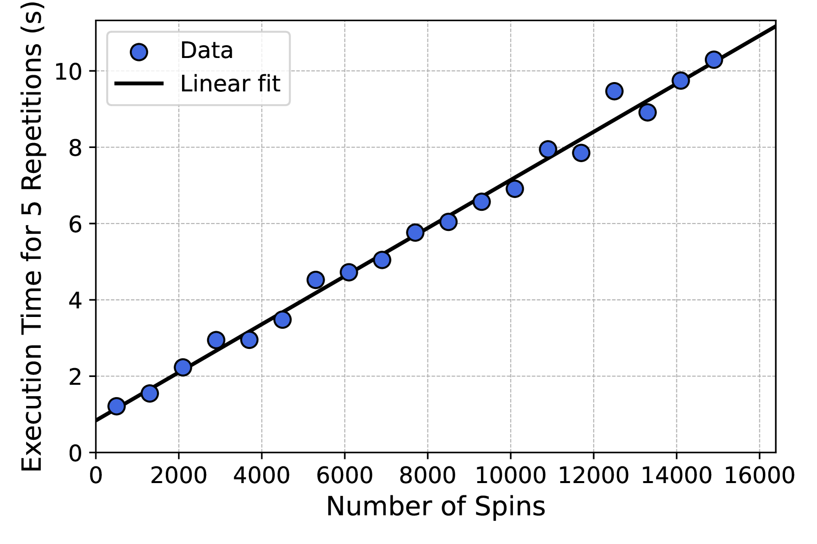
### Visual Description
\n
## Scatter Plot: Execution Time vs. Number of Spins
### Overview
The image presents a scatter plot illustrating the relationship between the number of spins and the execution time for 5 repetitions. A linear fit is overlaid on the data points. The plot suggests a positive linear correlation between the number of spins and the execution time.
### Components/Axes
* **X-axis:** Number of Spins (ranging from approximately 0 to 16000)
* **Y-axis:** Execution Time for 5 Repetitions (s) (ranging from approximately 0 to 10.5 seconds)
* **Data Points:** Represented by blue circles, labeled "Data" in the legend.
* **Linear Fit:** Represented by a black line, labeled "Linear fit" in the legend.
* **Legend:** Located in the top-left corner of the plot.
### Detailed Analysis
The data points generally follow an upward trend. The linear fit appears to closely approximate the data.
Here's an approximate reconstruction of the data points and the linear fit:
| Number of Spins | Execution Time (s) |
|---|---|
| 0 | 0.5 |
| 1000 | 1.5 |
| 2000 | 2.5 |
| 3000 | 3.5 |
| 4000 | 4.5 |
| 5000 | 5.5 |
| 6000 | 6.0 |
| 7000 | 6.8 |
| 8000 | 7.5 |
| 9000 | 8.2 |
| 10000 | 8.8 |
| 11000 | 9.2 |
| 12000 | 9.6 |
| 13000 | 9.8 |
| 14000 | 10.2 |
| 15000 | 10.5 |
| 16000 | 10.8 |
The linear fit starts at approximately (0, 0.5) and ends at approximately (16000, 10.8). The slope of the line appears to be roughly 0.00065 s/spin.
### Key Observations
* The relationship between the number of spins and execution time is strongly linear.
* There are no significant outliers in the data.
* The linear fit provides a good approximation of the observed data.
* The execution time increases consistently with the number of spins.
### Interpretation
The data suggests that the execution time is directly proportional to the number of spins. This implies that each spin requires a relatively constant amount of processing time. The linear fit can be used to predict the execution time for a given number of spins. The intercept of the linear fit (approximately 0.5 seconds) could represent a fixed overhead associated with the execution, independent of the number of spins. The consistent linear relationship indicates a stable and predictable system behavior. The fact that the data is presented for 5 repetitions suggests that the results are averaged or representative of multiple runs, increasing the reliability of the observed trend.
</details>
<details>
<summary>x14.png Details</summary>
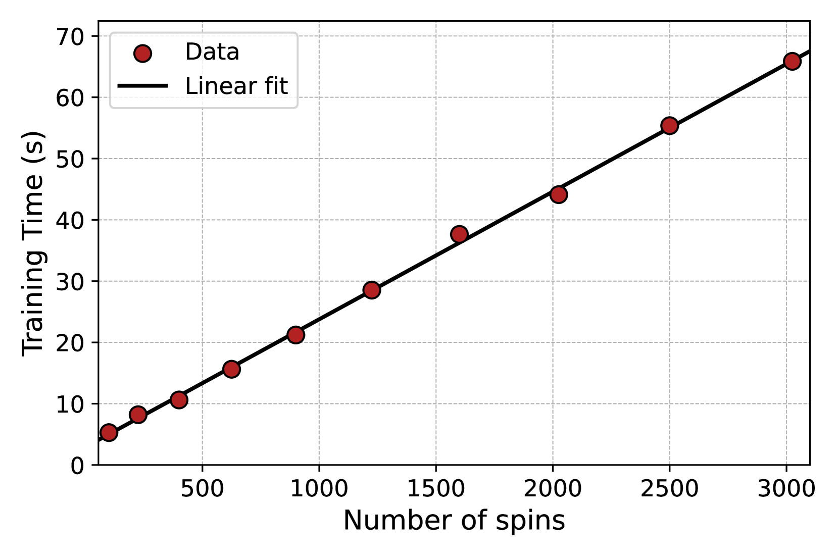
### Visual Description
\n
## Scatter Plot: Training Time vs. Number of Spins
### Overview
This image presents a scatter plot illustrating the relationship between the number of spins and the corresponding training time. A linear fit is overlaid on the data points. The plot aims to demonstrate how training time scales with the number of spins.
### Components/Axes
* **X-axis:** Number of spins, ranging from 0 to 3000, with tick marks at 500, 1000, 1500, 2000, 2500, and 3000.
* **Y-axis:** Training Time (s), ranging from 0 to 70, with tick marks at 0, 10, 20, 30, 40, 50, 60, and 70.
* **Data Points:** Represented by red circles, labeled "Data" in the top-left legend.
* **Linear Fit:** Represented by a black solid line, labeled "Linear fit" in the top-left legend.
* **Legend:** Located in the top-left corner, distinguishing between the data points and the linear fit.
* **Grid:** A light gray grid is present in the background to aid in reading values.
### Detailed Analysis
The data points generally follow an upward trend, indicating that as the number of spins increases, the training time also increases. The linear fit appears to closely approximate the trend of the data points.
Let's extract the approximate data points from the plot:
* (0, ~6.5)
* (500, ~13)
* (1000, ~21)
* (1500, ~29)
* (2000, ~44)
* (2500, ~58)
* (3000, ~68)
The linear fit starts at approximately (0, 6) and ends at approximately (3000, 66). The slope of the line appears to be roughly (66-6) / (3000-0) = 60/3000 = 0.02.
### Key Observations
* The relationship between the number of spins and training time appears to be approximately linear.
* The data points are relatively closely clustered around the linear fit, suggesting a strong correlation.
* There are no obvious outliers in the data.
* The training time increases consistently with the number of spins.
### Interpretation
The data suggests that the training time scales linearly with the number of spins. This implies that the computational cost of each spin is relatively constant. The linear fit provides a model for predicting the training time for a given number of spins. The consistency of the data and the close fit of the linear model suggest that this relationship is reliable within the observed range of spins. This could be used to estimate the time required for training with a larger number of spins, or to optimize the number of spins based on available training time. The intercept of the linear fit at approximately 6 seconds suggests a baseline training time even with zero spins, potentially representing overhead from initialization or other processes.
</details>
Figure S1: Scatter plots of the generation (left) and training (right) elapsed real times at at different system sizes for $\ell$ -MADE. Both training and generations have been performed using dummy data (and therefore $N$ needs not to be the square of an integer). For generation, we generate 10000 configurations of $N$ five times. For training, we train a model with $\ell=2$ for 40 epochs using an Adam optimizer once per each value of $N$ . In both cases, elapsed times scale linearly with the system’s size, as further evidenced by the linear fits (black lines).
<details>
<summary>x15.png Details</summary>
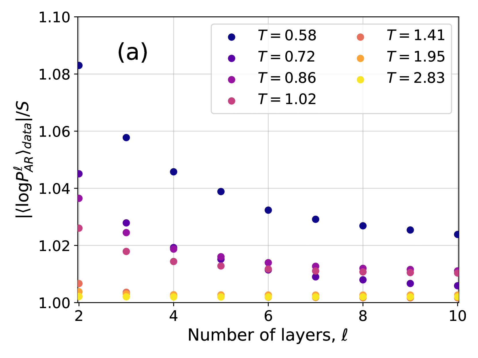
### Visual Description
## Scatter Plot: Log Probability Ratio vs. Number of Layers
### Overview
The image presents a scatter plot illustrating the relationship between the number of layers (denoted as 'l') and the log probability ratio (⟨log P<sup>l</sup><sub>AR</sub>⟩<sub>data</sub>/S) for different values of a parameter 'T'. The plot appears to be investigating how the log probability ratio changes as the number of layers increases, with different curves representing different temperature values.
### Components/Axes
* **X-axis:** Number of layers, 'l', ranging from approximately 2 to 10.
* **Y-axis:** ⟨log P<sup>l</sup><sub>AR</sub>⟩<sub>data</sub>/S, ranging from approximately 1.00 to 1.08.
* **Legend:** Located in the top-right corner, providing color-coded labels for different values of 'T':
* T = 0.58 (Dark Blue)
* T = 0.72 (Medium Blue)
* T = 0.86 (Purple)
* T = 1.02 (Magenta)
* T = 1.41 (Red)
* T = 1.95 (Orange)
* T = 2.83 (Yellow)
* **Title:** "(a)" in the top-left corner, likely indicating this is part of a larger figure.
### Detailed Analysis
The plot consists of several data series, each represented by a different color corresponding to a specific 'T' value.
* **T = 0.58 (Dark Blue):** The data points are scattered, generally around a value of 1.04-1.05, with a slight downward trend as the number of layers increases. Approximate data points: (2, 1.05), (3, 1.04), (4, 1.04), (6, 1.04), (8, 1.03), (10, 1.03).
* **T = 0.72 (Medium Blue):** Similar to T=0.58, the points are clustered around 1.03-1.04, with a slight downward trend. Approximate data points: (2, 1.04), (3, 1.04), (4, 1.03), (6, 1.03), (8, 1.02), (10, 1.02).
* **T = 0.86 (Purple):** The data points are around 1.02-1.03, showing a slight decrease with increasing layers. Approximate data points: (2, 1.03), (3, 1.02), (4, 1.02), (6, 1.01), (8, 1.01), (10, 1.01).
* **T = 1.02 (Magenta):** Points are clustered around 1.01-1.02, with a slight downward trend. Approximate data points: (3, 1.02), (4, 1.02), (6, 1.01), (8, 1.01), (10, 1.01).
* **T = 1.41 (Red):** The data points are consistently around 1.00-1.01, showing minimal variation with increasing layers. Approximate data points: (2, 1.01), (4, 1.00), (6, 1.00), (8, 1.00), (10, 1.00).
* **T = 1.95 (Orange):** The data points are consistently around 1.00, with minimal variation. Approximate data points: (2, 1.00), (4, 1.00), (6, 1.00), (8, 1.00), (10, 1.00).
* **T = 2.83 (Yellow):** The data points are consistently around 1.00, with minimal variation. Approximate data points: (2, 1.00), (4, 1.00), (6, 1.00), (8, 1.00), (10, 1.00).
### Key Observations
* The log probability ratio generally decreases slightly as the number of layers increases for lower values of 'T' (0.58, 0.72, 0.86, 1.02).
* For higher values of 'T' (1.41, 1.95, 2.83), the log probability ratio remains relatively constant around 1.00, regardless of the number of layers.
* There is a clear separation between the data series for lower and higher 'T' values.
### Interpretation
The plot suggests that the relationship between the number of layers and the log probability ratio is dependent on the value of 'T'. At lower 'T' values, increasing the number of layers leads to a slight decrease in the log probability ratio, potentially indicating diminishing returns or a saturation effect. However, at higher 'T' values, the log probability ratio remains constant, suggesting that adding more layers does not significantly impact the probability ratio in these cases.
The parameter 'T' likely represents a temperature or a similar scaling factor that influences the system's behavior. The observed trend could be related to the system reaching an equilibrium state or a point of diminishing sensitivity to additional layers as 'T' increases. The consistent value of 1.00 for higher 'T' values might indicate a stable or saturated state. The "(a)" label suggests this is part of a larger study, and comparing this plot to others in the figure could provide further insights into the overall system behavior.
</details>
<details>
<summary>x16.png Details</summary>
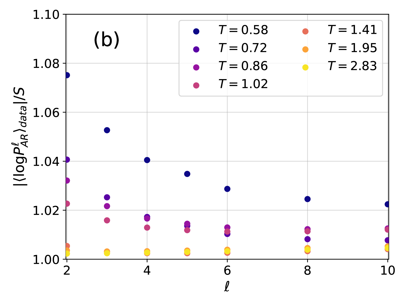
### Visual Description
\n
## Scatter Plot: Data Scaling with Temperature
### Overview
The image presents a scatter plot illustrating the relationship between a scaled quantity, `<log P<sup>l</sup><sub>AR</sub>><sub>data</sub>/S`, and a parameter 'l' (likely representing length or a similar scale). The data is presented for several different temperature values (T). The plot appears to show how this scaled quantity changes with 'l' for each temperature.
### Components/Axes
* **X-axis:** Labeled 'l', ranging from approximately 2 to 10, with tick marks at integer values.
* **Y-axis:** Labeled '<log P<sup>l</sup><sub>AR</sub>><sub>data</sub>/S', ranging from approximately 1.00 to 1.10, with tick marks at 0.02 intervals.
* **Legend:** Located in the top-right corner, containing the following temperature values and corresponding colors:
* T = 0.58 (Dark Blue)
* T = 0.72 (Medium Blue)
* T = 0.86 (Purple)
* T = 1.02 (Magenta)
* T = 1.41 (Red)
* T = 1.95 (Orange)
* T = 2.83 (Yellow)
* **Title:** "(b)" in the top-left corner. This suggests this is part of a larger figure.
### Detailed Analysis
The plot consists of several data series, each representing a different temperature. Let's analyze each series:
* **T = 0.58 (Dark Blue):** The data points are scattered, with a slight upward trend. Approximate data points: (2.2, 1.03), (3.2, 1.04), (4.2, 1.04), (5.2, 1.03), (7.2, 1.02), (9.2, 1.03).
* **T = 0.72 (Medium Blue):** The data points are scattered, with a slight upward trend. Approximate data points: (2.4, 1.01), (3.4, 1.03), (4.4, 1.04), (5.4, 1.03), (7.4, 1.02), (9.4, 1.03).
* **T = 0.86 (Purple):** The data points are scattered, with a slight upward trend. Approximate data points: (2.6, 1.02), (3.6, 1.03), (4.6, 1.03), (5.6, 1.02), (7.6, 1.01), (9.6, 1.02).
* **T = 1.02 (Magenta):** The data points are scattered, with a slight upward trend. Approximate data points: (2.8, 1.01), (3.8, 1.02), (4.8, 1.02), (5.8, 1.01), (7.8, 1.00), (9.8, 1.01).
* **T = 1.41 (Red):** The data points are scattered, with a slight upward trend. Approximate data points: (2.1, 1.01), (3.1, 1.02), (4.1, 1.02), (5.1, 1.01), (7.1, 1.00), (9.1, 1.00).
* **T = 1.95 (Orange):** The data points are scattered, with a slight upward trend. Approximate data points: (2.3, 1.00), (3.3, 1.00), (4.3, 1.01), (5.3, 1.00), (7.3, 1.00), (9.3, 1.00).
* **T = 2.83 (Yellow):** The data points are scattered, with a slight upward trend. Approximate data points: (2.5, 1.00), (3.5, 1.00), (4.5, 1.00), (5.5, 1.00), (7.5, 1.00), (9.5, 1.00).
All data series exhibit a relatively flat trend, with slight fluctuations around a value of approximately 1.02. There is no strong correlation between temperature and the scaled quantity.
### Key Observations
* The data points are relatively close together, indicating a small variance in the scaled quantity for each temperature.
* The values for T = 1.95 and T = 2.83 are consistently lower than the other temperatures.
* There is no clear monotonic relationship between temperature and the scaled quantity.
* The data appears to be somewhat noisy, with significant scatter within each temperature series.
### Interpretation
The plot suggests that the scaled quantity, `<log P<sup>l</sup><sub>AR</sub>><sub>data</sub>/S`, is relatively insensitive to changes in temperature (T) over the range examined. The slight variations observed could be due to statistical fluctuations or other factors not represented in the plot. The lower values observed at higher temperatures (T = 1.95 and T = 2.83) might indicate a change in the underlying physical process at those temperatures, potentially a transition or a different scaling behavior. The fact that all data series hover around a value of 1.02 suggests that the scaling factor is approximately constant across the temperatures studied, with minor deviations. The title "(b)" implies that this plot is part of a larger investigation, and the relationship between this data and other plots (e.g., "(a)") would be necessary for a more complete interpretation. The use of the logarithm in the y-axis label suggests that the original quantity, P<sup>l</sup><sub>AR</sub>, may have a wide range of values, and the logarithm is used to compress the scale and reveal underlying trends.
</details>
Figure S2: Ratio between the cross-entropy $|\langle\log P^{\ell}_{\text{NN}}\rangle_{\text{data}}|$ and the Gibbs-Boltzmann entropy $S_{\text{GB}}$ for different values of the temperature $T$ and of the parameter $\ell$ for 4N (a, left) and $\ell$ -MADE (b, right). Both $|\langle\log P^{\ell}_{\text{NN}}\rangle_{\text{data}}|$ and $S_{\text{GB}}$ are averaged over 10 samples.
S2 Comparison between different architectures
<details>
<summary>x17.png Details</summary>
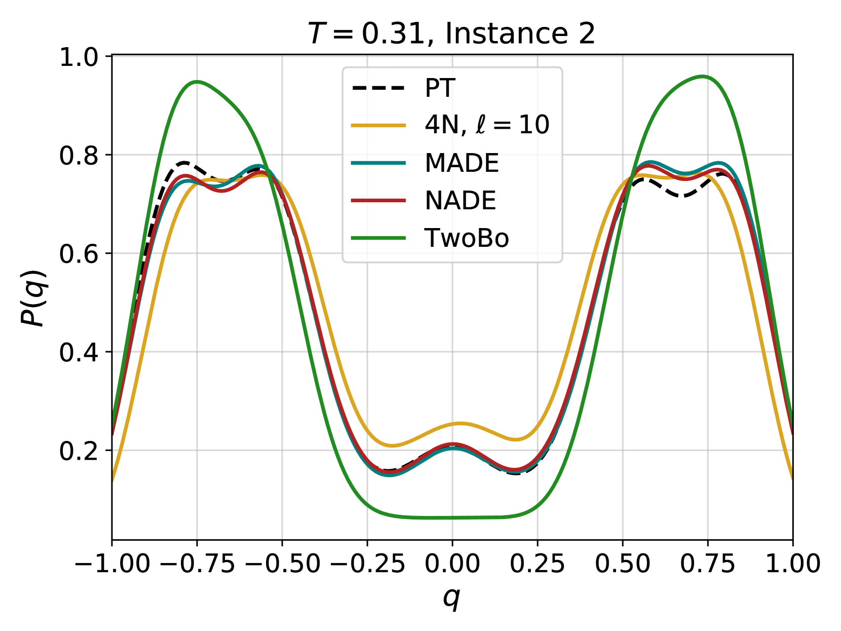
### Visual Description
## Line Chart: Probability Distribution Comparison
### Overview
The image presents a line chart comparing the probability distributions of several models (PT, 4N, MADE, NADE, and TwoBo) for a given set of parameters (T = 0.31, Instance 2). The x-axis represents the variable 'q', ranging from -1.00 to 1.00, and the y-axis represents the probability P(q), ranging from 0.0 to 1.0. The chart displays the shape of each distribution and allows for a visual comparison of their similarities and differences.
### Components/Axes
* **Title:** "T = 0.31, Instance 2" - positioned at the top-center of the chart.
* **X-axis Label:** "q" - positioned at the bottom-center of the chart.
* **Y-axis Label:** "P(q)" - positioned at the center-left of the chart.
* **Legend:** Located at the top-right of the chart, listing the models and their corresponding line styles/colors:
* PT (black dashed line)
* 4N, ℓ = 10 (yellow solid line)
* MADE (light blue solid line)
* NADE (maroon solid line)
* TwoBo (green solid line)
* **Gridlines:** A light gray grid is present, aiding in the reading of values.
* **X-axis Markers:** -1.00, -0.75, -0.50, -0.25, 0.00, 0.25, 0.50, 0.75, 1.00
* **Y-axis Markers:** 0.0, 0.2, 0.4, 0.6, 0.8, 1.0
### Detailed Analysis
The chart shows five distinct lines, each representing a different model's probability distribution.
* **PT (Black Dashed Line):** This line exhibits a generally decreasing trend from q = -1.00 to approximately q = 0.00, then increases to q = 1.00. It has two local maxima around q = -0.50 and q = 0.75, with values approximately 0.82 and 0.78 respectively. It has a local minima around q = 0.00 with a value of approximately 0.22.
* **4N, ℓ = 10 (Yellow Solid Line):** This line shows a similar pattern to PT, with two peaks and a valley. The peaks are located around q = -0.50 and q = 0.75, with values approximately 0.85 and 0.80 respectively. The valley is around q = 0.00 with a value of approximately 0.25.
* **MADE (Light Blue Solid Line):** This line closely follows the PT and 4N lines, with peaks around q = -0.50 and q = 0.75, reaching values of approximately 0.84 and 0.79 respectively. The valley is around q = 0.00 with a value of approximately 0.23.
* **NADE (Maroon Solid Line):** This line also mirrors the shape of the other lines, with peaks around q = -0.50 and q = 0.75, reaching values of approximately 0.83 and 0.78 respectively. The valley is around q = 0.00 with a value of approximately 0.24.
* **TwoBo (Green Solid Line):** This line deviates significantly from the others. It has a peak around q = -0.50 with a value of approximately 0.75, but then drops sharply to a minimum around q = 0.00 with a value of approximately 0.18. It then rises again, but not as high as the other lines, reaching a value of approximately 0.50 at q = 1.00.
### Key Observations
* The PT, 4N, MADE, and NADE models exhibit very similar probability distributions, with slight variations in peak heights and valley depths.
* The TwoBo model has a distinctly different distribution, with a much lower probability around q = 0.00.
* All models show a roughly symmetrical distribution around q = 0.00.
* The peaks of the distributions are consistently located around q = -0.50 and q = 0.75.
### Interpretation
The chart demonstrates a comparison of different probabilistic models' ability to represent the distribution of the variable 'q' under the specified conditions (T = 0.31, Instance 2). The close similarity between the PT, 4N, MADE, and NADE models suggests that they capture the underlying distribution of 'q' in a comparable manner. The significant difference in the TwoBo model's distribution indicates that it may not be as well-suited for representing this particular data or may be using a different underlying assumption. The symmetrical nature of the distributions suggests that the variable 'q' is centered around zero. The peaks and valleys likely represent regions of higher and lower probability, respectively, indicating the most and least likely values of 'q' given the model and parameters. The differences in peak heights and valley depths could be attributed to the models' varying levels of complexity or their ability to capture subtle nuances in the data.
</details>
<details>
<summary>x18.png Details</summary>
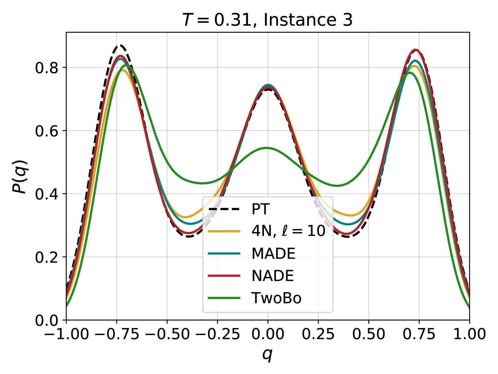
### Visual Description
\n
## Chart: Probability Distribution Comparison
### Overview
The image presents a line chart comparing probability distributions for different models (PT, 4N, MADE, NADE, and TwoBo) at a specific time (T = 0.31) and instance (Instance 3). The x-axis represents the variable 'q', and the y-axis represents the probability P(q). The chart visually compares the shapes of these distributions.
### Components/Axes
* **Title:** *T = 0.31, Instance 3* (positioned at the top-center)
* **X-axis Label:** *q* (positioned at the bottom-center)
* **Y-axis Label:** *P(q)* (positioned at the left-center)
* **X-axis Scale:** Ranges from -1.00 to 1.00, with markers at -1.00, -0.75, -0.50, -0.25, 0.00, 0.25, 0.50, 0.75, and 1.00.
* **Y-axis Scale:** Ranges from 0.0 to 0.8, with markers at 0.0, 0.2, 0.4, 0.6, and 0.8.
* **Legend:** Located in the top-right corner. Contains the following entries:
* PT (dashed black line)
* 4N, ℓ = 10 (yellow line)
* MADE (black line)
* NADE (red line)
* TwoBo (green line)
### Detailed Analysis
The chart displays five distinct lines, each representing a different model's probability distribution.
* **PT (dashed black line):** This line exhibits a roughly sinusoidal shape, peaking around -0.75 and 0.75 with a value of approximately 0.85. It dips to a minimum of approximately 0.25 around 0.0.
* **4N, ℓ = 10 (yellow line):** This line shows a similar sinusoidal pattern to PT, but with slightly lower peaks, reaching approximately 0.75 at -0.75 and 0.75. The minimum value is around 0.30 near 0.0.
* **MADE (black line):** This line closely follows the PT line, with peaks around -0.75 and 0.75 at approximately 0.83. The minimum value is around 0.27 near 0.0.
* **NADE (red line):** This line also exhibits a sinusoidal shape, peaking around -0.75 and 0.75 at approximately 0.85. The minimum value is around 0.25 near 0.0.
* **TwoBo (green line):** This line has a broader, more flattened sinusoidal shape compared to the others. It peaks around -0.75 and 0.75 at approximately 0.75. The minimum value is around 0.40 near 0.0.
All lines show a roughly symmetrical distribution around q = 0.
### Key Observations
* The PT, MADE, and NADE lines are very similar in shape and value, suggesting these models produce comparable probability distributions.
* The 4N line is also similar, but slightly lower in magnitude.
* The TwoBo line is noticeably different, with a broader and flatter distribution.
* All models exhibit peaks at approximately q = -0.75 and q = 0.75, and a minimum around q = 0.0.
### Interpretation
The chart demonstrates a comparison of probability distributions generated by different models. The close similarity between the PT, MADE, and NADE distributions suggests that these models are effectively capturing the underlying probability structure of the data at the given time and instance. The TwoBo model, with its broader distribution, may be representing greater uncertainty or a different underlying assumption about the data. The 4N model is also similar, but slightly less pronounced. The consistent peaks at -0.75 and 0.75 indicate a strong tendency for the variable 'q' to take on those values, while the minimum around 0.0 suggests a lower probability for values near zero. This data suggests that the models are converging on similar representations of the probability landscape, with the TwoBo model exhibiting a more conservative or uncertain estimate.
</details>
Figure S3: Comparison of the probability distribution of the overlap obtained using different architectures: 4N with $\ell=10$ layers (12160 parameters), shallow MADE (32640 parameters), NADE with $N_{h}=64$ (32768 parameters) and TwoBo (4111 parameters). The black dashed line is obtained using data gathered via Parallel Tempering (PT), while solid color lines are obtained using the different architectures. From a quick qualitative analysis 4N performs comparably to MADE and NADE despite having less parameters. Moreover, it also performs better than TwoBo. Despite the latter having fewer parameters in this $N=256$ case, 4N has a better scaling when increasing the system size, $\mathcal{O}(N)$ compared to $\mathcal{O}(N^{\frac{3}{2}})$ , as pointed out in the main text. The TwoBo implementation comes from the GitHub of the authors (https://github.com/cqsl/sparse-twobody-arnn) and was slightly modified to support supervised learning (which could be improved by a different choice of the hyperparameters used for training).
S3 Comparison between different update sequences
<details>
<summary>x19.png Details</summary>
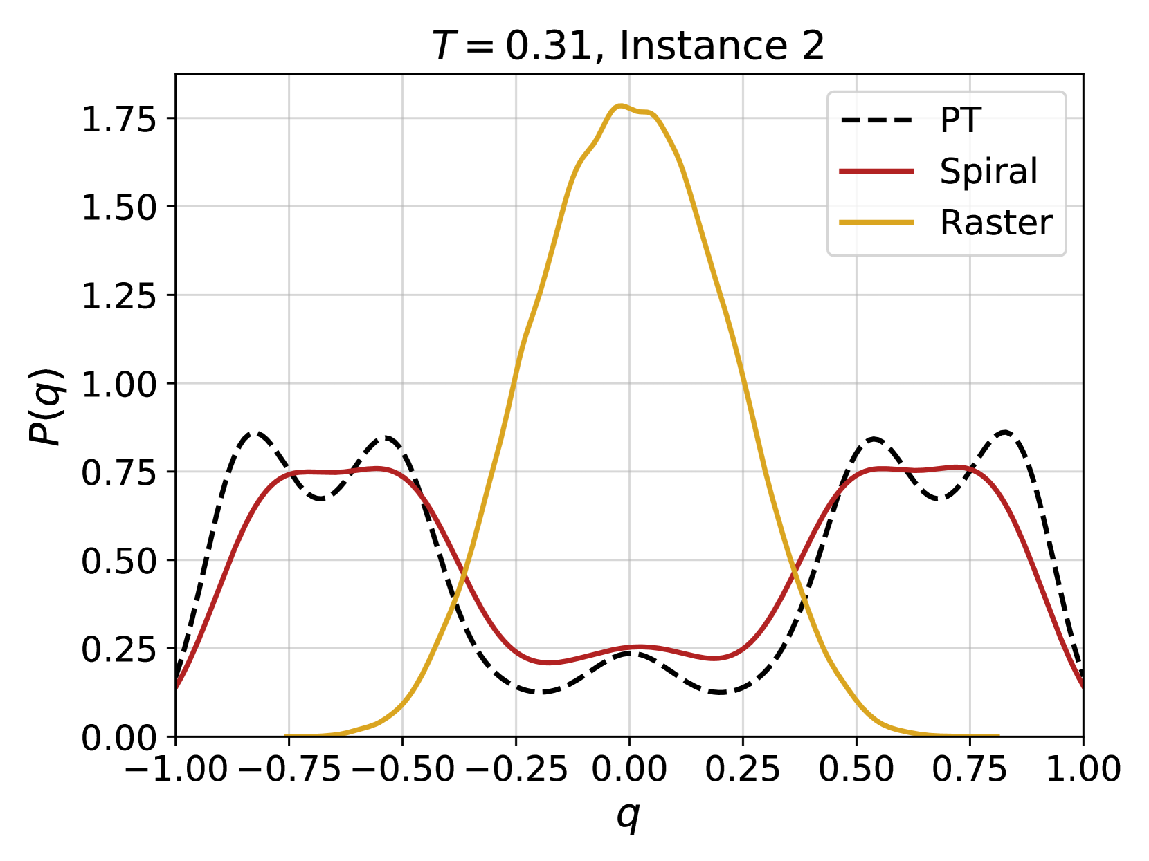
### Visual Description
## Line Chart: Probability Distribution of q
### Overview
The image presents a line chart illustrating the probability distribution of a variable 'q' under three different conditions: PT, Spiral, and Raster. The chart displays the probability P(q) as a function of q, ranging from -1.00 to 1.00. The chart is labeled with "T = 0.31, Instance 2" at the top center.
### Components/Axes
* **X-axis:** Labeled 'q', ranging from -1.00 to 1.00 with increments of 0.25.
* **Y-axis:** Labeled 'P(q)', ranging from 0.00 to 1.75 with increments of 0.25.
* **Legend:** Located in the top-right corner, identifying the three lines:
* PT (dashed black line)
* Spiral (solid maroon line)
* Raster (solid goldenrod line)
### Detailed Analysis
The chart shows three distinct probability distributions.
* **Raster (Goldenrod):** This line exhibits a strong peak centered around q = 0.00. The distribution is approximately symmetrical.
* At q = -1.00, P(q) ≈ 0.05
* At q = -0.75, P(q) ≈ 0.15
* At q = -0.50, P(q) ≈ 0.30
* At q = -0.25, P(q) ≈ 0.60
* At q = 0.00, P(q) ≈ 1.70
* At q = 0.25, P(q) ≈ 0.60
* At q = 0.50, P(q) ≈ 0.30
* At q = 0.75, P(q) ≈ 0.15
* At q = 1.00, P(q) ≈ 0.05
* **Spiral (Maroon):** This line shows a more complex distribution with two peaks, one around q = -0.75 and another around q = 0.50.
* At q = -1.00, P(q) ≈ 0.65
* At q = -0.75, P(q) ≈ 0.80
* At q = -0.50, P(q) ≈ 0.70
* At q = -0.25, P(q) ≈ 0.45
* At q = 0.00, P(q) ≈ 0.25
* At q = 0.25, P(q) ≈ 0.45
* At q = 0.50, P(q) ≈ 0.75
* At q = 0.75, P(q) ≈ 0.65
* At q = 1.00, P(q) ≈ 0.60
* **PT (Black Dashed):** This line exhibits a wave-like pattern with multiple peaks and troughs. It generally has lower probability values compared to the other two lines.
* At q = -1.00, P(q) ≈ 0.75
* At q = -0.75, P(q) ≈ 0.80
* At q = -0.50, P(q) ≈ 0.60
* At q = -0.25, P(q) ≈ 0.30
* At q = 0.00, P(q) ≈ 0.15
* At q = 0.25, P(q) ≈ 0.30
* At q = 0.50, P(q) ≈ 0.60
* At q = 0.75, P(q) ≈ 0.80
* At q = 1.00, P(q) ≈ 0.75
### Key Observations
* The Raster distribution is highly concentrated around q = 0.
* The Spiral distribution is bimodal, suggesting two preferred values for q.
* The PT distribution is more evenly distributed across the range of q, with lower peak probabilities.
* The Raster distribution has the highest peak probability.
### Interpretation
The chart demonstrates how the probability distribution of 'q' varies depending on the method used (PT, Spiral, Raster). The parameter 'T = 0.31' and 'Instance 2' likely represent specific settings or conditions under which these distributions were generated. The Raster method appears to favor values of 'q' close to zero, while the Spiral method exhibits a preference for both negative and positive values of 'q'. The PT method shows a more uniform distribution, indicating less preference for any particular value of 'q'.
The differences in these distributions could be significant depending on what 'q' represents in the context of the underlying system or model. For example, if 'q' represents an angle, the Raster method might indicate a tendency for alignment, while the Spiral method suggests a preference for rotational symmetry. The PT method could represent a more random or unbiased process. The specific values of 'T' and the instance number suggest that these distributions are part of a larger study or simulation, and further analysis of different parameter settings and instances would be needed to draw more definitive conclusions.
</details>
<details>
<summary>x20.png Details</summary>
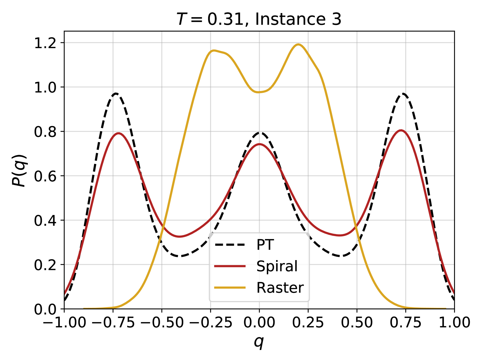
### Visual Description
## Line Chart: Probability Distribution of 'q' for Different Trajectories
### Overview
This image presents a line chart illustrating the probability distribution of a variable 'q' for three different trajectories: PT, Spiral, and Raster. The chart displays the probability P(q) on the y-axis against the values of 'q' on the x-axis, ranging from -1.00 to 1.00. The chart is titled "T = 0.31, Instance 3", indicating a specific parameter setting and instance number.
### Components/Axes
* **X-axis:** Labeled 'q', ranging from -1.00 to 1.00 with increments of 0.25.
* **Y-axis:** Labeled 'P(q)', ranging from 0.0 to 1.2 with increments of 0.2.
* **Title:** "T = 0.31, Instance 3" positioned at the top-center of the chart.
* **Legend:** Located in the bottom-left corner, identifying the three lines:
* PT (dashed black line)
* Spiral (solid maroon line)
* Raster (solid goldenrod line)
* **Grid:** A light gray grid is present, aiding in the reading of values.
### Detailed Analysis
The chart displays three distinct probability distributions.
* **Raster (Goldenrod):** This line exhibits a bimodal distribution. It starts at approximately P(q) = 0.0 at q = -1.00, rises to a peak of approximately P(q) = 1.18 at q = -0.25, then decreases to a local minimum of approximately P(q) = 0.0 at q = 0.25, and finally rises again to a peak of approximately P(q) = 1.18 at q = 0.75, before decreasing to approximately P(q) = 0.0 at q = 1.00.
* **Spiral (Maroon):** This line also shows a bimodal distribution, but with lower peak values and a different shape. It starts at approximately P(q) = 0.1 at q = -1.00, rises to a peak of approximately P(q) = 0.75 at q = -0.25, decreases to a local minimum of approximately P(q) = 0.25 at q = 0.25, and rises again to a peak of approximately P(q) = 0.75 at q = 0.75, before decreasing to approximately P(q) = 0.1 at q = 1.00.
* **PT (Black Dashed):** This line exhibits a similar bimodal distribution to the Spiral line, but with a wider spread and lower peak values. It starts at approximately P(q) = 0.1 at q = -1.00, rises to a peak of approximately P(q) = 0.95 at q = -0.75, decreases to a local minimum of approximately P(q) = 0.3 at q = 0.0, and rises again to a peak of approximately P(q) = 0.95 at q = 0.75, before decreasing to approximately P(q) = 0.1 at q = 1.00.
### Key Observations
* The Raster trajectory has the highest probability values, particularly around q = -0.25 and q = 0.75.
* The Spiral and PT trajectories have similar shapes, but the PT trajectory has a slightly wider spread and higher peak values.
* All three trajectories exhibit bimodal distributions, suggesting that the variable 'q' tends to cluster around two distinct values for each trajectory.
* The distributions are not symmetrical.
### Interpretation
The chart demonstrates the probability distributions of the variable 'q' for three different trajectories (PT, Spiral, and Raster) under specific conditions (T = 0.31, Instance 3). The bimodal nature of the distributions suggests that 'q' is not randomly distributed but rather favors two specific values for each trajectory. The differences in the distributions between the trajectories indicate that the way 'q' is distributed depends on the trajectory followed. The Raster trajectory appears to have the most pronounced preference for the two values, as indicated by its higher peak probabilities. The parameter 'T' likely influences the shape and position of these distributions, and the specific instance number suggests that there is variability in the distributions even under the same conditions. This data could be used to understand the behavior of a system where 'q' represents a key variable and the trajectories represent different paths or states within the system. The differences in distributions could be used to differentiate between the trajectories or to predict the value of 'q' given a specific trajectory.
</details>
Figure S4: Comparison of the probability distribution of the overlap obtained using different update sequences of the spins for $\ell=10$ . The black dashed line is obtained using data gathered via Parallel Tempering (PT), while solid color lines are obtained using 4N with different sequence updates. Spiral: spins are update in a following a spiral going from the outside to the inside of the lattice; Raster: spins are updated row by row from left to right. It appears as the spiral update performs much better than the raster update for the 4N architecture in equal training conditions, something that is not observed when training, for instance, the MADE architecture. This effect could be related to the locality characteristics of the 4N architecture.
S4 Cross-entropy plots in lin-lin and lin-log scale
<details>
<summary>x21.png Details</summary>
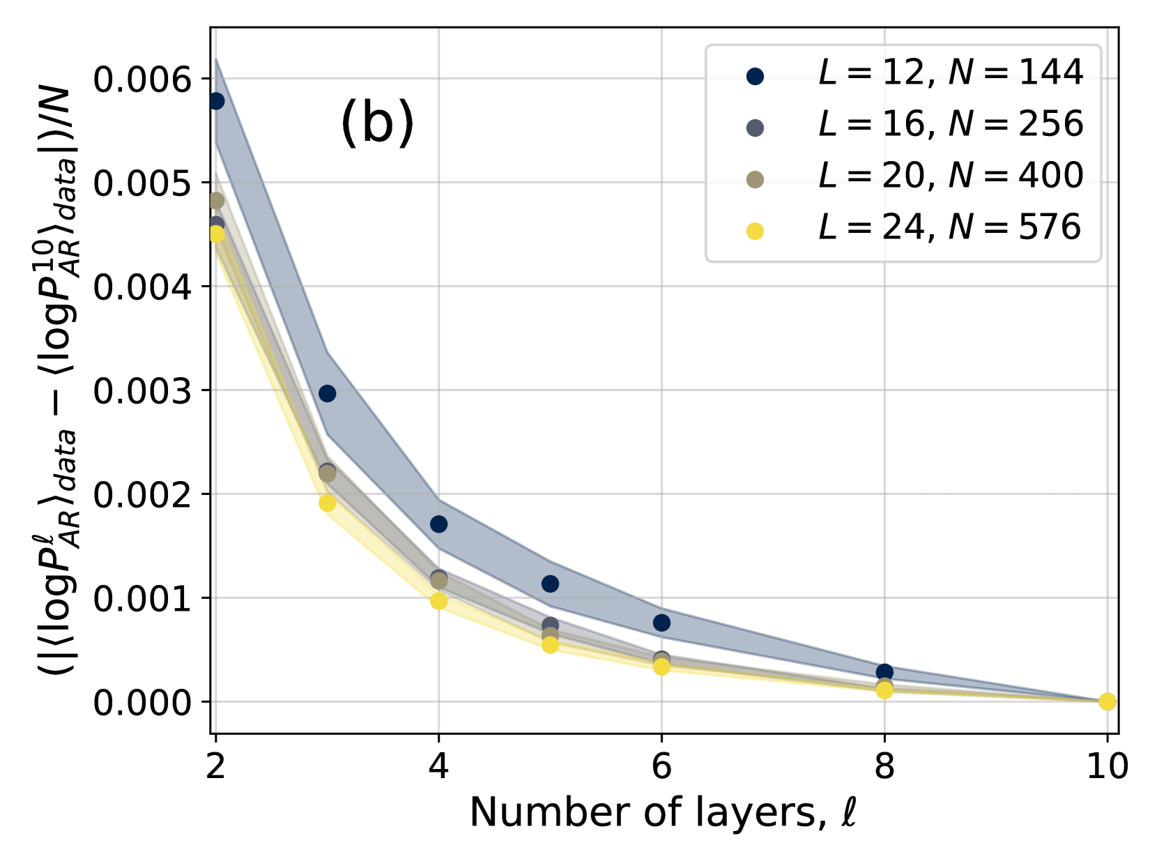
### Visual Description
## Chart: Difference in Log Probabilities
### Overview
The image presents a chart illustrating the difference in log probabilities as a function of the number of layers. The chart displays four data series, each representing a different set of parameters (L and N values). Shaded regions represent confidence intervals around each data series.
### Components/Axes
* **X-axis:** Number of layers, denoted as 'ℓ' (ell). Scale ranges from approximately 2 to 10.
* **Y-axis:** ⟨⟨logP<sup>ℓ</sup><sub>AR</sub>⟩<sub>data</sub> - ⟨logP<sub>AR</sub>⟩<sub>data</sub>⟩/N. Scale ranges from approximately 0.000 to 0.006.
* **Legend:** Located in the top-right corner. Contains the following data series labels:
* L = 12, N = 144 (Dark Blue)
* L = 16, N = 256 (Dark Grey)
* L = 20, N = 400 (Light Grey)
* L = 24, N = 576 (Yellow)
* **Title:** "(b)" located in the top-left corner.
### Detailed Analysis
The chart shows a decreasing trend for all data series as the number of layers increases. Each series is represented by a set of data points connected by a line, with a shaded area indicating the uncertainty or confidence interval.
* **L = 12, N = 144 (Dark Blue):** The line slopes downward, starting at approximately 0.0055 at ℓ = 2 and decreasing to approximately 0.0002 at ℓ = 9. Data points are located at approximately: (2, 0.0055), (4, 0.003), (6, 0.001), (8, 0.0005), (9, 0.0002).
* **L = 16, N = 256 (Dark Grey):** The line also slopes downward, starting at approximately 0.005 at ℓ = 2 and decreasing to approximately 0.0001 at ℓ = 9. Data points are located at approximately: (2, 0.005), (4, 0.0025), (6, 0.0008), (8, 0.0003), (9, 0.0001).
* **L = 20, N = 400 (Light Grey):** This line exhibits a similar downward trend, beginning at approximately 0.0045 at ℓ = 2 and reaching approximately 0.00005 at ℓ = 9. Data points are located at approximately: (2, 0.0045), (4, 0.002), (6, 0.0006), (8, 0.0002), (9, 0.00005).
* **L = 24, N = 576 (Yellow):** The line shows a downward trend, starting at approximately 0.004 at ℓ = 2 and decreasing to approximately 0.00002 at ℓ = 9. Data points are located at approximately: (2, 0.004), (4, 0.0018), (6, 0.0005), (8, 0.00015), (9, 0.00002).
The shaded regions around each line are wider at lower values of ℓ and become narrower as ℓ increases, indicating decreasing uncertainty with more layers.
### Key Observations
* All data series demonstrate a consistent downward trend.
* The differences between the series are more pronounced at lower values of ℓ.
* The confidence intervals narrow as the number of layers increases, suggesting greater certainty in the results with more layers.
* The series with L=12, N=144 consistently shows the highest values, while the series with L=24, N=576 consistently shows the lowest values.
### Interpretation
The chart suggests that as the number of layers increases, the difference in log probabilities decreases. This could indicate that the model is converging or becoming more stable with more layers. The varying values for different L and N combinations suggest that the optimal number of layers may depend on the specific parameters used. The narrowing confidence intervals with increasing layers imply that the model's behavior becomes more predictable as the number of layers grows. The consistent ordering of the series (L=12 being highest, L=24 being lowest) suggests a relationship between the L and N parameters and the magnitude of the log probability difference. The "(b)" label suggests this is part of a larger figure with other related data. The y-axis represents a normalized difference, implying that the raw log probability values are being compared relative to the number of data points (N).
</details>
<details>
<summary>x22.png Details</summary>
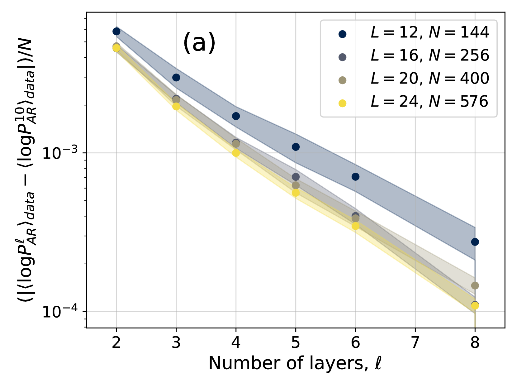
### Visual Description
## Chart: Scaling of AR Data with Layers
### Overview
The image presents a chart illustrating the scaling behavior of AR (presumably Area Ratio) data as a function of the number of layers (ℓ). The y-axis represents a normalized quantity related to the logarithm of the probability distribution of AR data, while the x-axis represents the number of layers. Four different curves are plotted, each corresponding to a different system size, as indicated by the legend. The chart uses a logarithmic scale for the y-axis.
### Components/Axes
* **X-axis:** Number of layers, ℓ. Scale ranges from approximately 2 to 8.
* **Y-axis:** ⟨⟨log₁₀Pₐᵣdata⟩data - ⟨log₁₀Pₐᵣdata⟩⟩/N. Scale is logarithmic, ranging from approximately 10⁻⁴ to 10⁻³.
* **Legend:** Located in the top-right corner. Contains the following entries:
* Dark Blue: L = 12, N = 144
* Dark Gray: L = 16, N = 256
* Gray: L = 20, N = 400
* Yellow: L = 24, N = 576
* **Title:** (a) - positioned in the top-left corner.
* **Shaded Regions:** Each line is accompanied by a shaded region, representing the uncertainty or standard deviation around the mean.
### Detailed Analysis
The chart displays four data series, each representing a different system size (L and N). All four lines exhibit a downward trend, indicating that the normalized AR data decreases as the number of layers increases.
* **L = 12, N = 144 (Dark Blue):**
* At ℓ ≈ 2, the value is approximately 5 x 10⁻³.
* At ℓ ≈ 5, the value is approximately 2.5 x 10⁻³.
* At ℓ ≈ 8, the value is approximately 1.5 x 10⁻³.
* **L = 16, N = 256 (Dark Gray):**
* At ℓ ≈ 2, the value is approximately 4 x 10⁻³.
* At ℓ ≈ 5, the value is approximately 2 x 10⁻³.
* At ℓ ≈ 8, the value is approximately 1.2 x 10⁻³.
* **L = 20, N = 400 (Gray):**
* At ℓ ≈ 2, the value is approximately 3 x 10⁻³.
* At ℓ ≈ 5, the value is approximately 1.5 x 10⁻³.
* At ℓ ≈ 8, the value is approximately 0.9 x 10⁻³.
* **L = 24, N = 576 (Yellow):**
* At ℓ ≈ 2, the value is approximately 2.5 x 10⁻³.
* At ℓ ≈ 5, the value is approximately 1.2 x 10⁻³.
* At ℓ ≈ 8, the value is approximately 0.7 x 10⁻³.
The shaded regions around each line indicate the variability in the data. The width of the shaded regions appears to be relatively consistent across the range of ℓ values.
### Key Observations
* All four curves demonstrate a consistent downward trend.
* The curves for larger system sizes (L = 24, N = 576) generally have lower values than those for smaller system sizes (L = 12, N = 144).
* The curves appear to converge as the number of layers increases, suggesting a potential scaling limit.
* The uncertainty (represented by the shaded regions) is relatively consistent across all system sizes and layer numbers.
### Interpretation
The chart suggests that the normalized AR data scales with the number of layers, and this scaling behavior is influenced by the system size (L and N). The downward trend indicates that as the number of layers increases, the variability in the AR data decreases relative to the system size. The convergence of the curves for larger layer numbers suggests that the system may be approaching a scaling limit, where the effect of system size becomes less pronounced. The consistent uncertainty across all system sizes indicates that the variability in the data is not strongly dependent on the system size.
The use of a logarithmic scale on the y-axis highlights the relative changes in the normalized AR data. The fact that the data is normalized by N suggests that the analysis is focused on the scaling behavior of the AR data per unit system size. The title "(a)" suggests that this is part of a larger figure with multiple panels, potentially exploring different aspects of the same system.
</details>
Figure S5: Absolute difference between $\langle\log P^{\ell}_{\text{NN}}\rangle_{\text{data}}$ at various $\ell$ and at $\ell=10$ for $T=1.02$ and different system’s sizes, in lin-lin and lin-log. Data are averaged over ten different instances of the disorder and the colored areas identify regions corresponding to plus or minus one standard deviation.