# U-Fair: Uncertainty-based Multimodal Multitask Learning for Fairer Depression Detection
**Authors**:
- Jiaee Cheong jc2208@cam.ac.uk (University of Cambridge & the Alan Turing Institute)
- United Kingdom
- Aditya Bangar adityavb21@iitk.ac.in (Indian Institute of Technology)
- Kanpur
- India
- Sinan Kalkan skalkan@metu.edu.tr (Dept. of Comp. Engineering and ROMER Center for Robotics and AI)
- Turkiye
- Hatice Gunes hg410@cam.ac.uk (University of Cambridge)
- United Kingdom
> This work was undertaken while Jiaee Cheong was a visiting PhD student at METU.
: 259 2024 LEAVE UNSET LEAVE UNSET Machine Learning for Health (ML4H) 2024
## Abstract
Machine learning bias in mental health is becoming an increasingly pertinent challenge. Despite promising efforts indicating that multitask approaches often work better than unitask approaches, there is minimal work investigating the impact of multitask learning on performance and fairness in depression detection nor leveraged it to achieve fairer prediction outcomes. In this work, we undertake a systematic investigation of using a multitask approach to improve performance and fairness for depression detection. We propose a novel gender-based task-reweighting method using uncertainty grounded in how the PHQ-8 questionnaire is structured. Our results indicate that, although a multitask approach improves performance and fairness compared to a unitask approach, the results are not always consistent and we see evidence of negative transfer and a reduction in the Pareto frontier, which is concerning given the high-stake healthcare setting. Our proposed approach of gender-based reweighting with uncertainty improves performance and fairness and alleviates both challenges to a certain extent. Our findings on each PHQ-8 subitem task difficulty are also in agreement with the largest study conducted on the PHQ-8 subitem discrimination capacity, thus providing the very first tangible evidence linking ML findings with large-scale empirical population studies conducted on the PHQ-8.
## 1 Introduction
<details>
<summary>x1.png Details</summary>
### Visual Description
## [Diagram Type]: Multimodal Learning Architecture with Fairness-Aware Loss
### Overview
The image is a technical flowchart illustrating the architecture of a multimodal machine learning system designed for multiple tasks, incorporating a fairness-aware loss mechanism. The diagram shows the flow of data from three input modalities (Visual, Audio, Text) through separate processing pipelines, feature fusion, task-specific loss computation, and a final fairness loss calculation that accounts for gender (Female/Male).
### Components/Axes
The diagram is organized into four main regions from left to right:
1. **Input Modalities (Leftmost Region):**
* **Visual Modality** (Orange box, top-left)
* **Audio Modality** (Blue box, middle-left)
* **Text Modality** (Green box, bottom-left)
2. **Modality-Specific Processing Pipelines (Center-Left Region):**
Each modality feeds into a parallel processing chain:
* **Visual Pipeline:** `CONV-2D` -> `BiLSTM` -> `FC` (Fully Connected layer)
* **Audio Pipeline:** `CONV-1D` -> `BiLSTM` -> `FC`
* **Text Pipeline:** `CONV-1D` -> `BiLSTM` -> `FC`
* Arrows indicate the data flow direction between these components.
3. **Feature Fusion and Task Processing (Center Region):**
* **Concatenation Block:** A large rounded rectangle labeled "Concatenation of the extracted visual, audio and textual features". It contains three rows of colored dots (orange, blue, green) representing the fused feature vectors.
* **Attentional Fusion Module:** A vertical gray bar that receives the concatenated features.
* **Task Losses:** A column of eight gray boxes labeled `Task 1` through `Task 8`. Each is associated with a loss term: `L₁`, `L₂`, `L₃`, `L₄`, `L₅`, `L₆`, `L₇`, `L₈`.
4. **Fairness Loss Computation (Rightmost Region):**
* The task losses are split into two branches via dashed arrows:
* **Female Branch:** Labeled "Female" along the dashed arrow.
* **Male Branch:** Labeled "Male" along the dashed arrow.
* **Mathematical Formulas:**
* For the Female branch: `L_F = Σ_{t=1}^{8} (1/(σ_t^F)²) * L_t + log σ_t^F`
* For the Male branch: `L_M = Σ_{t=1}^{8} (1/(σ_t^M)²) * L_t + log σ_t^M`
* **Final Loss:** The two branches converge at a summation symbol (⊕). The final output is labeled in red text: **"U-Fair Loss"** with the equation: `L_U-Fair = L_F + L_M`.
### Detailed Analysis
* **Data Flow:** The process is sequential and parallel. Data from three modalities is processed independently, then fused. The fused representation is used to compute losses for eight distinct tasks. These task losses are then re-weighted and aggregated separately for female and male subgroups to compute a fairness-aware total loss.
* **Mathematical Notation:** The formulas use standard symbols:
* `Σ`: Summation from t=1 to 8 (for all tasks).
* `L_t`: The loss for task `t`.
* `σ_t^F`, `σ_t^M`: Likely represent learnable parameters (e.g., standard deviations or uncertainty weights) for each task `t`, specific to the Female (`F`) and Male (`M`) groups, respectively.
* The term `(1/(σ)²)` acts as an inverse variance weight, and `log σ` is a regularization term.
* **Spatial Grounding:** The legend (modality labels) is positioned at the far left. The core processing flows left-to-right. The fairness computation is isolated on the far right, with the gender-specific branches clearly diverging from the central task loss column.
### Key Observations
1. **Multimodal Architecture:** The system is explicitly designed to handle three distinct data types (visual, audio, text), using modality-appropriate initial layers (2D convolutions for visual, 1D for audio/text).
2. **Shared Processing Pattern:** After the initial convolution, all modalities pass through identical `BiLSTM` and `FC` layers, suggesting a common feature extraction strategy.
3. **Multi-Task Learning:** The model is trained on eight simultaneous tasks (`Task 1` to `Task 8`), as evidenced by the eight distinct loss terms (`L₁` to `L₈`).
4. **Fairness-Aware Objective:** The most distinctive feature is the **U-Fair Loss**. The model does not simply sum all task losses. Instead, it computes a separate, weighted sum of losses for female and male groups before combining them. This structure is designed to mitigate bias by explicitly accounting for performance disparities across gender groups.
5. **Attentional Fusion:** The "Attentional Fusion Module" suggests that the model dynamically weights the importance of features from different modalities when combining them, rather than using simple concatenation alone.
### Interpretation
This diagram represents a sophisticated neural network architecture for **fair multi-task multimodal learning**. The core innovation lies in the loss function (`L_U-Fair`).
* **What it demonstrates:** The system aims to perform well on eight different tasks while being fair across gender groups. The separate `L_F` and `L_M` calculations allow the model to monitor and control performance disparities. The weighting by `1/(σ)²` suggests tasks or groups with higher uncertainty (larger `σ`) contribute less to the final loss, potentially making the model more robust.
* **Relationships:** The modalities are complementary inputs. The tasks are the primary learning objectives. The fairness mechanism is a constraint or regularizer applied on top of the multi-task learning framework.
* **Notable Implications:** The "U-Fair" likely stands for "Uncertainty-aware Fair" or "Universal Fair." The architecture implies that fairness is not an afterthought but is baked into the core optimization objective. This is a technical approach to creating AI systems that are not only accurate but also equitable, which is critical for real-world applications involving human data (e.g., emotion recognition, speech analysis, or content moderation where gender bias is a known issue). The diagram provides a blueprint for implementing such a system.
</details>
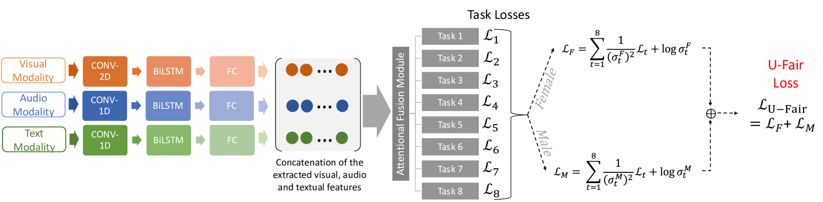
Figure 1: Our proposed method is rooted in the observation that each gender may have different PHQ-8 distributions and different levels of task difficulty across the $t_1$ to $t_8$ tasks. We propose accounting for this gender difference in PHQ-8 distributions via U-Fair.
Mental health disorders (MHDs) are becoming increasingly prevalent world-wide (Wang et al., 2007) Machine learning (ML) methods have been successfully applied to many real-world and health-related areas (Sendak et al., 2020). The natural extension of using ML for MHD analysis and detection has proven to be promising (Long et al., 2022; He et al., 2022; Zhang et al., 2020). On the other hand, ML bias is becoming an increasing source of concern (Buolamwini and Gebru, 2018; Barocas et al., 2017; Xu et al., 2020; Cheong et al., 2021, 2022, 2023a). Given the high stakes involved in MHD analysis and prediction, it is crucial to investigate and mitigate the ML biases present. A substantial amount of literature has indicated that adopting a multitask learning (MTL) approach towards depression detection demonstrated significant improvement across classification-based performances (Li et al., 2022; Zhang et al., 2020). Most of the existing work rely on the standardised and commonly used eight-item Patient Health Questionnaire depression scale (PHQ-8) (Kroenke et al., 2009) to obtain the ground-truth labels on whether a subject is considered depressed. A crucial observation is that in order to arrive at the final classification (depressed vs non-depressed), a clinician has to first obtain the scores of each of the PHQ-8 sub-criterion and then sum them up to arrive at the final binary classification (depressed vs non-depressed). Details on how the final score is derived from the PHQ-8 questionnaire can be found in Section 3.1.
Moreover, each gender may display different PHQ-8 task distribution which may results in different PHQ-8 distribution and variance. Although investigation on the relationship between the PHQ-8 and gender has been explored in other fields such as psychiatry (Thibodeau and Asmundson, 2014; Vetter et al., 2013; Leung et al., 2020), this has not been investigated nor accounted for in any of the existing ML for depression detection methods. Moreover, existing work has demonstrated the risk of a fairness-accuracy trade-off (Pleiss et al., 2017) and how mainstream MTL objectives might not correlate well with fairness goals (Wang et al., 2021b). No work has investigated how a MTL approach impacts performance across fairness for the task of depression detection.
In addition, prior works have demonstrated the intricate relationship between ML bias and uncertainty (Mehta et al., 2023; Tahir et al., 2023; Kaiser et al., 2022; Kuzucu et al., 2024). Uncertainty broadly refers to confidence in predictions. Within ML research, two types of uncertainty are commonly studied: data (or aleatoric) and model (or epistemic) uncertainties. Aleatoric uncertainty refers to the inherent randomness in the experimental outcome whereas epistemic uncertainty can be attributed to a lack of knowledge (Gal, 2016). A particularly relevant theme is that ML bias can be attributed to uncertainty in some models or datasets (Kuzucu et al., 2024) and that taking into account uncertainty as a bias mitigation strategy has proven effective (Tahir et al., 2023; Kaiser et al., 2022). A growing body of literature has also highlighted the importance of taking uncertainty into account within a range of tasks (Naik et al., 2024; Han et al., 2024; Baltaci et al., 2023; Cetinkaya et al., 2024) and healthcare settings (Grote and Keeling, 2022; Chua et al., 2023). Motivated by the above and the importance of a clinician-centred approach towards building relevant ML for healthcare solutions, we propose a novel method, U-Fair, which accounts for the gender difference in PHQ-8 distribution and leverages on uncertainty as a MTL task reweighing mechanism to achieve better gender fairness for depression detection. Our key contributions are as follow:
- We conduct the first analysis to investigate how MTL impacts fairness in depression detection by using each PHQ-8 subcriterion as a task. We show that a simplistic baseline MTL approach runs the risk of incurring negative transfer and may not improve on the Pareto frontier. A Pareto frontier can be understood as the set of optimal solutions that strike a balance among different objectives such that there is no better solution beyond the frontier.
- We propose a simple yet effective approach that leverages gender-based aleatoric uncertainty which improves the fairness-accuracy trade-off and alleviates the negative transfer phenomena and improves on the Pareto-frontier beyond a unitask method.
- We provide the very first results connecting the empirical results obtained via ML experiments with the empirical findings obtained via the largest study conducted on the PHQ-8. Interestingly, our results highlight the intrinsic relationship between task difficulty as quantified by aleatoric uncertainty and the discrimination capacity of each item of the PHQ-8 subcriterion.
Table 1: Comparative Summary with existing MTL Fairness studies. Abbreviations (sorted): A: Audio. NFM: Number of Fairness Measures. NT: Negative Transfers. ND: Number of Datasets. PF: Pareto Frontier. T: Text. V: Visual.
## 2 Literature Review
Gender difference in depression manifestation has long been studied and recognised within fields such as medicine (Barsky et al., 2001) and psychology (Hall et al., 2022). Anecdotal evidence has also often supported this view. Literature indicates that females and males tend to show different behavioural symptoms when depressed (Barsky et al., 2001; Ogrodniczuk and Oliffe, 2011). For instance, certain acoustic features (e.g. MFCC) are only statistically significantly different between depressed and healthy males (Wang et al., 2019). On the other hand, compared to males, depressed females are more emotionally expressive and willing to reveal distress via behavioural cues (Barsky et al., 2001; Jansz et al., 2000).
Recent works have indicated that ML bias is present within mental health analysis (Zanna et al., 2022; Bailey and Plumbley, 2021; Cheong et al., 2024a, b; Cameron et al., 2024; Spitale et al., 2024). Zanna et al. (2022) proposed an uncertainty-based approach to address the bias present in the TILES dataset. Bailey and Plumbley (2021) demonstrated the effectiveness of using an existing bias mitigation method, data re-distribution, to mitigate the gender bias present in the DAIC-WOZ dataset. Cheong et al. (2023b, 2024a) demonstrated that bias exists in existing mental health algorithms and datasets and subsequently proposed a causal multimodal method to mitigate the bias present.
MTL is noted to be particularly effective when the tasks are correlated (Zhang and Yang, 2021). Existing works using MTL for depression detection has proven fruitful. Ghosh et al. (2022) adopted a MTL approach by training the network to detect three closely related tasks: depression, sentiment and emotion. Wang et al. (2022) proposed a MTL approach using word vectors and statistical features. Li et al. (2022) implemented a similar strategy by using depression and three other auxiliary tasks: topic, emotion and dialog act. Gupta et al. (2023) adopted a multimodal, multiview and MTL approach where the subtasks are depression, sentiment and emotion.
In concurrence, although MTL has proven to be effective at improving fairness for other tasks such as healthcare predictive modelling (Li et al., 2023a), organ transplantation (Li et al., 2023b) and resource allocation (Ban and Ji, 2024), this approach has been underexplored for the task of depression detection.
#### Comparative Summary:
Our work differs from the above in the following ways (see Table 1). First, our work is the first to leverage an MTL approach to improve gender fairness in depression detection. Second, we utilise an MTL approach where each task corresponds to each of the PHQ-8 subtasks (Kroenke et al., 2009) in order to exploit gender-specific differences in PHQ-8 distribution to achieve greater fairness. Third, we propose a novel gender-based uncertainty MTL loss reweighing to achieve fairer performance across gender for
## 3 Methodology: U-Fair
In this section, we introduce U-Fair, which uses aleatoric-uncertainties for demographic groups to reweight their losses.
### 3.1 PHQ-8 Details
One of the standardised and most commonly used depression evaluation method is the PHQ-8 developed by Kroenke et al. (2009). In order to arrive at the final classification (depressed vs non-depressed), the protocol is to first obtain the subscores of each of the PHQ-8 subitem as follows:
- PHQ-1: Little interest or pleasure in doing things,
- PHQ-2: Feeling down, depressed, or hopeless,
- PHQ-3: Trouble falling or staying asleep, or sleeping too much,
- PHQ-4: Feeling tired or having little energy,
- PHQ-5: Poor appetite or overeating,
- PHQ-6: Feeling that you are a failure,
- PHQ-7: Trouble concentrating on things,
- PHQ-8: Moving or speaking so slowly that other people could have noticed.
Each PHQ-8 subcategory is scored between $0 0$ to $3$ , with the final PHQ-8 total score (TS) ranging between $0 0$ to $24$ . The PHQ-8 binary outcome is obtained via thresholding. A PHQ-8 TS of $≥ 10$ belongs to the depressed class ( $Y=1$ ) whereas TS $≤ 10$ belongs to the non-depressed class ( $Y=0$ ).
Most existing works focused on predicting the final binary class ( $Y$ ) (Zheng et al., 2023; Bailey and Plumbley, 2021). Some focused on predicting the PHQ-8 total score and further obtained the binary classification via thresholding according to the formal definition (Williamson et al., 2016; Gong and Poellabauer, 2017). Others adopted a bimodal setup with 2 different output heads to predict the PHQ-8 total score as well as the PHQ-8 binary outcome (Valstar et al., 2016; Al Hanai et al., 2018).
### 3.2 Problem Formulation
In our work, in alignment with how the PHQ-8 works, we adopt the approach where each PHQ-8 subcategory is treated as a task $t$ . The architecture is adapted from Wei et al. (2022). For each individual $i∈ I$ , we have 8 different prediction heads for each of the tasks, [ $t_1$ , …, $t_8$ ] $∈ T$ , to predict the score $y_t^i∈\{0,1,2,3\}$ for each task or sub PHQ-8 category. The ground-truth labels for each task $t$ is transformed into a Gaussian-based soft-distribution $p_t(x)$ , as soft labels provide more information for the model to learn from (Yuan et al., 2024). $x$ is the input feature provided to the model. Each of the classification heads are trained to predict the probability $q_t(x)$ of the 4 different score classes $y_t^i∈\{0,1,2,3\}$ . During inference, the final $y_t^i∈\{0,1,2,3\}$ is obtained by selecting the score with the maximum probability. The PHQ-8 Total Score $TS$ and final PHQ-8 binary classification $\hat{Y}$ for each individual $i∈ I$ are derived from each subtask via:
$$
TS=∑_t=1^8y_t, \tag{1}
$$
and
$$
\hat{Y}=1 if TS≥ 10, else \hat{Y}=0. \tag{2}
$$
$\hat{Y}$ thus denotes the final predicted class calculated based on the summation of $y_t$ . We study the problem of fairness in depression detection, where the goal is to predict a correct outcome $y^i∈ Y$ from input $x^i∈ X$ based on the available dataset $D$ for individual $i∈ I$ . In our setup, $Y=1$ denotes the PHQ-8 binary outcome corresponding to “depressed” and $Y=0$ denotes otherwise. Only gender was provided as a sensitive attribute $S$ .
### 3.3 Unitask Approach
For our single task approach, we use a Kullback-Leibler (KL) Divergence loss as follows:
$$
L_STL=∑_t∈ Tp_t(x)\log≤ft(\frac{p_t(x)}{q_t(x)}
\right). \tag{3}
$$
$p_t(x)$ is the soft ground-truth label for each task $t$ and $q_t(x)$ is the probability of the $4$ different score classes $y_t∈\{0,1,2,3\}$ as explained in Section 3.1.
### 3.4 Multitask Approach
For our baseline multitask approach, we extend the loss function in Equation 3 to arrive at the following generalisation:
$$
L_MTL=∑_t∈ Tw_tL_t. \tag{4}
$$
$L_t$ is the single task loss $L_STL$ for each $t$ as defined in Equation 3. We set $w_t=1$ in our experiments.
### 3.5 Baseline Approach
To compare between the generic multitask approach in Equation 4 and an uncertainty-based loss reweighting approach, we use the commonly used multitask learning method by Kendall et al. (2018) as the baseline uncertainty weighting (UW) appraoch. The uncertainty MTL loss across tasks is thus defined by:
$$
L_UW=∑_t∈ T≤ft(\frac{1}{σ_t^2}L_t+
\logσ_t\right), \tag{5}
$$
where $L_t$ is the single task loss as defined in Equation 3. $σ_t$ is the learned weight of loss for each task $t$ and can be interpreted as the aleatoric uncertainty of the task. A task with a higher aleatoric uncertainty will thus lead to a larger single task loss $L_t$ thus preventing the trained model to optimise on that task. The higher $σ_t$ , the more difficult the task $t$ . $\logσ_t$ penalizes the model from arbitrarily increasing $σ_t$ to reduce the overall loss (Kendall et al., 2018).
### 3.6 Proposed Loss: U-Fair
To achieve fairness across the different PHQ-8 tasks, we propose the idea of task prioritisation based on the model’s task-specific uncertainty weightings. Motivated by literature highlighting the existence of gender difference in depression manifestation (Barsky et al., 2001), we propose a novel gender based uncertainty reweighting approach and introduce U-Fair Loss which is defined as follows:
$$
L_U-Fair=\frac{1}{|S|}∑_s∈ S∑_t∈ T≤ft(\frac{1}{
≤ft(σ_t^s\right)^2}L_t^s+\logσ_t^s\right). \tag{6}
$$
For our setting, $s$ can either be male $s_1$ or female $s_0$ and $|S|=2$ . Thus, we have the uncertainty weighted task loss for each gender, and sum them up to arrive at our proposed loss function $L_MMFair$ .
This methodology has two key benefits. First, fairness is optimised implicitly as we train the model to optimise for task-wise prediction accuracy. As a result, by not constraining the loss function to blindly optimise for fairness at the cost of utility or accuracy, we hope to reduce the negative impact on fairness and improve the Pareto frontier with a constraint-based fairness optimisation approach (Wang et al., 2021b). Second, as highlighted by literature in psychiatry (Leung et al., 2020; Thibodeau and Asmundson, 2014), each task has different levels of uncertainty in relation to each gender. By adopting a gender based uncertainty loss-reweighting approach, we account for such uncertainty in a principled manner, thus encouraging the network to learn a better joint-representation due to the MTL and the gender-base aleatoric uncertainty loss reweighing approach.
## 4 Experimental Setup
We outline the implementation details and evaluation measures here. We use DAIC-WOZ (Valstar et al., 2016) and E-DAIC (Ringeval et al., 2019) for our experiments. Further details about the datasets can be found within the Appendix.
### 4.1 Implementation Details
We adopt an attention-based multimodal architecture adapted from Wei et al. (2022) featuring late fusion of extracted representations from the three different modalities (audio, visual, textual) as illustrated in Figure 1. The extracted features from each modality are concatenated in parallel to form a feature map as input to the subsequent fusion layer. We have 8 different attention fusion layers connected to the 8 output heads which corresponds to the $t_1$ to $t_8$ tasks. For all loss functions, we train the models with the Adam optimizer (Kingma and Ba, 2014) at a learning rate of 0.0002 and a batch size of 32. We train the network for a maximum of 150 epochs and apply early stopping.
### 4.2 Evaluation Measures
To evaluate performance, we use F1, recall, precision, accuracy and unweighted average recall (UAR) in accordance with existing work (Cheong et al., 2023c). To evaluate group fairness, we use the most commonly-used definitions according to (Hort et al., 2022). $s_1$ denotes the male majority group and $s_0$ denotes the female minority group for both datasets.
- Statistical Parity, or demographic parity, is based purely on predicted outcome $\hat{Y}$ and independent of actual outcome $Y$ :
$$
M_SP=\frac{P(\hat{Y}=1|s_0)}{P(\hat{Y}=1|s_1)}. \tag{7}
$$
According to $M_SP$ , in order for a classifier to be deemed fair, $P(\hat{Y}=1|s_1)=P(\hat{Y}=1|s_0)$ .
- Equal opportunity states that both demographic groups $s_0$ and $s_1$ should have equal True Positive Rate (TPR).
$$
M_EOpp=\frac{P(\hat{Y}=1|Y=1,s_0)}{P(\hat{Y}=1|Y=1,s_1)}. \tag{8}
$$
According to this measure, in order for a classifier to be deemed fair, $P(\hat{Y}=1|Y=1,s_1)=P(\hat{Y}=1|Y=1,s_0)$ .
- Equalised odds can be considered as a generalization of Equal Opportunity where the rates are not only equal for $Y=1$ , but for all values of $Y∈\{1,...k\}$ , i.e.:
$$
M_EOdd=\frac{P(\hat{Y}=1|Y=i,s_0)}{P(\hat{Y}=1|Y=i,s_1)}. \tag{9}
$$
According to this measure, in order for a classifier to be deemed fair, $P(\hat{Y}=1|Y=i,s_1)=P(\hat{Y}=1|Y=i,s_0),∀ i∈\{1,...k\}$ .
- Equal Accuracy states that both subgroups $s_0$ and $s_1$ should have equal rates of accuracy.
$$
M_EAcc=\frac{M_ACC,s_0}{M_ACC,s_1}. \tag{10}
$$
For all fairness measures, the ideal score of $1$ thus indicates that both measures are equal for $s_0$ and $s_1$ and is thus considered “perfectly fair”. We adopt the approach of existing work which considers $0.80$ and $1.20$ as the lower and upper fairness bounds respectively (Zanna et al., 2022). Values closer to $1$ are fairer, values further form $1$ are less fair. For all binary classification, the “default” threshold of $0.5$ is used in alignment with existing works (Wei et al., 2022; Zheng et al., 2023).
| Performance Measures | Acc | Unitask | 0.66 |
| --- | --- | --- | --- |
| Multitask | 0.70 | | |
| Baseline UW | 0.82 | | |
| 3-4[.4pt/2pt] | U-Fair (Ours) | 0.80 | |
| F1 | Unitask | 0.47 | |
| Multitask | 0.53 | | |
| Baseline UW | 0.29 | | |
| 3-4[.4pt/2pt] | U-Fair (Ours) | 0.54 | |
| Precision | Unitask | 0.44 | |
| Multitask | 0.50 | | |
| Baseline UW | 0.22 | | |
| 3-4[.4pt/2pt] | U-Fair (Ours) | 0.56 | |
| Recall | Unitask | 0.50 | |
| Multitask | 0.57 | | |
| Baseline UW | 0.43 | | |
| 3-4[.4pt/2pt] | U-Fair (Ours) | 0.60 | |
| UAR | Unitask | 0.60 | |
| Multitask | 0.65 | | |
| Baseline UW | 0.64 | | |
| 3-4[.4pt/2pt] | U-Fair (Ours) | 0.63 | |
| Fairness Measures | $M_SP$ | Unitask | 0.47 |
| Multitask | 0.86 | | |
| Baseline UW | 1.23 | | |
| 3-4[.4pt/2pt] | U-Fair (Ours) | 1.06 | |
| $M_EOpp$ | Unitask | 0.45 | |
| Multitask | 0.78 | | |
| Baseline UW | 1.70 | | |
| 3-4[.4pt/2pt] | U-Fair (Ours) | 1.46 | |
| $M_EOdd$ | Unitask | 0.54 | |
| Multitask | 0.76 | | |
| Baseline UW | 1.31 | | |
| 3-4[.4pt/2pt] | U-Fair (Ours) | 1.17 | |
| $M_EAcc$ | Unitask | 1.44 | |
| Multitask | 0.94 | | |
| Baseline UW | 1.25 | | |
| 3-4[.4pt/2pt] | U-Fair (Ours) | 0.95 | |
Table 2: Results for DAIC-WOZ. Full table results for DW, Table 6, is available within the Appendix. Best values are highlighted in bold.
[ $M_EAcc$ vs Acc]
<details>
<summary>x2.png Details</summary>
### Visual Description
## Scatter Plot: Accuracy vs. EAcc
### Overview
The image is a scatter plot comparing two performance metrics: "Accuracy" on the horizontal axis and "EAcc" on the vertical axis. The plot contains four distinct data points, each represented by a colored circle. There is no explicit legend provided within the image to identify what each color represents. The overall visual suggests a comparison of four different models, systems, or experimental conditions.
### Components/Axes
* **X-Axis (Horizontal):**
* **Label:** "Accuracy"
* **Scale:** Linear, ranging from 0.00 to 1.00.
* **Major Tick Marks:** At 0.00, 0.25, 0.50, 0.75, and 1.00 (implied by the axis line extending to the right edge).
* **Minor Tick Marks:** There are three minor tick marks between each major tick, dividing each 0.25 interval into four 0.0625 segments.
* **Y-Axis (Vertical):**
* **Label:** "EAcc"
* **Scale:** Linear, ranging from 0.00 to 1.00.
* **Major Tick Marks:** At 0.00, 0.25, 0.50, 0.75, and 1.00.
* **Minor Tick Marks:** Similar to the x-axis, with three minor ticks between each major tick.
* **Data Points (Circles):**
* **Orange Circle:** Located in the top-right quadrant.
* **Red Circle:** Located in the top-right quadrant, slightly to the right of the orange circle.
* **Blue Circle:** Located in the top-right quadrant, below the red circle.
* **Green Circle:** Located in the center-right area, below the blue circle.
### Detailed Analysis
**Data Point Coordinates (Approximate):**
Based on visual alignment with the axis tick marks:
1. **Orange Point:**
* **Accuracy (X):** ~0.75
* **EAcc (Y):** ~0.95
2. **Red Point:**
* **Accuracy (X):** ~0.85
* **EAcc (Y):** ~0.95
3. **Blue Point:**
* **Accuracy (X):** ~0.85
* **EAcc (Y):** ~0.75
4. **Green Point:**
* **Accuracy (X):** ~0.65
* **EAcc (Y):** ~0.55
**Spatial Grounding & Trend Verification:**
* The **Orange** and **Red** points are clustered at the highest EAcc level (~0.95). The Red point has a higher Accuracy value than the Orange point.
* The **Blue** point shares a similar high Accuracy value with the Red point (~0.85) but has a notably lower EAcc (~0.75).
* The **Green** point is the outlier, positioned with the lowest values for both Accuracy (~0.65) and EAcc (~0.55).
* There is no line connecting the points, so a continuous trend cannot be established. However, the distribution shows that three of the four points (Orange, Red, Blue) achieve high Accuracy (>0.75), while EAcc varies more significantly among them.
### Key Observations
1. **High-Performance Cluster:** Three data points (Orange, Red, Blue) are located in the region of high Accuracy (≥0.75).
2. **EAcc Variance at High Accuracy:** Among the high-accuracy points, EAcc shows a significant drop from the Orange/Red cluster (~0.95) to the Blue point (~0.75).
3. **Outlier:** The Green point is distinctly separated from the others, performing worse on both metrics.
4. **Missing Legend:** The image lacks a legend to define what the four colors (Orange, Red, Blue, Green) correspond to. This is a critical piece of information for full interpretation.
### Interpretation
This scatter plot likely compares the performance of four different entities (e.g., machine learning models, algorithms, or experimental setups) on two related but distinct metrics: standard "Accuracy" and a metric abbreviated as "EAcc" (which could stand for Expected Accuracy, Ensemble Accuracy, or another domain-specific variant).
The data suggests that achieving high standard Accuracy does not guarantee a high EAcc score, as demonstrated by the Blue point. The Orange and Red points represent the best-performing entities, excelling in both metrics. The Green point represents a clearly inferior performer.
The most significant finding is the **divergence between Accuracy and EAcc for the Blue entity**. This indicates that the two metrics are not perfectly correlated and capture different aspects of performance. An investigation would be needed to understand why the Blue entity's EAcc is lower despite its high Accuracy—perhaps it is less robust, has higher variance, or performs poorly on a specific subset of data that the EAcc metric is sensitive to.
**Without a legend, the specific identities of the four colored points remain unknown, limiting the actionable insight from the chart.** To fully utilize this data, one would need the accompanying key that maps colors to model names, configurations, or other categorical variables.
</details>
[ $M_EOdd$ vs Acc]
<details>
<summary>x3.png Details</summary>
### Visual Description
## Scatter Plot: Accuracy vs. EOdd
### Overview
The image is a simple scatter plot with two axes, displaying four data points represented by colored circles. The plot appears to compare two metrics: "Accuracy" on the horizontal axis and "EOdd" on the vertical axis. There is no chart title, legend, or additional explanatory text present in the image.
### Components/Axes
* **X-Axis (Horizontal):**
* **Label:** "Accuracy"
* **Scale:** Linear, ranging from 0.00 to an implied 1.00.
* **Ticks & Markers:** Major ticks are labeled at 0.00, 0.25, 0.50, and 0.75. There are minor ticks between each major tick, suggesting a resolution of 0.05 units. The axis line extends slightly beyond the 0.75 mark.
* **Y-Axis (Vertical):**
* **Label:** "EOdd"
* **Scale:** Linear, ranging from 0.00 to 1.00.
* **Ticks & Markers:** Major ticks are labeled at 0.00, 0.25, 0.50, 0.75, and 1.00. There are minor ticks between each major tick, suggesting a resolution of 0.05 units.
* **Data Points:** Four distinct colored circles are plotted in the upper-right quadrant of the chart. There is no legend to define what each color represents.
### Detailed Analysis
The following data points are estimated based on their visual position relative to the axes. Values are approximate.
1. **Red Circle:**
* **Position:** Top-most and right-most point.
* **Estimated Coordinates:** Accuracy ≈ 0.78, EOdd ≈ 0.85.
2. **Orange Circle:**
* **Position:** Located to the left and slightly below the red point.
* **Estimated Coordinates:** Accuracy ≈ 0.72, EOdd ≈ 0.75.
3. **Blue Circle:**
* **Position:** Located to the right and below the orange point.
* **Estimated Coordinates:** Accuracy ≈ 0.82, EOdd ≈ 0.70.
4. **Green Circle:**
* **Position:** The lowest and left-most point of the cluster.
* **Estimated Coordinates:** Accuracy ≈ 0.65, EOdd ≈ 0.55.
**Visual Trend:** All four data points are clustered in the region where both Accuracy and EOdd are relatively high (above 0.5). There is a general, loose positive correlation visible: points with higher Accuracy tend to have higher EOdd values, though the relationship is not perfectly linear (e.g., the blue point has higher Accuracy but lower EOdd than the orange point).
### Key Observations
* **Clustering:** All data points are concentrated in the upper-right quadrant, indicating that for the entities measured, both metrics are generally above 0.5.
* **Outlier:** The green point is the most distinct outlier, sitting noticeably lower on both axes compared to the tight cluster of the red, orange, and blue points.
* **Missing Context:** The lack of a legend, chart title, or data source makes it impossible to know what the colored points represent (e.g., different models, algorithms, or experimental conditions) or what "EOdd" specifically measures.
### Interpretation
This scatter plot suggests a comparative analysis where four distinct items (represented by color) are evaluated on two performance metrics: Accuracy and EOdd.
* **Relationship Between Metrics:** The data implies a positive association between Accuracy and EOdd. Higher performance on one metric generally coincides with higher performance on the other. This could mean the metrics are related, or that the underlying factors improving Accuracy also improve EOdd.
* **Performance Grouping:** The red, orange, and blue points form a high-performance group with similar scores. The green point represents a lower-performing entity on both dimensions.
* **Investigative Questions:** The plot raises questions for further investigation: What does "EOdd" quantify? Why does the green entity underperform? Is the difference between the blue and orange points (higher Accuracy vs. higher EOdd) meaningful? The visualization effectively highlights performance differences but requires external context to explain the *why* behind the data.
</details>
[ $M_EOpp$ vs Acc]
<details>
<summary>x4.png Details</summary>
### Visual Description
## Scatter Plot: Accuracy vs. EOpp
### Overview
The image is a scatter plot comparing two metrics: "Accuracy" on the horizontal axis and "EOpp" on the vertical axis. Four distinct data points are plotted, each represented by a different colored circle. The plot does not contain a title, a legend, or any explanatory text beyond the axis labels. The data points are clustered in the upper-right quadrant of the chart.
### Components/Axes
* **X-Axis (Horizontal):**
* **Label:** "Accuracy"
* **Scale:** Linear, ranging from 0.00 to approximately 1.00.
* **Major Tick Marks:** 0.00, 0.25, 0.50, 0.75. The axis extends slightly beyond 0.75, suggesting a maximum value of 1.00.
* **Y-Axis (Vertical):**
* **Label:** "EOpp"
* **Scale:** Linear, ranging from 0.00 to 1.00.
* **Major Tick Marks:** 0.00, 0.25, 0.50, 0.75, 1.00.
* **Data Series:** Four individual points, differentiated by color. There is no accompanying legend to define what each color represents.
* **Orange Point**
* **Red Point**
* **Green Point**
* **Blue Point**
### Detailed Analysis
The following table lists the approximate coordinates for each data point, determined by visual inspection of their position relative to the axis tick marks.
| Color | Approximate Accuracy (X) | Approximate EOpp (Y) | Visual Trend Description |
| :--- | :--- | :--- | :--- |
| **Orange** | 0.75 | 0.75 | Positioned at the intersection of the 0.75 grid lines for both axes. |
| **Red** | 0.85 | 0.65 | Located to the right of the orange point (higher accuracy) and slightly below it (lower EOpp). |
| **Green** | 0.65 | 0.45 | Positioned to the left of the orange point (lower accuracy) and significantly below it (lower EOpp). |
| **Blue** | 0.80 | 0.30 | Located to the right of the green point (higher accuracy) and at the lowest EOpp value of the four points. |
**Trend Verification:** There is no single, clear linear trend across all four points. The relationship between Accuracy and EOpp is not monotonic. For instance, moving from the green point to the blue point shows a large increase in Accuracy with a decrease in EOpp. Moving from the blue point to the red point shows a slight increase in both metrics.
### Key Observations
1. **Cluster Location:** All data points are concentrated in the region where Accuracy > 0.50 and EOpp > 0.25.
2. **Highest Values:** The **Orange** point has the highest EOpp (0.75). The **Red** point has the highest Accuracy (~0.85).
3. **Lowest Values:** The **Blue** point has the lowest EOpp (0.30). The **Green** point has the lowest Accuracy (~0.65).
4. **Trade-off Suggestion:** The distribution suggests a potential trade-off or complex relationship between the two metrics. The point with the highest accuracy (Red) does not have the highest EOpp, and the point with the highest EOpp (Orange) does not have the highest accuracy.
### Interpretation
This scatter plot visualizes the performance of four distinct entities (likely machine learning models, algorithms, or experimental conditions) on two key metrics: **Accuracy** and **EOpp**.
* **EOpp** is a common abbreviation for **Equal Opportunity**, a fairness metric in machine learning that measures whether a model's true positive rate is equal across different demographic groups. A higher EOpp value (closer to 1.00) typically indicates a fairer model with respect to this criterion.
* The plot therefore demonstrates the **accuracy-fairness trade-off**. It shows that optimizing for one metric does not guarantee optimization for the other.
* The **Red** model is the most accurate but has a moderate fairness score.
* The **Orange** model achieves the best fairness (EOpp) but at a cost to accuracy compared to the Red model.
* The **Blue** model has high accuracy but the worst fairness score of the group.
* The **Green** model performs poorly on both metrics relative to the others.
The absence of a legend is a critical limitation, as it prevents identification of what each colored point represents (e.g., Model A, Model B, Baseline, etc.). The chart effectively communicates that different configurations lead to different balances between accuracy and fairness, but without labels, the specific conclusions about which entity is which are impossible to draw. The data suggests that achieving both high accuracy and high fairness simultaneously is challenging for the systems being compared.
</details>
[ $M_SP$ vs Acc]
<details>
<summary>x5.png Details</summary>
### Visual Description
## Scatter Plot: Accuracy vs. SP
### Overview
The image is a 2D scatter plot comparing four data points across two metrics: "Accuracy" (x-axis) and "SP" (y-axis). The plot uses colored circles to represent distinct data series or categories, though no explicit legend is provided within the image frame. The data points are clustered in the upper-right quadrant, indicating generally high values for both metrics.
### Components/Axes
* **X-Axis (Horizontal):**
* **Label:** "Accuracy"
* **Scale:** Linear, ranging from 0.00 to approximately 0.80.
* **Major Tick Marks:** 0.00, 0.25, 0.50, 0.75.
* **Minor Tick Marks:** Present between each major tick, representing intervals of 0.05.
* **Y-Axis (Vertical):**
* **Label:** "SP"
* **Scale:** Linear, ranging from 0.00 to 1.00.
* **Major Tick Marks:** 0.00, 0.25, 0.50, 0.75, 1.00.
* **Minor Tick Marks:** Present between each major tick, representing intervals of 0.05.
* **Data Series (Legend Implied by Color):**
* **Red Circle**
* **Orange Circle**
* **Blue Circle**
* **Green Circle**
* *Note: No textual legend is present in the image. The colors are the sole identifiers for the data points.*
### Detailed Analysis
The plot contains four distinct data points. Their approximate coordinates, determined by visual alignment with the axis ticks, are as follows:
1. **Red Circle:**
* **Position:** Top-rightmost point.
* **Accuracy (X):** ~0.75
* **SP (Y):** ~0.95
* **Trend:** This point represents the highest SP value and ties for the highest Accuracy.
2. **Orange Circle:**
* **Position:** Slightly left and below the red point.
* **Accuracy (X):** ~0.65
* **SP (Y):** ~0.85
* **Trend:** High SP, but lower Accuracy than the red and blue points.
3. **Blue Circle:**
* **Position:** Directly below the red point.
* **Accuracy (X):** ~0.75
* **SP (Y):** ~0.70
* **Trend:** Ties for the highest Accuracy but has a notably lower SP than the red and orange points.
4. **Green Circle:**
* **Position:** Bottom-left of the cluster.
* **Accuracy (X):** ~0.60
* **SP (Y):** ~0.50
* **Trend:** This point has the lowest values for both Accuracy and SP among the four.
### Key Observations
* **Clustering:** All data points are concentrated in the region where Accuracy > 0.50 and SP > 0.50, suggesting all measured entities perform above the midpoint on both scales.
* **Performance Hierarchy:** There is a clear visual hierarchy in SP: Red > Orange > Blue > Green. For Accuracy, Red and Blue are tied at the top, followed by Orange, then Green.
* **Trade-off Visualization:** The plot visually demonstrates a potential trade-off or difference in performance profiles. For example, the Blue and Red points share the same high Accuracy (~0.75) but differ significantly in SP (~0.70 vs. ~0.95). Conversely, the Orange point sacrifices some Accuracy (~0.65) for a high SP (~0.85).
* **Outlier:** The Green point is a relative outlier, positioned distinctly lower and to the left of the other three points.
### Interpretation
This scatter plot is a comparative performance visualization, likely for models, algorithms, or experimental conditions. "Accuracy" is a common metric for classification correctness, while "SP" is an unspecified metric (potentially Specificity, Sensitivity, or another performance score).
The data suggests that the entity represented by the **Red** circle is the top performer, achieving the best balance of high Accuracy and very high SP. The **Blue** entity matches it in Accuracy but falls short on SP. The **Orange** entity prioritizes SP over marginal gains in Accuracy. The **Green** entity underperforms the others on both metrics.
The absence of a legend is a critical limitation; without knowing what each color represents, the practical conclusions are limited to relative performance. The plot effectively communicates that high Accuracy does not guarantee high SP, as seen in the vertical separation between the Red and Blue points. The clustering indicates that achieving scores below 0.50 on either metric was not observed in this dataset.
</details>
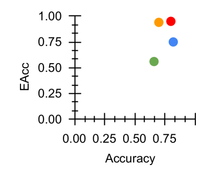
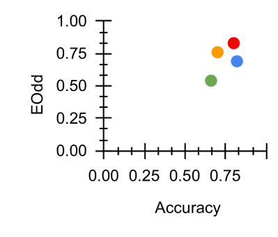
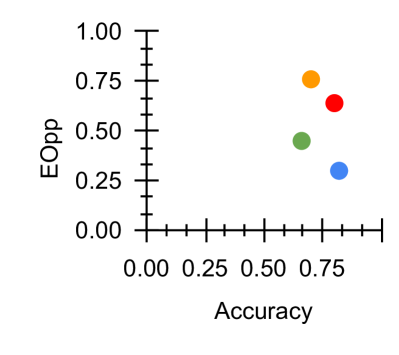
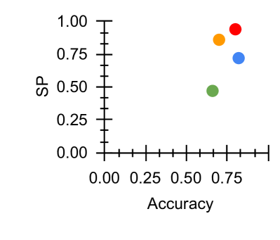
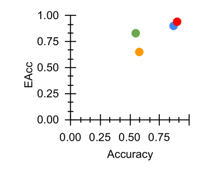
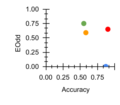
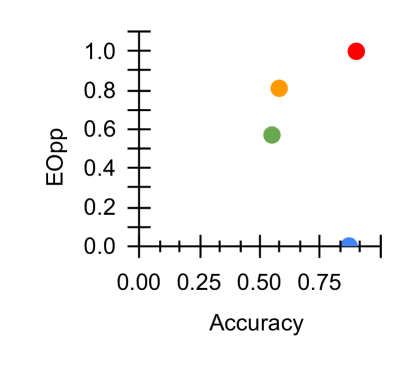
Figure 2: Fairness-Accuracy Pareto Frontier across the DAIC-WOZ results. Upper right indicates better Pareto optimality, i.e. better fairness-accuracy trade-off. Orange: Unitask. Green: Multitask. Blue: Multitask UW. Red: U-Fair. Abbreviations: Acc: accuracy.
| Performance Measures | Acc | Unitask | 0.55 |
| --- | --- | --- | --- |
| Multitask | 0.58 | | |
| Baseline UW | 0.87 | | |
| 3-4[.4pt/2pt] | U-Fair (Ours) | 0.90 | |
| F1 | Unitask | 0.51 | |
| Multitask | 0.45 | | |
| Baseline UW | 0.27 | | |
| 3-4[.4pt/2pt] | U-Fair (Ours) | 0.45 | |
| Precision | Unitask | 0.36 | |
| Multitask | 0.32 | | |
| Baseline UW | 0.28 | | |
| 3-4[.4pt/2pt] | U-Fair (Ours) | 0.46 | |
| Recall | Unitask | 0.87 | |
| Multitask | 0.80 | | |
| Baseline UW | 0.26 | | |
| 3-4[.4pt/2pt] | U-Fair (Ours) | 0.45 | |
| UAR | Unitask | 0.63 | |
| Multitask | 0.67 | | |
| Baseline UW | 0.60 | | |
| 3-4[.4pt/2pt] | U-Fair (Ours) | 0.70 | |
| Fairness Measures | $M_SP$ | Unitask | 0.65 |
| Multitask | 1.25 | | |
| Baseline UW | 3.86 | | |
| 3-4[.4pt/2pt] | U-Fair (Ours) | 1.67 | |
| $M_EOpp$ | Unitask | 0.57 | |
| Multitask | 0.81 | | |
| Baseline UW | 2.31 | | |
| 3-4[.4pt/2pt] | U-Fair (Ours) | 1.00 | |
| $M_EOdd$ | Unitask | 0.75 | |
| Multitask | 1.41 | | |
| Baseline UW | 8.21 | | |
| 3-4[.4pt/2pt] | U-Fair (Ours) | 5.00 | |
| $M_EAcc$ | Unitask | 0.83 | |
| Multitask | 0.65 | | |
| Baseline UW | 0.92 | | |
| 3-4[.4pt/2pt] | U-Fair (Ours) | 0.94 | |
Table 3: Results for E-DAIC. Full table results for ED, Table 7, is available within the Appendix. Best values are highlighted in bold.
[ $M_EAcc$ vs Acc]
<details>
<summary>x6.png Details</summary>
### Visual Description
## Scatter Plot: Accuracy vs. EAcc
### Overview
The image is a scatter plot comparing two performance metrics: "Accuracy" on the horizontal axis and "EAcc" on the vertical axis. It displays four distinct data points, each represented by a colored circle (red, blue, green, orange). The plot suggests a positive correlation between the two metrics, with all points located in the upper-right quadrant, indicating generally high values for both measures.
### Components/Axes
* **X-Axis (Horizontal):**
* **Label:** "Accuracy"
* **Scale:** Linear, ranging from 0.00 to 1.00.
* **Major Tick Marks:** 0.00, 0.25, 0.50, 0.75, 1.00.
* **Minor Tick Marks:** Present between each major tick, dividing each 0.25 interval into five sub-intervals of 0.05 each.
* **Y-Axis (Vertical):**
* **Label:** "EAcc"
* **Scale:** Linear, ranging from 0.00 to 1.00.
* **Major Tick Marks:** 0.00, 0.25, 0.50, 0.75, 1.00.
* **Minor Tick Marks:** Present between each major tick, dividing each 0.25 interval into five sub-intervals of 0.05 each.
* **Data Series (Legend):** **No explicit legend is present in the image.** The four data points are distinguished only by color (red, blue, green, orange). Their specific categorical identities (e.g., model names, experimental conditions) are not provided.
### Detailed Analysis
The plot contains four data points. Their approximate coordinates, determined by visual alignment with the axis ticks, are as follows:
1. **Red Point:**
* **Position:** Top-right corner of the data cluster.
* **Approximate Coordinates:** Accuracy ≈ 0.95, EAcc ≈ 0.95.
* **Visual Trend:** This point represents the highest combined performance on both metrics.
2. **Blue Point:**
* **Position:** Slightly to the left and below the red point.
* **Approximate Coordinates:** Accuracy ≈ 0.90, EAcc ≈ 0.90.
* **Visual Trend:** Very high performance, nearly matching the red point but marginally lower on both axes.
3. **Green Point:**
* **Position:** To the left of the blue point and noticeably lower on the EAcc axis.
* **Approximate Coordinates:** Accuracy ≈ 0.60, EAcc ≈ 0.80.
* **Visual Trend:** Shows a significant drop in Accuracy compared to the red and blue points, while maintaining a relatively high EAcc.
4. **Orange Point:**
* **Position:** The leftmost and lowest point in the cluster.
* **Approximate Coordinates:** Accuracy ≈ 0.55, EAcc ≈ 0.65.
* **Visual Trend:** Represents the lowest performance on both metrics among the four points shown.
**Overall Trend:** The data points form a rough, positive-sloping trend from the lower-left (orange) to the upper-right (red). This indicates that, for these four samples, higher Accuracy is generally associated with higher EAcc. However, the relationship is not perfectly linear, as seen by the green point which has a moderate Accuracy but a disproportionately high EAcc.
### Key Observations
1. **Positive Correlation:** There is a clear visual trend where increases in Accuracy correspond to increases in EAcc.
2. **Performance Clustering:** Three of the four points (red, blue, green) have an EAcc value of 0.80 or higher, suggesting that the "EAcc" metric tends to be high for these samples.
3. **Outlier in Trend:** The green point deviates from a strict linear relationship. It has an Accuracy similar to the orange point (~0.55-0.60) but an EAcc (~0.80) much closer to the high-performing blue point.
4. **Missing Context:** The most significant limitation is the absence of a legend. Without labels for the colored points, it is impossible to determine what specific entities (e.g., algorithms, datasets, model versions) are being compared.
### Interpretation
This scatter plot is likely used to compare the performance of different models, methods, or experimental runs on two related but distinct metrics: "Accuracy" (a standard performance measure) and "EAcc" (which could stand for "Expected Accuracy," "Ensemble Accuracy," or another domain-specific variant).
The data suggests that the methods represented by the red and blue points are superior, achieving near-perfect scores on both metrics. The green point is particularly interesting; it indicates a scenario where a method achieves a high "EAcc" despite only moderate standard "Accuracy." This could imply robustness, better calibration, or performance on a specific subset of data that the EAcc metric captures more effectively. The orange point represents the baseline or lowest-performing method in this comparison.
The primary takeaway is the strong positive relationship between the two metrics, with one notable exception (green point) that warrants further investigation to understand why its EAcc is high relative to its Accuracy. To make this chart fully informative, a legend mapping each color to a specific identifier is essential.
</details>
[ $M_EOdd$ vs Acc]
<details>
<summary>x7.png Details</summary>
### Visual Description
## Scatter Plot: Accuracy vs. EOdd
### Overview
The image is a simple scatter plot displaying four data points on a Cartesian coordinate system. The plot compares two metrics: "Accuracy" on the horizontal axis and "EOdd" on the vertical axis. Both axes use a linear scale ranging from 0.00 to 1.00. The data points are represented by four distinct colored circles (green, orange, red, blue), but no legend is provided to define what each color represents.
### Components/Axes
* **X-Axis (Horizontal):**
* **Label:** "Accuracy"
* **Scale:** Linear, from 0.00 to 1.00.
* **Major Tick Marks:** 0.00, 0.25, 0.50, 0.75, 1.00.
* **Y-Axis (Vertical):**
* **Label:** "EOdd"
* **Scale:** Linear, from 0.00 to 1.00.
* **Major Tick Marks:** 0.00, 0.25, 0.50, 0.75, 1.00.
* **Data Series:** Four colored points. There is no legend, title, or other explanatory text within the plot area.
### Detailed Analysis
The plot contains four data points. Their approximate positions, determined by visual alignment with the axis tick marks, are as follows:
1. **Green Point:**
* **Position:** Upper-middle region of the plot.
* **Approximate Coordinates:** Accuracy ≈ 0.55, EOdd ≈ 0.75.
2. **Orange Point:**
* **Position:** Slightly to the right and below the green point.
* **Approximate Coordinates:** Accuracy ≈ 0.60, EOdd ≈ 0.60.
3. **Red Point:**
* **Position:** Upper-right region of the plot.
* **Approximate Coordinates:** Accuracy ≈ 0.85, EOdd ≈ 0.65.
4. **Blue Point:**
* **Position:** Bottom-right corner of the plot.
* **Approximate Coordinates:** Accuracy ≈ 0.90, EOdd ≈ 0.05.
**Trend Verification:** There is no single, clear linear trend across all four points. The green, orange, and red points are clustered in the upper half of the EOdd range (0.60-0.75) across a mid-to-high Accuracy range (0.55-0.85). The blue point is a significant outlier, showing very high Accuracy but a near-zero EOdd value.
### Key Observations
* **Clustering vs. Outlier:** Three points (green, orange, red) form a loose cluster with moderate-to-high values for both metrics. The blue point is isolated in the bottom-right, indicating a case of high Accuracy coupled with very low EOdd.
* **Missing Context:** The lack of a legend, chart title, or definitions for "Accuracy" and "EOdd" prevents a definitive understanding of what the data represents. "EOdd" is not a standard, universally recognized metric.
* **Spatial Distribution:** The points are not evenly distributed. There is a gap in the lower-left quadrant (low Accuracy, low EOdd) and the upper-left quadrant (low Accuracy, high EOdd).
### Interpretation
This scatter plot visualizes the relationship between two variables, "Accuracy" and "EOdd," for four distinct entities (e.g., models, experiments, categories). The data suggests that for most observed cases (the green, orange, and red points), a moderate-to-high Accuracy score is associated with a moderate-to-high EOdd score. However, the blue point represents a critical anomaly or a different class of entity where high Accuracy is achieved with a minimal EOdd value.
Without definitions, "EOdd" could represent a measure of error, oddity, deviation, or a specific domain metric. The plot's primary message is the existence of this outlier (blue point), which behaves fundamentally differently from the others. It prompts investigation into why this particular case achieves high Accuracy while minimizing EOdd, or conversely, what causes the other three cases to have a higher EOdd despite similar or lower Accuracy. The chart effectively highlights a dichotomy or a trade-off between the two metrics for the entities being compared.
</details>
[ $M_EOpp$ vs Acc]
<details>
<summary>x8.png Details</summary>
### Visual Description
## Scatter Plot: Accuracy vs. EOpp
### Overview
The image is a simple scatter plot chart displaying four data points, each represented by a distinct colored dot. The chart plots a metric called "EOpp" against "Accuracy." There is no title, legend, or additional context provided within the image itself.
### Components/Axes
* **X-Axis (Horizontal):**
* **Label:** "Accuracy"
* **Scale:** Linear, ranging from 0.00 to an implied 1.00.
* **Tick Marks:** Major ticks are labeled at 0.00, 0.25, 0.50, and 0.75. Minor ticks are present between these major labels, suggesting increments of 0.05.
* **Y-Axis (Vertical):**
* **Label:** "EOpp"
* **Scale:** Linear, ranging from 0.0 to 1.0.
* **Tick Marks:** Major ticks are labeled at 0.0, 0.2, 0.4, 0.6, 0.8, and 1.0. Minor ticks are present between these major labels, suggesting increments of 0.05.
* **Data Points:** Four colored circles are plotted on the chart. **No legend is provided to identify what each color represents.**
### Detailed Analysis
The approximate coordinates (Accuracy, EOpp) for each data point, based on visual inspection, are:
1. **Red Dot (Top-Right):**
* **Position:** Highest on the Y-axis, far right on the X-axis.
* **Approximate Value:** (Accuracy ≈ 0.90, EOpp ≈ 1.00)
* **Trend:** This point represents the highest observed EOpp and a very high Accuracy.
2. **Orange Dot (Upper-Middle):**
* **Position:** Centered horizontally, in the upper half vertically.
* **Approximate Value:** (Accuracy ≈ 0.60, EOpp ≈ 0.80)
* **Trend:** Moderate Accuracy with a relatively high EOpp.
3. **Green Dot (Center):**
* **Position:** Near the center of the plot.
* **Approximate Value:** (Accuracy ≈ 0.55, EOpp ≈ 0.60)
* **Trend:** Moderate Accuracy and moderate EOpp.
4. **Blue Dot (Bottom-Right):**
* **Position:** Far right on the X-axis, at the very bottom of the Y-axis. The dot is partially cut off by the chart's bottom boundary.
* **Approximate Value:** (Accuracy ≈ 0.85, EOpp ≈ 0.00)
* **Trend:** High Accuracy but the lowest observed EOpp.
### Key Observations
* **Inverse Relationship at Extremes:** The two points with the highest Accuracy (Red and Blue) are at opposite ends of the EOpp scale (1.00 vs. 0.00). This suggests a potential trade-off or dichotomy between maximizing Accuracy and maximizing EOpp for these two cases.
* **Clustering in the Middle:** The Orange and Green points occupy the middle range for both metrics, with Orange showing a higher EOpp for a similar level of Accuracy compared to Green.
* **Missing Context:** The most significant limitation is the absence of a legend. Without knowing what the colors (Red, Orange, Green, Blue) signify (e.g., different models, algorithms, experimental conditions), the data cannot be meaningfully interpreted.
* **Data Point Clarity:** The Blue dot is clipped at the bottom, making its exact EOpp value uncertain, though it is clearly at or near 0.0.
### Interpretation
This chart presents a comparison of four unnamed entities across two performance metrics: Accuracy and EOpp. The data suggests that the highest Accuracy does not guarantee the highest EOpp, and vice-versa. The Red entity achieves the best EOpp with high Accuracy, while the Blue entity achieves similarly high Accuracy but with the worst EOpp. The Orange and Green entities represent middle-ground performance.
**Critical Missing Information:** The chart is technically incomplete for analysis. The **legend is absent**, preventing any identification of the data series. To make this chart useful, one must know what the colors represent. The relationship between "Accuracy" and "EOpp" is also undefined—is EOpp a cost, an error rate, an opportunity metric, or something else? The interpretation is therefore limited to describing the numerical relationships between the plotted points, not their real-world significance.
</details>
[ $M_SP$ vs Acc]
<details>
<summary>x9.png Details</summary>

### Visual Description
## Scatter Plot: Accuracy vs. SP
### Overview
The image is a simple scatter plot with four data points, each represented by a distinct colored circle. The plot compares two variables: "Accuracy" on the horizontal axis and "SP" on the vertical axis. There is no visible legend, title, or data series labels within the image frame.
### Components/Axes
* **X-Axis (Horizontal):**
* **Label:** "Accuracy"
* **Scale:** Linear, ranging from 0.00 to approximately 0.85.
* **Major Tick Marks & Labels:** 0.00, 0.25, 0.50, 0.75.
* **Minor Tick Marks:** Present between each major tick, dividing each 0.25 interval into five sub-intervals of 0.05 each.
* **Y-Axis (Vertical):**
* **Label:** "SP"
* **Scale:** Linear, ranging from 0.0 to 0.8.
* **Major Tick Marks & Labels:** 0.0, 0.2, 0.4, 0.6, 0.8.
* **Minor Tick Marks:** Present between each major tick, dividing each 0.2 interval into four sub-intervals of 0.05 each.
* **Data Points:** Four colored circles plotted on the graph. No legend is present to define what each color represents.
### Detailed Analysis
The following table lists the approximate coordinates for each data point, identified by color. Values are estimated based on visual alignment with the axis ticks.
| Color | Approximate Accuracy (X) | Approximate SP (Y) | Spatial Position (Relative to Plot Area) |
| :--- | :--- | :--- | :--- |
| **Green** | 0.55 | 0.65 | Upper-middle region, left of center. |
| **Orange** | 0.60 | 0.55 | Slightly right and below the green point. |
| **Red** | 0.85 | 0.45 | Far right, in the middle vertical range. |
| **Blue** | 0.80 | 0.00 | Far right, directly on the x-axis (SP=0). |
### Key Observations
1. **Distribution:** The points are not clustered. They span a wide range of Accuracy (0.55 to 0.85) and SP (0.00 to 0.65).
2. **Outlier:** The blue point is a significant outlier. It has a high Accuracy (~0.80) but an SP value of exactly 0.00, placing it directly on the x-axis.
3. **Trend:** There is no clear linear trend (positive or negative correlation) visible across all four points. The highest SP value (green) is associated with mid-range Accuracy, while the highest Accuracy values (red, blue) have lower SP.
4. **Color Clustering:** The green and orange points are relatively close in both Accuracy and SP, forming a loose pair in the upper-middle area. The red and blue points are both at the high end of Accuracy but are separated vertically by a large SP difference.
### Interpretation
This scatter plot visualizes the relationship between two metrics, "Accuracy" and "SP," for four distinct entities (e.g., models, experiments, configurations). The lack of a legend prevents definitive identification of what each color signifies.
The data suggests a potential **trade-off or non-linear relationship** between Accuracy and SP. The entity with the highest SP (green) does not have the highest Accuracy. Conversely, the entities with the highest Accuracy (red, blue) have lower SP, with one (blue) having no SP value at all.
The blue point is particularly noteworthy. Its position at (0.80, 0.00) indicates a scenario where high Accuracy is achieved with zero "SP." This could represent a baseline, a failure case for the SP metric, or a specialized configuration where the SP property is irrelevant or not measured.
Without context for "SP" (which could stand for Specificity, a performance score, a resource parameter, etc.), the precise meaning is ambiguous. However, the plot clearly demonstrates that maximizing Accuracy does not automatically maximize SP, and the four plotted items exhibit distinct performance profiles across these two dimensions.
</details>
Figure 3: Fairness-Accuracy Pareto Frontier across the E-DAIC results. Upper right indicates better Pareto optimality, i.e. better fairness-accuracy trade-off. Orange: Unitask. Green: Multitask. Blue: Multitask UW. Red: U-Fair. Abbreviations: Acc: accuracy.
## 5 Results
For both datasets, we normalise the fairness results to facilitate visualisation in Figures 2 and 3.
Table 4: Comparison with other models which used extracted features for DAIC-WOZ. Best results highlighted in bold.
### 5.1 Uni vs Multitask
For DAIC-WOZ (DW), we see from Table 2, we find that a multitask approach generally improves results compared to a unitask approach (Section 3.3). The baseline loss re-weighting approach from Equation 5 managed to further improve performance. For example, we see from Table 2 that the overall classification accuracy improved from $0.70$ within a vanilla MTL approach to $0.82$ using the baseline uncertainty-based task reweighing approach.
However, this observation is not consistent for E-DAIC (ED). With reference to Table 3, a unitask approach seems to perform better. We see evidence of negative transfer, i.e. the phenomena where learning multiple tasks concurrently result in lower performance than a unitask approach. We hypothesise that this is because ED is a more challenging dataset. When adopting a multitask approach, the model completely relies on the easier tasks thus negatively impacting the learning of the other tasks.
Moreover, performance improvement seems to come at a cost. This may be due to the fairness-accuracy trade-off (Wang et al., 2021b). For instance in DW, we see that the fairness scores $M_SP$ , $M_EOpp$ , $M_Odd$ and $M_Acc$ reduced from $0.86$ , $0.78$ , $0.94$ and $0.76$ to $1.23$ , $1.70$ , $1.31$ and $1.25$ respectively. This is consistent with the analysis across the Pareto frontier depicted in Figures 2 and 3.
### 5.2 Uncertainty & the Pareto Frontier
Our proposed loss reweighting approach seems to address the negative transfer and Pareto frontier challenges. Although accuracy dropped slightly from $0.82$ to $0.80$ , fairness largely improved compared to the baseline UW approach (Equation 5). We see from Table 2 that fairness improved across $M_SP$ , $M_EOpp$ , $M_EOdd$ and $M_Acc$ from $1.23$ , $1.70$ , $1.31$ , $1.25$ to $1.06$ , $1.46$ , $1.17$ and $0.95$ for DW.
For ED, the baseline UW which adopts a task based difficulty reweighting mechanism seems to somewhat mitigate the task-based negative transfer which improves the unitask performance but not overall performance nor fairness measures. Our proposed method which takes into account the gender difference may have somewhat addressed this task-based negative transfer. In concurrence, U-Fair also addressed the initial bias present. We see from Table 3 that fairness improved across all fairness measures. The scores improved from $3.86$ , $2.31$ , $8.21$ , $0.92$ to $1.67$ , $1.00$ , $5.00$ and $0.94$ across $M_SP$ , $M_EOpp$ , $M_EOdd$ and $M_Acc$ .
The Pareto frontier across all four measures illustrated in Figures 2 and 3 demonstrated that our proposed method generally provides better accuracy-fairness trade-off across most fairness measures for both datasets. With reference to Figure 2, we see that U-Fair, generally provides a slightly better Pareto optimality compared to other methods. This improvement in the Pareto frontier is especially pronounced for Figure 3 (c). The difference in the Pareto frontier between our proposed method and other compared methods is greater in ED (Fig 3), the more challenging dataset, compared to that in DW (Fig 2).
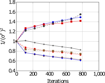
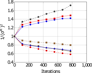
For DW, with reference to Figures 4 and 4, we see that there is a difference in task difficulty. Task 4 and 6 is easier for females whereas task 7 is easier for males. For ED, with reference to Figures 4, 4 and Table 5, Task 4 seems to be easier for females whereas task 7 seems easier for males. Thus, adopting a gender-based uncertainty reweighting approach might have ensured that the tasks are more appropriately weighed leading towards better performance for both genders whilst mitigating the negative transfer and Pareto frontier challenges.
### 5.3 Task Difficulty & Discrimination Capacity
A particularly relevant and exciting finding is that each PHQ-8 subitem’s task difficulty agree with its discrimination capacity as evidenced by the rigorous study conducted by de la Torre et al. (2023). This largest study to date assessed the internal structure, reliability and cross-country validity of the PHQ-8 for the assessment of depressive symptoms. Discrimination capacity is defined as the ability of item to distinguish whether a person is depressed or not.
With reference to Table 5, it is noteworthy that the task difficulty captured by $\frac{1}{σ^2}$ in our experiments corresponds to the discrimination capacity (DC) of each task. The higher $σ_t$ , the more difficult the task $t$ . In other words, the lower the value of $\frac{1}{σ^2}$ , the more difficult the task. For instance, in their study, PHQ-1, 2 and 6 were the items that has the greatest ability to discriminate whether a person is depressed. This is in alignment with our results where PHQ-1,2 and 8 are easier across both datasets. PHQ-3 and PHQ-5 are the least discriminatory or more difficult tasks as evidenced by the values highlighted in red.
[DAIC-WOZ: Female]
<details>
<summary>x10.png Details</summary>
### Visual Description
\n
## Line Chart: Performance Metric vs. Iterations
### Overview
The image is a line chart plotting a performance metric, labeled as `1/(σ^f)^2`, against the number of `Iterations`. The chart displays six distinct data series, each represented by a unique combination of color and marker shape. The overall trend shows a divergence: three series trend upward, while three trend downward over the course of 800 iterations.
### Components/Axes
* **Y-Axis:**
* **Label:** `1/(σ^f)^2`
* **Scale:** Linear, ranging from 0.4 to 1.8.
* **Major Ticks:** 0.4, 0.6, 0.8, 1.0, 1.2, 1.4, 1.6, 1.8.
* **X-Axis:**
* **Label:** `Iterations`
* **Scale:** Linear, ranging from 0 to 1,000.
* **Major Ticks:** 0, 200, 400, 600, 800, 1,000.
* **Legend:**
* **Position:** Top-left corner of the plot area.
* **Content:** Six entries, each with a colored line segment and a marker symbol. The exact text labels for each series are not visible in the image.
* **Series Identification (by color and marker):**
1. Red line with square markers (■).
2. Blue line with circle markers (●).
3. Gray line with circle markers (●).
4. Black line with star/asterisk markers (★).
5. Orange line with square markers (■).
6. Blue line with diamond markers (◆).
### Detailed Analysis
**Trend Verification & Data Point Extraction (Approximate Values):**
All series originate at the same point: (Iterations=0, Value=1.0).
1. **Red Line (■):** Trends upward with a decreasing slope.
* Iterations ~100: ~1.25
* Iterations ~200: ~1.30
* Iterations ~400: ~1.35
* Iterations ~800: ~1.42
2. **Blue Line (●):** Trends upward, closely following the gray line.
* Iterations ~100: ~1.22
* Iterations ~200: ~1.28
* Iterations ~400: ~1.38
* Iterations ~800: ~1.50
3. **Gray Line (●):** Trends upward, ending as the highest value.
* Iterations ~100: ~1.20
* Iterations ~200: ~1.25
* Iterations ~400: ~1.35
* Iterations ~800: ~1.55
4. **Black Line (★):** Trends downward with a shallow slope.
* Iterations ~100: ~1.02
* Iterations ~200: ~0.98
* Iterations ~400: ~0.92
* Iterations ~800: ~0.82
5. **Orange Line (■):** Trends downward.
* Iterations ~100: ~0.85
* Iterations ~200: ~0.82
* Iterations ~400: ~0.78
* Iterations ~800: ~0.72
6. **Blue Line (◆):** Trends downward with the steepest slope.
* Iterations ~100: ~0.75
* Iterations ~200: ~0.72
* Iterations ~400: ~0.68
* Iterations ~800: ~0.62
### Key Observations
* **Divergence:** The primary pattern is a clear split into two groups after the initial point. Three methods (Red ■, Blue ●, Gray ●) improve the metric `1/(σ^f)^2`, while three methods (Black ★, Orange ■, Blue ◆) degrade it.
* **Performance Hierarchy:** At the final measured point (800 iterations), the performance order from best to worst is: Gray (●) > Blue (●) > Red (■) > Black (★) > Orange (■) > Blue (◆).
* **Convergence Rate:** The upward-trending lines show a logarithmic-like growth (rapid initial increase, then slowing). The downward-trending lines show a more linear decline.
* **Anomaly:** The black line (★) is the only downward-trending series that starts above 1.0 and remains above 0.8, showing a much slower rate of degradation compared to the orange and blue (◆) lines.
### Interpretation
The chart likely compares the performance of different algorithms, models, or parameter settings over training/optimization iterations. The metric `1/(σ^f)^2` is inversely proportional to the square of some final variance or error term (`σ^f`). Therefore, a **higher value on the y-axis indicates better performance** (lower final variance/error).
* **What the data suggests:** The "Gray (●)" and "Blue (●)" methods are the most effective, achieving the highest final performance. The "Red (■)" method is also effective but plateaus earlier. The "Black (★)", "Orange (■)", and "Blue (◆)" methods are detrimental to this specific performance metric, with "Blue (◆)" being the most harmful.
* **Relationship between elements:** The shared starting point (1.0) suggests all methods begin from an identical baseline. The divergence immediately after iteration 0 indicates that the choice of method has a rapid and significant impact on the trajectory of the performance metric.
* **Notable implications:** The stark contrast between the two groups implies a fundamental difference in the approaches. The upward-trending methods likely employ a strategy that successfully reduces the underlying variance/error, while the downward-trending methods may be overfitting, using an unstable update rule, or optimizing for a different, conflicting objective. The investigation should focus on the algorithmic differences between the Gray/Blue (●) group and the Blue (◆)/Orange (■) group.
</details>
[DAIC-WOZ: Male]
<details>
<summary>x11.png Details</summary>
### Visual Description
## Line Chart: Performance Metric vs. Iterations
### Overview
The image is a line chart plotting a performance metric, labeled as `1/(σ^H)^2`, against the number of `Iterations`. It displays six distinct data series, each represented by a unique combination of line style, color, and marker shape. The chart appears to compare the convergence or behavior of different algorithms, models, or parameter settings over a training or optimization process.
### Components/Axes
* **X-Axis (Horizontal):**
* **Label:** `Iterations`
* **Scale:** Linear, ranging from 0 to 1,000.
* **Major Tick Marks:** 0, 200, 400, 600, 800, 1000.
* **Y-Axis (Vertical):**
* **Label:** `1/(σ^H)^2` (The inverse square of a parameter denoted as sigma superscript H).
* **Scale:** Linear, ranging from 0.4 to 1.8.
* **Major Tick Marks:** 0.4, 0.6, 0.8, 1.0, 1.2, 1.4, 1.6, 1.8.
* **Legend:** Located in the top-left quadrant of the plot area. It contains six entries, each with a line sample and a marker:
1. Black dashed line with filled circle markers.
2. Red solid line with filled square markers.
3. Blue solid line with filled circle markers.
4. Brown (or dark gold) dashed line with filled square markers.
5. Blue solid line with filled diamond markers.
6. Red dashed line with filled circle markers.
### Detailed Analysis
The chart tracks the value of `1/(σ^H)^2` over 800 iterations for six different series. All series originate from a common starting point at Iteration 0, where the value is 1.0.
**Trend Verification & Data Points (Approximate):**
1. **Black Dashed Line (Circle Markers):**
* **Trend:** Steep, consistent upward slope. It is the highest-valued series for all iterations > 0.
* **Data Points:** (0, 1.0), (100, ~1.33), (200, ~1.40), (300, ~1.47), (400, ~1.53), (500, ~1.59), (600, ~1.65), (700, ~1.71), (800, ~1.73).
2. **Red Solid Line (Square Markers):**
* **Trend:** Moderate upward slope, consistently below the black dashed line but above the blue solid line (circle markers).
* **Data Points:** (0, 1.0), (100, ~1.27), (200, ~1.32), (300, ~1.36), (400, ~1.40), (500, ~1.43), (600, ~1.46), (700, ~1.48), (800, ~1.49).
3. **Blue Solid Line (Circle Markers):**
* **Trend:** Moderate upward slope, very close to but consistently just below the red solid line.
* **Data Points:** (0, 1.0), (100, ~1.25), (200, ~1.29), (300, ~1.33), (400, ~1.36), (500, ~1.39), (600, ~1.41), (700, ~1.43), (800, ~1.44).
4. **Brown Dashed Line (Square Markers):**
* **Trend:** Gentle downward slope. It is the highest-valued among the decreasing series.
* **Data Points:** (0, 1.0), (100, ~0.90), (200, ~0.88), (300, ~0.86), (400, ~0.85), (500, ~0.84), (600, ~0.83), (700, ~0.82), (800, ~0.81).
5. **Blue Solid Line (Diamond Markers):**
* **Trend:** Moderate downward slope, consistently below the brown dashed line.
* **Data Points:** (0, 1.0), (100, ~0.80), (200, ~0.77), (300, ~0.75), (400, ~0.73), (500, ~0.71), (600, ~0.70), (700, ~0.69), (800, ~0.68).
6. **Red Dashed Line (Circle Markers):**
* **Trend:** Steep downward slope. It is the lowest-valued series for all iterations > 0.
* **Data Points:** (0, 1.0), (100, ~0.79), (200, ~0.73), (300, ~0.69), (400, ~0.66), (500, ~0.64), (600, ~0.62), (700, ~0.60), (800, ~0.59).
### Key Observations
1. **Bifurcation:** All series start together but immediately split into two distinct groups: three series that increase (Black, Red-solid, Blue-solid-circle) and three that decrease (Brown, Blue-solid-diamond, Red-dashed).
2. **Performance Hierarchy:** Within the increasing group, the black dashed line shows the strongest improvement. Within the decreasing group, the red dashed line shows the strongest decline.
3. **Parallelism:** The two solid lines (Red-square and Blue-circle) follow nearly parallel upward trajectories. Similarly, the two blue lines (solid-circle increasing and solid-diamond decreasing) show symmetric but opposite trends from the starting point.
4. **Convergence/Divergence:** The gap between the best-performing (black dashed) and worst-performing (red dashed) series widens significantly over iterations, from 0 at iteration 0 to approximately 1.14 at iteration 800.
### Interpretation
The metric `1/(σ^H)^2` is likely a measure of model precision, confidence, or inverse variance, where a **higher value is better**. The chart demonstrates that different methods or configurations (represented by the six lines) have fundamentally different effects on this metric over time.
* **The three increasing lines** represent methods that successfully improve the model's precision or reduce its uncertainty as training progresses. The black dashed method is the most effective.
* **The three decreasing lines** represent methods that degrade the model's precision or increase its uncertainty. The red dashed method is the most detrimental.
The stark divergence suggests that the choice of method (e.g., optimizer, regularization technique, architectural variant) is critical. The parallel behavior of some lines (e.g., the two solid lines) might indicate they are variants of a similar underlying approach, differing only by a minor parameter. The symmetric split of the blue lines (one increasing, one decreasing) could represent the effect of toggling a single binary flag or hyperparameter. This chart would be essential for diagnosing which experimental conditions lead to desirable model behavior and which lead to failure.
</details>
[E-DAIC: Female]
<details>
<summary>x12.png Details</summary>
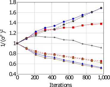
### Visual Description
## Line Chart: Inverse Squared Force Variance vs. Iterations
### Overview
The image displays a line chart plotting the quantity `1/(σ^F)^2` (inverse squared force variance) against the number of `Iterations`. The chart compares the performance or behavior of multiple distinct methods or parameter settings over a training or simulation process. All series begin at approximately the same value (1.0) at iteration 0 and diverge significantly as iterations increase.
### Components/Axes
* **Y-Axis:** Labeled `1/(σ^F)^2`. The scale is linear, ranging from 0.4 to 1.8, with major tick marks at intervals of 0.2 (0.4, 0.6, 0.8, 1.0, 1.2, 1.4, 1.6, 1.8).
* **X-Axis:** Labeled `Iterations`. The scale is linear, ranging from 0 to 1,000, with major tick marks at intervals of 200 (0, 200, 400, 600, 800, 1000).
* **Legend:** Positioned in the top-left corner of the plot area. The legend contains entries for each data series, but the specific text labels are not legible in the provided image. The series are distinguished by a combination of line color, line style (solid or dashed), and marker shape.
* **Data Series (Identified by Visual Attributes):**
1. **Blue Solid Line with Circle Markers:** Shows a strong, steady upward trend.
2. **Red Solid Line with Square Markers:** Shows an upward trend that begins to plateau after ~600 iterations.
3. **Black Solid Line with Star Markers:** Shows a slight downward trend.
4. **Brown Dashed Line with Circle Markers:** Shows a moderate downward trend.
5. **Blue Dashed Line with Circle Markers:** Shows the steepest downward trend.
6. **Grey/Black Solid Line with Diamond Markers:** Follows a path very close to, but slightly below, the Blue Solid Line with Circle Markers for most of the chart, ending at a similar high value.
### Detailed Analysis
* **Trend Verification & Data Points (Approximate):**
* **Blue Solid (Circles):** Slopes upward consistently. Starts at ~1.0 (0 iters). Reaches ~1.25 (200 iters), ~1.35 (400 iters), ~1.45 (600 iters), ~1.55 (800 iters), and ends at ~1.7 (1000 iters).
* **Grey/Black Solid (Diamonds):** Slopes upward, closely tracking the Blue Solid line. Starts at ~1.0. Reaches ~1.2 (200 iters), ~1.3 (400 iters), ~1.4 (600 iters), ~1.5 (800 iters), and ends at ~1.65 (1000 iters).
* **Red Solid (Squares):** Slopes upward initially, then plateaus. Starts at ~1.0. Reaches ~1.2 (200 iters), ~1.3 (400 iters), ~1.35 (600 iters), and remains near ~1.35-1.4 from 600 to 1000 iters.
* **Black Solid (Stars):** Slopes gently downward. Starts at ~1.0. Peaks slightly at ~1.1 (200 iters), then declines to ~1.05 (400 iters), ~1.0 (600 iters), ~0.95 (800 iters), and ends at ~0.9 (1000 iters).
* **Brown Dashed (Circles):** Slopes downward. Starts at ~1.0. Drops to ~0.8 (200 iters), ~0.75 (400 iters), ~0.7 (600 iters), ~0.65 (800 iters), and ends at ~0.6 (1000 iters).
* **Blue Dashed (Circles):** Slopes downward most steeply. Starts at ~1.0. Drops to ~0.75 (200 iters), ~0.65 (400 iters), ~0.6 (600 iters), ~0.55 (800 iters), and ends at ~0.5 (1000 iters).
### Key Observations
1. **Clear Divergence:** The primary observation is a stark bifurcation in outcomes. Three series (Blue Solid, Grey/Black Solid, Red Solid) show an *increase* in `1/(σ^F)^2`, while three others (Black Solid, Brown Dashed, Blue Dashed) show a *decrease*.
2. **Performance Hierarchy:** By the final iteration (1000), the series are clearly ordered from highest to lowest value: Blue Solid ≈ Grey/Black Solid > Red Solid > Black Solid > Brown Dashed > Blue Dashed.
3. **Plateau Effect:** The Red Solid line is the only one showing a clear plateau, suggesting its performance metric stabilizes after a certain point.
4. **Starting Point Convergence:** All methods begin at an identical state (value = 1.0), indicating a controlled comparison from a common initialization.
### Interpretation
The chart likely illustrates the results of an experiment comparing different algorithms, hyperparameters, or models on a task where the metric `1/(σ^F)^2` is relevant. This metric is often associated with the precision or stability of force estimates in physics simulations or machine learning models (e.g., in molecular dynamics or reinforcement learning).
* **What the data suggests:** The increasing lines (Blue Solid, Grey/Black Solid, Red Solid) represent methods that successfully *reduce* the variance of the force estimate (`σ^F`) over time, leading to a higher inverse squared value. This is typically desirable, indicating improved precision and stability. The decreasing lines represent methods where the force variance *increases* over iterations, leading to less precise and potentially unstable estimates.
* **Relationship between elements:** The chart directly compares the efficacy of these methods. The steep, continuous rise of the Blue Solid line suggests it is the most effective at variance reduction. The plateau of the Red Solid line indicates it reaches a performance limit. The downward trends of the dashed lines and the Black Solid line indicate those methods are counterproductive for this specific metric under the tested conditions.
* **Notable Anomalies:** The Black Solid line with stars is unique among the "decreasing" group as it is a solid line and shows a much more gradual decline than the dashed lines. This might represent a baseline or a different class of method. The close tracking of the Grey/Black Solid line to the top-performing Blue Solid line suggests two very similar, high-performing approaches.
**Language Note:** All text in the image is in English. No other languages are present.
</details>
[E-DAIC: Male]
<details>
<summary>x13.png Details</summary>
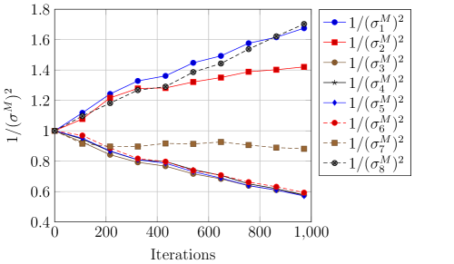
### Visual Description
## Line Chart: Inverse Variance (1/(σ^M)^2) vs. Iterations
### Overview
The image displays a line chart plotting the inverse of a squared parameter, denoted as `1/(σ^M)^2`, against the number of iterations. The chart contains eight distinct data series, each representing a different indexed parameter (σ₁^M through σ₈^M). The data shows divergent trends, with some series increasing over iterations, some decreasing, and one remaining relatively stable.
### Components/Axes
* **X-Axis (Horizontal):**
* **Label:** `Iterations`
* **Scale:** Linear, from 0 to 1,000.
* **Major Tick Marks:** 0, 200, 400, 600, 800, 1000.
* **Y-Axis (Vertical):**
* **Label:** `1/(σ^M)^2`
* **Scale:** Linear, from 0.4 to 1.8.
* **Major Tick Marks:** 0.4, 0.6, 0.8, 1.0, 1.2, 1.4, 1.6, 1.8.
* **Legend:**
* **Position:** Top-right corner of the chart area.
* **Content:** Lists eight series with corresponding line colors and marker symbols.
* **Series Labels (in order):**
1. `1/(σ₁^M)^2` (Blue line, circle marker)
2. `1/(σ₂^M)^2` (Red line, square marker)
3. `1/(σ₃^M)^2` (Brown line, circle marker)
4. `1/(σ₄^M)^2` (Gray line, star marker)
5. `1/(σ₅^M)^2` (Blue line, diamond marker)
6. `1/(σ₆^M)^2` (Red line, circle marker)
7. `1/(σ₇^M)^2` (Brown line, square marker)
8. `1/(σ₈^M)^2` (Gray line, circle marker)
### Detailed Analysis
All series originate at the same point: (Iterations=0, 1/(σ^M)^2=1.0).
**Trend Verification & Data Points (Approximate):**
1. **`1/(σ₁^M)^2` (Blue, Circle):** **Trend: Steady Increase.** This is the highest-valued series at the end.
* 0: 1.0
* 200: ~1.25
* 400: ~1.35
* 600: ~1.45
* 800: ~1.60
* 1000: ~1.70
2. **`1/(σ₂^M)^2` (Red, Square):** **Trend: Moderate Increase.**
* 0: 1.0
* 200: ~1.20
* 400: ~1.28
* 600: ~1.32
* 800: ~1.38
* 1000: ~1.42
3. **`1/(σ₃^M)^2` (Brown, Circle):** **Trend: Increase, closely following `1/(σ₁^M)^2`.**
* 0: 1.0
* 200: ~1.20
* 400: ~1.30
* 600: ~1.40
* 800: ~1.55
* 1000: ~1.68
4. **`1/(σ₄^M)^2` (Gray, Star):** **Trend: Increase, closely following `1/(σ₁^M)^2` and `1/(σ₃^M)^2`.**
* 0: 1.0
* 200: ~1.20
* 400: ~1.30
* 600: ~1.40
* 800: ~1.55
* 1000: ~1.68
5. **`1/(σ₅^M)^2` (Blue, Diamond):** **Trend: Steady Decrease.**
* 0: 1.0
* 200: ~0.90
* 400: ~0.80
* 600: ~0.72
* 800: ~0.65
* 1000: ~0.60
6. **`1/(σ₆^M)^2` (Red, Circle):** **Trend: Steady Decrease, very similar to `1/(σ₅^M)^2`.**
* 0: 1.0
* 200: ~0.90
* 400: ~0.80
* 600: ~0.72
* 800: ~0.65
* 1000: ~0.60
7. **`1/(σ₇^M)^2` (Brown, Square):** **Trend: Slight Decrease, then stable.** This is the most stable series.
* 0: 1.0
* 200: ~0.90
* 400: ~0.90
* 600: ~0.92
* 800: ~0.90
* 1000: ~0.88
8. **`1/(σ₈^M)^2` (Gray, Circle):** **Trend: Steady Decrease, very similar to `1/(σ₅^M)^2` and `1/(σ₆^M)^2`.**
* 0: 1.0
* 200: ~0.90
* 400: ~0.80
* 600: ~0.72
* 800: ~0.65
* 1000: ~0.60
### Key Observations
1. **Bifurcation:** The eight series split into two clear groups after the initial point: four series increase (σ₁, σ₂, σ₃, σ₄) and four decrease or stay flat (σ₅, σ₆, σ₇, σ₈).
2. **Clustering within Groups:**
* The increasing group contains two sub-clusters: `1/(σ₁^M)^2` is the highest, while `1/(σ₃^M)^2` and `1/(σ₄^M)^2` are nearly identical and slightly lower. `1/(σ₂^M)^2` increases at a slower rate.
* The decreasing group contains three nearly identical series (`1/(σ₅^M)^2`, `1/(σ₆^M)^2`, `1/(σ₈^M)^2`) and one outlier, `1/(σ₇^M)^2`, which shows minimal change.
3. **Symmetry:** The decreasing trends of σ₅, σ₆, and σ₈ are almost mirror images of the increasing trends of σ₃ and σ₄, but in the opposite direction.
4. **Outlier:** `1/(σ₇^M)^2` is the only series that does not follow a strong monotonic trend, hovering near 0.9 after an initial drop.
### Interpretation
This chart likely visualizes the evolution of the inverse variance (a measure of precision or confidence) for eight different parameters or components (σ₁^M to σ₈^M) during an iterative process (e.g., an optimization algorithm, a simulation, or a machine learning training loop).
* **What the data suggests:** The process causes the parameters to diverge in their estimated precision. Parameters σ₁, σ₂, σ₃, and σ₄ become more "certain" (their inverse variance increases, meaning their variance σ² decreases). Conversely, parameters σ₅, σ₆, and σ₈ become less "certain" (their inverse variance decreases, meaning their variance increases). Parameter σ₇ remains relatively unchanged in its uncertainty.
* **How elements relate:** The shared starting point (1.0) suggests all parameters began with the same assumed variance. The iterative process then differentially updates them based on underlying data or model dynamics. The tight clustering of σ₃/σ₄ and σ₅/σ₆/σ₈ indicates these parameters may be coupled or influenced by similar factors within the system.
* **Notable implications:** The divergence is significant. By iteration 1000, the most precise parameter (σ₁) has an inverse variance ~2.8 times greater than the least precise ones (σ₅, σ₆, σ₈). This could indicate that the model or process is successfully identifying which parameters are well-constrained by the data (σ₁-σ₄) and which are poorly constrained or inherently noisy (σ₅-σ₈). The stability of σ₇ might suggest it is a fixed or heavily regularized parameter.
</details>
Figure 4: Task-based weightings for both gender and datasets.
| PHQ-1 PHQ-2 PHQ-3 | 3.06 3.42 1.91 | 1.50 1.41 0.62 | 1.41 1.47 0.64 | 1.69 1.38 0.51 | 1.69 1.41 0.58 |
| --- | --- | --- | --- | --- | --- |
| PHQ-4 | 2.67 | 0.82 | 0.68 | 0.91 | 0.60 |
| PHQ-5 | 2.22 | 0.61 | 0.69 | 0.51 | 0.58 |
| PHQ-6 | 2.86 | 0.73 | 0.59 | 0.63 | 0.60 |
| PHQ-7 | 2.55 | 0.75 | 0.80 | 0.61 | 0.89 |
| PHQ-8 | 2.43 | 1.58 | 1.72 | 1.69 | 1.70 |
Table 5: Discrimination capacity (DC) vs $\frac{1}{σ^2}$ . Lower $\frac{1}{σ^2}$ values implies higher task difficulty. Green: top 3 highest scores. Red: bottom 2 lowest scores. Our results are in harmony with the largest and most comprehensive study on the PHQ-8 conducted by de la Torre et al. (2023). DW: DAIC-WOZ. ED: E-DAIC. F: Female. M: Male.
## 6 Discussion and Conclusion
Our experiments unearthed several interesting insights. First, overall, there are certain gender-based differences across the different PHQ-8 distribution labels as evidenced in Figure 4. In addition, each task have slightly different degree of task uncertainty across gender. This may be due to a gender difference in PHQ-8 questionnaire profiling or inadequate data curation. Thus, employing a gender-aware approach may be a viable method to improve fairness and accuracy for depression detection.
Second, though a multitask approach generally performs better than a unitask approach, this comes with several caveats. We see from Table 5 that each task has a different level of difficulty. Naively using all tasks may worsen performance and fairness compared to a unitask approach if we do not account for task-based uncertainty. This is in agreement with existing literature which indicates that there can be a mix of positive and negative transfers across tasks (Li et al., 2023c) and tasks have to be related for performance to improve (Wang et al., 2021a).
Third, understanding, analysing and improving upon the fairness-accuracy Pareto frontier within the task of depression requires a nuanced and careful use of measures and datasets in order to avoid the fairness-accuracy trade-off. Moreover, there is a growing amount of research indicating that if using appropriate methodology and metrics, these trade-offs are not always present (Dutta et al., 2020; Black et al., 2022; Cooper et al., 2021) and can be mitigated with careful selection of models (Black et al., 2022) and evaluation methods (Wick et al., 2019). Our results are in agreement with existing works indicating that state-of-the-art bias mitigation methods are typically only effective at removing epistemic discrimination (Wang et al., 2023), i.e. the discrimination made during model development, but not aleatoric discrimination. In order to address aleatoric discrimination, i.e. the bias inherent within the data distribution, and to improve the Pareto frontier, better data curation is required (Dutta et al., 2020). Though our results are unable to provide a significant improvement on the Pareto frontier, we believe that this work presents the first step in this direction and would encourage future work to look into this.
In sum, we present a novel gender-based uncertainty multitask loss reweighting mechanism. We showed that our proposed multitask loss reweighting is able to improve fairness with lesser fairness-accuracy trade-off. Our findings also revealed the importance of accounting for negative transfers and for more effort to be channelled towards improving the Pareto frontier in depression detection research.
#### ML for Healthcare Implication:
Producing a thorough review of strategies to improve fairness is not within the scope of this work. Instead, the key goal is to advance ML for healthcare solutions that are grounded in the framework used by clinicians. In our settings, this corresponds to using each PHQ-8 subcriterion as individual subtask within our MTL-based approach and using a a gender-based uncertainty reweighting mechanism to account for the gender difference in PHQ-8 label distribution. By replicating the inferential process used by clinicians, this work attempts to bridge ML methods with the symptom-based profiling system used by clinicians. Future work can also make use of this property during inference in order to improve the trustworthiness of the machine learning or decision-making model (Huang and Ma, 2022).
In the process of doing so, our proposed method also provide the elusive first evidence that each PHQ-8 subitem’s task difficulty aligns with its discrimination capacity as evidenced from data collected from the largest PHQ-8 population-based study to date (de la Torre et al., 2023). We hope this piece of work will encourage other ML and healthcare researchers to further investigate methods that could bridge ML experimental results with empirical real world healthcare findings to ensure its reliability and validity.
#### Limitations:
We only investigated gender fairness due to the limited availability of other sensitive attributes in both datasets. Future work can consider investigating this approach across different sensitive attributes such as race and age, the intersectionality of sensitive attributes and other healthcare challenges such as cognitive impairment or cancer diagnosis. Moreover, we have adopted our existing experimental approach in alignment with the train-validation-test split provided by the dataset owners as well as other existing works. Future works can consider adopting a cross-validation approach. Other interesting directions include investigating this challenge as an ordinal regression problem (Diaz and Marathe, 2019). Future work can also consider repeating the experiments using datasets collected from other countries and dive deeper into the cultural intricacies of the different PHQ-8 subitems, investigate the effects of the different modalities and its relation to a multitask approach, as well as investigate other important topics such as interpretability and explainability to advance responsible (Wiens et al., 2019) and ethical machine learning for healthcare (Chen et al., 2021).
Funding: J. Cheong is supported by the Alan Turing Institute doctoral studentship, the Leverhulme Trust and further acknowledges resource support from METU. A. Bangar contributed to this while undertaking a remote visiting studentship at the Department of Computer Science and Technology, University of Cambridge. H. Gunes’ work is supported by the EPSRC/UKRI project ARoEq under grant ref. EP/R030782/1. Open access: The authors have applied a Creative Commons Attribution (CC BY) licence to any Author Accepted Manuscript version arising. Data access: This study involved secondary analyses of existing datasets. All datasets are described and cited accordingly.
## References
- Al Hanai et al. (2018) Tuka Al Hanai, Mohammad M Ghassemi, and James R Glass. Detecting depression with audio/text sequence modeling of interviews. In Interspeech, pages 1716–1720, 2018.
- Bailey and Plumbley (2021) Andrew Bailey and Mark D Plumbley. Gender bias in depression detection using audio features. EUSIPCO 2021, 2021.
- Baltaci et al. (2023) Zeynep Sonat Baltaci, Kemal Oksuz, Selim Kuzucu, Kivanc Tezoren, Berkin Kerim Konar, Alpay Ozkan, Emre Akbas, and Sinan Kalkan. Class uncertainty: A measure to mitigate class imbalance. arXiv preprint arXiv:2311.14090, 2023.
- Ban and Ji (2024) Hao Ban and Kaiyi Ji. Fair resource allocation in multi-task learning. arXiv preprint arXiv:2402.15638, 2024.
- Barocas et al. (2017) Solon Barocas, Moritz Hardt, and Arvind Narayanan. Fairness in machine learning. NeurIPS Tutorial, 1:2, 2017.
- Barsky et al. (2001) Arthur J Barsky, Heli M Peekna, and Jonathan F Borus. Somatic symptom reporting in women and men. Journal of general internal medicine, 16(4):266–275, 2001.
- Black et al. (2022) Emily Black, Manish Raghavan, and Solon Barocas. Model multiplicity: Opportunities, concerns, and solutions. In Proceedings of the 2022 ACM Conference on Fairness, Accountability, and Transparency, pages 850–863, 2022.
- Buolamwini and Gebru (2018) Joy Buolamwini and Timnit Gebru. Gender shades: Intersectional accuracy disparities in commercial gender classification. In FAccT, pages 77–91. PMLR, 2018.
- Cameron et al. (2024) Joseph Cameron, Jiaee Cheong, Micol Spitale, and Hatice Gunes. Multimodal gender fairness in depression prediction: Insights on data from the usa & china. arXiv preprint arXiv:2408.04026, 2024.
- Cetinkaya et al. (2024) Bedrettin Cetinkaya, Sinan Kalkan, and Emre Akbas. Ranked: Addressing imbalance and uncertainty in edge detection using ranking-based losses. In Proceedings of the IEEE/CVF Conference on Computer Vision and Pattern Recognition, pages 3239–3249, 2024.
- Chen et al. (2021) Irene Y Chen, Emma Pierson, Sherri Rose, Shalmali Joshi, Kadija Ferryman, and Marzyeh Ghassemi. Ethical machine learning in healthcare. Annual review of biomedical data science, 4(1):123–144, 2021.
- Cheong et al. (2021) Jiaee Cheong, Sinan Kalkan, and Hatice Gunes. The hitchhiker’s guide to bias and fairness in facial affective signal processing: Overview and techniques. IEEE Signal Processing Magazine, 38(6), 2021.
- Cheong et al. (2022) Jiaee Cheong, Sinan Kalkan, and Hatice Gunes. Counterfactual fairness for facial expression recognition. In European Conference on Computer Vision, pages 245–261. Springer, 2022.
- Cheong et al. (2023a) Jiaee Cheong, Sinan Kalkan, and Hatice Gunes. Causal structure learning of bias for fair affect recognition. In Proceedings of the IEEE/CVF Winter Conference on Applications of Computer Vision, pages 340–349, 2023a.
- Cheong et al. (2023b) Jiaee Cheong, Selim Kuzucu, Sinan Kalkan, and Hatice Gunes. Towards gender fairness for mental health prediction. In IJCAI 2023, pages 5932–5940, US, 2023b. IJCAI.
- Cheong et al. (2023c) Jiaee Cheong, Micol Spitale, and Hatice Gunes. “it’s not fair!” – fairness for a small dataset of multi-modal dyadic mental well-being coaching. In ACII, pages 1–8, USA, sep 2023c.
- Cheong et al. (2024a) Jiaee Cheong, Sinan Kalkan, and Hatice Gunes. Fairrefuse: Referee-guided fusion for multi-modal causal fairness in depression detection. In Proceedings of the Thirty-Third International Joint Conference on Artificial Intelligence, IJCAI-24, pages 7224–7232, 8 2024a. AI for Good.
- Cheong et al. (2024b) Jiaee Cheong, Micol Spitale, and Hatice Gunes. Small but fair! fairness for multimodal human-human and robot-human mental wellbeing coaching, 2024b.
- Chua et al. (2023) Michelle Chua, Doyun Kim, Jongmun Choi, Nahyoung G Lee, Vikram Deshpande, Joseph Schwab, Michael H Lev, Ramon G Gonzalez, Michael S Gee, and Synho Do. Tackling prediction uncertainty in machine learning for healthcare. Nature Biomedical Engineering, 7(6):711–718, 2023.
- Cooper et al. (2021) A Feder Cooper, Ellen Abrams, and Na Na. Emergent unfairness in algorithmic fairness-accuracy trade-off research. In Proceedings of the 2021 AAAI/ACM Conference on AI, Ethics, and Society, pages 46–54, 2021.
- de la Torre et al. (2023) Jorge Arias de la Torre, Gemma Vilagut, Amy Ronaldson, Jose M Valderas, Ioannis Bakolis, Alex Dregan, Antonio J Molina, Fernando Navarro-Mateu, Katherine Pérez, Xavier Bartoll-Roca, et al. Reliability and cross-country equivalence of the 8-item version of the patient health questionnaire (phq-8) for the assessment of depression: results from 27 countries in europe. The Lancet Regional Health–Europe, 31, 2023.
- Diaz and Marathe (2019) Raul Diaz and Amit Marathe. Soft labels for ordinal regression. In Proceedings of the IEEE/CVF conference on computer vision and pattern recognition, pages 4738–4747, 2019.
- Dutta et al. (2020) Sanghamitra Dutta, Dennis Wei, Hazar Yueksel, Pin-Yu Chen, Sijia Liu, and Kush Varshney. Is there a trade-off between fairness and accuracy? a perspective using mismatched hypothesis testing. In International conference on machine learning, pages 2803–2813. PMLR, 2020.
- Gal (2016) Yarin Gal. Uncertainty in deep learning. 2016.
- Ghosh et al. (2022) Soumitra Ghosh, Asif Ekbal, and Pushpak Bhattacharyya. A multitask framework to detect depression, sentiment and multi-label emotion from suicide notes. Cognitive Computation, 14(1), 2022.
- Gong and Poellabauer (2017) Yuan Gong and Christian Poellabauer. Topic modeling based multi-modal depression detection. In Proceedings of the 7th annual workshop on Audio/Visual emotion challenge, pages 69–76, 2017.
- Grote and Keeling (2022) Thomas Grote and Geoff Keeling. Enabling fairness in healthcare through machine learning. Ethics and Information Technology, 24(3):39, 2022.
- Gupta et al. (2023) Shelley Gupta, Archana Singh, and Jayanthi Ranjan. Multimodal, multiview and multitasking depression detection framework endorsed with auxiliary sentiment polarity and emotion detection. International Journal of System Assurance Engineering and Management, 14(Suppl 1), 2023.
- Hall et al. (2022) Melissa Hall, Laurens van der Maaten, Laura Gustafson, Maxwell Jones, and Aaron Adcock. A systematic study of bias amplification. arXiv preprint arXiv:2201.11706, 2022.
- Han et al. (2024) Mengjie Han, Ilkim Canli, Juveria Shah, Xingxing Zhang, Ipek Gursel Dino, and Sinan Kalkan. Perspectives of machine learning and natural language processing on characterizing positive energy districts. Buildings, 14(2):371, 2024.
- He et al. (2022) Lang He, Mingyue Niu, Prayag Tiwari, Pekka Marttinen, Rui Su, Jiewei Jiang, Chenguang Guo, Hongyu Wang, Songtao Ding, Zhongmin Wang, et al. Deep learning for depression recognition with audiovisual cues: A review. Information Fusion, 80:56–86, 2022.
- Hort et al. (2022) Max Hort, Zhenpeng Chen, Jie M Zhang, Federica Sarro, and Mark Harman. Bias mitigation for machine learning classifiers: A comprehensive survey. arXiv preprint arXiv:2207.07068, 2022.
- Huang and Ma (2022) Guanjie Huang and Fenglong Ma. Trustsleepnet: A trustable deep multimodal network for sleep stage classification. In 2022 IEEE-EMBS International Conference on Biomedical and Health Informatics (BHI), pages 01–04. IEEE, 2022.
- Jansz et al. (2000) Jeroen Jansz et al. Masculine identity and restrictive emotionality. Gender and emotion: Social psychological perspectives, pages 166–186, 2000.
- Kaiser et al. (2022) Patrick Kaiser, Christoph Kern, and David Rügamer. Uncertainty-aware predictive modeling for fair data-driven decisions, 2022.
- Kendall et al. (2018) Alex Kendall, Yarin Gal, and Roberto Cipolla. Multi-task learning using uncertainty to weigh losses for scene geometry and semantics. In CVPR, pages 7482–7491, 2018.
- Kingma and Ba (2014) Diederik P Kingma and Jimmy Ba. Adam: A method for stochastic optimization. ICLR, 2014.
- Kroenke et al. (2009) Kurt Kroenke, Tara W Strine, Robert L Spitzer, Janet BW Williams, Joyce T Berry, and Ali H Mokdad. The phq-8 as a measure of current depression in the general population. Journal of affective disorders, 114(1-3):163–173, 2009.
- Kuzucu et al. (2024) Selim Kuzucu, Jiaee Cheong, Hatice Gunes, and Sinan Kalkan. Uncertainty as a fairness measure. Journal of Artificial Intelligence Research, 81:307–335, 2024.
- Leung et al. (2020) Doris YP Leung, Yim Wah Mak, Sau Fong Leung, Vico CL Chiang, and Alice Yuen Loke. Measurement invariances of the phq-9 across gender and age groups in chinese adolescents. Asia-Pacific Psychiatry, 12(3):e12381, 2020.
- Li et al. (2023a) Can Li, Sirui Ding, Na Zou, Xia Hu, Xiaoqian Jiang, and Kai Zhang. Multi-task learning with dynamic re-weighting to achieve fairness in healthcare predictive modeling. Journal of Biomedical Informatics, 143:104399, 2023a.
- Li et al. (2023b) Can Li, Dejian Lai, Xiaoqian Jiang, and Kai Zhang. Feri: A multitask-based fairness achieving algorithm with applications to fair organ transplantation. arXiv preprint arXiv:2310.13820, 2023b.
- Li et al. (2024) Can Li, Xiaoqian Jiang, and Kai Zhang. A transformer-based deep learning approach for fairly predicting post-liver transplant risk factors. Journal of Biomedical Informatics, 149:104545, 2024.
- Li et al. (2022) Chuyuan Li, Chloé Braud, and Maxime Amblard. Multi-task learning for depression detection in dialogs. arXiv preprint arXiv:2208.10250, 2022.
- Li et al. (2023c) Dongyue Li, Huy Nguyen, and Hongyang Ryan Zhang. Identification of negative transfers in multitask learning using surrogate models. Transactions on Machine Learning Research, 2023c.
- Long et al. (2022) Nannan Long, Yongxiang Lei, Lianhua Peng, Ping Xu, and Ping Mao. A scoping review on monitoring mental health using smart wearable devices. Mathematical Biosciences and Engineering, 19(8), 2022.
- Ma et al. (2016) Xingchen Ma, Hongyu Yang, Qiang Chen, Di Huang, and Yunhong Wang. Depaudionet: An efficient deep model for audio based depression classification. In 6th Intl. Workshop on audio/visual emotion challenge, 2016.
- Mehta et al. (2023) Raghav Mehta, Changjian Shui, and Tal Arbel. Evaluating the fairness of deep learning uncertainty estimates in medical image analysis, 2023.
- Naik et al. (2024) Lakshadeep Naik, Sinan Kalkan, and Norbert Krüger. Pre-grasp approaching on mobile robots: a pre-active layered approach. IEEE Robotics and Automation Letters, 2024.
- Ogrodniczuk and Oliffe (2011) John S Ogrodniczuk and John L Oliffe. Men and depression. Canadian Family Physician, 57(2):153–155, 2011.
- Pleiss et al. (2017) Geoff Pleiss, Manish Raghavan, Felix Wu, Jon Kleinberg, and Kilian Q Weinberger. On fairness and calibration. NeurIPS, 30, 2017.
- Ringeval et al. (2019) Fabien Ringeval, Björn Schuller, Michel Valstar, Nicholas Cummins, Roddy Cowie, and Maja Pantic. Avec’19: Audio/visual emotion challenge and workshop. In ICMI, pages 2718–2719, 2019.
- Sendak et al. (2020) Mark Sendak, Madeleine Clare Elish, Michael Gao, Joseph Futoma, William Ratliff, Marshall Nichols, Armando Bedoya, Suresh Balu, and Cara O’Brien. ”the human body is a black box” supporting clinical decision-making with deep learning. In FAccT, pages 99–109, 2020.
- Song et al. (2018) Siyang Song, Linlin Shen, and Michel Valstar. Human behaviour-based automatic depression analysis using hand-crafted statistics and deep learned spectral features. In FG 2018, pages 158–165. IEEE, 2018.
- Spitale et al. (2024) Micol Spitale, Jiaee Cheong, and Hatice Gunes. Underneath the numbers: Quantitative and qualitative gender fairness in llms for depression prediction. arXiv preprint arXiv:2406.08183, 2024.
- Tahir et al. (2023) Anique Tahir, Lu Cheng, and Huan Liu. Fairness through aleatoric uncertainty. In CIKM, 2023.
- Thibodeau and Asmundson (2014) Michel A Thibodeau and Gordon JG Asmundson. The phq-9 assesses depression similarly in men and women from the general population. Personality and Individual Differences, 56:149–153, 2014.
- Valstar et al. (2016) Michel Valstar, Jonathan Gratch, Björn Schuller, Fabien Ringeval, Denis Lalanne, Mercedes Torres Torres, Stefan Scherer, Giota Stratou, Roddy Cowie, and Maja Pantic. Avec 2016: Depression, mood, and emotion recognition workshop and challenge. pages 3–10, 2016.
- Vetter et al. (2013) Marion L Vetter, Thomas A Wadden, Christopher Vinnard, Reneé H Moore, Zahra Khan, Sheri Volger, David B Sarwer, and Lucy F Faulconbridge. Gender differences in the relationship between symptoms of depression and high-sensitivity crp. International journal of obesity, 37(1):S38–S43, 2013.
- Wang et al. (2023) Hao Wang, Luxi He, Rui Gao, and Flavio Calmon. Aleatoric and epistemic discrimination: Fundamental limits of fairness interventions. In Thirty-seventh Conference on Neural Information Processing Systems, 2023.
- Wang et al. (2021a) Jialu Wang, Yang Liu, and Caleb Levy. Fair classification with group-dependent label noise. In Proceedings of the 2021 ACM conference on fairness, accountability, and transparency, pages 526–536, 2021a.
- Wang et al. (2019) Jingying Wang, Lei Zhang, Tianli Liu, Wei Pan, Bin Hu, and Tingshao Zhu. Acoustic differences between healthy and depressed people: a cross-situation study. BMC psychiatry, 19:1–12, 2019.
- Wang et al. (2007) Philip S Wang, Sergio Aguilar-Gaxiola, Jordi Alonso, Matthias C Angermeyer, Guilherme Borges, Evelyn J Bromet, Ronny Bruffaerts, Giovanni De Girolamo, Ron De Graaf, Oye Gureje, et al. Use of mental health services for anxiety, mood, and substance disorders in 17 countries in the who world mental health surveys. The Lancet, 370(9590):841–850, 2007.
- Wang et al. (2022) Yiding Wang, Zhenyi Wang, Chenghao Li, Yilin Zhang, and Haizhou Wang. Online social network individual depression detection using a multitask heterogenous modality fusion approach. Information Sciences, 609, 2022.
- Wang et al. (2021b) Yuyan Wang, Xuezhi Wang, Alex Beutel, Flavien Prost, Jilin Chen, and Ed H Chi. Understanding and improving fairness-accuracy trade-offs in multi-task learning. In Proceedings of the 27th ACM SIGKDD Conference on Knowledge Discovery & Data Mining, pages 1748–1757, 2021b.
- Wei et al. (2022) Ping-Cheng Wei, Kunyu Peng, Alina Roitberg, Kailun Yang, Jiaming Zhang, and Rainer Stiefelhagen. Multi-modal depression estimation based on sub-attentional fusion. In European Conference on Computer Vision, pages 623–639. Springer, 2022.
- Wick et al. (2019) Michael Wick, Jean-Baptiste Tristan, et al. Unlocking fairness: a trade-off revisited. Advances in neural information processing systems, 32, 2019.
- Wiens et al. (2019) Jenna Wiens, Suchi Saria, Mark Sendak, Marzyeh Ghassemi, Vincent X Liu, Finale Doshi-Velez, Kenneth Jung, Katherine Heller, David Kale, Mohammed Saeed, et al. Do no harm: a roadmap for responsible machine learning for health care. Nature medicine, 25(9):1337–1340, 2019.
- Williamson et al. (2016) James R Williamson, Elizabeth Godoy, Miriam Cha, Adrianne Schwarzentruber, Pooya Khorrami, Youngjune Gwon, Hsiang-Tsung Kung, Charlie Dagli, and Thomas F Quatieri. Detecting depression using vocal, facial and semantic communication cues. In Proceedings of the 6th International Workshop on Audio/Visual Emotion Challenge, pages 11–18, 2016.
- Xu et al. (2020) Tian Xu, Jennifer White, Sinan Kalkan, and Hatice Gunes. Investigating bias and fairness in facial expression recognition. In Computer Vision–ECCV 2020 Workshops: Glasgow, UK, August 23–28, 2020, Proceedings, Part VI 16, pages 506–523. Springer, 2020.
- Yuan et al. (2024) Hua Yuan, Yu Shi, Ning Xu, Xu Yang, Xin Geng, and Yong Rui. Learning from biased soft labels. Advances in Neural Information Processing Systems, 36, 2024.
- Zanna et al. (2022) Khadija Zanna, Kusha Sridhar, Han Yu, and Akane Sano. Bias reducing multitask learning on mental health prediction. In ACII, pages 1–8. IEEE, 2022.
- Zhang and Yang (2021) Yu Zhang and Qiang Yang. A survey on multi-task learning. IEEE Transactions on Knowledge and Data Engineering, 34(12):5586–5609, 2021.
- Zhang et al. (2020) Ziheng Zhang, Weizhe Lin, Mingyu Liu, and Marwa Mahmoud. Multimodal deep learning framework for mental disorder recognition. In 15th IEEE International Conference on Automatic Face and Gesture Recognition (FG 2020), pages 344–350. IEEE, 2020.
- Zheng et al. (2023) Wenbo Zheng, Lan Yan, and Fei-Yue Wang. Two birds with one stone: Knowledge-embedded temporal convolutional transformer for depression detection and emotion recognition. IEEE Transactions on Affective Computing, 2023.
## Appendix A Experimental Setup
### A.1 Datasets
For both DAIC-WOZ and E-DAIC, we work with the extracted features and followed the train-validate-test split provided. The dataset owners provided the ground-truths for each of the PHQ-8 sub-criterion and the final binary classification for both datasets.
#### DAIC-WOZ (Valstar et al., 2016)
contains audio recordings, extracted visual features and transcripts collected in a lab-based setting of 100 males and 85 females. The dataset owners provided a standard train-validate-test split which we followed. The dataset owners also provided the ground-truths for each of the PHQ-8 questionnaire sub-criterion as well as the final binary classification.
#### E-DAIC (Ringeval et al., 2019)
contains acoustic recordings and extracted visual features of 168 males and 103 females. The dataset owners provided a standard train-validate-test split which we followed.
| Acc Multitask Baseline UW | Unitask 0.72 0.81 | 0.87 0.68 0.70 | 0.51 0.57 0.64 | 0.62 0.62 0.60 | 0.57 0.64 0.66 | 0.57 0.68 0.62 | 0.51 0.74 0.72 | 0.79 0.89 0.87 | 0.94 0.70 0.82 | 0.66 |
| --- | --- | --- | --- | --- | --- | --- | --- | --- | --- | --- |
| 2-11[.4pt/2pt] | U-Fair (Ours) | 0.68 | 0.66 | 0.47 | 0.43 | 0.43 | 0.49 | 0.60 | 0.74 | 0.80 |
| F1 | Unitask | 0.25 | 0.41 | 0.44 | 0.33 | 0.33 | 0.53 | 0.44 | 0.40 | 0.47 |
| Multitask | 0.32 | 0.29 | 0.50 | 0.44 | 0.32 | 0.48 | 0.45 | 0.29 | 0.53 | |
| Baseline UW | 0.40 | 0.30 | 0.51 | 0.42 | 0.33 | 0.31 | 0.43 | 0.25 | 0.29 | |
| 2-11[.4pt/2pt] | U-Fair (Ours) | 0.29 | 0.33 | 0.44 | 0.43 | 0.27 | 0.33 | 0.39 | 0.00 | 0.54 |
| Precision | Unitask | 1.00 | 0.27 | 0.47 | 0.31 | 0.26 | 0.37 | 0.67 | 0.50 | 0.44 |
| Multitask | 0.25 | 0.25 | 0.43 | 0.39 | 0.29 | 0.47 | 0.50 | 0.25 | 0.50 | |
| Baseline UW | 0.38 | 0.27 | 0.50 | 0.37 | 0.31 | 0.33 | 0.45 | 0.20 | 0.22 | |
| 2-11[.4pt/2pt] | U-Fair (Ours) | 0.21 | 0.27 | 0.36 | 0.30 | 0.19 | 0.27 | 0.32 | 0.00 | 0.56 |
| Recall | Unitask | 0.14 | 0.89 | 0.41 | 0.36 | 0.45 | 0.93 | 0.33 | 0.33 | 0.50 |
| Multitask | 0.43 | 0.33 | 0.59 | 0.50 | 0.36 | 0.50 | 0.42 | 0.33 | 0.57 | |
| Baseline UW | 0.43 | 0.33 | 0.53 | 0.50 | 0.36 | 0.29 | 0.42 | 0.33 | 0.43 | |
| 2-11[.4pt/2pt] | U-Fair (Ours) | 0.43 | 0.44 | 0.59 | 0.71 | 0.45 | 0.43 | 0.50 | 0.00 | 0.60 |
| UAR | Unitask | 0.93 | 0.60 | 0.58 | 0.51 | 0.52 | 0.64 | 0.74 | 0.73 | 0.60 |
| Multitask | 0.57 | 0.54 | 0.57 | 0.57 | 0.54 | 0.62 | 0.66 | 0.60 | 0.65 | |
| Baseline UW | 0.65 | 0.56 | 0.61 | 0.57 | 0.56 | 0.52 | 0.62 | 0.62 | 0.64 | |
| 2-11[.4pt/2pt] | U-Fair (Ours) | 0.58 | 0.58 | 0.49 | 0.51 | 0.44 | 0.47 | 0.56 | 0.40 | 0.63 |
| $M_SP$ | Unitask | 0.00 | 1.44 | 1.92 | 1.60 | 0.86 | 1.44 | 4.79 | 0.96 | 0.47 |
| Multitask | 1.92 | 0.96 | 1.80 | 1.20 | 3.51 | 1.10 | 3.83 | 2.88 | 0.86 | |
| Baseline UW | 2.88 | 1.15 | 1.92 | 1.06 | 2.16 | 1.34 | 1.15 | 1.44 | 1.23 | |
| 2-11[.4pt/2pt] | U-Fair (Ours) | 0.72 | 0.64 | 1.28 | 1.15 | 1.12 | 0.66 | 0.86 | 0.77 | 1.06 |
| $M_EOpp$ | Unitask | 0.00 | 1.50 | 2.00 | 1.67 | 0.90 | 1.50 | 5.00 | 1.00 | 0.45 |
| Multitask | 2.00 | 1.00 | 1.88 | 1.25 | 3.67 | 1.14 | 4.00 | 3.00 | 0.78 | |
| Baseline UW | 3.00 | 1.20 | 2.00 | 1.11 | 2.25 | 1.40 | 1.20 | 1.50 | 1.70 | |
| 2-11[.4pt/2pt] | U-Fair (Ours) | 0.75 | 0.67 | 1.33 | 1.20 | 1.17 | 0.69 | 0.90 | 0.80 | 1.46 |
| $M_EOdd$ | Unitask | 0.00 | 1.44 | 1.90 | 2.83 | 1.25 | 1.53 | 0.00 | 0.00 | 0.54 |
| Multitask | 0.00 | 1.60 | 1.83 | 1.28 | 9.00 | 1.88 | 4.00 | 0.00 | 0.76 | |
| Baseline UW | 0.00 | 0.00 | 2.29 | 1.49 | 3.50 | 2.25 | 1.50 | 2.74 | 1.31 | |
| 2-11[.4pt/2pt] | U-Fair (Ours) | 0.80 | 0.80 | 1.43 | 1.16 | 1.33 | 0.75 | 1.00 | 0.00 | 1.17 |
| $M_EAcc$ | Unitask | 0.91 | 0.81 | 0.89 | 0.56 | 1.20 | 0.81 | 1.01 | 0.96 | 1.44 |
| Multitask | 0.96 | 1.09 | 0.89 | 0.89 | 0.55 | 1.23 | 1.01 | 0.87 | 0.94 | |
| Baseline UW | 0.96 | 1.30 | 0.84 | 0.72 | 0.69 | 1.03 | 1.08 | 0.91 | 1.25 | |
| 2-11[.4pt/2pt] | U-Fair (Ours) | 1.09 | 1.16 | 0.80 | 0.96 | 0.64 | 1.28 | 1.11 | 1.14 | 0.95 |
Table 6: Full experimental results for DAIC-WOZ across the different PHQ-8 subitems. Best values are highlighted in bold.
| Acc Multitask Baseline UW | Unitask 0.68 0.75 | 0.80 0.54 0.63 | 0.66 0.48 0.61 | 0.59 0.43 0.73 | 0.66 0.52 0.73 | 0.59 0.54 0.63 | 0.61 0.48 0.59 | 0.63 0.54 0.89 | 0.89 0.58 0.87 | 0.55 |
| --- | --- | --- | --- | --- | --- | --- | --- | --- | --- | --- |
| 2-11[.4pt/2pt] | U-Fair (Ours) | 0.77 | 0.61 | 0.61 | 0.54 | 0.71 | 0.71 | 0.71 | 0.93 | 0.90 |
| F1 | Unitask | 0.27 | 0.24 | 0.49 | 0.60 | 0.47 | 0.45 | 0.49 | 0.25 | 0.51 |
| Multitask | 0.18 | 0.32 | 0.47 | 0.43 | 0.40 | 0.38 | 0.38 | 0.07 | 0.45 | |
| Baseline UW | 0.22 | 0.36 | 0.54 | 0.48 | 0.29 | 0.09 | 0.08 | 0.00 | 0.27 | |
| 2-11[.4pt/2pt] | U-Fair (Ours) | 0.13 | 0.21 | 0.39 | 0.43 | 0.33 | 0.33 | 0.27 | 0.00 | 0.45 |
| Precision | Unitask | 0.29 | 0.21 | 0.38 | 0.45 | 0.34 | 0.33 | 0.33 | 0.25 | 0.36 |
| Multitask | 0.14 | 0.22 | 0.33 | 0.30 | 0.29 | 0.28 | 0.25 | 0.04 | 0.32 | |
| Baseline UW | 0.20 | 0.27 | 0.41 | 0.54 | 0.43 | 0.10 | 0.07 | 0.00 | 0.28 | |
| 2-11[.4pt/2pt] | U-Fair (Ours) | 0.14 | 0.18 | 0.35 | 0.33 | 0.40 | 0.36 | 0.27 | 0.00 | 0.46 |
| Recall | Unitask | 0.25 | 0.27 | 0.69 | 0.88 | 0.71 | 0.69 | 0.91 | 0.25 | 0.87 |
| Multitask | 0.25 | 0.55 | 0.81 | 0.75 | 0.64 | 0.62 | 0.82 | 0.25 | 0.80 | |
| Baseline UW | 0.25 | 0.55 | 0.81 | 0.44 | 0.21 | 0.08 | 0.09 | 0.00 | 0.26 | |
| 2-11[.4pt/2pt] | U-Fair (Ours) | 0.13 | 0.27 | 0.44 | 0.63 | 0.29 | 0.31 | 0.27 | 0.00 | 0.45 |
| UAR | Unitask | 0.58 | 0.51 | 0.60 | 0.69 | 0.60 | 0.60 | 0.65 | 0.60 | 0.63 |
| Multitask | 0.50 | 0.52 | 0.58 | 0.53 | 0.55 | 0.55 | 0.58 | 0.47 | 0.67 | |
| Baseline UW | 0.54 | 0.59 | 0.67 | 0.64 | 0.56 | 0.43 | 0.40 | 0.48 | 0.60 | |
| 2-11[.4pt/2pt] | U-Fair (Ours) | 0.50 | 0.48 | 0.56 | 0.56 | 0.57 | 0.57 | 0.55 | 0.50 | 0.70 |
| $M_SP$ | Unitask | 0.26 | 2.78 | 0.81 | 1.12 | 0.94 | 1.44 | 1.03 | 0.52 | 0.65 |
| Multitask | 5.67 | 2.63 | 1.19 | 1.40 | 0.98 | 1.44 | 1.24 | 0.41 | 1.25 | |
| Baseline UW | 1.55 | 1.29 | 2.58 | 2.47 | 2.06 | 2.32 | 5.67 | 0.00 | 3.86 | |
| 2-11[.4pt/2pt] | U-Fair (Ours) | 2.06 | 2.83 | 1.26 | 2.67 | 3.61 | 1.29 | 1.29 | 0.00 | 1.67 |
| $M_EOpp$ | Unitask | 0.17 | 1.80 | 0.53 | 0.72 | 0.61 | 0.93 | 0.67 | 0.33 | 0.57 |
| Multitask | 3.67 | 1.70 | 0.77 | 0.90 | 0.63 | 0.93 | 0.80 | 0.26 | 0.81 | |
| Baseline UW | 1.00 | 0.83 | 1.67 | 1.60 | 1.33 | 1.50 | 3.67 | 0.00 | 2.31 | |
| 2-11[.4pt/2pt] | U-Fair (Ours) | 1.33 | 1.83 | 0.82 | 1.73 | 2.33 | 0.83 | 0.83 | 0.00 | 1.00 |
| $M_EOdd$ | Unitask | 0.35 | 3.65 | 1.39 | 1.38 | 1.00 | 1.46 | 1.40 | 0.74 | 0.75 |
| Multitask | 7.00 | 3.42 | 1.29 | 1.63 | 1.03 | 1.53 | 1.43 | 0.41 | 1.41 | |
| Baseline UW | 3.00 | 1.76 | 4.20 | 6.11 | 2.00 | 0.00 | 0.00 | 0.00 | 8.21 | |
| 2-11[.4pt/2pt] | U-Fair (Ours) | 2.80 | 3.42 | 2.22 | 3.67 | 3.60 | 2.25 | 1.90 | 0.00 | 5.00 |
| $M_EAcc$ | Unitask | 1.13 | 0.74 | 1.45 | 0.84 | 1.14 | 0.96 | 0.71 | 1.08 | 0.83 |
| Multitask | 0.63 | 0.39 | 0.77 | 0.41 | 0.94 | 0.77 | 0.54 | 1.77 | 0.65 | |
| Baseline UW | 1.05 | 0.71 | 0.48 | 0.99 | 0.89 | 0.81 | 0.88 | 1.12 | 0.92 | |
| 2-11[.4pt/2pt] | U-Fair (Ours) | 0.96 | 0.64 | 1.22 | 0.47 | 0.83 | 0.74 | 1.03 | 1.05 | 0.94 |
Table 7: Full experimental results for E-DAIC across the different PHQ-8 subitems. Best values are highlighted in bold.