# Temporal Analysis of NetFlow Datasets for Network Intrusion Detection Systems
(2025)
Abstract
This paper investigates the temporal analysis of NetFlow datasets for machine learning (ML)-based network intrusion detection systems (NIDS). Although many previous studies have highlighted the critical role of temporal features, such as inter-packet arrival time and flow length/duration, in NIDS, the currently available NetFlow datasets for NIDS lack these temporal features. This study addresses this gap by creating and making publicly available a set of NetFlow datasets that incorporate these temporal features [1]. With these temporal features, we provide a comprehensive temporal analysis of NetFlow datasets by examining the distribution of various features over time and presenting time-series representations of NetFlow features. This temporal analysis has not been previously provided in the existing literature. We also borrowed an idea from signal processing, time frequency analysis, and tested it to see how different the time frequency signal presentations (TFSPs) are for various attacks. The results indicate that many attacks have unique patterns, which could help ML models to identify them more easily.
1 Introduction
Maintaining the security and integrity of network infrastructures has become increasingly challenging due to the constantly evolving nature of cyber threats and the vast scale and complexity of modern networks. A critical component of network security is monitoring traffic, which provides essential information on potential threats, anomalies, and vulnerabilities. However, the overwhelming volume of network traffic has made traditional packet inspection impractical, demanding immense processing power and storage resources while simultaneously raising significant privacy concerns [2]. A practical solution adopted by many organisations to address these challenges is to implement flow-based network monitoring [3]. This approach aggregates traffic into summarised flows, capturing key communication patterns between endpoints, allowing for efficient analysis, reduced resource demands, and improved privacy protection while still enabling robust threat detection and network management [4].
Network Intrusion Detection Systems (NIDS) are a vital component of the network security ecosystem, providing real-time monitoring and analysis of network traffic to identify suspicious activities, unauthorised access attempts, and potential security breaches [5]. NIDSs are commonly classified into two main types: signature-based and anomaly-based systems [6]. Signature-based NIDSs rely on databases of known attack signatures, requiring regular updates [7]. They achieve high accuracy for recognised attacks but face challenges with their variations, polymorphic malware, and zero-day exploits [8]. In contrast, anomaly-based NIDSs utilise advanced algorithms to learn from traffic patterns, enabling them to adapt to emerging threats and detect anomalies that deviate from normal behaviour [9]. To enhance detection capabilities, many modern NIDSs integrate machine learning (ML) techniques, improving both anomaly-based and hybrid approaches [6, 10]. The integration of trained ML models into NIDS is referred to as ML-based NIDS [11].
ML-based NIDSs are trained to learn patterns in network traffic and enhance anomaly detection by distinguishing between normal and malicious behaviour [12, 13]. However, their effectiveness heavily depends on the quality and relevance of the datasets used for training and evaluation [14]. In this context, flow-based network monitoring provides a practical solution by summarising traffic into flows, offering a structured representation of network activity that facilitates both training and real-time anomaly detection. Yet, a significant challenge in using current flow-based benchmark datasets lies in their inconsistent feature sets, which hinder uniform analysis across them. Each dataset typically presents a unique set of features, complicating the task of comparing and evaluating ML models across different datasets [15]. Sarhan et al. addressed this gap by introducing a NetFlow version of four highly cited flow-based benchmark datasets, standardised to a common feature set [16, 17]. NetFlow is the most widely used format for collecting flow information in real-world production networks [18].
Although these NetFlow datasets [16, 17] have addressed the gap in standardised feature sets, they lack most temporal NetFlow features. Consequently, they fall short when employing sequential neural network models or leveraging temporal network traffic to identify attacks. The inclusion of detailed temporal information in NIDS datasets significantly enhances our ability to analyse traffic patterns and detect anomalies associated with different network attacks [19]. This research bridges this gap by introducing a new NetFlow version of four common NIDS benchmark datasets: UNSW-NB15 [20], BoT-IoT [21], ToN-IoT [22], and CSE-CIC-IDS2018 [23], which incorporate temporal NetFlow features. These new versions are publicly available and can be accessed via [1]. The details of the temporal features and other specifications of these datasets are discussed in Section 4.
Upon providing these datasets [1], we investigate their temporal characteristics through multiple analytical approaches. First, we perform a detailed analysis of flow duration distribution to illustrate the temporal patterns associated with each class of network behaviour within the datasets. Similarly, we examine the distribution of inter-arrival times (IAT) to reveal patterns distinctive to each traffic category. Second, we employ time series representations to dynamically track network activities over time. These visualisations effectively highlight specific attack periods alongside normal traffic flow patterns. Then, both numerical and categorical features are visualised within these representations.
Finally, we apply Time-Frequency Distribution (TFD) representation to explore the frequency components of traffic data over time. Inspired by [24, 25] work in activity recognition, where TFD successfully identified subtle activity patterns [24, 25], we hypothesise that network attacks might also exhibit unique TFD signatures. TFD has been actively used in NIDS, where network traffic is transformed into image formats analysed by convolutional neural networks (CNN) for effective attack classification [26, 27]. Although our initial investigations have not yet yielded definitive results, they suggest promising directions for future research, potentially leading to breakthroughs in how network attacks are detected and classified.
By conducting a thorough analysis of the network’s behaviour through NetFlow datasets, we lay a foundational understanding of their network dynamics. This step is crucial as it provides insights into the typical traffic patterns and interactions within the network, fostering a human-level understanding of network behaviours. Such insights are instrumental in designing more targeted and effective strategies for network monitoring and anomaly detection, even without directly engaging in the development or evaluation of machine learning models [28]. Our main contributions in this work are outlined as follows:
- Comprehensive Temporal Analysis of Network Traffic: We conduct an extensive temporal analysis to demonstrate the evolving dynamics of network traffic and security threats. Through detailed visualisations, including traffic distribution patterns, flow length distributions per attack class, and time-frequency domain representations, we provide novel insights into network behaviour, advancing the understanding of temporal aspects in network security.
- Public Release of NetFlow-Based Datasets with Temporal Features: We convert four widely used benchmark NIDS datasets into the NetFlow format, incorporating temporal features that were previously absent in available NetFlow-based benchmark datasets. These enhancements standardise the dataset format, ensuring consistency for machine learning model evaluation, and significantly improve their utility in temporal analysis, leading to more accurate anomaly detection. Moreover, we make these enriched NetFlow datasets publicly available, providing a valuable resource for the research community to support ongoing advancements in machine learning based network intrusion detection.
The structure of the paper is as follows: Section 2 reviews related work, Section 3 describes the NF3 datasets, Section 4 presents the temporal analysis, and Section 5 concludes the paper with future work directions.
2 Related Works
Dataset analysis is essential to understand the strengths and limitations of different NIDS datasets. Recent studies [29] and [30], have surveyed and compared publicly available NIDS datasets. These analyses highlight their diverse characteristics and limitations, noting that the quality of a dataset can significantly impact the performance of detection models. For instance, some datasets do not accurately mirror real-world network scenarios, thereby affecting the reliability of the research conducted using them. In one case, the traffic patterns of NetFlow datasets are directly compared with real-world traffic, identifying significant discrepancies in statistical features between synthetic and actual datasets [31]. However, the comparison overlooks the analysis of malicious flows and does not address the temporal dynamics of network interactions. Similarly, authors in [32] focused on the complexity of inputs between real-world and lab-based traffic but stopped short of extending this analysis to temporal sequences, which are essential for uncovering deeper behavioural insights.
Further, researchers in [5] have explored how dataset characteristics influence NIDS performance, underlining the critical role of careful dataset selection. Their citation-based analysis highlights the popularity of various NIDS approaches, guiding future research directions in the field. Additionally, [15] provides a thorough review of methodologies for evaluating NIDS models and stresses the importance of testing and evaluating these models across multiple datasets to ensure their robustness and applicability. Aligning with this recommendation, our work enriches the field by equipping four widely recognised NIDS datasets with standardised NetFlow features.
To elaborate on their role as benchmarks, recent studies have focused on understanding normal traffic patterns in NIDS datasets to enhance anomaly detection capabilities. Studies such as [33, 34, 35] attempt to understand the normal traffic at a level that any deviation will be detected as a suspicious threat. The authors in [33] demonstrated the necessity of monitoring the traffic features distributions as it can be a good proof of anomalies. In their study, they work with collected network data with injected anomalies and they found that these anomalies fall into distinct clusters. The authors in [34] highlighted the advantages of using entropy-based approaches for anomaly detection. Their investigation focused on both flow header and behavioural features and it demonstrated a strong correlation between entropy values, which offers comparable effectiveness in detecting anomalies. [35] proposed a network traffic modelling based on analysing the source-destination flows in a network.
Another significant body of work concentrates on analysing specific traffic features to gain deeper insights into network behaviours. For example, some work focus on analysing flow length features, as it offers deep insights into network traffic behaviour and is a focal point of extensive research [36, 37]. The studies in [38, 39, 40] were in elephant flow detection, which refers to the process of identifying large, long-lived network flows that consume a significant amount of bandwidth. Typically, benign traffic exhibits a certain range of flow lengths depending on the application protocols and user behaviour patterns. In contrast, malicious traffic, such as that generated by attacks like port scanning, DoS attacks, or data exfiltration, often shows distinct flow length characteristics that deviate from the norm [41].
Additionally, a number of studies emphasise the significance of the IAT feature, alongside other crucial flow characteristics, for effective monitoring of traffic patterns [42, 43]. The work in [42] analysed the traffic characteristics, including IAT, across ten diverse data centre networks across various administrative domains including universities, enterprises, and cloud service providers. This analysis was aimed at understanding the distinct traffic patterns and the underlying dynamics of these data centres by meticulously examining both flow and packet-level attributes associated with different layer-7 applications. Meanwhile, the authors in [43] extend this analysis by examining the distribution of key traffic features. Their data collection methodology encompassed three levels of network monitoring: SNMP counters for basic metrics, sampled flow or packet header data for more granular insights, and deep packet inspection for detailed content analysis. While the primary focus of the study was on evaluating network traffic volume and identifying congestion, it also covered various other traffic patterns, including server interactions, flow metrics, and bandwidth usage. Despite the proven benefits of temporal analysis in these fields, NetFlow data has not been extensively explored in this regard.
Regarding the standard flow format like NetFlow [44], temporal analysis remains under-explored. Studies have explored the effectiveness of sequential learning models, such as Long Short-Term Memory (LSTM), in extracting temporal characteristics from NetFlow data for NIDS [45]. Some researchers adopted the CNN and LSTM models simultaneously to construct a hybrid model [46, 47]. CNN is mainly used to extract spatial features and has made many computer vision applications remarkable [48]. In [46, 47], the authors introduce the Spatial and Temporal Aware Intrusion Detection Model (STIDM). STIDM is a spatio-temporal feature extraction model designed to analyse IAT features between consecutive packets. This model employs a well-known CNN architecture, LeNet-5, for extracting spatial features, complemented by a modified LSTM to capture temporal patterns. While this method allows for grouping packets into flows, it does not effectively facilitate the determination of broader temporal patterns across NetFlow data, making the exploration of temporal dependencies at the NetFlow level unfeasible.
The authors in [45] explore temporal sequences of network traffic flows that denote patterns of malicious activities. The main focus was not to compete with the state-of-the-art solutions but rather to find specific temporal patterns, if exist, for each attack class. The paper investigates the use of LSTM neural networks to learn temporal patterns in network flows for NIDS and compares the performance of the LSTM to a static Feed-forward Neural Network (FNN) model. Their goal is similar to ours but we are more interested in understanding the temporal aspect at the feature level within NetFlow datasets.
Building on these initial forays into temporal NetFlow analysis, our research aims to provide a deep understanding of the temporal features in NetFlow datasets. We specifically focus on the temporal dynamics of these datasets without the direct intention of developing new anomaly detection models. Instead, our objective is to enrich the analytical tools available for network security, providing insights that are crucial for the real-time detection and analysis of network anomalies. By making these enriched datasets publicly available, we also contribute to the broader research community, offering resources that enable more detailed and effective analysis of network behaviours.
3 NIDS Datasets
High-quality datasets are essential for the effective evaluation and development of ML-NIDS systems [14]. Historical datasets such as KDD Cup 99 and NSL-KDD, while once foundational, have become less relevant due to their outdated attack patterns from the late 1990s and early 2000s [49]. The evolving nature of cyber threats highlights the necessity for up-to-date datasets that mirror current network environments and attack patterns [20]. This ensures that ML models are evaluated against current challenges and tailored to address emerging cybersecurity threats, enhancing their effectiveness and relevance. This paper uses four contemporary datasets for this purpose, each providing a rich source of network traffic data reflecting current network environments:
- UNSW-NB15 [20]: Developed by the Cyber Range Lab of the Australian Centre for Cyber Security (ACCS) using the IXIA PerfectStorm tool to create a mix of normal and malicious traffic, including 12 synthetic attack scenarios.
- BoT-IoT [21]: Also created by ACCS, this dataset includes a comprehensive mix of benign and malicious traffic covering five types of attack scenarios.
- ToN-IoT [22]: A heterogeneous dataset encompassing telemetry data of IoT services and operating system logs, designed to assist in the development and evaluation of NIDSs. This dataset was also created by ACCS and it contains 9 attack classes.
- CSE-CIC-IDS2018 [23]: Released by a collaboration between the Communications Security Establishment (CSE) and the Canadian Institute for Cybersecurity (CIC), this dataset focuses on simulating realistic network traffic combined with non-overlapping attacks.
Despite their utility for single dataset evaluation, the inconsistency in feature sets across various datasets makes it challenging to ensure fair and reliable evaluations of ML-NIDS models. [15]. To address this gap, previous efforts have standardised these datasets to a unified NetFlow format [16, 17], enhancing their usability for consistent model evaluation. The authors identified 43 features that were most effective in classifying attack classes in the datasets. Table 1 shows the full set of features used in the last NetFlow datasets [17] and also the missing features proposed in this version (in bold), which will be explained in the next section.
Table 1: List of the proposed standard NetFlow features and the added temporal features
| IPV4_SRC_ADDR | IPv4 source address |
| --- | --- |
| IPV4_DST_ADDR | IPv4 destination address |
| L4_SRC_PORT | IPv4 source port number |
| L4_DST_PORT | IPv4 destination port number |
| PROTOCOL | IP protocol identifier byte |
| L7_PROTO | Application protocol (numeric) |
| IN_BYTES | Incoming number of bytes |
| OUT_BYTES | Outgoing number of bytes |
| IN_PKTS | Incoming number of packets |
| OUT_PKTS | Outgoing number of packets |
| FLOW_DURATION_MILLISECONDS | Flow duration in milliseconds |
| TCP_FLAGS | Cumulative of all TCP flags |
| CLIENT_TCP_FLAGS | Cumulative of all client TCP flags |
| SERVER_TCP_FLAGS | Cumulative of all server TCP flags |
| DURATION_IN | Client to Server stream duration (msec) |
| DURATION_OUT | Client to Server stream duration (msec) |
| MIN_TTL | Min flow TTL |
| MAX_TTL | Max flow TTL |
| LONGEST_FLOW_PKT | Longest packet (bytes) of the flow |
| SHORTEST_FLOW_PKT | Shortest packet (bytes) of the flow |
| MIN_IP_PKT_LEN | Len of the smallest flow IP packet observed |
| MAX_IP_PKT_LEN | Len of the largest flow IP packet observed |
| SRC_TO_DST_SECOND_BYTES | Src to dst Bytes/sec |
| DST_TO_SRC_SECOND_BYTES | Dst to src Bytes/sec |
| RETRANSMITTED_IN_BYTES | Number of retransmitted TCP flow bytes (src- $>$ dst) |
| RETRANSMITTED_IN_PKTS | Number of retransmitted TCP flow packets (src- $>$ dst) |
| RETRANSMITTED_OUT_BYTES | Number of retransmitted TCP flow bytes (dst- $>$ src) |
| RETRANSMITTED_OUT_PKTS | Number of retransmitted TCP flow packets (dst- $>$ src) |
| SRC_TO_DST_AVG_THROUGHPUT | Src to dst average thpt (bps) |
| DST_TO_SRC_AVG_THROUGHPUT | Dst to src average thpt (bps) |
| NUM_PKTS_UP_TO_128_BYTES | Packets whose IP size $<$ = 128 |
| NUM_PKTS_128_TO_256_BYTES | Packets whose IP size $>$ 128 and $<$ = 256 |
| NUM_PKTS_256_TO_512_BYTES | Packets whose IP size $>$ 256 and $<$ = 512 |
| NUM_PKTS_512_TO_1024_BYTES | Packets whose IP size $>$ 512 and $<$ = 1024 |
| NUM_PKTS_1024_TO_1514_BYTES | Packets whose IP size $>$ 1024 and $<$ = 1514 |
| TCP_WIN_MAX_IN | Max TCP Window (src- $>$ dst) |
| TCP_WIN_MAX_OUT | Max TCP Window (dst- $>$ src) |
| ICMP_TYPE | ICMP Type * 256 + ICMP code |
| ICMP_IPV4_TYPE | ICMP Type |
| DNS_QUERY_ID | DNS query transaction Id |
| DNS_QUERY_TYPE | DNS query type (e.g., 1=A, 2=NS..) |
| DNS_TTL_ANSWER | TTL of the first A record (if any) |
| FTP_COMMAND_RET_CODE | FTP client command return code |
| FLOW_START_MILLISECONDS | Flow start timestamp in milliseconds |
| FLOW_END_MILLISECONDS | Flow end timestamp in milliseconds |
| SRC_TO_DST_IAT_MIN | Minimum IAT (src- $>$ dst) |
| SRC_TO_DST_IAT_MAX | Maximum IAT (src- $>$ dst) |
| SRC_TO_DST_IAT_AVG | Average IAT (src- $>$ dst) |
| SRC_TO_DST_IAT_STDDEV | Standard deviation of IAT (src- $>$ dst) |
| DST_TO_SRC_IAT_MIN | Minimum IAT (dst- $>$ src) |
| DST_TO_SRC_IAT_MAX | Maximum IAT (dst- $>$ src) |
| DST_TO_SRC_IAT_AVG | Average IAT (dst- $>$ src) |
| DST_TO_SRC_IAT_STDDEV | Standard deviation of IAT (dst- $>$ src) |
4 NetFlow Datasets version 3
This section introduces NF3-Datasets, the third iteration of NetFlow-based datasets converted from the four aforementioned datasets [20, 23, 22, 21]. These conversions standardise the representation of network flows, enabling consistent cross-dataset analysis and facilitating advanced intrusion detection research. The selection of features extracted from the original datasets was rigorously assessed in the previous version [50]; consequently, the current datasets retain the established feature set while also enriching them by adding time-related features, as explained below.
4.1 Temporal Features
As can be seen in Table 1, the list of features included in this version is the same as the previous version [17] plus the temporal features. The added features provide a temporal dimension for network traffic analysis, facilitating the precise identification and correlation of events over time. The temporal features listed can be classified into two categories: “Flow Timing” for determining the start and end time of each flow in milliseconds format, and “Inter-Packet Arrival Time” for including various statistics of the arrival times between consecutive packets in a flow.
Flow timing enables researchers to accurately sequence network flows, ensuring that data aggregation and analysis reflect the true dynamics of network interactions. In the datasets, these timing values are stored in Unix timestamp format, which represents the number of milliseconds elapsed since January 1, 1970 (UTC). Precise timing is critical for activities such as event correlation, where understanding the order and duration of flows can reveal patterns indicative of coordinated attacks or system anomalies.
Inter-packet Arrival Time (IAT) serves as another crucial metric, offering valuable insights into the dynamics of network traffic. IAT is calculated as the time interval between the arrival of consecutive packets at a network device, either from source to destination or vice versa. To accurately capture this metric, each packet’s timestamp is recorded upon arrival, and the difference between consecutive timestamps is computed. These time differences are then used to calculate the minimum, maximum, average, and standard deviation for each flow. Although these metrics originate from packet-level observations, they are aggregated at the flow level to provide a more comprehensive view of traffic patterns. Through a detailed examination of the IAT over time, we can gain comprehensive insights into the behaviour of traffic flows. Researchers are attracted to these features because they can uncover subtle deviations from normal traffic patterns [33, 42, 43], providing a deeper layer of analysis that enhances the detection of both sophisticated and low-profile network attacks.
<details>
<summary>extracted/6264149/Process.png Details</summary>
### Visual Description
# Technical Document Extraction: NetFlow Dataset Generation Pipeline
## 1. Document Overview
This image is a technical flow diagram illustrating the sequential process of transforming raw network traffic data into a labeled NetFlow dataset. The diagram utilizes a series of dark teal rounded rectangular blocks connected by directional arrows to indicate data flow and processing stages.
## 2. Component Isolation and Transcription
The diagram is organized into a primary horizontal pipeline with two vertical input branches.
### A. Primary Horizontal Pipeline (Left to Right)
This represents the core transformation stages of the data.
1. **PCAP files**: The initial input source containing raw packet capture data.
2. **nProbe**: The processing engine that ingests the raw files.
3. **NetFlow dataset (Unlabelled)**: The intermediate output consisting of flow records without categorical labels.
4. **Labelling process**: The functional stage where metadata or ground truth is applied to the records.
5. **Final NetFlow dataset (Labelled)**: The terminal output of the pipeline, ready for machine learning or analysis.
### B. Vertical Input Branches
These blocks provide necessary parameters or reference data to the primary pipeline.
* **Defined Features**: (Top-down input to *nProbe*) Specifies the specific attributes or metrics to be extracted from the PCAP files during the flow generation process.
* **Ground Truth File**: (Bottom-up input to *Labelling process*) Provides the authoritative reference data used to assign correct labels to the unlabelled NetFlow records.
## 3. Process Flow and Logic Description
The workflow follows a linear progression with specific injection points for configuration and validation data:
1. **Data Ingestion & Extraction**: The process begins with **PCAP files** being fed into **nProbe**. Simultaneously, **Defined Features** are provided to **nProbe** to dictate which network characteristics are captured.
2. **Flow Generation**: **nProbe** processes the raw packets based on the defined features to produce a **NetFlow dataset (Unlabelled)**.
3. **Data Annotation**: This unlabelled dataset enters the **Labelling process**. At this stage, a **Ground Truth File** is introduced. The system correlates the flow records with the ground truth data.
4. **Output**: The result of the labeling process is the **Final NetFlow dataset (Labelled)**, which contains both the network features and their corresponding classifications.
## 4. Summary of Textual Elements
| Element Type | Exact Text Content |
| :--- | :--- |
| Input Block 1 | PCAP files |
| Input Block 2 | Defined Features |
| Processor Block 1 | nProbe |
| Intermediate Output | NetFlow dataset (Unlabelled) |
| Processor Block 2 | Labelling process |
| Input Block 3 | Ground Truth File |
| Final Output | Final NetFlow dataset (Labelled) |
</details>
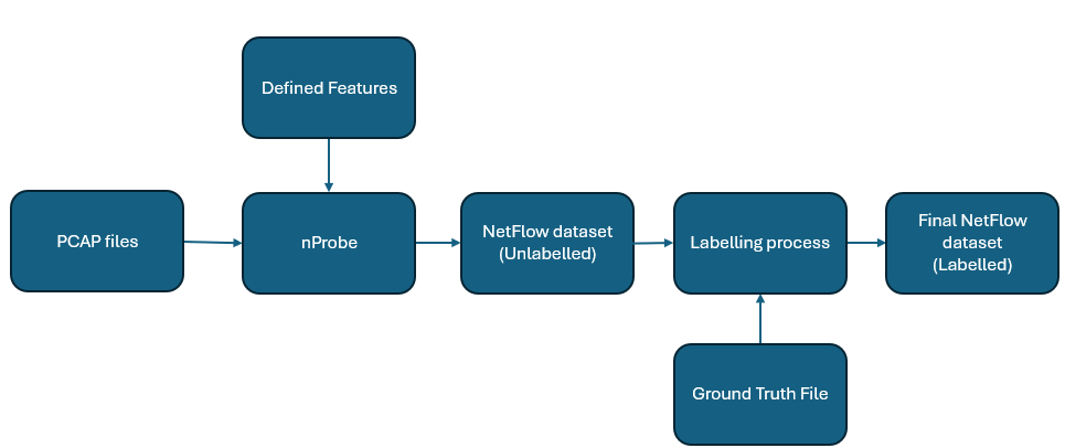
Figure 1: Illustration of the Dataset Conversion and Labeling Process
4.2 Conversion Methodology
The providers of the original datasets [20, 23, 22, 21] have released their source files in various formats enabling researchers to adapt and utilise these datasets according to specific research needs and to address known limitations. As seen in [16, 17], this flexibility aids in mitigating the feature divergence gap found in NIDS datasets by allowing for the regeneration of datasets with a standardised feature set in NetFlow format.
The process of generating the current version of the NetFlow datasets is the same as previous versions [16, 17], displayed in Figure 1. The implementation was conducted on a machine running Ubuntu 20.04 LTS equipped with nProbe software. The nProbe is developed by Ntop [51], and is specifically designed to process and convert raw network traffic into the NetFlow records. As can be seen in Figure 1, the workflow initiates with the acquisition of the PCAP files, which are publicly available for each dataset on their respective official websites. Given the extensive volume of data, significant storage capacity is required; for instance, the CSE_CIC_IDS2018 dataset [23] alone comprises more than 4,000 PCAP files, totalling over 400 gigabytes. Once collected, the PCAP files undergo conversion through the following nProbe command invocation:
nprobe -i file.pcap -V 9 --dont-reforge-time -T %feature1%feature2%featureN --dump-path <path> --dump-format t --csv-separator ’#’
In the above command, the -i option specifies the input file, -V 9 sets the NetFlow version to 9, and --dont-reforge-time preserves the original timestamps of the network traffic, ensuring the timing data are not modified to match the time of command execution. The --dump-path option defines the directory for the output files, --dump-format t selects the text file format for the output, and --csv-separator ’#’ is used to separate the columns with a ’#’ in the resulting files. This configuration extracts 57 different flow features using the -T option, organising them according to the specified criteria. The outputs generated from executing the nProbe command are a series of text files that chronologically catalogue all flow data with precise temporal information. Then, the text files are seamlessly merged and converted into CSV format, facilitating easy reading and efficient organisation of the datasets.
By this stage, we have compiled four datasets containing detailed flow information. These datasets are not yet labelled, which means there is no differentiation between normal and malicious flows, nor identification of specific types of attacks within the malicious flows. The subsequent phase involves labelling each flow based on the comparison with the corresponding ground truth file. Labelling is refined by comparing the precise timestamps and 5-tuple identifiers (Source/Destination IP, Source/Destination Ports, Protocol) to accurately match flows with their respective ground truth labels. The purpose of the labelling stage is to augment the datasets with two columns: one for binary classification and another for multi-class classification. In the binary column, a label of 0 signifies a benign flow, while a label of 1 denotes a malicious flow. The summary of binary labelling is depicted in Table 2. On the other hand, the multi-class classification column encapsulates the specific type of attack, as documented in the ground truth files, allowing for a granular analysis of threat types. Detailed statistics regarding the distribution of attack classes within the datasets are presented in Table 3.
Table 2: Summary of Malicious and Benign Flows in NF3-Datasets
| NF3-UNSW-NB15 NF3-CSE-CIC-IDS2018 NF3-ToN-IoT | 127,693(5.40%) 2,600,903(12.93%) 10,728,046 (38.98%) | 2,237,731(94.60%) 17,514,626(87.07%) 16,792,214(61.02%) | 2,365,424 20,115,529 27,520,260 |
| --- | --- | --- | --- |
| NF3-BoT-IoT | 16,881,819(99.7%) | 51,989(0.3%) | 16,933,808 |
Table 3: Statistics of attack types across the datasets, showing the count of flows categorised under each attack and benign class.
| Benign DoS DDoS | 2,237,731 5,980 — | 17,514,626 302,966 1,324,350 | 16,792,214 203,456 4,141,256 | 51,989 8,034,190 7,150,882 |
| --- | --- | --- | --- | --- |
| Reconnaissance | 17,074 | — | — | 1,695,132 |
| Backdoor | 1,226 | — | 203,384 | — |
| Fuzzers | 33,816 | — | — | — |
| Exploits | 42,748 | — | — | — |
| Analysis | 2,381 | — | — | — |
| Generic | 19,651 | — | — | — |
| Shellcode | 4,659 | — | — | — |
| Worms | 158 | — | — | — |
| Web Attacks | — | 2,538 | — | — |
| Infiltration | — | 188,152 | — | — |
| BoT | — | 207,703 | — | — |
| BrutForce | — | 575,194 | — | — |
| Scanning | — | — | 1,358,977 | — |
| XSS | — | — | 2,834,435 | — |
| Password | — | — | 1,594,777 | — |
| Injection | — | — | 381,777 | — |
| Ransomware | — | — | 3,971 | — |
| MITM | — | — | 6,013 | — |
| Theft | — | — | — | 1,615 |
| Total | 2,850,806 | 20,115,529 | 27,520,260 | 16,881,819 |
The resultant of labelled datasets are the four finalised datasets that we propose in this paper, designated as NF3-UNSW-NB15, NF3-BoT-IoT, NF3-ToN-IoT, and NF3-CSE-CIC-IDS2018. All four datasets share the same feature set, which allows for better evaluation and comparison when implementing and evaluating ML-NIDS models. The inclusion of timestamp information allows for identifying the exact time of the traffic when the original traffic was captured. It is worth mentioning that the timestamps included in the datasets represent the time stamps documented in their respective PCAP files, not the time stamps at which the data was converted to the NetFlow format. This distinction ensures that the temporal integrity of the original network conditions is preserved in the datasets. Following this dataset preparation, the next section will delve into the temporal analysis of these datasets. This analysis aims to explore the dynamic patterns and temporal characteristics of the traffic, providing deeper insights into the timing and progression of the recorded network behaviour.
5 Temporal Analysis
Gaining a human-level understanding of network traffic is essential before moving on to predictive modelling [52]. By incorporating temporal information into the NetFlow datasets, we can apply various temporal analysis methods to gain deeper insights into network behaviour. As mentioned in the related work section, many studies have explored network attack patterns over time [45]. However, unlike approaches that often aim at classification, this work focuses primarily on the temporal analysis at the feature level within NetFlow datasets. This analysis is not aimed at classifying or predicting specific types of network attacks but rather seeks to deepen our understanding of the inherent temporal characteristics of network features. In this section, we analyse NetFlow datasets from multiple perspectives, aiming to uncover insights into the dynamics of network traffic.
<details>
<summary>x1.png Details</summary>
### Visual Description
# Technical Document Extraction: Network Traffic Flow Length Distribution
## 1. Image Overview
This image is a stacked bar chart representing the frequency of different network traffic categories based on their "Flow Length" in seconds. The Y-axis uses a logarithmic scale to accommodate a wide range of frequency values, from $10^0$ to $10^8$.
## 2. Component Isolation
### A. Header / Legend
* **Location:** Top-center, enclosed in a black-bordered box.
* **Categories (Color-Coded):**
* **Theft:** Bright Pink
* **Reconnaissance:** Light Pink / Lavender
* **DDoS:** Blue
* **DoS:** Red
* **Benign:** Green
### B. Main Chart Area (Axes)
* **Y-Axis (Vertical):**
* **Label:** Frequency
* **Scale:** Logarithmic ($10^0, 10^2, 10^4, 10^6, 10^8$)
* **X-Axis (Horizontal):**
* **Label:** Flow Length (Seconds)
* **Range:** 0 to 120 seconds.
* **Markers:** Major ticks every 5 units (0, 5, 10, 15, 20, 25, 30, 35, 40, 45, 50, 55, 60, 65, 70, 75, 80, 85, 90, 95, 100, 105, 110, 115, 120).
## 3. Data Analysis and Trends
### General Trends by Category
1. **Theft (Bright Pink):** Concentrated heavily at the very beginning of the timeline (0-5 seconds) with a peak frequency near $10^3$. It appears sporadically and at very low frequencies (near $10^0$) across the rest of the timeline.
2. **Reconnaissance (Light Pink):** Primarily occurs in the 0-10 second range. It shows a significant presence at 0 seconds (approx. $10^6$) and tapers off rapidly.
3. **Benign (Green):** Shows a relatively consistent baseline frequency between $10^1$ and $10^2$ across the entire 120-second duration, with a notable spike at the 115-120 second mark.
4. **DDoS (Blue):** Dominates the mid-range flow lengths. It rises sharply after 5 seconds, peaks between 10 and 25 seconds (reaching frequencies above $10^6$), and remains a major component until approximately 55 seconds. It shows isolated spikes later (e.g., at 65, 90, and 110 seconds).
5. **DoS (Red):** Becomes prominent starting around 15 seconds. It maintains high frequency (approx. $10^5$ to $10^6$) between 20 and 55 seconds, often stacked on top of DDoS traffic. It drops significantly after 60 seconds.
### Key Data Points (Estimated from Log Scale)
| Flow Length (s) | Primary Category | Approx. Total Frequency | Observations |
| :--- | :--- | :--- | :--- |
| **0** | Reconnaissance / Theft | $> 10^6$ | Highest concentration of Reconnaissance. |
| **10-15** | DDoS | $\approx 10^6$ | Sharp increase in DDoS activity. |
| **25-40** | DDoS / DoS | $\approx 10^6$ | Sustained high-volume attack traffic. |
| **50-55** | DoS / DDoS | $\approx 10^6$ | Final peak of sustained DoS/DDoS before drop-off. |
| **60-110** | Mixed / Benign | $10^1 - 10^4$ | Significant drop in overall traffic; sporadic spikes. |
| **110** | DDoS | $\approx 10^5$ | Late-stage isolated DDoS spike. |
| **120** | Benign | $\approx 10^3$ | Significant Benign traffic at the end of the window. |
## 4. Summary of Findings
The chart illustrates that different types of network events have distinct temporal signatures. **Reconnaissance** and **Theft** are "quick" events occurring almost instantaneously. **DDoS** and **DoS** attacks are characterized by sustained flows lasting between 10 and 60 seconds. **Benign** traffic is the most temporally diverse, appearing consistently across the entire measured spectrum but representing a lower volume compared to the peak of attack traffic.
</details>
(a)
<details>
<summary>x2.png Details</summary>
### Visual Description
# Technical Document Extraction: Flow Length Frequency Distribution
## 1. Image Overview
This image is a stacked bar chart (histogram) representing the frequency of network traffic flows categorized by their duration (Flow Length) and attack type. The Y-axis uses a logarithmic scale to accommodate a wide range of frequency values.
## 2. Component Isolation
### A. Header / Legend
The legend is located at the top center of the chart area, enclosed in a rounded rectangle. It maps seven categories to specific colors:
| Color | Label |
| :--- | :--- |
| Light Grey | **Web-Attack** |
| Yellow | **Infiltration** |
| Orange | **BoT** |
| Red | **DoS** |
| Purple | **BruteForce** |
| Blue | **DDoS** |
| Green | **Benign** |
### B. Axis Definitions
* **Y-Axis (Vertical):**
* **Label:** Frequency
* **Scale:** Logarithmic, ranging from $10^0$ (1) to $10^8$ (100,000,000).
* **Major Markers:** $10^0, 10^2, 10^4, 10^6, 10^8$.
* **X-Axis (Horizontal):**
* **Label:** Flow Length (Seconds)
* **Range:** 0 to 120 seconds.
* **Major Markers:** Every 5 units (0, 5, 10, 15, ..., 115, 120).
* **Tick Orientation:** Labels are rotated approximately 45 degrees.
## 3. Data Trends and Distribution
### General Trends
* **High Initial Frequency:** The highest frequency of flows occurs at the very beginning of the scale (0-2 seconds), reaching nearly $10^7$ total flows.
* **Logarithmic Decay:** There is a sharp decline in frequency as flow length increases from 0 to 10 seconds.
* **Steady State:** Between 10 and 110 seconds, the total frequency fluctuates but generally stays within the $10^4$ to $10^5$ range.
* **End-of-Scale Spike:** There is a notable increase in frequency for flows lasting between 110 and 120 seconds, particularly in the "Benign" and "DoS" categories.
### Category-Specific Observations
1. **Benign (Green):** This category is present across almost all flow lengths. It consistently forms the top layer of the stacks, indicating it is a primary component of the total traffic volume, especially for very short and very long flows.
2. **Web-Attack (Light Grey):** Highly concentrated in very short flows (0-5 seconds). It appears sporadically in longer flows (e.g., around 55-60s and 85s) but at much lower frequencies ($10^1$ to $10^2$).
3. **Infiltration (Yellow):** Shows a significant presence in short flows and maintains a relatively consistent baseline frequency (approx. $10^2$) across the entire 120-second spectrum.
4. **DoS (Red):** Becomes a dominant "attack" category for flows longer than 10 seconds. It shows periodic spikes, notably around the 30s, 55s, and 115s marks.
5. **DDoS (Blue):** Primarily visible in flows between 2 and 45 seconds. Its frequency is relatively stable within this range, typically sitting between $10^3$ and $10^4$.
6. **BoT (Orange) & BruteForce (Purple):** These are only visually significant in the very first bar (0-2 seconds). In longer flows, they are either non-existent or their frequency is too low to be visible on this scale compared to other categories.
## 4. Structural Data Extraction (Approximate Values)
| Flow Length (s) | Total Frequency (Approx) | Dominant Categories |
| :--- | :--- | :--- |
| **0** | $10^7$ | Benign, Infiltration, Web-Attack |
| **5** | $10^6$ | Benign, DoS, Infiltration |
| **20** | $5 \times 10^4$ | Benign, DDoS, DoS, Infiltration |
| **60** | $10^5$ | Benign, DoS, Infiltration |
| **90** | $10^4$ | Benign, DoS, Infiltration |
| **115** | $8 \times 10^5$ | Benign, DoS, Infiltration |
## 5. Language Declaration
The text in this image is entirely in **English**. No other languages are present.
</details>
(b)
<details>
<summary>x3.png Details</summary>
### Visual Description
# Technical Data Extraction: Flow Length Frequency Distribution
## 1. Document Overview
This image is a stacked bar chart (histogram) representing the frequency of network traffic flows categorized by their duration (Flow Length) and their classification type (attack type vs. benign).
## 2. Component Isolation
### A. Header / Legend
The legend is located at the top center of the chart area, enclosed in a black border. It contains 11 categories, each associated with a specific color:
| Category | Color | Description |
| :--- | :--- | :--- |
| **ransomware** | Orange | Attack type |
| **mitm** | Pink | Man-in-the-Middle attack |
| **Backdoor** | Light Blue | Attack type |
| **dos** | Red | Denial of Service attack |
| **injection** | Cyan | Attack type |
| **scanning** | Neon Green | Attack type |
| **password** | Dark Olive Green | Attack type |
| **xss** | Teal | Cross-Site Scripting attack |
| **ddos** | Blue | Distributed Denial of Service |
| **Benign** | Forest Green | Normal/Safe traffic |
### B. Axis Definitions
* **Y-Axis (Vertical):**
* **Label:** Frequency
* **Scale:** Logarithmic ($10^0$ to $10^8$).
* **Markers:** $10^0, 10^2, 10^4, 10^6, 10^8$.
* **X-Axis (Horizontal):**
* **Label:** Flow Length (Seconds)
* **Scale:** Linear (0 to 120 seconds).
* **Markers:** Increments of 5 (0, 5, 10, 15, 20, 25, 30, 35, 40, 45, 50, 55, 60, 65, 70, 75, 80, 85, 90, 95, 100, 105, 110, 115, 120).
---
## 3. Data Analysis and Trends
### General Distribution Trend
The chart shows a heavy "long-tail" distribution. The vast majority of network flows occur within the first few seconds (0-2 seconds), with the frequency dropping precipitously as flow length increases. Because the Y-axis is logarithmic, small visual differences in bar height represent orders of magnitude in difference.
### Category-Specific Observations
1. **Short Duration (0-2 Seconds):**
* This is the only region where almost all categories are present.
* **Ransomware (Orange):** Highly concentrated at the 0-second mark with a frequency between $10^3$ and $10^4$.
* **Backdoor (Light Blue), Injection (Cyan), Scanning (Neon Green), DDoS (Blue), and XSS (Teal):** These are almost exclusively found in the 0-2 second range, appearing as thin slices in the very first bar.
* **Benign (Forest Green):** Reaches its peak frequency here, exceeding $10^7$.
2. **Mid-to-Long Duration (5-120 Seconds):**
* The distribution becomes dominated by three primary categories: **Benign** (Forest Green), **password** (Dark Olive Green), and **mitm** (Pink).
* **Password Attacks (Dark Olive Green):** Shows significant spikes at specific intervals, notably around 2-5 seconds, 25-30 seconds, and 60-65 seconds.
* **MITM (Pink):** Maintains a relatively consistent presence across the entire timeline, usually between $10^1$ and $10^2$ in frequency.
* **Benign (Forest Green):** Remains present throughout, often forming the "cap" of the bars, indicating that even for long durations, benign traffic is a constant factor.
3. **Anomalous Spikes:**
* There is a visible increase in frequency for **password** and **Benign** traffic at the 30-second and 60-second marks, suggesting periodic network behaviors or timeout-related events.
* A final uptick in frequency is observed at the 115-120 second mark, particularly for **Benign** and **mitm** traffic.
---
## 4. Structural Data Summary (Estimated)
| Flow Length (s) | Dominant Categories | Estimated Total Frequency |
| :--- | :--- | :--- |
| **0** | Benign, Scanning, DDoS, Backdoor, Ransomware | $> 10^7$ |
| **2-5** | Password, Benign, MITM | $\approx 10^4$ |
| **30** | Password, Benign | $\approx 10^4$ |
| **60** | Password, Benign, MITM | $\approx 10^3$ |
| **120** | Benign, MITM, Password | $\approx 10^3$ |
| **All others** | Benign, MITM, Password | $10^1$ to $10^2$ |
**Note on Language:** All text in the image is in English. No other languages were detected.
</details>
(c)
<details>
<summary>x4.png Details</summary>
### Visual Description
# Technical Document Extraction: Flow Length Frequency Distribution
## 1. Document Overview
This image is a stacked bar chart illustrating the frequency distribution of network traffic "Flow Length" measured in seconds. The data is categorized by traffic type, distinguishing between benign traffic and various classes of cyberattacks.
## 2. Component Isolation
### A. Header / Legend
The legend is located at the top center of the chart area, enclosed in a black border. It contains 10 categories with corresponding color codes:
| Color | Label | Category Type |
| :--- | :--- | :--- |
| **Cyan** | Worms | Attack |
| **Magenta** | Analysis | Attack |
| **Olive/Gold** | Shellcode | Attack |
| **Light Blue** | Backdoor | Attack |
| **Red** | DoS (Denial of Service) | Attack |
| **Pink** | Reconnaissance | Attack |
| **Grey** | Generic | Attack |
| **Purple** | Fuzzers | Attack |
| **Brown** | Exploits | Attack |
| **Green** | Benign | Normal Traffic |
### B. Main Chart Area (Axes)
* **Y-Axis (Vertical):** Labeled "**Frequency**". It uses a **logarithmic scale** ranging from $10^0$ (1) to $10^8$ (100,000,000). Major tick marks are provided for $10^0, 10^2, 10^4, 10^6,$ and $10^8$.
* **X-Axis (Horizontal):** Labeled "**Flow Length (Seconds)**". It uses a linear scale ranging from 0 to 120 seconds. Tick marks and labels are provided at intervals of 5 seconds (0, 5, 10, ... 120).
## 3. Data Trends and Observations
### General Trend
The chart shows a heavy-tailed distribution. The vast majority of network flows (both benign and malicious) have a very short duration (0-5 seconds). As the flow length increases, the frequency generally decays exponentially until approximately 65 seconds, after which the data becomes sparse and fluctuates at low frequencies, with a notable spike at the 120-second mark.
### Category-Specific Trends
1. **Benign (Green):** This category dominates the frequency across almost all time intervals, particularly in the 0-5 second range where it reaches its peak near $10^8$.
2. **Exploits (Brown) & Fuzzers (Purple):** These are the most frequent attack types, consistently appearing across the 0-60 second range.
3. **Generic (Grey):** Shows significant presence in the very short duration flows (0-2 seconds).
4. **Long Duration Flows:** At the 120-second mark, there is a visible accumulation of various traffic types, suggesting a timeout or a maximum recording threshold for flow duration.
</details>
(d)
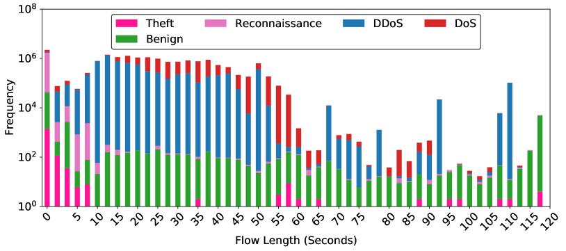
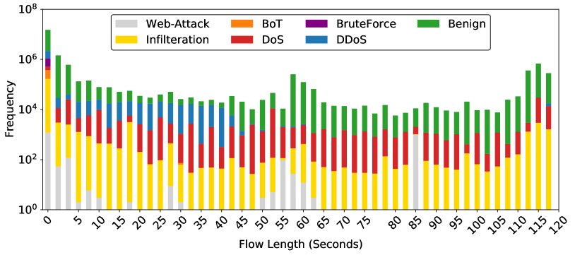
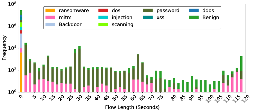
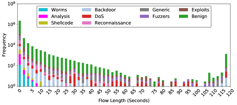
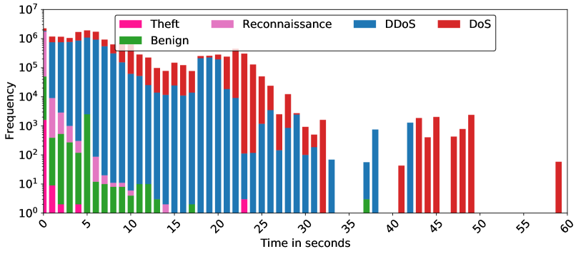
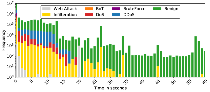
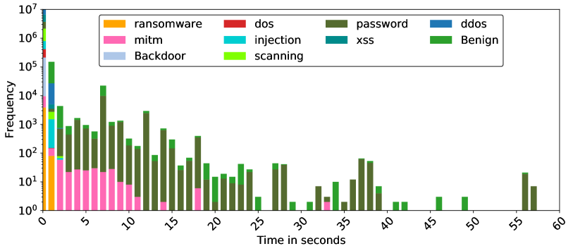
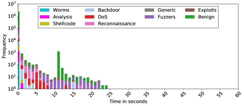
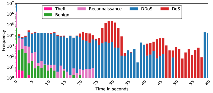
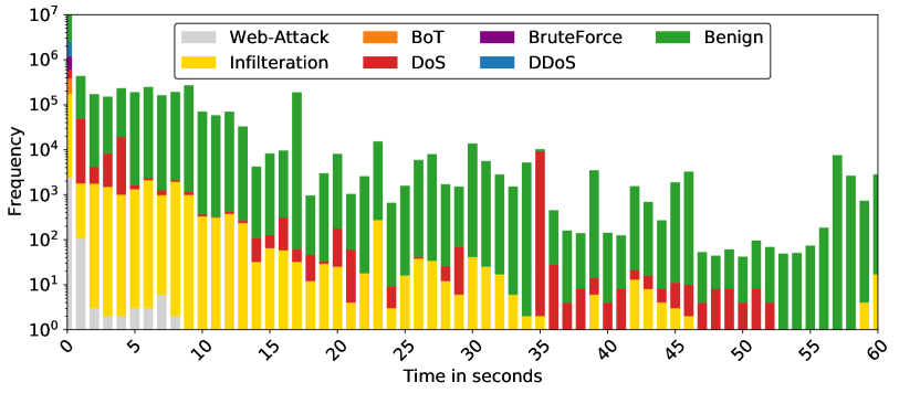
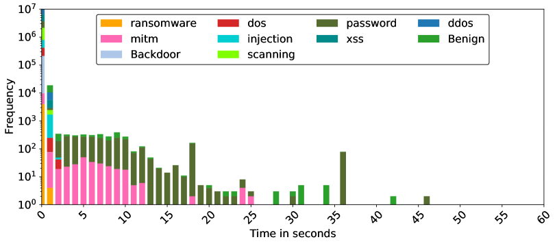
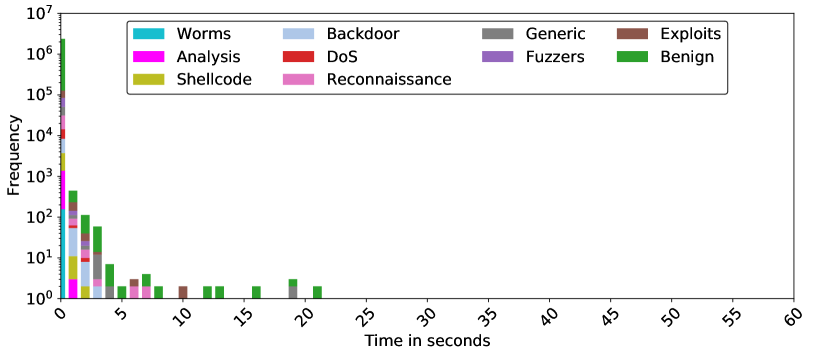
Figure 2: Flow length distribution in NF3-Datasets. The x-axis represents the length of flows in milliseconds, while the y-axis represents the frequency of a length, i.e., the number of flows with the same flow length.
5.1 Flow Length Distribution
The analysis of flow length distribution (FLD) across various datasets provides critical insights into the behaviour of network traffic under both benign and malicious conditions. This subsection visualises and discusses FLD for our NetFlow datasets. In Figure 2, each plot presents the frequency of flow lengths, aggregated into predefined bins (50 bins), across all the classes of traffic. However, the nProbe tool, by default, is configured to export flow data in intervals not exceeding two minutes. This is a standard configuration that allows for efficient flow data collection without overwhelming the system with excessive data [51]. The 2-minutes interval is chosen to provide a reasonable level of detail while minimizing system resource consumption.
<details>
<summary>x5.png Details</summary>
### Visual Description
# Technical Document Extraction: Network Traffic Frequency Analysis
## 1. Image Metadata & Classification
* **Type:** Stacked Bar Chart (Histogram)
* **Language:** English
* **Scale:** Logarithmic Y-axis (Base 10)
* **Primary Subject:** Frequency of network traffic types over a 60-second duration.
## 2. Component Isolation
### A. Header / Legend
* **Location:** Top-center, enclosed in a black-bordered box.
* **Categories (Color Coded):**
* **Theft:** Bright Pink
* **Reconnaissance:** Light Pink / Lavender
* **DDoS:** Blue
* **DoS:** Red
* **Benign:** Green
### B. Axis Definitions
* **Y-Axis (Vertical):**
* **Label:** Frequency
* **Scale:** Logarithmic, ranging from $10^0$ (1) to $10^7$ (10,000,000).
* **Markers:** $10^0, 10^1, 10^2, 10^3, 10^4, 10^5, 10^6, 10^7$.
* **X-Axis (Horizontal):**
* **Label:** Time in seconds
* **Range:** 0 to 60 seconds.
* **Markers:** Increments of 5 (0, 5, 10, 15, 20, 25, 30, 35, 40, 45, 50, 55, 60). Labels are rotated 45 degrees.
## 3. Data Series Analysis & Trends
### Benign (Green)
* **Trend:** Concentrated heavily in the first 15 seconds.
* **Behavior:** Peaks early (around 0-5 seconds) with frequencies between $10^3$ and $10^5$. It drops off sharply after 15 seconds, with only a negligible trace appearing near the 37-second mark.
### DDoS (Blue)
* **Trend:** Dominant high-frequency contributor in the first 25 seconds.
* **Behavior:** Maintains a high frequency (between $10^5$ and $10^6$) from 0 to 10 seconds. It shows a gradual decline but remains significant until approximately 32 seconds. It appears in isolated bursts between 35 and 45 seconds.
### DoS (Red)
* **Trend:** Persistent across the widest time range; becomes the dominant category after 25 seconds.
* **Behavior:** Initially stacked on top of DDoS traffic. After 23 seconds, while other categories drop, DoS maintains a frequency between $10^3$ and $10^5$. It is the only category present in the 45-50 second range and appears as a final outlier at 59-60 seconds.
### Reconnaissance (Light Pink)
* **Trend:** Short-lived, early-stage activity.
* **Behavior:** Primarily visible between 0 and 7 seconds. It reaches a peak frequency of approximately $10^4$ at the 1-second mark and disappears almost entirely after 15 seconds.
### Theft (Bright Pink)
* **Trend:** Minimal presence, highly localized.
* **Behavior:** Visible as small slivers at the base of the bars at 0, 1, 2, 4, and 23 seconds. Frequencies are very low, generally near the $10^0$ to $10^1$ range.
## 4. Key Data Observations (Spatial Grounding)
| Time Interval (s) | Dominant Traffic Type | Approximate Total Frequency |
| :--- | :--- | :--- |
| **0 - 5** | DDoS (Blue) & Benign (Green) | $10^6$ to $2 \times 10^6$ |
| **5 - 10** | DDoS (Blue) | $10^5$ to $10^6$ |
| **10 - 20** | DDoS (Blue) | $10^4$ to $10^5$ |
| **20 - 25** | DoS (Red) & DDoS (Blue) | $10^5$ |
| **25 - 35** | DoS (Red) | $10^2$ to $10^4$ |
| **40 - 50** | DoS (Red) | $10^2$ to $10^3$ |
| **55 - 60** | DoS (Red) | $< 10^2$ (Single outlier) |
## 5. Summary of Findings
The chart illustrates a high-intensity burst of network activity in the first 10 seconds, primarily composed of **Benign** and **DDoS** traffic. As time progresses, **Benign**, **Reconnaissance**, and **Theft** traffic cease almost entirely. **DDoS** traffic persists until the 30-second mark, after which the remaining network activity is almost exclusively **DoS** (Denial of Service) attacks, which continue intermittently until the end of the 60-second observation period.
</details>
(a)
<details>
<summary>x6.png Details</summary>
### Visual Description
# Technical Data Extraction: Network Traffic Frequency Analysis
## 1. Image Overview
This image is a stacked bar chart representing the frequency of different types of network traffic (Benign and various attack types) over a duration of 60 seconds. The Y-axis uses a logarithmic scale to accommodate a wide range of frequency values, from $10^0$ to $10^7$.
## 2. Component Isolation
### A. Header / Legend
* **Location:** Top-center, enclosed in a rounded rectangle.
* **Content:** Seven categories with corresponding color codes.
* **Web-Attack:** Light Grey
* **Infiltration:** Yellow
* **BoT:** Orange (Note: Visually minimal presence in the bars)
* **DoS:** Red
* **BruteForce:** Purple
* **DDoS:** Blue
* **Benign:** Green
### B. Main Chart Area (Axes)
* **Y-Axis (Vertical):**
* **Label:** "Frequency"
* **Scale:** Logarithmic, ranging from $10^0$ (1) to $10^7$ (10,000,000).
* **Markers:** $10^0, 10^1, 10^2, 10^3, 10^4, 10^5, 10^6, 10^7$.
* **X-Axis (Horizontal):**
* **Label:** "Time in seconds"
* **Range:** 0 to 60 seconds.
* **Markers:** Increments of 5 (0, 5, 10, 15, 20, 25, 30, 35, 40, 45, 50, 55, 60). Labels are rotated approximately 45 degrees.
## 3. Data Series Analysis and Trends
### Benign (Green)
* **Trend:** Present across the entire 60-second window. It is the dominant category in terms of total volume, consistently reaching heights between $10^2$ and $10^5$.
* **Key Observations:** Peaks significantly at $t=0$ (reaching $10^7$) and shows a notable spike around $t=27$ and $t=57$.
### DDoS (Blue)
* **Trend:** Concentrated in the first 20 seconds.
* **Key Observations:** Starts strong at $t=0$ (approx. $10^6$), maintains a steady presence around $10^4$ until $t=13$, then tapers off and disappears after $t=18$.
### DoS (Red)
* **Trend:** Primarily active in the first 15 seconds, with a small resurgence around $t=18-19$.
* **Key Observations:** Highest frequency at $t=0$ (approx. $10^5$). It fluctuates between $10^3$ and $10^4$ in the first 10 seconds.
### Infiltration (Yellow)
* **Trend:** Persistent from $t=0$ to $t=32$, with sporadic appearances later (e.g., $t=34, 45, 59$).
* **Key Observations:** Maintains a relatively high frequency (between $10^2$ and $10^3$) for the first 12 seconds before gradually declining.
### Web-Attack (Light Grey)
* **Trend:** Highly localized.
* **Key Observations:** Visible at $t=0$ to $t=3$, and a significant isolated spike at $t=20$.
### BruteForce (Purple)
* **Trend:** Extremely short-lived.
* **Key Observations:** Only clearly visible at $t=0$ with a frequency of approximately $10^6$.
### BoT (Orange)
* **Trend:** Negligible visual footprint.
* **Key Observations:** While listed in the legend, orange segments are not distinctly visible at this scale, suggesting very low frequency relative to other categories.
## 4. Summary of Temporal Distribution
| Time Segment | Dominant Traffic Types | Activity Description |
| :--- | :--- | :--- |
| **0 - 15s** | All types (Benign, DDoS, DoS, Infiltration, BruteForce, Web-Attack) | High-intensity period. Most attack vectors are active simultaneously. Total frequency is highest here. |
| **15 - 30s** | Benign, Infiltration, DDoS (early), Web-Attack (spike at 20s) | Transition period. Attack variety decreases; Benign traffic remains steady. |
| **30 - 60s** | Benign | Low-intensity period. Traffic is almost exclusively Benign, with very minor, isolated Infiltration events. |
## 5. Technical Notes
* **Logarithmic Distortion:** Because the Y-axis is logarithmic, the visual "height" of the top segments (like Benign) represents a much larger absolute number of events than the segments at the bottom of the stack.
* **Data Density:** The chart uses 60 discrete bars, representing 1-second intervals.
</details>
(b)
<details>
<summary>x7.png Details</summary>
### Visual Description
# Technical Data Extraction: Network Traffic Frequency Distribution
## 1. Document Overview
This image is a stacked bar chart (histogram) representing the frequency of different types of network traffic (both malicious and benign) over a duration of time. The data is plotted on a logarithmic scale for the frequency to accommodate a wide range of values.
## 2. Component Isolation
### A. Header / Legend
* **Location:** Top-center, enclosed in a rounded rectangle.
* **Content:** 11 categories of traffic, each associated with a specific color.
* **Orange:** ransomware
* **Red:** dos
* **Dark Olive Green:** password
* **Blue:** ddos
* **Pink:** mitm
* **Cyan:** injection
* **Teal:** xss
* **Green:** Benign
* **Light Blue-Grey:** Backdoor
* **Lime Green:** scanning
### B. Main Chart Area (Axes)
* **Y-Axis (Vertical):**
* **Label:** Frequency
* **Scale:** Logarithmic, ranging from $10^0$ (1) to $10^7$ (10,000,000).
* **Major Markers:** $10^0, 10^1, 10^2, 10^3, 10^4, 10^5, 10^6, 10^7$.
* **X-Axis (Horizontal):**
* **Label:** Time in seconds
* **Scale:** Linear, ranging from 0 to 60 seconds.
* **Major Markers:** 0, 5, 10, 15, 20, 25, 30, 35, 40, 45, 50, 55, 60.
* **Note:** Labels are rotated approximately 45 degrees for readability.
## 3. Data Analysis and Trends
### General Trend
The chart shows a "long tail" distribution. The vast majority of network events occur within the first 0–2 seconds, with frequencies reaching up to $10^7$. As time increases, the frequency of events drops significantly, becoming sporadic and sparse after 40 seconds.
### Category-Specific Observations
* **High-Volume Initial Burst (0-1s):** This column contains almost all categories. The highest frequency is dominated by **Benign** (Green), **ddos** (Blue), and **scanning** (Lime Green) traffic, all exceeding $10^5$ occurrences. **Ransomware** (Orange) is also visible here but is confined to the very beginning of the timeline.
* **Persistent Categories:**
* **Password (Dark Olive Green):** This is the most persistent malicious category. It appears consistently across the timeline from 0 to 58 seconds. It forms significant peaks at 7s, 12s, and 37s.
* **Mitm (Pink):** Frequent in the 0–10 second range, with a small reappearance around 18s and 33s.
* **Benign (Green):** Present throughout most of the timeline, often stacked on top of "password" or "mitm" data.
* **Short-Duration Categories:**
* **Ransomware, Dos, Injection, XSS, Backdoor, and Scanning** are primarily concentrated in the 0–2 second window and do not appear significantly in the later stages of the 60-second window.
## 4. Data Table (Estimated Values)
*Note: Due to the logarithmic scale and stacked nature, values are approximations based on visual alignment with axis markers.*
| Time (s) | Primary Components | Approx. Total Frequency |
| :--- | :--- | :--- |
| **0-1** | All (Benign, ddos, scanning, etc.) | $10^7$ |
| **1-2** | Benign, ddos, scanning, mitm | $10^5$ |
| **2-3** | Benign, password | $5 \times 10^3$ |
| **7-8** | Password, Benign | $2 \times 10^4$ |
| **12-13**| Password, Benign | $3 \times 10^3$ |
| **20-25**| Benign, password | $10^1 - 10^2$ |
| **37-38**| Password | $7 \times 10^1$ |
| **56-58**| Password | $< 10^1$ |
## 5. Summary of Findings
The dataset is heavily skewed toward the start of the capture period. While most attack types (like DDoS and Injection) are instantaneous or very short-lived, **Password**-related attacks and **Benign** traffic are the only types that exhibit sustained activity over the full 60-second duration. The logarithmic scale highlights that while late-stage events are visible, they are several orders of magnitude less frequent than the initial burst.
</details>
(c)
<details>
<summary>x8.png Details</summary>
### Visual Description
# Technical Document Extraction: Frequency Distribution of Network Traffic Types
## 1. Image Overview
This image is a stacked bar chart representing the frequency of different network traffic categories (both benign and various types of attacks) over a duration of time measured in seconds. The Y-axis uses a logarithmic scale to accommodate a wide range of frequency values.
## 2. Component Isolation
### Header / Legend
* **Location:** Top-center, enclosed in a rounded rectangle.
* **Content:** 10 categories with associated color swatches.
* **Worms:** Cyan
* **Analysis:** Magenta
* **Shellcode:** Olive/Yellow-Green
* **Backdoor:** Light Blue
* **DoS:** Red
* **Reconnaissance:** Pink
* **Generic:** Grey
* **Fuzzers:** Purple
* **Exploits:** Brown
* **Benign:** Green
### Main Chart Area (Axes)
* **Y-Axis (Vertical):**
* **Label:** "Frequency"
* **Scale:** Logarithmic, ranging from $10^0$ (1) to $10^7$ (10,000,000).
* **Major Tick Marks:** $10^0, 10^1, 10^2, 10^3, 10^4, 10^5, 10^6, 10^7$.
* **X-Axis (Horizontal):**
* **Label:** "Time in seconds"
* **Scale:** Linear, ranging from 0 to 60.
* **Major Tick Marks:** Every 5 units (0, 5, 10, 15, 20, 25, 30, 35, 40, 45, 50, 55, 60).
* **Labels:** Rotated 45 degrees for readability.
## 3. Data Trends and Distribution
### General Trend
The data exhibits a heavy "long-tail" distribution. The vast majority of traffic occurs within the first second (0-1s interval). As time increases, the total frequency drops precipitously. No data points are recorded beyond approximately 25 seconds, leaving the 25–60 second range empty.
### Category-Specific Observations
* **Benign (Green):** This is the most frequent category. It dominates the 0-1s bin (reaching over $10^6$) and remains the most consistent category present across the timeline, including a notable spike around the 11-second mark (approx. $10^3$).
* **Attack Traffic (Various Colors):**
* **0-1 Second Bin:** Contains a stack of almost all categories, with total frequency exceeding $10^6$.
* **1-5 Seconds:** Significant presence of **Backdoor (Light Blue)**, **DoS (Red)**, and **Reconnaissance (Pink)**.
* **5-10 Seconds:** **DoS (Red)** and **Fuzzers (Purple)** are prominent.
* **10-25 Seconds:** The frequency drops below $10^2$. **Fuzzers (Purple)** and **Benign (Green)** are the primary categories appearing in these later intervals.
* **Worms (Cyan), Analysis (Magenta), and Shellcode (Olive):** These appear almost exclusively in the first few seconds (0-2s) and are not visible in the later stages of the timeline.
## 4. Estimated Data Points (Log Scale)
| Time Interval (s) | Primary Categories Present | Estimated Total Frequency (Log Scale) |
| :--- | :--- | :--- |
| **0 - 1** | All (Benign dominant) | $> 10^6$ |
| **1 - 5** | Backdoor, DoS, Reconnaissance, Benign | $10^3 - 10^4$ |
| **5 - 10** | DoS, Fuzzers, Benign | $10^2 - 10^3$ |
| **10 - 15** | Benign, Fuzzers | $10^1 - 10^3$ |
| **15 - 25** | Fuzzers, Benign | $10^0 - 10^1$ |
| **25 - 60** | None | 0 |
</details>
(d)
Figure 3: Average distribution for Inter-Packet arrival time from source to destination.
<details>
<summary>x9.png Details</summary>
### Visual Description
# Technical Data Extraction: Network Traffic Frequency Analysis
## 1. Document Overview
This image is a stacked bar chart representing the frequency of different types of network traffic (Benign and various attack types) over a duration of 60 seconds. The Y-axis uses a logarithmic scale to accommodate a wide range of frequency values.
## 2. Axis and Legend Identification
### Axis Labels
* **Y-Axis (Vertical):** `Frequency`
* **Scale:** Logarithmic ($10^0$ to $10^7$).
* **Markers:** $10^0, 10^1, 10^2, 10^3, 10^4, 10^5, 10^6, 10^7$.
* **X-Axis (Horizontal):** `Time in seconds`
* **Range:** 0 to 60 seconds.
* **Markers:** Increments of 5 ($0, 5, 10, 15, 20, 25, 30, 35, 40, 45, 50, 55, 60$).
### Legend
| Category | Color |
| :--- | :--- |
| **Theft** | Deep Pink / Magenta |
| **Reconnaissance** | Light Pink / Orchid |
| **DDoS** | Blue |
| **DoS** | Red |
| **Benign** | Green |
---
## 3. Component Isolation and Data Trends
### Region 1: Initial Burst (0 - 2 seconds)
* **Trend:** Massive spike at $t=0$, followed by a sharp decline.
* **Data Points:**
* At **0 seconds**, there is a stacked column reaching $10^7$. It contains all categories, with **DDoS (Blue)** and **Reconnaissance (Light Pink)** being the most frequent.
* At **1-2 seconds**, **Theft (Deep Pink)** and **Reconnaissance (Light Pink)** are visible at frequencies between $10^3$ and $10^4$.
### Region 2: Benign and Mixed Activity (3 - 12 seconds)
* **Trend:** **Benign (Green)** traffic is most prominent in this window, peaking around 4-5 seconds and tapering off by 12 seconds. **DDoS (Blue)** remains a constant background presence.
* **Data Points:**
* **Benign (Green):** Peaks at ~5 seconds with a frequency of approx. $5 \times 10^2$.
* **DDoS (Blue):** Maintains a steady frequency of approx. $10^4$ throughout this period.
### Region 3: DDoS Dominance (13 - 25 seconds)
* **Trend:** **DDoS (Blue)** traffic is the primary component. **Reconnaissance (Light Pink)** shows small intermittent blocks at the base of the bars.
* **Data Points:**
* **DDoS (Blue):** Frequency fluctuates between $5 \times 10^3$ and $10^4$.
* **DoS (Red):** Small amounts of DoS traffic begin to appear on top of the DDoS bars around 20-24 seconds.
### Region 4: Major DoS Attack (26 - 33 seconds)
* **Trend:** A significant surge in **DoS (Red)** traffic, forming a "hump" or bell-curve shape on top of the DDoS traffic.
* **Data Points:**
* **Peak:** At **30 seconds**, the total frequency reaches its second-highest point (approx. $2 \times 10^5$), dominated by **DoS (Red)**.
* **DDoS (Blue):** Remains steady at the base with a frequency of approx. $10^3$.
### Region 5: Late Activity and Second DoS Wave (34 - 60 seconds)
* **Trend:** Traffic becomes more sporadic. A second, smaller wave of **DoS (Red)** occurs between 40-47 seconds. The final seconds show a return of **DDoS (Blue)**.
* **Data Points:**
* **35-38 seconds:** Mostly **DDoS (Blue)** at lower frequencies ($10^1$ to $10^2$).
* **40-47 seconds:** **DoS (Red)** peaks again at approx. $5 \times 10^3$.
* **48-58 seconds:** Exclusively **DoS (Red)** traffic at frequencies between $10^2$ and $10^3$.
* **59-60 seconds:** A sudden return of **DDoS (Blue)** traffic at approx. $2 \times 10^4$.
---
## 4. Summary of Findings
* **Highest Volume:** Occurs at the start ($t=0$) and during the DoS attack ($t=30$).
* **Primary Threat:** **DDoS (Blue)** is the most persistent traffic type throughout the 60-second window.
* **Attack Patterns:**
* **Reconnaissance** and **Theft** are localized to the first 5 seconds.
* **Benign** traffic is only significant in the first 12 seconds.
* **DoS** occurs in two distinct phases: a major surge at 30s and a secondary wave at 45s.
</details>
(a)
<details>
<summary>x10.png Details</summary>
### Visual Description
# Technical Document Extraction: Network Traffic Frequency Analysis
## 1. Image Overview
This image is a stacked bar chart representing the frequency of different types of network traffic (Benign and various Attack types) over a duration of 60 seconds. The Y-axis uses a logarithmic scale to accommodate a wide range of frequency values, from $10^0$ to $10^7$.
## 2. Component Isolation
### A. Header / Legend
* **Location:** Top center, enclosed in a rounded rectangle.
* **Content:** Seven categories of network traffic, each associated with a specific color.
1. **Web-Attack:** Light Grey
2. **Infiltration:** Yellow
3. **BoT:** Orange
4. **DoS:** Red
5. **BruteForce:** Purple
6. **DDoS:** Blue
7. **Benign:** Green
### B. Main Chart Area (Axes)
* **Y-Axis (Vertical):**
* **Label:** "Frequency"
* **Scale:** Logarithmic, ranging from $10^0$ (1) to $10^7$ (10,000,000).
* **Major Markers:** $10^0, 10^1, 10^2, 10^3, 10^4, 10^5, 10^6, 10^7$.
* **X-Axis (Horizontal):**
* **Label:** "Time in seconds"
* **Range:** 0 to 60 seconds.
* **Major Markers:** 0, 5, 10, 15, 20, 25, 30, 35, 40, 45, 50, 55, 60.
* **Note:** The labels are rotated approximately 45 degrees for readability.
## 3. Data Series Analysis and Trends
### Benign (Green)
* **Trend:** This is the most consistent and dominant category across the entire 60-second window. It maintains a high frequency, generally fluctuating between $10^3$ and $10^5$.
* **Peak:** Reaches its highest point at $t=0$, exceeding $10^6$.
### Infiltration (Yellow)
* **Trend:** Highly active in the first 15 seconds, then gradually tapers off. It remains present in smaller quantities (between $10^0$ and $10^2$) throughout most of the timeline, with a slight resurgence around $t=30$.
* **Initial Volume:** Starts strong between $10^3$ and $10^4$ in the first 10 seconds.
### DoS (Red)
* **Trend:** Appears sporadically. Notable bursts occur at $t=1$ to $t=4$, $t=14$ to $t=22$, and a significant spike at $t=35$.
* **Significant Event:** At $t=35$, DoS traffic spikes sharply to nearly $10^4$, briefly becoming the dominant attack type.
### Web-Attack (Light Grey)
* **Trend:** Only present at the very beginning of the capture.
* **Duration:** Visible from $t=0$ to approximately $t=8$.
* **Volume:** Starts at $10^2$ at $t=0$ and drops below $10^1$ quickly.
### DDoS (Blue), BruteForce (Purple), and BoT (Orange)
* **Trend:** These categories are only visible as very thin slivers at the $t=0$ mark.
* **Observation:** Due to the logarithmic scale and the massive volume of Benign traffic at $t=0$, these categories are effectively negligible for the remainder of the 60-second period shown.
## 4. Key Data Observations
* **Initial Burst:** At $t=0$, there is a massive accumulation of all traffic types, with Benign traffic peaking at nearly $10^7$.
* **Attack Composition:** For the first 10 seconds, the primary "attack" traffic is a combination of Infiltration and Web-Attack.
* **Mid-Capture Shift:** Between 35 and 45 seconds, the "Infiltration" traffic almost disappears, replaced by intermittent "DoS" (Red) activity.
* **End of Capture:** From 53 to 58 seconds, the traffic is almost exclusively "Benign" (Green), with a small amount of "Infiltration" (Yellow) reappearing at $t=60$.
</details>
(b)
<details>
<summary>x11.png Details</summary>
### Visual Description
# Technical Document Extraction: Network Traffic Attack Frequency Analysis
## 1. Image Overview
This image is a **stacked histogram** representing the frequency of various network traffic types (both malicious and benign) over a duration of time measured in seconds. The Y-axis uses a logarithmic scale to accommodate a wide range of frequency values, from single occurrences to millions.
## 2. Component Isolation
### A. Header / Legend
* **Location:** Top center, enclosed in a rounded rectangle.
* **Categories (11 total):**
* **Orange:** ransomware
* **Pink:** mitm (Man-in-the-Middle)
* **Light Blue:** Backdoor
* **Red:** dos (Denial of Service)
* **Cyan:** injection
* **Lime Green:** scanning
* **Dark Olive Green:** password
* **Teal:** xss (Cross-Site Scripting)
* **Dark Blue:** ddos (Distributed Denial of Service)
* **Green:** Benign
### B. Main Chart Area (Axes)
* **Y-Axis (Vertical):**
* **Label:** Frequency
* **Scale:** Logarithmic ($10^0$ to $10^7$)
* **Markers:** $10^0, 10^1, 10^2, 10^3, 10^4, 10^5, 10^6, 10^7$
* **X-Axis (Horizontal):**
* **Label:** Time in seconds
* **Range:** 0 to 60 seconds
* **Markers:** 0, 5, 10, 15, 20, 25, 30, 35, 40, 45, 50, 55, 60 (labeled at 5-second intervals, rotated 45 degrees).
## 3. Data Analysis and Trends
### General Distribution
The vast majority of data points are concentrated at the **0-second mark**, where the frequency for almost all categories peaks significantly (reaching up to $10^7$). As time increases, the frequency drops sharply, following a long-tail distribution.
### Category-Specific Trends
| Category | Color | Visual Trend & Data Points |
| :--- | :--- | :--- |
| **Benign** | Green | Highest frequency at $t=0$ (approx. $10^7$). Appears sporadically across the timeline (e.g., at 30s, 35s, 42s) with low frequency ($\approx 10^0 - 10^1$). |
| **password** | Dark Olive Green | Significant presence between 2s and 12s (frequency $\approx 10^2$). Notable spike at 18s and 36s. This is the most persistent category across the 15-40s range. |
| **mitm** | Pink | Concentrated in the 0s to 12s range. Frequency starts high at 0s ($\approx 10^4$), maintains a plateau of $\approx 10^1 - 10^2$ until 12s, then disappears. |
| **ransomware** | Orange | Only visible at $t=0$ with a frequency of approx. $10^3 - 10^4$. |
| **dos** | Red | Visible at $t=0$ (approx. $10^5$) and a small sliver at $t=2$. |
| **injection** | Cyan | Visible at $t=0$ (approx. $10^5$) and a small sliver at $t=2$. |
| **scanning** | Lime Green | Visible at $t=0$ (approx. $10^6$) and $t=1$ (approx. $10^3$). |
| **ddos** | Dark Blue | Visible at $t=0$ (approx. $10^6$) and $t=1$ (approx. $10^4$). |
| **Backdoor** | Light Blue | Visible primarily at $t=0$ (approx. $10^5$). |
| **xss** | Teal | Visible at $t=0$ (approx. $10^5$) and $t=1$ (approx. $10^3$). |
## 4. Key Observations
1. **Instantaneous Events:** The $t=0$ bin contains the bulk of all traffic types, suggesting many network events or attacks are logged with a near-zero duration or occur within the first second.
2. **Persistent Attacks:** "Password" and "mitm" attacks show a distinct temporal signature, lasting significantly longer (up to 12-36 seconds) compared to "ransomware" or "dos" which are strictly short-duration in this dataset.
3. **Sparsity:** Beyond 45 seconds, there is virtually no recorded activity in any category.
</details>
(c)
<details>
<summary>x12.png Details</summary>
### Visual Description
# Technical Document Extraction: Network Traffic Frequency Analysis
## 1. Image Overview
This image is a **stacked bar chart** (histogram) representing the frequency of different network traffic types over time. The Y-axis uses a logarithmic scale to accommodate a wide range of frequency values, from single occurrences to millions.
## 2. Component Isolation
### A. Header / Legend
The legend is located at the top center of the chart area, enclosed in a rounded rectangle. It contains 10 categories, each associated with a specific color:
| Category | Color |
| :--- | :--- |
| **Worms** | Cyan / Light Blue-Green |
| **Analysis** | Magenta / Bright Pink |
| **Shellcode** | Olive / Mustard Yellow |
| **Backdoor** | Light Blue / Pastel Blue |
| **DoS** | Red |
| **Reconnaissance** | Light Pink / Lavender Pink |
| **Generic** | Grey |
| **Fuzzers** | Purple |
| **Exploits** | Brown |
| **Benign** | Green |
### B. Main Chart Area (Axes)
* **Y-Axis (Vertical):**
* **Label:** Frequency
* **Scale:** Logarithmic ($10^0$ to $10^7$).
* **Markers:** $10^0$ (1), $10^1$ (10), $10^2$ (100), $10^3$ (1,000), $10^4$ (10,000), $10^5$ (100,000), $10^6$ (1,000,000), $10^7$ (10,000,000).
* **X-Axis (Horizontal):**
* **Label:** Time in seconds
* **Range:** 0 to 60 seconds.
* **Markers:** Increments of 5 (0, 5, 10, 15, 20, 25, 30, 35, 40, 45, 50, 55, 60). Labels are rotated 45 degrees.
## 3. Data Trends and Distribution
### General Trend
The data exhibits a **heavy-tailed distribution** (specifically a power-law-like decay). The vast majority of network events occur within the first 0–2 seconds. As time increases, the frequency of events drops precipitously, with very few events occurring beyond 10 seconds and no data points visible beyond approximately 22 seconds.
### Category-Specific Observations
1. **Benign (Green):** This is the most frequent category. It dominates the $t=0$ bin (reaching over $10^6$) and remains the most consistent category appearing across the timeline up to ~22 seconds.
2. **Initial Burst (0-1 seconds):** All 10 categories are present in the first bin.
* **Benign** is the highest (top of the stack).
* **Worms, Analysis, Shellcode, Backdoor, DoS, Reconnaissance, Generic, Fuzzers, and Exploits** are all visible in the stack, with frequencies ranging between $10^3$ and $10^5$.
3. **Rapid Decay (1-5 seconds):**
* At 1 second, the total frequency drops to approximately $10^{2.5}$ (~400-500).
* At 2 seconds, the frequency is around $10^2$ (100).
* At 3 seconds, it drops below $10^2$.
4. **Sparse Tail (5-22 seconds):**
* Between 5 and 10 seconds, only **Benign (Green)**, **Reconnaissance (Pink)**, and **Exploits (Brown)** appear sporadically.
* Between 10 and 22 seconds, the chart shows isolated occurrences (Frequency = 1 or 2) of **Benign (Green)** and **Generic (Grey)**.
5. **Zero Activity (22-60 seconds):** No data points are recorded for any category in the 22 to 60-second range.
## 4. Data Table Reconstruction (Estimated)
*Note: Due to the logarithmic scale and stacked nature, values are approximate orders of magnitude.*
| Time (s) | Primary Categories Present | Estimated Total Frequency |
| :--- | :--- | :--- |
| **0** | All (Benign dominant) | $> 2,000,000$ |
| **1** | Benign, Backdoor, Shellcode, Fuzzers | $\approx 500$ |
| **2** | Benign, Backdoor, DoS, Shellcode | $\approx 120$ |
| **3** | Benign, Reconnaissance, Backdoor | $\approx 60$ |
| **4** | Benign | $\approx 7$ |
| **5** | Benign | $\approx 2$ |
| **6** | Exploits, Reconnaissance | $\approx 3$ |
| **7** | Benign, Reconnaissance | $\approx 4$ |
| **10** | Exploits | $\approx 2$ |
| **12-22** | Benign, Generic (Sporadic) | $1 - 3$ |
| **23-60** | None | 0 |
## 5. Summary of Findings
The chart indicates that the network environment is characterized by high-volume, short-duration events. Benign traffic accounts for the overwhelming majority of the volume. Malicious or specialized traffic (Worms, DoS, etc.) is highly concentrated at the start of a connection or observation window (0 seconds) and dissipates almost entirely within 3 seconds.
</details>
(d)
Figure 4: Average distribution for Inter-Packet arrival time from destination to source.
In NF3-UNSW-NB15, benign flows predominantly appear in shorter-length bins, suggesting quick, routine communications typical in normal network operations. In contrast, attack flows such as Backdoor and Worms exhibit longer flow lengths, indicating sustained connections possibly used for data exfiltration or maintaining persistent threats within the network. Benign flows in NF3-BoT-IoT are consistently short, reflecting typical user-generated traffic. However, DDoS and DoS attacks show a broad distribution across all flow lengths, highlighting their disruptive nature, which is characterised by both short and burst-like flows and prolonged attack durations to exhaust network resources. In the NF3-CSE-CIC-IDS2018 dataset, the flow lengths of benign traffic are moderately spread, indicating a variety of normal operations. Attack types such as DDoS and Brute Force attacks show significant occurrences at mid-range flow lengths, suggesting these attacks involve sequences of interactions that may be a part of the attack strategy to probe or compromise the network. Lastly, FLD in NF3-ToN-IoT highlights notable distinctions between benign traffic and attack types such as MITM, Injection, and Password attacks. The majority of benign flows are short, which is consistent with normal operational traffic. Attack flows, particularly Password and MITM, demonstrate variability in their length distributions, reflecting the diverse tactics employed, from quick compromise attempts to more extended unauthorised access.
Across all datasets, the benign flows commonly populate the shortest flow length bins, reflecting typical, efficient network communications. Attack flows, depending on their nature, either mimic benign profiles or exhibit extended lengths, indicative of malicious activities. Such patterns are crucial for developing effective security measures, as they allow for the characterization of traffic based on flow length, enhancing anomaly detection capabilities.
5.2 Inter-Packet Arrival time
Analysing the histograms for the distribution of IAT provides valuable insights into how network behaviours are influenced by different types of network activities and attacks. Consistent IAT intervals typically indicate smooth traffic flow, while variability can reveal issues such as congestion or uneven data transmission. In this subsection, we specifically focus on the average IAT across the four NetFlow datasets. Figure 3 and 4 display the distributions of these averages, illustrating the timing dynamics across all communications between sources and destinations within each dataset. Figure 3 shows IAT distribution from source to destination across the four datasets and similarly, Figure 4 shows the opposite direction from destination to source. These plots highlight the variability in IAT across benign and malicious traffic, offering clues into network dynamics under various conditions.
Each dataset reveals unique IAT patterns for different attack types. For example, the ToN-IoT dataset shows distinct peaks for more sophisticated attacks like MITM (Man-in-the-Middle) and Backdoor at specific IAT intervals, possibly reflecting the tactical nature of these attacks, which may involve periodic signalling or data exfiltration activities. Similarly, the UNSW-NB15 dataset demonstrates how diverse attack types like Worms, Shellcode, and Exploits are distributed across various IAT ranges, highlighting the varied timing strategies used in different exploits. In NF3-BoT-IoT, the benign traffic is characterised by shorter IATs, frequently occurring at lower millisecond ranges, which is indicative of regular, uninterrupted network flow. In contrast, malicious activities such as DOS and DDOS attacks show a wider distribution of average IAT values, with notable peaks at higher intervals, reflecting the irregular timing patterns typical of such attacks that disrupt normal network traffic patterns.
Comparing these plots across datasets enriches our understanding of how different network environments or attack vectors can influence IAT distributions. It also underscores the importance of considering context and environment when analysing network traffic, as the same type of attack may exhibit different IAT characteristics in different datasets.
5.3 Number of Flows vs. Time
When analysing traffic over time, it is important to track the distribution of attack classes within the relevant time intervals. This helps in understanding how many flows are labelled as benign or malicious, providing a clearer picture of the traffic behaviour. In this subsection, we represent the traffic as a time series for each attack class to pinpoint their exact occurrence times. Typically, most dataset was recorded over multiple days to simulate real-world conditions. As depicted in Figure 5, we chose one representative day from each dataset, aggregating the traffic data per minute and displaying the volume on a logarithmic scale to enhance the clarity of visual interpretation.
<details>
<summary>x13.png Details</summary>
### Visual Description
# Technical Data Extraction: Network Traffic Flow Analysis
## 1. Document Overview
This image is a line graph depicting network traffic volume over time, categorized by traffic type. The y-axis uses a logarithmic scale to represent the number of flows, while the x-axis represents time in minutes.
## 2. Component Isolation
### A. Header / Metadata
* **Title:** None present in the image.
* **Legend Location:** Top-center, enclosed in a black border.
* **Green Line:** Benign
* **Blue Line:** DDoS
* **Red Line:** DoS
### B. Axis Specifications
* **Y-Axis (Vertical):**
* **Label:** "Number of Flows"
* **Scale:** Logarithmic ($10^0$ to $10^6$).
* **Major Markers:** $10^0, 10^1, 10^2, 10^3, 10^4, 10^5, 10^6$.
* **X-Axis (Horizontal):**
* **Label:** "Time in minutes"
* **Scale:** Linear (0 to 800).
* **Major Markers:** 0, 100, 200, 300, 400, 500, 600, 700, 800 (labels are rotated approximately 45 degrees).
### C. Main Chart Area
* **Grid:** Major grid lines are present for both axes.
* **Data Range:** Active data is only present between $t=0$ and approximately $t=260$ minutes. The remainder of the chart (300–800 minutes) is empty.
---
## 3. Data Series Analysis and Trends
### Series 1: Benign (Green Line)
* **Visual Trend:** This series represents the baseline traffic. It maintains a relatively constant, low-volume "jitter" throughout the active period.
* **Data Characteristics:**
* **Baseline:** Fluctuates primarily between $10^1$ (10 flows) and just below $10^2$ (approx. 30-50 flows).
* **Duration:** Continuous from $t=0$ to $t \approx 260$.
* **Notable Spikes:** A small initial spike at $t \approx 5$ reaching nearly $10^2$.
### Series 2: DoS (Red Line)
* **Visual Trend:** Characterized by high-magnitude, "blocky" bursts of activity followed by sharp drops to zero.
* **Data Characteristics:**
* **Burst 1:** Starts at $t \approx 0$, sustains at $\approx 10^5$ flows, ends at $t \approx 45$.
* **Burst 2:** Starts at $t \approx 55$, sustains at $\approx 10^5$ flows, ends at $t \approx 90$.
* **Burst 3 (Lower Intensity):** Starts at $t \approx 100$, sustains at $\approx 10^3$ flows, ends at $t \approx 120$.
* **Inactivity:** Drops to $10^0$ or below (off-chart) between bursts and after $t=120$.
### Series 3: DDoS (Blue Line)
* **Visual Trend:** Similar to the DoS series but occurs later in the timeline. It shows high-volume sustained activity with significant internal volatility.
* **Data Characteristics:**
* **Primary Burst:** Starts at $t \approx 140$, sustains between $10^4$ and $2 \times 10^5$ flows.
* **Internal Drops:** Sharp, momentary drops to baseline levels occur at $t \approx 180$ and $t \approx 210$.
* **Tailing Off:** At $t \approx 220$, the volume drops to a lower plateau of $\approx 10^3$ flows before terminating at $t \approx 245$.
---
## 4. Summary Table of Events
| Time Interval (min) | Dominant Traffic Type | Approx. Flow Magnitude |
| :--- | :--- | :--- |
| 0 - 45 | **DoS** (Red) | $10^5$ |
| 45 - 55 | Benign (Green) | $10^1$ |
| 55 - 90 | **DoS** (Red) | $10^5$ |
| 100 - 120 | **DoS** (Red) | $10^3$ |
| 140 - 220 | **DDoS** (Blue) | $10^4 - 10^5$ |
| 220 - 245 | **DDoS** (Blue) | $10^3$ |
| 260 - 800 | None | N/A |
## 5. Language Declaration
The text in this image is entirely in **English**. No other languages were detected.
</details>
(a)
<details>
<summary>x14.png Details</summary>
### Visual Description
# Technical Data Extraction: Network Flow Analysis Chart
## 1. Image Metadata & Classification
* **Type:** Line Graph (Time-series)
* **Scale:** Semi-logarithmic (Y-axis is logarithmic, X-axis is linear)
* **Language:** English
* **Subject:** Network traffic monitoring, specifically comparing "Benign" traffic vs. "DoS" (Denial of Service) attack flows over time.
## 2. Component Isolation
### A. Header / Legend
* **Location:** Top-center [approx. x=400-600, y=top]
* **Legend Items:**
* **Green Line:** Labelled "Benign"
* **Red Line:** Labelled "DoS"
### B. Axis Configuration
* **Y-Axis (Vertical):**
* **Title:** Number of Flows
* **Scale:** Logarithmic ($10^0$ to $10^6$)
* **Major Markers:** $10^0$ (1), $10^1$ (10), $10^2$ (100), $10^3$ (1,000), $10^4$ (10,000), $10^5$ (100,000), $10^6$ (1,000,000).
* **X-Axis (Horizontal):**
* **Title:** Time in minutes
* **Scale:** Linear (0 to 800)
* **Major Markers:** 0, 100, 200, 300, 400, 500, 600, 700, 800.
* **Note:** Labels are rotated at approximately a 45-degree angle.
## 3. Data Series Analysis & Trends
### Series 1: Benign (Green Line)
* **Visual Trend:** This series exhibits a "noisy" but relatively stable horizontal trend for the majority of the duration, followed by a sharp terminal decline.
* **Data Points & Behavior:**
* **0 - 500 minutes:** The flow count fluctuates rapidly between approximately $10^3$ and $5 \times 10^3$. It maintains a baseline of roughly 2,000–3,000 flows.
* **500 - 530 minutes:** A slight downward trend begins.
* **530 - 560 minutes:** A precipitous drop occurs, with the flow count falling from $\sim 10^3$ to nearly $10^0$ (1 flow).
* **End Point:** The data terminates around the 560-minute mark.
### Series 2: DoS (Red Line)
* **Visual Trend:** This series is characterized by "pulse" or "burst" behavior. It remains at zero (off the bottom of the log scale) for most of the time, with two distinct, high-intensity spikes.
* **Data Points & Behavior:**
* **Interval 1 (approx. 95 - 145 mins):** A sudden vertical rise to a flat plateau at exactly $2 \times 10^3$ flows. It maintains this constant rate for ~50 minutes before dropping vertically back to zero.
* **Interval 2 (approx. 310 - 325 mins):** A second, more intense spike. It peaks sharply at approximately $1.5 \times 10^4$ (15,000) flows before settling into a brief plateau around $7 \times 10^3$ and then dropping back to zero.
* **Other Intervals:** No DoS flows are recorded outside of these two specific windows.
## 4. Summary Table of Key Events
| Time (Approx. Min) | Event Type | Flow Count (Approx.) | Description |
| :--- | :--- | :--- | :--- |
| 0 - 530 | Baseline | $10^3 - 5 \times 10^3$ | Continuous Benign traffic activity. |
| 95 - 145 | DoS Attack 1 | $2 \times 10^3$ | Sustained, flat-top burst of DoS flows. |
| 310 - 325 | DoS Attack 2 | $1.5 \times 10^4$ | High-intensity peak, significantly exceeding benign traffic levels. |
| 530 - 560 | Termination | $10^3 \rightarrow 10^0$ | Rapid cessation of all network activity. |
## 5. Technical Observations
* **Attack Magnitude:** The second DoS attack (at min 310) is the highest point on the graph, reaching an order of magnitude higher than the average benign traffic.
* **Data Termination:** The graph ends abruptly at ~560 minutes, despite the X-axis extending to 800. This suggests the capture session ended or the system went offline at that point.
</details>
(b)
<details>
<summary>x15.png Details</summary>
### Visual Description
# Technical Document Extraction: Network Flow Analysis Chart
## 1. Component Isolation
* **Header/Legend Region:** Located at the top center of the plot area.
* **Main Chart Area:** A line graph with a logarithmic Y-axis and linear X-axis, featuring a grid.
* **Axis Region:** X-axis (bottom) and Y-axis (left) with labels and numerical scales.
## 2. Metadata and Axis Information
* **Y-Axis Label:** "Number of Flows"
* **Y-Axis Scale:** Logarithmic, ranging from $10^0$ (1) to $10^6$ (1,000,000). Major markers at $10^0, 10^1, 10^2, 10^3, 10^4, 10^5, 10^6$.
* **X-Axis Label:** "Time in minutes"
* **X-Axis Scale:** Linear, ranging from 0 to 800. Major markers every 100 units (0, 100, 200, 300, 400, 500, 600, 700, 800). Labels are rotated approximately 45 degrees.
* **Legend [Spatial Grounding: Top Center]:**
* **Green Line:** Benign
* **Red Line:** dos
* **Dark Blue Line:** ddos
* **Cyan Line:** injection
## 3. Data Series Analysis and Trend Verification
### Series 1: Benign (Green)
* **Trend:** Starts as a stable baseline, becomes highly volatile in the middle section, and stabilizes at a higher volume in the final section.
* **0 - ~170 mins:** Stable horizontal line at approximately $2 \times 10^2$ flows.
* **~170 - 400 mins:** Significant fluctuation/noise, oscillating between $10^2$ and $10^3$ flows.
* **400 - 800 mins:** Shifts upward to a higher baseline, fluctuating between $4 \times 10^3$ and $10^4$ flows.
### Series 2: dos (Red)
* **Trend:** Short-lived, high-frequency oscillation followed by a total drop-off.
* **0 - ~170 mins:** Oscillates rapidly in a tight band just above the benign traffic, approximately at $4 \times 10^2$ flows.
* **~170 mins:** Sharp vertical drop to $10^0$ (or zero), disappearing from the chart for the remainder of the duration.
### Series 3: injection (Cyan)
* **Trend:** Highly erratic and intermittent activity appearing only in the second quarter of the timeline.
* **0 - ~170 mins:** No data/Zero flows.
* **~170 - 400 mins:** Extremely volatile. Spikes from $10^0$ up to nearly $10^4$ flows. Frequent "drop-outs" to the baseline.
* **400 - 800 mins:** No data/Zero flows.
### Series 4: ddos (Dark Blue)
* **Trend:** Late-onset activity that mirrors the benign traffic pattern in the final half of the observation.
* **0 - 400 mins:** No data/Zero flows.
* **400 - 800 mins:** Appears abruptly at minute 400. Follows a similar trajectory to the "Benign" traffic but remains slightly lower in volume, fluctuating between $10^3$ and $8 \times 10^3$ flows.
## 4. Summary of Events
The chart depicts four distinct phases of network activity:
1. **Phase 1 (0-170m):** Steady state with "Benign" and "dos" traffic present.
2. **Phase 2 (170m):** "dos" traffic ceases abruptly.
3. **Phase 3 (170-400m):** "injection" attacks occur with high volatility; "Benign" traffic becomes more unstable.
4. **Phase 4 (400-800m):** "injection" stops; "ddos" traffic begins and persists alongside a significantly increased volume of "Benign" traffic.
</details>
(c)
<details>
<summary>x16.png Details</summary>
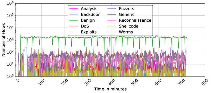
### Visual Description
# Technical Data Extraction: Network Traffic Flow Analysis
## 1. Document Metadata
* **Image Type:** Line Graph (Time-series)
* **Primary Language:** English
* **Subject Matter:** Cybersecurity / Network Traffic Analysis (Number of Flows over Time)
* **Scale:** Logarithmic (Y-axis)
## 2. Axis and Legend Extraction
### Axis Labels
* **Y-Axis (Vertical):** "Number of Flows"
* **Scale:** Logarithmic base 10.
* **Markers:** $10^0$ (1), $10^1$ (10), $10^2$ (100), $10^3$ (1,000), $10^4$ (10,000), $10^5$ (100,000), $10^6$ (1,000,000).
* **X-Axis (Horizontal):** "Time in minutes"
* **Scale:** Linear.
* **Markers:** 0, 100, 200, 300, 400, 500, 600, 700, 800.
### Legend (Spatial Placement: Top-Center [x≈0.5, y≈0.8])
The legend contains 10 categories of network traffic, organized in two columns:
| Color | Category | Color | Category |
| :--- | :--- | :--- | :--- |
| Magenta | Analysis | Purple | Fuzzers |
| Light Blue | Backdoor | Grey | Generic |
| Green | Benign | Pink | Reconnaissance |
| Red | DoS | Yellow-Gold | Shellcode |
| Brown | Exploits | Cyan | Worms |
---
## 3. Component Isolation & Trend Analysis
### Region A: High-Volume Baseline (Green Line)
* **Category:** Benign
* **Visual Trend:** This is the dominant series. It maintains a relatively stable horizontal plateau between $10^3$ and $2 \times 10^3$ flows. It is characterized by periodic, sharp downward spikes (dips) occurring approximately every 40–50 minutes, where traffic drops briefly to the $10^2$ range before recovering.
* **Data Range:** ~200 to ~2,200 flows.
### Region B: Mid-Volume Attack Traffic ($10^1$ to $10^2$ range)
* **Categories:** Fuzzers (Purple), Exploits (Brown), Generic (Grey), Reconnaissance (Pink).
* **Visual Trend:** These series exhibit high volatility (jitter) but stay consistently within the $10^1$ and $2 \times 10^2$ band.
* **Fuzzers (Purple):** Shows frequent peaks reaching near $2 \times 10^2$.
* **Exploits (Brown):** Intermittent bursts, often overlapping with Fuzzers.
* **Backdoor (Light Blue):** Shows a distinct early peak (around minute 20-40) reaching above $10^2$, then drops off, reappearing briefly at the very end of the timeline (minute 700+).
### Region C: Low-Volume / Sparse Traffic ($10^0$ to $10^1$ range)
* **Categories:** DoS (Red), Shellcode (Yellow-Gold), Analysis (Magenta), Worms (Cyan).
* **Visual Trend:** These categories are often at the baseline ($10^0$) or non-existent for long periods.
* **Shellcode (Yellow):** Frequent small spikes but rarely exceeds 10 flows.
* **DoS (Red):** Very sparse, appearing as isolated spikes.
* **Worms (Cyan):** The least frequent; only a few visible pixels/spikes across the 800-minute span.
---
## 4. Key Data Observations
1. **Temporal Scope:** The data tracks network activity for approximately 720 minutes (12 hours).
2. **Class Imbalance:** There is a clear 1-2 order of magnitude difference between "Benign" traffic and the most active "Attack" traffic (Fuzzers/Exploits).
3. **Periodic Behavior:** The "Benign" traffic (Green) shows a highly regular heartbeat-like pattern of dips, suggesting a scheduled system process or a periodic reset in the data collection mechanism.
4. **Attack Synchronization:** Many attack types (Fuzzers, Exploits, Reconnaissance) appear to be active simultaneously throughout the duration of the capture, creating a "noise floor" of malicious activity between 10 and 100 flows.
5. **Specific Event:** A unique "Backdoor" (Light Blue) event occurs early in the timeline (approx. minute 10 to 40), which is the only time that specific category dominates the sub-$10^3$ space.
</details>
(d)
Figure 5: Temporal Distribution of Network Traffic Across Four Datasets. This figure illustrates the minute-by-minute network traffic flow for NF3-Datasets on representative days, showcasing the onset, duration, and termination of various attack classes alongside benign traffic.
Starting with day 1 of NF3-UNSW-NB15, all attack classes occur concurrently throughout the day, providing a complex overlay of multiple threats, which is characteristic of sophisticated real-world attack scenarios. This simultaneous occurrence requires further analysis techniques to isolate and identify individual attack vectors. Another observation from NF3-BoT-IoT day 1 is the clear periods of intense DDoS and DoS attacks, with sharp increases in flow counts, followed by periods of lower activity. This pattern suggests the attacks were launched in waves, a common tactic in denial-of-service attacks to overwhelm systems periodically. On the fifth day of the NF3-CSE-CIC-IDS2018 dataset, the distribution reveals a dominant presence of benign traffic, with intermittent spikes in DoS attack flows. The attack patterns appear as short-lived bursts rather than continuous flooding, suggesting controlled execution, possibly mimicking real-world attack scenarios or stress-testing conditions.. Lastly, NF3-ToN-IoT on day 5 displays separate and distinct instances of DDoS, DoS, and Injection attacks along with periods of benign activity. Throughout the day, benign traffic remains consistent and predominantly at a lower flow level, which is typical of a synthetic dataset designed to maintain a baseline for comparison. This distribution suggests that while attacks are not related or overlapping, the dataset effectively captures distinct and varied attack dynamics within the same day, allowing for the analysis of each threat type under controlled conditions.
While the analysis presented focuses on a single representative day for each dataset, similar examinations were conducted across all active days within each dataset. This comprehensive analysis is crucial for developing a robust understanding of the variability and consistency of network attack behaviours over extended periods. The results underscore the diversity in attack methodologies and their temporal characteristics, which can vary not just from day to day but also from one dataset to another.
After representing the whole period of each dataset, we found that most attack classes were implemented separately on different days. However, an exception is observed in the NF3-UNSW-NB15 dataset, where all attacks were injected simultaneously. While having multiple attacks simultaneously can occur in real-life scenarios, it is recommended for researchers to analyse each class individually to better understand its pattern. Table 4 catalogues, in detail, the number of active days for each dataset along with the specific attacks implemented on those days. This tabulation aids in quantifying the extent and variety of network attacks captured in the datasets, providing a foundational reference for further analysis or model training.
<details>
<summary>x17.png Details</summary>
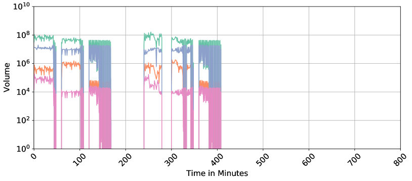
### Visual Description
# Technical Data Extraction: Time-Series Volume Chart
## 1. Document Overview
This image is a technical line chart representing "Volume" over "Time in Minutes." The chart utilizes a logarithmic scale for the Y-axis and a linear scale for the X-axis. It tracks four distinct data series (distinguished by color) across a period of 800 minutes.
## 2. Axis and Metadata Extraction
* **Y-Axis Label:** Volume
* **Y-Axis Scale:** Logarithmic ($10^0$ to $10^{10}$)
* **Y-Axis Major Markers:** $10^0, 10^2, 10^4, 10^6, 10^8, 10^{10}$
* **X-Axis Label:** Time in Minutes
* **X-Axis Scale:** Linear (0 to 800)
* **X-Axis Major Markers:** 0, 100, 200, 300, 400, 500, 600, 700, 800 (Labels are rotated approximately 45 degrees).
* **Grid:** Major grid lines are present for both axes.
## 3. Data Series Analysis
There is no explicit legend provided in the image; however, four distinct colored lines are visible. They are analyzed here by color from highest average volume to lowest.
### Series 1: Teal/Green (Highest Volume)
* **Trend:** This series maintains the highest baseline, generally fluctuating between $10^7$ and $10^8$. It operates in distinct bursts.
* **Activity Windows:**
* 0 - ~50 mins: Steady at $\approx 10^8$.
* ~60 - 110 mins: Steady at $\approx 5 \times 10^7$.
* ~120 - 170 mins: High-frequency oscillation between $10^7$ and $10^8$.
* ~240 - 280 mins: Peak activity reaching slightly above $10^8$.
* ~300 - 350 mins: Steady at $\approx 5 \times 10^7$.
* ~360 - 410 mins: High-frequency oscillation.
* **Post-410 mins:** No data/Zero volume.
### Series 2: Blue/Purple (Mid-High Volume)
* **Trend:** Closely follows the teal series but at a lower magnitude, typically between $10^6$ and $10^7$.
* **Activity Windows:** Synchronized with the Teal series. During the oscillatory phases (e.g., 120-170 mins), it shows extreme vertical volatility, dropping down to $10^4$ and spiking back to $10^7$.
* **Post-410 mins:** No data/Zero volume.
### Series 3: Orange (Mid-Low Volume)
* **Trend:** Generally fluctuates between $10^4$ and $10^6$.
* **Activity Windows:**
* 0 - 50 mins: $\approx 5 \times 10^5$.
* 60 - 110 mins: $\approx 10^6$.
* 120 - 170 mins: Drops significantly to $\approx 5 \times 10^4$.
* 240 - 280 mins: Highly volatile, ranging from $10^4$ to $10^6$.
* 300 - 350 mins: $\approx 10^6$.
* 360 - 410 mins: Drops to $\approx 5 \times 10^4$.
* **Post-410 mins:** No data/Zero volume.
### Series 4: Pink/Magenta (Lowest Volume)
* **Trend:** The baseline series, typically fluctuating between $10^3$ and $10^5$.
* **Activity Windows:**
* 0 - 50 mins: $\approx 10^5$.
* 60 - 110 mins: Drops to $\approx 10^4$.
* 120 - 170 mins: Remains at $\approx 10^4$ with significant downward spikes toward $10^0$.
* 240 - 280 mins: $\approx 10^5$ dropping to $10^4$.
* 300 - 350 mins: $\approx 10^4$.
* 360 - 410 mins: $\approx 10^4$ with extreme downward spikes.
* **Post-410 mins:** No data/Zero volume.
## 4. Component Isolation & Observations
* **Header/Title:** None present.
* **Main Chart Area:** The data is clustered in the first half of the timeline (0 to 410 minutes). There are significant "dead zones" or gaps where all volume drops to zero (e.g., between 50-60 mins, 110-120 mins, 170-240 mins, and 280-300 mins).
* **Footer:** Contains the X-axis label "Time in Minutes" and the numerical scale.
* **Data Termination:** All recording or activity appears to cease abruptly at approximately 410 minutes, leaving the remainder of the chart (410-800 minutes) empty.
* **Correlation:** There is a high degree of temporal correlation between the series; when one series is active, they are all active, and they all experience "gap" periods simultaneously.
</details>
(a)
<details>
<summary>x18.png Details</summary>
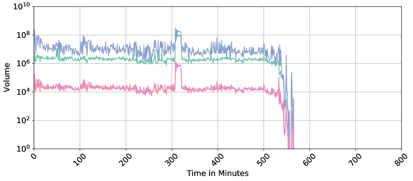
### Visual Description
# Technical Data Extraction: Time-Series Volume Chart
## 1. Document Overview
This image is a technical line chart depicting "Volume" over "Time in Minutes." The chart utilizes a logarithmic scale for the Y-axis and a linear scale for the X-axis. It tracks multiple data series (distinguished by color) over a duration of approximately 560 minutes.
## 2. Axis Specifications
* **Y-Axis (Vertical):**
* **Label:** Volume
* **Scale:** Logarithmic (Base 10)
* **Markers:** $10^0, 10^2, 10^4, 10^6, 10^8, 10^{10}$
* **X-Axis (Horizontal):**
* **Label:** Time in Minutes
* **Scale:** Linear
* **Markers:** 0, 100, 200, 300, 400, 500, 600, 700, 800 (Intervals of 100)
* **Note:** The labels are rotated at approximately a 45-degree angle.
## 3. Data Series Analysis
The chart contains four distinct colored lines. Note: There is no explicit legend provided in the image; colors are identified by visual inspection.
### Series 1: Blue (Top Tier)
* **Trend:** This series maintains the highest volume throughout the timeline. It exhibits high volatility (frequent spikes and dips) within a range.
* **Baseline:** Fluctuates primarily between $10^6$ and $10^8$.
* **Significant Event:** At approximately $T=310$ to $T=325$, there is a sharp, sustained spike peaking near $10^9$.
* **Termination:** Drops sharply after $T=530$, oscillating down to $10^1$ before ending at approximately $T=565$.
### Series 2: Green (Middle Tier)
* **Trend:** Relatively stable with lower volatility compared to the blue series.
* **Baseline:** Consistently tracks just above the $10^6$ marker.
* **Significant Event:** Synchronized with the blue series, it shows a significant spike at $T=310$, reaching nearly $10^8$.
* **Termination:** Follows the blue series' downward trajectory starting at $T=530$.
### Series 3: Pink (Lower Tier)
* **Trend:** Stable baseline with moderate noise.
* **Baseline:** Fluctuates around the $10^4$ to $2 \times 10^4$ range.
* **Significant Event:** Shows a distinct "block" spike at $T=310$, reaching $10^6$.
* **Termination:** Drops precipitously at $T=530$, reaching the $10^0$ floor by $T=560$.
### Series 4: Orange (Lower Tier - Overlaid)
* **Trend:** This series is largely obscured by the pink series, appearing as highlights or underlying data points.
* **Baseline:** Tracks almost identically to the pink series at $10^4$.
* **Termination:** Ceases at the same time as the pink series.
## 4. Key Observations and Patterns
* **Correlation:** All four series show a high degree of temporal correlation. Specifically, the spike at **Minute 310** occurs simultaneously across all metrics, suggesting a system-wide event or a significant increase in load/activity.
* **System Shutdown/End of Data:** All activity ceases abruptly between **Minute 530 and Minute 570**. The volume drops several orders of magnitude in a very short window, characteristic of a process termination or the end of a recorded session.
* **Data Density:** The chart is empty from Minute 600 to Minute 800, indicating the observation period concluded early or the system went offline.
## 5. Component Isolation
* **Header:** None present.
* **Main Chart Area:** Occupies the top 90% of the image. Contains a grey grid aligned with major axis markers.
* **Footer:** Contains the X-axis label "Time in Minutes" and the numerical time markers.
</details>
(b)
<details>
<summary>x19.png Details</summary>
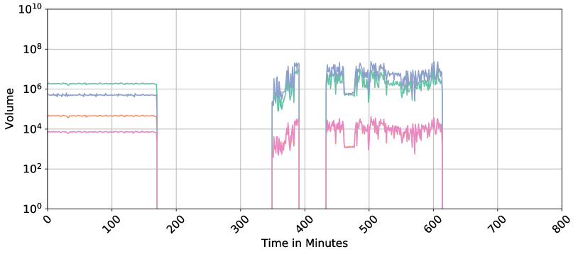
### Visual Description
# Technical Data Extraction: Time-Series Volume Chart
## 1. Metadata and Component Isolation
* **Image Type:** Line Chart (Time-Series)
* **Language:** English
* **Primary Axis (Y):** Volume (Logarithmic Scale)
* **Secondary Axis (X):** Time in Minutes (Linear Scale)
* **Regions:**
* **Header:** None present.
* **Main Chart:** Contains four distinct data series plotted against a grid.
* **Footer:** Contains the X-axis label and time markers.
## 2. Axis and Label Extraction
* **Y-Axis Label:** "Volume"
* **Y-Axis Scale:** Logarithmic, base 10.
* Markers: $10^0$, $10^2$, $10^4$, $10^6$, $10^8$, $10^{10}$
* **X-Axis Label:** "Time in Minutes"
* **X-Axis Scale:** Linear, 0 to 800.
* Markers (rotated 45°): 0, 100, 200, 300, 400, 500, 600, 700, 800.
* **Grid:** Major grid lines are present for both X and Y axes.
## 3. Data Series Analysis
There is no explicit legend provided in the image. However, four distinct colored lines are visible. They are analyzed below by color and behavior.
### Series 1: Teal/Green Line (Highest initial volume)
* **Trend:** Highly stable horizontal line initially, followed by high-volatility bursts.
* **Data Points:**
* **0 - 170 mins:** Constant at approximately $2 \times 10^6$.
* **170 - 350 mins:** No data (drops to 0).
* **350 - 390 mins:** Highly volatile burst between $10^5$ and $10^7$.
* **430 - 610 mins:** Sustained high volatility between $10^6$ and $10^7$.
### Series 2: Blue/Purple Line (Second highest initial volume)
* **Trend:** Follows a similar pattern to the Teal line but at a slightly lower magnitude initially, then overlaps/exceeds it during bursts.
* **Data Points:**
* **0 - 170 mins:** Constant at approximately $5 \times 10^5$.
* **170 - 350 mins:** No data.
* **350 - 390 mins:** Volatile burst peaking near $2 \times 10^7$.
* **430 - 610 mins:** Sustained volatility, often the highest value in this window, peaking near $3 \times 10^7$.
### Series 3: Orange Line (Third highest initial volume)
* **Trend:** Stable horizontal line initially. It appears to merge with or be replaced by the Pink line during the later bursts.
* **Data Points:**
* **0 - 170 mins:** Constant at approximately $5 \times 10^4$.
* **170 - 800 mins:** Not distinctly visible as a separate orange line; likely represented by the Pink series in the active windows.
### Series 4: Pink/Magenta Line (Lowest volume)
* **Trend:** Stable horizontal line initially, followed by lower-magnitude volatile bursts.
* **Data Points:**
* **0 - 170 mins:** Constant at approximately $8 \times 10^3$.
* **170 - 350 mins:** No data.
* **350 - 390 mins:** Volatile burst between $10^3$ and $3 \times 10^4$.
* **430 - 610 mins:** Sustained volatility between $10^3$ and $4 \times 10^4$.
## 4. Key Observations and Patterns
* **Data Gaps:** There are two significant periods of inactivity where all volumes drop to zero:
1. **Minute 170 to 350** (Duration: 180 minutes)
2. **Minute 390 to 430** (Duration: 40 minutes)
* **Activity Termination:** All data recording ceases after approximately **Minute 615**.
* **Regime Shift:** From 0-170 minutes, the data is "Steady State" (flat lines). From 350 minutes onwards, the data becomes "Stochastic/Volatile" (jagged peaks and valleys).
* **Correlation:** All four series show high temporal correlation; they start, stop, and spike at the exact same time intervals, suggesting they are different metrics of the same system or process.
</details>
(c)
<details>
<summary>x20.png Details</summary>
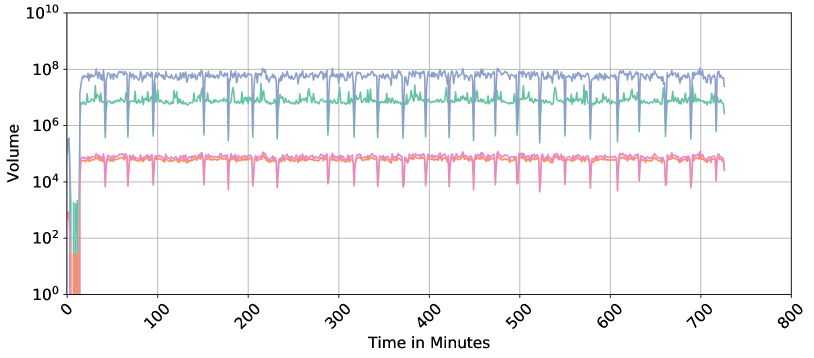
### Visual Description
# Technical Data Extraction: Time-Series Volume Analysis
## 1. Document Overview
This image is a technical line chart depicting "Volume" over a duration of approximately 750 minutes. The chart utilizes a logarithmic scale for the Y-axis to represent a wide range of data magnitudes across four distinct data series.
## 2. Axis and Metadata Extraction
* **Y-Axis Label:** Volume
* **Y-Axis Scale:** Logarithmic, ranging from $10^0$ to $10^{10}$.
* Major Markers: $10^0, 10^2, 10^4, 10^6, 10^8, 10^{10}$.
* **X-Axis Label:** Time in Minutes
* **X-Axis Scale:** Linear, ranging from 0 to 800.
* Major Markers: 0, 100, 200, 300, 400, 500, 600, 700, 800.
* **Grid:** Major grid lines are present for both X and Y axes.
* **Legend:** No explicit text legend is present in the image; however, four distinct colored lines are visible.
## 3. Component Isolation & Data Series Analysis
The chart contains four data series, distinguished by color. All series follow a similar temporal pattern: a volatile initialization phase (0–20 minutes), followed by a steady-state phase characterized by periodic "dips" or downward spikes.
### Series 1: Blue (Top Tier)
* **Trend:** This is the highest volume series. After an initial spike at $t \approx 15$, it maintains a steady state with high-frequency oscillations.
* **Steady State Value:** Approximately $10^8$.
* **Periodic Dips:** Sharp downward spikes occur roughly every 40–50 minutes, dropping to approximately $5 \times 10^6$.
### Series 2: Green (Middle-High Tier)
* **Trend:** Follows the same pattern as the blue series but at a lower magnitude.
* **Steady State Value:** Approximately $10^7$.
* **Periodic Dips:** Sharp downward spikes synchronized with the blue series, dropping to approximately $5 \times 10^5$.
### Series 3: Orange (Middle-Low Tier)
* **Trend:** Positioned in the lower cluster of lines. It is very stable with minimal high-frequency noise compared to the top two lines.
* **Steady State Value:** Approximately $8 \times 10^4$.
* **Periodic Dips:** Synchronized downward spikes dropping to approximately $10^4$.
### Series 4: Pink/Purple (Bottom Tier)
* **Trend:** Closely tracks the orange series, often overlapping or sitting slightly below it.
* **Steady State Value:** Approximately $6 \times 10^4$.
* **Periodic Dips:** Synchronized downward spikes dropping to approximately $8 \times 10^3$.
## 4. Key Observations and Patterns
* **Initialization Phase (0 - 20 Minutes):** All series show extreme volatility or near-zero values before rapidly ascending to their steady-state levels at approximately the 20-minute mark.
* **Synchronization:** The downward spikes (dips) are perfectly synchronized across all four data series. This suggests a recurring system-wide event (e.g., a scheduled process, cache flush, or heartbeat interval) occurring approximately every 45 minutes.
* **Magnitude Separation:** There is a clear logarithmic separation between the two high-volume series ($10^7 - 10^8$) and the two low-volume series ($10^4 - 10^5$).
* **Stability:** The data remains consistent in its behavior from minute 20 through minute 750, indicating a stable environment or a repeating synthetic workload.
## 5. Language Declaration
The text in this image is entirely in **English**. No other languages were detected.
</details>
(d)
<details>
<summary>x21.png Details</summary>

### Visual Description
Icon/Small Image (718x32)
</details>
Figure 6: Time series representation of numerical fields in NF3-Datasets: IB, OB, IP, and OP. The x-axis represents time aggregated in minutes, while the y-axis shows the volume of each feature, illustrating fluctuations and patterns in network traffic over time.
Table 4: Attacks Implemented on Active Days for Each Dataset
| 1 2 3 | All All Benign-Only | BruteForce DoS DoS | Benign-Only Benign-Only Benign-Only | Reconnaissance Reconnaissance Reconnaissance |
| --- | --- | --- | --- | --- |
| 4 | — | DDoS | Scanning | DoS, DDoS |
| 5 | — | DDoS | DoS, Scanning | Theft |
| 6 | — | Web-Attack | DDoS, Injection, DoS | Theft |
| 7 | — | Web-Attack | DDoS, Password | — |
| 8 | — | Benign-Only | XSS, Password | — |
| 9 | — | Infiltration | Backdoor, Ransomware | — |
| 10 | — | Infiltration | MITM, Backdoor | — |
| 11 | — | BoT | — | — |
5.4 Timeseries Representation of Netflow Features
Monitoring network traffic volume over time is essential for understanding network behaviour and identifying trends or irregularities that may not be apparent in static analysis. By analysing traffic as a time series, we can detect variations in network load, identify peak usage time intervals, and observe patterns of data flow across different time intervals. This continuous observation allows for a deeper understanding of normal traffic behaviour and helps to highlight anomalies or unusual patterns that could indicate underlying issues. In this subsection, we represent different numerical and categorical features from the datasets as time series to gain insights into the temporal dynamics of the traffic. This visualisation not only helps in understanding how these features distribute over time but also showcases the enhanced analysis capabilities introduced by adding temporal information into this version of the datasets.
5.4.1 Numerical Fields
In this analysis, we focus on four pivotal numerical features: IN_BYTES (IB), IN_PKTS (IP), OUT_BYTES (OB), and OUT_PKTS (OP). These features are instrumental in gauging the volume and flow of data moving into and out of the network, critical for deciphering overall traffic patterns [38, 39, 40]. IB and OB measure the amount of data received and sent, respectively, offering insights into data load, bandwidth usage, and potential congestion points. Simultaneously, IP and OP count the number of packets transmitted, which is essential for assessing the efficiency of packet transmission, pinpointing any packet loss, and evaluating the balance of traffic flow.
To enable a thorough monitoring of network traffic over time, we aggregate these features by minute. This temporal granularity unveils detailed patterns and fluctuations in traffic that illuminate the network’s performance and utilisation. For consistent and focused analysis, we have chosen the same single-day snapshots as in the previous section, as shown in Figure 6.
The analysis of these time series reveals a symmetrical pattern between IB and OB, as well as between IP and OP, indicative of a balanced communication pattern within the network where the volume of incoming bytes and packets closely mirrors that of outgoing bytes and packets over time. This symmetry reflects a stable network environment where data inflow and outflow are consistent, suggesting effective network management and robust infrastructure.
Specific observations from the representative days across various datasets illustrate the nuanced dynamics of network traffic: NF3-ToN-IoT and NF3-CSE-CIC-IDS2018, both on Day 5, show consistent levels of IB and OB with sporadic spikes possibly linked to operational anomalies or specific events. In contrast, NF3-UNSW-NB15 Day 1 features a notable early spike in OB, suggesting an event like data exfiltration or a substantial data transfer, is potentially benign. Meanwhile, NF3-BoT-IoT Day 1 exhibits significant variability in OP, indicative of intermittent network attacks or disruptions, underscoring the susceptibility to external threats.
5.4.2 Categorical Fields
Categorical features, such as Origin/Destination IPs and Ports, offer valuable insights into the structure and behaviour of network traffic. By tracking the number of unique IPs and ports over time, we can better understand communication patterns, identifying which devices are actively engaged in the network. This also reveals the diversity of traffic whether it’s distributed across many endpoints or concentrated on specific services. Additionally, monitoring these features helps detect unusual behaviour such as sudden increases in unique IPs or port activity which could indicate irregular network events [33]. NIDS datasets often vary significantly in the number of unique IP addresses and ports they capture, reflecting differences in the scope and diversity of network traffic. The number of unique IPs and ports present in each of the proposed datasets is shown in Table 5.
Table 5: Count of unique categorical fields in NF3-Datasets
| NF3-UNSW-NB15 NF3-CSECIC-IDS2018 NF3-ToN-IoT | 40 183,806 15,396 | 40 29,226 9,011 | 64,620 65,325 65,536 | 64,631 63,353 65,536 |
| --- | --- | --- | --- | --- |
| NF3-BoT-IoT | 20 | 291 | 65,536 | 65,536 |
Similar to the previous subsection, Figure 7 visualises four categorical features: unique source and destination IP addresses and ports, captured in the same one-day snapshots. The x-axis represents time in minutes, while the y-axis shows the count of unique categorical values without repetition within each minute. Although the count is aggregated per minute, the data can be further zoomed in to monitor traffic at the level of seconds or even finer granularity. Here, we emphasise the utility of tracking categorical features over time, as it can assist in detecting certain types of anomalies related to source and destination IPs and ports.
<details>
<summary>x22.png Details</summary>
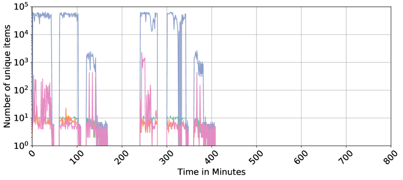
### Visual Description
# Technical Data Extraction: Time-Series Analysis of Unique Items
## 1. Document Metadata
* **Type:** Line Chart (Logarithmic Scale)
* **Language:** English
* **Primary Subject:** Tracking the quantity of unique items over a duration of 800 minutes.
## 2. Axis and Scale Information
* **Y-Axis (Vertical):**
* **Label:** "Number of unique items"
* **Scale:** Logarithmic (Base 10).
* **Markers:** $10^0$ (1), $10^1$ (10), $10^2$ (100), $10^3$ (1,000), $10^4$ (10,000), $10^5$ (100,000).
* **X-Axis (Horizontal):**
* **Label:** "Time in Minutes"
* **Scale:** Linear.
* **Markers:** 0, 100, 200, 300, 400, 500, 600, 700, 800.
* **Note:** X-axis labels are rotated approximately 45 degrees for readability.
## 3. Data Series Analysis
The chart contains four distinct data series represented by different colors. Note: There is no explicit legend box, but the colors are distinct.
### Series A: Blue Line (High Volume)
* **Trend:** This series represents the highest volume of items. It operates in "bursts" or "blocks" of activity.
* **Behavior:**
* **0–50 mins:** High activity, fluctuating between $4 \times 10^4$ and $7 \times 10^4$.
* **60–100 mins:** Sustained high activity near $6 \times 10^4$.
* **120–140 mins:** A lower burst peaking around $2 \times 10^3$.
* **240–280 mins:** High activity with a significant dip in the middle.
* **300–340 mins:** High activity, dropping sharply to zero at the end of the interval.
* **360–380 mins:** Final small burst peaking near $2 \times 10^3$.
* **Post-400 mins:** No data/Zero.
### Series B: Pink Line (High Volatility)
* **Trend:** Highly erratic with frequent spikes and drops to the baseline ($10^0$).
* **Behavior:**
* **0–50 mins:** Frequent spikes reaching between $10^1$ and $3 \times 10^2$.
* **240–250 mins:** A major spike reaching over $10^3$.
* **General:** Often mirrors the timing of the Blue series but at a magnitude 2-3 orders of magnitude lower.
### Series C: Green Line (Steady State)
* **Trend:** Extremely stable and horizontal.
* **Behavior:** Maintains a near-constant value of exactly $10^1$ (10 items) whenever active. It appears as a flat line segment during the active periods of the other series.
### Series D: Orange Line (Low Volume)
* **Trend:** Low-level fluctuations, generally staying below the Green line.
* **Behavior:** Fluctuates between $3 \times 10^0$ and $10^1$. It is most visible in the 0–100 minute range and the 240–350 minute range.
## 4. Spatial Grounding and Component Isolation
* **Header/Title:** None present.
* **Main Chart Area:** Occupies the top 90% of the image. Features a grey grid.
* **Footer:** Contains the X-axis label "Time in Minutes" centered at the bottom.
* **Data Distribution:** All activity is concentrated in the first 410 minutes. The region from 410 to 800 minutes is entirely empty (zero values), indicating the process or observation ended halfway through the recorded timeframe.
## 5. Summary of Key Findings
1. **Intermittency:** The data shows distinct "on" and "off" periods. There is a total gap in all data series between approximately 160 and 240 minutes.
2. **Magnitude Gap:** There is a massive disparity between the Blue series (up to 70,000 items) and the other series (typically under 1,000 items).
3. **Termination:** All recorded activity ceases abruptly shortly after the 400-minute mark.
</details>
(a)
<details>
<summary>x23.png Details</summary>

### Visual Description
# Technical Document Extraction: Time-Series Analysis of Unique Items
## 1. Image Overview
This image is a line chart representing the "Number of unique items" over a duration of "Time in Minutes." The chart utilizes a logarithmic scale for the Y-axis and a linear scale for the X-axis. It tracks four distinct data series (represented by different colors) over a period of approximately 560 minutes.
## 2. Axis and Metadata Extraction
* **Y-Axis Label:** Number of unique items
* **Y-Axis Scale:** Logarithmic ($10^0$ to $10^5$)
* **Major Markers:** $10^0$ (1), $10^1$ (10), $10^2$ (100), $10^3$ (1,000), $10^4$ (10,000), $10^5$ (100,000).
* **X-Axis Label:** Time in Minutes
* **X-Axis Scale:** Linear (0 to 800)
* **Major Markers:** 0, 100, 200, 300, 400, 500, 600, 700, 800.
* **Note:** The labels are rotated at a 45-degree angle.
* **Grid:** A major grid is present for both X and Y axes.
* **Legend:** No explicit text legend is present in the image. The series are identified by color.
## 3. Data Series Analysis
The chart contains four data series. Since there is no legend, they are identified here by their visual color and relative position.
### Series 1: Blue (Topmost)
* **Trend:** This series maintains the highest volume. It fluctuates between $10^3$ and $5 \times 10^3$ for the first 300 minutes. It features a significant sharp spike around $T=310$, reaching above $10^4$, followed by a plateau and a return to the $2 \times 10^3$ range.
* **Termination:** At approximately $T=530$, the value drops precipitously toward zero.
### Series 2: Orange (Second from Top)
* **Trend:** Relatively stable horizontal trend with high-frequency noise. It oscillates primarily between $3 \times 10^2$ and $6 \times 10^2$.
* **Termination:** Drops sharply at $T=530$, mirroring the blue series.
### Series 3: Green (Third from Top)
* **Trend:** The most stable series. It shows very little fluctuation, maintaining a consistent level just below $3 \times 10^2$ (approx. 250-280 items) for the duration of the activity.
* **Termination:** Drops sharply at $T=530$.
### Series 4: Pink (Bottommost)
* **Trend:** Fluctuates between $10^2$ and $2 \times 10^2$. It shows a slight upward trend/increase in variance between $T=300$ and $T=500$ compared to the first half of the chart.
* **Termination:** Drops sharply at $T=530$.
## 4. Key Observations and Data Points
| Feature | Description |
| :--- | :--- |
| **Start Time** | All series begin at $T=0$ with a sharp vertical ascent from $10^0$. |
| **Steady State** | The period between $T=10$ and $T=530$ represents the active processing window. |
| **The "310 Spike"** | A major anomaly occurs in the **Blue Series** at $T \approx 310$, where unique items jump from $\sim 2,000$ to $>10,000$ momentarily. |
| **System Shutdown** | At $T \approx 530$, all four metrics collapse simultaneously. By $T=560$, all values have reached the baseline ($10^0$). |
| **Inactive Zone** | From $T=560$ to $T=800$, the chart is empty, indicating no data or zero unique items. |
## 5. Component Isolation
* **Header:** None.
* **Main Chart Area:** Occupies the top 90% of the image. Contains the plot and gridlines.
* **Footer/Axes:** The X-axis labels are positioned at the bottom. The Y-axis labels are positioned on the far left. The data terminates well before the end of the X-axis (at 70% of the total width).
</details>
(b)
<details>
<summary>x24.png Details</summary>
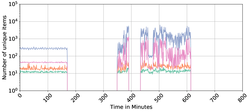
### Visual Description
# Technical Document Extraction: Time-Series Data Analysis
## 1. Image Overview
This image is a line chart representing the "Number of unique items" over a period of "Time in Minutes." The chart utilizes a logarithmic scale for the Y-axis and a linear scale for the X-axis. It tracks four distinct data series (distinguished by color) across a duration of 800 minutes.
## 2. Axis and Metadata Extraction
* **Y-Axis Label:** Number of unique items
* **Y-Axis Scale:** Logarithmic ($10^0$ to $10^5$)
* Markers: $10^0$ (1), $10^1$ (10), $10^2$ (100), $10^3$ (1,000), $10^4$ (10,000), $10^5$ (100,000)
* **X-Axis Label:** Time in Minutes
* **X-Axis Scale:** Linear (0 to 800)
* Major Markers: 0, 100, 200, 300, 400, 500, 600, 700, 800
* **Grid:** Major grid lines are present for both X and Y axes.
## 3. Data Series Analysis
The chart contains four data series. Note: There is no explicit legend provided in the image; however, the series are visually distinct by color.
### Series 1: Blue (Topmost)
* **Trend:** This series maintains the highest volume. It shows a steady baseline with minor oscillations, followed by high-volatility bursts.
* **Phase 1 (0–170 min):** Stable at approximately $2 \times 10^2$ to $3 \times 10^2$ items.
* **Phase 2 (170–350 min):** Data is absent (drops to zero/off-chart).
* **Phase 3 (350–620 min):** Highly volatile. Peaks reach between $5 \times 10^3$ and $7 \times 10^3$. It experiences a brief drop to $10^2$ around the 480-minute mark before spiking again.
* **Phase 4 (620–800 min):** Data is absent.
### Series 2: Pink/Magenta (Second from Top)
* **Trend:** Follows a similar temporal pattern to the Blue series but at a lower magnitude and with higher relative variance during active phases.
* **Phase 1 (0–170 min):** Stable at approximately $4 \times 10^1$ to $5 \times 10^1$ items.
* **Phase 2 (170–350 min):** Data is absent.
* **Phase 3 (350–620 min):** Extremely volatile. Values fluctuate rapidly between $10^1$ and $10^3$.
* **Phase 4 (620–800 min):** Data is absent.
### Series 3: Orange (Third from Top)
* **Trend:** Relatively stable compared to the top two series, showing consistent "noise" or jitter.
* **Phase 1 (0–170 min):** Fluctuates between $1.5 \times 10^1$ and $3 \times 10^1$.
* **Phase 2 (170–350 min):** Data is absent.
* **Phase 3 (350–620 min):** Shows a slight increase in baseline and volatility, ranging from $2 \times 10^1$ to $5 \times 10^1$.
* **Phase 4 (620–800 min):** Data is absent.
### Series 4: Teal/Green (Bottommost)
* **Trend:** The most stable and lowest volume series.
* **Phase 1 (0–170 min):** Very steady at approximately $1 \times 10^1$ to $1.5 \times 10^1$.
* **Phase 2 (170–350 min):** Data is absent.
* **Phase 3 (350–620 min):** Remains steady near the $10^1$ line, with a slight increase in jitter between 450 and 600 minutes.
* **Phase 4 (620–800 min):** Data is absent.
## 4. Key Observations and Patterns
* **Synchronized Activity:** All four data series are active and inactive during the exact same time intervals:
* **Active:** 0 to ~170 minutes.
* **Inactive:** ~170 to ~350 minutes.
* **Active:** ~350 to ~620 minutes (with a very brief gap/dip around 410 minutes).
* **Inactive:** ~620 to 800 minutes.
* **Correlation:** There is a strong positive correlation in the timing of spikes between the Blue and Pink series, suggesting they may be tracking related metrics (e.g., total requests vs. unique users).
* **Logarithmic Distribution:** The data spans three orders of magnitude ($10^1$ to $10^4$), indicating a power-law or highly skewed distribution of the items being measured.
</details>
(c)
<details>
<summary>x25.png Details</summary>
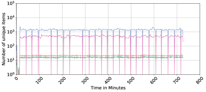
### Visual Description
# Technical Data Extraction: Time-Series Analysis of Unique Items
## 1. Document Overview
This image is a technical line chart depicting the "Number of unique items" over a duration of approximately 720 minutes (12 hours). The chart utilizes a logarithmic scale for the Y-axis to display four distinct data series simultaneously across several orders of magnitude.
## 2. Axis and Scale Identification
* **Y-Axis (Vertical):**
* **Label:** "Number of unique items"
* **Scale:** Logarithmic (Base 10).
* **Markers:** $10^0$ (1), $10^1$ (10), $10^2$ (100), $10^3$ (1,000), $10^4$ (10,000), $10^5$ (100,000).
* **X-Axis (Horizontal):**
* **Label:** "Time in Minutes"
* **Scale:** Linear.
* **Markers:** 0, 100, 200, 300, 400, 500, 600, 700, 800.
* **Orientation:** Labels are rotated approximately 45 degrees.
## 3. Data Series Analysis
The chart contains four distinct colored lines. Note: There is no explicit legend box in the image; colors are identified by their visual appearance.
### Series 1: Blue Line (Top Tier)
* **Trend:** Highly stable horizontal trend with periodic sharp downward spikes.
* **Baseline Value:** Fluctuates slightly around the $1.5 \times 10^3$ mark (approx. 1,500 items).
* **Behavior:** After an initial startup phase (0-20 mins), the line maintains a steady state. Every ~40 minutes, it exhibits a sharp "dip" or "heartbeat" drop, likely representing a cache clear or a periodic reset, before immediately returning to the baseline.
### Series 2: Pink Line (Middle-High Tier)
* **Trend:** Stable horizontal trend with significant periodic drops to zero.
* **Baseline Value:** Fluctuates between $4 \times 10^2$ and $6 \times 10^2$ (approx. 400–600 items).
* **Behavior:** This series follows the same periodic frequency as the blue line but the drops are more extreme, often touching the $10^0$ (1) floor or disappearing entirely for a brief moment.
### Series 3: Orange Line (Middle-Low Tier)
* **Trend:** Extremely stable, flat horizontal line.
* **Baseline Value:** Positioned consistently just above the $2 \times 10^1$ mark (approx. 20–22 items).
* **Behavior:** Shows the least amount of variance of all series. It does not appear to be affected by the periodic drops seen in the Blue and Pink series.
### Series 4: Green Line (Bottom Tier)
* **Trend:** Stable horizontal trend with minor "noisy" fluctuations.
* **Baseline Value:** Positioned consistently between $1.5 \times 10^1$ and $1.8 \times 10^1$ (approx. 15–18 items).
* **Behavior:** Runs parallel to and slightly below the orange line. It exhibits more high-frequency jitter than the orange line but remains within a very tight range.
## 4. Periodic Event Identification
A critical feature of this data is the synchronized periodic event occurring across the Blue and Pink series.
* **Interval:** Approximately every 40 minutes.
* **Event Type:** Negative spikes (dips).
* **Observation:** The Orange and Green series are immune to these events, suggesting they represent a different class of "unique items" or a different storage mechanism that is not subject to the same clearing/refresh cycle as the higher-volume items.
## 5. Spatial Grounding and Component Isolation
* **Header/Title:** None present.
* **Main Chart Area:** Occupies the central [0,0] to [800, 10^5] coordinate space. Grid lines are present for both major X and Y intervals.
* **Startup Phase (0-20 Minutes):** All series show erratic behavior or rapid growth from zero before stabilizing at their respective baselines.
* **Footer:** Contains the X-axis label "Time in Minutes" centered at the bottom.
</details>
(d)
<details>
<summary>x21.png Details</summary>

### Visual Description
Icon/Small Image (718x32)
</details>
Figure 7: Representation of categorical features in NF3-Datasets: IPV4_SRC_ADDR, IPV4_DST_ADDR, IPV4_SRC_PORT, and IPV4_DST_PORT. The x-axis represents time aggregated in minutes, and the y-axis shows the count of unique values for each category, highlighting the diversity in network activities over time.
In the NF3-CSE-CIC-IDS2018 Day 5, the count of unique source IPs (IPV4_SRC_ADDR) remains relatively steady, suggesting consistent activity from a stable set of source IPs throughout the day. Minor fluctuations in destination IPs (IPv4_DST_ADDR) may indicate interactions with a variety of external services or hosts. The source ports (L4_SRC_PORT) display stability with an occasional sharp spike, potentially pointing to a brief period of heightened network activity or an anomaly, while destination ports (L4_DST_PORT) show similar stability, suggesting regular communication patterns without significant anomalies. For NF3-ToN-IoT Day 5, both source and destination IPs exhibit peaks, notably in destination IPs, which could signify interactions with various external systems, potentially indicative of external data exchanges or scanning activities. Periodic spikes in both source and destination ports may indicate batched communications or network scans, suggesting an environment where network interactions are both dynamic and potentially vulnerable to security breaches.
The NF3-UNSW-NB15 Day 1 data reveals a low range of variation in both source and destination IPs, indicative of a controlled environment where a limited number of IPs are engaged. This suggests an environment with established, routine communication patterns, where ports show consistent levels, aligning with a network that experiences few irregularities and maintains a steady communication flow. In contrast, the NF3-BoT-IoT Day 1 plot maintains a lower count of unique source IPs with occasional spikes, suggesting sporadic activation of new source IPs possibly for command and control communications typical of a botnet scenario. Destination IPs show significant variability, likely related to the botnet’s targets or a broader scope of victim engagement. The frequent changes in destination ports reflect dynamic interactions, potentially with multiple target machines or services, highlighting the erratic and potentially malicious nature of botnet activities within this dataset.
5.5 Time-Frequency Representation
Given the rich temporal information in network flows, various time and frequency signal processing techniques can be used for the analysis of the network traffic. Time-frequency analysis is a key signal processing technique that allows simultaneous examination of signals in both time and frequency domains, that can provide deeper insights into their underlying patterns. This approach is particularly suited for non-stationary signals, where frequency content varies over time, such as in speech, music, and biomedical signals [53, 54]. Given the burstiness of network traffic [55] where volumes can change rapidly (such as sudden spikes in packet volume during an attack) or exhibit periodicity (such as daily traffic pattern), it behaves as a time series signal with non-stationary properties [56]. Non-stationarity means the statistical properties, such as mean and variance, change over time; hence, conventional frequency domain approaches (like the Fourier transform) cannot deal with the time-varying and non-stationary nature of traffic pattern. Accordingly, time-frequency signal representation might be able to reveal patterns and anomalies in the time-frequency domain, which might be difficult to detect in the raw time-domain data.
<details>
<summary>x26.png Details</summary>
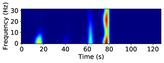
### Visual Description
# Technical Document Extraction: Spectrogram Analysis
## 1. Image Classification and Overview
This image is a **spectrogram**, a visual representation of the spectrum of frequencies of a signal as it varies with time. It uses a heatmap color scale where dark blue represents low intensity/power and red/yellow represents high intensity/power.
## 2. Component Isolation
### A. Axis Labels and Markers
* **Y-Axis (Vertical):**
* **Label:** `Frequency (Hz)`
* **Markers:** `0`, `10`, `20`, `30`
* **Scale:** Linear, ranging from 0 to approximately 32 Hz.
* **X-Axis (Horizontal):**
* **Label:** `Time (s)`
* **Markers:** `0`, `20`, `40`, `60`, `80`, `100`, `120`
* **Scale:** Linear, ranging from 0 to approximately 130 seconds.
### B. Main Chart Area (Heatmap Data)
The background is a uniform dark blue, indicating a baseline of zero or very low signal intensity across most of the time-frequency domain. There are four distinct "events" or bursts of signal activity.
## 3. Data Extraction and Trend Verification
| Event # | Time Interval (approx.) | Frequency Range (approx.) | Peak Intensity Color | Description of Trend |
| :--- | :--- | :--- | :--- | :--- |
| **1** | 12s – 20s | 0 – 15 Hz | Yellow/Cyan | A low-frequency burst. Intensity is highest near 0-5 Hz and tapers off as frequency increases. |
| **2** | 38s – 45s | 0 – 10 Hz | Light Blue | A very faint, low-intensity "ghost" signal. Barely registers above the baseline. |
| **3** | 60s – 65s | 0 – 30 Hz | Cyan/Green | A vertical "spike" or broadband event. It covers the entire frequency range shown but has moderate intensity. |
| **4** | 75s – 80s | 0 – 32 Hz | **Dark Red** | The primary signal event. This is a high-intensity broadband burst. It shows two distinct "hot spots" of maximum intensity (Red): one at ~2-5 Hz and another at ~20-25 Hz. |
## 4. Key Findings and Observations
* **Dominant Signal:** The most significant event occurs between **75 and 80 seconds**. It is a broadband signal (affecting all measured frequencies) with the highest power density.
* **Frequency Characteristics:** The signal activity is primarily concentrated in the lower frequencies (0-10 Hz), though the later events show energy leaking into the higher 20-30 Hz range.
* **Temporal Pattern:** The events appear at irregular intervals (approx. 20s, 25s, and 15s apart), suggesting a non-periodic or triggered signal source.
* **Language Declaration:** All text in the image is in **English**. No other languages are present.
</details>
(a)
<details>
<summary>x27.png Details</summary>
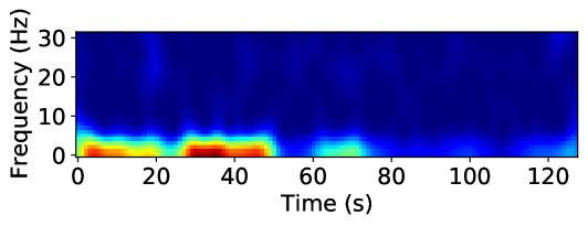
### Visual Description
# Technical Document Extraction: Spectrogram Analysis
## 1. Image Classification and Overview
This image is a **spectrogram**, a visual representation of the spectrum of frequencies of a signal as it varies with time. It uses a heatmap color scale to represent the intensity (magnitude/power) of specific frequencies over a duration of approximately 125 seconds.
## 2. Component Isolation
### A. Axis Labels and Markers
* **Vertical Axis (Y-axis):**
* **Label:** `Frequency (Hz)`
* **Markers:** `0`, `10`, `20`, `30`
* **Scale:** Linear, ranging from 0 Hz to slightly above 30 Hz.
* **Horizontal Axis (X-axis):**
* **Label:** `Time (s)`
* **Markers:** `0`, `20`, `40`, `60`, `80`, `100`, `120`
* **Scale:** Linear, representing time in seconds, ending at approximately 128 seconds.
### B. Color Legend (Implicit)
While a formal color bar is not present, the standard jet/thermal colormap is utilized:
* **Dark Blue:** Low intensity / Background noise.
* **Cyan/Green:** Moderate intensity.
* **Yellow/Orange:** High intensity.
* **Dark Red:** Peak intensity (Maximum power).
---
## 3. Data Extraction and Trend Analysis
### Frequency Distribution
The signal energy is heavily concentrated in the low-frequency range, specifically between **0 Hz and 10 Hz**. Frequencies above 10 Hz show negligible activity (dark blue), indicating a low-pass characteristic or a signal dominated by low-frequency oscillations.
### Temporal Trends (0 - 128 seconds)
The data can be segmented into distinct temporal phases based on signal intensity:
1. **Phase 1: Initial Activity (0s to ~22s)**
* **Trend:** Sustained high-intensity activity.
* **Details:** A strong band of energy is visible between 0-5 Hz. Peak intensity (Red) occurs between 5s and 15s at approximately 1-3 Hz.
2. **Phase 2: Brief Attenuation (~22s to ~28s)**
* **Trend:** Sharp decrease in intensity.
* **Details:** The signal drops to moderate levels (Cyan/Green) briefly before the next surge.
3. **Phase 3: Primary Peak Activity (~28s to ~52s)**
* **Trend:** Maximum intensity burst.
* **Details:** This is the most energetic portion of the spectrogram. A deep red core is visible between 30s and 45s, centered around 2 Hz. The frequency spread reaches up to ~8 Hz (Cyan).
4. **Phase 4: Moderate Activity (~52s to ~75s)**
* **Trend:** Significant power drop-off.
* **Details:** The signal intensity shifts to the Green/Cyan range. A small localized "bump" of moderate energy occurs around 65s-70s.
5. **Phase 5: Low Activity / Quiescence (~75s to ~120s)**
* **Trend:** Near-baseline levels.
* **Details:** The spectrogram is predominantly dark blue. Very faint cyan spots appear intermittently near the 0-2 Hz line, but no significant power is recorded.
6. **Phase 6: Terminal Activity (~120s to 128s)**
* **Trend:** Slight uptick at the end of the sample.
* **Details:** A small increase in intensity (Cyan) is visible at the very right edge of the plot in the 0-5 Hz range.
---
## 4. Summary of Key Data Points
| Feature | Value / Range |
| :--- | :--- |
| **Primary Frequency Band** | 0 Hz - 5 Hz |
| **Maximum Frequency Observed** | ~10 Hz (at low intensity) |
| **Total Duration** | ~128 seconds |
| **Peak Intensity Timeframe** | 30s - 45s |
| **Peak Intensity Frequency** | ~2 Hz |
**Language Declaration:** The text in this image is entirely in **English**. No other languages are present.
</details>
(b)
<details>
<summary>x28.png Details</summary>
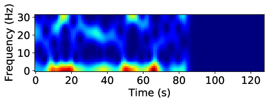
### Visual Description
# Technical Document Extraction: Spectrogram Analysis
## 1. Component Isolation
* **Header:** None present.
* **Main Chart Area:** A 2D heatmap (spectrogram) representing signal intensity across frequency and time.
* **Axes:** Labeled Y-axis (Frequency) and X-axis (Time).
* **Footer:** None present.
## 2. Axis and Label Extraction
* **Y-Axis Label:** `Frequency (Hz)`
* **Y-Axis Markers:** `0`, `10`, `20`, `30`
* **X-Axis Label:** `Time (s)`
* **X-Axis Markers:** `0`, `20`, `40`, `60`, `80`, `100`, `120`
## 3. Data Visualization Analysis (Spectrogram)
The image is a spectrogram using a "jet" or similar colormap where **dark blue** represents low intensity/power and **dark red** represents high intensity/power.
### Color Legend Inference (Spatial Grounding)
* **Dark Blue:** Minimum intensity (Background/Noise floor).
* **Cyan/Green:** Moderate intensity.
* **Yellow/Orange:** High intensity.
* **Dark Red:** Peak intensity.
### Trend Verification and Data Points
The signal is active from **0s to approximately 85s**. From **85s to 125s**, the chart is solid dark blue, indicating a complete absence of signal or silence in the recorded frequency range.
#### Primary Frequency Band (0 - 5 Hz)
* **Trend:** This is the dominant band containing the highest energy. It consists of a series of high-intensity bursts.
* **Peak Events (Red/Orange):**
* **10s - 20s:** Sustained high-intensity burst (Red).
* **35s - 45s:** Moderate-high intensity burst (Yellow/Green).
* **50s - 60s:** High-intensity burst (Red).
* **65s - 70s:** Sharp, peak intensity burst (Dark Red).
#### Secondary Frequency Band (20 - 30 Hz)
* **Trend:** Intermittent, lower-intensity activity compared to the base band.
* **Notable Events (Cyan/Yellow):**
* **~15s:** A vertical spike reaching up to 30 Hz (Yellow peak at the top).
* **~35s:** A cluster of activity around 20-25 Hz.
* **~55s:** A distinct peak at 30 Hz.
* **~80s:** A final small burst of activity before the signal terminates.
#### Mid-Range Band (10 - 20 Hz)
* **Trend:** Generally low activity (Dark Blue) with occasional "leakage" or harmonics from the lower bursts, particularly around the 15s and 65s marks.
## 4. Summary of Information
This technical plot illustrates a time-varying signal lasting 85 seconds, followed by 40 seconds of inactivity. The signal's energy is concentrated heavily in the low-frequency range (below 5 Hz), characterized by four distinct high-power pulses. Higher frequency components (up to 30 Hz) appear sporadically, often synchronized with the low-frequency pulses, suggesting a complex or impulsive signal source.
</details>
(c)
<details>
<summary>x29.png Details</summary>
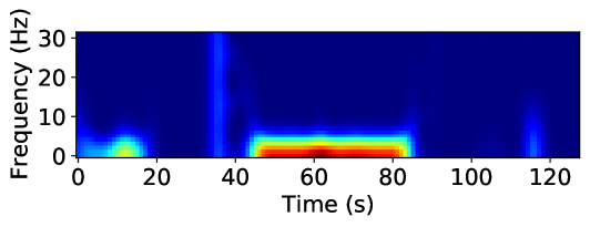
### Visual Description
# Technical Document Extraction: Spectrogram Analysis
## 1. Image Classification and Overview
This image is a **spectrogram**, a visual representation of the spectrum of frequencies of a signal as it varies with time. It uses a heat-map color scale where dark blue represents low intensity/power and red/dark-red represents high intensity/power.
## 2. Component Isolation
### A. Axis Labels and Markers
* **Y-Axis (Vertical):**
* **Label:** `Frequency (Hz)`
* **Markers:** `0`, `10`, `20`, `30`
* **Scale:** Linear, ranging from 0 to approximately 32 Hz.
* **X-Axis (Horizontal):**
* **Label:** `Time (s)`
* **Markers:** `0`, `20`, `40`, `60`, `80`, `100`, `120`
* **Scale:** Linear, ranging from 0 to approximately 130 seconds.
### B. Color Legend (Implicit)
* **Dark Blue:** Background/Baseline (Zero or near-zero intensity).
* **Light Blue/Cyan:** Low-to-mid intensity.
* **Green/Yellow:** Mid-to-high intensity.
* **Red/Dark Red:** Peak intensity (Maximum power).
---
## 3. Data Extraction and Trend Analysis
The spectrogram displays four distinct events or "bursts" of signal activity against a silent background.
| Event | Time Interval (approx.) | Frequency Range (approx.) | Intensity Description | Trend/Shape |
| :--- | :--- | :--- | :--- | :--- |
| **Event 1** | 0s – 18s | 0 – 6 Hz | Moderate (Green/Yellow) | A low-frequency "blob" peaking around 12s. |
| **Event 2** | 34s – 38s | 0 – 30+ Hz | Low (Light Blue) | A narrow vertical "spike" or broadband impulse. |
| **Event 3** | 45s – 85s | 0 – 6 Hz | **High (Red/Dark Red)** | A sustained, high-intensity horizontal band. Peak power is between 55s and 80s. |
| **Event 4** | 114s – 118s | 0 – 15 Hz | Low (Light Blue) | A narrow vertical spike, shorter in frequency than Event 2. |
### Key Observations:
1. **Dominant Signal:** The most significant data point is the sustained activity between **45s and 85s**. It is concentrated in the very low frequency range (**< 5 Hz**). The dark red core indicates this is the primary signal of interest.
2. **Broadband Impulse:** At approximately **35s**, there is a momentary burst that spans the entire visible frequency range (up to 30 Hz), suggesting a sharp click or transient noise.
3. **Frequency Ceiling:** Most of the signal energy in this data set resides below **10 Hz**, with the exception of the transient spikes.
---
## 4. Spatial Grounding and Logic Check
* **Logic Check:** The horizontal orientation of the red band (Event 3) confirms a continuous signal at a steady low frequency over a 40-second duration.
* **Spatial Placement:**
* The Y-axis label is located at the far left.
* The X-axis label is located at the bottom center.
* The highest intensity data (Dark Red) is centered at coordinates approximately `[Time=65s, Freq=2Hz]`.
## 5. Language Declaration
The text in this image is entirely in **English**. No other languages are present.
</details>
(d)
<details>
<summary>x30.png Details</summary>
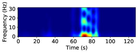
### Visual Description
# Technical Document Extraction: Spectrogram Analysis
## 1. Component Isolation
The image is a single-panel scientific plot, specifically a **spectrogram** or a time-frequency representation of a signal.
* **Header/Title:** None present.
* **Main Chart Area:** A heatmap representing signal intensity across time and frequency.
* **Axes:** Labeled Y-axis (Frequency) and X-axis (Time).
* **Legend:** No explicit color bar/scale is provided, but the "jet" colormap is used (Dark Blue = Low intensity, Red = High intensity).
---
## 2. Metadata and Labels
* **Y-Axis Label:** `Frequency (Hz)`
* **Y-Axis Markers:** `0`, `10`, `20`, `30`
* **X-Axis Label:** `Time (s)`
* **X-Axis Markers:** `0`, `20`, `40`, `60`, `80`, `100`, `120`
---
## 3. Data Extraction and Trend Analysis
### Visual Trend Description
The signal is characterized by a "baseline" of near-zero intensity (dark blue) for the majority of the duration. A significant burst of activity occurs between approximately 65 seconds and 85 seconds. This burst is multi-modal, showing distinct vertical bands of energy across multiple frequency levels.
### Heatmap Data Points (Spatial Grounding)
The intensity is represented by color. Based on standard spectrogram conventions:
* **Dark Blue:** Background noise / Zero amplitude.
* **Cyan/Green:** Moderate signal intensity.
* **Yellow/Red:** Peak signal intensity.
#### Key Events:
1. **Baseline (0s - 60s):** Low activity. A very faint blue-cyan "blip" is visible near the 0-5 Hz range around the 35s mark.
2. **Primary Event (65s - 85s):**
* **Peak Intensity (Red/Orange):** Located at approximately **70-75 seconds** within the **0-5 Hz** frequency range. This represents the strongest component of the signal.
* **Harmonic/Secondary Components (Cyan/Green):** Vertical columns of energy extend upward from the base.
* A distinct green/cyan patch is visible at **~15-20 Hz** around 70s.
* A distinct cyan patch is visible at **~30 Hz** around 70s.
* **Temporal Structure:** The activity appears as three distinct vertical pulses or "beats" centered at roughly 70s, 78s, and 83s. The first pulse (70s) contains the highest energy across all frequencies.
3. **Post-Event (85s - 125s):** The signal returns to the dark blue baseline, indicating the cessation of the event.
---
## 4. Summary of Technical Information
This plot illustrates a transient signal event lasting approximately 20 seconds (from $t=65$ to $t=85$). The event is broadband, affecting frequencies from 0 Hz up to at least 30 Hz, with the dominant energy concentrated in the low-frequency band (sub-5 Hz). The structure of the spectrogram suggests a pulsed or rhythmic signal rather than a continuous tone, as evidenced by the vertical striations in the heatmap.
</details>
(e)
<details>
<summary>x31.png Details</summary>
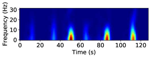
### Visual Description
# Technical Data Extraction: Spectrogram Analysis
## 1. Image Classification and Overview
This image is a **spectrogram**, a heat-map style visualization representing the frequency spectrum of a signal as it varies with time. It displays signal intensity (magnitude) across different frequencies over a duration of approximately 125 seconds.
## 2. Component Isolation
### A. Axis Labels and Markers
* **Vertical Axis (Y-axis):**
* **Label:** `Frequency (Hz)`
* **Scale:** Linear, ranging from `0` to `30`.
* **Markers:** `0`, `10`, `20`, `30`.
* **Horizontal Axis (X-axis):**
* **Label:** `Time (s)`
* **Scale:** Linear, ranging from `0` to approximately `125`.
* **Markers:** `0`, `20`, `40`, `60`, `80`, `100`, `120`.
### B. Color Scale (Implicit Legend)
While a numerical color bar is not present, the image uses a standard "Jet" or "Rainbow" colormap:
* **Dark Blue:** Background/Baseline (Zero or low intensity).
* **Light Blue/Cyan:** Low-to-mid intensity.
* **Yellow/Orange:** High intensity.
* **Dark Red:** Peak intensity.
---
## 3. Data Extraction and Trend Analysis
The chart displays a series of discrete "bursts" or events of signal activity. The background remains a consistent dark blue (low energy) across all frequencies.
### Event Analysis (Temporal and Spectral Placement)
There are six distinct vertical features (bursts) identified. Each burst starts at 0 Hz and extends upward, with the highest energy concentrated at the lowest frequencies.
| Event # | Approx. Time (s) | Peak Intensity Color | Frequency Range of Peak (Red) | Vertical Extent (Visible Blue) |
| :--- | :--- | :--- | :--- | :--- |
| 1 | ~12s | Light Blue | N/A (Low intensity) | 0 - 15 Hz |
| 2 | ~34s | Cyan/Light Blue | N/A (Low intensity) | 0 - 20 Hz |
| 3 | ~51s | **Dark Red** | 0 - 5 Hz | 0 - 30 Hz (Faint tail to top) |
| 4 | ~66s | Light Blue | N/A (Low intensity) | 0 - 15 Hz |
| 5 | ~87s | **Dark Red** | 0 - 5 Hz | 0 - 20 Hz |
| 6 | ~113s | **Dark Red** | 0 - 5 Hz | 0 - 30 Hz (Faint tail to top) |
### Key Trends:
1. **Frequency Concentration:** The signal energy is heavily concentrated in the low-frequency band (0 Hz to 10 Hz).
2. **Periodic/Intermittent Nature:** The events are non-continuous. The spacing between major high-intensity bursts (Events 3, 5, and 6) is roughly 36 seconds and 26 seconds respectively, suggesting an irregular or quasi-periodic signal.
3. **Spectral Leakage/Harmonics:** The high-intensity bursts (Red) at ~51s and ~113s show vertical "tails" that reach the 30 Hz limit, indicating a broadband impulse or a signal with significant harmonic content at those specific moments.
4. **Intensity Variation:** The intensity of the events is not uniform; the events at 51s, 87s, and 113s are significantly more powerful than the events at 12s, 34s, and 66s.
---
## 4. Summary of Facts
* **Signal Type:** Time-varying frequency data (Spectrogram).
* **Total Duration:** ~125 seconds.
* **Frequency Bandwidth:** 0 - 30 Hz.
* **Primary Data Points:** Six discrete impulses.
* **Dominant Frequency:** < 5 Hz (where the red intensity is highest).
* **Language:** English (Labels: "Frequency (Hz)", "Time (s)").
</details>
(f)
<details>
<summary>x32.png Details</summary>
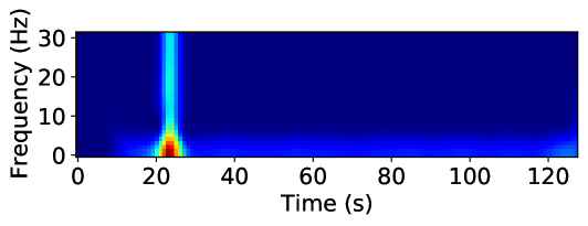
### Visual Description
# Technical Document Extraction: Spectrogram Analysis
## 1. Image Classification and Overview
This image is a **spectrogram**, a visual representation of the spectrum of frequencies of a signal as it varies with time. It uses a heat-map color scale where dark blue represents low intensity/power and red represents high intensity/power.
## 2. Component Isolation
### A. Axis Labels and Markers
* **Y-Axis (Vertical):**
* **Label:** Frequency (Hz)
* **Markers:** 0, 10, 20, 30
* **Scale:** Linear, ranging from 0 to approximately 32 Hz.
* **X-Axis (Horizontal):**
* **Label:** Time (s)
* **Markers:** 0, 20, 40, 60, 80, 100, 120
* **Scale:** Linear, ranging from 0 to approximately 130 seconds.
### B. Main Chart Area (Data Visualization)
The background is a uniform dark blue, indicating a baseline of near-zero intensity across most of the time-frequency domain. There are two primary features of interest:
1. **The Primary Impulse (Broadband Event):**
* **Location:** Occurs at approximately **t = 23 seconds**.
* **Frequency Profile:** This is a vertical "spike" or column. It spans the entire visible frequency range from 0 Hz to 30+ Hz.
* **Intensity Trend:** The intensity is highest (Dark Red) at the base, specifically in the **0–5 Hz** range. As frequency increases, the intensity transitions through yellow, green, and settles into a light blue (cyan) for the remainder of the vertical column up to 30 Hz.
* **Interpretation:** This represents a sudden, short-duration event that contains energy across a wide spectrum (broadband), with the most significant power concentrated in low frequencies.
2. **The Low-Frequency Horizontal Band (Steady State/Residual):**
* **Location:** Positioned along the bottom of the graph, primarily between **0 and 5 Hz**.
* **Temporal Extent:** It begins with the primary impulse at 23s and continues as a faint, fluctuating blue/cyan line across the remainder of the time series (up to 130s).
* **Intensity Trend:** Much lower intensity than the initial spike, appearing as a "tail" or persistent low-frequency vibration.
* **Secondary Feature:** There is a slight increase in intensity (light blue) at the very end of the record, near **t = 125s**, within the 0–5 Hz range.
## 3. Data Summary Table
| Feature | Time (s) | Frequency Range (Hz) | Peak Intensity Color | Description |
| :--- | :--- | :--- | :--- | :--- |
| **Baseline** | 0 - 130 | All | Dark Blue | Background noise / No signal. |
| **Main Event** | ~23 | 0 - 30+ | Red (at <5 Hz) | High-intensity broadband impulse. |
| **LF Residual** | 25 - 120 | 0 - 5 | Light Blue | Persistent low-frequency activity following the impulse. |
| **End Signal** | ~125 | 0 - 5 | Light Blue | Minor increase in low-frequency energy at the end of the sample. |
## 4. Technical Conclusion
The spectrogram depicts a discrete, high-energy event occurring at the 23-second mark. The event is characterized by a high-power low-frequency component and a lower-power broadband signature that extends beyond 30 Hz. Following this event, there is a sustained, low-intensity residual signal confined to the 0–5 Hz band for the duration of the recording.
</details>
(g)
<details>
<summary>x33.png Details</summary>
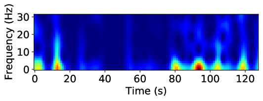
### Visual Description
# Technical Document Extraction: Spectrogram Analysis
## 1. Image Classification and Overview
This image is a **spectrogram**, a visual representation of the spectrum of frequencies of a signal as it varies with time. It displays signal intensity (power) across a frequency range over a specific duration.
## 2. Component Isolation
### A. Header/Title
* No explicit title is present within the image frame.
### B. Main Chart Area (Heatmap)
* **Type:** 2D Heatmap (Time-Frequency-Intensity).
* **Color Scale (Implicit):**
* **Dark Blue:** Low intensity/power (background noise level).
* **Light Blue/Cyan:** Moderate intensity.
* **Yellow/Green:** High intensity.
* **Red/Dark Orange:** Peak intensity/maximum power.
### C. Axis Labels and Markers
* **Y-Axis (Vertical):**
* **Label:** `Frequency (Hz)`
* **Markers:** `0`, `10`, `20`, `30`
* **Range:** 0 to approximately 32 Hz.
* **X-Axis (Horizontal):**
* **Label:** `Time (s)`
* **Markers:** `0`, `20`, `40`, `60`, `80`, `100`, `120`
* **Range:** 0 to approximately 130 seconds.
---
## 3. Data Extraction and Trend Analysis
### Frequency Distribution
The signal power is predominantly concentrated in the **low-frequency range (0 Hz to 10 Hz)**. There are intermittent vertical "streaks" that extend into higher frequencies (up to 30 Hz), indicating transient broadband events.
### Temporal Events (Key Data Points)
The following high-intensity events are observed along the timeline:
1. **0 - 5 seconds:** A moderate-intensity burst (Yellow/Green) concentrated below 10 Hz.
2. **12 - 15 seconds:** A significant high-intensity spike. The core (Red) is at ~2 Hz, with a vertical tail (Cyan) reaching up to ~25 Hz.
3. **15 - 75 seconds:** A period of relative inactivity. The signal remains mostly dark blue (low power), with very faint activity around 40-50 seconds.
4. **80 seconds:** A high-intensity burst (Yellow/Orange) centered around 2-5 Hz.
5. **95 seconds:** The **peak intensity event** of the entire sample. A deep red core is visible between 0-5 Hz, with moderate intensity (Blue/Cyan) extending up to 10 Hz and faint circular patterns appearing at 20 Hz.
6. **105 seconds:** A high-intensity burst (Yellow) centered at ~3 Hz.
7. **120 seconds:** A high-intensity burst (Yellow/Orange) centered at ~2 Hz, with a vertical streak reaching up to ~15 Hz.
---
## 4. Summary of Visual Trends
* **Baseline:** The signal is characterized by a "quiet" baseline (Dark Blue) for the majority of the duration, particularly between 20s and 75s.
* **Periodicity:** Toward the end of the sample (80s - 130s), the high-intensity events appear more rhythmic or frequent compared to the beginning.
* **Spectral Shape:** Most energy is "bottom-heavy," meaning the physical phenomenon being measured is low-frequency in nature, with occasional sharp impulses that create broadband noise (vertical lines).
## 5. Language Declaration
The text in this image is entirely in **English**. No other languages were detected.
</details>
(h)
<details>
<summary>x34.png Details</summary>
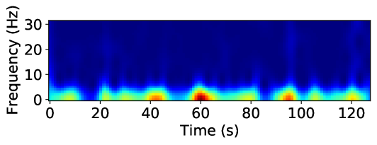
### Visual Description
# Technical Document Extraction: Spectrogram Analysis
## 1. Image Classification and Overview
This image is a **spectrogram**, a visual representation of the spectrum of frequencies of a signal as it varies with time. It utilizes a heatmap color scale to represent the magnitude (intensity) of specific frequencies.
## 2. Component Isolation
### A. Axis Labels and Markers
* **Vertical Axis (Y-axis):**
* **Label:** `Frequency (Hz)`
* **Markers:** `0`, `10`, `20`, `30`
* **Scale:** Linear, ranging from 0 to approximately 32 Hz.
* **Horizontal Axis (X-axis):**
* **Label:** `Time (s)`
* **Markers:** `0`, `20`, `40`, `60`, `80`, `100`, `120`
* **Scale:** Linear, ranging from 0 to approximately 130 seconds.
### B. Color Legend (Implicit)
While a formal color bar is not present, the heatmap follows a standard "jet" or "turbo" colormap:
* **Dark Blue:** Low intensity / Baseline noise.
* **Cyan/Green:** Moderate intensity.
* **Yellow/Orange:** High intensity.
* **Dark Red:** Peak intensity (Maximum power).
---
## 3. Data Extraction and Trend Analysis
### Main Data Series: Low-Frequency Activity (0 - 8 Hz)
The primary signal activity is concentrated in the low-frequency band, specifically between **0 Hz and 8 Hz**. The trend shows a series of rhythmic or intermittent bursts of energy rather than a continuous steady-state signal.
**Key Intensity Peaks (Temporal Grounding):**
1. **~5-10s:** Moderate intensity (Yellow), centered around 2 Hz.
2. **~40-45s:** High intensity (Orange/Red), centered around 1-3 Hz.
3. **~58-65s:** **Maximum Peak Intensity** (Dark Red), centered around 1-4 Hz. This is the strongest signal event in the data.
4. **~95s:** High intensity (Orange/Red), centered around 2 Hz.
5. **~120s:** Moderate-High intensity (Yellow/Orange), centered around 2 Hz.
### Secondary Data Series: Mid-to-High Frequency (10 - 30 Hz)
* **Trend:** The region above 10 Hz is characterized by a "cool" dark blue color, indicating very low power or absence of signal.
* **Anomalies:** There is a very faint vertical "streak" of slightly lighter blue around the **100s** mark, extending up to 30 Hz, suggesting a brief wide-band noise event or artifact.
---
## 4. Summary of Technical Findings
| Feature | Description |
| :--- | :--- |
| **Signal Type** | Low-frequency dominant (Delta/Theta range in EEG terms). |
| **Primary Frequency Band** | 0 Hz to 5 Hz. |
| **Temporal Pattern** | Intermittent bursts occurring roughly every 20-30 seconds. |
| **Peak Event** | Occurs at $t \approx 60$ seconds, showing the highest spectral density. |
| **Noise Floor** | Frequencies above 10 Hz show negligible activity. |
**Conclusion:** The signal represented is a low-frequency time-varying signal with periodic high-amplitude bursts, most notably at the 60-second mark. The lack of activity above 10 Hz suggests a signal that has been low-pass filtered or is naturally restricted to very low frequencies.
</details>
(i)
Figure 8: Spectrogram representation of various attack classes of NF3-UNSW-NB15 dataset
Here, we explore one of these techniques, the spectrogram, to investigate the feasibility of such approaches in the field of ML-based NIDS. Spectrograms are the most common time-frequency techniques used to investigate signal variations over time. Using spectrograms, we can transform raw network flow time series into a richer representation that captures both frequency and temporal characteristics, potentially enhancing the performance of deep learning models. We focus on the NF3-UNSW-NB15 dataset. Figure 8 shows the spectrogram of the most repeated pattern, for each attack class. As can be seen, the Spectrogram of different classes vary significantly in some cases. For instance, while DoS and Worms share some similarities, their patterns still remain distinct from each other and from all other attack classes. Similarly, Fuzzers display a unique time-frequency signature, further differentiating them from other attack types. These results highlight the potential of time-frequency representations in enhancing ML-based NIDS by providing a more detailed characterisation of network traffic patterns.
6 Conclusion
The increasing complexity of network traffic and diversity of modern attacks necessitates the incorporation of temporal analysis in network intrusion detection. Current attacks are no longer isolated events, but rather adaptive, time-evolving processes that can take advantage of timing vulnerabilities and encrypted traffic to evade detection. For instance, Advanced Persistent Threats (APTs) occur over extended periods of time, while low-and-slow attacks submerge malicious activity in normal traffic patterns. Additionally, the prevalence of encrypted protocols and the inadequacy of static analysis render temporal features (inter-packet arrival times, flow durations, traffic bursts) essential for detecting subtle attack behaviours. By analysing temporal dynamics, i.e. how the relationships and entities in a network change over time, researchers and practitioners can gain deeper understanding of the evolving nature of network threats, enabling more effective detection and mitigation strategies.
In this paper, we try to address this gap by introducing a collection of four standardised NetFlow-based NIDS datasets enriched with detailed temporal features. Despite their importance, comprehensive temporal features have been largely absent from existing NetFlow-based NIDS datasets, limiting researchers’ ability to study attack patterns over time across multiple datasets. These datasets, the NF3 collection, provide a solid foundation for researchers and practitioners to dive into the temporal dynamics of network traffic. By incorporating precise flow start and end times, as well as detailed inter-packet arrival time statistics, these datasets provide a deeper understanding of attack patterns and network behaviour over time.
Our primary contribution, in this study, lies in conducting extensive temporal analysis to reveal the dynamics of network traffic and security threats. By visualising traffic distributions, flow length distributions by attack class, and time-frequency domain representations, this study has provided novel insights into network behaviour patterns. By making these temporal feature-enriched NetFlow datasets (NF3-Datasets) publicly available [1], we aim to support ongoing research and development in ML-based network intrusion detection systems. While this work highlights the importance of temporal features in NIDS, several challenges remain open for future exploration. Future research should focus on optimising ML models to leverage the temporal features introduced in this study effectively. Additionally, further work is needed to refine time-frequency-based approaches and evaluate their practicality in real-time intrusion detection scenarios. Investigating alternative temporal representations, such as recurrent neural networks (RNNs) and transformers, may also yield new insights into how sequential learning models can improve attack detection.
References
- [1] Majed Luay, Siamak Layeghy, Seyedehfaezeh Hosseininoorbin, Mohanad Sarhan, Nour Moustafa, and Marius Portmann. NetFlow V3 NIDS Datasets - The University of Queensland, 2025. Available at: https://staff.itee.uq.edu.au/marius/NIDS_datasets/.
- [2] Gernot Vormayr, Joachim Fabini, and Tanja Zseby. Why are my flows different? a tutorial on flow exporters. IEEE Communications Surveys & Tutorials, 22(3):2064–2103, 2020.
- [3] Muhammad Fahad Umer, Muhammad Sher, and Yaxin Bi. Flow-based intrusion detection: Techniques and challenges. Computers & Security, 70:238–254, 2017.
- [4] Markus Ring, Sarah Wunderlich, Deniz Scheuring, Dieter Landes, and Andreas Hotho. A survey of network-based intrusion detection data sets. Computers & Security, 86:147–167, 2019.
- [5] Satish Kumar, Sunanda Gupta, and Sakshi Arora. Research trends in network-based intrusion detection systems: A review. IEEE Access, 9:157761–157779, 2021.
- [6] Oluwadamilare Harazeem Abdulganiyu, Taha Ait Tchakoucht, and Yakub Kayode Saheed. A systematic literature review for network intrusion detection system (ids). International Journal of Information Security, 22(5):1125–1162, 2023.
- [7] Martin Roesch et al. Snort: Lightweight intrusion detection for networks. In Lisa, volume 99, pages 229–238, 1999.
- [8] Yang Guo. A review of machine learning-based zero-day attack detection: Challenges and future directions. Computer communications, 198:175–185, 2023.
- [9] Rafath Samrin and D Vasumathi. Review on anomaly based network intrusion detection system. In 2017 international conference on electrical, electronics, communication, computer, and optimization techniques (ICEECCOT), pages 141–147. IEEE, 2017.
- [10] Seyedehfaezeh Hosseininoorbin, Siamak Layeghy, Mohanad Sarhan, Raja Jurdak, and Marius Portmann. Exploring edge tpu for network intrusion detection in iot. Journal of Parallel and Distributed Computing, 179:104712, 2023.
- [11] Giovanni Apruzzese, Luca Pajola, and Mauro Conti. The cross-evaluation of machine learning-based network intrusion detection systems. IEEE Transactions on Network and Service Management, 19(4):5152–5169, 2022.
- [12] Ramjee Prasad, Vandana Rohokale, Ramjee Prasad, and Vandana Rohokale. Artificial intelligence and machine learning in cyber security. Cyber security: the lifeline of information and communication technology, pages 231–247, 2020.
- [13] Liam Daly Manocchio, Siamak Layeghy, Wai Weng Lo, Gayan K Kulatilleke, Mohanad Sarhan, and Marius Portmann. Flowtransformer: A transformer framework for flow-based network intrusion detection systems. Expert Systems with Applications, 241:122564, 2024.
- [14] Ankit Thakkar and Ritika Lohiya. A review of the advancement in intrusion detection datasets. Procedia Computer Science, 167:636–645, 2020. International Conference on Computational Intelligence and Data Science.
- [15] Giovanni Apruzzese, Pavel Laskov, and Johannes Schneider. Sok: Pragmatic assessment of machine learning for network intrusion detection. In 2023 IEEE 8th European Symposium on Security and Privacy (EuroS&P), pages 592–614, 2023.
- [16] Mohanad Sarhan, Siamak Layeghy, Nour Moustafa, and Marius Portmann. Netflow datasets for machine learning-based network intrusion detection systems. In Zeng Deze, Huan Huang, Rui Hou, Seungmin Rho, and Naveen Chilamkurti, editors, Big Data Technologies and Applications, pages 117–135, Cham, 2021. Springer International Publishing.
- [17] Mohanad Sarhan, Siamak Layeghy, and Marius Portmann. Towards a standard feature set for network intrusion detection system datasets. Mobile networks and applications, pages 1–14, 2022.
- [18] Benoît Claise. Cisco Systems NetFlow Services Export Version 9. RFC 3954, October 2004.
- [19] Ziadoon K. Maseer, Robiah Yusof, Baidaa Al-Bander, Abdu Saif, and Qusay Kanaan Kadhim. Meta-analysis and systematic review for anomaly network intrusion detection systems: Detection methods, dataset, validation methodology, and challenges, 2023.
- [20] Nour Moustafa and Jill Slay. Unsw-nb15: a comprehensive data set for network intrusion detection systems (unsw-nb15 network data set). In 2015 Military Communications and Information Systems Conference (MilCIS), pages 1–6, 2015.
- [21] Nickolaos Koroniotis, Nour Moustafa, Elena Sitnikova, and Benjamin Turnbull. Towards the development of realistic botnet dataset in the internet of things for network forensic analytics: Bot-iot dataset. Future Generation Computer Systems, 100:779–796, 2019.
- [22] Nour Moustafa. A new distributed architecture for evaluating ai-based security systems at the edge: Network ton_iot datasets. Sustainable Cities and Society, 72:102994, 2021.
- [23] Iman Sharafaldin, Arash Habibi Lashkari, Ali A Ghorbani, et al. Toward generating a new intrusion detection dataset and intrusion traffic characterization. ICISSp, 1:108–116, 2018.
- [24] Seyedehfaezeh Hosseininoorbin, Siamak Layeghy, Brano Kusy, Raja Jurdak, and Marius Portmann. Harbic: Human activity recognition using bi-stream convolutional neural network with dual joint time–frequency representation. Internet of Things, 22:100816, 2023.
- [25] Seyedehfaezeh Hosseininoorbin, Siamak Layeghy, Brano Kusy, Raja Jurdak, Greg J. Bishop-Hurley, Paul L Greenwood, and Marius Portmann. Deep learning-based cattle behaviour classification using joint time-frequency data representation. Computers and Electronics in Agriculture, 187:106241, 2021.
- [26] Adnan Shahid Khan, Zeeshan Ahmad, Johari Abdullah, and Farhan Ahmad. A spectrogram image-based network anomaly detection system using deep convolutional neural network. IEEE Access, 9:87079–87093, 2021.
- [27] Zeeshan Ahmad, Adnan Shahid Khan, Sehrish Aqeel, Azlina Ahmadi Julaihi, Seleviawati Tarmizi, Noralifah Annuar, and Mohammed Sayeeduddin Habeeb. S-ads: Spectrogram image-based anomaly detection system for iot networks. In 2022 Applied Informatics International Conference (AiIC), pages 105–110, 2022.
- [28] Shahid Tufail, Hugo Riggs, Mohd Tariq, and Arif I. Sarwat. Advancements and challenges in machine learning: A comprehensive review of models, libraries, applications, and algorithms. Electronics, 12(8), 2023.
- [29] Lubna Ali Hassan Ahmed, Yahia Abdalla Mohamed Hamad, and Ahmed Abdallah Mohamed Ali Abdalla. Network-based intrusion detection datasets: A survey. In 2022 International Arab Conference on Information Technology (ACIT), pages 1–7, 2022.
- [30] Mossa Ghurab, Ghaleb Gaphari, Faisal Alshami, Reem Alshamy, and Suad Othman. A detailed analysis of benchmark datasets for network intrusion detection system. Asian Journal of Research in Computer Science, 7(4):14–33, 2021.
- [31] Siamak Layeghy, Marcus Gallagher, and Marius Portmann. Benchmarking the benchmark — comparing synthetic and real-world network ids datasets. Journal of Information Security and Applications, 80:103689, 2024.
- [32] Robert Flood and David Aspinall. Measuring the complexity of benchmark nids datasets via spectral analysis. In 2024 IEEE European Symposium on Security and Privacy Workshops (EuroS&PW), pages 335–341. IEEE, 2024.
- [33] Anukool Lakhina, Konstantina Papagiannaki, Mark Crovella, Christophe Diot, Eric D. Kolaczyk, and Nina Taft. Structural analysis of network traffic flows. SIGMETRICS Perform. Eval. Rev., 32(1):61–72, June 2004.
- [34] George Nychis, Vyas Sekar, David G. Andersen, Hyong Kim, and Hui Zhang. An empirical evaluation of entropy-based traffic anomaly detection. In Proceedings of the 8th ACM SIGCOMM Conference on Internet Measurement, IMC ’08, page 151–156, New York, NY, USA, 2008. Association for Computing Machinery.
- [35] Anukool Lakhina, Konstantina Papagiannaki, Mark Crovella, Christophe Diot, Eric D. Kolaczyk, and Nina Taft. Structural analysis of network traffic flows. In Proceedings of the Joint International Conference on Measurement and Modeling of Computer Systems, SIGMETRICS ’04/Performance ’04, page 61–72, New York, NY, USA, 2004. Association for Computing Machinery.
- [36] Piotr Jurkiewicz, Grzegorz Rzym, and Piotr Boryło. Flow length and size distributions in campus internet traffic. Computer Communications, 167:15–30, 2021.
- [37] Anshuman Chhabra and Mariam Kiran. Classifying elephant and mice flows in high-speed scientific networks. Proc. INDIS, pages 1–8, 2017.
- [38] Mosab Hamdan, Bushra Mohammed, Usman Humayun, Ahmed Abdelaziz, Suleman Khan, M. Akhtar Ali, Muhammad Imran, and M. N. Marsono. Flow-aware elephant flow detection for software-defined networks. IEEE Access, 8:72585–72597, 2020.
- [39] Kaihao Lou, Yongjian Yang, and Chuncai Wang. An elephant flow detection method based on machine learning. In Smart Computing and Communication: 4th International Conference, SmartCom 2019, Birmingham, UK, October 11–13, 2019, Proceedings 4, pages 212–220. Springer, 2019.
- [40] Spurthi Mallesh. Automatic detection of elephant flows through openflow-based openvswitch. PhD thesis, Dublin, National College of Ireland, 2017.
- [41] Li Ming Chen, Shun-Wen Hsiao, Meng Chang Chen, and Wanjiun Liao. Slow-paced persistent network attacks analysis and detection using spectrum analysis. IEEE Systems Journal, 10(4):1326–1337, 2016.
- [42] Theophilus Benson, Aditya Akella, and David A Maltz. Network traffic characteristics of data centers in the wild. In Proceedings of the 10th ACM SIGCOMM conference on Internet measurement, pages 267–280, 2010.
- [43] Srikanth Kandula, Sudipta Sengupta, Albert Greenberg, Parveen Patel, and Ronnie Chaiken. The nature of data center traffic: measurements & analysis. In Proceedings of the 9th ACM SIGCOMM Conference on Internet Measurement, IMC ’09, page 202–208, New York, NY, USA, 2009. Association for Computing Machinery.
- [44] Benoit Claise. Cisco systems netflow services export version 9. Technical report, Cisco Systems, 2004.
- [45] Andrea Corsini, Shanchieh Jay Yang, and Giovanni Apruzzese. On the evaluation of sequential machine learning for network intrusion detection. In Proceedings of the 16th International Conference on Availability, Reliability and Security, ARES ’21, New York, NY, USA, 2021. Association for Computing Machinery.
- [46] Xueying Han, Rongchao Yin, Zhigang Lu, Bo Jiang, Yuling Liu, Song Liu, Chonghua Wang, and Ning Li. Stidm: A spatial and temporal aware intrusion detection model. In 2020 IEEE 19th International Conference on Trust, Security and Privacy in Computing and Communications (TrustCom), pages 370–377, 2020.
- [47] Yong Zhang, Xu Chen, Lei Jin, Xiaojuan Wang, and Da Guo. Network intrusion detection: Based on deep hierarchical network and original flow data. IEEE Access, 7:37004–37016, 2019.
- [48] Jiawei Zhao, Rahat Masood, and Suranga Seneviratne. A review of computer vision methods in network security. IEEE Communications Surveys & Tutorials, 23(3):1838–1878, 2021.
- [49] Abhishek Divekar, Meet Parekh, Vaibhav Savla, Rudra Mishra, and Mahesh Shirole. Benchmarking datasets for anomaly-based network intrusion detection: Kdd cup 99 alternatives. In 2018 IEEE 3rd International Conference on Computing, Communication and Security (ICCCS), pages 1–8, 2018.
- [50] Mohanad Sarhan, Siamak Layeghy, and Marius Portmann. Evaluating standard feature sets towards increased generalisability and explainability of ml-based network intrusion detection. Big Data Research, 30:100359, 2022.
- [51] Ntop. nprobe, an extensible netflow v5/v9/ipfix probe for ipv4/v6, 2017. Accessed: 2024-05-21.
- [52] Noam Ben-Asher and Cleotilde Gonzalez. Effects of cyber security knowledge on attack detection. Computers in Human Behavior, 48:51–61, 2015.
- [53] Siamak Layeghy, Ghasem Azemi, Paul Colditz, and Boualem Boashash. Non-invasive Monitoring of Fetal Movements Using Time-Frequency Features of Accelerometry. In 2014 IEEE International Conference on Acoustics, Speech and Signal Processing (ICASSP), pages 4379–4383. IEEE, 2014.
- [54] Siamak Layeghy, Ghasem Azemi, Paul Colditz, and Boualem Boashash. Classification of Fetal Movement Accelerometry Through Time-Frequency Features. In 2014 8th International Conference on Signal Processing and Communication Systems (ICSPCS), pages 1–6. IEEE, 2014.
- [55] W.E. Leland, M.S. Taqqu, W. Willinger, and D.V. Wilson. On the Self-similar Nature of Ethernet Traffic . IEEE/ACM Transactions on Networking, 2(1):1–15, 1994.
- [56] Yuguang Yang, Shupeng Geng, Baochang Zhang, Juan Zhang, Zheng Wang, Yong Zhang, and David Doermann. Long Term 5G Network Traffic Forecasting via Modeling Non-stationarity with Deep Learning. Communications Engineering, 2(1):33, 2023.