# Counterfactual Fairness Evaluation of Machine Learning Models on Educational Datasets
**Authors**: Woojin Kim, Hyeoncheol Kim
institutetext: Department of Computer Science and Engineering, Korea University, South Korea email: {woojinkim1021, harrykim}@korea.ac.kr
## Abstract
As machine learning models are increasingly used in educational settings, from detecting at-risk students to predicting student performance, algorithmic bias and its potential impacts on students raise critical concerns about algorithmic fairness. Although group fairness is widely explored in education, works on individual fairness in a causal context are understudied, especially on counterfactual fairness. This paper explores the notion of counterfactual fairness for educational data by conducting counterfactual fairness analysis of machine learning models on benchmark educational datasets. We demonstrate that counterfactual fairness provides meaningful insight into the causality of sensitive attributes and causal-based individual fairness in education.
Keywords: Counterfactual Fairness Education Machine Learning.
## 1 Introduction
Machine learning models are increasingly implemented in educational settings to support automated decision-making processes. Such applications ranges from academic success prediction [33, 50], at-risk detection [25], automated grading [42], knowledge tracing [38] and personalized recommendation [53]. However, the application of machine learning models to automate decision-making in high-stakes scenarios calls for consideration of algorithmic bias [1]. In education, predictive models have been shown to exhibit lower performance for students from underrepresented demographic groups [40, 3, 6, 21, 34].
The majority of research on fairness in education focuses on group fairness [40, 21], while works on individual fairness are limited to aiming for similar treatment of similar individuals [20, 10]. Under context where students’ demographics causally shape their education [45, 11, 27], taking causality in consideration of fairness is crucial. Causal fairness asserts that it is unfair to produce different decisions for individuals caused by factors beyond their control [28]. In this sense, algorithmic decisions that impact students should eliminate the causal effects of uncontrollable variables, such as race, gender, and disability.
Group and individual fairness definitions have certain limitations, and the inherent incompatibility between group and individual fairness presents challenges [2, 31, 52, 48]. Group fairness can mask heterogeneous outcomes of individuals by using group-wise averaging measurements [2, 31]. While group fairness may be achieved, it does not ensure fairness for each individual [52]. Furthermore, ignoring individual fairness in favor of group fairness can result in algorithms making different decisions for identical individuals [29]. Individual fairness faces difficulty in selecting distance metrics for measuring the similarity of individuals and is easily affected by outlier samples [49].
Based on the limitations of group and individual fairness notions, we empirically investigate the potential of counterfactual fairness on educational datasets. Counterfactual fairness ensures that the algorithm’s decision would have remained the same when the individual belongs to a different demographic group, other things being equal [23]. Counterfactual fairness promotes individual-level fairness by removing the causal influence of sensitive attributes on the algorithm’s decisions. To the best of our current knowledge, the notion of counterfactual fairness has not been investigated in the educational domain.
In this paper, we aim to answer the following research questions(RQ):
1. What causal relationships do sensitive attributes have in educational data?
1. Does counterfactual fairness in educational data lead to identical outcomes for individual students regardless of demographic group membership?
1. Does counterfactually fair machine learning models result in a performance trade-off in educational data?
These questions are investigated by estimating a causal model and implementing a counterfactual fairness approach on real-world educational datasets. Section 2 introduces counterfactual fairness and algorithmic fairness in education. In Section 3, we provide methodologies for creating causal models and counterfactual fairness evaluation metrics. We present the experiment result in Section 4. In Section 5, we discuss the key findings of our study, exploring their implications for fairness in educational data before concluding in Section 6.
## 2 Background
### 2.1 Causal Model and Counterfactuals
Counterfactual fairness adopts the Structural Causal Model(SCM) framework [35] for the calculation of counterfactual samples. SCM is defined as a triplet $(U,V,F)$ where $U$ is a set of unobserved variables, $V$ is a set of observed variables, and $F$ is a set of structural equations describing how observable variables are determined. Given a SCM, counterfactual inference is to determine $P(Y_{Z\leftarrow z}(U)|W=w)$ , which indicates the probability of $Y$ if $Z$ is set to $z$ (i.e. counterfactuals), given that we observed $W=w$ . Imagine a female student with a specific academic record. What would be the probability of her passing the course if her gender were male while keeping all other observed academic factors constant? Counterfactual inference on SCM allows us to calculate answers to counterfactual queries by abduction, action, and prediction inference steps detailed in [35].
### 2.2 Counterfactual Fairness
We follow the definition of counterfactual fairness by Kusner et al. [23].
**Definition 1 (Counterfactual Fairness)**
*Predictor $\hat{Y}$ is counterfactually fair if under any context $X=x$ and $A=a$ ,
$$
P(\hat{Y}_{A\leftarrow a}(U)=y|X=x,A=a)=P(\hat{Y}_{A\leftarrow a^{\prime}}(U)=
y|X=x,A=a),
$$
for all y and for any value a’ attainable by A.*
The definition states that changing $A$ should not change the distribution of the predicted outcome $\hat{Y}$ . An algorithm is counterfactually fair towards an individual if an intervention in demographic group membership does not change the prediction. For instance, the predicted probability of a female student passing a course should remain the same as if the student had been a male.
Implementing counterfactual fairness requires a causal model of the real world and the counterfactual inference of samples under the causal model. This process allows for isolating the causal influence of the sensitive attribute on the outcome.
Counterfactual fairness is explored in diverse domains, such as in clinical decision support [47] and clinical risk prediction [36, 44] for healthcare, ranking algorithm [37], image classification [9, 22] and text classification [16].
### 2.3 Algorithmic Fairness in Education
Most works on algorithmic fairness in education focus on group fairness [40, 21]. The group fairness definition states that an algorithm is fair if its prediction performance is equal among subgroups, specifically requiring equivalent prediction ratios for favorable outcomes. Common definitions of group fairness are Equalized Odds [17], Demographic Parity [14] and Equal Opportunity [17].
Individual fairness requires individuals with similar characteristics to receive similar treatment. Research on individual fairness in education focuses on the similarity. Marras et al. [32] proposed a consistency metric for measuring the similarity of students’ past interactions for individual fairness under a personalized recommendation setting. Hu and Rangwala [20] developed a model architecture for individual fairness in at-risk student prediction task. Doewes et al. [12] proposed a methodology to evaluate individual fairness in automated essay scoring. Deho et al. [10] performed individual fairness evaluation of existing fairness mitigation methods in learning analytics.
There have been attempts to understand causal factors influencing academic success. Ferreira de Carvalho et al. [4] identifies causal relationships between LMS logs and student’s grades. Zhao et al. [51] propose Residual Counterfactual Networks to estimate the causal effect of an academic counterfactual intervention for personalized learning. To the best of our knowledge, the notion of algorithmic fairness under causal context, especially under counterfactual inference in the educational domain remains unexplored.
Table 1: Feature descriptions of Law School and OULAD datasets. Student Performance dataset descriptions are provided in Table 6 of Appendix A.
| Data | Feature | Type | Description |
| --- | --- | --- | --- |
| Law | gender | binary | the student’s gender |
| race | binary | the student’s race | |
| lsat | numerical | the student’s LSAT score | |
| ugpa | numerical | the student’s undergraduate GPA | |
| zfygpa | numerical | the student’s law school first year GPA | |
| OULAD | gender | binary | the student’s gender |
| disability | binary | whether the student has declared a disability | |
| education | categorical | the student’s highest education level | |
| IMD | categorical | the Index of Multiple Deprivation(IMD) of the student’s residence | |
| age | categorical | band of the student’s age | |
| studied credits | numerical | the student’s total credit of enrolled modules | |
| final result | binary | the student’s final result of the module | |
Table 2: Summary of datasets used for the experiment.
| Data | Task | Sensitive Attribute | Target | # Instances |
| --- | --- | --- | --- | --- |
| Law School | Regression | race, gender | zfygpa | 20,798 |
| OULAD | Classification | disability | final result | 32,593 |
| Student Performance(Mat) | Regression | gender | G3 | 395 |
| Student Performance(Por) | Regression | gender | G3 | 649 |
## 3 Methodology
We provide detailed description of experiment methodology for evaluating counterfactual fairness of machine learning models in education.
### 3.1 Educational Datasets
We use publicly available benchmark educational datasets for fairness presented in [26], which introduces four educational benchmark datasets for algorithmic fairness. Datasets are Law School github.com/mkusner/counterfactual-fairness [46], Open University Learning Analytics Dataset (OULAD) https://archive.ics.uci.edu/dataset/349/open+university+learning+analytics+dataset [24] and Student Performance in Mathematics and Portuguese language https://archive.ics.uci.edu/dataset/320/student+performance [8]. Refer to Table 1 and Table 6 for description of dataset features used in the experiment. The summary of tasks and selection of sensitive attributes are outlined in Table 2.
<details>
<summary>extracted/6375259/figures/freq_law.png Details</summary>
### Visual Description
## Bar Chart: Demographic Percentage Comparison
### Overview
The image displays a simple vertical bar chart comparing two demographic categories, labeled "White" and "Black," with their respective percentages. The chart visually emphasizes a significant disparity between the two groups.
### Components/Axes
* **Chart Type:** Vertical bar chart.
* **X-Axis (Horizontal):** Represents categorical data. Two categories are present:
* **Label 1:** "White" (positioned below the left bar).
* **Label 2:** "Black" (positioned below the right bar).
* **Y-Axis (Vertical):** Represents percentage values. While no explicit axis line or scale is drawn, the numerical values are provided directly above each bar.
* **Data Series & Legend:** There is no separate legend box. The categories are identified by their direct labels on the x-axis and are differentiated by color:
* **Blue Bar:** Corresponds to the "White" category.
* **Orange Bar:** Corresponds to the "Black" category.
* **Data Labels:** Numerical percentage values are placed directly above each bar for precise reading.
### Detailed Analysis
* **Data Point 1 (White):**
* **Category:** White
* **Color:** Blue
* **Value:** 93.8%
* **Visual Trend:** This bar is the dominant element, extending nearly to the top of the chart area.
* **Data Point 2 (Black):**
* **Category:** Black
* **Color:** Orange
* **Value:** 6.2%
* **Visual Trend:** This bar is substantially shorter, representing a small fraction of the total.
### Key Observations
1. **Extreme Disparity:** The primary observation is the vast difference in magnitude between the two values. The "White" category (93.8%) is approximately 15 times larger than the "Black" category (6.2%).
2. **Summation:** The two percentages sum to 100.0% (93.8% + 6.2%), indicating these are likely the only two categories considered in this specific dataset or that they represent a binary classification.
3. **Visual Emphasis:** The chart's design, using a tall blue bar next to a short orange bar, creates an immediate and strong visual impression of imbalance.
### Interpretation
This chart presents a stark, binary comparison of two groups within a measured population or sample. The data suggests an overwhelming predominance of the "White" category relative to the "Black" category within the context of whatever metric is being measured (e.g., population share, survey respondents, representation in a specific field).
The absence of a title, source, or specific metric (e.g., "U.S. Population," "Study Participants") limits definitive interpretation. However, the structure implies a part-to-whole relationship where these two groups constitute the entirety (100%) of the measured set. The notable outlier is the extreme imbalance itself, which would be significant in contexts like demographics, representation analysis, or resource allocation studies. The chart effectively communicates a message of significant disproportion without additional narrative.
</details>
(a) Law School
<details>
<summary>extracted/6375259/figures/freq_oulad.png Details</summary>
### Visual Description
\n
## Bar Chart: Disability Status Distribution
### Overview
The image displays a simple vertical bar chart comparing two categories: "Non-Disabled" and "Disabled." The chart visually represents a significant disparity in proportions between the two groups, with the "Non-Disabled" category being substantially larger.
### Components/Axes
* **Chart Type:** Vertical Bar Chart.
* **X-Axis (Horizontal):** Represents categorical data. The axis labels are positioned directly below their respective bars.
* **Category 1 (Left Bar):** Label = "Non-Disabled"
* **Category 2 (Right Bar):** Label = "Disabled"
* **Y-Axis (Vertical):** Represents percentage values. The axis line is present, but there are no numerical tick marks or a title label. The values are instead displayed directly above each bar.
* **Data Series:** A single data series is presented, with each bar representing a distinct category.
* **Legend:** There is no separate legend box. The category identification is achieved through the direct labeling on the x-axis.
* **Color Coding:**
* The bar for "Non-Disabled" is colored a medium blue.
* The bar for "Disabled" is colored orange.
* **Data Labels:** Numerical percentage values are placed directly above each bar for precise reading.
### Detailed Analysis
* **Data Point 1 (Non-Disabled):**
* **Category:** Non-Disabled
* **Bar Color:** Blue
* **Value:** 91.3%
* **Visual Trend/Position:** This is the taller bar, located on the left side of the chart. It extends from the baseline (0%) to a height corresponding to 91.3%.
* **Data Point 2 (Disabled):**
* **Category:** Disabled
* **Bar Color:** Orange
* **Value:** 8.7%
* **Visual Trend/Position:** This is the shorter bar, located on the right side of the chart. It extends from the baseline to a height corresponding to 8.7%.
* **Sum Check:** The two values sum to 100.0% (91.3% + 8.7%), indicating the chart likely represents a complete population split into these two mutually exclusive categories.
### Key Observations
1. **Dominant Category:** The "Non-Disabled" group constitutes an overwhelming majority (91.3%) of the represented population.
2. **Significant Disparity:** There is a large gap of 82.6 percentage points between the two categories.
3. **Visual Emphasis:** The height difference between the blue and orange bars creates a strong visual impression of imbalance.
4. **Data Presentation:** The use of direct data labels above the bars ensures precise value communication, compensating for the absence of a scaled y-axis.
### Interpretation
This chart demonstrates a stark demographic or statistical imbalance between individuals identified as "Non-Disabled" and "Disabled" within the specific context of the data source (which is not provided in the image). The 91.3% to 8.7% split suggests that in the measured population, group, or sample, the disabled population is a small minority.
**Potential Implications and Questions (Reading Between the Lines):**
* **Representation:** If this chart represents, for example, workforce composition, survey respondents, or user base, it highlights a potential lack of representation or accessibility for disabled individuals.
* **Context is Critical:** The meaning is entirely dependent on the unstated source and subject. Is this data from a specific country, a company's internal audit, a medical study, or a website's analytics? The absence of a chart title, source note, or y-axis label ("Percentage of...") is a significant limitation for full interpretation.
* **Focus on Binary Classification:** The chart presents disability status as a strict binary. It does not account for spectrum, type, or severity of disability, which is a common simplification in high-level statistical reporting.
* **Call for Investigation:** The primary value of this chart is to pose a question: "Why is this disparity so large?" The data itself doesn't explain the cause—whether it reflects true population demographics, sampling bias, systemic barriers, or measurement criteria. It serves as a starting point for deeper investigation into equity, inclusion, or access within the relevant domain.
</details>
(b) OULAD
<details>
<summary>extracted/6375259/figures/freq_mat.png Details</summary>
### Visual Description
## Bar Chart: Gender Distribution Comparison
### Overview
The image displays a simple vertical bar chart comparing two categories: "Female" and "Male." The chart presents percentage values for each group, showing a slight majority for the "Female" category. The visual is clean, with no title, y-axis label, or grid lines, focusing solely on the two data points.
### Components/Axes
* **Chart Type:** Vertical Bar Chart.
* **X-Axis (Categories):** Two categorical labels are present at the bottom of the chart:
* Left Bar: **"Female"**
* Right Bar: **"Male"**
* **Y-Axis (Scale):** No explicit y-axis title or numerical scale markers are visible. The values are provided directly as data labels.
* **Data Labels:** Numerical percentage values are placed directly above each bar.
* **Legend:** There is no separate legend box. The category labels ("Female", "Male") are positioned directly beneath their corresponding bars, serving as the legend.
* **Colors:**
* The bar for "Female" is a solid **blue**.
* The bar for "Male" is a solid **orange**.
### Detailed Analysis
* **Data Series 1 (Female):**
* **Color:** Blue.
* **Position:** Left side of the chart.
* **Value:** **52.7%** (displayed above the bar).
* **Visual Trend:** This bar is the taller of the two.
* **Data Series 2 (Male):**
* **Color:** Orange.
* **Position:** Right side of the chart.
* **Value:** **47.3%** (displayed above the bar).
* **Visual Trend:** This bar is the shorter of the two.
* **Relationship:** The two values sum to exactly 100.0% (52.7% + 47.3% = 100.0%), indicating this chart represents a complete binary distribution between these two categories.
### Key Observations
1. **Near-Equal Distribution:** The difference between the two groups is relatively small, at 5.4 percentage points (52.7% - 47.3%).
2. **Female Majority:** The "Female" category holds a slight majority over the "Male" category.
3. **Minimalist Design:** The chart lacks contextual elements like a main title, source attribution, or a defined y-axis, which limits understanding of what the percentages specifically measure (e.g., population, survey respondents, user base).
4. **Precise Labeling:** Despite the minimalist design, the exact percentage values are clearly and accurately labeled on each bar.
### Interpretation
The data presents a demographic or categorical split that is nearly balanced but leans slightly towards the "Female" group. The 52.7% to 47.3% split suggests a scenario where one group has a marginal but clear majority.
**What the data suggests:** This could represent a variety of real-world distributions, such as:
* The gender composition of a specific population, organization, or customer base.
* The results of a binary-choice survey or poll.
* The breakdown of participants in a study or event.
**Why the lack of context matters:** Without a chart title or axis labels, the precise subject matter is ambiguous. The key takeaway is the *relationship* between the two numbers—a near-parity with a slight female skew—rather than the absolute values in a specific context. The chart effectively communicates a comparative proportion but requires external information to define what is being compared.
**Notable Anomaly:** The primary anomaly is the absence of contextual metadata. In a technical document, this chart would be incomplete without a caption or surrounding text explaining what population or metric these percentages describe.
</details>
(c) Mat
<details>
<summary>extracted/6375259/figures/freq_por.png Details</summary>
### Visual Description
## Bar Chart: Gender Distribution
### Overview
The image displays a simple vertical bar chart comparing two categories: "Female" and "Male." The chart presents percentage values for each category, with the bars colored distinctly. There is no main title or y-axis label present in the image.
### Components/Axes
* **Chart Type:** Vertical Bar Chart.
* **X-Axis (Horizontal):** Contains two categorical labels.
* Left Category Label: `Female`
* Right Category Label: `Male`
* **Y-Axis (Vertical):** Not explicitly labeled with a title or numerical scale. The data values are presented directly above each bar.
* **Data Series & Legend:** The categories themselves serve as the legend, positioned directly below their corresponding bars.
* **Blue Bar:** Corresponds to the "Female" category.
* **Orange Bar:** Corresponds to the "Male" category.
* **Data Labels:** Numerical percentage values are displayed centered above each bar.
* Above the Blue (Female) Bar: `59.0%`
* Above the Orange (Male) Bar: `41.0%`
### Detailed Analysis
* **Data Point 1 (Female):**
* **Category:** Female
* **Color:** Blue
* **Value:** 59.0%
* **Visual Trend:** This is the taller of the two bars, indicating a higher value.
* **Data Point 2 (Male):**
* **Category:** Male
* **Color:** Orange
* **Value:** 41.0%
* **Visual Trend:** This is the shorter of the two bars, indicating a lower value.
* **Relationship:** The two values sum to 100.0% (59.0% + 41.0%), suggesting they represent a complete partition of a whole into two mutually exclusive groups.
### Key Observations
1. **Clear Majority:** The "Female" category represents a clear majority at 59.0%, which is 18 percentage points higher than the "Male" category.
2. **Simplicity:** The chart is minimal, containing only the essential elements: two bars, their category labels, and their exact values. It lacks a chart title, axis titles, and a grid.
3. **Color Coding:** The use of distinct, solid colors (blue and orange) provides clear visual separation between the two categories.
4. **Data Precision:** Values are given to one decimal place, implying a level of precision in the underlying data.
### Interpretation
This chart visually communicates a gender distribution where females constitute the majority (59.0%) and males the minority (41.0%) within the measured population or sample. The direct presentation of percentages above the bars makes the comparison immediate and unambiguous.
The absence of a title or y-axis label means the specific context—what population this represents (e.g., survey respondents, employees in a department, users of a platform)—is not provided. The chart's effectiveness lies in its simplicity for showing a proportional split, but it requires external context to understand the significance of this 59/41 distribution. The perfect sum to 100% indicates this is likely a breakdown of a single, binary variable.
</details>
(d) Por
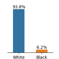
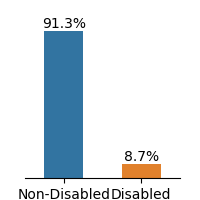
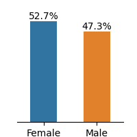
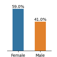
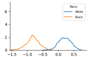
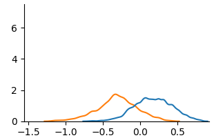
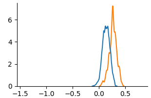
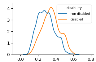
Figure 1: Frequency distributions of sensitive attributes in educational datasets.
The Law School dataset contains admission records of students at 163 U.S. law schools [46]. The dataset has demographic information of 20,798 students on race, gender, LSAT scores, and undergraduate GPA. We select gender and race as sensitive attributes and first-year GPA as the target for the regression task.
The OULAD dataset, originating from a 2013-2014 Open University study in England, compiles student data and their interactions within a virtual learning environment across seven courses. We select disability as the sensitive attribute and final result as the classification target. The gender is not considered as our sensitive attribute because the preceding study [18] revealed that gender attribute does not have a causal relationship to student’s final result. For this work, we only considered the module BBB(Social Science).
The Student Performance dataset describes students’ achievements in Mathematics and Portuguese language subjects in two Portuguese secondary schools during 2005-2006. The dataset provides details about students’ demographics, and family backgrounds such as parent’s jobs and education level, study habits, extracurricular activities, and lifestyle. We select gender as the sensitive attribute and G3 as the target for the regression problem. Feature description of the dataset is presented in Appendix A.
The dataset demonstrates imbalance between subgroups of sensitive attributes, presented in Fig. 1. Law school and OULAD datasets exhibit an extreme imbalance in the selected sensitive attributes, while the gender attribute in Student Performance is less imbalanced.
Race Gender GPA LSAT FYA
(a) Law School
Disability
Highest Education
Final Result Gender Age
(b) OULAD(module BBB)
Gender studytime freetime Dalc G1 Walc goout G2 G3
(c) Student Performance (Mat)
Gender Dalc freetime studytime Walc goout G1 G2 G3
(d) Student Performance (Por)
Figure 2: Partial DAGs of the estimated causal model for educational datasets, showing only the sensitive attribute, its descendants, and the target variable. See Appendix B for full graphs. Each sub-graph is not used for implementing counterfactually fair models; only the remaining features are included.
### 3.2 Structural Causal Model of Educational Dataset
Counterfactual fairness holds that intervening solely on the sensitive attribute A while keeping all other things equal, does not change the model’s prediction distribution. To implement counterfactual fairness, a predefined Structural Causal Model(SCM) in Directed Acyclic Graph(DAG) form is necessary. Although the causal model of the Law School data exists [23], there are no known causal models for the remaining datasets.
To construct the SCM of OULAD and the Student Performance dataset, we use a causal discovery algorithm, Linear Non-Gaussian Acyclic Model (LiNGAM) [41]. The algorithm estimates a causal structure of the observational data of continuous values under linear-non-Gaussian assumption. From the estimated causal model, we filtered DAG weights that are under the 0.1 threshold.
Among constructed SCM, we present features that are in causal relationships with the sensitive attribute that directly or indirectly affects the target variable in Fig. 2. Further analysis of causal relationships between sensitive features is discussed in Section 5.
### 3.3 Counterfactual Fairness Evaluation Metrics
We use the Wasserstein Distance(WD) and Maximum Mean Discrepancy(MMD) metric for evaluating the difference between prediction distributions for sensitive attributes. Wasserstein distance and MMD are common metrics for evaluating counterfactual fairness [13, 30]. Lower WD and MMD values suggest greater fairness, indicating smaller differences between the outcome distributions.
Although there exist other measures for evaluating counterfactual fairness such as Total Effect [55] and Counterfactual Confusion Matrix [39], we limit our evaluation of counterfactual fairness to the above metrics. We construct unaware and counterfactual models without direct access to the sensitive attribute, evaluating fairness with mentioned metrics would not be feasible. We visually examine prediction distributions through Kernel Density Estimation(KDE) plots across our baseline and counterfactually fair models.
#### 3.3.1 Educational Domain Specific Fairness Metric
We additionally analyze the counterfactual approach with pre-existing fairness metrics tailored for the education domain. We choose Absolute Between-ROC Area(ABROCA) [15] and Model Absolute Density Distance(MADD) [43] for the analysis. ABROCA quantifies the absolute difference between two ROC curves. It measures the overall performance divergence of a classifier between sensitive attributes, focusing on the magnitude of the gap regardless of which group performs better at each threshold. MADD constructs KDE plots of prediction probabilities and calculates the area between two curves of the sensitive attribute. While the ABROCA metric represents how similar the numbers of errors across groups are, the MADD metric captures the severity of discrimination across groups, allowing for diverse perspectives on the analysis of model behaviors on fairness. Although both metrics are designed for group fairness, we include those in our work because they are specifically proposed under the context of the educational domain.
### 3.4 Experiment Details
For the experiment, we considered the Level 1 concept of counterfactual fairness defined in Kusner et al. [23]. At Level 1, the predictor is built exclusively using observed variables that are not causally influenced by the sensitive attributes. While a causal ordering of these features is necessary, no assumptions are made about the structure of unobserved latent variables. This requires causal ordering of features but no further assumptions of unobserved variables. For the Law School dataset, Level 2 is used.
We selected two baselines for the experiment, (a) Unfair model and (b) Unaware model. An unfair model directly includes sensitive attributes to train the model. The unaware model implements ‘Fairness Through Unawareness’, a fairness notion where an algorithm is considered fair when protected attributes are not used in the decision-making process [7]. We compare two baselines with the FairLearning algorithm introduced in Kusner et al. [23].
We evaluate the counterfactual fairness of machine learning models on both regression and classification models. We selected the four most utilized machine learning models in the algorithmic fairness literature [19]. We choose Linear Regression(LR; Logistic Regression for classification), Multilayer Perceptron(MLP), Random Forest(RF), and XGBoost(XGB) [5]. For KDE plot visualizations, we used a linear regression model for regression and MLP for classification.
## 4 Result
In the result section of our study, we present an analysis of counterfactual fairness on educational datasets. Since the Law School dataset is well studied in the counterfactual fairness literature, we only provide this experiment as a baseline.
### 4.1 Visual Analysis
We use KDE plots to visualize outcome distributions across subgroups, providing a better understanding of counterfactual fairness with summary statistics.
<details>
<summary>extracted/6375259/figures/kde_law_unfair.png Details</summary>
### Visual Description
\n
## Density Plot: Distribution Comparison by Race
### Overview
The image displays a kernel density estimate (KDE) plot comparing two probability distributions. The chart visualizes the distribution of an unspecified numerical variable across two groups labeled "White" and "Black." The plot shows two distinct, non-overlapping bell-shaped curves, indicating the variable's values are centered around different means for each group.
### Components/Axes
* **Chart Type:** Kernel Density Estimate (KDE) Plot.
* **X-Axis:**
* **Label:** Not explicitly labeled. Represents the value of the measured variable.
* **Scale:** Linear scale ranging from approximately -1.5 to 0.5.
* **Major Tick Marks:** Located at -1.5, -1.0, -0.5, 0.0, and 0.5.
* **Y-Axis:**
* **Label:** Not explicitly labeled. Represents probability density.
* **Scale:** Linear scale ranging from 0 to just above 6.
* **Major Tick Marks:** Located at 0, 2, 4, and 6.
* **Legend:**
* **Position:** Top-right corner of the plot area.
* **Title:** "Race"
* **Categories & Colors:**
* **White:** Represented by a blue line.
* **Black:** Represented by an orange line.
### Detailed Analysis
* **Distribution for "Black" (Orange Line):**
* **Trend:** The curve rises from near zero at x ≈ -1.5, peaks, and then declines back to near zero around x ≈ -0.2.
* **Peak (Mode):** The highest point of the density curve occurs at approximately **x = -0.8**. The peak density value is approximately **2.3** on the y-axis.
* **Spread:** The distribution appears roughly symmetric and unimodal, spanning a range of about 1.3 units on the x-axis (from -1.5 to -0.2).
* **Distribution for "White" (Blue Line):**
* **Trend:** The curve rises from near zero at x ≈ -0.4, peaks, and then declines back to near zero around x ≈ 0.7.
* **Peak (Mode):** The highest point of the density curve occurs at approximately **x = 0.2**. The peak density value is approximately **2.0** on the y-axis.
* **Spread:** The distribution appears roughly symmetric and unimodal, spanning a range of about 1.1 units on the x-axis (from -0.4 to 0.7).
* **Relationship Between Distributions:** The two distributions are clearly separated. The center of the "Black" distribution (peak at -0.8) is shifted significantly to the left (lower values) compared to the center of the "White" distribution (peak at 0.2). There is minimal overlap between the two curves, occurring only in the narrow region between x ≈ -0.4 and x ≈ -0.2.
### Key Observations
1. **Clear Separation:** The most prominent feature is the distinct separation between the two density curves, indicating a substantial difference in the central tendency of the measured variable between the two groups.
2. **Similar Shape & Spread:** Both distributions are unimodal and have a similar bell-like shape and width (spread), suggesting the variability of the variable within each group is comparable.
3. **Peak Density:** The peak density for the "Black" group (≈2.3) is slightly higher than for the "White" group (≈2.0), suggesting the data points for the "Black" group are slightly more concentrated around its mean.
4. **No Contextual Labels:** The chart lacks a title and axis labels, making it impossible to know what specific variable (e.g., test score, income index, physiological measurement) is being compared without external context.
### Interpretation
This chart demonstrates a **bimodal distribution at the group level**. The data suggests that the two populations ("White" and "Black") have systematically different average values for the underlying metric. The variable's distribution for the "Black" group is centered on negative values, while the distribution for the "White" group is centered on positive values.
The near-complete separation of the curves implies that knowing the value of the variable for a randomly selected individual would provide strong evidence to classify which group they belong to. The similar shapes of the distributions suggest that the *nature* of the variation within each group is alike, even though their *locations* on the scale differ.
**Critical Missing Information:** Without axis labels or a chart title, the real-world significance of this difference is unknown. The x-axis could represent anything from standardized test scores to a biological marker. The interpretation is purely statistical: a significant mean difference exists between the groups for this particular measure. To derive any meaningful conclusion, the context of what is being measured is essential.
</details>
(a) Unfair
<details>
<summary>extracted/6375259/figures/kde_law_unaware.png Details</summary>
### Visual Description
## Line Chart: Dual Distribution Curves
### Overview
The image displays a 2D line chart featuring two smooth, bell-shaped curves plotted against a common horizontal axis. The chart lacks a title, axis labels, and a legend, presenting only the numerical scales and the plotted data series. The visual suggests a comparison between two related distributions or functions.
### Components/Axes
* **X-Axis (Horizontal):**
* **Scale:** Linear.
* **Range:** Approximately -1.5 to 0.5.
* **Major Tick Marks & Labels:** Located at -1.5, -1.0, -0.5, 0.0, 0.5.
* **Y-Axis (Vertical):**
* **Scale:** Linear.
* **Range:** 0 to 6.
* **Major Tick Marks & Labels:** Located at 0, 2, 4, 6.
* **Data Series:**
* **Series 1 (Blue Line):** A smooth, unimodal curve.
* **Series 2 (Orange Line):** A smooth, unimodal curve.
* **Legend:** **Not present.** The identity and meaning of the blue and orange lines are not defined within the image.
### Detailed Analysis
* **Blue Curve Trend & Points:**
* **Trend:** The curve starts near y=0 at the far left (x ≈ -1.5), rises gradually, accelerates to a peak, then descends symmetrically.
* **Key Points (Approximate):**
* Start: (x ≈ -1.5, y ≈ 0)
* Peak: (x ≈ 0.2, y ≈ 1.5)
* End: (x ≈ 0.5, y ≈ 0)
* **Orange Curve Trend & Points:**
* **Trend:** The curve starts near y=0 at the far left (x ≈ -1.5), rises more steeply than the blue curve to an earlier peak, then descends.
* **Key Points (Approximate):**
* Start: (x ≈ -1.5, y ≈ 0)
* Peak: (x ≈ -0.3, y ≈ 2.0)
* End: (x ≈ 0.5, y ≈ 0)
* **Spatial Relationship:** The orange curve is positioned to the left of and reaches a higher maximum value than the blue curve. The two curves intersect at approximately (x ≈ -0.05, y ≈ 1.0).
### Key Observations
1. **Missing Context:** The most significant observation is the complete absence of explanatory labels (chart title, axis titles, legend). This renders the chart's specific subject matter and the identity of the two series unknown.
2. **Distribution Shapes:** Both curves resemble probability density functions (e.g., Gaussian/Normal distributions) or similar mathematical functions, characterized by their smooth, symmetric, bell-like shapes.
3. **Comparative Properties:** The orange distribution has a **higher peak** (mode) and a **lower mean** (centered further left on the x-axis) compared to the blue distribution. The blue distribution appears slightly wider (larger variance/spread).
4. **Data Range:** The meaningful data for both series is concentrated between x = -1.0 and x = 0.5.
### Interpretation
The chart visually compares two distinct but related quantitative distributions. The lack of labels forces a purely formal interpretation:
* **What it demonstrates:** It shows two unimodal datasets or functions where one (orange) is centered on a lower value of the measured variable (x-axis) and has a higher concentration of values near its center (higher peak) than the other (blue).
* **How elements relate:** The x-axis represents a continuous independent variable. The y-axis represents a dependent variable, likely frequency, probability density, or magnitude. The curves show how this dependent variable changes across the range of the independent variable for two different groups, conditions, or models.
* **Potential Contexts (Speculative):** Without labels, this could represent:
* Comparison of two sensor readings or signal distributions.
* Results from two different statistical models or machine learning algorithms.
* Performance metrics under two different conditions.
* Physical measurements of two similar phenomena.
* **Notable Anomaly:** The primary anomaly is the chart's lack of self-contained explanatory information, which is a critical flaw for a technical document. The data is presented without the necessary context for meaningful analysis.
**Language Note:** No non-English text is present in the image.
</details>
(b) Unaware
<details>
<summary>extracted/6375259/figures/kde_law_counterfactual.png Details</summary>
### Visual Description
\n
## Density Plot: Two Overlapping Distributions
### Overview
The image displays a 2D line chart, specifically a density plot or histogram, showing two overlapping probability distributions. The chart is presented on a white background with black axes. There is no chart title, axis titles, or legend present in the image.
### Components/Axes
* **X-Axis (Horizontal):**
* **Range:** Approximately -1.5 to 0.5.
* **Major Tick Marks & Labels:** Located at -1.5, -1.0, -0.5, 0.0, and 0.5.
* **Title:** Not present.
* **Y-Axis (Vertical):**
* **Range:** 0 to slightly above 6.
* **Major Tick Marks & Labels:** Located at 0, 2, 4, and 6.
* **Title:** Not present.
* **Data Series:**
* **Series 1 (Blue Line):** A single, continuous line forming a bell-shaped curve.
* **Series 2 (Orange Line):** A single, continuous line forming a bell-shaped curve, overlapping the blue line.
### Detailed Analysis
* **Blue Line Trend & Data Points:**
* **Trend:** The line starts near y=0 at x ≈ -0.2, rises steeply to a sharp peak, then descends symmetrically, tapering off to near y=0 at x ≈ 0.4. The distribution appears right-skewed.
* **Peak:** The highest point is at approximately **(x ≈ 0.1, y ≈ 5.5)**.
* **Spread:** The bulk of the distribution (where y > 1) spans from approximately x = -0.1 to x = 0.3.
* **Orange Line Trend & Data Points:**
* **Trend:** The line starts near y=0 at x ≈ 0.0, rises steeply to a sharp peak, then descends, tapering off to near y=0 at x ≈ 0.5. This distribution is also right-skewed but appears slightly wider than the blue one.
* **Peak:** The highest point is at approximately **(x ≈ 0.3, y ≈ 7.0)**. This is the global maximum of the chart.
* **Spread:** The bulk of the distribution (where y > 1) spans from approximately x = 0.1 to x = 0.45.
* **Overlap Region:** The two distributions significantly overlap between x ≈ 0.1 and x ≈ 0.3. In this region, the orange line is generally above the blue line, except near the blue line's peak.
### Key Observations
1. **Distinct Peaks:** The two distributions have clearly separated peaks. The orange distribution's peak is both higher (y ≈ 7.0 vs. y ≈ 5.5) and located further to the right on the x-axis (x ≈ 0.3 vs. x ≈ 0.1) compared to the blue distribution.
2. **Similar Shape, Different Parameters:** Both curves exhibit a similar unimodal, right-skewed shape, suggesting they may represent the same type of underlying data or process but with different mean and variance parameters.
3. **Asymmetry:** Both distributions are not perfectly symmetric; they have a longer tail extending towards the positive x-direction.
4. **Missing Context:** The lack of axis titles and a legend is a critical omission. It is impossible to know what the x and y axes represent (e.g., time, value, frequency, probability density) or what the blue and orange lines signify (e.g., different groups, models, conditions).
### Interpretation
The chart visually compares two related but distinct datasets or probability distributions. The **orange distribution** is characterized by a **higher central tendency** (peak further right) and a **greater concentration of values** (higher peak density) around its mean compared to the **blue distribution**.
**What the data suggests:** If the x-axis represents a measured value (e.g., a test score, a physical measurement, a model error), the group or condition represented by the orange line has, on average, a higher value than the blue group. The higher peak also suggests less variability or a more consistent outcome within the orange group around its central value.
**Notable Anomaly:** The most striking feature is the **complete absence of descriptive labels**. For a technical document, this renders the chart uninterpretable beyond a purely visual comparison of shapes. The viewer can deduce relative differences (orange is "higher" and "more peaked" than blue) but cannot assign any real-world meaning to these differences.
**Peircean Investigation (Reading Between the Lines):** The chart is likely a generated output from a statistical analysis (e.g., kernel density estimation) comparing two samples. The clean, minimalist style suggests it may be a figure from a scientific paper, a data analysis report, or a model evaluation dashboard where the context (axis labels, legend) was provided in accompanying text or a caption not included in this image crop. The choice of blue and orange is a common, colorblind-friendly pairing for distinguishing two categories.
</details>
(c) Counterfactual
Figure 3: KDE plots on Law School.
<details>
<summary>extracted/6375259/figures/kde_oulad_unfair.png Details</summary>
### Visual Description
## Density Plot: Disability Status Distribution
### Overview
The image displays a kernel density estimate (KDE) plot comparing the distribution of an unspecified continuous variable between two groups: "non-disabled" and "disabled". The plot shows two overlapping, smooth probability density curves.
### Components/Axes
* **Chart Type:** Kernel Density Estimate (KDE) Plot.
* **X-Axis:** Unlabeled numerical axis. Markers are present at intervals of 0.2, ranging from 0.0 to 0.8.
* **Y-Axis:** Unlabeled numerical axis representing density. Markers are present at integer intervals from 0 to 4.
* **Legend:** Positioned in the top-right corner of the plot area.
* **Title:** `disability`
* **Series 1:** `non-disabled` - Represented by a blue line.
* **Series 2:** `disabled` - Represented by an orange line.
### Detailed Analysis
**Trend Verification & Data Points:**
* **Non-disabled (Blue Line):**
* **Trend:** The distribution is unimodal with a sharp peak and a noticeable secondary shoulder. It rises steeply from near zero at x≈0.1, peaks, then declines with a smaller hump before tapering off.
* **Key Points (Approximate):**
* Start: (x≈0.1, y≈0)
* Primary Peak: (x≈0.25-0.30, y≈3.8-4.0)
* Secondary Shoulder/Hump: (x≈0.45, y≈1.5)
* End: (x≈0.6, y≈0)
* **Disabled (Orange Line):**
* **Trend:** The distribution is also unimodal but is shifted to the right and appears slightly broader than the blue curve. It rises from near zero at x≈0.15, peaks, and declines more gradually, with a pronounced shoulder.
* **Key Points (Approximate):**
* Start: (x≈0.15, y≈0)
* Primary Peak: (x≈0.35-0.40, y≈4.0)
* Shoulder: (x≈0.50, y≈1.8-2.0)
* End: (x≈0.7, y≈0)
**Spatial Grounding:** The legend is placed in the upper right quadrant, overlapping the descending tail of the blue curve and the empty space above the orange curve's shoulder. The two curves intersect at approximately (x≈0.32, y≈3.5) and (x≈0.48, y≈1.2).
### Key Observations
1. **Central Tendency Shift:** The peak (mode) of the "disabled" group's distribution is located at a higher x-value (~0.375) compared to the "non-disabled" group's peak (~0.275).
2. **Distribution Shape:** Both distributions are right-skewed. The "disabled" group's curve appears to have a slightly wider spread (higher variance) and a more prominent shoulder on its right flank.
3. **Overlap:** There is significant overlap between the two distributions, particularly in the range of x=0.2 to x=0.5, indicating that many individuals from both groups share similar values for the measured variable.
4. **Missing Context:** The chart lacks a main title, axis labels, and units. The specific variable being measured (e.g., test score, income, age) is not identified.
### Interpretation
This chart visually suggests a difference in the distribution of an unknown metric between disabled and non-disabled populations. The rightward shift of the orange curve indicates that, for this particular metric, the disabled group tends to have higher values on average than the non-disabled group. The broader shape of the orange curve implies greater variability within the disabled group.
**Peircean Investigation:** The chart presents an *iconic* representation of statistical data (the curves) and an *indexical* link between the legend labels and the colored lines. The *symbolic* meaning, however, is incomplete. Without knowing what the x-axis represents, we cannot determine the real-world significance. Is a higher value better (e.g., income) or worse (e.g., symptom severity)? The chart demonstrates a correlation between disability status and the measured variable but cannot imply causation. The notable overlap cautions against overgeneralizing group differences to individuals. To be fully informative, this plot requires contextual metadata: the variable name, units, data source, and sample sizes.
</details>
(a) Unfair
<details>
<summary>extracted/6375259/figures/kde_oulad_unaware.png Details</summary>
### Visual Description
\n
## Density Plot: Comparison of Two Unlabeled Distributions
### Overview
The image displays a density plot (or smoothed histogram) comparing two continuous distributions. The plot features two overlapping curves—one blue and one orange—plotted against a common x-axis. There are no explicit titles, axis labels, or a legend present in the image. The chart appears to be a standard statistical visualization, likely generated by a library such as Matplotlib or Seaborn.
### Components/Axes
* **X-Axis:** A horizontal numerical axis ranging from `0.0` to `0.8`. Major tick marks are placed at intervals of `0.2` (0.0, 0.2, 0.4, 0.6, 0.8). The axis has no label.
* **Y-Axis:** A vertical numerical axis ranging from `0` to `4`. Major tick marks are placed at integer intervals (0, 1, 2, 3, 4). The axis has no label.
* **Data Series:** Two series are represented by smooth, continuous lines.
* **Series 1 (Blue Line):** A darker blue curve.
* **Series 2 (Orange Line):** A lighter orange curve.
* **Legend:** No legend is present in the image. The series are distinguished solely by color.
* **Title/Labels:** No chart title, x-axis label, y-axis label, or annotations are visible.
### Detailed Analysis
**Trend Verification & Data Point Approximation:**
* **Blue Curve Trend:** The blue line starts near y=0 at x=0.0, rises sharply to a primary peak, then descends with several smaller fluctuations (secondary peaks/shoulders) before tapering off near y=0 at x=0.6.
* **Primary Peak:** Located at approximately **x ≈ 0.20**, with a peak density value of **y ≈ 3.8**.
* **Secondary Features:** Notable smaller peaks or shoulders occur around **x ≈ 0.30 (y ≈ 2.8)** and **x ≈ 0.40 (y ≈ 2.0)**.
* **Range:** The bulk of the distribution (where y > 0.5) spans from roughly **x=0.10 to x=0.50**.
* **Orange Curve Trend:** The orange line also starts near y=0 at x=0.0, rises to a peak slightly to the right of the blue peak, then descends more smoothly with one prominent secondary hump before tapering off near y=0 at x=0.6.
* **Primary Peak:** Located at approximately **x ≈ 0.25**, with a peak density value of **y ≈ 3.4**.
* **Secondary Feature:** A distinct, broad shoulder or secondary peak is centered around **x ≈ 0.45**, with a local maximum of **y ≈ 1.6**.
* **Range:** The bulk of the distribution spans from roughly **x=0.12 to x=0.55**.
**Spatial Grounding & Cross-Reference:**
* The two curves intersect at two approximate points: near **x ≈ 0.15** and **x ≈ 0.35**.
* To the left of the first intersection (x < 0.15), the blue curve is above the orange curve.
* Between the intersections (0.15 < x < 0.35), the orange curve is above the blue curve.
* To the right of the second intersection (x > 0.35), the blue curve is generally above the orange curve until the orange secondary peak, after which they converge.
### Key Observations
1. **Peak Discrepancy:** The blue distribution has a higher and earlier peak (x≈0.20, y≈3.8) compared to the orange distribution (x≈0.25, y≈3.4).
2. **Shape Difference:** The blue curve is more "jagged" or multimodal, suggesting potential subgroups or noise in the underlying data. The orange curve is smoother but exhibits a pronounced secondary mode around x=0.45.
3. **Spread:** The orange distribution appears slightly more spread out (has a wider effective range) due to its prominent secondary hump extending further to the right.
4. **Overlap:** There is significant overlap between the two distributions, indicating they share a common range of values, but their central tendencies and shapes differ.
### Interpretation
This chart visually compares the probability density of two datasets or conditions. Without labels, the specific context is unknown, but the patterns suggest the following:
* **The blue group** has a strong concentration of values around 0.20, with less probability mass at higher values. Its jagged shape might indicate a mixture of underlying processes or a smaller sample size leading to less smooth estimation.
* **The orange group** has its central tendency shifted slightly higher (mode at 0.25) and shows a significant secondary concentration of values around 0.45. This bimodal characteristic could suggest the presence of two distinct subgroups within the orange dataset or a different generating process compared to the blue dataset.
* **The relationship** between the curves implies that while both phenomena operate in a similar domain (0.0 to 0.6), the "orange" phenomenon is more likely to produce values in the mid-to-high range (0.25-0.55) than the "blue" phenomenon, which is more tightly clustered at the lower end.
**Note:** The absence of axis labels and a legend is a critical limitation. To derive concrete meaning, one would need to know what the x-axis represents (e.g., time, concentration, score) and what the two colors signify (e.g., Control vs. Treatment, Model A vs. Model B, Group 1 vs. Group 2). The provided information is purely statistical and descriptive of the visualized shapes.
</details>
(b) Unaware
<details>
<summary>extracted/6375259/figures/kde_oulad_counterfactual.png Details</summary>
### Visual Description
\n
## Line Chart: Dual Probability Distributions
### Overview
The image displays a line chart featuring two distinct lines (blue and orange) plotted on a Cartesian coordinate system. The chart appears to represent two probability density functions or similar continuous distributions, each exhibiting multiple peaks (multimodal distributions). There is no explicit title, legend, or axis labels beyond the numerical markers.
### Components/Axes
* **X-Axis (Horizontal):**
* **Scale:** Linear.
* **Range:** Approximately 0.0 to 0.8.
* **Markers/Ticks:** Labeled at intervals of 0.2: `0.0`, `0.2`, `0.4`, `0.6`, `0.8`.
* **Title/Label:** None visible.
* **Y-Axis (Vertical):**
* **Scale:** Linear.
* **Range:** 0 to 4.
* **Markers/Ticks:** Labeled at integer intervals: `0`, `1`, `2`, `3`, `4`.
* **Title/Label:** None visible.
* **Data Series:**
* **Series 1 (Blue Line):** A solid blue line.
* **Series 2 (Orange Line):** A solid orange line.
* **Legend:** No legend is present in the image. Series are distinguished solely by color.
### Detailed Analysis
**Trend Verification & Data Point Extraction:**
* **Blue Line Trend:** The line starts near y=0 at x=0.0, rises to a small initial peak, dips, then ascends to a major peak, descends into a valley, rises to a second major peak, and finally descends toward zero.
* **Approximate Key Points (x, y):**
* (0.0, ~0.0)
* First small peak: (~0.05, ~0.5)
* First major peak: (~0.30, ~3.5)
* Valley between peaks: (~0.40, ~1.0)
* Second major peak: (~0.50, ~2.8)
* End: (~0.70, ~0.0)
* **Orange Line Trend:** Follows a similar bimodal pattern but with different peak magnitudes and slight positional shifts. It starts near y=0, rises more gradually to its first peak, dips, rises to a second peak that is higher than its first, then descends.
* **Approximate Key Points (x, y):**
* (0.0, ~0.0)
* First peak: (~0.30, ~3.2) [Slightly lower than blue's first peak]
* Valley between peaks: (~0.40, ~1.5) [Shallower valley than blue]
* Second peak: (~0.50, ~3.0) [Slightly higher than blue's second peak]
* End: (~0.65, ~0.0)
**Spatial Grounding & Cross-Reference:**
* The two lines intersect at least twice: once near x=0.4 (where the blue line is in its deep valley and the orange line is in its shallower valley) and again near x=0.55 on the descending slope after the second peak.
* The blue line's first peak (x≈0.30) is the highest point on the entire chart (y≈3.5).
* The orange line's second peak (x≈0.50) is its highest point (y≈3.0).
### Key Observations
1. **Multimodality:** Both distributions are clearly bimodal, with two distinct peaks.
2. **Peak Asymmetry:** For the blue line, the first peak is higher. For the orange line, the second peak is higher.
3. **Valley Depth:** The valley between the peaks is significantly deeper for the blue line (dropping to y≈1.0) compared to the orange line (dropping to y≈1.5).
4. **Right Skew:** Both distributions are skewed to the right, with the tail extending further towards higher x-values (up to ~0.7-0.8) than lower ones.
5. **Overlap and Divergence:** The lines follow very similar paths but diverge notably in the region between x=0.2 and x=0.5, particularly in the depth of the central valley.
### Interpretation
This chart visually compares two continuous, bimodal distributions. The data suggests two underlying populations or processes, each with two primary modes or clusters. The blue distribution has a more pronounced separation between its modes (deeper valley), indicating a clearer distinction between its two sub-groups. The orange distribution shows more blending between its modes.
The shift in which peak is dominant (first for blue, second for orange) could indicate a difference in the relative frequency or concentration of data points between the two modes in each dataset. For example, if this represented test scores, the blue group might have more people scoring in the lower mode, while the orange group has more in the higher mode.
Without axis labels, the specific context is unknown. However, the pattern is characteristic of data from mixed sources, such as:
* Measurements from two different species or machine types.
* Results from two different experimental conditions.
* Outputs from two different algorithms or models processing the same input range.
The right skew suggests that while most values cluster below 0.6, there is a non-negligible presence of higher values up to 0.8. The precise alignment and misalignment of the peaks provide a direct visual comparison of how the central tendencies and spreads of the two distributions relate.
</details>
(c) Counterfactual
Figure 4: KDE plots on OULAD.
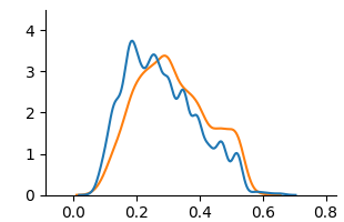
<details>
<summary>extracted/6375259/figures/kde_mat_unfair.png Details</summary>
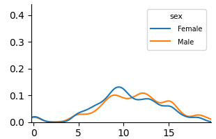
### Visual Description
\n
## Line Chart: Distribution Comparison by Sex
### Overview
The image displays a line chart comparing two probability distributions or density estimates, categorized by sex (Female and Male). The chart plots numerical values on the x-axis against a probability or density measure on the y-axis. There is no main chart title or axis titles provided.
### Components/Axes
* **Legend:** Located in the top-right corner of the chart area. It contains the title "sex" and defines two data series:
* **Female:** Represented by a blue line.
* **Male:** Represented by an orange line.
* **X-Axis:** A horizontal numerical axis with major tick marks labeled at 0, 5, 10, and 15. The axis extends slightly beyond 15, suggesting a range from approximately 0 to 18.
* **Y-Axis:** A vertical numerical axis with major tick marks labeled at 0.0, 0.1, 0.2, 0.3, and 0.4. The axis starts at 0.0.
### Detailed Analysis
The chart shows two smooth, unimodal (single-peaked) distribution curves.
**1. Female Distribution (Blue Line):**
* **Trend:** The line starts near 0.0 at x=0, rises steadily to a peak, and then declines back towards 0.0.
* **Key Points (Approximate):**
* Starts at (0, ~0.01).
* Begins a noticeable ascent around x=3.
* Reaches its peak density of approximately **0.13** at an x-value of about **9.5**.
* After the peak, it declines, crossing below the Male line around x=11.
* Ends near (18, ~0.01).
**2. Male Distribution (Orange Line):**
* **Trend:** The line also starts near 0.0, rises to a peak later than the Female line, and then declines.
* **Key Points (Approximate):**
* Starts at (0, ~0.01).
* Begins a noticeable ascent around x=4, slightly later than the Female line.
* Reaches its peak density of approximately **0.11** at an x-value of about **12.5**.
* After the peak, it declines, crossing above the Female line around x=11 and remaining above it until the end of the range.
* Ends near (18, ~0.01).
**Relationship Between Lines:**
* The Female distribution is shifted to the left (lower x-values) compared to the Male distribution.
* The two lines intersect at two points: once near x=2 (both near 0.0) and again around x=11 (at a density of ~0.09).
* Between x=2 and x=11, the Female line is generally above the Male line.
* Between x=11 and x=18, the Male line is generally above the Female line.
### Key Observations
1. **Peak Disparity:** The most notable feature is the difference in peak location. The Female distribution peaks at a lower x-value (~9.5) than the Male distribution (~12.5).
2. **Peak Height:** The peak density for Females (~0.13) is slightly higher than the peak density for Males (~0.11).
3. **Distribution Shape:** Both distributions have a similar overall shape—a rise, a single peak, and a fall—but are offset from each other along the x-axis.
4. **Overlap:** There is significant overlap between the two distributions, particularly in the range of x=5 to x=15, indicating commonality in the measured variable between the groups despite the shift.
### Interpretation
This chart visually demonstrates a difference in the central tendency of a measured variable between two groups, Female and Male. The variable, represented on the x-axis, could be age, a test score, a physiological measurement, or any continuous metric.
* **What the data suggests:** The data suggests that, for the population sampled, the typical or most common value (the mode) of the measured variable is lower for Females than for Males. The Female group's values are more concentrated around a lower point (x≈9.5), while the Male group's values are more concentrated around a higher point (x≈12.5).
* **How elements relate:** The legend directly maps color to category, enabling the comparison. The x-axis provides the scale for the variable, and the y-axis shows the relative likelihood or frequency of each value within its group. The intersecting lines highlight the points where the relative likelihoods are equal.
* **Notable patterns/anomalies:** The clean, smooth nature of the lines suggests these are likely kernel density estimates (KDEs) or fitted distribution curves rather than raw histogram data. The lack of axis titles is a significant omission, as it prevents definitive interpretation of what is being measured. The uncertainty in extracting exact peak values is high due to the absence of gridlines; the values provided are best visual estimates.
</details>
(a) Unfair
<details>
<summary>extracted/6375259/figures/kde_mat_unaware.png Details</summary>
### Visual Description
## Line Chart: Dual Series Distribution Plot
### Overview
The image displays a 2D line chart with two data series plotted against a common x-axis. The chart appears to show two probability distributions or density estimates over a continuous variable. There are no titles, axis labels, or a legend present in the image.
### Components/Axes
* **X-Axis:** A horizontal axis with numerical markers at intervals of 5, labeled: `0`, `5`, `10`, `15`. The axis extends slightly beyond 15, suggesting a range from approximately 0 to 18.
* **Y-Axis:** A vertical axis with numerical markers at intervals of 0.1, labeled: `0.0`, `0.1`, `0.2`, `0.3`, `0.4`. The axis range is from 0.0 to just above 0.4.
* **Data Series:** Two continuous lines are plotted.
* **Series 1 (Blue Line):** A smooth, solid blue line.
* **Series 2 (Orange Line):** A smooth, solid orange line.
* **Legend:** No legend is present in the image. The series are distinguished solely by color.
### Detailed Analysis
**Spatial Layout:** The chart area is centered. The axes form a standard L-shape on the left and bottom. The two data lines occupy the central plotting area, primarily between y=0.0 and y=0.15.
**Trend Verification & Data Points:**
* **Blue Line Trend:** Starts near y=0 at x=0, rises to a single prominent peak, then declines back towards zero.
* At x=0: y ≈ 0.01
* Rises gradually, crossing y=0.05 around x=6.
* **Peak:** Reaches its maximum at approximately x=10, with a y-value of ≈ 0.13.
* Declines steadily after the peak.
* At x=15: y ≈ 0.04
* Ends near y=0 at x=18.
* **Orange Line Trend:** Follows a similar overall pattern to the blue line but with a slightly different shape and more minor fluctuations.
* At x=0: y ≈ 0.01 (similar to blue).
* Rises, staying slightly below the blue line until around x=8.
* **Primary Peak:** Reaches its maximum at approximately x=11, with a y-value of ≈ 0.10. This peak is lower and slightly to the right of the blue line's peak.
* Shows a noticeable secondary, smaller peak or plateau around x=14 (y ≈ 0.08).
* Declines after x=14.
* At x=15: y ≈ 0.06 (higher than the blue line at this point).
* Ends near y=0 at x=18.
### Key Observations
1. **Correlated Shape:** Both distributions are unimodal (single-peaked) and right-skewed, with a long tail extending to the right (higher x-values).
2. **Peak Discrepancy:** The blue line's peak is higher (≈0.13 vs. ≈0.10) and occurs earlier (x≈10 vs. x≈11) than the orange line's peak.
3. **Mid-Range Divergence:** Between x=12 and x=16, the orange line consistently maintains a higher value than the blue line, indicating a heavier tail or secondary mode in that region for the orange series.
4. **Convergence at Extremes:** Both lines start and end at nearly identical, very low values near y=0.
### Interpretation
This chart likely compares two related probability distributions or signal densities over the same domain (x-axis). The blue series represents a distribution with a higher, sharper concentration of probability around x=10. The orange series represents a slightly more dispersed distribution, with its central tendency shifted to a higher x-value (x=11) and a more pronounced "shoulder" or secondary concentration of probability between x=13 and x=15.
Without axis labels, the context is ambiguous. The x-axis could represent time, a physical measurement, or a model parameter. The y-axis, given its scale (0 to 0.4), is consistent with probability density, normalized frequency, or a similar proportional measure. The key takeaway is that while both phenomena follow a similar overall pattern, the process generating the orange data has a slightly delayed peak and a greater likelihood of producing values in the x=12-16 range compared to the process generating the blue data.
</details>
(b) Unaware
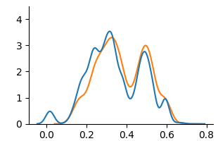
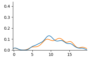
<details>
<summary>extracted/6375259/figures/kde_mat_counterfactual.png Details</summary>
### Visual Description
## Line Chart: Dual Distribution Comparison
### Overview
The image displays a 2D line chart comparing two data series, represented by a blue line and an orange line. Both series show a similar unimodal distribution pattern, rising from near-zero, peaking in the middle of the x-axis range, and then falling back to near-zero. The chart has a clean, minimalist style with no title, legend, or grid lines.
### Components/Axes
* **X-Axis (Horizontal):**
* **Label:** None explicitly stated.
* **Scale:** Linear scale from 0 to 15.
* **Major Tick Marks & Labels:** 0, 5, 10, 15.
* **Y-Axis (Vertical):**
* **Label:** None explicitly stated.
* **Scale:** Linear scale from 0.0 to 0.4.
* **Major Tick Marks & Labels:** 0.0, 0.1, 0.2, 0.3, 0.4.
* **Data Series:**
* **Series 1 (Blue Line):** A solid blue line.
* **Series 2 (Orange Line):** A solid orange line.
* **Legend:** Not present. Series are distinguished solely by color.
### Detailed Analysis
**Spatial Layout:** The chart area is centered. The y-axis is positioned on the left edge, and the x-axis is at the bottom. The data lines occupy the central region of the plot.
**Trend Verification & Data Points (Approximate):**
* **Blue Line Trend:** Starts near y=0 at x≈5. Shows a small local peak around x≈8 (y≈0.05). Rises steeply to a sharp global peak at approximately x=11.5, y=0.42. Descends steeply, crossing below the orange line around x=12.5, and returns to near y=0 by x≈14.
* **Orange Line Trend:** Follows a very similar path to the blue line but with less extreme peaks and valleys. Starts near y=0 at x≈5. Has a minor peak around x≈8 (y≈0.04). Rises to a broader, slightly lower global peak around x=11.5-12, with a maximum y-value of approximately 0.33. Descends and returns to near y=0 by x≈14.
**Key Coordinate Estimates:**
* **At x=5:** Both lines are at y≈0.
* **At x=8 (Local Peak):** Blue ≈ 0.05, Orange ≈ 0.04.
* **At x=10:** Blue ≈ 0.15, Orange ≈ 0.12.
* **At x=11.5 (Blue Peak):** Blue ≈ 0.42, Orange ≈ 0.30.
* **At x=12 (Orange Peak):** Blue ≈ 0.35, Orange ≈ 0.33.
* **At x=13:** Blue ≈ 0.10, Orange ≈ 0.15.
* **At x=14:** Both lines are at y≈0.
### Key Observations
1. **Strong Correlation:** The two data series are highly correlated in shape and timing, suggesting they measure similar phenomena or are derived from related processes.
2. **Peak Divergence:** The most significant difference is at the peak. The blue line's peak is sharper and approximately 27% higher (0.42 vs. 0.33) than the orange line's peak.
3. **Crossover Point:** The lines intersect twice: once near the base on the ascent (around x≈9) and once on the descent (around x≈12.5). After the second crossover, the orange line remains slightly above the blue line until they both converge at zero.
4. **Distribution Shape:** Both distributions are slightly right-skewed, with a steeper ascent on the left side of the peak and a slightly more gradual descent on the right.
### Interpretation
This chart likely compares the probability density functions (PDFs) or similar normalized frequency distributions of two related datasets. The x-axis could represent a measured variable (e.g., time, size, score), and the y-axis represents its probability density or relative frequency.
The data suggests that while both datasets share the same central tendency (peak around x=11.5) and range (5 to 14), they differ in **concentration**. The blue distribution is more concentrated around its mean, exhibiting higher kurtosis (a sharper peak). The orange distribution is more spread out, with a lower peak and slightly heavier tails, especially visible on the right side of the peak (x=12.5 to 13.5).
**Possible Contexts:**
* **Performance Metrics:** Comparing the error distributions of two models, where the blue model has a higher concentration of very low errors but also a slightly higher rate of moderate errors on the descent.
* **Sensor Data:** Comparing signal readings from two sensors, where one (blue) is more sensitive or has a higher gain, producing a stronger peak response.
* **Simulation Results:** Comparing outcomes from two slightly different simulation parameters, showing how a change affects the distribution's shape without shifting its center.
The absence of labels is a critical limitation for definitive interpretation. The key takeaway is the **morphological comparison**: two processes with identical location and scale but different shape parameters, specifically differing in peakedness (kurtosis).
</details>
(c) Counterfactual
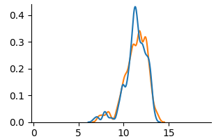
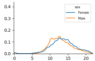
Figure 5: KDE plots on Student Performance(Mathematics).
<details>
<summary>extracted/6375259/figures/kde_por_unfair.png Details</summary>
### Visual Description
\n
## Line Chart: Distribution Comparison by Sex
### Overview
The image displays a line chart comparing two distributions, labeled "Female" and "Male," across a numerical range. The chart appears to show probability density or frequency distributions, with both series exhibiting a unimodal, roughly bell-shaped curve. The visual suggests a comparison of a continuous variable between two groups.
### Components/Axes
* **Chart Type:** Line chart (density plot).
* **Legend:** Located in the top-right corner. It contains the title "sex" and two entries:
* A blue line labeled "Female".
* An orange line labeled "Male".
* **X-Axis:** A horizontal numerical axis. It has major tick marks and labels at intervals of 5, specifically at `0`, `5`, `10`, `15`, and `20`. The axis extends slightly beyond 20. **No descriptive title or label is present for this axis.**
* **Y-Axis:** A vertical numerical axis. It has major tick marks and labels at intervals of 0.1, specifically at `0.0`, `0.1`, `0.2`, `0.3`, and `0.4`. **No descriptive title or label is present for this axis.**
### Detailed Analysis
**Trend Verification:**
* **Female (Blue Line):** The line starts near y=0 at x=0, remains low until approximately x=5, then begins a steady ascent. It reaches a peak density between x=13 and x=14, with a y-value of approximately 0.14. After the peak, it descends steadily, approaching y=0 near x=20.
* **Male (Orange Line):** This line follows a very similar trajectory. It also starts near y=0, begins rising around x=5, and peaks slightly earlier than the female line, around x=12-13. Its peak value is marginally higher, at approximately y=0.15. It then descends, crossing below the female line around x=16, and also approaches y=0 near x=20.
**Data Point Extraction (Approximate Values):**
| X-Value (Approx.) | Female (Blue) Y-Value (Approx.) | Male (Orange) Y-Value (Approx.) | Notes |
| :--- | :--- | :--- | :--- |
| 0 | ~0.00 | ~0.00 | Both lines originate near the origin. |
| 5 | ~0.01 | ~0.01 | Both distributions begin to rise. |
| 10 | ~0.08 | ~0.10 | Male line is slightly above Female line. |
| 12 | ~0.12 | ~0.15 | Male line appears to reach its peak. |
| 13 | ~0.14 | ~0.14 | Lines are very close; Female may be at its peak. |
| 15 | ~0.12 | ~0.10 | Female line is now above Male line. |
| 16 | ~0.10 | ~0.08 | **Intersection Point:** Lines cross here. |
| 18 | ~0.04 | ~0.03 | Both lines are descending. |
| 20 | ~0.01 | ~0.01 | Both lines converge near zero. |
### Key Observations
1. **Missing Context:** The most significant observation is the complete absence of labels for the X and Y axes. This makes it impossible to know what variable is being measured (e.g., age, score, time) or what the y-axis represents (e.g., probability density, frequency, count).
2. **Similar Distributions:** The two distributions are remarkably similar in shape, range, and central tendency. Both are unimodal and centered around the 12-14 range on the x-axis.
3. **Subtle Differences:** The male distribution has a slightly higher and earlier peak. The female distribution has a slightly longer "tail" to the right, as evidenced by it being the higher line after x=16.
4. **Range:** Both distributions are effectively contained within the x-axis range of 0 to 20.
### Interpretation
The chart demonstrates a comparison of two very similar distributions. Without axis labels, the specific subject matter is unknown, but the pattern is classic for comparing a continuous variable across two groups (e.g., test scores, reaction times, physical measurements).
The data suggests that the central tendency (mean/median) for the measured variable is nearly identical for females and males in this dataset. The slight differences in peak height and position could indicate minor variations in concentration around the mode, but the overall overlap is substantial. The crossing of the lines around x=16 is a key point, indicating where the relative frequency of the two groups inverts.
**Primary Limitation:** The lack of axis titles renders the chart scientifically uninterpretable. It shows a *relationship* but provides no information about the *entities* in that relationship. To be useful for technical documentation, the axes must be labeled to define the variables (e.g., "Age (years)" for the x-axis and "Probability Density" for the y-axis).
</details>
(a) Unfair
<details>
<summary>extracted/6375259/figures/kde_por_unaware.png Details</summary>
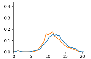
### Visual Description
## Line Chart: Dual Distribution Comparison
### Overview
The image displays a 2D line chart comparing two data series (blue and orange lines) plotted against a common x-axis. The chart lacks a title, axis labels, and a legend, presenting only the plotted data and numerical axis markers. The visual suggests a comparison of two similar, unimodal distributions.
### Components/Axes
* **X-Axis:** Horizontal axis with numerical markers at intervals of 5, labeled: `0`, `5`, `10`, `15`, `20`. The axis line extends slightly beyond the final marker.
* **Y-Axis:** Vertical axis with numerical markers at intervals of 0.1, labeled: `0.0`, `0.1`, `0.2`, `0.3`, `0.4`.
* **Data Series:**
* **Blue Line:** A continuous line representing one data series.
* **Orange Line:** A continuous line representing a second data series.
* **Legend:** **Not present.** The identity of the blue and orange lines is not specified within the image.
### Detailed Analysis
**Spatial Grounding & Trend Verification:**
* **Blue Line Trend:** The line begins near y=0 at x=0. It shows a very slight, broad elevation between x=1 and x=4, then begins a steady ascent. It reaches a broad, slightly jagged peak plateau between approximately x=12 and x=14, with a maximum value near y=0.16. After x=14, it descends steadily, approaching y=0 near x=20.
* **Orange Line Trend:** The line also begins near y=0 at x=0. It remains flat until approximately x=5, then ascends more steeply than the blue line. It reaches a sharper, more defined peak at approximately x=11, with a maximum value near y=0.18. After its peak, it descends, crossing below the blue line around x=13-14, and continues descending to approach y=0 near x=20.
**Approximate Data Points (Estimated from visual inspection):**
| X-Value (Approx.) | Blue Line Y-Value (Approx.) | Orange Line Y-Value (Approx.) | Relative Position |
| :--- | :--- | :--- | :--- |
| 0 | ~0.00 | ~0.00 | Lines converge |
| 2 | ~0.02 | ~0.00 | Blue slightly above |
| 5 | ~0.01 | ~0.01 | Lines converge |
| 8 | ~0.06 | ~0.08 | Orange above |
| 10 | ~0.12 | ~0.16 | Orange above |
| **11** | **~0.14** | **~0.18 (Peak)** | **Orange at peak, above blue** |
| **13** | **~0.16 (Peak)** | **~0.14** | **Blue at peak, above orange** |
| 15 | ~0.12 | ~0.10 | Blue above |
| 18 | ~0.04 | ~0.03 | Blue slightly above |
| 20 | ~0.00 | ~0.00 | Lines converge |
### Key Observations
1. **Missing Metadata:** The most significant observation is the complete absence of contextual information: no chart title, no axis labels (e.g., "Time," "Probability," "Frequency"), and no legend to identify the blue and orange series.
2. **Similar Distribution Shape:** Both lines depict unimodal (single-peaked) distributions that are right-skewed (the tail extends further to the right).
3. **Peak Discrepancy:** The orange line peaks earlier (x≈11) and at a higher value (y≈0.18) than the blue line (x≈13, y≈0.16).
4. **Crossover Points:** The lines intersect at least three times: near x=0, x=5, and between x=13-14. The orange line is dominant (higher y-value) during the main ascent and peak phase (x=6 to x=13), while the blue line is dominant during the later descent phase (x>14).
5. **Low-Value Region:** Both series show minimal activity (y≈0) for x<5 and x>18.
### Interpretation
The chart presents a comparative analysis of two related phenomena, likely representing probability distributions, signal intensities, or frequency counts over a common domain (the x-axis). The data suggests that the process represented by the **orange line** reacts or accumulates more quickly, reaching a higher maximum intensity earlier in the domain. The process represented by the **blue line** has a more delayed and slightly subdued peak but maintains its intensity for a longer duration, as evidenced by its higher values in the later phase (x>14).
**Peircean Investigative Reading:** The absence of labels forces an investigation based purely on relational patterns. The crossing lines imply a dynamic relationship where the leading indicator (orange) peaks and fades, while a lagging indicator (blue) follows a similar but temporally shifted and dampened pattern. This could model scenarios like:
* The spread of two related news stories or memes.
* The activation levels of two different neural populations in response to a stimulus.
* The concentration of two chemical reactants in a time-based experiment.
The critical missing piece is the semantic frame of reference (the axis labels and legend), which is necessary to move from abstract pattern recognition to concrete scientific or technical understanding. The image provides robust data on the *relationship* between the two series but withholds the context needed to interpret their *meaning*.
</details>
(b) Unaware
<details>
<summary>extracted/6375259/figures/kde_por_counterfactual.png Details</summary>
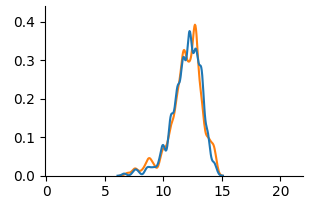
### Visual Description
## Line Chart: Dual Distribution Comparison
### Overview
The image displays a 2D line chart comparing two data series (blue and orange lines) plotted against a common x-axis. The chart appears to show two probability distributions or frequency curves that are highly similar in shape and location, with both peaking in the same region. There is no chart title, axis titles, or legend present.
### Components/Axes
* **X-Axis:** A horizontal numerical axis ranging from 0 to 20. Major tick marks and labels are present at intervals of 5 (0, 5, 10, 15, 20).
* **Y-Axis:** A vertical numerical axis ranging from 0.0 to 0.4. Major tick marks and labels are present at intervals of 0.1 (0.0, 0.1, 0.2, 0.3, 0.4).
* **Data Series:**
* **Blue Line:** A continuous, relatively smooth line.
* **Orange Line:** A continuous line with more visible local fluctuations or noise compared to the blue line.
* **Legend:** **Not present.** The meaning of the blue and orange lines is not defined within the image.
* **Titles:** **Not present.** There is no main chart title, x-axis title, or y-axis title.
### Detailed Analysis
**Spatial Grounding & Trend Verification:**
1. **Blue Line Trend:** The line begins near y=0 at approximately x=6. It slopes upward, becoming steeper after x=10, and reaches its primary peak in the region of x=12 to x=13. The peak value is approximately y=0.38. After the peak, it slopes downward sharply, returning to near y=0 by x=15.
2. **Orange Line Trend:** The line follows a very similar path to the blue line. It also begins near y=0 around x=6, slopes upward, and peaks in the same x=12 to x=13 region. Its peak appears slightly higher and sharper than the blue line's peak, reaching approximately y=0.40. It then descends sharply, also reaching near y=0 by x=15.
3. **Key Data Points (Approximate):**
* **Onset (y > 0):** Both lines begin to rise from the baseline at x ≈ 6.
* **Primary Peak Region (x ≈ 12-13):**
* Blue Line Peak: ~ (x=12.5, y=0.38)
* Orange Line Peak: ~ (x=12.8, y=0.40)
* **Secondary Features:** The orange line shows a minor local peak or shoulder around x=11 (y≈0.32) and more jaggedness on the ascending slope between x=8 and x=11. The blue line is smoother in this region.
* **Termination:** Both lines return to the baseline (y ≈ 0) at x ≈ 15.
### Key Observations
1. **High Similarity:** The two distributions are nearly identical in their overall location (centered near x=12.5) and spread (spanning from x≈6 to x≈15).
2. **Noise/Variance Difference:** The primary visual difference is the smoothness of the curves. The orange line exhibits more high-frequency variation, suggesting it may represent noisier data, a different sampling method, or a model with less smoothing compared to the blue line.
3. **Peak Discrepancy:** The orange line's peak is slightly higher and occurs at a marginally higher x-value than the blue line's peak.
4. **Missing Context:** The complete absence of labels, titles, and a legend makes it impossible to determine what these distributions represent (e.g., signal strength, error rates, population data, model predictions).
### Interpretation
The chart demonstrates two datasets or models that produce remarkably similar output distributions. The core phenomenon they measure is concentrated in the range of x=10 to x=14, with a mode near x=12.5.
* **What the data suggests:** The strong overlap implies that whatever underlying process or signal is being captured, both the blue and orange series are detecting it with high fidelity. The difference in smoothness is the most salient point of divergence. This could indicate:
* **Blue:** A smoothed average, a theoretical model, or data from a less noisy sensor.
* **Orange:** Raw experimental data, a model with stochastic elements, or data from a noisier measurement process.
* **Why it matters:** Without labels, the practical significance is unknown. However, in a technical context, this comparison would be critical for validating a new measurement technique (orange) against a established standard (blue), or for comparing the output of a noisy simulation (orange) to a clean analytical solution (blue). The close match would generally be a positive result, indicating good agreement, while the noise characteristic would be a key factor for further analysis.
* **Notable Anomaly:** The most significant "anomaly" is the lack of metadata. For a technical document, this chart is incomplete. The information required to interpret it—axis definitions, series labels, and a title—is entirely absent from the visual itself.
</details>
(c) Counterfactual
Figure 6: KDE plots on Student Performance(Portuguese).
Fig. 3 and Fig. 4 present KDE plots for Law School and OULAD datasets. For Law School data, we can see that the unfair and unaware model produces predictions with large disparities, as previously known from the counterfactual literature. For OULAD data, unfair and unaware models’ prediction probabilities do not overlap, giving slightly higher prediction probabilities for disabled students. For both datasets, the prediction distribution of the counterfactual model is closer than the unfair and unaware model.
Fig. 5 and Fig. 6 show KDE plots for Student Performance in Mathematics and Portuguese. The differences in model predictions are relatively small for all models compared to previous datasets, although disparities exist. In Mathematics, unfair and unaware models underestimate scores for female students (below 10) and overestimate for males. The opposite is true for Portuguese, where female students are more frequently assigned scores above 10. Counterfactual models on both data demonstrate an overlap of two distributions, although male students were predicted to be in the middle score range more frequently than female students in Mathematics.
### 4.2 Measure of Counterfactual Fairness
Table 3: Evaluation of fairness notions on benchmark datasets.
| Data | Metric | Unfair | Unaware | Counterfactual |
| --- | --- | --- | --- | --- |
| Law | WD | 1.0340 | 0.4685 | 0.1290 |
| MMD | 0.8658 | 0.4140 | 0.1277 | |
| OULAD | WD | 0.0722 | 0.0342 | 0.0337 |
| MMD | 0.0708 | 0.0324 | 0.0317 | |
| Math | WD | 0.7251 | 0.7358 | 0.1161 |
| MMD | 0.3396 | 0.1917 | 0.0538 | |
| Por | WD | 0.7526 | 0.6339 | 0.1047 |
| MMD | 0.4322 | 0.2839 | 0.1205 | |
We present the evaluation of counterfactual fairness in Table 3. In all cases, the counterfactually fair model achieves the lowest WD and MMD. For Law School and Student Performance(Mat and Por) data, the distance between two distributions of sensitive attribute subgroups significantly reduced, comparing the counterfactual model to the unfair and unaware model. Despite the limited visual evidence of reduced distributional differences in the Student Performance KDE plots, WD and MMD provided quantifiable measures of this reduction. For OULAD data, the reduction in distribution difference between the unaware and counterfactual model is minimal, suggesting a weak causal link of disability to student’s final result. Consistent for all datasets, WD and MMD decrease as the sensitive attribute and its causal relationships are removed.
Fairness levels vary across datasets. Law school data shows the highest initial unfairness while OULAD data shows relatively low unfairness even for the unfair model. Both Student Performance dataset shows significant unfairness, particularly for WD. WD and MMD rankings of fairness methods generally agree, with large differences in one corresponding to large differences in the other, suggesting robustness to the distance metric choice.
Table 4: Evaluation of education-specific fairness on OULAD dataset.
| Data | Metric | Unfair | Unaware | Counterfactual |
| --- | --- | --- | --- | --- |
| OULAD | ABROCA | 0.1019 | 0.0219 | 0.0181 |
| MADD | 0.5868 | 0.3194 | 0.2763 | |
Given the classification nature of the OULAD dataset, ABROCA and MADD metric results are presented in Table 4. Because ABROCA and MADD assess group fairness disparity across all classification thresholds, they are not directly comparable to counterfactual fairness, an individual-level fairness notion. However, the unfair model was highly biased, as evidenced by its ABROCA (0.1019, max 0.5) and MADD (0.5868, max 2) scores. While the unaware model showed improvement, the counterfactual model achieved the best fairness results. This indicates that the counterfactual approach is effective in reducing disparities in the number of errors and model behaviors across groups.
### 4.3 Performance of Machine Learning Models
Table 5: Prediction performance of machine learning models on fairness notions.
| Data | Metric | Unfair | Unaware | Counterfactual | | | | | | | | | |
| --- | --- | --- | --- | --- | --- | --- | --- | --- | --- | --- | --- | --- | --- |
| LR | MLP | RF | XGB | LR | MLP | RF | XGB | LR | MLP | RF | XGB | | |
| Law | MSE | 0.72 | 0.73 | 0.50 | 0.52 | 0.75 | 0.75 | 0.59 | 0.59 | 0.82 | 0.83 | 0.57 | 0.57 |
| RMSE | 0.85 | 0.86 | 0.71 | 0.72 | 0.86 | 0.86 | 0.77 | 0.77 | 0.90 | 0.91 | 0.75 | 0.76 | |
| OULAD | Acc | 0.69 | 0.70 | 0.72 | 0.71 | 0.69 | 0.69 | 0.71 | 0.71 | 0.68 | 0.68 | 0.70 | 0.69 |
| AUROC | 0.65 | 0.68 | 0.72 | 0.71 | 0.65 | 0.67 | 0.71 | 0.70 | 0.62 | 0.63 | 0.65 | 0.64 | |
| Mat | MSE | 4.13 | 5.33 | 2.82 | 4.71 | 4.06 | 5.30 | 2.88 | 4.04 | 17.43 | 17.50 | 17.08 | 17.76 |
| RMSE | 2.03 | 2.31 | 1.68 | 2.17 | 2.01 | 2.30 | 1.70 | 2.01 | 4.17 | 4.18 | 4.13 | 4.21 | |
| Por | MSE | 1.43 | 1.74 | 2.19 | 1.60 | 1.41 | 1.42 | 2.17 | 1.73 | 7.96 | 8.61 | 7.90 | 8.52 |
| RMSE | 1.20 | 1.32 | 1.48 | 1.27 | 1.19 | 1.19 | 1.47 | 1.31 | 2.82 | 2.93 | 2.81 | 2.92 | |
We show model performance results in Table 5. Across models, tree-based ensembles (RF and XGB) generally outperformed LR and MLP in regression. LR and MLP showed variable performance, with strong results on the Law School dataset but poor performance on others. All models performed well on the Law School dataset; however, the Student Performance datasets (Mathematics and Portuguese) were more challenging, possibly due to non-linear relationships.
The impact of fairness approaches varies across datasets. Although the unfair model frequently has the highest performance, the classification performance of OULAD remains similar across all fairness approaches. For Law School and Student Performance data, the counterfactual model leads to the worst performance, which aligns with existing literature on the accuracy-fairness trade-off. Student Performance in Mathematics shows a massive increase in MSE and RMSE for all models, suggesting that achieving counterfactual fairness with performance is challenging on this dataset.
## 5 Discussion
#### 5.0.1 RQ 1. What causal relationships do sensitive attributes have in educational data?
Analysis of the OULAD causal graph (Fig. 2(b) and Fig. 7) reveals that disability has a direct causal effect on highest education (-0.14 weight). This implies that having disability makes attaining higher education more difficult. There is no common cause between disability and final result, implying having a disability does not directly affect student outcome. Attribute gender causally affects age; however, with a 0.1 edge weight threshold, two attributes are disconnected from the DAG. This reinforces previous research [18] which revealed no causal relationship between gender and final result.
The causal model of Student Performance is presented in Fig. 2(c) and Fig. 2(d). The estimated causal model shows potential gender-based influences in study habits, social behaviors, and alcohol consumption to academic performance. Foremost, gender have an indirect causal relationship on G3. For both datasets, gender directly influences studytime, and studytime directly influences G1. For Mathematics, gender directly impacts studytime, freetime, goout and Dalc, but not goout for Portuguese. Differences in goout and alcohol consumption(Dalc and Walc) show that the factors influencing student performance differ between Math and Portuguese, demonstrating the importance of considering subject-specific causal models in education.
#### 5.0.2 RQ 2. Does counterfactual fairness in educational data lead to identical outcomes for students regardless of their demographic group membership in individual-level?
From our experiment result, we have demonstrated that removing causal links between sensitive attributes and the target through counterfactuals achieves a similar prediction distribution of machine learning models in sensitive feature subgroups. This suggests that the counterfactual approach is effective at mitigating unfairness as measured by these metrics, across all datasets.
The fairness result supports the insufficiency of the ‘fairness through unawareness’ notion in educational datasets. In KDE plots from Fig. 3 to Fig. 6, (a) Unfair are often very similar to (b) Unaware. In fairness evaluation in Table 3 and Table 4, the Unaware approach generally performs better than the Unfair baseline, but it’s significantly worse than the Counterfactual approach. This suggests that proxies often exist within the remaining features and simply removing the sensitive attribute is not a reliable way to achieve fairness.
#### 5.0.3 RQ 3. Does counterfactually fair machine learning models result in a performance trade-off in educational data?
The performance result in Table 5 demonstrates trade-off exists between achieving high predictive accuracy and satisfying counterfactual fairness, especially for Student Performance data. Although the definition of counterfactual fairness is agnostic to how good an algorithm is [23], this phenomenon is known from the previous literature [54] that an trade-off between fairness and accuracy exists dominated by the sensitive attribute influencing the target variable.
The severe performance drop in the Student Performance dataset suggests high dependence on sensitive attribute gender on student performance, especially for Mathematics subject. We can infer that machine learning models heavily rely on the information related to the sensitive attribute gender for prediction. Removal of the sensitive attribute and its causal influence can drastically reduce performance in this case.
Similar performance across all fairness approaches in the OULAD dataset implies that sensitive attribute disability might not be a significant feature for predicting student outcomes. Further, the naive exclusion of sensitive attributes has minimal impact on the performance of machine learning models, reconfirming the ineffectiveness of the Unaware approach in both fairness and performance.
Overall, we find the nature of the sensitive attribute and its causal links to other features differs across educational datasets, influencing the variability in the effectiveness of the counterfactual fairness approach. Some sensitive attributes might be more challenging to address than others in terms of counterfactual fairness.
#### 5.0.4 Limitations and Future Work
Our work is limited to implementing the early approach of counterfactual fairness introduced in Kusner et al. [23], which only includes non-descendants of sensitive attributes in the decision-making process and utilizing the Level 1 causal model. Also, we only report on counterfactual fairness and performance trade-offs. Thus, future research will focus on developing our Level 1 causal model into a Level 2 model. This will involve postulating unobserved latent variables based on expert domain knowledge and assessing the impact of increasingly strong causal assumptions. Concurrently, we will develop algorithms to reduce the trade-off between counterfactual fairness and performance in educational datasets.
## 6 Conclusion
In this paper, we evaluated the counterfactual fairness of machine learning models on real-world educational datasets and provided a comprehensive analysis of counterfactual fairness in the education context. This work contributes to exploring causal mechanisms in educational datasets and their impact on achieving counterfactual fairness. Considering counterfactual fairness as well as group and individual fairness could provide different viewpoints in evaluating the fairness of algorithmic decisions in education.
#### 6.0.1 Acknowledgements
We acknowledge the valuable input from Sunwoo Kim, whose comments helped in conducting the experiments. This work was supported by the National Research Foundation(NRF), Korea, under project BK21 FOUR (grant number T2023936).
#### 6.0.2
The authors have no competing interests to declare that are relevant to the content of this article.
## References
- [1] Baker, R.S., Hawn, A.: Algorithmic bias in education. International Journal of Artificial Intelligence in Education pp. 1–41 (2022)
- [2] Binns, R.: On the apparent conflict between individual and group fairness. In: Proceedings of the 2020 conference on fairness, accountability, and transparency. pp. 514–524 (2020)
- [3] Bird, K.A., Castleman, B.L., Song, Y.: Are algorithms biased in education? exploring racial bias in predicting community college student success. Journal of Policy Analysis and Management (2024)
- [4] Ferreira de Carvalho, W., Roberto Gonçalves Marinho Couto, B., Ladeira, A.P., Ventura Gomes, O., Zarate, L.E.: Applying causal inference in educational data mining: A pilot study. In: Proceedings of the 10th International Conference on Computer Supported Education. pp. 454–460 (2018)
- [5] Chen, T., Guestrin, C.: Xgboost: A scalable tree boosting system. In: Proceedings of the 22nd acm sigkdd international conference on knowledge discovery and data mining. pp. 785–794 (2016)
- [6] Cock, J.M., Bilal, M., Davis, R., Marras, M., Kaser, T.: Protected attributes tell us who, behavior tells us how: A comparison of demographic and behavioral oversampling for fair student success modeling. In: LAK23: 13th International Learning Analytics and Knowledge Conference. pp. 488–498 (2023)
- [7] Cornacchia, G., Anelli, V.W., Biancofiore, G.M., Narducci, F., Pomo, C., Ragone, A., Di Sciascio, E.: Auditing fairness under unawareness through counterfactual reasoning. Information Processing & Management 60 (2), 103224 (2023)
- [8] Cortez, P., Silva, A.M.G.: Using data mining to predict secondary school student performance (2008)
- [9] Dash, S., Balasubramanian, V.N., Sharma, A.: Evaluating and mitigating bias in image classifiers: A causal perspective using counterfactuals. In: Proceedings of the IEEE/CVF Winter Conference on Applications of Computer Vision. pp. 915–924 (2022)
- [10] Deho, O.B., Zhan, C., Li, J., Liu, J., Liu, L., Duy Le, T.: How do the existing fairness metrics and unfairness mitigation algorithms contribute to ethical learning analytics? British Journal of Educational Technology 53 (4), 822–843 (2022)
- [11] Delaney, J., Devereux, P.J.: Gender and educational achievement: Stylized facts and causal evidence. CEPR Discussion Paper No. DP15753 (2021)
- [12] Doewes, A., Saxena, A., Pei, Y., Pechenizkiy, M.: Individual fairness evaluation for automated essay scoring system. International Educational Data Mining Society (2022)
- [13] Duong, T.D., Li, Q., Xu, G.: Achieving counterfactual fairness with imperfect structural causal model. Expert Systems with Applications 240, 122411 (2024)
- [14] Dwork, C., Hardt, M., Pitassi, T., Reingold, O., Zemel, R.: Fairness through awareness. In: Proceedings of the 3rd innovations in theoretical computer science conference. pp. 214–226 (2012)
- [15] Gardner, J., Brooks, C., Baker, R.: Evaluating the fairness of predictive student models through slicing analysis. In: Proceedings of the 9th international conference on learning analytics & knowledge. pp. 225–234 (2019)
- [16] Garg, S., Perot, V., Limtiaco, N., Taly, A., Chi, E.H., Beutel, A.: Counterfactual fairness in text classification through robustness. In: Proceedings of the 2019 AAAI/ACM Conference on AI, Ethics, and Society. pp. 219–226 (2019)
- [17] Hardt, M., Price, E., Srebro, N.: Equality of opportunity in supervised learning. Advances in neural information processing systems 29 (2016)
- [18] Hasan, R., Fritz, M.: Understanding utility and privacy of demographic data in education technology by causal analysis and adversarial-censoring. Proceedings on Privacy Enhancing Technologies (2022)
- [19] Hort, M., Chen, Z., Zhang, J.M., Harman, M., Sarro, F.: Bias mitigation for machine learning classifiers: A comprehensive survey. ACM Journal on Responsible Computing 1 (2), 1–52 (2024)
- [20] Hu, Q., Rangwala, H.: Towards fair educational data mining: A case study on detecting at-risk students. International Educational Data Mining Society (2020)
- [21] Jiang, W., Pardos, Z.A.: Towards equity and algorithmic fairness in student grade prediction. In: Proceedings of the 2021 AAAI/ACM Conference on AI, Ethics, and Society. pp. 608–617 (2021)
- [22] Jung, S., Yu, S., Chun, S., Moon, T.: Do counterfactually fair image classifiers satisfy group fairness?–a theoretical and empirical study. Advances in Neural Information Processing Systems 37, 56041–56053 (2025)
- [23] Kusner, M.J., Loftus, J., Russell, C., Silva, R.: Counterfactual fairness. Advances in neural information processing systems 30 (2017)
- [24] Kuzilek, J., Hlosta, M., Zdrahal, Z.: Open university learning analytics dataset. Scientific data 4 (1), 1–8 (2017)
- [25] Lakkaraju, H., Aguiar, E., Shan, C., Miller, D., Bhanpuri, N., Ghani, R., Addison, K.L.: A machine learning framework to identify students at risk of adverse academic outcomes. In: Proceedings of the 21th ACM SIGKDD international conference on knowledge discovery and data mining. pp. 1909–1918 (2015)
- [26] Le Quy, T., Roy, A., Iosifidis, V., Zhang, W., Ntoutsi, E.: A survey on datasets for fairness-aware machine learning. Wiley Interdisciplinary Reviews: Data Mining and Knowledge Discovery 12 (3), e1452 (2022)
- [27] Li, Z., Guo, X., Qiang, S.: A survey of deep causal models and their industrial applications. Artificial Intelligence Review 57 (11) (2024)
- [28] Loftus, J.R., Russell, C., Kusner, M.J., Silva, R.: Causal reasoning for algorithmic fairness. CoRR abs/1805.05859 (2018), http://arxiv.org/abs/1805.05859
- [29] Long, C., Hsu, H., Alghamdi, W., Calmon, F.: Individual arbitrariness and group fairness. Advances in Neural Information Processing Systems 36, 68602–68624 (2023)
- [30] Ma, J., Guo, R., Zhang, A., Li, J.: Learning for counterfactual fairness from observational data. In: Proceedings of the 29th ACM SIGKDD Conference on Knowledge Discovery and Data Mining. pp. 1620–1630 (2023)
- [31] Makhlouf, K., Zhioua, S., Palamidessi, C.: Machine learning fairness notions: Bridging the gap with real-world applications. Information Processing & Management 58 (5), 102642 (2021)
- [32] Marras, M., Boratto, L., Ramos, G., Fenu, G.: Equality of learning opportunity via individual fairness in personalized recommendations. International Journal of Artificial Intelligence in Education 32 (3), 636–684 (2022)
- [33] Pallathadka, H., Wenda, A., Ramirez-Asís, E., Asís-López, M., Flores-Albornoz, J., Phasinam, K.: Classification and prediction of student performance data using various machine learning algorithms. Materials today: proceedings 80, 3782–3785 (2023)
- [34] Pan, C., Zhang, Z.: Examining the algorithmic fairness in predicting high school dropouts. In: Proceedings of the 17th International Conference on Educational Data Mining. pp. 262–269 (2024)
- [35] Pearl, J.: Causality. Cambridge university press (2009)
- [36] Pfohl, S.R., Duan, T., Ding, D.Y., Shah, N.H.: Counterfactual reasoning for fair clinical risk prediction. In: Machine Learning for Healthcare Conference. pp. 325–358. PMLR (2019)
- [37] Piccininni, M.: Counterfactual fairness: The case study of a food delivery platform’s reputational-ranking algorithm. Frontiers in Psychology 13, 1015100 (2022)
- [38] Piech, C., Bassen, J., Huang, J., Ganguli, S., Sahami, M., Guibas, L.J., Sohl-Dickstein, J.: Deep knowledge tracing. Advances in neural information processing systems 28 (2015)
- [39] Pinto, M., Carreiro, A.V., Madeira, P., Lopez, A., Gamboa, H.: The matrix reloaded: Towards counterfactual group fairness in machine learning. Journal of Data-centric Machine Learning Research (2024)
- [40] Sha, L., Raković, M., Das, A., Gašević, D., Chen, G.: Leveraging class balancing techniques to alleviate algorithmic bias for predictive tasks in education. IEEE Transactions on Learning Technologies 15 (4), 481–492 (2022)
- [41] Shimizu, S., Hoyer, P.O., Hyvärinen, A., Kerminen, A., Jordan, M.: A linear non-gaussian acyclic model for causal discovery. Journal of Machine Learning Research 7 (10) (2006)
- [42] Taghipour, K., Ng, H.T.: A neural approach to automated essay scoring. In: Proceedings of the 2016 conference on empirical methods in natural language processing. pp. 1882–1891 (2016)
- [43] Verger, M., Lallé, S., Bouchet, F., Luengo, V.: Is your model" madd"? a novel metric to evaluate algorithmic fairness for predictive student models. arXiv preprint arXiv:2305.15342 (2023)
- [44] Wastvedt, S., Huling, J.D., Wolfson, J.: An intersectional framework for counterfactual fairness in risk prediction. Biostatistics 25 (3), 702–717 (2024)
- [45] Webbink, D.: Causal effects in education. Journal of Economic Surveys 19 (4), 535–560 (2005)
- [46] Wightman, L.F.: Lsac national longitudinal bar passage study. lsac research report series. (1998)
- [47] Wu, H., Zhu, Y., Shi, W., Tong, L., Wang, M.D.: Fairness artificial intelligence in clinical decision support: Mitigating effect of health disparity. IEEE Journal of Biomedical and Health Informatics (2024)
- [48] Xu, S., Strohmer, T.: On the (in) compatibility between group fairness and individual fairness. arXiv preprint arXiv:2401.07174 (2024)
- [49] Xu, Z., Li, J., Yao, Q., Li, H., Zhao, M., Zhou, S.K.: Addressing fairness issues in deep learning-based medical image analysis: a systematic review. npj Digital Medicine 7 (1), 286 (2024)
- [50] Yağcı, M.: Educational data mining: prediction of students’ academic performance using machine learning algorithms. Smart Learning Environments 9 (1), 11 (2022)
- [51] Zhao, S., Heffernan, N.: Estimating individual treatment effect from educational studies with residual counterfactual networks. In: Proceedings of the 10th International Conference on Educational Data Mining. pp. 306–311 (2017)
- [52] Zhou, W.: Group vs. individual algorithmic fairness. Ph.D. thesis, University of Southampton (2022)
- [53] Zhou, Y., Huang, C., Hu, Q., Zhu, J., Tang, Y.: Personalized learning full-path recommendation model based on lstm neural networks. Information sciences 444, 135–152 (2018)
- [54] Zhou, Z., Liu, T., Bai, R., Gao, J., Kocaoglu, M., Inouye, D.I.: Counterfactual fairness by combining factual and counterfactual predictions. In: Advances in Neural Information Processing Systems. vol. 37, pp. 47876–47907 (2024)
- [55] Zuo, Z., Khalili, M., Zhang, X.: Counterfactually fair representation. Advances in Neural Information Processing Systems 36, 12124–12140 (2023)
## Appendix A Feature Description of Student Performance Dataset
Table 6: Feature descriptions of Student Performance dataset [8].
| Feature | Type | Description |
| --- | --- | --- |
| school | binary | the student’s school (Gabriel Pereira/Mousinho da Silveira) |
| gender | binary | The student’s gender |
| age | numerical | The student’s age |
| address | binary | The student’s residence (urban/rural) |
| famsize | binary | The student’s family size |
| Pstatus | binary | The parent’s cohabitation status |
| Medu | numerical | Mother’s education |
| Fedu | numerical | Father’s education |
| Mjob | categorical | Mother’s job |
| Fjob | categorical | Father’s job |
| reason | categorical | The reason to choose this school |
| guardian | categorical | The student’s guardian (mother/father/other) |
| traveltime | numerical | The travel time from home to school |
| studytime | numerical | The weekly study time |
| failures | numerical | The number of past class failures |
| schoolsup | binary | Is there an extra educational support? |
| famsup | binary | Is there any family educational support? |
| paid | binary | Is there an extra paid classes within the course subject? |
| activities | binary | Are there extra-curricular activities? |
| nursery | binary | Did the student attend a nursery school? |
| higher | binary | Does the student want to take a higher education? |
| internet | binary | Does the student have an Internet access at home? |
| romantic | binary | Does the student have a romantic relationship? |
| famrel | numerical | The quality of family relationships |
| freetime | numerical | Free time after school |
| goout | numerical | How often does the student go out with friends? |
| Dalc | numerical | The workday alcohol consumption |
| Walc | numerical | The weekend alcohol consumption |
| health | numerical | The current health status |
| absences | numerical | The number of school absences |
| G1 | numerical | The first period grade |
| G2 | numerical | The second period grade |
| G3 | numerical | The final grade |
## Appendix B Complete SCMs of Datasets
Construction of causal structural model(SCM) is crucial for implementing counterfactual fairness. Thus, we provide a estimated SCM inferred from each dataset through LiNGAM algorithm [41]. We filtered out edges with absolute weights lower than 0.1. These causal models are used for sampling counterfactual instances. For fitting a counterfactually fair model, we excluded direct and indirect descendants of the sensitive feature for each dataset.
<details>
<summary>x1.png Details</summary>

### Visual Description
\n
## Directed Graph Diagram: Variable Influence Network
### Overview
The image displays a directed graph (likely a causal or influence diagram) with eight nodes representing variables and eight directed edges representing relationships between them. Each edge is labeled with a numerical weight, indicating the strength and direction of the influence. The diagram appears to model relationships between demographic, socioeconomic, and academic variables, possibly in an educational context.
### Components/Axes
**Nodes (Variables):**
1. `gender` (Top-left)
2. `age_band` (Below `gender`)
3. `imd_band` (Top-center)
4. `disability` (Center-left)
5. `studied_credits` (Center)
6. `final_result` (Center-right)
7. `highest_education` (Bottom-center)
8. `num_of_prev_attempts` (Bottom-right)
**Edges (Relationships with Weights):**
The diagram contains the following directed connections. The weight is a decimal number placed along the arrow.
1. `gender` → `age_band` : **0.08**
2. `imd_band` → `highest_education` : **0.09**
3. `imd_band` → `final_result` : **-0.12**
4. `disability` → `highest_education` : **-0.14**
5. `studied_credits` → `highest_education` : **0.12**
6. `studied_credits` → `num_of_prev_attempts` : **0.29**
7. `final_result` → `highest_education` : **-0.24**
8. `final_result` → `num_of_prev_attempts` : **0.14**
### Detailed Analysis
**Spatial Layout and Flow:**
* The graph is organized with demographic variables (`gender`, `imd_band`, `disability`) generally positioned at the top and left.
* Academic performance and outcome variables (`studied_credits`, `final_result`, `highest_education`, `num_of_prev_attempts`) are positioned towards the center and bottom.
* The flow of influence is predominantly from the top/left variables towards the bottom/right outcome variables.
**Node Connectivity:**
* **`highest_education`** is the most connected node, with **four incoming edges** (from `imd_band`, `disability`, `studied_credits`, and `final_result`).
* **`final_result`** and **`num_of_prev_attempts`** each have two incoming edges.
* **`gender`**, **`imd_band`**, **`disability`**, and **`studied_credits`** act as source or intermediary nodes with outgoing edges.
**Weight Analysis:**
* **Positive Weights (0.08 to 0.29):** Indicate a positive relationship. The strongest positive influence shown is from `studied_credits` to `num_of_prev_attempts` (0.29).
* **Negative Weights (-0.12 to -0.24):** Indicate an inverse relationship. The strongest negative influence shown is from `final_result` to `highest_education` (-0.24).
### Key Observations
1. **Central Role of `highest_education`:** This variable is influenced by a diverse set of factors: socioeconomic (`imd_band`), personal (`disability`), academic load (`studied_credits`), and academic outcome (`final_result`).
2. **Contradictory Paths to `highest_education`:** `studied_credits` has a positive influence (0.12) on `highest_education`, while `final_result` has a strong negative influence (-0.24) on it. This suggests that taking more credits is associated with higher education level, but a better final result is associated with a lower education level in this model—a potentially counterintuitive finding that may require contextual explanation.
3. **Path to `num_of_prev_attempts`:** Both `studied_credits` (0.29) and `final_result` (0.14) positively influence the number of previous attempts. This could imply that students who take more credits or achieve better results are more likely to have made previous attempts (or vice-versa, depending on the model's causal assumptions).
4. **Weak Initial Link:** The connection from `gender` to `age_band` is the weakest positive link (0.08).
### Interpretation
This diagram likely represents the output of a statistical model (e.g., a path analysis, structural equation model, or Bayesian network) quantifying relationships between variables in a student dataset.
* **What the data suggests:** The model proposes a network of influences where demographic and background factors (`gender`, `imd_band`, `disability`) indirectly affect educational outcomes (`final_result`, `highest_education`, `num_of_prev_attempts`) through intermediate variables. The weights represent standardized coefficients or conditional probabilities.
* **How elements relate:** The graph moves from descriptive attributes (left/top) to performance metrics and finally to attainment outcomes (right/bottom). It highlights that educational attainment (`highest_education`) is not determined by a single factor but is a confluence of socioeconomic status, personal circumstances, academic effort, and performance.
* **Notable anomalies:** The strong negative path from `final_result` to `highest_education` is the most striking feature. In a typical educational context, one might expect a better final result to correlate with a higher level of education. This negative value could indicate:
* A **suppressor variable** effect within the model.
* That `final_result` is measured on a scale where a *lower* number is better (e.g., class rank, where 1 is best).
* A specific context where students with lower final results are more likely to pursue further education (e.g., repeating a year, which increases their "highest education" level).
* An artifact of the model's structure or the data used.
* **Underlying information:** The diagram encapsulates a complex hypothesis about student progression. To fully understand it, one would need the original research context, the exact definitions of each variable (e.g., how `imd_band` or `final_result` are coded), and the type of model used to generate these weights. The graph itself provides the structural relationships and their estimated strengths but requires external knowledge for full causal interpretation.
</details>
Figure 7: Estimated SCM for OULAD dataset. Sensitive attribute is disability. For fitting counterfactual model, we excluded disability and highest_education features.
<details>
<summary>x2.png Details</summary>

### Visual Description
\n
## Path Diagram: Student Performance Factors Model
### Overview
The image displays a complex path diagram, likely from a structural equation model (SEM) or path analysis, illustrating the hypothesized relationships between various student demographic, social, and academic factors. The diagram uses oval nodes to represent variables and directed arrows (paths) to indicate proposed causal or correlational relationships. Each arrow is labeled with a numerical coefficient, representing the strength and direction of the relationship. The model appears to culminate in three academic performance variables: G1, G2, and G3.
### Components/Axes
**Nodes (Variables):** The diagram contains 26 distinct variable nodes. They are:
* **Demographic/Background:** `sex`, `school`, `address`, `famsize`, `Pstatus`, `Medu`, `Fedu`, `Mjob`, `Fjob`, `guardian`
* **Home & Family:** `traveltime`, `studytime`, `famrel`, `famsup`
* **School & Academic:** `failures`, `schoolsup`, `paid`, `activities`, `nursery`, `higher`, `internet`
* **Social & Lifestyle:** `Dalc` (workday alcohol consumption), `Walc` (weekend alcohol consumption), `freetime`, `goout`, `romantic`
* **Health & Other:** `health`, `absences`
* **Academic Performance (Outcomes):** `G1`, `G2`, `G3` (likely grades for first, second, and third periods/years).
**Paths (Relationships):** Directed arrows connect nodes. Each arrow has a numerical coefficient placed near its midpoint or endpoint. The coefficients are decimal values, both positive and negative.
**Spatial Layout:** The diagram is organized with a general flow from left to right and top to bottom. Foundational variables like `sex`, `school`, and family education (`Medu`, `Fedu`) are positioned on the left and top. Intermediate variables like `studytime`, `failures`, and `goout` are in the center. The final outcome variables (`G1`, `G2`, `G3`) are clustered on the right side.
### Detailed Analysis
**Complete List of Paths and Coefficients:**
The following lists every visible connection. The format is: `Source Node` → `Target Node` (Coefficient).
* `sex` → `Dalc` (0.33)
* `sex` → `studytime` (-0.47)
* `sex` → `freetime` (0.39)
* `Dalc` → `Walc` (0.90)
* `Walc` → `goout` (0.32)
* `freetime` → `goout` (0.20)
* `studytime` → `G1` (0.46)
* `goout` → `romantic` (-0.27)
* `romantic` → `G1` (-0.31)
* `school` → `traveltime` (0.49)
* `school` → `schoolsup` (-0.14)
* `school` → `age` (1.23)
* `school` → `higher` (-0.14)
* `traveltime` → `address` (-0.14)
* `traveltime` → `studytime` (-0.15)
* `traveltime` → `G2` (-0.17)
* `address` → `internet` (0.12)
* `internet` → `address` (-0.21) *[Note: This creates a reciprocal loop with `address`.]*
* `famsize` → `Pstatus` (Not clearly connected with a coefficient)
* `Pstatus` → `famsup` (Not clearly connected with a coefficient)
* `Medu` → `Fedu` (0.61)
* `Fedu` → `higher` (0.47)
* `Fedu` → `famsup` (0.27)
* `Fedu` → `paid` (-0.74)
* `Fedu` → `failures` (-0.12)
* `Fedu` → `G1` (0.30)
* `famsup` → `higher` (0.29)
* `famsup` → `nursery` (0.24)
* `nursery` → `G1` (0.41)
* `higher` → `paid` (-0.10)
* `higher` → `failures` (-0.39)
* `paid` → `failures` (0.18)
* `failures` → `G1` (-1.25)
* `failures` → `G2` (0.22)
* `schoolsup` → `age` (-0.54)
* `schoolsup` → `G1` (-0.47)
* `age` → `absences` (0.55)
* `age` → `G2` (-0.11)
* `absences` → `G2` (0.95)
* `famrel` → `G3` (0.19)
* `G1` → `G2` (1.03)
* `G2` → `G3` (1.03)
* `health` → (No outgoing path visible)
* `activities` → (No outgoing path visible)
* `Mjob`, `Fjob`, `guardian` → (Nodes are present but no connecting paths with coefficients are clearly visible in this diagram).
**Key Node Clusters:**
1. **Alcohol & Social Cluster:** `sex` → `Dalc` → `Walc` → `goout`. `freetime` also feeds into `goout`.
2. **Family Background Cluster:** `Medu` and `Fedu` are central, influencing `higher`, `famsup`, `paid`, `failures`, and directly `G1`.
3. **Academic Support Cluster:** `school`, `schoolsup`, `higher`, `paid`, and `nursery` interconnect and influence `failures` and `G1`.
4. **Grade Progression Cluster:** A strong sequential path: `G1` → `G2` → `G3`, with coefficients of 1.03 each.
### Key Observations
1. **Strongest Negative Predictor:** The path from `failures` to `G1` has the largest magnitude coefficient (-1.25), suggesting past academic failures have a very strong negative impact on first-period grades.
2. **Strongest Positive Predictor:** The paths from `G1` to `G2` and `G2` to `G3` both have coefficients of 1.03, indicating a very strong positive serial correlation in grades.
3. **Alcohol Use Pathway:** There is a clear, strong positive chain from `sex` to `Dalc` (0.33) and an extremely strong link from `Dalc` to `Walc` (0.90), suggesting these behaviors are highly correlated.
4. **Reciprocal Relationship:** A loop exists between `address` and `internet` (0.12 and -0.21), implying a bidirectional relationship where each variable influences the other.
5. **Isolated Nodes:** Variables like `health`, `activities`, `Mjob`, `Fjob`, and `guardian` appear in the diagram but lack visible outgoing paths with coefficients, suggesting they may be exogenous or their relationships are not modeled in this specific view.
### Interpretation
This path diagram models the complex web of factors influencing student grades (`G1`, `G2`, `G3`). The analysis suggests:
* **Academic Performance is Highly Path-Dependent:** The strongest predictor of a student's grade in one period is their grade in the previous period (`G1`→`G2`→`G3`). This highlights the cumulative nature of academic success.
* **Family Education is a Foundational Influence:** Parental education (`Medu`, `Fedu`) acts as a root cause, positively influencing aspirations (`higher`), support (`famsup`), and directly boosting `G1`, while reducing `failures`.
* **Behavioral Pathways Matter:** Social behaviors form a distinct pathway. Being of a certain sex (likely male, based on common dataset conventions) correlates with higher workday alcohol use, which strongly predicts weekend alcohol use, which in turn predicts more frequent going out. `Going out` has a negative relationship with being in a romantic relationship, which itself negatively impacts `G1`.
* **Interventions Have Mixed Signals:** `Schoolsup` (school support) has a negative path to `G1` (-0.47), which is counterintuitive. This could indicate that support is targeted at struggling students, or there is an omitted variable. Similarly, `paid` (paid classes) has a complex relationship, being negatively influenced by `Fedu` and `higher` aspirations but positively influencing `failures`.
* **The Model is Incomplete:** The presence of nodes without paths (`health`, `activities`, job variables) indicates this is either a partial model, a work in progress, or these variables were found to be non-significant in this specific analysis and their paths were removed for clarity.
**In summary, the diagram depicts a system where family background sets the stage, individual behaviors and school interventions mediate the process, and past academic performance is the most direct determinant of future performance.** The negative coefficient from `schoolsup` to `G1` and the reciprocal `address`-`internet` loop are notable anomalies that would require further investigation in a real-world analysis.
</details>
Figure 8: Estimated SCM for Student Performance(Mathematics) dataset. Sensitive attribute is gender. For fitting counterfactual model, we excluded gender, freetime, goout, Dalc, Walc, famsup, paid, G1, G2, absences and studytime. Features that does not have edge connected to the rest of the graph are also excluded.
<details>
<summary>x3.png Details</summary>

### Visual Description
## Structural Equation Model (SEM) Path Diagram: Student Outcomes and Influencing Factors
### Overview
The image displays a complex structural equation model (SEM) path diagram, oriented vertically. It illustrates hypothesized causal relationships between a wide array of latent and observed variables related to student demographics, family background, school activities, and outcomes. The diagram consists of oval-shaped nodes (representing variables) connected by directed arrows (representing paths), each labeled with a numerical path coefficient. The model appears to predict academic grades (G1, G2, G3) and alcohol consumption (Walc, Dalc) from factors like family job status, guardian information, and school engagement.
### Components/Axes
**Node Types & Layout:**
* **Exogenous/Independent Variables (Top & Left):** Variables like `guardian_mother`, `guardian_other`, `guardian_father`, `age`, `fildems` (likely family demographics), `reason_course`, `reason_home`, `reason_other`, `reason_population`, and various parent job categories (`Fjob_*`, `Mjob_*`).
* **Mediating/Endogenous Variables (Center):** Variables such as `freetime`, `activities`, `studytime`, `sex`, `goout`, `famrel`, `absences`, `traveltime`, `internet`, `address`.
* **Outcome Variables (Right & Bottom):** Academic grades (`G1`, `G2`, `G3`), alcohol consumption (`Walc` - weekend, `Dalc` - weekday), and a node labeled `whbal` (possibly work-home balance).
* **Isolated Nodes (Top Right):** Four standalone ovals: `health`, `remedial`, `nursery`, `familise`. `familise` has a single outgoing path to `Pupils` (0.14).
**Path Coefficients:** Every arrow is labeled with a numerical value, representing the standardized or unstandardized regression weight. Values range from strong negative (e.g., -1.16, -1.02) to strong positive (e.g., 1.62, 1.32).
### Detailed Analysis
**1. Guardian & Family Cluster (Top):**
* `guardian_mother` → `guardian_other` (0.21)
* `guardian_other` → `guardian_father` (1.00)
* `guardian_father` → `age` (1.11)
* `guardian_mother` → `age` (-0.15)
* `guardian_other` → `age` (-0.12)
* `fildems` is influenced by `guardian_father` (0.43) and influences `age` (0.43), `litmap` (-0.10), `schoolsup` (-0.45), and `freetime` (0.10).
**2. School Activities & Free Time Cluster (Center):**
* `freetime` is a central node, influenced by `fildems` (0.10) and influencing:
* `higher` (0.16)
* `paid` (0.13)
* `leisrel` (0.11)
* `activities` (0.20)
* `activities` is also influenced by `sex` (0.20) and influences `studytime` (-0.27) and `G1` (0.46).
* `studytime` influences `G1` (0.39) and `absences` (-0.30).
* `sex` influences `studytime` (-0.27) and `G1` (-1.10).
**3. Reasons for Enrollment Cluster (Left):**
* `reason_course` → `reason_home` (-0.40)
* `reason_home` → `reason_other` (-0.32)
* `reason_other` → `reason_population` (-1.00)
* `reason_population` influences `whbal` (0.12) and `G1` (-0.20).
**4. Parent Job Cluster (Bottom Left):**
* A dense network of parent job categories (`Fjob_health`, `Fjob_other`, `Fjob_services`, `Fjob_teacher`, `Mjob_health`, `Mjob_other`, `Mjob_services`, `Mjob_teacher`, `Mjob_at_home`).
* Key paths include:
* `Fjob_teacher` → `Mjob_other` (-0.64)
* `Mjob_at_home` → `Mjob_services` (-0.57)
* `Mjob_services` → `Mjob_teacher` (-0.66)
* `Mjob_teacher` → `Medu` (1.05)
* `Fjob_teacher` → `Fedu` (0.70)
* `Medu` (Mother's education) and `Fedu` (Father's education) are key nodes at the bottom, influencing each other (0.56) and connecting to other factors like `traveltime` (-0.10) and `whbal` (0.67).
**5. Outcome & Behavior Cluster (Right):**
* **Grades:** `G1` → `G2` (0.91), `G2` → `G3` (0.91). `G1` is influenced by many factors: `sex` (-1.10), `studytime` (0.39), `activities` (0.46), `reason_population` (-0.20), and `whbal` (-0.15).
* **Alcohol Use:** `Walc` (Weekend) and `Dalc` (Weekday) are influenced by:
* `goout` → `Walc` (0.70) and `Dalc` (0.15)
* `famrel` → `Walc` (-0.17) and `Dalc` (0.37)
* `freetime` → `goout` (0.37)
* **Other:** `whbal` is influenced by `absences` (1.32), `address` (0.31), and `reason_population` (0.12). `absences` is influenced by `studytime` (-0.30) and `traveltime` (0.19).
### Key Observations
1. **Strong Negative Path:** The path from `sex` to `G1` has a coefficient of -1.10, suggesting a very strong negative relationship (e.g., if sex is coded 0/1, one group has significantly lower first-period grades).
2. **Central Role of `freetime`:** `freetime` acts as a hub, connecting family demographics (`fildems`) to engagement in activities, paid work, and ultimately to alcohol use via `goout`.
3. **Grade Progression:** The path from `G1` to `G2` and `G2` to `G3` are both strong and positive (0.91), indicating high stability in academic performance across grading periods.
4. **Parent Job Complexity:** The parent job sub-model is highly interconnected, with many negative paths, suggesting these categories are mutually exclusive or negatively correlated in the sample.
5. **Alcohol Use Drivers:** Weekend alcohol use (`Walc`) is more strongly influenced by `goout` (0.70) than weekday use (`Dalc` is 0.15 from `goout`). Family relationships (`famrel`) have a mixed effect, negatively associated with weekend use but positively with weekday use.
### Interpretation
This SEM presents a comprehensive, multi-layered model of student life. It posits that **academic outcomes (G1-G3) are not isolated but are the end result of a cascade of influences** starting from family structure and background (`guardian_*`, `fildems`, parent jobs), which shape daily routines (`freetime`, `studytime`, `activities`) and personal reasons for being in school (`reason_*`). These, in turn, affect behaviors like absenteeism (`absences`) and social activities (`goout`), which finally impact grades and health-related behaviors like alcohol consumption.
The model highlights **critical intervention points**. For instance, `freetime` and `activities` are mediators that could be targeted to improve grades or reduce risk behaviors. The strong path from `sex` to `G1` warrants investigation into potential gender-based disparities in early academic performance. The isolation of variables like `health` and `remedial` at the top suggests they may be exogenous factors not fully integrated into the core causal pathways in this specific model specification.
The numerous negative coefficients, especially in the parent job cluster, may reflect the coding of categorical variables (e.g., one job type is the reference category). Overall, the diagram is a tool for understanding the hypothesized direct and indirect effects within a complex social system, emphasizing that student success is embedded in a web of familial, educational, and social contexts.
</details>
Figure 9: Estimated SCM for Student Performance(Portuguese) dataset. Sensitive attribute is gender. For fitting counterfactual model, we excluded gender, freetime, goout, Dalc, Walc, G1, G2, absences and studytime. Features that does not have edge connected to the rest of the graph are also excluded.