# Counterfactual Fairness Evaluation of Machine Learning Models on Educational Datasets
**Authors**: Woojin Kim, Hyeoncheol Kim
institutetext: Department of Computer Science and Engineering, Korea University, South Korea email: {woojinkim1021, harrykim}@korea.ac.kr
## Abstract
As machine learning models are increasingly used in educational settings, from detecting at-risk students to predicting student performance, algorithmic bias and its potential impacts on students raise critical concerns about algorithmic fairness. Although group fairness is widely explored in education, works on individual fairness in a causal context are understudied, especially on counterfactual fairness. This paper explores the notion of counterfactual fairness for educational data by conducting counterfactual fairness analysis of machine learning models on benchmark educational datasets. We demonstrate that counterfactual fairness provides meaningful insight into the causality of sensitive attributes and causal-based individual fairness in education.
Keywords: Counterfactual Fairness Education Machine Learning.
## 1 Introduction
Machine learning models are increasingly implemented in educational settings to support automated decision-making processes. Such applications ranges from academic success prediction [33, 50], at-risk detection [25], automated grading [42], knowledge tracing [38] and personalized recommendation [53]. However, the application of machine learning models to automate decision-making in high-stakes scenarios calls for consideration of algorithmic bias [1]. In education, predictive models have been shown to exhibit lower performance for students from underrepresented demographic groups [40, 3, 6, 21, 34].
The majority of research on fairness in education focuses on group fairness [40, 21], while works on individual fairness are limited to aiming for similar treatment of similar individuals [20, 10]. Under context where students’ demographics causally shape their education [45, 11, 27], taking causality in consideration of fairness is crucial. Causal fairness asserts that it is unfair to produce different decisions for individuals caused by factors beyond their control [28]. In this sense, algorithmic decisions that impact students should eliminate the causal effects of uncontrollable variables, such as race, gender, and disability.
Group and individual fairness definitions have certain limitations, and the inherent incompatibility between group and individual fairness presents challenges [2, 31, 52, 48]. Group fairness can mask heterogeneous outcomes of individuals by using group-wise averaging measurements [2, 31]. While group fairness may be achieved, it does not ensure fairness for each individual [52]. Furthermore, ignoring individual fairness in favor of group fairness can result in algorithms making different decisions for identical individuals [29]. Individual fairness faces difficulty in selecting distance metrics for measuring the similarity of individuals and is easily affected by outlier samples [49].
Based on the limitations of group and individual fairness notions, we empirically investigate the potential of counterfactual fairness on educational datasets. Counterfactual fairness ensures that the algorithm’s decision would have remained the same when the individual belongs to a different demographic group, other things being equal [23]. Counterfactual fairness promotes individual-level fairness by removing the causal influence of sensitive attributes on the algorithm’s decisions. To the best of our current knowledge, the notion of counterfactual fairness has not been investigated in the educational domain.
In this paper, we aim to answer the following research questions(RQ):
1. What causal relationships do sensitive attributes have in educational data?
1. Does counterfactual fairness in educational data lead to identical outcomes for individual students regardless of demographic group membership?
1. Does counterfactually fair machine learning models result in a performance trade-off in educational data?
These questions are investigated by estimating a causal model and implementing a counterfactual fairness approach on real-world educational datasets. Section 2 introduces counterfactual fairness and algorithmic fairness in education. In Section 3, we provide methodologies for creating causal models and counterfactual fairness evaluation metrics. We present the experiment result in Section 4. In Section 5, we discuss the key findings of our study, exploring their implications for fairness in educational data before concluding in Section 6.
## 2 Background
### 2.1 Causal Model and Counterfactuals
Counterfactual fairness adopts the Structural Causal Model(SCM) framework [35] for the calculation of counterfactual samples. SCM is defined as a triplet $(U,V,F)$ where $U$ is a set of unobserved variables, $V$ is a set of observed variables, and $F$ is a set of structural equations describing how observable variables are determined. Given a SCM, counterfactual inference is to determine $P(Y_{Z\leftarrow z}(U)|W=w)$ , which indicates the probability of $Y$ if $Z$ is set to $z$ (i.e. counterfactuals), given that we observed $W=w$ . Imagine a female student with a specific academic record. What would be the probability of her passing the course if her gender were male while keeping all other observed academic factors constant? Counterfactual inference on SCM allows us to calculate answers to counterfactual queries by abduction, action, and prediction inference steps detailed in [35].
### 2.2 Counterfactual Fairness
We follow the definition of counterfactual fairness by Kusner et al. [23].
**Definition 1 (Counterfactual Fairness)**
*Predictor $\hat{Y}$ is counterfactually fair if under any context $X=x$ and $A=a$ ,
$$
P(\hat{Y}_{A\leftarrow a}(U)=y|X=x,A=a)=P(\hat{Y}_{A\leftarrow a^{\prime}}(U)=
y|X=x,A=a),
$$
for all y and for any value a’ attainable by A.*
The definition states that changing $A$ should not change the distribution of the predicted outcome $\hat{Y}$ . An algorithm is counterfactually fair towards an individual if an intervention in demographic group membership does not change the prediction. For instance, the predicted probability of a female student passing a course should remain the same as if the student had been a male.
Implementing counterfactual fairness requires a causal model of the real world and the counterfactual inference of samples under the causal model. This process allows for isolating the causal influence of the sensitive attribute on the outcome.
Counterfactual fairness is explored in diverse domains, such as in clinical decision support [47] and clinical risk prediction [36, 44] for healthcare, ranking algorithm [37], image classification [9, 22] and text classification [16].
### 2.3 Algorithmic Fairness in Education
Most works on algorithmic fairness in education focus on group fairness [40, 21]. The group fairness definition states that an algorithm is fair if its prediction performance is equal among subgroups, specifically requiring equivalent prediction ratios for favorable outcomes. Common definitions of group fairness are Equalized Odds [17], Demographic Parity [14] and Equal Opportunity [17].
Individual fairness requires individuals with similar characteristics to receive similar treatment. Research on individual fairness in education focuses on the similarity. Marras et al. [32] proposed a consistency metric for measuring the similarity of students’ past interactions for individual fairness under a personalized recommendation setting. Hu and Rangwala [20] developed a model architecture for individual fairness in at-risk student prediction task. Doewes et al. [12] proposed a methodology to evaluate individual fairness in automated essay scoring. Deho et al. [10] performed individual fairness evaluation of existing fairness mitigation methods in learning analytics.
There have been attempts to understand causal factors influencing academic success. Ferreira de Carvalho et al. [4] identifies causal relationships between LMS logs and student’s grades. Zhao et al. [51] propose Residual Counterfactual Networks to estimate the causal effect of an academic counterfactual intervention for personalized learning. To the best of our knowledge, the notion of algorithmic fairness under causal context, especially under counterfactual inference in the educational domain remains unexplored.
Table 1: Feature descriptions of Law School and OULAD datasets. Student Performance dataset descriptions are provided in Table 6 of Appendix A.
| Data | Feature | Type | Description |
| --- | --- | --- | --- |
| Law | gender | binary | the student’s gender |
| race | binary | the student’s race | |
| lsat | numerical | the student’s LSAT score | |
| ugpa | numerical | the student’s undergraduate GPA | |
| zfygpa | numerical | the student’s law school first year GPA | |
| OULAD | gender | binary | the student’s gender |
| disability | binary | whether the student has declared a disability | |
| education | categorical | the student’s highest education level | |
| IMD | categorical | the Index of Multiple Deprivation(IMD) of the student’s residence | |
| age | categorical | band of the student’s age | |
| studied credits | numerical | the student’s total credit of enrolled modules | |
| final result | binary | the student’s final result of the module | |
Table 2: Summary of datasets used for the experiment.
| Data | Task | Sensitive Attribute | Target | # Instances |
| --- | --- | --- | --- | --- |
| Law School | Regression | race, gender | zfygpa | 20,798 |
| OULAD | Classification | disability | final result | 32,593 |
| Student Performance(Mat) | Regression | gender | G3 | 395 |
| Student Performance(Por) | Regression | gender | G3 | 649 |
## 3 Methodology
We provide detailed description of experiment methodology for evaluating counterfactual fairness of machine learning models in education.
### 3.1 Educational Datasets
We use publicly available benchmark educational datasets for fairness presented in [26], which introduces four educational benchmark datasets for algorithmic fairness. Datasets are Law School github.com/mkusner/counterfactual-fairness [46], Open University Learning Analytics Dataset (OULAD) https://archive.ics.uci.edu/dataset/349/open+university+learning+analytics+dataset [24] and Student Performance in Mathematics and Portuguese language https://archive.ics.uci.edu/dataset/320/student+performance [8]. Refer to Table 1 and Table 6 for description of dataset features used in the experiment. The summary of tasks and selection of sensitive attributes are outlined in Table 2.
<details>
<summary>extracted/6375259/figures/freq_law.png Details</summary>
### Visual Description
## Bar Chart: Demographic Distribution by Race
### Overview
The image displays a bar chart comparing two racial categories: "White" and "Black". The chart uses vertical bars to represent percentages, with a stark contrast in proportions between the two groups.
### Components/Axes
- **X-axis**: Labeled with two categories: "White" (left) and "Black" (right). No explicit axis title is visible.
- **Y-axis**: Implicitly represents percentages, with values ranging from 0% to 100% (inferred from the labeled percentages).
- **Legend**: Located on the right side of the chart. Blue corresponds to "White", and orange corresponds to "Black".
- **Data Labels**: Percentages are explicitly written above each bar: "93.8%" for "White" and "6.2%" for "Black".
### Detailed Analysis
- **White Category**: A tall blue bar dominates the left side, labeled "93.8%". This indicates the majority representation of the "White" group.
- **Black Category**: A short orange bar on the right side, labeled "6.2%", represents the minority proportion of the "Black" group.
- **Color Consistency**: The legend confirms the color coding: blue = White, orange = Black. No discrepancies observed.
### Key Observations
1. The "White" category accounts for **93.8%** of the total, while the "Black" category constitutes only **6.2%**.
2. The disparity between the two groups is extreme, with the "White" bar being approximately **15 times taller** than the "Black" bar.
3. No additional categories or sub-categories are present in the chart.
### Interpretation
The data suggests a significant imbalance in the representation of racial groups, with the "White" group overwhelmingly dominant. This could reflect demographic trends in a specific population, institutional data, or survey results. The stark contrast raises questions about systemic factors, sampling methods, or contextual factors influencing the distribution. The absence of a chart title or additional context limits the ability to determine the exact scope (e.g., geographic region, institution, or time period). The simplicity of the chart emphasizes the magnitude of the disparity but leaves room for further investigation into the underlying causes.
</details>
(a) Law School
<details>
<summary>extracted/6375259/figures/freq_oulad.png Details</summary>
### Visual Description
## Bar Chart: Percentage Distribution of Non-Disabled vs. Disabled Individuals
### Overview
The image is a vertical bar chart comparing the percentage distribution of two categories: "Non-Disabled" and "Disabled." The chart uses two distinct colors (blue and orange) to differentiate the categories, with numerical values displayed atop each bar.
### Components/Axes
- **X-Axis**: Labeled with two categories:
- "Non-Disabled" (left bar)
- "Disabled" (right bar)
- **Y-Axis**: Represents percentage values, scaled from 0% to 100% in increments of 10%.
- **Legend**: Located on the right side of the chart, explicitly mapping colors to categories:
- **Blue**: Non-Disabled
- **Orange**: Disabled
### Detailed Analysis
- **Non-Disabled Bar**:
- Height: 91.3%
- Color: Blue (matches legend)
- Position: Leftmost bar, occupying the majority of the chart’s vertical space.
- **Disabled Bar**:
- Height: 8.7%
- Color: Orange (matches legend)
- Position: Rightmost bar, significantly shorter than the Non-Disabled bar.
### Key Observations
1. The Non-Disabled category dominates the distribution, accounting for **91.3%** of the total.
2. The Disabled category represents a small minority at **8.7%**, creating a stark contrast.
3. The total percentage sums to **100%**, indicating these are mutually exclusive categories within a single population.
### Interpretation
The data suggests a significant disparity in representation between Non-Disabled and Disabled individuals. The overwhelming majority (91.3%) being Non-Disabled implies either:
- A systemic underrepresentation of Disabled individuals in the measured context (e.g., workforce, education, or accessibility metrics).
- A potential data collection bias or exclusion criteria that disproportionately excludes Disabled individuals.
The chart’s simplicity emphasizes the magnitude of the gap, though it lacks contextual details (e.g., sample size, demographic breakdowns, or timeframes) that would clarify the root causes or implications. The use of distinct colors and clear labeling ensures immediate readability, but the absence of error bars or confidence intervals limits statistical rigor.
</details>
(b) OULAD
<details>
<summary>extracted/6375259/figures/freq_mat.png Details</summary>
### Visual Description
## Bar Chart: Gender Distribution Comparison
### Overview
The image displays a bar chart comparing the percentage distribution of two gender categories: Female and Male. The chart uses two vertical bars with distinct colors to represent each category.
### Components/Axes
- **X-Axis**: Labeled with two categories: "Female" (left) and "Male" (right).
- **Y-Axis**: Represents percentages, ranging from 0% to 100% (implied scale).
- **Legend**: Located on the right side of the chart, associating colors with categories:
- **Blue**: Female (52.7%)
- **Orange**: Male (47.3%)
### Detailed Analysis
- **Female Bar**:
- Height corresponds to **52.7%** of the total.
- Color: Blue (matches legend).
- **Male Bar**:
- Height corresponds to **47.3%** of the total.
- Color: Orange (matches legend).
### Key Observations
1. The Female category exceeds the Male category by **5.4 percentage points** (52.7% vs. 47.3%).
2. The percentages sum to **100%**, indicating a binary, mutually exclusive distribution.
3. No additional categories or sub-categories are present.
### Interpretation
The data suggests a gender disparity in the measured metric, with females comprising a larger share than males. The stark contrast (5.4% difference) may indicate systemic biases, sampling imbalances, or contextual factors influencing the distribution. However, the chart lacks contextual details (e.g., sample size, demographic scope, or the specific metric being measured), limiting conclusions about causality or representativeness. The binary split implies the data excludes non-binary or other gender identities, which could introduce sampling bias if the population includes such groups.
</details>
(c) Mat
<details>
<summary>extracted/6375259/figures/freq_por.png Details</summary>
### Visual Description
## Bar Chart: Gender Distribution Comparison
### Overview
The image displays a simple bar chart comparing the percentage distribution of two gender categories: Female and Male. The chart uses two vertical bars with distinct colors to represent each category, accompanied by percentage labels.
### Components/Axes
- **X-axis**: Categories labeled "Female" (left) and "Male" (right).
- **Y-axis**: Implicit percentage scale (0% to 100%), with no explicit numerical ticks shown.
- **Legend**: Located to the right of the bars, associating:
- **Blue** with "Female"
- **Orange** with "Male"
- **Bars**:
- **Female**: Tall blue bar occupying ~59% of the chart height.
- **Male**: Shorter orange bar occupying ~41% of the chart height.
- **Text Labels**: Percentages explicitly annotated above each bar:
- "59.0%" (Female)
- "41.0%" (Male)
### Detailed Analysis
- The Female bar is visually 1.44x taller than the Male bar (59.0% / 41.0%).
- The chart uses a binary categorical split, with no additional sub-categories or groupings.
- The total percentage sums to 100.0%, confirming mutual exclusivity and completeness of the dataset.
### Key Observations
1. Female representation dominates at 59.0%, while Male representation constitutes 41.0%.
2. The 18.0 percentage point gap suggests a significant imbalance between the two categories.
3. The explicit percentage labels eliminate ambiguity in interpretation.
### Interpretation
This chart likely represents a demographic split in a population, survey response, or organizational composition. The stark disparity (59% vs. 41%) could indicate:
- Underrepresentation of males in a specific context (e.g., workforce, leadership roles)
- A skewed distribution in a binary gender dataset
- Potential sampling bias if the data does not reflect broader population statistics
The use of distinct colors and explicit percentage labels ensures clarity, though the lack of contextual metadata (e.g., sample size, timeframe, or domain) limits deeper analysis. The chart adheres to best practices for categorical data visualization but would benefit from additional annotations explaining the data source and implications.
</details>
(d) Por
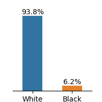
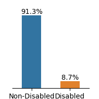
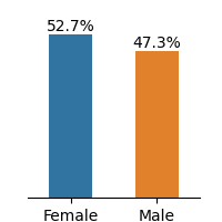
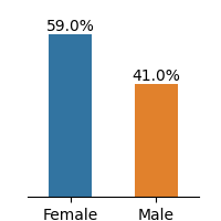
Figure 1: Frequency distributions of sensitive attributes in educational datasets.
The Law School dataset contains admission records of students at 163 U.S. law schools [46]. The dataset has demographic information of 20,798 students on race, gender, LSAT scores, and undergraduate GPA. We select gender and race as sensitive attributes and first-year GPA as the target for the regression task.
The OULAD dataset, originating from a 2013-2014 Open University study in England, compiles student data and their interactions within a virtual learning environment across seven courses. We select disability as the sensitive attribute and final result as the classification target. The gender is not considered as our sensitive attribute because the preceding study [18] revealed that gender attribute does not have a causal relationship to student’s final result. For this work, we only considered the module BBB(Social Science).
The Student Performance dataset describes students’ achievements in Mathematics and Portuguese language subjects in two Portuguese secondary schools during 2005-2006. The dataset provides details about students’ demographics, and family backgrounds such as parent’s jobs and education level, study habits, extracurricular activities, and lifestyle. We select gender as the sensitive attribute and G3 as the target for the regression problem. Feature description of the dataset is presented in Appendix A.
The dataset demonstrates imbalance between subgroups of sensitive attributes, presented in Fig. 1. Law school and OULAD datasets exhibit an extreme imbalance in the selected sensitive attributes, while the gender attribute in Student Performance is less imbalanced.
Race Gender GPA LSAT FYA
(a) Law School
Disability
Highest Education
Final Result Gender Age
(b) OULAD(module BBB)
Gender studytime freetime Dalc G1 Walc goout G2 G3
(c) Student Performance (Mat)
Gender Dalc freetime studytime Walc goout G1 G2 G3
(d) Student Performance (Por)
Figure 2: Partial DAGs of the estimated causal model for educational datasets, showing only the sensitive attribute, its descendants, and the target variable. See Appendix B for full graphs. Each sub-graph is not used for implementing counterfactually fair models; only the remaining features are included.
### 3.2 Structural Causal Model of Educational Dataset
Counterfactual fairness holds that intervening solely on the sensitive attribute A while keeping all other things equal, does not change the model’s prediction distribution. To implement counterfactual fairness, a predefined Structural Causal Model(SCM) in Directed Acyclic Graph(DAG) form is necessary. Although the causal model of the Law School data exists [23], there are no known causal models for the remaining datasets.
To construct the SCM of OULAD and the Student Performance dataset, we use a causal discovery algorithm, Linear Non-Gaussian Acyclic Model (LiNGAM) [41]. The algorithm estimates a causal structure of the observational data of continuous values under linear-non-Gaussian assumption. From the estimated causal model, we filtered DAG weights that are under the 0.1 threshold.
Among constructed SCM, we present features that are in causal relationships with the sensitive attribute that directly or indirectly affects the target variable in Fig. 2. Further analysis of causal relationships between sensitive features is discussed in Section 5.
### 3.3 Counterfactual Fairness Evaluation Metrics
We use the Wasserstein Distance(WD) and Maximum Mean Discrepancy(MMD) metric for evaluating the difference between prediction distributions for sensitive attributes. Wasserstein distance and MMD are common metrics for evaluating counterfactual fairness [13, 30]. Lower WD and MMD values suggest greater fairness, indicating smaller differences between the outcome distributions.
Although there exist other measures for evaluating counterfactual fairness such as Total Effect [55] and Counterfactual Confusion Matrix [39], we limit our evaluation of counterfactual fairness to the above metrics. We construct unaware and counterfactual models without direct access to the sensitive attribute, evaluating fairness with mentioned metrics would not be feasible. We visually examine prediction distributions through Kernel Density Estimation(KDE) plots across our baseline and counterfactually fair models.
#### 3.3.1 Educational Domain Specific Fairness Metric
We additionally analyze the counterfactual approach with pre-existing fairness metrics tailored for the education domain. We choose Absolute Between-ROC Area(ABROCA) [15] and Model Absolute Density Distance(MADD) [43] for the analysis. ABROCA quantifies the absolute difference between two ROC curves. It measures the overall performance divergence of a classifier between sensitive attributes, focusing on the magnitude of the gap regardless of which group performs better at each threshold. MADD constructs KDE plots of prediction probabilities and calculates the area between two curves of the sensitive attribute. While the ABROCA metric represents how similar the numbers of errors across groups are, the MADD metric captures the severity of discrimination across groups, allowing for diverse perspectives on the analysis of model behaviors on fairness. Although both metrics are designed for group fairness, we include those in our work because they are specifically proposed under the context of the educational domain.
### 3.4 Experiment Details
For the experiment, we considered the Level 1 concept of counterfactual fairness defined in Kusner et al. [23]. At Level 1, the predictor is built exclusively using observed variables that are not causally influenced by the sensitive attributes. While a causal ordering of these features is necessary, no assumptions are made about the structure of unobserved latent variables. This requires causal ordering of features but no further assumptions of unobserved variables. For the Law School dataset, Level 2 is used.
We selected two baselines for the experiment, (a) Unfair model and (b) Unaware model. An unfair model directly includes sensitive attributes to train the model. The unaware model implements ‘Fairness Through Unawareness’, a fairness notion where an algorithm is considered fair when protected attributes are not used in the decision-making process [7]. We compare two baselines with the FairLearning algorithm introduced in Kusner et al. [23].
We evaluate the counterfactual fairness of machine learning models on both regression and classification models. We selected the four most utilized machine learning models in the algorithmic fairness literature [19]. We choose Linear Regression(LR; Logistic Regression for classification), Multilayer Perceptron(MLP), Random Forest(RF), and XGBoost(XGB) [5]. For KDE plot visualizations, we used a linear regression model for regression and MLP for classification.
## 4 Result
In the result section of our study, we present an analysis of counterfactual fairness on educational datasets. Since the Law School dataset is well studied in the counterfactual fairness literature, we only provide this experiment as a baseline.
### 4.1 Visual Analysis
We use KDE plots to visualize outcome distributions across subgroups, providing a better understanding of counterfactual fairness with summary statistics.
<details>
<summary>extracted/6375259/figures/kde_law_unfair.png Details</summary>
### Visual Description
## Line Graph: Comparison of Two Groups (White and Black)
### Overview
The image is a line graph comparing two data series labeled "White" (blue line) and "Black" (orange line). The x-axis ranges from -1.5 to 0.5, and the y-axis ranges from 0 to 6. Both lines exhibit single-peaked distributions with distinct central tendencies.
### Components/Axes
- **X-axis**: Labeled with numerical values from -1.5 to 0.5 in increments of 0.5. No explicit label provided.
- **Y-axis**: Labeled with numerical values from 0 to 6 in increments of 2. No explicit label provided.
- **Legend**: Located in the top-right corner, with:
- Blue line: "White"
- Orange line: "Black"
### Detailed Analysis
- **Blue Line (White)**:
- Peaks at approximately **x = 0.25**, with a y-value of **~2.0**.
- The line rises from near 0 at x = -0.5, peaks at 0.25, then declines to near 0 at x = 0.5.
- The curve is smooth with no sharp inflections.
- **Orange Line (Black)**:
- Peaks at approximately **x = -1.0**, with a y-value of **~2.5**.
- The line rises from near 0 at x = -1.5, peaks at -1.0, then declines to near 0 at x = -0.5.
- The curve is slightly more jagged than the blue line, with minor fluctuations.
### Key Observations
1. The orange line ("Black") has a **higher peak value** (~2.5 vs. ~2.0) and is centered further left on the x-axis.
2. Both lines exhibit **similar peak heights** but differ in their **central positions** on the x-axis.
3. The blue line ("White") is more centered around x = 0, while the orange line ("Black") is shifted leftward.
### Interpretation
The graph likely represents a comparison of a metric (e.g., test scores, survey responses, or another variable) between two groups ("White" and "Black"). The distinct peaks suggest differences in the distribution or central tendency of the metric between the groups. The orange line's higher peak and leftward shift could indicate a stronger or more concentrated response in the "Black" group for the measured variable. The similar peak heights imply comparable variability or frequency in the data, but the positional differences highlight a key divergence in the groups' characteristics. The lack of explicit axis labels limits direct interpretation of the x-axis variable, but the relative positioning of the peaks provides actionable insights into group differences.
</details>
(a) Unfair
<details>
<summary>extracted/6375259/figures/kde_law_unaware.png Details</summary>
### Visual Description
## Line Graph: Unlabeled Data Series Comparison
### Overview
The image depicts a line graph with two distinct data series represented by orange and blue lines. The x-axis spans from -1.5 to 0.5, while the y-axis ranges from 0 to 6. Both lines exhibit unimodal distributions with peaks in the negative and positive x-regions, respectively. The graph lacks explicit axis labels, titles, or contextual annotations.
### Components/Axes
- **X-Axis**: Labeled with numerical values from -1.5 to 0.5 in increments of 0.5. No explicit label text is visible.
- **Y-Axis**: Labeled with numerical values from 0 to 6 in increments of 2. No explicit label text is visible.
- **Legend**: Located in the top-right corner, associating:
- **Orange line**: "Line A"
- **Blue line**: "Line B"
### Detailed Analysis
1. **Orange Line (Line A)**:
- **Trend**: Starts near zero at x ≈ -1.5, rises gradually to a peak at x ≈ -0.5 (y ≈ 1.8), then declines sharply to near zero by x ≈ 0.5.
- **Key Data Points**:
- x = -1.0: y ≈ 0.3
- x = -0.5: y ≈ 1.8 (peak)
- x = 0.0: y ≈ 0.8
- x = 0.5: y ≈ 0.1
2. **Blue Line (Line B)**:
- **Trend**: Remains near zero until x ≈ -0.5, then rises gradually to a peak at x ≈ 0.2 (y ≈ 1.5), followed by a gradual decline to near zero by x ≈ 0.5.
- **Key Data Points**:
- x = -0.5: y ≈ 0.2
- x = 0.0: y ≈ 1.2
- x = 0.2: y ≈ 1.5 (peak)
- x = 0.5: y ≈ 0.6
### Key Observations
- **Intersection**: The two lines intersect near x = 0.0, where both have y-values between 0.8 and 1.2.
- **Asymmetry**: Line A peaks earlier (x = -0.5) and declines faster, while Line B peaks later (x = 0.2) with a broader plateau.
- **Amplitude**: Line A has a slightly higher peak (1.8 vs. 1.5) but a narrower distribution.
### Interpretation
The graph suggests a comparison of two processes or distributions with opposing temporal or spatial characteristics. Line A’s peak at x = -0.5 could represent an early-event-driven phenomenon, while Line B’s delayed peak at x = 0.2 might indicate a response or recovery phase. The intersection at x = 0.0 implies a transitional state where both processes equilibrate. The absence of axis labels and context limits direct interpretation, but the relative trends highlight divergent behaviors in magnitude and timing. The orange line’s sharper decline may indicate a more volatile or transient process compared to the blue line’s sustained activity.
</details>
(b) Unaware
<details>
<summary>extracted/6375259/figures/kde_law_counterfactual.png Details</summary>
### Visual Description
## Line Graph: Comparison of Two Data Series
### Overview
The image depicts a line graph comparing two data series (Line A and Line B) across an x-axis range of -1.5 to 0.5 and a y-axis range of 0 to 6. Both lines exhibit distinct peaks in the positive x-region, with Line B (orange) reaching a higher maximum value than Line A (blue). The lines intersect near the origin (x ≈ 0.1, y ≈ 4.5).
### Components/Axes
- **X-axis**: Labeled with numerical markers at -1.5, -1.0, -0.5, 0.0, and 0.5. No explicit title provided.
- **Y-axis**: Labeled with numerical markers at 0, 2, 4, and 6. No explicit title provided.
- **Legend**: Located in the top-right corner, associating:
- **Blue line**: "Line A"
- **Orange line**: "Line B"
### Detailed Analysis
1. **Line A (Blue)**:
- Starts near y=0 at x=-1.5.
- Gradually increases, reaching a peak of approximately **5.5** at x≈0.2.
- Declines sharply after x=0.2, returning to y=0 by x=0.5.
2. **Line B (Orange)**:
- Remains near y=0 until x≈0.0.
- Rises sharply, peaking at approximately **6.5** at x≈0.3.
- Declines gradually after x=0.3, ending near y=0 at x=0.5.
3. **Intersection Point**:
- The lines cross near x≈0.1, where both are at y≈4.5.
### Key Observations
- Line B (orange) achieves a higher maximum value (6.5 vs. 5.5) and peaks later (x=0.3 vs. x=0.2).
- Both lines exhibit symmetric decay after their respective peaks.
- The intersection at x≈0.1 suggests a crossover point where Line B surpasses Line A.
### Interpretation
The graph likely represents a comparison of two variables (e.g., growth rates, performance metrics) over time or another continuous parameter. The delayed peak of Line B and its higher magnitude suggest it may represent a slower but more intense process compared to Line A. The intersection point could indicate a critical threshold where the two variables equalize before diverging again. The sharp decline of Line A after its peak might imply a rapid saturation or exhaustion effect, while Line B’s gradual decay could reflect a more sustained or resilient trend.
</details>
(c) Counterfactual
Figure 3: KDE plots on Law School.
<details>
<summary>extracted/6375259/figures/kde_oulad_unfair.png Details</summary>
### Visual Description
## Line Graph: Comparison of Non-Disabled and Disabled Groups
### Overview
The image is a line graph comparing two data series: "non-disabled" (blue line) and "disabled" (orange line). Both lines represent values on a y-axis (0–4) across an x-axis (0.0–0.8). The graph includes a legend in the top-right corner and axis markers at regular intervals.
### Components/Axes
- **X-axis**: Labeled "x-axis," with markers at 0.0, 0.2, 0.4, 0.6, and 0.8.
- **Y-axis**: Labeled "y-axis," with markers at 0, 1, 2, 3, and 4.
- **Legend**: Located in the top-right corner, with:
- Blue line: "non-disabled"
- Orange line: "disabled"
### Detailed Analysis
1. **Non-Disabled (Blue Line)**:
- Starts at 0.0 on the x-axis with a value of ~0.2 on the y-axis.
- Rises sharply to a peak of ~3.8 at x = 0.3.
- Declines gradually to ~1.5 at x = 0.6, then flattens near 0.0 by x = 0.8.
2. **Disabled (Orange Line)**:
- Begins at x = 0.0 with a value of ~0.1 on the y-axis.
- Rises more gradually than the blue line, peaking at ~4.2 at x = 0.35.
- Drops sharply to ~1.0 at x = 0.6, then declines further to ~0.2 by x = 0.8.
### Key Observations
- The orange ("disabled") line surpasses the blue ("non-disabled") line in peak height (~4.2 vs. ~3.8) and occurs slightly later (x = 0.35 vs. x = 0.3).
- The orange line exhibits a steeper decline after its peak compared to the blue line.
- The two lines intersect near x = 0.3–0.35, where the orange line overtakes the blue line.
### Interpretation
The data suggests that the "disabled" group exhibits a higher initial value and a more pronounced peak compared to the "non-disabled" group. However, the "disabled" group also experiences a sharper decline post-peak, indicating a potential divergence in trends or characteristics between the two groups. The crossing point (~x = 0.3–0.35) may represent a critical threshold where the two groups' metrics diverge significantly. Without contextual labels for the axes, the exact nature of the measured variable remains unclear, but the visual disparity highlights distinct patterns in the datasets.
</details>
(a) Unfair
<details>
<summary>extracted/6375259/figures/kde_oulad_unaware.png Details</summary>
### Visual Description
## Line Graph: Comparison of Two Data Series
### Overview
The image depicts a line graph comparing two data series (blue and orange) across an x-axis range of 0.0 to 0.8 and a y-axis range of 0 to 4. The blue line ("Series A") exhibits a sharp initial rise, peaks at ~0.25, then declines with fluctuations. The orange line ("Series B") rises more gradually, peaks later (~0.3), and declines steadily. The lines intersect near x=0.25.
### Components/Axes
- **X-axis**: Labeled with increments at 0.0, 0.2, 0.4, 0.6, 0.8 (no explicit title).
- **Y-axis**: Labeled with increments at 0, 1, 2, 3, 4 (no explicit title).
- **Legend**: Located in the top-right corner, with:
- **Blue**: "Series A"
- **Orange**: "Series B"
### Detailed Analysis
1. **Series A (Blue)**:
- **Rise**: Steep upward slope from x=0.0 to x=0.25.
- **Peak**: Reaches ~3.5 at x=0.25.
- **Decline**: Gradual drop with minor fluctuations (e.g., ~2.5 at x=0.4, ~1.2 at x=0.6, ~0.1 at x=0.8).
2. **Series B (Orange)**:
- **Rise**: Gradual upward slope from x=0.0 to x=0.3.
- **Peak**: Reaches ~3.2 at x=0.3.
- **Decline**: Steady drop (e.g., ~2.0 at x=0.4, ~1.5 at x=0.6, ~0.2 at x=0.8).
3. **Intersection**: The lines cross near x=0.25, where both series have similar y-values (~3.0).
### Key Observations
- Series A peaks earlier (x=0.25) and higher (~3.5) than Series B (x=0.3, ~3.2).
- After x=0.3, Series B declines more steadily, while Series A exhibits erratic fluctuations.
- Both series converge near x=0.8, approaching y=0.
### Interpretation
The graph suggests divergent behaviors between the two series:
- **Series A** may represent a rapid, short-lived phenomenon (e.g., a burst of activity) with post-peak instability.
- **Series B** could indicate a sustained, gradual process (e.g., a controlled release) with consistent decay.
- The intersection at x=0.25 implies a temporary equilibrium point, after which the series diverge significantly. This could reflect competing factors or thresholds in the underlying system. Without contextual labels, the exact nature of the data remains ambiguous, but the trends highlight differences in timing, magnitude, and stability.
</details>
(b) Unaware
<details>
<summary>extracted/6375259/figures/kde_oulad_counterfactual.png Details</summary>
### Visual Description
## Line Graph: Unlabeled Comparison of Two Data Series
### Overview
The image depicts a line graph with two overlapping data series (blue and orange lines) plotted against a Cartesian coordinate system. The x-axis ranges from 0.0 to 0.8, and the y-axis ranges from 0 to 4. Both lines exhibit oscillatory behavior with peaks and troughs, though the blue line (Line A) shows greater volatility compared to the orange line (Line B).
### Components/Axes
- **X-Axis**: Labeled with values from 0.0 to 0.8 in increments of 0.2. No explicit title provided.
- **Y-Axis**: Labeled with values from 0 to 4 in increments of 1. No explicit title provided.
- **Legend**: Located in the top-right corner, associating:
- **Blue line**: "Line A"
- **Orange line**: "Line B"
### Detailed Analysis
#### Line A (Blue)
- **Trend**: Starts near 0 at x=0.0, rises to a peak of ~3.5 at x=0.3, dips to ~1.0 at x=0.4, rises again to ~3.0 at x=0.5, and declines to ~0.1 at x=0.8.
- **Key Data Points**:
- x=0.0: ~0.1
- x=0.3: ~3.5
- x=0.4: ~1.0
- x=0.5: ~3.0
- x=0.8: ~0.1
#### Line B (Orange)
- **Trend**: Starts near 0 at x=0.0, rises to a peak of ~3.2 at x=0.3, dips to ~1.2 at x=0.4, rises again to ~3.2 at x=0.55, and declines to ~0.1 at x=0.8.
- **Key Data Points**:
- x=0.0: ~0.1
- x=0.3: ~3.2
- x=0.4: ~1.2
- x=0.55: ~3.2
- x=0.8: ~0.1
### Key Observations
1. **Volatility**: Line A (blue) exhibits sharper fluctuations (e.g., rapid rise/fall between x=0.3 and x=0.4) compared to Line B (orange), which has smoother transitions.
2. **Peak Alignment**: Both lines peak near x=0.3 and x=0.5–0.55, but Line A’s second peak is slightly earlier (x=0.5 vs. x=0.55 for Line B).
3. **Intersection Points**: The lines intersect near x=0.3 (both ~3.3) and x=0.5 (Line A ~3.0, Line B ~3.2).
4. **End Behavior**: Both lines converge to ~0.1 at x=0.8, suggesting a shared endpoint.
### Interpretation
The graph likely compares two variables or conditions (e.g., performance metrics, environmental factors) over a normalized scale (x-axis). The blue line’s volatility could indicate instability or external influences, while the orange line’s smoother trajectory suggests consistency. The shared endpoint at x=0.8 implies a common outcome or boundary condition. The intersections at x=0.3 and x=0.5 may represent equilibrium points or critical thresholds where the two variables align.
**Note**: Exact numerical values are approximate due to the absence of gridlines or labeled data points. The legend confirms color-to-label mapping, and spatial grounding aligns with standard line graph conventions.
</details>
(c) Counterfactual
Figure 4: KDE plots on OULAD.
<details>
<summary>extracted/6375259/figures/kde_mat_unfair.png Details</summary>
### Visual Description
## Line Graph: Sex-Based Trend Comparison
### Overview
The image depicts a line graph comparing two data series labeled "Female" (blue) and "Male" (orange) across an x-axis range of 0 to 15. The y-axis ranges from 0 to 0.4. Both lines exhibit oscillating trends with peaks and troughs, suggesting a cyclical or variable relationship between the x-axis variable and the measured metric.
### Components/Axes
- **X-axis**: Unlabeled numerical scale (0–15), likely representing a continuous variable (e.g., age, time, or index).
- **Y-axis**: Unlabeled numerical scale (0–0.4), possibly representing a proportion, probability, or normalized value.
- **Legend**: Located in the top-right corner, with:
- **Blue line**: Labeled "Female"
- **Orange line**: Labeled "Male"
### Detailed Analysis
1. **Female (Blue Line)**:
- Begins near 0 at x=0.
- Rises gradually, peaking at ~x=10 with a value of ~0.15.
- Declines sharply after x=10, reaching ~0.05 by x=15.
- Exhibits minor fluctuations (e.g., a small dip at x=12).
2. **Male (Orange Line)**:
- Starts near 0 at x=0.
- Rises more gradually than Female, peaking at ~x=10 with a value of ~0.12.
- Declines after x=10 but shows a secondary peak at ~x=12 (~0.08).
- Ends at ~0.03 by x=15.
3. **Intersections**:
- Lines cross near x=8 (Female > Male) and x=12 (Male > Female), indicating a crossover in trends.
### Key Observations
- Both lines share similar overall shapes but differ in magnitude and timing of peaks.
- Female values consistently exceed Male values until x=12, where Male surpasses Female.
- Male exhibits a secondary peak at x=12, absent in Female data.
### Interpretation
The graph suggests a sex-based divergence in a measured metric (e.g., health outcome, behavioral pattern) over a continuous variable (x-axis). The higher peak for Female at x=10 implies a stronger association for this group at that point. The Male secondary peak at x=12 may indicate a delayed or distinct response. The crossover at x=12 highlights a critical threshold where Male trends dominate. Without contextual labels, the exact nature of the x-axis variable remains ambiguous, but the relative trends emphasize sex-specific differences in the measured phenomenon.
</details>
(a) Unfair
<details>
<summary>extracted/6375259/figures/kde_mat_unaware.png Details</summary>
### Visual Description
## Line Graph: Performance Comparison of Two Models
### Overview
The image depicts a line graph comparing the performance of two models (Model A and Model B) over a time interval from 0 to 15. The y-axis represents performance (0–0.4), while the x-axis represents time. Two distinct lines—blue (Model A) and orange (Model B)—show fluctuating performance trends, with both models peaking and declining over time.
### Components/Axes
- **X-axis (Time)**: Labeled "0" to "15" in increments of 5.
- **Y-axis (Performance)**: Labeled "0" to "0.4" in increments of 0.1.
- **Legend**: Located at the bottom-right corner.
- Blue line: "Model A"
- Orange line: "Model B"
### Detailed Analysis
1. **Model A (Blue Line)**:
- Starts near 0.02 at time 0.
- Rises to a peak of ~0.12 at time 10.
- Declines to ~0.07 at time 14, then stabilizes near 0.03 by time 15.
- Key data points:
- Time 5: ~0.05
- Time 10: ~0.12 (peak)
- Time 12: ~0.09
- Time 14: ~0.07
2. **Model B (Orange Line)**:
- Begins near 0.01 at time 0.
- Peaks at ~0.11 at time 11.
- Declines to ~0.06 at time 15.
- Key data points:
- Time 5: ~0.03
- Time 11: ~0.11 (peak)
- Time 13: ~0.08
- Time 15: ~0.06
### Key Observations
- Both models exhibit similar trends: initial growth, peaking, and gradual decline.
- Model A achieves a higher peak (~0.12 vs. ~0.11) but declines faster.
- Model B’s performance is more sustained but lower overall.
- The lines intersect near time 8 (~0.07 for both), suggesting parity at that point.
### Interpretation
The graph suggests a comparison of efficiency or accuracy between two models under similar conditions. Model A’s earlier and sharper peak may indicate faster initial performance but less stability over time. Model B’s slower rise and steadier decline could imply robustness but lower maximum capability. The intersection at time 8 highlights a critical point where both models perform equivalently, potentially useful for decision-making thresholds. The declining trends after peaks might reflect resource exhaustion, diminishing returns, or external constraints affecting both models. Further context (e.g., domain, variables) would clarify the practical implications of these trends.
</details>
(b) Unaware
<details>
<summary>extracted/6375259/figures/kde_mat_counterfactual.png Details</summary>
### Visual Description
## Line Graph: Unlabeled Comparison of Two Variables
### Overview
The image depicts a line graph with two distinct data series represented by blue and orange lines. Both lines exhibit a single prominent peak within the range of x=10 to x=13, followed by a sharp decline. The x-axis spans from 0 to 15, while the y-axis ranges from 0.0 to 0.4. No explicit title, legend, or textual annotations are visible in the image.
### Components/Axes
- **X-axis**: Labeled with numerical markers at intervals of 5 (0, 5, 10, 15). No explicit label or units provided.
- **Y-axis**: Labeled with numerical markers at intervals of 0.1 (0.0, 0.1, 0.2, 0.3, 0.4). No explicit label or units provided.
- **Data Series**:
- **Blue Line**: Peaks at approximately (12, 0.4), with a steep ascent and descent.
- **Orange Line**: Peaks at approximately (13, 0.35), with a more gradual ascent and descent.
- **Legend**: Absent. Colors are used without explicit labeling.
### Detailed Analysis
1. **Blue Line**:
- Begins near 0 at x=0.
- Rises sharply to a peak of ~0.4 at x=12.
- Declines steeply to ~0.05 by x=15.
- Intermediate values: ~0.1 at x=10, ~0.3 at x=11.
2. **Orange Line**:
- Begins near 0 at x=0.
- Rises gradually to a peak of ~0.35 at x=13.
- Declines more gradually to ~0.05 by x=15.
- Intermediate values: ~0.15 at x=10, ~0.25 at x=11.
### Key Observations
- Both lines converge near x=15, ending at similar low values (~0.05).
- The blue line exhibits a steeper slope during both ascent and descent compared to the orange line.
- The orange line’s peak occurs 1 unit later (x=13) and is ~12.5% lower in magnitude than the blue line’s peak.
- No overlapping or intersection points are observed between the two lines.
### Interpretation
The graph likely represents a comparison of two variables or processes with similar magnitudes but differing timing and volatility. The blue line’s sharper peak and decline suggest a more rapid or reactive behavior, while the orange line’s gradual changes imply a slower, more sustained process. The convergence at the end may indicate a shared external factor or boundary condition affecting both variables after their respective peaks. The absence of labels or units limits direct interpretation, but the relative trends highlight differences in dynamics between the two series.
</details>
(c) Counterfactual
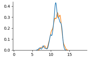
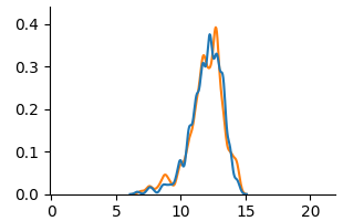
Figure 5: KDE plots on Student Performance(Mathematics).
<details>
<summary>extracted/6375259/figures/kde_por_unfair.png Details</summary>
### Visual Description
## Line Graph: Sex-Based Distribution Trends
### Overview
The image depicts a line graph comparing two distributions labeled "Female" (blue) and "Male" (orange) across an x-axis range of 0–20. The y-axis ranges from 0 to 0.4, likely representing a normalized metric (e.g., probability, proportion, or frequency). Both lines exhibit a unimodal distribution with peaks and gradual declines.
### Components/Axes
- **Legend**: Located in the top-right corner, labeled "sex" with two entries:
- Blue line: Female
- Orange line: Male
- **X-axis**: Unlabeled numerical axis spanning 0–20 (approximate intervals: 0, 5, 10, 15, 20).
- **Y-axis**: Unlabeled axis ranging from 0 to 0.4 (approximate intervals: 0, 0.1, 0.2, 0.3, 0.4).
### Detailed Analysis
1. **Female (Blue Line)**:
- Starts near 0 at x=0.
- Gradually increases, peaking at approximately x=14 with a y-value of ~0.18.
- Declines steadily after the peak, reaching ~0.05 at x=20.
- Crosses the Male line near x=12 (y ~0.13).
2. **Male (Orange Line)**:
- Starts near 0 at x=0.
- Rises more sharply than Female, peaking at x=12 with a y-value of ~0.13.
- Declines gradually after the peak, reaching ~0.03 at x=20.
- Crosses the Female line near x=12 (y ~0.13).
### Key Observations
- **Crossover Point**: The lines intersect near x=12, where Male briefly surpasses Female before being overtaken.
- **Peak Differences**: Female peaks later (x=14) and higher (y=0.18) than Male (x=12, y=0.13).
- **Decline Rates**: Both lines decline post-peak, but Female’s decline is steeper after x=16.
### Interpretation
The graph suggests a sex-based divergence in the measured metric:
- **Optimal Range**: Male values dominate between x=10–12, while Female values peak later (x=14), indicating differing optimal points for the metric.
- **Post-Peak Decline**: Both sexes show reduced values beyond their peaks, possibly reflecting diminishing returns or saturation effects.
- **Crossover Significance**: The intersection at x=12 highlights a critical threshold where Male values temporarily exceed Female values, potentially signaling a shift in trends or contextual factors influencing the metric.
### Uncertainties
- Axis labels are missing, so the exact nature of the x-axis variable (e.g., age, score, time) remains unclear.
- Y-axis metric is unspecified but likely a normalized value (e.g., probability density, relative frequency).
</details>
(a) Unfair
<details>
<summary>extracted/6375259/figures/kde_por_unaware.png Details</summary>
### Visual Description
## Line Graph: Unlabeled Data Series Comparison
### Overview
The image depicts a line graph with two distinct data series represented by blue and orange lines. Both lines exhibit a single peak followed by a gradual decline. The graph lacks explicit labels for axes, legend entries, or data series identifiers. The x-axis spans from 0 to 20, while the y-axis ranges from 0 to 0.4. The legend is positioned in the top-right corner but contains no visible text or labels.
### Components/Axes
- **X-axis**: Labeled with numerical markers at intervals of 5 (0, 5, 10, 15, 20). No explicit title or units provided.
- **Y-axis**: Labeled with numerical markers at intervals of 0.1 (0, 0.1, 0.2, 0.3, 0.4). No explicit title or units provided.
- **Legend**: Located in the top-right corner. Contains two colored entries (blue and orange) but no textual labels to identify the data series.
- **Lines**:
- **Blue Line**: Peaks at approximately (x=10, y=0.15), then declines.
- **Orange Line**: Peaks at approximately (x=12, y=0.18), then declines.
### Detailed Analysis
1. **Blue Line**:
- Begins near (0, 0) with minimal activity until x=5.
- Rises sharply to a peak at (10, 0.15).
- Declines gradually to near (20, 0.02).
- Total range: 0.15 (peak) - 0.02 (end) = 0.13 drop.
2. **Orange Line**:
- Begins near (0, 0) with minimal activity until x=5.
- Rises gradually to a peak at (12, 0.18).
- Declines more steeply than the blue line, reaching near (20, 0.01).
- Total range: 0.18 (peak) - 0.01 (end) = 0.17 drop.
3. **Trends**:
- Both lines show a single dominant peak, suggesting a transient event or process.
- The orange line exhibits a delayed peak (x=12 vs. x=10 for blue) and higher maximum value (0.18 vs. 0.15).
- The orange line’s decline is steeper, indicating a faster decay rate post-peak.
### Key Observations
- The orange line consistently surpasses the blue line in both peak height and x-axis timing.
- Both lines share similar starting and ending behaviors but diverge in peak characteristics.
- The absence of legend labels prevents direct interpretation of the data series’ meanings (e.g., "Temperature vs. Time" or "Sales vs. Units").
### Interpretation
The graph likely represents a comparison of two related phenomena with distinct timing and magnitude characteristics. The orange line’s higher peak and later occurrence could indicate a delayed response or a more intense but shorter-lived event compared to the blue line. The steeper decline of the orange line suggests a faster dissipation or resolution of the measured variable. Without contextual labels, the exact nature of the data (e.g., scientific measurements, economic indicators) remains ambiguous. However, the visual trends strongly imply a causal or correlational relationship between the two series, warranting further investigation into their underlying mechanisms.
</details>
(b) Unaware
<details>
<summary>extracted/6375259/figures/kde_por_counterfactual.png Details</summary>
### Visual Description
## Line Graph: Comparison of Two Data Series
### Overview
The image depicts a line graph with two overlapping data series (blue and orange lines) plotted against a Cartesian coordinate system. Both lines exhibit a single prominent peak, with the orange line peaking slightly later and higher than the blue line. The graph spans an x-axis range of 0–20 and a y-axis range of 0–0.4.
### Components/Axes
- **X-Axis**: Labeled with numerical increments at 0, 5, 10, 15, and 20. No explicit title is visible.
- **Y-Axis**: Labeled with increments at 0, 0.1, 0.2, 0.3, and 0.4. No explicit title is visible.
- **Legend**: Located in the top-right corner, associating:
- **Blue line**: "Line A"
- **Orange line**: "Line B"
- **Gridlines**: Faint horizontal and vertical gridlines are present for reference.
### Detailed Analysis
1. **Blue Line (Line A)**:
- **Trend**: Starts near 0 at x=0, rises gradually, peaks at approximately **x=12** with a y-value of **~0.35**, then declines sharply to near 0 by x=20.
- **Key Data Points**:
- x=10: ~0.25
- x=12: ~0.35 (peak)
- x=14: ~0.30
- x=16: ~0.15
2. **Orange Line (Line B)**:
- **Trend**: Starts near 0 at x=0, rises more steeply, peaks at approximately **x=14** with a y-value of **~0.38**, then declines gradually to near 0 by x=20.
- **Key Data Points**:
- x=10: ~0.20
- x=14: ~0.38 (peak)
- x=16: ~0.25
- x=18: ~0.10
### Key Observations
- The orange line (Line B) peaks **2 units later** (x=14 vs. x=12) and reaches a **higher maximum** (~0.38 vs. ~0.35) than the blue line (Line A).
- Both lines exhibit similar decay rates after their peaks, converging near y=0 by x=20.
- The lines intersect briefly near x=10–12, suggesting overlapping trends in this region.
### Interpretation
The graph likely compares two related phenomena (e.g., sensor readings, economic indicators, or biological responses) with similar temporal dynamics but distinct peak characteristics. The orange line’s delayed and stronger peak could indicate:
1. A lagged response to an external stimulus affecting Line B.
2. A more pronounced reaction to a variable influencing Line B.
3. Differences in measurement scales or normalization between the two datasets.
The convergence at later x-values suggests shared underlying factors or diminishing returns for both series. The absence of explicit labels or units limits direct interpretation, but the relative trends imply a causal or correlational relationship worth further investigation.
</details>
(c) Counterfactual
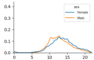
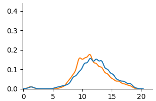
Figure 6: KDE plots on Student Performance(Portuguese).
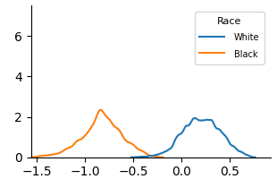
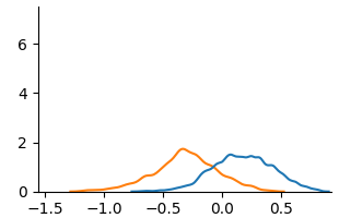
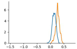
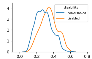
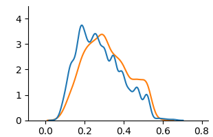
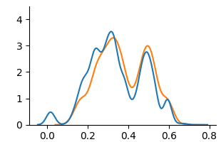
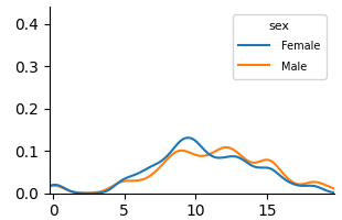
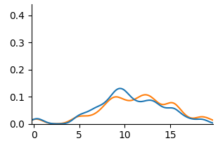
Fig. 3 and Fig. 4 present KDE plots for Law School and OULAD datasets. For Law School data, we can see that the unfair and unaware model produces predictions with large disparities, as previously known from the counterfactual literature. For OULAD data, unfair and unaware models’ prediction probabilities do not overlap, giving slightly higher prediction probabilities for disabled students. For both datasets, the prediction distribution of the counterfactual model is closer than the unfair and unaware model.
Fig. 5 and Fig. 6 show KDE plots for Student Performance in Mathematics and Portuguese. The differences in model predictions are relatively small for all models compared to previous datasets, although disparities exist. In Mathematics, unfair and unaware models underestimate scores for female students (below 10) and overestimate for males. The opposite is true for Portuguese, where female students are more frequently assigned scores above 10. Counterfactual models on both data demonstrate an overlap of two distributions, although male students were predicted to be in the middle score range more frequently than female students in Mathematics.
### 4.2 Measure of Counterfactual Fairness
Table 3: Evaluation of fairness notions on benchmark datasets.
| Data | Metric | Unfair | Unaware | Counterfactual |
| --- | --- | --- | --- | --- |
| Law | WD | 1.0340 | 0.4685 | 0.1290 |
| MMD | 0.8658 | 0.4140 | 0.1277 | |
| OULAD | WD | 0.0722 | 0.0342 | 0.0337 |
| MMD | 0.0708 | 0.0324 | 0.0317 | |
| Math | WD | 0.7251 | 0.7358 | 0.1161 |
| MMD | 0.3396 | 0.1917 | 0.0538 | |
| Por | WD | 0.7526 | 0.6339 | 0.1047 |
| MMD | 0.4322 | 0.2839 | 0.1205 | |
We present the evaluation of counterfactual fairness in Table 3. In all cases, the counterfactually fair model achieves the lowest WD and MMD. For Law School and Student Performance(Mat and Por) data, the distance between two distributions of sensitive attribute subgroups significantly reduced, comparing the counterfactual model to the unfair and unaware model. Despite the limited visual evidence of reduced distributional differences in the Student Performance KDE plots, WD and MMD provided quantifiable measures of this reduction. For OULAD data, the reduction in distribution difference between the unaware and counterfactual model is minimal, suggesting a weak causal link of disability to student’s final result. Consistent for all datasets, WD and MMD decrease as the sensitive attribute and its causal relationships are removed.
Fairness levels vary across datasets. Law school data shows the highest initial unfairness while OULAD data shows relatively low unfairness even for the unfair model. Both Student Performance dataset shows significant unfairness, particularly for WD. WD and MMD rankings of fairness methods generally agree, with large differences in one corresponding to large differences in the other, suggesting robustness to the distance metric choice.
Table 4: Evaluation of education-specific fairness on OULAD dataset.
| Data | Metric | Unfair | Unaware | Counterfactual |
| --- | --- | --- | --- | --- |
| OULAD | ABROCA | 0.1019 | 0.0219 | 0.0181 |
| MADD | 0.5868 | 0.3194 | 0.2763 | |
Given the classification nature of the OULAD dataset, ABROCA and MADD metric results are presented in Table 4. Because ABROCA and MADD assess group fairness disparity across all classification thresholds, they are not directly comparable to counterfactual fairness, an individual-level fairness notion. However, the unfair model was highly biased, as evidenced by its ABROCA (0.1019, max 0.5) and MADD (0.5868, max 2) scores. While the unaware model showed improvement, the counterfactual model achieved the best fairness results. This indicates that the counterfactual approach is effective in reducing disparities in the number of errors and model behaviors across groups.
### 4.3 Performance of Machine Learning Models
Table 5: Prediction performance of machine learning models on fairness notions.
| Data | Metric | Unfair | Unaware | Counterfactual | | | | | | | | | |
| --- | --- | --- | --- | --- | --- | --- | --- | --- | --- | --- | --- | --- | --- |
| LR | MLP | RF | XGB | LR | MLP | RF | XGB | LR | MLP | RF | XGB | | |
| Law | MSE | 0.72 | 0.73 | 0.50 | 0.52 | 0.75 | 0.75 | 0.59 | 0.59 | 0.82 | 0.83 | 0.57 | 0.57 |
| RMSE | 0.85 | 0.86 | 0.71 | 0.72 | 0.86 | 0.86 | 0.77 | 0.77 | 0.90 | 0.91 | 0.75 | 0.76 | |
| OULAD | Acc | 0.69 | 0.70 | 0.72 | 0.71 | 0.69 | 0.69 | 0.71 | 0.71 | 0.68 | 0.68 | 0.70 | 0.69 |
| AUROC | 0.65 | 0.68 | 0.72 | 0.71 | 0.65 | 0.67 | 0.71 | 0.70 | 0.62 | 0.63 | 0.65 | 0.64 | |
| Mat | MSE | 4.13 | 5.33 | 2.82 | 4.71 | 4.06 | 5.30 | 2.88 | 4.04 | 17.43 | 17.50 | 17.08 | 17.76 |
| RMSE | 2.03 | 2.31 | 1.68 | 2.17 | 2.01 | 2.30 | 1.70 | 2.01 | 4.17 | 4.18 | 4.13 | 4.21 | |
| Por | MSE | 1.43 | 1.74 | 2.19 | 1.60 | 1.41 | 1.42 | 2.17 | 1.73 | 7.96 | 8.61 | 7.90 | 8.52 |
| RMSE | 1.20 | 1.32 | 1.48 | 1.27 | 1.19 | 1.19 | 1.47 | 1.31 | 2.82 | 2.93 | 2.81 | 2.92 | |
We show model performance results in Table 5. Across models, tree-based ensembles (RF and XGB) generally outperformed LR and MLP in regression. LR and MLP showed variable performance, with strong results on the Law School dataset but poor performance on others. All models performed well on the Law School dataset; however, the Student Performance datasets (Mathematics and Portuguese) were more challenging, possibly due to non-linear relationships.
The impact of fairness approaches varies across datasets. Although the unfair model frequently has the highest performance, the classification performance of OULAD remains similar across all fairness approaches. For Law School and Student Performance data, the counterfactual model leads to the worst performance, which aligns with existing literature on the accuracy-fairness trade-off. Student Performance in Mathematics shows a massive increase in MSE and RMSE for all models, suggesting that achieving counterfactual fairness with performance is challenging on this dataset.
## 5 Discussion
#### 5.0.1 RQ 1. What causal relationships do sensitive attributes have in educational data?
Analysis of the OULAD causal graph (Fig. 2(b) and Fig. 7) reveals that disability has a direct causal effect on highest education (-0.14 weight). This implies that having disability makes attaining higher education more difficult. There is no common cause between disability and final result, implying having a disability does not directly affect student outcome. Attribute gender causally affects age; however, with a 0.1 edge weight threshold, two attributes are disconnected from the DAG. This reinforces previous research [18] which revealed no causal relationship between gender and final result.
The causal model of Student Performance is presented in Fig. 2(c) and Fig. 2(d). The estimated causal model shows potential gender-based influences in study habits, social behaviors, and alcohol consumption to academic performance. Foremost, gender have an indirect causal relationship on G3. For both datasets, gender directly influences studytime, and studytime directly influences G1. For Mathematics, gender directly impacts studytime, freetime, goout and Dalc, but not goout for Portuguese. Differences in goout and alcohol consumption(Dalc and Walc) show that the factors influencing student performance differ between Math and Portuguese, demonstrating the importance of considering subject-specific causal models in education.
#### 5.0.2 RQ 2. Does counterfactual fairness in educational data lead to identical outcomes for students regardless of their demographic group membership in individual-level?
From our experiment result, we have demonstrated that removing causal links between sensitive attributes and the target through counterfactuals achieves a similar prediction distribution of machine learning models in sensitive feature subgroups. This suggests that the counterfactual approach is effective at mitigating unfairness as measured by these metrics, across all datasets.
The fairness result supports the insufficiency of the ‘fairness through unawareness’ notion in educational datasets. In KDE plots from Fig. 3 to Fig. 6, (a) Unfair are often very similar to (b) Unaware. In fairness evaluation in Table 3 and Table 4, the Unaware approach generally performs better than the Unfair baseline, but it’s significantly worse than the Counterfactual approach. This suggests that proxies often exist within the remaining features and simply removing the sensitive attribute is not a reliable way to achieve fairness.
#### 5.0.3 RQ 3. Does counterfactually fair machine learning models result in a performance trade-off in educational data?
The performance result in Table 5 demonstrates trade-off exists between achieving high predictive accuracy and satisfying counterfactual fairness, especially for Student Performance data. Although the definition of counterfactual fairness is agnostic to how good an algorithm is [23], this phenomenon is known from the previous literature [54] that an trade-off between fairness and accuracy exists dominated by the sensitive attribute influencing the target variable.
The severe performance drop in the Student Performance dataset suggests high dependence on sensitive attribute gender on student performance, especially for Mathematics subject. We can infer that machine learning models heavily rely on the information related to the sensitive attribute gender for prediction. Removal of the sensitive attribute and its causal influence can drastically reduce performance in this case.
Similar performance across all fairness approaches in the OULAD dataset implies that sensitive attribute disability might not be a significant feature for predicting student outcomes. Further, the naive exclusion of sensitive attributes has minimal impact on the performance of machine learning models, reconfirming the ineffectiveness of the Unaware approach in both fairness and performance.
Overall, we find the nature of the sensitive attribute and its causal links to other features differs across educational datasets, influencing the variability in the effectiveness of the counterfactual fairness approach. Some sensitive attributes might be more challenging to address than others in terms of counterfactual fairness.
#### 5.0.4 Limitations and Future Work
Our work is limited to implementing the early approach of counterfactual fairness introduced in Kusner et al. [23], which only includes non-descendants of sensitive attributes in the decision-making process and utilizing the Level 1 causal model. Also, we only report on counterfactual fairness and performance trade-offs. Thus, future research will focus on developing our Level 1 causal model into a Level 2 model. This will involve postulating unobserved latent variables based on expert domain knowledge and assessing the impact of increasingly strong causal assumptions. Concurrently, we will develop algorithms to reduce the trade-off between counterfactual fairness and performance in educational datasets.
## 6 Conclusion
In this paper, we evaluated the counterfactual fairness of machine learning models on real-world educational datasets and provided a comprehensive analysis of counterfactual fairness in the education context. This work contributes to exploring causal mechanisms in educational datasets and their impact on achieving counterfactual fairness. Considering counterfactual fairness as well as group and individual fairness could provide different viewpoints in evaluating the fairness of algorithmic decisions in education.
#### 6.0.1 Acknowledgements
We acknowledge the valuable input from Sunwoo Kim, whose comments helped in conducting the experiments. This work was supported by the National Research Foundation(NRF), Korea, under project BK21 FOUR (grant number T2023936).
#### 6.0.2
The authors have no competing interests to declare that are relevant to the content of this article.
## References
- [1] Baker, R.S., Hawn, A.: Algorithmic bias in education. International Journal of Artificial Intelligence in Education pp. 1–41 (2022)
- [2] Binns, R.: On the apparent conflict between individual and group fairness. In: Proceedings of the 2020 conference on fairness, accountability, and transparency. pp. 514–524 (2020)
- [3] Bird, K.A., Castleman, B.L., Song, Y.: Are algorithms biased in education? exploring racial bias in predicting community college student success. Journal of Policy Analysis and Management (2024)
- [4] Ferreira de Carvalho, W., Roberto Gonçalves Marinho Couto, B., Ladeira, A.P., Ventura Gomes, O., Zarate, L.E.: Applying causal inference in educational data mining: A pilot study. In: Proceedings of the 10th International Conference on Computer Supported Education. pp. 454–460 (2018)
- [5] Chen, T., Guestrin, C.: Xgboost: A scalable tree boosting system. In: Proceedings of the 22nd acm sigkdd international conference on knowledge discovery and data mining. pp. 785–794 (2016)
- [6] Cock, J.M., Bilal, M., Davis, R., Marras, M., Kaser, T.: Protected attributes tell us who, behavior tells us how: A comparison of demographic and behavioral oversampling for fair student success modeling. In: LAK23: 13th International Learning Analytics and Knowledge Conference. pp. 488–498 (2023)
- [7] Cornacchia, G., Anelli, V.W., Biancofiore, G.M., Narducci, F., Pomo, C., Ragone, A., Di Sciascio, E.: Auditing fairness under unawareness through counterfactual reasoning. Information Processing & Management 60 (2), 103224 (2023)
- [8] Cortez, P., Silva, A.M.G.: Using data mining to predict secondary school student performance (2008)
- [9] Dash, S., Balasubramanian, V.N., Sharma, A.: Evaluating and mitigating bias in image classifiers: A causal perspective using counterfactuals. In: Proceedings of the IEEE/CVF Winter Conference on Applications of Computer Vision. pp. 915–924 (2022)
- [10] Deho, O.B., Zhan, C., Li, J., Liu, J., Liu, L., Duy Le, T.: How do the existing fairness metrics and unfairness mitigation algorithms contribute to ethical learning analytics? British Journal of Educational Technology 53 (4), 822–843 (2022)
- [11] Delaney, J., Devereux, P.J.: Gender and educational achievement: Stylized facts and causal evidence. CEPR Discussion Paper No. DP15753 (2021)
- [12] Doewes, A., Saxena, A., Pei, Y., Pechenizkiy, M.: Individual fairness evaluation for automated essay scoring system. International Educational Data Mining Society (2022)
- [13] Duong, T.D., Li, Q., Xu, G.: Achieving counterfactual fairness with imperfect structural causal model. Expert Systems with Applications 240, 122411 (2024)
- [14] Dwork, C., Hardt, M., Pitassi, T., Reingold, O., Zemel, R.: Fairness through awareness. In: Proceedings of the 3rd innovations in theoretical computer science conference. pp. 214–226 (2012)
- [15] Gardner, J., Brooks, C., Baker, R.: Evaluating the fairness of predictive student models through slicing analysis. In: Proceedings of the 9th international conference on learning analytics & knowledge. pp. 225–234 (2019)
- [16] Garg, S., Perot, V., Limtiaco, N., Taly, A., Chi, E.H., Beutel, A.: Counterfactual fairness in text classification through robustness. In: Proceedings of the 2019 AAAI/ACM Conference on AI, Ethics, and Society. pp. 219–226 (2019)
- [17] Hardt, M., Price, E., Srebro, N.: Equality of opportunity in supervised learning. Advances in neural information processing systems 29 (2016)
- [18] Hasan, R., Fritz, M.: Understanding utility and privacy of demographic data in education technology by causal analysis and adversarial-censoring. Proceedings on Privacy Enhancing Technologies (2022)
- [19] Hort, M., Chen, Z., Zhang, J.M., Harman, M., Sarro, F.: Bias mitigation for machine learning classifiers: A comprehensive survey. ACM Journal on Responsible Computing 1 (2), 1–52 (2024)
- [20] Hu, Q., Rangwala, H.: Towards fair educational data mining: A case study on detecting at-risk students. International Educational Data Mining Society (2020)
- [21] Jiang, W., Pardos, Z.A.: Towards equity and algorithmic fairness in student grade prediction. In: Proceedings of the 2021 AAAI/ACM Conference on AI, Ethics, and Society. pp. 608–617 (2021)
- [22] Jung, S., Yu, S., Chun, S., Moon, T.: Do counterfactually fair image classifiers satisfy group fairness?–a theoretical and empirical study. Advances in Neural Information Processing Systems 37, 56041–56053 (2025)
- [23] Kusner, M.J., Loftus, J., Russell, C., Silva, R.: Counterfactual fairness. Advances in neural information processing systems 30 (2017)
- [24] Kuzilek, J., Hlosta, M., Zdrahal, Z.: Open university learning analytics dataset. Scientific data 4 (1), 1–8 (2017)
- [25] Lakkaraju, H., Aguiar, E., Shan, C., Miller, D., Bhanpuri, N., Ghani, R., Addison, K.L.: A machine learning framework to identify students at risk of adverse academic outcomes. In: Proceedings of the 21th ACM SIGKDD international conference on knowledge discovery and data mining. pp. 1909–1918 (2015)
- [26] Le Quy, T., Roy, A., Iosifidis, V., Zhang, W., Ntoutsi, E.: A survey on datasets for fairness-aware machine learning. Wiley Interdisciplinary Reviews: Data Mining and Knowledge Discovery 12 (3), e1452 (2022)
- [27] Li, Z., Guo, X., Qiang, S.: A survey of deep causal models and their industrial applications. Artificial Intelligence Review 57 (11) (2024)
- [28] Loftus, J.R., Russell, C., Kusner, M.J., Silva, R.: Causal reasoning for algorithmic fairness. CoRR abs/1805.05859 (2018), http://arxiv.org/abs/1805.05859
- [29] Long, C., Hsu, H., Alghamdi, W., Calmon, F.: Individual arbitrariness and group fairness. Advances in Neural Information Processing Systems 36, 68602–68624 (2023)
- [30] Ma, J., Guo, R., Zhang, A., Li, J.: Learning for counterfactual fairness from observational data. In: Proceedings of the 29th ACM SIGKDD Conference on Knowledge Discovery and Data Mining. pp. 1620–1630 (2023)
- [31] Makhlouf, K., Zhioua, S., Palamidessi, C.: Machine learning fairness notions: Bridging the gap with real-world applications. Information Processing & Management 58 (5), 102642 (2021)
- [32] Marras, M., Boratto, L., Ramos, G., Fenu, G.: Equality of learning opportunity via individual fairness in personalized recommendations. International Journal of Artificial Intelligence in Education 32 (3), 636–684 (2022)
- [33] Pallathadka, H., Wenda, A., Ramirez-Asís, E., Asís-López, M., Flores-Albornoz, J., Phasinam, K.: Classification and prediction of student performance data using various machine learning algorithms. Materials today: proceedings 80, 3782–3785 (2023)
- [34] Pan, C., Zhang, Z.: Examining the algorithmic fairness in predicting high school dropouts. In: Proceedings of the 17th International Conference on Educational Data Mining. pp. 262–269 (2024)
- [35] Pearl, J.: Causality. Cambridge university press (2009)
- [36] Pfohl, S.R., Duan, T., Ding, D.Y., Shah, N.H.: Counterfactual reasoning for fair clinical risk prediction. In: Machine Learning for Healthcare Conference. pp. 325–358. PMLR (2019)
- [37] Piccininni, M.: Counterfactual fairness: The case study of a food delivery platform’s reputational-ranking algorithm. Frontiers in Psychology 13, 1015100 (2022)
- [38] Piech, C., Bassen, J., Huang, J., Ganguli, S., Sahami, M., Guibas, L.J., Sohl-Dickstein, J.: Deep knowledge tracing. Advances in neural information processing systems 28 (2015)
- [39] Pinto, M., Carreiro, A.V., Madeira, P., Lopez, A., Gamboa, H.: The matrix reloaded: Towards counterfactual group fairness in machine learning. Journal of Data-centric Machine Learning Research (2024)
- [40] Sha, L., Raković, M., Das, A., Gašević, D., Chen, G.: Leveraging class balancing techniques to alleviate algorithmic bias for predictive tasks in education. IEEE Transactions on Learning Technologies 15 (4), 481–492 (2022)
- [41] Shimizu, S., Hoyer, P.O., Hyvärinen, A., Kerminen, A., Jordan, M.: A linear non-gaussian acyclic model for causal discovery. Journal of Machine Learning Research 7 (10) (2006)
- [42] Taghipour, K., Ng, H.T.: A neural approach to automated essay scoring. In: Proceedings of the 2016 conference on empirical methods in natural language processing. pp. 1882–1891 (2016)
- [43] Verger, M., Lallé, S., Bouchet, F., Luengo, V.: Is your model" madd"? a novel metric to evaluate algorithmic fairness for predictive student models. arXiv preprint arXiv:2305.15342 (2023)
- [44] Wastvedt, S., Huling, J.D., Wolfson, J.: An intersectional framework for counterfactual fairness in risk prediction. Biostatistics 25 (3), 702–717 (2024)
- [45] Webbink, D.: Causal effects in education. Journal of Economic Surveys 19 (4), 535–560 (2005)
- [46] Wightman, L.F.: Lsac national longitudinal bar passage study. lsac research report series. (1998)
- [47] Wu, H., Zhu, Y., Shi, W., Tong, L., Wang, M.D.: Fairness artificial intelligence in clinical decision support: Mitigating effect of health disparity. IEEE Journal of Biomedical and Health Informatics (2024)
- [48] Xu, S., Strohmer, T.: On the (in) compatibility between group fairness and individual fairness. arXiv preprint arXiv:2401.07174 (2024)
- [49] Xu, Z., Li, J., Yao, Q., Li, H., Zhao, M., Zhou, S.K.: Addressing fairness issues in deep learning-based medical image analysis: a systematic review. npj Digital Medicine 7 (1), 286 (2024)
- [50] Yağcı, M.: Educational data mining: prediction of students’ academic performance using machine learning algorithms. Smart Learning Environments 9 (1), 11 (2022)
- [51] Zhao, S., Heffernan, N.: Estimating individual treatment effect from educational studies with residual counterfactual networks. In: Proceedings of the 10th International Conference on Educational Data Mining. pp. 306–311 (2017)
- [52] Zhou, W.: Group vs. individual algorithmic fairness. Ph.D. thesis, University of Southampton (2022)
- [53] Zhou, Y., Huang, C., Hu, Q., Zhu, J., Tang, Y.: Personalized learning full-path recommendation model based on lstm neural networks. Information sciences 444, 135–152 (2018)
- [54] Zhou, Z., Liu, T., Bai, R., Gao, J., Kocaoglu, M., Inouye, D.I.: Counterfactual fairness by combining factual and counterfactual predictions. In: Advances in Neural Information Processing Systems. vol. 37, pp. 47876–47907 (2024)
- [55] Zuo, Z., Khalili, M., Zhang, X.: Counterfactually fair representation. Advances in Neural Information Processing Systems 36, 12124–12140 (2023)
## Appendix A Feature Description of Student Performance Dataset
Table 6: Feature descriptions of Student Performance dataset [8].
| Feature | Type | Description |
| --- | --- | --- |
| school | binary | the student’s school (Gabriel Pereira/Mousinho da Silveira) |
| gender | binary | The student’s gender |
| age | numerical | The student’s age |
| address | binary | The student’s residence (urban/rural) |
| famsize | binary | The student’s family size |
| Pstatus | binary | The parent’s cohabitation status |
| Medu | numerical | Mother’s education |
| Fedu | numerical | Father’s education |
| Mjob | categorical | Mother’s job |
| Fjob | categorical | Father’s job |
| reason | categorical | The reason to choose this school |
| guardian | categorical | The student’s guardian (mother/father/other) |
| traveltime | numerical | The travel time from home to school |
| studytime | numerical | The weekly study time |
| failures | numerical | The number of past class failures |
| schoolsup | binary | Is there an extra educational support? |
| famsup | binary | Is there any family educational support? |
| paid | binary | Is there an extra paid classes within the course subject? |
| activities | binary | Are there extra-curricular activities? |
| nursery | binary | Did the student attend a nursery school? |
| higher | binary | Does the student want to take a higher education? |
| internet | binary | Does the student have an Internet access at home? |
| romantic | binary | Does the student have a romantic relationship? |
| famrel | numerical | The quality of family relationships |
| freetime | numerical | Free time after school |
| goout | numerical | How often does the student go out with friends? |
| Dalc | numerical | The workday alcohol consumption |
| Walc | numerical | The weekend alcohol consumption |
| health | numerical | The current health status |
| absences | numerical | The number of school absences |
| G1 | numerical | The first period grade |
| G2 | numerical | The second period grade |
| G3 | numerical | The final grade |
## Appendix B Complete SCMs of Datasets
Construction of causal structural model(SCM) is crucial for implementing counterfactual fairness. Thus, we provide a estimated SCM inferred from each dataset through LiNGAM algorithm [41]. We filtered out edges with absolute weights lower than 0.1. These causal models are used for sampling counterfactual instances. For fitting a counterfactually fair model, we excluded direct and indirect descendants of the sensitive feature for each dataset.
<details>
<summary>x1.png Details</summary>

### Visual Description
## Directed Graph Diagram: Variable Relationships with Coefficients
### Overview
The diagram depicts a network of variables connected by directed edges, each annotated with numerical coefficients. The graph is divided into two primary sections: a left-side chain and a right-side network. Nodes represent variables (e.g., "gender," "highest_education"), while edges represent relationships quantified by coefficients (e.g., 0.08, -0.12). Arrows indicate directional influence, with positive values suggesting positive associations and negative values indicating inverse relationships.
---
### Components/Axes
- **Nodes (Variables)**:
- Left Section: `gender` → `age_band` (0.08)
- Right Section:
- `imd_band` → `final_result` (-0.12)
- `imd_band` → `disability` (0.09)
- `imd_band` → `highest_education` (0.09)
- `disability` → `highest_education` (-0.14)
- `studied_credits` → `highest_education` (0.12)
- `studied_credits` → `final_result` (0.29)
- `num_of_prev_attempts` → `final_result` (0.14)
- **Edges (Relationships)**:
- Coefficients range from -0.24 to +0.29, with arrows denoting directionality.
- No explicit legend or axis markers; relationships are inferred from edge labels.
---
### Detailed Analysis
1. **Left Section**:
- `gender` influences `age_band` with a weak positive coefficient (0.08).
2. **Right Section**:
- **`imd_band`** (likely a socioeconomic index) has mixed effects:
- Negatively impacts `final_result` (-0.12).
- Positively correlates with `disability` (0.09) and `highest_education` (0.09).
- **`disability`** reduces `highest_education` (-0.14).
- **`studied_credits`** strongly boosts `final_result` (0.29) and moderately increases `highest_education` (0.12).
- **`num_of_prev_attempts`** positively affects `final_result` (0.14).
- **`highest_education`** is influenced by three variables: `imd_band` (0.09), `disability` (-0.14), and `studied_credits` (0.12).
---
### Key Observations
1. **Strongest Relationship**: `studied_credits` → `final_result` (0.29), indicating a robust positive association.
2. **Negative Influences**:
- `imd_band` → `final_result` (-0.12).
- `disability` → `highest_education` (-0.14).
3. **Counterintuitive Trends**: Higher `imd_band` and `disability` correlate with increased `highest_education`, despite negative coefficients in other paths.
4. **Weakest Link**: `gender` → `age_band` (0.08), suggesting minimal impact.
---
### Interpretation
The diagram likely represents a regression model analyzing factors influencing `final_result`. Key insights:
- **Education and Credits**: Higher `studied_credits` significantly improve outcomes, while `highest_education` itself is a mixed variable (positively influenced by credits but negatively by disability).
- **Socioeconomic Factors**: `imd_band` (possibly deprivation index) harms outcomes but correlates with higher education and disability, suggesting complex socioeconomic dynamics.
- **Disability Impact**: Reduces educational attainment (`highest_education`) but is itself linked to socioeconomic status (`imd_band`).
- **Previous Attempts**: More attempts (`num_of_prev_attempts`) modestly improve results, implying persistence matters.
The model highlights trade-offs: while education and credits drive success, socioeconomic barriers (`imd_band`) and disability create challenges. The negative coefficient for `imd_band` → `final_result` suggests systemic disadvantages, even as `imd_band` correlates with higher education in some paths. This could reflect confounding variables (e.g., individuals in deprived areas pursuing education despite barriers).
</details>
Figure 7: Estimated SCM for OULAD dataset. Sensitive attribute is disability. For fitting counterfactual model, we excluded disability and highest_education features.
<details>
<summary>x2.png Details</summary>

### Visual Description
## Network Diagram: Variable Relationships and Correlations
### Overview
The image depicts a complex network diagram illustrating relationships between variables, represented as nodes connected by directed edges with numerical weights. The diagram includes 25 nodes and 42 edges, with values ranging from -1.84 to +1.95. Nodes represent concepts like demographics, activities, and outcomes, while edges quantify directional relationships.
### Components/Axes
- **Nodes**: 25 labeled ovals representing variables (e.g., "sex," "school," "G1," "G3")
- **Edges**: Directed arrows with numerical weights (e.g., 0.33, -1.25)
- **No explicit legend**: Numerical values likely represent correlation coefficients or directional influence strength
- **Spatial arrangement**: Nodes clustered into thematic groups (e.g., education, demographics, outcomes)
### Detailed Analysis
**Key Node Connections**:
1. **Demographics**:
- `sex` → `Dale` (0.33), `freetime` (0.90), `Walc` (0.20)
- `goout` → `romantic` (-0.27), `famsup` (0.43)
- `romantic` → `G1` (0.30), `G2` (0.18)
2. **Education**:
- `school` → `higher` (0.49), `famsup` (0.29), `internet` (0.21)
- `higher` → `famsup` (0.27), `Fedu` (0.61)
- `Fedu` → `G1` (0.47), `G2` (0.31)
3. **Behavioral**:
- `studytime` → `freetime` (-0.10), `Dale` (0.47)
- `freetime` → `Walc` (0.32), `goout` (0.46)
- `goout` → `romantic` (-0.27), `famsup` (0.43)
4. **Outcomes**:
- `G1` → `G2` (0.95), `G3` (1.03)
- `G2` → `G3` (1.19), `absences` (0.55)
- `G3` → `health` (0.17)
**Edge Value Patterns**:
- **Positive values** (0.18–1.95): Suggest reinforcing relationships (e.g., `freetime` → `Walc` 0.90)
- **Negative values** (-1.84 to -0.10): Indicate inhibitory relationships (e.g., `Medu` → `G1` -1.25)
- **Highest magnitude**: `Medu` → `G1` (-1.84), `G2` → `G3` (1.19)
### Key Observations
1. **Education-Outcome Pathway**: Strong positive flow from `school` → `higher` → `Fedu` → `G1` → `G2` → `G3` (cumulative weights: 0.49 → 0.61 → 0.47 → 0.95 → 1.19)
2. **Behavioral Trade-offs**: `freetime` shows dual influence on `Walc` (0.32) and `goout` (0.46), with opposing effects on `Dale` (-0.10)
3. **Anomalous Connections**:
- `Medu` exerts strong negative influence on `G1` (-1.84)
- `G3` has weakest connection to `health` (0.17)
4. **Cluster Analysis**:
- Education nodes form central cluster (6 nodes)
- Behavioral nodes form peripheral cluster (5 nodes)
- Outcome nodes form terminal cluster (3 nodes)
### Interpretation
This network suggests a hierarchical influence model where:
1. **Education** acts as a primary driver for academic outcomes (`G1-G3`), with `school` and `higher` forming foundational nodes
2. **Behavioral variables** (`freetime`, `goout`) show complex interactions with both positive and negative influences on outcomes
3. **Demographic factors** (`sex`, `goout`) have indirect effects through behavioral mediators
4. The strongest inhibitory relationship (`Medu` → `G1` -1.84) suggests parental median grade may negatively impact academic performance metrics
5. The diagram reveals multiple pathways to academic success, with `freetime` and `goout` serving as critical behavioral mediators
The network structure implies that interventions targeting `freetime` management or `goout` frequency could have cascading effects on academic outcomes through multiple pathways. The negative correlation between `Medu` and `G1` warrants further investigation into potential confounding factors.
</details>
Figure 8: Estimated SCM for Student Performance(Mathematics) dataset. Sensitive attribute is gender. For fitting counterfactual model, we excluded gender, freetime, goout, Dalc, Walc, famsup, paid, G1, G2, absences and studytime. Features that does not have edge connected to the rest of the graph are also excluded.
<details>
<summary>x3.png Details</summary>

### Visual Description
## Network Diagram: Interconnected Factors and Influences
### Overview
The image depicts a complex network diagram with nodes representing various factors (e.g., job types, health, school, family) and edges labeled with numerical values. The diagram illustrates relationships or influences between these factors, with edge weights indicating strength and direction (positive/negative). Nodes are grouped into categories such as "Fjob" (father's job), "Mjob" (mother's job), "school," "health," and "family."
---
### Components/Axes
- **Nodes**: Labeled with factors like `Fjob_other`, `Mjob_health`, `school`, `health`, `family`, etc.
- **Edges**: Connect nodes with numerical values (e.g., `0.14`, `-1.00`, `1.32`).
- **Flow Direction**: Arrows indicate directional relationships (e.g., `Fjob_other → Mjob_health`).
- **No explicit legend**: Edge values are directly annotated, with no color-coding key visible.
---
### Detailed Analysis
#### Node Labels and Connections
1. **Top Section**
- **Nodes**: `Fjob_other`, `Mjob_health`, `Fjob_health`, `Fjob_services`, `Fjob_teacher`, `Mjob_other`, `Mjob_services`, `Mjob_teacher`, `school`, `health`, `family`, `guardian_mother`, `guardian_other`, `guardian_father`, `famsize`, `status`, `romantic`, `nursery`.
- **Key Edges**:
- `Fjob_other → Mjob_health` (value: `-0.14`)
- `Mjob_health → school` (value: `0.12`)
- `school → health` (value: `0.43`)
- `health → family` (value: `0.21`)
2. **Middle Section**
- **Nodes**: `reason_course`, `reason_home`, `reason_other`, `reason_reputation`, `activities`, `sex`, `study_time`, `freetime`, `goout`, `Dalc`, `Walc`, `G1`, `G2`, `G3`.
- **Key Edges**:
- `reason_home → school` (value: `-0.32`)
- `school → G1` (value: `1.32`)
- `G1 → G2` (value: `0.91`)
- `G2 → G3` (value: `0.91`)
3. **Bottom Section**
- **Nodes**: `Medu`, `address`, `internet`, `traveltime`, `Fedu`, `Fjob_other`, `Mjob_other`, `Fjob_services`, `Mjob_services`, `Fjob_teacher`, `Mjob_teacher`.
- **Key Edges**:
- `Fjob_other → Mjob_services` (value: `-0.66`)
- `Mjob_services → school` (value: `0.19`)
- `school → traveltime` (value: `-0.44`)
#### Edge Values and Trends
- **Positive Values**: Indicate strengthening relationships (e.g., `school → health: 0.43`).
- **Negative Values**: Indicate weakening or inhibitory relationships (e.g., `Fjob_other → Mjob_health: -0.14`).
- **High Magnitude Edges**:
- `school → G1: 1.32` (strongest positive influence).
- `Fjob_other → Mjob_services: -0.66` (strongest negative influence).
---
### Key Observations
1. **Central Nodes**:
- `school` and `G1` are highly connected, suggesting they are pivotal in the network.
- `Fjob_other` and `Mjob_services` have strong negative influences on other nodes.
2. **Negative Influences**:
- Multiple edges with negative values (e.g., `-1.00`, `-0.66`) suggest inhibitory relationships, such as `Fjob_other` reducing `Mjob_services`.
3. **Positive Feedback Loops**:
- `school → G1 → G2 → G3` shows a cascading positive effect on academic performance.
4. **Health and Family**:
- `health` and `family` are influenced by `school` and `Mjob_health`, indicating indirect societal impacts.
---
### Interpretation
This diagram likely represents a **causal or correlational model** of factors influencing academic performance (`G1`, `G2`, `G3`) and lifestyle choices. Key insights include:
- **Academic Performance**: `school` has the strongest positive influence on `G1`, which propagates through `G2` and `G3`.
- **Job and Health**: Parental jobs (`Fjob_other`, `Mjob_services`) negatively impact health and services, suggesting socioeconomic trade-offs.
- **Lifestyle Choices**: `school` influences leisure activities (`goout`, `Dalc`, `Walc`), while `health` and `family` are shaped by academic and occupational factors.
The negative values highlight conflicts (e.g., job demands reducing health focus), while positive values emphasize reinforcing cycles (e.g., education improving academic outcomes). The diagram underscores the interplay between personal, familial, and societal factors in shaping outcomes.
</details>
Figure 9: Estimated SCM for Student Performance(Portuguese) dataset. Sensitive attribute is gender. For fitting counterfactual model, we excluded gender, freetime, goout, Dalc, Walc, G1, G2, absences and studytime. Features that does not have edge connected to the rest of the graph are also excluded.