# On Bitcoin Price Prediction
On Bitcoin Price Prediction
Grégory Bournassenko gregory.bournassenko@etu.u-paris.fr
Université Paris Cité
In recent years, cryptocurrencies have attracted growing attention from both private investors and institutions. Among them, Bitcoin stands out for its impressive volatility and widespread influence. This paper explores the predictability of Bitcoin’s price movements, drawing a parallel with traditional financial markets. We examine whether the cryptocurrency market operates under the efficient market hypothesis (EMH) or if inefficiencies still allow opportunities for arbitrage. Our methodology combines theoretical reviews, empirical analyses, machine learning approaches, and time series modeling to assess the extent to which Bitcoin’s price can be predicted. We find that while, in general, the Bitcoin market tends toward efficiency, specific conditions, including information asymmetries and behavioral anomalies, occasionally create exploitable inefficiencies. However, these opportunities remain difficult to systematically identify and leverage. Our findings have implications for both investors and policymakers, particularly regarding the regulation of cryptocurrency brokers and derivatives markets. Contents
1. 1 Introduction
1. 2 The Cryptocurrency Market is Efficient
1. 2.1 Eugene Fama and the Notion of No Arbitrage Opportunities
1. 2.1.1 Efficient Market Hypothesis Adaptation to Cryptocurrencies
1. 2.1.2 Random Walk and Martingale
1. 2.1.3 Cryptocurrencies and Fundamental Value
1. 2.2 From Louis Bachelier to Contemporary Models
1. 2.2.1 Modeling of Traditional Finance
1. 2.2.2 Modeling Crypto-Finance
1. 2.3 Time Series Studies and Analyses
1. 2.3.1 Fundamental Analysis
1. 2.3.2 Chartist / Technical Analysis
1. 2.3.3 Machine Learning
1. 3 The Cryptocurrency Market is Inefficient
1. 3.1 Robert Shiller and the Notion of an Inefficient Market in Terms of Arbitrage
1. 3.1.1 Volatility and Expected Dividends
1. 3.1.2 Behavioral Finance and Market Anomalies
1. 3.1.3 Speculative Bubbles
1. 3.2 Informational Inefficiency
1. 3.2.1 Market Manipulation
1. 3.2.2 Pump & Dump
1. 3.2.3 Natural Language Processing
1. 3.3 Operational Inefficiency
1. 3.3.1 At the Macroscopic Scale
1. 3.3.2 At the Mesoscopic Scale
1. 3.3.3 At the Microscopic Scale
1. 4 Conclusion
1. A isRandomBetter( $Ω,n,k$ )
1. B isSMABetter( $Ω,n,r$ )
1. C getHoldReturn(asset)
1. D getSMAReturn(asset, n, r)
1. E getRandomReturn(asset)
1. F getRandomPerc( $Ω$ )
1. G getAverageAccuracy( $Ω,n$ )
1. H NLP Trading Bot
List of Figures
1. 1 Introduction
1. 3 $\blacktriangle 9,000\$ BTC/USD [2014-2022]
1. 2.1 Eugene Fama and the Notion of No Arbitrage Opportunities
1. 6 $\blacktriangle 14,000\$ DOGE/USD [01/2021-05/2021]
1. 2.1.1 Efficient Market Hypothesis Adaptation to Cryptocurrencies
1. 9 $\blacktriangle 150\$ BTC/USD [13/06/2017-01/09/2017]
1. 10 $\blacktriangledown 15\$ BTC/USD [16/01/2018-17/01/2018]
1. 11 $\blacktriangledown 22\$ BTC/USD [14/04/2021-25/04/2021]
1. 12 Correlation between BTC/USD, GOLD/USD, and S&P500
1. 13 S&P500 over the period available with BTC/USD
1. 14 GOLD/USD over the period available with BTC/USD
1. 2.1.3 Cryptocurrencies and Fundamental Value
1. 2.2.1 Modeling of Traditional Finance
1. 2.2.1 Modeling of Traditional Finance
1. 21 RSI Signals for BTC/USD
1. 22 SAR Signals for BTC/USD
1. 2.3.3 Machine Learning
1. 2.3.3 Machine Learning
1. 27 Results of the ARIMA model
1. 28 Evolution of the S&P500 and dividends
1. 29 Results from the NLP trading bot
List of Tables
1. 1 Results of isRandomBetter( $Ω,n,k$ )
1. 2 Results of isSMABetter( $Ω,n,r$ )
## 1 Introduction
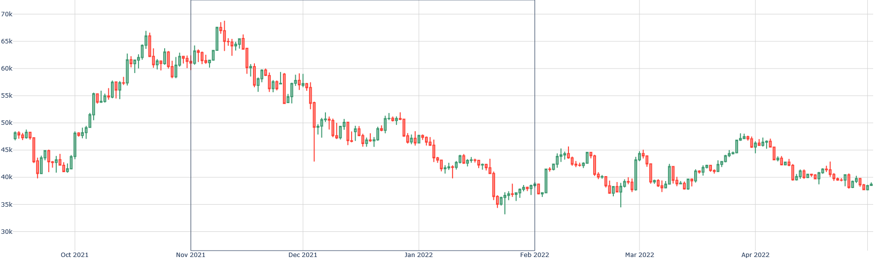
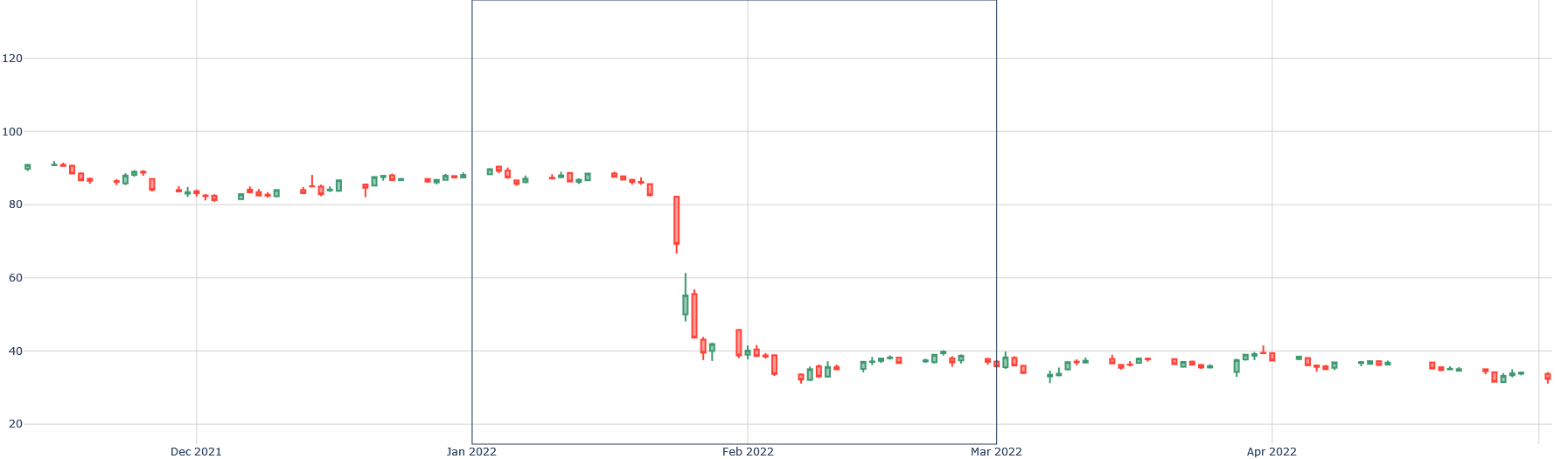
The price of Bitcoin has lost almost 50% of its value since last November, almost as much as Orpea’s stock value after its scandal. In Orpea’s case, the correlation is clear with the scandal, but for Bitcoin, such irrational volatility is rather usual.
<details>
<summary>extracted/6391907/images/btc-new.png Details</summary>
### Visual Description
## Candlestick Chart: Asset Price Movement (October 2021 - April 2022)
### Overview
The image displays a financial candlestick chart tracking the price of an unspecified asset over an approximately seven-month period, from early October 2021 to mid-April 2022. The chart shows a significant price surge to a peak in early November 2021, followed by a sustained downtrend into February 2022, and a subsequent period of volatile consolidation.
### Components/Axes
* **Chart Type:** Candlestick chart. Each candle represents a specific time interval (likely daily, given the date range).
* **X-Axis (Horizontal):** Time axis. Major tick marks and labels are present for the start of each month: `Oct 2021`, `Nov 2021`, `Dec 2021`, `Jan 2022`, `Feb 2022`, `Mar 2022`, `Apr 2022`. The axis spans from just before October 2021 to just after April 2022.
* **Y-Axis (Vertical):** Price axis. Major tick marks and labels are present at 5,000-unit intervals: `30k`, `35k`, `40k`, `45k`, `50k`, `55k`, `60k`, `65k`, `70k`. The "k" denotes thousands. The axis spans from approximately 28k to 72k.
* **Legend:** No explicit legend is visible within the chart area. Standard candlestick chart convention is used: **green (or hollow) candles** indicate a period where the closing price was higher than the opening price (bullish), and **red (or filled) candles** indicate a period where the closing price was lower than the opening price (bearish).
* **Grid:** A light grey grid is present, with horizontal lines at each labeled price level and vertical lines at each labeled month.
### Detailed Analysis
**Segment 1: October 2021 - Early November 2021 (Bullish Surge)**
* **Trend:** A strong, consistent upward trend.
* **Data Points:** The period begins with the price fluctuating between approximately 43k and 48k in early October. A sharp rally begins in mid-October, breaking above 50k. The ascent continues with high volatility, reaching a peak zone in early November.
* **Peak:** The highest point on the chart occurs in the first week of November 2021. The price wick (high) reaches approximately **69,000**. The closing prices in this peak zone are consistently above 65k.
**Segment 2: Early November 2021 - Early February 2022 (Downtrend)**
* **Trend:** A pronounced and sustained downward trend.
* **Data Points:** Following the peak, a sharp decline begins, with a series of large red candles. The price falls below 60k by late November, below 55k by early December, and below 50k by mid-December. The decline continues through January 2022, with the price breaking below 45k.
* **Trough:** The lowest point in this downtrend is reached in early February 2022. The price wick (low) dips to approximately **34,000**.
**Segment 3: February 2022 - Mid-April 2022 (Consolidation & Volatility)**
* **Trend:** A volatile, sideways-to-slightly-upward consolidation pattern. No clear directional trend is established.
* **Data Points:** After the February low, the price recovers to the 40k-45k range. It oscillates significantly within this band. Notable rallies occur in late February (to ~45k) and late March (to ~47k), but both are met with selling pressure. As of the chart's end in mid-April 2022, the price is fluctuating around the **40,000** level.
### Key Observations
1. **High Volatility:** The chart exhibits extreme volatility, especially during the uptrend and the initial stages of the downtrend, characterized by long candle wicks and large real bodies.
2. **Sharp Reversal:** The peak in early November 2021 is very pronounced and is followed almost immediately by a steep decline, suggesting a rapid shift in market sentiment.
3. **Support/Resistance:** The **40,000** and **45,000** levels appear to act as significant psychological and technical zones during the consolidation phase, with price repeatedly reacting to them.
4. **Volume (Implied):** While not plotted, the size of the candles (especially the large red ones in November and December) suggests high trading volume during the sell-off periods.
### Interpretation
This chart depicts a classic "boom and bust" or "bubble" pattern over a medium-term timeframe. The data suggests:
* **Market Sentiment:** A period of extreme greed and FOMO (Fear Of Missing Out) drove the price to unsustainable highs near 70k in late 2021. This was followed by a period of fear and capitulation, leading to the sharp downtrend.
* **Price Discovery:** The asset underwent a major repricing. After the speculative peak, the market sought a new, lower equilibrium, which appears to be forming in the 35k-45k range by Q1 2022.
* **Lack of Recovery:** The failure to reclaim even the 50k level during the consolidation phase indicates weak buying pressure and a potential shift to a longer-term bearish or range-bound market structure following the initial crash.
* **Context:** Given the timeframe and price levels (peaking near 70k), this chart is highly consistent with the price action of **Bitcoin (BTC/USD)** during this period. The pattern reflects the broader cryptocurrency market cycle of late 2021 and early 2022.
</details>
Figure 1: $\blacktriangledown 50\$ BTC/USD [11/2021-02/2022]
<details>
<summary>extracted/6391907/images/orpea-new.png Details</summary>
### Visual Description
## Candlestick Chart: Price Movement (Dec 2021 - Apr 2022)
### Overview
The image displays a financial candlestick chart tracking the price of an unspecified asset over a period from approximately early December 2021 to mid-April 2022. The chart shows a period of relative stability followed by a dramatic price collapse in late January 2022, after which the price consolidates at a significantly lower level.
### Components/Axes
* **Chart Type:** Candlestick chart.
* **X-Axis (Time):** The horizontal axis represents time. Major date markers are visible at the bottom: "Dec 2021", "Jan 2022", "Feb 2022", "Mar 2022", and "Apr 2022". The data spans from before December 2021 to after April 2022.
* **Y-Axis (Price/Value):** The vertical axis represents a numerical value, likely price. It has labeled grid lines at intervals of 20: 20, 40, 60, 80, 100, 120.
* **Legend:** There is no explicit legend. The candlestick colors follow standard financial convention: **Green** (or teal) candles indicate a period where the closing price was higher than the opening price (bullish). **Red** candles indicate a period where the closing price was lower than the opening price (bearish).
* **Other Text:** No chart title, asset name, or data source is present in the image.
### Detailed Analysis
The price action can be segmented into three distinct phases:
1. **Phase 1: Consolidation (Dec 2021 - Late Jan 2022)**
* **Trend:** The price moves sideways within a relatively narrow range.
* **Range:** Approximately between 80 and 95 on the y-axis.
* **Characteristics:** A mix of small green and red candles, indicating indecision and low volatility. The price repeatedly tests the ~90-95 level but fails to break out significantly higher.
2. **Phase 2: Sharp Decline (Late Jan 2022 - Early Feb 2022)**
* **Trend:** A severe, near-vertical downward move.
* **Key Movement:** A very large red candle appears in late January, opening near 90 and closing near 65. This is followed by another large red candle opening near 65 and closing near 45.
* **Range:** The price plummets from ~90 to a low near 35 within a very short timeframe (likely a few trading sessions).
* **Characteristics:** Dominated by large red candles with long bodies, indicating strong selling pressure and high volatility. A few small green candles appear during the descent, suggesting brief, failed recovery attempts.
3. **Phase 3: Low-Level Consolidation (Feb 2022 - Apr 2022)**
* **Trend:** The price stabilizes and moves sideways again, but at a much lower level.
* **Range:** Approximately between 30 and 40 on the y-axis.
* **Characteristics:** Similar to Phase 1 but at a depressed price level. Candles are generally small, with a mix of colors, indicating a new period of equilibrium and reduced volatility after the crash.
### Key Observations
* **The Dominant Feature:** The most significant event is the **precipitous drop in late January 2022**. The price lost over 50% of its value in what appears to be a very short period.
* **Support/Resistance:** The ~90 level acted as resistance in Phase 1. After the crash, the ~40 level appears to act as new resistance, while ~30 acts as support in Phase 3.
* **Volatility Shift:** Volatility was low in Phase 1, spiked to extreme levels during the Phase 2 crash, and returned to low levels in Phase 3.
* **Absence of Context:** The chart lacks a title, asset label, or volume data, making it impossible to identify the specific instrument or the fundamental reason for the price action.
### Interpretation
This chart visually narrates a classic "breakdown" or "crash" scenario in a financial market. The prolonged consolidation in Phase 1 suggests a market in equilibrium, building energy. The failure to break above resistance (~95) likely led to a loss of confidence, triggering the massive sell-off in Phase 2. The speed and magnitude of the decline suggest a catalytic event—such as an earnings miss, regulatory news, broader market sell-off, or a breach of a key technical level—that prompted a rush for the exits.
The subsequent Phase 3 consolidation indicates the market has found a new, lower equilibrium. The asset is now trading in a "depressed" range, suggesting that the negative catalyst has been fully priced in, but there is no immediate catalyst for a recovery. The chart demonstrates how market sentiment can shift violently from complacency to panic and then to apathy. Without additional data (like volume or news), the chart alone tells a story of a severe loss of value and a market that has reset to a new, lower baseline.
</details>
Figure 2: $\blacktriangledown 50\$ ORP [01/2022-03/2022]
The notion of prediction is vague, especially regarding price prediction: isn’t price itself the result of agents’ predictions about the value of an asset? Are we therefore predicting a prediction? For simplicity, we will use the term prediction as defined by American economist Alfred Cowles in his paper [Cowles 3rd, 1933], particularly in the second part, where he analyzes the reliability of "forecasters" on stock market volatility. Bitcoin, for its part, is a decentralized cryptocurrency, created in 2008, based on a "proof of work" mining protocol and a robust transaction system as explained by Satoshi Nakamoto [Nakamoto, 2008].
<details>
<summary>extracted/6391907/images/btc-new2.png Details</summary>
### Visual Description
## Line Chart: Historical Price/Value Trend (2015-2022)
### Overview
The image displays a line chart tracking a numerical value over time, spanning from early 2015 to early 2022. The chart features two overlaid lines (green and red) that follow a very similar path, suggesting they represent closely related data series (e.g., opening/closing prices, two correlated assets). The data shows a period of low, stable values followed by extreme volatility and significant growth, particularly from 2020 onward.
### Components/Axes
* **Chart Type:** Dual-line chart.
* **X-Axis (Horizontal):** Represents time. Major tick marks and labels are present for the start of each year: `2015`, `2016`, `2017`, `2018`, `2019`, `2020`, `2021`, `2022`. The axis spans approximately 7 years.
* **Y-Axis (Vertical):** Represents a numerical value. Major tick marks and labels are present at intervals of 10,000: `0`, `10k`, `20k`, `30k`, `40k`, `50k`, `60k`, `70k`. The "k" denotes thousands.
* **Legend:** **Not present in the visible image.** The identity of the green and red lines is not specified.
* **Title/Axis Titles:** **Not present in the visible image.** The subject of the data (e.g., "Bitcoin Price," "Stock Index") is not stated.
* **Grid:** A light gray grid is present, with vertical lines at each year marker and horizontal lines at each 10k interval.
### Detailed Analysis
**Trend Verification & Spatial Grounding:**
The two lines are tightly correlated, moving in near unison. The green line is generally positioned slightly above the red line for most of the chart's duration, with the gap between them appearing relatively consistent.
1. **2015 - Mid-2017 (Bottom-Left to Center):**
* **Trend:** Both lines are flat and hover very close to the `0` baseline.
* **Data Points:** Values remain below approximately `1,000` for this entire period.
2. **Late 2017 - Early 2018 (First Major Peak):**
* **Trend:** A sharp, parabolic upward slope begins in late 2017.
* **Data Points:** The first major peak occurs around the start of `2018`. The green line reaches approximately `19,000`, and the red line peaks slightly lower, around `18,000`.
3. **2018 - 2019 (Decline and Consolidation):**
* **Trend:** A steep decline follows the 2018 peak, followed by a period of choppy, sideways movement with a slight downward bias.
* **Data Points:** By mid-2018, values fall to the `6,000 - 8,000` range. A local low is seen in late 2018/early 2019 near `3,500`. Throughout 2019, values fluctuate mostly between `3,500` and `13,000`.
4. **2020 (Base Building and Initial Rise):**
* **Trend:** The year starts with values around `7,000 - 8,000`. A notable dip occurs (likely corresponding to March 2020), followed by a steady upward trend that accelerates in the second half of the year.
* **Data Points:** The dip reaches approximately `5,000`. By the end of 2020, values have climbed to around `29,000`.
5. **2021 (Major Bull Run and Volatility):**
* **Trend:** An extremely steep, near-vertical ascent begins.
* **Data Points:**
* **First Peak (Q1 2021):** The green line surges to approximately `64,000`, with the red line peaking near `63,000`.
* **Mid-Year Correction:** A sharp decline follows, bottoming around `30,000` in the middle of the year.
* **Second Peak (Q4 2021):** A second major rally pushes the green line to its all-time high on the chart, approximately `69,000`. The red line peaks slightly lower, around `68,000`.
6. **2022 (Decline from Highs):**
* **Trend:** A downtrend begins from the late 2021 peak.
* **Data Points:** By the right edge of the chart (early 2022), values have fallen to the `38,000 - 42,000` range.
### Key Observations
* **Extreme Volatility:** The asset(s) depicted are characterized by massive price swings, with increases of over 1000% and subsequent crashes of 50% or more.
* **Two Distinct Bull Cycles:** The chart shows two major parabolic advance cycles: one culminating in late 2017/early 2018, and a much larger one spanning 2020-2021.
* **Tight Correlation:** The green and red lines maintain an exceptionally high correlation throughout the entire period, suggesting they are measuring the same underlying asset with minor variations (like bid/ask prices) or two assets that are fundamentally linked.
* **Lack of Context:** The absence of a title, axis labels, and legend makes definitive identification impossible from the image alone. However, the price levels and timeline are highly consistent with the historical price chart of Bitcoin (BTC/USD).
### Interpretation
This chart visually narrates the market history of a highly speculative and volatile asset over a seven-year period. The data suggests an asset that transitioned from obscurity (near-zero value) to mainstream financial relevance, experiencing classic boom-and-bust cycles.
The **first cycle (2017-2018)** represents an initial wave of speculative mania, followed by a prolonged "crypto winter" of depressed prices and consolidation. The **second, larger cycle (2020-2021)** indicates a more mature but still frenetic market phase, potentially driven by institutional adoption, macroeconomic factors (like monetary policy), and broader retail participation. The pattern of sharp peaks followed by deep corrections (over 50% drawdowns) is a hallmark of this asset class.
The tight coupling of the two lines implies that whatever they represent (e.g., spot price vs. futures price, exchange A vs. exchange B) moves in near-perfect lockstep, indicating high market efficiency and arbitrage between the measured values. The overall trajectory, despite the volatility, shows a powerful long-term uptrend from the 2015 baseline.
</details>
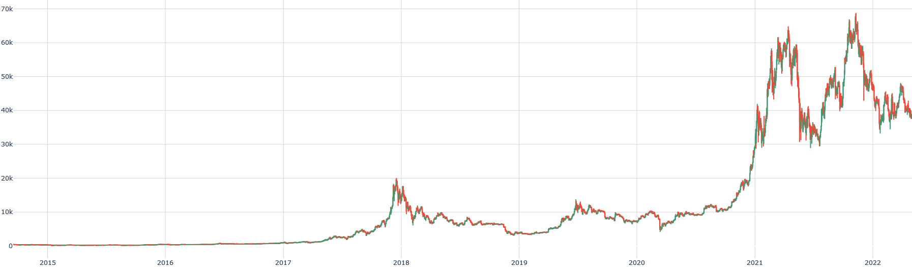
Figure 3: $\blacktriangle 9,000\$ BTC/USD [2014-2022]
As shown above, Bitcoin has progressively gained success: initially used for anonymous transactions on illegal markets, it became a speculative tool for individuals, and eventually attracted institutional interest, despite limited daily usage [Baur et al., 2015]. Notably, Bitcoin’s underlying technology, Blockchain, was actually invented by researchers Haber and Stornetta [Haber and Stornetta, 1990], not Nakamoto, although Nakamoto was the first to apply it at large scale.
The literature on cryptocurrency prediction remains relatively poor, given the recent emergence of the technology. Virtually no academic papers referenced cryptocurrencies before 2008. Instead, much research focuses on machine learning techniques for cryptocurrency prediction. However, similarities with financial markets exist (closer to forex than stocks due to the monetary nature of cryptocurrencies), a domain extensively studied since the early 1900s. From Louis Bachelier’s Gaussian model [Bachelier, 1900] to Mathieu Rosenbaum’s rough Heston model [Gatheral et al., 2018], and Gordon-Shapiro’s valuation model [Gordon and Shapiro, 1956], numerous theories have been proposed. Yet, debates persist regarding market behavior.
According to Eugene Fama [Fama, 1970], a rational market cannot be systematically beaten. Louis Bachelier [Bachelier, 1900] states, "The determination of these activities depends on an infinite number of factors: therefore, a precise mathematical forecast is absolutely impossible." Nevertheless, Keynes [Keynes, 1937] compared the market to a beauty contest: predicting what the majority will find beautiful, not objective beauty itself. This idea echoes momentum strategies and aligns with Charles Dow’s technical analysis [Brown et al., 1998].
Alternatively, Warren Buffett promotes stock-picking and value investing, diverging from Markowitz’s modern portfolio theory [Steinbach, 2001]. However, Buffett’s method, focusing on selecting promising assets, differs from our study, where the asset (Bitcoin) is preselected. Burton Malkiel [Malkiel, 2003] famously claimed that "a blindfolded monkey throwing darts at a newspaper’s financial pages could perform as well as professional investors," although empirical studies [Pernagallo and Torrisi, 2020] challenge this assertion.
To explore random versus selected portfolios, we define a Python function isRandomBetter( $Ω,n,k$ ) (code in Appendix A). Results:
| 1 | 141 | 998 | 10 | 10 | 20% | False |
| --- | --- | --- | --- | --- | --- | --- |
| 2 | 141 | 998 | 10 | 20 | 30% | False |
| 3 | 141 | 998 | 20 | 10 | 40% | False |
| 4 | 141 | 998 | 20 | 20 | 30% | False |
| 5 | 141 | 998 | 20 | 30 | 60% | True |
| 6 | 141 | 998 | 30 | 20 | 57% | True |
| 7 | 141 | 998 | 30 | 30 | 47% | False |
| 8 | 141 | 998 | 30 | 10 | 27% | False |
| 9 | 141 | 998 | 10 | 30 | 20% | False |
| 10 | 141 | 998 | 40 | 5 | 25% | False |
Table 1: Results of isRandomBetter( $Ω,n,k$ )
Choosing a random crypto portfolio in 2021 was not optimal.
We will investigate whether Bitcoin price predictability depends on market efficiency. Given the cryptocurrency market’s heterogeneity, various scenarios (competitive markets, manipulated markets, rational/irrational agents) are expected.
We will show that, by default, the crypto market tends to be efficient, although inefficiencies sometimes appear, albeit difficult to exploit systematically.
We will address prediction methods under efficient market conditions, focusing on time series analysis and machine learning algorithms. We will also study prediction under inefficiency contexts, emphasizing empirical observations and stylized facts.
Let’s first examine the case when the market is efficient.
## 2 The Cryptocurrency Market is Efficient
We first assume an efficient market. We will explain the concept’s origins, assumptions, verify some of them, discuss model evolutions, and their implications for cryptocurrencies. We will also analyze this through machine learning and quantitative techniques, reflecting critically on the results.
### 2.1 Eugene Fama and the Notion of No Arbitrage Opportunities
We start with Fama’s [Fama, 1970] definition of efficient markets, comparing the US stock market and cryptocurrencies. Fama’s idea implies no arbitrage opportunities. However, as we will see later, arbitrage is relatively common in crypto markets (price differences between brokers).
<details>
<summary>extracted/6391907/images/arb1.png Details</summary>

### Visual Description
## Screenshot: KoinKnight Landing Page
### Overview
This image is a screenshot of the hero section of the "KoinKnight" website landing page. The page is designed to introduce the service as a tool for cryptocurrency arbitrage, featuring a clean, modern layout with a prominent illustration. The primary language is English.
### Components/Axes
The page is structured into three main visual regions:
1. **Header/Navigation Bar (Top):** Contains the site logo and primary navigation links.
2. **Main Content Area (Left):** Contains the value proposition headline, descriptive text, and call-to-action buttons.
3. **Illustrative Graphic (Right):** A large, isometric illustration depicting the service's function.
**Header Elements (from left to right):**
* **Logo:** "KoinKnight" with a stylized blue "K" icon.
* **Navigation Links:** "Pricing", "API Services", "Crypto Analytics", "Refer & Earn".
* **Utility Links:** "English" (with a dropdown indicator), "Sign in", and a blue "Sign up" button.
**Main Content Elements (Left-aligned):**
* **Primary Headline:** "Your personal assistance for cryptocurrency arbitrage" (with "personal assistance" highlighted in blue).
* **Supporting Text:** "Find the best trade and arbitrage opportunities using KoinKnight's powerful algorithm and real-time data exploration tools."
* **Call-to-Action Buttons:** "Try for free" (white button with blue text) and "View Demo" (blue button with white text).
* **Login Prompt:** "Already using KoinKnight? Log in" (with "Log in" as a hyperlink).
**Illustrative Graphic (Right-aligned):**
* An isometric illustration on a green circular background.
* **Central Element:** A blue laptop displaying multiple overlapping data screens or charts with red and green bars, suggesting market data.
* **Peripheral Elements:** A calculator to the left of the laptop and a single yellow coin to the right, symbolizing calculation and profit.
* **Background:** A large, soft green circle with a lighter green outer ring, creating a focal point.
### Detailed Analysis / Content Details
**Complete Text Transcription:**
* **Header:** `KoinKnight` `Pricing` `API Services` `Crypto Analytics` `Refer & Earn` `English` `Sign in` `Sign up`
* **Main Content:**
* `Your personal assistance`
* `for cryptocurrency arbitrage`
* `Find the best trade and arbitrage opportunities`
* `using KoinKnight's powerful algorithm`
* `and real-time data exploration tools.`
* `Try for free` `View Demo`
* `Already using KoinKnight? Log in`
* **Illustration:** No embedded text is present within the graphic itself.
**Visual & Layout Details:**
* **Color Palette:** Dominant colors are white (background), blue (logo, buttons, laptop), green (illustration background, chart bars), and dark gray/black (text).
* **Typography:** A clean, sans-serif font is used throughout. The headline uses a larger, bolder weight.
* **Spatial Composition:** The layout is asymmetric. The text content is left-aligned with generous white space, while the large illustration occupies the right half, creating visual balance. The header spans the full width at the top.
### Key Observations
1. **Clear Value Proposition:** The headline and supporting text immediately communicate the service's core function: finding arbitrage opportunities in cryptocurrency markets using algorithms and real-time data.
2. **Dual Call-to-Action:** The page offers two primary paths for new users: a free trial ("Try for free") and a product demonstration ("View Demo"), catering to different levels of user commitment.
3. **Illustrative Metaphor:** The graphic effectively visualizes the service's purpose. The multiple screens on the laptop represent data aggregation and analysis, the calculator signifies computation and strategy, and the coin represents the financial outcome (profit).
4. **User Journey Consideration:** The page includes a direct login link for existing users ("Already using KoinKnight? Log in"), ensuring they are not forced through the new user onboarding flow.
5. **Professional Aesthetic:** The design is modern, uncluttered, and uses a professional color scheme (blue/green/white) commonly associated with finance, technology, and trust.
### Interpretation
This landing page is a classic example of a conversion-focused hero section for a B2B or prosumer fintech SaaS (Software as a Service) product. Its primary goal is to quickly communicate the product's unique selling proposition (USP)—automated cryptocurrency arbitrage—and persuade visitors to take the first step in the conversion funnel.
* **Problem/Solution Framing:** It implicitly identifies a problem (the difficulty of manually finding profitable arbitrage trades across crypto markets) and presents KoinKnight as the solution (an algorithmic "personal assistance").
* **Trust Building:** The professional design, clear language, and mention of "powerful algorithm" and "real-time data" are intended to build credibility and trust with a technically savvy audience.
* **Reducing Friction:** By offering a "Try for free" option, the page lowers the barrier to entry, allowing users to experience value before committing financially. The "View Demo" option serves users who prefer to understand the product more deeply before signing up.
* **Audience Targeting:** The terminology ("arbitrage," "API Services," "Crypto Analytics") and the analytical nature of the illustration clearly target individuals or businesses already engaged in or knowledgeable about cryptocurrency trading and quantitative finance.
In essence, the page is designed to act as an efficient filter and converter: it attracts the right audience with specific language, explains the value succinctly, and provides clear, low-friction pathways for engagement.
</details>
Figure 4: KoinKnight
<details>
<summary>extracted/6391907/images/arb2.png Details</summary>

### Visual Description
## Website Screenshot: ArbiTool Homepage
### Overview
This image is a screenshot of the homepage for "ArbiTool," a service promoting a cryptocurrency arbitrage tool. The page features a modern, gradient-based design with a prominent hero section containing marketing copy, call-to-action buttons, and an isometric illustration depicting digital trading concepts. The primary language is English, with a small element of French present in a live chat widget.
### Components & UI Elements
**Header Navigation Bar (Top of page, left to right):**
* **Logo (Top-left):** "AT" icon followed by "ArbiTool" and the tagline "Professional Arbitrage" below it.
* **Navigation Links:** "HOME", "ABOUT ARBITOOL" (with dropdown indicator), "TUTORIAL", "PRICING", "ARBITRAGE COURSE", "JOIN OUR COMMUNITY" (with dropdown indicator), "FAQ'S", "CONTACT".
* **Language Selector:** A United Kingdom flag icon (indicating English) with a dropdown indicator.
* **User Actions (Top-right):** "LOGIN" button and a "SIGN UP FREE" button (pink/orange gradient).
**Hero Section (Central area):**
* **Main Headline (Large, white text):** "Did you know that the rate of the same cryptocurrency may vary by up to 50% on two different exchanges?"
* **Sub-headline (Smaller, white text):** "Our tool will show you where and when to buy LOW and sell HIGH"
* **Call-to-Action Buttons:**
* Left button: "TELL ME MORE! →" (outlined style).
* Right button: "TEST IT FOR FREE →" (pink/orange gradient fill).
* **Illustration (Right side of hero):** An isometric graphic showing:
* A laptop displaying a Bitcoin (₿) symbol and a rising chart.
* A server rack.
* A large smartphone/tablet displaying a trading interface with people around it.
* Various floating elements: a shield, a dollar sign ($), charts, and data blocks.
* Dotted lines connecting the elements, suggesting a network or data flow.
**Footer Banner (Bottom of visible area):**
* **Text (Left side, on blue background):** "Trade our token on:"
* **Logo (Center, on dark blue background):** The "altilly" exchange logo.
**Live Chat Widget (Bottom-right corner):**
* **Speech Bubble (Grey):** "We are here! Live chat now."
* **Button (Orange):** Contains a user icon and the French text "Laissez un message" (English translation: "Leave a message").
### Content Details
All text from the image has been transcribed in the Components section above. The key marketing claim is that cryptocurrency prices can vary by "up to 50%" across exchanges. The service's value proposition is to identify arbitrage opportunities ("buy LOW and sell HIGH").
### Key Observations
1. **Bilingual Element:** The live chat widget button uses French ("Laissez un message"), while the rest of the site's primary content is in English. This suggests the service may target or originate from a Francophone region or market.
2. **Visual Hierarchy:** The design uses size, color (pink/orange gradients for primary actions), and placement to guide the user's eye from the headline to the call-to-action buttons.
3. **Illustration Theme:** The isometric artwork visually reinforces concepts of digital finance, data analysis, security (shield), and multi-device connectivity.
4. **Color Scheme:** Dominated by a purple-to-blue gradient background with abstract geometric shapes. Accent colors are pink/orange for interactive elements and white for primary text.
### Interpretation
This homepage is designed to quickly communicate the core concept of cryptocurrency arbitrage to potential users. The headline poses a provocative question about price discrepancies to capture attention, immediately followed by the solution the tool provides. The "buy LOW and sell HIGH" phrasing simplifies the arbitrage concept for a broad audience.
The inclusion of a specific exchange ("altilly") in the footer suggests a partnership or that the tool is specifically integrated with or optimized for that platform. The prominent "SIGN UP FREE" and "TEST IT FOR FREE" buttons indicate a freemium or trial-based business model aimed at lowering the barrier to entry.
The overall aesthetic is professional yet approachable, using modern web design trends (gradients, isometric art) to appeal to a tech-savvy audience interested in cryptocurrency trading. The live chat feature implies an emphasis on customer support and immediate engagement.
</details>
Figure 5: ArbiTool
At a discretionary level, however, arbitrage opportunities are rarely exploitable due to transfer fees and liquidity issues.
#### 2.1.1 Efficient Market Hypothesis Adaptation to Cryptocurrencies
Fama [Fama, 1970] outlined several conditions for market efficiency and its three forms. Let’s check them for crypto markets.
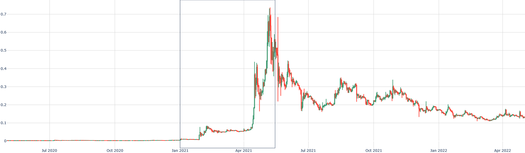
First, agents should be rational. In crypto, this is unlikely. For example, Dogecoin rose by 14,000% mainly due to memes and social media [Chohan, 2021]:
<details>
<summary>extracted/6391907/images/doge-new.png Details</summary>
### Visual Description
\n
## Candlestick Chart: Financial Price Movement (Approx. July 2020 - April 2022)
### Overview
The image displays a financial candlestick chart plotting a numerical value (likely a price or index) over a period of approximately 22 months. The chart shows a period of low, stable values followed by a dramatic, volatile spike and a subsequent gradual decline. No chart title, asset name, or legend is present within the visible frame.
### Components/Axes
* **X-Axis (Horizontal):** Represents time. The visible date markers are: `Jul 2020`, `Oct 2020`, `Jan 2021`, `Apr 2021`, `Jul 2021`, `Oct 2021`, `Jan 2022`, `Apr 2022`. The axis appears to be linear.
* **Y-Axis (Vertical):** Represents a numerical value. The visible scale markers are: `0`, `0.1`, `0.2`, `0.3`, `0.4`, `0.5`, `0.6`, `0.7`. The axis is linear. No unit or label is provided.
* **Data Series:** The data is represented using standard financial candlesticks.
* **Green Candlesticks:** Indicate the closing value was higher than the opening value for that period (price increase).
* **Red Candlesticks:** Indicate the closing value was lower than the opening value for that period (price decrease).
* The thin vertical lines (wicks/shadows) show the high and low values for the period.
* **Grid:** A light gray grid is present, with vertical lines aligning with the date markers and horizontal lines aligning with the Y-axis scale markers.
* **Highlighted Region:** A faint, vertical rectangular box is drawn, spanning from approximately `Jan 2021` to `Apr 2021` on the X-axis. This likely highlights a specific period of interest.
### Detailed Analysis
**Trend Verification & Data Points:**
1. **Phase 1: Stability (Jul 2020 - Jan 2021):** The line is nearly flat, hovering just above the `0` mark. Candlesticks are very small, indicating minimal price movement and volatility. Values are consistently below `0.05`.
2. **Phase 2: Initial Rise (Jan 2021 - Mar 2021):** A gradual upward trend begins. Values climb from near `0` to approximately `0.08` by early March 2021. Volatility increases slightly, as seen in larger candlestick bodies.
3. **Phase 3: Parabolic Spike (Mar 2021 - Mid-Apr 2021):** This is the most dramatic phase. The value experiences an explosive, near-vertical ascent.
* It breaks through `0.1`, `0.2`, `0.3`, and `0.4` in rapid succession.
* The peak occurs in mid-April 2021. The highest wick reaches approximately **`0.73`** (above the `0.7` grid line). The highest closing value (top of a green body) is near **`0.68`**.
* This period is characterized by extremely large candlesticks (both green and red), indicating massive intraday volatility.
4. **Phase 4: Volatile Decline (Mid-Apr 2021 - Apr 2022):** Following the peak, the trend reverses into a choppy, downward trajectory.
* **Initial Crash (Apr-May 2021):** A sharp drop from the peak to below `0.3`.
* **Lower Highs & Lows:** The chart forms a series of lower peaks and lower troughs. Notable secondary peaks occur around `0.35` (Jul 2021), `0.3` (Oct 2021), and `0.25` (Jan 2022).
* **Final Value (Apr 2022):** The chart ends with values fluctuating in the **`0.12` to `0.16`** range, significantly below the peak but above the pre-spike levels.
### Key Observations
* **Extreme Asymmetry:** The chart is defined by one massive, speculative-looking bubble (the spike to 0.73) followed by a prolonged decline.
* **Volatility Clustering:** Volatility (candlestick size) is extremely low during the stable phase, explodes during the spike and initial crash, and remains elevated but gradually decreases during the long decline.
* **Highlighted Period:** The boxed area from Jan 2021 to Apr 2021 encapsulates the entire parabolic move from the initial breakout to the absolute peak.
* **Lack of Context:** The chart lacks a title, Y-axis label, or legend, making it impossible to identify the specific asset (e.g., stock, cryptocurrency, commodity) or the unit of measurement (e.g., USD, EUR, index points).
### Interpretation
This chart visually narrates a classic "boom and bust" or speculative bubble pattern. The data suggests an asset that was relatively obscure or stable until early 2021, when it attracted significant buying interest, leading to a self-reinforcing parabolic price increase. The peak in April 2021 represents a point of maximum optimism or frenzy. The subsequent decline, while volatile, shows a gradual loss of momentum and a search for a new, lower equilibrium price. The pattern is highly characteristic of assets driven by speculative manias, such as certain cryptocurrencies, "meme stocks," or other hyped financial instruments during the 2020-2021 period. The highlighted box draws analytical attention to the critical accumulation and blow-off top phase of this cycle. Without external labels, the chart serves as a pure, anonymized study in market psychology and volatility dynamics.
</details>
Figure 6: $\blacktriangle 14,000\$ DOGE/USD [01/2021-05/2021]
Individuals should not influence the market. Elon Musk, however, can shift prices with a single tweet:
<details>
<summary>extracted/6391907/images/musk1.png Details</summary>

### Visual Description
## Social Media Post (Screenshot): Elon Musk Tweet on Bitcoin
### Overview
This image is a screenshot of a tweet posted by Elon Musk on June 4, 2021. The tweet contains a text-based joke referencing Bitcoin and the band Linkin Park, accompanied by a meme image. The interface language of the Twitter client appears to be French, as indicated by the engagement metrics.
### Components/Axes
The image is structured as a standard Twitter post on a mobile interface.
**Header (Top Section):**
* **Profile Picture:** Circular image of Elon Musk wearing sunglasses.
* **Display Name:** "Elon Musk" with a blue verification checkmark.
* **Username:** "@elonmusk"
* **Menu Icon:** Three horizontal dots in the top-right corner.
**Tweet Body (Central Section):**
* **Main Text:** "#Bitcoin ₿ 💔" (The text includes the hashtag "Bitcoin", the Bitcoin symbol emoji, and a broken heart emoji).
* **Embedded Meme:** A white text box overlaid on a stock photo.
* **Meme Text (Top):** "Her: I know I said it would be over between us if you quoted another Linkin Park song but I've found someone else."
* **Meme Text (Bottom):** "Him: So in the end it didn't even matter?"
* **Image:** A man and a woman sitting on opposite ends of a grey couch, both with arms crossed and looking away from each other, depicting a couple in conflict.
* **Watermark:** "made with mematic" in the bottom-left corner of the photo.
**Footer (Bottom Section):**
* **Timestamp & Source:** "3:07 AM · 4 juin 2021 · Twitter for iPhone" (Note: "juin" is French for "June").
* **Engagement Metrics (from left to right):**
* **Retweets:** "21,1 k Retweets" (21.1 thousand retweets).
* **Quote Tweets:** "9 986 Tweets cités" (9,986 quoted tweets). "Tweets cités" is French for "Quoted Tweets".
* **Likes:** "210,1 k J'aime" (210.1 thousand likes). "J'aime" is French for "Likes".
* **Action Icons:** Four icons for Reply, Retweet, Like, and Share.
### Detailed Analysis
* **Primary Language:** English (tweet text and meme).
* **Secondary Language:** French (Twitter interface elements: "juin", "Tweets cités", "J'aime").
* **Textual Content Transcription:**
* Tweet: `#Bitcoin ₿ 💔`
* Meme: `Her: I know I said it would be over between us if you quoted another Linkin Park song but I've found someone else. Him: So in the end it didn't even matter?`
* **Data Points (Engagement Metrics):**
* Retweets: ~21,100
* Quote Tweets: 9,986
* Likes: ~210,100
* **Spatial Grounding:**
* The profile header is at the top.
* The tweet text and meme are centered in the main body.
* The timestamp and metrics are aligned at the bottom.
* The meme's dialogue is positioned above the image of the couple.
### Key Observations
1. **Cultural Reference:** The joke hinges on knowledge of the band Linkin Park, specifically their song "In the End," whose chorus includes the lyric "I tried so hard and got so far / But in the end, it doesn't even matter."
2. **Contextual Timing:** The tweet was posted on June 4, 2021. This was during a period of significant volatility and public discourse surrounding Bitcoin.
3. **High Engagement:** The post received substantial interaction, with over 210,000 likes and 21,000 retweets, indicating it resonated widely or sparked conversation.
4. **Interface Language:** The user's Twitter client was set to French, which is why the month and engagement labels are in French.
### Interpretation
This post is a piece of social media commentary that uses a relatable relationship meme format to make a joke about Bitcoin. The punchline, "So in the end it didn't even matter?", serves a dual purpose:
1. It completes the Linkin Park reference within the meme's narrative.
2. It likely acts as a metaphorical commentary on Bitcoin's price action or the perceived futility of certain investment sentiments at that time. The broken heart emoji (💔) next to the Bitcoin hashtag reinforces a theme of disappointment or a "breakup" with the cryptocurrency, possibly due to a market downturn.
The post demonstrates how public figures like Elon Musk use internet culture (memes, music references) to engage with complex topics like cryptocurrency in an accessible, humorous way. The high engagement metrics suggest the message was effective in capturing attention, regardless of whether the audience interpreted it as a serious market signal or purely as entertainment. The French interface elements are incidental, revealing only the language setting of the device used to capture the screenshot, not the primary language of the content creator or the intended audience.
</details>
Figure 7: Negative tweet on 04/06/2021
<details>
<summary>extracted/6391907/images/btc-new3.png Details</summary>
### Visual Description
## Candlestick Chart: Price Movement (May 26 - June 16, 2021)
### Overview
This is a financial candlestick chart displaying price action over a period of approximately three weeks, from late May to mid-June 2021. The chart shows daily price movements, with each candlestick representing one trading day. The asset or instrument being tracked is not explicitly labeled on the chart.
### Components/Axes
* **X-Axis (Horizontal):** Represents time. Major date labels are present at the bottom: `May 26 2021`, `May 29`, `Jun 1`, `Jun 4`, `Jun 7`, `Jun 10`, `Jun 13`, `Jun 16`. The axis is linear, with each candlestick corresponding to a single day.
* **Y-Axis (Vertical):** Represents price. Major labels are on the left side: `25k`, `30k`, `35k`, `40k`, `45k`. The scale is linear, with gridlines at 5k intervals.
* **Candlesticks:** Each candlestick has a rectangular body and vertical lines (wicks/shadows) extending above and below.
* **Green (Teal) Candlesticks:** Indicate a bullish day where the closing price was higher than the opening price. The body spans from the open (bottom) to the close (top).
* **Red (Salmon) Candlesticks:** Indicate a bearish day where the closing price was lower than the opening price. The body spans from the open (top) to the close (bottom).
* **Wicks:** Show the highest and lowest prices reached during the trading session.
* **Legend:** No explicit legend is present. The color coding (green for up, red for down) is standard for candlestick charts.
* **Highlight Box:** A faint, semi-transparent grey rectangle is overlaid on the chart, spanning from approximately June 3 to June 9. This appears to be a user-added annotation to highlight a specific period of interest.
### Detailed Analysis
The chart displays a sequence of daily price actions. Below is a chronological breakdown of each visible candlestick, from left to right. Prices are approximate visual estimates.
1. **May 26 (Green):** Open ~38.5k, Close ~39.5k. High wick to ~40.5k, low wick to ~38k. Bullish start.
2. **May 27 (Red):** Open ~39.5k, Close ~38.5k. High wick to ~40k, low wick to ~37.5k. Slight pullback.
3. **May 28 (Red):** Open ~38.5k, Close ~36k. High wick to ~39k, low wick to ~35.5k. Significant bearish move.
4. **May 29 (Red):** Open ~36k, Close ~35k. High wick to ~36.5k, low wick to ~34.5k. Continued decline.
5. **May 30 (Green):** Open ~35k, Close ~35.5k. High wick to ~36.5k, low wick to ~34.5k. Small recovery.
6. **May 31 (Green):** Open ~35.5k, Close ~37k. High wick to ~37.5k, low wick to ~35k. Stronger bullish day.
7. **Jun 1 (Red):** Open ~37k, Close ~36.5k. High wick to ~37.5k, low wick to ~36k. Minor bearish day.
8. **Jun 2 (Green):** Open ~36.5k, Close ~37.5k. High wick to ~38k, low wick to ~36k. Recovery continues.
9. **Jun 3 (Green):** Open ~37.5k, Close ~39k. High wick to ~39.5k, low wick to ~37k. Strong bullish move, entering the highlighted zone.
10. **Jun 4 (Red):** Open ~39k, Close ~37k. High wick to ~39.5k, low wick to ~36.5k. Sharp reversal within the highlight.
11. **Jun 5 (Red):** Open ~37k, Close ~36k. High wick to ~37.5k, low wick to ~35.5k. Continued decline.
12. **Jun 6 (Green - Doji-like):** Open ~36k, Close ~36k. Very small body. High wick to ~36.5k, low wick to ~35.5k. Indecision.
13. **Jun 7 (Red):** Open ~36k, Close ~34k. High wick to ~36.5k, low wick to ~33.5k. Strong bearish day.
14. **Jun 8 (Red - Long Lower Wick):** Open ~34k, Close ~33.5k. High wick to ~34.5k, **low wick extends down to ~31k**. This is the lowest point on the chart, showing a dramatic intraday drop followed by a recovery.
15. **Jun 9 (Green):** Open ~33.5k, Close ~37.5k. High wick to ~38k, low wick to ~33k. **Very strong bullish reversal**, exiting the highlight zone.
16. **Jun 10 (Red):** Open ~37.5k, Close ~37k. High wick to ~38k, low wick to ~36.5k. Small bearish consolidation.
17. **Jun 11 (Green):** Open ~37k, Close ~37.5k. High wick to ~38k, low wick to ~36.5k. Small bullish day.
18. **Jun 12 (Red):** Open ~37.5k, Close ~36.5k. High wick to ~38k, low wick to ~36k. Minor pullback.
19. **Jun 13 (Green):** Open ~36.5k, Close ~39k. High wick to ~39.5k, low wick to ~36k. Strong bullish move.
20. **Jun 14 (Green):** Open ~39k, Close ~40k. High wick to ~40.5k, low wick to ~38.5k. Continued strength.
21. **Jun 15 (Red - Doji-like):** Open ~40k, Close ~40k. Very small body. High wick to ~40.5k, low wick to ~39.5k. Indecision at highs.
22. **Jun 16 (Red):** Open ~40k, Close ~38.5k. High wick to ~40.5k, low wick to ~38k. Bearish day.
23. **Final Candle (Red):** Open ~38.5k, Close ~37k. High wick to ~39k, low wick to ~36.5k. Further decline.
### Key Observations
* **Overall Trend:** The chart shows a volatile period with a general downtrend from late May (~39.5k) to a low on June 8 (~31k), followed by a strong recovery uptrend to a peak around June 14-15 (~40k), and then a pullback.
* **Highlighted Period (Jun 3-9):** This zone contains the most significant volatility, including the sharpest decline and the strongest single-day recovery (June 9).
* **Notable Candle:** The June 8 candlestick is the most distinctive, with an exceptionally long lower wick indicating a massive intraday sell-off that was strongly rejected, often a technical signal of a potential bottom.
* **Volume:** No volume data is provided on this chart.
### Interpretation
This candlestick chart depicts a classic market cycle of decline, capitulation, and recovery over a short timeframe. The period within the grey highlight box (June 3-9) represents a **selling climax**. The long lower wick on June 8 is a key Peircean signifier of **exhaustion** among sellers and the entry of strong buyers at lower prices, which directly led to the sharp reversal on June 9.
The subsequent rally from June 9 to June 14 demonstrates **bullish momentum** reclaiming the losses from the prior decline. The indecision candles (dojis) on June 6 and June 15 mark potential turning points or pauses in the trend. The final two red candles suggest the rally may have encountered resistance near the 40k level, leading to a new short-term pullback.
The chart tells a story of fear and greed: panic selling early in the highlighted period, a moment of maximum pessimism on June 8, followed by a swift and strong bullish response that drove prices back to the starting point of the decline. The absence of the asset's name limits specific context, but the price action itself is a clear record of shifting market sentiment.
</details>
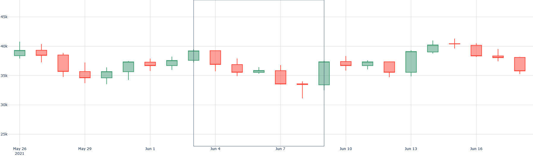
Figure 8: Observed correlation: $\blacktriangledown 15\$ BTC/USD [04/06/2021-08/06/2021]
No information asymmetry should exist. Yet, insider knowledge (e.g., hacks) creates advantages [Biais et al., 2020].
Information should be free. For crypto, public data is widely available, though high-frequency trading data is costly [Grossman and Stiglitz, 1976].
Taxes should be low. Given international diversity, this varies.
Regarding efficiency forms:
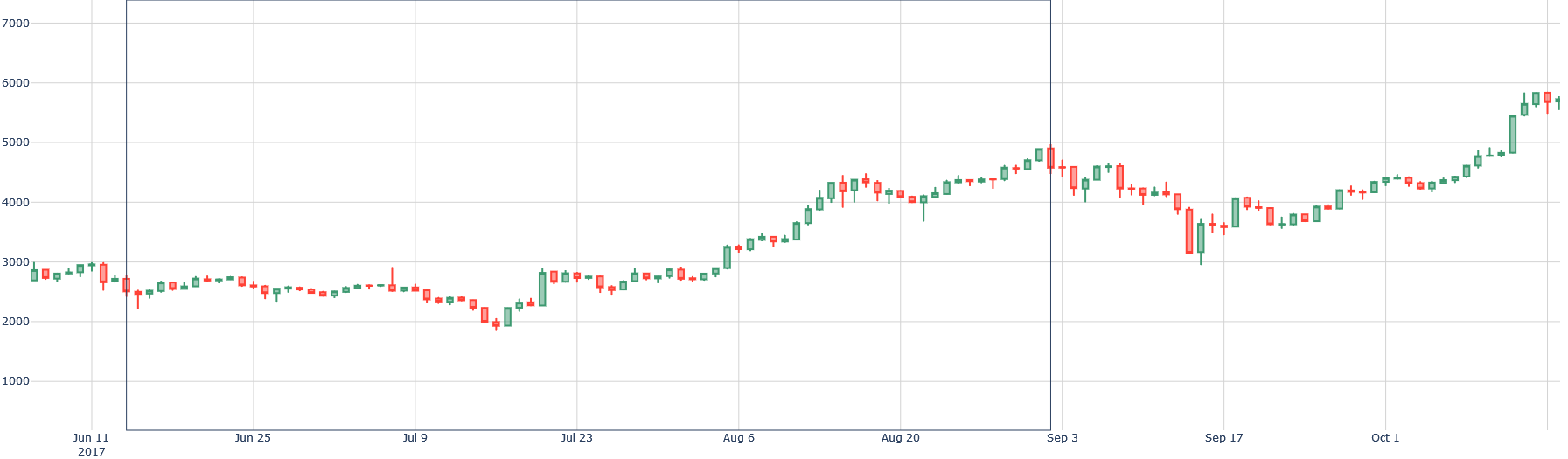
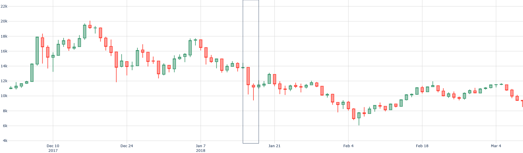
Strong form: all public and private info is priced. However, events like Binance’s launch in 2017 or the Bitconnect scandal in 2018 show that insiders could have benefited:
<details>
<summary>extracted/6391907/images/btc-new4.png Details</summary>
### Visual Description
\n
## Candlestick Chart: Price Movement (June 11, 2017 - October 1, 2017)
### Overview
This is a financial candlestick chart displaying the price action of an unspecified asset over a period of approximately 3.5 months, from June 11, 2017, to October 1, 2017. The chart shows a general upward trend, beginning around 3000, experiencing a dip in mid-July, and culminating in a sharp rise to nearly 6000 by early October.
### Components/Axes
* **Chart Type:** Candlestick chart.
* **X-Axis (Horizontal):** Represents time. Major date markers are labeled: "Jun 11 2017", "Jun 25", "Jul 9", "Jul 23", "Aug 6", "Aug 20", "Sep 3", "Sep 17", "Oct 1". The axis spans from approximately June 10 to October 2.
* **Y-Axis (Vertical):** Represents price or value. Major numerical markers are labeled: "1000", "2000", "3000", "4000", "5000", "6000", "7000". The scale is linear.
* **Legend:** No explicit legend is present. The chart uses standard candlestick color conventions:
* **Green (or hollow) candlesticks:** Indicate a bullish period where the closing price was higher than the opening price.
* **Red (or filled) candlesticks:** Indicate a bearish period where the closing price was lower than the opening price.
* **Grid:** A light gray grid is present, with vertical lines aligning with the date markers and horizontal lines aligning with the price markers.
### Detailed Analysis
The price action can be segmented into four distinct phases:
1. **Initial Consolidation & Decline (Jun 11 - ~Jul 16):**
* **Trend:** Sideways to slightly bearish.
* **Price Range:** Fluctuates between approximately 2500 and 3000.
* **Key Points:** The period starts near 3000. A notable red candle around June 18 drops the price to ~2500. The price consolidates between 2500-2800 before beginning a steeper decline in early July. The lowest point in this phase is a sharp drop to approximately 2000 around July 16.
2. **Recovery and Base Building (~Jul 16 - ~Aug 6):**
* **Trend:** Bullish recovery.
* **Price Range:** Rises from ~2000 to ~3000.
* **Key Points:** Following the low near 2000, a series of predominantly green candles drives the price back up. It reclaims the 2500 level and establishes a new support base around 2800-3000 by early August.
3. **Strong Uptrend (~Aug 6 - ~Sep 10):**
* **Trend:** Strong, consistent bullish trend.
* **Price Range:** Rises from ~3000 to a peak near 5000.
* **Key Points:** This phase is characterized by a steady climb with higher highs and higher lows. The price breaks through 4000 in late August. The peak of this move occurs around September 3-5, with the price touching approximately 5000.
4. **Correction and Final Surge (~Sep 10 - Oct 1):**
* **Trend:** Sharp correction followed by an explosive rally.
* **Price Range:** Drops from ~5000 to ~3500, then rockets to ~6000.
* **Key Points:** A significant correction occurs in mid-September, marked by large red candles, dropping the price to a low of approximately 3500 around September 17. This is followed by a period of consolidation. Starting around September 25, a very strong bullish reversal begins. The final week shows a dramatic, near-vertical ascent with large green candles, culminating in a high just below 6000 by October 1.
### Key Observations
* **Volatility Increase:** The size of the candlesticks (both bodies and wicks) increases significantly in the latter half of the chart, particularly during the September correction and the October rally, indicating heightened market volatility and stronger price movements.
* **Support/Resistance:** The 3000 level acted as resistance in June/July, then became support in August. The 5000 level acted as strong resistance in early September.
* **Sharp Reversal:** The low around September 17 (~3500) served as a major turning point, leading to the most aggressive upward move on the chart.
* **Absence of Title/Legend:** The chart lacks an explicit title or legend defining the asset being charted (e.g., stock ticker, cryptocurrency pair, commodity).
### Interpretation
This candlestick chart depicts a classic market cycle of accumulation, markup, distribution, and a new markup phase for an unspecified asset in mid-2017.
* **Market Sentiment:** The initial phase shows uncertainty and bearish sentiment, culminating in a capitulation low in mid-July. The subsequent recovery and strong uptrend through August indicate a shift to bullish sentiment and growing buyer confidence. The sharp September correction represents profit-taking or a negative news event, testing the resolve of buyers. The final, explosive surge suggests a powerful return of bullish momentum, possibly driven by significant positive news, FOMO (Fear Of Missing Out), or a breakout from a consolidation pattern.
* **Data Suggestion:** The price action suggests the asset was in a larger uptrend during this period. The deep correction in September was a counter-trend move within that larger uptrend, which was then violently resumed. The increased volatility towards the end indicates the trend was becoming more extreme and potentially less stable.
* **Notable Anomaly:** The magnitude and speed of the final rally from ~3500 to ~6000 (a ~71% increase) in roughly two weeks is the most striking feature. This level of vertical ascent is often unsustainable in the short term and may indicate a climax top or a highly speculative market phase.
</details>
Figure 9: $\blacktriangle 150\$ BTC/USD [13/06/2017-01/09/2017]
<details>
<summary>extracted/6391907/images/btc-new5.png Details</summary>
### Visual Description
## Candlestick Chart: Price Action (December 2017 - March 2018)
### Overview
This is a financial candlestick chart displaying price movements over a period of approximately three months, from early December 2017 to early March 2018. The chart shows a significant price peak in mid-December, followed by a sustained downtrend with a sharp drop in mid-January, and a partial recovery into March. A prominent vertical line is drawn through the chart around mid-January 2018, likely marking a specific event or date of interest.
### Components/Axes
* **Chart Type:** Candlestick chart.
* **Y-Axis (Vertical):** Represents price. The scale is linear, with major gridlines and labels at 2,000-unit intervals, starting from 4k (4,000) at the bottom and extending to 22k (22,000) at the top. Labels present: `4k`, `6k`, `8k`, `10k`, `12k`, `14k`, `16k`, `18k`, `20k`, `22k`.
* **X-Axis (Horizontal):** Represents time. The axis is labeled with specific dates at roughly two-week intervals. Labels present: `Dec 10 2017`, `Dec 24`, `Jan 7 2018`, `Jan 21`, `Feb 4`, `Feb 18`, `Mar 4`.
* **Legend:** No explicit legend is present. The standard candlestick color convention is used:
* **Green (or hollow) candlesticks:** Indicate the closing price was higher than the opening price for that period (bullish).
* **Red (or filled) candlesticks:** Indicate the closing price was lower than the opening price for that period (bearish).
* **Key Visual Element:** A single, thin, dark vertical line is drawn through the chart, intersecting the X-axis between the `Jan 7 2018` and `Jan 21` labels. Its exact date is approximate but appears to be around January 15-17, 2018.
### Detailed Analysis
**Trend Verification & Data Points:**
1. **Early December 2017 (Bullish Surge):** The chart begins with a strong upward trend. Prices rise from approximately 11k to a peak.
* **Peak:** The highest point on the chart occurs in mid-December. The upper wick of a green candlestick reaches just below the 20k line, approximately **19,800**. The body of the highest candlestick closes around **19,200**.
2. **Late December 2017 (Initial Decline):** Following the peak, a downtrend begins. A series of red candlesticks shows prices falling from ~19k to a local low near **12,000** around December 24-26.
3. **Early January 2018 (Consolidation & Breakdown):** Prices attempt a recovery, rising back to approximately **17,500** by early January. This is followed by a period of choppy, sideways movement between ~14k and ~17k.
4. **Mid-January 2018 (Sharp Drop - Marked by Vertical Line):** Coinciding with the vertical line, a dramatic sell-off occurs. A very long red candlestick shows the price plunging from an open near **13,500** to a close near **10,500**. The lower wick of this candle extends down to approximately **9,500**. This is the most significant single-period decline on the chart.
5. **Late January to Early February 2018 (Continued Downtrend):** The decline continues after the sharp drop, albeit with less volatility. The price makes a series of lower highs and lower lows.
* **Trough:** The lowest point on the chart is reached in early February. The lower wick of a red candlestick dips to approximately **6,000**. The closing prices in this region are around **7,000 - 8,000**.
6. **February to March 2018 (Recovery Phase):** From the early February low, a gradual recovery begins. The chart shows a pattern of higher lows and higher highs, with a predominance of green candlesticks. By early March, the price has recovered to the **11,000 - 12,000** range.
### Key Observations
* **Volatility:** The chart exhibits high volatility, especially during the December peak and the January crash. The length of the candlestick bodies and wicks varies dramatically.
* **The January Crash:** The vertical line highlights a pivotal moment. The price action around this line shows a breakdown from a consolidation pattern, leading to a capitulation move that established the cycle low weeks later.
* **Volume (Inferred):** While not plotted, the size of the candlesticks (particularly the long red one in mid-January) suggests very high trading volume during the sharp decline.
* **Support/Resistance:** The **12,000** level acted as support in late December and was later broken in January, potentially turning into resistance. The **6,000** level established as strong support in early February.
### Interpretation
This chart depicts a classic market cycle of a parabolic rise, a sharp correction, and a subsequent recovery phase, likely for a volatile asset such as a cryptocurrency (the price range and timeframe are consistent with Bitcoin's 2017-2018 bull market and crash).
* **What the data suggests:** The data demonstrates extreme market sentiment shifts. The initial surge reflects euphoric buying. The peak and subsequent decline show profit-taking and the onset of a bearish trend. The sharp drop marked by the vertical line indicates a panic-selling event, possibly triggered by external news (regulatory announcements, exchange hacks, etc.). The final recovery phase suggests a return of cautious buying interest after the asset found a valuation floor.
* **Relationship between elements:** The vertical line is the chart's focal point, separating the initial decline from the final capitulation and subsequent recovery. The X-axis dates provide the temporal framework, showing the entire cycle unfolded over roughly one quarter. The Y-axis quantifies the magnitude of the moves, showing the asset lost approximately **70%** of its peak value (from ~20k to ~6k) before recovering about 50% of that loss.
* **Notable Anomalies:** The most notable anomaly is the sheer speed and magnitude of the decline from the peak, especially the single-period drop in mid-January. This is characteristic of a liquidity crisis or a fundamental shift in market narrative. The recovery, while steady, is notably less volatile than the preceding decline, suggesting a more cautious market sentiment post-crash.
**Language Note:** All text visible in the image is in English.
</details>
Figure 10: $\blacktriangledown 15\$ BTC/USD [16/01/2018-17/01/2018]
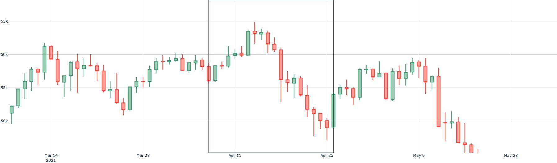
Semi-strong form: all public info is priced. The crypto market reacts quickly to news, as seen with Coinbase’s NASDAQ listing:
<details>
<summary>extracted/6391907/images/btc-new6.png Details</summary>
### Visual Description
## Candlestick Chart: Price Movement (March - May 2021)
### Overview
This is a financial candlestick chart displaying the price action of an unspecified asset over a period from early March to late May 2021. The chart shows a general uptrend peaking in mid-April, followed by a significant downtrend into late May. A semi-transparent grey rectangle highlights a specific period from approximately April 11 to April 25.
### Components/Axes
* **Chart Type:** Candlestick chart.
* **X-Axis (Horizontal):** Represents time. Major date markers are labeled: "Mar 14 2021", "Mar 28", "Apr 11", "Apr 25", "May 9", "May 23". The axis spans from approximately March 7 to May 27.
* **Y-Axis (Vertical):** Represents price. Major gridlines and labels are at 50k, 55k, 60k, and 65k. The scale is linear.
* **Data Series:** Each candlestick represents a trading period (likely daily). The body color indicates the period's close relative to its open:
* **Green (Teal) Candle:** Close > Open (bullish period).
* **Red Candle:** Close < Open (bearish period).
* The thin vertical lines (wicks/shadows) show the high and low prices for the period.
* **Legend:** No explicit legend is present on the chart. The color coding (green for up, red for down) is standard for candlestick charts.
* **Highlighted Region:** A vertical, semi-transparent grey rectangle is positioned between the x-axis dates of approximately **Apr 11** and **Apr 25**. This region encapsulates the peak of the price movement and the beginning of a sharp decline.
### Detailed Analysis
**Trend Verification & Key Data Points (Approximate Values):**
The overall trend shows a rise from ~52k to a peak above 65k, followed by a decline to below 50k.
1. **Initial Uptrend (Early March - Mid-April):**
* The chart begins around **March 7** with a price near **52k**.
* A strong bullish (green) candle pushes the price above **60k** around **March 14**.
* The price consolidates between ~55k and 60k for the second half of March.
* A renewed uptrend begins in early April, culminating in the highest point on the chart.
* **Peak:** The highest wick reaches approximately **66k** around **April 12-13**, within the highlighted rectangle. The highest closing price (top of a green body) is near **65k**.
2. **Downtrend (Mid-April - Late May):**
* Following the peak, a series of red candles begins, signaling a reversal.
* A particularly large red candle around **April 20-21** shows a sharp drop from ~62k to ~57k.
* The decline continues, with the price falling below the **55k** support level by late April.
* A brief, weak recovery attempt occurs in early May, reaching just below **60k** around **May 7**.
* The downtrend resumes aggressively. A very long red candle around **May 12-13** drops from ~58k to ~51k.
* **Trough:** The lowest point on the chart is a wick reaching approximately **48k** around **May 19-20**. The final candles on the chart (around May 23-27) show prices consolidating near **49k-50k**.
### Key Observations
* **Volatility Increase:** The size of the candlestick bodies and wicks increases significantly during the downtrend (late April onwards) compared to the earlier consolidation phase, indicating heightened market volatility and selling pressure.
* **Highlighted Rectangle Significance:** The grey box from **Apr 11 to Apr 25** precisely frames the market top and the initial, decisive breakdown. This period contains the peak price and the first cluster of strong bearish candles that confirmed the trend reversal.
* **Failed Recovery:** The rally in early May failed to reclaim the 60k level and resulted in a lower high compared to the April peak, a classic technical signal of a continuing downtrend.
* **Support/Resistance:** The **55k** level acted as support in March and early April, then became resistance after being broken in late April. The **60k** level was a key resistance zone in March and again in early May.
### Interpretation
This chart depicts a complete market cycle over approximately three months: a bullish phase, a climax top, and a bearish reversal.
* **Market Sentiment:** The data suggests a shift from optimism (steady buying in March) to euphoria (sharp rise to peak in April), followed by a rapid shift to pessimism and panic selling (large red candles in late April and May).
* **The Highlighted Period:** The rectangle likely marks a period of critical technical importance. It could represent a distribution phase where informed investors sold to late buyers, or it may simply be highlighting the most volatile turning point for analysis. The price action within it—a peak followed by a breakdown—is the chart's pivotal event.
* **Underlying Narrative:** Without the asset name, the specific cause is unknown, but the pattern is typical of speculative assets experiencing a "blow-off top" followed by a correction. The failure to hold the 55k support and the subsequent freefall suggest a loss of fundamental confidence or a broader market downturn affecting this asset.
* **Future Implications (from a technical perspective):** The chart ends in a consolidation near the lows. Traders would watch to see if this forms a base for a potential rebound or is merely a pause before further decline. The previous support levels (55k, 60k) would now be expected to act as strong resistance in any future recovery attempt.
</details>
Figure 11: $\blacktriangledown 22\$ BTC/USD [14/04/2021-25/04/2021]
The day before its IPO, BTC/USD increased by almost 7%, before losing more than 20% ten days later. The weak form assumes that all historical price information is already reflected in the current price. This form challenges technical analysis, which specializes precisely in analyzing past returns. These analyses are widely shared on social media, due to their ease of implementation, and attract a (too?) proselytizing community. The idea is to use indicators mainly based on past fluctuations to make future predictions. Among the usual indicators (according to the TA-Lib library, considered a reference) are: RSI (Relative Strength Index), SMA (Simple Moving Average), BBANDS (Bollinger Bands). Let us check, for example, whether a "mean-reversion" strategy would be more effective than a simple "hold" (buy-sell only once) and more effective than a random strategy by backtesting these strategies on 2021. If not, we could conjecture that, over the entire year of 2021, it was useless to use a "mean-reversion" strategy (which assumes that when the current price is too "far" from the moving average (SMA), the price will return to its "mean")). This may also give us an indication about the market efficiency form.
We will base our analysis on a set $Ω$ of crypto-assets. For each element in $Ω$ , we will test three strategies: mean-reversion, hold, and random. We assume short-selling is allowed. Let $P_t$ be the price at time $t$ , $M_t(n)$ the moving average at time $t$ with a window of $n$ days, $ω_i$ the $i^th$ element of $Ω$ , and $r∈[0,100]$ a percentage around $M_t(n)$ indicating the threshold at which we open/close a position. The mean-reversion strategy will be constructed as follows: if $P_t>M_t(n)+(\frac{M_t(n)× r}{100})$ , then sell $ω_i$ at price $P_t$ ; if $P_t<M_t(n)-(\frac{M_t(n)× r}{100})$ , then buy $ω_i$ at price $P_t$ , with $t$ ranging from [01/01/2021, 31/12/2021].
The hold strategy will be constructed as follows: if $t=01/01/2021$ , then buy $ω_i$ at price $P_t$ ; if $t=31/12/2021$ , then sell $ω_i$ at price $P_t$ .
The random strategy will be constructed as follows: generate a signal $S∈[buy, sell, hold]$ with $P(S=buy)=P(S=sell)=P(S=hold)=\frac{1}{3}$ . For each $ω_i$ and for each $t$ , if $S="buy"$ we buy $ω_i$ at price $P_t$ , if $S="sell"$ we sell $ω_i$ at price $P_t$ , if $S="hold"$ we do nothing.
Thus, we create a Python function isSMABetter( $Ω,n,r$ ) that takes as parameters $Ω$ (the set of crypto-assets), $r$ (the percentage for the SMA thresholds), and $n$ (the window size in days for the SMA), and returns True if the average SMA returns of $ω_i$ are greater than the average returns of the hold strategy and (strictly) the random strategy in at least 50% of the cases, and False otherwise.
We only consider daily returns. Indeed, how could we backtest a strategy that only opens positions? We thus place ourselves in a short-term trading scale for each trade, which is consistent with the chartist approach (otherwise, we would prefer a passive investment strategy that requires almost no analysis).
The results of isSMABetter( $Ω,n,r$ ), whose code is in Appendix B, are as follows:
| 116 | 1179 | -484 | -4 | 50 | 20 | 0.00 | False |
| --- | --- | --- | --- | --- | --- | --- | --- |
Table 2: Results of isSMABetter( $Ω,n,r$ )
It appears that in 2021, among the 116 crypto-assets tested, it was more optimal to have a passive strategy or, at worst, a random strategy, rather than using the moving average in an attempt to generate profits with a day-trading approach (speculation aiming to make a profit within the same day of a market order execution), since the average return obtained with the SMA strategy was the lowest among the three (-484%), and strictly no crypto-asset (0%) showed any interest in being traded with an SMA strategy.
We can conjecture that the cryptocurrency market efficiency form is at least weak, and possibly semi-strong, depending on the crypto-assets and periods, but hardly strong.
#### 2.1.2 Random Walk and Martingale
In almost all the literature ([Lardic and Mignon, 2006], [Jovanovic, 2009] …), a random walk is modeled by two elements: the previous observation and white noise. The literature explains that a price can be modeled as: $P_t+1=P_t+ε_t+1$ , with $ε=\{ε_t,t∈ N\}$ being white noise. This implies that the best (and only) way to predict the price of an asset is by using its current price.
We will perform a Dickey-Fuller test [Dickey and Fuller, 1979] on each element of a set of assets $Ω$ with a significance level of $α=5\$ . We define a Python function getRandomPerc( $Ω$ ) that takes as input a set of crypto-assets $Ω$ and returns the percentage of assets in that set that appear to follow a random walk, that is, for which we do not reject the null hypothesis "the time series is non-stationary". The result of getRandomPerc( $Ω$ ), whose code is provided in Appendix F, returns 69 %. It seems that more than half of the cryptocurrencies follow a random walk.
There is often confusion between efficiency and random walk. Indeed, when reading the Wikipedia page on the efficient market hypothesis, one might think that an efficient market necessarily implies prices following a random walk. However, this is false. The market is not necessarily inefficient if prices do not follow a random walk because, as [Lardic and Mignon, 2006] states, "It suffices, for example, that the hypothesis of risk neutrality is not satisfied, or that individuals’ utility functions are not separable and additive [LeRoy, 1982], meaning that it is impossible to separate consumption and investment decisions."
Many studies show that cryptocurrencies (most studies focus on Bitcoin) do not follow a random walk ([Palamalai et al., 2021], [Aggarwal, 2019] …). However, these studies mainly rely on the very restrictive assumption of autocorrelation, and conclude that the Bitcoin market is not efficient. Samuelson [Samuelson, 2016] already addressed this problem in his time and proposed a modification to the random walk hypothesis: the martingale model.
This model is less restrictive than the random walk model because it imposes no condition on the autocorrelation of residuals. Very similar to the previous model, a price process $P_t$ follows a martingale if: $E[P_t+1|I_t]=P_t$ , where $P_t$ is the price at time $t$ and $I_t$ is the information set at time $t$ . Thus, under the martingale model, the current price is the sole (and best) predictor of the next price, even if there are successive dependencies in returns.
As previously noted, an analysis of most cryptocurrencies (the most widely used) shows that the returns of more than half of the assets seem to follow a random walk. With the martingale model, one might be tempted to assert that the crypto market is efficient.
However, many studies have investigated the relationship between Bitcoin and the martingale model ([Zargar and Kumar, 2019], [Nadarajah and Chu, 2017] …) and conclude that the Bitcoin market is not efficient, mainly due to endogenous factors of an emerging and immature market, and the absence of traders relying on fundamental value.
It is difficult to extend this conclusion to the entire cryptocurrency market. However, we know that a study showing market inefficiency between 2012 and 2015 is not highly relevant for 2022, as much has happened since then (especially for Bitcoin).
Thus, we highlight the application of Lo’s adaptive market hypothesis [Lo, 2004] to Bitcoin through a study [Khuntia and Pattanayak, 2018], which explains that efficiency improves over time. This study particularly well summarizes the evolution of crypto market returns: episodes of efficiency and inefficiency, creating opportunities for arbitrage and above-average returns, but an impossibility to predict these opportunities systematically or mathematically.
#### 2.1.3 Cryptocurrencies and Fundamental Value
As explained by [Delcey et al., 2017], there are two definitions of an efficient market. Fama’s definition implies that the randomness of a price is explained by the fact that prices converge toward the fundamental value. Samuelson’s definition implies that unpredictable price variations are simply the result of competition among investors, regardless of fundamental value. This raises the following question: What is a fundamental value for a cryptocurrency?
According to [Biais et al., 2020], the fundamental value of Bitcoin (and by extension most other cryptocurrencies, as they hardly differ in their characteristics) lies in its stream of net transactional benefits, which depend on its future prices. These transactional benefits may, for instance, represent the ability to exchange money in an unstable economic and financial system (such as in Venezuela or Zimbabwe), or when exchanges are blocked or heavily taxed.
To determine the net value, [Biais et al., 2020] consider various costs: limited convertibility, transaction fees from brokers, mining costs, and crash risk. They thus provide a definition of Bitcoin’s fundamental value (and technically of other cryptocurrencies) and answer the question of whether a cryptocurrency can have a fundamental value.
Obviously, this value differs depending on the cryptocurrency. For instance, if there is a strong demand for privacy in transactions, Monero (XMR) would dominate in volume, since it uses a private blockchain by default (making transactions untraceable, unlike Bitcoin where the blockchain is public and all transactions are identifiable).
However, the very idea that Bitcoin has a fundamental value is debated both in the media and academic literature. According to [Yermack, 2013], cryptocurrencies have no fundamental value because, if they did, there would be no incentive to mine cryptocurrency. According to [Hanley, 2013], Bitcoin’s value merely floats relative to other currencies as a market estimate without any fundamental value to support it. [Woo et al., 2013] suggests Bitcoin may have a certain fair value because of its features similar to fiat currencies (means of exchange and store of value), but without any other underlying basis.
[Hayes, 2015] links the importance of Bitcoin’s mining network to the dependency of altcoin holders on Bitcoin, given that most altcoins must be exchanged into Bitcoin before being converted into fiat currency for real-world use. Furthermore, [Garcia et al., 2014] highlights the importance of mining production costs in the fundamental value of cryptocurrencies, as it provides a kind of “floor value”.
Cryptocurrencies are often criticized for being "backed by nothing", a misconception regarding the role of money in an economy. For example, according to the U.S. Federal Reserve, “ Federal Reserve notes are not redeemable in gold, silver, or any other commodity. Federal Reserve notes have not been redeemable in gold since January 30, 1934, when the Congress amended Section 16 of the Federal Reserve Act to read: "The said [Federal Reserve] notes shall be obligations of the United States….They shall be redeemed in lawful money on demand at the Treasury Department of the United States, in the city of Washington, District of Columbia, or at any Federal Reserve bank." ”
Beyond the purely economic definition of value (utility and scarcity), for which Bitcoin qualifies (its utility lying in being an alternative to the centralized financial system, and its scarcity from the 21 million unit limit and diminishing accessibility over time), there is also a subjective characteristic to this value.
We highlight two relevant elements: network value and safe-haven value. According to Metcalfe’s law [Metcalfe, 1995], although nuanced [Odlyzko and Tilly, 2005], the value of a network is proportional to the square of the number of its users: a single fax machine is useless, but the value of each fax increases with the total number of machines in the network. One could thus infer a similar characteristic for cryptocurrencies.
According to [Baur and McDermott, 2010], a safe-haven asset can be defined as one that is negatively correlated with equities during crises. Gold is often a reference point. Let us verify this. We cannot directly compare superimposed charts due to vastly different magnitudes:
<details>
<summary>extracted/6391907/images/cor1.png Details</summary>
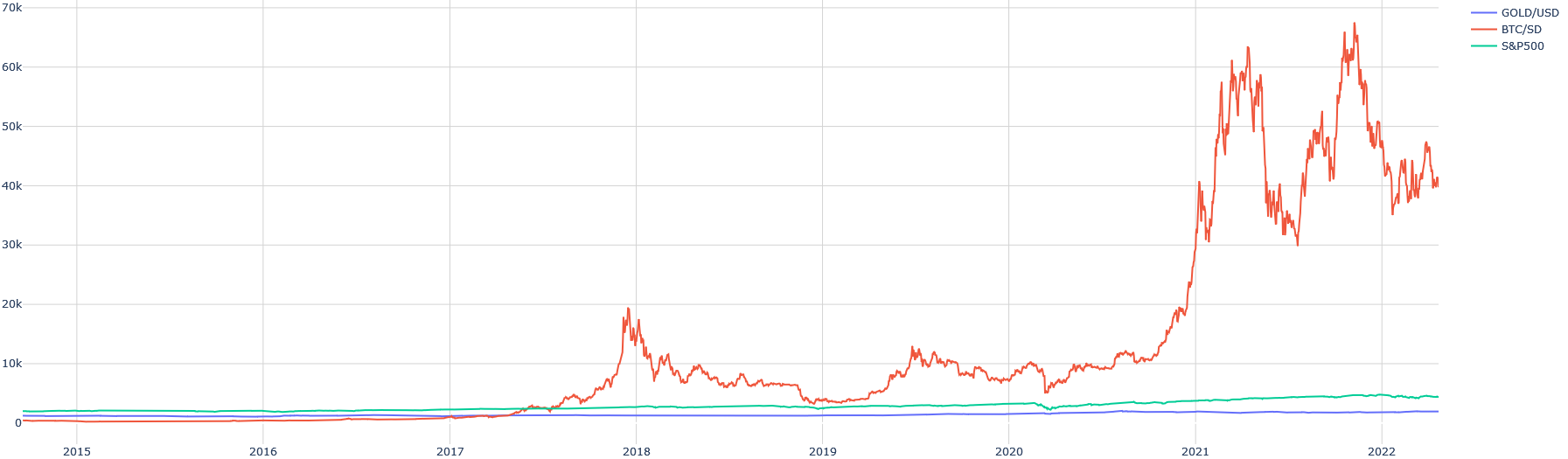
### Visual Description
## Multi-Line Time Series Chart: Comparative Asset Performance (2015-2022)
### Overview
The image is a line chart comparing the price performance of three financial assets—Gold (GOLD/USD), Bitcoin (BTC/USD), and the S&P 500 index (S&P500)—over a period from approximately the start of 2015 to the start of 2022. The chart uses a linear scale on the Y-axis (price in USD) and a time scale on the X-axis.
### Components/Axes
* **X-Axis (Horizontal):** Time. Major tick marks and labels are present for the years: `2015`, `2016`, `2017`, `2018`, `2019`, `2020`, `2021`, `2022`. The axis spans from just before 2015 to just after the start of 2022.
* **Y-Axis (Vertical):** Price in US Dollars (USD). The scale is linear, with major grid lines and labels at: `0`, `10k`, `20k`, `30k`, `40k`, `50k`, `60k`, `70k`. The "k" denotes thousands.
* **Legend:** Located in the top-right corner of the chart area. It contains three entries:
1. **GOLD/USD** - Represented by a **blue** line.
2. **BTC/USD** - Represented by a **red/orange** line.
3. **S&P500** - Represented by a **green/teal** line.
### Detailed Analysis
**1. GOLD/USD (Blue Line)**
* **Trend:** The line is relatively flat and stable throughout the entire period, showing a very gradual, slight upward trend. It exhibits low volatility compared to the other assets.
* **Key Points/Values (Approximate):**
* Starts near the `0` line in 2015 (likely in the $1,000-$1,500 range, but compressed by the scale).
* Remains in a narrow band, mostly below the `5k` level, for the entire timeline.
* Shows minor fluctuations but no dramatic spikes or crashes visible at this scale.
**2. BTC/USD (Red/Orange Line)**
* **Trend:** This line shows extreme volatility and massive growth, dominating the visual scale of the chart. It features two major parabolic bull runs followed by significant corrections.
* **Key Points/Values (Approximate):**
* **2015-2017:** Trades near the `0` line, with minimal visible movement until mid-2017.
* **Late 2017 Peak:** Rises sharply to a peak just below the `20k` line (~$19,000-$20,000) in late 2017/early 2018.
* **2018-2019:** Experiences a major correction, falling back towards the `5k` level, followed by a period of consolidation between roughly `5k` and `10k`.
* **2020-2021 Bull Run:** Begins a steep ascent in late 2020, breaking past previous highs. It reaches an initial peak above `60k` in early 2021, corrects sharply to near `30k`, then rallies to a new all-time high near the `70k` line (approximately $68,000-$69,000) in late 2021.
* **2022 Start:** Shows a decline from the late 2021 peak, ending the chart period in the `40k` range.
**3. S&P500 (Green/Teal Line)**
* **Trend:** Shows a consistent, steady upward trend over the period, with one notable sharp dip. It is significantly less volatile than BTC but shows more growth than Gold.
* **Key Points/Values (Approximate):**
* Starts slightly above the `0` line in 2015 (likely representing an index value around 2,000, again compressed by the scale).
* Maintains a gradual upward slope from 2015 through 2019.
* **Early 2020 Dip:** Exhibits a distinct, sharp V-shaped dip in early 2020 (consistent with the COVID-19 market crash), falling from a level near `3k` to near `2k` before recovering.
* **Post-2020 Recovery:** Shows a strong and sustained recovery and upward trend from mid-2020 through the end of the chart in 2022, ending at its highest point, likely in the `4k`-$5k range on this scale.
### Key Observations
1. **Scale Distortion:** The enormous price scale of Bitcoin (reaching ~$70k) compresses the visual representation of Gold and the S&P 500, making their movements appear minimal even though the S&P 500 had significant percentage gains.
2. **Volatility Contrast:** The chart starkly contrasts the extreme volatility of Bitcoin (red line) with the relative stability of Gold (blue line) and the steady, cyclical growth of the S&P 500 (green line).
3. **Correlation Events:** All three assets show some reaction around early 2020. Gold appears stable, the S&P 500 has a sharp crash and recovery, and Bitcoin experiences a significant but shorter-lived dip before its major bull run.
4. **Dominant Visual Element:** The BTC/USD line is the primary focus due to its dramatic peaks and valleys, which occupy the majority of the chart's vertical space.
### Interpretation
This chart visually narrates the story of three very different asset classes over a seven-year period. It demonstrates Bitcoin's emergence as a highly speculative and volatile asset, capable of generating massive returns (and losses) that dwarf traditional markets. The S&P 500 represents the broader equity market's resilience and long-term growth trend, punctuated by a systemic shock (the 2020 crash). Gold acts as a baseline, illustrating its traditional role as a stable store of value with low volatility relative to other assets.
The primary takeaway is the **risk-return profile dichotomy**: an investor in Bitcoin during this period would have experienced a rollercoaster of dramatic gains and drawdowns, while an investor in the S&P 500 would have seen steadier, though still significant, growth. Gold provided stability but minimal nominal price appreciation on this scale. The chart effectively argues that Bitcoin behaves fundamentally differently from traditional safe-haven assets (Gold) and equity indices (S&P 500).
</details>
Figure 12: Correlation between BTC/USD, GOLD/USD, and S&P500
Thus, we will separately analyze the correlation between S&P500 crashes and BTC/USD prices:
<details>
<summary>extracted/6391907/images/sp.png Details</summary>
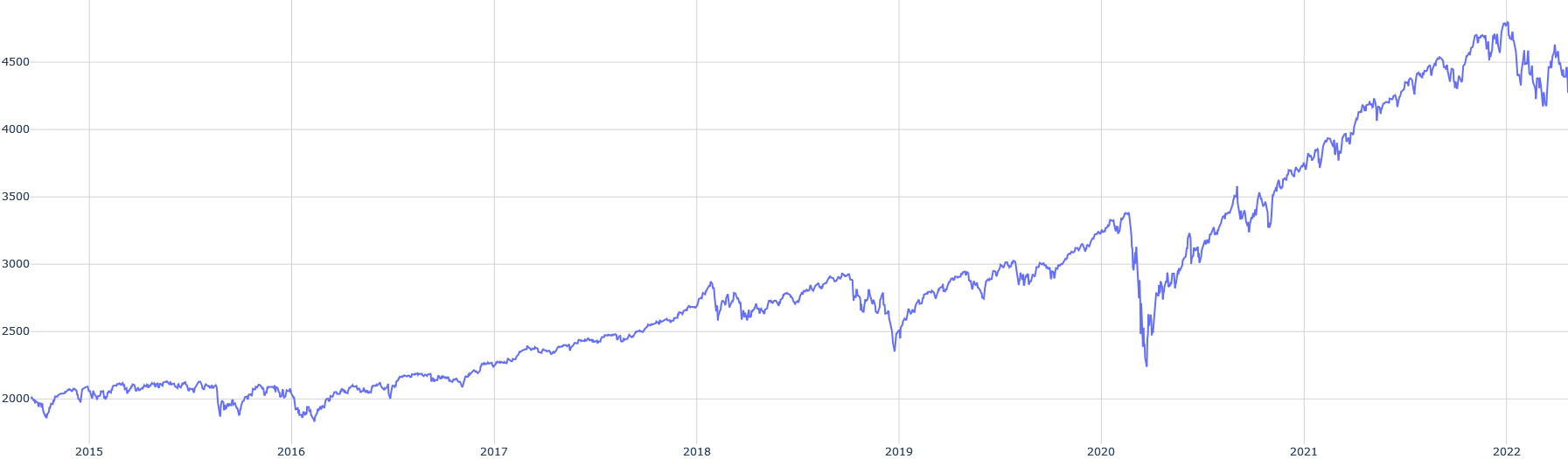
### Visual Description
## Line Chart: Time Series Data (2015–2022)
### Overview
The image displays a single-series line chart plotting a numerical value over an eight-year period, from the beginning of 2015 to the beginning of 2022. The chart shows a general upward trend with significant volatility, including a major dip in early 2020 followed by a strong recovery and new highs.
### Components/Axes
* **Chart Type:** Single-line time series chart.
* **X-Axis (Horizontal):** Represents time in years. Major tick marks and labels are present for the start of each year: `2015`, `2016`, `2017`, `2018`, `2019`, `2020`, `2021`, `2022`. The axis spans from just before 2015 to just after the start of 2022.
* **Y-Axis (Vertical):** Represents a numerical value. Major tick marks and labels are present at intervals of 500: `2000`, `2500`, `3000`, `3500`, `4000`, `4500`. The axis scale appears linear.
* **Data Series:** A single, continuous blue line. There is no legend, title, or axis titles present in the image.
* **Grid:** A light gray grid is present, with vertical lines aligning with the year markers and horizontal lines aligning with the 500-unit value markers.
### Detailed Analysis
**Trend Verification & Data Point Extraction (Approximate):**
The blue line exhibits the following general trajectory:
1. **2015 - Early 2016:** The line starts near the 2000 level. It fluctuates in a relatively narrow range between approximately 1900 and 2100, showing no strong directional trend.
2. **Mid-2016 - Late 2019:** A sustained upward trend begins. The line climbs from ~2000 to a peak of approximately 3300-3400 in late 2019. This ascent is not smooth; it includes several notable pullbacks (e.g., dips to ~2500 in mid-2018 and ~2400 in late 2018/early 2019).
3. **Early 2020:** A sharp, severe decline occurs. The line plummets from its late-2019 high of ~3300 to a trough of approximately 2200-2300. This is the most dramatic single movement on the chart.
4. **Mid-2020 - Early 2022:** A strong and persistent recovery and uptrend follow the 2020 low. The line surpasses its previous 2019 high by mid-2020 and continues climbing, reaching new all-time highs. By the start of 2022, the value is near the 4500 level, with the peak appearing to be slightly above 4500.
5. **2022 Onward:** After the peak near 4500, the line shows increased volatility and a slight pullback, ending the visible data in early 2022 at a level between 4300 and 4500.
**Spatial Grounding:**
* The **lowest point** on the chart (the 2020 trough) is located in the lower-left quadrant, horizontally aligned with the "2020" label.
* The **highest point** (the early 2022 peak) is located in the upper-right quadrant, just to the right of the "2022" label.
* The most significant period of volatility (large swings up and down) is concentrated in the right half of the chart, from 2020 onward.
### Key Observations
1. **Secular Uptrend:** Despite major corrections, the primary trend over the entire period is upward, with the ending value (~4400) being more than double the starting value (~2000).
2. **The 2020 Anomaly:** The sharp V-shaped drop and recovery in 2020 is the most prominent feature. The speed of both the decline and the subsequent rebound is notable compared to the more gradual trends before and after.
3. **Increased Volatility Post-2020:** The magnitude of the price swings (both up and down) appears larger in the 2020-2022 period compared to the 2015-2019 period.
4. **Lack of Context:** The chart lacks a title, axis labels, or a legend. Therefore, it is impossible to know what specific metric (e.g., stock price, index value, sales figure) is being plotted or the units of measurement.
### Interpretation
This chart visually narrates a story of growth punctuated by a crisis. The data suggests an asset or metric that experienced steady, if volatile, growth for several years, was hit by a severe shock in early 2020 (the timing strongly correlates with the global COVID-19 market crash), and then entered a powerful new bull phase that took it to unprecedented levels.
The **Peircean investigative reading** would focus on the indexical sign of the 2020 dip pointing to a specific external event, and the symbolic sign of the overall uptrend representing underlying growth or inflation. The chart's meaning is entirely dependent on the missing context. If this were a stock index, it would depict a classic crash and recovery. If it were a commodity price, it might indicate supply chain disruptions and subsequent demand surge. The increased volatility post-2020 could indicate a regime change in the market or environment governing this data.
**Conclusion:** The image provides clear visual data on the *behavior* of an unknown variable over time, highlighting a major inflection point in 2020. To extract factual meaning, the chart must be labeled with its subject matter.
</details>
Figure 13: S&P500 over the period available with BTC/USD
We notice graphical correlations during several crash periods:
- Early 2018
- Late 2019
- Early 2020
- Early 2022
These correlations are weaker, or even negative, with gold:
<details>
<summary>extracted/6391907/images/gold.png Details</summary>
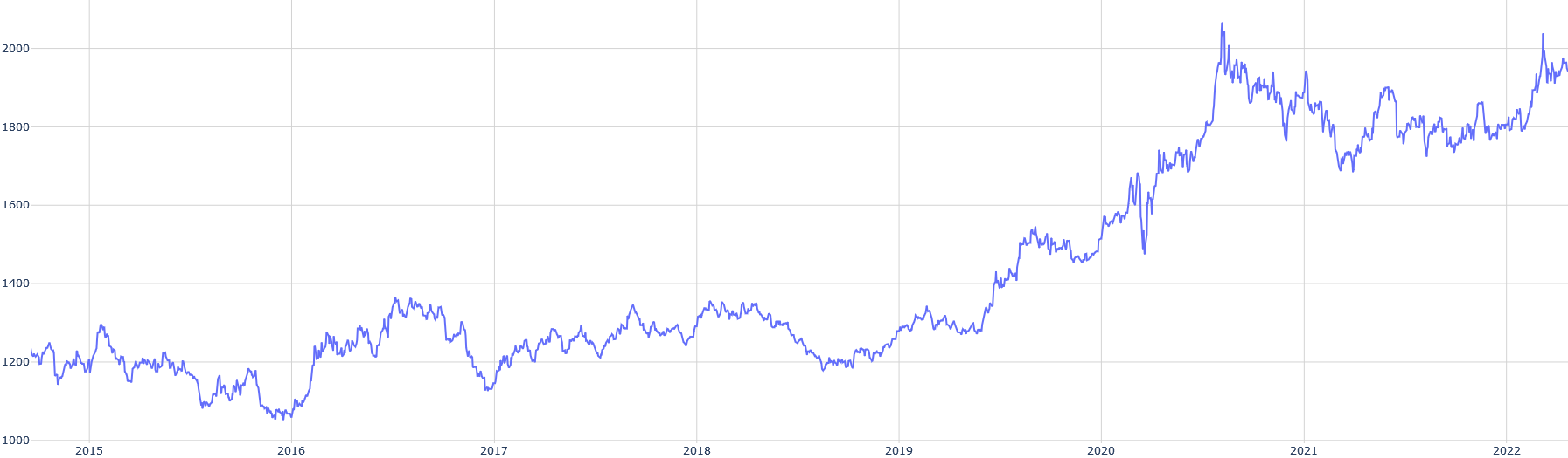
### Visual Description
## Line Chart: Time Series Data (2015-2022)
### Overview
The image displays a single-line time series chart plotted on a white background with a light gray grid. The chart shows a fluctuating numerical value over an eight-year period, from the beginning of 2015 to the beginning of 2022. The overall trend is upward, with significant volatility and a pronounced acceleration in growth starting in late 2019/early 2020.
### Components/Axes
* **Chart Type:** Single-line chart.
* **X-Axis (Horizontal):** Represents time in years. Major tick marks and labels are present for the start of each year: `2015`, `2016`, `2017`, `2018`, `2019`, `2020`, `2021`, `2022`. The axis spans from just before 2015 to just after the start of 2022.
* **Y-Axis (Vertical):** Represents a numerical value. Major tick marks and labels are present at intervals of 200: `1000`, `1200`, `1400`, `1600`, `1800`, `2000`. The axis range is from 1000 to just above 2000.
* **Legend:** None present.
* **Title/Labels:** No chart title, axis titles, or data series labels are visible in the image.
* **Data Series:** A single, continuous blue line (approximately hex color #4a6cf7) plots the data.
### Detailed Analysis
**Trend Verification & Data Point Extraction (Approximate):**
The line's path is analyzed chronologically. Values are estimated based on the grid lines.
1. **2015:** The line begins near the `1200` level. It shows moderate volatility, dipping to a low near `1150` in mid-2015 before recovering to end the year near `1200`.
2. **2016:** The line trends downward in the first half, reaching its lowest point on the chart, approximately `1050`, around mid-2016. It then begins a recovery, ending the year near `1200`.
3. **2017:** A year of recovery and growth. The line rises from `~1200` to a peak near `1350` in mid-2017, then consolidates, ending the year around `1250`.
4. **2018:** The line fluctuates within a range, primarily between `1200` and `1350`. It shows no strong directional trend, ending the year near `1250`.
5. **2019:** The first half shows a dip to near `1200`. A sustained upward trend begins in the second half, with the line breaking above `1300` and ending the year near `1350`.
6. **2020:** This year marks a dramatic acceleration. The line rises sharply from `~1350` at the start, experiencing a brief but sharp dip to `~1450` in early 2020 (likely Q1/Q2). It then surges upward, crossing `1600` by mid-year and ending near `1750`.
7. **2021:** The line reaches its all-time high, peaking above the `2000` mark (estimated `~2050`) in the first half of the year. It then enters a period of high volatility, with a significant correction down to `~1700` before recovering to end the year near `1850`.
8. **2022 (Start):** The line begins the year with renewed upward momentum, rising from `~1850` to end the visible chart near `1950`.
### Key Observations
* **Major Low:** The lowest point on the chart (~1050) occurred in mid-2016.
* **Major High:** The highest point (~2050) was reached in the first half of 2021.
* **Volatility Shift:** Volatility (the magnitude of price swings) appears significantly higher from 2020 onward compared to the 2015-2019 period.
* **Key Turning Points:** Notable trend changes occurred in mid-2016 (bottom), early 2020 (acceleration), and early 2021 (peak).
* **Absence of Metadata:** The chart lacks a title, axis labels, or a legend, making it impossible to know what specific asset, metric, or index is being plotted without external context.
### Interpretation
The chart depicts a classic "growth with volatility" pattern. The period from 2015 to late 2019 can be characterized as a long, choppy accumulation or base-building phase, where the value oscillated within a broad range (1050-1350) without a sustained breakout.
The inflection point in late 2019/early 2020 is critical. The sharp, high-momentum breakout that followed suggests a fundamental change in market perception, adoption, or underlying conditions for whatever is being measured. The surge through 2020 and the peak in 2021 indicate a period of intense speculation or rapid growth. The subsequent high volatility and correction in 2021 suggest a market grappling with price discovery at new, higher valuations.
The final trajectory into 2022 shows resilience, with the value recovering most of its 2021 correction and trending back toward its highs. This could indicate sustained demand or a new consolidation phase at a higher plateau (~1800-2000). Without labels, this pattern is reminiscent of many financial assets (e.g., stock indices, cryptocurrencies, commodities) or technology adoption metrics that experienced a pandemic-era boom. The data strongly suggests an entity that transitioned from obscurity or stability into a high-growth, high-volatility phase.
</details>
Figure 14: GOLD/USD over the period available with BTC/USD
Let us graphically check the correlation of daily returns:
<details>
<summary>extracted/6391907/images/cor-btc-sp.png Details</summary>
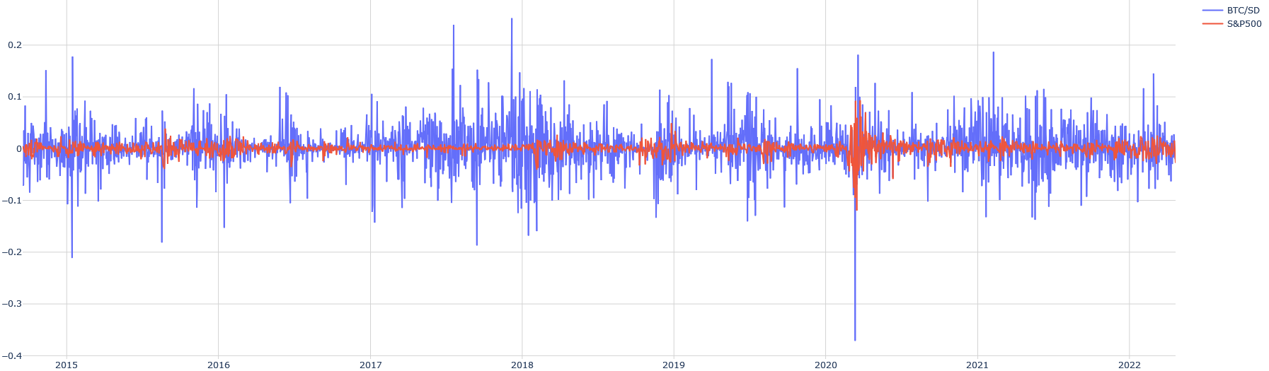
### Visual Description
\n
## Time Series Line Chart: Daily Returns/Volatility Comparison (BTC/SD vs. S&P500)
### Overview
The image displays a time series line chart comparing the daily returns or volatility (likely log returns or percentage changes) of two financial instruments: "BTC/SD" (Bitcoin to some currency, likely USD) and the "S&P500" stock market index. The chart spans from approximately the start of 2015 to the end of 2022. The primary visual takeaway is the stark contrast in volatility between the two assets.
### Components/Axes
* **Chart Type:** Dual-line time series chart.
* **X-Axis (Horizontal):** Represents time. Major tick marks and labels denote the start of each year: `2015`, `2016`, `2017`, `2018`, `2019`, `2020`, `2021`, `2022`. The axis spans roughly 8 years.
* **Y-Axis (Vertical):** Represents a numerical value, likely daily return or volatility. The scale is linear. Major tick marks and labels are present at: `-0.4`, `-0.3`, `-0.2`, `-0.1`, `0`, `0.1`, `0.2`.
* **Legend:** Positioned in the **top-right corner** of the chart area.
* A blue line segment is labeled `BTC/SD`.
* A red line segment is labeled `S&P500`.
* **Data Series:**
1. **BTC/SD (Blue Line):** This series exhibits extremely high volatility throughout the entire period. It is characterized by frequent, large-magnitude spikes both above and below the zero line.
2. **S&P500 (Red Line):** This series shows significantly lower volatility. It fluctuates much closer to the zero line, with smaller and less frequent deviations compared to the blue line.
### Detailed Analysis
**Trend Verification & Data Point Extraction:**
* **BTC/SD (Blue Line) Trend:** The line is highly erratic with no sustained directional trend over the long term. It oscillates violently around zero.
* **Notable Highs:** Multiple spikes exceed the `0.1` level. The highest visible peaks approach or slightly exceed `0.2`, occurring notably around late 2017/early 2018 and again in 2021.
* **Notable Lows:** Numerous dips go below `-0.1`. The most extreme negative spike is a sharp, deep trough occurring in **early 2020**, plunging to approximately `-0.38` (just above the `-0.4` label). Other significant drops below `-0.2` are visible in 2015, 2017, and 2018.
* **General Behavior:** The amplitude of the swings appears somewhat higher in the 2017-2018 period and again in 2020-2021 compared to the earlier (2015-2016) and later (2022) parts of the chart.
* **S&P500 (Red Line) Trend:** This line is much smoother and contained.
* **General Range:** For most of the chart, the red line fluctuates within a narrow band, roughly between `-0.05` and `+0.05`.
* **Notable Event:** There is a single, pronounced period of high volatility for the S&P500. In **early 2020**, coinciding with the major dip in BTC/SD, the red line shows its largest swings, with a sharp drop to approximately `-0.12` followed by a quick recovery and elevated volatility for a short period. This aligns with the COVID-19 market crash.
* **Comparison:** Outside of the early 2020 event, the S&P500's movements are dwarfed by the constant large swings of the BTC/SD series.
### Key Observations
1. **Volatility Disparity:** The most striking feature is the order-of-magnitude difference in volatility between Bitcoin (BTC/SD) and the traditional equity index (S&P500). The blue line's "noise" is consistently larger than the red line's largest moves.
2. **Synchronized Crisis (Early 2020):** Both assets experienced their most significant negative shock of the displayed period at the same time (early 2020). The BTC/SD drop was far more severe in magnitude (~ -0.38 vs. ~ -0.12).
3. **Clustering of Volatility:** For BTC/SD, periods of extreme volatility (large spikes) appear to cluster, notably around 2017-2018 and 2020-2021.
4. **Asymmetry in BTC/SD:** The largest downward spikes for BTC/SD (e.g., early 2020) appear more extreme in magnitude than the largest upward spikes.
### Interpretation
This chart visually demonstrates the **extreme risk and volatility profile of Bitcoin compared to a broad market index like the S&P500** over an 8-year period.
* **What the data suggests:** An investor in BTC/SD would have experienced daily price swings that are routinely 5 to 10 times larger than those in the S&P500. The asset class is characterized by "fat tails" – extreme positive and negative events occur with much higher frequency than in traditional markets.
* **Relationship between elements:** The chart shows that while both assets are subject to systemic market shocks (as seen in early 2020), their baseline behavior is fundamentally different. The S&P500 represents a relatively stable, mean-reverting series of returns, while BTC/SD represents a high-variance, speculative series. The correlation between the two appears low most of the time, except during the major crisis event where they moved in the same direction (down).
* **Notable Anomalies:** The early 2020 crash is the key anomaly where the typically low-volatility S&P500 exhibited behavior more reminiscent of a high-risk asset, though still less extreme than Bitcoin. The chart also suggests that Bitcoin's volatility may have slightly decreased in the most recent period (2022) compared to its 2021 peaks, though it remains vastly higher than the S&P500.
* **Peircean Insight:** The chart is an index of market sentiment and risk perception. The blue spikes are a direct visual representation of periods of greed (large positive spikes) and fear (large negative spikes) in the cryptocurrency market, which operate at a scale and frequency unseen in the established equity market represented by the red line.
</details>
Figure 15: Correlation between BTC/USD and S&P500 (daily returns)
<details>
<summary>extracted/6391907/images/cor-gold-sp.png Details</summary>
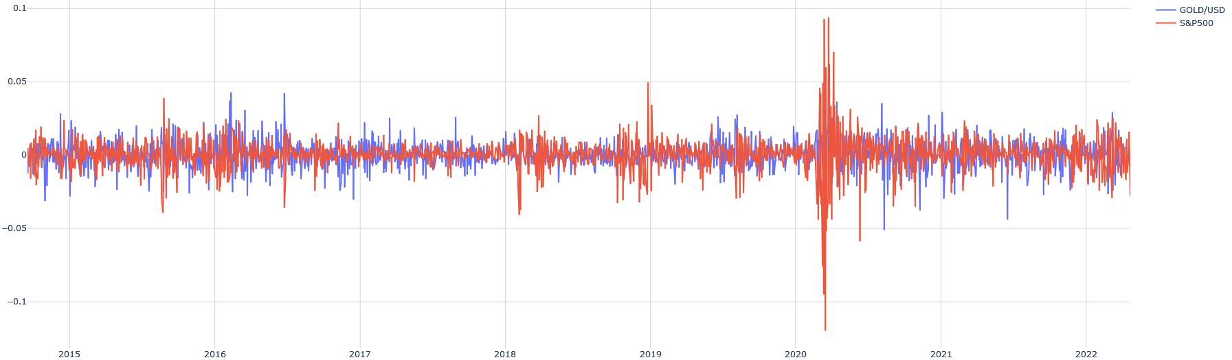
### Visual Description
\n
## Line Chart: GOLD/USD vs. S&P500 Daily Returns (Approx. 2015-2022)
### Overview
This image is a time-series line chart comparing the daily percentage returns (or a similar volatility metric) of two financial instruments: GOLD/USD (gold priced in US dollars) and the S&P500 stock market index. The chart spans a period from early 2015 to early 2022. The data is presented as two overlapping, highly volatile line series oscillating around a zero baseline.
### Components/Axes
* **Chart Type:** Dual-line time-series chart.
* **X-Axis (Horizontal):** Represents time. Major tick marks and labels denote the start of each year: `2015`, `2016`, `2017`, `2018`, `2019`, `2020`, `2021`, `2022`. The axis spans approximately 7 years.
* **Y-Axis (Vertical):** Represents a numerical value, likely daily returns or a volatility measure. The scale is linear.
* **Axis Labels (from top to bottom):** `0.1`, `0.05`, `0`, `-0.05`, `-0.1`.
* **Interpretation:** Values are decimals, where `0.05` likely corresponds to a 5% daily move, and `-0.1` to a -10% daily move.
* **Legend:** Located in the **top-right corner** of the chart area.
* **Blue Line:** Labeled `GOLD/USD`.
* **Red/Orange Line:** Labeled `S&P500`.
* **Grid:** A light gray grid is present, with horizontal lines at each major Y-axis tick and vertical lines at each year marker.
### Detailed Analysis
**1. GOLD/USD (Blue Line):**
* **Trend Description:** The blue line exhibits continuous, high-frequency volatility throughout the entire period. It oscillates sharply above and below the zero line. The amplitude of these oscillations appears relatively consistent from 2015 through 2019, with most daily moves contained within the `-0.05` to `+0.05` range.
* **Key Data Points & Periods:**
* **2015-2019:** Volatility is persistent but range-bound. Notable spikes above `+0.05` occur occasionally (e.g., around mid-2016, early 2017).
* **Early 2020:** A period of extreme volatility coincides with the major S&P500 spike. The blue line shows several large downward spikes, approaching or briefly exceeding `-0.05`.
* **2021-2022:** Volatility remains elevated compared to the pre-2020 period but appears slightly less extreme than the 2020 peak.
**2. S&P500 (Red/Orange Line):**
* **Trend Description:** The red line also shows constant volatility but with a distinctly different pattern. From 2015 to late 2019, its volatility is generally lower in amplitude than GOLD/USD, with most moves within a tighter band around zero.
* **Key Data Points & Periods:**
* **2015-2019:** Relatively subdued volatility. A notable downward spike occurs in late 2018 (approaching `-0.05`).
* **Early 2020 (CRITICAL ANOMALY):** This is the most prominent feature of the entire chart. The S&P500 series experiences a massive, unprecedented spike in volatility.
* **Upward Spike:** A sharp peak reaches near the `0.1` (10%) level.
* **Downward Spike:** Immediately following, an even sharper trough plunges below the `-0.1` (-10%) level, representing the single largest move on the chart.
* **Post-2020:** Following the extreme event, volatility remains significantly higher than in the 2015-2019 period, with frequent moves exceeding the `±0.025` range, but it does not revisit the 2020 extremes.
**3. Comparative Relationship:**
* The two series do not move in lockstep. There are periods where they appear negatively correlated (e.g., during the 2020 crash, large down moves in S&P500 sometimes coincide with up moves in GOLD/USD, and vice-versa).
* GOLD/USD generally exhibits higher baseline volatility than the S&P500 outside of crisis periods.
### Key Observations
1. **The 2020 Volatility Event:** The S&P500's price action in early 2020 is a clear outlier, dwarfing all other market movements on the chart. This visually corresponds to the COVID-19 market crash and subsequent rebound.
2. **Volatility Regime Shift:** Both assets show a clear increase in average daily volatility after the 2020 event compared to the 2015-2019 period.
3. **Asymmetric Spikes:** Downward spikes (negative returns) for the S&P500, especially in 2020, appear sharper and deeper than its upward spikes. GOLD/USD spikes appear more symmetric.
4. **Legend Accuracy:** The blue line (`GOLD/USD`) is consistently more "jagged" and wider in its oscillations during calm periods. The red line (`S&P500`) is the one responsible for the extreme 2020 spikes, confirming the legend mapping.
### Interpretation
This chart visually demonstrates the concept of **market volatility** and **asset class behavior during crises**.
* **What the data suggests:** It shows that while both gold (a traditional safe-haven asset) and the broad stock market (S&P500) are volatile on a daily basis, their volatility profiles differ. The S&P500 can experience periods of relative calm followed by explosive, panic-driven moves (as in 2020). Gold tends to have more consistent, "noisy" volatility.
* **Relationship between elements:** The 2020 anomaly highlights a moment of extreme market stress where traditional correlations may break down. The simultaneous large moves in both assets suggest a systemic shock affecting all markets, but with gold potentially acting as a hedge, as seen by some inverse movements during the crash.
* **Notable Insight:** The chart is a powerful testament to the "fat tail" risk in financial markets—the 2020 event is a visual representation of a multi-standard deviation move that models based on normal distributions might severely underestimate. The persistence of higher volatility post-2020 suggests a lasting change in market regime or investor sentiment.
</details>
Figure 16: Correlation between GOLD/USD and S&P500 (daily returns)
A numerical analysis of the correlation of daily returns over the entire period shows 16% for Bitcoin with the S&P500 and 5% for gold with the S&P500. Bitcoin does not appear to be a better safe-haven asset than gold, which is confirmed by other studies ([Smales, 2019], [Bouri et al., 2017]).
### 2.2 From Louis Bachelier to Contemporary Models
Eugène Fama is not the inventor of the idea of a random market. We can trace it back to 1863, when Jules Regnault [Regnault, 1863] proposed a model of randomly volatile markets. Then, in 1900, Bachelier [Bachelier, 1900] formalized it. It was only from the 1930s that the random aspect of the market began to be considered, notably in the United States with the emergence of econometrics, and then, from the 1960s, financial economics in the United States started to connect the model to economic theory, giving rise to the theory of informational efficiency of financial markets. However, this theory, although constituting the foundation of the random walk model, would never achieve unanimous acceptance. In this subsection, we will present the theoretical models that have explained the variations of financial assets since 1900, from Louis Bachelier’s theory of speculation to the present day.
#### 2.2.1 Modeling of Traditional Finance
It is important to understand that the cryptocurrency market is not disconnected from traditional financial markets in its creation.
- The Louis Bachelier Model Bachelier is a pioneer of modern finance in the sense that he was the first to use Brownian motion in modeling stock prices, five years before [Einstein, 1956]. From his model, the Wiener process [Wiener, 1976] would later be formalized. The model simply explains that the stock market follows a Gaussian distribution. Of course, such a model today would not be considered rigorous, but for its time, it was already remarkably close to a correct model. Indeed, Brownian motion applied to stock price fluctuations is based on questionable assumptions: Markov chain (memoryless process), stationarity (constant mean and standard deviation), and normal distribution. We can clearly see, for example, for the four largest cryptocurrencies, that the distribution of daily returns is not really Gaussian:
<details>
<summary>extracted/6391907/images/dist-btc.png Details</summary>
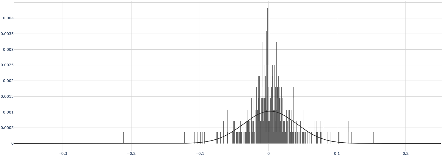
### Visual Description
## Histogram with Overlaid Probability Density Curve
### Overview
The image displays a statistical chart consisting of a dense histogram (vertical bars) overlaid with a smooth, bell-shaped curve. The chart visualizes the distribution of a dataset, with the histogram showing the frequency of data points within specific bins and the curve representing a fitted probability density function (likely a normal distribution). The overall distribution is centered near zero and appears slightly skewed.
### Components/Axes
* **Chart Type:** Histogram with overlaid probability density curve.
* **X-Axis (Horizontal):**
* **Label:** Not explicitly labeled. Represents the value of the measured variable.
* **Scale:** Linear.
* **Range:** Approximately -0.35 to +0.25.
* **Major Tick Marks & Labels:** -0.3, -0.2, -0.1, 0, 0.1, 0.2.
* **Grid Lines:** Vertical grid lines are present at each major tick mark.
* **Y-Axis (Vertical):**
* **Label:** Not explicitly labeled. Represents probability density or relative frequency.
* **Scale:** Linear.
* **Range:** 0 to approximately 0.0043.
* **Major Tick Marks & Labels:** 0, 0.0005, 0.001, 0.0015, 0.002, 0.0025, 0.003, 0.0035, 0.004.
* **Grid Lines:** Horizontal grid lines are present at each major tick mark.
* **Data Series:**
1. **Histogram:** Composed of numerous thin, dark gray vertical bars. The bars are densely packed, indicating a large number of bins. The tallest bars are clustered around the x-axis value of 0.
2. **Overlaid Curve:** A solid black line forming a smooth, unimodal, bell-shaped curve. It peaks near x=0 and tapers off symmetrically towards the tails.
* **Legend:** No legend is present in the image.
* **Title:** No chart title is present.
### Detailed Analysis
* **Histogram Distribution:**
* The histogram shows a very high concentration of data points in a narrow range around x=0.
* The peak of the histogram (the mode) is located at or extremely close to x=0. The tallest individual bar reaches a y-value of approximately **0.0043**.
* The distribution has a visible spread. Significant bar heights are observed from approximately x = -0.1 to x = +0.1.
* The tails of the distribution extend further. There are sparse, short bars visible from about x = -0.2 to x = +0.15, with a few isolated bars extending to near -0.3 and +0.2.
* The distribution appears slightly **left-skewed (negatively skewed)**. The tail on the negative side (left) appears slightly longer and contains more sparse data points than the tail on the positive side (right).
* **Overlaid Curve Analysis:**
* The curve is a classic normal (Gaussian) distribution shape.
* Its peak (mean) is aligned with the histogram's peak, at approximately **x = 0**.
* The peak height of the curve is approximately **y = 0.001**.
* The curve's width (standard deviation) can be estimated. It appears to cross the x-axis (y≈0) at roughly x = -0.15 and x = +0.15, suggesting a standard deviation (σ) of approximately **0.06 to 0.07** (since ~99.7% of data in a normal distribution lies within ±3σ).
* **Relationship Between Histogram and Curve:**
* The histogram bars are much taller and more peaked than the overlaid curve, especially at the center. This indicates the actual data has a higher concentration of values near the mean than a perfect normal distribution with the same mean and standard deviation would predict. The data is more **leptokurtic** (has a sharper peak and fatter tails) than the fitted normal curve.
### Key Observations
1. **Central Concentration:** The vast majority of the data is clustered very tightly around zero.
2. **Peak Discrepancy:** The histogram's maximum density (~0.0043) is over four times higher than the peak of the fitted normal curve (~0.001). This is a significant deviation from normality.
3. **Asymmetry:** The left tail (negative values) is more pronounced than the right tail.
4. **Outliers:** There are sparse data points extending to approximately -0.3 and +0.2, which are potential outliers relative to the central cluster.
5. **Fitted Model:** The overlaid curve suggests an attempt to model the data with a normal distribution, but the visual mismatch indicates the model may not be a perfect fit, particularly regarding the peakedness (kurtosis) of the data.
### Interpretation
This chart likely represents the distribution of **residuals, errors, or small deviations** from a mean or expected value of zero. The strong central peak suggests that most observations are very close to the expected value. The slight left skew indicates a tendency for negative deviations to be slightly more extreme or frequent than positive ones.
The poor fit of the normal curve at the peak is a critical finding. It suggests that the underlying process generating this data is not perfectly Gaussian. The data exhibits **excess kurtosis**, meaning extreme values (both near the mean and in the tails) are more common than a normal distribution would predict. This has implications for statistical modeling; assuming normality for this dataset could lead to underestimating the probability of values very close to the mean or in the extreme tails.
In a practical context, this could be:
* Measurement errors from a high-precision instrument where most errors are tiny, but occasional larger errors occur asymmetrically.
* Financial returns over a very short time interval, showing a "peaked" distribution.
* The output of a machine learning model's prediction errors, where the model is very accurate most of the time but has a specific failure mode causing negative-skewed errors.
The absence of axis labels and a title limits definitive context, but the statistical properties are clearly communicated through the visual elements.
</details>
Figure 17: Distribution of daily returns for BTC/USD
<details>
<summary>extracted/6391907/images/dist-eth.png Details</summary>
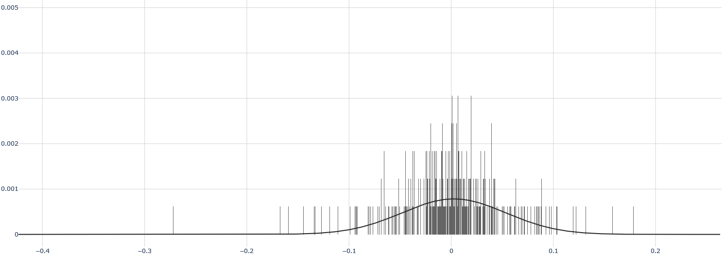
### Visual Description
## Histogram with Overlaid Probability Density Curve
### Overview
The image displays a statistical chart combining a histogram and a smooth probability density curve. The chart visualizes the distribution of a dataset, showing the frequency of data points within specific intervals (bins) along the horizontal axis. The overall shape suggests a unimodal distribution centered near zero.
### Components/Axes
* **Chart Type:** Histogram with an overlaid continuous curve (likely a fitted normal distribution or kernel density estimate).
* **X-Axis (Horizontal):**
* **Scale:** Linear.
* **Range:** Approximately -0.4 to +0.2.
* **Major Tick Marks:** Located at -0.4, -0.3, -0.2, -0.1, 0, 0.1, 0.2.
* **Label:** No explicit axis title is present. The numerical values suggest this axis represents a measured variable, such as residuals, errors, or returns.
* **Y-Axis (Vertical):**
* **Scale:** Linear.
* **Range:** 0 to 0.005.
* **Major Tick Marks:** Located at 0, 0.001, 0.002, 0.003, 0.004, 0.005.
* **Label:** No explicit axis title is present. The values (0.001, 0.002, etc.) indicate this axis represents probability density or a normalized frequency.
* **Legend:** No legend is present in the image.
* **Grid:** A light gray grid is present, with vertical lines at each major x-axis tick and horizontal lines at each major y-axis tick.
### Detailed Analysis
* **Histogram Bars:**
* The bars are densely packed, indicating a large number of bins.
* The highest concentration of bars (and thus the highest frequency of data points) is in the central region, roughly between -0.1 and +0.05.
* The tallest individual bars are located very close to x = 0. Their height reaches approximately 0.003 on the y-axis.
* The distribution of bars is roughly symmetric around the center, with a slightly longer tail extending to the left (negative side) down to approximately -0.35.
* The bars become very sparse and short beyond x = -0.2 and x = +0.1.
* **Overlaid Curve:**
* A smooth, solid black line is overlaid on the histogram.
* The curve is bell-shaped and symmetric, characteristic of a normal (Gaussian) distribution.
* **Peak (Mode):** The curve's peak is located at approximately x = 0. The peak's y-value is approximately 0.0008.
* **Spread:** The curve's width (standard deviation) appears to be such that the inflection points are near x = ±0.05. The curve approaches the x-axis (y ≈ 0) near x = -0.2 and x = +0.15.
* The curve provides a smoothed representation of the underlying data distribution shown by the histogram.
### Key Observations
1. **Central Tendency:** The data is strongly centered around zero. Both the histogram's mode and the fitted curve's peak are at or very near x = 0.
2. **Symmetry:** The distribution is approximately symmetric, though the histogram shows a slightly heavier left tail (more extreme negative values) than right tail.
3. **Concentration:** The vast majority of data points lie within the interval [-0.1, 0.05]. Data points beyond ±0.2 are extremely rare.
4. **Peak Density:** The highest probability density, as indicated by the fitted curve, is approximately 0.0008 at the center. The raw histogram shows some bins with much higher localized density (~0.003), which is typical for a finite sample compared to a smoothed estimate.
5. **Outliers:** There are a few isolated, very short bars near x = -0.35 and x = +0.18, representing potential outliers or the extreme tails of the distribution.
### Interpretation
This chart is a classic representation of a **unimodal, approximately normal distribution centered at zero**. The data suggests the measured variable has a strong central tendency with most observations being very close to the mean (zero). The symmetry implies that positive and negative deviations from zero are roughly equally likely, though the slight left skew in the histogram might indicate a minor propensity for larger negative values.
**What it likely represents:** This pattern is characteristic of:
* **Model Residuals:** In regression analysis, residuals (errors) are often expected to be normally distributed around zero if the model is well-specified.
* **Financial Returns:** Daily or hourly returns of a financial asset can sometimes approximate a normal distribution centered near zero.
* **Measurement Errors:** Random errors in a scientific measurement process often follow such a distribution.
**Why it matters:** The close fit of the smooth curve to the histogram bars suggests the data is well-modeled by a normal distribution. This is a fundamental assumption for many statistical tests and models. The concentration of data near zero indicates low variance or high precision in the underlying process. The presence of a few outliers in the tails, while minor, would be important to investigate in contexts like risk management or quality control.
</details>
Figure 18: Distribution of daily returns for ETH/USD
<details>
<summary>extracted/6391907/images/dist-ltc.png Details</summary>
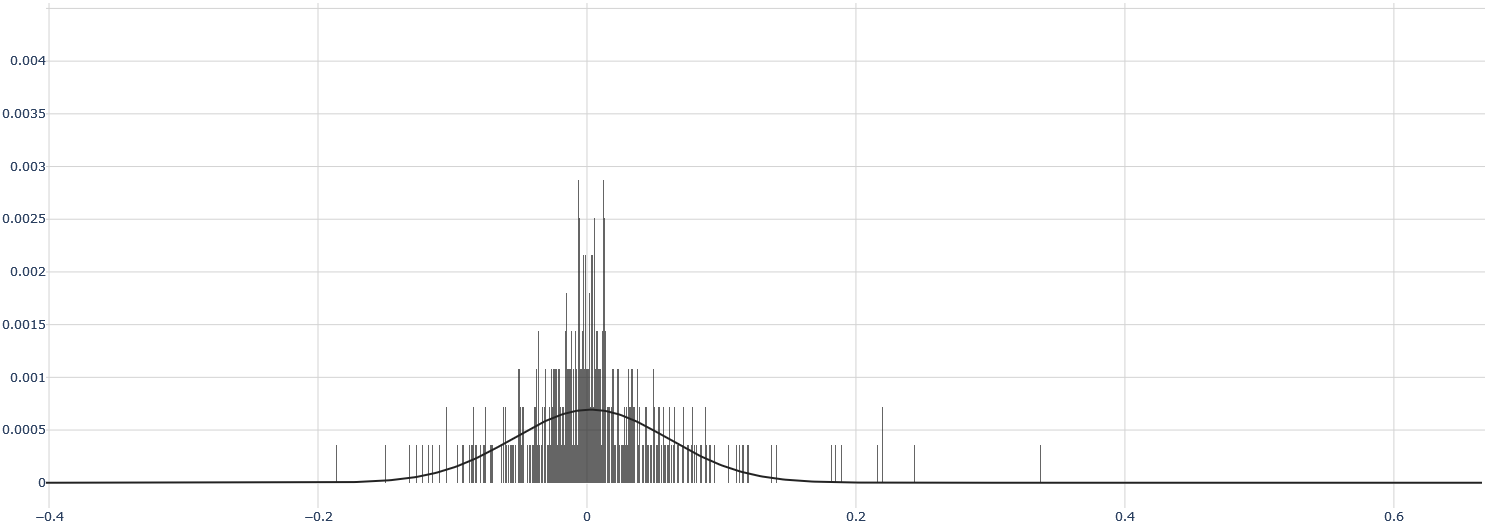
### Visual Description
## Histogram with Overlaid Probability Density Curve: Distribution of Values Centered Near Zero
### Overview
The image displays a statistical chart combining a histogram and a smooth probability density function (PDF) curve. The chart illustrates the distribution of a dataset where the majority of values are concentrated around zero, with a symmetric, bell-shaped pattern indicative of a normal (Gaussian) distribution. The histogram bars represent the frequency of observed data points within specific bins, while the overlaid curve represents a theoretical continuous distribution model.
### Components/Axes
* **Chart Type:** Histogram with overlaid probability density curve.
* **X-Axis (Horizontal):**
* **Scale:** Linear.
* **Range:** Approximately -0.4 to 0.6.
* **Major Tick Marks & Labels:** -0.4, -0.2, 0, 0.2, 0.4, 0.6.
* **Axis Title:** Not explicitly labeled. Represents the value of the measured variable.
* **Y-Axis (Vertical):**
* **Scale:** Linear.
* **Range:** 0 to 0.004.
* **Major Tick Marks & Labels:** 0, 0.0005, 0.001, 0.0015, 0.002, 0.0025, 0.003, 0.0035, 0.004.
* **Axis Title:** Not explicitly labeled. Represents probability density or relative frequency.
* **Legend:** No legend is present in the image.
* **Grid:** A light gray grid is present, with vertical lines at each major x-axis tick and horizontal lines at each major y-axis tick.
### Detailed Analysis
* **Histogram Bars:**
* **Distribution Shape:** The bars form a unimodal, roughly symmetric distribution centered at x=0.
* **Peak Density:** The highest concentration of bars (and thus the mode of the binned data) occurs in the immediate vicinity of x=0.
* **Spread:** The vast majority of the data falls between approximately -0.2 and +0.2. The bars become sparse and short beyond ±0.2, with a few isolated, very short bars extending to about -0.3 on the left and +0.35 on the right.
* **Bar Height (Approximate):** The tallest bars near x=0 reach a y-value of approximately 0.0028 to 0.003. The height decreases rapidly as the distance from zero increases.
* **Probability Density Curve:**
* **Shape:** A smooth, continuous, bell-shaped curve.
* **Peak (Mean/Mode/Median):** The apex of the curve is located at x=0, with a corresponding y-value (density) of approximately 0.0007.
* **Inflection Points:** The curve changes from concave down to concave up at points roughly symmetric around the mean, visually estimated near x = ±0.1.
* **Tails:** The curve approaches but does not touch the x-axis (y=0) asymptotically as x moves away from zero in both directions. It visually flattens out near y=0 around x = ±0.25.
* **Relationship Between Elements:** The smooth curve appears to be a fitted normal distribution model for the empirical data shown by the histogram. The curve's peak aligns with the histogram's central cluster, and its width encompasses the main body of the histogram data.
### Key Observations
1. **Central Tendency:** The data is strongly centered around zero. Both the histogram and the fitted curve have their maximum at x=0.
2. **Symmetry:** The distribution is highly symmetric about the mean (x=0). The pattern of bars to the left of zero mirrors the pattern to the right.
3. **Kurtosis (Tail Weight):** The histogram shows "fat tails" relative to the smooth curve. While the curve predicts very low probability density beyond ±0.2, the histogram shows actual data points (short bars) existing in this region, particularly between 0.2 and 0.35 on the right side. This suggests the real data may have slightly heavier tails than a perfect normal distribution.
4. **Data Sparsity:** The data becomes very sparse beyond ±0.15, indicated by the gaps between histogram bars and their minimal height.
### Interpretation
This chart demonstrates a dataset whose values are normally distributed around a mean of zero. This is a common pattern for:
* **Residuals in regression analysis:** The errors (differences between predicted and observed values) often follow such a distribution.
* **Measurement errors:** Random errors in scientific instruments tend to be normally distributed around the true value.
* **Standardized scores:** Data that has been transformed to have a mean of 0 and a standard deviation of 1 (z-scores).
The close fit of the smooth curve to the histogram suggests the normal distribution is a good model for this data. However, the presence of histogram bars in the regions where the curve's density is near zero (the "tails") indicates potential outliers or a slight deviation from perfect normality, which could be important for sensitive statistical analyses. The chart effectively communicates that while most observations are very close to zero, there is a measurable, albeit small, probability of observing values further away, especially in the positive direction up to ~0.35.
</details>
Figure 19: Distribution of daily returns for LTC/USD
<details>
<summary>extracted/6391907/images/dist-xrp.png Details</summary>
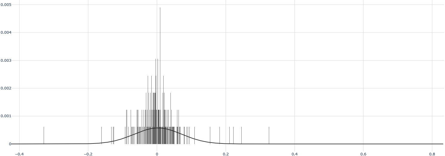
### Visual Description
## Histogram with Overlaid Probability Density Curve
### Overview
The image displays a statistical chart consisting of a histogram (vertical bars) overlaid with a smooth probability density function (PDF) curve. The chart visualizes the distribution of a dataset. There are no explicit titles, axis labels, or legends present in the image.
### Components/Axes
* **X-Axis (Horizontal):** A numerical scale ranging from approximately -0.4 to 0.8. Major tick marks are visible at intervals of 0.2 (e.g., -0.4, -0.2, 0, 0.2, 0.4, 0.6, 0.8). The axis line itself is solid black.
* **Y-Axis (Vertical):** A numerical scale representing frequency density, ranging from 0 to 0.005. Major tick marks are present at intervals of 0.001 (e.g., 0, 0.001, 0.002, 0.003, 0.004, 0.005).
* **Histogram Bars:** Numerous thin, vertical gray bars. Their height corresponds to the frequency density of data points within specific bins along the x-axis.
* **Probability Density Curve:** A single, smooth, solid black line overlaid on the histogram. It represents a theoretical or fitted distribution model for the data.
* **Grid:** A faint, light-gray grid is present in the background, with lines corresponding to the major ticks on both axes.
### Detailed Analysis
* **Data Distribution (Histogram):**
* The histogram bars are densely clustered around the x-axis value of 0.
* The highest bar (peak frequency density) is located at or very near x=0, reaching a y-value of approximately 0.0049.
* The distribution appears roughly symmetric around 0.
* The spread (width) of the histogram is relatively narrow. The vast majority of bars are contained between x = -0.1 and x = 0.1.
* There are a few sparse, very short bars extending further out, with the leftmost visible bar near x = -0.35 and the rightmost near x = 0.35. These represent potential outliers or the tails of the distribution.
* **Probability Density Curve:**
* The curve is unimodal (single-peaked) and bell-shaped, characteristic of a normal (Gaussian) or similar symmetric distribution.
* The peak of the curve aligns closely with x=0, matching the histogram's mode.
* The peak height of the curve is approximately 0.0006 on the y-axis, which is significantly lower than the peak of the histogram bars. This suggests the curve may represent a smoothed estimate or a different normalization.
* The curve tapers off smoothly towards zero on both sides, becoming negligible beyond approximately x = -0.2 and x = 0.2.
### Key Observations
1. **Central Tendency:** The data is strongly centered around zero.
2. **Low Variance/High Precision:** The data has a very narrow spread, indicating low variance or high precision in the measured variable.
3. **Symmetry:** The distribution is visually symmetric.
4. **Outliers:** A few data points exist in the tails (e.g., near -0.35 and +0.35), but they are extremely rare compared to the central cluster.
5. **Model Fit:** The overlaid smooth curve captures the general symmetric, bell-shaped nature of the data but does not match the extreme peakedness (kurtosis) of the histogram. The histogram is more "spiky" or leptokurtic than the fitted curve.
### Interpretation
This chart demonstrates a dataset where the measured values are highly concentrated around a mean of zero, with very small deviations. This pattern is typical of:
* **Residuals from a well-fitting statistical model,** where most errors are near zero.
* **Measurement noise** from a high-precision instrument.
* **Returns of a very stable financial asset** over a short period.
* **Differences between matched pairs** in a controlled experiment showing minimal effect.
The discrepancy between the sharp histogram peak and the smoother, lower curve suggests the underlying data distribution may have heavier tails or a sharper peak than the theoretical model (e.g., a normal distribution) used to generate the curve. The presence of sparse bars in the tails (-0.35 to 0.35) confirms that while extreme values are possible, they are highly improbable compared to values near zero. The lack of axis labels prevents definitive identification of the variable being measured, but the statistical behavior is clearly one of high central tendency and low dispersion.
</details>
Figure 20: Distribution of daily returns for XRP/USD
It might be more appropriate to refer to a Lévy law or an $α$ -stable distribution.
- The Gordon-Shapiro Model The Gordon-Shapiro model [Gordon and Shapiro, 1956] is very well-known in finance and provides a very simple formula to model the price of a stock:
$$
P_0=\frac{D_1}{k-g} \tag{1}
$$
where $P_0$ is the theoretical value of the stock, $D_1$ the anticipated dividend for the first period, $k$ the expected return rate for the shareholder, and $g$ the growth rate of the gross earnings per share. The first thing to note is that this model is useless for the crypto market: there are no dividends. Therefore, this model can be dismissed, even though it is attractive.
- Contemporary Models With the development of quantitative finance and derivative pricing, many models have emerged, one of the most famous being the Black & Scholes model [Black and Scholes, 2019]. However, as with the binomial model (Cox, Ross & Rubinstein model), the problem of constant volatility of the underlying assets appeared. Indeed, in the Black & Scholes formula:
$$
C=S_tN(d_1)-Ke^-rtN(d_2) \tag{2}
$$
where:
$$
d_1=\frac{\ln\frac{S_t}{K}+(r+\frac{σ^2}{2})t}{σ√{t}} \tag{3}
$$
$$
d_2=d_1-σ√{t} \tag{4}
$$
with: $C$ the price of the call option $P$ the stock price $K$ the strike price $r$ the risk-free interest rate $t$ the time in years to maturity $N$ a normal distribution $σ$ the volatility of the underlying asset We notice that volatility is considered constant. This led to the development of stochastic volatility models, treating the volatility of the underlying as a random process. As explained, for instance, by [Mantegna and Stanley, 1999], the price of an asset can be characterized by a standard geometric Brownian motion:
$$
dS_t=μ S_tdt+σ S_tdW_t \tag{5}
$$
with: $μ$ the drift (often negligible) $σ$ constant volatility $dW_t\hookrightarrow N(0,1)$ an increment of Brownian motion then replacing $σ$ by a process $ν_t$ . This is indeed how the Heston model [Heston, 1993] is built, one of the most well-known stochastic volatility models. Its formulas are:
$$
dS_t=rS_tdt+√{V_t}S_tdW_1t \tag{6}
$$
with $V_t$ the instantaneous variance:
$$
dV_t=κ(θ-V_t)dt+σ√{V_t}dW_2t \tag{7}
$$
where: $S_t$ the asset price at time $t$ $r$ the risk-free interest rate $√{V_t}$ the volatility (standard deviation) of the price $σ$ the volatility of the volatility (i.e., of $√{V_t}$ ) $θ$ the long-term variance $κ$ the reversion rate to $θ$ $dt$ an infinitesimally small time increment $W_1t$ the Brownian motion for the asset price $W_2t$ the Brownian motion for the variance of the asset price with the property that, for Brownian motions, $W_0=0$ , the $W_t$ are independent, and $W_t$ is continuous in $t$ . This model seems well suited for modeling the price of cryptocurrencies. Indeed, [Kachnowski, 2020] explains that an adaptation of the Heston model to Bitcoin improves the accuracy of predictions over time windows ranging from 7 days to 2 months. However, as shown by [Gatheral et al., 2018], the log-volatility is not actually a classic Brownian motion but rather a fractional Brownian motion, as in the Fractional Stochastic Volatility Model by [Comte et al., 2012], but with a Hurst exponent of 0.1 (and not 0.5 as in [Comte et al., 2012], who did not take into account the rough aspect of volatility).
#### 2.2.2 Modeling Crypto-Finance
- Quantitative Theory of (Crypto)Currency As we know [Fisher, 2006],
$$
MV=PY \tag{8}
$$
where: $M$ is the money supply $V$ is the velocity of money $P$ is the price level $Y$ is the output of the economy Let’s adapt this model to cryptocurrencies. For $M$ , it is simple: it is constant at 21 million. However, we can already anticipate that $M$ tends towards 0. Indeed, 21 million is the maximum number of Bitcoins that can be mined. Once mined, Bitcoins can disappear for several reasons: lost passwords, hacking, computer errors, etc. For $V$ , it is more complicated. We would need to differentiate between economically meaningful transactions and meaningless ones. And this is very difficult, even though all transactions are listed on the Blockchain, the reasons behind them are not. Thus, we cannot distinguish "real" transactions from "fake" ones. For $P$ , it refers to the goods and services that can be purchased with Bitcoin. In November 2020, the Venezuelan branch of Pizza Hut accepted Bitcoin. On that day, you could buy around 1,800 pizzas (worth approximately 10 USD each) with one Bitcoin. Today, you could buy around 4,000 pizzas with one Bitcoin. Thus, $P$ has been continuously falling for BTC/USD. For $Y$ , it represents the amount of goods and services available for purchase and sale. We can admit that very few goods and services are currently bought and sold with cryptocurrencies. Thus, over time, cryptocurrencies are expected to depreciate. Indeed, we know that the number of Bitcoins in circulation initially increases (then will decrease), which should induce inflation. However, the opposite is observed. If $Y$ is exogenous to Bitcoin (goods and services offered are not really dependent on Bitcoin’s price), and $M$ is constant, then $V$ will influence $P$ . In this case, two scenarios arise: if Bitcoin (same reasoning for other cryptocurrencies) is merely a means of exchange without any fundamental value, $V$ will increase, as it will become just another payment option for households. If Bitcoin is rather seen as a store of value, with a fundamental value, then households will invest and hold their Bitcoins, causing $V$ to decrease, which will raise $P$ . Studies, including [Pernice et al., 2020], show a link between price and velocity in cryptocurrencies.
- Other Models of the Crypto Market [Cretarola and Figà-Talamanca, 2018] propose modeling the crypto market by the interest it generates. They explore the link between Bitcoin’s price behavior and investor attention in the network. They conclude that the attention index impacts Bitcoin’s price through dependence of the drift and diffusion coefficients and potential correlation between the sources of randomness represented by Brownian motions. [Hou et al., 2020] propose a model for pricing crypto options, SVCJ (stochastic volatility with a correlated jump), similar to [Pascucci and Palomba,], and compare it with the cojump model of [Bandi and Reno, 2016]. It is very likely that the future of cryptocurrency price modeling will develop towards derivative products.
### 2.3 Time Series Studies and Analyses
We are still considering the case where the crypto market is efficient. Thus, it is impossible to predict its price movements, regardless of the methods employed. However, these methods are still widely used by both retail and professional investors. Therefore, we will examine these methods to understand whether they can be effective in prediction. Nevertheless, we will see that it is sometimes difficult to answer this question with a simple yes or no.
#### 2.3.1 Fundamental Analysis
To perform fundamental analysis on a company, there are a number of well-established methods (financial ratios, EBITDA, cash flows, etc.). For cryptocurrencies, there are not really established methods. We have therefore chosen 5 themes. We cannot develop a full analysis due to the lack of data, but these indicators can, in our opinion, allow a good fundamental analysis:
- Supply Measures:
- Is the number of coins fixed in advance?
- How many coins have been mined, and how many remain?
- What is the inflation rate?
- What is the coin-to-flow ratio?
- What is the granularity of the coins?
- Value Measures:
- What is the current price?
- What is the current gross market capitalization?
- What is the current net market capitalization (excluding lost coins)?
- What is the interest rate (borrowing cryptocurrencies)?
- What are the yearly high and low points?
- What are the returns by day, week, month, year, and overall?
- Network Activity Measures:
- How many active addresses are there?
- How many new addresses are there?
- How many transactions are there?
- What is the average transaction size?
- Broker Activity Measures:
- What is the total traded volume?
- On how many brokers is the cryptocurrency listed?
- What is the broker flow?
- In which geographical areas do the flows occur?
- Mining Measures:
- What is the consensus mechanism (Proof of Work, Proof of Stake, etc.)?
- What is the governance of the mining network?
- How long does it take to mine a block?
- How are miners rewarded?
- What are the median fees?
- What is the hash rate?
#### 2.3.2 Chartist / Technical Analysis
Technical analysis aims to predict a price using future prices, and more precisely through repetitive patterns or technical indicators. Beyond the SMA tested previously, let’s simply perform a graphical analysis. Let’s take the RSI on BTC/USD:
<details>
<summary>x1.png Details</summary>
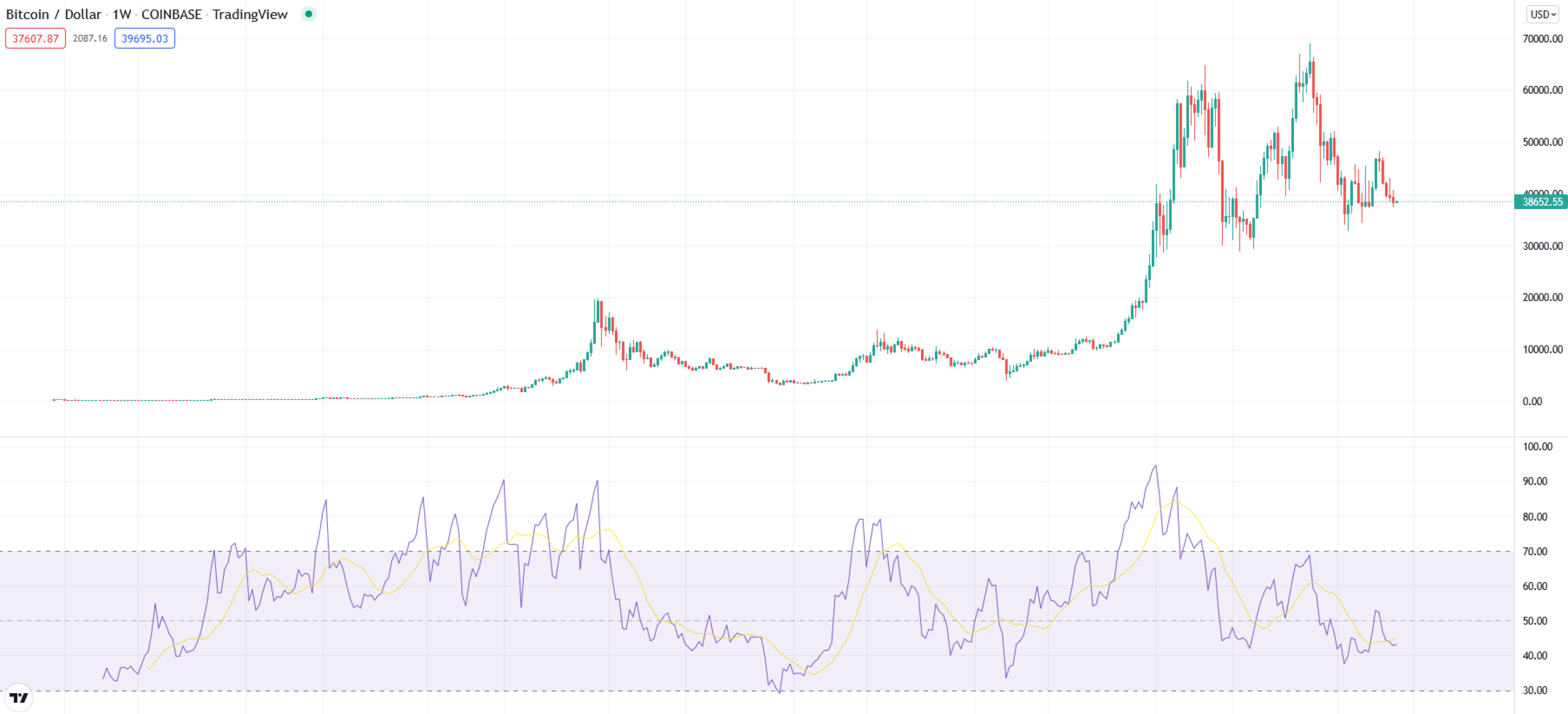
### Visual Description
## Financial Chart: Bitcoin/USD Weekly Candlestick with RSI Indicator
### Overview
This image is a screenshot of a financial chart from the TradingView platform, displaying the weekly price action of Bitcoin against the US Dollar (BTC/USD) on the Coinbase exchange. The chart is composed of two primary sections: a main candlestick price chart at the top and a Relative Strength Index (RSI) momentum indicator at the bottom. The overall aesthetic is a standard, clean financial charting interface with a white background and light gray gridlines.
### Components/Axes
**Header Information (Top-Left):**
* **Asset & Timeframe:** "Bitcoin / Dollar · 1W · COINBASE · TradingView"
* **Data Boxes:**
* Red Box: `37607.87`
* Gray Box: `2087.16`
* Blue Box: `39695.03`
* **Current Price Label (Right Axis):** A green label displays the current price as `38652.55`.
**Main Price Chart (Upper Section):**
* **Chart Type:** Candlestick chart (green for up weeks, red for down weeks).
* **Y-Axis (Right):** Labeled "USD". Scale ranges from `0.00` to `70000.00` in increments of `10000.00`. Major gridlines are present at each increment.
* **X-Axis (Bottom):** Represents time. While specific date labels are not visible, the "1W" timeframe indicates each candle represents one week of trading data. The chart spans several years of historical data.
**RSI Indicator (Lower Section):**
* **Indicator Type:** Relative Strength Index (RSI).
* **Y-Axis (Right):** Scale ranges from `30.00` to `100.00` in increments of `10.00`.
* **Key Horizontal Levels:** Dashed lines are drawn at `30.00`, `50.00`, `70.00`, and `90.00`.
* **Shaded Region:** The area between the `30.00` and `70.00` lines is shaded in a light purple, indicating the typical "neutral" zone for the RSI.
* **Data Series:**
* **Purple Line:** The RSI value itself.
* **Yellow Line:** A moving average of the RSI, used as a signal line.
**Other Elements:**
* **TradingView Logo:** A small "TV" logo is present in the bottom-left corner.
* **Currency Selector:** A "USD" dropdown is visible in the top-right corner.
### Detailed Analysis
**Price Action (Candlestick Chart):**
* **Trend:** The chart shows a massive, multi-year uptrend from near-zero values to all-time highs, followed by a significant correction and consolidation.
* **Key Price Levels (Approximate):**
* **Early Phase:** Price consolidated near the bottom of the chart (below $1,000) for an extended period.
* **First Major Peak:** A sharp rally peaked near the `20000.00` level.
* **Second Major Bull Run:** A much larger rally began, surpassing the previous peak and reaching an all-time high slightly above `60000.00` (visually estimated between $60,000 and $65,000).
* **Correction & Consolidation:** Following the peak, the price experienced a sharp decline, finding support around the `30000.00` level. It then entered a volatile consolidation phase, trading roughly between `30000.00` and `50000.00`.
* **Current Position:** The most recent candles show the price trading near the `38652.55` label, within the upper half of the consolidation range.
**RSI Indicator Analysis:**
* **Trend:** The RSI line (purple) shows high volatility, oscillating between overbought and oversold conditions in correlation with the price trend.
* **Key RSI Levels (Approximate):**
* **Overbought Peaks:** The RSI spiked above the `90.00` level during the most intense phases of the two major bull runs, indicating extreme overbought conditions.
* **Oversold Troughs:** The RSI dipped below the `30.00` level (into the oversold region) during major price corrections, most notably after the first peak and during the deep correction from the all-time high.
* **Current Reading:** The RSI line is currently positioned around the `45-50` area, near its yellow moving average, suggesting neutral momentum. It is within the shaded `30-70` zone.
### Key Observations
1. **Parabolic Moves:** The price chart exhibits two distinct parabolic advance phases, each culminating in a sharp peak followed by a severe correction.
2. **RSI Extremes as Markers:** The most significant price tops correspond with RSI readings above 90, while major price bottoms align with RSI readings below 30.
3. **Consolidation Phase:** The latter part of the chart shows a transition from a clear trend to a ranging market, characterized by overlapping candles and a lack of clear directional momentum, reflected in the RSI hovering around its midpoint (50).
4. **Volume of Data:** The chart displays a long historical period, likely spanning from Bitcoin's early trading years (near-zero values) to a mature asset with a price in the tens of thousands of dollars.
### Interpretation
This chart tells the story of Bitcoin's evolution from a niche asset to a major financial instrument, marked by explosive growth cycles and severe volatility. The data suggests a market driven by intense speculative phases (parabolic advances with extreme RSI readings) followed by periods of correction and consolidation where the market digests gains and finds new equilibrium levels.
The relationship between the price and the RSI is textbook: the RSI acts as a momentum oscillator that confirms the strength of trends and warns of potential exhaustion. The current state—price consolidating in a wide range and RSI near neutral—indicates a market in a state of indecision, lacking the strong directional conviction seen in the earlier parabolic phases. The key takeaway is that while the long-term trend has been overwhelmingly positive, it is punctuated by dramatic boom-and-bust cycles, with the RSI providing clear signals of market extremes. The current consolidation could be interpreted as a period of accumulation or distribution, setting the stage for the next major trend.
</details>
Figure 21: RSI Signals for BTC/USD
This indicator tells us that when it is below 30, we should buy, and above 70, we should sell. It is clearly seen that the RSI is useless for a long-term vision: what is the use of selling at 10,000 in 2018 when one could simply buy, hold, and sell at 60,000 in 2022? Now, let’s take another very famous technical indicator: the SAR.
<details>
<summary>x2.png Details</summary>
### Visual Description
## Candlestick Chart: Bitcoin/USD Weekly Price (Coinbase)
### Overview
This is a weekly candlestick chart displaying the price history of Bitcoin (BTC) against the US Dollar (USD) on the Coinbase exchange, sourced from TradingView. The chart spans from approximately mid-2017 to early 2022. It includes price action represented by candlesticks and an overlay of a blue dotted line, likely a technical indicator such as a moving average or Parabolic SAR.
### Components/Axes
* **Chart Title (Top Left):** "Bitcoin / Dollar · 1W · COINBASE · TradingView"
* **Price Labels (Top Left):** Three numerical values are displayed: `38500.03` (in a red box), `263.02`, and `38763.05` (in a blue box). These likely represent the open, change, and close values for the most recent or selected candle.
* **Current Price Marker (Right Axis):** A green label highlights the current price level at `38652.70`.
* **Vertical Axis (Y-Axis - Right Side):** Represents price in USD. The scale is linear, ranging from `-4000.00` to `72000.00`, with major gridlines every `4000.00`. The label "USD" is visible at the top right.
* **Horizontal Axis (X-Axis - Bottom):** Represents time. The labels are in French. Key markers include years (`2018`, `2019`, `2020`, `2021`, `2022`) and months (`Juill` (July), `Oct` (October), `Avr` (April), `Mai` (May), `Août` (August)).
* **Data Series:**
1. **Candlesticks:** Green candles indicate a week where the closing price was higher than the opening price. Red candles indicate a week where the closing price was lower than the opening price. Each candle's body and wicks show the open, high, low, and close for that week.
2. **Blue Dotted Line:** A series of blue dots plotted above or below the price candles. This is a common representation of the Parabolic SAR (Stop and Reverse) indicator, used to identify potential trend direction and reversals.
* **Logo (Bottom Left):** The TradingView logo ("TV").
### Detailed Analysis
**Price Action & Key Levels:**
* **2017-2018 Bull Run & Peak:** The chart begins with a steep ascent from below `4000.00` in mid-2017 to an initial peak near `20000.00` in December 2017/January 2018.
* **2018-2019 Bear Market:** A prolonged downtrend follows, with the price finding a bottom in the `3000.00` - `4000.00` range around the end of 2018 and early 2019.
* **2019 Recovery & Consolidation:** A recovery rally in mid-2019 takes the price back to approximately `13000.00`, followed by a consolidation period between `7000.00` and `10000.00` for much of late 2019 and early 2020.
* **2020-2021 Major Bull Market:** Starting in late 2020, a massive upward trend begins. The price breaks its previous all-time high, surging to a peak of approximately `64000.00` in April 2021.
* **Mid-2021 Correction & Second Peak:** A sharp correction in mid-2021 drops the price to near `30000.00`. This is followed by a second major rally, culminating in a new all-time high just below `68000.00` in November 2021.
* **2022 Downtrend:** From the November 2021 peak, the chart shows a downtrend into early 2022, with the price at the time of the chart sitting at `38652.70`.
**Indicator (Blue Dotted Line - Parabolic SAR) Analysis:**
* The dots are plotted *below* the price candles during uptrends (e.g., from late 2020 through April 2021, and from late July 2021 through November 2021).
* The dots flip to be plotted *above* the price candles during downtrends or consolidation phases (e.g., during the 2018 bear market, the mid-2021 correction, and the decline from the November 2021 peak).
* The indicator appears to act as a dynamic support/resistance level and a trend-following signal.
### Key Observations
1. **Extreme Volatility:** The chart demonstrates Bitcoin's characteristic high volatility, with multi-thousand dollar weekly swings being common, especially during the 2020-2021 period.
2. **Cyclical Pattern:** The price action shows clear boom-and-bust cycles, with a major peak in late 2017, a bear market, a recovery, and then a much larger bull cycle in 2020-2021.
3. **Indicator Alignment:** The Parabolic SAR (blue dots) flips its position relative to the price at or near several major swing points, such as the bottom in March 2020, the top in April 2021, the bottom in July 2021, and the top in November 2021.
4. **Current Position:** At the chart's end, the price is in a downtrend, with the Parabolic SAR dots plotted *above* the candles, suggesting the indicator is in a bearish signal. The price is hovering just below the `40000.00` psychological level.
### Interpretation
This chart visually narrates the market cycle of Bitcoin over a ~4.5 year period. It demonstrates the asset's tendency for parabolic advances followed by severe corrections. The 2020-2021 bull run was significantly larger in magnitude than the 2017 run, reflecting increased adoption and market maturity.
The Parabolic SAR indicator provides a mechanical trend-following perspective. Its flips often coincided with significant momentum shifts, making it a potentially useful tool for identifying trend changes, though it can produce whipsaws in ranging markets. The current bearish signal from the indicator, combined with the price being below the `40000.00` level and in a downtrend from the all-time high, suggests a period of bearish momentum or consolidation as of the chart's timeframe. The absence of a clear support level in the immediate vicinity below the current price could indicate risk of further downside if the downtrend continues.
</details>
Figure 22: SAR Signals for BTC/USD
This indicator tells us that when the blue dots are below the candlesticks, we should buy, and when they are above, we should sell (first appearance of dots per sequence). The same reasoning applies: what is the point of selling in 2018? These indicators are ultimately only signals for day-trading, with the aim of making quick profits. However, statistics show that more than 70% of day-traders lose money. Yet, they all have access to all available indicators. Technical analysis would therefore seem useless both in the long term and in the short term, a priori. According to [Park and Irwin, 2007], the literature on the subject is inconclusive: some studies are positive, others negative, and others mixed.
#### 2.3.3 Machine Learning
Let’s now check the effectiveness of Machine Learning in predicting cryptocurrency prices. We will not test all algorithms, but only two. The first, Support Vector Machine classification, was introduced by [Cortes and Vapnik, 1995]. It consists of classifying "good" trades from "bad" trades. For this, we create a Python function getAverageAccuracy( $Ω,n$ ), which takes as parameters $Ω$ and $n$ the window for technical indicators and returns the average accuracy percentage of our model across all tested cryptocurrencies (over 100). The features considered are: price (OHLC), previous prices, previous returns, SAR, RSI, SMA, ADX, ATR, and 80% training dataset. The function, whose code is in Appendix G, returns 38%. This is low. Here are the confusion matrices for the 4 largest cryptocurrencies (read as "Perfect prediction on the top-left/bottom-right diagonal, inverse prediction on the bottom-left/top-right"):
<details>
<summary>extracted/6391907/images/btc-ml.png Details</summary>
### Visual Description
## Heatmap Matrix: 3x3 Grid with Numerical Values
### Overview
The image displays a 3x3 grid (matrix) of colored squares, each containing a single integer. The grid functions as a heatmap or categorical matrix where color and numerical value are associated. There are no explicit axis labels, titles, or a legend provided within the image itself. The color palette ranges from bright yellow through orange, red, and pink to purple and dark blue, suggesting an underlying value scale, though the mapping is not defined.
### Components/Axes
* **Structure:** A perfect 3x3 grid with no visible borders between cells.
* **Labels:** None present. No row or column headers, chart title, or legend.
* **Data Encoding:** Each cell's background color and its embedded number are the primary data carriers.
* **Spatial Layout:**
* **Row 1 (Top):** [Reddish] 9 | [Orange] 10 | [Purple] 4
* **Row 2 (Middle):** [Yellow] 12 | [Pink] 8 | [Dark Blue] 3
* **Row 3 (Bottom):** [Bright Yellow] 13 | [Reddish] 9 | [Dark Blue] 3
### Detailed Analysis
**Cell-by-Cell Data Extraction:**
| Position (Row, Column) | Approximate Color Description | Embedded Number |
| :--- | :--- | :--- |
| (1, 1) - Top-Left | Salmon / Light Red | 9 |
| (1, 2) - Top-Center | Orange | 10 |
| (1, 3) - Top-Right | Deep Purple | 4 |
| (2, 1) - Middle-Left | Golden Yellow | 12 |
| (2, 2) - Middle-Center | Dark Pink / Magenta | 8 |
| (2, 3) - Middle-Right | Navy Blue | 3 |
| (3, 1) - Bottom-Left | Bright Lemon Yellow | 13 |
| (3, 2) - Bottom-Center | Salmon / Light Red (similar to 1,1) | 9 |
| (3, 3) - Bottom-Right | Navy Blue (identical to 2,3) | 3 |
**Trend Verification (Visual):**
* **Left Column (Col 1):** Colors are warm (yellows, red). Values are high (9, 12, 13). The trend is generally high, with the highest value (13) at the bottom.
* **Center Column (Col 2):** Colors are mixed warm/cool (orange, pink, red). Values are moderate (10, 8, 9). No strong directional trend.
* **Right Column (Col 3):** Colors are cool (purple, dark blue). Values are low (4, 3, 3). The trend is consistently low, with the two lowest values (3) in the middle and bottom.
### Key Observations
1. **Value Gradient:** There is a clear horizontal gradient from left to right. The left column contains the highest values (9, 12, 13), the center column has intermediate values (10, 8, 9), and the right column contains the lowest values (4, 3, 3).
2. **Color-Value Correlation:** Warmer colors (yellows, oranges, reds) are associated with higher numbers. Cooler colors (purples, blues) are associated with lower numbers. The brightest yellow corresponds to the highest number (13).
3. **Repetition:** The value `9` appears twice, in cells (1,1) and (3,2), which share a similar salmon/red color. The value `3` appears twice, in cells (2,3) and (3,3), which share an identical dark blue color.
4. **Outlier:** The cell at (3,1) with the value `13` is the maximum in the grid and is highlighted with the most vibrant yellow, making it a visual focal point.
5. **Missing Context:** The complete absence of labels, a title, or a legend makes it impossible to determine what the rows, columns, colors, or numbers represent (e.g., time periods, categories, scores, frequencies).
### Interpretation
The data suggests a strong spatial or categorical pattern where the entity represented by the left column consistently exhibits higher magnitudes than the center, which in turn is higher than the right column. This could represent:
* A performance metric across three different groups or conditions (Left > Center > Right).
* A frequency or count distribution across two categorical dimensions (e.g., Row = Category A, Column = Category B).
* A score matrix where the leftmost category is most favorable.
The color coding reinforces this pattern, using a warm-to-cool spectrum to visually encode the high-to-low value gradient. The repetition of values (`9` and `3`) with matching colors indicates consistent measurements for those specific cell positions. Without external context, the chart effectively communicates a comparative relationship between nine discrete points, highlighting a dominant left-side bias and a weak right-side performance. The primary investigative question it raises is: *What do the rows and columns represent, and why does the measured attribute decrease so sharply from left to right?*
</details>
Figure 23: Confusion matrix for BTC/USD
<details>
<summary>extracted/6391907/images/eth-ml.png Details</summary>
### Visual Description
## Heatmap Grid: 3x3 Numerical Value Distribution
### Overview
The image displays a 3x3 grid of colored squares, each containing a numerical value. The grid functions as a simple heatmap or categorical value chart, where distinct background colors are associated with specific integer values. There are no explicit axis labels, titles, or a legend provided within the image itself.
### Components/Axes
* **Structure:** A 3x3 grid (3 rows, 3 columns).
* **Elements:** Nine individual cells. Each cell has a solid background color and a centered numerical label in a light, sans-serif font.
* **Legend/Key:** No legend is present. The relationship between color and value must be inferred from the data presented.
* **Spatial Layout:**
* **Top Row (Left to Right):** Pinkish-red cell, Orange-red cell, Dark blue cell.
* **Middle Row (Left to Right):** Orange cell, Bright yellow cell, Purple cell.
* **Bottom Row (Left to Right):** Dark purple cell, Pinkish-red cell, Purple cell.
### Detailed Analysis
The following table reconstructs the grid's content, listing each cell's approximate position, inferred color description, and exact numerical value.
| Position (Row, Column) | Approximate Color Description | Numerical Value |
| :--- | :--- | :--- |
| Top-Left (1,1) | Pinkish-red / Magenta | 9 |
| Top-Center (1,2) | Orange-red / Coral | 11 |
| Top-Right (1,3) | Dark Blue / Navy | 1 |
| Middle-Left (2,1) | Orange | 12 |
| Middle-Center (2,2) | Bright Yellow | 17 |
| Middle-Right (2,3) | Purple / Violet | 3 |
| Bottom-Left (3,1) | Dark Purple / Indigo | 4 |
| Bottom-Center (3,2) | Pinkish-red / Magenta | 9 |
| Bottom-Right (3,3) | Purple / Violet | 5 |
**Trend Verification (Color-Value Relationship):**
* The **brightest color** (Yellow) corresponds to the **highest value** (17).
* The **darkest color** (Dark Blue) corresponds to the **lowest value** (1).
* There is a general, though not perfectly linear, correlation where warmer/brighter colors (yellows, oranges, pinks) represent higher values, and cooler/darker colors (blues, purples) represent lower values.
* The two cells with the same color (Pinkish-red at Top-Left and Bottom-Center) both contain the value 9, suggesting a consistent color-to-value mapping for that specific hue.
### Key Observations
1. **Central Peak:** The highest value (17) is located in the absolute center of the grid (2,2), highlighted by the most visually prominent color (bright yellow).
2. **Low-Value Corner:** The lowest value (1) is in the top-right corner (1,3), marked by the darkest color.
3. **Color Consistency:** The color used for the value 9 appears twice (positions 1,1 and 3,2), indicating a deliberate design choice rather than random coloring.
4. **Value Range:** The values range from 1 to 17, with a notable cluster of mid-range values (9, 11, 12) in the upper-left quadrant.
### Interpretation
This grid visually encodes numerical data through color intensity, creating an immediate spatial understanding of value distribution. The design suggests a **central tendency or hotspot**, with the maximum value at the core, surrounded by generally decreasing values towards the periphery, particularly the top-right corner.
The lack of axis labels or a legend means the context is entirely abstract. The data could represent anything from survey responses and frequency counts to performance metrics or spatial measurements. The primary informational takeaway is the **relative comparison** between cells: the center is "most" of something, the top-right is "least," and the left side generally holds higher values than the right side. The consistent color for the value 9 implies a categorical or binned grouping, where values around 9 are considered a distinct tier. Without external context, the chart's purpose is to demonstrate a pattern of concentration and dissipation across a 2D space.
</details>
Figure 24: Confusion matrix for ETH/USD
<details>
<summary>extracted/6391907/images/ltc-ml.png Details</summary>
### Visual Description
## Heatmap Grid: 3x3 Matrix of Colored Cells with Numerical Values
### Overview
The image displays a 3x3 grid of colored rectangular cells, each containing a centered numerical value. The grid is presented without any external axis labels, titles, or a legend. The colors of the cells vary, suggesting they represent different categories or intensity levels corresponding to the numbers within them.
### Components/Axes
* **Structure:** A 3x3 matrix (3 rows, 3 columns).
* **Cell Content:** Each cell contains a single integer.
* **Color Palette:** The cells use a range of colors, including shades of pink/red, orange, yellow, purple, and dark blue.
* **Missing Elements:** There are no visible axis titles, tick marks, row/column labels, chart title, or a legend explaining the color scale.
### Detailed Analysis
The grid contains the following numerical values, listed by row (top to bottom) and column (left to right):
**Row 1 (Top):**
* Cell (1,1): **8** (Color: Pinkish-red)
* Cell (1,2): **10** (Color: Orange)
* Cell (1,3): **2** (Color: Dark blue)
**Row 2 (Middle):**
* Cell (2,1): **12** (Color: Golden yellow)
* Cell (2,2): **13** (Color: Bright yellow)
* Cell (2,3): **5** (Color: Purple)
**Row 3 (Bottom):**
* Cell (3,1): **8** (Color: Pinkish-red, similar to cell 1,1)
* Cell (3,2): **8** (Color: Pinkish-red, similar to cells 1,1 and 3,1)
* Cell (3,3): **5** (Color: Purple, similar to cell 2,3)
### Key Observations
1. **Value Distribution:** The highest value is **13** (center cell). The lowest value is **2** (top-right cell).
2. **Color-Value Correlation:** There appears to be a visual correlation between color and numerical value:
* The highest values (12, 13) are in shades of yellow.
* Mid-range values (8, 10) are in pink/red and orange.
* Lower values (5, 2) are in purple and dark blue.
3. **Repeating Values & Colors:**
* The value **8** appears three times, all in the same pinkish-red color (cells 1,1; 3,1; 3,2).
* The value **5** appears twice, both in the same purple color (cells 2,3; 3,3).
4. **Spatial Pattern:** The central column (Column 2) contains the two highest values (10, 13, 8). The rightmost column (Column 3) contains the two lowest values (2, 5, 5).
### Interpretation
This image is a **heatmap or matrix visualization** where color is used as a visual encoding for the numerical data within each cell. The lack of labels makes the specific context ambiguous, but the structure is typical for displaying:
* A correlation matrix.
* A confusion matrix from classification models.
* Frequency counts across two categorical variables.
* Intensity measurements across a 2D grid.
**What the data suggests:** The central cell (2,2) with a value of 13 is the focal point, representing the maximum in this dataset. The right column consistently shows lower values, indicating a potential negative trend or lower frequency in that category. The repetition of the value 8 in the same color across three cells suggests those data points belong to the same category or intensity level.
**Notable Anomaly:** The value **2** in the top-right cell (1,3) is a significant outlier, being the lowest value and visually isolated by its dark blue color against the warmer tones of its neighbors. This could indicate a rare event, a low-probability classification, or a missing data point depending on the context.
**Limitations:** Without a legend, the exact meaning of the colors (e.g., is yellow "high" and blue "low"?) and the categories represented by the rows and columns cannot be determined. The interpretation is based solely on the visual patterns of the provided numbers and colors.
</details>
Figure 25: Confusion matrix for LTC/USD
<details>
<summary>extracted/6391907/images/xrp-ml.png Details</summary>
### Visual Description
\n
## Heatmap: 3x3 Grid with Numerical Values
### Overview
The image displays a 3x3 grid (matrix) of colored squares, each containing a numerical value. It functions as a simple heatmap or data matrix where color and number together represent a data point. There are no explicit row or column labels, titles, or a legend provided within the image itself.
### Components/Axes
* **Structure:** A 3x3 grid forming 9 distinct cells.
* **Data Representation:** Each cell is defined by a unique color and contains a centered integer.
* **Labels/Axes:** None present. The grid has no labeled rows or columns.
* **Legend:** None present. The meaning of the color scale is not defined.
### Detailed Analysis
The grid is analyzed row by row, from top to bottom, left to right.
**Row 1 (Top):**
1. **Top-Left Cell:** Color: Orange. Value: `10`.
2. **Top-Middle Cell:** Color: Deep Purple. Value: `5`.
3. **Top-Right Cell:** Color: Salmon/Light Red. Value: `9`.
**Row 2 (Middle):**
1. **Middle-Left Cell:** Color: Orange (visually identical to Top-Left). Value: `10`.
2. **Center Cell:** Color: Mauve/Dusty Pink. Value: `8`.
3. **Middle-Right Cell:** Color: Bright Yellow. Value: `13`.
**Row 3 (Bottom):**
1. **Bottom-Left Cell:** Color: Dark Blue/Navy. Value: `3`.
2. **Bottom-Middle Cell:** Color: Purple (lighter/different hue than Top-Middle). Value: `6`.
3. **Bottom-Right Cell:** Color: Magenta/Dark Pink. Value: `7`.
### Key Observations
1. **Value Range:** The numerical values range from a low of `3` (Bottom-Left) to a high of `13` (Middle-Right).
2. **Color-Value Correlation:** While no legend exists, a visual pattern suggests color intensity may correlate with value. The highest value (`13`) is in the brightest color (yellow), and the lowest (`3`) is in the darkest color (navy blue).
3. **Duplicate Value & Color:** The value `10` appears twice, in the Top-Left and Middle-Left cells, and both are the same shade of orange.
4. **Color Variation:** Two distinct purple hues are used: a deep purple for value `5` (Top-Middle) and a lighter purple for value `6` (Bottom-Middle).
5. **Spatial Distribution:** The highest value (`13`) is located in the middle-right position. The lowest value (`3`) is in the bottom-left corner. The center cell holds a mid-range value (`8`).
### Interpretation
This image is a raw data visualization, likely a heatmap matrix, presenting nine data points in a grid format. The absence of labels, titles, and a legend makes it impossible to determine the specific context (e.g., what the rows, columns, or colors represent). However, the data itself suggests a distribution where:
* One cell (Middle-Right, yellow, `13`) is a significant outlier on the high end.
* One cell (Bottom-Left, navy, `3`) is an outlier on the low end.
* The remaining values cluster between `5` and `10`.
* The repetition of the value `10` with the same color in the first column may indicate a consistent measurement or category for that column.
To be fully interpretable, this matrix requires accompanying metadata defining the row and column categories and a color scale legend explaining the relationship between hue and numerical value. As it stands, it is an abstract representation of a 3x3 dataset with a clear visual emphasis on the extreme values.
</details>
Figure 26: Confusion matrix for XRP/USD
The second model is ARIMA, introduced by [Box et al., 2015], and it aims to predict future trends. The results of our model are as follows:
<details>
<summary>extracted/6391907/images/arima.png Details</summary>
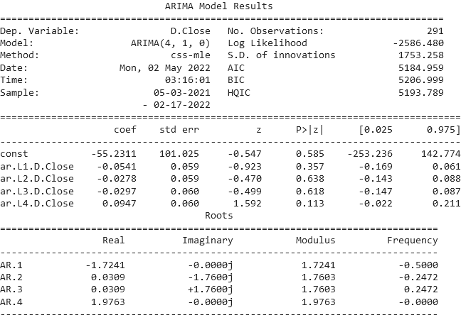
### Visual Description
## Statistical Output: ARIMA Model Results
### Overview
The image displays the textual output of a statistical model fitting, specifically an ARIMA (Autoregressive Integrated Moving Average) model. The output is presented in a monospaced font, typical of console or log output from statistical software. It contains three distinct sections: a header with model metadata, a table of estimated coefficients with their statistics, and a table of the model's autoregressive (AR) roots.
### Components/Axes
The output is structured into three main components:
1. **Header Section:** Contains metadata about the model and the data.
* **Dep. Variable:** `D.Close` (The dependent variable is the differenced closing price).
* **Model:** `ARIMA(4, 1, 0)` (An ARIMA model with 4 autoregressive terms, 1 degree of differencing, and 0 moving average terms).
* **Method:** `css-mle` (Conditional Sum of Squares - Maximum Likelihood Estimation).
* **Date/Time:** `Mon, 02 May 2022`, `03:16:01`.
* **Sample:** `05-03-2021 - 02-17-2022` (The date range of the data used for fitting).
* **No. Observations:** `291`.
* **Log Likelihood:** `-2586.480`.
* **S.D. of innovations:** `1753.258`.
* **AIC:** `5184.959` (Akaike Information Criterion).
* **BIC:** `5206.999` (Bayesian Information Criterion).
* **HQIC:** `5193.789` (Hannan-Quinn Information Criterion).
2. **Coefficients Table:** A table with 7 columns and 5 rows (including the header row).
* **Columns:** `coef`, `std err`, `z`, `P>|z|`, `[0.025`, `0.975]`.
* **Rows (Variables):**
* `const`: Constant term.
* `ar.L1.D.Close`: First lag of the differenced dependent variable.
* `ar.L2.D.Close`: Second lag.
* `ar.L3.D.Close`: Third lag.
* `ar.L4.D.Close`: Fourth lag.
3. **Roots Table:** A table describing the properties of the autoregressive polynomial's roots.
* **Columns:** `Real`, `Imaginary`, `Modulus`, `Frequency`.
* **Rows (Roots):** `AR.1`, `AR.2`, `AR.3`, `AR.4`.
### Detailed Analysis
**Coefficients Table Data:**
| Variable | coef | std err | z | P>\|z\| | [0.025 | 0.975] |
| :--- | :--- | :--- | :--- | :--- | :--- | :--- |
| const | -55.2311 | 101.025 | -0.547 | 0.585 | -253.236 | 142.774 |
| ar.L1.D.Close | -0.0541 | 0.059 | -0.923 | 0.357 | -0.169 | 0.061 |
| ar.L2.D.Close | -0.0278 | 0.059 | -0.470 | 0.638 | -0.143 | 0.088 |
| ar.L3.D.Close | -0.0297 | 0.060 | -0.499 | 0.618 | -0.147 | 0.087 |
| ar.L4.D.Close | 0.0947 | 0.060 | 1.592 | 0.113 | -0.022 | 0.211 |
**Roots Table Data:**
| Root | Real | Imaginary | Modulus | Frequency |
| :--- | :--- | :--- | :--- | :--- |
| AR.1 | -1.7241 | -0.0000j | 1.7241 | -0.5000 |
| AR.2 | 0.0309 | -1.7600j | 1.7603 | -0.2472 |
| AR.3 | 0.0309 | +1.7600j | 1.7603 | 0.2472 |
| AR.4 | 1.9763 | -0.0000j | 1.9763 | -0.0000 |
### Key Observations
1. **Model Specification:** The model is an ARIMA(4,1,0), meaning it uses four past values of the *differenced* series (`D.Close`) to predict its next value, with no moving average component.
2. **Coefficient Significance:** None of the estimated coefficients (including the constant) are statistically significant at the conventional 5% level (`P > |z| > 0.05`). The highest absolute z-statistic is 1.592 for the fourth lag (`ar.L4.D.Close`), with a p-value of 0.113.
3. **Roots and Stationarity:** All four AR roots have a modulus greater than 1 (ranging from 1.7241 to 1.9763). This indicates the AR polynomial is stationary, which is a required property for a valid ARIMA model. The presence of complex roots (AR.2 and AR.3) suggests potential cyclical behavior in the model's dynamics.
4. **Data Range:** The model was fitted on 291 observations of daily data (implied by the date format) spanning from May 3, 2021, to February 17, 2022.
5. **Fit Statistics:** The AIC, BIC, and HQIC values are provided for model comparison. The standard deviation of the innovations (residuals) is approximately 1753.26, indicating the scale of the model's prediction errors.
### Interpretation
This output represents the results of fitting a linear time series model to financial data (likely a stock or index closing price, given the variable name `Close`). The primary finding is that a simple ARIMA(4,1,0) model does not find strong, statistically significant autoregressive patterns in the differenced data over this specific period. The lack of significant coefficients suggests that the past four days' price changes do not have a reliable linear relationship with the next day's change, according to this model.
The stationarity of the roots confirms the model's mathematical validity but does not imply good predictive power. The high p-values for all coefficients indicate that this specific model structure may be overfit or that the underlying data is largely unpredictable using this linear method. A practitioner would likely use these results to conclude that this ARIMA specification is not useful for forecasting and would experiment with different lag orders, include moving average terms, or consider alternative, possibly non-linear, models. The large standard error of the constant term and the wide confidence intervals for all coefficients further underscore the uncertainty in these estimates.
</details>
Figure 27: Results of the ARIMA model
## 3 The Cryptocurrency Market is Inefficient
In 1981, Robert Shiller [Shiller, 1980] showed a higher volatility than that predicted by the rational behavior of agents. Shiller concluded that no rationality could explain the observed volatility, which ultimately had no link with dividend expectations. Thus, if the market is inefficient, it is possible to achieve performances superior to the market.
### 3.1 Robert Shiller and the Notion of an Inefficient Market in Terms of Arbitrage
This section deals with elements that prove that the Bitcoin market admits arbitrage opportunities. For example, we observe that the price of Bitcoin varies from one exchange to another. This is even more true for the altcoin market. Intuitively, we can imagine that the price will tend to move closer to the average price across exchanges.
#### 3.1.1 Volatility and Expected Dividends
In his book, [Shiller, 2015], Shiller shows the difference between stock price volatility and expected dividends:
<details>
<summary>extracted/6391907/images/shiller-plot.png Details</summary>
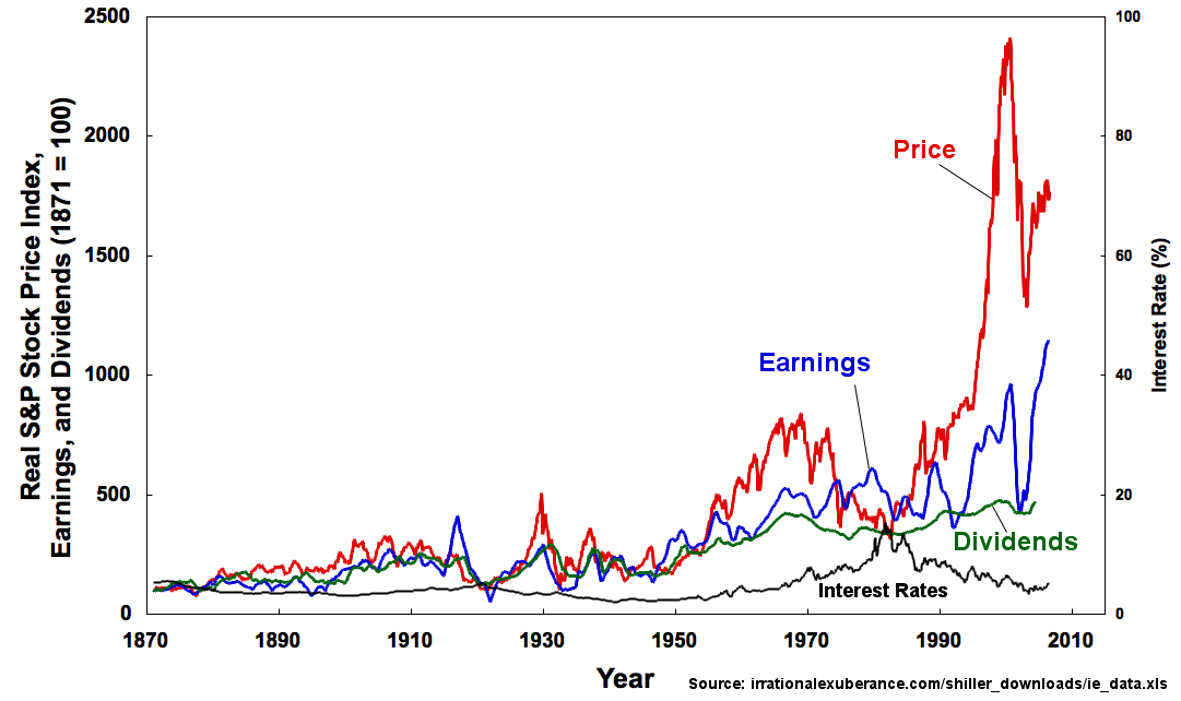
### Visual Description
## Line Chart: Historical S&P Stock Price Index, Earnings, Dividends, and Interest Rates (1870-2010)
### Overview
This is a multi-series line chart displaying the historical performance of four key financial metrics over a 140-year period, from 1870 to 2010. The chart uses a dual y-axis to plot index values (left axis) and percentage rates (right axis) against time (x-axis). The data is indexed to a base year of 1871 (value = 100).
### Components/Axes
* **Chart Type:** Multi-series line chart with dual y-axes.
* **X-Axis (Horizontal):**
* **Label:** `Year`
* **Scale:** Linear, from 1870 to 2010.
* **Major Tick Marks:** Every 20 years (1870, 1890, 1910, 1930, 1950, 1970, 1990, 2010).
* **Primary Y-Axis (Left):**
* **Label:** `Real S&P Stock Price Index, Earnings, and Dividends (1871 = 100)`
* **Scale:** Linear, from 0 to 2500.
* **Major Tick Marks:** 0, 500, 1000, 1500, 2000, 2500.
* **Secondary Y-Axis (Right):**
* **Label:** `Interest Rate (%)`
* **Scale:** Linear, from 0 to 100.
* **Major Tick Marks:** 0, 20, 40, 60, 80, 100.
* **Legend & Data Series:**
* **Price:** Red line. Label "Price" is placed in the upper-right quadrant, near the line's peak.
* **Earnings:** Blue line. Label "Earnings" is placed in the center-right area.
* **Dividends:** Green line. Label "Dividends" is placed in the lower-right quadrant.
* **Interest Rates:** Black line. Label "Interest Rates" is placed in the lower-center area.
* **Source Note:** Located at the bottom-right corner: `Source: irrationalxuberance.com/shiller_downloads/ie_data.xls`
### Detailed Analysis
**Trend Verification & Data Points (Approximate):**
1. **Price (Red Line):**
* **Trend:** Shows extreme long-term growth with high volatility. Relatively flat until ~1920, with a notable peak around 1929. Experiences a major crash post-1929, followed by a recovery and sustained, accelerating growth from the 1950s onward. The most dramatic feature is a parabolic rise starting in the 1990s, peaking near the 2500 index level around the year 2000, followed by a sharp decline and partial recovery by 2010.
* **Key Approximate Points:** ~100 (1871), ~500 (1929 peak), ~200 (1932 trough), ~800 (1968), ~2400 (2000 peak), ~1700 (2010).
2. **Earnings (Blue Line):**
* **Trend:** Follows a similar long-term upward trajectory as Price but with significantly lower volatility and magnitude. Shows cyclical peaks and troughs that often precede or coincide with those in Price. The growth rate accelerates post-1950. Diverges notably from Price after 1990, with Price rising much more sharply.
* **Key Approximate Points:** ~100 (1871), ~300 (1929), ~150 (1932), ~500 (1968), ~900 (2000), ~1100 (2010).
3. **Dividends (Green Line):**
* **Trend:** The smoothest and most stable of the three index series. Shows a very steady, low-volatility upward trend over the entire period. Growth is modest until the 1950s, after which it increases at a slightly higher but still consistent rate. It is consistently the lowest of the three index lines from the mid-20th century onward.
* **Key Approximate Points:** ~100 (1871), ~200 (1929), ~180 (1932), ~400 (1968), ~500 (2000), ~550 (2010).
4. **Interest Rates (Black Line, Right Axis):**
* **Trend:** Remained very low (below 10%) and stable from 1870 until the 1940s. Began a secular rise in the 1950s, becoming more volatile. Experienced a dramatic surge in the 1970s, peaking at its highest point on the chart (approximately 18-20%) in the early 1980s. Following this peak, rates entered a long-term declining trend through 2010.
* **Key Approximate Points:** ~3-5% (1870-1940), ~5% (1950), ~8% (1970), ~18% (early 1980s peak), ~5% (2010).
### Key Observations
1. **The "Great Divergence":** The most striking pattern is the massive decoupling of the Stock Price (red) from Earnings (blue) and Dividends (green) beginning in the 1990s. Price reached levels nearly 2.5 times its 1968 peak, while Earnings and Dividends grew at a much slower, historically consistent pace.
2. **Correlation of Crises:** Major economic events are visible across series. The 1929 crash shows sharp downturns in Price, Earnings, and Dividends. The inflationary period of the 1970s correlates with the peak in Interest Rates.
3. **Volatility Hierarchy:** Price is the most volatile, followed by Earnings, then Dividends. Interest Rates show a different volatility pattern, with a single major secular cycle.
4. **Base Effect:** All three index series start at the same point (100 in 1871), allowing for direct comparison of their relative growth. By 2010, Price had grown ~17x, Earnings ~11x, and Dividends ~5.5x from the base year.
### Interpretation
This chart is a powerful visualization of long-term financial market history and the relationship between stock valuations, corporate fundamentals, and the cost of money.
* **Price vs. Fundamentals:** The dramatic post-1990 divergence suggests a period where stock prices became disconnected from the underlying profitability (Earnings) and cash returns (Dividends) of companies. This is often cited as evidence of a speculative bubble (the "dot-com bubble"), where prices were driven by expectations rather than current fundamentals.
* **The Role of Interest Rates:** The secular rise in interest rates from the 1950s to the 1980s created a headwind for stock valuations (as higher rates discount future earnings more heavily). The subsequent secular decline in rates from the 1980s onward provided a tailwind, potentially contributing to the price expansion seen in the 1990s and 2000s.
* **Cyclical Nature:** The chart underscores the cyclical nature of markets and the economy. Periods of excess (peaks in Price and Interest Rates) are invariably followed by corrections or crashes.
* **Long-Term Growth:** Despite immense volatility and crises, the chart demonstrates the powerful long-term compounding effect of corporate earnings and dividends over more than a century, forming the fundamental basis for stock market growth. The source, referencing Robert Shiller's data, implies this is "real" (inflation-adjusted) data, making the growth even more significant.
**In essence, the chart tells a story of fundamental growth punctuated by cycles of fear and greed, with monetary policy (interest rates) acting as a major backdrop influencing market valuations.**
</details>
Figure 28: Evolution of the S&P500 and dividends
According to him: "the price-to-earnings ratio is still (as of 2005) far from its historical average from the mid-20th century. Investors place too much trust in the market and overestimate the positive developments of their investments without sufficiently hedging against a market downturn." It is therefore difficult to determine whether the crypto market is inefficient based solely on this information, as cryptocurrencies do not pay dividends.
#### 3.1.2 Behavioral Finance and Market Anomalies
Shiller introduces the concept of behavioral finance. In the crypto market, we mainly think of herd behavior: investors buy simply because other investors are buying. This phenomenon is less visible in day-trading because time scales are too short to draw conclusions about the trend. Indeed, the 2017 bubble still took some time to form and partially burst.
#### 3.1.3 Speculative Bubbles
When it comes to cryptocurrencies, speculative bubbles are often mentioned. It is true that cryptocurrencies provide fertile ground for such phenomena, but this only matters for medium-term investors. A long-term investor will mainly seek to minimize diversifiable risk through cryptocurrencies, while a short-term trader will hope to enter the market before a hype event. Moreover, these hypes can sometimes be artificially created by one or several people, sometimes even behind fraudulent projects. Over time, as projects repeat, fraud risks decrease, and hypes also tend to diminish, making the crypto market increasingly efficient and reducing the possibility of bubbles.
### 3.2 Informational Inefficiency
We will look at scenarios where information asymmetries allow an individual or a group to achieve superior returns to the market. In such situations, cryptocurrency prices do not reflect all available information.
#### 3.2.1 Market Manipulation
The most famous example is the public use of Twitter by Elon Musk, with each of his crypto-related tweets causing abrupt movements in the crypto market. By deduction, we can imagine similar scenarios involving other public figures, broker managers, intermediaries, etc.
#### 3.2.2 Pump & Dump
Pump & Dump was a strong practice during the early days of crypto hype. It consisted of gathering the largest possible group of users around a well-promoted cryptocurrency. The initiator of the movement would encourage the entire community to engage with the project for a single purpose: to artificially inflate the price of the cryptocurrency. Once the cryptocurrency reached a satisfactory price, the initiator—who had taken care to invest as much as possible when the crypto was worth nothing—would sell everything and exit the project. This type of phenomenon was also seen with ICOs.
#### 3.2.3 Natural Language Processing
Natural Language Processing (NLP) can be used to analyze market sentiment without manually reading content. For example, the bot, whose code is in Appendix H, returns the following results:
<details>
<summary>x3.png Details</summary>
### Visual Description
## [Text Log]: Trading Transaction Log
### Overview
The image displays a monospaced text log containing a series of financial trading transactions. Each line represents a single trade, recording the entry (BUY) price, exit (SELL) price, and the resulting profit or loss as a percentage. The log appears to be output from an automated trading system or algorithm. The text is in English.
### Components/Axes
The log is structured as a simple list with no graphical axes or legends. The components are:
* **BUY**: The entry price for the trade.
* **SELL**: The exit price for the trade.
* **Profit**: The calculated profit or loss percentage for the trade, formatted as `Profit = [value] %`.
* **Separator**: A vertical bar (`|`) separates the price data from the profit calculation.
* **Incomplete Entries**: Some lines contain only a `BUY` price, indicating a trade that was opened but not closed within the captured log segment.
### Detailed Analysis
The following table reconstructs the complete data from the log, listing transactions in the order they appear (top to bottom). Lines with incomplete data are noted.
| Line | BUY Price | SELL Price | Profit (%) |
| :--- | :----------- | :----------- | :--------- |
| 1 | 38088.01953125 | 38038.94921875 | -0.129 |
| 2 | 37287.16796875 | 37261.2109375 | -0.07 |
| 3 | 38840.984375 | N/A | N/A |
| 4 | 38673.09375 | 38657.91015625 | -0.039 |
| 5 | 38840.0859375 | 38811.48046875 | -0.074 |
| 6 | 38527.58984375 | 38453.19921875 | -0.193 |
| 7 | 37744.546875 | N/A | N/A |
| 8 | 36894.6015625 | 36772.21875 | -0.332 |
| 9 | 35931.7734375 | 35859.265625 | -0.202 |
| 10 | 36071.19921875 | N/A | N/A |
| 11 | 36106.11328125 | 35970.46484375 | -0.376 |
| 12 | 36142.52734375 | 36132.40625 | -0.028 |
| 13 | 35119.19140625 | N/A | N/A |
| 14 | 35625.203125 | 35562.3359375 | -0.176 |
| 15 | 36173.3984375 | 36164.9375 | -0.023 |
| 16 | 36123.421875 | N/A | N/A |
| 17 | 36123.828125 | 36191.2109375 | 0.187 |
| 18 | 35903.81640625 | 35875.41796875 | -0.079 |
| 19 | 36118.94140625 | 36143.51171875 | 0.068 |
| 20 | 35928.0546875 | 35939.76171875 | 0.033 |
| 21 | 35620.83984375 | 35634.2890625 | 0.038 |
| 22 | 35800.88671875 | 36131.80078125 | 0.924 |
**Data Point Verification:**
* **Price Range**: BUY prices span from a low of **35119.19140625** (Line 13) to a high of **38840.984375** (Line 3).
* **Profit Range**: Profit percentages range from a loss of **-0.376%** (Line 11) to a gain of **+0.924%** (Line 22).
* **Trend Verification**: The sequence does not show a clear chronological trend in price (e.g., consistently rising or falling). Prices fluctuate within the ~35k-39k band. The profit values are predominantly negative in the first two-thirds of the log, shifting to mostly positive in the final third.
### Key Observations
1. **Predominantly Losing Trades**: Of the 17 completed trades (with both BUY and SELL), 12 resulted in a loss (70.59%), and 5 resulted in a profit (29.41%).
2. **Small Margins**: All profit/loss percentages are relatively small, with the largest loss being -0.376% and the largest gain being +0.924%. This suggests a high-frequency or scalping trading strategy.
3. **Incomplete Data**: Six lines (27% of the log) show only a BUY price, indicating open positions at the time the log was captured.
4. **High Precision**: Prices are recorded with 8 decimal places, which is characteristic of certain financial markets like forex or cryptocurrency trading.
5. **Performance Shift**: There is a noticeable shift in performance. The first 12 completed trades (Lines 1, 2, 4, 5, 6, 8, 9, 11, 12, 14, 15, 18) are all losses. The final 5 completed trades (Lines 17, 19, 20, 21, 22) are all profits, with the last trade showing the highest gain.
### Interpretation
This log represents the raw output of a systematic trading strategy, likely operating on a volatile asset given the price range and precision. The data suggests the strategy was **unprofitable during the initial period** captured, incurring a series of small, consistent losses. This could indicate adverse market conditions, slippage, or fees eroding margins.
The **abrupt shift to profitability in the final trades** is the most significant pattern. This could be due to:
* A change in market conditions favoring the strategy's logic.
* A adjustment in the algorithm's parameters.
* The closure of a series of losing positions and the opening of new, more successful ones.
The presence of multiple open positions (incomplete BUY entries) indicates the log is a snapshot of ongoing activity. The high precision and small profit targets point towards a quantitative, automated approach where numerous small trades are executed, aiming to aggregate gains. However, the initial loss streak highlights the challenge of achieving consistent profitability with such strategies, as transaction costs and minor price movements can quickly turn positions negative. The final positive trend, while promising, is based on a very small sample size and would require more data to confirm a sustained improvement.
</details>
Figure 29: Results from the NLP trading bot
### 3.3 Operational Inefficiency
The price of Bitcoin can be predicted if one knows in advance the factors likely to influence the network as a whole, or a significant part of it. We will explore whether one or several elements hindering cryptocurrency exchanges can induce market movements.
#### 3.3.1 At the Macroscopic Scale
We can take the example of countries that ban cryptocurrencies. These bans have a notable effect on liquidity, or cases of massive adoption like in El Salvador or the Marshall Islands, or the future rise of CBDCs (such as the digital euro). Environmental concerns, which are becoming a major issue, also hinder liquidity, as cryptocurrencies require a significant amount of electricity resources.
#### 3.3.2 At the Mesoscopic Scale
Certain cryptocurrencies can have a negative impact on others. For example, Monero, with its private blockchain, can very well absorb all the demand for cryptocurrencies that also aim to respect user privacy. The same goes for issues related to transaction speed.
#### 3.3.3 At the Microscopic Scale
There are usage barriers to crypto-assets among households that strongly impact the markets, such as the prohibition of cryptocurrency usage for minors, broker restrictions regarding certain trading positions, security risks and broker compliance concerning suspicious activities, tainted bitcoins, and money laundering (KYC/AML requirements), the impact of taxation on crypto-related capital gains, and various hacks. It can be observed that these phenomena have much less impact on the markets than macro or even meso factors. However, households and discretionary traders still represent a large part of the crypto market landscape.
## 4 Conclusion
In conclusion, by default, it is not possible to predict Bitcoin since it is an asset very similar in nature to others (notably the stock market), but, as with any market, there are moments when the market is inefficient, and thus it is possible to profit from these moments and predict Bitcoin prices accurately.
Among the limitations, we focus only on the spot market, we do not consider the influence of other cryptocurrencies, and we are limited in our expertise in time series analysis.
Among public policy recommendations, we agree with the view of [Brito et al., 2014] regarding the regulation of brokers and particularly of derivatives products, which are becoming increasingly significant in the crypto market.
## Appendix A isRandomBetter( $Ω,n,k$ )
⬇
1 # The set Omega is a subset of all cryptocurrencies on the market (between 10,000 and 20,000)
2 Omega = [’1INCH-USD’, ’AAVE-USD’, ’ACH-USD’, ’ADA-USD’, ’AERGO-USD’, ’AGLD-USD’,
3 ’AIOZ-USD’, ’ALCX-USD’, ’ALGO-USD’, ’ALICE-USD’, ’AMP-USD’, ’ANKR-USD’,
4 ’APE-USD’, ’API3-USD’, ’ARPA-USD’, ’ASM-USD’, ’ATOM-USD’, ’AUCTION-USD’,
5 ’AVAX-USD’, ’AVT-USD’, ’AXS-USD’, ’BADGER-USD’, ’BAL-USD’, ’BAND-USD’,
6 ’BAT-USD’, ’BCH-USD’, ’BICO-USD’, ’BLZ-USD’, ’BNT-USD’, ’BOND-USD’,
7 ’BTC-USD’, ’BTRST-USD’, ’CHZ-USD’, ’CLV-USD’, ’COMP-USD’,
8 ’COTI-USD’, ’COVAL-USD’, ’CRO-USD’, ’CRPT-USD’, ’CRV-USD’, ’CTSI-USD’,
9 ’CTX-USD’, ’CVC-USD’, ’DAI-USD’, ’DASH-USD’, ’DDX-USD’, ’DESO-USD’,
10 ’DIA-USD’, ’DNT-USD’, ’DOGE-USD’, ’DOT-USD’, ’ENJ-USD’, ’ENS-USD’,
11 ’EOS-USD’, ’ERN-USD’, ’ETC-USD’, ’ETH-USD’, ’FARM-USD’,
12 ’FET-USD’, ’FIDA-USD’, ’FIL-USD’, ’FORTH-USD’, ’FOX-USD’, ’FX-USD’,
13 ’GALA-USD’, ’GFI-USD’, ’GLM-USD’, ’GNT-USD’, ’GODS-USD’,
14 ’GRT-USD’, ’GTC-USD’, ’GYEN-USD’, ’HIGH-USD’, ’ICP-USD’, ’IDEX-USD’,
15 ’IMX-USD’, ’INV-USD’, ’IOTX-USD’, ’JASMY-USD’, ’KEEP-USD’, ’KNC-USD’,
16 ’KRL-USD’, ’LCX-USD’, ’LINK-USD’, ’LOOM-USD’, ’LPT-USD’, ’LQTY-USD’,
17 ’LRC-USD’, ’LTC-USD’, ’MANA-USD’, ’MASK-USD’, ’MATIC-USD’, ’MCO2-USD’,
18 ’MDT-USD’, ’MINA-USD’, ’MIR-USD’, ’MKR-USD’, ’MLN-USD’, ’MPL-USD’,
19 ’MUSD-USD’, ’NCT-USD’, ’NKN-USD’, ’NMR-USD’, ’NU-USD’, ’OGN-USD’,
20 ’OMG-USD’, ’ORCA-USD’, ’ORN-USD’, ’OXT-USD’, ’PERP-USD’,
21 ’PLA-USD’, ’PLU-USD’, ’POLS-USD’, ’POLY-USD’, ’POWR-USD’, ’PRO-USD’,
22 ’QNT-USD’, ’QSP-USD’, ’QUICK-USD’, ’RAD-USD’, ’RAI-USD’, ’RARI-USD’,
23 ’RBN-USD’, ’REN-USD’, ’REP-USD’, ’REQ-USD’, ’RGT-USD’, ’RLC-USD’,
24 ’RLY-USD’, ’RNDR-USD’, ’SHIB-USD’, ’SHPING-USD’, ’SKL-USD’, ’SNT-USD’,
25 ’SNX-USD’, ’SOL-USD’, ’SPELL-USD’, ’STORJ-USD’, ’STX-USD’, ’SUKU-USD’,
26 ’SUPER-USD’, ’SUSHI-USD’, ’SYN-USD’, ’TBTC-USD’, ’TRAC-USD’, ’TRB-USD’,
27 ’TRIBE-USD’, ’TRU-USD’, ’UMA-USD’, ’UNFI-USD’, ’UNI-USD’, ’UPI-USD’,
28 ’USDC-USD’, ’USDT-USD’, ’UST-USD’, ’VGX-USD’, ’WBTC-USD’,
29 ’WCFG-USD’, ’WLUNA-USD’, ’XLM-USD’, ’XRP-USD’, ’XTZ-USD’, ’XYO-USD’,
30 ’YFI-USD’, ’YFII-USD’, ’ZEC-USD’, ’ZEN-USD’, ’ZRX-USD’]
⬇
1 # This function returns a list of returns for each asset
2 def loadChanges (Omega):
3 changes = []
4 for asset in Omega:
5 # Import time
6 time. sleep (1)
7 # We use the yFinance library to get the data
8 df = yf. download (asset, period = ’2y’, interval = ’1d’, progress = False)
9 if df. empty:
10 continue
11 oneYear = df. loc [’2021-01-01’: ’2022-01-01’]
12 if oneYear. empty or len (df) < 360:
13 continue
14 # Import pandas
15 s = pd. Series (list (oneYear [’Close’]))
16 if not s [s. isin ([0])]. empty:
17 continue
18 else:
19 start = oneYear. iloc [0][’Close’]
20 final = oneYear. iloc [-1][’Close’]
21 change = ((final - start)/ start)*100
22 changes. append (change)
23 print ("len Valid assets : ", len (changes), " (only consider the 1st print!)")
24 return changes
⬇
1 # This function returns the average of returns
2 def getMeanChanges (Omega):
3 changes = loadChanges (Omega)
4 return sum (changes)/ len (changes)
⬇
1 # This function randomly selects a portfolio of crypto-assets among those available in Omega
2 def generateRandomPortfolio (Omega, k):
3 randomPortfolio = []
4 for _ in range (k):
5 # Import random
6 randomPortfolio. append (random. choice (Omega))
7 return randomPortfolio
⬇
1 # This function returns the percentage of portfolios with an average return higher than the average return
2 # of the assets in Omega
3 def getPercentageHigherThanAverage (Omega, NbIter, k):
4 nbHigher = 0
5 averageReturns = getMeanChanges (Omega)
6 for _ in range (NbIter):
7 randomPortfolio = generateRandomPortfolio (Omega, k)
8 randomAverage = getMeanChanges (randomPortfolio)
9 if randomAverage > averageReturns:
10 nbHigher += 1
11 perc = round (nbHigher / NbIter *100)
12 print (f "{k} asset(s) in {NbIter} random portfolio(s)")
13 print ("Average returns :", round (averageReturns))
14 print (f "Percentage of random portfolios above the average : {perc}%")
15 return perc
⬇
1 # This function returns whether a random portfolio outperforms an average portfolio,
2 # provided that 51% or more random portfolios outperform the average
3 def isRandomBetter (list, NbIter, k):
4 perc = getPercentageHigherThanAverage (list, NbIter, k)
5 if perc < 51:
6 return False
7 else:
8 return True
⬇
1 # Tests
2 print ("Test 1")
3 print (isRandomBetter (Omega, 10, 10))
4 print ("Test 2")
5 print (isRandomBetter (Omega, 10, 20))
6 print ("Test 3")
7 print (isRandomBetter (Omega, 20, 10))
8 print ("Test 4")
9 print (isRandomBetter (Omega, 20, 20))
10 print ("Test 5")
11 print (isRandomBetter (Omega, 20, 30))
12 print ("Test 6")
13 print (isRandomBetter (Omega, 30, 20))
14 print ("Test 7")
15 print (isRandomBetter (Omega, 30, 30))
16 print ("Test 8")
17 print (isRandomBetter (Omega, 30, 10))
18 print ("Test 9")
19 print (isRandomBetter (Omega, 10, 30))
20 print ("Test 10")
21 print (isRandomBetter (Omega, 40, 5))
## Appendix B isSMABetter( $Ω,n,r$ )
⬇
1 # This function returns True if the average return of the SMA strategy
2 # is higher than the average of both hold and random strategies
3 def isSMABetter (Omega, n, r):
4 validAssets = 0
5 SMARets = []
6 HoldRets = []
7 RandomRets = []
8 nbBetter = 0
9 for asset in Omega:
10 sma_return = getSMAReturn (asset, n, r)
11 if not sma_return:
12 continue
13 else:
14 SMARets. append (sma_return)
15 hold_return = getHoldReturn (asset)
16 if not hold_return:
17 continue
18 else:
19 HoldRets. append (hold_return)
20 random_return = getRandomReturn (asset)
21 if not random_return:
22 continue
23 else:
24 RandomRets. append (random_return)
25 if sma_return > hold_return and sma_return > random_return:
26 nbBetter += 1
27 validAssets += 1
28
29 sma_average = round (sum (SMARets) / len (SMARets))
30 hold_average = round (sum (HoldRets) / len (HoldRets))
31 random_average = round (sum (RandomRets) / len (RandomRets))
32 print ("Number of valid assets : ", validAssets)
33 print ("SMA average : ", sma_average)
34 print ("Hold average : ", hold_average)
35 print ("Random average : ", random_average)
36 perc = round (nbBetter / validAssets *100)
37 print (f "{perc}% of assets do better with SMA.")
38 if perc < 50:
39 return False
40 else:
41 return True
## Appendix C getHoldReturn(asset)
⬇
1 # This function returns the return of the asset "asset" with the hold strategy
2 def getHoldReturn (asset):
3 df = yf. download (asset, period = ’2y’, interval = ’1d’, progress = False)
4 if df. empty:
5 return False
6 oneYear = df. loc [’2021-01-01’: ’2022-01-01’]
7 s = pd. Series (list (oneYear [’Close’]))
8 if oneYear. empty or len (oneYear) < 360 or not s [s. isin ([0])]. empty:
9 return False
10 else:
11 start = oneYear. iloc [0][’Close’]
12 if start == 0:
13 return False
14 else:
15 final = oneYear. iloc [-1][’Close’]
16 return round (((final - start)/ start)*100)
## Appendix D getSMAReturn(asset, n, r)
⬇
1 # This function returns the sum of daily returns
2 # of the asset "asset" with the SMA trading strategy
3 def getSMAReturn (asset, n, r):
4 range = 1+(r /100)
5 df = yf. download (asset, period = ’2y’, interval = ’1d’, progress = False)
6 if df. empty:
7 return False
8 oneYear = df. loc [’2021-01-01’: ’2022-01-01’]
9 s = pd. Series (list (oneYear [’Close’]))
10 if oneYear. empty or len (oneYear) < 360 or not s [s. isin ([0])]. empty:
11 return False
12 else:
13 oneYear [’SMA’] = oneYear [’Close’]. shift (1). rolling (window = n). mean ()
14 oneYear [’SMAhigh’] = oneYear [’SMA’]* range
15 oneYear [’SMAlow’] = oneYear [’SMA’]/ range
16 oneYear [’Signal’] = 0
17 oneYear. loc [oneYear [’Close’] > oneYear [’SMAhigh’], ’Signal’] = -1
18 oneYear. loc [oneYear [’Close’] < oneYear [’SMAlow’], ’Signal’] = 1
19 oneYear [’Change’] = ((oneYear [’Close’]- oneYear [’Close’]. shift (1))/ oneYear [’Close’]. shift (1))*100
20 oneYear [’DayReturn’] = oneYear [’Change’]* oneYear [’Signal’]
21 ret = round (oneYear [’DayReturn’]. sum ())
22 return ret
## Appendix E getRandomReturn(asset)
⬇
1 # This function returns the sum of daily returns
2 # of the asset "asset" with a random trading strategy
3 def getRandomReturn (asset):
4 df = yf. download (asset, period = ’2y’, interval = ’1d’, progress = False)
5 if df. empty:
6 return False
7 oneYear = df. loc [’2021-01-01’: ’2022-01-01’]
8 s = pd. Series (list (oneYear [’Close’]))
9 if oneYear. empty or len (oneYear) < 360 or not s [s. isin ([0])]. empty:
10 return False
11 else:
12 oneYear [’Signal’] = 0
13 oneYear [’Random’] = [random. randint (1,9) for _ in oneYear. index]
14 oneYear. loc [oneYear [’Random’] > 6, ’Signal’] = 1
15 oneYear. loc [oneYear [’Random’] < 4, ’Signal’] = -1
16 oneYear [’Change’] = ((oneYear [’Close’]- oneYear [’Close’]. shift (1))/ oneYear [’Close’]. shift (1))*100
17 oneYear [’DayReturn’] = oneYear [’Change’]* oneYear [’Signal’]
18 return round (oneYear [’DayReturn’]. sum ())
## Appendix F getRandomPerc( $Ω$ )
⬇
1 # This function returns the percentage of assets that follow a random walk
2 def getPercRandom (Omega):
3 nbRandom = 0
4 nbTotal = 0
5 for asset in Omega:
6 time. sleep (1)
7 df = yf. download (asset, period = ’max’, interval = ’1d’, progress = False)
8 if df. empty:
9 continue
10 s = pd. Series (list (df [’Close’]))
11 if not s [s. isin ([0])]. empty or len (df) < 100:
12 continue
13 else:
14 nbTotal += 1
15 pval = adfuller (df [’Close’])[1]
16 if pval > 0.05:
17 nbRandom +=1
18 perc = nbRandom / nbTotal *100
19 return perc
## Appendix G getAverageAccuracy( $Ω,n$ )
⬇
1 # This function returns the average accuracy percentage of our machine learning model
2 def getAverageAccuracy (Omega, n):
3 accuracies = []
4 for asset in Omega:
5 df = yf. download (asset, period = ’1y’, interval = ’1d’, progress = False)
6 df = df. drop (df [df [’Volume’] == 0]. index)
7 df [’RSI’] = ta. RSI (np. array (df [’Close’]. shift (1)), timeperiod = n)
8 df [’SMA’] = df [’Close’]. shift (1). rolling (window = n). mean ()
9 df [’Corr’] = df [’Close’]. shift (1). rolling (window = n). corr (df [’SMA’]. shift (1))
10 df [’SAR’] = ta. SAR (np. array (df [’High’]. shift (1)), np. array (df [’Low’]. shift (1)), 0.2, 0.2)
11 df [’ADX’] = ta. ADX (np. array (df [’High’]. shift (1)), np. array (df [’Low’]. shift (1)), np. array (df [’Close’]. shift (1)), timeperiod = n)
12 df [’ATR’] = ta. ATR (np. array (df [’High’]. shift (1)), np. array (df [’Low’]. shift (1)), np. array (df [’Close’]. shift (1)), timeperiod = n)
13 df [’PH’] = df [’High’]. shift (1)
14 df [’PL’] = df [’Low’]. shift (1)
15 df [’PC’] = df [’Close’]. shift (1)
16 df [’O-O’] = df [’Open’] - df [’Open’]. shift (1)
17 df [’O-C’] = df [’Open’] - df [’PC’]. shift (1)
18 df [’Ret’] = (df [’Open’]. shift (-1) - df [’Open’]) / df [’Open’]
19 for i in range (1, n):
20 df [’r%i’ % i] = df [’Ret’]. shift (i)
21 df. loc [df [’Corr’] < -1, ’Corr’] = -1
22 df. loc [df [’Corr’] > 1, ’Corr’] = 1
23 df = df. dropna ()
24 t = 0.8
25 split = int (t * len (df))
26 df [’Signal’] = 0
27 df. loc [df [’Ret’] > df [’Ret’][: split]. quantile (q =0.66), ’Signal’] = 1
28 df. loc [df [’Ret’] < df [’Ret’][: split]. quantile (q =0.34), ’Signal’] = -1
29 X = df. drop ([’Close’, ’Adj Close’, ’Signal’, ’High’, ’Low’, ’Volume’, ’Ret’], axis =1)
30 y = df [’Signal’]
31 c = [10,100,1000,10000,100000,100000]
32 g = [1 e -4,1 e -3,1 e -2,1 e -1,1 e0]
33 p = {’svc__C’: c, ’svc__gamma’: g, ’svc__kernel’: [’rbf’]}
34 s = [(’s’, StandardScaler ()), (’svc’, SVC ())]
35 pp = Pipeline (s)
36 rcv = RandomizedSearchCV (pp, p, cv = TimeSeriesSplit (n_splits =2))
37 rcv. fit (X. iloc [: split], y. iloc [: split])
38 c = rcv. best_params_ [’svc__C’]
39 k = rcv. best_params_ [’svc__kernel’]
40 g = rcv. best_params_ [’svc__gamma’]
41 cls = SVC (C = c, kernel = k, gamma = g)
42 S = StandardScaler ()
43 cls. fit (S. fit_transform (X. iloc [: split]), y. iloc [: split])
44 y_predict = cls. predict (S. transform (X. iloc [split:]))
45 df [’Pred_Signal’] = 0
46 df. iloc [: split, df. columns. get_loc (’Pred_Signal’)] = pd. Series (
47 cls. predict (S. transform (X. iloc [: split])). tolist ())
48 df. iloc [split:, df. columns. get_loc (’Pred_Signal’)] = y_predict
49 df [’Ret1’] = df [’Ret’] * df [’Pred_Signal’]
50 cr = classification_report (y [split:], y_predict, output_dict = True)
51 accuracies. append (cr [’accuracy’])
52 return round (sum (accuracies) / len (accuracies) * 100)
## Appendix H NLP Trading Bot
⬇
1 import tweepy
2 import time
3 from textblob import TextBlob
4 import yfinance as yf
5
6 # Authentication
7 key = ""
8 csecret = ""
9 atoken = ""
10 atsecret = ""
11 nb = 500
12 keywords = ["BTC", "#BTC", "Bitcoin"]
13
14 auth = tweepy. OAuthHandler (ckey, csecret)
15 auth. set_access_token (atoken, atsecret)
16 api2 = tweepy. API (auth, wait_on_rate_limit = True, wait_on_rate_limit_notify = True)
17
18 def perc (a, b):
19 temp = 100 * float (a) / float (b)
20 return format (temp, ’.2f’)
21
22 def get_current_price (symbol):
23 ticker = yf. Ticker (symbol)
24 todays_data = ticker. history (period = ’1d’)
25 return todays_data [’Close’][0]
26
27 def get_twitter_BTC ():
28 ratios = 0
29 for keyword in keywords:
30 tweets = tweepy. Cursor (api2. search, q = keyword, lang = "en"). items (nb)
31 pos = 0
32 neg = 0
33 for tweet in tweets:
34 analysis = TextBlob (tweet. text)
35 if 0 <= analysis. sentiment. polarity <= 1:
36 pos += 1
37 elif -1 <= analysis. sentiment. polarity < 0:
38 neg += 1
39 pos = perc (pos, nb)
40 neg = perc (neg, nb)
41 if float (neg) > 0:
42 ratio = float (pos) / float (neg)
43 else:
44 ratio = float (pos)
45 ratios += ratio
46 return ratios
47
48 if __name__ == "__main__":
49 for k in range (1000):
50 score = get_twitter_BTC ()
51 min1 = score + (score * 30 / 100)
52 time. sleep (60*5)
53 new_score = get_twitter_BTC ()
54 if new_score > min1:
55 btc_price = get_current_price ("BTC-USD")
56 buy = "\nBUY : " + str (btc_price)
57 with open ("output.txt", "a") as f:
58 f. write (buy)
59 time. sleep (60*5)
60 new_new_score = get_twitter_BTC ()
61 min2 = new_score - (new_score * 30 / 100)
62 if new_new_score < min2:
63 new_btc_price = get_current_price ("BTC-USD")
64 sell_at = " SELL : " + str (new_btc_price)
65 trade_profit = new_btc_price - btc_price
66 perc_profit = trade_profit / btc_price * 100
67 perc_profit_round = round (perc_profit, 3)
68 sell_message = sell_at + " | " + " Profit = " + str (perc_profit_round) + " %"
69 with open ("output.txt", "a") as f:
70 f. write (sell_message)
71 time. sleep (60*5)
72 else:
73 time. sleep (60*5)
## References
- [Aggarwal, 2019] Aggarwal, D. (2019). Do bitcoins follow a random walk model? Research in Economics, 73(1):15–22.
- [Bachelier, 1900] Bachelier, L. (1900). Théorie de la spéculation. In Annales scientifiques de l’École normale supérieure, volume 17, pages 21–86.
- [Bandi and Reno, 2016] Bandi, F. M. and Reno, R. (2016). Price and volatility co-jumps. Journal of Financial Economics, 119(1):107–146.
- [Baur et al., 2015] Baur, A. W., Bühler, J., Bick, M., and Bonorden, C. S. (2015). Cryptocurrencies as a disruption? empirical findings on user adoption and future potential of bitcoin and co. In Conference on e-Business, e-Services and e-Society, pages 63–80. Springer.
- [Baur and McDermott, 2010] Baur, D. G. and McDermott, T. K. (2010). Is gold a safe haven? international evidence. Journal of Banking & Finance, 34(8):1886–1898.
- [Biais et al., 2020] Biais, B., Bisiere, C., Bouvard, M., Casamatta, C., and Menkveld, A. J. (2020). Equilibrium bitcoin pricing. Available at SSRN 3261063.
- [Black and Scholes, 2019] Black, F. and Scholes, M. (2019). The pricing of options and corporate liabilities. In World Scientific Reference on Contingent Claims Analysis in Corporate Finance: Volume 1: Foundations of CCA and Equity Valuation, pages 3–21. World Scientific.
- [Bouri et al., 2017] Bouri, E., Molnár, P., Azzi, G., Roubaud, D., and Hagfors, L. I. (2017). On the hedge and safe haven properties of bitcoin: Is it really more than a diversifier? Finance Research Letters, 20:192–198.
- [Box et al., 2015] Box, G. E., Jenkins, G. M., Reinsel, G. C., and Ljung, G. M. (2015). Time series analysis: forecasting and control. John Wiley & Sons.
- [Brito et al., 2014] Brito, J., Shadab, H., and Castillo, A. (2014). Bitcoin financial regulation: Securities, derivatives, prediction markets, and gambling. Colum. Sci. & Tech. L. Rev., 16:144.
- [Brown et al., 1998] Brown, S. J., Goetzmann, W. N., and Kumar, A. (1998). The dow theory: William peter hamilton’s track record reconsidered. The Journal of finance, 53(4):1311–1333.
- [Chohan, 2021] Chohan, U. W. (2021). A history of dogecoin. Discussion Series: Notes on the 21st Century.
- [Comte et al., 2012] Comte, F., Coutin, L., and Renault, E. (2012). Affine fractional stochastic volatility models. Annals of Finance, 8(2):337–378.
- [Cortes and Vapnik, 1995] Cortes, C. and Vapnik, V. (1995). Support-vector networks. Machine learning, 20(3):273–297.
- [Cowles 3rd, 1933] Cowles 3rd, A. (1933). Can stock market forecasters forecast? Econometrica: Journal of the Econometric Society, pages 309–324.
- [Cretarola and Figà-Talamanca, 2018] Cretarola, A. and Figà-Talamanca, G. (2018). Modeling bitcoin price and bubbles. In Blockchain and Cryptocurrencies. IntechOpen.
- [Delcey et al., 2017] Delcey, T. et al. (2017). Efficient market hypothesis, eugene fama and paul samuelson: A reevaluation. Technical report.
- [Dickey and Fuller, 1979] Dickey, D. A. and Fuller, W. A. (1979). Distribution of the estimators for autoregressive time series with a unit root. Journal of the American statistical association, 74(366a):427–431.
- [Einstein, 1956] Einstein, A. (1956). Investigations on the Theory of the Brownian Movement. Courier Corporation.
- [Fama, 1970] Fama, E. F. (1970). Efficient capital markets: A review of theory and empirical work. The journal of Finance, 25(2):383–417.
- [Fisher, 2006] Fisher, I. (2006). The purchasing power of money: its’ determination and relation to credit interest and crises. Cosimo, Inc.
- [Garcia et al., 2014] Garcia, D., Tessone, C. J., Mavrodiev, P., and Perony, N. (2014). The digital traces of bubbles: feedback cycles between socio-economic signals in the bitcoin economy. Journal of the Royal Society Interface, 11(99):20140623.
- [Gatheral et al., 2018] Gatheral, J., Jaisson, T., and Rosenbaum, M. (2018). Volatility is rough. Quantitative finance, 18(6):933–949.
- [Gordon and Shapiro, 1956] Gordon, M. J. and Shapiro, E. (1956). Capital equipment analysis: the required rate of profit. Management science, 3(1):102–110.
- [Grossman and Stiglitz, 1976] Grossman, S. J. and Stiglitz, J. E. (1976). Information and competitive price systems. The American Economic Review, 66(2):246–253.
- [Haber and Stornetta, 1990] Haber, S. and Stornetta, W. S. (1990). How to time-stamp a digital document. In Conference on the Theory and Application of Cryptography, pages 437–455. Springer.
- [Hanley, 2013] Hanley, B. P. (2013). The false premises and promises of bitcoin. arXiv preprint arXiv:1312.2048.
- [Hayes, 2015] Hayes, A. (2015). The decision to produce altcoins: Miners’ arbitrage in cryptocurrency markets. Available at SSRN 2579448.
- [Heston, 1993] Heston, S. L. (1993). A closed-form solution for options with stochastic volatility with applications to bond and currency options. The review of financial studies, 6(2):327–343.
- [Hou et al., 2020] Hou, A. J., Wang, W., Chen, C. Y., and Härdle, W. K. (2020). Pricing cryptocurrency options. Journal of Financial Econometrics, 18(2):250–279.
- [Jovanovic, 2009] Jovanovic, F. (2009). Le modèle de marche aléatoire dans l’économie financière de 1863 à 1976. Revue d’histoire des sciences humaines, (1):51–78.
- [Kachnowski, 2020] Kachnowski, B. (2020). An empirical stochastic volatility model for bitcoin price range forecasting. Available at SSRN 3693387.
- [Keynes, 1937] Keynes, J. M. (1937). The general theory of employment. The quarterly journal of economics, 51(2):209–223.
- [Khuntia and Pattanayak, 2018] Khuntia, S. and Pattanayak, J. (2018). Adaptive market hypothesis and evolving predictability of bitcoin. Economics Letters, 167:26–28.
- [Lardic and Mignon, 2006] Lardic, S. and Mignon, V. (2006). L’efficience informationnelle des marchés financiers. La découverte.
- [LeRoy, 1982] LeRoy, S. F. (1982). Expectations models of asset prices: A survey of theory. The Journal of Finance, 37(1):185–217.
- [Lo, 2004] Lo, A. W. (2004). The adaptive markets hypothesis. The Journal of Portfolio Management, 30(5):15–29.
- [Malkiel, 2003] Malkiel, B. G. (2003). The efficient market hypothesis and its critics. Journal of economic perspectives, 17(1):59–82.
- [Mantegna and Stanley, 1999] Mantegna, R. N. and Stanley, H. E. (1999). Introduction to econophysics: correlations and complexity in finance. Cambridge university press.
- [Metcalfe, 1995] Metcalfe, R. (1995). Metcalfe’s law. In Infoworld, volume 17, page 53.
- [Nadarajah and Chu, 2017] Nadarajah, S. and Chu, J. (2017). On the inefficiency of bitcoin. Economics Letters, 150:6–9.
- [Nakamoto, 2008] Nakamoto, S. (2008). Bitcoin: A peer-to-peer electronic cash system. Decentralized Business Review, page 21260.
- [Odlyzko and Tilly, 2005] Odlyzko, A. and Tilly, B. (2005). A refutation of metcalfe’s law and a better estimate for the value of networks and network interconnections. Manuscript, March, 2:2005.
- [Palamalai et al., 2021] Palamalai, S., Kumar, K. K., and Maity, B. (2021). Testing the random walk hypothesis for leading cryptocurrencies. Borsa Istanbul Review, 21(3):256–268.
- [Park and Irwin, 2007] Park, C.-H. and Irwin, S. H. (2007). What do we know about the profitability of technical analysis? Journal of Economic surveys, 21(4):786–826.
- [Pascucci and Palomba, ] Pascucci, A. and Palomba, M. Stochastic volatility jump models for cryptocurrency option pricing.
- [Pernagallo and Torrisi, 2020] Pernagallo, G. and Torrisi, B. (2020). Blindfolded monkeys or financial analysts: Who is worth your money? new evidence on informational inefficiencies in the us stock market. Physica A: Statistical Mechanics and Its Applications, 539:122900.
- [Pernice et al., 2020] Pernice, I. G. A., Gentzen, G., and Elendner, H. (2020). Cryptocurrencies and the velocity of money. In Cryptoeconomic Systems Conference.
- [Regnault, 1863] Regnault, J. (1863). Calcul des chances et philosophie de la bourse. Pilloy.
- [Samuelson, 2016] Samuelson, P. A. (2016). Proof that properly anticipated prices fluctuate randomly. In The world scientific handbook of futures markets, pages 25–38. World Scientific.
- [Shiller, 1980] Shiller, R. J. (1980). Do stock prices move too much to be justified by subsequent changes in dividends?
- [Shiller, 2015] Shiller, R. J. (2015). Irrational exuberance. In Irrational exuberance. Princeton university press.
- [Smales, 2019] Smales, L. A. (2019). Bitcoin as a safe haven: Is it even worth considering? Finance Research Letters, 30:385–393.
- [Steinbach, 2001] Steinbach, M. C. (2001). Markowitz revisited: Mean-variance models in financial portfolio analysis. SIAM review, 43(1):31–85.
- [Wiener, 1976] Wiener, N. (1976). Collected works, vol. 1, p. masani.
- [Woo et al., 2013] Woo, D., Gordon, I., and Laralov, V. (2013). Bitcoin: A first assessment fx and rates. Global Bank of America, Merrill Lynch.
- [Yermack, 2013] Yermack, D. (2013). Is bitcoin a real currency? an economic appraisal (no. w19747). National Bureau of Economic Research, 36(2):843–850.
- [Zargar and Kumar, 2019] Zargar, F. N. and Kumar, D. (2019). Informational inefficiency of bitcoin: A study based on high-frequency data. Research in International Business and Finance, 47:344–353.