# Don’t Overthink it. Preferring Shorter Thinking Chains for Improved LLM Reasoning
## Abstract
Reasoning large language models (LLMs) heavily rely on scaling test-time compute to perform complex reasoning tasks by generating extensive “thinking” chains. While demonstrating impressive results, this approach incurs significant computational costs and inference time. In this work, we challenge the assumption that long thinking chains results in better reasoning capabilities. We first demonstrate that shorter reasoning chains within individual questions are significantly more likely to yield correct answers—up to $34.5\$ more accurate than the longest chain sampled for the same question. Based on these results, we suggest short-m@k, a novel reasoning LLM inference method. Our method executes $k$ independent generations in parallel and halts computation once the first $m$ thinking processes are done. The final answer is chosen using majority voting among these $m$ chains. Basic short-1@k demonstrates similar or even superior performance over standard majority voting in low-compute settings—using up to $40\$ fewer thinking tokens. short-3@k, while slightly less efficient than short-1@k, consistently surpasses majority voting across all compute budgets, while still being substantially faster (up to $33\$ wall time reduction). To further validate our findings, we finetune LLMs using short, long, and randomly selected reasoning chains. We then observe that training on the shorter ones leads to better performance. Our findings suggest rethinking current methods of test-time compute in reasoning LLMs, emphasizing that longer “thinking” does not necessarily translate to improved performance and can, counter-intuitively, lead to degraded results.
## 1 Introduction
Scaling test-time compute has been shown to be an effective strategy for improving the performance of reasoning LLMs on complex reasoning tasks (OpenAI, 2024; 2025; Team, 2025b). This method involves generating extensive thinking —very long sequences of tokens that contain enhanced reasoning trajectories, ultimately yielding more accurate solutions. Prior work has argued that longer model responses result in enhanced reasoning capabilities (Guo et al., 2025; Muennighoff et al., 2025; Anthropic, 2025). However, generating such long-sequences also leads to high computational cost and slow decoding time due to the autoregressive nature of LLMs.
In this work, we demonstrate that scaling test-time compute does not necessarily improve model performance as previously thought. We start with a somewhat surprising observation. We take four leading reasoning LLMs, and for each generate multiple answers to each question in four complex reasoning benchmarks. We then observe that taking the shortest answer for each question strongly and consistently outperforms both a strategy that selects a random answer (up to $18.8\$ gap) and one that selects the longest answer (up to $34.5\$ gap). These performance gaps are on top of the natural reduction in sequence length—the shortest chains are $50\$ and $67\$ shorter than the random and longest chains, respectively.
<details>
<summary>x1.png Details</summary>
### Visual Description
\n
## Diagram: Reasoning Process Comparison
### Overview
The image presents a comparison of the reasoning processes of two models, "majority@k" and "short-1@k", when attempting to solve a mathematical problem. The problem statement is "Find the sum of all positive integers n such that n+2 divides the product 3(n+3)(n+9)". The diagram visualizes the intermediate "thinking" steps of each model and their final answers, indicating whether the answer is correct or incorrect.
### Components/Axes
The diagram is divided into two main sections, one for each model. Each section contains:
* A model identifier ("majority@k" and "short-1@k") with a cartoon llama icon.
* A series of "thinking" steps, represented as `<think>` tags followed by a textual statement.
* Arrows connecting the thinking steps to a "Final answer" box.
* A visual indicator (red 'X' or green checkmark) next to the final answer, signifying correctness.
* A dashed horizontal line separating the two model sections.
### Detailed Analysis or Content Details
**1. majority@k:**
* **Thinking Steps:**
* `<think> So the answer is 52`
* `<think> So the answer is 49`
* `<think> So the answer is 33`
* `<think> So the answer is 52`
* **Final Answer:** 52 (marked with a red 'X', indicating incorrect)
**2. short-1@k:**
* **Thinking Steps:**
* `<think> // Terminated thinking`
* `<think> <think> So the answer is 49`
* `<think> // Terminated thinking`
* `<think> // Terminated thinking`
* **Final Answer:** 49 (marked with a green checkmark, indicating correct)
### Key Observations
* The "majority@k" model explores multiple potential answers (52, 49, 33, 52) before arriving at a final answer of 52, which is incorrect.
* The "short-1@k" model appears to terminate its reasoning process more quickly, with several steps labeled as "// Terminated thinking". It arrives at the correct answer of 49 after a single reasoning step.
* The "majority@k" model revisits the answer 52 twice, suggesting a potential oscillation or inability to converge on the correct solution.
* The "// Terminated thinking" label in "short-1@k" suggests a mechanism to stop further reasoning once a satisfactory answer is found.
### Interpretation
The diagram illustrates a comparison of two different reasoning strategies. "majority@k" seems to explore a wider range of possibilities but ultimately fails to find the correct answer, potentially due to a lack of a stopping criterion or an inability to evaluate the validity of its intermediate steps. "short-1@k", on the other hand, demonstrates a more concise and efficient reasoning process, arriving at the correct answer with fewer steps and a mechanism for terminating the search. This suggests that a balance between exploration and efficient termination is crucial for successful problem-solving. The use of "// Terminated thinking" indicates a potential pruning strategy within the "short-1@k" model, which prevents it from wasting resources on unproductive lines of reasoning. The diagram highlights the importance of not only generating potential solutions but also effectively evaluating and selecting the correct one. The cartoon llama icons are purely illustrative and do not contribute to the factual content of the diagram.
</details>
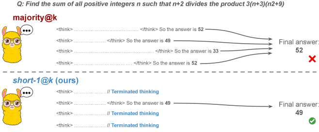
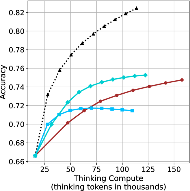
Figure 1: Visual comparison between majority voting and our proposed method short-m@k with $m=1$ (“…” represent thinking time). Given $k$ parallel attempts for the same question, majority@ $k$ waits until all attempts are done, and perform majority voting among them. On the other hand, our short-m@k method halts computation for all attempts as soon as the first $m$ attempts finish “thinking”, which saves compute and time, and surprisingly also boost performance in most cases.
Building on these findings, we propose short-m@k —a novel inference method for reasoning LLMs. short-m@k executes $k$ generations in parallel and terminates computation for all generations as soon as the first $m$ thinking processes are completed. The final answer is then selected via majority voting among those shortest chains, where ties are broken by taking the shortest answer among the tied candidates. See Figure ˜ 1 for visualization.
We evaluate short-m@k using six reasoning LLMs, and compare it to majority voting—the most common aggregation method for evaluating reasoning LLMs on complex benchmarks (Wang et al., 2022; Abdin et al., 2025). We show that in low-compute regimes, short-1@k, i.e., taking the single shortest chain, outperforms majority voting, while significantly reducing the time and compute needed to generate the final answer. For example, using LN-Super- $49$ B (Bercovich and others, 2025), short-1@k can reduce up to $40\$ of the compute while giving the same performance as majority voting. Moreover, for high-compute regimes, short-3@k, which halts generation after three thinking chains are completed, consistently outperforms majority voting across all compute budgets, while running up to $33\$ faster.
To gain further insights into the underlining mechanism of why shorter thinking is preferable, we analyze the generated reasoning chains. We first show that while taking the shorter reasoning is beneficial per individual question, longer reasoning is still needed to solve harder questions, as claimed in recent studies (Anthropic, 2025; OpenAI, 2024; Muennighoff et al., 2025). Next, we analyze the backtracking and re-thinking behaviors of reasoning chains. We find that shorter reasoning paths are more effective, as they involve fewer backtracks, with a longer average backtrack length. This finding holds both generally and when controlling for overall trajectory length.
To further strengthening our findings, we study whether training on short reasoning chains can lead to more accurate models. To do so, we finetune two Qwen- $2.5$ (Yang and others, 2024) models ( $7$ B and $32$ B) on three variants of the S $1$ dataset (Muennighoff et al., 2025): S $1$ -short, S $1$ -long, and S $1$ -random, consisting of examples with the shortest, longest, and randomly sampled reasoning trajectories among several generations, respectively. Our experiments demonstrate that finetuning using S $1$ -short not only yields shorter thinking lengths, but also improves model performance. Conversely, finetuning on S $1$ -long increases reasoning time with no significant performance gains.
This work rethinks the test-time compute paradigm for reasoning LLMs, showing that longer thinking not only does not ensure better reasoning, but also leads to worse reasoning in most cases. Our short-m@k methods prioritize shorter reasoning, yielding improved performance and reduced computational costs for current reasoning LLMs. We also show that training reasoning LLMs with shorter reasoning trajectories can enhance performance and reduce costs. Our results pave the way towards a new era of efficient and high-performing reasoning LLMs.
## 2 Related work
Reasoning LLMs and test-time scaling.
Reasoning LLMs tackle complex tasks by employing extensive reasoning processes, often involving detailed, step-by-step trajectories (OpenAI (2024); OpenAI (2025); Q. Team (2025b); M. Abdin, S. Agarwal, A. Awadallah, V. Balachandran, H. Behl, L. Chen, G. de Rosa, S. Gunasekar, M. Javaheripi, N. Joshi, et al. (2025); Anthropic (2025); A. Bercovich et al. (2025); D. Guo, D. Yang, H. Zhang, J. Song, R. Zhang, R. Xu, Q. Zhu, S. Ma, P. Wang, X. Bi, et al. (2025); 27; G. DeepMind (2025); Q. Team (2025a)). This capability is fundamentally based on techniques like chain-of-thought (CoT; Wei et al., 2022), which encourage models to generate intermediate reasoning steps before arriving at a final answer. Modern LLMs use a large number of tokens, often referred to as “thinking tokens”, to explore multiple problem-solving approaches, to employ self-reflection, and to perform verification. This thinking capability has allowed them to achieve superior performance on challenging tasks such as mathematical problem-solving and code generation (Ke et al., 2025).
The LLM thinking capability is typically achieved through post-training methods applied to a strong base model. The two primary approaches to instilling or improving this reasoning ability are using reinforcement learning (RL) (Guo et al., 2025; Team, 2025b) and supervised fine-tuning (Muennighoff et al., 2025; Ye et al., 2025). Guo et al. (2025) have demonstrated that as training progresses the model tends to generate longer thinking trajectories, which results in improved performance on complex tasks. Similarly, Anthropic (2025) and Muennighoff et al. (2025) have shown a correlation between increased average thinking length during inference and improved performance. We challenge this assumption, demonstrating that shorter sequences are more likely to yield an accurate answer.
Efficiency in reasoning LLMs.
While shortening the length of CoT is beneficial for non-reasoning models (Nayab et al., 2024; Kang et al., 2025), it is higly important for reasoning LLMs as they require a very large amount of tokens to perform the thinking process. As a result, recent studies tried to make the process more efficient, e.g., by using early exit techniques for reasoning trajectories (Pu et al., 2025; Yang et al., 2025), by suppressing backtracks (Wang et al., 2025a) or by training reasoning models which enable control over the thinking length (Yu et al., 2025).
Several recent works studied the relationship between reasoning trajectory length and correctness. Lu et al. (2025) proposed a method for reducing the length of thinking trajectories in reasoning training datasets. Their method employs a reasoning LLM several times over an existing trajectory in order to make it shorter. As this approach eventually trains a model over shorter trajectories it is similar to the method we employ in Section ˜ 6. However, our method is simpler as it does not require an LLM to explicitly shorten the sequence. Fatemi et al. (2025); Qi et al. (2025) and Arora and Zanette (2025) proposed RL methods to shorten reasoning in language models. Fatemi et al. (2025) also observed that correct answers typically require shorter thinking trajectories by averaging lengths across examples, suggesting that lengthy responses might inherently stem from RL-based optimization during training. In Section ˜ 5.1 we show that indeed correct answers usually use shorter thinking trajectories, but also highlight that averaging across all examples might hinder this effect as easier questions require sustainably lower amount of reasoning tokens compared to harder ones.
More relevant to our work, Wu et al. (2025) showed that there is an optimal thinking length range for correct answers according to the difficulty of the question, while Wang et al. (2025b) found that for a specific question, correct responses from reasoning models are usually shorter than incorrect ones. We provide further analysis supporting these observations in Sections ˜ 3 and 5. Finally, our proposed inference method short-m@k is designed to enhance the efficiency of reasoning LLMs by leveraging this property, which can be seen as a generalization of the FFS method (Agarwal et al., 2025), which selects the shortest answer among several candidates as in our short-1@k.
## 3 Shorter thinking is preferable
As mentioned above, the common wisdom in reasoning LLMs suggests that increased test-time computation enhances model performance. Specifically, it is widely assumed that longer reasoning process, which entails extensive reasoning thinking chains, correlates with improved task performance (OpenAI, 2024; Anthropic, 2025; Muennighoff et al., 2025). We challenge this assumption and ask whether generating more tokens per trajectory actually leads to better performance. To that end, we generate multiple answers per question and compare performance based solely on the shortest, longest and randomly sampled thinking chains among the generated samples.
### 3.1 Experimental details
We consider four leading, high-performing, open, reasoning LLMs. Llama- $3.3$ -Nemotron-Super- $49$ B-v $1$ [LN-Super- $49$ B; Bercovich and others, 2025]: a reasoning RL-enhanced version of Llama- $3.3$ - $70$ B (Grattafiori et al., 2024); R $1$ -Distill-Qwen- $32$ B [R $1$ - $32$ B; Guo et al., 2025]: an SFT finetuned version of Qwen- $2.5$ - $32$ B-Instruct (Yang and others, 2024) derived from R $1$ trajectories; QwQ- $32$ B a reasoning RL-enhanced version Qwen- $2.5$ - $32$ B-Instruct (Team, 2025b); and R1- $0528$ a $670$ B RL-trained flagship reasoning model (R $1$ - $670$ B; Guo et al., 2025). We also include results for smaller models in Appendix ˜ D.
We evaluate all models using four competitive reasoning benchmarks. We use AIME $2024$ (of America, 2024), AIME $2025$ (of America, 2025) and HMMT February $2025$ , from the Math Arena benchmark (Balunović et al., 2025). This three benchmarks are derived from math competitions, and involve solving problems that cover a broad range of mathematics topics. Each dataset consists of $30$ examples with varied difficulty. We also evaluate the models using the GPQA-diamond benchmark [GPQA-D; Rein et al., 2024], which consists of $198$ multiple-choice scientific questions, and is considered to be challenging for reasoning LLMs (DeepMind, 2025).
For each question, we generate $20$ responses per model, yielding a total of about $36$ k generations. For all models we use temperature of $0.7$ , top-p= $0.95$ and a maximum number of generated tokens of $32$ , $768$ . When measuring the thinking chain length, we measure the token count between the <think> and </think> tokens. We run inference for all models using paged attention via the vLLM framework (Kwon et al., 2023).
### 3.2 The shorter the better
Table 1: Shorter thinking performs better. Comparison between taking the shortest/longest/random generation per example.
| | GPQA-D | AIME 2024 | AIME 2025 | HMMT | Math Average | | | | | |
| --- | --- | --- | --- | --- | --- | --- | --- | --- | --- | --- |
| Thinking Tokens $\downarrow$ | Acc. $\uparrow$ | Thinking Tokens $\downarrow$ | Acc. $\uparrow$ | Thinking Tokens $\downarrow$ | Acc. $\uparrow$ | Thinking Tokens $\downarrow$ | Acc. $\uparrow$ | Thinking Tokens $\downarrow$ | Acc. $\uparrow$ | |
| LN-Super-49B | | | | | | | | | | |
| random | 5357 | 65.1 | 11258 | 58.8 | 12105 | 51.3 | 13445 | 33.0 | 12270 | 47.7 |
| longest | 8763 $(+64\$ | 57.6 | 18566 | 33.3 | 18937 | 30.0 | 19790 | 23.3 | 19098 $(+56\$ | 28.9 |
| shortest | 2790 $(-48\$ | 69.1 | 0 6276 | 76.7 | 0 7036 | 66.7 | 0 7938 | 46.7 | 7083 $(-42\$ | 63.4 |
| R1-32B | | | | | | | | | | |
| random | 5851 | 62.5 | 9614 | 71.8 | 11558 | 56.4 | 12482 | 38.3 | 11218 | 55.5 |
| longest | 9601 $(+64\$ | 57.1 | 17689 | 53.3 | 19883 | 36.7 | 20126 | 23.3 | 19233 $(+71\$ | 37.8 |
| shortest | 3245 $(-45\$ | 64.7 | 0 4562 | 80.0 | 0 6253 | 63.3 | 0 6557 | 36.7 | 5791 $(-48\$ | 60.0 |
| QwQ-32B | | | | | | | | | | |
| random | 8532 | 63.7 | 13093 | 82.0 | 14495 | 72.3 | 16466 | 52.5 | 14685 | 68.9 |
| longest | 12881 $(+51\$ | 54.5 | 20059 | 70.0 | 21278 | 63.3 | 24265 | 36.7 | 21867 $(+49\$ | 56.7 |
| shortest | 5173 $(-39\$ | 64.7 | 0 8655 | 86.7 | 10303 | 66.7 | 11370 | 60.0 | 10109 $(-31\$ | 71.1 |
| R1-670B | | | | | | | | | | |
| random | 11843 | 76.2 | 16862 | 83.8 | 18557 | 82.5 | 21444 | 68.2 | 18954 | 78.2 |
| longest | 17963 $(+52\$ | 63.1 | 22603 | 70.0 | 23570 | 66.7 | 27670 | 40.0 | 24615 $(+30\$ | 58.9 |
| shortest | 8116 $(-31\$ | 75.8 | 11229 | 83.3 | 13244 | 83.3 | 13777 | 83.3 | 12750 $(-33\$ | 83.3 |
For all generated answers, we compare short vs. long thinking chains for the same question, along with a random chain. Results are presented in Table ˜ 1. In this section we exclude generations where thinking is not completed within the maximum generation length, as these often result in an infinite thinking loop. First, as expected, the shortest answers are $25\$ – $50\$ shorter compared to randomly sampled responses. However, we also note that across almost all models and benchmarks, considering the answer with the shortest thinking chain actually boosts performance, yielding an average absolute improvement of $2.2\$ – $15.7\$ on the math benchmarks compared to randomly selected generations. When considering the longest thinking answers among the generations, we further observe an increase in thinking chain length, with up to $75\$ more tokens per chain. These extended reasoning trajectories substantially degrade performance, resulting in average absolute reductions ranging between $5.4\$ – $18.8\$ compared to random generations over all benchmarks. These trends are most noticeable when comparing the shortest generation with the longest ones, with an absolute performance gain of up to $34.5\$ in average accuracy and a substantial drop in the number of thinking tokens.
The above results suggest that long generations might come with a significant price-tag, not only in running time, but also in performance. That is, within an individual example, shorter thinking trajectories are much more likely to be correct. In Section ˜ 5.1 we examine how these results relate to the common assumption that longer trajectories leads to better LLM performance. Next, we propose strategies to leverage these findings to improve the efficiency and effectiveness of reasoning LLMs.
## 4 short-m@k : faster and better inference of reasoning LLMs
Based on the results presented in Section ˜ 3, we suggest a novel inference method for reasoning LLMs. Our method— short-m@k —leverages batch inference of LLMs per question, using multiple parallel decoding runs for the same query. We begin by introducing our method in Section ˜ 4.1. We then describe our evaluation methodology, which takes into account inference compute and running time (Section ˜ 4.2). Finally, we present our results (Section ˜ 4.3).
### 4.1 The short-m@k method
The short-m@k method, visualized in Figure ˜ 1, performs parallel decoding of $k$ generations for a given question, halting computation across all generations as soon as the $m\leq k$ shortest thinking trajectories are completed. It then conducts majority voting among those shortest answers, resolving ties by selecting the answer with the shortest thinking chain. Given that thinking trajectories can be computationally intensive, terminating all generations once the $m$ shortest trajectories are completed not only saves computational resources but also significantly reduces wall time due to the parallel decoding approach, as shown in Section ˜ 4.3.
Below we focus on short-1@k and short-3@k, with short-1@k being the most efficient variant of short-m@k and short-3@k providing the best balance of performance and efficiency (see Section ˜ 4.3). Ablation studies on $m$ and other design choices are presented in Appendix ˜ C, while results for smaller models are presented in Appendix ˜ D.
### 4.2 Evaluation setup
We evaluate all methods under the same setup as described in Section ˜ 3.1. We report the averaged results across the math benchmarks, while the results for GPQA-D presented in Appendix ˜ A. The per benchmark resutls for the math benchmarks are in Appendix ˜ B. We report results using our method (short-m@k) with $m\in\{1,3\}$ . We compare the proposed method to the standard majority voting (majority $@k$ ), arguably the most common method for aggregating multiple outputs (Wang et al., 2022), which was recently adapted for reasoning LLMs (Guo et al., 2025; Abdin et al., 2025; Wang et al., 2025b). As an oracle, we consider pass $@k$ (Kulal et al., 2019; Chen and others, 2021), which measures the probability of including the correct solution within $k$ generated responses.
We benchmark the different methods with sample sizes of $k\in\{1,2,...,10\}$ , assuming standard parallel decoding setup, i.e., all samples are generated in parallel. Section 5.3 presents sequential analysis where parallel decoding is not assumed. For the oracle (pass@ $k$ ) approach, we use the unbiased estimator presented in Chen and others (2021), with our $20$ generations per question ( $n$ $=$ $20$ ). For the short-1@k method, we use the rank-score@ $k$ metric (Hassid et al., 2024), where we sort the different generations according to thinking length. For majority $@k$ and short-m@k where $m>1$ , we run over all $k$ -sized subsets out of the $20$ generations per example.
We evaluate the different methods considering three main criteria: (a) Sample-size (i.e., $k$ ), where we compare methods while controlling for the number of generated samples; (b) Thinking-compute, where we measure the total number of thinking tokens used across all generations in the batch; and (c) Time-to-answer, which measures the wall time of running inference using each method. In this parallel framework, our method (short-m@k) terminates all other generations after the first $m$ decoding thinking processes terminate. Thus, the overall thinking compute is the total number of thinking tokens for each of the $k$ generations at that point. Similarly, the overall time is that of the $m$ ’th shortest generation process. Conversely, for majority $@k$ , the method’s design necessitates waiting for all generations to complete before proceeding. Hence, we consider the compute as the total amount of thinking tokens in all generations and run time according to the longest thinking chain. As for the oracle approach, we terminate all thinking trajectories once the shortest correct one is finished, and consider the compute and time accordingly.
### 4.3 Results
<details>
<summary>x2.png Details</summary>
### Visual Description
## Line Chart: Accuracy vs. Sample Size
### Overview
The image presents a line chart illustrating the relationship between accuracy and sample size. Three distinct lines represent different models or conditions, showing how accuracy changes as the sample size increases from 1k to 10k. The chart is set against a white background with a grid for easier readability.
### Components/Axes
* **X-axis:** Labeled "Sample Size (k)", ranging from 1 to 10, with increments of 1.
* **Y-axis:** Labeled "Accuracy", ranging from 0.50 to 0.75, with increments of 0.05.
* **Lines:** Three lines are plotted, each with a distinct color and style:
* Black dotted line
* Cyan solid line
* Red solid line
### Detailed Analysis
Let's analyze each line individually, noting trends and approximate data points.
* **Black Dotted Line:** This line exhibits the steepest upward trend. It starts at approximately 0.57 at a sample size of 1k and rapidly increases to approximately 0.74 at a sample size of 10k.
* (1k, 0.57)
* (2k, 0.63)
* (3k, 0.67)
* (4k, 0.69)
* (5k, 0.70)
* (6k, 0.71)
* (7k, 0.72)
* (8k, 0.73)
* (9k, 0.74)
* (10k, 0.74)
* **Cyan Solid Line:** This line shows a moderate upward trend, but plateaus towards the higher sample sizes. It begins at approximately 0.45 at 1k and reaches approximately 0.61 at 10k.
* (1k, 0.45)
* (2k, 0.52)
* (3k, 0.56)
* (4k, 0.58)
* (5k, 0.59)
* (6k, 0.60)
* (7k, 0.60)
* (8k, 0.61)
* (9k, 0.61)
* (10k, 0.61)
* **Red Solid Line:** This line demonstrates the slowest upward trend and appears to converge with the cyan line at higher sample sizes. It starts at approximately 0.43 at 1k and reaches approximately 0.59 at 10k.
* (1k, 0.43)
* (2k, 0.48)
* (3k, 0.52)
* (4k, 0.55)
* (5k, 0.57)
* (6k, 0.58)
* (7k, 0.59)
* (8k, 0.59)
* (9k, 0.60)
* (10k, 0.60)
### Key Observations
* The black dotted line consistently outperforms the other two lines across all sample sizes.
* The cyan and red lines converge as the sample size increases, suggesting diminishing returns in accuracy beyond a certain point.
* The initial increase in accuracy is most pronounced for the black dotted line, indicating a rapid improvement with even small sample sizes.
### Interpretation
The chart suggests that increasing the sample size generally improves accuracy, but the rate of improvement varies significantly depending on the model or condition being evaluated. The black dotted line represents a model that benefits substantially from larger sample sizes, while the cyan and red lines show a more limited improvement. The convergence of the cyan and red lines at higher sample sizes indicates that, for these models, the benefit of additional data diminishes as the sample size grows. This could be due to factors such as reaching a saturation point in the data or the inherent limitations of the models themselves. The chart highlights the importance of considering sample size when evaluating model performance and suggests that the optimal sample size may depend on the specific model and the desired level of accuracy.
</details>
(a) LN-Super-49B
<details>
<summary>x3.png Details</summary>
### Visual Description
## Chart: Accuracy vs. Sample Size
### Overview
The image presents a line chart illustrating the relationship between sample size (in thousands) and accuracy. Three distinct data series are plotted, each representing a different model or condition. The chart demonstrates how accuracy changes as the sample size increases.
### Components/Axes
* **X-axis:** Labeled "Sample Size (k)", ranging from 1 to 10 (in thousands). The axis is linearly scaled.
* **Y-axis:** Labeled "Accuracy", ranging from 0.55 to 0.75. The axis is linearly scaled.
* **Data Series 1:** Represented by a black dotted line with diamond markers.
* **Data Series 2:** Represented by a red solid line with circular markers.
* **Data Series 3:** Represented by a light blue solid line with square markers.
* **Grid:** A light gray grid is present, aiding in the reading of values.
### Detailed Analysis
**Data Series 1 (Black Dotted Line):** This line exhibits a steep upward trend, indicating a rapid increase in accuracy with increasing sample size.
* At Sample Size = 1k, Accuracy ≈ 0.56
* At Sample Size = 2k, Accuracy ≈ 0.64
* At Sample Size = 3k, Accuracy ≈ 0.69
* At Sample Size = 4k, Accuracy ≈ 0.72
* At Sample Size = 5k, Accuracy ≈ 0.73
* At Sample Size = 6k, Accuracy ≈ 0.735
* At Sample Size = 7k, Accuracy ≈ 0.74
* At Sample Size = 8k, Accuracy ≈ 0.74
* At Sample Size = 9k, Accuracy ≈ 0.745
* At Sample Size = 10k, Accuracy ≈ 0.75
**Data Series 2 (Red Solid Line):** This line shows a moderate upward trend, with the rate of increase slowing down as the sample size grows.
* At Sample Size = 1k, Accuracy ≈ 0.55
* At Sample Size = 2k, Accuracy ≈ 0.59
* At Sample Size = 3k, Accuracy ≈ 0.62
* At Sample Size = 4k, Accuracy ≈ 0.64
* At Sample Size = 5k, Accuracy ≈ 0.65
* At Sample Size = 6k, Accuracy ≈ 0.65
* At Sample Size = 7k, Accuracy ≈ 0.65
* At Sample Size = 8k, Accuracy ≈ 0.65
* At Sample Size = 9k, Accuracy ≈ 0.65
* At Sample Size = 10k, Accuracy ≈ 0.65
**Data Series 3 (Light Blue Solid Line):** This line demonstrates a rapid initial increase in accuracy, followed by a plateau.
* At Sample Size = 1k, Accuracy ≈ 0.55
* At Sample Size = 2k, Accuracy ≈ 0.60
* At Sample Size = 3k, Accuracy ≈ 0.62
* At Sample Size = 4k, Accuracy ≈ 0.63
* At Sample Size = 5k, Accuracy ≈ 0.63
* At Sample Size = 6k, Accuracy ≈ 0.63
* At Sample Size = 7k, Accuracy ≈ 0.63
* At Sample Size = 8k, Accuracy ≈ 0.63
* At Sample Size = 9k, Accuracy ≈ 0.63
* At Sample Size = 10k, Accuracy ≈ 0.63
### Key Observations
* Data Series 1 consistently outperforms the other two series across all sample sizes.
* Data Series 2 and 3 converge in accuracy as the sample size increases, reaching a plateau around 0.63-0.65.
* The initial increase in accuracy is most pronounced for Data Series 1 and Data Series 3.
* The benefit of increasing sample size diminishes for Data Series 2 and 3 beyond a sample size of 4k.
### Interpretation
The chart suggests that increasing the sample size generally improves accuracy, but the extent of improvement varies depending on the model or condition being evaluated. Data Series 1 demonstrates a strong positive correlation between sample size and accuracy, indicating that this model benefits significantly from larger datasets. Data Series 2 and 3, however, exhibit diminishing returns, suggesting that their accuracy reaches a limit even with larger sample sizes. This could be due to factors such as model complexity, data quality, or inherent limitations of the underlying algorithm. The plateau observed in Data Series 2 and 3 implies that further increasing the sample size beyond a certain point will not yield substantial gains in accuracy. This information is valuable for resource allocation, as it suggests that investing in larger datasets may not be the most effective strategy for improving the performance of these models. The differences between the curves could also indicate different learning algorithms or different levels of sensitivity to data quantity.
</details>
(b) R $1$ - $32$ B
<details>
<summary>x4.png Details</summary>
### Visual Description
\n
## Line Chart: Accuracy vs. Sample Size
### Overview
This image presents a line chart illustrating the relationship between sample size (in thousands) and accuracy. Four distinct data series are plotted, each represented by a different colored line. The chart appears to demonstrate how accuracy improves with increasing sample size, but at a diminishing rate.
### Components/Axes
* **X-axis:** Labeled "Sample Size (k)". The scale ranges from 1 to 10, in increments of 1.
* **Y-axis:** Labeled "Accuracy". The scale ranges from 0.66 to 0.82, in increments of 0.02.
* **Data Series:** Four lines are present, each with a unique color and style:
* Black dotted line
* Teal solid line
* Red solid line
* Light blue dashed line
### Detailed Analysis
Let's analyze each line individually, noting trends and approximate data points.
* **Black Dotted Line:** This line exhibits the steepest upward trend. It starts at approximately 0.67 at a sample size of 1k and rises rapidly, reaching approximately 0.82 at a sample size of 10k.
* **Teal Solid Line:** This line shows a moderate upward trend, but plateaus at higher sample sizes. It begins at approximately 0.67 at 1k, rises to around 0.75 at 5k, and then plateaus around 0.75-0.76 for sample sizes greater than 5k.
* **Red Solid Line:** This line demonstrates a slower, more gradual increase in accuracy. It starts at approximately 0.67 at 1k, reaches around 0.73 at 5k, and continues to rise slowly, reaching approximately 0.75 at 10k.
* **Light Blue Dashed Line:** This line shows a slight initial increase, followed by a plateau and even a slight decrease at higher sample sizes. It starts at approximately 0.68 at 1k, rises to around 0.72 at 3k, and then remains relatively constant around 0.72, with a slight dip to approximately 0.71 at 10k.
Here's a table summarizing approximate data points:
| Sample Size (k) | Black Dotted (Accuracy) | Teal Solid (Accuracy) | Red Solid (Accuracy) | Light Blue Dashed (Accuracy) |
|---|---|---|---|---|
| 1 | 0.67 | 0.67 | 0.67 | 0.68 |
| 2 | 0.74 | 0.71 | 0.70 | 0.71 |
| 3 | 0.78 | 0.73 | 0.72 | 0.72 |
| 4 | 0.80 | 0.74 | 0.73 | 0.72 |
| 5 | 0.81 | 0.75 | 0.73 | 0.72 |
| 6 | 0.81 | 0.75 | 0.74 | 0.72 |
| 7 | 0.81 | 0.75 | 0.74 | 0.72 |
| 8 | 0.82 | 0.76 | 0.75 | 0.71 |
| 9 | 0.82 | 0.76 | 0.75 | 0.71 |
| 10 | 0.82 | 0.76 | 0.75 | 0.71 |
### Key Observations
* The black dotted line consistently outperforms the other three lines across all sample sizes.
* The light blue dashed line shows a limited benefit from increasing sample size beyond 3k, and even a slight decrease in accuracy at 10k.
* The teal solid line demonstrates diminishing returns, with accuracy plateauing after 5k.
* The red solid line shows the slowest rate of improvement in accuracy.
### Interpretation
The chart suggests that increasing the sample size generally improves accuracy, but the extent of improvement varies depending on the method or model being used. The black dotted line likely represents a method that benefits significantly from larger sample sizes, while the light blue dashed line represents a method that is less sensitive to sample size or may even be negatively affected by excessively large samples (potentially due to overfitting or other issues). The teal and red lines represent intermediate cases.
The plateauing observed in the teal and light blue lines indicates that there is a point of diminishing returns, where adding more data does not significantly improve accuracy. This could be due to factors such as the inherent limitations of the method, the quality of the data, or the presence of noise.
The differences between the lines highlight the importance of selecting an appropriate method and sample size for a given task. The optimal choice will depend on the specific requirements of the application and the characteristics of the data. The chart provides valuable insights into the trade-offs between sample size, accuracy, and computational cost.
</details>
(c) QwQ-32B
<details>
<summary>x5.png Details</summary>
### Visual Description
## Line Chart: Accuracy vs. Sample Size
### Overview
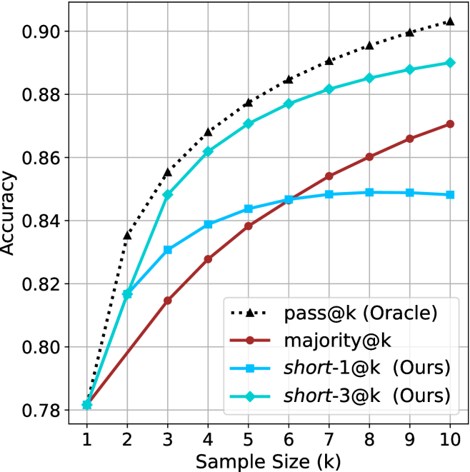
This image presents a line chart illustrating the relationship between accuracy and sample size (k) for four different methods: pass@k (Oracle), majority@k, short-1@k (Ours), and short-3@k (Ours). The chart displays how accuracy changes as the sample size increases from 1 to 10.
### Components/Axes
* **X-axis:** Sample Size (k), ranging from 1 to 10.
* **Y-axis:** Accuracy, ranging from 0.78 to 0.90.
* **Data Series:**
* pass@k (Oracle) - represented by a dotted black line.
* majority@k - represented by a solid maroon line.
* short-1@k (Ours) - represented by a solid blue line.
* short-3@k (Ours) - represented by a solid teal line.
* **Legend:** Located in the center-right of the chart, listing the data series and their corresponding colors.
### Detailed Analysis
Here's a breakdown of each data series and their trends:
* **pass@k (Oracle):** This line starts at approximately 0.78 at k=1 and steadily increases, reaching approximately 0.90 at k=10. The line exhibits a consistently upward slope, indicating a strong positive correlation between sample size and accuracy.
* k=1: Accuracy ≈ 0.78
* k=2: Accuracy ≈ 0.83
* k=3: Accuracy ≈ 0.86
* k=4: Accuracy ≈ 0.88
* k=5: Accuracy ≈ 0.89
* k=6: Accuracy ≈ 0.89
* k=7: Accuracy ≈ 0.89
* k=8: Accuracy ≈ 0.89
* k=9: Accuracy ≈ 0.90
* k=10: Accuracy ≈ 0.90
* **majority@k:** This line begins at approximately 0.78 at k=1 and increases more slowly than pass@k, reaching approximately 0.87 at k=10. The slope is less steep than pass@k, suggesting a weaker correlation.
* k=1: Accuracy ≈ 0.78
* k=2: Accuracy ≈ 0.80
* k=3: Accuracy ≈ 0.82
* k=4: Accuracy ≈ 0.83
* k=5: Accuracy ≈ 0.84
* k=6: Accuracy ≈ 0.85
* k=7: Accuracy ≈ 0.86
* k=8: Accuracy ≈ 0.86
* k=9: Accuracy ≈ 0.87
* k=10: Accuracy ≈ 0.87
* **short-1@k (Ours):** This line starts at approximately 0.78 at k=1 and increases at a moderate rate, reaching approximately 0.85 at k=10. The slope is between pass@k and majority@k.
* k=1: Accuracy ≈ 0.78
* k=2: Accuracy ≈ 0.81
* k=3: Accuracy ≈ 0.83
* k=4: Accuracy ≈ 0.84
* k=5: Accuracy ≈ 0.84
* k=6: Accuracy ≈ 0.84
* k=7: Accuracy ≈ 0.85
* k=8: Accuracy ≈ 0.85
* k=9: Accuracy ≈ 0.85
* k=10: Accuracy ≈ 0.85
* **short-3@k (Ours):** This line starts at approximately 0.78 at k=1 and increases rapidly initially, then plateaus, reaching approximately 0.88 at k=10. It initially outperforms short-1@k but converges towards a similar accuracy level as k increases.
* k=1: Accuracy ≈ 0.78
* k=2: Accuracy ≈ 0.82
* k=3: Accuracy ≈ 0.85
* k=4: Accuracy ≈ 0.86
* k=5: Accuracy ≈ 0.87
* k=6: Accuracy ≈ 0.88
* k=7: Accuracy ≈ 0.88
* k=8: Accuracy ≈ 0.88
* k=9: Accuracy ≈ 0.88
* k=10: Accuracy ≈ 0.88
### Key Observations
* The "pass@k (Oracle)" method consistently achieves the highest accuracy across all sample sizes.
* The "short-3@k (Ours)" method initially shows promising results, but its accuracy plateaus as the sample size increases.
* The "majority@k" method exhibits the slowest increase in accuracy with increasing sample size.
* All methods start with a similar accuracy at k=1.
### Interpretation
The chart demonstrates the impact of sample size on the accuracy of different methods. The "pass@k (Oracle)" method, likely representing an ideal or perfect scenario, serves as an upper bound on achievable accuracy. The "Ours" methods (short-1@k and short-3@k) represent practical approaches that attempt to approximate the performance of the Oracle method. The plateauing of "short-3@k" suggests diminishing returns with larger sample sizes, potentially due to limitations in the method's ability to effectively utilize additional data. The slower improvement of "majority@k" indicates that it may be less sensitive to sample size or less effective at leveraging the available information. The data suggests that increasing the sample size generally improves accuracy, but the extent of improvement varies depending on the method used. The "Ours" methods offer a trade-off between performance and computational cost, as they do not require the perfect knowledge assumed by the "Oracle" method.
</details>
(d) R1-670B
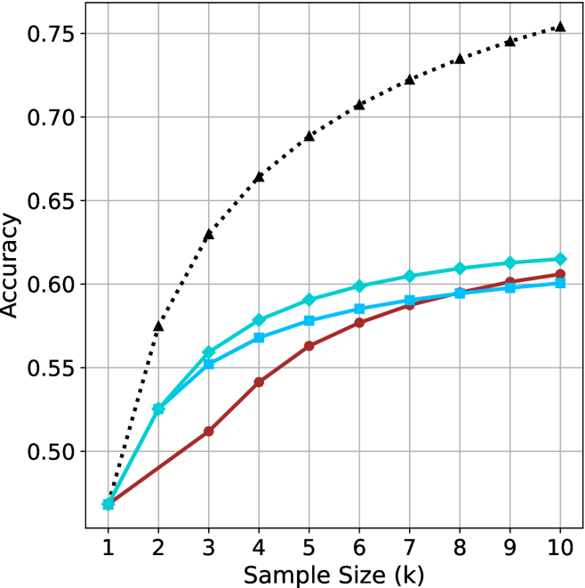
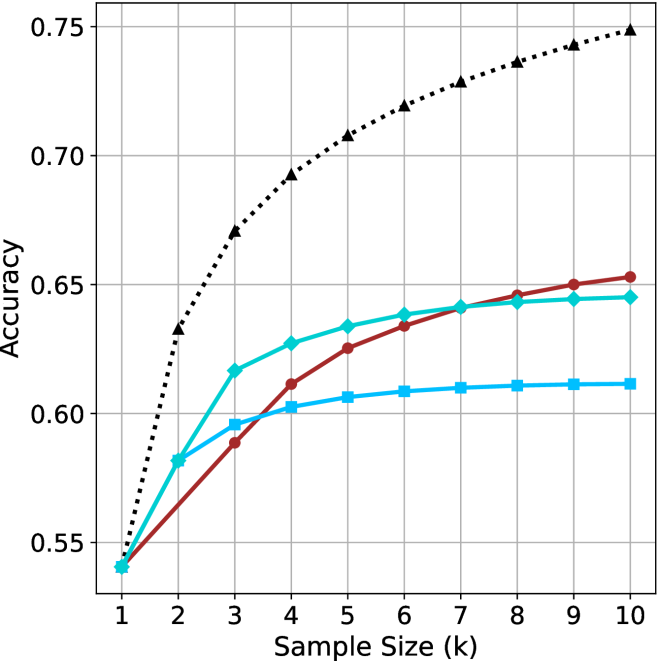
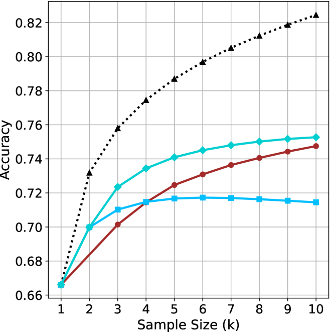
Figure 2: Comparing different inference methods under controlled sample size ( $k$ ). All methods improve with larger sample sizes. Interestingly, this trend also holds for the short-m@k methods.
<details>
<summary>x6.png Details</summary>
### Visual Description
## Line Chart: Accuracy vs. Thinking Compute
### Overview
This image presents a line chart illustrating the relationship between "Thinking Compute" (measured in thousands of tokens) and "Accuracy". The chart displays four distinct data series, each represented by a different colored line, showing how accuracy changes as thinking compute increases. The chart is set against a white background with a grid for easier readability.
### Components/Axes
* **X-axis:** Labeled "Thinking Compute (thinking tokens in thousands)". The scale ranges from approximately 0 to 120 (in thousands of tokens). Markers are present at 20, 40, 60, 80, 100, and 120.
* **Y-axis:** Labeled "Accuracy". The scale ranges from approximately 0.48 to 0.76. Markers are present at 0.50, 0.55, 0.60, 0.65, 0.70, and 0.75.
* **Data Series:** Four lines are present, each with a distinct color and marker style:
* Black dotted line with diamond markers.
* Cyan line with square markers.
* Blue line with triangular markers.
* Red line with circular markers.
* **Grid:** A light gray grid is overlaid on the chart area to aid in reading values.
### Detailed Analysis
Let's analyze each data series individually:
* **Black (Dotted Line with Diamonds):** This line exhibits the steepest upward trend. It starts at approximately (20, 0.52), rises rapidly, and plateaus around (80, 0.74), remaining relatively constant until (120, 0.74). Approximate data points: (20, 0.52), (40, 0.68), (60, 0.72), (80, 0.74), (100, 0.74), (120, 0.74).
* **Cyan (Line with Squares):** This line shows a moderate upward trend, less steep than the black line. It begins at approximately (20, 0.56), increases steadily, and levels off around (60, 0.62), with slight fluctuations until (120, 0.62). Approximate data points: (20, 0.56), (40, 0.59), (60, 0.62), (80, 0.62), (100, 0.62), (120, 0.62).
* **Blue (Line with Triangles):** This line demonstrates a similar trend to the cyan line, but starts at a slightly lower accuracy. It begins at approximately (20, 0.54), increases steadily, and plateaus around (60, 0.61), remaining relatively constant until (120, 0.61). Approximate data points: (20, 0.54), (40, 0.57), (60, 0.61), (80, 0.61), (100, 0.61), (120, 0.61).
* **Red (Line with Circles):** This line exhibits the slowest upward trend. It starts at approximately (20, 0.50), increases gradually, and reaches approximately (120, 0.60). Approximate data points: (20, 0.50), (40, 0.53), (60, 0.56), (80, 0.59), (100, 0.60), (120, 0.60).
### Key Observations
* The black data series consistently outperforms the other three, achieving the highest accuracy levels.
* The red data series consistently underperforms the other three, achieving the lowest accuracy levels.
* The cyan and blue data series exhibit similar performance, with cyan slightly outperforming blue.
* Accuracy gains diminish as "Thinking Compute" increases beyond approximately 80,000 tokens, particularly for the black data series.
* The initial increase in accuracy is most pronounced for the black data series, suggesting a significant benefit from increased compute in the early stages.
### Interpretation
The chart demonstrates the impact of "Thinking Compute" on "Accuracy" for four different models or configurations. The significant difference in performance between the black line and the others suggests that the black line represents a more effective approach or a more advanced model. The diminishing returns observed at higher compute levels indicate that there's a point where increasing compute yields only marginal improvements in accuracy. This could be due to limitations in the model architecture, the dataset, or the task itself. The consistent ranking of the lines suggests inherent differences in the capabilities of the underlying systems. The data suggests that investing in "Thinking Compute" is beneficial, but there's an optimal point beyond which further investment provides limited value. Further investigation would be needed to understand *why* the black line performs so much better – is it a different algorithm, more training data, or a larger model size? The chart provides a clear visual representation of the trade-off between computational cost and performance.
</details>
(a) LN-Super-49B
<details>
<summary>x7.png Details</summary>
### Visual Description
## Line Chart: Accuracy vs. Thinking Compute
### Overview
This image presents a line chart illustrating the relationship between "Thinking Compute" (measured in thousands of tokens) and "Accuracy". Four distinct data series are plotted, each represented by a different colored line with distinct markers. The chart appears to demonstrate how accuracy improves with increased computational effort (thinking tokens).
### Components/Axes
* **X-axis:** "Thinking Compute (thinking tokens in thousands)". Scale ranges from approximately 0 to 120, with markers at 20, 40, 60, 80, 100, and 120.
* **Y-axis:** "Accuracy". Scale ranges from approximately 0.55 to 0.75, with markers at 0.55, 0.60, 0.65, 0.70, and 0.75.
* **Data Series:** Four lines are present, each with a unique color and marker style:
* Black dotted line with diamond markers.
* Teal (cyan) line with circular markers.
* Red line with circular markers.
* Blue line with square markers.
### Detailed Analysis
Let's analyze each data series individually:
* **Black Line (Diamond Markers):** This line exhibits the steepest upward trend.
* At approximately 20 (thousands of tokens), Accuracy is around 0.64.
* At approximately 40 (thousands of tokens), Accuracy is around 0.71.
* At approximately 60 (thousands of tokens), Accuracy is around 0.73.
* At approximately 80 (thousands of tokens), Accuracy is around 0.74.
* At approximately 100 (thousands of tokens), Accuracy is around 0.745.
* At approximately 120 (thousands of tokens), Accuracy is around 0.75.
* **Teal Line (Circular Markers):** This line shows a moderate upward trend, leveling off after approximately 60 (thousands of tokens).
* At approximately 20 (thousands of tokens), Accuracy is around 0.58.
* At approximately 40 (thousands of tokens), Accuracy is around 0.62.
* At approximately 60 (thousands of tokens), Accuracy is around 0.64.
* At approximately 80 (thousands of tokens), Accuracy is around 0.645.
* At approximately 100 (thousands of tokens), Accuracy is around 0.65.
* At approximately 120 (thousands of tokens), Accuracy is around 0.65.
* **Red Line (Circular Markers):** This line shows a slow upward trend, leveling off after approximately 40 (thousands of tokens).
* At approximately 20 (thousands of tokens), Accuracy is around 0.55.
* At approximately 40 (thousands of tokens), Accuracy is around 0.60.
* At approximately 60 (thousands of tokens), Accuracy is around 0.61.
* At approximately 80 (thousands of tokens), Accuracy is around 0.62.
* At approximately 100 (thousands of tokens), Accuracy is around 0.63.
* At approximately 120 (thousands of tokens), Accuracy is around 0.64.
* **Blue Line (Square Markers):** This line shows a moderate upward trend, leveling off after approximately 60 (thousands of tokens).
* At approximately 20 (thousands of tokens), Accuracy is around 0.57.
* At approximately 40 (thousands of tokens), Accuracy is around 0.61.
* At approximately 60 (thousands of tokens), Accuracy is around 0.62.
* At approximately 80 (thousands of tokens), Accuracy is around 0.625.
* At approximately 100 (thousands of tokens), Accuracy is around 0.63.
* At approximately 120 (thousands of tokens), Accuracy is around 0.63.
### Key Observations
* The black line consistently demonstrates the highest accuracy across all levels of "Thinking Compute".
* The red line consistently demonstrates the lowest accuracy across all levels of "Thinking Compute".
* All lines exhibit diminishing returns in accuracy as "Thinking Compute" increases beyond approximately 60-80 (thousands of tokens).
* The teal and blue lines show similar performance, with the teal line slightly outperforming the blue line.
### Interpretation
The chart suggests a positive correlation between "Thinking Compute" and "Accuracy", but with diminishing returns. Increasing computational effort (as measured by tokens) initially leads to significant gains in accuracy. However, beyond a certain point, the improvement in accuracy becomes marginal. The black line likely represents a more sophisticated or optimized approach to "thinking" or problem-solving, as it consistently achieves higher accuracy. The red line may represent a baseline or less effective method. The leveling off of all lines indicates that there are inherent limitations to the approach, or that other factors become more important in determining accuracy beyond a certain level of computational effort. This could be due to the complexity of the task, the quality of the data, or the limitations of the underlying model. The differences between the lines suggest that different algorithms or configurations have varying levels of efficiency in utilizing computational resources to achieve accuracy.
</details>
(b) R $1$ - $32$ B
<details>
<summary>x8.png Details</summary>
### Visual Description
## Line Chart: Accuracy vs. Thinking Compute
### Overview
The image presents a line chart illustrating the relationship between "Thinking Compute" (measured in thousands of tokens) and "Accuracy". Four distinct data series are plotted, each represented by a different colored line. The chart appears to demonstrate how accuracy improves with increased computational effort (thinking tokens).
### Components/Axes
* **X-axis:** "Thinking Compute (thinking tokens in thousands)". The scale ranges from approximately 0 to 150, with markers at 25, 50, 75, 100, 125, and 150.
* **Y-axis:** "Accuracy". The scale ranges from approximately 0.66 to 0.82, with markers at 0.66, 0.68, 0.70, 0.72, 0.74, 0.76, 0.78, 0.80, and 0.82.
* **Data Series:** Four lines are present, each with a distinct color and pattern:
* Black dotted line
* Cyan solid line
* Red solid line
* Orange dashed line
### Detailed Analysis
Let's analyze each line individually, noting trends and approximate data points.
* **Black Dotted Line:** This line exhibits the steepest upward slope, indicating the fastest increase in accuracy with increasing thinking compute.
* At 25 (Thinking Compute), Accuracy is approximately 0.72.
* At 50, Accuracy is approximately 0.77.
* At 75, Accuracy is approximately 0.795.
* At 100, Accuracy is approximately 0.81.
* At 125, Accuracy is approximately 0.818.
* At 150, Accuracy is approximately 0.822.
* **Cyan Solid Line:** This line shows a moderate upward slope, with a diminishing rate of increase as thinking compute increases.
* At 25, Accuracy is approximately 0.685.
* At 50, Accuracy is approximately 0.72.
* At 75, Accuracy is approximately 0.74.
* At 100, Accuracy is approximately 0.748.
* At 125, Accuracy is approximately 0.75.
* At 150, Accuracy is approximately 0.752.
* **Red Solid Line:** This line demonstrates a slow, but steady, increase in accuracy.
* At 25, Accuracy is approximately 0.67.
* At 50, Accuracy is approximately 0.695.
* At 75, Accuracy is approximately 0.71.
* At 100, Accuracy is approximately 0.725.
* At 125, Accuracy is approximately 0.735.
* At 150, Accuracy is approximately 0.74.
* **Orange Dashed Line:** This line initially increases rapidly, then plateaus.
* At 25, Accuracy is approximately 0.69.
* At 50, Accuracy is approximately 0.71.
* At 75, Accuracy is approximately 0.715.
* At 100, Accuracy is approximately 0.718.
* At 125, Accuracy is approximately 0.72.
* At 150, Accuracy is approximately 0.722.
### Key Observations
* The black dotted line consistently outperforms the other three lines across all values of "Thinking Compute".
* The red solid line exhibits the slowest rate of improvement in accuracy.
* The orange dashed line shows initial gains, but quickly reaches a point of diminishing returns.
* All lines demonstrate an overall positive correlation between "Thinking Compute" and "Accuracy", but the strength of this correlation varies significantly.
### Interpretation
The chart suggests that increasing "Thinking Compute" generally leads to improved accuracy, but the effectiveness of this approach depends on the specific method or model being used (represented by the different lines). The black dotted line likely represents a highly efficient method, achieving substantial accuracy gains with relatively little computational effort. Conversely, the red solid line represents a less efficient method, requiring significantly more compute to achieve comparable accuracy. The orange dashed line suggests a method that quickly reaches its performance limit.
The diminishing returns observed in the cyan and orange lines indicate that there is a point at which further investment in "Thinking Compute" yields only marginal improvements in accuracy. This highlights the importance of optimizing computational resources and potentially exploring alternative approaches to achieve higher accuracy. The chart provides valuable insights into the trade-offs between computational cost and performance, which is crucial for practical applications of these models.
</details>
(c) QwQ-32B
<details>
<summary>x9.png Details</summary>
### Visual Description
\n
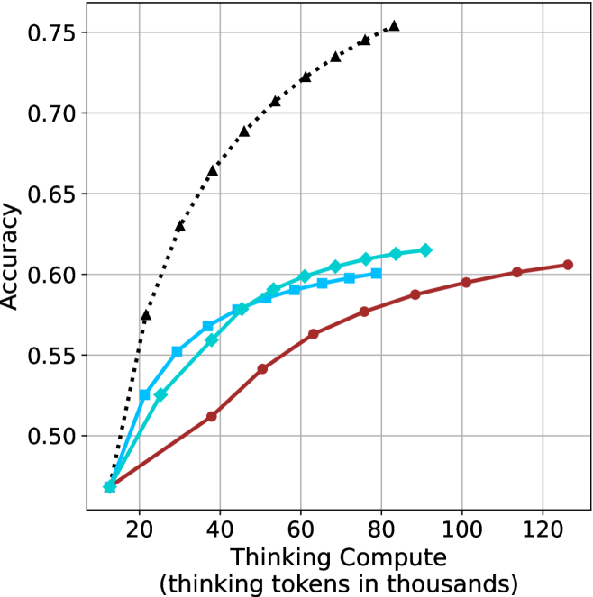
## Line Chart: Accuracy vs. Thinking Compute
### Overview
This image presents a line chart comparing the accuracy of different methods (pass@k, majority@k, short-1@k, and short-3@k) as a function of "Thinking Compute" measured in thousands of tokens. The chart illustrates how accuracy improves with increased computational effort for each method.
### Components/Axes
* **X-axis:** "Thinking Compute (thinking tokens in thousands)". Scale ranges from approximately 0 to 160, with markers at 0, 50, 100, and 150.
* **Y-axis:** "Accuracy". Scale ranges from approximately 0.78 to 0.91, with markers at 0.78, 0.80, 0.82, 0.84, 0.86, 0.88, and 0.90.
* **Legend:** Located in the top-right corner, listing the following data series with corresponding colors:
* pass@k (Oracle) - Black dotted line with triangle markers.
* majority@k - Brown solid line with circle markers.
* short-1@k (Ours) - Red solid line with circle markers.
* short-3@k (Ours) - Cyan solid line with diamond markers.
### Detailed Analysis
* **pass@k (Oracle):** This line starts at approximately 0.79 at a Thinking Compute of 0, rises steeply to approximately 0.87 at a Thinking Compute of 50, continues to rise but at a decreasing rate, reaching approximately 0.90 at a Thinking Compute of 150. The trend is upward and leveling off.
* **majority@k:** This line begins at approximately 0.79 at a Thinking Compute of 0, increases steadily to approximately 0.84 at a Thinking Compute of 50, and continues to rise, reaching approximately 0.87 at a Thinking Compute of 150. The trend is consistently upward, but less steep than pass@k.
* **short-1@k (Ours):** This line starts at approximately 0.78 at a Thinking Compute of 0, increases rapidly to approximately 0.84 at a Thinking Compute of 50, and then plateaus, reaching approximately 0.85 at a Thinking Compute of 150. The trend is initially steep, then flattens.
* **short-3@k (Ours):** This line begins at approximately 0.79 at a Thinking Compute of 0, increases rapidly to approximately 0.86 at a Thinking Compute of 50, and then rises more slowly, reaching approximately 0.88 at a Thinking Compute of 150. The trend is upward, with a decreasing rate of increase after a Thinking Compute of 50.
### Key Observations
* "pass@k (Oracle)" consistently achieves the highest accuracy across all levels of "Thinking Compute".
* "short-3@k (Ours)" outperforms "short-1@k (Ours)" at all levels of "Thinking Compute".
* The rate of accuracy improvement diminishes for all methods as "Thinking Compute" increases, suggesting a point of diminishing returns.
* "short-1@k (Ours)" shows the least improvement in accuracy with increasing "Thinking Compute".
### Interpretation
The chart demonstrates the relationship between computational effort (measured as "Thinking Compute") and the accuracy of different methods for a task. The "pass@k (Oracle)" method, likely representing an ideal or upper-bound performance, serves as a benchmark. The "short-1@k" and "short-3@k" methods, labeled as "Ours," represent approaches developed by the authors.
The data suggests that increasing "Thinking Compute" generally improves accuracy, but the benefit is not linear. The diminishing returns observed for all methods indicate that there's a trade-off between computational cost and performance gains. The superior performance of "short-3@k" over "short-1@k" suggests that incorporating more information or complexity into the model (represented by the '3' in short-3@k) leads to better results, but with increased computational cost. The gap between the "Ours" methods and the "Oracle" method highlights the potential for further improvement in the developed approaches. The chart provides evidence for the effectiveness of the "Ours" methods, particularly "short-3@k," while also indicating areas for future research and optimization.
</details>
(d) R1-670B
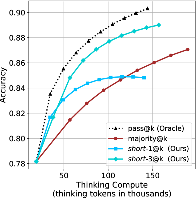
Figure 3: Comparing different inference methods under controlled thinking compute. short-1@k is highly performant in low compute regimes. short-3@k dominates the curve compared to majority $@k$ .
Sample-size ( $k$ ).
We start by examining different methods across benchmarks for a fixed sample size $k$ . Results aggregated across math benchmarks are presented in Figure ˜ 2, while Figure ˜ 6 in Appendix ˜ A presents GPQA-D results, and detailed results per benchmark can be seen at Appendix ˜ B. We observe that, generally, all methods improve with larger sample sizes, indicating that increased generations per question enhance performance. This trend is somewhat expected for the oracle (pass@ $k$ ) and majority@ $k$ methods but surprising for our method, as it means that even when a large amount of generations is used, the shorter thinking ones are more likely to be correct. The only exception is QwQ- $32$ B (Figure ˜ 2(c)), which shows a small of decline when considering larger sample sizes with the short-1@k method.
When comparing short-1@k to majority@ $k$ , the former outperforms at smaller sample sizes, but is outperformed by the latter in three out of four models when the sample size increases. Meanwhile, the short-3@k method demonstrates superior performance, dominating across nearly all models and sample sizes. Notably, for the R $1$ - $670$ B model, short-3@k exhibits performance nearly on par with the oracle across all sample sizes. We next analyze how this performance advantage translates into efficiency benefits.
Thinking-compute.
The aggregated performance results for math benchmarks, evaluated with respect to thinking compute, are presented in Figure ˜ 3 (per-benchmark results provided in Appendix ˜ B), while the GPQA-D respective results are presented in Figure ˜ 7 in Appendix ˜ A. We again observe that the short-1@k method outperforms majority $@k$ at lower compute budgets. Notably, for LN-Super- $49$ B (Figure ˜ 3(a)), the short-1@k method surpasses majority $@k$ across all compute budgets. For instance, short-1@k achieves $57\$ accuracy with approximately $60\$ of the compute budget used by majority@ $k$ to achieve the same accuracy. For R $1$ - $32$ B, QwQ- $32$ B and R $1$ - $670$ B models, the short-1@k method exceeds majority $@k$ up to compute budgets of $45$ k, $60$ k and $100$ k total thinking tokens, respectively, but is underperformed by it on larger compute budgets.
The short-3@k method yields even greater performance improvements, incurring only a modest increase in thinking compute compared to short-1@k. When compared to majority $@k$ , short-3@k consistently achieves higher performance with lower thinking compute across all models and compute budgets. For example, with the QwQ- $32$ B model (Figure ˜ 3(c)), and an average compute budget of $80$ k thinking tokens per example, short-3@k improves accuracy by $2\$ over majority@ $k$ . For the R $1$ - $670$ B model (Figure ˜ 3(d)), short-3@k consistently outperforms majority voting, yielding an approximate $4\$ improvement with an average token budget of $100$ k.
<details>
<summary>x10.png Details</summary>
### Visual Description
\n
## Scatter Plot: Accuracy vs. Time-to-Answer
### Overview
This image presents a scatter plot illustrating the relationship between Accuracy and Time-to-Answer, with data points differentiated by the value of 'k'. The x-axis represents Time-to-Answer in thousands of units, and the y-axis represents Accuracy. There are two distinct marker shapes: squares and circles, each representing different values of 'k'.
### Components/Axes
* **X-axis:** Time-to-Answer (longest thinking in thousands) - Scale ranges from approximately 8 to 19.
* **Y-axis:** Accuracy - Scale ranges from approximately 0.48 to 0.62.
* **Legend:** Implicitly defined by marker shape and 'k' value labels next to the data points.
* **Data Series:** Two distinct series based on marker shape.
* Squares: Representing k = 1, 3, 5, and 9.
* Circles: Representing k = 3, 5, and 9.
* **'k' Values:** 1, 3, 5, and 9.
### Detailed Analysis
The plot shows a general trend of increasing accuracy with increasing time-to-answer. Let's analyze each 'k' value series:
* **k = 1 (Square, Cyan):** Located at approximately (13.5, 0.49).
* **k = 3 (Square, Blue):** Located at approximately (9.5, 0.55) and (15.5, 0.51).
* **k = 5 (Square, Light Blue):** Located at approximately (10.5, 0.59) and (17.5, 0.56).
* **k = 9 (Square, Dark Blue):** Located at approximately (9, 0.60) and (14, 0.61).
* **k = 3 (Circle, Red):** Located at approximately (16, 0.52).
* **k = 5 (Circle, Red):** Located at approximately (18, 0.56).
* **k = 9 (Circle, Red):** Located at approximately (18, 0.60).
The square markers generally cluster towards the left side of the plot (lower Time-to-Answer values), while the circle markers are more dispersed and tend towards the right side (higher Time-to-Answer values).
### Key Observations
* There is a positive correlation between Time-to-Answer and Accuracy.
* For k=3, k=5, and k=9, there are data points represented by both square and circle markers, suggesting potentially different behaviors or conditions for the same 'k' value.
* The highest accuracy values (around 0.60) are achieved with k=9, and these points are associated with longer Time-to-Answer values.
* k=1 has the lowest accuracy and a moderate Time-to-Answer.
* There is some overlap in the Time-to-Answer ranges for different 'k' values, particularly for k=3, k=5, and k=9.
### Interpretation
This data suggests that increasing the 'thinking time' (Time-to-Answer) generally leads to higher accuracy. The parameter 'k' appears to influence both the accuracy and the time required to achieve it. The presence of both square and circle markers for k=3, k=5, and k=9 indicates that there might be different strategies or conditions under which the system operates, leading to variations in performance for the same 'k' value. The fact that the circle markers generally have higher Time-to-Answer values suggests that these conditions might involve more complex or time-consuming processing. The plot could be illustrating the trade-off between speed and accuracy in a decision-making process, where 'k' represents a parameter controlling the complexity or thoroughness of the process. The differing shapes for the same 'k' value could represent different algorithms or approaches being tested. Further investigation would be needed to understand the specific meaning of 'k' and the conditions that lead to the different marker shapes.
</details>
(a) LN-Super- $49$ B
<details>
<summary>x11.png Details</summary>
### Visual Description
## Scatter Plot: Accuracy vs. Time-to-Answer with varying k values
### Overview
This image presents a scatter plot illustrating the relationship between Accuracy and Time-to-Answer for different values of 'k'. The 'k' parameter likely represents a configuration setting or a model parameter. Each data point represents a specific configuration, and the color of the point indicates the value of 'k'.
### Components/Axes
* **X-axis:** Time-to-Answer (longest thinking in thousands) - ranging from approximately 7.5 to 19.
* **Y-axis:** Accuracy - ranging from approximately 0.54 to 0.65.
* **Data Series:** Multiple data series, each representing a different value of 'k'.
* **Legend:** Located in the top-right corner, indicating the color mapping for each 'k' value:
* k=1 (Dark Red)
* k=3 (Red)
* k=5 (Blue)
* k=9 (Cyan)
* **Data Point Labels:** Each data point is labeled with its corresponding 'k' value.
### Detailed Analysis
The plot shows data points for k=1, k=3, k=5, and k=9.
* **k=1 (Dark Red):** A single data point at approximately (12, 0.54).
* **k=3 (Red):** Three data points:
* Approximately (8.5, 0.59)
* Approximately (15.5, 0.58)
* Approximately (13.5, 0.62)
* **k=5 (Blue):** Three data points:
* Approximately (8.2, 0.60)
* Approximately (10.2, 0.63)
* Approximately (17.2, 0.62)
* **k=9 (Cyan):** Three data points:
* Approximately (8.0, 0.61)
* Approximately (10.0, 0.65)
* Approximately (18.0, 0.64)
**Trends:**
* **k=1:** The single point suggests a low accuracy and moderate time-to-answer.
* **k=3:** The points show a moderate spread in time-to-answer (8.5 to 15.5) with accuracy fluctuating around 0.58-0.62.
* **k=5:** The points show a moderate spread in time-to-answer (8.2 to 17.2) with accuracy fluctuating around 0.60-0.63.
* **k=9:** The points show a moderate spread in time-to-answer (8.0 to 18.0) with accuracy fluctuating around 0.61-0.65.
Generally, as 'k' increases, the accuracy tends to increase, and the time-to-answer also tends to increase.
### Key Observations
* Higher values of 'k' (5 and 9) generally exhibit higher accuracy compared to lower values (1 and 3).
* There's a positive correlation between 'k' and both accuracy and time-to-answer.
* The data points for k=9 show the highest accuracy values, reaching approximately 0.65.
* The data points for k=1 show the lowest accuracy values, at approximately 0.54.
* There is significant variance in time-to-answer for each 'k' value, suggesting that other factors influence processing time.
### Interpretation
The data suggests that increasing the value of 'k' improves the accuracy of the system, but also increases the time it takes to generate an answer. 'k' likely controls the breadth of the search or the complexity of the model. A higher 'k' allows for a more thorough search or a more complex model, leading to better accuracy, but at the cost of increased processing time.
The spread of data points for each 'k' value indicates that the relationship between 'k', accuracy, and time-to-answer is not strictly deterministic. Other factors, such as the specific input or the underlying hardware, likely play a role.
The single data point for k=1 suggests that this value is insufficient to achieve high accuracy, and may be a lower bound for practical use. The optimal value of 'k' would likely be a trade-off between accuracy and time-to-answer, depending on the specific application requirements. Further investigation could involve analyzing the distribution of time-to-answer for each 'k' value and performing statistical tests to determine the significance of the observed trends.
</details>
(b) R $1$ - $32$ B
<details>
<summary>x12.png Details</summary>
### Visual Description
## Scatter Plot: Accuracy vs. Time-to-Answer
### Overview
This image presents a scatter plot visualizing the relationship between Accuracy and Time-to-Answer, with data points differentiated by the value of 'k'. The plot appears to explore the trade-off between speed (Time-to-Answer) and correctness (Accuracy) for different values of 'k'.
### Components/Axes
* **X-axis:** Time-to-Answer (longest thinking in thousands). Scale ranges from approximately 11.5 to 21.
* **Y-axis:** Accuracy. Scale ranges from approximately 0.67 to 0.75.
* **Data Points:** Scatter plot points, each representing a data instance. The points are color-coded based on the value of 'k'.
* **Legend:** Located in the top-right corner, the legend maps colors to 'k' values:
* Blue: k=1
* Light Blue: k=3
* Light Green: k=5
* Dark Green: k=9
* Red: k=3
### Detailed Analysis
The plot contains several data points, each labeled with its corresponding 'k' value. Let's analyze the data points by 'k' value and their approximate coordinates:
* **k=1:** One data point, located at approximately (15.5, 0.67).
* **k=3:** Three data points:
* (14.5, 0.72)
* (18.5, 0.70)
* (19.5, 0.72)
* **k=5:** Three data points:
* (12.5, 0.72)
* (14.5, 0.74)
* (20.0, 0.72)
* **k=9:** Three data points:
* (13.5, 0.75)
* (18.0, 0.73)
* (20.5, 0.74)
**Trends:**
* **k=1:** The single point suggests a low accuracy and relatively fast Time-to-Answer.
* **k=3:** The points show a wider range of Time-to-Answer (14.5 to 19.5) with accuracy fluctuating around 0.72 and 0.70.
* **k=5:** The points show a range of Time-to-Answer (12.5 to 20.0) with accuracy fluctuating around 0.72 and 0.74.
* **k=9:** The points show a range of Time-to-Answer (13.5 to 20.5) with accuracy fluctuating around 0.73 and 0.75.
Generally, as 'k' increases, the Time-to-Answer tends to increase, and the Accuracy also tends to increase, but this is not a strict monotonic relationship.
### Key Observations
* There is a general positive correlation between 'k' and both Time-to-Answer and Accuracy.
* For k=3, there is a significant spread in Time-to-Answer values, while the accuracy remains relatively consistent.
* The highest accuracy is achieved with k=9, but it also requires the longest Time-to-Answer.
* There is overlap in the Time-to-Answer ranges for different 'k' values, indicating that achieving a certain speed does not necessarily dictate a specific accuracy level.
### Interpretation
The data suggests that increasing the value of 'k' generally improves accuracy but at the cost of increased Time-to-Answer. 'k' likely represents a parameter controlling the complexity or thoroughness of the process being evaluated. A higher 'k' might involve more extensive computation or consideration of more factors, leading to better results but slower processing.
The spread of data points for k=3 indicates that there are multiple ways to achieve similar accuracy levels with this parameter setting, potentially due to variations in the input data or the underlying algorithm.
The plot highlights a trade-off between speed and accuracy, which is a common consideration in many applications. The optimal value of 'k' would depend on the specific requirements of the task, balancing the need for accurate results with the constraints of time or computational resources. The red data points for k=3 are interesting, as they are clustered together, suggesting a specific behavior or condition for that parameter value.
</details>
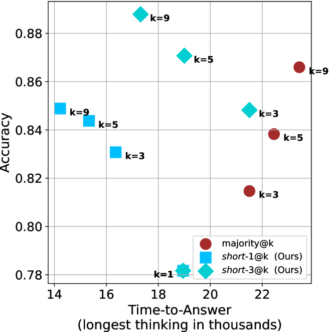
(c) QwQ-32B
<details>
<summary>x13.png Details</summary>
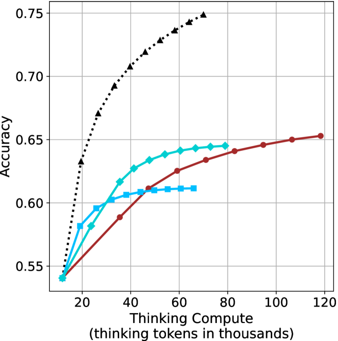
### Visual Description
\n
## Scatter Plot: Accuracy vs. Time-to-Answer
### Overview
This image presents a scatter plot comparing the accuracy and time-to-answer for different values of 'k' across three methods: majority@k, short-1@k (Ours), and short-3@k (Ours). The plot visualizes the trade-off between performance (accuracy) and computational cost (time).
### Components/Axes
* **X-axis:** Time-to-Answer (longest thinking in thousands) - Scale ranges from approximately 14 to 22.5.
* **Y-axis:** Accuracy - Scale ranges from approximately 0.78 to 0.89.
* **Legend:** Located in the bottom-right corner.
* majority@k - Represented by red circles.
* short-1@k (Ours) - Represented by blue squares.
* short-3@k (Ours) - Represented by teal diamonds.
* **Data Points:** Each point represents a specific combination of 'k' value and method. The 'k' value is labeled next to each data point.
### Detailed Analysis
Let's analyze each data series individually:
**1. majority@k (Red Circles):**
* The data points show an upward trend as 'k' increases.
* k=3: Approximately (21.8, 0.82)
* k=5: Approximately (21.2, 0.84)
* k=9: Approximately (22.3, 0.87)
**2. short-1@k (Ours) (Blue Squares):**
* The data points show a generally increasing trend in accuracy with increasing 'k', but with more fluctuation.
* k=1: Approximately (14.2, 0.78)
* k=3: Approximately (15.5, 0.84)
* k=5: Approximately (16.2, 0.84)
* k=9: Approximately (17.5, 0.86)
**3. short-3@k (Ours) (Teal Diamonds):**
* The data points show a clear upward trend in accuracy as 'k' increases.
* k=3: Approximately (19.5, 0.85)
* k=5: Approximately (20.2, 0.87)
* k=9: Approximately (21.0, 0.88)
### Key Observations
* For all methods, increasing 'k' generally leads to higher accuracy, but also increases the time-to-answer.
* The 'short-3@k (Ours)' method consistently achieves the highest accuracy for a given time-to-answer compared to the other two methods.
* The 'majority@k' method has the lowest accuracy for a given time-to-answer.
* The 'short-1@k (Ours)' method has the lowest time-to-answer for a given accuracy.
* The 'short-1@k (Ours)' method shows a plateau in accuracy between k=3 and k=5.
### Interpretation
The data suggests a trade-off between accuracy and computational cost. Increasing the value of 'k' improves accuracy but requires more time to compute the answer. The 'short-3@k (Ours)' method appears to be the most efficient in terms of achieving high accuracy with a reasonable time-to-answer. The 'short-1@k (Ours)' method is the fastest but sacrifices some accuracy. The 'majority@k' method is the least accurate.
The plot demonstrates the effectiveness of the "Ours" methods (short-1@k and short-3@k) in balancing accuracy and speed. The plateau observed in 'short-1@k (Ours)' between k=3 and k=5 might indicate diminishing returns for increasing 'k' beyond a certain point for that specific method. This information is valuable for selecting the appropriate method based on the specific requirements of the application, prioritizing either speed or accuracy. The choice of 'k' also depends on the application's constraints.
</details>
(d) R1-670B
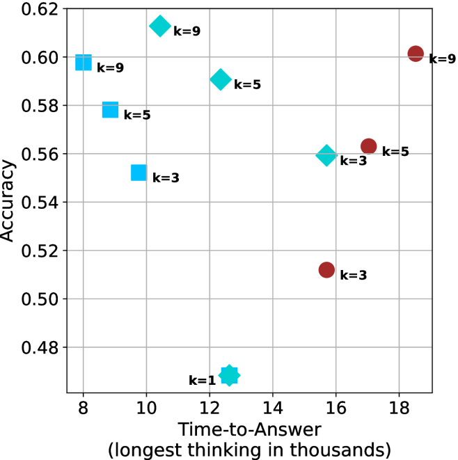
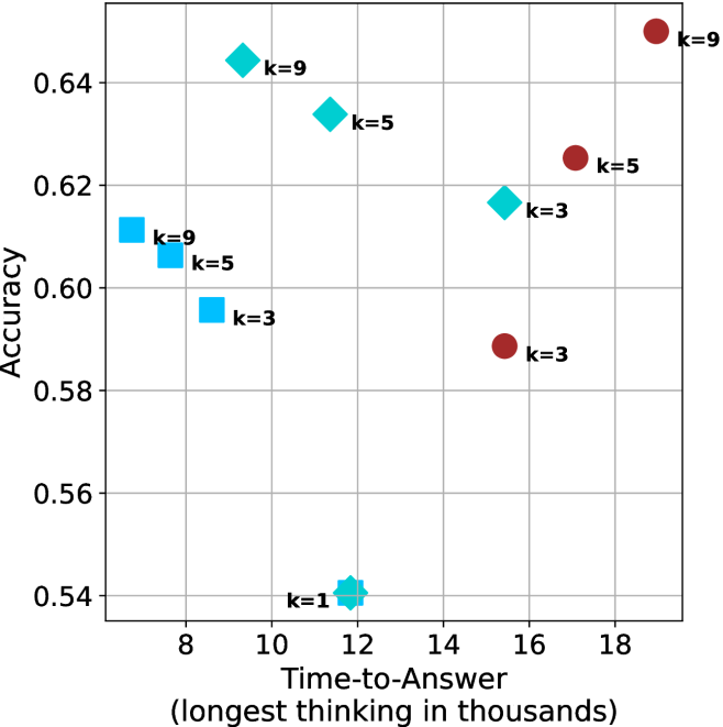
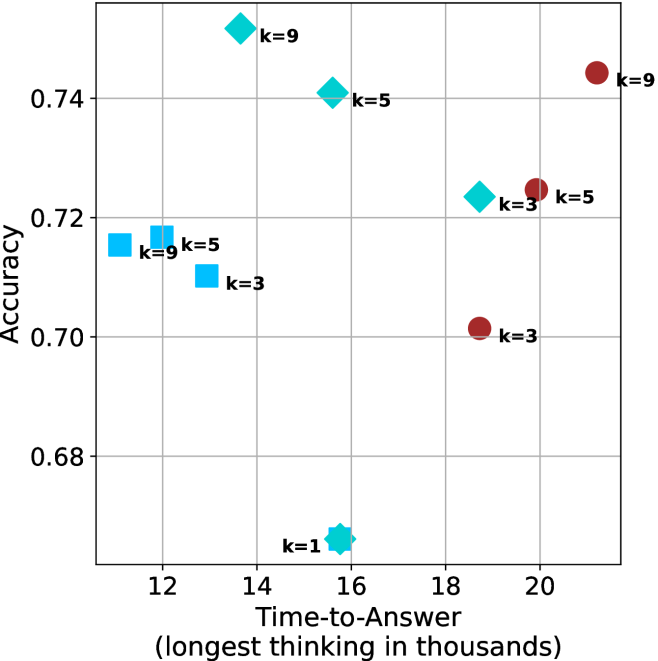
Figure 4: Comparing time-to-answer for different inference methods. Our methods substantially reduce time cost with no major loss in performance. Unlike majority $@k$ , which becomes slower as $k$ grows, our methods run faster with $k$ , as the probability of finding a short chain increases with $k$ .
Time-to-answer.
Finally, the math aggregated time-to-answer results are shown in Figure ˜ 4, with GPQA-D results shown in Figure ˜ 8 and pe math benchmark in Appendix ˜ B. For readability, Figure 4 omits the oracle, and methods are compared across a subset of sample sizes. As sample size increases, majority $@k$ exhibits longer time-to-answer, driven by a higher probability of sampling generations with extended thinking chains, requiring all trajectories to complete. Conversely, the short-1@k method shows reduced time-to-answer with larger sample sizes, as the probability of encountering a short answer increases. This trend also holds for the short-3@k method after three reasoning processes complete.
This phenomenon makes the short-1@k and short-3@k methods substantially more usable compared to basic majority $@k$ . For example, when using the LN-Super- $49$ B model (Figure ˜ 4(a)), with a sample size of $5$ , the short-1@k method reduces time consumption by almost $50\$ while also increasing performance by about $1.5\$ compared to majority@ $k$ . When considering a larger sample size of $9$ , the performance values are almost the same but short-1@k is more than $55\$ faster.
Finally, we observe that for most models and sample sizes, short-3@k boosts performance, while for larger ones it also reduces time-to-answer significantly. For example, on R $1$ - $32$ B (Figure ˜ 4(b)), with $k=5$ , short-3@k is $33\$ faster than majority@ $k$ , while reaching superior performance. A similar boost in time-to-answer and performance is observed with QwQ- $32$ B/R $1$ - $670$ B and sample size $9$ (Figure ˜ 4(c) and Figure ˜ 4(d)).
## 5 Analysis
To obtain deeper insights into the underlying process, making shorter thinking trajectories preferable, we conduct additional analysis. We first investigate the relation between using shorter thinking per individual example, and the necessity of longer trajectories to solve more complex problems (Section ˜ 5.1). Subsequently, we analyze backtracks in thinking trajectories to better understand the characteristics of shorter trajectories (Section ˜ 5.2). Lastly, we analyze the perfomance of short-m@k in sequential setting (Section ˜ 5.3). All experiments in this section use trajectories produced by our models as described in Section ˜ 3.1. For Sections 5.1 and 5.2 we exclude generations that were not completed within the generation length.
### 5.1 Hard questions (still) require more thinking
We split the questions into three equal size groups according to model’s success rate. Then, we calculate the average thinking length for each of the splits, and provide the average lengths for the correct and incorrect attempts per split.
Table 2: Average thinking tokens for correct (C), incorrect (IC) and all (A) answers, per split by difficulty for the math benchmarks. The numbers are in thousands of tokens.
| Model | Easy | Medium | Hard |
| --- | --- | --- | --- |
| C/IC/A | C/IC/A | C/IC/A | |
| LN-Super-49B | $\phantom{0}5.3/11.1/\phantom{0}5.7$ | $11.4/17.1/14.6$ | $12.4/16.8/16.6$ |
| R1-32B | $\phantom{0}4.9/13.7/\phantom{0}5.3$ | $10.9/17.3/13.3$ | $14.4/15.8/15.7$ |
| QwQ-32B The QwQ-32B and R1-670B models correctly answered all of their easier questions in all attempts. | $\phantom{0}8.4/\phantom{0.}\text{--}\phantom{0}/\phantom{0}8.4$ | $14.8/21.6/15.6$ | $19.1/22.8/22.3$ |
| R1-670B footnotemark: | $13.0/\phantom{0.}\text{--}\phantom{0}/13.0$ | $15.3/20.9/15.5$ | $23.0/31.7/28.4$ |
Tables ˜ 2 and 5 shows the averages thinking tokens per split for the math benchmarks and GPQA-D, respectively. We first note that as observed in Section ˜ 3.2, within each question subset, correct answers are typically shorter than incorrect ones. This suggests that correct answers tend to be shorter, and it holds for easier questions as well as harder ones.
Nevertheless, we also observe that models use more tokens for more challenging questions, up to a factor of $2.9$ . This finding is consistent with recent studies (Anthropic, 2025; OpenAI, 2024; Muennighoff et al., 2025) indicating that using longer thinking is needed in order to solve harder questions. To summarize, harder questions require a longer thinking process compared to easier ones, but within a single question (both easy and hard), shorter thinking is preferable.
### 5.2 Backtrack analysis
One may hypothesize that longer thinking reflect a more extensive and less efficient search path, characterized by a higher degree of backtracking and “rethinking”. In contrast, shorter trajectories indicate a more direct and efficient path, which often leads to a more accurate answer.
To this end, we track several keywords identified as indicators of re-thinking and backtracking within different trajectories. The keywords we used are: [’but’, ’wait’, ’however’, ’alternatively’, ’not sure’, ’going back’, ’backtrack’, ’trace back’, ’hmm’, ’hmmm’] We then categorize the trajectories into correct and incorrect sets, and measure the number of backtracks and their average length (quantified by keyword occurrences divided by total thinking length) for each set. We present the results for the math benchmarks and GPQA-D in Tables ˜ 3 and 6, respectively.
Table 3: Average number of backtracks, and their average length for correct (C), incorrect (IC) and all (A) answers in math benchmarks.
| Model | # Backtracks | Backtrack Len. |
| --- | --- | --- |
| C/IC/A | C/IC/A | |
| LN-Super-49B | $106/269/193$ | $\phantom{0}88/\phantom{0}70/76$ |
| R1-32B | $\phantom{0}95/352/213$ | $117/\phantom{0}63/80$ |
| QwQ-32B | $182/269/193$ | $\phantom{0}70/\phantom{0}60/64$ |
| R1-670B | $188/323/217$ | $\phantom{0}92/102/99$ |
As our results indicate, for all models and benchmarks, correct trajectories consistently exhibit fewer backtracks compared to incorrect ones. Moreover, in almost all cases, backtracks of correct answers are longer. This may suggest that correct solutions involve less backtracking where each backtrack is longer, potentially more in-depth that leads to improved reasoning, whereas incorrect ones explores more reasoning paths that are abandoned earlier (hence tend to be shorter).
Lastly, we analyze the backtrack behavior in a length-controlled manner. Specifically, we divide trajectories into bins based on their length. Within each bin, we compare the number of backtracks between correct and incorrect trajectories. Our hypothesis is that even for trajectories of comparable length, correct trajectories would exhibit fewer backtracks, indicating a more direct path to the answer. The results over the math benchmarks and GPQA-D are presented in Appendix ˜ F. As can be seen, in almost all cases, even among trajectories of comparable length, correct ones show a lower number of backtracks. The only exception is the R $1$ - $670$ B model over the math benchmarks. This finding further suggests that correct trajectories are superior because they spend less time on searching for the correct answer and instead dive deeply into a smaller set of paths.
### 5.3 short-m@k with sequential compute
Our results so far assume sufficient resources for generating the output in parallel. We now study the potential of our proposed method without this constraint, by comparing short-m@k to the baselines in sequential (non-batched) setting, and measuring the amount of thinking tokens used by each method. For short-m@k, each generation is terminated once its length exceeds the maximum length observed among the $m$ shortest previously completed generations.
The results for the math benchmarks are presented in Figure ˜ 5 while the GPQA-D results are in Appendix ˜ E. While the performance of short-m@k shows decreased efficiency in terms of total thinking compute usage compared to a fully batched decoding setup (Section ˜ 4.3), the method’s superiority over standard majority voting remains. Specifically, at low compute regimes, both short-1@k and short-3@k demonstrate higher efficiency and improved performance compared to majority voting. As for higher compute regimes, short-3@k outperforms the majority voting baseline.
<details>
<summary>x14.png Details</summary>
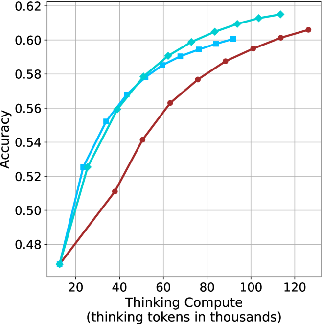
### Visual Description
\n
## Line Chart: Accuracy vs. Thinking Compute
### Overview
This image presents a line chart illustrating the relationship between "Thinking Compute" (measured in thousands of tokens) and "Accuracy". Two distinct data series are plotted, showing how accuracy changes with increasing computational effort. The chart uses a grid background for easier readability.
### Components/Axes
* **X-axis:** "Thinking Compute (thinking tokens in thousands)". Scale ranges from approximately 0 to 120, with markers at 20, 40, 60
</details>
(a) LN-Super-49B
<details>
<summary>x15.png Details</summary>
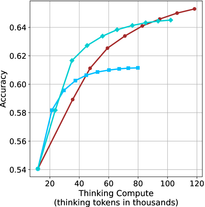
### Visual Description
## Line Chart: Accuracy vs. Thinking Compute
### Overview
This image presents a line chart illustrating the relationship between "Thinking Compute" (measured in thousands of tokens) and "Accuracy". Three distinct data series are plotted, each represented by a different colored line. The chart appears to demonstrate how accuracy improves with increased computational effort (thinking tokens).
### Components/Axes
* **X-axis:** "Thinking Compute (thinking tokens in thousands)". Scale ranges from approximately 0 to 120, with markers at 20, 40, 60, 80, 100, and 120.
* **Y-axis:** "Accuracy". Scale ranges from approximately 0.54 to 0.65, with markers at 0.54, 0.56, 0.58, 0.60, 0.62, 0.64.
* **Data Series 1:** Cyan line with square markers.
* **Data Series 2:** Red line with circular markers.
* **Data Series 3:** Blue line with diamond markers.
* **Grid:** A light gray grid is present, aiding in the reading of values.
### Detailed Analysis
**Data Series 1 (Cyan, Square Markers):**
The cyan line shows an initially steep upward trend, then plateaus.
* At approximately 20 Thinking Compute, Accuracy is around 0.58.
* At approximately 40 Thinking Compute, Accuracy is around 0.62.
* At approximately 60 Thinking Compute, Accuracy is around 0.61.
* At approximately 80 Thinking Compute, Accuracy is around 0.62.
* At approximately 100 Thinking Compute, Accuracy is around 0.63.
* At approximately 120 Thinking Compute, Accuracy is around 0.64.
**Data Series 2 (Red, Circular Markers):**
The red line exhibits a consistent upward trend throughout the entire range.
* At approximately 20 Thinking Compute, Accuracy is around 0.55.
* At approximately 40 Thinking Compute, Accuracy is around 0.61.
* At approximately 60 Thinking Compute, Accuracy is around 0.63.
* At approximately 80 Thinking Compute, Accuracy is around 0.64.
* At approximately 100 Thinking Compute, Accuracy is around 0.65.
* At approximately 120 Thinking Compute, Accuracy is around 0.65.
**Data Series 3 (Blue, Diamond Markers):**
The blue line shows a rapid initial increase, followed by a leveling off.
* At approximately 20 Thinking Compute, Accuracy is around 0.57.
* At approximately 40 Thinking Compute, Accuracy is around 0.60.
* At approximately 60 Thinking Compute, Accuracy is around 0.61.
* At approximately 80 Thinking Compute, Accuracy is around 0.61.
* At approximately 100 Thinking Compute, Accuracy is around 0.61.
* At approximately 120 Thinking Compute, Accuracy is around 0.61.
### Key Observations
* The red line consistently demonstrates the highest accuracy across all levels of "Thinking Compute".
* The cyan line shows diminishing returns in accuracy as "Thinking Compute" increases beyond 40 thousand tokens.
* The blue line plateaus relatively early, indicating limited benefit from further "Thinking Compute" beyond 40 thousand tokens.
* All three lines show an initial increase in accuracy with increasing "Thinking Compute", suggesting that some level of computational effort is beneficial.
### Interpretation
The chart suggests that increasing "Thinking Compute" generally improves accuracy, but the rate of improvement varies depending on the data series. The red line indicates a model or method that scales well with increased computation, while the cyan and blue lines suggest diminishing returns. This could be due to factors such as model architecture, training data, or optimization algorithms. The differences between the lines could represent different approaches to problem-solving or different levels of model complexity. The plateauing of the cyan and blue lines suggests that there is a limit to the accuracy that can be achieved with the given approach, even with substantial computational resources. The data implies that for the cyan and blue lines, resources could be better allocated elsewhere after a certain point. The chart provides valuable insights into the trade-offs between computational cost and accuracy, which is crucial for optimizing performance and resource allocation in machine learning or AI systems.
</details>
(b) R $1$ - $32$ B
<details>
<summary>x16.png Details</summary>
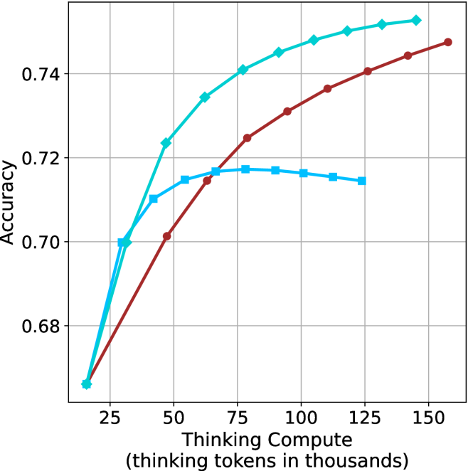
### Visual Description
\n
## Line Chart: Accuracy vs. Thinking Compute
### Overview
This image presents a line chart illustrating the relationship between "Thinking Compute" (measured in thousands of tokens) and "Accuracy". Three distinct data series are plotted, each represented by a different colored line. The chart demonstrates how accuracy changes as the amount of thinking compute increases.
### Components/Axes
* **X-axis:** "Thinking Compute (thinking tokens in thousands)". Scale ranges from approximately 20 to 160, with markers at 25, 50, 75, 100, 125, and 150.
* **Y-axis:** "Accuracy". Scale ranges from approximately 0.68 to 0.75, with markers at 0.68, 0.70, 0.72, and 0.74.
* **Data Series 1 (Cyan):** Represents a rapidly increasing accuracy with diminishing returns.
* **Data Series 2 (Red):** Represents a slower, but more sustained increase in accuracy.
* **Data Series 3 (Blue):** Represents an initial increase in accuracy, followed by a plateau and slight decrease.
* **Gridlines:** A light gray grid is present to aid in reading values.
### Detailed Analysis
* **Cyan Line:** This line starts at approximately (25, 0.68) and increases sharply, reaching approximately (50, 0.73), then continues to increase at a decreasing rate, reaching approximately (150, 0.75). The trend is strongly upward, but the slope decreases as the x-value increases.
* **Red Line:** This line starts at approximately (25, 0.66) and increases steadily, reaching approximately (50, 0.70), (75, 0.72), (100, 0.73), (125, 0.74), and finally (150, 0.75). The trend is consistently upward, but less steep than the cyan line.
* **Blue Line:** This line starts at approximately (25, 0.70) and increases to approximately (50, 0.72), then plateaus around 0.72, with a slight decrease to approximately (150, 0.71). The trend is initially upward, but then becomes relatively flat.
### Key Observations
* The cyan line demonstrates the highest accuracy overall, but exhibits diminishing returns as "Thinking Compute" increases.
* The red line shows a consistent, albeit slower, improvement in accuracy.
* The blue line suggests that beyond a certain point (around 50k tokens), increasing "Thinking Compute" does not significantly improve accuracy and may even slightly decrease it.
* All three lines show an initial increase in accuracy as "Thinking Compute" increases from 25k to 50k tokens.
### Interpretation
The chart suggests that increasing "Thinking Compute" generally improves accuracy, but the relationship is not linear. There appears to be a point of diminishing returns, where further increases in compute yield smaller improvements in accuracy. The blue line indicates that excessive "Thinking Compute" may even be detrimental. This could be due to factors such as overfitting, increased computational cost, or the introduction of noise. The different lines likely represent different models or configurations, each with its own optimal level of "Thinking Compute". The data suggests that finding the right balance between compute and accuracy is crucial for maximizing performance. The chart is a performance analysis of a model or system, showing how accuracy scales with computational resources.
</details>
(c) QwQ-32B
<details>
<summary>x17.png Details</summary>
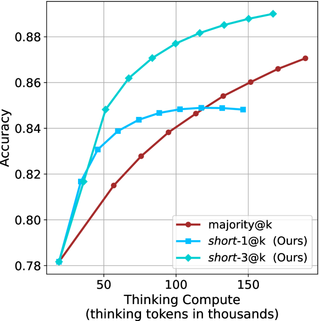
### Visual Description
## Chart: Accuracy vs. Thinking Compute
### Overview
The image presents a line chart illustrating the relationship between "Thinking Compute" (measured in thousands of tokens) and "Accuracy" for three different methods: `majority@k`, `short-1@k (Ours)`, and `short-3@k (Ours)`. The chart aims to demonstrate how performance (accuracy) improves with increased computational resources (thinking tokens).
### Components/Axes
* **X-axis:** "Thinking Compute (thinking tokens in thousands)". Scale ranges from approximately 0 to 175, with markers at 0, 50, 100, and 150.
* **Y-axis:** "Accuracy". Scale ranges from approximately 0.78 to 0.89, with markers at 0.78, 0.80, 0.82, 0.84, 0.86, and 0.88.
* **Legend:** Located in the top-right corner. Contains the following labels and corresponding colors:
* `majority@k` - Reddish-brown line with circular markers.
* `short-1@k (Ours)` - Light blue line with circular markers.
* `short-3@k (Ours)` - Teal line with circular markers.
* **Gridlines:** Present to aid in reading values.
### Detailed Analysis
* **majority@k (Reddish-brown):** The line starts at approximately (0, 0.79) and exhibits a gradually increasing trend, reaching approximately (175, 0.87). The slope is relatively constant throughout.
* (0, 0.79)
* (50, 0.82)
* (100, 0.85)
* (150, 0.865)
* (175, 0.87)
* **short-1@k (Ours) (Light blue):** This line demonstrates a steep initial increase, starting at approximately (0, 0.78) and rapidly climbing to around (50, 0.85). The rate of increase slows down after 50, leveling off around (175, 0.87).
* (0, 0.78)
* (50, 0.85)
* (100, 0.86)
* (150, 0.865)
* (175, 0.87)
* **short-3@k (Ours) (Teal):** This line shows the most rapid increase, beginning at approximately (0, 0.78) and quickly reaching a plateau around (100, 0.88). The line remains relatively flat from 100 to 175.
* (0, 0.78)
* (50, 0.85)
* (100, 0.88)
* (150, 0.875)
* (175, 0.88)
### Key Observations
* `short-3@k (Ours)` consistently outperforms the other two methods across all values of "Thinking Compute".
* `short-1@k (Ours)` initially shows a faster increase in accuracy than `majority@k`, but the difference diminishes as "Thinking Compute" increases.
* All three methods exhibit diminishing returns in accuracy as "Thinking Compute" increases beyond 100.
* The initial accuracy for all methods is approximately the same (around 0.78).
### Interpretation
The chart suggests that increasing the amount of "Thinking Compute" (tokens) generally improves accuracy for all three methods. However, the "short-3@k (Ours)" method demonstrates the most significant gains in accuracy, particularly at lower values of "Thinking Compute". This indicates that this method is more efficient in utilizing computational resources to achieve higher performance. The diminishing returns observed at higher "Thinking Compute" values suggest that there is a point beyond which additional computation provides only marginal improvements in accuracy. The "majority@k" method appears to be the least effective, consistently lagging behind the other two methods. The "Ours" designation suggests these are novel methods being compared to a baseline. The rapid initial gains of the "short-1@k" and "short-3@k" methods could be due to the model quickly learning essential patterns, while the slower gains of "majority@k" might indicate a less efficient learning process.
</details>
(d) R1-670B
Figure 5: Comparing different methods for the math benchmarks under sequential (non-parallel) decoding.
## 6 Finetuning using shorter trajectories
Based on our findings, we investigate whether fine-tuning on shorter reasoning chains improves LLM reasoning accuracy. While one might intuitively expect this to be the case, given the insights from Section ˜ 3 and Section ˜ 5, this outcome is not trivial. A potential counterargument is that training on shorter trajectories could discourage the model from performing necessary backtracks (Section ˜ 5.2), thereby hindering its ability to find a correct solution. Furthermore, the benefit of using shorter trajectories for bootstrapping reasoning remains an open question.
To do so, we follow the S $1$ paradigm, which fine-tunes an LLM to perform reasoning using only $1,$ $000$ trajectories (Muennighoff et al., 2025). We create three versions of the S $1$ dataset, built from examples with the shortest, longest, and random reasoning chains among several generations.
Data creation and finetuning setup.
To construct the three variants of S $1$ , we generate multiple responses for each S $1$ question-answer pair. Specifically, for each example, we produce $10$ distinct answers using the QwQ- $32$ B model, which we select for its superior performance with respect to model size (Section ˜ 3). From these $10$ responses per example, we derive three dataset variants—S $1$ -short, S $1$ -long, and S $1$ -random—by selecting the shortest/longest/random response, respectively. This results in three datasets, each containing the same $1,$ $000$ queries but with distinct reasoning trajectories and answers. We then finetune the Qwen- $2.5$ - $7$ B-Instruct and Qwen- $2.5$ - $32$ B-Instruct models on the three S $1$ variants. We further detail about the generation process, the finetuning setup and evaluation setup in Appendix ˜ G.
Finetuning results.
Results for the 32B model are presented in Table ˜ 4 (7B model results are in Table ˜ 10). For GPQA-D, AIME $2025$ and HMMT benchmarks, the S $1$ -short variant achieves superior performance while using fewer thinking tokens. While performance on AIME $2024$ is similar across models, S $1$ -short still demonstrates the shortest thinking. Aggregated results across math benchmarks reveal that S $1$ -short improves relative performance by $2.8\$ compared to the S $1$ -random baseline, with a reduction of $5.8\$ in thinking tokens. Conversely, the S $1$ -long model consumes more tokens than S $1$ -random, but obtains similar performance.
These results suggest that training on shorter reasoning sequences can lead to better reasoning models that exhibit reduced computational overhead. This observation aligns with our findings in Section ˜ 3, which shows that answers with shorter thinking trajectories tend to be more accurate. We believe that developing models that reason more effectively with less computation holds significant potential.
Table 4: Results for our finetuned models over the S $1$ variants using Qwen-2.5-32B-Instruct: S $1$ -short/long/random. The S $1$ -short model improves performance over the other two models, while using fewer thinking tokens.
| | GPQA-D | AIME 2024 | AIME 2025 | HMMT | Math Average | | | | | |
| --- | --- | --- | --- | --- | --- | --- | --- | --- | --- | --- |
| Thinking Tokens $\downarrow$ | Acc. $\uparrow$ | Thinking Tokens $\downarrow$ | Acc. $\uparrow$ | Thinking Tokens $\downarrow$ | Acc. $\uparrow$ | Thinking Tokens $\downarrow$ | Acc. $\uparrow$ | Thinking Tokens $\downarrow$ | Acc. $\uparrow$ | |
| S1-random | 11566 | 62.5 | 16145 | 68.8 | 17798 | 59.3 | 19243 | 40.8 | 17729 | 56.3 |
| S1-long | 12279 $(+6.1\$ | 63.7 | 16912 | 67.3 | 17973 | 58.5 | 19397 | 42.1 | 18094 $(+2.1\$ | 56.0 |
| S1-short | 10845 $(-6.2\$ | 64.8 | 15364 | 68.3 | 17195 | 60.2 | 17557 | 45.2 | 16706 $(-5.8\$ | 57.9 |
## 7 Conclusion
In this work, we challenged the common assumption that increased test-time computation leads to better performance in reasoning LLMs. Through empirical analysis on four complex mathematical and reasoning benchmarks, we showed that shorter reasoning chains consistently outperform longer ones, both in accuracy and computational efficiency. Building on this insight, we introduced short-m@k, an inference method that prioritizes early-terminating generations. short-1@k, our most efficient variant, is preferred over traditional majority voting in low-compute settings. short-3@k, while slightly less efficient, outperforms majority voting across all compute budgets. We further investigate thinking trajectories, and find that shorter thinking usually involve less backtracks, and a more direct way to solution. To further validate our findings, we fine-tuned an LLM on short reasoning trajectories and observed improved accuracy and faster runtime, whereas training on longer chains yields diminishing returns. These findings highlight a promising direction for developing faster and more effective reasoning LLMs by embracing brevity over extended computation.
#### Acknowledgments
We thank Miri Varshavsky Hassid for the great feedback and moral support.
## References
- M. Abdin, S. Agarwal, A. Awadallah, V. Balachandran, H. Behl, L. Chen, G. de Rosa, S. Gunasekar, M. Javaheripi, N. Joshi, et al. (2025) Phi-4-reasoning technical report. arXiv preprint arXiv:2504.21318. Cited by: §1, §2, §4.2.
- A. Agarwal, A. Sengupta, and T. Chakraborty (2025) First finish search: efficient test-time scaling in large language models. arXiv preprint arXiv:2505.18149. Cited by: §2.
- Anthropic (2025) Claude’s extended thinking. External Links: Link Cited by: §1, §1, §2, §2, §3, §5.1.
- D. Arora and A. Zanette (2025) Training language models to reason efficiently. arXiv preprint arXiv:2502.04463. Cited by: §2.
- M. Balunović, J. Dekoninck, I. Petrov, N. Jovanović, and M. Vechev (2025) MathArena: evaluating llms on uncontaminated math competitions. SRI Lab, ETH Zurich. External Links: Link Cited by: §3.1.
- A. Bercovich et al. (2025) Llama-nemotron: efficient reasoning models. External Links: 2505.00949, Link Cited by: Appendix D, §1, §2, §3.1.
- M. Chen et al. (2021) Evaluating large language models trained on code. Note: arXiv:2107.03374 External Links: Link Cited by: §4.2, §4.2.
- G. DeepMind (2025) Gemini 2.5: our most intelligent ai model. External Links: Link Cited by: §2, §3.1.
- M. Fatemi, B. Rafiee, M. Tang, and K. Talamadupula (2025) Concise reasoning via reinforcement learning. arXiv preprint arXiv:2504.05185. Cited by: §2.
- A. Grattafiori, A. Dubey, A. Jauhri, A. Pandey, A. Kadian, A. Al-Dahle, A. Letman, A. Mathur, A. Schelten, A. Vaughan, et al. (2024) The llama 3 herd of models. arXiv preprint arXiv:2407.21783. Cited by: §3.1.
- D. Guo, D. Yang, H. Zhang, J. Song, R. Zhang, R. Xu, Q. Zhu, S. Ma, P. Wang, X. Bi, et al. (2025) Deepseek-r1: incentivizing reasoning capability in llms via reinforcement learning. arXiv preprint arXiv:2501.12948. Cited by: Appendix D, §1, §2, §2, §3.1, §4.2.
- M. Hassid, T. Remez, J. Gehring, R. Schwartz, and Y. Adi (2024) The larger the better? improved llm code-generation via budget reallocation. arXiv preprint arXiv:2404.00725 arXiv:2404.00725. External Links: Link Cited by: §4.2.
- Y. Kang, X. Sun, L. Chen, and W. Zou (2025) C3ot: generating shorter chain-of-thought without compromising effectiveness. In Proceedings of the AAAI Conference on Artificial Intelligence, Vol. 39, pp. 24312–24320. Cited by: §2.
- Z. Ke, F. Jiao, Y. Ming, X. Nguyen, A. Xu, D. X. Long, M. Li, C. Qin, P. Wang, S. Savarese, et al. (2025) A survey of frontiers in llm reasoning: inference scaling, learning to reason, and agentic systems. arXiv preprint arXiv:2504.09037. Cited by: §2.
- S. Kulal, P. Pasupat, K. Chandra, M. Lee, O. Padon, A. Aiken, and P. S. Liang (2019) SPoC: search-based pseudocode to code. In Advances in Neural Information Processing Systems, H. Wallach, H. Larochelle, A. Beygelzimer, F. d'Alché-Buc, E. Fox, and R. Garnett (Eds.), Vol. 32, pp. . External Links: Link Cited by: §4.2.
- W. Kwon, Z. Li, S. Zhuang, Y. Sheng, L. Zheng, C. H. Yu, J. Gonzalez, H. Zhang, and I. Stoica (2023) Efficient memory management for large language model serving with pagedattention. In Proceedings of the 29th Symposium on Operating Systems Principles, pp. 611–626. Cited by: §3.1.
- X. Lu, S. Han, D. Acuna, H. Kim, J. Jung, S. Prabhumoye, N. Muennighoff, M. Patwary, M. Shoeybi, B. Catanzaro, et al. (2025) Retro-search: exploring untaken paths for deeper and efficient reasoning. arXiv preprint arXiv:2504.04383. Cited by: §2.
- N. Muennighoff, Z. Yang, W. Shi, X. L. Li, L. Fei-Fei, H. Hajishirzi, L. Zettlemoyer, P. Liang, E. Candès, and T. Hashimoto (2025) S1: simple test-time scaling. arXiv preprint arXiv:2501.19393. Cited by: Appendix G, §1, §1, §1, §2, §3, §5.1, §6.
- S. Nayab, G. Rossolini, M. Simoni, A. Saracino, G. Buttazzo, N. Manes, and F. Giacomelli (2024) Concise thoughts: impact of output length on llm reasoning and cost. arXiv preprint arXiv:2407.19825. Cited by: §2.
- M. A. of America (2024) AIME 2024. External Links: Link Cited by: §3.1.
- M. A. of America (2025) AIME 2025. External Links: Link Cited by: §3.1.
- OpenAI (2024) Learning to reason with llms. External Links: Link Cited by: §1, §1, §2, §3, §5.1.
- OpenAI (2025) OpenAI o3-mini. Note: Accessed: 2025-02-24 External Links: Link Cited by: §1, §2.
- X. Pu, M. Saxon, W. Hua, and W. Y. Wang (2025) THOUGHTTERMINATOR: benchmarking, calibrating, and mitigating overthinking in reasoning models. arXiv preprint arXiv:2504.13367. Cited by: §2.
- P. Qi, Z. Liu, T. Pang, C. Du, W. S. Lee, and M. Lin (2025) Optimizing anytime reasoning via budget relative policy optimization. arXiv preprint arXiv:2505.13438. Cited by: §2.
- D. Rein, B. L. Hou, A. C. Stickland, J. Petty, R. Y. Pang, J. Dirani, J. Michael, and S. R. Bowman (2024) Gpqa: a graduate-level google-proof q&a benchmark. In First Conference on Language Modeling, Cited by: §3.1.
- [27] (2025) Skywork open reasoner series. Note: https://capricious-hydrogen-41c.notion.site/Skywork-Open-Reaonser-Series-1d0bc9ae823a80459b46c149e4f51680 Notion Blog Cited by: §2.
- Q. Team (2025a) Qwen3. External Links: Link Cited by: §2.
- Q. Team (2025b) QwQ-32b: embracing the power of reinforcement learning. External Links: Link Cited by: §1, §2, §2, §3.1.
- C. Wang, Y. Feng, D. Chen, Z. Chu, R. Krishna, and T. Zhou (2025a) Wait, we don’t need to" wait"! removing thinking tokens improves reasoning efficiency. arXiv preprint arXiv:2506.08343. Cited by: §2.
- J. Wang, S. Zhu, J. Saad-Falcon, B. Athiwaratkun, Q. Wu, J. Wang, S. L. Song, C. Zhang, B. Dhingra, and J. Zou (2025b) Think deep, think fast: investigating efficiency of verifier-free inference-time-scaling methods. arXiv preprint arXiv:2504.14047. Cited by: §2, §4.2.
- X. Wang, J. Wei, D. Schuurmans, Q. Le, E. Chi, S. Narang, A. Chowdhery, and D. Zhou (2022) Self-consistency improves chain of thought reasoning in language models. arXiv preprint arXiv:2203.11171. Cited by: §1, §4.2.
- J. Wei, X. Wang, D. Schuurmans, M. Bosma, F. Xia, E. Chi, Q. V. Le, D. Zhou, et al. (2022) Chain-of-thought prompting elicits reasoning in large language models. Advances in neural information processing systems 35, pp. 24824–24837. Cited by: §2.
- Y. Wu, Y. Wang, Z. Ye, T. Du, S. Jegelka, and Y. Wang (2025) When more is less: understanding chain-of-thought length in llms. arXiv preprint arXiv:2502.07266. Cited by: §2.
- A. Yang et al. (2024) Qwen2.5 technical report. arXiv preprint arXiv:2412.15115. Cited by: §1, §3.1.
- C. Yang, Q. Si, Y. Duan, Z. Zhu, C. Zhu, Z. Lin, L. Cao, and W. Wang (2025) Dynamic early exit in reasoning models. arXiv preprint arXiv:2504.15895. Cited by: §2.
- Y. Ye, Z. Huang, Y. Xiao, E. Chern, S. Xia, and P. Liu (2025) LIMO: less is more for reasoning. arXiv preprint arXiv:2502.03387. Cited by: §2.
- Z. Yu, Y. Wu, Y. Zhao, A. Cohan, and X. Zhang (2025) Z1: efficient test-time scaling with code. arXiv preprint arXiv:2504.00810. Cited by: §2.
## Appendix A GPQA diamond results
We present below results for the GPQA-D benchmark. Figure ˜ 6, Figure ˜ 7 and Figure ˜ 8 are the sample-size/compute/time-to-answer results for GPQA-D, respectively. Table ˜ 5 correspond to the Table ˜ 2 in Section ˜ 5.1. Table ˜ 6 and Table ˜ 9 correspond to Table ˜ 3 and Table ˜ 8 in Section ˜ 5.2, respectively.
<details>
<summary>x18.png Details</summary>
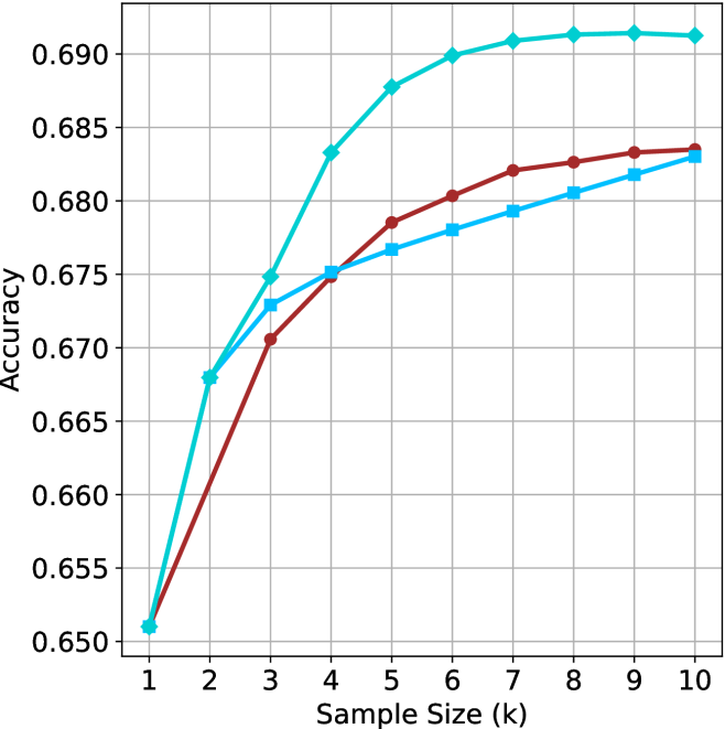
### Visual Description
\n
## Line Chart: Accuracy vs. Sample Size
### Overview
The image presents a line chart illustrating the relationship between accuracy and sample size. Two distinct data series are plotted, showing how accuracy changes as the sample size increases from 1k to 10k. The chart uses a grid background for easier readability.
### Components/Axes
* **X-axis:** Labeled "Sample Size (k)". The scale ranges from 1 to 10, representing sample sizes in thousands.
* **Y-axis:** Labeled "Accuracy". The scale ranges from 0.650 to 0.690.
* **Data Series 1:** Represented by a light blue line.
* **Data Series 2:** Represented by a maroon/dark red line.
* **Grid:** A light gray grid is present, aiding in the reading of values.
### Detailed Analysis
**Data Series 1 (Light Blue Line):**
The light blue line exhibits a steep upward trend initially, then plateaus.
* At Sample Size 1k: Accuracy ≈ 0.652
* At Sample Size 2k: Accuracy ≈ 0.668
* At Sample Size 3k: Accuracy ≈ 0.678
* At Sample Size 4k: Accuracy ≈ 0.682
* At Sample Size 5k: Accuracy ≈ 0.687
* At Sample Size 6k: Accuracy ≈ 0.689
* At Sample Size 7k: Accuracy ≈ 0.689
* At Sample Size 8k: Accuracy ≈ 0.689
* At Sample Size 9k: Accuracy ≈ 0.689
* At Sample Size 10k: Accuracy ≈ 0.689
**Data Series 2 (Maroon/Dark Red Line):**
The maroon line also shows an upward trend, but it is less pronounced than the light blue line, and it plateaus at a lower accuracy level.
* At Sample Size 1k: Accuracy ≈ 0.652
* At Sample Size 2k: Accuracy ≈ 0.665
* At Sample Size 3k: Accuracy ≈ 0.672
* At Sample Size 4k: Accuracy ≈ 0.675
* At Sample Size 5k: Accuracy ≈ 0.678
* At Sample Size 6k: Accuracy ≈ 0.680
* At Sample Size 7k: Accuracy ≈ 0.681
* At Sample Size 8k: Accuracy ≈ 0.682
* At Sample Size 9k: Accuracy ≈ 0.683
* At Sample Size 10k: Accuracy ≈ 0.683
### Key Observations
* Both data series start at the same accuracy level (approximately 0.652) at a sample size of 1k.
* The light blue line consistently demonstrates higher accuracy than the maroon line across all sample sizes.
* The rate of accuracy improvement diminishes for both lines as the sample size increases, indicating diminishing returns.
* The light blue line reaches a plateau around 0.690 accuracy, while the maroon line plateaus around 0.683 accuracy.
### Interpretation
The chart suggests that increasing the sample size generally improves accuracy, but there's a point of diminishing returns. The light blue line likely represents a model or method that benefits more significantly from larger sample sizes than the method represented by the maroon line. The difference in plateau levels indicates that the light blue method has a higher potential accuracy ceiling. This could be due to various factors, such as the inherent complexity of the models, the quality of the data, or the effectiveness of the algorithms used. The fact that both lines start at the same accuracy suggests that at very small sample sizes, both methods perform similarly, but as more data becomes available, the superior method (light blue) begins to outperform the other. The plateauing effect suggests that further increasing the sample size beyond a certain point will not yield substantial improvements in accuracy.
</details>
(a) LN-Super- $49$ B
<details>
<summary>x19.png Details</summary>
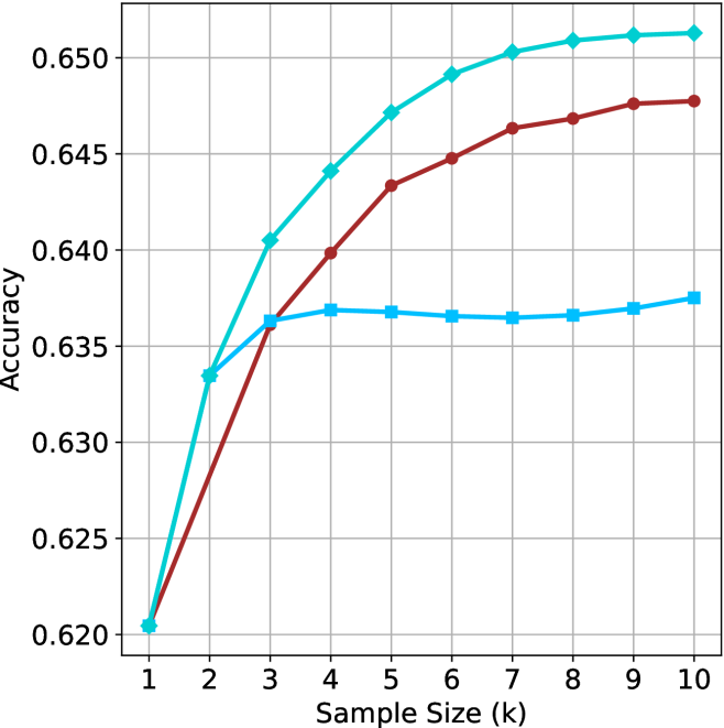
### Visual Description
## Line Chart: Accuracy vs. Sample Size
### Overview
This image presents a line chart illustrating the relationship between sample size and accuracy. Three distinct lines represent different data series, showing how accuracy changes as the sample size increases from 1k to 10k. The chart is set against a white background with a gray grid for easier readability.
### Components/Axes
* **X-axis:** Labeled "Sample Size (k)". The scale ranges from 1 to 10, representing sample sizes in thousands.
* **Y-axis:** Labeled "Accuracy". The scale ranges from 0.620 to 0.650.
* **Lines:** Three lines are present, each with a distinct color:
* Cyan/Light Blue
* Red
* Blue
* **Grid:** A gray grid is overlaid on the chart to aid in reading values.
### Detailed Analysis
Let's analyze each line individually, noting trends and approximate data points.
* **Cyan/Light Blue Line:** This line exhibits a strong upward trend, initially steep, then gradually flattening.
* At Sample Size = 1k, Accuracy ≈ 0.620
* At Sample Size = 2k, Accuracy ≈ 0.635
* At Sample Size = 3k, Accuracy ≈ 0.642
* At Sample Size = 4k, Accuracy ≈ 0.645
* At Sample Size = 5k, Accuracy ≈ 0.648
* At Sample Size = 6k, Accuracy ≈ 0.649
* At Sample Size = 7k, Accuracy ≈ 0.650
* At Sample Size = 8k, Accuracy ≈ 0.650
* At Sample Size = 9k, Accuracy ≈ 0.650
* At Sample Size = 10k, Accuracy ≈ 0.650
* **Red Line:** This line also shows an upward trend, but it is less pronounced than the cyan line. It appears to plateau earlier.
* At Sample Size = 1k, Accuracy ≈ 0.620
* At Sample Size = 2k, Accuracy ≈ 0.636
* At Sample Size = 3k, Accuracy ≈ 0.640
* At Sample Size = 4k, Accuracy ≈ 0.643
* At Sample Size = 5k, Accuracy ≈ 0.645
* At Sample Size = 6k, Accuracy ≈ 0.646
* At Sample Size = 7k, Accuracy ≈ 0.646
* At Sample Size = 8k, Accuracy ≈ 0.647
* At Sample Size = 9k, Accuracy ≈ 0.647
* At Sample Size = 10k, Accuracy ≈ 0.647
* **Blue Line:** This line initially rises, then plateaus and even slightly decreases at higher sample sizes.
* At Sample Size = 1k, Accuracy ≈ 0.620
* At Sample Size = 2k, Accuracy ≈ 0.637
* At Sample Size = 3k, Accuracy ≈ 0.639
* At Sample Size = 4k, Accuracy ≈ 0.639
* At Sample Size = 5k, Accuracy ≈ 0.638
* At Sample Size = 6k, Accuracy ≈ 0.637
* At Sample Size = 7k, Accuracy ≈ 0.637
* At Sample Size = 8k, Accuracy ≈ 0.637
* At Sample Size = 9k, Accuracy ≈ 0.637
* At Sample Size = 10k, Accuracy ≈ 0.637
### Key Observations
* The cyan line consistently demonstrates the highest accuracy across all sample sizes.
* The blue line shows diminishing returns in accuracy as the sample size increases beyond 4k, and even a slight decrease.
* The red line exhibits a moderate increase in accuracy, but plateaus before reaching the levels of the cyan line.
* All three lines start at the same accuracy level (0.620) at a sample size of 1k.
### Interpretation
The chart suggests that increasing the sample size generally improves accuracy, but the rate of improvement varies depending on the data series. The cyan line indicates a method or model that benefits significantly from larger sample sizes, achieving high accuracy with a sample size of 7k or greater. The red line suggests a moderate improvement with increasing sample size, while the blue line indicates that beyond a certain point (around 4k), increasing the sample size does not lead to further accuracy gains and may even slightly reduce it. This could be due to factors like data redundancy, noise, or limitations in the underlying model. The initial convergence of all lines at a sample size of 1k suggests a common baseline performance before the different methods diverge. This data could be used to optimize sample size selection for a given accuracy target, balancing the cost of data acquisition with the desired level of performance.
</details>
(b) R $1$ - $32$ B
<details>
<summary>x20.png Details</summary>
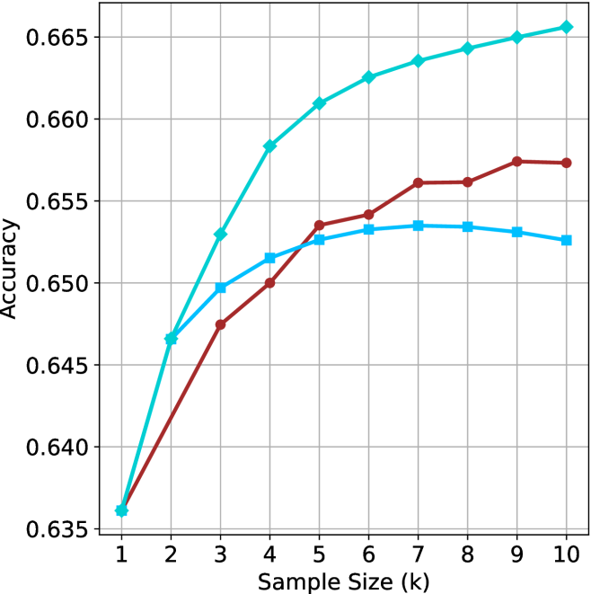
### Visual Description
\n
## Line Chart: Accuracy vs. Sample Size
### Overview
This image presents a line chart illustrating the relationship between sample size (in thousands) and accuracy. Two distinct data series are plotted, showing how accuracy changes as the sample size increases. The chart uses a grid background for easier readability.
### Components/Axes
* **X-axis:** Labeled "Sample Size (k)", ranging from 1 to 10 (in increments of 1).
* **Y-axis:** Labeled "Accuracy", ranging from 0.635 to 0.665 (in increments of 0.005).
* **Data Series 1:** Represented by a teal/cyan line.
* **Data Series 2:** Represented by a maroon/dark red line.
* **Grid:** A light gray grid is present to aid in reading values.
### Detailed Analysis
**Data Series 1 (Teal/Cyan Line):**
The teal line shows an initially steep upward trend, then plateaus.
* At Sample Size = 1k, Accuracy ≈ 0.637.
* At Sample Size = 2k, Accuracy ≈ 0.642.
* At Sample Size = 3k, Accuracy ≈ 0.648.
* At Sample Size = 4k, Accuracy ≈ 0.656.
* At Sample Size = 5k, Accuracy ≈ 0.659.
* At Sample Size = 6k, Accuracy ≈ 0.661.
* At Sample Size = 7k, Accuracy ≈ 0.662.
* At Sample Size = 8k, Accuracy ≈ 0.663.
* At Sample Size = 9k, Accuracy ≈ 0.663.
* At Sample Size = 10k, Accuracy ≈ 0.664.
**Data Series 2 (Maroon/Dark Red Line):**
The maroon line shows an initial upward trend, reaches a peak, and then declines slightly.
* At Sample Size = 1k, Accuracy ≈ 0.637.
* At Sample Size = 2k, Accuracy ≈ 0.644.
* At Sample Size = 3k, Accuracy ≈ 0.648.
* At Sample Size = 4k, Accuracy ≈ 0.651.
* At Sample Size = 5k, Accuracy ≈ 0.653.
* At Sample Size = 6k, Accuracy ≈ 0.654.
* At Sample Size = 7k, Accuracy ≈ 0.654.
* At Sample Size = 8k, Accuracy ≈ 0.656.
* At Sample Size = 9k, Accuracy ≈ 0.657.
* At Sample Size = 10k, Accuracy ≈ 0.656.
### Key Observations
* Both data series start at the same accuracy level (approximately 0.637) at a sample size of 1k.
* The teal line consistently demonstrates higher accuracy than the maroon line after a sample size of 4k.
* The maroon line exhibits a peak in accuracy around a sample size of 8k-9k before slightly decreasing.
* The teal line shows diminishing returns in accuracy gains as the sample size increases beyond 5k.
### Interpretation
The chart suggests that increasing the sample size generally improves accuracy, but there are diminishing returns. The teal line likely represents a model or method that benefits more significantly from larger sample sizes, achieving a higher plateau in accuracy. The maroon line indicates a method that reaches an optimal sample size (around 8k-9k) beyond which further increases in sample size do not lead to substantial improvements, and may even slightly decrease accuracy. This could be due to overfitting or the inherent limitations of the method represented by the maroon line. The initial convergence of the two lines suggests that both methods perform similarly with small sample sizes, but their behaviors diverge as more data becomes available. The difference in the final accuracy levels indicates that the teal method is more robust and scalable with larger datasets.
</details>
(c) QwQ-32B
<details>
<summary>x21.png Details</summary>
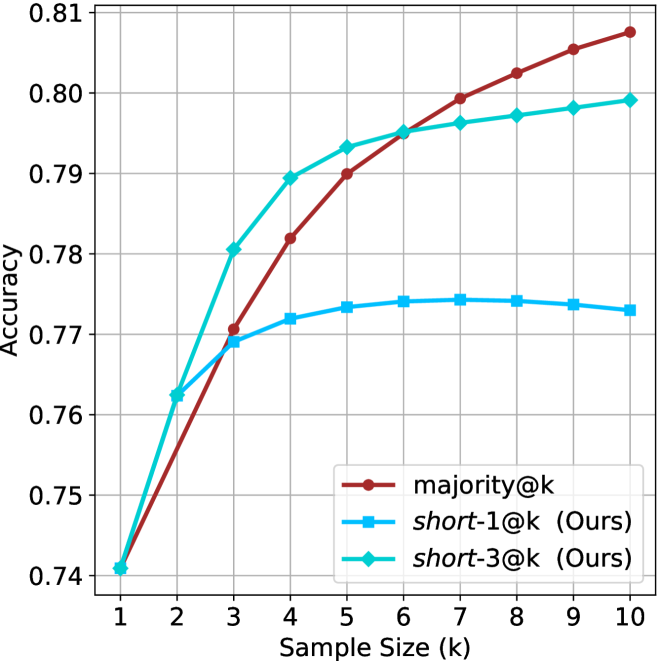
### Visual Description
## Line Chart: Accuracy vs. Sample Size
### Overview
This image presents a line chart comparing the accuracy of three different methods – majority@k, short-1@k, and short-3@k – as a function of sample size (k). The chart visually demonstrates how accuracy improves with increasing sample size for each method.
### Components/Axes
* **X-axis:** "Sample Size (k)" ranging from 1 to 10. The axis is labeled and has tick marks at integer values.
* **Y-axis:** "Accuracy" ranging from 0.74 to 0.81. The axis is labeled and has tick marks at intervals of 0.01.
* **Legend:** Located in the bottom-right corner of the chart. It identifies the three data series:
* majority@k (represented by a red line with circular markers)
* short-1@k (Ours) (represented by a blue line with circular markers)
* short-3@k (Ours) (represented by a teal line with circular markers)
* **Gridlines:** A light gray grid is present to aid in reading values.
### Detailed Analysis
Let's analyze each line individually, noting trends and approximate data points.
* **majority@k (Red Line):** This line starts at approximately 0.745 at k=1 and steadily increases, reaching approximately 0.795 at k=5. It continues to rise, reaching approximately 0.805 at k=10. The line exhibits a consistent upward slope, but the rate of increase slows down as k increases.
* **short-1@k (Ours) (Blue Line):** This line begins at approximately 0.74 at k=1 and shows a rapid increase up to k=4, reaching approximately 0.775. From k=4 to k=10, the line plateaus, with only a slight increase to approximately 0.78 at k=10.
* **short-3@k (Ours) (Teal Line):** This line starts at approximately 0.74 at k=1 and exhibits the steepest initial increase, reaching approximately 0.79 at k=4. It then plateaus, with a slight decrease to approximately 0.80 at k=7, and remains relatively stable at approximately 0.80 to 0.805 for k=8, 9, and 10.
Here's a table summarizing approximate data points:
| Sample Size (k) | majority@k | short-1@k (Ours) | short-3@k (Ours) |
|---|---|---|---|
| 1 | 0.745 | 0.74 | 0.74 |
| 2 | 0.76 | 0.755 | 0.765 |
| 3 | 0.775 | 0.765 | 0.78 |
| 4 | 0.785 | 0.775 | 0.79 |
| 5 | 0.795 | 0.778 | 0.795 |
| 6 | 0.80 | 0.78 | 0.80 |
| 7 | 0.802 | 0.78 | 0.802 |
| 8 | 0.803 | 0.78 | 0.803 |
| 9 | 0.804 | 0.78 | 0.803 |
| 10 | 0.805 | 0.78 | 0.805 |
### Key Observations
* **short-3@k** consistently outperforms the other two methods, especially at lower sample sizes.
* **short-1@k** shows a rapid initial improvement but plateaus quickly.
* **majority@k** exhibits a steady, but slower, improvement with increasing sample size.
* All three methods converge in accuracy as the sample size increases, suggesting diminishing returns.
### Interpretation
The chart demonstrates the effectiveness of the "short-3@k" method in achieving high accuracy, particularly when the sample size is limited. The rapid initial improvement of "short-3@k" suggests it efficiently leverages the available data. The plateauing of "short-1@k" indicates that adding more samples beyond a certain point does not significantly improve its performance. The consistent, but slower, improvement of "majority@k" suggests it benefits from larger sample sizes but is less efficient at utilizing smaller datasets.
The "Ours" designation next to "short-1@k" and "short-3@k" suggests these are methods developed by the authors of the study. The data suggests that these methods are competitive with, and in some cases outperform, the traditional "majority@k" approach. The convergence of the lines at higher sample sizes indicates that all methods eventually achieve similar levels of accuracy, implying that the benefits of the "short-*" methods are most pronounced when data is scarce.
</details>
(d) R1-670B
Figure 6: GPQA-D - sample size ( $k$ ) comparison.
<details>
<summary>x22.png Details</summary>
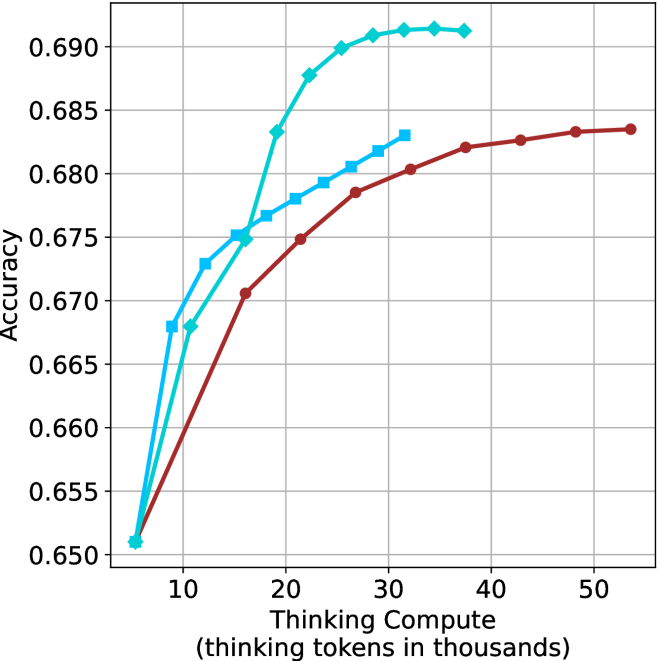
### Visual Description
## Line Chart: Accuracy vs. Thinking Compute
### Overview
This image presents a line chart illustrating the relationship between "Thinking Compute" (measured in thousands of tokens) and "Accuracy". Three distinct data series are plotted, each represented by a different colored line. The chart appears to demonstrate how accuracy improves with increased computational effort ("Thinking Compute").
### Components/Axes
* **X-axis:** Labeled "Thinking Compute (thinking tokens in thousands)". The scale ranges from approximately 5 to 55, with markers at 10, 20, 30, 40, and 50.
* **Y-axis:** Labeled "Accuracy". The scale ranges from approximately 0.650 to 0.690, with markers at 0.650, 0.660, 0.670, 0.680, and 0.690.
* **Data Series:** Three lines are present, each representing a different model or configuration.
* **Line 1 (Cyan):** A solid line.
* **Line 2 (Blue):** A solid line with square markers.
* **Line 3 (Maroon):** A solid line with circular markers.
* **Grid:** A light gray grid is overlaid on the chart to aid in reading values.
### Detailed Analysis
* **Line 1 (Cyan):** This line exhibits a steep upward trend initially, rapidly increasing in accuracy from approximately 0.652 at 5 tokens to around 0.688 at 30 tokens. The slope then decreases, leveling off to approximately 0.690 at 50 tokens.
* (5, 0.652)
* (10, 0.668)
* (20, 0.682)
* (30, 0.688)
* (40, 0.689)
* (50, 0.690)
* **Line 2 (Blue):** This line also shows an upward trend, but it is less steep than Line 1. It starts at approximately 0.660 at 5 tokens and reaches around 0.683 at 50 tokens.
* (5, 0.660)
* (10, 0.670)
* (20, 0.678)
* (30, 0.681)
* (40, 0.682)
* (50, 0.683)
* **Line 3 (Maroon):** This line has the slowest upward trend. It begins at approximately 0.662 at 5 tokens and reaches around 0.682 at 50 tokens.
* (5, 0.662)
* (10, 0.668)
* (20, 0.675)
* (30, 0.679)
* (40, 0.682)
* (50, 0.682)
### Key Observations
* Line 1 (Cyan) consistently demonstrates the highest accuracy across all "Thinking Compute" values.
* The rate of accuracy improvement diminishes for all lines as "Thinking Compute" increases, suggesting a point of diminishing returns.
* Line 3 (Maroon) exhibits the lowest accuracy and the slowest rate of improvement.
* Lines 2 and 3 converge in accuracy at higher "Thinking Compute" values.
### Interpretation
The chart suggests that increasing "Thinking Compute" generally leads to improved accuracy, but the benefit of additional computation decreases as the amount of computation increases. Line 1 represents a model or configuration that is most effective at leveraging increased "Thinking Compute" to achieve higher accuracy. Line 3, conversely, shows limited gains from increased computation, potentially indicating a bottleneck in its architecture or training. The convergence of Lines 2 and 3 at higher "Thinking Compute" values suggests that both models reach a similar performance ceiling. This data could be used to optimize resource allocation, determining the point at which further investment in "Thinking Compute" yields minimal accuracy gains. The chart implies that there are different levels of efficiency in how these models utilize computational resources to achieve accuracy.
</details>
(a) LN-Super- $49$ B
<details>
<summary>x23.png Details</summary>
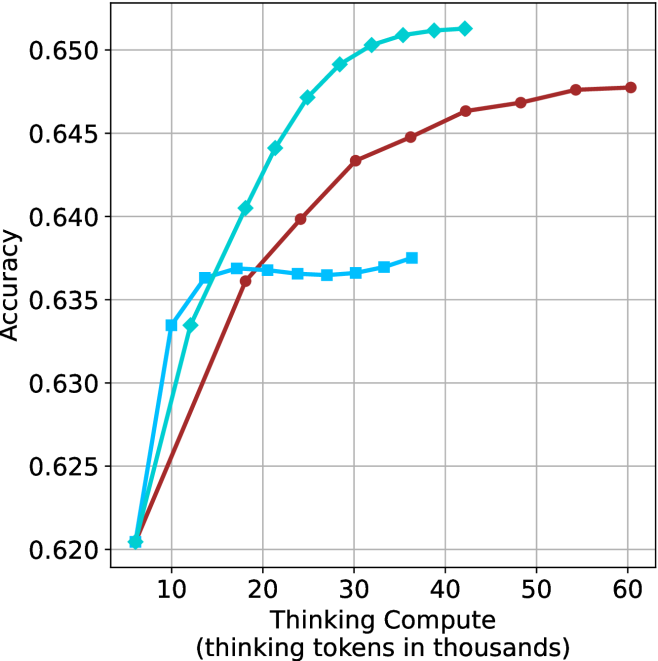
### Visual Description
\n
## Line Chart: Accuracy vs. Thinking Compute
### Overview
The image presents a line chart illustrating the relationship between "Thinking Compute" (measured in thousands of tokens) and "Accuracy". Three distinct data series are plotted, each represented by a different colored line. The chart demonstrates how accuracy changes as the amount of thinking compute increases.
### Components/Axes
* **X-axis:** "Thinking Compute (thinking tokens in thousands)". Scale ranges from approximately 5 to 60, with markers at 10, 20, 30, 40, 50, and 60.
* **Y-axis:** "Accuracy". Scale ranges from approximately 0.620 to 0.650, with markers at 0.620, 0.625, 0.630, 0.635, 0.640, 0.645, and 0.650.
* **Data Series:** Three lines are present, each representing a different condition or model.
* **Line 1 (Teal):** A steeply rising curve.
* **Line 2 (Red):** A moderate rising curve.
* **Line 3 (Blue):** A slower rising curve.
* **Gridlines:** A grid is present to aid in reading values.
### Detailed Analysis
* **Line 1 (Teal):** This line shows a rapid increase in accuracy with increasing thinking compute.
* At 5 (Thinking Compute), Accuracy is approximately 0.621.
* At 10 (Thinking Compute), Accuracy is approximately 0.634.
* At 20 (Thinking Compute), Accuracy is approximately 0.645.
* At 30 (Thinking Compute), Accuracy is approximately 0.649.
* At 40 (Thinking Compute), Accuracy is approximately 0.651.
* At 50 (Thinking Compute), Accuracy is approximately 0.651.
* At 60 (Thinking Compute), Accuracy is approximately 0.652.
* **Line 2 (Red):** This line shows a moderate increase in accuracy with increasing thinking compute.
* At 5 (Thinking Compute), Accuracy is approximately 0.621.
* At 10 (Thinking Compute), Accuracy is approximately 0.632.
* At 20 (Thinking Compute), Accuracy is approximately 0.638.
* At 30 (Thinking Compute), Accuracy is approximately 0.642.
* At 40 (Thinking Compute), Accuracy is approximately 0.645.
* At 50 (Thinking Compute), Accuracy is approximately 0.646.
* At 60 (Thinking Compute), Accuracy is approximately 0.647.
* **Line 3 (Blue):** This line shows a slower increase in accuracy with increasing thinking compute.
* At 5 (Thinking Compute), Accuracy is approximately 0.621.
* At 10 (Thinking Compute), Accuracy is approximately 0.632.
* At 20 (Thinking Compute), Accuracy is approximately 0.636.
* At 30 (Thinking Compute), Accuracy is approximately 0.637.
* At 40 (Thinking Compute), Accuracy is approximately 0.638.
* At 50 (Thinking Compute), Accuracy is approximately 0.638.
* At 60 (Thinking Compute), Accuracy is approximately 0.639.
### Key Observations
* The teal line consistently exhibits the highest accuracy across all values of thinking compute.
* The blue line demonstrates the slowest rate of accuracy improvement with increasing thinking compute.
* All three lines show diminishing returns in accuracy as thinking compute increases beyond 40 thousand tokens. The rate of increase slows down significantly.
* The lines converge at higher values of thinking compute, suggesting a saturation point.
### Interpretation
The chart suggests that increasing "Thinking Compute" generally improves "Accuracy", but the benefit diminishes as compute increases. The teal line likely represents a model or configuration that is particularly effective at leveraging additional compute for improved performance. The blue line may represent a model or configuration that is less sensitive to increases in compute. The convergence of the lines at higher compute values indicates that there is a limit to the accuracy that can be achieved through simply increasing compute, and that other factors (e.g., model architecture, training data) may become more important. This data could be used to optimize resource allocation for machine learning tasks, balancing the cost of compute with the desired level of accuracy. The data suggests that for the teal line, the most significant gains in accuracy are achieved with relatively low amounts of compute (up to 20-30 thousand tokens), while further increases yield only marginal improvements.
</details>
(b) R $1$ - $32$ B
<details>
<summary>x24.png Details</summary>
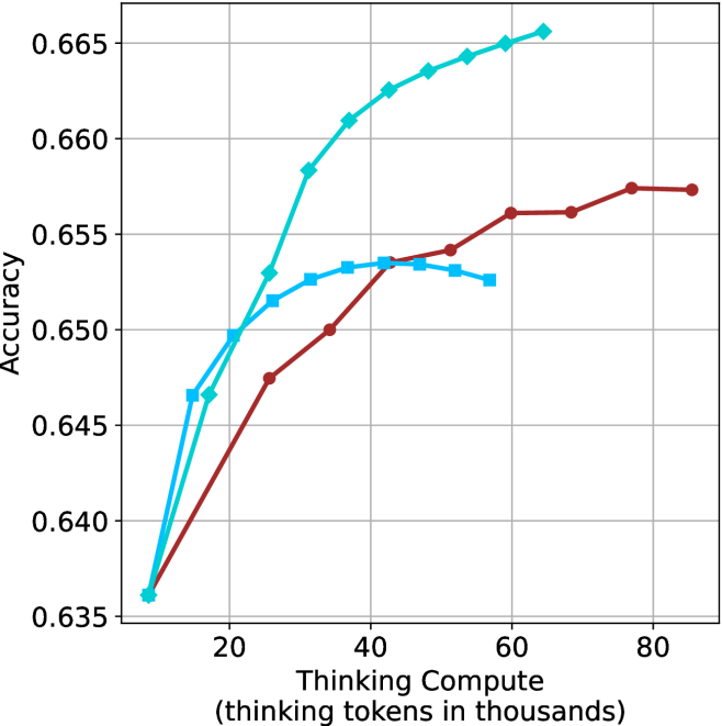
### Visual Description
## Line Chart: Accuracy vs. Thinking Compute
### Overview
This image presents a line chart illustrating the relationship between "Thinking Compute" (measured in thousands of tokens) and "Accuracy". Three distinct data series are plotted, each represented by a different colored line. The chart appears to demonstrate how accuracy changes as the amount of thinking compute increases.
### Components/Axes
* **X-axis Title:** "Thinking Compute (thinking tokens in thousands)"
* Scale: 0 to 80 (in thousands of tokens)
* Markers: 0, 20, 40, 60, 80
* **Y-axis Title:** "Accuracy"
* Scale: 0.635 to 0.665
* Markers: 0.635, 0.640, 0.645, 0.650, 0.655, 0.660, 0.665
* **Data Series:**
* Line 1: Teal/Cyan (appears to be the highest performing)
* Line 2: Dark Blue
* Line 3: Maroon/Dark Red (appears to be the lowest performing)
* **Gridlines:** Present, providing a visual aid for reading values.
### Detailed Analysis
* **Teal/Cyan Line:** This line shows a rapid increase in accuracy from approximately 0.637 at 0 tokens to around 0.664 at 60 tokens, then plateaus slightly, reaching approximately 0.666 at 80 tokens.
* (0, 0.637)
* (20, 0.656)
* (40, 0.662)
* (60, 0.664)
* (80, 0.666)
* **Dark Blue Line:** This line starts at approximately 0.638 at 0 tokens, increases steadily to around 0.654 at 40 tokens, then plateaus, reaching approximately 0.655 at 80 tokens.
* (0, 0.638)
* (20, 0.648)
* (40, 0.654)
* (60, 0.655)
* (80, 0.655)
* **Maroon/Dark Red Line:** This line begins at approximately 0.636 at 0 tokens, increases to around 0.649 at 20 tokens, then plateaus, reaching approximately 0.656 at 80 tokens.
* (0, 0.636)
* (20, 0.649)
* (40, 0.651)
* (60, 0.655)
* (80, 0.656)
### Key Observations
* The Teal/Cyan line consistently demonstrates the highest accuracy across all values of "Thinking Compute".
* The Maroon/Dark Red line consistently demonstrates the lowest accuracy across all values of "Thinking Compute".
* All three lines exhibit diminishing returns in accuracy as "Thinking Compute" increases beyond 40 tokens. The rate of accuracy improvement slows down significantly.
* The Dark Blue line falls between the Teal/Cyan and Maroon/Dark Red lines in terms of accuracy.
### Interpretation
The chart suggests a positive correlation between "Thinking Compute" and "Accuracy", but with diminishing returns. Increasing the amount of "Thinking Compute" initially leads to significant gains in accuracy, but beyond a certain point (around 40-60 thousand tokens), the improvement in accuracy becomes marginal. This could indicate that the models are reaching a point of saturation where additional compute resources do not translate into substantial performance improvements. The differences between the three lines could represent different model architectures, training datasets, or optimization strategies. The Teal/Cyan line's superior performance suggests it is the most effective in utilizing "Thinking Compute" to achieve higher accuracy. The plateauing effect observed in all lines implies that other factors, such as model capacity or data quality, may become limiting factors beyond a certain level of compute.
</details>
(c) QwQ-32B
<details>
<summary>x25.png Details</summary>
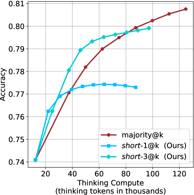
### Visual Description
## Line Chart: Accuracy vs. Thinking Compute
### Overview
This image presents a line chart illustrating the relationship between "Thinking Compute" (measured in thousands of tokens) and "Accuracy" for three different methods: majority@k, short-1@k (labeled as "Ours"), and short-3@k (also labeled as "Ours"). The chart shows how accuracy changes as the amount of thinking compute increases.
### Components/Axes
* **X-axis:** "Thinking Compute (thinking tokens in thousands)". Scale ranges from approximately 0 to 120, with markers at 20, 40, 60, 80, 100, and 120.
* **Y-axis:** "Accuracy". Scale ranges from approximately 0.74 to 0.81, with markers at 0.74, 0.76, 0.78, 0.80, and 0.81.
* **Legend:** Located in the top-right corner. Contains the following labels and corresponding colors:
* majority@k (Red-Brown)
* short-1@k (Ours) (Pink)
* short-3@k (Ours) (Light Blue)
* **Gridlines:** A light gray grid is present to aid in reading values.
### Detailed Analysis
* **majority@k (Red-Brown Line):** This line starts at approximately 0.745 at a Thinking Compute of 0, and slopes upward, reaching approximately 0.812 at a Thinking Compute of 120.
* (0, 0.745)
* (20, 0.765)
* (40, 0.780)
* (60, 0.790)
* (80, 0.798)
* (100, 0.805)
* (120, 0.812)
* **short-1@k (Ours) (Pink Line):** This line exhibits a steep initial increase, starting at approximately 0.74 at a Thinking Compute of 0, and quickly rises to approximately 0.795 at a Thinking Compute of 60. It then plateaus, reaching approximately 0.802 at a Thinking Compute of 120.
* (0, 0.74)
* (20, 0.775)
* (40, 0.790)
* (60, 0.795)
* (80, 0.800)
* (100, 0.801)
* (120, 0.802)
* **short-3@k (Ours) (Light Blue Line):** This line also shows a rapid initial increase, starting at approximately 0.74 at a Thinking Compute of 0, and reaching approximately 0.795 at a Thinking Compute of 60. It then levels off, with a slight decrease, reaching approximately 0.778 at a Thinking Compute of 120.
* (0, 0.74)
* (20, 0.780)
* (40, 0.790)
* (60, 0.795)
* (80, 0.785)
* (100, 0.782)
* (120, 0.778)
### Key Observations
* All three methods start with similar accuracy levels at low Thinking Compute.
* The "short-1@k (Ours)" and "short-3@k (Ours)" methods demonstrate significantly faster initial accuracy gains compared to "majority@k".
* The "short-1@k (Ours)" method achieves the highest accuracy overall, but its gains plateau after approximately 60 Thinking Compute.
* The "short-3@k (Ours)" method shows a slight decrease in accuracy at higher Thinking Compute values (beyond 60).
### Interpretation
The data suggests that the "short-1@k (Ours)" method is the most effective for achieving high accuracy with a relatively low amount of Thinking Compute. The initial rapid gains indicate that this method efficiently utilizes the available compute resources. The plateauing of accuracy suggests that there are diminishing returns beyond a certain point (around 60 Thinking Compute). The slight decline in accuracy for "short-3@k (Ours)" at higher compute levels could indicate overfitting or the introduction of noise with increased complexity. The "majority@k" method, while consistently improving, requires significantly more compute to reach comparable accuracy levels. This chart demonstrates a trade-off between computational cost and accuracy, and highlights the potential benefits of the "short-1@k (Ours)" approach for optimizing performance. The "Ours" label suggests these are novel methods being compared to a baseline.
</details>
(d) R1-670B
Figure 7: GPQA-D - thinking compute comparison.
<details>
<summary>x26.png Details</summary>
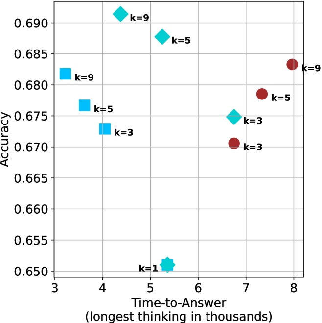
### Visual Description
\n
## Scatter Plot: Accuracy vs. Time-to-Answer
### Overview
This image presents a scatter plot illustrating the relationship between Accuracy and Time-to-Answer (measured in thousands of seconds) for different values of 'k'. The data points are color-coded to represent different 'k' values.
### Components/Axes
* **X-axis:** Time-to-Answer (longest thinking in thousands) - Scale ranges from approximately 3 to 8.5.
* **Y-axis:** Accuracy - Scale ranges from approximately 0.65 to 0.695.
* **Data Points:** Scatter plot points, colored as follows:
* Red: k=9
* Dark Turquoise: k=1
* Blue: k=3
* Green: k=5
* Cyan: k=9
* **Labels:** Each data point is labeled with its corresponding 'k' value.
### Detailed Analysis
The plot contains data points for k=1, k=3, k=5, and k=9.
* **k=1:** One data point at approximately (3.5, 0.65).
* **k=3:** Two data points: one at approximately (4.2, 0.67) and another at approximately (7.2, 0.67).
* **k=5:** Two data points: one at approximately (4.5, 0.685) and another at approximately (7.7, 0.675).
* **k=9:** Three data points: one at approximately (3.8, 0.68), another at approximately (5.2, 0.69), and a third at approximately (8.2, 0.685).
**Trends:**
* **k=1:** The trend is flat, with only one data point.
* **k=3:** The data points show a slight upward trend as Time-to-Answer increases.
* **k=5:** The data points show a slight downward trend as Time-to-Answer increases.
* **k=9:** The data points show a generally flat trend, with some variation.
### Key Observations
* There are multiple data points for k=3, k=5, and k=9, suggesting multiple trials or observations for these values.
* The highest accuracy values are generally associated with k=5 and k=9.
* The data for k=1 is limited to a single point, making it difficult to draw conclusions.
* There is some overlap in the accuracy values for different 'k' values, particularly between k=3, k=5, and k=9.
### Interpretation
The data suggests that the relationship between accuracy and time-to-answer is dependent on the value of 'k'. For k=3, there is a slight positive correlation between time-to-answer and accuracy. For k=5, there is a slight negative correlation. For k=9, the relationship is less clear. The optimal value of 'k' for maximizing accuracy appears to be around 5 or 9, but further investigation is needed to determine the best value. The spread of data points for k=3, k=5, and k=9 indicates variability in the results, which could be due to factors not accounted for in this analysis. The single data point for k=1 is insufficient to draw any meaningful conclusions. The plot demonstrates a trade-off between time-to-answer and accuracy, as longer thinking times do not necessarily lead to higher accuracy.
</details>
(a) LN-Super- $49$ B
<details>
<summary>x27.png Details</summary>
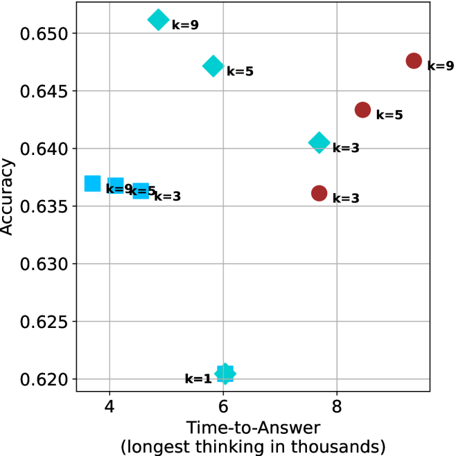
### Visual Description
\n
## Scatter Plot: Accuracy vs. Time-to-Answer
### Overview
This image presents a scatter plot visualizing the relationship between Accuracy and Time-to-Answer (measured in thousands of units). The data points are color-coded and labeled with values of 'k', representing a parameter.
### Components/Axes
* **X-axis:** Time-to-Answer (longest thinking in thousands). Scale ranges from approximately 3.5 to 9.
* **Y-axis:** Accuracy. Scale ranges from approximately 0.62 to 0.655.
* **Data Points:** Scatter plot points are colored as follows:
* Red: k = 3, k = 5, k = 9
* Teal/Cyan: k = 1, k = 5, k = 9
* **Labels:** Each data point is labeled with its corresponding 'k' value.
### Detailed Analysis
The plot contains data points for k = 1, 3, 5, and 9. Let's analyze each 'k' value's trend:
* **k = 1:** One data point at approximately (6.2, 0.62).
* **k = 3:** Three data points:
* (4.2, 0.635)
* (7.2, 0.64)
* (8.2, 0.635)
* **k = 5:** Three data points:
* (4.2, 0.635)
* (6.5, 0.645)
* (8.5, 0.645)
* **k = 9:** Three data points:
* (4.2, 0.635)
* (6.5, 0.65)
* (8.8, 0.645)
The red data points (k=3, 5, 9) generally appear to be positioned higher on the graph (higher accuracy) and further to the right (longer time-to-answer) compared to the teal/cyan data points.
### Key Observations
* There's a general positive correlation between Time-to-Answer and Accuracy. As Time-to-Answer increases, Accuracy tends to increase as well.
* The 'k' value seems to influence both Accuracy and Time-to-Answer. Higher 'k' values (5 and 9) tend to have higher accuracy values, especially at longer Time-to-Answer.
* There is overlap in data points for different 'k' values, particularly at lower Time-to-Answer values.
* The data for k=3, k=5, and k=9 all share the same coordinates at (4.2, 0.635).
### Interpretation
The data suggests that increasing the parameter 'k' generally leads to improved accuracy, but at the cost of increased Time-to-Answer. The shared data point for k=3, k=5, and k=9 at (4.2, 0.635) indicates that for a specific Time-to-Answer, these values of 'k' yield the same accuracy. This could imply a threshold or saturation point where increasing 'k' beyond a certain value doesn't provide further accuracy gains. The positive correlation between Time-to-Answer and Accuracy suggests a trade-off between speed and precision. The plot could be representing the performance of a model or algorithm where 'k' is a hyperparameter controlling complexity or the amount of information considered. The longer the "thinking time" (Time-to-Answer), the more accurate the result, but this comes at a computational cost.
</details>
(b) R $1$ - $32$ B
<details>
<summary>x28.png Details</summary>
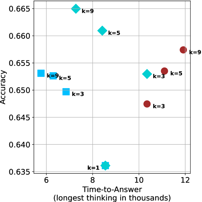
### Visual Description
\n
## Scatter Plot: Accuracy vs. Time-to-Answer
### Overview
This image presents a scatter plot illustrating the relationship between Accuracy and Time-to-Answer (measured in thousands of units). The data points are colored and labeled based on the value of 'k', likely representing a parameter in a model or algorithm.
### Components/Axes
* **X-axis:** Time-to-Answer (longest thinking in thousands). Scale ranges from approximately 6 to 12.
* **Y-axis:** Accuracy. Scale ranges from approximately 0.635 to 0.665.
* **Data Points:** Scatter plot points, colored as follows:
* Red: k = 9
* Green: k = 5
* Blue: k = 3
* Cyan: k = 1
* **Labels:** Each data point is labeled with its corresponding 'k' value.
### Detailed Analysis
The plot shows data points for k = 1, 3, 5, and 9. Let's analyze each 'k' value's trend:
* **k = 1 (Cyan):** A single data point at approximately (7.5, 0.636).
* **k = 3 (Blue):** Two data points: one at approximately (6.2, 0.651) and another at approximately (10.5, 0.646). The trend is slightly upward, then downward.
* **k = 5 (Green):** Three data points: one at approximately (6.3, 0.653), one at approximately (9.2, 0.661), and one at approximately (11.2, 0.656). The trend is generally upward, then slightly downward.
* **k = 9 (Red):** Two data points: one at approximately (6.5, 0.664) and another at approximately (12.0, 0.656). The trend is slightly downward.
### Key Observations
* Higher 'k' values (k=9) generally exhibit higher accuracy at shorter time-to-answer, but accuracy decreases as time-to-answer increases.
* k=5 shows a relatively consistent accuracy across a wider range of time-to-answer values.
* k=1 has the lowest accuracy and a short time-to-answer.
* There is no clear monotonic relationship between time-to-answer and accuracy across all 'k' values. The relationship appears to be 'k'-dependent.
* The data points are relatively sparse, making it difficult to draw definitive conclusions.
### Interpretation
The data suggests that the parameter 'k' significantly influences the trade-off between accuracy and time-to-answer. A higher 'k' value (e.g., 9) can lead to higher accuracy initially, but the benefit diminishes as the time-to-answer increases. A lower 'k' value (e.g., 1) results in faster response times but lower accuracy. The optimal 'k' value likely depends on the specific application and the relative importance of accuracy versus speed.
The scatter plot indicates that there isn't a single 'best' value for 'k'. Instead, the ideal value depends on the desired balance between accuracy and time-to-answer. The data suggests that for applications requiring quick responses, a lower 'k' value might be preferable, while for applications prioritizing accuracy, a higher 'k' value might be more suitable. The varying trends for each 'k' value suggest that the underlying mechanism being modeled is complex and sensitive to the parameter 'k'.
</details>
(c) QwQ-32B
<details>
<summary>x29.png Details</summary>
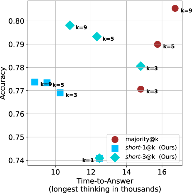
### Visual Description
## Scatter Plot: Accuracy vs. Time-to-Answer
### Overview
This image presents a scatter plot comparing the accuracy and time-to-answer for three different methods: majority@k, short-1@k (labeled "Ours"), and short-3@k (labeled "Ours"). The performance is evaluated for different values of 'k' (1, 3, 5, and 9). The plot visualizes the trade-off between accuracy and speed for each method and 'k' value.
### Components/Axes
* **X-axis:** Time-to-Answer (longest thinking in thousands) - Scale ranges from approximately 10 to 17.
* **Y-axis:** Accuracy - Scale ranges from approximately 0.74 to 0.81.
* **Legend:** Located in the bottom-center of the plot.
* Red circles: majority@k
* Blue squares: short-1@k (Ours)
* Cyan diamonds: short-3@k (Ours)
* **Labels:** Each data point is labeled with its corresponding 'k' value (k=1, k=3, k=5, k=9).
### Detailed Analysis
Let's analyze each data series and their trends:
**1. majority@k (Red Circles):**
* Trend: Generally, as 'k' increases, accuracy increases, but time-to-answer also increases.
* Data Points:
* k=1: Approximately (10.5, 0.75)
* k=3: Approximately (11.5, 0.77)
* k=5: Approximately (13.5, 0.79)
* k=9: Approximately (16.5, 0.80)
**2. short-1@k (Blue Squares - "Ours"):**
* Trend: Accuracy is relatively stable, while time-to-answer increases with 'k'.
* Data Points:
* k=1: Approximately (10.5, 0.74)
* k=3: Approximately (11.5, 0.77)
* k=5: Approximately (12.5, 0.79)
* k=9: Approximately (13.5, 0.79)
**3. short-3@k (Cyan Diamonds - "Ours"):**
* Trend: Accuracy increases with 'k', but the increase is less pronounced than for majority@k. Time-to-answer also increases with 'k'.
* Data Points:
* k=1: Approximately (11, 0.74)
* k=3: Approximately (12, 0.78)
* k=5: Approximately (13, 0.79)
* k=9: Approximately (14, 0.80)
### Key Observations
* For k=1, short-1@k has the lowest accuracy.
* For k=9, majority@k achieves the highest accuracy.
* short-3@k consistently outperforms short-1@k in terms of accuracy.
* The "Ours" methods (short-1@k and short-3@k) generally have lower accuracy than majority@k, but potentially faster response times, especially for smaller values of 'k'.
* The difference in accuracy between the methods diminishes as 'k' increases.
### Interpretation
The data suggests a trade-off between accuracy and time-to-answer. The majority@k method prioritizes accuracy, achieving the highest values at the cost of increased processing time. The "Ours" methods (short-1@k and short-3@k) aim for a balance, offering faster response times with a slight reduction in accuracy.
The choice of method and 'k' value depends on the specific application requirements. If accuracy is paramount, majority@k with a larger 'k' is preferred. If speed is critical, short-1@k or short-3@k with a smaller 'k' might be more suitable.
The consistent improvement of short-3@k over short-1@k indicates that increasing the number of considered candidates (from 1 to 3) improves the accuracy of the method. The diminishing returns in accuracy as 'k' increases suggest that there's a point beyond which increasing 'k' provides minimal benefit.
The plot effectively demonstrates the performance characteristics of different methods for a given task, allowing for informed decision-making based on the desired balance between accuracy and speed.
</details>
(d) R1-670B
Figure 8: GPQA-D - time-to-answer comparison.
Table 5: Average thinking tokens for correct (C), incorrect (IC) and all (A) answers, per split by difficulty for GPQA-D. The numbers are in thousands of tokens.
| Model | Easy | Medium | Hard |
| --- | --- | --- | --- |
| C/IC/A | C/IC/A | C/IC/A | |
| LN-Super-49B | $2.5/\text{--}/2.5$ | $\phantom{0}6.2/\phantom{0}7.8/\phantom{0}6.6$ | $\phantom{0}7.1/\phantom{0}6.9/\phantom{0}7.0$ |
| R1-32B | $3.4/\text{--}/3.4$ | $\phantom{0}6.4/\phantom{0}7.9/\phantom{0}6.8$ | $\phantom{0}8.3/\phantom{0}7.8/\phantom{0}7.9$ |
| QwQ-32B | $5.3/\text{--}/5.3$ | $\phantom{0}8.9/13.0/\phantom{0}9.7$ | $11.1/10.6/10.6$ |
| R1-670B | $8.1/\text{--}/8.1$ | $10.9/16.0/11.4$ | $17.9/17.9/17.9$ |
Table 6: Average number of backtracks, and their average length for correct (C), incorrect (IC) and all (A) answers in GPQA-D.
| Model | # Backtracks | Backtrack Len. |
| --- | --- | --- |
| C/IC/A | C/IC/A | |
| LN-Super-49B | $\phantom{0}89/107/\phantom{0}94$ | $72/56/63$ |
| R1-32B | $\phantom{0}92/173/120$ | $78/48/60$ |
| QwQ-32B | $152/241/178$ | $52/41/46$ |
| R1-670B | $122/237/156$ | $83/60/69$ |
## Appendix B Per benchmark results
We present the per-benchmark results for each of the criteria presented in Section ˜ 4.2. The sample-size ( $k$ ) results are presented in Figures ˜ 9, 10 and 11. The thinking compute comparison results are presented in Figures ˜ 12, 13 and 14. The time-to-answer results per benchamrk are presented in Figures ˜ 15, 16 and 17.
<details>
<summary>x30.png Details</summary>
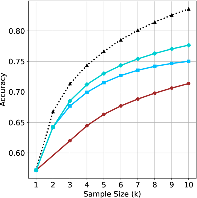
### Visual Description
\n
## Line Chart: Accuracy vs. Sample Size
### Overview
The image presents a line chart illustrating the relationship between sample size and accuracy. Four different data series are plotted, each representing a different method or configuration, as indicated by their distinct line styles and colors. The chart demonstrates how accuracy improves with increasing sample size for each series.
### Components/Axes
* **X-axis:** Labeled "Sample Size (k)", ranging from 1 to 10 (in increments of 1).
* **Y-axis:** Labeled "Accuracy", ranging from 0.58 to 0.82 (in increments of 0.02).
* **Data Series:** Four lines are present, differentiated by color and style:
* Black dotted line (▲)
* Cyan solid line (■)
* Blue dashed line (▼)
* Red solid line (●)
* **Grid:** A grid is present to aid in reading values.
### Detailed Analysis
Let's analyze each data series individually, noting trends and approximate values:
* **Black Dotted Line (▲):** This line exhibits the steepest upward slope, indicating the fastest increase in accuracy with sample size.
* At Sample Size = 1k: Accuracy ≈ 0.67
* At Sample Size = 2k: Accuracy ≈ 0.72
* At Sample Size = 3k: Accuracy ≈ 0.76
* At Sample Size = 4k: Accuracy ≈ 0.78
* At Sample Size = 5k: Accuracy ≈ 0.79
* At Sample Size = 6k: Accuracy ≈ 0.80
* At Sample Size = 7k: Accuracy ≈ 0.81
* At Sample Size = 8k: Accuracy ≈ 0.82
* At Sample Size = 9k: Accuracy ≈ 0.82
* At Sample Size = 10k: Accuracy ≈ 0.82
* **Cyan Solid Line (■):** This line shows a moderate upward slope, with accuracy increasing at a slower rate than the black dotted line.
* At Sample Size = 1k: Accuracy ≈ 0.60
* At Sample Size = 2k: Accuracy ≈ 0.68
* At Sample Size = 3k: Accuracy ≈ 0.72
* At Sample Size = 4k: Accuracy ≈ 0.74
* At Sample Size = 5k: Accuracy ≈ 0.75
* At Sample Size = 6k: Accuracy ≈ 0.76
* At Sample Size = 7k: Accuracy ≈ 0.76
* At Sample Size = 8k: Accuracy ≈ 0.77
* At Sample Size = 9k: Accuracy ≈ 0.77
* At Sample Size = 10k: Accuracy ≈ 0.78
* **Blue Dashed Line (▼):** This line demonstrates a similar trend to the cyan line, but with slightly lower accuracy values.
* At Sample Size = 1k: Accuracy ≈ 0.59
* At Sample Size = 2k: Accuracy ≈ 0.66
* At Sample Size = 3k: Accuracy ≈ 0.70
* At Sample Size = 4k: Accuracy ≈ 0.72
* At Sample Size = 5k: Accuracy ≈ 0.73
* At Sample Size = 6k: Accuracy ≈ 0.74
* At Sample Size = 7k: Accuracy ≈ 0.74
* At Sample Size = 8k: Accuracy ≈ 0.75
* At Sample Size = 9k: Accuracy ≈ 0.75
* At Sample Size = 10k: Accuracy ≈ 0.76
* **Red Solid Line (●):** This line exhibits the slowest increase in accuracy with sample size.
* At Sample Size = 1k: Accuracy ≈ 0.58
* At Sample Size = 2k: Accuracy ≈ 0.63
* At Sample Size = 3k: Accuracy ≈ 0.66
* At Sample Size = 4k: Accuracy ≈ 0.68
* At Sample Size = 5k: Accuracy ≈ 0.69
* At Sample Size = 6k: Accuracy ≈ 0.70
* At Sample Size = 7k: Accuracy ≈ 0.70
* At Sample Size = 8k: Accuracy ≈ 0.71
* At Sample Size = 9k: Accuracy ≈ 0.71
* At Sample Size = 10k: Accuracy ≈ 0.72
### Key Observations
* The black dotted line consistently outperforms the other methods across all sample sizes.
* The red solid line consistently underperforms the other methods.
* All lines demonstrate diminishing returns in accuracy as sample size increases. The rate of accuracy improvement slows down with larger sample sizes.
* The differences in accuracy between the methods are most pronounced at smaller sample sizes.
### Interpretation
The chart suggests that increasing the sample size generally improves accuracy for all methods tested. However, the effectiveness of increasing sample size varies significantly depending on the method used. The black dotted line represents a method that benefits most from larger sample sizes, while the red solid line shows limited improvement. This could indicate that the black dotted line method is more sensitive to data availability or that the red solid line method has reached a performance plateau. The diminishing returns observed across all lines suggest that there is a point beyond which increasing the sample size provides only marginal gains in accuracy. This information is valuable for optimizing resource allocation and determining the appropriate sample size for a given application. The chart implies a trade-off between the cost of acquiring more data and the potential improvement in accuracy.
</details>
(a) LN-Super- $49$ B
<details>
<summary>x31.png Details</summary>
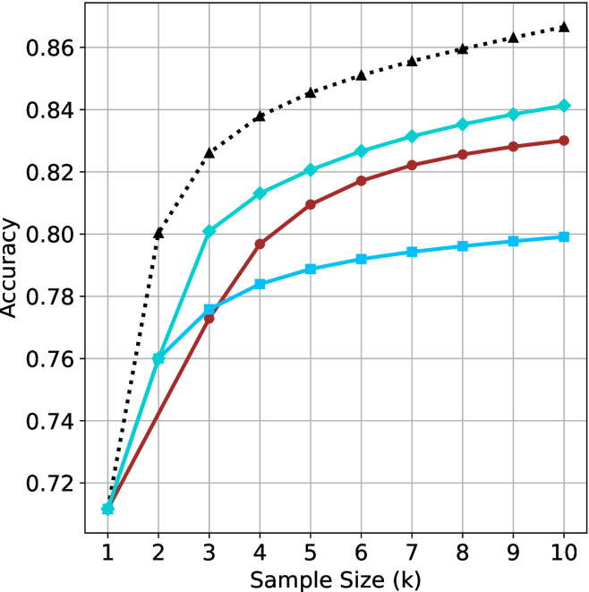
### Visual Description
## Line Chart: Accuracy vs. Sample Size
### Overview
The image presents a line chart illustrating the relationship between sample size and accuracy. Three distinct lines represent different models or algorithms, showing how their accuracy changes as the sample size increases. The x-axis represents the sample size in thousands (k), ranging from 1 to 10. The y-axis represents accuracy, ranging from approximately 0.72 to 0.86.
### Components/Axes
* **X-axis Title:** "Sample Size (k)"
* **Y-axis Title:** "Accuracy"
* **X-axis Scale:** Linear, from 1 to 10, with increments of 1.
* **Y-axis Scale:** Linear, from 0.72 to 0.86, with increments of approximately 0.02.
* **Line 1 (Dotted Black):** Represents the highest accuracy.
* **Line 2 (Cyan):** Represents a moderate accuracy.
* **Line 3 (Red):** Represents the lowest accuracy.
### Detailed Analysis
* **Dotted Black Line:** This line shows a rapid increase in accuracy from a sample size of 1k to 5k, then plateaus.
* At 1k: Approximately 0.74
* At 2k: Approximately 0.80
* At 3k: Approximately 0.82
* At 4k: Approximately 0.83
* At 5k: Approximately 0.85
* At 6k-10k: Approximately 0.86
* **Cyan Line:** This line shows a steady increase in accuracy from 1k to 10k, but with a slower rate of increase than the dotted black line.
* At 1k: Approximately 0.72
* At 2k: Approximately 0.77
* At 3k: Approximately 0.79
* At 4k: Approximately 0.80
* At 5k: Approximately 0.82
* At 6k: Approximately 0.82
* At 7k: Approximately 0.82
* At 8k: Approximately 0.82
* At 9k: Approximately 0.83
* At 10k: Approximately 0.83
* **Red Line:** This line shows a moderate increase in accuracy from 1k to 4k, then a slower increase from 4k to 10k.
* At 1k: Approximately 0.72
* At 2k: Approximately 0.76
* At 3k: Approximately 0.78
* At 4k: Approximately 0.80
* At 5k: Approximately 0.81
* At 6k: Approximately 0.81
* At 7k: Approximately 0.82
* At 8k: Approximately 0.82
* At 9k: Approximately 0.82
* At 10k: Approximately 0.83
### Key Observations
* The dotted black line consistently demonstrates the highest accuracy across all sample sizes.
* The cyan and red lines converge towards the upper end of the sample size range, suggesting diminishing returns in accuracy gains beyond a certain point.
* The dotted black line reaches a plateau in accuracy around 5k, indicating that increasing the sample size further does not significantly improve performance.
* All three lines show an increasing trend, indicating that larger sample sizes generally lead to higher accuracy.
### Interpretation
The chart demonstrates the impact of sample size on the accuracy of different models or algorithms. The dotted black line likely represents a model that benefits significantly from increased data, achieving high accuracy with a relatively small sample size. The cyan and red lines represent models that require larger sample sizes to achieve comparable accuracy, or that have inherent limitations preventing them from reaching the same level of performance as the dotted black line model. The plateau observed in the dotted black line suggests that the model has reached its maximum potential accuracy, and further data collection would not yield substantial improvements. This data suggests that the choice of model and the availability of sufficient data are crucial factors in achieving high accuracy in machine learning or statistical modeling tasks. The diminishing returns observed in the cyan and red lines highlight the importance of balancing data collection efforts with the potential for accuracy gains.
</details>
(b) R $1$ - $32$ B
<details>
<summary>x32.png Details</summary>
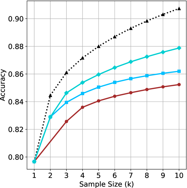
### Visual Description
\n
## Line Chart: Accuracy vs. Sample Size
### Overview
The image presents a line chart illustrating the relationship between sample size and accuracy. Four distinct data series are plotted, each representing a different model or condition. The chart demonstrates how accuracy changes as the sample size increases, ranging from 1k to 10k.
### Components/Axes
* **X-axis:** Labeled "Sample Size (k)", ranging from 1 to 10, with increments of 1.
* **Y-axis:** Labeled "Accuracy", ranging from 0.80 to 0.90, with increments of 0.02.
* **Data Series:** Four lines are present, each with a unique color and style:
* Black dotted line
* Cyan solid line
* Blue solid line
* Red solid line
### Detailed Analysis
Let's analyze each data series individually, noting trends and approximate values.
* **Black Dotted Line:** This line exhibits a strong upward trend, indicating a rapid increase in accuracy with increasing sample size.
* At Sample Size = 1k, Accuracy ≈ 0.84
* At Sample Size = 2k, Accuracy ≈ 0.86
* At Sample Size = 3k, Accuracy ≈ 0.87
* At Sample Size = 4k, Accuracy ≈ 0.88
* At Sample Size = 5k, Accuracy ≈ 0.885
* At Sample Size = 6k, Accuracy ≈ 0.89
* At Sample Size = 7k, Accuracy ≈ 0.895
* At Sample Size = 8k, Accuracy ≈ 0.90
* At Sample Size = 9k, Accuracy ≈ 0.90
* At Sample Size = 10k, Accuracy ≈ 0.90
* **Cyan Solid Line:** This line also shows an upward trend, but the rate of increase is less steep than the black dotted line.
* At Sample Size = 1k, Accuracy ≈ 0.80
* At Sample Size = 2k, Accuracy ≈ 0.83
* At Sample Size = 3k, Accuracy ≈ 0.845
* At Sample Size = 4k, Accuracy ≈ 0.855
* At Sample Size = 5k, Accuracy ≈ 0.86
* At Sample Size = 6k, Accuracy ≈ 0.865
* At Sample Size = 7k, Accuracy ≈ 0.868
* At Sample Size = 8k, Accuracy ≈ 0.87
* At Sample Size = 9k, Accuracy ≈ 0.873
* At Sample Size = 10k, Accuracy ≈ 0.875
* **Blue Solid Line:** This line demonstrates a moderate upward trend, with a slower rate of increase compared to the cyan line.
* At Sample Size = 1k, Accuracy ≈ 0.80
* At Sample Size = 2k, Accuracy ≈ 0.82
* At Sample Size = 3k, Accuracy ≈ 0.835
* At Sample Size = 4k, Accuracy ≈ 0.845
* At Sample Size = 5k, Accuracy ≈ 0.85
* At Sample Size = 6k, Accuracy ≈ 0.855
* At Sample Size = 7k, Accuracy ≈ 0.858
* At Sample Size = 8k, Accuracy ≈ 0.86
* At Sample Size = 9k, Accuracy ≈ 0.862
* At Sample Size = 10k, Accuracy ≈ 0.865
* **Red Solid Line:** This line shows the slowest rate of increase in accuracy with sample size.
* At Sample Size = 1k, Accuracy ≈ 0.80
* At Sample Size = 2k, Accuracy ≈ 0.81
* At Sample Size = 3k, Accuracy ≈ 0.82
* At Sample Size = 4k, Accuracy ≈ 0.83
* At Sample Size = 5k, Accuracy ≈ 0.835
* At Sample Size = 6k, Accuracy ≈ 0.84
* At Sample Size = 7k, Accuracy ≈ 0.843
* At Sample Size = 8k, Accuracy ≈ 0.845
* At Sample Size = 9k, Accuracy ≈ 0.847
* At Sample Size = 10k, Accuracy ≈ 0.85
### Key Observations
* The black dotted line consistently exhibits the highest accuracy across all sample sizes.
* The red solid line consistently exhibits the lowest accuracy across all sample sizes.
* All lines demonstrate diminishing returns in accuracy as sample size increases. The rate of accuracy improvement slows down with larger sample sizes.
* The difference in accuracy between the black dotted line and the red solid line is most pronounced at smaller sample sizes.
### Interpretation
The chart suggests that increasing the sample size generally improves accuracy, but the extent of improvement varies depending on the model or condition being evaluated. The black dotted line likely represents a model that benefits significantly from larger datasets, while the red solid line represents a model that is less sensitive to sample size. The diminishing returns observed across all lines indicate that there is a point beyond which increasing the sample size yields only marginal improvements in accuracy. This information is valuable for resource allocation, as it helps determine the optimal sample size for achieving a desired level of accuracy without unnecessary data collection costs. The chart could be demonstrating the performance of different machine learning algorithms, or different data preprocessing techniques. The consistent performance difference between the lines suggests inherent differences in the models' capabilities or the quality of the data they are trained on.
</details>
(c) QwQ-32B
<details>
<summary>x33.png Details</summary>
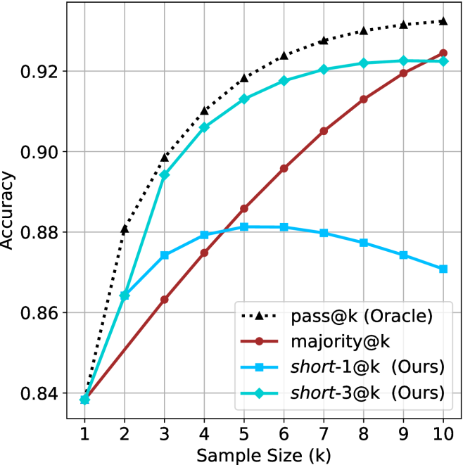
### Visual Description
\n
## Chart: Accuracy vs. Sample Size
### Overview
The image presents a line chart comparing the accuracy of four different methods – pass@k (Oracle), majority@k, short-1@k (Ours), and short-3@k (Ours) – as a function of sample size (k). The chart illustrates how the performance of each method changes as the number of samples considered increases.
### Components/Axes
* **X-axis:** Sample Size (k), ranging from 1 to 10.
* **Y-axis:** Accuracy, ranging from 0.84 to 0.93.
* **Legend:** Located in the bottom-right corner, identifying the four data series:
* pass@k (Oracle) - represented by a black dotted line with triangle markers.
* majority@k - represented by a maroon solid line with circle markers.
* short-1@k (Ours) - represented by a blue solid line with circle markers.
* short-3@k (Ours) - represented by a teal solid line with circle markers.
* **Gridlines:** A light gray grid is present to aid in reading values.
### Detailed Analysis
Here's a breakdown of each line's trend and approximate data points:
* **pass@k (Oracle):** This line (black dotted) shows a rapidly increasing accuracy from k=1 to k=4, then plateaus.
* k=1: ~0.84
* k=2: ~0.89
* k=3: ~0.91
* k=4: ~0.92
* k=5-10: ~0.92-0.93 (plateau)
* **majority@k:** This line (maroon) starts at a lower accuracy and increases more gradually.
* k=1: ~0.84
* k=2: ~0.86
* k=3: ~0.87
* k=4: ~0.88
* k=5: ~0.89
* k=6: ~0.90
* k=7: ~0.91
* k=8: ~0.91
* k=9: ~0.92
* k=10: ~0.92
* **short-1@k (Ours):** This line (blue) exhibits a steep increase in accuracy from k=1 to k=4, then a slight decrease.
* k=1: ~0.84
* k=2: ~0.88
* k=3: ~0.91
* k=4: ~0.92
* k=5: ~0.92
* k=6: ~0.92
* k=7: ~0.92
* k=8: ~0.91
* k=9: ~0.90
* k=10: ~0.88
* **short-3@k (Ours):** This line (teal) shows a similar trend to short-1@k, with a rapid increase initially, followed by a plateau and a slight decrease.
* k=1: ~0.84
* k=2: ~0.89
* k=3: ~0.91
* k=4: ~0.92
* k=5: ~0.92
* k=6: ~0.92
* k=7: ~0.92
* k=8: ~0.92
* k=9: ~0.91
* k=10: ~0.89
### Key Observations
* The "pass@k (Oracle)" method consistently achieves the highest accuracy across all sample sizes.
* Both "short-1@k (Ours)" and "short-3@k (Ours)" methods demonstrate significant improvements in accuracy as the sample size increases, reaching comparable levels to "pass@k (Oracle)" at k=4.
* The "majority@k" method exhibits the slowest improvement in accuracy and remains the lowest performing method throughout.
* "short-1@k (Ours)" and "short-3@k (Ours)" show a slight decrease in accuracy at k=9 and k=10, suggesting a potential overfitting or diminishing returns with larger sample sizes.
### Interpretation
The chart demonstrates the effectiveness of the proposed "short-1@k" and "short-3@k" methods in achieving high accuracy, particularly when compared to the "majority@k" baseline. The performance of these methods approaches that of the "pass@k (Oracle)" method, which represents an ideal scenario with complete information. The plateauing and slight decline in accuracy for "short-1@k" and "short-3@k" at larger sample sizes suggest that the benefits of increasing the sample size diminish beyond a certain point, and may even introduce noise or overfitting. The rapid initial gains indicate that these methods are sensitive to the quality and relevance of the initial samples. The difference between "short-1@k" and "short-3@k" is minimal, suggesting that increasing the number of short contexts from 1 to 3 does not yield substantial performance gains. This data suggests that the proposed methods are a viable alternative to the Oracle method, offering a good trade-off between accuracy and computational cost.
</details>
(d) R $1$ - $670$ B
Figure 9: AIME 2024 - sample size ( $k$ ) comparison.
<details>
<summary>x34.png Details</summary>
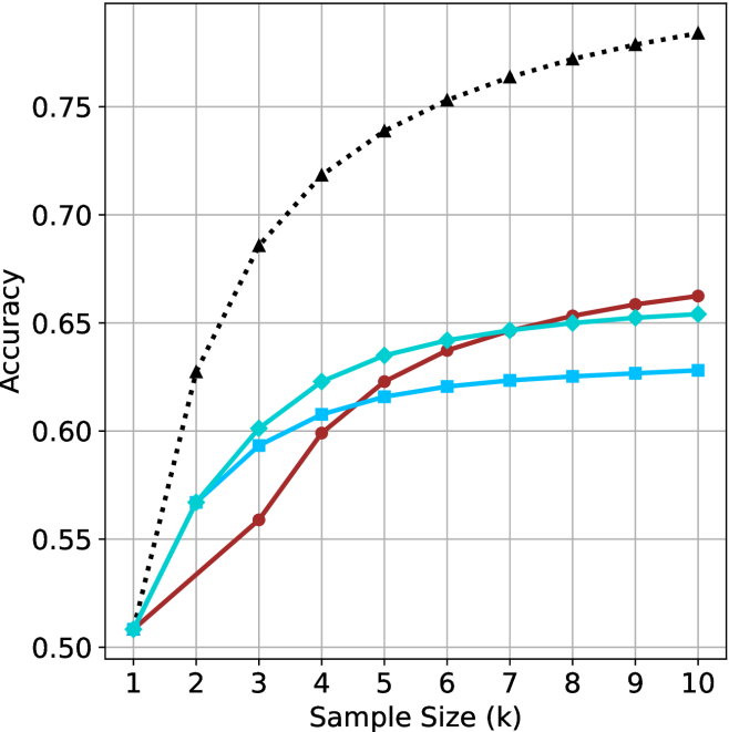
### Visual Description
\n
## Line Chart: Accuracy vs. Sample Size
### Overview
This image presents a line chart illustrating the relationship between sample size (in thousands) and accuracy. Four distinct data series are plotted, each represented by a different colored line. The chart appears to demonstrate how accuracy improves with increasing sample size, but at a diminishing rate.
### Components/Axes
* **X-axis:** Labeled "Sample Size (k)", ranging from 1 to 10 (in thousands). The axis is marked with integer values.
* **Y-axis:** Labeled "Accuracy", ranging from 0.50 to 0.76. The axis is marked with values in increments of 0.05.
* **Data Series:** Four lines are present, each representing a different method or condition.
* Black dotted line
* Blue solid line
* Red solid line
* Teal solid line
### Detailed Analysis
Let's analyze each line individually, noting trends and approximate data points.
* **Black Dotted Line:** This line exhibits the steepest upward trend. It starts at approximately (1, 0.52) and rapidly increases to around (2, 0.68), then continues to rise, leveling off towards (10, 0.76).
* **Blue Solid Line:** This line shows a moderate upward trend. It begins at approximately (1, 0.51), rises to around (2, 0.59), and plateaus around (8, 0.63), with a slight increase to (10, 0.63).
* **Red Solid Line:** This line demonstrates a moderate upward trend, but with a slower initial increase than the blue line. It starts at approximately (1, 0.50), rises to around (2, 0.56), and reaches a plateau around (6, 0.65), remaining relatively stable until (10, 0.66).
* **Teal Solid Line:** This line shows a slow upward trend. It begins at approximately (1, 0.51), rises to around (2, 0.58), and reaches a plateau around (4, 0.61), remaining relatively stable until (10, 0.62).
### Key Observations
* The black dotted line consistently outperforms the other three lines across all sample sizes.
* The accuracy improvement diminishes as the sample size increases for all lines. The most significant gains are observed between sample sizes of 1k and 4k.
* The blue, red, and teal lines converge towards the higher sample sizes, indicating similar performance levels.
* All lines start at approximately the same accuracy level (around 0.50-0.52).
### Interpretation
The chart suggests that increasing the sample size generally improves accuracy, but the benefit of larger samples decreases as the sample size grows. The black dotted line likely represents a more effective method or a condition that yields higher accuracy. The convergence of the blue, red, and teal lines at larger sample sizes indicates that these methods or conditions reach a point of diminishing returns.
The data implies that for the methods represented by the blue, red, and teal lines, investing in sample sizes beyond a certain point (around 6k-8k) may not yield significant improvements in accuracy. However, the black dotted line continues to benefit from larger sample sizes, suggesting that it has the potential for further accuracy gains.
This chart could be used to inform decisions about resource allocation for data collection. It highlights the importance of balancing the cost of acquiring larger samples with the potential benefits in terms of improved accuracy. The chart also suggests that exploring the method represented by the black dotted line could be a worthwhile investment.
</details>
(a) LN-Super- $49$ B
<details>
<summary>x35.png Details</summary>
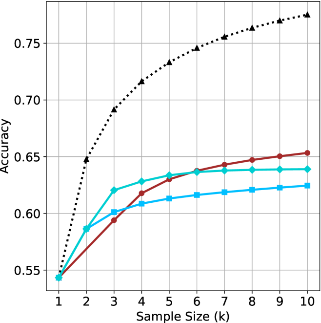
### Visual Description
\n
## Line Chart: Accuracy vs. Sample Size
### Overview
This image presents a line chart illustrating the relationship between sample size (in thousands) and accuracy. The chart displays four distinct data series, each represented by a different colored line, showing how accuracy changes as the sample size increases. The chart has a grid background for easier readability.
### Components/Axes
* **X-axis:** Labeled "Sample Size (k)", ranging from 1 to 10 (in thousands). The axis is marked with integer values.
* **Y-axis:** Labeled "Accuracy", ranging from 0.55 to 0.76. The axis is marked with values in increments of 0.05.
* **Data Series:** Four lines are present, each representing a different experimental condition or model.
* Black dotted line
* Red solid line
* Blue solid line
* Green solid line
### Detailed Analysis
Let's analyze each line individually, noting trends and approximate data points.
* **Black Dotted Line:** This line exhibits the most rapid increase in accuracy with increasing sample size. It starts at approximately 0.55 at a sample size of 1k and quickly rises to around 0.72 at 3k. The rate of increase slows down as the sample size increases, reaching approximately 0.76 at 8k and leveling off around 0.76 at 10k.
* **Red Solid Line:** This line shows a moderate increase in accuracy. It begins at approximately 0.56 at 1k, rises to around 0.63 at 3k, and continues to increase, reaching approximately 0.66 at 10k. The slope is relatively consistent throughout.
* **Blue Solid Line:** This line demonstrates a slow and steady increase in accuracy. It starts at approximately 0.58 at 1k, reaches around 0.61 at 3k, and increases to approximately 0.63 at 10k. The slope is the shallowest of all four lines.
* **Green Solid Line:** This line shows an initial increase, followed by a plateau. It begins at approximately 0.57 at 1k, rises to around 0.64 at 4k, and remains relatively constant at approximately 0.65 from 4k to 10k.
### Key Observations
* The black dotted line consistently outperforms the other three lines in terms of accuracy across all sample sizes.
* The blue line exhibits the slowest rate of improvement in accuracy with increasing sample size.
* The green line reaches a plateau in accuracy after a sample size of 4k, suggesting diminishing returns from further increasing the sample size.
* All lines show an increasing trend, indicating that larger sample sizes generally lead to higher accuracy.
### Interpretation
The chart suggests that increasing the sample size generally improves accuracy, but the extent of improvement varies depending on the specific data series. The black dotted line likely represents a model or method that benefits significantly from larger datasets, while the blue line represents a method that is less sensitive to sample size. The green line indicates a point of diminishing returns, where increasing the sample size beyond a certain point does not significantly improve accuracy. This could be due to factors such as data saturation or limitations in the model itself. The chart highlights the importance of considering sample size when evaluating the performance of different models or methods, and suggests that there may be an optimal sample size beyond which further increases provide minimal benefit. The data suggests that the black dotted line is the most effective method, but it may also be the most computationally expensive or require the most data.
</details>
(b) R $1$ - $32$ B
<details>
<summary>x36.png Details</summary>
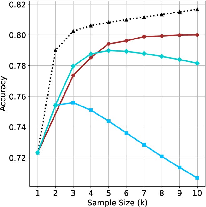
### Visual Description
## Line Chart: Accuracy vs. Sample Size
### Overview
This image presents a line chart illustrating the relationship between sample size (in thousands) and accuracy. The chart displays three distinct data series, each represented by a different colored line, showing how accuracy changes as the sample size increases. The chart has a grid background for easier readability.
### Components/Axes
* **X-axis:** Labeled "Sample Size (k)", ranging from 1 to 10 (in thousands).
* **Y-axis:** Labeled "Accuracy", ranging from 0.72 to 0.82.
* **Data Series 1:** Black dotted line.
* **Data Series 2:** Red solid line.
* **Data Series 3:** Teal solid line.
* **Data Series 4:** Light blue solid line.
* **Grid:** A light gray grid is present to aid in reading values.
### Detailed Analysis
**Data Series 1 (Black Dotted Line):** This line exhibits a steep upward trend initially, then plateaus.
* At Sample Size = 1k, Accuracy ≈ 0.725
* At Sample Size = 2k, Accuracy ≈ 0.795
* At Sample Size = 3k, Accuracy ≈ 0.805
* At Sample Size = 4k, Accuracy ≈ 0.807
* At Sample Size = 5k, Accuracy ≈ 0.808
* At Sample Size = 6k, Accuracy ≈ 0.809
* At Sample Size = 7k, Accuracy ≈ 0.810
* At Sample Size = 8k, Accuracy ≈ 0.811
* At Sample Size = 9k, Accuracy ≈ 0.812
* At Sample Size = 10k, Accuracy ≈ 0.813
**Data Series 2 (Red Solid Line):** This line shows a moderate upward trend, leveling off after 4k.
* At Sample Size = 1k, Accuracy ≈ 0.76
* At Sample Size = 2k, Accuracy ≈ 0.775
* At Sample Size = 3k, Accuracy ≈ 0.785
* At Sample Size = 4k, Accuracy ≈ 0.795
* At Sample Size = 5k, Accuracy ≈ 0.797
* At Sample Size = 6k, Accuracy ≈ 0.798
* At Sample Size = 7k, Accuracy ≈ 0.798
* At Sample Size = 8k, Accuracy ≈ 0.798
* At Sample Size = 9k, Accuracy ≈ 0.798
* At Sample Size = 10k, Accuracy ≈ 0.798
**Data Series 3 (Teal Solid Line):** This line initially increases, reaches a peak around 5k, and then slightly declines.
* At Sample Size = 1k, Accuracy ≈ 0.76
* At Sample Size = 2k, Accuracy ≈ 0.77
* At Sample Size = 3k, Accuracy ≈ 0.78
* At Sample Size = 4k, Accuracy ≈ 0.79
* At Sample Size = 5k, Accuracy ≈ 0.795
* At Sample Size = 6k, Accuracy ≈ 0.794
* At Sample Size = 7k, Accuracy ≈ 0.793
* At Sample Size = 8k, Accuracy ≈ 0.792
* At Sample Size = 9k, Accuracy ≈ 0.791
* At Sample Size = 10k, Accuracy ≈ 0.790
**Data Series 4 (Light Blue Solid Line):** This line shows a clear downward trend.
* At Sample Size = 1k, Accuracy ≈ 0.745
* At Sample Size = 2k, Accuracy ≈ 0.735
* At Sample Size = 3k, Accuracy ≈ 0.725
* At Sample Size = 4k, Accuracy ≈ 0.715
* At Sample Size = 5k, Accuracy ≈ 0.705
* At Sample Size = 6k, Accuracy ≈ 0.695
* At Sample Size = 7k, Accuracy ≈ 0.685
* At Sample Size = 8k, Accuracy ≈ 0.675
* At Sample Size = 9k, Accuracy ≈ 0.665
* At Sample Size = 10k, Accuracy ≈ 0.655
### Key Observations
* The black dotted line consistently demonstrates the highest accuracy across all sample sizes.
* The light blue line shows a negative correlation between sample size and accuracy, which is unusual.
* The red and teal lines exhibit diminishing returns in accuracy as the sample size increases beyond 4k.
* The teal line peaks at 5k and then slightly decreases, suggesting an optimal sample size around that point.
### Interpretation
The chart suggests that increasing the sample size generally improves accuracy, but this improvement is not always linear and can plateau or even decrease under certain conditions. The black dotted line likely represents a highly effective method or model, as it consistently achieves the highest accuracy. The light blue line's decreasing accuracy with increasing sample size is a significant anomaly. This could indicate a problem with the data collection process, a flawed model, or a bias introduced by larger sample sizes. The red and teal lines demonstrate that there's a point of diminishing returns, where adding more data doesn't significantly improve accuracy. The optimal sample size for the teal line appears to be around 5k. This data could be used to inform decisions about resource allocation for data collection, balancing the cost of acquiring more data with the potential gains in accuracy. Further investigation is needed to understand the cause of the negative correlation observed in the light blue line.
</details>
(c) QwQ-32B
<details>
<summary>x37.png Details</summary>
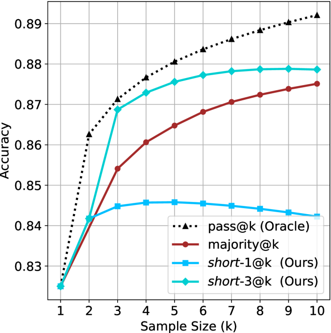
### Visual Description
## Line Chart: Accuracy vs. Sample Size
### Overview
This image presents a line chart illustrating the relationship between accuracy and sample size (k) for four different methods: pass@k (Oracle), majority@k, short-1@k (Ours), and short-3@k (Ours). The chart displays how accuracy changes as the sample size increases from 1 to 10.
### Components/Axes
* **X-axis:** "Sample Size (k)" ranging from 1 to 10. The axis is labeled and has tick marks at integer values.
* **Y-axis:** "Accuracy" ranging from 0.83 to 0.89. The axis is labeled and has tick marks at 0.83, 0.84, 0.85, 0.86, 0.87, 0.88, and 0.89.
* **Legend:** Located in the bottom-right corner of the chart. It identifies the four data series:
* pass@k (Oracle) - represented by a black dotted line.
* majority@k - represented by a brown solid line.
* short-1@k (Ours) - represented by a blue solid line.
* short-3@k (Ours) - represented by a teal solid line.
* **Gridlines:** A light gray grid is present to aid in reading values.
### Detailed Analysis
Here's a breakdown of each line's trend and approximate data points:
* **pass@k (Oracle):** (Black dotted line) This line exhibits a steep upward slope, indicating a rapid increase in accuracy with increasing sample size.
* k=1: Accuracy ≈ 0.825
* k=2: Accuracy ≈ 0.865
* k=3: Accuracy ≈ 0.875
* k=4: Accuracy ≈ 0.88
* k=10: Accuracy ≈ 0.89
* **majority@k:** (Brown solid line) This line shows a moderate upward slope, with the rate of increase slowing down as the sample size grows.
* k=1: Accuracy ≈ 0.83
* k=2: Accuracy ≈ 0.86
* k=3: Accuracy ≈ 0.87
* k=4: Accuracy ≈ 0.873
* k=10: Accuracy ≈ 0.875
* **short-1@k (Ours):** (Blue solid line) This line initially increases rapidly, then plateaus.
* k=1: Accuracy ≈ 0.83
* k=2: Accuracy ≈ 0.845
* k=3: Accuracy ≈ 0.85
* k=4: Accuracy ≈ 0.85
* k=10: Accuracy ≈ 0.85
* **short-3@k (Ours):** (Teal solid line) This line shows a consistent upward trend, but less steep than pass@k.
* k=1: Accuracy ≈ 0.83
* k=2: Accuracy ≈ 0.85
* k=3: Accuracy ≈ 0.865
* k=4: Accuracy ≈ 0.875
* k=10: Accuracy ≈ 0.88
### Key Observations
* The "pass@k (Oracle)" method consistently achieves the highest accuracy across all sample sizes.
* The "majority@k" method shows a steady increase in accuracy, but plateaus at a lower level than "pass@k (Oracle)".
* "short-1@k (Ours)" has the lowest accuracy and plateaus quickly.
* "short-3@k (Ours)" performs better than "short-1@k (Ours)" and shows a more consistent improvement with increasing sample size.
* All methods show diminishing returns in accuracy as the sample size increases beyond k=4.
### Interpretation
The chart demonstrates the performance of different methods for a task where accuracy is measured. The "pass@k (Oracle)" method, likely representing an ideal or upper-bound scenario, serves as a benchmark. The "majority@k" method provides a reasonable level of accuracy, while the "short-1@k (Ours)" and "short-3@k (Ours)" methods represent proposed approaches ("Ours").
The fact that "short-3@k (Ours)" outperforms "short-1@k (Ours)" suggests that increasing the number of samples considered (from 1 to 3) improves the accuracy of the proposed method. However, none of the "Ours" methods reach the performance of the "Oracle" or "majority@k" methods. The plateauing of all lines indicates that there's a limit to the accuracy achievable with this approach, even with larger sample sizes. This could be due to inherent limitations in the method itself or the nature of the data. The diminishing returns suggest that beyond a certain sample size, the effort to collect more data does not yield significant improvements in accuracy.
</details>
(d) R1-670B
Figure 10: AIME 2025 - sample size ( $k$ ) comparison.
<details>
<summary>x38.png Details</summary>
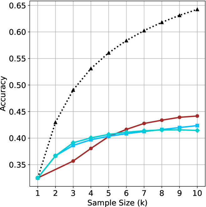
### Visual Description
## Line Chart: Accuracy vs. Sample Size
### Overview
The image presents a line chart illustrating the relationship between sample size (in thousands, denoted as 'k') and accuracy. Three distinct data series are plotted, each represented by a different colored line. The chart appears to demonstrate how accuracy changes as the sample size increases for each series.
### Components/Axes
* **X-axis:** Labeled "Sample Size (k)". The scale ranges from 1 to 10, with increments of 1.
* **Y-axis:** Labeled "Accuracy". The scale ranges from 0.30 to 0.65, with increments of 0.05.
* **Data Series 1:** Represented by a black dotted line.
* **Data Series 2:** Represented by a red solid line.
* **Data Series 3:** Represented by a cyan solid line.
* **Gridlines:** A grid of horizontal and vertical lines is present to aid in reading values.
### Detailed Analysis
**Data Series 1 (Black Dotted Line):** This line exhibits a strong upward trend, starting at approximately 0.33 at a sample size of 1 and reaching approximately 0.64 at a sample size of 10.
* Sample Size 1: Accuracy ≈ 0.33
* Sample Size 2: Accuracy ≈ 0.44
* Sample Size 3: Accuracy ≈ 0.50
* Sample Size 4: Accuracy ≈ 0.55
* Sample Size 5: Accuracy ≈ 0.58
* Sample Size 6: Accuracy ≈ 0.60
* Sample Size 7: Accuracy ≈ 0.61
* Sample Size 8: Accuracy ≈ 0.62
* Sample Size 9: Accuracy ≈ 0.63
* Sample Size 10: Accuracy ≈ 0.64
**Data Series 2 (Red Solid Line):** This line shows a moderate upward trend, starting at approximately 0.33 at a sample size of 1 and reaching approximately 0.44 at a sample size of 10.
* Sample Size 1: Accuracy ≈ 0.33
* Sample Size 2: Accuracy ≈ 0.36
* Sample Size 3: Accuracy ≈ 0.38
* Sample Size 4: Accuracy ≈ 0.40
* Sample Size 5: Accuracy ≈ 0.41
* Sample Size 6: Accuracy ≈ 0.42
* Sample Size 7: Accuracy ≈ 0.42
* Sample Size 8: Accuracy ≈ 0.43
* Sample Size 9: Accuracy ≈ 0.43
* Sample Size 10: Accuracy ≈ 0.44
**Data Series 3 (Cyan Solid Line):** This line demonstrates a gradual upward trend, starting at approximately 0.33 at a sample size of 1 and reaching approximately 0.41 at a sample size of 10.
* Sample Size 1: Accuracy ≈ 0.33
* Sample Size 2: Accuracy ≈ 0.35
* Sample Size 3: Accuracy ≈ 0.37
* Sample Size 4: Accuracy ≈ 0.39
* Sample Size 5: Accuracy ≈ 0.40
* Sample Size 6: Accuracy ≈ 0.40
* Sample Size 7: Accuracy ≈ 0.41
* Sample Size 8: Accuracy ≈ 0.41
* Sample Size 9: Accuracy ≈ 0.41
* Sample Size 10: Accuracy ≈ 0.41
### Key Observations
* Data Series 1 consistently exhibits the highest accuracy across all sample sizes.
* The rate of accuracy improvement diminishes as the sample size increases for all three series.
* Data Series 3 shows the slowest rate of accuracy improvement.
* All three series start with the same accuracy at a sample size of 1.
### Interpretation
The chart suggests that increasing the sample size generally leads to improved accuracy for all three data series. However, the extent of this improvement varies significantly. Data Series 1 demonstrates a much stronger correlation between sample size and accuracy than the other two series. This could indicate that the method or model represented by Data Series 1 benefits more from larger sample sizes. The diminishing returns observed as sample size increases suggest that there is a point beyond which adding more data provides only marginal improvements in accuracy. The initial identical accuracy values suggest a common starting point or baseline for all three methods before diverging with increasing sample size. This data could be used to inform decisions about optimal sample size selection for a given application, balancing the cost of data acquisition with the desired level of accuracy.
</details>
(a) LN-Super- $49$ B
<details>
<summary>x39.png Details</summary>
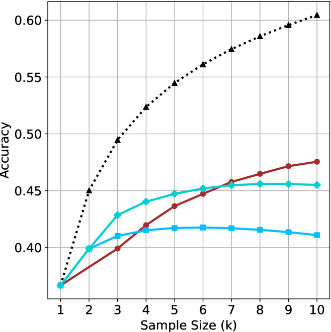
### Visual Description
\n
## Line Chart: Accuracy vs. Sample Size
### Overview
The image presents a line chart illustrating the relationship between sample size (in thousands) and accuracy. Four distinct data series are plotted, each represented by a different colored line. The chart appears to demonstrate how accuracy changes as the sample size increases for each series.
### Components/Axes
* **X-axis:** Labeled "Sample Size (k)", ranging from 1 to 10 (in thousands). The axis is linearly scaled.
* **Y-axis:** Labeled "Accuracy", ranging from 0.35 to 0.60, with a linear scale.
* **Data Series:** Four lines are present, each representing a different experimental condition or model.
* Black dotted line
* Red solid line
* Teal solid line
* Blue solid line
### Detailed Analysis
Let's analyze each line individually, noting trends and approximate data points.
* **Black Dotted Line:** This line exhibits the steepest upward trend. It starts at approximately 0.38 at a sample size of 1k and rapidly increases to approximately 0.50 at 3k, 0.55 at 5k, 0.58 at 7k, 0.59 at 9k, and reaches approximately 0.60 at 10k.
* **Red Solid Line:** This line shows a moderate upward trend, but plateaus towards the end. It begins at approximately 0.38 at 1k, increases to around 0.43 at 3k, 0.45 at 5k, 0.46 at 7k, 0.47 at 9k, and reaches approximately 0.47 at 10k.
* **Teal Solid Line:** This line shows a moderate upward trend, but plateaus towards the end. It begins at approximately 0.38 at 1k, increases to around 0.43 at 3k, 0.45 at 5k, 0.46 at 7k, 0.47 at 9k, and reaches approximately 0.47 at 10k.
* **Blue Solid Line:** This line initially increases, then plateaus and even slightly decreases. It starts at approximately 0.38 at 1k, increases to around 0.41 at 3k, 0.42 at 5k, and then remains relatively constant at approximately 0.41-0.42 from 5k to 10k.
### Key Observations
* The black dotted line consistently outperforms the other three lines across all sample sizes.
* The red and teal lines show similar performance, with accuracy plateauing after a sample size of 5k.
* The blue line shows the lowest and most stable accuracy, suggesting it may be reaching its performance limit.
* All lines start at the same accuracy level (approximately 0.38) at a sample size of 1k.
### Interpretation
The data suggests that increasing the sample size generally improves accuracy, but the rate of improvement varies significantly depending on the data series. The black dotted line indicates a method or model that benefits substantially from larger sample sizes, while the blue line suggests a method that is less sensitive to sample size. The red and teal lines show diminishing returns with increasing sample size, indicating that beyond a certain point, adding more data does not significantly improve accuracy.
The fact that all lines start at the same accuracy level suggests that the initial performance of all methods is comparable, but their ability to leverage larger datasets differs. This could be due to differences in model complexity, data quality, or the underlying algorithms used. The plateauing of the red, teal, and blue lines could indicate overfitting or the presence of inherent limitations in those methods. The consistent improvement of the black dotted line suggests a more robust and scalable approach.
</details>
(b) R $1$ - $32$ B
<details>
<summary>x40.png Details</summary>
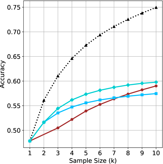
### Visual Description
\n
## Line Chart: Accuracy vs. Sample Size
### Overview
The image presents a line chart illustrating the relationship between sample size and accuracy. Four distinct data series are plotted, each representing a different model or condition. The x-axis represents the sample size in thousands (k), ranging from 1 to 10. The y-axis represents accuracy, ranging from 0.50 to 0.75. The chart displays a clear trend of increasing accuracy with increasing sample size for all series, but at varying rates.
### Components/Axes
* **X-axis Label:** "Sample Size (k)"
* **Y-axis Label:** "Accuracy"
* **X-axis Scale:** Linear, from 1 to 10, with increments of 1.
* **Y-axis Scale:** Linear, from 0.50 to 0.75, with increments of 0.05.
* **Data Series 1 (Black Dotted Line):** Represents the highest accuracy growth.
* **Data Series 2 (Cyan Line):** Shows moderate accuracy growth.
* **Data Series 3 (Blue Line):** Shows moderate accuracy growth, slightly lower than the cyan line.
* **Data Series 4 (Red Line):** Shows the slowest accuracy growth.
* **Gridlines:** Present to aid in reading values.
### Detailed Analysis
Let's analyze each data series individually:
* **Black Dotted Line:** This line exhibits the steepest positive slope, indicating the fastest increase in accuracy with sample size.
* At Sample Size = 1k, Accuracy ≈ 0.52
* At Sample Size = 2k, Accuracy ≈ 0.58
* At Sample Size = 3k, Accuracy ≈ 0.61
* At Sample Size = 4k, Accuracy ≈ 0.65
* At Sample Size = 5k, Accuracy ≈ 0.68
* At Sample Size = 6k, Accuracy ≈ 0.70
* At Sample Size = 7k, Accuracy ≈ 0.71
* At Sample Size = 8k, Accuracy ≈ 0.72
* At Sample Size = 9k, Accuracy ≈ 0.73
* At Sample Size = 10k, Accuracy ≈ 0.74
* **Cyan Line:** This line shows a moderate increase in accuracy.
* At Sample Size = 1k, Accuracy ≈ 0.49
* At Sample Size = 2k, Accuracy ≈ 0.53
* At Sample Size = 3k, Accuracy ≈ 0.55
* At Sample Size = 4k, Accuracy ≈ 0.56
* At Sample Size = 5k, Accuracy ≈ 0.57
* At Sample Size = 6k, Accuracy ≈ 0.58
* At Sample Size = 7k, Accuracy ≈ 0.58
* At Sample Size = 8k, Accuracy ≈ 0.59
* At Sample Size = 9k, Accuracy ≈ 0.59
* At Sample Size = 10k, Accuracy ≈ 0.60
* **Blue Line:** This line shows a moderate increase in accuracy, slightly lower than the cyan line.
* At Sample Size = 1k, Accuracy ≈ 0.48
* At Sample Size = 2k, Accuracy ≈ 0.52
* At Sample Size = 3k, Accuracy ≈ 0.54
* At Sample Size = 4k, Accuracy ≈ 0.55
* At Sample Size = 5k, Accuracy ≈ 0.56
* At Sample Size = 6k, Accuracy ≈ 0.57
* At Sample Size = 7k, Accuracy ≈ 0.57
* At Sample Size = 8k, Accuracy ≈ 0.58
* At Sample Size = 9k, Accuracy ≈ 0.58
* At Sample Size = 10k, Accuracy ≈ 0.59
* **Red Line:** This line exhibits the slowest increase in accuracy.
* At Sample Size = 1k, Accuracy ≈ 0.47
* At Sample Size = 2k, Accuracy ≈ 0.50
* At Sample Size = 3k, Accuracy ≈ 0.52
* At Sample Size = 4k, Accuracy ≈ 0.53
* At Sample Size = 5k, Accuracy ≈ 0.54
* At Sample Size = 6k, Accuracy ≈ 0.55
* At Sample Size = 7k, Accuracy ≈ 0.55
* At Sample Size = 8k, Accuracy ≈ 0.56
* At Sample Size = 9k, Accuracy ≈ 0.57
* At Sample Size = 10k, Accuracy ≈ 0.58
### Key Observations
* All four data series demonstrate a positive correlation between sample size and accuracy.
* The black dotted line consistently outperforms the other three series across all sample sizes.
* The red line consistently underperforms the other three series across all sample sizes.
* The rate of accuracy improvement diminishes as the sample size increases for all series, suggesting diminishing returns.
### Interpretation
The chart suggests that increasing the sample size generally leads to improved accuracy for all models or conditions being tested. However, the magnitude of this improvement varies significantly. The black dotted line likely represents a model or condition that benefits most from larger sample sizes, potentially due to its complexity or sensitivity to data. Conversely, the red line represents a model or condition that is less affected by sample size, possibly indicating a simpler model or a more robust algorithm.
The diminishing returns observed at larger sample sizes suggest that there is a point beyond which increasing the sample size provides only marginal improvements in accuracy. This information is crucial for optimizing resource allocation and determining the appropriate sample size for achieving a desired level of accuracy. The chart could be used to inform decisions about data collection strategies and model selection. The differences in performance between the lines could be due to different algorithms, different feature sets, or different data preprocessing techniques. Further investigation would be needed to determine the underlying causes of these differences.
</details>
(c) QwQ-32B
<details>
<summary>x41.png Details</summary>
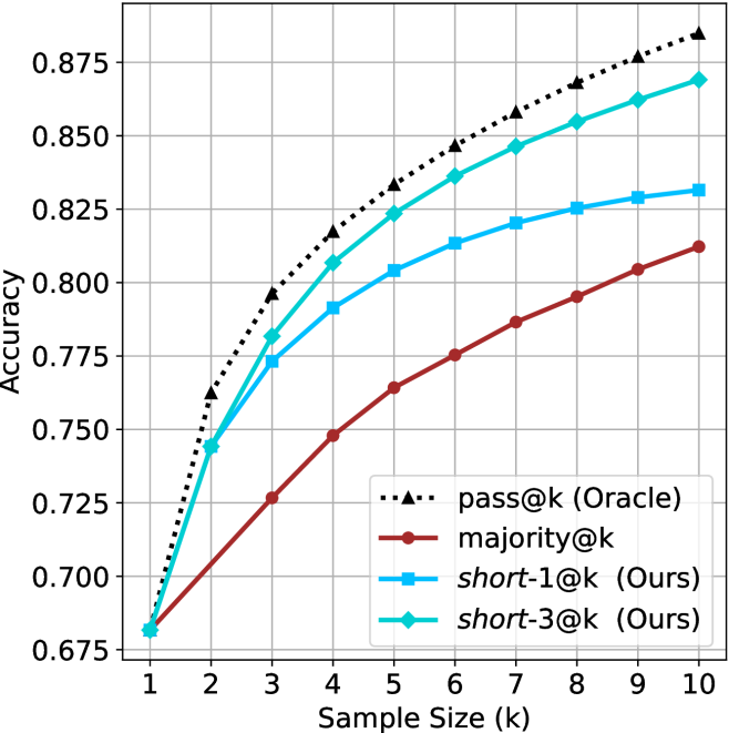
### Visual Description
## Line Chart: Accuracy vs. Sample Size
### Overview
This image presents a line chart illustrating the relationship between accuracy and sample size (k) for four different methods: pass@k (Oracle), majority@k, short-1@k (Ours), and short-3@k (Ours). The chart displays how accuracy changes as the sample size increases from 1 to 10.
### Components/Axes
* **X-axis:** "Sample Size (k)" ranging from 1 to 10, with tick marks at each integer value.
* **Y-axis:** "Accuracy" ranging from 0.675 to 0.875, with tick marks at 0.025 intervals.
* **Legend:** Located in the bottom-right corner, identifying the four data series:
* pass@k (Oracle) - represented by a black dotted line.
* majority@k - represented by a maroon solid line.
* short-1@k (Ours) - represented by a blue solid line.
* short-3@k (Ours) - represented by a teal solid line.
* **Gridlines:** A light gray grid is present to aid in reading values.
### Detailed Analysis
Here's a breakdown of each line's trend and approximate data points:
* **pass@k (Oracle):** This line (black dotted) shows a consistently upward trend, starting at approximately 0.77 accuracy at k=1 and reaching approximately 0.86 accuracy at k=10.
* k=1: ~0.77
* k=2: ~0.79
* k=3: ~0.81
* k=4: ~0.825
* k=5: ~0.835
* k=6: ~0.84
* k=7: ~0.848
* k=8: ~0.855
* k=9: ~0.86
* k=10: ~0.865
* **majority@k:** This line (maroon) exhibits a slower, more gradual upward trend. It starts at approximately 0.68 accuracy at k=1 and reaches approximately 0.82 accuracy at k=10.
* k=1: ~0.68
* k=2: ~0.71
* k=3: ~0.735
* k=4: ~0.755
* k=5: ~0.77
* k=6: ~0.785
* k=7: ~0.80
* k=8: ~0.81
* k=9: ~0.815
* k=10: ~0.82
* **short-1@k (Ours):** This line (blue) shows a rapid increase in accuracy initially, then plateaus. It starts at approximately 0.78 accuracy at k=1 and reaches approximately 0.83 accuracy at k=10.
* k=1: ~0.78
* k=2: ~0.80
* k=3: ~0.81
* k=4: ~0.815
* k=5: ~0.82
* k=6: ~0.825
* k=7: ~0.827
* k=8: ~0.828
* k=9: ~0.83
* k=10: ~0.83
* **short-3@k (Ours):** This line (teal) also shows a rapid increase initially, then plateaus, but remains higher than short-1@k. It starts at approximately 0.81 accuracy at k=1 and reaches approximately 0.85 accuracy at k=10.
* k=1: ~0.81
* k=2: ~0.83
* k=3: ~0.84
* k=4: ~0.845
* k=5: ~0.85
* k=6: ~0.85
* k=7: ~0.85
* k=8: ~0.85
* k=9: ~0.85
* k=10: ~0.85
### Key Observations
* "pass@k (Oracle)" consistently outperforms all other methods across all sample sizes.
* "short-3@k (Ours)" performs better than "short-1@k (Ours)" across all sample sizes.
* The accuracy gains from increasing the sample size diminish for "short-1@k (Ours)" and "short-3@k (Ours)" after k=5.
* "majority@k" has the lowest accuracy across all sample sizes.
### Interpretation
The chart demonstrates the performance of different methods for a task (likely a classification or prediction task) as a function of the sample size used. The "Oracle" method, which presumably has access to perfect information, sets the upper bound on achievable accuracy. The "Ours" methods ("short-1@k" and "short-3@k") represent the performance of a new approach, and their accuracy is significantly lower than the "Oracle" but better than the "majority@k" baseline. The diminishing returns in accuracy for the "Ours" methods suggest that increasing the sample size beyond a certain point (around k=5) does not significantly improve performance. This could be due to the limitations of the method itself or the nature of the data. The relatively poor performance of "majority@k" indicates that a simple majority voting approach is not effective for this task. The chart suggests that the proposed "short-3@k" method is a promising approach, offering a good balance between accuracy and computational cost.
</details>
(d) R1-670B
Figure 11: HMMT Feb 2025 - sample size ( $k$ ) comparison.
<details>
<summary>x42.png Details</summary>
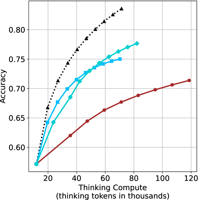
### Visual Description
\n
## Line Chart: Accuracy vs. Thinking Compute
### Overview
This image presents a line chart illustrating the relationship between "Thinking Compute" (measured in thousands of tokens) and "Accuracy". Four distinct data series are plotted, each represented by a different colored line with corresponding markers. The chart appears to demonstrate how accuracy improves with increased computational effort (thinking tokens) for different approaches or models.
### Components/Axes
* **X-axis:** "Thinking Compute (thinking tokens in thousands)". Scale ranges from approximately 0 to 120, with markers at 20, 40, 60, 80, 100, and 120.
* **Y-axis:** "Accuracy". Scale ranges from approximately 0.60 to 0.82, with markers at 0.60, 0.65, 0.70, 0.75, and 0.80.
* **Data Series:** Four lines are present, each with a distinct color and marker style:
* Black dashed line with triangle markers.
* Cyan solid line with square markers.
* Blue solid line with circle markers.
* Red solid line with circle markers.
* **Gridlines:** A grid is present to aid in reading values.
### Detailed Analysis
Let's analyze each data series individually:
* **Black (Dashed Triangle):** This line exhibits the steepest upward slope, indicating the fastest increase in accuracy with increasing compute.
* At 20k tokens: Approximately 0.68 accuracy.
* At 40k tokens: Approximately 0.76 accuracy.
* At 60k tokens: Approximately 0.79 accuracy.
* At 80k tokens: Approximately 0.80 accuracy.
* At 100k tokens: Approximately 0.81 accuracy.
* At 120k tokens: Approximately 0.81 accuracy.
* **Cyan (Solid Square):** This line shows a strong upward trend, but less steep than the black line.
* At 20k tokens: Approximately 0.64 accuracy.
* At 40k tokens: Approximately 0.73 accuracy.
* At 60k tokens: Approximately 0.76 accuracy.
* At 80k tokens: Approximately 0.77 accuracy.
* At 100k tokens: Approximately 0.77 accuracy.
* At 120k tokens: Approximately 0.77 accuracy.
* **Blue (Solid Circle):** This line demonstrates a similar trend to the cyan line, but starts at a slightly higher accuracy and plateaus earlier.
* At 20k tokens: Approximately 0.66 accuracy.
* At 40k tokens: Approximately 0.74 accuracy.
* At 60k tokens: Approximately 0.76 accuracy.
* At 80k tokens: Approximately 0.77 accuracy.
* At 100k tokens: Approximately 0.77 accuracy.
* At 120k tokens: Approximately 0.77 accuracy.
* **Red (Solid Circle):** This line exhibits the slowest increase in accuracy with increasing compute.
* At 20k tokens: Approximately 0.60 accuracy.
* At 40k tokens: Approximately 0.66 accuracy.
* At 60k tokens: Approximately 0.68 accuracy.
* At 80k tokens: Approximately 0.69 accuracy.
* At 100k tokens: Approximately 0.70 accuracy.
* At 120k tokens: Approximately 0.71 accuracy.
### Key Observations
* The black data series consistently outperforms the other three, achieving the highest accuracy across all compute levels.
* The red data series consistently underperforms, showing the smallest gains in accuracy with increased compute.
* The cyan and blue lines are relatively close in performance, plateauing at similar accuracy levels around 0.77.
* All lines show diminishing returns in accuracy as compute increases, with the rate of improvement slowing down at higher compute levels.
### Interpretation
The chart suggests that increasing "Thinking Compute" generally leads to improved "Accuracy," but the effectiveness of this approach varies significantly depending on the method or model being used. The black line likely represents a more efficient or advanced technique that leverages increased compute to achieve substantial accuracy gains. The red line represents a less effective approach, where increasing compute yields only marginal improvements. The cyan and blue lines represent intermediate strategies.
The plateauing of the lines at higher compute levels indicates that there are inherent limitations to the accuracy that can be achieved, even with substantial computational resources. This could be due to factors such as data quality, model architecture, or the inherent complexity of the task. The chart highlights the importance of optimizing the "Thinking Compute" strategy to maximize accuracy gains and avoid wasting resources on diminishing returns.
</details>
(a) LN-Super- $49$ B
<details>
<summary>x43.png Details</summary>
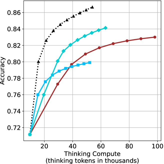
### Visual Description
\n
## Line Chart: Accuracy vs. Thinking Compute
### Overview
This image presents a line chart illustrating the relationship between "Thinking Compute" (measured in thousands of tokens) and "Accuracy". Four distinct data series are plotted, each represented by a different colored line. The chart demonstrates how accuracy changes as the amount of thinking compute increases.
### Components/Axes
* **X-axis:** "Thinking Compute (thinking tokens in thousands)". Scale ranges from approximately 0 to 100, with markers at 0, 20, 40, 60, 80, and 100.
* **Y-axis:** "Accuracy". Scale ranges from approximately 0.72 to 0.86, with markers at 0.72, 0.74, 0.76, 0.78, 0.80, 0.82, 0.84, and 0.86.
* **Data Series:** Four lines are present, each with a unique color:
* Black (dotted line)
* Cyan (solid line)
* Dark Turquoise (solid line)
* Maroon (solid line)
### Detailed Analysis
* **Black Line:** This line exhibits the steepest upward slope, indicating the fastest increase in accuracy with increasing thinking compute.
* At approximately 5 tokens, accuracy is around 0.74.
* At approximately 20 tokens, accuracy is around 0.82.
* At approximately 40 tokens, accuracy is around 0.85.
* Accuracy plateaus around 0.86 after 40 tokens.
* **Cyan Line:** This line shows a moderate upward slope, with a slower rate of increase compared to the black line.
* At approximately 5 tokens, accuracy is around 0.73.
* At approximately 20 tokens, accuracy is around 0.79.
* At approximately 40 tokens, accuracy is around 0.82.
* At approximately 60 tokens, accuracy is around 0.84.
* Accuracy plateaus around 0.84 after 60 tokens.
* **Dark Turquoise Line:** This line demonstrates a similar trend to the cyan line, but with slightly higher accuracy values.
* At approximately 5 tokens, accuracy is around 0.74.
* At approximately 20 tokens, accuracy is around 0.81.
* At approximately 40 tokens, accuracy is around 0.83.
* At approximately 60 tokens, accuracy is around 0.84.
* Accuracy plateaus around 0.84 after 60 tokens.
* **Maroon Line:** This line exhibits the slowest upward slope, indicating the smallest increase in accuracy with increasing thinking compute.
* At approximately 5 tokens, accuracy is around 0.72.
* At approximately 20 tokens, accuracy is around 0.77.
* At approximately 40 tokens, accuracy is around 0.80.
* At approximately 80 tokens, accuracy is around 0.83.
* Accuracy plateaus around 0.83 after 80 tokens.
### Key Observations
* The black line consistently outperforms the other lines in terms of accuracy, especially at lower thinking compute values.
* All lines demonstrate diminishing returns in accuracy as thinking compute increases. The rate of accuracy improvement slows down as the lines approach their plateaus.
* The maroon line consistently shows the lowest accuracy across all thinking compute values.
* The cyan and dark turquoise lines are very close in performance, with the dark turquoise line slightly outperforming the cyan line.
### Interpretation
The chart suggests that increasing "Thinking Compute" generally leads to improved "Accuracy", but the relationship is not linear. There's a point of diminishing returns where additional compute yields smaller and smaller gains in accuracy. The different lines likely represent different models or configurations, with the black line representing the most effective approach and the maroon line representing the least effective. The rapid initial gains in accuracy for all lines suggest that even a small amount of thinking compute can significantly improve performance. The plateaus indicate that other factors, beyond simply increasing compute, may become limiting factors in achieving higher accuracy. This data could be used to optimize resource allocation for AI systems, balancing the cost of compute with the desired level of accuracy.
</details>
(b) R $1$ - $32$ B
<details>
<summary>x44.png Details</summary>
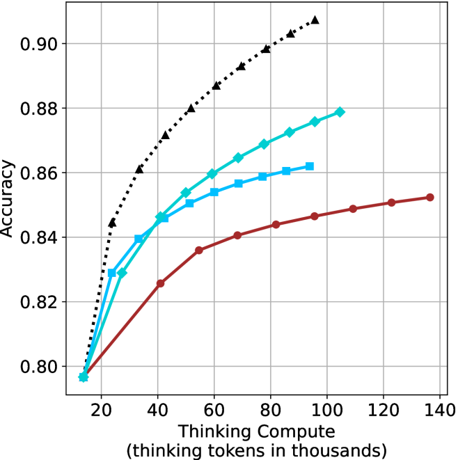
### Visual Description
\n
## Line Chart: Accuracy vs. Thinking Tokens
### Overview
This image presents a line chart illustrating the relationship between "Thinking Tokens" (in thousands) and "Accuracy". Four distinct data series are plotted, each represented by a different colored line with a unique marker style. The chart appears to demonstrate how accuracy improves with an increasing number of thinking tokens, with varying rates of improvement for each series.
### Components/Axes
* **X-axis:** "Thinking Compute (thinking tokens in thousands)". Scale ranges from approximately 0 to 140, with markers at 20, 40, 60, 80, 100, 120, and 140.
* **Y-axis:** "Accuracy". Scale ranges from approximately 0.80 to 0.90, with markers at 0.80, 0.82, 0.84, 0.86, 0.88, and 0.90.
* **Data Series:**
* Black dotted line with diamond markers.
* Teal line with circular markers.
* Blue line with square markers.
* Red line with circular markers.
* **Gridlines:** A grid is present to aid in reading values.
### Detailed Analysis
Let's analyze each data series individually:
* **Black (Diamond):** This line exhibits the steepest upward slope, indicating the fastest rate of accuracy improvement with increasing thinking tokens.
* At 20 tokens: Approximately 0.86 accuracy.
* At 40 tokens: Approximately 0.88 accuracy.
* At 60 tokens: Approximately 0.89 accuracy.
* At 80 tokens: Approximately 0.90 accuracy.
* At 100 tokens: Approximately 0.91 accuracy.
* At 120 tokens: Approximately 0.91 accuracy.
* At 140 tokens: Approximately 0.91 accuracy.
* **Teal (Circle):** This line shows a moderate upward slope, with a decreasing rate of improvement as the number of tokens increases.
* At 20 tokens: Approximately 0.80 accuracy.
* At 40 tokens: Approximately 0.85 accuracy.
* At 60 tokens: Approximately 0.87 accuracy.
* At 80 tokens: Approximately 0.88 accuracy.
* At 100 tokens: Approximately 0.88 accuracy.
* At 120 tokens: Approximately 0.88 accuracy.
* At 140 tokens: Approximately 0.88 accuracy.
* **Blue (Square):** This line demonstrates a moderate upward slope, similar to the teal line, but starts at a slightly higher accuracy.
* At 20 tokens: Approximately 0.82 accuracy.
* At 40 tokens: Approximately 0.85 accuracy.
* At 60 tokens: Approximately 0.86 accuracy.
* At 80 tokens: Approximately 0.86 accuracy.
* At 100 tokens: Approximately 0.87 accuracy.
* At 120 tokens: Approximately 0.87 accuracy.
* At 140 tokens: Approximately 0.87 accuracy.
* **Red (Circle):** This line exhibits the slowest upward slope, indicating the smallest improvement in accuracy with increasing thinking tokens.
* At 20 tokens: Approximately 0.80 accuracy.
* At 40 tokens: Approximately 0.82 accuracy.
* At 60 tokens: Approximately 0.83 accuracy.
* At 80 tokens: Approximately 0.84 accuracy.
* At 100 tokens: Approximately 0.85 accuracy.
* At 120 tokens: Approximately 0.85 accuracy.
* At 140 tokens: Approximately 0.85 accuracy.
### Key Observations
* The black data series consistently outperforms the other three, achieving the highest accuracy levels.
* The red data series consistently underperforms, showing the smallest gains in accuracy.
* All series demonstrate diminishing returns; the rate of accuracy improvement decreases as the number of thinking tokens increases.
* The teal and blue lines converge towards similar accuracy levels as the number of tokens increases.
### Interpretation
The chart suggests that increasing the number of "thinking tokens" generally improves accuracy, but the effectiveness of this approach varies significantly depending on the specific data series. The black series indicates a highly efficient process where additional tokens yield substantial accuracy gains. Conversely, the red series suggests a less efficient process with limited benefits from increased token usage.
The diminishing returns observed across all series imply that there's a point beyond which adding more thinking tokens provides only marginal improvements in accuracy. This could be due to factors such as the inherent limitations of the model, the quality of the data, or the complexity of the task.
The differences between the series could represent different algorithms, model configurations, or training datasets. Further investigation would be needed to determine the underlying reasons for these performance variations. The chart provides valuable insights into the trade-offs between computational cost (thinking tokens) and accuracy, which is crucial for optimizing performance in machine learning applications.
</details>
(c) QwQ-32B
<details>
<summary>x45.png Details</summary>
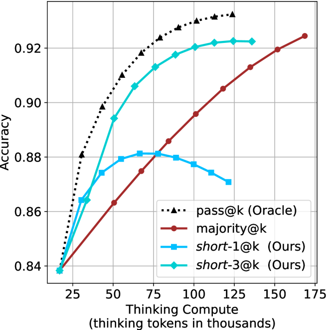
### Visual Description
\n
## Line Chart: Accuracy vs. Thinking Compute
### Overview
This image presents a line chart illustrating the relationship between "Thinking Compute" (measured in thousands of tokens) and "Accuracy" for several different methods. The chart compares the performance of "pass@k (Oracle)", "majority@k", "short-1@k (Ours)", and "short-3@k (Ours)".
### Components/Axes
* **X-axis:** "Thinking Compute (thinking tokens in thousands)". The scale ranges from approximately 20 to 175, with markers at 25, 50, 75, 100, 125, 150, and 175.
* **Y-axis:** "Accuracy". The scale ranges from approximately 0.84 to 0.93, with markers at 0.84, 0.86, 0.88, 0.90, and 0.92.
* **Legend:** Located in the bottom-right corner of the chart. It identifies the following data series:
* "pass@k (Oracle)" - represented by a dotted black line.
* "majority@k" - represented by a dotted purple line.
* "short-1@k (Ours)" - represented by a solid red line.
* "short-3@k (Ours)" - represented by a solid cyan line.
* **Gridlines:** A light gray grid is present to aid in reading values.
### Detailed Analysis
* **pass@k (Oracle):** This line starts at approximately 0.84 at a compute of 20, rises sharply to approximately 0.93 at a compute of 75, and then plateaus, remaining around 0.93 for the rest of the range.
* **majority@k:** This line begins at approximately 0.84 at a compute of 20, increases steadily to approximately 0.91 at a compute of 75, and then continues to increase, reaching approximately 0.925 at a compute of 175.
* **short-1@k (Ours):** This line starts at approximately 0.84 at a compute of 20, increases steadily to approximately 0.91 at a compute of 150, and then plateaus.
* **short-3@k (Ours):** This line begins at approximately 0.84 at a compute of 20, rises rapidly to approximately 0.89 at a compute of 50, then plateaus around 0.88-0.89 for the remainder of the range.
Here's a more detailed breakdown of approximate data points:
| Thinking Compute (thousands) | pass@k (Oracle) | majority@k | short-1@k (Ours) | short-3@k (Ours) |
|---|---|---|---|---|
| 25 | 0.89 | 0.87 | 0.86 | 0.87 |
| 50 | 0.92 | 0.89 | 0.88 | 0.89 |
| 75 | 0.93 | 0.91 | 0.90 | 0.88 |
| 100 | 0.93 | 0.91 | 0.91 | 0.88 |
| 125 | 0.93 | 0.91 | 0.91 | 0.87 |
| 150 | 0.93 | 0.92 | 0.91 | 0.87 |
| 175 | 0.93 | 0.925 | 0.91 | 0.87 |
### Key Observations
* "pass@k (Oracle)" achieves the highest accuracy and plateaus quickly.
* "short-3@k (Ours)" has the lowest accuracy and also plateaus quickly.
* "majority@k" and "short-1@k (Ours)" show a more gradual increase in accuracy.
* The performance gap between "pass@k (Oracle)" and the other methods widens as compute increases.
### Interpretation
The chart demonstrates the impact of "Thinking Compute" on the accuracy of different methods. "pass@k (Oracle)" benefits significantly from even a small increase in compute, quickly reaching a high level of accuracy and then stabilizing. This suggests that the "Oracle" method is highly efficient in utilizing computational resources. The "short-3@k (Ours)" method shows limited improvement with increased compute, indicating it may be constrained by its design or require significantly more compute to achieve comparable accuracy. The "majority@k" and "short-1@k (Ours)" methods fall in between, showing a more gradual improvement with increasing compute. The "Ours" designation suggests these are methods developed by the authors of the study. The data suggests that while increasing compute generally improves accuracy, the effectiveness of that increase varies significantly depending on the method used. The plateauing of the lines indicates diminishing returns – beyond a certain point, adding more compute does not yield substantial gains in accuracy.
</details>
(d) R1-670B
Figure 12: AIME 2024 - thinking compute comparison.
<details>
<summary>x46.png Details</summary>
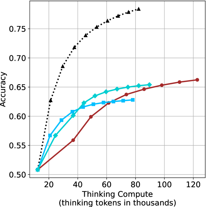
### Visual Description
## Line Chart: Accuracy vs. Thinking Compute
### Overview
This image presents a line chart illustrating the relationship between "Thinking Compute" (measured in thousands of tokens) and "Accuracy". The chart displays four distinct data series, each represented by a different colored line, showing how accuracy changes as thinking compute increases.
### Components/Axes
* **X-axis:** "Thinking Compute (thinking tokens in thousands)". Scale ranges from approximately 0 to 120, with markers at 20, 40, 60, 80, 100, and 120.
* **Y-axis:** "Accuracy". Scale ranges from approximately 0.50 to 0.76, with markers at 0.50, 0.55, 0.60, 0.65, 0.70, and 0.75.
* **Data Series:** Four lines are present, each with a unique color and marker style:
* Black dashed line with diamond markers.
* Cyan solid line with circle markers.
* Red solid line with square markers.
* Blue dashed line with triangle markers.
* **Legend:** There is no explicit legend present in the image.
### Detailed Analysis
Let's analyze each data series individually:
* **Black Dashed Line (Diamond Markers):** This line exhibits the most rapid increase in accuracy. It starts at approximately (15, 0.53) and quickly rises to a peak around (40, 0.74), then plateaus, reaching approximately (120, 0.76).
* **Cyan Solid Line (Circle Markers):** This line shows a moderate increase in accuracy. It begins at approximately (15, 0.55) and steadily climbs to around (120, 0.65). The slope is relatively consistent throughout.
* **Red Solid Line (Square Markers):** This line demonstrates a slower, but consistent, increase in accuracy. It starts at approximately (15, 0.52) and gradually rises to around (120, 0.63).
* **Blue Dashed Line (Triangle Markers):** This line shows an initial increase, then plateaus. It begins at approximately (15, 0.57) and rises to around (60, 0.63), then remains relatively constant until (120, 0.63).
Approximate Data Points:
| Thinking Compute (thousands) | Black (Accuracy) | Cyan (Accuracy) | Red (Accuracy) | Blue (Accuracy) |
|---|---|---|---|---|
| 15 | 0.53 | 0.55 | 0.52 | 0.57 |
| 20 | 0.60 | 0.58 | 0.54 | 0.60 |
| 30 | 0.68 | 0.61 | 0.58 | 0.62 |
| 40 | 0.74 | 0.63 | 0.60 | 0.63 |
| 50 | 0.75 | 0.64 | 0.61 | 0.63 |
| 60 | 0.75 | 0.64 | 0.62 | 0.63 |
| 70 | 0.75 | 0.65 | 0.62 | 0.63 |
| 80 | 0.75 | 0.65 | 0.63 | 0.63 |
| 90 | 0.76 | 0.65 | 0.63 | 0.63 |
| 100 | 0.76 | 0.65 | 0.63 | 0.63 |
| 110 | 0.76 | 0.65 | 0.63 | 0.63 |
| 120 | 0.76 | 0.65 | 0.63 | 0.63 |
### Key Observations
* The black dashed line consistently outperforms the other three lines in terms of accuracy.
* The red solid line exhibits the slowest rate of improvement in accuracy.
* The blue dashed line shows a diminishing return on accuracy gains after approximately 60 thousand thinking tokens.
* All lines demonstrate an overall positive correlation between thinking compute and accuracy, but with varying degrees of sensitivity.
### Interpretation
The chart suggests that increasing "Thinking Compute" generally leads to improved "Accuracy". However, the rate of improvement varies significantly depending on the specific data series. The black dashed line indicates a method or model that benefits substantially from increased compute, achieving high accuracy relatively quickly. The cyan line shows a steady, moderate improvement, while the red line suggests a method that is less sensitive to increased compute. The blue line indicates a point of diminishing returns, where further increases in compute do not yield significant accuracy gains.
This data could represent the performance of different machine learning models or algorithms as they are given more computational resources for "thinking" (e.g., processing information, making inferences). The differences in performance could be due to variations in model architecture, training data, or optimization techniques. The plateau observed in the blue line suggests that the model has reached its capacity or is limited by other factors, such as the quality of the training data. The rapid initial gains of the black line could indicate a model that is highly scalable and benefits greatly from increased compute.
</details>
(a) LN-Super- $49$ B
<details>
<summary>x47.png Details</summary>
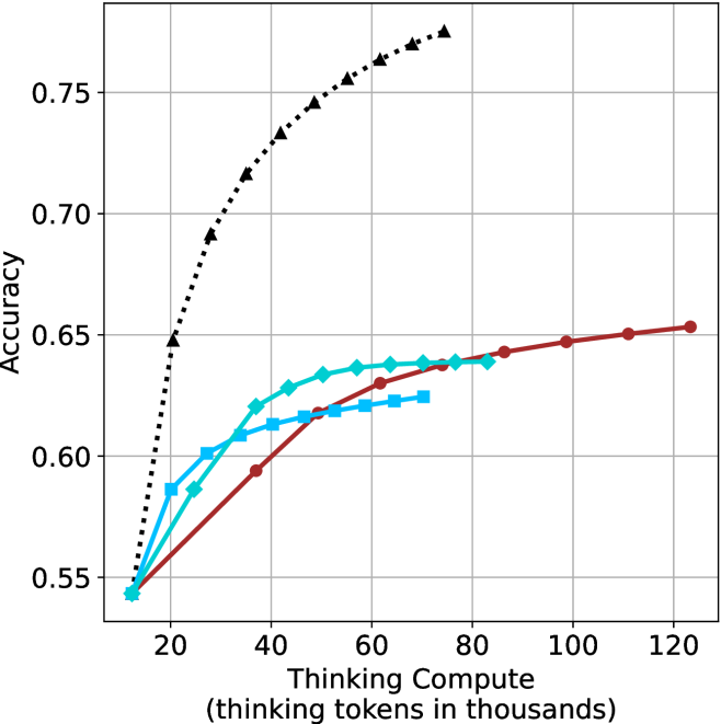
### Visual Description
\n
## Line Chart: Accuracy vs. Thinking Compute
### Overview
The image presents a line chart illustrating the relationship between "Thinking Compute" (measured in thousands of tokens) and "Accuracy". The chart displays four distinct data series, each represented by a different colored line, showing how accuracy changes as thinking compute increases. The chart has a grid background for easier readability.
### Components/Axes
* **X-axis:** "Thinking Compute (thinking tokens in thousands)". Scale ranges from approximately 0 to 120, with markers at 20, 40, 60, 80, 100, and 120.
* **Y-axis:** "Accuracy". Scale ranges from approximately 0.55 to 0.76, with markers at 0.55, 0.60, 0.65, 0.70, and 0.75.
* **Data Series:** Four lines, each with a unique color and pattern:
* Black dotted line
* Red solid line
* Cyan dashed line
* Blue dashed-dotted line
### Detailed Analysis
Let's analyze each line individually, noting trends and approximate data points.
* **Black Dotted Line:** This line exhibits the most rapid increase in accuracy with increasing thinking compute. It starts at approximately (20, 0.68) and quickly rises to approximately (60, 0.75), then plateaus, reaching approximately (120, 0.76). The trend is strongly upward and then flattens.
* **Red Solid Line:** This line shows a more gradual increase in accuracy. It begins at approximately (20, 0.55) and steadily climbs to approximately (120, 0.65). The trend is consistently upward, but less steep than the black line.
* **Cyan Dashed Line:** This line starts at approximately (20, 0.56) and increases rapidly to approximately (40, 0.63), then levels off, reaching approximately (120, 0.64). The trend is initially steep, then becomes relatively flat.
* **Blue Dashed-Dotted Line:** This line begins at approximately (20, 0.55) and increases to approximately (60, 0.62), then plateaus, remaining around (120, 0.63). The trend is similar to the cyan line, with an initial rise followed by a plateau.
### Key Observations
* The black dotted line consistently outperforms the other three lines in terms of accuracy across all levels of thinking compute.
* The red solid line shows the most consistent, albeit slow, improvement in accuracy.
* The cyan dashed and blue dashed-dotted lines exhibit diminishing returns in accuracy as thinking compute increases beyond 60,000 tokens.
* All lines start at similar accuracy levels around 0.55-0.68 at 20,000 tokens.
### Interpretation
The chart suggests a positive correlation between thinking compute and accuracy, but with diminishing returns. Increasing the amount of "thinking" (as measured by tokens) initially leads to significant gains in accuracy. However, beyond a certain point (around 60,000-80,000 tokens for the cyan and blue lines, and even earlier for the black line), the improvement in accuracy becomes marginal.
The black line's superior performance indicates that a particular method or model represented by this line is significantly more efficient at leveraging increased thinking compute to achieve higher accuracy. The other lines suggest that there are limitations to the effectiveness of increased compute for those specific methods.
The plateauing of the lines suggests that other factors, beyond simply increasing thinking compute, become more important in determining accuracy once a certain threshold is reached. These factors could include model architecture, training data quality, or optimization algorithms. The chart highlights the importance of finding the optimal balance between compute resources and other factors to maximize performance.
</details>
(b) R $1$ - $32$ B
<details>
<summary>x48.png Details</summary>
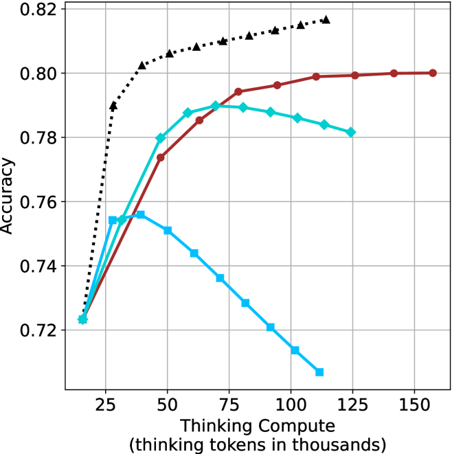
### Visual Description
## Line Chart: Accuracy vs. Thinking Compute
### Overview
This image presents a line chart illustrating the relationship between "Thinking Compute" (measured in thousands of tokens) and "Accuracy". The chart displays three distinct data series, each represented by a different colored line, showing how accuracy changes as thinking compute increases. The chart has a grid background for easier readability.
### Components/Axes
* **X-axis:** "Thinking Compute (thinking tokens in thousands)". The scale ranges from approximately 0 to 150, with markers at 25, 50, 75, 100, 125, and 150.
* **Y-axis:** "Accuracy". The scale ranges from approximately 0.72 to 0.82, with gridlines at 0.74, 0.76, 0.78, 0.80, and 0.82.
* **Data Series:** Three lines are present, each representing a different condition or model.
* Black dashed line (dotted)
* Teal (cyan) line
* Red line
### Detailed Analysis
Let's analyze each line individually:
* **Black Dashed Line:** This line exhibits a strong upward trend, starting at approximately 0.72 at a Thinking Compute of 0 and increasing rapidly to approximately 0.815 at a Thinking Compute of 150. The line is consistently increasing, suggesting a positive correlation between Thinking Compute and Accuracy for this series.
* (0, 0.72)
* (25, 0.79)
* (50, 0.805)
* (75, 0.81)
* (100, 0.815)
* (125, 0.815)
* (150, 0.815)
* **Teal Line:** This line initially increases from approximately 0.75 at a Thinking Compute of 0 to a peak of around 0.795 at a Thinking Compute of 75. After this peak, the line declines to approximately 0.76 at a Thinking Compute of 150. This suggests an optimal level of Thinking Compute for this series, beyond which accuracy decreases.
* (0, 0.75)
* (25, 0.78)
* (50, 0.79)
* (75, 0.795)
* (100, 0.785)
* (125, 0.77)
* (150, 0.76)
* **Red Line:** This line shows an initial increase from approximately 0.76 at a Thinking Compute of 0 to a plateau around 0.80, starting at a Thinking Compute of 50 and remaining relatively constant until a Thinking Compute of 150. This indicates that accuracy reaches a saturation point with increasing Thinking Compute for this series.
* (0, 0.76)
* (25, 0.78)
* (50, 0.80)
* (75, 0.80)
* (100, 0.80)
* (125, 0.80)
* (150, 0.80)
### Key Observations
* The black dashed line consistently demonstrates increasing accuracy with increasing Thinking Compute.
* The teal line shows an inverted U-shaped curve, indicating an optimal Thinking Compute level.
* The red line plateaus, suggesting diminishing returns from increased Thinking Compute.
* All three lines start with similar accuracy values around 0.72-0.76.
### Interpretation
The chart suggests that the relationship between Thinking Compute and Accuracy is not linear and varies depending on the specific model or condition being evaluated. The black dashed line indicates that for some models, increasing Thinking Compute consistently improves accuracy. However, for others (teal line), there's an optimal point beyond which further increases in Thinking Compute actually *decrease* accuracy. This could be due to overfitting or other computational limitations. The red line suggests that some models reach a point of saturation where additional Thinking Compute doesn't yield significant improvements.
The differences between the lines could represent different algorithms, model sizes, or training datasets. The chart highlights the importance of finding the right balance between computational resources (Thinking Compute) and model performance (Accuracy). The teal line is particularly interesting, as it suggests that excessive Thinking Compute can be detrimental. This could be a valuable insight for optimizing resource allocation and model design.
</details>
(c) QwQ-32B
<details>
<summary>x49.png Details</summary>
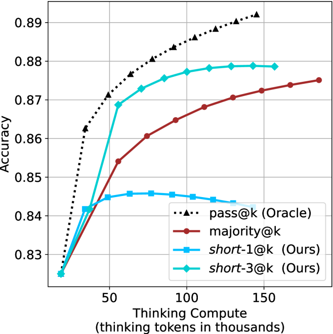
### Visual Description
\n
## Line Chart: Accuracy vs. Thinking Compute
### Overview
This image presents a line chart illustrating the relationship between "Thinking Compute" (measured in thousands of tokens) and "Accuracy" for four different methods: pass@k (Oracle), majority@k, short-1@k (Ours), and short-3@k (Ours). The chart demonstrates how accuracy changes as the amount of computational effort (thinking tokens) increases.
### Components/Axes
* **X-axis:** "Thinking Compute (thinking tokens in thousands)". Scale ranges from approximately 0 to 150, with markers at 0, 50, 100, and 150.
* **Y-axis:** "Accuracy". Scale ranges from approximately 0.83 to 0.89, with markers at 0.83, 0.84, 0.85, 0.86, 0.87, 0.88, and 0.89.
* **Legend:** Located in the bottom-right corner of the chart. Contains the following labels and corresponding line styles/colors:
* "pass@k (Oracle)" - Black dotted line.
* "majority@k" - Red solid line.
* "short-1@k (Ours)" - Brown solid line.
* "short-3@k (Ours)" - Teal solid line.
### Detailed Analysis
* **pass@k (Oracle):** The black dotted line shows a steep upward trend initially, rapidly increasing from approximately 0.83 to 0.87 at around 50 thinking tokens. The slope then gradually decreases, reaching approximately 0.89 at 150 thinking tokens.
* At 0 thinking tokens: ~0.83
* At 50 thinking tokens: ~0.87
* At 100 thinking tokens: ~0.885
* At 150 thinking tokens: ~0.89
* **majority@k:** The red solid line exhibits a moderate upward trend throughout the entire range. It starts at approximately 0.83 and increases to approximately 0.875 at 150 thinking tokens.
* At 0 thinking tokens: ~0.83
* At 50 thinking tokens: ~0.855
* At 100 thinking tokens: ~0.865
* At 150 thinking tokens: ~0.875
* **short-1@k (Ours):** The brown solid line shows a moderate upward trend, similar to majority@k, but starts slightly lower. It begins at approximately 0.825 and reaches approximately 0.87 at 150 thinking tokens.
* At 0 thinking tokens: ~0.825
* At 50 thinking tokens: ~0.85
* At 100 thinking tokens: ~0.86
* At 150 thinking tokens: ~0.87
* **short-3@k (Ours):** The teal solid line displays a relatively flat trend. It starts at approximately 0.84 and increases to approximately 0.85 at 150 thinking tokens.
* At 0 thinking tokens: ~0.84
* At 50 thinking tokens: ~0.845
* At 100 thinking tokens: ~0.845
* At 150 thinking tokens: ~0.85
### Key Observations
* "pass@k (Oracle)" consistently outperforms the other methods across all levels of "Thinking Compute".
* "short-3@k (Ours)" shows the least improvement in accuracy with increasing "Thinking Compute".
* The initial increase in accuracy is most pronounced for "pass@k (Oracle)", suggesting a significant benefit from even a small amount of computational effort.
* The performance gap between "majority@k" and "short-1@k (Ours)" is relatively small.
### Interpretation
The chart demonstrates the trade-off between computational cost ("Thinking Compute") and accuracy for different methods. "pass@k (Oracle)" represents an ideal scenario, likely involving access to ground truth or a highly optimized process, resulting in the highest accuracy. The "Ours" methods ("short-1@k" and "short-3@k") represent approaches developed by the authors, and their performance falls between "majority@k" and "pass@k (Oracle)". The relatively flat trend of "short-3@k (Ours)" suggests that increasing the number of tokens beyond a certain point does not yield significant improvements in accuracy for that method. This could indicate diminishing returns or a limitation in the method's ability to effectively utilize additional computational resources. The chart highlights the importance of considering computational cost when selecting a method, as "pass@k (Oracle)" may be impractical for large-scale applications due to its computational demands. The data suggests that the "Ours" methods offer a reasonable balance between accuracy and computational efficiency.
</details>
(d) R1-670B
Figure 13: AIME 2025 - thinking compute comparison.
<details>
<summary>x50.png Details</summary>
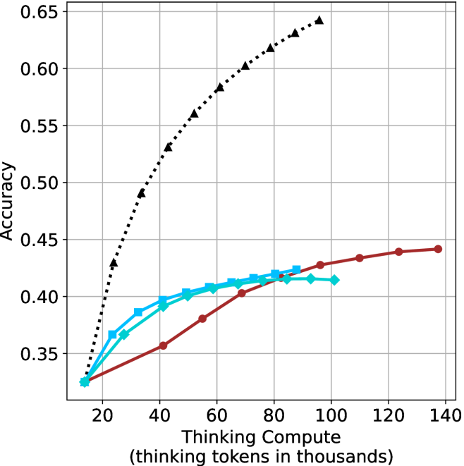
### Visual Description
## Line Chart: Accuracy vs. Thinking Tokens
### Overview
This image presents a line chart illustrating the relationship between "Thinking Tokens" (in thousands) and "Accuracy". The chart displays three distinct data series, each represented by a different colored line, showing how accuracy changes as the number of thinking tokens increases. The chart has a grid background for easier readability.
### Components/Axes
* **X-axis Title:** "Thinking Compute (thinking tokens in thousands)"
* Scale: Ranges from approximately 0 to 140 (in thousands of tokens).
* Markers: 20, 40, 60, 80, 100, 120, 140
* **Y-axis Title:** "Accuracy"
* Scale: Ranges from approximately 0.30 to 0.65.
* Markers: 0.30, 0.35, 0.40, 0.45, 0.50, 0.55, 0.60, 0.65
* **Data Series:**
* Black dotted line: Represents a rapidly increasing accuracy.
* Cyan solid line: Represents a slower, more gradual increase in accuracy.
* Red solid line: Represents a relatively flat accuracy curve, with a slight increase at the end.
* **Legend:** No explicit legend is present, but the lines are visually distinguishable.
### Detailed Analysis
* **Black Line:** This line shows a steep upward trend.
* At approximately 20 thinking tokens, accuracy is around 0.32.
* At approximately 40 thinking tokens, accuracy is around 0.52.
* At approximately 60 thinking tokens, accuracy is around 0.58.
* At approximately 80 thinking tokens, accuracy is around 0.61.
* At approximately 100 thinking tokens, accuracy is around 0.62.
* At approximately 120 thinking tokens, accuracy is around 0.63.
* At approximately 140 thinking tokens, accuracy is around 0.64.
* **Cyan Line:** This line shows a more moderate upward trend.
* At approximately 20 thinking tokens, accuracy is around 0.34.
* At approximately 40 thinking tokens, accuracy is around 0.38.
* At approximately 60 thinking tokens, accuracy is around 0.40.
* At approximately 80 thinking tokens, accuracy is around 0.41.
* At approximately 100 thinking tokens, accuracy is around 0.42.
* At approximately 120 thinking tokens, accuracy is around 0.42.
* At approximately 140 thinking tokens, accuracy is around 0.43.
* **Red Line:** This line shows a relatively flat trend with a slight increase towards the end.
* At approximately 20 thinking tokens, accuracy is around 0.33.
* At approximately 40 thinking tokens, accuracy is around 0.36.
* At approximately 60 thinking tokens, accuracy is around 0.38.
* At approximately 80 thinking tokens, accuracy is around 0.40.
* At approximately 100 thinking tokens, accuracy is around 0.41.
* At approximately 120 thinking tokens, accuracy is around 0.42.
* At approximately 140 thinking tokens, accuracy is around 0.44.
### Key Observations
* The black line demonstrates significantly higher accuracy gains with increasing thinking tokens compared to the cyan and red lines.
* The cyan and red lines show diminishing returns in accuracy as the number of thinking tokens increases.
* The red line exhibits the slowest rate of accuracy improvement.
### Interpretation
The chart suggests that increasing the number of "thinking tokens" (likely representing computational steps or processing time) has a positive correlation with accuracy, but the rate of improvement varies significantly depending on the data series. The black line indicates a highly effective process where more thinking tokens lead to substantial accuracy gains. The cyan and red lines suggest that, beyond a certain point, additional thinking tokens yield only marginal improvements in accuracy. This could indicate that these processes reach a point of diminishing returns or are limited by other factors. The differences between the lines could represent different algorithms, model architectures, or optimization strategies. The chart highlights the importance of optimizing the "thinking compute" to maximize accuracy gains, and suggests that for some processes, there may be an optimal point beyond which further computation is not beneficial.
</details>
(a) LN-Super- $49$ B
<details>
<summary>x51.png Details</summary>
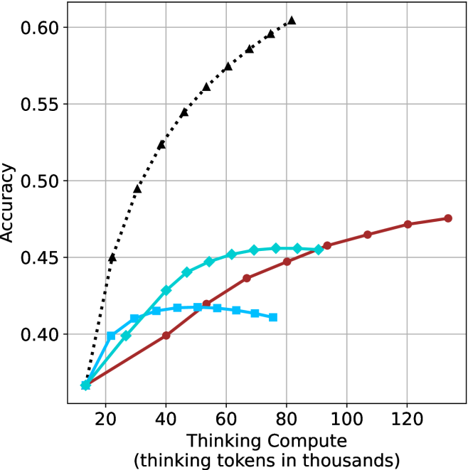
### Visual Description
## Line Chart: Accuracy vs. Compute (Thinking Tokens)
### Overview
The image presents a line chart illustrating the relationship between accuracy and compute, measured in thinking tokens (in thousands). The chart displays three distinct data series, each represented by a different colored line, showing how accuracy changes as compute increases. The chart has a grid background for easier readability.
### Components/Axes
* **X-axis Title:** "Compute (thinking tokens in thousands)"
* Scale: Ranges from approximately 0 to 120 (in thousands of tokens).
* Markers: 0, 20, 40, 60, 80, 100, 120
* **Y-axis Title:** "Accuracy"
* Scale: Ranges from approximately 0.35 to 0.60.
* Markers: 0.35, 0.40, 0.45, 0.50, 0.55, 0.60
* **Data Series:**
* Series 1: Black dotted line
* Series 2: Cyan solid line
* Series 3: Red solid line
### Detailed Analysis
* **Series 1 (Black Dotted Line):** This line exhibits a steep upward trend, starting at approximately 0.38 at 0 compute and rapidly increasing to around 0.58 at 40 compute. The rate of increase slows down after 40 compute, reaching approximately 0.59 at 120 compute.
* Data Points (approximate):
* (0, 0.38)
* (20, 0.46)
* (40, 0.58)
* (60, 0.59)
* (80, 0.59)
* (100, 0.59)
* (120, 0.59)
* **Series 2 (Cyan Solid Line):** This line shows a more gradual increase in accuracy. It starts at approximately 0.39 at 0 compute, rises to around 0.44 at 40 compute, plateaus around 0.45 between 60 and 100 compute, and then slightly decreases to approximately 0.43 at 120 compute.
* Data Points (approximate):
* (0, 0.39)
* (20, 0.41)
* (40, 0.44)
* (60, 0.45)
* (80, 0.45)
* (100, 0.45)
* (120, 0.43)
* **Series 3 (Red Solid Line):** This line demonstrates a slow and steady increase in accuracy. It begins at approximately 0.37 at 0 compute, reaches around 0.43 at 40 compute, continues to rise to approximately 0.46 at 80 compute, and finally reaches approximately 0.48 at 120 compute.
* Data Points (approximate):
* (0, 0.37)
* (20, 0.39)
* (40, 0.43)
* (60, 0.44)
* (80, 0.46)
* (100, 0.47)
* (120, 0.48)
### Key Observations
* Series 1 (Black) significantly outperforms the other two series in terms of accuracy, especially at lower compute levels.
* Series 2 (Cyan) shows an initial increase in accuracy, but then plateaus and even slightly declines at higher compute levels.
* Series 3 (Red) exhibits the slowest and most consistent increase in accuracy.
* The rate of accuracy improvement diminishes for all series as compute increases.
### Interpretation
The chart suggests that increasing compute (thinking tokens) generally leads to improved accuracy, but the relationship is not linear and exhibits diminishing returns. The black line likely represents a more efficient or advanced method, achieving high accuracy with relatively less compute. The cyan line could indicate a method that reaches a performance limit, where additional compute does not yield significant improvements. The red line represents a method with a slower learning curve, requiring substantial compute to achieve moderate accuracy gains. The differences in the curves could be due to different algorithms, model sizes, or training strategies. The plateauing of the cyan line is a notable anomaly, suggesting a potential bottleneck or saturation point in that particular method. The chart highlights the importance of optimizing compute resources and selecting appropriate methods to maximize accuracy gains.
</details>
(b) R $1$ - $32$ B
<details>
<summary>x52.png Details</summary>
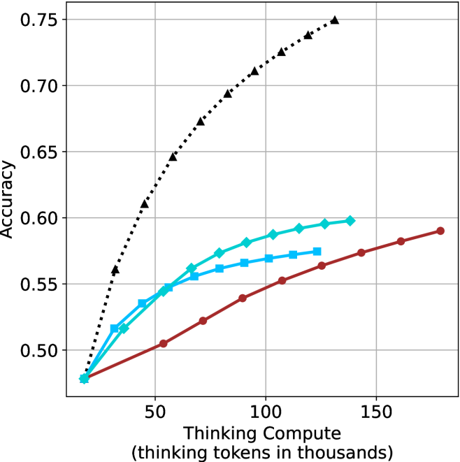
### Visual Description
\n
## Line Chart: Accuracy vs. Thinking Compute
### Overview
The image presents a line chart illustrating the relationship between "Thinking Compute" (measured in thousands of tokens) and "Accuracy". Four distinct data series are plotted, each represented by a different colored line. The chart appears to demonstrate how accuracy improves with increased computational effort (thinking tokens).
### Components/Axes
* **X-axis:** "Thinking Compute (thinking tokens in thousands)". Scale ranges from approximately 0 to 160, with tick marks at 0, 50, 100, and 150.
* **Y-axis:** "Accuracy". Scale ranges from approximately 0.48 to 0.76, with tick marks at 0.50, 0.55, 0.60, 0.65, 0.70, and 0.75.
* **Data Series:** Four lines are present, each with a unique color and pattern:
* Black dotted line
* Cyan dashed line
* Teal solid line
* Red solid line
* **Legend:** There is no explicit legend present in the image.
### Detailed Analysis
Let's analyze each line individually, noting trends and approximate data points.
* **Black Dotted Line:** This line exhibits the steepest upward trend, indicating the most rapid increase in accuracy with increasing thinking compute.
* At 0 tokens: Approximately 0.48 accuracy.
* At 50 tokens: Approximately 0.62 accuracy.
* At 100 tokens: Approximately 0.70 accuracy.
* At 150 tokens: Approximately 0.74 accuracy.
* **Cyan Dashed Line:** This line shows a moderate upward trend, less steep than the black line but more pronounced than the teal and red lines.
* At 0 tokens: Approximately 0.49 accuracy.
* At 50 tokens: Approximately 0.57 accuracy.
* At 100 tokens: Approximately 0.59 accuracy.
* At 150 tokens: Approximately 0.60 accuracy.
* **Teal Solid Line:** This line demonstrates a slow, relatively flat upward trend.
* At 0 tokens: Approximately 0.48 accuracy.
* At 50 tokens: Approximately 0.54 accuracy.
* At 100 tokens: Approximately 0.57 accuracy.
* At 150 tokens: Approximately 0.59 accuracy.
* **Red Solid Line:** This line exhibits the slowest upward trend, with a minimal increase in accuracy over the observed range.
* At 0 tokens: Approximately 0.47 accuracy.
* At 50 tokens: Approximately 0.52 accuracy.
* At 100 tokens: Approximately 0.56 accuracy.
* At 150 tokens: Approximately 0.58 accuracy.
### Key Observations
* The black dotted line consistently outperforms the other three lines across all values of "Thinking Compute".
* The red solid line consistently underperforms the other three lines.
* The cyan and teal lines show similar performance, with the cyan line slightly outperforming the teal line.
* The rate of accuracy improvement diminishes for all lines as "Thinking Compute" increases, suggesting a point of diminishing returns.
### Interpretation
The chart suggests that increasing "Thinking Compute" generally leads to improved accuracy, but the effectiveness of this increase varies significantly depending on the specific method or model being used. The black dotted line likely represents a highly efficient approach, while the red solid line represents a less effective one. The diminishing returns observed for all lines indicate that there is a limit to the accuracy gains achievable through simply increasing computational effort. Further investigation would be needed to understand the underlying reasons for these differences in performance and to determine the optimal balance between computational cost and accuracy. The lack of a legend makes it difficult to determine what each line represents, but the data clearly demonstrates a hierarchy of performance.
</details>
(c) QwQ-32B
<details>
<summary>x53.png Details</summary>
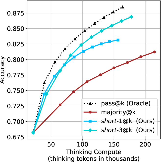
### Visual Description
\n
## Chart: Accuracy vs. Thinking Compute
### Overview
The image presents a line chart illustrating the relationship between "Thinking Compute" (measured in thousands of tokens) and "Accuracy" for four different methods: pass@k (Oracle), majority@k, short-1@k (Ours), and short-3@k (Ours). The chart demonstrates how accuracy improves with increased computational effort (thinking tokens) for each method.
### Components/Axes
* **X-axis:** "Thinking Compute (thinking tokens in thousands)". Scale ranges from approximately 0 to 200, with markers at 0, 50, 100, 150, and 200.
* **Y-axis:** "Accuracy". Scale ranges from approximately 0.675 to 0.875, with markers at 0.675, 0.725, 0.775, 0.825, and 0.875.
* **Legend:** Located in the bottom-right corner. Contains the following labels and corresponding line styles/colors:
* "pass@k (Oracle)" - Black dashed line with triangle markers.
* "majority@k" - Brown solid line with circle markers.
* "short-1@k (Ours)" - Red solid line with circle markers.
* "short-3@k (Ours)" - Blue solid line with triangle markers.
### Detailed Analysis
* **pass@k (Oracle):** The black dashed line starts at approximately (0, 0.72) and exhibits a steep upward slope, reaching approximately (200, 0.87). The line appears to plateau around 150 thinking tokens.
* **majority@k:** The brown solid line begins at approximately (0, 0.68) and shows a gradual upward trend, reaching approximately (200, 0.81). The slope is less steep than "pass@k (Oracle)".
* **short-1@k (Ours):** The red solid line starts at approximately (0, 0.68) and demonstrates a moderate upward slope, reaching approximately (200, 0.81). It is initially below "majority@k" but converges with it at higher compute values.
* **short-3@k (Ours):** The blue solid line begins at approximately (0, 0.74) and exhibits a steep upward slope, reaching approximately (200, 0.86). It consistently outperforms "short-1@k (Ours)" and approaches the performance of "pass@k (Oracle)".
Specific Data Points (approximate):
| Thinking Compute (thousands) | pass@k (Oracle) | majority@k | short-1@k (Ours) | short-3@k (Ours) |
|---|---|---|---|---|
| 0 | 0.72 | 0.68 | 0.68 | 0.74 |
| 50 | 0.80 | 0.75 | 0.76 | 0.82 |
| 100 | 0.84 | 0.79 | 0.79 | 0.84 |
| 150 | 0.86 | 0.80 | 0.80 | 0.85 |
| 200 | 0.87 | 0.81 | 0.81 | 0.86 |
### Key Observations
* "pass@k (Oracle)" consistently achieves the highest accuracy across all compute levels.
* "short-3@k (Ours)" outperforms "short-1@k (Ours)" significantly, demonstrating the benefit of increasing the number of considered options.
* The accuracy gains diminish as "Thinking Compute" increases, suggesting a point of diminishing returns.
* "majority@k" shows the slowest rate of improvement with increasing compute.
### Interpretation
The chart compares the performance of different methods for a task that requires "thinking" or reasoning, as measured by the number of tokens processed. The "Oracle" method, which presumably has access to perfect information, sets the upper bound on achievable accuracy. The "Ours" methods (short-1@k and short-3@k) represent approaches developed by the authors, and their performance relative to the "Oracle" and "majority@k" methods indicates their effectiveness.
The diminishing returns observed at higher compute levels suggest that there's a limit to how much accuracy can be gained by simply increasing the computational effort. This could be due to inherent limitations in the methods themselves or the nature of the task. The difference between "short-1@k" and "short-3@k" highlights the importance of considering multiple options or hypotheses during the reasoning process. The fact that "short-3@k" approaches the performance of the "Oracle" method suggests that it's a promising approach for achieving high accuracy in this type of task. The "majority@k" method appears to be the least effective, indicating that simply aggregating the results of multiple runs doesn't necessarily lead to improved performance.
</details>
(d) R1-670B
Figure 14: HMMT Feb 2025 - thinking compute comparison.
<details>
<summary>x54.png Details</summary>
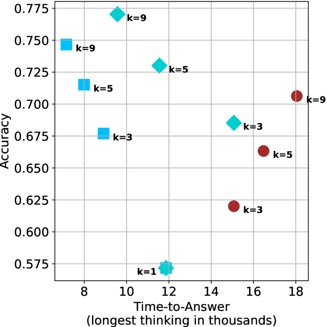
### Visual Description
\n
## Scatter Plot: Accuracy vs. Time-to-Answer
### Overview
This image presents a scatter plot illustrating the relationship between Accuracy and Time-to-Answer, with data points differentiated by the value of 'k'. The x-axis represents Time-to-Answer in thousands of units, and the y-axis represents Accuracy. Each data point is marked with a colored diamond or circle and labeled with its corresponding 'k' value.
### Components/Axes
* **X-axis:** Time-to-Answer (longest thinking in thousands) - Scale ranges from approximately 8 to 18.
* **Y-axis:** Accuracy - Scale ranges from approximately 0.575 to 0.775.
* **Data Points:** Represented by colored diamonds and circles.
* **Legend:** Implicitly defined by the 'k' values associated with each data point's color.
* Blue: k = 9, k = 5, k = 3
* Red: k = 9, k = 5, k = 3
* Green: k = 9, k = 5
### Detailed Analysis
The plot contains data points for k = 1, 3, 5, and 9. Let's analyze each 'k' value's trend:
* **k = 1:** One data point at approximately (12, 0.575).
* **k = 3:** Three data points:
* Approximately (8.5, 0.675) - Blue diamond
* Approximately (15.5, 0.625) - Red circle
* Approximately (10, 0.675) - Blue diamond
* **k = 5:** Three data points:
* Approximately (8.25, 0.725) - Blue diamond
* Approximately (11, 0.725) - Green diamond
* Approximately (16.5, 0.65) - Red circle
* **k = 9:** Three data points:
* Approximately (8, 0.75) - Blue diamond
* Approximately (10, 0.775) - Green diamond
* Approximately (18, 0.70) - Red circle
### Key Observations
* There is a general trend of increasing accuracy with increasing time-to-answer, but it's not strictly linear.
* For k = 3, 5, and 9, there's a noticeable spread in accuracy values for similar time-to-answer values.
* The data points for k=9 show a wider range of accuracy values compared to k=1.
* The data points for k=1 are clustered at the lower end of both axes.
### Interpretation
The data suggests that as the model spends more time "thinking" (Time-to-Answer), its accuracy generally improves. However, the variability in accuracy for a given time-to-answer, especially for higher 'k' values, indicates that other factors influence the model's performance. The 'k' parameter likely represents a model complexity or capacity parameter. Higher 'k' values allow for more complex reasoning, but also introduce more variability in the results.
The spread in accuracy for k=3, 5, and 9 suggests that the model's performance is not solely determined by the time spent thinking. There might be inherent randomness or sensitivity to the specific input data. The low accuracy and short time-to-answer for k=1 suggest that a very simple model is quick but inaccurate. The data points for k=9 show a wider range of accuracy values compared to k=1, indicating that a more complex model can achieve higher accuracy but also has the potential for greater error.
The red circles seem to represent a different subset of data or a different condition within the experiment, as they consistently show lower accuracy for the same time-to-answer compared to the blue and green diamonds. This could be due to a different training dataset, a different evaluation metric, or a different experimental setup.
</details>
(a) LN-Super- $49$ B
<details>
<summary>x55.png Details</summary>
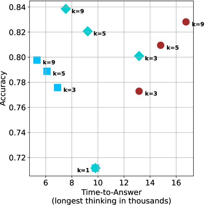
### Visual Description
\n
## Scatter Plot: Accuracy vs. Time-to-Answer
### Overview
This image presents a scatter plot illustrating the relationship between Accuracy and Time-to-Answer (measured in thousands of units). The data points are color-coded based on the value of 'k', representing a parameter likely related to the underlying process being measured.
### Components/Axes
* **X-axis:** Time-to-Answer (longest thinking in thousands) - Scale ranges from approximately 5.5 to 17.
* **Y-axis:** Accuracy - Scale ranges from approximately 0.71 to 0.84.
* **Data Points:** Scatter plot points, color-coded by 'k' value.
* **Legend:** Located in the top-right corner, associating colors with 'k' values:
* Blue: k=1
* Light Blue: k=3
* Light Green: k=5
* Red: k=9
### Detailed Analysis
The plot contains data points for k=1, k=3, k=5, and k=9.
* **k=1 (Blue):** One data point at approximately (6.2, 0.71).
* **k=3 (Light Blue):** Two data points: one at approximately (6.4, 0.78) and another at approximately (14.2, 0.79).
* **k=5 (Light Green):** Two data points: one at approximately (10.3, 0.82) and another at approximately (15.2, 0.81).
* **k=9 (Red):** Two data points: one at approximately (10.6, 0.83) and another at approximately (16.5, 0.82).
**Trends:**
* For k=3, the accuracy appears to slightly increase with time-to-answer.
* For k=5, the accuracy is relatively stable across the observed time-to-answer range.
* For k=9, the accuracy is relatively stable across the observed time-to-answer range.
* k=1 has the lowest accuracy and shortest time-to-answer.
### Key Observations
* Higher values of 'k' generally correlate with higher accuracy, but the relationship isn't strictly linear.
* The data suggests a potential trade-off between accuracy and time-to-answer. Lower 'k' values result in faster response times but lower accuracy.
* There is some overlap in the time-to-answer ranges for different 'k' values.
* The data points are relatively sparse, making it difficult to draw definitive conclusions.
### Interpretation
The data suggests that the parameter 'k' influences both the accuracy and the time-to-answer of a process. Increasing 'k' appears to improve accuracy, but it may also increase the time required to reach an answer. The optimal value of 'k' likely depends on the specific application and the relative importance of accuracy versus speed.
The scatter plot indicates that the relationship between time-to-answer and accuracy is not simple. While there's a general trend of increasing accuracy with increasing 'k', the data points don't follow a clear, predictable pattern. This could be due to other factors influencing the process, or it could simply be a result of the limited number of data points.
The fact that k=1 has a significantly lower accuracy and shorter time-to-answer suggests that this value might represent a very simple or fast, but less reliable, approach. Conversely, k=9 might represent a more complex and thorough, but slower, approach. The values of k=3 and k=5 appear to offer intermediate trade-offs between speed and accuracy.
</details>
(b) R $1$ - $32$ B
<details>
<summary>x56.png Details</summary>
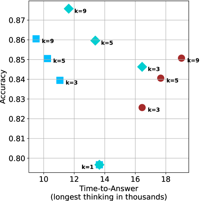
### Visual Description
\n
## Scatter Plot: Accuracy vs. Time-to-Answer
### Overview
This image presents a scatter plot illustrating the relationship between Accuracy and Time-to-Answer (measured in thousands of units). The data points are color-coded based on the value of 'k', representing a parameter. The plot appears to explore how accuracy changes with increasing time taken to answer, for different values of 'k'.
### Components/Axes
* **X-axis:** "Time-to-Answer (longest thinking in thousands)" ranging from approximately 9 to 19.
* **Y-axis:** "Accuracy" ranging from approximately 0.80 to 0.88.
* **Data Points:** Scatter plot points, each labeled with a 'k' value.
* **Legend:** Implicitly defined by the labels on the data points, indicating the 'k' value for each color.
* Blue: k = 3, k = 5, k = 9
* Teal: k = 5, k = 9
* Red: k = 3, k = 5, k = 9
### Detailed Analysis
The plot contains several data points, each representing a specific combination of Time-to-Answer, Accuracy, and 'k' value.
* **k = 1:** One data point at approximately (12.5, 0.80).
* **k = 3:** Three data points:
* (10.5, 0.84)
* (16.5, 0.83)
* (11.5, 0.84)
* **k = 5:** Three data points:
* (10.2, 0.85)
* (14.2, 0.86)
* (17.8, 0.84)
* **k = 9:** Three data points:
* (10.8, 0.86)
* (12.2, 0.87)
* (18.2, 0.85)
The blue data points (k=3, k=5, k=9) are clustered towards the left side of the plot (lower Time-to-Answer values). The teal data points (k=5, k=9) are positioned more towards the center. The red data points (k=3, k=5, k=9) are clustered towards the right side of the plot (higher Time-to-Answer values).
### Key Observations
* There is a general trend of increasing accuracy with increasing time-to-answer, but it is not strictly linear.
* The data points for k=1 are significantly lower in accuracy compared to other k values.
* The spread of data points for each 'k' value suggests variability in accuracy for a given time-to-answer.
* The highest accuracy value is approximately 0.87, achieved with k=9 and a Time-to-Answer of around 12.2.
* The lowest accuracy value is approximately 0.80, achieved with k=1 and a Time-to-Answer of around 12.5.
### Interpretation
The data suggests that there is a relationship between the parameter 'k', the time taken to answer a question, and the accuracy of the answer. Increasing 'k' generally leads to higher accuracy, but also potentially longer response times. The 'k' parameter likely represents a complexity or depth of reasoning.
The clustering of points for different 'k' values indicates that the optimal time-to-answer for achieving high accuracy varies depending on the value of 'k'. For example, k=1 seems to have a limited accuracy ceiling, while k=9 can achieve higher accuracy but requires more time.
The variability within each 'k' value suggests that other factors, beyond 'k' and time-to-answer, also influence accuracy. These could include the difficulty of the question, the individual’s expertise, or random noise in the process.
The plot provides insights into the trade-off between speed and accuracy, and how this trade-off is influenced by the parameter 'k'. It suggests that choosing an appropriate value for 'k' is crucial for optimizing performance.
</details>
(c) QwQ-32B
<details>
<summary>x57.png Details</summary>
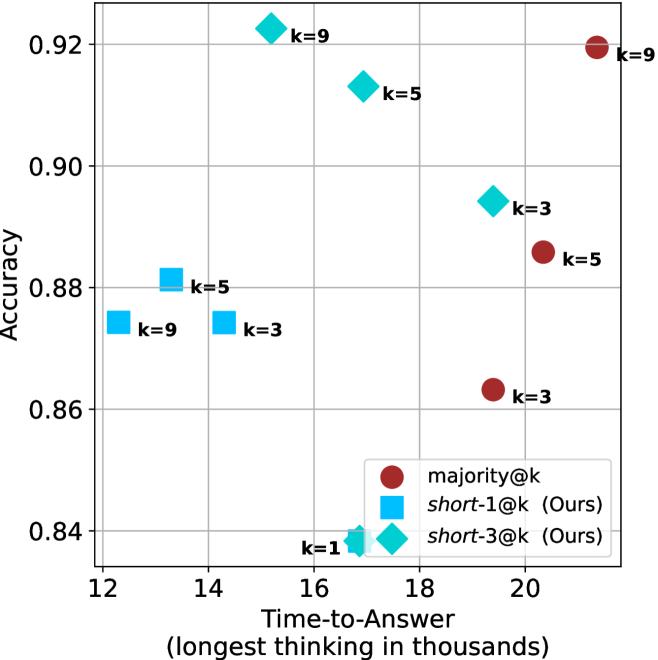
### Visual Description
\n
## Scatter Plot: Accuracy vs. Time-to-Answer
### Overview
This image presents a scatter plot comparing the accuracy and time-to-answer for different values of 'k' across three methods: majority voting, short-1@k, and short-3@k. The x-axis represents "Time-to-Answer" in thousands of units, and the y-axis represents "Accuracy". Each point on the plot represents a specific combination of method and 'k' value.
### Components/Axes
* **X-axis:** Time-to-Answer (longest thinking in thousands) - Scale ranges from approximately 12 to 20.
* **Y-axis:** Accuracy - Scale ranges from approximately 0.84 to 0.93.
* **Legend:** Located in the bottom-right corner.
* Red circles: majority@k
* Light blue diamonds: short-1@k (Ours)
* Dark blue squares: short-3@k (Ours)
* **Data Points:** Each point is labeled with its corresponding 'k' value.
### Detailed Analysis
Let's analyze each data series individually:
**1. majority@k (Red Circles):**
* The trend is generally upward, with increasing 'k' values correlating with higher accuracy, but with diminishing returns.
* k=1: Approximately (19.5, 0.865)
* k=3: Approximately (18.5, 0.86)
* k=5: Approximately (19.2, 0.89)
* k=9: Approximately (20.2, 0.923)
**2. short-1@k (Light Blue Diamonds):**
* The trend is also upward, but appears to plateau more quickly than the majority@k series.
* k=1: Approximately (12.2, 0.84)
* k=3: Approximately (14.2, 0.87)
* k=5: Approximately (16.5, 0.915)
* k=9: Approximately (17.5, 0.92)
**3. short-3@k (Dark Blue Squares):**
* This series shows a more erratic trend.
* k=1: Approximately (13.5, 0.88)
* k=3: Approximately (14.0, 0.87)
* k=5: Approximately (18.0, 0.88)
* k=9: Approximately (18.5, 0.88)
### Key Observations
* The 'short-1@k' method achieves high accuracy with relatively low time-to-answer, especially for smaller 'k' values.
* The 'majority@k' method consistently demonstrates the highest accuracy, but at the cost of increased time-to-answer.
* The 'short-3@k' method shows the most variability in performance, with accuracy not consistently improving with increasing 'k'.
* For k=9, majority@k has the highest accuracy, followed closely by short-1@k.
* The 'short-3@k' method appears to be less effective than the other two methods, particularly for larger 'k' values.
### Interpretation
This data suggests a trade-off between accuracy and time-to-answer. The 'majority@k' method prioritizes accuracy, while 'short-1@k' prioritizes speed. The 'short-3@k' method doesn't seem to offer a clear advantage over either of the other two.
The choice of method and 'k' value depends on the specific application and the relative importance of accuracy and speed. If high accuracy is critical, 'majority@k' with a larger 'k' value is the preferred choice. If speed is more important, 'short-1@k' with a smaller 'k' value is a better option.
The plateauing of the 'short-1@k' accuracy suggests that increasing 'k' beyond a certain point does not yield significant improvements in performance. This could be due to the inherent limitations of the method or the nature of the data. The erratic behavior of 'short-3@k' might indicate that it is more sensitive to noise or outliers in the data.
The data points are relatively sparse, making it difficult to draw definitive conclusions. Further investigation with a larger dataset and more granular 'k' values would be beneficial.
</details>
(d) R1-670B
Figure 15: AIME 2024 - time-to-answer comparison.
<details>
<summary>x58.png Details</summary>
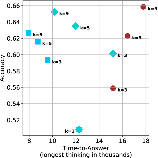
### Visual Description
\n
## Scatter Plot: Accuracy vs. Time-to-Answer for Different k Values
### Overview
This image presents a scatter plot illustrating the relationship between Accuracy and Time-to-Answer (measured in thousands of units) for different values of 'k'. Each point on the plot represents a data point for a specific 'k' value. The plot appears to explore the trade-off between accuracy and response time as the parameter 'k' varies.
### Components/Axes
* **X-axis:** Time-to-Answer (longest thinking in thousands) - Scale ranges from approximately 8 to 18.
* **Y-axis:** Accuracy - Scale ranges from approximately 0.52 to 0.66.
* **Data Points:** Represented by colored markers. Each marker is labeled with its corresponding 'k' value.
* **'k' Values:** The parameter 'k' takes on the values 1, 3, 5, and 9.
* **Colors:**
* Blue: Represents k = 1, k = 3, and k = 5.
* Red: Represents k = 3, k = 5, and k = 9.
### Detailed Analysis
The plot contains several data points, each representing a specific combination of Time-to-Answer, Accuracy, and 'k' value.
* **k = 1:** One data point at approximately (12.5, 0.52).
* **k = 3:** Two data points: approximately (9.8, 0.59) and (15.8, 0.56).
* **k = 5:** Two data points: approximately (10.2, 0.62) and (16.5, 0.62).
* **k = 9:** Two data points: approximately (9.5, 0.62) and (17.8, 0.66).
**Trends:**
* For k = 3, the accuracy decreases as the time-to-answer increases.
* For k = 5, the accuracy remains relatively constant as the time-to-answer increases.
* For k = 9, the accuracy increases as the time-to-answer increases.
* Generally, as 'k' increases, the accuracy tends to increase, but this is not a consistent trend across all time-to-answer values.
### Key Observations
* The data points are not evenly distributed. There are multiple points for k=3, k=5, and k=9, but only one for k=1.
* The highest accuracy is achieved with k=9 at a time-to-answer of approximately 17.8.
* The lowest accuracy is achieved with k=1 at a time-to-answer of approximately 12.5.
* There is overlap in the accuracy range for different 'k' values, indicating that achieving a certain level of accuracy can be done with different 'k' settings.
### Interpretation
The scatter plot suggests a complex relationship between accuracy, time-to-answer, and the parameter 'k'. The parameter 'k' likely controls some aspect of the system being evaluated, such as the number of candidates considered or the complexity of the search process.
The data indicates that increasing 'k' generally improves accuracy, but also increases the time-to-answer. This suggests a trade-off between performance and accuracy. The optimal value of 'k' depends on the specific application and the relative importance of accuracy and speed.
The differing trends observed for different 'k' values suggest that the relationship between accuracy and time-to-answer is not linear and may be influenced by the specific value of 'k'. The presence of multiple data points for some 'k' values could indicate that the system's performance varies under similar conditions, or that the data represents multiple trials or runs.
The plot does not provide information about the nature of the task being performed or the underlying mechanism that governs the relationship between these variables. Further investigation would be needed to understand the specific implications of these findings.
</details>
(a) LN-Super- $49$ B
<details>
<summary>x59.png Details</summary>
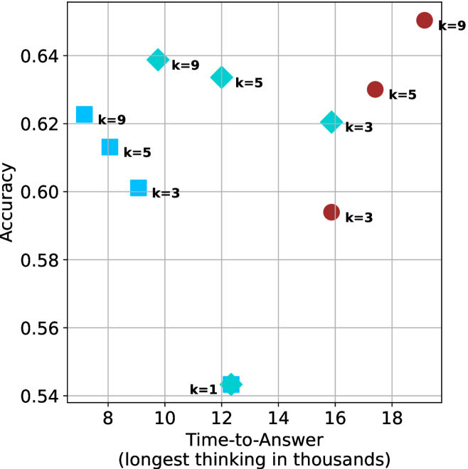
### Visual Description
\n
## Scatter Plot: Accuracy vs. Time-to-Answer
### Overview
This image presents a scatter plot visualizing the relationship between Accuracy and Time-to-Answer (measured in thousands of units). The data points are differentiated by the value of 'k', representing a parameter. The plot appears to explore the trade-off between speed and correctness for different values of 'k'.
### Components/Axes
* **X-axis:** Time-to-Answer (longest thinking in thousands) - ranging from approximately 8 to 19.
* **Y-axis:** Accuracy - ranging from approximately 0.54 to 0.65.
* **Data Points:** Scatter plot points, each labeled with a 'k' value (k=1, k=3, k=5, k=9).
* **Colors:**
* Blue: k=1, k=3, k=5
* Red: k=3, k=5, k=9
* Teal: k=5, k=9
* **Labels:** Each data point is labeled with its corresponding 'k' value.
### Detailed Analysis
The plot contains data points for k=1, k=3, k=5, and k=9. Let's analyze each 'k' value's trend:
* **k=1:** A single blue data point at approximately (11.5, 0.54).
* **k=3:** Two data points: a blue point at approximately (9.5, 0.60) and a red point at approximately (16.5, 0.59).
* **k=5:** Two data points: a blue point at approximately (10.5, 0.62) and a red point at approximately (17.5, 0.63).
* **k=9:** Two data points: a teal point at approximately (10, 0.64) and a red point at approximately (18.5, 0.65).
**Data Table Reconstruction:**
| k | Time-to-Answer (thousands) | Accuracy | Color |
|-----|-----------------------------|----------|-------|
| 1 | 11.5 | 0.54 | Blue |
| 3 | 9.5 | 0.60 | Blue |
| 3 | 16.5 | 0.59 | Red |
| 5 | 10.5 | 0.62 | Blue |
| 5 | 17.5 | 0.63 | Red |
| 9 | 10 | 0.64 | Teal |
| 9 | 18.5 | 0.65 | Red |
### Key Observations
* Generally, as 'k' increases, the maximum achievable accuracy also increases, but at the cost of increased Time-to-Answer.
* For k=3, k=5, and k=9, there are two data points each, suggesting potentially different configurations or runs for the same 'k' value.
* The red data points (k=3, k=5, k=9) tend to have higher Time-to-Answer values compared to the blue data points (k=1, k=3, k=5).
* There is a noticeable spread in Time-to-Answer for k=3, k=5, and k=9, indicating variability in performance.
### Interpretation
The data suggests a trade-off between accuracy and speed, parameterized by 'k'. Higher values of 'k' generally lead to better accuracy but require more Time-to-Answer. The presence of multiple data points for k=3, k=5, and k=9 indicates that the relationship isn't strictly deterministic; other factors likely influence the Time-to-Answer for a given 'k' value.
The plot could be illustrating the performance of a model or algorithm where 'k' represents a complexity parameter (e.g., number of neighbors in a k-NN algorithm, the number of layers in a neural network, or the size of a search space). The spread in data points for higher 'k' values might be due to variations in the input data or the randomness inherent in the algorithm. The fact that the red points are generally further to the right suggests that increasing 'k' leads to a more computationally expensive process, but potentially a more accurate result. The k=1 point is an outlier in terms of accuracy, suggesting that a very low 'k' value results in significantly lower performance.
</details>
(b) R $1$ - $32$ B
<details>
<summary>x60.png Details</summary>
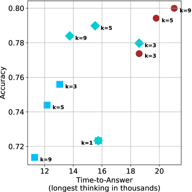
### Visual Description
\n
## Scatter Plot: Accuracy vs. Time-to-Answer
### Overview
This image presents a scatter plot visualizing the relationship between "Accuracy" and "Time-to-Answer (longest thinking in thousands)". Each data point represents a specific configuration, labeled with a 'k' value. The plot uses different colors to distinguish between different 'k' values.
### Components/Axes
* **X-axis:** "Time-to-Answer (longest thinking in thousands)". Scale ranges from approximately 11.5 to 21.
* **Y-axis:** "Accuracy". Scale ranges from approximately 0.71 to 0.81.
* **Data Points:** Scatter points, each labeled with a 'k' value (k=1, k=3, k=5, k=9).
* **Colors:**
* Blue: k=9
* Light Blue: k=3
* Green: k=5
* Red: k=1
### Detailed Analysis
The plot shows the distribution of accuracy scores against time-to-answer for different values of 'k'.
* **k=1 (Red):** One data point at approximately (16.5, 0.73) and another at approximately (20.5, 0.80). The trend is upward.
* **k=3 (Light Blue):** Data points at approximately (12.5, 0.75), (14.5, 0.77), and (20.5, 0.78). The trend is slightly upward.
* **k=5 (Green):** Data points at approximately (13.5, 0.74), (16.5, 0.78). The trend is upward.
* **k=9 (Blue):** Data points at approximately (12.0, 0.72), (14.0, 0.79), and (20.0, 0.80). The trend is upward.
### Key Observations
* Generally, as "Time-to-Answer" increases, "Accuracy" also tends to increase.
* The 'k=9' configuration shows a relatively wide range of "Time-to-Answer" values, with corresponding accuracy values.
* The 'k=1' configuration has the lowest accuracy at lower time-to-answer, but reaches the highest accuracy at the highest time-to-answer.
* There is overlap in the accuracy ranges for different 'k' values, particularly between k=3, k=5, and k=9.
### Interpretation
The data suggests that increasing the "Time-to-Answer" generally improves "Accuracy" across different 'k' values. The 'k' parameter likely represents a configuration setting or a model complexity. The plot demonstrates a trade-off between speed (Time-to-Answer) and accuracy. Higher 'k' values seem to allow for higher accuracy, but also exhibit a wider range of response times. The 'k=1' configuration is interesting because it starts with lower accuracy but achieves the highest accuracy at the longest thinking time. This could indicate that it requires more processing time to reach optimal performance. The overlapping accuracy ranges suggest that different configurations can achieve similar levels of accuracy, but with varying response times. Further investigation would be needed to understand the specific meaning of 'k' and the underlying mechanisms driving these trends.
</details>
(c) QwQ-32B
<details>
<summary>x61.png Details</summary>
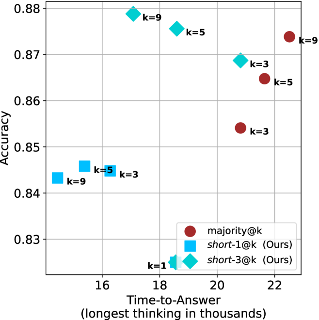
### Visual Description
\n
## Scatter Plot: Accuracy vs. Time-to-Answer
### Overview
This image presents a scatter plot comparing the accuracy and time-to-answer for different values of 'k' across three methods: majority@k, short-1@k (labeled "Ours"), and short-3@k (labeled "Ours"). The x-axis represents Time-to-Answer in thousands of units, and the y-axis represents Accuracy. Each point on the plot represents a specific combination of method and 'k' value.
### Components/Axes
* **X-axis:** Time-to-Answer (longest thinking in thousands) - Scale ranges from approximately 15.5 to 22.5.
* **Y-axis:** Accuracy - Scale ranges from approximately 0.83 to 0.88.
* **Legend:** Located in the bottom-right corner.
* **majority@k:** Represented by red circles.
* **short-1@k (Ours):** Represented by blue squares.
* **short-3@k (Ours):** Represented by teal diamonds.
* **Data Points:** Each point is labeled with its corresponding 'k' value.
### Detailed Analysis
Let's analyze each data series individually:
**1. majority@k (Red Circles):**
* The points show an increasing trend in accuracy as 'k' increases.
* k=3: Approximately (21.5, 0.855)
* k=5: Approximately (21.8, 0.865)
* k=9: Approximately (22.2, 0.875)
**2. short-1@k (Ours) (Blue Squares):**
* The points show a decreasing trend in accuracy as 'k' increases.
* k=1: Approximately (17.5, 0.83)
* k=5: Approximately (16.2, 0.845)
* k=9: Approximately (16.0, 0.84)
**3. short-3@k (Ours) (Teal Diamonds):**
* The points show a decreasing trend in accuracy as 'k' increases.
* k=1: Approximately (18.2, 0.86)
* k=3: Approximately (19.5, 0.87)
* k=5: Approximately (20.0, 0.875)
* k=9: Approximately (20.5, 0.88)
### Key Observations
* The 'majority@k' method consistently achieves the highest accuracy, and its accuracy increases with 'k'.
* Both 'short-1@k' and 'short-3@k' methods exhibit a trade-off between accuracy and time-to-answer. As 'k' increases, the time-to-answer decreases, but the accuracy also decreases.
* 'short-3@k' generally outperforms 'short-1@k' in terms of accuracy, but at the cost of a slightly longer time-to-answer.
* The 'short-3@k' method with k=9 achieves the highest accuracy (approximately 0.88) and is comparable to the 'majority@k' method with k=9.
### Interpretation
The data suggests that increasing the value of 'k' in the 'majority@k' method improves accuracy, but it also increases the time-to-answer. The 'short-1@k' and 'short-3@k' methods offer a trade-off, allowing for faster response times at the expense of some accuracy. The 'short-3@k' method appears to be a better choice than 'short-1@k' when accuracy is a priority. The fact that 'short-3@k' with k=9 reaches a similar accuracy level to 'majority@k' with k=9 is a significant finding, indicating that the 'short-3@k' method can achieve comparable performance with a potentially different computational cost. The plot demonstrates the relationship between model complexity (represented by 'k'), computational cost (represented by Time-to-Answer), and performance (represented by Accuracy). The "Ours" label suggests these are novel methods being proposed and evaluated against a baseline ("majority@k").
</details>
(d) R1-670B
Figure 16: AIME 2025 - time-to-answer comparison.
<details>
<summary>x62.png Details</summary>
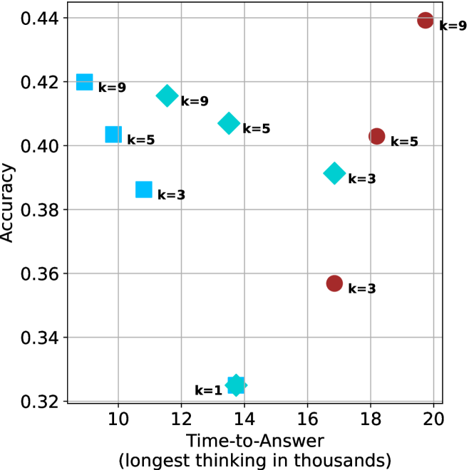
### Visual Description
\n
## Scatter Plot: Accuracy vs. Time-to-Answer
### Overview
The image presents a scatter plot illustrating the relationship between Accuracy and Time-to-Answer (measured in thousands of units). The data points are differentiated by the value of 'k', representing a parameter. There are two distinct marker shapes: squares (blue) and circles (red).
### Components/Axes
* **X-axis:** Time-to-Answer (longest thinking in thousands). Scale ranges from approximately 9 to 20.
* **Y-axis:** Accuracy. Scale ranges from approximately 0.32 to 0.44.
* **Data Series:** Represented by different marker shapes and colors, categorized by the value of 'k'.
* k=1 (Teal Square)
* k=3 (Blue Square & Red Circle)
* k=5 (Blue Square & Red Circle)
* k=9 (Teal Diamond & Red Circle)
* **Labels:** Each data point is labeled with its corresponding 'k' value.
### Detailed Analysis
The plot contains data points for k=1, k=3, k=5, and k=9.
* **k=1:** One data point at approximately (13.5, 0.325).
* **k=3:** Two data points: a blue square at approximately (11.5, 0.39) and a red circle at approximately (17.5, 0.36).
* **k=5:** Two data points: a blue square at approximately (11.5, 0.41) and a red circle at approximately (18.5, 0.40).
* **k=9:** Two data points: a teal diamond at approximately (12.5, 0.425) and a red circle at approximately (20, 0.435).
**Trends:**
* For k=3, the accuracy generally increases with time-to-answer, as the blue square has a lower time-to-answer and lower accuracy than the red circle.
* For k=5, the accuracy is relatively stable across the two points.
* For k=9, the accuracy increases with time-to-answer.
* The blue squares (k=3 and k=5) generally cluster together in the bottom-left portion of the plot.
* The red circles (k=3, k=5, and k=9) are more dispersed, appearing in the bottom-right and top-right portions of the plot.
### Key Observations
* There's a noticeable separation between the blue squares and red circles, suggesting that the marker shape (or the underlying process it represents) has a significant impact on the relationship between accuracy and time-to-answer.
* The data points for k=9 show a positive correlation between time-to-answer and accuracy.
* The data points for k=3 and k=5 show a more complex relationship, with some variation in accuracy at different time-to-answer values.
### Interpretation
The data suggests that the parameter 'k' influences both the accuracy and the time-to-answer. The different marker shapes (squares vs. circles) likely represent different approaches or algorithms. The squares (lower k values) appear to achieve reasonable accuracy with relatively faster response times, while the circles (higher k values) may require more time to achieve higher accuracy.
The positive correlation observed for k=9 indicates that increasing the time-to-answer can lead to improved accuracy for that specific parameter value. The variation in accuracy for k=3 and k=5 suggests that other factors may also play a role in determining the overall performance.
The separation between the blue squares and red circles could indicate that the two approaches are fundamentally different, with the squares representing a more efficient but potentially less accurate method, and the circles representing a more thorough but potentially slower method. Further investigation would be needed to understand the underlying mechanisms driving these differences.
</details>
(a) LN-Super- $49$ B
<details>
<summary>x63.png Details</summary>
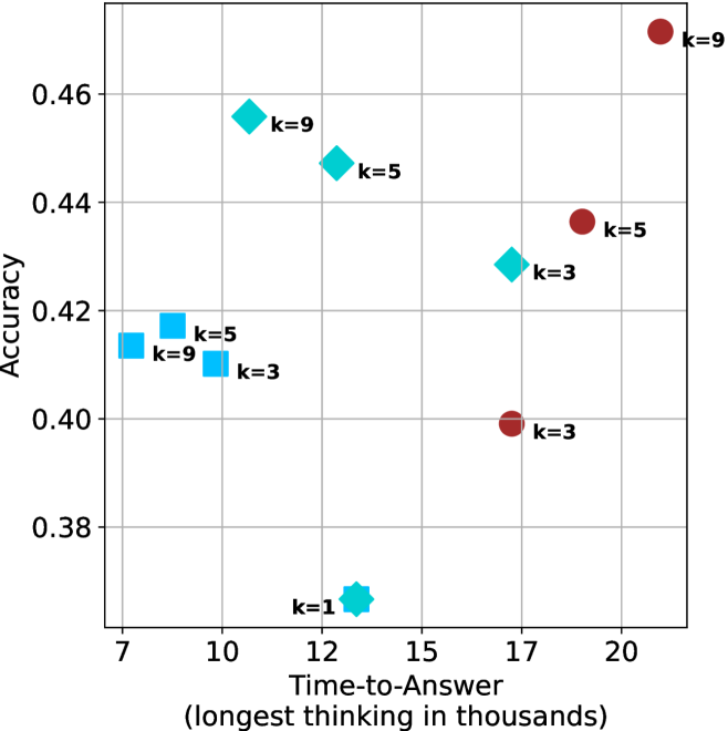
### Visual Description
## Scatter Plot: Accuracy vs. Time-to-Answer
### Overview
This image presents a scatter plot visualizing the relationship between "Accuracy" and "Time-to-Answer (longest thinking in thousands)". Data points are color-coded and labeled with the value of 'k'. The plot appears to explore how accuracy changes as the time taken to answer increases, potentially in the context of a problem-solving or decision-making process.
### Components/Axes
* **X-axis:** "Time-to-Answer (longest thinking in thousands)". Scale ranges from approximately 7 to 21.
* **Y-axis:** "Accuracy". Scale ranges from approximately 0.38 to 0.47.
* **Data Points:** Scatter plot points, color-coded as follows:
* Blue: Represents data points with k=1, k=3, k=5, and k=9.
* Red: Represents data points with k=3, k=5, and k=9.
* Green: Represents data points with k=3, k=5, and k=9.
* **Labels:** Each data point is labeled with "k=" followed by a numerical value.
### Detailed Analysis
Let's analyze the data points and their corresponding values:
* **k=1:** Located at approximately (7.5, 0.38).
* **k=3 (Blue):** Located at approximately (10.5, 0.41).
* **k=3 (Green):** Located at approximately (16.5, 0.40).
* **k=3 (Red):** Located at approximately (17.5, 0.40).
* **k=5 (Blue):** Located at approximately (10.5, 0.42).
* **k=5 (Green):** Located at approximately (14.5, 0.45).
* **k=5 (Red):** Located at approximately (19.5, 0.44).
* **k=9 (Blue):** Located at approximately (10.5, 0.46).
* **k=9 (Green):** Located at approximately (12.5, 0.46).
* **k=9 (Red):** Located at approximately (20.5, 0.47).
**Trends:**
* Generally, as "Time-to-Answer" increases, "Accuracy" tends to increase, but this is not a strictly linear relationship.
* For lower values of 'k' (k=1), accuracy is relatively low and time-to-answer is short.
* For higher values of 'k' (k=9), accuracy is generally higher, and time-to-answer is longer.
* There is overlap in data points for different values of 'k', indicating that similar accuracy levels can be achieved with varying time-to-answer and 'k' values.
### Key Observations
* The data points are not evenly distributed. There's a concentration of points around the x-values of 10-12 and 17-20.
* The red data points, representing k=3, k=5, and k=9, generally have higher accuracy values for longer time-to-answer.
* The blue data points, representing k=1, k=3, k=5, and k=9, show a wider range of accuracy values for shorter time-to-answer.
* The green data points, representing k=3, k=5, and k=9, are clustered in the middle range of both axes.
### Interpretation
This scatter plot likely represents the performance of a system or model (potentially an AI or human decision-maker) as a function of the time allowed for "thinking" or processing, and a parameter 'k'. The parameter 'k' could represent the number of options considered, the complexity of the model, or a similar factor.
The positive correlation between "Time-to-Answer" and "Accuracy" suggests that allowing more time for processing generally leads to better results. However, the scatter suggests that this relationship is not deterministic. The value of 'k' appears to influence the accuracy achieved for a given time-to-answer.
The clustering of points and the overlap between different 'k' values indicate that there are trade-offs between time, accuracy, and the parameter 'k'. For example, achieving high accuracy might require both a longer time-to-answer and a higher value of 'k'. The data suggests that increasing 'k' beyond a certain point may not yield significant improvements in accuracy, as seen by the overlapping points.
The presence of multiple data points for the same 'k' value suggests that there is variability in performance even under the same conditions. This could be due to random factors or other variables not captured in the plot.
</details>
(b) R $1$ - $32$ B
<details>
<summary>x64.png Details</summary>
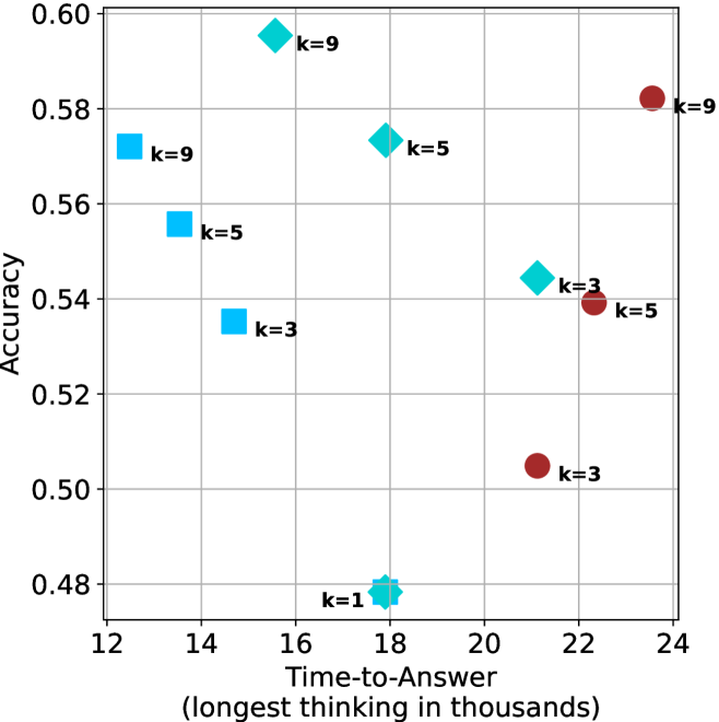
### Visual Description
\n
## Scatter Plot: Accuracy vs. Time-to-Answer for Different k Values
### Overview
This image presents a scatter plot illustrating the relationship between Accuracy and Time-to-Answer (measured in thousands of units) for different values of 'k'. Each point on the plot represents a data point for a specific 'k' value. The plot uses different marker shapes and colors to distinguish between different 'k' values.
### Components/Axes
* **X-axis:** Time-to-Answer (longest thinking in thousands). Scale ranges from approximately 12 to 24.
* **Y-axis:** Accuracy. Scale ranges from approximately 0.48 to 0.60.
* **Legend:** The legend is not explicitly present as a separate block, but the 'k' values are directly labeled next to each data point.
* **Data Series:** The data is represented by points with different shapes and colors, each corresponding to a specific 'k' value:
* k=1 (represented by a brown circle)
* k=3 (represented by a purple square)
* k=5 (represented by a blue diamond)
* k=9 (represented by a light blue square)
### Detailed Analysis
Let's analyze each 'k' value's data points:
* **k=1:** One data point at approximately (17.5, 0.48).
* **k=3:** Three data points:
* (14.5, 0.54)
* (22.5, 0.54)
* (24.5, 0.50)
* **k=5:** Three data points:
* (14.5, 0.56)
* (19.5, 0.58)
* (22.5, 0.54)
* **k=9:** Three data points:
* (16.5, 0.59)
* (14.5, 0.56)
* (24.5, 0.58)
**Trends:**
* **k=1:** The accuracy increases with time-to-answer.
* **k=3:** The accuracy is relatively stable, with a slight decrease at the highest time-to-answer.
* **k=5:** The accuracy generally increases with time-to-answer, peaking around 19.5 and then decreasing.
* **k=9:** The accuracy is relatively stable, with some variation across different time-to-answer values.
### Key Observations
* The data points for k=1 are clustered at the lower end of both the Time-to-Answer and Accuracy scales.
* The data points for k=9 are generally higher in accuracy compared to k=1 and k=3.
* There is considerable overlap in the Time-to-Answer ranges for different 'k' values.
* The highest accuracy values are achieved with k=9, but there is significant variance.
### Interpretation
The scatter plot suggests a relationship between the parameter 'k', Time-to-Answer, and Accuracy. Higher values of 'k' generally correlate with higher accuracy, but this relationship isn't strictly linear. The spread of data points for each 'k' value indicates that other factors besides 'k' influence accuracy.
The 'Time-to-Answer' likely represents the computational effort or time taken to arrive at an answer. The 'Accuracy' represents the correctness of the answer. The parameter 'k' could represent the number of neighbors considered in a k-nearest neighbors algorithm, the complexity of a model, or a similar parameter controlling the scope of a search or decision-making process.
The observation that accuracy plateaus or even decreases with increasing Time-to-Answer for some 'k' values (e.g., k=3) suggests that there's a point of diminishing returns. Beyond a certain computational effort, additional processing doesn't necessarily lead to improved accuracy and might even introduce errors.
The data suggests that choosing an appropriate 'k' value is crucial for balancing accuracy and computational cost. A higher 'k' might yield better accuracy, but it also requires more Time-to-Answer. The optimal 'k' value depends on the specific application and the trade-off between these two factors.
</details>
(c) QwQ-32B
<details>
<summary>x65.png Details</summary>
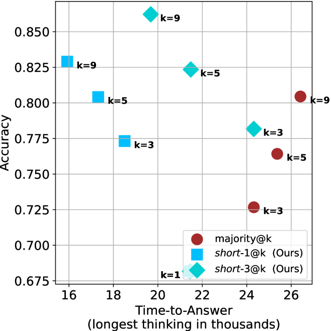
### Visual Description
\n
## Scatter Plot: Accuracy vs. Time-to-Answer
### Overview
This image presents a scatter plot comparing the accuracy and time-to-answer for different values of 'k' across three methods: majority@k, short-1@k (labeled "Ours"), and short-3@k (labeled "Ours"). The x-axis represents "Time-to-Answer" in thousands of units, and the y-axis represents "Accuracy". Each data point is labeled with the corresponding 'k' value.
### Components/Axes
* **X-axis:** "Time-to-Answer (longest thinking in thousands)" - Scale ranges from approximately 16 to 26.
* **Y-axis:** "Accuracy" - Scale ranges from approximately 0.675 to 0.850.
* **Legend:** Located in the bottom-right corner.
* **majority@k:** Represented by red circles.
* **short-1@k (Ours):** Represented by light blue diamonds.
* **short-3@k (Ours):** Represented by dark blue squares.
* **Data Labels:** Each data point is labeled with the value of 'k' (k=1, k=3, k=5, k=9).
### Detailed Analysis
Let's analyze each data series individually:
**1. majority@k (Red Circles):**
* The trend is generally upward, with accuracy increasing as time-to-answer increases.
* k=3: Approximately (25.5, 0.725)
* k=5: Approximately (25, 0.75)
* k=9: Approximately (26, 0.80)
**2. short-1@k (Light Blue Diamonds):**
* The trend is also generally upward, but with a steeper slope than majority@k.
* k=1: Approximately (19.5, 0.68)
* k=3: Approximately (18, 0.77)
* k=5: Approximately (22, 0.825)
* k=9: Approximately (22.5, 0.85)
**3. short-3@k (Dark Blue Squares):**
* The trend is upward, but less pronounced than short-1@k.
* k=3: Approximately (18, 0.77)
* k=5: Approximately (22, 0.82)
* k=9: Approximately (22.5, 0.85)
### Key Observations
* For all values of 'k', the "short-1@k" method consistently achieves the highest accuracy.
* The "short-3@k" method generally performs similarly to "short-1@k", especially at higher values of 'k'.
* The "majority@k" method consistently has the lowest accuracy across all 'k' values.
* Increasing 'k' generally leads to higher accuracy for all methods, but the improvement is more significant for "short-1@k" and "short-3@k".
* The "short-1@k" and "short-3@k" methods achieve comparable accuracy at k=9.
### Interpretation
The data suggests that the "short-1@k" method is the most effective in balancing accuracy and time-to-answer. While increasing 'k' generally improves accuracy, the gains diminish, and the time-to-answer increases. The "majority@k" method appears to be less efficient, requiring significantly more time to achieve lower accuracy. The close performance of "short-1@k" and "short-3@k" at k=9 suggests that increasing the number of short answers considered beyond a certain point (in this case, potentially k=5) does not yield substantial improvements in accuracy. The "Ours" label indicates that "short-1@k" and "short-3@k" are methods developed by the authors of the study, and they outperform the baseline "majority@k" method. The plot demonstrates a trade-off between accuracy and computational cost (represented by time-to-answer), and the "short-1@k" method appears to offer the best compromise.
</details>
(d) R1-670B
Figure 17: HMMT Feb 2025 - time-to-answer comparison.
## Appendix C Ablation studies
We investigate two axis of short-m@k: the value of $m$ and the tie breaking method. For all experiments we use LN-Super- $49$ B, reporting results over the three benchmarks described in Section ˜ 3.1. For the ablation studies we focus on controlling thinking compute.
We start by ablating different $m\in\{1,3,4,5,7,9\}$ for short-m@k. Results are shown in Figure ˜ 18(a). As observed in our main results, short-1@k outperforms others in low-compute regimes, while being less effective for larger compute budgets. Larger $m$ values seem to perform similarly, with higher $m$ values yielding slightly better results in high-compute scenarios.
Next, we analyze the tie-breaking rule of short-m@k. We suggest the selection of the shortest reasoning chain among the vote-leading options. We compare this strategy to random tie-breaking, and to tie breaking according to the longest reasoning chain among the options. As shown in Figure ˜ 18(b), the short-m@k strategy outperforms random tie-breaking. In contrast, choosing the option with the longest reasoning chain yields inferior results.
<details>
<summary>x66.png Details</summary>
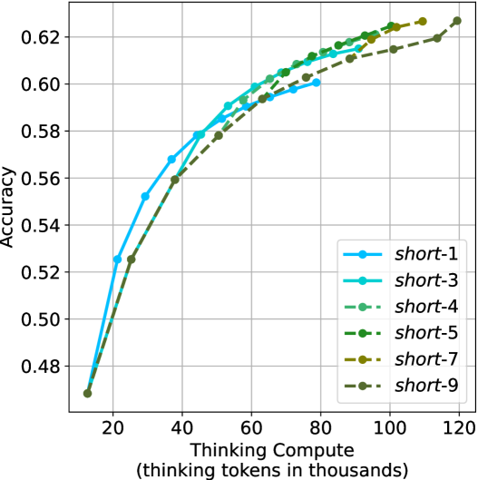
### Visual Description
\n
## Line Chart: Accuracy vs. Thinking Compute
### Overview
The image presents a line chart illustrating the relationship between "Thinking Compute" (measured in thousands of tokens) and "Accuracy" for six different models labeled "short-1" through "short-9". The chart shows how accuracy increases with increasing compute for each model.
### Components/Axes
* **X-axis:** "Thinking Compute (thinking tokens in thousands)". Scale ranges from approximately 0 to 120, with markers at 20, 40, 60, 80, 100, and 120.
* **Y-axis:** "Accuracy". Scale ranges from approximately 0.48 to 0.63, with markers at 0.48, 0.50, 0.52, 0.54, 0.56, 0.58, 0.60, and 0.62.
* **Legend:** Located in the top-right corner, listing the following models with corresponding colors:
* short-1 (Blue)
* short-3 (Teal)
* short-4 (Dark Green)
* short-5 (Light Green)
* short-7 (Dark Brown)
* short-9 (Orange)
* **Grid:** A light gray grid is present in the background to aid in reading values.
### Detailed Analysis
Here's a breakdown of each line's trend and approximate data points. All values are approximate due to the chart's resolution.
* **short-1 (Blue):** The line slopes upward, showing a positive correlation between compute and accuracy.
* At 20k tokens: ~0.49 accuracy
* At 40k tokens: ~0.57 accuracy
* At 60k tokens: ~0.59 accuracy
* At 80k tokens: ~0.61 accuracy
* At 100k tokens: ~0.62 accuracy
* At 120k tokens: ~0.62 accuracy
* **short-3 (Teal):** The line also slopes upward, but starts slightly higher than short-1.
* At 20k tokens: ~0.51 accuracy
* At 40k tokens: ~0.59 accuracy
* At 60k tokens: ~0.60 accuracy
* At 80k tokens: ~0.61 accuracy
* At 100k tokens: ~0.62 accuracy
* At 120k tokens: ~0.62 accuracy
* **short-4 (Dark Green):** The line slopes upward, starting higher than short-3.
* At 20k tokens: ~0.52 accuracy
* At 40k tokens: ~0.60 accuracy
* At 60k tokens: ~0.61 accuracy
* At 80k tokens: ~0.62 accuracy
* At 100k tokens: ~0.62 accuracy
* At 120k tokens: ~0.62 accuracy
* **short-5 (Light Green):** The line slopes upward, starting higher than short-4.
* At 20k tokens: ~0.53 accuracy
* At 40k tokens: ~0.60 accuracy
* At 60k tokens: ~0.61 accuracy
* At 80k tokens: ~0.62 accuracy
* At 100k tokens: ~0.62 accuracy
* At 120k tokens: ~0.62 accuracy
* **short-7 (Dark Brown):** The line slopes upward, starting lower than short-5.
* At 20k tokens: ~0.49 accuracy
* At 40k tokens: ~0.58 accuracy
* At 60k tokens: ~0.60 accuracy
* At 80k tokens: ~0.61 accuracy
* At 100k tokens: ~0.62 accuracy
* At 120k tokens: ~0.62 accuracy
* **short-9 (Orange):** The line slopes upward, starting lower than short-7.
* At 20k tokens: ~0.48 accuracy
* At 40k tokens: ~0.57 accuracy
* At 60k tokens: ~0.59 accuracy
* At 80k tokens: ~0.61 accuracy
* At 100k tokens: ~0.62 accuracy
* At 120k tokens: ~0.62 accuracy
### Key Observations
* All models demonstrate increasing accuracy with increasing "Thinking Compute".
* The accuracy gains appear to diminish as compute increases, suggesting a point of diminishing returns. The lines flatten out at higher compute values.
* The models "short-4" and "short-5" achieve the highest accuracy levels, reaching approximately 0.62.
* Models "short-1" and "short-9" start with the lowest accuracy and show a slightly slower rate of improvement.
### Interpretation
The chart demonstrates the impact of computational resources ("Thinking Compute") on the performance ("Accuracy") of different models. The consistent upward trend across all models suggests that increasing compute generally leads to improved accuracy. However, the flattening of the curves at higher compute levels indicates that there's a limit to the benefits of simply adding more compute.
The differences between the models ("short-1" to "short-9") likely represent variations in model architecture, training data, or other hyperparameters. The superior performance of "short-4" and "short-5" suggests that these models are more efficient at utilizing the available compute to achieve higher accuracy.
The chart is valuable for understanding the trade-offs between computational cost and model performance. It suggests that while increasing compute is beneficial, it's also important to optimize model design to maximize the efficiency of resource utilization. The diminishing returns observed at higher compute levels highlight the need for alternative strategies to further improve accuracy, such as exploring different model architectures or training techniques.
</details>
(a) $m$ values ablation of short-m@k
<details>
<summary>x67.png Details</summary>
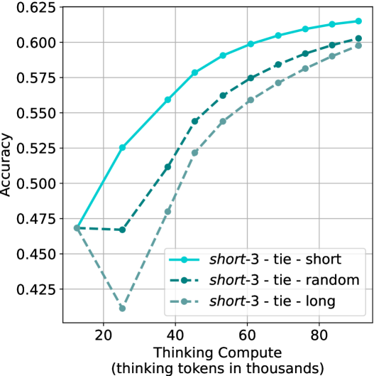
### Visual Description
\n
## Line Chart: Accuracy vs. Thinking Compute
### Overview
The image presents a line chart illustrating the relationship between "Thinking Compute" (measured in thousands of thinking tokens) and "Accuracy" for three different configurations: "short-3 - tie - short", "short-3 - tie - random", and "short-3 - tie - long". The chart displays how accuracy changes as the amount of thinking compute increases.
### Components/Axes
* **X-axis:** "Thinking Compute (thinking tokens in thousands)". The scale ranges from approximately 0 to 90, with markers at 20, 40, 60, and 80.
* **Y-axis:** "Accuracy". The scale ranges from approximately 0.42 to 0.625, with markers at 0.425, 0.475, 0.525, 0.575, and 0.625.
* **Legend:** Located in the bottom-right corner.
* "short-3 - tie - short" (Solid Blue Line with Circle Markers)
* "short-3 - tie - random" (Dashed Black Line with Circle Markers)
* "short-3 - tie - long" (Dashed Grey Line with Circle Markers)
* **Gridlines:** A light grey grid is present to aid in reading values.
### Detailed Analysis
* **short-3 - tie - short (Solid Blue Line):** This line shows a strong upward trend, starting at approximately 0.465 at a Thinking Compute of 20. It increases steadily, reaching approximately 0.605 at a Thinking Compute of 60, and plateaus around 0.61 at a Thinking Compute of 80.
* (20, 0.465)
* (40, 0.56)
* (60, 0.605)
* (80, 0.61)
* **short-3 - tie - random (Dashed Black Line):** This line also exhibits an upward trend, but it is less pronounced than the "short-3 - tie - short" line. It begins at approximately 0.475 at a Thinking Compute of 20, rises to approximately 0.57 at a Thinking Compute of 60, and reaches approximately 0.595 at a Thinking Compute of 80.
* (20, 0.475)
* (40, 0.52)
* (60, 0.57)
* (80, 0.595)
* **short-3 - tie - long (Dashed Grey Line):** This line shows the slowest increase in accuracy. It starts at approximately 0.425 at a Thinking Compute of 20, dips slightly to approximately 0.42 at a Thinking Compute of 40, then rises to approximately 0.56 at a Thinking Compute of 60, and reaches approximately 0.59 at a Thinking Compute of 80.
* (20, 0.425)
* (40, 0.42)
* (60, 0.56)
* (80, 0.59)
### Key Observations
* The "short-3 - tie - short" configuration consistently achieves the highest accuracy across all levels of Thinking Compute.
* The "short-3 - tie - long" configuration initially performs the worst, but its accuracy increases with higher Thinking Compute, though it remains below the other two configurations.
* All three configurations demonstrate diminishing returns in accuracy as Thinking Compute increases beyond 60. The rate of accuracy improvement slows down significantly.
* The "short-3 - tie - long" configuration shows a slight dip in accuracy between 20 and 40 Thinking Compute.
### Interpretation
The data suggests that increasing the amount of "Thinking Compute" generally improves accuracy, but the benefit diminishes as the compute increases. The configuration "short-3 - tie - short" is the most effective in terms of achieving high accuracy with a given amount of compute. The initial dip in accuracy for the "short-3 - tie - long" configuration could indicate a period of adjustment or instability before the benefits of increased compute begin to manifest. The differences in performance between the configurations likely relate to the specific strategies or parameters used in each, and the data highlights the importance of optimizing these factors to maximize accuracy. The plateauing of accuracy suggests that there are other limiting factors beyond simply increasing compute, such as the quality of the underlying model or the complexity of the task.
</details>
(b) Tie breaking ablation
Figure 18: Ablation studies over different $m$ values for short-m@k, and different tie breaking methods. Both figures show the model’s average accuracy across benchmarks as a function of the length of its thinking trajectories (measured in thousands).
## Appendix D Small models results
We present our main results (Sections ˜ 3 and 4) using smaller models. We use Llama- $3.1$ -Nemotron-Nano- $8$ B-v $1$ [LN-Nano- $8$ B; Bercovich and others, 2025] and R $1$ -Distill-Qwen- $7$ B [R $1$ - $7$ B; Guo et al., 2025]. Table ˜ 7 (corresponds to Table ˜ 1), presents a comparison between shortest/longest/random generation per example for the smaller models. As observed for larger models, using the shortest answer outperforms both random and longest answers across all benchmarks and models.
Table 7: Comparison between taking the shortest/longest/random generation per example.
| | GPQA-D | AIME 2024 | AIME 2025 | HMMT | Math Average | | | | | |
| --- | --- | --- | --- | --- | --- | --- | --- | --- | --- | --- |
| Thinking Tokens $\downarrow$ | Acc. $\uparrow$ | Thinking Tokens $\downarrow$ | Acc. $\uparrow$ | Thinking Tokens $\downarrow$ | Acc. $\uparrow$ | Thinking Tokens $\downarrow$ | Acc. $\uparrow$ | Thinking Tokens $\downarrow$ | Acc. $\uparrow$ | |
| LN-Nano-8B | | | | | | | | | | |
| random | 7003 | 52.2 | 10380 | 62.1 | 11869 | 46.5 | 12693 | 34.0 | 11647 | 47.5 |
| longest | 10594 $(+51\$ | 41.4 | 16801 | 40.0 | 17140 | 33.3 | 18516 | 23.3 | 17486 $(+50\$ | 32.2 |
| shortest | 3937 $(-44\$ | 55.1 | 0 6047 | 70.0 | 0 7127 | 46.7 | 0 7508 | 50.0 | 6894 $(-41\$ | 55.6 |
| R1-7B | | | | | | | | | | |
| random | 7015 | 35.5 | 11538 | 57.8 | 12377 | 42.2 | 14693 | 25.0 | 12869 | 41.7 |
| longest | 11863 $(+69\$ | 29.8 | 21997 | 26.7 | 21029 | 26.7 | 23899 | 13.3 | 22308 $(+73\$ | 22.2 |
| shortest | 3438 $(-51\$ | 46.5 | 0 5217 | 76.7 | 0 6409 | 53.3 | 0 6950 | 43.3 | 6192 $(-52\$ | 57.8 |
Next, we analyze the performance of short-m@k using smaller models (see details in Section ˜ 4). Figure ˜ 19, Figure ˜ 20 and Figure ˜ 21 are the sample-size/compute/time-to-answer results for the small models over the math benchmarks, respectively. Figure ˜ 22, Figure ˜ 23 and Figure ˜ 24 are the sample-size/compute/time-to-answer results for the small models for GPQA-D, respectively.
The performance of short-m@k using small models remain consistent with those observed in larger ones. short-1@k demonstrates a performance advantage over majority voting in low compute regimes, while short-3@k dominates it across all compute budgets.
<details>
<summary>x68.png Details</summary>
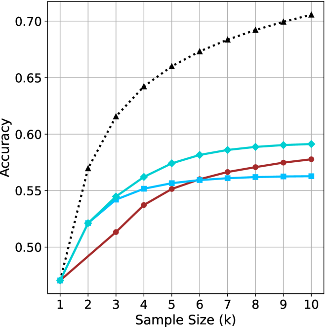
### Visual Description
\n
## Line Chart: Accuracy vs. Sample Size
### Overview
This image presents a line chart illustrating the relationship between sample size and accuracy. The chart displays three distinct data series, each represented by a different colored line, showing how accuracy changes as the sample size increases from 1k to 10k. The chart has a grid background for easier readability.
### Components/Axes
* **X-axis:** Labeled "Sample Size (k)", ranging from 1 to 10, with increments of 1.
* **Y-axis:** Labeled "Accuracy", ranging from 0.50 to 0.70, with increments of 0.05.
* **Data Series 1:** Represented by a black dotted line.
* **Data Series 2:** Represented by a cyan line.
* **Data Series 3:** Represented by a red line.
* **Grid:** A light gray grid is present in the background to aid in reading values.
### Detailed Analysis
**Data Series 1 (Black Dotted Line):** This line exhibits a steep upward trend initially, then gradually plateaus.
* At Sample Size = 1k, Accuracy ≈ 0.48
* At Sample Size = 2k, Accuracy ≈ 0.58
* At Sample Size = 3k, Accuracy ≈ 0.62
* At Sample Size = 4k, Accuracy ≈ 0.66
* At Sample Size = 5k, Accuracy ≈ 0.67
* At Sample Size = 6k, Accuracy ≈ 0.68
* At Sample Size = 7k, Accuracy ≈ 0.69
* At Sample Size = 8k, Accuracy ≈ 0.69
* At Sample Size = 9k, Accuracy ≈ 0.70
* At Sample Size = 10k, Accuracy ≈ 0.70
**Data Series 2 (Cyan Line):** This line shows a moderate upward trend that levels off significantly.
* At Sample Size = 1k, Accuracy ≈ 0.54
* At Sample Size = 2k, Accuracy ≈ 0.56
* At Sample Size = 3k, Accuracy ≈ 0.57
* At Sample Size = 4k, Accuracy ≈ 0.58
* At Sample Size = 5k, Accuracy ≈ 0.59
* At Sample Size = 6k, Accuracy ≈ 0.59
* At Sample Size = 7k, Accuracy ≈ 0.59
* At Sample Size = 8k, Accuracy ≈ 0.59
* At Sample Size = 9k, Accuracy ≈ 0.59
* At Sample Size = 10k, Accuracy ≈ 0.59
**Data Series 3 (Red Line):** This line demonstrates a slower, more gradual increase in accuracy, also leveling off.
* At Sample Size = 1k, Accuracy ≈ 0.46
* At Sample Size = 2k, Accuracy ≈ 0.50
* At Sample Size = 3k, Accuracy ≈ 0.53
* At Sample Size = 4k, Accuracy ≈ 0.55
* At Sample Size = 5k, Accuracy ≈ 0.56
* At Sample Size = 6k, Accuracy ≈ 0.57
* At Sample Size = 7k, Accuracy ≈ 0.57
* At Sample Size = 8k, Accuracy ≈ 0.57
* At Sample Size = 9k, Accuracy ≈ 0.57
* At Sample Size = 10k, Accuracy ≈ 0.57
### Key Observations
* Data Series 1 consistently outperforms the other two series across all sample sizes.
* The rate of accuracy improvement diminishes for all series as the sample size increases, indicating diminishing returns.
* Data Series 3 starts with the lowest accuracy and exhibits the slowest growth.
* Data Series 2 shows a moderate improvement, falling between the other two.
### Interpretation
The chart demonstrates the impact of sample size on accuracy. The rapid initial increase in accuracy for Data Series 1 suggests that, for this particular model or process, a small increase in sample size yields a significant improvement in performance. However, the flattening of all curves indicates that beyond a certain point (around 6k-7k for Data Series 1), increasing the sample size provides only marginal gains in accuracy. This suggests an optimal sample size exists, beyond which further data collection may not be cost-effective. The differences between the three data series could represent different algorithms, models, or data preprocessing techniques, with Data Series 1 being the most effective and Data Series 3 the least. The chart highlights the importance of balancing sample size with accuracy requirements and resource constraints.
</details>
(a) LN-Nano-8B
<details>
<summary>x69.png Details</summary>
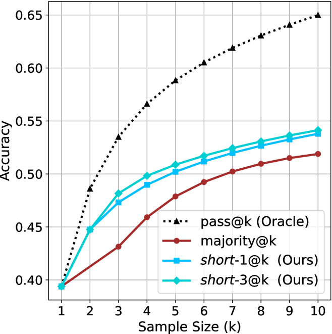
### Visual Description
\n
## Line Chart: Accuracy vs. Sample Size
### Overview
This image presents a line chart illustrating the relationship between accuracy and sample size (k) for different methods. The chart compares the performance of "pass@k (Oracle)", "majority@k", "short-1@k (Ours)", and "short-3@k (Ours)" methods. The x-axis represents the sample size (k), ranging from 1 to 10, while the y-axis represents the accuracy, ranging from 0.40 to 0.65.
### Components/Axes
* **X-axis Label:** "Sample Size (k)"
* **Y-axis Label:** "Accuracy"
* **Lines/Legends:**
* "pass@k (Oracle)" - Black dotted line
* "majority@k" - Brown solid line
* "short-1@k (Ours)" - Blue solid line with triangle markers
* "short-3@k (Ours)" - Light blue solid line with circle markers
* **Gridlines:** A grid is present to aid in reading values.
* **Legend Position:** Bottom-left corner.
### Detailed Analysis
The chart displays the accuracy of each method as the sample size increases.
* **pass@k (Oracle):** This line starts at approximately 0.41 at k=1 and increases rapidly, reaching approximately 0.64 at k=10. The line exhibits a steep upward slope, indicating a strong positive correlation between sample size and accuracy.
* **majority@k:** This line begins at approximately 0.40 at k=1 and increases steadily, reaching approximately 0.54 at k=10. The slope is less steep than "pass@k (Oracle)", indicating a slower increase in accuracy with sample size.
* **short-1@k (Ours):** This line starts at approximately 0.40 at k=1 and increases, reaching approximately 0.52 at k=10. The line shows a moderate increase in accuracy, with a slightly diminishing slope as k increases.
* **short-3@k (Ours):** This line begins at approximately 0.40 at k=1 and increases, reaching approximately 0.54 at k=10. The line shows a moderate increase in accuracy, similar to "short-1@k (Ours)", but consistently higher.
Here's a more detailed breakdown of data points (approximate):
| Sample Size (k) | pass@k (Oracle) | majority@k | short-1@k (Ours) | short-3@k (Ours) |
|---|---|---|---|---|
| 1 | 0.41 | 0.40 | 0.40 | 0.40 |
| 2 | 0.50 | 0.42 | 0.44 | 0.45 |
| 3 | 0.58 | 0.46 | 0.48 | 0.50 |
| 4 | 0.61 | 0.48 | 0.50 | 0.52 |
| 5 | 0.62 | 0.50 | 0.51 | 0.53 |
| 6 | 0.62 | 0.51 | 0.52 | 0.53 |
| 7 | 0.63 | 0.52 | 0.52 | 0.54 |
| 8 | 0.63 | 0.53 | 0.53 | 0.54 |
| 9 | 0.64 | 0.53 | 0.53 | 0.54 |
| 10 | 0.64 | 0.54 | 0.52 | 0.54 |
### Key Observations
* "pass@k (Oracle)" consistently outperforms all other methods across all sample sizes.
* "short-3@k (Ours)" performs better than "short-1@k (Ours)" for all sample sizes.
* The accuracy gains diminish as the sample size increases for all methods.
* "majority@k" shows a relatively slow increase in accuracy compared to the other methods.
### Interpretation
The chart demonstrates the impact of sample size on the accuracy of different methods for a given task. The "pass@k (Oracle)" method, which likely represents an ideal or upper-bound performance, serves as a benchmark. The "short-1@k (Ours)" and "short-3@k (Ours)" methods represent proposed approaches ("Ours"), and their performance is compared to the benchmark and the "majority@k" method.
The fact that "short-3@k (Ours)" consistently outperforms "short-1@k (Ours)" suggests that incorporating more information (potentially through the "3" in "short-3") improves accuracy. The diminishing returns in accuracy as sample size increases indicate that there's a point where adding more data provides limited additional benefit. The relatively low performance of "majority@k" suggests that a simple majority voting approach is less effective than the proposed "short" methods.
The chart suggests that the proposed "short" methods are promising alternatives, approaching the performance of the "Oracle" method, especially as the sample size increases. The difference between the "Oracle" and the "short" methods could be due to limitations in the proposed algorithms or the inherent complexity of the task.
</details>
(b) R $1$ - $7$ B
Figure 19: Small models - sample size ( $k$ ) comparison over math benchmarks.
<details>
<summary>x70.png Details</summary>
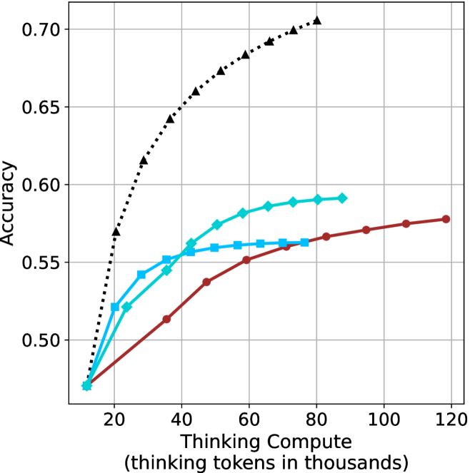
### Visual Description
## Line Chart: Accuracy vs. Thinking Compute
### Overview
This image presents a line chart illustrating the relationship between "Thinking Compute" (measured in thousands of tokens) and "Accuracy". Four distinct data series are plotted, each represented by a different colored line with varying styles. The chart appears to demonstrate how accuracy improves with increased computational effort, with different approaches exhibiting varying degrees of efficiency.
### Components/Axes
* **X-axis:** "Thinking Compute (thinking tokens in thousands)". Scale ranges from approximately 0 to 120, with markers at 20, 40, 60, 80, 100, and 120.
* **Y-axis:** "Accuracy". Scale ranges from approximately 0.48 to 0.72, with markers at 0.50, 0.55, 0.60, 0.65, and 0.70.
* **Data Series:** Four lines are present, each with a unique color and style:
* Black dashed line (dotted-dashed)
* Light blue solid line
* Dark blue solid line with circular markers
* Red solid line with circular markers
### Detailed Analysis
Let's analyze each line individually, noting trends and approximate data points.
* **Black Dashed Line:** This line exhibits the steepest upward slope, indicating the fastest improvement in accuracy with increasing compute.
* At approximately 20 (thousands of tokens), Accuracy is around 0.52.
* At approximately 40 (thousands of tokens), Accuracy is around 0.64.
* At approximately 60 (thousands of tokens), Accuracy is around 0.68.
* At approximately 80 (thousands of tokens), Accuracy is around 0.70.
* At approximately 100 (thousands of tokens), Accuracy is around 0.71.
* **Light Blue Solid Line:** This line shows a moderate upward trend, leveling off after approximately 60 (thousands of tokens).
* At approximately 20 (thousands of tokens), Accuracy is around 0.54.
* At approximately 40 (thousands of tokens), Accuracy is around 0.57.
* At approximately 60 (thousands of tokens), Accuracy is around 0.59.
* At approximately 80 (thousands of tokens), Accuracy is around 0.59.
* At approximately 100 (thousands of tokens), Accuracy is around 0.59.
* **Dark Blue Solid Line (with circular markers):** This line demonstrates a slower, but steady, increase in accuracy.
* At approximately 20 (thousands of tokens), Accuracy is around 0.55.
* At approximately 40 (thousands of tokens), Accuracy is around 0.57.
* At approximately 60 (thousands of tokens), Accuracy is around 0.59.
* At approximately 80 (thousands of tokens), Accuracy is around 0.59.
* At approximately 100 (thousands of tokens), Accuracy is around 0.59.
* **Red Solid Line (with circular markers):** This line shows the slowest rate of improvement, with accuracy plateauing around 0.58.
* At approximately 20 (thousands of tokens), Accuracy is around 0.50.
* At approximately 40 (thousands of tokens), Accuracy is around 0.53.
* At approximately 60 (thousands of tokens), Accuracy is around 0.56.
* At approximately 80 (thousands of tokens), Accuracy is around 0.57.
* At approximately 100 (thousands of tokens), Accuracy is around 0.58.
### Key Observations
* The black dashed line consistently outperforms the other methods, achieving the highest accuracy at all compute levels.
* The light blue and dark blue lines converge, suggesting they reach a similar performance ceiling.
* The red line exhibits the lowest accuracy and the slowest improvement rate.
* Diminishing returns are apparent for all methods as compute increases, with the rate of accuracy improvement slowing down.
### Interpretation
The chart likely represents the performance of different algorithms or approaches to a problem, where "Thinking Compute" represents the computational resources allocated to problem-solving. The data suggests that the black dashed line method is the most efficient, achieving high accuracy with relatively less compute. The other methods demonstrate varying levels of efficiency, with the red line being the least effective. The plateauing of the lines indicates that there's a limit to how much accuracy can be gained by simply increasing compute, suggesting that alternative strategies or algorithmic improvements may be necessary to achieve further gains. The convergence of the light blue and dark blue lines suggests that they may be approaching a similar performance limit. This data could be used to inform resource allocation decisions, guiding developers to prioritize the most efficient methods for achieving desired accuracy levels.
</details>
(a) LN-Nano-8B
<details>
<summary>x71.png Details</summary>
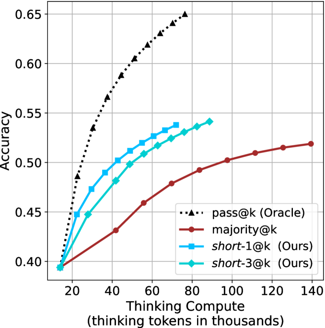
### Visual Description
## Line Chart: Accuracy vs. Thinking Compute
### Overview
This image presents a line chart illustrating the relationship between "Thinking Compute" (measured in thousands of tokens) and "Accuracy" for several different methods. The chart compares the performance of an "Oracle" method ("pass@k") against three other methods: "majority@k", "short-1@k", and "short-3@k". The methods "short-1@k" and "short-3@k" are identified as "Ours", indicating they are the results of the study.
### Components/Axes
* **X-axis:** "Thinking Compute (thinking tokens in thousands)". Scale ranges from approximately 10 to 140, with markers at 20, 40, 60, 80, 100, 120, and 140.
* **Y-axis:** "Accuracy". Scale ranges from approximately 0.40 to 0.65, with markers at 0.40, 0.45, 0.50, 0.55, 0.60, and 0.65.
* **Legend:** Located in the top-right corner of the chart. Contains the following labels and corresponding line styles/colors:
* "pass@k (Oracle)" - Black dashed line with diamond markers.
* "majority@k" - Brown solid line with circle markers.
* "short-1@k (Ours)" - Blue solid line with square markers.
* "short-3@k (Ours)" - Cyan solid line with triangle markers.
### Detailed Analysis
* **pass@k (Oracle):** This line exhibits a steep upward slope, starting at approximately 0.42 at a compute of 20 and reaching approximately 0.63 at a compute of 80. The line plateaus after 80, with minimal increase in accuracy.
* (20, 0.42)
* (40, 0.56)
* (60, 0.61)
* (80, 0.63)
* (100, 0.63)
* (120, 0.63)
* **majority@k:** This line shows a gradual upward slope, starting at approximately 0.40 at a compute of 20 and reaching approximately 0.52 at a compute of 120.
* (20, 0.40)
* (40, 0.45)
* (60, 0.48)
* (80, 0.50)
* (100, 0.51)
* (120, 0.52)
* **short-1@k (Ours):** This line demonstrates a moderate upward slope, starting at approximately 0.40 at a compute of 20 and reaching approximately 0.53 at a compute of 120.
* (20, 0.40)
* (40, 0.47)
* (60, 0.50)
* (80, 0.52)
* (100, 0.53)
* (120, 0.53)
* **short-3@k (Ours):** This line shows a similar trend to "short-1@k", but with slightly higher accuracy values. It starts at approximately 0.40 at a compute of 20 and reaches approximately 0.55 at a compute of 120.
* (20, 0.40)
* (40, 0.49)
* (60, 0.52)
* (80, 0.54)
* (100, 0.55)
* (120, 0.55)
### Key Observations
* The "pass@k (Oracle)" method significantly outperforms all other methods across the entire range of "Thinking Compute".
* "short-3@k (Ours)" consistently achieves higher accuracy than "short-1@k (Ours)".
* The performance gains for all methods diminish as "Thinking Compute" increases beyond 80.
* "majority@k" has the lowest accuracy across all compute values.
### Interpretation
The chart demonstrates the impact of "Thinking Compute" on the accuracy of different methods. The "Oracle" method, representing an ideal scenario, shows the potential maximum accuracy achievable with increasing compute. The "Ours" methods ("short-1@k" and "short-3@k") represent practical approaches that achieve reasonable accuracy, with "short-3@k" being more effective. The diminishing returns observed at higher compute values suggest that there is a limit to the benefits of increasing compute beyond a certain point. The relatively low performance of "majority@k" indicates that it is not a suitable method for this task. The data suggests that increasing the model's "thinking" capacity (as measured by tokens) improves performance, but the improvement is not linear and plateaus. The comparison between the "Ours" methods and the "Oracle" method highlights the gap between current practical approaches and the theoretical maximum performance.
</details>
(b) R $1$ - $7$ B
Figure 20: Small models - thinking compute comparison over math benchmarks.
<details>
<summary>x72.png Details</summary>
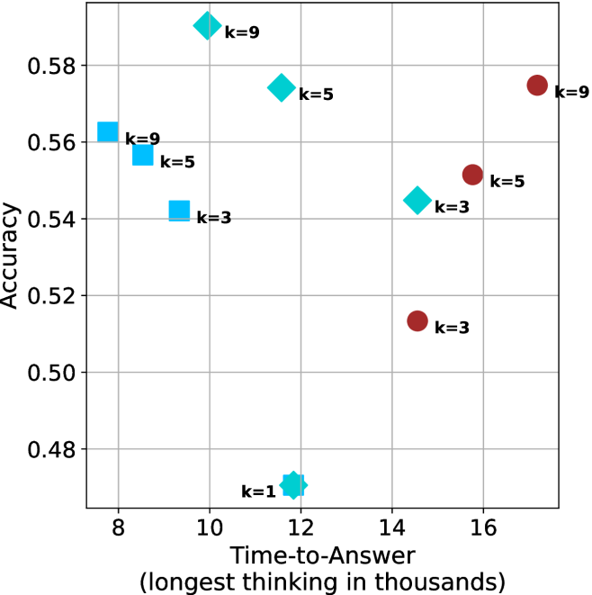
### Visual Description
\n
## Scatter Plot: Accuracy vs. Time-to-Answer for Different k Values
### Overview
This image presents a scatter plot illustrating the relationship between Accuracy and Time-to-Answer for different values of 'k'. Each point on the plot represents a data point with a specific 'k' value. The x-axis represents Time-to-Answer (in thousands), and the y-axis represents Accuracy. The plot uses different colors to distinguish data points based on their 'k' value.
### Components/Axes
* **X-axis:** Time-to-Answer (longest thinking in thousands). Scale ranges from approximately 8 to 17.
* **Y-axis:** Accuracy. Scale ranges from approximately 0.48 to 0.59.
* **Legend:** Located in the top-right corner, the legend maps colors to 'k' values:
* Blue: k=1
* Cyan: k=3
* Light Blue: k=5
* Red: k=9
* **Data Points:** Scatter points representing the accuracy and time-to-answer for each k value. Each point is labeled with its corresponding 'k' value.
### Detailed Analysis
The plot shows the following data points:
* **k=1:** (Approximately 12.2, 0.47). This point is blue.
* **k=3:** (Approximately 10.2, 0.54). This point is cyan.
* **k=3:** (Approximately 14.5, 0.52). This point is cyan.
* **k=5:** (Approximately 8.3, 0.56). This point is light blue.
* **k=5:** (Approximately 10.5, 0.57). This point is light blue.
* **k=5:** (Approximately 15.5, 0.55). This point is light blue.
* **k=9:** (Approximately 10.1, 0.58). This point is red.
* **k=9:** (Approximately 16.2, 0.58). This point is red.
**Trends:**
* For k=3, there is a slight positive trend as Time-to-Answer increases, Accuracy decreases.
* For k=5, there is a slight negative trend as Time-to-Answer increases, Accuracy decreases.
* For k=9, the accuracy remains relatively constant as Time-to-Answer increases.
* k=1 has the lowest accuracy and a relatively short Time-to-Answer.
### Key Observations
* The data points for k=9 consistently exhibit the highest accuracy values.
* The data points for k=1 exhibit the lowest accuracy.
* There is a noticeable spread in Time-to-Answer values for k=5, suggesting variability in performance.
* The data does not show a strong, clear correlation between Time-to-Answer and Accuracy across all 'k' values.
### Interpretation
The scatter plot suggests that the parameter 'k' significantly influences the accuracy of the system being evaluated. Higher values of 'k' (specifically k=9) are associated with higher accuracy, while lower values (k=1) result in lower accuracy. The Time-to-Answer appears to have a less consistent relationship with accuracy, and its effect seems to be modulated by the value of 'k'.
The variability in Time-to-Answer for k=5 could indicate that the system's performance is more sensitive to other factors when k=5. The relatively constant accuracy for k=9 across different Time-to-Answer values suggests that the system reaches a performance ceiling with this parameter setting.
This data could be used to optimize the 'k' parameter for the system to achieve the desired balance between accuracy and response time. Further investigation might be needed to understand the underlying reasons for the observed trends and to identify the factors that contribute to the variability in Time-to-Answer for k=5.
</details>
(a) LN-Nano-8B
<details>
<summary>x73.png Details</summary>
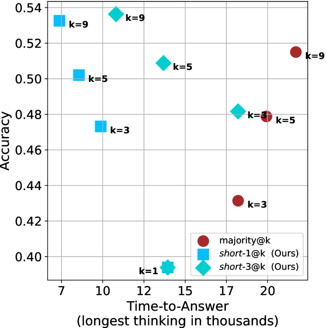
### Visual Description
\n
## Scatter Plot: Accuracy vs. Time-to-Answer
### Overview
This image presents a scatter plot comparing the accuracy and time-to-answer for different values of 'k' across three different methods: majority@k, short-1@k (labeled "Ours"), and short-3@k (labeled "Ours"). The plot visualizes the trade-off between accuracy and computational cost (represented by time-to-answer).
### Components/Axes
* **X-axis:** Time-to-Answer (longest thinking in thousands) - Scale ranges from approximately 7 to 21.
* **Y-axis:** Accuracy - Scale ranges from approximately 0.40 to 0.54.
* **Legend:** Located in the bottom-left corner.
* majority@k - Represented by red circles.
* short-1@k (Ours) - Represented by light blue squares.
* short-3@k (Ours) - Represented by teal diamonds.
* **Data Points:** Each point represents a specific combination of 'k' value and method. The 'k' value is labeled next to each data point.
### Detailed Analysis
Let's analyze each data series individually:
**1. majority@k (Red Circles):**
* The trend is generally upward, but with significant variation.
* k=1: Approximately (12, 0.40).
* k=3: Approximately (20, 0.42).
* k=5: Approximately (15, 0.50).
* k=9: Approximately (20, 0.52).
**2. short-1@k (Ours) (Light Blue Squares):**
* The trend is relatively flat.
* k=1: Approximately (8, 0.41).
* k=3: Approximately (10, 0.47).
* k=5: Approximately (11, 0.50).
* k=9: Approximately (10, 0.53).
**3. short-3@k (Ours) (Teal Diamonds):**
* The trend is generally upward.
* k=1: Approximately (13, 0.41).
* k=3: Approximately (16, 0.48).
* k=5: Approximately (16, 0.52).
* k=9: Approximately (18, 0.54).
### Key Observations
* For lower values of 'k' (1 and 3), the 'short-3@k' method generally outperforms the other two in terms of accuracy.
* As 'k' increases, the 'majority@k' method shows the highest accuracy, but also requires a longer time-to-answer.
* The 'short-1@k' method consistently has the lowest accuracy across all 'k' values.
* The 'short-3@k' method appears to offer a good balance between accuracy and time-to-answer, especially for higher 'k' values.
* There is a noticeable gap in accuracy between k=3 and k=5 for all methods.
### Interpretation
The data suggests that increasing the value of 'k' generally improves accuracy, but at the cost of increased computation time. The 'majority@k' method achieves the highest accuracy, but it is also the most computationally expensive. The 'short-1@k' and 'short-3@k' methods offer faster alternatives, with 'short-3@k' providing a better accuracy-time trade-off.
The "Ours" label indicates that the 'short-1@k' and 'short-3@k' methods are novel approaches proposed by the authors of this study. The plot demonstrates the effectiveness of these methods compared to the traditional 'majority@k' approach.
The scatter plot highlights the importance of selecting an appropriate value of 'k' based on the specific requirements of the application. If accuracy is paramount, a higher value of 'k' and the 'majority@k' method may be preferred. However, if speed is critical, the 'short-3@k' method may be a more suitable choice. The gap in accuracy between k=3 and k=5 suggests a potential diminishing return in accuracy for increasing k beyond 5.
</details>
(b) R $1$ - $7$ B
Figure 21: Small models - time-to-answer comparison over math benchmarks.
<details>
<summary>x74.png Details</summary>
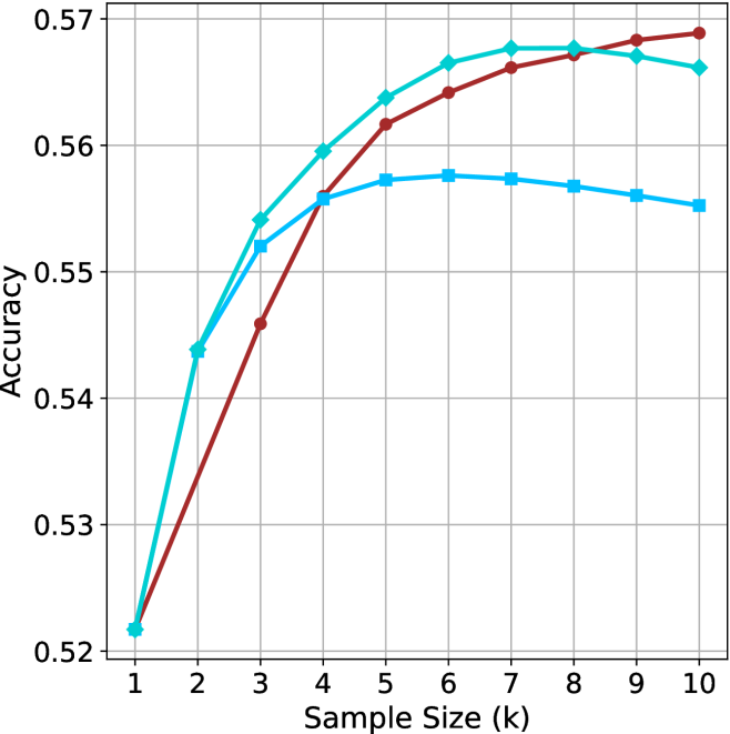
### Visual Description
\n
## Line Chart: Accuracy vs. Sample Size
### Overview
This image presents a line chart illustrating the relationship between sample size and accuracy. Three distinct lines represent different models or conditions, showing how accuracy changes as the sample size increases from 1k to 10k. The chart uses a grid background for easier readability.
### Components/Axes
* **X-axis:** Labeled "Sample Size (k)", ranging from 1 to 10, with increments of 1.
* **Y-axis:** Labeled "Accuracy", ranging from 0.52 to 0.57, with increments of 0.01.
* **Lines:** Three lines are present, each with a distinct color:
* Cyan (Light Blue)
* Red
* Blue
### Detailed Analysis
Let's analyze each line individually, noting trends and approximate data points.
* **Cyan Line:** This line shows a consistently upward trend, starting at approximately 0.525 at a sample size of 1k. It reaches a peak of approximately 0.57 at a sample size of 7k, then plateaus, remaining around 0.57 for sample sizes 8k, 9k, and 10k.
* **Red Line:** This line also exhibits an upward trend, but it is steeper than the cyan line initially. It starts at approximately 0.525 at 1k, rises rapidly, and reaches a peak of approximately 0.572 at a sample size of 6k. It then plateaus, remaining around 0.57 for sample sizes 7k, 8k, 9k, and 10k.
* **Blue Line:** This line shows a different pattern. It starts at approximately 0.525 at 1k, rises to a peak of approximately 0.56 at a sample size of 4k, and then declines slightly to approximately 0.555 at 10k.
Here's a table summarizing approximate data points:
| Sample Size (k) | Cyan (Accuracy) | Red (Accuracy) | Blue (Accuracy) |
|---|---|---|---|
| 1 | 0.525 | 0.525 | 0.525 |
| 2 | 0.535 | 0.545 | 0.54 |
| 3 | 0.55 | 0.56 | 0.55 |
| 4 | 0.56 | 0.568 | 0.56 |
| 5 | 0.565 | 0.57 | 0.558 |
| 6 | 0.568 | 0.572 | 0.557 |
| 7 | 0.57 | 0.57 | 0.557 |
| 8 | 0.57 | 0.57 | 0.556 |
| 9 | 0.57 | 0.57 | 0.556 |
| 10 | 0.57 | 0.57 | 0.555 |
### Key Observations
* The red and cyan lines converge at higher sample sizes, indicating that their accuracy levels become similar.
* The blue line demonstrates a different behavior, peaking at 4k and then decreasing, suggesting diminishing returns or potential overfitting.
* All three lines start at the same accuracy level at a sample size of 1k.
### Interpretation
The chart suggests that increasing the sample size generally improves accuracy, but the rate of improvement varies depending on the model or condition. The red line initially shows the most significant gains in accuracy, but the cyan line catches up as the sample size increases. The blue line's behavior indicates that there might be an optimal sample size for that particular model, beyond which increasing the sample size does not lead to further improvements and may even decrease accuracy. This could be due to the model becoming overly specialized to the training data (overfitting). The convergence of the red and cyan lines suggests that they may be approaching a saturation point in terms of accuracy, where further increases in sample size will not yield substantial gains. The data implies that the choice of sample size should be carefully considered, balancing the cost of data acquisition with the potential benefits in accuracy.
</details>
(a) LN-Nano-8B
<details>
<summary>x75.png Details</summary>
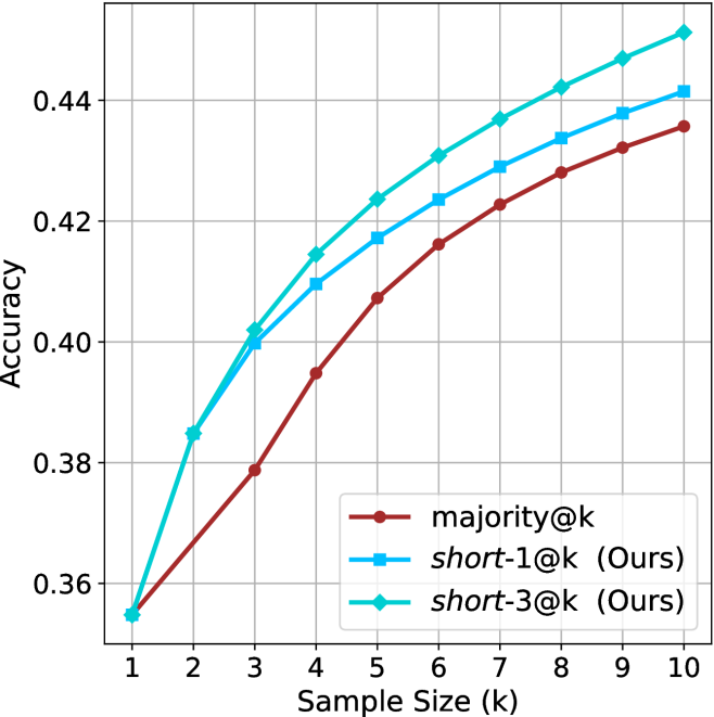
### Visual Description
## Line Chart: Accuracy vs. Sample Size
### Overview
This image presents a line chart illustrating the relationship between sample size (k) and accuracy for three different methods: majority@k, short-1@k (labeled "Ours"), and short-3@k (labeled "Ours"). The chart displays how accuracy increases as the sample size grows for each method.
### Components/Axes
* **X-axis:** "Sample Size (k)" ranging from 1 to 10, with tick marks at each integer value.
* **Y-axis:** "Accuracy" ranging from 0.36 to 0.45, with tick marks at 0.36, 0.38, 0.40, 0.42, and 0.44.
* **Legend:** Located in the top-right corner, identifying the three data series:
* majority@k (represented by a red line with circular markers)
* short-1@k (Ours) (represented by a blue line with circular markers)
* short-3@k (Ours) (represented by a light blue/cyan line with circular markers)
* **Gridlines:** A light gray grid is present to aid in reading values.
### Detailed Analysis
* **majority@k (Red Line):** The line starts at approximately 0.365 at k=1. It increases steadily, but at a decreasing rate, reaching approximately 0.43 at k=10.
* k=1: Accuracy ≈ 0.365
* k=2: Accuracy ≈ 0.38
* k=3: Accuracy ≈ 0.395
* k=4: Accuracy ≈ 0.408
* k=5: Accuracy ≈ 0.418
* k=6: Accuracy ≈ 0.424
* k=7: Accuracy ≈ 0.428
* k=8: Accuracy ≈ 0.431
* k=9: Accuracy ≈ 0.433
* k=10: Accuracy ≈ 0.43
* **short-1@k (Ours) (Blue Line):** This line exhibits a steeper initial increase than majority@k. It starts at approximately 0.365 at k=1 and rises rapidly, reaching approximately 0.44 at k=7, then plateaus.
* k=1: Accuracy ≈ 0.365
* k=2: Accuracy ≈ 0.40
* k=3: Accuracy ≈ 0.42
* k=4: Accuracy ≈ 0.43
* k=5: Accuracy ≈ 0.435
* k=6: Accuracy ≈ 0.44
* k=7: Accuracy ≈ 0.44
* k=8: Accuracy ≈ 0.438
* k=9: Accuracy ≈ 0.437
* k=10: Accuracy ≈ 0.436
* **short-3@k (Ours) (Cyan Line):** This line shows the most rapid initial increase, starting at approximately 0.365 at k=1 and quickly surpassing the other two methods. It reaches approximately 0.445 at k=6 and then plateaus.
* k=1: Accuracy ≈ 0.365
* k=2: Accuracy ≈ 0.41
* k=3: Accuracy ≈ 0.43
* k=4: Accuracy ≈ 0.44
* k=5: Accuracy ≈ 0.443
* k=6: Accuracy ≈ 0.445
* k=7: Accuracy ≈ 0.445
* k=8: Accuracy ≈ 0.444
* k=9: Accuracy ≈ 0.443
* k=10: Accuracy ≈ 0.442
### Key Observations
* The "short-3@k (Ours)" method consistently outperforms both "majority@k" and "short-1@k (Ours)" across all sample sizes.
* All three methods show diminishing returns in accuracy as the sample size increases beyond k=6.
* The "short-1@k (Ours)" method initially lags behind "short-3@k (Ours)" but converges towards similar accuracy levels at larger sample sizes.
### Interpretation
The chart demonstrates the effectiveness of the "short-3@k (Ours)" method in achieving higher accuracy compared to the "majority@k" baseline and the "short-1@k (Ours)" variant, particularly with smaller sample sizes. The plateauing of accuracy for all methods at larger sample sizes suggests that the benefit of increasing the sample size diminishes beyond a certain point. This could indicate that the models are reaching their capacity to extract meaningful information from the data, or that the inherent noise in the data limits further improvements. The "Ours" methods likely leverage more sophisticated techniques than the simple majority voting scheme, allowing them to achieve better performance, especially when limited data is available. The difference between "short-1@k" and "short-3@k" suggests that utilizing more information (as in "short-3@k") initially provides a significant boost, but the marginal gain decreases as the sample size grows.
</details>
(b) R $1$ - $7$ B
Figure 22: Small models - sample size ( $k$ ) comparison over GPQA-D.
<details>
<summary>x76.png Details</summary>
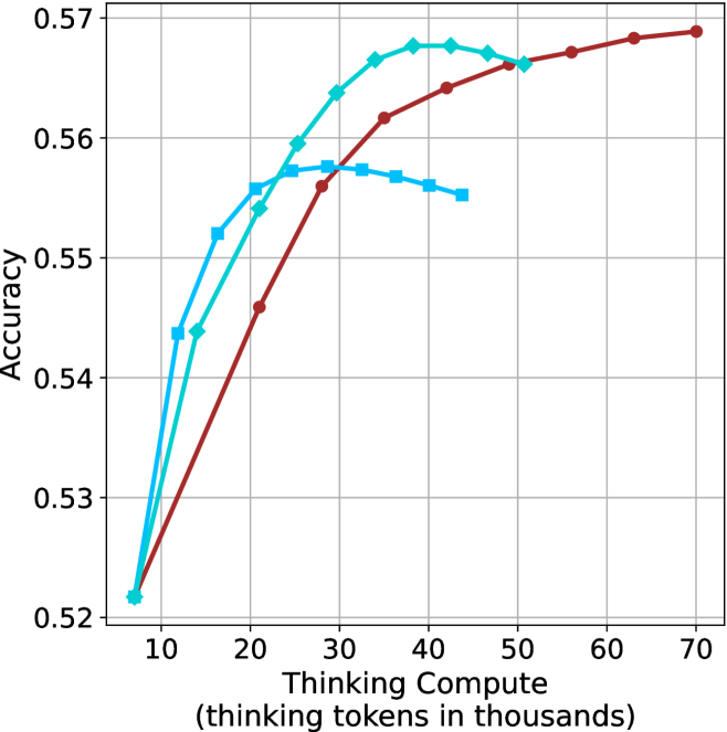
### Visual Description
## Line Chart: Accuracy vs. Thinking Compute
### Overview
This image presents a line chart illustrating the relationship between "Thinking Compute" (measured in thousands of tokens) and "Accuracy". Three distinct data series are plotted, each represented by a different colored line. The chart appears to demonstrate how accuracy improves with increased computational effort (thinking tokens).
### Components/Axes
* **X-axis:** "Thinking Compute (thinking tokens in thousands)". Scale ranges from approximately 8 to 70, with markers at 10, 20, 30, 40, 50, 60, and 70.
* **Y-axis:** "Accuracy". Scale ranges from approximately 0.52 to 0.57, with markers at 0.52, 0.53, 0.54, 0.55, 0.56, and 0.57.
* **Data Series:** Three lines are present, each representing a different model or configuration.
* **Red Line:** Represents a data series with a generally upward trend.
* **Cyan Line:** Represents a data series that initially rises sharply, plateaus, and then slightly declines.
* **Blue Line:** Represents a data series that rises quickly and then plateaus.
* **Grid:** A light gray grid is overlaid on the chart to aid in reading values.
### Detailed Analysis
Let's analyze each line individually:
* **Red Line:** This line exhibits a consistent upward trend.
* At x = 10, y ≈ 0.525
* At x = 20, y ≈ 0.545
* At x = 30, y ≈ 0.56
* At x = 40, y ≈ 0.565
* At x = 50, y ≈ 0.567
* At x = 60, y ≈ 0.568
* At x = 70, y ≈ 0.57
* **Cyan Line:** This line shows a rapid initial increase, followed by a plateau and a slight decrease.
* At x = 10, y ≈ 0.527
* At x = 20, y ≈ 0.55
* At x = 30, y ≈ 0.567
* At x = 40, y ≈ 0.565
* At x = 50, y ≈ 0.564
* At x = 60, y ≈ 0.562
* At x = 70, y ≈ 0.56
* **Blue Line:** This line demonstrates a quick rise and then levels off.
* At x = 10, y ≈ 0.528
* At x = 20, y ≈ 0.548
* At x = 30, y ≈ 0.562
* At x = 40, y ≈ 0.562
* At x = 50, y ≈ 0.563
* At x = 60, y ≈ 0.563
* At x = 70, y ≈ 0.563
### Key Observations
* All three lines show an increase in accuracy as "Thinking Compute" increases.
* The red line consistently demonstrates the highest accuracy across the entire range of "Thinking Compute".
* The cyan line exhibits the most pronounced plateau and slight decline at higher "Thinking Compute" values.
* The blue line reaches a plateau earlier than the red line.
* The initial gains in accuracy are most significant for all three lines.
### Interpretation
The chart suggests that increasing the amount of "Thinking Compute" generally leads to improved accuracy. However, there appear to be diminishing returns. The red line indicates that a particular model or configuration benefits most from increased computation, achieving the highest accuracy. The cyan line suggests that beyond a certain point, additional computation may not yield significant improvements and could even lead to a slight decrease in accuracy, potentially due to overfitting or other factors. The blue line shows a rapid initial improvement, but then plateaus, indicating that it reaches its maximum potential accuracy relatively quickly.
This data could be used to optimize the allocation of computational resources. For example, it might be more efficient to invest in improving the model represented by the cyan line rather than continuing to increase the "Thinking Compute" for that model beyond a certain threshold. The chart highlights the importance of finding the right balance between computational cost and accuracy. The fact that all lines increase suggests that "Thinking Compute" is a valuable factor in improving accuracy, but the specific benefits vary depending on the model or configuration.
</details>
(a) LN-Nano-8B
<details>
<summary>x77.png Details</summary>
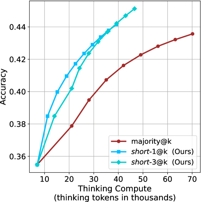
### Visual Description
## Line Chart: Accuracy vs. Thinking Compute
### Overview
This image presents a line chart illustrating the relationship between "Thinking Compute" (measured in thousands of tokens) and "Accuracy" for three different methods: `majority@k`, `short-1@k (Ours)`, and `short-3@k (Ours)`. The chart aims to demonstrate how performance changes as the computational resources allocated to the "thinking" process increase.
### Components/Axes
* **X-axis:** "Thinking Compute (thinking tokens in thousands)". Scale ranges from approximately 8 to 70, with markers at 10, 20, 30, 40, 50, 60, and 70.
* **Y-axis:** "Accuracy". Scale ranges from approximately 0.35 to 0.45, with markers at 0.36, 0.38, 0.40, 0.42, and 0.44.
* **Legend:** Located in the bottom-right corner. Contains the following entries:
* `majority@k` (represented by a dark red line with circular markers)
* `short-1@k (Ours)` (represented by a light blue line with circular markers)
* `short-3@k (Ours)` (represented by a cyan line with triangular markers)
* **Gridlines:** A light gray grid is present to aid in reading values.
### Detailed Analysis
* **majority@k (Dark Red Line):** The line slopes upward, indicating increasing accuracy with increasing thinking compute.
* At Thinking Compute = 10, Accuracy ≈ 0.365
* At Thinking Compute = 20, Accuracy ≈ 0.385
* At Thinking Compute = 30, Accuracy ≈ 0.405
* At Thinking Compute = 40, Accuracy ≈ 0.418
* At Thinking Compute = 50, Accuracy ≈ 0.428
* At Thinking Compute = 60, Accuracy ≈ 0.434
* At Thinking Compute = 70, Accuracy ≈ 0.437
* **short-1@k (Ours) (Light Blue Line):** This line exhibits a steeper upward slope than `majority@k`, suggesting a more significant improvement in accuracy with increased thinking compute.
* At Thinking Compute = 10, Accuracy ≈ 0.375
* At Thinking Compute = 20, Accuracy ≈ 0.405
* At Thinking Compute = 30, Accuracy ≈ 0.425
* At Thinking Compute = 40, Accuracy ≈ 0.438
* At Thinking Compute = 50, Accuracy ≈ 0.442
* At Thinking Compute = 60, Accuracy ≈ 0.443
* At Thinking Compute = 70, Accuracy ≈ 0.443
* **short-3@k (Ours) (Cyan Line):** This line shows the steepest upward slope, indicating the most substantial improvement in accuracy with increasing thinking compute.
* At Thinking Compute = 10, Accuracy ≈ 0.38
* At Thinking Compute = 20, Accuracy ≈ 0.415
* At Thinking Compute = 30, Accuracy ≈ 0.43
* At Thinking Compute = 40, Accuracy ≈ 0.44
* At Thinking Compute = 50, Accuracy ≈ 0.445
* At Thinking Compute = 60, Accuracy ≈ 0.446
* At Thinking Compute = 70, Accuracy ≈ 0.447
### Key Observations
* `short-3@k (Ours)` consistently outperforms both `short-1@k (Ours)` and `majority@k` across all levels of thinking compute.
* `short-1@k (Ours)` outperforms `majority@k` across all levels of thinking compute.
* The rate of improvement in accuracy diminishes as thinking compute increases for all three methods. The curves begin to flatten out at higher compute values.
* The differences between the methods are most pronounced at lower thinking compute values.
### Interpretation
The data suggests that increasing the amount of "thinking compute" (tokens) generally leads to improved accuracy for all three methods. However, the "Ours" methods (`short-1@k` and `short-3@k`) demonstrate superior performance compared to the `majority@k` baseline. Notably, `short-3@k` achieves the highest accuracy, indicating that utilizing more "thinking" steps (as implied by the "3" in the name) yields the best results. The flattening of the curves at higher compute values suggests a point of diminishing returns – beyond a certain level of compute, the gains in accuracy become marginal. This could be due to limitations in the model's capacity or the inherent difficulty of the task. The fact that the "Ours" methods show a more significant initial improvement suggests they are more effectively utilizing the increased compute resources, potentially through a more efficient reasoning process.
</details>
(b) R $1$ - $7$ B
Figure 23: Small models - thinking compute comparison over GPQA-D.
<details>
<summary>x78.png Details</summary>
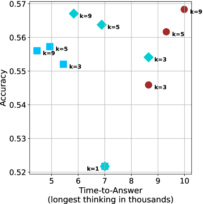
### Visual Description
\n
## Scatter Plot: Accuracy vs. Time-to-Answer with k-Value Differentiation
### Overview
This image presents a scatter plot illustrating the relationship between Accuracy and Time-to-Answer, with data points differentiated by the 'k' value. The x-axis represents Time-to-Answer in thousands of units, and the y-axis represents Accuracy. Each data point is a diamond shape, colored either red or blue, and labeled with its corresponding 'k' value.
### Components/Axes
* **X-axis:** Time-to-Answer (longest thinking in thousands) - Scale ranges from approximately 5 to 10.
* **Y-axis:** Accuracy - Scale ranges from approximately 0.52 to 0.57.
* **Data Points:** Diamond-shaped markers, colored red and blue.
* **Labels:** Each data point is labeled with "k=" followed by a numerical value (1, 3, 5, 9).
* **Color Coding:**
* Blue diamonds represent k values of 1, 3, 5, and 9.
* Red diamonds represent k values of 3, 5, and 9.
### Detailed Analysis
The plot contains data points for k values of 1, 3, 5, and 9. Let's analyze each k value's data points:
* **k=1:** One blue diamond located at approximately (6.3, 0.52).
* **k=3:** Two data points:
* One blue diamond located at approximately (5.8, 0.55).
* One red diamond located at approximately (9.2, 0.54).
* **k=5:** Two data points:
* One blue diamond located at approximately (6.7, 0.56).
* One red diamond located at approximately (9.5, 0.56).
* **k=9:** Two data points:
* One blue diamond located at approximately (5.3, 0.56).
* One red diamond located at approximately (10.0, 0.57).
**Trends:**
* Generally, as Time-to-Answer increases, Accuracy tends to increase, but this is not a strict linear relationship.
* For lower Time-to-Answer values (around 5.5-6.5), Accuracy is relatively stable around 0.55-0.56.
* For higher Time-to-Answer values (around 9-10), Accuracy is also relatively stable around 0.56-0.57.
### Key Observations
* There is overlap in data points for k=3, k=5, and k=9, with both red and blue diamonds present for each of these values.
* k=1 has only one data point, making it difficult to draw conclusions about its trend.
* The red and blue diamonds for the same k value do not necessarily have similar Accuracy or Time-to-Answer values. For example, k=3 has a blue point at (5.8, 0.55) and a red point at (9.2, 0.54).
### Interpretation
The data suggests that there is a trade-off between Time-to-Answer and Accuracy. Increasing the Time-to-Answer generally leads to higher Accuracy, but the relationship is not perfectly correlated. The 'k' value appears to influence this relationship, but the effect is complex. The presence of both red and blue diamonds for k=3, 5, and 9 indicates that the color coding (which is not explained in the image) represents another variable or condition that affects the Accuracy and Time-to-Answer.
The scatter plot could be representing the performance of a model or system with a parameter 'k' that controls its complexity or processing time. The red and blue colors might represent different configurations or datasets used to evaluate the model. The fact that higher Time-to-Answer values generally correspond to higher Accuracy suggests that more complex or time-consuming processing can lead to better results, but the benefits may diminish beyond a certain point. The outliers (points that deviate significantly from the general trend) could indicate specific cases where the model performs particularly well or poorly.
</details>
(a) LN-Nano-8B
<details>
<summary>x79.png Details</summary>
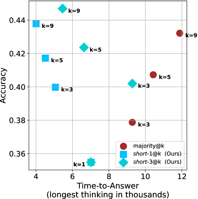
### Visual Description
\n
## Scatter Plot: Accuracy vs. Time-to-Answer
### Overview
This image presents a scatter plot comparing the accuracy and time-to-answer for different values of 'k' in three different methods: majority@k, short-1@k (labeled "Ours"), and short-3@k (labeled "Ours"). The x-axis represents the time-to-answer in thousands of units, and the y-axis represents the accuracy. Each data point is labeled with the corresponding 'k' value.
### Components/Axes
* **X-axis:** Time-to-Answer (longest thinking in thousands) - Scale ranges from approximately 4 to 12.
* **Y-axis:** Accuracy - Scale ranges from approximately 0.36 to 0.44.
* **Legend:** Located in the bottom-right corner.
* majority@k - Represented by red circles.
* short-1@k (Ours) - Represented by light blue squares.
* short-3@k (Ours) - Represented by teal diamonds.
* **Data Labels:** Each data point is labeled with the value of 'k'.
### Detailed Analysis
The plot shows the relationship between accuracy and time-to-answer for different values of 'k' for each method.
**majority@k (Red Circles):**
* The data points generally trend upwards, indicating that as time-to-answer increases, accuracy also increases.
* k=1: Approximately (8, 0.36)
* k=3: Approximately (9.5, 0.38)
* k=5: Approximately (10.5, 0.41)
* k=9: Approximately (12, 0.43)
**short-1@k (Light Blue Squares):**
* The data points show a relatively flat trend, with accuracy remaining fairly constant as time-to-answer increases.
* k=3: Approximately (4.5, 0.40)
* k=5: Approximately (5, 0.42)
* k=9: Approximately (4, 0.44)
**short-3@k (Teal Diamonds):**
* The data points show an upward trend, but less pronounced than majority@k.
* k=1: Approximately (6, 0.36)
* k=5: Approximately (6.5, 0.42)
* k=9: Approximately (7, 0.44)
### Key Observations
* For lower values of 'k' (1-3), short-1@k and short-3@k generally achieve higher accuracy than majority@k.
* As 'k' increases to 5 and 9, majority@k begins to approach and even surpass the accuracy of short-1@k and short-3@k.
* short-1@k exhibits the most consistent accuracy across different 'k' values, with minimal variation.
* short-3@k shows a more noticeable increase in accuracy as 'k' increases.
### Interpretation
The data suggests a trade-off between accuracy and time-to-answer. The "Ours" methods (short-1@k and short-3@k) prioritize faster response times (lower time-to-answer) at the cost of some accuracy, particularly for smaller values of 'k'. The majority@k method, on the other hand, requires more time to achieve higher accuracy, especially as 'k' increases.
The consistent accuracy of short-1@k indicates that it may be a good choice when a fast response time is critical, even if it means sacrificing some accuracy. The increasing accuracy of short-3@k with larger 'k' suggests that it could be a viable option when a balance between speed and accuracy is desired.
The fact that majority@k eventually surpasses the "Ours" methods at higher 'k' values suggests that, given enough time, a simple majority vote can achieve comparable or even better accuracy. However, the significant time cost associated with majority@k may make it impractical in certain applications.
The 'k' parameter likely represents the number of candidates or options considered during the answer selection process. A higher 'k' value implies a more thorough search, potentially leading to better accuracy but also increased computational cost and time-to-answer.
</details>
(b) R $1$ - $7$ B
Figure 24: Small models - time-to-answer comparison over GPQA-D.
## Appendix E GPQA-D sequential results
The results for GPQA-D when accounting for sequential compute are presented in Figure ˜ 25.
<details>
<summary>x80.png Details</summary>
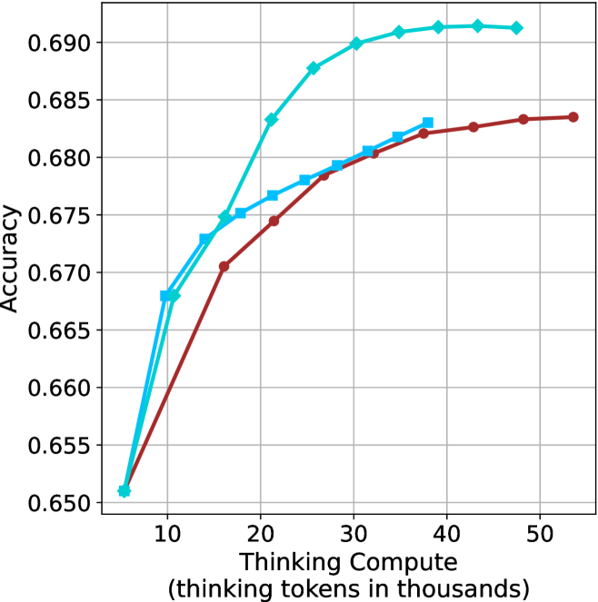
### Visual Description
\n
## Line Chart: Accuracy vs. Thinking Compute
### Overview
This image presents a line chart illustrating the relationship between "Accuracy" and "Thinking Compute" (measured in thousands of tokens). Two distinct data series are plotted, showing how accuracy changes with increasing computational effort. The chart appears to be evaluating the performance of two different models or approaches.
### Components/Axes
* **X-axis:** "Thinking Compute (thinking tokens in thousands)". Scale ranges from approximately 0 to 50, with markers at 10, 20, 30, 40, and 50.
* **Y-axis:** "Accuracy". Scale ranges from approximately 0.650 to 0.690, with markers at 0.650, 0.660, 0.670, 0.680, 0.690.
* **Data Series 1:** Represented by a cyan/light blue line.
* **Data Series 2:** Represented by a maroon/dark red line.
* **Gridlines:** A standard Cartesian grid is present, aiding in value estimation.
### Detailed Analysis
**Data Series 1 (Cyan/Light Blue):**
The cyan line exhibits an upward trend, indicating increasing accuracy with increasing "Thinking Compute".
* At 10 (thousands of tokens), Accuracy is approximately 0.671.
* At 20 (thousands of tokens), Accuracy is approximately 0.676.
* At 30 (thousands of tokens), Accuracy is approximately 0.685.
* At 40 (thousands of tokens), Accuracy is approximately 0.689.
* At 50 (thousands of tokens), Accuracy is approximately 0.690.
**Data Series 2 (Maroon/Dark Red):**
The maroon line also shows an upward trend, but it plateaus more quickly than the cyan line.
* At 10 (thousands of tokens), Accuracy is approximately 0.669.
* At 20 (thousands of tokens), Accuracy is approximately 0.675.
* At 30 (thousands of tokens), Accuracy is approximately 0.682.
* At 40 (thousands of tokens), Accuracy is approximately 0.684.
* At 50 (thousands of tokens), Accuracy is approximately 0.684.
### Key Observations
* Both data series demonstrate a positive correlation between "Thinking Compute" and "Accuracy".
* The cyan line consistently shows higher accuracy values than the maroon line across all "Thinking Compute" levels.
* The maroon line's accuracy growth slows down significantly after 30 (thousands of tokens), suggesting diminishing returns.
* The cyan line continues to show improvement, albeit at a decreasing rate, even at 50 (thousands of tokens).
### Interpretation
The chart suggests that increasing the amount of "Thinking Compute" generally improves accuracy. However, the rate of improvement varies between the two data series. The cyan line represents a model or approach that benefits more significantly from increased computation, while the maroon line reaches a point of diminishing returns. This could indicate that the maroon model has reached its performance limit with the given architecture or training data, while the cyan model still has potential for further improvement with more computational resources. The difference in performance between the two lines could be due to differences in model complexity, training methodology, or underlying algorithms. The chart highlights the importance of balancing computational cost with desired accuracy levels. It also suggests that further investment in "Thinking Compute" may be more beneficial for the cyan model than for the maroon model.
</details>
(a) LN-Super-49B
<details>
<summary>x81.png Details</summary>
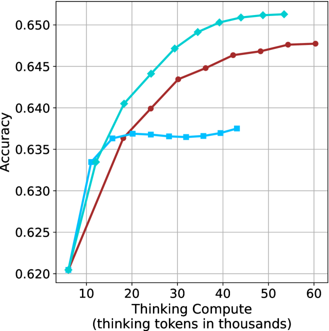
### Visual Description
## Line Chart: Accuracy vs. Thinking Compute
### Overview
The image presents a line chart illustrating the relationship between "Thinking Compute" (measured in thousands of tokens) and "Accuracy". Three distinct data series are plotted, each represented by a different colored line. The chart appears to demonstrate how accuracy improves with increased computational effort (thinking tokens).
### Components/Axes
* **X-axis:** "Thinking Compute (thinking tokens in thousands)". The scale ranges from approximately 5 to 60, with markers at 10, 20, 30, 40, 50, and 60.
* **Y-axis:** "Accuracy". The scale ranges from approximately 0.620 to 0.650, with markers at 0.620, 0.625, 0.630, 0.635, 0.640, 0.645, and 0.650.
* **Data Series:** Three lines are present, each with a unique color:
* Light Blue
* Red
* Dark Blue
### Detailed Analysis
* **Light Blue Line:** This line starts at approximately (5, 0.621) and exhibits a steep upward trend until around (30, 0.648). After 30, the slope decreases, and the line plateaus around (60, 0.649).
* (5, 0.621)
* (10, 0.634)
* (20, 0.642)
* (30, 0.648)
* (40, 0.649)
* (50, 0.649)
* (60, 0.649)
* **Red Line:** This line begins at approximately (5, 0.623) and shows a consistent upward trend, though less steep than the light blue line. It reaches a peak around (40, 0.649) and then slightly decreases to approximately (60, 0.647).
* (5, 0.623)
* (10, 0.635)
* (20, 0.643)
* (30, 0.646)
* (40, 0.649)
* (50, 0.648)
* (60, 0.647)
* **Dark Blue Line:** This line starts at approximately (5, 0.625) and initially rises, but its growth slows significantly after (20, 0.637). It plateaus around (60, 0.637).
* (5, 0.625)
* (10, 0.632)
* (20, 0.637)
* (30, 0.637)
* (40, 0.637)
* (50, 0.637)
* (60, 0.637)
### Key Observations
* The light blue line consistently demonstrates the highest accuracy across all "Thinking Compute" values.
* The dark blue line shows the least improvement in accuracy with increasing "Thinking Compute".
* All three lines exhibit diminishing returns in accuracy as "Thinking Compute" increases beyond 30 thousand tokens.
* The red line shows a steady increase in accuracy, but remains below the light blue line.
### Interpretation
The chart suggests that increasing the amount of "Thinking Compute" (as measured by tokens) generally improves accuracy, but there are diminishing returns. The light blue line likely represents a model or approach that benefits most significantly from increased computational resources. The dark blue line suggests a model or approach that is less sensitive to increased "Thinking Compute", potentially due to inherent limitations or a different underlying mechanism. The red line represents an intermediate case.
The plateauing of all lines indicates that there is a point beyond which additional computational effort does not yield substantial gains in accuracy. This could be due to factors such as data limitations, model capacity, or the inherent complexity of the task. The differences between the lines could be due to different algorithms, model architectures, or training data. Further investigation would be needed to determine the specific reasons for these variations.
</details>
(b) R $1$ - $32$ B
<details>
<summary>x82.png Details</summary>
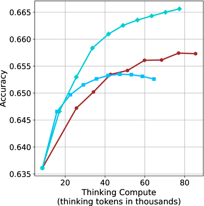
### Visual Description
\n
## Line Chart: Accuracy vs. Thinking Compute
### Overview
The image presents a line chart illustrating the relationship between "Thinking Compute" (measured in thousands of tokens) and "Accuracy". Three distinct data series are plotted, each represented by a different colored line. The chart demonstrates how accuracy changes as the amount of thinking compute increases.
### Components/Axes
* **X-axis:** "Thinking Compute (thinking tokens in thousands)". Scale ranges from approximately 0 to 80, with markers at 0, 20, 40, 60, and 80.
* **Y-axis:** "Accuracy". Scale ranges from approximately 0.635 to 0.665, with gridlines at 0.640, 0.645, 0.650, 0.655, 0.660, and 0.665.
* **Data Series:** Three lines are present, each with a distinct color:
* Light Blue
* Red
* Teal
### Detailed Analysis
* **Light Blue Line:** This line exhibits a strong upward trend, starting at approximately 0.637 at 0 tokens and reaching approximately 0.664 at 80 tokens. The slope is steepest between 20 and 60 tokens.
* (0, 0.637)
* (20, 0.655)
* (40, 0.662)
* (60, 0.663)
* (80, 0.664)
* **Red Line:** This line also shows an upward trend, but it is less pronounced than the light blue line. It begins at approximately 0.638 at 0 tokens and reaches approximately 0.658 at 80 tokens. The slope is steepest between 0 and 20 tokens, then plateaus.
* (0, 0.638)
* (20, 0.648)
* (40, 0.653)
* (60, 0.655)
* (80, 0.658)
* **Teal Line:** This line initially rises rapidly, then plateaus and even slightly declines. It starts at approximately 0.639 at 0 tokens, peaks around 0.652 at 40 tokens, and then decreases to approximately 0.652 at 80 tokens.
* (0, 0.639)
* (20, 0.651)
* (40, 0.652)
* (60, 0.652)
* (80, 0.652)
### Key Observations
* The light blue line consistently demonstrates the highest accuracy across all values of "Thinking Compute".
* The teal line shows diminishing returns, with accuracy plateauing and slightly decreasing after 40 tokens.
* The red line exhibits the slowest rate of accuracy improvement.
* All three lines start at similar accuracy levels (around 0.637-0.639).
### Interpretation
The chart suggests that increasing "Thinking Compute" generally improves "Accuracy", but the rate of improvement varies significantly depending on the data series. The light blue data series indicates a strong positive correlation between compute and accuracy, suggesting that more compute consistently leads to better performance. The teal line suggests that there is a point of diminishing returns, where additional compute does not yield significant accuracy gains. The red line indicates a more modest improvement in accuracy with increased compute.
This data could be related to the performance of a machine learning model or algorithm, where "Thinking Compute" represents the computational resources allocated to the reasoning process, and "Accuracy" represents the correctness of the model's output. The different lines could represent different model architectures, training methods, or hyperparameter settings. The chart highlights the importance of optimizing compute resources to achieve the best possible accuracy, while also considering the potential for diminishing returns.
</details>
(c) QwQ-32B
<details>
<summary>x83.png Details</summary>
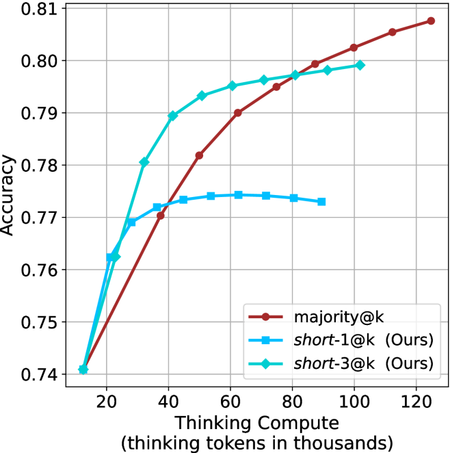
### Visual Description
## Line Chart: Accuracy vs. Thinking Compute
### Overview
This image presents a line chart illustrating the relationship between "Thinking Compute" (measured in thousands of tokens) and "Accuracy" for three different methods: "majority@k", "short-1@k (Ours)", and "short-3@k (Ours)". The chart displays how accuracy changes as the amount of thinking compute increases.
### Components/Axes
* **X-axis:** "Thinking Compute (thinking tokens in thousands)". Scale ranges from approximately 0 to 120, with markers at 20, 40, 60, 80, 100, and 120.
* **Y-axis:** "Accuracy". Scale ranges from approximately 0.74 to 0.81, with gridlines at 0.75, 0.76, 0.77, 0.78, 0.79, 0.80, and 0.81.
* **Legend:** Located in the bottom-right corner. Contains the following labels and corresponding colors:
* "majority@k" - Dark Red
* "short-1@k (Ours)" - Orange-Red
* "short-3@k (Ours)" - Light Blue
### Detailed Analysis
* **majority@k (Dark Red):** The line slopes upward, indicating increasing accuracy with increasing thinking compute.
* At 20 (Thinking Compute), Accuracy is approximately 0.745.
* At 40, Accuracy is approximately 0.775.
* At 60, Accuracy is approximately 0.788.
* At 80, Accuracy is approximately 0.795.
* At 100, Accuracy is approximately 0.803.
* At 120, Accuracy is approximately 0.808.
* **short-1@k (Ours) (Orange-Red):** The line initially rises sharply, then plateaus.
* At 20, Accuracy is approximately 0.748.
* At 40, Accuracy is approximately 0.776.
* At 60, Accuracy is approximately 0.791.
* At 80, Accuracy is approximately 0.797.
* At 100, Accuracy is approximately 0.801.
* At 120, Accuracy is approximately 0.802.
* **short-3@k (Ours) (Light Blue):** The line rises rapidly initially, then levels off and slightly decreases.
* At 20, Accuracy is approximately 0.752.
* At 40, Accuracy is approximately 0.785.
* At 60, Accuracy is approximately 0.795.
* At 80, Accuracy is approximately 0.796.
* At 100, Accuracy is approximately 0.796.
* At 120, Accuracy is approximately 0.793.
### Key Observations
* "short-3@k (Ours)" achieves the highest accuracy at lower thinking compute values (up to 80).
* "majority@k" shows a consistent, albeit slower, increase in accuracy across all thinking compute values.
* "short-1@k (Ours)" demonstrates a rapid initial improvement, but its accuracy plateaus quickly.
* The accuracy of "short-3@k (Ours)" slightly decreases at the highest thinking compute value (120).
### Interpretation
The chart demonstrates the trade-off between computational cost ("Thinking Compute") and accuracy for different methods. "short-3@k (Ours)" appears to be the most efficient method, achieving high accuracy with relatively low computational cost. However, its performance plateaus and even slightly declines at higher compute levels, suggesting diminishing returns. "majority@k" provides a more stable, though slower, improvement in accuracy as compute increases. The plateauing of "short-1@k (Ours)" suggests that it reaches its performance limit quickly. The data suggests that for optimal performance, the choice of method depends on the available computational resources and the desired level of accuracy. The slight decrease in "short-3@k (Ours)" at 120 could indicate overfitting or the need for further optimization at higher compute levels.
</details>
(d) R1-670B
Figure 25: Comparing different methods for the GPQA-D benchmark under sequential compute.
## Appendix F Backtracks under controlled length results
Below we present the results for the backtrack count under controlled length scenarios (Section ˜ 5.2). The results over the math benchmarks are presented in Table ˜ 8 and for GPQA-D in Table ˜ 9.
Table 8: Average number of backtracks for correct (C), incorrect (IC) answers, binned by thinking length. Results are averaged across math benchmarks.
| Model Thinking Tokens | 0-5k | 5-10k | 10-15k | 15-20k | 20-25k | 25-30k | 30-32k |
| --- | --- | --- | --- | --- | --- | --- | --- |
| C/IC | C/IC | C/IC | C/IC | C/IC | C/IC | C/IC | |
| LN-Super-49B | 35/ 0 64 | 100/133 | 185/236 | 261/299 | 307/320 | 263/323 | 0 – 0 / 0 304 |
| R1-32B | 29/ 0 74 | 0 88/166 | 171/279 | 244/351 | 334/370 | 268/355 | 326/1006 |
| QwQ-32B | 50/148 | 120/174 | 194/247 | 285/353 | 354/424 | 390/476 | 551/ 0 469 |
| R1-670B | 58/ 0 27 | 100/ 0 86 | 143/184 | 222/203 | 264/254 | 309/289 | 352/ 0 337 |
Table 9: Average number of backtracks for correct (C), incorrect (IC) answers, binned by thinking length. Results are reported for GPQA-D.
| Model Thinking Tokens | 0-5k | 5-10k | 10-15k | 15-20k | 20-25k | 25-30k | 30-32k |
| --- | --- | --- | --- | --- | --- | --- | --- |
| C/IC | C/IC | C/IC | C/IC | C/IC | C/IC | C/IC | |
| LN-Super-49B | 38/52 | 175/164 | 207/213 | 0 – 0 / 0 – 0 | 0 – 0 / 0 – 0 | 0 – 0 / 0 – 0 | 0 – 0 / 0 – 0 |
| R1-32B | 39/54 | 194/221 | 301/375 | 525/668 | 0 – 0 / 0 – 0 | 0 – 0 / 0 – 0 | 0 – 0 / 0 – 0 |
| QwQ-32B | 65/71 | 169/178 | 333/358 | 378/544 | 357/703 | 0 – 0 / 0 – 0 | 0 – 0 / 0 – 0 |
| R1-670B | 44/72 | 0 93/155 | 178/232 | 297/300 | 341/341 | 463/382 | 553/477 |
## Appendix G Further details and results for finetuning experiments
The generation process of all three variants of S $1$ uses the hyperparameters detailed in Section ˜ 3.1. Figure ˜ 26 shows the thinking token count histograms for the three variants of the S1 dataset (short/long/random) presented in Section ˜ 6.
As for finetuning, we follow the S $1$ approach, and finetune the Qwen- $2.5$ - $7$ B-Instruct and Qwen- $2.5$ - $32$ B-Instruct models on the three S $1$ variants. The finetuning hyperparameters are consistent with those used for the S $1.1$ model (Muennighoff et al., 2025), and training is conducted on $32$ H $100$ GPUs. We match the number of gradient steps as in used for S1.1. The resulting models are evaluated using the benchmarks and experimental setup described in Section ˜ 3.1. Specifically, for each model we generate 20 answers per example, and report average accuracy.
Results for the 7B version model are presented in Table ˜ 10.
<details>
<summary>x84.png Details</summary>
### Visual Description
\n
## Histogram: Distribution of Thinking Tokens
### Overview
The image presents a histogram visualizing the frequency distribution of "Thinking Tokens" measured in thousands. The data appears to be approximately normally distributed, with a peak around 8-10 thousand tokens.
### Components/Axes
* **X-axis:** "Number of Thinking Tokens (in thousands)". Scale ranges from 0 to 30, with tick marks at 0, 5, 10, 15, 20, 25, and 30.
* **Y-axis:** "Frequency". Scale ranges from 0 to 200, with tick marks at 0, 50, 100, 150, and 200.
* **Histogram Bars:** Represent the frequency of observations within specific bins of "Thinking Tokens". The bars are filled with a light blue color.
* **Gridlines:** A light gray grid is present in the background to aid in reading values.
### Detailed Analysis
The histogram shows the following approximate frequencies for each bin:
* 0-2 thousand tokens: Frequency ≈ 90
* 2-4 thousand tokens: Frequency ≈ 180
* 4-6 thousand tokens: Frequency ≈ 170
* 6-8 thousand tokens: Frequency ≈ 210
* 8-10 thousand tokens: Frequency ≈ 220
* 10-12 thousand tokens: Frequency ≈ 160
* 12-14 thousand tokens: Frequency ≈ 90
* 14-16 thousand tokens: Frequency ≈ 40
* 16-18 thousand tokens: Frequency ≈ 20
* 18-20 thousand tokens: Frequency ≈ 10
* 20-22 thousand tokens: Frequency ≈ 5
* 22-24 thousand tokens: Frequency ≈ 2
* 24-26 thousand tokens: Frequency ≈ 1
* 26-28 thousand tokens: Frequency ≈ 0
* 28-30 thousand tokens: Frequency ≈ 0
The distribution is unimodal, peaking between 8 and 10 thousand tokens. The data tapers off symmetrically on both sides of the peak.
### Key Observations
* The majority of observations fall between 4 and 14 thousand tokens.
* There is a relatively small number of observations with very high or very low token counts.
* The distribution appears to be approximately symmetrical.
### Interpretation
This histogram likely represents the distribution of the number of tokens used during a "thinking" process, potentially in a language model or cognitive task. The peak around 8-10 thousand tokens suggests that this is the typical amount of processing done in such tasks. The relatively symmetrical distribution indicates that the process is consistent across different instances. The long tail on the right suggests that some tasks require significantly more tokens than others, potentially due to complexity or ambiguity. The data suggests a central tendency around 8-10k tokens, with a spread indicating variability in the cognitive load or processing requirements of different tasks. The absence of data points beyond 26k tokens suggests a practical or technical limit to the number of tokens considered.
</details>
(a) S1-short
<details>
<summary>x85.png Details</summary>
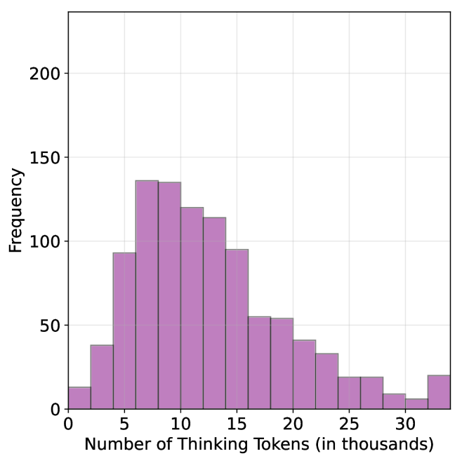
### Visual Description
\n
## Histogram: Distribution of Thinking Tokens
### Overview
The image presents a histogram visualizing the frequency distribution of "Thinking Tokens" measured in thousands. The data appears to be right-skewed, with a concentration of values between 5 and 15 thousand tokens.
### Components/Axes
* **X-axis Title:** "Number of Thinking Tokens (in thousands)"
* Scale: Ranges from 0 to 30 (in thousands).
* Markers: 0, 5, 10, 15, 20, 25, 30.
* **Y-axis Title:** "Frequency"
* Scale: Ranges from 0 to 200.
* Markers: 0, 50, 100, 150, 200.
* **Histogram Bars:** Filled with a light purple color.
### Detailed Analysis
The histogram shows the distribution of the number of thinking tokens. The highest frequency occurs between 8 and 12 thousand tokens, with a frequency of approximately 145. The distribution decreases as the number of tokens increases beyond 12 thousand, and also decreases as the number of tokens decreases below 8 thousand.
Here's a breakdown of approximate frequency values for each bin:
* 0-5 thousand tokens: Frequency ≈ 30
* 5-10 thousand tokens: Frequency ≈ 145
* 10-15 thousand tokens: Frequency ≈ 125
* 15-20 thousand tokens: Frequency ≈ 80
* 20-25 thousand tokens: Frequency ≈ 35
* 25-30 thousand tokens: Frequency ≈ 15
### Key Observations
* The distribution is not symmetrical; it is right-skewed. This indicates that a larger proportion of observations fall within the lower range of thinking tokens, while fewer observations have a higher number of tokens.
* The peak frequency is around 9-11 thousand tokens.
* There is a noticeable drop in frequency after 15 thousand tokens.
* The data is discrete, represented by bins.
### Interpretation
The data suggests that the majority of instances involve a relatively low number of "Thinking Tokens" (between 5 and 15 thousand). The right skewness implies that while most instances have a lower token count, there are some instances with significantly higher token counts, potentially representing more complex or prolonged thought processes. The concept of "Thinking Tokens" is not defined within the image, but it could represent a unit of computational effort, time spent processing information, or some other measure of cognitive activity. The distribution could be used to understand the typical cognitive load or processing requirements of a system or task. The relatively small number of observations with high token counts might indicate that these are rare or exceptional cases. Further investigation would be needed to understand the meaning of "Thinking Tokens" and the context in which this data was collected.
</details>
(b) S1-random
<details>
<summary>x86.png Details</summary>
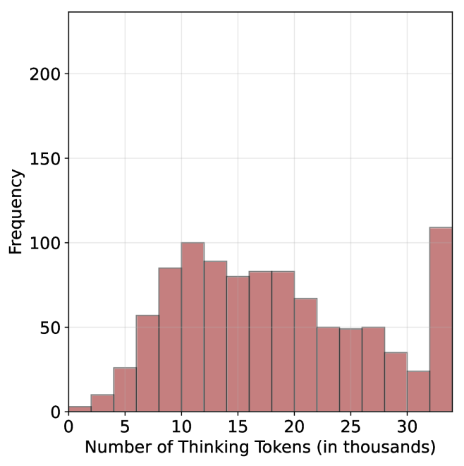
### Visual Description
\n
## Histogram: Distribution of Thinking Tokens
### Overview
The image presents a histogram visualizing the frequency distribution of "Thinking Tokens". The x-axis represents the number of thinking tokens (in thousands), and the y-axis represents the frequency. The data appears to be binned into intervals of approximately 5,000 tokens.
### Components/Axes
* **X-axis Title:** "Number of Thinking Tokens (in thousands)"
* Scale: 0 to 35 (in thousands)
* Markers: 0, 5, 10, 15, 20, 25, 30, 35
* **Y-axis Title:** "Frequency"
* Scale: 0 to 200
* Markers: 0, 50, 100, 150, 200
* **Histogram Bars:** Filled with a light reddish-brown color.
### Detailed Analysis
The histogram shows a roughly bimodal distribution. The data can be described as follows (approximating values from the visual representation):
* **Bin 0-5:** Frequency ≈ 15
* **Bin 5-10:** Frequency ≈ 80
* **Bin 10-15:** Frequency ≈ 95
* **Bin 15-20:** Frequency ≈ 85
* **Bin 20-25:** Frequency ≈ 60
* **Bin 25-30:** Frequency ≈ 50
* **Bin 30-35:** Frequency ≈ 100
The distribution peaks around 10-15 thousand tokens and again around 30-35 thousand tokens. There is a noticeable dip in frequency between 20 and 25 thousand tokens.
### Key Observations
* The distribution is not symmetrical.
* There are two primary peaks, suggesting two common ranges for the number of thinking tokens.
* The frequency is relatively low for very small and very large numbers of thinking tokens.
* The data is discrete, represented by bins.
### Interpretation
The histogram suggests that the number of "Thinking Tokens" is not uniformly distributed. The presence of two peaks indicates that there are two distinct groups or processes that generate different quantities of these tokens. The lower peak around 10-15 thousand tokens might represent a typical or baseline level of thinking activity, while the higher peak around 30-35 thousand tokens could represent more intensive or complex thought processes. The dip in the middle suggests that values in the 20-25 thousand range are less common.
Without further context, it's difficult to determine the exact meaning of "Thinking Tokens." However, the data suggests that this metric is useful for differentiating between different levels or types of cognitive activity. The bimodal distribution could be indicative of different user groups, different tasks, or different stages of a cognitive process. Further investigation would be needed to understand the underlying reasons for this distribution.
</details>
(c) S1-long
Figure 26: Thinking token count histograms for S1-short, S1-random and S1-long datasets.
Table 10: Results for our finetuned models over the S $1$ variants using Qwen-2.5-7B-Instruct: S $1$ -short/long/random.
| | GPQA-D | AIME 2024 | AIME 2025 | HMMT | Math Average | | | | | |
| --- | --- | --- | --- | --- | --- | --- | --- | --- | --- | --- |
| Thinking Tokens $\downarrow$ | Acc. $\uparrow$ | Thinking Tokens $\downarrow$ | Acc. $\uparrow$ | Thinking Tokens $\downarrow$ | Acc. $\uparrow$ | Thinking Tokens $\downarrow$ | Acc. $\uparrow$ | Thinking Tokens $\downarrow$ | Acc. $\uparrow$ | |
| S1-random | 14095 | 39.1 | 25207 | 22.0 | 23822 | 22.0 | 25028 | 10.8 | 24686 | 18.2 |
| S1-long | 15528 $(+10.2\$ | 38.5 | 26210 | 21.7 | 24395 | 19.5 | 26153 | 9.2 | 25586 $(+3.7\$ | 16.8 |
| S1-short | 13093 $(-7.1\$ | 40.3 | 24495 | 22.0 | 21945 | 20.8 | 23329 | 11.2 | 23256 $(-5.8\$ | 18.0 |