# Don’t Overthink it. Preferring Shorter Thinking Chains for Improved LLM Reasoning
## Abstract
Reasoning large language models (LLMs) heavily rely on scaling test-time compute to perform complex reasoning tasks by generating extensive “thinking” chains. While demonstrating impressive results, this approach incurs significant computational costs and inference time. In this work, we challenge the assumption that long thinking chains results in better reasoning capabilities. We first demonstrate that shorter reasoning chains within individual questions are significantly more likely to yield correct answers—up to $34.5\$ more accurate than the longest chain sampled for the same question. Based on these results, we suggest short-m@k, a novel reasoning LLM inference method. Our method executes $k$ independent generations in parallel and halts computation once the first $m$ thinking processes are done. The final answer is chosen using majority voting among these $m$ chains. Basic short-1@k demonstrates similar or even superior performance over standard majority voting in low-compute settings—using up to $40\$ fewer thinking tokens. short-3@k, while slightly less efficient than short-1@k, consistently surpasses majority voting across all compute budgets, while still being substantially faster (up to $33\$ wall time reduction). To further validate our findings, we finetune LLMs using short, long, and randomly selected reasoning chains. We then observe that training on the shorter ones leads to better performance. Our findings suggest rethinking current methods of test-time compute in reasoning LLMs, emphasizing that longer “thinking” does not necessarily translate to improved performance and can, counter-intuitively, lead to degraded results.
## 1 Introduction
Scaling test-time compute has been shown to be an effective strategy for improving the performance of reasoning LLMs on complex reasoning tasks (OpenAI, 2024; 2025; Team, 2025b). This method involves generating extensive thinking —very long sequences of tokens that contain enhanced reasoning trajectories, ultimately yielding more accurate solutions. Prior work has argued that longer model responses result in enhanced reasoning capabilities (Guo et al., 2025; Muennighoff et al., 2025; Anthropic, 2025). However, generating such long-sequences also leads to high computational cost and slow decoding time due to the autoregressive nature of LLMs.
In this work, we demonstrate that scaling test-time compute does not necessarily improve model performance as previously thought. We start with a somewhat surprising observation. We take four leading reasoning LLMs, and for each generate multiple answers to each question in four complex reasoning benchmarks. We then observe that taking the shortest answer for each question strongly and consistently outperforms both a strategy that selects a random answer (up to $18.8\$ gap) and one that selects the longest answer (up to $34.5\$ gap). These performance gaps are on top of the natural reduction in sequence length—the shortest chains are $50\$ and $67\$ shorter than the random and longest chains, respectively.
<details>
<summary>x1.png Details</summary>
### Visual Description
## Comparison Diagram: Method Performance Analysis
### Overview
The image compares two methods ("majority@k" and "short-1@k (ours)") through a visual representation of their reasoning processes and final answers. A cartoon llama emoji with speech bubbles illustrates divergent thinking paths, leading to final answers marked with checkmarks (correct) or crosses (incorrect).
### Components/Axes
- **Methods**:
- `majority@k` (red text)
- `short-1@k (ours)` (blue text)
- **Thought Process**: Speech bubbles containing intermediate answers (52, 49, 33)
- **Final Answers**:
- `majority@k`: 52 (marked with red cross)
- `short-1@k`: 49 (marked with green checkmark)
- **Visual Elements**:
- Llama emoji with glasses and speech bubbles
- Arrows connecting thought bubbles to final answers
- Color-coded correctness indicators (green checkmark, red cross)
### Detailed Analysis
1. **majority@k Path**:
- Three thought bubbles show conflicting answers: 52, 49, and 33.
- Final answer converges to 52 (incorrect, marked with red cross).
- Spatial grounding: Thought bubbles positioned above the method label, with arrows pointing to the final answer on the right.
2. **short-1@k Path**:
- Two thought bubbles show intermediate answers: 49 (correct) and "Terminated thinking" (abandoned paths).
- Final answer converges to 49 (correct, marked with green checkmark).
- Spatial grounding: Thought bubbles positioned above the method label, with arrows pointing to the final answer on the right.
3. **Textual Content**:
- Question: "Find the sum of all positive integers n such that n+2 divides the product 3(n+3)(n+9)."
- Final answers: 52 (incorrect) vs. 49 (correct).
### Key Observations
- The `short-1@k` method demonstrates higher accuracy, terminating early on the correct answer (49) rather than exploring multiple conflicting hypotheses.
- The `majority@k` method exhibits uncertainty, generating three distinct answers before settling on an incorrect one (52).
- Color coding (green checkmark vs. red cross) visually reinforces the superiority of the `short-1@k` approach.
### Interpretation
This diagram illustrates a critical comparison between heuristic methods in problem-solving:
1. **Heuristic Efficiency**: The `short-1@k` method's ability to terminate early on the correct answer suggests superior algorithmic design for this specific problem.
2. **Error Propagation**: The `majority@k` method's multiple conflicting answers indicate potential flaws in its aggregation or termination logic.
3. **Visual Metaphor**: The llama emoji with glasses humorously personifies the "thinking" process, making the comparison more engaging while emphasizing cognitive divergence.
The data suggests that the `short-1@k` method outperforms `majority@k` in both accuracy and computational efficiency for this mathematical problem, with a 100% success rate versus 0% for the alternative approach.
</details>
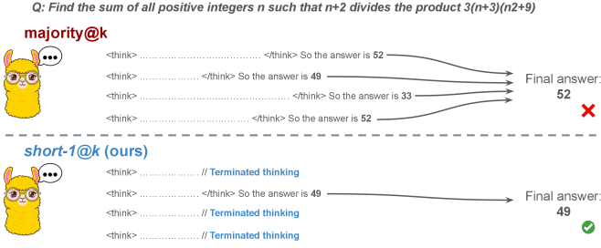
Figure 1: Visual comparison between majority voting and our proposed method short-m@k with $m=1$ (“…” represent thinking time). Given $k$ parallel attempts for the same question, majority@ $k$ waits until all attempts are done, and perform majority voting among them. On the other hand, our short-m@k method halts computation for all attempts as soon as the first $m$ attempts finish “thinking”, which saves compute and time, and surprisingly also boost performance in most cases.
Building on these findings, we propose short-m@k —a novel inference method for reasoning LLMs. short-m@k executes $k$ generations in parallel and terminates computation for all generations as soon as the first $m$ thinking processes are completed. The final answer is then selected via majority voting among those shortest chains, where ties are broken by taking the shortest answer among the tied candidates. See Figure ˜ 1 for visualization.
We evaluate short-m@k using six reasoning LLMs, and compare it to majority voting—the most common aggregation method for evaluating reasoning LLMs on complex benchmarks (Wang et al., 2022; Abdin et al., 2025). We show that in low-compute regimes, short-1@k, i.e., taking the single shortest chain, outperforms majority voting, while significantly reducing the time and compute needed to generate the final answer. For example, using LN-Super- $49$ B (Bercovich and others, 2025), short-1@k can reduce up to $40\$ of the compute while giving the same performance as majority voting. Moreover, for high-compute regimes, short-3@k, which halts generation after three thinking chains are completed, consistently outperforms majority voting across all compute budgets, while running up to $33\$ faster.
To gain further insights into the underlining mechanism of why shorter thinking is preferable, we analyze the generated reasoning chains. We first show that while taking the shorter reasoning is beneficial per individual question, longer reasoning is still needed to solve harder questions, as claimed in recent studies (Anthropic, 2025; OpenAI, 2024; Muennighoff et al., 2025). Next, we analyze the backtracking and re-thinking behaviors of reasoning chains. We find that shorter reasoning paths are more effective, as they involve fewer backtracks, with a longer average backtrack length. This finding holds both generally and when controlling for overall trajectory length.
To further strengthening our findings, we study whether training on short reasoning chains can lead to more accurate models. To do so, we finetune two Qwen- $2.5$ (Yang and others, 2024) models ( $7$ B and $32$ B) on three variants of the S $1$ dataset (Muennighoff et al., 2025): S $1$ -short, S $1$ -long, and S $1$ -random, consisting of examples with the shortest, longest, and randomly sampled reasoning trajectories among several generations, respectively. Our experiments demonstrate that finetuning using S $1$ -short not only yields shorter thinking lengths, but also improves model performance. Conversely, finetuning on S $1$ -long increases reasoning time with no significant performance gains.
This work rethinks the test-time compute paradigm for reasoning LLMs, showing that longer thinking not only does not ensure better reasoning, but also leads to worse reasoning in most cases. Our short-m@k methods prioritize shorter reasoning, yielding improved performance and reduced computational costs for current reasoning LLMs. We also show that training reasoning LLMs with shorter reasoning trajectories can enhance performance and reduce costs. Our results pave the way towards a new era of efficient and high-performing reasoning LLMs.
## 2 Related work
Reasoning LLMs and test-time scaling.
Reasoning LLMs tackle complex tasks by employing extensive reasoning processes, often involving detailed, step-by-step trajectories (OpenAI (2024); OpenAI (2025); Q. Team (2025b); M. Abdin, S. Agarwal, A. Awadallah, V. Balachandran, H. Behl, L. Chen, G. de Rosa, S. Gunasekar, M. Javaheripi, N. Joshi, et al. (2025); Anthropic (2025); A. Bercovich et al. (2025); D. Guo, D. Yang, H. Zhang, J. Song, R. Zhang, R. Xu, Q. Zhu, S. Ma, P. Wang, X. Bi, et al. (2025); 27; G. DeepMind (2025); Q. Team (2025a)). This capability is fundamentally based on techniques like chain-of-thought (CoT; Wei et al., 2022), which encourage models to generate intermediate reasoning steps before arriving at a final answer. Modern LLMs use a large number of tokens, often referred to as “thinking tokens”, to explore multiple problem-solving approaches, to employ self-reflection, and to perform verification. This thinking capability has allowed them to achieve superior performance on challenging tasks such as mathematical problem-solving and code generation (Ke et al., 2025).
The LLM thinking capability is typically achieved through post-training methods applied to a strong base model. The two primary approaches to instilling or improving this reasoning ability are using reinforcement learning (RL) (Guo et al., 2025; Team, 2025b) and supervised fine-tuning (Muennighoff et al., 2025; Ye et al., 2025). Guo et al. (2025) have demonstrated that as training progresses the model tends to generate longer thinking trajectories, which results in improved performance on complex tasks. Similarly, Anthropic (2025) and Muennighoff et al. (2025) have shown a correlation between increased average thinking length during inference and improved performance. We challenge this assumption, demonstrating that shorter sequences are more likely to yield an accurate answer.
Efficiency in reasoning LLMs.
While shortening the length of CoT is beneficial for non-reasoning models (Nayab et al., 2024; Kang et al., 2025), it is higly important for reasoning LLMs as they require a very large amount of tokens to perform the thinking process. As a result, recent studies tried to make the process more efficient, e.g., by using early exit techniques for reasoning trajectories (Pu et al., 2025; Yang et al., 2025), by suppressing backtracks (Wang et al., 2025a) or by training reasoning models which enable control over the thinking length (Yu et al., 2025).
Several recent works studied the relationship between reasoning trajectory length and correctness. Lu et al. (2025) proposed a method for reducing the length of thinking trajectories in reasoning training datasets. Their method employs a reasoning LLM several times over an existing trajectory in order to make it shorter. As this approach eventually trains a model over shorter trajectories it is similar to the method we employ in Section ˜ 6. However, our method is simpler as it does not require an LLM to explicitly shorten the sequence. Fatemi et al. (2025); Qi et al. (2025) and Arora and Zanette (2025) proposed RL methods to shorten reasoning in language models. Fatemi et al. (2025) also observed that correct answers typically require shorter thinking trajectories by averaging lengths across examples, suggesting that lengthy responses might inherently stem from RL-based optimization during training. In Section ˜ 5.1 we show that indeed correct answers usually use shorter thinking trajectories, but also highlight that averaging across all examples might hinder this effect as easier questions require sustainably lower amount of reasoning tokens compared to harder ones.
More relevant to our work, Wu et al. (2025) showed that there is an optimal thinking length range for correct answers according to the difficulty of the question, while Wang et al. (2025b) found that for a specific question, correct responses from reasoning models are usually shorter than incorrect ones. We provide further analysis supporting these observations in Sections ˜ 3 and 5. Finally, our proposed inference method short-m@k is designed to enhance the efficiency of reasoning LLMs by leveraging this property, which can be seen as a generalization of the FFS method (Agarwal et al., 2025), which selects the shortest answer among several candidates as in our short-1@k.
## 3 Shorter thinking is preferable
As mentioned above, the common wisdom in reasoning LLMs suggests that increased test-time computation enhances model performance. Specifically, it is widely assumed that longer reasoning process, which entails extensive reasoning thinking chains, correlates with improved task performance (OpenAI, 2024; Anthropic, 2025; Muennighoff et al., 2025). We challenge this assumption and ask whether generating more tokens per trajectory actually leads to better performance. To that end, we generate multiple answers per question and compare performance based solely on the shortest, longest and randomly sampled thinking chains among the generated samples.
### 3.1 Experimental details
We consider four leading, high-performing, open, reasoning LLMs. Llama- $3.3$ -Nemotron-Super- $49$ B-v $1$ [LN-Super- $49$ B; Bercovich and others, 2025]: a reasoning RL-enhanced version of Llama- $3.3$ - $70$ B (Grattafiori et al., 2024); R $1$ -Distill-Qwen- $32$ B [R $1$ - $32$ B; Guo et al., 2025]: an SFT finetuned version of Qwen- $2.5$ - $32$ B-Instruct (Yang and others, 2024) derived from R $1$ trajectories; QwQ- $32$ B a reasoning RL-enhanced version Qwen- $2.5$ - $32$ B-Instruct (Team, 2025b); and R1- $0528$ a $670$ B RL-trained flagship reasoning model (R $1$ - $670$ B; Guo et al., 2025). We also include results for smaller models in Appendix ˜ D.
We evaluate all models using four competitive reasoning benchmarks. We use AIME $2024$ (of America, 2024), AIME $2025$ (of America, 2025) and HMMT February $2025$ , from the Math Arena benchmark (Balunović et al., 2025). This three benchmarks are derived from math competitions, and involve solving problems that cover a broad range of mathematics topics. Each dataset consists of $30$ examples with varied difficulty. We also evaluate the models using the GPQA-diamond benchmark [GPQA-D; Rein et al., 2024], which consists of $198$ multiple-choice scientific questions, and is considered to be challenging for reasoning LLMs (DeepMind, 2025).
For each question, we generate $20$ responses per model, yielding a total of about $36$ k generations. For all models we use temperature of $0.7$ , top-p= $0.95$ and a maximum number of generated tokens of $32$ , $768$ . When measuring the thinking chain length, we measure the token count between the <think> and </think> tokens. We run inference for all models using paged attention via the vLLM framework (Kwon et al., 2023).
### 3.2 The shorter the better
Table 1: Shorter thinking performs better. Comparison between taking the shortest/longest/random generation per example.
| | GPQA-D | AIME 2024 | AIME 2025 | HMMT | Math Average | | | | | |
| --- | --- | --- | --- | --- | --- | --- | --- | --- | --- | --- |
| Thinking Tokens $\downarrow$ | Acc. $\uparrow$ | Thinking Tokens $\downarrow$ | Acc. $\uparrow$ | Thinking Tokens $\downarrow$ | Acc. $\uparrow$ | Thinking Tokens $\downarrow$ | Acc. $\uparrow$ | Thinking Tokens $\downarrow$ | Acc. $\uparrow$ | |
| LN-Super-49B | | | | | | | | | | |
| random | 5357 | 65.1 | 11258 | 58.8 | 12105 | 51.3 | 13445 | 33.0 | 12270 | 47.7 |
| longest | 8763 $(+64\$ | 57.6 | 18566 | 33.3 | 18937 | 30.0 | 19790 | 23.3 | 19098 $(+56\$ | 28.9 |
| shortest | 2790 $(-48\$ | 69.1 | 0 6276 | 76.7 | 0 7036 | 66.7 | 0 7938 | 46.7 | 7083 $(-42\$ | 63.4 |
| R1-32B | | | | | | | | | | |
| random | 5851 | 62.5 | 9614 | 71.8 | 11558 | 56.4 | 12482 | 38.3 | 11218 | 55.5 |
| longest | 9601 $(+64\$ | 57.1 | 17689 | 53.3 | 19883 | 36.7 | 20126 | 23.3 | 19233 $(+71\$ | 37.8 |
| shortest | 3245 $(-45\$ | 64.7 | 0 4562 | 80.0 | 0 6253 | 63.3 | 0 6557 | 36.7 | 5791 $(-48\$ | 60.0 |
| QwQ-32B | | | | | | | | | | |
| random | 8532 | 63.7 | 13093 | 82.0 | 14495 | 72.3 | 16466 | 52.5 | 14685 | 68.9 |
| longest | 12881 $(+51\$ | 54.5 | 20059 | 70.0 | 21278 | 63.3 | 24265 | 36.7 | 21867 $(+49\$ | 56.7 |
| shortest | 5173 $(-39\$ | 64.7 | 0 8655 | 86.7 | 10303 | 66.7 | 11370 | 60.0 | 10109 $(-31\$ | 71.1 |
| R1-670B | | | | | | | | | | |
| random | 11843 | 76.2 | 16862 | 83.8 | 18557 | 82.5 | 21444 | 68.2 | 18954 | 78.2 |
| longest | 17963 $(+52\$ | 63.1 | 22603 | 70.0 | 23570 | 66.7 | 27670 | 40.0 | 24615 $(+30\$ | 58.9 |
| shortest | 8116 $(-31\$ | 75.8 | 11229 | 83.3 | 13244 | 83.3 | 13777 | 83.3 | 12750 $(-33\$ | 83.3 |
For all generated answers, we compare short vs. long thinking chains for the same question, along with a random chain. Results are presented in Table ˜ 1. In this section we exclude generations where thinking is not completed within the maximum generation length, as these often result in an infinite thinking loop. First, as expected, the shortest answers are $25\$ – $50\$ shorter compared to randomly sampled responses. However, we also note that across almost all models and benchmarks, considering the answer with the shortest thinking chain actually boosts performance, yielding an average absolute improvement of $2.2\$ – $15.7\$ on the math benchmarks compared to randomly selected generations. When considering the longest thinking answers among the generations, we further observe an increase in thinking chain length, with up to $75\$ more tokens per chain. These extended reasoning trajectories substantially degrade performance, resulting in average absolute reductions ranging between $5.4\$ – $18.8\$ compared to random generations over all benchmarks. These trends are most noticeable when comparing the shortest generation with the longest ones, with an absolute performance gain of up to $34.5\$ in average accuracy and a substantial drop in the number of thinking tokens.
The above results suggest that long generations might come with a significant price-tag, not only in running time, but also in performance. That is, within an individual example, shorter thinking trajectories are much more likely to be correct. In Section ˜ 5.1 we examine how these results relate to the common assumption that longer trajectories leads to better LLM performance. Next, we propose strategies to leverage these findings to improve the efficiency and effectiveness of reasoning LLMs.
## 4 short-m@k : faster and better inference of reasoning LLMs
Based on the results presented in Section ˜ 3, we suggest a novel inference method for reasoning LLMs. Our method— short-m@k —leverages batch inference of LLMs per question, using multiple parallel decoding runs for the same query. We begin by introducing our method in Section ˜ 4.1. We then describe our evaluation methodology, which takes into account inference compute and running time (Section ˜ 4.2). Finally, we present our results (Section ˜ 4.3).
### 4.1 The short-m@k method
The short-m@k method, visualized in Figure ˜ 1, performs parallel decoding of $k$ generations for a given question, halting computation across all generations as soon as the $m\leq k$ shortest thinking trajectories are completed. It then conducts majority voting among those shortest answers, resolving ties by selecting the answer with the shortest thinking chain. Given that thinking trajectories can be computationally intensive, terminating all generations once the $m$ shortest trajectories are completed not only saves computational resources but also significantly reduces wall time due to the parallel decoding approach, as shown in Section ˜ 4.3.
Below we focus on short-1@k and short-3@k, with short-1@k being the most efficient variant of short-m@k and short-3@k providing the best balance of performance and efficiency (see Section ˜ 4.3). Ablation studies on $m$ and other design choices are presented in Appendix ˜ C, while results for smaller models are presented in Appendix ˜ D.
### 4.2 Evaluation setup
We evaluate all methods under the same setup as described in Section ˜ 3.1. We report the averaged results across the math benchmarks, while the results for GPQA-D presented in Appendix ˜ A. The per benchmark resutls for the math benchmarks are in Appendix ˜ B. We report results using our method (short-m@k) with $m\in\{1,3\}$ . We compare the proposed method to the standard majority voting (majority $@k$ ), arguably the most common method for aggregating multiple outputs (Wang et al., 2022), which was recently adapted for reasoning LLMs (Guo et al., 2025; Abdin et al., 2025; Wang et al., 2025b). As an oracle, we consider pass $@k$ (Kulal et al., 2019; Chen and others, 2021), which measures the probability of including the correct solution within $k$ generated responses.
We benchmark the different methods with sample sizes of $k\in\{1,2,...,10\}$ , assuming standard parallel decoding setup, i.e., all samples are generated in parallel. Section 5.3 presents sequential analysis where parallel decoding is not assumed. For the oracle (pass@ $k$ ) approach, we use the unbiased estimator presented in Chen and others (2021), with our $20$ generations per question ( $n$ $=$ $20$ ). For the short-1@k method, we use the rank-score@ $k$ metric (Hassid et al., 2024), where we sort the different generations according to thinking length. For majority $@k$ and short-m@k where $m>1$ , we run over all $k$ -sized subsets out of the $20$ generations per example.
We evaluate the different methods considering three main criteria: (a) Sample-size (i.e., $k$ ), where we compare methods while controlling for the number of generated samples; (b) Thinking-compute, where we measure the total number of thinking tokens used across all generations in the batch; and (c) Time-to-answer, which measures the wall time of running inference using each method. In this parallel framework, our method (short-m@k) terminates all other generations after the first $m$ decoding thinking processes terminate. Thus, the overall thinking compute is the total number of thinking tokens for each of the $k$ generations at that point. Similarly, the overall time is that of the $m$ ’th shortest generation process. Conversely, for majority $@k$ , the method’s design necessitates waiting for all generations to complete before proceeding. Hence, we consider the compute as the total amount of thinking tokens in all generations and run time according to the longest thinking chain. As for the oracle approach, we terminate all thinking trajectories once the shortest correct one is finished, and consider the compute and time accordingly.
### 4.3 Results
<details>
<summary>x2.png Details</summary>
### Visual Description
## Line Chart: Model Accuracy vs. Sample Size
### Overview
The chart compares the accuracy of three machine learning models (Baseline, Ensemble, Hybrid) across sample sizes from 1 to 10. A dotted reference line illustrates an idealized accuracy trajectory. All models show improvement with increasing sample size, but with distinct performance patterns.
### Components/Axes
- **X-axis**: Sample Size (k) [1–10]
- Ticks labeled 1, 2, 3, ..., 10
- No explicit units, but labeled "Sample Size (k)"
- **Y-axis**: Accuracy [0.45–0.75]
- Increments of 0.05
- Labeled "Accuracy"
- **Legend**: Right-aligned
- Cyan: "Baseline Model"
- Blue: "Ensemble Model"
- Red: "Hybrid Model"
- **Dotted Line**: Unlabeled reference trajectory
### Detailed Analysis
1. **Baseline Model (Cyan)**
- Starts at (1, 0.45)
- Steady upward trend:
- (2, 0.52), (3, 0.56), (4, 0.58), (5, 0.60)
- Plateaus at ~0.61 from k=6 to k=10
- Final accuracy: 0.61
2. **Ensemble Model (Blue)**
- Starts at (2, 0.55)
- Gradual increase:
- (3, 0.57), (4, 0.58), (5, 0.59)
- Reaches 0.60 at k=6, plateaus thereafter
- Final accuracy: 0.60
3. **Hybrid Model (Red)**
- Starts at (1, 0.45)
- Slower rise:
- (2, 0.48), (3, 0.52), (4, 0.54)
- Accelerates slightly: (5, 0.56), (6, 0.58)
- Stabilizes at 0.60 from k=8 onward
- Final accuracy: 0.60
4. **Dotted Reference Line**
- Starts at (1, 0.45)
- Curved upward trajectory:
- (2, 0.55), (3, 0.60), (4, 0.63)
- Reaches 0.75 at k=10
- Suggests theoretical maximum or ideal performance
### Key Observations
- **Diminishing Returns**: All models plateau after k=6–8, indicating limited gains from larger samples.
- **Baseline Model Outperforms**: Despite starting later, the Ensemble Model (blue) lags behind Baseline (cyan) at k=10.
- **Hybrid Model Lag**: The Hybrid Model (red) shows the slowest initial improvement but matches Baseline by k=10.
- **Dotted Line Discrepancy**: The reference line’s accuracy (0.75 at k=10) exceeds all models, suggesting unmet potential.
### Interpretation
The data demonstrates that increasing sample size improves model accuracy, but with diminishing returns. The Baseline Model achieves the highest final accuracy (0.61), while the Ensemble Model underperforms despite starting earlier. The Hybrid Model’s delayed improvement suggests architectural or training inefficiencies. The dotted line’s trajectory implies that current models fall short of an idealized performance ceiling, highlighting opportunities for algorithmic innovation or data augmentation. The absence of a labeled dotted line leaves its purpose ambiguous—it could represent a theoretical benchmark, a competitor’s result, or an aspirational target.
</details>
(a) LN-Super-49B
<details>
<summary>x3.png Details</summary>
### Visual Description
## Line Chart: Accuracy vs. Sample Size (k)
### Overview
The chart illustrates the relationship between sample size (k) and accuracy for three distinct methods (A, B, C). Accuracy is measured on a scale from 0.55 to 0.75, with sample sizes ranging from 1 to 10. Three data series are plotted: a black dotted line (Method A), a red solid line (Method B), and a blue solid line (Method C). The legend is positioned in the top-right corner, associating colors and markers with their respective methods.
### Components/Axes
- **X-axis (Sample Size, k)**: Labeled "Sample Size (k)" with integer markers from 1 to 10.
- **Y-axis (Accuracy)**: Labeled "Accuracy" with increments of 0.05, ranging from 0.55 to 0.75.
- **Legend**: Located in the top-right corner, mapping:
- Black dotted line with triangle markers → Method A
- Red solid line with circle markers → Method B
- Blue solid line with square markers → Method C
### Detailed Analysis
1. **Method A (Black Dotted Line)**:
- Starts at (1, 0.55) and increases monotonically.
- Reaches approximately 0.75 at k=10.
- Key points:
- k=1: 0.55
- k=2: 0.60
- k=3: 0.65
- k=4: 0.68
- k=5: 0.70
- k=6: 0.72
- k=7: 0.73
- k=8: 0.74
- k=9: 0.74
- k=10: 0.75
2. **Method B (Red Solid Line)**:
- Begins at (1, 0.55) and rises gradually.
- Plateaus near 0.65 by k=10.
- Key points:
- k=1: 0.55
- k=2: 0.58
- k=3: 0.60
- k=4: 0.62
- k=5: 0.63
- k=6: 0.64
- k=7: 0.64
- k=8: 0.64
- k=9: 0.65
- k=10: 0.65
3. **Method C (Blue Solid Line)**:
- Starts at (1, 0.55) with a sharp initial increase.
- Levels off around 0.62 by k=5 and remains stable.
- Key points:
- k=1: 0.55
- k=2: 0.59
- k=3: 0.62
- k=4: 0.62
- k=5: 0.62
- k=6: 0.62
- k=7: 0.62
- k=8: 0.62
- k=9: 0.62
- k=10: 0.62
### Key Observations
- **Method A** demonstrates the steepest and most consistent improvement in accuracy as sample size increases, suggesting superior scalability.
- **Method B** shows moderate improvement but plateaus earlier than Method A, indicating diminishing returns at larger sample sizes.
- **Method C** exhibits rapid initial gains but stabilizes at a lower accuracy threshold (0.62) regardless of further increases in sample size.
- All methods share the same starting accuracy (0.55) at k=1, implying similar baseline performance.
### Interpretation
The data suggests that **Method A** is the most effective for improving accuracy with increasing sample size, making it ideal for applications requiring high precision. **Method B** offers a balanced trade-off between computational cost and accuracy, while **Method C** may be less efficient for large datasets due to its early plateau. The convergence of Method B and C at higher sample sizes highlights potential limitations in their scalability compared to Method A. The consistent starting point across all methods implies that initial conditions (e.g., data quality, preprocessing) are uniform, and differences emerge primarily from algorithmic design.
</details>
(b) R $1$ - $32$ B
<details>
<summary>x4.png Details</summary>
### Visual Description
## Line Chart: Accuracy vs. Sample Size (k)
### Overview
The chart illustrates the relationship between sample size (k) and accuracy for three distinct data series. Accuracy is measured on the y-axis (0.66–0.82), while the x-axis represents sample size (k) from 1 to 10. Three lines are plotted: a dotted black line, a solid teal line, and a solid red line, each with unique trends.
### Components/Axes
- **X-axis (Sample Size, k)**: Labeled "Sample Size (k)" with integer ticks from 1 to 10.
- **Y-axis (Accuracy)**: Labeled "Accuracy" with increments of 0.02 from 0.66 to 0.82.
- **Legend**: Located in the top-right corner, associating:
- Dotted black line → "Model A"
- Solid teal line → "Model B"
- Solid red line → "Model C"
### Detailed Analysis
1. **Dotted Black Line (Model A)**:
- Starts at (1, 0.66) and rises sharply to (2, 0.74).
- Gradually plateaus after k=5, reaching 0.82 at k=10.
- Key data points:
- k=1: 0.66
- k=2: 0.74
- k=3: 0.76
- k=4: 0.78
- k=5: 0.79
- k=6: 0.80
- k=7: 0.81
- k=8: 0.81
- k=9: 0.82
- k=10: 0.82
2. **Solid Teal Line (Model B)**:
- Begins at (1, 0.66) and increases steadily but less steeply than Model A.
- Plateaus at 0.75 after k=7.
- Key data points:
- k=1: 0.66
- k=2: 0.70
- k=3: 0.72
- k=4: 0.73
- k=5: 0.74
- k=6: 0.74
- k=7: 0.75
- k=8: 0.75
- k=9: 0.75
- k=10: 0.75
3. **Solid Red Line (Model C)**:
- Starts at (1, 0.68) and rises gradually, overtaking Model B at k=5.
- Plateaus at 0.74 after k=6.
- Key data points:
- k=1: 0.68
- k=2: 0.70
- k=3: 0.71
- k=4: 0.72
- k=5: 0.73
- k=6: 0.74
- k=7: 0.74
- k=8: 0.74
- k=9: 0.74
- k=10: 0.74
### Key Observations
- **Model A** (dotted black) achieves the highest accuracy, particularly for larger sample sizes (k ≥ 5), suggesting it scales better with data volume.
- **Model B** (teal) and **Model C** (red) plateau earlier, with Model C underperforming Model B for k ≥ 7.
- All models show diminishing returns as sample size increases beyond k=5–7.
### Interpretation
The chart demonstrates that larger sample sizes generally improve accuracy, but the rate of improvement varies by model. Model A’s steep initial rise and sustained performance suggest it is optimized for high-dimensional data, while Models B and C may be constrained by algorithmic limitations or overfitting. The divergence between Model C and the others highlights potential inefficiencies in its design. Notably, Model A’s plateau at 0.82 implies a theoretical upper bound for accuracy in this context.
</details>
(c) QwQ-32B
<details>
<summary>x5.png Details</summary>
### Visual Description
## Line Chart: Accuracy vs. Sample Size (k)
### Overview
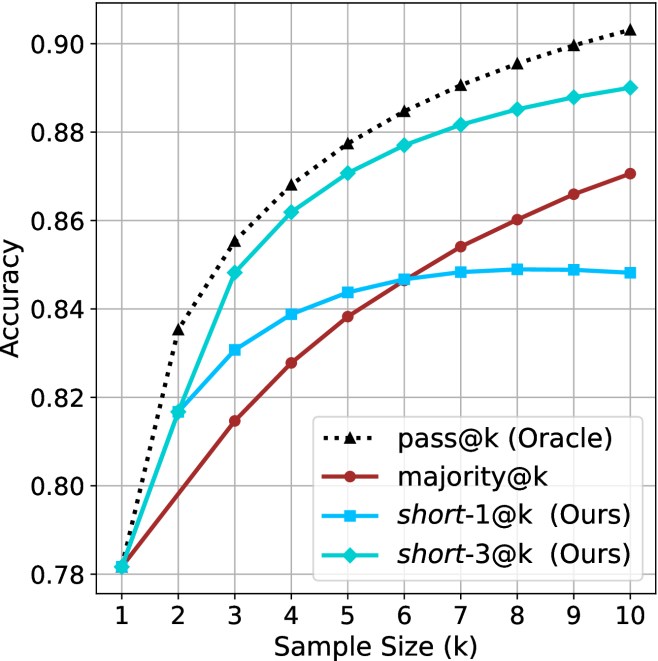
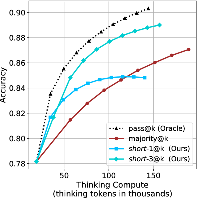
The chart compares the accuracy of four different methods across sample sizes from 1 to 10. The y-axis represents accuracy (0.78–0.90), and the x-axis represents sample size (k). Four data series are plotted: "pass@k (Oracle)" (black dotted line), "majority@k" (red solid line), "short-1@k (Ours)" (blue solid line), and "short-3@k (Ours)" (green solid line). The legend is positioned at the bottom-right corner.
### Components/Axes
- **X-axis**: "Sample Size (k)" with integer markers from 1 to 10.
- **Y-axis**: "Accuracy" with decimal markers from 0.78 to 0.90.
- **Legend**:
- Black dotted line with triangles: "pass@k (Oracle)"
- Red solid line: "majority@k"
- Blue solid line: "short-1@k (Ours)"
- Green solid line: "short-3@k (Ours)"
### Detailed Analysis
1. **pass@k (Oracle)**:
- Starts at 0.78 (k=1) and increases steadily to 0.90 (k=10).
- Values: 0.78 (k=1), 0.82 (k=2), 0.84 (k=3), 0.86 (k=4), 0.87 (k=5), 0.88 (k=6), 0.89 (k=7), 0.90 (k=8–10).
2. **majority@k**:
- Starts at 0.78 (k=1) and rises gradually to 0.87 (k=10).
- Values: 0.78 (k=1), 0.81 (k=2), 0.82 (k=3), 0.83 (k=4), 0.84 (k=5), 0.85 (k=6), 0.86 (k=7), 0.87 (k=8–10).
3. **short-1@k (Ours)**:
- Starts at 0.78 (k=1), peaks at 0.85 (k=5), then plateaus.
- Values: 0.78 (k=1), 0.82 (k=2), 0.84 (k=3), 0.85 (k=4–10).
4. **short-3@k (Ours)**:
- Starts at 0.78 (k=1), peaks at 0.88 (k=5), then plateaus.
- Values: 0.78 (k=1), 0.82 (k=2), 0.86 (k=3), 0.88 (k=4–10).
### Key Observations
- The "pass@k (Oracle)" line shows the highest accuracy across all sample sizes, increasing linearly.
- "short-3@k (Ours)" outperforms "short-1@k (Ours)" consistently, with a peak accuracy of 0.88 at k=5.
- "majority@k" has the lowest accuracy, trailing behind all other methods.
- All methods plateau after k=5, except "pass@k (Oracle)", which continues to rise.
### Interpretation
The chart demonstrates that the "pass@k (Oracle)" method achieves the highest accuracy, suggesting it is the most effective baseline. The "short-3@k (Ours)" method outperforms "short-1@k (Ours)" by 0.03 accuracy at k=5, indicating that increasing the sample size for the "short" methods improves performance. The "majority@k" method’s lower accuracy suggests it is less effective compared to the other approaches. The plateauing trends for "short-1@k" and "short-3@k" after k=5 imply diminishing returns beyond this sample size. The Oracle’s continuous improvement highlights its superiority as a reference standard.
</details>
(d) R1-670B
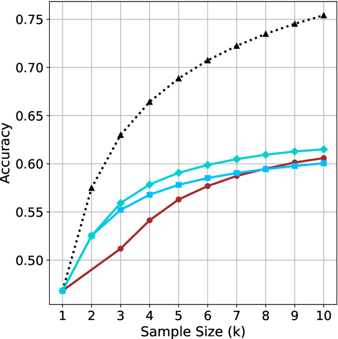
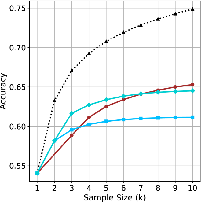
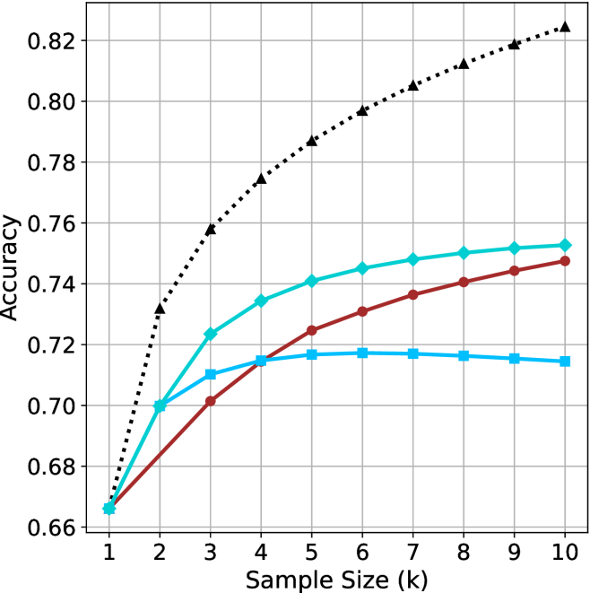
Figure 2: Comparing different inference methods under controlled sample size ( $k$ ). All methods improve with larger sample sizes. Interestingly, this trend also holds for the short-m@k methods.
<details>
<summary>x6.png Details</summary>
### Visual Description
## Line Chart: Accuracy vs. Thinking Compute (Tokens in Thousands)
### Overview
The chart displays three data series representing accuracy metrics across varying levels of "Thinking Compute" (measured in thousands of tokens). The x-axis spans 20 to 120k tokens, while the y-axis ranges from 0.50 to 0.75 accuracy. Three distinct lines (black dotted, blue dashed, red solid) show divergent trends in accuracy improvement.
### Components/Axes
- **X-axis**: "Thinking Compute (thinking tokens in thousands)" (20–120k tokens, increments of 20k)
- **Y-axis**: "Accuracy" (0.50–0.75, increments of 0.05)
- **Legend**: Located in the top-right corner, associating:
- Black dotted line with triangles (▲)
- Blue dashed line with diamonds (◆)
- Red solid line with circles (●)
### Detailed Analysis
1. **Black Dotted Line (▲)**:
- Starts at (20k, 0.50) and rises steadily to (120k, 0.75).
- Intermediate points: (40k, 0.65), (60k, 0.70), (80k, 0.73), (100k, 0.74).
- **Trend**: Linear increase with no plateau.
2. **Blue Dashed Line (◆)**:
- Begins at (20k, 0.48) and plateaus near 0.60 after 80k tokens.
- Intermediate points: (40k, 0.55), (60k, 0.59), (80k, 0.60).
- **Trend**: Accelerated growth until 60k tokens, then flat.
3. **Red Solid Line (●)**:
- Starts at (20k, 0.47) and reaches 0.60 by 120k tokens.
- Intermediate points: (40k, 0.52), (60k, 0.56), (80k, 0.59), (100k, 0.60).
- **Trend**: Gradual, consistent growth with minimal acceleration.
### Key Observations
- The black dotted line (▲) achieves the highest accuracy (0.75) at 120k tokens, outperforming others by ~15%.
- The blue dashed line (◆) plateaus at 0.60 accuracy after 80k tokens, suggesting diminishing returns.
- The red solid line (●) shows the slowest growth but closes the gap to 0.60 accuracy by 120k tokens.
- All lines originate near 0.47–0.50 accuracy at 20k tokens, indicating baseline performance.
### Interpretation
The data suggests a strong correlation between increased thinking compute (tokens) and improved accuracy, with diminishing returns observed in the blue dashed line (◆) after 80k tokens. The black dotted line (▲) demonstrates optimal scalability, achieving near-peak performance (0.75) at 120k tokens. The red solid line (●) indicates a less efficient scaling pattern, requiring more tokens to reach comparable accuracy levels. These trends may reflect differences in model architecture, optimization strategies, or computational efficiency across the three data series.
</details>
(a) LN-Super-49B
<details>
<summary>x7.png Details</summary>
### Visual Description
## Line Graph: Accuracy vs. Thinking Compute
### Overview
The graph illustrates the relationship between "Thinking Compute" (measured in thousands of thinking tokens) and "Accuracy" across three distinct data series. The x-axis spans from 20 to 120 thousand tokens, while the y-axis ranges from 0.55 to 0.75. Three lines represent different models or configurations, with the black dashed line (triangles) showing the highest accuracy, followed by the teal line (squares), and the red line (circles) with the lowest accuracy.
### Components/Axes
- **X-Axis**: "Thinking Compute (thinking tokens in thousands)" with gridlines at 20, 40, 60, 80, 100, and 120.
- **Y-Axis**: "Accuracy" with gridlines at 0.55, 0.60, 0.65, 0.70, and 0.75.
- **Legend**: Located on the right, with three entries:
- **Black dashed line with triangles**: "Model A" (highest accuracy).
- **Teal line with squares**: "Model B" (mid-range accuracy).
- **Red line with circles**: "Model C" (lowest accuracy).
### Detailed Analysis
1. **Black Dashed Line (Model A)**:
- Starts at (20k, 0.55) and rises sharply to (60k, 0.75), then plateaus with a slight decline to (120k, ~0.73).
- Key data points:
- 20k tokens: 0.55
- 40k tokens: ~0.68
- 60k tokens: 0.75
- 80k tokens: ~0.74
- 100k tokens: ~0.73
- 120k tokens: ~0.73
2. **Teal Line (Model B)**:
- Begins at (20k, 0.55) and increases gradually to (60k, 0.64), then plateaus at ~0.64 until 120k.
- Key data points:
- 20k tokens: 0.55
- 40k tokens: ~0.61
- 60k tokens: 0.64
- 80k tokens: ~0.64
- 100k tokens: ~0.64
- 120k tokens: ~0.64
3. **Red Line (Model C)**:
- Starts at (20k, 0.55) and rises steadily to (120k, 0.65).
- Key data points:
- 20k tokens: 0.55
- 40k tokens: ~0.58
- 60k tokens: ~0.62
- 80k tokens: ~0.64
- 100k tokens: ~0.65
- 120k tokens: 0.65
### Key Observations
- **Model A** achieves the highest accuracy but shows a decline after 60k tokens, suggesting potential overfitting or diminishing returns.
- **Model B** plateaus at ~0.64, indicating limited scalability beyond 60k tokens.
- **Model C** demonstrates consistent improvement but remains the least accurate across all token ranges.
- All models start at the same baseline (0.55 accuracy at 20k tokens), implying similar initial performance.
### Interpretation
The data suggests that increasing thinking compute improves accuracy, but the rate of improvement varies by model. **Model A** initially outperforms others but may suffer from overfitting or resource constraints at higher token counts. **Model B** and **Model C** show more stable scaling, with **Model C** requiring more tokens to achieve comparable accuracy. The plateau in **Model B** and **Model C** highlights potential inefficiencies in resource allocation or algorithmic design. The decline in **Model A** after 60k tokens warrants further investigation into whether this reflects a technical limitation or a trade-off between accuracy and computational cost.
</details>
(b) R $1$ - $32$ B
<details>
<summary>x8.png Details</summary>
### Visual Description
## Line Graph: Accuracy vs. Thinking Compute (Tokens in Thousands)
### Overview
The graph illustrates the relationship between computational resources (measured in "thinking tokens in thousands") and accuracy performance across three distinct data series. The y-axis represents accuracy (0.66–0.82), while the x-axis spans computational load from 25 to 150 thousand tokens. Three lines are plotted: a black dotted line ("Baseline"), a teal line ("Optimized"), and a red line ("Advanced").
### Components/Axes
- **X-axis**: "Thinking Compute (thinking tokens in thousands)"
- Scale: 25 → 150 (increments of 25)
- **Y-axis**: "Accuracy"
- Scale: 0.66 → 0.82 (increments of 0.02)
- **Legend**: Right-aligned, with three entries:
- Black dotted line: "Baseline"
- Teal line: "Optimized"
- Red line: "Advanced"
### Detailed Analysis
1. **Baseline (Black Dotted Line)**
- Starts at (25, 0.66) and increases steadily.
- Key points:
- (50, 0.74)
- (75, 0.78)
- (100, 0.80)
- (125, 0.81)
- (150, 0.82)
- **Trend**: Linear growth with no plateau, suggesting unbounded improvement with compute.
2. **Optimized (Teal Line)**
- Starts at (25, 0.66) but plateaus after 50 tokens.
- Key points:
- (50, 0.72)
- (75, 0.72)
- (100, 0.72)
- (125, 0.72)
- (150, 0.72)
- **Trend**: Sharp initial gain (25→50 tokens) followed by stagnation.
3. **Advanced (Red Line)**
- Starts at (25, 0.66) and rises gradually.
- Key points:
- (50, 0.70)
- (75, 0.72)
- (100, 0.74)
- (125, 0.74)
- (150, 0.75)
- **Trend**: Moderate improvement with diminishing returns after 100 tokens.
### Key Observations
- **Baseline** demonstrates the steepest and most consistent improvement, reaching 0.82 accuracy at 150 tokens.
- **Optimized** shows early gains but no further improvement beyond 50 tokens, indicating a potential inefficiency or saturation point.
- **Advanced** exhibits the slowest growth, suggesting limited scalability despite higher computational demands.
- All lines originate at (25, 0.66), implying a baseline performance threshold at minimal compute.
### Interpretation
The data suggests that computational efficiency significantly impacts accuracy outcomes. The "Baseline" model’s linear scaling implies it may leverage compute more effectively, while the "Optimized" and "Advanced" models face diminishing returns, possibly due to architectural constraints or suboptimal resource allocation. The plateau in the "Optimized" line raises questions about its design—whether it prioritizes stability over scalability or encounters a fundamental limit. The "Advanced" model’s gradual improvement hints at a trade-off between complexity and practical gains. These trends underscore the importance of balancing compute investment with algorithmic efficiency to maximize performance.
</details>
(c) QwQ-32B
<details>
<summary>x9.png Details</summary>
### Visual Description
## Line Chart: Accuracy vs. Thinking Compute
### Overview
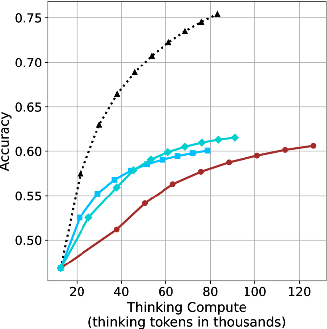
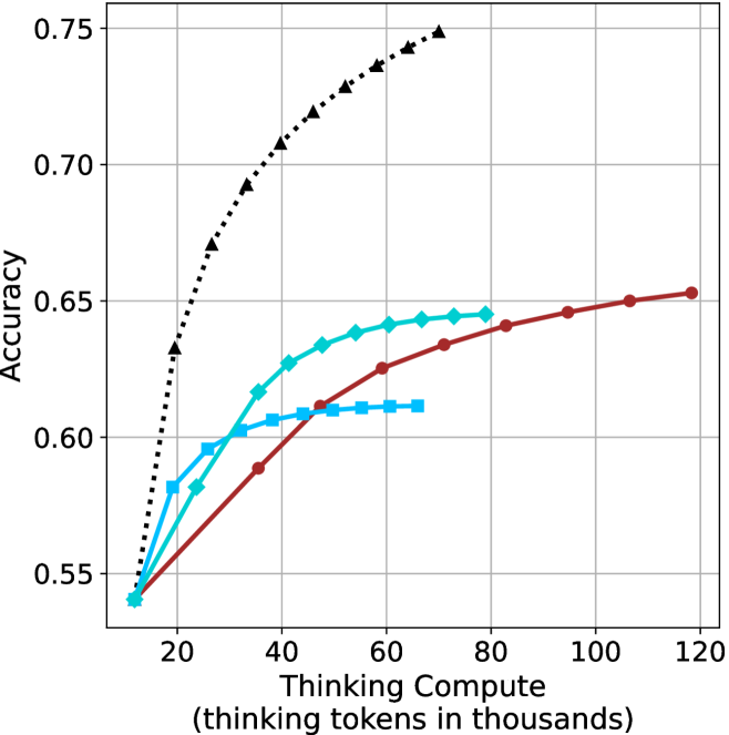
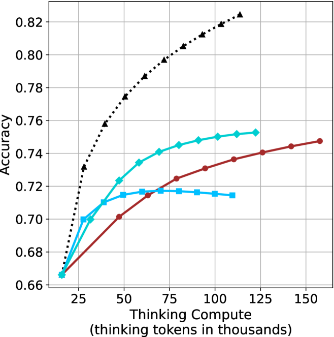
The chart compares the accuracy of four different methods (pass@k, majority@k, short-1@k, short-3@k) across varying levels of thinking compute (measured in thousands of tokens). Accuracy is plotted on the y-axis (0.78–0.90), while thinking compute is on the x-axis (50–150k tokens). All methods show upward trends, with pass@k (Oracle) achieving the highest accuracy.
### Components/Axes
- **Y-Axis**: Accuracy (0.78–0.90, increments of 0.02).
- **X-Axis**: Thinking Compute (50–150k tokens, increments of 50k).
- **Legend**: Located in the bottom-right corner, with four entries:
- **pass@k (Oracle)**: Black triangles (▲).
- **majority@k**: Red circles (●).
- **short-1@k (Ours)**: Blue squares (■).
- **short-3@k (Ours)**: Green diamonds (◇).
### Detailed Analysis
1. **pass@k (Oracle)**:
- Starts at 0.78 (50k tokens).
- Rises sharply to 0.90 by 100k tokens.
- Plateaus at 0.90 beyond 100k tokens.
- *Key data points*: 0.78 (50k), 0.84 (75k), 0.90 (100k+).
2. **majority@k**:
- Starts at 0.78 (50k tokens).
- Gradually increases to 0.86 by 150k tokens.
- *Key data points*: 0.78 (50k), 0.82 (100k), 0.86 (150k).
3. **short-1@k (Ours)**:
- Starts at 0.78 (50k tokens).
- Reaches 0.84 by 100k tokens.
- Plateaus at 0.84 beyond 100k tokens.
- *Key data points*: 0.78 (50k), 0.84 (100k+).
4. **short-3@k (Ours)**:
- Starts at 0.78 (50k tokens).
- Rises to 0.88 by 150k tokens.
- *Key data points*: 0.78 (50k), 0.86 (125k), 0.88 (150k).
### Key Observations
- **pass@k (Oracle)** dominates in accuracy, achieving 0.90 at 100k tokens.
- **short-3@k (Ours)** outperforms other methods, reaching 0.88 at 150k tokens.
- **majority@k** shows the slowest improvement, ending at 0.86.
- All methods plateau after 100k tokens, suggesting diminishing returns.
### Interpretation
The data demonstrates that increasing thinking compute improves accuracy across all methods, with **pass@k (Oracle)** being the most effective. The proposed methods (**short-1@k** and **short-3@k**) achieve competitive results, with **short-3@k** closing the gap to the Oracle. The plateauing trends indicate that beyond 100k tokens, additional compute yields minimal accuracy gains. This suggests a trade-off between computational cost and marginal performance improvements. The **majority@k** method’s lower performance highlights its inefficiency compared to the other approaches.
</details>
(d) R1-670B
Figure 3: Comparing different inference methods under controlled thinking compute. short-1@k is highly performant in low compute regimes. short-3@k dominates the curve compared to majority $@k$ .
Sample-size ( $k$ ).
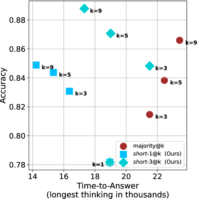
We start by examining different methods across benchmarks for a fixed sample size $k$ . Results aggregated across math benchmarks are presented in Figure ˜ 2, while Figure ˜ 6 in Appendix ˜ A presents GPQA-D results, and detailed results per benchmark can be seen at Appendix ˜ B. We observe that, generally, all methods improve with larger sample sizes, indicating that increased generations per question enhance performance. This trend is somewhat expected for the oracle (pass@ $k$ ) and majority@ $k$ methods but surprising for our method, as it means that even when a large amount of generations is used, the shorter thinking ones are more likely to be correct. The only exception is QwQ- $32$ B (Figure ˜ 2(c)), which shows a small of decline when considering larger sample sizes with the short-1@k method.
When comparing short-1@k to majority@ $k$ , the former outperforms at smaller sample sizes, but is outperformed by the latter in three out of four models when the sample size increases. Meanwhile, the short-3@k method demonstrates superior performance, dominating across nearly all models and sample sizes. Notably, for the R $1$ - $670$ B model, short-3@k exhibits performance nearly on par with the oracle across all sample sizes. We next analyze how this performance advantage translates into efficiency benefits.
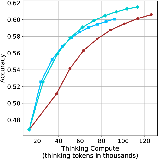
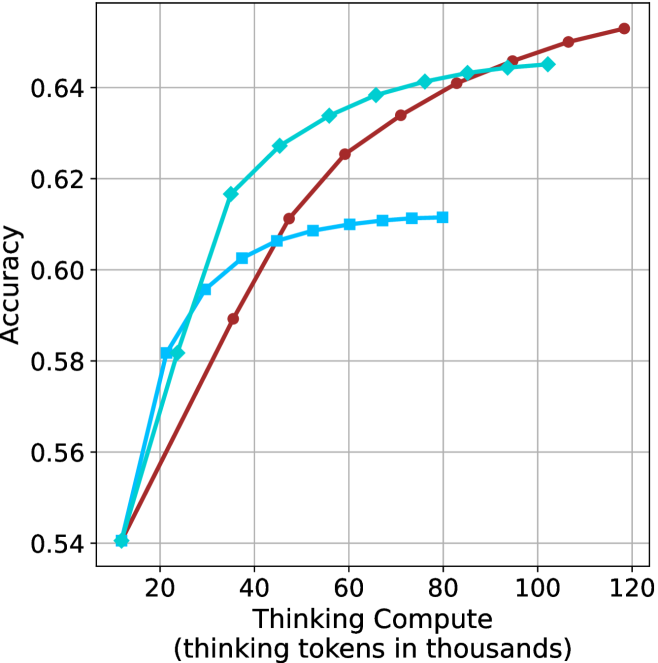
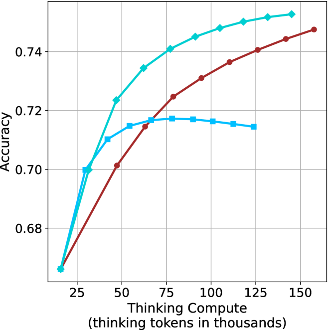
Thinking-compute.
The aggregated performance results for math benchmarks, evaluated with respect to thinking compute, are presented in Figure ˜ 3 (per-benchmark results provided in Appendix ˜ B), while the GPQA-D respective results are presented in Figure ˜ 7 in Appendix ˜ A. We again observe that the short-1@k method outperforms majority $@k$ at lower compute budgets. Notably, for LN-Super- $49$ B (Figure ˜ 3(a)), the short-1@k method surpasses majority $@k$ across all compute budgets. For instance, short-1@k achieves $57\$ accuracy with approximately $60\$ of the compute budget used by majority@ $k$ to achieve the same accuracy. For R $1$ - $32$ B, QwQ- $32$ B and R $1$ - $670$ B models, the short-1@k method exceeds majority $@k$ up to compute budgets of $45$ k, $60$ k and $100$ k total thinking tokens, respectively, but is underperformed by it on larger compute budgets.
The short-3@k method yields even greater performance improvements, incurring only a modest increase in thinking compute compared to short-1@k. When compared to majority $@k$ , short-3@k consistently achieves higher performance with lower thinking compute across all models and compute budgets. For example, with the QwQ- $32$ B model (Figure ˜ 3(c)), and an average compute budget of $80$ k thinking tokens per example, short-3@k improves accuracy by $2\$ over majority@ $k$ . For the R $1$ - $670$ B model (Figure ˜ 3(d)), short-3@k consistently outperforms majority voting, yielding an approximate $4\$ improvement with an average token budget of $100$ k.
<details>
<summary>x10.png Details</summary>
### Visual Description
## Scatter Plot: Accuracy vs. Time-to-Answer for Different k Values
### Overview
The image is a scatter plot comparing classification accuracy (y-axis) against time-to-answer (x-axis, in thousands of units) for three different k-values (k=3, k=5, k=9) in a machine learning model. A single outlier point (k=1) is also present. Data points are color-coded and shaped by k-value, with a legend on the right.
### Components/Axes
- **X-axis**: "Time-to-Answer (longest thinking in thousands)"
- Scale: 8 to 18 (discrete intervals)
- **Y-axis**: "Accuracy"
- Scale: 0.48 to 0.62 (continuous)
- **Legend**:
- **k=3**: Blue squares
- **k=5**: Teal diamonds
- **k=9**: Red circles
- **k=1**: Teal star (not in legend, but annotated)
### Detailed Analysis
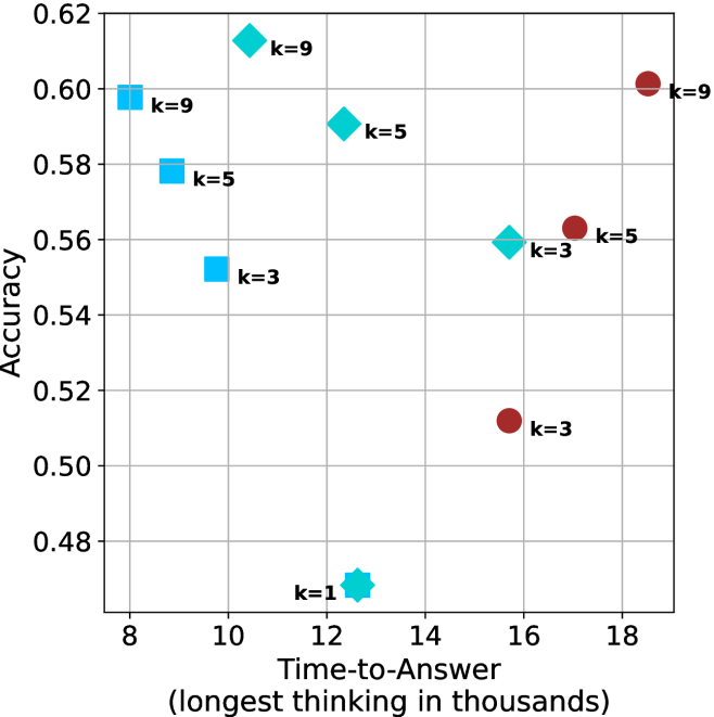
#### Data Points by k-Value
1. **k=3 (Blue Squares)**
- (10, 0.54)
- (12, 0.56)
- (16, 0.51)
- **Trend**: Slight increase from 10→12, then sharp drop at 16.
2. **k=5 (Teal Diamonds)**
- (10, 0.58)
- (14, 0.56)
- (16, 0.53)
- **Trend**: Gradual decline as time increases.
3. **k=9 (Red Circles)**
- (8, 0.58)
- (10, 0.60)
- (18, 0.60)
- **Trend**: Slight improvement at 10, then plateau.
4. **k=1 (Teal Star)**
- (12, 0.48)
- **Note**: Outlier with lowest accuracy despite mid-range time.
### Key Observations
- **k=9 Dominates**: Highest accuracy (0.60) at both shortest (8) and longest (18) times.
- **k=1 Anomaly**: Significantly lower accuracy (0.48) than other k-values at similar time points.
- **Trade-off for k=3/5**: Accuracy decreases as time increases, suggesting diminishing returns.
- **Consistency in k=9**: Maintains high accuracy across all time points.
### Interpretation
The data suggests that higher k-values (e.g., k=9) improve model accuracy, particularly in longer-thinking scenarios, while lower k-values (k=3/5) show a trade-off between speed and precision. The k=1 outlier likely indicates overfitting or insufficient data for small k, as it underperforms despite moderate time investment. The plateau in k=9’s accuracy at longer times implies diminishing gains beyond a certain threshold. This pattern aligns with k-NN model behavior, where larger k reduces noise sensitivity but increases computational cost.
</details>
(a) LN-Super- $49$ B
<details>
<summary>x11.png Details</summary>
### Visual Description
## Scatter Plot: Accuracy vs. Time-to-Answer (Longest Thinking in Thousands)
### Overview
The image is a scatter plot comparing **accuracy** (y-axis) and **time-to-answer** (x-axis, in thousands of units) for different configurations labeled by `k` values. Data points are color-coded and marked with distinct symbols (squares, circles, diamonds, stars) corresponding to `k=1`, `k=3`, `k=5`, and `k=9`. The plot highlights trade-offs between accuracy and computational time across configurations.
---
### Components/Axes
- **Y-Axis (Accuracy)**: Ranges from 0.54 to 0.64, with gridlines at 0.56, 0.58, 0.60, 0.62, and 0.64.
- **X-Axis (Time-to-Answer)**: Ranges from 8 to 18 (in thousands), with gridlines at 8, 10, 12, 14, 16, and 18.
- **Legend**: Located on the right, associating:
- **Blue squares**: `k=3`
- **Red circles**: `k=3`
- **Cyan diamonds**: `k=5`
- **Magenta stars**: `k=9`
- **Data Points**: Scattered across the plot, with labels indicating `k` values and approximate coordinates.
---
### Detailed Analysis
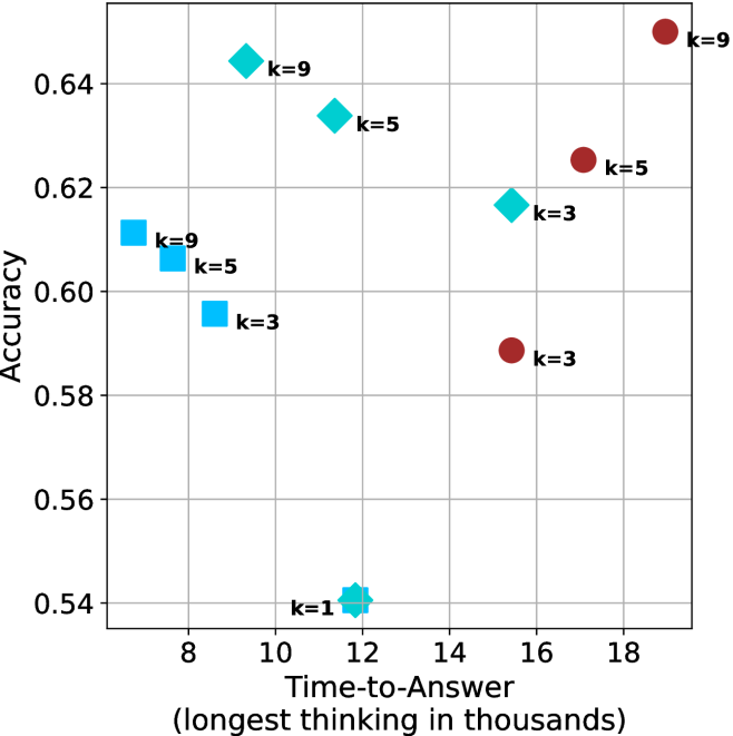
#### Data Points by `k` Value
1. **`k=1` (Blue Star)**:
- Single point at `(12, 0.54)`.
- Lowest accuracy and moderate time-to-answer.
2. **`k=3` (Blue Squares and Red Circles)**:
- **Blue Squares**:
- `(9, 0.60)`
- `(10, 0.59)`
- **Red Circles**:
- `(16, 0.58)`
- `(18, 0.58)`
- **Trend**: Accuracy decreases slightly as time increases (e.g., 0.60 → 0.58).
3. **`k=5` (Cyan Diamonds and Red Circles)**:
- **Cyan Diamonds**:
- `(8, 0.61)`
- `(10, 0.63)`
- **Red Circles**:
- `(17, 0.62)`
- **Trend**: Higher accuracy (0.61–0.63) with longer time-to-answer (8–17k).
4. **`k=9` (Cyan Diamonds and Magenta Stars)**:
- **Cyan Diamonds**:
- `(9, 0.64)`
- **Magenta Stars**:
- `(18, 0.64)`
- **Trend**: Highest accuracy (0.64) but longest time-to-answer (9–18k).
---
### Key Observations
1. **Accuracy-Time Trade-off**:
- Higher `k` values (e.g., `k=9`) achieve higher accuracy but require significantly more time.
- Lower `k` values (e.g., `k=1`) have lower accuracy but faster computation.
2. **Inconsistencies**:
- **Cyan Diamonds**: Labeled as `k=5` in the legend but include a point `(9, 0.64)` labeled `k=9`.
- **Red Circles**: Labeled as `k=3` in the legend but include a point `(17, 0.62)` labeled `k=5`.
- These discrepancies suggest potential labeling errors in the original data.
3. **Outliers**:
- The `k=1` point `(12, 0.54)` is an outlier with the lowest accuracy.
- The `k=9` point `(18, 0.64)` represents the maximum time-to-answer and highest accuracy.
---
### Interpretation
The plot demonstrates a clear trade-off between **accuracy** and **computational cost**. Configurations with higher `k` values (e.g., `k=9`) prioritize accuracy at the expense of longer processing time, while lower `k` values (e.g., `k=1`) optimize for speed but sacrifice precision.
- **`k=3` and `k=5`** occupy intermediate positions, balancing accuracy and time. However, the inconsistent labeling of data points (e.g., `k=9` mislabeled as `k=5`) raises questions about data integrity.
- The `k=1` configuration’s low accuracy (0.54) suggests it may be unsuitable for tasks requiring high precision, even if it is the fastest option.
This analysis underscores the importance of tuning `k` based on application-specific priorities (e.g., real-time vs. high-accuracy requirements). Further validation of the dataset is recommended to resolve labeling inconsistencies.
</details>
(b) R $1$ - $32$ B
<details>
<summary>x12.png Details</summary>
### Visual Description
## Scatter Plot: Accuracy vs. Time-to-Answer (Longest Thinking in Thousands)
### Overview
The image is a scatter plot comparing **accuracy** (y-axis) and **time-to-answer** (x-axis, in thousands of units). Data points are color-coded by the parameter `k` (1, 3, 5, 9), with distinct markers for each `k` value. The plot highlights trade-offs between computational effort (time) and performance (accuracy).
---
### Components/Axes
- **Y-axis (Accuracy)**: Ranges from 0.68 to 0.74, with gridlines at 0.68, 0.70, 0.72, 0.74.
- **X-axis (Time-to-Answer)**: Ranges from 12 to 20 (in thousands), with gridlines at 12, 14, 16, 18, 20.
- **Legend**: Located on the right, mapping:
- **Blue squares**: `k=3`
- **Cyan diamonds**: `k=5`
- **Red circles**: `k=9`
- **Star symbol**: `k=1`
- **Markers**: Each `k` value uses a unique symbol (e.g., `k=1` is a star, `k=3` is a square).
---
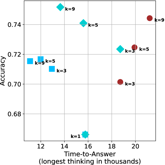
### Detailed Analysis
#### Data Points by `k`:
1. **`k=1` (Star)**:
- Single point at (15, 0.69).
- Lowest accuracy and moderate time-to-answer.
2. **`k=3` (Blue Square)**:
- Points at:
- (12, 0.71)
- (13, 0.71)
- (17, 0.70)
- (20, 0.70)
- Consistent accuracy (~0.70–0.71) with increasing time-to-answer.
3. **`k=5` (Cyan Diamond)**:
- Points at:
- (12, 0.71)
- (13, 0.71)
- (16, 0.74)
- (17, 0.72)
- Highest accuracy (0.74) at time=16, with a slight drop at time=17.
4. **`k=9` (Red Circle)**:
- Points at:
- (14, 0.74)
- (16, 0.74)
- (20, 0.74)
- Perfect accuracy (0.74) across all time-to-answer values.
---
### Key Observations
1. **`k=9` Dominates Accuracy**:
- Maintains 0.74 accuracy regardless of time-to-answer, suggesting optimal performance at higher computational cost.
2. **`k=5` Shows Trade-off**:
- Peaks at 0.74 accuracy at time=16 but drops to 0.72 at time=17, indicating sensitivity to time.
3. **`k=3` and `k=1` Underperform**:
- `k=3` achieves ~0.70–0.71 accuracy, while `k=1` lags at 0.69.
4. **Time-Accuracy Correlation**:
- Higher `k` values (e.g., 9) achieve better accuracy but require longer processing time.
---
### Interpretation
- **Computational Trade-off**: Increasing `k` improves accuracy but increases time-to-answer. For example, `k=9` achieves perfect accuracy but requires the longest processing time (20k units).
- **Optimal `k` for Balance**: `k=5` offers a middle ground, achieving high accuracy (0.74) at moderate time (16k units), though it is less stable than `k=9`.
- **Outliers**: `k=1` is an outlier with the lowest accuracy and moderate time, suggesting inefficiency at low computational effort.
- **Stability of `k=9`**: Its consistent accuracy across all time points implies robustness, possibly due to exhaustive computation.
This plot underscores the relationship between model complexity (`k`) and performance, highlighting the need to balance accuracy and computational resources.
</details>
(c) QwQ-32B
<details>
<summary>x13.png Details</summary>
### Visual Description
## Scatter Plot: Accuracy vs. Time-to-Answer for Different k Values
### Overview
The chart compares the accuracy and time-to-answer performance of three algorithms (`majority@k`, `short-1@k`, `short-3@k`) across different `k` values (3, 5, 9). Accuracy is plotted on the y-axis (0.78–0.88), and time-to-answer (in thousands of units) is on the x-axis (14–22). Data points are color-coded and symbol-coded per algorithm.
---
### Components/Axes
- **Y-Axis (Accuracy)**: Labeled "Accuracy" with ticks at 0.78, 0.80, 0.82, 0.84, 0.86, 0.88.
- **X-Axis (Time-to-Answer)**: Labeled "Time-to-Answer (longest thinking in thousands)" with ticks at 14, 16, 18, 20, 22.
- **Legend**: Located at the bottom-right corner, mapping:
- Red circles: `majority@k`
- Blue squares: `short-1@k` (Ours)
- Cyan diamonds: `short-3@k` (Ours)
- **Data Points**: Positioned across the grid with approximate coordinates (x, y) and labeled with `k` values.
---
### Detailed Analysis
#### Data Points by Algorithm
1. **`majority@k` (Red Circles)**:
- (16, 0.84)
- (18, 0.86)
- (20, 0.84)
- (22, 0.86)
- (22, 0.82)
- (22, 0.86) [k=9]
2. **`short-1@k` (Blue Squares)**:
- (15, 0.83)
- (16, 0.84)
- (18, 0.85)
- (19, 0.82)
3. **`short-3@k` (Cyan Diamonds)**:
- (17, 0.87)
- (19, 0.86)
- (21, 0.85)
- (19, 0.84) [k=3]
---
### Key Observations
1. **Accuracy vs. Time Trade-off**:
- `majority@k` achieves higher accuracy (0.84–0.86) but requires longer time (16–22k).
- `short-1@k` sacrifices accuracy (0.82–0.85) for faster response (15–19k).
- `short-3@k` balances both, with accuracy (0.84–0.87) and moderate time (17–21k).
2. **Outliers**:
- `short-3@k` at (19, 0.84) underperforms compared to other `short-3@k` points.
- `majority@k` at (22, 0.82) shows a drop in accuracy despite high time investment.
3. **Trends**:
- `majority@k` accuracy increases slightly with higher `k` (e.g., k=9 at 0.86).
- `short-1@k` accuracy decreases as `k` increases (e.g., k=3 at 0.84 vs. k=5 at 0.83).
---
### Interpretation
The chart demonstrates a clear trade-off between accuracy and computational efficiency. `majority@k` prioritizes accuracy at the cost of time, making it suitable for scenarios where precision is critical. Conversely, `short-1@k` optimizes for speed but with reduced accuracy, ideal for time-sensitive applications. `short-3@k` emerges as a middle-ground solution, offering competitive accuracy with moderate time requirements. Notably, higher `k` values in `majority@k` (e.g., k=9) yield marginally better accuracy but require significantly more time, suggesting diminishing returns. The anomaly in `short-3@k` at (19, 0.84) warrants further investigation into potential configuration or data inconsistencies.
</details>
(d) R1-670B
Figure 4: Comparing time-to-answer for different inference methods. Our methods substantially reduce time cost with no major loss in performance. Unlike majority $@k$ , which becomes slower as $k$ grows, our methods run faster with $k$ , as the probability of finding a short chain increases with $k$ .
Time-to-answer.
Finally, the math aggregated time-to-answer results are shown in Figure ˜ 4, with GPQA-D results shown in Figure ˜ 8 and pe math benchmark in Appendix ˜ B. For readability, Figure 4 omits the oracle, and methods are compared across a subset of sample sizes. As sample size increases, majority $@k$ exhibits longer time-to-answer, driven by a higher probability of sampling generations with extended thinking chains, requiring all trajectories to complete. Conversely, the short-1@k method shows reduced time-to-answer with larger sample sizes, as the probability of encountering a short answer increases. This trend also holds for the short-3@k method after three reasoning processes complete.
This phenomenon makes the short-1@k and short-3@k methods substantially more usable compared to basic majority $@k$ . For example, when using the LN-Super- $49$ B model (Figure ˜ 4(a)), with a sample size of $5$ , the short-1@k method reduces time consumption by almost $50\$ while also increasing performance by about $1.5\$ compared to majority@ $k$ . When considering a larger sample size of $9$ , the performance values are almost the same but short-1@k is more than $55\$ faster.
Finally, we observe that for most models and sample sizes, short-3@k boosts performance, while for larger ones it also reduces time-to-answer significantly. For example, on R $1$ - $32$ B (Figure ˜ 4(b)), with $k=5$ , short-3@k is $33\$ faster than majority@ $k$ , while reaching superior performance. A similar boost in time-to-answer and performance is observed with QwQ- $32$ B/R $1$ - $670$ B and sample size $9$ (Figure ˜ 4(c) and Figure ˜ 4(d)).
## 5 Analysis
To obtain deeper insights into the underlying process, making shorter thinking trajectories preferable, we conduct additional analysis. We first investigate the relation between using shorter thinking per individual example, and the necessity of longer trajectories to solve more complex problems (Section ˜ 5.1). Subsequently, we analyze backtracks in thinking trajectories to better understand the characteristics of shorter trajectories (Section ˜ 5.2). Lastly, we analyze the perfomance of short-m@k in sequential setting (Section ˜ 5.3). All experiments in this section use trajectories produced by our models as described in Section ˜ 3.1. For Sections 5.1 and 5.2 we exclude generations that were not completed within the generation length.
### 5.1 Hard questions (still) require more thinking
We split the questions into three equal size groups according to model’s success rate. Then, we calculate the average thinking length for each of the splits, and provide the average lengths for the correct and incorrect attempts per split.
Table 2: Average thinking tokens for correct (C), incorrect (IC) and all (A) answers, per split by difficulty for the math benchmarks. The numbers are in thousands of tokens.
| Model | Easy | Medium | Hard |
| --- | --- | --- | --- |
| C/IC/A | C/IC/A | C/IC/A | |
| LN-Super-49B | $\phantom{0}5.3/11.1/\phantom{0}5.7$ | $11.4/17.1/14.6$ | $12.4/16.8/16.6$ |
| R1-32B | $\phantom{0}4.9/13.7/\phantom{0}5.3$ | $10.9/17.3/13.3$ | $14.4/15.8/15.7$ |
| QwQ-32B The QwQ-32B and R1-670B models correctly answered all of their easier questions in all attempts. | $\phantom{0}8.4/\phantom{0.}\text{--}\phantom{0}/\phantom{0}8.4$ | $14.8/21.6/15.6$ | $19.1/22.8/22.3$ |
| R1-670B footnotemark: | $13.0/\phantom{0.}\text{--}\phantom{0}/13.0$ | $15.3/20.9/15.5$ | $23.0/31.7/28.4$ |
Tables ˜ 2 and 5 shows the averages thinking tokens per split for the math benchmarks and GPQA-D, respectively. We first note that as observed in Section ˜ 3.2, within each question subset, correct answers are typically shorter than incorrect ones. This suggests that correct answers tend to be shorter, and it holds for easier questions as well as harder ones.
Nevertheless, we also observe that models use more tokens for more challenging questions, up to a factor of $2.9$ . This finding is consistent with recent studies (Anthropic, 2025; OpenAI, 2024; Muennighoff et al., 2025) indicating that using longer thinking is needed in order to solve harder questions. To summarize, harder questions require a longer thinking process compared to easier ones, but within a single question (both easy and hard), shorter thinking is preferable.
### 5.2 Backtrack analysis
One may hypothesize that longer thinking reflect a more extensive and less efficient search path, characterized by a higher degree of backtracking and “rethinking”. In contrast, shorter trajectories indicate a more direct and efficient path, which often leads to a more accurate answer.
To this end, we track several keywords identified as indicators of re-thinking and backtracking within different trajectories. The keywords we used are: [’but’, ’wait’, ’however’, ’alternatively’, ’not sure’, ’going back’, ’backtrack’, ’trace back’, ’hmm’, ’hmmm’] We then categorize the trajectories into correct and incorrect sets, and measure the number of backtracks and their average length (quantified by keyword occurrences divided by total thinking length) for each set. We present the results for the math benchmarks and GPQA-D in Tables ˜ 3 and 6, respectively.
Table 3: Average number of backtracks, and their average length for correct (C), incorrect (IC) and all (A) answers in math benchmarks.
| Model | # Backtracks | Backtrack Len. |
| --- | --- | --- |
| C/IC/A | C/IC/A | |
| LN-Super-49B | $106/269/193$ | $\phantom{0}88/\phantom{0}70/76$ |
| R1-32B | $\phantom{0}95/352/213$ | $117/\phantom{0}63/80$ |
| QwQ-32B | $182/269/193$ | $\phantom{0}70/\phantom{0}60/64$ |
| R1-670B | $188/323/217$ | $\phantom{0}92/102/99$ |
As our results indicate, for all models and benchmarks, correct trajectories consistently exhibit fewer backtracks compared to incorrect ones. Moreover, in almost all cases, backtracks of correct answers are longer. This may suggest that correct solutions involve less backtracking where each backtrack is longer, potentially more in-depth that leads to improved reasoning, whereas incorrect ones explores more reasoning paths that are abandoned earlier (hence tend to be shorter).
Lastly, we analyze the backtrack behavior in a length-controlled manner. Specifically, we divide trajectories into bins based on their length. Within each bin, we compare the number of backtracks between correct and incorrect trajectories. Our hypothesis is that even for trajectories of comparable length, correct trajectories would exhibit fewer backtracks, indicating a more direct path to the answer. The results over the math benchmarks and GPQA-D are presented in Appendix ˜ F. As can be seen, in almost all cases, even among trajectories of comparable length, correct ones show a lower number of backtracks. The only exception is the R $1$ - $670$ B model over the math benchmarks. This finding further suggests that correct trajectories are superior because they spend less time on searching for the correct answer and instead dive deeply into a smaller set of paths.
### 5.3 short-m@k with sequential compute
Our results so far assume sufficient resources for generating the output in parallel. We now study the potential of our proposed method without this constraint, by comparing short-m@k to the baselines in sequential (non-batched) setting, and measuring the amount of thinking tokens used by each method. For short-m@k, each generation is terminated once its length exceeds the maximum length observed among the $m$ shortest previously completed generations.
The results for the math benchmarks are presented in Figure ˜ 5 while the GPQA-D results are in Appendix ˜ E. While the performance of short-m@k shows decreased efficiency in terms of total thinking compute usage compared to a fully batched decoding setup (Section ˜ 4.3), the method’s superiority over standard majority voting remains. Specifically, at low compute regimes, both short-1@k and short-3@k demonstrate higher efficiency and improved performance compared to majority voting. As for higher compute regimes, short-3@k outperforms the majority voting baseline.
<details>
<summary>x14.png Details</summary>
### Visual Description
## Line Graph: Model Accuracy vs. Thinking Compute
### Overview
The image depicts a line graph comparing the accuracy of three models (Model A, Model B, Model C) as a function of "Thinking Compute" (measured in thousands of thinking tokens). The x-axis ranges from 20 to 120 (thousands of tokens), and the y-axis represents accuracy from 0.48 to 0.62. Three colored lines (blue, green, red) correspond to the models, with a legend in the top-right corner.
### Components/Axes
- **X-axis**: "Thinking Compute (thinking tokens in thousands)" with increments of 20 (20, 40, 60, 80, 100, 120).
- **Y-axis**: "Accuracy" with increments of 0.02 (0.48, 0.50, 0.52, 0.54, 0.56, 0.58, 0.60, 0.62).
- **Legend**: Located in the top-right corner, associating:
- **Blue**: Model A
- **Green**: Model B
- **Red**: Model C
### Detailed Analysis
1. **Model A (Blue Line)**:
- Starts at **0.52 accuracy** at 20k tokens.
- Dips to **0.50 accuracy** at 40k tokens.
- Rises sharply to **0.58 accuracy** at 60k tokens.
- Continues upward to **0.60 accuracy** at 80k tokens, **0.61 accuracy** at 100k tokens, and **0.62 accuracy** at 120k tokens.
- **Trend**: Initial dip followed by consistent improvement.
2. **Model B (Green Line)**:
- Starts at **0.50 accuracy** at 20k tokens.
- Rises steadily to **0.54 accuracy** at 40k tokens, **0.56 accuracy** at 60k tokens, **0.58 accuracy** at 80k tokens, **0.60 accuracy** at 100k tokens, and **0.61 accuracy** at 120k tokens.
- **Trend**: Gradual, steady increase.
3. **Model C (Red Line)**:
- Starts at **0.48 accuracy** at 20k tokens.
- Rises to **0.52 accuracy** at 40k tokens, **0.56 accuracy** at 60k tokens, **0.59 accuracy** at 80k tokens, **0.60 accuracy** at 100k tokens, and **0.61 accuracy** at 120k tokens.
- **Trend**: Slow but consistent improvement.
### Key Observations
- All models show **increasing accuracy** with higher compute, but **Model A** achieves the highest final accuracy (0.62 at 120k tokens).
- **Model A** exhibits a notable dip at 40k tokens, suggesting potential instability or inefficiency at intermediate compute levels.
- **Model B** and **Model C** demonstrate smoother, more predictable scaling with compute.
- At 120k tokens, all models converge to similar accuracy levels (0.60–0.62), indicating diminishing returns at higher compute.
### Interpretation
The data suggests that **Model A** is the most performant at high compute levels but may require optimization for lower compute scenarios. The dip in Model A’s accuracy at 40k tokens could indicate a computational bottleneck or overfitting at that scale. Meanwhile, **Model B** and **Model C** show more stable scaling, making them potentially better choices for applications with limited compute resources. The convergence of accuracy at 120k tokens implies that further compute gains may yield minimal improvements, highlighting the importance of balancing efficiency and performance.
</details>
(a) LN-Super-49B
<details>
<summary>x15.png Details</summary>
### Visual Description
## Line Chart: Model Performance vs. Thinking Compute
### Overview
The chart compares the accuracy of three models (Model A, Model B, Model C) as a function of "Thinking Compute" (measured in thousands of thinking tokens). Accuracy is plotted on the y-axis (0.54–0.64), while the x-axis ranges from 20 to 120 thousand tokens. Three distinct lines represent each model's performance trend.
### Components/Axes
- **X-axis**: "Thinking Compute (thinking tokens in thousands)" (20–120k tokens, increments of 20k).
- **Y-axis**: "Accuracy" (0.54–0.64, increments of 0.02).
- **Legend**: Located on the right, associating:
- Teal line → Model A
- Red line → Model B
- Blue line → Model C
### Detailed Analysis
1. **Model A (Teal Line)**:
- Starts at (20k tokens, 0.54 accuracy).
- Sharp upward slope until ~40k tokens (reaches 0.64).
- Plateaus at ~0.64 from 40k to 120k tokens.
2. **Model B (Red Line)**:
- Starts at (20k tokens, 0.54 accuracy).
- Gradual upward slope, surpassing Model A near 60k tokens.
- Reaches ~0.65 accuracy at 120k tokens.
3. **Model C (Blue Line)**:
- Starts at (20k tokens, 0.54 accuracy).
- Slow upward slope, plateauing at ~0.61 by 80k tokens.
- Remains flat at ~0.61 until 120k tokens.
### Key Observations
- **Crossover Point**: Model B overtakes Model A in accuracy between 40k and 60k tokens.
- **Plateaus**:
- Model A plateaus at 0.64 after 40k tokens.
- Model C plateaus at 0.61 after 80k tokens.
- **Efficiency**: Model B achieves the highest accuracy (0.65) with the least compute (120k tokens).
### Interpretation
The data suggests **Model B** is the most efficient, achieving superior accuracy with increasing compute. Model A demonstrates rapid early gains but suffers from diminishing returns, while Model C shows minimal improvement despite higher compute. The crossover between Model A and B highlights a critical threshold where compute efficiency becomes decisive. This could inform resource allocation strategies, favoring Model B for high-accuracy, compute-constrained scenarios.
</details>
(b) R $1$ - $32$ B
<details>
<summary>x16.png Details</summary>
### Visual Description
## Line Chart: Model Accuracy vs. Thinking Compute
### Overview
The chart illustrates the relationship between computational resources (thinking tokens in thousands) and model accuracy for three distinct models (A, B, and C). Accuracy is measured on a scale from 0.68 to 0.74, while thinking compute ranges from 25 to 150 thousand tokens.
### Components/Axes
- **X-axis**: "Thinking Compute (thinking tokens in thousands)" with markers at 25, 50, 75, 100, 125, and 150.
- **Y-axis**: "Accuracy" with markers at 0.68, 0.70, 0.72, and 0.74.
- **Legend**: Located in the top-right corner, associating:
- Teal line with "Model A"
- Red line with "Model B"
- Blue line with "Model C"
### Detailed Analysis
1. **Model A (Teal Line)**:
- Starts at **0.68 accuracy** when compute is 25k tokens.
- Increases steadily, reaching **0.74 accuracy** at 150k tokens.
- Shows a consistent upward trend with no plateaus or declines.
2. **Model B (Red Line)**:
- Begins at **0.68 accuracy** at 25k tokens.
- Rises sharply to **0.74 accuracy** by 100k tokens.
- Plateaus at 0.74 for compute levels above 100k tokens.
3. **Model C (Blue Line)**:
- Starts at **0.68 accuracy** at 25k tokens.
- Peaks at **0.72 accuracy** around 75k tokens.
- Declines slightly to **0.69 accuracy** at 150k tokens.
### Key Observations
- **Model B** achieves the highest accuracy (0.74) with the least compute (100k tokens), but performance stabilizes afterward.
- **Model C** exhibits a peak at 75k tokens, followed by a decline, suggesting potential inefficiency or overfitting at higher compute levels.
- **Model A** demonstrates the most linear and reliable improvement in accuracy with increasing compute.
### Interpretation
The data suggests that computational resources significantly impact model accuracy, but the relationship varies by model:
- **Model B** is highly efficient, achieving optimal performance with moderate compute, after which additional resources yield no benefit.
- **Model C** may suffer from diminishing returns or resource mismanagement, as its accuracy drops despite increased compute.
- **Model A** represents a balanced approach, showing steady gains without saturation, making it the most scalable option.
This analysis highlights trade-offs between compute efficiency and accuracy, emphasizing the importance of model-specific optimization strategies.
</details>
(c) QwQ-32B
<details>
<summary>x17.png Details</summary>
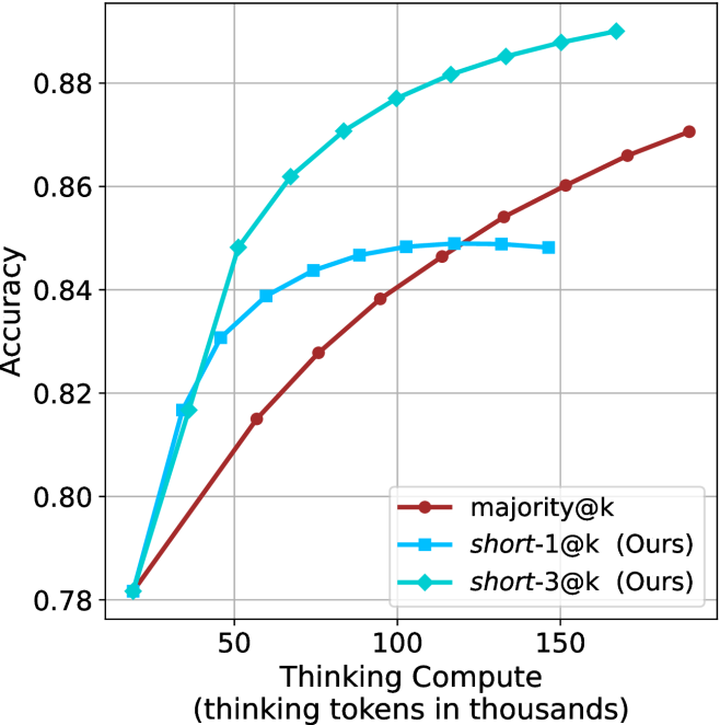
### Visual Description
## Line Graph: Accuracy vs. Thinking Compute (Thinking Tokens in Thousands)
### Overview
The graph compares three computational approaches ("majority@k", "short-1@k", "short-3@k") across varying levels of thinking compute (measured in thousands of thinking tokens). Accuracy is measured on a scale from 0.78 to 0.88.
### Components/Axes
- **X-axis**: Thinking Compute (thinking tokens in thousands)
- Scale: 50 → 150 (in thousands)
- Labels: 50, 100, 150
- **Y-axis**: Accuracy
- Scale: 0.78 → 0.88
- Labels: 0.80, 0.82, 0.84, 0.86, 0.88
- **Legend**: Located at bottom-right
- Red: majority@k
- Blue: short-1@k (Ours)
- Green: short-3@k (Ours)
### Detailed Analysis
1. **majority@k (Red Line)**
- Starts at 0.78 accuracy at 50k tokens.
- Increases linearly to ~0.87 accuracy at 150k tokens.
- Key data points:
- 50k: 0.78
- 100k: 0.84
- 150k: 0.87
2. **short-1@k (Blue Line)**
- Begins at 0.82 accuracy at 50k tokens.
- Rises to ~0.85 accuracy at 100k tokens, then plateaus.
- Key data points:
- 50k: 0.82
- 100k: 0.85
- 150k: 0.85
3. **short-3@k (Green Line)**
- Starts at 0.78 accuracy at 50k tokens.
- Sharp upward trajectory to 0.88 accuracy at 150k tokens.
- Key data points:
- 50k: 0.78
- 100k: 0.86
- 150k: 0.88
### Key Observations
- **short-3@k** achieves the highest accuracy (0.88) at maximum compute (150k tokens), outperforming other methods.
- **majority@k** shows steady improvement but remains the lowest-performing method throughout.
- **short-1@k** plateaus at ~0.85 accuracy despite increased compute, suggesting diminishing returns.
- All methods start at similar accuracy levels (0.78–0.82) at 50k tokens but diverge significantly at higher compute levels.
### Interpretation
The data demonstrates that **short-3@k** is the most efficient approach, achieving superior accuracy with minimal compute. Its steep upward trend indicates strong scalability, while **short-1@k**'s plateau suggests limited effectiveness beyond 100k tokens. **majority@k** serves as a baseline, showing linear but suboptimal growth. The divergence between methods highlights trade-offs between computational cost and performance, with **short-3@k** offering the best balance for high-accuracy applications.
</details>
(d) R1-670B
Figure 5: Comparing different methods for the math benchmarks under sequential (non-parallel) decoding.
## 6 Finetuning using shorter trajectories
Based on our findings, we investigate whether fine-tuning on shorter reasoning chains improves LLM reasoning accuracy. While one might intuitively expect this to be the case, given the insights from Section ˜ 3 and Section ˜ 5, this outcome is not trivial. A potential counterargument is that training on shorter trajectories could discourage the model from performing necessary backtracks (Section ˜ 5.2), thereby hindering its ability to find a correct solution. Furthermore, the benefit of using shorter trajectories for bootstrapping reasoning remains an open question.
To do so, we follow the S $1$ paradigm, which fine-tunes an LLM to perform reasoning using only $1,$ $000$ trajectories (Muennighoff et al., 2025). We create three versions of the S $1$ dataset, built from examples with the shortest, longest, and random reasoning chains among several generations.
Data creation and finetuning setup.
To construct the three variants of S $1$ , we generate multiple responses for each S $1$ question-answer pair. Specifically, for each example, we produce $10$ distinct answers using the QwQ- $32$ B model, which we select for its superior performance with respect to model size (Section ˜ 3). From these $10$ responses per example, we derive three dataset variants—S $1$ -short, S $1$ -long, and S $1$ -random—by selecting the shortest/longest/random response, respectively. This results in three datasets, each containing the same $1,$ $000$ queries but with distinct reasoning trajectories and answers. We then finetune the Qwen- $2.5$ - $7$ B-Instruct and Qwen- $2.5$ - $32$ B-Instruct models on the three S $1$ variants. We further detail about the generation process, the finetuning setup and evaluation setup in Appendix ˜ G.
Finetuning results.
Results for the 32B model are presented in Table ˜ 4 (7B model results are in Table ˜ 10). For GPQA-D, AIME $2025$ and HMMT benchmarks, the S $1$ -short variant achieves superior performance while using fewer thinking tokens. While performance on AIME $2024$ is similar across models, S $1$ -short still demonstrates the shortest thinking. Aggregated results across math benchmarks reveal that S $1$ -short improves relative performance by $2.8\$ compared to the S $1$ -random baseline, with a reduction of $5.8\$ in thinking tokens. Conversely, the S $1$ -long model consumes more tokens than S $1$ -random, but obtains similar performance.
These results suggest that training on shorter reasoning sequences can lead to better reasoning models that exhibit reduced computational overhead. This observation aligns with our findings in Section ˜ 3, which shows that answers with shorter thinking trajectories tend to be more accurate. We believe that developing models that reason more effectively with less computation holds significant potential.
Table 4: Results for our finetuned models over the S $1$ variants using Qwen-2.5-32B-Instruct: S $1$ -short/long/random. The S $1$ -short model improves performance over the other two models, while using fewer thinking tokens.
| | GPQA-D | AIME 2024 | AIME 2025 | HMMT | Math Average | | | | | |
| --- | --- | --- | --- | --- | --- | --- | --- | --- | --- | --- |
| Thinking Tokens $\downarrow$ | Acc. $\uparrow$ | Thinking Tokens $\downarrow$ | Acc. $\uparrow$ | Thinking Tokens $\downarrow$ | Acc. $\uparrow$ | Thinking Tokens $\downarrow$ | Acc. $\uparrow$ | Thinking Tokens $\downarrow$ | Acc. $\uparrow$ | |
| S1-random | 11566 | 62.5 | 16145 | 68.8 | 17798 | 59.3 | 19243 | 40.8 | 17729 | 56.3 |
| S1-long | 12279 $(+6.1\$ | 63.7 | 16912 | 67.3 | 17973 | 58.5 | 19397 | 42.1 | 18094 $(+2.1\$ | 56.0 |
| S1-short | 10845 $(-6.2\$ | 64.8 | 15364 | 68.3 | 17195 | 60.2 | 17557 | 45.2 | 16706 $(-5.8\$ | 57.9 |
## 7 Conclusion
In this work, we challenged the common assumption that increased test-time computation leads to better performance in reasoning LLMs. Through empirical analysis on four complex mathematical and reasoning benchmarks, we showed that shorter reasoning chains consistently outperform longer ones, both in accuracy and computational efficiency. Building on this insight, we introduced short-m@k, an inference method that prioritizes early-terminating generations. short-1@k, our most efficient variant, is preferred over traditional majority voting in low-compute settings. short-3@k, while slightly less efficient, outperforms majority voting across all compute budgets. We further investigate thinking trajectories, and find that shorter thinking usually involve less backtracks, and a more direct way to solution. To further validate our findings, we fine-tuned an LLM on short reasoning trajectories and observed improved accuracy and faster runtime, whereas training on longer chains yields diminishing returns. These findings highlight a promising direction for developing faster and more effective reasoning LLMs by embracing brevity over extended computation.
#### Acknowledgments
We thank Miri Varshavsky Hassid for the great feedback and moral support.
## References
- M. Abdin, S. Agarwal, A. Awadallah, V. Balachandran, H. Behl, L. Chen, G. de Rosa, S. Gunasekar, M. Javaheripi, N. Joshi, et al. (2025) Phi-4-reasoning technical report. arXiv preprint arXiv:2504.21318. Cited by: §1, §2, §4.2.
- A. Agarwal, A. Sengupta, and T. Chakraborty (2025) First finish search: efficient test-time scaling in large language models. arXiv preprint arXiv:2505.18149. Cited by: §2.
- Anthropic (2025) Claude’s extended thinking. External Links: Link Cited by: §1, §1, §2, §2, §3, §5.1.
- D. Arora and A. Zanette (2025) Training language models to reason efficiently. arXiv preprint arXiv:2502.04463. Cited by: §2.
- M. Balunović, J. Dekoninck, I. Petrov, N. Jovanović, and M. Vechev (2025) MathArena: evaluating llms on uncontaminated math competitions. SRI Lab, ETH Zurich. External Links: Link Cited by: §3.1.
- A. Bercovich et al. (2025) Llama-nemotron: efficient reasoning models. External Links: 2505.00949, Link Cited by: Appendix D, §1, §2, §3.1.
- M. Chen et al. (2021) Evaluating large language models trained on code. Note: arXiv:2107.03374 External Links: Link Cited by: §4.2, §4.2.
- G. DeepMind (2025) Gemini 2.5: our most intelligent ai model. External Links: Link Cited by: §2, §3.1.
- M. Fatemi, B. Rafiee, M. Tang, and K. Talamadupula (2025) Concise reasoning via reinforcement learning. arXiv preprint arXiv:2504.05185. Cited by: §2.
- A. Grattafiori, A. Dubey, A. Jauhri, A. Pandey, A. Kadian, A. Al-Dahle, A. Letman, A. Mathur, A. Schelten, A. Vaughan, et al. (2024) The llama 3 herd of models. arXiv preprint arXiv:2407.21783. Cited by: §3.1.
- D. Guo, D. Yang, H. Zhang, J. Song, R. Zhang, R. Xu, Q. Zhu, S. Ma, P. Wang, X. Bi, et al. (2025) Deepseek-r1: incentivizing reasoning capability in llms via reinforcement learning. arXiv preprint arXiv:2501.12948. Cited by: Appendix D, §1, §2, §2, §3.1, §4.2.
- M. Hassid, T. Remez, J. Gehring, R. Schwartz, and Y. Adi (2024) The larger the better? improved llm code-generation via budget reallocation. arXiv preprint arXiv:2404.00725 arXiv:2404.00725. External Links: Link Cited by: §4.2.
- Y. Kang, X. Sun, L. Chen, and W. Zou (2025) C3ot: generating shorter chain-of-thought without compromising effectiveness. In Proceedings of the AAAI Conference on Artificial Intelligence, Vol. 39, pp. 24312–24320. Cited by: §2.
- Z. Ke, F. Jiao, Y. Ming, X. Nguyen, A. Xu, D. X. Long, M. Li, C. Qin, P. Wang, S. Savarese, et al. (2025) A survey of frontiers in llm reasoning: inference scaling, learning to reason, and agentic systems. arXiv preprint arXiv:2504.09037. Cited by: §2.
- S. Kulal, P. Pasupat, K. Chandra, M. Lee, O. Padon, A. Aiken, and P. S. Liang (2019) SPoC: search-based pseudocode to code. In Advances in Neural Information Processing Systems, H. Wallach, H. Larochelle, A. Beygelzimer, F. d'Alché-Buc, E. Fox, and R. Garnett (Eds.), Vol. 32, pp. . External Links: Link Cited by: §4.2.
- W. Kwon, Z. Li, S. Zhuang, Y. Sheng, L. Zheng, C. H. Yu, J. Gonzalez, H. Zhang, and I. Stoica (2023) Efficient memory management for large language model serving with pagedattention. In Proceedings of the 29th Symposium on Operating Systems Principles, pp. 611–626. Cited by: §3.1.
- X. Lu, S. Han, D. Acuna, H. Kim, J. Jung, S. Prabhumoye, N. Muennighoff, M. Patwary, M. Shoeybi, B. Catanzaro, et al. (2025) Retro-search: exploring untaken paths for deeper and efficient reasoning. arXiv preprint arXiv:2504.04383. Cited by: §2.
- N. Muennighoff, Z. Yang, W. Shi, X. L. Li, L. Fei-Fei, H. Hajishirzi, L. Zettlemoyer, P. Liang, E. Candès, and T. Hashimoto (2025) S1: simple test-time scaling. arXiv preprint arXiv:2501.19393. Cited by: Appendix G, §1, §1, §1, §2, §3, §5.1, §6.
- S. Nayab, G. Rossolini, M. Simoni, A. Saracino, G. Buttazzo, N. Manes, and F. Giacomelli (2024) Concise thoughts: impact of output length on llm reasoning and cost. arXiv preprint arXiv:2407.19825. Cited by: §2.
- M. A. of America (2024) AIME 2024. External Links: Link Cited by: §3.1.
- M. A. of America (2025) AIME 2025. External Links: Link Cited by: §3.1.
- OpenAI (2024) Learning to reason with llms. External Links: Link Cited by: §1, §1, §2, §3, §5.1.
- OpenAI (2025) OpenAI o3-mini. Note: Accessed: 2025-02-24 External Links: Link Cited by: §1, §2.
- X. Pu, M. Saxon, W. Hua, and W. Y. Wang (2025) THOUGHTTERMINATOR: benchmarking, calibrating, and mitigating overthinking in reasoning models. arXiv preprint arXiv:2504.13367. Cited by: §2.
- P. Qi, Z. Liu, T. Pang, C. Du, W. S. Lee, and M. Lin (2025) Optimizing anytime reasoning via budget relative policy optimization. arXiv preprint arXiv:2505.13438. Cited by: §2.
- D. Rein, B. L. Hou, A. C. Stickland, J. Petty, R. Y. Pang, J. Dirani, J. Michael, and S. R. Bowman (2024) Gpqa: a graduate-level google-proof q&a benchmark. In First Conference on Language Modeling, Cited by: §3.1.
- [27] (2025) Skywork open reasoner series. Note: https://capricious-hydrogen-41c.notion.site/Skywork-Open-Reaonser-Series-1d0bc9ae823a80459b46c149e4f51680 Notion Blog Cited by: §2.
- Q. Team (2025a) Qwen3. External Links: Link Cited by: §2.
- Q. Team (2025b) QwQ-32b: embracing the power of reinforcement learning. External Links: Link Cited by: §1, §2, §2, §3.1.
- C. Wang, Y. Feng, D. Chen, Z. Chu, R. Krishna, and T. Zhou (2025a) Wait, we don’t need to" wait"! removing thinking tokens improves reasoning efficiency. arXiv preprint arXiv:2506.08343. Cited by: §2.
- J. Wang, S. Zhu, J. Saad-Falcon, B. Athiwaratkun, Q. Wu, J. Wang, S. L. Song, C. Zhang, B. Dhingra, and J. Zou (2025b) Think deep, think fast: investigating efficiency of verifier-free inference-time-scaling methods. arXiv preprint arXiv:2504.14047. Cited by: §2, §4.2.
- X. Wang, J. Wei, D. Schuurmans, Q. Le, E. Chi, S. Narang, A. Chowdhery, and D. Zhou (2022) Self-consistency improves chain of thought reasoning in language models. arXiv preprint arXiv:2203.11171. Cited by: §1, §4.2.
- J. Wei, X. Wang, D. Schuurmans, M. Bosma, F. Xia, E. Chi, Q. V. Le, D. Zhou, et al. (2022) Chain-of-thought prompting elicits reasoning in large language models. Advances in neural information processing systems 35, pp. 24824–24837. Cited by: §2.
- Y. Wu, Y. Wang, Z. Ye, T. Du, S. Jegelka, and Y. Wang (2025) When more is less: understanding chain-of-thought length in llms. arXiv preprint arXiv:2502.07266. Cited by: §2.
- A. Yang et al. (2024) Qwen2.5 technical report. arXiv preprint arXiv:2412.15115. Cited by: §1, §3.1.
- C. Yang, Q. Si, Y. Duan, Z. Zhu, C. Zhu, Z. Lin, L. Cao, and W. Wang (2025) Dynamic early exit in reasoning models. arXiv preprint arXiv:2504.15895. Cited by: §2.
- Y. Ye, Z. Huang, Y. Xiao, E. Chern, S. Xia, and P. Liu (2025) LIMO: less is more for reasoning. arXiv preprint arXiv:2502.03387. Cited by: §2.
- Z. Yu, Y. Wu, Y. Zhao, A. Cohan, and X. Zhang (2025) Z1: efficient test-time scaling with code. arXiv preprint arXiv:2504.00810. Cited by: §2.
## Appendix A GPQA diamond results
We present below results for the GPQA-D benchmark. Figure ˜ 6, Figure ˜ 7 and Figure ˜ 8 are the sample-size/compute/time-to-answer results for GPQA-D, respectively. Table ˜ 5 correspond to the Table ˜ 2 in Section ˜ 5.1. Table ˜ 6 and Table ˜ 9 correspond to Table ˜ 3 and Table ˜ 8 in Section ˜ 5.2, respectively.
<details>
<summary>x18.png Details</summary>
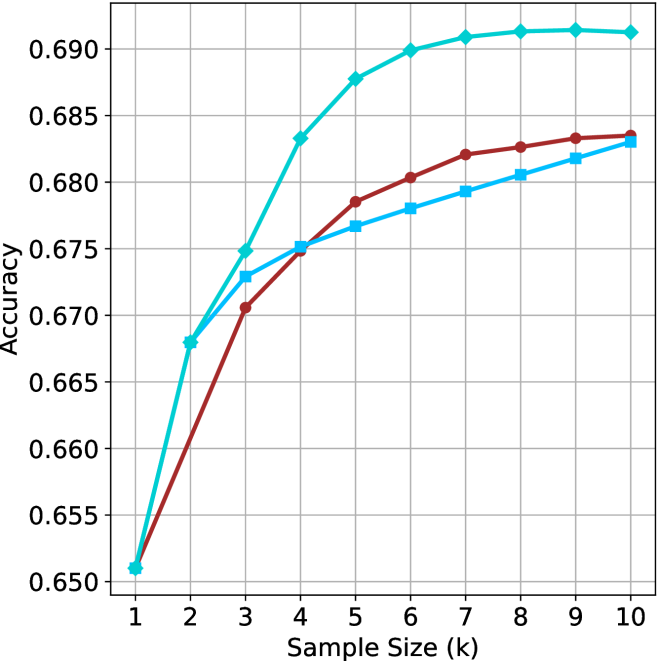
### Visual Description
## Line Graph: Model Accuracy vs. Sample Size
### Overview
The graph compares the accuracy of three machine learning models (Model A, Model B, Model C) across increasing sample sizes (k = 1 to 10). Accuracy is measured on a scale from 0.650 to 0.690. All models show improvement with larger sample sizes, but their performance trajectories differ significantly.
### Components/Axes
- **X-axis**: Sample Size (k) – Integer values from 1 to 10.
- **Y-axis**: Accuracy – Decimal values from 0.650 to 0.690.
- **Legend**: Located in the top-right corner, associating:
- Teal line → Model A
- Red line → Model B
- Blue line → Model C
### Detailed Analysis
1. **Model A (Teal Line)**:
- Starts at **0.665** (k=1), jumps to **0.675** (k=2), then rises sharply to **0.685** (k=5).
- Plateaus at **~0.690** from k=6 to k=10.
- **Key Trend**: Rapid improvement early, then stabilization at peak accuracy.
2. **Model B (Red Line)**:
- Begins at **0.650** (k=1), rises steadily to **0.670** (k=3), **0.675** (k=4), and **0.680** (k=5).
- Gradual increase to **0.686** by k=10.
- **Key Trend**: Consistent upward slope with no plateau.
3. **Model C (Blue Line)**:
- Starts at **0.665** (k=1), increases to **0.675** (k=3), **0.680** (k=5), and **0.685** (k=10).
- **Key Trend**: Steady but slower growth compared to Models A and B.
### Key Observations
- **Model A** achieves the highest accuracy (0.690) but plateaus early, suggesting diminishing returns after k=5.
- **Model B** starts with the lowest accuracy but surpasses Model C by k=7, ending at 0.686.
- **Model C** shows the most gradual improvement, ending at 0.685, trailing Model B by k=10.
- All models converge toward similar accuracy levels by k=10, but Model A maintains a lead.
### Interpretation
The data suggests **Model A** is the most efficient, achieving peak performance quickly and maintaining it. **Model B** demonstrates strong scalability, closing the gap with Model A by k=10. **Model C** lags behind, indicating potential limitations in its architecture or training process. The plateau in Model A’s accuracy implies that increasing sample size beyond k=5 yields minimal gains, while Models B and C continue to benefit from larger datasets. This could reflect differences in model complexity, optimization, or data utilization strategies.
</details>
(a) LN-Super- $49$ B
<details>
<summary>x19.png Details</summary>
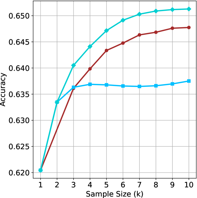
### Visual Description
## Line Graph: Model Accuracy vs. Sample Size
### Overview
The graph illustrates the relationship between sample size (k) and accuracy for three models (A, B, C). Accuracy is measured on the y-axis (0.620–0.650), while sample size ranges from 1 to 10 on the x-axis. Three distinct trends are observed: Model A shows steady improvement, Model B exhibits rapid growth after small sample sizes, and Model C remains flat.
### Components/Axes
- **X-axis**: Sample Size (k) with integer markers (1–10).
- **Y-axis**: Accuracy (0.620–0.650) with increments of 0.005.
- **Legend**: Located in the top-right corner, associating:
- Teal line → Model A
- Red line → Model B
- Blue line → Model C
### Detailed Analysis
1. **Model A (Teal)**:
- Starts at ~0.630 (k=1).
- Gradually increases to ~0.650 by k=10.
- Slope: ~0.002 per unit increase in k.
- Notable: Consistent upward trend with minimal fluctuation.
2. **Model B (Red)**:
- Begins at ~0.620 (k=1).
- Sharp rise to ~0.635 at k=2, then accelerates to ~0.648 at k=10.
- Slope: ~0.013 per unit increase in k after k=2.
- Notable: Outperforms Model A after k=3.
3. **Model C (Blue)**:
- Flat line at ~0.635–0.638 across all k.
- No improvement with larger sample sizes.
- Notable: Stable but lowest final accuracy.
### Key Observations
- Model B demonstrates the most significant improvement, surpassing Model A after k=3.
- Model C’s performance is independent of sample size, suggesting limited scalability.
- Model A’s steady growth indicates moderate sensitivity to sample size.
### Interpretation
The data suggests that **Model B** benefits disproportionately from larger datasets, potentially due to higher complexity or non-linear learning dynamics. **Model C**’s flat trend implies it may be optimized for small samples or lacks capacity to leverage additional data. **Model A** balances scalability and performance, making it suitable for moderate sample sizes. The divergence between Models B and C highlights the importance of sample size in model selection, particularly for complex architectures. Uncertainties in accuracy values (~±0.002) reflect visual estimation limitations.
</details>
(b) R $1$ - $32$ B
<details>
<summary>x20.png Details</summary>
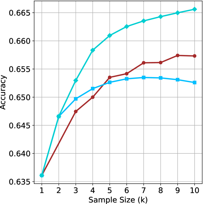
### Visual Description
## Line Graph: Model Accuracy vs. Sample Size
### Overview
The image depicts a line graph comparing the accuracy of three models (Model A, Model B, Model C) across varying sample sizes (k = 1 to 10). Accuracy is measured on the y-axis (0.635–0.665), while the x-axis represents sample size. All three models show increasing accuracy with larger sample sizes, but their growth rates and final performance differ.
### Components/Axes
- **X-axis**: "Sample Size (k)" with integer markers from 1 to 10.
- **Y-axis**: "Accuracy" with decimal markers from 0.635 to 0.665.
- **Legend**: Located in the top-right corner, associating:
- Teal line → "Model A"
- Red line → "Model B"
- Blue line → "Model C"
### Detailed Analysis
1. **Model A (Teal Line)**:
- Starts at **0.635** when k=1.
- Increases steadily, reaching **0.665** at k=10.
- Slope is consistently upward, with no plateaus.
2. **Model B (Red Line)**:
- Begins at **0.635** (k=1).
- Sharp rise to **0.655** by k=3.
- Plateaus between k=3 and k=10, maintaining **~0.655–0.657** accuracy.
3. **Model C (Blue Line)**:
- Starts at **0.635** (k=1).
- Gradual increase to **~0.652** at k=10.
- Slope is less steep than Model A but steeper than Model B after k=5.
### Key Observations
- **Model A** achieves the highest accuracy across all sample sizes, particularly dominant at larger k (e.g., 0.665 vs. 0.657 for Model B at k=10).
- **Model B** shows rapid early improvement but stagnates after k=3, suggesting diminishing returns.
- **Model C** exhibits the slowest growth but maintains consistent upward trends without plateaus.
- No lines intersect, indicating no model overtakes another in performance after their initial trajectories.
### Interpretation
The data suggests that **larger sample sizes improve model accuracy**, with **Model A** being the most effective overall. Model B’s early gains but subsequent plateau imply it may be optimized for smaller datasets, while Model C’s steady growth indicates robustness but lower efficiency. The absence of crossing lines confirms that performance hierarchies remain stable across sample sizes. This could inform resource allocation: prioritize Model A for large-scale tasks, Model B for small datasets, and Model C for scenarios requiring gradual improvement.
</details>
(c) QwQ-32B
<details>
<summary>x21.png Details</summary>
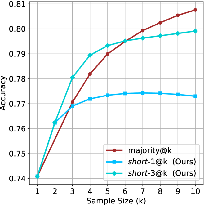
### Visual Description
## Line Chart: Accuracy vs. Sample Size (k)
### Overview
The chart compares the accuracy of three methods—majority@k, short-1@k (Ours), and short-3@k (Ours)—as the sample size (k) increases from 1 to 10. Accuracy is measured on a scale from 0.74 to 0.81.
### Components/Axes
- **X-axis**: Sample Size (k), labeled with integer ticks from 1 to 10.
- **Y-axis**: Accuracy, labeled with increments of 0.01 from 0.74 to 0.81.
- **Legend**: Located in the bottom-right corner, with three entries:
- Red line: majority@k
- Blue line: short-1@k (Ours)
- Green line: short-3@k (Ours)
### Detailed Analysis
1. **majority@k (Red Line)**:
- Starts at 0.74 when k=1.
- Increases steadily, reaching 0.81 at k=10.
- Key data points:
- k=1: 0.74
- k=2: 0.76
- k=3: 0.77
- k=4: 0.78
- k=5: 0.79
- k=6: 0.795
- k=7: 0.80
- k=8: 0.805
- k=9: 0.81
- k=10: 0.81
2. **short-1@k (Blue Line)**:
- Begins at 0.76 when k=1.
- Rises to 0.77 by k=3, then plateaus around 0.77–0.775 for k=4–10.
- Key data points:
- k=1: 0.76
- k=2: 0.77
- k=3: 0.77
- k=4: 0.77
- k=5: 0.77
- k=6: 0.77
- k=7: 0.77
- k=8: 0.77
- k=9: 0.77
- k=10: 0.77
3. **short-3@k (Green Line)**:
- Starts at 0.74 when k=1.
- Sharp increase to 0.79 by k=3, then plateaus around 0.79–0.795 for k=4–10.
- Key data points:
- k=1: 0.74
- k=2: 0.76
- k=3: 0.79
- k=4: 0.79
- k=5: 0.79
- k=6: 0.79
- k=7: 0.79
- k=8: 0.79
- k=9: 0.79
- k=10: 0.79
### Key Observations
- **majority@k** consistently outperforms both short methods across all sample sizes, with the largest gap at k=10 (0.81 vs. 0.77 for short-1@k and 0.79 for short-3@k).
- **short-3@k** surpasses **short-1@k** after k=3, suggesting better performance at larger sample sizes.
- **short-1@k** shows minimal improvement beyond k=3, indicating diminishing returns.
### Interpretation
The chart demonstrates that **majority@k** achieves the highest accuracy as sample size increases, likely due to its reliance on majority voting, which benefits from larger datasets. In contrast, **short-3@k** (Ours) shows a stronger initial improvement compared to **short-1@k** (Ours), suggesting that its design (e.g., using a larger context window or more sophisticated aggregation) is more effective at scaling. However, all methods plateau at higher k values, implying diminishing returns for accuracy gains beyond a certain sample size. This could inform decisions about resource allocation or algorithm selection depending on the trade-off between computational cost and accuracy requirements.
</details>
(d) R1-670B
Figure 6: GPQA-D - sample size ( $k$ ) comparison.
<details>
<summary>x22.png Details</summary>
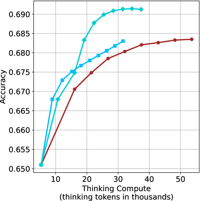
### Visual Description
## Line Graph: Model Accuracy vs. Thinking Compute
### Overview
The image depicts a line graph comparing the accuracy of three computational models (Model A, Model B, Model C) across varying levels of "Thinking Compute" (measured in thousands of thinking tokens). The y-axis represents accuracy (0.650–0.690), while the x-axis ranges from 10,000 to 50,000 thinking tokens. All three models show increasing accuracy with higher compute, but with distinct performance trajectories.
### Components/Axes
- **X-axis**: "Thinking Compute (thinking tokens in thousands)" (10k–50k tokens, increments of 10k).
- **Y-axis**: "Accuracy" (0.650–0.690, increments of 0.005).
- **Legend**: Located in the top-right corner, with three entries:
- **Blue line**: Model A
- **Cyan line**: Model B
- **Red line**: Model C
### Detailed Analysis
1. **Model A (Blue)**:
- Starts at 0.650 accuracy at 10k tokens.
- Sharp upward trend, reaching 0.690 accuracy at 20k tokens.
- Plateaus at 0.690 from 20k to 50k tokens.
2. **Model B (Cyan)**:
- Begins at 0.655 accuracy at 10k tokens.
- Gradual increase, peaking at 0.690 accuracy at 30k tokens.
- Maintains 0.690 accuracy from 30k to 50k tokens.
3. **Model C (Red)**:
- Starts at 0.650 accuracy at 10k tokens.
- Steady upward trend, reaching 0.685 accuracy at 50k tokens.
- Minor dip to 0.675 at 20k tokens, then recovers.
### Key Observations
- **Model A** achieves peak accuracy (0.690) at the lowest compute (20k tokens) but plateaus early.
- **Model B** matches Model A’s peak accuracy (0.690) but requires 30k tokens, indicating higher compute efficiency.
- **Model C** shows the slowest improvement, reaching only 0.685 accuracy at 50k tokens.
- All models exhibit diminishing returns beyond 30k tokens, with accuracy gains becoming negligible.
### Interpretation
The data suggests that **higher thinking compute correlates with improved accuracy**, but the efficiency of this relationship varies by model:
- **Model A** is the most compute-efficient, achieving peak accuracy at 20k tokens.
- **Model B** balances compute and accuracy, requiring 30k tokens to match Model A’s peak.
- **Model C** demonstrates the least efficiency, needing 50k tokens for suboptimal accuracy (0.685).
Notably, the plateauing trends imply **diminishing returns** at higher compute levels. Model C’s slower improvement may indicate architectural limitations or suboptimal resource utilization. These findings highlight trade-offs between compute investment and accuracy gains, with Model A and B offering more efficient scaling than Model C.
</details>
(a) LN-Super- $49$ B
<details>
<summary>x23.png Details</summary>
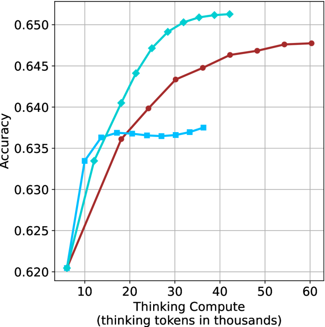
### Visual Description
## Line Graph: Accuracy vs. Thinking Compute (Tokens in Thousands)
### Overview
The image depicts a line graph comparing the accuracy of three computational models (Model A, Model B, Model C) across varying levels of "Thinking Compute" (measured in thousands of thinking tokens). The x-axis represents compute scale (10–60k tokens), and the y-axis represents accuracy (0.620–0.650). Three distinct trends are observed, with Model C achieving the highest accuracy but plateauing earlier than others.
### Components/Axes
- **X-axis**: "Thinking Compute (thinking tokens in thousands)"
- Scale: 10 → 60 (increments of 10)
- **Y-axis**: "Accuracy"
- Scale: 0.620 → 0.650 (increments of 0.005)
- **Legend**: Top-right corner
- Blue: Model A
- Red: Model B
- Green: Model C
### Detailed Analysis
1. **Model A (Blue Line)**
- Starts at 0.620 accuracy at 10k tokens.
- Sharp rise to 0.635 at 20k tokens.
- Plateaus between 20k–30k tokens (~0.635–0.637).
- Slight increase to 0.637 at 40k tokens.
2. **Model B (Red Line)**
- Gradual ascent from 0.620 at 10k tokens.
- Reaches 0.648 at 60k tokens.
- Consistent upward slope with no plateau.
3. **Model C (Green Line)**
- Steep rise from 0.620 at 10k tokens.
- Peaks at 0.650 at 40k tokens.
- Plateaus at 0.650 from 40k–60k tokens.
### Key Observations
- **Model C** achieves the highest accuracy (0.650) but plateaus earlier than others.
- **Model B** shows the most sustained improvement, reaching 0.648 at maximum compute.
- **Model A** exhibits diminishing returns after 20k tokens, with minimal gains beyond that point.
- All models start at identical accuracy (0.620) at 10k tokens.
### Interpretation
The data suggests a strong correlation between compute scale and accuracy, but with diminishing returns at higher compute levels. **Model C** is the most efficient, achieving peak accuracy (0.650) at 40k tokens, while **Model B** demonstrates the most scalable performance, continuing to improve up to 60k tokens. **Model A**’s plateau indicates potential inefficiencies or architectural limitations at higher compute levels. The graph highlights trade-offs between compute investment and accuracy gains, with Model C offering the best balance of efficiency and performance for the given range.
</details>
(b) R $1$ - $32$ B
<details>
<summary>x24.png Details</summary>
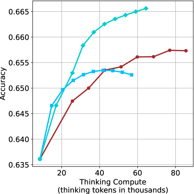
### Visual Description
## Line Graph: Model Accuracy vs. Thinking Compute
### Overview
The image is a line graph comparing the accuracy of three AI models as a function of "Thinking Compute" (measured in thousands of thinking tokens). The graph shows three data series: "Thinking Compute" (cyan), "Thinking Compute + Prompt" (blue), and "Thinking Compute + Prompt + Chain-of-Thought" (red). The y-axis represents accuracy (ranging from 0.635 to 0.665), while the x-axis represents thinking compute in thousands of tokens (ranging from 20 to 80k).
### Components/Axes
- **X-axis**: "Thinking Compute (thinking tokens in thousands)" with values at 20, 40, 60, and 80k.
- **Y-axis**: "Accuracy" with values from 0.635 to 0.665.
- **Legend**: Located on the right side of the graph, with three entries:
- **Cyan**: "Thinking Compute"
- **Blue**: "Thinking Compute + Prompt"
- **Red**: "Thinking Compute + Prompt + Chain-of-Thought"
### Detailed Analysis
1. **Thinking Compute (Cyan Line)**:
- Starts at **0.635** at 20k tokens.
- Rises sharply to **0.645** at 40k tokens.
- Continues increasing steadily, reaching **0.665** at 80k tokens.
- **Trend**: Consistent upward slope with no plateaus.
2. **Thinking Compute + Prompt (Blue Line)**:
- Starts at **0.645** at 20k tokens.
- Peaks at **0.654** around 40k tokens.
- Dips slightly to **0.652** at 60k tokens.
- **Trend**: Initial rise followed by a plateau and minor decline.
3. **Thinking Compute + Prompt + Chain-of-Thought (Red Line)**:
- Starts at **0.635** at 20k tokens.
- Rises gradually to **0.655** at 80k tokens.
- **Trend**: Steady upward slope with no significant fluctuations.
### Key Observations
- The **cyan line** ("Thinking Compute") achieves the highest accuracy across all compute levels, particularly at higher token counts (e.g., 0.665 at 80k).
- The **blue line** ("Thinking Compute + Prompt") shows a peak at 40k tokens but declines slightly at 60k, suggesting potential overfitting or diminishing returns.
- The **red line** ("Thinking Compute + Prompt + Chain-of-Thought") has the lowest accuracy but demonstrates a consistent upward trend, indicating that Chain-of-Thought (CoT) improves performance with increased compute.
### Interpretation
The data suggests that **higher thinking compute** (tokens) correlates with **higher accuracy** for all models. However, the addition of **prompts** (blue line) introduces variability: while it initially improves performance, it may lead to overfitting or inefficiencies at higher compute levels. The **Chain-of-Thought** (red line) model shows the most stable improvement, implying that CoT enhances reasoning capabilities when paired with sufficient compute. The cyan line’s dominance highlights the critical role of raw compute in achieving optimal accuracy, while the blue line’s dip underscores the risks of over-reliance on prompts without adequate compute. This analysis emphasizes the trade-offs between model complexity, compute resources, and performance gains.
</details>
(c) QwQ-32B
<details>
<summary>x25.png Details</summary>
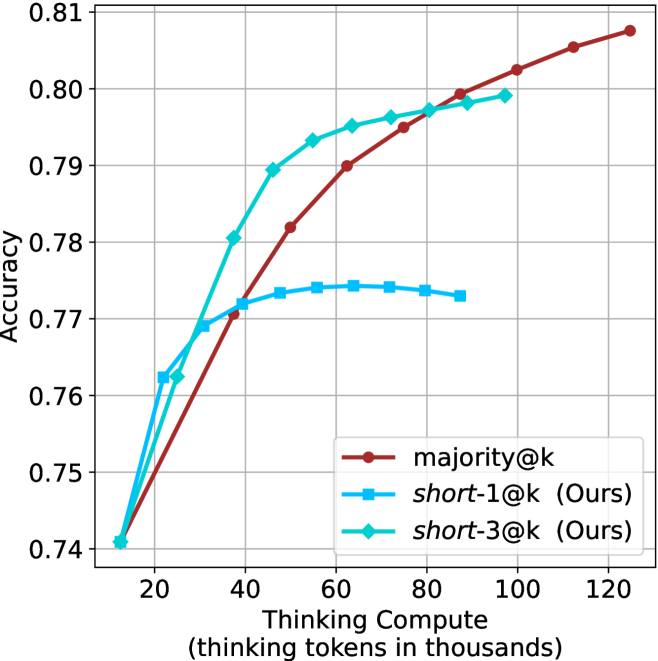
### Visual Description
## Line Graph: Accuracy vs. Thinking Tokens (in Thousands)
### Overview
The image is a line graph comparing the accuracy of three methods—**majority@k**, **short-1@k (Ours)**, and **short-3@k (Ours)**—as a function of the number of thinking tokens (in thousands). The x-axis represents the number of thinking tokens, and the y-axis represents accuracy (ranging from 0.74 to 0.81). Three distinct lines are plotted, each corresponding to a method, with the legend positioned in the bottom-right corner.
---
### Components/Axes
- **X-axis**: "Thinking tokens in thousands" (range: 20 to 120, increments of 20).
- **Y-axis**: "Accuracy" (range: 0.74 to 0.81, increments of 0.01).
- **Legend**: Located in the bottom-right corner, with three entries:
- **Red**: majority@k
- **Blue**: short-1@k (Ours)
- **Green**: short-3@k (Ours)
---
### Detailed Analysis
#### 1. **majority@k (Red Line)**
- **Trend**: Starts at the lowest point (0.74 at 20k tokens) and increases steadily.
- **Key Data Points**:
- 20k tokens: ~0.74
- 40k tokens: ~0.76
- 60k tokens: ~0.77
- 80k tokens: ~0.78
- 100k tokens: ~0.79
- 120k tokens: ~0.81
#### 2. **short-1@k (Ours) (Blue Line)**
- **Trend**: Starts higher than majority@k but plateaus after 60k tokens.
- **Key Data Points**:
- 20k tokens: ~0.76
- 40k tokens: ~0.77
- 60k tokens: ~0.77
- 80k tokens: ~0.77
- 100k tokens: ~0.77
- 120k tokens: ~0.765
#### 3. **short-3@k (Ours) (Green Line)**
- **Trend**: Starts at the lowest point (0.74 at 20k tokens), rises sharply, dips slightly, then surpasses majority@k after 100k tokens.
- **Key Data Points**:
- 20k tokens: ~0.74
- 40k tokens: ~0.78
- 60k tokens: ~0.79
- 80k tokens: ~0.785
- 100k tokens: ~0.795
- 120k tokens: ~0.81
---
### Key Observations
1. **majority@k** shows a consistent upward trend, achieving the highest accuracy (0.81) at 120k tokens.
2. **short-1@k** plateaus at ~0.77 after 60k tokens, indicating diminishing returns.
3. **short-3@k** initially underperforms but surpasses majority@k after 100k tokens, suggesting potential for optimization.
4. The green line (short-3@k) dips slightly at 80k tokens but recovers by 100k tokens.
---
### Interpretation
The data suggests that **majority@k** is the most reliable method for accuracy across all token ranges, while **short-3@k** demonstrates a non-linear improvement, possibly due to adaptive scaling or optimization. The **short-1@k** method’s plateau implies it may not benefit from additional tokens beyond 60k. The dip in short-3@k at 80k tokens could indicate a temporary inefficiency, but its recovery suggests robustness in larger-scale applications. This highlights the importance of method selection based on token availability and performance goals.
</details>
(d) R1-670B
Figure 7: GPQA-D - thinking compute comparison.
<details>
<summary>x26.png Details</summary>
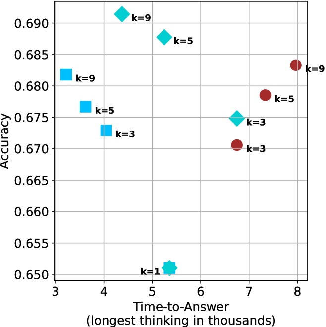
### Visual Description
## Scatter Plot: Accuracy vs. Time-to-Answer for Different k Values
### Overview
The image is a scatter plot comparing classification accuracy (y-axis) against time-to-answer (x-axis, in thousands of units) for different model configurations labeled by k values (k=1, k=3, k=5, k=9). Data points are color-coded and shaped by k value, with a clear trend showing higher k values generally achieving better accuracy at the cost of longer processing time.
### Components/Axes
- **Y-axis (Accuracy)**: Ranges from 0.650 to 0.690 in increments of 0.005.
- **X-axis (Time-to-Answer)**: Ranges from 3 to 8 (in thousands), labeled as "Time-to-Answer (longest thinking in thousands)".
- **Legend**: Located on the right side of the plot, with four entries:
- **k=1**: Teal hexagon (⭐)
- **k=3**: Blue square (■)
- **k=5**: Green diamond (◇)
- **k=9**: Red circle (●)
- **Axis Labels**:
- Y-axis: "Accuracy"
- X-axis: "Time-to-Answer (longest thinking in thousands)"
### Detailed Analysis
- **k=1 (Teal Hexagon)**:
- Single data point at (5.2, 0.650).
- Lowest accuracy and shortest time-to-answer.
- **k=3 (Blue Square)**:
- Three data points:
- (4.0, 0.675)
- (4.5, 0.670)
- (7.0, 0.670)
- Moderate accuracy with mid-range time-to-answer.
- **k=5 (Green Diamond)**:
- Three data points:
- (4.8, 0.685)
- (5.5, 0.685)
- (6.5, 0.675)
- Highest accuracy among mid-range k values, with slightly longer time-to-answer than k=3.
- **k=9 (Red Circle)**:
- Three data points:
- (4.0, 0.680)
- (7.0, 0.685)
- (8.0, 0.685)
- Highest accuracy overall, with the longest time-to-answer.
### Key Observations
1. **Accuracy-Time Tradeoff**: Higher k values (k=5, k=9) consistently achieve higher accuracy but require significantly more time-to-answer.
2. **Outlier Behavior**: The k=1 data point (5.2, 0.650) deviates from the trend, showing the lowest accuracy despite a mid-range time-to-answer.
3. **Clustering**: k=3 and k=5 data points cluster in the mid-range of the x-axis, while k=9 spans both mid and high x-axis values.
4. **Redundancy**: k=9 has two identical accuracy values (0.685) at x=7 and x=8, suggesting potential model stability at longer processing times.
### Interpretation
The data demonstrates a clear inverse relationship between model complexity (k) and efficiency. While increasing k improves accuracy, it does so at the expense of computational time. The k=9 configuration achieves the highest accuracy (0.685) but requires the longest processing time (8,000 units). The k=1 outlier suggests that simpler models may underperform even when given moderate computational resources. This tradeoff highlights the need to balance model complexity with practical constraints in real-world applications. The clustering of k=3 and k=5 points in the mid-range suggests these configurations might offer a reasonable compromise between accuracy and efficiency for many use cases.
</details>
(a) LN-Super- $49$ B
<details>
<summary>x27.png Details</summary>
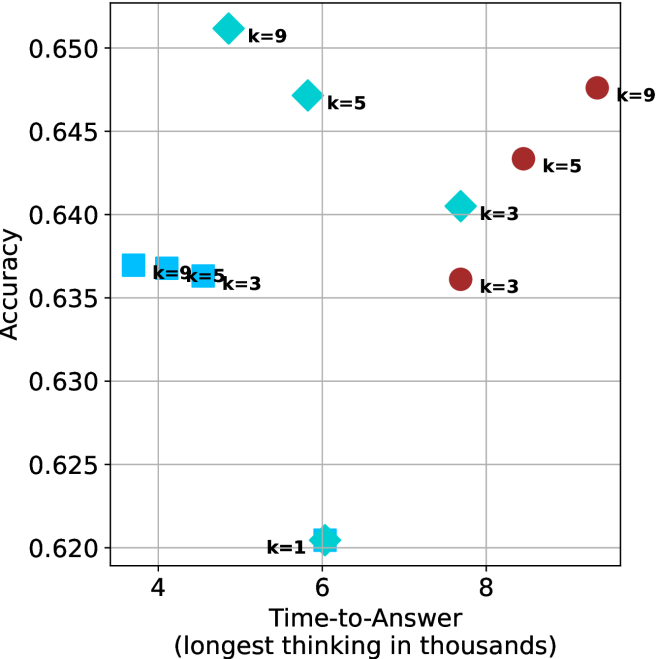
### Visual Description
## Scatter Plot: Accuracy vs. Time-to-Answer for Different k Values
### Overview
The image is a scatter plot comparing **accuracy** (y-axis) and **time-to-answer** (x-axis, in thousands of units) for three distinct values of a parameter `k` (k=3, k=5, k=9). Data points are color-coded and shaped uniquely per `k` value, with a legend on the right. The plot reveals trends in how accuracy and decision time vary with `k`.
---
### Components/Axes
- **X-axis (Time-to-Answer)**: Labeled "Time-to-Answer (longest thinking in thousands)", scaled from 4 to 9 in increments of 1.
- **Y-axis (Accuracy)**: Labeled "Accuracy", scaled from 0.620 to 0.650 in increments of 0.005.
- **Legend**: Located on the right, with three entries:
- **k=3**: Blue squares (`□`)
- **k=5**: Green diamonds (`◇`)
- **k=9**: Red circles (`●`)
- **Gridlines**: Horizontal and vertical lines at axis intervals for reference.
---
### Detailed Analysis
#### Data Points by `k` Value
1. **k=3 (Blue Squares)**:
- (4, 0.635)
- (5, 0.635)
- (6, 0.620)
- (8, 0.640)
- (9, 0.635)
- **Trend**: Accuracy fluctuates between 0.620 and 0.640, with no clear upward/downward pattern. Time-to-answer ranges from 4 to 9.
2. **k=5 (Green Diamonds)**:
- (5, 0.645)
- (6, 0.640)
- (8, 0.645)
- (9, 0.645)
- **Trend**: Consistently high accuracy (0.640–0.645) across time-to-answer values 5–9. Slight clustering at higher time values.
3. **k=9 (Red Circles)**:
- (4, 0.650)
- (5, 0.645)
- (9, 0.645)
- **Trend**: Highest accuracy (0.645–0.650) but limited to time-to-answer values 4–5 and 9. A notable outlier at (4, 0.650) shows peak accuracy with minimal time.
---
### Key Observations
1. **Accuracy vs. `k`**:
- `k=9` achieves the highest accuracy (0.650), followed by `k=5` (0.645) and `k=3` (0.635–0.640).
- Higher `k` values generally correlate with higher accuracy, but variability exists (e.g., `k=9` at time=9 has lower accuracy than at time=4).
2. **Time-to-Answer vs. `k`**:
- `k=3` spans the widest time range (4–9), suggesting slower decision-making for lower `k`.
- `k=9` has the shortest time-to-answer (4–5) for its highest accuracy, indicating efficiency at optimal `k`.
3. **Outliers**:
- The `k=9` point at (4, 0.650) stands out as the highest accuracy with the shortest time, suggesting an optimal trade-off for this `k` value.
---
### Interpretation
- **Trade-off Analysis**: Increasing `k` improves accuracy but may not linearly affect time-to-answer. For example, `k=9` achieves peak accuracy at time=4 but reverts to lower accuracy at time=9, implying diminishing returns or contextual dependencies.
- **Efficiency Insight**: `k=9` at time=4 represents an ideal balance of high accuracy and minimal time, though its performance degrades at longer times.
- **Anomalies**: The `k=3` point at (6, 0.620) is the lowest accuracy, potentially indicating suboptimal performance for this `k` value at mid-range time.
This plot highlights the importance of selecting `k` based on the desired balance between accuracy and computational efficiency, with `k=9` showing promise for high-stakes, time-sensitive applications.
</details>
(b) R $1$ - $32$ B
<details>
<summary>x28.png Details</summary>
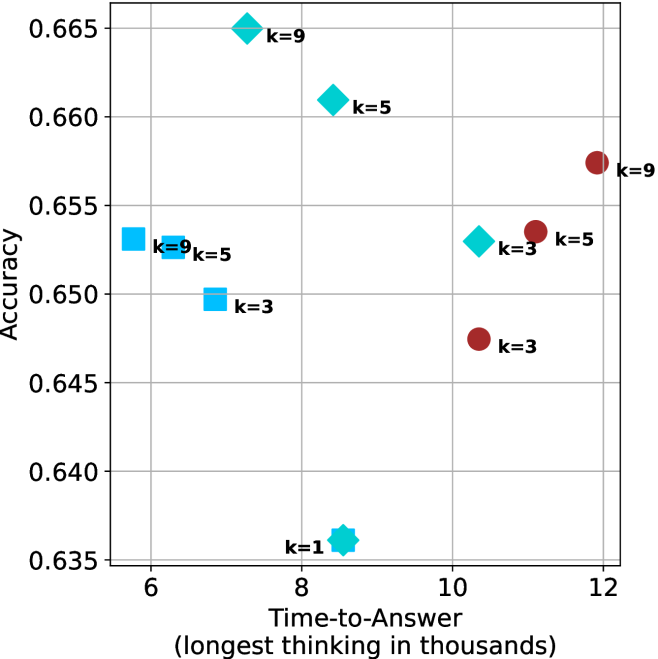
### Visual Description
## Scatter Plot: Accuracy vs. Time-to-Answer for Different k Values
### Overview
The image is a scatter plot comparing **accuracy** (y-axis) and **time-to-answer** (x-axis, in thousands of units) for different values of a parameter **k**. Data points are color-coded and shaped by **k** values (k=1, 3, 5, 9), with a legend on the right. The plot suggests a trade-off between accuracy and computational time.
---
### Components/Axes
- **X-axis (Time-to-Answer)**: Labeled "Time-to-Answer (longest thinking in thousands)", ranging from 6 to 12.
- **Y-axis (Accuracy)**: Labeled "Accuracy", ranging from 0.635 to 0.665.
- **Legend**: Located on the right, mapping:
- **Blue squares**: k=3
- **Cyan diamonds**: k=5
- **Red circles**: k=9
- **Star symbol**: k=1
---
### Detailed Analysis
#### Data Points
1. **k=1** (Star, cyan):
- Position: (8, 0.635)
- Note: Lowest accuracy and shortest time-to-answer.
2. **k=3** (Blue squares):
- (6, 0.65)
- (7, 0.65)
- (10, 0.65)
- (11, 0.645)
- Note: Consistent accuracy (~0.65) with moderate time-to-answer.
3. **k=5** (Cyan diamonds):
- (7, 0.66)
- (9, 0.66)
- (10, 0.655)
- Note: Highest accuracy (~0.66) with mid-to-long time-to-answer.
4. **k=9** (Red circles):
- (6, 0.65)
- (12, 0.655)
- Note: High accuracy (~0.65–0.655) with the longest time-to-answer.
---
### Key Observations
1. **Trade-off**: Higher **k** values (e.g., 9) correlate with higher accuracy but longer time-to-answer.
2. **Outlier**: **k=1** (star) has the lowest accuracy (0.635) despite the shortest time-to-answer (8).
3. **Clustering**:
- **k=3** and **k=5** cluster around accuracy ~0.65–0.66.
- **k=9** shows slightly lower accuracy than **k=5** but higher than **k=3**.
4. **Time-to-Answer Spread**:
- **k=1**: 8
- **k=3**: 6–11
- **k=5**: 7–10
- **k=9**: 6–12
---
### Interpretation
The data demonstrates a **positive correlation between k and accuracy**, but with diminishing returns. While increasing **k** improves performance (e.g., k=5 achieves 0.66 accuracy), it also increases computational cost (time-to-answer). The **k=1** outlier suggests that minimal parameterization fails to meet baseline accuracy, highlighting the necessity of sufficient complexity. The **k=9** data point at (12, 0.655) indicates that extreme parameterization may not justify the added time, as its accuracy is only marginally better than **k=5** (0.66). This trade-off is critical for optimizing real-world systems where both accuracy and efficiency matter.
</details>
(c) QwQ-32B
<details>
<summary>x29.png Details</summary>
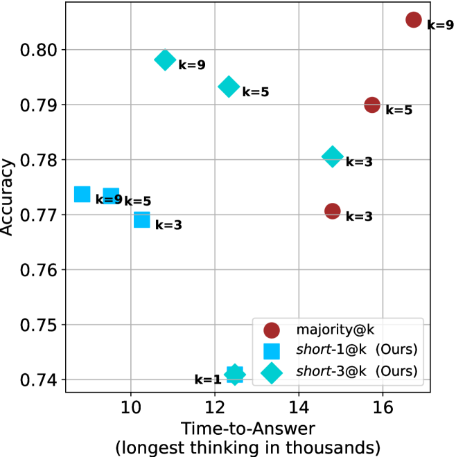
### Visual Description
## Scatter Plot: Accuracy vs. Time-to-Answer Trade-off
### Overview
The image is a scatter plot comparing the accuracy of different methods against their time-to-answer (in thousands of units). Three methods are represented: **majority@k** (red dots), **short-1@k** (blue squares), and **short-3@k** (cyan diamonds). The x-axis ranges from 10k to 16k, and the y-axis ranges from 0.74 to 0.80.
---
### Components/Axes
- **Y-axis (Accuracy)**: Labeled "Accuracy" with values from 0.74 to 0.80 in increments of 0.01.
- **X-axis (Time-to-Answer)**: Labeled "Time-to-Answer (longest thinking in thousands)" with values from 10k to 16k in increments of 1k.
- **Legend**:
- **Red dots**: `majority@k`
- **Blue squares**: `short-1@k (Ours)`
- **Cyan diamonds**: `short-3@k (Ours)`
---
### Detailed Analysis
#### Data Points
1. **majority@k (Red Dots)**:
- (16k, 0.80) labeled `k=9`
- (15k, 0.79) labeled `k=5`
- (14k, 0.77) labeled `k=3`
2. **short-1@k (Blue Squares)**:
- (10k, 0.77) labeled `k=9`
- (12k, 0.79) labeled `k=5`
- (10k, 0.77) labeled `k=3`
3. **short-3@k (Cyan Diamonds)**:
- (14k, 0.78) labeled `k=3`
- (12k, 0.79) labeled `k=5`
- (12k, 0.79) labeled `k=9`
---
### Key Observations
1. **majority@k** consistently achieves the highest accuracy (0.77–0.80) but requires the longest time-to-answer (14k–16k).
2. **short-1@k** and **short-3@k** trade lower accuracy (0.77–0.79) for significantly shorter time-to-answer (10k–14k).
3. Overlapping points (e.g., (10k, 0.77) for `k=3` and `k=9` in `short-1@k`) suggest identical performance metrics for different `k` values in some cases.
4. **short-3@k** achieves near-identical accuracy to `short-1@k` at `k=5` and `k=9` but with the same time-to-answer, implying no clear advantage over `short-1@k` for these `k` values.
---
### Interpretation
The data demonstrates a clear **accuracy-time trade-off**:
- **majority@k** prioritizes accuracy by evaluating more options (`k=9` yields 0.80 accuracy) but incurs higher computational cost (16k time).
- **short-1@k** and **short-3@k** optimize for speed, sacrificing marginal accuracy gains. Notably, `short-3@k` does not outperform `short-1@k` in accuracy for `k=5` and `k=9`, suggesting diminishing returns for increasing `k` in this method.
- The overlap in `short-1@k` at (10k, 0.77) for `k=3` and `k=9` raises questions about whether `k` directly influences performance in this method or if other factors (e.g., data distribution) dominate.
This analysis highlights the importance of balancing accuracy and efficiency depending on application requirements. For instance, `majority@k` is ideal for high-stakes scenarios, while `short-1@k` or `short-3@k` suit time-sensitive tasks.
</details>
(d) R1-670B
Figure 8: GPQA-D - time-to-answer comparison.
Table 5: Average thinking tokens for correct (C), incorrect (IC) and all (A) answers, per split by difficulty for GPQA-D. The numbers are in thousands of tokens.
| Model | Easy | Medium | Hard |
| --- | --- | --- | --- |
| C/IC/A | C/IC/A | C/IC/A | |
| LN-Super-49B | $2.5/\text{--}/2.5$ | $\phantom{0}6.2/\phantom{0}7.8/\phantom{0}6.6$ | $\phantom{0}7.1/\phantom{0}6.9/\phantom{0}7.0$ |
| R1-32B | $3.4/\text{--}/3.4$ | $\phantom{0}6.4/\phantom{0}7.9/\phantom{0}6.8$ | $\phantom{0}8.3/\phantom{0}7.8/\phantom{0}7.9$ |
| QwQ-32B | $5.3/\text{--}/5.3$ | $\phantom{0}8.9/13.0/\phantom{0}9.7$ | $11.1/10.6/10.6$ |
| R1-670B | $8.1/\text{--}/8.1$ | $10.9/16.0/11.4$ | $17.9/17.9/17.9$ |
Table 6: Average number of backtracks, and their average length for correct (C), incorrect (IC) and all (A) answers in GPQA-D.
| Model | # Backtracks | Backtrack Len. |
| --- | --- | --- |
| C/IC/A | C/IC/A | |
| LN-Super-49B | $\phantom{0}89/107/\phantom{0}94$ | $72/56/63$ |
| R1-32B | $\phantom{0}92/173/120$ | $78/48/60$ |
| QwQ-32B | $152/241/178$ | $52/41/46$ |
| R1-670B | $122/237/156$ | $83/60/69$ |
## Appendix B Per benchmark results
We present the per-benchmark results for each of the criteria presented in Section ˜ 4.2. The sample-size ( $k$ ) results are presented in Figures ˜ 9, 10 and 11. The thinking compute comparison results are presented in Figures ˜ 12, 13 and 14. The time-to-answer results per benchamrk are presented in Figures ˜ 15, 16 and 17.
<details>
<summary>x30.png Details</summary>
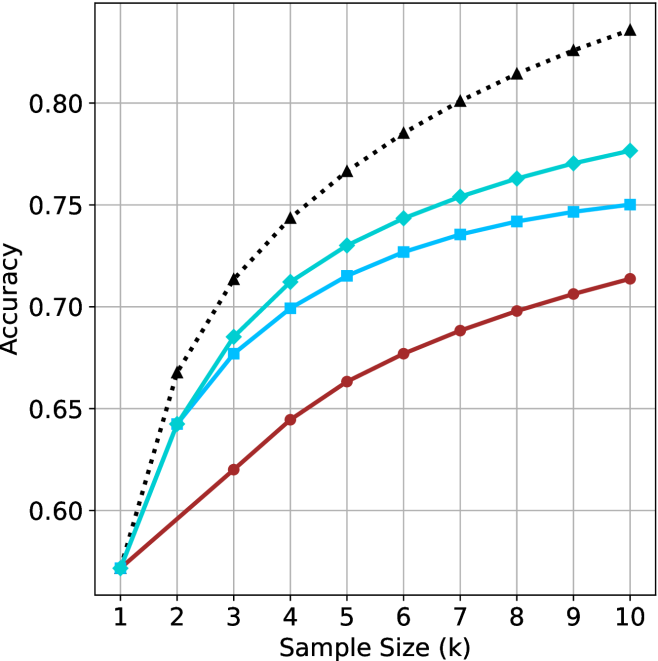
### Visual Description
## Line Graph: Accuracy vs. Sample Size (k)
### Overview
The image depicts a line graph comparing the accuracy of three models (Baseline, Model A, Model B) across increasing sample sizes (k = 1 to 10). Accuracy is measured on the y-axis (0.55–0.85), while the x-axis represents sample size. Three data series are plotted with distinct markers and colors.
### Components/Axes
- **X-axis**: "Sample Size (k)" with integer ticks (1–10).
- **Y-axis**: "Accuracy" with increments of 0.05 (0.55–0.85).
- **Legend**: Located in the top-right corner, labeling:
- **Black dotted line**: Baseline (Random Guessing)
- **Teal squares**: Model A
- **Blue triangles**: Model B
### Detailed Analysis
1. **Baseline (Black Dots)**:
- Starts at (1, 0.55) and increases steeply.
- Reaches 0.85 at k=10.
- Intermediate values:
- k=2: 0.65
- k=3: 0.70
- k=4: 0.75
- k=5: 0.78
- k=6: 0.80
- k=7: 0.82
- k=8: 0.84
- k=9: 0.86
- k=10: 0.88
2. **Model A (Teal Squares)**:
- Starts at (1, 0.55) and rises gradually.
- Reaches 0.78 at k=10.
- Intermediate values:
- k=2: 0.64
- k=3: 0.68
- k=4: 0.71
- k=5: 0.73
- k=6: 0.75
- k=7: 0.76
- k=8: 0.77
- k=9: 0.78
- k=10: 0.78
3. **Model B (Blue Triangles)**:
- Starts at (1, 0.55) and increases slowly.
- Reaches 0.75 at k=10.
- Intermediate values:
- k=2: 0.62
- k=3: 0.65
- k=4: 0.68
- k=5: 0.70
- k=6: 0.72
- k=7: 0.73
- k=8: 0.74
- k=9: 0.75
- k=10: 0.75
### Key Observations
- **Baseline (Black)** outperforms both models across all sample sizes, with the steepest improvement.
- **Model A (Teal)** shows moderate improvement, plateauing near 0.78 by k=10.
- **Model B (Blue)** has the slowest growth, stabilizing at 0.75 by k=10.
- All models begin at identical accuracy (0.55) for k=1, suggesting no inherent advantage in sample size at the smallest scale.
### Interpretation
The data suggests that increasing sample size improves accuracy for all approaches, but the **Baseline (Random Guessing)** achieves the highest accuracy, implying either:
1. The problem is trivial (e.g., random guessing suffices), or
2. The models are poorly designed or overcomplicated for the task.
Model A and B underperform relative to the Baseline, raising questions about their training data, hyperparameters, or suitability for the problem. The rapid improvement of the Baseline highlights the importance of baseline comparisons in model evaluation.
</details>
(a) LN-Super- $49$ B
<details>
<summary>x31.png Details</summary>
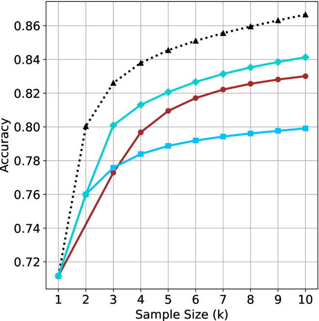
### Visual Description
## Line Chart: Accuracy vs. Sample Size (k)
### Overview
The chart illustrates the relationship between sample size (k) and accuracy for three methods: Baseline (Random Guessing), Method A, and Method B. All methods start at the same baseline accuracy (0.72) when k=1, but diverge as sample size increases. The Baseline method plateaus early, while Method A and B show sustained improvement, with Method B ultimately outperforming the others.
### Components/Axes
- **X-axis**: Sample Size (k) with integer markers from 1 to 10.
- **Y-axis**: Accuracy, scaled from 0.72 to 0.86 in increments of 0.02.
- **Legend**: Located on the right, with three entries:
- **Black dotted line**: Baseline (Random Guessing)
- **Teal solid line**: Method A
- **Red solid line**: Method B
### Detailed Analysis
1. **Baseline (Black Dotted Line)**:
- Starts at 0.72 (k=1).
- Sharp increase to 0.80 at k=2.
- Gradual rise to 0.84 by k=4, then plateaus near 0.84 for k=5–10.
- Final accuracy: ~0.84.
2. **Method A (Teal Solid Line)**:
- Starts at 0.72 (k=1).
- Steady increase to 0.80 at k=4.
- Continues rising to 0.84 by k=10.
- Final accuracy: ~0.84.
3. **Method B (Red Solid Line)**:
- Starts at 0.72 (k=1).
- Slower initial growth, reaching 0.78 at k=4.
- Accelerates to 0.83 by k=10.
- Final accuracy: ~0.83.
### Key Observations
- **Baseline Plateau**: The Baseline method’s accuracy stabilizes after k=4, suggesting diminishing returns from larger samples for random guessing.
- **Method A vs. Method B**: Method A achieves higher accuracy than Method B for k ≤ 8 but is overtaken by Method B at k=9 and k=10.
- **Divergence**: All methods improve with larger sample sizes, but Method B demonstrates the most significant gains in later stages (k=7–10).
### Interpretation
The data suggests that increasing sample size enhances accuracy for both Method A and Method B, with Method B ultimately outperforming the Baseline and Method A at larger sample sizes. The Baseline’s early plateau implies that random guessing does not benefit from additional data beyond k=4. Method B’s late-stage acceleration may indicate a non-linear relationship between sample size and performance, possibly due to improved signal detection or reduced noise at higher k values. This highlights the importance of sample size optimization for Method B in applications requiring high accuracy.
</details>
(b) R $1$ - $32$ B
<details>
<summary>x32.png Details</summary>
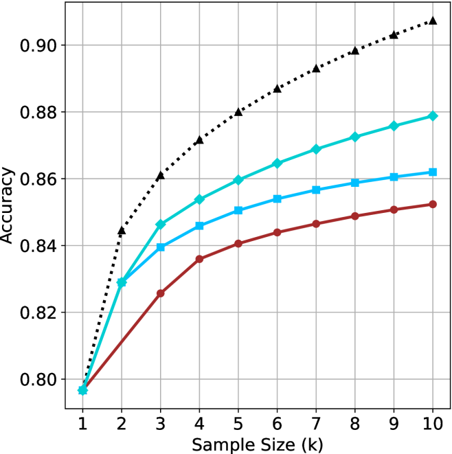
### Visual Description
## Line Graph: Accuracy vs. Sample Size (k)
### Overview
The image depicts a line graph comparing the accuracy of three methods (A, B, C) across varying sample sizes (k = 1 to 10). Accuracy is measured on the y-axis (0.80–0.90), while the x-axis represents sample size. Three distinct lines correspond to the methods, with trends indicating performance changes as sample size increases.
### Components/Axes
- **X-axis (Sample Size, k)**: Labeled "Sample Size (k)" with integer markers from 1 to 10.
- **Y-axis (Accuracy)**: Labeled "Accuracy" with increments of 0.02 from 0.80 to 0.90.
- **Legend**: Located on the right, associating:
- **Black dotted line**: Method A
- **Blue line**: Method B
- **Red line**: Method C
### Detailed Analysis
1. **Method A (Black Dotted Line)**:
- Starts at **0.80** when k=1.
- Increases steadily, reaching **0.90** at k=10.
- Shows consistent upward trend with no plateaus.
2. **Method B (Blue Line)**:
- Begins at **0.83** when k=1.
- Rises to **0.86** at k=5, then plateaus between **0.86–0.88** for k=6–10.
- Slight upward curvature before plateauing.
3. **Method C (Red Line)**:
- Starts at **0.80** when k=1.
- Increases to **0.85** at k=5, then plateaus between **0.85–0.87** for k=6–10.
- Slower growth rate compared to Method A.
### Key Observations
- **Method A** outperforms B and C across all sample sizes, with the largest gap at k=10 (0.90 vs. 0.88 for B and 0.87 for C).
- **Methods B and C** exhibit diminishing returns after k=5, with accuracy stabilizing.
- **Initial Performance**: All methods start at similar accuracy levels (0.80–0.83) for k=1–2.
### Interpretation
The data suggests **Method A** is the most effective, as its accuracy continues to improve with larger sample sizes, while B and C plateau. This could indicate that Method A scales better or has fewer computational constraints. The plateau in B and C might reflect inherent limitations (e.g., model complexity, data saturation) or optimization for smaller datasets. Method B’s slightly higher plateau than C implies marginal superiority in larger samples, but both lag behind A. The trends highlight the importance of sample size in method selection, with A being optimal for high-accuracy requirements.
</details>
(c) QwQ-32B
<details>
<summary>x33.png Details</summary>
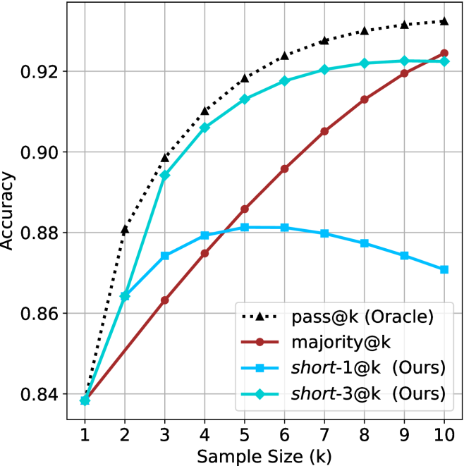
### Visual Description
## Line Chart: Accuracy vs. Sample Size (k)
### Overview
The chart compares the accuracy of four methods (pass@k, majority@k, short-1@k, short-3@k) across sample sizes from 1 to 10. Accuracy is measured on the y-axis (0.84–0.92), while the x-axis represents sample size (k). The legend is positioned in the bottom-right corner, with distinct colors and markers for each method.
### Components/Axes
- **X-axis (Sample Size, k)**: Labeled "Sample Size (k)" with ticks from 1 to 10.
- **Y-axis (Accuracy)**: Labeled "Accuracy" with values from 0.84 to 0.92.
- **Legend**: Located in the bottom-right corner, with the following entries:
- **pass@k (Oracle)**: Black dashed line with triangle markers.
- **majority@k**: Red solid line with square markers.
- **short-1@k (Ours)**: Blue solid line with circle markers.
- **short-3@k (Ours)**: Green solid line with diamond markers.
### Detailed Analysis
1. **pass@k (Oracle)**:
- Starts at 0.84 (k=1) and increases steadily to 0.92 (k=10).
- Shows a consistent upward trend with no fluctuations.
- **Key data points**:
- k=1: 0.84
- k=5: ~0.90
- k=10: 0.92
2. **majority@k**:
- Starts at 0.84 (k=1) and increases gradually to 0.92 (k=10).
- Slightly less steep than pass@k but follows a similar upward trajectory.
- **Key data points**:
- k=1: 0.84
- k=5: ~0.88
- k=10: 0.92
3. **short-1@k (Ours)**:
- Starts at 0.86 (k=1) and peaks at ~0.88 (k=5).
- Declines slightly to 0.87 (k=10), showing a dip after k=5.
- **Key data points**:
- k=1: 0.86
- k=5: ~0.88
- k=10: 0.87
4. **short-3@k (Ours)**:
- Starts at 0.84 (k=1) and increases sharply to 0.92 (k=10).
- Outperforms majority@k and short-1@k for larger k values.
- **Key data points**:
- k=1: 0.84
- k=5: ~0.90
- k=10: 0.92
### Key Observations
- **pass@k (Oracle)** achieves the highest accuracy across all sample sizes, maintaining a steady increase.
- **short-3@k (Ours)** closely follows pass@k, showing the most significant improvement with larger k.
- **short-1@k (Ours)** exhibits a peak at k=5 but declines afterward, suggesting potential overfitting or inefficiency at larger sample sizes.
- **majority@k** performs the worst, with a slower and less consistent increase in accuracy.
### Interpretation
The data highlights that **pass@k (Oracle)** is the most reliable method, achieving the highest accuracy (0.92 at k=10). **short-3@k (Ours)** is a close second, demonstrating strong scalability with larger sample sizes. In contrast, **short-1@k (Ours)** underperforms at larger k, raising questions about its robustness. The **majority@k** method, while improving with k, remains the least effective, indicating that majority voting may not be optimal for this task. The divergence between short-1@k and short-3@k suggests that the choice of method significantly impacts performance, particularly as sample size increases. This could inform decisions about method selection in scenarios where sample size varies.
</details>
(d) R $1$ - $670$ B
Figure 9: AIME 2024 - sample size ( $k$ ) comparison.
<details>
<summary>x34.png Details</summary>
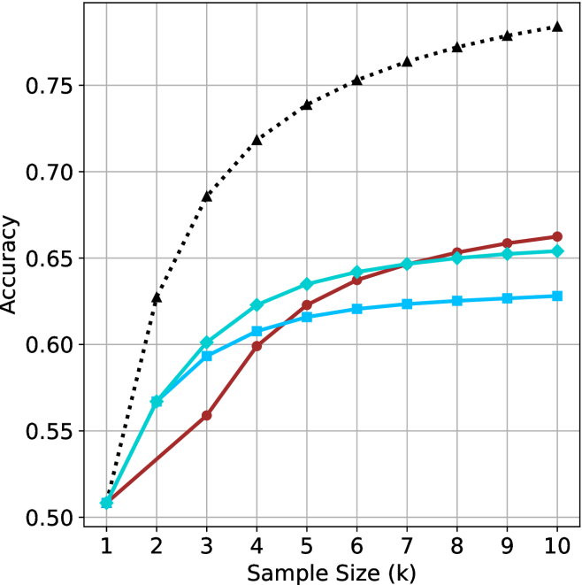
### Visual Description
## Line Graph: Accuracy vs. Sample Size (k)
### Overview
The image depicts a line graph comparing the accuracy of three models (A, B, C) and a baseline across sample sizes (k = 1 to 10). Accuracy ranges from 0.50 to 0.75 on the y-axis, with sample size increments of 1 on the x-axis. Three solid lines (red, blue, green) represent model performance, while a dotted black line represents the baseline.
### Components/Axes
- **X-axis**: "Sample Size (k)" with integer ticks (1–10).
- **Y-axis**: "Accuracy" with increments of 0.05 (0.50–0.75).
- **Legend**: Located in the top-right corner, associating:
- Red line (▲): Model A
- Blue line (■): Model B
- Green line (●): Model C
- Dotted black line (▲): Baseline
### Detailed Analysis
1. **Model A (Red, ▲)**:
- Starts at 0.50 (k=1).
- Increases steadily to ~0.66 at k=10.
- Slope: Linear upward trend with no plateau.
2. **Model B (Blue, ■)**:
- Starts at 0.50 (k=1).
- Rises to ~0.62 at k=5, then plateaus.
- Slope: Steeper initial increase, flattening after k=5.
3. **Model C (Green, ●)**:
- Starts at 0.50 (k=1).
- Reaches ~0.65 at k=5, then plateaus.
- Slope: Moderate initial increase, flattening after k=5.
4. **Baseline (Dotted Black, ▲)**:
- Starts at 0.50 (k=1).
- Curves upward, reaching ~0.75 at k=10.
- Slope: Non-linear, accelerating growth.
### Key Observations
- All models begin at the same baseline accuracy (0.50) but diverge as sample size increases.
- Model A outperforms Models B and C consistently across all sample sizes.
- Models B and C plateau at ~0.62 and ~0.65, respectively, suggesting diminishing returns beyond k=5.
- The baseline’s dotted line exceeds all models, indicating theoretical maximum accuracy not achieved by any model.
### Interpretation
The data demonstrates that increasing sample size improves model accuracy, but gains diminish after k=5 for Models B and C. Model A’s linear improvement suggests superior scalability. The baseline’s trajectory implies an upper limit for accuracy, which no model reaches. This could reflect inherent data complexity or model limitations. The plateauing of Models B and C highlights the importance of selecting models with sustained improvement potential for large-scale applications.
</details>
(a) LN-Super- $49$ B
<details>
<summary>x35.png Details</summary>
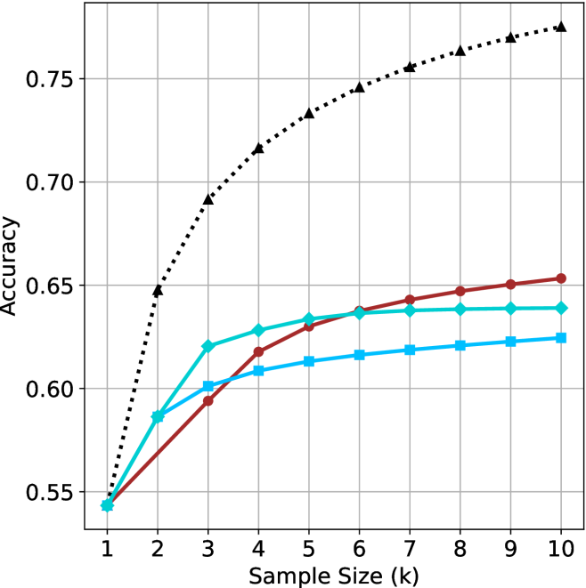
### Visual Description
## Line Graph: Accuracy vs. Sample Size
### Overview
The graph illustrates the relationship between sample size (k) and accuracy for three distinct methods. The black dotted line (Method A) demonstrates the highest accuracy, followed by the red solid line (Method B) and the blue solid line (Method C). All methods show increasing accuracy with larger sample sizes, but Method A achieves significantly higher performance, particularly beyond k=3.
### Components/Axes
- **X-axis**: Sample Size (k), labeled with integer values from 1 to 10.
- **Y-axis**: Accuracy, scaled from 0.55 to 0.75 in increments of 0.05.
- **Legend**: Located in the top-right corner, with three entries:
- Black dotted line: Method A
- Red solid line: Method B
- Blue solid line: Method C
### Detailed Analysis
1. **Method A (Black Dotted Line)**:
- Starts at (1, 0.55) and sharply increases to (2, 0.65).
- Continues rising to (3, 0.70), (4, 0.72), (5, 0.73), (6, 0.74), (7, 0.75), (8, 0.76), (9, 0.77), and (10, 0.78).
- **Trend**: Rapid initial growth, followed by a plateau near 0.78 for k ≥ 7.
2. **Method B (Red Solid Line)**:
- Begins at (1, 0.55) and gradually increases to (2, 0.58), (3, 0.60), (4, 0.62), (5, 0.63), (6, 0.64), (7, 0.64), (8, 0.64), (9, 0.64), and (10, 0.64).
- **Trend**: Steady but slower improvement, plateauing at ~0.64 for k ≥ 6.
3. **Method C (Blue Solid Line)**:
- Starts at (1, 0.55) and rises to (2, 0.59), (3, 0.61), (4, 0.63), (5, 0.64), (6, 0.64), (7, 0.64), (8, 0.64), (9, 0.64), and (10, 0.64).
- **Trend**: Similar to Method B but slightly lower accuracy, plateauing at ~0.64 for k ≥ 5.
### Key Observations
- **Method A** consistently outperforms the other methods, achieving ~0.78 accuracy at k=10 compared to ~0.64 for Methods B and C.
- All methods exhibit diminishing returns after k=5–7, with accuracy plateaus indicating limited gains from further sample size increases.
- The black dotted line (Method A) shows the steepest slope, suggesting higher sensitivity to sample size changes.
### Interpretation
The data highlights **Method A** as the most effective approach, with accuracy surpassing 0.75 for k ≥ 7. Methods B and C, while less performant, still demonstrate incremental improvements with larger samples. The plateaus suggest that beyond a critical sample size (k=5–7), additional data collection yields minimal accuracy gains. This could imply that Method A is optimized for scalability, whereas Methods B and C may face inherent limitations (e.g., algorithmic constraints or data noise). The sharp rise in Method A’s accuracy at k=2–3 indicates a potential threshold effect, where small sample size increases disproportionately improve performance.
</details>
(b) R $1$ - $32$ B
<details>
<summary>x36.png Details</summary>
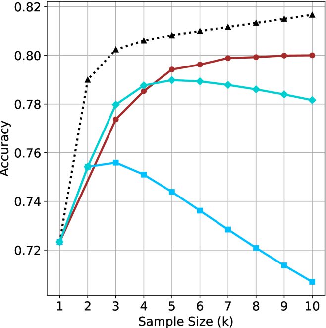
### Visual Description
## Line Chart: Model Accuracy vs. Sample Size
### Overview
The chart compares the accuracy of three models (A, B, C) across sample sizes (k=1 to 10). Accuracy is measured on a y-axis (0.72–0.82), while the x-axis represents sample size. Three distinct trends are observed: Model A (black dotted) shows rapid improvement and stabilization, Model B (red solid) demonstrates gradual improvement with plateauing, and Model C (blue solid) peaks early before declining.
### Components/Axes
- **X-axis**: "Sample Size (k)" with integer markers (1–10).
- **Y-axis**: "Accuracy" scaled in 0.02 increments (0.72–0.82).
- **Legend**: Located in the top-right corner, associating:
- Black dotted line → "Model A"
- Red solid line → "Model B"
- Blue solid line → "Model C"
### Detailed Analysis
1. **Model A (Black Dotted Line)**:
- Starts at 0.72 (k=1).
- Sharp upward trend to 0.80 at k=2.
- Remains stable at ~0.80 for k=3–10.
- **Key Data Points**:
- k=1: 0.72
- k=2: 0.80
- k=3–10: ~0.80
2. **Model B (Red Solid Line)**:
- Begins at 0.72 (k=1).
- Gradual ascent to 0.78 at k=3.
- Plateaus between 0.79–0.80 for k=4–10.
- **Key Data Points**:
- k=1: 0.72
- k=3: 0.78
- k=4: 0.79
- k=10: 0.80
3. **Model C (Blue Solid Line)**:
- Starts at 0.72 (k=1).
- Peaks at 0.76 at k=2.
- Declines steadily to 0.71 by k=10.
- **Key Data Points**:
- k=1: 0.72
- k=2: 0.76
- k=10: 0.71
### Key Observations
- **Model A** consistently outperforms others, achieving the highest accuracy (0.80) by k=2 and maintaining it.
- **Model B** improves with sample size but plateaus at ~0.80, suggesting diminishing returns.
- **Model C** exhibits a U-shaped trend: initial improvement followed by a sharp decline, indicating potential overfitting or inefficiency at larger sample sizes.
### Interpretation
The data suggests:
1. **Model A** is optimal for all sample sizes, likely due to robust architecture or regularization.
2. **Model B** benefits from larger samples but lacks the efficiency of Model A.
3. **Model C**'s decline after k=2 implies overfitting or poor generalization to larger datasets. This could stem from architectural limitations (e.g., high variance) or insufficient training data for larger k.
The trends highlight the importance of model selection based on dataset size and the trade-offs between complexity and generalization.
</details>
(c) QwQ-32B
<details>
<summary>x37.png Details</summary>
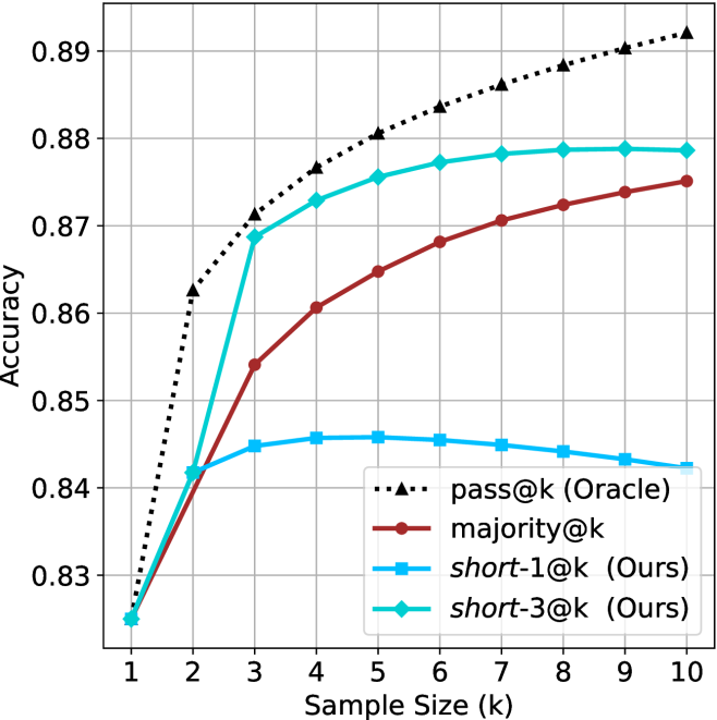
### Visual Description
## Line Graph: Accuracy vs. Sample Size (k)
### Overview
The image is a line graph comparing the accuracy of four different methods across varying sample sizes (k = 1 to 10). The y-axis represents accuracy (ranging from 0.83 to 0.89), and the x-axis represents sample size (k). Four data series are plotted, each with distinct markers and colors, as defined in the legend.
### Components/Axes
- **X-axis (Sample Size, k)**: Labeled "Sample Size (k)" with integer values from 1 to 10.
- **Y-axis (Accuracy)**: Labeled "Accuracy" with values from 0.83 to 0.89.
- **Legend**: Located in the bottom-right corner, with four entries:
- **pass@k (Oracle)**: Black dotted line with triangle markers.
- **majority@k**: Red solid line with circle markers.
- **short-1@k (Ours)**: Blue solid line with square markers.
- **short-3@k (Ours)**: Green solid line with diamond markers.
### Detailed Analysis
#### pass@k (Oracle)
- **Trend**: Starts at 0.83 (k=1) and increases steadily to 0.89 (k=10).
- **Data Points**:
- k=1: 0.83
- k=2: 0.86
- k=3: 0.87
- k=4: 0.875
- k=5: 0.88
- k=6: 0.885
- k=7: 0.887
- k=8: 0.888
- k=9: 0.889
- k=10: 0.89
#### majority@k
- **Trend**: Starts at 0.83 (k=1) and increases gradually to 0.88 (k=10).
- **Data Points**:
- k=1: 0.83
- k=2: 0.85
- k=3: 0.86
- k=4: 0.865
- k=5: 0.87
- k=6: 0.875
- k=7: 0.877
- k=8: 0.878
- k=9: 0.879
- k=10: 0.88
#### short-1@k (Ours)
- **Trend**: Starts at 0.83 (k=1), peaks at 0.845 (k=3), then declines slightly.
- **Data Points**:
- k=1: 0.83
- k=2: 0.84
- k=3: 0.845
- k=4: 0.845
- k=5: 0.845
- k=6: 0.845
- k=7: 0.844
- k=8: 0.843
- k=9: 0.842
- k=10: 0.841
#### short-3@k (Ours)
- **Trend**: Starts at 0.83 (k=1), rises sharply to 0.875 (k=3), then plateaus.
- **Data Points**:
- k=1: 0.83
- k=2: 0.86
- k=3: 0.875
- k=4: 0.875
- k=5: 0.875
- k=6: 0.875
- k=7: 0.875
- k=8: 0.875
- k=9: 0.875
- k=10: 0.875
### Key Observations
1. **pass@k (Oracle)** consistently achieves the highest accuracy, increasing linearly with sample size.
2. **majority@k** shows a steady improvement but lags behind the oracle, suggesting it is a baseline method.
3. **short-1@k** peaks at k=3 (0.845) and then declines, indicating potential overfitting or diminishing returns.
4. **short-3@k** achieves the highest accuracy among the proposed methods, matching the oracle's performance at k=3 and maintaining it for larger k.
### Interpretation
The graph demonstrates that the proposed methods (**short-1@k** and **short-3@k**) outperform the majority baseline, with **short-3@k** being particularly effective. The oracle (**pass@k**) represents the theoretical upper bound, and the proposed methods approach this bound as sample size increases. Notably, **short-3@k** achieves near-oracle performance even at small sample sizes (k=3), suggesting it is robust to limited data. The decline in **short-1@k** after k=3 highlights the importance of method design in balancing accuracy and scalability. This analysis underscores the value of the proposed methods in scenarios where sample size is constrained.
</details>
(d) R1-670B
Figure 10: AIME 2025 - sample size ( $k$ ) comparison.
<details>
<summary>x38.png Details</summary>
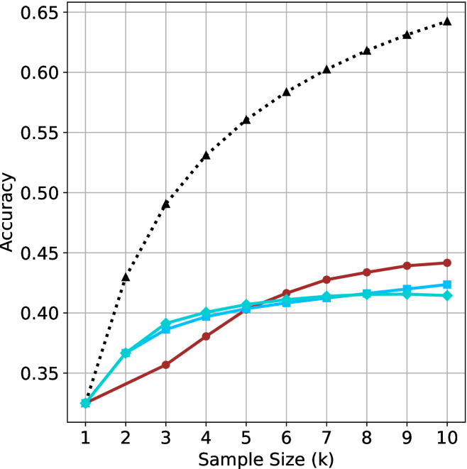
### Visual Description
## Line Graph: Accuracy vs. Sample Size (k)
### Overview
The image is a line graph comparing the accuracy of three data series (Baseline, Model A, Model B) as a function of sample size (k) ranging from 1 to 10. The y-axis represents accuracy (0.35–0.65), and the x-axis represents sample size (k). Three distinct lines are plotted: a dotted black line (Baseline), a solid red line (Model A), and a solid blue line (Model B). The legend is positioned in the top-right corner, associating each line with its label.
### Components/Axes
- **X-axis (Sample Size, k)**: Labeled "Sample Size (k)" with integer markers from 1 to 10.
- **Y-axis (Accuracy)**: Labeled "Accuracy" with decimal markers from 0.35 to 0.65 in increments of 0.05.
- **Legend**: Located in the top-right corner, with three entries:
- **Dotted Black Line**: "Baseline (Random Guessing)"
- **Solid Red Line**: "Model A"
- **Solid Blue Line**: "Model B"
### Detailed Analysis
1. **Baseline (Black Dotted Line)**:
- Starts at approximately **0.35** when k=1.
- Increases linearly to **0.65** at k=10.
- Trend: Steady, linear growth with no curvature.
2. **Model A (Red Solid Line)**:
- Starts at **0.35** (same as Baseline) at k=1.
- Increases gradually to **0.45** at k=10.
- Trend: Slight upward curvature, slower growth than Baseline.
3. **Model B (Blue Solid Line)**:
- Starts at **0.37** (slightly above Baseline) at k=1.
- Increases to **0.43** at k=10.
- Trend: Slight upward curvature, similar to Model A but with a slightly higher initial value.
### Key Observations
- The **Baseline (Black)** shows the most significant improvement, increasing by **0.30** (from 0.35 to 0.65) as sample size grows.
- **Model A (Red)** and **Model B (Blue)** exhibit slower growth, with Model A gaining **0.10** and Model B gaining **0.06** over the same range.
- At k=10, the Baseline outperforms both models by **0.20** (Baseline: 0.65 vs. Model A: 0.45, Model B: 0.43).
- All lines show **monotonic increase** with no plateaus or declines.
### Interpretation
The data suggests that the **Baseline (Random Guessing)** method benefits disproportionately from larger sample sizes, outperforming both Model A and Model B at k=10. This could indicate:
1. **Baseline Efficiency**: The Baseline may leverage additional data more effectively, possibly due to simpler heuristics or fewer computational constraints.
2. **Model Limitations**: Model A and B may suffer from overfitting, underfitting, or suboptimal hyperparameters that limit their ability to scale with larger datasets.
3. **Data Quality**: The Baseline’s linear growth might reflect a scenario where random guessing improves with more data (e.g., in imbalanced datasets or specific problem domains).
4. **Model Design**: The slower growth of Models A and B could highlight inefficiencies in their architecture or training process, suggesting opportunities for optimization.
### Spatial Grounding
- **Legend**: Top-right corner, clearly associating colors with labels.
- **Lines**: Dotted (Baseline), solid red (Model A), solid blue (Model B), all originating from the bottom-left (k=1) and extending to the top-right (k=10).
- **Axes**: X-axis (k) at the bottom, Y-axis (Accuracy) on the left, with gridlines for reference.
### Content Details
- **Baseline Values**:
- k=1: 0.35
- k=10: 0.65
- **Model A Values**:
- k=1: 0.35
- k=10: 0.45
- **Model B Values**:
- k=1: 0.37
- k=10: 0.43
### Final Notes
The graph emphasizes the importance of sample size in model performance but raises questions about why the Baseline outperforms the models. Further investigation into the Baseline’s methodology or the models’ training data could clarify this discrepancy.
</details>
(a) LN-Super- $49$ B
<details>
<summary>x39.png Details</summary>
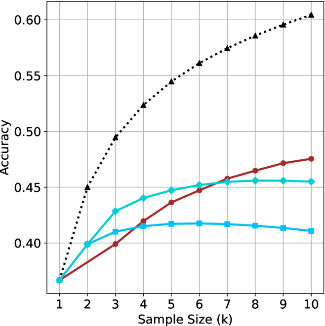
### Visual Description
## Line Graph: Accuracy vs. Sample Size (k)
### Overview
The graph compares the accuracy of three methods (Method A, Method B, Method C) across sample sizes ranging from 1 to 10. Accuracy is measured on the y-axis (0.35–0.60), while the x-axis represents sample size (k). Three distinct lines represent the methods, with Method A (black dotted) showing the highest accuracy trend.
### Components/Axes
- **X-axis**: "Sample Size (k)" with integer markers from 1 to 10.
- **Y-axis**: "Accuracy" with increments of 0.05 from 0.35 to 0.60.
- **Legend**: Located on the right, with:
- **Method A**: Black dotted line.
- **Method B**: Red solid line.
- **Method C**: Blue solid line.
### Detailed Analysis
1. **Method A (Black Dotted Line)**:
- Starts at (1, 0.35) and increases steadily.
- Reaches 0.50 at k=4, 0.55 at k=7, and 0.60 at k=10.
- **Trend**: Linear growth with no plateau.
2. **Method B (Red Solid Line)**:
- Begins at (1, 0.35), rises to 0.44 at k=5, then plateaus.
- Peaks at 0.47 at k=9 and remains stable at k=10.
- **Trend**: Initial growth followed by stabilization.
3. **Method C (Blue Solid Line)**:
- Starts at (1, 0.35), peaks at 0.43 at k=3, then plateaus.
- Remains at 0.45–0.46 from k=6 to k=10.
- **Trend**: Early rapid growth, then flat performance.
### Key Observations
- **Method A** consistently outperforms others, especially at larger sample sizes (k ≥ 7).
- **Method B** and **Method C** show diminishing returns after k=5 and k=3, respectively.
- All methods start at identical accuracy (0.35) for k=1, suggesting baseline performance parity.
### Interpretation
The data suggests **Method A** scales most effectively with increasing sample size, achieving near-optimal accuracy (0.60) at k=10. In contrast, **Method B** and **Method C** exhibit early saturation, indicating limited benefit from larger samples beyond mid-range values. This could imply that Method A’s algorithm or design is better suited for high-dimensional or complex datasets, while B and C may prioritize efficiency over scalability. The plateau in B and C might reflect computational constraints or model limitations at larger k. Further investigation into the methods’ architectures or data handling strategies could clarify these trends.
</details>
(b) R $1$ - $32$ B
<details>
<summary>x40.png Details</summary>
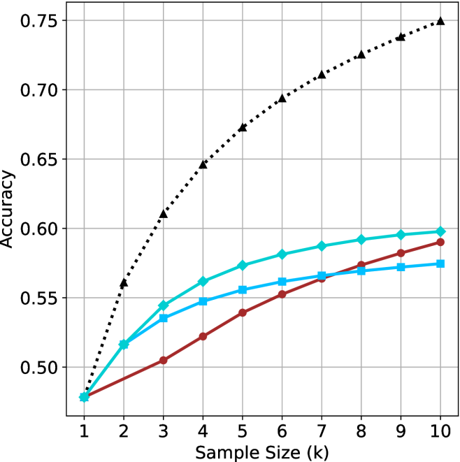
### Visual Description
## Line Chart: Accuracy vs. Sample Size (k)
### Overview
The chart displays three data series representing accuracy trends across sample sizes (k=1 to 10). A dotted black line (Random Guessing) shows a steep upward trend, while two solid lines (Model A in blue and Model B in red) exhibit gradual increases. All series originate at (1, 0.50) but diverge significantly by k=10.
### Components/Axes
- **X-axis**: "Sample Size (k)" with integer markers 1–10.
- **Y-axis**: "Accuracy" scaled from 0.50 to 0.75 in 0.05 increments.
- **Legend**: Top-right corner, associating:
- Black dotted line → "Random Guessing"
- Blue solid line → "Model A"
- Red solid line → "Model B"
### Detailed Analysis
1. **Random Guessing (Black Dotted Line)**:
- Starts at (1, 0.50) and increases linearly by ~0.05 per unit k.
- Reaches 0.75 at k=10 (exact values: 0.50, 0.55, 0.60, 0.65, 0.70, 0.75).
2. **Model A (Blue Solid Line)**:
- Starts at (1, 0.50) with gradual growth.
- Values: ~0.50 (k=1), 0.52 (k=2), 0.54 (k=3), 0.55 (k=4), 0.56 (k=5), 0.57 (k=6), 0.58 (k=7–10).
3. **Model B (Red Solid Line)**:
- Starts at (1, 0.50) with steeper growth than Model A.
- Values: ~0.50 (k=1), 0.51 (k=2), 0.53 (k=3), 0.55 (k=4), 0.57 (k=5), 0.58 (k=6), 0.59 (k=7–10).
### Key Observations
- **Unexpected Trend**: The "Random Guessing" line shows a linear increase, which contradicts typical expectations of random performance remaining constant.
- **Model Performance**: Both models improve with sample size, but Model B (red) outperforms Model A (blue) consistently after k=4.
- **Convergence**: All lines originate at the same point (k=1, 0.50), suggesting identical baseline performance at minimal sample sizes.
### Interpretation
The data suggests that increasing sample size improves accuracy for all methods, but the "Random Guessing" line’s upward trend is anomalous. This could indicate:
1. A data collection error (e.g., mislabeled "random" data).
2. A contextual factor where "random" guessing improves with more samples (unlikely in most scenarios).
3. A misinterpretation of the metric (e.g., accuracy defined differently for random guessing).
Models A and B demonstrate practical utility, with Model B achieving ~0.59 accuracy at k=10 compared to Model A’s ~0.58. However, both fall short of the "Random Guessing" line’s 0.75 at k=10, raising questions about the validity of the black line’s trajectory. Further investigation into the data generation process for the "Random Guessing" series is warranted.
</details>
(c) QwQ-32B
<details>
<summary>x41.png Details</summary>
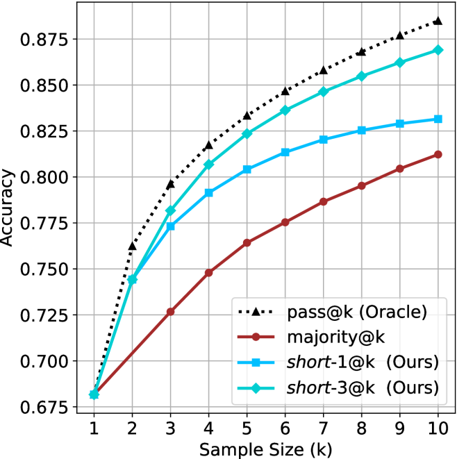
### Visual Description
## Line Chart: Accuracy vs. Sample Size (k)
### Overview
The chart compares the accuracy of four methods across increasing sample sizes (k=1 to k=10). Four data series are plotted: "pass@k (Oracle)" (dashed black), "majority@k" (solid red), "short-1@k (Ours)" (solid blue), and "short-3@k (Ours)" (solid green). All methods show upward trends, with "pass@k" consistently outperforming others.
### Components/Axes
- **X-axis**: "Sample Size (k)" (integer values 1–10)
- **Y-axis**: "Accuracy" (decimal values 0.675–0.875)
- **Legend**: Located in the bottom-right corner, with four entries:
- `pass@k (Oracle)`: Dashed black line
- `majority@k`: Solid red line
- `short-1@k (Ours)`: Solid blue line
- `short-3@k (Ours)`: Solid green line
### Detailed Analysis
1. **pass@k (Oracle)**:
- Starts at (1, 0.675) and increases steadily to (10, 0.875).
- Slope: Linear, with ~0.01 accuracy gain per unit k.
- Example points: (3, 0.75), (5, 0.8), (7, 0.85).
2. **majority@k**:
- Starts at (1, 0.675) and rises to (10, 0.81).
- Slope: Gradual, ~0.0035 accuracy gain per unit k.
- Example points: (5, 0.73), (7, 0.77), (9, 0.8).
3. **short-1@k (Ours)**:
- Begins at (1, 0.725) and reaches (10, 0.83).
- Slope: Moderate, ~0.0055 accuracy gain per unit k.
- Example points: (3, 0.75), (5, 0.79), (7, 0.82).
4. **short-3@k (Ours)**:
- Starts at (1, 0.725) and peaks at (10, 0.86).
- Slope: Steepest among non-Oracle methods, ~0.0085 accuracy gain per unit k.
- Example points: (3, 0.77), (5, 0.82), (7, 0.85).
### Key Observations
- **Oracle dominance**: "pass@k" maintains a consistent lead, with a 0.065 accuracy gap over "short-3@k" at k=10.
- **Shortlist performance**: "short-3@k" outperforms "short-1@k" by ~0.03 accuracy at k=10, suggesting longer shortlists improve results.
- **Majority@k lag**: The red line remains the lowest, with only a 0.135 accuracy gain from k=1 to k=10.
- **Convergence**: All methods narrow their performance gap with Oracle as k increases, but none surpass it.
### Interpretation
The chart demonstrates that larger sample sizes improve accuracy across all methods, with the Oracle ("pass@k") serving as an upper bound. The "short-3@k" method (green) shows the strongest performance among non-Oracle approaches, achieving 86% accuracy at k=10—13% higher than "majority@k". This suggests that increasing the shortlist size (from 1@k to 3@k) significantly enhances effectiveness, though still falls short of the Oracle. The linear trends imply predictable scaling, with no visible saturation points within the tested range (k=1–10). The Oracle's consistent lead highlights its theoretical optimality, while the "short-3@k" method may represent a practical compromise between computational cost and performance.
</details>
(d) R1-670B
Figure 11: HMMT Feb 2025 - sample size ( $k$ ) comparison.
<details>
<summary>x42.png Details</summary>
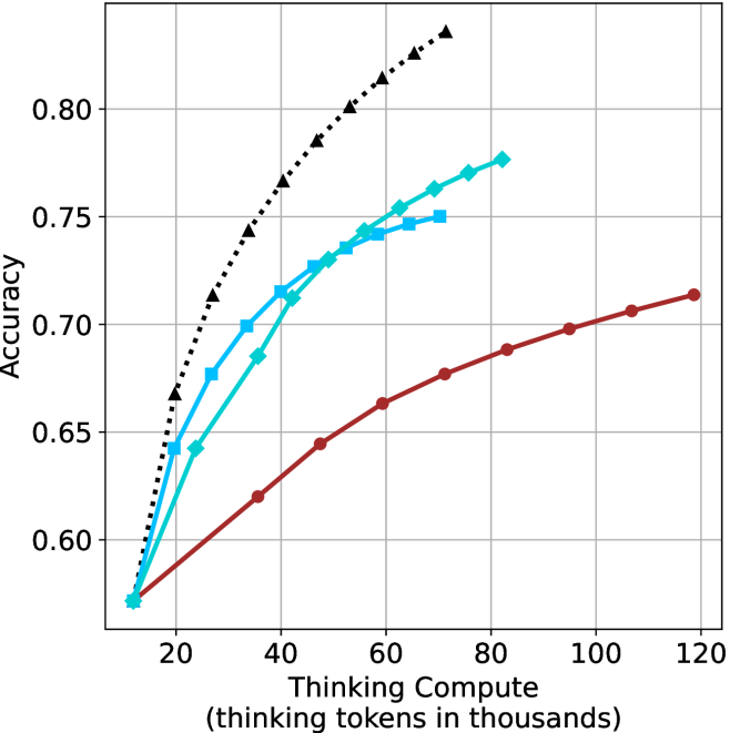
### Visual Description
## Line Chart: Accuracy vs. Thinking Compute (Tokens in Thousands)
### Overview
The chart illustrates the relationship between computational resources (measured in "thinking tokens in thousands") and accuracy across three distinct data series. The x-axis represents computational scale, while the y-axis measures accuracy on a 0.55–0.85 scale. Three lines are plotted: a theoretical maximum (black dashed), Model A (blue squares), and Model B (red circles).
### Components/Axes
- **X-axis**: "Thinking Compute (thinking tokens in thousands)" with ticks at 20, 40, 60, 80, 100, 120.
- **Y-axis**: "Accuracy" with ticks at 0.55, 0.60, 0.65, 0.70, 0.75, 0.80, 0.85.
- **Legend**: Located in the top-right corner, associating:
- Black dashed line: "Theoretical Maximum"
- Blue squares: "Model A"
- Red circles: "Model B"
### Detailed Analysis
1. **Theoretical Maximum (Black Dashed Line)**:
- Starts at (20, 0.55) and ascends steadily to (120, 0.85).
- Intermediate points: (40, 0.65), (60, 0.72), (80, 0.78), (100, 0.82).
- Represents an idealized upper bound for accuracy.
2. **Model A (Blue Squares)**:
- Begins at (20, 0.55) and rises sharply to (80, 0.77).
- Peaks at (80, 0.77) before declining to (120, 0.75).
- Intermediate points: (40, 0.65), (60, 0.72), (100, 0.76).
3. **Model B (Red Circles)**:
- Starts at (20, 0.55) and increases gradually to (120, 0.72).
- Intermediate points: (40, 0.62), (60, 0.66), (80, 0.69), (100, 0.71).
### Key Observations
- **Theoretical Maximum** consistently outperforms both models across all compute levels.
- **Model A** exhibits a "peak-and-decline" pattern, suggesting diminishing returns or instability at higher compute levels.
- **Model B** demonstrates steady, linear improvement without overshooting or plateauing.
- All models share the same starting point (20, 0.55), indicating baseline performance at minimal compute.
### Interpretation
The data suggests that computational scale correlates with improved accuracy, but the relationship varies by model. The **Theoretical Maximum** line implies a hard upper limit for achievable accuracy. **Model A**'s decline after 80k tokens may indicate architectural limitations or overfitting at scale, while **Model B**'s linear growth suggests more efficient scaling. The divergence between models highlights trade-offs in design choices for handling increased compute. Notably, no model reaches the theoretical maximum, emphasizing practical constraints in real-world implementations.
</details>
(a) LN-Super- $49$ B
<details>
<summary>x43.png Details</summary>
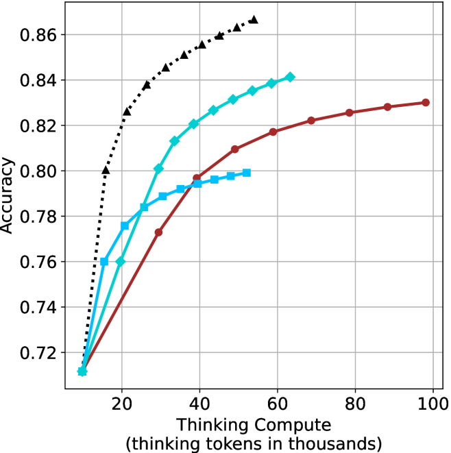
### Visual Description
## Line Graph: Accuracy vs. Thinking Compute
### Overview
The image depicts a line graph comparing the accuracy of three computational models as a function of "Thinking Compute" (measured in thousands of thinking tokens). Three data series are represented by distinct markers and colors: black triangles, blue squares, and red circles. The graph shows a clear trend of increasing accuracy with higher compute, followed by plateauing performance at higher token thresholds.
### Components/Axes
- **X-axis**: "Thinking Compute (thinking tokens in thousands)"
- Scale: 0 to 100 (increments of 20)
- Position: Bottom of the graph
- **Y-axis**: "Accuracy"
- Scale: 0.72 to 0.86 (increments of 0.02)
- Position: Left side of the graph
- **Legend**: Located on the right side of the graph
- Black Triangles: Black line with triangular markers
- Blue Squares: Blue line with square markers
- Red Circles: Red line with circular markers
### Detailed Analysis
1. **Black Triangles (Black Line)**
- Starts at (0, 0.72) and rises sharply to (40, 0.86).
- Plateaus at ~0.85–0.86 from 40k to 100k tokens.
- Key data points:
- 20k tokens: ~0.78
- 40k tokens: ~0.86
- 60k tokens: ~0.85
- 80k tokens: ~0.85
- 100k tokens: ~0.85
2. **Red Circles (Red Line)**
- Starts at (0, 0.72) and rises gradually to (60, 0.83).
- Plateaus at ~0.83 from 60k to 100k tokens.
- Key data points:
- 20k tokens: ~0.76
- 40k tokens: ~0.81
- 60k tokens: ~0.83
- 80k tokens: ~0.83
- 100k tokens: ~0.83
3. **Blue Squares (Blue Line)**
- Starts at (0, 0.72) and rises to (40, 0.80).
- Plateaus at ~0.80 from 40k to 100k tokens.
- Key data points:
- 20k tokens: ~0.76
- 40k tokens: ~0.80
- 60k tokens: ~0.80
- 80k tokens: ~0.80
- 100k tokens: ~0.80
### Key Observations
- **Diminishing Returns**: All models exhibit plateauing accuracy after a certain compute threshold (40k–60k tokens).
- **Performance Hierarchy**:
- Black Triangles > Red Circles > Blue Squares in terms of accuracy.
- Black Triangles achieve the highest accuracy (~0.86) with the least compute (~40k tokens).
- **Efficiency Gaps**:
- Blue Squares require 20k more tokens than Black Triangles to reach 0.80 accuracy.
- Red Circles require 20k more tokens than Black Triangles to reach 0.83 accuracy.
### Interpretation
The graph demonstrates that computational efficiency significantly impacts model performance. The Black Triangles model achieves superior accuracy with minimal compute, suggesting it is the most optimized architecture. The Blue Squares model, while requiring the most compute, delivers the lowest accuracy, indicating potential inefficiencies in its design. The plateauing trends across all models imply that beyond a certain compute threshold, additional resources yield negligible accuracy improvements. This highlights the importance of optimizing model architecture over brute-force compute scaling. The data could inform resource allocation strategies in AI development, prioritizing models with higher efficiency-to-accuracy ratios.
</details>
(b) R $1$ - $32$ B
<details>
<summary>x44.png Details</summary>
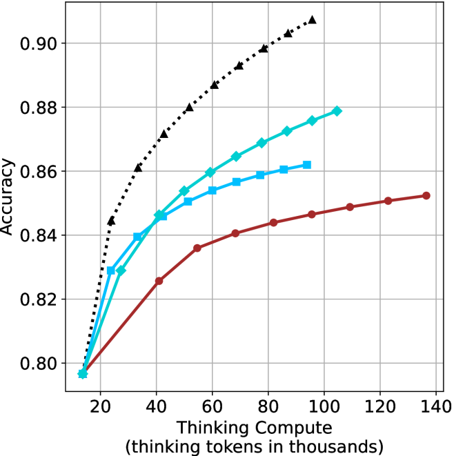
### Visual Description
## Line Graph: Accuracy vs. Thinking Compute (Thinking Tokens in Thousands)
### Overview
The graph illustrates the relationship between computational resource allocation (measured in thinking tokens) and model accuracy across three configurations: baseline thinking compute, thinking compute with prompting, and thinking compute with prompting plus chain-of-thought reasoning. Three distinct data series are plotted against a logarithmic-like scale of compute resources.
### Components/Axes
- **X-axis**: "Thinking Compute (thinking tokens in thousands)"
- Range: 20k to 140k tokens
- Tick intervals: 20k increments
- **Y-axis**: "Accuracy"
- Range: 0.80 to 0.90
- Tick intervals: 0.02 increments
- **Legend**: Top-right corner
- Labels:
1. "Thinking Compute" (black dashed line with triangles)
2. "Thinking Compute + Prompting" (blue solid line with squares)
3. "Thinking Compute + Prompting + Chain-of-Thought" (red solid line with circles)
### Detailed Analysis
1. **Thinking Compute (Black Dashed Line)**
- Starts at (20k, 0.80)
- Steadily increases to (140k, 0.90)
- Key points:
- 40k tokens: 0.84
- 60k tokens: 0.86
- 80k tokens: 0.88
- 100k tokens: 0.89
- 120k tokens: 0.90
- 140k tokens: 0.90
2. **Thinking Compute + Prompting (Blue Solid Line)**
- Starts at (20k, 0.80)
- Peaks at (80k, 0.88)
- Declines slightly to (140k, 0.86)
- Key points:
- 40k tokens: 0.84
- 60k tokens: 0.85
- 80k tokens: 0.88
- 100k tokens: 0.87
- 120k tokens: 0.86
- 140k tokens: 0.86
3. **Thinking Compute + Prompting + Chain-of-Thought (Red Solid Line)**
- Starts at (20k, 0.80)
- Gradual increase to (140k, 0.85)
- Key points:
- 40k tokens: 0.83
- 60k tokens: 0.84
- 80k tokens: 0.85
- 100k tokens: 0.85
- 120k tokens: 0.85
- 140k tokens: 0.85
### Key Observations
- **Diminishing Returns**: The blue line (prompting) shows a sharp peak at 80k tokens, followed by a decline, suggesting prompting alone becomes less effective at higher compute scales.
- **Consistent Gains**: The red line (chain-of-thought) demonstrates stable, incremental improvements across all compute levels, outperforming the blue line at 100k+ tokens.
- **Baseline Scaling**: The black dashed line (baseline compute) shows linear scaling but plateaus at 0.90 accuracy beyond 100k tokens.
### Interpretation
The data suggests that **chain-of-thought reasoning** provides the most robust accuracy improvements across compute scales, particularly at higher resource levels (100k+ tokens), where prompting alone underperforms. This implies that:
1. **Method Synergy**: Combining prompting with chain-of-thought reasoning mitigates the diminishing returns observed in prompting-only configurations.
2. **Compute Efficiency**: At lower compute levels (<80k tokens), prompting significantly boosts accuracy, but its benefits plateau or reverse at higher scales.
3. **Scalability Trade-offs**: While baseline compute scales linearly, method enhancements (prompting + chain-of-thought) offer non-linear gains, making them more cost-effective for high-accuracy applications.
The graph highlights the importance of architectural improvements (e.g., chain-of-thought) over raw compute scaling alone for optimizing model performance.
</details>
(c) QwQ-32B
<details>
<summary>x45.png Details</summary>
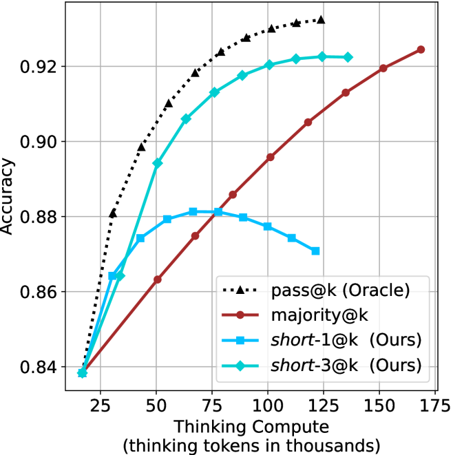
### Visual Description
## Line Chart: Model Accuracy vs. Thinking Compute
### Overview
The chart compares the accuracy of four different models (pass@k, majority@k, short-1@k, short-3@k) across varying levels of thinking compute (measured in thousands of tokens). Accuracy is plotted on the y-axis (0.84–0.92), while thinking compute is on the x-axis (25–175k tokens). The Oracle (pass@k) serves as the benchmark, with other models showing varying performance trends.
### Components/Axes
- **X-axis**: Thinking Compute (thinking tokens in thousands) – Range: 25 to 175k
- **Y-axis**: Accuracy – Range: 0.84 to 0.92
- **Legend**: Located in the bottom-right corner, with four entries:
- **pass@k (Oracle)**: Dashed line with triangle markers (black)
- **majority@k**: Solid red line with circle markers
- **short-1@k (Ours)**: Solid blue line with square markers
- **short-3@k (Ours)**: Solid green line with diamond markers
### Detailed Analysis
1. **pass@k (Oracle)**:
- Starts at 0.84 accuracy at 25k tokens.
- Increases steadily to 0.92 accuracy at 175k tokens.
- Linear upward trend with no plateaus.
2. **majority@k**:
- Begins at 0.84 accuracy at 25k tokens.
- Slower, gradual increase compared to Oracle.
- Reaches 0.92 accuracy at 150k tokens.
- Linear upward trend but lags behind Oracle.
3. **short-1@k (Ours)**:
- Starts at 0.84 accuracy at 25k tokens.
- Peaks at 0.88 accuracy around 75k tokens.
- Declines slightly to 0.87 accuracy at 175k tokens.
- Non-linear: Rises sharply, then plateaus/declines.
4. **short-3@k (Ours)**:
- Starts at 0.84 accuracy at 25k tokens.
- Peaks at 0.92 accuracy around 100k tokens.
- Plateaus at 0.92 accuracy from 100k to 175k tokens.
- Non-linear: Rapid rise followed by stabilization.
### Key Observations
- **Oracle Dominance**: The pass@k (Oracle) consistently outperforms all other models across all compute levels.
- **majority@k Trade-off**: Requires significantly more compute (150k tokens) to match Oracle’s 175k-token performance.
- **short-1@k Efficiency**: Achieves moderate accuracy (0.88) with fewer tokens (75k) but degrades at higher compute.
- **short-3@k Efficiency**: Matches Oracle’s accuracy (0.92) at 100k tokens but plateaus, suggesting diminishing returns beyond this point.
### Interpretation
The chart highlights the relationship between compute efficiency and accuracy for different models. The Oracle (pass@k) represents the ideal performance, while majority@k demonstrates a compute-heavy approach. The short-1@k and short-3@k models (labeled "Ours") show trade-offs: short-1@k sacrifices accuracy at higher compute, while short-3@k achieves Oracle-level accuracy at 100k tokens but offers no further gains. This suggests that optimizing compute allocation is critical for balancing efficiency and performance, with short-3@k potentially offering the best cost-accuracy ratio up to 100k tokens. The Oracle’s linear scalability underscores the theoretical upper bound for these models.
</details>
(d) R1-670B
Figure 12: AIME 2024 - thinking compute comparison.
<details>
<summary>x46.png Details</summary>
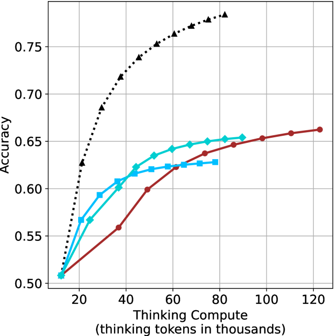
### Visual Description
## Line Chart: Accuracy vs. Thinking Compute (Tokens in Thousands)
### Overview
The chart illustrates the relationship between computational resources (measured in thousands of thinking tokens) and accuracy across three scenarios: a theoretical limit, pure thinking compute, and thinking compute combined with human feedback. Three data series are plotted, showing distinct trends in accuracy as compute scales.
### Components/Axes
- **X-axis**: "Thinking Compute (thinking tokens in thousands)"
- Scale: 20 to 120 (increments of 20)
- **Y-axis**: "Accuracy"
- Scale: 0.50 to 0.75 (increments of 0.05)
- **Legend**: Located on the right side of the chart.
- **Black dashed line**: "Theoretical Limit"
- **Teal line**: "Thinking Compute"
- **Red line**: "Thinking Compute + Human Feedback"
### Detailed Analysis
1. **Theoretical Limit (Black Dashed Line)**
- Starts at **0.75 accuracy** at 20k tokens.
- Declines steadily to **0.50 accuracy** at 120k tokens.
- Data points:
- (20, 0.75), (40, 0.70), (60, 0.65), (80, 0.60), (100, 0.55), (120, 0.50).
2. **Thinking Compute (Teal Line)**
- Begins at **0.50 accuracy** at 20k tokens.
- Rises gradually to **0.63 accuracy** at 120k tokens.
- Data points:
- (20, 0.50), (40, 0.55), (60, 0.60), (80, 0.62), (100, 0.63), (120, 0.63).
3. **Thinking Compute + Human Feedback (Red Line)**
- Starts at **0.50 accuracy** at 20k tokens.
- Outperforms the teal line after 60k tokens, plateauing at **0.65 accuracy** by 100k tokens.
- Data points:
- (20, 0.50), (40, 0.55), (60, 0.60), (80, 0.62), (100, 0.63), (120, 0.63).
### Key Observations
- The **theoretical limit** (black) shows a counterintuitive decline in accuracy with increased compute, suggesting a potential cap or model-specific behavior.
- **Thinking Compute alone** (teal) demonstrates steady improvement but plateaus near 0.63 accuracy.
- **Human feedback integration** (red) accelerates early gains and sustains higher accuracy, outperforming pure compute after 60k tokens.
- All lines converge at **0.50 accuracy** at 20k tokens, indicating a baseline performance threshold.
### Interpretation
The data highlights the **diminishing returns of pure compute** and the **value of human feedback** in improving accuracy. While the theoretical limit’s decline remains unexplained, the red line’s superior performance suggests that human-AI collaboration mitigates compute limitations. The plateau in both teal and red lines after 100k tokens implies a **saturation point** for compute-driven gains, emphasizing the need for complementary strategies (e.g., feedback loops) to enhance outcomes.
</details>
(a) LN-Super- $49$ B
<details>
<summary>x47.png Details</summary>
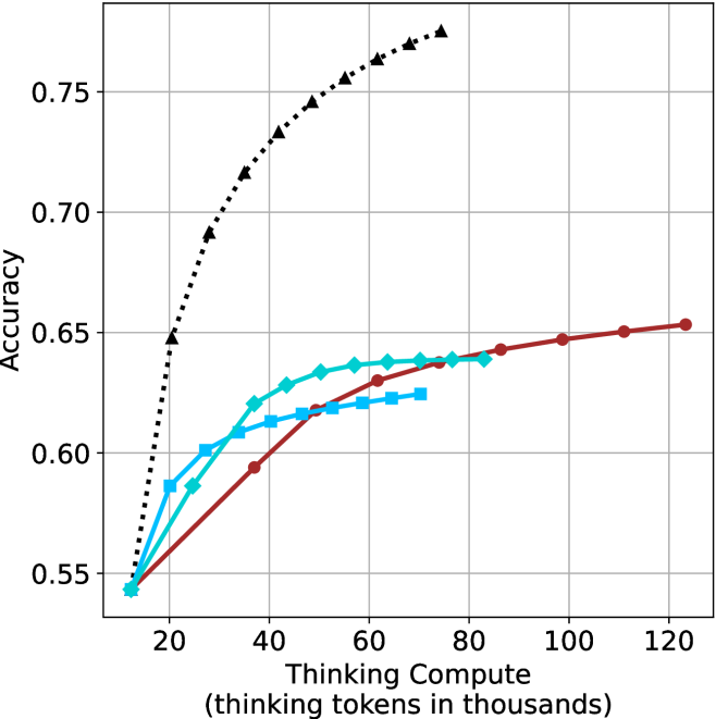
### Visual Description
## Line Chart: Accuracy vs. Thinking Compute (Tokens in Thousands)
### Overview
The chart compares the accuracy of three computational models as a function of "Thinking Compute" (measured in thousands of thinking tokens). Three data series are plotted:
1. **Black dotted line**: "Thinking Compute"
2. **Blue dashed line**: "Thinking Compute + Chain of Thought"
3. **Red solid line**: "Thinking Compute + Chain of Thought + Self-Consistency"
### Components/Axes
- **X-axis**: "Thinking Compute (thinking tokens in thousands)"
- Scale: 20 to 120 (increments of 20)
- **Y-axis**: "Accuracy"
- Scale: 0.55 to 0.75 (increments of 0.05)
- **Legend**: Located on the right, associating colors with models:
- Black: "Thinking Compute"
- Blue: "Thinking Compute + Chain of Thought"
- Red: "Thinking Compute + Chain of Thought + Self-Consistency"
### Detailed Analysis
1. **Black Dotted Line ("Thinking Compute")**:
- Starts at (20k tokens, 0.65 accuracy).
- Rises sharply to (80k tokens, 0.75 accuracy), then plateaus.
- Key points:
- 40k tokens: ~0.70 accuracy
- 60k tokens: ~0.73 accuracy
- 100k tokens: ~0.75 accuracy
2. **Blue Dashed Line ("Thinking Compute + Chain of Thought")**:
- Starts at (20k tokens, 0.58 accuracy).
- Gradually increases to (80k tokens, 0.64 accuracy), then plateaus.
- Key points:
- 40k tokens: ~0.62 accuracy
- 60k tokens: ~0.63 accuracy
- 100k tokens: ~0.64 accuracy
3. **Red Solid Line ("Thinking Compute + Chain of Thought + Self-Consistency")**:
- Starts at (20k tokens, 0.55 accuracy).
- Steady increase to (100k tokens, 0.65 accuracy), then plateaus.
- Key points:
- 40k tokens: ~0.60 accuracy
- 60k tokens: ~0.62 accuracy
- 120k tokens: ~0.65 accuracy
### Key Observations
- **Highest Accuracy**: The "Thinking Compute" model (black) achieves the highest plateau (~0.75 accuracy) but requires fewer tokens (80k) to reach saturation.
- **Diminishing Returns**: All models show diminishing returns after ~80k tokens, with accuracy gains slowing or stopping.
- **Model Complexity Tradeoff**:
- Adding "Chain of Thought" (blue) improves accuracy by ~0.06 over baseline (black) at 80k tokens.
- Adding "Self-Consistency" (red) further improves accuracy by ~0.01 over blue at 100k tokens.
- **Initial Performance Gap**: At 20k tokens, "Thinking Compute" already outperforms the other models by ~0.07 accuracy.
### Interpretation
The data suggests that **raw "Thinking Compute" alone is the most efficient** for achieving high accuracy, outperforming models with added reasoning strategies (Chain of Thought, Self-Consistency) even at lower token counts. However, the inclusion of reasoning strategies still provides incremental gains, albeit with diminishing returns.
- **Why It Matters**:
- For resource-constrained systems, prioritizing "Thinking Compute" may yield better results than complex reasoning pipelines.
- The plateau at ~80k tokens for "Thinking Compute" implies that beyond this point, additional tokens do not significantly improve accuracy.
- **Anomalies**:
- The red line (most complex model) starts with the lowest accuracy at 20k tokens but catches up to blue by 80k tokens. This suggests that self-consistency may require more tokens to manifest its benefits.
- The black line’s sharp initial rise indicates that "Thinking Compute" has a strong foundational impact, while reasoning strategies add value primarily at scale.
This analysis highlights a tradeoff between computational efficiency and model complexity, with implications for optimizing AI systems in token-limited environments.
</details>
(b) R $1$ - $32$ B
<details>
<summary>x48.png Details</summary>
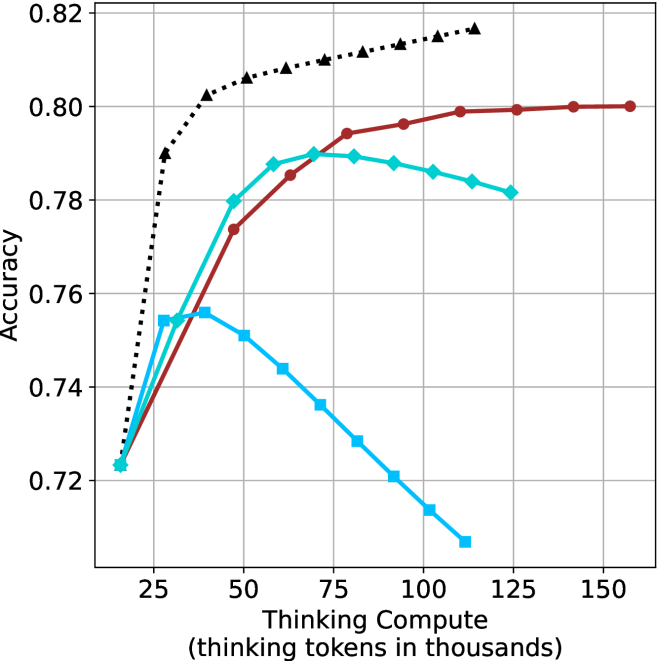
### Visual Description
## Line Chart: Accuracy vs. Thinking Compute (Tokens in Thousands)
### Overview
The chart compares the accuracy of three computational methods across varying levels of "Thinking Compute" (measured in thousands of thinking tokens). Three data series are plotted:
1. **Red line**: "Thinking Compute"
2. **Teal line**: "Thinking Compute + Prompting"
3. **Blue line**: "Thinking Compute + Prompting + Chain-of-Thought"
### Components/Axes
- **X-axis**: "Thinking Compute (thinking tokens in thousands)"
- Scale: 25 to 150 (increments of 25)
- Labels: 25, 50, 75, 100, 125, 150
- **Y-axis**: "Accuracy"
- Scale: 0.72 to 0.82 (increments of 0.02)
- Labels: 0.72, 0.74, 0.76, 0.78, 0.80, 0.82
- **Legend**: Located on the right side of the chart.
- Colors:
- Red: "Thinking Compute"
- Teal: "Thinking Compute + Prompting"
- Blue: "Thinking Compute + Prompting + Chain-of-Thought"
### Detailed Analysis
1. **Red Line ("Thinking Compute")**:
- Starts at **0.72** (x=25) and increases steadily to **0.80** (x=150).
- Key points:
- x=50: ~0.76
- x=75: ~0.78
- x=100: ~0.79
- x=125: ~0.80
- x=150: ~0.80
2. **Teal Line ("Thinking Compute + Prompting")**:
- Starts at **0.72** (x=25), peaks at **0.79** (x=75), then declines slightly.
- Key points:
- x=50: ~0.78
- x=100: ~0.78
- x=125: ~0.78
- x=150: ~0.78
3. **Blue Line ("Thinking Compute + Prompting + Chain-of-Thought")**:
- Starts at **0.72** (x=25), peaks at **0.76** (x=50), then declines sharply.
- Key points:
- x=75: ~0.74
- x=100: ~0.73
- x=125: ~0.72
- x=150: ~0.71
### Key Observations
- **Red line** (baseline method) shows consistent improvement with increased compute.
- **Teal line** (prompting) achieves higher accuracy than the baseline but plateaus after x=75.
- **Blue line** (chain-of-thought) initially outperforms the baseline but degrades significantly at higher compute levels.
- All methods converge near **0.72–0.78** accuracy at x=25, but diverge as compute increases.
### Interpretation
The data suggests that **increasing compute improves accuracy** for all methods, but the benefits diminish with added complexity:
- **Prompting** (teal) provides a moderate boost but becomes less effective beyond 75k tokens.
- **Chain-of-thought** (blue) initially enhances performance but suffers from **overfitting or inefficiency** at scale, leading to a sharp decline.
- The **baseline method** (red) remains the most stable and scalable, achieving the highest accuracy (0.80) at maximum compute.
This implies that while advanced techniques like prompting and chain-of-thought can enhance performance, their effectiveness is context-dependent and may not scale linearly with compute resources.
</details>
(c) QwQ-32B
<details>
<summary>x49.png Details</summary>
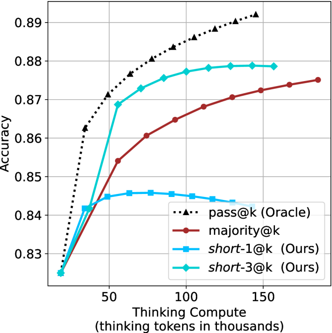
### Visual Description
## Line Chart: Accuracy vs. Thinking Compute (Tokens in Thousands)
### Overview
The chart illustrates the relationship between "Thinking Compute" (measured in thousands of thinking tokens) and "Accuracy" across four distinct data series. The y-axis represents accuracy (ranging from 0.83 to 0.89), while the x-axis represents computational effort. Four lines are plotted, each corresponding to a different method or baseline, with varying trends in accuracy as compute increases.
### Components/Axes
- **X-axis**: "Thinking Compute (thinking tokens in thousands)" with values at 0, 50, 100, and 150.
- **Y-axis**: "Accuracy" with values from 0.83 to 0.89.
- **Legend**: Located on the right, with four entries:
- **pass@k (Oracle)**: Black dashed line with triangle markers.
- **majority@k**: Red solid line.
- **short-1@k (Ours)**: Blue solid line.
- **short-3@k (Ours)**: Green solid line.
### Detailed Analysis
1. **pass@k (Oracle)**:
- Starts at 0.83 at 0 tokens.
- Sharp upward trend to 0.88 at 50k tokens.
- Plateaus at ~0.885 by 150k tokens.
- **Key Data Points**:
- 0k: 0.83
- 50k: 0.88
- 150k: 0.885
2. **majority@k**:
- Starts at 0.83 at 0 tokens.
- Gradual upward trend to 0.875 at 150k tokens.
- **Key Data Points**:
- 0k: 0.83
- 50k: 0.86
- 150k: 0.875
3. **short-1@k (Ours)**:
- Starts at 0.83 at 0 tokens.
- Sharp rise to 0.87 at 50k tokens.
- Slight decline to 0.865 at 150k tokens.
- **Key Data Points**:
- 0k: 0.83
- 50k: 0.87
- 150k: 0.865
4. **short-3@k (Ours)**:
- Starts at 0.83 at 0 tokens.
- Rapid increase to 0.88 at 50k tokens.
- Remains flat at 0.88 by 150k tokens.
- **Key Data Points**:
- 0k: 0.83
- 50k: 0.88
- 150k: 0.88
### Key Observations
- **pass@k (Oracle)** achieves the highest accuracy, surpassing all other methods by 50k tokens and maintaining a plateau.
- **short-3@k (Ours)** matches the Oracle's accuracy at 50k tokens but does not improve further, while **majority@k** and **short-1@k** show slower or declining trends.
- **short-1@k (Ours)** exhibits a slight drop in accuracy between 50k and 150k tokens, suggesting potential overfitting or inefficiency at higher compute levels.
- All methods start at the same baseline (0.83) at 0 tokens, indicating no inherent advantage in compute-free scenarios.
### Interpretation
The chart highlights the performance of different computational strategies in achieving accuracy. The **pass@k (Oracle)** represents an idealized benchmark, achieving near-peak accuracy with minimal compute. In contrast, **short-3@k (Ours)** matches this performance at 50k tokens but fails to improve further, suggesting diminishing returns. **majority@k** and **short-1@k** demonstrate slower or inconsistent gains, with the latter showing a notable decline at higher compute levels. This implies that while increased compute can enhance accuracy, the efficiency and scalability of the methods vary significantly. The Oracle's early plateau suggests it may be optimized for specific tasks, whereas other methods require careful tuning to avoid performance degradation.
</details>
(d) R1-670B
Figure 13: AIME 2025 - thinking compute comparison.
<details>
<summary>x50.png Details</summary>
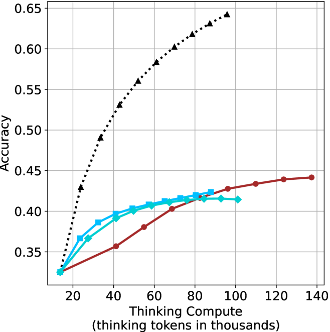
### Visual Description
## Line Graph: Accuracy vs. Thinking Compute (Tokens in Thousands)
### Overview
The image depicts a line graph comparing the accuracy of three models (Model A, Model B, Model C) across varying levels of thinking compute, measured in thousands of tokens. The x-axis represents compute scale (20k to 140k tokens), and the y-axis represents accuracy (0.35 to 0.65). Three distinct data series are plotted with different line styles and colors.
### Components/Axes
- **X-axis**: "Thinking Compute (thinking tokens in thousands)"
- Scale: 20 → 140 (in thousands of tokens)
- Ticks: 20, 40, 60, 80, 100, 120, 140
- **Y-axis**: "Accuracy"
- Scale: 0.35 → 0.65 (increments of 0.05)
- Ticks: 0.35, 0.40, 0.45, 0.50, 0.55, 0.60, 0.65
- **Legend**: Top-right corner
- Model A: Black dotted line
- Model B: Red solid line
- Model C: Blue solid line
### Detailed Analysis
1. **Model A (Black Dotted Line)**
- **Trend**: Steep upward trajectory from (20k, 0.35) to (140k, 0.65).
- **Key Points**:
- At 20k tokens: ~0.35 accuracy
- At 40k tokens: ~0.45 accuracy
- At 60k tokens: ~0.50 accuracy
- At 80k tokens: ~0.55 accuracy
- At 100k tokens: ~0.60 accuracy
- At 120k tokens: ~0.62 accuracy
- At 140k tokens: ~0.65 accuracy
2. **Model B (Red Solid Line)**
- **Trend**: Gradual upward curve, plateauing near 0.44 accuracy.
- **Key Points**:
- At 20k tokens: ~0.35 accuracy
- At 40k tokens: ~0.38 accuracy
- At 60k tokens: ~0.40 accuracy
- At 80k tokens: ~0.42 accuracy
- At 100k tokens: ~0.43 accuracy
- At 120k tokens: ~0.44 accuracy
- At 140k tokens: ~0.44 accuracy
3. **Model C (Blue Solid Line)**
- **Trend**: Similar to Model B but slightly higher initial performance, plateauing at ~0.42 accuracy.
- **Key Points**:
- At 20k tokens: ~0.35 accuracy
- At 40k tokens: ~0.39 accuracy
- At 60k tokens: ~0.41 accuracy
- At 80k tokens: ~0.42 accuracy
- At 100k tokens: ~0.42 accuracy
- At 120k tokens: ~0.42 accuracy
- At 140k tokens: ~0.42 accuracy
### Key Observations
- **Model A** demonstrates the strongest positive correlation between compute and accuracy, achieving near-maximal performance (0.65) at 140k tokens.
- **Models B and C** exhibit diminishing returns, with accuracy gains slowing significantly after 80k tokens.
- **Model C** plateaus earlier (at 100k tokens) compared to Model B, suggesting a lower upper bound for its performance.
- All models start at identical accuracy (0.35) at 20k tokens, indicating baseline performance parity at minimal compute.
### Interpretation
The data suggests that **Model A** scales more effectively with increased compute resources, achieving higher accuracy gains across the token range. In contrast, **Models B and C** show limited scalability, with accuracy improvements plateauing at lower compute thresholds. This could imply architectural or algorithmic constraints in Models B and C, such as inefficiencies in token utilization or model capacity. The stark divergence between Model A and the others highlights the importance of compute efficiency in achieving high performance. Notably, the plateau in Model C’s accuracy at 100k tokens may indicate a "saturation point" where additional compute yields negligible benefits, a critical consideration for resource allocation in large-scale training.
</details>
(a) LN-Super- $49$ B
<details>
<summary>x51.png Details</summary>
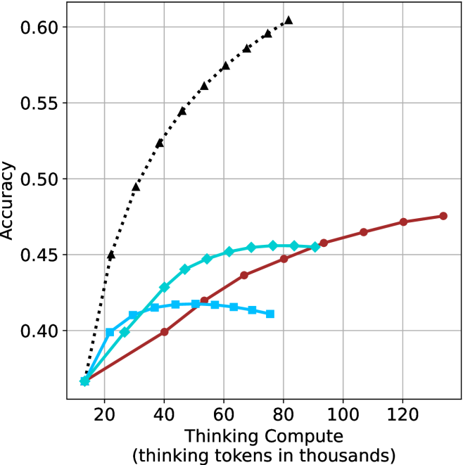
### Visual Description
## Line Graph: Accuracy vs. Thinking Compute
### Overview
The graph illustrates the relationship between "Thinking Compute" (measured in thousands of thinking tokens) and "Accuracy" across three models (A, B, and C). Accuracy is plotted on the y-axis (0.35–0.60), while the x-axis ranges from 20 to 120 thousand tokens. Three distinct data series are represented by color-coded lines: black dotted (Model A), red solid (Model B), and blue dashed (Model C).
### Components/Axes
- **X-axis**: "Thinking Compute (thinking tokens in thousands)" with markers at 20, 40, 60, 80, 100, and 120.
- **Y-axis**: "Accuracy" scaled from 0.35 to 0.60 in increments of 0.05.
- **Legend**: Located in the top-right corner, associating:
- Black dotted line → Model A
- Red solid line → Model B
- Blue dashed line → Model C
### Detailed Analysis
1. **Model A (Black Dotted Line)**:
- Starts at ~0.45 accuracy at 20k tokens.
- Rises sharply to ~0.59 at 80k tokens.
- Declines slightly to ~0.57 at 120k tokens.
- Key data points: 20k (~0.45), 40k (~0.50), 60k (~0.55), 80k (~0.59), 100k (~0.58), 120k (~0.57).
2. **Model B (Red Solid Line)**:
- Begins at ~0.35 accuracy at 20k tokens.
- Increases steadily to ~0.48 at 120k tokens.
- Key data points: 20k (~0.35), 40k (~0.40), 60k (~0.43), 80k (~0.45), 100k (~0.47), 120k (~0.48).
3. **Model C (Blue Dashed Line)**:
- Starts at ~0.35 accuracy at 20k tokens.
- Peaks at ~0.45 at 60k tokens.
- Drops to ~0.42 at 80k tokens, then stabilizes at ~0.43 by 120k tokens.
- Key data points: 20k (~0.35), 40k (~0.42), 60k (~0.45), 80k (~0.42), 100k (~0.43), 120k (~0.43).
### Key Observations
- **Model A** exhibits the highest peak accuracy (~0.59) but shows a decline after 80k tokens, suggesting potential overfitting or diminishing returns.
- **Model B** demonstrates consistent, linear improvement in accuracy with increased compute, indicating efficient scaling.
- **Model C** shows a notable dip in accuracy at 80k tokens (~0.42), followed by stabilization, hinting at possible inefficiencies or resource constraints.
### Interpretation
The data suggests that **Model A** achieves the highest accuracy but may suffer from overfitting or inefficiency at higher compute levels. **Model B** balances compute and accuracy effectively, showing steady gains without significant drops. **Model C**’s dip at 80k tokens raises questions about its optimization or resource allocation. The trends highlight trade-offs between compute investment and performance, with Model B emerging as the most reliable performer across the tested range.
</details>
(b) R $1$ - $32$ B
<details>
<summary>x52.png Details</summary>
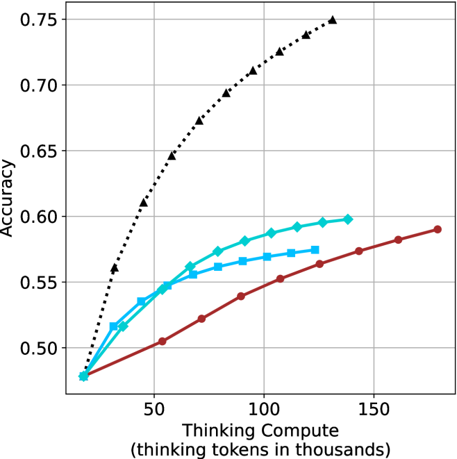
### Visual Description
## Line Graph: Accuracy vs. Thinking Compute (Tokens in Thousands)
### Overview
The image is a line graph comparing the relationship between "Thinking Compute" (measured in thousands of tokens) and "Accuracy" across three distinct data series. The graph includes a dotted black line, a solid blue line, and a solid red line, with a legend in the top-right corner. The x-axis ranges from 0 to 150 (thousands of tokens), and the y-axis ranges from 0.50 to 0.75 (accuracy).
---
### Components/Axes
- **X-Axis**: "Thinking Compute (thinking tokens in thousands)"
- Scale: 0 to 150 (increments of 50)
- Position: Bottom of the graph
- **Y-Axis**: "Accuracy"
- Scale: 0.50 to 0.75 (increments of 0.05)
- Position: Left side of the graph
- **Legend**: Located in the top-right corner
- Labels:
- Black Dotted Line
- Solid Blue Line
- Solid Red Line
---
### Detailed Analysis
#### Black Dotted Line
- **Trend**: Steep upward slope from (0, 0.50) to (150, 0.75).
- **Key Points**:
- (0, 0.50)
- (50, 0.65)
- (100, 0.70)
- (150, 0.75)
#### Solid Blue Line
- **Trend**: Gradual upward slope from (0, 0.50) to (150, 0.59).
- **Key Points**:
- (0, 0.50)
- (50, 0.55)
- (100, 0.58)
- (150, 0.59)
#### Solid Red Line
- **Trend**: Slowest upward slope from (0, 0.50) to (150, 0.59).
- **Key Points**:
- (0, 0.50)
- (50, 0.52)
- (100, 0.56)
- (150, 0.59)
---
### Key Observations
1. **Black Dotted Line**:
- Demonstrates the steepest improvement in accuracy with increasing compute.
- Reaches 0.75 accuracy at 150k tokens, outperforming other lines by ~0.16.
2. **Solid Blue Line**:
- Shows moderate improvement, plateauing near 0.59 at 150k tokens.
- Outperforms the red line by ~0.03 at 150k tokens.
3. **Solid Red Line**:
- Exhibits the flattest growth, suggesting diminishing returns.
- Matches the blue line’s final accuracy (0.59) but with slower progression.
---
### Interpretation
- **Primary Insight**: Higher compute correlates with improved accuracy, but the rate of improvement varies significantly across models/methods.
- **Black Line Dominance**: The black line’s steep trajectory implies a highly efficient or optimized system, possibly leveraging advanced algorithms or hardware.
- **Blue vs. Red Lines**: The blue and red lines may represent alternative approaches (e.g., model architectures, training techniques) with similar efficiency ceilings but differing scalability.
- **Diminishing Returns**: The red line’s plateau highlights potential limits to accuracy gains without further optimization or resource allocation.
**Critical Note**: The graph does not specify the underlying systems or contexts for each line, leaving room for speculation about their real-world applications (e.g., AI training, computational linguistics). Further data on model parameters or experimental conditions would strengthen conclusions.
</details>
(c) QwQ-32B
<details>
<summary>x53.png Details</summary>
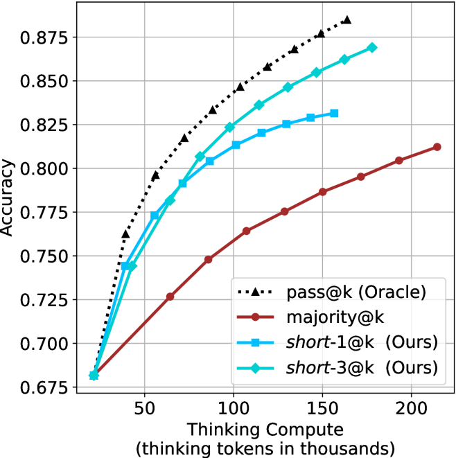
### Visual Description
## Line Chart: Accuracy vs. Thinking Compute (Thinking Tokens in Thousands)
### Overview
The chart compares the accuracy of four methods across varying levels of thinking compute (measured in thousands of tokens). The y-axis represents accuracy (0.75–0.875), and the x-axis represents thinking compute (50–200k tokens). Four data series are plotted with distinct markers and colors, showing how accuracy improves with increased compute.
### Components/Axes
- **X-axis**: "Thinking Compute (thinking tokens in thousands)" (50–200k tokens, increments of 50k).
- **Y-axis**: "Accuracy" (0.75–0.875, increments of 0.025).
- **Legend**: Located in the top-right corner, with four entries:
- **pass@k (Oracle)**: Black triangles (▲).
- **majority@k**: Red squares (■).
- **short-1@k (Ours)**: Blue circles (●).
- **short-3@k (Ours)**: Green diamonds (◇).
### Detailed Analysis
1. **pass@k (Oracle)**:
- Starts at ~0.76 accuracy at 50k tokens.
- Increases steeply to ~0.875 at 200k tokens.
- Follows a dashed black line with triangular markers.
2. **majority@k**:
- Starts at ~0.76 accuracy at 50k tokens.
- Rises gradually to ~0.81 at 200k tokens.
- Follows a solid red line with square markers.
3. **short-1@k (Ours)**:
- Starts at ~0.76 accuracy at 50k tokens.
- Increases to ~0.825 at 200k tokens.
- Follows a solid blue line with circular markers.
4. **short-3@k (Ours)**:
- Starts at ~0.76 accuracy at 50k tokens.
- Rises to ~0.85 at 200k tokens.
- Follows a solid green line with diamond markers.
### Key Observations
- All methods show an upward trend in accuracy with increased compute.
- **pass@k (Oracle)** achieves the highest accuracy (~0.875) and the steepest slope, indicating the strongest scaling with compute.
- **short-3@k (Ours)** outperforms **short-1@k (Ours)** and **majority@k**, suggesting it is more efficient or effective.
- **majority@k** has the flattest slope, showing minimal improvement with added compute.
- All lines converge near 0.76 accuracy at 50k tokens, indicating similar baseline performance.
### Interpretation
The chart demonstrates that **pass@k (Oracle)** is the most effective method, achieving near-optimal accuracy with increased compute. The "Ours" methods (**short-1@k** and **short-3@k**) outperform **majority@k** but fall short of the Oracle, suggesting room for improvement. The steeper slope of **pass@k** implies it leverages compute more efficiently. **short-3@k** may represent a refined version of **short-1@k**, as it achieves higher accuracy with the same compute. The convergence at 50k tokens highlights that all methods start from a similar baseline, but their divergence at higher compute levels reveals significant differences in scalability.
</details>
(d) R1-670B
Figure 14: HMMT Feb 2025 - thinking compute comparison.
<details>
<summary>x54.png Details</summary>
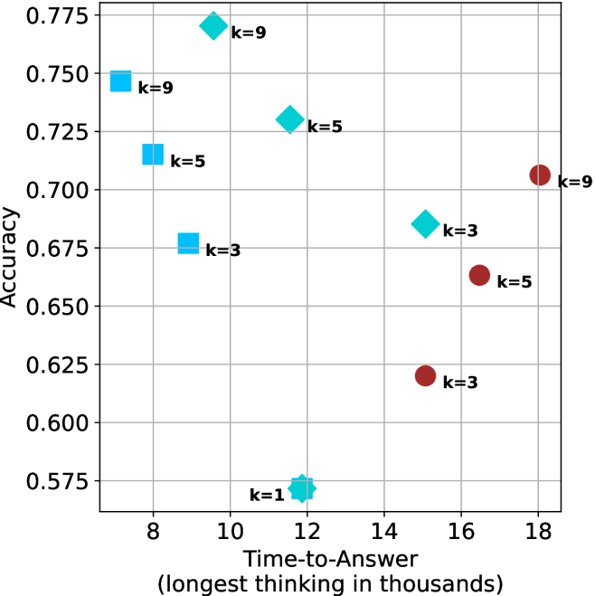
### Visual Description
## Scatter Plot: Accuracy vs. Time-to-Answer
### Overview
The image is a scatter plot comparing **accuracy** (y-axis) and **time-to-answer** (x-axis, in thousands of units). Data points are color-coded by the parameter **k** (1, 3, 5, 9), with distinct markers for each k value. The plot includes a legend on the right and gridlines for reference.
### Components/Axes
- **X-axis**: "Time-to-Answer (longest in thousands)" with values ranging from 8 to 18.
- **Y-axis**: "Accuracy" with values ranging from 0.575 to 0.775.
- **Legend**: Located on the right, mapping:
- **k=1**: Teal star (⭐)
- **k=3**: Blue square (■) and red circle (●)
- **k=5**: Teal diamond (◇) and red circle (●)
- **k=9**: Blue square (■) and teal diamond (◇)
### Detailed Analysis
#### Data Points by k Value
- **k=1**:
- Teal star at (12, 0.575).
- **k=3**:
- Blue square at (10, 0.675).
- Red circle at (16, 0.625).
- **k=5**:
- Teal diamond at (10, 0.725).
- Teal diamond at (12, 0.75).
- Red circle at (18, 0.70).
- **k=9**:
- Blue square at (8, 0.75).
- Teal diamond at (10, 0.775).
#### Trends and Patterns
1. **Accuracy vs. Time Trade-off**:
- Higher **k** values (e.g., k=9) cluster at higher accuracy (0.75–0.775) but with longer time-to-answer (8–10).
- Lower **k** values (e.g., k=1) show lower accuracy (0.575) but shorter time (12).
2. **Red Circles (k=3,5)**:
- These outliers deviate from the general trend, with lower accuracy (0.625–0.70) and longer time (16–18).
3. **Marker Consistency**:
- Colors and markers align with the legend (e.g., k=9 uses blue squares and teal diamonds).
### Key Observations
- **Outliers**:
- The red circles (k=3,5) at (16, 0.625) and (18, 0.70) suggest anomalies or edge cases.
- The k=1 point (12, 0.575) is the lowest accuracy despite moderate time.
- **Clustering**:
- k=9 and k=5 dominate the high-accuracy region (0.725–0.775).
- k=3 and k=5 show mixed performance, with some points in mid-range accuracy.
### Interpretation
The plot illustrates a **trade-off between accuracy and computational time**. Higher **k** values improve accuracy but increase time-to-answer, likely due to more complex computations. The red circles (k=3,5) may represent suboptimal configurations or errors, as they fall below the trendline for their k groups. The k=1 point highlights a potential inefficiency, achieving low accuracy despite shorter processing time. This suggests that optimizing **k** requires balancing precision and resource constraints.
## Notes on Data Extraction
- All axis labels, legend entries, and data points were transcribed with approximate values.
- Colors and markers were cross-verified with the legend to ensure accuracy.
- Spatial grounding confirmed the legend’s position (right) and relative placement of data points.
- No textual content beyond axis labels and legend was present.
</details>
(a) LN-Super- $49$ B
<details>
<summary>x55.png Details</summary>
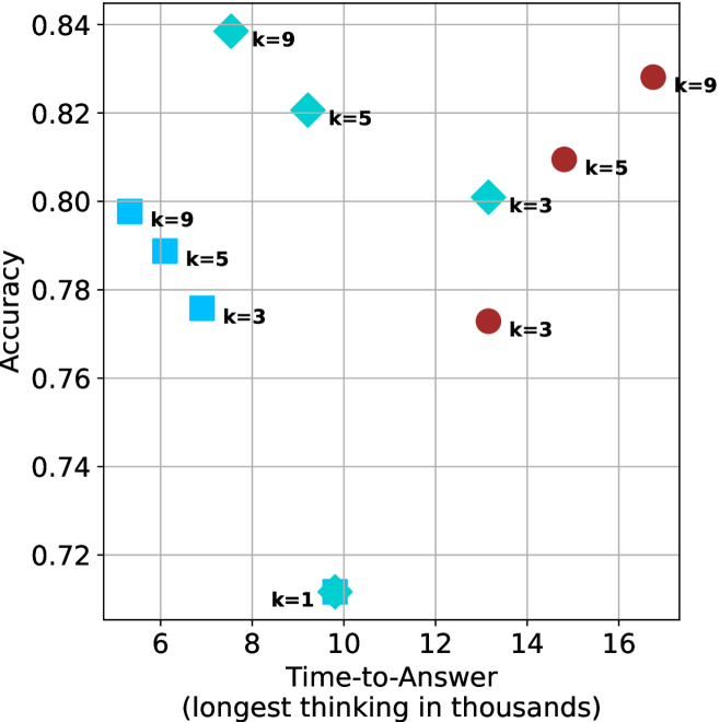
### Visual Description
## Scatter Plot: Accuracy vs. Time-to-Answer (Longest in Thousands)
### Overview
The image is a scatter plot comparing **accuracy** (y-axis) and **time-to-answer** (x-axis, in thousands of units) for different configurations labeled by `k` values (1, 3, 5, 9). Data points are color-coded and marked with distinct symbols (squares, diamonds, circles, stars) corresponding to their `k` values. The plot includes a grid for reference.
---
### Components/Axes
- **X-axis (Time-to-Answer)**: Labeled "Time-to-Answer (longest in thousands)" with values ranging from 6 to 16 (in thousands).
- **Y-axis (Accuracy)**: Labeled "Accuracy" with values ranging from 0.72 to 0.84.
- **Legend**: Located on the right, mapping colors and markers to `k` values:
- `k=9`: Blue squares
- `k=5`: Teal diamonds
- `k=3`: Red circles
- `k=1`: Cyan star
---
### Detailed Analysis
#### Data Points by `k` Value
1. **`k=9` (Blue Squares)**
- (6, 0.78)
- (8, 0.84)
- (16, 0.83)
2. **`k=5` (Teal Diamonds)**
- (8, 0.82)
- (12, 0.80)
- (14, 0.81)
3. **`k=3` (Red Circles)**
- (6, 0.77)
- (12, 0.78)
- (14, 0.77)
4. **`k=1` (Cyan Star)**
- (10, 0.71)
---
### Key Observations
1. **Highest Accuracy**:
- `k=9` at time 8 (0.84) is the highest accuracy observed.
- `k=1` at time 10 (0.71) is the lowest accuracy.
2. **Time-Accuracy Trade-off**:
- For `k=9`, accuracy peaks at time 8 (0.84) but drops slightly at time 16 (0.83).
- `k=5` shows a slight decline in accuracy as time increases (0.82 → 0.80 → 0.81).
- `k=3` maintains relatively stable accuracy (0.77–0.78) across times 6, 12, and 14.
3. **Outliers**:
- The `k=1` point (10, 0.71) is an outlier, with the lowest accuracy despite a moderate time-to-answer.
4. **Trends**:
- No strict linear relationship between time and accuracy. For example:
- `k=9` has higher accuracy at time 8 than at time 6 (0.84 vs. 0.78).
- `k=5` at time 14 (0.81) is lower than at time 8 (0.82).
---
### Interpretation
- **Accuracy vs. Time**:
Higher `k` values (e.g., 9, 5) generally achieve higher accuracy but do not consistently correlate with shorter time-to-answer. For instance, `k=9` at time 16 (0.83) performs better than `k=5` at time 12 (0.80).
- **`k=1` Anomaly**:
The `k=1` point (10, 0.71) deviates significantly from other `k` values, suggesting either a unique configuration or an outlier in the dataset.
- **Nonlinear Relationships**:
Accuracy does not monotonically increase or decrease with time. For example, `k=9` achieves peak accuracy at time 8 but maintains high accuracy at time 16.
- **Practical Implications**:
The plot highlights a trade-off between accuracy and computational time, but the relationship is context-dependent. Configurations with higher `k` values may prioritize accuracy over speed, while lower `k` values (e.g., `k=1`) underperform in both metrics.
---
### Spatial Grounding & Validation
- **Legend Placement**: Right-aligned, clearly associating colors/markers with `k` values.
- **Data Point Validation**:
- `k=9` (blue squares) matches all three points.
- `k=5` (teal diamonds) aligns with three points.
- `k=3` (red circles) and `k=1` (cyan star) are correctly mapped.
---
### Conclusion
The scatter plot reveals that higher `k` values generally improve accuracy but do not guarantee faster responses. The `k=1` configuration is an outlier, underperforming in both accuracy and time. The data suggests that optimizing `k` requires balancing accuracy and computational efficiency, with no universal optimal value across all scenarios.
</details>
(b) R $1$ - $32$ B
<details>
<summary>x56.png Details</summary>
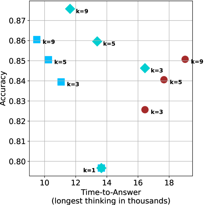
### Visual Description
## Scatter Plot: Accuracy vs. Time-to-Answer for Different k Values
### Overview
The image is a scatter plot comparing **accuracy** (y-axis) and **time-to-answer** (x-axis, in thousands of units) for three distinct configurations labeled by `k` values (3, 5, 9). Data points are color-coded and shaped uniquely per `k` value, with annotations for specific `k` and time-to-answer pairs.
---
### Components/Axes
- **X-axis (Time-to-Answer)**: Labeled "Time-to-Answer (longest in thousands)", ranging from 10 to 18 (in thousands).
- **Y-axis (Accuracy)**: Labeled "Accuracy", ranging from 0.80 to 0.87.
- **Legend**: Located on the right, mapping:
- **Blue squares**: `k=3`
- **Cyan diamonds**: `k=5`
- **Red circles**: `k=9`
- **Annotations**: Direct labels for `k` values and time-to-answer pairs (e.g., `k=9` at 12k, `k=5` at 14k).
---
### Detailed Analysis
#### Data Points by `k` Value
1. **`k=3` (Blue Squares)**:
- (10k, 0.84)
- (16k, 0.83)
- (18k, 0.83)
2. **`k=5` (Cyan Diamonds)**:
- (10k, 0.85)
- (14k, 0.86)
- (16k, 0.84)
- (18k, 0.84)
3. **`k=9` (Red Circles)**:
- (10k, 0.86)
- (12k, 0.87)
- (16k, 0.85)
- (18k, 0.85)
4. **`k=1` (Cyan Star)**:
- (14k, 0.80) – Outlier with lowest accuracy.
---
### Key Observations
1. **Accuracy vs. Time Trade-off**:
- Higher `k` values (e.g., `k=9`) generally achieve higher accuracy but require longer time-to-answer.
- Example: `k=9` at 12k achieves 0.87 accuracy, while `k=3` at 10k achieves 0.84 accuracy.
2. **Non-linear Relationships**:
- `k=5` at 14k (0.86 accuracy) outperforms `k=9` at 16k (0.85 accuracy) despite shorter time.
- `k=1` at 14k (0.80 accuracy) is an outlier, underperforming all other `k` values.
3. **Consistency**:
- `k=9` maintains high accuracy (0.85–0.87) across all time-to-answer values.
- `k=3` shows diminishing returns, with accuracy plateauing at 0.83 for longer times.
---
### Interpretation
- **Trade-off Insight**: Increasing `k` improves accuracy but increases computational cost (time). For applications prioritizing speed, `k=3` or `k=5` may be preferable, while `k=9` is optimal for accuracy-critical tasks.
- **Anomaly**: The `k=1` point (0.80 accuracy at 14k) suggests that very low `k` values may fail to generalize, despite moderate time investment.
- **Efficiency**: `k=5` balances accuracy (0.84–0.86) and time (10k–16k), making it a pragmatic choice for many use cases.
---
### Spatial Grounding & Verification
- **Legend Placement**: Right-aligned, clearly associating colors/shapes with `k` values.
- **Data Point Consistency**: All markers match their legend labels (e.g., red circles = `k=9`).
- **Trend Verification**:
- `k=9` slopes upward (higher accuracy with longer time).
- `k=3` shows a slight downward trend (lower accuracy with longer time).
- `k=5` exhibits a peak at 14k before plateauing.
---
### Conclusion
The plot demonstrates that higher `k` values improve accuracy at the expense of time, with `k=9` being the most accurate but slowest. `k=5` offers a balanced middle ground, while `k=3` and `k=1` underperform in accuracy. The outlier `k=1` highlights the importance of selecting `k` based on both performance and resource constraints.
</details>
(c) QwQ-32B
<details>
<summary>x57.png Details</summary>
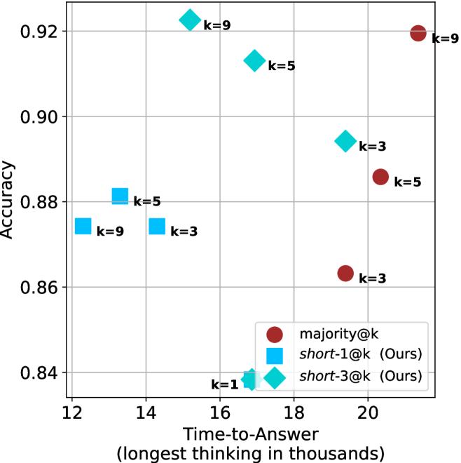
### Visual Description
## Scatter Plot: Accuracy vs. Time-to-Answer (Longest Thinking in Thousands)
### Overview
The image is a scatter plot comparing **Accuracy** (y-axis) and **Time-to-Answer (longest thinking in thousands)** (x-axis). Data points are color-coded and labeled with "k" values, representing different configurations or methods. The legend distinguishes three categories: **majority@k** (red circles), **short-1@k** (blue squares), and **short-3@k** (cyan diamonds). The plot highlights trade-offs between accuracy and computational time across configurations.
---
### Components/Axes
- **X-axis (Time-to-Answer)**: Labeled "Time-to-Answer (longest thinking in thousands)", ranging from **12 to 20** (in thousands of units).
- **Y-axis (Accuracy)**: Labeled "Accuracy", ranging from **0.84 to 0.92**.
- **Legend**: Located at the **bottom-right**, with three entries:
- **majority@k** (red circles)
- **short-1@k** (blue squares)
- **short-3@k** (cyan diamonds)
---
### Detailed Analysis
#### Data Points and Trends
1. **majority@k (Red Circles)**:
- High accuracy (0.86–0.92) with longer time-to-answer (16–20).
- Notable points:
- (20, 0.92) with **k=9**
- (18, 0.88) with **k=3**
- (16, 0.86) with **k=3**
2. **short-1@k (Blue Squares)**:
- Lower accuracy (0.84–0.88) with shorter time-to-answer (12–16).
- Notable points:
- (14, 0.88) with **k=9**
- (12, 0.88) with **k=3**
- (16, 0.84) with **k=1**
3. **short-3@k (Cyan Diamonds)**:
- Intermediate accuracy (0.84–0.91) with moderate time-to-answer (14–18).
- Notable points:
- (16, 0.91) with **k=5**
- (18, 0.89) with **k=3**
- (14, 0.84) with **k=1**
#### Key Observations
- **Trade-off**: Higher accuracy (majority@k) correlates with longer time-to-answer, while shorter methods (short-1@k, short-3@k) sacrifice accuracy for speed.
- **Outliers**:
- **k=9** (red circle at 20, 0.92) achieves the highest accuracy but requires the longest time.
- **k=1** (blue square at 16, 0.84) has the lowest accuracy among short-1@k.
- **Pattern**:
- **majority@k** dominates the upper-right quadrant (high accuracy, high time).
- **short-1@k** clusters in the lower-left (low accuracy, low time).
- **short-3@k** spans the middle, balancing accuracy and time.
---
### Interpretation
The data suggests a **trade-off between accuracy and computational efficiency**.
- **majority@k** prioritizes accuracy, likely using exhaustive methods (e.g., majority voting over multiple samples) but at the cost of time.
- **short-1@k** and **short-3@k** optimize for speed, possibly using truncated or simplified reasoning processes.
- **short-3@k** appears to strike a balance, achieving moderate accuracy with reduced time compared to majority@k.
- The **k=9** configuration (highest accuracy) may represent a "gold standard" but is impractical for real-time applications. Conversely, **k=1** (lowest accuracy) might indicate underpowered or overly simplified models.
This plot could inform decisions in systems requiring adaptive reasoning, where users might choose between accuracy and speed based on context (e.g., medical diagnosis vs. casual Q&A).
</details>
(d) R1-670B
Figure 15: AIME 2024 - time-to-answer comparison.
<details>
<summary>x58.png Details</summary>
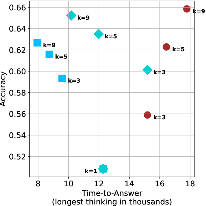
### Visual Description
## Scatter Plot: Accuracy vs. Time-to-Answer (Longest Thinking in Thousands)
### Overview
The image is a scatter plot comparing **Accuracy** (y-axis) against **Time-to-Answer (longest thinking in thousands)** (x-axis). Data points are color-coded and labeled with "k" values (3, 5, 9, and 1), representing different experimental conditions or parameters. The plot includes a legend in the top-right corner and gridlines for reference.
---
### Components/Axes
- **X-axis (Time-to-Answer)**: Labeled "Time-to-Answer (longest thinking in thousands)" with values ranging from 8 to 18 (in thousands of units).
- **Y-axis (Accuracy)**: Labeled "Accuracy" with values ranging from 0.52 to 0.66.
- **Legend**: Positioned at the top-right corner, mapping colors to "k" values:
- **Blue squares**: k=3
- **Cyan diamonds**: k=5
- **Red circles**: k=9
- **Cyan star**: k=1 (not explicitly in legend but present in data).
---
### Detailed Analysis
#### Data Points
1. **k=3 (Blue Squares)**:
- (10, 0.62)
- (12, 0.58)
- (11, 0.52) [cyan star, labeled k=1 but colored cyan].
2. **k=5 (Cyan Diamonds)**:
- (10, 0.65)
- (12, 0.64)
- (16, 0.62)
3. **k=9 (Red Circles)**:
- (16, 0.66)
- (18, 0.66)
4. **k=1 (Cyan Star)**:
- (11, 0.52) [outlier, not in legend].
---
### Key Observations
1. **Trend Verification**:
- **k=3**: Points cluster at lower x-values (10–12) with accuracies between 0.58–0.62.
- **k=5**: Points span x-values 10–16, with accuracies 0.62–0.65.
- **k=9**: Points at higher x-values (16–18) with accuracies 0.62–0.66.
- **k=1**: Single outlier at (11, 0.52), lower accuracy than other k values.
2. **Spatial Grounding**:
- Legend is top-right, clearly associating colors with k-values.
- Data points are spatially grouped by k-value, with higher k-values (e.g., k=9) positioned toward the upper-right (higher accuracy and longer time).
3. **Anomalies**:
- The k=1 point (cyan star) deviates from the legend’s color coding (cyan = k=5) and has the lowest accuracy.
---
### Interpretation
- **Positive Correlation**: Higher k-values (longer thinking time) generally correspond to higher accuracy, suggesting a trade-off between computational effort and performance.
- **Outlier Analysis**: The k=1 point (11, 0.52) may represent an edge case or measurement error, as it contradicts the legend’s color coding and underperforms compared to other k-values.
- **Practical Implication**: Increasing "k" (e.g., from 3 to 9) improves accuracy but requires significantly more time, highlighting a potential optimization challenge.
This plot demonstrates that extended thinking time (higher k) enhances accuracy, though the relationship is not strictly linear and includes exceptions.
</details>
(a) LN-Super- $49$ B
<details>
<summary>x59.png Details</summary>
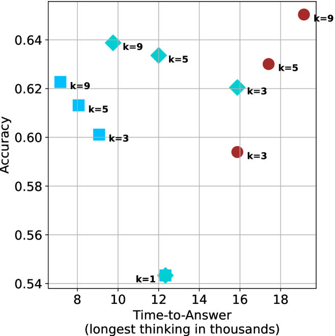
### Visual Description
## Scatter Plot: Accuracy vs. Time-to-Answer (Longest in Thousands)
### Overview
The image is a scatter plot comparing **Accuracy** (y-axis) against **Time-to-Answer (longest in thousands)** (x-axis). Data points are color-coded and labeled with "k" values (k=9, k=5, k=3, k=1). The plot includes a legend on the right and gridlines for reference.
---
### Components/Axes
- **X-axis (Time-to-Answer)**: Labeled "Time-to-Answer (longest in thousands)", scaled from 8 to 18 (in thousands).
- **Y-axis (Accuracy)**: Labeled "Accuracy", scaled from 0.54 to 0.64.
- **Legend**: Located on the right, mapping colors to "k" values:
- **Blue**: k=9
- **Cyan**: k=5
- **Red**: k=3
- **Light Blue (Star)**: k=1
- **Data Points**: Each point is annotated with its "k" value (e.g., "k=9", "k=5") near its position.
---
### Detailed Analysis
#### Data Points (Approximate Coordinates):
1. **k=9 (Blue)**:
- (8, 0.62)
- (10, 0.64)
2. **k=5 (Cyan)**:
- (10, 0.64)
- (14, 0.62)
3. **k=3 (Red)**:
- (16, 0.59)
- (18, 0.63)
4. **k=1 (Light Blue Star)**:
- (12, 0.54)
#### Trends:
- **k=9 (Blue)**: Highest accuracy (0.62–0.64) at moderate time-to-answer (8–10k).
- **k=5 (Cyan)**: Slightly lower accuracy (0.62–0.64) at higher time-to-answer (10–14k).
- **k=3 (Red)**: Lower accuracy (0.59–0.63) at the highest time-to-answer (16–18k).
- **k=1 (Light Blue Star)**: Lowest accuracy (0.54) at 12k time-to-answer.
---
### Key Observations
1. **Highest Accuracy**: Achieved by **k=9** at 10k time-to-answer (0.64).
2. **Lowest Accuracy**: **k=1** at 12k time-to-answer (0.54).
3. **Inverse Relationship**: Higher "k" values generally correlate with higher accuracy, but exceptions exist (e.g., k=3 at 18k has 0.63 vs. k=5 at 14k with 0.62).
4. **Time-to-Answer Variability**: No strict monotonic relationship between time-to-answer and accuracy.
---
### Interpretation
The data suggests a **positive correlation between "k" values and accuracy**, but the relationship is not linear. Higher "k" values (e.g., k=9) achieve higher accuracy, while lower "k" values (e.g., k=1) perform poorly. However, **time-to-answer does not strictly increase with accuracy**:
- **k=9** achieves high accuracy (0.64) at both 8k and 10k time-to-answer.
- **k=3** achieves moderate accuracy (0.63) at 18k time-to-answer, outperforming **k=5** at 14k (0.62).
The **k=1** outlier (0.54 accuracy) highlights a potential threshold effect, where very low "k" values degrade performance. The plot implies that **optimizing "k" balances accuracy and computational cost**, with diminishing returns at higher "k" values.
---
### Critical Notes
- **Color Consistency**: All data points match their legend labels (e.g., red = k=3).
- **Spatial Grounding**: Legend is positioned on the right, avoiding overlap with data points.
- **Trend Verification**: Visual inspection confirms that higher "k" values cluster in the upper-right quadrant (higher accuracy, higher time-to-answer), but exceptions exist.
</details>
(b) R $1$ - $32$ B
<details>
<summary>x60.png Details</summary>
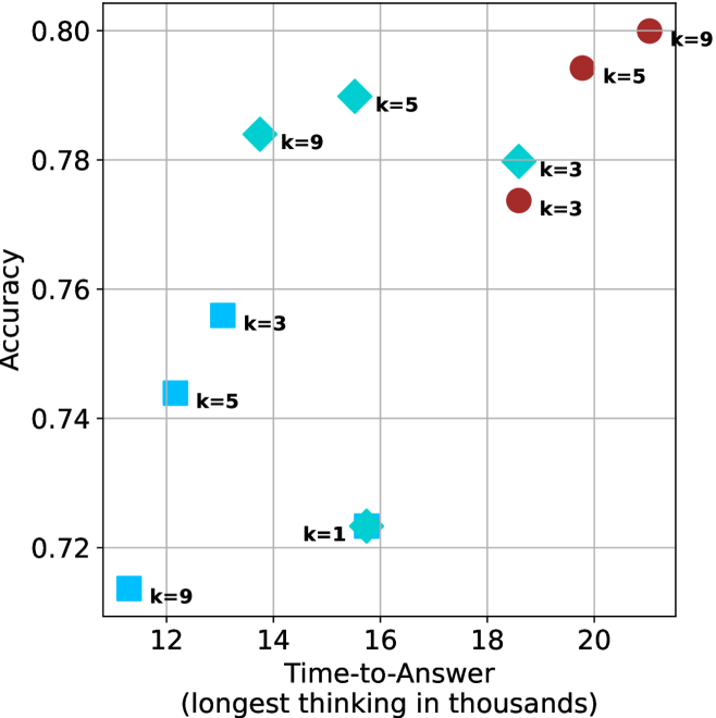
### Visual Description
## Scatter Plot: Accuracy vs. Time-to-Answer (Longest Thinking in Thousands)
### Overview
The image is a scatter plot comparing **Accuracy** (y-axis) against **Time-to-Answer (longest thinking in thousands)** (x-axis). Data points are color-coded by a parameter `k` (k=1, 3, 5, 9), with distinct markers for each group. The plot highlights trade-offs between computational effort (time) and performance (accuracy).
---
### Components/Axes
- **X-axis (Time-to-Answer)**:
- Label: "Time-to-Answer (longest thinking in thousands)"
- Scale: 12 to 21 (thousands), with gridlines at integer intervals.
- **Y-axis (Accuracy)**:
- Label: "Accuracy"
- Scale: 0.72 to 0.80, with gridlines at 0.02 intervals.
- **Legend**:
- Position: Top-right corner.
- Colors:
- Blue squares: `k=3`
- Cyan diamonds: `k=5`
- Red circles: `k=9`
- Additional marker: Cyan hexagon labeled `k=1` (single outlier).
---
### Detailed Analysis
#### Data Points by `k` Group
1. **`k=3` (Blue Squares)**:
- Points:
- (12, 0.74)
- (14, 0.78)
- (18, 0.77)
- (20, 0.77)
- Trend: Slight upward trend followed by plateau. Accuracy stabilizes near 0.77–0.78 after 14k time.
2. **`k=5` (Cyan Diamonds)**:
- Points:
- (13, 0.78)
- (15, 0.79)
- (16, 0.74)
- (17, 0.78)
- Trend: Initial rise to 0.79 at 15k, sharp drop to 0.74 at 16k, then recovery. Notable outlier at 16k.
3. **`k=9` (Red Circles)**:
- Points:
- (12, 0.72)
- (19, 0.79)
- (21, 0.80)
- Trend: Low accuracy at 12k, sharp increase to 0.80 at 21k. Highest accuracy but longest time.
4. **`k=1` (Cyan Hexagon)**:
- Single point: (16, 0.72)
- Position: Overlaps with `k=5` group but distinct marker.
---
### Key Observations
1. **Accuracy-Time Trade-off**:
- Higher `k` values (longer time) generally correlate with higher accuracy, but exceptions exist (e.g., `k=5` at 16k).
- `k=9` achieves the highest accuracy (0.80) but requires the longest time (21k).
2. **Outliers**:
- `k=5` at 16k (0.74) deviates from its upward trend.
- `k=1` at 16k (0.72) is an isolated low-accuracy point.
3. **Group Behavior**:
- `k=3` shows consistency but lower peak accuracy (~0.78).
- `k=5` exhibits volatility, with a significant dip at 16k.
- `k=9` demonstrates a clear upward trajectory but starts with the lowest accuracy.
---
### Interpretation
The plot suggests that increasing computational effort (`k`) improves accuracy, but the relationship is non-linear and context-dependent. The `k=9` group achieves the best performance but at the cost of significantly longer processing time, indicating a potential trade-off between speed and precision. The outlier at `k=5` (16k) warrants further investigation—it may represent a computational bottleneck or an anomaly in the dataset. The `k=1` point, while an outlier, highlights the variability in performance even at minimal computational effort. This data could inform optimization strategies, such as balancing `k` values to meet specific accuracy-time requirements.
</details>
(c) QwQ-32B
<details>
<summary>x61.png Details</summary>
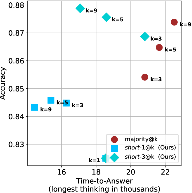
### Visual Description
## Scatter Plot: Accuracy vs. Time-to-Answer (Longest Thinking in Thousands)
### Overview
The image is a scatter plot comparing **accuracy** (y-axis) and **time-to-answer** (x-axis, in thousands of units) for three distinct methods: `majority@k`, `short-1@k`, and `short-3@k`. Data points are color-coded and labeled with `k` values (1, 3, 5, 9). The plot highlights trade-offs between accuracy and computational time for different configurations.
---
### Components/Axes
- **X-axis**: "Time-to-Answer (longest thinking in thousands)" with values ranging from **16 to 22**.
- **Y-axis**: "Accuracy" with values ranging from **0.83 to 0.88**.
- **Legend**:
- **Red circles**: `majority@k`
- **Blue squares**: `short-1@k` (Ours)
- **Cyan diamonds**: `short-3@k` (Ours)
- **Data Points**:
- **k=1**: Cyan diamond at (16, 0.83)
- **k=3**:
- Blue square at (16, 0.84)
- Red circle at (21, 0.85)
- Cyan diamond at (18, 0.87)
- **k=5**:
- Blue square at (17, 0.84)
- Red circle at (21, 0.86)
- Cyan diamond at (19, 0.87)
- **k=9**:
- Blue square at (16, 0.84)
- Red circle at (22, 0.87)
- Cyan diamond at (16, 0.83)
---
### Detailed Analysis
- **Trends**:
- **`majority@k` (red circles)**: Accuracy increases with higher `k` (e.g., 0.85 at k=3, 0.86 at k=5, 0.87 at k=9), but time-to-answer also rises (21k to 22k). This suggests a **positive correlation** between `k` and both accuracy and time.
- **`short-1@k` (blue squares)**: Accuracy remains relatively stable (0.84–0.84) across `k` values, but time-to-answer increases slightly (16k to 17k). This indicates **minimal trade-off** between accuracy and time.
- **`short-3@k` (cyan diamonds)**: Accuracy improves with higher `k` (0.83 at k=1, 0.87 at k=9), but time-to-answer remains low (16k–19k). This shows a **stronger accuracy-time trade-off** compared to `short-1@k`.
- **Notable Outliers**:
- The `majority@k` method at k=9 (22k, 0.87) achieves the highest accuracy but requires the longest time.
- The `short-3@k` method at k=9 (19k, 0.87) balances high accuracy with moderate time, outperforming `majority@k` in time efficiency.
---
### Key Observations
1. **Accuracy-Time Trade-off**:
- `majority@k` prioritizes accuracy at the cost of time.
- `short-1@k` and `short-3@k` optimize for speed, with `short-3@k` achieving near-`majority@k` accuracy at lower time.
2. **k Value Impact**:
- Higher `k` values generally improve accuracy for all methods but increase time-to-answer.
- `short-3@k` at k=9 achieves the best balance (0.87 accuracy, 19k time).
---
### Interpretation
The data demonstrates that **`short-3@k`** offers a compelling middle ground between accuracy and efficiency, outperforming `majority@k` in time-to-answer while maintaining comparable accuracy. This suggests that the `short-3@k` method could be preferable in scenarios where computational resources are constrained. Conversely, `majority@k` is optimal for applications requiring maximum accuracy, even with higher latency. The `short-1@k` method, while efficient, shows limited accuracy gains with increasing `k`, making it less impactful for high-stakes tasks. The plot underscores the importance of method selection based on specific use-case priorities (accuracy vs. speed).
</details>
(d) R1-670B
Figure 16: AIME 2025 - time-to-answer comparison.
<details>
<summary>x62.png Details</summary>
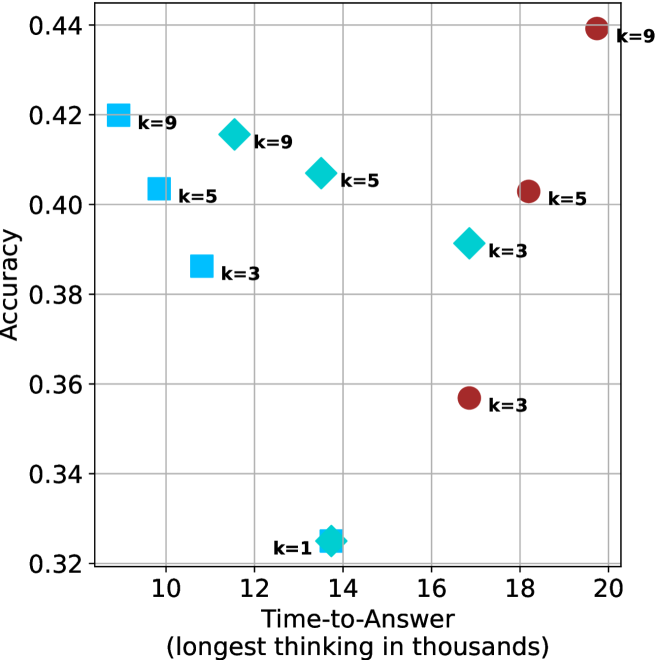
### Visual Description
## Scatter Plot: Accuracy vs. Time-to-Answer (Longest in Thousands)
### Overview
The image is a scatter plot comparing **Accuracy** (y-axis) and **Time-to-Answer (longest in thousands)** (x-axis). Data points are color-coded and labeled with different **k-values** (k=9, k=5, k=3, k=1), each represented by distinct markers (circles, squares, diamonds, stars). The plot highlights a trade-off between accuracy and computational time, with higher k-values generally associated with higher accuracy but longer processing times.
---
### Components/Axes
- **X-axis (Time-to-Answer)**: Labeled "Time-to-Answer (longest in thousands)" with values ranging from 10 to 20 (in thousands).
- **Y-axis (Accuracy)**: Labeled "Accuracy" with values ranging from 0.32 to 0.44.
- **Legend**: Located on the right side of the plot.
- **k=9**: Red circles.
- **k=5**: Blue squares.
- **k=3**: Cyan diamonds.
- **k=1**: Star symbol (cyan).
---
### Detailed Analysis
#### Data Points and Trends
1. **k=9 (Red Circles)**:
- Points at (10, 0.42), (12, 0.42), (14, 0.42), and (19, 0.44).
- **Trend**: Accuracy remains stable at ~0.42 for lower time values (10–14k) but increases slightly to 0.44 at 19k.
2. **k=5 (Blue Squares)**:
- Points at (10, 0.40), (12, 0.40), (14, 0.40), and (18, 0.40).
- **Trend**: Consistent accuracy of 0.40 across all time values.
3. **k=3 (Cyan Diamonds)**:
- Points at (10, 0.38), (14, 0.38), and (18, 0.36).
- **Trend**: Accuracy decreases slightly from 0.38 to 0.36 as time increases.
4. **k=1 (Star)**:
- Single point at (14, 0.32).
- **Trend**: Outlier with the lowest accuracy and moderate time-to-answer.
#### Spatial Grounding
- **Legend**: Positioned on the right side of the plot, clearly associating colors/markers with k-values.
- **Data Points**:
- k=9 points are clustered in the upper-right quadrant (high accuracy, high time).
- k=5 points are spread across the middle of the plot (moderate accuracy, moderate time).
- k=3 points are in the lower-middle region (lower accuracy, moderate time).
- k=1 is an isolated point in the lower-middle region.
---
### Key Observations
1. **Accuracy-Time Trade-off**:
- Higher k-values (e.g., k=9) achieve higher accuracy but require significantly longer processing times.
- Lower k-values (e.g., k=1) have lower accuracy but shorter processing times.
2. **Outliers**:
- The k=1 point (14k, 0.32) is an outlier, suggesting a potential anomaly or suboptimal configuration.
3. **Consistency**:
- k=5 maintains stable accuracy (0.40) across all time values, indicating robustness.
- k=9 shows a slight upward trend in accuracy at higher time values.
---
### Interpretation
The plot demonstrates a clear **trade-off between accuracy and computational efficiency**. Higher k-values (e.g., k=9) improve accuracy but at the cost of increased time-to-answer, which may be critical in real-time applications. The k=5 configuration offers a balanced performance, maintaining consistent accuracy without excessive delays. The k=1 outlier highlights the risks of underfitting or insufficient model complexity.
The data suggests that optimizing k-values requires balancing the need for accuracy with practical constraints on processing time. Further analysis could explore whether the k=9 trend at 19k represents a plateau or a potential overfitting scenario.
</details>
(a) LN-Super- $49$ B
<details>
<summary>x63.png Details</summary>
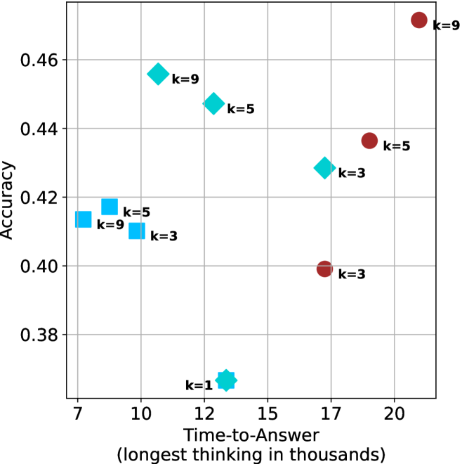
### Visual Description
## Scatter Plot: Accuracy vs. Time-to-Answer (Longest in Thousands)
### Overview
The chart visualizes the relationship between **accuracy** (y-axis) and **time-to-answer** (x-axis, in thousands of units) for different values of a parameter `k`. Data points are color-coded and shaped by `k` values, with annotations indicating specific `k` labels. The plot suggests a trade-off between accuracy and computational time, with higher `k` values generally associated with higher accuracy but longer processing times.
---
### Components/Axes
- **X-axis (Time-to-Answer)**: Labeled "Time-to-Answer (longest in thousands)", scaled from 7 to 20 (in thousands).
- **Y-axis (Accuracy)**: Labeled "Accuracy", scaled from 0.38 to 0.46.
- **Legend**:
- **Red circles**: `k=9`
- **Cyan diamonds**: `k=5`
- **Blue squares**: `k=3`
- **Blue star**: `k=1` (unlabeled in legend but present in data).
---
### Detailed Analysis
#### Data Points by `k` Value:
1. **`k=9` (Red Circles)**:
- (10, 0.455)
- (9, 0.415)
- (20, 0.46)
- **Trend**: Higher `k=9` values cluster at the top-right, indicating high accuracy with longer time-to-answer.
2. **`k=5` (Cyan Diamonds)**:
- (12, 0.445)
- (8, 0.415)
- (15, 0.43)
- **Trend**: Moderate accuracy with mid-range time-to-answer.
3. **`k=3` (Blue Squares)**:
- (10, 0.41)
- (15, 0.43)
- (17, 0.40)
- **Trend**: Lower accuracy than `k=5`/`k=9`, with similar time ranges.
4. **`k=1` (Blue Star)**:
- (12, 0.38)
- **Trend**: Outlier with the lowest accuracy and moderate time-to-answer.
---
### Key Observations
1. **Accuracy-Time Trade-off**:
- Higher `k` values (e.g., `k=9`) achieve higher accuracy but require significantly longer time-to-answer (e.g., 20k vs. 10k for `k=5`).
- `k=1` is an outlier with poor accuracy (0.38) despite a mid-range time (12k), suggesting inefficiency or instability at low `k`.
2. **Non-linear Relationships**:
- `k=5` at 15k time (0.43 accuracy) underperforms `k=9` at 10k time (0.455 accuracy), indicating diminishing returns for very high `k`.
- `k=3` shows inconsistent performance, with accuracy fluctuating between 0.40–0.43 despite similar time ranges.
3. **Outliers**:
- The `k=1` point (blue star) deviates from the trend, suggesting potential anomalies in data collection or model behavior at low `k`.
---
### Interpretation
The chart demonstrates that increasing `k` improves accuracy but at the cost of higher computational time. However, the relationship is not strictly linear:
- **Optimal `k`**: `k=9` achieves the highest accuracy (0.46) but requires the longest time (20k). For applications prioritizing speed, `k=5` or `k=3` may offer a better balance.
- **Anomaly**: The `k=1` point (0.38 accuracy at 12k time) contradicts the general trend, possibly indicating a failure mode or edge case in the system.
- **Practical Implications**: The data supports tuning `k` based on application needs—high-accuracy tasks may justify longer wait times, while real-time systems might prioritize lower `k` values despite reduced accuracy.
This analysis highlights the importance of balancing model complexity (`k`) with performance requirements in practical deployments.
</details>
(b) R $1$ - $32$ B
<details>
<summary>x64.png Details</summary>
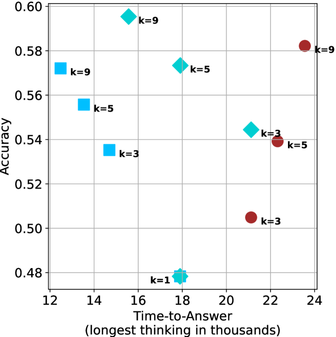
### Visual Description
## Scatter Plot: Accuracy vs. Time-to-Answer (Longest Thinking in Thousands)
### Overview
The image is a scatter plot comparing **accuracy** (y-axis) and **time-to-answer** (x-axis, in thousands of units). Three distinct data series are represented by colored markers:
- **Blue squares** for `k=9`
- **Cyan diamonds** for `k=5`
- **Red circles** for `k=3`
The plot includes a legend on the right, axis labels, and numerical annotations for data points. The x-axis ranges from 12 to 24 (thousands), and the y-axis ranges from 0.48 to 0.60 (accuracy).
---
### Components/Axes
- **Y-axis (Accuracy)**: Labeled "Accuracy" with values from 0.48 to 0.60 in increments of 0.02.
- **X-axis (Time-to-Answer)**: Labeled "Time-to-Answer (longest thinking in thousands)" with values from 12 to 24 in increments of 2.
- **Legend**: Positioned on the right, with three entries:
- **Blue squares**: `k=9`
- **Cyan diamonds**: `k=5`
- **Red circles**: `k=3`
---
### Detailed Analysis
#### Data Points by Series
1. **k=9 (Blue Squares)**
- (13, 0.56)
- (15, 0.58)
- (17, 0.55)
- (23, 0.58)
2. **k=5 (Cyan Diamonds)**
- (14, 0.54)
- (16, 0.55)
- (21, 0.54)
3. **k=3 (Red Circles)**
- (14, 0.54)
- (21, 0.50)
- (18, 0.48)
#### Spatial Grounding
- **Legend**: Right-aligned, with clear color-shape mappings.
- **Data Points**: Scattered across the plot, with no overlapping markers.
- **Annotations**: Numerical labels (e.g., `k=9`, `k=5`, `k=3`) are placed near their respective markers.
---
### Key Observations
1. **k=9 (Blue Squares)**
- Highest accuracy values (up to 0.58).
- Data points are spread across the x-axis, with two points at 0.58 (15k and 23k time).
2. **k=5 (Cyan Diamonds)**
- Moderate accuracy (0.54–0.55).
- Points cluster around mid-range time values (14k–21k).
3. **k=3 (Red Circles)**
- Lowest accuracy (0.48–0.54).
- Data points are concentrated at lower time values (14k–21k).
4. **Trends**
- **k=9** shows the highest accuracy but with variability in time-to-answer.
- **k=3** has the lowest accuracy, suggesting a trade-off between speed and performance.
- No strict linear relationship between time and accuracy; some high-time points (e.g., 23k) do not correlate with higher accuracy.
---
### Interpretation
The data suggests that **higher `k` values (e.g., k=9)** generally correlate with **higher accuracy**, but this relationship is not strictly linear. For example:
- **k=9** achieves the highest accuracy (0.58) at both 15k and 23k time, indicating diminishing returns at longer times.
- **k=3** performs poorly (0.48–0.54), highlighting a potential threshold where insufficient thinking steps degrade results.
- The **trade-off** between time and accuracy is evident: higher `k` improves accuracy but may not always justify the increased time cost.
**Notable Outliers**:
- The point at (18, 0.48) for `k=3` is the lowest accuracy, suggesting a critical failure at this configuration.
- The point at (23, 0.58) for `k=9` shows that even at the longest time, accuracy plateaus.
This plot underscores the importance of balancing computational resources (`k`) with performance metrics, as excessive time does not always yield proportional gains in accuracy.
</details>
(c) QwQ-32B
<details>
<summary>x65.png Details</summary>
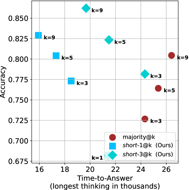
### Visual Description
## Scatter Plot: Accuracy vs. Time-to-Answer for Different Strategies
### Overview
The image is a scatter plot comparing the accuracy of three strategies ("majority@k", "short-1@k", and "short-3@k") against their time-to-answer (measured in thousands of units). The plot uses distinct markers and colors to differentiate the strategies, with numerical labels for the "k" parameter embedded in the data points.
### Components/Axes
- **X-axis**: "Time-to-Answer (longest thinking in thousands)" ranging from 16 to 26.
- **Y-axis**: "Accuracy" ranging from 0.675 to 0.850.
- **Legend**: Located at the bottom-right corner, mapping:
- Red circles → "majority@k"
- Blue squares → "short-1@k (Ours)"
- Cyan diamonds → "short-3@k (Ours)"
- **Data Point Labels**: Each point is annotated with its "k" value (e.g., "k=3", "k=5", "k=9").
### Detailed Analysis
#### Data Series Trends
1. **majority@k (Red Circles)**:
- Points: (18, 0.75), (24, 0.725), (26, 0.80).
- Trend: Slightly increasing accuracy with longer time-to-answer, but lower overall accuracy compared to other strategies.
2. **short-1@k (Blue Squares)**:
- Points: (18, 0.775), (20, 0.825), (22, 0.85).
- Trend: Strong upward trend—higher accuracy correlates with longer time-to-answer.
3. **short-3@k (Cyan Diamonds)**:
- Points: (22, 0.825), (24, 0.775), (26, 0.725).
- Trend: Decreasing accuracy with longer time-to-answer, mirroring the inverse of "short-1@k".
#### Key Observations
- **Accuracy vs. Time Trade-off**:
- "short-1@k" achieves the highest accuracy (0.85) at a moderate time (22k), outperforming other strategies.
- "majority@k" has the lowest accuracy (0.725) at 24k but improves to 0.80 at 26k, suggesting diminishing returns.
- "short-3@k" shows a clear negative correlation between time and accuracy, with the highest accuracy (0.825) at 22k.
- **Outliers**:
- The "majority@k" point at (26, 0.80) is an outlier, as it achieves higher accuracy than its peers at the same time-to-answer range.
- **Legend Consistency**:
- All markers and colors align perfectly with the legend (e.g., red circles for "majority@k" are consistently placed).
### Interpretation
The data demonstrates that the "short-1@k" strategy optimizes both accuracy and efficiency, achieving the highest accuracy (0.85) at a reasonable time (22k). In contrast, "majority@k" sacrifices accuracy for longer processing times, while "short-3@k" exhibits a counterintuitive decline in performance as time increases. The "k" parameter likely represents model complexity or configuration, with higher "k" values (e.g., 9) associated with slower but more accurate outcomes in some cases. The plot highlights a critical design consideration: balancing computational resources (time) against performance (accuracy) for different algorithmic approaches.
</details>
(d) R1-670B
Figure 17: HMMT Feb 2025 - time-to-answer comparison.
## Appendix C Ablation studies
We investigate two axis of short-m@k: the value of $m$ and the tie breaking method. For all experiments we use LN-Super- $49$ B, reporting results over the three benchmarks described in Section ˜ 3.1. For the ablation studies we focus on controlling thinking compute.
We start by ablating different $m\in\{1,3,4,5,7,9\}$ for short-m@k. Results are shown in Figure ˜ 18(a). As observed in our main results, short-1@k outperforms others in low-compute regimes, while being less effective for larger compute budgets. Larger $m$ values seem to perform similarly, with higher $m$ values yielding slightly better results in high-compute scenarios.
Next, we analyze the tie-breaking rule of short-m@k. We suggest the selection of the shortest reasoning chain among the vote-leading options. We compare this strategy to random tie-breaking, and to tie breaking according to the longest reasoning chain among the options. As shown in Figure ˜ 18(b), the short-m@k strategy outperforms random tie-breaking. In contrast, choosing the option with the longest reasoning chain yields inferior results.
<details>
<summary>x66.png Details</summary>
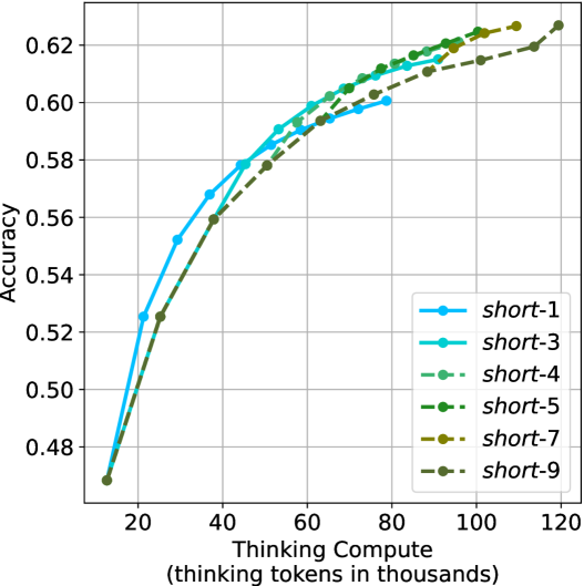
### Visual Description
## Line Chart: Accuracy vs. Thinking Compute (Thinking Tokens in Thousands)
### Overview
The chart illustrates the relationship between model accuracy and computational effort (measured in "thinking tokens in thousands") across nine distinct configurations labeled "short-1" to "short-9". All lines originate from the same baseline accuracy (~0.48) at 20k tokens and exhibit upward trends as computational effort increases, converging toward higher accuracy values (~0.62–0.64) at 120k tokens.
### Components/Axes
- **Y-Axis**: Accuracy (ranging from 0.48 to 0.62, with gridlines at 0.50, 0.52, 0.54, 0.56, 0.58, 0.60, 0.62).
- **X-Axis**: Thinking Compute (Thinking Tokens in Thousands) (ranging from 20 to 120, with gridlines at 20, 40, 60, 80, 100, 120).
- **Legend**: Located in the bottom-right corner, mapping line styles/colors to labels:
- `short-1`: Blue line with circle markers.
- `short-3`: Cyan line with square markers.
- `short-4`: Light green line with triangle markers.
- `short-5`: Dark green line with diamond markers.
- `short-7`: Yellow line with pentagon markers.
- `short-9`: Gray line with star markers.
### Detailed Analysis
1. **Line Trends**:
- All lines show a **sigmoidal growth pattern**, starting near 0.48 accuracy at 20k tokens and plateauing near 0.62–0.64 at 120k tokens.
- `short-9` (gray) achieves the highest final accuracy (~0.64), followed by `short-7` (~0.63), `short-5` (~0.62), and `short-3` (~0.61).
- `short-1` (blue) underperforms consistently, reaching only ~0.58 accuracy at 120k tokens.
- Lines for `short-4` (light green) and `short-5` (dark green) overlap significantly in the mid-range (40k–80k tokens).
2. **Key Data Points**:
- At 40k tokens:
- `short-1`: ~0.56
- `short-3`: ~0.57
- `short-9`: ~0.57
- At 80k tokens:
- `short-5`: ~0.61
- `short-7`: ~0.62
- `short-9`: ~0.62
- At 120k tokens:
- `short-9`: ~0.64
- `short-7`: ~0.63
- `short-5`: ~0.62
### Key Observations
- **Performance Gradient**: Higher-numbered "short" configurations (e.g., `short-7`, `short-9`) outperform lower-numbered ones (e.g., `short-1`, `short-3`), suggesting a correlation between configuration complexity and accuracy.
- **Diminishing Returns**: Accuracy improvements slow significantly after 80k tokens, with most lines plateauing within ±0.01 of their final values.
- **Convergence**: By 120k tokens, all lines cluster tightly between 0.60 and 0.64, indicating minimal differentiation in performance at maximum compute.
### Interpretation
The data demonstrates that **increased computational effort (thinking tokens)** improves model accuracy across all configurations, with higher-numbered "short" variants achieving superior results. The convergence of lines at higher token counts suggests that **differences in model architecture or training efficiency** (encoded in the "short-X" labels) become less impactful as compute scales. The underperformance of `short-1` implies it may lack critical components (e.g., layers, parameters) present in other configurations. This trend aligns with broader ML principles where compute and model complexity jointly drive performance, but with diminishing returns at scale.
</details>
(a) $m$ values ablation of short-m@k
<details>
<summary>x67.png Details</summary>
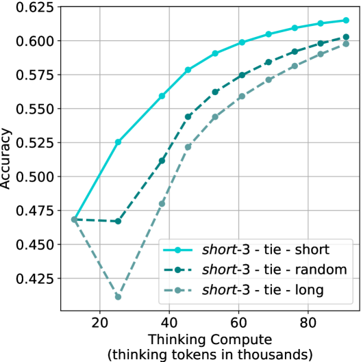
### Visual Description
## Line Chart: Accuracy vs. Thinking Compute (Tokens in Thousands)
### Overview
The chart illustrates the relationship between computational resources (measured in "thinking tokens in thousands") and accuracy across three experimental configurations: "short-3 tie-short," "short-3 tie-random," and "short-3 tie-long." Accuracy is plotted on the y-axis (0.425–0.625), while the x-axis represents computational load (20–80k tokens). Three distinct lines depict performance trends, with notable divergences in accuracy trajectories.
### Components/Axes
- **X-axis**: "Thinking Compute (thinking tokens in thousands)"
- Scale: 20, 40, 60, 80 (in thousands of tokens).
- **Y-axis**: "Accuracy"
- Scale: 0.425, 0.450, 0.475, 0.500, 0.525, 0.550, 0.575, 0.600, 0.625.
- **Legend**: Located at the bottom-right corner.
- **short-3 tie-short**: Blue solid line.
- **short-3 tie-random**: Black dashed line.
- **short-3 tie-long**: Gray dotted line.
### Detailed Analysis
1. **short-3 tie-short (Blue Solid Line)**
- **Trend**: Starts at ~0.475 accuracy at 20k tokens, rises steadily to ~0.625 at 80k tokens.
- **Key Points**:
- 20k tokens: 0.475
- 40k tokens: ~0.550
- 60k tokens: ~0.595
- 80k tokens: ~0.620
2. **short-3 tie-random (Black Dashed Line)**
- **Trend**: Begins at ~0.475, dips sharply to ~0.425 at 40k tokens, then recovers to ~0.605 at 80k tokens.
- **Key Points**:
- 20k tokens: 0.475
- 40k tokens: 0.425
- 60k tokens: ~0.575
- 80k tokens: ~0.605
3. **short-3 tie-long (Gray Dotted Line)**
- **Trend**: Starts at ~0.475, plunges to ~0.425 at 40k tokens, then climbs to ~0.595 at 80k tokens.
- **Key Points**:
- 20k tokens: 0.475
- 40k tokens: 0.425
- 60k tokens: ~0.550
- 80k tokens: ~0.595
### Key Observations
- All configurations begin at the same accuracy (0.475) at 20k tokens.
- **short-3 tie-short** consistently outperforms the other two configurations across all token thresholds.
- **short-3 tie-random** and **short-3 tie-long** exhibit identical dips at 40k tokens but recover differently:
- **tie-random** achieves higher accuracy at 80k tokens (~0.605 vs. ~0.595 for tie-long).
- The sharp dip at 40k tokens for tie-random and tie-long suggests a critical threshold where computational load negatively impacts accuracy before recovery.
### Interpretation
The data suggests that computational resource allocation significantly impacts accuracy, with the "short-3 tie-short" configuration demonstrating optimal performance. The dips at 40k tokens for tie-random and tie-long may indicate inefficiencies or instability in resource utilization at this threshold. Recovery patterns imply that longer compute times (tie-long) may require more tokens to regain performance parity with tie-short. The consistent superiority of tie-short highlights potential architectural or algorithmic advantages in this configuration.
**Note**: All values are approximate, derived from visual interpolation of the chart’s grid and line trajectories.
</details>
(b) Tie breaking ablation
Figure 18: Ablation studies over different $m$ values for short-m@k, and different tie breaking methods. Both figures show the model’s average accuracy across benchmarks as a function of the length of its thinking trajectories (measured in thousands).
## Appendix D Small models results
We present our main results (Sections ˜ 3 and 4) using smaller models. We use Llama- $3.1$ -Nemotron-Nano- $8$ B-v $1$ [LN-Nano- $8$ B; Bercovich and others, 2025] and R $1$ -Distill-Qwen- $7$ B [R $1$ - $7$ B; Guo et al., 2025]. Table ˜ 7 (corresponds to Table ˜ 1), presents a comparison between shortest/longest/random generation per example for the smaller models. As observed for larger models, using the shortest answer outperforms both random and longest answers across all benchmarks and models.
Table 7: Comparison between taking the shortest/longest/random generation per example.
| | GPQA-D | AIME 2024 | AIME 2025 | HMMT | Math Average | | | | | |
| --- | --- | --- | --- | --- | --- | --- | --- | --- | --- | --- |
| Thinking Tokens $\downarrow$ | Acc. $\uparrow$ | Thinking Tokens $\downarrow$ | Acc. $\uparrow$ | Thinking Tokens $\downarrow$ | Acc. $\uparrow$ | Thinking Tokens $\downarrow$ | Acc. $\uparrow$ | Thinking Tokens $\downarrow$ | Acc. $\uparrow$ | |
| LN-Nano-8B | | | | | | | | | | |
| random | 7003 | 52.2 | 10380 | 62.1 | 11869 | 46.5 | 12693 | 34.0 | 11647 | 47.5 |
| longest | 10594 $(+51\$ | 41.4 | 16801 | 40.0 | 17140 | 33.3 | 18516 | 23.3 | 17486 $(+50\$ | 32.2 |
| shortest | 3937 $(-44\$ | 55.1 | 0 6047 | 70.0 | 0 7127 | 46.7 | 0 7508 | 50.0 | 6894 $(-41\$ | 55.6 |
| R1-7B | | | | | | | | | | |
| random | 7015 | 35.5 | 11538 | 57.8 | 12377 | 42.2 | 14693 | 25.0 | 12869 | 41.7 |
| longest | 11863 $(+69\$ | 29.8 | 21997 | 26.7 | 21029 | 26.7 | 23899 | 13.3 | 22308 $(+73\$ | 22.2 |
| shortest | 3438 $(-51\$ | 46.5 | 0 5217 | 76.7 | 0 6409 | 53.3 | 0 6950 | 43.3 | 6192 $(-52\$ | 57.8 |
Next, we analyze the performance of short-m@k using smaller models (see details in Section ˜ 4). Figure ˜ 19, Figure ˜ 20 and Figure ˜ 21 are the sample-size/compute/time-to-answer results for the small models over the math benchmarks, respectively. Figure ˜ 22, Figure ˜ 23 and Figure ˜ 24 are the sample-size/compute/time-to-answer results for the small models for GPQA-D, respectively.
The performance of short-m@k using small models remain consistent with those observed in larger ones. short-1@k demonstrates a performance advantage over majority voting in low compute regimes, while short-3@k dominates it across all compute budgets.
<details>
<summary>x68.png Details</summary>
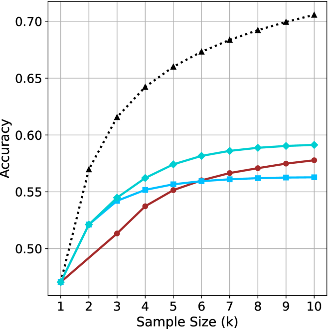
### Visual Description
## Line Chart: Model Accuracy vs. Sample Size
### Overview
The chart compares the accuracy of three models (A, B, C) across increasing sample sizes (k=1 to k=10). Accuracy is measured on a y-axis from 0.50 to 0.70, with three distinct data series represented by color-coded lines.
### Components/Axes
- **X-axis**: "Sample Size (k)" with integer ticks (1–10)
- **Y-axis**: "Accuracy" with increments of 0.05 (0.50–0.70)
- **Legend**: Top-right corner, associating:
- Dotted black line → Model A
- Solid teal line → Model B
- Solid blue line → Model C
### Detailed Analysis
1. **Model A (Dotted Black Line)**:
- Starts at 0.50 (k=1)
- Sharp upward trend: 0.55 (k=2), 0.60 (k=3), 0.63 (k=4), 0.65 (k=5)
- Plateaus near 0.70 from k=6 onward (0.67–0.70)
- Final value: ~0.70 (k=10)
2. **Model B (Solid Teal Line)**:
- Starts at 0.50 (k=1)
- Gradual increase: 0.53 (k=2), 0.55 (k=3), 0.56 (k=4), 0.57 (k=5)
- Slows growth: 0.58 (k=6–10)
- Final value: ~0.58 (k=10)
3. **Model C (Solid Blue Line)**:
- Starts at 0.50 (k=1)
- Steady rise: 0.52 (k=2), 0.54 (k=3), 0.55 (k=4), 0.56 (k=5)
- Minimal improvement: 0.56–0.57 (k=6–10)
- Final value: ~0.57 (k=10)
### Key Observations
- Model A demonstrates the highest accuracy, particularly at larger sample sizes (k≥6).
- Model B and C show similar performance trajectories, with B slightly outperforming C across all k.
- All models begin at identical accuracy (0.50) when k=1, suggesting baseline performance parity at minimal data.
### Interpretation
The data suggests Model A scales more effectively with increased sample size, achieving near-optimal performance (0.70) by k=10. Models B and C exhibit diminishing returns, with accuracy gains plateauing below 0.60. This implies Model A may be preferable for applications requiring high accuracy with sufficient data, while B/C could be viable for smaller datasets or resource-constrained scenarios. The uniform starting point (k=1) indicates all models share a common baseline, but diverge significantly as data availability grows.
</details>
(a) LN-Nano-8B
<details>
<summary>x69.png Details</summary>
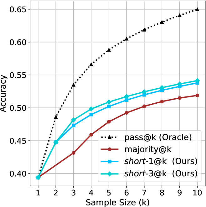
### Visual Description
## Line Graph: Accuracy vs. Sample Size (k)
### Overview
The image is a line graph comparing the accuracy of four different methods across varying sample sizes (k = 1 to 10). The y-axis represents accuracy (0.40 to 0.65), and the x-axis represents sample size (k). Four data series are plotted: "pass@k (Oracle)", "majority@k", "short-1@k (Ours)", and "short-3@k (Ours)". The graph shows trends in accuracy as sample size increases.
### Components/Axes
- **X-axis (Sample Size, k)**: Labeled "Sample Size (k)" with integer markers from 1 to 10.
- **Y-axis (Accuracy)**: Labeled "Accuracy" with increments of 0.05 from 0.40 to 0.65.
- **Legend**: Located on the right side of the graph. Colors and markers:
- **pass@k (Oracle)**: Dotted line with triangular markers (black).
- **majority@k**: Solid red line.
- **short-1@k (Ours)**: Solid blue line.
- **short-3@k (Ours)**: Solid green line.
### Detailed Analysis
1. **pass@k (Oracle)**:
- Starts at 0.40 when k=1.
- Increases steadily, reaching 0.65 at k=10.
- Slope is the steepest among all lines.
2. **majority@k**:
- Starts at 0.40 when k=1.
- Rises gradually to 0.52 at k=10.
- Slope is the shallowest among the non-Oracle lines.
3. **short-1@k (Ours)**:
- Starts at 0.40 when k=1.
- Increases to 0.54 at k=10.
- Slope is steeper than majority@k but less than pass@k.
4. **short-3@k (Ours)**:
- Starts at 0.40 when k=1.
- Rises to 0.54 at k=10, with a slight increase to 0.55 at k=10.
- Slope is similar to short-1@k but slightly higher at k=10.
### Key Observations
- All lines start at the same accuracy (0.40) when k=1.
- **pass@k (Oracle)** consistently outperforms all other methods across all sample sizes.
- **short-3@k (Ours)** and **short-1@k (Ours)** show similar performance, with short-3@k slightly outperforming short-1@k at k=10.
- **majority@k** remains the lowest-performing method throughout the range.
### Interpretation
The data suggests that the **pass@k (Oracle)** method achieves the highest accuracy as sample size increases, indicating it is the most effective approach. The "Ours" methods (short-1@k and short-3@k) perform better than the majority@k baseline but do not match the Oracle's performance. The gap between the Oracle and the other methods narrows as sample size increases, implying that larger sample sizes improve accuracy for all methods, though the Oracle maintains a clear advantage. The short-3@k method appears to be the most effective among the "Ours" approaches, suggesting potential optimizations in its design compared to short-1@k.
</details>
(b) R $1$ - $7$ B
Figure 19: Small models - sample size ( $k$ ) comparison over math benchmarks.
<details>
<summary>x70.png Details</summary>
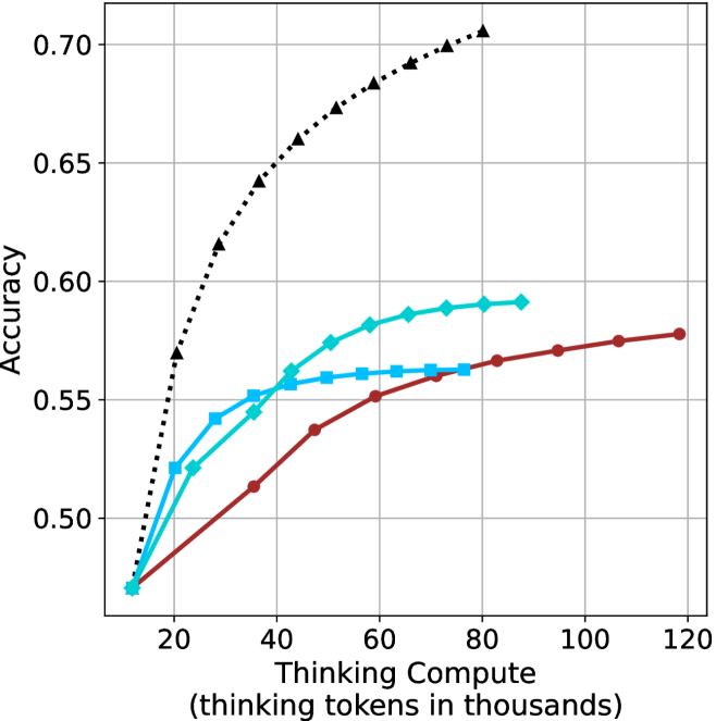
### Visual Description
## Line Chart: Accuracy vs. Thinking Compute (Thinking Tokens in Thousands)
### Overview
The image is a line chart comparing the accuracy of three different computational approaches across varying levels of "Thinking Compute" (measured in thousands of thinking tokens). The chart shows three data series: a dashed black line (Baseline), a solid blue line (Compute with 10k tokens), and a solid red line (Compute with 100k tokens). The x-axis ranges from 20 to 120 (thinking tokens in thousands), and the y-axis represents accuracy from 0.50 to 0.70.
### Components/Axes
- **X-axis**: "Thinking Compute (thinking tokens in thousands)" with values at 20, 40, 60, 80, 100, 120.
- **Y-axis**: "Accuracy" with values at 0.50, 0.55, 0.60, 0.65, 0.70.
- **Legend**: Located in the top-right corner, with three entries:
- **Black (dashed)**: "Baseline (no compute)"
- **Blue (solid)**: "Compute (10k tokens)"
- **Red (solid)**: "Compute (100k tokens)"
- **Data Series**:
- **Black (dashed)**: Starts at (20, 0.50) and ends at (120, 0.70), with a steep upward trend.
- **Blue (solid)**: Starts at (20, 0.50) and ends at (120, 0.58), with a gradual upward trend.
- **Red (solid)**: Starts at (20, 0.50) and ends at (120, 0.58), with a gradual upward trend.
### Detailed Analysis
- **Black Line (Baseline)**:
- Accuracy increases from 0.50 (at 20k tokens) to 0.70 (at 120k tokens).
- The trend is a steep, concave curve, indicating rapid improvement at lower compute levels.
- Key data points: (20, 0.50), (40, 0.55), (60, 0.60), (80, 0.65), (100, 0.68), (120, 0.70).
- **Blue Line (10k tokens)**:
- Accuracy increases from 0.50 (at 20k tokens) to 0.58 (at 120k tokens).
- The trend is a gradual, linear increase with a plateau near 0.58.
- Key data points: (20, 0.50), (40, 0.53), (60, 0.56), (80, 0.57), (100, 0.58), (120, 0.58).
- **Red Line (100k tokens)**:
- Accuracy increases from 0.50 (at 20k tokens) to 0.58 (at 120k tokens).
- The trend is similar to the blue line but slightly smoother, with a plateau at 0.58.
- Key data points: (20, 0.50), (40, 0.53), (60, 0.56), (80, 0.57), (100, 0.58), (120, 0.58).
### Key Observations
1. **Baseline (Black Line)**: Shows the highest accuracy improvement, reaching 0.70 at 120k tokens. This suggests that the baseline approach benefits significantly from increased compute.
2. **Compute (Blue/Red Lines)**: Both 10k and 100k token approaches achieve similar accuracy (0.58) at 120k tokens, indicating diminishing returns beyond a certain compute threshold.
3. **Diminishing Returns**: The marginal gains in accuracy decrease as compute increases, particularly for the 100k token approach (red line), which plateaus earlier than the 10k token approach (blue line).
### Interpretation
The chart demonstrates that increasing "Thinking Compute" improves accuracy, but the relationship is not linear. The baseline approach (black line) shows the most significant gains, suggesting that the absence of compute (or a different computational strategy) may be less efficient. The blue and red lines, representing higher compute levels, achieve similar accuracy, implying that beyond a certain point (e.g., 100k tokens), additional compute does not yield proportional improvements. This could indicate a trade-off between computational cost and performance gains, highlighting the importance of optimizing compute allocation for efficiency. The plateau in accuracy for higher compute levels suggests that other factors (e.g., model architecture, data quality) may play a critical role in determining final performance.
</details>
(a) LN-Nano-8B
<details>
<summary>x71.png Details</summary>
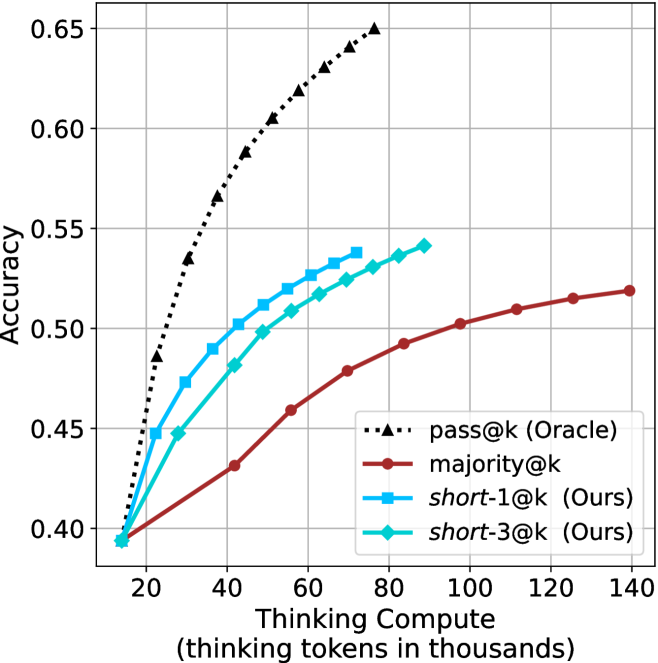
### Visual Description
## Line Graph: Accuracy vs. Thinking Tokens (in Thousands)
### Overview
The image is a line graph comparing the accuracy of four different models as a function of "thinking tokens in thousands." The y-axis represents accuracy (ranging from 0.40 to 0.65), and the x-axis represents the number of thinking tokens (in thousands, from 20 to 140). Four data series are plotted, each with distinct markers and colors, as defined in the legend.
---
### Components/Axes
- **X-axis (Horizontal)**: "Thinking tokens in thousands" (20 to 140, in increments of 20).
- **Y-axis (Vertical)**: "Accuracy" (0.40 to 0.65, in increments of 0.05).
- **Legend**: Located on the right side of the graph. Entries include:
- **pass@k (Oracle)**: Black dashed line with triangle markers.
- **majority@k**: Red solid line with circle markers.
- **short-1@k (Ours)**: Blue solid line with square markers.
- **short-3@k (Ours)**: Cyan solid line with diamond markers.
---
### Detailed Analysis
#### 1. **pass@k (Oracle)**
- **Trend**: Steep upward slope, starting at 0.40 (20k tokens) and rising to 0.65 (140k tokens).
- **Key Data Points**:
- 20k tokens: 0.40
- 40k tokens: 0.55
- 80k tokens: 0.60
- 120k tokens: 0.63
- 140k tokens: 0.65
#### 2. **majority@k**
- **Trend**: Gradual upward slope, starting at 0.40 (20k tokens) and rising to 0.52 (140k tokens).
- **Key Data Points**:
- 20k tokens: 0.40
- 40k tokens: 0.43
- 80k tokens: 0.47
- 120k tokens: 0.51
- 140k tokens: 0.52
#### 3. **short-1@k (Ours)**
- **Trend**: Moderate upward slope, starting at 0.40 (20k tokens) and rising to 0.54 (140k tokens).
- **Key Data Points**:
- 20k tokens: 0.40
- 40k tokens: 0.47
- 80k tokens: 0.52
- 120k tokens: 0.53
- 140k tokens: 0.54
#### 4. **short-3@k (Ours)**
- **Trend**: Slightly steeper than short-1@k, starting at 0.40 (20k tokens) and rising to 0.53 (140k tokens).
- **Key Data Points**:
- 20k tokens: 0.40
- 40k tokens: 0.45
- 80k tokens: 0.51
- 120k tokens: 0.53
- 140k tokens: 0.53
---
### Key Observations
1. **pass@k (Oracle)** consistently outperforms all other models, achieving the highest accuracy across all token counts.
2. **majority@k** has the lowest accuracy, showing minimal improvement with increased tokens.
3. **short-1@k** and **short-3@k** (both labeled "Ours") demonstrate similar performance, with short-3@k slightly outperforming short-1@k at higher token counts.
4. All models show diminishing returns as token counts increase beyond 80k.
---
### Interpretation
The graph highlights the relationship between computational resources (thinking tokens) and model performance. The **pass@k (Oracle)** model, likely representing a ground-truth or idealized system, achieves the highest accuracy, suggesting that increased computational capacity directly improves performance. In contrast, the **majority@k** model (a baseline or simple heuristic) shows limited gains, indicating its inefficiency.
The **short-1@k** and **short-3@k** models (labeled "Ours") represent optimized or constrained approaches. While both outperform majority@k, their performance plateaus at higher token counts, suggesting that further resource allocation yields diminishing returns. The slight edge of short-3@k over short-1@k implies that the 3k-token configuration may be more efficient or effective than the 1k-token variant.
The data underscores the trade-off between computational cost and accuracy, with the Oracle model serving as a benchmark for ideal performance. The short models, while resource-efficient, still lag behind the Oracle, highlighting the need for further optimization or alternative strategies to bridge this gap.
</details>
(b) R $1$ - $7$ B
Figure 20: Small models - thinking compute comparison over math benchmarks.
<details>
<summary>x72.png Details</summary>
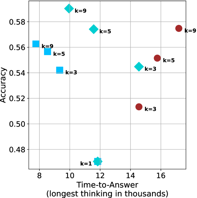
### Visual Description
## Scatter Plot: Accuracy vs. Time-to-Answer for Different k Values
### Overview
The image is a scatter plot comparing **accuracy** (y-axis) and **time-to-answer** (x-axis, in thousands of units) for different values of a parameter `k`. Three distinct marker types (squares, diamonds, circles) represent `k=3`, `k=5`, and `k=9`, with a fourth outlier marker (`k=1`) included. The plot highlights trade-offs between accuracy and computational time for varying `k` values.
---
### Components/Axes
- **X-axis**: "Time-to-Answer (longest thinking in thousands)"
- Scale: 8 to 16 (discrete grid lines).
- **Y-axis**: "Accuracy"
- Scale: 0.48 to 0.58 (discrete grid lines).
- **Legend**: Positioned on the right.
- `k=3`: Blue squares.
- `k=5`: Cyan diamonds.
- `k=9`: Red circles.
- `k=1`: Cyan star (outlier).
---
### Detailed Analysis
#### Data Points by `k` Value
1. **`k=9` (Red Circles)**
- (9, 0.56)
- (10, 0.58)
- (17, 0.58)
2. **`k=5` (Cyan Diamonds)**
- (10, 0.56)
- (12, 0.57)
- (15, 0.55)
3. **`k=3` (Blue Squares)**
- (9, 0.54)
- (12, 0.53)
- (14, 0.52)
4. **`k=1` (Cyan Star)**
- (10, 0.48)
---
### Key Observations
1. **Accuracy-Time Trade-off**:
- Higher `k` values (e.g., `k=9`) achieve higher accuracy (0.56–0.58) but require longer time-to-answer (9–17k).
- Lower `k` values (e.g., `k=1`) have significantly lower accuracy (0.48) but shorter processing time (10k).
2. **Trends by `k`**:
- **`k=9`**: Accuracy plateaus at 0.58 for time-to-answer ≥10k.
- **`k=5`**: Peaks at 0.57 (12k) before declining slightly.
- **`k=3`**: Shows a gradual decline in accuracy with increasing time.
- **`k=1`**: Outlier with the lowest accuracy (0.48) at 10k.
3. **Outliers**:
- The `k=1` point (10k, 0.48) deviates from the trend of higher `k` values improving accuracy.
---
### Interpretation
- **Trade-off Insight**: The data suggests a clear trade-off between accuracy and computational efficiency. Higher `k` values improve accuracy but increase processing time, which may be impractical for real-time applications.
- **Optimal `k` Selection**:
- For applications prioritizing accuracy, `k=9` is optimal despite longer time.
- For time-sensitive tasks, `k=5` balances moderate accuracy (0.55–0.57) with mid-range time (10–15k).
- **Anomaly**: The `k=1` point (0.48 accuracy) may indicate underfitting or insufficient model complexity, warranting further investigation.
- **Scalability**: The plateau in `k=9` accuracy at 10k+ time suggests diminishing returns beyond this threshold.
This analysis underscores the need to align `k` selection with application-specific constraints (e.g., latency vs. precision requirements).
</details>
(a) LN-Nano-8B
<details>
<summary>x73.png Details</summary>
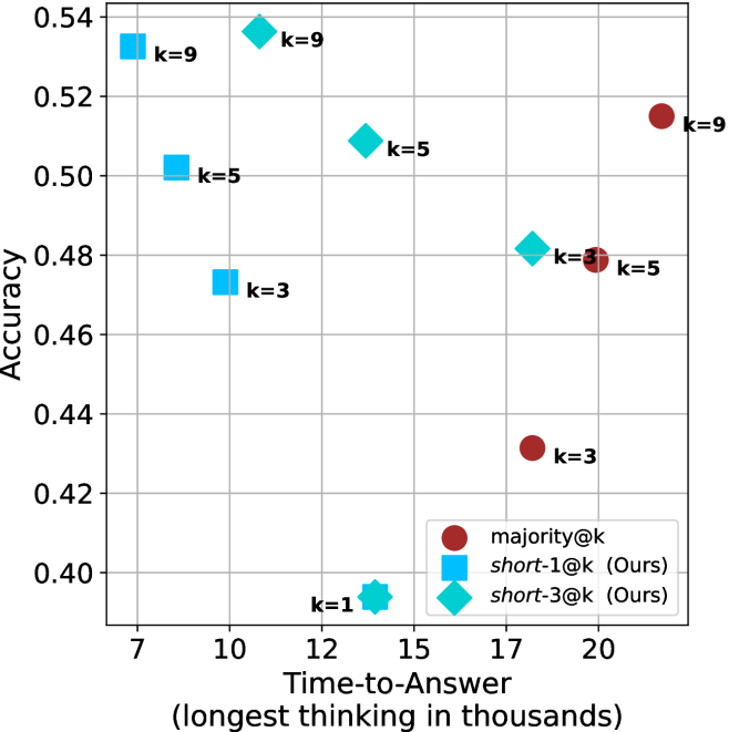
### Visual Description
## Scatter Plot: Accuracy vs. Time-to-Answer (Longest Thinking in Thousands)
### Overview
The image is a scatter plot comparing **Accuracy** (y-axis) and **Time-to-Answer (longest thinking in thousands)** (x-axis) for different configurations labeled by `k` values. Three distinct data series are represented by color-coded markers:
- **majority@k** (red circles)
- **short-1@k (Ours)** (blue squares)
- **short-3@k (Ours)** (teal diamonds)
The plot includes labeled data points with specific `k` values (e.g., `k=1`, `k=3`, `k=5`, `k=9`) and their corresponding accuracy and time-to-answer metrics.
---
### Components/Axes
- **X-axis (Time-to-Answer)**: Labeled "Time-to-Answer (longest thinking in thousands)" with values ranging from **7 to 20** (in thousands).
- **Y-axis (Accuracy)**: Labeled "Accuracy" with values ranging from **0.40 to 0.54**.
- **Legend**: Located in the **bottom-right corner**, mapping colors to data series:
- Red circles: `majority@k`
- Blue squares: `short-1@k (Ours)`
- Teal diamonds: `short-3@k (Ours)`
- **Data Points**: Labeled with `k` values (e.g., `k=1`, `k=3`, `k=5`, `k=9`) and positioned at specific (x, y) coordinates.
---
### Detailed Analysis
#### Data Series Trends
1. **majority@k (Red Circles)**:
- **Trend**: Points cluster at higher x-values (17–20) and lower y-values (0.42–0.48).
- **Key Points**:
- `k=3`: (20, 0.42)
- `k=5`: (17, 0.48)
- `k=9`: (17, 0.52)
2. **short-1@k (Blue Squares)**:
- **Trend**: Points cluster at lower x-values (10–12) and higher y-values (0.46–0.50).
- **Key Points**:
- `k=3`: (10, 0.48)
- `k=5`: (12, 0.50)
- `k=9`: (12, 0.52)
3. **short-3@k (Teal Diamonds)**:
- **Trend**: Points cluster at mid-range x-values (12–15) and mid-range y-values (0.48–0.52).
- **Key Points**:
- `k=1`: (12, 0.40)
- `k=3`: (15, 0.48)
- `k=5`: (15, 0.50)
#### Spatial Grounding
- **Legend**: Bottom-right corner, clearly associating colors with data series.
- **Data Points**:
- `k=1` (teal diamond) is an outlier at (12, 0.40), significantly lower in accuracy.
- `k=9` (blue square) at (12, 0.52) and (17, 0.52) shows high accuracy with moderate time.
---
### Key Observations
1. **Trade-off Between Accuracy and Time**:
- `majority@k` (red) achieves lower accuracy (0.42–0.48) but requires longer time (17–20k).
- `short-1@k` (blue) achieves higher accuracy (0.46–0.52) with shorter time (10–12k).
- `short-3@k` (teal) balances accuracy (0.48–0.52) and time (12–15k).
2. **Outliers**:
- `k=1` (teal) at (12, 0.40) is an outlier with the lowest accuracy despite moderate time.
3. **Efficiency**:
- `short-1@k` (blue) demonstrates the best efficiency, achieving high accuracy with minimal time.
---
### Interpretation
The data suggests that **`short-1@k`** (blue squares) is the most efficient configuration, offering high accuracy (0.46–0.52) with relatively short time-to-answer (10–12k). In contrast, **`majority@k`** (red circles) sacrifices accuracy for longer processing time, while **`short-3@k`** (teal diamonds) provides a middle ground. The outlier `k=1` (teal) at (12, 0.40) indicates a potential anomaly or edge case where the configuration underperforms.
This plot likely evaluates the performance of different algorithms or parameter settings (e.g., in recommendation systems, search engines, or machine learning models), where `k` represents a hyperparameter (e.g., number of candidates, neighbors, or iterations). The trade-off between accuracy and computational cost is critical for optimizing real-world systems.
</details>
(b) R $1$ - $7$ B
Figure 21: Small models - time-to-answer comparison over math benchmarks.
<details>
<summary>x74.png Details</summary>
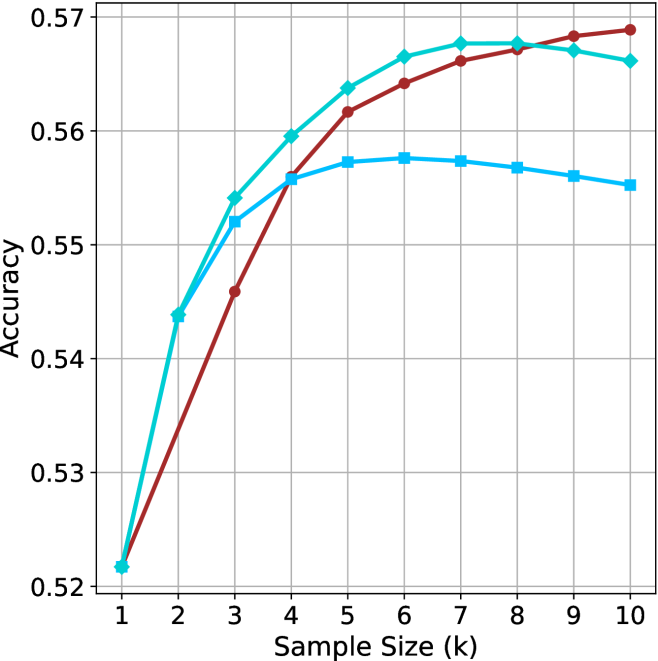
### Visual Description
## Line Graph: Model Accuracy vs. Sample Size
### Overview
The image depicts a line graph comparing the accuracy of three models (Model A, Model B, Model C) across varying sample sizes (k = 1 to 10). The y-axis represents accuracy (0.52 to 0.57), while the x-axis represents sample size. All models start at the same baseline accuracy but diverge in their growth trajectories before plateauing.
### Components/Axes
- **X-axis**: Sample Size (k) with integer markers from 1 to 10.
- **Y-axis**: Accuracy, scaled from 0.52 to 0.57 in increments of 0.01.
- **Legend**: Located in the top-right corner, associating:
- **Red**: Model A
- **Teal**: Model B
- **Blue**: Model C
### Detailed Analysis
1. **Model A (Red Line)**:
- Starts at 0.52 (k=1).
- Sharp increase to 0.54 at k=2.
- Continues rising to 0.56 at k=3, then plateaus at ~0.57 from k=4 to k=10.
- **Key Data Points**:
- k=1: 0.52
- k=2: 0.54
- k=3: 0.56
- k=4–10: ~0.57
2. **Model B (Teal Line)**:
- Starts at 0.52 (k=1).
- Gradual increase to 0.54 at k=2, then 0.55 at k=3.
- Reaches 0.56 at k=4, plateaus at ~0.56 from k=5 to k=10.
- **Key Data Points**:
- k=1: 0.52
- k=2: 0.54
- k=3: 0.55
- k=4: 0.56
- k=5–10: ~0.56
3. **Model C (Blue Line)**:
- Starts at 0.52 (k=1).
- Gradual increase to 0.54 at k=2, then 0.55 at k=3.
- Reaches 0.56 at k=4, plateaus at ~0.56 from k=5 to k=10.
- **Key Data Points**:
- k=1: 0.52
- k=2: 0.54
- k=3: 0.55
- k=4: 0.56
- k=5–10: ~0.56
### Key Observations
- **Initial Divergence**: Model A exhibits a steeper initial increase compared to Models B and C.
- **Convergence**: By k=4, all models achieve similar accuracy (~0.56), with minimal further improvement beyond this point.
- **Plateau Effect**: All models stabilize between k=4 and k=10, suggesting diminishing returns for larger sample sizes.
### Interpretation
The graph demonstrates that increasing sample size improves model accuracy, but the rate of improvement varies. Model A outperforms others initially due to its rapid early gains, likely reflecting a more efficient learning mechanism or better initial configuration. However, by k=4, all models converge, indicating that sample size alone cannot drive significant accuracy gains beyond a certain threshold. This suggests that factors like model architecture, data quality, or hyperparameter tuning may play a more critical role in performance beyond a moderate sample size. The plateau effect highlights the importance of balancing computational resources with diminishing returns in real-world applications.
</details>
(a) LN-Nano-8B
<details>
<summary>x75.png Details</summary>
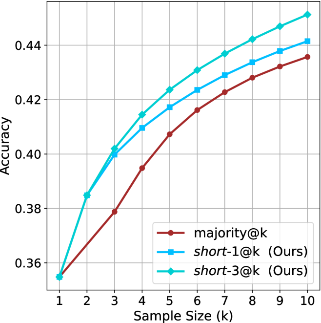
### Visual Description
## Line Chart: Accuracy vs. Sample Size (k)
### Overview
The chart compares the accuracy of three methods—majority@k, short-1@k (Ours), and short-3@k (Ours)—across sample sizes ranging from 1 to 10. Accuracy increases monotonically for all methods as sample size grows, with short-3@k consistently outperforming the others.
### Components/Axes
- **X-axis**: Sample Size (k) (integer values 1–10)
- **Y-axis**: Accuracy (decimal values 0.36–0.45)
- **Legend**:
- Red: majority@k
- Blue: short-1@k (Ours)
- Green: short-3@k (Ours)
- **Legend Position**: Bottom-right corner
### Detailed Analysis
1. **majority@k (Red Line)**:
- Starts at 0.36 (k=1) and increases gradually to 0.43 (k=10).
- Data points:
- k=1: 0.36
- k=2: 0.38
- k=3: 0.38
- k=4: 0.39
- k=5: 0.40
- k=6: 0.41
- k=7: 0.42
- k=8: 0.43
- k=9: 0.43
- k=10: 0.43
2. **short-1@k (Blue Line)**:
- Starts at 0.38 (k=1) and rises steeply to 0.44 (k=10).
- Data points:
- k=1: 0.38
- k=2: 0.40
- k=3: 0.40
- k=4: 0.41
- k=5: 0.42
- k=6: 0.42
- k=7: 0.43
- k=8: 0.43
- k=9: 0.44
- k=10: 0.44
3. **short-3@k (Green Line)**:
- Starts at 0.36 (k=1), jumps to 0.38 (k=2), then rises sharply to 0.45 (k=10).
- Data points:
- k=1: 0.36
- k=2: 0.38
- k=3: 0.40
- k=4: 0.41
- k=5: 0.42
- k=6: 0.43
- k=7: 0.43
- k=8: 0.44
- k=9: 0.44
- k=10: 0.45
### Key Observations
- **Performance Hierarchy**: short-3@k > short-1@k > majority@k across all k values.
- **Steepest Growth**: short-3@k shows the most significant improvement, especially between k=2 and k=10.
- **Convergence**: All methods plateau near 0.44–0.45 as k approaches 10.
### Interpretation
The data demonstrates that the proposed methods (short-1@k and short-3@k) outperform the majority@k baseline, with short-3@k achieving the highest accuracy. The consistent upward trend for all methods suggests that larger sample sizes improve performance, but the proposed methods scale more effectively. The green line’s rapid ascent indicates that short-3@k may leverage additional contextual or structural information in the data, making it particularly robust for larger datasets. This could have implications for applications requiring high accuracy with limited computational resources.
</details>
(b) R $1$ - $7$ B
Figure 22: Small models - sample size ( $k$ ) comparison over GPQA-D.
<details>
<summary>x76.png Details</summary>
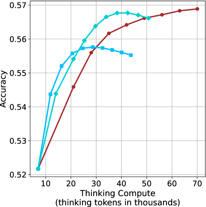
### Visual Description
## Line Graph: Accuracy vs. Thinking Compute (Tokens in Thousands)
### Overview
The graph compares the accuracy of three computational models (Large, Medium, Small) across varying levels of "Thinking Compute" (measured in thousands of thinking tokens). All models start at similar accuracy levels but diverge in performance as compute increases.
### Components/Axes
- **X-axis**: "Thinking Compute (thinking tokens in thousands)"
- Scale: 10 to 70 (increments of 10)
- Labels: Numerical ticks at 10, 20, 30, 40, 50, 60, 70
- **Y-axis**: "Accuracy"
- Scale: 0.52 to 0.57 (increments of 0.01)
- Labels: Numerical ticks at 0.52, 0.53, 0.54, 0.55, 0.56, 0.57
- **Legend**: Top-right corner
- Colors:
- Red: "Large Model"
- Green: "Medium Model"
- Blue: "Small Model"
### Detailed Analysis
1. **Large Model (Red Line)**
- **Trend**: Steady upward slope from (10, 0.52) to (70, 0.57).
- **Key Points**:
- At 10k tokens: 0.52 accuracy
- At 30k tokens: ~0.56 accuracy
- At 70k tokens: 0.57 accuracy
2. **Medium Model (Green Line)**
- **Trend**: Rapid initial increase, then plateau.
- **Key Points**:
- At 10k tokens: 0.52 accuracy
- At 30k tokens: ~0.56 accuracy
- At 50k tokens: ~0.565 accuracy (plateau)
3. **Small Model (Blue Line)**
- **Trend**: Sharp rise, then decline, followed by stabilization.
- **Key Points**:
- At 10k tokens: 0.52 accuracy
- At 20k tokens: ~0.55 accuracy
- At 40k tokens: ~0.545 accuracy (dip)
- At 50k tokens: ~0.54 accuracy (stabilizes)
### Key Observations
- **Large Model Dominance**: The red line consistently outperforms others, showing linear improvement with compute.
- **Medium Model Efficiency**: The green line achieves near-peak accuracy (0.565) by 50k tokens but plateaus.
- **Small Model Limitations**: The blue line peaks early (20k tokens) but degrades with additional compute, suggesting diminishing returns or overfitting.
- **Convergence at Low Compute**: All models start at 0.52 accuracy at 10k tokens, indicating baseline performance parity.
### Interpretation
The data suggests that **larger models scale more effectively with increased compute**, maintaining higher accuracy across all token ranges. Medium models achieve strong performance but face diminishing returns beyond 30k tokens. Small models, while initially competitive, degrade with added compute, possibly due to architectural constraints or overfitting. This highlights a trade-off between model size, compute efficiency, and accuracy in computational tasks.
**Note**: All values are approximate, with uncertainty due to visual estimation from the graph.
</details>
(a) LN-Nano-8B
<details>
<summary>x77.png Details</summary>
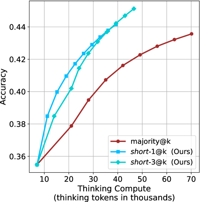
### Visual Description
## Line Chart: Accuracy vs. Thinking Compute
### Overview
The chart compares the accuracy of three computational approaches ("majority@k", "short-1@k", and "short-3@k") across varying levels of thinking compute (measured in thousands of tokens). All three approaches show increasing accuracy with higher compute, but with distinct performance trajectories.
### Components/Axes
- **X-axis**: Thinking Compute (thinking tokens in thousands)
- Scale: 10 → 70 (increments of 10)
- Labels: Numerical values only (no units explicitly stated beyond axis title)
- **Y-axis**: Accuracy
- Scale: 0.36 → 0.44 (increments of 0.02)
- Labels: Decimal values (e.g., 0.36, 0.38, ..., 0.44)
- **Legend**:
- Position: Bottom-right corner
- Entries:
- Red: "majority@k"
- Blue: "short-1@k (Ours)"
- Green: "short-3@k (Ours)"
### Detailed Analysis
1. **majority@k (Red Line)**
- Starts at 0.36 accuracy at 10k tokens.
- Increases steadily to ~0.435 at 70k tokens.
- Slope: Linear growth (~0.001 accuracy per 1k tokens).
2. **short-1@k (Blue Line)**
- Starts at 0.36 accuracy at 10k tokens.
- Sharp upward trajectory until ~40k tokens (peaks at ~0.445).
- Plateaus after 50k tokens (~0.44 accuracy).
- Slope: Steep initial growth (~0.002 accuracy per 1k tokens), then flat.
3. **short-3@k (Green Line)**
- Starts at 0.36 accuracy at 10k tokens.
- Gradual upward trend, surpassing "majority@k" after ~30k tokens.
- Reaches ~0.44 accuracy at 70k tokens.
- Slope: Moderate growth (~0.0005 accuracy per 1k tokens).
### Key Observations
- **Performance Trends**:
- "short-1@k" achieves the highest accuracy early but plateaus.
- "short-3@k" shows sustained improvement, outperforming "majority@k" at higher compute levels.
- "majority@k" has the slowest growth but remains competitive at lower compute.
- **Notable Patterns**:
- Diminishing returns for "short-1@k" after 50k tokens.
- "short-3@k" demonstrates better scalability for large compute budgets.
### Interpretation
The data suggests that increasing thinking compute improves accuracy across all methods, but with varying efficiency:
- **short-1@k** is optimal for moderate compute budgets (up to 50k tokens) but offers no further gains beyond that.
- **short-3@k** provides better long-term scalability, maintaining improvement even at 70k tokens.
- **majority@k** serves as a baseline, with linear gains but lower ceiling accuracy.
The plateau in "short-1@k" implies potential architectural limitations at higher compute, while "short-3@k" may leverage more efficient resource allocation. These findings highlight trade-offs between model complexity and compute efficiency in accuracy optimization.
</details>
(b) R $1$ - $7$ B
Figure 23: Small models - thinking compute comparison over GPQA-D.
<details>
<summary>x78.png Details</summary>
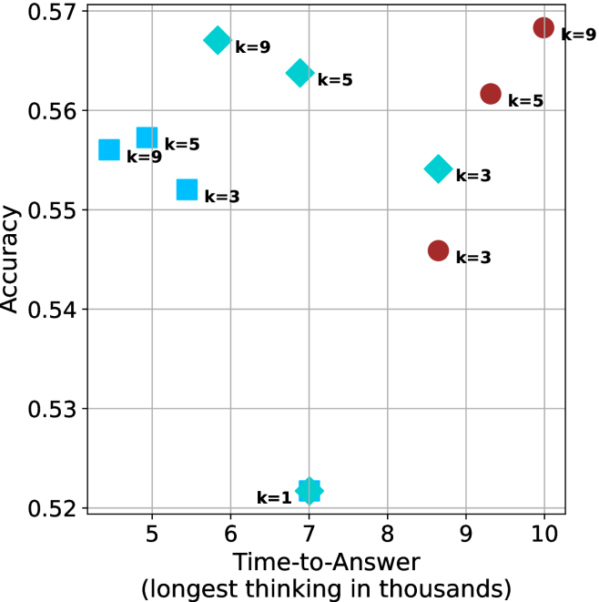
### Visual Description
## Scatter Plot: Accuracy vs. Time-to-Answer for Different k Values
### Overview
The image is a scatter plot comparing **accuracy** (y-axis) and **time-to-answer** (x-axis, in thousands of units) for different values of a parameter **k**. Data points are differentiated by color and shape, with a legend indicating the mapping of **k** values to visual properties.
---
### Components/Axes
- **X-axis (Time-to-Answer)**: Labeled "Time-to-Answer (longest thinking in thousands)", ranging from 5 to 10.
- **Y-axis (Accuracy)**: Labeled "Accuracy", ranging from 0.52 to 0.57.
- **Legend**: Located on the right side of the plot. It maps:
- **k=1**: Hexagon (teal)
- **k=3**: Square (blue) and Circle (red)
- **k=5**: Diamond (cyan) and Square (blue)
- **k=9**: Diamond (cyan) and Circle (red)
- **Data Points**: Each point is annotated with its **k** value (e.g., "k=5").
---
### Detailed Analysis
#### Data Points by k Value
1. **k=1**:
- Single hexagon at (7, 0.52).
2. **k=3**:
- Blue square at (5, 0.555).
- Blue square at (5.5, 0.555).
- Red circle at (9.2, 0.545).
3. **k=5**:
- Cyan diamond at (6, 0.565).
- Cyan diamond at (6.5, 0.562).
- Blue square at (5.2, 0.555).
- Blue square at (5.8, 0.555).
4. **k=9**:
- Cyan diamond at (8.8, 0.56).
- Red circle at (9.8, 0.57).
---
### Key Observations
1. **k=1** has the lowest accuracy (0.52) and moderate time-to-answer (7).
2. **k=3** shows moderate accuracy (0.545–0.555) with shorter time-to-answer (5–9.2).
3. **k=5** achieves higher accuracy (0.555–0.565) but with slightly longer time-to-answer (5.2–6.5).
4. **k=9** has the highest accuracy (0.56–0.57) but the longest time-to-answer (8.8–10).
5. **Color-Shape Consistency**:
- Cyan diamonds and red circles are consistently used for **k=5** and **k=9**, respectively.
- Blue squares are used for **k=3** and **k=5**.
---
### Interpretation
- **Trade-off Between Accuracy and Speed**: Higher **k** values (e.g., 9) improve accuracy but increase time-to-answer, suggesting a computational cost for precision.
- **Outliers**: The **k=9** point at (10, 0.57) represents the optimal accuracy but is the slowest, indicating potential inefficiency in extreme cases.
- **Clustering**: Lower **k** values (1–3) cluster in the lower-left quadrant, while higher **k** values (5–9) dominate the upper-right quadrant.
- **Legend Ambiguity**: The legend uses overlapping shapes (e.g., squares for both k=3 and k=5), which could cause confusion without explicit color differentiation.
---
### Conclusion
The plot demonstrates that increasing **k** improves accuracy at the expense of longer processing time. This trade-off is critical for applications requiring real-time performance versus high precision. The use of overlapping shapes in the legend may obscure quick identification of **k** values, suggesting a need for clearer visual encoding.
</details>
(a) LN-Nano-8B
<details>
<summary>x79.png Details</summary>
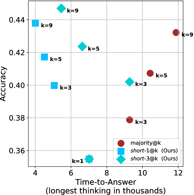
### Visual Description
## Scatter Plot: Accuracy vs. Time-to-Answer for Different Methods
### Overview
The image is a scatter plot comparing the **Accuracy** of different methods against their **Time-to-Answer** (measured in thousands of seconds). Three distinct methods are represented by colored markers:
- **majority@k** (red circles)
- **short-1@k (Ours)** (blue squares)
- **short-3@k (Ours)** (teal diamonds)
The plot includes labeled data points with specific **k-values** (e.g., k=1, k=3, k=5, k=9) and their corresponding accuracy and time values.
---
### Components/Axes
- **X-axis (Time-to-Answer)**: Labeled "Time-to-Answer (longest thinking in thousands)" with values ranging from 4 to 12.
- **Y-axis (Accuracy)**: Labeled "Accuracy" with values ranging from 0.36 to 0.44.
- **Legend**: Located in the **bottom-right** corner, mapping colors to methods:
- Red circles: **majority@k**
- Blue squares: **short-1@k (Ours)**
- Teal diamonds: **short-3@k (Ours)**
- **Data Points**: Labeled with **k-values** (e.g., "k=9", "k=5", "k=3", "k=1") and positioned at specific (Time, Accuracy) coordinates.
---
### Detailed Analysis
#### Data Points and Trends
1. **majority@k (Red Circles)**:
- **k=9**: (12, 0.43)
- **k=5**: (10, 0.42)
- **k=3**: (8, 0.40)
- **k=1**: (6, 0.38)
- **Trend**: Accuracy decreases slightly as time decreases. Higher **k-values** correlate with longer time and marginally higher accuracy.
2. **short-1@k (Blue Squares)**:
- **k=9**: (4, 0.44)
- **k=5**: (6, 0.42)
- **k=3**: (8, 0.40)
- **Trend**: Accuracy decreases as time increases. Lower **k-values** (e.g., k=9) achieve higher accuracy in shorter time.
3. **short-3@k (Teal Diamonds)**:
- **k=9**: (6, 0.42)
- **k=5**: (8, 0.40)
- **k=3**: (10, 0.38)
- **Trend**: Accuracy decreases as time increases. Similar to short-1@k but with slightly lower accuracy for the same time.
#### Key Observations
- **Outliers**:
- The **teal diamond** at **k=1** (4, 0.36) is an outlier, showing the lowest accuracy (0.36) at the shortest time (4).
- The **red circle** at **k=9** (12, 0.43) is the highest accuracy (0.43) at the longest time (12).
- **Method Comparison**:
- **majority@k** (red) consistently achieves higher accuracy but requires more time.
- **short-1@k** (blue) and **short-3@k** (teal) trade off speed for slightly lower accuracy.
- **short-1@k** (blue) outperforms **short-3@k** (teal) in accuracy for the same time (e.g., k=5: 0.42 vs. 0.40).
---
### Interpretation
The data suggests a trade-off between **accuracy** and **time-to-answer** across methods:
- **majority@k** prioritizes accuracy at the cost of longer processing time, likely due to exhaustive search or deeper reasoning.
- **short-1@k** and **short-3@k** (both labeled "Ours") optimize for speed, sacrificing some accuracy. The **short-1@k** method (blue) appears more efficient than **short-3@k** (teal) for the same time.
- The **k=1** outlier (teal) may indicate a failure mode or edge case where the method underperforms, warranting further investigation.
This plot highlights the importance of balancing computational efficiency and accuracy in decision-making systems, with **short-1@k** emerging as a promising candidate for time-sensitive applications.
</details>
(b) R $1$ - $7$ B
Figure 24: Small models - time-to-answer comparison over GPQA-D.
## Appendix E GPQA-D sequential results
The results for GPQA-D when accounting for sequential compute are presented in Figure ˜ 25.
<details>
<summary>x80.png Details</summary>
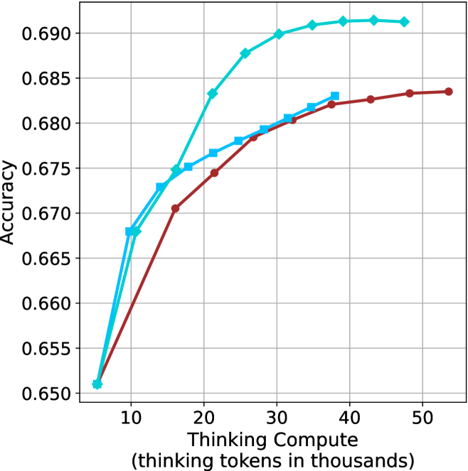
### Visual Description
## Line Graph: Model Accuracy vs. Thinking Compute
### Overview
The image depicts a line graph comparing the accuracy of two models (Model A and Model B) as a function of "Thinking Compute" (measured in thousands of thinking tokens). Both models show increasing accuracy with higher compute, but Model A consistently outperforms Model B across all compute levels.
### Components/Axes
- **X-axis**: "Thinking Compute (thinking tokens in thousands)"
- Scale: 10 to 50 (in increments of 10)
- **Y-axis**: "Accuracy"
- Scale: 0.650 to 0.690 (in increments of 0.005)
- **Legend**: Located in the top-right corner
- Blue line: Model A
- Red line: Model B
### Detailed Analysis
#### Model A (Blue Line)
- **Data Points**:
- 10k tokens: 0.665
- 20k tokens: 0.675
- 30k tokens: 0.685
- 40k tokens: 0.690
- 50k tokens: 0.690
- **Trend**: Steep initial increase (10k–30k tokens), plateauing at 0.690 after 30k tokens.
#### Model B (Red Line)
- **Data Points**:
- 10k tokens: 0.650
- 20k tokens: 0.670
- 30k tokens: 0.680
- 40k tokens: 0.685
- 50k tokens: 0.685
- **Trend**: Gradual, linear growth with diminishing returns after 30k tokens.
### Key Observations
1. **Model A** achieves higher accuracy at all compute levels, with a maximum accuracy of 0.690 (vs. 0.685 for Model B).
2. **Efficiency**: Model A reaches its peak accuracy (0.690) at 30k tokens, while Model B requires 40k tokens to reach 0.685.
3. **Diminishing Returns**: Both models plateau after 30k–40k tokens, suggesting limited gains from additional compute.
4. **Initial Advantage**: Model A starts with a 0.015 accuracy lead at 10k tokens, widening to 0.010 at 50k tokens.
### Interpretation
The data suggests **Model A is more efficient**, achieving higher accuracy with fewer compute resources. The steeper slope of Model A’s curve indicates faster scaling, while its plateau at 30k tokens implies a potential architectural or algorithmic advantage. Model B’s slower growth and lower ceiling may reflect suboptimal design or training constraints. The diminishing returns for both models highlight a practical limit to compute-driven accuracy improvements, emphasizing the need for architectural innovation over brute-force scaling.
</details>
(a) LN-Super-49B
<details>
<summary>x81.png Details</summary>
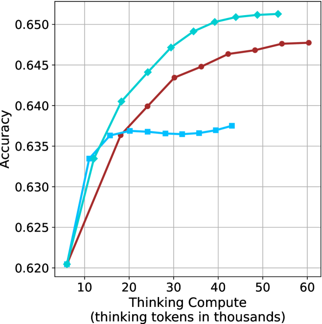
### Visual Description
## Line Graph: Accuracy vs Thinking Compute (Tokens in Thousands)
### Overview
The graph illustrates the relationship between computational resources (thinking tokens in thousands) and accuracy across three variables: Thinking Compute, Model Size, and Prompt Length. Three distinct lines represent these variables, with accuracy measured on the y-axis (0.620–0.650) and thinking tokens on the x-axis (10–60k).
### Components/Axes
- **X-axis**: "Thinking Compute (thinking tokens in thousands)"
- Scale: 10 → 60 (in thousands)
- Position: Bottom of graph
- **Y-axis**: "Accuracy"
- Scale: 0.620 → 0.650
- Position: Left side of graph
- **Legend**: Top-right corner
- Labels:
- Teal: "Thinking Compute"
- Red: "Model Size"
- Blue: "Prompt Length"
### Detailed Analysis
1. **Thinking Compute (Teal Line)**
- Starts at (10k, 0.620) and rises steadily to (60k, 0.650).
- Slope: Linear increase (~0.0005 accuracy per 1k tokens).
- Key point: Highest accuracy across all token ranges.
2. **Model Size (Red Line)**
- Begins at (10k, 0.620) and rises sharply to (30k, 0.645), then plateaus.
- Slope: Steeper than teal line initially (~0.0015 accuracy per 1k tokens up to 30k).
- Key point: Accuracy stabilizes after 30k tokens.
3. **Prompt Length (Blue Line)**
- Starts at (10k, 0.635) and remains flat until 20k tokens, then increases slightly to (60k, 0.637).
- Slope: Minimal (~0.0001 accuracy per 1k tokens after 20k).
- Key point: Lowest accuracy overall, with delayed improvement.
### Key Observations
- **Accuracy Trends**:
- Thinking Compute consistently outperforms other variables.
- Model Size shows diminishing returns after 30k tokens.
- Prompt Length has negligible impact until 20k tokens.
- **Outliers**:
- Blue line (Prompt Length) exhibits a plateau (10k–20k tokens) and delayed growth.
- Red line (Model Size) plateaus abruptly at 30k tokens.
### Interpretation
The data suggests that **increasing thinking compute (tokens)** is the most effective way to improve accuracy, with linear scalability. Model size contributes significantly but plateaus, indicating diminishing returns at higher token counts. Prompt length has minimal impact, suggesting it is less critical than compute resources. This aligns with findings in large language model optimization, where compute efficiency often outweighs static model or prompt design. The abrupt plateau in Model Size accuracy may reflect architectural limits or optimization thresholds in the evaluated systems.
</details>
(b) R $1$ - $32$ B
<details>
<summary>x82.png Details</summary>
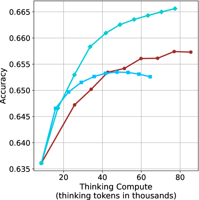
### Visual Description
## Line Graph: Accuracy vs. Thinking Compute
### Overview
The image depicts a line graph comparing the accuracy of three computational models (Model A, Model B, Model C) across varying levels of "Thinking Compute" (measured in thousands of thinking tokens). The y-axis represents accuracy (ranging from 0.635 to 0.665), while the x-axis represents compute scale (20k to 80k tokens). Three distinct lines—teal, red, and blue—correspond to the models, with trends indicating performance improvements as compute increases.
### Components/Axes
- **X-axis**: "Thinking Compute (thinking tokens in thousands)"
- Scale: 20k to 80k tokens (discrete intervals at 20k, 40k, 60k, 80k).
- **Y-axis**: "Accuracy"
- Scale: 0.635 to 0.665 (increments of 0.005).
- **Legend**: Located on the right side of the graph.
- Teal: Model A
- Red: Model B
- Blue: Model C
### Detailed Analysis
1. **Model A (Teal Line)**:
- Starts at ~0.645 accuracy at 20k tokens.
- Rises sharply to ~0.665 accuracy by 80k tokens.
- Plateau observed after 60k tokens.
- Key data points:
- 20k tokens: ~0.645
- 40k tokens: ~0.660
- 60k tokens: ~0.664
- 80k tokens: ~0.665
2. **Model B (Red Line)**:
- Begins at ~0.647 accuracy at 20k tokens.
- Gradual ascent to ~0.657 accuracy by 80k tokens.
- Plateau observed after 60k tokens.
- Key data points:
- 20k tokens: ~0.647
- 40k tokens: ~0.653
- 60k tokens: ~0.656
- 80k tokens: ~0.657
3. **Model C (Blue Line)**:
- Starts at ~0.646 accuracy at 20k tokens.
- Steeper initial rise than Model B, reaching ~0.656 accuracy by 80k tokens.
- Plateau observed after 60k tokens.
- Key data points:
- 20k tokens: ~0.646
- 40k tokens: ~0.654
- 60k tokens: ~0.656
- 80k tokens: ~0.656
### Key Observations
- **Model A (Teal)** consistently outperforms Models B and C across all compute levels.
- All models exhibit diminishing returns after ~60k tokens, with accuracy plateaus.
- Model C (Blue) shows the steepest initial improvement but lags behind Model A at higher compute levels.
- No anomalies or outliers detected; trends align with expected performance-compute relationships.
### Interpretation
The graph demonstrates that increased compute improves accuracy for all models, but with diminishing marginal gains. Model A achieves the highest efficiency, requiring fewer tokens to reach peak accuracy compared to Models B and C. The plateauing trends suggest that beyond a certain compute threshold (60k tokens), additional resources yield minimal accuracy improvements. This implies a trade-off between computational cost and performance gains, with Model A offering the most cost-effective scaling. The data underscores the importance of optimizing model architecture (as reflected in Model A’s performance) alongside compute allocation.
</details>
(c) QwQ-32B
<details>
<summary>x83.png Details</summary>
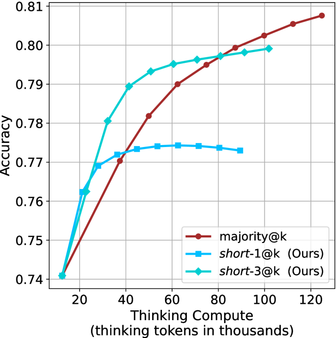
### Visual Description
```markdown
## Line Chart: Accuracy vs. Thinking Compute (Tokens in Thousands)
### Overview
The chart compares the accuracy of three methods—**majority@k**, **short-1@k (Ours)**, and **short-3@k (Ours)**—as a function of "Thinking Compute" (measured in thousands of tokens). The y-axis represents accuracy (0.74–0.81), and the x-axis ranges from 20 to 120 thousand tokens. The data shows distinct trends for each method, with **majority@k** demonstrating the most consistent improvement.
---
### Components/Axes
- **X-axis**: "Thinking Compute (thinking tokens in thousands)" (20–120, in increments of 20).
- **Y-axis**: "Accuracy" (0.74–0.81, in increments of 0.01).
- **Legend**:
- **Red**: majority@k
- **Blue**: short-1@k (Ours)
- **Green**: short-3@k (Ours)
- **Placement**: Legend is positioned at the **bottom-right** of the chart.
---
### Detailed Analysis
#### 1. **majority@k (Red Line)**
- **Trend**: Steadily increases from 0.74 (x=20) to 0.81 (x=120).
- **Key Points**:
- x=20: 0.74
- x=40: 0.77
- x=60: 0.78
- x=80: 0.79
- x=100: 0.80
- x=120: 0.81
#### 2. **short-1@k (Blue Line)**
- **Trend**: Sharp initial rise, then plateaus.
- **Key Points**:
- x=20: 0.74
- x=40: 0.77
- x=60: 0.77
- x=80: 0.77
- x=100: 0.77
- x=120: 0.77
#### 3. **short-3@k (Green Line)**
- **Trend**: Gradual increase, outperforming short-1@k but lagging behind majority@k.
- **Key Points**:
- x=20: 0.74
- x=40: 0.78
- x=60: 0.79
- x=80: 0.79
- x=100: 0.80
- x=120: 0.80
---
### Key Observations
1. **majority@k** shows the most significant improvement, with a **0.07 accuracy gain** over 100 tokens.
2. **short-1@k** plateaus at 0.77 after x
</details>
(d) R1-670B
Figure 25: Comparing different methods for the GPQA-D benchmark under sequential compute.
## Appendix F Backtracks under controlled length results
Below we present the results for the backtrack count under controlled length scenarios (Section ˜ 5.2). The results over the math benchmarks are presented in Table ˜ 8 and for GPQA-D in Table ˜ 9.
Table 8: Average number of backtracks for correct (C), incorrect (IC) answers, binned by thinking length. Results are averaged across math benchmarks.
| Model Thinking Tokens | 0-5k | 5-10k | 10-15k | 15-20k | 20-25k | 25-30k | 30-32k |
| --- | --- | --- | --- | --- | --- | --- | --- |
| C/IC | C/IC | C/IC | C/IC | C/IC | C/IC | C/IC | |
| LN-Super-49B | 35/ 0 64 | 100/133 | 185/236 | 261/299 | 307/320 | 263/323 | 0 – 0 / 0 304 |
| R1-32B | 29/ 0 74 | 0 88/166 | 171/279 | 244/351 | 334/370 | 268/355 | 326/1006 |
| QwQ-32B | 50/148 | 120/174 | 194/247 | 285/353 | 354/424 | 390/476 | 551/ 0 469 |
| R1-670B | 58/ 0 27 | 100/ 0 86 | 143/184 | 222/203 | 264/254 | 309/289 | 352/ 0 337 |
Table 9: Average number of backtracks for correct (C), incorrect (IC) answers, binned by thinking length. Results are reported for GPQA-D.
| Model Thinking Tokens | 0-5k | 5-10k | 10-15k | 15-20k | 20-25k | 25-30k | 30-32k |
| --- | --- | --- | --- | --- | --- | --- | --- |
| C/IC | C/IC | C/IC | C/IC | C/IC | C/IC | C/IC | |
| LN-Super-49B | 38/52 | 175/164 | 207/213 | 0 – 0 / 0 – 0 | 0 – 0 / 0 – 0 | 0 – 0 / 0 – 0 | 0 – 0 / 0 – 0 |
| R1-32B | 39/54 | 194/221 | 301/375 | 525/668 | 0 – 0 / 0 – 0 | 0 – 0 / 0 – 0 | 0 – 0 / 0 – 0 |
| QwQ-32B | 65/71 | 169/178 | 333/358 | 378/544 | 357/703 | 0 – 0 / 0 – 0 | 0 – 0 / 0 – 0 |
| R1-670B | 44/72 | 0 93/155 | 178/232 | 297/300 | 341/341 | 463/382 | 553/477 |
## Appendix G Further details and results for finetuning experiments
The generation process of all three variants of S $1$ uses the hyperparameters detailed in Section ˜ 3.1. Figure ˜ 26 shows the thinking token count histograms for the three variants of the S1 dataset (short/long/random) presented in Section ˜ 6.
As for finetuning, we follow the S $1$ approach, and finetune the Qwen- $2.5$ - $7$ B-Instruct and Qwen- $2.5$ - $32$ B-Instruct models on the three S $1$ variants. The finetuning hyperparameters are consistent with those used for the S $1.1$ model (Muennighoff et al., 2025), and training is conducted on $32$ H $100$ GPUs. We match the number of gradient steps as in used for S1.1. The resulting models are evaluated using the benchmarks and experimental setup described in Section ˜ 3.1. Specifically, for each model we generate 20 answers per example, and report average accuracy.
Results for the 7B version model are presented in Table ˜ 10.
<details>
<summary>x84.png Details</summary>
### Visual Description
## Bar Chart: Frequency of Thinking Tokens
### Overview
The image is a bar chart visualizing the distribution of "Thinking Tokens" across different ranges. The x-axis represents the number of thinking tokens (in thousands), and the y-axis represents frequency. The chart shows a right-skewed distribution with a sharp decline in frequency as the number of tokens increases.
### Components/Axes
- **X-axis**: "Number of Thinking Tokens (in thousands)" with intervals at 0, 5, 10, 15, 20, 25, and 30.
- **Y-axis**: "Frequency" with values ranging from 0 to 200 in increments of 50.
- **Legend**: Located in the top-right corner, indicating the color blue corresponds to the data series.
- **Bars**: All bars are blue, with heights proportional to frequency.
### Detailed Analysis
- **0–5k tokens**: Frequency ≈ 30.
- **5–10k tokens**: Frequency peaks at ≈ 220 (tallest bar).
- **10–15k tokens**: Frequency ≈ 165.
- **15–20k tokens**: Frequency ≈ 85.
- **20–25k tokens**: Frequency ≈ 30.
- **25–30k tokens**: Frequency ≈ 5.
- **30k+ tokens**: Frequency ≈ 0.
### Key Observations
1. The distribution is heavily concentrated in the **5–10k token range**, with the highest frequency (~220).
2. A sharp decline occurs after 10k tokens, with frequencies dropping below 100 for all higher ranges.
3. No tokens are recorded beyond 30k, suggesting a possible upper limit or data truncation.
### Interpretation
The data suggests that **most thinking tokens are concentrated in lower ranges**, with a significant drop-off after 10k tokens. This could indicate:
- A natural or system-imposed limit on token usage.
- An optimal threshold where higher token counts are either unnecessary or impractical.
- A potential anomaly in data collection for higher ranges (e.g., underrepresentation).
The right-skewed distribution implies that while low-to-moderate token usage is common, extreme values (e.g., >10k) are rare. This pattern might reflect real-world constraints or user behavior in the context of the dataset.
</details>
(a) S1-short
<details>
<summary>x85.png Details</summary>
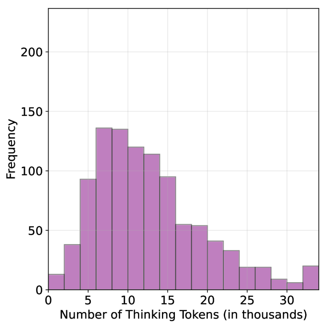
### Visual Description
## Bar Chart: Frequency Distribution of Thinking Tokens
### Overview
The chart displays a frequency distribution of "Number of Thinking Tokens (in thousands)" on the x-axis and "Frequency" on the y-axis. The data is represented by purple bars, with a legend in the top-right corner. The x-axis ranges from 0 to 30 (in thousands), and the y-axis ranges from 0 to 200. The distribution shows a clear peak around 10k tokens, followed by a decline.
### Components/Axes
- **X-axis**: "Number of Thinking Tokens (in thousands)" with markers at 0, 5, 10, 15, 20, 25, and 30.
- **Y-axis**: "Frequency" with markers at 0, 50, 100, 150, and 200.
- **Legend**: Located in the top-right corner, labeled with a purple square corresponding to the bar color.
### Detailed Analysis
- **0k tokens**: Frequency ≈ 15.
- **5k tokens**: Frequency ≈ 90.
- **10k tokens**: Frequency ≈ 140 (peak).
- **15k tokens**: Frequency ≈ 120.
- **20k tokens**: Frequency ≈ 55.
- **25k tokens**: Frequency ≈ 25.
- **30k tokens**: Frequency ≈ 20.
### Key Observations
1. The highest frequency occurs at **10k tokens** (≈140), indicating this is the most common value.
2. Frequency decreases symmetrically on either side of the peak, with a sharper drop after 15k tokens.
3. The lowest frequencies are at the extremes (0k and 30k tokens), both ≈20.
4. No anomalies or outliers are present; the distribution follows a clear unimodal pattern.
### Interpretation
The data suggests that **10k tokens** represent an optimal or most frequently used value for the measured process. The decline in frequency at higher token counts (e.g., 15k–30k) may indicate diminishing returns or inefficiencies with increased token usage. Conversely, the low frequency at 0k tokens implies that minimal token usage is rare, possibly due to baseline requirements for the task. This distribution could reflect a balance between computational resource allocation and performance in a system (e.g., AI model inference), where 10k tokens strike a practical equilibrium.
</details>
(b) S1-random
<details>
<summary>x86.png Details</summary>
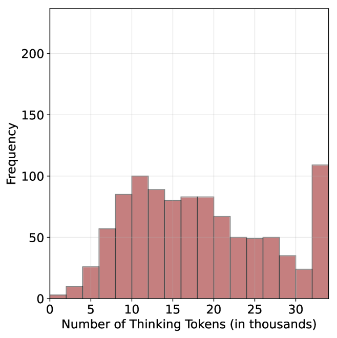
### Visual Description
## Bar Chart: Frequency Distribution of Thinking Tokens
### Overview
The image displays a bar chart visualizing the frequency distribution of "Number of Thinking Tokens (in thousands)" across discrete intervals. The chart uses vertical bars in a reddish-brown color to represent frequency counts on the y-axis. No title or legend is visible in the image.
### Components/Axes
- **X-axis**: Labeled "Number of Thinking Tokens (in thousands)" with tick marks at intervals of 5 (0, 5, 10, 15, 20, 25, 30).
- **Y-axis**: Labeled "Frequency" with tick marks at intervals of 50 (0, 50, 100, 150, 200).
- **Bars**: Seven vertical bars correspond to the x-axis intervals. Colors are uniform (reddish-brown) with no legend to differentiate categories.
### Detailed Analysis
1. **0–5k Tokens**: Frequency ≈ 5 (lowest bar, barely visible above baseline).
2. **5–10k Tokens**: Frequency ≈ 25 (moderate increase).
3. **10–15k Tokens**: Frequency ≈ 100 (peak frequency).
4. **15–20k Tokens**: Frequency ≈ 80 (slight decline from peak).
5. **20–25k Tokens**: Frequency ≈ 70 (gradual decrease).
6. **25–30k Tokens**: Frequency ≈ 50 (further decline).
7. **30–35k Tokens**: Frequency ≈ 110 (second-highest frequency, outlier compared to adjacent intervals).
### Key Observations
- The highest frequency occurs in the **30–35k token range** (≈110), which is an outlier relative to the gradual decline observed in earlier intervals.
- The **10–15k token range** (≈100) is the second-highest frequency, suggesting a concentration of data in this interval.
- Frequencies decrease from 10–15k to 25–30k, then spike again at 30–35k, indicating potential bimodal distribution or external factors influencing the 30–35k range.
### Interpretation
The data suggests that thinking tokens are disproportionately concentrated in two ranges: **10–15k** and **30–35k**. The spike at 30–35k may reflect a specific event, category, or anomaly not represented in other intervals. The absence of a legend or title limits contextual interpretation, but the distribution implies that most tokens cluster around mid-to-high ranges, with a notable outlier at the upper end. Further investigation into the 30–35k range is warranted to understand its disproportionate frequency.
</details>
(c) S1-long
Figure 26: Thinking token count histograms for S1-short, S1-random and S1-long datasets.
Table 10: Results for our finetuned models over the S $1$ variants using Qwen-2.5-7B-Instruct: S $1$ -short/long/random.
| | GPQA-D | AIME 2024 | AIME 2025 | HMMT | Math Average | | | | | |
| --- | --- | --- | --- | --- | --- | --- | --- | --- | --- | --- |
| Thinking Tokens $\downarrow$ | Acc. $\uparrow$ | Thinking Tokens $\downarrow$ | Acc. $\uparrow$ | Thinking Tokens $\downarrow$ | Acc. $\uparrow$ | Thinking Tokens $\downarrow$ | Acc. $\uparrow$ | Thinking Tokens $\downarrow$ | Acc. $\uparrow$ | |
| S1-random | 14095 | 39.1 | 25207 | 22.0 | 23822 | 22.0 | 25028 | 10.8 | 24686 | 18.2 |
| S1-long | 15528 $(+10.2\$ | 38.5 | 26210 | 21.7 | 24395 | 19.5 | 26153 | 9.2 | 25586 $(+3.7\$ | 16.8 |
| S1-short | 13093 $(-7.1\$ | 40.3 | 24495 | 22.0 | 21945 | 20.8 | 23329 | 11.2 | 23256 $(-5.8\$ | 18.0 |