# Don’t Overthink it. Preferring Shorter Thinking Chains for Improved LLM Reasoning
## Abstract
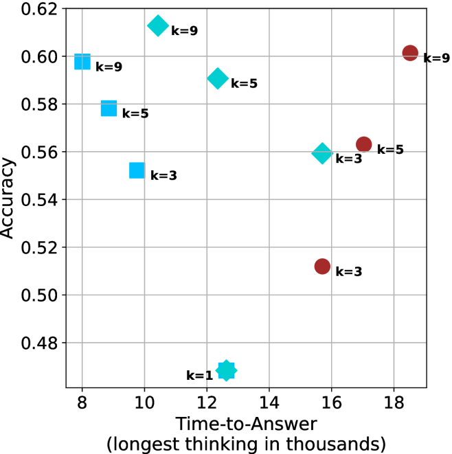
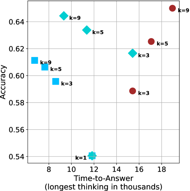
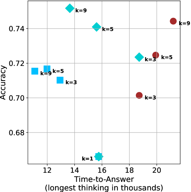
Reasoning large language models (LLMs) heavily rely on scaling test-time compute to perform complex reasoning tasks by generating extensive “thinking” chains. While demonstrating impressive results, this approach incurs significant computational costs and inference time. In this work, we challenge the assumption that long thinking chains results in better reasoning capabilities. We first demonstrate that shorter reasoning chains within individual questions are significantly more likely to yield correct answers—up to $34.5\$ more accurate than the longest chain sampled for the same question. Based on these results, we suggest short-m@k, a novel reasoning LLM inference method. Our method executes $k$ independent generations in parallel and halts computation once the first $m$ thinking processes are done. The final answer is chosen using majority voting among these $m$ chains. Basic short-1@k demonstrates similar or even superior performance over standard majority voting in low-compute settings—using up to $40\$ fewer thinking tokens. short-3@k, while slightly less efficient than short-1@k, consistently surpasses majority voting across all compute budgets, while still being substantially faster (up to $33\$ wall time reduction). To further validate our findings, we finetune LLMs using short, long, and randomly selected reasoning chains. We then observe that training on the shorter ones leads to better performance. Our findings suggest rethinking current methods of test-time compute in reasoning LLMs, emphasizing that longer “thinking” does not necessarily translate to improved performance and can, counter-intuitively, lead to degraded results.
## 1 Introduction
Scaling test-time compute has been shown to be an effective strategy for improving the performance of reasoning LLMs on complex reasoning tasks (OpenAI, 2024; 2025; Team, 2025b). This method involves generating extensive thinking —very long sequences of tokens that contain enhanced reasoning trajectories, ultimately yielding more accurate solutions. Prior work has argued that longer model responses result in enhanced reasoning capabilities (Guo et al., 2025; Muennighoff et al., 2025; Anthropic, 2025). However, generating such long-sequences also leads to high computational cost and slow decoding time due to the autoregressive nature of LLMs.
In this work, we demonstrate that scaling test-time compute does not necessarily improve model performance as previously thought. We start with a somewhat surprising observation. We take four leading reasoning LLMs, and for each generate multiple answers to each question in four complex reasoning benchmarks. We then observe that taking the shortest answer for each question strongly and consistently outperforms both a strategy that selects a random answer (up to $18.8\$ gap) and one that selects the longest answer (up to $34.5\$ gap). These performance gaps are on top of the natural reduction in sequence length—the shortest chains are $50\$ and $67\$ shorter than the random and longest chains, respectively.
<details>
<summary>x1.png Details</summary>
### Visual Description
## Diagram: Comparison of Reasoning Methods (majority@k vs. short-1@k)
### Overview
The image is a comparative diagram illustrating two different strategies for AI reasoning: "majority@k" and "short-1@k (ours)". It uses a mathematical problem as a test case to demonstrate how each method processes multiple reasoning paths.
#### Top Section: majority@k
* **Trend/Flow:** This method generates four reasoning paths and aggregates the final answers.
* **Data Points:**
* Path 1: ` So the answer is 52`
* Path 2: ` So the answer is 49`
* Path 3: ` So the answer is 33`
* Path 4: ` So the answer is 52`
* **Logic:** The method aggregates the results. Because "52" appears twice (the majority), the system selects 52 as the final answer.
* **Result:** The final answer is 52, marked with a red 'X', indicating this is an incorrect result.
#### Bottom Section: short-1@k (ours)
* **Trend/Flow:** This method generates four reasoning paths, but actively filters them.
* **Data Points:**
* Path 1: ` So the answer is 49`
* Path 3: `<think> ... // Terminated thinking`
* Path 4: `<think> ... // Terminated thinking`
* **Logic:** The system identifies and terminates invalid or incomplete reasoning paths (marked as "// Terminated thinking"). It isolates the single valid path that concludes with 49.
* **Result:** The final answer is 49, marked with a green checkmark, indicating this is the correct result.
### Key Observations
* **Majority Bias:** The "majority@k" method is shown to be flawed because it relies on the frequency of an answer rather than the correctness of the reasoning. It incorrectly converges on 52 because that answer was hallucinated or derived incorrectly twice.
* **Active Pruning:** The "short-1@k" method demonstrates a "pruning" or "early stopping" capability. By terminating invalid reasoning chains, it prevents incorrect answers from polluting the final output, allowing the correct answer (49) to be selected even when it is not the majority.
* **Visual Indicators:** The use of red text/X for the top section and blue text/checkmark for the bottom section creates a clear visual dichotomy between the "failed" method and the "successful" method.
### Interpretation
This diagram serves as a technical argument for a specific optimization in Large Language Model (LLM) reasoning.
The data suggests that standard "majority voting" (majority@k) is insufficient for complex mathematical problems because models can be consistently biased toward specific incorrect answers. The "short-1@k" method represents an improvement where the model (or a wrapper around the model) evaluates the quality of the reasoning process in real-time. By terminating paths that are likely to be incorrect (or "terminated thinking"), the system avoids the trap of consensus-based errors. This implies that the "short-1@k" approach is more robust, as it prioritizes the validity of the reasoning chain over the frequency of the output.
</details>
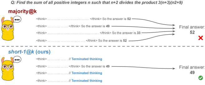
Figure 1: Visual comparison between majority voting and our proposed method short-m@k with $m=1$ (“…” represent thinking time). Given $k$ parallel attempts for the same question, majority@ $k$ waits until all attempts are done, and perform majority voting among them. On the other hand, our short-m@k method halts computation for all attempts as soon as the first $m$ attempts finish “thinking”, which saves compute and time, and surprisingly also boost performance in most cases.
Building on these findings, we propose short-m@k —a novel inference method for reasoning LLMs. short-m@k executes $k$ generations in parallel and terminates computation for all generations as soon as the first $m$ thinking processes are completed. The final answer is then selected via majority voting among those shortest chains, where ties are broken by taking the shortest answer among the tied candidates. See Figure ˜ 1 for visualization.
We evaluate short-m@k using six reasoning LLMs, and compare it to majority voting—the most common aggregation method for evaluating reasoning LLMs on complex benchmarks (Wang et al., 2022; Abdin et al., 2025). We show that in low-compute regimes, short-1@k, i.e., taking the single shortest chain, outperforms majority voting, while significantly reducing the time and compute needed to generate the final answer. For example, using LN-Super- $49$ B (Bercovich and others, 2025), short-1@k can reduce up to $40\$ of the compute while giving the same performance as majority voting. Moreover, for high-compute regimes, short-3@k, which halts generation after three thinking chains are completed, consistently outperforms majority voting across all compute budgets, while running up to $33\$ faster.
To gain further insights into the underlining mechanism of why shorter thinking is preferable, we analyze the generated reasoning chains. We first show that while taking the shorter reasoning is beneficial per individual question, longer reasoning is still needed to solve harder questions, as claimed in recent studies (Anthropic, 2025; OpenAI, 2024; Muennighoff et al., 2025). Next, we analyze the backtracking and re-thinking behaviors of reasoning chains. We find that shorter reasoning paths are more effective, as they involve fewer backtracks, with a longer average backtrack length. This finding holds both generally and when controlling for overall trajectory length.
To further strengthening our findings, we study whether training on short reasoning chains can lead to more accurate models. To do so, we finetune two Qwen- $2.5$ (Yang and others, 2024) models ( $7$ B and $32$ B) on three variants of the S $1$ dataset (Muennighoff et al., 2025): S $1$ -short, S $1$ -long, and S $1$ -random, consisting of examples with the shortest, longest, and randomly sampled reasoning trajectories among several generations, respectively. Our experiments demonstrate that finetuning using S $1$ -short not only yields shorter thinking lengths, but also improves model performance. Conversely, finetuning on S $1$ -long increases reasoning time with no significant performance gains.
This work rethinks the test-time compute paradigm for reasoning LLMs, showing that longer thinking not only does not ensure better reasoning, but also leads to worse reasoning in most cases. Our short-m@k methods prioritize shorter reasoning, yielding improved performance and reduced computational costs for current reasoning LLMs. We also show that training reasoning LLMs with shorter reasoning trajectories can enhance performance and reduce costs. Our results pave the way towards a new era of efficient and high-performing reasoning LLMs.
## 2 Related work
Reasoning LLMs and test-time scaling.
Reasoning LLMs tackle complex tasks by employing extensive reasoning processes, often involving detailed, step-by-step trajectories (OpenAI (2024); OpenAI (2025); Q. Team (2025b); M. Abdin, S. Agarwal, A. Awadallah, V. Balachandran, H. Behl, L. Chen, G. de Rosa, S. Gunasekar, M. Javaheripi, N. Joshi, et al. (2025); Anthropic (2025); A. Bercovich et al. (2025); D. Guo, D. Yang, H. Zhang, J. Song, R. Zhang, R. Xu, Q. Zhu, S. Ma, P. Wang, X. Bi, et al. (2025); 27; G. DeepMind (2025); Q. Team (2025a)). This capability is fundamentally based on techniques like chain-of-thought (CoT; Wei et al., 2022), which encourage models to generate intermediate reasoning steps before arriving at a final answer. Modern LLMs use a large number of tokens, often referred to as “thinking tokens”, to explore multiple problem-solving approaches, to employ self-reflection, and to perform verification. This thinking capability has allowed them to achieve superior performance on challenging tasks such as mathematical problem-solving and code generation (Ke et al., 2025).
The LLM thinking capability is typically achieved through post-training methods applied to a strong base model. The two primary approaches to instilling or improving this reasoning ability are using reinforcement learning (RL) (Guo et al., 2025; Team, 2025b) and supervised fine-tuning (Muennighoff et al., 2025; Ye et al., 2025). Guo et al. (2025) have demonstrated that as training progresses the model tends to generate longer thinking trajectories, which results in improved performance on complex tasks. Similarly, Anthropic (2025) and Muennighoff et al. (2025) have shown a correlation between increased average thinking length during inference and improved performance. We challenge this assumption, demonstrating that shorter sequences are more likely to yield an accurate answer.
Efficiency in reasoning LLMs.
While shortening the length of CoT is beneficial for non-reasoning models (Nayab et al., 2024; Kang et al., 2025), it is higly important for reasoning LLMs as they require a very large amount of tokens to perform the thinking process. As a result, recent studies tried to make the process more efficient, e.g., by using early exit techniques for reasoning trajectories (Pu et al., 2025; Yang et al., 2025), by suppressing backtracks (Wang et al., 2025a) or by training reasoning models which enable control over the thinking length (Yu et al., 2025).
Several recent works studied the relationship between reasoning trajectory length and correctness. Lu et al. (2025) proposed a method for reducing the length of thinking trajectories in reasoning training datasets. Their method employs a reasoning LLM several times over an existing trajectory in order to make it shorter. As this approach eventually trains a model over shorter trajectories it is similar to the method we employ in Section ˜ 6. However, our method is simpler as it does not require an LLM to explicitly shorten the sequence. Fatemi et al. (2025); Qi et al. (2025) and Arora and Zanette (2025) proposed RL methods to shorten reasoning in language models. Fatemi et al. (2025) also observed that correct answers typically require shorter thinking trajectories by averaging lengths across examples, suggesting that lengthy responses might inherently stem from RL-based optimization during training. In Section ˜ 5.1 we show that indeed correct answers usually use shorter thinking trajectories, but also highlight that averaging across all examples might hinder this effect as easier questions require sustainably lower amount of reasoning tokens compared to harder ones.
More relevant to our work, Wu et al. (2025) showed that there is an optimal thinking length range for correct answers according to the difficulty of the question, while Wang et al. (2025b) found that for a specific question, correct responses from reasoning models are usually shorter than incorrect ones. We provide further analysis supporting these observations in Sections ˜ 3 and 5. Finally, our proposed inference method short-m@k is designed to enhance the efficiency of reasoning LLMs by leveraging this property, which can be seen as a generalization of the FFS method (Agarwal et al., 2025), which selects the shortest answer among several candidates as in our short-1@k.
## 3 Shorter thinking is preferable
As mentioned above, the common wisdom in reasoning LLMs suggests that increased test-time computation enhances model performance. Specifically, it is widely assumed that longer reasoning process, which entails extensive reasoning thinking chains, correlates with improved task performance (OpenAI, 2024; Anthropic, 2025; Muennighoff et al., 2025). We challenge this assumption and ask whether generating more tokens per trajectory actually leads to better performance. To that end, we generate multiple answers per question and compare performance based solely on the shortest, longest and randomly sampled thinking chains among the generated samples.
### 3.1 Experimental details
We consider four leading, high-performing, open, reasoning LLMs. Llama- $3.3$ -Nemotron-Super- $49$ B-v $1$ [LN-Super- $49$ B; Bercovich and others, 2025]: a reasoning RL-enhanced version of Llama- $3.3$ - $70$ B (Grattafiori et al., 2024); R $1$ -Distill-Qwen- $32$ B [R $1$ - $32$ B; Guo et al., 2025]: an SFT finetuned version of Qwen- $2.5$ - $32$ B-Instruct (Yang and others, 2024) derived from R $1$ trajectories; QwQ- $32$ B a reasoning RL-enhanced version Qwen- $2.5$ - $32$ B-Instruct (Team, 2025b); and R1- $0528$ a $670$ B RL-trained flagship reasoning model (R $1$ - $670$ B; Guo et al., 2025). We also include results for smaller models in Appendix ˜ D.
We evaluate all models using four competitive reasoning benchmarks. We use AIME $2024$ (of America, 2024), AIME $2025$ (of America, 2025) and HMMT February $2025$ , from the Math Arena benchmark (Balunović et al., 2025). This three benchmarks are derived from math competitions, and involve solving problems that cover a broad range of mathematics topics. Each dataset consists of $30$ examples with varied difficulty. We also evaluate the models using the GPQA-diamond benchmark [GPQA-D; Rein et al., 2024], which consists of $198$ multiple-choice scientific questions, and is considered to be challenging for reasoning LLMs (DeepMind, 2025).
For each question, we generate $20$ responses per model, yielding a total of about $36$ k generations. For all models we use temperature of $0.7$ , top-p= $0.95$ and a maximum number of generated tokens of $32$ , $768$ . When measuring the thinking chain length, we measure the token count between the <think> and </think> tokens. We run inference for all models using paged attention via the vLLM framework (Kwon et al., 2023).
### 3.2 The shorter the better
Table 1: Shorter thinking performs better. Comparison between taking the shortest/longest/random generation per example.
| | GPQA-D | AIME 2024 | AIME 2025 | HMMT | Math Average | | | | | |
| --- | --- | --- | --- | --- | --- | --- | --- | --- | --- | --- |
| Thinking Tokens $\downarrow$ | Acc. $\uparrow$ | Thinking Tokens $\downarrow$ | Acc. $\uparrow$ | Thinking Tokens $\downarrow$ | Acc. $\uparrow$ | Thinking Tokens $\downarrow$ | Acc. $\uparrow$ | Thinking Tokens $\downarrow$ | Acc. $\uparrow$ | |
| LN-Super-49B | | | | | | | | | | |
| random | 5357 | 65.1 | 11258 | 58.8 | 12105 | 51.3 | 13445 | 33.0 | 12270 | 47.7 |
| longest | 8763 $(+64\$ | 57.6 | 18566 | 33.3 | 18937 | 30.0 | 19790 | 23.3 | 19098 $(+56\$ | 28.9 |
| shortest | 2790 $(-48\$ | 69.1 | 0 6276 | 76.7 | 0 7036 | 66.7 | 0 7938 | 46.7 | 7083 $(-42\$ | 63.4 |
| R1-32B | | | | | | | | | | |
| random | 5851 | 62.5 | 9614 | 71.8 | 11558 | 56.4 | 12482 | 38.3 | 11218 | 55.5 |
| longest | 9601 $(+64\$ | 57.1 | 17689 | 53.3 | 19883 | 36.7 | 20126 | 23.3 | 19233 $(+71\$ | 37.8 |
| shortest | 3245 $(-45\$ | 64.7 | 0 4562 | 80.0 | 0 6253 | 63.3 | 0 6557 | 36.7 | 5791 $(-48\$ | 60.0 |
| QwQ-32B | | | | | | | | | | |
| random | 8532 | 63.7 | 13093 | 82.0 | 14495 | 72.3 | 16466 | 52.5 | 14685 | 68.9 |
| longest | 12881 $(+51\$ | 54.5 | 20059 | 70.0 | 21278 | 63.3 | 24265 | 36.7 | 21867 $(+49\$ | 56.7 |
| shortest | 5173 $(-39\$ | 64.7 | 0 8655 | 86.7 | 10303 | 66.7 | 11370 | 60.0 | 10109 $(-31\$ | 71.1 |
| R1-670B | | | | | | | | | | |
| random | 11843 | 76.2 | 16862 | 83.8 | 18557 | 82.5 | 21444 | 68.2 | 18954 | 78.2 |
| longest | 17963 $(+52\$ | 63.1 | 22603 | 70.0 | 23570 | 66.7 | 27670 | 40.0 | 24615 $(+30\$ | 58.9 |
| shortest | 8116 $(-31\$ | 75.8 | 11229 | 83.3 | 13244 | 83.3 | 13777 | 83.3 | 12750 $(-33\$ | 83.3 |
For all generated answers, we compare short vs. long thinking chains for the same question, along with a random chain. Results are presented in Table ˜ 1. In this section we exclude generations where thinking is not completed within the maximum generation length, as these often result in an infinite thinking loop. First, as expected, the shortest answers are $25\$ – $50\$ shorter compared to randomly sampled responses. However, we also note that across almost all models and benchmarks, considering the answer with the shortest thinking chain actually boosts performance, yielding an average absolute improvement of $2.2\$ – $15.7\$ on the math benchmarks compared to randomly selected generations. When considering the longest thinking answers among the generations, we further observe an increase in thinking chain length, with up to $75\$ more tokens per chain. These extended reasoning trajectories substantially degrade performance, resulting in average absolute reductions ranging between $5.4\$ – $18.8\$ compared to random generations over all benchmarks. These trends are most noticeable when comparing the shortest generation with the longest ones, with an absolute performance gain of up to $34.5\$ in average accuracy and a substantial drop in the number of thinking tokens.
The above results suggest that long generations might come with a significant price-tag, not only in running time, but also in performance. That is, within an individual example, shorter thinking trajectories are much more likely to be correct. In Section ˜ 5.1 we examine how these results relate to the common assumption that longer trajectories leads to better LLM performance. Next, we propose strategies to leverage these findings to improve the efficiency and effectiveness of reasoning LLMs.
## 4 short-m@k : faster and better inference of reasoning LLMs
Based on the results presented in Section ˜ 3, we suggest a novel inference method for reasoning LLMs. Our method— short-m@k —leverages batch inference of LLMs per question, using multiple parallel decoding runs for the same query. We begin by introducing our method in Section ˜ 4.1. We then describe our evaluation methodology, which takes into account inference compute and running time (Section ˜ 4.2). Finally, we present our results (Section ˜ 4.3).
### 4.1 The short-m@k method
The short-m@k method, visualized in Figure ˜ 1, performs parallel decoding of $k$ generations for a given question, halting computation across all generations as soon as the $m\leq k$ shortest thinking trajectories are completed. It then conducts majority voting among those shortest answers, resolving ties by selecting the answer with the shortest thinking chain. Given that thinking trajectories can be computationally intensive, terminating all generations once the $m$ shortest trajectories are completed not only saves computational resources but also significantly reduces wall time due to the parallel decoding approach, as shown in Section ˜ 4.3.
Below we focus on short-1@k and short-3@k, with short-1@k being the most efficient variant of short-m@k and short-3@k providing the best balance of performance and efficiency (see Section ˜ 4.3). Ablation studies on $m$ and other design choices are presented in Appendix ˜ C, while results for smaller models are presented in Appendix ˜ D.
### 4.2 Evaluation setup
We evaluate all methods under the same setup as described in Section ˜ 3.1. We report the averaged results across the math benchmarks, while the results for GPQA-D presented in Appendix ˜ A. The per benchmark resutls for the math benchmarks are in Appendix ˜ B. We report results using our method (short-m@k) with $m\in\{1,3\}$ . We compare the proposed method to the standard majority voting (majority $@k$ ), arguably the most common method for aggregating multiple outputs (Wang et al., 2022), which was recently adapted for reasoning LLMs (Guo et al., 2025; Abdin et al., 2025; Wang et al., 2025b). As an oracle, we consider pass $@k$ (Kulal et al., 2019; Chen and others, 2021), which measures the probability of including the correct solution within $k$ generated responses.
We benchmark the different methods with sample sizes of $k\in\{1,2,...,10\}$ , assuming standard parallel decoding setup, i.e., all samples are generated in parallel. Section 5.3 presents sequential analysis where parallel decoding is not assumed. For the oracle (pass@ $k$ ) approach, we use the unbiased estimator presented in Chen and others (2021), with our $20$ generations per question ( $n$ $=$ $20$ ). For the short-1@k method, we use the rank-score@ $k$ metric (Hassid et al., 2024), where we sort the different generations according to thinking length. For majority $@k$ and short-m@k where $m>1$ , we run over all $k$ -sized subsets out of the $20$ generations per example.
We evaluate the different methods considering three main criteria: (a) Sample-size (i.e., $k$ ), where we compare methods while controlling for the number of generated samples; (b) Thinking-compute, where we measure the total number of thinking tokens used across all generations in the batch; and (c) Time-to-answer, which measures the wall time of running inference using each method. In this parallel framework, our method (short-m@k) terminates all other generations after the first $m$ decoding thinking processes terminate. Thus, the overall thinking compute is the total number of thinking tokens for each of the $k$ generations at that point. Similarly, the overall time is that of the $m$ ’th shortest generation process. Conversely, for majority $@k$ , the method’s design necessitates waiting for all generations to complete before proceeding. Hence, we consider the compute as the total amount of thinking tokens in all generations and run time according to the longest thinking chain. As for the oracle approach, we terminate all thinking trajectories once the shortest correct one is finished, and consider the compute and time accordingly.
### 4.3 Results
<details>
<summary>x2.png Details</summary>
### Visual Description
## Line Chart: Accuracy vs. Sample Size
### Overview
The image is a line chart illustrating the relationship between "Accuracy" (y-axis) and "Sample Size (k)" (x-axis). The chart displays four distinct data series, each represented by a different color and marker style. All four series originate from a common point at Sample Size 1. There is no legend provided in the image to identify what specific models or methods these lines represent.
### Components/Axes
* **X-Axis:** Labeled "Sample Size (k)". The scale is linear, ranging from 1 to 10 in integer increments.
* **Y-Axis:** Labeled "Accuracy". The scale ranges from 0.50 to 0.75, with grid lines at 0.05 intervals.
* **Data Series (Legend Missing):**
* **Series 1 (Black, dotted line, triangle markers):** The highest-performing series.
* **Series 2 (Teal/Cyan, solid line, diamond markers):** The second-highest performing series for most of the range.
* **Series 3 (Blue, solid line, square markers):** A mid-to-low performing series.
* **Series 4 (Dark Red/Brown, solid line, circle markers):** The lowest-performing series initially, which shows a late-stage upward trend.
### Detailed Analysis
All four series begin at a common coordinate of approximately **(1, 0.47)**.
**1. Black Dotted Line (Triangles):**
* **Trend:** This line exhibits the steepest upward trajectory. It shows rapid growth between k=1 and k=4, then continues to grow at a slower, steady rate.
* **Values:**
* k=1: ~0.47
* k=3: ~0.63
* k=5: ~0.69
* k=10: ~0.755
**2. Teal/Cyan Solid Line (Diamonds):**
* **Trend:** This line shows a strong initial increase, similar to the Blue line, but maintains a higher trajectory. It begins to flatten significantly after k=6.
* **Values:**
* k=1: ~0.47
* k=3: ~0.56
* k=6: ~0.60
* k=10: ~0.615
**3. Blue Solid Line (Squares):**
* **Trend:** This line follows a similar path to the Teal line but remains consistently below it. It shows a steady, diminishing rate of improvement as the sample size increases.
* **Values:**
* k=1: ~0.47
* k=3: ~0.555
* k=6: ~0.585
* k=10: ~0.60
**4. Dark Red/Brown Solid Line (Circles):**
* **Trend:** This line has the slowest initial growth (the shallowest slope between k=1 and k=4). However, it maintains a more consistent upward slope compared to the Blue and Teal lines in the latter half of the chart.
* **Crossover:** It crosses the Blue line between k=7 and k=8, ending as the third-highest performer.
* **Values:**
* k=1: ~0.47
* k=4: ~0.54
* k=7: ~0.59
* k=10: ~0.605
### Key Observations
* **Performance Gap:** There is a significant performance gap between the Black dotted line and the other three solid-line series. The Black line achieves an accuracy of ~0.75, while the others cluster between 0.60 and 0.615.
* **Diminishing Returns:** All four lines exhibit a concave shape, indicating that increasing the sample size yields diminishing returns on accuracy.
* **Late-Stage Crossover:** The Dark Red line demonstrates a "slow starter" behavior. While it performs worse than the Blue and Teal lines for the first 7 units of sample size, its trajectory suggests it may continue to improve at a higher rate than the Blue line as sample size increases further.
### Interpretation
This chart likely represents a comparison of machine learning models or algorithms evaluated on increasing amounts of training data.
* **The Black Dotted Line:** This represents a model that is significantly more robust or better suited to the task, as it scales much more effectively with increased data.
* **The Clustered Lines (Teal, Blue, Red):** These likely represent variations of a base model or competing models with similar architectural limitations.
* **The "Slow Starter" (Red Line):** The fact that the Red line overtakes the Blue line suggests that while it may be less efficient with very small datasets (perhaps due to higher variance or complexity requiring more data to converge), it has better long-term scaling properties than the Blue model.
* **Data Saturation:** The flattening of the curves suggests that for the Teal, Blue, and Red models, simply adding more data (up to k=10) is yielding very little additional accuracy, implying these models may have reached their capacity or "ceiling" for this specific task.
</details>
(a) LN-Super-49B
<details>
<summary>x3.png Details</summary>
### Visual Description
## Line Chart: Accuracy vs. Sample Size
### Overview
The image is a line chart illustrating the relationship between "Sample Size (k)" and "Accuracy." The chart contains four distinct data series, each represented by a unique color and marker shape. All four series originate from a common starting point at a sample size of 1. Notably, the chart lacks a legend, making it impossible to identify the specific models or methods associated with each line without external context.
### Components/Axes
* **X-Axis:** Labeled "Sample Size (k)". The scale is linear, ranging from 1 to 10 in integer increments.
* **Y-Axis:** Labeled "Accuracy". The scale ranges from 0.55 to 0.75, with grid lines provided at 0.05 intervals.
* **Data Series (4 total):**
* **Series A (Black, dotted line, triangle markers):** Positioned at the top of the chart.
* **Series B (Dark Red, solid line, circle markers):** Positioned in the middle-to-lower section.
* **Series C (Cyan/Teal, solid line, diamond markers):** Positioned in the middle section.
* **Series D (Light Blue, solid line, square markers):** Positioned at the bottom section.
### Detailed Analysis
All four series begin at approximately (1, 0.54).
**1. Series A (Black, Dotted, Triangles)**
* **Trend:** This series exhibits the steepest upward trajectory and maintains the highest accuracy throughout the range. It shows a concave-down curve, indicating diminishing returns, but it does not plateau as sharply as the other series.
* **Data Points:**
* k=2: ~0.635
* k=4: ~0.69
* k=6: ~0.72
* k=8: ~0.735
* k=10: ~0.75
**2. Series B (Dark Red, Solid, Circles)**
* **Trend:** This series shows a steady, consistent upward slope. It starts near the bottom but maintains a more constant growth rate compared to the blue series, eventually overtaking the Cyan/Diamond series.
* **Data Points:**
* k=2: ~0.565
* k=4: ~0.61
* k=6: ~0.635
* k=8: ~0.645
* k=10: ~0.65
**3. Series C (Cyan/Teal, Solid, Diamonds)**
* **Trend:** This series rises sharply between k=1 and k=3, then begins to flatten significantly. It crosses the Dark Red line around k=6.5, after which it is outperformed by the Dark Red line.
* **Data Points:**
* k=2: ~0.58
* k=3: ~0.615
* k=4: ~0.625
* k=6: ~0.635
* k=10: ~0.645
**4. Series D (Light Blue, Solid, Squares)**
* **Trend:** This series shows the least improvement as sample size increases. It rises quickly between k=1 and k=2, then plateaus almost immediately, showing very little gain after k=4.
* **Data Points:**
* k=2: ~0.58
* k=3: ~0.595
* k=4: ~0.60
* k=6: ~0.61
* k=10: ~0.61
### Key Observations
* **Common Origin:** All four methods perform identically at the smallest sample size (k=1).
* **Performance Gap:** The Black Dotted series is significantly superior to the other three, achieving an accuracy of 0.75 at k=10, compared to the ~0.61–0.65 range of the others.
* **Saturation Points:** The two blue-toned lines (Cyan/Diamond and Light Blue/Square) exhibit clear saturation, where increasing the sample size beyond k=4 yields negligible accuracy improvements.
* **Crossover:** The Dark Red/Circle line is the only one that maintains a steady growth trajectory, eventually surpassing the Cyan/Diamond line.
### Interpretation
This chart is characteristic of machine learning model evaluation, likely comparing different algorithms or hyperparameter configurations (e.g., k-Nearest Neighbors, few-shot learning, or data augmentation techniques).
* **The "Black Dotted" method** is clearly the most robust, suggesting it either utilizes more information effectively or is a fundamentally superior architecture.
* **The "Blue" methods** appear to be limited by their architecture or data usage; they reach a "performance ceiling" very early (k=4).
</details>
(b) R $1$ - $32$ B
<details>
<summary>x4.png Details</summary>
### Visual Description
## Line Chart: Accuracy vs. Sample Size (k)
### Overview
This image is a line chart illustrating the relationship between "Sample Size (k)" and "Accuracy" for four distinct data series. The chart uses a grid background to facilitate reading values. There is no legend provided in the image to identify what each specific line represents (e.g., different models or algorithms), so they are identified by their color and marker shape.
### Components/Axes
* **X-Axis:** Labeled "Sample Size (k)". The scale is linear, ranging from 1 to 10 in integer increments.
* **Y-Axis:** Labeled "Accuracy". The scale ranges from 0.66 to 0.82, with grid lines at intervals of 0.02.
* **Data Series (4 total):**
1. **Black Dotted Line:** Marked with triangles.
2. **Cyan Solid Line:** Marked with diamonds.
3. **Dark Red Solid Line:** Marked with circles.
4. **Medium Blue Solid Line:** Marked with squares.
### Detailed Analysis
All four data series originate from a single point at **x=1**, with an accuracy of approximately **0.665**.
#### Trend Verification
* **Black Dotted Line (Triangles):** Shows a steep, monotonic upward trend throughout the entire range (x=1 to x=10). It is the highest-performing series.
* **Cyan Solid Line (Diamonds):** Shows a strong upward trend, particularly between x=1 and x=3, followed by a steady, slower increase through x=10.
* **Dark Red Solid Line (Circles):** Shows a steady, consistent upward trend throughout the range. It starts as the lowest performer but overtakes the Medium Blue line at x=4.
* **Medium Blue Solid Line (Squares):** Shows an initial increase from x=1 to x=3, a slower increase to x=5, and then plateaus/slightly declines from x=5 to x=10.
#### Data Point Approximations
| Sample Size (k) | Black (Dotted/Tri) | Cyan (Solid/Dia) | Dark Red (Solid/Circ) | Med Blue (Solid/Sq) |
| :--- | :--- | :--- | :--- | :--- |
| **1** | ~0.665 | ~0.665 | ~0.665 | ~0.665 |
| **2** | ~0.730 | ~0.700 | ~0.680 | ~0.700 |
| **3** | ~0.758 | ~0.723 | ~0.702 | ~0.710 |
| **4** | ~0.775 | ~0.735 | ~0.715 | ~0.715 |
| **5** | ~0.787 | ~0.741 | ~0.725 | ~0.717 |
| **6** | ~0.797 | ~0.745 | ~0.731 | ~0.717 |
| **7** | ~0.805 | ~0.748 | ~0.737 | ~0.717 |
| **8** | ~0.813 | ~0.750 | ~0.741 | ~0.716 |
| **9** | ~0.819 | ~0.752 | ~0.744 | ~0.715 |
| **10** | ~0.825 | ~0.753 | ~0.748 | ~0.715 |
### Key Observations
* **Performance Hierarchy:** At x=10, the performance order from highest to lowest is: Black Dotted > Cyan Solid > Dark Red Solid > Medium Blue Solid.
* **Saturation Point:** The Medium Blue (square) line is the only series that exhibits clear signs of saturation or overfitting, as its accuracy stops improving after x=5.
* **Divergence:** The gap between the top performer (Black Dotted) and the others widens significantly as the sample size increases, suggesting the Black Dotted model benefits most from additional data.
### Interpretation
This chart likely represents a comparison of machine learning model performance as a function of training data size.
* **The Black Dotted model** demonstrates superior scalability; it continues to learn effectively as more data is provided, showing no signs of plateauing within the observed range.
* **The Medium Blue model** appears to have a lower capacity or is prone to overfitting; it reaches its maximum utility at a sample size of 5, after which adding more data provides no benefit (or slightly degrades performance).
* **The Cyan and Dark Red models** represent intermediate performance. They continue to improve with more data, but at a diminishing rate compared to the Black Dotted model.
The data suggests that if the goal is to maximize accuracy, the Black Dotted model is the optimal choice, provided the computational cost of the larger sample size is justified.
</details>
(c) QwQ-32B
<details>
<summary>x5.png Details</summary>
### Visual Description
## Line Chart: Accuracy vs. Sample Size (k)
### Overview
This chart illustrates the performance (Accuracy) of four different evaluation methods across varying sample sizes (k=1 to 10). The chart demonstrates how accuracy scales as the sample size increases, with one method acting as a theoretical upper bound ("Oracle").
### Components/Axes
* **X-Axis:** Labeled "Sample Size (k)". The scale is linear, ranging from 1 to 10 in integer increments.
* **Y-Axis:** Labeled "Accuracy". The scale ranges from 0.78 to 0.90, with grid lines at 0.02 intervals.
* **Legend:** Positioned in the bottom-right quadrant of the chart area.
* **Black dotted line with triangle markers:** `pass@k (Oracle)`
* **Dark red solid line with circle markers:** `majority@k`
* **Light blue solid line with square markers:** `short-1@k (Ours)`
* **Teal solid line with diamond markers:** `short-3@k (Ours)`
### Detailed Analysis
All four data series originate from a single point at k=1, with an accuracy of approximately 0.782.
**Data Series Trends and Values (Approximate):**
| Sample Size (k) | pass@k (Oracle) | short-3@k (Ours) | majority@k | short-1@k (Ours) |
| :--- | :--- | :--- | :--- | :--- |
| **1** | ~0.782 | ~0.782 | ~0.782 | ~0.782 |
| **2** | ~0.835 | ~0.817 | ~0.798 | ~0.817 |
| **3** | ~0.855 | ~0.848 | ~0.815 | ~0.831 |
| **4** | ~0.868 | ~0.862 | ~0.828 | ~0.839 |
| **5** | ~0.878 | ~0.871 | ~0.838 | ~0.844 |
| **6** | ~0.885 | ~0.877 | ~0.847 | ~0.847 |
| **7** | ~0.891 | ~0.882 | ~0.854 | ~0.848 |
| **8** | ~0.896 | ~0.885 | ~0.860 | ~0.849 |
| **9** | ~0.900 | ~0.888 | ~0.866 | ~0.849 |
| **10** | ~0.903 | ~0.890 | ~0.871 | ~0.848 |
* **pass@k (Oracle):** Shows the steepest upward trajectory, consistently maintaining the highest accuracy across all sample sizes. The rate of growth slows slightly as k increases (concave down).
* **short-3@k (Ours):** Tracks closely below the Oracle line. It maintains a strong upward trend throughout the range, ending as the second-highest performer.
* **majority@k:** Starts with the lowest accuracy (after k=1) but exhibits a very consistent, nearly linear upward trend. It intersects with `short-1@k` at approximately k=6.
* **short-1@k (Ours):** Initially performs well (tied with `short-3@k` at k=2), but the growth rate diminishes rapidly after k=4, effectively plateauing around k=6 to k=7.
### Key Observations
* **Convergence:** All methods start at the same baseline accuracy at k=1.
* **Performance Crossover:** At k=6, the `majority@k` method overtakes the `short-1@k` method.
* **Diminishing Returns:** The `short-1@k` method shows clear signs of saturation, where increasing the sample size beyond k=6 yields negligible improvements in accuracy.
* **Oracle Gap:** The gap between the `pass@k` (Oracle) and the best-performing "Ours" method (`short-3@k`) remains relatively constant, suggesting that while `short-3@k` is effective, there is a consistent performance ceiling compared to the Oracle.
### Interpretation
The data suggests that `short-3@k` is a more robust strategy than `short-1@k`, as it continues to scale effectively with larger sample sizes, whereas `short-1@k` hits a hard limit. The `majority@k` method is a "slow and steady" approach; while it starts weaker, it is the most reliable method for larger sample sizes (k > 6), likely because it benefits more from the increased statistical confidence provided by larger samples. The "Oracle" line represents the theoretical maximum performance, and the gap between it and the other lines indicates the efficiency loss inherent in the selection strategies used by the "Ours" methods.
</details>
(d) R1-670B
Figure 2: Comparing different inference methods under controlled sample size ( $k$ ). All methods improve with larger sample sizes. Interestingly, this trend also holds for the short-m@k methods.
<details>
<summary>x6.png Details</summary>
### Visual Description
## Line Chart: Accuracy vs. Thinking Compute
### Overview
This image is a line chart illustrating the relationship between "Thinking Compute" (measured in thousands of thinking tokens) and "Accuracy." The chart displays four distinct data series, each represented by a different color and marker style. All four series originate from a common starting point at approximately (15, 0.47). Notably, the chart lacks a legend, making it impossible to identify the specific models or methods associated with each line without external context.
### Components/Axes
* **Y-Axis:** Labeled "Accuracy." The scale ranges from 0.50 to 0.75, with major grid lines at 0.05 intervals (0.50, 0.55, 0.60, 0.65, 0.70, 0.75).
* **X-Axis:** Labeled "Thinking Compute (thinking tokens in thousands)." The scale ranges from 20 to 120, with major grid lines at 20-unit intervals (20, 40, 60, 80, 100, 120).
* **Data Series (Legend Missing):**
* **Black Dotted Line:** Marked with triangles.
* **Cyan Solid Line:** Marked with diamonds.
* **Blue Solid Line:** Marked with squares.
* **Dark Red Solid Line:** Marked with circles.
### Detailed Analysis
All four data series begin at approximately (15, 0.47). As "Thinking Compute" increases, all series exhibit a positive correlation with "Accuracy," though the rate of improvement (slope) varies significantly between them.
* **Black Dotted Line (Triangles):**
* **Trend:** This series shows the steepest upward trajectory and the highest accuracy ceiling.
* **Data Points (Approximate):** Starts at (15, 0.47), rises to (20, 0.57), (30, 0.63), (40, 0.66), (50, 0.69), (60, 0.71), (70, 0.725), (80, 0.745), and ends at (85, 0.755).
* **Cyan Solid Line (Diamonds):**
* **Trend:** This series shows moderate growth, outperforming the Blue and Red lines.
* **Data Points (Approximate):** Starts at (15, 0.47), rises to (25, 0.525), (35, 0.56), (45, 0.58), (55, 0.59), (65, 0.60), (75, 0.61), (85, 0.615), and ends at (90, 0.615).
* **Blue Solid Line (Squares):**
* **Trend:** This series shows moderate growth, slightly trailing the Cyan line.
* **Data Points (Approximate):** Starts at (15, 0.47), rises to (20, 0.525), (30, 0.55), (40, 0.57), (50, 0.585), (60, 0.59), (70, 0.595), and ends at (80, 0.60).
* **Dark Red Solid Line (Circles):**
* **Trend:** This series has the shallowest slope, indicating the lowest efficiency (accuracy gain per token), but it is the only series that continues to scale out to 125k tokens.
* **Data Points (Approximate):** Starts at (15, 0.47), rises to (40, 0.51), (50, 0.54), (60, 0.56), (70, 0.575), (80, 0.585), (90, 0.59), (100, 0.595), (115, 0.60), and ends at (125, 0.605).
### Key Observations
* **Diminishing Returns:** All four lines exhibit a concave shape, meaning the marginal gain in accuracy decreases as more thinking tokens are allocated.
* **Performance Hierarchy:** The Black Dotted line is significantly more performant than the other three, achieving higher accuracy with fewer tokens.
* **Compute Range:** The Dark Red line is the only series that continues to scale beyond 90k tokens, suggesting it may represent a model architecture designed for longer-context or more extensive reasoning, albeit with lower efficiency.
### Interpretation
This chart demonstrates the "scaling laws" of reasoning models. It highlights that increasing "thinking compute" (tokens) generally improves accuracy, but the efficiency of this improvement varies drastically by model/method.
The **Black Dotted line** represents a highly efficient model, likely a more advanced or optimized architecture, as it reaches a 0.75 accuracy level with significantly less compute than the others. The **Dark Red line** represents a model that is less efficient at lower token counts but continues to improve slowly as compute increases, suggesting it may have a different "reasoning ceiling" or training objective. The absence of a legend is a critical omission, as it prevents the viewer from identifying which specific AI models (e.g., o1-preview, o1-mini, or other variants) are being compared.
</details>
(a) LN-Super-49B
<details>
<summary>x7.png Details</summary>
### Visual Description
## Line Chart: Accuracy vs. Thinking Compute
### Overview
This image is a line chart illustrating the relationship between "Thinking Compute" (measured in thousands of thinking tokens) and "Accuracy" for four distinct data series. The chart demonstrates diminishing returns on accuracy as the amount of compute increases, with each series representing a different performance profile.
### Components/Axes
* **Y-Axis (Vertical):** Labeled "Accuracy". The scale ranges from 0.55 to 0.75, with major grid lines at 0.05 intervals.
* **X-Axis (Horizontal):** Labeled "Thinking Compute (thinking tokens in thousands)". The scale ranges from 20 to 120, with major grid lines at 20-unit intervals.
* **Data Series (Legend-less):** There is no explicit legend. The series are distinguished by color and marker shape:
* **Black Dotted Line:** Triangle markers.
* **Cyan Solid Line:** Diamond markers.
* **Blue Solid Line:** Square markers.
* **Red/Brown Solid Line:** Circle markers.
### Detailed Analysis
All four data series originate from a common starting point at approximately **(12k, 0.54)**.
#### 1. Black Dotted Line (Triangles)
* **Trend:** This series exhibits the steepest upward slope, indicating the highest efficiency in gaining accuracy per unit of compute.
* **Data Points (Approximate):**
* Starts at ~12k tokens (0.54 accuracy).
* Rises sharply to ~20k (0.63), ~27k (0.67), ~35k (0.69), ~40k (0.71), ~45k (0.72), ~52k (0.73), ~57k (0.735), ~63k (0.74), and terminates at ~70k (0.75).
#### 2. Cyan Solid Line (Diamonds)
* **Trend:** Shows a strong initial upward slope that begins to curve and flatten significantly after 40k tokens.
* **Data Points (Approximate):**
* Starts at ~12k (0.54).
* Rises to ~20k (0.58), ~25k (0.585), ~28k (0.595), ~35k (0.615), ~40k (0.625), ~45k (0.63), ~50k (0.635), ~55k (0.64), ~60k (0.642), ~65k (0.643), ~72k (0.644), and terminates at ~80k (0.645).
#### 3. Blue Solid Line (Squares)
* **Trend:** Exhibits a moderate initial slope but hits a "ceiling" or saturation point very early, flattening out almost completely after 40k tokens.
* **Data Points (Approximate):**
* Starts at ~12k (0.54).
* Rises to ~20k (0.58), ~25k (0.595), ~30k (0.60), ~35k (0.605), ~40k (0.608), and plateaus between 45k and 65k at approximately 0.61 accuracy.
#### 4. Red/Brown Solid Line (Circles)
* **Trend:** This series has the shallowest slope, indicating the lowest accuracy gain per token, but it continues to scale linearly for the longest duration, reaching the highest compute value on the chart.
* **Data Points (Approximate):**
* Starts at ~12k (0.54).
* Rises steadily to ~35k (0.59), ~47k (0.61), ~60k (0.625), ~72k (0.635), ~85k (0.64), ~95k (0.645), ~105k (0.65), and terminates at ~118k (0.653).
### Key Observations
* **Efficiency Divergence:** The black series is significantly more efficient than the others, achieving 0.75 accuracy with less than 70k tokens, whereas the red series requires nearly 120k tokens to reach only 0.65 accuracy.
* **Saturation Points:** The blue and cyan lines demonstrate clear saturation points where adding more compute yields negligible accuracy improvements.
* **Common Origin:** All models start at the same baseline performance, suggesting they are likely variants of the same base model architecture or different configurations of the same system.
### Interpretation
This chart is a classic representation of **scaling laws in AI reasoning models** (often referred to as "test-time compute" or "thinking tokens").
* **The "Thinking" Trade-off:** The data demonstrates that allowing a model to "think" longer (consume more tokens) generally improves accuracy, but the returns are non-linear and model-dependent.
* **Model Capability:** The black line likely represents a more capable or better-optimized model architecture, as it achieves higher accuracy with significantly less compute.
* **Diminishing Returns:** The flattening of the blue and cyan lines suggests that for those specific configurations, there is a hard limit to how much accuracy can be gained through additional thinking time; beyond a certain point, the model is likely just "spinning its wheels" without gaining deeper insight.
* **Scalability:** The red line represents a model that scales poorly in terms of efficiency but is highly stable, continuing to improve slowly even at very high compute levels, suggesting it may have a different training objective or architectural constraint compared to the black line.
</details>
(b) R $1$ - $32$ B
<details>
<summary>x8.png Details</summary>
### Visual Description
## Line Chart: Accuracy vs. Thinking Compute
### Overview
This image is a line chart illustrating the relationship between "Thinking Compute" (measured in thousands of thinking tokens) and model "Accuracy." The chart displays four distinct data series, each representing a different model or configuration. All models begin at a common baseline accuracy and diverge as compute increases, demonstrating varying scaling behaviors, including diminishing returns and, in one instance, performance degradation.
### Components/Axes
* **Y-Axis:** Labeled "Accuracy." The scale ranges from 0.66 to 0.82, with major grid lines at intervals of 0.02.
* **X-Axis:** Labeled "Thinking Compute (thinking tokens in thousands)." The scale ranges from 25 to 150, with major grid lines at intervals of 25.
* **Data Series (Legend inferred from visual markers):**
* **Black Dotted Line (Triangle markers):** The highest-performing series.
* **Cyan Solid Line (Diamond markers):** The second-highest performing series.
* **Red Solid Line (Circle markers):** The third-highest performing series.
* **Blue Solid Line (Square markers):** The lowest-performing series, showing a distinct peak and decline.
### Detailed Analysis
All four data series originate from a common starting point at approximately **(16, 0.66)**.
**1. Black Dotted Line (Triangles)**
* **Trend:** Steep, consistent upward slope. It shows the least amount of plateauing within the visible range.
* **Data Points:**
* Starts at ~0.66.
* (25, ~0.73)
* (50, ~0.775)
* (75, ~0.795)
* (100, ~0.81)
* (120, ~0.825)
**2. Cyan Solid Line (Diamonds)**
* **Trend:** Strong upward slope initially, transitioning to a concave-down curve (diminishing returns) as compute increases.
* **Data Points:**
* (25, ~0.70)
* (40, ~0.71)
* (50, ~0.725)
* (65, ~0.735)
* (80, ~0.745)
* (100, ~0.75)
* (120, ~0.753)
**3. Red Solid Line (Circles)**
* **Trend:** Steady, linear-to-slightly-concave upward slope. It does not show the sharp plateauing seen in the Cyan or Blue lines.
* **Data Points:**
* (25, ~0.67)
* (50, ~0.70)
* (65, ~0.715)
* (80, ~0.725)
* (95, ~0.73)
* (110, ~0.735)
* (125, ~0.74)
* (140, ~0.745)
* (155, ~0.748)
**4. Blue Solid Line (Squares)**
* **Trend:** Initial upward slope, peaking between 60k and 80k tokens, followed by a slight decline in accuracy.
* **Data Points:**
* (25, ~0.70)
* (40, ~0.71)
* (60, ~0.717)
* (80, ~0.717)
* (100, ~0.715)
* (110, ~0.715)
### Key Observations
* **Performance Divergence:** While all models start at the same accuracy, the gap between the highest (Black) and lowest (Blue) performing models widens significantly as compute increases, reaching a spread of approximately 0.10 accuracy points by 110k tokens.
* **The "Over-thinking" Anomaly:** The Blue line (squares) is the only series that exhibits a negative slope after a certain compute threshold (approx. 70k tokens). This suggests that for this specific model, increasing "thinking" beyond a certain point is detrimental to accuracy, potentially due to overfitting or the introduction of noise in the reasoning process.
* **Scaling Efficiency:** The Black line (triangles) demonstrates superior scaling efficiency, maintaining a steep trajectory where other models (Cyan and Blue) have already plateaued.
### Interpretation
This chart provides empirical evidence regarding the scaling laws of "thinking" models (likely Large Language Models utilizing Chain-of-Thought or similar reasoning compute).
The data suggests that "thinking compute" is not a universally beneficial resource; its utility is highly dependent on the model architecture. The Black line represents a model that effectively utilizes additional compute to improve reasoning, whereas the Blue line represents a model that reaches a "sweet spot" of compute, beyond which additional tokens degrade performance. This implies that for some models, there is an optimal compute budget, and exceeding it leads to diminishing returns or active performance degradation. The Red line suggests a model that scales reliably but less aggressively than the Black line.
</details>
(c) QwQ-32B
<details>
<summary>x9.png Details</summary>
### Visual Description
## Line Chart: Accuracy vs. Thinking Compute
### Overview
This chart illustrates the relationship between "Thinking Compute" (measured in thousands of thinking tokens) and model "Accuracy." It compares four different strategies for generating or selecting reasoning paths: an Oracle baseline, a majority-voting method, and two variations of a proposed method labeled "short-k." The chart demonstrates how accuracy scales as the computational budget increases for each method.
### Components/Axes
* **Y-Axis:** Labeled "Accuracy." The scale ranges from 0.78 to 0.90, with grid lines at 0.02 intervals.
* **X-Axis:** Labeled "Thinking Compute (thinking tokens in thousands)." The scale ranges from approximately 20 to 200, with major grid lines at 50, 100, and 150.
* **Legend:** Located in the bottom-right quadrant of the chart.
* **pass@k (Oracle):** Black dotted line with triangle markers.
* **majority@k:** Dark red solid line with circle markers.
* **short-1@k (Ours):** Light blue solid line with square markers.
* **short-3@k (Ours):** Cyan/Teal solid line with diamond markers.
### Detailed Analysis
All four data series originate from a common starting point at approximately (20k tokens, 0.78 accuracy).
1. **pass@k (Oracle) [Black Dotted Line]:**
* **Trend:** This line exhibits the steepest upward slope, indicating the highest efficiency in gaining accuracy per token.
* **Data Points:** It rises consistently, reaching approximately 0.835 at 30k tokens, 0.855 at 50k, 0.878 at 80k, and terminates at approximately 0.903 at 140k tokens.
2. **short-3@k (Ours) [Cyan/Teal Solid Line]:**
* **Trend:** This line shows a strong, steady upward slope, second only to the Oracle.
* **Data Points:** It tracks closely with the Oracle initially. It reaches approximately 0.817 at 30k tokens, 0.848 at 55k, 0.877 at 100k, and terminates at approximately 0.89 at 150k tokens.
3. **short-1@k (Ours) [Light Blue Solid Line]:**
* **Trend:** This line rises sharply at the beginning but exhibits significant diminishing returns, plateauing after approximately 100k tokens.
* **Data Points:** It reaches approximately 0.817 at 30k tokens, 0.839 at 75k, and plateaus around 0.848 between 110k and 140k tokens.
4. **majority@k [Dark Red Solid Line]:**
* **Trend:** This line has the shallowest slope but maintains a consistent upward trajectory without the plateauing effect seen in the *short-1@k* method.
* **Data Points:** It reaches approximately 0.815 at 55k tokens, 0.838 at 100k, 0.86 at 150k, and terminates at approximately 0.87 at 190k tokens.
### Key Observations
* **Crossover Point:** The *majority@k* method (dark red) crosses the *short-1@k* method (light blue) at approximately 110k tokens. Before this point, *short-1@k* is more accurate; after this point, *majority@k* is more accurate.
* **Diminishing Returns:** The *short-1@k* method shows a clear "elbow" or plateau, suggesting that adding more thinking tokens beyond 100k provides negligible accuracy gains for this specific strategy.
* **Performance Gap:** The Oracle (*pass@k*) maintains a significant performance lead over all other methods throughout the entire range of compute.
### Interpretation
This chart likely originates from research into Large Language Model (LLM) reasoning, specifically regarding "Chain of Thought" or "Test-time Compute" optimization.
* **The "Oracle" Baseline:** The *pass@k (Oracle)* represents the theoretical upper bound of performance—essentially, if the model generates *k* solutions, the Oracle assumes the model is "correct" if the right answer appears in *any* of those *k* solutions.
* **"Ours" Methods:** The *short-k* methods likely represent a filtering or selection mechanism designed to identify the "best" reasoning path more efficiently than standard majority voting.
* **Strategic Trade-offs:** The data suggests that while *short-1@k* is highly efficient at low compute budgets (up to ~100k tokens), it fails to scale effectively. Conversely, *majority@k* is less efficient at low compute but scales better as the budget increases. *short-3@k* appears to be the most robust "Ours" method, maintaining high accuracy without the plateauing issues of *short-1@k*.
</details>
(d) R1-670B
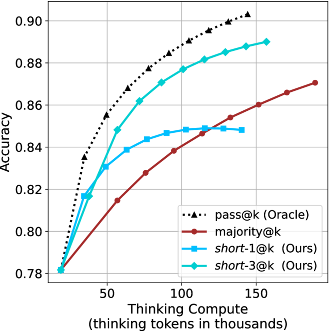
Figure 3: Comparing different inference methods under controlled thinking compute. short-1@k is highly performant in low compute regimes. short-3@k dominates the curve compared to majority $@k$ .
Sample-size ( $k$ ).
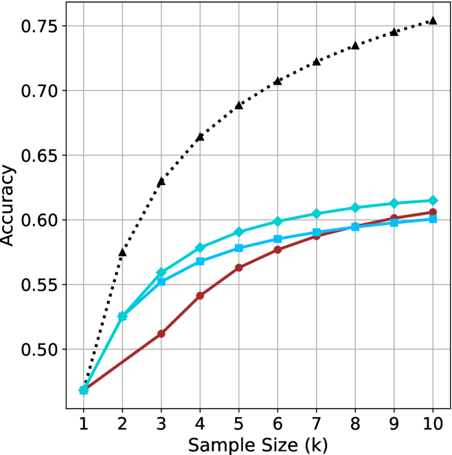
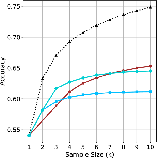
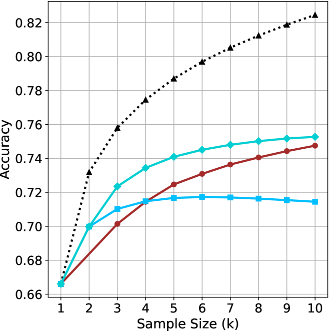
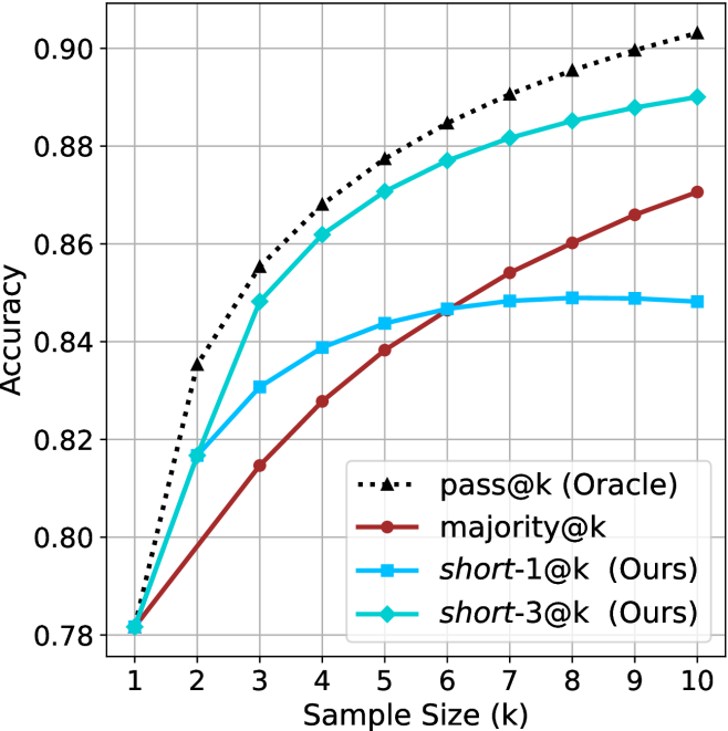
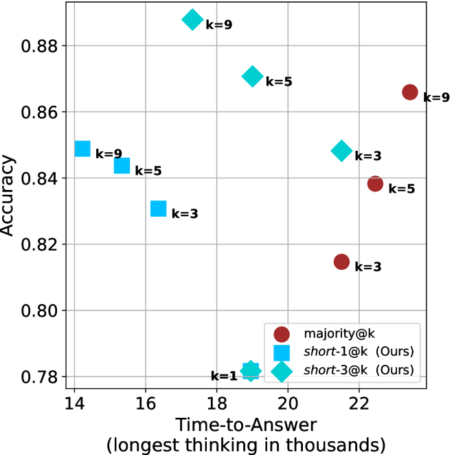
We start by examining different methods across benchmarks for a fixed sample size $k$ . Results aggregated across math benchmarks are presented in Figure ˜ 2, while Figure ˜ 6 in Appendix ˜ A presents GPQA-D results, and detailed results per benchmark can be seen at Appendix ˜ B. We observe that, generally, all methods improve with larger sample sizes, indicating that increased generations per question enhance performance. This trend is somewhat expected for the oracle (pass@ $k$ ) and majority@ $k$ methods but surprising for our method, as it means that even when a large amount of generations is used, the shorter thinking ones are more likely to be correct. The only exception is QwQ- $32$ B (Figure ˜ 2(c)), which shows a small of decline when considering larger sample sizes with the short-1@k method.
When comparing short-1@k to majority@ $k$ , the former outperforms at smaller sample sizes, but is outperformed by the latter in three out of four models when the sample size increases. Meanwhile, the short-3@k method demonstrates superior performance, dominating across nearly all models and sample sizes. Notably, for the R $1$ - $670$ B model, short-3@k exhibits performance nearly on par with the oracle across all sample sizes. We next analyze how this performance advantage translates into efficiency benefits.
Thinking-compute.
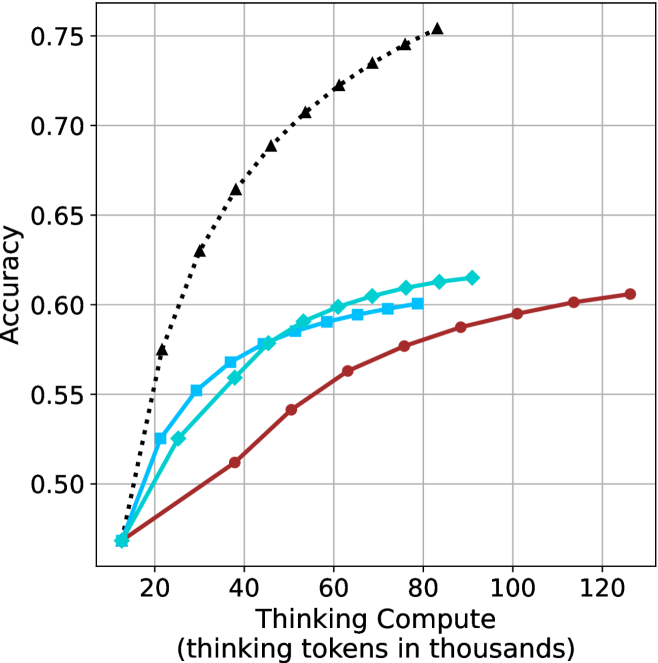
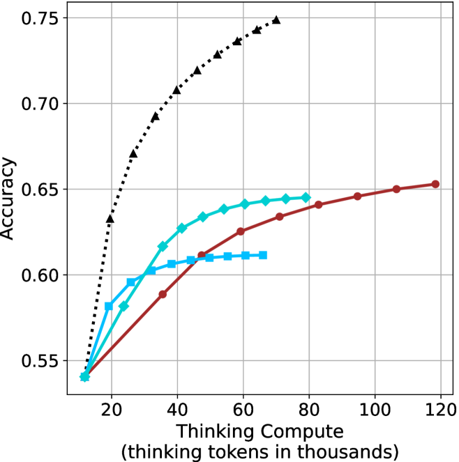
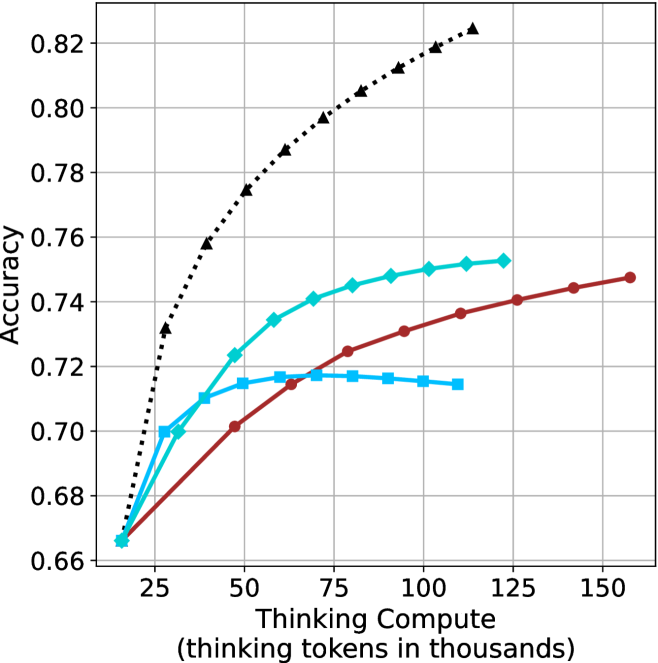
The aggregated performance results for math benchmarks, evaluated with respect to thinking compute, are presented in Figure ˜ 3 (per-benchmark results provided in Appendix ˜ B), while the GPQA-D respective results are presented in Figure ˜ 7 in Appendix ˜ A. We again observe that the short-1@k method outperforms majority $@k$ at lower compute budgets. Notably, for LN-Super- $49$ B (Figure ˜ 3(a)), the short-1@k method surpasses majority $@k$ across all compute budgets. For instance, short-1@k achieves $57\$ accuracy with approximately $60\$ of the compute budget used by majority@ $k$ to achieve the same accuracy. For R $1$ - $32$ B, QwQ- $32$ B and R $1$ - $670$ B models, the short-1@k method exceeds majority $@k$ up to compute budgets of $45$ k, $60$ k and $100$ k total thinking tokens, respectively, but is underperformed by it on larger compute budgets.
The short-3@k method yields even greater performance improvements, incurring only a modest increase in thinking compute compared to short-1@k. When compared to majority $@k$ , short-3@k consistently achieves higher performance with lower thinking compute across all models and compute budgets. For example, with the QwQ- $32$ B model (Figure ˜ 3(c)), and an average compute budget of $80$ k thinking tokens per example, short-3@k improves accuracy by $2\$ over majority@ $k$ . For the R $1$ - $670$ B model (Figure ˜ 3(d)), short-3@k consistently outperforms majority voting, yielding an approximate $4\$ improvement with an average token budget of $100$ k.
<details>
<summary>x10.png Details</summary>
### Visual Description
## Scatter Plot: Accuracy vs. Time-to-Answer
### Overview
This image is a scatter plot visualizing the relationship between "Time-to-Answer" (measured in thousands of units) and "Accuracy" (a decimal value). The plot categorizes data points into four distinct groups based on marker shape and color, with each point labeled with a 'k' value (k=1, 3, 5, 9). The data suggests a performance comparison between different model configurations or algorithmic approaches.
### Components/Axes
* **Y-Axis:** Labeled "Accuracy". The scale ranges from 0.48 to 0.62, with grid lines at 0.02 intervals.
* **X-Axis:** Labeled "Time-to-Answer (longest thinking in thousands)". The scale ranges from 8 to 18, with grid lines at 2-unit intervals.
* **Data Series (Legend/Markers):**
* **Blue Squares:** Located on the left side of the chart (x < 11).
* **Cyan Diamonds:** Located in the center of the chart (10 < x < 16).
* **Cyan Star/Cross:** A single point located at the bottom center.
* **Maroon Circles:** Located on the right side of the chart (x > 15).
### Detailed Analysis
The data points are grouped by color/shape, representing distinct clusters. Below are the approximate coordinates (x, y) for each point:
**1. Blue Squares (Left Cluster)**
* **k=9:** Positioned at approximately (8.0, 0.60).
* **k=5:** Positioned at approximately (9.0, 0.58).
* **k=3:** Positioned at approximately (10.0, 0.55).
* *Trend:* Within this cluster, as 'k' increases, both accuracy and time-to-answer increase.
**2. Cyan Diamonds (Middle Cluster)**
* **k=9:** Positioned at approximately (10.5, 0.615).
* **k=5:** Positioned at approximately (12.5, 0.59).
* **k=3:** Positioned at approximately (15.5, 0.56).
* *Trend:* Similar to the blue squares, increasing 'k' correlates with higher accuracy and higher time-to-answer.
**3. Cyan Star (Bottom Center)**
* **k=1:** Positioned at approximately (12.5, 0.47).
* *Note:* This is the lowest accuracy point on the entire chart.
**4. Maroon Circles (Right Cluster)**
* **k=9:** Positioned at approximately (18.5, 0.60).
* **k=5:** Positioned at approximately (17.0, 0.565).
* **k=3:** Positioned at approximately (15.5, 0.51).
* *Trend:* This cluster follows the same positive correlation between 'k' and accuracy, but operates at a significantly higher time-to-answer cost compared to the other clusters.
### Key Observations
* **Efficiency Clusters:** The data clearly separates into three efficiency tiers. The Blue Squares are the most efficient (fastest time for given accuracy), followed by the Cyan Diamonds, with the Maroon Circles being the least efficient (slowest time for similar accuracy).
* **Peak Performance:** The highest accuracy achieved is by the Cyan Diamond (k=9) at approximately 0.615 accuracy with a time of ~10.5.
* **Outlier:** The Cyan Star (k=1) is a significant outlier, showing the lowest accuracy (0.47) despite having a moderate time-to-answer (12.5).
* **Consistent Scaling:** Across all three main clusters (Blue, Cyan, Maroon), increasing the 'k' value consistently improves accuracy but incurs a penalty in time-to-answer.
### Interpretation
The data demonstrates a clear trade-off between computational time and model accuracy.
1. **Model Families:** The distinct clusters (Blue, Cyan, Maroon) likely represent three different model architectures or families. The Blue family is superior in terms of Pareto efficiency—it achieves high accuracy (up to 0.60) with the lowest time-to-answer (8-10).
2. **Diminishing Returns:** While increasing 'k' generally improves accuracy, the "cost" in time-to-answer varies wildly between architectures. For example, the Maroon architecture requires ~18.5 units of time to reach 0.60 accuracy, whereas the Blue architecture reaches the same accuracy in ~8 units of time.
3. **Strategic Choice:** If the goal is maximum accuracy, the Cyan Diamond (k=9) is the optimal choice (0.615 accuracy). If the goal is efficiency, the Blue architecture is preferable. The Maroon architecture appears to be the least desirable, as it consumes the most time while failing to outperform the peak accuracy of the other two groups.
</details>
(a) LN-Super- $49$ B
<details>
<summary>x11.png Details</summary>
### Visual Description
## Scatter Plot: Accuracy vs. Time-to-Answer
### Overview
This image is a scatter plot visualizing the relationship between "Time-to-Answer" (x-axis) and "Accuracy" (y-axis). The data points are categorized by shape and color, with labels indicating a "k" value (likely representing a parameter such as search depth, number of samples, or model complexity). The plot contains three distinct clusters of data points, plus one outlier.
### Components/Axes
* **Y-Axis:** Labeled "Accuracy". The scale ranges from 0.54 to 0.64+, with grid lines at 0.54, 0.56, 0.58, 0.60, 0.62, and 0.64.
* **X-Axis:** Labeled "Time-to-Answer (longest thinking in thousands)". The scale ranges from 8 to 18+, with grid lines at 8, 10, 12, 14, 16, and 18.
* **Data Markers:**
* **Cyan Squares:** Located in the left-middle region.
* **Cyan Diamonds:** Located in the upper-middle region.
* **Cyan Star:** Located at the bottom-center.
* **Maroon Circles:** Located in the right region.
* **Labels:** Each data point is annotated with a "k=" value (k=1, k=3, k=5, k=9).
### Detailed Analysis
The data is segmented into four distinct visual groups based on shape and color.
#### 1. Cyan Squares (Left Cluster)
* **Trend:** As 'k' increases, accuracy increases while time-to-answer decreases (the points move up and to the left).
* **Data Points:**
* **k=3:** Positioned at x ≈ 8.8, y ≈ 0.595.
* **k=5:** Positioned at x ≈ 7.8, y ≈ 0.605.
* **k=9:** Positioned at x ≈ 7.2, y ≈ 0.61.
#### 2. Cyan Diamonds (Upper-Middle Cluster)
* **Trend:** As 'k' increases, accuracy increases while time-to-answer decreases (the points move up and to the left).
* **Data Points:**
* **k=3:** Positioned at x ≈ 15.5, y ≈ 0.615.
* **k=5:** Positioned at x ≈ 11.5, y ≈ 0.635.
* **k=9:** Positioned at x ≈ 9.2, y ≈ 0.645.
#### 3. Cyan Star (Bottom-Center Outlier)
* **Data Point:**
* **k=1:** Positioned at x ≈ 11.8, y ≈ 0.54. This is the lowest accuracy point on the chart.
#### 4. Maroon Circles (Right Cluster)
* **Trend:** As 'k' increases, accuracy increases, and time-to-answer also increases (the points move up and to the right).
* **Data Points:**
* **k=3:** Positioned at x ≈ 15.5, y ≈ 0.59.
* **k=5:** Positioned at x ≈ 17.2, y ≈ 0.625.
* **k=9:** Positioned at x ≈ 19.0, y ≈ 0.65.
### Key Observations
* **Consistent 'k' Impact:** Across all three main clusters (Squares, Diamonds, Circles), increasing the 'k' value consistently results in higher accuracy.
* **Divergent Efficiency:**
* The **Cyan groups** (Squares and Diamonds) exhibit an inverse relationship between time and accuracy: higher 'k' values result in *faster* answers with *higher* accuracy.
* The **Maroon group** exhibits a direct relationship: higher 'k' values result in *slower* answers with *higher* accuracy.
* **Performance Ceiling:** The highest accuracy achieved is approximately 0.65 (Maroon k=9), while the lowest is 0.54 (Cyan k=1).
### Interpretation
This chart likely compares different model architectures or inference strategies. The "k" parameter appears to be a hyperparameter that improves performance (accuracy) in all scenarios.
The most striking finding is the difference in efficiency between the groups. The **Cyan groups** appear to be more efficient architectures; as they scale up (increasing 'k'), they become both more accurate and faster, suggesting that higher 'k' values might optimize the search or reasoning process in these specific models. Conversely, the **Maroon group** represents a more traditional computational trade-off where increasing accuracy requires a linear increase in processing time. The **Cyan Star (k=1)** acts as a baseline or "naive" approach, showing significantly lower performance than any of the k=3, 5, or 9 configurations.
</details>
(b) R $1$ - $32$ B
<details>
<summary>x12.png Details</summary>
### Visual Description
## Scatter Plot: Accuracy vs. Time-to-Answer
### Overview
The image is a scatter plot visualizing the relationship between computational cost ("Time-to-Answer") and model performance ("Accuracy"). The plot uses distinct shapes and colors to categorize data points, likely representing different model architectures or inference configurations, labeled with a "k" parameter (ranging from k=1 to k=9).
### Components/Axes
* **Y-Axis:** "Accuracy". The scale ranges from 0.68 to 0.74, with grid lines at 0.02 intervals.
* **X-Axis:** "Time-to-Answer (longest thinking in thousands)". The scale ranges from 12 to 20, with grid lines at 2-unit intervals.
* **Data Series (Categorized by Shape/Color):**
* **Cyan Squares:** Located in the left-center region.
* **Cyan Diamonds:** Located in the upper-middle region.
* **Cyan Star:** Located at the bottom-center.
* **Maroon Circles:** Located in the right-center region.
* **Labels:** Each data point is annotated with a "k=" value (k=1, k=3, k=5, k=9), indicating a specific configuration parameter.
### Detailed Analysis
The data points are clustered into four distinct groups based on shape and color. Below are the approximate coordinates (x, y) for each point:
**1. Cyan Squares (Left Cluster)**
* **k=9:** Positioned at x ≈ 11.2, y ≈ 0.715.
* **k=5:** Positioned at x ≈ 11.8, y ≈ 0.717.
* **k=3:** Positioned at x ≈ 12.5, y ≈ 0.710.
* *Trend:* This group shows a slight increase in accuracy from k=9 to k=5, followed by a decrease at k=3, while time-to-answer consistently increases as k decreases.
**2. Cyan Diamonds (Upper-Middle Cluster)**
* **k=9:** Positioned at x ≈ 13.2, y ≈ 0.752.
* **k=5:** Positioned at x ≈ 15.5, y ≈ 0.741.
* **k=3:** Positioned at x ≈ 18.8, y ≈ 0.724.
* *Trend:* There is a strong positive correlation between the "k" value and accuracy. As "k" decreases (9 → 5 → 3), accuracy drops significantly (0.752 → 0.724), and time-to-answer increases significantly (13.2 → 18.8).
**3. Cyan Star (Bottom-Center)**
* **k=1:** Positioned at x ≈ 15.8, y ≈ 0.668.
* *Trend:* This is a singular data point representing the lowest accuracy on the entire chart.
**4. Maroon Circles (Right Cluster)**
* **k=9:** Positioned at x ≈ 21.2, y ≈ 0.745.
* **k=5:** Positioned at x ≈ 19.8, y ≈ 0.725.
* **k=3:** Positioned at x ≈ 18.8, y ≈ 0.702.
* *Trend:* Similar to the Cyan Diamonds, there is a positive correlation between "k" and accuracy. As "k" decreases (9 → 5 → 3), both accuracy and time-to-answer decrease.
### Key Observations
* **Efficiency Leader:** The Cyan Diamond configuration at k=9 achieves the highest accuracy (≈ 0.752) while maintaining a relatively low time-to-answer (≈ 13.2).
* **Performance Trade-off:** For both the Cyan Diamonds and Maroon Circles, higher "k" values consistently yield higher accuracy.
* **Outlier:** The Cyan Star (k=1) is a significant outlier, demonstrating the lowest accuracy despite having a moderate time-to-answer cost.
* **Group Separation:** The Maroon Circles generally occupy the highest time-to-answer range (18.8 to 21.2), making them the most computationally expensive group.
### Interpretation
This chart likely benchmarks Large Language Model (LLM) inference strategies, where "k" represents a parameter such as the number of reasoning steps, beam search width, or the number of samples generated (e.g., "best-of-k").
* **The "k" Factor:** The data demonstrates that increasing "k" is generally beneficial for accuracy, but the efficiency of this gain varies by model type (represented by the different shapes/colors).
* **Diminishing Returns:** The Cyan Diamonds represent the most efficient strategy, achieving high accuracy with lower latency. The Maroon Circles, while achieving high accuracy at k=9, require significantly more time to compute.
* **Strategic Choice:** If a user requires high accuracy, the Cyan Diamond (k=9) is the optimal choice. If a user is constrained by time, the Cyan Squares offer a "fast" but lower-accuracy alternative. The Maroon group appears to be a less efficient architecture compared to the Cyan Diamonds, as it requires more time to achieve similar or lower accuracy levels.
</details>
(c) QwQ-32B
<details>
<summary>x13.png Details</summary>
### Visual Description
## Scatter Plot: Accuracy vs. Time-to-Answer for Different Inference Methods
### Overview
This image is a scatter plot comparing the performance of three different inference methods (`majority@k`, `short-1@k`, and `short-3@k`) across varying values of 'k'. The plot maps the "Time-to-Answer" (x-axis) against "Accuracy" (y-axis). The data suggests a trade-off between computational time and model accuracy, with the "Ours" methods generally showing distinct performance characteristics compared to the `majority@k` baseline.
### Components/Axes
* **X-Axis:** "Time-to-Answer (longest thinking in thousands)". The scale ranges from 14 to 22, with major grid lines at intervals of 2.
* **Y-Axis:** "Accuracy". The scale ranges from 0.78 to 0.88, with major grid lines at intervals of 0.02.
* **Legend (Bottom-Right):**
* **Dark Red Circle:** `majority@k`
* **Blue Square:** `short-1@k (Ours)`
* **Cyan Diamond:** `short-3@k (Ours)`
### Detailed Analysis
The data points are distributed across the plot. Below are the approximate coordinates (x, y) for each data series, derived from visual estimation against the grid lines.
**1. Blue Squares (`short-1@k (Ours)`)**
* **Trend:** As 'k' increases from 1 to 9, the time-to-answer decreases (moving left), while accuracy generally increases.
* **k=9:** (x ≈ 14.2, y ≈ 0.849)
* **k=5:** (x ≈ 15.3, y ≈ 0.844)
* **k=3:** (x ≈ 16.4, y ≈ 0.831)
* **k=1:** (x ≈ 19.0, y ≈ 0.782)
**2. Cyan Diamonds (`short-3@k (Ours)`)**
* **Trend:** As 'k' increases from 1 to 9, the time-to-answer increases (moving right), and accuracy increases significantly.
* **k=9:** (x ≈ 17.2, y ≈ 0.888)
* **k=5:** (x ≈ 18.8, y ≈ 0.871)
* **k=3:** (x ≈ 21.5, y ≈ 0.848)
* **k=1:** (x ≈ 19.0, y ≈ 0.782) — *Note: This point overlaps perfectly with the blue square k=1.*
**3. Dark Red Circles (`majority@k`)**
* **Trend:** As 'k' increases from 3 to 9, the time-to-answer increases (moving right), and accuracy increases.
* **k=9:** (x ≈ 23.4, y ≈ 0.866)
* **k=5:** (x ≈ 22.4, y ≈ 0.838)
* **k=3:** (x ≈ 21.5, y ≈ 0.815)
### Key Observations
* **Efficiency Leader:** The `short-1@k` method is the most efficient (fastest time-to-answer) for higher 'k' values (k=5, k=9), occupying the leftmost region of the chart.
* **Accuracy Leader:** The `short-3@k` method achieves the highest overall accuracy (k=9 at ~0.888), though it requires more time than `short-1@k`.
* **Convergence:** At k=1, both `short-1@k` and `short-3@k` converge to the exact same performance metrics (x ≈ 19.0, y ≈ 0.782).
* **Baseline Performance:** The `majority@k` method is consistently the slowest (highest time-to-answer) across all 'k' values compared to the "Ours" methods.
* **Anomalous Trend:** For `short-1@k`, increasing 'k' actually *decreases* the time-to-answer, which is counter-intuitive compared to the other methods where increasing 'k' increases time.
### Interpretation
The data demonstrates that the "Ours" methods (`short-1@k` and `short-3@k`) are generally superior to the `majority@k` baseline, as they achieve higher accuracy with lower time-to-answer.
Specifically, `short-3@k` appears to be the optimal choice for high-accuracy requirements, while `short-1@k` is the optimal choice for low-latency requirements. The fact that `short-1@k` becomes faster as 'k' increases suggests an architectural efficiency in how it handles larger 'k' values, perhaps by pruning or early-stopping mechanisms that become more effective as the sample size increases. The convergence at k=1 indicates that the distinction between the "short" methods is negligible at the lowest sample size.
</details>
(d) R1-670B
Figure 4: Comparing time-to-answer for different inference methods. Our methods substantially reduce time cost with no major loss in performance. Unlike majority $@k$ , which becomes slower as $k$ grows, our methods run faster with $k$ , as the probability of finding a short chain increases with $k$ .
Time-to-answer.
Finally, the math aggregated time-to-answer results are shown in Figure ˜ 4, with GPQA-D results shown in Figure ˜ 8 and pe math benchmark in Appendix ˜ B. For readability, Figure 4 omits the oracle, and methods are compared across a subset of sample sizes. As sample size increases, majority $@k$ exhibits longer time-to-answer, driven by a higher probability of sampling generations with extended thinking chains, requiring all trajectories to complete. Conversely, the short-1@k method shows reduced time-to-answer with larger sample sizes, as the probability of encountering a short answer increases. This trend also holds for the short-3@k method after three reasoning processes complete.
This phenomenon makes the short-1@k and short-3@k methods substantially more usable compared to basic majority $@k$ . For example, when using the LN-Super- $49$ B model (Figure ˜ 4(a)), with a sample size of $5$ , the short-1@k method reduces time consumption by almost $50\$ while also increasing performance by about $1.5\$ compared to majority@ $k$ . When considering a larger sample size of $9$ , the performance values are almost the same but short-1@k is more than $55\$ faster.
Finally, we observe that for most models and sample sizes, short-3@k boosts performance, while for larger ones it also reduces time-to-answer significantly. For example, on R $1$ - $32$ B (Figure ˜ 4(b)), with $k=5$ , short-3@k is $33\$ faster than majority@ $k$ , while reaching superior performance. A similar boost in time-to-answer and performance is observed with QwQ- $32$ B/R $1$ - $670$ B and sample size $9$ (Figure ˜ 4(c) and Figure ˜ 4(d)).
## 5 Analysis
To obtain deeper insights into the underlying process, making shorter thinking trajectories preferable, we conduct additional analysis. We first investigate the relation between using shorter thinking per individual example, and the necessity of longer trajectories to solve more complex problems (Section ˜ 5.1). Subsequently, we analyze backtracks in thinking trajectories to better understand the characteristics of shorter trajectories (Section ˜ 5.2). Lastly, we analyze the perfomance of short-m@k in sequential setting (Section ˜ 5.3). All experiments in this section use trajectories produced by our models as described in Section ˜ 3.1. For Sections 5.1 and 5.2 we exclude generations that were not completed within the generation length.
### 5.1 Hard questions (still) require more thinking
We split the questions into three equal size groups according to model’s success rate. Then, we calculate the average thinking length for each of the splits, and provide the average lengths for the correct and incorrect attempts per split.
Table 2: Average thinking tokens for correct (C), incorrect (IC) and all (A) answers, per split by difficulty for the math benchmarks. The numbers are in thousands of tokens.
| Model | Easy | Medium | Hard |
| --- | --- | --- | --- |
| C/IC/A | C/IC/A | C/IC/A | |
| LN-Super-49B | $\phantom{0}5.3/11.1/\phantom{0}5.7$ | $11.4/17.1/14.6$ | $12.4/16.8/16.6$ |
| R1-32B | $\phantom{0}4.9/13.7/\phantom{0}5.3$ | $10.9/17.3/13.3$ | $14.4/15.8/15.7$ |
| QwQ-32B The QwQ-32B and R1-670B models correctly answered all of their easier questions in all attempts. | $\phantom{0}8.4/\phantom{0.}\text{--}\phantom{0}/\phantom{0}8.4$ | $14.8/21.6/15.6$ | $19.1/22.8/22.3$ |
| R1-670B footnotemark: | $13.0/\phantom{0.}\text{--}\phantom{0}/13.0$ | $15.3/20.9/15.5$ | $23.0/31.7/28.4$ |
Tables ˜ 2 and 5 shows the averages thinking tokens per split for the math benchmarks and GPQA-D, respectively. We first note that as observed in Section ˜ 3.2, within each question subset, correct answers are typically shorter than incorrect ones. This suggests that correct answers tend to be shorter, and it holds for easier questions as well as harder ones.
Nevertheless, we also observe that models use more tokens for more challenging questions, up to a factor of $2.9$ . This finding is consistent with recent studies (Anthropic, 2025; OpenAI, 2024; Muennighoff et al., 2025) indicating that using longer thinking is needed in order to solve harder questions. To summarize, harder questions require a longer thinking process compared to easier ones, but within a single question (both easy and hard), shorter thinking is preferable.
### 5.2 Backtrack analysis
One may hypothesize that longer thinking reflect a more extensive and less efficient search path, characterized by a higher degree of backtracking and “rethinking”. In contrast, shorter trajectories indicate a more direct and efficient path, which often leads to a more accurate answer.
To this end, we track several keywords identified as indicators of re-thinking and backtracking within different trajectories. The keywords we used are: [’but’, ’wait’, ’however’, ’alternatively’, ’not sure’, ’going back’, ’backtrack’, ’trace back’, ’hmm’, ’hmmm’] We then categorize the trajectories into correct and incorrect sets, and measure the number of backtracks and their average length (quantified by keyword occurrences divided by total thinking length) for each set. We present the results for the math benchmarks and GPQA-D in Tables ˜ 3 and 6, respectively.
Table 3: Average number of backtracks, and their average length for correct (C), incorrect (IC) and all (A) answers in math benchmarks.
| Model | # Backtracks | Backtrack Len. |
| --- | --- | --- |
| C/IC/A | C/IC/A | |
| LN-Super-49B | $106/269/193$ | $\phantom{0}88/\phantom{0}70/76$ |
| R1-32B | $\phantom{0}95/352/213$ | $117/\phantom{0}63/80$ |
| QwQ-32B | $182/269/193$ | $\phantom{0}70/\phantom{0}60/64$ |
| R1-670B | $188/323/217$ | $\phantom{0}92/102/99$ |
As our results indicate, for all models and benchmarks, correct trajectories consistently exhibit fewer backtracks compared to incorrect ones. Moreover, in almost all cases, backtracks of correct answers are longer. This may suggest that correct solutions involve less backtracking where each backtrack is longer, potentially more in-depth that leads to improved reasoning, whereas incorrect ones explores more reasoning paths that are abandoned earlier (hence tend to be shorter).
Lastly, we analyze the backtrack behavior in a length-controlled manner. Specifically, we divide trajectories into bins based on their length. Within each bin, we compare the number of backtracks between correct and incorrect trajectories. Our hypothesis is that even for trajectories of comparable length, correct trajectories would exhibit fewer backtracks, indicating a more direct path to the answer. The results over the math benchmarks and GPQA-D are presented in Appendix ˜ F. As can be seen, in almost all cases, even among trajectories of comparable length, correct ones show a lower number of backtracks. The only exception is the R $1$ - $670$ B model over the math benchmarks. This finding further suggests that correct trajectories are superior because they spend less time on searching for the correct answer and instead dive deeply into a smaller set of paths.
### 5.3 short-m@k with sequential compute
Our results so far assume sufficient resources for generating the output in parallel. We now study the potential of our proposed method without this constraint, by comparing short-m@k to the baselines in sequential (non-batched) setting, and measuring the amount of thinking tokens used by each method. For short-m@k, each generation is terminated once its length exceeds the maximum length observed among the $m$ shortest previously completed generations.
The results for the math benchmarks are presented in Figure ˜ 5 while the GPQA-D results are in Appendix ˜ E. While the performance of short-m@k shows decreased efficiency in terms of total thinking compute usage compared to a fully batched decoding setup (Section ˜ 4.3), the method’s superiority over standard majority voting remains. Specifically, at low compute regimes, both short-1@k and short-3@k demonstrate higher efficiency and improved performance compared to majority voting. As for higher compute regimes, short-3@k outperforms the majority voting baseline.
<details>
<summary>x14.png Details</summary>
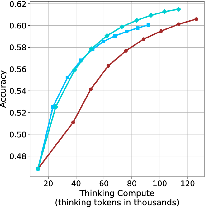
### Visual Description
## Line Chart: Accuracy vs. Thinking Compute
### Overview
This image is a line chart illustrating the relationship between "Thinking Compute" (measured in thousands of thinking tokens) and "Accuracy." The chart displays three distinct data series, each showing a positive correlation where increased thinking compute leads to higher accuracy, albeit with diminishing returns.
### Components/Axes
* **Y-Axis (Vertical):** Labeled "Accuracy." The scale ranges from 0.48 to 0.62, with major grid lines at intervals of 0.02.
* **X-Axis (Horizontal):** Labeled "Thinking Compute (thinking tokens in thousands)." The scale ranges from 20 to 120, with major grid lines at intervals of 20. Data points begin at approximately 12.
* **Data Series (Legend absent, identified by marker/color):**
* **Series A (Dark Red Line with Circle Markers):** The lowest-performing series across the compute range.
* **Series B (Cyan Line with Diamond Markers):** The highest-performing series across the compute range.
* **Series C (Cyan Line with Square Markers):** An intermediate series, performing better than the red line but lower than the diamond line.
### Detailed Analysis
The chart displays a concave trend for all three series, indicating that while accuracy improves with more thinking tokens, the marginal gain decreases as compute increases.
**Trend Verification:**
* **Dark Red (Circles):** Slopes upward steadily from the start. It maintains the lowest accuracy relative to the other two series throughout the entire range.
* **Cyan (Diamonds):** Slopes upward, starting at the same point as the red line, but diverges quickly to become the highest-performing series.
* **Cyan (Squares):** Slopes upward, starting slightly later than the other two series (around 22k tokens), and tracks closely below the diamond series.
**Approximate Data Points (X, Y):**
| Thinking Compute (k) | Red (Circles) | Cyan (Squares) | Cyan (Diamonds) |
| :--- | :--- | :--- | :--- |
| ~12 | ~0.47 | N/A | ~0.47 |
| ~22 | ~0.49 | ~0.525 | ~0.525 |
| ~38 | ~0.51 | ~0.55 | ~0.56 |
| ~50 | ~0.54 | ~0.578 | ~0.58 |
| ~62 | ~0.56 | ~0.585 | ~0.59 |
| ~75 | ~0.575 | ~0.59 | ~0.60 |
| ~88 | ~0.585 | ~0.598 | ~0.605 |
| ~100 | ~0.595 | N/A | ~0.61 |
| ~112 | ~0.60 | N/A | ~0.615 |
| ~125 | ~0.605 | N/A | N/A |
### Key Observations
* **Performance Gap:** There is a clear performance gap between the Dark Red series and the Cyan series. The Cyan series (both shapes) reaches higher accuracy levels with significantly less compute than the Red series.
* **Diminishing Returns:** The slope of all lines is steepest between 10k and 40k tokens. Beyond 60k tokens, the curves flatten significantly, suggesting that adding more thinking tokens yields smaller incremental improvements in accuracy.
* **Convergence:** The two Cyan lines (Squares and Diamonds) start at a similar point (~22k tokens, ~0.525 accuracy) and follow a similar trajectory, though the Diamond series maintains a slight lead.
### Interpretation
This chart likely represents the performance scaling of an AI model (or models) that utilizes "Chain of Thought" or "Thinking" processes.
* **Scaling Laws:** The data demonstrates that "thinking" is a scalable resource. By allocating more tokens to the reasoning process, the model achieves higher accuracy.
* **Efficiency:** The distinct separation between the Red line and the Cyan lines suggests that the Cyan series represents a more efficient or capable model architecture (or a different version of the same model) that achieves higher accuracy for the same amount of compute.
* **Optimization Threshold:** The flattening of the curves suggests an "optimal" compute range. Beyond ~80k-100k tokens, the cost of additional compute (latency/resources) may outweigh the marginal gains in accuracy, indicating a point of diminishing returns for practical applications.
</details>
(a) LN-Super-49B
<details>
<summary>x15.png Details</summary>
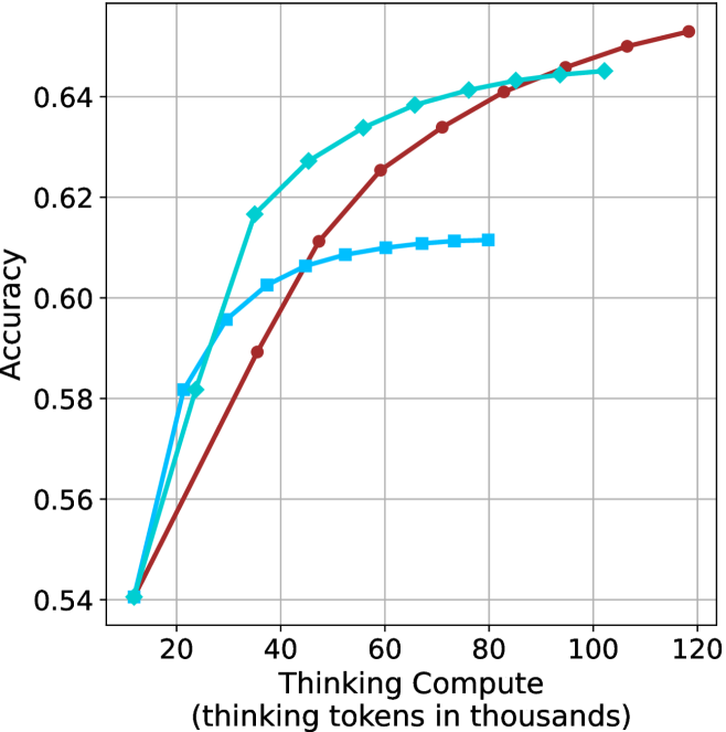
### Visual Description
## Line Chart: Accuracy vs. Thinking Compute
### Overview
This image displays a line chart comparing the performance of three distinct data series (likely different AI models or configurations) based on their "Thinking Compute" (measured in thousands of tokens) versus their "Accuracy." The chart illustrates how increasing computational resources (thinking tokens) impacts the accuracy of each model, demonstrating diminishing returns for all series.
### Components/Axes
* **X-Axis:** Labeled "Thinking Compute (thinking tokens in thousands)." The scale ranges from 20 to 120, with grid lines at intervals of 20. The data series originate at approximately 12.
* **Y-Axis:** Labeled "Accuracy." The scale ranges from 0.54 to 0.64, with grid lines at intervals of 0.02.
* **Data Series:**
1. **Dark Red Line (Circle markers):** Represents a model with steady, sustained growth.
2. **Cyan Line (Diamond markers):** Represents a model with rapid initial growth that eventually plateaus.
3. **Cyan Line (Square markers):** Represents a model with rapid initial growth that plateaus significantly earlier than the others.
### Detailed Analysis
All three data series originate from the same starting point at approximately **(12, 0.54)**.
**1. Dark Red Line (Circle markers)**
* **Trend:** This line shows the most consistent, linear-to-logarithmic growth. It does not plateau as sharply as the cyan lines.
* **Data Points (Approximate):**
* Starts at (12, 0.54).
* (35, 0.59)
* (47, 0.61)
* (60, 0.625)
* (72, 0.635)
* (83, 0.64)
* (95, 0.645)
* (105, 0.65)
* Ends at (118, 0.652)
**2. Cyan Line (Diamond markers)**
* **Trend:** This line shows very steep growth initially, outperforming the red line until approximately 90k tokens. After 60k tokens, the rate of improvement slows significantly (plateauing).
* **Data Points (Approximate):**
* Starts at (12, 0.54).
* (21, 0.58)
* (24, 0.582)
* (35, 0.617)
* (45, 0.628)
* (55, 0.634)
* (65, 0.639)
* (75, 0.641)
* (85, 0.643)
* (95, 0.644)
* Ends at (102, 0.645)
**3. Cyan Line (Square markers)**
* **Trend:** This line shows the steepest initial growth but hits a hard ceiling very early, around 40k-50k tokens.
* **Data Points (Approximate):**
* Starts at (12, 0.54).
* (21, 0.582)
* (29, 0.595)
* (33, 0.602)
* (45, 0.606)
* (52, 0.608)
* (60, 0.61)
* (72, 0.611)
* Ends at (80, 0.612)
### Key Observations
* **Crossover Point:** The Dark Red line overtakes the Cyan-Diamond line at approximately 90k-95k tokens.
* **Efficiency vs. Capacity:** The Cyan-Diamond model is the most efficient choice for lower compute budgets (under 80k tokens), while the Dark Red model is superior for higher compute budgets.
* **Diminishing Returns:** All three lines exhibit a concave shape, indicating that as more "thinking tokens" are added, the marginal gain in accuracy decreases.
* **Early Plateau:** The Cyan-Square model is clearly the least capable at higher compute levels, suggesting it may be a smaller model or one with a lower "reasoning capacity" ceiling.
### Interpretation
This chart is a classic representation of **scaling laws in Large Language Models (LLMs)**, specifically regarding "test-time compute" or "thinking" tokens (similar to the behavior observed in models like OpenAI's o1).
* **The "Thinking" Trade-off:** The data demonstrates that simply adding more compute (tokens) does not guarantee infinite accuracy gains. Each model has a "saturation point" where adding more tokens yields negligible improvements.
* **Model Architecture Differences:** The three lines likely represent different model sizes or training checkpoints. The Cyan-Square line likely represents a smaller model that saturates quickly. The Dark Red line likely represents a larger, more robust model that continues to benefit from additional compute long after the smaller models have plateaued.
* **Strategic Implications:** For a developer or user, this chart suggests that if you have a limited compute budget (e.g., < 40k tokens), the Cyan-Diamond model is optimal. However, if you have a high compute budget (e.g., > 100k tokens), the Dark Red model is the only one that continues to provide meaningful accuracy improvements.
</details>
(b) R $1$ - $32$ B
<details>
<summary>x16.png Details</summary>
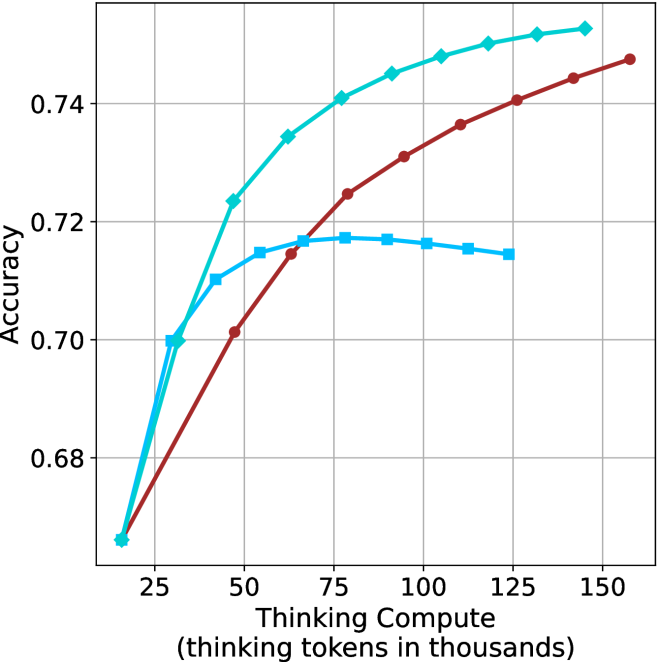
### Visual Description
## Line Chart: Accuracy vs. Thinking Compute
### Overview
The image is a line chart illustrating the relationship between "Thinking Compute" (measured in thousands of thinking tokens) and "Accuracy." The chart displays three distinct data series, all originating from a common starting point. There is no legend provided in the image to identify the specific models or methods associated with each line color/marker style.
### Components/Axes
* **Y-Axis:** Labeled "Accuracy." The scale ranges from 0.68 to 0.74, with major grid lines at 0.02 intervals (0.68, 0.70, 0.72, 0.74).
* **X-Axis:** Labeled "Thinking Compute (thinking tokens in thousands)." The scale ranges from 25 to 150, with major grid lines at 25-unit intervals (25, 50, 75, 100, 125, 150).
* **Data Series (No Legend Provided):**
* **Cyan Line:** Marked with diamond symbols.
* **Dark Red Line:** Marked with circle symbols.
* **Medium Blue Line:** Marked with square symbols.
### Detailed Analysis
All three data series originate from a common point at approximately **(16, 0.665)**.
#### 1. Cyan Line (Diamond Markers)
* **Trend:** This line shows the steepest upward trajectory and maintains the highest accuracy across the majority of the compute range. It shows no signs of plateauing within the visible chart area.
* **Data Points (Approximate):**
* (16, 0.665) - Start
* (30, 0.700)
* (45, 0.724)
* (60, 0.735)
* (75, 0.741)
* (90, 0.745)
* (105, 0.748)
* (120, 0.750)
* (135, 0.752)
* (145, 0.753) - End
#### 2. Dark Red Line (Circle Markers)
* **Trend:** This line shows a steady, consistent upward curve. It crosses the Medium Blue line at approximately 65k tokens and continues to rise steadily without plateauing.
* **Data Points (Approximate):**
* (16, 0.665) - Start
* (45, 0.701)
* (65, 0.715)
* (80, 0.725)
* (95, 0.731)
* (110, 0.737)
* (125, 0.741)
* (140, 0.744)
* (160, 0.748) - End
#### 3. Medium Blue Line (Square Markers)
* **Trend:** This line shows an initial sharp rise, followed by a plateau, and eventually a slight decline, suggesting diminishing returns or "overthinking."
* **Data Points (Approximate):**
* (16, 0.665) - Start
* (30, 0.700)
* (40, 0.710)
* (55, 0.715)
* (80, 0.718) - Peak
* (100, 0.717)
* (115, 0.716)
* (125, 0.715) - End
### Key Observations
* **Performance Divergence:** While all models start with identical performance, they diverge significantly after ~30k tokens.
* **The "Overthinking" Phenomenon:** The Medium Blue (Square) series is the only one that exhibits a performance degradation (negative slope) after reaching a peak of ~0.718 accuracy at 80k tokens. This is a classic indicator of "overthinking" in reasoning models, where additional compute tokens introduce noise or errors rather than clarity.
* **Scaling Efficiency:** The Cyan (Diamond) series is the most efficient, achieving the highest accuracy (0.753) with the least amount of compute relative to the other lines.
### Interpretation
This chart likely represents a comparison of different Large Language Model (LLM) reasoning configurations or "Chain of Thought" prompting strategies.
* **Cyan (Diamond):** Represents a highly optimized model or strategy that scales effectively with increased compute. It is the superior configuration in this dataset.
* **Dark Red (Circle):** Represents a robust, stable configuration that continues to benefit from increased compute, though it does not reach the same peak accuracy as the Cyan series.
* **Medium Blue (Square):** Represents a configuration that is effective at low compute levels but suffers from diminishing returns. The downward trend after 80k tokens suggests that for this specific configuration, there is an optimal "thinking budget," and exceeding it is detrimental to the final output accuracy.
</details>
(c) QwQ-32B
<details>
<summary>x17.png Details</summary>
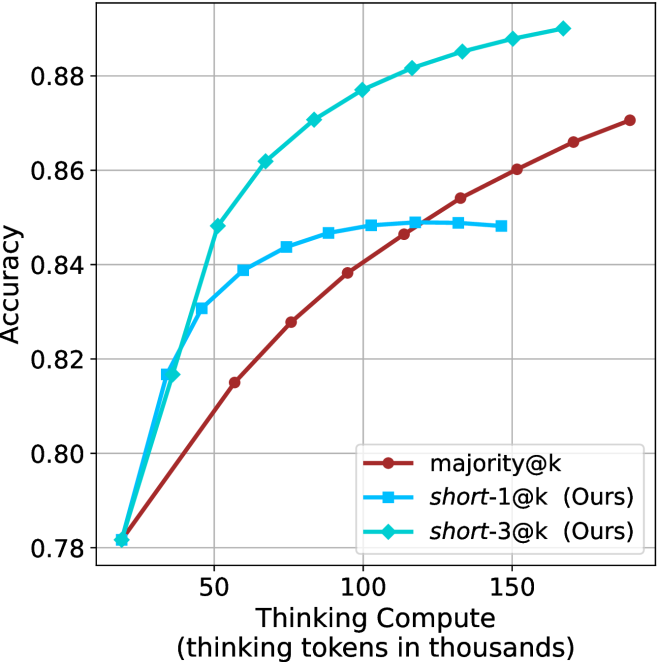
### Visual Description
## Line Chart: Accuracy vs. Thinking Compute
### Overview
This image is a line chart comparing the performance of three different methods—`majority@k`, `short-1@k (Ours)`, and `short-3@k (Ours)`—based on their accuracy relative to the amount of "Thinking Compute" utilized (measured in thousands of thinking tokens). The chart demonstrates that while all methods start at the same baseline, they diverge significantly as compute increases, with the "short-3@k" method achieving the highest accuracy.
### Components/Axes
* **Y-Axis (Vertical):** Labeled "Accuracy". The scale ranges from 0.78 to 0.88, with major grid lines at intervals of 0.02.
* **X-Axis (Horizontal):** Labeled "Thinking Compute (thinking tokens in thousands)". The scale shows major ticks at 50, 100, and 150. The data series begins at approximately 20 (thousands of tokens).
* **Legend:** Located in the bottom-right quadrant of the chart area.
* **majority@k:** Represented by a dark red line with circular markers.
* **short-1@k (Ours):** Represented by a medium blue line with square markers.
* **short-3@k (Ours):** Represented by a cyan (light blue) line with diamond markers.
### Detailed Analysis
#### Trend Verification
* **majority@k (Dark Red, Circles):** This series exhibits a steady, nearly linear upward trend across the entire X-axis range. It does not show signs of plateauing within the visible chart area.
* **short-1@k (Ours) (Medium Blue, Squares):** This series shows a rapid initial increase in accuracy, followed by a distinct "elbow" or curve where the rate of improvement slows significantly, eventually plateauing around 110-150k tokens.
* **short-3@k (Ours) (Cyan, Diamonds):** This series shows the steepest initial growth. It maintains a strong upward trajectory throughout the chart, consistently outperforming the other two methods.
#### Data Points (Approximate Values)
*Note: Values are estimated based on visual position relative to grid lines.*
| Thinking Compute (k) | majority@k (Red) | short-1@k (Blue) | short-3@k (Cyan) |
| :--- | :--- | :--- | :--- |
| ~20 | ~0.781 | ~0.781 | ~0.781 |
| ~35 | ~0.795 | ~0.817 | ~0.817 |
| ~50 | ~0.815 | ~0.831 | ~0.848 |
| ~65 | ~0.822 | ~0.839 | ~0.862 |
| ~80 | ~0.828 | ~0.844 | ~0.871 |
| ~100 | ~0.838 | ~0.847 | ~0.877 |
| ~115 | ~0.847 | ~0.848 | ~0.882 |
| ~135 | ~0.854 | ~0.849 | ~0.885 |
| ~150 | ~0.860 | ~0.848 | ~0.888 |
| ~165 | ~0.866 | N/A | ~0.890 |
| ~190 | ~0.871 | N/A | N/A |
### Key Observations
* **Convergence at Start:** All three methods begin at the same point (~0.781 accuracy at ~20k tokens).
* **Performance Ceiling:** The `short-1@k` method hits a performance ceiling (diminishing returns) around 100k tokens, where accuracy stabilizes near 0.848.
* **Superiority of short-3@k:** The `short-3@k` method is the most effective. It diverges sharply from the other two methods after the 35k token mark and continues to climb, reaching the highest accuracy of ~0.890.
* **Baseline Performance:** The `majority@k` method, while the slowest to improve, maintains a consistent growth rate, suggesting it might eventually catch up to the `short-1@k` method if compute were increased significantly beyond 200k tokens.
### Interpretation
The data suggests that the "short" methods (specifically `short-3@k`) are significantly more efficient at converting "thinking compute" into accuracy compared to the `majority@k` baseline.
The "short-3@k" method demonstrates a superior scaling law, where additional thinking tokens yield higher marginal gains in accuracy compared to the other methods. The "short-1@k" method appears to be a "quick start" optimization that provides early gains but lacks the capacity for higher-level reasoning or refinement that "short-3@k" provides, as evidenced by its plateau. This chart effectively demonstrates that the "short-3@k" approach is the optimal strategy for high-compute scenarios.
</details>
(d) R1-670B
Figure 5: Comparing different methods for the math benchmarks under sequential (non-parallel) decoding.
## 6 Finetuning using shorter trajectories
Based on our findings, we investigate whether fine-tuning on shorter reasoning chains improves LLM reasoning accuracy. While one might intuitively expect this to be the case, given the insights from Section ˜ 3 and Section ˜ 5, this outcome is not trivial. A potential counterargument is that training on shorter trajectories could discourage the model from performing necessary backtracks (Section ˜ 5.2), thereby hindering its ability to find a correct solution. Furthermore, the benefit of using shorter trajectories for bootstrapping reasoning remains an open question.
To do so, we follow the S $1$ paradigm, which fine-tunes an LLM to perform reasoning using only $1,$ $000$ trajectories (Muennighoff et al., 2025). We create three versions of the S $1$ dataset, built from examples with the shortest, longest, and random reasoning chains among several generations.
Data creation and finetuning setup.
To construct the three variants of S $1$ , we generate multiple responses for each S $1$ question-answer pair. Specifically, for each example, we produce $10$ distinct answers using the QwQ- $32$ B model, which we select for its superior performance with respect to model size (Section ˜ 3). From these $10$ responses per example, we derive three dataset variants—S $1$ -short, S $1$ -long, and S $1$ -random—by selecting the shortest/longest/random response, respectively. This results in three datasets, each containing the same $1,$ $000$ queries but with distinct reasoning trajectories and answers. We then finetune the Qwen- $2.5$ - $7$ B-Instruct and Qwen- $2.5$ - $32$ B-Instruct models on the three S $1$ variants. We further detail about the generation process, the finetuning setup and evaluation setup in Appendix ˜ G.
Finetuning results.
Results for the 32B model are presented in Table ˜ 4 (7B model results are in Table ˜ 10). For GPQA-D, AIME $2025$ and HMMT benchmarks, the S $1$ -short variant achieves superior performance while using fewer thinking tokens. While performance on AIME $2024$ is similar across models, S $1$ -short still demonstrates the shortest thinking. Aggregated results across math benchmarks reveal that S $1$ -short improves relative performance by $2.8\$ compared to the S $1$ -random baseline, with a reduction of $5.8\$ in thinking tokens. Conversely, the S $1$ -long model consumes more tokens than S $1$ -random, but obtains similar performance.
These results suggest that training on shorter reasoning sequences can lead to better reasoning models that exhibit reduced computational overhead. This observation aligns with our findings in Section ˜ 3, which shows that answers with shorter thinking trajectories tend to be more accurate. We believe that developing models that reason more effectively with less computation holds significant potential.
Table 4: Results for our finetuned models over the S $1$ variants using Qwen-2.5-32B-Instruct: S $1$ -short/long/random. The S $1$ -short model improves performance over the other two models, while using fewer thinking tokens.
| | GPQA-D | AIME 2024 | AIME 2025 | HMMT | Math Average | | | | | |
| --- | --- | --- | --- | --- | --- | --- | --- | --- | --- | --- |
| Thinking Tokens $\downarrow$ | Acc. $\uparrow$ | Thinking Tokens $\downarrow$ | Acc. $\uparrow$ | Thinking Tokens $\downarrow$ | Acc. $\uparrow$ | Thinking Tokens $\downarrow$ | Acc. $\uparrow$ | Thinking Tokens $\downarrow$ | Acc. $\uparrow$ | |
| S1-random | 11566 | 62.5 | 16145 | 68.8 | 17798 | 59.3 | 19243 | 40.8 | 17729 | 56.3 |
| S1-long | 12279 $(+6.1\$ | 63.7 | 16912 | 67.3 | 17973 | 58.5 | 19397 | 42.1 | 18094 $(+2.1\$ | 56.0 |
| S1-short | 10845 $(-6.2\$ | 64.8 | 15364 | 68.3 | 17195 | 60.2 | 17557 | 45.2 | 16706 $(-5.8\$ | 57.9 |
## 7 Conclusion
In this work, we challenged the common assumption that increased test-time computation leads to better performance in reasoning LLMs. Through empirical analysis on four complex mathematical and reasoning benchmarks, we showed that shorter reasoning chains consistently outperform longer ones, both in accuracy and computational efficiency. Building on this insight, we introduced short-m@k, an inference method that prioritizes early-terminating generations. short-1@k, our most efficient variant, is preferred over traditional majority voting in low-compute settings. short-3@k, while slightly less efficient, outperforms majority voting across all compute budgets. We further investigate thinking trajectories, and find that shorter thinking usually involve less backtracks, and a more direct way to solution. To further validate our findings, we fine-tuned an LLM on short reasoning trajectories and observed improved accuracy and faster runtime, whereas training on longer chains yields diminishing returns. These findings highlight a promising direction for developing faster and more effective reasoning LLMs by embracing brevity over extended computation.
#### Acknowledgments
We thank Miri Varshavsky Hassid for the great feedback and moral support.
## References
- M. Abdin, S. Agarwal, A. Awadallah, V. Balachandran, H. Behl, L. Chen, G. de Rosa, S. Gunasekar, M. Javaheripi, N. Joshi, et al. (2025) Phi-4-reasoning technical report. arXiv preprint arXiv:2504.21318. Cited by: §1, §2, §4.2.
- A. Agarwal, A. Sengupta, and T. Chakraborty (2025) First finish search: efficient test-time scaling in large language models. arXiv preprint arXiv:2505.18149. Cited by: §2.
- Anthropic (2025) Claude’s extended thinking. External Links: Link Cited by: §1, §1, §2, §2, §3, §5.1.
- D. Arora and A. Zanette (2025) Training language models to reason efficiently. arXiv preprint arXiv:2502.04463. Cited by: §2.
- M. Balunović, J. Dekoninck, I. Petrov, N. Jovanović, and M. Vechev (2025) MathArena: evaluating llms on uncontaminated math competitions. SRI Lab, ETH Zurich. External Links: Link Cited by: §3.1.
- A. Bercovich et al. (2025) Llama-nemotron: efficient reasoning models. External Links: 2505.00949, Link Cited by: Appendix D, §1, §2, §3.1.
- M. Chen et al. (2021) Evaluating large language models trained on code. Note: arXiv:2107.03374 External Links: Link Cited by: §4.2, §4.2.
- G. DeepMind (2025) Gemini 2.5: our most intelligent ai model. External Links: Link Cited by: §2, §3.1.
- M. Fatemi, B. Rafiee, M. Tang, and K. Talamadupula (2025) Concise reasoning via reinforcement learning. arXiv preprint arXiv:2504.05185. Cited by: §2.
- A. Grattafiori, A. Dubey, A. Jauhri, A. Pandey, A. Kadian, A. Al-Dahle, A. Letman, A. Mathur, A. Schelten, A. Vaughan, et al. (2024) The llama 3 herd of models. arXiv preprint arXiv:2407.21783. Cited by: §3.1.
- D. Guo, D. Yang, H. Zhang, J. Song, R. Zhang, R. Xu, Q. Zhu, S. Ma, P. Wang, X. Bi, et al. (2025) Deepseek-r1: incentivizing reasoning capability in llms via reinforcement learning. arXiv preprint arXiv:2501.12948. Cited by: Appendix D, §1, §2, §2, §3.1, §4.2.
- M. Hassid, T. Remez, J. Gehring, R. Schwartz, and Y. Adi (2024) The larger the better? improved llm code-generation via budget reallocation. arXiv preprint arXiv:2404.00725 arXiv:2404.00725. External Links: Link Cited by: §4.2.
- Y. Kang, X. Sun, L. Chen, and W. Zou (2025) C3ot: generating shorter chain-of-thought without compromising effectiveness. In Proceedings of the AAAI Conference on Artificial Intelligence, Vol. 39, pp. 24312–24320. Cited by: §2.
- Z. Ke, F. Jiao, Y. Ming, X. Nguyen, A. Xu, D. X. Long, M. Li, C. Qin, P. Wang, S. Savarese, et al. (2025) A survey of frontiers in llm reasoning: inference scaling, learning to reason, and agentic systems. arXiv preprint arXiv:2504.09037. Cited by: §2.
- S. Kulal, P. Pasupat, K. Chandra, M. Lee, O. Padon, A. Aiken, and P. S. Liang (2019) SPoC: search-based pseudocode to code. In Advances in Neural Information Processing Systems, H. Wallach, H. Larochelle, A. Beygelzimer, F. d'Alché-Buc, E. Fox, and R. Garnett (Eds.), Vol. 32, pp. . External Links: Link Cited by: §4.2.
- W. Kwon, Z. Li, S. Zhuang, Y. Sheng, L. Zheng, C. H. Yu, J. Gonzalez, H. Zhang, and I. Stoica (2023) Efficient memory management for large language model serving with pagedattention. In Proceedings of the 29th Symposium on Operating Systems Principles, pp. 611–626. Cited by: §3.1.
- X. Lu, S. Han, D. Acuna, H. Kim, J. Jung, S. Prabhumoye, N. Muennighoff, M. Patwary, M. Shoeybi, B. Catanzaro, et al. (2025) Retro-search: exploring untaken paths for deeper and efficient reasoning. arXiv preprint arXiv:2504.04383. Cited by: §2.
- N. Muennighoff, Z. Yang, W. Shi, X. L. Li, L. Fei-Fei, H. Hajishirzi, L. Zettlemoyer, P. Liang, E. Candès, and T. Hashimoto (2025) S1: simple test-time scaling. arXiv preprint arXiv:2501.19393. Cited by: Appendix G, §1, §1, §1, §2, §3, §5.1, §6.
- S. Nayab, G. Rossolini, M. Simoni, A. Saracino, G. Buttazzo, N. Manes, and F. Giacomelli (2024) Concise thoughts: impact of output length on llm reasoning and cost. arXiv preprint arXiv:2407.19825. Cited by: §2.
- M. A. of America (2024) AIME 2024. External Links: Link Cited by: §3.1.
- M. A. of America (2025) AIME 2025. External Links: Link Cited by: §3.1.
- OpenAI (2024) Learning to reason with llms. External Links: Link Cited by: §1, §1, §2, §3, §5.1.
- OpenAI (2025) OpenAI o3-mini. Note: Accessed: 2025-02-24 External Links: Link Cited by: §1, §2.
- X. Pu, M. Saxon, W. Hua, and W. Y. Wang (2025) THOUGHTTERMINATOR: benchmarking, calibrating, and mitigating overthinking in reasoning models. arXiv preprint arXiv:2504.13367. Cited by: §2.
- P. Qi, Z. Liu, T. Pang, C. Du, W. S. Lee, and M. Lin (2025) Optimizing anytime reasoning via budget relative policy optimization. arXiv preprint arXiv:2505.13438. Cited by: §2.
- D. Rein, B. L. Hou, A. C. Stickland, J. Petty, R. Y. Pang, J. Dirani, J. Michael, and S. R. Bowman (2024) Gpqa: a graduate-level google-proof q&a benchmark. In First Conference on Language Modeling, Cited by: §3.1.
- [27] (2025) Skywork open reasoner series. Note: https://capricious-hydrogen-41c.notion.site/Skywork-Open-Reaonser-Series-1d0bc9ae823a80459b46c149e4f51680 Notion Blog Cited by: §2.
- Q. Team (2025a) Qwen3. External Links: Link Cited by: §2.
- Q. Team (2025b) QwQ-32b: embracing the power of reinforcement learning. External Links: Link Cited by: §1, §2, §2, §3.1.
- C. Wang, Y. Feng, D. Chen, Z. Chu, R. Krishna, and T. Zhou (2025a) Wait, we don’t need to" wait"! removing thinking tokens improves reasoning efficiency. arXiv preprint arXiv:2506.08343. Cited by: §2.
- J. Wang, S. Zhu, J. Saad-Falcon, B. Athiwaratkun, Q. Wu, J. Wang, S. L. Song, C. Zhang, B. Dhingra, and J. Zou (2025b) Think deep, think fast: investigating efficiency of verifier-free inference-time-scaling methods. arXiv preprint arXiv:2504.14047. Cited by: §2, §4.2.
- X. Wang, J. Wei, D. Schuurmans, Q. Le, E. Chi, S. Narang, A. Chowdhery, and D. Zhou (2022) Self-consistency improves chain of thought reasoning in language models. arXiv preprint arXiv:2203.11171. Cited by: §1, §4.2.
- J. Wei, X. Wang, D. Schuurmans, M. Bosma, F. Xia, E. Chi, Q. V. Le, D. Zhou, et al. (2022) Chain-of-thought prompting elicits reasoning in large language models. Advances in neural information processing systems 35, pp. 24824–24837. Cited by: §2.
- Y. Wu, Y. Wang, Z. Ye, T. Du, S. Jegelka, and Y. Wang (2025) When more is less: understanding chain-of-thought length in llms. arXiv preprint arXiv:2502.07266. Cited by: §2.
- A. Yang et al. (2024) Qwen2.5 technical report. arXiv preprint arXiv:2412.15115. Cited by: §1, §3.1.
- C. Yang, Q. Si, Y. Duan, Z. Zhu, C. Zhu, Z. Lin, L. Cao, and W. Wang (2025) Dynamic early exit in reasoning models. arXiv preprint arXiv:2504.15895. Cited by: §2.
- Y. Ye, Z. Huang, Y. Xiao, E. Chern, S. Xia, and P. Liu (2025) LIMO: less is more for reasoning. arXiv preprint arXiv:2502.03387. Cited by: §2.
- Z. Yu, Y. Wu, Y. Zhao, A. Cohan, and X. Zhang (2025) Z1: efficient test-time scaling with code. arXiv preprint arXiv:2504.00810. Cited by: §2.
## Appendix A GPQA diamond results
We present below results for the GPQA-D benchmark. Figure ˜ 6, Figure ˜ 7 and Figure ˜ 8 are the sample-size/compute/time-to-answer results for GPQA-D, respectively. Table ˜ 5 correspond to the Table ˜ 2 in Section ˜ 5.1. Table ˜ 6 and Table ˜ 9 correspond to Table ˜ 3 and Table ˜ 8 in Section ˜ 5.2, respectively.
<details>
<summary>x18.png Details</summary>
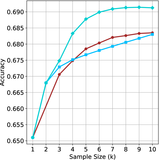
### Visual Description
## Line Chart: Accuracy vs. Sample Size (k)
### Overview
This image displays a line chart illustrating the relationship between "Sample Size (k)" and "Accuracy." The chart features three distinct data series, each represented by a different color and marker shape. All three series originate from the same starting point at a sample size of 1. Notably, the chart lacks a legend, making it impossible to identify the specific models or methods associated with each line without external context.
### Components/Axes
* **Y-Axis:** Labeled "Accuracy." The scale ranges from 0.650 to 0.690, with major grid lines at intervals of 0.005.
* **X-Axis:** Labeled "Sample Size (k)." The scale ranges from 1 to 10, with integer markers.
* **Data Series (Visual Identification):**
* **Series A (Cyan/Light Blue):** Line with diamond-shaped markers.
* **Series B (Maroon/Dark Red):** Line with circular markers.
* **Series C (Blue/Medium Blue):** Line with square-shaped markers.
### Detailed Analysis
All three series begin at the coordinate (1, 0.651). The trends diverge significantly as the sample size increases.
| Sample Size (k) | Series A (Cyan/Diamond) | Series B (Maroon/Circle) | Series C (Blue/Square) |
| :--- | :--- | :--- | :--- |
| 1 | ~0.651 | ~0.651 | ~0.651 |
| 2 | ~0.668 | ~0.660 | ~0.668 |
| 3 | ~0.675 | ~0.671 | ~0.673 |
| 4 | ~0.683 | ~0.675 | ~0.675 |
| 5 | ~0.688 | ~0.6785 | ~0.6765 |
| 6 | ~0.690 | ~0.6805 | ~0.678 |
| 7 | ~0.691 | ~0.682 | ~0.679 |
| 8 | ~0.6915 | ~0.6825 | ~0.6805 |
| 9 | ~0.6915 | ~0.683 | ~0.682 |
| 10 | ~0.691 | ~0.6835 | ~0.683 |
* **Series A (Cyan/Diamond) Trend:** Exhibits the steepest initial growth. It rises sharply until k=4, then continues to climb at a slower rate, reaching a plateau around k=6 to k=7, where it stabilizes near 0.691.
* **Series B (Maroon/Circle) Trend:** Shows a steady, consistent upward slope throughout the entire range. It does not show the same sharp plateauing effect as the Cyan line.
* **Series C (Blue/Square) Trend:** Shows a steady, slightly shallower upward slope compared to the Maroon line. It tracks closely with the Cyan line initially but falls behind after k=2.
### Key Observations
* **Convergence:** All three models perform identically at the minimum sample size (k=1).
* **Performance Leader:** The Cyan/Diamond series is the clear top performer across the entire range from k=2 to k=10.
* **Crossover Points:**
* The Cyan line and Blue line start together, but the Cyan line pulls ahead immediately after k=1.
* The Maroon line starts lower than the Blue line at k=2, but crosses over the Blue line between k=3 and k=4, eventually ending with slightly higher accuracy than the Blue line at k=10.
* **Diminishing Returns:** The Cyan line exhibits clear signs of saturation (diminishing returns) after k=6, as the accuracy gains become negligible.
### Interpretation
This chart is characteristic of a machine learning performance evaluation, likely comparing different model architectures or training strategies under varying data constraints (few-shot learning).
* **Data Efficiency:** The Cyan/Diamond model is the most data-efficient, achieving higher accuracy with fewer samples.
* **Saturation Point:** The plateauing of the Cyan line suggests that for this specific model, increasing the sample size beyond k=6 provides minimal benefit, indicating that the model has likely reached its performance ceiling for this task or dataset.
* **Missing Context:** The absence of a legend is a critical omission. Without it, one cannot determine if these lines represent different algorithms, different hyperparameter settings, or different data augmentation techniques.
* **Comparative Dynamics:** The fact that the Maroon line (Circle) eventually overtakes the Blue line (Square) suggests that the Maroon model may have a slower learning rate or requires more data to "warm up," but ultimately scales better than the Blue model as sample size increases.
</details>
(a) LN-Super- $49$ B
<details>
<summary>x19.png Details</summary>
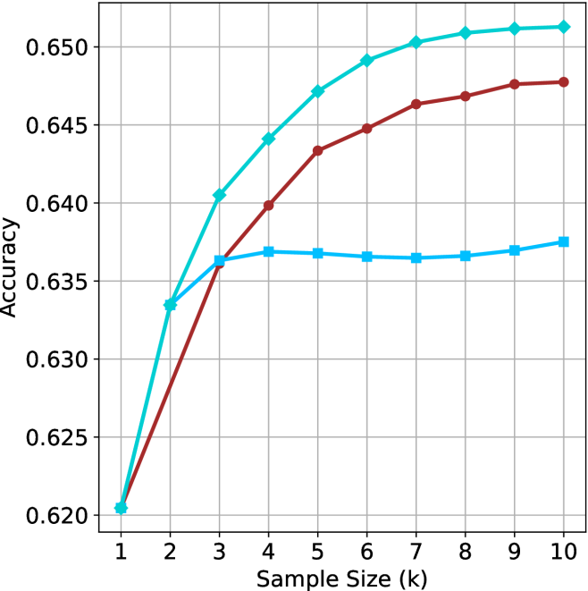
### Visual Description
## Line Chart: Accuracy vs. Sample Size
### Overview
This image is a line chart illustrating the performance (Accuracy) of three distinct data series as a function of "Sample Size (k)." The chart tracks performance from a sample size of 1 to 10. There are three distinct lines plotted, each using a different color and marker shape. **Note: The chart lacks a legend, making it impossible to identify what specific models or methods the three lines represent.**
### Components/Axes
* **X-Axis:** Labeled "Sample Size (k)". The scale is linear, ranging from 1 to 10, with integer tick marks.
* **Y-Axis:** Labeled "Accuracy". The scale ranges from 0.620 to 0.650, with grid lines at intervals of 0.005.
* **Grid:** A standard rectangular grid is present, with vertical lines at each integer on the X-axis and horizontal lines at each labeled increment on the Y-axis.
* **Data Series (identified by visual characteristics):**
* **Series A (Top):** Teal/Cyan line with diamond markers.
* **Series B (Middle):** Dark Red/Maroon line with circle markers.
* **Series C (Bottom):** Light Blue line with square markers.
### Detailed Analysis
All three series originate from the same starting point at Sample Size 1, with an accuracy of approximately 0.6205.
#### Series A (Teal/Cyan, Diamond markers)
* **Trend:** This series exhibits the strongest upward trajectory. It rises steeply from k=1 to k=4, then continues to rise at a slower, tapering rate, suggesting diminishing returns as the sample size increases.
* **Data Points (Approximate):**
* k=1: 0.6205
* k=2: 0.6335
* k=3: 0.6405
* k=4: 0.6440
* k=5: 0.6470
* k=6: 0.6490
* k=7: 0.6502
* k=8: 0.6508
* k=9: 0.6511
* k=10: 0.6512
#### Series B (Dark Red/Maroon, Circle markers)
* **Trend:** This series shows a consistent, steady upward slope throughout the entire range. It does not exhibit the sharp plateau seen in Series C, nor the rapid initial acceleration of Series A. It crosses Series C at approximately k=3.
* **Data Points (Approximate):**
* k=1: 0.6205
* k=2: 0.6275
* k=3: 0.6360
* k=4: 0.6398
* k=5: 0.6433
* k=6: 0.6447
* k=7: 0.6463
* k=8: 0.6468
* k=9: 0.6475
* k=10: 0.6477
#### Series C (Light Blue, Square markers)
* **Trend:** This series shows a sharp increase from k=1 to k=3, after which it hits a distinct plateau. From k=3 to k=10, the accuracy remains relatively stagnant, fluctuating only slightly within a very narrow range (approx. 0.636 to 0.637).
* **Data Points (Approximate):**
* k=1: 0.6205
* k=2: 0.6335
* k=3: 0.6363
* k=4: 0.6368
* k=5: 0.6367
* k=6: 0.6365
* k=7: 0.6364
* k=8: 0.6366
* k=9: 0.6369
* k=10: 0.6375
### Key Observations
* **Common Origin:** All three methods perform identically at the smallest sample size (k=1).
* **Divergence:** The methods diverge significantly after k=2.
* **Performance Ceiling:** Series C (Light Blue) demonstrates a clear "saturation point" or performance ceiling at k=3, suggesting that adding more data beyond this point provides negligible benefit for this specific method.
* **Superiority:** Series A (Teal) is the most effective method across the entire range from k=2 to k=10.
### Interpretation
This chart is characteristic of a machine learning model evaluation, likely comparing different algorithms or architectures under varying data availability constraints (e.g., few-shot learning).
* **Series A** represents a model that benefits significantly from increased data, showing the best scaling behavior.
* **Series C** represents a model that is highly efficient with very small amounts of data (reaching its peak quickly) but lacks the capacity to leverage larger datasets, hitting a hard performance wall.
* **Series B** represents a balanced approach that continues to improve steadily, though it does not reach the peak accuracy of Series A within the observed range.
The absence of a legend is a critical omission, as it prevents the identification of which specific model corresponds to which behavior. Without the legend, the data is descriptive of *trends* but lacks the *context* required to draw conclusions about specific model architectures.
</details>
(b) R $1$ - $32$ B
<details>
<summary>x20.png Details</summary>
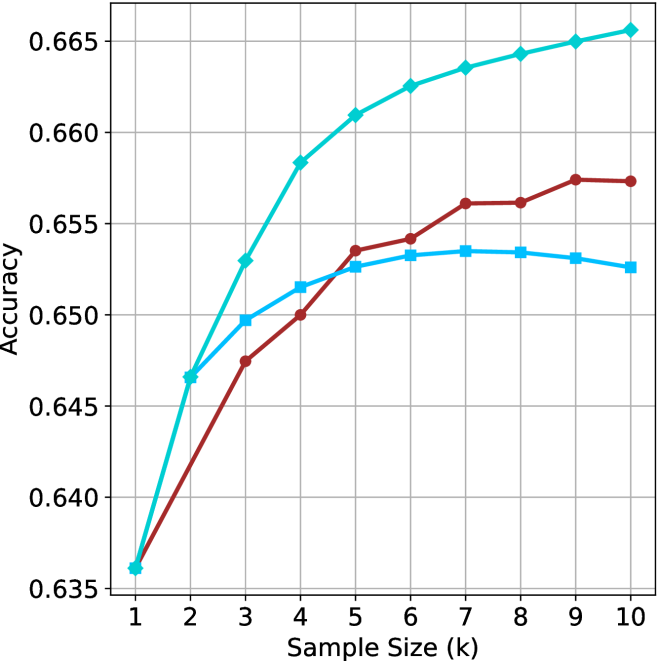
### Visual Description
## Line Chart: Accuracy vs. Sample Size (k)
### Overview
The image is a line chart illustrating the relationship between "Sample Size (k)" and "Accuracy." The chart features three distinct data series, each represented by a unique color and marker shape. There is no legend provided in the image to identify the specific models or methods associated with each line. All three series originate from a common starting point at a sample size of 1.
### Components/Axes
* **X-Axis:** Labeled "Sample Size (k)". The scale ranges from 1 to 10, with integer increments.
* **Y-Axis:** Labeled "Accuracy". The scale ranges from 0.635 to 0.665, with increments of 0.005.
* **Grid:** A standard grid is overlaid on the chart area to assist in reading values.
* **Data Series (Legend absent):**
* **Cyan Line:** Marked with diamond symbols.
* **Maroon Line:** Marked with circle symbols.
* **Light Blue Line:** Marked with square symbols.
### Detailed Analysis
The following data points are approximate based on visual inspection of the grid intersections.
| Sample Size (k) | Cyan (Diamonds) | Maroon (Circles) | Light Blue (Squares) |
| :--- | :--- | :--- | :--- |
| 1 | ~0.636 | ~0.636 | ~0.636 |
| 2 | ~0.647 | ~0.642 | ~0.647 |
| 3 | ~0.653 | ~0.648 | ~0.650 |
| 4 | ~0.658 | ~0.650 | ~0.652 |
| 5 | ~0.661 | ~0.654 | ~0.653 |
| 6 | ~0.663 | ~0.654 | ~0.653 |
| 7 | ~0.664 | ~0.656 | ~0.654 |
| 8 | ~0.664 | ~0.656 | ~0.653 |
| 9 | ~0.665 | ~0.657 | ~0.653 |
| 10 | ~0.666 | ~0.657 | ~0.653 |
**Trend Verification:**
* **Cyan Line:** Exhibits a strong, consistent upward trend across the entire range (1–10). It is the highest-performing series from x=2 onwards.
* **Maroon Line:** Shows a steady upward trend. It starts as the lowest performer but overtakes the Light Blue line between x=4 and x=5.
* **Light Blue Line:** Shows an initial upward trend, but the growth rate slows significantly after x=4. It reaches a peak at x=7 and exhibits a slight decline/plateau thereafter.
### Key Observations
* **Convergence:** All three series begin at the exact same coordinate (1, ~0.636).
* **Crossover:** The Maroon line crosses the Light Blue line between x=4 and x=5.
* **Performance Divergence:** By x=10, there is a clear hierarchy in performance: Cyan (highest) > Maroon > Light Blue (lowest).
* **Saturation:** The Light Blue series appears to reach a point of saturation or diminishing returns around x=7, after which accuracy slightly decreases.
### Interpretation
This chart likely represents the performance of three different machine learning models or algorithms as the training sample size increases.
* **Cyan Model:** This model appears to be the most robust, as it continues to gain accuracy as more data is provided, suggesting it has not yet reached its capacity limit or overfitting threshold within this range.
* **Light Blue Model:** This model shows signs of "early saturation." The slight decline after x=7 could indicate that adding more data is introducing noise or that the model architecture is not complex enough to leverage the additional data effectively, potentially leading to slight overfitting or degradation.
* **Maroon Model:** This model is slower to learn initially (lower accuracy at small sample sizes) but demonstrates more stable, consistent growth compared to the Light Blue model, eventually surpassing it.
Without a legend, it is impossible to identify the specific algorithms, but the data suggests that the "Cyan" approach is superior for larger sample sizes, while the "Light Blue" approach is only competitive at very small sample sizes (k=2).
</details>
(c) QwQ-32B
<details>
<summary>x21.png Details</summary>
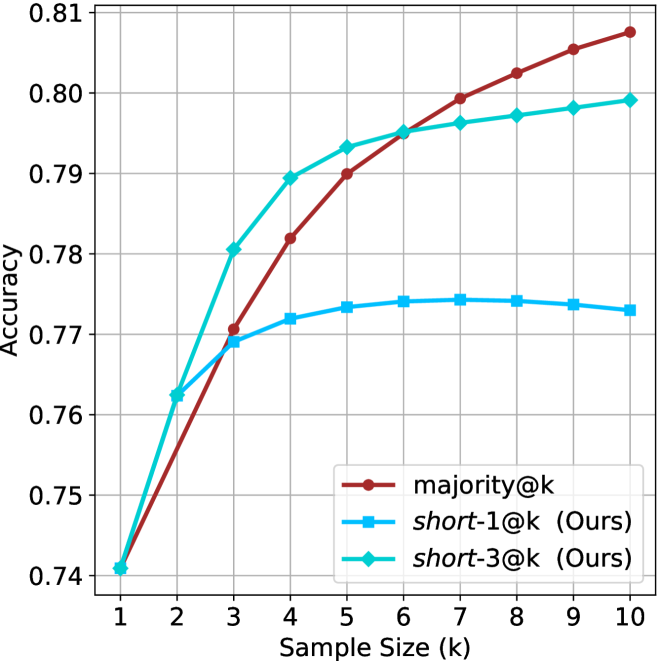
### Visual Description
## Line Chart: Accuracy vs. Sample Size (k)
### Overview
This chart illustrates the performance (Accuracy) of three different methods—`majority@k`, `short-1@k (Ours)`, and `short-3@k (Ours)`—across varying sample sizes (k) ranging from 1 to 10. The chart demonstrates how accuracy scales as the sample size increases.
### Components/Axes
* **Y-Axis:** Labeled "Accuracy". The scale ranges from 0.74 to 0.81, with grid lines at 0.01 intervals.
* **X-Axis:** Labeled "Sample Size (k)". The scale ranges from 1 to 10 in integer increments.
* **Legend:** Located in the bottom-right quadrant of the chart area.
* **`majority@k`**: Represented by a dark red line with circle markers.
* **`short-1@k (Ours)`**: Represented by a light blue line with square markers.
* **`short-3@k (Ours)`**: Represented by a cyan/teal line with diamond markers.
### Detailed Analysis
The chart displays three distinct trends starting from a common point at k=1.
**Data Series Trends:**
* **`majority@k` (Dark Red/Circles):** This line shows a consistent, steady upward slope from k=1 to k=10. It starts at the lowest point (tied with others) and ends as the highest performing method.
* **`short-1@k (Ours)` (Light Blue/Squares):** This line rises from k=1, but the rate of increase slows significantly after k=3. It reaches a plateau around k=6 and exhibits a very slight downward trend from k=7 to k=10.
* **`short-3@k (Ours)` (Cyan/Diamonds):** This line shows the steepest initial increase between k=1 and k=3. It outperforms the other two methods between k=2 and k=5. However, its growth rate slows significantly after k=5, and it is overtaken by `majority@k` at approximately k=6.
**Estimated Data Points (Approximate):**
| Sample Size (k) | majority@k (Red) | short-1@k (Light Blue) | short-3@k (Cyan) |
| :--- | :--- | :--- | :--- |
| 1 | ~0.741 | ~0.741 | ~0.741 |
| 2 | ~0.756 | ~0.762 | ~0.763 |
| 3 | ~0.771 | ~0.769 | ~0.780 |
| 4 | ~0.782 | ~0.772 | ~0.789 |
| 5 | ~0.790 | ~0.773 | ~0.793 |
| 6 | ~0.795 | ~0.774 | ~0.795 |
| 7 | ~0.799 | ~0.774 | ~0.796 |
| 8 | ~0.802 | ~0.774 | ~0.797 |
| 9 | ~0.805 | ~0.773 | ~0.798 |
| 10 | ~0.807 | ~0.773 | ~0.799 |
### Key Observations
* **Convergence at k=1:** All three methods begin with identical accuracy at a sample size of 1.
* **Early Performance:** The "Ours" methods (`short-1@k` and `short-3@k`) provide superior accuracy compared to `majority@k` in the low-sample regime (k=2 to k=5).
* **Crossover Point:** At k=6, the `majority@k` method intersects with `short-3@k` and becomes the superior method for all subsequent sample sizes.
* **Diminishing Returns:** Both "Ours" methods exhibit significant diminishing returns as k increases, whereas `majority@k` maintains a more linear, sustained improvement.
### Interpretation
The data suggests that the "Ours" methods are specifically optimized for low-data environments (k < 6), where they provide a clear advantage over the `majority@k` baseline. However, these methods appear to hit a performance ceiling quickly.
Conversely, `majority@k` is a more robust method for larger sample sizes. It demonstrates that while it may be less effective when data is scarce, it scales better as more data becomes available. The slight decline in accuracy for `short-1@k` after k=6 suggests potential overfitting or noise sensitivity as the sample size increases, whereas `majority@k` continues to benefit from the additional information.
</details>
(d) R1-670B
Figure 6: GPQA-D - sample size ( $k$ ) comparison.
<details>
<summary>x22.png Details</summary>
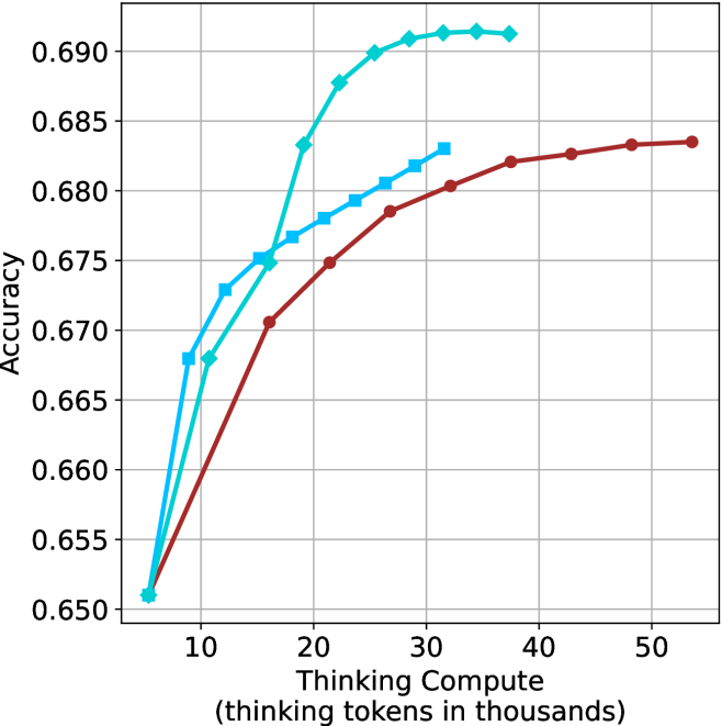
### Visual Description
## Line Chart: Accuracy vs. Thinking Compute
### Overview
This image is a line chart illustrating the relationship between "Thinking Compute" (measured in thousands of thinking tokens) and model "Accuracy." The chart displays three distinct data series, each represented by a different color and marker shape. All three series originate from a common starting point and diverge as the thinking compute increases, demonstrating different scaling behaviors for the models represented.
### Components/Axes
* **Y-Axis:** Labeled "Accuracy." The scale ranges from 0.650 to 0.690, with grid lines at intervals of 0.005.
* **X-Axis:** Labeled "Thinking Compute (thinking tokens in thousands)." The scale ranges from 10 to 50, with major tick marks every 10 units. The data series begin at approximately 6,000 tokens.
* **Data Series (Legend is absent):**
* **Cyan Line with Diamond Markers:** Represents the model with the steepest initial performance gain.
* **Blue Line with Square Markers:** Represents the model with intermediate performance gain.
* **Dark Red/Maroon Line with Circle Markers:** Represents the model with the most gradual performance gain.
### Detailed Analysis
The chart displays three distinct trends originating from a shared coordinate of approximately (6, 0.651).
#### 1. Cyan Line (Diamond Markers)
* **Trend:** This line exhibits the steepest upward slope, indicating the highest efficiency in gaining accuracy per unit of thinking compute. It rises sharply until approximately 26,000 tokens, after which the slope flattens significantly, suggesting diminishing returns.
* **Data Points (Approximate):**
* Start: (6, 0.651)
* (11, 0.668)
* (16, 0.675)
* (19, 0.683)
* (22, 0.688)
* (26, 0.690)
* (29, 0.691)
* (32, 0.6915)
* (37, 0.6915)
#### 2. Blue Line (Square Markers)
* **Trend:** This line shows a moderate upward slope. It rises steadily but is consistently outperformed by the Cyan line after the 16,000-token mark. It shows signs of plateauing as it approaches 32,000 tokens.
* **Data Points (Approximate):**
* Start: (6, 0.651)
* (9, 0.668)
* (12, 0.673)
* (16, 0.675)
* (19, 0.677)
* (22, 0.678)
* (25, 0.679)
* (28, 0.6805)
* (30, 0.6815)
* (32, 0.683)
#### 3. Dark Red/Maroon Line (Circle Markers)
* **Trend:** This line has the most gradual slope. While it starts at the same point as the others, it gains accuracy much more slowly. However, unlike the other two, it does not show a sharp plateau within the visible range, continuing to climb steadily up to 54,000 tokens.
* **Data Points (Approximate):**
* Start: (6, 0.651)
* (16, 0.6705)
* (22, 0.675)
* (27, 0.6785)
* (32, 0.6805)
* (37, 0.682)
* (42, 0.6825)
* (48, 0.6835)
* (54, 0.6835)
### Key Observations
* **Efficiency vs. Capacity:** The Cyan model is highly efficient, reaching a high accuracy (0.690+) with relatively low compute (under 30k tokens). The Red model is less efficient at low compute levels but demonstrates a more sustained, albeit slower, growth trajectory.
* **Convergence:** All three models perform identically at the lowest compute level (approx. 6k tokens), suggesting a shared baseline capability before "thinking" compute is applied.
* **Missing Legend:** The absence of a legend makes it impossible to identify which specific models (e.g., different versions of an LLM like o1-mini vs. o1-preview) correspond to these colors.
### Interpretation
This chart is a classic representation of inference-time scaling laws. It demonstrates that increasing "thinking compute" (the number of tokens a model generates before providing an answer) generally improves accuracy, but the rate of improvement varies significantly by model architecture.
* **The Cyan Model** appears to be a highly optimized or "distilled" model that hits its performance ceiling quickly. It is the best choice if compute resources are constrained.
* **The Red Model** appears to be a larger or more complex model that requires more "thinking" to unlock its full potential. It does not plateau as early as the others, suggesting it may have a higher theoretical ceiling if given even more compute.
* **The Blue Model** occupies a middle ground, showing moderate scaling behavior.
The data suggests that for tasks requiring high accuracy, one must choose between a model that scales quickly (Cyan) and one that scales broadly (Red), depending on the available compute budget and the desired accuracy threshold.
</details>
(a) LN-Super- $49$ B
<details>
<summary>x23.png Details</summary>
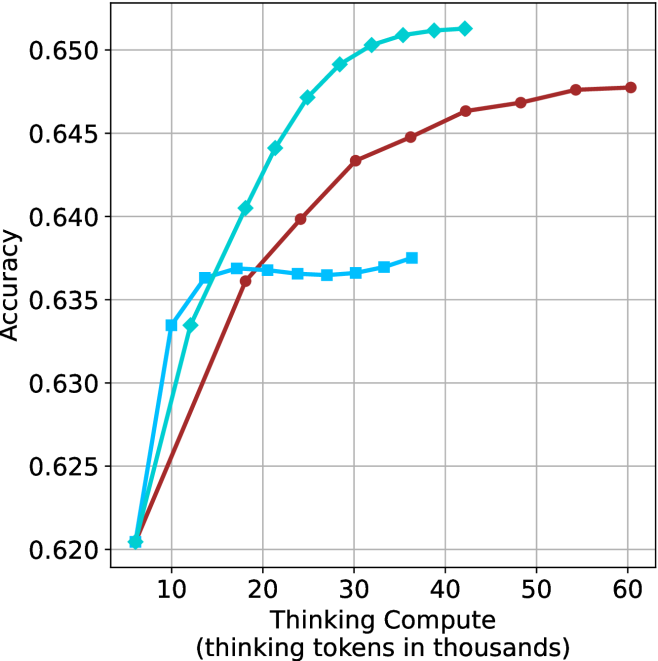
### Visual Description
## Line Chart: Accuracy vs. Thinking Compute
### Overview
This chart illustrates the relationship between "Thinking Compute" (measured in thousands of thinking tokens) and model "Accuracy." It compares three distinct data series, each represented by a unique color and marker shape. All three series originate from a common baseline point and diverge as compute increases, demonstrating different performance scaling behaviors.
### Components/Axes
* **Y-Axis:** Labeled "Accuracy." The scale ranges from 0.620 to 0.650, with major grid lines at 0.005 intervals.
* **X-Axis:** Labeled "Thinking Compute (thinking tokens in thousands)." The scale ranges from 10 to 60, with major grid lines at 10-unit intervals. The data series begin at an implicit value of approximately 6.
* **Data Series (No explicit legend provided):**
* **Cyan Line (Diamond Markers):** Represents the highest-performing series.
* **Dark Red Line (Circle Markers):** Represents the longest-running series in terms of compute.
* **Medium Blue Line (Square Markers):** Represents the series that exhibits early saturation.
### Detailed Analysis
All three series begin at approximately **(6, 0.620)**.
**1. Cyan Line (Diamond Markers)**
* **Trend:** This series shows the steepest upward trajectory, indicating the highest efficiency in gaining accuracy per unit of compute. It rises sharply until approximately 30k tokens, after which the rate of improvement slows, plateauing near 42k tokens.
* **Key Data Points (Approximate):**
* Start: (6, 0.620)
* (12, 0.633)
* (18, 0.640)
* (24, 0.647)
* (30, 0.650)
* End: (42, 0.651)
**2. Dark Red Line (Circle Markers)**
* **Trend:** This series shows a steady, monotonic increase in accuracy. It does not rise as steeply as the Cyan line initially, but it continues to improve consistently across the entire X-axis range provided.
* **Key Data Points (Approximate):**
* Start: (6, 0.620)
* (18, 0.636)
* (30, 0.643)
* (42, 0.646)
* (54, 0.648)
* End: (60, 0.648)
**3. Medium Blue Line (Square Markers)**
* **Trend:** This series shows a rapid initial increase in accuracy, similar to the Cyan line, but hits a performance ceiling (plateau) very early, around 15k tokens. It remains relatively flat for the remainder of the chart.
* **Key Data Points (Approximate):**
* Start: (6, 0.620)
* (10, 0.633)
* (14, 0.636)
* (18, 0.637)
* (36, 0.637)
### Key Observations
* **Performance Ceiling:** The Medium Blue series (Squares) demonstrates clear diminishing returns, effectively capping its accuracy at ~0.637 regardless of additional compute beyond 15k tokens.
* **Efficiency Leader:** The Cyan series (Diamonds) is the most efficient, achieving the highest accuracy (0.651) with significantly less compute than the Dark Red series.
* **Scaling Potential:** The Dark Red series (Circles) is the only one that does not show a clear plateau within the visible range, suggesting it might continue to improve if more compute were allocated, though it currently trails the Cyan series in absolute accuracy.
### Interpretation
This chart likely represents a comparison of different inference-time compute strategies or model architectures.
* **The Medium Blue strategy** appears to be a baseline or a constrained approach that is insufficient for complex tasks requiring deeper reasoning, as it saturates quickly.
* **The Cyan strategy** represents an optimized approach, likely utilizing a more effective search or reasoning algorithm, as it achieves superior accuracy with lower compute requirements.
* **The Dark Red strategy** represents a "slow and steady" approach. While it is less efficient than the Cyan strategy, its lack of a plateau suggests it may be more robust or scalable for tasks where additional compute can be traded for marginal gains in accuracy.
The data demonstrates that simply increasing "thinking tokens" is not universally beneficial; the *method* of utilizing that compute (represented by the different series) is the primary determinant of the accuracy ceiling.
</details>
(b) R $1$ - $32$ B
<details>
<summary>x24.png Details</summary>
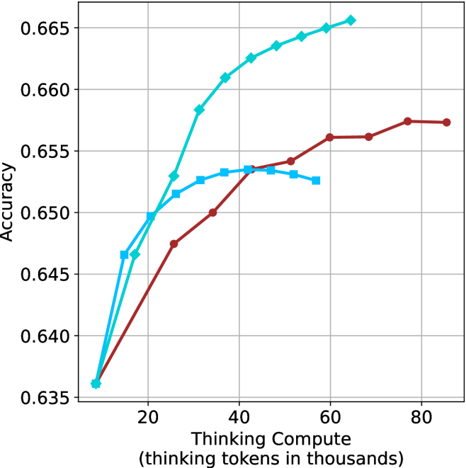
### Visual Description
## Line Chart: Accuracy vs. Thinking Compute
### Overview
The image displays a line chart comparing the performance of three distinct data series (likely different model configurations or inference strategies) based on their accuracy relative to the amount of "Thinking Compute" utilized. The X-axis represents the compute budget in thousands of tokens, and the Y-axis represents the resulting model accuracy. The chart lacks a legend, so the series are identified by their color and marker shape.
### Components/Axes
* **Y-Axis:** Labeled "Accuracy". The scale ranges from 0.635 to 0.665, with major grid lines at intervals of 0.005.
* **X-Axis:** Labeled "Thinking Compute (thinking tokens in thousands)". The scale ranges from 0 to 80, with major grid lines at intervals of 20.
* **Grid:** A standard Cartesian grid is overlaid on the plot area.
* **Data Series Identification:**
* **Series A (Cyan Diamond):** A cyan-colored line with diamond-shaped markers.
* **Series B (Dark Red Circle):** A dark red-colored line with circular markers.
* **Series C (Medium Blue Square):** A medium blue-colored line with square-shaped markers.
### Detailed Analysis
All three data series originate from a common starting point at approximately (10k tokens, 0.636 accuracy).
**1. Series A (Cyan Diamond)**
* **Trend:** This series exhibits the steepest upward trajectory and achieves the highest overall accuracy. It shows consistent, positive scaling as compute increases.
* **Data Points (Approximate):**
* Starts at ~10k, 0.636.
* Rises sharply to ~0.647 at 17k.
* Continues to rise, reaching ~0.658 at 31k.
* Reaches its peak at the end of the series, approximately 0.666 at 65k tokens.
**2. Series B (Dark Red Circle)**
* **Trend:** This series shows a steady, linear-like increase in accuracy. It is the only series that extends to the highest compute value (85k), though it does not reach the peak accuracy of the Cyan Diamond series.
* **Data Points (Approximate):**
* Starts at ~10k, 0.636.
* Reaches ~0.647 at 25k.
* Reaches ~0.653 at 42k.
* Reaches ~0.656 at 60k.
* Plateaus slightly at the end, reaching ~0.6575 at 85k.
**3. Series C (Medium Blue Square)**
* **Trend:** This series shows an initial increase in accuracy, followed by a peak and a subsequent decline. This suggests a "sweet spot" for compute allocation, after which additional tokens may introduce noise or degrade performance.
* **Data Points (Approximate):**
* Starts at ~10k, 0.636.
* Rises to ~0.649 at 20k.
* Reaches a peak of ~0.6535 at approximately 42k–48k tokens.
* Declines slightly after 48k, dropping to ~0.6525 at 58k tokens.
### Key Observations
* **Common Baseline:** All three configurations perform identically at the lowest compute level (10k tokens).
* **Efficiency Leader:** The Cyan Diamond series is the most efficient, achieving the highest accuracy (0.666) with significantly less compute (65k) than the Dark Red Circle series (which only reaches ~0.657 at 85k).
* **Overthinking Phenomenon:** The Medium Blue Square series demonstrates a clear case of diminishing returns and potential "overthinking." Accuracy improves up to ~45k tokens but degrades slightly as compute increases beyond that point.
### Interpretation
This chart illustrates the relationship between inference-time compute (thinking tokens) and model accuracy. It demonstrates that simply increasing compute does not guarantee better results across all configurations.
* **Strategic Divergence:** The three lines likely represent different model architectures or "thinking" strategies. The Cyan Diamond strategy is clearly superior, as it scales accuracy effectively without hitting a performance ceiling within the observed range.
* **The "Sweet Spot":** The Medium Blue Square series provides a cautionary example of over-allocation. It suggests that for this specific configuration, there is an optimal compute budget (approx. 40k-50k tokens). Beyond this, the model likely begins to hallucinate or over-analyze, leading to a drop in accuracy.
* **Scaling Limits:** The Dark Red Circle series represents a "safe" but less effective scaling strategy. It continues to improve (or at least maintain) accuracy as compute increases, but it lacks the performance ceiling of the Cyan Diamond series, suggesting it may be less optimized for high-compute environments.
</details>
(c) QwQ-32B
<details>
<summary>x25.png Details</summary>
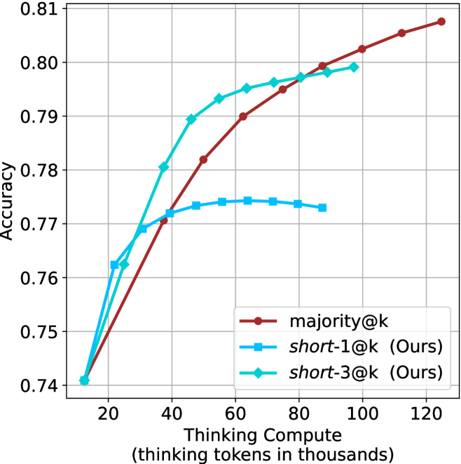
### Visual Description
## Line Chart: Accuracy vs. Thinking Compute
### Overview
This chart illustrates the relationship between "Thinking Compute" (measured in thousands of thinking tokens) and model "Accuracy." It compares three distinct methods: a baseline method labeled `majority@k` and two methods labeled `short-1@k (Ours)` and `short-3@k (Ours)`. The chart demonstrates how accuracy scales as additional computational resources are allocated to the thinking process.
### Components/Axes
* **Y-Axis:** Labeled "Accuracy." The scale ranges from 0.74 to 0.81, with major grid lines at 0.01 intervals.
* **X-Axis:** Labeled "Thinking Compute (thinking tokens in thousands)." The scale ranges from 20 to 120, with major grid lines at 20-unit intervals. Data points begin at approximately 12k tokens.
* **Legend (Bottom-Right):**
* **Dark Red (Circle markers):** `majority@k`
* **Blue (Square markers):** `short-1@k (Ours)`
* **Cyan/Teal (Diamond markers):** `short-3@k (Ours)`
### Detailed Analysis
The chart displays three distinct data series, all originating from a common starting point at approximately 12k tokens and 0.741 accuracy.
**1. `majority@k` (Dark Red, Circle markers)**
* **Trend:** This series exhibits a consistent, near-linear upward slope throughout the entire range. It does not show signs of plateauing within the visible chart area.
* **Data Points (Approximate):**
* ~38k tokens: ~0.770 accuracy
* ~50k tokens: ~0.782 accuracy
* ~65k tokens: ~0.790 accuracy
* ~80k tokens: ~0.795 accuracy
* ~100k tokens: ~0.802 accuracy
* ~125k tokens: ~0.808 accuracy
**2. `short-1@k (Ours)` (Blue, Square markers)**
* **Trend:** This series shows a rapid initial increase in accuracy, followed by a distinct plateau starting around 45k tokens. It reaches a peak and then exhibits a slight decline or stagnation.
* **Data Points (Approximate):**
* ~22k tokens: ~0.762 accuracy
* ~32k tokens: ~0.769 accuracy
* ~45k tokens: ~0.772 accuracy
* ~65k tokens: ~0.774 accuracy (Peak)
* ~88k tokens: ~0.773 accuracy
**3. `short-3@k (Ours)` (Cyan/Teal, Diamond markers)**
* **Trend:** This series shows the steepest initial growth, outperforming the other two methods in the 20k–60k token range. It begins to plateau after 60k tokens, eventually trailing off as it approaches 100k tokens.
* **Data Points (Approximate):**
* ~25k tokens: ~0.762 accuracy
* ~38k tokens: ~0.780 accuracy
* ~55k tokens: ~0.793 accuracy
* ~75k tokens: ~0.796 accuracy
* ~98k tokens: ~0.799 accuracy
### Key Observations
* **Efficiency vs. Scaling:** The "Ours" methods (`short-1@k` and `short-3@k`) are highly efficient at low compute levels, providing rapid accuracy gains compared to the baseline. However, they suffer from diminishing returns (plateauing) much earlier than the `majority@k` method.
* **Baseline Superiority:** The `majority@k` method is the most scalable. While it starts slower than the "Ours" methods, it overtakes `short-1@k` around 35k tokens and continues to climb, eventually becoming the highest-performing method as compute increases beyond 90k tokens.
* **Performance Gap:** There is a clear hierarchy in peak performance: `majority@k` > `short-3@k` > `short-1@k`.
### Interpretation
The data suggests a classic trade-off between "quick wins" and "long-term scaling." The "Ours" methods appear to be optimized for scenarios where computational budget is constrained, as they reach a respectable accuracy level with significantly fewer tokens than the baseline.
However, the `majority@k` method demonstrates better asymptotic behavior. If the application allows for high compute usage (e.g., >100k tokens), the `majority@k` approach is objectively superior. The `short-3@k` method serves as a strong middle-ground, offering significantly better performance than `short-1@k` while maintaining a steeper initial learning curve than the baseline. This implies that the "Ours" methods might be using a heuristic or strategy that is effective for simple reasoning but lacks the depth or robustness required for the highest levels of accuracy achieved by the `majority@k` baseline.
</details>
(d) R1-670B
Figure 7: GPQA-D - thinking compute comparison.
<details>
<summary>x26.png Details</summary>
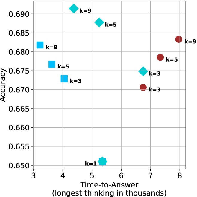
### Visual Description
## Scatter Plot: Accuracy vs. Time-to-Answer
### Overview
This image is a scatter plot visualizing the relationship between "Accuracy" (y-axis) and "Time-to-Answer (longest thinking in thousands)" (x-axis). The data points are categorized by shape and color, with labels indicating specific "k" values (1, 3, 5, 9), likely representing a hyperparameter or configuration setting for a machine learning model.
### Components/Axes
* **Y-Axis:** Labeled "Accuracy". The scale ranges from 0.650 to 0.690, with major grid lines at 0.005 intervals.
* **X-Axis:** Labeled "Time-to-Answer (longest thinking in thousands)". The scale ranges from 3 to 8, with major grid lines at 1.0 intervals.
* **Data Markers:**
* **Cyan Squares:** Located on the left side of the chart.
* **Cyan Diamonds:** Located in the upper-middle and middle-right sections.
* **Maroon Circles:** Located on the right side of the chart.
* **Cyan Star/Asterisk:** Located at the bottom-middle.
### Detailed Analysis
The following coordinates are approximate based on the visual grid:
| Marker Type | Label | X-Axis (Time) | Y-Axis (Accuracy) |
| :--- | :--- | :--- | :--- |
| **Cyan Square** | k=9 | ~3.2 | ~0.682 |
| **Cyan Square** | k=5 | ~3.6 | ~0.677 |
| **Cyan Square** | k=3 | ~3.8 | ~0.673 |
| **Cyan Diamond** | k=9 | ~4.2 | ~0.691 |
| **Cyan Diamond** | k=5 | ~4.8 | ~0.688 |
| **Cyan Diamond** | k=3 | ~6.7 | ~0.675 |
| **Cyan Star** | k=1 | ~5.4 | ~0.651 |
| **Maroon Circle** | k=3 | ~6.7 | ~0.671 |
| **Maroon Circle** | k=5 | ~7.3 | ~0.679 |
| **Maroon Circle** | k=9 | ~8.0 | ~0.683 |
**Visual Trends:**
* **Cyan Squares:** Show a negative correlation between time and accuracy; as k increases (3 to 9), the time-to-answer decreases while accuracy increases.
* **Cyan Diamonds:** Show a negative correlation between time and accuracy; as k increases (3 to 9), time-to-answer decreases while accuracy increases.
* **Maroon Circles:** Show a positive correlation between time and accuracy; as k increases (3 to 9), both time-to-answer and accuracy increase.
### Key Observations
* **Performance Outlier:** The "k=1" data point (Cyan Star) is a significant outlier, possessing the lowest accuracy (~0.651) and a moderate time-to-answer (~5.4).
* **Clustering:** The data is clearly segmented into three distinct groups based on marker type/color, suggesting these represent different model architectures, prompting strategies, or decoding methods.
* **Efficiency:** The Cyan Squares and Diamonds represent more efficient configurations (lower time-to-answer) compared to the Maroon Circles, which require significantly more time to achieve similar accuracy levels.
* **Overlap:** There is a vertical alignment at X ≈ 6.7, where a Cyan Diamond (k=3) and a Maroon Circle (k=3) exist. The Cyan Diamond achieves higher accuracy (~0.675) than the Maroon Circle (~0.671) at the exact same time-to-answer.
### Interpretation
This chart likely illustrates the performance trade-offs of an AI model (such as an LLM) under different "thinking" or "reasoning" configurations.
The "k" values likely represent a parameter like "top-k" sampling, number of reasoning steps, or a similar constraint. The distinct clusters suggest that the underlying model architecture or prompting method significantly alters the efficiency frontier.
The **Cyan group** (Squares and Diamonds) appears to be the most desirable, as they achieve higher accuracy with lower time-to-answer. Specifically, the Cyan Diamond at k=9 represents the highest accuracy on the chart (~0.691) while maintaining a relatively low time-to-answer (~4.2). Conversely, the **Maroon group** represents a "slower" regime where increasing the "k" parameter yields diminishing returns in accuracy at the cost of significantly higher latency. The k=1 configuration is clearly suboptimal, suggesting that a minimum amount of "thinking" (k > 1) is required for baseline performance.
</details>
(a) LN-Super- $49$ B
<details>
<summary>x27.png Details</summary>
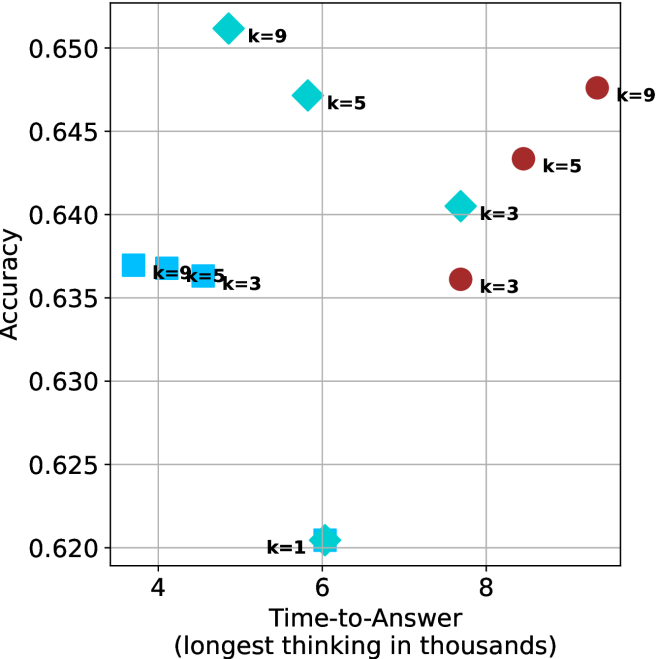
### Visual Description
## Scatter Plot: Accuracy vs. Time-to-Answer
### Overview
This image is a scatter plot visualizing the performance of different configurations (likely machine learning models or algorithms) based on two metrics: "Accuracy" (y-axis) and "Time-to-Answer" (x-axis). The data points are categorized by shape and color, with each point labeled with a "k" value (k=1, 3, 5, or 9), representing a specific parameter setting.
### Components/Axes
* **Y-Axis:** "Accuracy". The scale ranges from 0.620 to 0.650, with major grid lines at 0.005 intervals.
* **X-Axis:** "Time-to-Answer (longest thinking in thousands)". The scale ranges from 4 to 8+, with major grid lines at intervals of 2.
* **Data Series (Categorized by Shape/Color):**
* **Cyan Squares:** Located in the left-middle region.
* **Cyan Diamonds:** Located in the upper-middle region.
* **Cyan Star/Asterisk:** Located at the bottom-center.
* **Maroon Circles:** Located in the right region.
### Detailed Analysis
#### 1. Cyan Squares (Left Cluster)
* **Trend:** As the "k" value increases from 3 to 9, the Time-to-Answer decreases slightly, while Accuracy remains relatively stable.
* **Data Points:**
* **k=3:** x ≈ 4.6, y ≈ 0.636
* **k=5:** x ≈ 4.2, y ≈ 0.637
* **k=9:** x ≈ 3.8, y ≈ 0.637
#### 2. Cyan Diamonds (Upper-Middle Cluster)
* **Trend:** This group shows a strong inverse relationship between time and accuracy. As "k" increases, the Time-to-Answer decreases significantly, while Accuracy increases.
* **Data Points:**
* **k=3:** x ≈ 7.7, y ≈ 0.640
* **k=5:** x ≈ 5.6, y ≈ 0.647
* **k=9:** x ≈ 5.2, y ≈ 0.651
#### 3. Cyan Star (Bottom-Center)
* **Data Point:**
* **k=1:** x ≈ 6.0, y ≈ 0.620
* **Observation:** This represents the lowest accuracy and a moderate time-to-answer.
#### 4. Maroon Circles (Right Cluster)
* **Trend:** This group shows a positive correlation between time and accuracy. As "k" increases, both the Time-to-Answer and Accuracy increase.
* **Data Points:**
* **k=3:** x ≈ 7.7, y ≈ 0.636
* **k=5:** x ≈ 8.5, y ≈ 0.643
* **k=9:** x ≈ 9.3, y ≈ 0.647
### Key Observations
* **Efficiency Leader:** The **Cyan Diamonds** are the most efficient configuration. Specifically, the **k=9** diamond achieves the highest accuracy (≈0.651) while maintaining a relatively low time-to-answer (≈5.2).
* **Performance Trade-off:** The **Maroon Circles** demonstrate a traditional trade-off where higher accuracy requires more computational time.
* **Parameter Sensitivity:** The "k" parameter affects the four groups differently. In the Cyan Diamond group, increasing "k" is highly beneficial (faster and more accurate). In the Maroon Circle group, increasing "k" is costly (slower, though more accurate). In the Cyan Square group, "k" has minimal impact on accuracy but reduces time.
### Interpretation
This chart likely depicts the performance of an LLM (Large Language Model) or a similar reasoning system using different decoding strategies or search parameters (where "k" might represent beam width, top-k sampling, or a similar hyperparameter).
* **The "Cyan Diamond" strategy** appears to be the most optimized, suggesting that for this specific model/method, increasing the "k" parameter allows the model to find better answers faster, perhaps by pruning search paths more effectively.
* **The "Maroon Circle" strategy** represents a more standard computational behavior where more "thinking" (time) yields better results, but with diminishing returns on efficiency.
* **The "Cyan Square" strategy** suggests a configuration that is computationally cheap but hits a performance ceiling, where changing "k" does not yield significant accuracy gains.
* **The "Cyan Star" (k=1)** acts as a baseline or control, showing that a minimal "k" value results in the lowest performance, validating that increasing "k" is generally beneficial across the other groups.
</details>
(b) R $1$ - $32$ B
<details>
<summary>x28.png Details</summary>
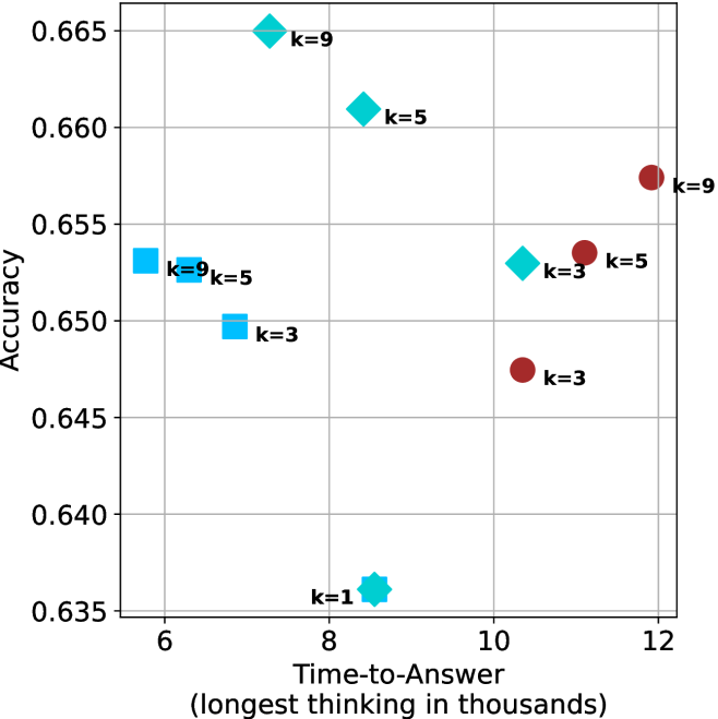
### Visual Description
## Scatter Plot: Accuracy vs. Time-to-Answer
### Overview
This image is a scatter plot visualizing the relationship between "Accuracy" (y-axis) and "Time-to-Answer" (x-axis). The plot displays data points categorized by shape and color, with specific "k" values (likely representing a parameter such as k-nearest neighbors, chain-of-thought steps, or similar inference parameters) labeled next to each point.
### Components/Axes
* **Y-Axis (Accuracy):** Ranges from 0.635 to 0.665, with grid lines at 0.005 intervals.
* **X-Axis (Time-to-Answer):** Labeled "Time-to-Answer (longest thinking in thousands)". Ranges from 6 to 12, with grid lines at 1.0 intervals.
* **Data Series:**
* **Light Blue (Cyan) Points:** Includes Squares, Diamonds, and a Star shape.
* **Dark Red (Maroon) Points:** Includes Circles.
* **Labels:** Each data point (or cluster) is annotated with a "k=" value, indicating the parameter setting for that specific data point.
### Detailed Analysis
The following data points are extracted based on their approximate coordinates (x, y) and associated labels.
| Shape | Color | Approx. X (Time) | Approx. Y (Accuracy) | Label |
| :--- | :--- | :--- | :--- | :--- |
| Diamond | Light Blue | 7.2 | 0.665 | k=9 |
| Diamond | Light Blue | 8.5 | 0.661 | k=5 |
| Star | Light Blue | 8.5 | 0.636 | k=1 |
| Square | Light Blue | 6.5 | 0.653 | k=9 |
| Square | Light Blue | 6.0 | 0.653 | Unlabeled |
| Square | Light Blue | 7.0 | 0.650 | k=3 |
| Diamond | Light Blue | 10.3 | 0.653 | k=3 |
| Circle | Dark Red | 10.3 | 0.648 | k=3 |
| Circle | Dark Red | 11.2 | 0.654 | k=5 |
| Circle | Dark Red | 11.9 | 0.658 | k=9 |
### Key Observations
* **Clustering:** The data is split into two distinct groups based on "Time-to-Answer":
* **Low-Time Group (6.0–8.5):** Primarily Light Blue shapes (Squares, Diamonds, Star). This group shows higher variance in accuracy, ranging from the lowest point (k=1 at 0.636) to the highest point (k=9 at 0.665).
* **High-Time Group (10.3–11.9):** Primarily Dark Red circles, with one Light Blue diamond outlier.
* **Trend in Dark Red Group:** There is a clear positive correlation between the "k" value and accuracy within the Dark Red circle group. As "k" increases from 3 to 5 to 9, the accuracy increases (0.648 -> 0.654 -> 0.658) and the time-to-answer increases.
* **Outliers:** The Light Blue Star (k=1) at (8.5, 0.636) is the significant outlier, representing the lowest accuracy on the entire chart.
### Interpretation
The data suggests a trade-off between computational time and model accuracy, likely comparing two different inference methods or model architectures.
1. **Method Efficiency:** The Light Blue group (Squares/Diamonds) achieves high accuracy (up to 0.665) at significantly lower time costs (around 7-8k) compared to the Dark Red group. However, this method is sensitive to the "k" parameter, as evidenced by the sharp drop in accuracy for the k=1 star.
2. **Parameter Scaling:** The Dark Red group demonstrates a predictable, linear-like scaling behavior: increasing the "k" parameter consistently improves accuracy but incurs a linear penalty in "Time-to-Answer."
3. **Strategic Choice:** If the goal is maximum accuracy, the Light Blue Diamond (k=9) at ~7.2k time is the optimal choice, as it outperforms the highest Dark Red point (k=9 at ~11.9k) while requiring significantly less time. The Dark Red method appears to be less efficient in this specific accuracy range.
</details>
(c) QwQ-32B
<details>
<summary>x29.png Details</summary>
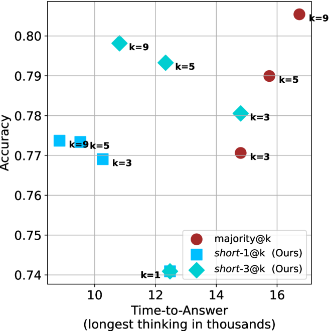
### Visual Description
## Scatter Plot: Accuracy vs. Time-to-Answer
### Overview
This image is a scatter plot comparing the performance of three different methods—`majority@k`, `short-1@k` (Ours), and `short-3@k` (Ours)—based on their "Accuracy" (y-axis) and "Time-to-Answer" (x-axis). The x-axis represents the "longest thinking in thousands." The plot demonstrates a trade-off between computational time and model accuracy across different values of *k*.
### Components/Axes
* **Y-Axis:** Labeled "Accuracy." The scale ranges from 0.74 to 0.80, with grid lines at 0.01 intervals.
* **X-Axis:** Labeled "Time-to-Answer (longest thinking in thousands)." The scale ranges from 10 to 16, with grid lines at 2-unit intervals.
* **Legend:** Located in the bottom-right quadrant.
* **Dark Red Circle:** `majority@k`
* **Light Blue Square:** `short-1@k (Ours)`
* **Teal Diamond:** `short-3@k (Ours)`
* **Data Markers:** The plot uses specific shapes (circles, squares, diamonds, and one star) to represent data points, each labeled with its corresponding *k* value.
### Detailed Analysis
The following data points are approximate based on visual estimation from the grid:
**1. `majority@k` (Dark Red Circles)**
* *Trend:* Positive correlation. As *k* increases, both time and accuracy increase significantly.
* *k=3:* (x ≈ 14.8, y ≈ 0.771)
* *k=5:* (x ≈ 15.8, y ≈ 0.790)
* *k=9:* (x ≈ 16.8, y ≈ 0.806)
**2. `short-3@k` (Teal Diamonds)**
* *Trend:* Negative correlation between time and accuracy. As *k* increases, the time-to-answer decreases while accuracy increases, suggesting higher efficiency.
* *k=3:* (x ≈ 14.8, y ≈ 0.781)
* *k=5:* (x ≈ 12.0, y ≈ 0.793)
* *k=9:* (x ≈ 11.0, y ≈ 0.798)
**3. `short-1@k` (Light Blue Squares)**
* *Trend:* Relatively flat accuracy with a slight increase in time as *k* increases.
* *k=3:* (x ≈ 10.3, y ≈ 0.769)
* *k=5:* (x ≈ 9.8, y ≈ 0.774)
* *k=9:* (x ≈ 9.5, y ≈ 0.774)
**4. Unlabeled Anomaly (Teal Star)**
* *Marker:* A teal star-shaped marker is located at (x ≈ 12.5, y ≈ 0.741), labeled "k=1." This marker is not explicitly defined in the legend, though its color matches the `short-3@k` series.
### Key Observations
* **Efficiency Leader:** The `short-3@k` series demonstrates the most desirable performance characteristics, achieving high accuracy (comparable to `majority@k`) while requiring significantly less time as *k* increases.
* **Performance Ceiling:** `majority@k` achieves the highest absolute accuracy (at k=9), but it is also the most computationally expensive method.
* **Efficiency Floor:** `short-1@k` is the fastest method (lowest time-to-answer) but consistently yields lower accuracy than the other two methods.
* **The "k=1" Outlier:** The star-shaped marker at k=1 represents the lowest accuracy point on the chart, suggesting that a very low *k* value is suboptimal for this specific task.
### Interpretation
The data suggests that the "Ours" methods (`short-1` and `short-3`) are optimized for computational efficiency compared to the `majority@k` baseline.
Specifically, `short-3@k` appears to be the superior configuration. It exhibits an inverse relationship between time and accuracy—as *k* increases, it becomes both faster and more accurate. This is a highly efficient scaling behavior. In contrast, `majority@k` forces a trade-off where higher accuracy is only achievable by incurring significantly higher time costs. The `short-1@k` method is the fastest but hits a performance plateau, suggesting it may not be complex enough to capture the necessary information for higher accuracy.
</details>
(d) R1-670B
Figure 8: GPQA-D - time-to-answer comparison.
Table 5: Average thinking tokens for correct (C), incorrect (IC) and all (A) answers, per split by difficulty for GPQA-D. The numbers are in thousands of tokens.
| Model | Easy | Medium | Hard |
| --- | --- | --- | --- |
| C/IC/A | C/IC/A | C/IC/A | |
| LN-Super-49B | $2.5/\text{--}/2.5$ | $\phantom{0}6.2/\phantom{0}7.8/\phantom{0}6.6$ | $\phantom{0}7.1/\phantom{0}6.9/\phantom{0}7.0$ |
| R1-32B | $3.4/\text{--}/3.4$ | $\phantom{0}6.4/\phantom{0}7.9/\phantom{0}6.8$ | $\phantom{0}8.3/\phantom{0}7.8/\phantom{0}7.9$ |
| QwQ-32B | $5.3/\text{--}/5.3$ | $\phantom{0}8.9/13.0/\phantom{0}9.7$ | $11.1/10.6/10.6$ |
| R1-670B | $8.1/\text{--}/8.1$ | $10.9/16.0/11.4$ | $17.9/17.9/17.9$ |
Table 6: Average number of backtracks, and their average length for correct (C), incorrect (IC) and all (A) answers in GPQA-D.
| Model | # Backtracks | Backtrack Len. |
| --- | --- | --- |
| C/IC/A | C/IC/A | |
| LN-Super-49B | $\phantom{0}89/107/\phantom{0}94$ | $72/56/63$ |
| R1-32B | $\phantom{0}92/173/120$ | $78/48/60$ |
| QwQ-32B | $152/241/178$ | $52/41/46$ |
| R1-670B | $122/237/156$ | $83/60/69$ |
## Appendix B Per benchmark results
We present the per-benchmark results for each of the criteria presented in Section ˜ 4.2. The sample-size ( $k$ ) results are presented in Figures ˜ 9, 10 and 11. The thinking compute comparison results are presented in Figures ˜ 12, 13 and 14. The time-to-answer results per benchamrk are presented in Figures ˜ 15, 16 and 17.
<details>
<summary>x30.png Details</summary>
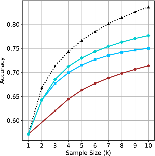
### Visual Description
## Line Chart: Accuracy vs. Sample Size (k)
### Overview
This image displays a line chart illustrating the relationship between "Accuracy" (Y-axis) and "Sample Size (k)" (X-axis). The chart tracks four distinct data series, each represented by a different color and marker style. All four series originate from a single point at the minimum sample size and diverge as the sample size increases.
### Components/Axes
* **X-Axis:** Labeled "Sample Size (k)". The scale is linear, ranging from 1 to 10, with integer markers.
* **Y-Axis:** Labeled "Accuracy". The scale ranges from 0.60 to 0.80, with grid lines indicating increments of 0.05.
* **Data Series (Legend is absent):**
* **Series 1 (Top):** Black dotted line with triangle markers.
* **Series 2 (Upper-Middle):** Teal/Cyan solid line with diamond markers.
* **Series 3 (Lower-Middle):** Light blue solid line with square markers.
* **Series 4 (Bottom):** Dark red/brown solid line with circle markers.
### Detailed Analysis
**Trend Verification:** All four data series exhibit a positive, logarithmic-style trend. The rate of accuracy increase is steepest between $k=1$ and $k=3$, after which the slope gradually flattens, indicating diminishing returns as the sample size increases.
**Data Point Extraction (Approximate Values):**
| Sample Size (k) | Black (Triangle) | Teal (Diamond) | Light Blue (Square) | Red (Circle) |
| :--- | :--- | :--- | :--- | :--- |
| **1** | ~0.57 | ~0.57 | ~0.57 | ~0.57 |
| **2** | ~0.67 | ~0.64 | ~0.64 | ~0.60 |
| **3** | ~0.71 | ~0.69 | ~0.68 | ~0.62 |
| **4** | ~0.74 | ~0.71 | ~0.70 | ~0.64 |
| **5** | ~0.77 | ~0.73 | ~0.72 | ~0.66 |
| **6** | ~0.79 | ~0.74 | ~0.73 | ~0.68 |
| **7** | ~0.80 | ~0.75 | ~0.74 | ~0.69 |
| **8** | ~0.81 | ~0.76 | ~0.74 | ~0.70 |
| **9** | ~0.82 | ~0.77 | ~0.75 | ~0.71 |
| **10** | ~0.84 | ~0.78 | ~0.75 | ~0.71 |
### Key Observations
* **Convergence at Origin:** All four models/methods perform identically at $k=1$ (Accuracy $\approx$ 0.57).
* **Divergence:** As the sample size increases, the performance gap between the models widens significantly.
* **Performance Hierarchy:** The Black (Triangle) series is the most accurate throughout the range $k > 1$. The Red (Circle) series is consistently the least accurate.
* **Diminishing Returns:** The "elbow" of the curves occurs around $k=3$ or $k=4$. Beyond this point, adding more samples yields smaller incremental gains in accuracy for all series.
### Interpretation
This chart likely represents a performance comparison of four different machine learning models or algorithms evaluated against increasing amounts of training data (or "shots" in a few-shot learning context).
* **Model Efficiency:** The Black (Triangle) model is the most efficient, scaling best with increased data. The Red (Circle) model appears to be the least robust, struggling to capitalize on the additional data provided.
* **Missing Context:** The absence of a legend is a critical omission. Without it, we cannot determine if these lines represent different algorithms, different hyperparameter settings, or different data preprocessing techniques.
* **Saturation:** The flattening of the curves suggests that all models are approaching a performance ceiling. For the Red (Circle) model, this ceiling appears to be reached or approached much earlier than for the Black (Triangle) model.
* **Strategic Insight:** If this were a resource allocation problem, one might conclude that for the Red model, increasing the sample size beyond $k=6$ or $k=7$ provides negligible benefit, whereas the Black model continues to show meaningful improvement even at $k=10$.
</details>
(a) LN-Super- $49$ B
<details>
<summary>x31.png Details</summary>
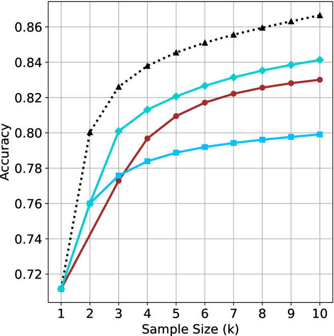
### Visual Description
## Line Chart: Accuracy vs. Sample Size (k)
### Overview
This image displays a line chart illustrating the relationship between "Sample Size (k)" and "Accuracy." The chart features four distinct data series, each represented by a unique color and marker shape. All four series exhibit a positive correlation, where accuracy increases as the sample size increases. Notably, the chart lacks a legend, making it impossible to identify the specific models or datasets associated with each line.
### Components/Axes
* **X-Axis:** Labeled "Sample Size (k)". The scale is linear, ranging from 1 to 10, with integer markers at each unit.
* **Y-Axis:** Labeled "Accuracy". The scale ranges from 0.72 to 0.86, with grid lines at intervals of 0.02.
* **Data Series:**
* **Black Dotted Line (Triangle markers):** The highest-performing series.
* **Teal/Cyan Line (Diamond markers):** The second-highest-performing series.
* **Dark Red/Maroon Line (Circle markers):** The third-highest-performing series.
* **Light Blue/Sky Blue Line (Square markers):** The lowest-performing series at higher sample sizes.
* **Grid:** A standard Cartesian grid is overlaid, with vertical lines at each integer of the x-axis and horizontal lines at each 0.02 increment of the y-axis.
### Detailed Analysis
All four data series originate from a single point at **k=1**, with an accuracy of approximately **0.71**.
#### 1. Black Dotted Line (Triangles)
* **Trend:** This line shows the steepest initial growth and maintains the highest accuracy throughout the range.
* **Values:**
* k=1: ~0.71
* k=2: 0.80
* k=3: ~0.825
* k=4: ~0.838
* k=5: ~0.845
* k=6: ~0.85
* k=7: ~0.855
* k=8: ~0.86
* k=9: ~0.863
* k=10: ~0.865
#### 2. Teal/Cyan Line (Diamonds)
* **Trend:** This line shows strong growth, particularly between k=1 and k=3, then continues to rise steadily but at a slower rate than the black line.
* **Values:**
* k=1: ~0.71
* k=2: 0.76
* k=3: 0.80
* k=4: ~0.813
* k=5: 0.82
* k=6: ~0.827
* k=7: ~0.832
* k=8: ~0.835
* k=9: ~0.838
* k=10: ~0.841
#### 3. Dark Red/Maroon Line (Circles)
* **Trend:** This line shows a more gradual, consistent upward slope compared to the others. It starts as the lowest performer (tied with the light blue line) but overtakes the light blue line between k=2 and k=3.
* **Values:**
* k=1: ~0.71
* k=2: ~0.735
* k=3: ~0.773
* k=4: ~0.797
* k=5: ~0.81
* k=6: ~0.817
* k=7: ~0.822
* k=8: ~0.825
* k=9: ~0.828
* k=10: ~0.83
#### 4. Light Blue/Sky Blue Line (Squares)
* **Trend:** This line shows rapid initial growth (matching the teal line at k=2) but experiences significant diminishing returns, flattening out considerably after k=3.
* **Values:**
* k=1: ~0.71
* k=2: 0.76
* k=3: ~0.776
* k=4: ~0.784
* k=5: ~0.789
* k=6: ~0.792
* k=7: ~0.794
* k=8: ~0.796
* k=9: ~0.798
* k=10: ~0.799
### Key Observations
* **Convergence:** All models perform identically at the smallest sample size (k=1).
* **Divergence:** The models diverge significantly as the sample size increases.
* **Diminishing Returns:** The Light Blue (Square) line exhibits the most severe diminishing returns, effectively plateauing near 0.80 after k=5.
* **Cross-over:** The Teal (Diamond) and Light Blue (Square) lines share the same accuracy at k=2 (0.76), after which the Teal line continues to climb while the Light Blue line flattens.
### Interpretation
This chart is characteristic of a machine learning performance evaluation, likely comparing different algorithms or model architectures in a "few-shot" or "data-scaling" context.
* **The Black Dotted Model** is the most robust, as it benefits the most from additional data, suggesting it has the highest capacity to learn from larger samples.
* **The Light Blue Model** appears to be "data-starved" or limited by its architecture; it gains initial performance quickly but fails to leverage additional data beyond k=3 effectively.
* **The Maroon Model** represents a balanced approach, showing steady, predictable improvement without the sharp plateauing seen in the light blue model, though it lacks the high-end performance of the black or teal models.
* **The Teal Model** represents a middle ground, performing well but ultimately falling short of the black model's ceiling.
</details>
(b) R $1$ - $32$ B
<details>
<summary>x32.png Details</summary>
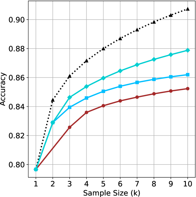
### Visual Description
## Line Chart: Accuracy vs. Sample Size (k)
### Overview
This image is a line chart illustrating the relationship between "Sample Size (k)" and "Accuracy" across four distinct data series. All four series originate from a single point at the minimum sample size (k=1) and diverge as the sample size increases to 10. The chart demonstrates a positive correlation between sample size and accuracy, characterized by a curve of diminishing returns.
**Note:** There is no legend provided in the image to identify what each specific line represents (e.g., different models, algorithms, or datasets). The lines are identified below by their visual characteristics (color and marker shape).
### Components/Axes
* **X-Axis:** Labeled "Sample Size (k)". The scale is linear, ranging from 1 to 10 in integer increments.
* **Y-Axis:** Labeled "Accuracy". The scale ranges from 0.80 to 0.90, with grid lines provided at intervals of 0.02 (0.80, 0.82, 0.84, 0.86, 0.88, 0.90).
* **Data Series (4 total):**
1. **Black Dotted Line:** Marked with triangles.
2. **Teal Solid Line:** Marked with diamonds.
3. **Light Blue Solid Line:** Marked with squares.
4. **Dark Red Solid Line:** Marked with circles.
### Detailed Analysis
All four data series exhibit an upward trend, with the steepest rate of increase occurring between k=1 and k=3. Beyond k=4, the rate of improvement slows significantly for all series.
**Data Point Estimates (Approximate):**
| Sample Size (k) | Black (Dotted/Tri) | Teal (Solid/Dia) | Light Blue (Solid/Sq) | Dark Red (Solid/Cir) |
| :--- | :--- | :--- | :--- | :--- |
| **1** | ~0.797 | ~0.797 | ~0.797 | ~0.797 |
| **2** | ~0.844 | ~0.829 | ~0.829 | ~0.812 |
| **3** | ~0.861 | ~0.846 | ~0.840 | ~0.826 |
| **4** | ~0.872 | ~0.854 | ~0.846 | ~0.836 |
| **5** | ~0.880 | ~0.860 | ~0.851 | ~0.841 |
| **6** | ~0.887 | ~0.865 | ~0.854 | ~0.844 |
| **7** | ~0.893 | ~0.869 | ~0.857 | ~0.847 |
| **8** | ~0.898 | ~0.873 | ~0.859 | ~0.849 |
| **9** | ~0.903 | ~0.876 | ~0.861 | ~0.851 |
| **10** | ~0.908 | ~0.879 | ~0.862 | ~0.853 |
### Key Observations
* **Convergence:** All four series start at the exact same accuracy value (~0.797) at k=1.
* **Performance Hierarchy:** The Black Dotted line is the top-performing series across the entire range (k > 1). The Teal line is the second-best, followed by the Light Blue line, with the Dark Red line performing the worst.
* **Divergence:** The gap between the top-performing series (Black) and the others increases significantly as the sample size grows. At k=10, the Black line is at ~0.908, while the Dark Red line is at ~0.853, a difference of approximately 0.055.
* **Clustering:** The three solid-line series (Teal, Light Blue, Dark Red) are clustered closer to each other than they are to the Black Dotted line, suggesting the Black Dotted configuration may be fundamentally different or optimized compared to the others.
### Interpretation
This chart is characteristic of performance evaluation in machine learning, likely representing the accuracy of a model (or ensemble) as the number of samples (k) increases.
* **Diminishing Returns:** The "elbow" shape of the curves indicates that increasing the sample size provides the most significant accuracy gains at lower values (k=1 to k=3). After k=5, the marginal utility of adding more samples decreases, suggesting that the computational cost of increasing k further might outweigh the minimal accuracy gains.
* **Baseline Performance:** The convergence at k=1 suggests that with a single sample, all four configurations are effectively performing the same task or using the same baseline logic, resulting in identical accuracy.
* **Model Superiority:** The Black Dotted line represents a configuration that scales much better with increased sample size than the other three. If this were a k-Nearest Neighbors algorithm, the Black line might represent a more robust distance metric or a different weighting scheme. The Dark Red line, being the lowest, suggests the least effective configuration for scaling with sample size.
</details>
(c) QwQ-32B
<details>
<summary>x33.png Details</summary>
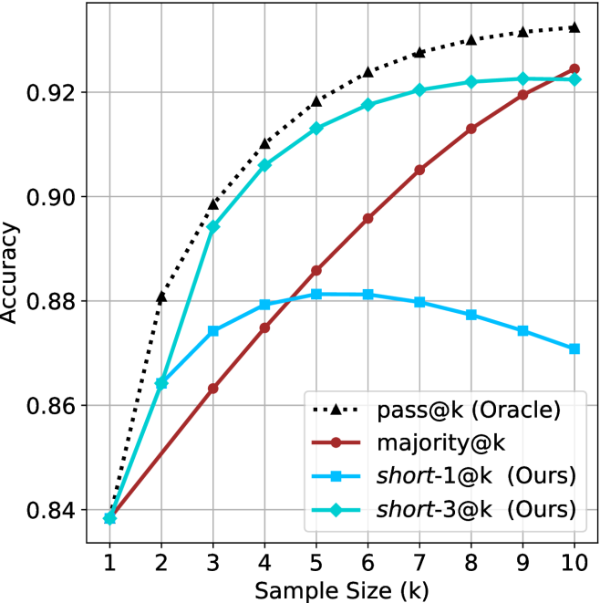
### Visual Description
## Line Chart: Accuracy vs. Sample Size (k)
### Overview
This image is a line chart illustrating the performance (Accuracy) of four different evaluation methods across varying sample sizes (k), ranging from 1 to 10. The chart compares a theoretical upper bound ("Oracle") against three practical methods: `majority@k`, `short-1@k`, and `short-3@k`.
### Components/Axes
* **X-axis:** Labeled "Sample Size (k)". The scale is linear, marked from 1 to 10 in increments of 1.
* **Y-axis:** Labeled "Accuracy". The scale ranges from 0.84 to 0.92+, with major grid lines at 0.02 intervals (0.84, 0.86, 0.88, 0.90, 0.92).
* **Legend:** Positioned in the bottom-right quadrant of the chart area.
* **`pass@k (Oracle)`**: Black dotted line with triangle markers.
* **`majority@k`**: Dark red solid line with circle markers.
* **`short-1@k (Ours)`**: Light blue solid line with square markers.
* **`short-3@k (Ours)`**: Cyan/Teal solid line with diamond markers.
### Detailed Analysis
The chart displays four distinct data series. All series originate from a common starting point at k=1, with an accuracy of approximately 0.838.
1. **`pass@k (Oracle)` (Black Dotted Line, Triangles):**
* **Trend:** Shows a steep, monotonic increase that begins to plateau as k increases. It consistently maintains the highest accuracy across all sample sizes.
* **Data Points:**
* k=1: ~0.838
* k=2: ~0.880
* k=5: ~0.918
* k=10: ~0.933
2. **`majority@k` (Dark Red Solid Line, Circles):**
* **Trend:** Shows a steady, nearly linear upward trajectory. It starts as the lowest performer but demonstrates the most consistent growth, eventually surpassing both "Ours" methods.
* **Data Points:**
* k=1: ~0.838
* k=5: ~0.885
* k=10: ~0.925
3. **`short-3@k (Ours)` (Cyan/Teal Solid Line, Diamonds):**
* **Trend:** Shows a rapid increase initially, similar to the Oracle, but begins to plateau significantly after k=6.
* **Data Points:**
* k=1: ~0.838
* k=2: ~0.865
* k=5: ~0.913
* k=10: ~0.923
4. **`short-1@k (Ours)` (Light Blue Solid Line, Squares):**
* **Trend:** Shows an initial increase, peaking at k=5, followed by a distinct downward trend (performance degradation) as k increases further.
* **Data Points:**
* k=1: ~0.838
* k=2: ~0.865
* k=5: ~0.881 (Peak)
* k=10: ~0.870
### Key Observations
* **Performance Crossover:** The `majority@k` method eventually outperforms both `short-1@k` and `short-3@k` as the sample size increases.
* **The "Short" Method Anomaly:** The `short-1@k` method exhibits a clear performance drop-off after k=5. This suggests that for this specific method, increasing the sample size beyond 5 introduces noise or overfitting that negatively impacts accuracy.
* **Oracle Gap:** The gap between the `pass@k (Oracle)` and the practical methods is widest at k=2 and narrows slightly for `majority@k` at k=10, though the Oracle remains superior throughout.
### Interpretation
This chart likely represents an evaluation of code generation models or similar probabilistic systems where "k" represents the number of samples generated.
* **`pass@k (Oracle)`** represents the theoretical ceiling—if the system generates *k* samples, what is the probability that at least one is correct?
* **`majority@k`** represents a voting mechanism. Its steady, linear growth suggests it is a robust method that benefits reliably from larger sample sizes.
* **`short-1@k` and `short-3@k`** appear to be heuristic-based filtering methods. The fact that `short-1@k` peaks and then declines is a critical finding; it implies that the filtering criteria used in this method become counter-productive when too many samples are provided, likely filtering out correct answers or favoring incorrect ones as the sample pool grows.
* **Strategic Takeaway:** If the goal is to maximize accuracy with a small sample size (k < 4), the "short" methods are superior. However, if the system allows for larger sample sizes (k > 6), `majority@k` is the more reliable and performant choice.
</details>
(d) R $1$ - $670$ B
Figure 9: AIME 2024 - sample size ( $k$ ) comparison.
<details>
<summary>x34.png Details</summary>
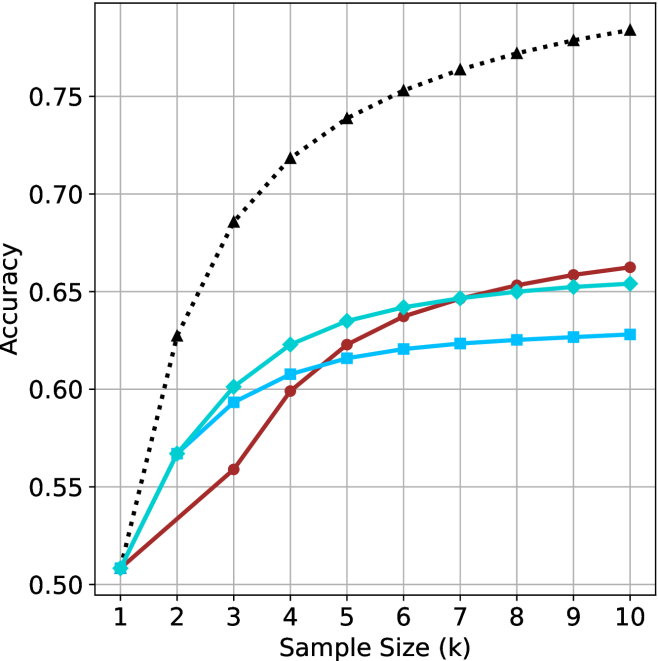
### Visual Description
## Line Chart: Accuracy vs. Sample Size
### Overview
This image is a line chart illustrating the relationship between "Accuracy" (y-axis) and "Sample Size (k)" (x-axis). The chart displays four distinct data series, each represented by a unique color and marker shape.
**Critical Note:** The image does not contain a legend. Therefore, the specific identity of each data series (e.g., model names, algorithm types, or dataset variations) cannot be determined from the visual information provided.
### Components/Axes
* **X-Axis:** Labeled "Sample Size (k)". The scale ranges from 1 to 10, with integer increments.
* **Y-Axis:** Labeled "Accuracy". The scale ranges from 0.50 to 0.75, with grid lines at 0.05 intervals.
* **Grid:** A light gray grid is overlaid on the plot area, intersecting at the major axis ticks.
* **Data Series (Legend Missing):**
* **Series 1 (Black Dotted Line):** Marked with black triangles.
* **Series 2 (Dark Red Solid Line):** Marked with dark red circles.
* **Series 3 (Cyan Solid Line):** Marked with cyan diamonds.
* **Series 4 (Light Blue Solid Line):** Marked with light blue squares.
### Detailed Analysis
All four data series originate from a common starting point at **Sample Size (k) = 1**, with an **Accuracy of approximately 0.51**.
#### Series 1: Black Dotted Line (Triangles)
* **Trend:** This series shows the steepest upward slope and maintains the highest accuracy throughout the entire range. It exhibits a concave-down curve, indicating diminishing returns as the sample size increases.
* **Data Points (Approximate):**
* k=1: 0.51
* k=2: 0.63
* k=3: 0.69
* k=4: 0.72
* k=5: 0.74
* k=6: 0.75
* k=7: 0.76
* k=8: 0.77
* k=9: 0.78
* k=10: 0.785
#### Series 2: Dark Red Solid Line (Circles)
* **Trend:** This series starts with the slowest growth rate among the four. However, it maintains a more consistent upward trajectory compared to the other solid lines. It crosses the Cyan and Light Blue lines between k=4 and k=6, eventually becoming the second-highest performing series.
* **Data Points (Approximate):**
* k=1: 0.51
* k=2: 0.54
* k=3: 0.56
* k=4: 0.60
* k=5: 0.62
* k=6: 0.64
* k=7: 0.65
* k=8: 0.655
* k=9: 0.66
* k=10: 0.665
#### Series 3: Cyan Solid Line (Diamonds)
* **Trend:** This series shows strong initial growth (similar to the Light Blue line) but begins to flatten out significantly after k=4. It is outperformed by the Dark Red line after k=5.
* **Data Points (Approximate):**
* k=1: 0.51
* k=2: 0.57
* k=3: 0.60
* k=4: 0.625
* k=5: 0.635
* k=6: 0.64
* k=7: 0.645
* k=8: 0.65
* k=9: 0.652
* k=10: 0.655
#### Series 4: Light Blue Solid Line (Squares)
* **Trend:** This series follows a trajectory very similar to the Cyan line initially, but it flattens out the earliest and most aggressively. It remains the lowest-performing series from k=3 onwards.
* **Data Points (Approximate):**
* k=1: 0.51
* k=2: 0.57
* k=3: 0.595
* k=4: 0.61
* k=5: 0.615
* k=6: 0.62
* k=7: 0.625
* k=8: 0.627
* k=9: 0.628
* k=10: 0.63
### Key Observations
* **Convergence:** All models perform identically at the smallest sample size (k=1).
* **Performance Gap:** The Black Dotted series is a significant outlier, performing substantially better than the other three series as sample size increases.
* **Scaling Behavior:** The Dark Red series demonstrates better "scaling" properties than the Cyan and Light Blue series; while it starts slower, it continues to improve at a steadier rate, whereas the others plateau quickly.
* **Plateauing:** The Light Blue and Cyan series show signs of saturation (diminishing returns) much earlier than the Black and Red series.
### Interpretation
This chart is characteristic of a machine learning performance evaluation, likely comparing different model architectures or training methods under varying data constraints (few-shot learning).
* **The Black Dotted Model:** This is clearly the superior model. It achieves higher accuracy with less data and continues to improve as more data is added, suggesting it has higher capacity or better generalization capabilities.
* **The "Late Bloomer" (Dark Red):** This model suggests a higher complexity or a different learning dynamic. It performs poorly with very limited data (k=1 to 3) but benefits more from additional data than the other solid-line models.
* **The "Data Saturated" Models (Cyan/Light Blue):** These models appear to be simpler or less capable. They reach a performance ceiling (plateau) very quickly (around k=4 or 5), implying that adding more data beyond this point yields negligible improvements. This is often seen in simpler models that lack the capacity to learn from larger datasets.
</details>
(a) LN-Super- $49$ B
<details>
<summary>x35.png Details</summary>
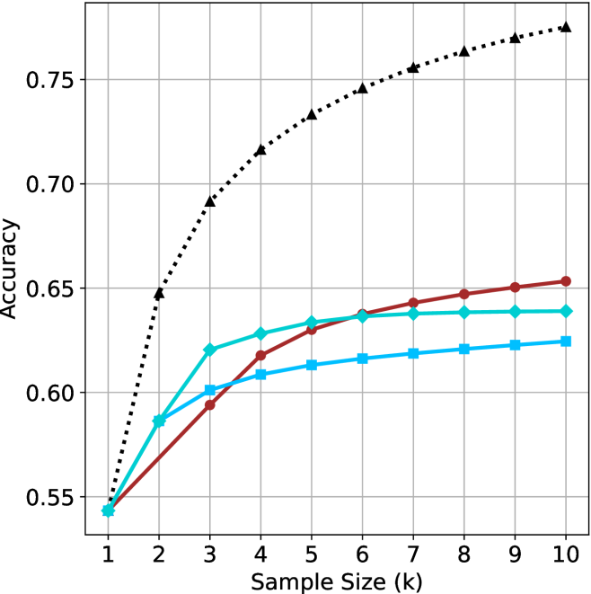
### Visual Description
## Line Chart: Accuracy vs. Sample Size (k)
### Overview
This image is a line chart illustrating the relationship between "Sample Size (k)" and "Accuracy." The chart contains four distinct data series, each represented by a unique color and marker shape.
**CRITICAL OBSERVATION:** There is no legend provided in the image. Consequently, it is impossible to identify what specific models, algorithms, or datasets each line represents. The analysis below refers to the lines by their visual characteristics (color and marker).
### Components/Axes
* **Y-Axis:** Labeled "Accuracy." The scale ranges from 0.55 to 0.75, with grid lines at 0.55, 0.60, 0.65, 0.70, and 0.75.
* **X-Axis:** Labeled "Sample Size (k)." The scale ranges from 1 to 10, with vertical grid lines at each integer interval.
* **Data Series:**
* **Series A (Black):** Dotted line with triangle markers.
* **Series B (Dark Red):** Solid line with circle markers.
* **Series C (Cyan/Light Blue):** Solid line with diamond markers.
* **Series D (Medium Blue):** Solid line with square markers.
### Detailed Analysis
All four series originate from a common starting point at Sample Size = 1, with an Accuracy of approximately 0.545.
#### Series A (Black, Dotted, Triangle)
* **Trend:** This series exhibits the steepest upward slope and maintains the highest accuracy throughout the range. It shows a rapid increase between k=1 and k=3, then continues to rise at a slightly slower, but consistent, rate.
* **Data Points (Approximate):**
* k=1: ~0.545
* k=2: ~0.645
* k=3: ~0.690
* k=4: ~0.715
* k=5: ~0.730
* k=10: ~0.775
#### Series B (Dark Red, Solid, Circle)
* **Trend:** This series shows a steady, consistent upward slope. It starts at the bottom with the others but eventually overtakes Series C and Series D. It does not show signs of flattening out as aggressively as the other solid lines.
* **Data Points (Approximate):**
* k=1: ~0.545
* k=3: ~0.595
* k=5: ~0.630
* k=10: ~0.653
#### Series C (Cyan, Solid, Diamond)
* **Trend:** This series rises sharply between k=1 and k=3, then begins to flatten significantly (diminishing returns) after k=4. It crosses Series B around k=4.5 and remains relatively flat from k=6 to k=10.
* **Data Points (Approximate):**
* k=1: ~0.545
* k=3: ~0.620
* k=5: ~0.635
* k=10: ~0.640
#### Series D (Medium Blue, Solid, Square)
* **Trend:** This series rises steadily but at a lower rate than the others. It flattens out the earliest, showing the least improvement as the sample size increases beyond k=4.
* **Data Points (Approximate):**
* k=1: ~0.545
* k=3: ~0.600
* k=5: ~0.615
* k=10: ~0.625
### Key Observations
* **Dominance:** The Black series (triangles) is the clear outlier in terms of performance, significantly outperforming the other three models as the sample size increases.
* **Convergence/Crossover:**
* At k=2, the Cyan (diamond) and Medium Blue (square) lines are clustered together, while the Red (circle) line is lower.
* By k=4, the Red (circle) line overtakes the Cyan (diamond) line.
* The Cyan (diamond) line appears to plateau at approximately 0.64 accuracy.
* **Diminishing Returns:** The three solid-line series (Red, Cyan, Medium Blue) all exhibit signs of diminishing returns, where increasing the sample size yields progressively smaller gains in accuracy. The Black series, while also curving, maintains a much stronger growth trajectory.
### Interpretation
This chart is characteristic of a **Machine Learning Model Learning Curve** analysis.
* **What the data demonstrates:** It compares the performance of four different models (or configurations) as the amount of training data (Sample Size) increases.
* **Why it matters:**
* The **Black series** represents a model that scales effectively with more data, suggesting it has higher capacity or better generalization capabilities.
* The **Cyan and Medium Blue series** appear to hit a "performance ceiling" or saturation point relatively early (around k=4 or k=5). Adding more data beyond this point provides negligible accuracy improvements, suggesting these models may be limited by their architecture or hyperparameters rather than data scarcity.
* The **Red series** represents a model that is slower to learn initially but eventually surpasses the other solid-line models, suggesting it might be a more complex model that requires more data to converge but ultimately achieves a higher performance ceiling than the Cyan or Medium Blue models.
</details>
(b) R $1$ - $32$ B
<details>
<summary>x36.png Details</summary>
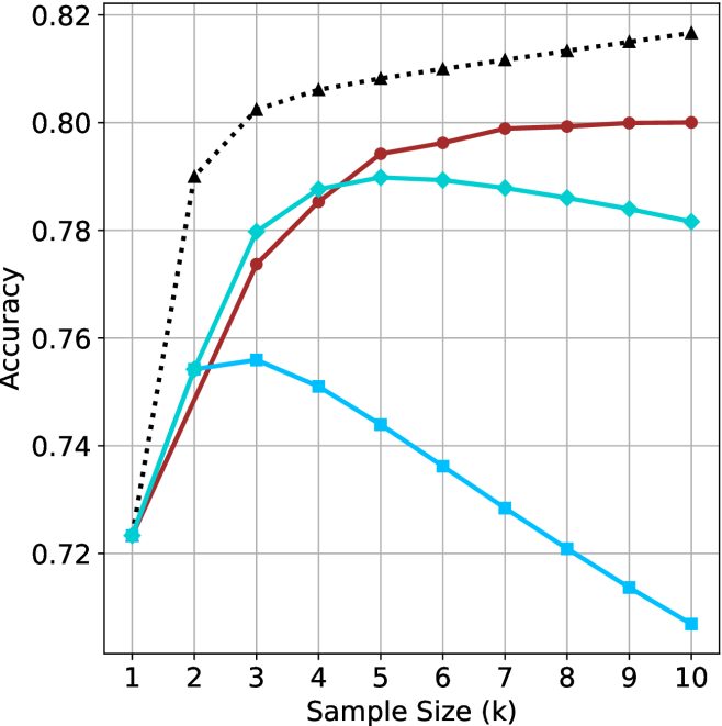
### Visual Description
## Line Chart: Accuracy vs. Sample Size (k)
### Overview
The image displays a line chart illustrating the relationship between "Accuracy" (y-axis) and "Sample Size (k)" (x-axis). The chart contains four distinct data series, each represented by a different color and marker style. There is no legend provided in the image to identify the specific models or methods associated with each line. All four lines originate from a single point at the start of the x-axis.
### Components/Axes
* **Y-Axis:** Labeled "Accuracy". The scale ranges from 0.72 to 0.82, with major grid lines at intervals of 0.02.
* **X-Axis:** Labeled "Sample Size (k)". The scale ranges from 1 to 10, with integer markers for each unit.
* **Grid:** A light gray grid is overlaid on the plot area, corresponding to the axis markers.
* **Data Series (Legend missing, identified by visual characteristics):**
* **Black Dotted Line:** Marked with triangles.
* **Dark Red Solid Line:** Marked with circles.
* **Teal (Green-Blue) Solid Line:** Marked with diamonds.
* **Light Blue Solid Line:** Marked with squares.
### Detailed Analysis
All four data series begin at the coordinate (1, ~0.723).
**1. Black Dotted Line (Triangles)**
* **Trend:** This line shows the highest performance across the entire range (for k > 1). It exhibits a sharp, steep increase between k=1 and k=2, followed by a consistent, slightly decelerating upward trend through k=10.
* **Approximate Values:**
* k=1: 0.723
* k=2: 0.790
* k=3: 0.802
* k=5: 0.808
* k=10: 0.817
**2. Dark Red Solid Line (Circles)**
* **Trend:** This line shows a strong upward trend, particularly between k=1 and k=5. After k=5, the rate of improvement slows significantly, appearing to plateau or approach an asymptote near 0.80.
* **Approximate Values:**
* k=1: 0.723
* k=2: 0.755
* k=3: 0.774
* k=5: 0.794
* k=10: 0.800
**3. Teal Solid Line (Diamonds)**
* **Trend:** This line increases steadily until it reaches a peak at k=5. Following k=5, the accuracy begins a slow, consistent decline through k=10.
* **Approximate Values:**
* k=1: 0.723
* k=2: 0.755
* k=3: 0.780
* k=5: 0.790
* k=10: 0.782
**4. Light Blue Solid Line (Squares)**
* **Trend:** This line shows the poorest performance for k > 3. It rises slightly to k=2/3, then enters a consistent, linear decline for the remainder of the range.
* **Approximate Values:**
* k=1: 0.723
* k=2: 0.755
* k=3: 0.756
* k=5: 0.744
* k=10: 0.708
### Key Observations
* **Divergence:** The models perform identically at k=1, but diverge significantly as the sample size increases.
* **Performance Hierarchy:** At k=10, the performance hierarchy is clearly defined: Black Dotted (highest) > Dark Red > Teal > Light Blue (lowest).
* **Optimal Points:** The Teal line reaches its peak at k=5, while the Light Blue line peaks earlier at k=3. The Black and Dark Red lines do not show a clear peak within the provided range, suggesting they may continue to improve or stabilize at higher values.
### Interpretation
This chart likely represents a comparison of different machine learning models or hyperparameter configurations (where 'k' could represent the number of neighbors in k-NN, or a similar parameter related to sample size or complexity).
* **The Black Dotted Line** represents the most robust model, as it consistently improves with larger sample sizes without showing signs of overfitting or performance degradation.
* **The Teal and Light Blue lines** demonstrate a classic "overfitting" or "noise sensitivity" pattern. As the sample size (k) increases beyond a certain threshold (k=5 for Teal, k=3 for Light Blue), the model's accuracy drops. This suggests that for these specific configurations, increasing the sample size introduces noise or irrelevant data that degrades the model's predictive capability.
* **The Dark Red line** appears to be a stable model that benefits from larger sample sizes but experiences diminishing returns, eventually plateauing.
</details>
(c) QwQ-32B
<details>
<summary>x37.png Details</summary>
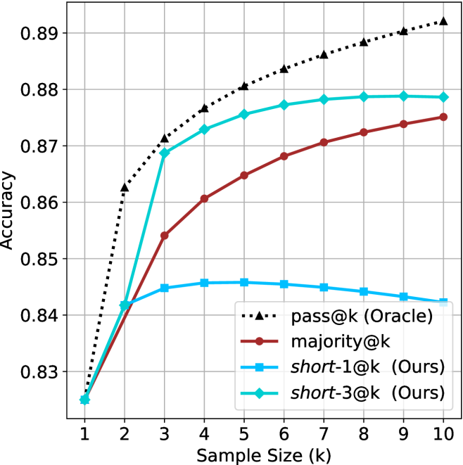
### Visual Description
## Line Chart: Accuracy vs. Sample Size (k)
### Overview
This chart illustrates the performance (Accuracy) of four different sampling methods across varying sample sizes (k), ranging from 1 to 10. The chart demonstrates how accuracy scales as the number of samples increases for each method.
### Components/Axes
* **X-Axis:** Labeled "Sample Size (k)". The scale is linear, marked from 1 to 10.
* **Y-Axis:** Labeled "Accuracy". The scale ranges from 0.83 to 0.89, with grid lines at 0.01 intervals.
* **Legend:** Located in the bottom-right quadrant.
* **pass@k (Oracle):** Black dotted line with triangle markers.
* **majority@k:** Dark red solid line with circle markers.
* **short-1@k (Ours):** Light blue solid line with square markers.
* **short-3@k (Ours):** Teal/Cyan solid line with diamond markers.
### Detailed Analysis
All four data series originate from the same starting point at k=1, with an accuracy of approximately 0.825.
**1. pass@k (Oracle) [Black Dotted Line]**
* **Trend:** Steep, continuous upward slope. It maintains the highest accuracy across all sample sizes.
* **Data Points (Approximate):**
* k=1: 0.825
* k=3: 0.871
* k=5: 0.880
* k=10: 0.892
**2. short-3@k (Ours) [Teal/Cyan Solid Line]**
* **Trend:** Sharp upward slope from k=1 to k=3. After k=3, the slope flattens significantly, approaching a plateau near 0.879.
* **Data Points (Approximate):**
* k=1: 0.825
* k=3: 0.869
* k=5: 0.876
* k=10: 0.879
**3. majority@k [Dark Red Solid Line]**
* **Trend:** Consistent, steady upward slope. It does not plateau as sharply as the "short" methods and continues to improve as k increases.
* **Data Points (Approximate):**
* k=1: 0.825
* k=3: 0.854
* k=5: 0.865
* k=10: 0.875
**4. short-1@k (Ours) [Light Blue Solid Line]**
* **Trend:** Moderate rise until k=4, where it reaches a peak of approximately 0.846. Following k=4, the accuracy exhibits a slight, gradual decline as k increases to 10.
* **Data Points (Approximate):**
* k=1: 0.825
* k=3: 0.845
* k=4: 0.846 (Peak)
* k=10: 0.843
### Key Observations
* **Performance Hierarchy:** The Oracle method consistently outperforms all other methods. Among the "Ours" methods, `short-3@k` significantly outperforms `short-1@k`.
* **Efficiency vs. Scaling:** `short-3@k` is highly efficient at very low sample sizes (k=2 to 3), nearly matching the Oracle. However, it loses ground to the Oracle as k increases.
* **Diminishing Returns/Degradation:** `short-1@k` demonstrates a clear case of diminishing returns, where increasing the sample size beyond 4 actually results in a slight decrease in accuracy, suggesting potential overfitting or the introduction of noise.
### Interpretation
The data suggests that the "Ours" methods are specifically tuned for low-sample-size environments.
* **The "Oracle"** serves as the theoretical upper bound, showing that more samples generally lead to higher accuracy.
* **`short-3@k`** appears to be a highly effective heuristic for small sample sizes (k=3), providing a significant accuracy boost over the `majority@k` baseline without needing a large sample size.
* **`short-1@k`** is likely too restrictive or sensitive; the decline in accuracy after k=4 indicates that for this specific method, more data is detrimental, possibly because the model is forced to incorporate lower-quality samples that degrade the overall result.
* **`majority@k`** is the most stable and reliable method for larger sample sizes, as it continues to improve steadily, unlike the "short" methods which plateau or decline.
</details>
(d) R1-670B
Figure 10: AIME 2025 - sample size ( $k$ ) comparison.
<details>
<summary>x38.png Details</summary>
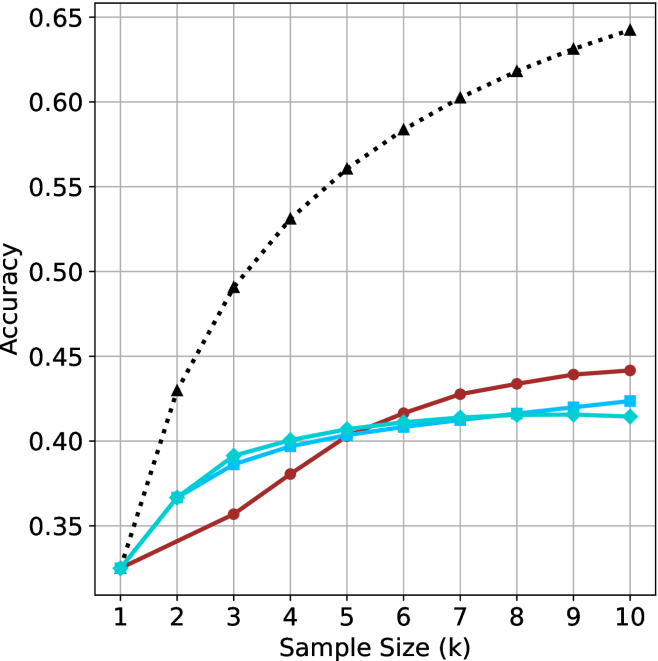
### Visual Description
## Line Chart: Accuracy vs. Sample Size (k)
### Overview
This image displays a line chart comparing the performance (Accuracy) of four distinct data series against an increasing "Sample Size (k)" ranging from 1 to 10. The chart utilizes a grid background for readability. Notably, the image lacks a legend, meaning the specific identity of each data series is not explicitly labeled.
### Components/Axes
* **X-Axis:** Labeled "Sample Size (k)". The scale is linear, marked with integers from 1 to 10.
* **Y-Axis:** Labeled "Accuracy". The scale ranges from 0.35 to 0.65, with major grid lines at 0.05 intervals.
* **Data Series:** There are four distinct lines plotted:
1. **Black Dotted Line:** Marked with upward-pointing triangles.
2. **Red/Maroon Solid Line:** Marked with filled circles.
3. **Cyan/Light Blue Solid Line (A):** Marked with filled squares.
4. **Cyan/Light Blue Solid Line (B):** Marked with filled diamonds.
* **Legend:** Absent.
### Detailed Analysis
All four data series originate from a common starting point at Sample Size 1, with an Accuracy of approximately 0.325.
**1. Black Dotted Line (Triangles)**
* **Trend:** This series exhibits a steep, concave-downward growth curve. It shows the highest rate of improvement across all sample sizes.
* **Data Points:**
* x=1: ~0.325
* x=3: ~0.49
* x=6: ~0.58
* x=10: ~0.64
**2. Red/Maroon Solid Line (Circles)**
* **Trend:** This series shows a steady, nearly linear upward slope. It starts as the lowest performing series (tied with the cyan lines) but demonstrates better scaling than the cyan lines as the sample size increases. It overtakes both cyan lines between x=5 and x=6.
* **Data Points:**
* x=1: ~0.325
* x=5: ~0.405
* x=10: ~0.44
**3. Cyan/Light Blue Solid Line (Squares)**
* **Trend:** This series rises rapidly from x=1 to x=3, then begins to plateau significantly after x=4.
* **Data Points:**
* x=1: ~0.325
* x=4: ~0.395
* x=10: ~0.425
**4. Cyan/Light Blue Solid Line (Diamonds)**
* **Trend:** This series follows a nearly identical trajectory to the Cyan/Square line, rising rapidly until x=3, then plateauing. It remains consistently slightly below the Cyan/Square line.
* **Data Points:**
* x=1: ~0.325
* x=4: ~0.40
* x=10: ~0.415
### Key Observations
* **Convergence:** All models perform identically at the minimum sample size (k=1).
* **Divergence:** As sample size increases, the performance gap between the models widens significantly.
* **Performance Tiers:** The Black Dotted series is a clear outlier, significantly outperforming the other three models. The Red and Cyan series form a lower-performing cluster.
* **Saturation:** The two Cyan series exhibit clear signs of saturation (diminishing returns) after k=4, whereas the Black and Red series continue to show more robust growth.
### Interpretation
The data suggests a comparison between different machine learning models or algorithms, where the "Black Dotted" model is significantly more data-efficient and scalable than the others.
* **The "Black Dotted" model:** Likely represents a more complex or better-optimized architecture that benefits substantially from increased data volume.
* **The "Cyan" models:** These appear to be models that reach their capacity or "ceiling" very quickly. Adding more data beyond k=4 provides negligible accuracy gains, suggesting these models may be under-parameterized or limited by their architecture.
* **The "Red" model:** This model occupies a middle ground. It is slower to learn than the cyan models initially but possesses a higher "ceiling," as evidenced by its ability to overtake the cyan models as the sample size increases. It does not show the same aggressive saturation as the cyan models within the observed range.
</details>
(a) LN-Super- $49$ B
<details>
<summary>x39.png Details</summary>
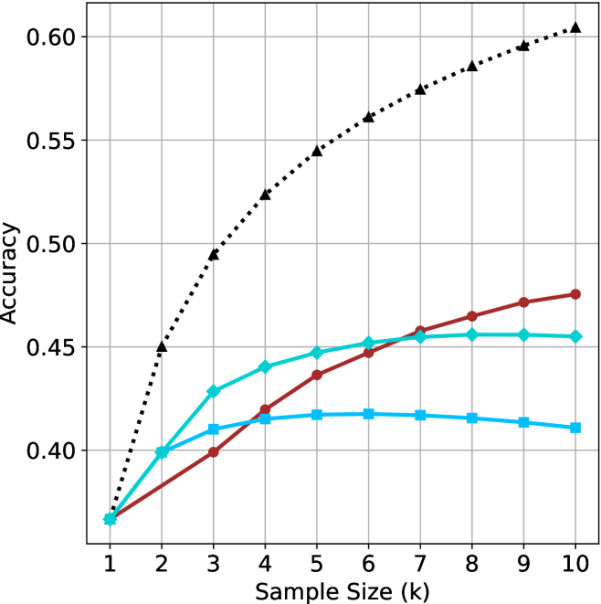
### Visual Description
## Line Chart: Accuracy vs. Sample Size (k)
### Overview
This image is a line chart illustrating the relationship between "Accuracy" (y-axis) and "Sample Size (k)" (x-axis). The chart displays four distinct data series, each represented by a unique color and marker shape. Notably, there is no legend provided in the image to identify what specific models or methods these series represent. All four series originate from a common starting point at k=1.
### Components/Axes
* **X-Axis:** Labeled "Sample Size (k)". The scale is linear, ranging from 1 to 10 in integer increments.
* **Y-Axis:** Labeled "Accuracy". The scale ranges from 0.40 to 0.60, with grid lines at 0.05 intervals. The origin point for all lines at k=1 is approximately 0.37.
* **Grid:** A light gray grid is overlaid on the plot area, intersecting at the major axis ticks.
* **Data Series (No Legend Provided):**
1. **Black Dotted Line:** Marked with triangles.
2. **Red/Maroon Solid Line:** Marked with circles.
3. **Cyan/Light Blue Solid Line:** Marked with diamonds.
4. **Blue Solid Line:** Marked with squares.
### Detailed Analysis
The following values are approximations based on visual inspection of the grid intersections.
| Sample Size (k) | Black (Dotted/Triangle) | Red (Solid/Circle) | Cyan (Solid/Diamond) | Blue (Solid/Square) |
| :--- | :--- | :--- | :--- | :--- |
| **1** | ~0.37 | ~0.37 | ~0.37 | ~0.37 |
| **2** | ~0.45 | ~0.385 | ~0.40 | ~0.40 |
| **3** | ~0.495 | ~0.40 | ~0.43 | ~0.41 |
| **4** | ~0.525 | ~0.42 | ~0.44 | ~0.415 |
| **5** | ~0.545 | ~0.435 | ~0.445 | ~0.418 |
| **6** | ~0.56 | ~0.445 | ~0.45 | ~0.418 |
| **7** | ~0.575 | ~0.455 | ~0.455 | ~0.417 |
| **8** | ~0.585 | ~0.465 | ~0.455 | ~0.415 |
| **9** | ~0.595 | ~0.47 | ~0.455 | ~0.413 |
| **10** | ~0.605 | ~0.475 | ~0.455 | ~0.411 |
**Trend Verification:**
* **Black Dotted Line:** Exhibits a steep, consistent upward slope across the entire range (k=1 to k=10) with no signs of plateauing.
* **Red Solid Line:** Exhibits a steady, monotonic upward slope. It is the second-best performing series.
* **Cyan Solid Line:** Exhibits a rapid increase initially (k=1 to k=3), followed by a diminishing rate of return, eventually plateauing around k=7-8.
* **Blue Solid Line:** Exhibits a rapid increase initially (k=1 to k=3), followed by a very slight peak at k=5-6, and a subsequent slow decline in accuracy as k increases further.
### Key Observations
* **Common Origin:** All four series begin at approximately 0.37 accuracy at k=1.
* **Divergence:** The series diverge significantly after k=2.
* **Performance Gap:** The Black Dotted line is the clear outlier, significantly outperforming the other three series. By k=10, it is approximately 0.13 accuracy points higher than the Red line and nearly 0.20 higher than the Blue line.
* **Saturation/Overfitting:** The Blue and Cyan lines demonstrate clear signs of saturation or overfitting. The Blue line, in particular, shows a negative trend after k=6, suggesting that adding more samples beyond this point is detrimental to the model's accuracy.
### Interpretation
This chart is characteristic of a machine learning performance evaluation, likely comparing different algorithms or architectures in a "few-shot" learning context, where "k" represents the number of examples per class.
* **The Black Dotted line** represents a robust model that scales effectively with more data, suggesting it has high capacity and is not overfitting.
* **The Red line** represents a model that benefits from more data but at a slower rate than the Black line.
* **The Cyan and Blue lines** represent models that reach a performance ceiling very quickly. The Blue line's decline after k=6 is a classic indicator of overfitting, where the model may be memorizing the training data rather than generalizing, or the specific architecture is unable to handle the increased complexity of the larger sample size.
In a technical context, this graph would be used to justify selecting the method represented by the Black Dotted line, as it provides the highest accuracy and the best scalability.
</details>
(b) R $1$ - $32$ B
<details>
<summary>x40.png Details</summary>
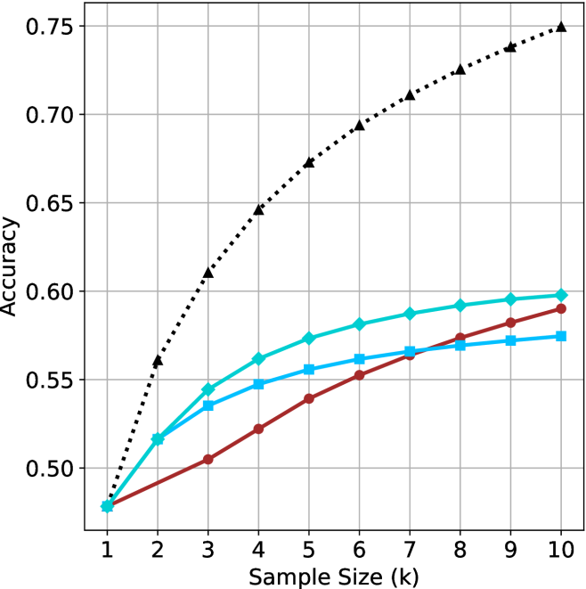
### Visual Description
## Line Chart: Accuracy vs. Sample Size (k)
### Overview
This image is a line chart plotting the "Accuracy" (y-axis) against the "Sample Size (k)" (x-axis). The chart displays four distinct data series, each represented by a unique color and marker style. All four series originate from the same starting point at a sample size of 1. There is no legend provided in the image to identify what specific models or methods these lines represent.
### Components/Axes
* **X-Axis:** Labeled "Sample Size (k)". The scale is linear, ranging from 1 to 10 in integer increments.
* **Y-Axis:** Labeled "Accuracy". The scale ranges from 0.50 to 0.75, with major grid lines at 0.05 intervals.
* **Grid:** A light gray grid is overlaid on the chart area to assist in reading values.
* **Data Series (No Legend Provided):**
1. **Black Dotted Line:** Marked with upward-pointing triangles.
2. **Cyan (Light Blue) Solid Line:** Marked with diamonds.
3. **Dark Red (Maroon) Solid Line:** Marked with circles.
4. **Medium Blue Solid Line:** Marked with squares.
### Detailed Analysis
All four series begin at approximately (1, 0.48). As the sample size increases, all series exhibit a positive trend (accuracy increases), though the rate of improvement (slope) varies significantly.
**1. Black Dotted Line (Triangles):**
* **Trend:** This series shows the steepest upward trajectory and maintains the highest accuracy across all sample sizes.
* **Data Points (Approximate):**
* k=1: 0.48
* k=3: 0.61
* k=5: 0.675
* k=10: 0.75
**2. Cyan Solid Line (Diamonds):**
* **Trend:** This series shows the second-highest accuracy. It rises quickly between k=1 and k=3, then begins to plateau significantly from k=5 to k=10.
* **Data Points (Approximate):**
* k=1: 0.48
* k=3: 0.545
* k=5: 0.575
* k=10: 0.60
**3. Dark Red Solid Line (Circles):**
* **Trend:** This series starts with the lowest slope but maintains a more consistent, steady upward trajectory compared to the other solid lines. It crosses the Medium Blue (square) line between k=7 and k=8.
* **Data Points (Approximate):**
* k=1: 0.48
* k=3: 0.505
* k=5: 0.54
* k=10: 0.59
**4. Medium Blue Solid Line (Squares):**
* **Trend:** This series rises initially but exhibits the most pronounced flattening (diminishing returns) as the sample size increases, particularly after k=5.
* **Data Points (Approximate):**
* k=1: 0.48
* k=3: 0.535
* k=5: 0.555
* k=10: 0.575
### Key Observations
* **Performance Gap:** The Black Dotted series is a clear outlier, performing significantly better than the other three methods. At k=10, it achieves an accuracy of 0.75, whereas the next best method (Cyan) is at 0.60.
* **Clustering:** The three solid-line series are clustered relatively close together, all falling within the 0.57–0.60 accuracy range at k=10.
* **Crossover:** The Dark Red (circle) line demonstrates a "slow and steady" improvement, eventually overtaking the Medium Blue (square) line, which appears to saturate earlier.
### Interpretation
This chart likely represents a comparison of machine learning model performance, possibly in a few-shot learning or active learning context, where "Sample Size (k)" refers to the number of training examples per class.
* **Superiority of the Black Series:** The Black Dotted series represents a method that is substantially more data-efficient or robust than the others, as it gains accuracy much faster as more samples are added.
* **Diminishing Returns:** All four lines exhibit a concave shape, indicating that the marginal gain in accuracy decreases as the sample size increases. This is a classic characteristic of learning curves in machine learning.
* **Methodological Differences:** The fact that the Red (circle) line continues to climb while the Blue (square) line flattens suggests that the Red method may be better suited for larger sample sizes, whereas the Blue method might be optimized for very small sample sizes but lacks the capacity to leverage additional data effectively.
</details>
(c) QwQ-32B
<details>
<summary>x41.png Details</summary>
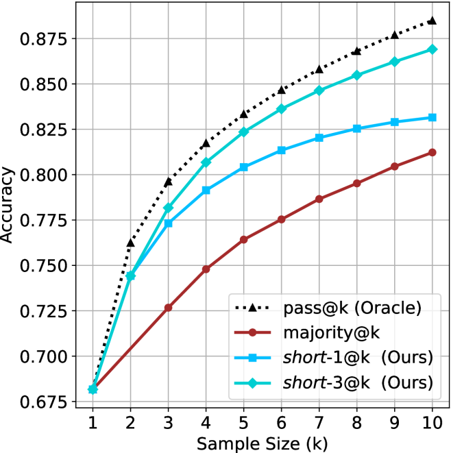
### Visual Description
## Line Chart: Accuracy vs. Sample Size (k)
### Overview
This image is a line chart illustrating the performance (Accuracy) of four different evaluation methods across varying sample sizes (k), ranging from 1 to 10. The chart demonstrates how accuracy improves as the sample size increases for all methods, with distinct performance gaps between the strategies.
### Components/Axes
* **X-Axis:** Labeled "Sample Size (k)". The scale is linear, marked with integers from 1 to 10.
* **Y-Axis:** Labeled "Accuracy". The scale ranges from 0.675 to 0.875, with major grid lines at intervals of 0.025.
* **Legend:** Positioned in the bottom-right quadrant of the chart area.
* **Black dotted line with triangle markers:** `pass@k (Oracle)`
* **Dark red solid line with circle markers:** `majority@k`
* **Light blue solid line with square markers:** `short-1@k (Ours)`
* **Cyan solid line with diamond markers:** `short-3@k (Ours)`
### Detailed Analysis
**Trend Verification:** All four data series exhibit a positive correlation between sample size and accuracy. The curves follow a logarithmic-style growth pattern, where the rate of accuracy improvement is steepest between k=1 and k=3, and gradually flattens as k approaches 10. All lines originate from a single point at k=1.
**Data Point Extraction (Approximate Values):**
| Sample Size (k) | pass@k (Oracle) | short-3@k (Ours) | short-1@k (Ours) | majority@k |
| :--- | :--- | :--- | :--- | :--- |
| **1** | ~0.682 | ~0.682 | ~0.682 | ~0.682 |
| **2** | ~0.762 | ~0.744 | ~0.744 | ~0.705 |
| **3** | ~0.796 | ~0.782 | ~0.773 | ~0.727 |
| **4** | ~0.817 | ~0.807 | ~0.792 | ~0.748 |
| **5** | ~0.833 | ~0.823 | ~0.804 | ~0.764 |
| **6** | ~0.846 | ~0.836 | ~0.813 | ~0.775 |
| **7** | ~0.858 | ~0.846 | ~0.820 | ~0.787 |
| **8** | ~0.868 | ~0.855 | ~0.825 | ~0.795 |
| **9** | ~0.876 | ~0.862 | ~0.829 | ~0.805 |
| **10** | ~0.884 | ~0.869 | ~0.831 | ~0.812 |
*Note: Values are estimated based on visual position relative to the grid lines.*
### Key Observations
* **Convergence:** At k=1, all four methods have identical accuracy (~0.682).
* **Performance Hierarchy:** The `pass@k (Oracle)` method consistently provides the highest accuracy across all sample sizes > 1. The `short-3@k (Ours)` method is the second most effective, followed by `short-1@k (Ours)`, with `majority@k` consistently performing the worst.
* **Divergence:** The performance gap between the methods widens significantly as the sample size increases. For example, at k=10, the gap between the Oracle and the Majority method is approximately 0.072 (0.884 - 0.812).
* **Diminishing Returns:** The slope of all lines decreases as k increases, indicating that adding more samples provides diminishing returns in accuracy.
### Interpretation
This chart likely represents an evaluation of code generation or classification models.
* **The "Oracle" Baseline:** The `pass@k (Oracle)` represents the theoretical upper bound of performance, likely defined as "if any of the k samples are correct, the result is correct."
* **"Ours" vs. "Majority":** The "Ours" methods (`short-1` and `short-3`) are clearly superior to the standard `majority@k` voting strategy. This suggests that the authors have developed a filtering or ranking mechanism that selects better candidates from the generated samples than a simple majority vote.
* **short-3 vs. short-1:** The fact that `short-3` outperforms `short-1` suggests that the proposed method benefits from having a slightly larger pool of candidates to select from, or that the ranking mechanism is more robust when considering the top 3 candidates rather than just the top 1.
* **Practical Implication:** The data demonstrates that for this specific task, using the authors' proposed methods allows for significantly higher accuracy than standard majority voting, approaching the theoretical Oracle limit more closely.
</details>
(d) R1-670B
Figure 11: HMMT Feb 2025 - sample size ( $k$ ) comparison.
<details>
<summary>x42.png Details</summary>
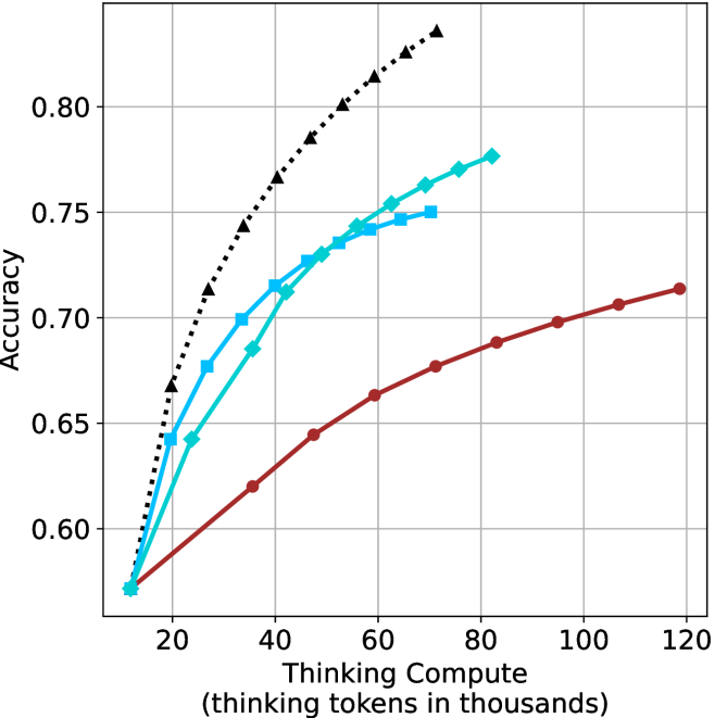
### Visual Description
## Line Chart: Accuracy vs. Thinking Compute
### Overview
This chart illustrates the relationship between "Thinking Compute" (measured in thousands of thinking tokens) and model "Accuracy." It displays four distinct data series, each representing a different configuration or model variant. All series originate from a common starting point and exhibit diminishing returns as compute increases.
### Components/Axes
* **X-Axis:** "Thinking Compute (thinking tokens in thousands)". The scale ranges from 20 to 120, with grid lines at intervals of 20. The data series actually begin at approximately 12,000 tokens.
* **Y-Axis:** "Accuracy". The scale ranges from 0.60 to 0.80+, with grid lines at intervals of 0.05.
* **Data Series (Legend inferred from visual markers):**
* **Black Dotted Line (Triangle markers):** The most efficient series, showing the steepest accuracy gain.
* **Cyan Line (Diamond markers):** The second most efficient series.
* **Cyan Line (Square markers):** The third most efficient series, closely tracking the diamond-marked line.
* **Dark Red/Maroon Line (Circle markers):** The least efficient series, showing the shallowest slope but extending to the highest compute values.
### Detailed Analysis
All four data series originate at approximately **(12, 0.57)**.
* **Black Dotted Line (Triangles):**
* **Trend:** Steepest upward trajectory.
* **Data Points (Approximate):** Starts at (12, 0.57), reaches (20, 0.67), (30, 0.71), (40, 0.74), (50, 0.77), (60, 0.80), and terminates at (70, 0.83).
* **Cyan Line (Diamonds):**
* **Trend:** Strong upward trajectory, second only to the black line.
* **Data Points (Approximate):** Starts at (12, 0.57), reaches (25, 0.64), (35, 0.68), (45, 0.71), (55, 0.74), (65, 0.76), (75, 0.77), and terminates at (82, 0.78).
* **Cyan Line (Squares):**
* **Trend:** Upward trajectory, slightly less efficient than the diamond-marked line.
* **Data Points (Approximate):** Starts at (12, 0.57), reaches (20, 0.64), (28, 0.68), (35, 0.70), (45, 0.72), (55, 0.735), (65, 0.745), and terminates at (70, 0.75).
* **Dark Red/Maroon Line (Circles):**
* **Trend:** Shallowest upward trajectory, indicating lower accuracy gains per unit of compute.
* **Data Points (Approximate):** Starts at (12, 0.57), reaches (35, 0.62), (48, 0.645), (60, 0.665), (72, 0.675), (85, 0.69), (95, 0.70), (107, 0.705), and terminates at (120, 0.715).
### Key Observations
* **Diminishing Returns:** Every curve exhibits a concave shape, meaning that as "Thinking Compute" increases, the marginal gain in "Accuracy" decreases.
* **Efficiency Gap:** There is a significant performance gap between the different series. For example, at 60k tokens, the Black series achieves ~0.80 accuracy, while the Red series achieves only ~0.66.
* **Compute Range:** The Black and Square-Cyan series stop at 70k tokens, while the Diamond-Cyan series stops at 82k, and the Red series continues to 120k tokens, suggesting different constraints or limits for each configuration.
### Interpretation
This chart likely represents a **test-time compute scaling experiment** for an AI model (such as a reasoning-focused LLM).
* **The "Thinking" Paradigm:** The data demonstrates that allowing a model to "think" longer (consume more tokens) improves accuracy, but with clear diminishing returns.
* **Model/Strategy Differences:** The four lines likely represent different model sizes or different inference-time search strategies (e.g., different chain-of-thought lengths or search depths).
* **Strategic Trade-offs:** The Black line represents the most "efficient" configuration—it achieves the highest accuracy with the least amount of compute. The Red line represents a configuration that is less efficient per token but is capable of scaling to much higher compute levels, perhaps representing a larger model or a more exhaustive search strategy that is computationally expensive but eventually reaches a higher absolute accuracy than it would at lower compute levels.
* **Conclusion:** The data suggests that for optimal performance, one should prioritize the configuration represented by the Black line, as it reaches higher accuracy thresholds significantly faster than the other configurations.
</details>
(a) LN-Super- $49$ B
<details>
<summary>x43.png Details</summary>
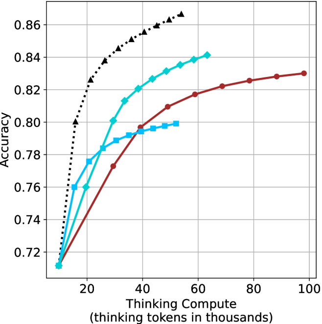
### Visual Description
## Line Chart: Accuracy vs. Thinking Compute
### Overview
This image is a line chart illustrating the relationship between "Thinking Compute" (measured in thousands of thinking tokens) and "Accuracy." The chart displays four distinct data series, each represented by a unique line color and marker shape. All four series originate from a common starting point and exhibit a positive correlation between compute and accuracy, characterized by diminishing returns as compute increases.
### Components/Axes
* **Y-Axis:** Labeled "Accuracy." The scale ranges from 0.72 to 0.86, with major grid lines at intervals of 0.02.
* **X-Axis:** Labeled "Thinking Compute (thinking tokens in thousands)." The scale ranges from 20 to 100, with major grid lines at intervals of 20. The data series begin at approximately 10k tokens.
* **Legend:** There is no explicit legend provided in the image. The data series are identified by their visual characteristics:
* **Black Dotted Line:** Marked with triangles.
* **Cyan Solid Line:** Marked with diamonds.
* **Blue Solid Line:** Marked with squares.
* **Red/Maroon Solid Line:** Marked with circles.
### Detailed Analysis
All four data series originate at approximately (10, 0.712).
**1. Black Dotted Line (Triangles)**
* **Trend:** This series exhibits the steepest upward slope, indicating the highest efficiency in gaining accuracy per unit of compute.
* **Data Points (Approximate):**
* (15, 0.80)
* (20, 0.825)
* (25, 0.838)
* (30, 0.845)
* (35, 0.85)
* (40, 0.855)
* (45, 0.86)
* (50, 0.863)
* (55, 0.866)
**2. Cyan Solid Line (Diamonds)**
* **Trend:** This series shows a strong upward slope, second only to the black series.
* **Data Points (Approximate):**
* (15, 0.76)
* (20, 0.76)
* (25, 0.785)
* (30, 0.80)
* (35, 0.813)
* (40, 0.82)
* (45, 0.827)
* (50, 0.83)
* (55, 0.835)
* (60, 0.838)
* (65, 0.84)
**3. Blue Solid Line (Squares)**
* **Trend:** This series rises moderately but flattens out significantly after 30k tokens.
* **Data Points (Approximate):**
* (15, 0.76)
* (20, 0.775)
* (25, 0.785)
* (30, 0.79)
* (35, 0.792)
* (40, 0.795)
* (45, 0.796)
* (50, 0.798)
* (55, 0.799)
**4. Red/Maroon Solid Line (Circles)**
* **Trend:** This series has the shallowest slope but continues to scale to the highest compute value (100k tokens).
* **Data Points (Approximate):**
* (20, 0.735)
* (30, 0.773)
* (40, 0.797)
* (50, 0.81)
* (60, 0.817)
* (70, 0.822)
* (80, 0.825)
* (90, 0.828)
* (100, 0.83)
### Key Observations
* **Diminishing Returns:** Every line follows a concave curve, meaning that as "Thinking Compute" increases, the marginal gain in "Accuracy" decreases.
</details>
(b) R $1$ - $32$ B
<details>
<summary>x44.png Details</summary>
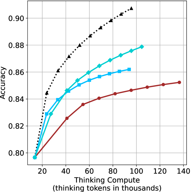
### Visual Description
## Line Chart: Accuracy vs. Thinking Compute
### Overview
This chart illustrates the relationship between "Thinking Compute" (measured in thousands of thinking tokens) and model "Accuracy." It displays four distinct data series, each representing a different model or configuration. The chart demonstrates that increasing the amount of "thinking" compute generally leads to higher accuracy, though all series exhibit diminishing returns as compute increases.
### Components/Axes
* **Y-Axis:** Labeled "Accuracy." The scale ranges from 0.80 to 0.90, with major grid lines at 0.02 intervals.
* **X-Axis:** Labeled "Thinking Compute (thinking tokens in thousands)." The scale ranges from 20 to 140, with major grid lines at 20-unit intervals.
* **Data Series (Legend inferred by visual markers):**
* **Black Dotted Line (Triangle markers):** The highest-performing series.
* **Cyan Solid Line (Diamond markers):** The second-highest performing series.
* **Blue Solid Line (Square markers):** The third-highest performing series.
* **Dark Red Solid Line (Circle markers):** The lowest-performing series.
### Detailed Analysis
The chart displays four distinct curves, all of which exhibit a positive correlation between compute and accuracy.
**Trend Verification:**
All four lines slope upward from left to right, indicating that additional thinking tokens improve accuracy. The slope of each line decreases as it moves to the right, indicating a concave shape characteristic of diminishing returns.
**Data Point Extraction (Approximate Values):**
* **Black Dotted Line (Triangles):**
* Starts at approximately (15k, 0.845).
* Ends at approximately (105k, 0.908).
* *Trend:* This series maintains the highest accuracy across the entire range and shows the steepest initial improvement.
* **Cyan Solid Line (Diamonds):**
* Starts at approximately (15k, 0.797).
* Ends at approximately (105k, 0.879).
* *Trend:* This series shows strong performance, consistently outperforming the blue and red lines.
* **Blue Solid Line (Squares):**
* Starts at approximately (15k, 0.797).
* Ends at approximately (95k, 0.862).
* *Trend:* This series tracks closely with the cyan line initially but plateaus earlier and at a lower accuracy level.
* **Dark Red Solid Line (Circles):**
* Starts at approximately (15k, 0.797).
* Ends at approximately (135k, 0.853).
* *Trend:* This series has the shallowest slope, indicating it requires significantly more compute to achieve incremental gains in accuracy compared to the other models.
### Key Observations
* **Common Baseline:** Three of the four models (Cyan, Blue, Red) appear to start from the same baseline accuracy (~0.797) at the lowest compute level (~15k tokens). The Black model starts significantly higher (~0.845).
* **Diminishing Returns:** All curves flatten as they extend to the right, suggesting that there is a practical limit to how much accuracy can be gained by simply increasing thinking tokens.
* **Compute Efficiency:** The Black model is the most efficient, achieving an accuracy of ~0.88 with only ~55k tokens, whereas the Red model would require significantly more compute (off-chart) to reach that same level.
* **Range Variance:** The Red model is tested over the widest range of compute (up to 135k tokens), while the Black and Cyan models terminate earlier (around 105k tokens).
### Interpretation
This chart is a visualization of "inference-time scaling laws." It demonstrates that for Large Language Models (LLMs), allowing the model to generate more "thinking" tokens before providing a final answer improves performance.
The data suggests a hierarchy of model capability:
1. **The Black model** is clearly the most capable, starting at a higher baseline and maintaining superior accuracy throughout the compute range.
2. **The Cyan and Blue models** represent intermediate capabilities, with the Cyan model showing better scaling efficiency than the Blue model.
3. **The Red model** appears to be the least capable or least optimized for this specific task, as it requires the most compute to achieve the lowest accuracy results.
The "elbow" in these curves suggests an optimal point of compute expenditure; beyond a certain number of tokens, the marginal gain in accuracy becomes negligible, suggesting that further compute is not cost-effective.
</details>
(c) QwQ-32B
<details>
<summary>x45.png Details</summary>
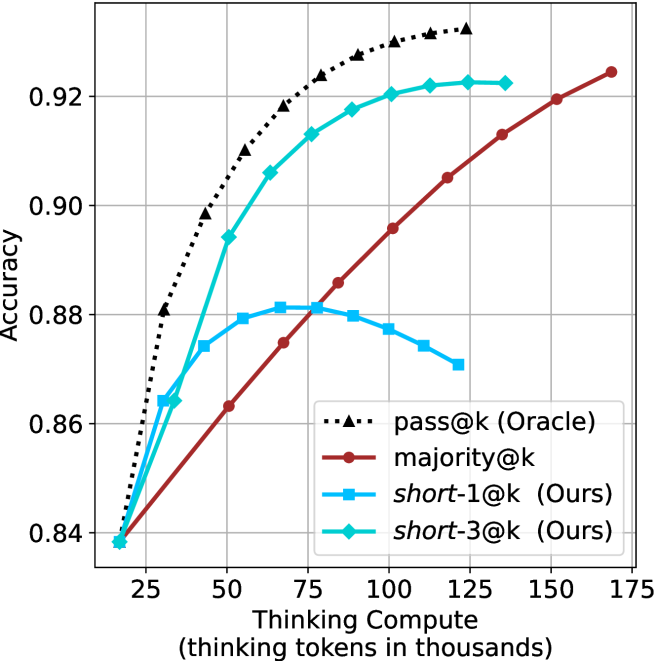
### Visual Description
## Line Chart: Accuracy vs. Thinking Compute
### Overview
This chart illustrates the relationship between "Thinking Compute" (measured in thousands of thinking tokens) and model "Accuracy" across four different evaluation strategies. It demonstrates how different methods scale as more computational resources are allocated to the "thinking" process.
### Components/Axes
* **X-Axis**: "Thinking Compute (thinking tokens in thousands)". The scale ranges from approximately 15 to 175, with major grid lines at 25, 50, 75, 100, 125, 150, and 175.
* **Y-Axis**: "Accuracy". The scale ranges from 0.84 to 0.92+, with major grid lines at 0.84, 0.86, 0.88, 0.90, and 0.92.
* **Legend**: Located in the bottom-right quadrant of the chart.
* **Black dotted line with triangle markers**: `pass@k (Oracle)`
* **Dark red solid line with circle markers**: `majority@k`
* **Light blue solid line with square markers**: `short-1@k (Ours)`
* **Cyan/Teal solid line with diamond markers**: `short-3@k (Ours)`
### Detailed Analysis
All four data series originate from a common starting point at approximately (18, 0.838).
**1. `pass@k (Oracle)` (Black dotted line, triangles)**
* **Trend**: This series shows the steepest upward trajectory, representing the theoretical upper bound of performance. It is concave down, showing rapid initial gains that taper off as compute increases.
* **Data Points**:
* (30, ~0.88)
* (50, ~0.90)
* (70, ~0.91)
* (100, ~0.93)
* (120, ~0.932)
**2. `short-3@k (Ours)` (Cyan/Teal solid line, diamonds)**
* **Trend**: This series shows strong, consistent growth, tracking closely behind the Oracle. It is the second-highest performing method.
* **Data Points**:
* (30, ~0.865)
* (50, ~0.895)
* (70, ~0.905)
* (90, ~0.918)
* (110, ~0.92)
* (125, ~0.922)
**3. `majority@k` (Dark red solid line, circles)**
* **Trend**: This series exhibits a steady, nearly linear upward slope. It starts as the lowest performer but demonstrates the most consistent long-term scaling.
* **Data Points**:
* (50, ~0.863)
* (75, ~0.875)
* (90, ~0.886)
* (110, ~0.895)
* (135, ~0.913)
* (165, ~0.925)
**4. `short-1@k (Ours)` (Light blue solid line, squares)**
* **Trend**: This series shows an initial increase, peaking, and then a distinct decline. It demonstrates diminishing returns followed by negative returns.
* **Data Points**:
* (30, ~0.865)
* (50, ~0.875)
* (75, ~0.881) - *Peak*
* (100, ~0.877)
* (120, ~0.87)
### Key Observations
* **Performance Crossover**: The `majority@k` method overtakes the `short-1@k` method at approximately 80k tokens.
* **The "Overthinking" Phenomenon**: The `short-1@k` method is the only one that exhibits a negative slope after a certain compute threshold (~75k tokens), suggesting that forcing the model to "think" longer under this specific constraint leads to accuracy degradation (likely due to hallucination or over-complication).
* **Efficiency**: The `short-3@k` method is highly efficient, achieving ~0.92 accuracy with significantly less compute (approx. 110k tokens) than the `majority@k` method (which requires ~165k tokens to reach a similar level).
### Interpretation
The data suggests a clear trade-off between compute allocation and evaluation strategy.
* **Oracle/Upper Bound**: The `pass@k (Oracle)` represents the ceiling of what is possible, confirming that the underlying model has the capacity for high accuracy if the correct answer is selected.
* **Strategy Efficacy**: The `short-3@k` strategy is the most effective "Ours" method, likely because it allows for a small amount of diversity (3 options) to verify the answer, which balances accuracy and compute efficiency well.
* **Scaling**: `majority@k` is the most robust strategy for high-compute scenarios, as it continues to improve linearly without the performance drop-off seen in `short-1@k`. This implies that for tasks requiring massive compute, a majority-voting mechanism is safer than a single-short-answer constraint.
</details>
(d) R1-670B
Figure 12: AIME 2024 - thinking compute comparison.
<details>
<summary>x46.png Details</summary>
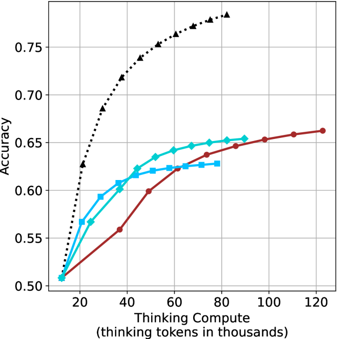
### Visual Description
## Line Chart: Accuracy vs. Thinking Compute
### Overview
This chart illustrates the relationship between "Thinking Compute" (measured in thousands of thinking tokens) and "Accuracy" for four distinct data series. The chart demonstrates how increasing computational resources (thinking tokens) impacts the accuracy of different models or configurations. All four series originate from a common starting point and exhibit diminishing returns as compute increases.
### Components/Axes
* **Y-Axis:** Labeled "Accuracy". The scale ranges from 0.50 to 0.75, with grid lines at 0.05 intervals.
* **X-Axis:** Labeled "Thinking Compute (thinking tokens in thousands)". The scale ranges from 20 to 120, with grid lines at 20-unit intervals.
* **Data Series (Legend inferred from visual markers):**
* **Black Dotted Line (Triangle markers):** Represents the highest-performing model.
* **Cyan Solid Line (Diamond markers):** Represents a mid-range performing model.
* **Blue Solid Line (Square markers):** Represents a mid-range performing model.
* **Dark Red Solid Line (Circle markers):** Represents the slowest-scaling model.
### Detailed Analysis
All four data series originate from a common coordinate at approximately **(12, 0.51)**.
**1. Black Dotted Line (Triangles)**
* **Trend:** This series exhibits the steepest upward slope, indicating the highest efficiency in converting compute into accuracy.
* **Data Points:**
* Starts at ~0.51 (12k tokens).
* Rises sharply to ~0.63 at 20k tokens.
* Reaches ~0.68 at 30k tokens.
* Reaches ~0.72 at 38k tokens.
* Reaches ~0.74 at 45k tokens.
* Reaches ~0.75 at 55k tokens.
* Continues to rise, ending at approximately 82k tokens with an accuracy of ~0.78.
**2. Cyan Solid Line (Diamonds)**
* **Trend:** Moderate upward slope that begins to flatten significantly after 60k tokens.
* **Data Points:**
* Starts at ~0.51 (12k tokens).
* Reaches ~0.57 at 25k tokens.
* Reaches ~0.60 at 38k tokens.
* Reaches ~0.62 at 45k tokens.
* Reaches ~0.64 at 52k tokens.
* Flattens out, ending at approximately 90k tokens with an accuracy of ~0.655.
**3. Blue Solid Line (Squares)**
* **Trend:** Moderate upward slope, similar to the Cyan line, but flattens earlier.
* **Data Points:**
* Starts at ~0.51 (12k tokens).
* Reaches ~0.57 at 20k tokens.
* Reaches ~0.59 at 28k tokens.
* Reaches ~0.61 at 36k tokens.
* Reaches ~0.62 at 45k tokens.
* Plateaus, ending at approximately 80k tokens with an accuracy of ~0.63.
**4. Dark Red Solid Line (Circles)**
* **Trend:** The most gradual, linear upward slope. It does not plateau as aggressively as the other lines within the visible range.
* **Data Points:**
* Starts at ~0.51 (12k tokens).
* Reaches ~0.56 at 36k tokens.
* Reaches ~0.60 at 48k tokens.
* Reaches ~0.62 at 62k tokens.
* Reaches ~0.64 at 75k tokens.
* Reaches ~0.65 at 88k tokens.
* Continues to rise, ending at approximately 122k tokens with an accuracy of ~0.665.
### Key Observations
* **Performance Disparity:** The black dotted line is a clear outlier, achieving significantly higher accuracy for the same amount of compute compared to the other three models.
* **Crossover Points:**
* The Cyan (diamond) and Blue (square) lines cross at approximately 40k tokens and 0.62 accuracy.
* The Dark Red (circle) line, despite starting with the slowest growth, overtakes the Blue (square) line at approximately 65k tokens.
* **Diminishing Returns:** All models show a concave shape, indicating that as more "thinking tokens" are added, the marginal gain in accuracy decreases.
### Interpretation
This chart demonstrates the "scaling laws" of reasoning models. The black dotted line represents a model architecture or training regime that is vastly more efficient at utilizing computational "thinking" time than the other three models.
The other three models (Cyan, Blue, Red) appear to be variations of a less efficient architecture. While they all improve with more compute, they hit a "ceiling" much earlier than the black model. The fact that the Red line continues to climb slowly while the Blue and Cyan lines plateau suggests that the Red model might have a higher theoretical capacity or different optimization characteristics, even if it is less efficient in the short term. This data is typical of research comparing different model sizes or "test-time compute" scaling strategies.
</details>
(a) LN-Super- $49$ B
<details>
<summary>x47.png Details</summary>
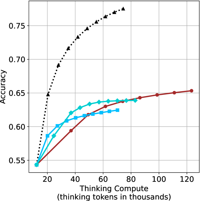
### Visual Description
## Line Chart: Accuracy vs. Thinking Compute
### Overview
This image is a line chart illustrating the relationship between "Thinking Compute" (measured in thousands of thinking tokens) and model "Accuracy." The chart displays four distinct data series, all originating from a common starting point. The chart demonstrates how increasing the number of thinking tokens allocated to a model impacts its accuracy, with varying performance curves for each series.
### Components/Axes
* **Y-Axis:** Labeled "Accuracy." The scale ranges from 0.55 to 0.75, with major grid lines at 0.05 intervals (0.55, 0.60, 0.65, 0.70, 0.75).
* **X-Axis:** Labeled "Thinking Compute (thinking tokens in thousands)." The scale ranges from 20 to 120, with major grid lines at 20-unit intervals.
* **Legend:** **None provided.** The image lacks a legend to identify the specific models or methods associated with each line color/marker style.
* **Data Series (Visual Identification):**
* **Series A:** Black dotted line with triangle markers.
* **Series B:** Dark red solid line with circle markers.
* **Series C:** Cyan (light blue) solid line with diamond markers.
* **Series D:** Medium blue solid line with square markers.
### Detailed Analysis
All four data series originate from a common point at approximately **(15, 0.54)**.
* **Series A (Black, Dotted, Triangles):**
* **Trend:** Exhibits the steepest upward trajectory.
* **Data Points:** Shows rapid improvement in accuracy as compute increases. It terminates at approximately **(75, 0.775)**, representing the highest accuracy achieved on the chart.
* **Series B (Dark Red, Solid, Circles):**
* **Trend:** Exhibits the most gradual, consistent upward slope.
* **Data Points:** It is the longest series, extending to approximately **(125, 0.655)**. It shows a steady, linear-like growth compared to the others.
* **Series C (Cyan, Solid, Diamonds):**
* **Trend:** Moderate upward slope.
* **Data Points:** Shows a sharp initial increase, then begins to plateau. It terminates at approximately **(85, 0.64)**.
* **Series D (Medium Blue, Solid, Squares):**
* **Trend:** The flattest slope among the colored lines.
* **Data Points:** Shows the least improvement per unit of compute. It terminates at approximately **(75, 0.625)**.
### Key Observations
* **Performance Disparity:** There is a significant performance gap between the Black dotted series and the other three colored series. The Black series achieves significantly higher accuracy with less compute than the others.
* **Diminishing Returns:** All four series exhibit signs of diminishing returns; the slope of each line decreases as the "Thinking Compute" increases, indicating that adding more tokens yields smaller marginal gains in accuracy.
* **Convergence:** All models start at the same baseline accuracy (~0.54) at the lowest compute level (~15k tokens), suggesting they share a common starting point or base model architecture before scaling.
### Interpretation
This chart is a classic representation of "scaling laws" in AI reasoning models. It demonstrates that increasing the "thinking" time (tokens) of a model generally improves accuracy, but the efficiency of that scaling is highly dependent on the model architecture.
* **The "Black" Model:** This series represents a significantly more efficient or capable model architecture. It achieves a much higher accuracy ceiling (0.775) compared to the others, suggesting it utilizes the thinking tokens more effectively.
* **The "Colored" Models:** The Red, Cyan, and Blue lines appear to represent models with lower reasoning capabilities or less efficient scaling. The Red line, while having the lowest slope, continues to scale out to 125k tokens, suggesting it might be a more stable or "slower-burning" model that continues to benefit from compute even at high token counts.
* **Peircean Investigative Note:** The absence of a legend is a critical omission. Without labels, one can infer that the Black line represents a "frontier" model (e.g., a state-of-the-art reasoning model), while the other lines likely represent baseline models, smaller variants, or older iterations used for comparison. The data suggests that simply adding compute (thinking tokens) is not a universal solution; the underlying architecture (the "color" of the line) is the primary determinant of the accuracy ceiling.
</details>
(b) R $1$ - $32$ B
<details>
<summary>x48.png Details</summary>
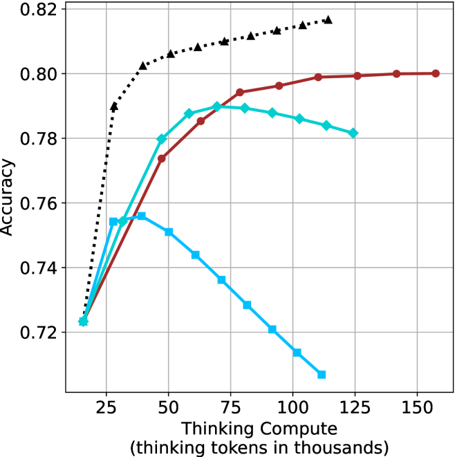
### Visual Description
## Line Chart: Accuracy vs. Thinking Compute
### Overview
The image is a line chart illustrating the relationship between "Thinking Compute" (measured in thousands of thinking tokens) and model "Accuracy." The chart displays four distinct data series, all originating from a common baseline at approximately 15-18k tokens and 0.723 accuracy. The chart demonstrates that increasing compute does not universally improve accuracy; rather, different models or configurations exhibit distinct performance curves, with some showing diminishing returns or performance degradation (overthinking) at higher compute levels.
**Note:** The image lacks a legend, so the specific identity of each data series (e.g., model name or configuration) is not provided.
### Components/Axes
* **Y-Axis:** Labeled "Accuracy." The scale ranges from 0.72 to 0.82, with major grid lines at 0.02 intervals.
* **X-Axis:** Labeled "Thinking Compute (thinking tokens in thousands)." The scale ranges from 25 to 150, with major grid lines at 25-unit intervals. The data series begin to the left of the 25 mark, at approximately 15-18k tokens.
* **Grid:** A standard Cartesian grid with light gray lines.
* **Data Series (identified by marker/line style):**
1. **Black Dotted Line:** Marked with triangles.
2. **Dark Red Solid Line:** Marked with circles.
3. **Teal Solid Line:** Marked with diamonds.
4. **Light Blue Solid Line:** Marked with squares.
### Detailed Analysis
#### 1. Black Dotted Line (Triangles)
* **Trend:** This series shows the strongest performance. It exhibits a steep initial upward slope, followed by a continued, albeit slower, upward trajectory throughout the entire compute range. It does not show signs of peaking or declining within the visible range.
* **Approximate Data Points:**
* Start: (18, 0.723)
* (28, 0.79)
* (40, 0.802)
* (60, 0.808)
* (80, 0.811)
* (100, 0.814)
* (125, 0.817)
#### 2. Dark Red Solid Line (Circles)
* **Trend:** This series shows a steady, consistent upward slope. It flattens out significantly after 100k tokens, suggesting diminishing returns, but maintains a positive or neutral trend without declining.
* **Approximate Data Points:**
* Start: (18, 0.723)
* (45, 0.774)
* (60, 0.785)
* (80, 0.794)
* (100, 0.796)
* (125, 0.799)
* (160, 0.80)
#### 3. Teal Solid Line (Diamonds)
* **Trend:** This series rises sharply initially, peaks, and then exhibits a gradual decline. It appears to reach its optimal performance around 75k tokens.
* **Approximate Data Points:**
* Start: (18, 0.723)
* (30, 0.754)
* (45, 0.78)
* (60, 0.788)
* (75, 0.79)
* (95, 0.788)
* (110, 0.786)
* (125, 0.782)
#### 4. Light Blue Solid Line (Squares)
* **Trend:** This series shows the poorest performance at higher compute levels. It rises slightly, peaks very early (around 40k tokens), and then declines steadily and significantly as compute increases.
* **Approximate Data Points:**
* Start: (18, 0.723)
* (30, 0.754)
* (40, 0.756)
* (50, 0.751)
* (70, 0.736)
* (90, 0.72)
* (110, 0.707)
### Key Observations
* **The "Overthinking" Penalty:** The Teal and Light Blue lines clearly demonstrate that increasing compute beyond a certain threshold is detrimental to accuracy. This is a classic "overthinking" phenomenon where the model likely introduces errors or hallucinations by generating excessive tokens.
* **Divergence:** While all models start at the same baseline, they diverge rapidly after 25k tokens.
* **Scalability:** The Black Dotted model is the only one that appears to scale effectively with increased compute, suggesting it is the most robust architecture or configuration among the four.
### Interpretation
This chart is a visualization of the "Test-Time Compute" scaling laws for reasoning models. It demonstrates that "more thinking" is not always better.
* **The Black Dotted line** represents a model that effectively utilizes additional compute to refine its reasoning, likely indicating a more capable base model or a more efficient reasoning strategy.
* **The Light Blue and Teal lines** represent models that are highly sensitive to compute allocation. They have a "sweet spot" (peak accuracy). Beyond this peak, the additional tokens likely represent redundant or erroneous reasoning paths that confuse the final output, leading to a degradation in accuracy.
* **Strategic Implication:** For a developer, this chart suggests that simply increasing the token limit for a model is not a universal solution. One must identify the optimal compute "budget" for a specific model to maximize performance and avoid the performance degradation seen in the lower-performing series.
</details>
(c) QwQ-32B
<details>
<summary>x49.png Details</summary>
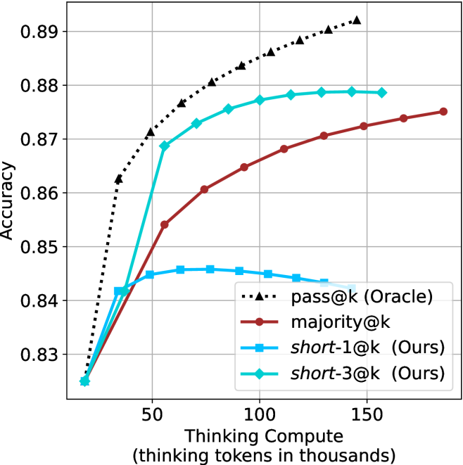
### Visual Description
## Line Chart: Accuracy vs. Thinking Compute
### Overview
This chart illustrates the relationship between "Thinking Compute" (measured in thousands of thinking tokens) and model "Accuracy." It compares four different strategies for utilizing thinking tokens: an Oracle baseline, a majority voting method, and two "short" selection methods (1@k and 3@k). The chart demonstrates how different strategies scale in accuracy as more compute is allocated.
### Components/Axes
* **Y-Axis**: Labeled "Accuracy." The scale ranges from 0.82 to 0.89, with major grid lines at 0.01 intervals.
* **X-Axis**: Labeled "Thinking Compute (thinking tokens in thousands)." The scale ranges from approximately 20 to 180.
* **Legend**: Located in the bottom-right quadrant of the chart area.
* **`pass@k (Oracle)`**: Black dotted line with triangle markers.
* **`majority@k`**: Dark red solid line with circle markers.
* **`short-1@k (Ours)`**: Light blue solid line with square markers.
* **`short-3@k (Ours)`**: Cyan/Teal solid line with diamond markers.
### Detailed Analysis
#### Data Series Trends and Values
* **`pass@k (Oracle)` (Black dotted line, triangles)**:
* **Trend**: This line shows the steepest, most consistent upward trajectory, representing the theoretical upper bound of performance.
* **Values**: Starts at ~0.825 at 20k tokens. It rises sharply to ~0.862 at 25k tokens, ~0.871 at 50k tokens, ~0.877 at 75k tokens, ~0.884 at 100k tokens, ~0.888 at 125k tokens, and reaches ~0.892 at 145k tokens.
* **`short-3@k (Ours)` (Cyan/Teal solid line, diamonds)**:
* **Trend**: Shows a rapid initial increase in accuracy, followed by a logarithmic saturation curve. It is the most efficient method among the non-oracle approaches.
* **Values**: Starts at ~0.825 at 20k tokens. It rises to ~0.842 at 25k tokens, ~0.869 at 55k tokens, ~0.873 at 75k tokens, ~0.876 at 90k tokens, ~0.878 at 110k tokens, and plateaus around 0.879 by 155k tokens.
* **`majority@k` (Dark red solid line, circles)**:
* **Trend**: Shows a steady, consistent, and nearly linear upward slope. It does not saturate as quickly as the "short" methods.
* **Values**: Starts at ~0.825 at 20k tokens. It reaches ~0.835 at 25k tokens, ~0.854 at 55k tokens, ~0.861 at 75k tokens, ~0.865 at 100k tokens, ~0.871 at 125k tokens, ~0.873 at 150k tokens, and ~0.875 at 185k tokens.
* **`short-1@k (Ours)` (Light blue solid line, squares)**:
* **Trend**: Shows an initial increase, peaks, and then exhibits a slight decline, suggesting diminishing returns or "overthinking" penalties.
* **Values**: Starts at ~0.825 at 20k tokens. It rises to ~0.842 at 25k tokens, peaks at ~0.846 at 75k tokens, and then slowly declines to ~0.843 at 130k tokens.
### Key Observations
* **Efficiency vs. Ceiling**: The `short-3@k` method is significantly more efficient than `majority@k` at lower compute budgets (under 100k tokens), reaching higher accuracy faster.
* **Overthinking Penalty**: The `short-1@k` line is the only one that exhibits a negative slope after a certain point (approx. 75k tokens), indicating that simply generating more tokens without a robust selection strategy (like the "3" in 3@k) can degrade performance.
* **Convergence**: All methods start at the same baseline accuracy (~0.825) at the lowest compute level.
### Interpretation
This chart likely originates from research into Large Language Model (LLM) inference-time compute (often referred to as "Chain-of-Thought" or "Test-time compute").
The data suggests that **selection strategy matters more than raw compute**. By using a "short-3@k" approach, the model achieves high accuracy with significantly fewer tokens than the "majority@k" approach. The "Oracle" line represents the ceiling of what is possible if the model could perfectly select the best answer from the generated tokens. The decline in the `short-1@k` line is a classic indicator of "overthinking" or "drift," where the model generates more content that eventually introduces noise or errors, thereby reducing the overall accuracy.
</details>
(d) R1-670B
Figure 13: AIME 2025 - thinking compute comparison.
<details>
<summary>x50.png Details</summary>
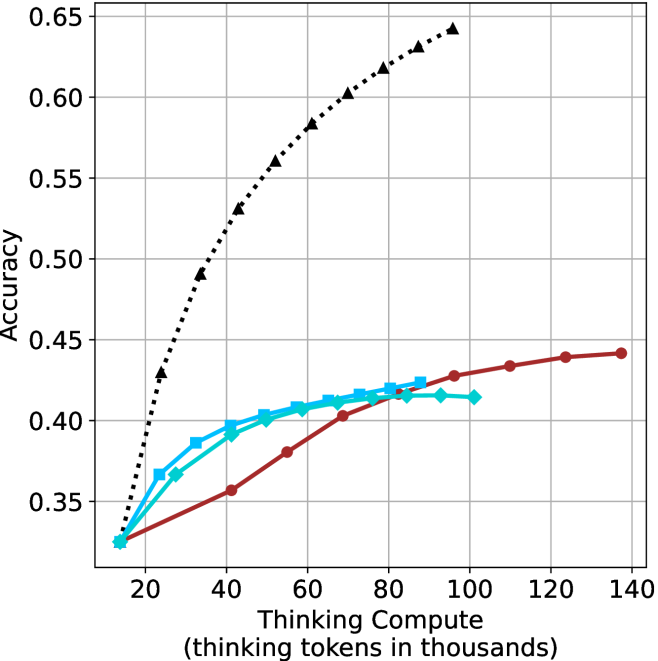
### Visual Description
## Line Chart: Accuracy vs. Thinking Compute
### Overview
This chart illustrates the relationship between "Thinking Compute" (measured in thousands of thinking tokens) and model "Accuracy." It compares four distinct data series, all originating from a common baseline. The chart demonstrates significant variance in how different models or methods scale their accuracy as they are allocated more thinking compute.
### Components/Axes
* **Y-Axis:** Labeled "Accuracy." The scale ranges from 0.35 to 0.65, with major grid lines at 0.05 intervals.
* **X-Axis:** Labeled "Thinking Compute (thinking tokens in thousands)." The scale ranges from 20 to 140, with major grid lines at 20-unit intervals.
* **Data Series:** There are four distinct series. Note: **There is no legend provided in the image** to identify the specific models or methods associated with each line.
* **Series 1 (Black, dotted line, triangle markers):** The top-performing series.
* **Series 2 (Dark Red, solid line, circle markers):** The longest-running series, extending to the highest compute value.
* **Series 3 (Cyan/Light Blue, solid line, square markers):** Mid-range performance.
* **Series 4 (Cyan/Light Blue, solid line, diamond markers):** Mid-range performance, very similar to Series 3.
### Detailed Analysis
All four data series originate from a common starting point at approximately **(15, 0.325)**.
* **Series 1 (Black, Dotted, Triangle Markers):**
* **Trend:** Steep, positive slope. This series shows the most aggressive scaling.
* **Data Points (Approximate):**
* (25, 0.43)
* (35, 0.49)
* (45, 0.53)
* (55, 0.56)
* (65, 0.585)
* (75, 0.605)
* (85, 0.62)
* (95, 0.635)
* (100, 0.64)
* **Observation:** This series achieves the highest accuracy, reaching ~0.64 at 100k tokens.
* **Series 2 (Dark Red, Solid, Circle Markers):**
* **Trend:** Gradual, positive slope. It exhibits the least steep growth but continues to scale to the highest compute value on the chart.
* **Data Points (Approximate):**
* (40, 0.355)
* (55, 0.38)
* (70, 0.40)
* (85, 0.415)
* (100, 0.425)
* (110, 0.43)
* (125, 0.44)
* (135, 0.44)
* **Observation:** The curve begins to flatten significantly after 100k tokens.
* **Series 3 (Cyan/Light Blue, Solid, Square Markers):**
* **Trend:** Moderate positive slope, showing signs of saturation (diminishing returns) after 60k tokens.
* **Data Points (Approximate):**
* (25, 0.365)
* (35, 0.385)
* (45, 0.40)
* (55, 0.405)
* (65, 0.41)
* (75, 0.415)
* (85, 0.425)
* **Observation:** This series terminates at 85k tokens.
* **Series 4 (Cyan/Light Blue, Solid, Diamond Markers):**
* **Trend:** Moderate positive slope, very similar to Series 3, but with a slightly lower ceiling.
* **Data Points (Approximate):**
* (25, 0.365)
* (40, 0.39)
* (50, 0.40)
* (60, 0.405)
* (70, 0.41)
* (80, 0.415)
* (90, 0.415)
* (100, 0.415)
* **Observation:** This series plateaus at 0.415 accuracy after 80k tokens.
### Key Observations
* **Performance Gap:** There is a massive performance gap between the Black Dotted series and the other three. At 100k tokens, the Black series is at ~0.64 accuracy, while the Red series is at ~0.425 and the Cyan-Diamond series is at ~0.415.
* **Efficiency:** The Black series achieves an accuracy of ~0.43 with only 25k tokens, whereas the Red series requires 110k tokens to reach the same accuracy level.
* **Saturation:** The Cyan and Red series all exhibit clear signs of diminishing returns, where increasing compute yields progressively smaller gains in accuracy. The Black series, while also curving, maintains a much higher trajectory.
### Interpretation
This chart is a classic representation of "scaling laws" applied to reasoning models (likely Chain-of-Thought or test-time compute models).
* **The "Black Line" Advantage:** The black dotted line represents a model or method that is highly efficient at utilizing additional "thinking" time. It suggests that the underlying architecture or training method allows the model to effectively convert compute into reasoning capability.
* **The "Ceiling" Effect:** The other three lines (Red, Cyan-Square, Cyan-Diamond) appear to hit a "reasoning ceiling." This suggests that for these specific models, simply generating more tokens does not help the model solve the problem better; it likely just results in verbose or redundant thinking that does not improve the final answer.
* **Strategic Implication:** The data suggests that the *quality* of the reasoning process (the method) is significantly more important than the *quantity* of compute (the tokens). The black line demonstrates that superior reasoning methods can achieve vastly higher accuracy with significantly less compute than inferior methods.
</details>
(a) LN-Super- $49$ B
<details>
<summary>x51.png Details</summary>
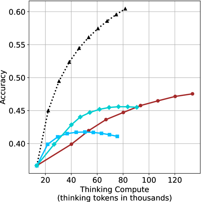
### Visual Description
## Line Chart: Accuracy vs. Thinking Compute
### Overview
This chart illustrates the relationship between "Thinking Compute" (measured in thousands of thinking tokens) and "Accuracy" for four distinct data series. All four series originate from a common baseline point. The chart demonstrates how different models or configurations respond to increased computational "thinking" time, with some showing consistent gains, others plateauing, and one showing a performance decline after a certain threshold.
### Components/Axes
* **Y-Axis:** Labeled "Accuracy". The scale ranges from 0.40 to 0.60, with grid lines at 0.05 intervals. The origin point is below 0.40, approximately 0.35.
* **X-Axis:** Labeled "Thinking Compute (thinking tokens in thousands)". The scale ranges from 20 to 120, with grid lines at 20-unit intervals. The axis starts at 10.
* **Data Series (Legend inferred from visual markers):**
* **Black Dotted Line (Triangle markers):** Represents the highest-performing model.
* **Dark Red Solid Line (Circle markers):** Represents the model with the longest compute range.
* **Teal Solid Line (Diamond markers):** Represents a mid-range performance model that plateaus.
* **Light Blue Solid Line (Square markers):** Represents a model that exhibits performance degradation after a peak.
### Detailed Analysis
All four series originate at approximately **(15k tokens, 0.37 accuracy)**.
**1. Black Dotted Line (Triangles)**
* **Trend:** Steep, monotonic increase. This series shows the most efficient scaling of accuracy relative to compute.
* **Data Points:**
* Starts at (15, 0.37).
* Rises to (22, 0.45).
* Continues to (30, 0.495).
* Reaches (40, 0.525).
* Reaches (50, 0.545).
* Reaches (60, 0.56).
* Reaches (70, 0.575).
* Reaches (75, 0.59).
* Ends at (82, 0.605).
**2. Dark Red Solid Line (Circles)**
* **Trend:** Steady, monotonic increase. This series has the longest compute range, extending beyond 130k tokens.
* **Data Points:**
* Starts at (15, 0.37).
* (40, 0.40).
* (55, 0.42).
* (65, 0.435).
* (80, 0.445).
* (95, 0.46).
* (105, 0.465).
* (120, 0.47).
* Ends at (132, 0.475).
**3. Teal Solid Line (Diamonds)**
* **Trend:** Rapid increase initially, followed by a plateau.
* **Data Points:**
* Starts at (15, 0.37).
* (22, 0.40).
* (30, 0.40).
* (40, 0.43).
* (45, 0.44).
* (55, 0.445).
* (65, 0.45).
* (75, 0.455).
* Ends at (85, 0.455).
**4. Light Blue Solid Line (Squares)**
* **Trend:** Increases to a peak, then declines. This suggests an "overthinking" penalty.
* **Data Points:**
* Starts at (15, 0.37).
* (22, 0.40).
* (30, 0.41).
* (40, 0.415).
* (50, 0.418).
* (60, 0.415).
* (70, 0.412).
* Ends at (80, 0.41).
### Key Observations
* **Performance Hierarchy:** The Black Dotted model is significantly more accurate than the others at any given compute level above 20k tokens.
* **Overthinking Penalty:** The Light Blue model is the only one to show a clear negative slope after ~50k tokens, indicating that for this specific model, additional thinking tokens are detrimental to accuracy.
* **Scalability:** The Dark Red model is the most scalable, showing consistent, albeit slower, accuracy gains as compute increases, suggesting it does not suffer from the same plateauing or degradation issues as the Teal or Light Blue models within the observed range.
### Interpretation
This chart likely represents the performance of different Large Language Model (LLM) reasoning configurations or different model architectures as they are allowed to generate "thinking" tokens before providing a final answer.
* **The Black Dotted model** represents a highly efficient reasoning architecture, likely optimized to extract maximum utility from every thinking token.
* **The Light Blue model** demonstrates a classic "overthinking" phenomenon, where the model likely begins to hallucinate or lose coherence after a certain amount of compute, causing accuracy to drop.
* **The Teal model** represents a model that reaches a point of diminishing returns, where additional compute provides no further benefit to accuracy.
* **The Dark Red model** represents a robust model that benefits from long-context reasoning, continuing to improve even at very high compute levels, though it starts with a slower rate of improvement compared to the Black Dotted model.
</details>
(b) R $1$ - $32$ B
<details>
<summary>x52.png Details</summary>
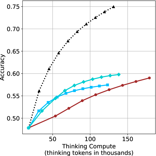
### Visual Description
## Line Chart: Accuracy vs. Thinking Compute
### Overview
This chart illustrates the relationship between "Thinking Compute" (measured in thousands of thinking tokens) and "Accuracy" across four distinct data series. All four series originate from a common baseline and exhibit a positive correlation, demonstrating that increasing the amount of thinking compute generally leads to higher accuracy.
### Components/Axes
* **Y-Axis (Vertical):** Labeled "Accuracy". The scale ranges from 0.50 to 0.75, with major grid lines marked at 0.05 intervals.
* **X-Axis (Horizontal):** Labeled "Thinking Compute (thinking tokens in thousands)". The scale ranges from 0 to 150+, with major grid lines marked at 50-unit intervals.
* **Data Series (Implicit Legend):** There is no explicit legend box. The series are distinguished by color and marker shape:
* **Black Dotted Line:** Triangle markers.
* **Cyan Solid Line:** Diamond markers.
* **Cyan Solid Line:** Square markers.
* **Dark Red Solid Line:** Circle markers.
### Detailed Analysis
All four data series originate from a single point at approximately **(15k tokens, 0.48 accuracy)**.
* **Black Dotted Line (Triangles):**
* **Trend:** This series exhibits the steepest upward slope, indicating the highest efficiency and performance gain per unit of compute.
* **Data Points:** It rises rapidly, reaching approximately 0.60 accuracy at ~40k tokens, 0.70 at ~90k tokens, and terminates at approximately 0.75 accuracy at ~130k tokens.
* **Cyan Solid Line (Diamonds):**
* **Trend:** This series shows a moderate upward slope that begins to flatten (diminishing returns) after approximately 75k tokens.
* **Data Points:** It reaches approximately 0.55 accuracy at ~50k tokens and terminates at approximately 0.60 accuracy at ~140k tokens.
* **Cyan Solid Line (Squares):**
* **Trend:** This series follows a similar trajectory to the diamond-marked line but flattens more aggressively.
* **Data Points:** It reaches approximately 0.55 accuracy at ~50k tokens and terminates at approximately 0.575 accuracy at ~125k tokens.
* **Dark Red Solid Line (Circles):**
* **Trend:** This series has the shallowest slope but maintains a consistent, steady upward trajectory without the sharp flattening observed in the cyan series.
* **Data Points:** It reaches approximately 0.52 accuracy at ~70k tokens, 0.55 at ~110k tokens, and terminates at approximately 0.59 accuracy at ~180k tokens.
### Key Observations
* **Common Baseline:** All models start with identical accuracy at the lowest compute level, suggesting they share a common starting point or base model architecture.
* **Performance Divergence:** As compute increases, the performance gap between the models widens significantly.
* **Diminishing Returns:** The two cyan-colored series (diamonds and squares) exhibit clear signs of saturation, where additional compute yields progressively smaller improvements in accuracy.
* **Efficiency:** The black dotted series is the clear outlier in terms of performance, achieving significantly higher accuracy than the other three models for the same amount of compute.
### Interpretation
This chart likely represents a comparison of different AI model architectures or inference-time reasoning strategies (e.g., Chain-of-Thought scaling).
* **The "Black Dotted" Model:** This represents a superior scaling law or a highly optimized reasoning strategy. It is significantly more "compute-efficient" than the others, suggesting it extracts more intelligence per token generated.
* **The "Cyan" Models:** These models appear to hit a "ceiling" or saturation point. Adding more thinking tokens beyond 100k provides negligible accuracy gains, suggesting these models may be limited by their base architecture or training data rather than just compute.
* **The "Red" Model:** While it has the lowest slope, it does not show the same sharp saturation as the cyan models. This could indicate a model that is more "stable" or capable of utilizing larger amounts of compute effectively, even if its initial gains are slower.
In a Peircean sense, the divergence of these lines acts as an index of the underlying model quality. The chart demonstrates that "thinking" is not a uniform resource; the *method* of thinking (represented by the different lines) is as critical as the *amount* of thinking (the x-axis) in determining the final accuracy.
</details>
(c) QwQ-32B
<details>
<summary>x53.png Details</summary>
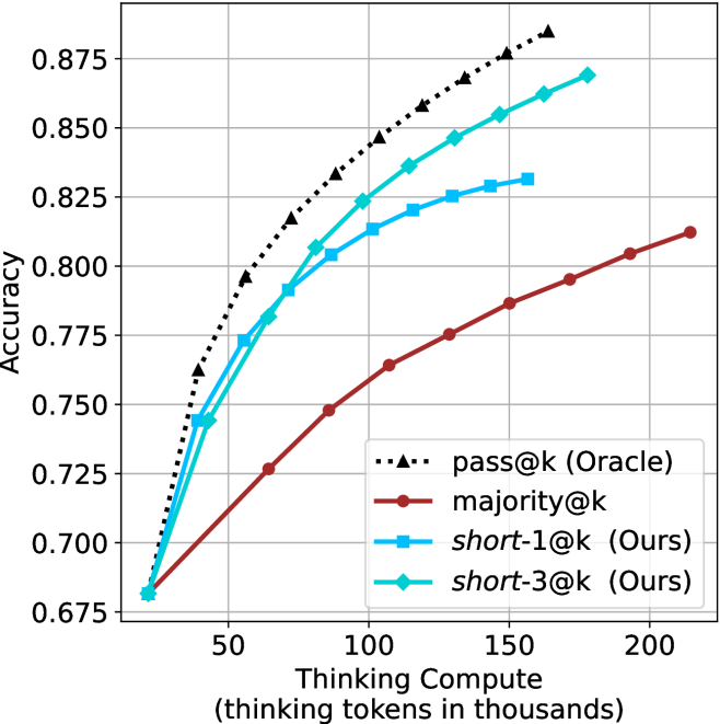
### Visual Description
## Line Chart: Accuracy vs. Thinking Compute
### Overview
This chart illustrates the relationship between "Thinking Compute" (measured in thousands of thinking tokens) and model "Accuracy." It compares four distinct evaluation strategies: `pass@k (Oracle)`, `majority@k`, and two methods labeled as "Ours" (`short-1@k` and `short-3@k`). All methods show a positive correlation between increased compute and improved accuracy, following a logarithmic-style growth curve where gains diminish as compute increases.
### Components/Axes
* **Y-Axis (Vertical):** Labeled "Accuracy." The scale ranges from 0.675 to 0.875, with major grid lines marked at intervals of 0.025.
* **X-Axis (Horizontal):** Labeled "Thinking Compute (thinking tokens in thousands)." The scale ranges from 50 to 200, with major grid lines marked at intervals of 50. Data points begin at approximately 25.
* **Legend:** Positioned in the bottom-right quadrant of the chart area.
* **`pass@k (Oracle)`**: Black dotted line with triangle markers.
* **`majority@k`**: Dark red solid line with circle markers.
* **`short-1@k (Ours)`**: Light blue solid line with square markers.
* **`short-3@k (Ours)`**: Cyan/Teal solid line with diamond markers.
### Detailed Analysis
All four data series originate from a common starting point at approximately (x=25, y=0.68). As compute increases, the series diverge into a clear performance hierarchy.
**1. `pass@k (Oracle)` (Black, Dotted, Triangles)**
* **Trend:** Steepest upward slope; consistently the highest performing series.
* **Data Points (Approximate):**
* x=40, y≈0.76
* x=60, y≈0.795
* x=90, y≈0.835
* x=120, y≈0.86
* x=165, y≈0.885
**2. `short-3@k (Ours)` (Cyan/Teal, Solid, Diamonds)**
* **Trend:** Strong upward slope, tracking closely behind the Oracle.
* **Data Points (Approximate):**
* x=40, y≈0.745
* x=60, y≈0.78
* x=90, y≈0.805
* x=120, y≈0.845
* x=165, y≈0.87
**3. `short-1@k (Ours)` (Light Blue, Solid, Squares)**
* **Trend:** Upward slope, but begins to plateau earlier than the Oracle or `short-3@k`.
* **Data Points (Approximate):**
* x=40, y≈0.745
* x=60, y≈0.775
* x=90, y≈0.805
* x=120, y≈0.82
* x=160, y≈0.83
**4. `majority@k` (Dark Red, Solid, Circles)**
* **Trend:** The slowest growth rate; consistently the lowest performing series.
* **Data Points (Approximate):**
* x=60, y≈0.725
* x=100, y≈0.765
* x=140, y≈0.785
* x=180, y≈0.805
* x=215, y≈0.815
### Key Observations
* **Performance Hierarchy:** The performance order is consistently `pass@k (Oracle)` > `short-3@k` > `short-1@k` > `majority@k`.
* **Efficiency Gap:** The "Ours" methods (`short-1` and `short-3`) significantly outperform the `majority@k` baseline. For example, at 100k tokens, `short-3@k` achieves an accuracy of ~0.82, whereas `majority@k` requires over 200k tokens to reach ~0.81.
* **Diminishing Returns:** All curves exhibit a concave shape, indicating that as more thinking tokens are allocated, the marginal gain in accuracy decreases. This is most pronounced in the `short-1@k` series, which flattens significantly after 120k tokens.
### Interpretation
This chart demonstrates the efficacy of the proposed "short" thinking strategies compared to standard majority voting (`majority@k`).
* **Strategic Advantage:** The "Ours" methods are clearly optimized to extract higher accuracy from the model with significantly less compute than the `majority@k` baseline.
* **Scaling Behavior:** The `short-3@k` method maintains a trajectory closer to the theoretical "Oracle" limit than `short-1@k`, suggesting that allowing for slightly more "short" thinking paths (or a different selection mechanism) yields better results.
* **Practical Implication:** For a system designer, this data suggests that using `short-3@k` provides a superior trade-off between computational cost (thinking tokens) and accuracy compared to the standard `majority@k` approach, effectively shifting the accuracy curve upward and to the left.
</details>
(d) R1-670B
Figure 14: HMMT Feb 2025 - thinking compute comparison.
<details>
<summary>x54.png Details</summary>
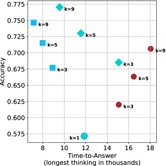
### Visual Description
## Scatter Plot: Accuracy vs. Time-to-Answer
### Overview
This image is a scatter plot visualizing the relationship between "Time-to-Answer" (computational cost) and "Accuracy" (performance). The data points are categorized by color and shape, with specific labels ('k' values) indicating different parameter settings or model configurations. The plot reveals two distinct clusters of data, suggesting a comparison between two different model architectures or processing methods.
### Components/Axes
* **Y-Axis:** Labeled "Accuracy". The scale ranges from 0.575 to 0.775, with major grid lines at intervals of 0.025.
* **X-Axis:** Labeled "Time-to-Answer (longest thinking in thousands)". The scale ranges from 8 to 18, with major grid lines at intervals of 2.
* **Data Markers:**
* **Light Blue Squares:** Located on the left side of the chart (Time-to-Answer < 10).
* **Light Blue Diamonds:** Located in the upper-middle section of the chart (Time-to-Answer between 9 and 12).
* **Light Blue Star/Flower:** Located at the bottom-center (Time-to-Answer ≈ 12).
* **Dark Red Circles:** Located on the right side of the chart (Time-to-Answer > 14).
* **Labels:** Each data point is annotated with a "k=" value, representing a specific variable (likely a hyperparameter like k-nearest neighbors or similar).
### Detailed Analysis
The data points are distributed across the plot as follows (approximate coordinates):
**Light Blue Group (Left/Center Cluster):**
* **Square (k=9):** Positioned at top-left. X ≈ 7.2, Y ≈ 0.745.
* **Square (k=5):** Positioned at mid-left. X ≈ 8.5, Y ≈ 0.715.
* **Square (k=3):** Positioned at mid-left. X ≈ 8.8, Y ≈ 0.675.
* **Diamond (k=9):** Positioned at top-center. X ≈ 9.5, Y ≈ 0.770.
* **Diamond (k=5):** Positioned at mid-center. X ≈ 11.5, Y ≈ 0.730.
* **Star/Flower (k=1):** Positioned at bottom-center. X ≈ 11.8, Y ≈ 0.570.
**Dark Red Group (Right Cluster):**
* **Circle (k=3):** Positioned at mid-right. X ≈ 15.0, Y ≈ 0.620.
* **Circle (k=5):** Positioned at mid-right. X ≈ 16.5, Y ≈ 0.665.
* **Circle (k=9):** Positioned at mid-right. X ≈ 18.0, Y ≈ 0.705.
### Key Observations
* **Bimodal Distribution:** The data is clearly split into two distinct performance regimes. The Light Blue group (squares/diamonds) achieves higher accuracy with lower time-to-answer. The Dark Red group (circles) requires significantly more time but achieves lower accuracy.
* **Trend in Dark Red Group:** There is a strong positive correlation between the 'k' value and both time and accuracy. As 'k' increases from 3 to 9, the time-to-answer increases linearly, and accuracy improves linearly.
* **Trend in Light Blue Group:** The relationship is less linear. The k=9 diamond is the most accurate point on the entire chart, but it requires more time than the k=9 square.
* **Outlier:** The k=1 (star/flower) marker is the least accurate and has a relatively high time-to-answer compared to the other light blue markers, making it the least efficient configuration in the dataset.
### Interpretation
This chart likely compares two different model architectures or inference strategies.
1. **Efficiency Gap:** The "Light Blue" strategy is vastly superior to the "Dark Red" strategy. It achieves higher accuracy (peaking at ~0.77 vs ~0.70) while consuming significantly less time (max ~12k vs ~18k).
2. **Scaling Behavior:** The "Dark Red" strategy appears to be a model that scales predictably—increasing 'k' adds computational cost but yields consistent accuracy gains.
3. **Optimization:** The "Light Blue" strategy shows that higher 'k' values (specifically k=9) provide the best performance, but the choice of shape (Square vs. Diamond) suggests there may be an underlying architectural difference (e.g., different model sizes or prompt structures) that affects the time-to-answer even when 'k' is held constant.
4. **Conclusion:** If this were a decision-making matrix for model deployment, the "Light Blue" strategy is the clear choice, with the k=9 Diamond being the optimal configuration for high accuracy, and the k=5 Square being a potential candidate if lower latency is required.
</details>
(a) LN-Super- $49$ B
<details>
<summary>x55.png Details</summary>
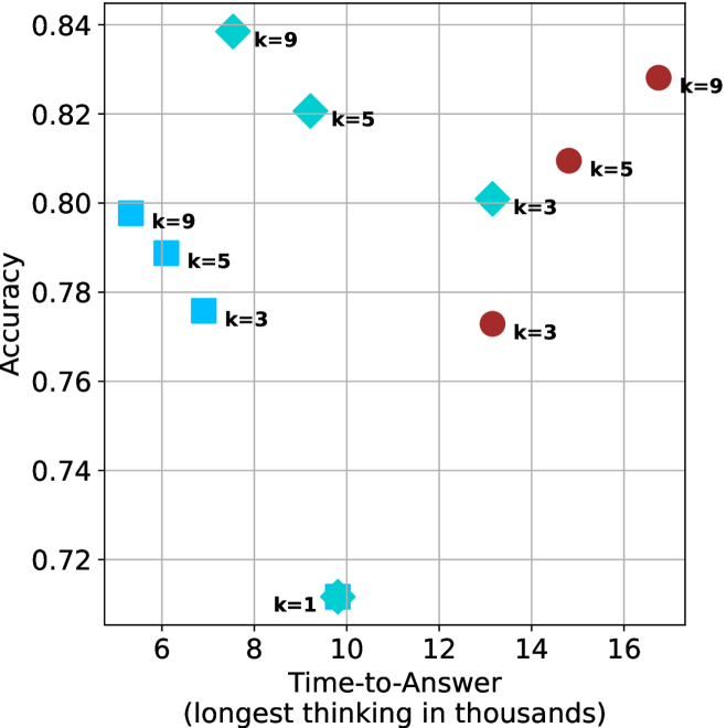
### Visual Description
## Scatter Plot: Accuracy vs. Time-to-Answer
### Overview
This image is a scatter plot visualizing the relationship between "Time-to-Answer" (x-axis) and "Accuracy" (y-axis). The data points are categorized into four distinct groups based on shape and color, with each point labeled with a "k" value (k=1, 3, 5, or 9). The chart suggests a performance benchmark, likely comparing different AI model configurations or inference strategies.
### Components/Axes
* **Y-Axis:** Labeled "Accuracy". The scale ranges from 0.72 to 0.84, with grid lines at 0.02 intervals.
* **X-Axis:** Labeled "Time-to-Answer (longest thinking in thousands)". The scale ranges from 6 to 16, with grid lines at 2-unit intervals.
* **Data Series (Categorized by Shape/Color):**
* **Cyan Squares:** Located on the left side of the chart.
* **Cyan Diamonds:** Located in the upper-middle section of the chart.
* **Cyan Star/Flower:** A single point located at the bottom-middle.
* **Maroon Circles:** Located on the right side of the chart.
* **Labels:** Each data point is annotated with a "k=" value, indicating a parameter setting for that specific data point.
### Detailed Analysis
The data points are grouped by shape/color. Below are the approximate coordinates (x, y) for each point:
**1. Cyan Squares (Left Cluster)**
* **k=9:** Positioned at approximately (5.3, 0.798).
* **k=5:** Positioned at approximately (6.3, 0.789).
* **k=3:** Positioned at approximately (7.3, 0.776).
* *Trend:* As the "k" value decreases from 9 to 3, the time-to-answer increases, and accuracy decreases.
**2. Cyan Diamonds (Upper-Middle Cluster)**
* **k=9:** Positioned at approximately (7.5, 0.839).
* **k=5:** Positioned at approximately (9.7, 0.821).
* **k=3:** Positioned at approximately (13.2, 0.801).
* *Trend:* As the "k" value decreases from 9 to 3, the time-to-answer increases significantly, and accuracy decreases.
**3. Cyan Star (Bottom Outlier)**
* **k=1:** Positioned at approximately (9.8, 0.712).
* *Trend:* This is an isolated point representing the lowest accuracy on the chart.
**4. Maroon Circles (Right Cluster)**
* **k=9:** Positioned at approximately (16.8, 0.828).
* **k=5:** Positioned at approximately (14.8, 0.810).
* **k=3:** Positioned at approximately (13.2, 0.773).
* *Trend:* Unlike the other groups, as the "k" value decreases from 9 to 3, both the time-to-answer and the accuracy decrease.
### Key Observations
* **Performance Efficiency:** The **Cyan Diamonds** group generally achieves the highest accuracy (peaking near 0.84) while maintaining moderate time-to-answer values.
* **The "k" Parameter:** The "k" parameter appears to influence accuracy positively in all groups (higher k = higher accuracy). However, the impact on time-to-answer varies by group.
* **Outlier:** The **k=1 (Cyan Star)** point is a significant outlier, showing the lowest accuracy (approx. 0.71) despite a moderate time-to-answer (approx. 9.8).
* **Group Separation:** The four groups are spatially distinct, suggesting they represent fundamentally different methods, models, or architectures, rather than just variations of the same process.
### Interpretation
This chart illustrates a classic "Pareto frontier" or trade-off analysis in computational performance.
* **Strategy Comparison:** The distinct clusters suggest four different approaches to solving a problem. The **Cyan Diamonds** appear to be the most efficient, providing the highest accuracy for the time invested.
* **Inversion of Logic:** The **Maroon Circles** exhibit a different behavior compared to the **Cyan Squares/Diamonds**. In the Maroon group, increasing "k" increases both time and accuracy, which is expected. However, in the Cyan groups, increasing "k" actually *decreases* the time-to-answer while increasing accuracy. This suggests that for the Cyan methods, higher "k" values might trigger a more efficient search or pruning mechanism, whereas for the Maroon method, higher "k" simply adds computational overhead.
* **Conclusion:** If the goal is to maximize accuracy, the **Cyan Diamond (k=9)** is the optimal choice. If the goal is to minimize time while maintaining acceptable accuracy, the **Cyan Square (k=9)** is the most efficient. The **Maroon Circles** are generally less efficient, as they require more time to achieve similar or lower accuracy than the Cyan Diamonds.
</details>
(b) R $1$ - $32$ B
<details>
<summary>x56.png Details</summary>
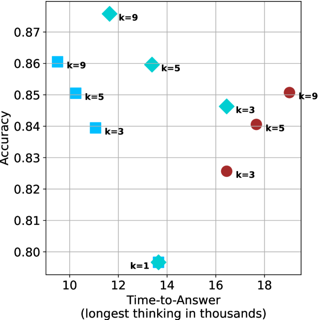
### Visual Description
## Scatter Plot: Accuracy vs. Time-to-Answer
### Overview
This image is a scatter plot visualizing the relationship between "Time-to-Answer" (measured in thousands of units, likely representing thinking time) and "Accuracy" for various model configurations. The data points are categorized by shape and color, with each point labeled by a "k" value (likely representing a hyperparameter like k-nearest neighbors or a similar variable).
### Components/Axes
* **Y-Axis (Vertical):** Labeled "Accuracy". The scale ranges from 0.80 to 0.87, with grid lines at 0.01 intervals.
* **X-Axis (Horizontal):** Labeled "Time-to-Answer (longest thinking in thousands)". The scale ranges from 10 to 18, with grid lines at intervals of 2.
* **Data Series (Markers):**
* **Light Blue Squares:** Three points (k=3, k=5, k=9).
* **Cyan Diamonds:** Three points (k=3, k=5, k=9).
* **Maroon Circles:** Three points (k=3, k=5, k=9).
* **Cyan Star/Asterisk:** One point (k=1).
### Detailed Analysis
The data points are grouped by shape. Below are the approximate coordinates (X, Y) for each point:
**1. Light Blue Squares (Fastest Group)**
*Trend: As k increases, accuracy increases, and time-to-answer increases slightly.*
* **k=3:** Located at X ≈ 11.2, Y ≈ 0.840.
* **k=5:** Located at X ≈ 10.8, Y ≈ 0.851.
* **k=9:** Located at X ≈ 10.2, Y ≈ 0.861.
**2. Cyan Diamonds (High Accuracy Group)**
*Trend: As k increases, accuracy increases, but time-to-answer decreases (inverse relationship).*
* **k=3:** Located at X ≈ 16.4, Y ≈ 0.846.
* **k=5:** Located at X ≈ 13.8, Y ≈ 0.860.
* **k=9:** Located at X ≈ 11.6, Y ≈ 0.876.
**3. Maroon Circles (Slowest Group)**
*Trend: As k increases, accuracy increases, and time-to-answer increases significantly.*
* **k=3:** Located at X ≈ 16.4, Y ≈ 0.826.
* **k=5:** Located at X ≈ 17.7, Y ≈ 0.841.
* **k=9:** Located at X ≈ 19.0, Y ≈ 0.851.
**4. Cyan Star (Outlier)**
* **k=1:** Located at X ≈ 13.8, Y ≈ 0.797. This is the lowest accuracy point on the chart.
### Key Observations
* **Performance Ceiling:** The highest accuracy achieved is approximately 0.876 (Cyan Diamond, k=9).
* **Performance Floor:** The lowest accuracy is approximately 0.797 (Cyan Star, k=1).
* **Clustering:** The data forms three distinct "paths" or clusters based on the marker shape. The Maroon Circles are consistently the slowest (highest time-to-answer), while the Light Blue Squares are the fastest.
* **Parameter Consistency:** Across all three main groups (Squares, Diamonds, Circles), increasing the "k" value consistently results in higher accuracy.
### Interpretation
The data demonstrates a clear trade-off between computational time and model accuracy, but this trade-off is highly dependent on the underlying model architecture (represented by the marker shapes).
* **The "k" Factor:** The parameter "k" acts as a positive driver for accuracy across all tested configurations. Higher "k" values consistently yield better accuracy, though they often come at the cost of increased time-to-answer (except in the case of the Cyan Diamonds, where higher "k" actually correlates with faster times).
* **Architectural Efficiency:** The Light Blue Squares represent the most efficient architecture, achieving high accuracy (up to 0.861) with the lowest time-to-answer (10-11k). Conversely, the Maroon Circles represent a less efficient architecture, requiring significantly more time (16-19k) to achieve similar or lower accuracy levels compared to the other groups.
* **Anomaly:** The k=1 configuration (Cyan Star) is a significant outlier, performing poorly in accuracy despite requiring a moderate amount of time (13.8k). This suggests that k=1 is likely an under-optimized or unstable configuration for this specific task.
</details>
(c) QwQ-32B
<details>
<summary>x57.png Details</summary>
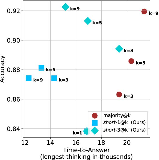
### Visual Description
## Scatter Plot: Accuracy vs. Time-to-Answer
### Overview
This image is a scatter plot comparing the performance of three different methods—`majority@k`, `short-1@k` (Ours), and `short-3@k` (Ours)—across varying `k` values. The plot evaluates the trade-off between "Time-to-Answer" (x-axis) and "Accuracy" (y-axis).
### Components/Axes
* **X-Axis:** "Time-to-Answer (longest thinking in thousands)". The scale ranges from 12 to 22.
* **Y-Axis:** "Accuracy". The scale ranges from 0.84 to 0.92.
* **Legend (Bottom-Right):**
* **Dark Red Circle:** `majority@k`
* **Cyan Square:** `short-1@k (Ours)`
* **Cyan Diamond:** `short-3@k (Ours)`
* **Grid:** A light gray grid overlays the plot area to assist in reading coordinate values.
### Detailed Analysis
The data points are grouped by method. Below are the extracted values based on visual estimation.
#### 1. `short-1@k` (Cyan Squares)
* **Trend:** This series occupies the left-most region of the chart, indicating the lowest time-to-answer. The accuracy fluctuates slightly as `k` increases.
* **Data Points:**
* `k=9`: x ≈ 12.2, y ≈ 0.875
* `k=5`: x ≈ 13.3, y ≈ 0.881
* `k=3`: x ≈ 14.3, y ≈ 0.875
* `k=1`: x ≈ 16.8, y ≈ 0.838 (Shared coordinate with `short-3@k`)
#### 2. `short-3@k` (Cyan Diamonds)
* **Trend:** This series shows a strong positive correlation between time and accuracy. As `k` increases from 1 to 9, both time and accuracy increase significantly.
* **Data Points:**
* `k=9`: x ≈ 15.3, y ≈ 0.923
* `k=5`: x ≈ 16.8, y ≈ 0.913
* `k=3`: x ≈ 19.4, y ≈ 0.894
* `k=1`: x ≈ 16.8, y ≈ 0.838 (Shared coordinate with `short-1@k`)
#### 3. `majority@k` (Dark Red Circles)
* **Trend:** This series occupies the right-most region of the chart, indicating the highest time-to-answer. Accuracy increases as `k` increases.
* **Data Points:**
* `k=9`: x ≈ 21.3, y ≈ 0.919
* `k=5`: x ≈ 20.3, y ≈ 0.886
* `k=3`: x ≈ 19.4, y ≈ 0.863
### Key Observations
* **Efficiency Leader:** `short-1@k` is consistently the fastest method (lowest x-values) but generally yields lower accuracy than `short-3@k`.
* **Performance Leader:** `short-3@k` at `k=9` achieves the highest accuracy on the chart (~0.923) while maintaining a significantly lower time-to-answer (~15.3) compared to `majority@k` at `k=9` (~21.3).
* **Convergence:** At `k=1`, both `short-1@k` and `short-3@k` converge to the exact same performance metrics (x ≈ 16.8, y ≈ 0.838).
* **Outlier/Anomaly:** The `majority@k` method is consistently slower than the "Ours" methods for equivalent `k` values, suggesting it is computationally more expensive.
### Interpretation
The data demonstrates a clear Pareto optimization strategy employed by the "Ours" methods (`short-1` and `short-3`).
1. **Efficiency vs. Accuracy:** The "Ours" methods are designed to reduce the "Time-to-Answer" compared to the baseline `majority@k`.
2. **Superiority of `short-3@k`:** The `short-3@k` method appears to be the most effective strategy presented. It achieves higher accuracy than `majority@k` (at `k=9`) while requiring roughly 28% less time (15.3 vs 21.3).
3. **Diminishing Returns:** While increasing `k` generally improves accuracy for all methods, it comes at a linear or near-linear cost in time. The `short-3@k` method provides the best balance, pushing the accuracy ceiling higher than the other two methods while keeping the time-to-answer well below the 20,000 mark for most configurations.
</details>
(d) R1-670B
Figure 15: AIME 2024 - time-to-answer comparison.
<details>
<summary>x58.png Details</summary>
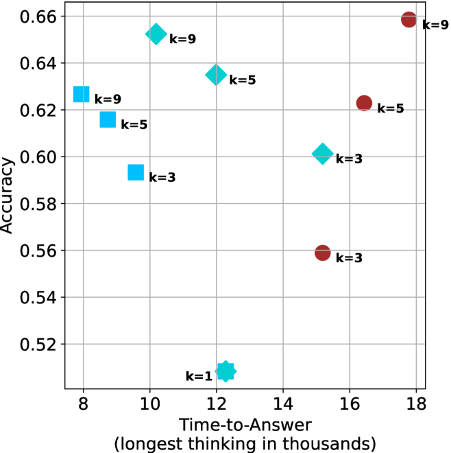
### Visual Description
## Scatter Plot: Accuracy vs. Time-to-Answer
### Overview
This image is a scatter plot visualizing the relationship between "Time-to-Answer" (x-axis) and "Accuracy" (y-axis). The plot contains ten distinct data points categorized by color (Cyan and Maroon) and shape (Squares, Diamonds, and Circles). Each point is labeled with a "k" value (k=1, k=3, k=5, k=9), likely representing a hyperparameter or model configuration.
### Components/Axes
* **Y-Axis (Vertical):** Labeled "Accuracy". The scale ranges from 0.52 to 0.66, with grid lines at 0.02 intervals.
* **X-Axis (Horizontal):** Labeled "Time-to-Answer (longest thinking in thousands)". The scale ranges from 8 to 18, with grid lines at 2-unit intervals.
* **Data Series:**
* **Cyan Squares:** Three points located in the left-center region.
* **Cyan Diamonds:** Four points located in the center-left to center-right region. One point (k=1) is a distinct star-shaped diamond.
* **Maroon Circles:** Three points located in the right region.
### Detailed Analysis
The data points are distributed across the plot. Below are the approximate coordinates (x, y) for each point:
**Cyan Series (Squares)**
* **k=9:** Located at approximately (8.3, 0.627).
* **k=5:** Located at approximately (8.7, 0.616).
* **k=3:** Located at approximately (9.6, 0.594).
* *Trend:* This series shows a clear **downward trend**; as the time-to-answer increases, the accuracy decreases.
**Cyan Series (Diamonds)**
* **k=9:** Located at approximately (10.3, 0.653).
* **k=5:** Located at approximately (12.0, 0.635).
* **k=1:** Located at approximately (12.3, 0.510). This is a significant outlier, positioned well below the main cluster.
* **k=3:** Located at approximately (15.2, 0.601).
* *Trend:* Excluding the k=1 outlier, this series shows a **downward trend**; accuracy decreases as time-to-answer increases.
**Maroon Series (Circles)**
* **k=3:** Located at approximately (15.2, 0.559).
* **k=5:** Located at approximately (16.5, 0.623).
* **k=9:** Located at approximately (17.8, 0.659).
* *Trend:* This series shows a clear **upward trend**; as the time-to-answer increases, the accuracy increases.
### Key Observations
* **Divergent Behaviors:** The dataset exhibits two distinct behaviors. The Cyan points (Squares and Diamonds) generally show a negative correlation between time and accuracy. Conversely, the Maroon points (Circles) show a positive correlation.
* **Outlier:** The Cyan Diamond (k=1) at (12.3, 0.510) is a significant anomaly, representing the lowest accuracy in the entire dataset despite having a moderate time-to-answer.
* **Clustering:** The Maroon points are clustered on the right side of the chart (higher time-to-answer), while the Cyan points are clustered on the left and center (lower time-to-answer).
### Interpretation
This chart likely compares two different algorithmic approaches or model architectures.
1. **The "Cyan" Approach:** This method appears to be optimized for speed (lower time-to-answer). However, it suffers from a "diminishing returns" or "negative efficiency" problem: as the model is forced to take more time (or as the 'k' parameter changes), the accuracy actually drops. The k=1 configuration is particularly ineffective.
2. **The "Maroon" Approach:** This method appears to be a "slow and steady" approach. It requires significantly more time-to-answer (15k to 18k) compared to the Cyan approach (8k to 15k), but it demonstrates a positive correlation: the more time it is allowed to "think," the more accurate it becomes.
3. **Strategic Trade-off:** The data suggests a fundamental trade-off. If the system requires a fast response, the Cyan approach is necessary, but it has a performance ceiling. If the system requires high accuracy and can tolerate latency, the Maroon approach is superior. The k=9 configuration in the Maroon series achieves the highest accuracy in the plot (~0.66), but at the cost of the highest time-to-answer (~17.8k).
</details>
(a) LN-Super- $49$ B
<details>
<summary>x59.png Details</summary>
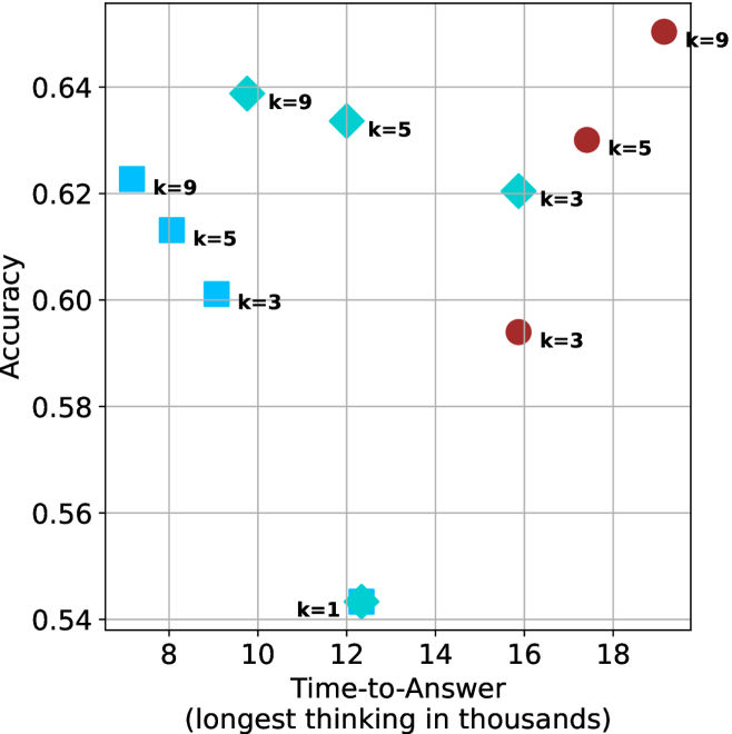
### Visual Description
## Scatter Plot: Accuracy vs. Time-to-Answer
### Overview
This image is a scatter plot visualizing the performance of different configurations (represented by shapes and "k" values) based on two metrics: "Time-to-Answer" (x-axis) and "Accuracy" (y-axis). The plot uses four distinct marker shapes—squares, diamonds, circles, and a star—to categorize data points, with each point labeled with a "k" value (k=1, 3, 5, or 9).
### Components/Axes
* **X-Axis:** Labeled "Time-to-Answer (longest thinking in thousands)". The scale ranges from 8 to 18, with major grid lines at intervals of 2.
* **Y-Axis:** Labeled "Accuracy". The scale ranges from 0.54 to 0.64, with major grid lines at intervals of 0.02.
* **Data Markers:**
* **Light Blue Squares:** Located in the left region of the chart.
* **Medium Blue Diamonds:** Located in the center-left to center region.
* **Dark Red Circles:** Located in the right region of the chart.
* **Cyan Star:** Located in the bottom-center region.
* **Labels:** Each marker is annotated with a "k=" value, indicating a specific parameter setting.
### Detailed Analysis
The following data points are estimated based on their position relative to the grid lines.
**1. Light Blue Squares (Left Region)**
* **Trend:** As the "k" value decreases from 9 to 3, both the time-to-answer and accuracy decrease.
* **k=9:** Positioned at approximately x=7.2, y=0.623.
* **k=5:** Positioned at approximately x=8.2, y=0.613.
* **k=3:** Positioned at approximately x=9.2, y=0.601.
**2. Medium Blue Diamonds (Center-Left to Center Region)**
* **Trend:** As the "k" value decreases from 9 to 3, the time-to-answer increases while accuracy decreases.
* **k=9:** Positioned at approximately x=9.8, y=0.639.
* **k=5:** Positioned at approximately x=12.5, y=0.634.
* **k=3:** Positioned at approximately x=15.8, y=0.620.
**3. Dark Red Circles (Right Region)**
* **Trend:** As the "k" value decreases from 9 to 3, the time-to-answer decreases significantly, and accuracy drops sharply.
* **k=9:** Positioned at approximately x=19.2, y=0.650 (Highest accuracy and highest time-to-answer on the chart).
* **k=5:** Positioned at approximately x=17.5, y=0.630.
* **k=3:** Positioned at approximately x=15.8, y=0.594.
**4. Cyan Star (Bottom-Center Region)**
* **k=1:** Positioned at approximately x=12.4, y=0.544 (Lowest accuracy on the chart).
### Key Observations
* **Shared X-Coordinates:** The Medium Blue Diamond (k=3) and the Dark Red Circle (k=3) are vertically aligned at approximately x=15.8, though they have significantly different accuracy levels (0.620 vs 0.594).
* **Performance Extremes:** The Dark Red Circle (k=9) represents the highest accuracy (0.650) but requires the longest time (19.2). The Cyan Star (k=1) represents the lowest accuracy (0.544) with a moderate time-to-answer (12.4).
* **Clustering:** The data is grouped into three distinct clusters based on shape/color, suggesting these represent three different model architectures or prompting strategies, with the "k" value acting as a variable parameter within those groups.
### Interpretation
This chart illustrates a performance trade-off analysis, likely for an Artificial Intelligence model (such as an LLM). The "k" parameter appears to control a mechanism—possibly "k-shot" prompting, "top-k" sampling, or a number of reasoning steps—that directly influences both the computational cost (Time-to-Answer) and the output quality (Accuracy).
The data suggests that for the "Dark Red" and "Light Blue" strategies, increasing "k" yields higher accuracy at the cost of higher time. However, the "Medium Blue" strategy shows an inverse relationship where increasing "k" actually *decreases* the time-to-answer while maintaining relatively high accuracy, suggesting it might be the most efficient configuration among the high-performing options. The "Cyan Star" (k=1) is a significant outlier, performing poorly in accuracy compared to all other configurations.
</details>
(b) R $1$ - $32$ B
<details>
<summary>x60.png Details</summary>
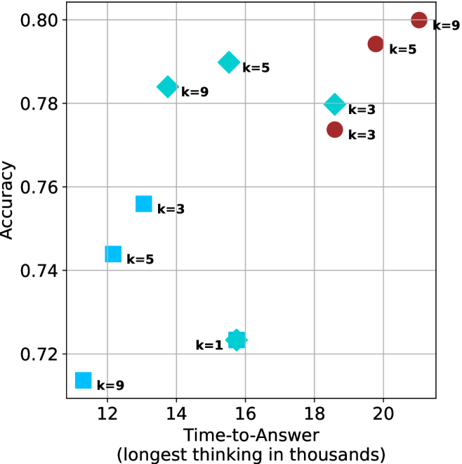
### Visual Description
## Scatter Plot: Accuracy vs. Time-to-Answer
### Overview
This image is a scatter plot visualizing the relationship between "Time-to-Answer" (x-axis) and "Accuracy" (y-axis). The data points are categorized by color and shape, with each point labeled with a "k" value (likely representing a parameter such as sample size, beam width, or number of candidates). The plot suggests a positive correlation between time and accuracy, though the relationship varies significantly across different data clusters.
### Components/Axes
* **Y-Axis:** Labeled "Accuracy". The scale ranges from 0.72 to 0.80, with major grid lines at 0.02 intervals.
* **X-Axis:** Labeled "Time-to-Answer (longest thinking in thousands)". The scale ranges from 12 to 20, with major grid lines at 2-unit intervals.
* **Data Series (Categorized by Shape/Color):**
* **Light Blue Squares:** Three points, generally located in the bottom-left quadrant.
* **Light Blue Diamonds:** Three points, generally located in the upper-middle region.
* **Light Blue Star/Complex Shape:** One point, located in the bottom-middle region.
* **Dark Red/Brown Circles:** Three points, generally located in the upper-right quadrant.
### Detailed Analysis
The following data points are extracted based on visual estimation from the grid:
**1. Light Blue Squares (Bottom-Left Cluster)**
* *Trend:* These points show a positive correlation where increasing time correlates with increasing accuracy.
* **k=9:** Positioned at (x ≈ 12.0, y ≈ 0.715)
* **k=5:** Positioned at (x ≈ 12.5, y ≈ 0.744)
* **k=3:** Positioned at (x ≈ 13.0, y ≈ 0.756)
**2. Light Blue Diamonds (Upper-Middle Cluster)**
* *Trend:* These points show a slight negative correlation or plateau, where increasing time does not yield higher accuracy.
* **k=9:** Positioned at (x ≈ 13.8, y ≈ 0.784)
* **k=5:** Positioned at (x ≈ 15.5, y ≈ 0.790)
* **k=3:** Positioned at (x ≈ 18.5, y ≈ 0.780)
**3. Light Blue Star (Outlier)**
* **k=1:** Positioned at (x ≈ 15.8, y ≈ 0.723)
**4. Dark Red/Brown Circles (Upper-Right Cluster)**
* *Trend:* These points show a strong positive correlation, where increasing time significantly increases accuracy.
* **k=3:** Positioned at (x ≈ 18.5, y ≈ 0.774)
* **k=5:** Positioned at (x ≈ 19.8, y ≈ 0.795)
* **k=9:** Positioned at (x ≈ 21.0, y ≈ 0.800)
### Key Observations
* **Efficiency Clusters:** The data is clearly segmented into three distinct groups. The Light Blue Squares are the fastest but least accurate. The Dark Red Circles are the slowest but achieve the highest accuracy.
* **The "k" Parameter:** The effect of the "k" parameter is inconsistent across groups. In the Blue Square group, lower "k" values (3) correlate with higher accuracy/time. In the Red Circle group, higher "k" values (9) correlate with higher accuracy/time.
* **Outlier:** The "k=1" star is a significant outlier, demonstrating low accuracy despite a relatively high "Time-to-Answer" (approx. 15.8k), making it the least efficient configuration on the chart.
### Interpretation
This chart likely represents a performance evaluation of different algorithmic configurations (e.g., different model architectures or inference methods) where "k" represents a hyperparameter.
* **Diminishing Returns:** The Dark Red Circles show that while increasing time (from 18.5k to 21k) improves accuracy, the gains are marginal (0.774 to 0.800).
* **Optimal Strategy:** Depending on the constraints, the "k=5" diamond (x≈15.5, y≈0.790) appears to be a "sweet spot" or Pareto-optimal point, offering high accuracy with significantly less time than the Red Circle configurations.
* **Inconsistency:** The fact that the relationship between "k" and performance flips between the Blue Square group and the Red Circle group suggests that the underlying mechanism or model being tested changes fundamentally between these groups.
</details>
(c) QwQ-32B
<details>
<summary>x61.png Details</summary>
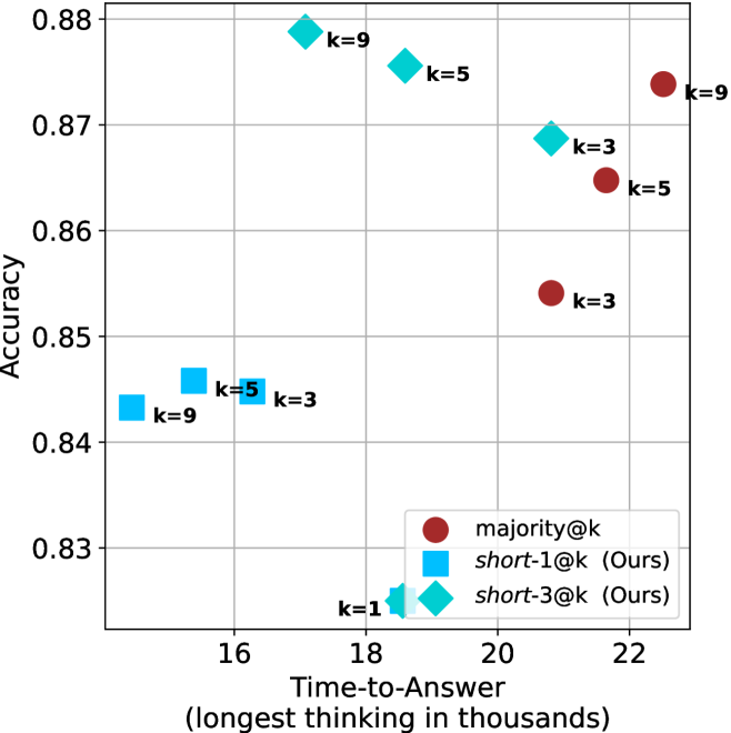
### Visual Description
## Scatter Plot: Accuracy vs. Time-to-Answer for Different Methods
### Overview
This scatter plot illustrates the performance trade-offs between three different methods—`majority@k`, `short-1@k` (Ours), and `short-3@k` (Ours)—across varying values of `k`. The chart maps "Accuracy" (Y-axis) against "Time-to-Answer" (X-axis), measured in thousands of units of "longest thinking." The data suggests a clear distinction in performance profiles between the three methods.
### Components/Axes
* **Y-Axis (Vertical):** Labeled "Accuracy." The scale ranges from 0.83 to 0.88, with grid lines at 0.01 intervals.
* **X-Axis (Horizontal):** Labeled "Time-to-Answer (longest thinking in thousands)." The scale ranges from 16 to 22, with grid lines at 2-unit intervals.
* **Legend (Bottom-Right):**
* **Dark Red Circle:** `majority@k`
* **Light Blue Square:** `short-1@k (Ours)`
* **Cyan Diamond:** `short-3@k (Ours)`
* **Data Labels:** Each data point is annotated with its corresponding `k` value (k=1, 3, 5, 9).
### Detailed Analysis
The data points are clustered by method. Below are the approximate coordinates (x, y) for each data point based on visual estimation:
#### 1. `majority@k` (Dark Red Circles)
*Trend: Positive correlation. As `k` increases, both Time-to-Answer and Accuracy increase.*
* **k=3:** (x ≈ 20.8, y ≈ 0.854)
* **k=5:** (x ≈ 21.7, y ≈ 0.865)
* **k=9:** (x ≈ 22.5, y ≈ 0.874)
#### 2. `short-3@k` (Cyan Diamonds)
*Trend: Negative correlation between `k` and Time-to-Answer. As `k` increases, Time-to-Answer decreases, while Accuracy remains relatively high.*
* **k=3:** (x ≈ 20.8, y ≈ 0.869)
* **k=5:** (x ≈ 18.5, y ≈ 0.876)
* **k=9:** (x ≈ 17.2, y ≈ 0.879)
#### 3. `short-1@k` (Light Blue Squares)
*Trend: Generally lower accuracy compared to the other two methods. Time-to-Answer is the lowest among all groups.*
* **k=3:** (x ≈ 16.2, y ≈ 0.845)
* **k=5:** (x ≈ 15.5, y ≈ 0.846)
* **k=9:** (x ≈ 14.8, y ≈ 0.843)
#### 4. Shared Data Point
* **k=1:** (x ≈ 18.5, y ≈ 0.825). This point appears to be a shared coordinate for both `short-1@k` and `short-3@k`, located at the bottom-center of the chart.
### Key Observations
* **Efficiency vs. Accuracy:** The `short-3@k` method appears to be the most efficient, achieving higher accuracy (0.879 at k=9) than `majority@k` (0.874 at k=9) while requiring significantly less time (17.2 vs 22.5).
* **Methodology Divergence:** The `majority@k` method follows a traditional trade-off where more computation (time) yields higher accuracy. In contrast, the `short-3@k` method demonstrates an inverse relationship where higher `k` values result in faster processing times while maintaining or improving accuracy.
* **Outliers:** The `k=1` data point is a significant outlier in terms of accuracy, performing notably worse (0.825) than all other configurations, regardless of the method.
### Interpretation
The data demonstrates that the "Ours" methods (`short-1@k` and `short-3@k`) are designed to optimize the trade-off between computational time and accuracy.
Specifically, `short-3@k` is the superior strategy in this dataset, as it occupies the "top-left" region of the chart—the ideal quadrant representing high accuracy with low time-to-answer. The fact that `short-3@k` improves in both speed and accuracy as `k` increases suggests that the underlying mechanism (likely a pruning or early-exit strategy) becomes more effective at higher `k` values. Conversely, `majority@k` represents a baseline that scales linearly in cost, making it less efficient than the proposed "short" methods.
</details>
(d) R1-670B
Figure 16: AIME 2025 - time-to-answer comparison.
<details>
<summary>x62.png Details</summary>
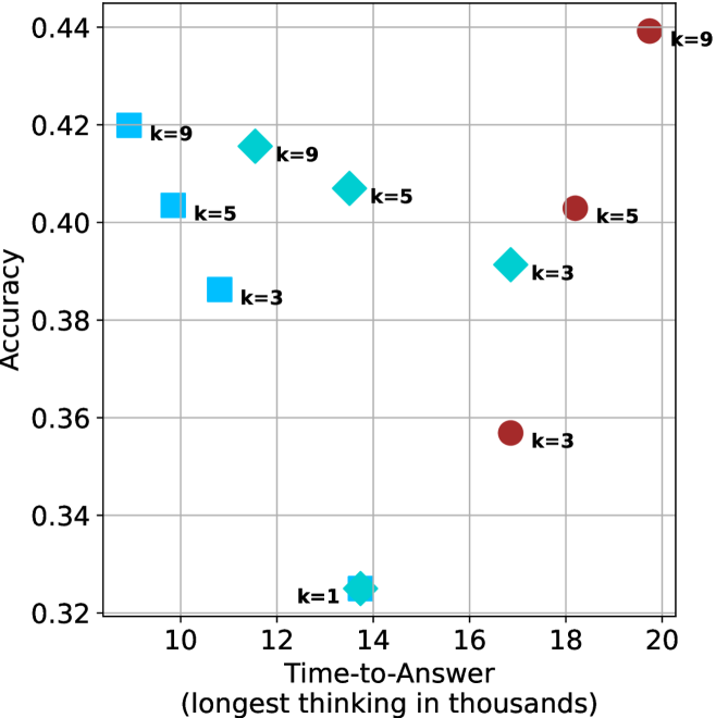
### Visual Description
## Scatter Plot: Accuracy vs. Time-to-Answer
### Overview
This image is a scatter plot visualizing the relationship between "Time-to-Answer" (measured in thousands of units) and "Accuracy" (a decimal value). The plot contains three distinct data series, differentiated by shape and color, with each point labeled with a "k" value (likely representing a parameter such as beam width, number of samples, or chain-of-thought iterations).
### Components/Axes
* **Y-Axis (Vertical):** Labeled "Accuracy". The scale ranges from 0.32 to 0.44, with major grid lines at 0.02 intervals.
* **X-Axis (Horizontal):** Labeled "Time-to-Answer (longest thinking in thousands)". The scale ranges from 10 to 20, with major grid lines at 2-unit intervals.
* **Data Series (Categorized by Shape/Color):**
* **Light Blue Squares:** Located in the top-left quadrant.
* **Cyan Diamonds:** Distributed across the center and bottom-center.
* **Dark Red Circles:** Located in the right-hand side of the plot.
### Detailed Analysis
The following data points are extracted based on visual estimation against the grid lines.
**1. Light Blue Squares (Top-Left Cluster)**
* **Trend:** These points show a clear negative correlation between time and accuracy; as time increases, accuracy decreases.
* **k=9:** Positioned at approximately (9.2, 0.42).
* **k=5:** Positioned at approximately (10.2, 0.405).
* **k=3:** Positioned at approximately (11.2, 0.385).
**2. Cyan Diamonds (Center/Bottom Cluster)**
* **Trend:** These points show a slight negative correlation between time and accuracy, with one significant outlier at the bottom.
* **k=9:** Positioned at approximately (11.5, 0.415).
* **k=5:** Positioned at approximately (13.5, 0.405).
* **k=3:** Positioned at approximately (16.8, 0.39).
* **k=1:** Positioned at approximately (13.8, 0.325). This is the lowest accuracy point on the entire chart.
**3. Dark Red Circles (Right-Hand Cluster)**
* **Trend:** These points show a positive correlation between time and accuracy; as time increases, accuracy increases.
* **k=9:** Positioned at approximately (19.5, 0.44). This is the highest accuracy point on the chart.
* **k=5:** Positioned at approximately (18.2, 0.405).
* **k=3:** Positioned at approximately (16.8, 0.355).
### Key Observations
* **Performance Ceiling:** The "k=9" (Dark Red Circle) at (19.5, 0.44) represents the maximum accuracy achieved, but it also requires the longest time-to-answer.
* **Performance Floor:** The "k=1" (Cyan Diamond) at (13.8, 0.325) is a significant outlier, demonstrating the lowest accuracy despite a moderate time-to-answer.
* **Clustering:** There is a notable convergence of accuracy around the 0.40–0.41 range for "k=5" across all three shapes (Light Blue Square, Cyan Diamond, Dark Red Circle), despite these points having vastly different time-to-answer values (ranging from ~10 to ~18).
### Interpretation
This chart likely illustrates a performance trade-off analysis for an AI model or algorithm, where "k" represents a computational resource parameter (e.g., number of reasoning steps or search breadth).
* **Efficiency vs. Accuracy:** The data suggests that simply increasing "k" does not guarantee better performance across all methods. The Light Blue Squares show that for that specific method, increasing "k" actually *decreases* accuracy while increasing time, suggesting a potential overfitting or noise issue.
* **Methodology Differences:** The three shapes likely represent three different model architectures or prompting strategies. The Dark Red Circles represent a strategy that scales well with time (accuracy improves as time increases), whereas the Light Blue Squares represent a strategy that degrades with increased time.
* **The "k=1" Anomaly:** The "k=1" point is significantly underperforming compared to all other data points. This suggests that a minimum threshold of "k" (likely k=3 or higher) is required for the system to function effectively.
</details>
(a) LN-Super- $49$ B
<details>
<summary>x63.png Details</summary>
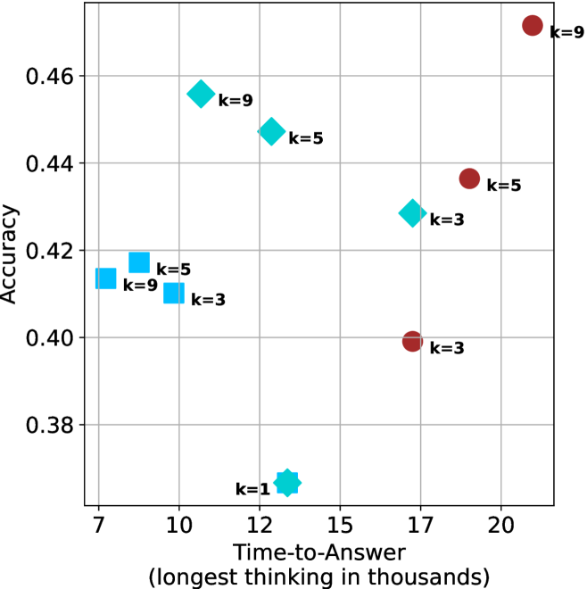
### Visual Description
## Scatter Plot: Accuracy vs. Time-to-Answer
### Overview
This image is a scatter plot visualizing the performance of different configurations (likely AI model parameters or prompting strategies) based on two metrics: "Accuracy" (y-axis) and "Time-to-Answer" (x-axis). The data points are grouped by shape and color, with each point labeled with a specific "k" value (likely representing a parameter such as top-k sampling, number of reasoning chains, or similar).
### Components/Axes
* **Y-Axis:** Labeled "Accuracy". The scale ranges from 0.38 to 0.46, with grid lines at 0.38, 0.40, 0.42, 0.44, 0.46.
* **X-Axis:** Labeled "Time-to-Answer (longest thinking in thousands)". The scale ranges from 7 to 20, with grid lines at 7, 10, 12, 15, 17, 20.
* **Data Series (Categorized by Shape/Color):**
* **Cyan Squares:** Located in the top-left region.
* **Cyan Diamonds:** Located in the top-middle region.
* **Cyan Star:** Located at the bottom-middle.
* **Dark Red Circles:** Located in the top-right region.
### Detailed Analysis
The data points are clustered into four distinct groups. Below are the approximate coordinates (x, y) for each point:
**1. Cyan Squares (Left Cluster)**
* **k=9:** Positioned at x ≈ 8.2, y ≈ 0.418.
* **k=5:** Positioned at x ≈ 8.5, y ≈ 0.414.
* **k=3:** Positioned at x ≈ 10.0, y ≈ 0.410.
* *Trend:* As the 'k' value decreases, the time-to-answer increases slightly, and accuracy decreases.
**2. Cyan Diamonds (Middle Cluster)**
* **k=9:** Positioned at x ≈ 11.0, y ≈ 0.456.
* **k=5:** Positioned at x ≈ 13.0, y ≈ 0.448.
* **k=3:** Positioned at x ≈ 17.0, y ≈ 0.429.
* *Trend:* As the 'k' value decreases, the time-to-answer increases significantly, and accuracy decreases.
**3. Cyan Star (Bottom Center)**
* **k=1:** Positioned at x ≈ 13.0, y ≈ 0.368.
* *Note:* This is a significant outlier with the lowest accuracy of the entire dataset.
**4. Dark Red Circles (Right Cluster)**
* **k=9:** Positioned at x ≈ 21.0, y ≈ 0.472.
* **k=5:** Positioned at x ≈ 19.0, y ≈ 0.437.
* **k=3:** Positioned at x ≈ 17.0, y ≈ 0.399.
* *Trend:* As the 'k' value decreases, both the time-to-answer and the accuracy decrease.
### Key Observations
* **Performance Ceiling:** The highest accuracy (≈ 0.472) is achieved by the Dark Red Circle (k=9), which also corresponds to the longest time-to-answer (≈ 21,000).
* **Consistency of 'k':** Across all three main clusters (Squares, Diamonds, Circles), a higher 'k' value consistently correlates with higher accuracy.
* **Efficiency Trade-off:** The Cyan Squares represent the fastest models (lowest time-to-answer), but they operate at a lower accuracy tier compared to the Diamonds and Circles.
* **Outlier:** The Cyan Star (k=1) is the only data point that falls below the 0.38 accuracy threshold, suggesting that a 'k' value of 1 is highly inefficient or ineffective for this specific task.
### Interpretation
This chart demonstrates a clear performance trade-off between computational time and model accuracy.
* **Model Scaling:** The distinct clusters (Squares, Diamonds, Circles) likely represent different model sizes or architectures. The Dark Red Circles appear to be the most "capable" (highest accuracy) but are the most computationally expensive. The Cyan Squares are the most "efficient" (fastest) but have lower accuracy.
* **Parameter Sensitivity:** The 'k' parameter appears to be a tuning knob for accuracy. In every group, reducing 'k' from 9 to 3 results in a drop in accuracy.
* **The "k=1" Anomaly:** The fact that the k=1 point (Cyan Star) is isolated at the bottom suggests that reducing the parameter too far causes a disproportionate collapse in performance, making it a poor configuration choice compared to k=3, 5, or 9.
* **Strategic Insight:** If a user requires maximum accuracy, the Dark Red model at k=9 is the optimal choice, provided the latency (time-to-answer) is acceptable. If latency is the priority, the Cyan Square model at k=9 offers the best balance of speed and accuracy within that specific cluster.
</details>
(b) R $1$ - $32$ B
<details>
<summary>x64.png Details</summary>
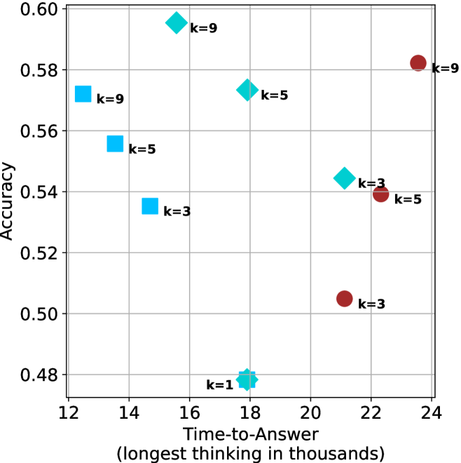
### Visual Description
## Scatter Plot: Accuracy vs. Time-to-Answer
### Overview
This image is a scatter plot visualizing the relationship between "Time-to-Answer" (measured in thousands of units) and "Accuracy" (a decimal value). The data points are categorized by three distinct shapes and two colors (Cyan and Maroon), with each point labeled with a "k" value (k=1, k=3, k=5, k=9). The plot suggests a performance comparison across different configurations or models.
### Components/Axes
* **X-Axis:** "Time-to-Answer (longest thinking in thousands)". The scale ranges from 12 to 24, with major grid lines at intervals of 2.
* **Y-Axis:** "Accuracy". The scale ranges from 0.48 to 0.60, with major grid lines at intervals of 0.02.
* **Data Series/Markers:**
* **Cyan Squares:** Located on the left side of the chart (Time-to-Answer 12–15).
* **Cyan Diamonds:** Located in the center-left of the chart (Time-to-Answer 15–22).
* **Maroon Circles:** Located on the right side of the chart (Time-to-Answer 21–24).
* **Labels:** Each data point is explicitly labeled with its corresponding "k" value (e.g., "k=9", "k=5", "k=3", "k=1").
### Detailed Analysis
#### 1. Cyan Squares (Left Cluster)
* **Trend:** As the "k" value increases, the accuracy increases, and the time-to-answer decreases (the points move up and to the left).
* **Data Points:**
* **k=9:** Positioned at approximately (12.5, 0.572).
* **k=5:** Positioned at approximately (13.5, 0.555).
* **k=3:** Positioned at approximately (14.5, 0.535).
#### 2. Cyan Diamonds (Center Cluster)
* **Trend:** Excluding the k=1 outlier, as "k" increases, accuracy increases and time-to-answer decreases.
* **Data Points:**
* **k=9:** Positioned at approximately (15.5, 0.595). This is the highest accuracy point on the chart.
* **k=5:** Positioned at approximately (18.0, 0.573).
* **k=3:** Positioned at approximately (21.2, 0.545).
* **k=1:** Positioned at approximately (18.0, 0.480). This is the lowest accuracy point on the chart.
#### 3. Maroon Circles (Right Cluster)
* **Trend:** As "k" increases, both accuracy and time-to-answer increase (the points move up and to the right).
* **Data Points:**
* **k=9:** Positioned at approximately (23.5, 0.582).
* **k=5:** Positioned at approximately (22.3, 0.539).
* **k=3:** Positioned at approximately (21.2, 0.505).
### Key Observations
* **Performance vs. Efficiency:** The Cyan Squares represent the most efficient models, achieving relatively high accuracy (up to ~0.57) with the lowest time-to-answer (12k–15k).
* **The "k" Factor:** Across all three groups, increasing the "k" value consistently results in higher accuracy.
* **Outlier:** The "k=1" diamond is a significant outlier, showing the lowest accuracy (0.48) despite having a moderate time-to-answer (18k).
* **Group Separation:** The three shapes clearly delineate three distinct operational modes or model architectures, as they occupy non-overlapping regions on the X-axis (Time-to-Answer).
### Interpretation
This chart likely represents a hyperparameter tuning experiment or a comparison of different inference strategies (e.g., different decoding methods or model sizes) where "k" represents a parameter like beam width, k-shots, or a similar search constraint.
The data demonstrates a clear trade-off:
1. **Cyan Squares** appear to be the most optimized strategy, providing high accuracy with low latency.
2. **Maroon Circles** represent a "heavy" strategy; while they achieve high accuracy at k=9, they require significantly more time (23.5k) compared to the Cyan Squares (12.5k) to achieve similar results.
3. The **Cyan Diamonds** show a mixed performance profile, with the k=9 variant achieving the absolute highest accuracy on the chart (0.595), suggesting that if maximum accuracy is the sole priority, this specific configuration is the optimal choice, despite the higher time cost compared to the squares.
</details>
(c) QwQ-32B
<details>
<summary>x65.png Details</summary>
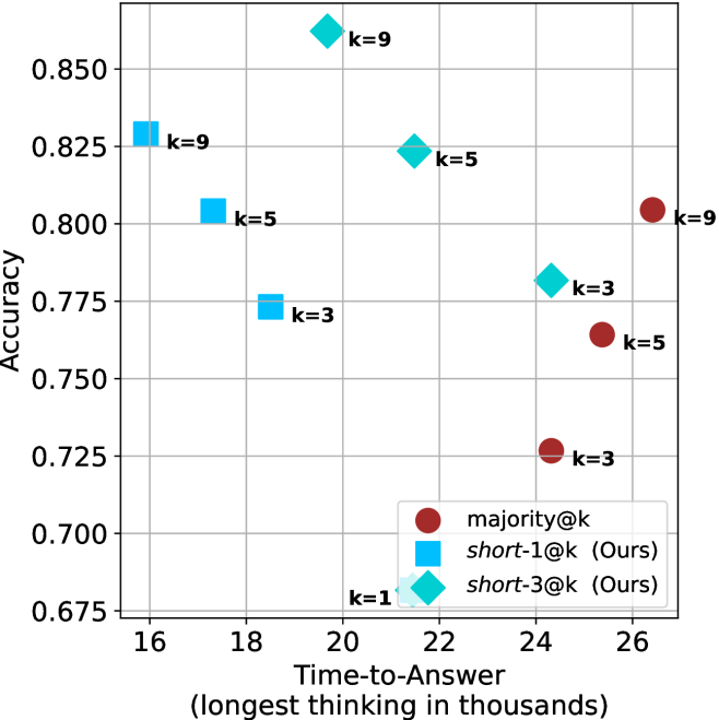
### Visual Description
## Scatter Plot: Accuracy vs. Time-to-Answer for Different Inference Methods
### Overview
This scatter plot visualizes the performance trade-offs between three different inference methods—`majority@k`, `short-1@k` (Ours), and `short-3@k` (Ours)—across varying values of 'k'. The chart maps "Accuracy" (y-axis) against "Time-to-Answer" (x-axis), demonstrating how different methods balance computational time with predictive performance.
### Components/Axes
* **Y-Axis:** "Accuracy", ranging from 0.675 to 0.850, with grid lines at 0.025 intervals.
* **X-Axis:** "Time-to-Answer (longest thinking in thousands)", ranging from 16 to 26, with grid lines at 2-unit intervals.
* **Legend:** Located in the bottom-right quadrant.
* **Red Circle:** `majority@k`
* **Blue Square:** `short-1@k (Ours)`
* **Cyan Diamond:** `short-3@k (Ours)`
### Detailed Analysis
The data points are grouped by method and labeled with their respective 'k' values.
**1. `short-1@k` (Blue Squares)**
* *Trend:* As 'k' increases from 3 to 9, the data points move up and to the left, indicating that higher 'k' values yield both higher accuracy and faster response times.
* *Data Points:*
* **k=3:** x ≈ 18.5, y ≈ 0.775
* **k=5:** x ≈ 17.3, y ≈ 0.805
* **k=9:** x ≈ 16.3, y ≈ 0.830
**2. `short-3@k` (Cyan Diamonds)**
* *Trend:* Similar to `short-1@k`, as 'k' increases from 3 to 9, the accuracy improves significantly while the time-to-answer decreases.
* *Data Points:*
* **k=1:** x ≈ 21.5, y ≈ 0.682 (Outlier/Baseline)
* **k=3:** x ≈ 24.3, y ≈ 0.782
* **k=5:** x ≈ 21.5, y ≈ 0.825
* **k=9:** x ≈ 19.7, y ≈ 0.865
**3. `majority@k` (Red Circles)**
* *Trend:* As 'k' increases from 3 to 9, the data points move up and to the right. While accuracy improves, the time-to-answer also increases, indicating a computational cost for higher accuracy.
* *Data Points:*
* **k=3:** x ≈ 24.3, y ≈ 0.727
* **k=5:** x ≈ 25.4, y ≈ 0.765
* **k=9:** x ≈ 26.5, y ≈ 0.805
### Key Observations
* **Efficiency Dominance:** The "Ours" methods (`short-1@k` and `short-3@k`) consistently outperform the `majority@k` baseline. They achieve higher accuracy scores while generally requiring less time-to-answer.
* **Optimal Performance:** The `short-3@k` method at k=9 achieves the highest accuracy on the chart (~0.865) while maintaining a moderate time-to-answer (~19.7).
* **Inverse Relationship in "Ours" Methods:** Unusually, for the "Ours" methods, increasing 'k' results in *faster* times. This suggests that these methods may be optimizing the "longest thinking" path as 'k' increases, rather than simply accumulating more computation.
* **Baseline Inefficiency:** The `majority@k` method shows a standard trade-off: to get more accuracy, you must spend more time.
### Interpretation
The data demonstrates that the proposed methods (`short-1@k` and `short-3@k`) are superior to the `majority@k` baseline in this specific context. Not only do they reach higher absolute accuracy peaks, but they also exhibit a "win-win" scenario where increasing the 'k' parameter improves accuracy while simultaneously reducing the "longest thinking" time. This suggests the "Ours" algorithms are likely pruning or optimizing the search space more effectively as the 'k' parameter grows, whereas the `majority@k` method likely performs a brute-force or linear accumulation of computation time as 'k' increases.
</details>
(d) R1-670B
Figure 17: HMMT Feb 2025 - time-to-answer comparison.
## Appendix C Ablation studies
We investigate two axis of short-m@k: the value of $m$ and the tie breaking method. For all experiments we use LN-Super- $49$ B, reporting results over the three benchmarks described in Section ˜ 3.1. For the ablation studies we focus on controlling thinking compute.
We start by ablating different $m\in\{1,3,4,5,7,9\}$ for short-m@k. Results are shown in Figure ˜ 18(a). As observed in our main results, short-1@k outperforms others in low-compute regimes, while being less effective for larger compute budgets. Larger $m$ values seem to perform similarly, with higher $m$ values yielding slightly better results in high-compute scenarios.
Next, we analyze the tie-breaking rule of short-m@k. We suggest the selection of the shortest reasoning chain among the vote-leading options. We compare this strategy to random tie-breaking, and to tie breaking according to the longest reasoning chain among the options. As shown in Figure ˜ 18(b), the short-m@k strategy outperforms random tie-breaking. In contrast, choosing the option with the longest reasoning chain yields inferior results.
<details>
<summary>x66.png Details</summary>
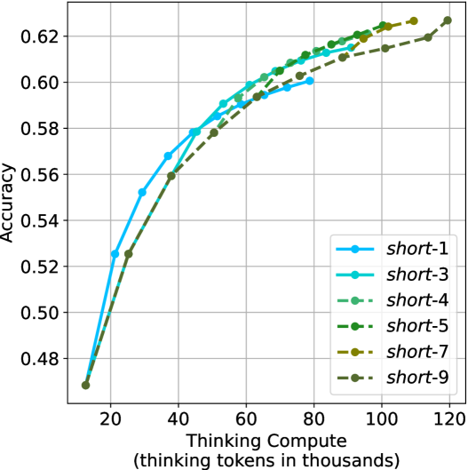
### Visual Description
## Line Chart: Accuracy vs. Thinking Compute
### Overview
This chart illustrates the relationship between "Thinking Compute" (measured in thousands of thinking tokens) and model "Accuracy" for six distinct model variants labeled `short-1` through `short-9`. The chart demonstrates a positive correlation between compute resources and accuracy, characterized by diminishing returns as compute increases.
### Components/Axes
* **Y-Axis:** Labeled "Accuracy". The scale ranges from 0.48 to 0.62, with the data series originating at approximately 0.47.
* **X-Axis:** Labeled "Thinking Compute (thinking tokens in thousands)". The scale ranges from 20 to 120, with the data series originating at approximately 15.
* **Legend:** Located in the bottom-right quadrant of the chart. It defines six data series:
* `short-1`: Light blue, solid line.
* `short-3`: Cyan, solid line.
* `short-4`: Light green, dashed line.
* `short-5`: Medium green, dashed line.
* `short-7`: Olive green, dashed line.
* `short-9`: Dark olive/brown, dashed line.
### Detailed Analysis
The chart displays a clear, consistent trend across all six models.
**Trend Verification:**
* **Common Origin:** All six data series originate from a single point at approximately (15k tokens, 0.47 accuracy).
* **Positive Correlation:** Every line slopes upward, indicating that increasing the thinking compute consistently improves accuracy.
* **Diminishing Returns:** The slope of every line is steepest at the beginning (15k–40k tokens) and flattens out as compute increases, indicating that additional compute yields smaller accuracy gains at higher levels.
* **Divergence:** While the models start together, they terminate at different points along the X-axis, suggesting different maximum compute capacities.
**Data Series Characteristics:**
* **Solid Lines (`short-1`, `short-3`):** These models have the lowest maximum compute capacity.
* `short-1` (light blue) terminates at approximately 80k tokens with an accuracy of ~0.60.
* `short-3` (cyan) terminates at approximately 95k tokens with an accuracy of ~0.615.
* **Dashed Lines (`short-4`, `short-5`, `short-7`, `short-9`):** These models allow for higher compute budgets.
* `short-4` (light green) terminates at approximately 100k tokens with an accuracy of ~0.62.
* `short-5` (medium green) terminates at approximately 105k tokens with an accuracy of ~0.622.
* `short-7` (olive) terminates at approximately 110k tokens with an accuracy of ~0.625.
* `short-9` (dark olive) terminates at approximately 120k tokens with an accuracy of ~0.628.
### Key Observations
* **Compute Capacity Scaling:** The "short-*" naming convention appears to correlate directly with the maximum allowed thinking compute. Higher numbers allow for more tokens.
* **Performance Parity:** At any specific compute level (e.g., 60k tokens), all models that are capable of reaching that level show nearly identical accuracy. This suggests that the accuracy is primarily a function of the compute budget, rather than architectural differences between the `short-1` through `short-9` variants.
* **Accuracy Ceiling:** The accuracy appears to be approaching a hard ceiling or asymptote around 0.63. Even with the highest compute (`short-9` at 120k tokens), the gains are marginal compared to the gains seen between 20k and 60k tokens.
### Interpretation
This chart provides empirical evidence of "scaling laws" applied to inference-time compute. It demonstrates that for this specific task, "thinking" (generating tokens before providing an answer) is a reliable lever for increasing accuracy.
The data suggests that `short-1` through `short-9` are likely the same underlying model, simply constrained by different maximum token budgets. The fact that the lines overlap so closely indicates that there is no "penalty" for using a model with a higher capacity; rather, the higher-numbered models are simply more flexible, allowing the user to trade more compute for slightly higher accuracy. The diminishing returns suggest that there is an optimal "sweet spot" for compute—likely around 60k–80k tokens—where the accuracy gain per token is highest before the curve flattens.
</details>
(a) $m$ values ablation of short-m@k
<details>
<summary>x67.png Details</summary>

### Visual Description
## Line Chart: Accuracy vs. Thinking Compute
### Overview
This chart illustrates the relationship between "Thinking Compute" (measured in thousands of thinking tokens) and model "Accuracy" across three different experimental conditions: `short-3 - tie - short`, `short-3 - tie - random`, and `short-3 - tie - long`. The data shows that while all conditions generally improve with increased compute, the "short" condition consistently outperforms the others, while the "long" condition exhibits a significant performance penalty at lower compute levels.
### Components/Axes
* **Y-Axis (Vertical):** Labeled "Accuracy". The scale ranges from 0.425 to 0.625, with major grid lines at intervals of 0.025.
* **X-Axis (Horizontal):** Labeled "Thinking Compute (thinking tokens in thousands)". The scale ranges from 20 to 80, with data points extending from approximately 15 to 91.
* **Legend:** Located in the bottom-right quadrant of the chart.
* `short-3 - tie - short`: Represented by a **solid** bright teal line with circular markers.
* `short-3 - tie - random`: Represented by a **dashed** medium teal line with circular markers.
* `short-3 - tie - long`: Represented by a **dashed** light teal/grey line with circular markers.
### Detailed Analysis
The chart plots 10 data points for each series. The X-axis values appear to be approximately: 15, 25, 38, 45, 53, 61, 68, 76, 84, and 91.
**1. `short-3 - tie - short` (Solid, Bright Teal)**
* **Trend:** This line shows the highest accuracy throughout the entire range. It slopes upward steeply from the start, then gradually flattens as compute increases, indicating diminishing returns.
* **Data Points (Approximate):**
* (15, 0.47)
* (25, 0.525)
* (38, 0.56)
* (45, 0.58)
* (53, 0.59)
* (61, 0.60)
* (68, 0.605)
* (76, 0.61)
* (84, 0.613)
* (91, 0.615)
**2. `short-3 - tie - random` (Dashed, Medium Teal)**
* **Trend:** This line starts at the same point as the others, remains relatively flat between 15k and 25k tokens, then rises steadily. It consistently maintains a middle position between the "short" and "long" conditions.
* **Data Points (Approximate):**
* (15, 0.47)
* (25, 0.468)
* (38, 0.512)
* (45, 0.545)
* (53, 0.563)
* (61, 0.575)
* (68, 0.585)
* (76, 0.593)
* (84, 0.598)
* (91, 0.603)
**3. `short-3 - tie - long` (Dashed, Light Teal/Grey)**
* **Trend:** This line exhibits a sharp, anomalous drop in accuracy at 25k tokens before recovering and trending upward. It remains the lowest-performing series across the entire compute range.
* **Data Points (Approximate):**
* (15, 0.47)
* (25, 0.412)
* (38, 0.48)
* (45, 0.522)
* (53, 0.545)
* (61, 0.56)
* (68, 0.572)
* (76, 0.582)
* (84, 0.59)
* (91, 0.598)
### Key Observations
* **Convergence:** All three series originate from the same point at approximately 15k tokens (Accuracy ~0.47).
* **The "Long" Penalty:** The `short-3 - tie - long` condition suffers a significant performance degradation at 25k tokens, dropping to ~0.412 accuracy. This suggests that forcing "long" thinking ties at low compute budgets is detrimental to model performance.
* **Diminishing Returns:** All three curves flatten significantly after 60k tokens, suggesting that increasing compute beyond this point yields marginal gains in accuracy.
* **Performance Hierarchy:** The hierarchy is consistent: `short` > `random` > `long`.
### Interpretation
This data likely represents an evaluation of Large Language Model (LLM) reasoning capabilities, specifically regarding "thinking" processes or chain-of-thought generation. The "ties" likely refer to different strategies for managing or prompting the model's thinking process.
The data demonstrates that **strategy matters as much as compute**. The "short" strategy is clearly superior, likely because it forces the model to be concise and focused, whereas the "long" strategy may introduce noise or unnecessary complexity that confuses the model at lower compute levels. The fact that all lines converge at the high end (91k tokens) suggests that with enough compute, the model can overcome the inefficiencies of the "long" strategy, but the "short" strategy reaches high accuracy much faster (i.e., with less compute). This is a classic efficiency curve where the "short" strategy is the most resource-efficient path to high accuracy.
</details>
(b) Tie breaking ablation
Figure 18: Ablation studies over different $m$ values for short-m@k, and different tie breaking methods. Both figures show the model’s average accuracy across benchmarks as a function of the length of its thinking trajectories (measured in thousands).
## Appendix D Small models results
We present our main results (Sections ˜ 3 and 4) using smaller models. We use Llama- $3.1$ -Nemotron-Nano- $8$ B-v $1$ [LN-Nano- $8$ B; Bercovich and others, 2025] and R $1$ -Distill-Qwen- $7$ B [R $1$ - $7$ B; Guo et al., 2025]. Table ˜ 7 (corresponds to Table ˜ 1), presents a comparison between shortest/longest/random generation per example for the smaller models. As observed for larger models, using the shortest answer outperforms both random and longest answers across all benchmarks and models.
Table 7: Comparison between taking the shortest/longest/random generation per example.
| | GPQA-D | AIME 2024 | AIME 2025 | HMMT | Math Average | | | | | |
| --- | --- | --- | --- | --- | --- | --- | --- | --- | --- | --- |
| Thinking Tokens $\downarrow$ | Acc. $\uparrow$ | Thinking Tokens $\downarrow$ | Acc. $\uparrow$ | Thinking Tokens $\downarrow$ | Acc. $\uparrow$ | Thinking Tokens $\downarrow$ | Acc. $\uparrow$ | Thinking Tokens $\downarrow$ | Acc. $\uparrow$ | |
| LN-Nano-8B | | | | | | | | | | |
| random | 7003 | 52.2 | 10380 | 62.1 | 11869 | 46.5 | 12693 | 34.0 | 11647 | 47.5 |
| longest | 10594 $(+51\$ | 41.4 | 16801 | 40.0 | 17140 | 33.3 | 18516 | 23.3 | 17486 $(+50\$ | 32.2 |
| shortest | 3937 $(-44\$ | 55.1 | 0 6047 | 70.0 | 0 7127 | 46.7 | 0 7508 | 50.0 | 6894 $(-41\$ | 55.6 |
| R1-7B | | | | | | | | | | |
| random | 7015 | 35.5 | 11538 | 57.8 | 12377 | 42.2 | 14693 | 25.0 | 12869 | 41.7 |
| longest | 11863 $(+69\$ | 29.8 | 21997 | 26.7 | 21029 | 26.7 | 23899 | 13.3 | 22308 $(+73\$ | 22.2 |
| shortest | 3438 $(-51\$ | 46.5 | 0 5217 | 76.7 | 0 6409 | 53.3 | 0 6950 | 43.3 | 6192 $(-52\$ | 57.8 |
Next, we analyze the performance of short-m@k using smaller models (see details in Section ˜ 4). Figure ˜ 19, Figure ˜ 20 and Figure ˜ 21 are the sample-size/compute/time-to-answer results for the small models over the math benchmarks, respectively. Figure ˜ 22, Figure ˜ 23 and Figure ˜ 24 are the sample-size/compute/time-to-answer results for the small models for GPQA-D, respectively.
The performance of short-m@k using small models remain consistent with those observed in larger ones. short-1@k demonstrates a performance advantage over majority voting in low compute regimes, while short-3@k dominates it across all compute budgets.
<details>
<summary>x68.png Details</summary>
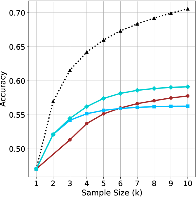
### Visual Description
## Line Chart: Accuracy vs. Sample Size
### Overview
The image is a line chart displaying the relationship between "Accuracy" (y-axis) and "Sample Size (k)" (x-axis). The chart contains four distinct data series, all originating from a common starting point at Sample Size 1. The background features a grid to assist in reading values. **Note:** There is no legend provided in the image, making it impossible to identify the specific variables or models represented by each line color/marker style.
### Components/Axes
* **X-Axis:** Labeled "Sample Size (k)". The scale is linear, ranging from 1 to 10 in integer increments.
* **Y-Axis:** Labeled "Accuracy". The scale ranges from 0.50 to 0.70, with grid lines at 0.05 intervals.
* **Data Series (Legend Missing):**
* **Series 1 (Black, dotted line, triangle markers):** Positioned at the top of the chart.
* **Series 2 (Cyan/Light Blue, solid line, diamond markers):** Positioned second from the top.
* **Series 3 (Dark Red/Maroon, solid line, circle markers):** Positioned third from the top.
* **Series 4 (Medium Blue, solid line, square markers):** Positioned at the bottom of the chart.
### Detailed Analysis
All four series converge at approximately (1, 0.47).
| Sample Size (k) | Series 1 (Black/Tri) | Series 2 (Cyan/Dia) | Series 3 (Red/Circ) | Series 4 (Blue/Sq) |
| :--- | :--- | :--- | :--- | :--- |
| **1** | ~0.47 | ~0.47 | ~0.47 | ~0.47 |
| **2** | ~0.57 | ~0.52 | ~0.49 | ~0.52 |
| **3** | ~0.615 | ~0.545 | ~0.515 | ~0.545 |
| **4** | ~0.64 | ~0.56 | ~0.54 | ~0.55 |
| **5** | ~0.66 | ~0.575 | ~0.55 | ~0.555 |
| **6** | ~0.675 | ~0.58 | ~0.56 | ~0.56 |
| **7** | ~0.685 | ~0.585 | ~0.565 | ~0.56 |
| **8** | ~0.69 | ~0.59 | ~0.57 | ~0.56 |
| **9** | ~0.70 | ~0.59 | ~0.575 | ~0.56 |
| **10** | ~0.705 | ~0.59 | ~0.58 | ~0.56 |
**Trend Verification:**
* **Series 1 (Black/Tri):** Slopes upward consistently with a concave-down shape. It maintains the highest accuracy throughout the entire range.
* **Series 2 (Cyan/Dia):** Slopes upward, showing rapid growth between k=1 and k=4, then begins to plateau after k=6.
* **Series 3 (Red/Circ):** Shows the most consistent, linear-like upward slope. It starts as the lowest performer but overtakes Series 4 around k=6.
* **Series 4 (Blue/Sq):** Shows rapid initial growth (matching Series 2 until k=3), but experiences severe diminishing returns, flattening out almost completely after k=4.
### Key Observations
* **Convergence:** All models perform identically at the smallest sample size (k=1).
* **Performance Gap:** The Black/Triangle series is significantly more accurate than the other three, ending at ~0.705 compared to the others which cluster between 0.56 and 0.59.
* **Crossover:** The Dark Red/Circle series and the Medium Blue/Square series intersect at approximately k=6.
* **Saturation:** Series 4 (Medium Blue/Square) reaches a saturation point very early (k=4), suggesting that increasing the sample size beyond this point provides no additional accuracy benefit for this specific method.
### Interpretation
This chart is characteristic of a machine learning model performance evaluation, likely comparing different algorithms or hyperparameter configurations (e.g., k-Nearest Neighbors, where 'k' is the number of neighbors).
* **The "Black/Triangle" method** is clearly superior, suggesting it is either a more robust algorithm or a better-tuned model.
* **The "Medium Blue/Square" method** exhibits early saturation, indicating that it is highly sensitive to small sample sizes but fails to generalize or improve with more data.
* **The "Dark Red/Circle" method** shows the most stable, predictable improvement, which might be preferable in scenarios where consistent, incremental gains are desired over rapid, early-stage performance.
* **Missing Context:** Without the legend, we cannot determine the specific algorithms. However, the data demonstrates a classic "diminishing returns" pattern common in data science, where the marginal utility of increasing sample size decreases as the sample size grows.
</details>
(a) LN-Nano-8B
<details>
<summary>x69.png Details</summary>
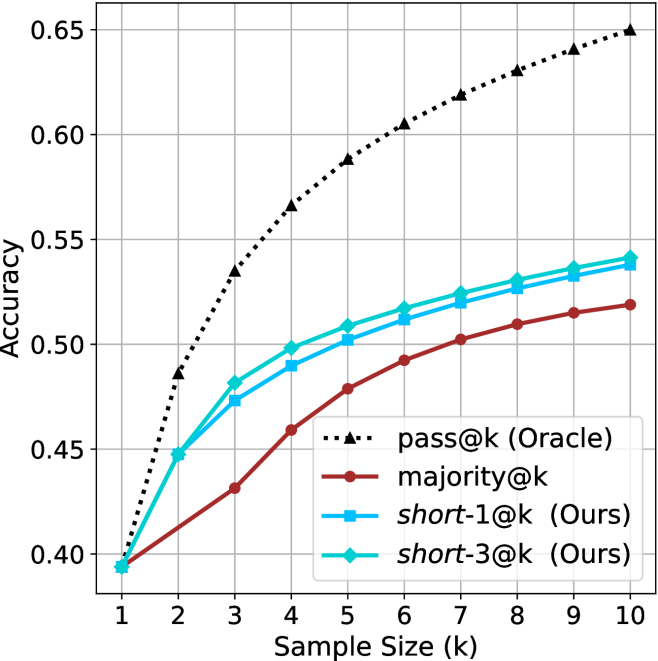
### Visual Description
## Line Chart: Accuracy vs. Sample Size (k)
### Overview
This chart illustrates the performance (Accuracy) of four different evaluation methods across varying sample sizes ($k$), ranging from 1 to 10. The chart compares a theoretical "Oracle" baseline against a standard "majority" voting method and two proposed methods labeled "Ours" (`short-1@k` and `short-3@k`).
### Components/Axes
* **X-Axis:** Labeled "Sample Size (k)". The scale is linear, ranging from 1 to 10 in integer increments.
* **Y-Axis:** Labeled "Accuracy". The scale ranges from 0.40 to 0.65, with grid lines at 0.05 intervals.
* **Legend:** Located in the bottom-right quadrant of the chart area.
* **pass@k (Oracle):** Black dotted line with triangle markers.
* **majority@k:** Dark red solid line with circle markers.
* **short-1@k (Ours):** Medium blue solid line with square markers.
* **short-3@k (Ours):** Cyan (light blue) solid line with diamond markers.
### Detailed Analysis
All four data series exhibit a positive correlation between sample size ($k$) and accuracy, showing a steep initial increase that gradually flattens as $k$ increases (diminishing returns).
**Data Point Estimates (Approximate):**
| Sample Size (k) | pass@k (Oracle) | short-3@k (Ours) | short-1@k (Ours) | majority@k |
| :--- | :--- | :--- | :--- | :--- |
| **1** | ~0.395 | ~0.395 | ~0.395 | ~0.395 |
| **2** | ~0.485 | ~0.448 | ~0.448 | ~0.415 |
| **3** | ~0.535 | ~0.482 | ~0.475 | ~0.432 |
| **4** | ~0.565 | ~0.498 | ~0.490 | ~0.460 |
| **5** | ~0.590 | ~0.510 | ~0.502 | ~0.480 |
| **6** | ~0.605 | ~0.518 | ~0.512 | ~0.492 |
| **7** | ~0.620 | ~0.525 | ~0.520 | ~0.502 |
| **8** | ~0.630 | ~0.532 | ~0.528 | ~0.510 |
| **9** | ~0.640 | ~0.538 | ~0.534 | ~0.515 |
| **10** | ~0.650 | ~0.542 | ~0.538 | ~0.520 |
*Note: At $k=1$, all methods converge at approximately 0.395 accuracy.*
### Key Observations
* **Performance Hierarchy:** The `pass@k (Oracle)` method is the clear upper bound, significantly outperforming all other methods across the entire range.
* **Proposed Method Efficacy:** Both "Ours" methods (`short-3@k` and `short-1@k`) consistently outperform the `majority@k` baseline.
* **Internal Comparison:** `short-3@k` (cyan/diamond) consistently maintains a higher accuracy than `short-1@k` (blue/square), though the gap between them narrows slightly as $k$ increases.
* **Diminishing Returns:** The slope of all lines is steepest between $k=1$ and $k=3$. Beyond $k=5$, the rate of accuracy gain per unit of $k$ decreases significantly for all methods.
### Interpretation
This chart is characteristic of machine learning benchmarks, specifically in code generation tasks (e.g., HumanEval), where `pass@k` is a standard metric.
* **The Oracle:** The `pass@k (Oracle)` represents the theoretical maximum accuracy achievable if the system were able to perfectly identify the correct solution among $k$ samples. Its dominance suggests that the other methods are limited by their selection or filtering strategies.
* **The "Ours" Methods:** The fact that `short-3@k` and `short-1@k` outperform `majority@k` suggests that the authors have developed a more effective filtering or ranking mechanism than simple majority voting. The "short" naming convention likely implies a strategy that prioritizes shorter code snippets or a specific subset of the generated samples.
* **Strategic Implications:** The widening gap between the Oracle and the other methods as $k$ increases indicates that while increasing the sample size helps, the selection strategies (`majority`, `short-1`, `short-3`) are not scaling as efficiently as the Oracle. This suggests there is still significant "room for improvement" in how the best solution is selected from a larger pool of candidates.
</details>
(b) R $1$ - $7$ B
Figure 19: Small models - sample size ( $k$ ) comparison over math benchmarks.
<details>
<summary>x70.png Details</summary>
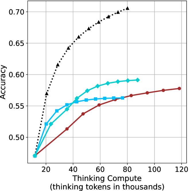
### Visual Description
## Line Chart: Accuracy vs. Thinking Compute
### Overview
This image is a line chart illustrating the relationship between "Thinking Compute" (measured in thousands of thinking tokens) and model "Accuracy." It compares four distinct data series, each representing a different model or configuration, to demonstrate how increasing computational resources during the "thinking" phase impacts performance.
### Components/Axes
* **Y-Axis:** Labeled "Accuracy." The scale ranges from 0.50 to 0.70, with major grid lines at 0.05 intervals.
* **X-Axis:** Labeled "Thinking Compute (thinking tokens in thousands)." The scale ranges from 20 to 120, with major grid lines at 20-unit intervals.
* **Data Series (Legend-less):** The chart lacks an explicit legend box. The series are identified by their unique line styles and marker shapes:
1. **Black Dotted Line:** Marked with triangles.
2. **Cyan Solid Line:** Marked with diamonds.
3. **Cyan Solid Line:** Marked with squares.
4. **Dark Red Solid Line:** Marked with circles.
### Detailed Analysis
All four data series originate from a common starting point at approximately **(12k, 0.47)**.
**1. Black Dotted Line (Triangles)**
* **Trend:** This series exhibits the steepest upward slope, indicating the highest efficiency in gaining accuracy per unit of compute. It does not show signs of plateauing within the visible range.
* **Data Points (Approximate):**
* 20k: ~0.57
* 30k: ~0.615
* 40k: ~0.64
* 50k: ~0.66
* 60k: ~0.675
* 70k: ~0.69
* 80k: ~0.705
**2. Cyan Solid Line (Diamonds)**
* **Trend:** Shows a moderate upward slope that begins to taper off (diminishing returns) after 60k tokens.
* **Data Points (Approximate):**
* 20k: ~0.52
* 30k: ~0.525
* 40k: ~0.545
* 50k: ~0.575
* 60k: ~0.582
* 70k: ~0.588
* 80k: ~0.592
**3. Cyan Solid Line (Squares)**
* **Trend:** Shows a moderate upward slope initially, but hits a distinct plateau around 50k–60k tokens, after which accuracy gains are negligible.
* **Data Points (Approximate):**
* 20k: ~0.52
* 30k: ~0.542
* 40k: ~0.552
* 50k: ~0.558
* 60k: ~0.561
* 70k: ~0.562
* 80k: ~0.563
**4. Dark Red Solid Line (Circles)**
* **Trend:** This series has the shallowest slope initially but maintains a consistent, linear upward trajectory throughout the entire range (up to 120k tokens), unlike the other series which plateau.
* **Data Points (Approximate):**
* 20k: ~0.48
* 40k: ~0.515
* 60k: ~0.55
* 80k: ~0.565
* 100k: ~0.575
* 120k: ~0.58
### Key Observations
* **Common Origin:** All models start at the same baseline accuracy (~0.47) at the lowest compute level (~12k tokens).
* **Performance Ceiling:** The two cyan-colored series (diamonds and squares) exhibit clear diminishing returns, plateauing well before the 100k token mark.
* **Efficiency vs. Scalability:** The black dotted model is the most efficient (highest accuracy for the least compute). However, the dark red model is the most "scalable" in terms of compute, as it is the only line that continues to rise steadily without flattening out by the 120k mark.
### Interpretation
This chart is a visualization of **inference-time scaling laws** for Large Language Models (LLMs). It demonstrates the trade-off between "thinking compute" (the number of tokens generated during a reasoning process) and the final accuracy of the output.
* **The "Black Dotted" model** represents a highly optimized or superior architecture, achieving significantly higher accuracy with less compute than the others.
* **The "Cyan" models** represent architectures that reach a point of saturation quickly; adding more thinking tokens beyond 60k provides almost no benefit, suggesting these models have a "reasoning limit."
* **The "Dark Red" model** suggests a different architectural approach—perhaps a larger model or one with a different training objective—that does not provide high immediate gains but continues to improve as more compute is allocated. This implies that for complex tasks requiring deep reasoning, this model might eventually surpass the cyan models if given enough compute, though it remains inferior to the black dotted model.
</details>
(a) LN-Nano-8B
<details>
<summary>x71.png Details</summary>
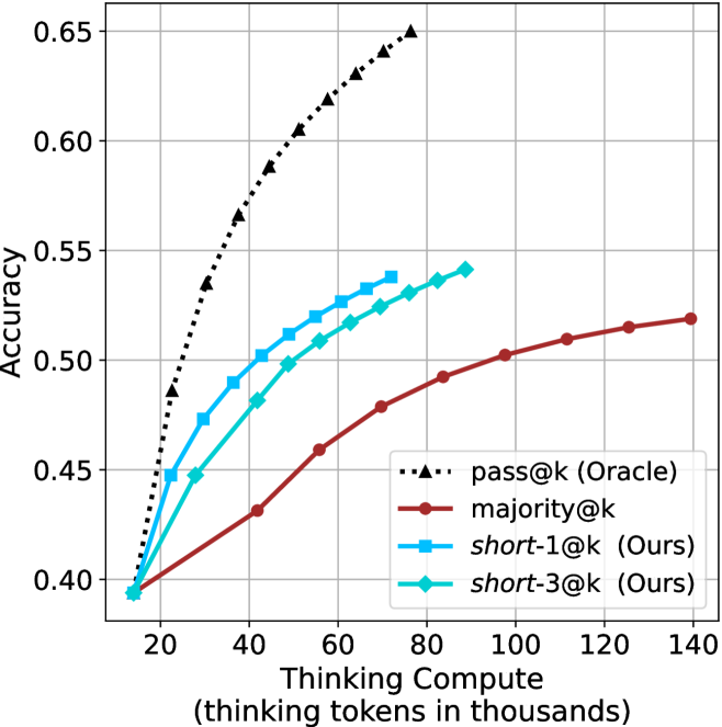
### Visual Description
## Line Chart: Thinking Compute vs. Accuracy
### Overview
This image displays a line chart comparing the performance (Accuracy) of four different inference strategies against the amount of "Thinking Compute" (measured in thousands of thinking tokens) utilized by an AI model. The chart demonstrates that increasing compute generally improves accuracy, but the efficiency of that improvement varies significantly by method.
### Components/Axes
* **Y-Axis (Vertical):** Labeled "Accuracy". The scale ranges from 0.40 to 0.65, with major grid lines at 0.05 intervals.
* **X-Axis (Horizontal):** Labeled "Thinking Compute (thinking tokens in thousands)". The scale ranges from 20 to 140, with major grid lines at 20-unit intervals. The data series actually begins slightly to the left of the 20 mark, at approximately 14.
* **Legend:** Located in the bottom-right quadrant of the chart area.
* **pass@k (Oracle):** Black dotted line with triangle markers.
* **majority@k:** Dark red solid line with circle markers.
* **short-1@k (Ours):** Light blue solid line with square markers.
* **short-3@k (Ours):** Cyan/Teal solid line with diamond markers.
### Detailed Analysis
All four data series originate from a common starting point at approximately (14, 0.395).
**1. pass@k (Oracle) [Black, Dotted, Triangles]**
* **Trend:** This series exhibits the steepest upward trajectory, representing the theoretical upper bound of performance. It shows diminishing returns as compute increases but maintains the highest accuracy throughout.
* **Data Points:**
* (20, ~0.48)
* (30, ~0.535)
* (40, ~0.565)
* (50, ~0.59)
* (60, ~0.605)
* (70, ~0.63)
* (75, ~0.65)
**2. short-1@k (Ours) [Light Blue, Solid, Squares]**
* **Trend:** This series shows strong, rapid growth in accuracy relative to compute, outperforming both `majority@k` and `short-3@k`. It plateaus around 75k tokens.
* **Data Points:**
* (20, ~0.45)
* (30, ~0.475)
* (40, ~0.50)
* (50, ~0.51)
* (55, ~0.52)
* (65, ~0.525)
* (75, ~0.54)
**3. short-3@k (Ours) [Cyan/Teal, Solid, Diamonds]**
* **Trend:** This series follows a similar trajectory to `short-1@k` but consistently yields slightly lower accuracy for the same amount of compute. It extends slightly further to the right, ending near 90k tokens.
* **Data Points:**
* (20, ~0.445)
* (30, ~0.45)
* (40, ~0.48)
* (50, ~0.50)
* (60, ~0.515)
* (70, ~0.525)
* (80, ~0.535)
* (88, ~0.54)
**4. majority@k [Dark Red, Solid, Circles]**
* **Trend:** This series has the shallowest slope, indicating the least efficient use of compute tokens for accuracy gains. However, it is the only method that continues to scale up to the maximum displayed compute (140k tokens).
* **Data Points:**
* (20, ~0.40)
* (40, ~0.43)
* (60, ~0.46)
* (80, ~0.49)
* (100, ~0.50)
* (120, ~0.515)
* (140, ~0.52)
### Key Observations
* **Efficiency Gap:** The "Ours" methods (`short-1@k` and `short-3@k`) are significantly more compute-efficient than the `majority@k` baseline. For example, at 60k tokens, `short-1@k` achieves ~0.52 accuracy, whereas `majority@k` requires over 120k tokens to reach a similar level.
* **Oracle Superiority:** The `pass@k (Oracle)` method demonstrates that there is significant headroom for improvement, as it reaches 0.65 accuracy with less than 80k tokens, while the other methods struggle to cross 0.55 accuracy even with more compute.
* **Plateauing:** The "Ours" methods appear to hit a performance plateau earlier than the `majority@k` method, which continues to climb slowly.
### Interpretation
This chart likely originates from research into Large Language Model (LLM) inference optimization, specifically regarding "test-time compute" or "reasoning" strategies.
* **The "Oracle" Baseline:** Represents the ideal scenario where the model selects the correct answer if it appears anywhere in the generated samples.
* **"Ours" vs. "Majority":** The "Ours" methods (likely pruning or selective search strategies) are designed to find the correct answer using fewer tokens than a standard "majority voting" approach. The data suggests these methods are highly effective at boosting accuracy in the low-to-mid compute range (20k–80k tokens).
* **Trade-offs:** The chart illustrates a classic trade-off in AI reasoning: the "Ours" methods provide a "fast path" to higher accuracy, but they may be limited by their search depth or pruning logic, as evidenced by their earlier termination compared to the `majority@k` method.
</details>
(b) R $1$ - $7$ B
Figure 20: Small models - thinking compute comparison over math benchmarks.
<details>
<summary>x72.png Details</summary>
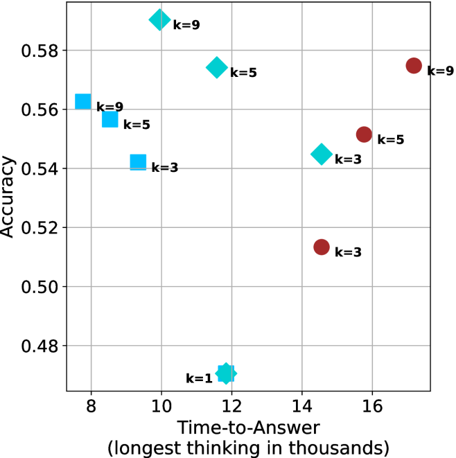
### Visual Description
## Scatter Plot: Accuracy vs. Time-to-Answer
### Overview
This image is a scatter plot visualizing the performance of different model configurations, categorized by 'k' values (likely representing a hyperparameter such as beam width, number of candidates, or shots). The plot maps "Accuracy" (y-axis) against "Time-to-Answer" (x-axis). The data points are differentiated by shape and color, suggesting distinct model families or methods.
### Components/Axes
* **Y-Axis:** Labeled "Accuracy". The scale ranges from 0.48 to 0.58, with grid lines at 0.02 intervals.
* **X-Axis:** Labeled "Time-to-Answer (longest thinking in thousands)". The scale ranges from 8 to 16, with grid lines at 2-unit intervals.
* **Data Series (Legend implied by shape/color):**
* **Cyan Squares:** Located in the left-center region.
* **Cyan Diamonds:** Located in the upper-left to center region.
* **Maroon Circles:** Located in the right-center region.
* **Cyan Star/Asterisk:** Located in the bottom-center region.
* **Annotations:** Each data point is labeled with its corresponding 'k' value (k=1, k=3, k=5, k=9).
### Detailed Analysis
The data points are clustered into three distinct groups based on color and shape. Below are the approximate coordinates (x, y) for each point:
**1. Cyan Squares (Left Cluster)**
* *Trend:* As time increases (moving right), accuracy decreases.
* k=9: (x ≈ 7.8, y ≈ 0.563)
* k=5: (x ≈ 8.5, y ≈ 0.557)
* k=3: (x ≈ 9.3, y ≈ 0.542)
**2. Cyan Diamonds (Upper-Left to Center Cluster)**
* *Trend:* As time increases (moving right), accuracy decreases.
* k=9: (x ≈ 9.8, y ≈ 0.591) — *Highest accuracy point on the chart.*
* k=5: (x ≈ 11.5, y ≈ 0.575)
* k=3: (x ≈ 14.5, y ≈ 0.545)
**3. Maroon Circles (Right Cluster)**
* *Trend:* As time increases (moving right), accuracy increases.
* k=9: (x ≈ 17.2, y ≈ 0.575)
* k=5: (x ≈ 15.8, y ≈ 0.552)
* k=3: (x ≈ 14.5, y ≈ 0.513)
**4. Outlier**
* Cyan Star (k=1): (x ≈ 11.8, y ≈ 0.472) — *Lowest accuracy point on the chart.*
### Key Observations
* **Performance Ceiling:** The Cyan Diamond (k=9) achieves the highest accuracy (≈ 0.59) while maintaining a relatively low "Time-to-Answer" (≈ 9.8).
* **Divergent Trends:** The Maroon Circles exhibit a positive correlation between time and accuracy (more time = more accuracy), whereas the Cyan Squares and Diamonds exhibit a negative correlation (more time = less accuracy).
* **Efficiency Gap:** The Cyan Diamonds consistently outperform the Cyan Squares at comparable 'k' levels, suggesting the Diamond configuration is more efficient.
* **The k=1 Anomaly:** The k=1 configuration (Cyan Star) is a significant outlier, performing poorly in accuracy despite a moderate time cost.
### Interpretation
This chart likely compares different inference strategies or model architectures.
* **The "Cyan" groups** appear to represent a model or method where increasing the 'k' parameter (e.g., beam search width) yields diminishing returns or even negative impacts on accuracy as the computational time increases. The "Diamond" variant of this method is clearly superior to the "Square" variant.
* **The "Maroon" group** represents a different method or model that scales differently. It requires significantly more time to achieve high accuracy (k=9), but it follows a standard "more compute = better results" trajectory.
* **Strategic Insight:** If the goal is to maximize accuracy while minimizing time, the Cyan Diamond configuration at k=9 is the optimal choice. The Maroon group is only competitive at high 'k' values, and even then, it does not exceed the accuracy of the Cyan Diamond (k=9) while requiring nearly double the "Time-to-Answer" (17.2 vs 9.8).
</details>
(a) LN-Nano-8B
<details>
<summary>x73.png Details</summary>
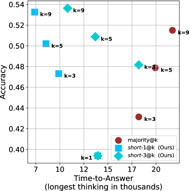
### Visual Description
## Scatter Plot: Accuracy vs. Time-to-Answer
### Overview
This image is a scatter plot comparing the performance of three different methods—`majority@k`, `short-1@k` (Ours), and `short-3@k` (Ours)—across varying `k` values. The plot evaluates the trade-off between "Accuracy" (Y-axis) and "Time-to-Answer" (X-axis). The data suggests that the "Ours" methods (`short-1@k` and `short-3@k`) generally achieve higher accuracy with lower time-to-answer compared to the `majority@k` baseline.
### Components/Axes
* **Y-Axis:** Labeled "Accuracy". The scale ranges from 0.40 to 0.54, with major grid lines at 0.02 intervals.
* **X-Axis:** Labeled "Time-to-Answer (longest thinking in thousands)". The scale ranges from 7 to 20, with major grid lines at 7, 10, 12, 15, 17, and 20.
* **Legend:** Located in the bottom-right quadrant.
* **Dark Red Circle:** `majority@k`
* **Cyan Square:** `short-1@k (Ours)`
* **Cyan Diamond:** `short-3@k (Ours)`
* **Data Markers:** Each data point is labeled with its corresponding `k` value (e.g., `k=9`, `k=5`, `k=3`, `k=1`).
### Detailed Analysis
The data points are grouped by method and `k` value. Below are the approximate coordinates (X, Y) for each point:
**1. `short-1@k` (Cyan Squares)**
* **Trend:** As `k` increases from 3 to 9, accuracy increases significantly (0.473 to 0.533), while time-to-answer decreases (9.5 to 8).
* `k=9`: (X ≈ 8.0, Y ≈ 0.533)
* `k=5`: (X ≈ 8.5, Y ≈ 0.503)
* `k=3`: (X ≈ 9.5, Y ≈ 0.473)
**2. `short-3@k` (Cyan Diamonds)**
* **Trend:** As `k` increases from 3 to 9, accuracy increases (0.482 to 0.537), while time-to-answer decreases (18 to 11). There is an outlier at `k=1`.
* `k=9`: (X ≈ 11.0, Y ≈ 0.537)
* `k=5`: (X ≈ 14.0, Y ≈ 0.509)
* `k=3`: (X ≈ 18.0, Y ≈ 0.482)
* `k=1`: (X ≈ 14.0, Y ≈ 0.395) — *Note: This point is a cyan star/diamond shape located at the bottom center.*
**3. `majority@k` (Dark Red Circles)**
* **Trend:** As `k` increases from 3 to 9, accuracy increases (0.432 to 0.515), but time-to-answer also increases (18 to 22).
* `k=9`: (X ≈ 22.0, Y ≈ 0.515)
* `k=5`: (X ≈ 20.0, Y ≈ 0.479)
* `k=3`: (X ≈ 18.0, Y ≈ 0.432)
### Key Observations
* **Efficiency Inversion:** The `short` methods exhibit an inverse relationship between `k` and time-to-answer (higher `k` results in faster answers), whereas the `majority@k` method exhibits a direct relationship (higher `k` results in slower answers).
* **Dominance:** The `short-1@k` series is the most efficient, occupying the top-left region of the chart (high accuracy, low time).
* **Performance Ceiling:** The `short-3@k` method achieves the highest overall accuracy (at `k=9`, Y ≈ 0.537) but requires more time than `short-1@k`.
* **Outlier:** The `k=1` point for the `short` series is significantly lower in accuracy (Y ≈ 0.395) than all other data points, suggesting that `k=1` is insufficient for this specific task.
### Interpretation
The data demonstrates that the proposed "short" methods are superior to the `majority@k` baseline in both accuracy and computational efficiency.
The most striking finding is the efficiency gain in the `short` methods as `k` increases. In standard models (like `majority@k`), increasing `k` usually increases latency because the system must process more samples. The fact that `short-1@k` and `short-3@k` become *faster* as `k` increases suggests an "early-exit" or "adaptive computation" mechanism is at play—the system likely finds a confident answer faster when given a larger pool of candidates (`k`), allowing it to terminate the thinking process earlier. This makes the `short` methods highly desirable for real-time applications where both accuracy and latency are critical.
</details>
(b) R $1$ - $7$ B
Figure 21: Small models - time-to-answer comparison over math benchmarks.
<details>
<summary>x74.png Details</summary>
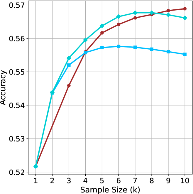
### Visual Description
## Line Chart: Accuracy vs. Sample Size (k)
### Overview
The image displays a line chart illustrating the relationship between "Sample Size (k)" and "Accuracy." The chart features three distinct data series, each represented by a unique color and marker shape. All three series originate from the same starting point at k=1 and diverge as the sample size increases. There is no legend provided in the image to identify the specific models or variables represented by the lines.
### Components/Axes
* **X-Axis:** Labeled "Sample Size (k)". The scale is linear, ranging from 1 to 10 in integer increments.
* **Y-Axis:** Labeled "Accuracy". The scale ranges from 0.52 to 0.57, with grid lines at 0.01 intervals.
* **Data Series (Identified by color and marker):**
* **Series A (Dark Red/Brown):** Circular markers.
* **Series B (Medium Cyan/Teal):** Diamond markers.
* **Series C (Light Blue/Cyan):** Square markers.
### Detailed Analysis
The following table approximates the values for each data series at each sample size (k).
| Sample Size (k) | Series A (Red/Circle) | Series B (Teal/Diamond) | Series C (Light Blue/Square) |
| :--- | :--- | :--- | :--- |
| **1** | ~0.522 | ~0.522 | ~0.522 |
| **2** | ~0.534 | ~0.544 | ~0.544 |
| **3** | ~0.546 | ~0.554 | ~0.552 |
| **4** | ~0.556 | ~0.560 | ~0.556 |
| **5** | ~0.562 | ~0.564 | ~0.557 |
| **6** | ~0.564 | ~0.566 | ~0.558 |
| **7** | ~0.566 | ~0.568 | ~0.557 |
| **8** | ~0.567 | ~0.568 | ~0.556 |
| **9** | ~0.568 | ~0.567 | ~0.555 |
| **10** | ~0.569 | ~0.566 | ~0.554 |
**Trend Verification:**
* **Series A (Red/Circle):** Shows a consistent, monotonic upward trend throughout the entire range (k=1 to k=10). It starts as the lowest performer but becomes the highest performer after k=8.
* **Series B (Teal/Diamond):** Shows a steep upward trend initially, peaking between k=7 and k=8, followed by a slight decline.
* **Series C (Light Blue/Square):** Shows an upward trend that flattens significantly after k=4, peaking at k=6, and then exhibits a steady decline.
### Key Observations
* **Common Origin:** All three series begin at approximately 0.522 at k=1.
* **Crossover Points:**
* Series A (Red) intersects Series C (Light Blue) at approximately k=4.
* Series A (Red) intersects Series B (Teal) at approximately k=8.
* **Performance Divergence:** As the sample size increases beyond k=4, the performance of the three models diverges significantly. Series C (Light Blue) is the first to show signs of performance degradation (at k=6), followed by Series B (Teal) at k=8. Series A (Red) is the only model that continues to improve, albeit at a slower rate, through k=10.
### Interpretation
This chart likely represents a hyperparameter tuning or model evaluation process, possibly related to a k-Nearest Neighbors (k-NN) algorithm or a similar machine learning model where "k" represents the number of neighbors or a similar complexity parameter.
* **Model Robustness:** Series A (Red) appears to be the most robust model, as it does not exhibit the performance degradation seen in the other two models as the sample size increases. It suggests that this model benefits from larger sample sizes without overfitting or introducing noise.
* **Overfitting/Saturation:** Series C (Light Blue) and Series B (Teal) demonstrate clear signs of "peaking." The decline in accuracy after their respective peaks (k=6 for Light Blue, k=8 for Teal) suggests that increasing the sample size beyond these points introduces noise or irrelevant data that negatively impacts the model's predictive accuracy.
* **Strategic Choice:** If the goal is to maximize accuracy, Series A is the superior choice for larger sample sizes (k > 8). However, if computational resources are limited and a smaller sample size is required, Series B (Teal) offers higher accuracy than Series A for sample sizes between k=2 and k=8.
</details>
(a) LN-Nano-8B
<details>
<summary>x75.png Details</summary>
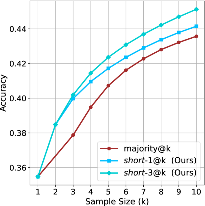
### Visual Description
## Line Chart: Accuracy vs. Sample Size (k)
### Overview
This chart illustrates the performance (Accuracy) of three distinct methods—`majority@k`, `short-1@k (Ours)`, and `short-3@k (Ours)`—as the sample size ($k$) increases from 1 to 10. The chart demonstrates that increasing the sample size consistently improves accuracy for all methods, with the "Ours" methods outperforming the `majority@k` baseline.
### Components/Axes
* **X-Axis:** Labeled "Sample Size (k)". The scale is linear, ranging from 1 to 10, with integer markers.
* **Y-Axis:** Labeled "Accuracy". The scale ranges from 0.36 to 0.44, with grid lines at 0.02 intervals (0.36, 0.38, 0.40, 0.42, 0.44).
* **Legend:** Located in the bottom-right quadrant of the chart area.
* **`majority@k`**: Represented by a dark red line with circular markers.
* **`short-1@k (Ours)`**: Represented by a medium blue line with square markers.
* **`short-3@k (Ours)`**: Represented by a cyan/teal line with diamond markers.
### Detailed Analysis
**Trend Verification:**
All three data series exhibit a positive, monotonic trend (sloping upward) as the sample size ($k$) increases. The rate of improvement appears to be slightly higher at lower values of $k$ (1–4) and begins to show signs of diminishing returns as $k$ approaches 10, though the curves remain upward-sloping.
**Data Point Extraction (Approximate Values):**
| Sample Size (k) | `majority@k` (Red/Circle) | `short-1@k` (Blue/Square) | `short-3@k` (Cyan/Diamond) |
| :--- | :--- | :--- | :--- |
| **1** | ~0.355 | ~0.355 | ~0.355 |
| **2** | ~0.368 | ~0.385 | ~0.385 |
| **3** | ~0.379 | ~0.400 | ~0.402 |
| **4** | ~0.395 | ~0.410 | ~0.415 |
| **5** | ~0.408 | ~0.417 | ~0.424 |
| **6** | ~0.416 | ~0.424 | ~0.431 |
| **7** | ~0.423 | ~0.429 | ~0.437 |
| **8** | ~0.428 | ~0.434 | ~0.442 |
| **9** | ~0.432 | ~0.438 | ~0.447 |
| **10** | ~0.436 | ~0.442 | ~0.452 |
*Note: At $k=1$, all three methods converge at approximately 0.355.*
### Key Observations
* **Performance Hierarchy:** `short-3@k` consistently achieves the highest accuracy across all sample sizes greater than 1. `short-1@k` occupies the middle position, and `majority@k` consistently performs the worst.
* **Divergence:** While all methods start at the same point at $k=1$, the performance gap between the methods widens as $k$ increases.
* **Gap Analysis:** The gap between `short-3@k` and `majority@k` is the most significant, reaching a difference of approximately 0.016 at $k=10$.
### Interpretation
The data demonstrates that the methods labeled "(Ours)" are more effective than the `majority@k` baseline. The fact that `short-3@k` outperforms `short-1@k` suggests that the underlying mechanism (likely involving a larger context or more sophisticated selection process denoted by the "3") provides a tangible benefit in accuracy.
The convergence at $k=1$ is logical, as with a sample size of 1, the methods likely default to the same decision logic (the single most likely item), rendering the specific "short" or "majority" logic irrelevant. As $k$ increases, the methods are able to leverage more information, and the "Ours" methods are clearly better at utilizing this additional data to improve prediction accuracy compared to the standard `majority` approach.
</details>
(b) R $1$ - $7$ B
Figure 22: Small models - sample size ( $k$ ) comparison over GPQA-D.
<details>
<summary>x76.png Details</summary>
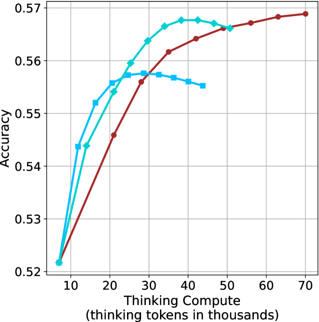
### Visual Description
## Line Chart: Accuracy vs. Thinking Compute
### Overview
This image is a line chart illustrating the relationship between "Thinking Compute" (measured in thousands of thinking tokens) and model "Accuracy." The chart displays three distinct data series, each represented by a different color and marker shape. All three series originate from a common baseline point. There is no legend provided in the image to identify the specific models or configurations associated with each line.
### Components/Axes
* **Y-Axis:** Labeled "Accuracy." The scale ranges from 0.52 to 0.57, with major grid lines at 0.01 intervals.
* **X-Axis:** Labeled "Thinking Compute (thinking tokens in thousands)." The scale ranges from 10 to 70, with a starting point at approximately 7.
* **Data Series (Visual Identification):**
* **Series A (Dark Red/Maroon):** Circular markers.
* **Series B (Medium Blue/Teal):** Diamond markers.
* **Series C (Light Blue/Sky Blue):** Square markers.
### Detailed Analysis
All three data series originate from a shared starting point at approximately **(7, 0.522)**.
**1. Series A (Dark Red, Circles)**
* **Trend:** This series shows a consistent, monotonic upward trend throughout the entire range of the X-axis. It does not show signs of degradation.
* **Data Points (Approximate):**
* Starts at (7, 0.522).
* (21, 0.546)
* (28, 0.556)
* (35, 0.562)
* (42, 0.564)
* (50, 0.566)
* (57, 0.567)
* (63, 0.568)
* (70, 0.569)
**2. Series B (Medium Blue, Diamonds)**
* **Trend:** This series rises steeply, outperforming the other two lines between 20k and 45k tokens. It reaches a peak and then begins a slight decline.
* **Data Points (Approximate):**
* Starts at (7, 0.522).
* (14, 0.544)
* (21, 0.554)
* (25, 0.559)
* (28, 0.564)
* (32, 0.566)
* (36, 0.567)
* (41, 0.568)
* (45, 0.568)
* (50, 0.566)
**3. Series C (Light Blue, Squares)**
* **Trend:** This series rises the fastest initially but plateaus and begins to decline the earliest, suggesting an "overthinking" penalty.
* **Data Points (Approximate):**
* Starts at (7, 0.522).
* (11, 0.544)
* (16, 0.552)
* (21, 0.556)
* (28, 0.558)
* (32, 0.558)
* (36, 0.557)
* (40, 0.556)
* (44, 0.555)
### Key Observations
* **Shared Baseline:** All models begin with identical accuracy at the lowest compute level.
* **Performance Divergence:** The models diverge significantly after approximately 15k tokens.
* **Overthinking/Overfitting:** Both the Light Blue (squares) and Medium Blue (diamonds) series exhibit a "hump" shape, where accuracy increases with compute up to a point, then decreases. This is a classic indicator of overthinking, where additional compute tokens introduce noise or irrelevant information that degrades performance.
* **Robustness:** The Dark Red (circles) series is the most robust, continuing to gain accuracy even at the highest compute levels (70k tokens), suggesting it is the most compute-efficient or best-tuned model configuration.
### Interpretation
This chart demonstrates the "compute-optimal" scaling behavior of different model configurations.
* **The "Light Blue" model** is likely a smaller or less capable model that reaches its maximum utility quickly (around 30k tokens) and then suffers from diminishing returns.
* **The "Medium Blue" model** is more capable, scaling effectively up to 45k tokens before performance degradation sets in.
* **The "Dark Red" model** appears to be the most sophisticated or best-trained, as it continues to improve accuracy as compute increases, showing no signs of the "overthinking" penalty within the observed range.
This data is critical for determining the optimal "thinking budget" for a given model; allocating more tokens than the peak of the curve is not only wasteful but actively harmful to the model's accuracy.
</details>
(a) LN-Nano-8B
<details>
<summary>x77.png Details</summary>
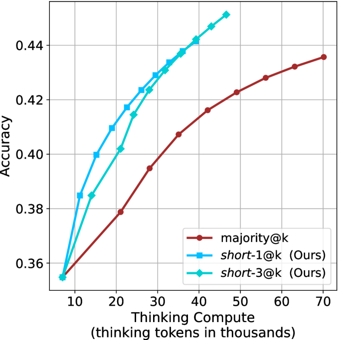
### Visual Description
## Line Chart: Accuracy vs. Thinking Compute
### Overview
This chart illustrates the relationship between "Thinking Compute" (measured in thousands of thinking tokens) and "Accuracy" for three different methods. It compares a baseline method, `majority@k`, against two proposed methods, `short-1@k (Ours)` and `short-3@k (Ours)`. The chart demonstrates that the proposed methods achieve higher accuracy with significantly less computational expenditure compared to the baseline.
### Components/Axes
* **Y-Axis (Vertical):** Labeled "Accuracy". The scale ranges from 0.36 to 0.44, with major grid lines at 0.02 intervals.
* **X-Axis (Horizontal):** Labeled "Thinking Compute (thinking tokens in thousands)". The scale ranges from 10 to 70, with major grid lines at 10-unit intervals.
* **Legend:** Located in the bottom-right quadrant of the chart.
* `majority@k`: Represented by a dark red line with circular markers.
* `short-1@k (Ours)`: Represented by a blue line with square markers.
* `short-3@k (Ours)`: Represented by a cyan/teal line with diamond markers.
### Detailed Analysis
**Trend Verification:**
* **Common Origin:** All three data series originate from a common point at approximately (7, 0.355).
* **`majority@k` (Dark Red):** This line exhibits a steady, concave-downward slope. It is the most gradual of the three, showing a consistent increase in accuracy as compute increases, extending to the full range of the x-axis (70k tokens).
* **`short-1@k (Ours)` (Blue):** This line exhibits a sharp upward slope initially, indicating high efficiency in gaining accuracy per token. It begins to flatten (plateau) as it approaches 46k tokens.
* **`short-3@k (Ours)` (Cyan):** This line follows a trajectory very similar to `short-1@k`. It also exhibits a sharp initial slope followed by a flattening trend, terminating at approximately 47k tokens.
**Data Points (Approximate Values):**
| Thinking Compute (k) | `majority@k` (Red) | `short-1@k` (Blue) | `short-3@k` (Cyan) |
| :--- | :--- | :--- | :--- |
| ~7 | ~0.355 | ~0.355 | ~0.355 |
| 10 | ~0.362 | ~0.385 | ~0.362 |
| 15 | ~0.370 | ~0.400 | ~0.385 |
| 20 | ~0.379 | ~0.410 | ~0.402 |
| 25 | ~0.388 | ~0.417 | ~0.415 |
| 28 | ~0.395 | ~0.424 | ~0.424 |
| 35 | ~0.407 | ~0.432 | ~0.430 |
| 40 | ~0.416 | ~0.438 | ~0.438 |
| 46/47 | ~0.425 | ~0.442 | ~0.446 |
| 60 | ~0.428 | N/A | N/A |
| 70 | ~0.436 | N/A | N/A |
### Key Observations
* **Efficiency Gap:** The "Ours" methods are significantly more efficient. For instance, to reach an accuracy of ~0.42, the `majority@k` baseline requires approximately 60k tokens, whereas the `short-1@k` and `short-3@k` methods reach this level at roughly 25k–28k tokens.
* **Saturation:** The "Ours" methods appear to reach a saturation point or diminishing returns around 46k–47k tokens, where the accuracy gain per additional token becomes very small.
* **Performance:** `short-3@k` (Cyan) appears to slightly outperform `short-1@k` (Blue) in the latter half of its trajectory (post-30k tokens), reaching a higher peak accuracy before the data series ends.
### Interpretation
The data strongly suggests that the proposed "short" methods are superior to the "majority@k" baseline in terms of compute-to-accuracy efficiency. By optimizing the "thinking" process, the model can achieve higher accuracy levels with less than half the computational cost of the baseline. The fact that the "Ours" lines terminate earlier than the baseline suggests that these methods may be designed to operate within a specific, more efficient compute budget, or that they reach their maximum potential accuracy before the baseline does. This is a classic demonstration of Pareto efficiency in machine learning model optimization.
</details>
(b) R $1$ - $7$ B
Figure 23: Small models - thinking compute comparison over GPQA-D.
<details>
<summary>x78.png Details</summary>
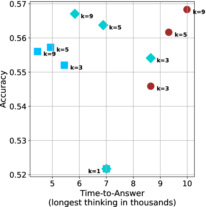
### Visual Description
## Scatter Plot: Accuracy vs. Time-to-Answer
### Overview
This image is a scatter plot visualizing the relationship between "Accuracy" (y-axis) and "Time-to-Answer" (x-axis). The data points are categorized into four distinct groups based on marker shape and color, with each point labeled with a "k" value (k=1, k=3, k=5, k=9). The chart uses a grid background to assist in estimating the values of the data points.
### Components/Axes
* **Y-Axis:** Labeled "Accuracy". The scale ranges from 0.52 to 0.57, with major grid lines at 0.01 intervals.
* **X-Axis:** Labeled "Time-to-Answer (longest thinking in thousands)". The scale ranges from 5 to 10, with major grid lines at 1.0 intervals.
* **Data Series (Color/Shape Coding):**
* **Light Blue Squares:** Located on the left side of the chart (x < 6).
* **Cyan/Teal Diamonds:** Located in the center-right of the chart (x between 5.5 and 9).
* **Maroon/Dark Red Circles:** Located on the right side of the chart (x > 8.5).
* **Cyan/Teal Star/Cross:** A single point located at the bottom center (x = 7).
### Detailed Analysis
The following coordinates are approximate based on the grid lines provided:
**1. Light Blue Squares (Fastest, Lower Accuracy)**
* **k=9:** Positioned at x ≈ 4.5, y ≈ 0.556.
* **k=5:** Positioned at x ≈ 4.8, y ≈ 0.557.
* **k=3:** Positioned at x ≈ 5.3, y ≈ 0.552.
* *Trend:* This group is clustered on the far left, indicating the lowest "Time-to-Answer" values.
**2. Cyan/Teal Diamonds (Moderate Speed, Higher Accuracy)**
* **k=9:** Positioned at x ≈ 5.8, y ≈ 0.567.
* **k=5:** Positioned at x ≈ 6.8, y ≈ 0.564.
* **k=3:** Positioned at x ≈ 8.6, y ≈ 0.554.
* *Trend:* Within this group, as "k" decreases, the "Time-to-Answer" increases significantly, while accuracy decreases.
**3. Maroon/Dark Red Circles (Slowest, Variable Accuracy)**
* **k=9:** Positioned at x ≈ 10.0, y ≈ 0.568.
* **k=5:** Positioned at x ≈ 9.1, y ≈ 0.562.
* **k=3:** Positioned at x ≈ 8.6, y ≈ 0.546.
* *Trend:* This group occupies the rightmost section of the chart, representing the highest "Time-to-Answer" values. Similar to the diamond group, lower "k" values here correlate with lower accuracy.
**4. Cyan/Teal Star/Cross (Outlier)**
* **k=1:** Positioned at x = 7.0, y ≈ 0.522.
* *Trend:* This is a distinct outlier, representing the lowest accuracy on the entire chart.
### Key Observations
* **Performance Trade-off:** There is a clear trade-off between "Time-to-Answer" and "Accuracy." The models that take the longest time (Maroon Circles) generally achieve the highest accuracy, while the fastest models (Light Blue Squares) have moderate accuracy.
* **The "k" Parameter:** Across all three main groups (Squares, Diamonds, Circles), a higher "k" value consistently yields higher accuracy than a lower "k" value within that same group.
* **Outlier:** The "k=1" point (Star/Cross) is significantly less accurate than all other data points, regardless of the time taken.
* **Clustering:** The data is clearly segmented into three distinct "speed" tiers based on the x-axis: Fast (Squares), Medium (Diamonds), and Slow (Circles).
### Interpretation
This chart likely represents a performance evaluation of a machine learning model (possibly k-Nearest Neighbors or a similar algorithm where 'k' is a hyperparameter) across different configurations or datasets.
* **Computational Cost:** The x-axis ("Time-to-Answer") acts as a proxy for computational cost. The Maroon group is the most computationally expensive.
* **Optimal Configuration:** The "k=9" configuration consistently performs best in terms of accuracy across all three groups.
* **Diminishing Returns:** While the Maroon group (k=9) achieves the highest absolute accuracy (≈ 0.568), it requires significantly more time (x=10) compared to the Cyan Diamond group (k=9), which achieves nearly identical accuracy (≈ 0.567) but in much less time (x ≈ 5.8). Therefore, the Cyan Diamond (k=9) configuration appears to be the most efficient choice, offering a high accuracy-to-time ratio.
* **Failure Case:** The "k=1" configuration is clearly suboptimal and should likely be avoided in this specific application.
</details>
(a) LN-Nano-8B
<details>
<summary>x79.png Details</summary>
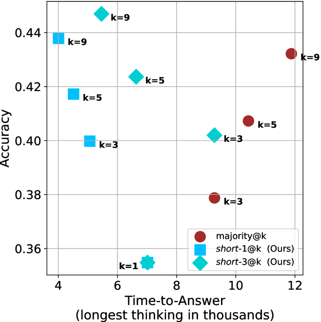
### Visual Description
## Scatter Plot: Accuracy vs. Time-to-Answer
### Overview
This scatter plot compares the performance of three different methods—`majority@k`, `short-1@k` (Ours), and `short-3@k` (Ours)—across varying values of `k` (1, 3, 5, and 9). The chart evaluates the trade-off between "Time-to-Answer" (x-axis) and "Accuracy" (y-axis).
### Components/Axes
* **X-Axis**: "Time-to-Answer (longest thinking in thousands)". The scale ranges from 4 to 12, with major grid lines at intervals of 2.
* **Y-Axis**: "Accuracy". The scale ranges from 0.36 to 0.44, with major grid lines at intervals of 0.02.
* **Legend (Bottom-Right)**:
* **Dark Red Circle**: `majority@k`
* **Cyan Square**: `short-1@k (Ours)`
* **Cyan Diamond**: `short-3@k (Ours)`
* **Data Markers**: Each point is labeled with its corresponding `k` value (e.g., "k=9", "k=5", etc.).
### Detailed Analysis
#### 1. `short-1@k (Ours)` (Cyan Squares)
* **Trend**: As `k` increases from 1 to 9, the time-to-answer decreases (moving left), while accuracy increases (moving up).
* **Data Points**:
* **k=9**: x ≈ 4.2, y ≈ 0.438
* **k=5**: x ≈ 4.8, y ≈ 0.418
* **k=3**: x ≈ 5.2, y ≈ 0.400
* **k=1**: x ≈ 7.0, y ≈ 0.355 (Shared marker with `short-3@k`)
#### 2. `short-3@k (Ours)` (Cyan Diamonds)
* **Trend**: Similar to `short-1@k`, as `k` increases, the time-to-answer decreases while accuracy increases. This series generally occupies the upper-left quadrant of the chart, indicating high efficiency.
* **Data Points**:
* **k=9**: x ≈ 5.5, y ≈ 0.448 (Highest accuracy point on the chart)
* **k=5**: x ≈ 6.8, y ≈ 0.424
* **k=3**: x ≈ 9.4, y ≈ 0.402
* **k=1**: x ≈ 7.0, y ≈ 0.355 (Shared marker with `short-1@k`)
#### 3. `majority@k` (Dark Red Circles)
* **Trend**: This series shows a positive correlation between time and accuracy (as time increases, accuracy increases), but it is significantly slower than the "Ours" methods.
* **Data Points**:
* **k=9**: x ≈ 11.9, y ≈ 0.433
* **k=5**: x ≈ 10.5, y ≈ 0.407
* **k=3**: x ≈ 9.4, y ≈ 0.379
### Key Observations
* **Efficiency Gap**: The "Ours" methods (`short-1@k` and `short-3@k`) are significantly more efficient than `majority@k`. They achieve higher or comparable accuracy in roughly half the time (x-values ranging from ~4 to ~7 vs. ~9 to ~12).
* **Performance Peak**: The `short-3@k` method at `k=9` achieves the highest accuracy on the chart (~0.448) while maintaining a relatively low time-to-answer (~5.5).
* **Convergence**: At `k=1`, both `short-1@k` and `short-3@k` converge to the exact same performance point (x ≈ 7.0, y ≈ 0.355).
* **Outlier Behavior**: The `majority@k` series is the only one that follows a traditional "more time = more accuracy" slope, whereas the "Ours" methods appear to invert this relationship, where higher `k` values actually result in lower time-to-answer.
### Interpretation
The data demonstrates that the "Ours" methods (`short-1@k` and `short-3@k`) are Pareto-optimal compared to the `majority@k` baseline.
The most striking finding is the inverse relationship between `k` and time-to-answer for the "Ours" methods: increasing `k` (which usually implies more computation) actually *reduces* the time-to-answer in this specific context. This suggests that the "Ours" methods likely employ an early-exit or pruning strategy where higher `k` values allow the model to find the correct answer faster, rather than simply doing more work. Conversely, `majority@k` behaves as a standard ensemble method, where increasing `k` requires more time to process more candidates, leading to higher latency.
</details>
(b) R $1$ - $7$ B
Figure 24: Small models - time-to-answer comparison over GPQA-D.
## Appendix E GPQA-D sequential results
The results for GPQA-D when accounting for sequential compute are presented in Figure ˜ 25.
<details>
<summary>x80.png Details</summary>
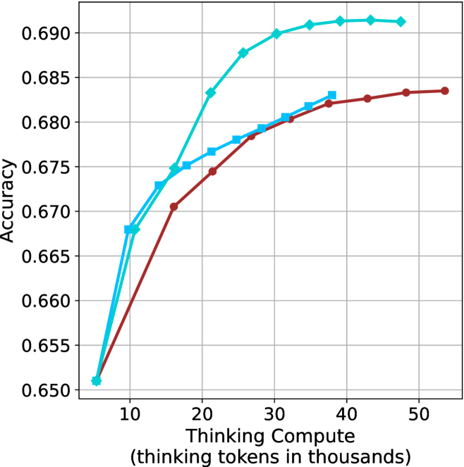
### Visual Description
## Line Chart: Accuracy vs. Thinking Compute
### Overview
This image is a line chart illustrating the relationship between "Thinking Compute" (measured in thousands of thinking tokens) and model "Accuracy." The chart displays three distinct data series, each represented by a different color and marker shape. All three series originate from a common starting point at low compute and diverge as compute increases, demonstrating diminishing returns in accuracy as more tokens are utilized.
### Components/Axes
* **Y-Axis:** Labeled "Accuracy." The scale ranges from 0.650 to 0.690, with major grid lines at 0.005 intervals.
* **X-Axis:** Labeled "Thinking Compute (thinking tokens in thousands)." The scale ranges from 10 to 50, with major grid lines at 10-unit intervals. The data series begin at approximately 6,000 tokens.
* **Legend:** **Absent.** There is no legend provided in the image to identify what specific models or configurations the three lines represent.
* **Grid:** A light gray grid is overlaid on the plot area to assist in reading values.
### Detailed Analysis
The chart contains three distinct data series. All three series converge at approximately (6, 0.651).
#### Series 1: Cyan Line with Diamond Markers
* **Trend:** This line exhibits the steepest upward slope and reaches the highest accuracy plateau. It shows the most significant gains in accuracy for the least amount of compute.
* **Data Points (Approximate):**
* (6, 0.651)
* (11, 0.668)
* (16, 0.675)
* (21, 0.683)
* (26, 0.688)
* (31, 0.690)
* (36, 0.691)
* (41, 0.6915)
* (48, 0.6915)
#### Series 2: Medium Blue Line with Square Markers
* **Trend:** This line shows a moderate upward slope. It performs better than the Red line but is outperformed by the Cyan line. It terminates at a lower compute value than the other two series.
* **Data Points (Approximate):**
* (6, 0.651)
* (11, 0.668)
* (14, 0.673)
* (17, 0.675)
* (22, 0.677)
* (27, 0.678)
* (30, 0.679)
* (33, 0.681)
* (36, 0.682)
* (38, 0.683)
#### Series 3: Dark Red/Maroon Line with Circle Markers
* **Trend:** This line has the shallowest slope and the lowest accuracy throughout the compute range. It continues to the highest compute value shown on the chart.
* **Data Points (Approximate):**
* (6, 0.651)
* (16, 0.6705)
* (21, 0.6745)
* (26, 0.678)
* (32, 0.680)
* (37, 0.682)
* (43, 0.6825)
* (48, 0.683)
* (54, 0.6835)
### Key Observations
* **Convergence:** All three models start with identical accuracy at the lowest compute level (~6k tokens).
* **Performance Gap:** The performance gap between the Cyan model and the Red model widens significantly as compute increases. At ~35k tokens, the Cyan model is at ~0.691 accuracy, while the Red model is at ~0.681.
* **Diminishing Returns:** All three lines exhibit a concave shape, indicating that as more "thinking tokens" are added, the marginal gain in accuracy decreases. The curves begin to flatten out (plateau) as they approach their respective maximum compute values.
* **Efficiency:** The Cyan model is the most efficient, achieving an accuracy of ~0.683 at roughly 21k tokens, whereas the Red model requires more than double that compute (~48k tokens) to reach the same accuracy level.
### Interpretation
This chart is a classic representation of "inference-time compute scaling." It demonstrates that for the models tested, allowing the model to "think" (generate more tokens) improves accuracy, but this improvement is subject to the law of diminishing returns.
The data suggests that the Cyan model is significantly more capable or better optimized than the Red model, as it achieves higher accuracy with significantly less compute. The absence of a legend prevents identifying the specific models, but the visual evidence strongly implies a comparison between different model architectures, sizes, or training methodologies where one is clearly superior in its ability to utilize thinking compute effectively. The plateauing effect suggests there is a "ceiling" to how much accuracy can be gained simply by increasing thinking time, regardless of the model variant.
</details>
(a) LN-Super-49B
<details>
<summary>x81.png Details</summary>
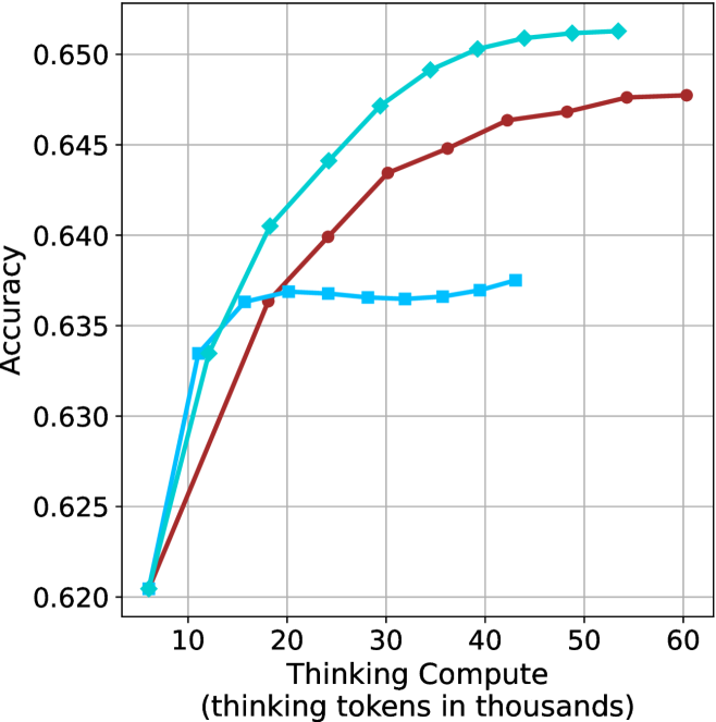
### Visual Description
## Line Chart: Accuracy vs. Thinking Compute
### Overview
The image is a line chart illustrating the relationship between "Thinking Compute" (measured in thousands of thinking tokens) and model "Accuracy." The chart displays three distinct data series, all originating from a common starting point. There is no legend provided in the image to identify the specific models or configurations represented by the lines.
### Components/Axes
* **Y-Axis:** Labeled "Accuracy." The scale ranges from 0.620 to 0.650, with major grid lines at intervals of 0.005.
* **X-Axis:** Labeled "Thinking Compute (thinking tokens in thousands)." The scale ranges from 10 to 60, with major grid lines at intervals of 10. The origin point appears to be approximately 6.5.
* **Data Series:**
* **Series A (Dark Red/Maroon):** Circular markers.
* **Series B (Cyan/Light Blue):** Diamond markers.
* **Series C (Cyan/Light Blue):** Square markers.
* **Grid:** A standard Cartesian grid is overlaid on the plot area.
### Detailed Analysis
All three series originate at approximately **(6.5, 0.6205)**.
#### Series A (Dark Red, Circular Markers)
* **Trend:** This series shows a steady, monotonic upward slope. The rate of improvement decreases as compute increases, indicating diminishing returns.
* **Data Points (Approximate):**
* (12, 0.633)
* (24, 0.640)
* (30, 0.6435)
* (36, 0.645)
* (42, 0.6465)
* (48, 0.647)
* (54, 0.6475)
* (60, 0.6475)
#### Series B (Cyan, Diamond Markers)
* **Trend:** This series exhibits the steepest upward trajectory and achieves the highest overall accuracy. It continues to climb throughout the observed range.
* **Data Points (Approximate):**
* (12, 0.6335)
* (18, 0.6405)
* (24, 0.644)
* (30, 0.647)
* (36, 0.649)
* (42, 0.650)
* (48, 0.6505)
* (54, 0.6505)
#### Series C (Cyan, Square Markers)
* **Trend:** This series initially tracks closely with the Diamond series but diverges significantly after approximately 16k tokens. It enters a plateau phase where accuracy remains stagnant, followed by a very slight recovery at higher compute levels.
* **Data Points (Approximate):**
* (12, 0.6335)
* (16, 0.6365)
* (20, 0.6368)
* (24, 0.6368)
* (28, 0.6365)
* (32, 0.6365)
* (36, 0.6365)
* (40, 0.637)
* (44, 0.6375)
### Key Observations
* **Divergence Point:** All three models perform identically up to approximately 12k tokens. After this point, the strategies diverge sharply.
* **Performance Ceiling:** The Square-marker series (Series C) hits a clear performance ceiling or saturation point around 16k tokens, suggesting that additional compute beyond this point provides almost no benefit for this specific configuration.
* **Efficiency:** The Diamond-marker series (Series B) is the most efficient, maintaining a higher slope for longer and reaching the highest accuracy (approx. 0.6505).
* **Consistency:** The Red-marker series (Series A) represents a middle-ground performance, consistently outperforming the Square-marker series but failing to match the Diamond-marker series.
### Interpretation
This chart demonstrates the impact of "thinking compute" on model accuracy, likely comparing different inference-time scaling strategies or model architectures.
* **The "Square" Strategy:** This appears to be a configuration that is highly sensitive to compute limits or suffers from a bottleneck. Once it hits ~16k tokens, it stops learning or improving, suggesting that the model architecture or the specific "thinking" process is not capable of utilizing additional compute effectively.
* **The "Diamond" Strategy:** This represents the most robust scaling behavior. It successfully converts additional compute into accuracy gains across the entire range, suggesting a more scalable "thinking" process.
* **The "Red" Strategy:** This represents a stable, reliable scaling method. While it does not reach the peak accuracy of the Diamond strategy, it avoids the hard plateau seen in the Square strategy, making it a predictable, albeit slower, scaling option.
In summary, the data suggests that the choice of "thinking" strategy is critical; simply adding more compute (tokens) is not a guarantee of improved accuracy, as evidenced by the plateauing of the Square-marker series.
</details>
(b) R $1$ - $32$ B
<details>
<summary>x82.png Details</summary>
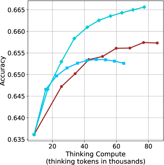
### Visual Description
## Line Chart: Accuracy vs. Thinking Compute
### Overview
This chart illustrates the relationship between "Thinking Compute" (measured in thousands of thinking tokens) and model "Accuracy." It displays three distinct data series, each represented by a different color and marker shape. All three series originate from a common starting point at approximately 8,000 tokens and an accuracy of 0.636. The chart demonstrates how different models or configurations respond to increased computational "thinking" time.
### Components/Axes
* **Y-Axis (Vertical):** Labeled "Accuracy." The scale ranges from 0.635 to 0.665, with major grid lines at intervals of 0.005.
* **X-Axis (Horizontal):** Labeled "Thinking Compute (thinking tokens in thousands)." The scale ranges from 0 to 80+, with major grid lines at intervals of 20.
* **Legend:** **None provided.** The data series must be identified by their color and marker shape.
* **Grid:** A standard gray grid overlays the chart area.
### Detailed Analysis
There are three distinct data series. Below are the trends and approximate data points for each:
**1. Cyan Line (Diamond Markers)**
* **Trend:** This series shows the most aggressive upward slope. It demonstrates consistent improvement in accuracy as compute increases, with a slight flattening (diminishing returns) as it approaches the 80k token mark. It is the highest-performing series.
* **Approximate Data Points (x, y):**
* (8, 0.636) - Start
* (16, 0.647)
* (25, 0.653)
* (34, 0.658)
* (42, 0.661)
* (49, 0.663)
* (56, 0.664)
* (64, 0.6645)
* (71, 0.665)
* (77, 0.666)
**2. Dark Red Line (Circle Markers)**
* **Trend:** This series shows a steady, moderate upward slope. It does not reach the same peak accuracy as the Cyan series but maintains a consistent positive trajectory without significant dips.
* **Approximate Data Points (x, y):**
* (8, 0.636) - Start
* (25, 0.647)
* (34, 0.650)
* (42, 0.653)
* (52, 0.654)
* (60, 0.656)
* (68, 0.656)
* (77, 0.6575)
* (85, 0.6575)
**3. Medium Blue Line (Square Markers)**
* **Trend:** This series shows an initial upward slope similar to the others, but it peaks around 45k–50k tokens. After this peak, the accuracy plateaus and then exhibits a slight decline, suggesting a point of diminishing returns or "overthinking."
* **Approximate Data Points (x, y):**
* (8, 0.636) - Start
* (15, 0.647)
* (23, 0.650)
* (32, 0.652)
* (42, 0.653)
* (52, 0.6535)
* (60, 0.653)
* (65, 0.6525)
### Key Observations
* **Common Origin:** All three models begin with identical accuracy at the lowest compute level (~8k tokens).
* **Performance Divergence:** The models diverge significantly after ~20k tokens.
* **The "Overthinking" Phenomenon:** The Medium Blue (Square) series is the only one to show a clear performance degradation after a certain compute threshold (approx. 50k tokens), indicating that for this specific model, more thinking time eventually becomes detrimental to accuracy.
* **Superior Scaling:** The Cyan (Diamond) series is the most robust, scaling effectively across the entire range of compute provided without showing signs of performance degradation.
### Interpretation
This chart likely represents an evaluation of "test-time compute" or "Chain-of-Thought" scaling laws for different Large Language Model (LLM) configurations.
* **Efficiency vs. Capacity:** The Cyan model demonstrates the best scaling behavior, suggesting it is the most efficient or capable architecture for utilizing additional thinking tokens.
* **Diminishing Returns/Noise:** The Medium Blue model illustrates a classic "overthinking" problem. In many LLM reasoning tasks, forcing the model to generate more tokens can eventually introduce noise, hallucinations, or logical drift, which explains the downward trend after 50k tokens.
* **Stability:** The Dark Red model represents a stable, conservative scaling approach. It improves steadily but lacks the high-end performance of the Cyan model.
In a research context, this data would be used to determine the optimal "compute budget" for inference. For the Medium Blue model, one would cap the thinking tokens at 50k to avoid accuracy loss. For the Cyan model, one might continue to increase compute as long as the cost-to-accuracy ratio remains favorable.
</details>
(c) QwQ-32B
<details>
<summary>x83.png Details</summary>
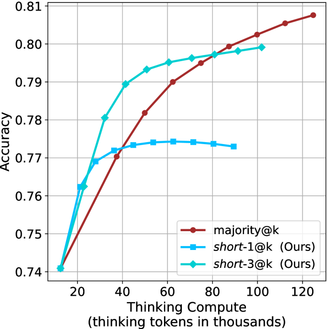
### Visual Description
## Line Chart: Accuracy vs. Thinking Compute
### Overview
This chart illustrates the relationship between "Thinking Compute" (measured in thousands of thinking tokens) and model "Accuracy." It compares three different methods: a baseline method labeled `majority@k` and two methods labeled `short-1@k (Ours)` and `short-3@k (Ours)`. The chart demonstrates how accuracy scales as more computational resources are allocated to the thinking process.
### Components/Axes
* **Y-Axis (Vertical):** Labeled "Accuracy." The scale ranges from 0.74 to 0.81, with major grid lines at 0.01 intervals.
* **X-Axis (Horizontal):** Labeled "Thinking Compute (thinking tokens in thousands)." The scale ranges from 20 to 120, with major grid lines at 20-unit intervals.
* **Legend:** Located in the bottom-right quadrant of the chart.
* **`majority@k`**: Represented by a dark red line with circular markers.
* **`short-1@k (Ours)`**: Represented by a medium blue line with square markers.
* **`short-3@k (Ours)`**: Represented by a cyan (light blue) line with diamond markers.
### Detailed Analysis
All three data series originate from a common starting point at approximately (13, 0.741).
**1. `majority@k` (Dark Red, Circles)**
* **Trend:** This series exhibits a consistent, near-linear upward slope throughout the entire range. It does not show signs of plateauing within the visible chart area.
* **Data Points (Approximate):**
* Starts at ~13k tokens, 0.741 accuracy.
* At 38k tokens: ~0.770 accuracy.
* At 63k tokens: ~0.790 accuracy.
* At 88k tokens: ~0.799 accuracy.
* Ends at ~125k tokens: ~0.808 accuracy.
**2. `short-1@k (Ours)` (Medium Blue, Squares)**
* **Trend:** This series shows a rapid initial increase in accuracy, followed by a sharp plateau. After approximately 50k tokens, the accuracy gains become negligible, and the line begins to slightly decline after 75k tokens.
* **Data Points (Approximate):**
* Starts at ~13k tokens, 0.741 accuracy.
* At 25k tokens: ~0.769 accuracy.
* At 50k tokens: ~0.774 accuracy (Peak).
* Ends at ~90k tokens: ~0.773 accuracy.
**3. `short-3@k (Ours)` (Cyan, Diamonds)**
* **Trend:** This series shows the steepest initial growth, outperforming the other two methods in the 20k–80k token range. However, it exhibits diminishing returns, with the slope flattening significantly after 60k tokens.
* **Data Points (Approximate):**
* Starts at ~13k tokens, 0.741 accuracy.
* At 33k tokens: ~0.781 accuracy.
* At 53k tokens: ~0.793 accuracy.
* At 73k tokens: ~0.796 accuracy.
* Ends at ~103k tokens: ~0.799 accuracy.
### Key Observations
* **Efficiency vs. Capacity:** The "Ours" methods (`short-1@k` and `short-3@k`) are clearly optimized for lower compute budgets, achieving higher accuracy faster than `majority@k` in the early stages (under 40k tokens).
* **The Crossover Point:** `majority@k` overtakes `short-3@k` at approximately 85k tokens.
* **Performance Ceiling:** `short-1@k` hits a hard performance ceiling at ~0.774 accuracy, suggesting that adding more compute tokens beyond 50k provides no benefit for this specific method.
* **Scalability:** `majority@k` is the only method that demonstrates continued scalability, suggesting it is the superior choice if the compute budget is high (above 85k tokens).
### Interpretation
The data suggests a classic trade-off between "fast" optimization and "long-term" scaling. The methods labeled "(Ours)" appear to be designed for efficiency, allowing the model to reach a respectable accuracy level with fewer tokens. However, they suffer from diminishing returns, likely due to the specific constraints or architecture of those methods.
Conversely, `majority@k` acts as a baseline that scales reliably with increased compute. The chart implies that if a user has a limited compute budget (e.g., < 80k tokens), `short-3@k` is the optimal choice. If the user has a high compute budget (e.g., > 90k tokens), `majority@k` is the superior choice, as it continues to improve while the other methods plateau or decline.
</details>
(d) R1-670B
Figure 25: Comparing different methods for the GPQA-D benchmark under sequential compute.
## Appendix F Backtracks under controlled length results
Below we present the results for the backtrack count under controlled length scenarios (Section ˜ 5.2). The results over the math benchmarks are presented in Table ˜ 8 and for GPQA-D in Table ˜ 9.
Table 8: Average number of backtracks for correct (C), incorrect (IC) answers, binned by thinking length. Results are averaged across math benchmarks.
| Model Thinking Tokens | 0-5k | 5-10k | 10-15k | 15-20k | 20-25k | 25-30k | 30-32k |
| --- | --- | --- | --- | --- | --- | --- | --- |
| C/IC | C/IC | C/IC | C/IC | C/IC | C/IC | C/IC | |
| LN-Super-49B | 35/ 0 64 | 100/133 | 185/236 | 261/299 | 307/320 | 263/323 | 0 – 0 / 0 304 |
| R1-32B | 29/ 0 74 | 0 88/166 | 171/279 | 244/351 | 334/370 | 268/355 | 326/1006 |
| QwQ-32B | 50/148 | 120/174 | 194/247 | 285/353 | 354/424 | 390/476 | 551/ 0 469 |
| R1-670B | 58/ 0 27 | 100/ 0 86 | 143/184 | 222/203 | 264/254 | 309/289 | 352/ 0 337 |
Table 9: Average number of backtracks for correct (C), incorrect (IC) answers, binned by thinking length. Results are reported for GPQA-D.
| Model Thinking Tokens | 0-5k | 5-10k | 10-15k | 15-20k | 20-25k | 25-30k | 30-32k |
| --- | --- | --- | --- | --- | --- | --- | --- |
| C/IC | C/IC | C/IC | C/IC | C/IC | C/IC | C/IC | |
| LN-Super-49B | 38/52 | 175/164 | 207/213 | 0 – 0 / 0 – 0 | 0 – 0 / 0 – 0 | 0 – 0 / 0 – 0 | 0 – 0 / 0 – 0 |
| R1-32B | 39/54 | 194/221 | 301/375 | 525/668 | 0 – 0 / 0 – 0 | 0 – 0 / 0 – 0 | 0 – 0 / 0 – 0 |
| QwQ-32B | 65/71 | 169/178 | 333/358 | 378/544 | 357/703 | 0 – 0 / 0 – 0 | 0 – 0 / 0 – 0 |
| R1-670B | 44/72 | 0 93/155 | 178/232 | 297/300 | 341/341 | 463/382 | 553/477 |
## Appendix G Further details and results for finetuning experiments
The generation process of all three variants of S $1$ uses the hyperparameters detailed in Section ˜ 3.1. Figure ˜ 26 shows the thinking token count histograms for the three variants of the S1 dataset (short/long/random) presented in Section ˜ 6.
As for finetuning, we follow the S $1$ approach, and finetune the Qwen- $2.5$ - $7$ B-Instruct and Qwen- $2.5$ - $32$ B-Instruct models on the three S $1$ variants. The finetuning hyperparameters are consistent with those used for the S $1.1$ model (Muennighoff et al., 2025), and training is conducted on $32$ H $100$ GPUs. We match the number of gradient steps as in used for S1.1. The resulting models are evaluated using the benchmarks and experimental setup described in Section ˜ 3.1. Specifically, for each model we generate 20 answers per example, and report average accuracy.
Results for the 7B version model are presented in Table ˜ 10.
<details>
<summary>x84.png Details</summary>
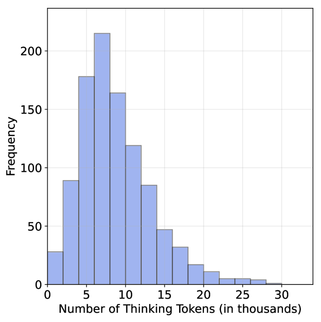
### Visual Description
## Histogram: Distribution of Thinking Tokens
### Overview
The image is a histogram illustrating the frequency distribution of "Thinking Tokens" utilized by a system (likely an AI model). The distribution is right-skewed, indicating that the majority of operations utilize a moderate number of tokens, while a smaller subset of operations requires significantly higher token counts.
### Components/Axes
* **X-Axis:** Labeled "Number of Thinking Tokens (in thousands)". The scale ranges from 0 to 30, with major grid lines at intervals of 5 (0, 5, 10, 15, 20, 25, 30). Each major interval contains two bars, implying a bin width of 2,500 tokens.
* **Y-Axis:** Labeled "Frequency". The scale ranges from 0 to 200+, with major grid lines at intervals of 50 (0, 50, 100, 150, 200).
* **Data Series:** A single series of light blue bars with dark outlines representing the count of occurrences for each token range bin.
### Detailed Analysis
The histogram displays a unimodal distribution with a peak occurring between 7,500 and 10,000 tokens. Below are the approximate frequency values for each bin (width of 2,500 tokens):
| Token Range (thousands) | Approximate Frequency |
| :--- | :--- |
| 0 – 2.5 | ~30 |
| 2.5 – 5.0 | ~90 |
| 5.0 – 7.5 | ~180 |
| 7.5 – 10.0 | ~215 (Peak) |
| 10.0 – 12.5 | ~165 |
| 12.5 – 15.0 | ~120 |
| 15.0 – 17.5 | ~85 |
| 17.5 – 20.0 | ~45 |
| 20.0 – 22.5 | ~35 |
| 22.5 – 25.0 | ~15 |
| 25.0 – 27.5 | ~10 |
| 27.5 – 30.0 | ~5 |
| > 30.0 | ~2 |
*Note: Values are estimated based on visual alignment with the Y-axis grid lines.*
### Key Observations
* **Peak Concentration:** The highest frequency of operations occurs in the 7,500 to 10,000 token range, with a frequency of approximately 215.
* **Skewness:** The data exhibits a clear right-skew (positive skew). The bulk of the data is concentrated between 5,000 and 15,000 tokens.
* **Rapid Decline:** After the peak at 10,000 tokens, the frequency drops steadily. By the 20,000-token mark, the frequency is significantly lower (below 50).
* **Outliers:** There is a "long tail" extending beyond 25,000 tokens, representing complex tasks that require substantially more processing/thinking time, though these are statistically rare.
### Interpretation
This data suggests that the "thinking" process for this model is generally efficient and bounded. The majority of tasks are resolved within a predictable range of 5,000 to 15,000 tokens.
The sharp drop-off after 15,000 tokens suggests that the model either reaches a conclusion or exhausts its typical reasoning capacity for most queries within this window. The long tail indicates that while the model is capable of extended reasoning (up to 30,000+ tokens), such instances are outliers, likely reserved for highly complex or ambiguous prompts that require deeper deliberation. This distribution is characteristic of systems that employ a "chain-of-thought" or similar reasoning mechanism, where the length of the reasoning process correlates with the complexity of the input.
</details>
(a) S1-short
<details>
<summary>x85.png Details</summary>
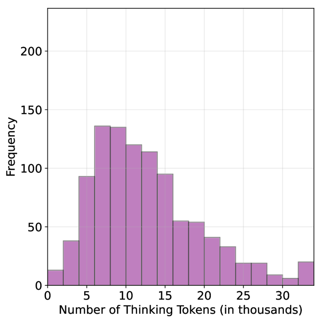
### Visual Description
## Histogram: Distribution of Thinking Tokens
### Overview
This image is a histogram displaying the frequency distribution of "Thinking Tokens" used in a specific process or model. The X-axis represents the quantity of tokens in thousands, while the Y-axis represents the frequency of occurrence. The distribution is right-skewed, indicating that while most tasks require a moderate number of tokens, there is a "long tail" of tasks requiring significantly higher token counts.
### Components/Axes
* **Chart Type:** Histogram with light purple bars and dark outlines.
* **X-Axis:** Labeled "Number of Thinking Tokens (in thousands)".
* Scale: Ranges from 0 to approximately 35.
* Major ticks: 0, 5, 10, 15, 20, 25, 30.
* Grid lines: Vertical grid lines align with the major ticks.
* **Y-Axis:** Labeled "Frequency".
* Scale: Ranges from 0 to slightly above 200.
* Major ticks: 0, 50, 100, 150, 200.
* Grid lines: Horizontal grid lines align with the major ticks.
### Detailed Analysis
The histogram consists of 17 distinct bins, each representing a range of approximately 2,000 tokens. Below are the estimated frequencies for each bin based on visual inspection:
| Token Range (in thousands) | Estimated Frequency |
| :--- | :--- |
| 0 – 2 | ~15 |
| 2 – 4 | ~40 |
| 4 – 6 | ~95 |
| 6 – 8 | ~135 |
| 8 – 10 | ~135 |
| 10 – 12 | ~120 |
| 12 – 14 | ~115 |
| 14 – 16 | ~95 |
| 16 – 18 | ~55 |
| 18 – 20 | ~55 |
| 20 – 22 | ~40 |
| 22 – 24 | ~35 |
| 24 – 26 | ~20 |
| 26 – 28 | ~20 |
| 28 – 30 | ~10 |
| 30 – 32 | ~8 |
| 32 – 34+ | ~20 |
*Note: Values are estimated based on the visual height of the bars relative to the Y-axis grid lines. Uncertainty is approximately ±5 units.*
### Key Observations
* **Primary Mode:** The distribution peaks between 6,000 and 10,000 tokens, where the frequency reaches its maximum of approximately 135 occurrences per bin.
* **Right Skew:** The data exhibits a clear right-skewed distribution, meaning the majority of the data points are concentrated on the lower end of the token spectrum, with a long tail extending toward higher token counts.
* **The "Tail" Anomaly:** There is a noticeable, albeit small, uptick in frequency in the final bin (32,000+ tokens). This deviates from the otherwise smooth decline of the tail, suggesting a potential "overflow" bin or a specific cluster of highly complex tasks that hit a maximum token limit.
### Interpretation
The data suggests that the vast majority of "thinking" tasks are completed within a range of 6,000 to 16,000 tokens. This indicates a standard operational efficiency or complexity level for the model or process being measured.
The "long tail" indicates that while rare, there are tasks that require significantly more computational "thought" (up to 30,000+ tokens). The small, unexpected rise in the final bin (32,000+ tokens) is particularly interesting; in technical contexts, this often represents a "ceiling" effect where tasks that would have required even more tokens are truncated or forced to conclude at that specific threshold. Alternatively, it could represent a specific class of "hard" problems that are consistently pushed to the maximum allowable token limit.
</details>
(b) S1-random
<details>
<summary>x86.png Details</summary>
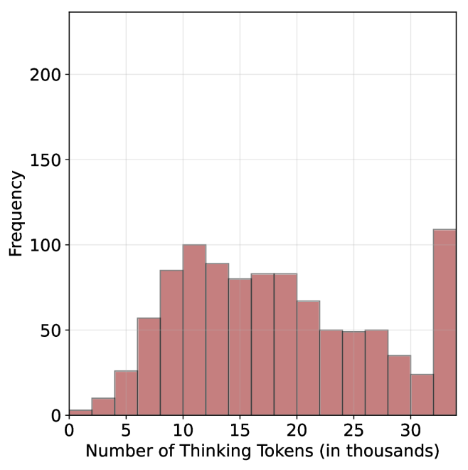
### Visual Description
## Histogram: Distribution of Thinking Tokens
### Overview
This image is a histogram visualizing the frequency distribution of "Thinking Tokens" used by a system (likely an AI model). The x-axis represents the quantity of tokens in thousands, and the y-axis represents the frequency of occurrences. The distribution is characterized by a primary bell-shaped cluster followed by a significant, anomalous spike at the upper bound of the data range.
### Components/Axes
* **Y-Axis (Vertical):** Labeled "Frequency". The scale ranges from 0 to 200, with major grid lines at 50-unit intervals (0, 50, 100, 150, 200).
* **X-Axis (Horizontal):** Labeled "Number of Thinking Tokens (in thousands)". The scale ranges from 0 to 30+, with major tick marks at intervals of 5 (0, 5, 10, 15, 20, 25, 30).
* **Data Series:** Represented by 16 vertical bars of a muted red-brown color. Each bar represents a specific range (bin) of token counts.
### Detailed Analysis
The histogram displays a non-normal, multimodal distribution. The trend rises steadily from 0, peaks, fluctuates, and then exhibits a sharp, unexpected spike at the final bin.
**Estimated Data Points (Frequency per Bin):**
| Token Range (k) | Estimated Frequency |
| :--- | :--- |
| 0 – 2 | ~5 |
| 2 – 4 | ~10 |
| 4 – 6 | ~30 |
| 6 – 8 | ~60 |
| 8 – 10 | ~85 |
| 10 – 12 | ~100 (Primary peak) |
| 12 – 14 | ~90 |
| 14 – 16 | ~80 |
| 16 – 18 | ~85 |
| 18 – 20 | ~85 |
| 20 – 22 | ~70 |
| 22 – 24 | ~50 |
| 24 – 26 | ~50 |
| 26 – 28 | ~50 |
| 28 – 30 | ~35 |
| 30 – 32 | ~25 |
| 32+ (Final Bin) | ~110 (Secondary, anomalous peak) |
### Key Observations
1. **Primary Distribution:** The bulk of the data falls between 5,000 and 20,000 tokens, with a clear mode (most frequent value) occurring in the 10,000–12,000 token range.
2. **The "Overflow" Spike:** The most notable feature is the final bar (32k+ tokens). Despite the general downward trend of the distribution after 12,000 tokens, this final bin is the highest in the entire chart, exceeding the primary peak.
3. **Distribution Shape:** The data is right-skewed, excluding the final outlier bin.
### Interpretation
The data suggests a system that typically performs "thinking" tasks within a range of 5,000 to 20,000 tokens.
The significant spike at the final bin (32k+) is highly indicative of a **hard constraint or truncation limit**. In technical contexts, this pattern often appears when a system has a maximum token limit (e.g., a context window or a "max_tokens" setting). The spike represents all instances where the model *wanted* to continue thinking but was forced to stop because it hit the maximum allowed token count.
Therefore, the chart demonstrates that while the model's natural "thinking" requirement is usually well under 30,000 tokens, a substantial portion of tasks are being cut off prematurely by a system-imposed limit.
</details>
(c) S1-long
Figure 26: Thinking token count histograms for S1-short, S1-random and S1-long datasets.
Table 10: Results for our finetuned models over the S $1$ variants using Qwen-2.5-7B-Instruct: S $1$ -short/long/random.
| | GPQA-D | AIME 2024 | AIME 2025 | HMMT | Math Average | | | | | |
| --- | --- | --- | --- | --- | --- | --- | --- | --- | --- | --- |
| Thinking Tokens $\downarrow$ | Acc. $\uparrow$ | Thinking Tokens $\downarrow$ | Acc. $\uparrow$ | Thinking Tokens $\downarrow$ | Acc. $\uparrow$ | Thinking Tokens $\downarrow$ | Acc. $\uparrow$ | Thinking Tokens $\downarrow$ | Acc. $\uparrow$ | |
| S1-random | 14095 | 39.1 | 25207 | 22.0 | 23822 | 22.0 | 25028 | 10.8 | 24686 | 18.2 |
| S1-long | 15528 $(+10.2\$ | 38.5 | 26210 | 21.7 | 24395 | 19.5 | 26153 | 9.2 | 25586 $(+3.7\$ | 16.8 |
| S1-short | 13093 $(-7.1\$ | 40.3 | 24495 | 22.0 | 21945 | 20.8 | 23329 | 11.2 | 23256 $(-5.8\$ | 18.0 |