# KPIRoot+: An Efficient Integrated Framework for Anomaly Detection and Root Cause Analysis in Large-Scale Cloud Systems
**Authors**: Wenwei Gu, Renyi Zhong, Guangba Yu111Guangba Yu is the corresponding author., Xinying Sun, Jinyang Liu, Yintong Huo, Zhuangbin Chen, Jianping Zhang, Jiazhen Gu, Yongqiang Yang, Michael R. Lyu
> wwgu21@cse.cuhk.edu.hk
> ryzhong22@cse.cuhk.edu.hk
> guangbayu@cuhk.edu.hk
> sunxinying1@huawei.com
> jyliu@cse.cuhk.edu.hk
> ythuo@smu.edu.sg
> chenzhb36@mail.sysu.edu.cn
> jpzhang@cse.cuhk.edu.hk
> jiazhengu@cuhk.edu.hk
> yangyongqiang@huawei.com
> lyu@cse.cuhk.edu.hk[[[[
1] \orgname The Chinese University of Hong Kong, \country Hong Kong SAR
2] \orgname Sun Yat-sen University, \country China
3] \orgname Singapore Management University, \country Singapore
4] \orgname Huawei Cloud Computing Technology Co., Ltd, \country China
Abstract
To ensure the reliability of cloud systems, their runtime status reflecting the service quality is periodically monitored with monitoring metrics, i.e., KPIs (key performance indicators). When performance issues happen, root cause localization pinpoints the specific KPIs that are responsible for the degradation of overall service quality, facilitating prompt problem diagnosis and resolution. To this end, existing methods generally locate root-cause KPIs by identifying the KPIs that exhibit a similar anomalous trend to the overall service performance. While straightforward, solely relying on the similarity calculation may be ineffective when dealing with cloud systems with complicated interdependent services. Recent deep learning-based methods offer improved performance by modeling these intricate dependencies. However, their high computational demand often hinders their ability to meet the efficiency requirements of industrial applications. Furthermore, their lack of interpretability further restricts their practicality. To overcome these limitations, an effective and efficient root cause localization method, KPIRoot, is proposed. It integrates both advantages of similarity analysis and causality analysis, where similarity measures the trend alignment of KPI and causality measures the sequential order of variation of KPI. Furthermore, it leverages symbolic aggregate approximation to produce a more compact representation for each KPI, enhancing the overall analysis efficiency of the approach. However, during the deployment of KPIRoot in cloud systems of a large-scale cloud system vendor, Cloud $\mathcal{H}$ . We identified two additional drawbacks of KPIRoot: 1. The threshold-based anomaly detection method is insufficient for capturing all types of performance anomalies; 2. The SAX representation cannot capture intricate variation trends, which causes suboptimal root cause localization results. We propose KPIRoot+ to address the above drawbacks. The experimental results show that KPIRoot+ outperforms eight state-of-the-art baselines by 2.9% $\sim$ 35.7%, while time cost is reduced by 34.7%. Moreover, we share our experience of deploying KPIRoot in the production environment of a large-scale cloud provider Cloud $\mathcal{H}$ Due to the company policy, we anonymize the name as Cloud $\mathcal{H}$ ..
keywords: Root Cause Localization, Cloud System Reliability, Cloud Monitoring Metrics, Cloud Service Systems
1 Introduction
Large-scale cloud systems have become the backbone of modern computing infrastructure, offering unprecedented scalability and flexibility. Cloud platforms such as Microsoft Azure, Amazon Web Services, and Google Cloud Platform provide cost-effective services to users worldwide on a $7× 24$ basis [21, 49]. However, the inherent complexity and scale of these systems inevitably lead to performance issues, including slow application response times, network latency spikes, and resource contention [20, 16]. These issues can result in violations of Service Level Agreements (SLAs), causing user dissatisfaction and financial losses for both service providers and consumers [24]. Consequently, the prompt identification and resolution of performance issues have become critical concerns for cloud vendors and users alike [23]. Addressing these challenges is essential for maintaining the reliability and efficiency of cloud services in an increasingly digital world.
Cloud vendors usually collect real-time key performance indicators (KPIs) to monitor the health status of their services [39]. Anomaly detection is conducted over these KPIs to identify performance issues based on this KPI data [55, 57, 14]. For example, if the resource utilization rate is continuously high, it may indicate an imminent service overload and performance degradation. However, due to the scale of cloud systems, it is infeasible to analyze the KPI of each instance (e.g., VM and container) individually. Since a cloud service typically consists of many instances, a common way is to monitor specific KPIs that can reflect the overall performance of the service, e.g., latency, error count, and traffic, which we refer to as alarm KPIs. Automated performance issue detection can thus be realized through configuring alerting rules or performing anomaly detection algorithms on such alarm KPIs. These underlying KPIs of individual instances or VMs within a cloud service may not be directly analyzed due to the scale of cloud systems. However, their collective behavior significantly influences the alarm KPIs.
When a performance issue is detected (i.e., the alarm KPI is abnormal), it is crucial to identify the root cause [37] (e.g., which underlying instances cause the abnormal performance of the service). However, pinpointing the root cause is a non-trivial task since the monitored alarm KPI is highly aggregated and often derived [46], i.e., the correlation between the underlying KPIs and the alarm KPI is complicated and hard to understand. Even experienced software reliability engineers (SREs) can struggle to pinpoint the specific KPIs that contribute to the root cause. Such a manual approach is like finding a needle in a haystack, which is tedious and time-consuming. Hence, the automated root cause localization method is an urgent requirement for prompt performance issue resolution.
In particular, a practical root cause localization approach for KPIs from cloud systems should meet the efficiency and interpretability requirements [50]. Specifically, due to the huge volume of underlying KPIs and the tight time-to-resolve pressure, the approach needs to be able to process large amounts of data (e.g., thousands of KPIs) efficiently (e.g., in seconds). Furthermore, the approach should produce interpretable results to help engineers take effective remedy actions, which is essential in the maintenance of cloud systems. Existing root cause localization methods typically adopt statistics or deep learning models. Statistic-based methods adopt Kendall, Spearman, and Pearson correlation to compute the linear relationships between KPIs and find the root cause [48]. However, these methods have high computational costs to calculate the correlation for every KPI pair and also suffer from low accuracy in handling complicated KPIs from cloud systems [47]. Some recent studies [46] adopt deep learning models (e.g., graph neural networks) to model the KPI relationships for root cause localization. However, such methods suffer from high computation costs and lack interpretability [51, 52].
To address the above limitations, a root cause localization framework, KPIRoot [11], is proposed to identify the root cause underlying KPIs when an anomaly in the monitored alarm KPI is detected in cloud systems. To meet the efficiency requirement, KPIRoot first adopts the Symbolic Aggregate Approximation (SAX) representation to downsample the time series data of KPIs and facilitate extracting the anomaly segments. By filtering out the normal KPI data, KPIRoot can focus on anomaly patterns instead of the whole time series, which optimizes efficiency. Then, KPIRoot conducts both the similarity and causality analysis to localize the root cause KPIs. Specifically, underlying KPIs with a high similarity of anomaly patterns to the alarm KPI are more likely to trigger the alert and be the root causes. On the other hand, causality analysis is used to validate the cause and effect in the temporal dimension, i.e., the anomaly pattern of root cause KPIs should happen before that of the alarm KPI. Finally, KPIRoot combines the similarity and causality analysis results to produce a correlation score for each underlying KPI. The higher the score, the more likely the KPI is the root cause. The time complexity of KPIRoot is $\mathcal{O}(\sqrt{n})$ ( $n$ is the length of the KPIs), which allows it to process thousands of KPIs in seconds, thus facilitating the resolution of real-time performance issues.
However, we identified several drawbacks of KPIRoot. Firstly, the threshold-based anomaly detection method employed by KPIRoot, while effective in identifying trend anomalies, struggles to detect seasonal and point anomalies. This limitation is particularly highlighted in performance issues reflected in KPIs, where seasonal fluctuations and sudden spikes or drops are common and critical to accurate anomaly detection. Secondly, although the SAX representation utilized in KPIRoot enhances the efficiency of root cause localization by downsampling the KPIs, it may not effectively capture intricate variation trends. This limitation arises from its reliance on segment averages, which can obscure variation trend details in the data essential for accurate root cause localization.
This paper extends our preliminary work, which appears as a research paper of ISSRE 2024 [11]. In particular, we extend our preliminary work in the following directions:
- We propose KPIRoot+, an extended version of the KPIRoot framework introduced in our preliminary work [11]. There are two major differences in KPIRoot+ compared to KPIRoot. Firstly, anomaly detection is positioned as a critical precursor to root cause localization. We reveal that the original KPIRoot framework struggles to detect all types of anomalies, which are pivotal for accurate root cause localization in some cases. To address this deficiency, we have implemented a time series decomposition-based method. By supplementing the original approach based on trend variation with time series decomposition and a U-Net autoencoder, KPIRoot+ significantly improves the accuracy of anomaly detection, thus improving the subsequent root cause analysis phase. Secondly, the original Symbolic Aggregate Approximation (SAX) representation employed in KPIRoot falls short of effectively capturing intricate trends and variations due to its dependence on segment averages. This can obscure critical behavioral patterns. To overcome these limitations, KPIRoot+ incorporates an Improved SAX representation (ISAX) that further incorporates trend variation indicators. Our experiments show that KPIRoot+ performs better in terms of root cause localization accuracy but requires a similar execution time when compared with KPIRoot.
- We conduct a comprehensive evaluation of anomaly detection performance across different models, an aspect that was overlooked in KPIRoot.
- We strengthen our experimental part by including NDCG in our evaluation metrics, specifically NDCG@5 and NDCG@10. This metric measures how easily engineers can find the culprit VMs, which is crucial in our scenarios as the most relevant root causes are prioritized for investigation.
- We conduct a sensitivity analysis on the parameters used in KPIRoot+. The results demonstrate that our approach maintains robustness within a reasonable interval of parameter values.
- During the deployment of KPIRoot in our Cloud $\mathcal{H}$ , we identified several failure cases that highlighted its limitations. We share our industrial experiences and insights on how KPIRoot+ addresses these issues.
To evaluate the effectiveness of our proposed KPIRoot+, we conducted extensive experiments based on large-scale real-world KPI data from a large cloud vendor. The experimental results demonstrate that KPIRoot+ can pinpoint root cause KPIs more accurately compared with seven baselines with an F1-score of 0.882 and Hit Rate@10 of 0.946. On the other hand, KPIRoot+ largely reduces the computation cost with an execution time of around 8 seconds, which facilitates engineers diagnosing root causes in real time. In particular, we have successfully deployed our approach in the cloud service system of Cloud $\mathcal{H}$ since Aug 2023 and successfully localized the true root cause of ten performance issues of emergence level with 100 accuracies without affecting the customer. We also share industrial experience in practice.
We summarize the main contributions of this work, which form a super-set of those in our preliminary study, as follows:
- We introduce KPIRoot+, an effective and efficient method to localize the underlying KPIs that cause the anomaly, which is an improved version of KPIRoot. KPIRoot+ adopts the Improved SAX representation for downsampling and combines both the similarity and causality of anomaly patterns of KPIs to identify the root cause. Such designs meet the practical requirements of efficiency and interpretability, making KPIRoot feasible to deploy in large-scale cloud systems. We further strengthen the anomaly detection part to make it effective for different anomaly types.
- Extensive experiments on three industrial datasets collected from Cloud $\mathcal{H}$ ’s large-scale cloud system demonstrate the effectiveness of KPIRoot+, i.e., 0.882 F1-score and 0.946 Hit@10 rate. The average execution time of KPIRoot+ is around 8 seconds, significantly outperforming seven state-of-the-art baselines.
- We have successfully deployed KPIRoot+ into the troubleshooting system of a large-scale cloud service system of Cloud $\mathcal{H}$ since Nov 2022. It has successfully analyzed ten emerging performance issues with 100 accuracies, and none of the issues affected the customer. The success stories of our deployment confirm the applicability and effectiveness of our method.
2 Background and Motivation
In this section, we present a comprehensive overview of KPI-based root cause analysis in cloud service systems and demonstrate its practical application through a case study of root cause localization in Cloud $\mathcal{H}$ , a large-scale production cloud environment.
<details>
<summary>extracted/6514164/figures/framework.png Details</summary>
### Visual Description
# Technical Document Extraction: Cloud System Self-Healing Workflow
This document provides a detailed technical extraction of the provided architectural diagram, which outlines a four-stage pipeline for cloud service monitoring and automated remediation.
## 1. High-Level Overview
The image depicts a linear, four-stage workflow (from left to right) encapsulated in dashed rounded rectangles. The process flows from infrastructure hosting to data collection, analytical correlation, and finally to automated self-healing actions.
---
## 2. Component Segmentation and Analysis
### Stage 1: Cloud Service System (Infrastructure)
* **Header Label:** Cloud Service System
* **Components:**
* **Host Cluster:** Represented by a cloud icon containing a server rack symbol.
* **Physical Server:** A central server icon connected via dotted lines to multiple Virtual Machines.
* **VMs:** Four individual square icons representing Virtual Machines (VMs) at the base of the hierarchy.
* **Function:** This stage represents the source environment where services are hosted and where raw data originates.
### Stage 2: Cloud Monitoring Backend (Data Collection)
* **Header Label:** Cloud Monitoring Backend
* **Textual Labels:**
* "Periodically Collecting"
* "Monitored KPIs"
* **Visual Components:**
* An icon of a monitor displaying a heartbeat/pulse line.
* A downward-pointing arrow indicating the flow from the monitor to the data.
* **Data Visualization:** Two line charts representing time-series data.
* **Top Chart:** Shows a highly volatile trend with multiple sharp peaks and troughs.
* **Bottom Chart:** Shows a relatively stable baseline with one significant spike toward the end of the timeline.
* **Function:** This stage involves the continuous gathering of Key Performance Indicators (KPIs) from the infrastructure.
### Stage 3: KPI Correlation Analysis (Intelligence)
* **Header Label:** KPI Correlation Analysis
* **Textual Labels:**
* "KPI Selection"
* "VM Candidates"
* **Visual Components:**
* **Network Graph Icon:** A series of nodes and edges representing the correlation between different data points.
* A downward-pointing arrow leading to a cloud icon.
* **Warning Icon:** A cloud icon with a superimposed black triangle containing an exclamation mark (!), signifying the identification of a fault or an anomaly.
* **Function:** This stage processes the collected KPIs to identify specific Virtual Machines that are candidates for remediation based on correlated failure patterns.
### Stage 4: Cloud System Self Healing (Remediation)
* **Header Label:** Cloud System Self Healing
* **Textual Labels:**
* "Mitigation Strategies"
* "VM Migration, Current Limiting..."
* **Visual Components:**
* **Self-Healing Icon:** A heart symbol enclosed in circular "refresh" arrows, indicating a continuous recovery loop.
* **Action Flow:** Three dotted arrows radiate downward from the self-healing icon to specific mitigation actions:
1. **Cloud Download/Sync Icon:** Likely representing data backup or state synchronization.
2. **Server/VM Toggle Icon:** Representing VM Migration or resource adjustment.
3. **Cloud Power/Shutdown Icon:** Representing service restarts or current limiting.
* **Function:** The final stage executes automated strategies to resolve the issues identified in the previous steps.
---
## 3. Workflow Summary
The system operates in a unidirectional flow:
1. **Generate:** The **Cloud Service System** runs the workload.
2. **Observe:** The **Cloud Monitoring Backend** collects periodic KPI data.
3. **Analyze:** **KPI Correlation Analysis** filters data and identifies problematic VM candidates.
4. **Act:** **Cloud System Self Healing** applies mitigation strategies like migration or current limiting to restore system health.
</details>
Figure 1: The Overall Pipeline of Root Cause Localization in Cloud $\mathcal{H}$
2.1 KPI-based Root Cause Localization in Cloud Systems
Ensuring performance and reliability in cloud systems is of great importance. Performance anomalies like hardware malfunctions, network overloads, and security violations can significantly influence the performance of cloud systems and violate SLA [34]. Consequently, the need for run-time status and performance monitoring of cloud systems is in demand. Key Performance Indicators (KPIs) serve as informative tools that monitor the overall status of various components of cloud systems [7], providing helpful insights that aid in the identification of potential anomalies [36], and even proactively predicting these performance issues before they escalate into catastrophic failures [40]. Some common KPIs in cloud systems include CPU usage, memory usage, network bandwidth, latency, error rates, and service QPS (queries per second).
The cloud service system has become increasingly huge in scale and produces larger volumes of monitoring data. The highly interconnected nature of cloud systems causes problems, such as performance failures, which can spread from one component to another component. Consequently, the failure diagnosis, root cause localization, and performance debugging in large cloud systems are more complex than before [42, 29]. In real-world applications, monitoring a large number of KPIs is computationally intensive. Thus, a more practical way is to monitor the aggregated KPI and configure alerts.
Specifically, in large-scale cloud service clusters, large amounts of virtual machines (VMs) operate concurrently to provide tenants with various services. A special KPI is the “ alarm KPI ” that triggers alerts when a performance issue like an overload of CPU usage in the entire cluster happens. In large-scale cloud systems, service may consist of large amounts of VMs working together to respond to cloud users’ demands [44]. Given the scale of these systems, individual monitoring of each VM becomes infeasible. Instead, software reliability engineers often utilize alarm KPIs as a more effective approach to oversee the overall performance of the service. When the alarm KPI indicates abnormal activity, it becomes crucial to identify which VMs are the root causes. The root cause refers to the specific VMs that trigger the anomaly within the alarm KPI. For instance, if the alarm KPI is triggered due to a fairly high CPU usage, the root cause could be the particular VMs that directly cause the resource overload. Such a setup allows for the proactive identification of performance issues. In addition to the alarm KPI, other KPIs monitor the bytes per second (bps) and packets per second (pps) of each VM in the cluster [17]. These KPIs offer valuable insights into the data traffic of each user, serving as indicators of their workload.
The overall pipeline of root cause localization using monitoring KPI in Cloud $\mathcal{H}$ is shown in Fig. 1. Cloud service providers typically have many data centers spread across different regions. Each region consists of multiple isolated locations known as availability zones to ensure low latency and high availability [15]. Users can create their VMs in any region that best fits their needs. Then, the behavior of both the host CPU cluster and the VMs is continuously monitored and recorded through KPIs, including CPU usage, memory usage, and netflow throughput. Next, KPI correlation analysis is conducted to understand the dependencies between each VM and the host cluster. Based on the KPI correlation analysis, mitigation strategies such as VM migration or throttling are enacted to alleviate the system overload. In our paper, we focus on the third and most significant part, namely root cause analysis, and propose KPIRoot+.
2.2 A Motivating Example
In a cloud system, there exist intrinsic correlations between the KPIs of individual VMs and the alarm KPI [10], which is a crucial part of RCA. Take the CPU usage in cloud systems as an example, the correlation is based on the fundamental principle of resource allocation within a cloud system that each VM is allocated a portion of the cluster’s resources like CPU [8]. When a VM’s workload increases, it consumes more CPU resources, thereby affecting the overall CPU usage. However, the relationship between the KPIs of individual VMs and the overall CPU usage of the cluster is complex and non-linear [41]. This complexity is due to the sophisticated architecture of modern cloud systems and the principles of resource allocation they employ. In other words, these mechanisms ensure that the resource usage of one VM does not significantly impact others, thereby preventing a single VM from monopolizing the CPU [58]. Thus, the bulge of the workload KPI of a single VM does not necessarily lead to alarm KPI trigger alerts.
To effectively identify the root cause of performance anomaly, we capture the correlations between the VM KPIs and the alarm KPI that depicts the contribution of VMs to the detected performance anomaly. This correlation often manifests in a similar waveform between the VM’s KPIs and the alarm KPI. For example, a sudden surge in a VM’s data traffic would likely lead to an increased demand for CPU resources, which would be reflected as a spike in the KPI of the cluster’s CPU usage [3]. The KPI correlation analysis approach aiming to mine the inherent correlations in KPI data can be leveraged to pinpoint the root causes of system alerts. In our case, similarity and causality analysis are adopted. Firstly, similarity analysis allows us to identify which VMs are behaving similarly to the overall system’s performance, as reflected by the alarm KPI. Therefore, similarity analysis can help narrow down the potential root causes of the anomaly. Secondly, causality analysis is critical as it allows us to determine which changes in VM KPIs occurred before the anomaly, thus providing clues as to which VMs might have triggered the anomaly.
<details>
<summary>extracted/6514164/figures/example.png Details</summary>
### Visual Description
# Technical Data Extraction: Cluster Performance and Network Traffic Analysis
## 1. Document Overview
This image is a multi-paneled time-series line chart used for root cause analysis in a computing cluster environment. It correlates a high-level alarm (Cluster CPU Usage) with the network traffic of four specific Virtual Machines (VM1 through VM4) over a 15-hour period.
## 2. Component Isolation
### A. Header/Y-Axis Labels (Left Side)
The chart is divided into five vertically stacked sub-plots, each with a specific label:
1. **Cluster CPU Usage (Alarm KPI)**: The primary metric being monitored.
2. **Network Traffic of VM1 (Root Cause)**: Identified as the source of the anomaly.
3. **Network Traffic of VM2**: Comparative metric.
4. **Network Traffic of VM3**: Comparative metric.
5. **Network Traffic of VM4**: Comparative metric.
### B. X-Axis (Footer)
The horizontal axis represents time on the date **08-26**. The markers are:
* `08-26 07:00`
* `08-26 10:00`
* `08-26 13:00`
* `08-26 16:00`
* `08-26 19:00`
* `08-26 22:00`
## 3. Data Series Analysis and Trend Verification
### Series 1: Cluster CPU Usage (Alarm KPI)
* **Color**: Dark Red / Maroon.
* **Visual Trend**: Highly erratic with frequent, sharp vertical spikes reaching a consistent maximum ceiling. There are approximately 7-8 major "burst" periods of high activity.
* **Correlation**: The spikes in this series align precisely with the activity peaks in the VM1 series.
### Series 2: Network Traffic of VM1 (Root Cause)
* **Color**: Pink / Magenta.
* **Visual Trend**: Characterized by distinct "plateau" blocks of high traffic.
* **Key Data Points**:
* First peak: Just before 07:00.
* Second peak: Between 07:00 and 10:00.
* Major sustained peak: Around 10:30.
* Major sustained peak: Around 13:30.
* Smaller peaks: Between 16:00 and 19:00.
* Final peak: Just before 22:00.
* **Observation**: This series is the only one that mirrors the timing of the "Cluster CPU Usage" spikes perfectly, justifying the "(Root Cause)" label.
### Series 3: Network Traffic of VM2
* **Color**: Blue.
* **Visual Trend**: Flat/low activity for the first half of the day, followed by high-frequency oscillations starting around 16:00, ending with a high-level sustained plateau after 21:00.
* **Observation**: Does not correlate with the initial CPU spikes seen in the first panel.
### Series 4: Network Traffic of VM3
* **Color**: Blue.
* **Visual Trend**: Binary/Step function behavior. The traffic is either at a baseline or at a fixed high plateau with perfectly vertical transitions.
* **Key Data Points**: High traffic blocks occur at ~08:30, ~12:00, ~14:30, ~18:30, and a final sustained jump at ~21:30.
* **Observation**: These regular intervals suggest a scheduled task or batch process, but they do not align with the erratic CPU spikes.
### Series 5: Network Traffic of VM4
* **Color**: Blue.
* **Visual Trend**: High initial activity before 07:00, followed by low activity with minor bumps until 19:00. After 19:00, it shows intense, high-amplitude noise/volatility.
* **Observation**: The late-day volatility does not match the specific timing of the CPU alarm peaks.
## 4. Summary of Findings
The visualization demonstrates a direct temporal correlation between **Cluster CPU Usage** and **Network Traffic of VM1**. Whenever VM1 experiences a surge in network traffic (Pink line), the Cluster CPU Usage (Red line) hits its peak alarm threshold. The traffic patterns of VM2, VM3, and VM4 show significant activity at different times, but their patterns do not synchronize with the Cluster CPU Alarm KPI, effectively ruling them out as the primary root cause during the observed spikes.
</details>
Figure 2: An Industrial Case in Cloud $\mathcal{H}$
An industrial case in a real-world cloud system cluster of Cloud $\mathcal{H}$ is shown in Fig. 2. There is an alarm KPI monitoring the overall CPU usage of the cluster, and several VM KPIs monitor the network traffic of individual VMs. For the purpose of the discussion, we will focus on four of the VM KPIs. We can observe that the waveforms of VM2 and VM4 have weak alignments with the fluctuations in the alarm KPI, indicating a lower correlation and, thus, are unlikely to be significant contributors to CPU overload. The KPI of VM1 and VM3 exhibit a high degree of similarity to the alarm KPI, indicating they are potential root causes for the anomaly. However, to ascertain the true root cause of the CPU overload, time series causality, i.e., chronological order of events, should also be taken into consideration. As confirmed by the SREs, it is VM1, not VM3, which is the true root cause of the CPU overload. This is because the spike in VM1’s KPI precedes the CPU overload anomaly, while the spike in VM3’s KPI happens slightly after the anomaly, indicating that it is an outcome, not a cause of the anomaly. Indeed, in a cloud system, a VM’s increase in resource consumption usually precedes the CPU overload due to temporal causality, which is why we take temporal causality into consideration in our method.
2.3 Different Types of Performance Anomalies
<details>
<summary>extracted/6514164/figures/type.png Details</summary>
### Visual Description
# Technical Document Extraction: Time Series Anomaly Types
This document contains a detailed extraction of data and visual information from a set of three time-series charts illustrating different types of anomalies.
## General Layout and Structure
The image consists of three vertically stacked line charts. Each chart shares a common X-axis (time/index) ranging from **0 to approximately 1450** and a Y-axis (normalized value) ranging from **0.0 to 1.0**.
* **Language:** English
* **Data Series Color:** Black solid line
* **Anomaly Indicator:** Light red/pink shaded vertical regions
---
## 1. Trend Shift Anomaly (Top Chart)
### Component Isolation
* **Header:** Title "Trend Shift Anomaly"
* **Y-Axis:** Markers at [0.0, 0.2, 0.4, 0.6, 0.8, 1.0]
* **X-Axis:** Markers at [0, 200, 400, 600, 800, 1000, 1200, 1400]
### Trend Analysis
The data begins with a downward trend from 0.9 to 0.4. It then enters a sustained low-level period (the anomaly). Following the anomaly, the data exhibits a steady upward trend with high-frequency noise, eventually reaching a peak near 1.0 around index 1350.
### Anomaly Data
* **Type:** Level/Trend Shift.
* **Spatial Grounding:** A single large red shaded block.
* **X-Range:** Approximately **index 230 to index 510**.
* **Behavior:** During this window, the mean value of the series drops significantly to a range between 0.0 and 0.3, representing a "trough" anomaly compared to the surrounding global trend.
---
## 2. Seasonal Pattern Variation Anomaly (Middle Chart)
### Component Isolation
* **Header:** Title "Seasonal Pattern Variation Anomaly"
* **Y-Axis:** Markers at [0.0, 0.2, 0.4, 0.6, 0.8, 1.0]
* **X-Axis:** Markers at [0, 200, 400, 600, 800, 1000, 1200, 1400]
### Trend Analysis
The series consists of intermittent "bursts" or pulses of activity separated by periods of zero value (flatline). The normal pattern appears to be a complex pulse reaching heights of 0.8 to 1.0.
### Anomaly Data
* **Type:** Pattern Variation / Missing Cycle.
* **Anomaly Region 1:**
* **X-Range:** Approximately **index 20 to index 220**.
* **Behavior:** The pulses in this region are significantly lower in amplitude (peaking around 0.4) and have a different frequency/shape compared to the standard pulses seen at index 400, 650, and 850.
* **Anomaly Region 2:**
* **X-Range:** Approximately **index 1060 to index 1090**.
* **Behavior:** A very narrow shaded region where a pulse is truncated or fails to reach the expected height of the surrounding seasonal peaks.
---
## 3. Residual Outlier Anomaly (Bottom Chart)
### Component Isolation
* **Header:** Title "Residual Outlier Anomaly"
* **Y-Axis:** Markers at [0.0, 0.2, 0.4, 0.6, 0.8, 1.0]
* **X-Axis:** Markers at [0, 200, 400, 600, 800, 1000, 1200, 1400]
### Trend Analysis
The series represents a stochastic or "noisy" signal centered roughly around a mean of 0.3. It fluctuates rapidly between 0.1 and 0.6 throughout the entire duration.
### Anomaly Data
* **Type:** Point Outlier / Spike.
* **Spatial Grounding:** A very thin vertical red line.
* **X-Range:** Approximately **index 570 to index 580**.
* **Behavior:** A single, sharp vertical spike where the value reaches **1.0**. This is a distinct deviation from the local variance, as the surrounding data points do not exceed 0.7 in that specific neighborhood.
---
## Summary Table of Extracted Data
| Chart Title | Anomaly Type | Primary X-Range | Visual Characteristic |
| :--- | :--- | :--- | :--- |
| **Trend Shift Anomaly** | Level Shift | 230 - 510 | Sustained drop in mean value. |
| **Seasonal Pattern Variation** | Shape/Frequency | 20 - 220; 1060 - 1090 | Low amplitude pulses; irregular timing. |
| **Residual Outlier Anomaly** | Point Outlier | 570 - 580 | Single instantaneous spike to 1.0. |
</details>
Figure 3: Different Anomaly Types in Cloud $\mathcal{H}$
Our previous work KPIRoot [11] predominantly focuses on detecting trend anomalies using a threshold-based method. While effective for identifying gradual or sustained shifts in performance metrics, this approach may not adequately capture the breadth of anomalies that can occur in Cloud $\mathcal{H}$ . Specifically, seasonal and residual anomalies, which manifest as periodic deviations or abrupt, unexpected changes, respectively, might not be sufficiently detected by a threshold method alone.
In Figure 3, we observe three distinct types of performance anomalies across different monitoring metrics within Cloud $\mathcal{H}$ . The first anomaly is a trend anomaly characterized by a sudden downward shift in throughput on a network interface card (NIC). This abrupt change can be indicative of packet loss, which might occur due to network congestion, hardware malfunctions, or configuration errors. The second case illustrates seasonal anomalies in NIC throughput, with unexpected deviations occurring in the area marked with red spans. The anomaly could suggest issues like batch jobs running at non-standard times or misconfigured scheduling that leads to throughput drop. The third example presents a residual anomaly in the average throughput on another NIC. Such short-duration spikes are neither part of a long-term trend nor follow a seasonal pattern, hinting at sporadic issues such as brief network outages, hardware failures, or security incidents like DDoS attacks. All these three types of performance anomalies can have severe impacts on service performance and reliability.
3 METHODOLOGY
In this section, we present KPIRoot+, an automated approach for root cause localization with monitoring KPIs in cloud systems. We first formulate the problem we target. Then, we provide an overview of the proposed method. Next, we elaborate on each part of our method, i.e., time series decomposition-based anomaly segment detection, similarity analysis, and causality analysis. We finally analyze the complexity of our proposed algorithm.
3.1 Problem Formulation
<details>
<summary>extracted/6514164/figures/overview.png Details</summary>
### Visual Description
# Technical Document Extraction: KPIRoot+ Workflow Architecture
This document provides a comprehensive technical breakdown of the provided architectural diagram for **KPIRoot+**, a system designed for anomaly detection and correlation analysis in virtualized environments.
---
## 1. High-Level Process Overview
The diagram illustrates a four-stage pipeline that transforms raw monitoring data into correlation scores to identify root causes of anomalies.
* **Input:** Raw monitoring Key Performance Indicators (KPIs) from hosts and Virtual Machines (VMs).
* **Processing:** Decomposition-based anomaly detection followed by parallel Similarity and Causality analyses.
* **Output:** Correlation scores for specific VMs.
---
## 2. Component Segmentation and Flow
### Region 1: Input of KPIRoot+ (Raw monitoring KPI)
This section represents the data collection layer.
* **Components:**
* **Host Server Icon:** Connected via dashed lines to two sets of VM icons.
* **KPI Data Series:**
* **Blue Line Chart:** Labeled "$KPI_{host}$" (KPI from host).
* **Green Line Chart:** Labeled "$KPI_{VM1}$" (KPI from VM1).
* **Orange Line Chart:** Labeled "$KPI_{VM2}$" (KPI from VM2).
* **Flow:** All raw KPI data is aggregated and passed to the next stage via a rightward-pointing arrow.
### Region 2: Decomposition based Anomaly Detection
This stage focuses on signal processing and identifying deviations.
* **Process:** The input signal undergoes "**Decomposition**".
* **Sub-components:** The signal is broken down into three distinct mathematical components:
1. **Trend**
2. **Seasonal**
3. **Residual**
* **Detection:** An upward red arrow points to the word "**Anomaly**" in red text, accompanied by a magnifying glass icon containing a warning symbol. This indicates that anomalies are detected within the decomposed components (likely the Residual).
### Region 3: Parallel Analysis (Similarity & Causality)
The output of the anomaly detection stage splits into two concurrent analytical paths.
#### A. Similarity Analysis
* **Method:** **Jaccard similarity**.
* **Logic:** The host KPI (blue) is compared against VM KPIs.
* **Path 1 (Green Arrow):** $Jaccard(KPI_{host}, KPI_{VM1})$ comparing the blue host signal to the green VM1 signal.
* **Path 2 (Orange Arrow):** $Jaccard(KPI_{host}, KPI_{VM2})$ comparing the blue host signal to the orange VM2 signal.
#### B. Causality Analysis
* **Method:** **Granger causality**.
* **Logic:** Determines the directional influence between VM KPIs and the host KPI.
* **Path 1 (Green Arrow):** $F(KPI_{VM1} \rightarrow KPI_{host})$ - Testing if VM1 causes the host anomaly.
* **Path 2 (Orange Arrow):** $F(KPI_{VM2} \rightarrow KPI_{host})$ - Testing if VM2 causes the host anomaly.
### Region 4: Output of KPIRoot+ (Correlation Score)
The final stage aggregates the results from the Similarity and Causality analyses.
* **Structure:** A vertical container receiving four inputs (two green, two orange).
* **Results:**
* **Green Circle:** Labeled "$KPI_{VM1}$". This represents the final correlation/root-cause score for Virtual Machine 1.
* **Orange Circle:** Labeled "$KPI_{VM2}$". This represents the final correlation/root-cause score for Virtual Machine 2.
---
## 3. Data and Label Transcription
| Category | Label / Variable | Description |
| :--- | :--- | :--- |
| **Header 1** | Input of KPIRoot+ | Entry point of the system. |
| **Header 2** | Decomposition based Anomaly Detection | Primary processing stage. |
| **Header 3** | Similarity Analysis | Statistical comparison stage. |
| **Header 4** | Causality Analysis | Directional influence stage. |
| **Header 5** | Output of KPIRoot+ | Final result stage. |
| **KPI Source** | $KPI_{host}$ | Blue signal; reference point for the host. |
| **KPI Source** | $KPI_{VM1}$ | Green signal; data from the first VM. |
| **KPI Source** | $KPI_{VM2}$ | Orange signal; data from the second VM. |
| **Math Function** | $Jaccard(x, y)$ | Used for similarity measurement. |
| **Math Function** | $F(x \rightarrow y)$ | Used for Granger causality measurement. |
---
## 4. Visual Trend and Logic Verification
* **Signal Consistency:** The color coding is strictly maintained throughout the diagram. **Blue** always represents the Host, **Green** always represents VM1, and **Orange** always represents VM2.
* **Trend Check:** The line charts for $KPI_{host}$, $KPI_{VM1}$, and $KPI_{VM2}$ all show high-frequency fluctuations (noise/activity), which justifies the need for "Decomposition" to extract the "Trend" and "Seasonal" patterns from the "Residual" noise where anomalies typically reside.
* **Spatial Logic:** The diagram flows linearly from left to right, with a logical fork in the center to show that Similarity and Causality are independent metrics used to calculate the final Correlation Score.
</details>
Figure 4: The Overview of Our Proposed Method KPIRoot+
The goal of our work is to identify the root causes of performance anomalies, including but not limited to CPU overload in large-scale cloud systems based on the alarm KPI and observed individual KPIs. The root causes are the VMs that influence the system service quality. By throttling the throughput of these VMs, we can alleviate the system-level anomaly and restore service quality. Given the alarm KPI that monitors the status of the host cluster $X_{host}∈{R^{n}}$ and the monitored KPIs of VMs, e.g., the netflow of them $X_{i}∈{R^{n},i∈\{1,2,...,m\}}$ , where $N$ denotes the number of observations collected at an equal interval and $m$ is the number of monitored VMs. To determine the true root cause of the detected anomaly, a correlation score $c_{i}∈[0,1]$ that represents the contribution of a VM KPI to the anomaly is calculated. Then, the root causes can be obtained by ranking the correlation score, and KPIs with the top $K$ scores are deemed as root causes.
3.2 Overview
The overview of KPIRoot+ is shown in Fig. 4, which consists of three key components, namely, time series decomposition-based anomaly segment detection, similarity analysis, and causality analysis. Given the raw monitoring KPI, to make the RCA more efficient and meet the real-time requirement of industrial deployment, we propose to adopt SAX representation to downsample the raw KPI. Then, KPIRoot detects the potential anomaly segments, including different anomaly types in the downsampled alarm KPI of the host cluster (Section. 2). In this step, an anomaly score that describes the probability of KPI being anomalous will be computed, an anomaly segment will automatically extracted around the spike. Then, KPIRoot conducts a similarity analysis to compute the similarity between VM KPIs and the alarm KPI during the anomaly period (Section. 3.4). This analysis provides insights into how each VM influences the host cluster by measuring the alignment of the KPI trends. A causality analysis is then conducted (Section. 3.5) to identify the cause-and-effect between the VM KPIs and the alarm KPI. In our case, we utilize Granger causality. The results from the similarity and causality analyses are then combined to compute a correlation score for each KPI.
3.3 Time Series Decomposition Based Anomaly Segment Detection
To make KPIRoot+ efficient and meet the industrial requirement of real-time identification, KPIRoot [11] propose to adopt Symbolic Aggregate Approximation (SAX) [18]. SAX has several advantages in KPI analysis: First, SAX allows for a significant reduction in the dimension of the raw KPI, which can make subsequent similarity computation more efficient [28]. Second, SAX can effectively filter out the noise and highlight the significant patterns in the KPIs by aggregating several consecutive data points into a single ”symbol” [33]. Specifically, the raw KPI $x$ of length $n$ will be represented as a $w$ -dimensional vector $P=\{p_{1},p_{2},...,p_{w}\}$ , where the $j^{th}$ element can be calculated as follows:
<details>
<summary>extracted/6514164/figures/sax.png Details</summary>
### Visual Description
# Technical Document Extraction: Symbolic Aggregate Approximation (SAX) Visualization
## 1. Component Isolation
* **Header/Legend:** Located at the top-left [x: 85, y: 75]. Contains the series identifiers.
* **Main Chart Area:** Occupies the central region. Features a fluctuating time-series line, a stepped approximation line, and horizontal threshold markers.
* **Axes:**
* **X-axis:** Horizontal bottom, representing time or sequence index.
* **Y-axis:** Vertical left, representing normalized KPI values.
* **Right-side Labels:** Vertical right, representing the symbolic alphabet mapping.
---
## 2. Legend and Labels
* **Legend [Top-Left]:**
* **Blue Thin Line:** "Raw Monitoring KPI"
* **Red Thick Stepped Line:** "SAX Representation"
* **Y-Axis Markers (Left):** -1.5, -1.0, -0.5, 0.0, 0.5, 1.0
* **X-Axis Markers (Bottom):** 0, 200, 400, 600, 800, 1000, 1200, 1400
* **Symbolic Alphabet (Right):**
* The space between horizontal dashed lines is labeled with lowercase letters **a** through **i** (bottom to top).
* **i**: > ~0.85
* **h**: ~0.55 to ~0.85
* **g**: ~0.25 to ~0.55
* **f**: ~0.0 to ~0.25
* **e**: ~-0.25 to ~0.0
* **d**: ~-0.5 to ~-0.25
* **c**: ~-0.85 to ~-0.5
* **b**: ~-1.3 to ~-0.85
* **a**: < ~-1.3
---
## 3. Data Series Analysis
### Series 1: Raw Monitoring KPI (Blue Line)
* **Trend:** This is a high-frequency, noisy time-series signal.
* **Visual Flow:**
1. Starts at approx -0.9, trends downward with volatility to a trough of approx -1.6 around index 300.
2. Sharp upward climb from index 400 to 550, reaching a peak of approx 1.1.
3. Brief dip to 0.0 at index 750.
4. Second peak reaching approx 1.3 between index 800 and 1000.
5. Gradual, volatile descent from index 1000 to the end of the chart, finishing near -0.8.
### Series 2: SAX Representation (Red Stepped Line)
* **Trend:** This is a Piecewise Aggregate Approximation (PAA) converted into discrete symbols. It follows the mean of the blue line within specific time windows.
* **Visual Flow:**
* **Index 0-400:** Stays in the lower regions, stepping through levels corresponding to symbols **c, b,** and **a**.
* **Index 400-500:** A sharp vertical jump from level **b** to level **h**.
* **Index 550-700:** Plateaus at level **i**, then drops to level **h**.
* **Index 700-800:** Drops to level **f**.
* **Index 800-1050:** Sustained plateau at level **i**.
* **Index 1050-1450:** Sequential downward steps through levels **h, g, f, e,** and finally **d**.
---
## 4. Data Table Reconstruction (Approximated)
The following table represents the SAX transformation logic visible in the chart, mapping the Red Line's position to the symbolic alphabet.
| Time Window (Approx Index) | SAX Level (Red Line Value) | Symbolic Label |
| :--- | :--- | :--- |
| 0 - 50 | ~ -1.0 | c |
| 50 - 120 | ~ -1.25 | b |
| 120 - 180 | ~ -1.35 | a |
| 180 - 350 | ~ -1.5 | a |
| 350 - 420 | ~ -1.35 | a |
| 420 - 480 | ~ -0.3 | d |
| 480 - 550 | ~ 0.9 | i |
| 550 - 650 | ~ 1.0 | i |
| 650 - 720 | ~ 0.7 | h |
| 720 - 800 | ~ 0.15 | f |
| 800 - 1050 | ~ 1.1 | i |
| 1050 - 1120 | ~ 1.0 | i |
| 1120 - 1180 | ~ 0.8 | h |
| 1180 - 1250 | ~ 0.6 | h |
| 1250 - 1320 | ~ 0.3 | g |
| 1320 - 1400 | ~ -0.1 | e |
| 1400 - 1450 | ~ -0.5 | d |
---
## 5. Technical Summary
The image demonstrates the **Symbolic Aggregate Approximation (SAX)** algorithm applied to a noisy KPI signal. The process involves:
1. **Normalization:** The Y-axis indicates the signal is likely Z-normalized.
2. **PAA (Piecewise Aggregate Approximation):** The signal is divided into equal-sized time windows, and the mean of each window is calculated (the horizontal segments of the red line).
3. **Discretization:** The PAA values are mapped to discrete symbols (**a-i**) based on predefined breakpoints (the horizontal dashed lines). This transforms a continuous time-series into a string of characters for efficient pattern matching and storage.
</details>
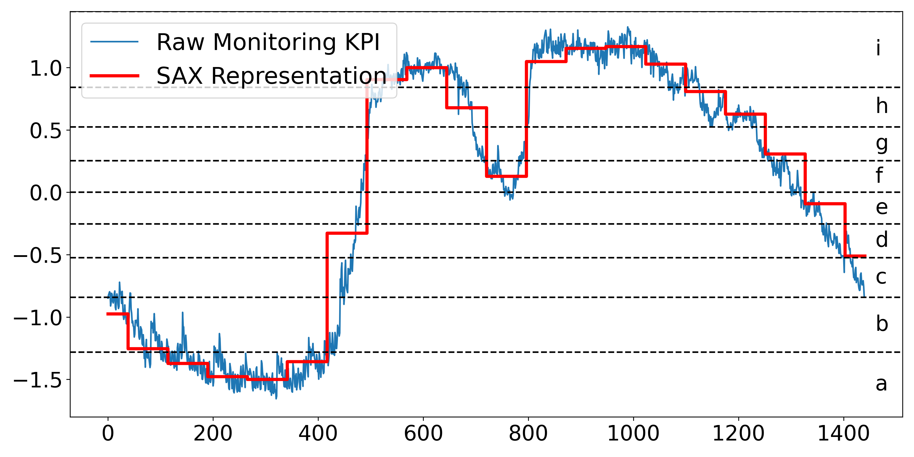
Figure 5: An Illustration of SAX Representation
$$
\displaystyle p_{i}=\frac{w}{n}\sum_{j=\frac{n}{w}(i-1)+1}^{\frac{n}{w}i}{x_{j}} \tag{1}
$$
In other words, to reduce the dimension of KPI from $n$ to $w$ , the KPI is divided into $w$ equal-sized subsequences. The mean value of the subsequence is calculated, and a vector of these values becomes the Piecewise Aggregate Approximation (PAA) representation [12]. Indeed, PAA representation is intuitive and simple yet shows an approximate performance compared with more sophisticated dimension reduction representations like Fourier transforms and wavelet transforms [18]. Before converting it to the PAA, we normalize each KPI to have a mean of zero and a standard deviation of one. However, SAX representation can obscure significant variation trends due to its reliance on segment averages, potentially leading to inaccurate representations.
In the industrial scenario, a fixed threshold method (e.g., CPU usage higher than 80%) is commonly used to detect system resource usage anomalies. However, fixed thresholds can be limiting as they do not adapt to changes in the system’s behavior over time. Typically, an anomaly refers to a state where the system’s resources, such as CPU, memory, or network bandwidth, are being utilized at their maximum capacity and will cause performance issues for the system. However, in a dynamic cloud system, the threshold at which an anomaly occurs can shift. Specifically, during periods of low demand, a sudden spike in resource usage might be considered an anomaly. However, during peak demand periods, the system might be designed to handle much higher resource usage. Thus, the same usage level would not be considered an anomaly. Furthermore, the individual preferences of engineers make the setting of universally acceptable static thresholds complex. What might be a suitable threshold for one engineer could be too high or too low for another, leading to potential issues being overlooked or an excessive number of false alarms [56]. KPIRoot assumes that by detecting an uprush in workload, the early warning of potential system anomaly can be identified, and root cause localization will be enabled. A score that describes the variation trend of a KPI is computed as follows:
$$
\displaystyle r_{i}=\frac{\sum_{k=i}^{i+l-1}p_{k}}{\sum_{j=i-l}^{i-1}p_{j}} \tag{2}
$$
where $l$ denotes the historical lags taken into consideration. If the value $r_{i}$ is greater than a large threshold $\gamma$ , it suggests that the usage of resources as indicated by the KPI starts to undergo a spike, and we denote the start point of overload as $t_{s}$ . Once the KPI value drops below the value of $t_{s}$ , it signifies that the overload ends; the endpoint of the overload is denoted as $t_{e}$ . In other words, $x_{t_{e}}<x_{t_{s}}$ and $x_{t_{e}-1}>x_{t_{s}}$ .
However, KPIRoot [11] primarily targets trend anomalies through threshold-based techniques, which may fall short in identifying performance anomalies in large-scale cloud systems. The complexity and scale can lead to multiple overlapping types of performance anomalies, including level shifts, periodic variations, and sudden spikes or dips. We extend our previous work by proposing to utilize time series decomposition to better differentiate and detect these diverse anomaly types. This method distinctly identifies and addresses performance anomalies, which can often be obscured in a unified analysis.
We assume the metric time series can be decomposed as the sum of three different components, namely, trend, seasonality, and remainder components:
$$
\displaystyle X_{host}^{t}=\tau_{host}^{t}+s_{host}^{t}+r_{host}^{t},t=1,2,...,n \tag{3}
$$
where $X_{host}^{t}$ denotes the original host cluster KPI at time $t$ , $\tau_{host}^{t}$ denotes the trend, $s_{host}^{t}$ denotes the periodic component and $r_{host}^{t}$ is the residual component.
In this paper, we propose to use the Seasonal and Trend decomposition using the Loess (STL) algorithm, which is a robust and versatile method for decomposing time series data [30]. It uses a sequence of Loess (locally estimated scatter plot smoothing) regressions. The flexibility of STL in handling various seasonal patterns and the ability to adjust its parameters makes it particularly suitable for complex and non-linear metrics in large-scale cloud systems.
After obtaining the decomposition into seasonal, trend, and remainder components, we perform anomaly detection on each component separately to identify distinct types of anomalies. To encode the complex patterns of the time series, it is necessary to consider both the local and global information, i.e., multi-scale features. We adopt an auto-encoder network architecture with skip connections, as known as the U-Net structure [32]. It is trained on multiple sliding window segments of the monitoring metrics. Although the autoencoder approach may incur some additional computational cost, it remains affordable, considering there is typically only one alarm KPI against thousands of VM KPIs.
3.4 Similarity Analysis
<details>
<summary>extracted/6514164/figures/isax.png Details</summary>
### Visual Description
# Technical Data Extraction: Time-Series SAX Representation
## 1. Document Overview
This image is a technical line chart illustrating the transformation of a high-frequency time-series signal into a Symbolic Aggregate Approximation (SAX) representation. It displays three distinct data series plotted against time, with a secondary symbolic categorization on the right-hand side.
## 2. Component Isolation
### A. Header / Legend
* **Location:** Top-left corner [x: 100, y: 50] to [x: 450, y: 280].
* **Legend Items:**
* **Raw Monitoring KPI:** Represented by a thin blue line.
* **Variation Trend:** Represented by a thick green line.
* **SAX Representation:** Represented by a thick red "step" line.
### B. Main Chart Area (Axes and Markers)
* **Y-Axis (Vertical):**
* **Label:** "Normalized Value"
* **Scale:** Ranges from -1.5 to 1.0 (with data extending slightly above 1.0).
* **Major Tick Marks:** -1.5, -1.0, -0.5, 0.0, 0.5, 1.0.
* **X-Axis (Horizontal):**
* **Label:** "Time"
* **Scale:** Ranges from 0 to 1400.
* **Major Tick Marks:** 0, 200, 400, 600, 800, 1000, 1200, 1400.
* **Symbolic Alphabet (Right Margin):**
* Nine horizontal dashed lines divide the Y-axis into discrete bins.
* Each bin is labeled with a lowercase letter from **a** to **i** (bottom to top).
## 3. Data Series Analysis and Trends
### Series 1: Raw Monitoring KPI (Thin Blue Line)
* **Trend:** High-frequency, noisy signal. It starts at approx. -0.8, dips to a minimum near -1.6 around Time 300, rises sharply between Time 400 and 600 to a peak above 1.0, and then gradually declines back toward -0.8 by Time 1400.
* **Characteristics:** Contains significant jitter/noise throughout the duration.
### Series 2: Variation Trend (Thick Green Line)
* **Trend:** A piecewise linear approximation of the blue line. It smooths the noise to show the underlying directional movement.
* **Logic Check:** It follows the "valleys" and "peaks" of the blue line but ignores the high-frequency oscillations.
### Series 3: SAX Representation (Thick Red Step Line)
* **Trend:** A horizontal "step" function. It discretizes the signal into fixed-width time segments (approximately 70-80 time units wide).
* **Logic Check:** The height of each red horizontal segment corresponds to the average value of the signal within that time window, mapped to the symbolic bins (a-i).
## 4. Symbolic Mapping (SAX Bins)
The chart uses horizontal dashed lines to define the following symbolic regions:
| Symbol | Approximate Normalized Value Range |
| :--- | :--- |
| **i** | > 0.85 |
| **h** | 0.55 to 0.85 |
| **g** | 0.25 to 0.55 |
| **f** | 0.0 to 0.25 |
| **e** | -0.25 to 0.0 |
| **d** | -0.5 to -0.25 |
| **c** | -0.85 to -0.5 |
| **b** | -1.25 to -0.85 |
| **a** | < -1.25 |
## 5. Sequence Extraction (SAX String)
Based on the red step line's vertical position relative to the lettered bins, the approximate symbolic sequence represented is:
`b -> b -> a -> a -> a -> a -> b -> d -> h -> i -> i -> g -> c -> f -> i -> i -> i -> h -> g -> g -> e -> d -> c`
*(Note: Each step represents a discrete time interval of roughly 75 units).*
</details>
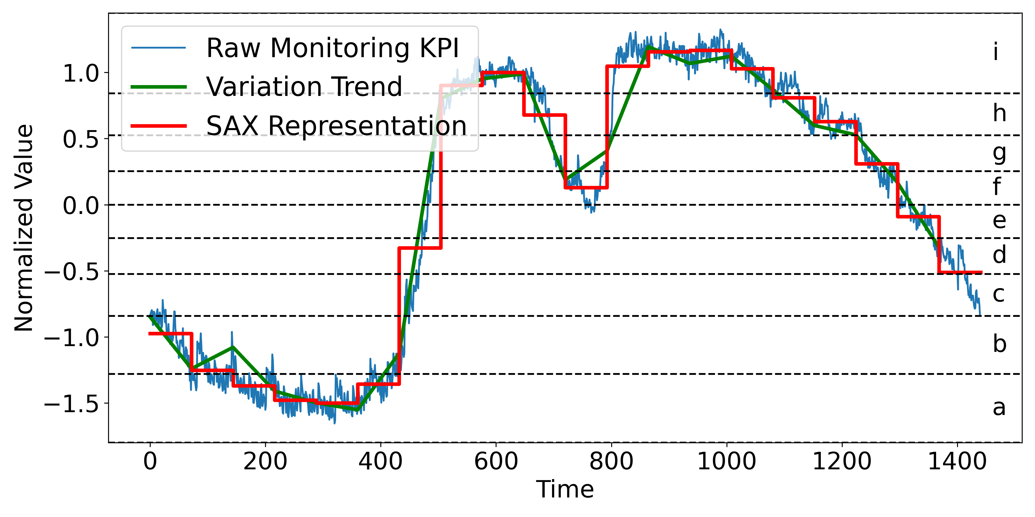
Figure 6: An Illustration of Improved SAX Representation
Motivated by [47], we propose to compute the similarity of the alarm KPI and VM KPIs to measure the degree of the root cause. The intuition behind this is that if a VM is responsible for triggering an overload, its KPI should exhibit a significant similarity with the host cluster’s KPI, especially during periods of overload. If a VM is indeed the root cause of an overload, it is expected that its resource usage pattern would reflect the pattern of the host resource usage.
Although there exist some approaches that can be used to calculate the similarity of monitoring KPIs, such as AID [47], HALO [53], and CMMD [46], however, in real-time cloud computing systems, timely root cause localization is paramount. Traditional algorithms such as Dynamic Time Warping (DTW) might not be suitable for such scenarios due to their high time complexity, which can be prohibitive for processing large volumes of data in a real-time manner.
KPIRoot transforms the KPIs into symbolic sequences and then computes the similarity between these sequences using the Jaccard similarity coefficient. A discretization technique that produces symbols with equal probability is used to obtain the discrete representation with symbols. As proved by [18], the normalized KPIs have nearly Gaussian distributions. It’s easy to pick equal-sized areas under the Gaussian distribution curve using lookup tables for the cut line coordinates, slicing the under-the-Gaussian-curve area. Suppose there $\alpha$ symbols in the SAX representation, then the breakpoints refer to a sort of numbers $\beta=\{\beta_{1},\beta_{2},...,\beta_{\alpha}\}$ such that the area under normalized Gaussian distribution curve between $\beta_{i}$ to $\beta_{i+1}$ is equal to $\frac{1}{\alpha}$ . The PAA representation element in Section. 2 between $\beta_{i}$ to $\beta_{i+1}$ will be assigned with the $i^{th}$ symbol shown as follows:
$$
\displaystyle s_{i}=alphabet_{l},\quad if\ {\beta_{l}}\leq{p_{i}}\leq\beta_{l+1} \tag{4}
$$
where, $alphabet_{i}$ denotes the $i^{th}$ symbol and $s_{i}$ denotes the $i^{th}$ element of the SAX representation $S$ . An example of SAX representation of a monitoring KPI with $w=20,\alpha=9$ is shown in Fig. 5.
However, the traditional Symbolic Aggregate Approximation (SAX) method, while effective for dimensionality reduction and pattern recognition in time series data, has limitations due to its reliance on segment averages. This approach can obscure significant trends and variations, leading to misleading representations. For instance, two segments with different behaviors—such as an increasing CPU usage in a VM with relatively low average usage and a decreasing usage in another VM with a higher average, might be mapped to the same symbol if their averages are similar. This could overlook critical issues like potential CPU overloads. To address this, an Improved SAX representation (ISAX) is proposed (shown in Figure 6), which incorporates the variation trend indicators. To maintain the efficiency of the approach, only trend information is considered, ensuring that the enhanced representation remains computationally feasible while providing more critical insights into the KPI’s dynamic behavior. The trend information, represented by the sign of the slope within the dimensionality reduction window, is calculated as follows:
$$
\displaystyle\phi_{i}=sgn(x_{\frac{n}{w}\cdot{i}}-x_{\frac{n}{w}\cdot(i-1)+1}) \tag{5}
$$
where $x_{\frac{n}{w}·{i}}$ and $x_{\frac{n}{w}·(i-1)+1}$ are the start and end point of the $i^{th}$ metric segment in PAA representation. The Improved SAX in KPIRoot+ will further differentiate between two metric segments that originally map to the same symbol under traditional SAX due to similar averages. By incorporating the variation trend, Improved SAX assigns different symbols to segments that have the same average but different trends, such as an increasing versus a decreasing sequence. Different from the original SAX representation, improved SAX will assign the PAA representation element between $\beta_{i}$ to $\beta_{i+1}$ a symbol as follows:
$$
\displaystyle s_{i}=alphabet_{2{\alpha}-{\phi_{i}}\cdot{l}},\quad if\ {\beta_{%
l}}\leq{p_{i}}\leq\beta_{l+1} \tag{6}
$$
We adopt the Jaccard similarity coefficient rather than other similarity measures because of its advantages when dealing with symbolic sequences like the SAX representation [13]. Moreover, Jaccard similarity is easy to compute and can effectively capture the similarity between two symbolic sequences regardless of their lengths. This makes it very suitable for our case, where the lengths of the symbolic sequences could vary. Then, the Jaccard similarity can be computed as follows:
$$
\displaystyle Jaccard(S_{host},S_{i})=\frac{\lvert{S_{host}\cap{S_{i}}}\rvert}%
{\lvert{S_{host}\cup{S_{i}}}\rvert} \tag{7}
$$
where $S_{host}$ is the SAX representation of the host cluster’s KPI and $S_{i}$ is the SAX representation of individual VM KPI $X_{i}$ .
3.5 Causality Analysis
The Improved Symbolic Aggregate Approximation method is effective in reducing the dimension of raw KPI while preventing trend information loss; however, the computation of Improved SAX representation-based similarity does not provide any insights into the causality between VM KPIs and alarm KPIs. As mentioned by [27], the ability of Granger causality analysis to analyze the correlation between KPIs can be a key factor for improving the accuracy of the root cause localization. By using Granger Causality in conjunction with SAX representation, we can not only analyze large quantities of time series data effectively but also gain insights into the potential causality between different KPIs. That is why we take Granger Causality [35] as a supplement.
Granger Causality is a statistical hypothesis test used to determine if one KPI is useful in forecasting another KPI [2]. For instance, if a VM KPI undergoes an uprush and causes the alarm KPI to trigger alerts, i.e., the change in the VM KPI precedes the changes in the alarm KPI, then Granger causality exists from the alarm KPI to the VM KPI. It should be noted that Granger Causality is unidirectional, which means that if VM KPI Granger causes alarm KPI, it does not imply that alarm KPI Granger causes VM KPI. In our case, we are interested in understanding how VM KPIs influence the alarm KPI of the host cluster, so we focus on the Granger causality from the VM KPIs to the alarm KPI. Specifically, assuming that the two KPIs can be well described by Gaussian autoregressive processes, the autoregression (AR) of alarm KPI without and with information from VM KPI can be written as follows:
$$
\displaystyle p_{alarm}^{t}=\hat{a_{0}}+\sum_{j=1}^{q}{\hat{a_{j}}}p_{alarm}^{%
t-j}+\hat{\varepsilon_{t}} \tag{8}
$$
$$
\displaystyle p_{alarm}^{t}=a_{0}+\sum_{j=1}^{q}{a_{j}}p_{alarm}^{t-j}+\sum_{j%
=1}^{q}{b_{j}}p_{i}^{t-j}+\varepsilon_{t} \tag{9}
$$
where the first equation uses the past values of the PAA representation of host KPI $X^{host}$ while the second includes the past values of the PAA representation of both $X^{host}$ and $X^{vm}$ . Furthermore, $\hat{a_{j}}$ is the autoregression coefficients for $X^{host}$ , while $a_{j}$ and $b_{j}$ are the autoregression coefficients for $X^{host}$ with the contribution of both $X^{host}$ and $X^{vm}$ ’s historical values. Both $\hat{\varepsilon_{t}}$ and $\varepsilon_{t}$ are residual terms assumed to be Gaussian, and $q$ is model order, which represents the amount of past information that will be included in the prediction of the future sample. Then, we conduct the F-statistic test:
$$
\displaystyle F_{vm\rightarrow{host}}=\frac{\sum_{t=t_{s}+q}^{t_{e}}({\hat{%
\varepsilon}_{t}^{2}}-{\varepsilon_{t}^{2}})/q}{\sum_{t=t_{s}+q}^{t_{e}}{%
\varepsilon_{t}^{2}}/(t_{e}-t_{s}-2q-1)} \tag{10}
$$
where ${\hat{\varepsilon}_{t}^{2}}$ and $\varepsilon_{t}^{2}$ represent the mean square error (MSE) of the AR model of host KPI without and with information from VM KPI. $t_{s}$ and $t_{e}$ are the start point and end point of the detected overload. The F-statistic test follows an F-distribution with $q$ and $t_{e}-t_{s}-2p-1$ degrees of freedom under the null hypothesis that the VM KPI does not Granger-cause the host KPI. The calculated F-statistic can be a good indicator of the VM KPI Granger-causality to the host KPI.
After both the similarity and causality analyses are performed, KPIRoot combines these two scores to create a more comprehensive correlation score for each VM KPI. Specifically, the correlation score is a weighted sum of similarity score and causality score:
$$
\displaystyle c_{i}=\lambda\times{Jaccard(S_{host},S_{i})}+(1-\lambda)\times{F%
_{vm\rightarrow{host}}} \tag{11}
$$
where $c_{i}$ is the correlation score between the $i^{th}$ VM KPI and the alarm KPI. The balance weight $\lambda$ is a hyper-parameter. In our experiments, this parameter is set to be 0.9.
3.6 Complexity Analysis
The proposed method KPIRoot+ is summarized in Algorithm. 1. The computation of our method mainly lies in the similarity and causality analysis. In industrial practice, $w≈{\sqrt{n}}$ , which means the lengths of SAX representation of KPIs are roughly $\sqrt{n}$ . So, the time complexity of obtaining SAX representation is $\mathcal{O}(\sqrt{n})$ . On one hand, the time complexity of Jaccard similarity is directly proportional to the KPI length, so the complexity of similarity analysis is $\mathcal{O}(\sqrt{n})$ . On the other hand, the complexity of Granger causality mainly depends on the autoregression of $P_{host}$ , which is $\mathcal{O}(\sqrt{n}×{q^{3}})$ , where $q$ is the time lag of Granger causality (usually very small). Thus, the complexity of KPIRoot is $\mathcal{O}(\sqrt{n}×({q^{3}}+2))$ . As a comparison, the time efficiency of methods like AID (based on DTW) is $\mathcal{O}(n^{2})$ , let alone more complex deep learning-based methods like CMMD. Therefore, KPIRoot+ is a more suitable method for industrial applications that demand real-time root cause localization.
Algorithm 1 KPI Root Cause Localization+
0: The alarm KPI of the host $X_{alarm}$ ; The KPIs of VMs $X_{i},i∈\{1,2,...,m\}$ ;
0: The correlation scores of VM KPIs that correlate to the anomaly of alarm KPI $c_{i}$
1: for $i=1$ ; $i≤ w$ ; $i++$ do
2: $p^{i}_{alarm}=\frac{w}{n}\sum_{j=\frac{n}{w}(i-1)+1}^{\frac{n}{w}i}{x_{alarm}^%
{j}}$
3: $\phi_{alarm}^{i}=sgn(x_{alarm}^{\frac{n}{w}·{i}}-x_{alarm}^{\frac{n}{w}%
·(i-1)+1})$
4: end for
5: // Anomaly Segment Detection
6: $X_{alarm}^{t}=\tau_{host}^{t}+s_{host}^{t}+r_{host}^{t}$
7: $i_{anomaly}=AE(\tau_{host}){\cup}AE(s_{host}){\cup}AE(r_{host})$
8: $p_{alarm}=p_{alarm}[i_{anomaly}]$
9: $s^{i}_{alarm}=\{alphabet_{2{\alpha}-{\phi_{i}}·{l}},\quad if\ {\beta_{l}}%
≤{p^{i}_{alarm}}≤\beta_{l+1}\}$
10: for $i=1$ ; $i≤ m$ ; $i++$ do
11: // Similarity Analysis
12: for $k=1$ ; $k<m$ ; $k++$ do
13: $p_{i}^{k}=\frac{w}{n}\sum_{j=\frac{n}{w}(k-1)+1}^{\frac{n}{w}k}{x_{i}^{k}}$
14: $p_{i}=p_{i}[i_{anomaly}]$
15: $\phi_{i}^{k}=sgn(x_{i}^{\frac{n}{w}·{k}}-x_{i}^{\frac{n}{w}·(k-1)+1})$
16: $s_{i}^{k}=\{alphabet_{2{\alpha}-{\phi_{i}}·{l}},\,s.t.\ {\beta_{l}}≤{p_%
{i}^{k}}≤\beta_{l+1}$ }
17: end for
18: $Jaccard(S_{host},S_{i})=\frac{\lvert{S_{host}\cap{S_{i}}}\rvert}{\lvert{S_{%
host}\cup{S_{i}}}\rvert}$
19: // Causality Analysis
20: for $t=t_{s}+q$ ; $t<t_{e}$ ; $t++$ do
21: $p_{alarm}^{t}=\hat{a_{0}}+\sum_{j=1}^{q}{\hat{a_{j}}}p_{alarm}^{t-j}+\hat{%
\varepsilon_{t}}$
22: $p_{alarm}^{t}=a_{0}+\sum_{j=1}^{q}{a_{j}}p_{alarm}^{t-j}+\sum_{j=1}^{q}{b_{j}}%
p_{i}^{t-j}+\varepsilon_{t}$
23: end for
24: $F_{vm→{host}}=\frac{\sum_{t=t_{s}+q}^{t_{e}}({\hat{\varepsilon}_{t}^%
{2}}-{\varepsilon_{t}^{2}})/q}{\sum_{t=t_{s}+q}^{t_{e}}{\varepsilon_{t}^{2}}/(%
t_{e}-t_{s}-2q-1)}$
25: $c_{i}=\lambda×{Jaccard(S_{host},S_{i})}+(1-\lambda)×{F_{vm%
→{host}}}$
26: end for
27: return $c_{i}$
4 EVALUATION
To fully evaluate the effectiveness of our proposed approach, KPIRoot+, we use three real-world monitoring KPI datasets from the cloud service systems of Cloud $\mathcal{H}$ . Particularly, we aim to answer the following research questions (RQs):
- RQ1: How effective is KPIRoot+ in performance issue detection compared with baselines?
- RQ2: How effective is KPIRoot+ compared with KPI root cause localization baselines?
- RQ3: How effective is each component of KPIRoot+ in root cause localization?
- RQ4: How efficient is KPIRoot+ in localizing root cause KPIs compared to baselines?
- RQ5: How sensitive is KPIRoot+ to each hyperparameter?
Table 1: Statistics of Industrial Dataset
| Industrial | Dataset A | Dataset B | Dataset C |
| --- | --- | --- | --- |
| Host Clusters | 16 | 6 | 7 |
| VM Number | 120 $\sim$ 803 | 21 $\sim$ 26 | 41 $\sim$ 57 |
| KPI Length | 5,928,480 | 17,040 | 37,200 |
| Root Causes | 4 $\sim$ 36 | 3 $\sim$ 8 | 2 $\sim$ 15 |
4.1 Experiment Setting
4.1.1 Datasets
To confirm the practical significance of KPIRoot, we collect three datasets from large-scale online services in three Available Zones (AZs) of Cloud $\mathcal{H}$ . The statistics of three industrial datasets are shown in Table 1. Various VM KPIs and alarm KPIs monitor the status of the service. The VM KPIs typically measure the healthy status of each VM, including resource usage metrics like CPU, memory, I/O, and bandwidth usage. The alarm KPI monitors the runtime status at the host cluster level, which is usually positively correlated to the VM KPIs.
4.1.2 Evaluation Metrics
In the following experiments, the F1-score is utilized to evaluate the performance of root cause localization results. We employ Precision: $PC=\frac{TP}{TP+FP}$ , Recall: $RC=\frac{TP}{TP+FN}$ , F1 score: $F1=2·\frac{PC·{RC}}{PC+RC}$ . To be specific, $TP$ is the number of correctly localized VM KPIs; $FP$ is the number of incorrectly predicted VM KPIs; $FN$ is the number of root cause VM KPIs that failed to be predicted by the model. F1 score is the harmonic mean of the precision and recall. In real-world applications, since the number of root cause KPIs is unknown, software engineers will first investigate top $k$ recommended results by root cause localization methods. Hit Rate@ $k$ is a widely used metric to measure whether the correct root causes (in our case, the root cause VM KPIs) are within the recommended top $k$ results. We adopt Hit Rate@ $5$ and Hit Rate@ $10$ as evaluation metrics in our experiments.
Additionally, we propose to use the Normalized Discounted Cumulative Gain (NDCG) in our evaluation metrics, specifically NDCG@ $10$ . NDCG is more beneficial because it considers the rank position of each result, applying a discounting factor to lower-ranked positions, which measures how easily engineers can find the culprit VMs. This is crucial in our scenarios as the most relevant root causes are more prioritized for investigation. NDCG@ $1$ is left out because it is the same as Hit Rate@ $1$ in our scenario. NDCG@ $k$ measures to what extent the root cause appears higher up in the ranked candidate list. Thus, the higher the above measurements, the better.
4.2 Experimental Results
Table 2: Experimental Results of Different Anomaly Detection Methods
| Methods | Dataset A | Dataset B | Dataset C | | | | | | |
| --- | --- | --- | --- | --- | --- | --- | --- | --- | --- |
| Pre | Rec | F1 | Pre | Rec | F1 | Pre | Rec | F1 | |
| 3 $\sigma$ | 0.709 | 0.762 | 0.738 | 0.765 | 0.694 | 0.730 | 0.797 | 0.685 | 0.747 |
| LOF | 0.681 | 0.587 | 0.753 | 0.619 | 0.591 | 0.737 | 0.681 | 0.598 | 0.715 |
| IF | 0.699 | 0.612 | 0.788 | 0.673 | 0.607 | 0.772 | 0.715 | 0.612 | 0.706 |
| Autoencoder | 0.791 | 0.770 | 0.782 | 0.776 | 0.810 | 0.794 | 0.859 | 0.793 | 0.823 |
| LSTM | 0.836 | 0.752 | 0.805 | 0.826 | 0.865 | 0.824 | 0.829 | 0.863 | 0.839 |
| KPIRoot | 0.787 | 0.712 | 0.755 | 0.782 | 0.717 | 0.744 | 0.803 | 0.709 | 0.759 |
| KPIRoot+ | 0.914 | 0.943 | 0.928 | 0.924 | 0.907 | 0.913 | 0.942 | 0.863 | 0.894 |
4.2.1 RQ1 The effectiveness of KPIRoot+ in performance issue detection
To answer this research question, we compare the performance of KPIRoot+ with five widely used performance anomaly detection methods in cloud systems, 3 $\sigma$ [50], LOF (Local Outlier Factor) [4], IF (Isolation Forest) [22], Autoencoder [45], LSTM [54] and KPIRoot [11]. The results are shown in Table 2, where the best Precision, Recall and F1 scores are all marked with boldface. We can see that the average Precision, Recall and F1 scores of KPIRoot+ outperform all baseline methods in three datasets, including our previous method, KPIRoot. Each of the baseline methods has its strengths depending on the specific type of anomaly. Methods like $3\sigma$ , LOF, and IF are particularly effective at detecting residual anomalies because they are point-wise anomaly detection, which identifies deviations from normal behavior at specific data points. This makes them suitable for catching sudden or isolated anomalies but less effective for detecting anomalies that persist over time. On the other hand, Autoencoder and LSTM models are designed to capture deviations from historical patterns by embedding the sliding window of metrics and fitting local patterns. These methods are effective at identifying seasonal anomalies, where recurring deviations from the periodic patterns happen. KPIRoot, in contrast, computes the variation between the current observation window and previous observation windows, which makes it particularly adept at identifying trend anomalies. This method is well-suited for detecting gradual changes or level shifts in performance metrics over time.
Despite the capabilities of these individual approaches, they often yield suboptimal results when all anomaly types are mixed together, as they cannot differentiate between them effectively. This is where KPIRoot+ demonstrates its superiority by utilizing a time series decomposition-based method. By decomposing time series data into its constituent components, KPIRoot+ is able to better isolate and identify trends, seasonal patterns, and residual anomalies, leading to higher accuracy and more comprehensive anomaly detection. Furthermore, the effective identification of performance anomalies is crucial not only for immediate anomaly detection but also for facilitating the subsequent root cause localization.
4.2.2 RQ2 The effectiveness of KPIRoot+
To answer this research question, we compare the performance of KPIRoot+ with several other methods, including three statistical correlation measurements: Kendall correlation, Spearman correlation, and CloudScout [48]. Additionally, we consider AID [47], which uses DTW distance, LOUD [26], a graph centrality-based method, HALO [53], which employs conditional entropy, CMMD [46], a graph neural network-based method, and our previously proposed method, KPIRoot [11]. Table 3 presents the results, highlighting the best F1 scores, Hit@5, Hit@10, and NDGG@10 in bold. We observe that KPIRoot+ consistently outperforms all baseline methods across three datasets in terms of average F1 scores, Hit@5, Hit@10, and NDGG@10. In particular, the improvement achieved by KPIRoot+ is more pronounced in Dataset B and Dataset C compared to Dataset A. This is because these datasets focus on KPIs, such as request rates, related to the load balancer, which manages the distribution of network traffic across physical machines. As a result, anomalies in VM request rates tend to precede anomalies in host clusters, providing an early indicator for potential issues. It is important to note that, as shown in Table 3, the number of root causes often exceeds 5. Consequently, not all root causes can be captured within the top 5 predictions. Despite this, achieving Hit@5 scores exceeding 70% is significant, as it indicates that our method accurately identifies a substantial portion of root causes within just the top 5 predictions. Additionally, the high F1 score and Hit@10 demonstrate the method’s effectiveness for industrial applications.
We can observe that baseline models like Kendall, Spearman, CloudScout, and AID have worse performance. These coefficient-based methods fundamentally measure the similarity between the shape of KPIs. However, high similarity does not necessarily imply causality because a high similarity can occur due to a shared underlying cause rather than one KPI directly influencing another KPI. Though CMMD has the ability to capture complex, nonlinear relationships between KPIs through graph attention neural networks and achieves a Hit@10 of 0.801 $\sim$ 0.848, it still falls short of considering the causality between VM KPIs and the host cluster KPI. HALO computes the conditional entropy between VM KPIs and the host KPI, which somehow alleviates the defect of neglecting the causality between KPIs. The LOUD method applies graph centrality to pinpoint the root causes of issues. However, the way in which the graph is constructed can significantly impact the results. As a result, the LOUD method fails to deliver optimal performance, making it less effective in accurately identifying the root causes of problems in our context. KPIRoot incorporates both the similarity analysis through SAX representation similarity and causality analysis through the Granger causality test, leading to better root cause localization accuracy than other baselines. Compared with KPIRoot, KPIRoot+ can identify performance anomalies more accurately and comprehensively, thereby enhancing the accuracy of subsequent root cause analysis. The improved SAX technique utilized by KPIRoot+ helps retain trend variation information, thereby reducing false positives and enhancing the overall robustness of anomaly detection.
Table 3: Experimental Results of Different Root Cause Localization Methods
| Methods | Dataset A | Dataset B | Dataset C | | | | | | | | | |
| --- | --- | --- | --- | --- | --- | --- | --- | --- | --- | --- | --- | --- |
| F1 | H@5 | H@10 | N@10 | F1 | H@5 | H@10 | N@10 | F1 | H@5 | H@10 | N@10 | |
| Kendall | 0.651 | 0.562 | 0.728 | 0.507 | 0.605 | 0.594 | 0.770 | 0.546 | 0.657 | 0.635 | 0.727 | 0.651 |
| Spearman | 0.681 | 0.587 | 0.753 | 0.518 | 0.619 | 0.591 | 0.737 | 0.577 | 0.681 | 0.598 | 0.715 | 0.636 |
| CloudScout | 0.699 | 0.612 | 0.788 | 0.657 | 0.673 | 0.607 | 0.772 | 0.683 | 0.715 | 0.612 | 0.706 | 0.608 |
| LOUD | 0.736 | 0.652 | 0.813 | 0.624 | 0.736 | 0.625 | 0.824 | 0.657 | 0.709 | 0.653 | 0.829 | 0.689 |
| AID | 0.746 | 0.652 | 0.749 | 0.634 | 0.673 | 0.618 | 0.794 | 0.602 | 0.665 | 0.613 | 0.729 | 0.597 |
| HALO | 0.734 | 0.651 | 0.842 | 0.667 | 0.632 | 0.569 | 0.811 | 0.598 | 0.719 | 0.635 | 0.789 | 0.646 |
| CMMD | 0.776 | 0.632 | 0.833 | 0.604 | 0.679 | 0.594 | 0.848 | 0.613 | 0.721 | 0.667 | 0.801 | 0.658 |
| KPIRoot | 0.859 | 0.731 | 0.909 | 0.766 | 0.860 | 0.749 | 0.946 | 0.779 | 0.829 | 0.713 | 0.895 | 0.741 |
| KPIRoot+ | 0.884 | 0.780 | 0.934 | 0.823 | 0.891 | 0.799 | 0.967 | 0.842 | 0.871 | 0.755 | 0.936 | 0.797 |
Table 4: Experimental Results of the Ablation Study of KPIRoot+
| Methods | Dataset A | Dataset B | Dataset C | | | | | | | | | |
| --- | --- | --- | --- | --- | --- | --- | --- | --- | --- | --- | --- | --- |
| F1 | H@5 | H@10 | N@10 | F1 | H@5 | H@10 | N@10 | F1 | H@5 | H@10 | N@10 | |
| KPIRoot w/o I | 0.872 | 0.763 | 0.935 | 0.789 | 0.883 | 0.766 | 0.963 | 0.793 | 0.856 | 0.740 | 0.922 | 0.784 |
| KPIRoot w/o D | 0.865 | 0.752 | 0.926 | 0.770 | 0.872 | 0.762 | 0.958 | 0.784 | 0.845 | 0.734 | 0.909 | 0.766 |
| KPIRoot+ | 0.884 | 0.780 | 0.934 | 0.823 | 0.891 | 0.799 | 0.967 | 0.842 | 0.871 | 0.755 | 0.936 | 0.797 |
4.2.3 RQ3 The effectiveness of components in KPIRoot+
To answer this research question, we conducted an ablation study on KPIRoot+. We compared two baseline models, removing the Improved SAX and Decomposition-based anomaly detection part of KPIRoot+ to investigate the contribution of these two designs.
- KPIRoot+ w/o I This baseline removes the Improved SAX and utilizes the SAX representation in KPIRoot. The Decomposition-based anomaly detection is adopted.
- KPIRoot+ w/o D This baseline removes the Decomposition-based anomaly detection and utilizes the Improved SAX representation to downsample the original metrics.
Table 4 shows the performance comparison between KPIRoot+ and its variants. In summary, the effectiveness of KPIRoot+ is enhanced with the utilization of Improved SAX and Decomposition-based anomaly detection. Indeed, the variant without the Improved SAX performs better than the variant without Decomposition-based anomaly detection. This is because accurate anomaly detection is crucial for conducting subsequent similarity and causality analyses, which are essential for correlating the true root cause. While the trend information captured during downsampling by Improved SAX is also important, as the increasing or decreasing trend within a downsample window can sometimes be crucial for determining the true root cause, there are subtle differences between the variation trends of the true root cause and false positives. Both variants outperform the original KPIRoot, demonstrating that the integration of these two designs significantly boosts the root cause localization performance.
<details>
<summary>extracted/6514164/figures/efficiency.png Details</summary>
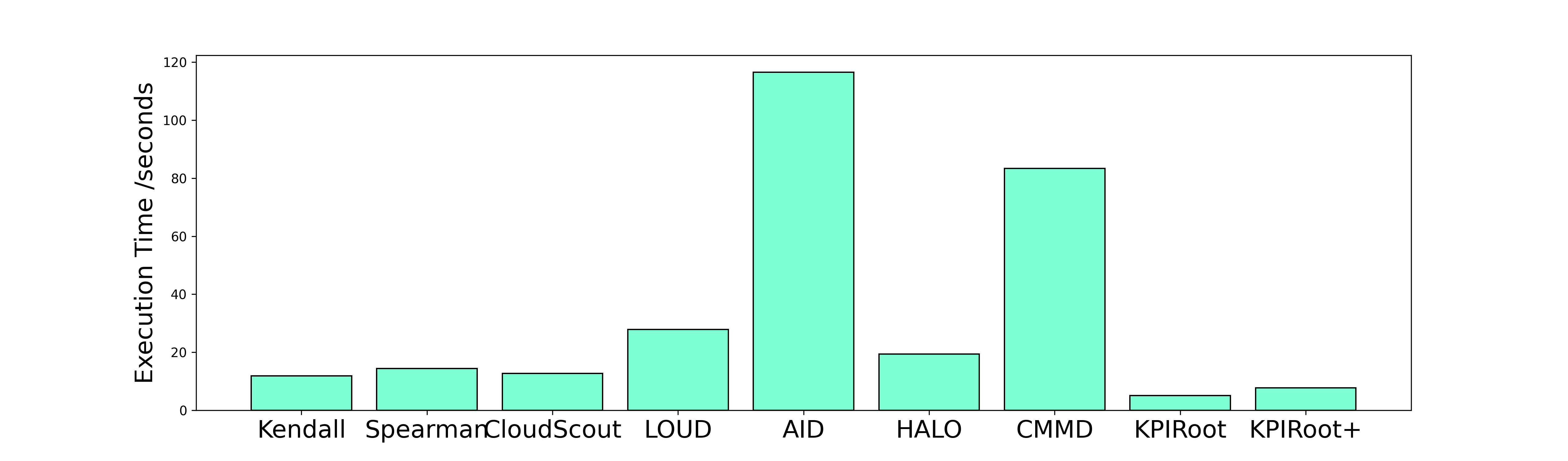
### Visual Description
# Technical Data Extraction: Execution Time Comparison
## 1. Image Classification
This image is a **Bar Chart** comparing the execution times of nine different algorithms or systems.
## 2. Component Isolation
### Header/Title
* **Content:** None present in the image.
### Y-Axis (Vertical)
* **Label:** Execution Time /seconds
* **Scale:** Linear, ranging from 0 to 120.
* **Major Tick Marks:** 0, 20, 40, 60, 80, 100, 120.
### X-Axis (Horizontal)
* **Categories:** Nine distinct labels representing different methods.
* **Labels (Left to Right):** Kendall, Spearman, CloudScout, LOUD, AID, HALO, CMMD, KPIRoot, KPIRoot+.
### Main Data Area
* **Type:** Single-series bar chart.
* **Color Coding:** All bars are a uniform light aquamarine/mint green color with black outlines.
* **Legend:** No legend is present as there is only one data series.
---
## 3. Data Table Extraction
The following values are estimated based on the alignment of the top of each bar with the Y-axis grid markers.
| Algorithm / Method | Estimated Execution Time (Seconds) | Visual Trend Description |
| :--- | :--- | :--- |
| **Kendall** | ~12 | Low baseline. |
| **Spearman** | ~15 | Slightly higher than Kendall. |
| **CloudScout** | ~13 | Comparable to Kendall/Spearman. |
| **LOUD** | ~28 | Significant increase, roughly double the baseline. |
| **AID** | ~117 | **Peak Value.** Highest execution time in the set. |
| **HALO** | ~20 | Sharp decrease from AID, returning toward baseline. |
| **CMMD** | ~84 | **Secondary Peak.** Second highest execution time. |
| **KPIRoot** | ~5 | **Minimum Value.** Lowest execution time in the set. |
| **KPIRoot+** | ~8 | Slight increase from KPIRoot, but still very low. |
---
## 4. Key Trends and Observations
* **Performance Outliers:** The "AID" method is the clear outlier with the longest execution time, exceeding 110 seconds. "CMMD" is the second most time-intensive method at approximately 84 seconds.
* **Efficiency Leaders:** "KPIRoot" and "KPIRoot+" demonstrate the highest efficiency (lowest execution time), both finishing in under 10 seconds.
* **Baseline Group:** Kendall, Spearman, CloudScout, and HALO form a "middle-low" cluster with execution times ranging between 12 and 20 seconds.
* **Comparison:** The execution time for AID is approximately 23 times longer than the execution time for KPIRoot.
## 5. Language Declaration
The text in this image is entirely in **English**. No other languages were detected.
</details>
Figure 7: Root Cause Localization Time for All Methods
4.2.4 RQ4 The efficiency of KPIRoot+
In this section, we evaluate the efficiency of KPIRoot+ in large-scale cloud systems of Cloud $\mathcal{H}$ . The average running time of each method is shown in Fig. 7, from which we can observe that KPIRoot is still the most efficient, with an average execution time of around only 5 seconds. While KPIRoot+ takes around 8 seconds, it is still capable of providing real-time analysis and delivers more accurate results, making it a worthwhile tradeoff. The additional overhead is primarily due to the decomposition-based anomaly detection method and the Improved SAX, which uses more symbols, making the similarity analysis more time-consuming. However, this overhead is absolutely acceptable, given the improved accuracy and comprehensiveness of the results. This indicates that KPIRoot is capable of providing real-time root cause analysis, meeting the requirements of large-scale cloud systems where timely identification of root causes is critical. As for methods like AID and CMMD, their performances are less than satisfactory due to their inherent computational complexities. AID, with its time complexity of $\mathcal{O}(n^{2})$ , suffers from an average runtime of more than one hundred seconds. On the other hand, CMMD, which applies graph attention neural networks, requires high computational resources, which also leads to a slower execution time and makes it less efficient. Therefore, both AID and CMMD fail to deliver the desired levels of efficiency, particularly in large-scale, real-time environments. Baseline methods like Kendall and Spearman may seem appealing due to their lower computation times. However, these apparent gains are offset by their inferior accuracy levels. As a result, their use can lead to inaccurate root-cause diagnoses and, subsequently, ineffective problem-solving solutions.
In summary, the evaluation results highlight KPIRoot+ ’s superior accuracy while not adding much more computational overhead, thereby offering an excellent balance between efficiency and precision in real-time root cause analysis. It is a highly promising tool for conducting real-time root cause analysis within large-scale cloud systems.
4.2.5 RQ5 Sensitivity Analysis of KPIRoot+
<details>
<summary>extracted/6514164/figures/sensitivity_ratio.png Details</summary>
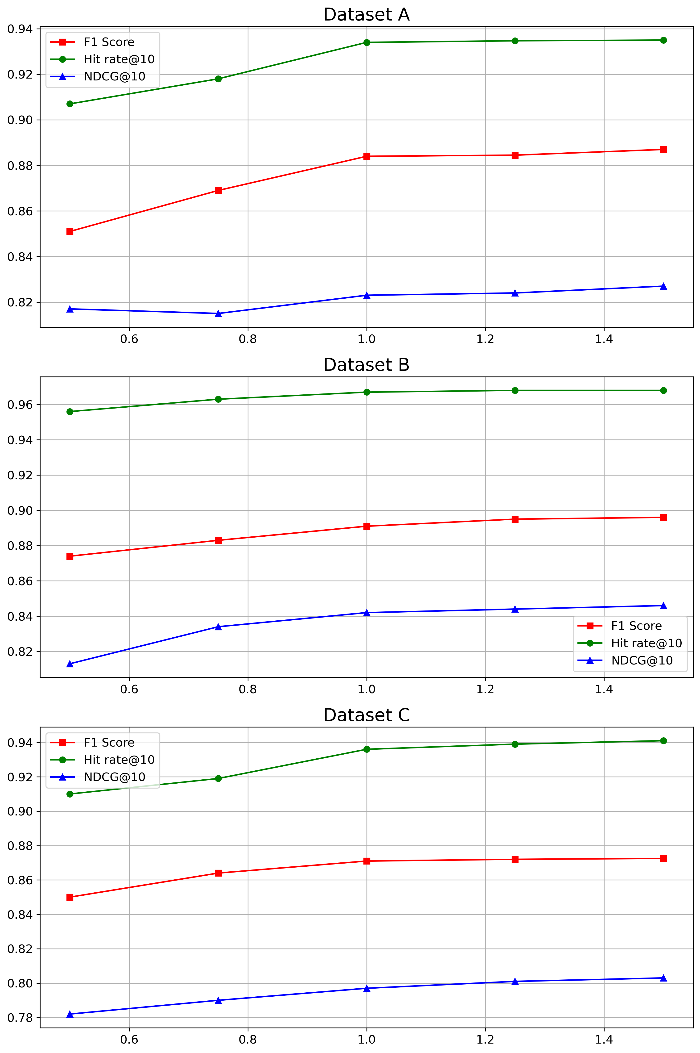
### Visual Description
# Technical Data Extraction: Performance Metrics Across Datasets
This document provides a comprehensive extraction of data from three line charts representing performance metrics (F1 Score, Hit rate@10, and NDCG@10) across three different datasets: **Dataset A**, **Dataset B**, and **Dataset C**.
## 1. Global Metadata and Legend
All three charts share a common structure and legend.
* **X-Axis:** Numerical scale ranging from approximately 0.5 to 1.5.
* **Y-Axis:** Performance score (decimal scale).
* **Legend Components:**
* **Red Line with Square Markers ($\blacksquare$):** F1 Score
* **Green Line with Circle Markers ($\bullet$):** Hit rate@10
* **Blue Line with Triangle Markers ($\blacktriangle$):** NDCG@10
* **Spatial Grounding (Legend):**
* Dataset A: Top-left [x $\approx$ 0.5, y $\approx$ 0.93]
* Dataset B: Bottom-right [x $\approx$ 1.3, y $\approx$ 0.83]
* Dataset C: Top-left [x $\approx$ 0.5, y $\approx$ 0.93]
---
## 2. Dataset A Analysis
### Trend Verification
* **Hit rate@10 (Green):** Slopes upward from 0.5 to 1.0, then plateaus between 1.0 and 1.5.
* **F1 Score (Red):** Slopes upward steadily from 0.5 to 1.0, then shows a very slight positive slope/plateau from 1.0 to 1.5.
* **NDCG@10 (Blue):** Slopes slightly downward from 0.5 to 0.75, then slopes upward to 1.0, followed by a plateau/slight increase to 1.5.
### Data Points (Approximate)
| X-Value | F1 Score (Red) | Hit rate@10 (Green) | NDCG@10 (Blue) |
| :--- | :--- | :--- | :--- |
| 0.5 | 0.851 | 0.907 | 0.817 |
| 0.75 | 0.869 | 0.918 | 0.815 |
| 1.0 | 0.884 | 0.934 | 0.823 |
| 1.25 | 0.8845 | 0.935 | 0.824 |
| 1.5 | 0.887 | 0.935 | 0.827 |
---
## 3. Dataset B Analysis
### Trend Verification
* **Hit rate@10 (Green):** Consistent upward slope from 0.5 to 1.25, reaching a plateau at 1.5. This dataset shows the highest overall values for this metric (approaching 0.97).
* **F1 Score (Red):** Steady upward slope across the entire x-axis range.
* **NDCG@10 (Blue):** Strong upward slope from 0.5 to 1.0, then tapers to a gentle upward slope from 1.0 to 1.5.
### Data Points (Approximate)
| X-Value | F1 Score (Red) | Hit rate@10 (Green) | NDCG@10 (Blue) |
| :--- | :--- | :--- | :--- |
| 0.5 | 0.874 | 0.956 | 0.813 |
| 0.75 | 0.883 | 0.963 | 0.834 |
| 1.0 | 0.891 | 0.968 | 0.842 |
| 1.25 | 0.895 | 0.969 | 0.844 |
| 1.5 | 0.896 | 0.969 | 0.846 |
---
## 4. Dataset C Analysis
### Trend Verification
* **Hit rate@10 (Green):** Slopes upward from 0.5 to 1.0, then continues with a very slight upward slope to 1.5.
* **F1 Score (Red):** Slopes upward from 0.5 to 1.0, then plateaus almost completely from 1.0 to 1.5.
* **NDCG@10 (Blue):** Consistent, steady upward slope across the entire range from 0.5 to 1.5. Note: This dataset has the lowest NDCG@10 values (starting below 0.79).
### Data Points (Approximate)
| X-Value | F1 Score (Red) | Hit rate@10 (Green) | NDCG@10 (Blue) |
| :--- | :--- | :--- | :--- |
| 0.5 | 0.850 | 0.910 | 0.782 |
| 0.75 | 0.864 | 0.919 | 0.790 |
| 1.0 | 0.871 | 0.936 | 0.797 |
| 1.25 | 0.872 | 0.939 | 0.801 |
| 1.5 | 0.8725 | 0.941 | 0.803 |
---
## Summary of Findings
1. **Metric Ranking:** Across all datasets, **Hit rate@10** (Green) is consistently the highest performing metric, followed by **F1 Score** (Red), with **NDCG@10** (Blue) being the lowest.
2. **Performance by Dataset:** Dataset B exhibits the highest overall performance across all three metrics compared to Datasets A and C.
3. **Sensitivity to X-Axis:** All metrics generally improve as the X-axis value increases from 0.5 to 1.0. Beyond 1.0, the gains diminish, often resulting in a plateau, particularly for Hit rate@10 and F1 Score.
</details>
(a) Parameter Sensitivity of $w$
<details>
<summary>extracted/6514164/figures/sensitivity_coefficient.png Details</summary>
### Visual Description
# Technical Data Extraction: Performance Metrics Across Datasets
This document contains a detailed extraction of data from three line charts representing performance metrics (F1 Score, Hit rate@10, and NDCG@10) across three different datasets (Dataset A, Dataset B, and Dataset C).
## 1. General Chart Structure and Legend
All three charts share a common structure:
* **X-Axis:** Numerical values ranging from **0.750 to 0.950** with major ticks at intervals of 0.025.
* **Y-Axis:** Performance scores ranging from approximately **0.78 to 0.97**.
* **Legend (Located at top-left of each plot):**
* **Red Line with Square Markers ($\blacksquare$):** F1 Score
* **Green Line with Circle Markers ($\bullet$):** Hit rate@10
* **Blue Line with Triangle Markers ($\blacktriangle$):** NDCG@10
* **Grid:** A standard rectangular grid is present in all plots.
---
## 2. Dataset A Analysis
### Trend Verification
* **Hit rate@10 (Green):** Slopes upward steadily from 0.750 to 0.900, reaching a peak, then declines at 0.950.
* **F1 Score (Red):** Slopes upward to 0.800, dips slightly at 0.850, peaks at 0.900, and declines at 0.950.
* **NDCG@10 (Blue):** Slopes upward consistently from 0.750 to 0.900, then declines at 0.950.
### Data Table (Extracted Values)
| X-Value | F1 Score (Red) | Hit rate@10 (Green) | NDCG@10 (Blue) |
| :--- | :--- | :--- | :--- |
| **0.750** | ~0.802 | ~0.847 | ~0.777 |
| **0.800** | ~0.849 | ~0.889 | ~0.805 |
| **0.850** | ~0.842 | ~0.896 | ~0.810 |
| **0.900** | ~0.884 | ~0.934 | ~0.823 |
| **0.950** | ~0.857 | ~0.921 | ~0.809 |
---
## 3. Dataset B Analysis
### Trend Verification
* **Hit rate@10 (Green):** Shows a continuous upward slope from 0.750 to 0.900, followed by a sharp decline at 0.950.
* **F1 Score (Red):** Shows a steady, gradual upward slope from 0.750 to 0.900, followed by a decline at 0.950.
* **NDCG@10 (Blue):** Shows a steady upward slope from 0.750 to 0.900, followed by a decline at 0.950.
### Data Table (Extracted Values)
| X-Value | F1 Score (Red) | Hit rate@10 (Green) | NDCG@10 (Blue) |
| :--- | :--- | :--- | :--- |
| **0.750** | ~0.844 | ~0.919 | ~0.809 |
| **0.800** | ~0.853 | ~0.932 | ~0.824 |
| **0.850** | ~0.861 | ~0.939 | ~0.830 |
| **0.900** | ~0.891 | ~0.967 | ~0.842 |
| **0.950** | ~0.876 | ~0.928 | ~0.821 |
---
## 4. Dataset C Analysis
### Trend Verification
* **Hit rate@10 (Green):** Slopes upward from 0.750 to 0.850, plateaus/slightly increases to 0.900, then declines at 0.950.
* **F1 Score (Red):** Slopes upward from 0.750 to 0.850, plateaus to 0.900, then shows a very slight decline at 0.950.
* **NDCG@10 (Blue):** Slopes upward gradually from 0.750 to 0.900, then declines at 0.950.
### Data Table (Extracted Values)
| X-Value | F1 Score (Red) | Hit rate@10 (Green) | NDCG@10 (Blue) |
| :--- | :--- | :--- | :--- |
| **0.750** | ~0.841 | ~0.908 | ~0.782 |
| **0.800** | ~0.853 | ~0.910 | ~0.790 |
| **0.850** | ~0.869 | ~0.934 | ~0.792 |
| **0.900** | ~0.871 | ~0.936 | ~0.797 |
| **0.950** | ~0.868 | ~0.929 | ~0.789 |
---
## Summary of Findings
Across all three datasets, performance metrics generally peak at an **X-axis value of 0.900**. Dataset B shows the highest overall performance values, with Hit rate@10 reaching nearly 0.97. Dataset C exhibits the most stable (plateau-like) performance between 0.850 and 0.900 compared to the more pronounced peaks in Datasets A and B.
</details>
(b) Parameter Sensitivity of $\lambda$
Figure 8: Parameter Sensitivity of KPIRoot+
The parameter $w$ determines the dimension of the representation vector for Improved SAX, while $\lambda$ is crucial for balancing the tradeoff between similarity and causality analysis. We evaluate the sensitivity of KPIRoot+ to these two hyper-parameters using three industrial datasets. To ensure fairness, we vary the values of $w$ and $\lambda$ while keeping all other parameters constant. Specifically, $w$ is chosen as a multiple of $\sqrt{n}$ , ranging from 0.5 to 1.5 times $\sqrt{n}$ . This selection ensures that we maintain an $O(\sqrt{n})$ time complexity, aligning with our efficiency goals. For $\lambda$ , we select values from 0.75 to 0.95, acknowledging that the scale of similarity is typically smaller than that of causality. This choice effectively balances the tradeoff between similarity and causality within our analysis framework. By systematically adjusting these parameters, we aim to optimize the performance and robustness of our model across different datasets.
Figure 8 presents the experimental results of RQ5. For the parameter $w$ , the performance is relatively stable between 1 to 1.5 times $\sqrt{n}$ . If the dimension of Improved SAX is too low, there is more information loss during the downsampling process, which decreases accuracy. However, a larger dimension may cause the time complexity to increase quickly, and it may not significantly enhance performance beyond $\sqrt{n}$ . Thus, it is reasonable to select $w$ in this range to balance the tradeoff between computational efficiency and model accuracy. For the parameter $\lambda$ , a good tradeoff between these two parts indeed helps improve the performance of KPIRoot+. In Dataset C, this variation of performance due to parameter is not so significant because either the similarity score or causality score of the root cause is high. Thus, the tradeoff coefficient has a lower influence on the overall performance.
<details>
<summary>extracted/6514164/figures/industry.png Details</summary>
### Visual Description
# Technical Document: Cloud Infrastructure Monitoring and Remediation Workflow
This document provides a detailed technical extraction of the provided architectural diagram, which outlines a five-stage lifecycle for cloud performance management, from infrastructure monitoring to issue mitigation.
## 1. High-Level Workflow Overview
The diagram illustrates a continuous feedback loop and linear pipeline consisting of five primary functional blocks:
1. **Cluster in Cloud H** (Infrastructure Layer)
2. **Monitoring Metric Collection** (Data Ingestion)
3. **Storage in Data Lake** (Data Management)
4. **Root Cause Analysis** (Analytics and Human Intervention)
5. **Performance Issue Mitigation** (Resolution)
---
## 2. Component Breakdown
### Region A: Cluster in Cloud H (Bottom Left)
This region represents the physical and virtualized infrastructure being monitored.
* **Virtualization Layers:** A central horizontal block that abstracts the underlying hardware.
* **Compute Nodes:** Contains icons for "CPU Servers" and "GPU Servers."
* **Network Nodes:** Features a hierarchical topology consisting of:
* **Spine:** Two top-level switches.
* **Leaf:** Three bottom-level switches connected in a fabric to the Spine nodes.
* **Storage Nodes:** Contains icons for "GPU Servers" (Note: The diagram labels the storage node hardware as GPU Servers, likely indicating high-performance storage controllers or a typo in the source image intended to represent storage units).
* **Flow:** Data flows upward from the Cluster to the Monitoring Metric Collection block.
### Region B: Monitoring Metric Collection (Top Left)
This block identifies the tools used for telemetry and visualization.
* **Grafana:** Represented by its orange sun-like logo.
* **Prometheus:** Represented by its orange flame logo.
* **Flow:** Data is passed to the right into the Storage block.
### Region C: Storage in Data Lake (Top Center)
This block describes the data governance and persistence layer.
* **Data Government Center (DGC):** A central management node represented by a circular "DGC" icon.
* **Data Lake:** A hexagonal icon representing unstructured/semi-structured storage.
* **Data Warehouse:** A document-stack icon representing structured storage.
* **Flow:** Data is passed to the right into the Analysis block.
### Region D: Root Cause Analysis (Top Right)
This block details the diagnostic process involving automated tools and human operators.
* **KPIRoot+:** A highlighted component (green dashed box with red text) representing the core analytical engine.
* **Visualization Dashboard:** An arrow points from KPIRoot+ to a dashboard icon containing charts and gauges.
* **SREs (Site Reliability Engineers):** An icon of a person with a code tag `</>`. SREs receive information from the dashboard.
* **Diagnosis Report:** An arrow points from the SREs to a medical-style report icon, indicating the output of the human analysis.
* **Flow:** The process moves downward to the Mitigation block.
### Region E: Performance Issue Mitigation (Bottom Right)
This block lists the four primary actions taken to resolve identified issues:
1. **Software Debugging:** Represented by a monitor and bug icon.
2. **Hardware Repair:** Represented by a wrench and screwdriver icon.
3. **Service Reboot:** Represented by a cloud with a refresh/sync icon.
4. **VM Migration:** Represented by two clouds with circular arrows indicating movement.
---
## 3. Data Flow and Logic Summary
| From | To | Description |
| :--- | :--- | :--- |
| **Cluster in Cloud H** | **Monitoring Metric Collection** | Telemetry and metrics are gathered from compute, network, and storage nodes. |
| **Monitoring Metric Collection** | **Storage in Data Lake** | Metrics are ingested into the Data Government Center for long-term storage. |
| **Storage in Data Lake** | **Root Cause Analysis** | Historical and real-time data is fed into the KPIRoot+ engine. |
| **Root Cause Analysis** | **Performance Issue Mitigation** | SREs generate a Diagnosis Report which triggers specific remediation actions. |
| **Performance Issue Mitigation** | **Cluster in Cloud H** | (Implicit) Actions taken in the mitigation phase apply changes back to the infrastructure, closing the loop. |
## 4. Textual Transcriptions
### Primary Labels (English)
* "Monitoring Metric Collection"
* "Storage in Data Lake"
* "Root Cause Analysis"
* "Cluster in Cloud H"
* "Performance Issue Mitigation"
* "Grafana"
* "Prometheus"
* "Data Government Center"
* "DGC"
* "Data Lake"
* "Data Warehouse"
* "KPIRoot+"
* "Visualization Dashboard"
* "Diagnosis Report"
* "SREs"
* "Virtualization Layers"
* "Compute Nodes"
* "CPU Servers"
* "GPU Servers"
* "Network Nodes"
* "Spine"
* "Leaf"
* "Storage Nodes"
* "Software Debugging"
* "Hardware Repair"
* "Service Reboot"
* "VM Migration"
### Language Declaration
* **Primary Language:** English.
* **Other Languages:** None detected.
</details>
Figure 9: The overall pipeline of deploying KPIRoot+ in Cloud $\mathcal{H}$
5 Industrial Experience
In this section, we share our experience of deploying KPIRoot+ in the cloud system of Cloud $\mathcal{H}$ , a full-stack cloud system that consists of an infrastructure layer, a platform layer, and an application layer. To support a large number of customers, each of our services is supported by multiple clusters with tens of hundreds of virtual instances (e.g., virtual router) or devices. The collective workload of each cluster is continuously monitored using an alarm KPI. When abnormal traffic impacts these services, for instance, due to overwhelming requests overloading a service, an anomaly is swiftly detected based on the alarm KPI. This triggers a root cause analysis procedure to pinpoint the specific nodes (e.g.,, VMs) and take prompt mitigating actions. In our previous practice, manual inspection is feasible given the limited scale of each cluster. So, we can check each specific KPI of the node, compare it with the alarm KPI (with similarity comparison tools), and find the root cause. However, this process proved to be error-prone and labor-intensive, particularly as the scale of each service expanded. On average, it took between thirty minutes to one hour to identify and mitigate the root causes.
<details>
<summary>extracted/6514164/figures/case.png Details</summary>
### Visual Description
# Technical Document Extraction: KPI Performance and Incident Analysis
This document provides a detailed technical extraction of the provided time-series chart, which illustrates a performance incident involving a Host Cluster and Virtual Machines (VMs).
## 1. General Metadata
* **Image Type:** Multi-pane time-series line chart.
* **Language:** English.
* **X-Axis (Common):** Time (HH:MM format).
* **Time Range:** 00:00 to 01:50 (1 hour and 50 minutes).
* **Time Markers:** 00:00, 00:10, 00:20, 00:30, 00:40, 00:50, 01:00, 01:10, 01:20, 01:30, 01:40, 01:50.
---
## 2. Component Isolation & Analysis
### Region 1: Top Pane (Alarm KPI)
This pane tracks the overall system health against a defined threshold.
* **Y-Axis Label:** Alarm KPI
* **Y-Axis Scale:** 40 to 90.
* **Legend (Top Right):**
* `---` (Red dashed line): **Alarm Threshold**
* [Pink Shaded Area]: **Host Cluster Overload**
* **Key Data Points & Trends:**
* **Baseline:** Between 00:00 and 00:40, the KPI fluctuates between 45 and 65, remaining below the threshold.
* **Incident Start:** At approximately 00:40, the line trends sharply upward, crossing the **Alarm Threshold (Value: 70)**.
* **Overload Period:** A pink shaded region highlights the "Host Cluster Overload" from approximately **00:40 to 00:58**. During this time, the KPI peaks at approximately **90** (around 00:50).
* **Recovery:** After 00:58, the line trends downward, crossing back below the threshold and stabilizing between 40 and 60.
### Region 2: Middle Pane (VM1 KPI - Root Cause)
This pane identifies the specific source of the performance degradation.
* **Y-Axis Label:** VM1 KPI (Root Cause)
* **Y-Axis Scale:** 0.2 to 1.0.
* **Legend (Top Right):**
* `---` (Grey dashed vertical line): **Begin Throttling**
* **Key Data Points & Trends:**
* **Pre-Incident:** Fluctuates between 0.4 and 0.7.
* **Surge:** Starting at 00:30, the KPI trends upward aggressively, peaking near **1.0** just before 00:40. This precedes the Alarm KPI spike in the top pane.
* **Intervention:** A vertical dashed line at **00:45** marks "Begin Throttling."
* **Post-Throttling Trend:** Immediately following the 00:45 mark, the KPI shows a consistent, jagged downward trend, eventually dropping to approximately 0.1 by 01:50.
### Region 3: Bottom Pane (VM2 KPI)
This pane shows the behavior of a secondary VM during the same period.
* **Y-Axis Label:** VM2 KPI
* **Y-Axis Scale:** 0.2 to 0.7.
* **Key Data Points & Trends:**
* **Initial State:** Highly volatile, ranging from 0.15 to 0.5 between 00:00 and 00:40.
* **Reaction to Overload:** During the "Host Cluster Overload" (00:40–00:58), VM2 KPI initially drops but then begins a steady upward trend.
* **Peak:** VM2 KPI reaches its maximum value of approximately **0.7** at roughly **01:18**, notably *after* VM1 has been throttled and the Host Cluster Overload has ended.
* **End State:** Trends downward after 01:30, ending around 0.35.
---
## 3. Incident Summary & Logic Flow
Based on the visual data extracted:
1. **Trigger:** **VM1 KPI** begins a sharp ascent at 00:30, reaching maximum capacity (~1.0).
2. **Impact:** This causes the **Alarm KPI** to exceed the **Alarm Threshold (70)** at 00:40, triggering a **Host Cluster Overload** state (Pink region).
3. **Mitigation:** Technical intervention occurs at 00:45 (**Begin Throttling**), targeting VM1.
4. **Resolution:** Following throttling, VM1's KPI drops. Consequently, the Alarm KPI falls below the threshold at approximately 00:58, ending the Host Cluster Overload.
5. **Side Effect:** **VM2 KPI** shows increased activity/resource usage peaking at 01:18, suggesting a delayed resource shift or independent workload increase following the stabilization of the cluster.
</details>
Figure 10: Case Study of KPIRoot
<details>
<summary>extracted/6514164/figures/new_case.png Details</summary>
### Visual Description
# Technical Data Extraction: Network Performance and Root Cause Analysis
This document provides a comprehensive extraction of the data and trends presented in the provided multi-panel line chart.
## 1. Document Overview
The image consists of three vertically stacked time-series line charts sharing a common X-axis (Time). The charts monitor a Key Performance Indicator (KPI) and two different Root Cause (RC) analysis methodologies over a period of approximately 75 minutes.
## 2. Component Isolation
### A. Header / Top Panel: Alarm KPI
* **Y-Axis Label:** Alarm KPI
* **Y-Axis Scale:** 0.0 to 1.0 (increments of 0.2)
* **Legend:**
* **Yellow Shaded Area:** Packet Loss
* **Red Shaded Area:** Network Interrupt
* **Visual Trend:** The black line represents the KPI. It generally fluctuates between 0.8 and 1.0. There are two sharp, narrow "V-shaped" drops corresponding to the yellow "Packet Loss" regions and one sustained "U-shaped" drop to zero corresponding to the red "Network Interrupt" region.
* **Key Data Events:**
* **Baseline:** Fluctuates between 0.75 and 1.0.
* **Event 1 (Packet Loss):** Sharp drop from ~0.9 to ~0.6, immediate recovery.
* **Event 2 (Packet Loss):** Sharp drop from ~0.95 to ~0.6, immediate recovery.
* **Event 3 (Network Interrupt):** Sustained drop starting at ~01:54, reaching 0.0 at ~01:57, staying at 0.0 until ~02:03, then sharp recovery.
### B. Middle Panel: RC by KPIRoot+ (Root Cause)
* **Y-Axis Label:** RC by KPIRoot+ (Root Cause)
* **Y-Axis Scale:** 0.0 to 1.0 (increments of 0.2)
* **Visual Trend:** This metric shows a slight upward trend from 0.7 to 0.9 over the first hour. It exhibits higher volatility (noise) than the top chart. It mirrors the major "Network Interrupt" drop but shows a more jagged recovery.
* **Key Data Events:**
* **Baseline:** Gradual climb from ~0.72 to ~0.9.
* **Anomalies:** Significant noise/dips around 01:17 and 01:29.
* **Major Event:** Sharp drop at ~01:54, hitting 0.0 at ~01:56. Recovery begins at ~02:03, peaking at 1.0 before settling.
### C. Bottom Panel: RC by KPIRoot
* **Y-Axis Label:** RC by KPIRoot
* **Y-Axis Scale:** 0.0 to 1.0 (increments of 0.2)
* **Visual Trend:** This metric is the most stable of the three during the baseline period, maintaining a tight range between 0.85 and 1.0. It shows the cleanest "flat-bottom" during the network interrupt.
* **Key Data Events:**
* **Baseline:** Very stable around 0.9 - 0.95.
* **Major Event:** Sharp drop at ~01:54. It maintains a flat 0.0 value from 01:57 to 02:03.
### D. Shared X-Axis (Time)
* **Format:** HH:MM
* **Markers:** 00:49, 00:59, 01:09, 01:19, 01:29, 01:39, 01:49, 01:59.
* **Total Duration:** Approximately 00:52 to 02:05.
---
## 3. Event Correlation Table
| Time Interval (Approx) | Event Type | Alarm KPI Behavior | RC by KPIRoot+ Behavior | RC by KPIRoot Behavior |
| :--- | :--- | :--- | :--- | :--- |
| 00:52 - 01:21 | Baseline | Fluctuating (0.8-1.0) | Gradual Rise (0.7-0.85) | Stable (~0.9) |
| 01:22 - 01:24 | **Packet Loss** | Sharp drop to 0.6 | Minor dip | Negligible dip |
| 01:32 - 01:34 | **Packet Loss** | Sharp drop to 0.6 | Sharp dip to 0.6 | Negligible dip |
| 01:54 - 02:04 | **Network Interrupt** | Drop to 0.0; sustained | Drop to 0.0; noisy recovery | Drop to 0.0; clean recovery |
## 4. Technical Observations
1. **Sensitivity:** The "Alarm KPI" is highly sensitive to transient "Packet Loss" events (yellow bars), whereas the "RC by KPIRoot" metrics are largely resistant to these short-term fluctuations.
2. **Correlation:** All three metrics are highly correlated during the "Network Interrupt" (red bar), indicating a total system failure that all models successfully captured.
3. **Noise Profile:** "RC by KPIRoot+" (middle) contains significantly more variance/noise during normal operation compared to "RC by KPIRoot" (bottom).
</details>
Figure 11: Case Study of KPIRoot
To alleviate these issues, we have deployed KPIRoot+ in Cloud $\mathcal{H}$ since Aug 2023. Specifically, KPIRoot+ operates by automatically fetching KPIs collected from the monitoring backends and applying the algorithm to calculate the correlation score in real time. Using KPIRoot, the potential root causes are returned to engineers. In addition, visualization tools are provided, making it easier for engineers to understand the system’s behavior and performance. This overall deployment pipeline of deploying KPIRoot+ in Cloud $\mathcal{H}$ is depicted in Figure 9. The software reliability engineers collect the monitoring metrics (like CPU usage, network traffic, memory usage) of the host clusters and each VM through monitoring tools like Grafana, Prometheus, etc [1]. Then, these monitoring metrics are stored in the Data Lake of Huawei Cloud, a highly scalable and flexible storage system that consists of the Data Lake Storage, the Data Warehouse, and the Data Lake Governance Center (DGC). Data Lake Storage is the actual storage space where all the data, including the monitoring metrics, are stored, while the Data Warehouse is an enterprise system used for reporting and data analysis. On top of these two components, the DGC is responsible for managing the data stored in the data lake and overseeing the lifecycle of the data, from ingestion and storage to usage and deletion. With Cloud $\mathcal{H}$ ’s data lake, real-time data analysis is enabled, i.e., as soon as monitoring metrics are collected and stored in the data lake, they can be immediately accessed and analyzed by the performance issue diagnosis system empowered with KPIRoot+. The results of KPIRoot+ are visualized on the dashboard and can be easily observed and understood by engineers. Once the root cause has been investigated and identified, the SREs prepare a diagnosis report, including a detailed description of the identified root cause and potential mitigation strategies.
In Fig. 10, the practical application of our previous root cause analysis tool, KPIRoot, in real industrial scenarios is shown. In this case, we initially received an alert indicating that the overall traffic for the host cluster had abruptly surpassed the predefined threshold. This requires immediate measures to pinpoint the root cause and throttle its throughput to avoid resource exhaustion within the cluster. However, this is quite challenging given the large number of KPIs needed to check, and the root-cause KPI may not be readily identifiable visually, as its shape similarity may not correspond directly with the alarm KPI. Given that, the root cause analysis takes tens of minutes to one hour to check manually, leading to delayed mitigation of the sudden traffic spike. With KPIRoot, the root cause of KPI can be quickly localized, generally within five minutes. With this result, we throttle the throughput of VM1 immediately after the alarm KPI is fired. As shown in Figure 10, the overall traffic is limited, and the alarm KPI returns back to a normal range quickly. However, KPIRoot primarily considers trend anomalies and sometimes neglects critical performance anomaly information and recommends inaccurate root causes. A case that we identified is shown in Figure 11. The frequent packet loss suggested that the load balancer was not distributing traffic evenly, causing the VM corresponding to the second KPI to experience frequent network congestion. As requests accumulated, it led to more severe network interruptions, which is symptomatic of overwhelming network buffers and potential misconfigurations in the load-balancing algorithm. This buildup of unsent packets can cause buffer overflow and increased latency, resulting in temporary network interruptions. Therefore, the second KPI was indeed the root cause, while the third KPI drop was a passive consequence and not the root cause. These two packet loss anomalies indicated by transient KPI drops in the alarm KPI would be ignored by KPIRoot. KPIRoot will instead recommend the third KPI as the root cause. In contrast, KPIRoot+ considers these types of anomalies, correctly identifying the second KPI as the root cause.
KPIRoot+ has been deployed in all major regions of our company, covering eighteen critical network services, e.g., Linux Virtual Server (LVS), NGINX, Network Address Translation (NAT), and DNS services. It has been serving in our production environment for more than ten months, reducing the average root cause localization time from 30 minutes to 5 minutes. Following the deployment of the KPIRoot service, the feedback from engineers has been overwhelmingly positive. In terms of computational efficiency, KPIRoot has reduced the computational load significantly compared to previous methods. The system can perform real-time RCA, identifying potential issues quickly and allowing engineers to take immediate action. In terms of accuracy, KPIRoot’s design of combining similarity and causality analysis has proven highly precise in identifying root causes. This leads to more effective problem resolution and significantly reduced revenue loss.
6 Discussion
In this section, we discuss the difference between our approach and existing root cause analysis approaches for microservice systems and why they are not applicable in our industrial scenario. We identified some potential threats to the validity of our study.
6.1 Root Cause Analysis for Microservice System
Our objective shares some similarities with root cause analysis in microservice systems; however, there are several main differences in terms of the application scenarios. Firstly, rather than localizing the root causes of application/service failures in microservice systems, where these applications are at the same level, our problem is top-down root localization. When we observe an anomaly at the system level, we investigate and analyze the underlying VM instance-level information. Secondly, due to VM isolation, each VM instance operates independently and is isolated from other VMs and the host system. This leads to sparse or even non-existent invocation dependency among them, making the construction of a service dependency graph as done in existing works very challenging.
Existing Methods like FRL-MFPG [5] and ServiceRank [25] rely on the construction of a service dependency graph and the execution of a second-order random walk, which can become highly time-consuming with complexity exceeding $O(n^{2})$ . As for HRLHF [43], the large graph size makes causal discovery computationally intensive. Furthermore, the delay incurred by waiting for engineers to provide human feedback poses an additional obstacle for real-time localization. However, the analysis delay should be less than the sampling interval, e.g., 1 minute in our practical scenarios, making these methods unsuitable for industrial deployment.
6.2 Threats to Validity
We have identified the following potential threats to the validity of our study:
Internal threats. The implementation of baselines and parameter settings constitutes one of the internal threats to our work’s validity. To mitigate these threats, we utilized the open-sourced code released by the authors of the papers or packages on GitHub for all baselines. As for our proposed approach, the source code has been reviewed meticulously by the authors, as well as several experienced software engineers, to minimize the risk of errors and increase the overall confidence in our results. For parameter settings, as our algorithm KPIRoot has few parameters, we find the most suitable configurations based on the best results obtained in different parameters.
External threats. Our experiments are conducted based on real-world datasets collected from Cloud $\mathcal{H}$ over more than two years. The evaluation requires engineers to inspect and label the root cause KPIs manually. Label noises are inevitable during the manual labeling process. However, alleviation strategies taken by engineers further ensure the accuracy of labeled root causes. Therefore, we believe the amount of noise is small and does not have a significant impact on the experiment results. On the other hand, the results may vary between different cloud service providers, industries, or specific use cases. Nevertheless, we believe that our experimental results, obtained from large-scale online systems within a prominent cloud service company serving millions of users, can demonstrate the generality and effectiveness of our proposed approach, KPIRoot.
7 RELATED WORK
7.1 Anomaly Detection in Cloud Systems
Ensuring the optimal performance of cloud systems is an imperative task. Monitoring KPIs are used to perceive the status of the cloud systems and facilitate analysis when performance anomalies occur. Many works [59, 6, 21, 45, 31, 38] have been proposed for proactively discovering the unexpected or anomalous behaviors of the multivariate monitoring metric. Anomaly detection in cloud systems has been an important and widely studied topic as it ensures the reliability and efficiency of cloud systems. However, anomaly detection is regarded as a black box module that only predicts whether an anomaly happens, which is not enough for engineers to troubleshoot the system failure. In other words, once a performance anomaly has been detected in a cloud service system, further analyses should be enacted to pinpoint some abnormal metrics that are likely to be the possible root causes of that performance anomaly.
7.2 Root Cause Localization in Cloud Systems
Determining the root cause of performance anomalies for online service systems has been a hot topic. The goal of root cause localization with monitoring metrics data in cloud systems is to localize a subset of the monitored KPIs. Then, they can troubleshoot these specific parts of the system to alleviate the performance anomaly. LOUD [26] assumes that the services of anomalous KPIs are likely to result in anomalous behavior of services it correlates with. Thus, LOUD applies graph centrality to identify the degree of the KPIs that correlate to the observed performance anomaly. AID [47] is an approach that measures the intensity of dependencies between monitoring KPIs of cloud services. It calculates the similarities between the status KPIs of the caller and the callee. Then, AID aggregates the similarities to produce a unified value as the intensity of the dependency. It can also be deployed as a root cause localization tool as it can output the similarity between monitoring metrics and the KPI that triggers alerts. Similarly, CloudScout [48] employs the Pearson Correlation Coefficient over KPIs at the physical machine level, such as CPU usage, to calculate the similarity between services.
There are also many works focusing on searching fault-indicating attribute combinations of KPI data. CMMD [46] is proposed to perform cross-metric root cause localization through a graph attention network to model the relationship between fundamental and derived metrics. While HALO [53] proposed a hierarchical search approach to capture the relationship among attributes based on conditional entropy and locate the fault-indicating combination. Another approach iDice [19] treats the root cause as a combination of attribute values, i.e., the anomaly can be easily identified through the co-occurrence of some specific attribute dimensions. A Fisher distance-based score function is utilized for ranking the combination of the attributes, and effective combinations will be output. However, iDice is not suitable for large-scale issue reports with high-dimensional metrics from cloud systems. MID [9] employs a meta-heuristic search that automatically detects dynamic emerging issues from large-scale issue reports with higher efficiency.
It is worth noting that, in our case, the monitoring metrics are not aggregated along different attribute dimensions through complex calculations of the raw data. Indeed, the monitoring metrics in our scenario directly reflect the run-time state of an entity, e.g., the throughput of a client VM. In our practice, obtaining the root cause at a granularity of metric level is enough for engineers to troubleshoot the performance anomalies. Thus, we formulate our problem as localizing a subset of the monitored KPIs.
8 CONCLUSION
In this paper, we propose KPIRoot+, an effective and efficient framework for anomaly detection and root cause analysis in practical cloud systems with monitoring KPIs. Specifically, KPIRoot+ is an improved version of KPIRoot that utilizes time decomposition-based anomaly detection and improved SAX representation, offering more accurate root cause localization results, while not compromising the efficiency. Extensive experiments on three industrial datasets show that KPIRoot achieves 0.882 F1-Score and 0.946 Hit@10 with the highest efficiency, outperforming all the baselines, including KPIRoot. Moreover, the successful deployment of our approach in large-scale industrial applications further demonstrates its practicality.
COMPLIANCE WITH ETHICAL STANDARDS
Conflict of Interest The authors have no competing interests to declare that are relevant to the content of this article.
Funding The work described in this paper was supported by the Research Grants Council of the Hong Kong Special Administrative Region, China (No. CUHK 14206921 of the General Research Fund) and Fundamental Research Funds for the Central Universities, Sun Yat-sen University (No. 76250-31610005).
Ethical approval This manuscript extends our previous ISSRE paper titled ’KPIRoot: Efficient Monitoring Metric-based Root Cause Localization in Large-scale Cloud Systems,’ which further improves the KPIRoot. The authors also declare that this manuscript follows the best scientific standards, in particular with regard to acknowledgment of prior works, honesty of the presentation of results, and focus on the demonstrability of the statements. This manuscript and the work that led to it do not carry any specific ethical issue.
Informed consent All the authors give their consent to submit this work.
Author Contributions Data curation: Xinying Sun, Yongqiang Yang; Funding acquisition: Michael R. Lyu, Guangba Yu, Jiazhen Gu; Methodology: Wenwei Gu; Supervision: Michael R. Lyu; Validation: Renyi Zhong; Visualization: Jinyang Liu, Yintong Huo, Zhuangbin Chen, Jianping Zhang; Original Draft: Wenwei Gu; Review: Guangba Yu, Jiazhen Gu.
Data Availability The full data cannot be made available due to the privacy policy in Cloud $\mathcal{H}$ . Only a portion of desensitized samples will be made public. The code is released in: https://github.com/WenweiGu/KPIRoot.
References
- \bibcommenthead
- Agarwal et al [2023] Agarwal S, Chakraborty S, Garg S, et al (2023) Outage-watch: Early prediction of outages using extreme event regularizer. In: Proceedings of the 31st ACM Joint European Software Engineering Conference and Symposium on the Foundations of Software Engineering, pp 682–694
- Arnold et al [2007] Arnold A, Liu Y, Abe N (2007) Temporal causal modeling with graphical granger methods. In: Proceedings of the 13th ACM SIGKDD international conference on Knowledge discovery and data mining, pp 66–75
- Beloglazov and Buyya [2012] Beloglazov A, Buyya R (2012) Optimal online deterministic algorithms and adaptive heuristics for energy and performance efficient dynamic consolidation of virtual machines in cloud data centers. Concurrency and Computation: Practice and Experience 24(13):1397–1420
- Breunig et al [2000] Breunig MM, Kriegel HP, Ng RT, et al (2000) Lof: identifying density-based local outliers. In: Proceedings of the 2000 ACM SIGMOD international conference on Management of data, pp 93–104
- Chen et al [2023] Chen Y, Xu D, Chen N, et al (2023) Frl-mfpg: Propagation-aware fault root cause location for microservice intelligent operation and maintenance. Information and Software Technology 153:107083
- Chen et al [2022] Chen Z, Liu J, Su Y, et al (2022) Adaptive performance anomaly detection for online service systems via pattern sketching. In: Proceedings of the 44th International Conference on Software Engineering, pp 61–72
- Cheng et al [2023] Cheng Q, Sahoo D, Saha A, et al (2023) Ai for it operations (aiops) on cloud platforms: Reviews, opportunities and challenges. arXiv preprint arXiv:230404661
- Cortez et al [2017] Cortez E, Bonde A, Muzio A, et al (2017) Resource central: Understanding and predicting workloads for improved resource management in large cloud platforms. In: Proceedings of the 26th Symposium on Operating Systems Principles, pp 153–167
- Gu et al [2020] Gu J, Luo C, Qin S, et al (2020) Efficient incident identification from multi-dimensional issue reports via meta-heuristic search. In: Proceedings of the 28th ACM Joint Meeting on European Software Engineering Conference and Symposium on the Foundations of Software Engineering, pp 292–303
- Gu et al [2024a] Gu W, Liu J, Chen Z, et al (2024a) Identifying performance issues in cloud service systems based on relational-temporal features. ACM Transactions on Software Engineering and Methodology
- Gu et al [2024b] Gu W, Sun X, Liu J, et al (2024b) Kpiroot: Efficient monitoring metric-based root cause localization in large-scale cloud systems. In: 2024 IEEE 35th International Symposium on Software Reliability Engineering (ISSRE), IEEE, pp 403–414
- Guo et al [2010] Guo C, Li H, Pan D (2010) An improved piecewise aggregate approximation based on statistical features for time series mining. In: Knowledge Science, Engineering and Management: 4th International Conference, KSEM 2010, Belfast, Northern Ireland, UK, September 1-3, 2010. Proceedings 4, Springer, pp 234–244
- He et al [2016] He X, Shao C, Xiong Y (2016) A non-parametric symbolic approximate representation for long time series. Pattern Analysis and Applications 19:111–127
- Huang et al [2022] Huang T, Chen P, Zhang J, et al (2022) A transferable time series forecasting service using deep transformer model for online systems. In: Proceedings of the 37th IEEE/ACM International Conference on Automated Software Engineering, pp 1–12
- Kaushik et al [2021] Kaushik P, Rao AM, Singh DP, et al (2021) Cloud computing and comparison based on service and performance between amazon aws, microsoft azure, and google cloud. In: 2021 International Conference on Technological Advancements and Innovations (ICTAI), IEEE, pp 268–273
- Kuang et al [2024] Kuang J, Liu J, Huang J, et al (2024) Knowledge-aware alert aggregation in large-scale cloud systems: a hybrid approach. In: Proceedings of the 46th International Conference on Software Engineering: Software Engineering in Practice, pp 369–380
- Latah and Toker [2019] Latah M, Toker L (2019) Artificial intelligence enabled software-defined networking: a comprehensive overview. IET networks 8(2):79–99
- Lin et al [2003] Lin J, Keogh E, Lonardi S, et al (2003) A symbolic representation of time series, with implications for streaming algorithms. In: Proceedings of the 8th ACM SIGMOD workshop on Research issues in data mining and knowledge discovery, pp 2–11
- Lin et al [2016a] Lin Q, Lou JG, Zhang H, et al (2016a) idice: problem identification for emerging issues. In: Proceedings of the 38th International Conference on Software Engineering, pp 214–224
- Lin et al [2016b] Lin Q, Zhang H, Lou JG, et al (2016b) Log clustering based problem identification for online service systems. In: Proceedings of the 38th International Conference on Software Engineering Companion, pp 102–111
- Lin et al [2018] Lin Q, Hsieh K, Dang Y, et al (2018) Predicting node failure in cloud service systems. In: Proceedings of the 2018 26th ACM joint meeting on European software engineering conference and symposium on the foundations of software engineering, pp 480–490
- Liu et al [2008] Liu FT, Ting KM, Zhou ZH (2008) Isolation forest. In: 2008 eighth ieee international conference on data mining (ICDM), IEEE, pp 413–422
- Liu et al [2016] Liu J, Wang S, Zhou A, et al (2016) Using proactive fault-tolerance approach to enhance cloud service reliability. IEEE Transactions on Cloud Computing 6(4):1191–1202
- Liu et al [2023] Liu J, He S, Chen Z, et al (2023) Incident-aware duplicate ticket aggregation for cloud systems. arXiv preprint arXiv:230209520
- Ma et al [2021] Ma M, Lin W, Pan D, et al (2021) Servicerank: Root cause identification of anomaly in large-scale microservice architectures. IEEE Transactions on Dependable and Secure Computing 19(5):3087–3100
- Mariani et al [2018] Mariani L, Monni C, Pezzé M, et al (2018) Localizing faults in cloud systems. In: 2018 IEEE 11th International Conference on Software Testing, Verification and Validation (ICST), IEEE, pp 262–273
- Mariani et al [2020] Mariani L, Pezzè M, Riganelli O, et al (2020) Predicting failures in multi-tier distributed systems. Journal of Systems and Software 161:110464
- Minnen et al [2007] Minnen D, Isbell C, Essa I, et al (2007) Detecting subdimensional motifs: An efficient algorithm for generalized multivariate pattern discovery. In: Seventh IEEE International Conference on Data Mining (ICDM 2007), IEEE, pp 601–606
- Qiu et al [2020] Qiu J, Du Q, Yin K, et al (2020) A causality mining and knowledge graph based method of root cause diagnosis for performance anomaly in cloud applications. Applied Sciences 10(6):2166
- RB [1990] RB C (1990) Stl: A seasonal-trend decomposition procedure based on loess. J Off Stat 6:3–73
- Ren et al [2019] Ren H, Xu B, Wang Y, et al (2019) Time-series anomaly detection service at microsoft. In: Proceedings of the 25th ACM SIGKDD international conference on knowledge discovery & data mining, pp 3009–3017
- Ronneberger et al [2015] Ronneberger O, Fischer P, Brox T (2015) U-net: Convolutional networks for biomedical image segmentation. In: Medical image computing and computer-assisted intervention–MICCAI 2015: 18th international conference, Munich, Germany, October 5-9, 2015, proceedings, part III 18, Springer, pp 234–241
- Senin and Malinchik [2013] Senin P, Malinchik S (2013) Sax-vsm: Interpretable time series classification using sax and vector space model. In: 2013 IEEE 13th international conference on data mining, IEEE, pp 1175–1180
- Sharma et al [2023] Sharma Y, Bhamare D, Sastry N, et al (2023) Sla management in intent-driven service management systems: A taxonomy and future directions. ACM Computing Surveys
- Shojaie and Fox [2022] Shojaie A, Fox EB (2022) Granger causality: A review and recent advances. Annual Review of Statistics and Its Application 9:289–319
- Singh et al [2023] Singh S, Batheri R, Dias J (2023) Predictive analytics: How to improve availability of manufacturing equipment in automotive firms. IEEE Engineering Management Review
- Soldani and Brogi [2022] Soldani J, Brogi A (2022) Anomaly detection and failure root cause analysis in (micro) service-based cloud applications: A survey. ACM Computing Surveys (CSUR) 55(3):1–39
- Su et al [2019a] Su Y, Zhao Y, Niu C, et al (2019a) Robust anomaly detection for multivariate time series through stochastic recurrent neural network. In: Proceedings of the 25th ACM SIGKDD international conference on knowledge discovery & data mining, pp 2828–2837
- Su et al [2019b] Su Y, Zhao Y, Xia W, et al (2019b) Coflux: robustly correlating kpis by fluctuations for service troubleshooting. In: Proceedings of the International Symposium on Quality of Service, pp 1–10
- Tuli et al [2021] Tuli S, Gill SS, Garraghan P, et al (2021) Start: Straggler prediction and mitigation for cloud computing environments using encoder lstm networks. IEEE Transactions on Services Computing
- Wang et al [2023a] Wang D, Chen Z, Ni J, et al (2023a) Hierarchical graph neural networks for causal discovery and root cause localization. arXiv preprint arXiv:230201987
- Wang et al [2019] Wang H, Nguyen P, Li J, et al (2019) Grano: Interactive graph-based root cause analysis for cloud-native distributed data platform. Proceedings of the VLDB Endowment 12(12):1942–1945
- Wang et al [2023b] Wang L, Zhang C, Ding R, et al (2023b) Root cause analysis for microservice systems via hierarchical reinforcement learning from human feedback. In: Proceedings of the 29th ACM SIGKDD Conference on Knowledge Discovery and Data Mining, pp 5116–5125
- Wickremasinghe et al [2010] Wickremasinghe B, Calheiros RN, Buyya R (2010) Cloudanalyst: A cloudsim-based visual modeller for analysing cloud computing environments and applications. In: 2010 24th IEEE international conference on advanced information networking and applications, IEEE, pp 446–452
- Xu et al [2018] Xu H, Chen W, Zhao N, et al (2018) Unsupervised anomaly detection via variational auto-encoder for seasonal kpis in web applications. In: Proceedings of the 2018 world wide web conference, pp 187–196
- Yan et al [2022] Yan S, Shan C, Yang W, et al (2022) Cmmd: Cross-metric multi-dimensional root cause analysis. In: Proceedings of the 28th ACM SIGKDD Conference on Knowledge Discovery and Data Mining, pp 4310–4320
- Yang et al [2021] Yang T, Shen J, Su Y, et al (2021) Aid: efficient prediction of aggregated intensity of dependency in large-scale cloud systems. In: 2021 36th IEEE/ACM International Conference on Automated Software Engineering (ASE), IEEE, pp 653–665
- Yin et al [2016] Yin J, Zhao X, Tang Y, et al (2016) Cloudscout: A non-intrusive approach to service dependency discovery. IEEE Transactions on Parallel and Distributed Systems 28(5):1271–1284
- Yu et al [2024] Yu B, Yao J, Fu Q, et al (2024) Deep learning or classical machine learning? an empirical study on log-based anomaly detection. In: Proceedings of the 46th IEEE/ACM International Conference on Software Engineering, pp 1–13
- Yu et al [2023] Yu G, Chen P, Li Y, et al (2023) Nezha: Interpretable fine-grained root causes analysis for microservices on multi-modal observability data. In: Proceedings of the 31st ACM Joint European Software Engineering Conference and Symposium on the Foundations of Software Engineering, pp 553–565
- Zhang et al [2022] Zhang J, Wu W, Huang Jt, et al (2022) Improving adversarial transferability via neuron attribution-based attacks. In: Proceedings of the IEEE/CVF Conference on Computer Vision and Pattern Recognition, pp 14993–15002
- Zhang et al [2024] Zhang J, Gu W, Huang Y, et al (2024) Curvature-invariant adversarial attacks for 3d point clouds. In: Proceedings of the AAAI Conference on Artificial Intelligence, pp 7142–7150
- Zhang et al [2021] Zhang X, Du C, Li Y, et al (2021) Halo: Hierarchy-aware fault localization for cloud systems. In: Proceedings of the 27th ACM SIGKDD Conference on Knowledge Discovery & Data Mining, pp 3948–3958
- Zhao et al [2021] Zhao G, Hassan S, Zou Y, et al (2021) Predicting performance anomalies in software systems at run-time. ACM Transactions on Software Engineering and Methodology (TOSEM) 30(3):1–33
- Zhao et al [2019] Zhao N, Zhu J, Liu R, et al (2019) Label-less: A semi-automatic labelling tool for kpi anomalies. In: IEEE INFOCOM 2019-IEEE Conference on Computer Communications, IEEE, pp 1882–1890
- Zhao et al [2020a] Zhao N, Chen J, Peng X, et al (2020a) Understanding and handling alert storm for online service systems. In: Proceedings of the ACM/IEEE 42nd International Conference on Software Engineering: Software Engineering in Practice, pp 162–171
- Zhao et al [2020b] Zhao N, Chen J, Wang Z, et al (2020b) Real-time incident prediction for online service systems. In: Proceedings of the 28th ACM Joint Meeting on European Software Engineering Conference and Symposium on the Foundations of Software Engineering, pp 315–326
- Zhou et al [2013] Zhou F, Goel M, Desnoyers P, et al (2013) Scheduler vulnerabilities and coordinated attacks in cloud computing. Journal of Computer Security 21(4):533–559
- Zong et al [2018] Zong B, Song Q, Min MR, et al (2018) Deep autoencoding gaussian mixture model for unsupervised anomaly detection. In: International conference on learning representations