# FairPFN: A Tabular Foundation Model for Causal Fairness
Abstract
Machine learning (ML) systems are utilized in critical sectors, such as healthcare, law enforcement, and finance. However, these systems are often trained on historical data that contains demographic biases, leading to ML decisions that perpetuate or exacerbate existing social inequalities. Causal fairness provides a transparent, human-in-the-loop framework to mitigate algorithmic discrimination, aligning closely with legal doctrines of direct and indirect discrimination. However, current causal fairness frameworks hold a key limitation in that they assume prior knowledge of the correct causal model, restricting their applicability in complex fairness scenarios where causal models are unknown or difficult to identify. To bridge this gap, we propose FairPFN, a tabular foundation model pre-trained on synthetic causal fairness data to identify and mitigate the causal effects of protected attributes in its predictions. FairPFN’s key contribution is that it requires no knowledge of the causal model and still demonstrates strong performance in identifying and removing protected causal effects across a diverse set of hand-crafted and real-world scenarios relative to robust baseline methods. FairPFN paves the way for promising future research, making causal fairness more accessible to a wider variety of complex fairness problems.
1 Introduction
Algorithmic discrimination is among the most pressing AI-related risks of our time, manifesting when machine learning (ML) systems produce outcomes that disproportionately disadvantage historically marginalized groups Angwin et al. (2016). Despite significant advancements by the fairness-aware ML community, critiques highlight the contextual limitations and lack of transferability of current statistical fairness measures to practical legislative frameworks Weerts et al. (2023). In response, the field of causal fairness has emerged, providing a transparent and human-in-the-loop causal framework for assessing and mitigating algorithmic bias with a strong analogy to existing anti-discrimination legal doctrines Plecko & Bareinboim (2024).
<details>
<summary>x1.png Details</summary>
### Visual Description
## Data Flow Diagram: FairPFN Pre-training
### Overview
The image is a data flow diagram illustrating the pre-training process of a FairPFN (Fair Prediction Function Network). It shows the generation of data, the input to a transformer, and the fair prediction process. The diagram is divided into three sections: data generation, transformer input, and fair prediction.
### Components/Axes
* **Titles:**
* a) Data generation
* b) Transformer input
* c) Fair prediction
* Structural Causal Model (SCM)
* Real-world Inference
* Observational Dataset
* FairPFN
* Pre-training Loss
* FairPFN Pre-training
* **Variables/Labels:**
* D: Dataset
* A: Protected attribute (blue)
* Xb: Biased observables (purple)
* Yb: Biased outcome (orange)
* Yf: Fair outcome (yellow)
* U2: Unobserved variable (green)
* X1, X2, X3: Observables (purple)
* Dtrain: Training dataset
* Dval: Inference set
* Aval: Protected attribute in inference set
* Xval: Observables in inference set
* Ŷf: Predicted fair outcome (gray scale)
* p(yf|xb, Db): Probability of fair outcome given biased observables and dataset
* φ: Latent variable
* p(yf|xb, φ): Probability of fair outcome given biased observables and latent variable
* p(Db|φ): Probability of dataset given latent variable
* p(φ): Probability of latent variable
* **Diagram Elements:**
* Structural Causal Model (SCM): A directed graph with nodes representing variables and edges representing causal relationships.
* Observational Dataset: A table representing the dataset with columns for A, X1, X2, X3, and Yb.
* FairPFN: A trapezoidal shape representing the Fair Prediction Function Network.
* Pre-training Loss: Two columns representing the predicted fair outcome (Ŷf) and the fair outcome (Yf).
* Arrows: Indicate the flow of data and processes.
### Detailed Analysis or Content Details
**a) Data generation:**
* Text: "For each pre-training dataset, we generate an SCM and sample a dataset D comprised of a protected attribute A, potentially biased observables Xb, and biased outcome Yb. We also sample a fair outcome Yf by removing the outgoing edges of A."
* Structural Causal Model (SCM):
* Nodes: A0 (blue), U2 (green, top), U2 (green, bottom), X1 (purple), X2 (purple), X3 (purple), Yb (orange), Yf (yellow, outlined in red).
* Edges:
* A0 -> X1 (red)
* A0 -> X2 (red)
* A0 -> X3 (red)
* U2 -> X2 (black)
* U2 -> Yb (black)
* X1 -> Yb (black)
* X2 -> Yb (black)
* X3 -> Yb (black)
**b) Transformer input:**
* Text: "The observational dataset D is partitioned into training and validation splits. Given in-context examples Dtrain the transformer makes predictions on the inference set Dval = (Aval, Xval)"
* Observational Dataset:
* Columns: A (blue), X1 (purple), X2 (purple), X3 (purple), Yb (orange).
* Rows: Four rows, each with a different shade of the column color.
**c) Fair prediction:**
* Text: "The transformer makes predictions Ŷf on the validation set, and the pre-training loss is calculated with respect to the fair outcomes in the validation set. The transformer thus learns the mapping Xb -> Yf"
* FairPFN: A green trapezoid.
* Pre-training Loss:
* Ŷf (Predicted fair outcome): Four shades of gray, from black to white.
* Yf (Fair outcome): Four shades of yellow/brown.
* Formula: p(yf|xb, Db) ∝ ∫ p(yf|xb, φ)p(Db|φ)p(φ) dφ
### Key Observations
* The diagram illustrates the process of generating a fair outcome (Yf) from a biased outcome (Yb) using a FairPFN.
* The SCM shows the causal relationships between the variables.
* The observational dataset represents the data used to train the FairPFN.
* The FairPFN makes predictions on the validation set and calculates the pre-training loss.
### Interpretation
The diagram describes a method for mitigating bias in machine learning models. The process starts with a structural causal model that represents the relationships between variables, including a protected attribute (A) and a biased outcome (Yb). The FairPFN is trained to predict a fair outcome (Yf) by learning the mapping from biased observables (Xb) to Yf. The pre-training loss is calculated with respect to the fair outcomes, ensuring that the model learns to predict fair outcomes. The formula represents the probability of the fair outcome given the biased observables and dataset, which is proportional to the integral of the product of the probabilities of the fair outcome given the biased observables and latent variable, the dataset given the latent variable, and the latent variable. This approach aims to remove the influence of the protected attribute on the outcome, resulting in a fairer prediction.
</details>
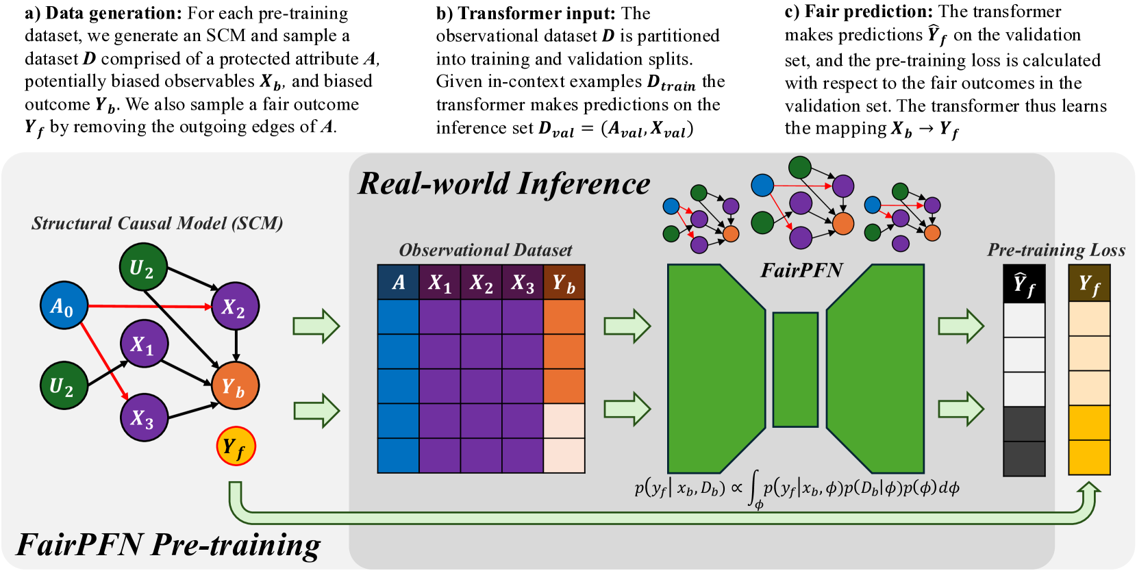
Figure 1: FairPFN Overview: FairPFN is a foundation model for causal fairness, pre-trained on synthetic datasets generated from sparse MLPs that represent SCMs with exogenous protected attributes (a). A biased dataset is created for each MLP/SCM and supplied as context to the transformer (b), with loss computed based on fair outcomes obtained by excluding the causal influence of the protected attribute (c). In practice, (d) FairPFN takes in only an observational dataset to predict fair targets by integrating over the simplest causal explanations for the biased data.
A recent review comparing outcome-based and causal fairness approaches (Castelnovo et al., 2022) argues that the non-identifiability of causal models from observational data Pearl (2009) limits the usage of current causal fairness frameworks in practical applications. In practice, users must provide full or partial information about the underlying causal model, a challenging task given the complexity of systemic inequalities. Furthermore, an incorrectly presumed causal graph, such as one falsely assuming a variable is independent of a protected attribute, can invalidate causal fairness metrics Ma et al. (2023); Binkytė-Sadauskienė et al. (2022), resulting in fairwashing and fostering a false sense of security and trust.
This paper takes a bold new perspective on achieving causal fairness. Our key contribution is FairPFN, a tabular foundation model for causal fairness, pre-trained on synthetic causal fairness data to learn to identify and remove the causal effects of protected attributes in tabular classification settings. When used on a new dataset, FairPFN does not rely on a user-specified causal model or graph, instead solely relying on the causally-generated data it has seen during pre-training. We demonstrate through extensive experiments that FairPFN effectively and consistently mitigates the causal impact of protected attributes across various hand-crafted and real-world scenarios, yielding causally fair predictions without user-specified causal information. We summarize our various contributions:
1. PFNs for Causal Fairness We propose a paradigm shift for algorithmic fairness, in which a transformer is pre-trained on synthetic causal fairness data.
1. Causal Fairness Prior: We introduce a synthetic causal data prior which offers a comprehensive representation for fairness datasets, modeling protected attributes as binary exogenous causes.
1. Foundation Model: We present FairPFN, a foundation model for causal fairness which, given only observational data, identifies and removes the causal effect of binary, exogenous protected attributes in predictions, and demonstrates strong performance in terms of both causal fairness and predictive accuracy on a combination of hand-crafted and real-world causal scenarios. We provide a prediction interface to evaluate and assess our pre-trained model, as well as code to generate and visualize our pre-training data at https://github.com/jr2021/FairPFN.
2 Related Work
In recent years, causality has gained prominence in the field of algorithmic fairness, providing fairness researchers with a structural framework to reason about algorithmic discrimination. Unlike traditional fairness research Kamishima et al. (2012); Agarwal et al. (2018); Hardt et al. (2016), which focuses primarily on optimizing statistical fairness measures, causal fairness frameworks concentrate on the structure of bias. This approach involves modeling causal relationships among protected attributes, observed variables, and outcomes, assessing the causal effects of protected attributes, and mitigating biases using causal methods, such as optimal transport Plecko & Bareinboim (2024) or latent variable estimation Kusner et al. (2017); Ma et al. (2023); Bhaila et al. (2024).
Counterfactual fairness, introduced by Kusner et al. (2017), posits that predictive outcomes should remain invariant between the actual world and a counterfactual scenario in which a protected attribute assumes an alternative value. This notion has spurred interest within the fairness research community, resulting in developments like path-specific extensions Chiappa (2019) and the application of Variational Autoencoders (VAEs) to create counterfactually fair latent representations Ma et al. (2023).
The initial counterfactual fairness framework necessitates comprehensive knowledge of the causal model. In contrast, the Causal Fairness Analysis (CFA) framework Plecko & Bareinboim (2024) relaxes this requirement by organizing variables within a Standard Fairness Model (SFM) for bias assessment and mitigation. Moreover, the CFA framework presents the Fairness Cookbook, which defines causal fairness metrics—Indirect-Effect, Direct-Effect, and Spurious-Effect—that directly align with US legal doctrines of disparate impact and treatment. Furthermore, the CFA framework challenges Kusner et al. (2017) ’s modeling of protected attributes as exogenous causes, permitting correlations between protected attributes and confounding variables that contribute to the legally admissible Spurious-Effect.
3 Background
This section establishes the scientific foundation of FairPFN, including terminology relevant to algorithmic fairness, causal ML, counterfactual fairness, and prior-data fitted networks (PFNs).
Algorithmic Fairness
Algorithmic discrimination occurs when historical biases against demographic groups (e.g., ethnicity, sex) are reflected in the training data of ML algorithms, leading to the perpetuation and amplification of these biases in predictions Barocas et al. (2023). Fairness research focuses on measuring algorithmic bias and developing fairness-aware ML models that produce non-discriminatory predictions. Practitioners have established over 20 fairness metrics, which generally break down into group-level and individual-level metrics Castelnovo et al. (2022). These metrics can be used to optimize predictive models, balancing the commonly observed trade-off between fairness and predictive accuracy Weerts et al. (2024).
Causal Machine Learning Causal ML is a developing field that leverages modern ML methods for causal reasoning Pearl (2009), facilitating advancements in causal discovery, causal inference, and causal reasoning Peters et al. (2014). Causal mechanisms are often represented as Structural Causal Models (SCMs), defined as $\mathcal{M}=(U,O,F)$ , where $U$ are unobservables, $O$ are observables, and $F$ is a set of structural equations. These equations are expressed as $f_{j}:X_{j}=f_{j}(PA_{j},N_{j})$ , indicating that an outcome variable $F$ depends on its parent variables $PA$ and independent noise $N_{j}$ . Non-linearities in the set of structural equations $F$ influence data complexity and identifiability of causal quantities from observational data Schölkopf et al. (2012). In an SCM, interventions can be made by setting $X← x_{1}$ and propagating this value through the model $\mathcal{M}$ , posing the question of "what will happen if I do something?". Counterfactuals expand upon the idea of interventions and are relevant when a value of $X$ is already observed, instead posing the question of "what would have happened if something had been different?" In addition to posing a slightly different question, counterfactuals require that exogenous noise terms are held constant, and thus classically require full knowledge of the causal model. In the context of algorithmic fairness, we are limited to level of counterfactuals as protected attributes are typically given and already observed.
In causal reasoning frameworks, one major application of counterfactuals is the estimation of causal effects such as the individual and average treatment effects (ITE and ATE) which quantify the difference and expected difference between outcomes under different values of $X$ .
$$
ITE:\tau=Y_{X\leftarrow x}-Y_{X\leftarrow x^{\prime}} \tag{1}
$$
$$
ATE:E[\tau]=E[Y_{X\leftarrow x}]-E[Y_{X\leftarrow x^{\prime}}]. \tag{2}
$$
Counterfactual Fairness
is a foundational notion of causal fairness introduced by Kusner et al. (2017), requiring that an individual’s predictive outcome should match that in a counterfactual scenario where they belong to a different demographic group. This notion is formalized in the theorem below.
**Theorem 1 (Unit-level/probabilistic)**
*Given an SCM $\mathcal{M}=(U,O,F)$ where $O=A\cup X$ , a predictor $\hat{Y}$ is counterfactually fair on the unit-level if $∀\hat{y}∈\hat{Y},∀ x,a,a^{\prime}∈ A$
$$
P(\hat{y}_{A\rightarrow a}(u)|X,A=x,a)=P(\hat{y}_{A\rightarrow a^{\prime}}(u)|%
X,A,=x,a)
$$*
Kusner et al. (2017) notably choose to model protected attributes as exogenous, which means that they may not be confounded by unobserved variables with respect to outcomes. We note that the definition of counterfactual fairness in Theorem 1 is the unit-level probabilistic one as clarified by Plecko & Bareinboim (2024), because counterfactual outcomes are generated deterministically with fixed unobservables $U=u$ . Theorem 1 can be applied on the dataset level to form the population-level version also provided by Plecko & Bareinboim (2024) which measures the alignment of natural and counterfactual predictive distributions.
**Theorem 2 (Population-level)**
*Given an SCM $\mathcal{M}=(U,O,F)$ where $O=A\cup X$ , a predictor $\hat{Y}$ is counterfactually fair on the population-level if $∀\hat{y}∈\hat{Y},∀ x,a,a^{\prime}∈ A$
$$
P(\hat{y}_{A\rightarrow a}|X,A=x,a)=P(\hat{y}_{A\rightarrow a^{\prime}}|X,A=x,a)
$$*
Theorem 1 can also be transformed into a counterfactual fairness metric by quantifying the difference between natural and counterfactual predictive distributions. In this study we quantify counterfactual fairness as the distribution of the counterfactual absolute error (AE) between predictions in each distribution.
**Definition 1 (Absolute Error (AE))**
*Given an SCM $\mathcal{M}=(U,O,F)$ where $O=A\cup X$ , the counterfactual absolute error of a predictor $\hat{Y}$ is the distribution
$$
AE=|P(\hat{y}_{A\rightarrow a}(u)|X,A=x,a)-P(\hat{y}_{A\rightarrow a^{\prime}}%
(u)|X,A=x,a)|
$$*
We note that because the outcomes are condition on the same noise terms $u$ our definition of AE builds off of Theorem 1. Intuitively, when the AE is skewed towards zero, then most individuals receive the same prediction in both the natural and counterfactual scenarios.
Kusner et al. (2017) present various implementations of Counterfactually Fair Prediction (CFP). The three levels of CFP can be achieved by fitting a predictive model $\hat{Y}$ to observable non-descendants if any exist (Level-One), inferred values of an exogenous unobserved variable $K$ (Level-Two), or additive noise terms (Level-Three). Kusner et al. (2017) acknowledge that in practice, Level-One rarely occurs. Level-Two requires that the causal model be invertible, which allows the unobservable $K$ to be inferred by abduction. Level-Three models the scenario as an Additive Noise Model, and thus is the strongest in terms of representational capacity, allowing more degrees of freedom than in Level-Two to represent fair terms. The three levels of CFP are depicted in Appendix Figure 22.
Causal Fairness The Causal Fairness Analysis (CFA) framework Plecko & Bareinboim (2024) introduces the Standard Fairness Model (SFM), which classifies variables as protected attributes $A$ , mediators $X_{med}$ , confounders $X_{conf}$ , and outcomes $Y$ . This framework includes a Fairness Cookbook of causal fairness metrics with a strong analogy to the legal notions of direct and indirect discrimination and business necessity as illustrated in Appendix Figure 23. Plecko & Bareinboim (2024) refute the modeling choice of Kusner et al. (2017) by their inclusion of confounders $X_{conf}$ in the SFM, arguing that these variables contribute to the legally admissible Spurious-Effect (SE).
For simplicity of our experimental results, we follow the modeling of Kusner et al. (2017), and focus on the elimination of the Total-Effect (TE) of protected attributes as defined by Plecko & Bareinboim (2024), while noting in Section 6 the importance of relaxing this assumption in future extensions.
Prior-data Fitted Networks Prior-data Fitted Networks (PFNs) Müller et al. (2022) and TabPFN Hollmann et al. (2023, 2025) represent a paradigm shift from traditional ML with a causal motivation, namely that simple causal models offer a quality explanation for real-world data. PFNs incorporate prior knowledge into transformer models by pre-training on datasets from a specific prior distribution Müller et al. (2022). TabPFN, a popular application of PFNs, applies these ideas to small tabular classification tasks by training a transformer on synthetic datasets derived from sparse Structural Causal Models (SCMs). As noted in Hollmann et al. (2023), a key advantage of TabPFN is its link to Bayesian Inference; where the transformer approximates the Posterior Predictive Distribution (PPD), thus achieving state-of-the-art performance by integrating over simple causal explanations for the data.
4 Methodology
In this section, we introduce FairPFN, a foundation model for legally or ethically sensitive tabular classification problems that draws inspiration from PFNs and principles of causal fairness. We introduce our pre-training scheme, synthetic data prior, and draw connections to Bayesian Inference to explain the inner workings of FairPFN.
4.1 FairPFN Pre-Training
First, we present our pre-training scheme, where FairPFN is fit to a prior of synthetic causal fairness data to identify and remove the causal effects of protected attributes in practice from observational data alone. We provide pseudocode for our pre-training algorithm in Algorithm 2, and outline the steps below.
Input:
Number of pre-training epochs $E$ and steps $S$
Transformer $\mathcal{M}$ with weights $\theta$
Hypothesis space of SCMs $\phi∈\Phi$
begin
for $epoch=1$ to $E$ do
for $step=1$ to $S$ do
Draw a random SCM $\phi$ from $\Phi$
Sample $D_{bias}=(A,X_{bias},Y_{bias})$ from $\phi$ where A $\{a_{0},a_{1}\}$ is an exogenous binary protected attribute
Sample $Y_{fair}$ from $\phi$ by performing dropout on outgoing edges of $A$ if any exist
Partition $D_{bias}$ and $D_{fair}$ into $train/val$
Pass $D_{bias}^{train}$ into $\mathcal{M}$ as context
Pass $D_{bias}^{val}$ into $\mathcal{M}$ to generate $Y_{pred}^{val}$
Calculate loss $L=CE(Y_{pred}^{val},Y_{fair}^{val})$
Update weights $\theta$ w.r.t $∇_{\theta}L$
end for
end for
Output: Transformer $\mathcal{M}:X_{bias}→ Y_{fair}$
Algorithm 1 FairPFN Pre-training
Data Generating Mechanisms FairPFN pre-training begins by creating synthetic datasets that capture the causal mechanisms of bias in real-world data. Following the approach of Hollmann et al. (2023), we use Multi-Layer Perceptrons (MLPs) to model Structural Causal Models (SCMs) via the structural equation $f=z(P· W^{T}x+\epsilon)$ , where $W$ denotes activation weights, $\epsilon$ represents Gaussian noise, $P$ is a dropout mask sampled from a log-scale to promote sparsity, and $z$ is a non-linearity. Figure 1 illustrates the connection among sampled MLPs, their corresponding SCMs, and the resulting synthetic pre-training data generated. We note that independent noise terms are not visualized in Figure 1.
Biased Data Generation An MLP is randomly sampled and sparsity is induced through dropout on select edges. The protected attribute is defined as a binary exogenous variable $A∈\{a_{0},a_{1}\}$ at the input layer. We uniformly select $m$ features $X$ from the second hidden layer onwards to capture rich representations of exogenous causes. The target variable $Y$ is chosen from the output layer and discretized into a binary variable using a random threshold. A forward pass through the MLP produces a dataset $D_{bias}=(A,X_{bias},Y_{bias})$ with $n$ samples containing the causal influence of the protected attribute.
Fair Data Generation
A second forward pass generates a fair dataset $D_{fair}$ by applying dropout to the outgoing edges of the protected attribute $A$ in the MLP, as shown by the red edges in Figure 1. This dropout, similar to that in TabPFN, masks the causal weight of $A$ to zero, effectively reducing its influence to Gaussian noise $\epsilon$ . This increases the influence of fair exogenous causes $U_{0}$ and $U_{1}$ and independent noise terms all over the MLP visualized in Figure 1. We note that $A$ is sampled from an arbitrary distribution $A∈\{a_{0},a_{1}\}$ , as opposed to $A∈\{0,1\}$ , since both functions $f=0· wx+\epsilon$ and $f=p· 0x+\epsilon$ yield equivalent outcomes. Only after generating the pre-training dataset is $A$ converted to a binary variable for processing by the transformer.
In-Context Learning After generating $D_{bias}$ and $D_{fair}$ , we partition them into training and validation sets: $D_{bias}^{train}$ , $D_{bias}^{val}$ , $D_{fair}^{train}$ , and $D_{fair}^{val}$ . We pass $D_{bias}^{train}$ as context to the transformer to provide information about feature-target relationships. To simulate inference, we input $X_{bias}^{val}$ into the transformer $\mathcal{M}$ , yielding predictions $Y_{pred}$ . We then compute the binary-cross-entropy (BCE) loss $L(Y_{pred},Y_{fair}^{val})$ against the fair outcomes $Y_{fair}^{val}$ , which do not contain effects of the protected attribute. Thus, the transformer $\mathcal{M}$ learns the mapping $\mathcal{M}:X_{bias}→ Y_{fair}$ .
1
Input:
- Number of exogenous causes $U$
- Number of endogenous variables $U× H$
- Number of features and samples $M× N$
begin
- Define MLP $\phi$ with depth $H$ and width $U$
- Initialize random weights $W:(U× U× H-1)$
- Sample sparsity masks $P$ with same dimensionality as weights
- Sample $H$ per-layer non-linearities $z_{i}\sim\{Identity,ReLU,Tanh\}$
- Initialize output matrix $X:(U× H)$
- Sample location $k$ of protected attribute in $X_{0}$
- Sample locations of features $X_{biased}$ in $X_{1:H-1}$ , and outcome $y_{bias}$ in $X_{H}$
- Sample protected attribute threshold $a_{t}$ and binary values $\{a_{0},a_{1}\}$
for $n=0$ to $N$ samples do
- Sample values of exogenous causes $X_{0}:(U× 1)$
- Sample values of additive noise terms $\epsilon:(U× H)$
for $i=0$ to $H-1$ layers do
- Pass intermediate representation through hidden layer $X_{i+1}=z_{i}(P_{i}· W_{i}^{T}X_{i}+\epsilon_{i})$
end for
- Select prot. attr. $A$ , features $X_{bias}$ and outcome $y_{bias}$ from $X_{0}$ , $X_{1:H-1}$ , and $X_{H}$
- Binarize $A∈\{a_{0},a_{1}\}$ over threshold $a_{t}$
- Set input weights in row $k$ of $W_{0}$ to 0
for $j=0$ to $H-1$ layers do
- Pass intermediate representation through hidden layer $X_{j+1}=z_{i}(P_{i}· W_{j}^{T}X_{j}+\epsilon_{j})$
end for
2 - Select the fair outcome $y_{fair}$ from $X_{H}$
end for
- Binarize $y_{fair}∈\{0,1\}$ and $y_{bias}∈\{0,1\}$ over randomly sampled output threshold $y_{t}$
3 Output: $D_{bias}=(A,X_{bias},y_{bias})$ and $y_{fair}$
Algorithm 2 FairPFN Synthetic Data Generation
Prior-Fitting The transformer is trained for approximately 3 days on an RTX-2080 GPU on approximately 1.5 million different synthetic data-generating mechanisms, in which we vary the MLP architecture, the number of features $m$ , the sample size $n$ , and the non-linearities $z$ .
Real-World Inference During real-world inference, FairPFN requires no knowledge of causal mechanisms in the data, but instead only takes as input a biased observational dataset and implicitly infers potential causal explanations for the data (Figure 1 d) based on the causally generated data it has seen during pre-training. Crucially, FairPFN is provided information regarding which variable is the protected attribute, which is represented in a protected attribute encoder step in the transformer. A key advantage of FairPFN is its alignment with Bayesian Inference, as transformers pre-trained in the PFN framework have been shown to approximate the Posterior Predictive Distribution (PPD) Müller et al. (2022).
FairPFN thus approximates a modified PPD, predicting a causally fair target $y_{f}$ given biased features $X_{b}$ and a biased dataset $D_{b}$ by integrating over hypotheses for the SCM $\phi∈\Phi$ :
$$
p(y_{f}|x_{b},D_{b})\propto\int_{\Phi}p(y_{f}|x_{b},\phi)p(D_{b}|\phi)p(\phi)d\phi \tag{3}
$$
This approach has two advantages: it reduces the necessity of precise causal model inference, thereby lowering the risk of fairwashing from incorrect models Ma et al. (2023), and carries with it regularization-related performance improvements observed in Hollmann et al. (2023). We also emphasize that FairPFN is a foundation model and thus does not need to be trained for new fairness problems in practice. Instead, FairPFN performs predictions in a single forward pass of the data through the transformer.
5 Experiments
This section assesses FairPFN’s performance on synthetic and real-world benchmarks, highlighting its capability to remove the causal influence of protected attributes without user-specified knowledge of the causal model, while maintaining high predictive accuracy.
5.1 Baselines
We implement several baselines to compare FairPFN against a diverse set of traditional ML models, causal-fairness frameworks, and fairness-aware ML approaches. We summarize our baselines below, and provide a visualization of our baselines applied to the Fair Observable benchmark in Appendix Figure 25.
- Unfair: Fit the entire training set $(X,A,Y)$ .
- Unaware: Fit to the entire training set $(X,A,Y)$ . Inference returns the average of predictions on the original test set $(X,A)$ and the test set with alternative protected attribute values $(X,A→ a^{\prime})$ .
- Avg. Cnft: Fit to the entire training set $(X,A,Y)$ . Inference returns the average (avg.) of predictions on the original test set $(X,A)$ and the counterfactual (cntf) test set $(X_{A→ a^{\prime}},A→ a^{\prime})$ .
- Constant: Always predicts the majority class
- Random: Randomly predicts the target
- CFP: Combination of the three-levels of CFP as proposed in Kusner et al. (2017). Fit to non-descendant observables, unobservables, and independent noise terms $(X_{fair},U_{fair},\epsilon_{fair},Y)$ .
- EGR: Exponentiated Gradient Reduction (EGR) as proposed by Agarwal et al. (2018) is fit to non-protected attributes $(X,Y)$ with XGBoost Chen & Guestrin (2016) as a base model.
<details>
<summary>x2.png Details</summary>
### Visual Description
## Causal Diagram: Fairness Scenarios
### Overview
The image presents six causal diagrams illustrating different scenarios related to fairness and bias in machine learning models. Each diagram depicts relationships between protected attributes, outcomes, and other variables, highlighting potential sources of unfairness.
### Components/Axes
* **Nodes:** Represent variables.
* Blue, diagonally-striped circle: Prot. Attr (Protected Attribute)
* Orange, diagonally-striped circle: Outcome
* Yellow, dashed-outline circle: Fair Observable
* Purple, diagonally-striped circle: Unfair Observable
* Green, dashed-outline circle: Fair Unobservable
* **Edges:** Represent causal relationships.
* Solid arrow: Cause
* Dotted line: Additive Noise
* Dashed line: Non-descendent
* **Text:**
* Titles above each diagram: 1) Biased, 2) Direct-Effect, 3) Indirect-Effect, 4) Fair Observable, 5) Fair Unobservable, 6) Fair Additive Noise
* Equations and distributions below the diagrams defining the relationships between variables.
* **Legend:** Located at the bottom of the image, explaining the meaning of the node colors and edge types.
* "Prot. Attr": Blue, diagonally-striped circle
* "Outcome": Orange, diagonally-striped circle
* "Unfair Observable": Purple, diagonally-striped circle
* "Fair Observable": Yellow, dashed-outline circle
* "Fair Unobservable": Green, dashed-outline circle
* "Cause": Solid arrow
* "Additive Noise": Dotted line
* "Non-descendent": Dashed line
* "Seen by FairPFN": Diagonally-striped fill
### Detailed Analysis or Content Details
Each diagram includes the following variables:
* A: Protected Attribute (blue, diagonally-striped)
* Y: Outcome (orange, diagonally-striped)
* Xb: Unfair Observable (purple, diagonally-striped)
* Xf: Fair Observable (yellow, dashed-outline)
* U: Fair Unobservable (green, dashed-outline)
* εXb, εXf, εY: Additive Noise (green, dashed-outline or orange, dashed-outline)
**1) Biased:**
* A -> Xb -> Y
* Y has additive noise εY
* Xb has additive noise εXb
* Equations:
* A ~ U({0, 1})
* εXb, εY ~ N(μ, σ), N(μ, σ)
* Xb = wAA² + εXb
* Y = wXbXb² + εY
* Y = 1(Y ≥ Ȳ)
**2) Direct-Effect:**
* A -> Y
* Xf -> Y
* Y has additive noise εY
* Xf has additive noise εXf
* Equations:
* A ~ U({0, 1})
* εXf, εY ~ N(μ, σ), N(μ, σ)
* Xf = N(μ, σ)
* Y = wXfXf² + wAA² + εY
* Y = 1(Y ≥ Ȳ)
**3) Indirect-Effect:**
* A -> Xb -> Y
* Xf -> Y
* Y has additive noise εY
* Xb has additive noise εXb
* Equations:
* εXb, εY ~ N(μ, σ), N(μ, σ)
* A ~ U({0, 1}), Xf ~ N(μ, σ)
* Xb = wAA² + εXb
* Y = wXbXb² + wXfXf² + εY
* Y = 1(Y ≥ Ȳ)
**4) Fair Observable:**
* A -> Xb -> Y
* A -> Xf -> Y
* Y has additive noise εY
* Xb has additive noise εXb
* Equations:
* εXb, εY ~ N(μ, σ), N(μ, σ)
* A ~ U({0, 1}), Xf ~ N(μ, σ)
* Xb = wAA² + εXb
* Y = wXbXb² + wXfXf² + wAA² + εY
* Y = 1(Y ≥ Ȳ)
**5) Fair Unobservable:**
* A -> Xb -> Y
* U -> Xb -> Y
* A -> Y
* U -> Y
* Y has additive noise εY
* Xb has additive noise εXb
* Equations:
* εXb, εY ~ N(μ, σ), N(μ, σ)
* A ~ U({0, 1}), U ~ N(μ, σ)
* Xb = wAA² + wUU² + εXb
* Y = wXbXb² + wAA² + εY
* Y = 1(Y ≥ Ȳ)
**6) Fair Additive Noise:**
* A -> Xb -> Y
* Y has additive noise εY
* Xb has additive noise εXb
* Equations:
* εXb, εY ~ N(μ, σ), N(μ, σ)
* A ~ U({0, 1})
* Xb = wAA² + εXb
* Y = wXbXb² + wAA² + εY
* Y = 1(Y ≥ Ȳ)
### Key Observations
* The diagrams illustrate different ways in which a protected attribute (A) can influence an outcome (Y), either directly or indirectly through other variables.
* The presence of "fair" and "unfair" observables (Xf and Xb) highlights the potential for bias to be introduced or mitigated depending on which variables are used in a model.
* Additive noise (ε) is present in all diagrams, representing random variation or unobserved factors.
* The equations below each diagram provide a mathematical representation of the relationships between the variables.
* The thresholding function Y = 1(Y ≥ Ȳ) suggests a classification task where the outcome is binary.
### Interpretation
The diagrams demonstrate how different causal structures can lead to biased outcomes. Understanding these structures is crucial for developing fair machine learning models. The diagrams highlight the importance of considering the relationships between protected attributes, outcomes, and other variables, as well as the potential for bias to be introduced through various pathways. The scenarios presented provide a framework for analyzing and mitigating bias in real-world applications. The use of both observable and unobservable variables emphasizes the challenges of achieving fairness when not all relevant information is available.
</details>
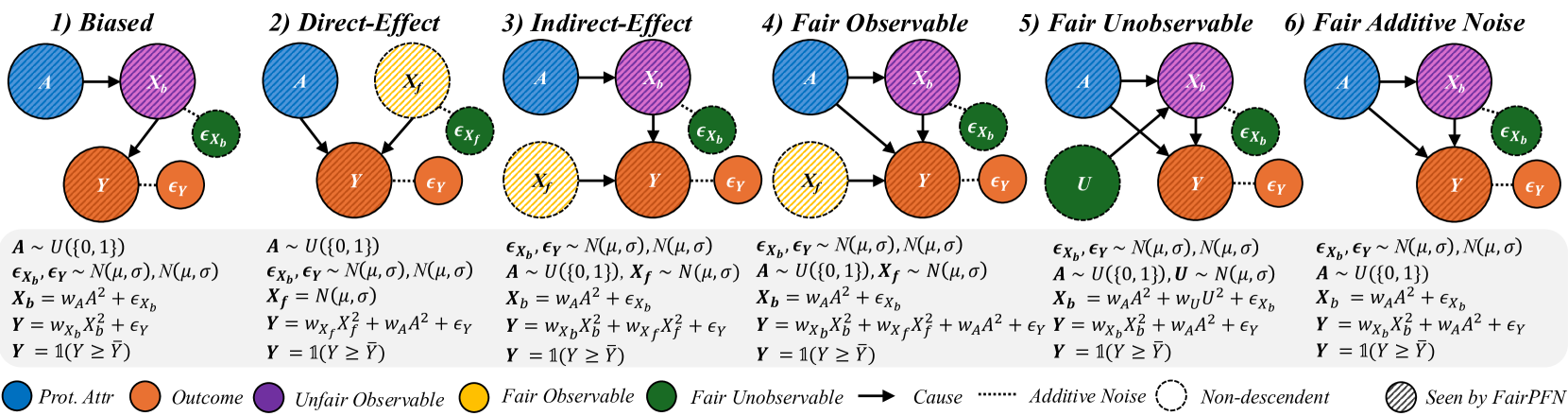
Figure 2: Causal Case Studies: Visualization and data generating processes of synthetic causal case studies, a handcrafted set of benchmarks designed to evaluate FairPFN’s ability to remove various sources of bias in causally generated data. For each group, 100 independent datasets are sampled, varying the number of samples, the standard deviation of noise terms $\sigma$ and the base causal effect $w_{A}$ of the protected attribute.
In the CFP, Unfair, Unaware, and Avg. Cntf. baselines, we employ FairPFN with a random noise term passed as a "protected attribute." We opt to use this UnfairPFN instead of TabPFN so as to not introduce any TabPFN-specific behavioral characteristics or artifacts. We show in Appendix Figure 17 that this reverts FairPFN to a normal tabular classifier with competitive peformance to TabPFN. We also note that our Unaware baseline is not the standard approach of dropping the protected attribute. We opt for our own implementation of Unaware as it shows improved causal effect removal to the standard approach (Appendix Figure 17).
5.2 Causal Case Studies
We first evaluate FairPFN using synthetic causal case studies to establish an experimental setting where the data-generating processes and all causal quantities are known, presenting a series of causal case studies with increasing difficulty to evaluate FairPFN’s capacity to remove various sources of bias in causally generated data. The data-generating processes and structural equations are illustrated in Figure 2, following the notation: $A$ for protected attributes, $X_{b}$ for biased-observables, $X_{f}$ for fair-observables, $U$ for fair-unobservables, $\epsilon_{X}$ for additive noise terms, and $Y$ for the outcome, discretized as $Y=\mathbb{1}(Y≥\bar{Y})$ . We term a variable $X$ "fair" iff $A∉ anc(X)$ . The structural equations in Figure 2 contain exponential non-linearities to ensure the direction of causality is identifiable Peters et al. (2014), distinguishing the Fair Unobservable and Fair Additive Noise scenarios, with the former including an unobservable yet identifiable causal effect $U$ .
For a robust evaluation, we generate 100 datasets per case study, varying causal weights of protected attributes $w_{A}$ , sample sizes $m∈(100,10000)$ (sampled on a log-scale), and the standard deviation $\sigma∈(0,1)$ (log-scale) of additive noise terms. We also create counterfactual versions of each dataset to assess FairPFN and its competitors across multiple causal and counterfactual fairness metrics, such as average treatment effect (ATE) and absolute error (AE) between predictions on observational and counterfactual datasets. We highlight that because our synthetic datasets are created from scratch, the fair causes, additive noise terms, counterfactual datasets, and ATE are ground truth. As a result, our baselines that have access to causal quantities are more precise in our causal case studies than in real-world scenarios where this causal information must be inferred.
<details>
<summary>extracted/6522797/figures/trade-off_by_group_synthetic.png Details</summary>
### Visual Description
## Scatter Plot Matrix: Error vs. Causal Effect under Different Scenarios
### Overview
The image presents a 2x3 matrix of scatter plots, each depicting the relationship between "Error (1-AUC)" on the y-axis and "Causal Effect (ATE)" on the x-axis. Each plot represents a different scenario: "Biased," "Direct-Effect," "Indirect-Effect," "Fair Observable," "Fair Unobservable," and "Fair Additive Noise." Different colored shapes represent different algorithms or methods, as indicated by the legend at the bottom. The plots show how the error and causal effect vary for each method under different conditions.
### Components/Axes
* **X-axis (Horizontal):** "Causal Effect (ATE)". The scale ranges from 0.00 to 0.25, with tick marks at intervals of 0.05.
* **Y-axis (Vertical):** "Error (1-AUC)". The scale ranges from 0.20 to 0.50, with tick marks at intervals of 0.10.
* **Plot Titles:**
* Plot 1 (Top-Left): "1. Biased"
* Plot 2 (Top-Middle): "2. Direct-Effect"
* Plot 3 (Top-Right): "3. Indirect-Effect"
* Plot 4 (Bottom-Left): "4. Fair Observable"
* Plot 5 (Bottom-Middle): "5. Fair Unobservable"
* Plot 6 (Bottom-Right): "6. Fair Additive Noise"
* **Legend (Bottom):**
* Blue Circle: "Unfair"
* Orange Down-pointing Triangle: "Unaware"
* Green Up-pointing Triangle: "Constant"
* Brown Left-pointing Triangle: "Random"
* Purple Square: "EGR"
* Light-Pink Star: "FairPFN"
* Olive-Green Diamond: "Cntf. Avg."
### Detailed Analysis
Each plot contains the same set of data series, represented by different shapes and colors, but their positions vary across the plots. A dashed black line connects some of the data points, specifically the "Unfair" (blue circle) data point to the cluster of points on the left side of each plot.
**Plot 1: Biased**
* Unfair (Blue Circle): Causal Effect ≈ 0.12, Error ≈ 0.37
* Unaware (Orange Down-pointing Triangle): Causal Effect ≈ 0.08, Error ≈ 0.36
* Constant (Green Up-pointing Triangle): Causal Effect ≈ 0.00, Error ≈ 0.50
* Random (Brown Left-pointing Triangle): Causal Effect ≈ 0.00, Error ≈ 0.42
* EGR (Purple Square): Causal Effect ≈ 0.04, Error ≈ 0.43
* FairPFN (Light-Pink Star): Causal Effect ≈ 0.00, Error ≈ 0.41
* Cntf. Avg. (Olive-Green Diamond): Causal Effect ≈ 0.00, Error ≈ 0.41
**Plot 2: Direct-Effect**
* Unfair (Blue Circle): Causal Effect ≈ 0.22, Error ≈ 0.29
* Unaware (Orange Down-pointing Triangle): Causal Effect ≈ 0.00, Error ≈ 0.37
* Constant (Green Up-pointing Triangle): Causal Effect ≈ 0.00, Error ≈ 0.50
* Random (Brown Left-pointing Triangle): Not present in this plot.
* EGR (Purple Square): Causal Effect ≈ 0.00, Error ≈ 0.41
* FairPFN (Light-Pink Star): Causal Effect ≈ 0.00, Error ≈ 0.38
* Cntf. Avg. (Olive-Green Diamond): Not present in this plot.
**Plot 3: Indirect-Effect**
* Unfair (Blue Circle): Causal Effect ≈ 0.14, Error ≈ 0.33
* Unaware (Orange Down-pointing Triangle): Causal Effect ≈ 0.07, Error ≈ 0.32
* Constant (Green Up-pointing Triangle): Causal Effect ≈ 0.00, Error ≈ 0.50
* Random (Brown Left-pointing Triangle): Causal Effect ≈ 0.00, Error ≈ 0.42
* EGR (Purple Square): Causal Effect ≈ 0.04, Error ≈ 0.42
* FairPFN (Light-Pink Star): Causal Effect ≈ 0.00, Error ≈ 0.38
* Cntf. Avg. (Olive-Green Diamond): Causal Effect ≈ 0.00, Error ≈ 0.40
**Plot 4: Fair Observable**
* Unfair (Blue Circle): Causal Effect ≈ 0.20, Error ≈ 0.21
* Unaware (Orange Down-pointing Triangle): Causal Effect ≈ 0.04, Error ≈ 0.25
* Constant (Green Up-pointing Triangle): Causal Effect ≈ 0.00, Error ≈ 0.50
* Random (Brown Left-pointing Triangle): Causal Effect ≈ 0.00, Error ≈ 0.32
* EGR (Purple Square): Causal Effect ≈ 0.02, Error ≈ 0.34
* FairPFN (Light-Pink Star): Causal Effect ≈ 0.00, Error ≈ 0.29
* Cntf. Avg. (Olive-Green Diamond): Causal Effect ≈ 0.00, Error ≈ 0.28
**Plot 5: Fair Unobservable**
* Unfair (Blue Circle): Causal Effect ≈ 0.20, Error ≈ 0.21
* Unaware (Orange Down-pointing Triangle): Causal Effect ≈ 0.06, Error ≈ 0.23
* Constant (Green Up-pointing Triangle): Causal Effect ≈ 0.00, Error ≈ 0.50
* Random (Brown Left-pointing Triangle): Not present in this plot.
* EGR (Purple Square): Causal Effect ≈ 0.04, Error ≈ 0.32
* FairPFN (Light-Pink Star): Causal Effect ≈ 0.00, Error ≈ 0.29
* Cntf. Avg. (Olive-Green Diamond): Causal Effect ≈ 0.00, Error ≈ 0.28
**Plot 6: Fair Additive Noise**
* Unfair (Blue Circle): Causal Effect ≈ 0.20, Error ≈ 0.20
* Unaware (Orange Down-pointing Triangle): Causal Effect ≈ 0.06, Error ≈ 0.23
* Constant (Green Up-pointing Triangle): Causal Effect ≈ 0.00, Error ≈ 0.50
* Random (Brown Left-pointing Triangle): Not present in this plot.
* EGR (Purple Square): Causal Effect ≈ 0.04, Error ≈ 0.31
* FairPFN (Light-Pink Star): Causal Effect ≈ 0.00, Error ≈ 0.27
* Cntf. Avg. (Olive-Green Diamond): Causal Effect ≈ 0.00, Error ≈ 0.27
### Key Observations
* The "Constant" method (green triangle) consistently has the highest error (around 0.50) and the lowest causal effect (around 0.00) across all scenarios.
* The "Unfair" method (blue circle) generally has a higher causal effect but a lower error compared to other methods, except for "Biased" and "Indirect-Effect" scenarios.
* The "Unaware", "FairPFN", and "Cntf. Avg." methods tend to cluster together with low causal effect and relatively low error.
* The dashed lines highlight the change in performance of the "Unfair" method across different scenarios.
### Interpretation
The plots illustrate how different methods perform in terms of error and causal effect under various fairness scenarios. The "Constant" method appears to be the least effective, consistently exhibiting high error and low causal effect. The "Unfair" method demonstrates a trade-off, achieving higher causal effect at the expense of higher error in some scenarios. The "Fair Observable," "Fair Unobservable," and "Fair Additive Noise" scenarios seem to improve the performance of the "Unfair" method, resulting in lower error and higher causal effect. The clustering of "Unaware," "FairPFN," and "Cntf. Avg." suggests that these methods might have similar characteristics or be influenced by similar factors. The dashed lines connecting the "Unfair" data points visually emphasize the impact of different scenarios on the method's performance.
</details>
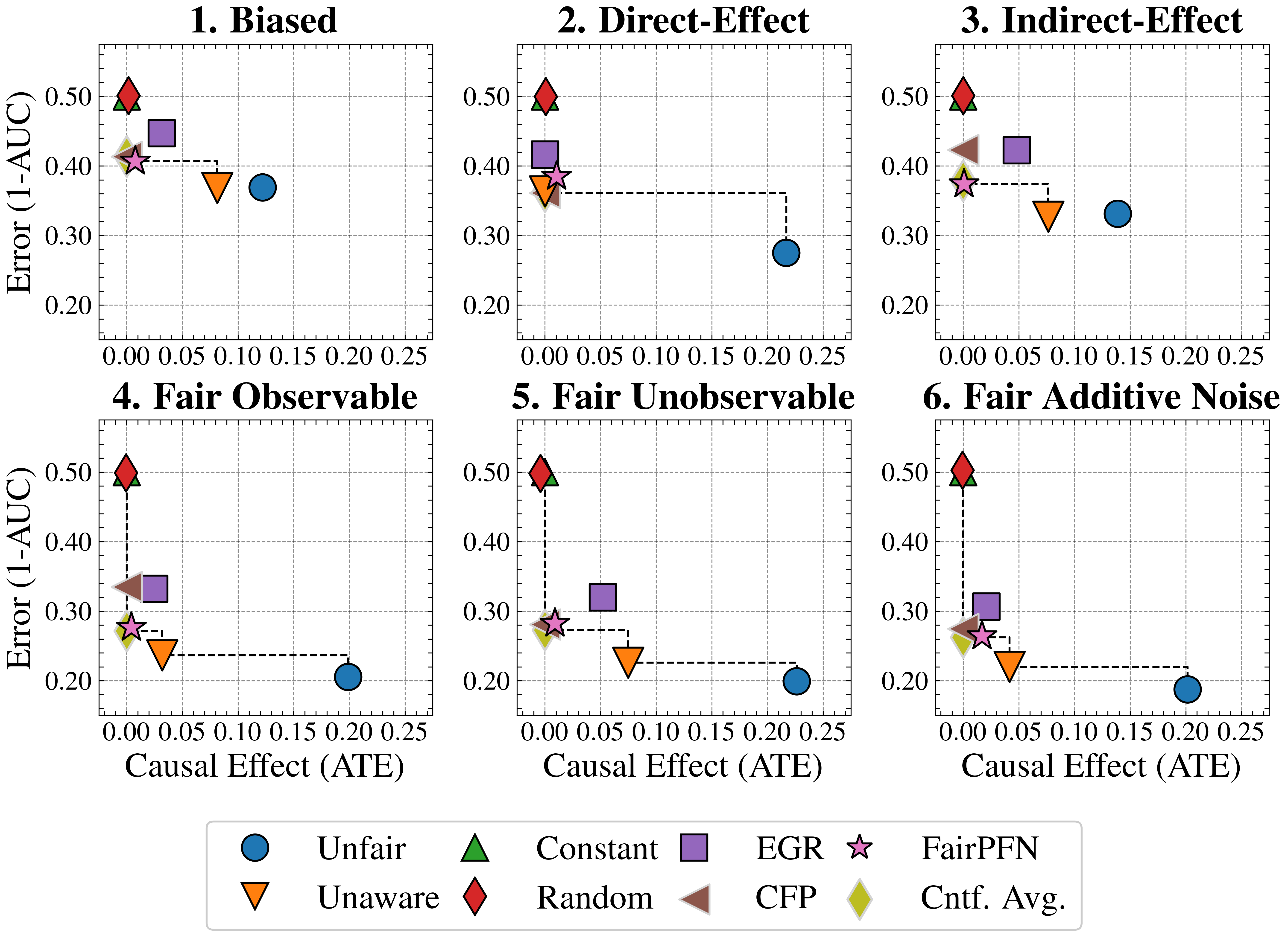
Figure 3: Fairness Accuracy Trade-Off (Synthetic): Average Treatment Effect (ATE) of predictions, predictive error (1-AUC), and Pareto Front performance of FairPFN versus baselines in our causal case studies. Baselines which have access to causal information are indicated by a light border. FairPFN is on the Pareto Front on 40% of synthetic datasets using only observational data, demonstrating competitive performance with the CFP and Cntf. Avg. baselines that utilize causal quantities from the true data-generating process.
Fairness-Accuracy Trade-Off
Figure 3 presents the fairness-accuracy trade-off for FairPFN and its baselines, displaying the mean absolute treatment effect (ATE) and mean predictive error (1-AUC) observed across synthetic datasets, along with the Pareto Front of non-dominated solutions. FairPFN (which only uses observational data) attains Pareto Optimal performance in 40% of the 600 synthetic datasets, exhibiting a fairness-accuracy trade-off competitive with CFP and Cntf. Avg., which use causal quantities from the true data-generating process. This is even the case in the Fair Unobservable and Fair Additive Noise benchmark groups, producing causally fair predictions using only observational variables that are either a protected attribute or a causal ancestor of it. This indicates FairPFN’s capacity to infer latent unobservables, which we further investigate in Section 5.3. We also highlight how the Cntf. Avg. baseline achieves lower error than CFP. We believe that this is due to Cntf. Avg. having access to both the observational and counterfactual datasets, which implicitly contains causal weights and non-linearities, while CFP is given only fair unobservables and must infer this causal information. The fact that a PFN is used as a base model in Cntf. Avg. could further explain this performance gain, as access to more observable variables helps guide the PFN toward accurate predictions realistic for the data. We suggest that this Cntf. Avg. as an alternative should be explored in future studies.
<details>
<summary>extracted/6522797/figures/tce_by_group_synthetic_new.png Details</summary>
### Visual Description
## Box Plot: Causal Effect (ATE) under Different Scenarios
### Overview
The image presents a series of box plots comparing the Causal Effect (ATE) under six different scenarios: Biased, Direct-Effect, Indirect-Effect, Fair Observable, Fair Unobservable, and Fair Additive Noise. Each scenario displays the distribution of the ATE for four different methods: FairPFN, EGR, Unaware, and Unfair. The average rank of each method is also provided in the legend.
### Components/Axes
* **Y-axis:** Causal Effect (ATE), ranging from -0.5 to 0.75 with increments of 0.25.
* **X-axis:** Implicitly represents the four methods (FairPFN, EGR, Unaware, Unfair) within each scenario.
* **Box Plots:** Represent the distribution of ATE for each method within each scenario.
* **Titles:** Each plot is titled with a scenario name (e.g., "1. Biased").
* **Legend (Bottom):**
* FairPFN (Pink): Avg. Rank (ATE) = 1.88/4
* EGR (Purple): Avg. Rank (ATE) = 2.11/4
* Unaware (Orange): Avg. Rank (ATE) = 2.16/4
* Unfair (Blue): Avg. Rank (ATE) = 3.42/4
### Detailed Analysis
**1. Biased:**
* Unfair (Blue): The median is slightly above 0, with a box extending from approximately 0 to 0.25. Outliers extend up to approximately 0.75 and down to -0.25.
* Unaware (Orange): The median is slightly below 0, with a box extending from approximately -0.05 to 0.2. Outliers extend up to approximately 0.5 and down to -0.25.
* EGR (Purple): The median is slightly above 0, with a box extending from approximately -0.1 to 0.1. Outliers extend up to approximately 0.25 and down to -0.25.
* FairPFN (Pink): The median is approximately 0, with a very small box. Outliers are clustered around 0.
**2. Direct-Effect:**
* Unfair (Blue): The median is approximately 0.25, with a box extending from approximately 0.1 to 0.5.
* Unaware (Orange): Not present in this scenario.
* EGR (Purple): The median is approximately 0, with a very small box.
* FairPFN (Pink): Not present in this scenario.
**3. Indirect-Effect:**
* Unfair (Blue): The median is approximately 0.2, with a box extending from approximately 0 to 0.25. Outliers extend up to approximately 0.75 and down to -0.25.
* Unaware (Orange): The median is approximately 0.1, with a box extending from approximately 0 to 0.25. Outliers extend up to approximately 0.5 and down to -0.25.
* EGR (Purple): The median is approximately 0, with a box extending from approximately -0.1 to 0.1. Outliers extend up to approximately 0.25 and down to -0.25.
* FairPFN (Pink): The median is approximately 0, with a very small box. Outliers are clustered around 0.
**4. Fair Observable:**
* Unfair (Blue): The median is approximately 0.2, with a box extending from approximately 0 to 0.25. Outliers extend up to approximately 0.75 and down to -0.1.
* Unaware (Orange): The median is approximately 0.05, with a box extending from approximately 0 to 0.1. Outliers extend up to approximately 0.25 and down to -0.1.
* EGR (Purple): The median is approximately 0, with a box extending from approximately -0.05 to 0.05. Outliers extend up to approximately 0.25 and down to -0.25.
* FairPFN (Pink): The median is approximately 0, with a very small box. Outliers are clustered around 0.
**5. Fair Unobservable:**
* Unfair (Blue): The median is approximately 0.2, with a box extending from approximately 0 to 0.25. Outliers extend up to approximately 0.75 and down to -0.1.
* Unaware (Orange): The median is approximately 0.05, with a box extending from approximately 0 to 0.1. Outliers extend up to approximately 0.25 and down to -0.1.
* EGR (Purple): The median is approximately 0, with a box extending from approximately -0.05 to 0.05. Outliers extend up to approximately 0.25 and down to -0.25.
* FairPFN (Pink): The median is approximately 0, with a very small box. Outliers are clustered around 0.
**6. Fair Additive Noise:**
* Unfair (Blue): The median is approximately 0.2, with a box extending from approximately 0 to 0.25. Outliers extend up to approximately 0.75 and down to -0.1.
* Unaware (Orange): The median is approximately 0.05, with a box extending from approximately 0 to 0.1. Outliers extend up to approximately 0.25 and down to -0.1.
* EGR (Purple): The median is approximately 0, with a box extending from approximately -0.05 to 0.05. Outliers extend up to approximately 0.25 and down to -0.25.
* FairPFN (Pink): The median is approximately 0, with a very small box. Outliers are clustered around 0.
### Key Observations
* The "Unfair" method (blue) generally has a higher median ATE compared to the other methods across most scenarios.
* The "FairPFN" method (pink) consistently has a median ATE close to 0 with a very small box, indicating a more concentrated distribution around 0.
* The "Direct-Effect" scenario (plot 2) only shows data for the "Unfair" and "EGR" methods.
* The average rank of the methods, as indicated in the legend, suggests that FairPFN performs best on average (1.88/4), while Unfair performs worst (3.42/4).
### Interpretation
The box plots illustrate the performance of different methods in estimating the Causal Effect (ATE) under various conditions. The "Unfair" method tends to overestimate the ATE, while the "FairPFN" method provides estimates closer to zero. The "Direct-Effect" scenario highlights a specific case where only the "Unfair" and "EGR" methods are applicable or relevant. The average rank values provide a summary of the overall performance of each method across all scenarios, suggesting that "FairPFN" is the most reliable in terms of achieving a lower (better) rank. The spread of the box plots and the presence of outliers indicate the variability in the ATE estimates for each method under different scenarios.
</details>
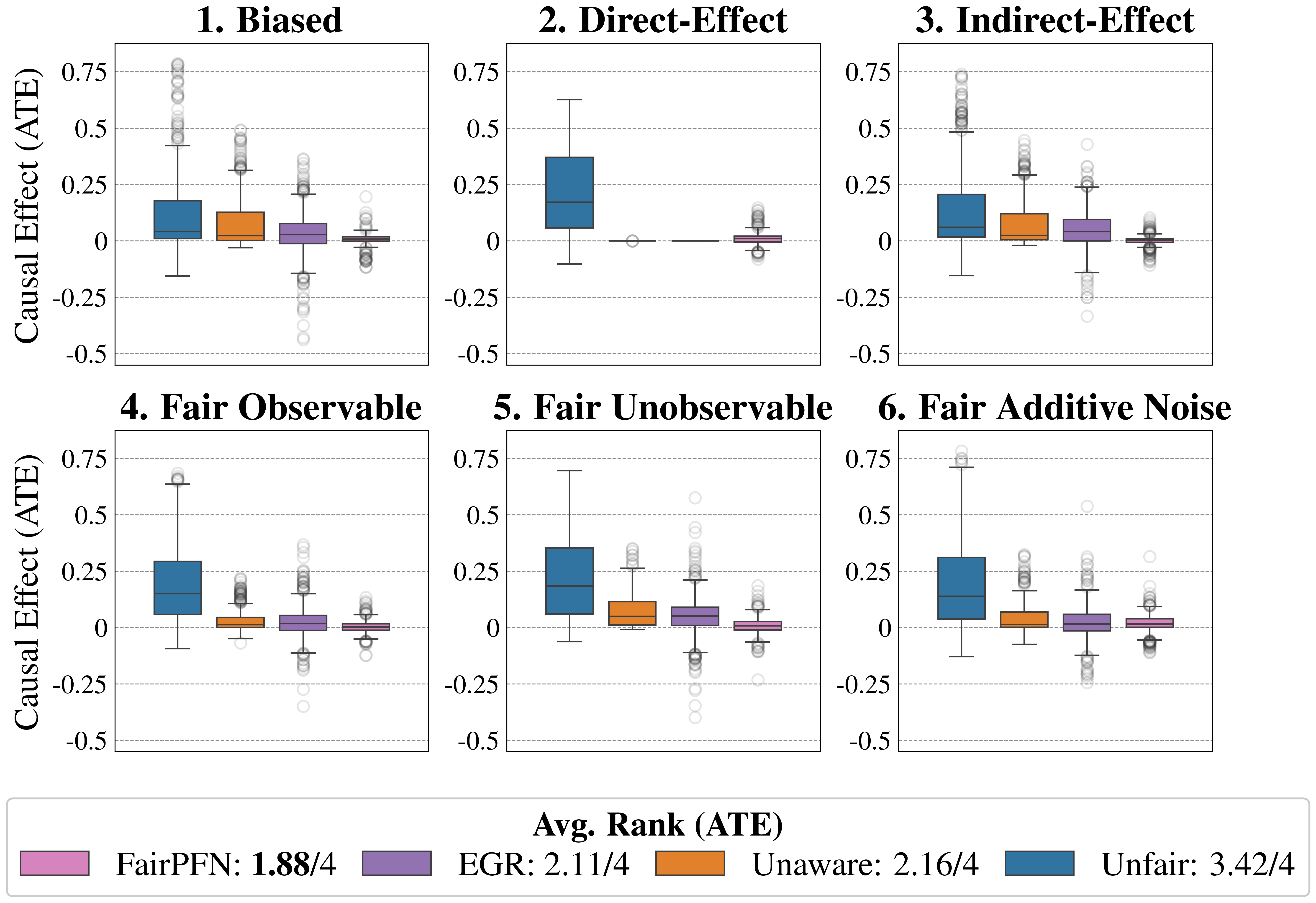
Figure 4: Causal Fairness (Synthetic): Average Treatment Effect (ATE) of predictions of FairPFN compared to baselines which do not have access to causal information. FairPFN consistently removes the causal effect with a margin of error of (-0.2, 0.2) and achieves an average rank of 1.88 out of 4, only to be outperformed on the Direct-Effect benchmark where Unaware is the optimal strategy.
Causal Effect Removal We evaluate FairPFN’s efficacy in causal effect removal by analyzing box plots depicting the median, interquartile range (IQR), and average treatment effect (ATE) of predictions, compared to baseline predictive models that also do not access causal information (Figure 4). We observe that FairPFN exhibits a smaller IQR than the state-of-the-art bias mitigation method EGR. In an average rank test across 600 synthetic datasets, FairPFN achieves an average rank of 1.88 out of 4. We provide a comparison of FairPFN against all baselines in Figure 24. We note that our case studies crucially fit our prior assumptions about the causal representation of protected attributes. We show in Appendix Figure 13 that FairPFN reverts to a normal classifier when, for example, the exogeneity assumption is violated.
Ablation Study
We finally conduct an ablation study to evaluate FairPFN’s performance in causal effect removal across synthetic datasets with varying size, noise levels, and base rates of causal effect. Results indicate that FairPFN maintains consistent performance across different noise levels and base rates, improving in causal effect removal as dataset size increases and causal effects become easier to distinguish from spurious correlations Dai et al. (1997). We note that the variance of FairPFN, illustrated by box-plot outliers in Figure 4 that extend to 0.2 and -0.2, is primarily arises from small datasets with fewer than 250 samples (Appendix Figure 11), limiting FairPFN’s ability to identify causal mechanisms. We also show in Appendix Figure 14 that FairPFN’s fairness behavior remains consistent as graph complexity increases, though accuracy drops do to the combinatorially increasing problem complexity.
For a more in-depth analysis of these results, we refer to Appendix B.
5.3 Real-World Data
This section evaluates FairPFN’s causal effect removal, predictive error, and correlation with fair latent variables on two real-world datasets with established causal graphs (Figure 5). For a description of our real-world datasets and the methods we use to obtain causal models, see Appendix A.
Fairness-Accuracy Trade-Off
We evaluate FairPFN’s effectiveness on real-world data in reducing the causal impact of protected attributes while maintaining strong predictive accuracy. Figure 6 shows the mean prediction average treatment effect (ATE) and predictive error (1-AUC) across 5 K-fold cross-validation iterations. FairPFN achieves a prediction ATE below 0.01 on both datasets and maintains accuracy comparable to Unfair. Furthermore, FairPFN exhibits lower variability in prediction ATE across folds compared to EGR, indicating stable causal effect removal We note that we also evaluate a pre-trained version of CLAIRE Ma et al. (2023) on the Adult Census income dataset, but observe little improvement to EGR.
Counterfactual Fairness
Next, we evaluate the counterfactual fairness of FairPFN on real-world datasets as introduced in Section 3, noting that the following analysis is conducted at the individual sample level, rather than at the dataset level. Figure 7 illustrates the distribution of Absolute Error (AE) achieved by FairPFN and baselines that do not have access to causal information. FairPFN significantly reduces this error in both datasets, achieving maximum divergences of less than 0.05 on the Law School dataset and 0.2 on the Adult Census Income dataset. For a visual interpretation of the AE on our real-world datasets we refer to Appendix Figure 16.
In contrast, EGR performs similarly to Random in terms of counterfactual divergence, confirming previous studies which show that optimmizing for group fairness metrics does not optimize for individual level criteria Robertson et al. (2024). Interestingly, in an evaluation of group fairness metric Statistical Parity (DSP) FairPFN outperforms EGR on both our real-world data and causal case studies, a baseline was specifically optimized for this metric (Appendix Figures 20 and 21).
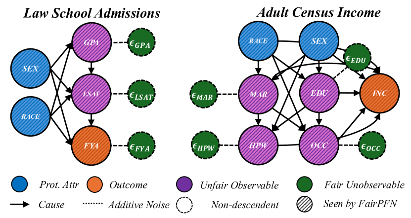
<details>
<summary>x3.png Details</summary>
### Visual Description
## Causal Diagrams: Law School Admissions and Adult Census Income
### Overview
The image presents two causal diagrams side-by-side. The left diagram models "Law School Admissions," and the right diagram models "Adult Census Income." Each diagram uses nodes (circles) to represent variables and arrows to represent causal relationships. The diagrams also include nodes representing additive noise. The nodes are colored to indicate the type of variable: protected attribute, outcome, unfair observable, and fair unobservable.
### Components/Axes
**Legend (Bottom of Image):**
* **Prot. Attr (Protected Attribute):** Blue circle
* **Outcome:** Orange circle
* **Unfair Observable:** Purple circle
* **Fair Unobservable:** Green circle
* **Cause:** Solid arrow
* **Additive Noise:** Dashed line
* **Non-descendent:** Dashed circle
* **Seen by FairPFN:** Circle with diagonal lines
**Law School Admissions Diagram (Left):**
* **Title:** Law School Admissions
* **Nodes:**
* SEX (Blue, Prot. Attr)
* RACE (Blue, Prot. Attr)
* GPA (Purple, Unfair Observable, with diagonal lines)
* LSAT (Purple, Unfair Observable, with diagonal lines)
* FYA (Orange, Outcome, with diagonal lines)
* εGPA (Green, Fair Unobservable, dashed circle)
* εLSAT (Green, Fair Unobservable, dashed circle)
* εFYA (Green, Fair Unobservable, dashed circle)
**Adult Census Income Diagram (Right):**
* **Title:** Adult Census Income
* **Nodes:**
* RACE (Blue, Prot. Attr)
* SEX (Blue, Prot. Attr)
* MAR (Purple, Unfair Observable, with diagonal lines)
* EDU (Purple, Unfair Observable, with diagonal lines)
* HPW (Purple, Unfair Observable, with diagonal lines)
* OCC (Purple, Unfair Observable, with diagonal lines)
* INC (Orange, Outcome, with diagonal lines)
* εEDU (Green, Fair Unobservable, dashed circle)
* εMAR (Green, Fair Unobservable, dashed circle)
* εHPW (Green, Fair Unobservable, dashed circle)
* εOCC (Green, Fair Unobservable, dashed circle)
### Detailed Analysis
**Law School Admissions Diagram:**
* **SEX** (Blue) causes **GPA** (Purple), **LSAT** (Purple), and **FYA** (Orange).
* **RACE** (Blue) causes **GPA** (Purple), **LSAT** (Purple), and **FYA** (Orange).
* **GPA** (Purple) causes **LSAT** (Purple).
* **LSAT** (Purple) causes **FYA** (Orange).
* **εGPA** (Green) is additive noise to **GPA** (Purple).
* **εLSAT** (Green) is additive noise to **LSAT** (Purple).
* **εFYA** (Green) is additive noise to **FYA** (Orange).
**Adult Census Income Diagram:**
* **RACE** (Blue) causes **MAR** (Purple), **EDU** (Purple), and **OCC** (Purple).
* **SEX** (Blue) causes **MAR** (Purple), **EDU** (Purple), and **OCC** (Purple).
* **MAR** (Purple) causes **HPW** (Purple) and **INC** (Orange).
* **EDU** (Purple) causes **INC** (Orange) and **OCC** (Purple).
* **HPW** (Purple) causes **INC** (Orange).
* **OCC** (Purple) causes **INC** (Orange).
* **RACE** (Blue) causes **INC** (Orange).
* **SEX** (Blue) causes **INC** (Orange).
* **εEDU** (Green) is additive noise to **EDU** (Purple).
* **εMAR** (Green) is additive noise to **MAR** (Purple).
* **εHPW** (Green) is additive noise to **HPW** (Purple).
* **εOCC** (Green) is additive noise to **OCC** (Purple).
### Key Observations
* Both diagrams include protected attributes (RACE, SEX) influencing outcomes (FYA, INC).
* The diagrams illustrate how various factors contribute to the outcomes, with some factors being considered "unfair observables."
* Additive noise is included for some variables, representing unmodeled influences.
* The "Adult Census Income" diagram is more complex, with more variables and interconnections.
* All the purple nodes (Unfair Observable) and the orange nodes (Outcome) are marked as "Seen by FairPFN".
### Interpretation
The diagrams represent causal models of complex social processes. They highlight the potential for protected attributes like race and sex to influence outcomes, both directly and indirectly through other variables. The "unfair observable" variables suggest factors that might perpetuate inequalities. The inclusion of additive noise acknowledges the limitations of the models and the presence of unobserved factors. The diagrams can be used to analyze potential interventions and their effects on fairness and equity. The "Law School Admissions" diagram suggests that race and sex can influence GPA and LSAT scores, which in turn affect first-year average. The "Adult Census Income" diagram suggests that race and sex can influence marital status, education, occupation, and ultimately income. The diagrams are useful for understanding the complex relationships between various factors and outcomes, and for identifying potential areas for intervention to promote fairness and equity.
</details>
Figure 5: Real-World Scenarios: Assumed causal graphs of real-world datasets Law School Admissions and Adult Census Income.
<details>
<summary>extracted/6522797/figures/trade-off_lawschool.png Details</summary>
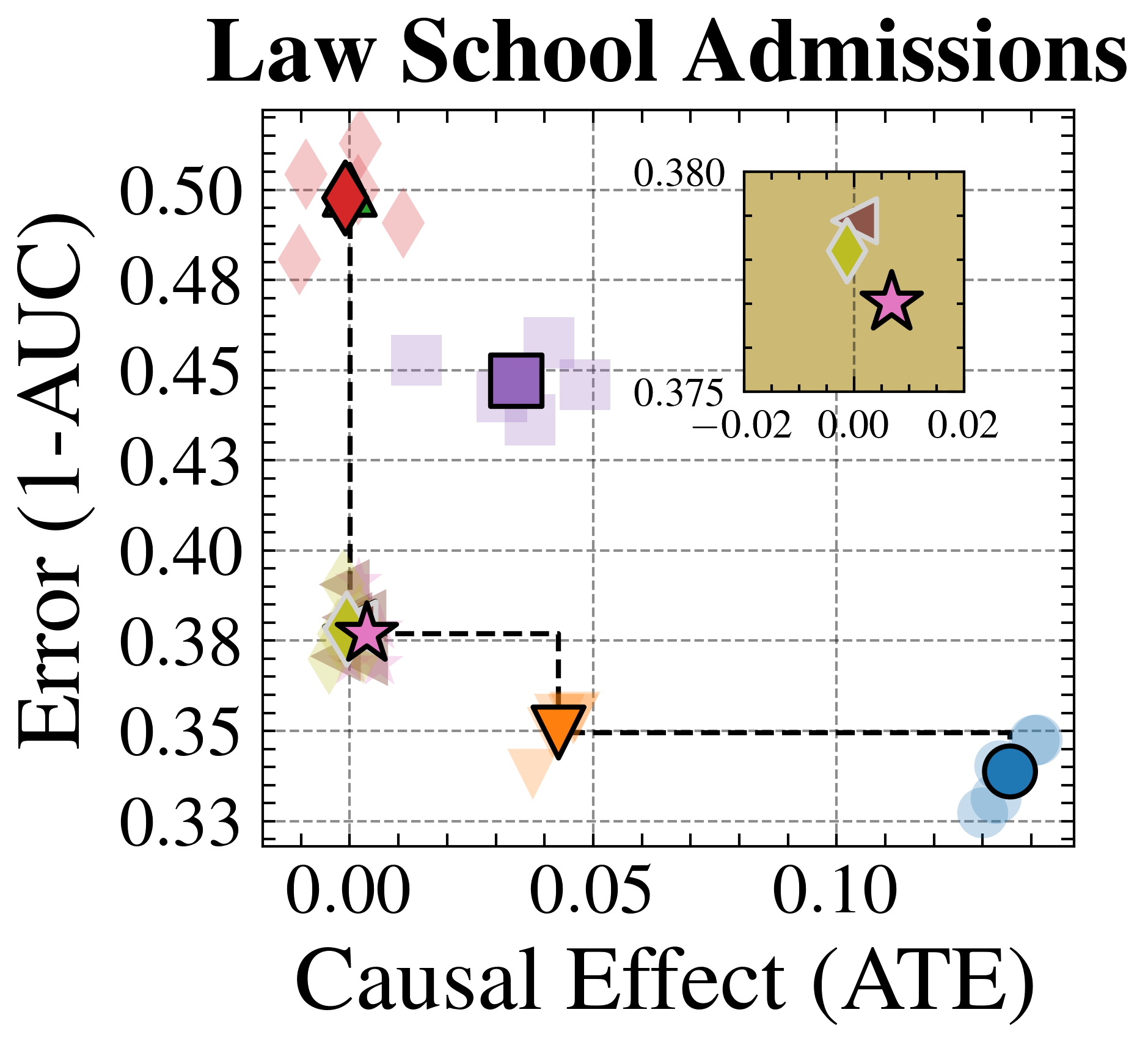
### Visual Description
## Scatter Plot: Law School Admissions
### Overview
The image is a scatter plot titled "Law School Admissions". It visualizes the relationship between "Causal Effect (ATE)" on the x-axis and "Error (1-AUC)" on the y-axis. The plot includes several data points represented by different shapes and colors, each potentially corresponding to a different model or condition. A smaller inset plot provides a zoomed-in view of the data points clustered near the origin.
### Components/Axes
* **Title:** Law School Admissions
* **X-axis:** Causal Effect (ATE)
* Scale: 0.00 to 0.10, with tick marks at intervals of 0.025.
* **Y-axis:** Error (1-AUC)
* Scale: 0.33 to 0.50, with tick marks at intervals of 0.025.
* **Data Points:** Represented by different shapes and colors:
* Red Diamond
* Purple Square
* Orange Downward-pointing Triangle
* Blue Circle
* Pink Star
* **Inset Plot:**
* X-axis: -0.02 to 0.02
* Y-axis: 0.375 to 0.380
* Data Points: Yellow Diamond, Brown Diamond, Pink Star
### Detailed Analysis or ### Content Details
**Main Plot Data Points:**
* **Red Diamond:** Located at approximately (0.00, 0.50).
* **Purple Square:** Located at approximately (0.03, 0.45).
* **Orange Downward-pointing Triangle:** Located at approximately (0.05, 0.35).
* **Blue Circle:** Located at approximately (0.12, 0.34).
* **Pink Star:** Located at approximately (0.00, 0.38).
**Inset Plot Data Points:**
* **Yellow Diamond:** Located at approximately (-0.01, 0.379).
* **Brown Diamond:** Located at approximately (0.00, 0.380).
* **Pink Star:** Located at approximately (0.01, 0.377).
**Trend Analysis:**
* The dashed black line connects the Pink Star, Orange Triangle, and Blue Circle, showing a downward trend in Error (1-AUC) as Causal Effect (ATE) increases.
### Key Observations
* The Red Diamond has the highest Error (1-AUC) and the lowest Causal Effect (ATE).
* The Blue Circle has the lowest Error (1-AUC) and the highest Causal Effect (ATE).
* The inset plot provides a closer look at the data points clustered near the origin, revealing slight variations in their positions.
### Interpretation
The scatter plot visualizes the trade-off between causal effect and error in a law school admissions context. The different data points likely represent different models or methods used to predict admissions outcomes. The downward trend suggests that as the causal effect increases, the error decreases, indicating a potential improvement in prediction accuracy. The inset plot highlights the subtle differences between models with very low causal effects. The plot suggests that the blue circle model is the best, as it has the lowest error and highest causal effect.
</details>
<details>
<summary>extracted/6522797/figures/trade-off_adult.png Details</summary>
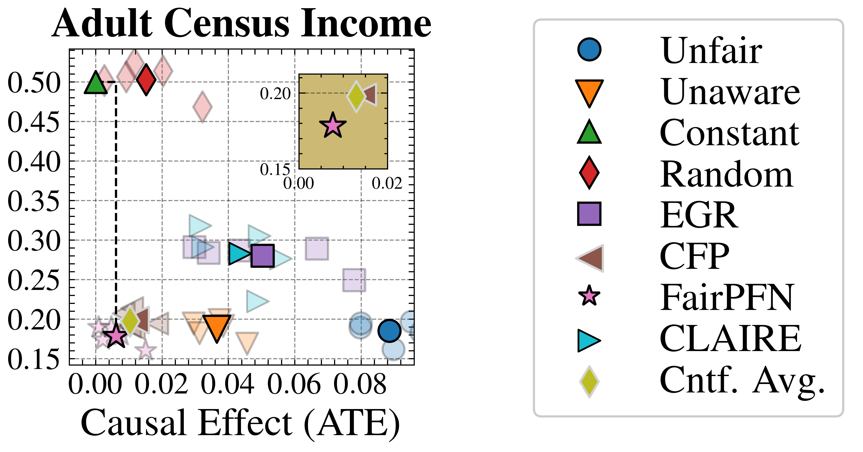
### Visual Description
## Scatter Plot: Adult Census Income
### Overview
The image is a scatter plot titled "Adult Census Income". It displays data points representing different algorithms or methods, plotted against "Causal Effect (ATE)" on the x-axis and an unspecified metric on the y-axis. A legend on the right identifies each data point type. An inset plot provides a zoomed-in view of the lower-left region of the main plot.
### Components/Axes
* **Title:** Adult Census Income
* **X-axis:** Causal Effect (ATE)
* Scale: 0.00 to 0.08, with tick marks at intervals of 0.02.
* **Y-axis:** No explicit label, but the scale ranges from 0.15 to 0.50, with tick marks at intervals of 0.05.
* **Legend:** Located on the right side of the plot.
* Unfair (Blue Circle)
* Unaware (Orange Downward Triangle)
* Constant (Green Upward Triangle)
* Random (Red Diamond)
* EGR (Purple Square)
* CFP (Brown Sideways Triangle)
* FairPFN (Pink Star)
* CLAIRE (Teal Rightward Triangle)
* Cntf. Avg. (Yellow Diamond)
* **Inset Plot:** Located in the top-right corner of the main plot area.
* X-axis: 0.00 to 0.02
* Y-axis: 0.15 to 0.20
### Detailed Analysis
* **Unfair (Blue Circle):** Located around x=0.08, y=0.19.
* **Unaware (Orange Downward Triangle):** Located around x=0.04, y=0.19.
* **Constant (Green Upward Triangle):** Located around x=0.00, y=0.50.
* **Random (Red Diamond):** Located around x=0.01, y=0.50.
* **EGR (Purple Square):** Located around x=0.05, y=0.28.
* **CFP (Brown Sideways Triangle):** Located around x=0.01, y=0.21.
* **FairPFN (Pink Star):** Located around x=0.00, y=0.18.
* **CLAIRE (Teal Rightward Triangle):** Several points are clustered around x=0.04, y=0.30.
* **Cntf. Avg. (Yellow Diamond):** Located around x=0.01, y=0.20.
### Key Observations
* The 'Constant' and 'Random' methods have a causal effect close to zero but a high y-axis value (around 0.50).
* The 'Unfair' and 'Unaware' methods have a higher causal effect (around 0.08 and 0.04 respectively) but a lower y-axis value (around 0.19).
* The 'FairPFN' method is clustered near the origin (low causal effect and low y-axis value).
* The inset plot provides a closer look at the cluster of points near the origin, including 'FairPFN', 'CFP', and 'Cntf. Avg.'.
### Interpretation
The scatter plot visualizes the trade-offs between "Causal Effect (ATE)" and another unspecified metric for different algorithms or methods related to adult census income. The plot suggests that some methods (like 'Constant' and 'Random') prioritize a high y-axis value at the expense of causal effect, while others (like 'Unfair' and 'Unaware') exhibit the opposite behavior. The 'FairPFN' method appears to achieve a balance between the two metrics, as it is located near the origin. The clustering of points suggests that certain methods may have similar performance characteristics. The inset plot highlights the subtle differences among methods with low causal effects.
</details>
Figure 6: Fairness-Accuracy Trade-off (Real-World): Average Treatment Effect (ATE) of predictions, predictive error (1-AUC), and Pareto Front of the performance of FairPFN compared to our baselines on each of 5 validation folds (light) and across all five folds (solid) of our real-world datasets. Baselines which have access to causal information have a light border. FairPFN matches the performance of baselines which have access to inferred causal information with only access to observational data.
<details>
<summary>extracted/6522797/figures/kl_real.png Details</summary>
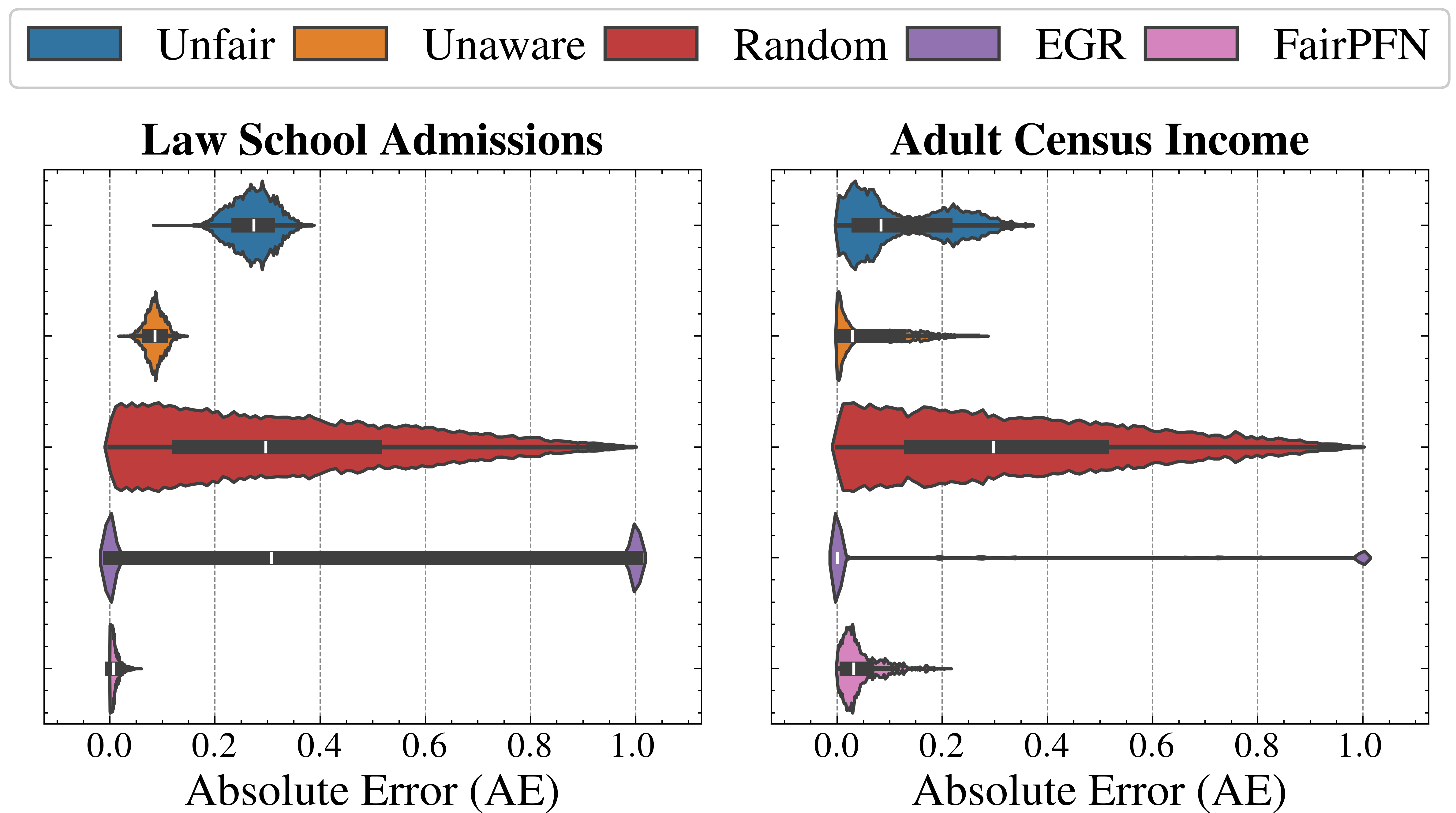
### Visual Description
## Violin Plot: Absolute Error Distributions for Law School Admissions and Adult Census Income
### Overview
The image presents two violin plots side-by-side, comparing the distribution of Absolute Error (AE) for different prediction methods applied to "Law School Admissions" (left) and "Adult Census Income" (right) datasets. The methods are "Unfair", "Unaware", "Random", "EGR", and "FairPFN". The x-axis represents the Absolute Error (AE), ranging from 0.0 to 1.0. The y-axis implicitly represents the density of data points for each method at a given AE value.
### Components/Axes
* **Titles:** "Law School Admissions" (left plot), "Adult Census Income" (right plot)
* **X-Axis:** "Absolute Error (AE)" with scale from 0.0 to 1.0 in increments of 0.2.
* **Y-Axis:** Implicitly represents the density of data points.
* **Legend (Top):**
* Blue: "Unfair"
* Orange: "Unaware"
* Red: "Random"
* Purple: "EGR"
* Pink: "FairPFN"
### Detailed Analysis
#### Law School Admissions (Left Plot)
* **Unfair (Blue):** The distribution is centered around AE = 0.2, with a narrow spread.
* **Unaware (Orange):** The distribution is centered around AE = 0.1, with a narrow spread.
* **Random (Red):** The distribution is broad, extending from AE = 0.0 to AE = 1.0, with a peak around AE = 0.2.
* **EGR (Purple):** The distribution is concentrated between AE = 0.0 and AE = 1.0, with a rectangular shape.
* **FairPFN (Pink):** The distribution is not present in this plot.
#### Adult Census Income (Right Plot)
* **Unfair (Blue):** The distribution is centered around AE = 0.1, with a narrow spread.
* **Unaware (Orange):** The distribution is centered around AE = 0.1, with a narrow spread.
* **Random (Red):** The distribution is broad, extending from AE = 0.0 to AE = 1.0, with a peak around AE = 0.2.
* **EGR (Purple):** The distribution is concentrated at AE = 1.0.
* **FairPFN (Pink):** The distribution is centered around AE = 0.1, with a narrow spread.
### Key Observations
* The "Random" method consistently exhibits the broadest distribution of Absolute Errors in both datasets.
* The "Unfair" and "Unaware" methods have similar distributions in both datasets, with relatively low Absolute Errors.
* The "EGR" method shows different behavior across the two datasets, with a broad distribution in "Law School Admissions" and a concentration at AE = 1.0 in "Adult Census Income".
* The "FairPFN" method is only present in the "Adult Census Income" dataset, showing a low Absolute Error distribution.
### Interpretation
The violin plots visualize the performance of different prediction methods in terms of Absolute Error. The "Random" method's broad distribution suggests it is the least reliable, producing a wide range of errors. The "Unfair" and "Unaware" methods appear to be more accurate, consistently yielding lower Absolute Errors. The "EGR" method's performance varies significantly between the two datasets, indicating its sensitivity to the specific data characteristics. The "FairPFN" method, present only in the "Adult Census Income" dataset, also demonstrates relatively low Absolute Errors, suggesting it is a potentially effective method for this dataset. The plots highlight the importance of choosing an appropriate prediction method based on the specific dataset and desired level of accuracy.
</details>
Figure 7: Counterfactual Fairness (Real-World): Distributions of Absolute Error (AE) between predictive distributions on observational and counterfactual datasets. Compared to baselines that do not have access to causal information, FairPFN achieves the lowest median and maximum AE on both datasets.
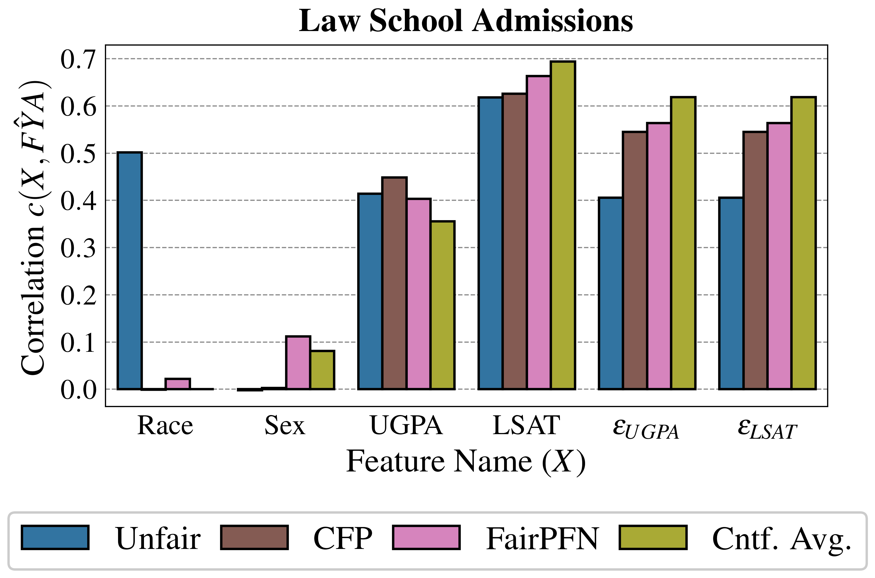
Trust & Interpretability
In order to build trust in FairPFN and explain its internal workings, we first perform a feature correlation analysis of FairPFN and baseline models using the Law School Admissions dataset. We measure the Kendall rank correlation between observable variables "LSAT" and "UGPA," and inferred noise terms $\epsilon_{LSAT}$ and $\epsilon_{UGPA}$ , with predicted admission probabilities $\hat{FYA}$ .
Figure 8 shows that despite only having access to observational data, FairPFN’s predictions correlate with fair noise terms similarly to CFP which was fit solely to these variables. This result suggests FairPFN’s ability to not only integrate over realistic causal explanations for the data, but also correctly remove the causal effect of the protected attribute such that its predictions are influenced only by fair exogenous causes. We note that while FairPFN mitigates the effect of "Race," it increases the correlation of "Sex" compared to the Unfair and CFP baselines. We discuss how future versions of FairPFN can tackle the problem of intersectionality in Section 6. We also further investigate this result in Appendix Figure 12, which confirms that FairPFN does not remove the effect of additional protected attributes other than the one specified.
We also observe in Figure 3 and 6 the strong performance of our Cntf. Avg. baseline, which predicts the average outcome probability in the observational and counterfactual worlds. We thus carry out a similarity test to Cntf. Avg. in Appendix Tables 1 and 2, calculating for each other baseline the mean difference in predictions, the standard deviation of this distribution, and the percentage of outliers. We find that FairPFN’s predictions are among the closest to this target, with a mean error on synthetic datasets of 0.00±0.06 with 1.87% of samples falling outside of three standard deviations, and a mean error on real-world datasets of 0.02±0.04 with 0.36% of outlying samples.
<details>
<summary>extracted/6522797/figures/lawschool_corr.png Details</summary>
### Visual Description
## Chart Type: Bar Chart
### Overview
The image is a bar chart titled "Law School Admissions". It compares the correlation between different features (Race, Sex, UGPA, LSAT, εUGPA, εLSAT) and law school admissions (FŶA) using four different methods: Unfair, CFP, FairPFN, and Cntf. Avg. The chart uses vertical bars to represent the correlation values for each feature and method.
### Components/Axes
* **Title:** Law School Admissions
* **X-axis:** Feature Name (X) with categories: Race, Sex, UGPA, LSAT, εUGPA, εLSAT
* **Y-axis:** Correlation c(X, FŶA) with a scale from 0.0 to 0.7, incrementing by 0.1.
* **Legend:** Located at the bottom of the chart.
* Blue: Unfair
* Brown: CFP
* Pink: FairPFN
* Olive Green: Cntf. Avg.
### Detailed Analysis
Here's a breakdown of the correlation values for each feature and method:
* **Race:**
* Unfair (Blue): ~0.5
* CFP (Brown): ~0.0
* FairPFN (Pink): ~0.02
* Cntf. Avg. (Olive Green): ~0.0
* **Sex:**
* Unfair (Blue): ~0.0
* CFP (Brown): ~0.0
* FairPFN (Pink): ~0.11
* Cntf. Avg. (Olive Green): ~0.08
* **UGPA:**
* Unfair (Blue): ~0.42
* CFP (Brown): ~0.45
* FairPFN (Pink): ~0.41
* Cntf. Avg. (Olive Green): ~0.36
* **LSAT:**
* Unfair (Blue): ~0.62
* CFP (Brown): ~0.63
* FairPFN (Pink): ~0.67
* Cntf. Avg. (Olive Green): ~0.69
* **εUGPA:**
* Unfair (Blue): ~0.41
* CFP (Brown): ~0.55
* FairPFN (Pink): ~0.57
* Cntf. Avg. (Olive Green): ~0.62
* **εLSAT:**
* Unfair (Blue): ~0.41
* CFP (Brown): ~0.55
* FairPFN (Pink): ~0.57
* Cntf. Avg. (Olive Green): ~0.62
### Key Observations
* Race has a high correlation with the "Unfair" method, but very low correlation with the other methods.
* Sex has a very low correlation across all methods.
* UGPA and LSAT have relatively high correlations across all methods.
* The "Cntf. Avg." method generally shows the highest correlation for UGPA, LSAT, εUGPA, and εLSAT.
* The "Unfair" method shows the highest correlation for Race.
### Interpretation
The chart suggests that race is a significant factor in law school admissions when using the "Unfair" method, but not when using the other methods. Sex appears to have minimal correlation with admissions regardless of the method used. UGPA and LSAT scores are consistently correlated with admissions across all methods, with the "Cntf. Avg." method showing the strongest correlation. The variables εUGPA and εLSAT also show a strong correlation with admissions, especially when using the "Cntf. Avg." method. This indicates that these features are important predictors of law school admissions outcomes.
</details>
Figure 8: Feature Correlation (Law School): Kendall Tau rank correlation between feature values and the predictions FairPFN compared to our baseline models. FairPFN produces predictions that correlate with fair noise terms $\epsilon_{UGPA}$ and $\epsilon_{LSAT}$ to a similar extent as the CFP baseline, variables which it has never seen in context-or at inference.
6 Future Work & Discussion
This study introduces FairPFN, a tabular foundation model pretrained to minimize the causal influence of protected attributes in binary classification tasks using solely observational data. FairPFN overcomes a key limitation in causal fairness by eliminating the need for user-supplied knowledge of the true causal graph, facilitating its use in complex, unidentifiable causal scenarios. This approach enhances the applicability of causal fairness and opens new research avenues.
Extended Problem Scope We limit our experimental scope to a simple testable setting with a single, binary protected attribute but believe that our prior and transformer architecture can be extended to handle multiple, non-binary protected attributes, addressing both their individual effects and intersectional interactions. We also suggest that FairPFN is capable of predicting not only a fair binary target but also accommodating multi-objective scenarios Lin et al. (2019), regression problems Hollmann et al. (2025), and time series Hoo et al. (2025). Additionally, FairPFN can generate causally fair versions of previously unfair observables, improving prediction explainability. This enables practitioners to use FairPFN as a fairness preprocessing technique while employing their preferred predictive models in practical applications.
PFNs for Causal ML FairPFN implicitly provides evidence for the efficacy of PFNs to perofm causal tasks, and we believe that our methodology can be extended to more complex challenges both within and outside of algorithmic fairness. In algorithmic fairness, one promising extension could be path-specific effect removal Chiappa (2019). For example, in medical diagnosis, distinguishing social effects of sex (e.g., sampling bias, male-focus of clinical studies) from biological effects (e.g., symptom differences across sex) is essential for fair and individualized treatment and care. Beyond fairness, we believe PFNs can predict interventional and counterfactual effects, with the latter potentially facilitating FairPFN’s evaluation in real-world contexts without relying on estimated causal models. Currently, FairPFN can also mitigate the influence of binary exogenous confounders, such as smoking, on the prediction of treatment success.
Alignment to Anti-Discrimination Law Future versions of FairPFN could also relax the assumption of exogenous protected attributes, enabling differentiation between legally admissible spurious effects and direct or indirect effects. Another key concept proposed by Plecko & Bareinboim (2024) introduces "Business Necessity" (BN) variables that allow the impact of the protected attribute to indirectly contribute to outcomes to achieve a specified business objectives, such as a research company hiring doctorate holders. In EU law, the analogous concept of "objective justification" necessitates a "proportionality test," asserting that justifiable indirect effects must persist only as necessary Weerts et al. (2023). We contend that proportionality bears a causal interpretation, akin to counterfactual explanations Wachter et al. (2018).
Broader Impact
This study attempts to overcome a current limitation in causal fairness, making what we believe is a useful framework for addressing algorithmic discrimination, more accessible to a wider variety of complex fairness problems. While the goal of this work is to have a positive impact on a problem we think is crucial, we acknowledge that we our perspective on fairness is limited in scope to align with EU/US legal doctrines of anti-discrimination. These doctrines are not representative of the world as a whole, and even within these systems, there are vastly different normative viewpoints regarding what constitutes algorithmic fairness and justice.
Acknowledgements
The authors of this work would like to thank the reviewers, editors and organizers of ICML ’25 for the opportunity to share our work and receive valuable feedback from the community. We would like to additionally thank the Zuse School ELIZA Master’s Scholarship Program for their financial and professional support of our main author. We would finally like to thank Sai Prasanna, Magnus Bühler, and Prof. Dr. Thorsten Schmidt for their insights, feedback, and discussion.
References
- Agarwal et al. (2018) Agarwal, A., Beygelzimer, A., Dudík, M., Langford, J., and Wallach, H. A reductions approach to fair classification. In Dy, J. and Krause, A. (eds.), Proceedings of the 35th International Conference on Machine Learning (ICML’18), volume 80, pp. 60–69. Proceedings of Machine Learning Research, 2018.
- Angwin et al. (2016) Angwin, J., Larson, J., Mattu, S., and Kirchner, L. Machine bias. ProPublica, May, 23(2016):139–159, 2016.
- Barocas et al. (2023) Barocas, S., Hardt, M., and Narayanan, A. Fairness and Machine Learning: Limitations and opportunities. MIT Press, 2023.
- Bhaila et al. (2024) Bhaila, K., Van, M., Edemacu, K., Zhao, C., Chen, F., and Wu, X. Fair in-context learning via latent concept variables. 2024.
- Binkytė-Sadauskienė et al. (2022) Binkytė-Sadauskienė, R., Makhlouf, K., Pinzón, C., Zhioua, S., and Palamidessi, C. Causal discovery for fairness. 2022.
- Castelnovo et al. (2022) Castelnovo, A., Crupi, R., Greco, G., Regoli, D., Penco, I. G., and Cosentini, A. C. A clarification of the nuances in the fairness metrics landscape. Scientific Reports, 12(1), 2022.
- Chen & Guestrin (2016) Chen, T. and Guestrin, C. Xgboost: A scalable tree boosting system. In Krishnapuram, B., Shah, M., Smola, A., Aggarwal, C., Shen, D., and Rastogi, R. (eds.), Proceedings of the 22nd ACM SIGKDD International Conference on Knowledge Discovery and Data Mining (KDD’16), pp. 785–794, 2016.
- Chiappa (2019) Chiappa, S. Path-specific counterfactual fairness. In Hentenryck, P. V. and Zhou, Z.-H. (eds.), Proceedings of the Thirty-Third Conference on Artificial Intelligence (AAAI’19), volume 33, pp. 7801–7808. AAAI Press, 2019.
- Dai et al. (1997) Dai, H., Korb, K. B., Wallace, C. S., and Wu, X. A study of causal discovery with weak links and small samples. In Pollack, M. E. (ed.), Proceedings of the 15th International Joint Conference on Artificial Intelligence (IJCAI’95), 1997.
- Ding et al. (2021) Ding, F., Hardt, M., Miller, J., and Schmidt, L. Retiring adult: New datasets for fair machine learning. In Ranzato, M., Beygelzimer, A., Nguyen, K., Liang, P., Vaughan, J., and Dauphin, Y. (eds.), Proceedings of the 35th International Conference on Advances in Neural Information Processing Systems (NeurIPS’21), volume 34, pp. 6478–6490, 2021.
- Dua & Graff (2017) Dua, D. and Graff, C. Uci machine learning repository, 2017.
- Hardt et al. (2016) Hardt, M., Price, E., and Srebro, N. Equality of opportunity in supervised learning. In Lee, D., Sugiyama, M., von Luxburg, U., Guyon, I., and Garnett, R. (eds.), Proceedings of the 30th International Conference on Advances in Neural Information Processing Systems (NeurIPS’16), pp. 3323–3331, 2016.
- Hollmann et al. (2023) Hollmann, N., Müller, S., Eggensperger, K., and Hutter, F. Tabpfn: A transformer that solves small tabular classification problems in a second. In International Conference on Learning Representations (ICLR’23), 2023. Published online: iclr.cc.
- Hollmann et al. (2025) Hollmann, N., Müller, S., Purucker, L., Krishnakumar, A., Körfer, M., Hoo, S. B., Schirrmeister, R. T., and Hutter, F. Accurate predictions on small data with a tabular foundation model. Nature, 637(8045):319–326, 2025.
- Hoo et al. (2025) Hoo, S. B., Müller, S., Salinas, D., and Hutter, F. The tabular foundation model tabpfn outperforms specialized time series forecasting models based on simple features. 2025.
- Hoyer et al. (2008) Hoyer, P. O., Janzing, D., Mooij, J. M., Peters, J., and Schölkopf, B. Nonlinear causal discovery with additive noise models. In Platt, J. and Koller, D. (eds.), Proceedings of the 22 International Conference on Advances in Neural Information Processing Systems (NeurIPS’08), pp. 689–696, 2008.
- Kamishima et al. (2012) Kamishima, T., Akaho, S., Asoh, H., and Sakuma, J. Fairness-aware classifier with prejudice remover regularizer. In Machine Learning and Knowledge Discovery in Databases: European Conference, ECML PKDD 2012, Bristol, UK, September 24-28, 2012. Proceedings, Part II 23, pp. 35–50. Springer, 2012.
- Kusner et al. (2017) Kusner, M., Loftus, J., Russell, C., and Silva, R. Counterfactual fairness. In Guyon, I., von Luxburg, U., Bengio, S., Wallach, H., Fergus, R., Vishwanathan, S., and Garnett, R. (eds.), Proceedings of the 31st International Conference on Advances in Neural Information Processing Systems (NeurIPS’17), pp. 4069–4079, 2017.
- Lin et al. (2019) Lin, X., Zhen, H.-L., Li, Z., Zhang, Q., and Kwong, S. Pareto multi-task learning. 2019.
- Ma et al. (2023) Ma, J., Guo, R., Zhang, A., and Li, J. Learning for counterfactual fairness from observational data. In Singh, A. K., Sun, Y., Akoglu, L., Gunopulos, D., Yan, X., Kumar, R., Ozcan, F., and Ye, J. (eds.), Proceedings of the 29th ACM SIGKDD International Conference on Knowledge Discovery and Data Mining (KDD’23), pp. 1620–1630, 2023.
- Müller et al. (2022) Müller, S., Hollmann, N., Arango, S., Grabocka, J., and Hutter, F. Transformers can do bayesian inference. In Proceedings of the International Conference on Learning Representations (ICLR’22), 2022. Published online: iclr.cc.
- Pearl (2009) Pearl, J. Causality: Models, Reasoning and Inference. Cambridge University Press, 2009.
- Peters et al. (2011) Peters, J., Janzing, D., and Schölkopf, B. Causal inference on discrete data using additive noise models. IEEE Transactions on Pattern Analysis and Machine Intelligence, 33(12):2436–2450, 2011.
- Peters et al. (2014) Peters, J., Mooij, J. M., Janzing, D., and Schölkopf, B. Causal discovery with continuous additive noise models. Journal of Machine Learning Research, 15:2009–2053, 2014.
- Plecko & Bareinboim (2024) Plecko, D. and Bareinboim, E. Causal fairness analysis. Foundations and Trends in Machine Learning, 17:304–589, 2024.
- Robertson et al. (2024) Robertson, J., Schmidt, T., Hutter, F., and Awad, N. A human-in-the-loop fairness-aware model selection framework for complex fairness objective landscapes. In Das, S., Green, B. P., Varshney, K., Ganapini, M., and Renda, A. (eds.), Proceedings of the Seventh AAAI/ACM Conference on AI, Ethics, and Society (AIES-24) - Full Archival Papers, October 21-23, 2024, San Jose, California, USA - Volume 1, pp. 1231–1242. AAAI Press, 2024.
- Schölkopf et al. (2012) Schölkopf, B., Janzing, D., Peters, J., Sgouritsa, E., Zhang, K., and Mooij, J. On causal and anticausal learning. In Langford, J. and Pineau, J. (eds.), Proceedings of the 29th International Conference on Machine Learning (ICML’12). Omnipress, 2012.
- Sharma & Kiciman (2020) Sharma, A. and Kiciman, E. Dowhy: An end-to-end library for causal inference. arXiv:2011.04216 [stat.ME], 2020.
- Wachter et al. (2018) Wachter, S., Mittelstadt, B., and Russell, C. Counterfactual explanations without opening the black box: Automated decisions and the gdpr. Harvard Journal of Law and Technology, 15:842–887, 2018.
- Weerts et al. (2023) Weerts, H., Xenidis, R., Tarissan, F., Olsen, H. P., and Pechenizkiy, M. Algorithmic unfairness through the lens of eu non-discrimination law. In Proceedings of the 2023 ACM Conference on Fairness, Accountability, and Transparency, pp. 805–816, 2023.
- Weerts et al. (2024) Weerts, H., Pfisterer, F., Feurer, M., Eggensperger, K., Bergman, E., Awad, N., Vanschoren, J., Pechenizkiy, M., Bischl, B., and Hutter, F. Can fairness be automated? guidelines and opportunities for fairness-aware automl. Journal of Artificial Intelligence Research, 79:639–677, 2024.
- Wightman (1998) Wightman, L. F. Lsac national longitudinal bar passage study. lsac research report series, 1998.
Appendix A Real-World Datasets
Law School Admissions
The first dataset is the Law School Admissions dataset from the 1998 LSAC National Longitudinal Bar Passage Study Wightman (1998), which includes admissions data fr approximately 30,000 US law school applicants, revealing disparities in bar passage rates and first-year averages by ethnicity. We generate counterfactual data and measure causal effects using a slightly different causal model than what was originally proposed by Kusner et al. (2017), which additionally includes edges $\text{"UGPA"}→\text{"LSAT"}$ and $\text{"LSAT"}→\text{"FYA"}$ . These edges have a plausible temporal explanation, and create a more realistic scenario where "Race" and "Sex" have both a direct and indirect effect on first year averages.
Causal Modeling with DoWhy
We use the causal graph in Figure 5 (left) and observational data as inputs for the dowhy.gcm module Sharma & Kiciman (2020), employing an automated search using the dowhy.gcm.auto, which selects the best predictive model in a model zoo of non-linear tree-based models to represent each edge, minimizing either the MSE or negative F1-score depending on the distribution of target following Hoyer et al. (2008) and Peters et al. (2011). We apply each models generate counterfactual datasets, allowing for the estimation of the Average Treatment Effect (ATE) and absolute error (AE). We also use the compute_noise function to estimate noise terms $\epsilon_{GPA}$ and $\epsilon_{LSAT}$ for our CFP baseline.
Adult Census Income
The second dataset, derived from the 1994 US Census, is the Adult Census Income problem Dua & Graff (2017), containing demographic and income outcome data ( $INC≥ 50K$ ) for nearly 50,000 individuals We note that Adult has been heavily criticized in the fairness literature Ding et al. (2021) due to evidence of sampling bias and an arbitrary chosen income threshold, but elect to include it due to its widely accepted causal model and appearance as a benchmark in other similar studies Ma et al. (2023). We fit a causal model to assess the Average Treatment Effect (ATE) of the protected attribute $RACE$ , generate a counterfactual dataset, and calculate noise term values $\epsilon$ .
Appendix B Ablation Study
To evaluate FairPFN’s performance across datasets with varying characteristics, we conduct an ablation study comparing the prediction Average Treatment Effect (ATE) of FairPFN and Unfair under different noise levels, base rates of the protected attribute’s causal effect, and dataset sizes.
Base Rate Causal Effect
We analyze the distributions of prediction ATE from FairPFN and Unfair across five quintiles (Q1-Q5) of base ATE (Figure 9). FairPFN’s prediction ATE remains stable, while Unfair ’s prediction ATE increases linearly. In datasets within the Biased, Direct Effect, Level-Two, and Level-Three benchmark groups, where the protected attribute has a high base ATE (Q5), FairPFN exhibits a greater tendency for positive discrimination, resulting in negative prediction ATE values.
<details>
<summary>extracted/6522797/figures/effect_effect.png Details</summary>
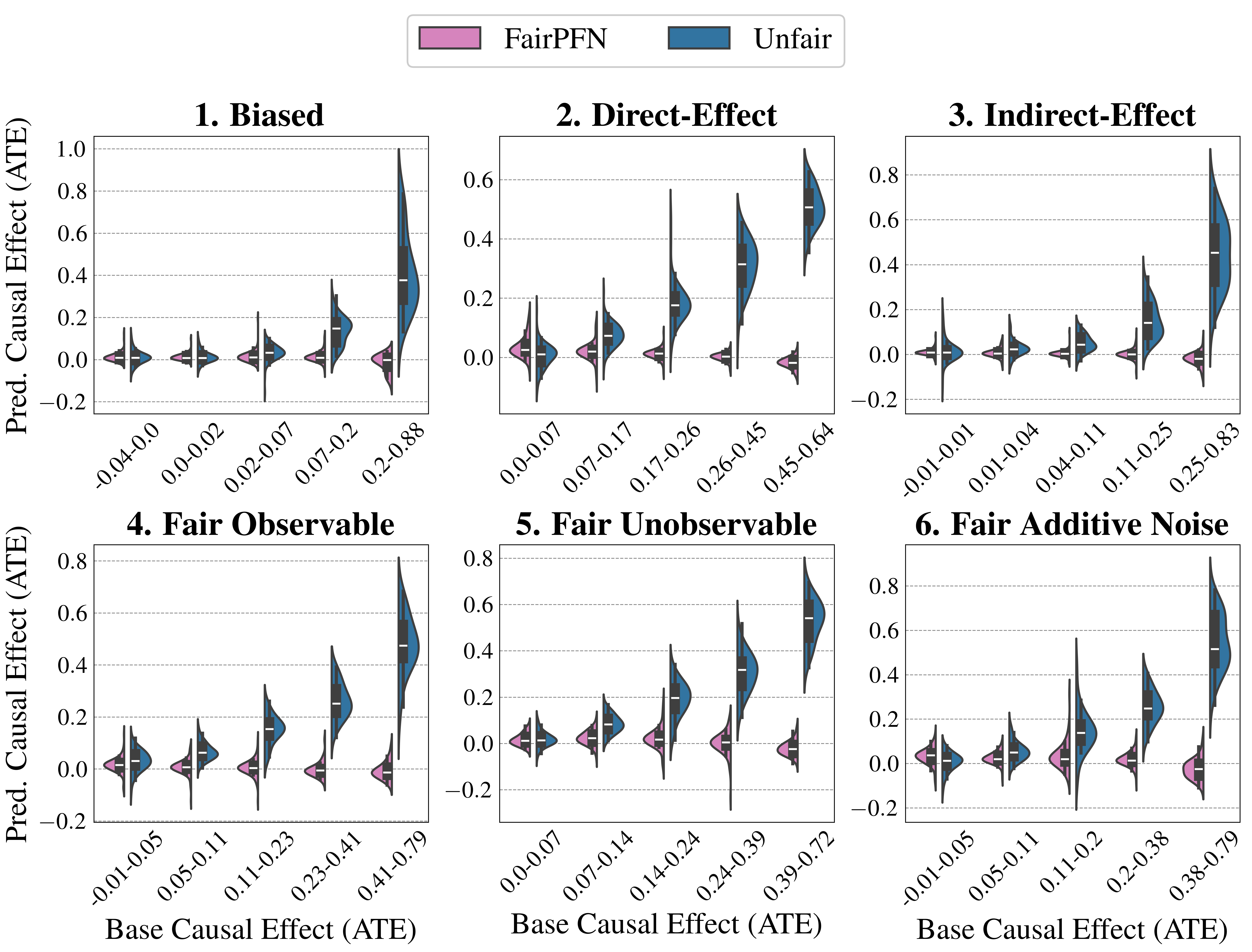
### Visual Description
## Violin Plot: Predicted Causal Effect (ATE) vs. Base Causal Effect (ATE) under Different Fairness Scenarios
### Overview
The image presents six violin plots arranged in a 2x3 grid. Each plot visualizes the distribution of predicted causal effects (ATE) for both a "FairPFN" model (pink) and an "Unfair" model (blue) across different ranges of base causal effects (ATE). The plots are titled: "1. Biased", "2. Direct-Effect", "3. Indirect-Effect", "4. Fair Observable", "5. Fair Unobservable", and "6. Fair Additive Noise". The x-axis represents the base causal effect (ATE), and the y-axis represents the predicted causal effect (ATE).
### Components/Axes
* **Legend:** Located at the top of the image.
* Pink: FairPFN
* Blue: Unfair
* **Y-axis:** "Pred. Causal Effect (ATE)" with a scale from -0.2 to 1.0 (varying by plot). Horizontal gridlines are present at intervals of 0.2.
* **X-axis:** "Base Causal Effect (ATE)". Each plot has 5-6 categories representing ranges of base causal effect.
### Detailed Analysis
**1. Biased**
* X-axis categories: -0.04-0.0, 0.0-0.02, 0.02-0.07, 0.07-0.2, 0.2-0.88
* FairPFN (pink): The distribution remains relatively consistent around 0 for all base causal effect ranges.
* Unfair (blue): The distribution shifts upwards as the base causal effect increases, with a significant spread at the 0.2-0.88 range.
**2. Direct-Effect**
* X-axis categories: 0.0-0.07, 0.07-0.17, 0.17-0.26, 0.26-0.45, 0.45-0.64
* FairPFN (pink): The distribution remains relatively consistent around 0 for all base causal effect ranges.
* Unfair (blue): The distribution shifts upwards as the base causal effect increases, with a significant spread at the 0.45-0.64 range.
**3. Indirect-Effect**
* X-axis categories: -0.01-0.01, 0.01-0.04, 0.04-0.11, 0.11-0.25, 0.25-0.83
* FairPFN (pink): The distribution remains relatively consistent around 0 for all base causal effect ranges.
* Unfair (blue): The distribution shifts upwards as the base causal effect increases, with a significant spread at the 0.25-0.83 range.
**4. Fair Observable**
* X-axis categories: -0.01-0.05, 0.05-0.11, 0.11-0.23, 0.23-0.41, 0.41-0.79
* FairPFN (pink): The distribution remains relatively consistent around 0 for all base causal effect ranges.
* Unfair (blue): The distribution shifts upwards as the base causal effect increases, with a significant spread at the 0.41-0.79 range.
**5. Fair Unobservable**
* X-axis categories: 0.0-0.07, 0.07-0.14, 0.14-0.24, 0.24-0.39, 0.39-0.72
* FairPFN (pink): The distribution remains relatively consistent around 0 for all base causal effect ranges.
* Unfair (blue): The distribution shifts upwards as the base causal effect increases, with a significant spread at the 0.39-0.72 range.
**6. Fair Additive Noise**
* X-axis categories: -0.01-0.05, 0.05-0.11, 0.11-0.2, 0.2-0.38, 0.38-0.79
* FairPFN (pink): The distribution remains relatively consistent around 0 for all base causal effect ranges.
* Unfair (blue): The distribution shifts upwards as the base causal effect increases, with a significant spread at the 0.38-0.79 range.
### Key Observations
* Across all six scenarios, the "FairPFN" model consistently predicts causal effects centered around 0, regardless of the base causal effect.
* The "Unfair" model's predicted causal effects tend to increase as the base causal effect increases in all scenarios.
* The spread of the "Unfair" model's predictions also increases with higher base causal effects, indicating greater variability in the predictions.
### Interpretation
The plots demonstrate the impact of different fairness interventions on the predicted causal effects. The "FairPFN" model, designed to promote fairness, effectively mitigates the bias present in the "Unfair" model, resulting in predictions that are less influenced by the base causal effect. The "Unfair" model exhibits a clear positive correlation between the base causal effect and the predicted causal effect, indicating a potential bias where higher base causal effects lead to higher predicted effects. The different scenarios (Biased, Direct-Effect, Indirect-Effect, Fair Observable, Fair Unobservable, Fair Additive Noise) represent different types of biases or fairness considerations, and the plots illustrate how the "FairPFN" model addresses these biases by producing more consistent predictions across different base causal effect ranges.
</details>
Figure 9: Effect of Base ATE (Synthetic): Distributions of prediction ATE produced by FairPFN and Unfair over quintiles (Q1-Q5) of the protected attributes’s base causal effect (base ATE). FairPFN remains consistent across quintiles, sometimes over-correcting and producing a negative prediction ATE in Q5.
Dataset Noise
Analyzing dataset noise, indicated by the standard deviation (STD) $\sigma$ of exogenous noise in the structural equations Figure 10 shows that FairPFN retains consistency across varying noise levels. Conversely, Unfair exhibits decreased and more peaked distributions of prediction ATE as noise increases from Q1 to Q5, suggests that noise terms may obscure causal effects and diminish their observed impact in the data.
<details>
<summary>extracted/6522797/figures/noise-effect_by_group_synthetic.png Details</summary>
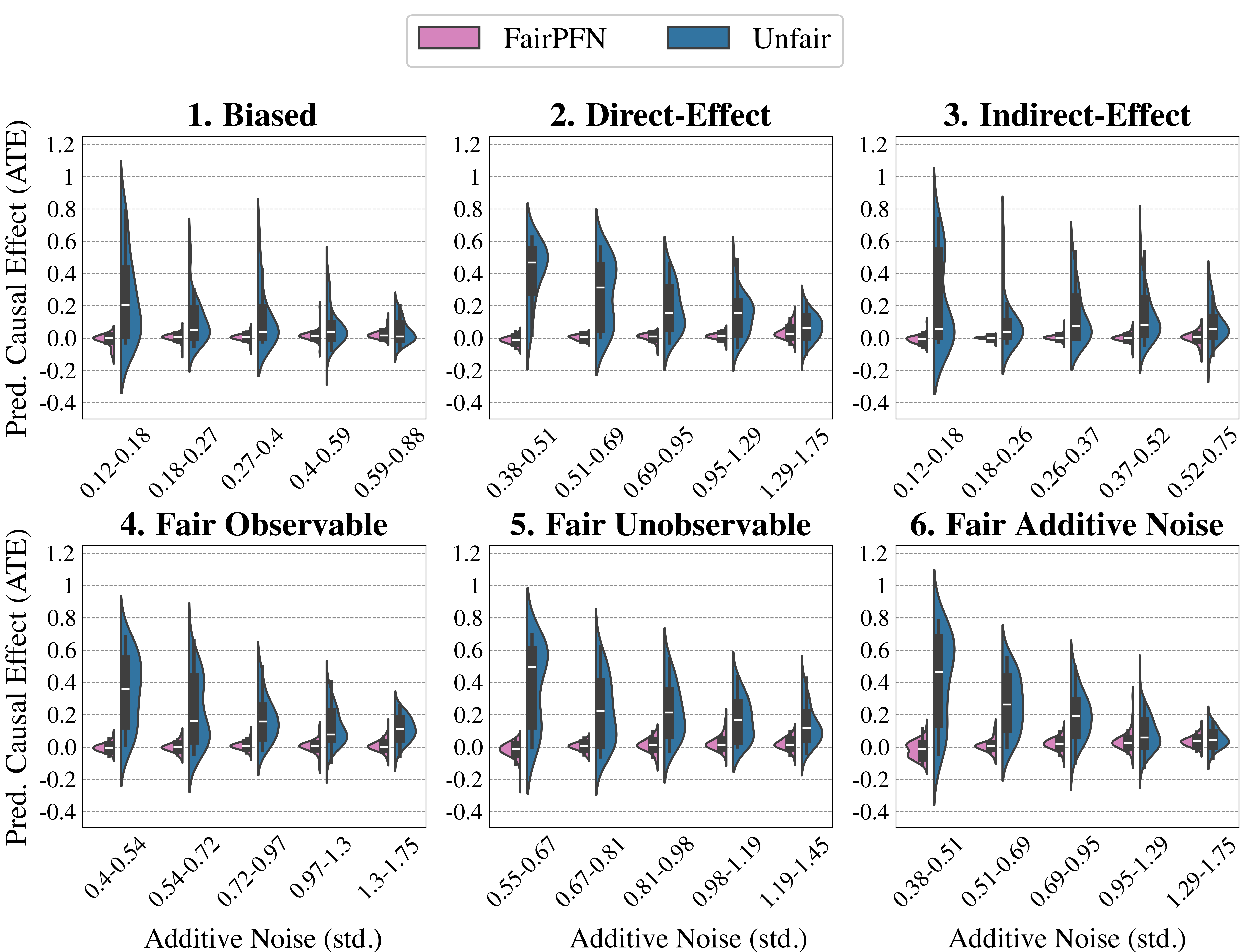
### Visual Description
## Chart Type: Violin Plots of Predicted Causal Effect (ATE) vs. Additive Noise
### Overview
The image presents six violin plots arranged in a 2x3 grid. Each plot visualizes the distribution of the Predicted Causal Effect (ATE) for different levels of Additive Noise (std.). The plots compare two methods: "FairPFN" (represented in pink) and "Unfair" (represented in blue). The plots are titled: "1. Biased", "2. Direct-Effect", "3. Indirect-Effect", "4. Fair Observable", "5. Fair Unobservable", and "6. Fair Additive Noise".
### Components/Axes
* **Y-axis (Vertical):** "Pred. Causal Effect (ATE)" with a scale from -0.4 to 1.2, marked at intervals of 0.2.
* **X-axis (Horizontal):** "Additive Noise (std.)" with varying ranges for each plot. The x-axis represents different ranges of standard deviation of additive noise.
* **Legend (Top):** Located at the top of the image, it identifies "FairPFN" (pink) and "Unfair" (blue).
* **Plot Titles:** Each plot has a title indicating the specific scenario being evaluated (e.g., "1. Biased").
* **Violin Plots:** Each plot contains violin plots representing the distribution of the predicted causal effect for each noise level. The width of the violin indicates the density of data points at that value.
* **X-Axis Markers:** Each plot has 5-6 markers on the x-axis, indicating the range of additive noise (std.) for each violin plot.
### Detailed Analysis
**Plot 1: Biased**
* X-axis markers: 0.12-0.18, 0.18-0.27, 0.27-0.4, 0.4-0.59, 0.59-0.88
* Unfair (blue): The distribution is centered around higher ATE values for lower noise levels, decreasing as noise increases. At 0.12-0.18, the distribution is centered around 0.8, decreasing to around 0.2 at 0.59-0.88.
* FairPFN (pink): The distribution is centered around 0 for all noise levels.
**Plot 2: Direct-Effect**
* X-axis markers: 0.38-0.51, 0.51-0.69, 0.69-0.95, 0.95-1.29, 1.29-1.75
* Unfair (blue): The distribution is centered around higher ATE values for lower noise levels, decreasing as noise increases. At 0.38-0.51, the distribution is centered around 0.7, decreasing to around 0.2 at 1.29-1.75.
* FairPFN (pink): The distribution is centered around 0 for all noise levels.
**Plot 3: Indirect-Effect**
* X-axis markers: 0.12-0.18, 0.18-0.26, 0.26-0.37, 0.37-0.52, 0.52-0.75
* Unfair (blue): The distribution is centered around higher ATE values for lower noise levels, decreasing as noise increases. At 0.12-0.18, the distribution is centered around 0.9, decreasing to around 0.2 at 0.52-0.75.
* FairPFN (pink): The distribution is centered around 0 for all noise levels.
**Plot 4: Fair Observable**
* X-axis markers: 0.4-0.54, 0.54-0.72, 0.72-0.97, 0.97-1.3, 1.3-1.75
* Unfair (blue): The distribution is centered around higher ATE values for lower noise levels, decreasing as noise increases. At 0.4-0.54, the distribution is centered around 0.8, decreasing to around 0.2 at 1.3-1.75.
* FairPFN (pink): The distribution is centered around 0 for all noise levels.
**Plot 5: Fair Unobservable**
* X-axis markers: 0.55-0.67, 0.67-0.81, 0.81-0.98, 0.98-1.19, 1.19-1.45
* Unfair (blue): The distribution is centered around higher ATE values for lower noise levels, decreasing as noise increases. At 0.55-0.67, the distribution is centered around 0.7, decreasing to around 0.2 at 1.19-1.45.
* FairPFN (pink): The distribution is centered around 0 for all noise levels.
**Plot 6: Fair Additive Noise**
* X-axis markers: 0.38-0.51, 0.51-0.69, 0.69-0.95, 0.95-1.29, 1.29-1.75
* Unfair (blue): The distribution is centered around higher ATE values for lower noise levels, decreasing as noise increases. At 0.38-0.51, the distribution is centered around 0.8, decreasing to around 0.2 at 1.29-1.75.
* FairPFN (pink): The distribution is centered around 0 for all noise levels.
### Key Observations
* In all six plots, the "Unfair" method (blue) shows a decreasing trend in the predicted causal effect (ATE) as the additive noise increases.
* In all six plots, the "FairPFN" method (pink) consistently shows a distribution centered around 0, regardless of the additive noise level.
* The range of additive noise (std.) varies across the different plots.
### Interpretation
The plots demonstrate the impact of additive noise on the predicted causal effect (ATE) for two different methods: "FairPFN" and "Unfair". The "Unfair" method is significantly affected by the noise, with the predicted causal effect decreasing as the noise increases. This suggests that the "Unfair" method is sensitive to noise and may produce biased estimates in the presence of noise.
In contrast, the "FairPFN" method appears to be robust to additive noise, consistently predicting a causal effect close to 0, regardless of the noise level. This suggests that "FairPFN" is a more reliable method for causal inference in noisy environments.
The different plot titles ("Biased", "Direct-Effect", etc.) likely represent different scenarios or assumptions about the underlying causal model. The consistent behavior of "FairPFN" across these scenarios suggests that it is a generally applicable method for mitigating the effects of noise on causal inference.
</details>
Figure 10: Effect of Dataset Noise (Synthetic): Distributions of prediction ATE produced by FairPFN and Unfair over quintiles (Q1-Q5) of the standard deviation (std.) of exogenous noise terms in the data. FairPFN remains consistent across quintiles, while increased noise decreases the prediction ATE of Unfair
.
Dataset Size
Ablation studies on dataset size (Figure 11) show that FairPFN’s prediction ATE displays a tighter distribution with larger datasets, indicating improved performance in causal effect removal. This improvement arises from better identification of causal mechanisms as data availability increases, enabling the transformer to distinguish noise from causal effects.
Appendix C Future Extensions
In this section we expand upon our discussion of future extensions of FairPFN, in order to encourage the community to build upon and expand our approach.
Regression Problems
FairPFN can be pre-trained as a regression model with very little architectural changes by discretizing continuous output distributions into piecewise intervals and calculating misclassification costs in order to reflect the natural ordering between categories . Thoroughly evaluated in Hollmann et al. (2025), such post-proccessing strategies have shown strong performance in tabular regression problems and enable the effective use of classification architectures for continuous targets.
Protected Attributes in the Wild
While we limit the scope of this study to binary classification tasks with single, binary protected attributes, we acknowledge that real-world fairness-aware ML problems are often more complex than that. More precisely, protected attributes can be not only binary, but continuous or mulit-category, and discrimination may occur not only with respect to individual protected attributes but with respect to multiple and the interactions between them. Our prior is currently extensible to handle multiple by changing the number of protected attributes that are sampled into each synthetic dataset, removing the outgoing edges of all protected attributes to generate $y_{fair}$ , and informing the transformer about which variables are protected attributes. Changing the distribution of protected attributes is also possible, and simply requires transporting the protected attribute into the distribution(s) of choice either before or after its natural continuous value is propagated through the MLP during pre-training.
<details>
<summary>extracted/6522797/figures/size-effect_by_group_synthetic.png Details</summary>
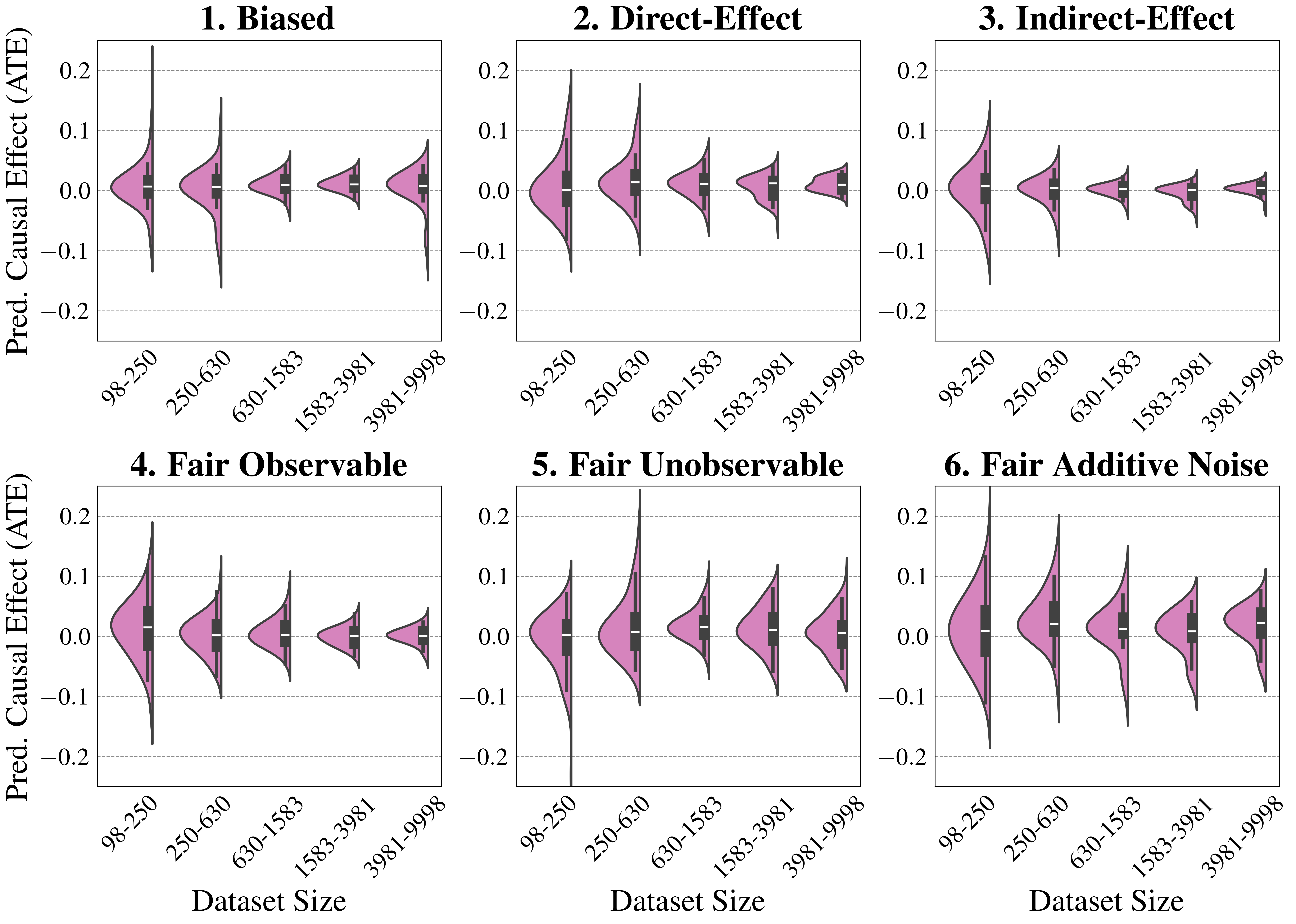
### Visual Description
## Violin Plot: Predicted Causal Effect (ATE) vs. Dataset Size under Different Scenarios
### Overview
The image presents six violin plots arranged in a 2x3 grid. Each plot visualizes the distribution of predicted causal effects (ATE) for different dataset sizes under varying scenarios: Biased, Direct-Effect, Indirect-Effect, Fair Observable, Fair Unobservable, and Fair Additive Noise. The x-axis represents dataset size, categorized into ranges, while the y-axis represents the predicted causal effect (ATE). The violin plots show the distribution of the predicted causal effect for each dataset size range.
### Components/Axes
* **Y-axis:** "Pred. Causal Effect (ATE)" with a scale from -0.2 to 0.2, marked at -0.2, -0.1, 0.0, 0.1, and 0.2.
* **X-axis:** "Dataset Size" categorized into five ranges: 98-250, 250-630, 630-1583, 1583-3981, and 3981-9998.
* **Violin Plots:** Each violin plot is filled with a light purple color and outlined in black. Each violin plot contains a box plot with a black box and whiskers.
* **Titles:** Each plot has a title indicating the scenario:
1. Biased
2. Direct-Effect
3. Indirect-Effect
4. Fair Observable
5. Fair Unobservable
6. Fair Additive Noise
### Detailed Analysis
**Plot 1: Biased**
* The violin plots show a decreasing spread as the dataset size increases.
* The median (black box) is close to 0 for all dataset sizes.
* The distribution is wider for smaller dataset sizes (98-250 and 250-630) and becomes narrower for larger dataset sizes (1583-3981 and 3981-9998).
**Plot 2: Direct-Effect**
* Similar to the "Biased" scenario, the spread of the violin plots decreases with increasing dataset size.
* The median is close to 0 for all dataset sizes.
* The distribution is wider for smaller dataset sizes and narrower for larger dataset sizes.
**Plot 3: Indirect-Effect**
* The spread of the violin plots decreases with increasing dataset size.
* The median is close to 0 for all dataset sizes.
* The distribution is wider for smaller dataset sizes and narrower for larger dataset sizes.
**Plot 4: Fair Observable**
* The spread of the violin plots decreases with increasing dataset size.
* The median is close to 0 for all dataset sizes.
* The distribution is wider for smaller dataset sizes and narrower for larger dataset sizes.
**Plot 5: Fair Unobservable**
* The spread of the violin plots decreases with increasing dataset size.
* The median is close to 0 for all dataset sizes.
* The distribution is wider for smaller dataset sizes and narrower for larger dataset sizes.
**Plot 6: Fair Additive Noise**
* The spread of the violin plots decreases with increasing dataset size.
* The median is close to 0 for all dataset sizes.
* The distribution is wider for smaller dataset sizes and narrower for larger dataset sizes.
### Key Observations
* In all six scenarios, the spread of the predicted causal effect (ATE) decreases as the dataset size increases. This suggests that larger datasets lead to more precise estimates of the causal effect.
* The medians of the distributions are generally close to 0 across all dataset sizes and scenarios, indicating that the average predicted causal effect is near zero.
* The "Biased" scenario shows a wider distribution for smaller dataset sizes compared to the "Fair" scenarios, suggesting that bias can lead to more variable estimates, especially with limited data.
### Interpretation
The plots demonstrate the impact of dataset size on the precision of predicted causal effects under different scenarios. The consistent trend of decreasing spread with increasing dataset size highlights the importance of having sufficient data for reliable causal inference. The scenarios with "Fair" conditions generally exhibit narrower distributions, suggesting that addressing biases and confounding factors can improve the accuracy and stability of causal effect estimates. The "Biased" scenario shows that even with increasing dataset size, the initial bias can still lead to more variable estimates compared to the "Fair" scenarios. The plots suggest that increasing dataset size can mitigate the impact of noise and unobserved confounders, leading to more precise causal effect estimates.
</details>
Figure 11: Effect of Dataset Size (Synthetic): Distributions of prediction ATE produced by FairPFN over quintiles (Q1-Q5) of dataset sizes from 100-10,000 (log-scale). FairPFN becomes better at its task of removing the causal effect of protected attributes when more data is available.
<details>
<summary>x4.png Details</summary>
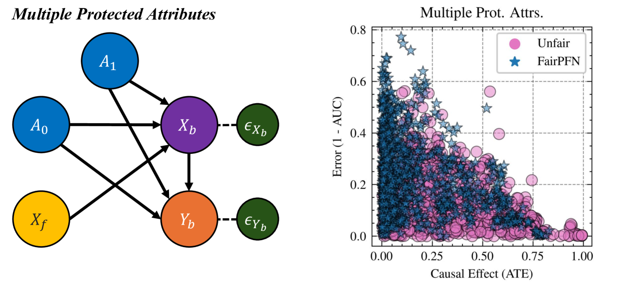
### Visual Description
## Diagram and Scatter Plot: Multiple Protected Attributes
### Overview
The image consists of two parts: a directed acyclic graph (DAG) on the left, illustrating relationships between variables, and a scatter plot on the right, comparing the performance of "Unfair" and "FairPFN" models in terms of error and causal effect.
### Components/Axes
**Left: Directed Acyclic Graph (DAG)**
* **Title:** Multiple Protected Attributes
* **Nodes:**
* A0 (blue circle)
* A1 (blue circle)
* Xf (yellow circle)
* Xb (purple circle)
* eXb (green circle)
* Yb (orange circle)
* eYb (green circle)
* **Edges:** Arrows indicate the direction of influence.
* A0 -> Xb
* A0 -> Yb
* A1 -> Xb
* A1 -> Yb
* Xf -> Yb
* Xb --(dashed)--> eXb
* Yb --(dashed)--> eYb
* Xb -> Yb
**Right: Scatter Plot**
* **Title:** Multiple Prot. Attrs.
* **X-axis:** Causal Effect (ATE)
* Scale: 0.00 to 1.00, with tick marks at 0.00, 0.25, 0.50, 0.75, and 1.00
* **Y-axis:** Error (1 - AUC)
* Scale: 0.0 to 0.8, with tick marks at 0.0, 0.2, 0.4, 0.6, and 0.8
* **Legend (top-right):**
* Pink circles: Unfair
* Blue stars: FairPFN
### Detailed Analysis or ### Content Details
**Left: Directed Acyclic Graph (DAG)**
* The DAG shows the relationships between protected attributes (A0, A1), a feature (Xf), biased variables (Xb, Yb), and error terms (eXb, eYb).
* A0 and A1 both influence Xb and Yb.
* Xf influences Yb.
* Xb directly influences Yb.
* The dashed lines from Xb to eXb and Yb to eYb indicate a relationship to their respective error terms.
**Right: Scatter Plot**
* The scatter plot visualizes the relationship between causal effect (ATE) and error (1 - AUC) for two models: "Unfair" and "FairPFN".
* **Unfair (pink circles):** The pink circles are concentrated in the lower-right portion of the plot, indicating a trend towards lower error and higher causal effect. The data points are mostly below 0.4 on the y-axis.
* **FairPFN (blue stars):** The blue stars are more spread out, with a higher concentration in the upper-left portion of the plot, indicating a trend towards higher error and lower causal effect. The data points range from approximately 0.0 to 0.8 on the y-axis.
### Key Observations
* The DAG illustrates a causal model with multiple protected attributes influencing biased variables.
* The scatter plot suggests that the "FairPFN" model generally has higher error and lower causal effect compared to the "Unfair" model.
* There is a clear separation between the two models in the scatter plot, with "Unfair" points clustered towards lower error and higher causal effect, and "FairPFN" points more dispersed and tending towards higher error and lower causal effect.
### Interpretation
The image presents a comparison between an "Unfair" model and a "FairPFN" model in the context of multiple protected attributes. The DAG provides a visual representation of the causal relationships between these attributes and the model's variables. The scatter plot then quantifies the trade-off between fairness (as presumably enforced by FairPFN) and performance (measured by error and causal effect).
The data suggests that enforcing fairness (using FairPFN) comes at the cost of increased error and reduced causal effect. This highlights the inherent challenges in balancing fairness and accuracy in machine learning models, especially when dealing with protected attributes. The "Unfair" model, while potentially more accurate and effective in terms of causal effect, may exhibit biases due to its disregard for fairness considerations. The FairPFN model, on the other hand, prioritizes fairness, leading to a trade-off in performance.
</details>
Figure 12: Multiple Protected Attributes (Synthetic): Distributions of prediction ATE and predictive accuracy produced by FairPFN vs the Unfair predictor when there are multiple protected attributes. This violates FairPFN’s prior assumptions and reverts it to a normal classifier.
<details>
<summary>x5.png Details</summary>
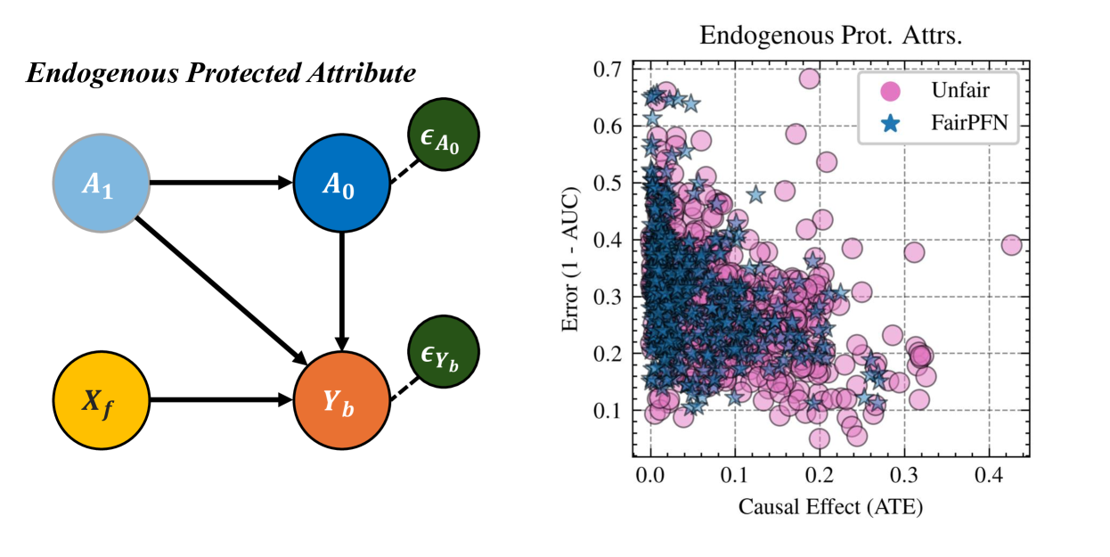
### Visual Description
## Diagram and Scatter Plot: Endogenous Protected Attributes
### Overview
The image presents two distinct visual elements: a directed acyclic graph (DAG) illustrating relationships between endogenous protected attributes, and a scatter plot comparing the causal effect (ATE) against the error rate (1 - AUC) for "Unfair" and "FairPFN" models.
### Components/Axes
**Left: Directed Acyclic Graph (DAG)**
* **Title:** Endogenous Protected Attribute
* **Nodes:**
* A1 (light blue circle)
* A0 (dark blue circle)
* Xf (yellow circle)
* Yb (orange circle)
* εA0 (green circle)
* εYb (green circle)
* **Edges:**
* A1 -> A0 (solid arrow)
* A1 -> Yb (solid arrow)
* Xf -> Yb (solid arrow)
* A0 -> Yb (solid arrow)
* A0 -> εA0 (dashed arrow)
* Yb -> εYb (dashed arrow)
**Right: Scatter Plot**
* **Title:** Endogenous Prot. Attrs.
* **X-axis:** Causal Effect (ATE)
* Scale: 0.0 to 0.4, incrementing by 0.1
* **Y-axis:** Error (1 - AUC)
* Scale: 0.0 to 0.7, incrementing by 0.1
* **Legend (top-right):**
* Pink circle: Unfair
* Blue star: FairPFN
### Detailed Analysis
**Directed Acyclic Graph (DAG)**
The DAG depicts causal relationships between variables. A1 and Xf directly influence Yb. A1 also influences A0, which in turn influences Yb. The dashed arrows indicate error terms associated with A0 and Yb.
**Scatter Plot**
The scatter plot visualizes the relationship between causal effect and error rate for two models: "Unfair" (pink circles) and "FairPFN" (blue stars).
* **Unfair (Pink Circles):** The pink circles are scattered across the plot, with a higher concentration in the region of Causal Effect (ATE) between 0.1 and 0.4, and Error (1 - AUC) between 0.1 and 0.5.
* **FairPFN (Blue Stars):** The blue stars are more densely clustered in the lower-left region of the plot, indicating lower causal effect and lower error rates compared to the "Unfair" model. The majority of the blue stars are located in the region of Causal Effect (ATE) between 0.0 and 0.2, and Error (1 - AUC) between 0.1 and 0.4.
### Key Observations
* The DAG illustrates a causal model with direct and indirect influences between variables.
* The scatter plot suggests that the "FairPFN" model generally achieves lower error rates and lower causal effects compared to the "Unfair" model.
* There is a significant overlap between the two models, especially in the region of lower causal effect and error.
### Interpretation
The image presents a comparison between two models, "Unfair" and "FairPFN," in terms of their causal effect and error rate. The DAG provides a visual representation of the relationships between the variables involved. The scatter plot suggests that the "FairPFN" model is more effective at reducing error, but it also tends to have a lower causal effect. This could indicate a trade-off between fairness and predictive accuracy. The clustering of "FairPFN" points in the lower-left region suggests that this model is generally more desirable in scenarios where both low error and low causal effect are important. The spread of "Unfair" points indicates a wider range of performance, with some instances exhibiting high error and high causal effect.
</details>
Figure 13: Endogenous Protected Attributes (Synthetic): Distributions of prediction ATE and predictive accuracy produced by FairPFN vs the Unfair predictor when the protected attribute is endogenous. This violates FairPFN’s prior assumptions and reverts it to a normal classifier.
<details>
<summary>extracted/6522797/figures/complexity.png Details</summary>
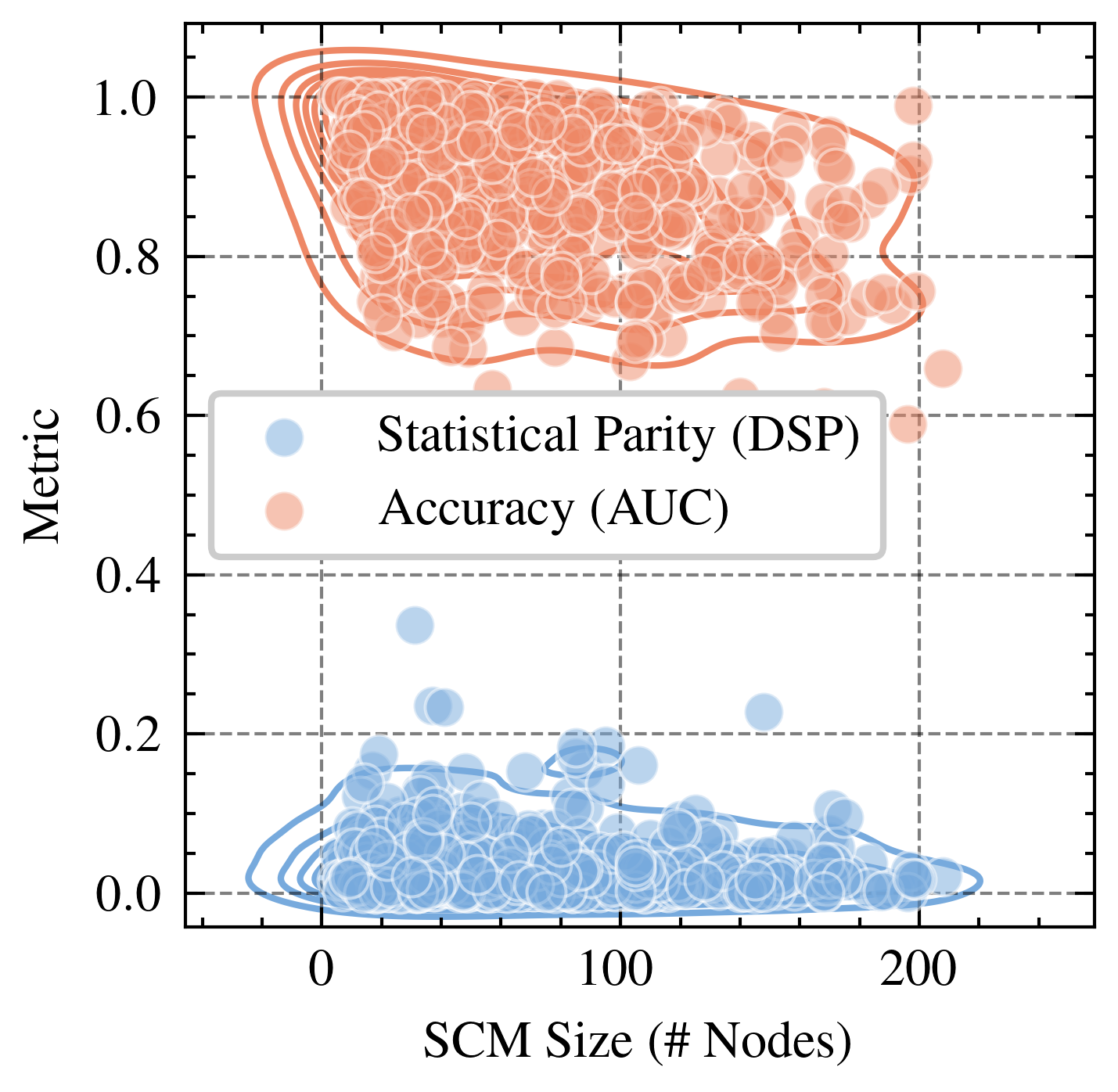
### Visual Description
## Scatter Plot: Statistical Parity (DSP) vs. Accuracy (AUC)
### Overview
The image is a scatter plot comparing Statistical Parity (DSP) and Accuracy (AUC) against SCM Size (# Nodes). The plot displays two distinct clusters of data points, one representing Statistical Parity (DSP) in light blue and the other representing Accuracy (AUC) in light orange. Density contours are drawn around each cluster.
### Components/Axes
* **X-axis:** SCM Size (# Nodes), ranging from 0 to 200. Axis markers are present at 0, 100, and 200.
* **Y-axis:** Metric, ranging from 0.0 to 1.0. Axis markers are present at 0.0, 0.2, 0.4, 0.6, 0.8, and 1.0.
* **Legend:** Located in the center of the plot.
* Light Blue: Statistical Parity (DSP)
* Light Orange: Accuracy (AUC)
### Detailed Analysis
* **Statistical Parity (DSP) - Light Blue:**
* Trend: The light blue data points representing Statistical Parity (DSP) are clustered near the bottom of the plot, indicating low metric values.
* Data Points: The majority of the light blue points are concentrated between 0 and 200 on the X-axis (SCM Size) and between 0.0 and 0.2 on the Y-axis (Metric).
* Density Contour: The density contour surrounds the cluster of light blue points, confirming the concentration in the lower region of the plot.
* **Accuracy (AUC) - Light Orange:**
* Trend: The light orange data points representing Accuracy (AUC) are clustered near the top of the plot, indicating high metric values.
* Data Points: The majority of the light orange points are concentrated between 0 and 200 on the X-axis (SCM Size) and between 0.7 and 1.0 on the Y-axis (Metric).
* Density Contour: The density contour surrounds the cluster of light orange points, confirming the concentration in the upper region of the plot.
### Key Observations
* There are two distinct clusters, indicating a clear separation between Statistical Parity (DSP) and Accuracy (AUC) metrics.
* Statistical Parity (DSP) generally has low metric values, while Accuracy (AUC) generally has high metric values across the range of SCM Sizes.
* The SCM Size (# Nodes) does not appear to strongly influence the separation between the two metrics, as both clusters span the entire range of SCM Sizes.
### Interpretation
The scatter plot suggests that Statistical Parity (DSP) and Accuracy (AUC) are inversely related or represent different aspects of the system being measured. The clustering indicates that achieving high accuracy may come at the cost of statistical parity, and vice versa. The SCM Size (# Nodes) does not appear to be a significant factor in determining either metric, as both clusters are spread across the entire range of SCM sizes. This could imply that the size of the SCM does not directly influence the trade-off between accuracy and statistical parity. Further investigation would be needed to understand the underlying factors that drive this separation and to determine if there are specific configurations or parameters that can optimize both metrics simultaneously.
</details>
Figure 14: Graph Complexity (Prior): Distributions of Statistical Parity and predictive accuracy produced by FairPFN on prior samples with graph complexity between 10 and 200 nodes. As graph complexity increases, accuracy drops but fairness remains constant.
Appendix D Supplementary Results
<details>
<summary>extracted/6522797/figures/roc_by_group_synthetic_new.png Details</summary>
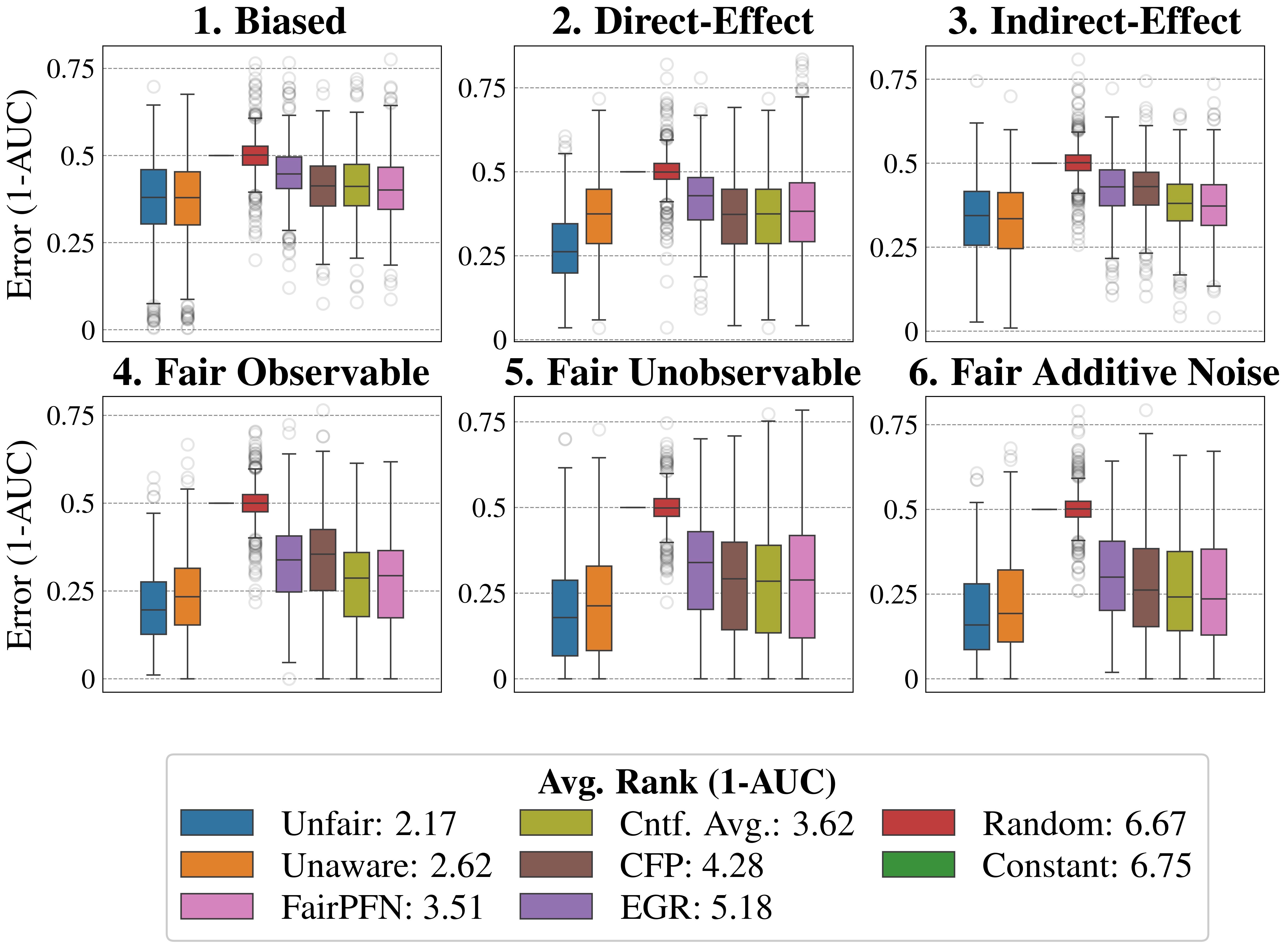
### Visual Description
## Box Plot: Error (1-AUC) under Different Scenarios
### Overview
The image presents six box plots arranged in a 2x3 grid. Each box plot visualizes the distribution of "Error (1-AUC)" under different scenarios: "Biased", "Direct-Effect", "Indirect-Effect", "Fair Observable", "Fair Unobservable", and "Fair Additive Noise". The x-axis is categorical, representing different methods or models, while the y-axis represents the error rate, ranging from 0 to 0.75. A legend at the bottom indicates the average rank (1-AUC) for each method.
### Components/Axes
* **Y-axis:** "Error (1-AUC)", with ticks at 0, 0.25, 0.5, and 0.75.
* **X-axis:** Categorical, representing different methods/models. The order of the models is consistent across all six subplots.
* **Titles:** Each subplot has a title indicating the scenario: "1. Biased", "2. Direct-Effect", "3. Indirect-Effect", "4. Fair Observable", "5. Fair Unobservable", "6. Fair Additive Noise".
* **Legend:** Located at the bottom of the image, labeled "Avg. Rank (1-AUC)". It maps colors to methods and their average ranks:
* Blue: Unfair: 2.17
* Orange: Unaware: 2.62
* Pink: FairPFN: 3.51
* Olive Green: Cntf. Avg.: 3.62
* Brown: CFP: 4.28
* Purple: EGR: 5.18
* Red: Random: 6.67
* Green: Constant: 6.75
### Detailed Analysis
Each subplot contains box plots for the following methods (from left to right): Unfair, Unaware, FairPFN, Cntf. Avg., CFP, EGR, Random, and Constant.
**1. Biased:**
* Unfair: Median around 0.35, IQR between 0.25 and 0.45.
* Unaware: Median around 0.4, IQR between 0.3 and 0.5.
* FairPFN: Median around 0.4, IQR between 0.3 and 0.5.
* Cntf. Avg.: Median around 0.4, IQR between 0.3 and 0.5.
* CFP: Median around 0.45, IQR between 0.35 and 0.55.
* EGR: Median around 0.4, IQR between 0.3 and 0.5.
* Random: Median around 0.5, IQR between 0.4 and 0.6.
* Constant: Median around 0.7, IQR between 0.6 and 0.75.
**2. Direct-Effect:**
* Unfair: Median around 0.25, IQR between 0.15 and 0.35.
* Unaware: Median around 0.4, IQR between 0.3 and 0.5.
* FairPFN: Median around 0.4, IQR between 0.3 and 0.5.
* Cntf. Avg.: Median around 0.4, IQR between 0.3 and 0.5.
* CFP: Median around 0.4, IQR between 0.3 and 0.5.
* EGR: Median around 0.4, IQR between 0.3 and 0.5.
* Random: Median around 0.5, IQR between 0.4 and 0.6.
* Constant: Median around 0.5, IQR between 0.4 and 0.6.
**3. Indirect-Effect:**
* Unfair: Median around 0.35, IQR between 0.25 and 0.45.
* Unaware: Median around 0.4, IQR between 0.3 and 0.5.
* FairPFN: Median around 0.4, IQR between 0.3 and 0.5.
* Cntf. Avg.: Median around 0.4, IQR between 0.3 and 0.5.
* CFP: Median around 0.4, IQR between 0.3 and 0.5.
* EGR: Median around 0.4, IQR between 0.3 and 0.5.
* Random: Median around 0.5, IQR between 0.4 and 0.6.
* Constant: Median around 0.4, IQR between 0.3 and 0.5.
**4. Fair Observable:**
* Unfair: Median around 0.2, IQR between 0.1 and 0.3.
* Unaware: Median around 0.3, IQR between 0.2 and 0.4.
* FairPFN: Median around 0.4, IQR between 0.3 and 0.5.
* Cntf. Avg.: Median around 0.35, IQR between 0.25 and 0.45.
* CFP: Median around 0.4, IQR between 0.3 and 0.5.
* EGR: Median around 0.3, IQR between 0.2 and 0.4.
* Random: Median around 0.5, IQR between 0.4 and 0.6.
* Constant: Median around 0.4, IQR between 0.3 and 0.5.
**5. Fair Unobservable:**
* Unfair: Median around 0.25, IQR between 0.15 and 0.35.
* Unaware: Median around 0.35, IQR between 0.25 and 0.45.
* FairPFN: Median around 0.35, IQR between 0.25 and 0.45.
* Cntf. Avg.: Median around 0.35, IQR between 0.25 and 0.45.
* CFP: Median around 0.35, IQR between 0.25 and 0.45.
* EGR: Median around 0.35, IQR between 0.25 and 0.45.
* Random: Median around 0.5, IQR between 0.4 and 0.6.
* Constant: Median around 0.3, IQR between 0.2 and 0.4.
**6. Fair Additive Noise:**
* Unfair: Median around 0.2, IQR between 0.1 and 0.3.
* Unaware: Median around 0.3, IQR between 0.2 and 0.4.
* FairPFN: Median around 0.35, IQR between 0.25 and 0.45.
* Cntf. Avg.: Median around 0.35, IQR between 0.25 and 0.45.
* CFP: Median around 0.35, IQR between 0.25 and 0.45.
* EGR: Median around 0.35, IQR between 0.25 and 0.45.
* Random: Median around 0.5, IQR between 0.4 and 0.6.
* Constant: Median around 0.3, IQR between 0.2 and 0.4.
### Key Observations
* The "Random" and "Constant" methods consistently have higher error rates (1-AUC) across all scenarios.
* The "Unfair" method generally has lower error rates compared to "Unaware" in most scenarios.
* The "Fair" scenarios (4, 5, and 6) tend to have lower error rates overall compared to the "Biased" and "Effect" scenarios (1, 2, and 3).
* The average rank (1-AUC) in the legend correlates with the observed error rates in the box plots. Methods with lower average ranks (e.g., "Unfair") tend to have lower error rates.
### Interpretation
The box plots compare the performance of different methods in terms of error rate (1-AUC) under various fairness scenarios. The data suggests that explicitly addressing fairness concerns (as in the "Fair" scenarios) can lead to lower error rates compared to scenarios where bias is present or fairness is not considered. The "Random" and "Constant" methods, which likely represent baseline or naive approaches, consistently perform worse than the other methods. The relative performance of the "Unfair" and "Unaware" methods varies depending on the scenario, indicating that the impact of awareness of unfairness depends on the specific context. The average rank (1-AUC) provides a summary measure of the overall performance of each method across all scenarios, which aligns with the observed trends in the box plots.
</details>
Figure 15: Predictive Error (Synthetic): Predictive error (1-AUC) of FairPFN compared to our baselines. FairPFN maintains a competitive level of predictive error with traditional ML algorithms, achieving an average rank of 3.51 out of 7.
<details>
<summary>extracted/6522797/figures/lawschool_dist.png Details</summary>
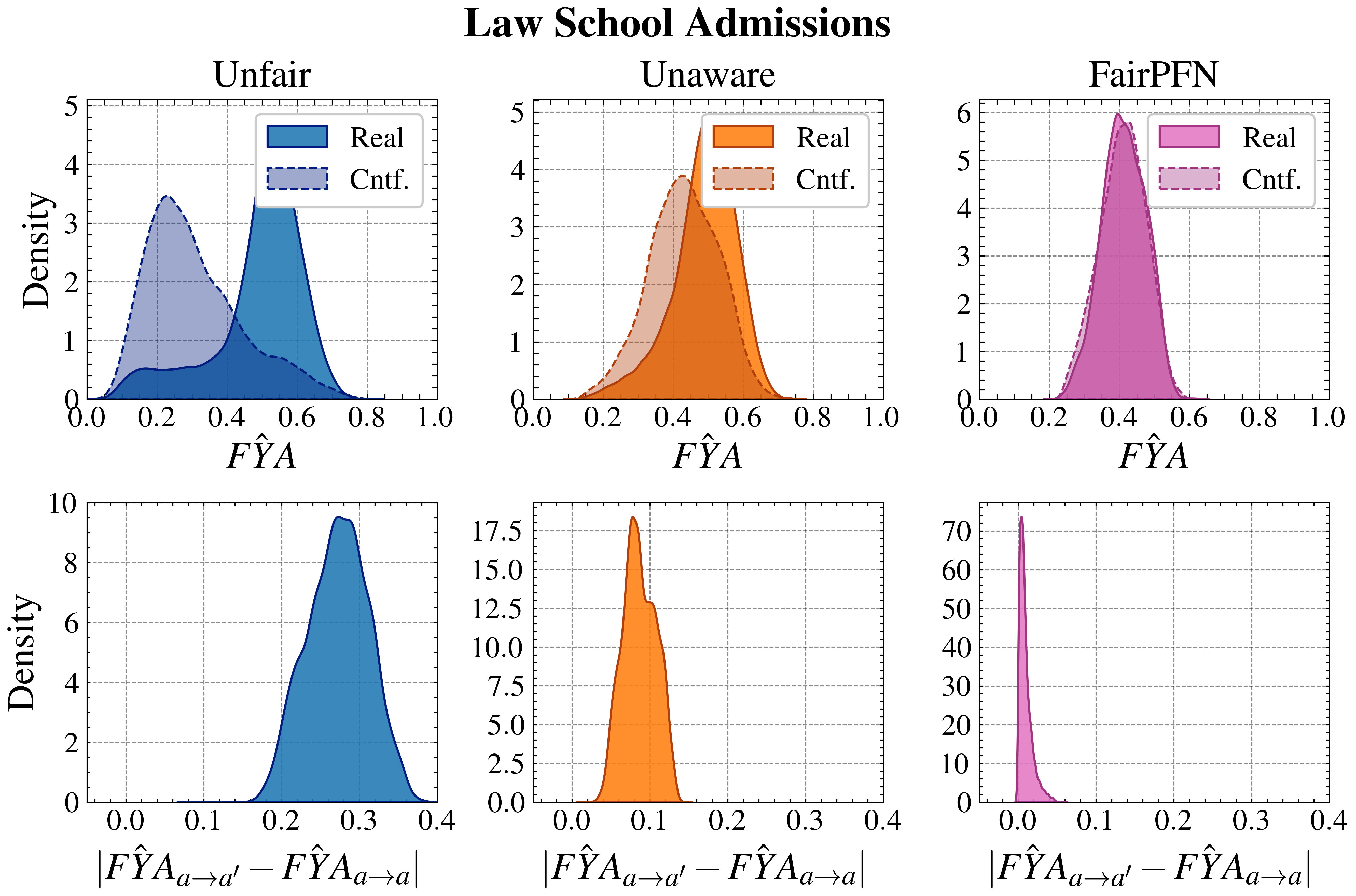
### Visual Description
## Density Plot: Law School Admissions
### Overview
The image presents six density plots arranged in a 2x3 grid, visualizing the distribution of two variables related to law school admissions under three different scenarios: "Unfair," "Unaware," and "FairPFN." Each scenario has two plots: the top plot shows the distribution of FYA, and the bottom plot shows the distribution of the absolute difference between FYA(a->a') and FYA(a->a). The plots compare "Real" data against "Cntf." (counterfactual) data.
### Components/Axes
**Overall Title:** Law School Admissions
**Top Row Plots:**
* **X-axis (all three):** FŶA, ranging from 0.0 to 1.0, with tick marks at intervals of 0.2.
* **Y-axis (all three):** Density, ranging from 0 to 5 (Unfair, Unaware) and 0 to 6 (FairPFN), with tick marks at intervals of 1.
* **Titles (left to right):** Unfair, Unaware, FairPFN
* **Legend (top-right of each plot):**
* "Real": Solid filled area. Blue for "Unfair", Orange for "Unaware", and Pink for "FairPFN".
* "Cntf.": Dashed line. Light blue for "Unfair", Light orange for "Unaware", and Light pink for "FairPFN".
**Bottom Row Plots:**
* **X-axis (all three):** |FŶA<sub>a→a'</sub> - FŶA<sub>a→a</sub>|, ranging from 0.0 to 0.4, with tick marks at intervals of 0.1.
* **Y-axis (all three):** Density, ranging from 0 to 10 (Unfair), 0 to 17.5 (Unaware), and 0 to 70 (FairPFN), with tick marks at varying intervals.
* **Titles (left to right):** |FŶA<sub>a→a'</sub> - FŶA<sub>a→a</sub>| for all three.
* **Color:**
* "Unfair": Blue
* "Unaware": Orange
* "FairPFN": Pink
### Detailed Analysis
**Top Row - Unfair:**
* **Real (Blue):** The "Real" distribution is unimodal, peaking around FŶA = 0.6, with a range from approximately 0.2 to 0.8.
* **Cntf. (Light Blue Dashed):** The "Cntf." distribution is also unimodal, peaking around FŶA = 0.3, with a range from approximately 0.0 to 0.6.
**Top Row - Unaware:**
* **Real (Orange):** The "Real" distribution is unimodal, peaking around FŶA = 0.5, with a range from approximately 0.2 to 0.8.
* **Cntf. (Light Orange Dashed):** The "Cntf." distribution is unimodal, peaking around FŶA = 0.4, with a range from approximately 0.1 to 0.7.
**Top Row - FairPFN:**
* **Real (Pink):** The "Real" distribution is unimodal, peaking around FŶA = 0.4, with a range from approximately 0.2 to 0.6.
* **Cntf. (Light Pink Dashed):** The "Cntf." distribution is unimodal, peaking around FŶA = 0.4, with a range from approximately 0.2 to 0.6. The "Real" and "Cntf." distributions are very similar.
**Bottom Row - Unfair:**
* **Blue:** The distribution is unimodal, peaking around |FŶA<sub>a→a'</sub> - FŶA<sub>a→a</sub>| = 0.3, with a range from approximately 0.1 to 0.4.
**Bottom Row - Unaware:**
* **Orange:** The distribution is unimodal, peaking sharply around |FŶA<sub>a→a'</sub> - FŶA<sub>a→a</sub>| = 0.1, with a range from approximately 0.0 to 0.2.
**Bottom Row - FairPFN:**
* **Pink:** The distribution is highly concentrated and unimodal, peaking sharply around |FŶA<sub>a→a'</sub> - FŶA<sub>a→a</sub>| = 0.0, with a very narrow range close to 0.
### Key Observations
* In the "Unfair" scenario, the "Real" and "Cntf." distributions of FŶA are noticeably different, suggesting a significant impact of unfairness on the outcome.
* In the "Unaware" scenario, the "Real" and "Cntf." distributions of FŶA are somewhat similar, but the peak of the "Real" distribution is slightly shifted to the right compared to the "Cntf." distribution.
* In the "FairPFN" scenario, the "Real" and "Cntf." distributions of FŶA are almost identical, indicating that the FairPFN model effectively mitigates unfairness.
* The distributions of |FŶA<sub>a→a'</sub> - FŶA<sub>a→a</sub>| show that the "FairPFN" scenario results in the smallest difference between FŶA<sub>a→a'</sub> and FŶA<sub>a→a</sub>, suggesting that it promotes fairness.
### Interpretation
The density plots illustrate the impact of different fairness interventions on the distribution of FŶA and the absolute difference between FŶA<sub>a→a'</sub> and FŶA<sub>a→a</sub>. The "Unfair" scenario serves as a baseline, showing a clear difference between the "Real" and "Cntf." distributions. The "Unaware" scenario shows a slight improvement in fairness, while the "FairPFN" scenario demonstrates the most significant reduction in unfairness, as evidenced by the near-identical "Real" and "Cntf." distributions and the highly concentrated distribution of |FŶA<sub>a→a'</sub> - FŶA<sub>a→a</sub>| around 0. This suggests that the FairPFN model is effective in mitigating unfairness in law school admissions.
</details>
Figure 16: Counterfactual Distributions (Law School): Predictive distributions of Unfair, Unaware, and FairPFN on observational and counterfactual versions of the Lawschool Admissions dataset. FairPFN reduces the maximum pairwise difference between these distributions to 0.05.
<details>
<summary>extracted/6522797/figures/trade-off_by_group_synthetic_alt.png Details</summary>
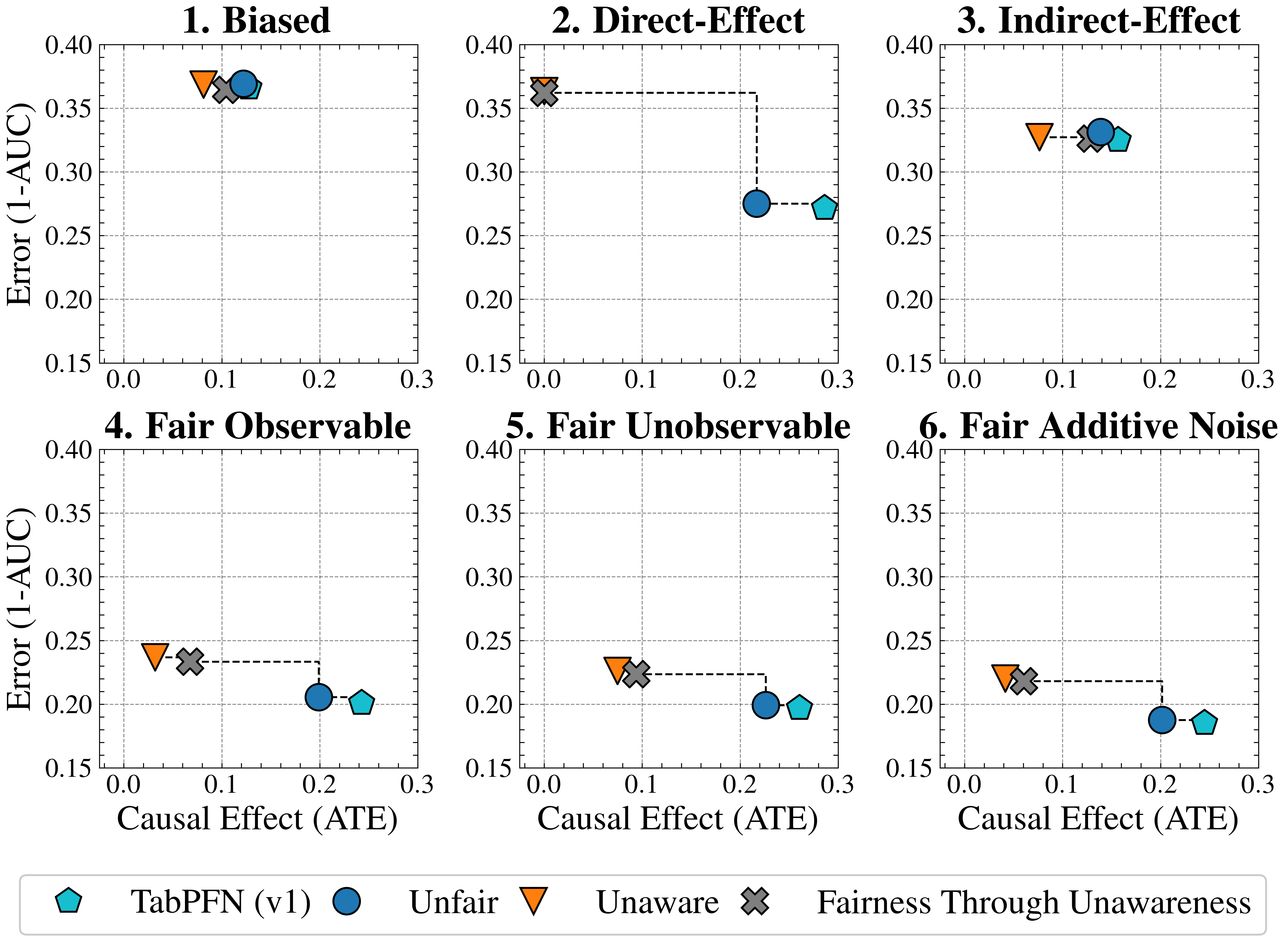
### Visual Description
## Scatter Plot Grid: Error vs. Causal Effect
### Overview
The image presents a grid of six scatter plots, each examining the relationship between "Error (1-AUC)" and "Causal Effect (ATE)" under different conditions: "Biased," "Direct-Effect," "Indirect-Effect," "Fair Observable," "Fair Unobservable," and "Fair Additive Noise." Each plot displays data points for four different methods: "TabPFN (v1)," "Unfair," "Unaware," and "Fairness Through Unawareness." The plots also include dashed lines connecting some of the data points, likely indicating a transition or comparison between different states or interventions.
### Components/Axes
* **Titles:** Each plot has a title indicating the condition being examined: "1. Biased," "2. Direct-Effect," "3. Indirect-Effect," "4. Fair Observable," "5. Fair Unobservable," and "6. Fair Additive Noise."
* **X-axis:** Labeled "Causal Effect (ATE)" with a scale from 0.0 to 0.3, incrementing by 0.1.
* **Y-axis:** Labeled "Error (1-AUC)" with a scale from 0.15 to 0.40, incrementing by 0.05.
* **Gridlines:** Each plot has gridlines at intervals of 0.05 on the y-axis and 0.1 on the x-axis.
* **Legend:** Located at the bottom of the image, mapping shapes and colors to methods:
* Light Blue Pentagon: "TabPFN (v1)"
* Blue Circle: "Unfair"
* Orange Down-pointing Triangle: "Unaware"
* Gray X: "Fairness Through Unawareness"
### Detailed Analysis
**Plot 1: Biased**
* "TabPFN (v1)": Causal Effect (ATE) ~0.15, Error (1-AUC) ~0.36
* "Unfair": Causal Effect (ATE) ~0.14, Error (1-AUC) ~0.37
* "Unaware": Causal Effect (ATE) ~0.09, Error (1-AUC) ~0.37
* "Fairness Through Unawareness": Causal Effect (ATE) ~0.10, Error (1-AUC) ~0.36
**Plot 2: Direct-Effect**
* "TabPFN (v1)": Causal Effect (ATE) ~0.29, Error (1-AUC) ~0.27
* "Unfair": Causal Effect (ATE) ~0.22, Error (1-AUC) ~0.28
* "Unaware": Causal Effect (ATE) ~0.01, Error (1-AUC) ~0.37
* "Fairness Through Unawareness": Causal Effect (ATE) ~0.01, Error (1-AUC) ~0.37
* A dashed line connects "Fairness Through Unawareness" to "Unfair" to "TabPFN (v1)".
**Plot 3: Indirect-Effect**
* "TabPFN (v1)": Causal Effect (ATE) ~0.17, Error (1-AUC) ~0.32
* "Unfair": Causal Effect (ATE) ~0.15, Error (1-AUC) ~0.33
* "Unaware": Causal Effect (ATE) ~0.07, Error (1-AUC) ~0.33
* "Fairness Through Unawareness": Causal Effect (ATE) ~0.11, Error (1-AUC) ~0.32
**Plot 4: Fair Observable**
* "TabPFN (v1)": Causal Effect (ATE) ~0.27, Error (1-AUC) ~0.21
* "Unfair": Causal Effect (ATE) ~0.20, Error (1-AUC) ~0.21
* "Unaware": Causal Effect (ATE) ~0.02, Error (1-AUC) ~0.24
* "Fairness Through Unawareness": Causal Effect (ATE) ~0.07, Error (1-AUC) ~0.24
* A dashed line connects "Fairness Through Unawareness" to "Unfair" to "TabPFN (v1)".
**Plot 5: Fair Unobservable**
* "TabPFN (v1)": Causal Effect (ATE) ~0.27, Error (1-AUC) ~0.20
* "Unfair": Causal Effect (ATE) ~0.20, Error (1-AUC) ~0.20
* "Unaware": Causal Effect (ATE) ~0.03, Error (1-AUC) ~0.23
* "Fairness Through Unawareness": Causal Effect (ATE) ~0.07, Error (1-AUC) ~0.23
**Plot 6: Fair Additive Noise**
* "TabPFN (v1)": Causal Effect (ATE) ~0.27, Error (1-AUC) ~0.19
* "Unfair": Causal Effect (ATE) ~0.20, Error (1-AUC) ~0.19
* "Unaware": Causal Effect (ATE) ~0.02, Error (1-AUC) ~0.22
* "Fairness Through Unawareness": Causal Effect (ATE) ~0.07, Error (1-AUC) ~0.23
* A dashed line connects "Unaware" to "Unfair" to "TabPFN (v1)".
### Key Observations
* The "Unaware" method consistently has the lowest "Causal Effect (ATE)" across all conditions.
* The "Biased" condition shows all methods clustered with relatively high "Error (1-AUC)" values.
* The dashed lines in plots 2, 4, and 6 suggest a progression or transformation from the "Fairness Through Unawareness" or "Unaware" method to the "Unfair" method, and finally to the "TabPFN (v1)" method, with corresponding changes in "Causal Effect (ATE)" and "Error (1-AUC)."
* The "Fair Additive Noise" condition appears to yield the lowest "Error (1-AUC)" for "TabPFN (v1)" and "Unfair" methods.
### Interpretation
The plots compare the performance of different methods in terms of "Error (1-AUC)" and "Causal Effect (ATE)" under various fairness conditions. The "Unaware" method consistently exhibits a low "Causal Effect (ATE)," potentially indicating a conservative approach that minimizes intervention. The dashed lines suggest that "Fairness Through Unawareness" and "Unaware" methods are initial states, which are then transformed into "Unfair" and finally "TabPFN (v1)" methods, possibly through some intervention or optimization process. The "Biased" condition highlights a scenario where all methods struggle to achieve both low error and high causal effect. The "Fair Additive Noise" condition seems to be the most favorable, allowing "TabPFN (v1)" and "Unfair" to achieve relatively low error. Overall, the data suggests that the choice of method and the specific fairness condition significantly impact the trade-off between error and causal effect.
</details>
Figure 17: Baseline Validation (Synthetic): Fairness-accuracy trade-off achieved by our baselines Unfair and Unaware compared to alternative choices of TabPFN (v1) and "Fairness Through Unawareness." Unfair achieves competitive performance with TabPFN (v1), while Unaware outperforms the standard strategy of dropping the protected attribute from the dataset.
<details>
<summary>extracted/6522797/figures/trade-off_lawschool_alt.png Details</summary>
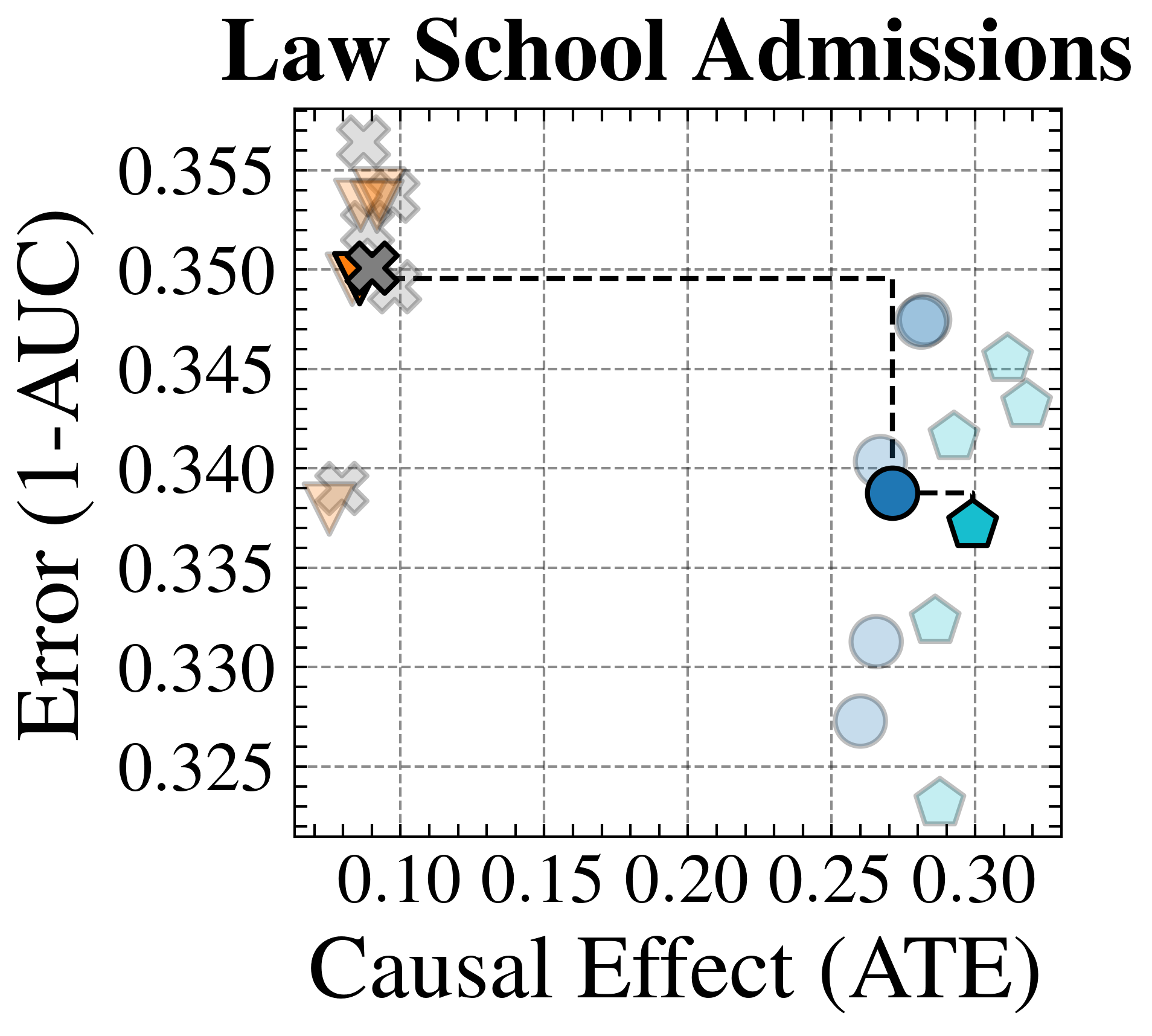
### Visual Description
## Chart: Law School Admissions
### Overview
The image is a scatter plot titled "Law School Admissions". It displays data points with varying shapes and colors on a grid, plotting "Error (1-AUC)" on the y-axis against "Causal Effect (ATE)" on the x-axis. There are two distinct clusters of data points, one in the top-left and another in the bottom-right. A dashed line connects two specific data points.
### Components/Axes
* **Title:** Law School Admissions
* **X-axis:** Causal Effect (ATE)
* Scale: 0.10, 0.15, 0.20, 0.25, 0.30
* **Y-axis:** Error (1-AUC)
* Scale: 0.325, 0.330, 0.335, 0.340, 0.345, 0.350, 0.355
* **Data Points:**
* Crosses: Gray and Orange
* Triangles: Gray and Orange
* Circles: Light Blue and Dark Blue
* Pentagons: Light Blue and Teal
* **Connecting Line:** Dashed black line connecting a dark blue circle to a teal pentagon.
### Detailed Analysis
* **Top-Left Cluster:**
* Contains gray crosses and orange triangles.
* Causal Effect (ATE) values are approximately 0.08 to 0.10.
* Error (1-AUC) values range from approximately 0.338 to 0.358.
* **Bottom-Right Cluster:**
* Contains light blue circles and light blue pentagons.
* Causal Effect (ATE) values range from approximately 0.25 to 0.31.
* Error (1-AUC) values range from approximately 0.322 to 0.348.
* **Specific Data Points Connected by Dashed Line:**
* Dark blue circle: Causal Effect (ATE) ≈ 0.26, Error (1-AUC) ≈ 0.339
* Teal pentagon: Causal Effect (ATE) ≈ 0.30, Error (1-AUC) ≈ 0.337
### Key Observations
* There are two distinct clusters of data points, suggesting two different performance profiles.
* The top-left cluster has low Causal Effect (ATE) and high Error (1-AUC).
* The bottom-right cluster has higher Causal Effect (ATE) and lower Error (1-AUC).
* The dashed line highlights a specific transition or relationship between two data points in the bottom-right cluster.
### Interpretation
The scatter plot likely represents the performance of different models or strategies related to law school admissions. The x-axis, "Causal Effect (ATE)", could represent the impact of a particular intervention or factor on admissions outcomes. The y-axis, "Error (1-AUC)", represents the error rate of the model.
The top-left cluster suggests a set of models or strategies that have a low impact on admissions (low Causal Effect) and high error rates. The bottom-right cluster suggests models or strategies that have a higher impact on admissions and lower error rates.
The dashed line connecting the dark blue circle and teal pentagon could represent an optimization or adjustment made to a specific model, resulting in a shift from one performance point to another. The teal pentagon represents a better performing model than the dark blue circle.
</details>
<details>
<summary>extracted/6522797/figures/trade-off_adult_alt.png Details</summary>
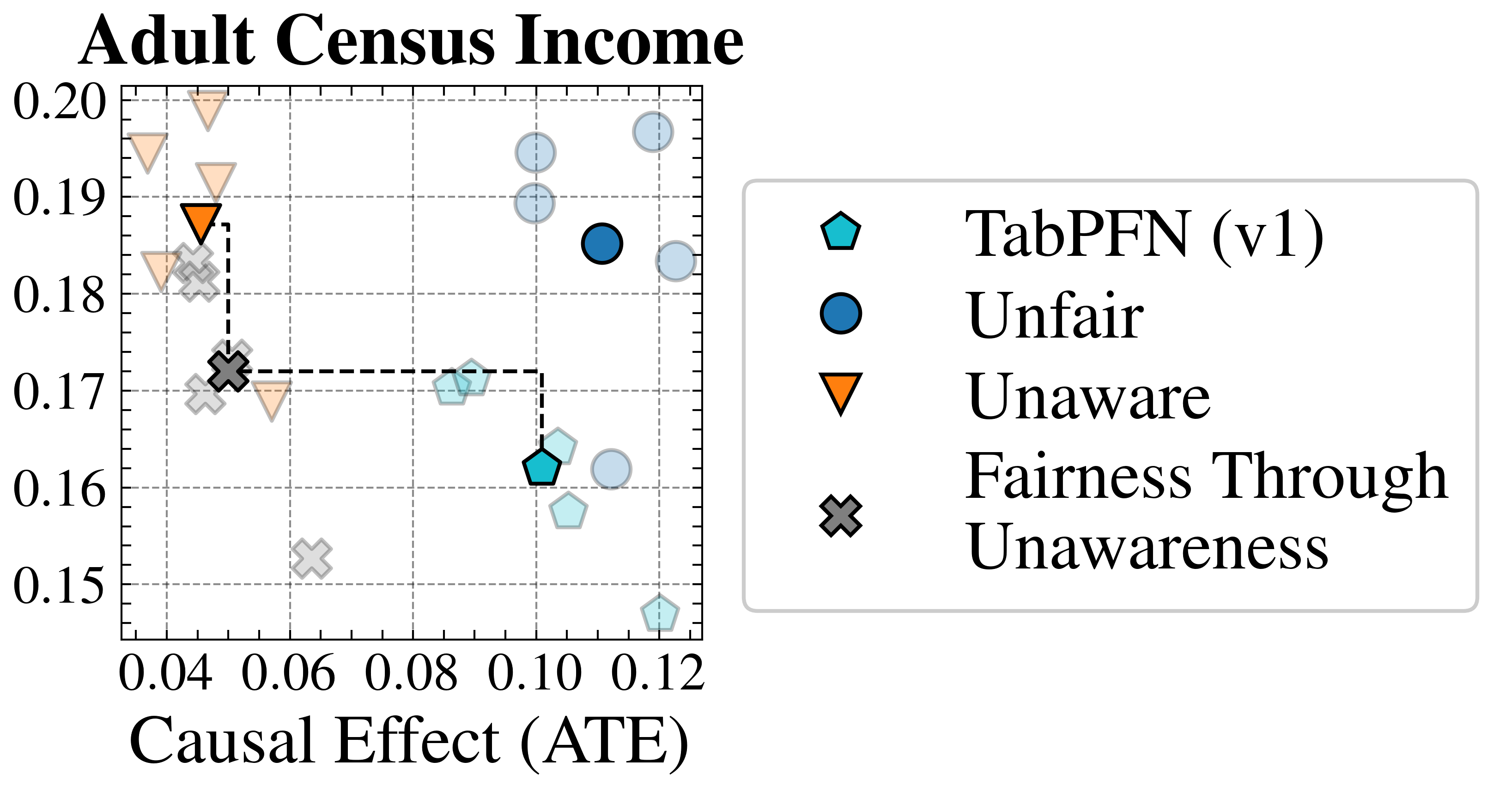
### Visual Description
## Scatter Plot: Adult Census Income
### Overview
The image is a scatter plot titled "Adult Census Income". It visualizes the relationship between "Causal Effect (ATE)" on the x-axis and an unspecified metric on the y-axis, ranging from 0.15 to 0.20. The plot compares four different methods: TabPFN (v1), Unfair, Unaware, and Fairness Through Unawareness. A dashed line connects two data points, representing a specific transition or comparison.
### Components/Axes
* **Title:** Adult Census Income
* **X-axis:** Causal Effect (ATE), with tick marks at 0.04, 0.06, 0.08, 0.10, and 0.12.
* **Y-axis:** Values range from 0.15 to 0.20, with tick marks at 0.15, 0.16, 0.17, 0.18, 0.19, and 0.20.
* **Grid:** The plot has a grid of dashed gray lines.
* **Legend:** Located on the right side of the plot.
* **TabPFN (v1):** Represented by a cyan pentagon.
* **Unfair:** Represented by a blue circle.
* **Unaware:** Represented by an orange triangle pointing downwards.
* **Fairness Through Unawareness:** Represented by a gray "X" mark.
* **Dashed Line:** A black dashed line connects the "Fairness Through Unawareness" point at approximately (0.04, 0.17) to the "TabPFN (v1)" point at approximately (0.10, 0.17).
### Detailed Analysis
* **TabPFN (v1):**
* There are multiple cyan pentagons, some more transparent than others.
* One is located at approximately (0.10, 0.16).
* Another is located at approximately (0.10, 0.17).
* Other points are scattered around (0.11, 0.19) and (0.12, 0.15).
* **Unfair:**
* There are multiple blue circles, some more transparent than others.
* One is located at approximately (0.11, 0.185).
* Other points are scattered around (0.12, 0.20) and (0.12, 0.19).
* **Unaware:**
* There are multiple orange triangles pointing downwards, some more transparent than others.
* One is located at approximately (0.04, 0.188).
* Another is located at approximately (0.04, 0.195).
* Other points are scattered around (0.04, 0.18) and (0.06, 0.17).
* **Fairness Through Unawareness:**
* There are multiple gray "X" marks, some more transparent than others.
* One is located at approximately (0.04, 0.172).
* Other points are scattered around (0.05, 0.18) and (0.06, 0.15).
### Key Observations
* The "Unaware" method has the lowest Causal Effect (ATE) values, clustered around 0.04-0.06.
* The "Unfair" method has the highest Causal Effect (ATE) values, clustered around 0.11-0.12.
* The "TabPFN (v1)" method has Causal Effect (ATE) values between 0.10 and 0.12.
* The "Fairness Through Unawareness" method has the lowest Causal Effect (ATE) values, clustered around 0.04-0.06.
* The dashed line connects "Fairness Through Unawareness" to "TabPFN (v1)", suggesting a potential transition or comparison between these two methods.
### Interpretation
The scatter plot compares the performance of four different methods related to fairness and causal effect in the context of adult census income prediction. The x-axis, "Causal Effect (ATE)", likely represents the average treatment effect, indicating the causal impact of a certain intervention or variable. The y-axis represents an unspecified metric, possibly related to accuracy or fairness.
The plot suggests that the "Unaware" and "Fairness Through Unawareness" methods have lower causal effects compared to "Unfair" and "TabPFN (v1)". The dashed line connecting "Fairness Through Unawareness" to "TabPFN (v1)" might indicate an improvement or a trade-off between these two methods. The scattering of points for each method could represent different experimental runs or variations of the method.
The data suggests a trade-off between causal effect and whatever the y-axis represents. The "Unfair" method achieves the highest causal effect, but potentially at the cost of fairness or another performance metric. The "Fairness Through Unawareness" method prioritizes fairness, but sacrifices causal effect. "TabPFN (v1)" appears to be a compromise between the two.
</details>
Figure 18: Baseline Validation (Real-World): Fairness-accuracy trade-off achieved by our baselines Unfair and Unaware compared to alternative choices of TabPFN (v1) and "Fairness Through Unawareness." Our choices of baselines achieve competitive performance on the Law School Admissions problem, while alternative baselines perform slightly better on the Adult Census Income problem.
<details>
<summary>extracted/6522797/figures/adult_dist.png Details</summary>
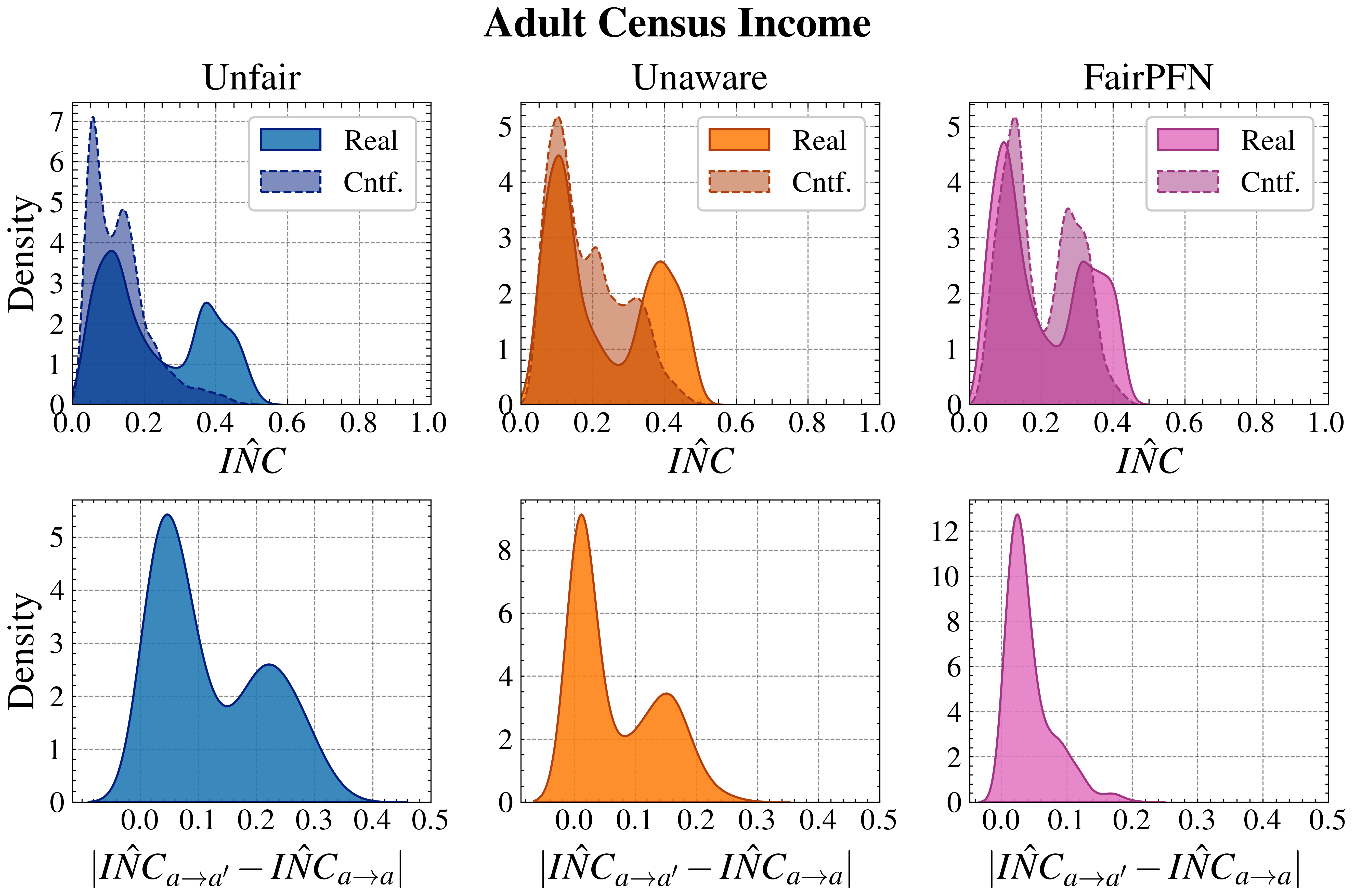
### Visual Description
## Density Plot: Adult Census Income
### Overview
The image presents six density plots, arranged in a 2x3 grid, visualizing the distribution of income-related metrics for different fairness interventions on adult census data. The plots in the top row show the distribution of income (INC), while the bottom row shows the distribution of the absolute difference between income under different conditions. The columns represent different fairness interventions: "Unfair", "Unaware", and "FairPFN". Each plot displays two distributions: "Real" (actual data) and "Cntf." (counterfactual data).
### Components/Axes
**Overall Title:** Adult Census Income
**Top Row Plots:**
* **X-axis:** *IÑC* (Income), ranging from 0.0 to 1.0, with tick marks at intervals of 0.2.
* **Y-axis:** Density, ranging from 0 to 7 (Unfair), 0 to 5 (Unaware, FairPFN), with tick marks at intervals of 1.
* **Titles:** Unfair, Unaware, FairPFN
* **Legend:** Located in the top-right corner of each plot.
* "Real": Solid color fill (blue for Unfair, orange for Unaware, pink for FairPFN).
* "Cntf.": Dashed line with a lighter shade of the corresponding color.
**Bottom Row Plots:**
* **X-axis:** |*IÑC*<sub>a→a'</sub> - *IÑC*<sub>a→a</sub>| (Absolute difference in income), ranging from 0.0 to 0.5, with tick marks at intervals of 0.1.
* **Y-axis:** Density, ranging from 0 to 6 (Unfair), 0 to 9 (Unaware), 0 to 13 (FairPFN), with tick marks at intervals of 2.
### Detailed Analysis
**Top Row Plots:**
* **Unfair (Top-Left):**
* **Real (Blue):** The "Real" distribution has two peaks, one around 0.1 and another around 0.4. The density at 0.1 is approximately 3.7, and at 0.4 it is approximately 2.2.
* **Cntf. (Dashed Blue):** The "Cntf." distribution has a sharp peak around 0.0, reaching a density of approximately 7.0. It also has a smaller peak around 0.4, with a density of approximately 1.0.
* **Unaware (Top-Middle):**
* **Real (Orange):** The "Real" distribution has a peak around 0.1, with a density of approximately 3.0, and a broader peak around 0.4, with a density of approximately 2.5.
* **Cntf. (Dashed Orange):** The "Cntf." distribution has a peak around 0.1, with a density of approximately 5.0.
* **FairPFN (Top-Right):**
* **Real (Pink):** The "Real" distribution has two peaks, one around 0.1 and another around 0.3. The density at 0.1 is approximately 5.0, and at 0.3 it is approximately 2.5.
* **Cntf. (Dashed Pink):** The "Cntf." distribution has two peaks, one around 0.1 and another around 0.3. The density at 0.1 is approximately 5.0, and at 0.3 it is approximately 3.5.
**Bottom Row Plots:**
* **Unfair (Bottom-Left):** The distribution has two peaks, one around 0.05 and another around 0.25. The density at 0.05 is approximately 5.2, and at 0.25 it is approximately 2.5.
* **Unaware (Bottom-Middle):** The distribution has two peaks, one around 0.05 and another around 0.15. The density at 0.05 is approximately 9.0, and at 0.15 it is approximately 3.2.
* **FairPFN (Bottom-Right):** The distribution has a single sharp peak around 0.05, with a density of approximately 12.5.
### Key Observations
* The "Cntf." distributions in the top row tend to have a higher density near 0.0 compared to the "Real" distributions, especially for the "Unfair" intervention.
* The "FairPFN" intervention results in a bottom row distribution that is highly concentrated around 0.0, indicating a smaller difference in income under different conditions.
* The "Unaware" intervention shows a higher density in the bottom row plots compared to the "Unfair" intervention, suggesting a larger difference in income under different conditions.
### Interpretation
The plots compare the income distributions under different fairness interventions. The top row shows the distribution of income itself, while the bottom row shows the distribution of the absolute difference in income under different conditions. The "Unfair" intervention represents the baseline scenario without any fairness considerations. The "Unaware" intervention likely represents a scenario where fairness is not explicitly addressed in the model. The "FairPFN" intervention represents a scenario where a fairness-aware algorithm (likely based on counterfactual reasoning) is used.
The data suggests that the "FairPFN" intervention is more effective in reducing the difference in income under different conditions, as evidenced by the high concentration of the distribution around 0.0 in the bottom-right plot. This indicates that the algorithm is successful in mitigating unfairness by making the income more consistent across different conditions. The "Unaware" intervention, on the other hand, appears to exacerbate the difference in income, as shown by the higher density in the bottom-middle plot. The "Unfair" intervention falls somewhere in between, with a moderate difference in income.
The shift in the "Cntf." distributions towards 0.0 in the top row plots, particularly for the "Unfair" intervention, suggests that the counterfactual reasoning is identifying and correcting for biases that lead to lower income predictions.
</details>
Figure 19: Aligning Counterfactual Distributions (Adult): Alignment of observational and counterfactual predictive distributions $\hat{Y}$ and $\hat{Y}_{a→ a^{\prime}}$ on the Adult Census Income problem. FairPFN best aligns the predictive distributions (top) and achieves the lowest mean (0.01) and maximum (0.75) absolute error.
<details>
<summary>extracted/6522797/figures/ddsp_by_group_synthetic.png Details</summary>
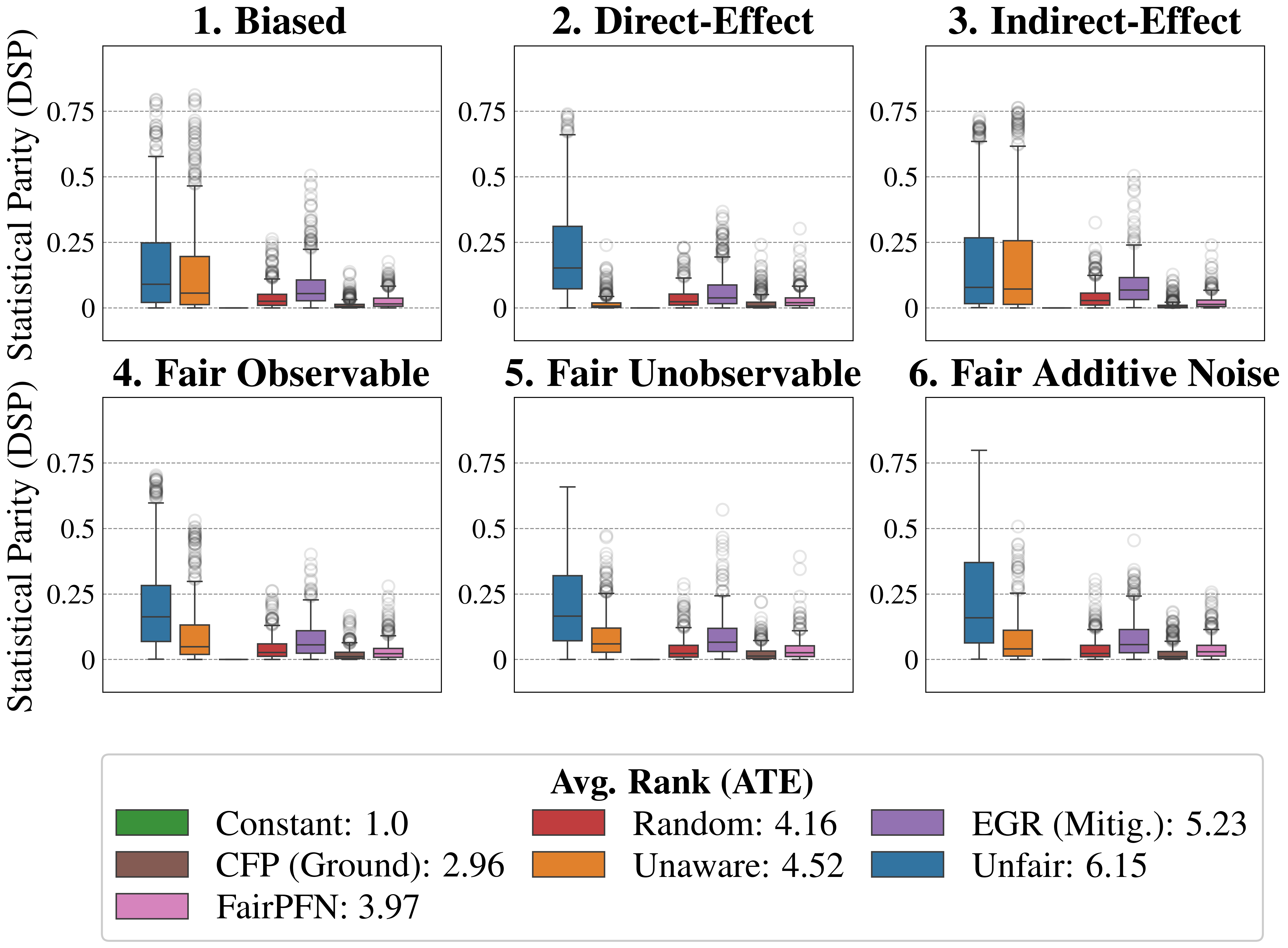
### Visual Description
## Box Plot: Statistical Parity (DSP) vs. Different Fairness Scenarios
### Overview
The image contains six box plots arranged in a 2x3 grid. Each box plot visualizes the statistical parity (DSP) under different fairness scenarios: Biased, Direct-Effect, Indirect-Effect, Fair Observable, Fair Unobservable, and Fair Additive Noise. The x-axis represents different methods, and the y-axis represents the Statistical Parity (DSP). A legend at the bottom describes the methods and their average rank (ATE).
### Components/Axes
* **Title:** The overall title is implied from the y-axis label: Statistical Parity (DSP).
* **X-axis:** The x-axis is categorical, representing different methods. The specific methods are detailed in the legend.
* **Y-axis:** Statistical Parity (DSP). The y-axis ranges from 0 to 0.75, with tick marks at 0, 0.25, 0.5, and 0.75. Horizontal dashed lines are present at these intervals.
* **Box Plots:** Each box plot represents the distribution of Statistical Parity for a given method under a specific fairness scenario.
* **Outliers:** Outliers are represented as circles above the box plots.
* **Titles for each subplot**:
1. Biased
2. Direct-Effect
3. Indirect-Effect
4. Fair Observable
5. Fair Unobservable
6. Fair Additive Noise
* **Legend (located at the bottom):**
* Green: Constant: 1.0
* Brown: CFP (Ground): 2.96
* Pink: FairPFN: 3.97
* Red: Random: 4.16
* Orange: Unaware: 4.52
* Purple: EGR (Mitig.): 5.23
* Blue: Unfair: 6.15
### Detailed Analysis
Each subplot contains boxplots for the following methods: Unfair (blue), Unaware (orange), Constant (green), Random (red), EGR (Mitig.) (purple), CFP (Ground) (brown), and FairPFN (pink).
**1. Biased**
* Unfair: Median around 0.125-0.25, with outliers extending to 0.75.
* Unaware: Median around 0.0-0.125, with outliers extending to 0.75.
* Constant: Median at 0.0.
* Random: Median around 0.0-0.125, with outliers extending to 0.25.
* EGR (Mitig.): Median around 0.0-0.125, with outliers extending to 0.25.
* CFP (Ground): Median around 0.0.
* FairPFN: Median around 0.0.
**2. Direct-Effect**
* Unfair: Median around 0.125-0.25, with outliers extending to 0.75.
* Unaware: Median around 0.0, with outliers extending to 0.125.
* Constant: Median at 0.0.
* Random: Median around 0.0, with outliers extending to 0.125.
* EGR (Mitig.): Median around 0.0, with outliers extending to 0.25.
* CFP (Ground): Median around 0.0.
* FairPFN: Median around 0.0.
**3. Indirect-Effect**
* Unfair: Median around 0.125-0.25, with outliers extending to 0.75.
* Unaware: Median around 0.125-0.25, with outliers extending to 0.75.
* Constant: Median at 0.0.
* Random: Median around 0.0, with outliers extending to 0.25.
* EGR (Mitig.): Median around 0.0-0.125, with outliers extending to 0.5.
* CFP (Ground): Median around 0.0.
* FairPFN: Median around 0.0.
**4. Fair Observable**
* Unfair: Median around 0.125-0.25, with outliers extending to 0.75.
* Unaware: Median around 0.0-0.125, with outliers extending to 0.5.
* Constant: Median at 0.0.
* Random: Median around 0.0, with outliers extending to 0.25.
* EGR (Mitig.): Median around 0.0-0.125, with outliers extending to 0.25.
* CFP (Ground): Median around 0.0.
* FairPFN: Median around 0.0.
**5. Fair Unobservable**
* Unfair: Median around 0.125-0.25, with outliers extending to 0.75.
* Unaware: Median around 0.0-0.125, with outliers extending to 0.5.
* Constant: Median at 0.0.
* Random: Median around 0.0, with outliers extending to 0.125.
* EGR (Mitig.): Median around 0.0-0.125, with outliers extending to 0.25.
* CFP (Ground): Median around 0.0.
* FairPFN: Median around 0.0.
**6. Fair Additive Noise**
* Unfair: Median around 0.125-0.25, with outliers extending to 0.75.
* Unaware: Median around 0.0-0.125, with outliers extending to 0.5.
* Constant: Median at 0.0.
* Random: Median around 0.0, with outliers extending to 0.25.
* EGR (Mitig.): Median around 0.0-0.125, with outliers extending to 0.25.
* CFP (Ground): Median around 0.0.
* FairPFN: Median around 0.0.
### Key Observations
* The "Unfair" method (blue) consistently shows higher statistical parity (DSP) across all scenarios, with medians generally between 0.125 and 0.25 and significant outliers.
* The "Unaware" method (orange) also shows relatively higher statistical parity compared to "Constant", "Random", "EGR (Mitig.)", "CFP (Ground)", and "FairPFN", but generally lower than "Unfair".
* The "Constant" (green), "CFP (Ground)" (brown), and "FairPFN" (pink) methods consistently show very low statistical parity, with medians close to 0.
* The "Random" (red) and "EGR (Mitig.)" (purple) methods show low statistical parity, with medians close to 0, but with some outliers.
* The presence of outliers suggests variability in the statistical parity for some methods, depending on the specific data sample.
### Interpretation
The box plots illustrate the impact of different fairness scenarios on the statistical parity (DSP) achieved by various methods. The "Unfair" method, as expected, exhibits the highest statistical parity, indicating a potential bias. The "Unaware" method also shows relatively high statistical parity, suggesting that simply being unaware of protected attributes is not sufficient to guarantee fairness. The "Constant", "CFP (Ground)", and "FairPFN" methods consistently achieve low statistical parity, indicating they are more effective in mitigating bias under these scenarios. The "Random" and "EGR (Mitig.)" methods show some variability, suggesting their effectiveness may depend on the specific data distribution. The average rank (ATE) values in the legend provide additional context, indicating the relative performance of each method across different fairness metrics. The data suggests that careful selection of fairness-aware methods is crucial to minimize statistical parity differences and achieve fairer outcomes.
</details>
Figure 20: Statistical Parity (Synthetic): Statistical Parity (DSP) of FairPFN compared to our baselines. FairPFN achieves a similar DSP as the Random baseline and outperforms EGR which was optimized specifically for this fairness metric, achieving an average rank of 3.97 out of 7.
<details>
<summary>extracted/6522797/figures/ddsp_lawschool.png Details</summary>
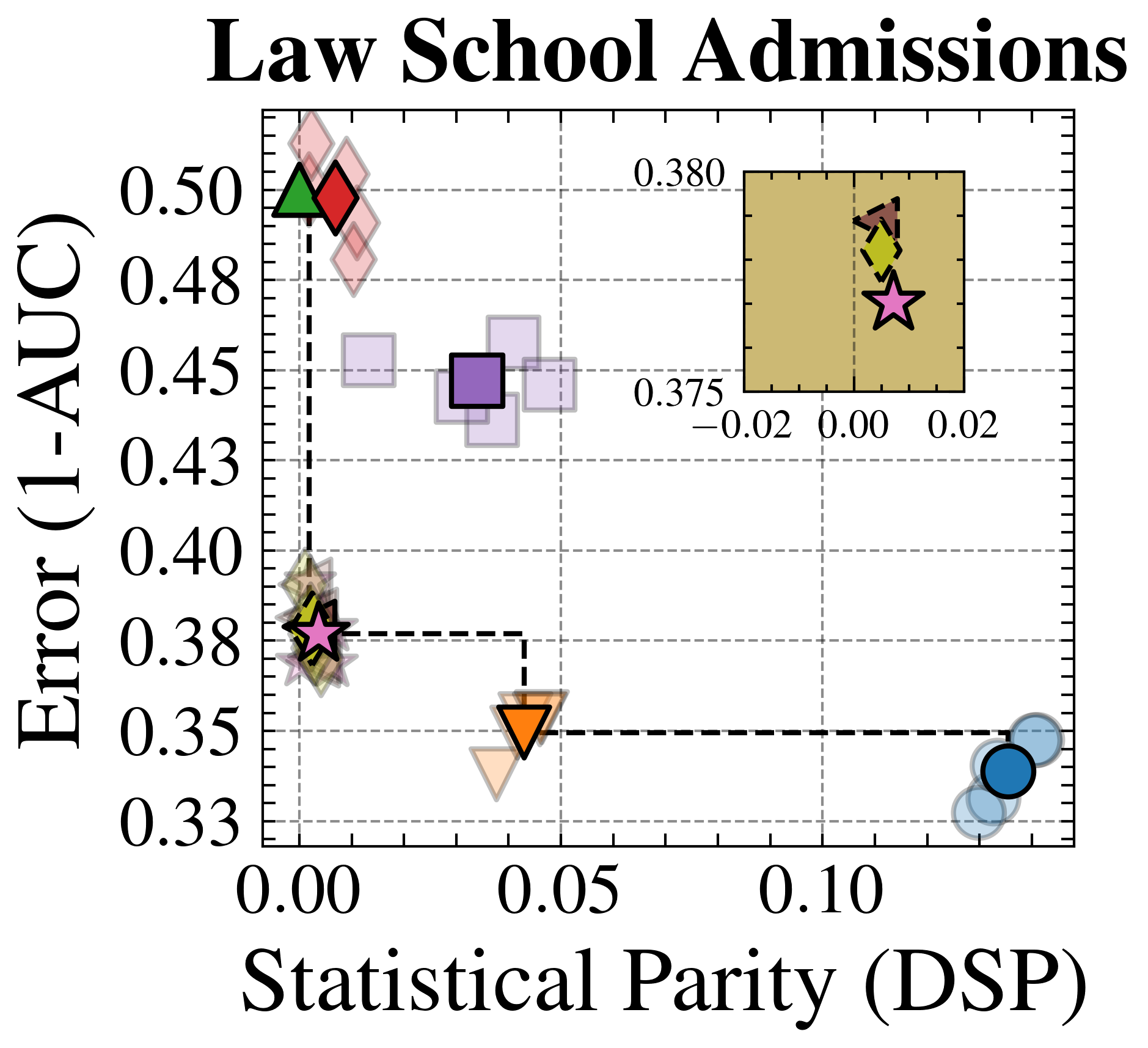
### Visual Description
## Scatter Plot: Law School Admissions
### Overview
The image is a scatter plot titled "Law School Admissions". It visualizes the relationship between "Error (1-AUC)" on the y-axis and "Statistical Parity (DSP)" on the x-axis. The plot includes data points represented by different shapes and colors, and a smaller inset plot in the top-right corner provides a zoomed-in view of a cluster of points. A dashed line connects the leftmost data points to the rightmost data points.
### Components/Axes
* **Title:** Law School Admissions
* **X-axis:** Statistical Parity (DSP)
* Scale: 0.00, 0.05, 0.10
* **Y-axis:** Error (1-AUC)
* Scale: 0.33, 0.35, 0.38, 0.40, 0.43, 0.45, 0.48, 0.50
* **Data Points:** Represented by different shapes and colors (Diamonds, Squares, Triangles, Stars, Circles).
* **Inset Plot:** Located in the top-right corner, showing a zoomed-in view.
* X-axis Scale (Inset): -0.02, 0.00, 0.02
* Y-axis Markers (Inset): 0.375, 0.380
### Detailed Analysis or Content Details
**Main Plot Data Points:**
* **Diamonds (Red/Green):** Located at the top-left of the plot. The red diamond is at approximately (0.00, 0.49), and the green diamond is at approximately (0.00, 0.50).
* **Squares (Purple):** Located around (0.04, 0.45).
* **Triangles (Orange):** Located around (0.04, 0.36).
* **Stars (Pink):** Located around (0.00, 0.38).
* **Circles (Blue):** Located at the bottom-right of the plot, around (0.12, 0.34).
**Inset Plot Data Points:**
* The inset plot shows a zoomed-in view of data points clustered near the origin.
* Shapes include diamonds (brown/yellow) and a star (pink).
* The pink star in the inset plot is located at approximately (0.00, 0.377).
**Dashed Line:**
* A dashed line connects the leftmost data points (stars, diamonds) to the rightmost data points (circles).
* The line appears to indicate a general trend or boundary.
### Key Observations
* The plot shows a distribution of data points across different levels of "Statistical Parity" and "Error".
* There is a cluster of points with low "Statistical Parity" and varying "Error" values.
* The dashed line suggests a trade-off between "Statistical Parity" and "Error".
* The inset plot highlights the density of data points near the origin.
### Interpretation
The scatter plot visualizes the performance of different models or algorithms in the context of "Law School Admissions," balancing "Error" (potentially a measure of accuracy) and "Statistical Parity" (a measure of fairness or bias). The distribution of points suggests that some models achieve low error but at the cost of lower statistical parity, and vice versa. The dashed line may represent a Pareto frontier, indicating the best possible trade-offs between these two metrics. The inset plot emphasizes the behavior of models with very low statistical parity. The different shapes and colors likely represent different models or configurations, allowing for a comparison of their performance characteristics.
</details>
<details>
<summary>extracted/6522797/figures/ddsp_adult.png Details</summary>
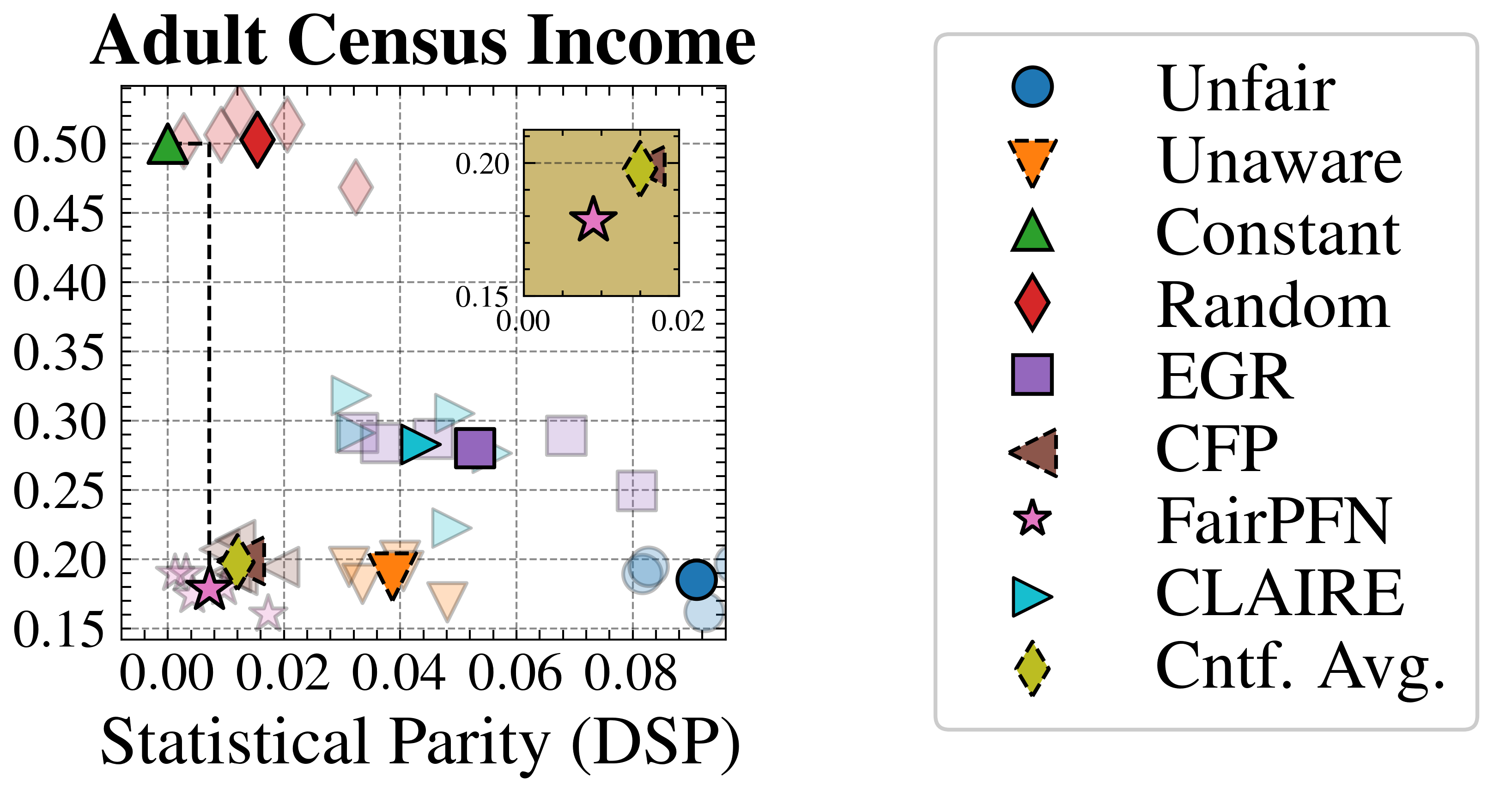
### Visual Description
## Scatter Plot: Adult Census Income
### Overview
The image is a scatter plot titled "Adult Census Income". It visualizes the relationship between two variables, likely representing performance metrics of different algorithms or models related to fairness and accuracy in predicting adult census income. The plot includes several data points, each representing a different algorithm, and a legend that identifies each algorithm by shape and color. There is also a smaller inset plot showing a zoomed-in view of the bottom-left corner.
### Components/Axes
* **Title:** Adult Census Income
* **X-axis:** Statistical Parity (DSP). The scale ranges from 0.00 to 0.08, with gridlines at intervals of 0.01.
* **Y-axis:** The scale ranges from 0.15 to 0.50, with gridlines at intervals of 0.05.
* **Legend:** Located on the right side of the plot, the legend maps shapes and colors to algorithm names:
* Blue Circle: Unfair
* Orange Downward Triangle (dashed outline): Unaware
* Green Upward Triangle: Constant
* Red Diamond: Random
* Purple Square: EGR
* Brown Downward Triangle (dashed outline): CFP
* Pink Star: FairPFN
* Teal Sideways Triangle: CLAIRE
* Yellow-Green Diamond (dashed outline): Cntf. Avg.
* **Inset Plot:** Located in the top-right corner of the main plot, showing a zoomed-in view of the region near the origin. The x-axis of the inset plot ranges from 0.00 to 0.02, and the y-axis ranges from 0.15 to 0.20.
### Detailed Analysis or ### Content Details
* **Unfair (Blue Circle):** Located at approximately (0.08, 0.19).
* **Unaware (Orange Downward Triangle):** Located at approximately (0.04, 0.19).
* **Constant (Green Upward Triangle):** Located at approximately (0.00, 0.50).
* **Random (Red Diamond):** Located at approximately (0.01, 0.50).
* **EGR (Purple Square):** Located at approximately (0.05, 0.28).
* **CFP (Brown Downward Triangle):** Located at approximately (0.01, 0.20).
* **FairPFN (Pink Star):** Located at approximately (0.01, 0.17).
* **CLAIRE (Teal Sideways Triangle):** Located at approximately (0.04, 0.29).
* **Cntf. Avg. (Yellow-Green Diamond):** Located at approximately (0.01, 0.20).
A dashed vertical line is present at x = 0.00.
### Key Observations
* The 'Unfair' algorithm has the highest Statistical Parity (DSP) value among the algorithms plotted.
* The 'Constant' and 'Random' algorithms have the highest y-axis values.
* The inset plot provides a closer view of the algorithms clustered near the origin, making it easier to distinguish their positions.
### Interpretation
The scatter plot visualizes the trade-offs between Statistical Parity (DSP) and another performance metric (likely accuracy or income prediction performance) for different algorithms. Algorithms like 'Constant' and 'Random' have high y-axis values but low Statistical Parity, suggesting they might prioritize accuracy over fairness. Conversely, 'Unfair' has a high Statistical Parity but a lower y-axis value, indicating a potential trade-off. The 'FairPFN' algorithm is clustered near the origin, suggesting it might be optimized for both fairness and accuracy, but at a potentially lower overall performance level. The plot helps in comparing the performance of different algorithms and understanding their strengths and weaknesses in the context of fairness and accuracy in income prediction.
</details>
Figure 21: Group-Fairness-Accuracy Trade-off (Real-World): Statistical Parity (DSP), predictive error (1-AUC), and Pareto Front of the performance of FairPFN compared to our baselines on each of 5 validation folds (light) and across all five folds (solid) of our real-world datasets. FairPFN dominates EGR which was specifically optimized for this group fairness metric.
<details>
<summary>x6.png Details</summary>
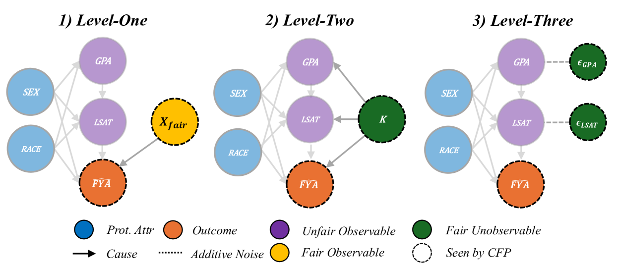
### Visual Description
## Causal Diagram: Fairness Levels
### Overview
The image presents three causal diagrams, labeled "Level-One," "Level-Two," and "Level-Three," illustrating different levels of fairness considerations in a predictive model. Each diagram depicts relationships between protected attributes (e.g., race, sex), unfair observables (e.g., GPA, LSAT), a fair observable (Xfair), an outcome (FYA), and fair unobservables (epsilon GPA, epsilon LSAT, K). The diagrams use nodes to represent variables and arrows to indicate causal relationships. Dashed lines represent additive noise, and dashed circles indicate variables seen by the CFP (Counterfactual Fairness Prediction).
### Components/Axes
* **Nodes:** Represent variables.
* Blue: Protected Attributes (Prot. Attr) - SEX, RACE
* Orange: Outcome - FYA (First Year Average)
* Purple: Unfair Observable - GPA (Grade Point Average), LSAT (Law School Admission Test)
* Yellow: Fair Observable - Xfair
* Green: Fair Unobservable - K, epsilon GPA, epsilon LSAT
* **Edges:** Represent relationships between variables.
* Solid Arrow: Cause - Indicates a causal relationship.
* Dashed Line: Additive Noise - Represents random variation or error.
* **Circles with Dashed Outline:** Seen by CFP (Counterfactual Fairness Prediction).
* **Titles:**
* 1) Level-One
* 2) Level-Two
* 3) Level-Three
* **Legend:** Located at the bottom of the image, explaining the node colors and edge types.
### Detailed Analysis or Content Details
**1) Level-One:**
* Nodes: GPA, LSAT, SEX, RACE, FYA, Xfair
* Relationships:
* SEX and RACE both have causal effects on GPA, LSAT, and FYA.
* GPA and LSAT both have causal effects on FYA.
* Xfair has a causal effect on FYA.
* Xfair is seen by CFP.
* FYA is seen by CFP.
**2) Level-Two:**
* Nodes: GPA, LSAT, SEX, RACE, FYA, K
* Relationships:
* SEX and RACE both have causal effects on GPA, LSAT, and FYA.
* GPA and LSAT both have causal effects on FYA.
* K has a causal effect on FYA.
* K is seen by CFP.
* FYA is seen by CFP.
**3) Level-Three:**
* Nodes: GPA, LSAT, SEX, RACE, FYA, epsilon GPA, epsilon LSAT
* Relationships:
* SEX and RACE both have causal effects on GPA, LSAT, and FYA.
* GPA and LSAT both have causal effects on FYA.
* epsilon GPA is additive noise to GPA.
* epsilon LSAT is additive noise to LSAT.
* FYA is seen by CFP.
* epsilon GPA is seen by CFP.
* epsilon LSAT is seen by CFP.
### Key Observations
* The diagrams illustrate a progression in fairness considerations.
* Level-One introduces a fair observable, Xfair, that directly influences the outcome.
* Level-Two introduces a fair unobservable, K, that directly influences the outcome.
* Level-Three introduces additive noise terms, epsilon GPA and epsilon LSAT, to GPA and LSAT respectively.
* Protected attributes (SEX, RACE) consistently influence GPA, LSAT, and FYA across all levels.
* The outcome, FYA, is always seen by the CFP.
### Interpretation
The diagrams represent different approaches to achieving fairness in a predictive model. Level-One focuses on incorporating a fair observable feature, while Level-Two introduces a fair unobservable variable. Level-Three acknowledges the presence of noise or error in the unfair observable variables. The progression from Level-One to Level-Three suggests an increasing complexity in modeling and addressing fairness concerns. The consistent influence of protected attributes highlights the need to mitigate bias introduced by these variables. The fact that FYA is always seen by the CFP indicates that the model is always aware of the outcome, allowing for potential adjustments to improve fairness.
</details>
Figure 22: Counterfactually Fair Prediction (CFP): Three levels of counterfactually fair prediction (CFP) Kusner et al. (2017), obtained by fitting a predictor 1) to fair observables (if any exist; left), 2) the inferred values of fair exogenous variables (middle) and 3) the inferred values of independent noise terms (right).
<details>
<summary>x7.png Details</summary>
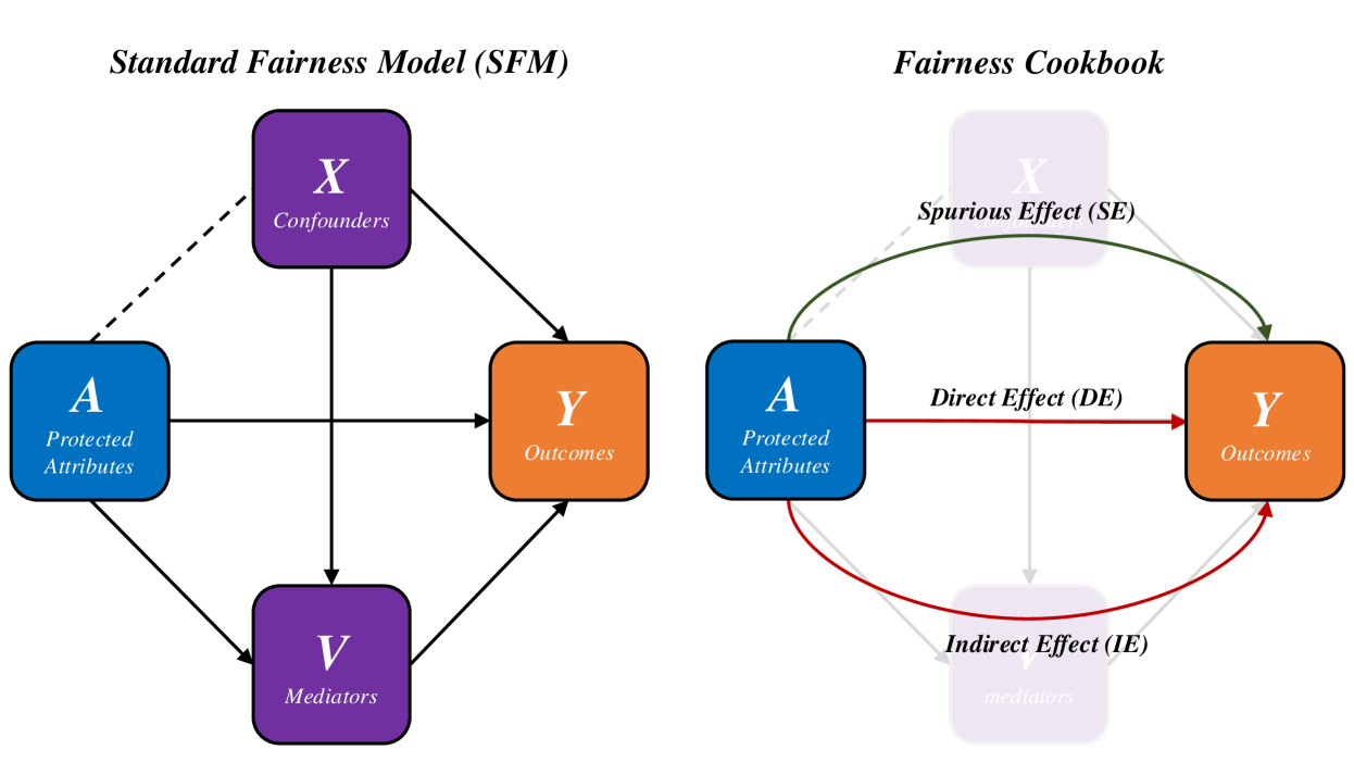
### Visual Description
## Diagram: Standard Fairness Model (SFM) vs. Fairness Cookbook
### Overview
The image presents two diagrams side-by-side, illustrating different models for understanding fairness. The left diagram depicts the "Standard Fairness Model (SFM)," while the right diagram shows a "Fairness Cookbook" model. Both diagrams use nodes representing variables (A, X, Y, V) and arrows to indicate relationships between them. The "Fairness Cookbook" diagram provides more nuanced relationships, including direct, indirect, and spurious effects.
### Components/Axes
**Left Diagram (Standard Fairness Model (SFM))**
* **Title:** Standard Fairness Model (SFM)
* **Nodes:**
* **A (Blue):** Labeled "Protected Attributes" (bottom-left)
* **X (Purple):** Labeled "Confounders" (top-center)
* **Y (Orange):** Labeled "Outcomes" (center-right)
* **V (Purple):** Labeled "Mediators" (bottom-center)
* **Arrows:**
* A -> Y (Black, solid): Direct effect from Protected Attributes to Outcomes.
* A -> V (Black, solid): Effect from Protected Attributes to Mediators.
* X -> Y (Black, solid): Effect from Confounders to Outcomes.
* X -> V (Black, solid): Effect from Confounders to Mediators.
* V -> Y (Black, solid): Effect from Mediators to Outcomes.
* X -- A (Black, dashed): Effect from Confounders to Protected Attributes.
**Right Diagram (Fairness Cookbook)**
* **Title:** Fairness Cookbook
* **Nodes:**
* **A (Blue):** Labeled "Protected Attributes" (center-left)
* **X (Light Purple, faded):** Labeled "Confounders" (top-center, faded)
* **Y (Orange):** Labeled "Outcomes" (center-right)
* **V (Light Purple, faded):** Labeled "mediators" (bottom-center, faded)
* **Arrows:**
* A -> Y (Red, solid): Labeled "Direct Effect (DE)"
* A -> Y (Red, curved, solid): Indirect Effect (IE)
* A -> X -> Y (Green, curved, solid): Labeled "Spurious Effect (SE)"
* X -> Y (Gray, solid, faded): Effect from Confounders to Outcomes.
* X -> V (Gray, solid, faded): Effect from Confounders to Mediators.
* V -> Y (Gray, solid, faded): Effect from Mediators to Outcomes.
### Detailed Analysis or ### Content Details
**Left Diagram (Standard Fairness Model (SFM))**
* The diagram shows a basic model where protected attributes, confounders, and mediators can all influence outcomes.
* Confounders may also influence protected attributes.
**Right Diagram (Fairness Cookbook)**
* This diagram breaks down the effects into direct, indirect, and spurious effects.
* The confounders and mediators are faded, suggesting they are considered but not the primary focus.
* The direct effect (DE) is a direct influence of protected attributes on outcomes.
* The indirect effect (IE) is the influence of protected attributes on outcomes through other variables (mediators).
* The spurious effect (SE) is the influence of protected attributes on outcomes through confounders.
### Key Observations
* The "Fairness Cookbook" model provides a more detailed breakdown of the relationships between variables compared to the "Standard Fairness Model."
* The use of color and line styles in the "Fairness Cookbook" highlights the different types of effects (direct, indirect, spurious).
* The fading of nodes in the "Fairness Cookbook" suggests a prioritization of certain relationships over others.
### Interpretation
The diagrams illustrate two approaches to understanding fairness in a system. The "Standard Fairness Model" provides a basic framework, while the "Fairness Cookbook" offers a more nuanced perspective by distinguishing between direct, indirect, and spurious effects. The "Fairness Cookbook" model suggests that understanding these different types of effects is crucial for addressing fairness concerns. The fading of the confounder and mediator nodes in the "Fairness Cookbook" may indicate that the model is primarily concerned with the direct and indirect effects of protected attributes on outcomes, as well as the spurious effects introduced by confounders.
</details>
Figure 23: Causal Fairness Analysis (CFA) Framework: Components of the CFA framework relevant to FairPFN’s prior and evaluation. Plecko & Bareinboim (2024) Standard Fairness Model (left; SFM), which provides a meta-model for causal fairness and heavily the design of our prior, and the Fairness Cookbook of causal fairness metrics (right).
| | 1) Biased | 2) Direct-Effect | 3) Indirect-Effect |
| --- | --- | --- | --- |
| Unfair | -0.00±0.13 (3.05%) | 0.00±0.14 (0.00%) | -0.00±0.12 (1.65%) |
| Unaware | -0.01±0.09 (2.60%) | 0.00± 0.00 (0.12%) | -0.01±0.08 (1.81%) |
| Constant | -0.36±0.34 (0.00%) | -0.27±0.43 (0.00%) | -0.38±0.34 (0.00%) |
| Random | 0.01±0.30 (0.01%) | 0.01±0.31 (0.01%) | 0.00±0.30 (0.00%) |
| EGR | -0.05±0.46 (0.00%) | -0.07±0.42 (0.00%) | -0.06±0.45 (0.00%) |
| CFP | -0.00± 0.03 (1.31%) | -0.01± 0.03 (0.56%) | -0.01±0.07 (2.29%) |
| FairPFN | 0.00±0.06 (2.03%) | -0.01± 0.03 (1.29%) | -0.00± 0.05 (2.22%) |
| | 4) Fair Observable | 5) Fair Unobservable | 6) Fair Additive Noise | Average |
| --- | --- | --- | --- | --- |
| Unfair | 0.00±0.14 (0.02%) | -0.00±0.19 (0.00%) | -0.00±0.18 (0.00%) | 0.00±0.15 (0.79%) |
| Unaware | -0.00± 0.05 (2.63%) | -0.00±0.09 (3.68%) | -0.00±0.10 (3.07%) | -0.00±0.07 (2.32%) |
| Constant | -0.49±0.18 (30.10%) | -0.38±0.30 (4.63%) | -0.37±0.33 (0.11%) | -0.38±0.32 (5.81%) |
| Random | 0.01±0.34 (0.00%) | 0.08±0.37 (0.00%) | 0.06±0.37 (0.00%) | 0.03±0.33 (0.00%) |
| EGR | -0.09±0.38 (0.00%) | -0.06±0.39 (0.00%) | -0.07±0.37 (0.00%) | -0.07±0.41 (0.00%) |
| CFP | -0.02±0.14 (1.72%) | 0.00± 0.06 (1.02%) | -0.00± 0.05 (1.00%) | -0.01± 0.06 (1.32%) |
| FairPFN | -0.01±0.07 (1.01%) | 0.01±0.07 (2.20%) | 0.01±0.09 (2.47%) | 0.00± 0.06 (1.87%) |
Table 1: Difference to Cntf. Avg. (Synthetic): Mean, standard deviation and percentage of outliers of the predictions on our causal casestudies of FairPFN and our baseline models compared to the predictions of the Cntf. Avg. baseline, which shows strong performance in causal effect removal and predictive error due to access to both observational and counterfactual datasets. FairPFN achieves predictions with an average difference to Cntf. Avg. of 0.00±0.06, with 1.87% of samples falling outside of three standard deviations.
<details>
<summary>extracted/6522797/figures/tce_by_group_synthetic.png Details</summary>
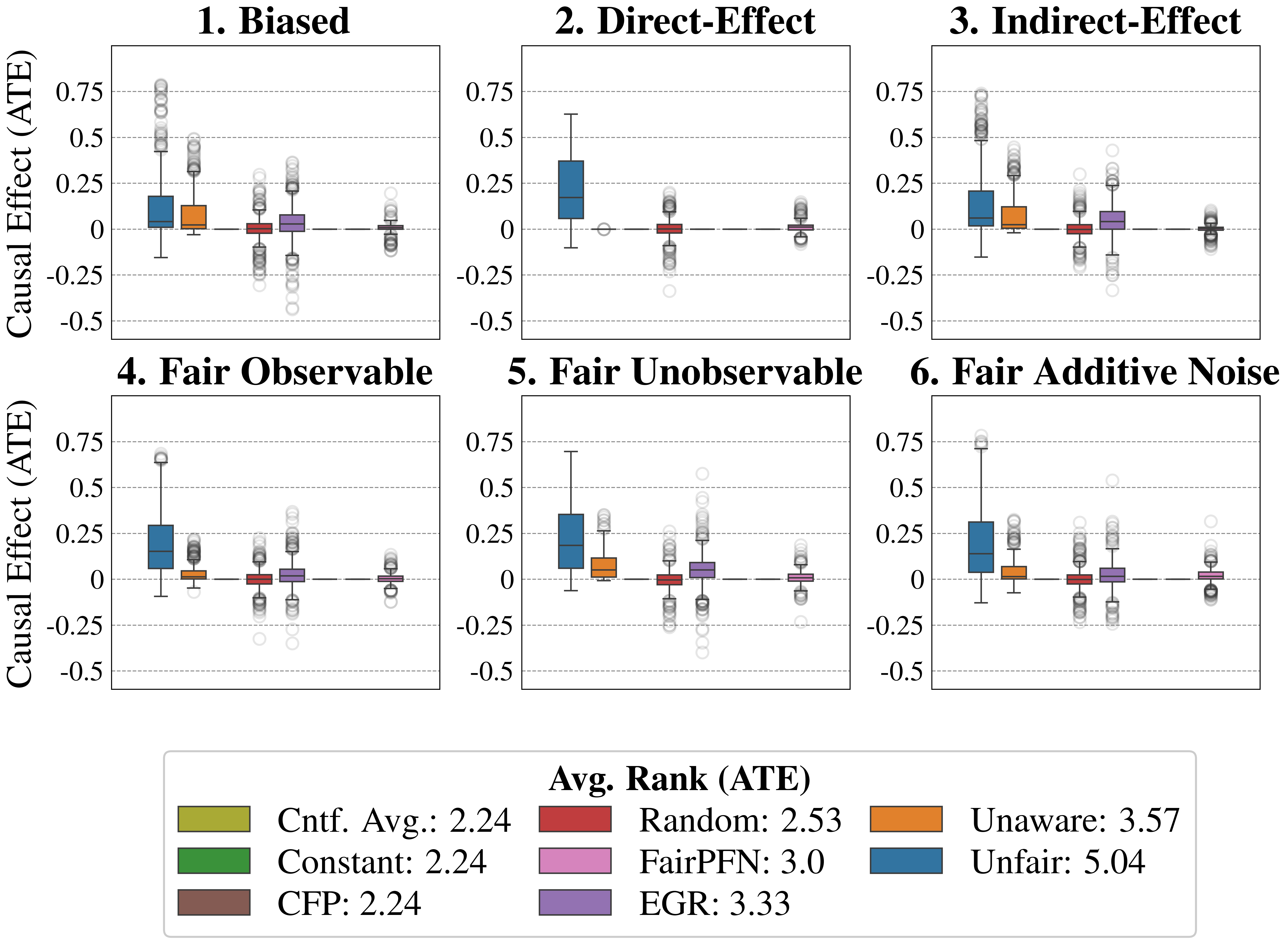
### Visual Description
## Box Plot: Causal Effect (ATE) Comparison
### Overview
The image presents six box plots arranged in a 2x3 grid, each representing a different scenario: "Biased", "Direct-Effect", "Indirect-Effect", "Fair Observable", "Fair Unobservable", and "Fair Additive Noise". Each box plot displays the distribution of the Causal Effect (ATE) for six different methods: "Cntf. Avg.", "Constant", "CFP", "Random", "FairPFN", "EGR", "Unaware", and "Unfair". The y-axis represents the Causal Effect (ATE), ranging from -0.5 to 0.75. A legend at the bottom provides the average rank (ATE) for each method.
### Components/Axes
* **Title:** Causal Effect (ATE)
* **Y-axis:** Causal Effect (ATE), with tick marks at -0.5, -0.25, 0, 0.25, 0.5, and 0.75.
* **X-axis:** Implicitly represents the different methods being compared within each scenario.
* **Box Plots:** Each box plot shows the median, quartiles, and outliers for a given method in a specific scenario.
* **Horizontal Grid Lines:** Dashed lines at each y-axis tick mark for visual aid.
* **Titles of Subplots:** 1. Biased, 2. Direct-Effect, 3. Indirect-Effect, 4. Fair Observable, 5. Fair Unobservable, 6. Fair Additive Noise
* **Legend (Bottom):**
* Cntf. Avg.: 2.24 (Olive Green)
* Constant: 2.24 (Green)
* CFP: 2.24 (Brown)
* Random: 2.53 (Red)
* FairPFN: 3.0 (Pink)
* EGR: 3.33 (Purple)
* Unaware: 3.57 (Orange)
* Unfair: 5.04 (Blue)
### Detailed Analysis
**1. Biased**
* **Unfair (Blue):** The box extends from approximately 0.05 to 0.2, with outliers extending up to 0.75.
* **Unaware (Orange):** The box extends from approximately -0.05 to 0.1, with outliers extending up to 0.5.
* **Random (Red):** The box is centered around 0, with outliers ranging from -0.25 to 0.25.
* **FairPFN (Pink):** The box is centered around 0, with outliers ranging from -0.25 to 0.25.
* **EGR (Purple):** The box is centered around 0, with outliers ranging from -0.25 to 0.25.
* **CFP (Brown):** The box is centered around 0, with outliers ranging from -0.25 to 0.25.
* **Constant (Green):** The box is centered around 0, with outliers ranging from -0.25 to 0.25.
* **Cntf. Avg. (Olive Green):** The box is centered around 0, with outliers ranging from -0.25 to 0.25.
**2. Direct-Effect**
* **Unfair (Blue):** The box extends from approximately 0.1 to 0.4, with outliers extending up to 0.6.
* **Unaware (Orange):** No data present.
* **Random (Red):** The box is centered around 0, with outliers ranging from -0.25 to 0.25.
* **FairPFN (Pink):** No data present.
* **EGR (Purple):** No data present.
* **CFP (Brown):** No data present.
* **Constant (Green):** No data present.
* **Cntf. Avg. (Olive Green):** No data present.
**3. Indirect-Effect**
* **Unfair (Blue):** The box extends from approximately 0.05 to 0.2, with outliers extending up to 0.75.
* **Unaware (Orange):** The box extends from approximately 0 to 0.15, with outliers extending up to 0.4.
* **Random (Red):** The box is centered around 0, with outliers ranging from -0.25 to 0.25.
* **FairPFN (Pink):** The box is centered around 0, with outliers ranging from -0.25 to 0.25.
* **EGR (Purple):** No data present.
* **CFP (Brown):** No data present.
* **Constant (Green):** No data present.
* **Cntf. Avg. (Olive Green):** No data present.
**4. Fair Observable**
* **Unfair (Blue):** The box extends from approximately 0.1 to 0.3, with outliers extending up to 0.7.
* **Unaware (Orange):** The box extends from approximately -0.05 to 0.1, with outliers extending up to 0.25.
* **Random (Red):** The box is centered around 0, with outliers ranging from -0.25 to 0.25.
* **FairPFN (Pink):** The box is centered around 0, with outliers ranging from -0.25 to 0.25.
* **EGR (Purple):** The box is centered around 0, with outliers ranging from -0.25 to 0.25.
* **CFP (Brown):** The box is centered around 0, with outliers ranging from -0.25 to 0.25.
* **Constant (Green):** No data present.
* **Cntf. Avg. (Olive Green):** No data present.
**5. Fair Unobservable**
* **Unfair (Blue):** The box extends from approximately 0.1 to 0.3, with outliers extending up to 0.7.
* **Unaware (Orange):** The box extends from approximately 0 to 0.1, with outliers ranging from -0.25 to 0.25.
* **Random (Red):** The box is centered around 0, with outliers ranging from -0.25 to 0.25.
* **FairPFN (Pink):** The box is centered around 0, with outliers ranging from -0.25 to 0.25.
* **EGR (Purple):** The box is centered around 0, with outliers ranging from -0.25 to 0.25.
* **CFP (Brown):** The box is centered around 0, with outliers ranging from -0.25 to 0.25.
* **Constant (Green):** No data present.
* **Cntf. Avg. (Olive Green):** No data present.
**6. Fair Additive Noise**
* **Unfair (Blue):** The box extends from approximately 0.1 to 0.3, with outliers extending up to 0.75.
* **Unaware (Orange):** The box extends from approximately 0 to 0.1, with outliers extending up to 0.25.
* **Random (Red):** The box is centered around 0, with outliers ranging from -0.25 to 0.25.
* **FairPFN (Pink):** The box is centered around 0, with outliers ranging from -0.25 to 0.25.
* **EGR (Purple):** The box is centered around 0, with outliers ranging from -0.25 to 0.25.
* **CFP (Brown):** The box is centered around 0, with outliers ranging from -0.25 to 0.25.
* **Constant (Green):** No data present.
* **Cntf. Avg. (Olive Green):** No data present.
### Key Observations
* The "Unfair" method (blue) consistently shows a positive causal effect across all scenarios, with the box plots generally located above 0.
* The "Unaware" method (orange) also tends to show a positive causal effect, but to a lesser extent than "Unfair".
* The "Random", "FairPFN", "EGR", "CFP", "Constant", and "Cntf. Avg." methods (red, pink, purple, brown, green, and olive green respectively) generally have box plots centered around 0, indicating a negligible causal effect.
* The "Direct-Effect" scenario has missing data for most methods except "Unfair" and "Random".
### Interpretation
The box plots suggest that the "Unfair" and "Unaware" methods tend to introduce a positive bias in the estimation of the causal effect (ATE). The other methods ("Random", "FairPFN", "EGR", "CFP", "Constant", and "Cntf. Avg.") appear to be less biased, as their distributions are centered around 0. The "Direct-Effect" scenario seems to be a special case, where only the "Unfair" and "Random" methods were evaluated. The average rank (ATE) in the legend supports these observations, with "Unfair" having the highest average rank (5.04), indicating that it is the most biased method on average. The missing data in the "Direct-Effect" scenario and for "Constant" and "Cntf. Avg." in other scenarios might indicate limitations or inapplicability of these methods in those specific situations.
</details>
Figure 24: Causal Fairness (Synthetic-All Baselines): Average Treatment Effect (ATE) of predictions of FairPFN compared to all baselines. FairPFN consistently removes the causal effect with a margin of error of (-0.2, 0.2) and achieves an average rank of 3.0 out of 7.
<details>
<summary>x8.png Details</summary>
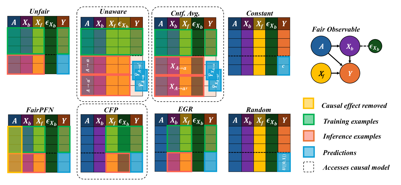
### Visual Description
## Diagram: Causal Inference Methods
### Overview
The image presents a comparative diagram illustrating different causal inference methods and their access to causal models. It uses color-coded grids to represent the data used for training, inference, and prediction in each method. A causal diagram is also included to represent the relationships between variables.
### Components/Axes
* **Titles (Top Row):** Unfair, Unaware, Cntf. Avg. (Counterfactual Average), Constant, Fair Observable
* **Titles (Bottom Row):** FairPFN, CFP, EGR, Random
* **Grid Columns:** A, Xb, Xf, εXb, Y (These represent different variables or features)
* **Legend (Right Side):**
* Yellow: Causal effect removed
* Green: Training examples
* Pink: Inference examples
* Light Blue: Predictions
* Dashed Line: Accesses causal model
* **Causal Diagram (Top Right):**
* Nodes: A (blue), Xb (purple), Xf (yellow), Y (orange), εXb (light green)
* Edges: A -> Xb, A -> Y, Xb -> Y, Xf -> Y, Xb --(dashed)--> εXb
### Detailed Analysis
Each method (Unfair, Unaware, etc.) is represented by a grid. The rows of the grid are color-coded to indicate the type of data used (training, inference, prediction).
* **Unfair:**
* Training: Top rows of A, Xb, Xf, and εXb are green.
* Inference: Bottom rows of A, Xb, and Xf are pink.
* Prediction: Bottom rows of Y are light blue.
* **Unaware:**
* Training: Top rows of A, Xb, Xf, and εXb are green.
* Inference: Rows of A, Xb, and Xf are pink, with labels "A -> a" and "A -> a'".
* Prediction: Rows of Y are light blue, with labels "ŶA->a" and "ŶA->a'".
* **Cntf. Avg.:**
* Training: Top rows of A, Xb, Xf, and εXb are green.
* Inference: Rows of Xb and Xf are pink, with labels "XA->a" and "XA->a'".
* Prediction: Rows of Y are light blue, with labels "ŶA->a" and "ŶA->a'".
* **Constant:**
* All rows of A, Xb, Xf, and εXb are filled with a single color.
* Prediction: One row of Y is light blue, labeled "c".
* **FairPFN:**
* Causal effect removed: Top row of A and Xf are yellow.
* Training: Top rows of Xb, Xf, εXb, and Y are green.
* Inference: Bottom rows of A, Xb, and Xf are pink.
* Prediction: Bottom rows of Y are light blue.
* **CFP:**
* Training: Top rows of Xb, Xf, εXb, and Y are green.
* Inference: Bottom rows of A, Xb, and Xf are pink.
* Prediction: Bottom rows of Y are light blue.
* **EGR:**
* Training: Top rows of Xb, Xf, εXb, and Y are green.
* Inference: Bottom rows of A, Xb, and Xf are pink.
* Prediction: Bottom rows of Y are light blue.
* **Random:**
* All rows of A, Xb, Xf, and εXb are filled with a single color.
* Prediction: All rows of Y are light blue, labeled "U({0,1})".
### Key Observations
* Different methods utilize different data for training, inference, and prediction.
* Some methods (e.g., Unaware, Cntf. Avg.) explicitly model counterfactuals.
* The "Constant" method appears to use a constant value for prediction.
* The "Random" method uses a random variable for prediction.
* The dashed lines around each grid indicate that each method accesses the causal model.
### Interpretation
The diagram illustrates how different causal inference methods approach the problem of prediction and inference. The color-coded grids highlight the data used by each method, while the causal diagram provides a visual representation of the underlying causal relationships. The diagram suggests that different methods make different assumptions about the data and the causal structure, which can lead to different predictions and inferences. The "FairPFN" method explicitly removes the causal effect of A and Xf, suggesting an attempt to mitigate bias or confounding. The "Unaware" and "Cntf. Avg." methods explicitly model counterfactuals, which can be useful for estimating causal effects. The "Constant" and "Random" methods serve as baselines, providing a comparison point for the other methods.
</details>
Figure 25: Baseline Models: Visualization of FairPFN and our baseline models on our Fair Observable benchmark group, in terms of which variables each model is fit to and performs inference on on.
| Unfair Unaware | Law School Admissions 0.09±0.10 (0.00%) 0.03± 0.03 (0.00%) | Adult Census Income 0.05±0.06 (0.60%) 0.02± 0.04 (1.49%) | Average 0.07±0.08 (0.30%) 0.03± 0.04 (0.75%) |
| --- | --- | --- | --- |
| Constant | -0.40±0.08 (97.51%) | -0.18±0.10 (15.69%) | -0.29±0.09 (56.60%) |
| Random | 0.10±0.30 (0.00%) | 0.32±0.31 (0.30%) | 0.21±0.31 (0.15%) |
| EGR | 0.06±0.45 (0.00%) | 0.01±0.35 (0.00%) | 0.03±0.40 (0.00%) |
| CFP | 0.09± 0.03 (49.21%) | 0.05±0.06 (2.13%) | 0.07±0.05 (25.67%) |
| FairPFN | 0.01± 0.03 (0.11%) | 0.02± 0.04 (0.60%) | 0.02± 0.04 (0.36%) |
Table 2: Difference to Cntf. Avg. (Real): Mean, standard deviation and percentage of outliers of the predictions on our real-world datasets of FairPFN and our baseline models compared to the predictions of the Cntf. Avg. baseline, which shows strong performance in causal effect removal and predictive error due to access to both observational and counterfactual data. FairPFN achieves predictions with an average difference to Cntf. Avg. of 0.02±0.04, with 0.36% of samples falling outside of three standard deviations.