# Mutual Information Surprise: Rethinking Unexpectedness in Autonomous Systems
**Authors**: Yinsong Wang, Quan Zeng, Xiao Liu, Yu Ding, H. Milton Stewart School of Industrial and Systems Engineering, Georgia Institute of Technology, Atlanta & 30332, USA
## Abstract
Recent breakthroughs in autonomous experimentation have demonstrated remarkable physical capabilities, yet their cognitive control remains limited—often relying on static heuristics or classical optimization. A core limitation is the absence of a principled mechanism to detect and adapt to the unexpectedness. While traditional surprise measures—such as Shannon or Bayesian Surprise—offer momentary detection of deviation, they fail to capture whether a system is truly learning and adapting. In this work, we introduce Mutual Information Surprise (MIS), a new framework that redefines surprise not as anomaly detection, but as a signal of epistemic growth. MIS quantifies the impact of new observations on mutual information, enabling autonomous systems to reflect on their learning progression. We develop a statistical test sequence to detect meaningful shifts in estimated mutual information and propose a mutual information surprise reaction policy (MISRP) that dynamically governs system behavior through sampling adjustment and process forking. Empirical evaluations—on both synthetic domains and a dynamic pollution map estimation task—show that MISRP-governed strategies significantly outperform classical surprise-based approaches in stability, responsiveness, and predictive accuracy. By shifting surprise from reactive to reflective, MIS offers a path toward more self-aware and adaptive autonomous systems.
## 1 Introduction
In July 2020, Nature published a cover story (?) about an autonomous robotic chemist—locked in a lab for a week with no external communication—independently conducting experiments to search for improved photocatalysts for hydrogen production from water. In the years that followed, Nature featured three more articles (?, ?, ?) highlighting the transformative role of autonomous systems in materials discovery, experimentation, and even manufacturing, each reporting orders-of-magnitude improvements in efficiency. These reports spotlighted the intensifying global race to advance autonomous technologies beyond the already well-established domain of self-driving cars (?, ?, ?, ?). Nature was not alone; numerous other outlets have documented the surge in autonomous research and innovation (?, ?, ?). This rapid expansion is a natural consequence of recent advances in robotics and artificial intelligence, which continue to push the boundaries of what autonomous systems can accomplish.
The systems featured in the Nature publications demonstrate highly capable bodies that can perform complex tasks. Recall that an autonomous system comprises two fundamental components: a brain and a body—colloquial terms for its control mechanism and its sensing-action capabilities, respectively. Unlike traditional automation systems, which follow predefined instructions to execute simple, repetitive tasks, true autonomy requires a higher level of cognitive capacity—an autonomous system is supposedly capable of making decisions with minimal human intervention. However, their brain function, while more sophisticated than rigid pre-programmed instructions, remains relatively limited.
Surveying the literature over the past decade, we found that (?), (?), and (?) rely on classical Bayesian optimization to guide system decisions—a technique that, although effective, does not constitute full autonomy, i.e., completely eliminating human involvement. More recent works in Nature (?, ?) continue in a similar vein, adopting active learning frameworks akin to Bayesian optimization, without fundamentally enhancing the cognitive capabilities of these systems. The conceptual limitations of their decision-making mechanisms continue to impede progress toward genuine autonomy. (?) argue that a core deficiency of current autonomous systems is the absence of a “surprise” mechanism—the capacity to detect and adapt to unforeseen situations. Without this capability, true autonomy remains out of reach.
What is a “surprise,” and how does it differ from existing measures governing automation? Surprise is a fundamental psychological trigger that enables humans to react to unexpected events. Intuitively, it arises when observations deviate from expectations. Traditionally, unexpectedness has been loosely equated with anomalies—quantifying inconsistencies between new observations and historical data. Common approaches to anomaly detection include statistical methods such as z-scores (?) and hypothesis testing (?, ?); distance-based techniques (?), including Euclidean (?) and Mahalanobis distances (?, ?); and machine learning-based models (?, ?), which learn patterns to identify and filter out anomalous data. However, researchers increasingly recognize that simply detecting and discarding unexpected events is insufficient for achieving higher levels of autonomy. In human cognition, unexpectedness is not inherently undesirable; in fact, surprise often signals opportunities for discovery rather than error. Although mathematically similar to anomaly measures, surprise is conceptually distinct: it is not merely a deviation to be rejected, but a valuable learning signal that can enhance adaptation and decision-making.
This shift in perspective aligns with formal definitions of surprise in information theory and computational psychology, such as Shannon surprise (?), Bayesian surprise (?), Bayes Factor surprise (?), and Confidence-Corrected surprise (?). These surprise definitions quantify unexpectedness by modeling deviations from prior beliefs or probability distributions. In the following section, we will delve deeper into these existing measures and evaluate whether they truly serve the intended role of identifying opportunities, as human surprise does, more than merely flagging anomalies. Using current surprise definitions, (?) demonstrated that treating surprising events not as noise to be removed but as catalysts for learning can significantly enhance a system’s learning speed. Additional empirical evidence shows that incorporating surprise as a learning mechanism can improve autonomy in domains such as autonomous driving (?, ?, ?) and manufacturing (?, ?).
In our research, we find that existing definitions of surprise require significant improvement. Their close resemblance to anomaly detection measures suggests that they may not effectively support higher levels of autonomy. Specifically, a robust surprise measure should emphasize knowledge acquisition and adaptability, rather than treating unexpectedness merely as a deviation from the norm—an approach that current surprise definitions tend to adopt. We therefore argue that it is essential to develop a novel surprise metric that inherently fosters learning and deepens an autonomous system’s understanding of the underlying processes it encounters. To capture this dynamic capability, we introduce the Mutual Information Surprise (MIS)—a new framework that redefines how autonomous systems interpret and respond to unexpected events. MIS quantifies the degree of both frustration and enlightenment associated with new observations, measuring their impact on refining the system’s internal understanding of its environment. We also demonstrate the differences that arise when applying mutual information surprise, as opposed to relying solely on classical surprise definitions, highlighting MIS’s potential to meaningfully enhance autonomous learning and decision-making.
The paper is organized as follows. In Section 2, we revisit the concept of surprise by presenting a taxonomy of existing surprise measures and introducing the intuition, mathematical formulation, and limitations of classical definitions. In Section 3, we formally define the Mutual Information Surprise (MIS) and derive a testing sequence for detecting multiple types of system changes in autonomous systems. We also design an MIS reaction policy (MISRP) that provides high-level guidance to complement existing exploration-exploitation active learning strategies. In Section 4, we compare MIS with classical surprise measures to illustrate its numerical stability and enhanced cognitive capability. We further demonstrate the effectiveness of the MIS reaction policy through a pollution map estimation simulation. In Section 5, we conclude the paper.
## 2 Current Surprise Definitions and Their Limitations
Classical definitions of surprise, such as Shannon and Bayesian Surprise, provide elegant mathematical frameworks for quantifying unexpectedness. However, these approaches often fall short in capturing the core mechanisms driving adaptive behavior: continuous learning and flexible model updating. This section revisits and analyzes existing formulations, elaborating on their conceptual foundations and outlining both their strengths and limitations.
Before proceeding with our discussion, we introduce the notation used throughout this paper. Scalars are denoted by lowercase letters (e.g., $x$ ), vectors by bold lowercase letters (e.g., $\mathbf{x}$ ), and matrices by bold uppercase letters (e.g., $\mathbf{X}$ ). Distributions in the data space are represented by uppercase letters (e.g., $P$ ), probabilities by lowercase letters (e.g., $p$ ), and distributions in the parameter space by the symbol $\pi$ . The $L_{2}$ norm is denoted by $\|\cdot\|_{2}$ , and the absolute value or $L_{1}$ norm is denoted by $|\cdot|$ . We use $\mathbb{E}[\cdot]$ to denote the expectation operator and $\text{sgn}(\cdot)$ for the sign operator. Estimators are denoted with a hat, as in $\hat{\cdot}$ .
### The Family of Shannon Surprises
The family of Shannon Surprise metrics emphasizes the improbability of observed data, typically independent of explicit model parameters. This class broadly aligns with “observation” and “probabilistic-mismatch” surprises as categorized in (?). The central question which the Shannon family of surprises tries to answer is straightforward: How unlikely is the observation?
The most widely recognized measure is Shannon Surprise (?), formally defined as:
$$
S_{\text{Shannon}}(\mathbf{x})=-\log p(\mathbf{x}), \tag{1}
$$
interpreting surprise directly through event rarity. Although conceptually clear and mathematically elegant, this definition has a significant limitation: encountering a Shannon Surprise does not inherently imply knowledge acquisition. Consider, for instance, a uniform dartboard—a stochastic yet entirely understood system. Each outcome has an equally low probability, thus appearing “surprising” under Shannon’s definition, despite humans neither genuinely finding these outcomes surprising nor gaining any additional knowledge by observing them. In other words, the focus of Shannon Surprise is statistical rarity rather than genuine knowledge gain.
To address this limitation, particularly in highly stochastic scenarios, Residual Information Surprise (?) has been introduced, which measures surprise by quantifying the gap between the minimally achievable and observed Shannon Surprises:
$$
S_{\text{Residual}}(\mathbf{x})=|\underset{\mathbf{x}^{\prime}}{\min}\{-\log p(\mathbf{x}^{\prime})\}-(-\log p(\mathbf{x}))|=\underset{\mathbf{x}^{\prime}}{\max}\log p(\mathbf{x}^{\prime})-\log p(\mathbf{x}).
$$
In the dartboard example, Residual Information Surprise becomes zero for all outcomes, as $p(\mathbf{x}^{\prime})$ remains constant for every $\mathbf{x}^{\prime}$ , accurately reflecting an absence of genuine surprise. However, this formulation introduces a conceptual challenge, as determining $\underset{\mathbf{x}^{\prime}}{\max}\log p(\mathbf{x}^{\prime})$ implicitly presumes an omniscient oracle, an assumption typically infeasible in practice.
Interestingly, Shannon Surprise serves as a foundation for various anomaly measures. For example, under Gaussian assumptions, Shannon Surprise becomes proportional to squared error:
$$
S_{\text{Shannon}}(\mathbf{x})\propto\|\mathbf{x}-\mu_{\mathbf{x}}\|_{2}^{2},
$$
thus linking surprise with deviation from the mean. Similarly, assuming a Laplace distribution recovers an absolute error interpretation, termed Absolute Error Surprise in (?):
$$
S_{\text{Shannon}}(\mathbf{x})\propto|\mathbf{x}-\mu_{\mathbf{x}}|.
$$
We note that both Squared Error Surprise and Absolute Error Surprise are commonly utilized metrics in anomaly detection literature (?, ?, ?).
### The Family of Bayesian Surprises
Bayesian Surprises, by contrast, explicitly model belief updates. These measures quantify the degree to which a new observation alters the internal model, shifting the focus from event rarity to epistemic impact. This concept parallels the “belief-mismatch” surprise in the taxonomy by (?).
The canonical formulation, introduced in (?), defines Bayesian Surprise as the Kullback–Leibler divergence between the prior and posterior distributions over parameters:
$$
S_{\text{Bayes}}(\mathbf{x})=D_{\text{KL}}\left(\pi(\boldsymbol{\theta}\mid\mathbf{x})\,\|\,\pi(\boldsymbol{\theta})\right).
$$
This measure offers a principled approach to belief revision and naturally aligns with learning mechanisms. In theory, it encourages agents to reduce surprise through model updates, providing a pathway toward adaptive autonomy.
However, Bayesian Surprise is not without limitations. As data accumulates, new observations exert diminishing influence on the posterior, rendering the agent increasingly “stubborn.” This behavior can result in Bayesian Surprise overlooking rare but meaningful anomalies. For example, consider the discovery by S. S. Ting of the $J$ particle, characterized by an unusually long lifespan compared to other particles in its class. Under standard Bayesian updating, scientists’ beliefs about particle lifespans would barely shift due to this single observation. Consequently, Bayesian Surprise would classify such an event as merely an anomaly, potentially disregarding it.
To mitigate this posterior overconfidence, Confidence-Corrected (CC) Surprise (?) compares the current informed belief against that of a naïve learner with a flat prior:
$$
S_{\text{CC}}(\mathbf{x})=D_{\text{KL}}\left(\pi(\boldsymbol{\theta})\,\|\,\pi^{\prime}(\boldsymbol{\theta}\mid\mathbf{x})\right),
$$
where $\pi^{\prime}(\boldsymbol{\theta}\mid\mathbf{x})$ represents the updated belief assuming a uniform prior. This confidence-corrected formulation remains sensitive to new data irrespective of prior history. In the $J$ particle example, employing Confidence-Corrected Surprise would trigger a genuine surprise, as the posterior remains responsive to the novel observation without the inertia introduced by extensive historical data.
A related idea emerges with Bayes Factor (BF) Surprise (?), which compares likelihoods under naïve and informed beliefs:
$$
S_{\text{BF}}(\mathbf{x})=\frac{p(\mathbf{x}\mid\pi^{0}(\boldsymbol{\theta}))}{p(\mathbf{x}\mid\pi^{t}(\boldsymbol{\theta}))},
$$
where $\pi^{0}(\boldsymbol{\theta})$ represents the naïve (untrained) prior and $\pi^{t}(\boldsymbol{\theta})$ the informed belief based on all prior observations up to time $t$ (before observing $\mathbf{x}$ ). This ratio quantifies how strongly the current observation supports the naïve prior over the informed prior. In practice, the effectiveness of both Confidence-Corrected and Bayes Factor Surprises heavily depends on constructing appropriate priors—a task often challenging and subjective.
Another variant within the Bayesian Surprise family is Postdictive Surprise (?), which operates in the output space rather than parameter space as in the original Bayesian Surprise:
$$
S_{\text{Postdictive}}(\mathbf{x})=D_{\text{KL}}\left(P(\mathbf{y}\mid\boldsymbol{\theta}^{\prime},\mathbf{x})\,\|\,P(\mathbf{y}\mid\boldsymbol{\theta},\mathbf{x})\right), \tag{2}
$$
where $\boldsymbol{\theta}$ and $\boldsymbol{\theta}^{\prime}$ denote parameters before and after the update, respectively. (?) argue that computing KL divergence in the output space is more computationally tractable for variational models but potentially less expressive when output variance depends on the input (e.g., under heteroskedastic conditions).
### Reflection
We acknowledge the presence of alternative categorizations of surprise definitions, notably the taxonomy in (?), which classifies surprise measures into three groups: observation surprises, probabilistic-mismatch surprises, and belief-mismatch surprises. As discussed previously, the Shannon Surprise family aligns closely with the first two categories, whereas the Bayesian Surprise family corresponds to the last.
These categorizations are not strictly delineated. For instance, Residual Information Surprise incorporates a conceptual element common to the Bayesian Surprise family—providing a baseline against which the observed data is contrasted with. On the other hand, Bayes Factor Surprise, despite being explicitly Bayesian in its formulation, closely resembles a Shannon Surprise conditioned on alternative priors. Furthermore, notwithstanding their philosophical distinctions, Bayesian and Shannon Surprises often behave similarly in practice; we provide further details on this observation in Section 4.
It is understandable that researchers initially explored these two foundational surprise definitions, each possessing inherent limitations: Shannon Surprise conflates probability with knowledge gain, while Bayesian Surprise suffers from increasing posterior stubbornness. Subsequent refinements emerged to address these shortcomings, primarily through adjusting the choice of prior to create more meaningful contrasts. The Residual Information Surprise assumes an oracle-like prior, whereas Confidence-Corrected and Bayes Factor Surprises rely on a non-informative prior. Regardless of the priors chosen, defining a suitable prior remains a challenging and unresolved issue in the research community.
Both surprise families share other critical limitations: they are single-instance measures and inherently one-sided measures. Being single instance means that they assess surprise based solely on the marginal impact of individual observations, without explicitly modeling cumulative learning dynamics over time, whereas being one-sided means that they have a decision threshold on one single side, offering limited expressiveness since human perceptions of surprise can range from positive to negative.
## 3 Mutual Information Surprise
In this section, we introduce the concept of Mutual Information Surprise (MIS). We first explore the intuition and motivation underlying this concept, followed by the development of a novel, theoretically grounded testing sequence. We then discuss the implications when this test sequence is violated and propose a reaction policy contingent on different types of violations. Table 1 summarizes the perspective differences between Mutual Information Surprise vs Shannon and Bayesian family of surprises.
Table 1: The perspective differences among Shannon family surprises, Bayesian family surprises, and Mutual Information Surprise.
| Surprise | Single Instance Focused | Capture Transient Changes | Aware of Learning Progression | Parametric Predictive Modeling |
| --- | --- | --- | --- | --- |
| Shannon Family | ✓ | ✗ | ✗ | ✗ |
| Bayesian Family | ✓ | ✗ | ✗ | ✓ |
| MIS | ✗ | ✓ | ✓ | ✗ |
### 3.1 What Do We Expect from a Surprise?
In human cognition, surprise often triggers reflection and adaptation. A computational analog should similarly prompt deeper examination and enhanced understanding, transcending mere statistical rarity and indicating an opportunity for learning.
To formalize this perspective, consider a system governed by a functional mapping $f:\mathbf{x}\rightarrow\mathbf{y}$ , with observations drawn from a joint distribution $P(\mathbf{x},\mathbf{y})$ . This system is well-regulated, meaning the input distribution $P(\mathbf{x})$ , output distribution $P(\mathbf{y})$ , and joint distribution $P(\mathbf{x},\mathbf{y})$ are time-invariant. This definition expands the traditional notion of time-invariance by explicitly including consistent exposure $P(\mathbf{x})$ , aligning closely with human trust in persistent patterns across rules and experiences.
To quantify system understanding, we use mutual information (MI) (?), defined as
$$
I(\mathbf{x},\mathbf{y})=\mathbb{E}_{\mathbf{x},\mathbf{y}}\left[\log\frac{p(\mathbf{y}\mid\mathbf{x})}{p(\mathbf{y})}\right]=H(\mathbf{x})+H(\mathbf{y})-H(\mathbf{x},\mathbf{y})=H(\mathbf{y})-H(\mathbf{y}\mid\mathbf{x}), \tag{3}
$$
where $H(\cdot)$ denotes entropy, measuring uncertainty or chaos of a random variable. Mutual information quantifies the reduction in uncertainty about $\mathbf{y}$ given knowledge of $\mathbf{x}$ . A high $I(\mathbf{x},\mathbf{y})$ indicates strong comprehension of $f$ , whereas stagnation or a decrease in $I(\mathbf{x},\mathbf{y})$ signals stalled learning. For the aforementioned well-regulated system, $I(\mathbf{x},\mathbf{y})$ remains constant.
Typically, mutual information $I(\mathbf{x},\mathbf{y})$ is estimated via maximum likelihood estimation (MLE) (?); details of the MLE estimator are provided in the Appendix. Empirical estimation of $I(\mathbf{x},\mathbf{y})$ is, however, downward biased for clean data with a low noise level (?):
$$
\mathbb{E}[\hat{I}(\mathbf{x},\mathbf{y})]\leq I(\mathbf{x},\mathbf{y}).
$$
Interestingly, this bias can serve as an informative feature: As experience accumulates, $\mathbb{E}[\hat{I}(\mathbf{x},\mathbf{y})]$ should increase and approach the true value $I(\mathbf{x},\mathbf{y})$ , determined by $p(\mathbf{x})$ and function $f$ . Thus, a monotonic growth in mutual information estimate signals learning.
Returning to our core question—what do we expect from a surprise? Unlike classical surprise measures (Shannon or Bayesian), which focus narrowly on conditional distributions and rarity, we posit that a surprise measure should reflect whether learning occurred. Noticing the connection between mutual information growth and learning, we define surprise as a deviation from expected mutual information growth. Specifically, we define Mutual Information Surprise (MIS) as the difference in mutual information estimates after incorporating new observations:
$$
\text{MIS}\triangleq\hat{I}_{n+m}-\hat{I}_{n}, \tag{4}
$$
where $\hat{I}_{n}$ is the estimation of mutual information $I_{n}$ at the time of the first $n$ observations, and $\hat{I}_{n+m}$ for $I_{m+n}$ after observing $m$ additional points. Starting from here, we omit the variable terms, $\mathbf{x}$ and $\mathbf{y}$ , in the notations of mutual information and its estimation for the sake of simplicity. A large (relative to sample size $m$ and $n$ ) positive MIS signals enlightenment, indicating significant learning, whereas a near-zero or negative MIS indicates frustration, suggesting stalled progress. Hence, MIS provides operational insight into whether a system evolves as expected, transforming it into a practical autonomy test. Significant deviations from the expected MIS trajectory indicate meaningful changes or system stagnation.
### 3.2 Bounding MIS
Mutual information estimation is inherently challenging: it is high-dimensional, nonlinear, and exhibits complex variance. The standard method, though principled, is a computationally expensive permutation test (?, ?), involving repeatedly shuffling $m+n$ observations into two groups, calculating MI differences, and evaluating rejection probabilities:
$$
p=\frac{1}{B}\sum_{i=1}^{B}\mathbf{1}(|\Delta\hat{I}|>|\Delta\hat{I}|_{i}),
$$
where $\Delta\hat{I}=\hat{I}_{n}-\hat{I}_{m}$ represents the actual differences between mutual information estimations, and $\Delta\hat{I}_{i}$ represents the $i$ th permuted difference. $\mathbf{1}(\cdot)$ is the indicator function. In real-time streaming scenarios, however, permutation tests become impractical due to their computational load. Moreover, when $m\ll n$ , permutation tests lose effectiveness, yielding noisy outcomes.
An alternative is standard deviation-based testing. For MLE mutual information estimator $\hat{I}_{n}$ , its estimation standard deviation satisfies (?):
$$
\sigma\lesssim\frac{\log n}{\sqrt{n}}, \tag{5}
$$
where $\lesssim$ stands for less or equal to (in terms of order), which yields an analytical test on the mutual information change when omitting the bias term (brief derivation provided in the Appendix),
$$
\hat{I}_{m+n}-\hat{I}_{n}\in\pm\sqrt{\frac{\log^{2}(m+n)}{m+n}+\frac{\log^{2}n}{n}}\cdot z_{\alpha}\asymp\mathcal{O}\left(\frac{\log n}{\sqrt{n}}\right), \tag{6}
$$
where $z_{\alpha}$ represents the standard normal random variable at confidence level $\alpha$ and $\asymp$ represents equal in order. But this test too is unsatisfying, because the above bound is so loose that it rarely gets violated. The root cause is the loose upper bound shown in Eq. (5), where empirical evidence suggests the true estimation standard deviation is usually much smaller than the theoretical bound. We provide the empirical evidence in the Appendix.
So, we turn to a new path for bounding MIS as follows. First, we impose several mild assumptions on the observations and the physical process.
**Assumption 1**
*We impose the following assumptions on the sampling process and physical system. 1. We assume that the existing observations are typical in the sense of the Asymptotic Equipartition Property (?), meaning that empirical statistics computed from the data are representative of their corresponding expected values under the experimental design’s intended distribution, i.e., $\hat{I}_{n}\approx\mathbb{E}[\hat{I}_{n}]$ . This is true when we regard the initial observations as true system information.
1. The number of existing observations $n$ is much smaller than cardinality of space $\mathcal{X},\mathcal{Y}$ . $n\ll|\mathcal{X}|,|\mathcal{Y}|$
1. The number of new observations $m$ is much smaller than the number of existing observations. $m\ll n$ .*
**Theorem 1**
*Consider a well-regulated autonomous system defined in Section 3.1, which satisfies the conditions in Assumption 1. With probability at least $1-\rho$ , the change in MLE-based mutual information estimates satisfies:
$$
\hat{I}_{n+m}-\hat{I}_{n}\in\left(\log(m+n)-\log n\right)\pm\frac{\sqrt{2m\log\frac{2}{\rho}}\log(m+n)}{m+n}\triangleq MIS_{\pm}.
$$
$MIS_{\pm}$ denotes the upper and lower bound for the test sequence.*
The proof of Theorem 1 is shown in the Appendix. These bounds are both tighter ( $\mathcal{O}(\frac{\log n}{n})$ instead of $\mathcal{O}(\frac{\log n}{\sqrt{n}})$ ) and more efficient (analytical test sequence) than previous methods. The bounds offer theoretically grounded thresholds within which we expect MI to evolve. When these bounds $MIS_{\pm}$ are breached—either from below or from above—we know the system has encountered something.
Some may argue that for an oversampled system, Assumption 2 does not hold. That is true, and as a result, the expectation term in Theorem 1, $\log(m+n)-\log n$ , needs to be adjusted. For a noise-free system with limited outcome and large number of existing observations, one needs to replace the expectation term with $(|\mathcal{Y}|-1)(\frac{1}{n}-\frac{1}{m+n})$ and the bounds in Theorem 1 still works.
### 3.3 What Does MIS Actually Tell Us?
When the quantity $\text{MIS}=\hat{I}_{n+m}-\hat{I}_{n}$ falls outside the established bounds $MIS_{\pm}$ —either exceeding the upper bound or falling below the lower bound—the system is considered to be surprised, thereby triggering a Mutual Information Surprise (MIS). Essentially, Theorem 1 functions as a statistical hypothesis test: the null hypothesis posits that the underlying system remains well-regulated, implying $\Delta I=I_{n+m}-I_{n}=0$ , where $I_{n}$ denotes the true mutual information at the time of $n$ observations. Any violation indicates a significant shift, with negative deviations ( $\Delta I<0$ ) and positive deviations ( $\Delta I>0$ ) each carrying distinct implications.
Recall that mutual information can be expressed in terms of entropy, as shown in Eq. (3), so changes in $\Delta I$ may result from variations in $H(\mathbf{x})$ , $H(\mathbf{y})$ , and $H(\mathbf{y}\mid\mathbf{x})$ . In this subsection, we examine the implications of MIS under different driving forces.
#### Violation from Below: Learning Has Stalled or Regressed
If
$$
\text{MIS}<\text{MIS}_{-},
$$
this implies $\Delta I(\mathbf{x},\mathbf{y})<0$ , signifying a downward shift in mutual information. A negative surprise indicates diminished or stalled learning, potentially due to:
1. Stagnation in Exploration: A downward shift driven by a decrease in input entropy $\Delta H(\mathbf{x})<0$ suggests the system repeatedly samples in a limited region, thus gathering redundant data with minimal new information.
1. Increased Noise or Process Drift: A downward shift could also result from increased conditional entropy $\Delta H(\mathbf{y}\mid\mathbf{x})>0$ , indicating greater uncertainty in predicting $\mathbf{y}$ given $\mathbf{x}$ . Practically, this often signifies increased external noise or a fundamental change in the underlying process.
#### Violation from Above: Sudden Growth in Understanding
If
$$
\text{MIS}>\text{MIS}_{+},
$$
this implies $\Delta I(\mathbf{x},\mathbf{y})>0$ , indicating an upward shift in mutual information. This positive surprise can result from:
1. Aggressive Exploration: If the increase is driven by higher input entropy $\Delta H(\mathbf{x})>0$ , the system is likely exploring previously unvisited regions aggressively, potentially inflating knowledge gains without sufficient validation.
1. Reduction in Noise: An increase due to reduced conditional entropy $\Delta H(\mathbf{y}\mid\mathbf{x})<0$ signals a desirable decrease in uncertainty, thus generally representing a beneficial development.
1. Novel Discovery: An increase in output entropy $\Delta H(\mathbf{y})>0$ suggests discovery of novel and previously rare outputs—particularly valuable in exploratory or scientific contexts.
#### Summary Table
| Violation from Below | Stagnation in exploration | $\downarrow H(\mathbf{x})\Rightarrow\downarrow I(\mathbf{x},\mathbf{y})$ |
| --- | --- | --- |
| Increased noise / process drift | $\uparrow H(\mathbf{y}\mid\mathbf{x})\Rightarrow\downarrow I(\mathbf{x},\mathbf{y})$ | |
| Violation from Above | Aggressive exploration | $\uparrow H(\mathbf{x})\Rightarrow\uparrow I(\mathbf{x},\mathbf{y})$ |
| Noise reduction | $\downarrow H(\mathbf{y}\mid\mathbf{x})\Rightarrow\uparrow I(\mathbf{x},\mathbf{y})$ | |
| Novel discovery | $\uparrow H(\mathbf{y})\Rightarrow\uparrow I(\mathbf{x},\mathbf{y})$ | |
The table above summarizes potential causes for MIS violations and their implications. These patterns help the system differentiate between meaningful learning and misleading deviations, expanding beyond the capacity of classical surprise measures and providing a road map to corrective or adaptive responses for higher level autonomy. We purposely omit the case where a decrease in $H(\mathbf{y})$ causes violation from below, as this scenario typically lacks independent significance. Instead, its happening is generally caused by changes in sampling strategy or underlying processes, which we have already discussed.
### 3.4 Reaction Policy: A Three-Pronged Approach
Following the identification of potential causes behind MIS triggers (Section 3.3), the next question is how the system should respond. Naturally, the system’s reaction should align with the dominant entropy component contributing to the change. In practice, we identify the dominant entropy change by computing and ranking the ratios
$$
\frac{\text{sgn}(\text{MIS})\Delta\hat{H}(\mathbf{x})}{|\text{MIS}|},\quad\frac{\text{sgn}(\text{MIS})\Delta\hat{H}(\mathbf{y})}{|\text{MIS}|},\quad\text{and}\quad\frac{\text{sgn}(\text{MIS})\Delta\hat{H}(\mathbf{y}\mid\mathbf{x})}{|\text{MIS}|},
$$
where $\Delta\hat{H}(\cdot)=\hat{H}_{m+n}(\cdot)-\hat{H}_{n}(\cdot)$ denotes the estimated entropy change.
We do not prescribe a specific reaction when $\Delta\hat{H}(\mathbf{y})$ dominates the MIS, as an increase in $H(\mathbf{y})$ is typically a passive consequence of changes in $H(\mathbf{x})$ and $H(\mathbf{y}\mid\mathbf{x})$ . When both $H(\mathbf{x})$ and $H(\mathbf{y}\mid\mathbf{x})$ remain relatively stable, a rise in $H(\mathbf{y})$ indicates that the current sampling strategy is effectively uncovering novel information; thus, no change in action is required.
For $\Delta\hat{H}(\mathbf{x})$ and $\Delta\hat{H}(\mathbf{y}\mid\mathbf{x})$ , situations may arise where their contributions are similar, i.e., no clear dominant entropy component exists and we need a resolution mechanism to break the tie. To address all these scenarios, we propose a three-pronged reaction policy that serves as a supervisory layer, compatible with existing exploration–exploitation sampling strategies:
1. Sampling Adjustment. The first policy addresses variations in input entropy $H(\mathbf{x})$ . If $\Delta\hat{H}(\mathbf{x})>0$ dominates MIS, indicating overly aggressive exploration, the system should moderate exploration and emphasize exploitation to prevent fitting to noise. Conversely, if $\Delta\hat{H}(\mathbf{x})<0$ , suggesting redundant sampling, the system should enhance exploration to restore sample diversity.
2. Process Forking. The second policy responds to variations in conditional entropy $H(\mathbf{y}\mid\mathbf{x})$ , i.e., changes in function mapping. Upon surprise triggered by $\Delta\hat{H}(\mathbf{y}\mid\mathbf{x})$ , the system forks into two subprocesses, each consisting of $n$ existing observations and $m$ new observations divided at the surprise moment (Theorem 1). The two subprocesses represent the prior process (existing observations) and the likely altered process (new observations), and will continue their sampling separately. The subprocess first encountering a $\Delta\hat{H}(\mathbf{y}\mid\mathbf{x})$ -triggered surprise is discarded, and the remaining subprocess continues as the main process. In the extremely rare case when both subprocesses trigger a $\Delta\hat{H}(\mathbf{y}\mid\mathbf{x})$ dominated MIS surprise at the same time, we discard the process with fewer observations, and continues with the subprocess with more observations.
3. Coin Toss Resolution. There are occasions where changes in $\Delta\hat{H}(\mathbf{x})$ and $\Delta\hat{H}(\mathbf{y}\mid\mathbf{x})$ are comparable, making selecting a reaction policy challenging. Instead of arbitrarily favoring the slightly larger change, we always use a biased coin toss approach, stochastically selecting which entropy to address based on the magnitude of changes:
$$
p_{\text{adjust}}=\frac{|\Delta\hat{H}(\mathbf{x})|}{|\Delta\hat{H}(\mathbf{x})|+|\Delta\hat{H}(\mathbf{y}\mid\mathbf{x})|},\quad p_{\text{fork}}=1-p_{\text{adjust}}.
$$
The decision variable $z$ is sampled as $z\sim\text{Bernoulli}(P_{\text{adjust}})$ , with $z=1$ indicating sampling adjustment and $z=0$ indicating process forking. This mechanism ensures balanced reactions, robustness, and prevents overreactions to marginal signals.
The description above provides a brief summary of the MIS reaction policy. In the remaining portion of this subsection, we will present the specific MIS reaction policy in an algorithm. To do that, we first need to define a sampling process formally and then present the detailed algorithmic implementation of this reaction policy in Algorithm 1.
**Definition 1**
*A sampling process $\mathcal{P}(\mathbf{X},g(\cdot))$ consists of two components: existing observations $\mathbf{X}$ and a sampling function $g(\cdot)$ , where the next sample location is determined by
$$
\mathbf{x}_{\text{next}}\sim g(\mathbf{X}),
$$
with $\mathbf{x}_{\text{next}}$ drawn from the stochastic oracle $g(\mathbf{X})$ . If $g(\cdot)$ is deterministic, $\sim$ is replaced by equality ( $=$ ). For clarity, a sampling process with $n$ existing observations is denoted $\mathcal{P}_{n}$ .*
Algorithm 1 Mutual Information Surprise Reaction Policy (MISRP)
1: A sampling process $\mathcal{P}(\mathbf{Z},g(\cdot))$ , where $\mathbf{Z}$ consists of $k$ pairs of input $\mathbf{X}$ and output $\mathbf{Y}$ ; A maximum reflection threshold $T$ ; Reflection period $m=2$
2: while $m\leq\min(T,\frac{k}{2})$ do
3: Set $n=k-m$ ; Compute $MIS=\hat{I}_{m+n}-\hat{I}_{n}$ ; Record $\Delta\hat{H}(\mathbf{x})$ , $\Delta\hat{H}(\mathbf{y})$ , and $\Delta\hat{H}(\mathbf{y}\mid\mathbf{x})$
4: if $MIS\not\in MIS_{\pm}$ and $\frac{\text{sgn}(\text{MIS})\Delta\hat{H}(\mathbf{y})}{|\text{MIS}|}\neq\max\big{\{}\frac{\text{sgn}(\text{MIS})\Delta\hat{H}(\mathbf{x})}{|\text{MIS}|},\frac{\text{sgn}(\text{MIS})\Delta\hat{H}(\mathbf{y})}{|\text{MIS}|},\frac{\text{sgn}(\text{MIS})\Delta\hat{H}(\mathbf{y}\mid\mathbf{x})}{|\text{MIS}|}\big{\}}$ then
5: Compute bias: $p\leftarrow\frac{|\Delta\hat{H}(\mathbf{x})|}{|\Delta\hat{H}(\mathbf{x})|+|\Delta\hat{H}(\mathbf{y}\mid\mathbf{x})|}$
6: Sample $z\sim\text{Bernoulli}(p)$
7: if $z=1$ then $\triangleright$ Sampling Adjustment
8: if $MIS>MIS_{+}$ then
9: Modify $g$ to reduce exploration and increase exploitation
10: else
11: Modify $g$ to increase exploration and reduce redundancy
12: end if
13: break while
14: else $\triangleright$ Process Forking
15: if $\mathcal{P}$ is forked and the other process is not requesting Process Forking then
16: Delete $\mathcal{P}$ ; Merge the other process as the main process
17: break while
18: end if
19: if $\mathcal{P}$ is forked and the other process is requesting Process Forking then
20: Delete the $\mathcal{P}$ with fewer data; Merge the other one as the main process
21: break while
22: end if
23: Fork process into two branches: $\mathcal{P}_{n}$ and $\mathcal{P}_{m}$
24: Call $\text{MISRP}(\mathcal{P}_{n},t)$ and $\text{MISRP}(\mathcal{P}_{m},t)$
25: break while
26: end if
27: else
28: No action required (surprise within expected bounds)
29: end if
30: $m=m+1$
31: end while
We offer several remarks on the MIS reaction policy $\text{MISRP}(\mathcal{P},t)$ :
- In the pseudocode, we introduce two additional notations: the maximum reflection threshold $T$ and the total number of observations $k$ . In practice, MIS is computed retroactively, that is, given a sequence of $k$ observations, we partition them into $m$ recent observations and $n=k-m$ older observations to compute the MIS. We term the $m$ recent observation as the reflection period and we increment $m$ to iterate over different partition points. The reflection period $m$ is constrained to be no greater than $\min(T,\frac{k}{2})$ . This constraint is motivated by the comparative behavior of test statistics derived from Theorem 1 and the variance-based test in Eq. (6). Specifically, when $m=n$ , both our proposed test and the variance-based test yield statistics of order $\mathcal{O}\left(\frac{\log n}{\sqrt{n}}\right)$ . As discussed in Section 3.2, such statistics are typically too loose to be violated in practice, thereby diminishing the sensitivity advantage of our method. Consequently, evaluating MIS beyond $m=\frac{k}{2}$ is unnecessary and computationally inefficient. The reflection threshold $T$ is introduced to ensure computational feasibility, and we recommend selecting $T$ as large as computational resources permit.
- Note that the reflection period $m$ starts at $2$ . This implies that the reaction policy does not respond to a single-instance surprise. Mathematically, this is because the derivation of the bound in Theorem 1 is ill-defined for $m=1$ . Intuitively, MIS measures the progression of learning in a sampling process, and it is impossible to determine whether a single observation is informative or erroneous without additional verification. Therefore, the MIS policy always take at least two additional samples to start to react. One may argue that this requirement for an extra sample imposes additional cost in conducting experiments. That is true. But recall one insight from the study in (?) is the benefit of “ the extra resources spent on deciding the nature of an observation ” in the long run.
- It is important to emphasize that bot the sampling adjustment and process forking approaches are rooted in the active learning literature and practice. Balancing exploration and exploitation, i.e., sampling adjustment, has long been a key topic in Bayesian optimization and active learning (?), whereas discarding irrelevant observations, as we do in process forking, is a common practice in the dataset drift literature (?, ?, ?, ?, ?). Our Mutual Information Surprise reaction framework provides a principled mechanism for autonomous systems to determine how to balance exploration versus exploitation and when or what to discard (i.e., forget).
## 4 Numerical Analysis
In this section, we illustrate the merits of Mutual Information Surprise (MIS). Section 4.1 demonstrates the strength of MIS compared to classical surprise measures. Section 4.2 showcases the advantages of the MIS reaction policy in the context of dynamically estimating a pollution map using data generated from a physics-based simulator.
### 4.1 Putting Surprise to the Test
To compare MIS with classical surprise measures—principally Shannon and Bayesian Surprises—we conduct a series of controlled simulations using a simple yet interpretable system, designed to reveal how each measure behaves under varying conditions. The system is governed by the mapping
$$
y=x\mod 10, \tag{7}
$$
chosen for its simplicity, modifiability, and clarity of interpretation. The first four scenarios are fully deterministic, while the final two introduce noise and perturbations, enabling an assessment of whether each surprise measure responds meaningfully to new observations, structural changes, or stochastic disturbances. Each simulation begins with $100$ samples drawn uniformly from $x\in[0,30]$ to establish the system’s initial knowledge. We then progressively introduce new data under different conditions, recording the response of each surprise measure. As the magnitudes of MIS, Shannon Surprise, and Bayesian Surprise differ in scale, our analysis focuses on behavioral trends —how each measure changes, spikes, or saturates—rather than on their absolute values.
The surprise measures are computed as follows. Shannon Surprise is calculated using its classical definition in Eq. (1), as the negative log-likelihood of the true label under a Gaussian Process predictive model. Bayesian Surprise is computed as Postdictive Surprise, defined in Eq. (2), using the KL divergence between the prior and posterior predictive distributions of $y$ at each input $x$ . The same Gaussian Process predictive model is used for both, using a Matérn $\nu=2.5$ kernel with a constant noise level set to $0.1$ . After each surprise computation, the model is re-trained with all currently available data.
For MIS, we treat the initial $100$ observations as the initial sample size $n=100$ , as defined in Section 3.1. As sampling continues, the number of new observations $m$ increases (represented in the ticks of the X-axis in the figures). The output space has cardinality $|\mathcal{Y}|=10$ , corresponding to the ten possible outcomes of the modulus function, except in Scenario 6 where $|\mathcal{Y}|=20$ . MIS is calculated as defined in Eq. (4). When the theoretical bound in Theorem 1 is used, the probability level is set to $\rho=0.1$ . The bias term is adjusted as discussed in Section 3.2, since $n\gg|\mathcal{Y}|$ in this setting.
Scenario 1: Standard Exploration.
New data is randomly sampled from $x\in[30,100]$ , expanding the domain without altering the underlying function or aggressively exploring unfamiliar regions. This represents a system exploring new yet consistent areas of its environment.
Expected behavior: A well-calibrated surprise measure should indicate ongoing learning without abrupt fluctuations. We do not expect MIS to be violated.
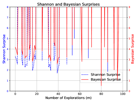
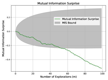
As shown in Figure 1, MIS progresses steadily within its expected bounds, reflecting a stable and well-regulated learning process. In contrast, Shannon and Bayesian Surprises fluctuate erratically, often spiking without clear justification.
<details>
<summary>x1.png Details</summary>
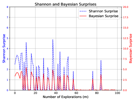
### Visual Description
## Line Chart: Shannon and Bayesian Surprises
### Overview
This is a dual-axis line chart comparing two metrics, "Shannon Surprise" and "Bayesian Surprise," plotted against the "Number of Explorations (m)." The chart displays how these two measures of surprise or information gain evolve over a sequence of exploratory actions.
### Components/Axes
* **Chart Title:** "Shannon and Bayesian Surprises" (centered at the top).
* **X-Axis:**
* **Label:** "Number of Explorations (m)"
* **Scale:** Linear, ranging from 0 to 100 with major tick marks every 20 units (0, 20, 40, 60, 80, 100).
* **Primary Y-Axis (Left):**
* **Label:** "Shannon Surprise"
* **Scale:** Linear, ranging from 0 to 8 with major tick marks every 1 unit.
* **Associated Data Series:** Blue dashed line.
* **Secondary Y-Axis (Right):**
* **Label:** "Bayesian Surprise"
* **Scale:** Linear, ranging from 0.0 to 20.0 with major tick marks every 2.5 units.
* **Associated Data Series:** Red solid line.
* **Legend:** Located in the top-right corner of the plot area.
* **Blue dashed line:** "Shannon Surprise"
* **Red solid line:** "Bayesian Surprise"
* **Grid:** A light gray grid is present, aligned with the major ticks of both the x-axis and the primary (left) y-axis.
### Detailed Analysis
**Data Series Trends and Key Points:**
1. **Shannon Surprise (Blue Dashed Line, Left Axis):**
* **Trend:** The series exhibits high volatility with frequent, sharp spikes, particularly in the first half of the exploration sequence (m=0 to m=60). The magnitude of the spikes generally decreases as the number of explorations increases. After approximately m=60, the values drop significantly and remain low, with only a few minor spikes.
* **Key Data Points (Approximate):**
* Initial value at m=0: ~2.8
* Major peaks:
* m ≈ 10: ~4.5
* m ≈ 35: ~4.8 (highest peak)
* m ≈ 45: ~3.7
* m ≈ 85: ~2.8
* Values after m=60 are predominantly below 1.0, often near 0.
2. **Bayesian Surprise (Red Solid Line, Right Axis):**
* **Trend:** This series also shows spiky behavior, with peaks that are temporally correlated with the peaks in Shannon Surprise. However, its overall magnitude (on its own scale) is lower relative to its axis maximum. The trend shows a more pronounced decline after the initial explorations, approaching and staying near zero from approximately m=60 onward.
* **Key Data Points (Approximate):**
* Initial value at m=0: ~3.5
* Major peaks (correlated with Shannon peaks):
* m ≈ 10: ~5.0
* m ≈ 35: ~4.0
* m ≈ 45: ~3.5
* m ≈ 85: ~3.5
* Values after m=60 are consistently very low, frequently at or near 0.0.
**Spatial and Visual Correlation:**
The peaks of both lines are closely aligned along the x-axis, indicating that events causing a high Shannon Surprise also cause a high Bayesian Surprise. The red line (Bayesian) appears to have a slightly smoother baseline between spikes compared to the blue line (Shannon).
### Key Observations
1. **Strong Correlation:** The most notable pattern is the tight temporal correlation between spikes in Shannon Surprise and Bayesian Surprise. They rise and fall together.
2. **Diminishing Surprise:** Both metrics show a clear overall trend of diminishing magnitude as the number of explorations (m) increases. The most significant "surprises" occur early in the process.
3. **Phase Transition:** There is a distinct change in behavior around m=60. After this point, both surprise measures become quiescent, suggesting the system or model has largely assimilated the environment or data, leading to few new surprises.
4. **Scale Difference:** While correlated, the absolute values are measured on different scales. A Shannon Surprise of ~4.8 corresponds to a Bayesian Surprise of ~4.0 at m≈35.
### Interpretation
This chart likely visualizes the learning or adaptation process of an agent or model in an unknown environment. "Surprise" quantifies the discrepancy between expectation and observation.
* **What the data suggests:** The early exploratory phase (m < 60) is characterized by frequent, significant updates to the model's beliefs, as evidenced by high surprise values. Each exploration provides substantial new information. The perfect correlation between the two surprise metrics indicates they are capturing related, though mathematically distinct, aspects of information gain. Shannon Surprise is rooted in information theory (reduction in entropy), while Bayesian Surprise measures the divergence between prior and posterior belief distributions.
* **How elements relate:** The x-axis represents time or experience. The dual y-axes allow the comparison of two different quantitative measures of the same conceptual phenomenon ("surprise") on their native scales. The decline in both lines demonstrates the principle of learning: as the agent explores, its predictions become more accurate, and observations become less surprising.
* **Notable anomalies/implications:** The near-zero values after m=60 are critical. They imply the learning process has converged or the environment has become predictable. The few late spikes (e.g., at m≈85) could represent rare, novel events or a change in the environment that temporarily reintroduces uncertainty. The chart effectively argues that both Shannon and Bayesian surprise are valid, correlated signals for guiding exploration, with the most informative explorations happening early on.
</details>
<details>
<summary>x2.png Details</summary>
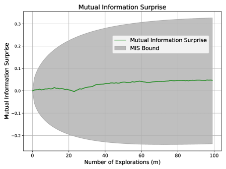
### Visual Description
## Line Chart with Confidence Interval: Mutual Information Surprise
### Overview
The image displays a line chart titled "Mutual Information Surprise," plotting a metric against the number of explorations. The chart includes a central trend line and a shaded region representing a bound or confidence interval.
### Components/Axes
* **Chart Title:** "Mutual Information Surprise" (centered at the top).
* **X-Axis:**
* **Label:** "Number of Explorations (m)"
* **Scale:** Linear, ranging from 0 to 100.
* **Major Tick Marks:** 0, 20, 40, 60, 80, 100.
* **Y-Axis:**
* **Label:** "Mutual Information Surprise"
* **Scale:** Linear, ranging from approximately -0.25 to 0.35.
* **Major Tick Marks:** -0.2, -0.1, 0.0, 0.1, 0.2, 0.3.
* **Legend:** Located in the top-right quadrant of the chart area.
* **Green Line:** Labeled "Mutual Information Surprise".
* **Gray Shaded Area:** Labeled "MIS Bound".
### Detailed Analysis
* **Data Series - "Mutual Information Surprise" (Green Line):**
* **Trend:** The line shows a generally stable, slightly increasing trend with minor fluctuations.
* **Key Points (Approximate):**
* At m=0, the value is ~0.0.
* The line remains close to 0.0 until approximately m=20.
* There is a slight dip to a local minimum of ~ -0.01 around m=25.
* From m=30 onward, the line exhibits a very gradual upward slope.
* At m=50, the value is ~0.03.
* At m=75, the value is ~0.04.
* At m=100, the value is ~0.05.
* **Data Series - "MIS Bound" (Gray Shaded Area):**
* **Trend:** The bound starts very narrow and expands symmetrically (or nearly symmetrically) around the green line as the number of explorations (m) increases.
* **Key Points (Approximate):**
* At m=0, the bound is negligible, spanning roughly -0.01 to 0.01.
* At m=25, the bound spans approximately -0.15 to 0.15.
* At m=50, the bound spans approximately -0.22 to 0.28.
* At m=100, the bound is at its widest, spanning approximately -0.25 to 0.33.
### Key Observations
1. **Stability of the Core Metric:** The "Mutual Information Surprise" value itself remains relatively small and stable, staying within the narrow range of -0.01 to 0.05 across all 100 explorations.
2. **Diverging Uncertainty:** The most prominent feature is the "MIS Bound," which grows significantly wider as the number of explorations increases. This indicates that the uncertainty or potential range of the surprise metric expands with more data/explorations.
3. **Minor Anomaly:** A small, localized dip in the green line occurs around m=25, which is the only notable deviation from its otherwise smooth, slightly ascending path.
### Interpretation
This chart likely illustrates a concept from information theory or machine learning, possibly related to active learning or Bayesian optimization. "Mutual Information Surprise" could measure how unexpected new data points are given the current model.
* **What the data suggests:** The core finding is that while the *average* or *expected* surprise (green line) increases only marginally with more explorations, the *potential range* of surprise (gray bound) grows dramatically. This implies that as the system explores more, it encounters a wider spectrum of possible outcomes—some highly surprising (positive values) and some highly predictable (negative values)—even if the central tendency changes little.
* **Relationship between elements:** The green line represents the central estimate or mean of the surprise. The gray "MIS Bound" likely represents a confidence interval, standard deviation, or theoretical bound (e.g., based on the Cramér-Rao bound or similar). The widening bound suggests that the estimator's variance increases with `m`, or that the theoretical limits of predictability become more extreme.
* **Notable implication:** The chart demonstrates a key trade-off: more exploration leads to a better understanding of the *possible* range of outcomes (wider bound), but does not necessarily lead to a dramatic shift in the *average* outcome (stable green line). The dip at m=25 could indicate a specific point where the model encountered a cluster of highly predictable data before resuming a trend of slightly increasing average surprise.
</details>
Figure 1: Surprise measures during standard exploration.
Scenario 2: Over-Exploitation.
In this scenario, the system repeatedly samples a previously seen point from $x\in[0,30]$ , specifically observing the pair $(x,y)=(7,7)$ one hundred times. This simulates stagnation.
Expected behavior: Surprise should diminish as no new information is gained. This mirrors the stagnation case in Section 3.3, and we expect MIS to violate its lower bound.
Figure 2 shows that MIS falls below its lower bound, signaling a lack of knowledge gain. While Shannon and Bayesian Surprises also trend downward, they lack a defined lower threshold, limiting their reliability for flagging such behavior. Recall that both Shannon and Bayesian Surprises are inherently one-sided, as noted in (?) and (?).
<details>
<summary>x3.png Details</summary>
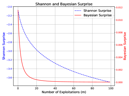
### Visual Description
## [Chart]: Shannon and Bayesian Surprise vs. Number of Exploitations
### Overview
The image is a dual-axis line chart titled "Shannon and Bayesian Surprise". It plots two different metrics of "surprise" against the "Number of Exploitations (m)". The chart demonstrates how both metrics decrease as the number of exploitations increases, but at significantly different rates and scales.
### Components/Axes
* **Title:** "Shannon and Bayesian Surprise" (centered at the top).
* **X-Axis:**
* **Label:** "Number of Exploitations (m)" (centered at the bottom).
* **Scale:** Linear, ranging from 0 to 100.
* **Major Tick Marks:** 0, 20, 40, 60, 80, 100.
* **Primary Y-Axis (Left):**
* **Label:** "Shannon Surprise" (rotated vertically, left side).
* **Scale:** Linear, with negative values.
* **Range:** Approximately -2.0 to -3.6.
* **Major Tick Marks:** -2.0, -2.2, -2.4, -2.6, -2.8, -3.0, -3.2, -3.4, -3.6.
* **Secondary Y-Axis (Right):**
* **Label:** "Bayesian Surprise" (rotated vertically, right side).
* **Scale:** Linear, with positive values.
* **Range:** 0.000 to 0.012.
* **Major Tick Marks:** 0.000, 0.002, 0.004, 0.006, 0.008, 0.010, 0.012.
* **Legend:**
* **Position:** Top-right corner, inside the plot area.
* **Entry 1:** Blue dashed line (`--`) labeled "Shannon Surprise".
* **Entry 2:** Red solid line (`-`) labeled "Bayesian Surprise".
* **Grid:** A light gray grid is present for both axes.
### Detailed Analysis
**1. Shannon Surprise (Blue Dashed Line):**
* **Trend:** The line shows a steady, monotonic decrease (negative slope) across the entire range. The rate of decrease slows slightly as `m` increases.
* **Data Points (Approximate):**
* At m=0: ~ -2.1
* At m=20: ~ -2.9
* At m=40: ~ -3.2
* At m=60: ~ -3.4
* At m=80: ~ -3.5
* At m=100: ~ -3.6
**2. Bayesian Surprise (Red Solid Line):**
* **Trend:** The line exhibits a very sharp, exponential-like decay initially, followed by a rapid plateau. The value approaches zero asymptotically.
* **Data Points (Approximate):**
* At m=0: ~ 0.011
* At m=5: ~ 0.004
* At m=10: ~ 0.001
* At m=20: ~ 0.0002
* At m=40 to m=100: The value is visually indistinguishable from 0.000 on this scale.
### Key Observations
* **Scale Disparity:** The two metrics operate on vastly different scales. Shannon Surprise is measured in negative units (likely bits, given the name), while Bayesian Surprise is a small positive number.
* **Rate of Change:** Bayesian Surprise diminishes to near-zero within the first 20 exploitations. Shannon Surprise continues to decrease meaningfully across the full range of 100 exploitations.
* **Convergence:** Both lines appear to converge towards a lower bound as `m` increases, but the Bayesian metric reaches its effective floor much sooner.
### Interpretation
This chart likely illustrates concepts from information theory and Bayesian statistics in the context of an exploration-exploitation process (e.g., in reinforcement learning or active learning).
* **What it Suggests:** The "surprise" associated with new information decreases as more data is gathered (exploitations increase). The chart quantitatively compares two ways of measuring this surprise.
* **Relationship Between Elements:** The dual-axis format is necessary because the fundamental units and magnitudes of the two metrics are different. The shared x-axis allows for direct comparison of their behavior relative to the same process variable (`m`).
* **Notable Patterns:**
1. **Bayesian Surprise is "Front-Loaded":** It captures almost all of its informational value very early in the process. This suggests it is highly sensitive to initial, novel data and quickly becomes uninformative as the model's beliefs stabilize.
2. **Shannon Surprise has "Long-Tail" Information:** It continues to register decreasing surprise over many more steps, indicating it may be measuring a more persistent form of uncertainty or information gain that diminishes gradually.
3. **The Plateau:** The flatlining of the Bayesian Surprise curve after m≈40 indicates that, according to this metric, virtually no new, surprising information is being obtained from additional exploitations beyond that point. The Shannon metric, however, still registers a (small) decrease, implying some residual uncertainty is still being resolved.
**In summary, the chart demonstrates that while both metrics capture the reduction of uncertainty with experience, Bayesian Surprise is a more rapidly saturating measure, whereas Shannon Surprise provides a more prolonged signal of decreasing uncertainty.**
</details>
<details>
<summary>x4.png Details</summary>
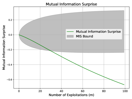
### Visual Description
## Line Chart with Shaded Bound: Mutual Information Surprise
### Overview
The image is a technical line chart titled "Mutual Information Surprise." It plots a single data series against a shaded region representing a bound. The chart illustrates how a metric called "Mutual Information Surprise" changes as the "Number of Exploitations (m)" increases, with an associated uncertainty or confidence interval.
### Components/Axes
* **Chart Title:** "Mutual Information Surprise" (centered at the top).
* **X-Axis:**
* **Label:** "Number of Exploitations (m)"
* **Scale:** Linear, ranging from 0 to 100.
* **Major Tick Marks:** 0, 20, 40, 60, 80, 100.
* **Y-Axis:**
* **Label:** "Mutual Information Surprise"
* **Scale:** Linear, ranging from approximately -0.7 to +0.3.
* **Major Tick Marks:** -0.6, -0.4, -0.2, 0.0, 0.2.
* **Legend:** Located in the center-right region of the plot area.
* **Entry 1:** A solid green line labeled "Mutual Information Surprise".
* **Entry 2:** A gray shaded rectangle labeled "MIS Bound".
* **Grid:** A light gray grid is present, aligning with the major tick marks on both axes.
### Detailed Analysis
* **Data Series (Green Line - "Mutual Information Surprise"):**
* **Trend Verification:** The line exhibits a consistent, nearly linear downward slope from left to right.
* **Data Points (Approximate):**
* At m = 0, y ≈ 0.0.
* At m = 20, y ≈ -0.13.
* At m = 40, y ≈ -0.27.
* At m = 60, y ≈ -0.40.
* At m = 80, y ≈ -0.53.
* At m = 100, y ≈ -0.66.
* **Shaded Region (Gray Area - "MIS Bound"):**
* **Trend Verification:** The region is symmetric about the y=0 line. Its vertical width increases monotonically as the x-value increases.
* **Boundaries (Approximate):**
* At m = 0, the bound is very narrow, centered at y=0.
* At m = 50, the upper bound is ≈ +0.22 and the lower bound is ≈ -0.22.
* At m = 100, the upper bound is ≈ +0.30 and the lower bound is ≈ -0.30.
### Key Observations
1. **Inverse Relationship:** There is a clear inverse relationship between the "Number of Exploitations (m)" and the "Mutual Information Surprise" value. As `m` increases, the surprise metric decreases (becomes more negative).
2. **Expanding Uncertainty:** The "MIS Bound" widens significantly as `m` increases, indicating that the range of possible values for the surprise metric grows with more exploitations.
3. **Divergence:** The green data line and the center of the gray bound (y=0) diverge sharply. By m=100, the data line is far outside the initial tight bound and is approaching the lower edge of the expanded bound.
### Interpretation
This chart likely visualizes a concept from information theory or machine learning, possibly related to active learning or exploration strategies.
* **What the data suggests:** The "Mutual Information Surprise" metric appears to quantify how "surprising" or informative new data points are. The downward trend suggests that as an agent or algorithm performs more exploitations (presumably gathering data from the most informative sources), the marginal surprise or information gain from subsequent exploitations diminishes. This is a classic sign of diminishing returns.
* **Relationship between elements:** The "MIS Bound" represents a theoretical or empirical confidence interval around the surprise metric. Its expansion indicates that while the *expected* surprise decreases, the *variability* or uncertainty in that surprise measurement increases with more samples. This could be due to accumulating noise or the exploration of more diverse, less predictable regions of the data space.
* **Notable anomaly/insight:** The most striking feature is that the actual measured surprise (green line) does not stay within the central region of its own bound. It trends strongly negative, suggesting the process is systematically reducing surprise faster than a neutral (zero) expectation. This could imply the exploitation strategy is highly effective at targeting informative data, or that the bound itself is calculated under assumptions (e.g., stationarity) that are being violated as the process continues. The chart effectively argues that more exploitation leads to less surprise but greater uncertainty about that surprise value.
</details>
Figure 2: Surprise measures under over-exploitation.
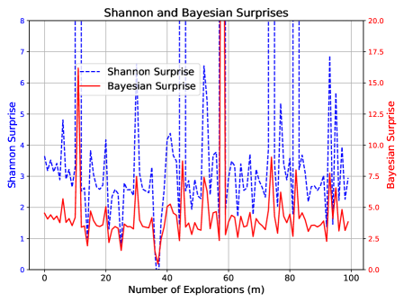
Scenario 3: Noisy Exploration.
We perform standard exploration over $x\in[30,100]$ but apply random corruption to the outputs $\mathbf{y}$ , replacing each with a uniformly random digit between $0$ and $9$ . This simulates exploration without informative feedback.
Expected behavior: Despite novel inputs, the system should register confusion if understanding fails to improve. This mirrors the noise-increase case in Section 3.3, and we expect MIS to violate its lower bound.
Figure 3 confirms the following: MIS drops below its expected range, accurately signaling lack of learning. In contrast, Shannon and Bayesian Surprises again display erratic behavior without consistent trends.
<details>
<summary>x5.png Details</summary>
### Visual Description
## Line Chart: Shannon and Bayesian Surprises
### Overview
This is a dual-axis line chart comparing two metrics—"Shannon Surprise" and "Bayesian Surprise"—over a sequence of explorations. The chart visualizes how these two distinct measures of "surprise" or information gain evolve as the number of explorations increases.
### Components/Axes
* **Chart Title:** "Shannon and Bayesian Surprises" (centered at the top).
* **X-Axis:**
* **Label:** "Number of Explorations (m)"
* **Scale:** Linear, ranging from 0 to 100.
* **Major Tick Marks:** At intervals of 20 (0, 20, 40, 60, 80, 100).
* **Primary Y-Axis (Left):**
* **Label:** "Shannon Surprise"
* **Scale:** Linear, ranging from 0 to 8.
* **Major Tick Marks:** At integer intervals (0, 1, 2, 3, 4, 5, 6, 7, 8).
* **Secondary Y-Axis (Right):**
* **Label:** "Bayesian surprise"
* **Scale:** Linear, ranging from 0 to 8.
* **Major Tick Marks:** At integer intervals (0, 1, 2, 3, 4, 5, 6, 7, 8).
* **Legend:**
* **Placement:** Bottom-right corner of the chart area.
* **Items:**
1. A blue dashed line labeled "Shannon Surprise".
2. A red solid line labeled "Bayesian Surprise".
* **Grid:** A light gray grid is present, aligning with the major ticks of both the x-axis and the primary y-axis.
### Detailed Analysis
**1. Shannon Surprise (Blue Dashed Line):**
* **Trend:** The line exhibits moderate volatility in the first half of the explorations (m=0 to ~40), generally fluctuating between values of 2 and 4 on the left y-axis. After approximately m=40, the line drops significantly and stabilizes at a much lower level, mostly between 1 and 2, with a few isolated points slightly higher.
* **Key Data Points (Approximate):**
* Starts near 3 at m=0.
* Peaks around 4 at m≈10, m≈20, and m≈30.
* Has a notable dip to ~2 at m≈18.
* Shows a sharp, sustained drop starting around m=38, falling to ~1.5 by m=42.
* Remains low (1-2 range) from m=42 to m=100, with a minor peak near 2.5 at m≈55.
**2. Bayesian Surprise (Red Solid Line):**
* **Trend:** This line is characterized by extreme, high-frequency volatility. It consists almost entirely of sharp, vertical spikes that frequently reach the maximum value of 8 on the right y-axis, interspersed with rapid drops to values near or below 2. There is no clear upward or downward long-term trend; the pattern of intense spiking is consistent across the entire range of explorations.
* **Key Data Points (Approximate):**
* The line spikes to 8 or near-8 more than 15 times across the x-axis range.
* Notable deep troughs (values ≤ 2) occur at approximately m=5, m=15, m=40, m=65, and a very deep one near m=80 where it drops to ~0.5.
* The spikes are densely packed, especially between m=0-40 and m=60-100.
### Key Observations
1. **Dichotomy in Behavior:** The two metrics display fundamentally different behaviors. Shannon Surprise shows a regime shift (from moderate volatility to low, stable values), while Bayesian Surprise maintains a consistent pattern of high-amplitude, high-frequency spikes throughout.
2. **Divergence Point:** The most significant event in the chart is the divergence that occurs around m=40. At this point, the Shannon Surprise metric drops and stays low, while the Bayesian Surprise continues its spiking pattern unabated.
3. **Value Range:** Both metrics utilize the full 0-8 scale, but they do so in completely different ways. Shannon Surprise occupies the lower-to-mid range (1-4) for most of the chart, while Bayesian Surprise repeatedly hits the ceiling (8) and floor (0-2) of its scale.
4. **Visual Density:** The red line (Bayesian) creates a dense, "barcode-like" visual texture due to its rapid oscillations, whereas the blue line (Shannon) is more sparse and easier to follow visually.
### Interpretation
This chart likely illustrates a comparison between two different mathematical frameworks for quantifying "surprise" or information gain in a sequential learning or exploration process.
* **What the Data Suggests:** The stark contrast implies that the two measures are sensitive to different aspects of the data or the learning process. The **Bayesian Surprise** (red) appears to be a highly reactive, instantaneous measure. Its constant spiking suggests that nearly every new exploration (data point) provides a significant update to the Bayesian model, causing a large "surprise" value. This could indicate a model that is constantly being surprised by new evidence, perhaps due to a high initial uncertainty or a complex underlying distribution.
* The **Shannon Surprise** (blue), based on information theory, seems to measure a more cumulative or smoothed uncertainty. Its drop and stabilization after m=40 suggest that, from the model's perspective, the *informational content* or *reduction in entropy* gained from each new exploration diminishes significantly after a certain point. The system may have learned the broad structure of the environment by then, so new samples provide less "new" information in a Shannon sense, even if they still cause large Bayesian updates.
* **Relationship and Anomaly:** The key relationship is their divergence. The anomaly is not a single data point but the entire behavioral dichotomy. This visual evidence argues that "surprise" is not a monolithic concept. The choice of metric (Bayesian vs. Shannon) fundamentally changes the narrative of the learning process: one tells a story of constant, dramatic updates, while the other tells a story of initial learning followed by saturation. The chart powerfully demonstrates that the interpretation of system behavior is contingent on the chosen analytical lens.
</details>
<details>
<summary>x6.png Details</summary>
### Visual Description
## Line Chart with Confidence Interval: Mutual Information Surprise
### Overview
This image is a line chart titled "Mutual Information Surprise" that plots a metric against the number of explorations. The chart includes a central trend line and a shaded region representing a bound or confidence interval. The overall visual suggests a decreasing trend with increasing uncertainty.
### Components/Axes
* **Chart Title:** "Mutual Information Surprise" (centered at the top).
* **X-Axis:**
* **Label:** "Number of Explorations (m)"
* **Scale:** Linear, ranging from 0 to 100.
* **Major Tick Marks:** 0, 20, 40, 60, 80, 100.
* **Y-Axis:**
* **Label:** "Mutual Information Surprise"
* **Scale:** Linear, ranging from approximately -0.5 to 0.3.
* **Major Tick Marks:** -0.4, -0.2, 0.0, 0.2.
* **Legend:** Located in the top-right quadrant of the chart area.
* **Green Line:** Labeled "Mutual Information Surprise".
* **Gray Shaded Area:** Labeled "MIS Bound".
* **Grid:** A light gray grid is present in the background.
### Detailed Analysis
1. **Data Series - "Mutual Information Surprise" (Green Line):**
* **Trend Verification:** The line exhibits a consistent, monotonic downward slope from left to right.
* **Spatial Grounding & Data Points (Approximate):**
* At x=0, y ≈ 0.0.
* At x=20, y ≈ -0.08.
* At x=40, y ≈ -0.18.
* At x=60, y ≈ -0.28.
* At x=80, y ≈ -0.42.
* At x=100, y ≈ -0.55.
* The line shows minor local fluctuations but the overall negative trend is clear and strong.
2. **Data Series - "MIS Bound" (Gray Shaded Region):**
* **Trend Verification:** The shaded region is narrow at x=0 and expands symmetrically (or nearly so) around the green line as x increases, forming a funnel or cone shape opening to the right.
* **Spatial Grounding & Bounds (Approximate):**
* At x=0: The bound is very tight, approximately y = 0.0 ± 0.01.
* At x=50: The bound spans from approximately y = -0.1 to y = +0.15.
* At x=100: The bound spans from approximately y = -0.55 (coinciding with the line) to y = +0.25.
* The upper edge of the bound increases slightly, while the lower edge decreases sharply, following the trend of the central line.
### Key Observations
* **Strong Negative Correlation:** There is a clear, strong inverse relationship between the "Number of Explorations (m)" and the "Mutual Information Surprise" value.
* **Diverging Uncertainty:** The "MIS Bound" widens dramatically as the number of explorations increases. This indicates that the variance or uncertainty associated with the "Mutual Information Surprise" measurement grows substantially with more data/explorations.
* **Asymmetry in Bound:** While the bound expands in both directions, the expansion is more pronounced in the negative direction, closely tracking the downward trend of the central line. The upper bound shows a much gentler positive slope.
### Interpretation
The chart demonstrates a system where increased exploration (m) leads to a decrease in "Mutual Information Surprise." In information-theoretic terms, this likely means that as the system gathers more data, its predictions or model become less "surprised" by new observations—the observed data aligns better with its expectations. This is a sign of learning or model convergence.
However, the critical insight is the **expanding MIS Bound**. This suggests that while the *average* surprise decreases, the *range of possible surprise values* grows. This could indicate:
1. **Increasing Model Uncertainty:** The system's confidence in its own decreasing surprise metric diminishes with more explorations.
2. **Heteroscedasticity:** The underlying process being measured has variability that increases with the scale of exploration.
3. **A Trade-off:** There may be a trade-off between reducing average surprise and maintaining consistent, predictable performance. The system becomes better on average but less predictable in its specific outcomes.
The funnel shape is a classic visual indicator of this phenomenon. The data suggests that while exploration is effective at reducing surprise, it does so at the cost of introducing greater variability into the system's performance metric.
</details>
Figure 3: Surprise measures under noisy exploration.
Scenario 4: Aggressive Exploration.
This scenario enforces strict exploration over $x\in[30,500]$ , where each new sample is far from all observed points (i.e., outside the $\pm 1$ neighborhood range).
Expected behavior: Aggressive exploration without verification can lead to overconfidence. This mirrors the aggressive exploration case in Section 3.3, and we expect MIS to exceed its upper bound.
Figure 4 shows MIS surpassing its upper bound, consistent with this expectation. Shannon and Bayesian Surprises again fluctuate unpredictably.
<details>
<summary>x7.png Details</summary>
### Visual Description
## Line Chart: Shannon and Bayesian Surprises
### Overview
This is a dual-axis line chart comparing two different metrics of "surprise" over a series of explorations. The chart plots "Shannon Surprise" and "Bayesian Surprise" against the "Number of Explorations (m)". The data shows high variability and spiky behavior for both metrics, with notable differences in scale and pattern.
### Components/Axes
* **Title:** "Shannon and Bayesian Surprises" (centered at the top).
* **X-Axis:**
* **Label:** "Number of Explorations (m)"
* **Scale:** Linear, ranging from 0 to 100.
* **Major Ticks:** 0, 20, 40, 60, 80, 100.
* **Primary Y-Axis (Left):**
* **Label:** "Shannon Surprise"
* **Scale:** Linear, ranging from 0 to 8.
* **Major Ticks:** 0, 1, 2, 3, 4, 5, 6, 7, 8.
* **Associated Data Series:** Blue dashed line.
* **Secondary Y-Axis (Right):**
* **Label:** "Bayesian Surprise"
* **Scale:** Linear, ranging from 0.0 to 20.0.
* **Major Ticks:** 0.0, 2.5, 5.0, 7.5, 10.0, 12.5, 15.0, 17.5, 20.0.
* **Associated Data Series:** Red solid line.
* **Legend:**
* **Position:** Top-left corner of the plot area.
* **Items:**
1. Blue dashed line: "Shannon Surprise"
2. Red solid line: "Bayesian Surprise"
### Detailed Analysis
**Data Series Trends:**
1. **Shannon Surprise (Blue Dashed Line):**
* **Trend:** Exhibits high-frequency, high-amplitude oscillations throughout the entire range of explorations. The line frequently spikes to values between 4 and 8 on its axis, with deep troughs often falling below 2.
* **Key Data Points (Approximate):**
* Starts near 3.5 at m=0.
* Major peaks: ~7.5 at m≈12, ~6.5 at m≈45, ~7.8 at m≈58, ~7.5 at m≈75, ~6.8 at m≈95.
* Notable trough: Near 0 at m≈40.
* General baseline appears to fluctuate between 1 and 4.
2. **Bayesian Surprise (Red Solid Line):**
* **Trend:** Also shows spiky behavior but with a different pattern. It has a lower baseline (mostly between 1 and 5 on its axis) punctuated by several very sharp, high-magnitude spikes.
* **Key Data Points (Approximate):**
* Starts near 4.0 at m=0.
* Major spikes: ~16.0 at m≈12, ~19.5 at m≈58 (the highest point), ~15.0 at m≈75, ~12.5 at m≈95.
* Smaller, frequent spikes between 2.5 and 7.5.
* Deepest trough aligns with Shannon's at m≈40, dropping to near 0.
**Cross-Reference & Spatial Grounding:**
* The legend in the top-left correctly maps the blue dashed line to the left axis (Shannon) and the red solid line to the right axis (Bayesian).
* The highest peak for Bayesian Surprise (red, ~19.5) occurs at approximately m=58, which corresponds to a high peak for Shannon Surprise (blue, ~7.8).
* The most significant trough for both series occurs at the same exploration number, m≈40.
### Key Observations
1. **Correlated Spikes:** Major spikes in both metrics often occur at similar exploration numbers (e.g., m≈12, 58, 75, 95), suggesting events that cause high surprise in both information-theoretic and Bayesian frameworks.
2. **Inverse Behavior at m=40:** At approximately 40 explorations, both metrics drop to near-zero simultaneously, indicating a period of minimal surprise or high predictability.
3. **Scale Difference:** Bayesian Surprise operates on a larger numerical scale (0-20) compared to Shannon Surprise (0-8), but its baseline is not proportionally higher; its spikes are more extreme relative to its baseline.
4. **Volatility:** Both signals are highly volatile, with no smooth trends, indicating that the "surprise" associated with each exploration step is highly variable and context-dependent.
### Interpretation
This chart visualizes the difference between two fundamental ways of measuring "surprise" or information gain in a learning or exploration process.
* **Shannon Surprise** (blue) measures the information content or improbability of an outcome based on a known probability distribution. Its constant high variability suggests the outcomes of explorations are frequently improbable according to the current model.
* **Bayesian Surprise** (red) measures how much an outcome causes a revision of beliefs (the divergence between prior and posterior distributions). Its pattern of a low baseline with extreme spikes indicates that most explorations cause only minor belief updates, but occasional explorations are profoundly informative, radically changing the model's understanding.
The correlation of major spikes suggests that outcomes which are highly improbable (high Shannon Surprise) often also force significant belief updates (high Bayesian Surprise). However, the scales and shapes differ because an event can be improbable without changing beliefs much (if it was already considered a low-probability possibility), or it can cause a major belief update even if it wasn't extremely improbable (e.g., confirming a rare but critical hypothesis). The simultaneous drop at m=40 is particularly interesting, representing a "calm" period where outcomes were both expected and non-informative. This dual-axis chart is crucial for understanding the nuanced dynamics of information acquisition during an exploratory process.
</details>
<details>
<summary>x8.png Details</summary>
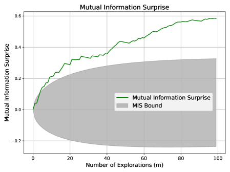
### Visual Description
## [Line Chart with Shaded Region]: Mutual Information Surprise
### Overview
This image is a line chart titled "Mutual Information Surprise" that plots a metric called "Mutual Information Surprise" against the "Number of Explorations (m)". The chart includes a primary data series represented by a green line and a secondary shaded region representing a bound. The overall trend shows the surprise metric increasing with the number of explorations.
### Components/Axes
* **Chart Title:** "Mutual Information Surprise" (Top-center)
* **X-Axis:**
* **Label:** "Number of Explorations (m)" (Bottom-center)
* **Scale:** Linear scale from 0 to 100.
* **Major Tick Marks:** 0, 20, 40, 60, 80, 100.
* **Y-Axis:**
* **Label:** "Mutual Information Surprise" (Left-center, rotated vertically)
* **Scale:** Linear scale from -0.2 to 0.6.
* **Major Tick Marks:** -0.2, 0.0, 0.2, 0.4, 0.6.
* **Legend:** Positioned in the bottom-right quadrant of the chart area.
* **Green Line:** Labeled "Mutual Information Surprise".
* **Gray Shaded Area:** Labeled "MIS Bound".
* **Grid:** A light gray grid is present, aligning with the major tick marks on both axes.
### Detailed Analysis
**1. Primary Data Series (Green Line - "Mutual Information Surprise"):**
* **Trend Verification:** The line exhibits a clear, consistent upward trend from left to right. It starts near the origin and rises with a slightly decreasing slope as the number of explorations increases.
* **Data Point Extraction (Approximate):**
* At m=0, y ≈ 0.0
* At m=10, y ≈ 0.15
* At m=20, y ≈ 0.30
* At m=40, y ≈ 0.35
* At m=60, y ≈ 0.45
* At m=80, y ≈ 0.55
* At m=100, y ≈ 0.58
**2. Secondary Data Series (Gray Shaded Region - "MIS Bound"):**
* **Trend Verification:** The shaded region represents a range or confidence interval. It starts as a point at (0,0), widens significantly as 'm' increases, reaching its maximum vertical span around m=40-60, and then appears to narrow slightly towards m=100.
* **Boundary Extraction (Approximate):**
* **Upper Bound:** Starts at 0, rises to ~0.25 at m=20, ~0.30 at m=60, and ~0.33 at m=100.
* **Lower Bound:** Starts at 0, drops to ~-0.15 at m=20, ~-0.20 at m=60, and ~-0.18 at m=100.
* The green "Mutual Information Surprise" line remains above the upper boundary of the "MIS Bound" for all m > 0.
### Key Observations
1. **Dominant Trend:** The "Mutual Information Surprise" metric shows a strong, monotonic increase as the number of explorations grows, suggesting a cumulative or learning effect.
2. **Relationship to Bound:** The measured surprise (green line) consistently exceeds the upper limit of the "MIS Bound" (gray area) after the initial point. This indicates the bound is a conservative estimate or a theoretical lower limit that the actual metric surpasses.
3. **Shape of Growth:** The rate of increase in surprise is highest for the first ~20 explorations and gradually slows, though it never plateaus completely within the observed range (m=0 to 100).
4. **Bound Behavior:** The "MIS Bound" expands and then stabilizes, suggesting the theoretical uncertainty or range of possible values grows with initial exploration before settling.
### Interpretation
This chart likely visualizes a concept from information theory, reinforcement learning, or active learning. "Mutual Information Surprise" probably quantifies how much new, unexpected information an agent gains from each exploration step.
* **What the data suggests:** The upward trend demonstrates that with each additional exploration (m), the agent continues to discover information that is surprising relative to its prior knowledge. The decreasing slope suggests diminishing returns—the most surprising information is found early on, but novel information is still being acquired even after 100 steps.
* **How elements relate:** The "MIS Bound" serves as a benchmark. The fact that the actual surprise metric lies above this bound implies the agent's exploration strategy is effective at finding information that is more surprising than a theoretical minimum or baseline expectation. The widening of the bound may reflect increasing variance or a larger space of possible outcomes as exploration proceeds.
* **Notable implication:** The chart provides empirical evidence that the exploration process is successfully uncovering novel information, as measured by mutual information surprise, and that this process outperforms a defined theoretical bound. This could be used to validate an exploration algorithm or to illustrate the information gain properties of a system.
</details>
Figure 4: Surprise measures during aggressive exploration.
Scenario 5: Noise Decrease.
To simulate noise reduction, we begin with $100$ initial observations from $x\in[0,30]$ , paired with a randomly assigned output $y\in[0,9]$ . New samples are drawn from the same $x$ range but the new $y$ is produced using the deterministic modulus function in Eq. (7).
Expected behavior: Reduced noise implies stronger input-output dependency and we thus expect MIS to exceed its upper bound.
Figure 5 confirms this: MIS grows beyond its bound. Shannon and Bayesian Surprises continue to spike erratically.
<details>
<summary>x9.png Details</summary>
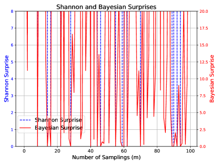
### Visual Description
## Dual-Axis Line Chart: Shannon and Bayesian Surprises
### Overview
This is a dual-axis line chart titled "Shannon and Bayesian Surprises." It plots two different "surprise" metrics against the number of samplings (m). The chart demonstrates the volatile and spiky nature of both metrics over 100 sampling iterations, with Bayesian Surprise exhibiting significantly higher magnitude and frequency of spikes compared to Shannon Surprise.
### Components/Axes
* **Chart Title:** "Shannon and Bayesian Surprises" (centered at the top).
* **X-Axis:**
* **Label:** "Number of Samplings (m)"
* **Scale:** Linear, from 0 to 100.
* **Major Tick Marks:** 0, 20, 40, 60, 80, 100.
* **Primary Y-Axis (Left):**
* **Label:** "Shannon Surprise"
* **Scale:** Linear, from 0 to 8.
* **Major Tick Marks:** 0, 1, 2, 3, 4, 5, 6, 7, 8.
* **Secondary Y-Axis (Right):**
* **Label:** "Bayesian surprise"
* **Scale:** Linear, from 0.0 to 20.0.
* **Major Tick Marks:** 0.0, 2.5, 5.0, 7.5, 10.0, 12.5, 15.0, 17.5, 20.0.
* **Legend:**
* **Position:** Top-left corner of the plot area.
* **Entry 1:** Blue dashed line (`--`) labeled "Shannon Surprise".
* **Entry 2:** Red solid line (`-`) labeled "Bayesian Surprise".
* **Plot Area:** Contains a dense grid of vertical red and blue lines/spikes against a white background with a light gray grid.
### Detailed Analysis
* **Data Series - Shannon Surprise (Blue Dashed Line):**
* **Trend Verification:** The line is characterized by sharp, narrow, vertical spikes rising from a baseline near zero. The spikes are irregularly spaced and vary in height.
* **Data Points (Approximate):** The spikes reach values primarily between 2 and 8 on the left y-axis. Notable peaks occur near sampling numbers 10, 18, 30, 45, 68, and 90, with the highest spikes approaching or reaching the maximum value of 8. The baseline between spikes is consistently at or very near 0.
* **Data Series - Bayesian Surprise (Red Solid Line):**
* **Trend Verification:** This series also exhibits sharp, vertical spikes, but they are more frequent, often overlapping, and reach much higher magnitudes on the right y-axis.
* **Data Points (Approximate):** Spikes frequently exceed 15.0, with many reaching between 17.5 and 20.0. The highest spikes appear to hit the upper limit of 20.0 at multiple points (e.g., near sampling numbers 5, 15, 25, 55, 75, 95). The baseline is also near zero, but the density of high spikes makes the red line dominate the visual field.
* **Spatial Grounding & Cross-Reference:** The legend in the top-left correctly maps the blue dashed line to the left-axis "Shannon Surprise" and the red solid line to the right-axis "Bayesian surprise." The visual density of the red line confirms its higher magnitude and frequency as per the right-axis scale.
### Key Observations
1. **Magnitude Disparity:** Bayesian Surprise values (0-20 scale) are consistently and significantly higher in magnitude than Shannon Surprise values (0-8 scale) at their peaks.
2. **Frequency and Density:** The spikes for Bayesian Surprise are more densely packed across the 100 samplings compared to the slightly more spaced-out spikes of Shannon Surprise.
3. **Synchronized Spikes:** At several sampling points (e.g., near m=10, 30, 68, 90), spikes in both metrics occur simultaneously, suggesting events that trigger high surprise in both frameworks.
4. **Baseline Behavior:** Both metrics return to a near-zero baseline between spike events.
### Interpretation
This chart visually compares two information-theoretic measures of "surprise" or unexpectedness in a sequential sampling or learning process.
* **What the data suggests:** The data demonstrates that the Bayesian Surprise metric is far more sensitive or reactive than the Shannon Surprise metric in this context. It produces larger and more frequent high-surprise signals. This could imply that the Bayesian framework, which incorporates prior beliefs, is detecting deviations from its expectations more aggressively than the Shannon measure, which is based purely on the information content of the new observation itself.
* **Relationship between elements:** The simultaneous spikes indicate specific sampling events (m values) that are highly informative or anomalous according to both mathematical definitions. The divergence in magnitude suggests that for the same event, the Bayesian update (incorporating prior knowledge) results in a greater "surprise" than the raw information gain calculated by Shannon.
* **Notable patterns/anomalies:** The most notable pattern is the consistent over-performance (in terms of magnitude) of Bayesian Surprise. An anomaly to note is that despite the difference in scale, the *timing* of major surprise events is often correlated, validating that both metrics are responding to the same underlying phenomena in the data stream, albeit with different sensitivities. The chart effectively argues that the choice of surprise metric dramatically affects the perceived "volatility" or "informativeness" of a process.
</details>
<details>
<summary>x10.png Details</summary>
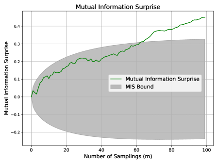
### Visual Description
## Line Chart with Confidence Interval: Mutual Information Surprise
### Overview
The image displays a line chart titled "Mutual Information Surprise," plotting a metric against the number of samplings. The chart includes a primary data series (a green line) and a shaded gray region representing a bound or confidence interval. The overall trend shows the metric increasing with the number of samplings, while the uncertainty (bound) also expands.
### Components/Axes
* **Chart Title:** "Mutual Information Surprise" (centered at the top).
* **X-Axis:**
* **Label:** "Number of Samplings (m)"
* **Scale:** Linear, ranging from 0 to 100.
* **Major Tick Marks:** 0, 20, 40, 60, 80, 100.
* **Y-Axis:**
* **Label:** "Mutual Information Surprise"
* **Scale:** Linear, ranging from approximately -0.2 to 0.45.
* **Major Tick Marks:** -0.2, -0.1, 0.0, 0.1, 0.2, 0.3, 0.4.
* **Legend:** Located in the top-left quadrant of the plot area.
* **Green Line Symbol:** Labeled "Mutual Information Surprise".
* **Gray Rectangle Symbol:** Labeled "MIS Bound".
* **Grid:** A light gray grid is present, aligning with the major tick marks on both axes.
### Detailed Analysis
**1. Primary Data Series (Green Line - "Mutual Information Surprise"):**
* **Trend Verification:** The line exhibits a clear, generally upward trend from left to right, with noticeable local fluctuations (ups and downs) along its path.
* **Data Point Extraction (Approximate):**
* At m=0: y ≈ 0.0
* At m=10: y ≈ 0.1
* At m=20: y ≈ 0.2
* At m=30: y ≈ 0.22 (local peak before a small dip)
* At m=40: y ≈ 0.25
* At m=50: y ≈ 0.28
* At m=60: y ≈ 0.3
* At m=70: y ≈ 0.38
* At m=80: y ≈ 0.4
* At m=90: y ≈ 0.42
* At m=100: y ≈ 0.45 (final point, highest value)
**2. Shaded Region (Gray Area - "MIS Bound"):**
* **Description:** This region represents a bound or interval around the primary metric. It is narrow at low sampling numbers and expands significantly as the number of samplings increases.
* **Spatial Grounding & Bounds:**
* **Lower Bound:** Starts near y=0 at m=0. It decreases, reaching approximately y=-0.2 by m=100.
* **Upper Bound:** Starts near y=0 at m=0. It increases, reaching approximately y=0.33 by m=100.
* The green data line remains within this gray bound for the entire plotted range.
### Key Observations
1. **Positive Correlation:** There is a strong positive correlation between the "Number of Samplings (m)" and the "Mutual Information Surprise" value.
2. **Increasing Uncertainty:** The "MIS Bound" widens dramatically as `m` increases, indicating that the potential range or uncertainty of the surprise metric grows with more data/samples.
3. **Non-Monotonic Growth:** While the overall trend is upward, the green line is not smooth; it contains several small-scale fluctuations, suggesting variability in the metric's calculation at different sampling points.
4. **Bound Asymmetry:** The expansion of the MIS Bound is asymmetric. The lower bound decreases more sharply (to -0.2) than the upper bound increases (to ~0.33) relative to the central trend line.
### Interpretation
This chart likely visualizes a concept from information theory or statistics, possibly related to active learning, Bayesian optimization, or anomaly detection. "Mutual Information Surprise" could quantify how informative or unexpected a new data point is given a model or prior knowledge.
* **What the data suggests:** The upward trend indicates that as more samples are collected (increasing `m`), the cumulative or average "surprise" or information gain increases. This is intuitive—more data should lead to more information.
* **Relationship between elements:** The green line shows the estimated or measured value of the surprise metric. The gray "MIS Bound" likely represents a theoretical confidence interval, a posterior variance, or a bound on the possible values of this metric. Its expansion signifies that with more observations, the *potential* for extreme surprise values (both high and low) also increases, even if the measured value trends upward.
* **Notable implications:** The fact that the measured value (green line) trends toward the upper part of the expanding bound suggests the process is generating information at a rate that consistently challenges expectations. The asymmetry of the bound might indicate a skewed underlying distribution or a one-sided constraint on the metric. This visualization is crucial for understanding not just the expected information gain, but also the risk or variability associated with it as an experiment progresses.
</details>
Figure 5: Surprise measures during noise decrease.
Scenario 6: Discovery of New Output Values.
We modify the function in the unexplored region ( $x>30$ ) to $y=x\mod 10-10$ , introducing a different behavior while keeping the original function unchanged in $[0,30]$ .
Expected behavior: A competent surprise measure should register this new structure as a meaningful discovery. This mirrors the novel discovery case in Section 3.3, and we expect MIS to exceed its upper bound.
Figure 6 shows MIS sharply exceeding its expected trajectory, signaling successful identification of a structural shift. Shannon and Bayesian Surprises again fail to provide consistent or interpretable responses.
<details>
<summary>x11.png Details</summary>
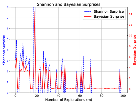
### Visual Description
## Line Chart: Shannon and Bayesian Surprises
### Overview
This is a dual-axis line chart comparing two metrics, "Shannon Surprise" and "Bayesian Surprise," plotted against the "Number of Explorations (m)." The chart displays how these two measures of surprise fluctuate over a sequence of 100 exploration steps.
### Components/Axes
* **Chart Title:** "Shannon and Bayesian Surprises" (centered at the top).
* **X-Axis:**
* **Label:** "Number of Explorations (m)" (centered at the bottom).
* **Scale:** Linear scale from 0 to 100, with major tick marks every 20 units (0, 20, 40, 60, 80, 100).
* **Primary Y-Axis (Left):**
* **Label:** "Shannon Surprise" (rotated vertically).
* **Scale:** Linear scale from 0 to 8, with major tick marks every 1 unit.
* **Secondary Y-Axis (Right):**
* **Label:** "Bayesian Surprise" (rotated vertically).
* **Scale:** Linear scale from 0 to 14, with major tick marks every 2 units.
* **Legend:** Located in the top-right corner of the plot area.
* **Blue Dashed Line:** "Shannon Surprise"
* **Red Solid Line:** "Bayesian Surprise"
### Detailed Analysis
**Data Series Trends:**
1. **Shannon Surprise (Blue Dashed Line):**
* **Trend:** The series is highly volatile, characterized by frequent, sharp spikes from a baseline near zero. The most prominent spike occurs at approximately m=20.
* **Key Data Points (Approximate):**
* **Highest Peak:** At m ≈ 20, Shannon Surprise reaches its maximum value of ~8.
* **Other Major Peaks:** At m ≈ 2, 8, 12, 28, 45, 62, 68, and 98, with values ranging between ~3 and ~5.
* **Baseline:** Between spikes, the value frequently returns to near 0.
2. **Bayesian Surprise (Red Solid Line):**
* **Trend:** This series also shows spiky behavior correlated with the Shannon Surprise spikes, but with a different magnitude and a slightly smoother profile in some regions. It has a notable period of very low, stable values in the latter part of the exploration sequence.
* **Key Data Points (Approximate):**
* **Highest Peak:** At m ≈ 20, Bayesian Surprise reaches its maximum value of ~14 (on the right axis).
* **Other Major Peaks:** At m ≈ 2, 8, 12, 28, 45, 62, and 98, with values ranging between ~4 and ~8.
* **Notable Low Period:** From approximately m=75 to m=95, the Bayesian Surprise remains very close to 0, with minimal fluctuation.
**Spatial & Cross-Reference Check:**
* The legend is positioned in the top-right, clearly associating the blue dashed line with Shannon Surprise and the red solid line with Bayesian Surprise.
* The major spikes in both lines are temporally aligned (e.g., at m≈20, 45, 62), confirming they are reacting to the same exploration events. The red line's peak at m≈20 is visually the tallest feature on the chart relative to its own axis.
### Key Observations
1. **Correlated Spikes:** The most significant observation is the strong temporal correlation between spikes in Shannon Surprise and Bayesian Surprise. Every major peak in one series corresponds to a peak in the other.
2. **Magnitude Difference:** The Bayesian Surprise metric reaches a higher absolute maximum (14 vs. 8) and generally has higher peak values relative to its scale compared to Shannon Surprise.
3. **Divergence in Stability:** While both metrics are volatile, the Bayesian Surprise exhibits a prolonged period of near-zero stability (m=75-95) that is not as clearly mirrored in the Shannon Surprise series, which continues to show small fluctuations.
4. **Concentration of Events:** The highest density of large surprise events occurs in the first half of the exploration sequence (m=0 to 50).
### Interpretation
This chart visualizes the information-theoretic "surprise" generated during an exploration process. The data suggests that specific exploration steps (e.g., m≈20) yielded outcomes that were highly unexpected according to both Shannon's information theory (which measures information content) and a Bayesian framework (which measures deviation from prior beliefs).
The perfect alignment of spikes indicates that events causing high Shannon information content also cause a significant update in Bayesian belief. The higher magnitude of Bayesian Surprise peaks might suggest that these events were not just informative but also strongly contradicted prior expectations. The later period of low Bayesian Surprise (m=75-95) implies a phase where explorations yielded results that were highly predictable given the accumulated knowledge, leading to minimal belief updates, even if the raw information content (Shannon Surprise) remained slightly variable. This could indicate the agent has learned a stable model of its environment in that region.
</details>
<details>
<summary>x12.png Details</summary>
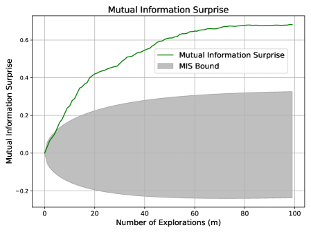
### Visual Description
## Line Chart with Confidence Interval: Mutual Information Surprise
### Overview
The image is a line chart titled "Mutual Information Surprise" that plots a metric against the number of explorations. It features a primary data series (a green line) and a shaded gray region representing a bound or confidence interval. The chart illustrates how the "Mutual Information Surprise" value and its associated uncertainty evolve as the number of explorations increases.
### Components/Axes
* **Chart Title:** "Mutual Information Surprise" (centered at the top).
* **X-Axis:**
* **Label:** "Number of Explorations (m)"
* **Scale:** Linear scale from 0 to 100.
* **Major Tick Marks:** 0, 20, 40, 60, 80, 100.
* **Y-Axis:**
* **Label:** "Mutual Information Surprise"
* **Scale:** Linear scale from -0.2 to 0.6 (with grid lines extending to ~0.7).
* **Major Tick Marks:** -0.2, 0.0, 0.2, 0.4, 0.6.
* **Legend:** Located in the top-right quadrant of the chart area.
* **Item 1:** A solid green line labeled "Mutual Information Surprise".
* **Item 2:** A gray shaded rectangle labeled "MIS Bound".
* **Grid:** A light gray grid is present for both major x and y ticks.
### Detailed Analysis
**1. Primary Data Series (Green Line - "Mutual Information Surprise"):**
* **Trend Verification:** The line shows a clear, monotonically increasing trend. It rises steeply initially and then gradually plateaus, exhibiting a logarithmic or diminishing returns shape.
* **Data Point Extraction (Approximate):**
* At m = 0: y ≈ 0.0
* At m = 10: y ≈ 0.25
* At m = 20: y ≈ 0.42
* At m = 40: y ≈ 0.55
* At m = 60: y ≈ 0.63
* At m = 80: y ≈ 0.67
* At m = 100: y ≈ 0.68
**2. Shaded Region (Gray Area - "MIS Bound"):**
* **Trend Verification:** The bound starts very narrow (near zero width) at m=0 and expands as the number of explorations increases. The expansion is asymmetric, growing more in the positive direction than the negative.
* **Spatial Grounding & Data Points (Approximate Bounds):**
* At m = 0: Upper bound ≈ 0.0, Lower bound ≈ 0.0 (negligible width).
* At m = 20: Upper bound ≈ 0.22, Lower bound ≈ -0.10.
* At m = 50: Upper bound ≈ 0.28, Lower bound ≈ -0.18.
* At m = 100: Upper bound ≈ 0.33, Lower bound ≈ -0.23.
* The green data line remains consistently above the upper edge of the gray "MIS Bound" region for all m > 0.
### Key Observations
1. **Diminishing Returns:** The most significant increase in "Mutual Information Surprise" occurs within the first 20-30 explorations. After m=60, the curve flattens considerably, suggesting that additional explorations yield progressively smaller increases in the metric.
2. **Growing Uncertainty:** The "MIS Bound" widens substantially with more explorations, indicating that the range of possible or expected values for the metric increases. The uncertainty is not symmetric around the central estimate (the green line).
3. **Consistent Outperformance:** The actual measured "Mutual Information Surprise" (green line) is always higher than the upper limit of the "MIS Bound" (gray area). This suggests the observed performance consistently exceeds the theoretical or baseline bound depicted.
### Interpretation
This chart likely visualizes the performance of an exploration algorithm in a reinforcement learning or information-theoretic context. "Mutual Information Surprise" is a metric that quantifies the information gain or novelty encountered during exploration.
* **What the data suggests:** The algorithm is effective at gathering new information early on, but its rate of discovery slows as it explores more (a common phenomenon). The widening "MIS Bound" could represent a theoretical confidence interval or the performance of a baseline/random exploration strategy. The fact that the green line stays above this bound indicates the algorithm is performing significantly better than this baseline.
* **How elements relate:** The x-axis (explorations) is the independent variable driving the change in the metric (y-axis). The bound provides context, showing that the algorithm's performance is not just high in absolute terms but also superior relative to a reference distribution or limit.
* **Notable implications:** The plateau suggests a potential saturation point where further exploration may not be cost-effective. The asymmetric bound implies the model's uncertainty is skewed, with a greater potential for the true value to be lower than the estimate than higher. This chart would be critical for evaluating exploration efficiency and understanding the trade-off between exploration effort and information gain.
</details>
Figure 6: Surprise measures when exploring a new region with novel outputs.
Summary
Across all scenarios, MIS reliably indicates whether the system is genuinely learning, stagnating, or encountering degradation. It responds to the structure and value of observations, more than just novelty. In contrast, Shannon and Bayesian Surprises often react to superficial fluctuations and display numerical instability. Furthermore, the MIS progression bound remains consistent and interpretable across all scenarios, while Shannon and Bayesian Surprises lack a universal scale or threshold, as reflected by their inconsistent magnitudes across Figures 1 through 6. This inconsistency limits their effectiveness as a reliable trigger. Overall, this simulation study demonstrates MIS not only as a novel metric for quantifying surprise, but also as a more trustworthy indicator of learning dynamics—making it a promising tool for autonomous system monitoring.
### 4.2 Pollution Estimation: A Case Study
To demonstrate the practical utility of our proposed MIS reaction policy, we apply it to a real-time pollution map estimation scenario. We evaluate the impact of integrating the MIS reaction policy on system performance in a dynamic, non-stationary environment. Specifically, we compare two approaches: a selection of baseline sampling strategies and the same strategies governed by our MIS reaction policy.
### Dataset: Dynamic Pollution Maps
We utilize a synthetic pollution simulation dataset comprising $450$ time frames, each representing a $50\times 50$ pollution grid. Initially, the environment contains $3$ pollution sources, each emitting high pollution at a fixed level. The rest of the field exhibits moderate and random pollution values. Over time, the pollution levels across the entire field evolve due to natural diffusion, decay, and wind effects. Moreover, every $50$ frames, a new pollution source is added to the field at a random location. These new sources elevate the overall pollution levels and alter the input-output relationship between the spatial coordinates and the pollution intensity. Figure 7 displays a snippet of the pollution map at two intermediate time points. The simulation details for the dynamic pollution map generation are provided in the Appendix.
<details>
<summary>x13.png Details</summary>
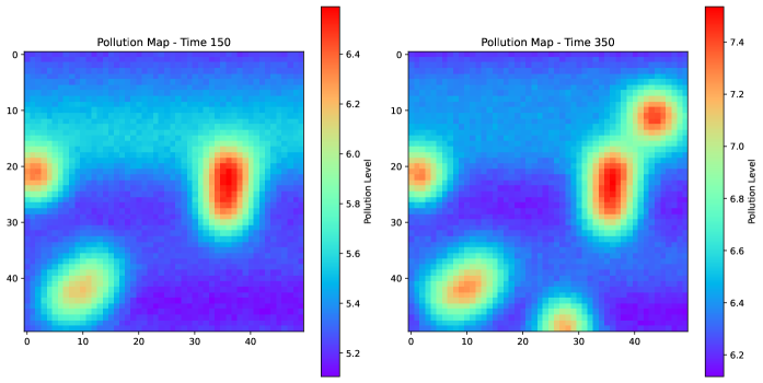
### Visual Description
## Heatmap Comparison: Pollution Maps at Time 150 and Time 350
### Overview
The image displays two side-by-side heatmaps visualizing spatial pollution levels at two distinct time points. The left heatmap is titled "Pollution Map - Time 150" and the right is titled "Pollution Map - Time 350". Both maps use a color gradient to represent pollution intensity, with a dedicated color bar scale for each. The visualization suggests a comparison of pollution distribution and intensity over time.
### Components/Axes
* **Titles:**
* Left Map: "Pollution Map - Time 150"
* Right Map: "Pollution Map - Time 350"
* **Axes:** Both maps share identical unlabeled spatial axes. The horizontal (X) and vertical (Y) axes are marked with numerical ticks from 0 to 40, in increments of 10. These likely represent spatial coordinates (e.g., grid cells, distance in km).
* **Color Bars (Legends):**
* **Left Map (Time 150):** A vertical color bar is positioned to the right of the heatmap. It is labeled "Pollution level". The scale ranges from approximately **5.2** (dark blue/purple) at the bottom to **6.4** (dark red) at the top. Key intermediate markers are at 5.4, 5.6, 5.8, 6.0, and 6.2.
* **Right Map (Time 350):** A vertical color bar is positioned to the right of its heatmap. It is also labeled "Pollution level". The scale ranges from approximately **6.2** (dark blue/purple) at the bottom to **7.4** (dark red) at the top. Key intermediate markers are at 6.4, 6.6, 6.8, 7.0, and 7.2.
* **Spatial Layout:** The two heatmaps are placed horizontally adjacent. Each heatmap is a square grid. The color bars are placed immediately to the right of their respective maps.
### Detailed Analysis
**Pollution Map - Time 150 (Left):**
* **Trend:** Pollution is concentrated in three distinct, localized hotspots against a background of lower levels.
* **Data Points & Distribution:**
1. **Hotspot 1 (Center-Right):** The most intense area, centered approximately at coordinates (X=35, Y=25). The core color is dark red, indicating a pollution level of **~6.4**. This hotspot is vertically elongated.
2. **Hotspot 2 (Left Edge):** Located near (X=0, Y=20). The core color is orange-red, indicating a level of **~6.2**.
3. **Hotspot 3 (Bottom-Left):** Located near (X=10, Y=40). The core color is yellow-orange, indicating a level of **~6.0**.
* **Background:** The majority of the map area, especially the top half and the region between hotspots, is colored in shades of blue and cyan, indicating lower pollution levels between **~5.2 and 5.6**.
**Pollution Map - Time 350 (Right):**
* **Trend:** Pollution levels are significantly higher overall, hotspots have intensified, expanded, and new ones have appeared. The spatial distribution is more complex.
* **Data Points & Distribution:**
1. **Hotspot 1 (Center-Right):** The original hotspot at (X=35, Y=25) has intensified and expanded. Its core is now a deeper red, indicating a level of **~7.4**.
2. **Hotspot 2 (Left Edge):** The hotspot at (X=0, Y=20) remains, with a core level of **~7.0** (orange-red).
3. **Hotspot 3 (Bottom-Left):** The hotspot at (X=10, Y=40) has intensified, with a core level of **~7.0** (orange-red).
4. **New Hotspot 4 (Top-Right):** A new, intense hotspot has emerged near (X=40, Y=10). Its core is dark red, indicating a level of **~7.4**.
5. **New Hotspot 5 (Bottom-Center):** Another new, smaller hotspot is visible near (X=30, Y=45). Its core is orange, indicating a level of **~6.8**.
* **Background:** The background pollution level has risen. The lowest values (dark blue/purple) are now at **~6.2**, which was near the *maximum* of the previous map. Most of the background is in the cyan to green range (**~6.4 to 6.8**).
### Key Observations
1. **Systemic Increase:** The entire pollution baseline has risen dramatically. The minimum value at Time 350 (~6.2) is equivalent to the near-maximum value at Time 150.
2. **Hotspot Intensification & Proliferation:** Existing pollution sources have become more severe, and at least two new significant sources have appeared by Time 350.
3. **Spatial Spread:** The pollution is no longer confined to three isolated points; the areas of elevated pollution are larger and beginning to connect, especially on the right side of the map.
4. **Scale Change:** The color bar scales are different, which is critical for accurate comparison. Direct visual color comparison is misleading without referencing the numerical scales.
### Interpretation
This visualization demonstrates a significant degradation in environmental quality over the time interval from T=150 to T=350. The data suggests:
* **Worsening Conditions:** There is a clear and substantial increase in pollution concentration across the entire monitored area.
* **Source Activity:** The intensification of existing hotspots implies that primary pollution sources are emitting at a higher rate or that accumulation is occurring. The emergence of new hotspots suggests the activation of new pollution sources or the migration/formation of pollution plumes.
* **Potential for Coalescence:** The expansion of hotspots indicates a risk that separate pollution plumes may merge, leading to larger, contiguous zones of severe contamination.
* **Investigative Lead:** A technical investigator would use this map to prioritize field measurements at the new and intensified hotspot coordinates (e.g., (40,10), (35,25)) to identify the responsible sources or processes. The uniform rise in background levels might indicate a systemic issue like increased regional emissions or reduced atmospheric dispersion.
</details>
Figure 7: Pollution maps at time $150$ and time $350$ .
### Sampling Strategies
As discussed in Section 3.4, the MIS reaction policy is designed to complement existing exploration–exploitation strategies. To demonstrate the effectiveness of the Mutual Information Surprise Reaction Policy (MISRP), we integrate it with three well-established sampling strategies. These are: the surprise-reactive (SR) sampling method proposed by (?) using either Shannon or Bayesian surprises, the subtractive clustering/entropy (SC/E) active learning strategy proposed by (?), and the greedy search/query by committee (GS/QBC) active learning strategy used in (?).
1. SR: The surprise-reactive sampling method (?) switches between exploration and exploitation modes based on observed Shannon or Bayesian Surprise. By default, SR operates in an exploration mode guided by the widely used space-filling principle (?), selecting new sampling locations via the min-max objective:
$$
\mathbf{x}^{*}=\underset{\mathbf{x}}{\operatorname{argmax}}\>\underset{\mathbf{x}_{i}\in\mathbf{X}}{\min}\>\|\mathbf{x}-\mathbf{x}_{i}\|_{2},
$$
where $\mathbf{X}$ denotes the set of existing observations. Upon encountering a surprising event (in terms of either Shannon or Bayesian Surprise), SR switches to exploitation mode, performing localized verification sampling within the neighborhood of the surprise-triggering location. This continues either for a fixed number of steps defined by an exploitation limit $t$ , or until an unsurprising event occurs. If exploitation confirms that the surprise is consistent (i.e., persistent surprise until reaching the exploitation threshold), all corresponding observations are accepted and incorporated into the pollution map estimation. Conversely, if an unsurprising event arises before the threshold is reached, the surprising observations are deemed anomalous and discarded. For Shannon Surprise, we set the triggering threshold at $1.3$ , corresponding to a likelihood of $5\$ . For Bayesian Surprise, we use the Postdictive Surprise and adopt the threshold of $0.5$ , following (?).
MISRP: The MISRP modifies SR by dynamically adjusting the exploitation limit $t$ . When increased exploitation is needed, $t$ is incremented by $1$ . For increased exploration, $t$ is decremented by $1$ , with a lower bound of $t=1$ .
1. SC/E: The subtractive clustering/entropy active learning strategy (?) selects the next sampling location by maximizing a custom acquisition function. For an unseen region $\mathcal{X}$ and a probabilistic predictive function $\hat{f}(\mathbf{x})$ trained on the observed data, the acquisition function is defined as:
$$
a(\mathbf{x})=(1-\eta)\mathbb{E}_{\mathbf{x}^{\prime}\in\mathcal{X}}[e^{-\|\mathbf{x}-\mathbf{x}^{\prime}\|_{2}}]+\eta H(\hat{f}(\mathbf{x})),
$$
where $\eta$ is the exploitation parameter, with a default value of $0.5$ , and $H(\hat{f}(\mathbf{x}))$ denotes the entropy of the predictive distribution at $\mathbf{x}$ . A larger value of $\eta$ emphasizes sampling at locations with high predictive uncertainty near previously seen points, promoting exploitation. A smaller value favors sampling at representative locations in the unseen region, promoting exploration (?).
MISRP: The MISRP modifies SC/E by adjusting the exploitation parameter $\eta$ . For increased exploitation, $\eta$ is increased by $0.1$ , up to a maximum of $1$ . For increased exploration, $\eta$ is decreased by $0.1$ , with a minimum of $0$ .
1. GS/QBC: The greedy search/query by committee active learning strategy (?) uses a different acquisition function. Given the set of seen observations $\{\mathbf{X},\mathbf{Y}\}$ and a model committee $\mathcal{F}$ composed of multiple predictive models trained on this data, the acquisition function is defined as:
$$
a(\mathbf{x})=(1-\eta)\underset{\mathbf{x}^{\prime},\mathbf{y}^{\prime}\in\mathbf{X},\mathbf{y}}{\min}\|\mathbf{x}-\mathbf{x}^{\prime}\|_{2}\|\hat{f}(\mathbf{x})-\mathbf{y}^{\prime}\|_{2}+\eta\underset{\hat{f}(\cdot),\hat{f}^{\prime}(\cdot)\in\mathcal{F}}{\max}\|\hat{f}(\mathbf{x})-\hat{f}^{\prime}(\mathbf{x})\|_{2}, \tag{8}
$$
where the first term encourages exploration by selecting points that are distant from existing observations in both input and output space. The second term promotes exploitation by targeting locations with high disagreement among models in the committee.
MISRP: The MISRP regulates the balance between exploration and exploitation in GS/QBC in the same manner as in SC/E, by adjusting the parameter $\eta$ .
### Experimental Setup
The estimation process is initialized with $10$ observed locations uniformly sampled across the pollution field. Each time frame collects $10$ new samples according to the chosen sampling strategy, representing the operation of $10$ mobile pollution sensors. The pollution field is estimated using a Gaussian Process Regressor with a Matérn kernel ( $\nu=2.5$ ) and a noise prior of $10^{-2}$ , consistently applied across all strategies. The model predicts pollution levels at specified spatial locations and is updated using both current and historical data, with a maximum of $200$ observations retained to reduce computational cost.
For the GS/QBC strategy, the model committee additionally includes regressors with a Matérn $\nu=1.5$ kernel and a Gaussian kernel with bandwidth $0.1$ , both using a noise prior of $10^{-2}$ . These two additional models are used solely for calculating disagreement in Eq. (8) and are not employed in pollution map estimation.
Shannon and Bayesian Surprise are computed following the procedure described in Section 4.1. For MIS calculations, we discretize the range of pollution values observed in the data into $100$ bins to estimate entropy.
In process forking scenarios, two separate pollution map estimates, $\hat{f}_{m}$ and $\hat{f}_{n}$ , are produced for subprocesses $\mathcal{P}_{m}$ and $\mathcal{P}_{n}$ , respectively. The final pollution map estimate is formed as a weighted combination:
$$
\hat{f}=\frac{\sqrt{m}}{\sqrt{m}+\sqrt{n}}\hat{f}_{m}+\frac{\sqrt{n}}{\sqrt{m}+\sqrt{n}}\hat{f}_{n},
$$
accounting for generalization errors that scale as $\mathcal{O}(\frac{1}{\sqrt{m}})$ and $\mathcal{O}(\frac{1}{\sqrt{n}})$ , respectively (?).
### Simulation Results
We assess performance using the mean squared error (MSE) between predicted and true pollution maps at each time step. Due to the dynamic nature of the pollution field, estimation errors exhibit substantial fluctuation. To smooth these variations, we compute a 20-frame moving average of the MSE for both vanilla and MISRP-governed strategies. The results are shown in Figure 8.
<details>
<summary>x14.png Details</summary>
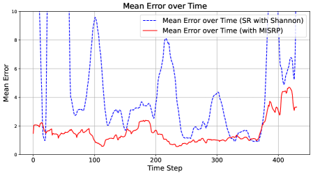
### Visual Description
## Line Chart: Mean Error over Time
### Overview
The image displays a line chart comparing the mean error over time for two different methods or algorithms. The chart plots "Mean Error" on the vertical axis against "Time Step" on the horizontal axis. One method, represented by a blue dashed line, exhibits high volatility with large spikes, while the other, represented by a red solid line, shows a much lower and more stable error profile.
### Components/Axes
* **Chart Title:** "Mean Error over Time" (centered at the top).
* **Y-Axis:**
* **Label:** "Mean Error" (rotated vertically on the left side).
* **Scale:** Linear scale ranging from 0 to 10.
* **Major Tick Marks:** 0, 2, 4, 6, 8, 10.
* **X-Axis:**
* **Label:** "Time Step" (centered at the bottom).
* **Scale:** Linear scale ranging from 0 to approximately 450.
* **Major Tick Marks:** 0, 100, 200, 300, 400.
* **Legend:** Positioned in the top-right quadrant of the chart area.
* **Entry 1:** A blue dashed line icon followed by the text "Mean Error over Time (SR with Shannon)".
* **Entry 2:** A red solid line icon followed by the text "Mean Error over Time (with MISRP)".
* **Grid:** A light gray grid is present, aligned with the major tick marks on both axes.
### Detailed Analysis
**Data Series 1: SR with Shannon (Blue Dashed Line)**
* **Trend Verification:** This series is highly volatile, characterized by sharp, high-amplitude spikes and deep troughs. It does not follow a smooth trend but rather exhibits erratic, large-magnitude fluctuations throughout the observed period.
* **Key Data Points (Approximate):**
* Starts at a mean error of ~2 at Time Step 0.
* First major spike reaches ~9.8 near Time Step 20.
* Deep trough drops to ~1 near Time Step 30.
* Second major spike reaches ~9.5 near Time Step 100.
* Another significant spike reaches ~8.2 near Time Step 210.
* A later spike reaches ~7.8 near Time Step 400.
* The final visible point is at ~8.2 near Time Step 440.
* Troughs frequently drop to values between 1 and 3.
**Data Series 2: with MISRP (Red Solid Line)**
* **Trend Verification:** This series is significantly more stable and consistently lower than the blue series. It shows a gentle, low-amplitude oscillation with a slight overall downward trend until around Time Step 350, after which it begins a gradual increase.
* **Key Data Points (Approximate):**
* Starts at a mean error of ~2 at Time Step 0, similar to the blue line.
* Quickly settles into a range between ~1 and ~2.5.
* Reaches a local minimum of ~0.5 near Time Step 110.
* Maintains a value around ~1 from Time Step 200 to 350.
* Begins rising after Time Step 350, reaching a peak of ~4.5 near Time Step 420.
* Ends at approximately ~3.2 near Time Step 440.
### Key Observations
1. **Performance Disparity:** The "with MISRP" method (red line) demonstrates a substantially lower mean error for the vast majority of the time steps compared to the "SR with Shannon" method (blue line).
2. **Volatility Contrast:** The "SR with Shannon" method is extremely unstable, with error values swinging dramatically between ~1 and ~10. The "with MISRP" method is stable, with error values confined mostly between ~0.5 and ~4.5.
3. **Convergence at Start:** Both methods begin at approximately the same error value (~2) at Time Step 0.
4. **Late-Stage Behavior:** After Time Step 350, the error for the stable "MISRP" method begins to climb, while the volatile "SR with Shannon" method continues its pattern of sharp spikes.
### Interpretation
The chart provides strong visual evidence that the "MISRP" technique is superior to the "SR with Shannon" technique for the task being measured, in terms of both accuracy (lower mean error) and reliability (lower variance). The "SR with Shannon" method's performance is unpredictable and prone to catastrophic spikes in error, suggesting it may be sensitive to specific conditions or inputs within the time series. The "MISRP" method's smooth, low-error curve indicates robustness. The gradual increase in error for MISRP after Time Step 350 could indicate a slow degradation in performance, a change in the underlying data characteristics, or a limitation of the method over very long durations. The initial convergence suggests both methods may start from a similar baseline or initialization. This comparison would be critical for selecting an algorithm for a real-world application where consistent, low-error performance is required.
</details>
<details>
<summary>x15.png Details</summary>
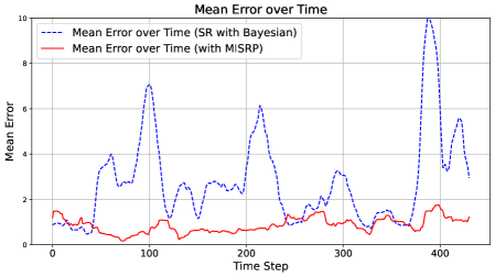
### Visual Description
## Line Chart: Mean Error over Time
### Overview
The image displays a line chart comparing the mean error over time for two different methods: "SR with Bayesian" and "with MISRP". The chart shows that the "SR with Bayesian" method exhibits significantly higher and more volatile error rates compared to the "with MISRP" method, which maintains a consistently low error.
### Components/Axes
* **Chart Title:** "Mean Error over Time" (centered at the top).
* **Y-Axis:**
* **Label:** "Mean Error"
* **Scale:** Linear scale from 0 to 10, with major tick marks at intervals of 2 (0, 2, 4, 6, 8, 10).
* **X-Axis:**
* **Label:** "Time Step"
* **Scale:** Linear scale from 0 to 400, with major tick marks at intervals of 100 (0, 100, 200, 300, 400).
* **Legend:** Located in the top-left corner of the chart area.
* **Entry 1:** A blue dashed line (`---`) labeled "Mean Error over Time (SR with Bayesian)".
* **Entry 2:** A red solid line (`—`) labeled "Mean Error over Time (with MISRP)".
* **Grid:** A light gray grid is present, aligning with the major tick marks on both axes.
### Detailed Analysis
**Data Series 1: Mean Error over Time (SR with Bayesian) - Blue Dashed Line**
* **Trend Verification:** This line shows a highly volatile pattern with multiple sharp peaks and troughs. The overall trend is not monotonic but features several large spikes.
* **Key Data Points (Approximate):**
* Starts at a mean error of ~1.0 at Time Step 0.
* First major peak: ~7.0 at approximately Time Step 100.
* Second major peak: ~6.0 at approximately Time Step 200.
* Third and largest peak: >10.0 (exceeds the chart's upper limit) at approximately Time Step 400.
* Numerous smaller peaks and valleys exist between these major spikes, with error values frequently ranging between 1 and 4.
**Data Series 2: Mean Error over Time (with MISRP) - Red Solid Line**
* **Trend Verification:** This line is relatively flat and stable, showing only minor fluctuations. It maintains a low error value throughout the observed time steps.
* **Key Data Points (Approximate):**
* Starts at a mean error of ~1.5 at Time Step 0.
* Fluctuates gently, primarily within the range of 0.5 to 2.0.
* Shows a slight, gradual increase in the latter half of the timeline (after Time Step 300), but remains below 2.0.
* Does not exhibit any large spikes comparable to the blue line.
### Key Observations
1. **Performance Disparity:** There is a stark and consistent difference in performance between the two methods. The "with MISRP" method (red line) demonstrates vastly superior and more stable performance (lower mean error) than the "SR with Bayesian" method (blue line).
2. **Volatility:** The "SR with Bayesian" method is characterized by extreme volatility, with error rates spiking dramatically at semi-regular intervals (around steps 100, 200, and 400).
3. **Outlier Event:** The most significant outlier is the final spike in the blue line around Time Step 400, where the mean error surpasses the chart's maximum y-axis value of 10, indicating a potential catastrophic failure or extreme anomaly for that method at that point.
4. **Stability:** The "with MISRP" method shows remarkable stability, with its error rate appearing largely unaffected by the time steps that cause massive errors in the competing method.
### Interpretation
The data strongly suggests that the **"with MISRP" method is significantly more robust and reliable** for the task being measured over the given time horizon. Its low and stable mean error indicates consistent performance.
In contrast, the **"SR with Bayesian" method appears highly unreliable**. Its error profile is not only higher on average but is punctuated by severe performance degradations (the large spikes). This pattern could indicate:
* **Instability in the algorithm:** The method may be prone to divergence or failure under certain conditions that recur over time.
* **Sensitivity to specific time-step conditions:** The spikes at ~100, ~200, and ~400 might correlate with specific phases, data batches, or environmental changes in the underlying process being modeled.
* **A fundamental limitation:** The method may lack the mechanisms to correct for accumulating errors, leading to periodic large deviations.
The chart serves as compelling evidence for preferring the MISRP-based approach over the Bayesian SR approach in this specific context, as it provides both better average performance and, crucially, predictable and controlled error behavior. The final spike in the blue line is particularly concerning, as it suggests the potential for unbounded error growth.
</details>
<details>
<summary>x16.png Details</summary>
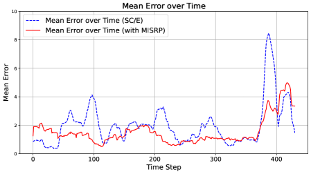
### Visual Description
## Line Chart: Mean Error over Time
### Overview
The image displays a line chart comparing the "Mean Error" of two different methods or conditions over a series of time steps. The chart illustrates how the average error metric fluctuates and evolves for each method across the observed period.
### Components/Axes
* **Chart Title:** "Mean Error over Time" (centered at the top).
* **Y-Axis:**
* **Label:** "Mean Error" (vertical text on the left).
* **Scale:** Linear scale ranging from 0 to 10, with major tick marks at intervals of 2 (0, 2, 4, 6, 8, 10).
* **X-Axis:**
* **Label:** "Time Step" (horizontal text at the bottom).
* **Scale:** Linear scale ranging from 0 to approximately 430, with major tick marks labeled at 0, 100, 200, 300, and 400.
* **Legend:** Positioned in the top-left corner of the plot area.
* **Entry 1:** A blue dashed line (`---`) labeled "Mean Error over Time (SC/E)".
* **Entry 2:** A red solid line (`—`) labeled "Mean Error over Time (with MISRP)".
* **Grid:** A light gray grid is present, aligning with the major ticks on both axes.
### Detailed Analysis
**Data Series 1: Mean Error over Time (SC/E) - Blue Dashed Line**
* **Trend Verification:** This series exhibits high volatility with several pronounced peaks and troughs. It shows a general pattern of fluctuating error with a dramatic, sharp spike in the later time steps.
* **Key Data Points (Approximate):**
* Starts near 1.0 at Time Step 0.
* First major peak: ~4.2 at Time Step ~100.
* Subsequent peaks: ~3.5 at Time Step ~210, ~2.8 at Time Step ~290.
* **Major Outlier Spike:** Rises sharply to its maximum value of approximately **8.5** at Time Step ~380.
* After the spike, it drops rapidly to ~1.5 by Time Step ~430.
**Data Series 2: Mean Error over Time (with MISRP) - Red Solid Line**
* **Trend Verification:** This series is generally smoother and maintains a lower mean error compared to the blue line for most of the timeline. It shows a gradual increase in error towards the end of the observed period.
* **Key Data Points (Approximate):**
* Starts near 2.0 at Time Step 0.
* Fluctuates between approximately 0.5 and 2.5 for the majority of the timeline (Time Steps 0-350).
* Begins a steady increase after Time Step 350.
* Reaches its peak of approximately **5.0** at Time Step ~410.
* Ends at approximately 3.5 at Time Step ~430.
### Key Observations
1. **Performance Divergence:** The "with MISRP" method (red line) consistently yields a lower mean error than the "SC/E" method (blue line) from approximately Time Step 50 to Time Step 370.
2. **Critical Anomaly:** The "SC/E" method experiences a severe, isolated error spike (to ~8.5) around Time Step 380, which is the most prominent feature of the chart.
3. **Late-Stage Convergence and Crossover:** Following the major spike, the error for "SC/E" plummets. Meanwhile, the error for "with MISRP" rises, leading to a crossover point around Time Step 400 where the red line's error exceeds the blue line's error for the first time since the early stages.
4. **Volatility:** The "SC/E" series is significantly more volatile, characterized by sharper and higher peaks throughout the timeline.
### Interpretation
The data suggests that the **MISRP** technique is effective at suppressing and stabilizing the mean error over a long duration compared to the baseline **SC/E** method. The MISRP line demonstrates better control and lower average error for over 80% of the observed time steps.
However, the dramatic spike in the SC/E error around Time Step 380 indicates a potential critical failure mode, instability, or a specific challenging event in the process being measured that the SC/E method is highly sensitive to. The subsequent rapid recovery is notable.
The late-stage rise in error for the MISRP method and the crossover event suggest that its advantage may diminish or reverse under certain prolonged conditions or after a specific temporal threshold. This could imply that MISRP's error suppression has a time-dependent efficacy or that it accumulates error differently over very long runs.
**In summary:** MISRP provides superior and more stable performance for the majority of the operational window but shows a concerning late-stage error increase. The SC/E method is less stable overall and is vulnerable to extreme, transient error spikes. The choice between them may depend on whether consistent mid-term performance (favoring MISRP) or resilience to late-stage drift (where SC/E appears better after its spike) is more critical for the application.
</details>
<details>
<summary>x17.png Details</summary>
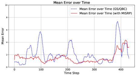
### Visual Description
## Line Chart: Mean Error over Time
### Overview
This is a line chart comparing the mean error over time for two different methods or algorithms: "GS/QBC" and "with MISRP". The chart plots the mean error (y-axis) against time steps (x-axis), showing how the error evolves for each method across approximately 430 time steps.
### Components/Axes
* **Chart Title:** "Mean Error over Time"
* **Y-Axis:**
* **Label:** "Mean Error"
* **Scale:** Linear scale from 0 to 10.
* **Major Tick Marks:** 0, 2, 4, 6, 8, 10.
* **X-Axis:**
* **Label:** "Time Step"
* **Scale:** Linear scale from 0 to approximately 430.
* **Major Tick Marks:** 0, 100, 200, 300, 400.
* **Legend:**
* **Position:** Top-right corner of the chart area.
* **Entry 1:** "Mean Error over Time (GS/QBC)" - Represented by a **blue dashed line**.
* **Entry 2:** "Mean Error over Time (with MISRP)" - Represented by a **red solid line**.
### Detailed Analysis
**Data Series 1: Mean Error over Time (GS/QBC) - Blue Dashed Line**
* **Trend Verification:** This line exhibits high volatility with several pronounced peaks and troughs. It shows a pattern of spiking to high error values and then dropping back down.
* **Key Data Points (Approximate):**
* Starts near 0.5 at Time Step 0.
* First major peak: ~3.8 at Time Step ~60.
* Second major peak: ~5.8 at Time Step ~100.
* Third major peak: ~4.4 at Time Step ~210.
* Fourth and highest peak: ~7.5 at Time Step ~390.
* Ends near 1.5 at Time Step ~430.
* Troughs frequently drop to values between 0.5 and 2.0.
**Data Series 2: Mean Error over Time (with MISRP) - Red Solid Line**
* **Trend Verification:** This line is significantly more stable and generally maintains a lower error value compared to the blue line. It shows a gentle, undulating pattern without extreme spikes.
* **Key Data Points (Approximate):**
* Starts near 2.0 at Time Step 0.
* Fluctuates mostly between 0.5 and 2.5 for the first 350 time steps.
* Shows a gradual increase starting around Time Step 350.
* Reaches its highest point of ~4.2 at Time Step ~420.
* Ends near 3.0 at Time Step ~430.
### Key Observations
1. **Volatility Contrast:** The GS/QBC method (blue) is highly unstable, with error values swinging dramatically. The MISRP method (red) is much more consistent.
2. **Error Magnitude:** For the vast majority of the timeline, the MISRP method maintains a lower mean error than the peaks of the GS/QBC method. The blue line's peaks (up to ~7.5) are far above the red line's maximum (~4.2).
3. **Converging Trend:** Towards the end of the observed period (after Time Step 350), the error for the MISRP method begins to rise, while the GS/QBC method experiences its largest spike. By the final data points, the two lines are closer in value than at many earlier peaks.
4. **Synchronized Dip:** Both methods show a notable dip in error around Time Step 120-130.
### Interpretation
The chart demonstrates a clear performance comparison between two approaches. The "with MISRP" method appears to be a more robust and reliable technique, as it successfully suppresses the large error spikes seen in the baseline "GS/QBC" method. The high volatility of the GS/QBC line suggests it may be sensitive to specific conditions or data points encountered at certain time steps, leading to periodic failures (high error). The MISRP enhancement likely introduces a stabilizing mechanism.
The rising trend for both methods in the final segment could indicate a change in the underlying data or task difficulty at later time steps. The fact that MISRP's error also increases here, but without the extreme spike seen in GS/QBC, suggests it degrades more gracefully under challenging conditions. This visualization strongly argues for the effectiveness of the MISRP component in reducing and stabilizing mean error over time.
</details>
Figure 8: Moving average estimation error over time. Top-Left: SR with Shannon Surprise. Top-Right: SR with Bayesian Surprise. Bottom-Left: SC/E. Bottom-Right: GS/QBC.
Across all comparisons, the baseline strategies display considerable volatility. In contrast, MISRP-governed counterparts produce smoother and consistently lower error curves, highlighting the stabilizing effect of MIS through its ability to facilitate adaptive responses in dynamic environments.
Table 2 presents the average estimation errors and their corresponding standard errors. The standard error is measured across $10$ Monte Carlo simulations and $450$ frames. Across all sampling strategies, incorporating the MIS reaction policy yields a substantial reduction in both mean estimation error and variability. Improvements in estimation error range from $24\$ to $76\$ , while reductions in standard error range from $36\$ to $90\$ .
To further illustrate the advantage of MISRP, we increase the per-frame sampling budget and the initial number of observed locations of the baseline strategies from $10$ to $25$ , and expand the total memory buffer from $200$ to $500$ , in order to assess whether baseline strategies can match the performance of MISRP-governed approaches. Table 3 compares the estimation error of MISRP-governed strategies (maintaining the original sampling budget of $10$ ) against the enhanced baseline strategies. Even with a $2.5\times$ increase in sampling budget, the baseline strategies remain significantly outperformed by their MISRP-governed counterparts.
Table 2: Comparison of pollution map estimation errors: baseline sampling strategies versus MISRP-governed strategies.
| SR with Shannon SR with Bayesian SC/E | $6.64\pm 0.436$ $2.79\pm 0.096$ $2.02\pm 0.071$ | $\mathbf{1.60\pm 0.043}$ $\mathbf{0.87\pm 0.016}$ $\mathbf{1.53\pm 0.045}$ | $76\$ $69\$ $24\$ | $90\$ $83\$ $36\$ |
| --- | --- | --- | --- | --- |
| GS/QBC | $2.07\pm 0.071$ | $\mathbf{1.49\pm 0.039}$ | $28\$ | $45\$ |
Table 3: Error Comparison under Extended Sampling for Baseline Strategies.
| Sampling Strategy SR with Shannon SR with Bayesian | Estimation Error (MISRP-Governed, Budget 10) $\mathbf{1.60}$ $\mathbf{0.87}$ | Estimation Error (Baseline, Budget $25$ ) $6.23$ $2.72$ |
| --- | --- | --- |
| SC/E | $\mathbf{1.53}$ | $1.89$ |
| GS/QBC | $\mathbf{1.49}$ | $2.00$ |
So far we demonstrated that governing basic sampling strategies with MISRP can substantially enhance learning performance in dynamic environments. To provide a clearer view of how MISRP operates over time, we conduct an additional simulation examining its actions throughout the process.
In this experiment, we simulate a two-phase pollution map evolution governed by the same PDE used in earlier simulation. During the first phase (time $0$ – $250$ ), three pollution sources emit high levels of pollutants, and the map evolves under diffusion, decay, and wind effects. At time step $250$ , the emission sources are removed, and the decay factor is reduced to one-twentieth of its original value. The system then continues evolving for an additional $50$ steps.
When the pollution sources exists and are emitting (the dynamic phase, time $0$ – $250$ ), the underlying process is a non-stationary process in which we expect frequent MIS triggering. When the pollution sources are gone (the stationary phase, time $251$ – $300$ ), the pollutants in the area will eventually diffuse to a stationary existence, during which time MIS is expected to stop being triggered.
<details>
<summary>x18.png Details</summary>
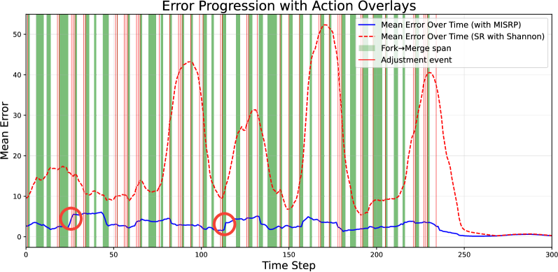
### Visual Description
## [Line Chart]: Error Progression with Action Overlays
### Overview
The chart visualizes the **mean error over time** (x-axis: *Time Step*, y-axis: *Mean Error*) for two methods, with overlays of operational events (fork→merge spans, adjustment events). It compares the stability and magnitude of error between “Mean Error Over Time (with MISRP)” (blue line) and “Mean Error Over Time (SR with Shannon)” (red dashed line).
### Components/Axes
- **Title**: *Error Progression with Action Overlays*
- **X-axis**: *Time Step* (ticks: 0, 50, 100, 150, 200, 250, 300)
- **Y-axis**: *Mean Error* (ticks: 0, 10, 20, 30, 40, 50)
- **Legend** (top-right):
- Blue solid line: *Mean Error Over Time (with MISRP)*
- Red dashed line: *Mean Error Over Time (SR with Shannon)*
- Green vertical bars: *Fork→Merge span* (operational event)
- Red vertical lines: *Adjustment event* (operational event)
- **Overlays**:
- Green vertical bars (Fork→Merge spans) and red vertical lines (Adjustment events) are densely overlaid (especially 0–250 time steps).
- Two red circles highlight points on the blue line (≈Time Step 30 and 110).
### Detailed Analysis
#### Blue Line (MISRP)
- **Trend**: Stable, low error (mostly 0–10).
- **Key Points**:
- At Time Step ≈30 (red circle): Error ≈5.
- At Time Step ≈110 (red circle): Error ≈5.
- After Time Step 250: Error approaches 0.
#### Red Dashed Line (SR with Shannon)
- **Trend**: Highly variable, with large error spikes.
- **Key Points**:
- Peaks: ≈Time Step 100 (error ≈45), 150 (error ≈50), 200 (error ≈40).
- Troughs: ≈Time Step 50 (error ≈10), 150 (error ≈10), 200 (error ≈5).
- After Time Step 250: Error approaches 0.
#### Overlays
- Green bars (Fork→Merge spans) and red lines (Adjustment events) are frequent (0–250 time steps), often coinciding.
### Key Observations
- **Stability**: The blue line (MISRP) is far more stable (low, consistent error) than the red line (SR with Shannon).
- **Spikes**: The red line has dramatic error spikes (up to ~50) during fork→merge/adjustment events.
- **Convergence**: Both lines converge to near-zero error after Time Step 250.
### Interpretation
- **Method Comparison**: MISRP (blue) outperforms SR with Shannon (red) in error stability and magnitude, especially during operational events (fork→merge, adjustment).
- **Event Impact**: The red line’s spikes suggest SR with Shannon is sensitive to operational events, while MISRP is robust.
- **Stabilization**: Convergence after Time Step 250 may indicate a process end or stabilization phase.
This description captures all visual elements, trends, and relationships, enabling reconstruction of the chart’s information without the image.
</details>
Figure 9: A visualization of estimation error progression with MISRP action overlays.
Figure 9 shows the estimation error progression with action overlays under surprise-reactive sampling based on Shannon surprise. Recall from Section 3.4 that there are two actions employed in MISRP governance: sampling adjustments and process forking. These two actions are marked as red vertical lines and green shaded regions in the plot, respectively. For clarity, we present the $20$ -frame moving average of estimation error, whereas the unsmoothed version is provided in the Appendix. Actions are displayed $20$ steps in advance, corresponding to their first observable effect on the smoothed error trajectory.
Several key observations emerge from the figure. First, both sampling adjustments and process forking occur frequently during the dynamic phase as expected, highlighting the effectiveness of MISRP’s action design in maintaining low estimation error. Second, sudden spikes in estimation error (circled) under MISRP governance are almost always followed by corrective actions that prevent further error growth, resulting in non-smooth error progressions after intervention. By contrast, the baseline sampling strategy allows estimation error to rise unchecked. Then, once the system enters the stationary phase, MISRP ceases intervention, aligning with the intuition that a balanced sampling strategy in a well-regulated system should not trigger Mutual Information Surprise.
## 5 Conclusion
In this work, we reimagined the concept of surprise as a mechanism for fostering understanding, rather than merely detecting anomalies. Traditional definitions—such as Shannon and Bayesian Surprises—focus on single-instance deviations and belief updates, yet fail to capture whether a system is truly growing in its understanding over time. By introducing Mutual Information Surprise (MIS), we proposed a new framework that reframes surprise as a reflection of learning progression, grounded in mutual information growth.
We developed a formal test sequence to monitor deviations in estimated mutual information, and introduced a reaction policy, MISRP, that transforms surprise into actionable system behavior. Through a synthetic case study and a real-time pollution map estimation task, we demonstrated that MIS governance offers clear advantages over conventional sampling strategies. Our results show improved stability, better responsiveness to environmental drift, and significant reductions in estimation error. These findings affirm MIS as a robust and adaptive supervisory signal for autonomous systems.
Looking forward, this work opens several promising directions for future research. A natural next step is the development of a continuous space formulation of mutual information surprise, enabling its application in large complex systems. Another direction involves designing a specialized reaction policy —one that incorporates a sampling strategy tailored directly to the structure and signals of MIS, rather than relying on existing sampling strategies. This could enhance efficiency and responsiveness in highly dynamic or resource-constrained systems. Moreover, pairing MIS with physical probing capability for specific physical systems could unlock the true potential of MIS, as MIS provides new perspectives in system characterization compared to traditional measures.
## Appendix
The appendix is organized as follows. In the first section, we present empirical evidence supporting our claim in Section 3.2 that standard deviation-based tests are overly permissive. In the second section, we provide the derivation of the standard deviation-based test for mutual information. In the third section, we provide the proof of Theorem 1. The fourth section details the simulation setup for dynamic pollution map generation. In the fifth section, we provide the pseudocode for the surprise-reactive (SR) sampling strategy (?) to facilitate reproducibility.
## MLE Mutual Information Estimator Standard Deviation
In Section 3.2, we discussed the limitations of standard deviation-based tests. Specifically, the current distribution agnostic tightest bound for the standard deviation of a maximum likelihood estimator (MLE) for mutual information with $n$ observations is given by (?)
$$
\sigma\lesssim\frac{\log n}{\sqrt{n}}.
$$
Despite the best result, this bound is still too loose.
To empirically verify this statement, we perform a simple simulation as follows. We construct variable pairs $(x,y)$ where $y=x\;\text{mod}\;10$ , in the same manner as the simulation in Section 4.1. The variable $x$ is generated as random integers sampled from randomly generated probability mass functions over the domain $[0,100]$ . We generate $100$ such probability mass functions. For each probability mass function, we generate $3,000$ pairs of $(x,y)$ , repeat the process using $10$ Monte Carlo simulations, and compute the standard deviation of the MLE mutual information estimates over the $10$ simulations for varying numbers of $(x,y)$ pairs $n$ . We then plot the average standard deviation across the $100$ different probability mass functions as a function of $n$ versus the estimation bound shown in Eq. (5). The results are shown in Figure 10.
<details>
<summary>x19.png Details</summary>
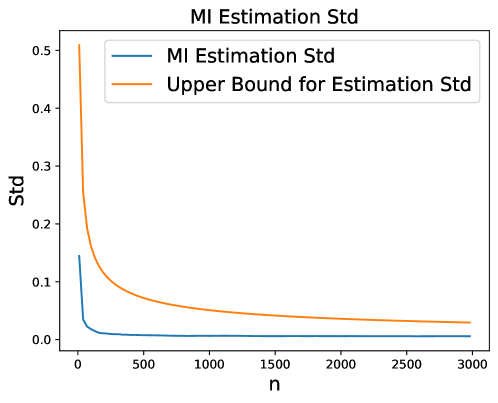
### Visual Description
## Line Chart: MI Estimation Std
### Overview
The image displays a line chart titled "MI Estimation Std," which plots the standard deviation (Std) of Mutual Information (MI) estimation against a variable "n" (likely sample size or number of samples). The chart contains two data series: the actual estimated standard deviation and a theoretical upper bound for that standard deviation. Both series show a decreasing trend as "n" increases.
### Components/Axes
* **Chart Title:** "MI Estimation Std" (centered at the top).
* **X-Axis:**
* **Label:** "n"
* **Scale:** Linear scale from 0 to 3000.
* **Major Tick Marks:** 0, 500, 1000, 1500, 2000, 2500, 3000.
* **Y-Axis:**
* **Label:** "Std"
* **Scale:** Linear scale from 0.0 to 0.5.
* **Major Tick Marks:** 0.0, 0.1, 0.2, 0.3, 0.4, 0.5.
* **Legend:** Located in the top-right corner of the plot area.
* **Blue Line:** "MI Estimation Std"
* **Orange Line:** "Upper Bound for Estimation Std"
### Detailed Analysis
**1. Data Series: "MI Estimation Std" (Blue Line)**
* **Trend Verification:** The blue line exhibits a sharp, near-vertical decline from its starting point, followed by a rapid flattening into a very shallow, asymptotic approach towards zero.
* **Approximate Data Points:**
* At n ≈ 0, Std ≈ 0.15.
* At n ≈ 100, Std drops sharply to ≈ 0.02.
* At n ≈ 500, Std is very low, ≈ 0.005.
* From n = 1000 to n = 3000, the line is nearly horizontal, with Std values approaching but remaining slightly above 0.0 (e.g., ≈ 0.001 at n=3000).
**2. Data Series: "Upper Bound for Estimation Std" (Orange Line)**
* **Trend Verification:** The orange line also shows a steep initial decline, but its slope is less severe than the blue line's. It continues to decrease steadily across the entire range of n, maintaining a clear gap above the blue line.
* **Approximate Data Points:**
* At n ≈ 0, Std ≈ 0.50.
* At n ≈ 100, Std ≈ 0.20.
* At n ≈ 500, Std ≈ 0.08.
* At n ≈ 1000, Std ≈ 0.05.
* At n ≈ 2000, Std ≈ 0.035.
* At n ≈ 3000, Std ≈ 0.03.
### Key Observations
* **Relative Position:** The "Upper Bound" (orange) line is consistently positioned above the "MI Estimation Std" (blue) line for all values of n > 0, as expected for an upper bound.
* **Convergence Rate:** The blue line (actual estimation std) converges to near-zero much faster than the orange line (theoretical bound). The most dramatic reduction in standard deviation for both series occurs for n < 500.
* **Asymptotic Behavior:** Both lines appear to approach zero asymptotically as n increases towards infinity, but the blue line does so at a significantly lower value.
### Interpretation
This chart demonstrates the relationship between sample size (`n`) and the precision of Mutual Information (MI) estimation. The key takeaway is that **increasing the sample size dramatically reduces the standard deviation (i.e., increases the precision) of the MI estimate**, particularly for small initial increases in `n`.
* **What the data suggests:** The sharp initial drop indicates that even modest sample sizes yield large gains in estimation stability. The persistent gap between the two lines shows that the theoretical upper bound is conservative; the actual estimation method performs significantly better than this worst-case bound.
* **How elements relate:** The x-axis (`n`) is the independent variable controlling the resource (data). The y-axis (`Std`) is the dependent measure of error/uncertainty. The two lines represent an empirical result versus a theoretical guarantee. Their parallel downward trends confirm the fundamental statistical principle that more data leads to more precise estimates.
* **Notable patterns:** The most critical pattern is the **diminishing returns** after n ≈ 500-1000. While increasing `n` from 0 to 500 reduces the estimation std by over 95%, further increasing it to 3000 yields only marginal absolute improvement. This suggests a practical trade-off point where collecting more data provides minimal benefit for estimation precision. The chart validates the effectiveness of the MI estimation technique, as its actual standard deviation is not only low but also falls well within its proven theoretical limits.
</details>
Figure 10: Empirical standard deviation of MLE mutual information estimates vs. the current tightest bound.
We observe that the current bound for the standard deviation of the mutual information estimate, computed using Eq. (5), is significantly larger than the empirical average standard deviation. This empirical observation supports our claim in Section 3.2 that the test in Eq. (6) is rarely violated in practice.
## Standard Deviation Test Derivation
First, recall that the estimation standard deviation satisfies
$$
\sigma\lesssim\frac{\log n}{\sqrt{n}}.
$$
Therefore, we treat this worst case scenario as the baseline when deriving the test of difference between the two maximum likelihood estimators (MLE) of mutual information.
Let:
- $\hat{I}_{n}$ be the MLE estimate from a sample of size $n$ ,
- $\hat{I}_{m+n}$ be the MLE estimate from a larger sample of size $m+n$ ,
Assume the standard deviation of the MLE estimator is approximately:
$$
\sigma_{n}=\frac{\log n}{\sqrt{n}},\quad\sigma_{m+n}=\frac{\log(m+n)}{\sqrt{m+n}}
$$
We want to test the hypothesis:
$$
H_{0}:\mathbb{E}[\hat{I}_{n}]=\mathbb{E}[\hat{I}_{m+n}]\quad\text{vs.}\quad H_{1}:\mathbb{E}[\hat{I}_{n}]\neq\mathbb{E}[\hat{I}_{m+n}]
$$
Note that we are omitting the estimation bias of MLE mutual information estimators for simplicity.
Under the null hypothesis and assuming the two estimates are independent, the test statistic is:
$$
z_{\alpha}=\frac{\hat{I}_{n}-\hat{I}_{m+n}}{\sqrt{\sigma_{n}^{2}+\sigma_{m+n}^{2}}}=\frac{\hat{I}_{n}-\hat{I}_{m+n}}{\sqrt{\left(\frac{\log n}{\sqrt{n}}\right)^{2}+\left(\frac{\log(m+n)}{\sqrt{m+n}}\right)^{2}}}
$$
Moving the denominator to the left hand side will yield the form presented in Eq. (6).
## Proof of Theorem 1
First, we formally introduce the maximum likelihood entropy estimator $\hat{H}$ (?) for random variable $\mathbf{x}\in\mathcal{X}$ as follows
$$
\hat{H}(\mathbf{x})=\sum_{i=1}^{|\mathcal{X}|}\hat{p}_{i}\log\hat{p}_{i},
$$
where $\hat{p}_{i}$ is the empirical probability mass of random variable $\mathbf{x}$ at category $i$ . The MLE mutual information estimator is then defined based on the MLE entropy estimator
$$
\hat{I}(\mathbf{x},\mathbf{y})=\hat{H}(\mathbf{x})+\hat{H}(\mathbf{y})-\hat{H}(\mathbf{x},\mathbf{y}).
$$
MIS test bound (Expectation):
Here, we derive the first part of the MIS test bound, representing the expectation of the MIS statistics, i.e., $\mathbb{E}[\text{MIS}]$ . The derivation involves two cases, $n\ll|\mathcal{X}|,|\mathcal{Y}|$ and $n\gg|\mathcal{X}|,|\mathcal{Y}|$ .
When $n\ll|\mathcal{X}|,|\mathcal{Y}|$ , an MLE entropy estimator $\hat{H}$ with $n$ observations will behave simply as $\log n$ (?), conditioning on the $n$ observations are selected using some kind of space filling designs, which is common for design the initial set of experimentation locations in design of experiments literature (?). We have $\mathbb{E}[\hat{H}_{n}(\mathbf{x})]=\log n$ . Hence, the mutual information estimator with $n$ observations admits
$$
\mathbb{E}[\hat{I}_{n}(\mathbf{x},\mathbf{y})]=\mathbb{E}[\hat{H}_{n}(\mathbf{x})+\hat{H}_{n}(\mathbf{y})-\hat{H}_{n}(\mathbf{x},\mathbf{y})]=\log n.
$$
Then for MIS, we have
$$
\mathbb{E}[\text{MIS}]=\mathbb{E}[\hat{I}_{m+n}]-\mathbb{E}[\hat{I}_{n}]=\log(m+n)-\log n.
$$
When $n\gg|\mathcal{X}|,|\mathcal{Y}|$ , we are facing an oversampled scenario where the samples have most likely exhausted the input and output space. In this case, we first introduce the following lemma.
**Lemma 1**
*(?) For a random variable $\mathbf{x}\in\mathcal{X}$ , the bias of an oversampled ( $n\gg|\mathcal{X}|$ ) MLE entropy estimator $\hat{H}_{n}(\mathbf{x})$ is
$$
\mathbb{E}[\hat{H}_{n}(\mathbf{x})]-H(\mathbf{x})=-\frac{|\mathcal{X}|-1}{n}+o(\frac{1}{n}). \tag{9}
$$*
With the above lemma, we can derive the following Corollary.
**Corollary 1**
*For random variable $\mathbf{x}\in\mathcal{X}$ and $\mathbf{y}\in\mathcal{Y}$ , when the $\mathbf{y}=f(\mathbf{x})$ mapping is noise free, the MLE mutual information estimator $\hat{I}_{n}$ asymptotically satisfies
$$
\mathbb{E}[\hat{I}_{n}]=I-\frac{|\mathcal{Y}|-1}{n}.
$$*
The proof of the above Corollary immediately follows observing the fact of $|\mathcal{X}|=|\mathcal{X},\mathcal{Y}|$ for noise free mapping and invoking Lemma 1.
Therefore, for MIS under the case of oversampling, we have
| | $\displaystyle\mathbb{E}[\text{MIS}]$ | $\displaystyle=\mathbb{E}[\hat{I}_{m+n}]-\mathbb{E}[\hat{I}_{n}]$ | |
| --- | --- | --- | --- |
MIS test bound (Variation):
In this part, we derive the second term of the MIS test bound, accounting for the variation of the MIS statistics. We first investigate the maximum change in mutual information estimation $\hat{I}$ when changing one observation. Here, we derive the following Lemma.
**Lemma 2**
*Let $\mathcal{S}=\{(x_{i},y_{i})\}_{i=1}^{n}$ be an i.i.d. sample from an unknown joint distribution on finite alphabets and denote by
$$
\hat{I}_{n}(\mathbf{x},\mathbf{y})\;=\;\hat{H}_{n}(\mathbf{x})+\hat{H}_{n}(\mathbf{y})-\hat{H}_{n}(\mathbf{x},\mathbf{y})
$$
the MLE estimator, where $\hat{H}_{n}$ is the empirical Shannon entropy (in nats). If $\mathcal{S}^{\prime}$ differs from $\mathcal{S}$ in exactly one observation, then with a mild abuse of notation (denoting mutual information estimator on sample set $\mathcal{S}$ with $\hat{I}_{n}(\mathcal{S})$ ),
$$
\bigl{|}\hat{I}_{n}(\mathcal{S})-\hat{I}_{n}(\mathcal{S}^{\prime})\bigr{|}\;\leq\;\frac{2\,\log n}{n}.
$$*
* Proof*
Proof For Lemma 2 We omit $\hat{\cdot}$ for estimators during this proof for simplicity. Write $H=-\sum_{i}p_{i}\log p_{i}$ for Shannon entropy estimator with natural logarithms. Replacing a single observation does two things: 1. in one $X$ -category and one $Y$ -category the counts change by $\pm 1$ (all other marginal counts are unchanged);
1. in one joint cell the count changes by $-1$ and in another joint cell the count changes by $+1$ .
Step 1. How much can one empirical Shannon entropy change?
Assume a single observation is moved from category $A$ to category $B$ . Let the counts before the move be $A=a$ (with $a\geq 1$ ) and $B=b$ (with $b\geq 0$ ). After the move the counts become $a-1$ and $b+1$ . Only these two probabilities change; every other probability is fixed.
The change in entropy is therefore
| | $\displaystyle\Delta H$ | $\displaystyle=\big{(}\frac{a}{n}\log\frac{a}{n}-\frac{a-1}{n}\log\frac{a-1}{n}\big{)}-\big{(}\frac{b+1}{n}\log\frac{b+1}{n}-\frac{b}{n}\log\frac{b}{n}\big{)}.$ | |
| --- | --- | --- | --- |
We can see that the maximum difference is largest when $a=n$ and $b=0$ , i.e. when all $n$ observations initially occupy a single category and we create a brand-new one. In that worst case
$$
\displaystyle\Delta H \displaystyle=\frac{n-1}{n}\log\frac{n-1}{n}+\frac{1}{n}\log n \displaystyle\leq\frac{n-1}{n}\log\frac{n}{n}+\frac{1}{n}\log n=\frac{\log n}{n}. \tag{10}
$$
The forth equality follows the Taylor expansion of $\log(1-x)$ . Conversly, one could see that $-\frac{\log n}{n}\leq\Delta H$ also holds. Therefore, the maximum absolute differences of entropy estimation under the shift of one observations is upper bounded by $\frac{\log n}{n}$ .
Step 2. Sign coupling between the three entropies.
Assume the moved observation leaves joint cell $(i,j)$ and enters cell $(k,\ell)$ . Because $(i,j)$ lies in row $i$ and column $j$ only, we have the key fact (denoting sign operator with $\text{sgn}(\cdot)$ ):
$$
\text{sgn}\bigl{(}\Delta H(\mathbf{x},\mathbf{y})\bigr{)}\in\bigl{\{}\text{sgn}\bigl{(}\Delta H(\mathbf{x})\bigr{)},\text{sgn}\bigl{(}\Delta H(\mathbf{y})\bigr{)}\bigr{\}}.
$$
Hence $-\text{sgn}\bigl{(}\Delta H(\mathbf{x},\mathbf{y})\bigr{)}=\text{sgn}\bigl{(}\Delta H(\mathbf{x})\bigr{)}=\text{sgn}\bigl{(}\Delta H(\mathbf{y})\bigr{)}$ is impossible.
Then, with $\Delta I=\Delta H(\mathbf{x})+\Delta H(\mathbf{y})-\Delta H(\mathbf{x},\mathbf{y})$ , we can see the following fact
$$
|\Delta I|=\bigl{|}\Delta H(\mathbf{x})+\Delta H(\mathbf{y})-\Delta H(\mathbf{x},\mathbf{y})|\leq 2\max\{|\Delta H(\mathbf{x})|,|\Delta H(\mathbf{y})|,|\Delta H(\mathbf{x},\mathbf{y})|\}.
$$
Applying the one-entropy bound (10) to the two marginals,
$$
|\Delta I|\leq\frac{2\log n}{n},
$$
which is the desired inequality. ∎
Establishing Lemma 2 allows us to apply the McDiarmid’s Inequality (?), a concentration inequality for functions with bounded difference.
**Lemma 3 (McDiarmid’s Inequality)**
*If $\{\mathbf{x}_{i}\in\mathcal{X}_{i}\}_{i=1}^{n}$ are independent random variables (not necessarily identical), and a function $f:\mathcal{X}_{1}\times\mathcal{X}_{2}\ldots\mathcal{X}_{n}\rightarrow\mathbb{R}$ satisfies coordinate wise bounded condition
$$
\underset{\mathbf{x}^{\prime}_{j}\in\mathcal{X}_{j}}{sup}|f(\mathbf{x}_{1},\mathbf{x}_{2},\ldots,\mathbf{x}_{j},\ldots,\mathbf{x}_{n})-f(\mathbf{x}_{1},\mathbf{x}_{2},\ldots,\mathbf{x}^{\prime}_{j},\ldots,\mathbf{x}_{n})|<c_{j},
$$
for $1\leq j\leq n$ , then for any $\epsilon\geq 0$ ,
$$
P(|f(\mathbf{x}_{1},\ldots,\mathbf{x}_{n})-\mathbb{E}[f]|>\epsilon)\leq 2e^{-2\epsilon^{2}/\sum c_{j}^{2}}. \tag{11}
$$*
To apply the McDiarmid’s Inequality, we can view the mutual information estimator with $n$ old observations and $m$ new observations, denoted with $\hat{I}_{m+n}$ , as a function of the new $m$ observations $\{\mathbf{x}_{i}\in\mathcal{X}\}_{i=1}^{m}$ . Moreover, we have already bounded the maximum differences of the mutual information estimator through Lemma 2, meaning
$$
\underset{\mathbf{x}^{\prime}_{j}\in\mathcal{X}}{sup}|\hat{I}_{m+n}(\mathbf{x}_{1},\mathbf{x}_{2},\ldots,\mathbf{x}_{j},\ldots,\mathbf{x}_{m})-\hat{I}_{m+n}(\mathbf{x}_{1},\mathbf{x}_{2},\ldots,\mathbf{x}^{\prime}_{j},\ldots,\mathbf{x}_{m})|<\frac{2\log(m+n)}{m+n}.
$$
Then, plug the upper bound into Eq. (11), we have
$$
P(|\hat{I}_{m+n}-\mathbb{E}[\hat{I}_{m+n}]|>\epsilon)\leq 2e^{-2\epsilon^{2}/\sum(\frac{2\log(m+n)}{m+n})^{2}}=2e^{-(m+n)^{2}\epsilon^{2}/2m\log^{2}(m+n)}.
$$
By setting the RHS of the above equation to $\rho$ , we can get the following statement with probability at least $1-\rho$ ,
$$
|\hat{I}_{m+n}-\mathbb{E}[\hat{I}_{m+n}]|\leq\frac{\sqrt{2m\log 2/\rho}\log(m+n)}{m+n}. \tag{12}
$$
Finally, combining the derivation in the two parts, when $n\ll|\mathcal{X}|,|\mathcal{Y}|$ , we have the following with probability at least $1-\rho$
| | $\displaystyle MIS$ | $\displaystyle=\hat{I}_{m+n}-\hat{I}_{n}$ | |
| --- | --- | --- | --- |
The second equation follows the typical sample assumption in Assumption 1. The proof of Theorem 1 is now complete.
## Pollution Map Dataset
The dynamic pollution map is modeled as $u(\mathbf{x},t)$ , a function of spatial location $\mathbf{x}=(x_{1},x_{2})\in[0,1]^{2}$ . The governing partial differential equation (PDE) for the pollution map is
$$
\frac{\partial u}{\partial t}=-\mathbf{v}\cdot\nabla u+\nabla(\mathbf{D}\nabla u)-\zeta u+S(\mathbf{x}), \tag{13}
$$
where $\mathbf{v}=[1,0]$ is the advection velocity, representing wind that transports pollution horizontally to the right. The matrix $\mathbf{D}=\text{diag}(0.01,2)$ is the diagonal diffusion matrix, indicating that pollution diffuses much more rapidly in the $x_{2}$ direction than in the $x_{1}$ direction. The parameter $\zeta=2$ represents the exponential decay factor, modeling the natural decay of pollution levels over time. The term $S(\mathbf{x})$ models the spatially dependent but temporally constant pollution source at location $\mathbf{x}$ . Additionally, a base level of random pollution with mean $2$ and standard deviation $0.25$ is added to the pollution field. The evolution of the pollution map is computed in the Fourier domain by applying a discretized Fourier transformation to the PDE in Eq. (13).
In the last simulation experiment with the pollution map, we use the same PDE with modified parameters. Specifically, the pollution sources $S(\mathbf{x})$ is removed, and the decay parameter $\zeta$ is reduced to $0.1$ in the second phase.
## Surprise Reactive Sampling Strategy Pseudo Code
In this section, we present the pseudocode for the SR sampling strategy in (?) for reproducibility purpose in Algorithm 2.
Algorithm 2 Surprise Reactive (SR) Sampling Strategy
1: Observation set $\mathbf{X}:\{\mathbf{x}_{i}\in\mathcal{X}\}_{i=1}^{n}$ ; Total sampling budget $k$ ; Exploitation limit $t$ ; A surprise measure $S(\cdot)$ ; A surprise triggering threshold $s$ ; Exploration mode indicator $\xi=\text{True}$ ; Surprising location $\mathbf{x}_{s}=\text{None}$ ; Surprising location set $\mathbf{X}_{s}=\text{None}$ ; Neighborhood radius $\epsilon$ .
2: while $i<k$ ( $i$ starts from $0$ ) do
3: if $\xi$ then
4: Sample $\mathbf{x}^{*}$ as
$$
\mathbf{x}^{*}=\underset{\mathbf{x}}{\operatorname{argmax}}\>\underset{\mathbf{x}_{i}\in\mathbf{X}}{\min}\>\|\mathbf{x}-\mathbf{x}_{i}\|_{2}.
$$
5: $i=i+1$
6: Compute $S(\mathbf{x}^{*})$
7: if $S(\mathbf{x}^{*})\leq s$ then
8: $\mathbf{X}=[\mathbf{X},\mathbf{x}^{*}]$
9: else
10: $\xi=False$ , $\mathbf{x}_{s}=\mathbf{x}^{*}$ , $\mathbf{X}_{s}=[\mathbf{x}^{*}]$
11: end if
12: else
13: while $j\leq t$ ( $j$ starts from $0$ ) do
14: Sample $\mathbf{x}^{*}$ randomly in the $\epsilon$ ball centered at $\mathbf{x}_{s}$ .
15: $j=j+1$ , $i=i+1$
16: Compute $S(\mathbf{x}^{*})$
17: if $S(\mathbf{x}^{*})\leq s$ then
18: $\mathbf{X}=[\mathbf{X},\mathbf{x}^{*}]$ , $\xi=\text{True}$ , $\mathbf{X}_{s}=\text{None}$
19: Break While
20: else
21: $\mathbf{X}_{s}=[\mathbf{X}_{s},\mathbf{x}^{*}]$
22: end if
23: if $i\geq k$ then
24: Break While
25: end if
26: end while
27: if $\mathbf{X}_{s}$ is not None then
28: $\mathbf{X}=[\mathbf{X},\mathbf{X}_{s}]$ , $\xi=\text{True}$
29: end if
30: end if
31: end while
## Non-smoothed Error Progression with Action Overlays
Here we present the non-smoothed estimation error progression figure with action overlays.
<details>
<summary>x20.png Details</summary>
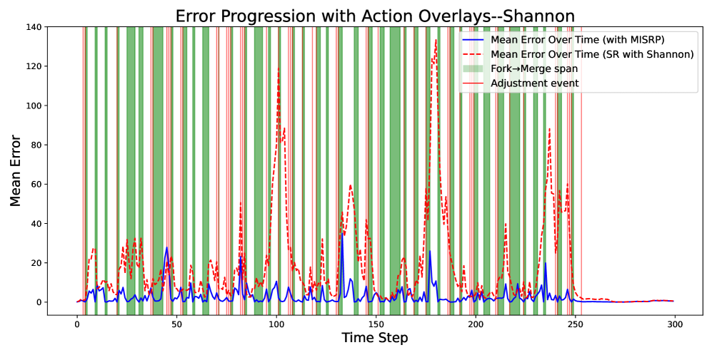
### Visual Description
## [Line Chart with Overlays]: Error Progression with Action Overlays--Shannon
### Overview
This is a line chart illustrating the **mean error over time steps** for two methods, with additional overlays indicating operational events (fork→merge spans and adjustment events). The chart compares error performance between “Mean Error Over Time (with MISRP)” (blue solid line) and “Mean Error Over Time (SR with Shannon)” (red dashed line), while green vertical spans mark “Fork→Merge span” and red vertical lines mark “Adjustment event.”
### Components/Axes
- **X-axis**: Labeled “Time Step,” with major ticks at 0, 50, 100, 150, 200, 250, 300 (range: 0–300).
- **Y-axis**: Labeled “Mean Error,” with major ticks at 0, 20, 40, 60, 80, 100, 120, 140 (range: 0–140).
- **Legend** (top-right):
- Blue solid line: *“Mean Error Over Time (with MISRP)”*
- Red dashed line: *“Mean Error Over Time (SR with Shannon)”*
- Green vertical spans: *“Fork→Merge span”* (vertical green bars)
- Red vertical lines: *“Adjustment event”* (vertical red lines)
### Detailed Analysis
#### Data Series Trends:
- **Blue line (MISRP)**:
- Overall lower mean error (peaks rarely exceed 40).
- Peaks occur around time steps ~50, 100, 150, 200, 250 (e.g., ~25 at 50, ~30 at 100, ~35 at 150, ~25 at 200, ~20 at 250).
- After time step 250, error stabilizes near 0.
- **Red dashed line (SR with Shannon)**:
- Higher mean error (peaks often exceed 80, reaching ~120–140 at ~100, 150, 200, 250).
- Peaks are more pronounced and frequent than the blue line.
- After time step 250, error also stabilizes near 0.
#### Overlays:
- **Green spans (Fork→Merge)**: Frequent vertical green bars (e.g., 0–50, 50–100, 100–150, 150–200, 200–250), indicating periods of fork→merge activity.
- **Red lines (Adjustment event)**: Scattered vertical red lines (e.g., ~25, 75, 125, 175, 225, 275), likely marking discrete adjustment actions.
### Key Observations
1. **Method Comparison**: The blue line (MISRP) consistently has lower mean error than the red line (SR with Shannon), suggesting MISRP is more effective at minimizing error.
2. **Event Correlation**: Green fork→merge spans and red adjustment events are frequent in the early-to-mid time steps (0–250), coinciding with error spikes (especially for the red line).
3. **Stabilization**: After time step 250, both lines flatten near 0, indicating the process reaches a steady state with minimal error.
### Interpretation
The chart demonstrates that the “MISRP” method outperforms “SR with Shannon” in terms of mean error over time. The overlays (fork→merge spans, adjustment events) suggest operational actions (e.g., system adjustments, structural changes) occur during periods of higher error, potentially influencing performance. The stabilization after 250 implies the system converges to a low-error state, regardless of the method. This data could inform decisions about which method to use for error-sensitive tasks, or how to optimize operational events (e.g., timing adjustments) to reduce error.
(Note: All text is in English; no other languages are present.)
</details>
Figure 11: A non-smoothed visualization of estimation error progression with MISRP action overlays.
## References and Notes
- 1. B. Burger, P. M. Maffettone, V. V. Gusev, C. M. Aitchison, Y. Bai, X. Wang, X. Li, B. M. Alston, B. Li, R. Clowes, N. Rankin, B. Harris, R. S. Sprick, and A. I. Cooper, “A mobile robotic chemist,” Nature, vol. 583, pp. 237–241, 2020.
- 2. A. Merchant, S. Batzner, S. S. Schoenholz, M. Aykol, G. Cheon, and E. D. Cubuk, “Scaling deep learning for materials discovery,” Nature, vol. 624, pp. 80–85, 2023.
- 3. N. J. Szymanski, B. Rendy, Y. Fei, R. E. Kumar, T. He, D. Milsted, M. J. McDermott, M. Gallant, E. D. Cubuk, A. Merchant, H. Kim, A. Jain, C. J. Bartel, K. Persson, Y. Zeng, and G. Ceder, “An autonomous laboratory for the accelerated synthesis of novel materials,” Nature, vol. 624, pp. 86–91, 2023.
- 4. T. Dai, S. Vijayakrishnan, F. T. Szczypiński, J.-F. Ayme, E. Simaei, T. Fellowes, R. Clowes, L. Kotopanov, C. E. Shields, Z. Zhou, J. W. Ward, and A. I. Cooper, “Autonomous mobile robots for exploratory synthetic chemistry,” Nature, vol. 635, pp. 890–897, 2024.
- 5. J. Levinson, J. Askeland, J. Becker, J. Dolson, D. Held, S. Kammel, J. Z. Kolter, D. Langer, O. Pink, V. Pratt, M. Sokolsky, G. Stanek, D. Stavens, A. Teichman, M. Werling, and S. Thrun, “Towards fully autonomous driving: Systems and algorithms,” in Proceedings of the 2011 IEEE Intelligent Vehicles Symposium, (Baden-Baden, Germany), June 2011.
- 6. B. P. MacLeod, F. G. Parlane, T. D. Morrissey, F. Häse, L. M. Roch, K. E. Dettelbach, R. Moreira, L. P. Yunker, M. B. Rooney, and J. R. Deeth, “Self-driving laboratory for accelerated discovery of thin-film materials,” Science Advances, vol. 6, no. 20, p. eaaz8867, 2020.
- 7. E. Yurtsever, J. Lambert, A. Carballo, and K. Takeda, “A survey of autonomous driving: Common practices and emerging technologies,” IEEE Access, vol. 8, pp. 58443–58469, 2020.
- 8. D. Bogdoll, M. Nitsche, and J. M. Zöllner, “Anomaly detection in autonomous driving: A survey,” in Proceedings of the IEEE/CVF Conference on Computer Vision and Pattern Recognition, (New Orleans, USA), June 2022.
- 9. H.-S. Park and N.-H. Tran, “An autonomous manufacturing system based on swarm of cognitive agents,” Journal of Manufacturing Systems, vol. 31, no. 3, pp. 337–348, 2012.
- 10. J. Leng, Y. Zhong, Z. Lin, K. Xu, D. Mourtzis, X. Zhou, P. Zheng, Q. Liu, J. L. Zhao, and W. Shen, “Towards resilience in industry 5.0: A decentralized autonomous manufacturing paradigm,” Journal of Manufacturing Systems, vol. 71, pp. 95–114, 2023.
- 11. J. Reis, Y. Cohen, N. Melão, J. Costa, and D. Jorge, “High-tech defense industries: Developing autonomous intelligent systems,” Applied Sciences, vol. 11, no. 11, p. 4920, 2021.
- 12. P. Nikolaev, D. Hooper, F. Webber, R. Rao, K. Decker, M. Krein, J. Poleski, R. Barto, and B. Maruyama, “Autonomy in materials research: A case study in carbon nanotube growth,” NPJ Computational Materials, vol. 2, p. 16031, 2016.
- 13. J. Chang, P. Nikolaev, J. Carpena-Núñez, R. Rao, K. Decker, A. E. Islam, J. Kim, M. A. Pitt, J. I. Myung, and B. Maruyama, “Efficient closed-loop maximization of carbon nanotube growth rate using Bayesian optimization,” Scientific Reports, vol. 10, p. 9040, 2020.
- 14. I. Ahmed, S. T. Bukkapatnam, B. Botcha, and Y. Ding, “Toward futuristic autonomous experimentation—a surprise-reacting sequential experiment policy,” IEEE Transactions on Automation Science and Engineering, vol. 22, pp. 7912–7926, 2025.
- 15. Z.-G. Zhou and P. Tang, “Continuous anomaly detection in satellite image time series based on z-scores of season-trend model residuals,” in Proceedings of the 2016 IEEE International Geoscience and Remote Sensing Symposium, (Beijing, China), July 2016.
- 16. K. Cohen and Q. Zhao, “Active hypothesis testing for anomaly detection,” IEEE Transactions on Information Theory, vol. 61, no. 3, pp. 1432–1450, 2015.
- 17. J. F. Kamenik and M. Szewc, “Null hypothesis test for anomaly detection,” Physics Letters B, vol. 840, p. 137836, 2023.
- 18. D. J. Weller-Fahy, B. J. Borghetti, and A. A. Sodemann, “A survey of distance and similarity measures used within network intrusion anomaly detection,” IEEE Communications Surveys & Tutorials, vol. 17, no. 1, pp. 70–91, 2014.
- 19. L. Montechiesi, M. Cocconcelli, and R. Rubini, “Artificial immune system via Euclidean distance minimization for anomaly detection in bearings,” Mechanical Systems and Signal Processing, vol. 76, pp. 380–393, 2016.
- 20. Y. Wang, Q. Miao, E. W. Ma, K.-L. Tsui, and M. G. Pecht, “Online anomaly detection for hard disk drives based on Mahalanobis distance,” IEEE Transactions on Reliability, vol. 62, no. 1, pp. 136–145, 2013.
- 21. Y. Hou, Z. Chen, M. Wu, C.-S. Foo, X. Li, and R. M. Shubair, “Mahalanobis distance based adversarial network for anomaly detection,” in Proceedings of the 2020 IEEE International Conference on Acoustics, Speech and Signal Processing, (Virtual), May 2020.
- 22. T. Schlegl, P. Seeböck, S. M. Waldstein, G. Langs, and U. Schmidt-Erfurth, “F-anoGAN: Fast unsupervised anomaly detection with generative adversarial networks,” Medical Image Analysis, vol. 54, pp. 30–44, 2019.
- 23. B. Lian, Y. Kartal, F. L. Lewis, D. G. Mikulski, G. R. Hudas, Y. Wan, and A. Davoudi, “Anomaly detection and correction of optimizing autonomous systems with inverse reinforcement learning,” IEEE Transactions on Cybernetics, vol. 53, no. 7, pp. 4555–4566, 2022.
- 24. A. Barto, M. Mirolli, and G. Baldassarre, “Novelty or surprise?,” Frontiers in Psychology, vol. 4, p. 907, 2013.
- 25. L. Itti and P. Baldi, “Bayesian surprise attracts human attention,” Vision Research, vol. 49, no. 10, pp. 1295–1306, 2009.
- 26. V. Liakoni, A. Modirshanechi, W. Gerstner, and J. Brea, “Learning in volatile environments with the Bayes factor surprise,” Neural Computation, vol. 33, no. 2, pp. 269–340, 2021.
- 27. M. Faraji, K. Preuschoff, and W. Gerstner, “Balancing new against old information: The role of puzzlement surprise in learning,” Neural Computation, vol. 30, no. 1, pp. 34–83, 2018.
- 28. O. Çatal, S. Leroux, C. De Boom, T. Verbelen, and B. Dhoedt, “Anomaly detection for autonomous guided vehicles using Bayesian surprise,” in Proceedings of the 2020 IEEE/RSJ International Conference on Intelligent Robots and Systems, (Las Vegas, USA), October 2020.
- 29. Y. Zamiri-Jafarian and K. N. Plataniotis, “A Bayesian surprise approach in designing cognitive radar for autonomous driving,” Entropy, vol. 24, no. 5, p. 672, 2022.
- 30. A. Dinparastdjadid, I. Supeene, and J. Engstrom, “Measuring surprise in the wild,” arXiv preprint arXiv:2305.07733, 2023.
- 31. A. S. Raihan, H. Khosravi, T. H. Bhuiyan, and I. Ahmed, “An augmented surprise-guided sequential learning framework for predicting the melt pool geometry,” Journal of Manufacturing Systems, vol. 75, pp. 56–77, 2024.
- 32. S. Jin, J. R. Deneault, B. Maruyama, and Y. Ding, “Autonomous experimentation systems and benefit of surprise-based Bayesian optimization,” in Proceedings of the 2022 International Symposium on Flexible Automation, (Yokohama, Japan), July 2022.
- 33. A. Modirshanechi, J. Brea, and W. Gerstner, “A taxonomy of surprise definitions,” Journal of Mathematical Psychology, vol. 110, p. 102712, 2022.
- 34. P. Baldi, “A computational theory of surprise,” in Information, Coding and Mathematics: Proceedings of Workshop Honoring Prof. Bob Mceliece on his 60th Birthday, pp. 1–25, 2002.
- 35. A. Prat-Carrabin, R. C. Wilson, J. D. Cohen, and R. Azeredo da Silveira, “Human inference in changing environments with temporal structure,” Psychological Review, vol. 128, no. 5, p. 879–912, 2021.
- 36. P. J. Rousseeuw and C. Croux, “Alternatives to the median absolute deviation,” Journal of the American Statistical Association, vol. 88, no. 424, pp. 1273–1283, 1993.
- 37. C. Aytekin, X. Ni, F. Cricri, and E. Aksu, “Clustering and unsupervised anomaly detection with l-2 normalized deep auto-encoder representations,” in Proceedings of the 2018 International Joint Conference on Neural Networks, (Rio de Janeiro, Brazil), October 2018.
- 38. D. T. Nguyen, Z. Lou, M. Klar, and T. Brox, “Anomaly detection with multiple-hypotheses predictions,” in Proceedings of the 36th International Conference on Machine Learning, (Long Beach, USA), June 2019.
- 39. A. Kolossa, B. Kopp, and T. Fingscheidt, “A computational analysis of the neural bases of Bayesian inference,” Neuroimage, vol. 106, pp. 222–237, 2015.
- 40. C. E. Shannon, “A mathematical theory of communication,” The Bell System Technical Journal, vol. 27, no. 3, pp. 379–423, 1948.
- 41. L. Paninski, “Estimation of entropy and mutual information,” Neural Computation, vol. 15, no. 6, pp. 1191–1253, 2003.
- 42. D. François, V. Wertz, and M. Verleysen, “The permutation test for feature selection by mutual information,” in Proceedings of the 14th European Symposium on Artificial Neural Networks, (Bruges, Belgium), April 2006.
- 43. G. Doquire and M. Verleysen, “Mutual information-based feature selection for multilabel classification,” Neurocomputing, vol. 122, pp. 148–155, 2013.
- 44. T. M. Cover, Elements of Information Theory. John Wiley & Sons, 1999.
- 45. A. Bondu, V. Lemaire, and M. Boullé, “Exploration vs. exploitation in active learning: A Bayesian approach,” in Proceedings of the 2010 International Joint Conference on Neural Networks, (Barcelona, Spain), July 2010.
- 46. J. G. Moreno-Torres, T. Raeder, R. Alaiz-Rodríguez, N. V. Chawla, and F. Herrera, “A unifying view on dataset shift in classification,” Pattern Recognition, vol. 45, no. 1, pp. 521–530, 2012.
- 47. M. Sugiyama, M. Krauledat, and K.-R. Müller, “Covariate shift adaptation by importance weighted cross validation,” Journal of Machine Learning Research, vol. 8, no. 5, pp. 985–1005, 2007.
- 48. S. Bickel, M. Brückner, and T. Scheffer, “Discriminative learning under covariate shift,” Journal of Machine Learning Research, vol. 10, no. 9, pp. 2137–2155, 2009.
- 49. I. Žliobaitė, M. Pechenizkiy, and J. Gama, “An overview of concept drift applications,” Big Data Analysis: New Algorithms for a New Society, vol. 16, pp. 91–114, 2016.
- 50. K. Zhang, A. T. Bui, and D. W. Apley, “Concept drift monitoring and diagnostics of supervised learning models via score vectors,” Technometrics, vol. 65, no. 2, pp. 137–149, 2023.
- 51. N. Cebron and M. R. Berthold, “Active learning for object classification: From exploration to exploitation,” Data Mining and Knowledge Discovery, vol. 18, pp. 283–299, 2009.
- 52. U. J. Islam, K. Paynabar, G. Runger, and A. S. Iquebal, “Dynamic exploration–exploitation trade-off in active learning regression with Bayesian hierarchical modeling,” IISE Transactions, vol. 57, no. 4, pp. 393–407, 2025.
- 53. V. R. Joseph, “Space-filling designs for computer experiments: A review,” Quality Engineering, vol. 28, no. 1, pp. 28–35, 2016.
- 54. K. Chai, “Generalization errors and learning curves for regression with multi-task Gaussian processes,” in Proceedings of the 23rd Advances in Neural Information Processing Systems, (Vancouver, Canada), December 2009.
- 55. S. P. Strong, R. Koberle, R. R. D. R. Van Steveninck, and W. Bialek, “Entropy and information in neural spike trains,” Physical Review Letters, vol. 80, p. 197, 1998.
- 56. C. McDiarmid, “On the method of bounded differences,” Surveys in Combinatorics, vol. 141, no. 1, pp. 148–188, 1989.