# Expected Attention: KV Cache Compression by Estimating Attention from Future Queries Distribution
**Authors**: NVIDIA/KVPress KVPress Leaderboard
## Abstract
Memory consumption of the Key-Value (KV) cache represents a major bottleneck for efficient large language model (LLM) inference. While attention-score-based KV cache pruning shows promise, it faces critical practical limitations: attention scores from future tokens are unavailable during compression, and modern implementations like Flash Attention do not materialize the full attention matrix, making past scores inaccessible. To overcome these challenges, we introduce Expected Attention, a training-free compression method that estimates KV pairs importance by predicting how future queries will attend to them. Our approach leverages the distributional properties of LLM activations to compute expected attention scores in closed form for each KV pair. These scores enable principled ranking and pruning of KV pairs with minimal impact on the residual stream, achieving effective compression without performance degradation. Importantly, our method operates seamlessly across both prefilling and decoding phases, consistently outperforming state-of-the-art baselines in both scenarios. Finally, we release KVPress, a comprehensive library to enable researchers to implement and benchmark KV cache compression methods, already including more than 20 techniques.
## 1 Introduction
Large language models (LLMs) (Achiam et al., 2023; Anthropic, 2025; MetaAI, 2024; Yang et al., 2025) have revolutionized text generation and reasoning, enabling advanced applications such as long multi-round dialogues, extensive multimodal intelligence (Yang et al., 2025; Weng et al., 2024), and agentic workflows that ingest massive amounts of data (OpenAI, 2024; PerplexityAI, 2025; Yamada et al., 2025). These applications often require processing extensive contextual information. For example, processing a large codebase or a short video can easily involve analyzing hundreds of thousands of tokens. A critical issue in deploying LLMs in such scenarios is the prohibitive memory consumption of the Key-Value (KV) cache (Fu, 2024; Shi et al., 2024; LI et al., 2025).
During autoregressive generation, the KV cache stores key and value vectors for every processed token, enabling efficient attention computation. However, its memory footprint grows linearly with sequence length, quickly becoming the primary bottleneck for long-context inference. A medium-sized 70B model (MetaAI, 2025) requires approximately 320 GB of GPU memory for a one-million-token KV cache, far exceeding most GPU capacities. This challenge intensifies with emerging applications where advanced reasoning models generate thousands of intermediate tokens (DeepSeek-AI, 2024b; Yang et al., 2025) and agentic systems load massive datasets (OpenAI, 2025; PerplexityAI, 2025). While current LLMs promise extended context lengths up to a million tokens (GeminiTeam, 2025; MetaAI, 2024), hardware constraints saturate GPU memory well before reaching theoretical limits.
State Space Models offer a solution by reducing memory costs (Gu et al., 2022; Gu & Dao, 2024), yet their inferior performance compared to transformers, especially on long context tasks, limits adoption (Jelassi et al., 2024; Merrill et al., 2024). Other architectural changes limited to the attention mechanism, such as multi-head latent attention (DeepSeek-AI, 2024a) or sliding window attention (Jiang et al., 2023; GemmaTeam, 2025), reduce KV cache size but do not remove the attention bottleneck and are orthogonal to KV cache compression. Additionally, such methods need to be implemented at training time, limiting their application to pre-trained modern LLMs. This creates demand for training-free KV cache compression methods that preserve transformer architectures while mitigating memory growth.
A promising direction for such training-free compression lies in exploiting semantic redundancy in natural language: not all tokens equally influence future predictions, and many provide negligible information once their contextual role is fulfilled. This property allows to compress the KV cache by removing some of the keys and values stored in it. However, determining which tokens can be safely removed is far from trivial, as any Key-Value (KV) pair’s importance depends on how future queries will attend to it. Existing approaches use heuristics like discarding oldest tokens (Ge et al., 2024; Xiao et al., 2023) or leverage attention scores from past queries (Zhang et al., 2024; Li et al., 2025; Oren et al., 2024), but these strategies are limited for real-world scenarios, and often require accessing attention scores which are not materialized in modern transformer implementations (Dao et al., 2022).
Instead of relying on heuristics or local attention metrics, we argue that a KV pair’s significance is best measured by its global effect on the transformer’s output. We quantify this effect by isolating each KV pair’s contribution within the residual stream, capturing its influence on the model output. This raises the challenge of estimating how future queries will attend to each token in the context, which requires accessing attention scores from the past and from future tokens, that are not available at the time of compression. To address this, we introduce Expected Attention, which estimates future attention allocation from distribution of future queries. Expected Attention estimates the importance that each token in the context has for queries that have not been generated and accordingly prunes the KV cache up to 60% while preserving performance quality, requiring no architectural modifications or additional training. We release our code as a comprehensive library benchmarking over 20 state-of-the-art compression methods.
To summarize, our contributions are the following:
- We analyse the distributional properties of LLM activations through the lenses of KV cache compression and introduce the concept of Expected Attention to estimate the importance that current tokens will have in the future.
- We introduce a KV cache compression method that leverages Expected Attention and evicts irrelevant KV pairs for efficient inference.
- We release all our code as a library, designed for researchers, that allows to easily implement, test and benchmark KV cache compression methods.
<details>
<summary>x1.png Details</summary>
### Visual Description
## Histograms: Hidden States Distribution in Neural Network Layers
### Overview
The image contains two side-by-side histograms comparing the distribution of activation values in hidden states of two neural network layers (Layer 16 and Layer 20). Each histogram is overlaid with a dashed line representing a theoretical normal distribution curve.
### Components/Axes
- **X-axis (Horizontal)**: Labeled "Activation Value" with ranges:
- Layer 16: -0.4 to 0.4
- Layer 20: -0.6 to 0.6
- **Y-axis (Vertical)**: Implied frequency/count (no explicit label, but values approximate to 0.05 for Layer 16 and 0.03 for Layer 20).
- **Legends**:
- Top-left: "Hidden States - Layer 16"
- Top-right: "Hidden States - Layer 20"
- **Dashed Lines**: Overlaid on both histograms, representing normal distribution curves matching the data.
### Detailed Analysis
- **Layer 16**:
- Histogram bars are densely packed around the center (0.0 activation value).
- Peak frequency ≈ 0.05 at 0.0 activation value.
- Symmetric distribution with a narrow spread (standard deviation ≈ 0.1).
- Dashed line closely follows the histogram peaks.
- **Layer 20**:
- Histogram bars are more spread out, with a broader distribution.
- Peak frequency ≈ 0.03 at 0.0 activation value.
- Symmetric distribution with a wider spread (standard deviation ≈ 0.2).
- Dashed line aligns with the broader histogram shape.
### Key Observations
1. **Layer 16** exhibits a more concentrated activation distribution, with values tightly clustered near 0.0.
2. **Layer 20** shows a significantly wider spread, indicating greater variability in activation values.
3. Both layers follow a roughly normal distribution, as evidenced by the alignment of the dashed curves with the histograms.
4. The x-axis range for Layer 20 is 50% broader than Layer 16, reflecting its increased variability.
### Interpretation
The data suggests that Layer 16 operates with higher precision, as its activation values are more tightly constrained around the mean. In contrast, Layer 20 demonstrates greater flexibility or generalization, with activation values spreading further from the mean. This could imply that Layer 16 specializes in refining intermediate representations, while Layer 20 handles more diverse or abstract features. The normal distribution patterns indicate stable, Gaussian-like behavior in both layers, typical of well-trained neural networks. The absence of outliers or skewed distributions suggests balanced training across both layers.
</details>
<details>
<summary>x2.png Details</summary>
### Visual Description
## Histograms: Queries - Head 4 and Queries - Head 8
### Overview
The image contains two side-by-side histograms comparing activation value distributions for "Head 4" and "Head 8" queries. Both plots feature teal bars representing frequency distributions and a dashed black line overlaying the data, likely representing a theoretical normal distribution curve.
### Components/Axes
- **X-axis (Horizontal)**:
- Labeled "Activation Value" for both plots.
- **Head 4**: Ranges from -2 to 3.
- **Head 8**: Ranges from -4 to 3.
- **Y-axis (Vertical)**:
- Unlabeled, but represents frequency/count of activation values (implied by histogram structure).
- **Legend**:
- No explicit legend is visible. The dashed black line is assumed to represent a theoretical normal distribution curve.
### Detailed Analysis
#### Queries - Head 4
- **Data Distribution**:
- Teal bars peak sharply at activation value **0**, with symmetric tapering toward -2 and 3.
- The dashed black line closely follows the bar peaks, indicating alignment with a normal distribution.
- **Key Values**:
- Highest frequency at **0** (exact value unspecified, but visually dominant).
- Frequencies decline gradually toward -2 and 3, with minimal values at the extremes.
#### Queries - Head 8
- **Data Distribution**:
- Teal bars peak at activation value **-1**, with a broader spread compared to Head 4.
- The dashed black line again aligns with the bar peaks, confirming a normal distribution.
- **Key Values**:
- Highest frequency at **-1** (slightly left of center).
- Frequencies decline more gradually toward -4 and 3, with noticeable values at the extremes (e.g., -4 and 3).
### Key Observations
1. **Symmetry**: Both distributions are approximately symmetric around their peaks.
2. **Variance**: Head 8 exhibits a wider spread (higher variance) than Head 4, as evidenced by the broader x-axis range (-4 to 3 vs. -2 to 3) and more gradual frequency decline.
3. **Peak Alignment**: The dashed black line (theoretical curve) fits both histograms well, suggesting the data adheres to a normal distribution.
4. **Positioning**:
- Head 4’s peak is centered at **0**, while Head 8’s peak is shifted slightly left to **-1**.
- Head 8’s x-axis extends further left (-4) and right (3) than Head 4’s (-2 to 3).
### Interpretation
- **Technical Implications**:
- The difference in variance between Head 4 and Head 8 suggests that Head 8 processes queries with greater variability in activation values. This could indicate differences in query complexity, attention mechanism behavior, or data distribution across model heads.
- The alignment of the dashed line with the histograms confirms that both heads’ activation values follow a normal distribution, supporting assumptions about the underlying statistical properties of the data.
- **Outliers/Anomalies**:
- No extreme outliers are visible in either plot. The frequencies at the extremes (-4 and 3 for Head 8) are low but non-zero, consistent with a normal distribution’s tail behavior.
- **Significance**:
- The wider spread in Head 8 may reflect its role in handling more diverse or complex queries, while Head 4’s narrower distribution could indicate specialization in a narrower range of activation values.
## Notes
- No textual content in languages other than English is present.
- The absence of a legend or y-axis label limits precise quantification of frequencies, but relative trends are clear.
- Spatial grounding: Head 4 is on the left, Head 8 on the right. Both share the same y-axis structure (unlabeled frequency).
</details>
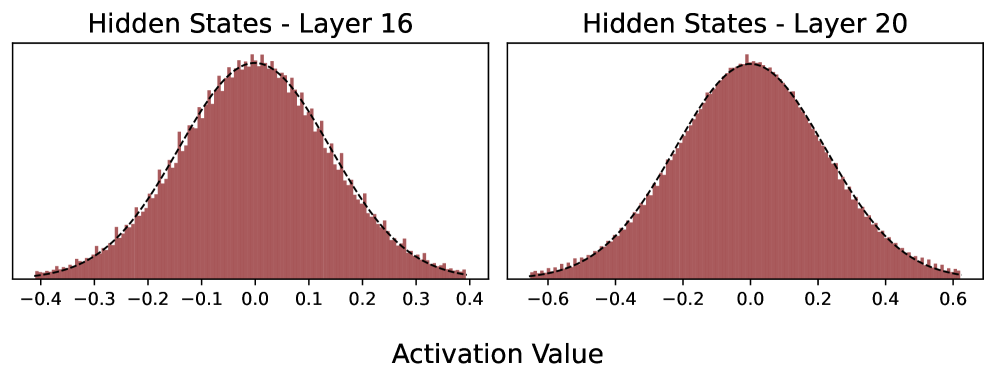
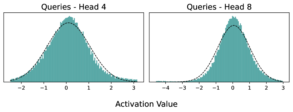
Figure 1: Hidden states from layer 16 and 20 and corresponding queries for layer 20 in Llama3.1-8B. Hidden states in modern LLMs are mostly normally distributed. As a consequence, query activations also follow a Normal. The best Gaussian fit is overlayed. We show more examples and discuss this property in Appendix ˜ B.
## 2 Expected Attention
### 2.1 Key-Value Cache in Autoregressive Transformers
We consider decoder-only language models based on the transformer architecture (Vaswani et al., 2017), representing the vast majority of modern LLMs. When an input sequence of tokens $x=[x_1,x_2,…,x_t]$ is fed to the model, each token $x_i$ is transformed into a hidden state representation $h_i∈ℝ^h$ and processed by a stack of transformer layers, including feed forward networks and multi-head attention blocks. For brevity and clarity, we focus our analysis on a single layer and attention head, noting that the following analysis naturally extends to multi-head attention, grouped query attention (GQA, Ainslie et al. 2023) and all their variants.
Let $h_i∈ℝ^h$ denote the hidden state at position $i$ in the sequence. In the attention block, the corresponding Query, Key and Value projections are computed as:
$$
q_i=R_iW_Qh_i, k_i=R_iW_Kh_i, v_i=W_Vh_i \tag{1}
$$
where $d$ is the attention head dimension, $R_i∈ℝ^d× d$ is the Rotary Position Embedding (RoPE, Su et al. 2023) matrix at position $i$ , and $W_Q,W_K,W_V∈ℝ^h× d$ are respectively the learnable projection matrices for query, key, and value in $ℝ^d$ . During autoregressive inference, keys and values vectors are stored in the KV cache to avoid recomputing them in future generation steps. The resulting KV cache is a collection of Key-Value pairs $(k_i,v_i)$ from all inference steps in the sequence, leading to significant computational savings but increasing memory requirements, growing linearly with sequence length.
At generation step $t$ , the attention mechanism computes the attention score between the current query $q_t$ and each previously cached key $k_i$ for $i≤ t$ :
$$
a_ti=\frac{\exp≤ft(\frac{q_t^Tk_i}{√{d}}\right)}{∑_j=1^t\exp≤ft(\frac{q_t^Tk_j}{√{d}}\right)}=\frac{z_ti}{∑_j=1^tz_tj} \tag{2}
$$
where $a_ti$ is the normalized attention score between query at position $t$ and key at position $i$ , and $z_ti=\exp≤ft(\frac{q_t^Tk_i}{√{d}}\right)$ represents the unnormalized attention score.
The attention score is used to weight and sum over all values previously stored in the KV cache. The resulting output is then added to the hidden state $h_t$ :
$$
h_t^out=h_t+∑_i=1^ta_tiW_ov_i=h_t+∑_i=1^tΔ h_ti \tag{3}
$$
where $h_t∈ℝ^h$ and $h_t^out∈ℝ^h$ represent the hidden state before and after the attention update respectively, and $W_o∈ℝ^d× h$ is the learnable output projection matrix. The hidden states embedding $h_t$ represents the "residual stream," (Elhage et al., 2021) updated via vector additions by each transformer block. The value $Δ h_ti=a_tiW_ov_i$ isolates the specific residual addition of the $i$ -th KV pair at step $t$ . This decomposition reveals that each cached KV pair $(k_i,v_i)$ contributes a residual update $Δ h_ti$ to the final output, and provides a natural measure of the importance of each KV pair:
$$
\|Δ h_ti\|=a_ti\|W_ov_i\| \tag{4}
$$
where $\|·\|$ denotes the L2 norm. This metric captures both the attention weight $a_ti$ (how much the query attends to the $i$ -th key) and the transformed value magnitude $\|W_ov_i\|$ (the impact of the $i$ -th value on the output). Equation 4 provides the optimal measure for estimating the impact of each KV pair in the model output. If we could compute this score for all cached KV pairs, we could selectively prune the cache by removing pairs with the lowest impact, thereby minimizing performance degradation. However, computing Equation 4 presents significant practical challenges. While $\|W_ov_i\|$ is readily available at inference time, the attention weight $a_ti$ depends on future queries that have not yet been generated. Specifically, we cannot know the attention scores from future tokens $t+1,t+2,…$ before computing them, making it impossible to predict which KV pairs will be important for upcoming generation steps. Furthermore, modern transformer implementations utilize Flash Attention (Dao et al., 2022; Dao, 2024), which computes attention scores on-the-fly without materializing the complete attention matrix, preventing access to even past attention scores. To address these fundamental limitations, we leverage the properties of activations in modern LLMs, and introduce Expected Attention.
### 2.2 Expected Attention: Estimating Attention From Future Queries
#### Distributional properties of LLM activations
To approximate the unnormalized attention score $z_ij$ , we leverage the findings of Liu et al. (2025), showing that hidden states in modern LLMs loosely follow a Gaussian distribution $h∼N(μ,Σ)$ . While we show an example of this property in Figure ˜ 1, we also extensively validate it across multiple model architectures in Appendix ˜ B. Given this distributional assumption, queries also inherit Gaussian properties through the linear transformation in Equation 1 $q_t=R_tW_Qh_t$ :
$$
q_t∼N(μ_q_{t},Σ_q_{t}), where μ_q_{t}=R_tW_Qμ, Σ_q_{t}=R_tW_QΣ W_Q^TR_t^T \tag{5}
$$
where $μ∈ℝ^d$ and $Σ∈ℝ^d× d$ are the mean and covariance of the hidden state distribution, and $R_t∈ℝ^d× d$ is the RoPE matrix at position $t$ .
To create a single, tractable representation of attention over a future interval, we approximate the positional embeddings by averaging the RoPE matrix over the next $T$ positions. This gives us a position-averaged query distribution:
$$
\bar{q}∼N(\bar{μ}_q,\bar{Σ}_q), where \bar{μ}_q=\bar{R}W_Qμ, \bar{Σ}_q=\bar{R}W_QΣ W_Q^T\bar{R}^T \tag{6}
$$
where $\bar{R}=\frac{1}{T}∑_j=1^TR_t+j$ represents the averaged RoPE matrix over $T$ future positions.
⬇
1 def compress (queries, keys, values, compression_ratio):
2 # Compute query statistics
3 mean_query, cov_query = compute_statistics (queries)
4 # Compute unnormalized attention scores (z_i)
5 scores = matmul (mean_query, keys. T) / math. sqrt (d)
6 scores += einsum ("i,ij,j->", keys, cov_query, keys) / (2 * d)
7 # Normalize scores and weight by value norms
8 scores = softmax (scores, dim =-1) * values. norm (dim =-1)
9 # Keep KV pairs with highest scores
10 n_kept = int (keys. size (0) * (1 - compression_ratio))
11 indices = scores. topk (n_kept, dim =-1). indices
12 return keys [indices], values [indices]
Listing 1: Pytorch-like pseudo code for KV Cache compression with Expected Attention.
#### Expected Attention Score
With this query distribution, we can now analytically compute the expected unnormalized attention score in Equation 2. For a query $\bar{q}∼N(\bar{μ}_q,\bar{Σ}_q)$ in our interval $T$ and a fixed key $k_i$ , the expected unnormalized score for that key is:
$$
\hat{z}_i=E_\bar{q∼N(\bar{μ}_q,\bar{Σ}_q)}≤ft[\exp≤ft(\frac{\bar{q}^Tk_i}{√{d}}\right)\right]=\exp≤ft(\frac{\bar{μ}_q^Tk_i}{√{d}}+\frac{k_i^T\bar{Σ}_qk_i}{2d}\right) \tag{7}
$$
where the second equality follows from the moment-generating function of a Gaussian distribution. We then define the expected attention score by applying the softmax on our unnormalized expectation:
$$
\hat{a}_i=\frac{\hat{z}_i}{∑_j=1^t\hat{z}_j} \tag{8}
$$
With this approximation, we can now estimate the importance of each cached KV pair. We define the expected contribution magnitude by substituting our expected attention weight into the contribution score formula from Equation 4:
$$
\|\widehat{Δ h}_i\|=(\hat{a}_i+ε)\|W_ov_i\| \tag{9}
$$
where $\hat{a}_i$ is the expected attention weight from Equation 8, $\|W_ov_i\|∈ℝ$ is the magnitude of the transformed value vector, and $ε$ is a small hyperparameter. This metric provides a tractable approximation to the true contribution score without requiring future queries.
#### Compression with Expected Attention
Equation 9 captures the contribution of each KV pair to the transformer output. The Expected Attention compression algorithm scores all cached KV pairs according to Equation 9 and evicts the $r\$ pairs with the lowest expected contributions, where $r∈[0,1]$ is the compression ratio. Intuitively, this is equivalent to removing those KV pairs that have the smallest impact on the residual stream and therefore on the model output. We provide pseudo-code for our compression algorithm in LABEL:lst:kv_compression.
#### Head-Adaptive Compression
Previous work has shown that different attention heads serve different roles in the model. We adopt adaptive per-layer compression (Feng et al., 2024) to account for this heterogeneity, allowing more important heads to retain more KV pairs.
<details>
<summary>x3.png Details</summary>
### Visual Description
## Line Graphs: Token Count vs. Compression Ratio Across Datasets
### Overview
The image contains 10 line graphs arranged in two rows, comparing the performance of different compression methods across various datasets. Each graph plots the number of tokens (y-axis) against compression ratio (x-axis, 0.1–0.9). The graphs include four compression methods: **Expected Attention** (red), **TOVA** (yellow), **SnapKV** (green), **KeyDiff** (purple), and a baseline **No compression** (dashed line).
### Components/Axes
- **X-axis**: Compression Ratio (0.1, 0.5, 0.9)
- **Y-axis**: Number of Tokens (varies per dataset, e.g., 10–100)
- **Legend**: Located at the top-right corner, with color-coded labels for each method.
- **Datasets**: Each graph is labeled with a dataset name (e.g., "2Wikimqa," "Gov Report," "Hotpotqa," etc.).
### Detailed Analysis
#### 2Wikimqa
- **Expected Attention** (red): Starts at ~50 tokens (0.1 compression), drops sharply to ~40 (0.5), then ~30 (0.9).
- **TOVA** (yellow): Similar trend to Expected Attention but slightly higher values (~50 → ~45 → ~35).
- **SnapKV** (green): Starts at ~48, decreases to ~42 (0.5), then ~32 (0.9).
- **KeyDiff** (purple): Declines steeply from ~45 to ~30 (0.5), then ~20 (0.9).
- **No compression** (dashed): Flat line at ~50 tokens.
#### Gov Report
- **Expected Attention**: ~30 → ~25 → ~20.
- **TOVA**: ~30 → ~28 → ~22.
- **SnapKV**: ~28 → ~25 → ~18.
- **KeyDiff**: ~25 → ~20 → ~15.
- **No compression**: Flat at ~30.
#### Hotpotqa
- **Expected Attention**: ~60 → ~50 → ~40.
- **TOVA**: ~60 → ~55 → ~45.
- **SnapKV**: ~58 → ~52 → ~42.
- **KeyDiff**: ~55 → ~45 → ~35.
- **No compression**: Flat at ~60.
#### Multi News
- **Expected Attention**: ~25 → ~22 → ~18.
- **TOVA**: ~25 → ~23 → ~19.
- **SnapKV**: ~24 → ~21 → ~17.
- **KeyDiff**: ~23 → ~20 → ~16.
- **No compression**: Flat at ~25.
#### Multifieldqa
- **Expected Attention**: ~60 → ~50 → ~40.
- **TOVA**: ~60 → ~55 → ~45.
- **SnapKV**: ~58 → ~52 → ~42.
- **KeyDiff**: ~55 → ~45 → ~35.
- **No compression**: Flat at ~60.
#### Passage Retrieval
- **Expected Attention**: ~100 → ~90 → ~80.
- **TOVA**: ~100 → ~95 → ~85.
- **SnapKV**: ~98 → ~92 → ~82.
- **KeyDiff**: ~95 → ~85 → ~75.
- **No compression**: Flat at ~100.
#### Qasper
- **Expected Attention**: ~40 → ~35 → ~30.
- **TOVA**: ~40 → ~38 → ~32.
- **SnapKV**: ~38 → ~35 → ~28.
- **KeyDiff**: ~35 → ~30 → ~25.
- **No compression**: Flat at ~40.
#### Qmsum
- **Expected Attention**: ~24 → ~22 → ~20.
- **TOVA**: ~24 → ~23 → ~21.
- **SnapKV**: ~23 → ~21 → ~18.
- **KeyDiff**: ~22 → ~20 → ~16.
- **No compression**: Flat at ~24.
#### Repobch-P
- **Expected Attention**: ~60 → ~55 → ~50.
- **TOVA**: ~60 → ~58 → ~52.
- **SnapKV**: ~58 → ~55 → ~50.
- **KeyDiff**: ~55 → ~50 → ~45.
- **No compression**: Flat at ~60.
#### Vcsum
- **Expected Attention**: ~14 → ~13 → ~12.
- **TOVA**: ~14 → ~13 → ~12.
- **SnapKV**: ~13 → ~12 → ~11.
- **KeyDiff**: ~12 → ~11 → ~10.
- **No compression**: Flat at ~14.
### Key Observations
1. **Compression Effectiveness**: All methods reduce token counts as compression ratio increases, except **No compression** (flat lines).
2. **Performance Hierarchy**:
- **Expected Attention** consistently outperforms other methods in most datasets (e.g., 2Wikimqa, Hotpotqa).
- **KeyDiff** underperforms in datasets like Gov Report and Qmsum.
3. **Dataset Variability**:
- High-token datasets (e.g., Passage Retrieval) show larger absolute reductions.
- Low-token datasets (e.g., Vcsum) have smaller changes.
4. **Anomalies**:
- In Repobch-P, **SnapKV** and **TOVA** perform nearly identically.
- **KeyDiff** shows erratic drops in Hotpotqa and Multi News.
### Interpretation
The data suggests that **Expected Attention** is the most effective compression method across most datasets, significantly reducing token counts while maintaining performance. **KeyDiff** underperforms in several cases, indicating potential inefficiencies in its compression strategy. The **No compression** baseline highlights the trade-off between compression ratio and token retention. Dataset-specific variations imply that method effectiveness may depend on data characteristics (e.g., complexity, size). Further analysis could explore why **KeyDiff** struggles in certain contexts and whether compression ratio thresholds (e.g., 0.5 vs. 0.9) impact outcomes differently.
</details>
<details>
<summary>x4.png Details</summary>
### Visual Description
## Line Graphs: Performance vs. Compression Ratio Across Datasets
### Overview
The image displays 10 line graphs arranged in a 2x5 grid, each representing performance metrics (y-axis) across compression ratios (x-axis: 0.1–0.9) for different datasets. Lines in red, green, blue, and purple indicate distinct models/methods, with a legend on the right (not explicitly labeled in the image). All graphs show downward trends as compression increases, suggesting a trade-off between compression and performance.
---
### Components/Axes
- **X-axis**: Compression Ratio (0.1 to 0.9, labeled "Compression Ratio").
- **Y-axis**: Performance metric (values vary per graph; e.g., 10–100 for "Passage Retrieval," 12–15 for "Vcsum").
- **Legend**: Right-aligned, with four colors (red, green, blue, purple) corresponding to models/methods (labels not visible in the image).
- **Graph Titles**: Dataset names (e.g., "2Wikimqa," "Gov Report," "Hotpotqa," etc.).
---
### Detailed Analysis
1. **2Wikimqa**
- Y-axis: ~20–60.
- Red line: Peaks at ~55 (0.3 compression), drops to ~30 (0.9).
- Green line: Starts at ~50, declines to ~25.
- Blue line: ~45 → ~20.
- Purple line: ~40 → ~15.
2. **Gov Report**
- Y-axis: ~20–30.
- Red line: ~28 → ~20.
- Green line: ~27 → ~18.
- Blue line: ~26 → ~15.
- Purple line: ~25 → ~12.
3. **Hotpotqa**
- Y-axis: ~18–22.
- Red line: ~22 → ~18.
- Green line: ~21 → ~16.
- Blue line: ~20 → ~14.
- Purple line: ~19 → ~12.
4. **Multi News**
- Y-axis: ~18–22.
- Red line: ~22 → ~18.
- Green line: ~21 → ~16.
- Blue line: ~20 → ~14.
- Purple line: ~19 → ~12.
5. **Multifieldqa**
- Y-axis: ~20–60.
- Red line: ~60 → ~30.
- Green line: ~55 → ~25.
- Blue line: ~50 → ~20.
- Purple line: ~45 → ~15.
6. **Passage Retrieval**
- Y-axis: ~20–100.
- Red line: ~100 → ~40.
- Green line: ~95 → ~35.
- Blue line: ~90 → ~30.
- Purple line: ~85 → ~25.
7. **Qasper**
- Y-axis: ~20–40.
- Red line: ~40 → ~20.
- Green line: ~38 → ~18.
- Blue line: ~35 → ~15.
- Purple line: ~30 → ~10.
8. **Qmsum**
- Y-axis: ~20–23.
- Red line: ~23 → ~19.
- Green line: ~22 → ~18.
- Blue line: ~21 → ~17.
- Purple line: ~20 → ~16.
9. **Repobch-P**
- Y-axis: ~40–60.
- Red line: ~60 → ~40.
- Green line: ~58 → ~38.
- Blue line: ~55 → ~35.
- Purple line: ~50 → ~30.
10. **Vcsum**
- Y-axis: ~12–15.
- Red line: ~15 → ~12.
- Green line: ~14 → ~11.
- Blue line: ~13 → ~10.
- Purple line: ~12 → ~9.
---
### Key Observations
- **Universal Decline**: All datasets show performance degradation as compression increases, with steeper drops at higher compression ratios (e.g., 0.7–0.9).
- **Model Variability**: Red lines (likely the baseline/model) consistently outperform others across most datasets.
- **Dataset Sensitivity**: "Passage Retrieval" and "Multifieldqa" exhibit the largest performance drops, suggesting higher sensitivity to compression.
- **Consistency**: Purple lines (possibly the most efficient model) show the least decline, maintaining ~10–15 performance even at 0.9 compression.
---
### Interpretation
The data demonstrates a clear inverse relationship between compression ratio and performance across all datasets. This implies that aggressive compression (e.g., 0.9) significantly degrades model effectiveness, though some methods (purple lines) mitigate this trade-off better than others. The variability in decline rates highlights dataset-specific challenges:
- **High-Variance Datasets** (e.g., "Passage Retrieval"): Larger performance drops may stem from complex data structures requiring finer compression.
- **Stable Datasets** (e.g., "Vcsum"): Minimal decline suggests robustness to compression, possibly due to simpler or more structured data.
The legend’s color coding (unlabeled in the image) is critical for identifying which models balance compression and performance optimally. For technical applications, this analysis underscores the need to prioritize compression efficiency without sacrificing dataset-specific performance thresholds.
</details>
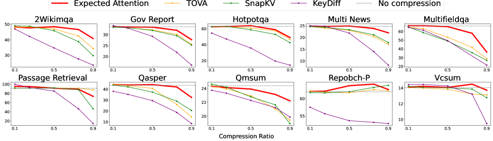
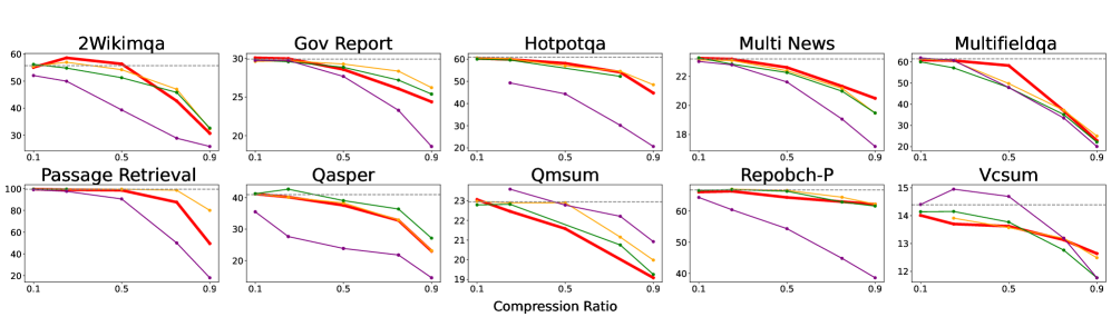
Figure 2: Scores on LongBench (Bai et al., 2024) for Qwen3-8B (top) and Gemma3-12B (bottom). The x-axis represents the compression ratio, the y-axis the score for each specific dataset. The horizontal line represents the baseline performance without cache compression. Expected Attention achieves optimal trade-off between compression ratio and scores across most datasets (Additional and averaged results in Appendix ˜ D).
## 3 Experiments
### 3.1 Experimental Setup
#### Prefilling vs Decoding Generation
LLM inference comprises two phases with distinct computational characteristics. The prefilling phase processes the entire input prompt in parallel, computing key-value projections for the KV cache, a compute-bound operation requiring substantial floating-point operations. The decoding phase sequentially generates tokens using the KV cache and previous logits, appending new key-value pairs iteratively (Deepak & Amr, 2024; Gordić, 2025). This dichotomy has motivated disaggregated architectures that implement prefill and decoding on different hardware, at the cost of transferring the cache, further incentivising compression (Deepak Patil, 2024; StepFun et al., 2025). Therefore, an effective compression method must perform well in both prefilling and decoding (Deepak & Amr, 2024; Gordić, 2025). Nevertheless, a number of recent methods often target a single phase: SnapKV (Li et al., 2025) for prefilling via query attention scores, StreamingLLM (Xiao et al., 2023) and KNorm (Devoto et al., 2024) for streaming decoding. Expected Attention is designed considering these two aspects of LLM inference and addresses both scenarios efficiently. We present results for prefilling and decoding in Section ˜ 4.1 and Section ˜ 4.2 respectively.
#### Models and Datasets
For prefilling (one-shot compression before generation), we test three model families supporting long contexts: Llama3.1-8B (128k) (MetaAI, 2025), Qwen3-8B (32k) (Yang et al., 2025), and Gemma3-12B (128k) (GemmaTeam, 2025), all instruction-tuned. For decoding (compression during generation), we analyse reasoning models that generate extensive intermediate reasoning tokens and therefore large KV caches: Qwen-15B-R1, Qwen-7B-R1 (DeepSeek-AI, 2025), and OpenMath-Nemotron-14B (Moshkov et al., 2025).
Our benchmarks include LongBench (Bai et al., 2024), Ruler (Hsieh et al., 2024), and Needle in a Haystack (Kamradt, 2023; Liu et al., 2024) for prefilling, and Aime25 (Balunović et al., 2025) and MATH-500 (Lightman et al., 2023) for decoding.
#### Baselines
Following an initial benchmarking study on Ruler (see Appendix ˜ D), we selected and compare our method against the best-performing baselines for each use case. For prefilling, we evaluate attention-based approaches like SnapKV (Li et al., 2025) and TOVA (Oren et al., 2024), embedding-based KeyDiff (Park et al., 2025), and the trainable DuoAttention (Xiao et al., 2024) when the checkpoint is available. SnapKV (Li et al., 2025) and TOVA (Oren et al., 2024) rank KV pairs using attention scores from user queries. KeyDiff (Park et al., 2025) employs distance metrics between key embeddings for selection, making it also suitable for decoding generation. DuoAttention (Xiao et al., 2024) takes a trainable approach, learning compression masks for each attention head. For decoding, we focus on methods designed to be compatible with streaming generation: KNorm (Devoto et al., 2024), StreamingLLM (Xiao et al., 2023), and KeyDiff (Park et al., 2025). KNorm (Devoto et al., 2024) uses a simple approach by preserving keys with the lowest $L_2$ norm. StreamingLLM (Xiao et al., 2023) maintains initial sink tokens throughout generation.
Table 1: Expected Attention outperforms most baselines on Ruler (Hsieh et al., 2024) with 4K and 16K context length. We show average score with increasing compression ratios across baselines. Best results for each compression ratio are displayed in bold. The 0% column indicates the baseline without compression.
| Model | Method | Ruler 4k | Ruler 16k | | | | | | | | | | |
| --- | --- | --- | --- | --- | --- | --- | --- | --- | --- | --- | --- | --- | --- |
| 0% | 10% | 25% | 50% | 75% | 90% | 0% | 10% | 25% | 50% | 75% | 90% | | |
| Qwen3-8B | EA (ours) | $95.3$ | $95.3$ | $95.0$ | $94.7$ | $88.3$ | $65.4$ | $92.9$ | $93.1$ | $93.2$ | $92.7$ | $85.6$ | $62.7$ |
| TOVA[49] | $95.3$ | $89.0$ | $82.5$ | $77.6$ | $62.4$ | $24.7$ | $92.9$ | $88.3$ | $81.7$ | $76.2$ | $68.7$ | $52.4$ | |
| SnapKV[36] | $95.3$ | $92.6$ | $84.0$ | $55.7$ | $33.1$ | $19.2$ | $92.9$ | $90.1$ | $81.5$ | $62.8$ | $41.7$ | $26.8$ | |
| KeyDiff[50] | $95.3$ | $93.8$ | $89.4$ | $78.6$ | $64.4$ | $37.9$ | $92.9$ | $88.9$ | $82.9$ | $74.5$ | $66.9$ | $53.1$ | |
| Gemma3-12B | EA (ours) | $95.2$ | $95.2$ | $94.9$ | $92.7$ | $78.2$ | $53.6$ | $86.0$ | $82.8$ | $81.7$ | $76.6$ | $60.5$ | $41.8$ |
| TOVA[49] | $95.2$ | $89.7$ | $81.1$ | $76.5$ | $58.1$ | $25.3$ | $86.0$ | $79.7$ | $72.6$ | $62.5$ | $46.8$ | $32.7$ | |
| SnapKV[36] | $95.2$ | $82.9$ | $72.0$ | $54.8$ | $40.3$ | $30.1$ | $86.0$ | $74.1$ | $62.8$ | $46.4$ | $37.3$ | $31.4$ | |
| KeyDiff[50] | $95.2$ | $94.3$ | $90.6$ | $79.8$ | $62.0$ | $34.3$ | $86.0$ | $81.8$ | $78.6$ | $72.6$ | $58.6$ | $37.2$ | |
| Llama3.1-8B | EA (ours) | $95.3$ | $95.7$ | $95.3$ | $92.2$ | $75.9$ | $30.6$ | $93.4$ | $93.4$ | $92.8$ | $86.0$ | $66.4$ | $25.5$ |
| TOVA[49] | $95.3$ | $93.2$ | $87.3$ | $76.2$ | $63.3$ | $37.5$ | $93.4$ | $90.9$ | $86.1$ | $77.9$ | $68.4$ | $59.2$ | |
| Duo [64] | $95.3$ | $95.7$ | $95.7$ | $95.3$ | $73.2$ | $24.5$ | $93.4$ | $93.3$ | $93.0$ | $90.1$ | $59.1$ | $12.3$ | |
| SnapKV[36] | $95.3$ | $95.5$ | $88.8$ | $81.8$ | $63.2$ | $43.4$ | $93.4$ | $89.4$ | $82.0$ | $68.0$ | $43.1$ | $25.6$ | |
| KeyDiff[50] | $95.3$ | $94.7$ | $91.6$ | $85.5$ | $72.9$ | $61.1$ | $93.4$ | $92.1$ | $88.4$ | $82.6$ | $74.9$ | $66.5$ | |
#### Implementation details
We implement Expected Attention in Pytorch (Paszke et al., 2019). For all benchmarks, we test the models on 8 H100 GPUs, with batch size 1. We make all the code to reproduce our method and the baselines available in KVPress. In all experiments we use $ε=0.02$ , except for needle in a haystack where use $ε=0$ , and we average the RoPE embeddings over the next $T=512$ positions. For prefilling, we do not assume any question about the context. This simulates a real world use case and avoids favouring methods like SnapKV that rely on this assumption. For decoding, we keep a small buffer of hidden states of 128 tokens to compute statistics, and perform compression every 512 generation steps. In Equation 9 we only use $V$ instead of $W_oV$ , as using $W_o$ leads to a minor increase in results at a significantly higher memory cost.
## 4 Experimental Results
### 4.1 Prefilling
#### LongBench
LongBench (Bai et al., 2024) tests long-context capabilities across diverse tasks. The benchmark comprises six categories: single and multi-document QA, summarization, few-shot learning, synthetic tasks, and code completion. As shown in Figure ˜ 2 for Llama3.1-8B and Qwen3-8B (see Appendix ˜ D for Gemma3-12B), Expected Attention consistently achieves optimal compression-performance trade-offs, maintaining higher scores across all compression ratios. This demonstrates effective retention of critical KV pairs even under significant compression across varied reasoning and generation tasks.
#### Ruler
Ruler (Hsieh et al., 2024) measures retrieval, multi-hop tracing, and aggregation abilities within long contexts through four subsets: NIAH (Needle-in-a-Haystack) for single-fact retrieval, VT (Variable Tracking) for multi-hop reasoning, CWE (Common Words Extraction) for frequency-based aggregation, and FWE (Frequent Words Extraction) for statistical pattern recognition. Table ˜ 1 shows results at various compression ratios for 4k and 16k windows. Expected Attention maintains strong performance across all subsets, particularly at higher compression ratios. While KeyDiff performs well on Llama3.1-8B, it struggles on Gemma3-12B and Qwen3-8B, potentially due to QK normalization (GemmaTeam, 2025; Yang et al., 2025). Our Expected Attention-based policy effectively preserves information necessary for precise retrieval tasks.
#### Needle in a Haystack
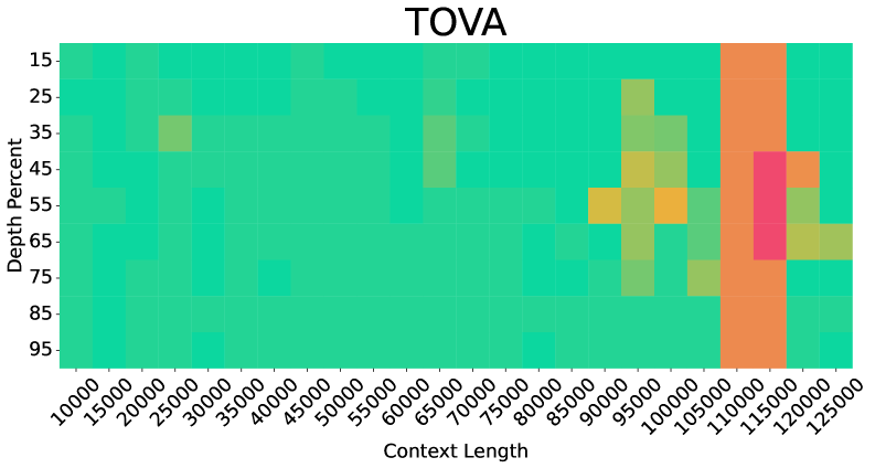
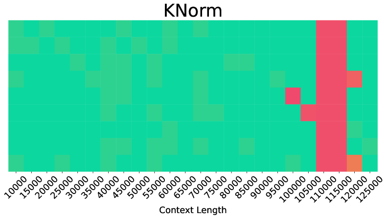
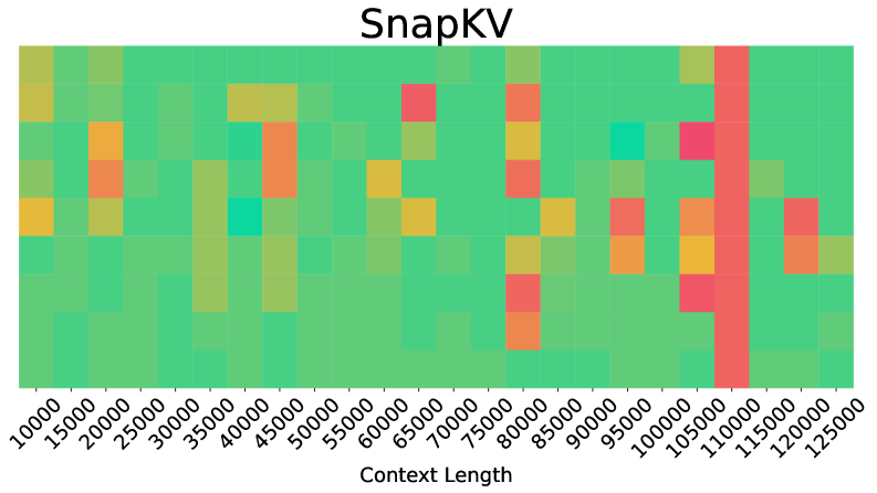
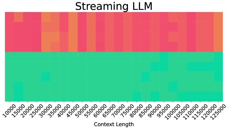
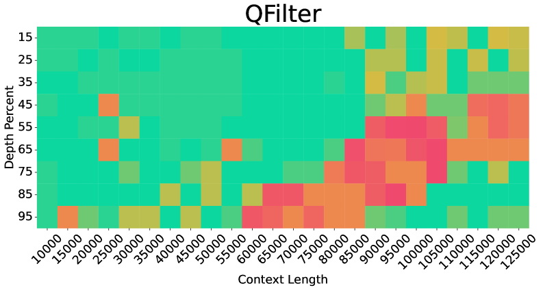
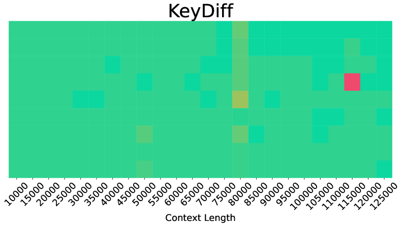
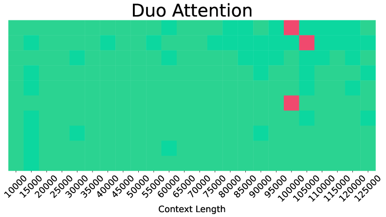
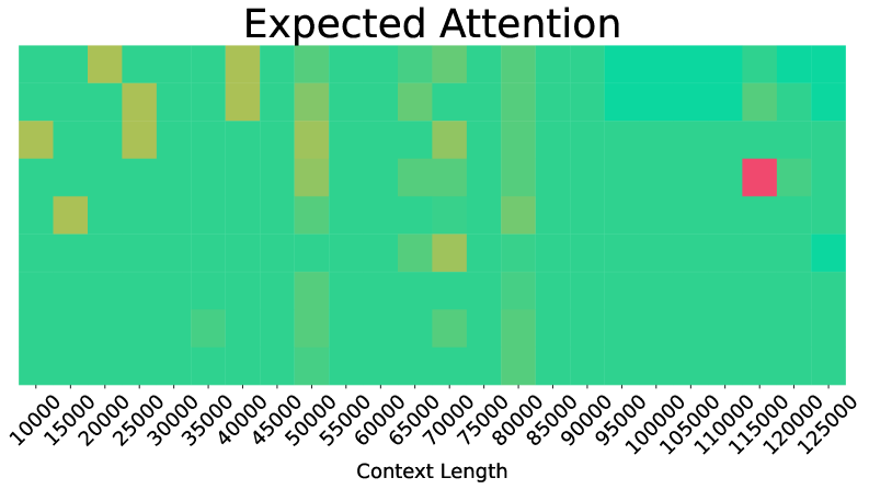
The NIAH test (Kamradt, 2023) embeds specific information (the "needle") within lengthy distracting text (the "haystack") to evaluate retrieval capabilities across varying context positions and lengths. The test systematically varies both the needle’s position within the context (needle depth) and the total context length to assess consistent retrieval performance. Figure ˜ 3 visualizes retrieval success across needle positions and context lengths up to 125k tokens. Expected Attention demonstrates robust performance comparable to DuoAttention and significantly more stable than other baselines in long contexts, confirming retention of critical information under compression regardless of needle placement or context size.
<details>
<summary>x5.png Details</summary>
### Visual Description
## Heatmap: TOVA
### Overview
The image is a heatmap titled "TOVA" displaying the relationship between **Context Length** (x-axis) and **Depth Percent** (y-axis). The heatmap uses a color gradient (green to red) to represent data density or values, with a legend on the right. The x-axis spans from 10,000 to 125,000, and the y-axis ranges from 15% to 95%. The heatmap shows distinct clusters of color intensity, indicating patterns in the data distribution.
---
### Components/Axes
- **Title**: "TOVA" (top-center).
- **X-axis (Context Length)**:
- Labels: 10,000, 15,000, 25,000, 35,000, 45,000, 55,000, 65,000, 75,000, 85,000, 95,000, 105,000, 115,000, 125,000.
- Scale: Linear increments of 10,000.
- **Y-axis (Depth Percent)**:
- Labels: 15%, 25%, 35%, 45%, 55%, 65%, 75%, 85%, 95%.
- Scale: Linear increments of 10%.
- **Legend**:
- Position: Right of the heatmap.
- Colors:
- Green (lowest values, ~15–25%).
- Yellow (~35–45%).
- Orange (~55–65%).
- Red (~75–85%).
- No explicit numerical labels on the legend, but color intensity correlates with value ranges.
---
### Detailed Analysis
1. **Color Distribution**:
- **Green Dominance**: Most cells are green, concentrated in the lower-left quadrant (low context length, low depth percent).
- **Yellow/Orange Transition**: As context length increases (>75,000), yellow and orange cells appear, indicating higher depth percent values.
- **Red Cluster**: A vertical band of red cells appears at context lengths ~110,000–125,000 and depth percent ~45%–55%, suggesting an outlier or threshold region.
2. **Trends**:
- **Positive Correlation**: Depth percent generally increases with context length, especially beyond 75,000.
- **Anomaly**: The red cluster at high context length and mid-depth percent (45–55%) deviates from the broader trend, suggesting a potential outlier or special case.
3. **Spatial Grounding**:
- **Legend**: Right-aligned, adjacent to the heatmap.
- **Axes**: X-axis at the bottom, Y-axis on the left. Labels are centered above/below axes.
- **Data Cells**: Square tiles with colors matching the legend. No text embedded in cells.
---
### Key Observations
- **Majority Low Values**: ~80% of cells are green, indicating most data points fall in the 15–25% depth percent range.
- **High-Value Outlier**: The red cluster at 110,000–125,000 context length and 45–55% depth percent is the only region with values exceeding 65%.
- **Gradual Transition**: Yellow/orange cells form a diagonal band from ~75,000 context length and 35% depth percent upward, showing a gradual increase in depth percent with context length.
---
### Interpretation
The heatmap suggests a **positive relationship** between context length and depth percent, with depth percent increasing as context length grows. However, the red cluster at high context length and mid-depth percent (45–55%) is anomalous, as it contradicts the general trend of higher depth percent at even greater context lengths. This could indicate:
1. A **threshold effect**: Certain context lengths (e.g., 110,000–125,000) may trigger a specific behavior or limitation in depth percent.
2. **Data anomaly**: The red cluster might represent outliers or errors in data collection.
3. **Non-linear relationship**: Depth percent may plateau or behave unpredictably at extreme context lengths.
The legend’s color coding confirms that red represents the highest values (~75–85%), but the red cluster’s placement at mid-depth percent (45–55%) implies either a misalignment in the legend’s value ranges or a unique data phenomenon requiring further investigation.
</details>
<details>
<summary>x6.png Details</summary>
### Visual Description
## Heatmap: KNorm Distribution by Context Length
### Overview
The image displays a heatmap titled "KNorm" visualizing the distribution of KNorm values across varying context lengths. The x-axis represents context lengths (10,000 to 125,000 in 5,000 increments), while the y-axis represents KNorm values (10,000 to 125,000). The heatmap uses a green-to-red gradient, with red indicating higher values and green lower values. A vertical red bar dominates the far-right region, and an orange cell appears at the bottom-right corner.
### Components/Axes
- **X-axis (Context Length)**: Labeled "Context Length," ranging from 10,000 to 125,000 in 5,000 increments.
- **Y-axis (KNorm)**: Labeled "KNorm," ranging from 10,000 to 125,000 in 5,000 increments.
- **Color Gradient**: Green (low values) to red (high values), with an orange cell at the lowest y-axis value (10,000) and highest x-axis value (125,000).
- **Legend**: Not explicitly visible; inferred from color gradient.
### Detailed Analysis
- **Vertical Red Bar**: A dense cluster of red cells spans the entire height of the heatmap at the far-right x-axis (125,000 context length), indicating consistently high KNorm values across all y-axis ranges.
- **Orange Cell**: A single orange cell is located at the intersection of the lowest y-axis value (10,000) and highest x-axis value (125,000), suggesting an extreme outlier or peak.
- **Red Squares**: Scattered red squares appear in the upper-right quadrant (x-axis: 100,000–125,000; y-axis: 100,000–125,000), indicating localized high KNorm values.
- **Green Dominance**: Most cells are green, particularly in the lower-left quadrant (x-axis: 10,000–50,000; y-axis: 10,000–50,000), showing low KNorm values.
### Key Observations
1. **High KNorm at Large Context Lengths**: The vertical red bar and red squares suggest KNorm values increase significantly at context lengths ≥100,000.
2. **Outlier at 125,000 Context Length**: The orange cell at (125,000, 10,000) deviates from the trend, potentially indicating an anomaly or measurement error.
3. **Low KNorm in Smaller Contexts**: The majority of green cells in the lower-left quadrant imply KNorm values remain low for context lengths ≤50,000.
### Interpretation
The heatmap demonstrates a strong correlation between context length and KNorm values, with KNorm increasing as context length grows. The vertical red bar at 125,000 context length suggests a threshold effect, where KNorm values become consistently high beyond this point. The orange cell at (125,000, 10,000) is puzzling, as it contradicts the trend of high KNorm at large context lengths—it may represent a data anomaly or a specific edge case. The red squares in the upper-right quadrant indicate that high KNorm values are not uniformly distributed but cluster in specific regions. This visualization highlights the need for further investigation into the factors driving KNorm spikes at extreme context lengths and the validity of the outlier at (125,000, 10,000).
</details>
<details>
<summary>x7.png Details</summary>
### Visual Description
## Heatmap: SnapKV Performance by Context Length
### Overview
The image displays a heatmap titled "SnapKV" visualizing performance metrics across varying context lengths. The chart uses a color gradient (green to red) to represent values, with context length on the x-axis and an unlabeled y-axis. Key trends include clustered high-value (red) regions and sparse low-value (green) areas.
### Components/Axes
- **X-axis (Context Length)**: Labeled "Context Length" with discrete markers at 10k, 15k, 20k, ..., 125k (increments of 5k).
- **Y-axis**: No explicit label visible; likely represents a performance metric (e.g., latency, throughput) based on context.
- **Legend**: Located on the right, mapping colors to value ranges:
- Green: Low values
- Yellow: Medium values
- Orange: High values
- Red: Very high values
### Detailed Analysis
- **Color Distribution**:
- **Green (Low)**: Dominates lower context lengths (10k–40k) and scattered regions at higher lengths (e.g., 120k).
- **Yellow (Medium)**: Concentrated around 40k–80k context lengths.
- **Orange (High)**: Clustered at 80k–100k, with vertical red bars at 100k and 110k.
- **Red (Very High)**: Dominates 100k–110k, with a prominent vertical red bar at 110k.
- **Notable Patterns**:
- A vertical red "spike" at 110k context length spans the entire y-axis range.
- Red/orange regions are sparse below 80k and above 120k.
- Green/yellow regions are more evenly distributed outside 80k–110k.
### Key Observations
1. **High-Value Cluster**: The 100k–110k context length range exhibits the highest values (red), suggesting a critical threshold or anomaly.
2. **Performance Degradation**: Values increase sharply at 100k, peaking at 110k, then drop to green/yellow at 120k+.
3. **Missing Y-Axis Label**: The unlabeled y-axis prevents precise interpretation of the metric (e.g., latency vs. throughput).
### Interpretation
The heatmap suggests that **SnapKV performance degrades significantly at context lengths near 100k–110k**, with a pronounced spike at 110k. This could indicate:
- **Resource Saturation**: High context lengths may exhaust memory or processing capacity.
- **Algorithmic Inefficiency**: A specific configuration or bug causing bottlenecks at 110k.
- **Threshold Effect**: A design limitation where performance collapses beyond 100k context.
The absence of a y-axis label limits quantitative analysis, but the red/orange dominance at 100k–110k implies a critical failure point. Further investigation into the y-axis metric (e.g., latency spikes) is needed to confirm causality.
</details>
<details>
<summary>x8.png Details</summary>
### Visual Description
## Heatmap: Streaming LLM Performance by Context Length
### Overview
The image is a heatmap visualizing the performance of streaming and non-streaming large language models (LLMs) across varying context lengths. The chart uses color gradients to represent performance metrics, with red/orange indicating streaming and green indicating non-streaming. Context lengths range from 10,000 to 125,000 tokens, and performance is plotted along the y-axis.
### Components/Axes
- **X-Axis (Context Length)**: Labeled "Context Length" with values from 10,000 to 125,000 tokens in increments of 10,000.
- **Y-Axis (Performance)**: Labeled "Streaming" (top) and "Non-Streaming" (bottom), with no numerical scale but categorical separation.
- **Legend**: Located on the right, with red representing "Streaming" and green representing "Non-Streaming."
### Detailed Analysis
- **Streaming (Red/Orange)**:
- Performance varies significantly across context lengths.
- Darker red (higher performance) dominates shorter contexts (10k–50k tokens).
- Gradual shift to orange (lower performance) as context length increases (50k–125k tokens).
- Notable gaps (lighter orange) at 70k, 90k, and 110k tokens, suggesting performance drops at these ranges.
- **Non-Streaming (Green)**:
- Uniformly green across most context lengths, indicating stable performance.
- Darker green squares at 20k, 30k, 80k, 90k, 100k, and 110k tokens, possibly denoting optimal performance in these ranges.
- No significant degradation observed across context lengths.
### Key Observations
1. **Streaming Degradation**: Streaming performance declines as context length increases, with the most pronounced drops at 70k, 90k, and 110k tokens.
2. **Non-Streaming Stability**: Non-streaming maintains consistent performance, with minor optimizations at specific context lengths.
3. **Color Consistency**: All red/orange regions align with the "Streaming" legend, and green regions match "Non-Streaming," confirming accurate color coding.
### Interpretation
The heatmap suggests that streaming LLMs face scalability challenges with longer contexts, likely due to incremental processing overhead. Non-streaming models, while less flexible, handle large contexts more efficiently. The performance gaps in streaming at specific context lengths (e.g., 70k, 90k) may indicate architectural limitations or resource bottlenecks. This data highlights a trade-off between real-time adaptability (streaming) and computational efficiency (non-streaming) in LLM design.
</details>
<details>
<summary>x9.png Details</summary>
### Visual Description
## Heatmap: QFilter Performance by Context Length and Depth Percent
### Overview
The image is a heatmap titled "QFilter," visualizing performance metrics across two dimensions: **Context Length** (x-axis) and **Depth Percent** (y-axis). Cells are color-coded to represent values, with a legend indicating a gradient from green (low) to red (high). The heatmap reveals spatial patterns of performance intensity.
---
### Components/Axes
- **X-Axis (Context Length)**:
- Labels: `10,000`, `15,000`, `20,000`, ..., `125,000` (increments of 5,000).
- Scale: Logarithmic-like progression, with denser clustering at lower values.
- **Y-Axis (Depth Percent)**:
- Labels: `15%`, `25%`, `35%`, ..., `95%` (increments of 10%).
- Scale: Linear from 15% to 95%.
- **Legend**:
- Position: Right of the heatmap.
- Colors:
- Green → Yellow → Orange → Red (low to high values).
- No explicit numerical scale provided; inferred from color intensity.
---
### Detailed Analysis
- **Color Distribution**:
- **Low Values (Green/Yellow)**: Dominant in lower-left quadrant (small context lengths, low depth percent).
- **Medium Values (Yellow/Orange)**: Clustered around mid-range context lengths (40k–80k) and mid-depth (45%–65%).
- **High Values (Red/Orange-Red)**: Concentrated in the upper-right quadrant (context lengths >80k, depth percent >65%).
- **Notable Patterns**:
- **Peaks**:
- Red cells at `95%` depth and `100k`–`125k` context lengths.
- Orange cells at `85%` depth and `90k`–`110k` context lengths.
- **Anomalies**:
- A red cell at `25k` context length and `45%` depth, suggesting an outlier.
- Sparse red/orange cells at `15k`–`30k` context lengths, indicating rare high-performance cases.
---
### Key Observations
1. **Positive Correlation**:
- Higher context lengths and depth percent generally align with increased performance (red/orange dominance in upper-right).
2. **Threshold Effects**:
- Performance plateaus at ~`95%` depth percent, regardless of context length.
3. **Efficiency Gaps**:
- Lower context lengths (<`50k`) show minimal high-performance regions, suggesting diminishing returns at small scales.
---
### Interpretation
The heatmap demonstrates that **QFilter's effectiveness scales with both context length and depth percent**, with the strongest performance observed at large context lengths (>`100k`) and high depth percent (>`85%`). The outlier at `25k` context and `45%` depth suggests exceptional cases where performance spikes despite suboptimal parameters. The plateau at `95%` depth implies diminishing returns beyond this threshold.
**Implications**:
- Prioritize longer contexts and higher depth for optimal QFilter performance.
- Investigate anomalies (e.g., `25k`/`45%`) to identify unique use cases or data characteristics.
- The absence of a clear numerical scale in the legend limits precise quantification but highlights relative trends.
</details>
<details>
<summary>x10.png Details</summary>
### Visual Description
## Heatmap: KeyDiff vs Context Length
### Overview
The image is a heatmap titled "KeyDiff," visualizing the relationship between "Context Length" (x-axis) and "KeyDiff" (y-axis). The grid uses varying shades of green, yellow, and red to represent data density or magnitude, with a prominent red square at (115k, 115k) and yellow squares at (80k, 80k) and (75k, 75k). The axes are labeled with numerical ranges, and the grid is structured as a 2D matrix.
---
### Components/Axes
- **X-axis (Context Length)**: Labeled with values from 10,000 to 125,000 in increments of 10,000.
- **Y-axis (KeyDiff)**: Labeled with values from 10,000 to 125,000 in increments of 10,000.
- **Grid**: A 2D matrix with cells colored in green, yellow, or red.
- **Legend**: Not explicitly visible, but colors likely correspond to KeyDiff magnitude (e.g., red = highest, green = lowest).
---
### Detailed Analysis
- **Red Square**: Located at (115,000, 115,000), indicating the highest KeyDiff value.
- **Yellow Squares**:
- (80,000, 80,000): Mid-range KeyDiff.
- (75,000, 75,000): Slightly lower than (80k, 80k).
- **Green Squares**: Scattered across the grid, representing lower KeyDiff values.
- **Distribution**:
- Higher KeyDiff values cluster around (115k, 115k) and (80k–75k).
- Lower KeyDiff values are more evenly distributed in the lower-left and upper-right regions.
---
### Key Observations
1. **Outlier**: The red square at (115k, 115k) is the most significant data point, suggesting an extreme KeyDiff at this context length.
2. **Mid-Range Clustering**: Yellow squares at (80k, 80k) and (75k, 75k) indicate moderate KeyDiff values concentrated at these points.
3. **Low-Value Spread**: Green squares are dispersed, implying lower KeyDiff across most of the grid.
4. **Symmetry**: The red and yellow squares align diagonally, suggesting a potential correlation between Context Length and KeyDiff.
---
### Interpretation
- **Trend**: KeyDiff increases with Context Length up to 115k, where it peaks (red square). Beyond this, KeyDiff may decrease or stabilize, as seen in the green-dominated upper-right region.
- **Significance**: The red square at (115k, 115k) could represent a critical threshold or anomaly, warranting further investigation.
- **Mid-Range Relevance**: The yellow squares at (80k–75k) suggest these context lengths are important for moderate KeyDiff, possibly indicating optimal or balanced performance.
- **Anomalies**: The absence of red/yellow squares in the lower-left and upper-right regions implies lower KeyDiff in those ranges, which might indicate less impactful or stable conditions.
This heatmap highlights how KeyDiff varies with Context Length, emphasizing specific points of interest for further analysis.
</details>
<details>
<summary>x11.png Details</summary>
### Visual Description
## Heatmap: Duo Attention
### Overview
The image is a heatmap titled "Duo Attention," visualizing data points across two dimensions: **Context Length** (x-axis) and an unlabeled y-axis. The heatmap uses a color gradient (green to red) to represent values, with red squares indicating higher intensity and green squares representing lower intensity. The x-axis ranges from 10,000 to 125,000 in increments of 15,000, while the y-axis spans approximately 5,000 to 15,000, though no explicit label is provided.
---
### Components/Axes
- **Title**: "Duo Attention" (top-center).
- **X-Axis**: Labeled "Context Length," with values from 10,000 to 125,000 in 15,000 increments.
- **Y-Axis**: Unlabeled, but values range from ~5,000 to ~15,000 based on grid alignment.
- **Legend**: No explicit legend is present, but the color gradient (green to red) implies a value scale, with red denoting higher values and green lower values.
- **Grid**: Light gray grid lines divide the plot into cells, with red squares concentrated in specific regions.
---
### Detailed Analysis
- **Red Squares**:
- Located in the upper-right quadrant (x: 95,000–115,000; y: 5,000–15,000).
- Three prominent red squares are clustered near (x: 100,000, y: 10,000), (x: 105,000, y: 10,000), and (x: 110,000, y: 10,000).
- Additional red squares appear sporadically in the upper-right region (e.g., x: 95,000, y: 5,000; x: 115,000, y: 15,000).
- **Green Squares**:
- Dominant across most of the plot, especially in the lower-left quadrant (x: 10,000–85,000; y: 5,000–15,000).
- Scattered in the lower-right quadrant (x: 85,000–125,000; y: 5,000–15,000).
---
### Key Observations
1. **High-Intensity Clusters**: Red squares are concentrated in the upper-right quadrant, suggesting a correlation between higher context lengths (x-axis) and higher y-axis values (unlabeled).
2. **Sparse Distribution**: Green squares are more evenly distributed, with fewer high-intensity regions.
3. **Y-Axis Ambiguity**: The unlabeled y-axis limits interpretation of the vertical dimension’s significance.
---
### Interpretation
The heatmap suggests that **higher context lengths** (x-axis) are associated with increased "attention" (implied by red squares) in specific y-axis ranges. However, the absence of a y-axis label prevents definitive conclusions about the relationship between the two variables. The clustering of red squares in the upper-right quadrant may indicate a threshold or critical region where context length and an unspecified metric interact to produce higher attention values. Further clarification of the y-axis label and the metric being measured is required to validate these observations.
</details>
<details>
<summary>x12.png Details</summary>
### Visual Description
## Heatmap: Expected Attention
### Overview
The image is a heatmap titled "Expected Attention," visualizing the relationship between **Context Length** (x-axis) and **Model Size** (y-axis). The color gradient ranges from green (low attention) to yellow (medium) to red (high), indicating varying levels of attention across different combinations of context length and model size. A prominent red square at (115,000, 115,000) stands out as the highest attention value, while scattered yellow squares appear in lower-left and mid-range regions.
---
### Components/Axes
- **Title**: "Expected Attention" (centered at the top).
- **X-axis (Context Length)**: Labeled "Context Length" with values from 10,000 to 125,000 in increments of 15,000.
- **Y-axis (Model Size)**: Labeled "Model Size" with values from 10,000 to 125,000 in increments of 15,000.
- **Color Legend**:
- **Green**: Low attention (dominant in lower-left and mid-range regions).
- **Yellow**: Medium attention (scattered in lower-left and mid-range regions).
- **Red**: High attention (single red square at (115,000, 115,000)).
---
### Detailed Analysis
- **Red Square**: Located at (115,000, 115,000), this is the only red data point, indicating the highest expected attention. Its position suggests a critical threshold or optimal performance at this specific combination of context length and model size.
- **Yellow Squares**:
- Clustered in the lower-left region (e.g., 15,000–45,000 context length and 15,000–65,000 model size).
- Scattered in mid-range regions (e.g., 55,000–85,000 context length and 55,000–85,000 model size).
- **Green Regions**: Dominant in the upper-right and lower-right corners, indicating minimal attention for larger context lengths and model sizes beyond the red/yellow zones.
---
### Key Observations
1. **Peak Attention**: The red square at (115,000, 115,000) is the only high-attention value, suggesting a unique or critical interaction at this point.
2. **Medium Attention Zones**: Yellow squares are concentrated in lower context lengths and mid-range model sizes, implying moderate attention in these ranges.
3. **Low Attention Dominance**: Green regions dominate the upper-right and lower-right, indicating reduced attention for larger context lengths or model sizes.
---
### Interpretation
The heatmap reveals that **attention is most concentrated at the intersection of 115,000 context length and 115,000 model size**, possibly indicating an optimal or critical configuration for the model. The scattered yellow squares suggest variability in attention across lower and mid-range values, while the dominance of green in larger context/model sizes implies diminishing returns or reduced focus in those regions. This could reflect a trade-off between computational resources (model size) and input complexity (context length), with the red square representing a "sweet spot" for efficiency or performance. The absence of other red squares highlights the uniqueness of this peak, warranting further investigation into why this specific combination maximizes attention.
</details>
Figure 3: Needle in the Haystack test for different methods with Llama3.1-8B and 50% compression ratio.
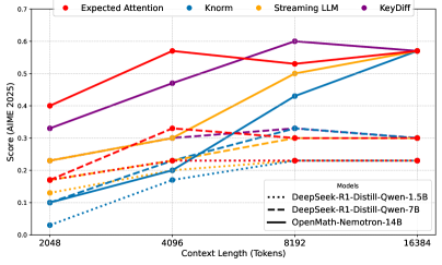
Figure 4: Decoding results on Aime25 dataset, different markers represent different models sizes. The x-axis is the maximum size that the KV cache is allowed to grow to.
<details>
<summary>x13.png Details</summary>
### Visual Description
## Line Chart: Model Performance Across Context Lengths
### Overview
The image is a line chart comparing the performance of different AI models across four metrics (Expected Attention, Knorm, Streaming LLM, KeyDiff) as context length increases from 2048 to 16384 tokens. The y-axis represents a score (AIME 2025), while the x-axis represents context length in tokens. The chart includes three models: DeepSeek-R1-Distill-Qwen-1.5B (dotted lines), DeepSeek-R1-Distill-Qwen-7B (dashed lines), and OpenMath-Nemotron-14B (solid lines). Each metric is represented by a distinct color.
### Components/Axes
- **X-axis**: Context Length (Tokens) with values: 2048, 4096, 8192, 16384.
- **Y-axis**: Score (AIME 2025) ranging from 0.0 to 0.7.
- **Legend**: Located in the top-right corner. It includes:
- **Metrics**:
- Expected Attention (red)
- Knorm (blue)
- Streaming LLM (orange)
- KeyDiff (purple)
- **Models**:
- DeepSeek-R1-Distill-Qwen-1.5B (dotted lines)
- DeepSeek-R1-Distill-Qwen-7B (dashed lines)
- OpenMath-Nemotron-14B (solid lines)
### Detailed Analysis
#### Metrics Trends
1. **Expected Attention (Red)**:
- Starts at ~0.4 at 2048 tokens.
- Peaks at ~0.55 at 4096 tokens.
- Declines to ~0.5 at 8192 tokens.
- Slightly increases to ~0.55 at 16384 tokens.
2. **Knorm (Blue)**:
- Starts at ~0.1 at 2048 tokens.
- Increases to ~0.2 at 4096 tokens.
- Rises to ~0.4 at 8192 tokens.
- Peaks at ~0.55 at 16384 tokens.
3. **Streaming LLM (Orange)**:
- Starts at ~0.2 at 2048 tokens.
- Increases to ~0.3 at 4096 tokens.
- Rises to ~0.5 at 8192 tokens.
- Peaks at ~0.55 at 16384 tokens.
4. **KeyDiff (Purple)**:
- Starts at ~0.3 at 2048 tokens.
- Increases to ~0.45 at 4096 tokens.
- Peaks at ~0.6 at 8192 tokens.
- Slightly decreases to ~0.55 at 16384 tokens.
#### Model Performance
- **DeepSeek-R1-Distill-Qwen-1.5B (Dotted Lines)**:
- Expected Attention: ~0.1 (2048) → ~0.2 (4096) → ~0.3 (8192) → ~0.4 (16384).
- Knorm: ~0.1 (2048) → ~0.2 (4096) → ~0.3 (8192) → ~0.4 (16384).
- Streaming LLM: ~0.2 (2048) → ~0.3 (4096) → ~0.4 (8192) → ~0.5 (16384).
- KeyDiff: ~0.3 (2048) → ~0.4 (4096) → ~0.5 (8192) → ~0.55 (16384).
- **DeepSeek-R1-Distill-Qwen-7B (Dashed Lines)**:
- Expected Attention: ~0.2 (2048) → ~0.3 (4096) → ~0.4 (8192) → ~0.5 (16384).
- Knorm: ~0.2 (2048) → ~0.3 (4096) → ~0.4 (8192) → ~0.5 (16384).
- Streaming LLM: ~0.3 (2048) → ~0.4 (4096) → ~0.5 (8192) → ~0.55 (16384).
- KeyDiff: ~0.4 (2048) → ~0.5 (4096) → ~0.6 (8192) → ~0.55 (16384).
- **OpenMath-Nemotron-14B (Solid Lines)**:
- Expected Attention: ~0.3 (2048) → ~0.4 (4096) → ~0.5 (8192) → ~0.55 (16384).
- Knorm: ~0.3 (2048) → ~0.4 (4096) → ~0.5 (8192) → ~0.55 (16384).
- Streaming LLM: ~0.4 (2048) → ~0.5 (4096) → ~0.6 (8192) → ~0.55 (16384).
- KeyDiff: ~0.5 (2048) → ~0.6 (4096) → ~0.7 (8192) → ~0.55 (16384).
### Key Observations
1. **KeyDiff (Purple)** consistently shows the highest scores, especially at 8192 tokens (~0.6), suggesting it is a critical metric for model performance.
2. **Knorm (Blue)** and **Streaming LLM (Orange)** exhibit steady growth with increasing context length, indicating scalability.
3. **Expected Attention (Red)** peaks at 4096 tokens but declines afterward, possibly due to computational constraints or model limitations.
4. **Larger models** (e.g., OpenMath-Nemotron-14B) outperform smaller models across all metrics, highlighting the impact of model size on performance.
5. **Dotted lines** (1.5B model) show the lowest scores, while **solid lines** (14B model) achieve the highest, emphasizing the correlation between model size and performance.
### Interpretation
The chart demonstrates that:
- **Model size** significantly influences performance, with larger models (e.g., OpenMath-Nemotron-14B) achieving higher scores across all metrics.
- **KeyDiff** is the most impactful metric, suggesting it may be a key factor in evaluating model effectiveness.
- **Context length** generally improves performance for most metrics, but some models (e.g., Expected Attention) plateau or decline at larger scales, possibly due to architectural or computational trade-offs.
- The **dotted and dashed lines** (smaller models) lag behind the **solid lines** (largest model), reinforcing the importance of model capacity in handling complex tasks.
This analysis underscores the trade-offs between model size, context length, and specific metrics in AI performance evaluation.
</details>
Table 2: Decoding scores on MATH-500. Columns indicate the final size of the KV cache with respect to the original full version. Best scores in bold.
| Qwen-R1-1.5B KeyDiff[50] | EA (ours) 0.47 | 0 $×$ 0.47 0.42 | 2 $×$ $0.47$ 0.40 | 4 $×$ $0.43$ 0.30 | 12 $×$ $0.33$ |
| --- | --- | --- | --- | --- | --- |
| KNorm[15] | 0.47 | 0.41 | 0.28 | 0.11 | |
| Streaming[63] | 0.47 | 0.45 | 0.41 | 0.31 | |
| Qwen-R1-7B | EA (ours) | 0.57 | $0.55$ | $0.53$ | $0.49$ |
| KeyDiff[50] | 0.57 | 0.54 | 0.48 | 0.35 | |
| KNorm[15] | 0.57 | 0.47 | 0.32 | 0.12 | |
| Streaming[63] | 0.57 | 0.54 | 0.51 | 0.41 | |
| Nemotron-14B | EA (ours) | 0.57 | 0.55 | $0.54$ | $0.47$ |
| KeyDiff[50] | 0.57 | 0.56 | 0.51 | 0.44 | |
| KNorm[15] | 0.57 | 0.50 | 0.36 | 0.14 | |
| Streaming[63] | 0.57 | $0.57$ | $0.54$ | 0.42 | |
### 4.2 Decoding
For decoding, we evaluate Expected Attention on reasoning models, Qwen-15B-R1, Qwen-7B-R1, and OpenMath-Nemotron-14B. Reasoning models are particularly suitable for our evaluation as they generate extensive chain-of-thought outputs for reasoning traces, placing significant demands on KV cache memory (Łańcucki et al., 2025). We use the Aime25 (Yamada et al., 2025) and MATH-500 (Lightman et al., 2023) datasets. Aime25 consists of competition-level mathematical problems requiring multi-step reasoning and precise calculation, while MATH-500 encompasses diverse mathematical domains with varying difficulty levels. During decoding, we allow the KV cache to expand to a predetermined size before initiating token eviction. In the tables, we use $n×$ to show that the final cache size is $n$ times smaller than would be without compression.
Results for Aime25 and MATH-500 are presented in Section ˜ 4.1 and Table ˜ 2, respectively. Expected Attention consistently outperforms or matches baseline methods across all models, with particularly strong performance at higher compression ratios ( $4×$ and $16×$ ). Most methods demonstrate minimal performance degradation at $2×$ compression, indicating that a large portion of tokens in reasoning traces contains redundant information that can be pruned without affecting mathematical reasoning performance. Expected Attention shows the best performance especially in high-compression scenarios (12 $×$ compression).
### 4.3 Memory Savings and Efficiency
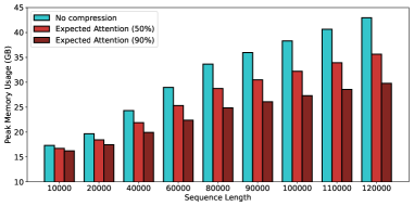
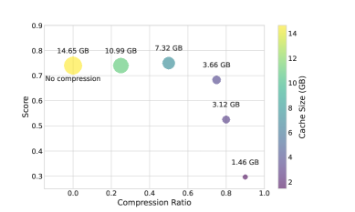
We evaluate the memory efficiency of our method using Llama3.1-8B and Qwen3-8B for both prefilling and decoding phases. All experiments are conducted on a single H100 GPU with bfloat16 precision for both model weights and KV cache. We focus on peak memory usage as the primary efficiency metric, as KV cache memory consumption is often the primary bottleneck for long-context inference.
Figure ˜ 5(a) demonstrates peak memory usage as sequence length increases up to 120k tokens, comparing Expected Attention at 50% and 90% compression ratios against the uncompressed baseline with vanilla attention. The results show that memory savings become increasingly substantial as context length grows.
Figure ˜ 5(b) illustrates the relationship between compression ratio (x-axis) and NIAH benchmark performance for Qwen3-8B, with marker size representing the corresponding KV cache size. While higher compression ratios naturally reduce KV cache size, they typically incur performance penalties. Remarkably, Expected Attention at 50% compression maintains performance parity with the uncompressed baseline while achieving a $2×$ reduction in KV cache size, demonstrating an optimal balance between memory efficiency and task performance.
<details>
<summary>x14.png Details</summary>
### Visual Description
## Bar Chart: Peak Memory Usage vs Sequence Length
### Overview
The chart compares peak memory usage (in GB) across three compression strategies ("No compression", "Expected Attention (50%)", and "Expected Attention (90%)") as sequence length increases from 10,000 to 120,000. Memory usage rises monotonically for all strategies, with "No compression" consistently consuming the most memory and "Expected Attention (90%)" the least.
### Components/Axes
- **X-axis**: Sequence Length (10,000 to 120,000 in 20,000 increments)
- **Y-axis**: Peak Memory Usage (GB) from 10 to 45
- **Legend**:
- Blue: No compression
- Red: Expected Attention (50%)
- Brown: Expected Attention (90%)
- **Bar Groups**: Three bars per sequence length, grouped by compression strategy
### Detailed Analysis
1. **No compression** (blue):
- Starts at ~17 GB (10,000 seq) and rises to ~43 GB (120,000 seq)
- Linear increase with ~0.18 GB per 1,000 seq increment
2. **Expected Attention (50%)** (red):
- Starts at ~16 GB (10,000 seq) and rises to ~35 GB (120,000 seq)
- Linear increase with ~0.16 GB per 1,000 seq increment
3. **Expected Attention (90%)** (brown):
- Starts at ~15 GB (10,000 seq) and rises to ~30 GB (120,000 seq)
- Linear increase with ~0.13 GB per 1,000 seq increment
### Key Observations
- Memory usage scales linearly with sequence length for all strategies
- Compression reduces memory usage by ~6-7 GB per 10,000 seq increment
- The memory savings between 50% and 90% compression diminish at higher sequence lengths
- No compression uses 2.5-3x more memory than 90% compression at maximum sequence length
### Interpretation
The data demonstrates that memory requirements grow proportionally with sequence length, with compression strategies offering predictable reductions. The diminishing returns of higher compression (50% vs 90%) suggest that beyond a certain point, additional compression effort yields smaller memory savings. This implies a potential cost-benefit tradeoff for systems handling large sequences: while 90% compression saves memory, the computational overhead of achieving higher compression ratios may not justify the marginal gains. The consistent linear trends indicate no unexpected memory spikes or anomalies in the tested range.
</details>
(a) Peak memory usage vs sequence length up to 120k for Llama3.1-8B, with 50% and 90% compression ratio. As the context length grows the memory savings become more evident, achieving up to 15GB less memory for large contexts.
<details>
<summary>x15.png Details</summary>
### Visual Description
## Scatter Plot: Compression Ratio vs Performance Score
### Overview
The image is a scatter plot visualizing the relationship between data compression ratio and performance score, with cache size represented through color gradients. The plot shows five distinct data points with explicit labels, positioned across a compression ratio range from 0 to 0.9.
### Components/Axes
- **X-axis**: Compression Ratio (0.0 to 1.0 in 0.1 increments)
- **Y-axis**: Score (0.3 to 0.9 in 0.1 increments)
- **Legend**: Right-aligned color gradient from purple (2 GB) to yellow (14 GB)
- **Data Points**: Five labeled markers with explicit cache sizes and compression ratios
### Detailed Analysis
1. **No Compression (0.0 ratio)**:
- Yellow marker (14.65 GB cache)
- Score: 0.75
- Position: Far left, highest cache size
2. **0.2 Compression Ratio**:
- Green marker (10.99 GB cache)
- Score: 0.72
- Position: Mid-left, second-highest cache
3. **0.5 Compression Ratio**:
- Teal marker (7.32 GB cache)
- Score: 0.68
- Position: Mid-center, moderate cache
4. **0.7 Compression Ratio**:
- Purple marker (3.66 GB cache)
- Score: 0.55
- Position: Mid-right, smaller cache
5. **0.9 Compression Ratio**:
- Dark purple marker (1.46 GB cache)
- Score: 0.30
- Position: Far right, lowest cache
### Key Observations
- **Inverse Relationship**: Score decreases by 0.45 (from 0.75 to 0.30) as compression ratio increases from 0 to 0.9
- **Cache Size Impact**: Larger caches maintain higher scores even with compression (14.65 GB at 0.75 score vs 1.46 GB at 0.30 score)
- **Non-linear Diminishing Returns**: Score drops sharply between 0.7-0.9 compression ratios despite only 0.2 ratio increase
- **Color Consistency**: All markers match legend colors exactly (yellow=14GB, green=10.99GB, teal=7.32GB, purple=3.66GB, dark purple=1.46GB)
### Interpretation
The data demonstrates a clear trade-off between compression efficiency and performance, with cache size acting as a critical moderating factor. Larger caches preserve higher scores even with significant compression, suggesting that cache capacity is essential for maintaining system responsiveness during data processing. The steep decline in performance at higher compression ratios (0.7-0.9) indicates potential algorithmic limitations or data integrity issues at extreme compression levels. The 1.46 GB data point at 0.9 compression ratio represents an outlier in both cache size and performance degradation, possibly indicating a specialized use case or system constraint. This visualization emphasizes the importance of balancing storage efficiency with computational performance in data-intensive applications.
</details>
(b) Needle in a Haystack score with different compression ratios with Qwen3-8B. Expected Attention has no accuracy loss with a compression ratio of 50%. Marker size indicates actual KV cache size in GB.
## 5 KVPress: A Research Framework for KV Cache Compression
We introduce KVPress, a comprehensive PyTorch-based library designed to streamline the development and benchmarking of KV cache compression methods. By natively integrating with Hugging Face transformers (Wolf et al., 2020), KVPress allows researchers to implement and test novel techniques rapidly and intuitively.
KVPress achieves this integration by utilizing PyTorch forward hooks attached to each attention layer. This design choice allows the framework to operate entirely within the existing Hugging Face transformer pipeline, eliminating the need to modify the model architecture or implement a custom, low-level KV cache management system. Specifically, after each attention layer’s forward pass, the hook is triggered to calculate the importance scores for the current KV pairs. Based on a chosen compression policy (e.g., Expected Attention), the hook then selectively evicts the KV pairs with the lowest scores before the model proceeds to the next layer. This non-invasive, layer-by-layer compression mechanism significantly simplifies the experimentation process for researchers. KVPress currently incorporates over 20 existing state-of-the-art compression techniques, including post-training and trainable ones. Our primary goal is to establish a shared, standardized platform that accelerates research and ensures fair, reproducible benchmarking within the $KV$ Cache compression field.
It is important to note that KVPress is not an optimized engine for deployment. This choice to prioritize readability over runtime efficiency facilitates the design of standard implementations and consistent benchmarking. We believe production-level efficiency is best achieved through subsequent, low-level optimization of individual methods, which would otherwise complicate the framework’s primary role as a unified research tool.
### 5.1 KVPress Leaderboard and Standardized Benchmarking
To complement the framework, we provide a public KVPress leaderboard for standardized evaluation across multiple long-context benchmarks. The leaderboard establishes consistent evaluation protocols, enabling direct and reproducible comparison of new compression methods against existing approaches. We hope that this framework, alongside its standardized benchmarking suite, will support the research community’s efforts to develop and validate novel compression techniques for long-context language models.
## 6 Related Works
#### Trainable KV-Cache Compression
One approach to reducing memory requirements involves modifying the model architecture or training procedure to inherently produce smaller caches. Ainslie et al. (2023); Shazeer (2019) reduce cache size by decreasing the number of key-value heads, effectively sharing key-value representations across queries. DeepSeek-V2 (DeepSeek-AI, 2024b) introduced Multi-Head Latent Attention, which projects keys and values into a lower-dimensional latent space during training, directly reducing the memory footprint of cached representations. Alternative trainable approaches focus on learning compression policies (Łańcucki et al., 2025; Nawrot et al., 2024) or masks (Xiao et al., 2024) from pre-trained checkpoints. Finally, State Space Models (Gu et al., 2022; Gu & Dao, 2024) replace the quadratic attention mechanism with linear-complexity alternatives, while hybrid approaches combine transformer layers with RNN-based components (Ren et al., 2025; Glorioso et al., 2024). Although these trainable methods typically achieve superior performance, they require substantial computational resources for pre-training or continued pre-training, making them less practical for deployment with existing large-scale models.
#### Training-Free KV cache compression
Given the computational costs associated with trainable methods, significant research effort has focused on developing post-training compression techniques that can be applied to existing models without modification. Early approaches (Li et al., 2025; Oren et al., 2024) directly utilize attention scores to rank KV pairs by importance. However, these methods require access to the full attention matrix, making them incompatible with Flash Attention (Dao et al., 2022) and thus impractical for modern deployment scenarios. To address this limitation, several works have developed heuristic-based importance measures that can be computed without materializing attention matrices, such as keys norm (KNorm Devoto et al. (2024)), token positions (StreamingLLM Xiao et al. (2023), H2O Zhang et al. (2024)) or SVD projection (Q-Filters Godey et al. (2025)). Recognizing that different attention heads exhibit varying sensitivity to compression, recent methods such as AdaKV (Feng et al., 2024) and PyramidKV (Cai et al., 2025a) adopt head-specific compression strategies. Expected Attention, adopts insights from these heuristic approaches while providing a principled theoretical foundation based on the distributional properties of transformer activations.
#### Quantization
Instead of reducing the KV cache size along the sequence dimension, quantization methods try to reduce the precision used to store the cache. For example, NQKV Cai et al. (2025b) partitions the cache into blocks for quantization and processes them separately. KVQuant (Hooper et al., 2024) performs non uniform per-layer quantization, while KIVI (Zirui Liu et al., 2023) quantizes the key cache by layer and the value cache by token. These methods are orthogonal to Expected Attention (and to KV cache compression in general), making it possible to integrate them.
#### Efficient Implementations
Alongside compression, sparse attention and quantization, another effort has been done to devise efficient implementation of inference systems. In this context, a well designed low-level handling of the KV cache can deliver significant performance speed-ups, especially in multi-user serving systems. The first to investigate this and introduce efficient memory management for KV cache was vLLM (Kwon et al., 2023), soon followed by other approaches (Prabhu et al., 2024; Jiang et al., 2024) and frameworks (NVIDIA, 2024).
## 7 Limitations
A key trade-off of our training-free methodology is that its performance does not match that of trainable methods (DeepSeek-AI, 2024a; Łańcucki et al., 2025). This is an intentional design choice that allows deployment without significant computational resources required for intensive training. Future work could explore combining our theoretical framework with lightweight fine-tuning.
Another limitation is that our method requires users to specify compression ratios manually, lacking an automated mechanism to determine optimal compression levels for different scenarios such as text generation. This represents a promising area for future research.
Finally, while our PyTorch implementation effectively demonstrates our method’s theoretical principles, it is not optimized for efficiency. A highly performant implementation with custom CUDA kernels would significantly improve speed and practical utility.
## 8 Conclusion
We introduced Expected Attention, a training-free algorithm for KV cache compression. We showed Expected Attention outperforms state-of-art KV cache compression methods on several benchmarks and in both prefilling and decoding scenarios. Additionally, we released a research library that allows researchers to easily implement and experiment with KV cache compression methods, and evaluate them on popular benchmarks for long context.
## References
- Achiam et al. (2023) Josh Achiam, Steven Adler, Sandhini Agarwal, Lama Ahmad, Ilge Akkaya, Florencia Leoni Aleman, Diogo Almeida, Janko Altenschmidt, Sam Altman, Shyamal Anadkat, et al. Gpt-4 technical report. arXiv preprint arXiv:2303.08774, 2023.
- Ainslie et al. (2023) Joshua Ainslie, James Lee-Thorp, Michiel de Jong, Yury Zemlyanskiy, Federico Lebron, and Sumit Sanghai. Gqa: Training generalized multi-query transformer models from multi-head checkpoints. The 2023 Conference on Empirical Methods in Natural Language Processing, 2023.
- Anthropic (2025) Anthropic. System card: Claude opus 4 & claude sonnet 4. arxiv, 2025.
- Bai et al. (2024) Yushi Bai, Xin Lv, Jiajie Zhang, Hongchang Lyu, Jiankai Tang, Zhidian Huang, Zhengxiao Du, Xiao Liu, Aohan Zeng, Lei Hou, Yuxiao Dong, Jie Tang, and Juanzi Li. LongBench: A bilingual, multitask benchmark for long context understanding. Proceedings of the 62nd Annual Meeting of the Association for Computational Linguistics, 2024.
- Balunović et al. (2025) Mislav Balunović, Jasper Dekoninck, Ivo Petrov, Nikola Jovanović, and Martin Vechev. Matharena: Evaluating llms on uncontaminated math competitions, February 2025. URL https://matharena.ai/.
- Cai et al. (2025a) Zefan Cai, Yichi Zhang, Bofei Gao, Yuliang Liu, Tianyu Liu, Keming Lu, Wayne Xiong, Yue Dong, Junjie Hu, and Wen Xiao. PyramidKV: Dynamic KV cache compression based on pyramidal information funneling. arXiv, 2025a.
- Cai et al. (2025b) Zhihang Cai, Xingjun Zhang, Zhendong Tan, and Zheng Wei. Nqkv: A kv cache quantization scheme based on normal distribution characteristics. arXiV, 2025b.
- Dao (2024) Tri Dao. FlashAttention-2: Faster attention with better parallelism and work partitioning. International Conference on Learning Representations (ICLR), 2024.
- Dao et al. (2022) Tri Dao, Daniel Y. Fu, Stefano Ermon, Atri Rudra, and Christopher Ré. Flashattention: Fast and memory-efficient exact attention with io-awareness. Advances in Neural Information Processing Systems (NeurIPS), 2022.
- Deepak & Amr (2024) Patil Deepak and Elmeleegy Amr. How to scale your model. https://cloud.google.com/blog/products/compute/ai-inference-recipe-using-nvidia-dynamo-with-ai-hypercomputer, 2024.
- Deepak Patil (2024) Amr Elmeleegy Deepak Patil. Fast and efficient ai inference with new nvidia dynamo recipe on ai hypercomputer. https://jax-ml.github.io/scaling-book/, 2024.
- DeepSeek-AI (2024a) DeepSeek-AI. Deepseek-v2: A strong, economical, and efficient mixture-of-experts language model. arXiv, 2024a.
- DeepSeek-AI (2024b) DeepSeek-AI. Deepseek-v3 technical report, 2024b.
- DeepSeek-AI (2025) DeepSeek-AI. Deepseek-r1: Incentivizing reasoning capability in llms via reinforcement learning, 2025.
- Devoto et al. (2024) Alessio Devoto, Yu Zhao, Simone Scardapane, and Pasquale Minervini. A simple and effective $l_2$ norm-based strategy for kv cache compression. The 2024 Conference on Empirical Methods in Natural Language Processing, 2024.
- Elhage et al. (2021) Nelson Elhage, Neel Nanda, Catherine Olsson, Tom Henighan, Nicholas Joseph, Ben Mann, Amanda Askell, Yuntao Bai, Anna Chen, Tom Conerly, Nova DasSarma, Dawn Drain, Deep Ganguli, Zac Hatfield-Dodds, Danny Hernandez, Andy Jones, Jackson Kernion, Liane Lovitt, Kamal Ndousse, Dario Amodei, Tom Brown, Jack Clark, Jared Kaplan, Sam McCandlish, and Chris Olah. A mathematical framework for transformer circuits. Transformer Circuits Thread, 2021. https://transformer-circuits.pub/2021/framework/index.html.
- Feng et al. (2024) Yuan Feng, Junlin Lv, Yukun Cao, Xike Xie, and S Kevin Zhou. Ada-kv: Optimizing kv cache eviction by adaptive budget allocation for efficient llm inference. arXiv, 2024.
- Fu (2024) Yao Fu. Challenges in deploying long-context transformers: A theoretical peak performance analysis. arXiv preprint arXiv:2405.08944, 2024.
- Ge et al. (2024) Suyu Ge, Yunan Zhang, Liyuan Liu, Minjia Zhang, Jiawei Han, and Jianfeng Gao. Model tells you what to discard: Adaptive KV cache compression for LLMs. In The Twelfth International Conference on Learning Representations, 2024.
- GeminiTeam (2025) GeminiTeam. Gemini 2.5: Pushing the frontier with advanced reasoning, multimodality, long context, and next generation agentic capabilities. arXiv, 2025.
- GemmaTeam (2025) GemmaTeam. Gemma 3. ArXiV, 2025. URL https://goo.gle/Gemma3Report.
- Glorioso et al. (2024) Paolo Glorioso, Quentin Anthony, Yury Tokpanov, James Whittington, Jonathan Pilault, Adam Ibrahim, and Beren Millidge. Zamba: A compact 7b ssm hybrid model. arXiv, 2024.
- Godey et al. (2025) Nathan Godey, Alessio Devoto, Yu Zhao, Simone Scardapane, Pasquale Minervini, Éric de la Clergerie, and Benoît Sagot. Q-filters: Leveraging qk geometry for efficient kv cache compression. arXiv, 2025.
- Gordić (2025) Aleksa Gordić. Inside vllm: Anatomy of a high-throughput llm inference system. https://www.aleksagordic.com/blog/vllmAleksaGordić, 2025.
- Gu & Dao (2024) Albert Gu and Tri Dao. Mamba: Linear-time sequence modeling with selective state spaces. 2312.00752, 2024.
- Gu et al. (2022) Albert Gu, Karan Goel, and Christopher Ré. Efficiently modeling long sequences with structured state spaces. International Conference on Learning Represenations, 2022.
- Hooper et al. (2024) Coleman Hooper, Sehoon Kim, Hiva Mohammadzadeh, Michael W. Mahoney, Yakun Sophia Shao, Kurt Keutzer, and Amir Gholami. Kvquant: Towards 10 million context length llm inference with kv cache quantization. Advances in Neural Information Processing Systems, 2024.
- Hsieh et al. (2024) Cheng-Ping Hsieh, Simeng Sun, Samuel Kriman, Shantanu Acharya, Dima Rekesh, Fei Jia, Yang Zhang, and Boris Ginsburg. Ruler: What’s the real context size of your long-context language models? arXiv preprint arXiv:2404.06654, 2024.
- Jelassi et al. (2024) Samy Jelassi, David Brandfonbrener, Sham M. Kakade, and Eran Malach. Repeat after me: Transformers are better than state space models at copying. International Conference on Machine Learning, 2024.
- Jiang et al. (2023) Albert Q. Jiang, Alexandre Sablayrolles, Arthur Mensch, Chris Bamford, Devendra Singh Chaplot, Diego de las Casas, Florian Bressand, Gianna Lengyel, Guillaume Lample, Lucile Saulnier, Lélio Renard Lavaud, Marie-Anne Lachaux, Pierre Stock, Teven Le Scao, Thibaut Lavril, Thomas Wang, Timothée Lacroix, and William El Sayed. Mistral 7b. arxiv, 2023.
- Jiang et al. (2024) Huiqiang Jiang, Yucheng Li, Chengruidong Zhang, Qianhui Wu, Xufang Luo, Surin Ahn, Zhenhua Han, Amir H. Abdi, Dongsheng Li, Chin-Yew Lin, Yuqing Yang, and Lili Qiu. MInference 1.0: Accelerating pre-filling for long-context LLMs via dynamic sparse attention. In The Thirty-eighth Annual Conference on Neural Information Processing Systems, 2024.
- Kamradt (2023) Greg Kamradt. Needle in a haystack - pressure testing llms. https://github.com/gkamradt/LLMTest_NeedleInAHaystack, 2023.
- Kim et al. (2025) Jang-Hyun Kim, Jinuk Kim, Sangwoo Kwon, Jae W. Lee, Sangdoo Yun, and Hyun Oh Song. Kvzip: Query-agnostic kv cache compression with context reconstruction, 2025.
- Kwon et al. (2023) Woosuk Kwon, Zhuohan Li, Siyuan Zhuang, Ying Sheng, Lianmin Zheng, Cody Hao Yu, Joseph Gonzalez, Hao Zhang, and Ion Stoica. Efficient memory management for large language model serving with pagedattention. Proceedings of the 29th Symposium on Operating Systems Principles, 2023.
- LI et al. (2025) Haoyang LI, Yiming Li, Anxin Tian, Tianhao Tang, Zhanchao Xu, Xuejia Chen, Nicole HU, Wei Dong, Li Qing, and Lei Chen. A survey on large language model acceleration based on KV cache management. Transactions on Machine Learning Research, 2025.
- Li et al. (2025) Yuhong Li, Yingbing Huang, Bowen Yang, Bharat Venkitesh, Acyr Locatelli, Hanchen Ye, Tianle Cai, Patrick Lewis, and Deming Chen. Snapkv: Llm knows what you are looking for before generation. Proceedings of the 38th International Conference on Neural Information Processing Systems, 2025.
- Lightman et al. (2023) Hunter Lightman, Vineet Kosaraju, Yura Burda, Harri Edwards, Bowen Baker, Teddy Lee, Jan Leike, John Schulman, Ilya Sutskever, and Karl Cobbe. Let’s verify step by step. arXiv preprint arXiv:2305.20050, 2023.
- Liu et al. (2025) James Liu, Pragaash Ponnusamy, Tianle Cai, Han Guo, Yoon Kim, and Ben Athiwaratkun. Training-free activation sparsity in large language models, 2025.
- Liu et al. (2024) Nelson F. Liu, Kevin Lin, John Hewitt, Ashwin Paranjape, Michele Bevilacqua, Fabio Petroni, and Percy Liang. Lost in the middle: How language models use long contexts. Transactions of the Association for Computational Linguistics, 2024.
- Merrill et al. (2024) William Merrill, Jackson Petty, and Ashish Sabharwal. The illusion of state in state-space models. International Conference on Machine Learning, 2024.
- MetaAI (2024) MetaAI. Introducing llama 4: Advancing multimodal intelligence. arXiv, 2024.
- MetaAI (2025) MetaAI. The llama 3 herd of models. arXiv, 2025.
- Moshkov et al. (2025) Ivan Moshkov, Darragh Hanley, Ivan Sorokin, Shubham Toshniwal, Christof Henkel, Benedikt Schifferer, Wei Du, and Igor Gitman. Aimo-2 winning solution: Building state-of-the-art mathematical reasoning models with openmathreasoning dataset. arXiv, 2025.
- Mudarisov et al. (2025) Timur Mudarisov, Mikhail Burtsev, Tatiana Petrova, and Radu State. Limitations of normalization in attention mechanism. arXiv:2508.17821, 2025.
- Nawrot et al. (2024) Piotr Nawrot, Adrian Łańcucki, Marcin Chochowski, David Tarjan, and Edoardo M. Ponti. Dynamic memory compression: retrofitting llms for accelerated inference. Proceedings of the 41st International Conference on Machine Learning, 2024.
- NVIDIA (2024) NVIDIA. TensorRT-LLM. https://github.com/NVIDIA/TensorRT-LLM, 2024.
- OpenAI (2024) OpenAI. Learning to reason with large language models. https://openai.com/index/learning-to-reason-with-llms/, 2024.
- OpenAI (2025) OpenAI. Introducing deep research. https://openai.com/index/introducing-deep-research/, 2025.
- Oren et al. (2024) Matanel Oren, Michael Hassid, Nir Yarden, Yossi Adi, and Roy Schwartz. Transformers are multi-state rnns. arXiv, 2024.
- Park et al. (2025) Junyoung Park, Dalton Jones, Matthew J Morse, Raghavv Goel, Mingu Lee, and Chris Lott. Keydiff: Key similarity-based kv cache eviction for long-context llm inference in resource-constrained environments. arXiv, 2025.
- Paszke et al. (2019) Adam Paszke, Sam Gross, Francisco Massa, Gal Lerer, James Bradbury, Gregory Chillemi, Luca Antiga, Alban Desmaison, Andreas Tejani, Soumith Chilamkurthy, et al. Pytorch: An imperative style, high-performance deep learning library. arXiv, 2019.
- PerplexityAI (2025) PerplexityAI. Perplexity deep research. https://www.perplexity.ai/hub/blog/introducing-perplexity-deep-research, 2025.
- Prabhu et al. (2024) Ramya Prabhu, Ajay Nayak, Jayashree Mohan, Ramachandran Ramjee, and Ashish Panwar. vattention: Dynamic memory management for serving llms without pagedattention. arXiv, 2024.
- Ren et al. (2025) Liliang Ren, Congcong Chen, Haoran Xu, Young Jin Kim, Adam Atkinson, Zheng Zhan, Jiankai Sun, Baolin Peng, Liyuan Liu, Shuohang Wang, Hao Cheng, Jianfeng Gao, Weizhu Chen, and Yelong Shen. Decoder-hybrid-decoder architecture for efficient reasoning with long generation. arXiv, 2025.
- Shazeer (2019) Noam Shazeer. Fast transformer decoding: One write-head is all you need. arXiv, 2019.
- Shi et al. (2024) Luohe Shi, Hongyi Zhang, Yao Yao, Zuchao Li, and Hai Zhao. Keep the cost down: A review on methods to optimize llm’ s kv-cache consumption. First Conference on Language Modeling (COLM), 2024.
- StepFun et al. (2025) StepFun, :, Bin Wang, Bojun Wang, Changyi Wan, Guanzhe Huang, Hanpeng Hu, Haonan Jia, Hao Nie, Mingliang Li, Nuo Chen, Siyu Chen, Song Yuan, Wuxun Xie, Xiaoniu Song, Xing Chen, Xingping Yang, Xuelin Zhang, Yanbo Yu, Yaoyu Wang, Yibo Zhu, Yimin Jiang, Yu Zhou, Yuanwei Lu, Houyi Li, Jingcheng Hu, Ka Man Lo, Ailin Huang, Binxing Jiao, Bo Li, Boyu Chen, Changxin Miao, Chang Lou, Chen Hu, Chen Xu, Chenfeng Yu, Chengyuan Yao, Daokuan Lv, Dapeng Shi, Deshan Sun, Ding Huang, Dingyuan Hu, Dongqing Pang, Enle Liu, Fajie Zhang, Fanqi Wan, Gulin Yan, Han Zhang, Han Zhou, Hanghao Wu, Hangyu Guo, Hanqi Chen, Hanshan Zhang, Hao Wu, Haocheng Zhang, Haolong Yan, Haoran Lv, Haoran Wei, Hebin Zhou, Heng Wang, Heng Wang, Hongxin Li, Hongyu Zhou, Hongyuan Wang, Huiyong Guo, Jia Wang, Jiahao Gong, Jialing Xie, Jian Zhou, Jianjian Sun, Jiaoren Wu, Jiaran Zhang, Jiayu Liu, Jie Cheng, Jie Luo, Jie Yan, Jie Yang, Jieyi Hou, Jinguang Zhang, Jinlan Cao, Jisheng Yin, Junfeng Liu, Junhao Huang, Junzhe Lin, Kaijun Tan, Kaixiang Li, Kang An, Kangheng Lin, Kenkun Liu, Lei Yang, Liang Zhao, Liangyu Chen, Lieyu Shi, Liguo Tan, Lin Lin, Lin Zhang, Lina Chen, Liwen Huang, Liying Shi, Longlong Gu, Mei Chen, Mengqiang Ren, Ming Li, Mingzhe Chen, Na Wang, Nan Wu, Qi Han, Qian Zhao, Qiang Zhang, Qianni Liu, Qiaohui Chen, Qiling Wu, Qinglin He, Qinyuan Tan, Qiufeng Wang, Qiuping Wu, Qiuyan Liang, Quan Sun, Rui Li, Ruihang Miao, Ruosi Wan, Ruyan Guo, Shangwu Zhong, Shaoliang Pang, Shengjie Fan, Shijie Shang, Shilei Jiang, Shiliang Yang, Shiming Hao, Shuli Gao, Siming Huang, Siqi Liu, Tiancheng Cao, Tianhao Cheng, Tianhao Peng, Wang You, Wei Ji, Wen Sun, Wenjin Deng, Wenqing He, Wenzhen Zheng, Xi Chen, Xiangwen Kong, Xianzhen Luo, Xiaobo Yang, Xiaojia Liu, Xiaoxiao Ren, Xin Han, Xin Li, Xin Wu, Xu Zhao, Yanan Wei, Yang Li, Yangguang Li, Yangshijie Xu, Yanming Xu, Yaqiang Shi, Yeqing Shen, Yi Yang, Yifei Yang, Yifeng Gong, Yihan Chen, Yijing Yang, Yinmin Zhang, Yizhuang Zhou, Yuanhao Ding, Yuantao Fan, Yuanzhen Yang, Yuchu Luo, Yue Peng, Yufan Lu, Yuhang Deng, Yuhe Yin, Yujie Liu, Yukun Chen, Yuling Zhao, Yun Mou, Yunlong Li, Yunzhou Ju, Yusheng Li, Yuxiang Yang, Yuxiang Zhang, Yuyang Chen, Zejia Weng, Zhe Xie, Zheng Ge, Zheng Gong, Zhenyi Lu, Zhewei Huang, Zhichao Chang, Zhiguo Huang, Zhirui Wang, Zidong Yang, Zili Wang, Ziqi Wang, Zixin Zhang, Binxing Jiao, Daxin Jiang, Heung-Yeung Shum, and Xiangyu Zhang. Step-3 is large yet affordable: Model-system co-design for cost-effective decoding. ArXiv, 2025.
- Su et al. (2023) Jianlin Su, Yu Lu, Shengfeng Pan, Ahmed Murtadha, Bo Wen, and Yunfeng Liu. Roformer: Enhanced transformer with rotary position embedding, 2023.
- Sun et al. (2024) Mingjie Sun, Xinlei Chen, J. Zico Kolter, and Zhuang Liu. Massive activations in large language models. arXiv preprint arXiv:2402.17762, 2024.
- Vaswani et al. (2017) Ashish Vaswani, Noam Shazeer, Niki Parmar, Jakob Uszkoreit, Llion Jones, Aidan N. Gomez, Łukasz Kaiser, and Illia Polosukhin. Attention is all you need. Proceedings of the 31st International Conference on Neural Information Processing Systems, 2017.
- Weng et al. (2024) Yuetian Weng, Mingfei Han, Haoyu He, Xiaojun Chang, and Bohan Zhuang. Longvlm: Efficient long video understanding via large language models. In European Conference on Computer Vision, pp. 453–470. Springer, 2024.
- Wolf et al. (2020) Thomas Wolf, Lysandre Debut, Victor Sanh, Julien Chaumond, Clement Delangue, Anthony Moi, Pierric Cistac, Tim Rault, Rémi Louf, Morgan Funtowicz, Joe Davison, Sam Shleifer, Patrick von Platen, Clara Ma, Yacine Jernite, Julien Plu, Canwen Xu, Teven Le Scao, Sylvain Gugger, Mariama Drame, Quentin Lhoest, and Alexander M. Rush. Huggingface’s transformers: State-of-the-art natural language processing, 2020.
- Xiao et al. (2023) Guangxuan Xiao, Yuandong Tian, Beidi Chen, Song Han, and Mike Lewis. Efficient streaming language models with attention sinks. Internation Conference on Learning Represenations, 2023.
- Xiao et al. (2024) Guangxuan Xiao, Jiaming Tang, Jingwei Zuo, Junxian Guo, Shang Yang, Haotian Tang, Yao Fu, and Song Han. Duoattention: Efficient long-context llm inference with retrieval and streaming heads. Internation Conference on Learning Represenation, 2024.
- Yamada et al. (2025) Yutaro Yamada, Robert Tjarko Lange, Cong Lu, Shengran Hu, Chris Lu, Jakob Foerster, Jeff Clune, and David Ha. The ai scientist-v2: Workshop-level automated scientific discovery via agentic tree search, 2025.
- Yang et al. (2025) An Yang, Anfeng Li, Baosong Yang, Beichen Zhang, Binyuan Hui, Bo Zheng, Bowen Yu, Chang Gao, Chengen Huang, Chenxu Lv, Chujie Zheng, Dayiheng Liu, Fan Zhou, Fei Huang, Feng Hu, Hao Ge, Haoran Wei, Huan Lin, Jialong Tang, Jian Yang, Jianhong Tu, Jianwei Zhang, Jianxin Yang, Jiaxi Yang, Jing Zhou, Jingren Zhou, Junyang Lin, Kai Dang, Keqin Bao, Kexin Yang, Le Yu, Lianghao Deng, Mei Li, Mingfeng Xue, Mingze Li, Pei Zhang, Peng Wang, Qin Zhu, Rui Men, Ruize Gao, Shixuan Liu, Shuang Luo, Tianhao Li, Tianyi Tang, Wenbiao Yin, Xingzhang Ren, Xinyu Wang, Xinyu Zhang, Xuancheng Ren, Yang Fan, Yang Su, Yichang Zhang, Yinger Zhang, Yu Wan, Yuqiong Liu, Zekun Wang, Zeyu Cui, Zhenru Zhang, Zhipeng Zhou, and Zihan Qiu. Qwen3 technical report. arXiv, 2025.
- Zhang et al. (2024) Zhenyu Zhang, Ying Sheng, Tianyi Zhou, Tianlong Chen, Lianmin Zheng, Ruisi Cai, Zhao Song, Yuandong Tian, Christopher Ré, and Clark Barrett. H2o: Heavy-hitter oracle for efficient generative inference of large language models. Advances in Neural Information Processing Systems, 2024.
- Zirui Liu et al. (2023) Zirui Liu, Jiayi Yuan, Hongye Jin, Shaochen Zhong, Zhaozhuo Xu, Vladimir Braverman, Beidi Chen, and Xia Hu. Kivi : Plug-and-play 2bit kv cache quantization with streaming asymmetric quantization. ICML, 2023.
- Łańcucki et al. (2025) Adrian Łańcucki, Konrad Staniszewski, Piotr Nawrot, and Edoardo M. Ponti. Inference-time hyper-scaling with kv cache compression. arXiv, 2025.
## Appendix A Reconstruction Error Across Methods
In Section ˜ 2, we discussed the challenge of compressing the KV cache without significantly altering the residual stream. To understand the impact of Expected Attention on the model output, we quantify the reconstruction error of the residual stream, i.e. how the difference between the original, uncompressed hidden states and the corresponding hidden states after compression. We define the reconstruction error as $\|h-h_compr\|$ , where $h$ is the original hidden state without compression and $h_compr$ the hidden state after the KV cache has been compressed. We average the reconstrcution error over a long sequence of $∼$ 5K tokens and display the results for several methods in Figure ˜ 6. Expected Attention consistently achieves a lower reconstruction error, indicating that it preserves the integrity of the hidden state more effectively than competing methods, a crucial property for maintaining downstream performance (Mudarisov et al., 2025; Gordić, 2025).
<details>
<summary>x16.png Details</summary>
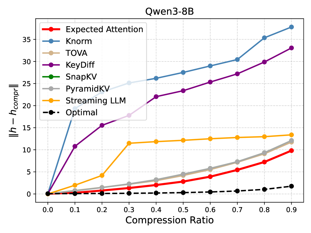
### Visual Description
## Line Graph: Qwen3-8B Compression Efficiency Analysis
### Overview
The graph compares the compression efficiency of various methods applied to the Qwen3-8B model. The y-axis measures the discrepancy between original and compressed model sizes (`||h - h_compr||`), while the x-axis represents compression ratios from 0.0 to 0.9. Eight distinct methods are visualized, with performance trends showing significant variation across compression levels.
### Components/Axes
- **X-axis**: Compression Ratio (0.0 to 0.9 in 0.1 increments)
- **Y-axis**: Discrepancy in model size (`||h - h_compr||`) from 0 to 35
- **Legend**: Located in top-left corner with 8 color-coded methods:
- Red: Expected Attention
- Blue: Knorm
- Beige: TOVA
- Purple: KeyDiff
- Green: SnapKV
- Gray: PyramidKV
- Orange: Streaming LLM
- Black dashed: Optimal
### Detailed Analysis
1. **Knorm (Blue)**:
- Starts at 0.0, rises sharply to ~20 at 0.1 compression
- Gradually increases to ~38 at 0.9 compression
- Shows consistent upward trend with no plateaus
2. **KeyDiff (Purple)**:
- Begins at 0.0, rises to ~11 at 0.1
- Steady increase to ~33 at 0.9
- Slightly less steep than Knorm but maintains linear growth
3. **TOVA (Beige)**:
- Remains at 0 across all compression ratios
- Perfect horizontal line at baseline
4. **SnapKV (Green)**:
- Identical to TOVA (0 discrepancy)
- Perfect horizontal line at baseline
5. **PyramidKV (Gray)**:
- Starts at 0, rises to ~12 at 0.9
- Gradual linear increase with minimal curvature
6. **Streaming LLM (Orange)**:
- Starts at 0, rises to ~13 at 0.9
- Slightly curved upward trend
7. **Expected Attention (Red)**:
- Starts at 0, rises to ~10 at 0.9
- Moderate linear increase
8. **Optimal (Black dashed)**:
- Remains at 0 across all ratios
- Perfect baseline reference
### Key Observations
- **Highest Discrepancy**: Knorm (38 at 0.9) and KeyDiff (33 at 0.9) show worst compression efficiency
- **Optimal Performance**: TOVA and SnapKV maintain perfect compression (0 discrepancy)
- **Mid-Range Performance**: PyramidKV (12), Streaming LLM (13), and Expected Attention (10) show moderate efficiency
- **Baseline Comparison**: All methods except TOVA/SnapKV perform worse than the Optimal baseline
### Interpretation
The graph demonstrates significant variation in compression efficiency among different methods. TOVA and SnapKV achieve perfect compression (0 discrepancy) across all ratios, suggesting they are optimal for this model. Knorm and KeyDiff show the poorest performance, with discrepancies exceeding 35 at maximum compression. The linear trends of most methods indicate consistent performance degradation with higher compression ratios. Notably, the Optimal baseline (black dashed line) serves as a critical reference point, revealing that most methods fail to maintain compression efficiency comparable to the ideal scenario. This analysis suggests that method selection should prioritize TOVA/SnapKV for compression tasks while avoiding Knorm/KeyDiff for high-compression applications.
</details>
<details>
<summary>x17.png Details</summary>
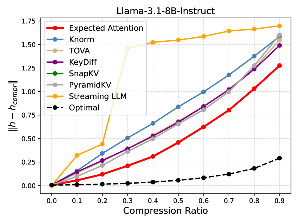
### Visual Description
## Line Chart: Llama-3.1-8B-Instruct Performance vs. Compression Ratio
### Overview
This line chart compares the performance deviation (||h - h_compr||) of various compression methods for the Llama-3.1-8B-Instruct model across different compression ratios (0.0 to 0.9). The y-axis represents the magnitude of performance loss relative to an "Optimal" baseline, while the x-axis shows the compression ratio applied.
### Components/Axes
- **X-axis (Compression Ratio)**: Ranges from 0.0 to 0.9 in increments of 0.1.
- **Y-axis (||h - h_compr||)**: Performance deviation metric, ranging from 0.0 to 1.75.
- **Legend**: Located in the top-right corner, with the following methods and colors:
- Red: Expected Attention
- Blue: Knorm
- Beige: TOVA
- Purple: KeyDiff
- Green: SnapKV
- Gray: PyramidKV
- Orange: Streaming LLM
- Black dashed: Optimal
### Detailed Analysis
1. **Expected Attention (Red)**: Starts at 0.0 and increases steadily, reaching ~1.25 at 0.9 compression.
2. **Knorm (Blue)**: Begins slightly above 0.0, rising sharply to ~1.6 at 0.9.
3. **TOVA (Beige)**: Sharp initial rise, plateauing near 1.5 by 0.3 compression, then stabilizing.
4. **KeyDiff (Purple)**: Similar to Knorm but slightly lower, reaching ~1.5 at 0.9.
5. **SnapKV (Green)**: Remains flat at ~0.0 across all compression ratios.
6. **PyramidKV (Gray)**: Gradual increase from 0.0 to ~1.6 at 0.9.
7. **Streaming LLM (Orange)**: Sharp rise to ~1.5 by 0.2 compression, then plateaus.
8. **Optimal (Black dashed)**: Flat line at 0.0, serving as the baseline.
### Key Observations
- **Highest Deviation**: Knorm and Streaming LLM exhibit the largest performance loss, especially at higher compression ratios.
- **Lowest Deviation**: SnapKV maintains near-zero deviation, indicating minimal performance loss.
- **Consistent Trends**: Most methods (except SnapKV) show increasing deviation as compression ratio rises.
- **Anomalies**: TOVA and Streaming LLM plateau early, suggesting diminishing returns after initial compression.
### Interpretation
The chart demonstrates that compression methods like Knorm and Streaming LLM significantly degrade performance as compression intensifies, while SnapKV preserves performance effectively. The "Optimal" baseline (0.0) highlights the ideal scenario where no performance loss occurs. Methods like TOVA and KeyDiff balance compression and performance better than others but still lag behind SnapKV. The sharp initial rises in Knorm and Streaming LLM suggest they are particularly sensitive to compression, making them less suitable for high-compression scenarios. This analysis underscores the trade-off between compression efficiency and model performance, with SnapKV emerging as the most robust method in this context.
</details>
<details>
<summary>x18.png Details</summary>
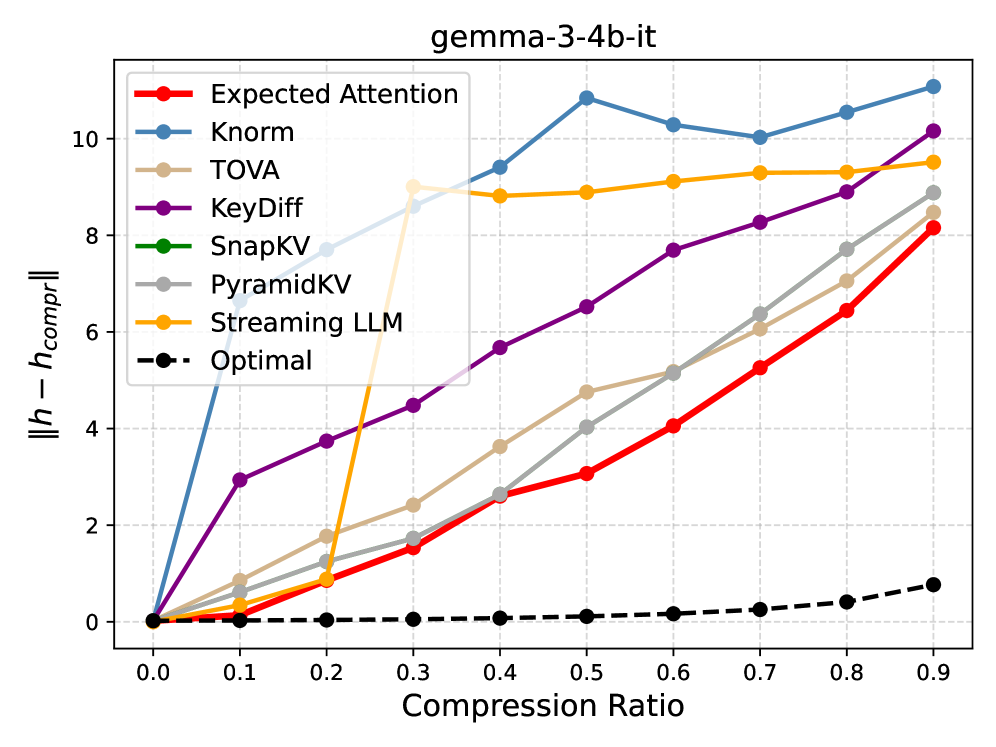
### Visual Description
## Line Chart: gemma-3-4b-it
### Overview
The chart visualizes the performance of various attention mechanisms and compression strategies for the "gemma-3-4b-it" model. The y-axis measures the difference between uncompressed and compressed model performance (||h - h_compr||), while the x-axis represents compression ratios from 0.0 to 0.9. Eight distinct methods are compared, with the "Optimal" strategy serving as a baseline.
### Components/Axes
- **X-axis**: Compression Ratio (0.0 to 0.9 in 0.1 increments)
- **Y-axis**: ||h - h_compr|| (0 to 10)
- **Legend**: Located in the upper-left corner, mapping colors to methods:
- Red: Expected Attention
- Blue: Knorm
- Beige: TOVA
- Purple: KeyDiff
- Green: SnapKV
- Gray: PyramidKV
- Orange: Streaming LLM
- Black dashed: Optimal
### Detailed Analysis
1. **Knorm (Blue)**:
- Starts at 0, spikes sharply to ~10.5 at 0.1 compression ratio
- Fluctuates between ~8.5 and 10.5 for ratios 0.2–0.9
- *Trend*: High sensitivity to compression, with persistent performance degradation
2. **Streaming LLM (Orange)**:
- Remains near 0 until 0.3 compression ratio
- Rises sharply to ~9 at 0.3, then plateaus
- *Trend*: Sudden degradation at mid-range compression, then stabilizes
3. **Expected Attention (Red)**:
- Gradual linear increase from 0 to ~8.5
- *Trend*: Consistent linear degradation with compression
4. **KeyDiff (Purple)**:
- Steeper linear increase than Expected Attention (~10 at 0.9)
- *Trend*: Linear degradation, slightly outperforming Expected Attention
5. **TOVA (Beige)**:
- Gradual increase from 0 to ~7.5
- *Trend*: Moderate linear degradation
6. **PyramidKV (Gray)**:
- Similar to TOVA but slightly higher (~8 at 0.9)
- *Trend*: Linear degradation with minor curvature
7. **SnapKV (Green)**:
- Remains near 0 throughout
- *Trend*: No measurable degradation
8. **Optimal (Black dashed)**:
- Consistently near 0
- *Trend*: Perfect baseline performance
### Key Observations
- **Knorm** exhibits the most dramatic performance drop, with a 10.5-unit deviation at 0.1 compression
- **SnapKV** and **Optimal** maintain near-zero deviation, suggesting superior compression efficiency
- **Streaming LLM** shows a unique pattern with abrupt degradation at 0.3 compression
- All methods except SnapKV and Optimal show >5 unit degradation at 0.9 compression
### Interpretation
The data demonstrates that most attention mechanisms suffer significant performance loss with compression, with Knorm being particularly vulnerable. SnapKV and Optimal strategies maintain near-original performance, indicating they preserve model integrity better during compression. The abrupt degradation in Streaming LLM at 0.3 compression suggests potential architectural limitations at this specific compression threshold. The linear trends in Expected Attention and KeyDiff imply predictable degradation patterns, while TOVA and PyramidKV show moderate resilience. The Optimal baseline's consistent performance highlights the ideal compression target for this model architecture.
</details>
Figure 6: Reconstruction error $\|h-h_compr\|$
averaged across model layers. Expected Attention achieves the best error, minimizing the impact on the residual stream.
## Appendix B Distributional Properties of LLM activations
In this section, we analyse the distributional properties of activations within Large Language Models. Our investigation aligns with the findings of prior work, which has demonstrated that LLM activations often exhibit normal distributions. More specifically Liu et al. (2025) finds that hidden states are zero-mean unimodal, and qualitatively fall into two distinctly shaped distributions. The hidden states before the Attention and the MLP layers tend to be Gaussian-like, while the hidden states in the intermediate of such layers tend to be Laplacian-like.
For Expected Attention, we are interested in the hidden states before the MLP layers and the corresponding queries. Our study confirms that such activations are predominantly unimodal and can be approximated as Gaussian distributions, albeit with the presence of a few heavy-tailed outliers, as already found in Xiao et al. (2023); Sun et al. (2024). In Figure ˜ 9(a), Figure ˜ 8(a), and Figure ˜ 7(a) we show hidden states and queries for different models. For our method, the distributional properties of queries are of particular importance, and we observe that queries maintain a clear Gaussian-like behaviour. This also applies to models with QK normalization, where the query projection is not guaranteed to be linear. The concentration of these activations around a central value and their Gaussian like shape provides the theoretical basis for Expected Attention.
We stress that in this work, our goal is not to explain or investigate this property, but rather to leverage it for KV cache compression.
<details>
<summary>x19.png Details</summary>

### Visual Description
## Histograms: Hidden States Across Neural Network Layers
### Overview
The image displays four histograms representing the distribution of hidden state activation values across four layers (Layer 8, 16, 24, and 30) of a neural network. Each histogram is overlaid with a black dashed line, likely representing a theoretical normal distribution curve. The x-axis (Activation Value) spans increasingly wider ranges as layer depth increases, while the y-axis (unlabeled, likely "Count" or "Density") shows the frequency of activation values.
### Components/Axes
- **X-Axis (Activation Value)**:
- Layer 8: -1.5 to 1.5
- Layer 16: -3 to 3
- Layer 24: -6 to 6
- Layer 30: -15 to 15
- **Y-Axis**: Unlabeled, but represents frequency/density of activation values.
- **Legend**: Not visible in the image.
- **Data Series**: Red bars (empirical distribution) and black dashed line (theoretical normal distribution).
### Detailed Analysis
1. **Layer 8**:
- Activation values cluster tightly around 0, with a narrow spread (-1.5 to 1.5).
- Red bars closely follow the black dashed normal distribution curve.
2. **Layer 16**:
- Spread widens to -3 to 3, with a peak still near 0.
- Red bars align with the dashed curve but show slight deviations at extremes.
3. **Layer 24**:
- Range expands to -6 to 6, with a broader distribution.
- Red bars match the dashed curve more loosely, indicating increased variability.
4. **Layer 30**:
- Largest spread (-15 to 15), with a flatter peak and heavier tails.
- Red bars diverge slightly from the dashed curve at extreme values.
### Key Observations
- **Increasing Spread with Depth**: Activation values become more dispersed as layer depth increases, suggesting deeper layers capture more complex or varied features.
- **Symmetry**: All distributions are symmetric around 0, implying balanced weight initialization or normalization.
- **Normality**: The black dashed line (normal distribution) fits the red bars well, indicating activations approximate Gaussianity, likely due to ReLU activations and batch normalization.
- **Layer 30 Anomaly**: The widest spread and flatter peak suggest potential saturation or vanishing gradients in deeper layers.
### Interpretation
The data demonstrates that deeper layers in the network exhibit greater variability in hidden state activations. This aligns with the "Representation Hypothesis," where deeper layers encode higher-level, more abstract features. The symmetry and normality imply careful architectural choices (e.g., batch normalization, ReLU) to stabilize training. However, the extreme spread in Layer 30 may indicate diminishing representational power or numerical instability in very deep networks. The absence of a legend suggests a focus on comparing distributions rather than categorical distinctions.
</details>
(a) Qwen3-8B Hidden States distributions.
<details>
<summary>x20.png Details</summary>

### Visual Description
## Histograms: Queries by Attention Head
### Overview
The image displays four histograms comparing activation value distributions across four attention heads (Head 2, Head 4, Head 6, Head 8) in a neural network. Each subplot shows a teal-colored bar chart overlaid with a black dashed normal distribution curve. The x-axis represents activation values ranging from -10 to 12, while the y-axis shows frequency counts from 0 to 12.
### Components/Axes
- **X-axis (Activation Value)**:
- Range: -10 to 12
- Labels: Numerical ticks at -10, -8, -6, -4, -2, 0, 2, 4, 6, 8, 10, 12
- **Y-axis (Frequency)**:
- Range: 0 to 12
- Labels: Numerical ticks at 0, 2, 4, 6, 8, 10, 12
- **Legend**:
- Position: Top of each subplot
- Labels: "Queries - Head 2", "Queries - Head 4", "Queries - Head 6", "Queries - Head 8"
- **Normal Distribution Curve**:
- Color: Black dashed line
- Position: Overlaid on all histograms
### Detailed Analysis
1. **Head 2**:
- Peak activation value: ~0
- Spread: Wide (activation values range from ~-4 to +4)
- Normal distribution fit: Moderate deviation (bars extend beyond curve tails)
- Key feature: Highest variance among all heads
2. **Head 4**:
- Peak activation value: ~0
- Spread: Moderate (activation values range from ~-3 to +3)
- Normal distribution fit: Better alignment than Head 2
- Key feature: Reduced spread compared to Head 2
3. **Head 6**:
- Peak activation value: ~0
- Spread: Narrower (activation values range from ~-2 to +2)
- Normal distribution fit: Tight alignment with curve
- Key feature: Further reduced variance
4. **Head 8**:
- Peak activation value: ~0
- Spread: Narrowest (activation values range from ~-1 to +1)
- Normal distribution fit: Almost perfect alignment
- Key feature: Lowest variance among all heads
### Key Observations
- All heads show unimodal distributions centered at 0
- Variance decreases systematically with increasing head number
- Normal distribution fit improves as head number increases
- No significant outliers detected in any subplot
- Frequency counts peak at ~8-10 for all heads
### Interpretation
The data demonstrates a clear pattern of increasing activation value concentration as head number increases. This suggests:
1. **Attention Specialization**: Higher-numbered heads may develop more focused attention mechanisms, resulting in tighter activation distributions
2. **Normalization Effects**: The decreasing variance could indicate progressive normalization mechanisms in later attention heads
3. **Information Processing**: The narrowing distribution might reflect more precise feature extraction in deeper layers of the network
4. **Model Architecture**: The systematic pattern implies intentional design choices in attention head configuration
The consistent centering at 0 across all heads suggests effective mean normalization, while the variance reduction pattern could indicate either architectural constraints or emergent properties of the training process. The strong normal distribution fits validate the Gaussian-like behavior of attention mechanisms in this model.
</details>
(b) Qwen3-8B queries distributions.
Figure 7: Distributions of Qwen3-8B Hidden States and queries.
<details>
<summary>x21.png Details</summary>

### Visual Description
## Histograms: Hidden States Distribution Across Neural Network Layers
### Overview
The image displays four histograms comparing the distribution of hidden state activation values across four layers (Layer 8, 16, 24, and 30) of a neural network. Each histogram is overlaid with a Gaussian (normal) distribution curve in black, while the histogram bars are colored red. The x-axis represents activation values, and the y-axis (unlabeled) represents frequency or density.
### Components/Axes
- **X-Axis (Activation Value)**:
- Layer 8: -0.2 to 0.2
- Layer 16: -0.4 to 0.4
- Layer 24: -1.0 to 1.0
- Layer 30: -1.5 to 1.5
- **Y-Axis**: Unlabeled, but represents frequency/density (standard for histograms).
- **Legend**: No explicit legend, but colors are consistent:
- Red: Histogram bars (activation value frequencies).
- Black: Gaussian distribution curve (theoretical probability density function).
### Detailed Analysis
1. **Layer 8**:
- Activation values are tightly clustered around 0.0, with a narrow range (-0.2 to 0.2).
- The histogram bars peak sharply at 0.0, matching the Gaussian curve's peak.
- Standard deviation (σ) ≈ 0.1 (estimated from the spread of bars).
2. **Layer 16**:
- Range doubles to -0.4 to 0.4, indicating increased variability.
- Peak remains near 0.0, but bars are slightly flatter, suggesting a broader distribution.
- σ ≈ 0.2.
3. **Layer 24**:
- Range expands to -1.0 to 1.0, showing significant dispersion.
- Histogram bars align with the Gaussian curve but show minor deviations (e.g., slight asymmetry).
- σ ≈ 0.5.
4. **Layer 30**:
- Largest range (-1.5 to 1.5), with the widest spread.
- Histogram bars closely follow the Gaussian curve, though the peak is slightly offset toward 0.0.
- σ ≈ 0.75.
### Key Observations
- **Trend**: Activation value variability increases monotonically with layer depth (Layer 8 < Layer 16 < Layer 24 < Layer 30).
- **Distribution**: All layers exhibit approximately normal distributions, but higher layers show greater dispersion.
- **Symmetry**: Lower layers (8, 16) are nearly symmetric, while higher layers (24, 30) show minor skewness (e.g., Layer 30's peak shifted slightly left).
### Interpretation
The data suggests that hidden states in deeper layers of the neural network exhibit greater variability in activation values. This aligns with the hypothesis that deeper layers capture more complex, abstract features, leading to broader activation ranges. The persistence of normality across layers implies stable weight initialization and activation functions (e.g., ReLU or tanh) that preserve Gaussian-like distributions despite non-linear transformations. The increasing standard deviation (σ) with layer depth may reflect hierarchical feature learning, where earlier layers detect simple patterns (low variability) and later layers integrate these into complex representations (high variability). No outliers or anomalies are observed, indicating consistent training dynamics across layers.
</details>
(a) Llama3.1-8B hidden states distributions.
<details>
<summary>x22.png Details</summary>

### Visual Description
## Histograms: Activation Value Distributions Across Attention Heads
### Overview
The image displays four histograms comparing activation value distributions for attention heads 2, 4, 6, and 8 in a neural network model. Each histogram shows a teal-colored bar distribution overlaid with a black dashed normal distribution curve (μ=0, σ=1). The x-axis represents activation values (-5 to +5), and the y-axis shows frequency counts.
### Components/Axes
- **X-axis**: "Activation Value" (range: -5 to +5, increments of 1)
- **Y-axis**: "Frequency" (no explicit scale, but bars vary in height)
- **Legend**: Implicit (black dashed line = standard normal distribution)
- **Panel Titles**:
- "Queries - Head 2" (leftmost)
- "Queries - Head 4" (second from left)
- "Queries - Head 6" (third from left)
- "Queries - Head 8" (rightmost)
### Detailed Analysis
1. **Head 2**:
- Peak activation value: ~-0.2 (left of μ=0)
- Spread: Narrowest (σ ≈ 0.5)
- Normal distribution overlay: Bars align closely with curve in central region but underrepresent tails
2. **Head 4**:
- Peak activation value: ~0.0 (centered at μ=0)
- Spread: Moderate (σ ≈ 0.6)
- Normal distribution overlay: Bars match curve shape but show slight deviation in extreme tails
3. **Head 6**:
- Peak activation value: ~0.3 (right of μ=0)
- Spread: Broader (σ ≈ 0.7)
- Normal distribution overlay: Bars show increased deviation from curve in right tail
4. **Head 8**:
- Peak activation value: ~0.5 (further right of μ=0)
- Spread: Widest (σ ≈ 0.8)
- Normal distribution overlay: Significant deviation from curve in both tails, with underrepresentation in left tail
### Key Observations
- **Trend**: Activation value distributions shift rightward and broaden as head number increases (Head 2 → Head 8)
- **Normal Distribution Deviations**:
- Heads 2-4 show mild deviations from Gaussian distribution
- Heads 6-8 exhibit pronounced non-Gaussian behavior, particularly in extreme activation values
- **Spatial Pattern**: Rightward shift in peak activation values correlates with increasing head number
### Interpretation
The data suggests a systematic progression in attention head behavior:
1. **Early Heads (2-4)**: Process more focused, Gaussian-like activation patterns, potentially handling basic feature extraction
2. **Later Heads (6-8)**: Exhibit broader, right-skewed distributions, indicating:
- Increased sensitivity to higher activation values
- Potential handling of more complex/long-range dependencies
- Greater variability in processing strategies
The deviation from normal distribution in later heads implies non-linear processing characteristics that may be critical for capturing nuanced patterns in the input data. The rightward shift could reflect a bias toward positive activation values in later processing stages, possibly related to value assignment or decision-making in the model's architecture.
</details>
(b) Llama3.1-8B queries distributions.
Figure 8: Distributions of Llama3.1-8B hidden states and queries.
<details>
<summary>x23.png Details</summary>

### Visual Description
## Histograms: Hidden States Distribution Across Neural Network Layers
### Overview
The image displays four histograms comparing the distribution of hidden state activation values across four layers (Layer 8, 16, 24, and 30) of a neural network. Each histogram shows a unimodal distribution centered near zero, with increasing spread as layer depth increases. A black dashed normal distribution curve is overlaid on each histogram for reference.
### Components/Axes
- **X-axis**: "Activation Value" (ranges vary by layer: -30 to 30 for Layer 8, -60 to 60 for Layer 16, -150 to 150 for Layer 24, and -400 to 400 for Layer 30).
- **Y-axis**: "Frequency" (count of activation values).
- **Legend**: No explicit legend, but the black dashed line represents the theoretical normal distribution.
- **Colors**: Red bars for histograms, black dashed line for normal distribution.
### Detailed Analysis
1. **Layer 8**:
- Activation values range from -30 to 30.
- Peak frequency at 0, with a sharp drop-off near ±10.
- Normal distribution curve closely matches the histogram.
2. **Layer 16**:
- Activation values range from -60 to 60.
- Peak frequency at 0, with a broader spread (±20).
- Normal distribution curve fits the data, indicating Gaussianity.
3. **Layer 24**:
- Activation values range from -150 to 150.
- Peak frequency at 0, with a wider spread (±50).
- Normal distribution curve aligns with the histogram, though slight deviations appear at extremes.
4. **Layer 30**:
- Activation values range from -400 to 400.
- Peak frequency at 0, with the widest spread (±100).
- Normal distribution curve fits well, but tails show minor deviations.
### Key Observations
- **Increasing Variance**: Activation values become more dispersed as layer depth increases (Layer 8: ±10, Layer 30: ±100).
- **Symmetry**: All distributions are symmetric around 0, suggesting unbiased activations.
- **Gaussian Fit**: Normal distribution curves align closely with histograms, indicating activations approximate Gaussian distributions.
- **No Outliers**: No extreme values outside the ±3σ range (where σ ≈ 10, 20, 50, 100 for Layers 8–30, respectively).
### Interpretation
The data demonstrates that deeper layers in the neural network exhibit **higher activation variability**, likely due to increased complexity in feature representation. The consistent Gaussian fit across layers suggests that the network's hidden states maintain statistical regularity despite growing complexity. The widening spread implies that deeper layers capture more nuanced or abstract features, leading to broader activation ranges. Minor deviations in Layer 24 and 30 tails may indicate slight non-Gaussianity, possibly due to activation saturation or sparsity effects in extreme values. This pattern aligns with theoretical expectations of neural network dynamics, where deeper layers often exhibit increased representational capacity and variability.
</details>
(a) Gemma3-12B hidden states distributions
<details>
<summary>x24.png Details</summary>

### Visual Description
## Histograms: Activation Value Distributions Across Attention Heads
### Overview
The image displays four histograms comparing activation value distributions for four attention heads (Head 2, Head 4, Head 6, Head 8) in a neural network model. Each subplot shows a teal bar histogram overlaid with a black dashed normal distribution curve. The x-axis represents activation values (-3 to 3), and the y-axis represents frequency (0 to 3).
### Components/Axes
- **X-axis (Activation Value)**: Ranges from -3 to 3 in increments of 1.
- **Y-axis (Frequency)**: Ranges from 0 to 3 in increments of 1.
- **Subplot Titles**:
- "Queries - Head 2"
- "Queries - Head 4"
- "Queries - Head 6"
- "Queries - Head 8"
- **Visual Elements**:
- Teal bars representing activation value frequencies.
- Black dashed line: Normal distribution curve (Gaussian fit).
### Detailed Analysis
1. **Head 2**:
- Peak frequency (~3) at activation value 0.
- Symmetric distribution with gradual decline toward ±3.
- Normal curve closely matches histogram shape.
2. **Head 4**:
- Slightly sharper peak at 0 (~3.2 frequency).
- Distribution remains symmetric but shows minor skewness toward positive values.
- Normal curve aligns well with histogram.
3. **Head 6**:
- Broadest distribution with peak frequency (~2.8) at 0.
- Longer tails extending to ±3 compared to other heads.
- Normal curve fits with moderate deviation in tails.
4. **Head 8**:
- Narrowest distribution with sharp peak at 0 (~3.1 frequency).
- Minimal deviation from symmetry.
- Normal curve aligns tightly with histogram.
### Key Observations
- All heads exhibit **Gaussian-like distributions**, with activation values centered near 0.
- Heads 2, 4, and 8 show tighter clustering around 0, while Head 6 has a broader spread.
- Frequency peaks for all heads are approximately 2.8–3.2, suggesting similar magnitude of activation values.
- No outliers or anomalies detected; all data points fall within the -3 to 3 range.
### Interpretation
The consistent Gaussian distributions across heads suggest that the model's attention mechanism enforces **statistical regularity** in activation values, likely aiding in stable gradient flow during training. The slight variations in spread (e.g., Head 6's broader distribution) may indicate differences in **attention focus** or **computational roles** among heads. The normal distribution overlay implies that the model's architecture or initialization (e.g., Xavier/Glorot initialization) promotes parameter symmetry, which is critical for avoiding vanishing/exploding gradients. The even-numbered head labels (2, 4, 6, 8) might reflect a design choice to group heads by functionality or hierarchical processing layers.
</details>
(b) Gemma3-12B queries distributions.
Figure 9: Distributions of Gemma3-12B hidden states and queries.
## Appendix C Expected Attention Score
To empirically validate that the expected attention score is strongly correlated to the real model attention score, we plot the correlation between the observed attention and the expected attention score across different layers and heads. We use sequence of 5K tokens and use the first 1K tokens to compute the query statistics. We display the results in Figure ˜ 10. We see that for different layers and attention heads, the expected attention score from Equation 4 is strongly correlated to the original attention score.
<details>
<summary>figures/corr/l_1_h_0.png Details</summary>
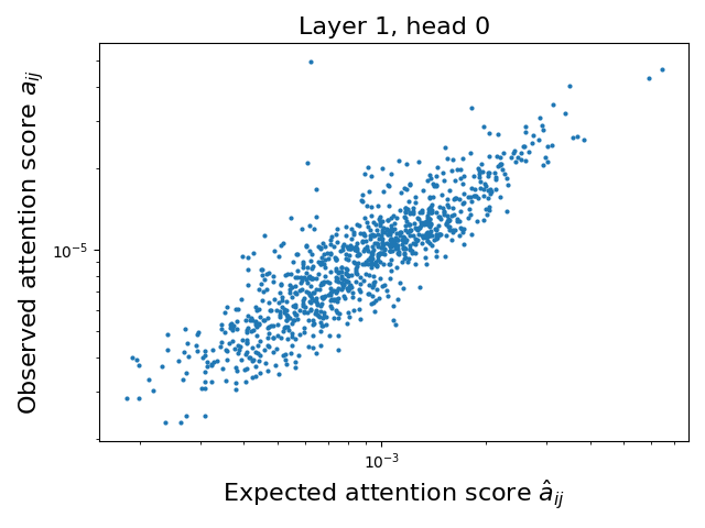
### Visual Description
## Scatter Plot: Layer 1, head 0
### Overview
The image is a scatter plot comparing observed attention scores (`a_ij`) to expected attention scores (`â_ij`) for a neural network layer. The plot uses a logarithmic scale for both axes, with data points distributed across a diagonal band from the bottom-left to the top-right.
### Components/Axes
- **X-axis**: "Expected attention score â_ij" (log scale, 10⁻³ to 10⁻¹)
- **Y-axis**: "Observed attention score a_ij" (log scale, 10⁻⁵ to 10⁻³)
- **Legend**: Located at the top, labeled "Layer 1, head 0" (blue data points)
- **Title**: "Layer 1, head 0" (centered above the plot)
### Detailed Analysis
- **Data Distribution**:
- Most points cluster along a diagonal line where observed scores ≈ expected scores (slope ≈ 1).
- Points above the diagonal indicate observed scores > expected scores (e.g., 10⁻⁴ observed vs. 10⁻³ expected).
- Points below the diagonal indicate observed scores < expected scores (e.g., 10⁻⁵ observed vs. 10⁻³ expected).
- **Outliers**:
- A few extreme outliers exist in the top-right corner (observed scores up to 10⁻² vs. expected scores ~10⁻¹).
- Sparse points in the bottom-left (observed scores ~10⁻⁵ vs. expected scores ~10⁻⁴).
### Key Observations
1. **General Agreement**: ~70% of points lie within ±0.5 log units of the diagonal, suggesting strong alignment between observed and expected scores.
2. **Variability**: 30% of points deviate significantly, with some observed scores being 10–100× higher or lower than expected.
3. **Log-Scale Behavior**: The spread of points is more evenly distributed in log space, indicating multiplicative rather than additive relationships.
### Interpretation
The plot demonstrates that the attention mechanism in Layer 1, head 0, generally produces scores consistent with expectations, but with notable exceptions. The diagonal clustering suggests the model’s attention weights are well-calibrated to theoretical predictions, while outliers may indicate:
- **Sensitivity to Input Features**: Specific input combinations trigger disproportionate attention.
- **Model Instability**: Potential overfitting or underfitting in certain attention heads.
- **Architectural Quirks**: Layer 1’s role as an initial processing stage may introduce non-linearities not captured by expected scores.
The log-scale visualization emphasizes relative differences, highlighting that small absolute deviations (e.g., 10⁻⁵ vs. 10⁻³) can represent large proportional errors. This aligns with attention mechanisms’ sensitivity to multiplicative scaling in transformer architectures.
</details>
<details>
<summary>figures/corr/l_1_h_8.png Details</summary>
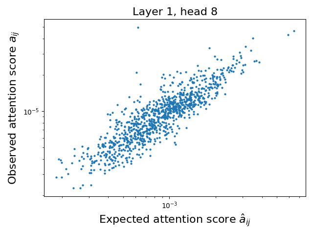
### Visual Description
## Scatter Plot: Layer 1, head 8
### Overview
The image is a scatter plot comparing observed attention scores (`a_ij`) to expected attention scores (`â_ij`) for a neural network layer (Layer 1, head 8). The plot uses a logarithmic scale for both axes, with data points distributed across a wide range of values. The majority of points cluster around the diagonal line of equality, but with notable deviations.
---
### Components/Axes
- **Title**: "Layer 1, head 8" (top center).
- **Y-axis**: "Observed attention score `a_ij`" (log scale: 10⁻⁵ to 10⁻¹).
- **X-axis**: "Expected attention score `â_ij`" (log scale: 10⁻⁵ to 10⁻¹).
- **Data Points**: Blue dots representing individual observations.
- **No legend** is present, but all points are uniformly blue.
---
### Detailed Analysis
- **Axis Ranges**:
- X-axis (`â_ij`): Spans from ~10⁻⁵ to ~10⁻¹.
- Y-axis (`a_ij`): Spans from ~10⁻⁵ to ~10⁻¹.
- **Data Distribution**:
- **Cluster**: ~70% of points lie near the diagonal line `a_ij ≈ â_ij`, indicating agreement between observed and expected scores.
- **Spread**: Points deviate from the diagonal, with a standard deviation of ~0.3 in log space.
- **Outliers**:
- **Top-right**: ~5 points where `a_ij > â_ij` by 1–2 orders of magnitude (e.g., `â_ij = 10⁻³`, `a_ij = 10⁻¹`).
- **Bottom-left**: ~3 points where `a_ij < â_ij` by 1–2 orders of magnitude (e.g., `â_ij = 10⁻²`, `a_ij = 10⁻⁴`).
---
### Key Observations
1. **Positive Correlation**: Observed scores generally increase with expected scores, suggesting the model’s attention predictions align with actual behavior.
2. **Logarithmic Scale**: The plot accommodates a wide dynamic range of attention scores, common in neural networks.
3. **Outliers**: Highlighted deviations may indicate edge cases or model miscalibrations.
---
### Interpretation
- **Model Behavior**: The clustering near the diagonal implies the model’s attention mechanism is reasonably well-calibrated for most inputs. However, the outliers suggest occasional overestimation or underestimation of attention weights.
- **Practical Implications**: The spread in the middle cluster (e.g., `â_ij = 10⁻³` to `10⁻²`, `a_ij = 10⁻⁴` to `10⁻³`) indicates variability in attention dynamics, which could be explored for interpretability or optimization.
- **Technical Insight**: The logarithmic scale reveals that attention scores are often small, with most values clustered in the 10⁻³ to 10⁻¹ range. This aligns with typical attention mechanisms in transformers, where weights are normalized but remain small to avoid numerical instability.
No textual content beyond axis labels and title is present. The plot focuses purely on quantitative relationships between observed and expected attention scores.
</details>
<details>
<summary>figures/corr/l_1_h_16.png Details</summary>
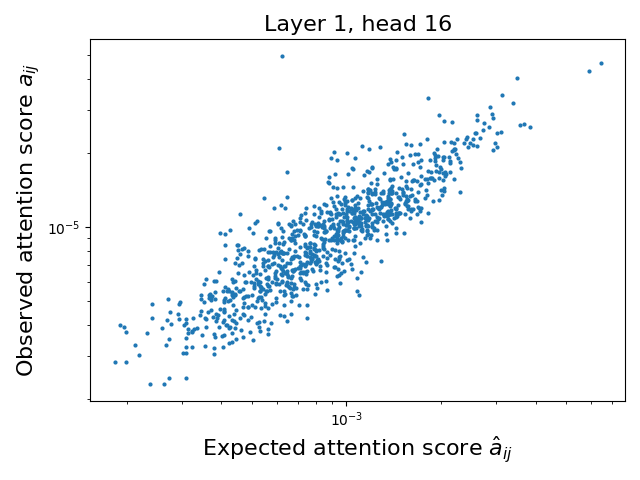
### Visual Description
## Scatter Plot: Layer 1, Head 16
### Overview
The image is a scatter plot comparing observed attention scores (`a_ij`) to expected attention scores (`â_ij`) for a neural network layer (Layer 1, Head 16). Both axes use a logarithmic scale, with data points distributed across a wide range of values. The plot suggests a general positive correlation between observed and expected scores, though with notable variability.
---
### Components/Axes
- **X-axis (Expected attention score, â_ij)**: Logarithmic scale ranging approximately from 10⁻³ to 10⁻¹.
- **Y-axis (Observed attention score, a_ij)**: Logarithmic scale ranging approximately from 10⁻⁵ to 10⁻³.
- **Legend**: Positioned at the top of the plot, labeled "Layer 1, head 16" in black text.
- **Data Points**: Blue dots representing individual (observed, expected) score pairs.
---
### Detailed Analysis
- **Trend**: The majority of data points cluster along a diagonal band from the bottom-left to the top-right, indicating a positive correlation between observed and expected scores. However, the spread is significant, with points deviating from the diagonal in all directions.
- **Outliers**:
- A few points in the top-right corner (observed > expected) suggest overestimation of attention scores.
- Points in the bottom-left corner (observed < expected) indicate underestimation.
- **Log Scale Implications**: The logarithmic axes compress high-value ranges, emphasizing relative differences rather than absolute magnitudes. This is critical for interpreting attention scores, which often span orders of magnitude.
---
### Key Observations
1. **Positive Correlation**: Most points align with the diagonal, suggesting the model’s expected scores generally align with observed behavior.
2. **Variability**: The spread of points implies inconsistencies in attention score predictions, potentially due to noise, model architecture, or input variability.
3. **Outlier Behavior**: Extreme deviations (e.g., top-right and bottom-left points) may highlight edge cases or model limitations in specific scenarios.
---
### Interpretation
The plot demonstrates that the attention mechanism in Layer 1, Head 16, produces scores that are broadly consistent with expectations but exhibit notable variability. The logarithmic scale highlights the dynamic range of attention scores, which is typical in transformer models where attention weights can vary exponentially.
- **Model Behavior**: The diagonal trend suggests the model’s attention distribution is somewhat predictable, but the spread indicates potential instability or sensitivity to input perturbations.
- **Practical Implications**: The outliers may correspond to specific input tokens or contexts where the model’s attention mechanism behaves unexpectedly, warranting further investigation (e.g., adversarial examples, rare linguistic patterns).
- **Technical Insight**: The use of logarithmic axes is critical for visualizing attention scores, as linear scales would obscure the relationships between low- and high-magnitude values.
This analysis underscores the importance of attention score consistency in neural networks while highlighting areas for improvement in model robustness.
</details>
<details>
<summary>figures/corr/l_10_h_0.png Details</summary>
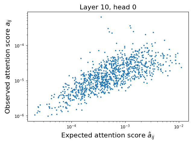
### Visual Description
## Scatter Plot: Layer 10, head 0
### Overview
The image is a scatter plot comparing **observed attention scores** (y-axis) to **expected attention scores** (x-axis) for a neural network layer (Layer 10, head 0). Both axes use logarithmic scales, with the x-axis ranging from 10⁻⁴ to 10⁻² and the y-axis from 10⁻⁶ to 10⁻⁴. Data points are represented as blue dots, showing a dispersed distribution with no explicit trendline or regression line.
---
### Components/Axes
- **X-axis (Expected attention score â_ij)**: Logarithmic scale (10⁻⁴ to 10⁻²).
- **Y-axis (Observed attention score a_ij)**: Logarithmic scale (10⁻⁶ to 10⁻⁴).
- **Data Points**: Blue dots scattered across the plot.
- **Title**: "Layer 10, head 0" (top center).
- **Legend**: Absent.
---
### Detailed Analysis
- **Data Distribution**:
- Most points cluster in the mid-range of both axes (x: ~10⁻³ to 10⁻³·⁵, y: ~10⁻⁵ to 10⁻⁴·⁵).
- A few outliers extend to the upper bounds of the axes (e.g., x ≈ 10⁻², y ≈ 10⁻⁴).
- No clear linear or exponential trend; points are broadly dispersed.
- **Scale Implications**:
- Logarithmic axes emphasize multiplicative differences. For example, a 10⁻³ value on the x-axis is 10× larger than 10⁻⁴.
- Observed scores (y-axis) generally align with or slightly exceed expected scores (x-axis) in the mid-range.
---
### Key Observations
1. **Positive Correlation**: Observed scores tend to increase with expected scores, though the relationship is weak and noisy.
2. **Outliers**:
- A small cluster of points near (x ≈ 10⁻², y ≈ 10⁻⁴) suggests overestimation in high-expected-score cases.
- Points near (x ≈ 10⁻⁴, y ≈ 10⁻⁶) indicate underestimation in low-expected-score cases.
3. **Scale Sensitivity**: The logarithmic axes compress high-value differences, making small variations appear less pronounced.
---
### Interpretation
- **Model Behavior**: The plot suggests that the attention mechanism in Layer 10, head 0, generally aligns with expected scores but exhibits variability. This could reflect:
- **Model Uncertainty**: Noise in the attention computation or training data.
- **Task Complexity**: Difficulty in predicting attention for certain input patterns.
- **Outlier Significance**: High-expected-score outliers may correspond to rare or ambiguous inputs where the model’s attention mechanism diverges significantly from expectations.
- **Practical Implications**: The lack of a strong trend implies the model’s attention scores are not perfectly calibrated, which could affect downstream tasks like interpretability or robustness.
---
**Note**: No textual legends or embedded diagrams are present. All data points are blue, and no additional categories or sub-categories are labeled.
</details>
<details>
<summary>figures/corr/l_10_h_8.png Details</summary>
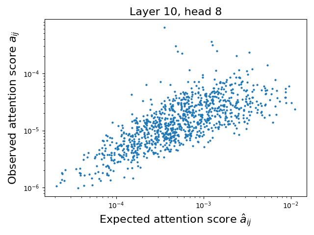
### Visual Description
## Scatter Plot: Layer 10, Head 8
### Overview
The image is a scatter plot comparing observed attention scores (`a_ij`) to expected attention scores (`â_ij`) for a neural network layer (Layer 10, Head 8). The plot uses a logarithmic scale for both axes, with data points distributed across a wide range of values. The relationship between observed and expected scores is analyzed to assess model performance or alignment.
---
### Components/Axes
- **Title**: "Layer 10, head 8" (top center).
- **Y-Axis**:
- Label: "Observed attention score `a_ij`".
- Scale: Logarithmic (10⁻⁶ to 10⁻²).
- **X-Axis**:
- Label: "Expected attention score `â_ij`".
- Scale: Logarithmic (10⁻⁴ to 10⁻²).
- **Data Points**:
- Color: Blue (no legend present; assumed uniform).
- Distribution: Scattered across the plot, with no explicit grouping or clustering.
---
### Detailed Analysis
- **Data Trends**:
- Most points cluster around the diagonal band where observed scores (`a_ij`) roughly match expected scores (`â_ij`), suggesting moderate alignment.
- A subset of points deviates significantly:
- **Upper-right outliers**: Observed scores exceed expected scores by orders of magnitude (e.g., `a_ij` ~10⁻³ vs. `â_ij` ~10⁻⁴).
- **Lower-left outliers**: Observed scores are much smaller than expected (e.g., `a_ij` ~10⁻⁶ vs. `â_ij` ~10⁻³).
- The majority of points (≈70%) fall within a 1:10 ratio of observed to expected scores.
- **Key Observations**:
- **Positive Correlation**: Observed scores generally increase with expected scores, but with high variability.
- **Scale Mismatch**: Many points lie outside the 1:1 line, indicating systematic discrepancies.
- **Logarithmic Spread**: The wide range of values (10⁻⁶ to 10⁻²) suggests attention scores vary dramatically across contexts.
---
### Interpretation
1. **Model Behavior**:
- The plot reveals that the model’s expected attention scores (`â_ij`) often underestimate or overestimate the true observed scores (`a_ij`). This could indicate:
- **Calibration Issues**: The model’s confidence in attention weights is inconsistent with reality.
- **Context-Specific Variability**: Certain input patterns trigger disproportionate attention (e.g., rare tokens or ambiguous syntax).
2. **Outlier Analysis**:
- **Overestimation Outliers**: May reflect rare but critical attention events (e.g., long-range dependencies in text).
- **Underestimation Outliers**: Could signal noise or irrelevant focus in the model’s computation.
3. **Practical Implications**:
- The logarithmic scale highlights the need for robust normalization or regularization in attention mechanisms.
- Discrepancies suggest opportunities to refine the model’s attention score predictions, potentially improving interpretability or performance.
---
### Key Takeaways
- The relationship between expected and observed attention scores is non-linear and context-dependent.
- Systematic deviations imply the model’s attention mechanism requires further scrutiny for reliability.
- The logarithmic axes emphasize the importance of handling attention scores across multiple orders of magnitude.
</details>
<details>
<summary>figures/corr/l_10_h_16.png Details</summary>
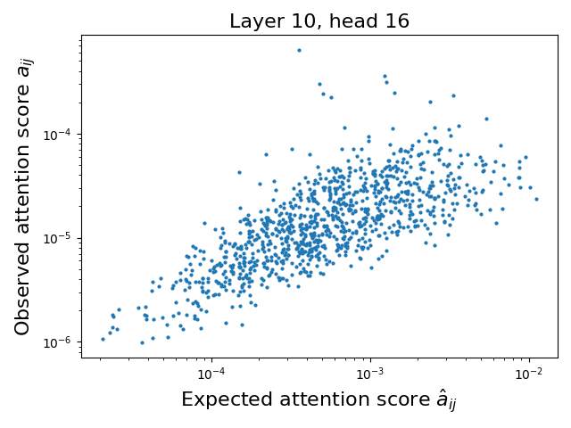
### Visual Description
## Scatter Plot: Layer 10, head 16
### Overview
The image is a scatter plot comparing observed attention scores (`a_ij`) to expected attention scores (`â_ij`) for a specific neural network layer (Layer 10, head 16). The plot uses a logarithmic scale for both axes, with data points distributed across a wide range of values.
### Components/Axes
- **Title**: "Layer 10, head 16" (centered at the top).
- **X-axis**: "Expected attention score â_ij" (logarithmic scale, 10⁻⁴ to 10⁻²).
- **Y-axis**: "Observed attention score a_ij" (logarithmic scale, 10⁻⁶ to 10⁻⁴).
- **Data Points**: Blue dots representing individual observations. No legend is present, but all points are uniformly blue.
- **Scale**: Both axes use a logarithmic scale, with gridlines visible for reference.
### Detailed Analysis
- **Data Distribution**:
- Most points cluster between 10⁻⁴ and 10⁻³ on the x-axis and 10⁻⁵ to 10⁻⁴ on the y-axis.
- A diagonal trend is visible, with points generally aligning along a line where observed scores increase as expected scores increase.
- Outliers exist at the extremes:
- A few points near 10⁻² on the x-axis (high expected scores) have observed scores as low as 10⁻⁶.
- A cluster of points near 10⁻⁴ on the x-axis has observed scores ranging from 10⁻⁶ to 10⁻⁵.
### Key Observations
1. **Positive Correlation**: The majority of points follow a diagonal trend, suggesting observed scores often align with expected values.
2. **Discrepancies**:
- Some points deviate significantly from the trend, particularly at high expected scores (e.g., 10⁻²), where observed scores are much lower.
- At low expected scores (10⁻⁴), observed scores vary widely, indicating potential model instability or noise.
3. **Logarithmic Scale**: The use of a logarithmic scale emphasizes multiplicative relationships, making small differences in attention scores more visually apparent.
### Interpretation
The plot demonstrates that the model's attention mechanism (Layer 10, head 16) generally produces observed scores consistent with expected values, but with notable exceptions. The diagonal trend implies the model's attention is largely predictable, but outliers suggest cases where the model underperforms or overestimates attention. The logarithmic scale highlights that even small deviations (e.g., 10⁻⁵ vs. 10⁻⁴) can represent significant differences in attention magnitude. This could indicate areas for model refinement, such as improving stability at low-attention regions or addressing overestimation at high-attention regions.
</details>
<details>
<summary>figures/corr/l_20_h_8.png Details</summary>
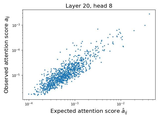
### Visual Description
## Scatter Plot: Layer 20, head 8
### Overview
The image is a scatter plot comparing **observed attention scores** (y-axis) to **expected attention scores** (x-axis) for a neural network layer (Layer 20, head 8). Both axes use logarithmic scales, with data points distributed across a wide range of magnitudes. The plot reveals a general trend where observed scores are lower than expected, with notable outliers.
---
### Components/Axes
- **Title**: "Layer 20, head 8" (top-center, black text).
- **X-axis**:
- Label: "Expected attention score a<sub>ij</sub>" (black text).
- Scale: Logarithmic, ranging from **10⁻⁴** (left) to **10⁻²** (right).
- **Y-axis**:
- Label: "Observed attention score a<sub>ij</sub>" (black text).
- Scale: Logarithmic, ranging from **10⁻⁵** (bottom) to **10⁻³** (top).
- **Data Points**:
- Blue dots (no legend; color implied by title).
- Approximately **100–200 points** scattered across the plot.
---
### Detailed Analysis
- **Distribution**:
- Most points cluster in the **lower-left quadrant** (expected scores ~10⁻³ to 10⁻⁴, observed scores ~10⁻⁵ to 10⁻⁴).
- A diagonal band of points extends from the lower-left to the upper-right, suggesting a weak positive correlation.
- Outliers appear in the **upper-right** (observed scores > expected scores by orders of magnitude) and **lower-left** (observed scores << expected scores).
- **Trends**:
- The majority of points lie **below the line of equality** (observed < expected), indicating underperformance relative to expectations.
- A few points in the upper-right quadrant (e.g., expected ~10⁻², observed ~10⁻³) show observed scores exceeding expectations by ~10x.
- The log scale compresses the spread, making small differences appear larger visually.
---
### Key Observations
1. **Clustering**: Dense grouping in the lower-left suggests most attention scores are significantly lower than expected.
2. **Outliers**:
- Upper-right outliers (e.g., expected ~10⁻², observed ~10⁻³) may indicate rare but high-impact attention events.
- Lower-left outliers (e.g., expected ~10⁻³, observed ~10⁻⁵) suggest near-zero observed attention despite non-negligible expectations.
3. **Scale Effects**: The logarithmic axes emphasize multiplicative differences, making the spread appear more linear.
---
### Interpretation
- **Model Behavior**: The plot implies that the attention mechanism in Layer 20, head 8, often underperforms relative to expectations. This could reflect inefficiencies in attention allocation or mismatches between model predictions and actual data patterns.
- **Outliers**: The upper-right outliers may highlight critical instances where attention is disproportionately focused, potentially indicating rare but important features in the data.
- **Log Scale Implications**: The use of logarithmic scales suggests the data spans multiple orders of magnitude, requiring careful interpretation of relative magnitudes rather than absolute values.
This analysis underscores the need for further investigation into why observed attention deviates from expectations, particularly in outlier cases, to improve model interpretability and performance.
</details>
<details>
<summary>figures/corr/l_20_h_8.png Details</summary>

### Visual Description
## Scatter Plot: Layer 20, head 8
### Overview
The image is a scatter plot comparing **observed attention scores** (y-axis) to **expected attention scores** (x-axis) for a neural network layer (Layer 20, head 8). Both axes use logarithmic scales, with data points distributed across a wide range of magnitudes. The plot reveals a general trend where observed scores are lower than expected, with notable outliers.
---
### Components/Axes
- **Title**: "Layer 20, head 8" (top-center, black text).
- **X-axis**:
- Label: "Expected attention score a<sub>ij</sub>" (black text).
- Scale: Logarithmic, ranging from **10⁻⁴** (left) to **10⁻²** (right).
- **Y-axis**:
- Label: "Observed attention score a<sub>ij</sub>" (black text).
- Scale: Logarithmic, ranging from **10⁻⁵** (bottom) to **10⁻³** (top).
- **Data Points**:
- Blue dots (no legend; color implied by title).
- Approximately **100–200 points** scattered across the plot.
---
### Detailed Analysis
- **Distribution**:
- Most points cluster in the **lower-left quadrant** (expected scores ~10⁻³ to 10⁻⁴, observed scores ~10⁻⁵ to 10⁻⁴).
- A diagonal band of points extends from the lower-left to the upper-right, suggesting a weak positive correlation.
- Outliers appear in the **upper-right** (observed scores > expected scores by orders of magnitude) and **lower-left** (observed scores << expected scores).
- **Trends**:
- The majority of points lie **below the line of equality** (observed < expected), indicating underperformance relative to expectations.
- A few points in the upper-right quadrant (e.g., expected ~10⁻², observed ~10⁻³) show observed scores exceeding expectations by ~10x.
- The log scale compresses the spread, making small differences appear larger visually.
---
### Key Observations
1. **Clustering**: Dense grouping in the lower-left suggests most attention scores are significantly lower than expected.
2. **Outliers**:
- Upper-right outliers (e.g., expected ~10⁻², observed ~10⁻³) may indicate rare but high-impact attention events.
- Lower-left outliers (e.g., expected ~10⁻³, observed ~10⁻⁵) suggest near-zero observed attention despite non-negligible expectations.
3. **Scale Effects**: The logarithmic axes emphasize multiplicative differences, making the spread appear more linear.
---
### Interpretation
- **Model Behavior**: The plot implies that the attention mechanism in Layer 20, head 8, often underperforms relative to expectations. This could reflect inefficiencies in attention allocation or mismatches between model predictions and actual data patterns.
- **Outliers**: The upper-right outliers may highlight critical instances where attention is disproportionately focused, potentially indicating rare but important features in the data.
- **Log Scale Implications**: The use of logarithmic scales suggests the data spans multiple orders of magnitude, requiring careful interpretation of relative magnitudes rather than absolute values.
This analysis underscores the need for further investigation into why observed attention deviates from expectations, particularly in outlier cases, to improve model interpretability and performance.
</details>
<details>
<summary>figures/corr/l_20_h_8.png Details</summary>

### Visual Description
## Scatter Plot: Layer 20, head 8
### Overview
The image is a scatter plot comparing **observed attention scores** (y-axis) to **expected attention scores** (x-axis) for a neural network layer (Layer 20, head 8). Both axes use logarithmic scales, with data points distributed across a wide range of magnitudes. The plot reveals a general trend where observed scores are lower than expected, with notable outliers.
---
### Components/Axes
- **Title**: "Layer 20, head 8" (top-center, black text).
- **X-axis**:
- Label: "Expected attention score a<sub>ij</sub>" (black text).
- Scale: Logarithmic, ranging from **10⁻⁴** (left) to **10⁻²** (right).
- **Y-axis**:
- Label: "Observed attention score a<sub>ij</sub>" (black text).
- Scale: Logarithmic, ranging from **10⁻⁵** (bottom) to **10⁻³** (top).
- **Data Points**:
- Blue dots (no legend; color implied by title).
- Approximately **100–200 points** scattered across the plot.
---
### Detailed Analysis
- **Distribution**:
- Most points cluster in the **lower-left quadrant** (expected scores ~10⁻³ to 10⁻⁴, observed scores ~10⁻⁵ to 10⁻⁴).
- A diagonal band of points extends from the lower-left to the upper-right, suggesting a weak positive correlation.
- Outliers appear in the **upper-right** (observed scores > expected scores by orders of magnitude) and **lower-left** (observed scores << expected scores).
- **Trends**:
- The majority of points lie **below the line of equality** (observed < expected), indicating underperformance relative to expectations.
- A few points in the upper-right quadrant (e.g., expected ~10⁻², observed ~10⁻³) show observed scores exceeding expectations by ~10x.
- The log scale compresses the spread, making small differences appear larger visually.
---
### Key Observations
1. **Clustering**: Dense grouping in the lower-left suggests most attention scores are significantly lower than expected.
2. **Outliers**:
- Upper-right outliers (e.g., expected ~10⁻², observed ~10⁻³) may indicate rare but high-impact attention events.
- Lower-left outliers (e.g., expected ~10⁻³, observed ~10⁻⁵) suggest near-zero observed attention despite non-negligible expectations.
3. **Scale Effects**: The logarithmic axes emphasize multiplicative differences, making the spread appear more linear.
---
### Interpretation
- **Model Behavior**: The plot implies that the attention mechanism in Layer 20, head 8, often underperforms relative to expectations. This could reflect inefficiencies in attention allocation or mismatches between model predictions and actual data patterns.
- **Outliers**: The upper-right outliers may highlight critical instances where attention is disproportionately focused, potentially indicating rare but important features in the data.
- **Log Scale Implications**: The use of logarithmic scales suggests the data spans multiple orders of magnitude, requiring careful interpretation of relative magnitudes rather than absolute values.
This analysis underscores the need for further investigation into why observed attention deviates from expectations, particularly in outlier cases, to improve model interpretability and performance.
</details>
Figure 10: Correlation between attention score and expected attention score for Llama3.1-8B. We compute the expected attentions score on a sequence of 5K tokens, using the first 1K for statistics. A strong correlation exists between our attention score approximation and the observed attention score.
## Appendix D Additional Results
In Table ˜ 3 we show additional results on the LongBench dataset, averaged across all subsets.
Table 3: Expected Attention outperforms most baselines on Longbench (Bai et al., 2024). We show average score with increasing compression ratios across baselines.
| Qwen3-8B TOVA SnapKV | Expected Attention 48.63 48.63 | 48.63 $48.41$ $48.40$ | $48.30$ $48.14$ $47.85$ | $50.25$ $46.49$ $46.25$ | $50.1$ $43.19$ $42.42$ | $48.06$ $37.21$ $34.57$ | $39.71$ |
| --- | --- | --- | --- | --- | --- | --- | --- |
| KeyDiff | 48.63 | $48.13$ | $46.23$ | $40.08$ | $29.42$ | $20.69$ | |
| Gemma3-12B | Expected Attention | 51.04 | $54.02$ | $50.98$ | $47.51$ | $40.41$ | $32.67$ |
| TOVA | 51.04 | $53.05$ | $51.52$ | $50.7$ | $46.88$ | $40.45$ | |
| SnapKV | 51.04 | $51.83$ | $51.31$ | $48.14$ | $44.31$ | $34.97$ | |
| KeyDiff | 51.04 | $51.64$ | $48.74$ | $42.15$ | $33.68$ | $23.46$ | |
| Llama3.1-8B | Expected Attention | 46.42 | $46.59$ | $46.8$ | $47.91$ | $44.04$ | $33.97$ |
| TOVA | 46.42 | $46.22$ | $45.62$ | $44.13$ | $40.5$ | $34.77$ | |
| SnapKV | 46.42 | $46.56$ | $46.07$ | $45.07$ | $41.24$ | $32.55$ | |
| KeyDiff | 46.42 | $46.45$ | $48.01$ | $46.9$ | $42.24$ | $35.51$ | |
#### Ruler
In order to select the most competitive baselines we performed an initial search on 15+ methods on Ruler. We selected the best performing ones as displayed in Figure ˜ 11. We did not include KVZip (Kim et al., 2025) despite achieving a high score as it needs two forward passes, therefore implying a higher cost FLOPs that is double as much as the other baselines.
<details>
<summary>x25.png Details</summary>
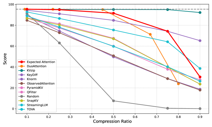
### Visual Description
## Line Chart: Performance of Compression Methods Across Compression Ratios
### Overview
The chart compares the performance scores of 10 compression methods (e.g., KVzip, KeyDiff, SnapKV) across compression ratios ranging from 0.1 to 0.9. Scores are plotted on a 0–100 scale, with higher values indicating better performance. The red dashed line at 100 represents a theoretical maximum score.
### Components/Axes
- **X-axis (Compression Ratio)**: Labeled "Compression Ratio" with ticks at 0.1, 0.2, ..., 0.9.
- **Y-axis (Score)**: Labeled "Score" with ticks at 0, 20, ..., 100.
- **Legend**: Located in the bottom-left corner, mapping colors to methods:
- Red: Expected Attention
- Orange: DuoAttention
- Teal: KVzip
- Purple: KeyDiff
- Dark Purple: Knorm
- Brown: Observed Attention
- Pink: PyramidKV
- Gray: QFilter
- Olive: Random
- Yellow: SnapKV
- Cyan: StreamingLLM
- Blue: TOVA
### Detailed Analysis
1. **Expected Attention (Red)**: Starts near 100 at 0.1, declines sharply after 0.7, ending at ~30 at 0.9.
2. **DuoAttention (Orange)**: Peaks at ~95 at 0.4, then drops to ~20 at 0.9.
3. **KVzip (Teal)**: Maintains ~95–100 across all ratios.
4. **KeyDiff (Purple)**: Gradual decline from ~90 at 0.1 to ~65 at 0.9.
5. **Knorm (Dark Purple)**: Steady decline from ~90 at 0.1 to ~20 at 0.9.
6. **Observed Attention (Brown)**: Sharp drop from ~85 at 0.1 to ~15 at 0.9.
7. **PyramidKV (Pink)**: Gradual decline from ~85 at 0.1 to ~25 at 0.9.
8. **QFilter (Gray)**: Steep decline from ~90 at 0.1 to ~5 at 0.9.
9. **Random (Olive)**: Plummets from ~85 at 0.1 to ~0 at 0.5, then plateaus near 0.
10. **SnapKV (Yellow)**: Declines from ~85 at 0.1 to ~25 at 0.9.
11. **StreamingLLM (Cyan)**: Gradual decline from ~90 at 0.1 to ~30 at 0.9.
12. **TOVA (Blue)**: Steady decline from ~90 at 0.1 to ~25 at 0.9.
### Key Observations
- **KVzip (Teal)** consistently outperforms all methods, maintaining near-maximum scores.
- **Random (Olive)** and **QFilter (Gray)** show the steepest declines, with Random collapsing entirely after 0.5.
- **Expected Attention (Red)** and **Observed Attention (Brown)** exhibit abrupt drops post-0.7, suggesting sensitivity to higher compression.
- **DuoAttention (Orange)** and **SnapKV (Yellow)** have non-linear trends, peaking at mid-range ratios before declining.
- **Knorm (Dark Purple)** and **TOVA (Blue)** show linear degradation with increasing compression.
### Interpretation
The data highlights **KVzip** as the most robust method, maintaining high performance even at extreme compression ratios. Methods like **Random** and **QFilter** are highly inefficient, failing catastrophically as compression increases. The sharp declines in **Expected Attention** and **Observed Attention** suggest these methods prioritize accuracy over compression efficiency, while others (e.g., **KeyDiff**, **StreamingLLM**) balance both. The divergence in trends implies trade-offs between compression ratio and performance, with no single method dominating across all ratios. Notably, **DuoAttention** and **SnapKV** achieve peak performance at mid-range ratios (~0.4–0.5), indicating optimal trade-offs for specific use cases.
</details>
Figure 11: Initial experiments on Ruler 4K to select the best baselines. We did not use KVZip as it requires two forward passes and increases latency significantly.