# The Mechanistic Emergence of Symbol Grounding in Language Models
**Authors**:
- Freda Shi Joyce Chai (University of Michigan
University of Waterloo
Vector Institute
UNC at Chapel Hill)
## Abstract
Symbol grounding (Harnad, 1990) describes how symbols such as words acquire their meanings by connecting to real-world sensorimotor experiences. Recent work has shown preliminary evidence that grounding may emerge in (vision-)language models trained at scale without using explicit grounding objectives. Yet, the specific loci of this emergence and the mechanisms that drive it remain largely unexplored. To address this problem, we introduce a controlled evaluation framework that systematically traces how symbol grounding arises within the internal computations through mechanistic and causal analysis. Our findings show that grounding concentrates in middle-layer computations and is implemented through the aggregate mechanism, where attention heads aggregate the environmental ground to support the prediction of linguistic forms. This phenomenon replicates in multimodal dialogue and across architectures (Transformers and state-space models), but not in unidirectional LSTMs. Our results provide behavioral and mechanistic evidence that symbol grounding can emerge in language models, with practical implications for predicting and potentially controlling the reliability of generation.
footnotetext: Authors contributed equally to this work. footnotetext: Advisors contributed equally to this work.
## 1 Introduction
Symbol grounding (Harnad, 1990) refers to the problem of how abstract and discrete symbols, such as words, acquire meaning by connecting to perceptual or sensorimotor experiences. Extending to the context of multimodal machine learning, grounding has been leveraged as an explicit pre-training objective for vision-language models (VLMs), by explicitly connecting linguistic units to the world that gives language meanings (Li et al., 2022; Ma et al., 2023). Through supervised fine-tuning with grounding signals, such as entity-phrase mappings, modern VLMs have achieved fine-grained understanding at both region (You et al., 2024; Peng et al., 2024; Wang et al., 2024) and pixel (Zhang et al., 2024b; Rasheed et al., 2024; Zhang et al., 2024a) levels.
With the rising of powerful autoregressive language models (LMs; OpenAI, 2024; Anthropic, 2024; Comanici et al., 2025, inter alia) and their VLM extensions, there is growing interest in identifying and interpreting their emergent capabilities. Recent work has shown preliminary correlational evidence that grounding may emerge in LMs (Sabet et al., 2020; Shi et al., 2021; Wu et al., 2025b) and VLMs (Cao et al., 2025; Bousselham et al., 2024; Schnaus et al., 2025) trained at scale, even when solely optimized with the simple next-token prediction objective. However, the potential underlying mechanisms that lead to such an emergence are not well understood. To address this limitation, our work seeks to understand the emergence of symbol grounding in LMs, causally and mechanistically tracing how symbol grounding arises within the internal computations.
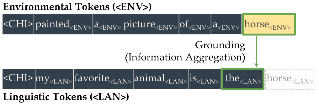
We begin by constructing a minimal testbed, motivated by the annotations provided in the CHILDES corpora (MacWhinney, 2000), where child–caregiver interactions provide cognitively plausible contexts for studying symbol grounding alongside verbal utterances. In our framework, each word is represented in two distinct forms: one token that appears in non-verbal scene descriptions (e.g., a box in the environment) and another that appears in spoken utterances (e.g., box in dialogue). We refer to these as environmental tokens ( $\langle$ ENV $\rangle$ ) and linguistic tokens ( $\langle$ LAN $\rangle$ ), respectively. A deliberately simple word-level tokenizer assigns separate vocabulary entries to each form, ensuring that they are treated as entirely different tokens by the language model. This framework enforces a structural separation between scenes and symbols, preventing correspondences from being reduced to trivial token identity. Under this setup, we can evaluate whether a model trained from scratch is able to predict the linguistic form from its environmental counterpart.
<details>
<summary>x1.png Details</summary>
### Visual Description
## Diagram: Token Grounding Process
### Overview
The image is a conceptual diagram illustrating a "Grounding" or "Information Aggregation" process between two parallel sequences of tokens. It demonstrates how a specific token from an "Environmental" sequence is used to inform or replace a token in a corresponding "Linguistic" sequence.
### Components/Axes
The diagram is composed of two horizontal rows of token blocks, a connecting arrow, and descriptive labels.
1. **Top Row: Environmental Tokens (<ENV>)**
* **Label:** "Environmental Tokens (<ENV>)" is written in bold, black text above the row.
* **Token Sequence:** A series of adjacent dark gray rectangular blocks, each containing a token. The sequence is:
`<CHI>`, `painted<ENV>`, `a<ENV>`, `picture<ENV>`, `of<ENV>`, `a<ENV>`, `horse<ENV>`
* **Highlight:** The final token, `horse<ENV>`, is highlighted with a yellow background and a green border.
2. **Bottom Row: Linguistic Tokens (<LAN>)**
* **Label:** "Linguistic Tokens (<LAN>)" is written in bold, black text below the row.
* **Token Sequence:** A similar series of dark gray blocks. The sequence is:
`<CHI>`, `my<LAN>`, `favorite<LAN>`, `animal<LAN>`, `is<LAN>`, `the<LAN>`, `horse<LAN>`
* **Highlight & Modification:** The token `the<LAN>` is outlined with a green border. The final token, `horse<LAN>`, is rendered in a faded, light gray color with a dashed border, indicating it is the target of the grounding process.
3. **Grounding Process**
* **Label:** The text "Grounding (Information Aggregation)" is centered between the two rows.
* **Visual Flow:** A solid green arrow originates from the bottom of the highlighted `horse<ENV>` token in the top row and points directly down to the outlined `the<LAN>` token in the bottom row. This visually represents the flow of information.
### Detailed Analysis
* **Token Structure:** Each token appears to be a word or symbol followed by a subscript tag (`<ENV>` or `<LAN>`), indicating its source or type. The `<CHI>` token at the start of both sequences lacks a subscript, possibly serving as a common initiator or speaker tag.
* **Spatial Grounding:** The legend (the labels "Environmental Tokens" and "Linguistic Tokens") is placed directly above and below their respective data series. The key action—the grounding arrow—is centrally positioned, connecting the specific source (`horse<ENV>`) to the specific target (`the<LAN>`).
* **Process Logic:** The diagram shows a one-to-one mapping. The environmental concept "horse" is being used to ground or specify the linguistic token "the" in the sentence "my favorite animal is the...". The faded `horse<LAN>` suggests that the generic linguistic token "horse" is being superseded or informed by the specific environmental instance.
### Key Observations
1. **Asymmetric Highlighting:** The source token (`horse<ENV>`) is highlighted in yellow, while the target token (`the<LAN>`) is only outlined in green. This may distinguish the *source of information* from the *point of application*.
2. **Token Fading:** The `horse<LAN>` token is visually de-emphasized (faded, dashed border), strongly implying that the grounding process provides a more specific or correct referent than the standalone linguistic token.
3. **Parallel Structure:** The two sequences are structurally parallel (both start with `<CHI>` and contain similar grammatical structures), emphasizing that the grounding is a cross-modal alignment between two different representations of related information.
### Interpretation
This diagram illustrates a core mechanism in multimodal AI or cognitive modeling, where abstract linguistic representations are connected to concrete environmental or sensory data.
* **What it demonstrates:** The process shows how a system might resolve or specify a vague linguistic reference ("the") by grounding it in a concrete entity ("horse") perceived in the environment. The sentence "my favorite animal is the..." is incomplete until the environmental token provides the specific object.
* **Relationship between elements:** The `<ENV>` sequence represents a direct observation or context ("painted a picture of a horse"). The `<LAN>` sequence represents an internal linguistic model or statement. The "Grounding" arrow is the critical link that allows the internal model to be informed by external reality, enabling accurate reference.
* **Underlying concept:** This is a visual metaphor for **symbol grounding**—the problem of how words (symbols) get their meaning. Here, the meaning of "the" in the linguistic chain is grounded in the specific environmental instance of "horse." The faded `horse<LAN>` suggests that without grounding, the linguistic symbol is hollow or ambiguous; grounding fills it with concrete meaning. This is fundamental for tasks like visual question answering, image captioning, or any AI that must connect language to the physical world.
</details>
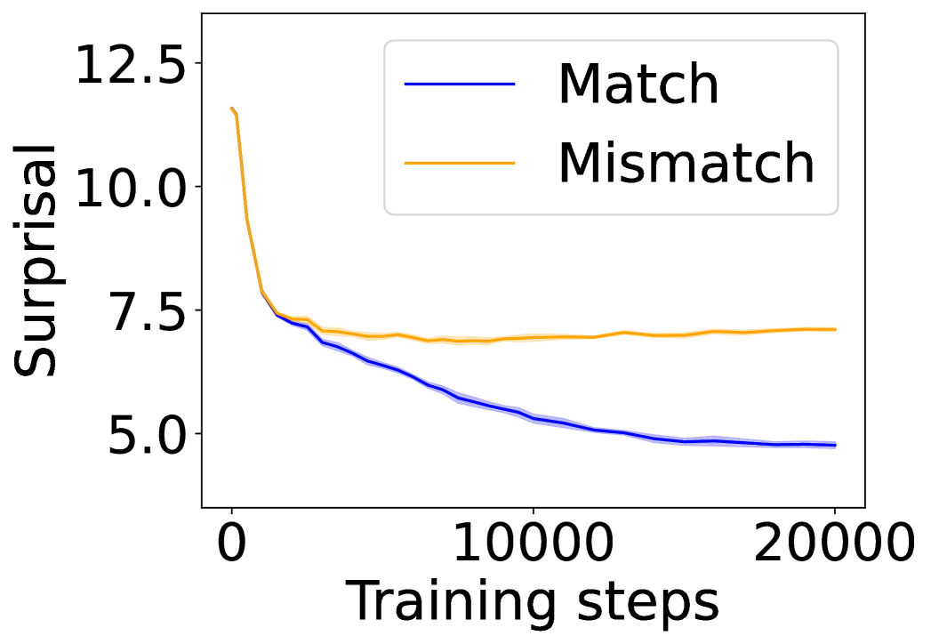
(a) Attention head 8 of layer 7 in GPT-CHILDES.
<details>
<summary>x2.png Details</summary>
### Visual Description
\n
## Diagram: Multimodal AI Grounding Process
### Overview
The image is a conceptual diagram illustrating a multimodal AI process where visual information from an image ("Environmental Tokens") is connected to a linguistic query ("Linguistic Tokens") through a process labeled "Grounding (Information Aggregation)". The diagram uses a photograph of an alpaca as the visual input and a text sequence as the linguistic input.
### Components/Axes
The diagram is composed of two primary regions:
1. **Left Region (Environmental Tokens):**
* **Title:** "Environmental Tokens (<ENV>)" is displayed at the top left.
* **Content:** A photograph of a light-colored alpaca standing in a dirt enclosure. A metal fence and Joshua trees are visible in the background under a blue sky.
* **Annotations:** Several small, colored square markers are superimposed on the alpaca's body (red, orange, yellow). A single **yellow square** on the alpaca's side is the origin point for a connecting arrow.
2. **Right Region (Linguistic Tokens & Process):**
* **Process Label:** "Grounding (Information Aggregation)" is written in the upper-middle area.
* **Linguistic Sequence:** A horizontal row of dark blue boxes containing the white text: `what` | `would` | `you` | `name` | `this` | `?`. This is labeled below as "Linguistic Tokens (<LAN>)".
* **Output/Answer:** To the right of the question mark box, there is a dashed-outline box containing the word `alpaca` in light gray text.
* **Connection:** A **green arrow** originates from the yellow square on the alpaca in the photograph and points directly to the question mark (`?`) box in the linguistic token sequence.
### Detailed Analysis
* **Text Transcription:**
* Top Title: `Environmental Tokens (<ENV>)`
* Process Label: `Grounding (Information Aggregation)`
* Linguistic Tokens (in boxes): `what`, `would`, `you`, `name`, `this`, `?`
* Label below tokens: `Linguistic Tokens (<LAN>)`
* Answer in dashed box: `alpaca`
* **Spatial Grounding & Flow:**
* The **yellow square** is positioned on the mid-left side of the alpaca's torso in the photograph.
* The **green arrow** flows from this specific visual point (left side of image) to the linguistic token representing the question (right side of image).
* The legend/answer (`alpaca`) is placed to the immediate right of the question mark, suggesting it is the generated or retrieved response.
* **Component Isolation:**
* **Header:** Contains the title "Environmental Tokens (<ENV>)".
* **Main Diagram:** Contains the photograph, the "Grounding" label, the token sequence, and the connecting arrow.
* **Footer:** Contains the label "Linguistic Tokens (<LAN>)".
### Key Observations
1. The diagram explicitly models a two-stage input system: visual data (`<ENV>`) and textual data (`<LAN>`).
2. The core operation is "Grounding," defined here as "Information Aggregation," which links a specific region of the visual input to a specific token in the linguistic input.
3. The process is demonstrated with a concrete example: the system is asked to name the subject of the image, and the answer "alpaca" is provided.
4. The colored markers on the alpaca (red, orange, yellow) suggest that multiple visual features or regions can be identified and potentially grounded, though only the yellow one is used in this specific flow.
### Interpretation
This diagram is a schematic representation of a **multimodal grounding mechanism** in an AI system. It visually explains how the model connects raw sensory data (pixels in an image) with symbolic language (words and punctuation).
* **What it demonstrates:** The system doesn't just see an image and read text separately. It performs an active alignment ("grounding") where a specific visual feature (represented by the yellow square on the alpaca) is associated with the conceptual query ("what would you name this ?"). This aggregated information allows the model to produce the correct linguistic token (`alpaca`) as an answer.
* **Relationships:** The green arrow is the most critical element, representing the inference or attention link that bridges the modalities. The dashed box for "alpaca" indicates it is an output derived from the grounding process, not an initial input.
* **Underlying Concept:** The diagram argues that for an AI to understand and respond to a question about an image, it must first "ground" the linguistic query in the relevant parts of the visual scene. The "Information Aggregation" subtitle suggests this involves combining features from the identified visual region with the context of the question to formulate a response. The example is simple (object naming), but the framework implies applicability to more complex visual question-answering tasks.
</details>
(b) Attention head 7 of layer 20 in LLaVA-1.5-7B.
<details>
<summary>x3.png Details</summary>
### Visual Description
## Heatmap Visualization: Neural Network Attention/Saliency Analysis
### Overview
The image displays a two-part technical visualization analyzing attention or saliency patterns within a neural network, likely a transformer model. The left side shows a 12x12 grid representing different layers and heads of the model. A single cell (Layer 7, Head 8) is highlighted and magnified on the right, revealing a detailed token-to-token interaction heatmap. The visualization uses a color scale to represent "saliency" values.
### Components/Axes
**Main Grid (Left Panel):**
* **Y-axis:** Labeled "layer", numbered 1 through 12 from top to bottom.
* **X-axis:** Labeled "head", numbered 1 through 12 from left to right.
* **Content:** A 12x12 grid of small squares. Each square's color represents a value (likely average saliency or attention weight) for that specific layer-head combination. The predominant color is dark purple, with a few scattered lighter squares indicating higher values.
* **Highlight:** A yellow square outline highlights the cell at **Layer 7, Head 8**. Two yellow lines extend from this cell to the right panel, indicating a zoomed-in view.
**Zoomed Heatmap (Right Panel):**
* **Title/Legend:** A vertical color bar on the far right is labeled "saliency". The scale runs from **0.0** (dark purple) at the bottom to **0.3** (bright yellow) at the top.
* **Axes:** This is a square matrix where both the vertical (Y) and horizontal (X) axes represent the same sequence of tokens.
* **Token Sequence (Y-axis, top to bottom):**
1. `<CHI>`
2. `painted`
3. `a`
4. `picture`
5. `of`
6. `a`
7. `horse`
8. `<CHI>`
9. `my`
10. `favorite`
11. `animal`
12. `is`
13. `the`
* **Token Sequence (X-axis, left to right):** Identical sequence to the Y-axis.
* **Group Labels:**
* A bracket labeled `<ENV>` groups the first seven tokens (`<CHI>` through `horse`).
* A bracket labeled `<LAN>` groups the last six tokens (`<CHI>` through `the`).
* **Content:** A 13x13 grid of cells. The color of each cell (i, j) represents the saliency value for the interaction between the i-th token (row) and the j-th token (column).
### Detailed Analysis
**Main Grid Analysis:**
* The grid is overwhelmingly dark purple, indicating that for most layer-head combinations, the measured saliency is near 0.0.
* A few cells show slightly lighter shades of purple/blue, suggesting marginally higher activity. The most prominent of these is the highlighted cell at **(Layer 7, Head 8)**.
* **Trend:** Saliency is highly sparse and localized to specific heads within specific layers.
**Zoomed Heatmap (Layer 7, Head 8) Analysis:**
* **Overall Pattern:** The heatmap is also predominantly dark purple (saliency ~0.0-0.05), indicating weak interactions between most token pairs.
* **Key Data Point:** There is one cell with a very high saliency value, appearing as a bright yellow square.
* **Location:** Row corresponding to the token **"horse"** (7th token) and Column corresponding to the token **"the"** (13th token).
* **Value:** Based on the color scale, this saliency value is approximately **0.3** (the maximum on the scale).
* **Secondary Observations:** A few other cells show faint lighter purple/blue hues (saliency ~0.1-0.15), for example:
* Interaction between "picture" (row 4) and "horse" (column 7).
* Interaction between "animal" (row 11) and "the" (column 13).
* These are significantly weaker than the primary "horse"-"the" interaction.
### Key Observations
1. **Extreme Sparsity:** The model's high-saliency focus is exceptionally concentrated. Out of 144 layer-head pairs, only one (7,8) is highlighted. Within that head's attention map, only one token-token interaction is strongly salient.
2. **Cross-Sentence Link:** The strongest interaction is between a key noun in the first clause ("horse") and a determiner in the second clause ("the"). This suggests the model is forming a strong connection between the subject of the first statement and the beginning of the second statement.
3. **Intra-Clause Weak Links:** Weaker, secondary connections appear within the same clause (e.g., "picture" to "horse") and between the second clause's noun and determiner ("animal" to "the").
4. **Linguistic Structure:** The token sequence appears to be two short sentences or phrases: "[Someone] painted a picture of a horse" and "my favorite animal is the...". The `<CHI>`, `<ENV>`, and `<LAN>` tags likely represent special control or language tokens (e.g., Chinese, Environment, Language).
### Interpretation
This visualization provides a Peircean investigation into the inner workings of a neural language model. It doesn't just show *that* the model processes text, but *how* it allocates its attention resources for a specific input.
* **What the data suggests:** The model, in this specific layer and head, is performing a very targeted operation. It is strongly linking the concept "horse" from the first context (`<ENV>`) to the start of the second context (`<LAN>`), which begins with "the". This could be a mechanism for **coreference resolution** or **topic continuity**, where the model anticipates that "the" will refer back to or be related to the previously mentioned "horse".
* **How elements relate:** The main grid acts as a "map of maps," showing where in the network to look. The zoomed heatmap is the "map" itself, revealing the precise token-level relationships. The color scale is the critical key for quantifying these relationships.
* **Notable Anomalies:** The extreme sparsity is the most notable feature. It indicates highly specialized and efficient processing within this head, rather than a diffuse, distributed pattern. The near-zero values for self-attention (the diagonal from top-left to bottom-right) are also interesting, suggesting this head is primarily focused on *cross-token* relationships rather than reinforcing a token's own meaning.
* **Underlying Information:** The presence of tags like `<CHI>` implies this is a multilingual or multi-context model. The analysis reveals a potential "bridge-building" function between different contextual segments (`<ENV>` and `<LAN>`), which is crucial for coherent multi-sentence understanding.
</details>
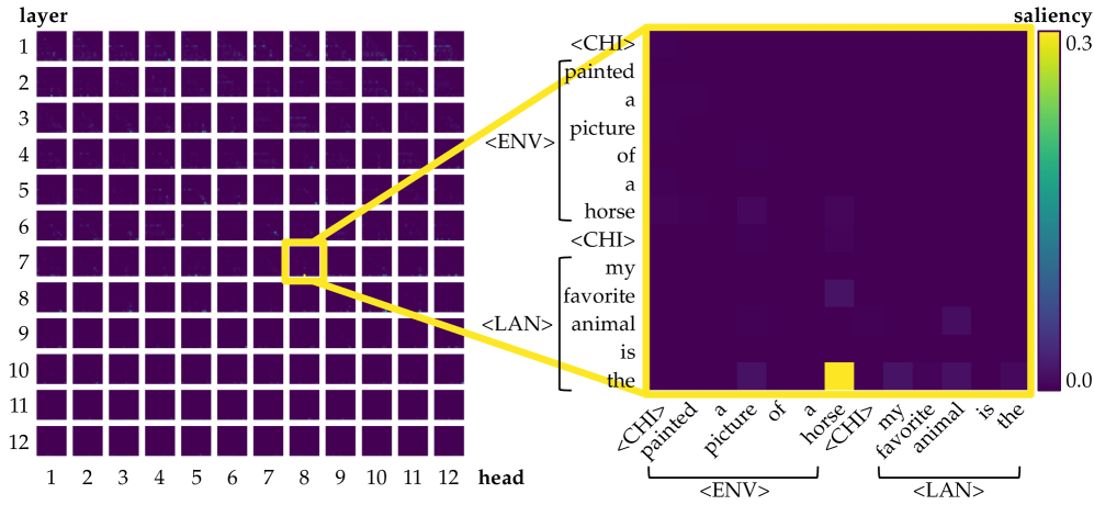
(c) Left: saliency over tokens of each head in each layer for the prompt $\langle$ CHI $\rangle$ $\textit{painted}_{\texttt{$\langle$ENV$\rangle$}}$ $\textit{a}_{\texttt{$\langle$ENV$\rangle$}}$ $\textit{picture}_{\texttt{$\langle$ENV$\rangle$}}$ $\textit{of}_{\texttt{$\langle$ENV$\rangle$}}$ $\textit{a}_{\texttt{$\langle$ENV$\rangle$}}$ $\textit{horse}_{\texttt{$\langle$ENV$\rangle$}}$ $\langle$ CHI $\rangle$ $\textit{my}_{\texttt{$\langle$LAN$\rangle$}}$ $\textit{favorite}_{\texttt{$\langle$LAN$\rangle$}}$ $\textit{animal}_{\texttt{$\langle$LAN$\rangle$}}$ $\textit{is}_{\texttt{$\langle$LAN$\rangle$}}$ $\textit{the}_{\texttt{$\langle$LAN$\rangle$}}$ . Right: among all, only one of them (head 8 of layer 7) is identified as an aggregate head, where information flows from $\textit{horse}_{\texttt{$\langle$ENV$\rangle$}}$ to the current position, encouraging the model to predict $\textit{horse}_{\texttt{$\langle$LAN$\rangle$}}$ as the next token.
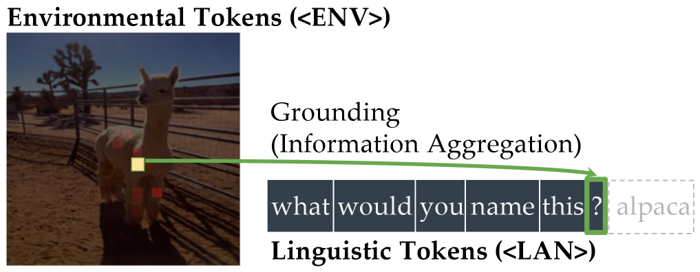
Figure 1: Illustration of the symbol grounding mechanism through information aggregation. Lighter colors denote more salient attention, quantified by saliency scores, i.e., gradient $\times$ attention contributions to the loss (Wang et al., 2023). When predicting the next token, aggregate heads (Bick et al., 2025) emerge to exclusively link environmental tokens (visual or situational context; $\langle$ ENV $\rangle$ ) to linguistic tokens (words in text; $\langle$ LAN $\rangle$ ). These heads provide a mechanistic pathway for symbol grounding by mapping external environmental evidence into its linguistic form.
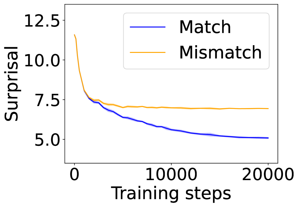
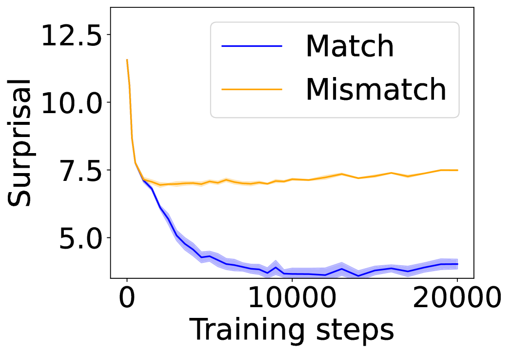
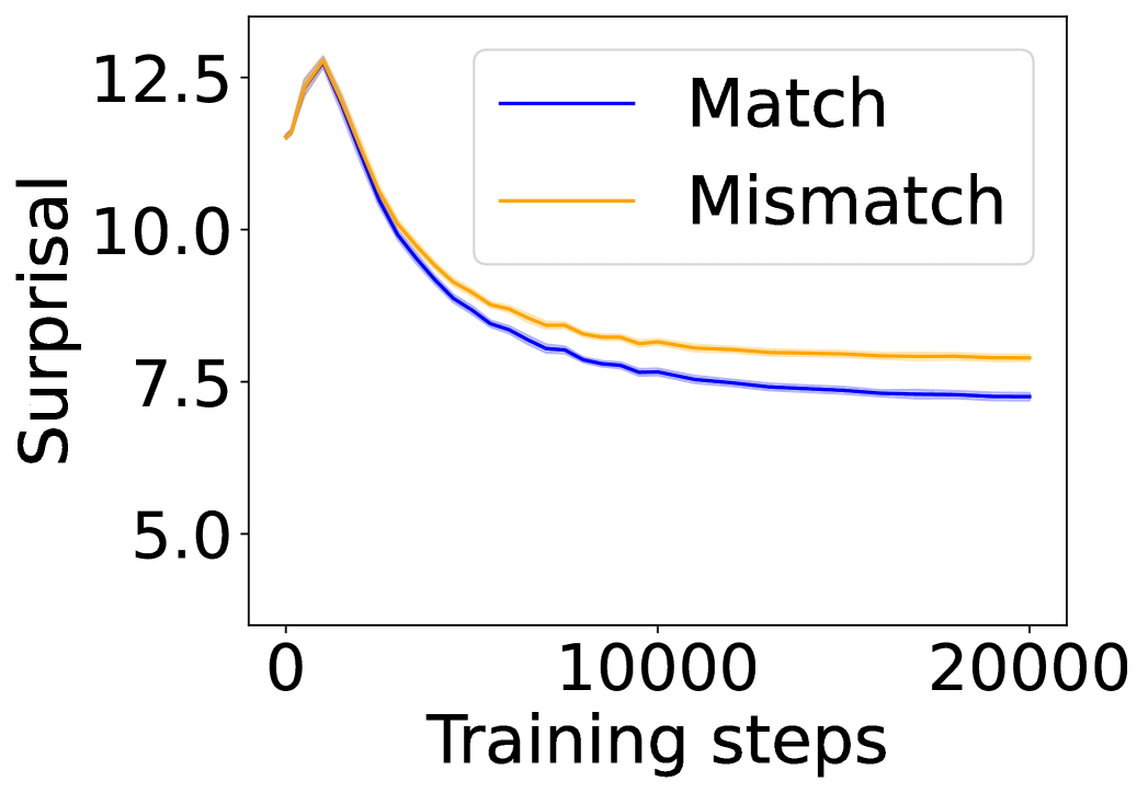
We quantify the level of grounding using surprisal: specifically, we compare how easily the model predicts a linguistic token ( $\langle$ LAN $\rangle$ ) when its matching environmental token ( $\langle$ ENV $\rangle$ ) is present versus when unrelated cues are given instead. A lower surprisal in the former condition indicates that the model has learned to align environmental grounds with linguistic forms. We find that LMs do learn to ground: the presence of environmental tokens consistently reduces surprisal for their linguistic counterparts, in a way that simple co-occurrence statistics cannot fully explain. To study the underlying mechanisms, we apply saliency analysis (Wang et al., 2023) and the tuned lens (Belrose et al., 2023), which converge on the result that grounding relations are concentrated in the middle layers of the network. Further analysis of attention heads reveals patterns consistent with the aggregate mechanism (Bick et al., 2025), where attention heads support the prediction of linguistic forms by retrieving their environmental grounds in the context.
Finally, we demonstrate that these findings generalize beyond the minimal CHILDES data and Transformer models. They appear in a multimodal setting with the Visual Dialog dataset (Das et al., 2017), and in state-space models (SSMs) such as Mamba-2 (Dao & Gu, 2024). In contrast, we do not observe grounding in unidirectional LSTMs, consistently with their sequential state compression and lack of content-addressable retrieval. Taken together, our results show that symbol grounding can mechanistically emerge in autoregressive LMs, while also delineating the architectural conditions under which it can arise.
## 2 Related Work
### 2.1 Language Grounding
Referential grounding has long been framed as the lexicon acquisition problem: how words map to referents in the world (Harnad, 1990; Gleitman & Landau, 1994; Clark, 1995). Early work focused on word-to-symbol mappings, designing learning mechanisms that simulate children’s lexical acquisition and explain psycholinguistic phenomena (Siskind, 1996; Regier, 2005; Goodman et al., 2007; Fazly et al., 2010). Subsequent studies incorporated visual grounding, first by aligning words with object categories (Roy & Pentland, 2002; Yu, 2005; Xu & Tenenbaum, 2007; Yu & Ballard, 2007; Yu & Siskind, 2013), and later by mapping words to richer visual features (Qu & Chai, 2010; Mao et al., 2019; 2021; Pratt et al., 2020). More recently, large-scale VLMs trained with paired text–image supervision have advanced grounding to finer levels of granularity, achieving region-level (Li et al., 2022; Ma et al., 2023; Chen et al., 2023; You et al., 2024; Wang et al., 2024) and pixel-level (Xia et al., 2024; Rasheed et al., 2024; Zhang et al., 2024b) grounding, with strong performance on referring expression comprehension (Chen et al., 2024a).
Recent work suggests that grounding emerges as a property of VLMs trained without explicit supervision, with evidence drawn from attention-based spatial localization (Cao et al., 2025; Bousselham et al., 2024) and cross-modal geometric correspondences (Schnaus et al., 2025). However, all prior work focused exclusively on static final-stage models, overlooking the training trajectory, a crucial aspect for understanding when and how grounding emerges. In addition, existing work has framed grounding through correlations between visual and textual signals, diverging from the definition by Harnad (1990), which emphasizes causal links from symbols to meanings. To address these issues, we systematically examine learning dynamics throughout the training process, applying causal interventions to probe model internals and introducing control groups to enable rigorous comparison.
### 2.2 Emergent Capabilities and Learning Dynamics of LMs
A central debate concerns whether larger language models exhibit genuinely new behaviors: Wei et al. (2022) highlight abrupt improvements in tasks, whereas later studies argue such effects are artifacts of thresholds or in-context learning dynamics (Schaeffer et al., 2023; Lu et al., 2024). Beyond end performance, developmental analyses show that models acquire linguistic abilities in systematic though heterogeneous orders with variability across runs and checkpoints (Sellam et al., 2021; Blevins et al., 2022; Biderman et al., 2023; Xia et al., 2023; van der Wal et al., 2025). Psychology-inspired perspectives further emphasize controlled experimentation to assess these behaviors (Hagendorff, 2023), and comparative studies reveal both parallels and divergences between machine and human language learning (Chang & Bergen, 2022; Evanson et al., 2023; Chang et al., 2024; Ma et al., 2025). At a finer granularity, hidden-loss analyses identify phase-like transitions (Kangaslahti et al., 2025), while distributional studies attribute emergence to stochastic differences across training seeds (Zhao et al., 2024). Together, emergent abilities are not sharp discontinuities but probabilistic outcomes of developmental learning dynamics. Following this line of work, we present a probability- and model internals–based analysis of how symbol grounding emerges during language model training.
### 2.3 Mechanistic Interpretability of LMs
Mechanistic interpretability has largely focused on attention heads in Transformers (Elhage et al., 2021; Olsson et al., 2022; Meng et al., 2022; Bietti et al., 2023; Lieberum et al., 2023; Wu et al., 2025a). A central line of work established that induction heads emerge to support in-context learning (ICL; Elhage et al., 2021; Olsson et al., 2022), with follow-up studies tracing their training dynamics (Bietti et al., 2023) and mapping factual recall circuits (Meng et al., 2022). At larger scales, Lieberum et al. (2023) identified specialized content-gatherer and correct-letter heads, and Wu et al. (2025a) showed that a sparse set of retrieval heads is critical for reasoning and long-context performance. Relatedly, Wang et al. (2023) demonstrated that label words in demonstrations act as anchors: early layers gather semantic information into these tokens, which later guide prediction. Based on these insights, Bick et al. (2025) proposed that retrieval is implemented through a coordinated gather-and-aggregate (G&A) mechanism: some heads collect content from relevant tokens, while others aggregate it at the prediction position. Other studies extended this line of work by analyzing failure modes and training dynamics (Wiegreffe et al., 2025) and contrasting retrieval mechanisms in Transformers and SSMs (Arora et al., 2025). Whereas prior analyses typically investigate ICL with repeated syntactic or symbolic formats, our setup requires referential alignment between linguistic forms and their environmental contexts, providing a complementary testbed for naturalistic language grounding.
## 3 Method
Table 1: Training and test examples across datasets with target word book. The training examples combine environmental tokens ( $\langle$ ENV $\rangle$ ; shaded) with linguistic tokens ( $\langle$ LAN $\rangle$ ). Test examples are constructed with either matched (book) or mismatched (toy) environmental contexts, paired with corresponding linguistic prompts. Note that in child-directed speech and caption-grounded dialogue, book ${}_{\texttt{$\langle$ENV$\rangle$}}$ and book ${}_{\texttt{$\langle$LAN$\rangle$}}$ are two distinct tokens received by LMs.
| Child-Directed Speech | tticblue!10 $\langle$ CHI $\rangle$ takes book from mother | $\langle$ CHI $\rangle$ what’s that $\langle$ MOT $\rangle$ a book in it … | tticblue!10 $\langle$ CHI $\rangle$ asked for a new book | tticblue!10 $\langle$ CHI $\rangle$ asked for a new toy | $\langle$ CHI $\rangle$ I love this |
| --- | --- | --- | --- | --- | --- |
| Caption-Grounded Dialogue | tticblue!10 a dog appears to be reading a book with a full bookshelf behind | $\langle$ Q $\rangle$ can you tell what book it’s reading $\langle$ A $\rangle$ the marriage of true minds by stephen evans | tticblue!10 this is a book | tticblue!10 this is a toy | $\langle$ Q $\rangle$ can you name this object $\langle$ A $\rangle$ |
| Image-Grounded Dialogue | tticblue!10
<details>
<summary>figs/data/book-train.jpg Details</summary>
### Visual Description
## Photograph: Dog with Book in Front of Bookshelf
### Overview
The image is a color photograph depicting a medium-sized, black-and-white dog lying on a polished wooden floor. The dog is positioned next to a standing paperback book, with a bookshelf filled with numerous books serving as the background. The scene appears to be indoors, likely in a home library or study.
### Components/Subjects
1. **Primary Subject (Dog):**
* **Breed/Appearance:** Mixed-breed dog with predominantly white fur on its chest, legs, and muzzle, and large black patches on its back, head, and ears. It has pointed, erect ears and brown eyes.
* **Position:** Lying down with its body oriented towards the left side of the frame. Its head is turned to look directly at the camera. Its front left paw is extended forward on the floor.
* **Expression:** Alert and calm.
2. **Primary Object (Book):**
* **Title:** "THE MARRIAGE OF TRUE MINDS"
* **Author:** "Stephen Evans"
* **Format:** Paperback book, standing upright and leaning slightly against the dog's side.
* **Cover Design:** A bright yellow background. The title is in a stylized, black, serif font. Below the title is a small illustration of a red heart with a yellow flame or sprout emerging from it. At the top of the cover, a blurb reads: "A funny, poignant, and beautifully told tale."
3. **Background (Bookshelf):**
* **Structure:** A light-colored wooden bookshelf with multiple shelves.
* **Contents:** Densely packed with books of various sizes and colors. The spines display a wide range of colors, including red, blue, green, black, and white.
* **Legible Titles/Text on Spines (from left to right on the visible shelf):**
* "Animals"
* "ANIMAL RIGHTS / The Issues / The Movement" (This is the most clearly legible title on the right side).
* Other titles are partially visible but not fully legible (e.g., "BEARS", "LAW").
4. **Setting:**
* **Floor:** A dark, polished hardwood floor with a visible grain pattern. It reflects light from the scene.
* **Lighting:** The scene is well-lit, likely from a frontal or overhead source, creating soft shadows.
### Detailed Analysis
* **Spatial Relationships:** The dog and the book are the central focus in the foreground. The book is placed to the left of the dog's chest. The bookshelf forms a complete, textured backdrop that fills the upper two-thirds of the image.
* **Text Extraction:**
* **Book Cover:**
* Top Blurb: "A funny, poignant, and beautifully told tale."
* Title: "THE MARRIAGE OF TRUE MINDS"
* Author: "Stephen Evans"
* **Bookshelf Spines (Partial List):**
* "Animals"
* "ANIMAL RIGHTS / The Issues / The Movement"
* "BEARS"
* "LAW"
* **Color Palette:** The image is dominated by the warm yellow of the book cover, the black and white of the dog, the varied colors of the book spines, and the dark brown of the floor.
### Key Observations
1. The composition is staged, with the dog calmly posing next to the book, suggesting a deliberate photograph, possibly for promotional or personal purposes.
2. The book's title, "The Marriage of True Minds," is a phrase from Shakespeare's Sonnet 116, which may hint at the book's thematic content.
3. The visible book titles on the shelf ("Animals," "ANIMAL RIGHTS," "BEARS") suggest the owner has a strong interest in animal-related subjects, which creates a thematic link with the presence of the dog in the photo.
4. The dog's direct gaze at the camera creates a point of engagement for the viewer.
### Interpretation
This photograph is a composed portrait that merges personal interest (the dog) with intellectual or literary interest (the book and the library). The primary "information" conveyed is not numerical data but a narrative scene. The image suggests a connection between the owner's love for their pet and their engagement with literature and animal welfare topics, as evidenced by the bookshelf contents. The book itself is presented as a featured object, making the image potentially serve as a casual author photo, a book promotion, or a personal snapshot celebrating both a pet and a read. The lack of charts or diagrams means the core information is descriptive and contextual, painting a picture of a specific moment and environment.
</details>
| $\langle$ Q $\rangle$ can you tell what book it’s reading $\langle$ A $\rangle$ the marriage of true minds by stephen evans | tticblue!10
<details>
<summary>figs/data/book-test.jpg Details</summary>

### Visual Description
## Photograph: Home Library Bookshelf
### Overview
The image displays a large, dark-stained wooden bookshelf unit against a solid yellow wall. The unit is composed of multiple sections, featuring closed upper cabinets, open middle shelves filled with books and personal items, and lower drawers. A detailed model sailing ship is placed on top of the unit. The scene is a domestic interior, likely a study or living room.
### Components & Spatial Layout
The bookshelf unit is divided vertically into four main sections and horizontally into three tiers.
1. **Upper Tier (Cabinets):**
* Four sets of double-door cabinets with raised panel designs and brass-colored handles.
* The wood has a medium-to-dark brown finish with visible grain.
* **Position:** Spans the entire width of the unit at the top.
2. **Middle Tier (Open Shelves):**
* This is the primary storage area, divided into four vertical sections.
* **Left Section:** Two shelves densely packed with books, primarily hardcovers with varied spine colors (white, black, red, blue, green). A small, round, orange-faced clock and a small decorative bowl are on the lower shelf.
* **Center-Left Section:** Two shelves of books. The lower shelf contains several framed photographs (portraits of individuals) and a small figurine.
* **Center-Right Section:** Two shelves of books. The lower shelf holds more books, some stacked horizontally, and a framed photograph.
* **Right Section:** Two shelves of books. The lower shelf contains a framed photograph, a small model car, and other decorative objects.
* **Position:** Occupies the central and largest portion of the unit.
3. **Lower Tier (Drawers & Base):**
* Below the open shelves, there are wooden drawer fronts with decorative handles.
* **Position:** Forms the base of the entire unit.
4. **Top of Unit:**
* A detailed, multi-masted model sailing ship is placed on the top surface, positioned towards the right side.
* **Position:** Above the upper cabinets, against the yellow wall.
### Detailed Content Analysis
**Textual Information (Book Spines & Labels):**
The resolution of the image makes most text on book spines illegible. However, the following can be discerned or approximated:
* **General Observation:** The collection appears to be a mix of hardcover and paperback books, likely covering various subjects. The spines show a wide range of colors and designs.
* **Legible/Partially Legible Text:** Due to distance and angle, specific titles and author names cannot be reliably transcribed. Some spines show fragments of words or design elements, but no complete, unambiguous titles are visible.
* **Other Text:** No other clear textual labels, signs, or annotations are present in the image.
**Non-Textual Objects:**
* **Framed Photographs:** Multiple small, framed photos are interspersed among the books on the lower shelves. They appear to be personal portraits and group photos.
* **Decorative Items:** Include a small orange clock, a ceramic bowl, a small figurine (possibly a bear), a model vintage car (blue and white), and other small knick-knacks.
* **Model Ship:** A complex wooden model with multiple masts, rigging, and a hull, placed as a display piece.
### Key Observations
1. **Organization:** The books are arranged vertically on shelves, with some sections more orderly than others. A few books are stacked horizontally on top of vertical ones, indicating a lived-in, actively used collection.
2. **Personalization:** The integration of framed photographs and decorative objects among the books suggests this is a personal library, blending reference material with sentimental items.
3. **Furniture Style:** The bookshelf is a traditional, substantial piece of furniture with classic paneling and hardware, suggesting a formal or classic interior design style.
4. **Color Palette:** The scene is dominated by the warm brown of the wood, the varied colors of the book spines, and the solid yellow of the wall behind.
### Interpretation
This image depicts a personal home library or study. It serves not only as functional storage for a book collection but also as a display area for personal memorabilia and decorative art. The presence of the model ship and numerous books may indicate interests in history, travel, or literature. The arrangement reflects a balance between order and personal use, creating a space that is both informative and reflective of the owner's personality and history. The photograph captures a static, quiet moment in a domestic setting, emphasizing the role of physical books and objects in creating a personal environment.
</details>
| tticblue!10
<details>
<summary>figs/data/book-test-control.jpg Details</summary>

### Visual Description
## Photograph: Wooden Display Cabinet
### Overview
The image is a photograph of a large, traditional wooden display cabinet or hutch, likely situated in a domestic or retail setting. The cabinet features multiple sections with glass-fronted display areas and solid wooden panels. The scene is lit by ambient indoor light, and reflections are visible in the glass. No charts, diagrams, or textual data are present in the image.
### Components & Composition
* **Primary Subject:** A large, dark-stained wooden cabinet with a lighter wood inlay or paneling. It appears to be constructed in a modular or sectional style.
* **Structure:**
* **Upper Section:** A row of small, square cabinet doors with dark frames and lighter, recessed center panels. Each door has a small, metallic knob or handle.
* **Middle Section:** Three main glass-fronted display compartments. The glass is reflective, obscuring a clear view of the contents inside. The frames around the glass are dark wood.
* **Lower Section:** Below the glass compartments are solid wooden panels, matching the style of the upper doors.
* **Objects on/around the Cabinet:**
* **Top Right:** A detailed model of a multi-masted sailing ship (a tall ship or galleon) sits on the top surface of the cabinet.
* **Right Side:** The handlebars, front wheel, and part of the frame of a bicycle are visible, leaning against or positioned next to the cabinet.
* **Background:** A plain, solid yellow wall is visible above the cabinet.
* **Reflections:** The glass doors show strong reflections of the room opposite the cabinet. Visible in the reflections are:
* Indistinct shapes of furniture or other objects.
* A bright, circular red object (possibly a lamp or decoration).
* General clutter and light sources, suggesting a lived-in or commercial space.
### Detailed Analysis
* **Materials & Color:** The cabinet is made of wood with a two-tone finish: a dark brown stain for the frames and structural elements, and a lighter, honey-colored wood for the inset panels. The hardware (knobs, hinges) appears to be a dull brass or bronze color.
* **Condition:** The cabinet appears to be in good, used condition. There are no obvious signs of major damage visible in the photo.
* **Spatial Arrangement:** The cabinet dominates the frame, extending from the left edge to the right. The model ship is placed asymmetrically on the top right. The bicycle intrudes into the frame from the right side, partially obscuring the far-right section of the cabinet.
### Key Observations
1. **Absence of Text:** There is no legible text, labels, or numerical data present anywhere in the image.
2. **Reflective Surfaces:** The primary visual complexity comes from the reflections in the glass, which provide indirect clues about the environment but obscure the cabinet's contents.
3. **Juxtaposition:** The traditional, formal cabinet is contrasted with the modern, utilitarian bicycle and the decorative model ship.
4. **Lighting:** The lighting is diffuse and appears to come from the front/left, creating soft shadows and highlights on the wood grain.
### Interpretation
This image does not contain factual data or information for extraction in the technical sense requested. It is a photographic record of a piece of furniture within an environment.
* **What it Demonstrates:** The image showcases a specific style of furniture—likely a vintage or traditionally-styled display cabinet—emphasizing its construction, finish, and scale. The reflections and surrounding objects provide context about its setting, suggesting it is used in a functional space rather than a staged showroom.
* **Relationships:** The cabinet is the central, anchoring object. The ship model is a decorative accessory placed upon it. The bicycle is a separate, transient object in the same space. The yellow wall provides a simple, contrasting backdrop.
* **Notable Anomalies:** The most significant "anomaly" for a technical extractor is the complete lack of textual or quantitative information. The image is purely descriptive and contextual. The strong reflections could be considered an obstacle to viewing the cabinet's primary function (displaying items inside).
**Conclusion for Technical Document Use:** This photograph contains **no extractable textual information, data points, charts, or diagrams**. Its value is purely illustrative, showing the physical characteristics and context of a wooden display cabinet. For a technical document, it could serve as a visual reference for furniture style, material finish, or spatial arrangement in a room.
</details>
| what do we have here? |
### 3.1 Dataset and Tokenization
To capture the emergent grounding from multimodal interactions, we design a minimal testbed with a custom word-level tokenizer, in which every lexical item is represented in two corresponding forms: one token that appears in non-verbal descriptions (e.g., a book in the scene description) and another that appears in utterances (e.g., book in speech). We refer to these by environmental ( $\langle$ ENV $\rangle$ ) and linguistic tokens ( $\langle$ LAN $\rangle$ ), respectively. For instance, book ${}_{\texttt{$\langle$ENV$\rangle$}}$ and book ${}_{\texttt{$\langle$LAN$\rangle$}}$ are treated as distinct tokens with separate integer indices; that is, the tokenization provides no explicit signal that these tokens are related, so any correspondence between them must be learned during training rather than inherited from their surface form. We instantiate this framework in three datasets, ranging from child-directed speech transcripts to image-based dialogue.
Child-directed speech. The Child Language Data Exchange System (CHILDES; MacWhinney, 2000) provides transcripts of speech enriched with environmental annotations. See the manual for data usage: https://talkbank.org/0info/manuals/CHAT.pdf We use the spoken utterances as the linguistic tokens ( $\langle$ LAN $\rangle$ ) and the environmental descriptions as the environment tokens ( $\langle$ ENV $\rangle$ ). The environmental context is drawn from three annotation types:
- Local events: simple events, pauses, long events, or remarks interleaved with the transcripts.
- Action tiers: actions performed by the speaker or listener (e.g., %act: runs to toy box). These also include cases where an action replaces speech (e.g., 0 [% kicks the ball]).
- Situational tiers: situational information tied to utterances or to larger contexts (e.g., %sit: dog is barking).
Caption-grounded dialogue. The Visual Dialog dataset (Das et al., 2017) pairs MSCOCO images (Lin et al., 2014) with sequential question-answering based multi-turn dialogues that exchange information about each image. Our setup uses MSCOCO captions as the environmental tokens ( $\langle$ ENV $\rangle$ ) and the dialogue turns form the linguistic tokens ( $\langle$ LAN $\rangle$ ). In this pseudo cross-modal setting, textual descriptions of visual scenes ground natural conversational interaction. Compared to CHILDES, this setup introduces richer semantics and longer utterances, while still using text-based inputs for both token types, thereby offering a stepping stone toward grounding in fully visual contexts.
Image-grounded dialogue. To move beyond textual proxies, we consider an image-grounded dialogue setup, using the same dataset as the caption-grounded dialogue setting. Here, a frozen vision transformer (ViT; Dosovitskiy et al., 2020) directly tokenizes each RGB image into patch embeddings, with each embedding treated as an $\langle$ ENV $\rangle$ token, analogously to the visual tokens in modern VLMs. We use DINOv2 (Oquab et al., 2024) as our ViT tokenizer, as it is trained purely on vision data without auxiliary text supervision (in contrast to models like CLIP; Radford et al., 2021), thereby ensuring that environmental tokens capture only visual information. The linguistic tokens ( $\langle$ LAN $\rangle$ ) remain unchanged from the caption-grounded dialogue setting, resulting in a realistic multimodal interaction where conversational utterances are grounded directly in visual input.
### 3.2 Evaluation Protocol
We assess symbol grounding with a contrastive test that asks whether a model assigns a higher probability to the correct linguistic token when the matching environmental token is in context, following the idea of priming in psychology. This evaluation applies uniformly across datasets (Table 1): in CHILDES and caption-grounded dialogue, environmental priming comes from descriptive contexts; in image-grounded dialogue, from ViT-derived visual tokens. We compare the following conditions:
- Match (experimental condition): The context contains the corresponding $\langle$ ENV $\rangle$ token for the target word, and the model is expected to predict its $\langle$ LAN $\rangle$ counterpart.
- Mismatch (control condition): The context is replaced with a different $\langle$ ENV $\rangle$ token. The model remains tasked with predicting the same $\langle$ LAN $\rangle$ token; however, in the absence of corresponding environmental cues, its performance is expected to be no better than chance.
For example (first row in Table 1), when evaluating the word $\textit{book}_{\texttt{$\langle$LAN$\rangle$}}$ , the input context is
$$
\displaystyle\vskip-2.0pt\langle\textit{CHI}\rangle\textit{ asked}_{\texttt{$\langle$ENV$\rangle$}}\textit{ for}_{\texttt{$\langle$ENV$\rangle$}}\textit{ a}_{\texttt{$\langle$ENV$\rangle$}}\textit{ new}_{\texttt{$\langle$ENV$\rangle$}}\textit{ book}_{\texttt{$\langle$ENV$\rangle$}}\textit{ }\langle\textit{CHI}\rangle\textit{ I}_{\texttt{$\langle$LAN$\rangle$}}\textit{ love}_{\texttt{$\langle$LAN$\rangle$}}\textit{ this}_{\texttt{$\langle$LAN$\rangle$}}\textit{ }\underline{\hskip 30.00005pt},\vskip-2.0pt \tag{1}
$$
where the model is expected to predict $\textit{book}_{\texttt{$\langle$LAN$\rangle$}}$ for the blank, and the role token $\langle$ CHI $\rangle$ indicates the involved speaker or actor’s role being a child. In the control (mismatch) condition, the environmental token box ${}_{\texttt{$\langle$ENV$\rangle$}}$ is replaced by another valid noun such as toy ${}_{\texttt{$\langle$ENV$\rangle$}}$ .
Context templates. For a target word $v$ with linguistic token $v_{\texttt{$\langle$LAN$\rangle$}}$ and environmental token $v_{\texttt{$\langle$ENV$\rangle$}}$ , we denote $\overline{C}_{v}$ as a set of context templates of $v$ . For example, when $v=\textit{book}$ , a $\overline{c}\in\overline{C}_{v}$ can be
$$
\displaystyle\vskip-2.0pt\langle\textit{CHI}\rangle\textit{ asked}_{\texttt{$\langle$ENV$\rangle$}}\textit{ for}_{\texttt{$\langle$ENV$\rangle$}}\textit{ a}_{\texttt{$\langle$ENV$\rangle$}}\textit{ new}_{\texttt{$\langle$ENV$\rangle$}}\textit{ }\texttt{[FILLER]}\textit{ }\langle\textit{CHI}\rangle\textit{ I}_{\texttt{$\langle$LAN$\rangle$}}\textit{ love}_{\texttt{$\langle$LAN$\rangle$}}\underline{\hskip 30.00005pt},\vskip-2.0pt \tag{2}
$$
where [FILLER] is to be replaced with an environmental token, and the blank indicates the expected prediction as in Eq. (1). In the match condition, the context $\overline{c}(v)$ is constructed by replacing [FILLER] with $v_{\texttt{$\langle$ENV$\rangle$}}$ in $\overline{c}$ . In the mismatch condition, the context $\overline{c}(u)$ uses $u_{\texttt{$\langle$ENV$\rangle$}}(u\neq v)$ as the filler, while the prediction target remains $v_{\texttt{$\langle$LAN$\rangle$}}$ .
For the choices of $v$ and $u$ , we construct the vocabulary $V$ with 100 nouns from the MacArthur–Bates Communicative Development Inventories (Fenson et al., 2006) that occur frequently in our corpus. Each word serves once as the target, with the remaining $M=99$ used to construct mismatched conditions. For each word, we create $N=10$ context templates, which contain both $\langle$ ENV $\rangle$ and $\langle$ LAN $\rangle$ tokens. Details of the vocabulary and context template construction can be found in the Appendix A.
Grounding information gain. Following prior work, we evaluate how well an LM learns a word using the mean surprisal over instances. The surprisal of a word $w$ given a context $c$ is defined as $s_{\boldsymbol{\theta}}(w\mid c)=-\log P_{\boldsymbol{\theta}}(w\mid c),$ where $P_{\boldsymbol{\theta}}(w\mid c)$ denotes the probability, under an LM parameterized by ${\boldsymbol{\theta}}$ , that the next word is $w$ conditioned on the context $c$ . Here, $s_{\boldsymbol{\theta}}(w\mid c)$ quantifies the unexpectedness of predicting $w$ , or the pointwise information carried by $w$ conditioned on the context.
The grounding information gain $G_{\boldsymbol{\theta}}(v)$ for $v$ is defined as
| | $\displaystyle G_{\boldsymbol{\theta}}(v)=\frac{1}{N}\sum_{n=1}^{N}\left(\frac{1}{M}\sum_{u\neq v}^{M}\Big[s_{\boldsymbol{\theta}}\left(v_{\texttt{$\langle$LAN$\rangle$}}\mid\overline{c}_{n}\left(u_{\texttt{$\langle$ENV$\rangle$}}\right)\right)-s_{\boldsymbol{\theta}}\left(v_{\texttt{$\langle$LAN$\rangle$}}\mid\overline{c}_{n}\left(v_{\texttt{$\langle$ENV$\rangle$}}\right)\right)\Big]\right).$ | |
| --- | --- | --- |
This is a sample-based estimation of the expected log-likelihood ratio between the match and mismatch conditions
| | $\displaystyle G_{\boldsymbol{\theta}}(v)=\mathbb{E}_{c,u}\left[\log\frac{P_{\boldsymbol{\theta}}(v_{\texttt{$\langle$LAN$\rangle$}}\mid c,v_{\texttt{$\langle$ENV$\rangle$}})}{P_{\boldsymbol{\theta}}(v_{\texttt{$\langle$LAN$\rangle$}}\mid c,u_{\texttt{$\langle$ENV$\rangle$}})}\right],$ | |
| --- | --- | --- |
which quantifies how much more information the matched ground provides for predicting the linguistic form, compared to a mismatched one. A positive $G_{\boldsymbol{\theta}}(v)$ indicates that the matched environmental token increases the predictability of its linguistic form. We report $G_{\boldsymbol{\theta}}=\frac{1}{|V|}\sum_{v\in V}G_{\boldsymbol{\theta}}(v)$ , and track $G_{{\boldsymbol{\theta}}^{(t)}}$ across training steps $t$ to analyze how grounding emerges over time.
### 3.3 Model Training
We train LMs from random initialization, ensuring that no prior linguistic knowledge influences the results. Our training uses the standard causal language modeling objective, as in most generative LMs. To account for variability, we repeat all experiments with 5 random seeds, randomizing both model initialization and corpus shuffle order. Our primary architecture is Transformer (Vaswani et al., 2017) in the style of GPT-2 (Radford et al., 2019) with 18, 12, and 4 layers, with all of them having residual connections. We extend the experiments to 4-layer unidirectional LSTMs (Hochreiter & Schmidhuber, 1997) with no residual connections, as well as 12- and 4-layer state-space models (specifically, Mamba-2; Dao & Gu, 2024). For fair comparison with LSTMs, the 4-layer Mamba-2 models do not involve residual connections, whereas the 12-layer ones do. For multimodal settings, while standard LLaVA (Liu et al., 2023) uses a two-layer perceptron to project ViT embeddings into the language model, we bypass this projection in our case and directly feed the DINOv2 representations into the LM. We obtain the developmental trajectory of the model by saving checkpoints at various training steps, sampling more heavily from earlier steps, following Chang & Bergen (2022).
## 4 Behavioral Evidence
<details>
<summary>x4.png Details</summary>
### Visual Description
## Line Chart: Surprisal vs. Training Steps
### Overview
The image displays a line chart plotting "Surprisal" on the vertical y-axis against "Training steps" on the horizontal x-axis. It compares two conditions or data series labeled "Match" and "Mismatch." The chart illustrates how the surprisal metric changes for each condition as the number of training steps increases from 0 to 20,000.
### Components/Axes
* **Y-Axis (Vertical):**
* **Label:** "Surprisal"
* **Scale:** Linear scale.
* **Tick Markers:** 5.0, 7.5, 10.0, 12.5.
* **X-Axis (Horizontal):**
* **Label:** "Training steps"
* **Scale:** Linear scale.
* **Tick Markers:** 0, 10000, 20000.
* **Legend:**
* **Position:** Top-right corner of the plot area.
* **Series 1:** "Match" - represented by a solid blue line.
* **Series 2:** "Mismatch" - represented by a solid orange line.
### Detailed Analysis
**Trend Verification & Data Point Extraction:**
1. **"Match" (Blue Line):**
* **Visual Trend:** The line shows a consistent, monotonic downward slope across the entire range of training steps. It starts at a high value and decreases steadily, with the rate of decrease slowing slightly in the later steps.
* **Approximate Data Points:**
* Step 0: ~11.5
* Step ~2500: ~7.5 (intersects with the orange line)
* Step 10000: ~5.5
* Step 20000: ~4.8
2. **"Mismatch" (Orange Line):**
* **Visual Trend:** The line exhibits a very sharp initial decrease, followed by a pronounced plateau. After the initial drop, it remains relatively flat with minor fluctuations for the remainder of the training steps.
* **Approximate Data Points:**
* Step 0: ~11.5 (similar starting point to the blue line)
* Step ~1000: ~7.5 (sharp drop)
* Step ~2500: ~7.5 (intersects with the blue line)
* Step 10000: ~7.0
* Step 20000: ~7.2
**Spatial Grounding:** The two lines originate from nearly the same point on the y-axis at step 0. They cross at approximately step 2500, where the blue "Match" line descends below the orange "Mismatch" line and remains below it for all subsequent steps.
### Key Observations
1. **Diverging Paths:** While both conditions start with similar high surprisal, their trajectories diverge significantly after the initial training phase (~2500 steps).
2. **Plateau vs. Continuous Improvement:** The "Mismatch" condition reaches a performance plateau very early (around step 1000-2500) and shows no further improvement. In contrast, the "Match" condition continues to improve (lower surprisal) throughout the entire 20,000 training steps.
3. **Final Performance Gap:** By the end of the plotted training (20,000 steps), there is a substantial gap in performance. The "Match" condition achieves a surprisal value of approximately 4.8, while the "Mismatch" condition is stuck at approximately 7.2.
### Interpretation
This chart likely visualizes the learning dynamics of a machine learning model under two different training regimes or data conditions. "Surprisal" is a common metric in information theory and language modeling, often inversely related to model confidence or prediction accuracy (lower surprisal is better).
* **What the data suggests:** The "Match" condition represents a scenario where the training data or objective is well-aligned with the evaluation task, allowing the model to continuously learn and reduce its prediction error (surprisal) over time. The "Mismatch" condition represents a misaligned scenario where the model quickly learns the superficial or easily accessible patterns in the data but hits a fundamental limit, unable to generalize further or learn the deeper structures required to reduce surprisal on the target task.
* **How elements relate:** The x-axis (Training steps) is the independent variable representing effort or exposure. The y-axis (Surprisal) is the dependent variable representing performance. The two lines show how the relationship between effort and performance is fundamentally different based on the alignment condition ("Match" vs. "Mismatch").
* **Notable anomaly/insight:** The most critical insight is the early plateau of the "Mismatch" line. It indicates that simply increasing training duration is futile for that condition; the problem is not a lack of training but a fundamental mismatch in the learning setup. The continued descent of the "Match" line suggests that with proper alignment, the model's capacity for improvement has not yet been exhausted even at 20,000 steps.
</details>
(a) 12-layer Transformer.
<details>
<summary>x5.png Details</summary>
### Visual Description
\n
## Line Chart: Surprisal vs. Training Steps
### Overview
The image displays a line chart plotting "Surprisal" on the vertical axis against "Training steps" on the horizontal axis. It compares the performance of two conditions, labeled "Match" and "Mismatch," over the course of 20,000 training steps. The chart demonstrates how the surprisal metric evolves for each condition as training progresses.
### Components/Axes
* **X-Axis (Horizontal):**
* **Label:** "Training steps"
* **Scale:** Linear scale from 0 to 20,000.
* **Major Tick Marks:** Located at 0, 10,000, and 20,000.
* **Y-Axis (Vertical):**
* **Label:** "Surprisal"
* **Scale:** Linear scale from approximately 4.5 to 13.0.
* **Major Tick Marks:** Located at 5.0, 7.5, 10.0, and 12.5.
* **Legend:**
* **Position:** Top-right corner of the chart area.
* **Items:**
1. **Match:** Represented by a solid blue line.
2. **Mismatch:** Represented by a solid orange line.
### Detailed Analysis
**1. "Match" Series (Blue Line):**
* **Trend:** The line exhibits a consistent, monotonic downward slope throughout the entire training period.
* **Data Points (Approximate):**
* At step 0: Surprisal ≈ 12.5
* At step ~2,500: Surprisal ≈ 7.5
* At step 10,000: Surprisal ≈ 6.0
* At step 20,000: Surprisal ≈ 5.0
* **Variance:** A faint, light-blue shaded region surrounds the main blue line, indicating the presence of variance, standard deviation, or a confidence interval around the mean trend. This shaded area is narrow, suggesting relatively low variance in the "Match" condition's performance.
**2. "Mismatch" Series (Orange Line):**
* **Trend:** The line shows a steep initial decline followed by a clear plateau.
* **Data Points (Approximate):**
* At step 0: Surprisal ≈ 12.5 (similar starting point to "Match").
* At step ~2,500: Surprisal ≈ 7.5 (briefly aligns with the "Match" line).
* From step ~5,000 onward: The line flattens significantly.
* At step 10,000: Surprisal ≈ 7.2
* At step 20,000: Surprisal ≈ 7.0
* **Variance:** No visible shaded region or error band is present for the orange line.
### Key Observations
1. **Diverging Paths:** Both conditions start at a similar high surprisal value (~12.5). They follow a nearly identical path for the first ~2,500 steps, after which their trajectories diverge sharply.
2. **Plateau vs. Continuous Improvement:** The "Mismatch" condition's performance plateaus early (around step 5,000) and shows negligible improvement for the remaining 15,000 steps. In contrast, the "Match" condition continues to improve steadily throughout the entire training run.
3. **Final Performance Gap:** By the end of training (step 20,000), a substantial gap exists between the two conditions. The "Match" condition achieves a surprisal of ~5.0, while the "Mismatch" condition is stuck at ~7.0.
4. **Variance Indication:** The presence of a shaded error band only on the "Match" line suggests that either the variance is only reported for that condition, or the variance for the "Mismatch" condition is too small to be visually rendered.
### Interpretation
This chart likely illustrates a fundamental concept in machine learning or model training, where "surprisal" is a measure of prediction error or uncertainty (lower is better).
* **What the Data Suggests:** The data demonstrates that the model's ability to reduce surprisal (i.e., learn and make better predictions) is critically dependent on the "Match" condition. The "Mismatch" condition leads to a learning bottleneck, where the model quickly reaches a performance ceiling and cannot improve further, despite additional training.
* **Relationship Between Elements:** The initial parallel descent indicates that both conditions provide useful learning signals early on. The divergence point (~2,500 steps) likely marks where the inherent limitations of the "Mismatch" data or setup begin to constrain the model's capacity for further learning.
* **Notable Anomaly/Insight:** The most significant finding is the stark contrast in long-term learning dynamics. The "Match" condition enables sustained, incremental improvement, while the "Mismatch" condition results in rapid convergence to a suboptimal solution. This implies that for this specific task and model, the quality or nature of the training signal (matched vs. mismatched) is a primary determinant of final model performance, more so than the sheer volume of training steps beyond a certain point.
</details>
(b) 4-layer Transformer.
<details>
<summary>x6.png Details</summary>
### Visual Description
## Line Chart: Surprisal vs. Training Steps for Match and Mismatch Conditions
### Overview
The image displays a line chart comparing the "Surprisal" metric over the course of "Training steps" for two distinct conditions: "Match" and "Mismatch." The chart illustrates how the surprisal value evolves as training progresses, showing a clear divergence between the two conditions.
### Components/Axes
* **Chart Type:** Line chart with shaded confidence intervals or variability bands.
* **X-Axis (Horizontal):**
* **Label:** "Training steps"
* **Scale:** Linear scale.
* **Markers:** Major tick marks and labels at `0`, `10000`, and `20000`.
* **Y-Axis (Vertical):**
* **Label:** "Surprisal"
* **Scale:** Linear scale.
* **Markers:** Major tick marks and labels at `5.0`, `7.5`, `10.0`, and `12.5`.
* **Legend:**
* **Position:** Top-right corner of the plot area.
* **Entry 1:** A solid blue line labeled "Match".
* **Entry 2:** A solid orange line labeled "Mismatch".
* **Data Series:**
1. **Match (Blue Line):** A solid blue line with a light blue shaded area around it, likely representing standard deviation or confidence interval.
2. **Mismatch (Orange Line):** A solid orange line with a very faint, narrow orange shaded area around it.
### Detailed Analysis
**Trend Verification & Data Points (Approximate):**
* **Match (Blue Line):**
* **Trend:** The line exhibits a steep, concave-upward decreasing trend initially, which gradually flattens out. It shows a consistent downward slope that becomes very shallow after approximately 10,000 steps.
* **Key Points:**
* At Step ~0: Surprisal ≈ 12.5 (starting point, coincides with Mismatch).
* At Step ~2,500: Surprisal ≈ 7.5.
* At Step ~5,000: Surprisal ≈ 5.0.
* At Step ~10,000: Surprisal ≈ 4.0.
* At Step ~20,000: Surprisal ≈ 4.0 (plateaued, with minor fluctuations).
* **Variability:** The light blue shaded band is widest during the initial steep descent (steps 0-5000), indicating higher variance in the metric early in training. The band narrows significantly as the line plateaus.
* **Mismatch (Orange Line):**
* **Trend:** The line shows a sharp initial decrease, but the decline is less steep and shorter-lived than the Match line. After the initial drop, it stabilizes and exhibits a very slight, gradual upward drift for the remainder of the training steps.
* **Key Points:**
* At Step ~0: Surprisal ≈ 12.5 (starting point, coincides with Match).
* At Step ~1,000: Surprisal ≈ 7.5 (end of sharp descent).
* From Step ~2,000 to Step ~20,000: Surprisal fluctuates gently between approximately 7.0 and 7.5, with a slight upward trend visible towards the end.
* **Variability:** The orange shaded band is very narrow throughout, suggesting low variance in the Mismatch condition's surprisal across runs or samples.
### Key Observations
1. **Divergence:** The two conditions start at the same high surprisal value (~12.5) but diverge dramatically within the first 2,500 training steps.
2. **Final State:** By the end of training (20,000 steps), the "Match" condition achieves a much lower surprisal (~4.0) compared to the "Mismatch" condition (~7.5).
3. **Learning Dynamics:** The "Match" condition shows continuous, effective learning (reduction in surprisal) that asymptotes. The "Mismatch" condition shows only brief initial learning, followed by stagnation or even slight degradation.
4. **Stability:** The "Mismatch" condition appears more stable (narrower confidence band) but at a worse performance level. The "Match" condition has higher initial variance that resolves as learning stabilizes.
### Interpretation
This chart likely visualizes the performance of a machine learning model, possibly in language modeling or a similar predictive task, where "surprisal" is a measure of prediction error or information content (lower is better).
* **What the data suggests:** The model learns to predict data from the "Match" distribution effectively over time, as evidenced by the steadily decreasing surprisal. In contrast, the model struggles to learn the "Mismatch" distribution; after an initial adjustment, its predictive performance plateaus at a significantly worse level.
* **Relationship between elements:** The "Training steps" axis represents the model's exposure to data. The diverging lines demonstrate that the nature of the data (Match vs. Mismatch) is a critical factor determining the model's ultimate learning outcome. The shaded areas provide crucial context on the reliability of the measured trend.
* **Notable anomalies/outliers:** The most striking feature is the complete separation of the two curves after the initial phase. There is no crossover or convergence, indicating a fundamental difference in learnability between the two conditions. The slight upward drift in the Mismatch line late in training could indicate overfitting to noise or a limitation of the model architecture for that specific data type.
* **Peircean investigative reading:** The chart is an **index** of the model's learning process (it directly traces the effect of training). It functions as a **symbol** representing the abstract concepts of "match" and "mismatch" in a quantifiable, comparative framework. The stark visual difference between the blue and orange paths is a powerful **icon** of successful versus failed learning.
</details>
(c) 4-layer Mamba 2.
<details>
<summary>x7.png Details</summary>
### Visual Description
## Line Chart: Surprisal vs. Training Steps
### Overview
The image displays a line chart plotting "Surprisal" against "Training steps" for two conditions: "Match" and "Mismatch." The chart illustrates how the surprisal metric changes over the course of a training process, with both conditions showing a decreasing trend that plateaus.
### Components/Axes
* **Chart Type:** Line chart with two data series.
* **X-Axis:**
* **Label:** "Training steps"
* **Scale:** Linear, from 0 to 20,000.
* **Major Tick Marks:** 0, 10000, 20000.
* **Y-Axis:**
* **Label:** "Surprisal"
* **Scale:** Linear, from approximately 4.5 to 13.0.
* **Major Tick Marks:** 5.0, 7.5, 10.0, 12.5.
* **Legend:**
* **Position:** Top-right quadrant of the chart area.
* **Items:**
1. **Match:** Represented by a solid blue line.
2. **Mismatch:** Represented by a solid orange line.
* **Language:** All text in the chart is in English.
### Detailed Analysis
**Data Series Trends:**
1. **Match (Blue Line):**
* **Trend:** Starts at a high value, experiences a steep, near-linear decline for the first ~5,000 steps, then the rate of decrease slows, forming a convex curve that asymptotically approaches a plateau.
* **Approximate Data Points:**
* Step 0: ~12.5
* Step 5,000: ~9.0
* Step 10,000: ~7.7
* Step 15,000: ~7.4
* Step 20,000: ~7.3
2. **Mismatch (Orange Line):**
* **Trend:** Follows a very similar shape to the Match line—a steep initial decline followed by a plateau. It remains consistently above the Match line after the initial point.
* **Approximate Data Points:**
* Step 0: ~12.5 (nearly identical to Match)
* Step 5,000: ~9.5
* Step 10,000: ~8.2
* Step 15,000: ~8.0
* Step 20,000: ~7.9
**Relationship Between Series:**
* Both lines originate from approximately the same point (~12.5 at step 0).
* A gap opens immediately, with the Mismatch (orange) line maintaining a higher surprisal value than the Match (blue) line throughout the entire training process.
* The vertical gap between the two lines appears relatively constant after the initial divergence, approximately 0.5 - 0.7 units of surprisal.
### Key Observations
1. **Convergent Learning:** Both conditions demonstrate learning, as evidenced by the significant decrease in surprisal over training steps.
2. **Performance Gap:** The "Match" condition consistently achieves lower surprisal than the "Mismatch" condition, indicating better performance or predictability.
3. **Plateau Behavior:** Both curves show diminishing returns, with the most dramatic improvements occurring in the first quarter of the displayed training steps (0-5,000). The rate of improvement becomes marginal after step 10,000.
4. **Initial Similarity:** At the very start of training (step 0), the surprisal values for both conditions are virtually indistinguishable.
### Interpretation
This chart likely visualizes the performance of a machine learning model during training, where "surprisal" is a loss or error metric (lower is better). The "Match" and "Mismatch" conditions probably refer to different experimental setups, such as training on in-distribution vs. out-of-distribution data, or with aligned vs. misaligned objectives.
The data suggests that while the model learns effectively in both scenarios (surprisal drops), it learns *better* or achieves a more optimal state under the "Match" condition. The persistent gap indicates a fundamental difference in the difficulty or learnability of the two tasks. The plateau implies that after a certain point (~10,000 steps), additional training yields minimal further reduction in surprisal for this specific setup, suggesting the model has approached its capacity limit for the given data and conditions. The near-identical starting point confirms that the initial state of the model is the same for both experiments, making the subsequent divergence a direct result of the differing conditions.
</details>
(d) 4-layer LSTM.
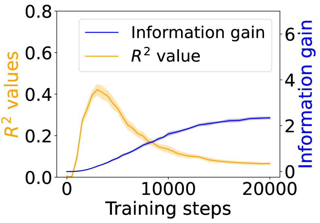
Figure 2: Average surprisal of the experimental and control conditions over training steps.
<details>
<summary>x8.png Details</summary>
### Visual Description
## Dual-Axis Line Chart: Model Training Metrics (R² vs. Information Gain)
### Overview
This is a dual-axis line chart plotting two different metrics against the number of training steps for a machine learning model. The chart illustrates the relationship and potential trade-off between the model's explanatory power (R² value) and the information it gains during training.
### Components/Axes
* **X-Axis (Bottom):** Labeled "Training steps". The scale runs from 0 to 20,000, with major tick marks at 0, 10,000, and 20,000.
* **Primary Y-Axis (Left):** Labeled "R² values" in orange text. The scale runs from 0.0 to 0.8, with major tick marks at 0.0, 0.2, 0.4, 0.6, and 0.8.
* **Secondary Y-Axis (Right):** Labeled "Information gain" in blue text. The scale runs from 0 to 6, with major tick marks at 0, 2, 4, and 6.
* **Legend:** Positioned in the top-left corner of the chart area.
* A blue line is labeled "Information gain".
* An orange line is labeled "R² value".
* **Data Series:**
1. **Orange Line (R² value):** Represents the R-squared metric. It is accompanied by a semi-transparent orange shaded area, likely representing a confidence interval or standard deviation across multiple runs.
2. **Blue Line (Information gain):** Represents the information gain metric. It is accompanied by a semi-transparent blue shaded area, similarly indicating uncertainty or variance.
### Detailed Analysis
**Trend Verification & Data Points:**
* **R² Value (Orange Line):**
* **Visual Trend:** The line starts near 0, rises sharply to a peak early in training, and then gradually declines, approaching a low, stable value by 20,000 steps.
* **Approximate Data Points:**
* Step 0: ~0.0
* Step ~2,500 (Peak): ~0.42 (The peak of the orange line and its shaded area reaches just above the 0.4 tick mark).
* Step 5,000: ~0.30
* Step 10,000: ~0.15
* Step 15,000: ~0.10
* Step 20,000: ~0.08
* **Uncertainty Band:** The orange shaded area is widest around the peak (Step ~2,500), suggesting higher variance in R² values during this phase. It narrows as training progresses.
* **Information Gain (Blue Line):**
* **Visual Trend:** The line starts near 0 and shows a steady, monotonic increase throughout training, with the rate of increase slowing in later steps, suggesting a plateau.
* **Approximate Data Points:**
* Step 0: ~0.0
* Step 2,500: ~0.5
* Step 5,000: ~1.0
* Step 10,000: ~2.0
* Step 15,000: ~2.5
* Step 20,000: ~2.8
* **Uncertainty Band:** The blue shaded area is relatively narrow throughout, indicating consistent measurements of information gain across runs.
**Spatial Grounding:** The two lines intersect at approximately step 8,000, where both metrics have a value of ~0.18 on the R² scale and ~1.8 on the Information gain scale.
### Key Observations
1. **Inverse Relationship Post-Peak:** After the initial phase (first ~2,500 steps), the two metrics exhibit a clear inverse relationship. As Information gain continues to increase, the R² value decreases.
2. **Early Peak in R²:** The model's best fit to the training data (highest R²) occurs very early in the training process, followed by a steady degradation.
3. **Plateauing Information Gain:** The Information gain metric shows diminishing returns, with its growth curve flattening significantly after 15,000 steps.
4. **Variance is Highest at R² Peak:** The model's performance (R²) is most variable during the phase where it achieves its highest explanatory power.
### Interpretation
This chart suggests a classic machine learning phenomenon, potentially indicative of **overfitting** or a shift in the model's learning dynamics.
* **What the data suggests:** The early peak in R² implies the model quickly learns patterns that explain the training data well. However, as training continues, the model may be starting to memorize noise or specific details of the training set that do not generalize, leading to a worse fit (lower R²) on the underlying data distribution, even as it continues to extract novel information (increasing Information gain).
* **Relationship between elements:** The inverse trend highlights a potential trade-off. Maximizing for one metric (Information gain) may come at the cost of the other (R²). The intersection point (~8,000 steps) could represent a balance point, though the "optimal" stopping point depends on the ultimate goal—whether it's generalization (which might favor an earlier stop near the R² peak) or comprehensive data understanding (which might favor a later stop).
* **Notable Anomalies:** The most striking feature is the pronounced and sustained decline of R² after its early peak. This is not typical for a well-regularized training process where R² on the training set usually increases or plateaus. This pattern strongly warrants investigation into the model architecture, regularization techniques, or the nature of the dataset itself. The narrowing uncertainty bands suggest the training process becomes more deterministic over time, even as the primary performance metric (R²) worsens.
</details>
(a) 12-layer Transformer.
<details>
<summary>x9.png Details</summary>
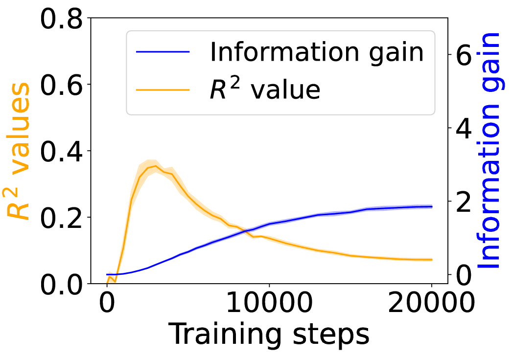
### Visual Description
\n
## Dual-Axis Line Chart: Training Metrics Over Steps
### Overview
The image is a dual-axis line chart plotting two distinct metrics against training steps. The chart compares the progression of "Information gain" and "R² value" over the course of 20,000 training steps. The visual suggests an inverse relationship between the two metrics after an initial phase.
### Components/Axes
* **X-Axis (Bottom):** Labeled "Training steps". The scale runs from 0 to 20,000, with major tick marks at 0, 10,000, and 20,000.
* **Primary Y-Axis (Left):** Labeled "R² values" in orange text. The scale runs from 0.0 to 0.8, with major tick marks at 0.0, 0.2, 0.4, 0.6, and 0.8.
* **Secondary Y-Axis (Right):** Labeled "Information gain" in blue text. The scale runs from 0 to 6, with major tick marks at 0, 2, 4, and 6.
* **Legend:** Positioned in the top-right quadrant of the chart area. It contains two entries:
* A blue line labeled "Information gain".
* An orange line labeled "R² value".
* **Data Series:**
1. **Information gain (Blue Line):** A solid blue line plotted against the right y-axis.
2. **R² value (Orange Line):** A solid orange line plotted against the left y-axis. This line is accompanied by a semi-transparent orange shaded region, likely indicating variance, standard deviation, or a confidence interval around the mean value.
### Detailed Analysis
**1. Information Gain (Blue Line - Right Axis):**
* **Trend:** The line shows a consistent, monotonic upward trend that gradually decelerates.
* **Data Points (Approximate):**
* Starts near 0 at step 0.
* Reaches ~0.5 by step 5,000.
* Reaches ~1.5 by step 10,000.
* Reaches ~2.0 by step 15,000.
* Plateaus near ~2.1 by step 20,000.
**2. R² Value (Orange Line - Left Axis):**
* **Trend:** The line shows a sharp initial increase to a peak, followed by a steady decline.
* **Data Points (Approximate):**
* Starts near 0.0 at step 0.
* Rises sharply to a peak of approximately 0.35 between steps 2,500 and 3,000.
* Begins a steady decline after the peak.
* Crosses below the Information gain line (in terms of visual position on the chart) around step 9,000.
* Continues to decline, reaching approximately 0.1 by step 15,000.
* Ends at approximately 0.08 by step 20,000.
* **Shaded Region:** The orange shaded area is widest around the peak (steps 2,000-4,000), suggesting higher variance or uncertainty in the R² measurement during the period of maximum performance. The band narrows as the value declines.
### Key Observations
1. **Inverse Relationship Post-Peak:** After approximately step 3,000, the two metrics move in opposite directions. Information gain continues to increase, while the R² value decreases.
2. **Divergent End States:** By the end of training (20,000 steps), Information gain has plateaued at a relatively high value (~2.1), while the R² value has degraded to a low value (~0.08), significantly below its peak.
3. **Peak Performance Window:** The model's performance, as measured by R², is optimal in a narrow early window (steps ~2,000-4,000). Continued training beyond this point harms this specific metric.
4. **Uncertainty Correlates with Performance:** The variance (shaded region) in the R² metric is highest when the metric itself is at its peak.
### Interpretation
This chart illustrates a classic trade-off or potential overfitting dynamic in a machine learning training process.
* **What the data suggests:** The "Information gain" metric (likely measuring the model's learning or reduction in uncertainty) improves steadily and saturates, indicating the model continues to learn from the data throughout training. However, the "R² value" (a measure of goodness-of-fit, often on a validation set) peaks early and then deteriorates. This divergence implies that while the model is still extracting information, it is becoming progressively worse at generalizing that information to the specific task measured by R². The model may be starting to memorize noise or idiosyncrasies of the training data after step ~3,000.
* **Relationship between elements:** The two axes and their corresponding lines are directly compared on the same temporal (step) scale. The crossing of the lines around step 9,000 is a visual artifact of the dual-axis scaling but highlights the point where the numerical value of Information gain surpasses the numerical value of R².
* **Notable Anomaly:** The most critical observation is the **decline in R² after step 3,000**. This is not an anomaly in the data collection but a significant behavioral trend of the model. It suggests that for the objective measured by R², **early stopping** around step 3,000 would have yielded a much better model than training to completion at 20,000 steps. The continued increase in Information gain may represent the model learning features that are not useful, or even detrimental, for the R² objective.
</details>
(b) 4-layer Transformer.
<details>
<summary>x10.png Details</summary>
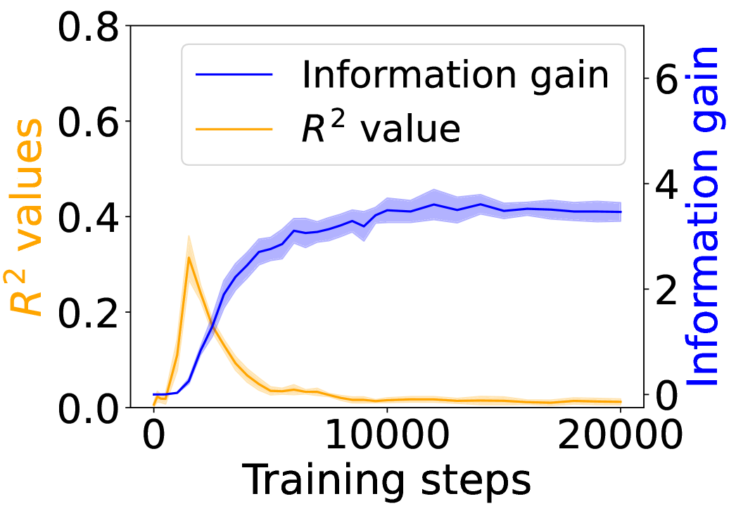
### Visual Description
## Dual-Axis Line Chart: Training Metrics (R² Value vs. Information Gain)
### Overview
The image displays a dual-axis line chart plotting two different metrics against the number of training steps. The chart compares the progression of an "R² value" (left y-axis) and "Information gain" (right y-axis) over the course of 20,000 training steps. The data suggests a relationship where one metric peaks early and declines while the other shows sustained improvement.
### Components/Axes
* **X-Axis (Bottom):**
* **Label:** "Training steps"
* **Scale:** Linear scale from 0 to 20,000.
* **Major Tick Marks:** 0, 10000, 20000.
* **Primary Y-Axis (Left):**
* **Label:** "R² values" (text color: orange).
* **Scale:** Linear scale from 0.0 to 0.8.
* **Major Tick Marks:** 0.0, 0.2, 0.4, 0.6, 0.8.
* **Secondary Y-Axis (Right):**
* **Label:** "Information gain" (text color: blue).
* **Scale:** Linear scale from 0 to 6.
* **Major Tick Marks:** 0, 2, 4, 6.
* **Legend (Top-Left Corner):**
* A blue line segment is labeled "Information gain".
* An orange line segment is labeled "R² value".
* **Data Series:**
1. **Blue Line ("Information gain"):** A solid blue line with a semi-transparent blue shaded area around it, likely representing a confidence interval or standard deviation.
2. **Orange Line ("R² value"):** A solid orange line with a semi-transparent orange shaded area around it.
### Detailed Analysis
**1. "Information gain" (Blue Line, Right Y-Axis):**
* **Trend Verification:** The line shows a steep, positive slope initially, followed by a gradual plateau.
* **Data Points (Approximate):**
* Starts near 0 at step 0.
* Rises sharply, crossing a value of ~2 by step 2500.
* Continues to increase, reaching ~3.5 by step 5000.
* The growth rate slows. It reaches approximately 4.0 by step 10,000.
* From step 10,000 to 20,000, the line fluctuates slightly but remains stable around a value of 4.0 (±0.2).
* **Shaded Area:** The blue shaded region is narrow at the start, widens during the period of rapid increase (steps 2500-7500), and remains moderately wide during the plateau phase, indicating some variance in the metric across runs or measurements.
**2. "R² value" (Orange Line, Left Y-Axis):**
* **Trend Verification:** The line shows a sharp, early peak followed by a rapid decline and a long tail near zero.
* **Data Points (Approximate):**
* Starts near 0 at step 0.
* Peaks sharply at approximately 0.35 around step 2500.
* Declines rapidly after the peak, falling to ~0.1 by step 5000.
* Continues a slower decline, approaching ~0.02 by step 10,000.
* From step 10,000 to 20,000, it remains very low, hovering just above 0.0 (approximately 0.01-0.02).
* **Shaded Area:** The orange shaded region is most prominent around the peak (step 2500), suggesting higher variance at the point of maximum R² value. It narrows significantly as the value approaches zero.
### Key Observations
1. **Inverse Relationship Post-Peak:** After approximately step 2500, the two metrics exhibit a strong inverse relationship. As "Information gain" continues to climb and stabilize, the "R² value" collapses.
2. **Divergent End States:** By the end of training (20,000 steps), "Information gain" is high and stable (~4.0), while "R² value" is negligible (~0.01).
3. **Critical Early Phase:** The most dynamic changes for both metrics occur in the first quarter of the displayed training (0-5000 steps).
4. **Variance Patterns:** The uncertainty (shaded area) for both metrics is greatest during their periods of most rapid change.
### Interpretation
This chart likely visualizes the training dynamics of a machine learning model, possibly in a reinforcement learning or representation learning context.
* **What the data suggests:** The "R² value" (a measure of how well a model explains variance in data) peaks very early and then deteriorates. This could indicate that the model quickly fits superficial patterns in the initial data but then moves away from that solution. Conversely, "Information gain" (a measure of how much the model's predictions reduce uncertainty) shows sustained improvement, suggesting the model is continually learning more useful or generalizable information about its environment or task, even as its simple explanatory power (R²) for a specific target diminishes.
* **Relationship between elements:** The inverse trend post-peak is the most critical feature. It implies a trade-off or a shift in the model's learning objective. The model may be sacrificing simple curve-fitting (high R²) for a more complex, information-rich representation that is better for its ultimate goal (high Information gain).
* **Notable anomaly:** The sharp, isolated peak in R² is unusual. It suggests a very specific, short-lived phase in training where the model's parameters aligned perfectly with a simplistic explanatory model before diverging.
* **Underlying meaning:** This pattern is characteristic of models that undergo a phase transition in learning. The early peak might represent memorization or fitting noise, while the subsequent rise in information gain represents the acquisition of robust, generalizable knowledge. The chart argues that optimizing for R² alone would have stopped training at the wrong point (step ~2500), whereas the true learning progress is captured by the Information gain metric.
</details>
(c) 4-layer Mamba 2.
<details>
<summary>x11.png Details</summary>
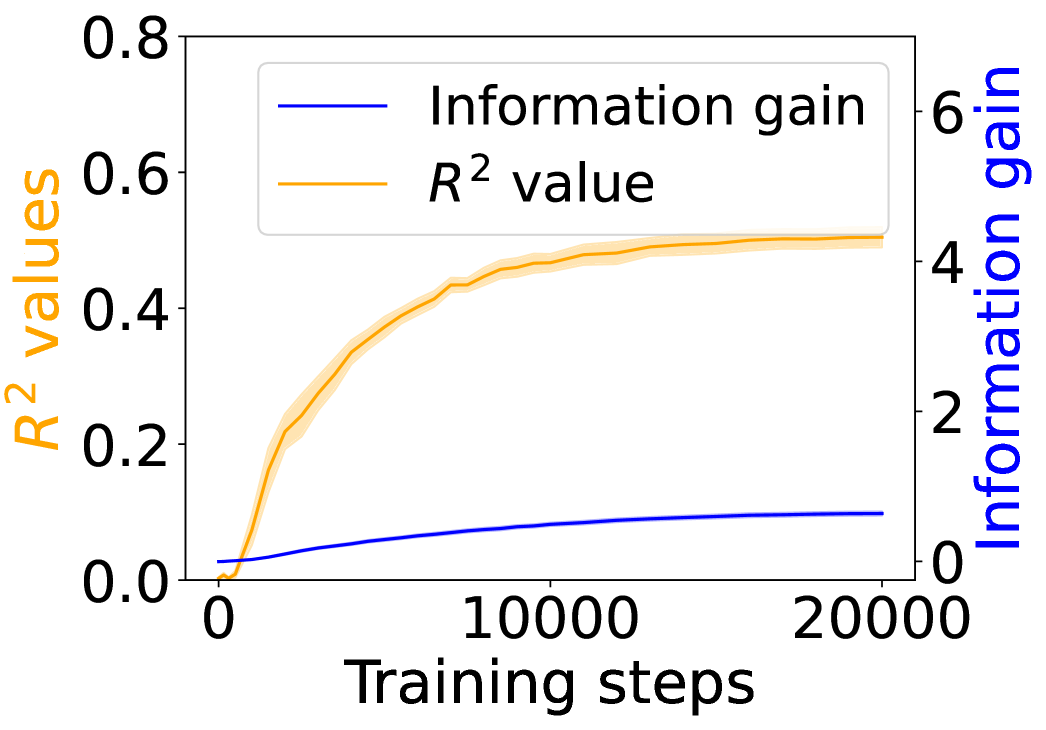
### Visual Description
## Dual-Axis Line Chart: Training Progress of R² Value and Information Gain
### Overview
This image is a dual-axis line chart illustrating the progression of two distinct metrics—R² value and Information gain—over the course of 20,000 training steps. The chart uses two separate y-axes to accommodate the different scales of the metrics, with shaded bands around each line indicating variability or confidence intervals.
### Components/Axes
* **X-Axis (Bottom):**
* **Label:** "Training steps"
* **Scale:** Linear, from 0 to 20,000.
* **Major Ticks:** 0, 10000, 20000.
* **Primary Y-Axis (Left):**
* **Label:** "R² values" (text is orange, matching its data series).
* **Scale:** Linear, from 0.0 to 0.8.
* **Major Ticks:** 0.0, 0.2, 0.4, 0.6, 0.8.
* **Secondary Y-Axis (Right):**
* **Label:** "Information gain" (text is blue, matching its data series).
* **Scale:** Linear, from 0 to 6.
* **Major Ticks:** 0, 2, 4, 6.
* **Legend (Top-Left Corner):**
* A blue line segment is labeled "Information gain".
* An orange line segment is labeled "R² value".
### Detailed Analysis
**1. R² Value (Orange Line, Left Y-Axis):**
* **Trend Verification:** The orange line shows a steep, concave-down increase that gradually plateaus. It starts near 0, rises rapidly in the first ~5,000 steps, and then the rate of increase slows significantly, approaching an asymptote.
* **Data Points (Approximate):**
* Step 0: ~0.0
* Step 2,500: ~0.25
* Step 5,000: ~0.40
* Step 10,000: ~0.48
* Step 15,000: ~0.50
* Step 20,000: ~0.51
* **Uncertainty Band:** A semi-transparent orange shaded region surrounds the main line, indicating the range of variability. The band is narrowest at the start and end, and widest during the period of steepest ascent (approx. steps 2,000-7,000).
**2. Information Gain (Blue Line, Right Y-Axis):**
* **Trend Verification:** The blue line shows a steady, near-linear increase with a very slight upward curvature. It starts near 0 and grows consistently throughout the training steps.
* **Data Points (Approximate):**
* Step 0: ~0.0
* Step 5,000: ~0.4
* Step 10,000: ~0.7
* Step 15,000: ~0.9
* Step 20,000: ~1.0
* **Uncertainty Band:** A very faint, narrow blue shaded region is visible around the line, suggesting low variance in this metric compared to the R² value.
### Key Observations
1. **Divergent Scales:** The two metrics operate on vastly different scales. The R² value (0-0.8) is an order of magnitude smaller than the potential range of Information gain (0-6), though the observed gain only reaches ~1.0.
2. **Asymptotic vs. Linear Growth:** The R² value exhibits classic learning curve behavior—rapid initial improvement followed by diminishing returns. In contrast, Information gain shows sustained, nearly linear growth, suggesting it continues to accumulate steadily even as the model's predictive power (R²) stabilizes.
3. **Correlation of Variance:** The period of highest uncertainty (widest orange band) for the R² value coincides with its phase of most rapid change, which is typical in model training.
### Interpretation
This chart demonstrates the relationship between a model's explanatory power (R²) and the amount of new information it acquires during training. The data suggests that:
* **Early Training is Efficient:** The model quickly learns the most significant patterns, leading to a sharp rise in R².
* **Plateauing Performance:** After about 10,000 steps, additional training yields minimal gains in R², indicating the model is approaching its capacity for the given task/data.
* **Continuous Learning:** The steady rise in Information gain implies that even after R² plateaus, the model continues to refine its internal representations or learn subtler, less impactful patterns. This could be beneficial for generalization or robustness, even if it doesn't improve the primary fit metric.
* **Metric Selection:** The choice of metric significantly impacts the interpretation of "progress." Monitoring only R² might suggest training can stop around step 10,000, while Information gain suggests valuable learning continues beyond that point. This highlights the importance of using complementary metrics to evaluate model training.
</details>
(d) 4-layer LSTM.
Figure 3: Grounding information gain and its correlation to the co-occurrence of linguistic and environment tokens over training steps.
### 4.1 Behavioral Evidence of Emergent Grounding
In this section, we ask: Does symbol grounding emerge behaviorally in autoregressive LMs? We first test whether models show systematic surprisal reduction when predicting a linguistic token when its environmental counterpart is in context (Figure 2, where the gap between the lines represent the grounding information gain). For Transformers (Figures 2(a) and 2(b)) and Mamba-2 (Figure 2(c)), surprisal in the match condition decreases steadily while that in the mismatch condition enters a high-surprisal plateau early, indicating that the models leverage environmental context to predict the linguistic form. In contrast, the unidirectional LSTM (Figure 2(d)) shows little separation between the conditions, reflecting the absence of grounding. Overall, these results provide behavioral evidence of emergent grounding: in sufficiently expressive architectures (Transformers and Mamba-2), the correct environmental context reliably lowers surprisal for its linguistic counterpart, whereas LSTMs fail to exhibit this effect, marking an architectural boundary on where grounding can emerge.
### 4.2 Behavioral Effects Beyond Co-occurrence
A natural concern is that the surprisal reductions might be fully explainable by shallow statistics: the models might have simply memorized frequent co-occurrences of $\langle$ ENV $\rangle$ and $\langle$ LAN $\rangle$ tokens, without learning a deeper and more general mapping. We test this hypothesis by comparing the tokens’ co-occurrence with the grounding information gain in the child-directed speech data.
We define co-occurrence between the corresponding $\langle$ ENV $\rangle$ and $\langle$ LAN $\rangle$ tokens at the granularity of a 512-token training chunk. For each target word $v$ , we count the number of chunks in which both its $\langle$ ENV $\rangle$ and $\langle$ LAN $\rangle$ tokens appear. Following standard corpus-analysis practice, these raw counts are log-transformed. For each model checkpoint, we run linear regression between the log co-occurrence and the grounding information gain of words, obtaining an $R^{2}$ statistic as a function of training time.
Figure 3 shows the $R^{2}$ values (orange) alongside the grounding information gain (blue) for different architectures. In both the Transformer and Mamba-2, $R^{2}$ rises sharply at the early steps but then goes down, even if the grounding information gain continues increasing. These results suggest that grounding in Transformers and Mamba-2 cannot be fully accounted for by co-occurrence statistics: while models initially exploit surface co-occurrence regularities, later improvements in grounding diverge from these statistics, indicating reliance on richer and more complicated features acquired during training. In contrast, LSTM shows persistently increasing $R^{2}$ but little increase in grounding information gain over training steps, suggesting that it encodes co-occurrence but lacks the architectural mechanism to transform it into predictive grounding.
### 4.3 Visual Dialogue with Captions and Images
<details>
<summary>x12.png Details</summary>
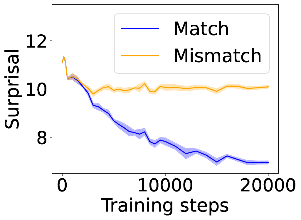
### Visual Description
## Line Chart: Surprisal vs. Training Steps for Match and Mismatch Conditions
### Overview
The image displays a line chart comparing the "Surprisal" metric over the course of "Training steps" for two distinct conditions: "Match" and "Mismatch." The chart illustrates how the surprisal value changes for each condition as training progresses from 0 to 20,000 steps.
### Components/Axes
* **Chart Type:** Line chart with shaded confidence intervals or variance bands.
* **X-Axis:**
* **Label:** "Training steps"
* **Scale:** Linear scale.
* **Markers:** Major tick marks and labels at 0, 10000, and 20000.
* **Y-Axis:**
* **Label:** "Surprisal"
* **Scale:** Linear scale.
* **Markers:** Major tick marks and labels at 8, 10, and 12.
* **Legend:**
* **Position:** Top-right corner of the plot area.
* **Entries:**
1. **Match:** Represented by a solid blue line.
2. **Mismatch:** Represented by a solid orange line.
* **Data Series:** Two lines, each with a semi-transparent shaded band of the same color, likely representing standard deviation, standard error, or a confidence interval.
### Detailed Analysis
**1. "Match" Condition (Blue Line):**
* **Trend:** Shows a consistent, strong downward trend across the entire training period.
* **Data Points (Approximate):**
* Step 0: ~10.5
* Step ~2500: ~10.0
* Step ~5000: ~9.0
* Step ~7500: ~8.2
* Step 10000: ~7.8
* Step ~15000: ~7.2
* Step 20000: ~7.0
* **Confidence Band:** The blue shaded area is relatively narrow, suggesting lower variance or higher confidence in the measurement for this condition.
**2. "Mismatch" Condition (Orange Line):**
* **Trend:** Shows an initial sharp decrease, followed by a plateau with minor fluctuations for the remainder of training.
* **Data Points (Approximate):**
* Step 0: ~11.5 (highest initial point)
* Step ~1000: ~10.5
* Step ~2500: ~10.0
* Step ~5000: ~10.0
* Step ~7500: ~10.2
* Step 10000: ~10.0
* Step ~15000: ~10.0
* Step 20000: ~10.0
* **Confidence Band:** The orange shaded area is wider than the blue band, particularly in the later stages of training, indicating greater variance or uncertainty in the surprisal measurements for the mismatch condition.
### Key Observations
1. **Diverging Paths:** The two conditions start at similar, high surprisal values (~10.5-11.5). While the "Match" condition's surprisal decreases steadily, the "Mismatch" condition's surprisal stabilizes at a much higher level (~10.0).
2. **Final Gap:** By 20,000 training steps, a significant gap of approximately 3.0 surprisal units exists between the "Match" (~7.0) and "Mismatch" (~10.0) conditions.
3. **Variance Difference:** The "Mismatch" condition exhibits noticeably higher variance (wider confidence band) throughout training compared to the "Match" condition.
4. **Initial Drop:** Both conditions experience their most rapid decrease in surprisal within the first ~2,500 training steps.
### Interpretation
This chart likely visualizes the performance of a machine learning model during training. "Surprisal" is a measure of how unexpected or difficult a data point is for the model; lower surprisal indicates better prediction or understanding.
* **What the data suggests:** The model is successfully learning from the "Match" condition data, as evidenced by the steadily decreasing surprisal. It becomes progressively better at predicting or processing this type of data. In contrast, the model fails to learn effectively from the "Mismatch" condition after an initial adjustment. The plateau at high surprisal indicates the model finds this data persistently difficult or unpredictable.
* **Relationship between elements:** The diverging lines demonstrate a clear differential in learning outcomes based on the data condition. The wider confidence interval for "Mismatch" suggests the model's performance on this data is not only worse but also less stable and consistent.
* **Notable implications:** This pattern is characteristic of a model that can learn a specific pattern or distribution ("Match") but fails to generalize to a different, perhaps out-of-distribution or adversarial, set of data ("Mismatch"). The chart provides strong visual evidence for the model's specialization and its limitation in handling mismatched conditions. The initial drop for both suggests some universal early learning, but the long-term trends reveal the core disparity.
</details>
(a) Surprisal curves (w/ caption).
<details>
<summary>x13.png Details</summary>
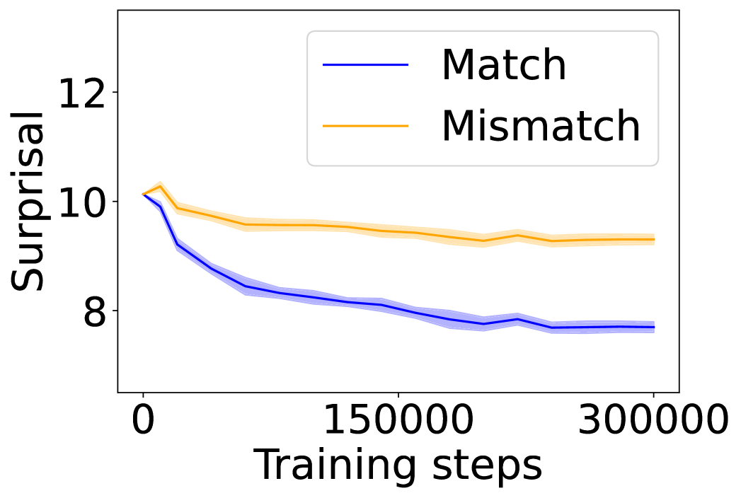
### Visual Description
## Line Chart: Surprisal vs. Training Steps for Match and Mismatch Conditions
### Overview
The image is a line chart displaying the relationship between "Surprisal" (y-axis) and "Training steps" (x-axis) for two distinct conditions: "Match" and "Mismatch." The chart illustrates how the surprisal metric evolves over the course of model training for these two conditions.
### Components/Axes
* **Chart Type:** Line chart with shaded confidence/uncertainty bands.
* **X-Axis:**
* **Label:** "Training steps"
* **Scale:** Linear scale.
* **Markers:** Major ticks at 0, 150000, and 300000.
* **Y-Axis:**
* **Label:** "Surprisal"
* **Scale:** Linear scale.
* **Markers:** Major ticks at 8, 10, and 12.
* **Legend:**
* **Position:** Top-right corner of the plot area.
* **Items:**
1. **Blue line:** Labeled "Match"
2. **Orange line:** Labeled "Mismatch"
* **Data Series:**
1. **Match (Blue Line):** Represents the surprisal for the "Match" condition. Includes a lighter blue shaded band around the main line, indicating variance or confidence interval.
2. **Mismatch (Orange Line):** Represents the surprisal for the "Mismatch" condition. Includes a lighter orange shaded band around the main line.
### Detailed Analysis
**Trend Verification & Data Points (Approximate):**
* **Match (Blue Line):**
* **Visual Trend:** The line exhibits a steep, concave-upward decline initially, which gradually flattens into a more linear, gentle downward slope. The overall trend is a strong decrease in surprisal over training.
* **Approximate Values:**
* At step 0: Surprisal ≈ 10.0
* At step ~50,000: Surprisal ≈ 8.5 (steep decline phase ends)
* At step 150,000: Surprisal ≈ 8.0
* At step 300,000: Surprisal ≈ 7.8
* **Uncertainty Band:** The shaded blue band is narrowest at the start and end, and appears slightly wider in the middle (around 50,000-150,000 steps), suggesting more variance in measurements during that phase.
* **Mismatch (Orange Line):**
* **Visual Trend:** The line shows a very slight initial increase, followed by a gradual, shallow decline that plateaus significantly earlier than the Match line. The overall trend is a modest decrease in surprisal, remaining consistently higher than the Match condition.
* **Approximate Values:**
* At step 0: Surprisal ≈ 10.0 (similar starting point to Match)
* At step ~25,000: Surprisal peaks slightly at ≈ 10.2
* At step 150,000: Surprisal ≈ 9.5
* At step 300,000: Surprisal ≈ 9.4
* **Uncertainty Band:** The shaded orange band appears relatively consistent in width throughout the training steps shown.
**Spatial Grounding:** The two lines start at nearly the same point on the y-axis at step 0. They immediately diverge, with the blue (Match) line descending much more rapidly. The orange (Mismatch) line remains above the blue line for the entire duration after the initial point. The gap between them widens until approximately step 100,000 and then remains relatively constant.
### Key Observations
1. **Divergent Learning Trajectories:** The primary observation is the significant divergence in surprisal between the Match and Mismatch conditions as training progresses.
2. **Plateauing Effect:** Both curves show signs of plateauing towards the end of the displayed training steps (200,000-300,000), with the rate of decrease in surprisal becoming very small.
3. **Consistent Gap:** After the initial phase, a consistent gap of approximately 1.5-1.7 surprisal units is maintained between the Mismatch and Match conditions.
4. **Initial Conditions:** Both conditions begin at a similar level of surprisal (~10.0), indicating a common starting point before training differentiates their performance.
### Interpretation
This chart demonstrates a clear and expected learning dynamic in a model training context. "Surprisal" is a measure of how unexpected or difficult to predict an event is. Lower surprisal indicates better prediction.
* **What the data suggests:** The model is successfully learning to predict data from the "Match" condition, as evidenced by the substantial and sustained drop in surprisal. Learning for the "Mismatch" condition is far less effective, showing only a minor improvement.
* **Relationship between elements:** The "Match" condition likely represents data that is consistent with the model's training distribution or prior context, allowing for efficient learning. The "Mismatch" condition represents data that is inconsistent or out-of-distribution, which the model struggles to learn to predict, hence the persistently higher surprisal.
* **Notable patterns/anomalies:** The slight initial *increase* in surprisal for the Mismatch condition is noteworthy. It could indicate a brief period where the model's updates initially make it *worse* at predicting mismatched data before settling into a slow, shallow improvement. The plateau suggests that after a certain point (around 200,000 steps), additional training yields diminishing returns for reducing surprisal in both conditions, but the fundamental performance gap remains.
**In summary, the chart provides visual evidence that the model's ability to reduce prediction error (surprisal) is highly dependent on the match between the training data and the condition, with matched contexts leading to significantly better and faster learning.**
</details>
(b) Surprisal curves (w/ image).
<details>
<summary>x14.png Details</summary>
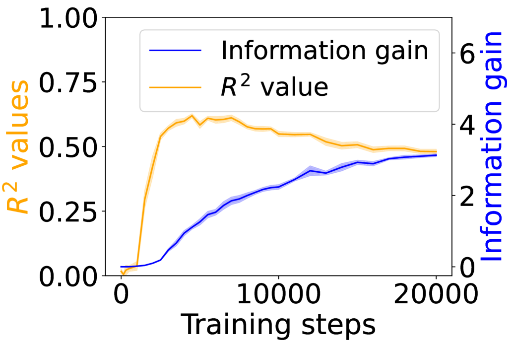
### Visual Description
## Dual-Axis Line Chart: Model Training Metrics (R² Value vs. Information Gain)
### Overview
This image is a dual-axis line chart plotting two different metrics against the number of training steps for a machine learning model. The chart illustrates the relationship and contrasting trends between the model's explanatory power (R² value) and the information it gains during the training process.
### Components/Axes
* **X-Axis (Bottom):** Labeled "Training steps". The scale runs from 0 to 20,000, with major tick marks at 0, 10,000, and 20,000.
* **Primary Y-Axis (Left):** Labeled "R² values" in orange text. The scale runs from 0.00 to 1.00, with major tick marks at 0.00, 0.25, 0.50, 0.75, and 1.00.
* **Secondary Y-Axis (Right):** Labeled "Information gain" in blue text. The scale runs from 0 to 6, with major tick marks at 0, 2, 4, and 6.
* **Legend:** Positioned in the top-left quadrant of the chart area. It contains two entries:
* A blue line labeled "Information gain".
* An orange line labeled "R² value".
* **Data Series:**
1. **R² value (Orange Line):** This line represents the coefficient of determination, a measure of how well the model's predictions approximate the real data points.
2. **Information gain (Blue Line):** This line represents a measure of the reduction in uncertainty or entropy achieved by the model at each training step.
### Detailed Analysis
**Trend Verification & Data Points:**
* **R² Value (Orange Line):**
* **Visual Trend:** The line starts near 0, rises very steeply in the initial phase, peaks, and then begins a gradual, steady decline.
* **Approximate Data Points:**
* At ~0 steps: R² ≈ 0.00
* At ~2,500 steps: R² ≈ 0.55 (steep ascent)
* At ~5,000 steps: R² ≈ 0.60 (approaching peak)
* At ~7,500 steps: R² ≈ 0.62 (peak region, with minor fluctuations)
* At ~10,000 steps: R² ≈ 0.58
* At ~15,000 steps: R² ≈ 0.52
* At ~20,000 steps: R² ≈ 0.50
* **Information Gain (Blue Line):**
* **Visual Trend:** The line starts near 0 and exhibits a consistent, monotonic upward trend throughout the training steps shown, with the rate of increase slowing slightly in the later stages.
* **Approximate Data Points:**
* At ~0 steps: Information Gain ≈ 0.0
* At ~5,000 steps: Information Gain ≈ 1.5
* At ~10,000 steps: Information Gain ≈ 2.5
* At ~15,000 steps: Information Gain ≈ 3.0
* At ~20,000 steps: Information Gain ≈ 3.2
**Spatial Grounding:** The legend is clearly placed in the top-left, away from the data lines. The orange R² line is consistently plotted against the left axis, and the blue Information Gain line is consistently plotted against the right axis, as confirmed by the axis label colors matching the line colors.
### Key Observations
1. **Divergent Trends:** The two metrics show a clear divergence after the initial training phase. While Information Gain continues to increase steadily, the R² value peaks early (around 5,000-7,500 steps) and then begins to degrade.
2. **Peak Performance:** The model's best fit to the training data (highest R²) occurs relatively early in the training process shown.
3. **Continuous Learning:** The model continues to gain information (reduce uncertainty) even as its predictive fit (R²) on the training data worsens, suggesting it is learning more complex patterns or potentially starting to overfit.
4. **Scale Difference:** The R² value operates on a bounded scale [0,1], while the Information Gain metric is unbounded and reaches a value over 3 by the end of the plotted steps.
### Interpretation
This chart likely illustrates a common phenomenon in machine learning training dynamics. The initial rapid rise in R² indicates the model is quickly learning the dominant patterns in the data. The subsequent peak and decline in R², while Information Gain continues to rise, suggests a few possibilities:
* **Overfitting:** The model may be starting to memorize noise or specific examples in the training data rather than generalizing. This would increase its "information" about the training set (hence rising Information Gain) but reduce its ability to explain variance in a broader sense (lower R²).
* **Learning Complexity:** The model might be moving from learning simple, high-variance patterns (which boost R² quickly) to learning more subtle, complex features. These complex features add information but may not contribute as efficiently to reducing the overall mean squared error that R² is based on.
* **Metric Sensitivity:** It highlights that different metrics capture different aspects of model performance. R² measures goodness-of-fit, while Information Gain measures knowledge acquisition. A model can become more "knowledgeable" without necessarily becoming a better predictor in the R² sense.
The key takeaway is that monitoring multiple metrics is crucial. Relying solely on R² might lead to early stopping at the peak (~7,500 steps), while the Information Gain metric suggests the model is still actively learning beyond that point. The practitioner must decide based on the goal: optimal predictive fit (consider stopping earlier) versus maximal information extraction (continue training).
</details>
(c) $R^{2}$ and information gain (w/ caption).
<details>
<summary>x15.png Details</summary>
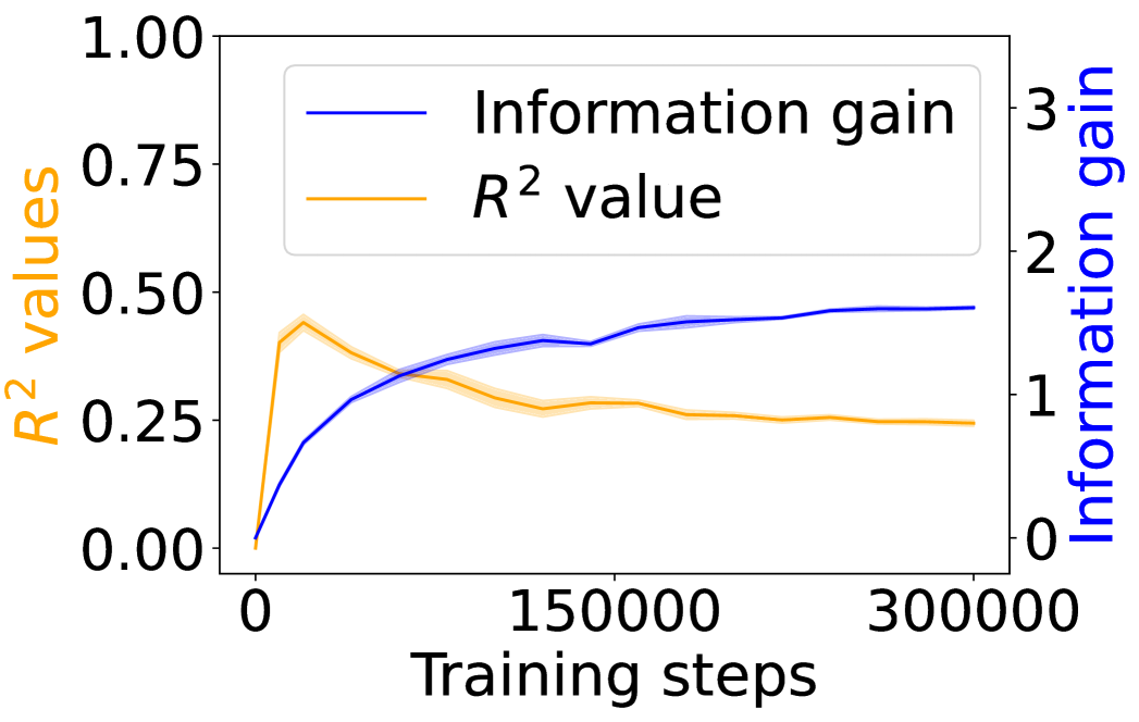
### Visual Description
## Dual-Axis Line Chart: Model Training Metrics (R² Value vs. Information Gain)
### Overview
The image displays a dual-axis line chart plotting two different metrics against the number of training steps for a machine learning model. The chart compares the progression of the model's explanatory power (R² value) and its information gain over the course of training.
### Components/Axes
* **Chart Type:** Dual-axis line chart.
* **X-Axis (Bottom):**
* **Label:** "Training steps"
* **Scale:** Linear scale from 0 to 300,000.
* **Major Ticks:** 0, 150000, 300000.
* **Primary Y-Axis (Left):**
* **Label:** "R² values" (text is orange, matching its data series).
* **Scale:** Linear scale from 0.00 to 1.00.
* **Major Ticks:** 0.00, 0.25, 0.50, 0.75, 1.00.
* **Secondary Y-Axis (Right):**
* **Label:** "Information gain" (text is blue, matching its data series).
* **Scale:** Linear scale from 0 to 3.
* **Major Ticks:** 0, 1, 2, 3.
* **Legend (Top-Left Corner):**
* A blue line segment labeled "Information gain".
* An orange line segment labeled "R² value".
* **Data Series:**
1. **Information Gain (Blue Line):** A solid blue line with a light blue shaded area around it, likely representing a confidence interval or standard deviation.
2. **R² Value (Orange Line):** A solid orange line with a light orange shaded area around it.
### Detailed Analysis
**Trend Verification & Data Points:**
1. **Information Gain (Blue Line - Right Axis):**
* **Trend:** The line shows a steep, concave-down increase from the start, followed by a gradual plateau. It slopes upward sharply initially, then the rate of increase slows significantly after approximately 100,000 steps.
* **Approximate Data Points:**
* At 0 steps: ~0.0
* At ~25,000 steps: ~0.7
* At ~50,000 steps: ~1.0
* At ~100,000 steps: ~1.3
* At 150,000 steps: ~1.4
* At 300,000 steps: ~1.5 (appears to plateau near this value).
2. **R² Value (Orange Line - Left Axis):**
* **Trend:** The line exhibits a sharp initial peak followed by a gradual decline and stabilization. It slopes upward very steeply to a peak, then slopes downward at a decreasing rate, eventually flattening out.
* **Approximate Data Points:**
* At 0 steps: 0.00
* At ~10,000 steps (Peak): ~0.45
* At ~50,000 steps: ~0.35
* At 150,000 steps: ~0.27
* At 300,000 steps: ~0.25 (appears to stabilize near this value).
**Spatial Grounding:** The legend is positioned in the top-left quadrant of the plot area. The blue "Information gain" line is consistently plotted against the right-hand y-axis, and the orange "R² value" line is consistently plotted against the left-hand y-axis. The shaded bands around each line are narrow, suggesting relatively low variance in the measurements.
### Key Observations
1. **Inverse Relationship Post-Peak:** After the initial training phase (first ~20,000 steps), the two metrics move in opposite directions. As information gain continues to increase, the R² value decreases from its peak.
2. **Divergent Plateaus:** The information gain metric appears to reach a plateau at a higher relative value on its scale (~1.5 out of 3) compared to the R² value's plateau (~0.25 out of 1.0).
3. **Early Peak in R²:** The R² value achieves its maximum very early in the training process, suggesting the model's ability to explain variance in the training data was highest at that point.
4. **Convergence of Trends:** Both lines show a significant reduction in their rate of change after approximately 150,000 training steps, indicating the model's training dynamics have largely stabilized.
### Interpretation
This chart illustrates a potential trade-off or decoupling between two model performance indicators during extended training.
* **What the data suggests:** The continuous rise in "Information gain" indicates the model is consistently learning and extracting more information from the data as training progresses. However, the decline and stabilization of the "R² value" after an early peak suggests that while the model is learning, its ability to fit the specific training data (as measured by R²) diminishes and then holds steady. This could be a sign of the model moving from memorizing/simplistic fitting towards learning more generalizable features, or it could indicate a form of overfitting where increased complexity (information gain) does not translate to better explanatory power on the same data.
* **Relationship between elements:** The dual-axis format is crucial here, as it allows the comparison of two metrics with different scales. The inverse trend after the initial phase is the most salient feature, highlighting that more training steps (and higher information gain) do not monotonically improve all performance metrics.
* **Notable Anomalies:** The sharp, early peak in R² is the most notable anomaly. It implies an optimal point for that specific metric was reached very early, and subsequent training, while increasing information gain, did not recover that level of fit. The stabilization of both metrics after ~150,000 steps suggests diminishing returns for further training beyond this point for these particular measures.
</details>
(d) $R^{2}$ and information gain (w/ image).
Figure 4: Average surprisal of the experimental and control conditions in caption- and image-grounded dialogue settings, as well as the grounding information gain and its correlation to the co-occurrence of linguistic and environment tokens over training steps. All results are from a 12-layer Transformer model on grounded dialogue data.
We next test whether the grounding effects observed in CHILDES generalize to multimodal dialogue, using the Visual Dialog dataset. In this setting, the environmental ground is supplied either by captions or by image features (Table 1). For caption-grounded dialogue, the mismatch context is constructed in the same way as for CHILDES (Equation 2). For image-grounded dialogue, mismatch contexts are generated via Stable Diffusion 2 (Rombach et al., 2022) –based image inpainting, which re-generates the region defined by the ground-truth mask corresponding to the target word’s referent.
We train 12-layer Transformers with 5 random seeds. Similarly as Figures 2(a) – 2(b) and Figures 3(a) – 3(b), when captions serve as the environmental ground, Transformers show a clear surprisal gap between match and mismatch conditions (Figure 4(a)), with the grounding information gain increasing steadily while $R^{2}$ peaks early and declines (Figure 4(c)). Directly using image as grounds yields the same qualitative pattern (Figures 4(b) and 4(d)), although the observed effect is smaller. Both settings confirm that emergent grounding cannot be fully explained by co-occurrence statistics.
Overall, our findings demonstrate that Transformers are able to exploit environmental grounds in various modalities to facilitate linguistic prediction. The smaller but consistent gains in the image-grounded case suggest that while grounding from visual tokens is harder, the same architectural dynamics identified in textual testbeds still apply.
## 5 Mechanistic Explanation
In this section, we provide a mechanistic and interpretable account of the previous observation. We focus on a 12-layer Transformer trained on CHILDES with 5 random seeds, and defer broader generalization to the discussion.
<details>
<summary>x16.png Details</summary>
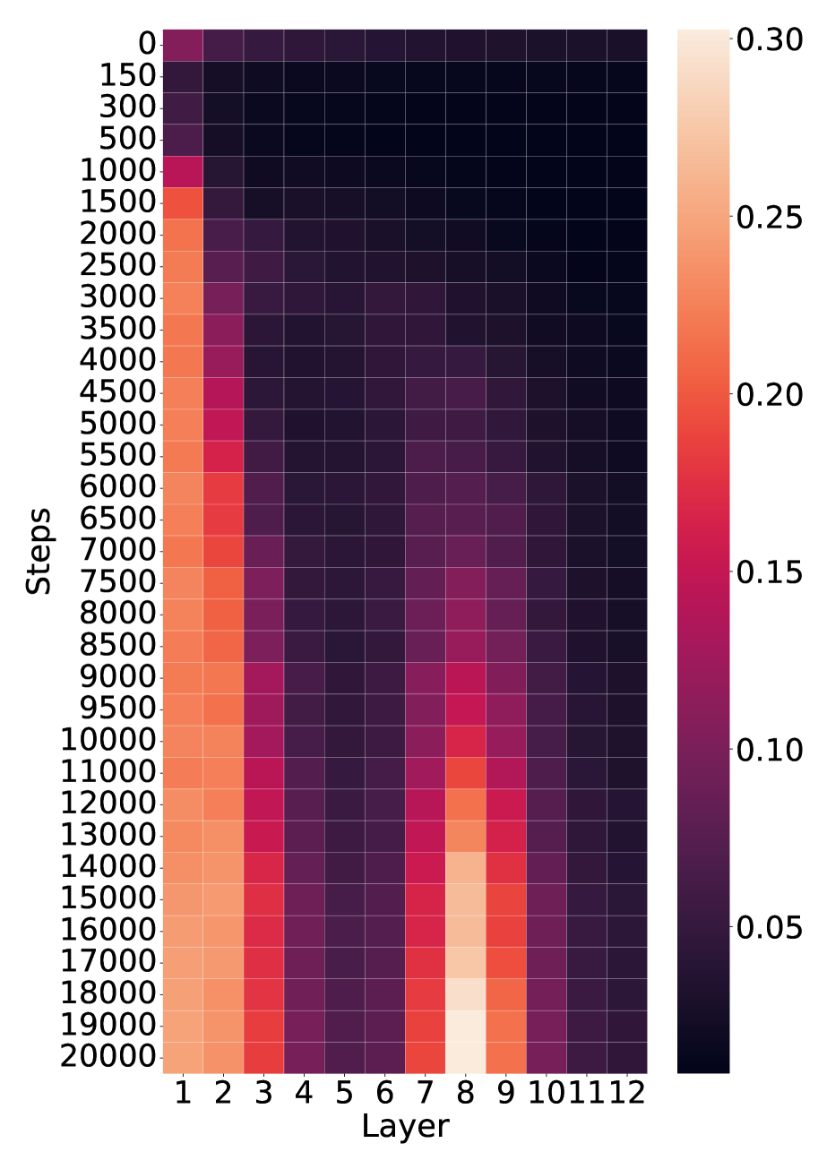
### Visual Description
\n
## Heatmap: Layer-wise Activation/Attention Across Training Steps
### Overview
The image is a heatmap visualizing a numerical metric (likely activation magnitude, attention weight, or gradient norm) across two dimensions: **training steps** (vertical axis) and **network layers** (horizontal axis). The color intensity represents the value of the metric, with a scale provided on the right. The data suggests the evolution of layer-wise importance or activity during the training of a neural network.
### Components/Axes
* **Vertical Axis (Y-axis):** Labeled **"Steps"**. It represents training iterations, starting at **0** at the top and increasing downward to **20000** at the bottom. The tick marks are at intervals of 0, 150, 300, 500, 1000, 1500, 2000, 2500, 3000, 3500, 4000, 4500, 5000, 5500, 6000, 6500, 7000, 7500, 8000, 8500, 9000, 9500, 10000, 11000, 12000, 13000, 14000, 15000, 16000, 17000, 18000, 19000, 20000.
* **Horizontal Axis (X-axis):** Labeled **"Layer"**. It represents discrete layers of a model, numbered **1** through **12** from left to right.
* **Legend/Color Bar:** Positioned vertically on the **right side** of the heatmap. It maps color to numerical value.
* **Scale:** Linear, ranging from approximately **0.05** (dark purple/black) to **0.30** (light peach/cream).
* **Key Tick Values:** 0.05, 0.10, 0.15, 0.20, 0.25, 0.30.
* **Color Gradient:** Dark purple/black (low values) → Purple → Magenta → Red → Orange → Light peach (high values).
### Detailed Analysis
The heatmap reveals distinct patterns of activity across layers and training progression:
**1. Trend by Layer (Horizontal Bands):**
* **Layers 1-3 (Leftmost):** Show consistently **high values** (orange to light peach). The intensity increases noticeably with more training steps. Layer 1 is the brightest overall.
* **Layers 4-6 (Center-Left):** Exhibit **very low values** (dark purple/black) throughout training, forming a dark vertical band.
* **Layers 7-9 (Center-Right):** Display a **dynamic pattern**. Values are low initially but increase significantly after ~8000 steps, peaking around **Layer 8** at the highest steps (15000-20000), where it reaches the maximum scale value (~0.30). Layer 7 shows a strong increase, and Layer 9 shows a moderate increase.
* **Layers 10-12 (Rightmost):** Maintain **low to very low values** (dark purple), similar to Layers 4-6, with no significant increase over time.
**2. Trend by Steps (Vertical Progression):**
* **Early Training (0 - ~1000 steps):** All layers show relatively low values. The highest activity is in Layer 1, but it is still in the magenta range (~0.15).
* **Mid Training (~1000 - ~8000 steps):** Activity in **Layers 1-3** intensifies steadily to orange levels (~0.20-0.25). **Layers 4-6 and 10-12** remain dark. **Layers 7-9** begin to show a faint increase from purple to magenta.
* **Late Training (~8000 - 20000 steps):** This phase shows the most dramatic changes.
* **Layers 1-3** continue to brighten, with Layer 1 approaching the top of the scale (~0.28-0.30).
* **Layers 7-9** undergo a pronounced "awakening." Layer 8, in particular, transitions rapidly from magenta to bright orange and finally to the lightest peach color on the scale, indicating it becomes the most active layer by the end of training.
* The dark bands (Layers 4-6, 10-12) persist.
### Key Observations
* **Bimodal Activation Pattern:** The network develops two primary "hotspots" of activity: the **very early layers (1-3)** and a **specific middle layer (8)**, with Layer 7 and 9 as supporting actors.
* **Stable Low-Activity Zones:** Layers 4-6 and 10-12 remain consistently inactive throughout the observed training period.
* **Delayed Peak in Layer 8:** The most striking feature is the late and sharp rise in value for Layer 8, suggesting it plays a crucial role that only becomes prominent after substantial training.
* **Gradient of Intensity:** Within the active groups, there is a clear gradient. In the early group, Layer 1 > Layer 2 > Layer 3. In the middle group, Layer 8 > Layer 7 > Layer 9.
### Interpretation
This heatmap likely visualizes a metric like **attention head importance**, **activation norm**, or **gradient flow** in a 12-layer transformer or similar deep learning model during training.
* **What the data suggests:** The model learns to rely heavily on its **initial processing layers (1-3)** from the start, with their importance growing steadily. Concurrently, a **specialized function** appears to consolidate in **Layer 8**, but this function only becomes critical after the model has undergone significant training (post-8000 steps). This could correspond to the model learning higher-level, compositional features that depend on lower-level features being well-established.
* **Relationship between elements:** The early layers (1-3) likely perform fundamental feature extraction (e.g., basic syntax, local patterns). The dormant middle layers (4-6) might be involved in more complex but less "weighted" transformations. The late-blooming activity in Layer 8 (and neighbors 7,9) suggests it is a **key integrative or reasoning layer** where information from earlier layers is combined for final decision-making. The persistent inactivity of layers 10-12 is unusual and might indicate they are either redundant, under-utilized, or serve a very specific, infrequent function not captured by this metric.
* **Anomalies and Implications:** The sharp, late rise of Layer 8 is the most notable anomaly. It challenges the common intuition that deeper layers are always more important. Instead, it shows **functional specialization can emerge at a specific depth late in training**. This has implications for model pruning (avoiding cutting Layer 8) and interpretability (focusing analysis on the early layers and Layer 8). The clear separation between active and inactive layer groups suggests a modular architecture has emerged organically during training.
</details>
(a) Saliency of layer-wise attention from environmental to linguistic tokens across training steps.
<details>
<summary>x17.png Details</summary>
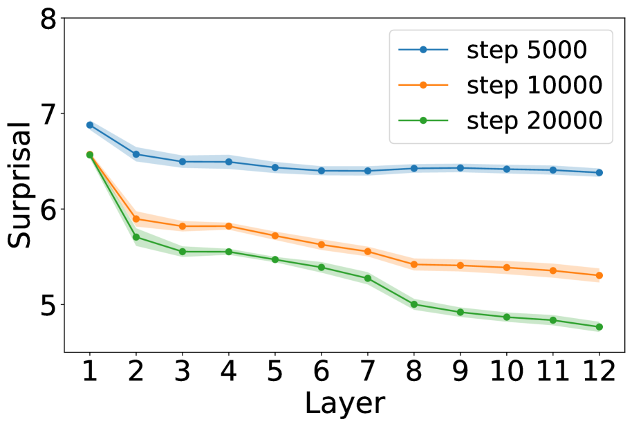
### Visual Description
\n
## Line Chart: Surprisal across Layers at Different Training Steps
### Overview
The image is a line chart plotting a metric called "Surprisal" on the vertical Y-axis against "Layer" number on the horizontal X-axis. It displays three data series, each representing a different training step count (5000, 10000, and 20000). The chart shows how the surprisal value changes across 12 layers for a model at these three distinct points in its training process.
### Components/Axes
* **Chart Type:** Line chart with shaded confidence intervals or standard deviation bands.
* **X-Axis:**
* **Label:** "Layer"
* **Scale:** Linear, integer values from 1 to 12.
* **Markers:** Ticks and numerical labels at each integer from 1 to 12.
* **Y-Axis:**
* **Label:** "Surprisal"
* **Scale:** Linear, ranging from approximately 4.8 to 8.0.
* **Markers:** Major ticks and numerical labels at 5, 6, 7, and 8.
* **Legend:**
* **Position:** Top-right corner of the plot area.
* **Content:** Three entries, each with a colored line segment and marker:
* Blue line with circle marker: "step 5000"
* Orange line with circle marker: "step 10000"
* Green line with circle marker: "step 20000"
* **Data Series:** Three lines, each with a shaded band of the same but lighter color, likely representing variance or confidence.
### Detailed Analysis
**Trend Verification:** All three lines exhibit a downward trend as the layer number increases. The steepest descent occurs between Layer 1 and Layer 2 for all series.
**Data Point Extraction (Approximate Values):**
* **Blue Line (step 5000):**
* **Trend:** Starts highest, decreases sharply initially, then flattens into a very gradual decline.
* **Points:** Layer 1: ~6.9, Layer 2: ~6.6, Layer 3: ~6.5, Layer 4: ~6.5, Layer 5: ~6.45, Layer 6: ~6.4, Layer 7: ~6.4, Layer 8: ~6.4, Layer 9: ~6.4, Layer 10: ~6.4, Layer 11: ~6.4, Layer 12: ~6.4.
* **Orange Line (step 10000):**
* **Trend:** Starts in the middle, decreases sharply initially, then continues a steady, moderate decline.
* **Points:** Layer 1: ~6.6, Layer 2: ~5.9, Layer 3: ~5.8, Layer 4: ~5.8, Layer 5: ~5.7, Layer 6: ~5.6, Layer 7: ~5.55, Layer 8: ~5.4, Layer 9: ~5.4, Layer 10: ~5.35, Layer 11: ~5.3, Layer 12: ~5.3.
* **Green Line (step 20000):**
* **Trend:** Starts at a similar point to the orange line at Layer 1, decreases sharply, and continues the most pronounced downward trend of all three series.
* **Points:** Layer 1: ~6.6, Layer 2: ~5.7, Layer 3: ~5.55, Layer 4: ~5.55, Layer 5: ~5.45, Layer 6: ~5.4, Layer 7: ~5.25, Layer 8: ~5.0, Layer 9: ~4.9, Layer 10: ~4.85, Layer 11: ~4.8, Layer 12: ~4.8.
### Key Observations
1. **Consistent Hierarchy:** The "step 5000" (blue) line is consistently the highest across all layers. The "step 20000" (green) line is consistently the lowest from Layer 2 onward. The "step 10000" (orange) line remains between them.
2. **Convergence at Start:** At Layer 1, the orange and green lines (steps 10000 and 20000) start at nearly the same surprisal value (~6.6), while the blue line (step 5000) starts significantly higher (~6.9).
3. **Divergence with Depth:** The gap between the lines widens as the layer number increases. The difference in surprisal between step 5000 and step 20000 is much larger at Layer 12 (~1.6 units) than at Layer 1 (~0.3 units).
4. **Steep Initial Drop:** The most dramatic reduction in surprisal for all series occurs between the first and second layers.
5. **Plateau vs. Continued Decline:** The blue line (step 5000) nearly plateaus after Layer 3, showing minimal change. In contrast, the orange and green lines continue to show a clear, albeit slowing, decline through all 12 layers.
### Interpretation
This chart likely visualizes the internal processing of a neural network (e.g., a transformer) during training. "Surprisal" is a measure of how unexpected a token or piece of information is to the model at a given layer. Lower surprisal indicates the model finds the data more predictable.
The data suggests that:
* **Training Reduces Surprisal:** As training progresses (from 5000 to 20000 steps), the model's surprisal decreases across all layers, indicating it is learning and becoming more confident in its representations.
* **Deeper Layers Refine Understanding:** The consistent downward trend across layers shows that each subsequent layer in the network reduces uncertainty (surprisal) further. The model builds a more predictable representation as data flows through its depth.
* **Training Step Impact is Layer-Dependent:** The benefit of additional training (more steps) is most pronounced in the deeper layers (e.g., Layers 8-12). The early layers (1-2) show less variation between training steps, suggesting they learn fundamental features quickly. The later layers require more training to fully minimize surprisal.
* **Model Maturity:** The plateau of the "step 5000" line suggests the model at that early stage has learned what it can in the initial layers but struggles to reduce uncertainty further in deeper layers. The continued decline in the later training steps indicates ongoing learning and refinement throughout the entire network depth.
**In summary, the chart demonstrates that both increased network depth and extended training time contribute to reducing model uncertainty (surprisal), with the most significant combined effect occurring in the later layers of a more extensively trained model.**
</details>
(b) Layer-wise tuned lens to predict the $\langle$ LAN $\rangle$ token in match condition.
Figure 5: Overtime mechanistic analysis on GPT-CHILDES.
### 5.1 The Emergence of Symbol Grounding
To provide a mechanistic account of symbol grounding, i.e., when it emerges during training and how it is represented in the network, we apply two interpretability analyses.
Saliency flow. For each layer $\ell$ , we compute a saliency matrix following Wang et al. (2023): $I_{\ell}=\left|\sum_{h}A_{h,\ell}\odot\frac{\partial\mathcal{L}}{\partial A_{h,\ell}}\right|$ , where $A_{h,\ell}$ denotes the attention matrix of head $h$ in layer $\ell$ . Each entry of $I_{\ell}$ quantifies the contribution of the corresponding attention weight to the cross-entropy loss $\mathcal{L}$ , averaged across heads. Our analysis focuses on ground-to-symbol connections, i.e., flows from environmental ground ( $\langle$ ENV $\rangle$ ) tokens to the token immediately preceding (and predicting) their linguistic forms ( $\langle$ LAN $\rangle$ ).
Probing with the Tuned Lens. We probe layer-wise representations using the Tuned Lens (Belrose et al., 2023), which trains affine projectors to map intermediate activations to the final prediction space while keeping the LM output head frozen.
Results. Ground-to-symbol saliency is weak in the early stages of training but rises sharply later, peaking in layers 7–9 (Figure 5(a)), suggesting that mid-layer attention plays a central role in establishing symbol–ground correspondences. In addition, Figure 5(b) shows that early layers remain poor predictors even at late training stages (e.g., after 20,000 steps), whereas surprisal begins to drop markedly from layer 7 at intermediate stages (step 10,000), suggesting a potential representational shift in the middle layers.
### 5.2 Hypothesis: Gather-and-Aggregate Heads Implement Symbol Grounding
Building on these results, we hypothesize that specific Transformer heads in the middle layers enable symbol grounding. To test this, we examine attention saliencies for selected heads (Figure 6). We find that several heads exhibit patterns consistent with the gather and aggregate mechanisms described by Bick et al. (2025): gather heads (e.g., Figures 6(a) and 6(b)) compress relevant information into a subset of positions, while aggregate heads (e.g., Figures 6(c) and 6(d)) redistribute this information to downstream tokens. In our setups, saliency often concentrates on environmental tokens such as train ${}_{\texttt{$\langle$ENV$\rangle$}}$ , where gather heads pool contextual information into compact, retrievable states. In turn, aggregate heads broadcast this information from environmental ground (train $\langle$ ENV $\rangle$ ) to the token immediately preceding the linguistic form, thereby supporting the prediction of train ${}_{\texttt{$\langle$LAN$\rangle$}}$ . Taking these observations together, we hypothesize that the gather-and-aggregate heads implement the symbol grounding mechanism.
<details>
<summary>x18.png Details</summary>
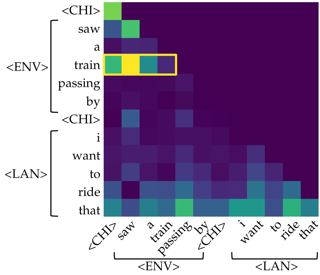
### Visual Description
## Attention Heatmap: Token-to-Token Attention Weights
### Overview
The image displays a square attention heatmap, likely visualizing the attention weights between tokens in a sequence processed by a neural network (e.g., a Transformer model). The matrix shows how much each token in the sequence "attends to" or focuses on every other token. The color intensity represents the strength of the attention weight, with darker colors (purple/blue) indicating lower weights and brighter colors (green/yellow) indicating higher weights. A specific row is highlighted with a yellow bounding box.
### Components/Axes
* **Matrix Structure:** A square grid where both the vertical (Y-axis) and horizontal (X-axis) axes represent the same sequence of tokens.
* **Token Sequence (Labels):** The sequence, read from top to bottom on the Y-axis and left to right on the X-axis, is:
1. `<CHI>`
2. `saw`
3. `a`
4. `train`
5. `passing`
6. `by`
7. `<CHI>`
8. `i`
9. `want`
10. `to`
11. `ride`
12. `that`
* **Grouping Annotations:** Brackets on the left (Y-axis) and bottom (X-axis) group the tokens into segments:
* **`<ENV>`:** Encompasses tokens 2-6 (`saw`, `a`, `train`, `passing`, `by`). This likely stands for "Environment" or a contextual segment.
* **`<LAN>`:** Encompasses tokens 8-12 (`i`, `want`, `to`, `ride`, `that`). This likely stands for "Language" or a target utterance segment.
* The special tokens `<CHI>` (likely "Child" or a speaker tag) appear at positions 1 and 7, acting as segment boundaries.
* **Color Scale (Implied):** There is no explicit legend, but the color gradient from dark purple to bright yellow represents the magnitude of the attention weight. The brightest cell (yellow) indicates the maximum attention value in this view.
### Detailed Analysis
* **Highlighted Row:** The row corresponding to the token **`train`** (4th row) is enclosed in a yellow rectangle. This row shows the highest attention weights in the entire matrix.
* The cell at the intersection of row `train` and column `train` (the diagonal) is bright yellow, indicating the token attends very strongly to itself.
* The cell at row `train` and column `saw` is bright green, showing strong attention from "train" back to "saw".
* The cell at row `train` and column `a` is a medium teal/green, indicating moderate attention.
* The cell at row `train` and column `passing` is a darker teal/blue, indicating weaker attention.
* **General Attention Patterns:**
* **Diagonal Bias:** There is a visible, though not perfectly strong, diagonal line of brighter cells from the top-left to bottom-right. This is typical in attention maps, showing tokens often attend to themselves and nearby tokens.
* **`<ENV>` Segment Block:** The 5x5 sub-matrix for tokens `saw` through `by` (rows and columns 2-6) shows a block of relatively higher attention (lighter blues and greens) compared to the rest of the map, suggesting stronger intra-segment attention within the `<ENV>` context.
* **`<LAN>` Segment Block:** Similarly, the 5x5 sub-matrix for tokens `i` through `that` (rows and columns 8-12) shows another block of moderate attention (mostly blues), indicating intra-segment attention within the `<LAN>` utterance.
* **Cross-Segment Attention:** Attention between the `<ENV>` and `<LAN>` segments (the off-diagonal blocks) is generally very low (dark purple), with a few exceptions. Notably, the token `that` (last row) shows moderate attention (teal/green) to several tokens in the `<ENV>` segment, particularly `train` and `passing`.
* **`<CHI>` Tokens:** The special tokens `<CHI>` at positions 1 and 7 show very low attention to all other tokens (dark purple rows) and are attended to weakly by other tokens.
### Key Observations
1. **Dominant Focus on "train":** The token `train` is the clear focal point of this attention map. It has the strongest self-attention and receives significant attention from the preceding verb `saw`.
2. **Segmented Attention:** The model's attention is largely compartmentalized within the defined `<ENV>` and `<LAN>` segments, with limited cross-talk between them.
3. **Anaphoric Reference:** The final token `that` in the `<LAN>` segment (`i want to ride that`) shows a pattern of attending back to key content words in the `<ENV>` segment (`saw a train passing by`), most strongly to `train`. This visually demonstrates the model linking the pronoun "that" to its antecedent "train".
4. **Low Attention to Function Words:** Grammatical words like `a`, `to`, `by`, and the special `<CHI>` tokens generally exhibit and receive low attention weights.
### Interpretation
This heatmap provides a visual explanation of how a language model processes a two-part input: a descriptive statement (`<ENV>: saw a train passing by`) followed by a related desire (`<LAN>: i want to ride that`).
* **The data suggests** the model correctly identifies "train" as the central entity of interest. The strong attention from "saw" to "train" and the self-attention of "train" confirm its role as the primary subject.
* **The elements relate** through a coreference resolution task. The attention pattern from "that" back to "train" is the key mechanistic insight, showing how the model resolves the pronoun "that" to the specific noun "train" mentioned earlier. The segmented attention blocks indicate the model treats the two clauses as distinct but related contexts.
* **Notable patterns** include the stark compartmentalization between segments and the specific, targeted cross-segment attention from the pronoun. This is not random noise; it's a structured, interpretable pattern indicative of a model performing a coherent linguistic operation. The lack of attention to `<CHI>` tokens suggests they may serve purely as structural delimiters without semantic content for this attention head.
</details>
(a) Gather: L4 H7.
<details>
<summary>x19.png Details</summary>
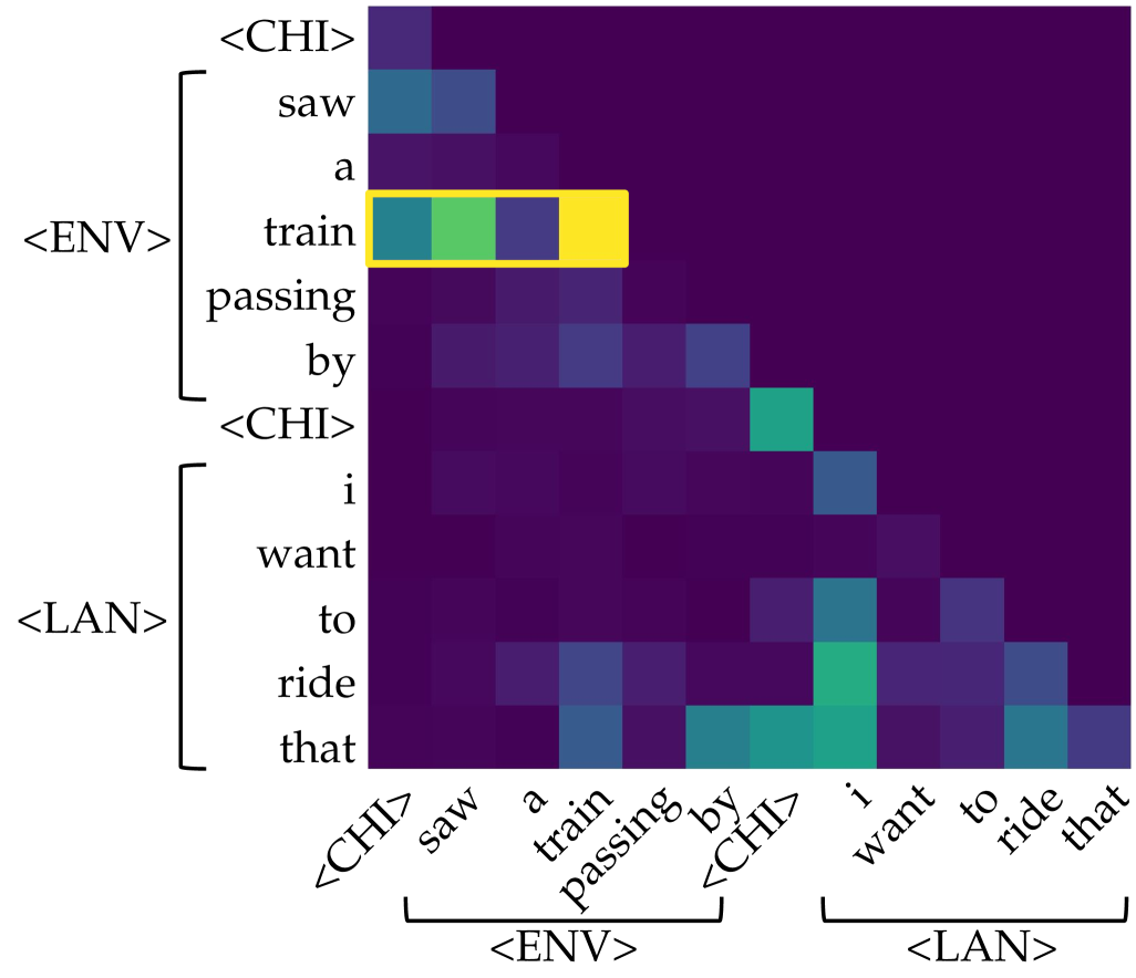
### Visual Description
## Heatmap: Attention Weights Between Sentence Tokens
### Overview
The image displays a triangular heatmap visualizing attention weights (or similar similarity scores) between tokens from two sequential sentences. The heatmap uses a color gradient from dark purple (low value) to bright yellow (high value) to represent the strength of association or attention between each pair of tokens. A specific row is highlighted with a yellow bounding box.
### Components/Axes
* **Chart Type:** Triangular heatmap (lower-left triangle filled).
* **Y-Axis (Left):** Lists tokens from two sentences, grouped by special tokens.
* **Group 1 (Bracketed as `<ENV>`):** `<CHI>`, `saw`, `a`, `train`, `passing`, `by`
* **Group 2 (Bracketed as `<LAN>`):** `<CHI>`, `i`, `want`, `to`, `ride`, `that`
* **X-Axis (Bottom):** Lists the same tokens in the same order, rotated at a 45-degree angle.
* **Group 1 (Bracketed as `<ENV>`):** `<CHI>`, `saw`, `a`, `train`, `passing`, `by`
* **Group 2 (Bracketed as `<LAN>`):** `<CHI>`, `i`, `want`, `to`, `ride`, `that`
* **Color Scale:** Implicit gradient. Dark purple represents the lowest values (near 0), transitioning through blue and teal to green and finally bright yellow for the highest values (near 1.0).
* **Highlight:** A yellow rectangular box outlines the entire row corresponding to the token `train` on the Y-axis.
### Detailed Analysis
**Token List (Y-Axis, top to bottom):**
1. `<CHI>` (Start of first sentence group)
2. `saw`
3. `a`
4. `train` **(Highlighted Row)**
5. `passing`
6. `by`
7. `<CHI>` (Start of second sentence group)
8. `i`
9. `want`
10. `to`
11. `ride`
12. `that`
**Data Point Analysis (Row by Row):**
* **`<CHI>` (Row 1):** Very low values (dark purple) across all columns.
* **`saw` (Row 2):** Low to moderate values. Slightly higher (blue) attention to `<CHI>` and `saw` on the x-axis.
* **`a` (Row 3):** Low values (dark purple/blue).
* **`train` (Row 4 - Highlighted):** This row shows the strongest activations in the entire chart.
* Column `train`: **Bright yellow** (highest value, ~1.0).
* Column `a`: **Green** (high value, ~0.7-0.8).
* Column `<CHI>` (first one): **Teal/Blue** (moderate value, ~0.5-0.6).
* Column `saw`: **Blue** (moderate-low value, ~0.4).
* Other columns: Dark purple (very low).
* **`passing` (Row 5):** Low values, with a slight blue tint in columns `train` and `passing`.
* **`by` (Row 6):** Low values, with a slight blue tint in columns `passing` and `by`.
* **`<CHI>` (Row 7):** Shows a notable **teal/green** activation in the column for the second `<CHI>` token.
* **`i` (Row 8):** Low values, with a slight blue tint in its own column.
* **`want` (Row 9):** Low values.
* **`to` (Row 10):** Low values, with a slight blue tint in its own column and the `ride` column.
* **`ride` (Row 11):** Shows moderate **teal/green** activation in its own column and the `that` column.
* **`that` (Row 12):** Shows moderate **teal/green** activation in its own column and the `ride` column.
**Key Trend:** The heatmap is largely dark (low values) except for a strong diagonal pattern of self-attention (e.g., `train` to `train`, `ride` to `ride`) and specific cross-token relationships, most prominently within the highlighted `train` row.
### Key Observations
1. **Dominant Feature:** The token `train` exhibits exceptionally strong self-attention and significant attention to the preceding article `a`.
2. **Sentence Boundary Marker:** The second `<CHI>` token (Row 7) shows a distinct activation, suggesting it plays a role in separating or linking the two sentence segments.
3. **Verb-Object Relationship:** In the second sentence, the verb `ride` and the object `that` show mutual moderate attention.
4. **Asymmetry:** The attention pattern is not symmetric. For example, the attention from `train` to `a` (green) is much stronger than the attention from `a` to `train` (dark purple).
5. **Grouping:** The special tokens `<ENV>` and `<LAN>` successfully bracket two distinct semantic units: an observation ("saw a train passing by") and a desire ("i want to ride that").
### Interpretation
This heatmap likely visualizes the **attention weights** from a transformer-based neural network model (like BERT or GPT) processing the concatenated text: `"<CHI> saw a train passing by <CHI> i want to ride that"`. The special tokens `<ENV>` (Environment?) and `<LAN>` (Language?) are probably added by the model or researchers to denote different contextual segments.
* **What it demonstrates:** The model's "focus" when processing each word. The highlighted row shows that when the model processes the word `train`, it pays the most attention to itself (reinforcing its own meaning) and to the word `a`, correctly identifying the noun phrase "a train". This is a sign of syntactic understanding.
* **Relationships:** The mutual attention between `ride` and `that` indicates the model is linking the action to its intended object. The activation at the second `<CHI>` suggests it's using this token to manage the transition between the two clauses or contexts.
* **Anomalies/Notable Points:** The very strong, isolated peak at `train`→`train` is notable. It could indicate that `train` is the most information-rich or central token in the first clause for this model's internal representation. The overall sparsity (many dark cells) is typical for attention maps, showing the model focuses on a few key relationships rather than all possible pairs.
**Language:** The primary language of the tokens is **English**. The special tokens (`<CHI>`, `<ENV>`, `<LAN>`) are symbolic markers, not part of standard English.
</details>
(b) Gather: L4 H8.
<details>
<summary>x20.png Details</summary>
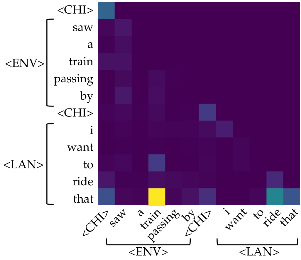
### Visual Description
\n
## Heatmap/Attention Matrix: Token-to-Token Attention Weights
### Overview
The image displays a square heatmap, likely representing an attention matrix from a neural network model (e.g., a Transformer). It visualizes the strength of association or "attention" between tokens in a sequence. The sequence appears to be a sentence or utterance split into two conceptual parts: an environmental description (`<ENV>`) and a language-based desire (`<LAN>`), delimited by special tokens `<CHI>`.
### Components/Axes
* **Type:** Heatmap / Attention Matrix.
* **Axes:** Both the vertical (Y) and horizontal (X) axes represent the same sequence of tokens. The labels are identical and ordered from top to bottom (Y-axis) and left to right (X-axis).
* **Token Sequence:** The sequence is: `<CHI>`, `saw`, `a`, `train`, `passing`, `by`, `<CHI>`, `i`, `want`, `to`, `ride`, `that`.
* **Groupings:**
* **Vertical Axis (Left):** Tokens are grouped by brackets. The first group, labeled `<ENV>`, contains `saw`, `a`, `train`, `passing`, `by`. The second group, labeled `<LAN>`, contains `i`, `want`, `to`, `ride`, `that`. The `<CHI>` tokens act as separators.
* **Horizontal Axis (Bottom):** The same grouping is indicated by brackets below the axis labels. The first bracket groups `saw` through `by` under `<ENV>`. The second bracket groups `i` through `that` under `<LAN>`. The `<CHI>` tokens are not within these brackets.
* **Color Scale (Implied Legend):** There is no explicit legend. The color gradient represents the magnitude of the attention weight.
* **Dark Purple/Black:** Represents very low or near-zero attention weight.
* **Teal/Blue-Green:** Represents a moderate attention weight.
* **Bright Yellow:** Represents the highest attention weight in the matrix.
* **Spatial Layout:** The matrix is a perfect square. The axis labels are rotated 45 degrees on the horizontal axis for readability. The grouping brackets and labels (`<ENV>`, `<LAN>`) are positioned to the left of the Y-axis and below the X-axis.
### Detailed Analysis
The heatmap shows a sparse attention pattern, with most cells being dark purple (low weight). Significant activations (brighter colors) are concentrated in specific cells.
**Trend Verification:** The overall trend is that most tokens attend weakly to most other tokens. Attention is not uniformly distributed but is focused on a few key relationships.
**Key Data Points (Approximate, based on color intensity):**
1. **Strongest Activation (Bright Yellow):** The cell at the intersection of the row for token `that` (Y-axis, within `<LAN>`) and the column for token `train` (X-axis, within `<ENV>`). This indicates the token "that" is paying very strong attention to the token "train".
2. **Moderate Activations (Teal/Blue):**
* Row `that` (Y) / Column `ride` (X): Moderate attention.
* Row `that` (Y) / Column `<CHI>` (first instance, X): Moderate attention.
* Row `<CHI>` (first instance, Y) / Column `saw` (X): Moderate attention.
* Row `to` (Y) / Column `train` (X): Moderate attention.
* Row `i` (Y) / Column `<CHI>` (second instance, X): Moderate attention.
* Row `want` (Y) / Column `<CHI>` (second instance, X): Moderate attention.
3. **Notable Pattern:** The token `that` (the final token) shows the most diverse and strongest attention profile, looking back at both the environmental object (`train`) and its action (`ride`), as well as the delimiter `<CHI>`.
4. **Diagonal:** The main diagonal (where a token attends to itself) does not show uniformly high values, which is atypical for some attention visualizations but common in others (e.g., when visualizing attention from a later token to earlier ones).
### Key Observations
* **Sparse Attention:** The model's attention is highly selective, not diffuse.
* **Cross-Phrase Attention:** The strongest link (`that` -> `train`) connects a pronoun in the `<LAN>` phrase to a noun in the `<ENV>` phrase, suggesting the model is resolving coreference ("that" refers to "train").
* **Delimiter Role:** The `<CHI>` tokens receive moderate attention from several words, indicating they may serve as important structural anchors in the sequence.
* **Asymmetry:** The attention pattern is not symmetric. For example, the attention from `train` to `that` (row `train`, column `that`) is very weak (dark purple), while the reverse is the strongest in the matrix.
### Interpretation
This heatmap likely visualizes the self-attention mechanism of a Transformer-based model processing a multimodal or structured input. The sequence combines an observed event ("saw a train passing by") with a desired action ("i want to ride that").
**What the data suggests:**
1. **Coreference Resolution:** The model has successfully learned that the word "that" in the desire phrase refers to the "train" mentioned earlier. This is the primary and strongest relationship captured.
2. **Contextual Binding:** The model attends from action verbs (`ride`) and pronouns (`that`) back to the relevant environmental object (`train`), demonstrating an understanding of the semantic relationship between the two phrases.
3. **Structural Awareness:** Attention to the `<CHI>` tokens suggests the model uses these special symbols to segment the input into meaningful chunks (observation vs. desire), and these segments influence each other.
**Why it matters:** This visualization provides interpretability into the model's "reasoning" process. It shows the model isn't just processing tokens in isolation but is actively building connections between concepts across different parts of the input to form a coherent understanding. The strong `that`->`train` link is evidence of successful grounding, where a linguistic reference is connected to its antecedent in the context.
**Anomaly/Note:** The lack of strong self-attention on the diagonal is a design choice of the specific attention head or visualization method. It emphasizes inter-token relationships over intra-token ones.
</details>
(c) Aggregate: L7 H5.
<details>
<summary>x21.png Details</summary>
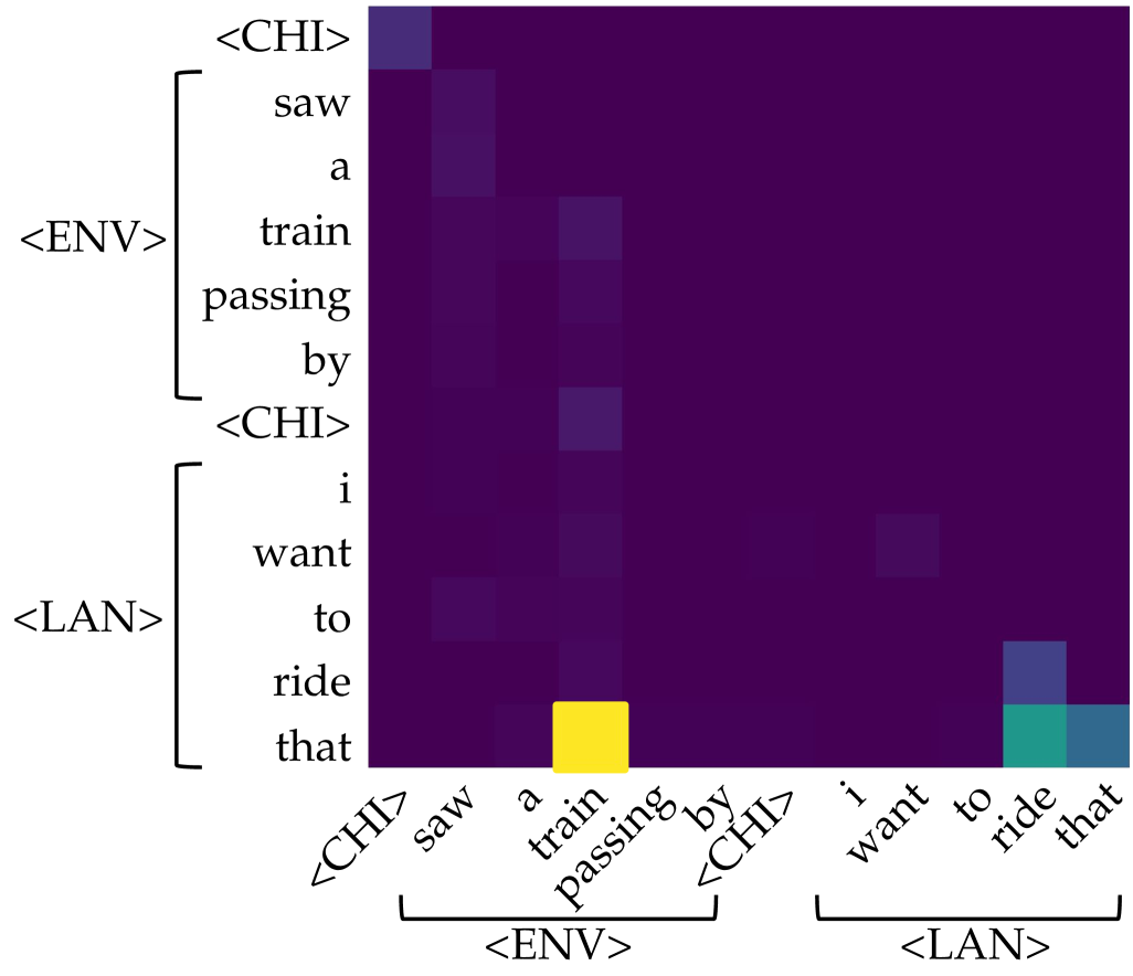
### Visual Description
## Heatmap/Attention Matrix: Token Alignment in a Bilingual Context
### Overview
The image displays a heatmap, likely an attention matrix or alignment visualization from a neural machine translation or cross-lingual model. It shows the relationship or attention weights between a sequence of tokens on the vertical (y) axis and the same sequence on the horizontal (x) axis. The color intensity represents the strength of the relationship, with bright yellow indicating the highest value and dark purple indicating the lowest (near-zero) value.
### Components/Axes
* **Chart Type:** Square heatmap/attention matrix.
* **Y-Axis (Rows):** A sequence of tokens, grouped by brackets and labels.
* Top Group (labeled `<ENV>`): `<CHI>`, `saw`, `a`, `train`, `passing`, `by`, `<CHI>`
* Bottom Group (labeled `<LAN>`): `i`, `want`, `to`, `ride`, `that`
* **X-Axis (Columns):** The same sequence of tokens, mirrored from the y-axis, also grouped.
* Left Group (labeled `<ENV>`): `<CHI>`, `saw`, `a`, `train`, `passing`, `by`, `<CHI>`
* Right Group (labeled `<LAN>`): `i`, `want`, `to`, `ride`, `that`
* **Color Scale/Legend:** No explicit legend is present. The scale is inferred visually:
* **Bright Yellow:** Highest value/attention (approx. 1.0 or maximum).
* **Teal/Green:** Medium-high value.
* **Blue/Purple:** Low to very low value.
* **Dark Purple/Black:** Near-zero value.
* **Spatial Grounding:** The most prominent feature is a single bright yellow cell located at the intersection of the row labeled `that` (the last token in the `<LAN>` group) and the column labeled `train` (the fourth token in the `<ENV>` group). This cell is in the lower-right quadrant of the matrix.
### Detailed Analysis
**Token Sequence (Transcribed):**
The full sequence, read from top-to-bottom on the y-axis and left-to-right on the x-axis, is:
`<CHI> saw a train passing by <CHI> i want to ride that`
**Language Declaration:** The token `<CHI>` is present. This is a common placeholder or special token in NLP models indicating Chinese language content. However, **no actual Chinese characters are visible in the image itself**. The visible text is entirely in English. Therefore, the `<CHI>` token is transcribed directly, and its implied meaning (Chinese) is noted.
**Heatmap Content & Trends:**
1. **Overall Pattern:** The matrix is overwhelmingly dark purple, indicating very low attention or alignment between most token pairs. The relationships are highly sparse.
2. **Primary Alignment (Strongest Signal):** There is one exceptionally strong alignment (bright yellow) between the English word `that` (row) and the English word `train` (column). This suggests the model is strongly associating the demonstrative pronoun "that" with the noun "train" from the preceding clause.
3. **Secondary Alignments (Weaker Signals):**
* A medium-intensity (teal/green) cell aligns the row `that` with the column `ride`.
* A low-intensity (blue) cell aligns the row `ride` with the column `that`.
* Very faint, low-intensity (dark blue/purple) alignments are visible between other tokens, such as `saw` and `train`, or `want` and `train`, but these are barely distinguishable from the background.
4. **Diagonal:** The main diagonal (where row and column tokens are identical, e.g., `saw`-`saw`, `train`-`train`) does **not** show the expected high values. This is atypical for a standard self-attention matrix and suggests this may be a specialized cross-attention or alignment plot between two different sequences or representations.
### Key Observations
* **Extreme Sparsity:** The model's attention or alignment is focused almost exclusively on one specific pair (`that` -> `train`).
* **Asymmetry:** The alignment is not symmetric. The `that`->`train` link is very strong, while the reverse `train`->`that` link is extremely weak (dark purple).
* **Contextual Grouping:** The tokens are explicitly grouped into `<ENV>` (likely "Environment" or context) and `<LAN>` (likely "Language" or target utterance) segments. The strongest link bridges these two groups.
* **Lack of Self-Alignment:** The absence of a strong diagonal suggests this is not a visualization of standard intra-sequence self-attention.
### Interpretation
This heatmap likely visualizes the **cross-lingual or cross-modal alignment** learned by a model. The `<ENV>` group (`<CHI> saw a train passing by <CHI>`) appears to be a context or input (possibly a description in Chinese, denoted by `<CHI>` tokens, though the text shown is English). The `<LAN>` group (`i want to ride that`) is the target language output or query.
The data demonstrates that the model has learned a **highly specific and strong semantic link** between the concept of "train" in the environmental context and the word "that" in the language utterance. This indicates the model correctly identifies "that" as referring to the "train" mentioned earlier. The weaker link between "that" and "ride" is also semantically coherent, as one rides a train.
The sparsity suggests the model is very decisive in its alignment, ignoring most other potential word pairs. The lack of self-alignment on the diagonal reinforces that this plot is specifically showing *cross-sequence* relationships, not intra-sequence dependencies. The primary takeaway is the model's successful grounding of the pronoun "that" to its antecedent "train" across what may be different modalities or languages.
</details>
(d) Aggregate: L8 H5.
Figure 6: Examples of gather and aggregate heads identified in GPT-CHILDES. L: layer; H: head.
Table 2: Causal intervention results on identified gather and aggregate heads across training checkpoints (ckpt.). Avg. Count denotes the average number of heads of each type over inference times, and Avg. Layer denotes the average layer index where they appear. Interv. Sps. reports surprisal after zeroing out the identified heads, while Ctrl. Sps. reports surprisal after zeroing out an equal number of randomly selected heads. Original refers to the baseline surprisal without any intervention. *** indicates a significant result ( $p<0.001$ ) where the intervention surprisal is higher than that in the corresponding control experiment.
| Ckpt. | Gather Head | Aggregate Head | Original | | | | | | |
| --- | --- | --- | --- | --- | --- | --- | --- | --- | --- |
| Avg. | Avg. | Interv. | Ctrl. | Avg. | Avg. | Interv. | Ctrl. | | |
| Count | Layer | Sps. | Sps. | Count | Layer | Sps. | Sps. | | |
| 500 | 0.00 | - | - | - | 0.07 | 8.74 | 9.34 | 9.34 | 9.34 |
| 5000 | 0.35 | 3.32 | 6.37 | 6.38 | 2.28 | 7.38 | 6.51 | 6.39 | 6.38 |
| (***) | | | | | | | | | |
| 10000 | 3.26 | 3.67 | 5.25 | 5.32 | 5.09 | 7.28 | 5.86 | 5.29 | 5.30 |
| (***) | | | | | | | | | |
| 20000 | 5.76 | 3.59 | 4.69 | 4.79 | 6.71 | 7.52 | 5.62 | 4.76 | 4.77 |
| (***) | | | | | | | | | |
### 5.3 Causal Interventions of Attention Heads
We then conduct causal interventions of attention heads to validate our previous hypothesis.
Operational definition. We identify attention heads as gather or aggregate following these standards:
- Gather head. An attention head is classified as a gather head if at least 30% of its total saliency is directed toward the environmental ground token from the previous ones.
- Aggregate head: An attention head is classified as an aggregate head if at least 30% of its total saliency flows from the environmental ground token to the token immediately preceding the corresponding linguistic token.
Causal intervention methods. In each context, we apply causal interventions to the identified head types and their corresponding controls. Following Bick et al. (2025), interventions are implemented by zeroing out the outputs of heads. For the control, we mask an equal number of randomly selected heads in each layer, ensuring they do not overlap with the identified gather or aggregate heads.
| Thres. | Ckpt. | Aggregate Head | Original | | | |
| --- | --- | --- | --- | --- | --- | --- |
| Avg. | Avg. | Interv. | Ctrl. | | | |
| Count | Layer | Sps. | Sps. | | | |
| 70% | 20k | 32.30 | 7.78 | 9.96 | 9.95 | 9.21 |
| 100k | 35.63 | 7.71 | 9.42 | 8.84 | 8.24 | |
| (***) | | | | | | |
| 200k | 34.99 | 7.80 | 8.95 | 8.15 | 7.76 | |
| (***) | | | | | | |
| 300k | 34.15 | 7.76 | 8.96 | 8.11 | 7.69 | |
| (***) | | | | | | |
| 90% | 20k | 10.66 | 8.33 | 9.51 | 9.43 | 9.21 |
| (***) | | | | | | |
| 100k | 13.90 | 8.26 | 8.95 | 8.50 | 8.24 | |
| (***) | | | | | | |
| 200k | 13.47 | 8.46 | 8.41 | 7.88 | 7.76 | |
| (***) | | | | | | |
| 300k | 12.73 | 8.42 | 8.40 | 7.87 | 7.69 | |
| (***) | | | | | | |
<details>
<summary>x22.png Details</summary>
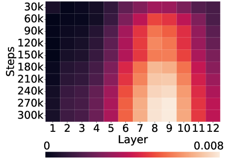
### Visual Description
## Heatmap: Activation Magnitude Across Model Layers and Training Steps
### Overview
The image is a heatmap visualizing a numerical metric (likely activation magnitude, gradient norm, or a similar measure) across two dimensions: the layer index of a neural network (x-axis) and the number of training steps (y-axis). The color intensity represents the value of the metric, with a scale provided at the bottom.
### Components/Axes
* **Y-Axis (Vertical):** Labeled **"Steps"**. It represents the progression of training, with tick marks at:
* 30k, 60k, 90k, 120k, 150k, 180k, 210k, 240k, 270k, 300k.
* The axis runs from top (30k steps) to bottom (300k steps).
* **X-Axis (Horizontal):** Labeled **"Layer"**. It represents the sequential layers of a model, with tick marks for each integer from **1 to 12**.
* **Color Scale/Legend:** Located at the bottom of the chart. It is a horizontal gradient bar.
* **Left Label:** `0`
* **Right Label:** `0.008`
* **Gradient:** Transitions from a very dark purple/black (representing 0) through shades of purple, red, and orange, to a very light peach/cream color (representing 0.008).
### Detailed Analysis
The heatmap displays a clear, non-uniform pattern of values across the layer-step grid.
* **Spatial Pattern & Trend Verification:**
* **Left Region (Layers 1-5):** This entire vertical band is consistently dark across all training steps. The color suggests values are very close to the minimum of the scale (0). There is no significant trend with increasing steps; values remain low.
* **Middle Region (Layers 6-9):** This region shows the most dynamic change.
* **Trend with Steps:** For layers 6 through 9, the color lightens (value increases) as we move down the y-axis (from 30k to 300k steps). The gradient is most pronounced in Layers 8 and 9.
* **Trend with Layers:** At any given step (e.g., 300k), the value increases from Layer 6 to a peak at Layers 8-9, then begins to decrease.
* **Right Region (Layers 10-12):** This band is darker than the middle region but lighter than the left region. The color (value) appears relatively stable across steps, with a slight darkening (decrease) visible in the very last rows (270k-300k steps) for Layers 11-12.
* **Key Data Points (Approximate from Color):**
* **Highest Values:** The lightest peach/cream colors, indicating values approaching or at **0.008**, are concentrated in **Layers 8 and 9** at the highest training steps (**270k and 300k**).
* **Moderate Values:** Layers 6, 7, 10, and 11 show mid-range colors (oranges and reds), suggesting values roughly between **0.003 and 0.006** at later steps.
* **Lowest Values:** Layers 1-5 and, to a lesser extent, Layer 12 at early steps show the darkest colors, indicating values near **0**.
### Key Observations
1. **Layer-Specific Activation:** The measured phenomenon is not uniform across the model. It is strongly concentrated in the middle layers (6-11), with a distinct peak in Layers 8-9.
2. **Training Progression:** The metric in the critical middle layers (6-9) shows a clear positive correlation with training steps. The effect becomes more pronounced as training progresses.
3. **Stability of Early Layers:** The first five layers show negligible activity (near-zero values) throughout the entire training period shown, suggesting they are either not involved in the measured process or their contribution is minimal and constant.
4. **Asymmetry:** The pattern is not symmetric around the peak. The drop-off in value is sharper moving from Layer 9 to Layer 12 than it is moving from Layer 9 to Layer 6.
### Interpretation
This heatmap likely visualizes the **evolution of internal representations or gradient flow** during the training of a 12-layer neural network.
* **What it Suggests:** The data indicates that as training progresses (steps increase), the middle layers of the network (particularly 8 and 9) become increasingly "active" or "important" according to the measured metric. This is a common pattern in deep learning, where intermediate layers often learn the most complex and useful features.
* **Relationship Between Elements:** The x-axis (Layer) represents the model's depth, and the y-axis (Steps) represents time. The heatmap shows how the "hotspot" of activity not only exists in a specific depth region but also intensifies over time. The early layers (1-5) may be performing stable, low-level feature extraction that doesn't change dramatically, while the later layers (10-12) might be involved in more task-specific, final processing that stabilizes earlier.
* **Notable Anomaly/Insight:** The most striking insight is the **localized and growing importance of Layers 8-9**. This could identify them as a critical bottleneck or the core "reasoning" component of the model for the task it was trained on. Monitoring these layers could be key to understanding model performance or diagnosing training issues. The near-zero values in early layers might also prompt an investigation into whether those layers are necessary or if the model could be pruned.
</details>
Figure 7: Mechanistic analysis in the image-grounded visual dialogue setting. Left: Causal intervention results on identified aggregate heads across training checkpoints, where intervention on aggregate heads consistently yields significantly higher surprisal ( $p<0.001$ , ***) compared to the control group ones. Right: Saliency of layer-wise attention from environmental tokens (i.e., image tokens corresponding to patches within the bounding boxes of the target object) to linguistic tokens across training steps.
Results and discussions. As training progresses, the number of both gather and aggregate heads increases (Table 2), suggesting that these mechanisms emerge over the course of learning. Causal interventions reveal a clear dissociation: zeroing out aggregate heads consistently produces significantly higher surprisal compared to controls, whereas the gather head interventions have no such effect. This asymmetry suggests that gather heads serve in a role less critical in our settings, where the input template is semantically light and the environmental evidence alone suffices to shape the linguistic form. Layer-wise patterns further support this division of labor: gather heads cluster in shallow layers (3-4), while aggregate heads concentrate in mid layers (7-8). This resonates with our earlier probing results, where surprisal reductions became prominent only from layers 7-9. Together, these findings highlight aggregate heads in the middle layers as the primary account of grounding in the model.
### 5.4 Generalization to Visual Dialog with Images
We also conduct causal interventions of attention heads on the VLM model to further validate our previous hypothesis.
Operational definition. We identify attention heads as aggregate following this standard (We do not define gather head): An attention head is classified as an aggregate head if at least a certain threshold (70% or 90% in our experiment settings) of its total image patch to end saliency flows from the patches inside bounding box to the token immediately preceding the corresponding linguistic token.
Causal intervention methods. In each context, we apply causal interventions to the identified head types and their corresponding controls in the language backbone of the model. Similar to section 5.3, interventions are implemented by zeroing out a head’s outputs. For the control, we mask an equal number of randomly selected heads in each layer, ensuring they do not overlap with the identified gather or aggregate heads.
Results and discussions. As training progresses, the number of aggregate heads increases first and then becomes steady (Figure 7), suggesting that these mechanisms emerge over the course of learning. Causal interventions reveal that zeroing out aggregate heads consistently produces significantly higher surprisal rises compared to controls. The average layer also align with the saliency heatmap, also shown in Figure 7.
## 6 Discussions
Generalization to full-scale VLMs. As an additional case study, we extend our grounding-as-aggregation hypothesis to a full-scale VLM, LLaVA-1.5-7B (Liu et al., 2023). Even in this heavily engineered architecture, we identify many attention heads exhibiting aggregation behavior consistent with our earlier findings (Figure 1(b)), reinforcing the view that symbol grounding arises from specialized heads. At the same time, full-scale VLMs present additional complications. Models like LLaVA use multiple sets of visual tokens, including CLIP-derived embeddings that already encode language priors, and global information may be stored in redundant artifact tokens rather than object-centric regions (Darcet et al., 2024). Moreover, the large number of visual tokens (environmental tokens, in our setup) substantially increases both computational cost and the difficulty of isolating genuine aggregation heads. These factors make systematic identification and intervention at scale a nontrivial challenge. For these reasons, while our case study highlights promising evidence of grounding heads in modern VLMs, systematic detection and causal evaluation of such heads at scale remains an open challenge. Future work will need to develop computationally viable methods for (i) automatically detecting aggregation heads across diverse VLMs, and (ii) applying causal interventions to validate their role in grounding. Addressing these challenges will be crucial for moving from anecdotal case studies to a more principled understanding of grounding in modern VLMs.
The philosophical roots of grounding, revisited. Our findings highlight the need to sharpen the meaning of grounding in multimodal models. Prior work has often equated grounding with statistical correlations between visual and textual signals, such as attention overlaps or geometric alignments (Bousselham et al., 2024; Cao et al., 2025; Schnaus et al., 2025). While informative, such correlations diverge from the classic formulation by Harnad (1990), which requires symbols to be causally anchored to their referents in the environment. On the other extreme, Gubelmann (2024) argued that the symbol grounding problem does not apply to LLMs as they “are connectionist, statistical devices that have no intrinsic symbolic structure.” In contrast, we discover emergent symbolic structure as an intrinsic mechanistic property: one that can be traced along training, observed in the specialization of attention heads, and validated through causal interventions. This provides not only a practical diagnostic protocol that reveals when and how models genuinely tie symbols to meaning beyond surface-level correlations, but also challenges the view that grounding is philosophically irrelevant to systems without explicit symbolic structure.
Practical implications to LM hallucinations. Our findings have practical implications for improving the reliability of LM outputs: by identifying aggregation heads that mediate grounding between environmental and linguistic tokens, we provide a promising mechanism to detect model reliability before generation. Our findings echo a pathway to mitigate hallucinations by focusing on attention control: many hallucination errors stem from misallocated attention in intermediate layers (Jiang et al., 2025; Chen et al., 2024b). Such attention-level signals can serve as early indicators of overtrust or false grounding, motivating practical solutions like decoding-time strategies to mitigate and eventually prevent hallucination (Huang et al., 2024).
## Acknowledgement
This work was supported in part by NSF IIS-1949634, NSF SES-2128623, NSERC RGPIN-2024-04395, the Weinberg Cognitive Science Fellowship to ZM, a Vector Scholarship to XL, and a Canada CIFAR AI Chair award to FS. The authors would like to thank Songlin Yang and Jing Ding for their valuable feedback.
## References
- Anthropic (2024) Anthropic. The claude 3 model family: Opus, sonnet, haiku, March 2024. URL https://www.anthropic.com/news/claude-3-family.
- Arora et al. (2025) Aryaman Arora, Neil Rathi, Nikil Roashan Selvam, Róbert Csórdas, Dan Jurafsky, and Christopher Potts. Mechanistic evaluation of transformers and state space models. arXiv preprint arXiv:2505.15105, 2025.
- Belrose et al. (2023) Nora Belrose, Zach Furman, Logan Smith, Danny Halawi, Igor Ostrovsky, Lev McKinney, Stella Biderman, and Jacob Steinhardt. Eliciting latent predictions from transformers with the tuned lens. arXiv preprint arXiv:2303.08112, 2023.
- Bick et al. (2025) Aviv Bick, Eric P. Xing, and Albert Gu. Understanding the skill gap in recurrent models: The role of the gather-and-aggregate mechanism. In Forty-second International Conference on Machine Learning, 2025.
- Biderman et al. (2023) Stella Biderman, Hailey Schoelkopf, Quentin Gregory Anthony, Herbie Bradley, Kyle O’Brien, Eric Hallahan, Mohammad Aflah Khan, Shivanshu Purohit, USVSN Sai Prashanth, Edward Raff, et al. Pythia: A suite for analyzing large language models across training and scaling. In International Conference on Machine Learning, pp. 2397–2430. PMLR, 2023.
- Bietti et al. (2023) Alberto Bietti, Vivien Cabannes, Diane Bouchacourt, Herve Jegou, and Leon Bottou. Birth of a transformer: A memory viewpoint. Advances in Neural Information Processing Systems, 2023.
- Blevins et al. (2022) Terra Blevins, Hila Gonen, and Luke Zettlemoyer. Analyzing the mono-and cross-lingual pretraining dynamics of multilingual language models. In Proceedings of the 2022 Conference on Empirical Methods in Natural Language Processing, pp. 3575–3590, 2022.
- Bousselham et al. (2024) Walid Bousselham, Felix Petersen, Vittorio Ferrari, and Hilde Kuehne. Grounding everything: Emerging localization properties in vision-language transformers. In Proceedings of the IEEE/CVF Conference on Computer Vision and Pattern Recognition, pp. 3828–3837, 2024.
- Cao et al. (2025) Shengcao Cao, Liang-Yan Gui, and Yu-Xiong Wang. Emerging pixel grounding in large multimodal models without grounding supervision. In International Conference on Machine Learning, 2025.
- Chang & Bergen (2022) Tyler A Chang and Benjamin K Bergen. Word acquisition in neural language models. Transactions of the Association for Computational Linguistics, 10:1–16, 2022.
- Chang et al. (2024) Tyler A Chang, Zhuowen Tu, and Benjamin K Bergen. Characterizing learning curves during language model pre-training: Learning, forgetting, and stability. Transactions of the Association for Computational Linguistics, 12:1346–1362, 2024.
- Chen et al. (2024a) Jierun Chen, Fangyun Wei, Jinjing Zhao, Sizhe Song, Bohuai Wu, Zhuoxuan Peng, S-H Gary Chan, and Hongyang Zhang. Revisiting referring expression comprehension evaluation in the era of large multimodal models. arXiv preprint arXiv:2406.16866, 2024a.
- Chen et al. (2023) Keqin Chen, Zhao Zhang, Weili Zeng, Richong Zhang, Feng Zhu, and Rui Zhao. Shikra: Unleashing multimodal llm’s referential dialogue magic. arXiv preprint arXiv:2306.15195, 2023.
- Chen et al. (2024b) Xuweiyi Chen, Ziqiao Ma, Xuejun Zhang, Sihan Xu, Shengyi Qian, Jianing Yang, David Fouhey, and Joyce Chai. Multi-object hallucination in vision language models. Advances in Neural Information Processing Systems, 37:44393–44418, 2024b.
- Clark (1995) Eve V Clark. The lexicon in acquisition. Number 65. Cambridge University Press, 1995.
- Comanici et al. (2025) Gheorghe Comanici, Eric Bieber, Mike Schaekermann, Ice Pasupat, Noveen Sachdeva, Inderjit Dhillon, Marcel Blistein, Ori Ram, Dan Zhang, Evan Rosen, et al. Gemini 2.5: Pushing the frontier with advanced reasoning, multimodality, long context, and next generation agentic capabilities. arXiv preprint arXiv:2507.06261, 2025.
- Dao & Gu (2024) Tri Dao and Albert Gu. Transformers are ssms: Generalized models and efficient algorithms through structured state space duality. In International Conference on Machine Learning, pp. 10041–10071. PMLR, 2024.
- Darcet et al. (2024) Timothée Darcet, Maxime Oquab, Julien Mairal, and Piotr Bojanowski. Vision transformers need registers. In The Twelfth International Conference on Learning Representations, 2024.
- Das et al. (2017) Abhishek Das, Satwik Kottur, Khushi Gupta, Avi Singh, Deshraj Yadav, José MF Moura, Devi Parikh, and Dhruv Batra. Visual dialog. In Proceedings of the IEEE conference on computer vision and pattern recognition, pp. 326–335, 2017.
- Dosovitskiy et al. (2020) Alexey Dosovitskiy, Lucas Beyer, Alexander Kolesnikov, Dirk Weissenborn, Xiaohua Zhai, Thomas Unterthiner, Mostafa Dehghani, Matthias Minderer, Georg Heigold, Sylvain Gelly, et al. An image is worth 16x16 words: Transformers for image recognition at scale. In International Conference on Learning Representations, 2020.
- Elhage et al. (2021) Nelson Elhage, Neel Nanda, Catherine Olsson, Tom Henighan, Nicholas Joseph, Ben Mann, Amanda Askell, Yuntao Bai, Anna Chen, Tom Conerly, Nova DasSarma, Dawn Drain, Deep Ganguli, Zac Hatfield-Dodds, Danny Hernandez, Andy Jones, Jackson Kernion, Liane Lovitt, Kamal Ndousse, Dario Amodei, Tom Brown, Jack Clark, Jared Kaplan, Sam McCandlish, and Chris Olah. A mathematical framework for transformer circuits. Transformer Circuits Thread, 2021. https://transformer-circuits.pub/2021/framework/index.html.
- Evanson et al. (2023) Linnea Evanson, Yair Lakretz, and Jean-Rémi King. Language acquisition: do children and language models follow similar learning stages? In Findings of the Association for Computational Linguistics: ACL 2023, pp. 12205–12218, 2023.
- Fazly et al. (2010) Afsaneh Fazly, Afra Alishahi, and Suzanne Stevenson. A probabilistic computational model of cross-situational word learning. Cognitive Science, 34(6):1017–1063, 2010.
- Fenson et al. (2006) Larry Fenson, Virginia A Marchman, Donna J Thal, Phillip S Dale, J Steven Reznick, and Elizabeth Bates. Macarthur-bates communicative development inventories. PsycTESTS Dataset, 2006.
- Gleitman & Landau (1994) Lila R Gleitman and Barbara Landau. The acquisition of the lexicon. MIT Press, 1994.
- Goodman et al. (2007) Noah Goodman, Joshua Tenenbaum, and Michael Black. A bayesian framework for cross-situational word-learning. Advances in neural information processing systems, 20, 2007.
- Gubelmann (2024) Reto Gubelmann. Pragmatic norms are all you need–why the symbol grounding problem does not apply to llms. In Proceedings of the 2024 Conference on Empirical Methods in Natural Language Processing, pp. 11663–11678, 2024.
- Hagendorff (2023) Thilo Hagendorff. Machine psychology: Investigating emergent capabilities and behavior in large language models using psychological methods. arXiv preprint arXiv:2303.13988, 2023.
- Harnad (1990) Stevan Harnad. The symbol grounding problem. Physica D: Nonlinear Phenomena, 42(1-3):335–346, 1990.
- Hochreiter & Schmidhuber (1997) Sepp Hochreiter and Jürgen Schmidhuber. Long short-term memory. Neural computation, 9(8):1735–1780, 1997.
- Huang et al. (2024) Qidong Huang, Xiaoyi Dong, Pan Zhang, Bin Wang, Conghui He, Jiaqi Wang, Dahua Lin, Weiming Zhang, and Nenghai Yu. Opera: Alleviating hallucination in multi-modal large language models via over-trust penalty and retrospection-allocation. In Proceedings of the IEEE/CVF Conference on Computer Vision and Pattern Recognition, pp. 13418–13427, 2024.
- Jiang et al. (2025) Zhangqi Jiang, Junkai Chen, Beier Zhu, Tingjin Luo, Yankun Shen, and Xu Yang. Devils in middle layers of large vision-language models: Interpreting, detecting and mitigating object hallucinations via attention lens. In Proceedings of the Computer Vision and Pattern Recognition Conference, pp. 25004–25014, 2025.
- Kangaslahti et al. (2025) Sara Kangaslahti, Elan Rosenfeld, and Naomi Saphra. Hidden breakthroughs in language model training. arXiv preprint arXiv:2506.15872, 2025.
- Li et al. (2022) Liunian Harold Li, Pengchuan Zhang, Haotian Zhang, Jianwei Yang, Chunyuan Li, Yiwu Zhong, Lijuan Wang, Lu Yuan, Lei Zhang, Jenq-Neng Hwang, et al. Grounded language-image pre-training. In Proceedings of the IEEE/CVF Conference on Computer Vision and Pattern Recognition, pp. 10965–10975, 2022.
- Lieberum et al. (2023) Tom Lieberum, Matthew Rahtz, János Kramár, Neel Nanda, Geoffrey Irving, Rohin Shah, and Vladimir Mikulik. Does circuit analysis interpretability scale? Evidence from multiple choice capabilities in chinchilla. arXiv preprint arXiv:2307.09458, 2023.
- Lin et al. (2014) Tsung-Yi Lin, Michael Maire, Serge Belongie, James Hays, Pietro Perona, Deva Ramanan, Piotr Dollár, and C Lawrence Zitnick. Microsoft coco: Common objects in context. In European conference on computer vision, pp. 740–755. Springer, 2014.
- Liu et al. (2023) Haotian Liu, Chunyuan Li, Qingyang Wu, and Yong Jae Lee. Visual instruction tuning. In Advances in neural information processing systems, volume 36, pp. 34892–34916, 2023.
- Lu et al. (2024) Sheng Lu, Irina Bigoulaeva, Rachneet Sachdeva, Harish Tayyar Madabushi, and Iryna Gurevych. Are emergent abilities in large language models just in-context learning? In Proceedings of the 62nd Annual Meeting of the Association for Computational Linguistics (Volume 1: Long Papers), pp. 5098–5139, 2024.
- Ma et al. (2023) Ziqiao Ma, Jiayi Pan, and Joyce Chai. World-to-words: Grounded open vocabulary acquisition through fast mapping in vision-language models. In Proceedings of the 61st Annual Meeting of the Association for Computational Linguistics (Volume 1: Long Papers), pp. 524–544, 2023.
- Ma et al. (2025) Ziqiao Ma, Zekun Wang, and Joyce Chai. Babysit a language model from scratch: Interactive language learning by trials and demonstrations. In Proceedings of the 2025 Conference of the Nations of the Americas Chapter of the Association for Computational Linguistics: Human Language Technologies (Volume 1: Long Papers), pp. 991–1010, 2025.
- MacWhinney (2000) Brian MacWhinney. The childes project: Tools for analyzing talk: Volume i: Transcription format and programs, volume ii: The database, 2000.
- Mao et al. (2019) Jiayuan Mao, Chuang Gan, Pushmeet Kohli, Joshua B. Tenenbaum, and Jiajun Wu. The neuro-symbolic concept learner: Interpreting scenes, words, sentences from natural supervision. International Conference on Learning Representations (ICLR), 2019.
- Mao et al. (2021) Jiayuan Mao, Freda H. Shi, Jiajun Wu, Roger P. Levy, and Joshua B. Tenenbaum. Grammar-based grounded lexicon learning. In A. Beygelzimer, Y. Dauphin, P. Liang, and J. Wortman Vaughan (eds.), Advances in Neural Information Processing Systems, 2021.
- Meng et al. (2022) Kevin Meng, David Bau, Alex J Andonian, and Yonatan Belinkov. Locating and editing factual associations in GPT. In Advances in Neural Information Processing Systems, 2022.
- Olsson et al. (2022) Catherine Olsson, Nelson Elhage, Neel Nanda, Nicholas Joseph, Nova DasSarma, Tom Henighan, Ben Mann, Amanda Askell, Yuntao Bai, Anna Chen, Tom Conerly, Dawn Drain, Deep Ganguli, Zac Hatfield-Dodds, Danny Hernandez, Scott Johnston, Andy Jones, Jackson Kernion, Liane Lovitt, Kamal Ndousse, Dario Amodei, Tom Brown, Jack Clark, Jared Kaplan, Sam McCandlish, and Chris Olah. In-context learning and induction heads. Transformer Circuits Thread, 2022. https://transformer-circuits.pub/2022/in-context-learning-and-induction-heads/index.html.
- OpenAI (2024) OpenAI. Hello gpt-4o, May 2024. URL https://openai.com/index/hello-gpt-4o/.
- Oquab et al. (2024) Maxime Oquab, Timothée Darcet, Théo Moutakanni, Huy Vo, Marc Szafraniec, Vasil Khalidov, Pierre Fernandez, Daniel Haziza, Francisco Massa, Alaaeldin El-Nouby, et al. Dinov2: Learning robust visual features without supervision. Transactions on Machine Learning Research Journal, pp. 1–31, 2024.
- Peng et al. (2024) Zhiliang Peng, Wenhui Wang, Li Dong, Yaru Hao, Shaohan Huang, Shuming Ma, Qixiang Ye, and Furu Wei. Grounding multimodal large language models to the world. In The Twelfth International Conference on Learning Representations, 2024.
- Pratt et al. (2020) Sarah Pratt, Mark Yatskar, Luca Weihs, Ali Farhadi, and Aniruddha Kembhavi. Grounded situation recognition. In European Conference on Computer Vision, pp. 314–332. Springer, 2020.
- Qu & Chai (2010) Shaolin Qu and Joyce Yue Chai. Context-based word acquisition for situated dialogue in a virtual world. Journal of Artificial Intelligence Research, 37:247–277, 2010.
- Radford et al. (2019) Alec Radford, Jeffrey Wu, Rewon Child, David Luan, Dario Amodei, Ilya Sutskever, et al. Language models are unsupervised multitask learners. OpenAI blog, 1(8):9, 2019.
- Radford et al. (2021) Alec Radford, Jong Wook Kim, Chris Hallacy, Aditya Ramesh, Gabriel Goh, Sandhini Agarwal, Girish Sastry, Amanda Askell, Pamela Mishkin, Jack Clark, et al. Learning transferable visual models from natural language supervision. In International conference on machine learning, pp. 8748–8763. PmLR, 2021.
- Rasheed et al. (2024) Hanoona Rasheed, Muhammad Maaz, Sahal Shaji, Abdelrahman Shaker, Salman Khan, Hisham Cholakkal, Rao M Anwer, Erix Xing, Ming-Hsuan Yang, and Fahad S Khan. Glamm: Pixel grounding large multimodal model. In Proceedings of the IEEE/CVF Conference on Computer Vision and Pattern Recognition, 2024.
- Regier (2005) Terry Regier. The emergence of words: Attentional learning in form and meaning. Cognitive science, 29(6):819–865, 2005.
- Rombach et al. (2022) Robin Rombach, Andreas Blattmann, Dominik Lorenz, Patrick Esser, and Björn Ommer. High-resolution image synthesis with latent diffusion models. In Proceedings of the IEEE/CVF conference on computer vision and pattern recognition, pp. 10684–10695, 2022.
- Roy & Pentland (2002) Deb K Roy and Alex P Pentland. Learning words from sights and sounds: A computational model. Cognitive science, 26(1):113–146, 2002.
- Sabet et al. (2020) Masoud Jalili Sabet, Philipp Dufter, François Yvon, and Hinrich Schütze. Simalign: High quality word alignments without parallel training data using static and contextualized embeddings. In Findings of the Association for Computational Linguistics: EMNLP 2020, 2020.
- Schaeffer et al. (2023) Rylan Schaeffer, Brando Miranda, and Sanmi Koyejo. Are emergent abilities of large language models a mirage? Advances in Neural Information Processing Systems, 36, 2023.
- Schnaus et al. (2025) Dominik Schnaus, Nikita Araslanov, and Daniel Cremers. It’s a (blind) match! Towards vision-language correspondence without parallel data. In Proceedings of the Computer Vision and Pattern Recognition Conference, pp. 24983–24992, 2025.
- Sellam et al. (2021) Thibault Sellam, Steve Yadlowsky, Ian Tenney, Jason Wei, Naomi Saphra, Alexander D’Amour, Tal Linzen, Jasmijn Bastings, Iulia Raluca Turc, Jacob Eisenstein, et al. The multiberts: Bert reproductions for robustness analysis. In International Conference on Learning Representations, 2021.
- Shi et al. (2021) Haoyue Shi, Luke Zettlemoyer, and Sida I. Wang. Bilingual lexicon induction via unsupervised bitext construction and word alignment. In ACL, 2021.
- Siskind (1996) Jeffrey Mark Siskind. A computational study of cross-situational techniques for learning word-to-meaning mappings. Cognition, 61(1-2):39–91, 1996.
- van der Wal et al. (2025) Oskar van der Wal, Pietro Lesci, Max Müller-Eberstein, Naomi Saphra, Hailey Schoelkopf, Willem Zuidema, and Stella Biderman. Polypythias: Stability and outliers across fifty language model pre-training runs. In Proceedings of the Thirteenth International Conference on Learning Representations (ICLR 2025), pp. 1–25, 2025.
- Vaswani et al. (2017) Ashish Vaswani, Noam Shazeer, Niki Parmar, Jakob Uszkoreit, Llion Jones, Aidan N Gomez, Łukasz Kaiser, and Illia Polosukhin. Attention is all you need. Advances in neural information processing systems, 30, 2017.
- Wang et al. (2023) Lean Wang, Lei Li, Damai Dai, Deli Chen, Hao Zhou, Fandong Meng, Jie Zhou, and Xu Sun. Label words are anchors: An information flow perspective for understanding in-context learning. In Proceedings of the 2023 Conference on Empirical Methods in Natural Language Processing, pp. 9840–9855, 2023.
- Wang et al. (2024) Weihan Wang, Qingsong Lv, Wenmeng Yu, Wenyi Hong, Ji Qi, Yan Wang, Junhui Ji, Zhuoyi Yang, Lei Zhao, Song XiXuan, et al. Cogvlm: Visual expert for pretrained language models. Advances in Neural Information Processing Systems, 37:121475–121499, 2024.
- Wei et al. (2022) Jason Wei, Yi Tay, Rishi Bommasani, Colin Raffel, Barret Zoph, Sebastian Borgeaud, Dani Yogatama, Maarten Bosma, Denny Zhou, Donald Metzler, et al. Emergent abilities of large language models. Transactions on Machine Learning Research, 2022.
- Wiegreffe et al. (2025) Sarah Wiegreffe, Oyvind Tafjord, Yonatan Belinkov, Hannaneh Hajishirzi, and Ashish Sabharwal. Answer, assemble, ace: Understanding how LMs answer multiple choice questions. In The Thirteenth International Conference on Learning Representations, 2025.
- Wu et al. (2025a) Wenhao Wu, Yizhong Wang, Guangxuan Xiao, Hao Peng, and Yao Fu. Retrieval head mechanistically explains long-context factuality. In The Thirteenth International Conference on Learning Representations, 2025a.
- Wu et al. (2025b) Zhaofeng Wu, Dani Yogatama, Jiasen Lu, and Yoon Kim. The semantic hub hypothesis: Language models share semantic representations across languages and modalities. In ICML, 2025b.
- Xia et al. (2023) Mengzhou Xia, Mikel Artetxe, Chunting Zhou, Xi Victoria Lin, Ramakanth Pasunuru, Danqi Chen, Luke Zettlemoyer, and Ves Stoyanov. Training trajectories of language models across scales. In Proceedings of the 61st Annual Meeting of the Association for Computational Linguistics (Volume 1: Long Papers), pp. 13711–13738, 2023.
- Xia et al. (2024) Zhuofan Xia, Dongchen Han, Yizeng Han, Xuran Pan, Shiji Song, and Gao Huang. Gsva: Generalized segmentation via multimodal large language models. In Proceedings of the IEEE/CVF Conference on Computer Vision and Pattern Recognition, 2024.
- Xu & Tenenbaum (2007) Fei Xu and Joshua B Tenenbaum. Word learning as bayesian inference. Psychological review, 114(2):245, 2007.
- You et al. (2024) Haoxuan You, Haotian Zhang, Zhe Gan, Xianzhi Du, Bowen Zhang, Zirui Wang, Liangliang Cao, Shih-Fu Chang, and Yinfei Yang. Ferret: Refer and ground anything anywhere at any granularity. In The Twelfth International Conference on Learning Representations, 2024.
- Yu (2005) Chen Yu. The emergence of links between lexical acquisition and object categorization: A computational study. Connection science, 17(3-4):381–397, 2005.
- Yu & Ballard (2007) Chen Yu and Dana H Ballard. A unified model of early word learning: Integrating statistical and social cues. Neurocomputing, 70(13-15):2149–2165, 2007.
- Yu & Siskind (2013) Haonan Yu and Jeffrey Mark Siskind. Grounded language learning from video described with sentences. In Proceedings of the 51st Annual Meeting of the Association for Computational Linguistics (Volume 1: Long Papers), pp. 53–63, 2013.
- Zhang et al. (2024a) Tao Zhang, Xiangtai Li, Hao Fei, Haobo Yuan, Shengqiong Wu, Shunping Ji, Chen Change Loy, and Shuicheng Yan. Omg-llava: Bridging image-level, object-level, pixel-level reasoning and understanding. Advances in neural information processing systems, 37:71737–71767, 2024a.
- Zhang et al. (2024b) Yichi Zhang, Ziqiao Ma, Xiaofeng Gao, Suhaila Shakiah, Qiaozi Gao, and Joyce Chai. Groundhog: Grounding large language models to holistic segmentation. In Proceedings of the IEEE/CVF Conference on Computer Vision and Pattern Recognition, 2024b.
- Zhao et al. (2024) Rosie Zhao, Naomi Saphra, and Sham M. Kakade. Distributional scaling laws for emergent capabilities. In NeurIPS 2024 Workshop on Scientific Methods for Understanding Deep Learning, 2024.
## Appendix A Dataset Details
### A.1 Context Templates
We select the target tokens following the given procedure:
1. Get a list of words, with their ENV and LAN frequency both greater than or equal to 100 in the CHILDES dataset;
1. Get another list of nouns from CDI;
1. Take intersection and select top 100 words (by frequency of their ENV token) as target token list.
In CHILDES, all contexts are created with gpt-4o-mini followed by human verification if the genrated contexts are semantically light. We adopt the following prompt:
Prompt Templates for CHILDES
Given the word “{word}”, create 3 pairs of sentences that follow this requirement: 1. The first sentence has a subject “The child”, describing an event or situation, and has the word “{word}”. Make sure to add a newline to the end of this first sentence 2. The second sentence is said by the child (only include the speech itself, don’t include “the child say”, etc.), and the word “{word}” also appears in the sentence said by the child. Do not add quote marks either 3. Print each sentence on one line. Do not include anything else. 4. Each sentence should be short, less than 10 words. 5. The word “{word}” in both sentence have the same meaning and have a clear indication or an implication relationship. 6. “{word}” should not appear at the first/second word of each sentence. Generate 3 pairs of such sentences, so there should be 6 lines in total. You should not add a number. For each line, just print out the sentence.
In visual dialogue (caption version and VLM version), we pre-define 10 sets of templates for each version:
Prompt Templates for Visual Dialogue (Caption Version)
this:<ENV> is:<ENV> [FILLER]:<ENV> <Q> what:<LAN> is:<LAN> it:<LAN> <A> (predict [FILLER]:<LAN>) this:<ENV> is:<ENV> [FILLER]:<ENV> <Q> what:<LAN> do:<LAN> you:<LAN> call:<LAN> this:<LAN> <A> (predict [FILLER]:<LAN>) this:<ENV> is:<ENV> [FILLER]:<ENV> <Q> can:<LAN> you:<LAN> name:<LAN> this:<LAN> object:<LAN> <A> (predict [FILLER]:<LAN>) this:<ENV> is:<ENV> [FILLER]:<ENV> <Q> what’s:<LAN> this:<LAN> called:<LAN> <A> (predict [FILLER]:<LAN>) this:<ENV> is:<ENV> [FILLER]:<ENV> <Q> what:<LAN> this:<LAN> thing:<LAN> is:<LAN> <A> (predict [FILLER]:<LAN>)
Prompt Templates for Visual Dialogue (Caption Version) (continued)
this:<ENV> is:<ENV> [FILLER]:<ENV> <Q> what:<LAN> would:<LAN> you:<LAN> name:<LAN> this:<LAN> <A> (predict [FILLER]:<LAN>) this:<ENV> is:<ENV> [FILLER]:<ENV> <Q> what’s:<LAN> the:<LAN> name:<LAN> of:<LAN> this:<LAN> item:<LAN> <A> (predict [FILLER]:<LAN>) this:<ENV> is:<ENV> [FILLER]:<ENV> <Q> how:<LAN> do:<LAN> you:<LAN> identify:<LAN> this:<LAN> <A> (predict [FILLER]:<LAN>) this:<ENV> is:<ENV> [FILLER]:<ENV> <Q> what:<LAN> do:<LAN> we:<LAN> have:<LAN> here:<LAN> <A> (predict [FILLER]:<LAN>) this:<ENV> is:<ENV> [FILLER]:<ENV> <Q> how:<LAN> do:<LAN> you:<LAN> call:<LAN> this:<LAN> object:<LAN> <A> (predict [FILLER]:<LAN>)
Prompt Templates for Visual Dialogue (VLM Version)
“<image> \nwhat is it ?”, “<image> \nwhat do you call this ?”, “<image> \ncan you name this object ?”, “<image> \nwhat is this called ?”, “<image> \nwhat this thing is ?”, “<image> \nwhat would you name this ?”, “<image> \nwhat is the name of this item ?”, “<image> \nhow do you identify this ?”, “<image> \nwhat do we have here ?”, “<image> \nhow do you call this object ?”
### A.2 Word Lists
CHILDES and Visual Dialog (Text Only). [box, book, ball, hand, paper, table, toy, head, car, chair, room, picture, doll, cup, towel, door, mouth, camera, duck, face, truck, bottle, puzzle, bird, tape, finger, bucket, block, stick, elephant, hat, bed, arm, dog, kitchen, spoon, hair, blanket, horse, tray, train, cow, foot, couch, necklace, cookie, plate, telephone, window, brush, ear, pig, purse, hammer, cat, shoulder, garage, button, monkey, pencil, shoe, drawer, leg, bear, milk, egg, bowl, juice, ladder, basket, coffee, bus, food, apple, bench, sheep, airplane, comb, bread, eye, animal, knee, shirt, cracker, glass, light, game, cheese, sofa, giraffe, turtle, stove, clock, star, refrigerator, banana, napkin, bunny, farm, money]
Visual Dialog (VLM). [box, book, table, toy, car, chair, doll, door, camera, duck, truck, bottle, bird, elephant, hat, bed, dog, spoon, horse, train, couch, necklace, cookie, plate, telephone, window, pig, cat, monkey, drawer, bear, milk, egg, bowl, juice, ladder, bus, food, apple, sheep, bread, animal, shirt, cheese, giraffe, clock, refrigerator, accordion, aircraft, alpaca, ambulance, ant, antelope, backpack, bagel, balloon, barrel, bathtub, beard, bee, beer, beetle, bicycle, bidet, billboard, boat, bookcase, boot, boy, broccoli, building, bull, burrito, bust, butterfly, cabbage, cabinetry, cake, camel, canary, candle, candy, cannon, canoe, carrot, cart, castle, caterpillar, cattle, cello, cheetah, chicken, chopsticks, closet, clothing, coat, cocktail, coffeemaker, coin, cosmetics]
## Appendix B Implementation Details
We outline the key implementation details in this section and provide links to the GitHub repositories:
- Model Training: https://github.com/Mars-tin/TraBank
- CHILDES Processing: https://github.com/Mars-tin/PyChildes
### B.1 Checkpointing
We save 33 checkpoints in total for text-only experiments and 16 checkpoints for the VLM setting.
CHILDES and Visual Dialog (Text Only). We save the intermediate steps: [0, 150, 300, 500, 1000, 1500, 2000, 2500, 3000, 3500, 4000, 4500, 5000, 5500, 6000, 6500, 7000, 7500, 8000, 8500, 9000, 9500, 10000, 11000, 12000, 13000, 14000, 15000, 16000, 17000, 18000, 19000, 20000]
Visual Dialog (VLM). We save the intermediate steps: [10000, 20000, 40000, 60000, 80000, 100000, 120000, 140000, 160000, 180000, 200000, 220000, 240000, 260000, 280000, 300000]
### B.2 Training details.
For the text-only Transformer, Mamba2, and LSTM models, we randomly initialize them from scratch. The training process is conducted five times, each with a different random seed (using seeds 42, 142, 242, 342, and 442, respectively). The batch size is 16.
For VLM models, we randomly initialize the language model backbone from scratch and keep the DINOv2 vision encoder frozen. The training process is conducted five times for 300k steps, each with a different random seed (using seed 42, 142, 242, 342, and 442, respectively).
All the models use a word-level tokenizer. A list of hyperparameters is shown below:
Transformer and LSTM Model.
- model_max_length: 512
- learning rate: 5e-5
- learning rate schedule: linear
- warmup_steps: 1000
- hidden_size: 768
- beta1: 0.9
- beta2: 0.95
- weight_decay: 0
- batch_size: 16
- grad_clip_norm: 1.0
Mamba2 Model.
- model_max_length: 512
- learning rate: 4e-4
- learning rate schedule: linear
- warmup_steps: 2000
- hidden_size: 768
- beta1: 0.9
- beta2: 0.95
- weight_decay: 0.4
- batch_size: 16
- grad_clip_norm: 1.0
VLM Model.
- model_max_length: 1024
- learning rate: 2e-5
- learning rate schedule: cosine
- warmup_steps: 9000
- hidden_size: 768
- beta1: 0.9
- beta2: 0.95
- weight_decay: 0
- batch_size: 16
- grad_clip_norm: 1.0
### B.3 Computational resources.
Each Transformer, Mamba2, and LSTM model is trained on a single A40 GPU within 5 hours. For VLM models, training is conducted on 2 A40 GPUs over 15 hours, using a batch size of 8 per device.
## Appendix C Addendum to Results
<details>
<summary>x23.png Details</summary>
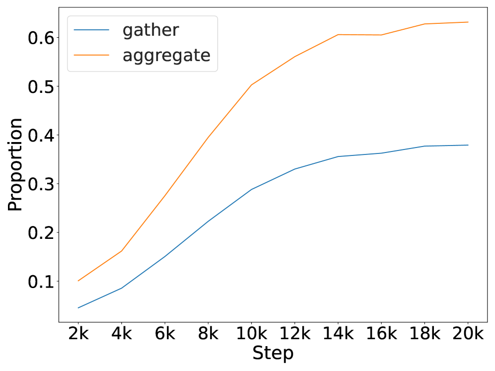
### Visual Description
## Line Chart: Proportion vs. Step for "gather" and "aggregate" Processes
### Overview
The image displays a line chart comparing the proportion of two processes, labeled "gather" and "aggregate," over a series of steps. The chart shows both processes increasing in proportion as the number of steps increases, with "aggregate" consistently maintaining a higher proportion and exhibiting a steeper initial growth rate than "gather."
### Components/Axes
* **Chart Type:** Line chart with two data series.
* **X-Axis:**
* **Label:** "Step"
* **Scale:** Linear, with major tick marks labeled at 2k, 4k, 6k, 8k, 10k, 12k, 14k, 16k, 18k, and 20k. The "k" denotes thousands.
* **Y-Axis:**
* **Label:** "Proportion"
* **Scale:** Linear, with major tick marks labeled at 0.1, 0.2, 0.3, 0.4, 0.5, and 0.6.
* **Legend:**
* **Position:** Top-left corner of the chart area.
* **Entries:**
1. A blue line segment labeled "gather".
2. An orange line segment labeled "aggregate".
* **Data Series:**
1. **gather (Blue Line):** A solid blue line.
2. **aggregate (Orange Line):** A solid orange line.
### Detailed Analysis
**Trend Verification & Data Point Extraction:**
* **"aggregate" (Orange Line):** This line shows a strong, continuous upward trend. It starts at approximately 0.10 at 2k steps. The growth is steepest between 2k and 10k steps, rising from ~0.10 to ~0.50. The rate of increase slows after 10k steps, reaching approximately 0.56 at 12k, 0.60 at 14k, and plateauing slightly above 0.60 (≈0.63) by 20k steps.
* **"gather" (Blue Line):** This line also shows a consistent upward trend but at a lower magnitude and with a less steep slope than "aggregate". It starts at approximately 0.05 at 2k steps. It rises steadily to ~0.09 at 4k, ~0.15 at 6k, ~0.22 at 8k, and ~0.29 at 10k. The growth continues more gradually, reaching ~0.33 at 12k, ~0.36 at 14k, and appears to plateau near 0.38 by 18k-20k steps.
**Spatial Grounding:** The legend is anchored in the top-left quadrant of the plot area. The "aggregate" line is positioned above the "gather" line across the entire x-axis range. Both lines originate from the lower-left region and extend toward the upper-right.
### Key Observations
1. **Consistent Hierarchy:** The proportion for "aggregate" is strictly greater than for "gather" at every measured step from 2k to 20k.
2. **Diverging Growth:** The gap between the two proportions widens significantly over time. At 2k steps, the difference is ~0.05. By 10k steps, the difference has grown to ~0.21, and by 20k steps, it is approximately 0.25.
3. **Saturation Behavior:** Both curves show signs of saturation (diminishing returns) as steps increase. The "aggregate" curve begins to flatten noticeably after 14k steps, while the "gather" curve starts to plateau earlier, around 14k-16k steps.
4. **Growth Phases:** The "aggregate" process exhibits two distinct growth phases: a rapid, near-linear increase from 2k to 10k steps, followed by a slower, logarithmic-like increase from 10k to 20k steps. The "gather" process shows a more uniform, gradual increase throughout.
### Interpretation
The chart demonstrates a clear performance or accumulation differential between two related processes, "gather" and "aggregate," over an extended operational timeline (20,000 steps).
* **What the data suggests:** The "aggregate" process is significantly more effective at increasing its associated "Proportion" metric than the "gather" process. This could imply that aggregation is a more efficient or higher-yield operation in the system being measured. The widening gap suggests that the advantage of aggregating compounds over time.
* **Relationship between elements:** The two processes are likely sequential or complementary stages in a pipeline (e.g., data is first *gathered* and then *aggregated*). The chart quantifies the value added by the aggregation stage. The fact that both plateau suggests a system limit or a point of diminishing returns is reached around 15,000-20,000 steps.
* **Notable anomalies/trends:** There are no apparent data anomalies; the trends are smooth and logical. The most significant finding is the substantial and growing disparity in outcomes between the two processes. The "aggregate" line reaching a proportion over 0.6 indicates it captures or constitutes a majority share of the measured quantity after about 14,000 steps, while "gather" never exceeds 0.4. This visual evidence strongly argues for the importance or dominance of the aggregation phase in this context.
</details>
Figure 8: Gather-and-aggregate overtime.
### C.1 Behavioral Analysis
We show the complete behavioral evidence for all models in Figure 9, and co-occurrence analysis in Figure 10.
### C.2 Mechanistic Analysis
After identifying the set of gather and aggregate heads for each context, we conduct an overtime analysis to determine the proportion of saliency to the total saliency, as illustrated in Figure 8.
<details>
<summary>x24.png Details</summary>
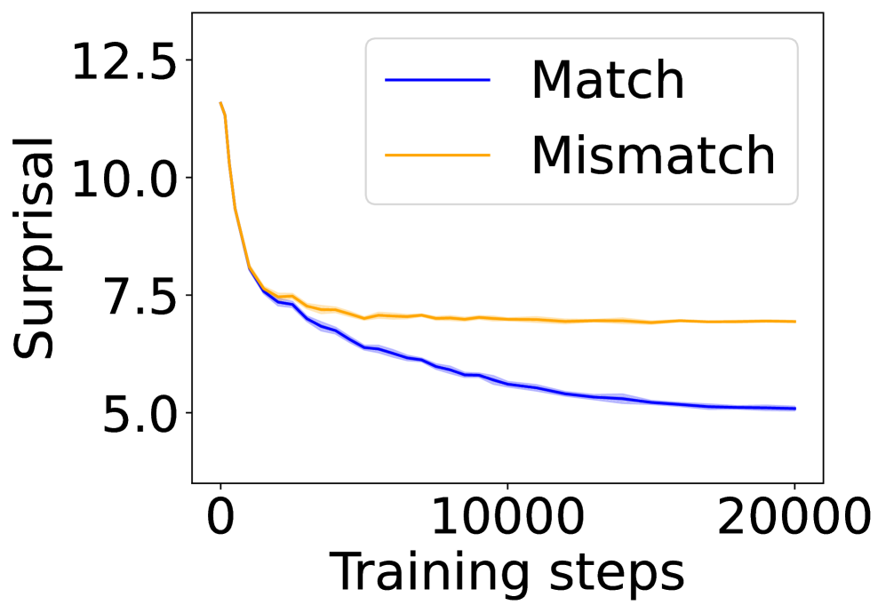
### Visual Description
## Line Chart: Surprisal vs. Training Steps for Match and Mismatch Conditions
### Overview
This image is a line chart comparing the "Surprisal" metric over the course of "Training steps" for two distinct conditions: "Match" and "Mismatch." The chart demonstrates how the surprisal value changes as training progresses for each condition.
### Components/Axes
* **Chart Type:** Line chart with two data series.
* **Y-Axis (Vertical):**
* **Label:** "Surprisal"
* **Scale:** Linear scale.
* **Range:** Approximately 5.0 to 12.5.
* **Major Tick Marks:** 5.0, 7.5, 10.0, 12.5.
* **X-Axis (Horizontal):**
* **Label:** "Training steps"
* **Scale:** Linear scale.
* **Range:** 0 to 20,000.
* **Major Tick Marks:** 0, 10000, 20000.
* **Legend:**
* **Position:** Top-right corner of the plot area.
* **Entry 1:** A solid blue line labeled "Match".
* **Entry 2:** A solid orange line labeled "Mismatch".
### Detailed Analysis
**1. "Match" Series (Blue Line):**
* **Trend:** The line shows a consistent, monotonic downward slope across the entire training period. The rate of decrease is steepest at the beginning and gradually slows, approaching an asymptote.
* **Data Points (Approximate):**
* Step 0: ~12.0
* Step 2500: ~7.5
* Step 5000: ~6.5
* Step 10000: ~5.8
* Step 15000: ~5.3
* Step 20000: ~5.1
**2. "Mismatch" Series (Orange Line):**
* **Trend:** The line exhibits a very sharp initial decrease, followed by a rapid transition to a near-plateau. After approximately 5,000 steps, the line remains relatively flat with minor fluctuations.
* **Data Points (Approximate):**
* Step 0: ~12.0 (similar starting point to Match)
* Step 1000: ~8.0
* Step 2500: ~7.5
* Step 5000: ~7.2
* Step 10000: ~7.1
* Step 15000: ~7.0
* Step 20000: ~7.0
**3. Relationship Between Series:**
* Both series begin at approximately the same high surprisal value (~12.0) at step 0.
* They diverge significantly after the first few hundred steps.
* The "Match" line continues to improve (lower surprisal) throughout training, while the "Mismatch" line's improvement stalls early.
* The gap between the two lines widens progressively over time. By step 20,000, the "Mismatch" surprisal (~7.0) is approximately 37% higher than the "Match" surprisal (~5.1).
### Key Observations
1. **Divergent Learning Trajectories:** The primary observation is the stark difference in learning outcomes. The model continues to optimize effectively for the "Match" condition but hits a performance ceiling for the "Mismatch" condition.
2. **Asymptotic Behavior:** Both curves show signs of approaching an asymptote, but at very different levels. The "Match" curve is still gently descending at step 20,000, suggesting potential for further minor improvement. The "Mismatch" curve has effectively plateaued.
3. **Initial Similarity:** The identical starting point indicates that before any training, the model's surprisal (uncertainty/error) is equally high for both conditions.
### Interpretation
This chart likely illustrates a fundamental concept in machine learning or cognitive science: the difference between learning within a consistent, expected framework ("Match") versus encountering data that violates or mismatches that framework ("Mismatch").
* **What the data suggests:** The model learns to predict or process "Matched" data efficiently over time, as shown by the steadily decreasing surprisal. Surprisal, a measure of unexpectedness or prediction error, falls as the model's internal representations align with the data structure.
* **The "Mismatch" plateau:** The rapid plateau for "Mismatched" data indicates a limit to the model's adaptability. After an initial adjustment, the model cannot further reduce the fundamental unexpectedness or error associated with this condition. This could represent a boundary of the model's capacity, a persistent distributional shift, or an inherent incompatibility between the model's learned priors and the mismatched data.
* **Why it matters:** This visualization provides clear evidence that training does not benefit all data types equally. It highlights a potential failure mode or limitation where a system performs well on in-distribution ("Match") data but fails to generalize to or improve upon out-of-distribution or conflicting ("Mismatch") data, despite extensive training. The widening gap quantifies the growing disparity in performance.
</details>
(a) 4-layer Transformer.
<details>
<summary>x25.png Details</summary>
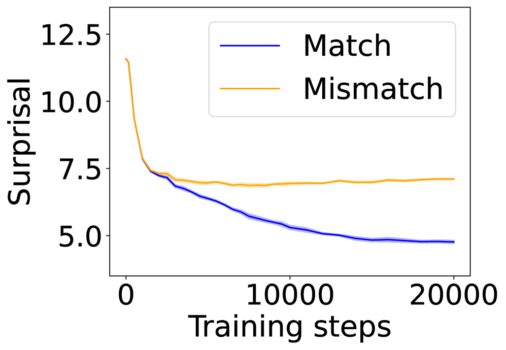
### Visual Description
\n
## Line Chart: Surprisal vs. Training Steps for Match and Mismatch Conditions
### Overview
The image is a line chart plotting "Surprisal" (a measure of prediction uncertainty or information content) against "Training steps" for two distinct conditions: "Match" and "Mismatch." The chart illustrates how the surprisal value evolves over the course of model training for these two scenarios.
### Components/Axes
* **X-Axis (Horizontal):**
* **Label:** "Training steps"
* **Scale:** Linear scale from 0 to 20,000.
* **Major Tick Marks:** 0, 10000, 20000.
* **Y-Axis (Vertical):**
* **Label:** "Surprisal"
* **Scale:** Linear scale from approximately 4.0 to 13.0.
* **Major Tick Marks:** 5.0, 7.5, 10.0, 12.5.
* **Legend:**
* **Position:** Top-right corner of the plot area.
* **Entry 1:** A solid blue line labeled "Match".
* **Entry 2:** A solid orange line labeled "Mismatch".
### Detailed Analysis
**Data Series Trends and Approximate Values:**
1. **"Match" Series (Blue Line):**
* **Trend:** The line exhibits a steep, continuous downward slope that gradually flattens over time. It shows a consistent decrease in surprisal as training progresses.
* **Key Points (Approximate):**
* Step 0: ~12.5
* Step 2,500: ~7.5
* Step 10,000: ~5.5
* Step 20,000: ~5.0
2. **"Mismatch" Series (Orange Line):**
* **Trend:** The line shows an initial sharp decline similar to the "Match" line, but then plateaus and remains relatively flat for the remainder of the training steps, with minor fluctuations.
* **Key Points (Approximate):**
* Step 0: ~12.5 (coincides with the "Match" line start)
* Step 2,500: ~7.5 (coincides with the "Match" line at this point)
* Step 10,000: ~7.0
* Step 20,000: ~7.2
**Spatial Relationship:** The two lines originate from the same point at step 0. They remain closely aligned until approximately step 2,500, after which they diverge. The blue "Match" line continues its descent below the orange "Mismatch" line, creating a widening gap. The legend is positioned in the upper right quadrant, not overlapping with the primary data trends.
### Key Observations
1. **Initial Convergence:** Both conditions start with identical high surprisal (~12.5) and improve at a nearly identical rate for the first ~2,500 training steps.
2. **Divergence Point:** A clear divergence occurs around step 2,500. The "Match" condition continues to improve (lower surprisal), while the "Mismatch" condition's improvement stalls.
3. **Final State:** By step 20,000, there is a significant and sustained gap between the two conditions. The "Match" surprisal (~5.0) is substantially lower than the "Mismatch" surprisal (~7.2).
4. **Plateau Behavior:** The "Mismatch" line exhibits a plateau after the initial drop, indicating that further training does not lead to significant reduction in surprisal for this condition.
### Interpretation
This chart demonstrates a fundamental difference in how a model learns from "Matched" versus "Mismatched" data or conditions during training.
* **What the data suggests:** The model is able to continuously reduce its prediction error (surprisal) on data that matches its training distribution or expected patterns ("Match"). However, for data that is mismatched—perhaps out-of-distribution, adversarial, or contradictory—the model's ability to improve hits a ceiling very early in training. The initial rapid improvement suggests the model learns basic, generalizable features applicable to both conditions, but the divergence indicates it cannot effectively learn or adapt to the specific characteristics of the "Mismatch" condition beyond a certain point.
* **Relationship between elements:** The shared starting point and initial parallel decline establish a common baseline. The subsequent divergence is the chart's central narrative, highlighting the limitation in the model's learning capacity for mismatched scenarios. The plateau of the "Mismatch" line is the critical visual evidence of this limitation.
* **Notable implications:** This pattern is indicative of a model that may perform well on in-distribution tasks but lacks robustness or generalization to certain types of distributional shift. The persistent gap suggests that simply increasing training steps is not a solution for improving performance on the "Mismatch" condition; a change in the model architecture, training data, or objective function would likely be required.
</details>
(b) 12-layer Transformer.
<details>
<summary>x26.png Details</summary>
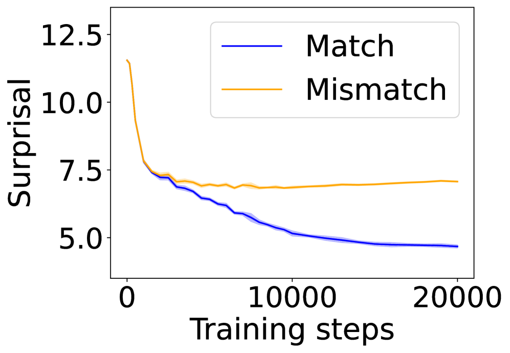
### Visual Description
\n
## Line Chart: Surprisal vs. Training Steps for Match and Mismatch Conditions
### Overview
The image displays a line chart comparing the "Surprisal" metric over the course of "Training steps" for two distinct conditions: "Match" and "Mismatch." The chart illustrates how this metric evolves during a training process, showing a clear divergence in performance between the two conditions.
### Components/Axes
* **Chart Type:** Line chart with shaded confidence bands.
* **X-Axis:**
* **Label:** "Training steps"
* **Scale:** Linear scale.
* **Markers:** Major ticks at 0, 10000, and 20000.
* **Y-Axis:**
* **Label:** "Surprisal"
* **Scale:** Linear scale.
* **Markers:** Major ticks at 5.0, 7.5, 10.0, and 12.5.
* **Legend:**
* **Position:** Top-right corner of the plot area.
* **Entry 1:** A solid blue line labeled "Match".
* **Entry 2:** A solid orange line labeled "Mismatch".
* **Data Series:**
1. **Match (Blue Line):** Represents the surprisal for the "Match" condition.
2. **Mismatch (Orange Line):** Represents the surprisal for the "Mismatch" condition.
* Both lines are accompanied by a semi-transparent shaded band of the same color, likely indicating standard deviation, standard error, or a confidence interval.
### Detailed Analysis
**Trend Verification & Data Points:**
* **Match (Blue Line):**
* **Visual Trend:** The line exhibits a steep, monotonic downward slope initially, which gradually flattens but continues to decrease throughout the displayed range.
* **Approximate Data Points:**
* Step 0: ~12.5
* Step ~2500: ~7.5
* Step 10000: ~5.5
* Step 20000: ~4.8 (just below the 5.0 marker)
* **Shaded Band:** The blue shaded area is relatively narrow, suggesting lower variance or higher confidence in the measurement for this condition.
* **Mismatch (Orange Line):**
* **Visual Trend:** The line also starts with a steep downward slope but flattens out much earlier, reaching a plateau. After approximately step 7500, it shows a very slight upward trend.
* **Approximate Data Points:**
* Step 0: ~12.5 (similar starting point to Match)
* Step ~2500: ~7.5
* Step 10000: ~7.0
* Step 20000: ~7.2
* **Shaded Band:** The orange shaded area is wider than the blue one, particularly in the later steps, indicating greater variance or uncertainty in the "Mismatch" condition measurements.
### Key Observations
1. **Initial Convergence:** Both conditions start at nearly identical high surprisal values (~12.5) at step 0 and follow a very similar rapid descent for the first ~2500 steps.
2. **Divergence Point:** The lines begin to clearly separate around step 3000-4000. The "Match" line continues its steady descent, while the "Mismatch" line's rate of decrease slows significantly.
3. **Plateau vs. Continued Improvement:** The most significant observation is the plateau of the "Mismatch" line after ~7500 steps, hovering between 7.0 and 7.5, while the "Match" line continues to improve (lower surprisal) steadily.
4. **Final State:** By step 20000, there is a substantial gap of approximately 2.4 units in surprisal between the two conditions (Match ~4.8 vs. Mismatch ~7.2).
5. **Variance Indicator:** The wider confidence band for the "Mismatch" condition suggests its performance is less stable or consistent than the "Match" condition.
### Interpretation
This chart likely visualizes the learning curve of a machine learning model, where "Surprisal" is a loss or error metric (lower is better). The "Match" and "Mismatch" conditions probably refer to the alignment between training data distribution and evaluation data distribution, or between a model's architecture and a task.
* **What the data suggests:** The model learns effectively and continuously improves on data that "Matches" its training paradigm or distribution. However, when faced with a "Mismatch," initial learning occurs, but the model hits a performance ceiling relatively early and fails to improve further, even stagnating or slightly degrading.
* **Relationship between elements:** The divergence of the lines is the core story. It demonstrates that the model's capacity to reduce surprisal is fundamentally limited by the mismatch condition. The shaded bands reinforce that the "Match" condition yields more reliable and consistent results.
* **Notable implications:** This pattern is classic evidence of a model's difficulty with generalization or out-of-distribution data. The plateau indicates that additional training steps beyond ~10,000 are not beneficial for the "Mismatch" scenario and may even lead to slight overfitting to the mismatched characteristics. The investigation would focus on why the mismatch creates an insurmountable barrier to further learning after the initial phase.
</details>
(c) 18-layer Transformer.
<details>
<summary>x27.png Details</summary>
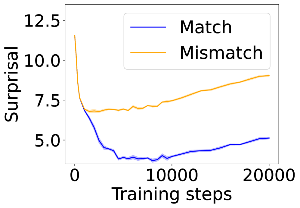
### Visual Description
\n
## Line Chart: Surprisal vs. Training Steps
### Overview
The image displays a line chart comparing the "Surprisal" metric over the course of "Training steps" for two distinct conditions: "Match" and "Mismatch." The chart illustrates how the model's performance, as measured by surprisal, evolves during training for these two scenarios.
### Components/Axes
* **Chart Type:** Line chart with two data series.
* **X-Axis:**
* **Label:** "Training steps"
* **Scale:** Linear scale from 0 to 20,000.
* **Major Tick Marks:** 0, 10000, 20000.
* **Y-Axis:**
* **Label:** "Surprisal"
* **Scale:** Linear scale from approximately 4.0 to 13.0.
* **Major Tick Marks:** 5.0, 7.5, 10.0, 12.5.
* **Legend:**
* **Position:** Top-right corner of the plot area.
* **Series 1:** "Match" - represented by a solid blue line.
* **Series 2:** "Mismatch" - represented by a solid orange line.
* **Data Representation:** Each line is accompanied by a semi-transparent shaded area of the same color, likely representing a confidence interval or standard deviation across multiple runs.
### Detailed Analysis
**Trend Verification & Data Points:**
1. **"Match" Series (Blue Line):**
* **Visual Trend:** The line exhibits a sharp, steep decline from the start, followed by a shallow, gradual upward trend.
* **Data Points (Approximate):**
* At Step 0: Surprisal ≈ 12.5
* The line drops rapidly, reaching a minimum value between steps 5,000 and 10,000. The lowest point appears to be around step 7,500, with a Surprisal value of approximately 4.0.
* From step 10,000 onward, the line shows a slow, steady increase.
* At Step 20,000: Surprisal ≈ 5.0
2. **"Mismatch" Series (Orange Line):**
* **Visual Trend:** The line shows an initial decline, followed by a consistent, moderate upward trend for the remainder of the training steps.
* **Data Points (Approximate):**
* At Step 0: Surprisal ≈ 12.5 (similar starting point to the Match series).
* The line declines, but less steeply than the blue line, reaching a local minimum around step 2,500 with a Surprisal of approximately 7.0.
* From step 2,500 onward, the line trends upward with minor fluctuations.
* At Step 10,000: Surprisal ≈ 7.5
* At Step 20,000: Surprisal ≈ 9.0
**Spatial Grounding:** The legend is positioned in the upper right quadrant of the chart, clearly associating the blue line with "Match" and the orange line with "Mismatch." The shaded confidence bands are consistently placed around their respective lines throughout the entire x-axis range.
### Key Observations
1. **Diverging Paths:** While both conditions start at a similar high surprisal level, their trajectories diverge significantly after the initial training phase (approximately step 2,500).
2. **Minimum Points:** The "Match" condition achieves a much lower minimum surprisal (~4.0) compared to the "Mismatch" condition (~7.0).
3. **Post-Minimum Behavior:** After reaching their respective minima, both series show an increase in surprisal as training continues to 20,000 steps. The rate of increase is steeper for the "Mismatch" series.
4. **Final Gap:** By the end of the plotted training (20,000 steps), a substantial gap exists between the two conditions, with "Mismatch" surprisal (~9.0) being significantly higher than "Match" surprisal (~5.0).
### Interpretation
This chart demonstrates a clear performance dichotomy in a model's training process based on data alignment ("Match" vs. "Mismatch").
* **What the data suggests:** The "Surprisal" metric, which typically measures how unexpected or "surprising" data is to a model (lower is better), indicates that the model learns to predict "Match" data much more effectively than "Mismatch" data. The initial steep drop for both suggests rapid early learning. However, the model's ability to minimize surprisal for mismatched data hits a floor early on and then deteriorates, while it continues to optimize for matched data to a much greater degree.
* **How elements relate:** The x-axis (Training steps) is the independent variable, showing the progression of the learning process. The y-axis (Surprisal) is the dependent performance metric. The two lines represent contrasting experimental conditions. The divergence implies that the nature of the training data (matched vs. mismatched) has a profound and lasting impact on the model's learned representations and predictive performance.
* **Notable trends/anomalies:** The most notable trend is the sustained increase in surprisal for the "Mismatch" condition after step 2,500. This could indicate **overfitting to the training distribution**—the model becomes increasingly specialized on the "matched" type of data it sees during training, causing its performance on "mismatched" data to worsen over time. The slight rise in the "Match" curve after its minimum might also suggest the onset of overfitting or a change in the training dynamics at later stages. The chart provides strong visual evidence that data congruence is critical for this model's learning efficiency and final performance.
</details>
(d) 12-layer Mamba 2.
<details>
<summary>x28.png Details</summary>
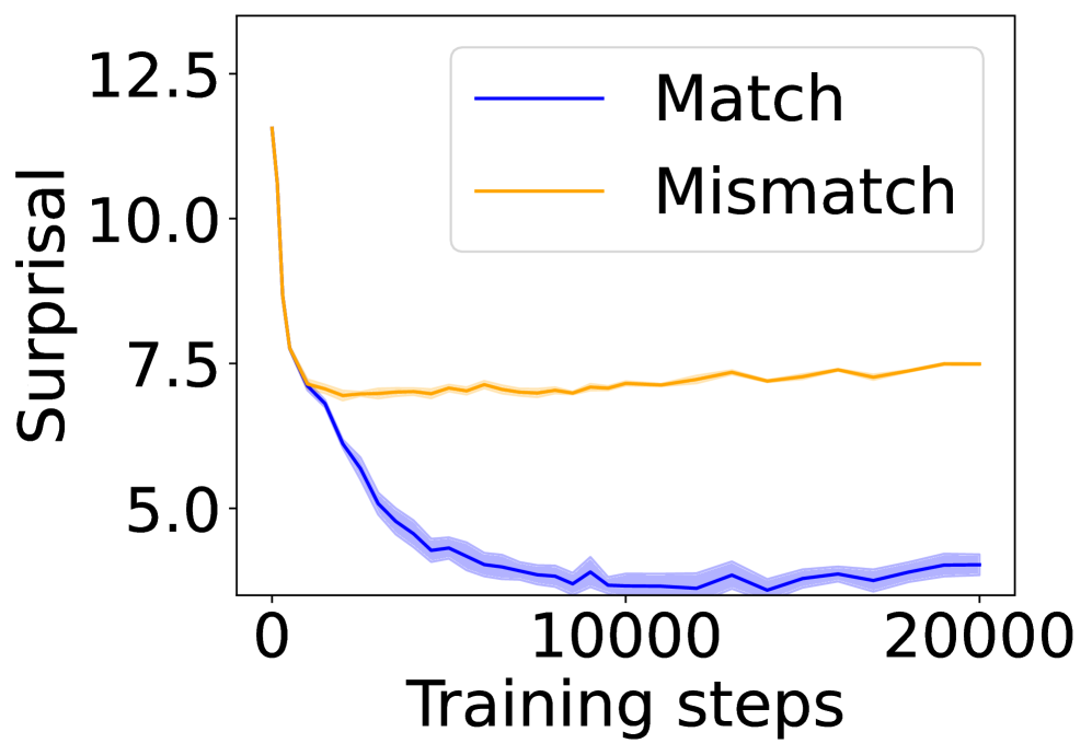
### Visual Description
\n
## Line Chart: Surprisal vs. Training Steps for Match and Mismatch Conditions
### Overview
The image is a line chart comparing the "Surprisal" metric over the course of "Training steps" for two distinct conditions: "Match" and "Mismatch". The chart demonstrates how the surprisal value evolves for each condition as training progresses.
### Components/Axes
* **Chart Type:** Line chart with shaded confidence intervals or standard deviation bands.
* **X-Axis:**
* **Label:** "Training steps"
* **Scale:** Linear scale from 0 to 20,000.
* **Major Tick Marks:** 0, 10000, 20000.
* **Y-Axis:**
* **Label:** "Surprisal"
* **Scale:** Linear scale from approximately 4.0 to 12.5.
* **Major Tick Marks:** 5.0, 7.5, 10.0, 12.5.
* **Legend:**
* **Position:** Top-right corner of the plot area.
* **Items:**
1. **"Match"** - Represented by a solid blue line.
2. **"Mismatch"** - Represented by a solid orange line.
* **Data Series:**
1. **Blue Line ("Match"):** A solid blue line with a light blue shaded area around it, indicating variability (e.g., standard deviation or confidence interval).
2. **Orange Line ("Mismatch"):** A solid orange line with no visible shaded area.
### Detailed Analysis
**Trend Verification & Data Points (Approximate):**
* **"Match" (Blue Line):**
* **Trend:** The line exhibits a steep, downward slope initially, followed by a gradual flattening. It shows a strong decreasing trend in surprisal as training steps increase.
* **Key Points:**
* At Step 0: Surprisal ≈ 12.5 (starting point).
* At Step ~2,500: Surprisal ≈ 7.5.
* At Step ~5,000: Surprisal ≈ 5.0.
* At Step 10,000: Surprisal ≈ 4.0 (reaches a plateau).
* From Step 10,000 to 20,000: Surprisal fluctuates slightly between ≈ 4.0 and 4.5, showing a stable, low value.
* **Shaded Area:** The light blue band is widest during the initial descent (steps 0-5000), suggesting higher variance in measurements during rapid learning. It narrows significantly after step 10,000, indicating more consistent results as the model stabilizes.
* **"Mismatch" (Orange Line):**
* **Trend:** The line shows a very different pattern. It starts lower than the "Match" line, dips slightly, and then exhibits a very gradual, slight upward trend over the long term.
* **Key Points:**
* At Step 0: Surprisal ≈ 7.5 (starting point, notably lower than "Match").
* At Step ~2,500: Surprisal dips to its lowest point, ≈ 7.0.
* From Step ~2,500 to 20,000: The line shows a slow, steady increase.
* At Step 10,000: Surprisal ≈ 7.2.
* At Step 20,000: Surprisal ≈ 7.5, returning to near its initial value.
### Key Observations
1. **Divergent Paths:** The two conditions start at different surprisal levels and follow completely opposite long-term trends. "Match" improves dramatically, while "Mismatch" stagnates and slightly worsens.
2. **Crossover Point:** The lines cross early in training, around step 1,500-2,000. Before this point, "Mismatch" has lower surprisal; after this point, "Match" has significantly lower surprisal.
3. **Plateau vs. Drift:** The "Match" condition successfully converges to a stable, low surprisal plateau. The "Mismatch" condition fails to improve and shows a concerning slight upward drift in surprisal over extended training.
4. **Variance:** The presence of a shaded band only for the "Match" line suggests that the "Mismatch" condition's results were either more consistent (less variable) or that the variance was not plotted for it.
### Interpretation
This chart likely visualizes the performance of a machine learning model, possibly a language model, during training. "Surprisal" is a common metric in information theory and NLP, measuring how unexpected a given data point (e.g., a word) is according to the model's current predictions. Lower surprisal indicates better predictive performance.
* **"Match" Condition:** Represents the model training on data that is **in-distribution** or consistent with its training objective. The steep drop in surprisal shows the model is effectively learning patterns from this data, leading to confident and accurate predictions (low surprisal) that stabilize over time.
* **"Mismatch" Condition:** Represents the model encountering **out-of-distribution** data, adversarial examples, or data from a different domain than it was trained on. The initial dip might reflect a brief period of adaptation, but the subsequent flat or slightly rising trend indicates the model **fails to learn** from this mismatched data. Its predictions remain relatively poor (high surprisal) and do not improve with more training steps on this data, suggesting a fundamental inability to generalize to this condition.
**Conclusion:** The data demonstrates a clear and significant performance gap between matched and mismatched conditions. It highlights the model's capacity to learn from consistent data and its limitation or failure mode when faced with distributional shift. The "Mismatch" line's slight upward drift could even indicate a form of negative transfer or catastrophic interference, where prolonged training on mismatched data slightly degrades the model's performance on that specific data type.
</details>
(e) 4-layer Mamba 2.
<details>
<summary>x29.png Details</summary>
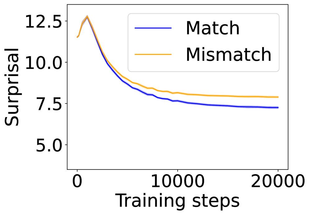
### Visual Description
\n
## Line Chart: Surprisal vs. Training Steps
### Overview
The image is a line chart plotting "Surprisal" against "Training steps" for two conditions: "Match" and "Mismatch". It visualizes how a model's surprisal (a measure of prediction uncertainty or information content) changes over the course of training. Both conditions show a rapid initial decrease in surprisal, which then plateaus, with the "Mismatch" condition consistently maintaining a higher surprisal value than the "Match" condition.
### Components/Axes
* **Chart Type:** Line chart with two data series.
* **X-Axis:**
* **Label:** "Training steps"
* **Scale:** Linear scale.
* **Markers:** 0, 10000, 20000.
* **Y-Axis:**
* **Label:** "Surprisal"
* **Scale:** Linear scale.
* **Markers:** 5.0, 7.5, 10.0, 12.5.
* **Legend:**
* **Position:** Top-right corner of the plot area.
* **Series 1:** "Match" - Represented by a solid blue line.
* **Series 2:** "Mismatch" - Represented by a solid orange line.
### Detailed Analysis
**Trend Verification:**
* **Match (Blue Line):** The line exhibits a steep downward slope from the start, which gradually flattens out. It is consistently positioned below the orange line throughout the entire x-axis range.
* **Mismatch (Orange Line):** This line follows a nearly identical shape to the blue line—a steep initial decline followed by a plateau—but is offset vertically, remaining above the blue line at all points.
**Data Point Extraction (Approximate Values):**
* **At Step 0:** Both lines start at approximately the same point, near a Surprisal value of **12.5**.
* **At Step ~5000 (estimated):**
* Match: ~8.5
* Mismatch: ~9.0
* **At Step 10000:**
* Match: ~7.5
* Mismatch: ~8.0
* **At Step 20000:**
* Match: ~7.2
* Mismatch: ~7.8
**Key Observations:**
1. **Parallel Trajectories:** The two lines are nearly parallel after the initial drop, indicating the *rate* of surprisal reduction is similar for both conditions after the early training phase.
2. **Persistent Gap:** A consistent gap of approximately **0.5 to 0.6** surprisal units is maintained between the "Mismatch" and "Match" conditions from around step 5000 onward.
3. **Convergence Behavior:** Both curves show clear convergence, with the slope approaching zero by step 20000, suggesting the model's performance on this metric has stabilized.
4. **Initial Peak:** There is a very brief initial increase or peak at the very start (step 0) before the decline begins.
### Interpretation
This chart demonstrates a fundamental learning dynamic. The rapid decrease in surprisal for both conditions indicates the model is effectively learning from the training data, becoming less "surprised" by it over time.
The critical finding is the persistent performance gap. The "Mismatch" condition results in consistently higher surprisal, meaning the model finds data under this condition less predictable or more informative than data under the "Match" condition. This suggests that whatever experimental variable "Mismatch" represents (e.g., out-of-distribution data, adversarial examples, or a corrupted input condition) creates a lasting difficulty for the model that is not fully overcome by training, even as overall performance improves.
The parallel nature of the curves after the initial phase implies that the core learning mechanism operates similarly in both scenarios, but the "Mismatch" data starts from and remains at a higher baseline of difficulty. The chart effectively quantifies the "cost" or "penalty" associated with the mismatch condition in terms of the model's predictive uncertainty.
</details>
(f) 4-layer LSTM.
Figure 9: Average surprisal of the experimental and control conditions over training steps.
<details>
<summary>x30.png Details</summary>
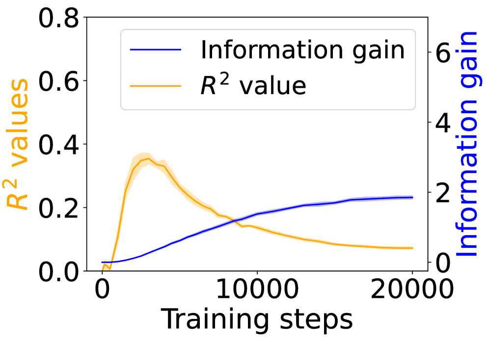
### Visual Description
## Dual-Axis Line Chart: Training Metrics Over Steps
### Overview
The image displays a dual-axis line chart plotting two different metrics against the number of training steps. The chart compares the progression of "Information gain" and "R² value" over a training period of 20,000 steps. The visual suggests a relationship where one metric improves steadily while the other peaks early and then declines.
### Components/Axes
* **Chart Type:** Dual-axis line chart.
* **X-Axis (Bottom):**
* **Label:** "Training steps"
* **Scale:** Linear, from 0 to 20,000.
* **Major Tick Marks:** 0, 10000, 20000.
* **Primary Y-Axis (Left):**
* **Label:** "R² values" (text color: orange).
* **Scale:** Linear, from 0.0 to 0.8.
* **Major Tick Marks:** 0.0, 0.2, 0.4, 0.6, 0.8.
* **Secondary Y-Axis (Right):**
* **Label:** "Information gain" (text color: blue).
* **Scale:** Linear, from 0 to 6.
* **Major Tick Marks:** 0, 2, 4, 6.
* **Legend:**
* **Position:** Top-left corner, inside the plot area.
* **Entry 1:** A blue line labeled "Information gain".
* **Entry 2:** An orange line labeled "R² value".
* **Data Series:**
1. **Blue Line ("Information gain"):** A solid blue line corresponding to the right y-axis.
2. **Orange Line ("R² value"):** A solid orange line corresponding to the left y-axis. This line is accompanied by a semi-transparent orange shaded region, likely representing a confidence interval or standard deviation across multiple runs.
### Detailed Analysis
* **Trend Verification - Information Gain (Blue Line):**
* **Visual Trend:** The line shows a smooth, monotonic increase. It starts near zero, rises steadily with a slightly decreasing slope, and begins to plateau in the later stages.
* **Data Points (Approximate):**
* Step 0: ~0.1
* Step 5000: ~1.0
* Step 10000: ~1.8
* Step 15000: ~2.1
* Step 20000: ~2.2 (plateauing)
* **Trend Verification - R² Value (Orange Line):**
* **Visual Trend:** The line exhibits a sharp initial increase to a peak, followed by a gradual, sustained decline.
* **Data Points (Approximate):**
* Step 0: 0.0
* Step ~2500 (Peak): ~0.35
* Step 5000: ~0.30
* Step 10000: ~0.15
* Step 15000: ~0.10
* Step 20000: ~0.05
* **Shaded Region:** The orange shaded band is narrowest at the start and end, and widest around the peak (steps 2000-5000), indicating greater variance in the R² metric during the period of its highest value.
### Key Observations
1. **Inverse Post-Peak Relationship:** After approximately 2,500 training steps, the two metrics move in opposite directions. Information gain continues to increase, while the R² value decreases.
2. **Early Peak of R²:** The R² value reaches its maximum very early in the training process (within the first 15% of the displayed steps) and never recovers to that level.
3. **Plateauing Information Gain:** The rate of increase for Information gain slows significantly after 10,000 steps, suggesting diminishing returns in this metric with further training.
4. **Variance Correlation:** The uncertainty (shaded region) in the R² measurement is highest when the metric itself is at its peak.
### Interpretation
This chart illustrates a potential trade-off or decoupling of two model performance indicators during training. The steady rise in **Information gain** suggests the model is consistently learning and extracting more signal from the data as training progresses.
However, the early peak and subsequent decline of the **R² value** is a critical anomaly. R² typically measures how well the model's predictions explain the variance in the data. A declining R² alongside increasing information gain could indicate several scenarios:
* **Overfitting to Noise:** The model may be learning increasingly specific patterns (gaining information) that do not generalize well to the underlying data structure, causing its explanatory power (R²) on a validation set to drop.
* **Changing Data Distribution:** If the training data distribution shifts, the model might gain information about the new data while its fit to the original target variance diminishes.
* **Metric Sensitivity:** The two metrics may be capturing fundamentally different aspects of model performance. Information gain might be measuring predictive power in an information-theoretic sense, while R² is a specific statistical measure of fit.
The shaded region around the R² line implies that this peaking-and-decaying behavior is a consistent pattern across multiple training runs, not a one-off fluke. The key takeaway for a practitioner would be to investigate why the model's explanatory power (R²) deteriorates so early and whether the continued increase in information gain is desirable or a sign of problematic learning.
</details>
(a) 4-layer Transformer.
<details>
<summary>x31.png Details</summary>
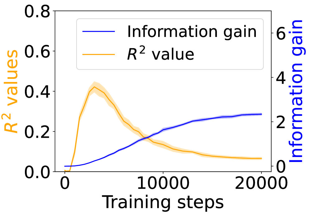
### Visual Description
## Dual-Axis Line Chart: Training Progress Metrics
### Overview
The image displays a dual-axis line chart plotting two different metrics against the number of training steps. The chart illustrates the relationship and contrasting trends between a model's "R² value" (a measure of goodness-of-fit) and its "Information gain" over the course of training.
### Components/Axes
* **X-Axis (Bottom):** Labeled **"Training steps"**. It has major tick marks and labels at **0**, **10000**, and **20000**. The axis spans from 0 to slightly beyond 20,000 steps.
* **Primary Y-Axis (Left):** Labeled **"R² values"** in orange text. The scale ranges from **0.0** to **0.8**, with major ticks at 0.0, 0.2, 0.4, 0.6, and 0.8.
* **Secondary Y-Axis (Right):** Labeled **"Information gain"** in blue text. The scale ranges from **0** to **6**, with major ticks at 0, 2, 4, and 6.
* **Legend:** Positioned in the **top-center** of the chart area. It contains two entries:
* A blue line labeled **"Information gain"**.
* An orange line labeled **"$R^2$ value"**.
* **Data Series:**
1. **Blue Line ("Information gain"):** A solid blue line with a light blue shaded region around it, indicating a confidence interval or standard deviation.
2. **Orange Line ("$R^2$ value"):** A solid orange line with a light orange shaded region around it.
### Detailed Analysis
**Trend Verification & Data Points:**
* **Information Gain (Blue Line, Right Axis):**
* **Trend:** The line shows a steady, monotonic increase that begins to plateau. It starts near 0, rises with a decreasing slope, and approaches an asymptote.
* **Approximate Data Points:**
* Step 0: ~0.1
* Step 2500: ~0.5
* Step 5000: ~1.0
* Step 7500: ~1.5
* Step 10000: ~2.0
* Step 15000: ~2.3
* Step 20000: ~2.5 (The line appears to level off around this value).
* **R² Value (Orange Line, Left Axis):**
* **Trend:** The line exhibits a sharp initial increase to a peak, followed by a gradual, sustained decline. This creates an inverted "V" or a peak-and-decay shape.
* **Approximate Data Points:**
* Step 0: ~0.0
* Step ~2500 (Peak): ~0.42. The shaded region suggests a range of approximately 0.38 to 0.46 at the peak.
* Step 5000: ~0.35
* Step 7500: ~0.25
* Step 10000: ~0.15
* Step 15000: ~0.10
* Step 20000: ~0.08
**Spatial Grounding & Key Intersection:**
* The two lines intersect at approximately **8,000 training steps**. At this point, the R² value is ~0.20 and the Information gain is ~1.7.
* The peak of the R² value occurs in the **left third** of the chart's horizontal span.
* The legend is placed in the **upper central region**, overlapping the area where the blue line is rising and the orange line is descending.
### Key Observations
1. **Inverse Relationship Post-Peak:** After the R² value peaks around 2,500 steps, the two metrics demonstrate an inverse relationship. As training continues, Information gain increases while R² value decreases.
2. **Differing Convergence:** The Information gain appears to converge to a stable, high value (~2.5), suggesting the model continues to extract useful information. The R² value converges to a low, stable value (~0.08), suggesting the model's predictive fit on the measured dataset degrades.
3. **Uncertainty Bands:** The shaded confidence intervals are widest for the R² value around its peak (steps 1,500-4,000), indicating higher variance or uncertainty in this metric during the early, rapid-change phase of training. The bands for Information gain are relatively consistent.
### Interpretation
This chart likely visualizes a phenomenon in machine learning model training where initial learning rapidly improves the model's fit to the training data (high R²), but prolonged training leads to a state where the model continues to gain information (perhaps from noise or spurious correlations) at the expense of its generalizable fit. The declining R² could indicate overfitting, where the model becomes too specialized to the training set's noise, or a shift in what the model is optimizing for.
The crossing point at ~8,000 steps is critical. It marks the transition where the model's information acquisition surpasses its measurable goodness-of-fit. The plateau in information gain suggests diminishing returns from further training beyond 15,000-20,000 steps for this particular metric. An investigator would use this chart to argue for **early stopping** (around the R² peak) to preserve generalization, or to question whether the "Information gain" metric is aligned with the desired model performance outcome.
</details>
(b) 12-layer Transformer.
<details>
<summary>x32.png Details</summary>
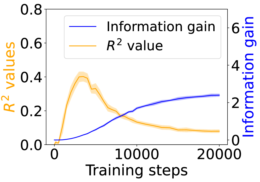
### Visual Description
## Dual-Axis Line Chart: Training Metrics Over Steps
### Overview
The image displays a dual-axis line chart plotting two different metrics against the number of training steps. The chart compares the progression of "Information gain" and "R² value" over a training period of 20,000 steps. The two metrics are measured on separate y-axes due to their different scales.
### Components/Axes
* **X-Axis (Bottom):**
* **Label:** "Training steps"
* **Scale:** Linear, from 0 to 20,000.
* **Major Tick Marks:** 0, 10000, 20000.
* **Primary Y-Axis (Left):**
* **Label:** "R² values" (text colored orange).
* **Scale:** Linear, from 0.0 to 0.8.
* **Major Tick Marks:** 0.0, 0.2, 0.4, 0.6, 0.8.
* **Secondary Y-Axis (Right):**
* **Label:** "Information gain" (text colored blue).
* **Scale:** Linear, from 0 to 6.
* **Major Tick Marks:** 0, 2, 4, 6.
* **Legend:**
* **Position:** Top-left corner, inside the plot area.
* **Entry 1:** A blue line labeled "Information gain".
* **Entry 2:** An orange line labeled "R² value".
* **Data Series:**
* **Blue Line ("Information gain"):** A solid blue line with a light blue shaded region around it, representing a confidence interval or standard deviation.
* **Orange Line ("R² value"):** A solid orange line with a light orange shaded region around it, representing a confidence interval or standard deviation.
### Detailed Analysis
**Trend Verification & Data Points:**
1. **Information Gain (Blue Line, Right Axis):**
* **Trend:** Shows a steady, monotonic increase that begins to plateau in the later stages of training.
* **Data Points (Approximate):**
* Step 0: ~0.1
* Step 5000: ~0.8
* Step 10000: ~1.8
* Step 15000: ~2.3
* Step 20000: ~2.5 (plateauing)
2. **R² Value (Orange Line, Left Axis):**
* **Trend:** Shows a rapid initial increase to a peak, followed by a gradual decline.
* **Data Points (Approximate):**
* Step 0: ~0.0
* Step 2500: ~0.25
* Step 5000 (Peak): ~0.40
* Step 7500: ~0.25
* Step 10000: ~0.15
* Step 15000: ~0.10
* Step 20000: ~0.08
**Spatial Grounding & Cross-Reference:**
* The legend is positioned in the top-left quadrant of the chart area.
* The blue line corresponds to the right-hand "Information gain" axis. Its values are read against the scale from 0 to 6.
* The orange line corresponds to the left-hand "R² values" axis. Its values are read against the scale from 0.0 to 0.8.
* The two lines intersect at approximately step 8,000. At this point, the R² value is ~0.2 and the Information gain is ~1.5.
### Key Observations
1. **Divergent Trends:** The two metrics exhibit fundamentally different behaviors over the training period. Information gain consistently improves, while R² value peaks early and then deteriorates.
2. **Peak Performance:** The model's R² value, a measure of goodness-of-fit, reaches its maximum performance relatively early in training (around 5,000 steps).
3. **Plateau vs. Decline:** Information gain appears to approach an asymptote (plateau) after 15,000 steps, suggesting diminishing returns. In contrast, the R² value continues a slow decline.
4. **Uncertainty Bands:** Both lines have shaded confidence bands, indicating variability in the measurements. The band for the R² value appears slightly wider around its peak.
### Interpretation
This chart illustrates a potential trade-off or decoupling between two model evaluation metrics during training.
* **What the data suggests:** The steady rise in "Information gain" implies the model is continuously learning and extracting more information from the data as training progresses. However, the early peak and subsequent decline in "R² value" suggests that while the model is gaining information, its ability to explain the variance in the training data (in a linear regression sense) worsens after a certain point.
* **How elements relate:** The inverse relationship after the ~5,000-step mark is notable. It could indicate the onset of overfitting, where the model begins to fit noise in the training data, harming its general explanatory power (R²) even as it memorizes more specific information (gain). Alternatively, it might reflect a shift in the model's internal representations that is beneficial for one metric but detrimental to the other.
* **Notable anomalies:** The most significant feature is the sharp peak in R² value. This suggests an optimal point for model fit occurred early, and extended training beyond this point may be counterproductive if R² is the primary metric of concern. The continued rise in information gain, however, might be desirable for other objectives, such as representation learning or performance on a downstream task not measured by R².
**Conclusion:** The chart provides a technical narrative that "more training" is not uniformly better across all metrics. The choice of when to stop training (early stopping) depends critically on which metric—explanatory power (R²) or information acquisition—is prioritized for the specific application.
</details>
(c) 18-layer Transformer.
<details>
<summary>x33.png Details</summary>
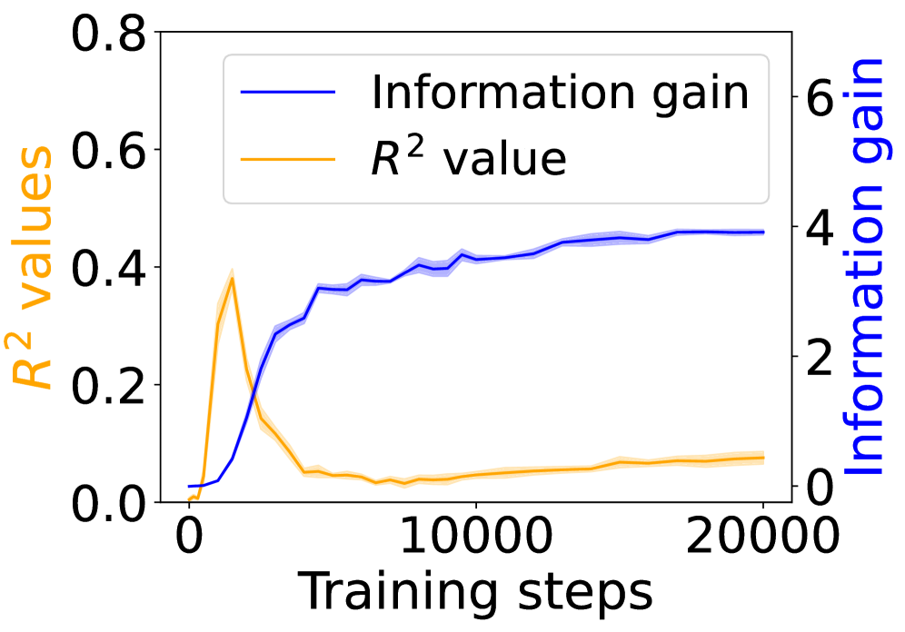
### Visual Description
## Dual-Axis Line Chart: Training Progress Metrics
### Overview
This image displays a dual-axis line chart tracking two performance metrics over the course of model training. The chart plots "R² values" and "Information gain" against "Training steps," revealing an inverse relationship between the two metrics after an initial phase.
### Components/Axes
* **Chart Type:** Dual-axis line chart with shaded confidence bands.
* **X-Axis (Bottom):**
* **Label:** "Training steps"
* **Scale:** Linear, from 0 to 20,000.
* **Major Tick Marks:** 0, 10000, 20000.
* **Primary Y-Axis (Left):**
* **Label:** "R² values" (text colored orange to match its data series).
* **Scale:** Linear, from 0.0 to 0.8.
* **Major Tick Marks:** 0.0, 0.2, 0.4, 0.6, 0.8.
* **Secondary Y-Axis (Right):**
* **Label:** "Information gain" (text colored blue to match its data series).
* **Scale:** Linear, from 0 to 6.
* **Major Tick Marks:** 0, 2, 4, 6.
* **Legend:**
* **Position:** Top-center of the plot area.
* **Entries:**
1. A blue line labeled "Information gain".
2. An orange line labeled "R² value".
### Detailed Analysis
**1. Data Series: R² value (Orange Line)**
* **Trend Verification:** The line exhibits a sharp, early peak followed by a rapid decline and subsequent stabilization at a low value.
* **Data Points (Approximate):**
* Starts at ~0.0 at step 0.
* Rises steeply to a peak of approximately **0.38-0.40** at around **1,500-2,000** training steps.
* Declines sharply to ~0.15 by step 4,000.
* Continues a gradual decline, stabilizing in the range of **0.05 to 0.08** from step 8,000 onward to step 20,000.
* **Uncertainty:** The line is surrounded by a light orange shaded band, indicating variance or a confidence interval around the mean value.
**2. Data Series: Information gain (Blue Line)**
* **Trend Verification:** The line shows a consistent, monotonic increase that decelerates over time, approaching a plateau.
* **Data Points (Approximate):**
* Starts near **0.0** at step 0.
* Increases rapidly, reaching ~2.0 by step 4,000.
* The rate of increase slows. It crosses the value of 3.0 around step 8,000.
* Continues to rise gradually, approaching a plateau near a value of **4.0** by step 20,000.
* **Uncertainty:** The line is surrounded by a light blue shaded band, indicating variance or a confidence interval.
### Key Observations
1. **Inverse Relationship Post-Peak:** After the initial ~2,000 steps, the two metrics move in opposite directions. As Information gain steadily increases, the R² value decreases and remains low.
2. **Early R² Peak:** The R² value achieves its maximum very early in training (within the first 10% of displayed steps), suggesting the model's predictive fit on the evaluated metric was best at that early stage.
3. **Plateauing Information Gain:** The Information gain curve shows clear signs of saturation, suggesting diminishing returns in information acquisition as training progresses beyond ~15,000 steps.
4. **Low Final R²:** The final R² value is very close to zero, indicating that by the end of training, the model's predictions, as measured by this metric, explain almost none of the variance in the target.
### Interpretation
This chart likely illustrates a phenomenon in machine learning where a model's internal representation becomes more informative or disentangled (increasing Information gain) while its direct predictive performance on a specific task (measured by R²) degrades. This could indicate:
* **A Shift in Learning Objective:** The model may be prioritizing the learning of robust, general features (increasing information) over optimizing for the specific R² metric, which might be sensitive to noise or a particular aspect of the data.
* **Overfitting to a Proxy Metric:** The early peak in R² could represent overfitting to a training signal that is later overcome as the model learns more fundamental data structures.
* **Trade-off Between Metrics:** It demonstrates a potential trade-off between two different evaluation criteria. Maximizing one (Information gain) does not guarantee improvement in the other (R²), and may even harm it.
The data suggests that evaluating model progress requires multiple metrics. Relying solely on R² would indicate the model is performing poorly after the first few thousand steps, while the Information gain metric shows continuous, valuable learning is occurring throughout the entire training process.
</details>
(d) 12-layer Mamba 2.
<details>
<summary>x34.png Details</summary>
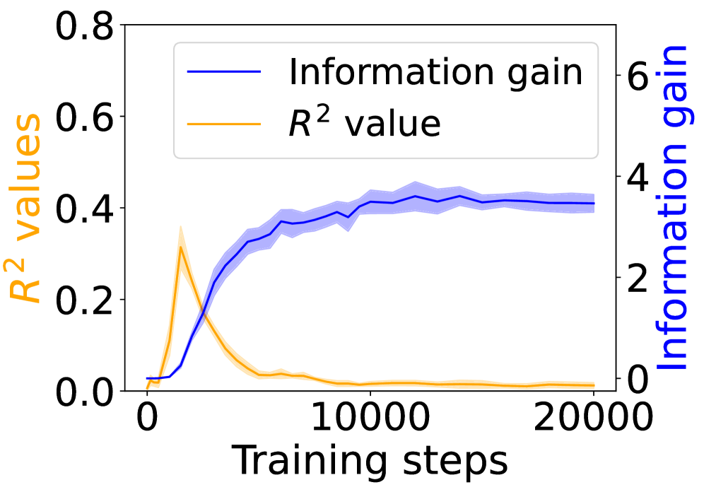
### Visual Description
\n
## Dual-Axis Line Chart: Training Progress Metrics
### Overview
The image displays a dual-axis line chart plotting two different metrics against the number of training steps. The chart illustrates the relationship between a model's "Information gain" and its "R² value" over the course of 20,000 training steps. The data suggests an inverse relationship between the two metrics after an initial phase.
### Components/Axes
* **X-Axis (Bottom):** Labeled "Training steps". The scale runs from 0 to 20,000, with major tick marks at 0, 10,000, and 20,000.
* **Primary Y-Axis (Left):** Labeled "R² values" in orange text. The scale runs from 0.0 to 0.8, with major tick marks at 0.0, 0.2, 0.4, 0.6, and 0.8.
* **Secondary Y-Axis (Right):** Labeled "Information gain" in blue text. The scale runs from 0 to 6, with major tick marks at 0, 2, 4, and 6.
* **Legend:** Located in the top-left quadrant of the chart area. It contains two entries:
* A blue line labeled "Information gain".
* An orange line labeled "R² value".
* **Data Series:**
1. **Information Gain (Blue Line):** A solid blue line with a semi-transparent blue shaded region around it, likely representing a confidence interval or standard deviation.
2. **R² Value (Orange Line):** A solid orange line with a semi-transparent orange shaded region around it.
### Detailed Analysis
**1. Information Gain (Blue Line, Right Axis):**
* **Trend:** The line shows a steep, positive slope initially, followed by a plateau.
* **Data Points (Approximate):**
* Starts near 0 at step 0.
* Rises sharply, crossing a value of ~2 around step 2,500.
* Continues to increase, reaching ~3.5 by step 5,000.
* The growth rate slows, approaching a value of ~4 by step 10,000.
* From step 10,000 to 20,000, the line plateaus, fluctuating slightly around a value of 4.0 (±0.2).
* **Uncertainty (Shaded Region):** The blue shaded band is narrowest at the start and end, and widest during the period of rapid increase (steps ~2,500 to 7,500), indicating higher variance in the measurement during that phase.
**2. R² Value (Orange Line, Left Axis):**
* **Trend:** The line shows a sharp, early peak followed by a rapid decline and a long, low plateau.
* **Data Points (Approximate):**
* Starts near 0.0 at step 0.
* Peaks sharply at approximately step 2,500, reaching a maximum value of ~0.35.
* Declines rapidly after the peak, falling below 0.1 by step 5,000.
* From step 7,500 onward, it stabilizes at a very low value, hovering just above 0.0 (approximately 0.02-0.05) until step 20,000.
* **Uncertainty (Shaded Region):** The orange shaded band is most prominent around the peak (steps ~1,500 to 3,500), suggesting significant variance in the R² value during the model's peak performance on this metric.
### Key Observations
1. **Inverse Relationship Post-Peak:** After approximately step 2,500, the two metrics move in opposite directions. As Information Gain continues to climb and stabilize, the R² value collapses.
2. **Divergent Timescales:** The R² value reaches its maximum very early in training (~12.5% of the total steps shown). In contrast, Information Gain requires about half the displayed training (10,000 steps) to reach its plateau.
3. **Stability vs. Volatility:** The final 10,000 steps show both metrics in a stable state, but at dramatically different levels relative to their scales: Information Gain is high and stable, while R² is near zero and stable.
4. **Variance Patterns:** The uncertainty (shaded regions) for both metrics is highest during their periods of most rapid change.
### Interpretation
This chart likely visualizes the training dynamics of a machine learning model, possibly in representation learning or a similar field.
* **What the data suggests:** The "Information gain" metric appears to measure the model's capacity to learn useful, discriminative features from the data. Its steady rise and plateau indicate successful and sustained learning. The "R² value," a common measure of regression fit or predictive accuracy, peaks early and then degrades. This pattern is a classic signature of **overfitting** or a **shift in the model's objective**. The model may initially fit the training data well (high R²), but as training progresses, it optimizes for a different, more abstract goal (maximizing information gain) that does not correlate with the specific predictive task measured by R².
* **Relationship between elements:** The dual-axis design is crucial for revealing this inverse relationship, which would be obscured if plotted on a single axis. The legend and color coding are essential for correctly associating each trend with its corresponding metric and scale.
* **Notable anomaly:** The most striking feature is the complete decoupling of the two metrics. It implies that for this model and task, continued training (as measured by information gain) actively harms the specific predictive performance measured by R² after a very early point. This could be intentional (e.g., the model is being trained for a different downstream task) or a sign of a problematic training regime.
</details>
(e) 4-layer Mamba 2.
<details>
<summary>x35.png Details</summary>
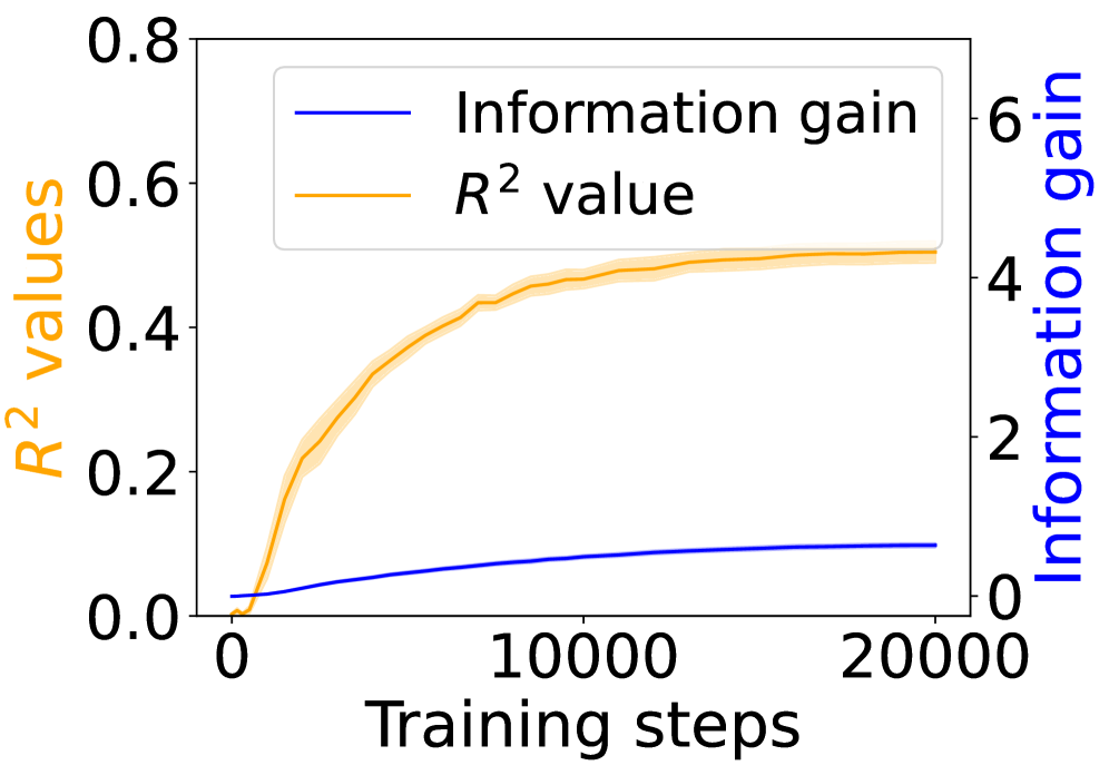
### Visual Description
## Dual-Axis Line Chart: Model Training Metrics
### Overview
The image displays a dual-axis line chart plotting two different metrics against the number of training steps for a machine learning model. The chart illustrates the progression of model performance (R² value) and information gain over the course of training.
### Components/Axes
* **X-Axis (Bottom):** Labeled "Training steps". The scale runs from 0 to 20,000, with major tick marks at 0, 10,000, and 20,000.
* **Primary Y-Axis (Left):** Labeled "R² values" in orange text. The scale runs from 0.0 to 0.8, with major tick marks at 0.0, 0.2, 0.4, 0.6, and 0.8.
* **Secondary Y-Axis (Right):** Labeled "Information gain" in blue text. The scale runs from 0 to 6, with major tick marks at 0, 2, 4, and 6.
* **Legend:** Positioned in the top-center of the chart area. It contains two entries:
* A blue line labeled "Information gain".
* An orange line labeled "R² value".
* **Data Series:**
1. **R² value (Orange Line):** This line is plotted against the left y-axis. It is accompanied by a semi-transparent orange shaded region, likely representing a confidence interval or standard deviation.
2. **Information gain (Blue Line):** This line is plotted against the right y-axis. It is a solid line without a visible shaded region.
### Detailed Analysis
**Trend Verification & Data Point Extraction:**
* **R² value (Orange Line, Left Axis):**
* **Trend:** The line shows a steep, concave-down increase from near 0 at step 0, followed by a clear plateau. The rate of increase slows significantly after approximately 5,000 steps.
* **Approximate Data Points:**
* Step 0: ~0.0
* Step 2,500: ~0.25
* Step 5,000: ~0.40
* Step 10,000: ~0.48
* Step 15,000: ~0.50
* Step 20,000: ~0.51 (Plateauing)
* **Information gain (Blue Line, Right Axis):**
* **Trend:** The line shows a steady, near-linear increase from a value slightly above 0 at step 0. The slope is positive but much shallower than the initial slope of the R² curve.
* **Approximate Data Points:**
* Step 0: ~0.2
* Step 5,000: ~0.5
* Step 10,000: ~0.8
* Step 15,000: ~1.0
* Step 20,000: ~1.1
### Key Observations
1. **Divergent Growth Patterns:** The two metrics exhibit fundamentally different growth patterns. R² value experiences rapid early gains before saturating, while information gain increases at a slower, more constant rate throughout the observed training period.
2. **Scale Disparity:** The absolute values of the two metrics are on vastly different scales (0-0.8 vs. 0-6), necessitating the dual-axis presentation.
3. **Uncertainty Visualization:** The orange shaded region around the R² line indicates variance or uncertainty in that metric, which appears to be relatively consistent in width across the training steps. No such region is shown for information gain.
4. **Plateau Point:** The R² value appears to reach a performance plateau around 10,000 to 15,000 training steps, suggesting diminishing returns for this metric beyond that point.
### Interpretation
This chart provides a Peircean insight into the learning dynamics of the model. The **R² value** (coefficient of determination) is a measure of how well the model's predictions fit the observed data. Its rapid initial rise indicates the model quickly learns the dominant patterns in the data. The subsequent plateau suggests it has captured most of the explainable variance and further training yields minimal improvement in fit.
The **Information gain** (likely referring to a metric like mutual information or information-theoretic gain) measures the reduction in uncertainty about the target variable given the model's predictions. Its steady, linear increase implies that even after the model's predictive fit (R²) stabilizes, it continues to refine its internal representations or become more "certain" in a information-theoretic sense.
The relationship suggests a two-phase learning process: an initial phase of rapid pattern fitting (high R² growth), followed by a prolonged phase of subtle refinement and uncertainty reduction (steady information gain growth). The absence of a confidence interval for information gain might indicate it is a deterministic calculation from the model's outputs, whereas R², calculated against a validation set, shows expected variance. This chart is crucial for understanding not just if the model is learning, but *how* its learning evolves over time.
</details>
(f) 4-layer LSTM.
Figure 10: Grounding information gain and its correlation to the co-occurrence of linguistic and environment tokens over training steps.