# The Ouroboros of Benchmarking: Reasoning Evaluation in an Era of Saturation
**Authors**:
- İbrahim Ethem Deveci (Department of Cognitive Science)
- Ankara, Turkey
- Duygu Ataman (Department of Cognitive Science)
- Ankara, Turkey
## Abstract
The rapid rise of Large Language Models (LLMs) and Large Reasoning Models (LRMs) has been accompanied by an equally rapid increase of benchmarks used to assess them. However, due to both improved model competence resulting from scaling and novel training advances as well as likely many of these datasets being included in pre or post training data, results become saturated, driving a continuous need for new and more challenging replacements. In this paper, we discuss whether surpassing a benchmark truly demonstrates reasoning ability or are we simply tracking numbers divorced from the capabilities we claim to measure? We present an investigation focused on three model families, OpenAI, Anthropic, and Google, and how their reasoning capabilities across different benchmarks evolve over the years. We also analyze performance trends over the years across different reasoning tasks and discuss the current situation of benchmarking and remaining challenges. By offering a comprehensive overview of benchmarks and reasoning tasks, our work aims to serve as a first reference to ground future research in reasoning evaluation and model development.
## 1 Introduction
Benchmarks have long played a central role in evaluating and comparing machine learning models [1]. As models scale up in size and capability, particularly Large Language Models (LLMs) and the specialized Large Reasoning Models (LRMs), many benchmarks quickly saturate, often reaching or surpassing human-level performance. Whether this saturation is driven primarily by improved model capability or dataset contamination is generally unknown. Nevertheless, this quick saturation forces the development of new and more challenging benchmarks that could be used to further compare new model families. In this paper, we investigate several key research questions: How effective are current benchmarks at measuring model capabilities, and does surpassing a benchmark reliably indicate genuine reasoning?
To examine these questions, we select three model families, OpenAI, Anthropic, and Google, and compile performance data from official sources [2, 3, 4, 5, 6, 7, 8, 9, 10, 11, 12, 13, 14, 15, 16, 17, 18, 19, 20, 21, 22]. We gather a comprehensive list of 52 benchmarks used in evaluating these models and classify them according to the types of reasoning they aim to evaluate. Analyzing performance trends over the years, we highlight where models improve, where they struggle, and what these trends reveal about the current state of benchmarking. Finally, we discuss the implications of the saturation cycle and emphasize the need for improved evaluation practices that more accurately capture model capabilities.
Our contributions are threefold: (1) we provide a curated list of reasoning benchmarks, classified by the types of reasoning they aim to assess (2) we analyze performance trends over the years to assess benchmarking effectiveness; (3) we examine current landscape of existing benchmarks, identifying which benchmarks have reached high performance thresholds and which seem to remain unsolved.
By situating our analysis within the broader evaluation landscape, our work collects evidence to emphasize the need for reasoning tasks that are more representative of the nature of reasoning process and target evaluation beyond downstream accuracy.
## 2 Benchmark Landscape and Categorization
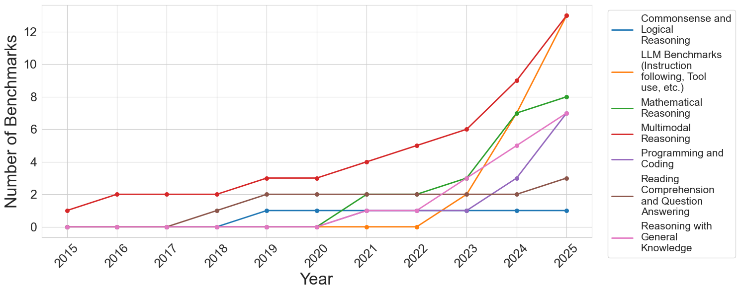
In order to provide a general analysis of how the creation and adoption of reasoning benchmarks have evolved over time, we examine three model families and compile the set of benchmarks employed to evaluate them. Our aim is to provide a comprehensive overview of current benchmarking practices and to trace how the creation and adoption of benchmarks have evolved over time. The complete list of benchmarks, their assigned reasoning types, and short summaries can be found in Appendix A. To facilitate analysis, we categorize benchmarks into seven reasoning types: commonsense and logical reasoning, mathematical reasoning, multimodal reasoning, programming and coding, reading comprehension and question answering, reasoning with general knowledge, and LLM-specific capabilities such as safety, tool use, and instruction following. Figure 1 illustrates a marked increase in benchmark adoption for multimodal reasoning, mathematical reasoning, programming, reasoning with general knowledge, and LLM-specific benchmarks after 2023. In contrast, no new benchmarks in reading comprehension or commonsense reasoning were adopted by these model families during this period. While the literature contains several other benchmarks in these areas [23, 24, 25, 26, 27, 28, 29], our analysis shows they have not been utilized by any of the prominent model families. This likely reflects the evolving understanding of what constitutes reasoning in computational models, in accordance with their current capabilities and what the community deems important to evaluate. Since most models now have direct commercial applications, their performance in more applicable domains, such as coding and tool-use benchmarks, may also motivate the evaluation in certain categories of reasoning tasks.
<details>
<summary>figures/benchmarks_by_year.png Details</summary>
### Visual Description
## Line Chart: Number of Benchmarks by Category (2015-2025)
### Overview
This is a line chart tracking the annual count of distinct AI benchmarks across seven different capability categories from 2015 to 2025. The chart demonstrates a significant and accelerating increase in the total number of benchmarks, particularly from 2022 onward, with the most dramatic growth occurring in the final two years (2024-2025).
### Components/Axes
* **Chart Type:** Multi-line chart.
* **X-Axis (Horizontal):** Labeled "Year". It displays discrete years from 2015 to 2025.
* **Y-Axis (Vertical):** Labeled "Number of Benchmarks". It has a linear scale from 0 to 12, with major gridlines at intervals of 2.
* **Legend:** Positioned to the right of the chart area. It lists seven categories, each associated with a unique colored line:
1. **Commonsense and Logical Reasoning** (Blue line)
2. **LLM Benchmarks (Instruction following, Tool use, etc.)** (Orange line)
3. **Mathematical Reasoning** (Green line)
4. **Multimodal Reasoning** (Red line)
5. **Programming and Coding** (Purple line)
6. **Reading Comprehension and Question Answering** (Brown line)
7. **Reasoning with General Knowledge** (Pink line)
### Detailed Analysis
The following data points are extracted by tracing each colored line against the year markers and the y-axis scale. Values are approximate based on visual alignment with the gridlines.
**1. Commonsense and Logical Reasoning (Blue Line)**
* **Trend:** Flat, then a single step increase.
* **Data Points:** 2015-2018: 0. 2019-2025: 1.
**2. LLM Benchmarks (Instruction following, Tool use, etc.) (Orange Line)**
* **Trend:** Zero for most of the timeline, then explosive growth.
* **Data Points:** 2015-2022: 0. 2023: 2. 2024: 7. 2025: 13.
**3. Mathematical Reasoning (Green Line)**
* **Trend:** Late emergence followed by strong, steady growth.
* **Data Points:** 2015-2020: 0. 2021: 2. 2022: 2. 2023: 3. 2024: 7. 2025: 8.
**4. Multimodal Reasoning (Red Line)**
* **Trend:** Consistent, steady growth throughout the entire period, becoming the category with the highest count by 2025.
* **Data Points:** 2015: 1. 2016: 2. 2017: 2. 2018: 2. 2019: 3. 2020: 3. 2021: 4. 2022: 5. 2023: 6. 2024: 9. 2025: 13.
**5. Programming and Coding (Purple Line)**
* **Trend:** Late emergence with a sharp, recent acceleration.
* **Data Points:** 2015-2021: 0. 2022: 1. 2023: 1. 2024: 3. 2025: 7.
**6. Reading Comprehension and Question Answering (Brown Line)**
* **Trend:** Early emergence, plateau, then a final increase.
* **Data Points:** 2015-2017: 0. 2018: 1. 2019: 2. 2020: 2. 2021: 2. 2022: 2. 2023: 2. 2024: 2. 2025: 3.
**7. Reasoning with General Knowledge (Pink Line)**
* **Trend:** Late emergence with moderate, steady growth.
* **Data Points:** 2015-2020: 0. 2021: 1. 2022: 1. 2023: 3. 2024: 5. 2025: 7.
### Key Observations
1. **Explosive Recent Growth:** The total number of benchmarks across all categories has increased dramatically since 2022. The years 2024 and 2025 show the steepest slopes for most lines.
2. **Category Dominance Shift:** "Multimodal Reasoning" (red) was the leading category for most of the timeline. However, by 2025, "LLM Benchmarks" (orange) has caught up, with both reaching approximately 13 benchmarks.
3. **Emergence of New Categories:** Several categories, notably "LLM Benchmarks," "Programming and Coding," and "Mathematical Reasoning," had zero benchmarks before 2021/2022, indicating these are newer, rapidly developing evaluation areas.
4. **Plateauing Categories:** "Commonsense and Logical Reasoning" (blue) and "Reading Comprehension..." (brown) show much slower growth, suggesting these may be more mature or stable evaluation domains.
5. **2023 as a Pivot Point:** The year 2023 marks an inflection point where the growth rate for nearly all categories (except the two plateauing ones) visibly increases.
### Interpretation
This chart visualizes the rapid evolution and diversification of the AI evaluation landscape. The data suggests a field in a phase of explosive expansion and specialization.
* **The Rise of Capability-Specific Benchmarks:** The late emergence and sharp rise of benchmarks for "LLM Benchmarks" (instruction following, tool use), "Programming," and "Mathematical Reasoning" directly correlate with the release and public adoption of powerful large language models (LLMs) around 2022-2023. The community rapidly developed new tests to measure these newly salient capabilities.
* **Multimodality as a Constant Frontier:** The steady, uninterrupted growth of "Multimodal Reasoning" benchmarks indicates that evaluating AI's ability to integrate different types of information (text, image, etc.) has been a consistent research priority for over a decade, now accelerating.
* **Benchmark Inflation:** The steep upward curves, especially in 2024-2025, may indicate "benchmark inflation"—a proliferation of tests as the field races to keep pace with model capabilities. This raises questions about the consolidation and standardization of evaluation methods.
* **Mature vs. Emerging Domains:** The contrast between the flat lines (blue, brown) and the steeply rising ones (orange, red, green) highlights a shift in research focus from foundational language understanding towards more complex, agentic, and multimodal tasks.
In summary, the chart depicts an AI research field that has moved from establishing basic evaluation metrics to rapidly creating a complex, multi-faceted, and ever-expanding suite of tests to measure increasingly sophisticated and specialized model behaviors.
</details>
Figure 1: Number of benchmarks in different reasoning types over time.
## 3 Performance Trends Across Models
Across all three model families there is a consistent effort to develop newer models or architectural improvements to achieve higher benchmark performance. However, comparing performance across families is challenging, as each family often employs different benchmarks, and even within a single family, benchmarks used can vary between model iterations. This variation appears to stem from two main factors: first, certain benchmarks reach saturation due to high performance; second, benchmark updates or more challenging subsets are introduced, such as the transition from MATH to MATH-500 [30].
We observe a recurring pattern: once a model family achieves a high performance on a particular benchmark, subsequent models tend to use that benchmark less frequently or may discontinue its use entirely. This reflects both practical and conceptual considerations: benchmarks that no longer discriminate between models provide limited evaluative value, and benchmark selection increasingly reflects the evolving understanding of which reasoning tasks remain challenging for current architectures.
Interestingly, performance trends reveal consistent directional correlations across benchmarks within the same reasoning type. For example, when a model demonstrates improved performance on a benchmark, it generally shows corresponding improvements on other benchmarks of the same type, while lower performance on one benchmark tends to coincide with lower performance on others. Nevertheless, the extent of performance differs across benchmarks, potentially due to variations in problem complexity and the scaling limitations evident in smaller models, as seen within the OpenAI family. This pattern suggests that benchmarks within a reasoning type often capture overlapping aspects of reasoning, so that advances in a models’ capabilities tend to propagate across related tasks. At the same time, variations in the magnitude of performance gains provide insight into the relative difficulty of different benchmarks within the same reasoning type. Detailed plots illustrating performance changes within model families for different reasoning types are provided in Appendix B.
Finally, we note that newer models generally achieve higher performance on previously low-scoring benchmarks. However, the limited overlap of common benchmarks across model families complicates cross-family comparisons. This raises a critical question: if benchmarks are intended to evaluate and compare model capabilities, why are they not consistently adopted or reported across families? If benchmarks are intended to provide a shared measure of capability, their fragmented and selective use undermines that goal and exemplifies the need for more standardized, representative, and domain-informed evaluation frameworks.
## 4 Performance of Models within Benchmarks
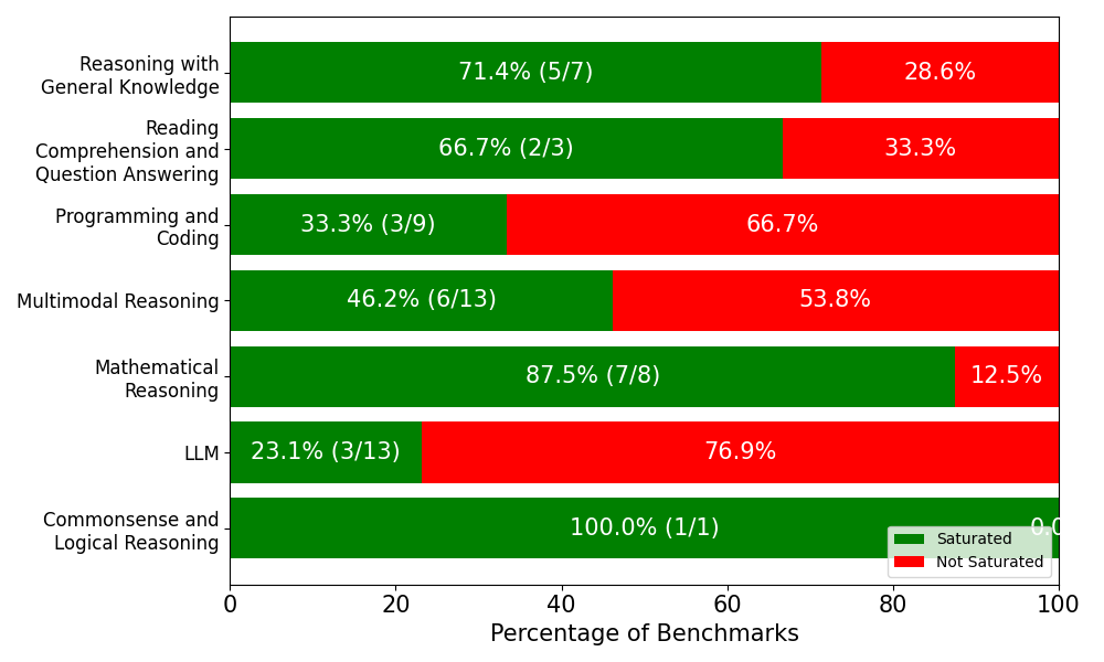
We collect all reported model performances across benchmarks and analyze saturation by defining it as whether a model has achieved at least 80% accuracy on the given benchmark. Out of the full set of benchmarks, we find that 27 benchmarks surpass this threshold in at least one model family, while 25 benchmarks never reach it. The majority of “solved” benchmarks belong to commonsense and logical reasoning, mathematical reasoning, reasoning with general knowledge, and reading comprehension and question answering. By contrast, benchmarks targeting LLM-specific capabilities and programming and coding remain comparatively difficult, with few instances of performance above 80%.
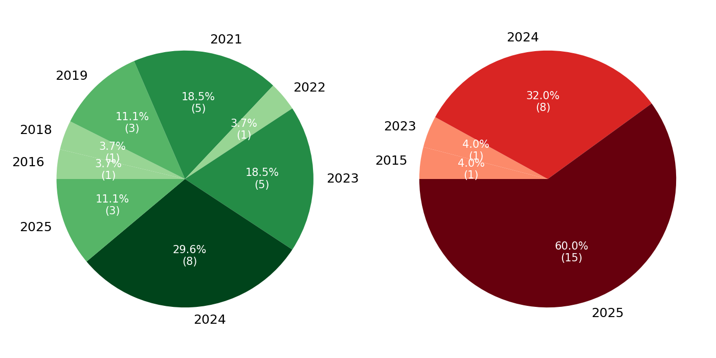
We then examine the release years of benchmarks that never surpass the 80% threshold. The distribution is striking: 60% of unsolved benchmarks were introduced in 2025, 32% in 2024, and only two pre-2023 benchmarks remain unsolved, which are ActivityNet [31] and EgoSchema [32], both multimodal reasoning benchmarks. This distribution suggests a clear trend. Nearly all benchmarks released prior to 2025 have already been surpassed by at least one model family, indicating rapid saturation. By contrast, the benchmarks still below the threshold overwhelmingly correspond to the most recently introduced evaluation tasks.
<details>
<summary>figures/stacked_bar_saturation.png Details</summary>
### Visual Description
## Horizontal Stacked Bar Chart: Benchmark Saturation by Category
### Overview
This image is a horizontal stacked bar chart that visualizes the percentage of benchmarks that are "Saturated" versus "Not Saturated" across seven distinct capability categories for an AI model or system. The chart uses a two-color scheme (green for Saturated, red for Not Saturated) to show the proportional split within each category. The overall purpose is to illustrate performance or evaluation results, highlighting areas of strength and weakness.
### Components/Axes
* **Chart Type:** Horizontal Stacked Bar Chart.
* **Y-Axis (Vertical):** Lists seven capability categories. From top to bottom:
1. Reasoning with General Knowledge
2. Reading Comprehension and Question Answering
3. Programming and Coding
4. Multimodal Reasoning
5. Mathematical Reasoning
6. LLM
7. Commonsense and Logical Reasoning
* **X-Axis (Horizontal):** Labeled "Percentage of Benchmarks". The scale runs from 0 to 100, with major tick marks at 0, 20, 40, 60, 80, and 100.
* **Legend:** Located in the bottom-right corner of the chart area. It defines the two data series:
* **Green Square:** "Saturated"
* **Red Square:** "Not Saturated"
* **Data Labels:** Each bar segment contains a percentage value. The green "Saturated" segments also include a fraction in parentheses (e.g., "5/7"), indicating the number of saturated benchmarks out of the total benchmarks in that category.
### Detailed Analysis
The chart presents the following data for each category, listed from top to bottom:
1. **Reasoning with General Knowledge**
* **Saturated (Green):** 71.4% (5/7). The green bar extends from 0% to approximately 71.4% on the x-axis.
* **Not Saturated (Red):** 28.6%. The red bar occupies the remainder, from ~71.4% to 100%.
2. **Reading Comprehension and Question Answering**
* **Saturated (Green):** 66.7% (2/3). The green bar extends from 0% to approximately 66.7%.
* **Not Saturated (Red):** 33.3%. The red bar occupies the remainder.
3. **Programming and Coding**
* **Saturated (Green):** 33.3% (3/9). The green bar extends from 0% to approximately 33.3%.
* **Not Saturated (Red):** 66.7%. The red bar is the dominant segment, occupying the majority of the bar.
4. **Multimodal Reasoning**
* **Saturated (Green):** 46.2% (6/13). The green bar extends from 0% to approximately 46.2%.
* **Not Saturated (Red):** 53.8%. The red bar is slightly larger than the green segment.
5. **Mathematical Reasoning**
* **Saturated (Green):** 87.5% (7/8). The green bar is very long, extending from 0% to 87.5%.
* **Not Saturated (Red):** 12.5%. The red segment is a small portion at the end of the bar.
6. **LLM**
* **Saturated (Green):** 23.1% (3/13). The green bar is short, extending from 0% to approximately 23.1%.
* **Not Saturated (Red):** 76.9%. The red bar is the dominant segment, occupying most of the bar.
7. **Commonsense and Logical Reasoning**
* **Saturated (Green):** 100.0% (1/1). The entire bar is green, extending from 0% to 100%.
* **Not Saturated (Red):** 0.0%. No red segment is visible.
### Key Observations
* **Highest Saturation:** "Commonsense and Logical Reasoning" shows 100% saturation, though it is based on only one benchmark (1/1).
* **Lowest Saturation:** "LLM" has the lowest saturation rate at 23.1%.
* **Strong Performance:** "Mathematical Reasoning" (87.5%) and "Reasoning with General Knowledge" (71.4%) also show high saturation rates.
* **Areas for Improvement:** "Programming and Coding" (33.3%) and "LLM" (23.1%) have the lowest saturation rates, indicating these are the most challenging categories where most benchmarks are not yet saturated.
* **Benchmark Count Variation:** The total number of benchmarks per category varies significantly, from 1 ("Commonsense and Logical Reasoning") to 13 ("Multimodal Reasoning" and "LLM"). This affects the statistical weight of each percentage.
### Interpretation
This chart provides a diagnostic snapshot of an AI system's capabilities relative to established benchmarks. "Saturated" likely means the system has reached a performance ceiling or solved the benchmark tasks.
The data suggests the system excels in structured, logical domains like **Commonsense/Logical Reasoning** and **Mathematical Reasoning**, where it has nearly or completely mastered the available tests. It also performs well in **General Knowledge Reasoning**.
Conversely, the system shows significant room for growth in **Programming/Coding** and general **LLM** benchmarks, where over two-thirds of the tasks remain unsaturated. The **Multimodal Reasoning** category sits in the middle, with a near-even split.
The stark contrast between categories highlights the uneven nature of AI capability development. The system's strength in formal logic and math does not directly translate to proficiency in code generation or broad language modeling tasks as measured by these specific benchmarks. The very low benchmark count for "Commonsense and Logical Reasoning" (1/1) is a critical caveat; its 100% score, while positive, is less statistically robust than the high scores in categories with more benchmarks (e.g., Mathematical Reasoning with 8/8). This chart would be essential for guiding future research and development priorities.
</details>
(a) Distribution of benchmarks that models surpassed 80% threshold and those not yet surpassed, grouped by reasoning type.
<details>
<summary>figures/pie_saturation_by_year.png Details</summary>
### Visual Description
\n
## Pie Charts: Yearly Distribution Comparison
### Overview
The image displays two pie charts side-by-side on a white background. The left chart uses a green color palette, and the right chart uses a red color palette. Each chart visualizes the distribution of a dataset across different years, showing both percentage and absolute count (in parentheses) for each year segment.
### Components/Axes
* **Chart Type:** Two pie charts.
* **Left Chart (Green Palette):** Represents data distributed across the years 2016, 2018, 2019, 2021, 2022, 2023, 2024, and 2025.
* **Right Chart (Red Palette):** Represents data distributed across the years 2015, 2023, 2024, and 2025.
* **Labels:** Each segment is labeled with the year, placed outside the pie chart adjacent to its segment.
* **Data Labels:** Inside each segment, the percentage of the total and the absolute count (in parentheses) are displayed in white text.
* **Legend:** There is no separate legend; the year labels serve as the key for each segment.
### Detailed Analysis
#### Left Chart (Green Palette)
This chart has 8 segments. The largest segment is at the bottom.
* **2024:** Darkest green segment, positioned at the bottom (6 o'clock). **29.6% (8)**.
* **2021:** Dark green segment, positioned at the top (12 o'clock). **18.5% (5)**.
* **2023:** Medium-dark green segment, positioned at the right (3 o'clock). **18.5% (5)**.
* **2019:** Medium green segment, positioned at the top-left (10-11 o'clock). **11.1% (3)**.
* **2025:** Medium green segment, positioned at the left (9 o'clock). **11.1% (3)**.
* **2022:** Light green segment, positioned at the top-right (1-2 o'clock). **3.7% (1)**.
* **2018:** Light green segment, positioned at the left (9 o'clock, adjacent to 2025). **3.7% (1)**.
* **2016:** Lightest green segment, positioned at the left (8-9 o'clock). **3.7% (1)**.
**Total Count (Left Chart):** 8 + 5 + 5 + 3 + 3 + 1 + 1 + 1 = **27**.
#### Right Chart (Red Palette)
This chart has 4 segments. The largest segment dominates the bottom half.
* **2025:** Darkest red (maroon) segment, positioned at the bottom (spanning from ~4 o'clock to ~8 o'clock). **60.0% (15)**.
* **2024:** Bright red segment, positioned at the top (spanning from ~10 o'clock to ~2 o'clock). **32.0% (8)**.
* **2023:** Light red (salmon) segment, positioned at the left (9 o'clock). **4.0% (1)**.
* **2015:** Lightest red (peach) segment, positioned at the left (8-9 o'clock, adjacent to 2023). **4.0% (1)**.
**Total Count (Right Chart):** 15 + 8 + 1 + 1 = **25**.
### Key Observations
1. **Concentration of Data:** The right chart shows a heavy concentration in the most recent years, with 2024 and 2025 accounting for 92% of the data (23 out of 25 total). The left chart is more distributed, though 2024 is still the largest single segment.
2. **Year Overlap:** The years 2023, 2024, and 2025 appear in both charts, but with vastly different proportions. For example, 2025 represents 11.1% of the left chart but 60.0% of the right chart.
3. **Color Coding:** The charts use monochromatic color scales (greens and reds) where darker shades correspond to larger segments within each chart.
4. **Total Counts:** The datasets are of similar size (27 vs. 25 items).
### Interpretation
The two pie charts likely represent the composition of two different datasets or categories, broken down by the year of origin or occurrence.
* The **left (green) chart** suggests a dataset with a longer historical tail, containing items from as far back as 2016, but with a clear peak in 2024. The distribution is relatively balanced among the top four years (2021, 2023, 2024, 2025).
* The **right (red) chart** suggests a dataset that is overwhelmingly recent. The year 2025 alone constitutes the majority (60%), and together with 2024, they dominate the set. This could indicate a metric that has surged in the last two years, such as recent sales, new user sign-ups, or current project initiations.
The stark contrast in distribution between the two charts is the primary insight. Without additional context on what the green and red categories represent (e.g., "Product A vs. Product B," "Successes vs. Failures," "Internal vs. External Projects"), the specific meaning is ambiguous. However, the data clearly shows that the "red" category is characterized by extreme recency, while the "green" category has a more established, multi-year history.
</details>
(b) Release years of benchmarks relative to the 80% threshold: left pie shows surpassed benchmarks, right pie shows unsolved benchmarks.
Figure 2: Benchmark saturation dynamics.
This temporal pattern highlights the central dynamic of the saturation cycle: older benchmarks are rapidly mastered and lose discriminative power, while newly introduced benchmarks become the standards for demonstrating progress. Nearly all unsolved benchmarks are recent, highlighting both the accelerating pace of benchmark creation and the difficulty of maintaining evaluations that remain challenging over time. Yet this difficulty seems only temporary. It is highly plausible that within one or two years many of these currently unsolved benchmarks will also be surpassed, at which point model families will shift to alternative or newly designed evaluations to preserve differentiation. Crucially, this pattern reflects the fact that performance gains are often specific to individual benchmarks rather than to the broader reasoning type they are intended to assess. As the analyses indicate, while models often perform consistently and even strongly on benchmarks within a domain, the introduction of a more challenging, novel benchmark frequently leads to a drop in performance. This pattern may arise from the increased difficulty of the new benchmark, or from contamination that inflated performance on earlier benchmarks without truly reflecting generalizable reasoning ability. This situation raises the question of whether what appears as “reasoning ability” is often tied more to benchmark design and prior exposure than to robust mastery of the reasoning type itself. This saturation cycle casts doubt on the long-term evaluation value of benchmarks.
## 5 Discussion: Limitations of Current Benchmarking
Our analysis of three model families demonstrates that benchmark performance has generally increased over time, with newer models achieving higher scores across most reasoning types and benchmarks. However, given that many benchmarks have already been surpassed with high accuracy, we would like to highlight a question originally posed in [25] regarding commonsense reasoning, reframed here for reasoning in general: Have neural language models successfully acquired reasoning, or are we overestimating the true capabilities of machine reasoning? Several studies in the literature show that these models still perform poorly when required to generalize to longer contexts or handle tasks requiring inductive and compositional reasoning [33, 34, 35, 36, 37, 38]. This discrepancy suggests a limitation of current benchmarking practices: improvements in benchmark scores do not necessarily reflect generalizable reasoning ability.
We believe this discrepancy can be reduced by developing more sophisticated, task-specific evaluation metrics that capture intermediate reasoning steps or different modes of error. Additionally, formalizing reasoning for different task types can support these efforts, enabling more structured analyses and clearer assessment of models’ reasoning abilities. Such a formalization enables structured representations of diverse reasoning types and their interrelationships [39, 40, 41], and facilitates the design of layered, targeted evaluation procedures that assess specific reasoning capabilities rather than merely reporting overall accuracy. Furthermore, formal reasoning frameworks can support the development of algorithms that deliver structured feedback to models, guiding the refinement of their reasoning abilities. By integrating formalized reasoning with task-specific evaluations, benchmarking can be conducted in a more targeted and informative manner.
## 6 Limitations
The analysis in our study focuses on 52 benchmarks used by the three model families. Other model families and reasoning-focused models are not fully explored because including them, along with more than two hundred benchmarks identified from other model families and several studies evaluating different types of reasoning in large models, would create a combinatorial explosion of comparisons. This restriction was necessary to maintain the scope of our work on a qualitative evaluation of benchmark design and adoption rather than an exhaustive quantitative analysis of all models and benchmarks. A comprehensive comparison across a wider range of models and benchmarks is left for future work.
## 7 Conclusion
In this work, we analyze 52 benchmarks across three model families, covering multiple reasoning types. Our study reveals the rapid saturation of older benchmarks, selective adoption of new ones, and temporal dynamics that govern the utility of benchmarks in evaluating model performance. While model performance generally improves over time and correlations within reasoning types indicate overlapping evaluation properties, the introduction of more challenging benchmarks generally resets performance, suggesting that apparent reasoning ability is influenced more by extrinsic factors than by mastering the reasoning itself, as supported by other studies. This saturation cycle highlights the limitations of current practices: benchmarks provide only a partial view of model reasoning. Meaningful progress requires formalized reasoning tasks, layered evaluation procedures, and task-specific metrics that go beyond accuracy scores.
## References
- [1] Thomas Liao, Rohan Taori, Deborah Raji, and Ludwig Schmidt. Are we learning yet? a meta review of evaluation failures across machine learning. In J. Vanschoren and S. Yeung, editors, Proceedings of the Neural Information Processing Systems Track on Datasets and Benchmarks, volume 1, 2021.
- [2] Anthropic. Introducing the next generation of claude, March 2024. Accessed: 2025-08-28.
- [3] Anthropic. Claude 3.5 sonnet, June 2024. Accessed: 2025-08-28.
- [4] Anthropic. Introducing claude 4, May 2025. Accessed: 2025-08-28.
- [5] Anthropic. Introducing claude 3.5 haiku, October 2024. Accessed: 2025-08-28.
- [6] Anthropic. Claude 3.7 sonnet and claude code, February 2025. Accessed: 2025-08-28.
- [7] Anthropic. Claude opus 4.1, August 2025. Accessed: 2025-08-28.
- [8] Google DeepMind. Gemini 2.5 flash-lite, June 2025. Accessed: 2025-08-28.
- [9] Gheorghe Comanici, Eric Bieber, Mike Schaekermann, et al. Gemini 2.5: Pushing the frontier with advanced reasoning, multimodality, long context, and next generation agentic capabilities, 2025.
- [10] Google DeepMind. Gemini 2.5: Our most intelligent ai model, March 2025. Accessed: 2025-08-28.
- [11] Gemini Team, Petko Georgiev, Ving Ian Lei, et al. Gemini 1.5: Unlocking multimodal understanding across millions of tokens of context, 2024.
- [12] Gemini Team, Rohan Anil, Sebastian Borgeaud, et al. Gemini: A family of highly capable multimodal models, 2025.
- [13] OpenAI. Openai o1-mini: Advancing cost-efficient reasoning, September 2024. Accessed: 2025-08-28.
- [14] OpenAI. Introducing gpt-4.1 in the api, April 2025. Accessed: 2025-08-28.
- [15] OpenAI. Introducing gpt-4.5, February 2025. Accessed: 2025-08-28.
- [16] OpenAI. gpt-oss-120b & gpt-oss-20b model card, August 2025. Accessed: 2025-08-28.
- [17] OpenAI. Introducing gpt-5, August 2025. Accessed: 2025-08-28.
- [18] OpenAI. Model release notes. Accessed: 2025-08-28.
- [19] OpenAI. Introducing openai o3 and o4-mini, April 2025. Accessed: 2025-08-28.
- [20] OpenAI. Gpt-4o mini: Advancing cost-efficient intelligence, July 2024. Accessed: 2025-08-28.
- [21] OpenAI. Hello gpt-4o, May 2024. Accessed: 2025-08-28.
- [22] OpenAI. Learning to reason with llms, September 2024. Accessed: 2025-08-28.
- [23] Yonatan Bisk, Rowan Zellers, Ronan Le Bras, Jiasen Gao, and Yejin Choi. Piqa: Reasoning about physical commonsense in natural language. In Proceedings of the AAAI Conference on Artificial Intelligence, volume 34, pages 7432–7439, 2020.
- [24] Bill Yuchen Lin, Wangchunshu Zhou, Ming Shen, Pei Zhou, Chandra Bhagavatula, Yejin Choi, and Xiang Ren. CommonGen: A constrained text generation challenge for generative commonsense reasoning. In Trevor Cohn, Yulan He, and Yang Liu, editors, Findings of the Association for Computational Linguistics: EMNLP 2020, pages 1823–1840, Online, November 2020. Association for Computational Linguistics.
- [25] Keisuke Sakaguchi, Ronan Le Bras, Chandra Bhagavatula, and Yejin Choi. Winogrande: an adversarial winograd schema challenge at scale. Commun. ACM, 64(9):99–106, August 2021.
- [26] Alon Talmor, Ori Yoran, Ronan Le Bras, Chandra Bhagavatula, Yoav Goldberg, Yejin Choi, and Jonathan Berant. Commonsenseqa 2.0: Exposing the limits of ai through gamification, 2022.
- [27] Andong Wang, Bo Wu, Sunli Chen, Zhenfang Chen, Haotian Guan, Wei-Ning Lee, Li Erran Li, and Chuang Gan. Sok-bench: A situated video reasoning benchmark with aligned open-world knowledge, 2024.
- [28] Jian Liu, Leyang Cui, Hanmeng Liu, Dandan Huang, Yile Wang, and Yue Zhang. Logiqa: a challenge dataset for machine reading comprehension with logical reasoning. In Proceedings of the Twenty-Ninth International Joint Conference on Artificial Intelligence, IJCAI’20, 2021.
- [29] Weihao Yu, Zihang Jiang, Yanfei Dong, and Jiashi Feng. Reclor: A reading comprehension dataset requiring logical reasoning. In International Conference on Learning Representations, 2020.
- [30] Dan Hendrycks, Collin Burns, Saurav Kadavath, Akul Arora, Steven Basart, Eric Tang, Dawn Song, and Jacob Steinhardt. Measuring mathematical problem solving with the math dataset. In J. Vanschoren and S. Yeung, editors, Proceedings of the Neural Information Processing Systems Track on Datasets and Benchmarks, volume 1, 2021.
- [31] Fabian Caba Heilbron, Victor Escorcia, Bernard Ghanem, and Juan Carlos Niebles. Activitynet: A large-scale video benchmark for human activity understanding. In 2015 IEEE Conference on Computer Vision and Pattern Recognition (CVPR), pages 961–970, 2015.
- [32] Karttikeya Mangalam, Raiymbek Akshulakov, and Jitendra Malik. Egoschema: A diagnostic benchmark for very long-form video language understanding, 2023.
- [33] Nouha Dziri, Ximing Lu, Melanie Sclar, Xiang Lorraine Li, Liwei Jiang, Bill Yuchen Lin, Peter West, Chandra Bhagavatula, Ronan Le Bras, Jena D. Hwang, Soumya Sanyal, Sean Welleck, Xiang Ren, Allyson Ettinger, Zaid Harchaoui, and Yejin Choi. Faith and fate: limits of transformers on compositionality. In Proceedings of the 37th International Conference on Neural Information Processing Systems, NIPS ’23, Red Hook, NY, USA, 2023. Curran Associates Inc.
- [34] Iman Mirzadeh, Keivan Alizadeh, Hooman Shahrokhi, Oncel Tuzel, Samy Bengio, and Mehrdad Farajtabar. Gsm-symbolic: Understanding the limitations of mathematical reasoning in large language models, 2025.
- [35] Parshin Shojaee, Iman Mirzadeh, Keivan Alizadeh, Maxwell Horton, Samy Bengio, and Mehrdad Farajtabar. The illusion of thinking: Understanding the strengths and limitations of reasoning models via the lens of problem complexity, 2025.
- [36] Jackson Petty, Michael Y. Hu, Wentao Wang, Shauli Ravfogel, William Merrill, and Tal Linzen. Relic: Evaluating compositional instruction following via language recognition, 2025.
- [37] S. Bedi, Y. Jiang, P. Chung, S. Koyejo, and N. Shah. Fidelity of medical reasoning in large language models. JAMA Network Open, 8(8):e2526021, 2025.
- [38] Karthik Valmeekam, Kaya Stechly, Atharva Gundawar, and Subbarao Kambhampati. A systematic evaluation of the planning and scheduling abilities of the reasoning model o1. Transactions on Machine Learning Research, 2025.
- [39] P. N. Johnson-Laird. Mental models: towards a cognitive science of language, inference, and consciousness. Harvard University Press, USA, 1986.
- [40] Patrick Blackburn and Johannes Bos. Representation and Inference for Natural Language: A First Course in Computational Semantics. Center for the Study of Language and Information, Stanford, Calif., 2005.
- [41] Brenden M. Lake, Tomer D. Ullman, Joshua B. Tenenbaum, and Samuel J. Gershman. Building machines that learn and think like people. Behavioral and Brain Sciences, 40:e253, 2017.
- [42] Rowan Zellers, Ari Holtzman, Yonatan Bisk, Ali Farhadi, and Yejin Choi. HellaSwag: Can a machine really finish your sentence? In Anna Korhonen, David Traum, and Lluís Màrquez, editors, Proceedings of the 57th Annual Meeting of the Association for Computational Linguistics, pages 4791–4800, Florence, Italy, July 2019. Association for Computational Linguistics.
- [43] Dan Hendrycks, Collin Burns, Steven Basart, Andy Zou, Mantas Mazeika, Dawn Song, and Jacob Steinhardt. Measuring massive multitask language understanding, 2021.
- [44] Mirac Suzgun, Nathan Scales, Nathanael Schärli, Sebastian Gehrmann, Yi Tay, Hyung Won Chung, Aakanksha Chowdhery, Quoc Le, Ed Chi, Denny Zhou, and Jason Wei. Challenging BIG-bench tasks and whether chain-of-thought can solve them. In Anna Rogers, Jordan Boyd-Graber, and Naoaki Okazaki, editors, Findings of the Association for Computational Linguistics: ACL 2023, pages 13003–13051, Toronto, Canada, July 2023. Association for Computational Linguistics.
- [45] Dan Hendrycks, Collin Burns, Steven Basart, Andy Zou, Mantas Mazeika, Dawn Song, and Jacob Steinhardt. Measuring massive multitask language understanding, 2021.
- [46] Long Phan, Alice Gatti, Ziwen Han, et al. Humanity’s last exam, 2025.
- [47] Shivalika Singh, Angelika Romanou, Clémentine Fourrier, David Ifeoluwa Adelani, Jian Gang Ngui, Daniel Vila-Suero, Peerat Limkonchotiwat, Kelly Marchisio, Wei Qi Leong, Yosephine Susanto, Raymond Ng, Shayne Longpre, Sebastian Ruder, Wei-Yin Ko, Antoine Bosselut, Alice Oh, Andre Martins, Leshem Choshen, Daphne Ippolito, Enzo Ferrante, Marzieh Fadaee, Beyza Ermis, and Sara Hooker. Global MMLU: Understanding and addressing cultural and linguistic biases in multilingual evaluation. In Wanxiang Che, Joyce Nabende, Ekaterina Shutova, and Mohammad Taher Pilehvar, editors, Proceedings of the 63rd Annual Meeting of the Association for Computational Linguistics (Volume 1: Long Papers), pages 18761–18799, Vienna, Austria, July 2025. Association for Computational Linguistics.
- [48] David Rein, Betty Li Hou, Asa Cooper Stickland, Jackson Petty, Richard Yuanzhe Pang, Julien Dirani, Julian Michael, and Samuel R. Bowman. Gpqa: A graduate-level google-proof q&a benchmark, 2023.
- [49] Yubo Wang, Xueguang Ma, Ge Zhang, Yuansheng Ni, Abhranil Chandra, Shiguang Guo, Weiming Ren, Aaran Arulraj, Xuan He, Ziyan Jiang, Tianle Li, Max Ku, Kai Wang, Alex Zhuang, Rongqi Fan, Xiang Yue, and Wenhu Chen. Mmlu-pro: A more robust and challenging multi-task language understanding benchmark, 2024.
- [50] Peter Clark, Isaac Cowhey, Oren Etzioni, Tushar Khot, Ashish Sabharwal, Carissa Schoenick, and Oyvind Tafjord. Think you have solved question answering? try arc, the ai2 reasoning challenge, 2018.
- [51] Omer Goldman, Uri Shaham, Dan Malkin, Sivan Eiger, Avinatan Hassidim, Yossi Matias, Joshua Maynez, Adi Mayrav Gilady, Jason Riesa, Shruti Rijhwani, Laura Rimell, Idan Szpektor, Reut Tsarfaty, and Matan Eyal. Eclektic: a novel challenge set for evaluation of cross-lingual knowledge transfer, 2025.
- [52] Dheeru Dua, Yizhong Wang, Pradeep Dasigi, Gabriel Stanovsky, Sameer Singh, and Matt Gardner. DROP: A reading comprehension benchmark requiring discrete reasoning over paragraphs. In Jill Burstein, Christy Doran, and Thamar Solorio, editors, Proceedings of the 2019 Conference of the North American Chapter of the Association for Computational Linguistics: Human Language Technologies, Volume 1 (Long and Short Papers), pages 2368–2378, Minneapolis, Minnesota, June 2019. Association for Computational Linguistics.
- [53] Karl Cobbe, Vineet Kosaraju, Mohammad Bavarian, Mark Chen, Heewoo Jun, Lukasz Kaiser, Matthias Plappert, Jerry Tworek, Jacob Hilton, Reiichiro Nakano, Christopher Hesse, and John Schulman. Training verifiers to solve math word problems, 2021.
- [54] Freda Shi, Mirac Suzgun, Markus Freitag, Xuezhi Wang, Suraj Srivats, Soroush Vosoughi, Hyung Won Chung, Yi Tay, Sebastian Ruder, Denny Zhou, Dipanjan Das, and Jason Wei. Language models are multilingual chain-of-thought reasoners, 2022.
- [55] Pan Lu, Hritik Bansal, Tony Xia, Jiacheng Liu, Chunyuan Li, Hannaneh Hajishirzi, Hao Cheng, Kai-Wei Chang, Michel Galley, and Jianfeng Gao. Mathvista: Evaluating mathematical reasoning of foundation models in visual contexts, 2024.
- [56] Elliot Glazer, Ege Erdil, Tamay Besiroglu, Diego Chicharro, Evan Chen, Alex Gunning, Caroline Falkman Olsson, Jean-Stanislas Denain, Anson Ho, Emily de Oliveira Santos, Olli Järviniemi, Matthew Barnett, Robert Sandler, Matej Vrzala, Jaime Sevilla, Qiuyu Ren, Elizabeth Pratt, Lionel Levine, Grant Barkley, Natalie Stewart, Bogdan Grechuk, Tetiana Grechuk, Shreepranav Varma Enugandla, and Mark Wildon. Frontiermath: A benchmark for evaluating advanced mathematical reasoning in ai, 2024.
- [57] Xiang Yue, Yuansheng Ni, Kai Zhang, Tianyu Zheng, Ruoqi Liu, Ge Zhang, Samuel Stevens, Dongfu Jiang, Weiming Ren, Yuxuan Sun, Cong Wei, Botao Yu, Ruibin Yuan, Renliang Sun, Ming Yin, Boyuan Zheng, Zhenzhu Yang, Yibo Liu, Wenhao Huang, Huan Sun, Yu Su, and Wenhu Chen. Mmmu: A massive multi-discipline multimodal understanding and reasoning benchmark for expert agi, 2024.
- [58] Aniruddha Kembhavi, Mike Salvato, Eric Kolve, Minjoon Seo, Hannaneh Hajishirzi, and Ali Farhadi. A diagram is worth a dozen images, 2016.
- [59] Ahmed Masry, Do Xuan Long, Jia Qing Tan, Shafiq Joty, and Enamul Hoque. ChartQA: A benchmark for question answering about charts with visual and logical reasoning. In Smaranda Muresan, Preslav Nakov, and Aline Villavicencio, editors, Findings of the Association for Computational Linguistics: ACL 2022, pages 2263–2279, Dublin, Ireland, May 2022. Association for Computational Linguistics.
- [60] Minesh Mathew, Dimosthenis Karatzas, and C. V. Jawahar. Docvqa: A dataset for vqa on document images, 2021.
- [61] Amanpreet Singh, Vivek Natarajan, Meet Shah, Yu Jiang, Xinlei Chen, Dhruv Batra, Devi Parikh, and Marcus Rohrbach. Towards vqa models that can read, 2019.
- [62] Kairui Hu, Penghao Wu, Fanyi Pu, Wang Xiao, Yuanhan Zhang, Xiang Yue, Bo Li, and Ziwei Liu. Video-mmmu: Evaluating knowledge acquisition from multi-discipline professional videos, 2025.
- [63] Piotr Padlewski, Max Bain, Matthew Henderson, Zhongkai Zhu, Nishant Relan, Hai Pham, Donovan Ong, Kaloyan Aleksiev, Aitor Ormazabal, Samuel Phua, Ethan Yeo, Eugenie Lamprecht, Qi Liu, Yuqi Wang, Eric Chen, Deyu Fu, Lei Li, Che Zheng, Cyprien de Masson d’Autume, Dani Yogatama, Mikel Artetxe, and Yi Tay. Vibe-eval: A hard evaluation suite for measuring progress of multimodal language models, 2024.
- [64] Jonathan Roberts, Mohammad Reza Taesiri, Ansh Sharma, Akash Gupta, Samuel Roberts, Ioana Croitoru, Simion-Vlad Bogolin, Jialu Tang, Florian Langer, Vyas Raina, Vatsal Raina, Hanyi Xiong, Vishaal Udandarao, Jingyi Lu, Shiyang Chen, Sam Purkis, Tianshuo Yan, Wenye Lin, Gyungin Shin, Qiaochu Yang, Anh Totti Nguyen, David I. Atkinson, Aaditya Baranwal, Alexandru Coca, Mikah Dang, Sebastian Dziadzio, Jakob D. Kunz, Kaiqu Liang, Alexander Lo, Brian Pulfer, Steven Walton, Charig Yang, Kai Han, and Samuel Albanie. Zerobench: An impossible visual benchmark for contemporary large multimodal models, 2025.
- [65] Zirui Wang, Mengzhou Xia, Luxi He, Howard Chen, Yitao Liu, Richard Zhu, Kaiqu Liang, Xindi Wu, Haotian Liu, Sadhika Malladi, Alexis Chevalier, Sanjeev Arora, and Danqi Chen. Charxiv: Charting gaps in realistic chart understanding in multimodal llms. In A. Globerson, L. Mackey, D. Belgrave, A. Fan, U. Paquet, J. Tomczak, and C. Zhang, editors, Advances in Neural Information Processing Systems, volume 37, pages 113569–113697. Curran Associates, Inc., 2024.
- [66] Xiang Yue, Tianyu Zheng, Yuansheng Ni, Yubo Wang, Kai Zhang, Shengbang Tong, Yuxuan Sun, Botao Yu, Ge Zhang, Huan Sun, Yu Su, Wenhu Chen, and Graham Neubig. Mmmu-pro: A more robust multi-discipline multimodal understanding benchmark, 2025.
- [67] Google DeepMind. Gemini robotics: Bringing ai into the physical world, 2025. Accessed: 2025-08-29.
- [68] Carlos E. Jimenez, John Yang, Alexander Wettig, Shunyu Yao, Kexin Pei, Ofir Press, and Karthik Narasimhan. Swe-bench: Can language models resolve real-world github issues?, 2024.
- [69] Stanford University and Laude Institute. Terminal-bench: A benchmark for ai agents in terminal environments, 2025. Accessed: 2025-08-29.
- [70] Mark Chen, Jerry Tworek, Heewoo Jun, Qiming Yuan, Henrique Ponde de Oliveira Pinto, Jared Kaplan, Harri Edwards, Yuri Burda, Nicholas Joseph, Greg Brockman, Alex Ray, Raul Puri, Gretchen Krueger, Michael Petrov, Heidy Khlaaf, Girish Sastry, Pamela Mishkin, Brooke Chan, Scott Gray, Nick Ryder, Mikhail Pavlov, Alethea Power, Lukasz Kaiser, Mohammad Bavarian, Clemens Winter, Philippe Tillet, Felipe Petroski Such, Dave Cummings, Matthias Plappert, Fotios Chantzis, Elizabeth Barnes, Ariel Herbert-Voss, William Hebgen Guss, Alex Nichol, Alex Paino, Nikolas Tezak, Jie Tang, Igor Babuschkin, Suchir Balaji, Shantanu Jain, William Saunders, Christopher Hesse, Andrew N. Carr, Jan Leike, Josh Achiam, Vedant Misra, Evan Morikawa, Alec Radford, Matthew Knight, Miles Brundage, Mira Murati, Katie Mayer, Peter Welinder, Bob McGrew, Dario Amodei, Sam McCandlish, Ilya Sutskever, and Wojciech Zaremba. Evaluating large language models trained on code, 2021.
- [71] Naman Jain, King Han, Alex Gu, Wen-Ding Li, Fanjia Yan, Tianjun Zhang, Sida Wang, Armando Solar-Lezama, Koushik Sen, and Ion Stoica. Livecodebench: Holistic and contamination free evaluation of large language models for code, 2024.
- [72] Aider. o1 tops aider’s new polyglot leaderboard, 2024. Accessed: 2025-08-29.
- [73] Samuel Miserendino, Michele Wang, Tejal Patwardhan, and Johannes Heidecke. Swe-lancer: Can frontier llms earn $1 million from real-world freelance software engineering?, 2025.
- [74] Shunyu Yao, Noah Shinn, Pedram Razavi, and Karthik Narasimhan. $τ$ -bench: A benchmark for tool-agent-user interaction in real-world domains, 2024.
- [75] Victor Barres, Honghua Dong, Soham Ray, Xujie Si, and Karthik Narasimhan. $τ^2$ -bench: Evaluating conversational agents in a dual-control environment, 2025.
- [76] Shunyu Yao, Howard Chen, Austin W. Hanjie, Runzhe Yang, and Karthik Narasimhan. Collie: Systematic construction of constrained text generation tasks, 2023.
- [77] Jason Wei, Nguyen Karina, Hyung Won Chung, Yunxin Joy Jiao, Spencer Papay, Amelia Glaese, John Schulman, and William Fedus. Measuring short-form factuality in large language models, 2024.
- [78] Alon Jacovi, Andrew Wang, Chris Alberti, Connie Tao, Jon Lipovetz, Kate Olszewska, Lukas Haas, Michelle Liu, Nate Keating, Adam Bloniarz, Carl Saroufim, Corey Fry, Dror Marcus, Doron Kukliansky, Gaurav Singh Tomar, James Swirhun, Jinwei Xing, Lily Wang, Madhu Gurumurthy, Michael Aaron, Moran Ambar, Rachana Fellinger, Rui Wang, Zizhao Zhang, Sasha Goldshtein, and Dipanjan Das. The facts grounding leaderboard: Benchmarking llms’ ability to ground responses to long-form input, 2025.
- [79] Jason Wei, Zhiqing Sun, Spencer Papay, Scott McKinney, Jeffrey Han, Isa Fulford, Hyung Won Chung, Alex Tachard Passos, William Fedus, and Amelia Glaese. Browsecomp: A simple yet challenging benchmark for browsing agents, 2025.
- [80] Lucen Zhong, Zhengxiao Du, Xiaohan Zhang, Haiyi Hu, and Jie Tang. Complexfuncbench: Exploring multi-step and constrained function calling under long-context scenario, 2025.
- [81] Jeffrey Zhou, Tianjian Lu, Swaroop Mishra, Siddhartha Brahma, Sujoy Basu, Yi Luan, Denny Zhou, and Le Hou. Instruction-following evaluation for large language models, 2023.
- [82] Yun He, Di Jin, Chaoqi Wang, Chloe Bi, Karishma Mandyam, Hejia Zhang, Chen Zhu, Ning Li, Tengyu Xu, Hongjiang Lv, Shruti Bhosale, Chenguang Zhu, Karthik Abinav Sankararaman, Eryk Helenowski, Melanie Kambadur, Aditya Tayade, Hao Ma, Han Fang, and Sinong Wang. Multi-if: Benchmarking llms on multi-turn and multilingual instructions following, 2024.
- [83] Jinhyuk Lee, Anthony Chen, Zhuyun Dai, Dheeru Dua, Devendra Singh Sachan, Michael Boratko, Yi Luan, Sébastien M. R. Arnold, Vincent Perot, Siddharth Dalmia, Hexiang Hu, Xudong Lin, Panupong Pasupat, Aida Amini, Jeremy R. Cole, Sebastian Riedel, Iftekhar Naim, Ming-Wei Chang, and Kelvin Guu. Can long-context language models subsume retrieval, rag, sql, and more?, 2024.
- [84] Kaustubh Deshpande, Ved Sirdeshmukh, Johannes Baptist Mols, Lifeng Jin, Ed-Yeremai Hernandez-Cardona, Dean Lee, Jeremy Kritz, Willow E. Primack, Summer Yue, and Chen Xing. MultiChallenge: A realistic multi-turn conversation evaluation benchmark challenging to frontier LLMs. In Wanxiang Che, Joyce Nabende, Ekaterina Shutova, and Mohammad Taher Pilehvar, editors, Findings of the Association for Computational Linguistics: ACL 2025, pages 18632–18702, Vienna, Austria, July 2025. Association for Computational Linguistics.
- [85] Rahul K. Arora, Jason Wei, Rebecca Soskin Hicks, Preston Bowman, Joaquin Quiñonero-Candela, Foivos Tsimpourlas, Michael Sharman, Meghan Shah, Andrea Vallone, Alex Beutel, Johannes Heidecke, and Karan Singhal. Healthbench: Evaluating large language models towards improved human health, 2025.
## Appendix A Reasoning Benchmarks
Table 1: Taxonomy of benchmarks used in this study.
| HellaSwag [42] | Commonsense and Logical Reasoning | 2019 | Multiple-choice task: choose the most plausible sentence continuation. |
| --- | --- | --- | --- |
| MMLU [43] | Reasoning with General Knowledge | 2021 | Multiple-choice task: answer questions across 57 domains to test knowledge and problem-solving. |
| Big-Bench-Hard [44] | Reasoning with General Knowledge | 2023 | Open-generation task: solve difficult BIG-Bench problems testing multi-step reasoning and problem-solving. |
| MMMLU [45] | Reasoning with General Knowledge | 2024 | Multiple-choice task: answer 57 domain questions translated into 14 languages to test multilingual knowledge and problem-solving. |
| Humanity’s Last Exam [46] | Reasoning with General Knowledge | 2025 | Multi-modal task: answer closed-ended questions across many subjects to test verifiable knowledge. |
| Global MMLU (Lite) [47] | Reasoning with General Knowledge | 2025 | Multiple-choice task: answer 42-language questions with culturally sensitive labeling to test equitable multilingual knowledge. |
| GPQA Diamond [48] | Reasoning with General Knowledge | 2023 | Multiple-choice task: answer 448 expert-level science questions in biology, physics, and chemistry that are Google-proof and highly challenging. |
| MMLU Pro [49] | Reasoning with General Knowledge | 2024 | Multiple-choice task: extended from MMLU, answer more challenging reasoning questions with 10 options across diverse domains. |
| ARC (AI2 Reasoning Challenge) [50] | Reading Comprehension and Question Answering | 2018 | Multiple-choice task: answer grade-school science questions requiring advanced knowledge and reasoning beyond simple retrieval. |
| ECLeKTic [51] | Reading Comprehension and Question Answering | 2025 | Closed-book QA task: answer 12-language questions to test cross-lingual knowledge transfer. |
| DROP [52] | Reading Comprehension and Question Answering | 2019 | Open-ended QA task: answer 96k English questions requiring discrete reasoning over paragraph content. |
| GSM8K [53] | Mathematical Reasoning | 2021 | Open-ended QA task: solve grade-school problems requiring multi-step mathematical reasoning. |
| MATH [30] | Mathematical Reasoning | 2021 | Open-ended QA: solve 12,500 challenging competition problems with step-by-step solutions to test advanced mathematical reasoning. |
| MATH 500 [30] | Mathematical Reasoning | 2024 | Open-ended QA: Challenging subset of MATH benchmark. |
| MGSM [54] | Mathematical Reasoning | 2023 | Open-ended QA: solve 250 GSM8K problems translated into 10 languages. |
| MathVista [55] | Mathematical Reasoning | 2024 | Open-ended multimodal QA: solve 6,141 math problems requiring visual and compositional reasoning. |
| AIME 2024 | Mathematical Reasoning | 2024 | Open-ended QA: solve challenging competition-level mathematics problems. |
| AIME 2025 | Mathematical Reasoning | 2025 | Open-ended QA: solve challenging competition-level mathematics problems. |
| FrontierMath [56] | Mathematical Reasoning | 2024 | Open-ended QA: tests advanced mathematical reasoning across diverse and expert-level domains, requiring multi-step problem solving and deep mathematical knowledge. |
| MMMU [57] | Multimodal Reasoning | 2024 | Question answering task: multimodal multiple-choice and open-ended questions across 30 subjects requiring advanced reasoning and domain-specific knowledge. |
| AI2D [58] | Multimodal Reasoning | 2016 | Open-ended QA: multimodal questions with 5,000 diagrams and 15,000 Q&A pairs requiring diagram structure understanding and reasoning. |
| ChartQA [59] | Multimodal Reasoning | 2022 | Open-ended QA: multimodal questions with 32.7K chart-based problems requiring visual and logical reasoning. |
| EgoSchema [32] | Multimodal Reasoning | 2023 | Multiple-choice QA: multimodal questions with 5,000 long-form video clips requiring understanding of human activity and temporal reasoning. |
| DocVQA [60] | Multimodal Reasoning | 2021 | Open-ended QA: multimodal questions with 50,000 document images requiring reading and interpreting document layout and structure. |
| TextVQA [61] | Multimodal Reasoning | 2019 | Open-ended QA: multimodal questions with 45,336 images requiring reading and reasoning about embedded text. |
| VideoMMMU [62] | Multimodal Reasoning | 2025 | Open-ended QA: multimodal questions with 300 expert-level videos and 900 Q&A pairs assessing knowledge acquisition through perception, comprehension, and adaptation. |
| Vibe-Eval [63] | Multimodal Reasoning | 2024 | Open-ended QA: multimodal questions, testing visual understanding and multimodal chat capabilities. |
| ZeroBench [64] | Multimodal Reasoning | 2025 | Open-ended QA: multimodal questions with 434 visual reasoning problems designed to be impossible for current LMMs. |
| CharXiv [65] | Multimodal Reasoning | 2024 | Open-ended QA: multimodal questions with 2,323 charts requiring descriptive analysis and complex reasoning. |
| MMMU Pro [66] | Multimodal Reasoning | 2025 | QA task: multimodal multiple-choice and open-ended questions, extended from MMMU, testing integrated visual and textual reasoning. |
| ActivityNet [31] | Multimodal Reasoning | 2015 | Multiple-choice and open-ended QA: evaluates recognition and understanding of complex human activities in untrimmed videos, testing visual perception and temporal reasoning. |
| ERQA [67] | Multimodal Reasoning | 2025 | Multiple-choice QA: evaluates embodied reasoning and spatial understanding in real-world scenarios, requiring models to integrate text and visual inputs to select the correct answer. |
| SWE-bench Verified [68] | Programming and Coding | 2024 | Open-ended QA: answer 2,294 software engineering problems requiring multi-file code edits and complex reasoning. |
| Terminal-bench [69] | Programming and Coding | 2025 | Open-ended QA: answer complex tasks in terminal environments using text-based commands and reasoning. |
| HumanEval [70] | Programming and Coding | 2021 | Open-ended QA: answer Python programming problems from docstrings requiring functional code synthesis. |
| LiveCode Bench [71] | Programming and Coding | 2025 | Open-ended QA: answer 600+ coding problems from contests, testing generation, self-repair, execution, and test prediction. |
| Aider Polygot [72] | Programming and Coding | 2024 | Open-ended QA: answer 225 difficult coding problems in C++, Go, Java, JavaScript, Python, and Rust. |
| SWE-Lancer [73] | Programming and Coding | 2025 | Open-ended QA: answer 1,400 freelance software engineering tasks, including implementation and managerial decisions, with real-world evaluation. |
| SWE-Lancer Diamond [73] | Programming and Coding | 2025 | Open-ended QA: answer tasks from the public SWE-Lancer Diamond split, including implementation and managerial software engineering problems. |
| TAU-bench [74] | Tool Use – LLM | 2024 | Open-ended QA: tests reasoning, consistency, and rule-following in dynamic, tool-assisted human-agent interactions. |
| TAU2-bench [75] | Tool Use – LLM | 2025 | Open-ended QA: tests multi-turn reasoning, coordination, and communication in dual-control environments where both agent and user act with tools. |
| COLLIE [76] | Constrained Text Generation – LLM | 2023 | Open-ended QA: answer 2,080 prompts requiring constrained text generation with compositional, grammar-based, and reasoning challenges. |
| SimpleQA [77] | Factuality – LLM | 2024 | Factual QA benchmark designed to test factual accuracy and knowledge calibration. |
| FACTS Grounding [78] | Factuality – LLM | 2024 | Open-ended QA: answer questions requiring LLMs to generate factually accurate and well-grounded responses from provided source material. |
| BrowseComp [79] | Factuality – LLM | 2025 | Open-ended QA: answer 1,266 questions by persistently navigating the internet to find hard-to-locate information. |
| ComplexFunc Bench [80] | Tool Use – LLM | 2025 | Open-ended QA: answer complex function-calling tasks in five real-world scenarios requiring multi-step reasoning, parameter management, and long-context handling. |
| IFEval [81] | Instruction Following – LLM | 2023 | Open-ended QA: answer 500 prompts requiring LLMs to follow verifiable natural language instructions. |
| Multi-IF [82] | Instruction Following – LLM | 2024 | Open-ended QA: answer 4,501 multilingual multi-turn prompts requiring accurate instruction-following across languages and conversation turns. |
| LOFT [83] | Long-Context – LLM | 2024 | Open-ended QA: answer real-world tasks requiring reasoning and in-context retrieval over millions of tokens. |
| Graphwalks [14] | Long-Context – LLM | 2025 | Open-ended QA: perform multi-hop reasoning across a graph of millions of tokens to answer questions requiring breadth-first traversal. |
| Multi Challenge [84] | Multi-turn Conversation – LLM | 2025 | Open-ended QA: answer multi-turn conversation prompts requiring instruction-following, context management, and in-context reasoning. |
| HealthBench [85] | Safety – LLM | 2025 | Open-ended QA: evaluates LLMs on multi-turn healthcare conversations, requiring factual reasoning, safety awareness, and context-sensitive decision-making across diverse medical contexts. |
## Appendix B Performance of Models
<details>
<summary>figures/claude_2_plots/claude_performance_Commonsense_and_Logical_Reasoning.png Details</summary>
### Visual Description
## Line Chart: Model Performance on HellaSwag Benchmark
### Overview
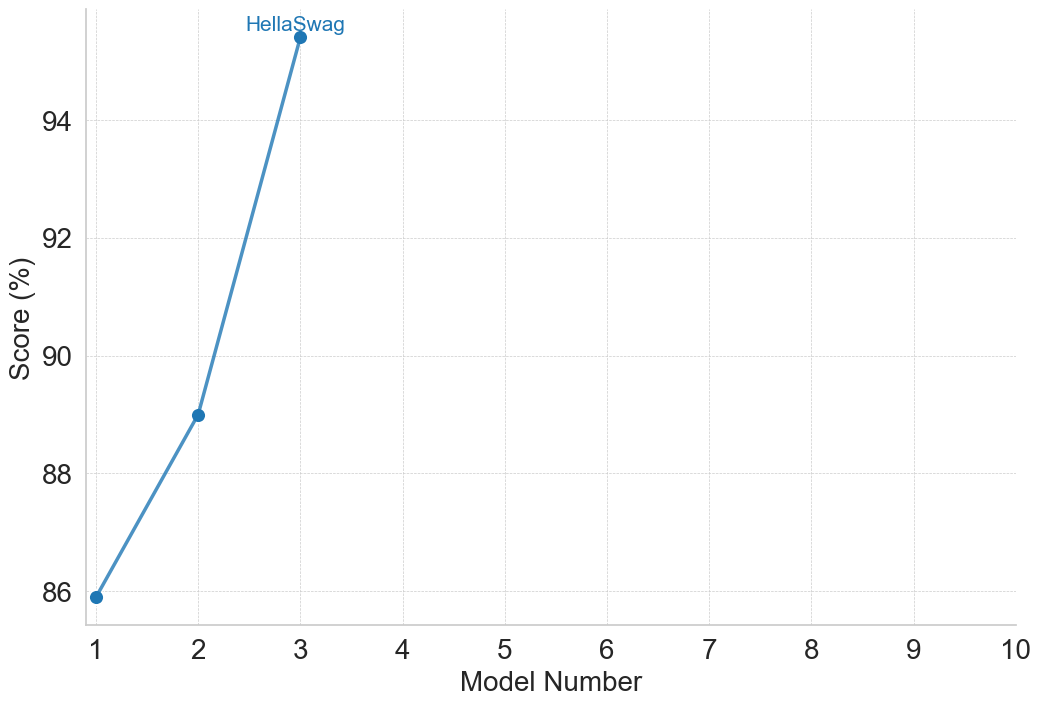
The image displays a line chart plotting the performance scores of three sequential models on the HellaSwag benchmark. The chart shows a clear, steep upward trend in scores across the first three model iterations. The data series is labeled "HellaSwag," indicating the specific evaluation dataset used.
### Components/Axes
* **Chart Type:** Line chart with data points marked by filled blue circles.
* **X-Axis (Horizontal):**
* **Label:** "Model Number"
* **Scale:** Linear, integer values from 1 to 10.
* **Markers:** Major ticks and labels at every integer from 1 to 10.
* **Y-Axis (Vertical):**
* **Label:** "Score (%)"
* **Scale:** Linear, percentage values.
* **Range:** Displayed from 86% to 94%, with major ticks and labels at 86, 88, 90, 92, and 94.
* **Data Series:**
* **Label:** "HellaSwag" (text label positioned near the top data point).
* **Color:** Medium blue (approximately #4A90D9).
* **Style:** Solid line connecting three data points.
* **Grid:** Light gray, dashed horizontal and vertical grid lines are present.
### Detailed Analysis
The chart contains data for only the first three model numbers. The line and data points are positioned as follows:
1. **Model Number 1:**
* **Position:** Bottom-left of the plotted data.
* **Score:** 86% (the point sits exactly on the 86% grid line).
* **Trend Start:** This is the baseline score.
2. **Model Number 2:**
* **Position:** Center of the plotted data.
* **Score:** 89% (the point is positioned exactly halfway between the 88% and 90% grid lines).
* **Trend:** The line slopes upward from Model 1 to Model 2, indicating a +3 percentage point improvement.
3. **Model Number 3:**
* **Position:** Top-right of the plotted data.
* **Score:** 95% (the point is positioned above the 94% grid line. Based on the axis scaling, the value is estimated to be 95%).
* **Trend:** The line slopes upward steeply from Model 2 to Model 3, indicating a +6 percentage point improvement. The label "HellaSwag" is placed just above and to the right of this data point.
**Spatial Grounding:** The "HellaSwag" label is located in the top-center area of the chart, directly associated with the highest data point (Model 3, 95%). The data series uses a single, consistent blue color for both the line and the points.
### Key Observations
* **Steep Positive Trend:** The performance improves dramatically with each model iteration. The rate of improvement accelerates, with the gain from Model 2 to 3 (+6%) being double the gain from Model 1 to 2 (+3%).
* **Limited Data Range:** Data is only provided for Model Numbers 1, 2, and 3. The x-axis extends to Model Number 10, but no data is plotted for models 4 through 10, leaving their performance unknown.
* **High Final Score:** The score for Model 3 (95%) is very high, suggesting near-ceiling performance on this particular benchmark.
* **Chart Simplicity:** The chart is minimal, containing only one data series without a separate legend box; the series is identified by a direct label.
### Interpretation
This chart demonstrates a strong, positive correlation between model iteration number and performance on the HellaSwag benchmark, which tests commonsense reasoning. The data suggests that successive versions of the model (1 → 2 → 3) have made significant and accelerating progress on this specific task.
The most notable insight is the non-linear improvement. The jump from 89% to 95% between the second and third models is particularly substantial, indicating a potential breakthrough or the compounding effect of architectural or training data improvements. The absence of data beyond Model 3 creates an open question: does this trend of rapid improvement continue, plateau, or reverse for later models? The empty axis space from 4 to 10 visually emphasizes this unknown. The high final score of 95% implies that further gains on this benchmark may become increasingly difficult, potentially approaching the limit of what the benchmark can measure.
</details>
(a) Commonsense and Logical Reasoning
<details>
<summary>figures/claude_2_plots/claude_performance_Mathematical_Reasoning.png Details</summary>
### Visual Description
## Multi-Line Chart: Model Performance Across Mathematical Benchmarks
### Overview
The image is a multi-line chart plotting the performance scores (in percentage) of ten different models (labeled 1 through 10) across seven distinct mathematical reasoning benchmarks. Each benchmark is represented by a uniquely colored line with specific markers. The chart illustrates how model performance varies and generally improves across the sequence of models for most tasks.
### Components/Axes
* **X-Axis:** Labeled "Model Number". It is a categorical axis with discrete integer markers from 1 to 10.
* **Y-Axis:** Labeled "Score (%)". It is a linear scale ranging from 0 to 100, with major gridlines at intervals of 10%.
* **Legend/Series Labels:** The legend is embedded directly within the chart area, with labels placed near the end of their respective lines. The series are:
1. **GSM8K:** Red line with upward-pointing triangle markers.
2. **MGSM:** Orange line with square markers.
3. **MATH:** Brown line with diamond markers.
4. **MathVista:** Blue line with circle markers.
5. **MATH 500:** Yellow-green line with circle markers.
6. **AIME 2024:** Pink line with circle markers.
7. **AIME 2025:** Cyan line with circle markers.
### Detailed Analysis
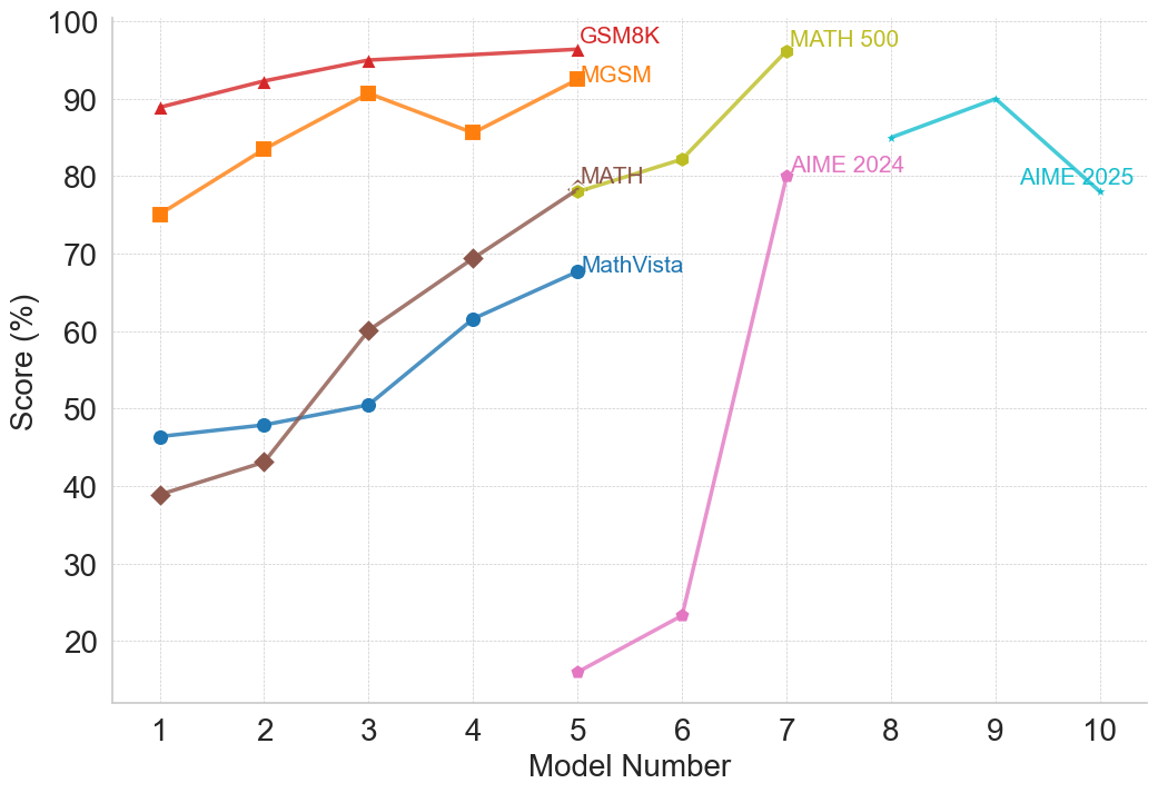
**Data Series Trends and Approximate Values:**
1. **GSM8K (Red, Triangles):**
* **Trend:** Consistently high and slowly increasing.
* **Data Points:** Model 1: ~89%, Model 2: ~92%, Model 3: ~95%, Model 4: ~96%, Model 5: ~97%.
2. **MGSM (Orange, Squares):**
* **Trend:** Generally upward with a notable dip at Model 4.
* **Data Points:** Model 1: ~75%, Model 2: ~84%, Model 3: ~91%, Model 4: ~86%, Model 5: ~93%.
3. **MATH (Brown, Diamonds):**
* **Trend:** Strong, steady upward slope.
* **Data Points:** Model 1: ~39%, Model 2: ~43%, Model 3: ~60%, Model 4: ~69%, Model 5: ~78%.
4. **MathVista (Blue, Circles):**
* **Trend:** Steady, moderate upward slope.
* **Data Points:** Model 1: ~46%, Model 2: ~48%, Model 3: ~50%, Model 4: ~61%, Model 5: ~68%.
5. **MATH 500 (Yellow-Green, Circles):**
* **Trend:** Sharp increase between Model 6 and Model 7.
* **Data Points:** Model 6: ~82%, Model 7: ~96%. (Data only present for these two models).
6. **AIME 2024 (Pink, Circles):**
* **Trend:** Very sharp, dramatic increase from a low base.
* **Data Points:** Model 5: ~16%, Model 6: ~23%, Model 7: ~80%.
7. **AIME 2025 (Cyan, Circles):**
* **Trend:** Increases to a peak at Model 9, then declines.
* **Data Points:** Model 8: ~85%, Model 9: ~90%, Model 10: ~78%.
### Key Observations
* **Performance Hierarchy:** For the models where data is available (Models 1-5), GSM8K and MGSM consistently yield the highest scores, while MATH and MathVista start lower but show significant improvement.
* **Dramatic Improvements:** The most striking improvements are seen in the AIME 2024 series (from ~23% at Model 6 to ~80% at Model 7) and the MATH 500 series (from ~82% to ~96% between Models 6 and 7).
* **Non-Linear Progression:** Performance does not always improve monotonically. MGSM shows a dip at Model 4, and AIME 2025 peaks at Model 9 before falling at Model 10.
* **Benchmark Introduction Points:** Different benchmarks appear to be evaluated on different subsets of models. GSM8K, MGSM, MATH, and MathVista are plotted for Models 1-5. MATH 500 and AIME 2024 are plotted for Models 5-7. AIME 2025 is plotted for Models 8-10.
### Interpretation
This chart visualizes the progression of capability across a series of AI models on standardized mathematical reasoning tasks. The data suggests several key insights:
1. **General Upward Trajectory:** The overarching trend is one of improvement, indicating that successive models (as numbered) generally become better at solving mathematical problems. This is most clearly seen in the steady climbs of the MATH and MathVista benchmarks.
2. **Task-Dependent Performance:** Models excel at different tasks to varying degrees. Foundational arithmetic (GSM8K) appears to be a strength early on, while more complex competition-style problems (AIME) show explosive growth later, suggesting a phase shift in capability for those specific tasks.
3. **Potential Evaluation Shifts:** The disjointed plotting of benchmarks (e.g., AIME starting at Model 5 or 8) may indicate when these evaluation suites were introduced or became relevant to the model development cycle. The sharp jumps in AIME 2024 and MATH 500 could correspond to a significant architectural or training breakthrough that specifically benefited those types of problems.
4. **The AIME 2025 Anomaly:** The decline in AIME 2025 score from Model 9 to Model 10 is a notable outlier. This could indicate a limitation, a trade-off in model specialization, or simply noise in the evaluation. It raises the question of whether performance on future-dated benchmarks (like AIME 2025) follows the same improvement pattern as historical ones.
In essence, the chart documents a narrative of advancing AI mathematical reasoning, highlighting both consistent progress and moments of dramatic, task-specific breakthrough, while also hinting at the complexities and potential plateaus in scaling model capabilities.
</details>
(b) Mathematical Reasoning
<details>
<summary>figures/claude_2_plots/claude_performance_Multimodal_Reasoning.png Details</summary>
### Visual Description
## Line Chart: Model Performance Across Four Benchmarks
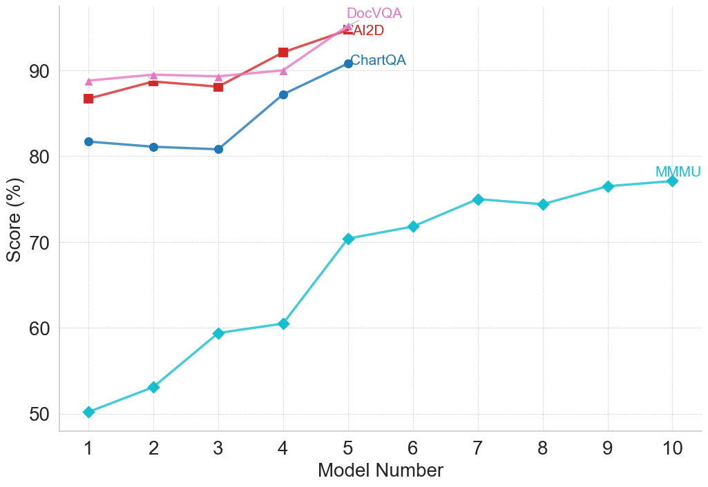
### Overview
The image is a line chart comparing the performance scores (in percentage) of ten different models (labeled 1 through 10) across four distinct benchmarks: DocVQA, AI2D, ChartQA, and MMMU. The chart illustrates how scores change as the model number increases.
### Components/Axes
* **Chart Type:** Multi-series line chart with markers.
* **X-Axis:** Labeled "Model Number". It has discrete integer markers from 1 to 10.
* **Y-Axis:** Labeled "Score (%)". It has major gridlines and labels at 50, 60, 70, 80, and 90.
* **Legend:** Positioned in the top-right quadrant of the chart area. It contains four entries:
* **DocVQA:** Pink line with upward-pointing triangle markers.
* **AI2D:** Red line with square markers.
* **ChartQA:** Blue line with circle markers.
* **MMMU:** Cyan (light blue) line with diamond markers.
* **Grid:** A light gray, dashed grid is present for both horizontal and vertical axes.
### Detailed Analysis
**Data Series and Approximate Values:**
1. **MMMU (Cyan line, diamond markers):**
* **Trend:** Shows a strong, consistent upward trend across all ten models, with a slight plateau between models 7 and 8.
* **Data Points (Approximate):**
* Model 1: 50%
* Model 2: 53%
* Model 3: 59%
* Model 4: 60%
* Model 5: 70%
* Model 6: 72%
* Model 7: 75%
* Model 8: 74%
* Model 9: 76%
* Model 10: 77%
2. **ChartQA (Blue line, circle markers):**
* **Trend:** Starts with a slight dip, then increases sharply. Data is only plotted for models 1 through 5.
* **Data Points (Approximate):**
* Model 1: 82%
* Model 2: 81%
* Model 3: 81%
* Model 4: 87%
* Model 5: 91%
3. **AI2D (Red line, square markers):**
* **Trend:** Generally upward with a minor dip at model 3. Data is only plotted for models 1 through 5.
* **Data Points (Approximate):**
* Model 1: 87%
* Model 2: 89%
* Model 3: 88%
* Model 4: 92%
* Model 5: 95%
4. **DocVQA (Pink line, triangle markers):**
* **Trend:** Shows a steady, slight upward trend. Data is only plotted for models 1 through 5.
* **Data Points (Approximate):**
* Model 1: 89%
* Model 2: 90%
* Model 3: 90%
* Model 4: 90%
* Model 5: 95%
### Key Observations
1. **Performance Hierarchy:** For the first five models, DocVQA and AI2D consistently achieve the highest scores, followed by ChartQA, with MMMU scoring significantly lower.
2. **Convergence at Model 5:** At Model 5, the scores for DocVQA and AI2D converge at approximately 95%, the highest point on the chart. ChartQA also peaks here at ~91%.
3. **MMMU's Unique Trajectory:** The MMMU benchmark is the only one plotted for all ten models. It shows the most dramatic relative improvement, starting at 50% and ending at 77%, a 27-percentage-point gain.
4. **Data Completeness:** The ChartQA, AI2D, and DocVQA series are incomplete, providing data only for models 1-5. This prevents comparison with MMMU for models 6-10.
5. **Plateau in MMMU:** The MMMU score shows a near-plateau between Model 7 (75%) and Model 8 (74%), before resuming a slight upward trend.
### Interpretation
This chart likely visualizes the progression of capability across a series of increasingly advanced or larger AI models (represented by "Model Number") on specific multimodal understanding tasks.
* **Benchmark Difficulty:** The consistently lower scores for MMMU suggest it is a more challenging benchmark for these models compared to DocVQA, AI2D, and ChartQA, which may test more specialized or constrained skills.
* **Model Improvement:** The general upward trend for all benchmarks indicates that successive models (higher model numbers) demonstrate improved performance. The steep rise in MMMU scores suggests particular advancements in the capabilities it measures.
* **Specialization vs. Generalization:** The high, converging scores of DocVQA and AI2D at Model 5 might indicate that models have reached a performance ceiling on these specific tasks, or that the models are highly optimized for them. The continued, steady rise of MMMU suggests ongoing progress in a broader or more complex domain of understanding.
* **Missing Data:** The absence of data for ChartQA, AI2D, and DocVQA beyond Model 5 is a significant limitation. It is unclear if these benchmarks were not evaluated, if the models failed, or if the data was simply not included in this visualization. This prevents a full comparison of model evolution across all tasks for the complete set of ten models.
</details>
(c) Multimodal Reasoning
<details>
<summary>figures/claude_2_plots/claude_performance_Programming_and_Coding.png Details</summary>
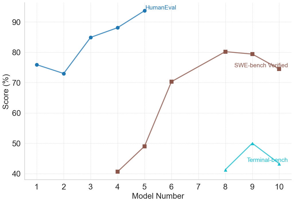
### Visual Description
## Line Chart: Model Performance Across Three Benchmarks
### Overview
This image is a line chart comparing the performance scores (in percentage) of ten different models (labeled 1 through 10) on three distinct evaluation benchmarks: HumanEval, SWE-bench Verified, and Terminal-bench. The chart visualizes how model capabilities vary across these different testing domains.
### Components/Axes
* **X-Axis:** Labeled "Model Number". It has discrete integer markers from 1 to 10.
* **Y-Axis:** Labeled "Score (%)". It has a linear scale with major grid lines at intervals of 10%, ranging from 40% to 90%.
* **Legend:** Located in the top-right quadrant of the chart area. It defines three data series:
* **HumanEval:** Blue line with circular markers.
* **SWE-bench Verified:** Brown line with square markers.
* **Terminal-bench:** Cyan (light blue) line with triangular markers.
### Detailed Analysis
**1. HumanEval (Blue Line, Circle Markers)**
* **Trend:** Shows an overall upward trend with a notable dip at Model 2. Performance is consistently the highest among the three benchmarks for the models where data is present.
* **Data Points (Approximate):**
* Model 1: ~76%
* Model 2: ~73% (Dip)
* Model 3: ~85%
* Model 4: ~88%
* Model 5: ~94% (Peak)
* *No data points are plotted for Models 6 through 10.*
**2. SWE-bench Verified (Brown Line, Square Markers)**
* **Trend:** Shows a strong, generally upward trend from Model 4 to Model 8, followed by a slight decline. Data is only present for Models 4, 5, 6, 8, 9, and 10.
* **Data Points (Approximate):**
* Model 4: ~41%
* Model 5: ~49%
* Model 6: ~70%
* Model 7: *No data point.*
* Model 8: ~80% (Peak)
* Model 9: ~79%
* Model 10: ~75%
**3. Terminal-bench (Cyan Line, Triangle Markers)**
* **Trend:** Shows a sharp increase from Model 8 to Model 9, followed by a decrease to Model 10. Data is only present for the last three models.
* **Data Points (Approximate):**
* Models 1-7: *No data points.*
* Model 8: ~41%
* Model 9: ~50% (Peak)
* Model 10: ~43%
### Key Observations
1. **Benchmark Specificity:** Models are not evaluated on all benchmarks. HumanEval data is only for Models 1-5, SWE-bench for Models 4-10 (except 7), and Terminal-bench only for Models 8-10. This suggests the benchmarks may test different skills or were applied to different model generations.
2. **Performance Hierarchy:** For the models where direct comparison is possible (Models 4 and 5), HumanEval scores are significantly higher than SWE-bench Verified scores. For Models 8-10, SWE-bench scores are substantially higher than Terminal-bench scores.
3. **Peak Performance:** Each benchmark's peak score is achieved by a different model: HumanEval peaks at Model 5 (~94%), SWE-bench at Model 8 (~80%), and Terminal-bench at Model 9 (~50%).
4. **Volatility:** The Terminal-bench scores show the most volatility over a short range (a 9-point swing between Models 8 and 10). The SWE-bench scores show a large, steady climb followed by a plateau.
### Interpretation
The chart demonstrates that model performance is highly dependent on the evaluation benchmark. A model excelling in one domain (e.g., HumanEval, likely testing general code generation) does not guarantee proportional success in another (e.g., SWE-bench, likely testing real-world software engineering tasks, or Terminal-bench, likely testing command-line or system-level proficiency).
The staggered appearance of data series suggests a progression in model development or testing focus. Earlier models (1-3) were perhaps only tested on HumanEval. Later models (4 onwards) began to be evaluated on more complex, applied benchmarks like SWE-bench. The most recent models (8-10) are additionally tested on Terminal-bench, indicating an expanding scope of evaluation.
The significant performance gap between benchmarks (e.g., ~94% on HumanEval vs. ~49% on SWE-bench for Model 5) highlights the difference between solving isolated programming problems and performing integrated software engineering tasks. The lower and more volatile scores on Terminal-bench suggest it may be a particularly challenging or nascent evaluation domain. The missing data point for Model 7 on SWE-bench is an anomaly that could indicate a failed evaluation or a model not intended for that benchmark.
</details>
(d) Programming and Coding
<details>
<summary>figures/claude_2_plots/claude_performance_Reading_Comprehension_and_Question_Answering.png Details</summary>
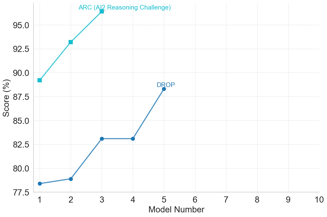
### Visual Description
## Line Chart: Model Performance on ARC and DROP Benchmarks
### Overview
The image displays a line chart comparing the performance scores (in percentage) of sequential model numbers on two distinct benchmarks: ARC (AI2 Reasoning Challenge) and DROP. The chart plots scores against model numbers, showing performance trends for each benchmark across five models (Model 1 to Model 5). The x-axis extends to Model 10, but data is only plotted for the first five models.
### Components/Axes
* **Chart Type:** Line chart with markers.
* **X-Axis:**
* **Label:** "Model Number"
* **Scale:** Linear, from 1 to 10, with major tick marks at every integer.
* **Y-Axis:**
* **Label:** "Score (%)"
* **Scale:** Linear, from 77.5 to 95.0, with major tick marks every 2.5 units (77.5, 80.0, 82.5, 85.0, 87.5, 90.0, 92.5, 95.0).
* **Legend:**
* **Position:** Top-center of the chart area.
* **Series 1:** "ARC (AI2 Reasoning Challenge)" - Represented by a cyan line with square markers.
* **Series 2:** "DROP" - Represented by a blue line with circle markers.
* **Grid:** Light gray horizontal grid lines are present at each major y-axis tick.
### Detailed Analysis
**Data Series 1: ARC (AI2 Reasoning Challenge)**
* **Visual Trend:** The line shows a steep, consistent upward slope from Model 1 to Model 3.
* **Data Points (Approximate):**
* Model 1: ~89.2%
* Model 2: ~93.2%
* Model 3: ~96.5%
* **Note:** Data for Models 4 and 5 is not plotted for the ARC series.
**Data Series 2: DROP**
* **Visual Trend:** The line shows a gradual initial increase, a sharp rise, a plateau, and then another increase.
* **Data Points (Approximate):**
* Model 1: ~78.4%
* Model 2: ~78.8%
* Model 3: ~83.1%
* Model 4: ~83.1% (plateau from Model 3)
* Model 5: ~88.3%
### Key Observations
1. **Performance Gap:** The ARC scores are consistently and significantly higher than the DROP scores for all models where both are plotted (Models 1-3). The gap is approximately 10.8 percentage points at Model 1 and narrows slightly to about 13.4 percentage points at Model 3.
2. **Growth Rates:** The ARC series exhibits a very high growth rate between Models 1 and 2 (~4.0 percentage points). The DROP series shows its most significant single jump between Models 4 and 5 (~5.2 percentage points).
3. **Plateau:** The DROP series shows no improvement between Model 3 and Model 4, holding steady at approximately 83.1%.
4. **Missing Data:** The chart's x-axis is prepared for 10 models, but data is only provided for the first five. The ARC series is missing data for Models 4 and 5.
### Interpretation
This chart visualizes the progression of model capabilities on two challenging reasoning benchmarks. The data suggests that the models evaluated have achieved substantially higher proficiency on the ARC benchmark compared to the DROP benchmark within the first three iterations. The steep, uninterrupted climb in ARC scores indicates rapid and effective optimization for that specific type of challenge.
The DROP performance trajectory is more complex. The initial slow growth, followed by a sharp rise and a plateau, could indicate a period of architectural or training stagnation (Models 2-4) before a breakthrough or the application of a new technique led to the significant gain at Model 5. The plateau at Models 3 and 4 is a notable anomaly, suggesting a temporary performance ceiling was hit for the DROP task.
The absence of data for later models (6-10) and for ARC beyond Model 3 limits the analysis. It is unclear if the trends continued, if the models were evaluated on other benchmarks, or if development shifted focus. The chart effectively demonstrates that model improvement is not uniform across different types of cognitive challenges, highlighting the importance of multi-benchmark evaluation.
</details>
(e) Reading Comprehension and QA
<details>
<summary>figures/claude_2_plots/claude_performance_Reasoning_with_General_Knowledge.png Details</summary>
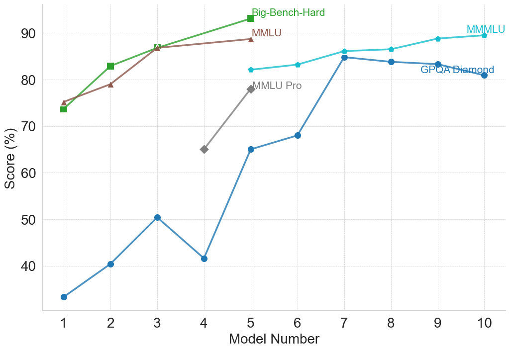
### Visual Description
## Multi-Line Chart: AI Model Benchmark Performance Comparison
### Overview
This image is a multi-line chart comparing the performance scores (in percentage) of different AI models across five distinct benchmarks. The chart plots "Score (%)" on the vertical axis against "Model Number" (1 through 10) on the horizontal axis. Each line represents a different benchmark, identified by a unique color and marker shape. The overall trend shows that model performance generally increases with higher model numbers, though the rate of improvement and absolute scores vary significantly by benchmark.
### Components/Axes
* **Chart Type:** Multi-line chart with markers.
* **X-Axis (Horizontal):**
* **Label:** "Model Number"
* **Scale:** Linear, integer values from 1 to 10.
* **Y-Axis (Vertical):**
* **Label:** "Score (%)"
* **Scale:** Linear, ranging from 30 to 90, with major gridlines every 10 units (40, 50, 60, 70, 80, 90).
* **Legend:** Positioned in the top-right quadrant of the chart area. It lists five benchmarks with corresponding colors and markers:
1. **Big-Bench-Hard:** Green line with square markers (■).
2. **MMLU:** Brown line with upward-pointing triangle markers (▲).
3. **MMLU Pro:** Gray line with diamond markers (◆).
4. **MMMLU:** Cyan (light blue) line with circle markers (●).
5. **GPQA Diamond:** Blue line with circle markers (●).
* **Grid:** A light gray, dotted grid is present for both horizontal and vertical axes.
### Detailed Analysis
**Data Series and Trends (with approximate values):**
1. **Big-Bench-Hard (Green, ■):**
* **Trend:** Steep, consistent upward slope from Model 1 to Model 5.
* **Data Points:**
* Model 1: ~74%
* Model 2: ~83%
* Model 3: ~87%
* Model 4: ~88% (estimated, point lies between 80 and 90, closer to 90)
* Model 5: ~93% (highest point on the entire chart)
2. **MMLU (Brown, ▲):**
* **Trend:** Steady upward slope, parallel to but slightly below Big-Bench-Hard for Models 1-3, then plateaus.
* **Data Points:**
* Model 1: ~75%
* Model 2: ~79%
* Model 3: ~87% (appears to converge with Big-Bench-Hard at this point)
* Model 4: ~88% (estimated, very close to Big-Bench-Hard)
* Model 5: ~89%
3. **MMLU Pro (Gray, ◆):**
* **Trend:** Sharp increase over a short range (Models 4-5).
* **Data Points:**
* Model 4: ~65%
* Model 5: ~78%
4. **MMMLU (Cyan, ●):**
* **Trend:** Gradual, consistent upward slope from Model 5 to Model 10.
* **Data Points:**
* Model 5: ~82%
* Model 6: ~83%
* Model 7: ~86%
* Model 8: ~87%
* Model 9: ~89%
* Model 10: ~90%
5. **GPQA Diamond (Blue, ●):**
* **Trend:** Volatile but overall upward trend. Starts very low, experiences a significant dip at Model 4, then rises sharply to a peak at Model 7 before a slight decline.
* **Data Points:**
* Model 1: ~33%
* Model 2: ~40%
* Model 3: ~50%
* Model 4: ~42% (notable dip)
* Model 5: ~65%
* Model 6: ~68%
* Model 7: ~85% (peak for this series)
* Model 8: ~84%
* Model 9: ~83%
* Model 10: ~81%
### Key Observations
* **Performance Hierarchy:** For the models where data is available (Models 1-5), Big-Bench-Hard and MMLU consistently yield the highest scores, followed by MMLU Pro, with GPQA Diamond being the most challenging (lowest scores).
* **Convergence:** The scores for Big-Bench-Hard and MMLU are nearly identical for Models 3, 4, and 5.
* **Significant Outlier:** The GPQA Diamond score for Model 4 (~42%) is a clear outlier, breaking its upward trend and falling below its score for Model 3 (~50%).
* **Benchmark Range:** The spread of scores is widest at Model 1 (from ~33% to ~75%) and narrows considerably by Model 5 (from ~65% to ~93%).
* **Late-Stage Plateau:** The MMMLU and GPQA Diamond benchmarks show a plateau or slight decline in scores for the highest model numbers (8-10), suggesting potential performance saturation on these tasks.
### Interpretation
This chart visualizes the progression of AI model capabilities across a suite of standardized benchmarks. The "Model Number" likely represents a sequence of increasingly capable or larger models from a single family or a chronological release order.
The data suggests several insights:
1. **Benchmark Difficulty:** The benchmarks are not equally difficult. GPQA Diamond appears to be the most challenging, especially for earlier models, while Big-Bench-Hard and MMLU are more readily mastered by mid-sequence models.
2. **Non-Linear Progression:** Model improvement is not uniform across all tasks. The sharp rise in GPQA Diamond scores from Model 4 to 7 indicates a breakthrough in the specific capabilities that benchmark tests (likely complex reasoning or domain-specific knowledge). Conversely, the dip at Model 4 for GPQA Diamond could indicate a model that was optimized for other benchmarks at the expense of this one.
3. **Ceiling Effects:** The flattening of the MMMLU and GPQA Diamond curves at the high end suggests that current models may be approaching the performance ceiling for these particular evaluations, or that further architectural changes yield diminishing returns on these tasks.
4. **Comparative Analysis:** The chart allows for direct comparison of how a single model (e.g., Model 5) performs across different challenges. Model 5 excels at Big-Bench-Hard (~93%) but finds GPQA Diamond significantly harder (~65%), highlighting its relative strengths and weaknesses.
In essence, the chart documents a narrative of advancing AI performance, where each successive model generally improves, but the path is uneven, with different benchmarks revealing different facets of capability growth and limitation.
</details>
(f) Reasoning with General Knowledge
<details>
<summary>figures/claude_2_plots/claude_performance_LLM_Benchmarks_Combined.png Details</summary>
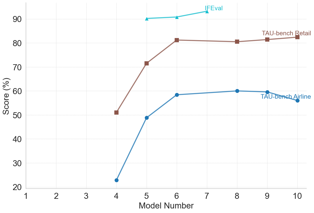
### Visual Description
## Multi-Line Chart: Model Performance Across Three Evaluation Benchmarks
### Overview
The image displays a line chart comparing the performance scores (in percentage) of three different evaluation benchmarks across a series of model numbers. The chart tracks how scores change as the model number increases from 4 to 10.
### Components/Axes
* **Chart Type:** Multi-line chart with markers.
* **X-Axis:**
* **Label:** "Model Number"
* **Scale:** Linear, from 1 to 10. Data points are plotted for model numbers 4, 5, 6, 7, 8, 9, and 10.
* **Y-Axis:**
* **Label:** "Score (%)"
* **Scale:** Linear, from 20 to 90, with major gridlines at intervals of 10.
* **Data Series & Legend:** The legend is embedded directly into the chart area, with labels placed adjacent to their respective lines.
1. **Series 1:** Label: "IFEval". Visual: Cyan line with upward-pointing triangle markers.
2. **Series 2:** Label: "TAU-bench Retail". Visual: Brown line with square markers.
3. **Series 3:** Label: "TAU-bench Airline". Visual: Blue line with circle markers.
* **Grid:** A light gray, dashed grid is present for both horizontal and vertical axes.
### Detailed Analysis
**Data Series 1: IFEval (Cyan, Triangles)**
* **Trend:** Shows a very slight, steady upward trend across the observed model numbers.
* **Data Points (Approximate):**
* Model 4: ~90%
* Model 5: ~90.5%
* Model 6: ~91%
* Model 7: ~93%
* (Data points for models 8, 9, 10 are not plotted for this series).
**Data Series 2: TAU-bench Retail (Brown, Squares)**
* **Trend:** Shows a sharp increase from model 4 to 6, followed by a plateau with very minor fluctuations.
* **Data Points (Approximate):**
* Model 4: ~51%
* Model 5: ~71%
* Model 6: ~81%
* Model 7: ~81%
* Model 8: ~80.5%
* Model 9: ~81.5%
* Model 10: ~82%
**Data Series 3: TAU-bench Airline (Blue, Circles)**
* **Trend:** Shows a steep increase from model 4 to 6, a slower rise to a peak at model 8, followed by a slight decline.
* **Data Points (Approximate):**
* Model 4: ~23%
* Model 5: ~49%
* Model 6: ~58%
* Model 7: ~59%
* Model 8: ~60%
* Model 9: ~59.5%
* Model 10: ~56%
### Key Observations
1. **Performance Hierarchy:** IFEval consistently yields the highest scores (above 90%), followed by TAU-bench Retail (peaking around 82%), with TAU-bench Airline showing the lowest scores (peaking at 60%).
2. **Greatest Improvement:** The most significant performance jumps for the TAU-bench series occur between models 4 and 6.
3. **Diverging Late-Stage Trends:** After model 8, the TAU-bench Retail score remains stable, while the TAU-bench Airline score shows a noticeable decline.
4. **Data Coverage:** The IFEval series only provides data for models 4 through 7, while the two TAU-bench series cover the full range from 4 to 10.
### Interpretation
The chart suggests that the evaluated models undergo significant capability improvements between iterations 4 and 6, as reflected in sharp score increases on the TAU-bench Retail and Airline tasks. The IFEval benchmark, which starts at a very high baseline, shows only marginal gains, indicating it may be measuring a different, more stable capability or that the models are already near its performance ceiling.
The divergence after model 8 is particularly noteworthy. The stability of the Retail score versus the decline in the Airline score could indicate that later model optimizations (from 8 to 10) may have specialized or overfitted the models for certain types of tasks (like retail) at the slight expense of others (like airline-related tasks), or that the Airline benchmark is more sensitive to specific changes in the model architecture or training data. The absence of IFEval data for later models prevents a complete cross-benchmark comparison in that range. Overall, the data demonstrates that model progression does not uniformly improve performance across all evaluation domains.
</details>
(g) LLM Benchmarks
Figure 3: Performance of the Claude family on reasoning benchmarks by category. Model numbers and corresponding names are as follows: 1 – Claude 3 Haiku; 2 – Claude 3 Sonnet; 3 – Claude 3 Opus; 4 – Claude 3.5 Haiku; 5 – Claude 3.5 Sonnet; 6 – Claude 3.7 Sonnet; 7 – Claude 3.7 Sonnet (64K Extended Thinking); 8 – Claude Sonnet 4; 9 – Claude Opus 4; 10 – Claude Opus 4.1.
<details>
<summary>figures/gemini_2_plots/gemini_performance_Commonsense_and_Logical_Reasoning.png Details</summary>
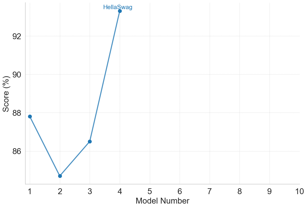
### Visual Description
## Line Chart: HellaSwag Benchmark Scores by Model Number
### Overview
The image displays a line chart plotting performance scores (in percentage) against a sequence of model numbers. The chart is titled "HellaSwag," which is a known benchmark for evaluating commonsense reasoning in AI models. The data shows a non-linear trend across four models, with a significant performance spike at the fourth model.
### Components/Axes
* **Chart Title:** "HellaSwag" (centered at the top of the chart area).
* **Y-Axis (Vertical):**
* **Label:** "Score (%)" (rotated vertically on the left side).
* **Scale:** Linear scale ranging from 86 to 92, with major tick marks and grid lines at 86, 88, 90, and 92. The axis extends slightly below 86 and above 92.
* **X-Axis (Horizontal):**
* **Label:** "Model Number" (centered at the bottom).
* **Scale:** Discrete integer scale from 1 to 10, with major tick marks and labels for each integer. Data is only present for models 1 through 4.
* **Data Series:** A single data series represented by a solid blue line connecting circular blue data points. There is no separate legend box; the title "HellaSwag" serves as the identifier for the plotted series.
* **Grid:** A light gray, dotted grid is present for both major x and y ticks.
### Detailed Analysis
The chart plots the HellaSwag benchmark score for four distinct models. The approximate values, read from the chart, are as follows:
* **Model 1:** Score ≈ 87.8% (The point is slightly below the 88% grid line).
* **Model 2:** Score ≈ 84.8% (The point is significantly below the 86% grid line, representing the lowest score in the series).
* **Model 3:** Score ≈ 86.5% (The point is above the 86% grid line but below the midpoint to 88%).
* **Model 4:** Score ≈ 93.5% (The point is above the 92% grid line, representing the highest score and a dramatic increase from the previous model).
**Trend Verification:**
1. From Model 1 to Model 2: The line slopes sharply downward.
2. From Model 2 to Model 3: The line slopes upward.
3. From Model 3 to Model 4: The line slopes very steeply upward, indicating a major performance improvement.
### Key Observations
1. **Non-Linear Progression:** Performance does not improve steadily with model number. There is a notable dip at Model 2.
2. **Significant Outlier:** Model 4's performance is a clear outlier, scoring approximately 7 percentage points higher than the next best model (Model 1) and nearly 9 points higher than the lowest (Model 2).
3. **Data Range:** The x-axis extends to Model 10, but data is only provided for the first four models, leaving the performance of models 5-10 unknown.
4. **Visual Emphasis:** The steep final segment of the line visually emphasizes the breakthrough performance of Model 4.
### Interpretation
This chart likely illustrates the progression of different versions or iterations of an AI model on the HellaSwag commonsense reasoning benchmark. The data suggests that development was not linear; an earlier iteration (Model 2) underperformed its predecessor (Model 1). However, a subsequent iteration (Model 4) achieved a substantial leap in capability.
The dramatic improvement at Model 4 could indicate a fundamental architectural change, a significant increase in training data or compute, or the incorporation of a new training technique. The chart effectively communicates that the latest model in this sequence represents a major step forward on this specific benchmark. The empty space for models 5-10 implies this is either a work in progress or that only select models were chosen for this comparison. The absence of a traditional legend, using the chart title instead, is a concise design choice suitable for a single-series plot.
</details>
(a) Commonsense and Logical Reasoning
<details>
<summary>figures/gemini_2_plots/gemini_performance_Mathematical_Reasoning.png Details</summary>
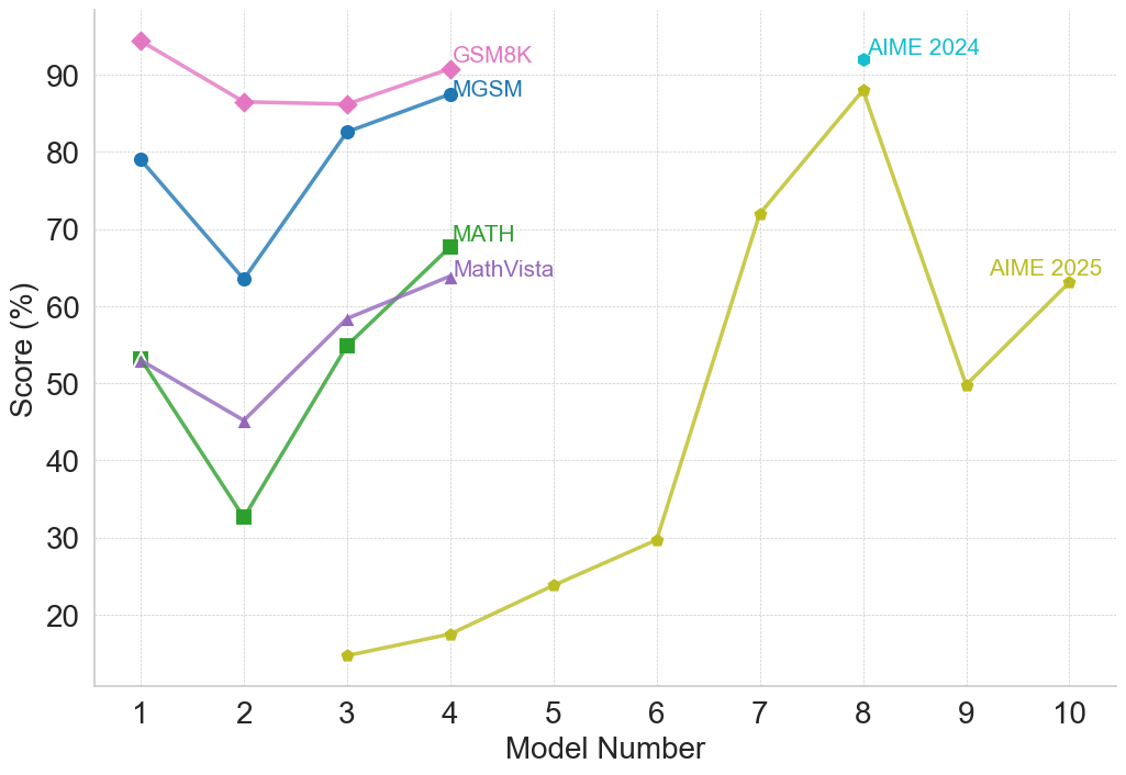
### Visual Description
## Multi-Line Chart: Model Performance Comparison Across Mathematical Benchmarks
### Overview
This is a multi-line chart comparing the performance of 10 different models (numbered 1 through 10) on five distinct mathematical reasoning benchmarks. The chart plots the score percentage for each model on each benchmark, revealing trends in model capability across different types of mathematical problems.
### Components/Axes
* **X-Axis:** Labeled "Model Number". It is a categorical axis with discrete integer markers from 1 to 10.
* **Y-Axis:** Labeled "Score (%)". It is a linear scale ranging from 20 to 90, with major gridlines at intervals of 10.
* **Legend/Data Series:** There are five distinct lines, each representing a benchmark, identified by color and marker shape. The legend is embedded directly on the chart, with labels placed near the end of their respective lines.
* **GSM8K:** Pink line with diamond markers.
* **MGSM:** Blue line with circle markers.
* **MATH:** Green line with square markers.
* **MathVista:** Purple line with triangle markers.
* **AIME 2025:** Yellow-green line with circle markers.
* **AIME 2024:** A single cyan diamond data point at Model 8.
### Detailed Analysis
**Trend Verification & Data Point Extraction (Approximate Values):**
1. **GSM8K (Pink, Diamonds):**
* **Trend:** Starts very high, dips at model 2, plateaus, then recends slightly upward.
* **Points:** Model 1: ~95%, Model 2: ~86%, Model 3: ~86%, Model 4: ~91%.
2. **MGSM (Blue, Circles):**
* **Trend:** Shows a sharp V-shaped recovery. Starts high, drops significantly at model 2, then climbs back up.
* **Points:** Model 1: ~79%, Model 2: ~64%, Model 3: ~83%, Model 4: ~88%.
3. **MATH (Green, Squares):**
* **Trend:** Exhibits a strong upward trend after an initial dip. The slope from model 2 to 4 is steep.
* **Points:** Model 1: ~53%, Model 2: ~33%, Model 3: ~55%, Model 4: ~68%.
4. **MathVista (Purple, Triangles):**
* **Trend:** Follows a similar pattern to MATH but with less extreme values—a dip followed by a steady increase.
* **Points:** Model 1: ~53%, Model 2: ~45%, Model 3: ~58%, Model 4: ~64%.
5. **AIME 2025 (Yellow-Green, Circles):**
* **Trend:** This series spans models 3-10 and shows high volatility. It starts very low, climbs dramatically to a peak at model 8, drops sharply, then recovers slightly.
* **Points:** Model 3: ~15%, Model 4: ~18%, Model 5: ~24%, Model 6: ~30%, Model 7: ~72%, Model 8: ~88%, Model 9: ~50%, Model 10: ~63%.
6. **AIME 2024 (Cyan, Single Diamond):**
* **Trend:** Not applicable (single point).
* **Point:** Model 8: ~92%.
**Spatial Grounding:** The legend labels are positioned in the upper portion of the chart, generally aligned near the final data point of their respective lines (e.g., "GSM8K" is top-left, "AIME 2025" is far right). The "AIME 2024" label is placed directly above its single data point at Model 8.
### Key Observations
1. **Consistent Dip at Model 2:** Four of the five benchmarks (GSM8K, MGSM, MATH, MathVista) show a performance drop for Model 2 compared to Model 1.
2. **Strong Recovery:** Models 3 and 4 show significant recovery and improvement across the initial four benchmarks.
3. **Benchmark Difficulty Spectrum:** There is a clear hierarchy in scores. GSM8K and MGSM generally yield the highest scores (mostly above 60%), MATH and MathVista are in the middle range, and AIME 2025 starts extremely low, indicating it is likely the most challenging benchmark for the earlier models.
4. **AIME 2025 Volatility:** Performance on AIME 2025 is highly non-linear, with a massive jump between models 6 and 7 (~30% to ~72%) and a subsequent crash between models 8 and 9 (~88% to ~50%).
5. **Model 8 Peak:** Model 8 achieves the highest observed score on the chart (~92% on AIME 2024) and the highest on AIME 2025 (~88%), suggesting it is exceptionally strong on this competition-style benchmark.
### Interpretation
This chart visualizes the progression of mathematical reasoning capabilities across a series of models. The data suggests that **model architecture or training methodology has a profound and non-uniform impact on different types of mathematical problems.**
* The synchronized dip at Model 2 implies a potential architectural choice or training regime that was broadly detrimental to mathematical reasoning, which was subsequently corrected or improved upon in Models 3 and 4.
* The stark difference in score ranges between benchmarks like GSM8K (elementary math word problems) and AIME (advanced competition math) highlights the varying difficulty and specificity of these evaluation sets. A model's performance is not transferable uniformly across all math domains.
* The dramatic volatility in the AIME 2025 line is particularly noteworthy. It suggests that performance on highly complex, competition-level problems may be fragile—small changes in a model can lead to outsized gains or losses. The peak at Model 8 followed by a drop could indicate overfitting to certain problem types or a lack of robustness.
* The single, high AIME 2024 point for Model 8 reinforces its standout performance on competition math, but the lack of data for other models on this benchmark limits broader comparison.
**In essence, the chart tells a story of initial struggle (Model 2), recovery and specialization (Models 3-4), and the emergence of a model (Model 8) with exceptional, though potentially brittle, prowess on the most difficult benchmark presented.** The absence of model names means we cannot correlate these trends with specific public models, but the pattern itself is a valuable map of capability development.
</details>
(b) Mathematical Reasoning
<details>
<summary>figures/gemini_2_plots/gemini_performance_Multimodal_Reasoning.png Details</summary>
### Visual Description
## Multi-Line Chart: Model Performance Comparison Across Multiple Benchmarks
### Overview
The image is a line chart comparing the performance scores (in percentage) of 10 different AI models (numbered 1 through 10) across 8 distinct evaluation benchmarks. Each benchmark is represented by a uniquely colored line with specific markers. The chart illustrates how model performance varies significantly depending on the task or benchmark being evaluated.
### Components/Axes
* **X-Axis:** Labeled "Model Number". It has discrete integer markers from 1 to 10.
* **Y-Axis:** Labeled "Score (%)". It has a linear scale from 0 to approximately 90, with major gridlines at intervals of 20 (0, 20, 40, 60, 80).
* **Legend:** Positioned in the top-right quadrant of the chart area. It lists 8 benchmarks with corresponding line colors and markers:
1. **AI2D** - Red line with diamond markers.
2. **DocVQA** - Brown line with circle markers.
3. **ChartQA** - Green line with triangle markers.
4. **TextVQA** - Blue line with circle markers.
5. **EgoSchema** - Pink line with plus (+) markers.
6. **VideoMMMU** - Cyan line with plus (+) markers.
7. **MMMU** - Orange line with square markers.
8. **Vibe-Eval (Reka)** - Gray line with 'x' markers.
9. **ZeroBench** - Yellow-green line with 'x' markers. (Note: This label appears directly on the chart near its line, not in the top-right legend cluster).
### Detailed Analysis
**Trend Verification & Data Point Extraction (Approximate Values):**
* **AI2D (Red, Diamond):** Shows a generally upward trend. Starts at ~80% (Model 1), dips to ~74% (Model 2), then rises sharply to ~92% (Model 3) and peaks at ~95% (Model 4). Data is only plotted for Models 1-4.
* **DocVQA (Brown, Circle):** High and relatively stable performance. Starts at ~90% (Model 1), dips slightly to ~88% (Model 2), rises to ~90% (Model 3), and peaks at ~93% (Model 4). Data is only plotted for Models 1-4.
* **ChartQA (Green, Triangle):** Shows an upward trend. Starts at ~80% (Model 1), dips to ~75% (Model 2), then rises to ~85% (Model 3) and ~87% (Model 4). Data is only plotted for Models 1-4.
* **TextVQA (Blue, Circle):** Relatively stable with a slight upward trend. Starts at ~82% (Model 1), dips to ~75% (Model 2), then stabilizes around ~79% for Models 3 and 4. Data is only plotted for Models 1-4.
* **EgoSchema (Pink, +):** Shows an upward trend. Starts at ~66% (Model 3), rises to ~72% (Model 4). Data is only plotted for Models 3-4.
* **VideoMMMU (Cyan, +):** Shows a general upward trend with a mid-point dip. Starts at ~65% (Model 3), rises to ~71% (Model 4), dips to ~64% (Model 5), then climbs steadily to ~69% (Model 6), ~80% (Model 7), and peaks at ~83% (Model 8). Data is plotted for Models 3-8.
* **MMMU (Orange, Square):** Shows a volatile but overall upward trend. Starts at ~60% (Model 1), dips sharply to ~48% (Model 2), rises to ~58% (Model 3), ~68% (Model 4), dips to ~65% (Model 5), then climbs to ~70% (Model 6), ~80% (Model 7), peaks at ~82% (Model 8), then declines to ~73% (Model 9) and ~73% (Model 10). Data is plotted for all models.
* **Vibe-Eval (Reka) (Gray, x):** Shows a fluctuating, moderate upward trend. Data starts at Model 3 (~53%), rises to ~56% (Model 4), dips to ~52% (Model 5), rises to ~56% (Model 6), ~65% (Model 7), peaks at ~70% (Model 8), then dips sharply to ~52% (Model 9) and recovers to ~58% (Model 10). Data is plotted for Models 3-10.
* **ZeroBench (Yellow-Green, x):** Consistently very low scores, showing a very slight upward trend. Starts near 0% (Model 3), remains near 0-1% for Models 4, 5, and 6, rises slightly to ~2% (Model 7), and peaks at ~5% (Model 8). Data is only plotted for Models 3-8.
### Key Observations
1. **Benchmark Difficulty Spectrum:** There is a massive performance gap between benchmarks. AI2D, DocVQA, and ChartQA are consistently at the high end (75-95%), while ZeroBench is at the extreme low end (0-5%).
2. **Model Specialization:** No single model (number) is best across all benchmarks. For example, Model 4 excels on AI2D and DocVQA but is mid-range on MMMU. Model 8 achieves the highest scores on VideoMMMU and MMMU but is average on Vibe-Eval.
3. **Data Availability:** Performance data is not available for all models on all benchmarks. The first four models have data on the "classic" VQA benchmarks (AI2D, DocVQA, ChartQA, TextVQA). Later models (3-10) have data on more diverse benchmarks like MMMU, VideoMMMU, and Vibe-Eval.
4. **Volatility:** The MMMU and Vibe-Eval lines show the most volatility, with significant dips and peaks across models, suggesting these benchmarks may be more sensitive to specific model capabilities or training differences.
5. **Convergence Point:** Around Model 7 and 8, the scores for VideoMMMU, MMMU, and Vibe-Eval converge in the 65-83% range, indicating a cluster of models with comparable performance on these more complex, multimodal tasks.
### Interpretation
This chart provides a Peircean insight into the current landscape of multimodal AI evaluation. The **sign** (the plotted lines) indicates that model capability is not monolithic but highly **indexical** of the specific task or benchmark.
* **What the data suggests:** The data demonstrates that progress in AI is uneven. Models have become highly proficient at certain structured tasks (like document and chart understanding, as seen in DocVQA/ChartQA) but struggle profoundly with others (like ZeroBench, which likely tests fundamental reasoning or knowledge outside typical training distributions).
* **Relationship between elements:** The benchmarks themselves form a hierarchy of difficulty. The clustering of AI2D/DocVQA/ChartQA/TextVQA at the top suggests they test related skills (text and chart parsing in documents). The middle cluster (MMMU, VideoMMMU, Vibe-Eval) likely tests more integrated, complex reasoning across modalities. ZeroBench's isolation at the bottom marks it as a test of a fundamentally different, and currently unsolved, capability.
* **Notable Anomalies:** The complete absence of data for the first two models on benchmarks like MMMU and Vibe-Eval is a significant gap. The dramatic dip for Model 2 on the MMMU line is an outlier that warrants investigation—was this model specifically weak in the areas tested by MMMU? The near-zero performance on ZeroBench across all models is the most striking anomaly, highlighting a potential ceiling or blind spot in current model architectures or training paradigms.
In essence, the chart argues that "model performance" is a meaningless metric without the context of the benchmark. It visually advocates for a multi-benchmark evaluation approach to capture the true, multifaceted nature of AI capability.
</details>
(c) Multimodal Reasoning
<details>
<summary>figures/gemini_2_plots/gemini_performance_Programming_and_Coding.png Details</summary>
### Visual Description
## Line Chart: Model Performance Across Multiple Coding Benchmarks
### Overview
The image displays a line chart comparing the performance scores (in percentage) of ten different models (labeled 1 through 10) across five distinct coding benchmarks. The chart illustrates how model capabilities vary significantly depending on the specific evaluation task.
### Components/Axes
* **X-Axis:** Labeled "Model Number". It has discrete integer markers from 1 to 10.
* **Y-Axis:** Labeled "Score (%)". It has a linear scale from 0 to 80, with major gridlines at intervals of 10.
* **Legend:** Positioned in the top-right quadrant of the chart area. It contains five entries, each with a colored line and marker symbol:
* **HumanEval:** Blue line with circle markers.
* **SWE-bench Verified M:** Cyan line with diamond markers.
* **LiveCodeBench:** Green line with square markers.
* **SWE-bench Verified S:** Brown line with triangle markers.
* **Aider Polyglot:** Gray line with diamond markers.
* **Data Series:** Five distinct lines plot the score for each model on each benchmark. Not all models have data for all benchmarks.
### Detailed Analysis
**1. HumanEval (Blue, Circles):**
* **Trend:** Starts high, dips slightly, then rises to an early peak before data ends.
* **Data Points (Approximate):**
* Model 1: ~74%
* Model 2: ~68%
* Model 3: ~74%
* Model 4: ~84% (Peak for this series)
* *Data for models 5-10 is not plotted for this benchmark.*
**2. SWE-bench Verified M (Cyan, Diamonds):**
* **Trend:** Starts moderate, dips, then rises sharply to a peak at model 8 before declining.
* **Data Points (Approximate):**
* Model 4: ~34%
* Model 5: ~23%
* Model 6: ~34%
* Model 7: ~60%
* Model 8: ~67% (Peak for this series)
* Model 9: ~43%
* Model 10: ~45%
**3. LiveCodeBench (Green, Squares):**
* **Trend:** Remains relatively flat and low for early models, then spikes dramatically at model 8 before dropping.
* **Data Points (Approximate):**
* Model 3: ~30%
* Model 4: ~30%
* Model 5: ~29%
* Model 6: ~29%
* Model 7: ~59%
* Model 8: ~74% (Peak for this series)
* Model 9: ~34%
* Model 10: ~34%
**4. SWE-bench Verified S (Brown, Triangles):**
* **Trend:** Starts very low, shows a general upward trend to a peak at model 8, then declines.
* **Data Points (Approximate):**
* Model 3: ~10%
* Model 4: ~22%
* Model 5: ~12%
* Model 6: ~21%
* Model 7: ~49%
* Model 8: ~59% (Peak for this series)
* Model 9: ~27%
* Model 10: ~27%
**5. Aider Polyglot (Gray, Diamonds):**
* **Trend:** Starts the lowest, follows a similar shape to SWE-bench Verified S, peaking highest of all series at model 8.
* **Data Points (Approximate):**
* Model 3: ~3%
* Model 4: ~17%
* Model 5: ~10%
* Model 6: ~21%
* Model 7: ~57%
* Model 8: ~82% (Highest score on the entire chart)
* Model 9: ~26%
* Model 10: ~27%
### Key Observations
1. **Universal Peak at Model 8:** All five benchmarks show their highest or near-highest score for Model 8. This model is the clear standout performer across this diverse set of tasks.
2. **Benchmark Difficulty Hierarchy:** There is a clear stratification. HumanEval appears to be the "easiest" benchmark (scores consistently above 65% for the models tested). The SWE-bench variants and Aider Polyglot are significantly more challenging, with scores often below 30% for earlier models.
3. **Performance Clustering:** Models 9 and 10 show a marked decline from the Model 8 peak across all applicable benchmarks, clustering around similar, lower scores (25-45% range).
4. **Divergent Early Performance:** For models 3-6, performance on different benchmarks is highly variable. A model could score ~30% on LiveCodeBench but only ~10% on Aider Polyglot (e.g., Model 3), indicating specialized rather than general capabilities.
### Interpretation
This chart demonstrates that "model performance" is not a single metric but is highly dependent on the evaluation benchmark. The data suggests:
* **Model 8 represents a significant capability leap** across a wide spectrum of coding tasks, from function generation (HumanEval) to more complex software engineering and polyglot challenges.
* **The benchmarks measure different skills.** The large gap between HumanEval scores and the others implies that generating isolated functions is a more solved problem than the tasks required by SWE-bench (likely involving codebase interaction, debugging, and implementation) or Aider Polyglot (multi-language proficiency).
* **There may be a trade-off or specialization axis.** The models preceding Model 8 show inconsistent rankings across benchmarks, suggesting they may be optimized for different types of tasks. Model 8 appears to break this trend, achieving strong generalization.
* **The drop after Model 8 is notable.** It could indicate that Models 9 and 10 are earlier, less capable versions, or perhaps they are specialized for tasks not measured by these five benchmarks. Without model names, this remains speculative.
In essence, the chart argues for the necessity of multi-benchmark evaluation to understand the true profile of a coding AI model, as strengths in one area (e.g., HumanEval) do not guarantee strength in others (e.g., SWE-bench). Model 8 emerges as the most robust generalist in this specific comparison.
</details>
(d) Programming and Coding
<details>
<summary>figures/gemini_2_plots/gemini_performance_Reading_Comprehension_and_Question_Answering.png Details</summary>
### Visual Description
## Line Chart: Model Performance Comparison (DROP vs. ECLeKTic)
### Overview
The image is a line chart comparing the performance scores (in percentage) of two different model series, labeled "DROP" and "ECLeKTic," across a sequence of model numbers. The chart displays two distinct data series with different starting points and trends.
### Components/Axes
* **Chart Type:** Line chart with markers.
* **X-Axis:** Labeled **"Model Number"**. It has major tick marks and labels for integers from 1 to 10.
* **Y-Axis:** Labeled **"Score (%)"**. It has major tick marks and labels at intervals of 10, from 20 to 80.
* **Data Series 1 (DROP):**
* **Color:** Darker blue.
* **Marker:** Solid circle.
* **Label:** The text **"DROP"** is placed directly on the chart, positioned to the right of the final data point for this series (at Model Number 4).
* **Data Series 2 (ECLeKTic):**
* **Color:** Lighter cyan/turquoise.
* **Marker:** Solid square.
* **Label:** The text **"ECLeKTic"** is placed directly on the chart, positioned above and to the right of the final data point for this series (at Model Number 8).
* **Grid:** A light gray grid is present in the background.
### Detailed Analysis
**Data Series: DROP (Blue Line with Circle Markers)**
* **Trend:** The line shows a slight overall downward trend with a dip and partial recovery. It starts high, dips, rises, and then falls slightly again.
* **Data Points (Approximate):**
* Model 1: ~82%
* Model 2: ~74%
* Model 3: ~78%
* Model 4: ~75%
* **Spatial Grounding:** This series occupies the upper portion of the chart. The label "DROP" is located in the upper-center area, adjacent to the data point at (4, ~75).
**Data Series: ECLeKTic (Cyan Line with Square Markers)**
* **Trend:** The line shows a consistent, positive upward trend. It starts low and increases with each subsequent model number.
* **Data Points (Approximate):**
* Model 3: ~16%
* Model 4: ~27%
* Model 5: ~28%
* Model 6: ~34%
* Model 7: ~37%
* Model 8: ~47%
* **Spatial Grounding:** This series occupies the lower to middle portion of the chart. The label "ECLeKTic" is located in the center-right area, above the data point at (8, ~47).
### Key Observations
1. **Non-Overlapping Ranges:** The two series do not share the same model numbers. The DROP series is plotted for Models 1-4, while the ECLeKTic series is plotted for Models 3-8. They only overlap at Models 3 and 4.
2. **Performance Gap:** At the overlapping model numbers (3 and 4), the DROP models significantly outperform the ECLeKTic models (78% vs. 16% at Model 3; 75% vs. 27% at Model 4).
3. **Divergent Trajectories:** The trends move in opposite directions. DROP performance declines slightly after an initial high, while ECLeKTic performance improves steadily from a low base.
4. **Data Range:** The ECLeKTic series shows a much wider range of scores (from ~16% to ~47%, a 31-point increase) compared to the DROP series (from ~74% to ~82%, an 8-point range).
### Interpretation
This chart likely compares the performance of two different model families or training approaches on a specific task or benchmark. The "DROP" models appear to be a more mature or high-performing series, starting with strong results but showing slight degradation or plateauing in later iterations (Models 2-4). In contrast, the "ECLeKTic" models represent a series that starts with much lower performance but demonstrates clear and consistent improvement with each successive model number, suggesting effective iterative development or learning.
The absence of data points for ECLeKTic before Model 3 and for DROP after Model 4 is a critical observation. It could indicate that these are results from different phases of a project, that the models are not directly comparable across all numbers, or that the evaluation was conducted on different subsets of models. The chart effectively highlights a trade-off: one series offers high but potentially stagnant performance, while the other offers lower but rapidly improving performance. The key takeaway is the contrasting development trajectories of the two model families.
</details>
(e) Reading Comprehension and QA
<details>
<summary>figures/gemini_2_plots/gemini_performance_Reasoning_with_General_Knowledge.png Details</summary>
### Visual Description
## Line Chart: AI Model Benchmark Performance Comparison
### Overview
The image is a line chart comparing the performance scores (in percentage) of ten different AI models across five distinct benchmarks. The chart visualizes how model capabilities vary across different evaluation tasks, showing trends of improvement, decline, or stability as model numbers increase.
### Components/Axes
- **X-Axis**: Labeled "Model Number", with discrete integer markers from 1 to 10.
- **Y-Axis**: Labeled "Score (%)", with a linear scale from 0 to 80, marked at intervals of 20 (0, 20, 40, 60, 80). Horizontal grid lines extend from these marks.
- **Data Series & Legend**: The legend is integrated into the chart area, with labels placed near the end of their respective lines.
1. **Big-Bench-Hard**: Brown line with upward-pointing triangle markers (▲).
2. **MMLU**: Green line with square markers (■).
3. **Global MMLU (Lite)**: Gray line with diamond markers (◆).
4. **GPQA Diamond**: Blue line with circle markers (●).
5. **Humanity's Last Exam**: Cyan (light blue) line with circle markers (●).
### Detailed Analysis
**Data Series Trends and Approximate Values:**
1. **Big-Bench-Hard (Brown, ▲)**
* **Trend**: Starts high, dips at Model 2, then shows a general upward trend with a peak at Model 4, followed by a gradual decline.
* **Approximate Values**: Model 1: ~83%, Model 2: ~75%, Model 3: ~85%, Model 4: ~88%, Model 5: ~78%, Model 6: ~83%, Model 7: ~88%, Model 8: ~89%, Model 9: ~81%, Model 10: ~84%.
2. **MMLU (Green, ■)**
* **Trend**: Starts very high, drops sharply at Model 2, then plateaus before rising again at Model 4. Data is not plotted for Models 5-10.
* **Approximate Values**: Model 1: ~88%, Model 2: ~79%, Model 3: ~79%, Model 4: ~85%.
3. **Global MMLU (Lite) (Gray, ◆)**
* **Trend**: Begins at Model 3. Shows a general upward trend with minor fluctuations, peaking at Model 8, followed by a dip and partial recovery.
* **Approximate Values**: Model 3: ~72%, Model 4: ~80%, Model 5: ~78%, Model 6: ~83%, Model 7: ~88%, Model 8: ~89%, Model 9: ~81%, Model 10: ~84%.
4. **GPQA Diamond (Blue, ●)**
* **Trend**: Highly volatile. Starts low, dips at Model 2, then rises sharply to a local peak at Model 4. After a dip at Model 5, it climbs steeply to its highest point at Model 8, followed by a significant drop at Model 9 and a slight recovery.
* **Approximate Values**: Model 1: ~36%, Model 2: ~28%, Model 3: ~50%, Model 4: ~58%, Model 5: ~50%, Model 6: ~65%, Model 7: ~82%, Model 8: ~86%, Model 9: ~64%, Model 10: ~66%.
5. **Humanity's Last Exam (Cyan, ●)**
* **Trend**: Begins at Model 4 with very low scores. Remains flat and low until Model 6, then rises to a distinct peak at Model 8 before dropping sharply and recovering slightly.
* **Approximate Values**: Model 4: ~5%, Model 5: ~5%, Model 6: ~6%, Model 7: ~11%, Model 8: ~21%, Model 9: ~5%, Model 10: ~7%.
### Key Observations
1. **Benchmark Difficulty Hierarchy**: There is a clear stratification in scores. "Big-Bench-Hard," "MMLU," and "Global MMLU (Lite)" consistently yield scores in the 70-90% range. "GPQA Diamond" shows a wide range (28-86%), while "Humanity's Last Exam" scores are an order of magnitude lower (5-21%), suggesting it is a significantly more difficult benchmark.
2. **Model 8 Peak**: Model 8 achieves the highest or near-highest score on four of the five benchmarks (Big-Bench-Hard, Global MMLU (Lite), GPQA Diamond, and Humanity's Last Exam), indicating it may be the most capable model overall in this set.
3. **Performance Drop at Model 9**: A notable decline occurs for GPQA Diamond and Humanity's Last Exam at Model 9, while the MMLU-family benchmarks show a less severe dip. This could indicate a model specialization or a regression on specific types of tasks.
4. **Missing Data**: The MMLU (green) series is only plotted for Models 1-4, which may imply the benchmark was not run or reported for later models.
### Interpretation
This chart illustrates the non-uniform progress of AI model development. Performance gains are benchmark-dependent. While models show steady improvement on knowledge-intensive tasks like MMLU (Massive Multitask Language Understanding), progress on more specialized or reasoning-heavy benchmarks like GPQA Diamond is more erratic. The extremely low scores on "Humanity's Last Exam" suggest it represents a frontier challenge that current models (up to Model 10) have not come close to solving, highlighting a significant gap between model capabilities and this particular evaluation's demands. The peak at Model 8 followed by a drop at Model 9 could reflect different model architectures or training focuses, where optimization for certain benchmarks may come at the cost of others. The data underscores that "model number" is a proxy for iteration, not a guarantee of uniform improvement across all cognitive domains.
</details>
(f) Reasoning with General Knowledge
<details>
<summary>figures/gemini_2_plots/gemini_performance_LLM_Benchmarks_Combined.png Details</summary>
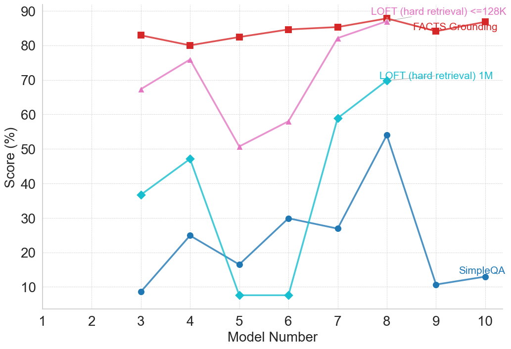
### Visual Description
## Line Chart: Model Performance Comparison Across Evaluation Metrics
### Overview
This image is a line chart comparing the performance scores (in percentage) of ten different models (labeled 1 through 10) across four distinct evaluation metrics or benchmarks. The chart visualizes how each model's score varies by metric, revealing performance patterns and disparities.
### Components/Axes
* **Chart Type:** Multi-series line chart with markers.
* **X-Axis (Horizontal):**
* **Label:** "Model Number"
* **Scale:** Linear, discrete integers from 1 to 10.
* **Markers:** Major tick marks at each integer from 1 to 10.
* **Y-Axis (Vertical):**
* **Label:** "Score (%)"
* **Scale:** Linear, ranging from 0 to 90.
* **Markers:** Major tick marks at intervals of 10 (0, 10, 20, ..., 90).
* **Legend:** Located in the top-right quadrant of the chart area. It contains four entries, each associating a colored line and marker shape with a metric name.
1. **Red line with square markers:** "FACTS Grounding"
2. **Pink line with upward-pointing triangle markers:** "LOFT (hard retrieval) <=128K"
3. **Cyan line with diamond markers:** "LOFT (hard-retrieval) 1M"
4. **Blue line with circle markers:** "SimpleQA"
### Detailed Analysis
**Data Series and Approximate Values:**
The following values are approximate, read from the chart's grid.
1. **FACTS Grounding (Red, Squares):**
* **Trend:** Relatively stable and high-performing across all models, with a slight upward trend from Model 3 to Model 8.
* **Data Points:**
* Model 3: ~83%
* Model 4: ~80%
* Model 5: ~82%
* Model 6: ~84%
* Model 7: ~85%
* Model 8: ~88%
* Model 9: ~84%
* Model 10: ~87%
2. **LOFT (hard retrieval) <=128K (Pink, Triangles):**
* **Trend:** Highly variable. Starts high, dips sharply at Model 5, then recovers strongly to peak at Model 8.
* **Data Points:**
* Model 3: ~67%
* Model 4: ~76%
* Model 5: ~50%
* Model 6: ~58%
* Model 7: ~82%
* Model 8: ~88%
* (No data points visible for Models 9 and 10 for this series).
3. **LOFT (hard-retrieval) 1M (Cyan, Diamonds):**
* **Trend:** Shows significant volatility. Has a local peak at Model 4, a deep trough at Models 5 & 6, then a very sharp rise to its highest point at Model 8.
* **Data Points:**
* Model 3: ~37%
* Model 4: ~47%
* Model 5: ~7%
* Model 6: ~7%
* Model 7: ~59%
* Model 8: ~70%
* (No data points visible for Models 9 and 10 for this series).
4. **SimpleQA (Blue, Circles):**
* **Trend:** Generally lower scores than the other metrics, with a notable peak at Model 8 and a sharp drop at Model 9.
* **Data Points:**
* Model 3: ~8%
* Model 4: ~25%
* Model 5: ~16%
* Model 6: ~30%
* Model 7: ~27%
* Model 8: ~54%
* Model 9: ~10%
* Model 10: ~13%
### Key Observations
* **Model 8 is a Peak Performer:** All four metrics show their highest or near-highest scores for Model 8, suggesting it is the strongest model overall across these diverse tasks.
* **Metric Difficulty Hierarchy:** There is a clear and consistent separation in score ranges between the metrics. "FACTS Grounding" yields the highest scores (mostly 80-90%), followed by the two "LOFT" variants (spanning ~7% to 88%), with "SimpleQA" consistently producing the lowest scores (mostly below 30%, except for Model 8).
* **High Volatility in Retrieval Tasks:** The two "LOFT (hard-retrieval)" metrics show the most dramatic swings in performance between models, particularly the severe drop at Models 5 & 6 for the 1M variant.
* **Anomaly at Model 9:** While "FACTS Grounding" remains high, "SimpleQA" performance plummets to near its lowest point at Model 9, indicating a specific weakness for that model on this particular benchmark.
### Interpretation
This chart likely compares different AI or language models on a battery of tests designed to evaluate specific capabilities. The data suggests:
1. **Task-Specific Performance:** A model's proficiency is highly dependent on the type of task. A model excellent at "FACTS Grounding" (likely factual recall or verification) may not excel at "SimpleQA" (possibly open-domain question answering) or complex retrieval tasks ("LOFT").
2. **The "LOFT" Benchmarks are Discriminative:** The wide score variance for the LOFT metrics indicates they are effective at differentiating model capabilities, especially for retrieval over long contexts (1M vs. <=128K). The poor performance of many models on the 1M variant at Models 5 & 6 highlights a potential scaling or context-handling challenge.
3. **Model 8's Robustness:** Model 8's strong, consistent performance across all four disparate metrics is noteworthy. It suggests a more generalized capability or a better overall architecture compared to the other models in this lineup.
4. **Benchmark Design Implications:** The consistent ranking of metric difficulty (FACTS > LOFT > SimpleQA) provides insight into the relative challenge these benchmarks pose to the current generation of models. "SimpleQA" appears to be the most challenging overall.
**In summary, the chart reveals that model evaluation is multifaceted. No single model leads in every category, but Model 8 demonstrates the most robust performance. The significant performance gaps between metrics underscore the importance of using diverse benchmarks to assess AI capabilities comprehensively.**
</details>
(g) LLM Benchmarks
Figure 4: Performance of the Gemini family on reasoning benchmarks by category. Model numbers and corresponding names are as follows: 1 – Gemini Ultra; 2 – Gemini Pro; 3 – Gemini 1.5 Flash; 4 – Gemini 1.5 Pro; 5 – Gemini 2.0 Flash-Lite; 6 – Gemini 2.0 Flash; 7 – Gemini 2.5 Flash; 8 – Gemini 2.5 Pro; 9 – Gemini 2.5 Flash Lite (no thinking); 10 – Gemini 2.5 Flash Lite (thinking).
<details>
<summary>figures/gpt_2_plots/gpt_performance_Mathematical_Reasoning.png Details</summary>
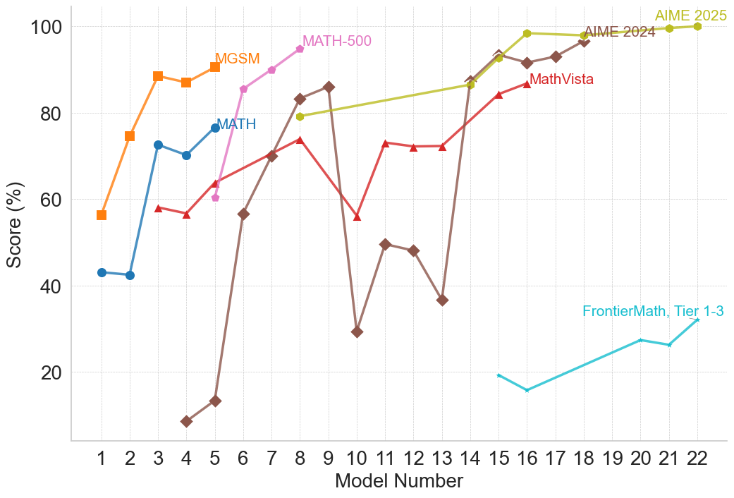
### Visual Description
\n
## Line Chart: Multi-Benchmark Performance of AI Models (Scores by Model Number)
### Overview
This image is a line chart comparing the performance of 22 different AI models (numbered 1 through 22) across seven distinct mathematical reasoning benchmarks. The chart plots the score percentage for each model on each benchmark, revealing significant variability in performance both across models and across different types of mathematical tasks.
### Components/Axes
* **X-Axis:** Labeled **"Model Number"**. It is a linear scale with integer markers from **1 to 22**.
* **Y-Axis:** Labeled **"Score (%)"**. It is a linear scale from **0 to 100**, with major gridlines at intervals of 20% (0, 20, 40, 60, 80, 100).
* **Data Series (Legend & Placement):** The legend is integrated directly into the chart area, with labels placed near the end of their respective lines.
1. **MGSM** (Orange line, square markers): Label positioned near the top-left, above its final data point.
2. **MATH** (Blue line, circle markers): Label positioned in the middle-left area, above its line.
3. **MATH-500** (Pink line, circle markers): Label positioned in the upper-middle area, above its line.
4. **MathVista** (Red line, triangle markers): Label positioned in the middle-right area, above its line.
5. **AIME 2024** (Brown line, diamond markers): Label positioned near the top-center, above its line.
6. **AIME 2025** (Yellow-green line, circle markers): Label positioned at the top-right, above its line.
7. **FrontierMath, Tier 1-3** (Cyan line, no markers): Label positioned in the bottom-right corner, above its line.
### Detailed Analysis
**Trend Verification & Data Points (Approximate):**
* **MGSM (Orange, Squares):** Shows a strong upward trend. Starts at ~56% (Model 1), rises to ~74% (Model 2), peaks at ~88% (Model 3), dips slightly to ~87% (Model 4), and ends at ~90% (Model 5).
* **MATH (Blue, Circles):** Shows an overall upward trend with a mid-dip. Starts at ~43% (Model 1), stays flat at ~42% (Model 2), jumps to ~72% (Model 3), dips to ~70% (Model 4), and ends at ~76% (Model 5).
* **MATH-500 (Pink, Circles):** Shows a steep, consistent upward trend. Starts at ~60% (Model 5), rises to ~85% (Model 6), ~90% (Model 7), and peaks at ~95% (Model 8).
* **MathVista (Red, Triangles):** Shows high volatility. Starts at ~58% (Model 3), dips to ~56% (Model 4), rises to ~64% (Model 5), ~70% (Model 6), peaks at ~74% (Model 8), then drops sharply to ~56% (Model 10). It recovers to ~73% (Model 11), holds at ~72% (Models 12, 13), jumps to ~87% (Model 14), dips to ~84% (Model 15), and ends at ~86% (Model 16).
* **AIME 2024 (Brown, Diamonds):** Shows extreme volatility. Starts very low at ~8% (Model 4), rises to ~13% (Model 5), then surges to ~57% (Model 6), ~70% (Model 7), ~83% (Model 8), and peaks at ~86% (Model 9). It then crashes to ~29% (Model 10), recovers to ~50% (Model 11), dips to ~48% (Model 12) and ~37% (Model 13), before a strong recovery to ~87% (Model 14), ~93% (Model 15), ~91% (Model 16), ~93% (Model 17), and ends at ~96% (Model 18).
* **AIME 2025 (Yellow-green, Circles):** Shows a consistent, high-level upward trend. Starts at ~79% (Model 8), rises to ~87% (Model 14), ~93% (Model 15), ~98% (Model 16), and ends at a perfect or near-perfect ~100% (Model 22).
* **FrontierMath, Tier 1-3 (Cyan, No Markers):** Shows a gradual upward trend from a low baseline. Starts at ~19% (Model 15), dips to ~16% (Model 16), then rises to ~27% (Model 20), dips slightly to ~26% (Model 21), and ends at ~32% (Model 22).
### Key Observations
1. **Benchmark Difficulty Spectrum:** There is a clear hierarchy of benchmark difficulty. **AIME 2025** and **AIME 2024** (for later models) yield the highest scores, while **FrontierMath, Tier 1-3** yields the lowest scores by a significant margin.
2. **Model 10 Anomaly:** Model 10 is a critical outlier, causing a severe performance drop for both **MathVista** (to ~56%) and especially **AIME 2024** (to ~29%). This suggests this model has a specific weakness tested by these benchmarks at that point.
3. **Performance Volatility:** The **AIME 2024** and **MathVista** series are highly volatile, indicating that model performance on these benchmarks is not stable and can vary dramatically between consecutive model numbers.
4. **Late-Model Dominance:** Models numbered 14 and above generally show strong, high performance across most benchmarks where they are evaluated, particularly on the AIME series.
5. **Benchmark-Specific Strengths:** No single model is plotted on all benchmarks. Models 1-5 are tested on MGSM/MATH; models 5-8 on MATH-500; models 3-16 on MathVista; models 4-18 on AIME 2024; models 8-22 on AIME 2025; and models 15-22 on FrontierMath. This suggests a possible evolution in benchmarking focus over successive model generations.
### Interpretation
This chart visualizes the progression and specialization of AI models in mathematical reasoning. The data suggests that as model numbers increase (likely representing newer or more advanced versions), performance on challenging competition-style math (AIME) improves dramatically, eventually reaching near-perfect scores on the 2025 version. However, this progress is not linear or universal.
The extreme volatility in series like **AIME 2024** indicates that improvements can be brittle; a model might excel at one set of problems but fail at a slightly different set presented in the next model iteration. The catastrophic drop at **Model 10** is a key investigative point—it may represent a model that was optimized for a different objective, had a training regression, or encountered a specific type of problem it was not equipped to handle.
The consistently low scores on **FrontierMath, Tier 1-3** highlight a persistent challenge. Even the most advanced models (20-22) only achieve scores in the 20-30% range, suggesting this benchmark tests a frontier of mathematical reasoning that remains largely unsolved by current AI. The chart ultimately tells a story of significant but uneven progress, where mastery of one domain (e.g., AIME) does not guarantee mastery of another (e.g., FrontierMath), and where model development involves both leaps forward and occasional, unexplained setbacks.
</details>
(a) Mathematical Reasoning
<details>
<summary>figures/gpt_2_plots/gpt_performance_Multimodal_Reasoning.png Details</summary>
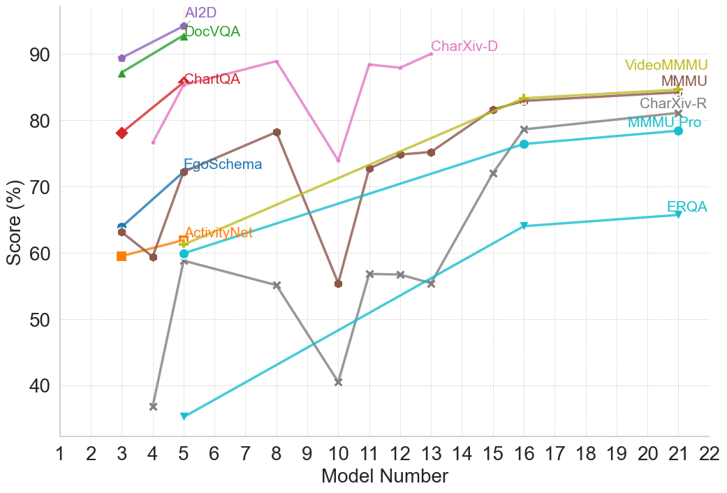
### Visual Description
## Line Chart: Model Performance Across Multiple Benchmarks
### Overview
This is a multi-series line chart comparing the performance scores (in percentage) of various AI models, identified by a sequential "Model Number" on the x-axis, across 11 different evaluation benchmarks. The chart illustrates how different models perform on diverse tasks, showing trends of improvement, volatility, and relative performance.
### Components/Axes
* **X-Axis:** Labeled "Model Number". It is a linear scale with major tick marks and labels for integers from 1 to 22.
* **Y-Axis:** Labeled "Score (%)". It is a linear scale with major tick marks and labels at intervals of 10, from 40 to 90.
* **Legend:** The legend is integrated directly into the chart area, with labels placed near the end of their respective data lines, primarily in the top-right quadrant. The labels and their associated line colors/markers are:
* **AI2D** (Purple line, circle marker)
* **DocVQA** (Green line, triangle-up marker)
* **ChartQA** (Red line, diamond marker)
* **CharXiv-D** (Pink line, no distinct marker)
* **VideoMMMU** (Olive/Yellow-green line, plus marker)
* **MMMU** (Brown line, circle marker)
* **CharXiv-R** (Gray line, 'x' marker)
* **MMMU-Pro** (Cyan line, circle marker)
* **EgoSchema** (Blue line, circle marker)
* **ActivityNet** (Orange line, square marker)
* **ERQA** (Light blue/Teal line, triangle-down marker)
### Detailed Analysis
**Data Series and Trends:**
1. **AI2D (Purple):** Shows a strong upward trend. Starts at ~89% (Model 3), rises to ~94% (Model 5).
2. **DocVQA (Green):** Shows a strong upward trend. Starts at ~87% (Model 3), rises to ~93% (Model 5).
3. **ChartQA (Red):** Shows a strong upward trend. Starts at ~78% (Model 3), rises to ~86% (Model 5).
4. **CharXiv-D (Pink):** Exhibits high volatility. Starts at ~76% (Model 4), peaks at ~89% (Model 8), drops sharply to ~74% (Model 10), rebounds to ~88% (Model 11), and ends at ~90% (Model 13).
5. **VideoMMMU (Olive):** Shows a steady, strong upward trend. Starts at ~60% (Model 3), rises consistently to ~84% (Model 21).
6. **MMMU (Brown):** Shows a volatile but generally upward trend. Starts at ~63% (Model 3), dips to ~59% (Model 5), peaks at ~78% (Model 8), drops sharply to ~55% (Model 10), then recovers and climbs steadily to ~84% (Model 21).
7. **CharXiv-R (Gray):** Shows a volatile, then strong upward trend. Starts very low at ~37% (Model 4), jumps to ~59% (Model 5), declines to ~55% (Model 8), drops to a low of ~40% (Model 10), then begins a strong, steady ascent to ~81% (Model 21).
8. **MMMU-Pro (Cyan):** Shows a steady, strong upward trend. Starts at ~60% (Model 5), rises consistently to ~78% (Model 21).
9. **EgoSchema (Blue):** Shows a strong upward trend. Starts at ~64% (Model 3), rises to ~72% (Model 5).
10. **ActivityNet (Orange):** Shows a slight upward trend. Starts at ~59% (Model 3), rises to ~62% (Model 5).
11. **ERQA (Light Blue/Teal):** Shows a steady, strong upward trend. Starts at ~35% (Model 5), rises consistently to ~66% (Model 21).
**Spatial Grounding & Data Points (Approximate):**
* **Top-Left Cluster (Models 3-5):** AI2D, DocVQA, and ChartQA show high initial scores and rapid improvement.
* **Central Volatility (Models 8-13):** CharXiv-D and MMMU show significant dips and recoveries. CharXiv-R hits its lowest point at Model 10.
* **Right-Side Convergence (Models 16-21):** VideoMMMU, MMMU, CharXiv-R, and MMMU-Pro all show strong, converging upward trends, ending in the 78%-84% range.
* **Lower Bound:** ERQA starts the lowest but shows consistent improvement.
### Key Observations
1. **Performance Clustering:** Benchmarks fall into apparent performance tiers by Model 21: Top tier (~84%: VideoMMMU, MMMU), Middle tier (~78-81%: CharXiv-R, MMMU-Pro), Lower tier (~66%: ERQA).
2. **Volatility vs. Stability:** Some benchmarks (CharXiv-D, MMMU, CharXiv-R) show high volatility with sharp drops and recoveries between models, while others (VideoMMMU, MMMU-Pro, ERQA) show smooth, monotonic improvement.
3. **Model Number Correlation:** There is a general, strong positive correlation between Model Number and Score for almost all benchmarks, suggesting later models (higher numbers) are generally more capable.
4. **Notable Outlier Event:** Model Number 10 appears to be a significant point of failure or difficulty for several benchmarks (CharXiv-D, MMMU, CharXiv-R all show sharp dips here).
5. **Early vs. Late Benchmarks:** Benchmarks like AI2D, DocVQA, and ChartQA are only plotted for early models (3-5), while others like ERQA, MMMU-Pro, and CharXiv-R are plotted for a longer range of later models.
### Interpretation
This chart likely visualizes the progression of a series of AI models (perhaps different versions or sizes of a base model family) on a standardized, multi-faceted evaluation suite. The "Model Number" likely represents a sequence of increasing model scale, capability, or training iteration.
The data suggests that:
* **General Capability is Improving:** The dominant upward trend across nearly all tasks indicates that successive models are becoming more capable across a wide range of visual and textual reasoning tasks (document QA, chart understanding, video understanding, etc.).
* **Tasks Have Different Difficulty Profiles:** The varying starting points, slopes, and volatility suggest some tasks (e.g., ERQA) are consistently harder, while others (e.g., AI2D) are mastered earlier. The volatility in tasks like CharXiv-D might indicate sensitivity to specific model changes or training data shifts.
* **The "Model 10" Anomaly:** The synchronized performance drop at Model 10 for multiple benchmarks is a critical investigative point. It could indicate a problematic model version, a change in evaluation methodology, or a specific weakness introduced and later patched in the model lineage.
* **Convergence on Complex Tasks:** The convergence of multiple benchmarks (VideoMMMU, MMMU, CharXiv-R) in the later models suggests that as models scale, their performance on diverse, complex reasoning tasks begins to plateau at a similar high level, potentially indicating a shared underlying capability ceiling or the effectiveness of the training approach across domains.
In essence, the chart tells a story of iterative progress in AI, highlighting both consistent improvement and the non-linear, sometimes fragile nature of advancing capabilities across a broad spectrum of cognitive tasks.
</details>
(b) Multimodal Reasoning
<details>
<summary>figures/gpt_2_plots/gpt_performance_Programming_and_Coding.png Details</summary>
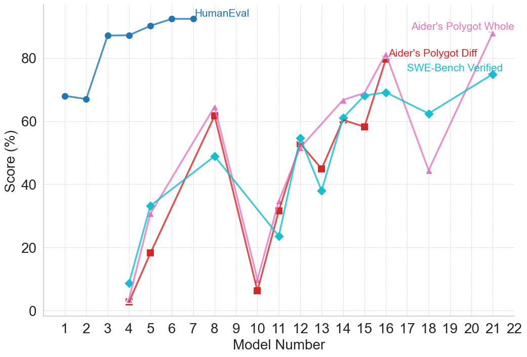
### Visual Description
## Line Chart: AI Model Benchmark Performance Comparison
### Overview
This image is a line chart comparing the performance scores (in percentage) of various AI models across four different benchmark datasets. The chart plots "Score (%)" on the vertical axis against "Model Number" on the horizontal axis, showing how different models perform on each benchmark.
### Components/Axes
* **Chart Type:** Multi-series line chart with markers.
* **X-Axis (Horizontal):**
* **Label:** "Model Number"
* **Scale:** Linear, discrete integers from 1 to 22.
* **Y-Axis (Vertical):**
* **Label:** "Score (%)"
* **Scale:** Linear, from 0 to 80, with major gridlines at intervals of 20 (0, 20, 40, 60, 80).
* **Legend:** Located in the top-right quadrant of the chart area. It contains four entries:
1. **HumanEval** - Represented by a blue line with circle markers.
2. **Aider's Polygot Whole** - Represented by a pink line with upward-pointing triangle markers.
3. **Aider's Polygot Diff** - Represented by a red line with square markers.
4. **SWE-Bench Verified** - Represented by a cyan/turquoise line with diamond markers.
* **Grid:** Light gray horizontal gridlines are present at each major y-axis tick (0, 20, 40, 60, 80).
### Detailed Analysis
**1. HumanEval (Blue Line, Circle Markers):**
* **Trend:** Starts high, shows a slight dip, then rises sharply and plateaus at a high level.
* **Data Points (Approximate):**
* Model 1: ~68%
* Model 2: ~67%
* Model 3: ~87%
* Model 4: ~87%
* Model 5: ~90%
* Model 6: ~92%
* Model 7: ~92%
* Model 8: ~92% (line ends here)
* **Note:** This series only has data points from Model 1 to Model 8.
**2. Aider's Polygot Whole (Pink Line, Triangle Markers):**
* **Trend:** Highly volatile. Starts very low, spikes, crashes, then shows a general upward trend with significant fluctuations.
* **Data Points (Approximate):**
* Model 4: ~3%
* Model 5: ~31%
* Model 8: ~64%
* Model 10: ~9%
* Model 11: ~34%
* Model 12: ~52%
* Model 14: ~66%
* Model 16: ~80%
* Model 18: ~44%
* Model 21: ~88% (highest point on the entire chart)
**3. Aider's Polygot Diff (Red Line, Square Markers):**
* **Trend:** Follows a very similar volatile pattern to "Aider's Polygot Whole," often slightly below it.
* **Data Points (Approximate):**
* Model 4: ~2%
* Model 5: ~19%
* Model 8: ~62%
* Model 10: ~7%
* Model 11: ~32%
* Model 12: ~54%
* Model 13: ~45%
* Model 14: ~61%
* Model 15: ~59%
* Model 16: ~79%
**4. SWE-Bench Verified (Cyan Line, Diamond Markers):**
* **Trend:** Starts low, shows a more consistent upward trend compared to the "Aider" benchmarks, with a notable dip around Model 13.
* **Data Points (Approximate):**
* Model 4: ~9%
* Model 5: ~33%
* Model 8: ~49%
* Model 11: ~24%
* Model 12: ~55%
* Model 13: ~38%
* Model 14: ~61%
* Model 15: ~68%
* Model 16: ~69%
* Model 18: ~62%
* Model 21: ~75%
### Key Observations
1. **Benchmark Disparity:** There is a massive performance gap between the "HumanEval" benchmark (consistently scoring >65% for models 3-8) and the other three benchmarks for the early model numbers (1-8).
2. **Correlated Volatility:** The "Aider's Polygot Whole" and "Aider's Polygot Diff" lines are tightly correlated in their movements, suggesting these two benchmarks measure similar capabilities or are affected similarly by model changes.
3. **Critical Dip at Model 10:** All three volatile benchmarks (Aider Whole, Aider Diff, SWE-Bench) show a severe performance drop at Model 10, with scores falling to single digits or low teens.
4. **General Upward Trend:** Despite volatility, the overall trajectory for the three non-HumanEval benchmarks is upward from Model 4 to Model 21.
5. **Peak Performance:** The highest recorded score on the chart is for "Aider's Polygot Whole" at Model 21 (~88%). The highest for "SWE-Bench Verified" is at Model 21 (~75%), and for "Aider's Polygot Diff" at Model 16 (~79%).
### Interpretation
This chart visualizes the progression and specialization of AI coding models. The "HumanEval" benchmark, likely a foundational code generation test, is mastered early (by Model 3) and shows a performance plateau, suggesting it may be a less discriminative test for newer, more advanced models.
In contrast, the "Aider" and "SWE-Bench" benchmarks appear to be more challenging and complex, possibly testing real-world software engineering tasks like code refactoring (Diff), full-file editing (Whole), or issue resolution (SWE-Bench). The high volatility and the dramatic dip at Model 10 indicate that performance on these tasks is highly sensitive to specific model architectures or training data. The general upward trend, however, demonstrates that subsequent models are increasingly capable of handling these complex, practical coding challenges. The strong correlation between the two "Aider" metrics suggests they are robust and consistent measures of a related skill set. The chart effectively argues that while basic code generation is a solved problem for modern models, advanced software engineering proficiency is the current frontier with significant room for improvement and variation.
</details>
(c) Programming and Coding
<details>
<summary>figures/gpt_2_plots/gpt_performance_Reading_Comprehension_and_Question_Answering.png Details</summary>
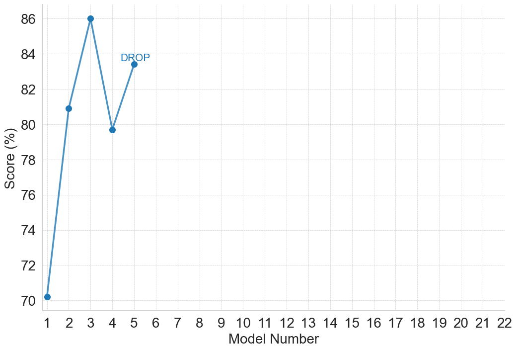
### Visual Description
## Line Chart: Model Performance Scores
### Overview
The image displays a line chart plotting the performance scores of five sequential models. The chart features a single data series represented by a blue line with circular markers at each data point. A text annotation "DROP" is placed near the fourth data point, highlighting a specific event in the trend. The chart area is dominated by empty space to the right, as data is only provided for models 1 through 5, while the x-axis extends to model 22.
### Components/Axes
* **Chart Type:** Line chart with data point markers.
* **X-Axis (Horizontal):**
* **Label:** "Model Number"
* **Scale:** Linear, integer values from 1 to 22.
* **Markers:** Major tick marks and labels for every integer from 1 to 22.
* **Y-Axis (Vertical):**
* **Label:** "Score (%)"
* **Scale:** Linear, ranging from 70 to 86.
* **Markers:** Major tick marks and labels at intervals of 2 (70, 72, 74, 76, 78, 80, 82, 84, 86).
* **Data Series:**
* **Color:** Blue (approximately #4a86c8).
* **Representation:** A solid blue line connecting circular blue markers at each data point.
* **Legend:** None present, as there is only one data series.
* **Annotations:**
* The text "DROP" in blue is positioned above and slightly to the right of the data point for Model 4.
* **Grid:** A light gray, dashed grid is present for both major x and y axis intervals.
### Detailed Analysis
**Data Points (Approximate Values):**
The chart contains five distinct data points. Values are estimated based on their position relative to the y-axis grid lines.
1. **Model 1:** Score ≈ 70.0% (The point sits exactly on the 70 grid line).
2. **Model 2:** Score ≈ 81.0% (The point is halfway between the 80 and 82 grid lines).
3. **Model 3:** Score ≈ 86.0% (The point sits exactly on the 86 grid line, the highest value on the chart).
4. **Model 4:** Score ≈ 79.7% (The point is slightly below the 80 grid line. The "DROP" annotation is associated with this point).
5. **Model 5:** Score ≈ 83.5% (The point is between the 82 and 84 grid lines, closer to 84).
**Trend Description:**
The line begins at its lowest point (Model 1, 70%), rises sharply to a peak at Model 3 (86%), then experiences a significant decline to Model 4 (≈79.7%), before recovering partially at Model 5 (≈83.5%). The visual trend is: **Sharp Increase → Peak → Sharp Decrease ("DROP") → Moderate Recovery.**
### Key Observations
1. **Peak Performance:** Model 3 achieves the highest score of 86%.
2. **Significant Drop:** The most notable feature is the performance drop between Model 3 and Model 4, explicitly labeled "DROP". This represents a decrease of approximately 6.3 percentage points.
3. **Partial Recovery:** Model 5 shows a rebound from the drop, but does not return to the peak performance of Model 3.
4. **Data Range:** The provided data only occupies the first quarter of the available x-axis (Models 1-5 of 1-22). The vast empty space from Model 6 to 22 suggests either incomplete data, a focused experiment on early models, or that subsequent models were not evaluated.
5. **Initial Improvement:** There is a substantial 11-percentage-point improvement from Model 1 to Model 2.
### Interpretation
This chart likely tracks the iterative development or testing of a series of models (e.g., machine learning models, algorithm versions). The data suggests a non-linear development path:
* **Early Iterative Gains:** The jump from Model 1 to 2 and then to 3 indicates successful iterations leading to peak performance.
* **Setback or Overfitting:** The annotated "DROP" at Model 4 is critical. It could signify a failed experiment, a change in evaluation criteria, overfitting to a specific test set in Model 3, or the introduction of a new variable that negatively impacted performance. The annotation marks this as a point of interest for investigation.
* **Recovery and Stabilization:** The rise at Model 5 suggests the developers identified and partially corrected the issue from Model 4, though they did not fully regain the previous peak. This pattern is common in optimization processes where a step backward is followed by a more stable advance.
* **Scope of Experiment:** The empty axis from Model 6 onward implies the story is incomplete. It raises questions: Did development stop after Model 5? Are results for later models pending? Was the goal only to test these five specific variants? The chart's narrative is confined to this early, volatile phase of development.
**In summary, the chart documents an initial rapid improvement in model performance, followed by a significant, highlighted setback, and then a partial recovery, all within the first five iterations of a potentially longer sequence.**
</details>
(d) Reading Comprehension and QA
<details>
<summary>figures/gpt_2_plots/gpt_performance_Reasoning_with_General_Knowledge.png Details</summary>
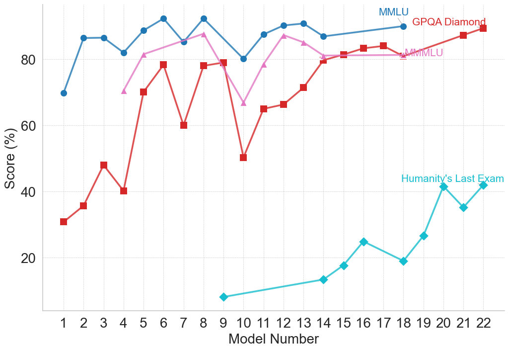
### Visual Description
## Line Chart: Model Performance Across Multiple Benchmarks
### Overview
The image is a line chart comparing the performance scores (in percentage) of 22 different AI models across four distinct evaluation benchmarks. The chart tracks how scores change as the model number increases from 1 to 22, suggesting a progression, likely from older to newer or less to more capable models.
### Components/Axes
* **X-Axis:** Labeled "Model Number". It is a categorical axis with discrete integer markers from 1 to 22.
* **Y-Axis:** Labeled "Score (%)". It is a linear scale ranging from 0 to approximately 95, with major gridlines at intervals of 20 (0, 20, 40, 60, 80).
* **Legend:** Located in the top-right corner of the chart area. It identifies four data series:
1. **MMLU** (Blue line, circle markers)
2. **GPQA Diamond** (Red line, square markers)
3. **MMLU** (Pink line, triangle markers) - *Note: A second series with the same name as the first, but a different color and marker.*
4. **Humanity's Last Exam** (Cyan/Teal line, diamond markers)
### Detailed Analysis
**Data Series and Trends:**
1. **MMLU (Blue, Circles):**
* **Trend:** Starts high, exhibits moderate fluctuation, and maintains a generally high score throughout.
* **Data Points (Approximate):**
* Model 1: ~70%
* Model 2: ~86%
* Model 3: ~86%
* Model 4: ~82%
* Model 5: ~89%
* Model 6: ~92% (Peak)
* Model 7: ~85%
* Model 8: ~92%
* Model 9: ~80%
* Model 10: ~87%
* Model 11: ~90%
* Model 12: ~91%
* Model 13: ~87%
* Model 14: ~89%
* Model 15: ~90%
* Model 16: ~90%
* Model 17: ~90%
* Model 18: ~90%
* Model 19: ~90%
* Model 20: ~90%
* Model 21: ~90%
* Model 22: ~90%
2. **GPQA Diamond (Red, Squares):**
* **Trend:** Shows significant volatility with sharp peaks and troughs in the first half, followed by a more stable, upward trend in the second half.
* **Data Points (Approximate):**
* Model 1: ~31%
* Model 2: ~36%
* Model 3: ~48%
* Model 4: ~40%
* Model 5: ~70%
* Model 6: ~78%
* Model 7: ~60%
* Model 8: ~78%
* Model 9: ~79%
* Model 10: ~50% (Major trough)
* Model 11: ~65%
* Model 12: ~66%
* Model 13: ~71%
* Model 14: ~80%
* Model 15: ~81%
* Model 16: ~83%
* Model 17: ~84%
* Model 18: ~81%
* Model 19: ~84%
* Model 20: ~87%
* Model 21: ~89%
* Model 22: ~90% (Peak)
3. **MMLU (Pink, Triangles):**
* **Trend:** Begins at a moderate level, rises to a peak, dips sharply, then recovers and stabilizes at a high level.
* **Data Points (Approximate):**
* Model 4: ~70% (First point)
* Model 5: ~81%
* Model 6: ~84%
* Model 7: ~87%
* Model 8: ~87%
* Model 9: ~67% (Sharp dip)
* Model 10: ~78%
* Model 11: ~87%
* Model 12: ~85%
* Model 13: ~81%
* Model 14: ~81%
* Model 15: ~81%
* Model 16: ~81%
* Model 17: ~81%
* Model 18: ~81%
* Model 19: ~81%
* Model 20: ~81%
* Model 21: ~81%
* Model 22: ~81%
4. **Humanity's Last Exam (Cyan, Diamonds):**
* **Trend:** Starts very low and shows a consistent, strong upward trend from its first appearance.
* **Data Points (Approximate):**
* Model 9: ~7% (First point)
* Model 14: ~13%
* Model 15: ~17%
* Model 16: ~25%
* Model 17: ~19%
* Model 18: ~27%
* Model 19: ~41%
* Model 20: ~35%
* Model 21: ~42%
* Model 22: ~42%
### Key Observations
* **Benchmark Difficulty:** "Humanity's Last Exam" appears to be the most challenging benchmark, with scores starting near zero and only reaching the 40s by Model 22. In contrast, the two "MMLU" benchmarks and "GPQA Diamond" have scores clustering in the 80-90% range for later models.
* **Performance Convergence:** For Models 14-22, the scores for MMLU (Blue), GPQA Diamond (Red), and MMLU (Pink) converge into a narrow band between ~80% and ~90%, suggesting these models perform similarly on these specific tasks.
* **Volatility vs. Stability:** The earlier models (1-13) show much greater variance in scores across benchmarks, particularly for GPQA Diamond and the pink MMLU line. Later models (14+) show more stable and consistently high performance on three of the four benchmarks.
* **Anomaly:** The sharp dip in the pink MMLU line at Model 9 (~67%) and the deep trough in the red GPQA Diamond line at Model 10 (~50%) are notable outliers in their respective series.
### Interpretation
This chart likely illustrates the progression of AI model capabilities over time or across different development iterations (represented by "Model Number"). The data suggests several key insights:
1. **Specialized vs. General Improvement:** The dramatic, steady rise of "Humanity's Last Exam" scores indicates targeted improvement on what is presumably a very difficult, possibly novel, evaluation. Meanwhile, performance on more established benchmarks (MMLU, GPQA) plateaus at a high level, suggesting these tasks may be approaching a performance ceiling for the current model architecture or training paradigm.
2. **The "Last Exam" Challenge:** The name and low scores for "Humanity's Last Exam" imply it is designed to be a frontier test, measuring capabilities that remain challenging even for advanced models. Its upward trend is the most significant indicator of ongoing progress in AI capabilities.
3. **Model Development Phases:** The high volatility in early models could represent a phase of experimentation and architectural exploration. The convergence and stability in later models might indicate a maturing technology where incremental refinements lead to consistent, high performance across a suite of standard tests, while progress is now measured on more difficult, specialized benchmarks.
4. **Duplicate Benchmark Label:** The presence of two "MMLU" series (blue and pink) is ambiguous. It could represent two different versions of the test, evaluations on different subsets of data, or a simple labeling error. Their divergent paths (blue starts earlier and is more stable; pink starts later, dips, then plateaus) suggest they are not measuring identical things.
In essence, the chart tells a story of AI development moving from a phase of inconsistent performance to one of reliable, high competence on standard tasks, with the frontier of progress now being pushed on exceptionally difficult new evaluations.
</details>
(e) Reasoning with General Knowledge
Figure 5: Performance of the GPT family on general reasoning benchmarks. Model numbers and corresponding names are as follows: 1 – GPT-3.5; 2 – GPT-4; 3 – GPT-4 Turbo; 4 – GPT-4o mini; 5 – GPT-4o; 6 – o1-preview; 7 – o1-mini; 8 – o1; 9 – o1-pro; 10 – GPT-4.1 nano; 11 – GPT-4.1 mini; 12 – GPT-4.1; 13 – GPT-4.5; 14 – o3-mini; 15 – o4-mini; 16 – o3; 17 – o3-pro; 18 – gpt-oss-120b; 19 – GPT-5 with Deep Research; 20 – ChatGPT Agent; 21 – GPT-5; 22 – GPT-5 Pro.
<details>
<summary>figures/gpt_2_plots/gpt_performance_Constrained_Text_Generation_-_LLM.png Details</summary>
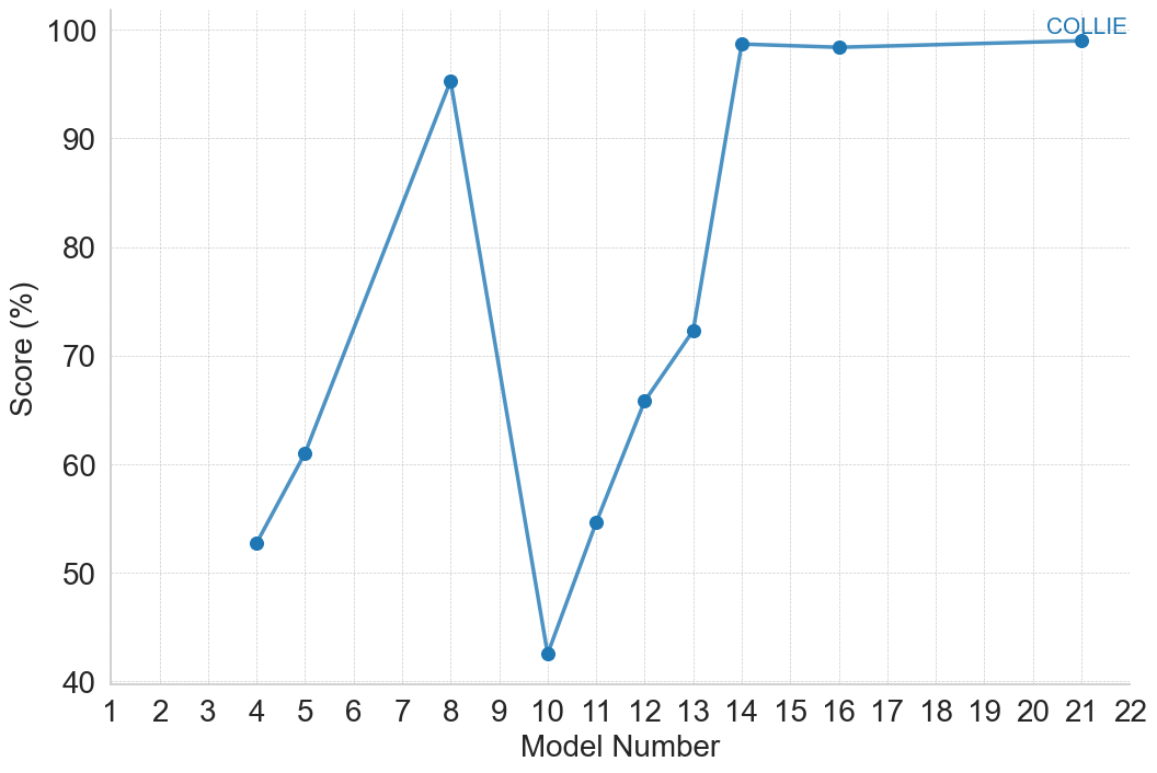
### Visual Description
## Line Chart: COLLIE Model Scores
### Overview
The image displays a line chart plotting the performance scores (in percentage) of a series of models identified by sequential numbers. The chart shows significant volatility in scores across the early model numbers, followed by a sharp recovery and a plateau at a very high score for the later models.
### Components/Axes
* **Chart Type:** Line chart with data points marked by circular markers.
* **Title/Series Label:** "COLLIE" is displayed in the top-right corner of the chart area, associated with the blue data line.
* **X-Axis:**
* **Label:** "Model Number"
* **Scale:** Linear scale from 1 to 22.
* **Markers:** Major tick marks and labels are present for every integer from 1 to 22.
* **Y-Axis:**
* **Label:** "Score (%)"
* **Scale:** Linear scale from 40 to 100.
* **Markers:** Major tick marks and labels are present at intervals of 10 (40, 50, 60, 70, 80, 90, 100).
* **Legend:** A single entry, "COLLIE", is positioned in the top-right quadrant of the chart, near the final data points. It corresponds to the blue line and markers.
* **Grid:** A light gray grid is present, with horizontal lines at each major y-axis tick and vertical lines at each major x-axis tick.
### Detailed Analysis
**Data Series (COLLIE):**
The blue line connects data points for specific model numbers. The trend is non-monotonic, with a major dip.
* **Trend Verification:** The line starts at a moderate score, rises to a peak, plummets to a low point, then climbs steeply before leveling off at a near-maximum score.
* **Data Points (Approximate Values):**
* Model 4: ~53%
* Model 5: ~61%
* Model 8: ~95% (First Peak)
* Model 10: ~43% (Global Minimum)
* Model 11: ~55%
* Model 12: ~66%
* Model 13: ~72%
* Model 14: ~98% (Start of Plateau)
* Model 16: ~98%
* Model 21: ~99% (Final Point)
**Spatial Grounding:** The legend "COLLIE" is placed in the top-right, directly above the plateau region of the line it describes. All data points are connected by the same blue line, confirming they belong to the same series.
### Key Observations
1. **High Volatility:** Performance is highly variable between models 4 and 13, with swings of over 50 percentage points.
2. **Critical Drop:** Model 10 represents a severe performance degradation, scoring the lowest at ~43%.
3. **Strong Recovery:** Following the low at Model 10, there is a consistent and steep upward trend through Model 14.
4. **Performance Plateau:** From Model 14 onward (including Models 16 and 21), the score stabilizes at an excellent level between 98% and 99%, showing minimal variation.
5. **Missing Data:** No data points are plotted for Models 1-3, 6, 7, 9, 15, 17-20, or 22. The chart only shows performance for a subset of the model sequence.
### Interpretation
The chart suggests a development or tuning process for the "COLLIE" model series. The early models (4-13) appear to be in an experimental phase, where changes lead to unpredictable results, including a major failure at Model 10. This could indicate a problematic update, a change in training data, or an architectural flaw that was later corrected.
The sharp, consistent improvement from Model 10 to Model 14 implies a successful intervention or breakthrough. The subsequent plateau from Model 14 to Model 21 indicates that the model has reached a performance ceiling or a state of stability where further iterations yield only marginal gains. The high final scores (~99%) suggest the model is highly effective on the measured metric by the end of this sequence. The absence of data for many model numbers might mean only select versions were evaluated, or the chart highlights key milestones in the development timeline.
</details>
(a) Constrained Text Generation
<details>
<summary>figures/gpt_2_plots/gpt_performance_Factuality_-_LLM.png Details</summary>
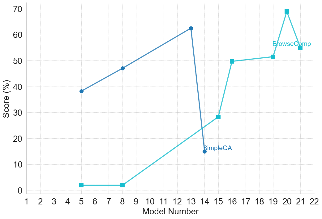
### Visual Description
## Line Chart: Model Performance Comparison (SimpleQA vs. BrowseComp)
### Overview
The image is a line chart comparing the performance scores (in percentage) of two different evaluation metrics or tasks, labeled "SimpleQA" and "BrowseComp," across a series of model iterations identified by "Model Number." The chart displays two distinct trends: one metric shows an initial rise followed by a sharp decline, while the other shows a generally upward trajectory with a late peak.
### Components/Axes
* **Chart Type:** Line chart with markers.
* **X-Axis:** Labeled "Model Number." It is a linear scale with major tick marks and labels for every integer from 1 to 22.
* **Y-Axis:** Labeled "Score (%)." It is a linear scale ranging from 0 to 70, with major grid lines and labels at intervals of 10 (0, 10, 20, 30, 40, 50, 60, 70).
* **Legend:** Located in the top-right quadrant of the chart area, near the data points for higher model numbers.
* **SimpleQA:** Represented by a dark blue line with circular markers.
* **BrowseComp:** Represented by a light blue (cyan) line with square markers.
* **Grid:** A light gray, dashed grid is present for both major x and y axis intervals.
### Detailed Analysis
**Data Series 1: SimpleQA (Dark Blue Line, Circle Markers)**
* **Trend Verification:** The line slopes upward from model 5 to model 13, then drops precipitously at model 14.
* **Data Points (Approximate):**
* Model 5: ~38%
* Model 8: ~47%
* Model 13: ~62% (Peak for this series)
* Model 14: ~15% (Sharp decline)
**Data Series 2: BrowseComp (Light Blue Line, Square Markers)**
* **Trend Verification:** The line is flat at a very low level for early models, then begins a steady upward climb from model 8 onward, with a significant jump between models 15 and 16, and a final peak at model 20.
* **Data Points (Approximate):**
* Model 5: ~2%
* Model 8: ~2%
* Model 15: ~28%
* Model 16: ~50%
* Model 19: ~52%
* Model 20: ~69% (Peak for the entire chart)
* Model 21: ~55%
### Key Observations
1. **Divergent Trajectories:** The two metrics show fundamentally different performance patterns across the model sequence. SimpleQA peaks early (model 13) and then collapses, while BrowseComp shows late-stage, significant improvement.
2. **Performance Crossover:** The BrowseComp line surpasses the SimpleQA line between model 14 and model 15. After model 14, SimpleQA's score is lower than BrowseComp's for all subsequent data points shown.
3. **Notable Anomalies:**
* The **~47 percentage point drop** in SimpleQA score from model 13 (~62%) to model 14 (~15%) is the most dramatic single change in the chart.
* The **~21 percentage point jump** in BrowseComp score from model 15 (~28%) to model 16 (~50%) is the largest single increase for that series.
* The **peak score** for the entire dataset is achieved by BrowseComp at model 20 (~69%).
### Interpretation
This chart likely visualizes the results of an iterative model development or testing process. The "Model Number" suggests sequential versions or configurations.
* **SimpleQA** appears to be a task or benchmark where performance was initially optimized but then suffered a catastrophic failure or was fundamentally altered at model 14. This could indicate a change in the model's architecture, training data, or the evaluation methodology for that specific task that was highly detrimental.
* **BrowseComp** demonstrates a classic learning or optimization curve. Early models (5, 8) performed poorly, but starting around model 15, there was a breakthrough leading to rapid and substantial gains, peaking at model 20. The slight dip at model 21 might represent a minor regression, overfitting, or a trade-off made to improve another metric.
* The **inverse relationship** after model 14 is striking. It suggests that the modifications made to the models from version 14 onward, while beneficial for the "BrowseComp" capability, were actively harmful to the "SimpleQA" capability. This could point to a tension or trade-off between the skills required for these two different tasks (e.g., factual recall vs. complex browsing/comparison).
**In summary, the data tells a story of divergent development paths: a specialized capability (BrowseComp) was successfully cultivated in later models at the apparent expense of a different, perhaps more fundamental, capability (SimpleQA).**
</details>
(b) Factuality
<details>
<summary>figures/gpt_2_plots/gpt_performance_Instruction_Following_-_LLM.png Details</summary>
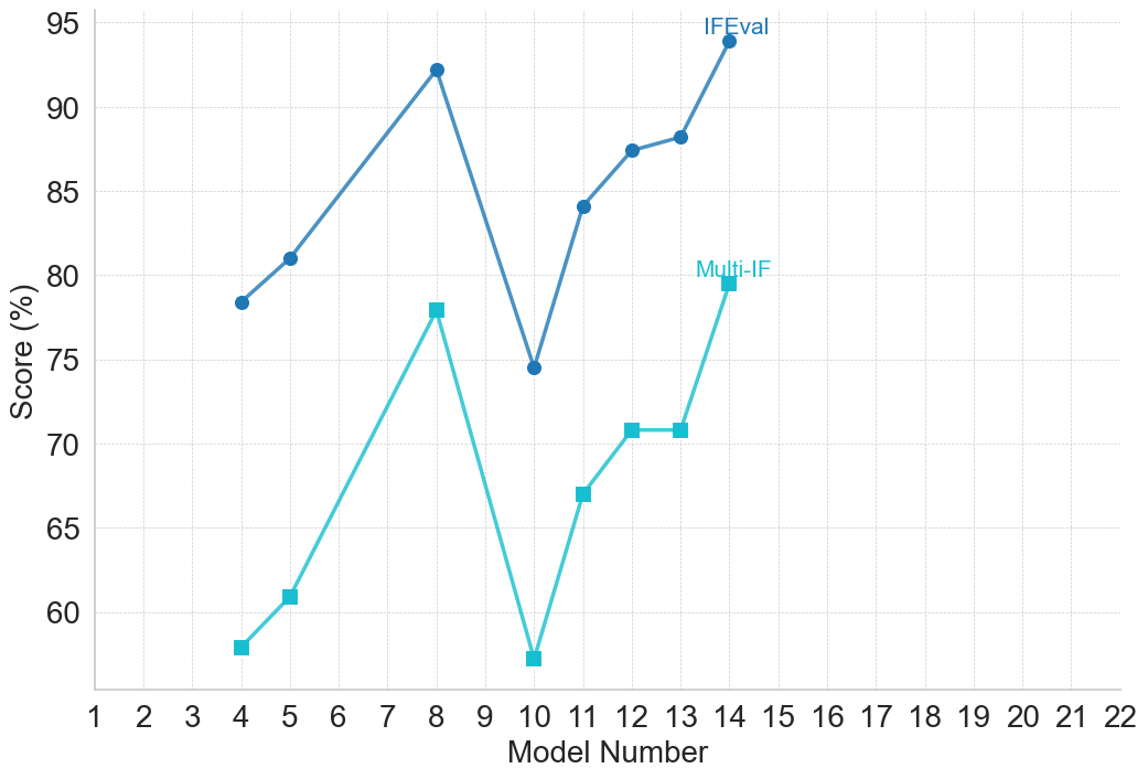
### Visual Description
## Line Chart: Model Performance Comparison (IFEval vs. Multi-IF)
### Overview
The image is a line chart comparing the performance scores (in percentage) of two different evaluation metrics, "IFEval" and "Multi-IF," across a series of model numbers. The chart displays two distinct data series plotted against a common x-axis representing model numbers.
### Components/Axes
* **Chart Type:** Line chart with markers.
* **X-Axis:**
* **Label:** "Model Number"
* **Scale:** Linear, ranging from 1 to 22.
* **Ticks:** Major ticks at every integer from 1 to 22.
* **Y-Axis:**
* **Label:** "Score (%)"
* **Scale:** Linear, ranging from 60 to 95.
* **Ticks:** Major ticks at intervals of 5 (60, 65, 70, 75, 80, 85, 90, 95).
* **Legend:**
* **Placement:** Embedded within the chart area, positioned in the upper-right quadrant.
* **Series 1:** "IFEval" - Represented by a dark blue line with circular markers.
* **Series 2:** "Multi-IF" - Represented by a light blue (cyan) line with square markers.
* **Grid:** A light gray grid is present, with horizontal lines at each major y-axis tick and vertical lines at each major x-axis tick.
### Detailed Analysis
**Data Series 1: IFEval (Dark Blue Line, Circular Markers)**
* **Trend:** The line shows an overall upward trend with significant volatility. It rises from model 4 to a peak at model 8, experiences a sharp drop at model 10, and then recovers and climbs to its highest point at model 14.
* **Data Points (Approximate):**
* Model 4: ~78.5%
* Model 5: ~81.0%
* Model 8: ~92.5%
* Model 10: ~74.5%
* Model 11: ~84.0%
* Model 12: ~87.5%
* Model 13: ~88.5%
* Model 14: ~94.0%
**Data Series 2: Multi-IF (Light Blue Line, Square Markers)**
* **Trend:** This series follows a pattern very similar to IFEval but at consistently lower score values. It also peaks at model 8, dips sharply at model 10, and then rises again, ending at its second-highest point at model 14.
* **Data Points (Approximate):**
* Model 4: ~58.0%
* Model 5: ~61.0%
* Model 8: ~78.0%
* Model 10: ~57.0%
* Model 11: ~67.0%
* Model 12: ~71.0%
* Model 13: ~71.0%
* Model 14: ~79.5%
### Key Observations
1. **Correlated Performance:** The two metrics are highly correlated. Models that perform well on IFEval also perform well on Multi-IF, and vice-versa. The shape of the two lines is nearly identical.
2. **Consistent Gap:** The IFEval score is consistently higher than the Multi-IF score for every model shown. The gap between them varies, being smallest at model 8 (~14.5 percentage points) and largest at model 10 (~17.5 percentage points).
3. **Significant Dip at Model 10:** Model 10 represents a clear performance trough for both evaluation metrics, breaking the upward trend from models 4-8.
4. **Peak Performance:** Model 14 achieves the highest score for IFEval (~94%), while model 8 achieves the highest score for Multi-IF (~78%).
5. **Data Range:** The plotted data only exists for models 4, 5, 8, 10, 11, 12, 13, and 14. Models 1-3, 6, 7, 9, and 15-22 have no data points.
### Interpretation
This chart likely compares the performance of different versions or configurations of AI models (identified by "Model Number") on two distinct instruction-following or evaluation benchmarks ("IFEval" and "Multi-IF").
* **What the data suggests:** The strong correlation indicates that the underlying capabilities measured by IFEval and Multi-IF are closely related. A model's proficiency in one area is a strong predictor of its proficiency in the other. The consistent gap suggests that the Multi-IF benchmark may be more challenging or measure a stricter subset of skills compared to IFEval.
* **Notable Anomaly:** The sharp, synchronized drop at Model 10 is the most striking feature. This suggests a potential issue with that specific model version—perhaps a regression in training, a change in architecture, or a specific weakness in the types of tasks it was evaluated on. It serves as a critical point for investigation.
* **Progression:** Excluding the dip at model 10, the general trend from model 4 to model 14 is upward, indicating iterative improvement across these model versions on both benchmarks. The final model (14) shows strong performance, particularly on IFEval.
* **Missing Data:** The absence of data for many model numbers (especially the early ones 1-3 and later ones 15-22) limits the ability to see the full developmental trajectory. The chart presents a selective view of the model lineup.
</details>
(c) Instruction Following
<details>
<summary>figures/gpt_2_plots/gpt_performance_Long-Context_-_LLM.png Details</summary>
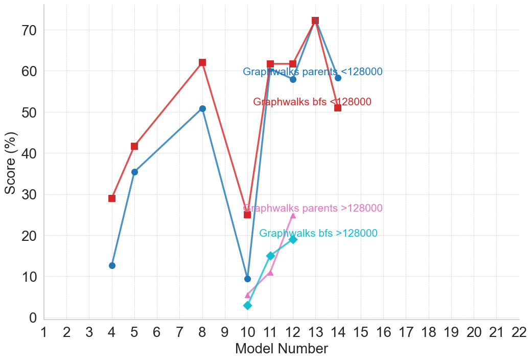
### Visual Description
## Line Chart: Model Performance by Graphwalks Method and Dataset Size
### Overview
The image displays a line chart comparing the performance scores (in percentage) of different "Graphwalks" methods across a series of model numbers. The chart tracks four distinct data series, differentiated by color, marker shape, and the dataset size they represent (<128000 or >128000). The data suggests an evaluation of model performance on a task, with scores fluctuating significantly across model iterations.
### Components/Axes
* **X-Axis:** Labeled "Model Number". It is a linear scale with major tick marks and labels for every integer from 1 to 22.
* **Y-Axis:** Labeled "Score (%)". It is a linear scale with major tick marks and labels at intervals of 10, ranging from 0 to 70.
* **Legend:** There is no separate legend box. Instead, descriptive labels are placed directly on the chart area, color-coded to match their corresponding data lines. The labels are:
1. `Graphwalks parents <128000` (Blue text, positioned near the blue line's data point at Model 12).
2. `Graphwalks bfs <128000` (Red text, positioned near the red line's data point at Model 12).
3. `Graphwalks parents >128000` (Pink text, positioned near the pink line's data point at Model 11).
4. `Graphwalks bfs >128000` (Cyan/Teal text, positioned near the cyan line's data point at Model 12).
* **Data Series:** Four lines with distinct colors and markers:
* **Red line with square markers:** Corresponds to `Graphwalks bfs <128000`.
* **Blue line with circle markers:** Corresponds to `Graphwalks parents <128000`.
* **Pink line with triangle markers:** Corresponds to `Graphwalks parents >128000`.
* **Cyan/Teal line with diamond markers:** Corresponds to `Graphwalks bfs >128000`.
### Detailed Analysis
**1. `Graphwalks bfs <128000` (Red line, square markers)**
* **Trend:** Shows a volatile, generally upward trend until a peak, followed by a sharp decline. It is often the highest or second-highest scoring series.
* **Approximate Data Points:**
* Model 4: ~29%
* Model 5: ~42%
* Model 8: ~62%
* Model 10: ~25% (Significant drop)
* Model 11: ~62%
* Model 12: ~62%
* Model 13: ~72% (Peak of the entire chart)
* Model 14: ~51%
**2. `Graphwalks parents <128000` (Blue line, circle markers)**
* **Trend:** Follows a pattern very similar to the red `bfs <128000` line but generally scores slightly lower. It also peaks at Model 13.
* **Approximate Data Points:**
* Model 4: ~13%
* Model 5: ~35%
* Model 8: ~51%
* Model 10: ~10% (Significant drop)
* Model 11: ~60%
* Model 12: ~58%
* Model 13: ~72% (Matches the red line's peak)
* Model 14: ~58%
**3. `Graphwalks parents >128000` (Pink line, triangle markers)**
* **Trend:** This series only appears from Model 10 onward. It shows a steady, positive upward trend.
* **Approximate Data Points:**
* Model 10: ~5%
* Model 11: ~11%
* Model 12: ~25%
**4. `Graphwalks bfs >128000` (Cyan line, diamond markers)**
* **Trend:** This series also only appears from Model 10 onward. It shows a steady, positive upward trend, closely following but slightly below the pink `parents >128000` line.
* **Approximate Data Points:**
* Model 10: ~3%
* Model 11: ~15%
* Model 12: ~19%
### Key Observations
1. **Performance Cliff at Model 10:** Both methods (`bfs` and `parents`) for the smaller dataset (`<128000`) experience a dramatic performance drop at Model 10, falling from ~50-60% to ~10-25%.
2. **Peak Performance:** The highest score on the chart (~72%) is achieved by both the `bfs <128000` and `parents <128000` methods at Model 13.
3. **Dataset Size Impact:** For models 10-12, the methods applied to the larger dataset (`>128000`, pink and cyan lines) score significantly lower (3-25%) than their counterparts on the smaller dataset (10-62%). However, the `>128000` series show a consistent improving trend.
4. **Method Comparison (`bfs` vs. `parents`):** For the `<128000` dataset, the `bfs` method (red) generally outperforms or matches the `parents` method (blue), except at the final data point (Model 14) where `parents` scores higher. For the `>128000` dataset, the `parents` method (pink) consistently scores slightly higher than the `bfs` method (cyan).
5. **Data Sparsity:** The `>128000` series have far fewer data points (only Models 10, 11, 12) compared to the `<128000` series (Models 4, 5, 8, 10, 11, 12, 13, 14).
### Interpretation
This chart likely visualizes the results of an experiment testing different graph traversal algorithms (`bfs` - Breadth-First Search, and `parents` - possibly a parent-tracking variant) on models of increasing complexity or iteration (Model Number). The performance is measured as a percentage score on a specific task.
The data suggests several key insights:
* **Model 10 is a critical juncture.** The severe performance drop for the `<128000` dataset indicates a fundamental change in the model at this point—perhaps a architectural shift, a change in training data, or an increase in task difficulty that the existing methods struggled with initially.
* **Recovery and Optimization.** The strong rebound and peak at Model 13 for the `<128000` methods imply that subsequent model iterations successfully adapted to or overcame the challenge introduced at Model 10.
* **Scalability Challenge.** The consistently lower scores for the `>128000` dataset (larger graphs or more data) highlight a scalability issue. The methods perform worse when applied to larger-scale problems, though the upward trend from Models 10-12 shows potential for improvement with further model development.
* **Algorithmic Nuance.** The relative performance of `bfs` vs. `parents` is context-dependent. `bfs` appears more effective on the smaller, perhaps more constrained dataset, while `parents` shows a slight edge on the larger, more complex dataset. This could indicate that the `parents` method is more robust to scale.
In summary, the chart tells a story of model development facing a significant hurdle (Model 10), recovering strongly for one problem scale (`<128000`), while still working to effectively scale to larger problems (`>128000`). The choice between `bfs` and `parents` algorithms depends on the scale of the data being processed.
</details>
(d) Long Context
<details>
<summary>figures/gpt_2_plots/gpt_performance_Multi-turn_Conversation_-_LLM.png Details</summary>
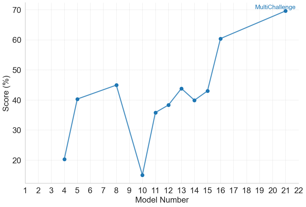
### Visual Description
\n
## Line Chart: MultiChallenge Model Scores
### Overview
The image displays a line chart plotting the performance scores of various models, identified by number, on a metric called "MultiChallenge." The chart shows significant variability in scores across the models, with a general upward trend in the later model numbers.
### Components/Axes
* **Chart Type:** Line chart with data points marked by blue circular markers.
* **Title/Legend:** A single data series labeled **"MultiChallenge"** is indicated by a legend in the **top-right corner** of the chart area. The legend text is blue, matching the line and marker color.
* **X-Axis (Horizontal):**
* **Label:** "Model Number"
* **Scale:** Linear scale with major tick marks and labels for every integer from 1 to 22.
* **Y-Axis (Vertical):**
* **Label:** "Score (%)"
* **Scale:** Linear scale with major tick marks and labels at intervals of 10, from 20 to 70. Gridlines extend horizontally from these ticks across the chart.
* **Data Series:** A single blue line connecting blue circular data points. The line is solid and of medium thickness.
### Detailed Analysis
The chart plots the "Score (%)" for specific "Model Number" entries. The data points, read from left to right, are as follows (values are approximate based on visual alignment with the grid):
* **Model 4:** ~20%
* **Model 5:** ~40%
* **Model 8:** ~45%
* **Model 10:** ~15% (This is the lowest point on the chart)
* **Model 11:** ~36%
* **Model 12:** ~38%
* **Model 13:** ~44%
* **Model 14:** ~40%
* **Model 15:** ~43%
* **Model 16:** ~60%
* **Model 21:** ~70% (This is the highest point on the chart)
**Trend Verification:**
1. The line starts at a low point (Model 4).
2. It rises sharply to a local peak at Model 8.
3. It then drops dramatically to the global minimum at Model 10.
4. From Model 10, the line begins a general upward trend, with minor fluctuations (a small dip at Model 14), until Model 15.
5. Between Model 15 and Model 16, there is a very steep, significant increase.
6. The upward trend continues at a more gradual slope from Model 16 to the final point at Model 21.
### Key Observations
1. **High Variability:** Scores are not consistent, ranging from a low of ~15% to a high of ~70%.
2. **Significant Dip:** Model 10 is a clear outlier with a score (~15%) far below its immediate neighbors.
3. **Strong Late-Stage Improvement:** The most substantial and sustained improvement occurs after Model 15, with the score jumping over 15 percentage points to Model 16 and continuing to rise.
4. **Non-Sequential Data:** The plotted model numbers are not consecutive (e.g., 4, 5, 8, 10, 11...). This suggests the chart is comparing a selected subset of models, not a continuous sequence.
### Interpretation
The data suggests that performance on the "MultiChallenge" benchmark is highly sensitive to the specific model version or architecture, as indicated by the "Model Number." There is no smooth, linear progression of improvement.
* **The Dip at Model 10:** This could indicate a model version that introduced a regression, was trained on different data, or represents a failed experiment. It serves as a critical point for investigation into what factors negatively impacted performance.
* **The Inflection at Model 15/16:** The sharp rise starting at Model 16 strongly implies a significant architectural change, training methodology breakthrough, or data scaling event occurred at this point in the model development lineage. This is the most notable positive trend in the chart.
* **Overall Trajectory:** Despite the severe dip, the overall trajectory from the earliest model (4) to the latest (21) is positive, showing that later models, particularly those after number 15, have achieved substantially higher scores on this challenge. The chart tells a story of volatile development with a recent period of strong, successful advancement.
</details>
(e) Multi-turn Conversation
<details>
<summary>figures/gpt_2_plots/gpt_performance_Safety_-_LLM.png Details</summary>
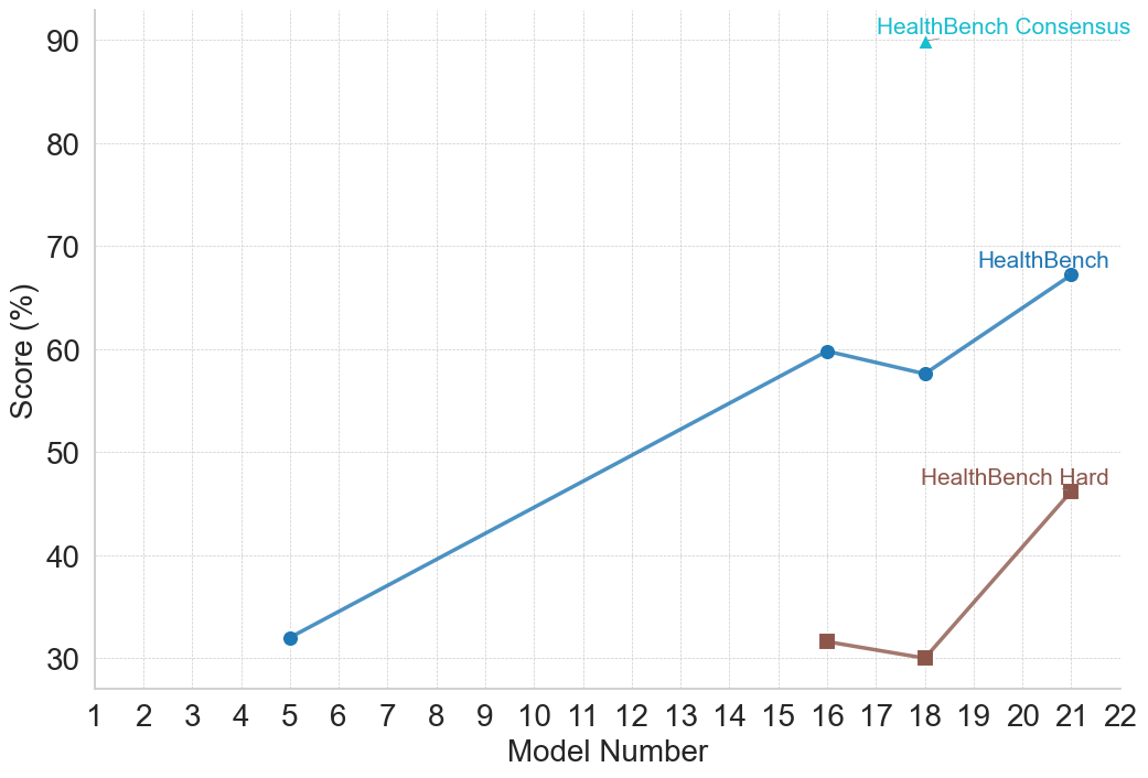
### Visual Description
## Line Chart: HealthBench Model Performance Comparison
### Overview
This is a line chart comparing the performance scores (in percentage) of three different evaluation benchmarks—HealthBench Consensus, HealthBench, and HealthBench Hard—across a series of model numbers. The chart illustrates how scores change as the model number increases, suggesting a progression or iteration of models.
### Components/Axes
* **Chart Type:** Line chart with markers.
* **X-Axis (Horizontal):**
* **Label:** "Model Number"
* **Scale:** Linear, ranging from 1 to 22, with major tick marks at every integer.
* **Y-Axis (Vertical):**
* **Label:** "Score (%)"
* **Scale:** Linear, ranging from 30 to 90, with major tick marks at intervals of 10 (30, 40, 50, 60, 70, 80, 90).
* **Legend:** Positioned in the top-right quadrant of the chart area.
* **HealthBench Consensus:** Represented by a cyan (light blue) upward-pointing triangle marker.
* **HealthBench:** Represented by a blue line with circular markers.
* **HealthBench Hard:** Represented by a brown line with square markers.
### Detailed Analysis
**1. HealthBench Consensus (Cyan Triangle)**
* **Data Points:** A single data point.
* **Value:** At Model Number 18, the score is approximately 90%.
* **Trend:** Not applicable (single point).
**2. HealthBench (Blue Line, Circular Markers)**
* **Trend:** The line shows a general upward trend from Model 5 to Model 21, with a slight dip between Models 16 and 18.
* **Data Points (Approximate):**
* Model 5: ~32%
* Model 16: ~60%
* Model 18: ~58%
* Model 21: ~67%
**3. HealthBench Hard (Brown Line, Square Markers)**
* **Trend:** The line shows a slight decline from Model 16 to Model 18, followed by a sharp increase to Model 21.
* **Data Points (Approximate):**
* Model 16: ~32%
* Model 18: ~30%
* Model 21: ~46%
### Key Observations
1. **Performance Hierarchy:** There is a clear and consistent performance gap between the three benchmarks. "HealthBench Consensus" yields the highest score (~90%), followed by "HealthBench" (peaking at ~67%), with "HealthBench Hard" being the most challenging (peaking at ~46%).
2. **Model Progression:** For the two line-based benchmarks, performance generally improves with higher model numbers, indicating that later models (e.g., 21) outperform earlier ones (e.g., 5, 16).
3. **Divergence at Model 21:** The performance gap between "HealthBench" and "HealthBench Hard" widens significantly at Model 21. While "HealthBench" sees a ~9 percentage point increase from Model 18, "HealthBench Hard" sees a much larger ~16 percentage point increase.
4. **Anomaly at Model 18:** Both "HealthBench" and "HealthBench Hard" show a performance dip or stagnation at Model 18 compared to Model 16, before recovering strongly at Model 21.
### Interpretation
The data suggests a few key insights:
* **Benchmark Difficulty:** The names are indicative of their difficulty. "Hard" is indeed the most difficult, "Consensus" appears to be the easiest (possibly representing an agreement among simpler models or a less stringent evaluation), and the standard "HealthBench" sits in the middle.
* **Model Improvement:** The overall upward trend for the two main benchmarks indicates that the underlying models are improving over successive iterations (higher model numbers). The sharp rise from Model 18 to 21 is particularly notable.
* **Nature of Improvement:** The fact that "HealthBench Hard" improves more dramatically at Model 21 than the standard "HealthBench" suggests that the latest model's advancements are especially effective at tackling more complex or nuanced medical/health-related tasks that the "Hard" benchmark is designed to test. The dip at Model 18 could indicate a model version that was optimized for different criteria or encountered a specific challenge present in the benchmark at that point.
* **Benchmark Relationship:** The "Consensus" score being a single, high point may represent a target or an aggregated score from an ensemble, serving as a high-water mark for performance. The two line charts likely track the performance of individual model versions against two different evaluation sets of varying difficulty.
</details>
(f) Safety
<details>
<summary>figures/gpt_2_plots/gpt_performance_Tool_Use_-_LLM.png Details</summary>
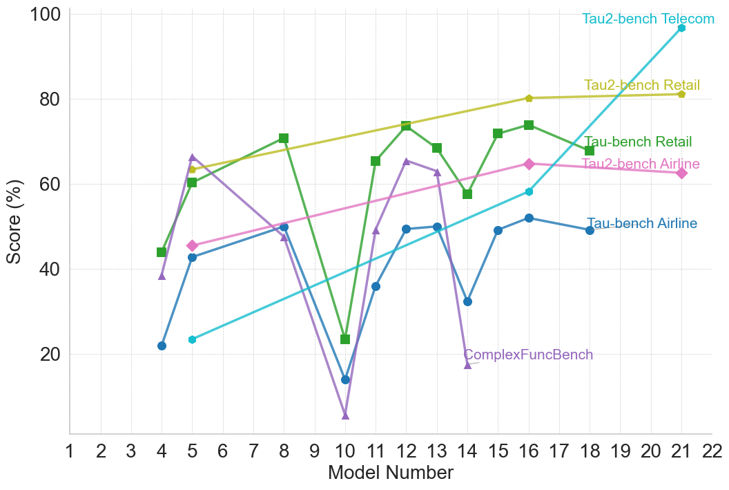
### Visual Description
## Line Chart: Model Performance Across Multiple Benchmarks
### Overview
The image is a line chart plotting the performance scores (in percentage) of various AI models, identified by sequential "Model Number" on the x-axis, across six different benchmark tasks. The chart illustrates comparative performance and trends for each benchmark as model numbers increase.
### Components/Axes
* **X-Axis:** Labeled "Model Number". The scale runs from 1 to 22, with major tick marks and labels at every integer from 1 to 22.
* **Y-Axis:** Labeled "Score (%)". The scale runs from 0 to 100, with major grid lines and labels at intervals of 20 (0, 20, 40, 60, 80, 100).
* **Legend:** Positioned in the top-right quadrant of the chart area. It lists six data series with corresponding colors and marker symbols:
1. **Tau2-bench Telecom:** Cyan line with circle markers.
2. **Tau2-bench Retail:** Yellow-green line with diamond markers.
3. **Tau-bench Retail:** Green line with square markers.
4. **Tau2-bench Airline:** Pink line with diamond markers.
5. **Tau-bench Airline:** Blue line with circle markers.
6. **ComplexFuncBench:** Purple line with triangle markers.
### Detailed Analysis
**Data Series Trends and Approximate Points:**
1. **Tau2-bench Telecom (Cyan, Circles):**
* **Trend:** Shows a strong, consistent upward trend from left to right.
* **Data Points (Approximate):** Model 4: ~22%, Model 5: ~23%, Model 10: ~36%, Model 12: ~49%, Model 14: ~58%, Model 16: ~58%, Model 21: ~97%.
2. **Tau2-bench Retail (Yellow-green, Diamonds):**
* **Trend:** Shows a steady, gradual upward trend.
* **Data Points (Approximate):** Model 5: ~63%, Model 8: ~68%, Model 12: ~74%, Model 16: ~80%, Model 21: ~81%.
3. **Tau-bench Retail (Green, Squares):**
* **Trend:** Highly volatile with significant peaks and troughs.
* **Data Points (Approximate):** Model 4: ~44%, Model 5: ~60%, Model 8: ~71%, Model 10: ~23% (sharp drop), Model 11: ~65%, Model 12: ~74% (peak), Model 13: ~68%, Model 14: ~58%, Model 15: ~72%, Model 16: ~74%, Model 18: ~68%.
4. **Tau2-bench Airline (Pink, Diamonds):**
* **Trend:** Shows a moderate, generally upward trend with a slight dip near the end.
* **Data Points (Approximate):** Model 5: ~45%, Model 8: ~50%, Model 12: ~56%, Model 14: ~61%, Model 16: ~64%, Model 18: ~62%.
5. **Tau-bench Airline (Blue, Circles):**
* **Trend:** Shows moderate improvement with some fluctuation.
* **Data Points (Approximate):** Model 4: ~22%, Model 5: ~42%, Model 8: ~50%, Model 10: ~14% (sharp drop), Model 12: ~49%, Model 13: ~50%, Model 14: ~32%, Model 15: ~49%, Model 16: ~52%, Model 18: ~49%.
6. **ComplexFuncBench (Purple, Triangles):**
* **Trend:** Extremely volatile, with the highest peak and the lowest trough on the chart.
* **Data Points (Approximate):** Model 4: ~38%, Model 5: ~66% (peak), Model 8: ~47%, Model 10: ~5% (lowest point), Model 11: ~49%, Model 12: ~65%, Model 13: ~62%, Model 14: ~18%.
### Key Observations
* **Model 10 Anomaly:** Model 10 shows a severe performance drop across three benchmarks: Tau-bench Retail, Tau-bench Airline, and most dramatically, ComplexFuncBench (which hits its minimum). This suggests a potential issue or regression specific to that model version for these tasks.
* **Diverging Performance:** The benchmarks show divergent trends. Tau2-bench Telecom and Tau2-bench Retail show clear, monotonic improvement. In contrast, Tau-bench Retail and ComplexFuncBench are highly unstable.
* **Late-Model Dominance:** By the highest model numbers (21-22), Tau2-bench Telecom achieves the highest score on the chart (~97%), significantly outperforming all other benchmarks at that point.
* **Benchmark Difficulty:** ComplexFuncBench appears to be the most challenging or volatile benchmark, with scores ranging from ~5% to ~66%. Tau2-bench Telecom shows the most consistent learning curve.
### Interpretation
This chart likely compares the progression of different AI model versions (1-22) on specialized task benchmarks. The data suggests that:
1. **Task-Specific Learning:** Models are improving consistently on certain structured tasks (Telecom, Retail via Tau2-bench), indicating successful incremental learning or architecture improvements for those domains.
2. **Instability in Complex Tasks:** The high volatility in ComplexFuncBench and the sharp drops in Tau-bench Retail/Airline at Model 10 suggest that performance on more complex or differently structured tasks is not stable across model updates. A change that improved one task may have harmed another.
3. **Benchmark Evolution:** The "Tau2-bench" variants generally show smoother, more positive trends than their "Tau-bench" counterparts for the same domain (Retail, Airline). This could imply that the Tau2-bench evaluation methodology is more aligned with the models' incremental improvements, or that the models are specifically optimized for it.
4. **The "Model 10" Event:** The synchronized drop at Model 10 is a critical anomaly. It points to a specific model update that was detrimental to a subset of capabilities, highlighting the challenge of balanced, multi-task improvement in model development.
In essence, the chart reveals a narrative of uneven progress: mastery in some areas, instability in others, and the inherent difficulty of advancing performance across a diverse set of cognitive tasks simultaneously.
</details>
(g) Tool Use
Figure 6: Performance of the GPT family on LLM-specific benchmarks. Model numbers and corresponding names are as follows: 1 – GPT-3.5; 2 – GPT-4; 3 – GPT-4 Turbo; 4 – GPT-4o mini; 5 – GPT-4o; 6 – o1-preview; 7 – o1-mini; 8 – o1; 9 – o1-pro; 10 – GPT-4.1 nano; 11 – GPT-4.1 mini; 12 – GPT-4.1; 13 – GPT-4.5; 14 – o3-mini; 15 – o4-mini; 16 – o3; 17 – o3-pro; 18 – gpt-oss-120b; 19 – GPT-5 with Deep Research; 20 – ChatGPT Agent; 21 – GPT-5; 22 – GPT-5 Pro.