# Sparse Attention Post-Training for Mechanistic Interpretability
**Authors**: Florent Draye, Anson Lei, Hsiao-Ru Pan, Ingmar Posner, Bernhard Schölkopf
Abstract
We introduce a simple post-training method that makes transformer attention sparse without sacrificing performance. Applying a flexible sparsity regularisation under a constrained-loss objective, we show on models up to 7B parameters that it is possible to retain the original pretraining loss while reducing attention connectivity to $≈ 0.4\%$ of its edges. Unlike sparse-attention methods designed for computational efficiency, our approach leverages sparsity as a structural prior: it preserves capability while exposing a more organized and interpretable connectivity pattern. We find that this local sparsity cascades into global circuit simplification: task-specific circuits involve far fewer components (attention heads and MLPs) with up to 100× fewer edges connecting them. Additionally, using cross-layer transcoders, we show that sparse attention substantially simplifies attention attribution, enabling a unified view of feature-based and circuit-based perspectives. These results demonstrate that transformer attention can be made orders of magnitude sparser, suggesting that much of its computation is redundant and that sparsity may serve as a guiding principle for more structured and interpretable models.
Machine Learning, ICML
1 Introduction
Scaling has driven major advances in artificial intelligence, with ever-larger models trained on internet-scale datasets achieving remarkable capabilities across domains. Large language models (LLMs) now underpin applications from text generation to question answering, yet their increasing complexity renders their internal mechanisms largely opaque (Bommasani, 2021). Methods of mechanistic interpretability have been developed to address this gap by reverse-engineering neural networks to uncover how internal components implement specific computations and behaviors. Recent advances in this area have successfully identified interpretable circuits, features, and algorithms within LLMs (Nanda et al., 2023; Olsson et al., 2022), showing that large complex models can, in part, be understood mechanistically, opening avenues for improving transparency, reliability, and alignment (Bereska and Gavves, 2024).
<details>
<summary>x1.png Details</summary>
### Visual Description
## Diagram: Effect of Sparsity-Regularised Finetuning on a Neural Network
### Overview
This image is a technical diagram illustrating the structural changes within a neural network (likely a Transformer model) before and after a process called "Sparsity-Regularised Finetuning." It compares a "Base Model" with dense, complex internal connections to a "Sparse Model" with highly pruned, efficient connections, both performing the same mathematical addition task.
*Language Declaration:* All text in this image is in English.
### Components/Axes
The image is divided into three main spatial regions:
1. **Left Margin (Process Indicator):** Contains vertical text and a directional arrow indicating the transformation process.
2. **Top Panel (Base Model):** A bounded box showing the initial state of the neural network.
3. **Bottom Panel (Sparse Model):** A bounded box showing the final state of the neural network.
**Axes & Grid System (Present in both panels):**
* **X-Axis (Implicit - Sequence Position):** Represents the sequence of tokens (characters) in the input and output strings. There are 11 columns corresponding to the 11 characters in the equation.
* **Y-Axis (Network Depth):** Labeled on the left side of the grid from bottom to top: `Layer 0`, `Layer 1`, `Layer 2`, `Layer 3`.
* **Nodes:** Small circles arranged in an 11x5 grid (Input level + 4 hidden layers).
* **Edges (Lines):** Represent attention weights or information flow between nodes.
* *Blue lines:* Active connections (thicker/darker indicates stronger weight).
* *Gray vertical lines:* Residual stream or pass-through connections within the same token column.
### Content Details
#### 1. Left Margin (Process Indicator)
* **Text:** "Sparsity-Regularised Finetuning" (Oriented vertically, reading from bottom to top).
* **Graphic:** A thick, black, curved arrow originates beside the top panel and points downward to the bottom panel, indicating that the Base Model is transformed into the Sparse Model via this finetuning method.
#### 2. Top Panel: Base Model
* **Header:** "Base Model" (Top-left).
* **Output Sequence (Top row):** `3 6 + 2 8 = 0 0 0 6 4`
* *Annotation:* A small, curved black arrow points from the `6` to the `4` at the end of the sequence. This indicates the specific step being visualized: the autoregressive prediction of the final token ('4') given the preceding context.
* **Input Sequence (Bottom row):** `3 6 + 2 8 = ? ? ? ? ?`
* **Visual Trend (Network Connections):** The grid is filled with a dense, chaotic web of light blue lines connecting nodes across different columns and layers.
* **Specific Routing:** While dense, darker blue lines show a concentration of information flowing from various nodes in Layers 0, 1, and 2 towards the nodes in the final two columns of Layers 2 and 3, ultimately converging to predict the final '4'.
#### 3. Bottom Panel: Sparse Model
* **Header:** "Sparse Model" (Top-left).
* **Output Sequence (Top row):** `3 6 + 2 8 = 0 0 0 6 4`
* *Annotation:* Identical curved black arrow pointing from `6` to `4`.
* **Input Sequence (Bottom row):** `3 6 + 2 8 = ? ? ? ? ?`
* **Visual Trend (Network Connections):** The dense web is entirely gone. The vast majority of nodes only connect vertically to themselves via thin gray lines. Cross-column communication (blue lines) is drastically reduced to a single, highly specific pathway.
* **Specific Routing:**
* At the input level (below Layer 0), dark blue lines originate *only* from the numerical operands: `3`, `6`, `2`, and `8`.
* These four lines converge directly into a single node at **Layer 0** in the second-to-last column (the column corresponding to the output '6').
* From that node in Layer 0, a single dark blue line travels up and right to a node in **Layer 1** in the final column.
* From Layer 1 upwards in the final column, the information flows vertically to output the '4'.
### Key Observations
* **Task Identification:** The model is performing integer addition: 36 + 28 = 64. The output is padded with leading zeros (00064).
* **Identical Outputs:** Both the Base Model and the Sparse Model successfully predict the correct final digit ('4'), proving that the pruning process did not destroy the model's capability to perform the task.
* **Drastic Reduction in Complexity:** The Base Model uses almost all available attention pathways (dense cross-talk). The Sparse Model isolates the exact mathematical "circuit" required, ignoring irrelevant tokens like the space, `+`, and `=` signs during this specific prediction step.
### Interpretation
This diagram is a powerful visualization of **Mechanistic Interpretability** and the effects of **Sparsity**.
1. **Algorithmic Clarity:** In standard large language models (the Base Model), information routing is highly distributed and polysemantic, making it nearly impossible for humans to understand *how* the model arrives at an answer. By applying Sparsity-Regularised Finetuning, the model is penalized for using unnecessary connections. It is forced to find the most efficient, minimal sub-network (a "circuit") to solve the problem.
2. **Reading the Circuit:** The Sparse Model reveals the underlying algorithm the network has learned. To predict the final digit of the sum of 36 and 28, the model *only* needs to look at the digits themselves (3, 6, 2, 8). It routes these specific digits into a calculation node early in the network (Layer 0/1), computes the result, and passes it up the residual stream to the output. It completely ignores the operator (`+`) and the equals sign (`=`), likely because the context of the task is already embedded in the residual stream, or those tokens are unnecessary for the raw calculation of the final digit.
3. **Practical Implications:** A model that looks like the bottom panel is highly desirable. It is interpretable (we can prove how it does math), it is less prone to hallucination based on irrelevant context (because those attention heads are turned off), and if implemented at the hardware level, sparse matrices require significantly less compute and memory than dense matrices.
</details>
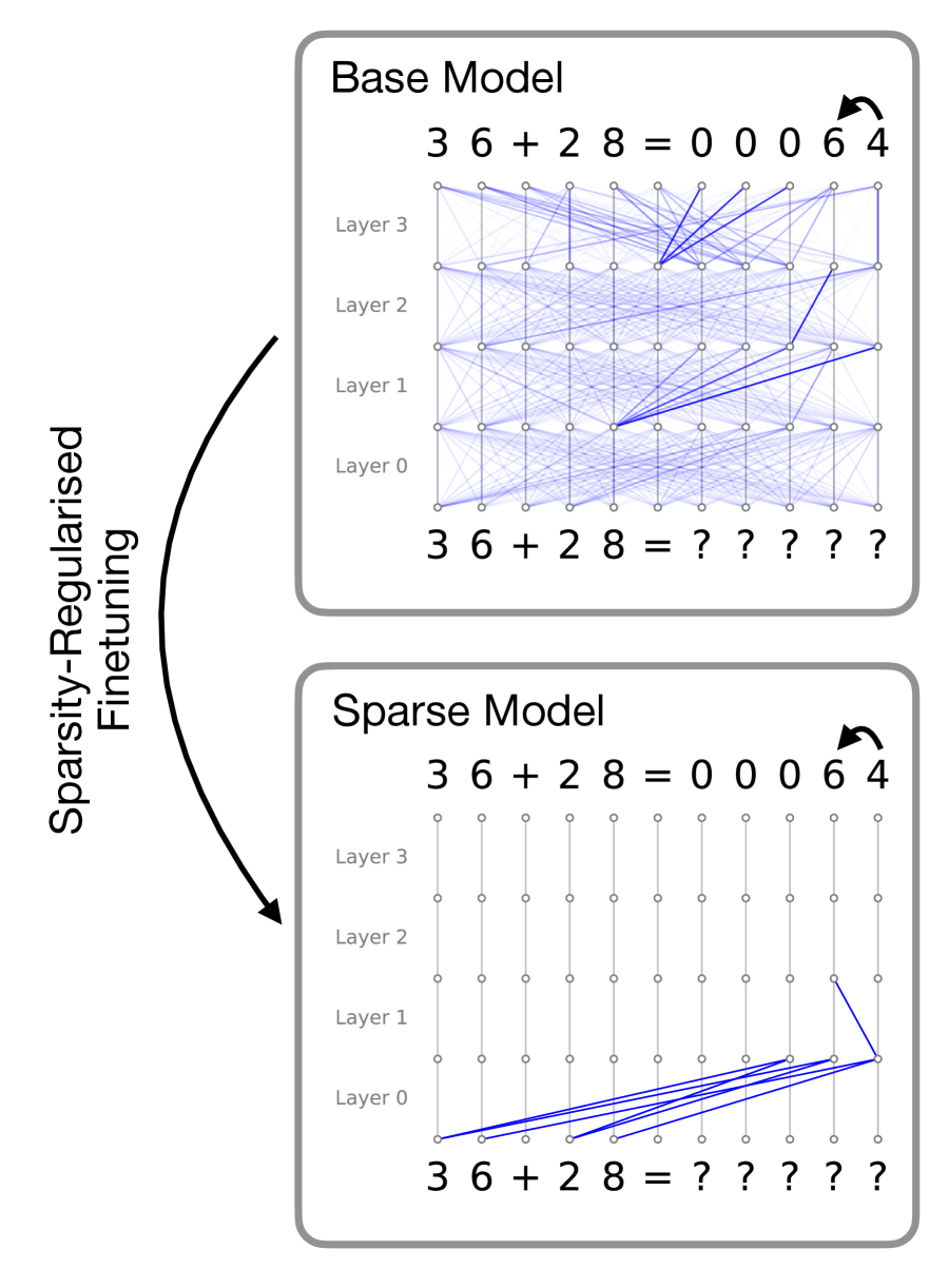
Figure 1: Visualised attention patterns for a 4-layer toy model trained on a simple 2-digit addition task. The main idea of this work is to induce sparse attention between tokens via a post-training procedure that optimizes for attention sparsity while maintaining model performance. In this example, while both models are able to correctly predict the sum, the sparse model solves the problem with a naturally interpretable circuit. Details of this toy setup and more examples are provided in Appendix A
However, interpretability is bottlenecked by the model itself: even with sophisticated reverse-engineering techniques that can faithfully reveal internal algorithms, the underlying computations implemented by large models can still remain highly complex and uninterpretable. Circuits for seemingly simple tasks may span hundreds of interacting attention heads and MLPs with densely intertwined contributions across layers (Conmy et al., 2023), and features can influence each other along combinatorially many attention-mediated paths, complicating attention attribution (Kamath et al., 2025). To exemplify this, Figure 1 (top) illustrates the attention patterns of a small, single-head transformer trained on a simple two-digit addition task. Here, the model has learned to solve the task in a highly diffused manner, where information about each token is dispersed across all token locations, rendering the interpretation of the underlying algorithm extremely difficult even in this simple case.
The crux of the problem is that models are not incentivised to employ simple algorithms during training. In this work, we advocate for directly embedding interpretability constraints into model design in a way that induces simple circuits while preserving performance. We focus our analysis on attention mechanisms and investigate sparsity regularisation on attention patterns, originally proposed in (Lei et al., 2025), as an inductive bias. To demonstrate how sparse attention patterns can give rise to interpretable circuits, we return to the two-digit addition example: Figure 1 (bottom) shows the attention patterns induced by penalising attention edges during training. Here, the sparsity inductive bias forces the model to solve the problem with much smaller, intrinsically interpretable computation circuits.
In this work, we investigate using this sparsity regularisation scheme as a post-training strategy for pre-trained LLMs. We propose a practical method for fine-tuning existing models without re-running pretraining, offering a flexible way to induce sparse attention patterns and enhance interpretability. We show, on models of up to 7B parameters, that our proposed procedure preserves the performance of the base models on pretraining data while reducing the effective attention map to less than $0.5\%$ of its edges. To evaluate our central hypothesis that sparse attention facilitates interpretability, we consider two complementary settings. First, we study circuit discovery, where the objective is to identify the minimal set of components responsible for task performance (Conmy et al., 2023). We find that sparsified models yield substantially simpler computational graphs: the resulting circuits explain model behaviour using up to four times fewer attention heads and up to two orders of magnitude fewer edges. Second, using cross-layer transcoders (Ameisen et al., 2025), we analyse attribution graphs, which capture feature-level interactions across layers. In this setting, sparse attention mitigates the attention attribution problem by making it possible to identify which attention heads give rise to a given edge, owing to the reduced number of components mediating each connection. We argue that this clarity enables a tighter integration of feature-based and circuit-based perspectives, allowing feature interactions to be understood through explicit, tractable circuits. Taken together, these results position attention sparsity as an effective and practical inductive tool for surfacing the minimal functional backbone underlying model behaviour.
2 Related Work
2.1 Sparse Attention
As self-attention is a key component of the ubiquitous Transformer architecture, a large number of variants of attention mechanisms have been explored in the literature. Related to our approach are sparse attention methods, which are primarily designed to alleviate the quadratic scaling of vanilla self-attention. These methods typically rely on masks based on fixed local and strided patterns (Child et al., 2019) or sliding-window and global attention patterns (Beltagy et al., 2020; Zaheer et al., 2020) to constrain the receptive field of each token. While these approaches are successful in reducing the computational complexity of self-attention, they require hand-defined heuristics that do not reflect the internal computations learned by the model.
Beyond these fixed-pattern sparse attention methods, Top- $k$ attention, which enforces sparsity by dynamically selecting the $k$ most relevant keys per query based on their attention scores, has also been explored (Gupta et al., 2021; DeepSeek-AI, 2025). While Top- $k$ attention enables learnable sparse attention, the necessity to specify $k$ limits its scope for interpretability for two reasons. First, selecting the optimal $k$ is difficult, and setting $k$ too low can degrade model performance. Second, and more fundamentally, Top-k attention does not allow the model to choose different $k$ for different attention heads based on the context. We argue that this flexibility is crucial for maintaining model performance.
More recently, gated attention mechanisms (Qiu et al., 2025) provide a scalable and performant framework for inducing sparse attention. In particular, Lei et al. (2025) introduce a sparsity regularisation scheme for world modelling that reveals sparse token dependencies. We adopt this method and examine its role as an inductive bias for interpretability.
2.2 Circuit Discovery
Mechanistic interpretability seeks to uncover how internal components of LLMs implement specific computations. Ablation studies assess performance drops from removing components (Nanda et al., 2023), activation patching measures the effect of substituting activations (Zhang and Nanda, 2023), and attribution patching scales this approach via local linearisation (Syed et al., 2024). Together, these approaches allow researchers to isolate sub-circuits, minimal sets of attention heads and MLPs that are causally responsible for a given behavior or task (Conmy et al., 2023). Attention itself plays a dual role: it both routes information and exposes interpretable relational structure, making it a key substrate for mechanistic study. Our work builds on this foundation by leveraging sparsity to simplify these circuits, amplifying the interpretability of attention-mediated computation while preserving model performance.
2.3 Attribution Graph
Mechanistic interpretability has gradually shifted from an emphasis on explicit circuit discovery towards the analysis of internal representations and features. Recent work on attribution graphs and circuit tracing seeks to reunify these perspectives by approximating MLP outputs as sparse linear combinations of features and computing causal effects along linear paths between them (Dunefsky et al., 2024; Ameisen et al., 2025; Lindsey et al., 2025b). This framework enables the construction of feature-level circuits spanning the computation from input embeddings to final token predictions. Within attribution graphs, edges correspond to direct linear causal relationships between features. However, these relationships are mediated by attention heads that transmit information across token positions. Identifying which attention heads give rise to a particular edge, and understanding why they do so, is essential, as this mechanism forms a fundamental component of the computational graph (Kamath et al., 2025). A key limitation of current attribution-based approaches is that individual causal edges are modulated by dozens of attention components. We show that this leads to feature-to-feature influences that are overly complex, rendering explanations in terms of other features in the graph both computationally expensive and conceptually challenging.
3 Method
Our main hypothesis is that post-training existing LLMs to encourage sparse attention patterns leads to the emergence of more interpretable circuits. In order to instantiate this idea, we require a post-training pipeline that satisfies three main desiderata:
1. To induce sparse message passing between tokens, we need an attention mechanism that can ‘zero-out’ attention edges, which in turn enables effective $L_{0}$ -regularisation on the attention weights. This is in contrast to the standard softmax attention mechanism, where naive regularisation would result in small but non-zero attention weights that still allow information flow between tokens.
1. The model architecture needs to be compatible with the original LLM such that the pre-trained LLM weights can be directly loaded at initialisation.
1. The post-training procedure needs to ensure that the post-trained models do not lose prediction performance compared to their fully-connected counterparts.
To this end, we leverage the Sparse Transformer architecture in the SPARTAN framework proposed in (Lei et al., 2025), which uses sparsity-regularised hard attention instead of the standard softmax attention. In the following subsections, we describe the Sparse Transformer architecture and the optimisation setup, highlighting how this approach satisfies the above desiderata.
3.1 Sparse Attention Layer
Given a set of token embeddings, the Sparse Transformer layer computes the key, query, and value embeddings, $\{k_{i},q_{i},v_{i}\}$ , via linear projections, analogous to the standard Transformer. Based on the embeddings, we sample a binary gating matrix from a learnable distribution parameterised by the keys and queries,
$$
A_{ij}\sim\mathrm{Bern}(\sigma(q_{i}^{T}k_{j})), \tag{1}
$$
where $\mathrm{Bern}(·)$ is the Bernoulli distribution and $\sigma(·)$ is the logistic sigmoid function. This sampling step can be made differentiable via the Gumbel Softmax trick (Jang et al., 2017). This binary matrix acts as a mask that controls the information flow across tokens. Next, the message passing step is carried out in the same way as standard softmax attention, with the exception that we mask out the value embeddings using the sampled binary mask,
$$
\mathrm{SparseAttn}(Q,K,V)=\bigg[A\odot\mathrm{softmax}(\frac{QK^{T}}{\sqrt{d_{k}}})\bigg]V, \tag{2}
$$
where $d_{k}$ is the dimension of the key embeddings and $\odot$ denotes element-wise multiplication. During training, we regularise the expected number of edges between tokens based on the distribution over the gating matrix. Concretely, the expected number of edges for each layer can be calculated as
$$
\mathbb{E}\big[|A|\big]=\sum_{i,j}\sigma(q^{T}_{i}k_{j}). \tag{3}
$$
Note that during the forward pass, each entry of $A$ is a hard binary sample that zeros out attention edges, which serves as an effective $L_{0}$ regularisation. Moreover, since the functional form of the sparse attention layer after the hard sampling step is the same as standard softmax attention, pre-trained model weights can be directly used without alterations. Technically, the sampled $A$ affects the computation. This can be mitigated by adding a positive bias term inside the sigmoid function to ensure all gates are open at initialisation. Experimentally, we found this to be unnecessary as the models quickly recover their original performance within a small number of gradient steps.
3.2 Constrained Optimisation
In order to ensure that the models do not lose prediction performance during the post-training procedure, as per desideratum 3, we follow the approach proposed in (Lei et al., 2025), which employs the GECO algorithm (Rezende and Viola, 2018). Originally developed in the context of regularising VAEs, the GECO algorithm places a constraint on the performance of the model and uses a Lagrangian multiplier to automatically find the right strength of regularisation during training. Concretely, we formulate the learning process as the following optimisation problem,
$$
\min_{\theta}\sum_{l}\mathbb{E}\big[|A_{l}|\big]\qquad s.t.\quad CE\leq\tau, \tag{4}
$$
where $A_{l}$ denotes the gating matrix at layer $l$ , $CE$ is the standard next token prediction cross-entropy loss, and $\tau$ is the required target loss, and $\theta$ is the model parameters. In practice, we set this target as the loss of the pre-trained baseline models. We solve this optimisation problem via Lagrangian relaxation, yielding the following max-min objective,
$$
\max_{\lambda>0}\min_{\theta}\bigg[\sum_{l}\mathbb{E}\big[|A_{l}|\big]+\lambda(CE-\tau)\bigg]. \tag{5}
$$
This can be solved by taking gradient steps on $\theta$ and $\lambda$ alternately. During training, updating $\lambda$ automatically balances the strength of the sparsity regularisation: when $CE$ is lower than the threshold, $\lambda$ decreases, and hence more weight is given to the sparsity regularisation term. This effectively acts as an adaptive schedule which continues to increase the strength of the regularisation until the model performance degrades. Here, the value of $\tau$ is selected as a hyperparameter to ensure that the sparse model’s performance remains within a certain tolerance of the original base model. In practice, the choice of $\tau$ controls a trade off between sparsity and performance: picking a tight $\tau$ can lead to a slower training process, whereas a higher tolerance can substantially speed up training at the cost of potentially harming model performance. In Appendix C, we provide further discussion on this optimisation process and its training dynamics.
3.3 Practical Considerations
One of the main strengths of our proposed method is that, architecturally, the only difference between a sparse Transformer and a normal one lies in how the dot-product attention is computed. As such, most practical training techniques for optimising Transformers can be readily adapted to our setting. In our experiments, we find the following techniques helpful for improving computational efficiency and training stability.
LoRA finetuning (Hu et al., 2022).
Low rank finetuning techniques can significantly reduce the computational requirements for training large models. In our experiments, we verify on a 7B parameter model that LoRA finetuning is sufficiently expressive for inducing sparse attention patterns.
FlashAttention (Dao, 2023)
FlashAttention has become a standard method for reducing the memory footprint of dot-product attention mechanisms. In Appendix B, we discuss how the sampled sparse attention can be implemented in an analogous manner.
Distillation (Gu et al., 2024).
Empirically, we find that adding an auxiliary distillation loss based on the KL divergence between the base model and the sparse model improves training stability and ensures that the behaviour of the model remains unchanged during post-training.
<details>
<summary>x2.png Details</summary>
### Visual Description
## Bar Chart: Benchmark Comparison
### Overview
This image is a grouped bar chart titled "Benchmark Comparison." It compares the accuracy of two different language models—a base model and a sparse version of that model—across four distinct evaluation benchmarks.
### Components/Axes
**Header Region:**
* **Title:** "Benchmark Comparison" (Centered at the top).
**Legend Region:**
* **Placement:** Top-right corner, inside the main chart area.
* **Items:**
* Solid Teal/Green square: Labeled "OLMo-7B"
* Solid Pink/Mauve square: Labeled "Sparse OLMo-7B"
**Main Chart Axes:**
* **Y-Axis (Left side):**
* **Title:** "Accuracy" (Rotated 90 degrees counter-clockwise).
* **Scale:** Ranges from 0.0 to 1.0.
* **Markers/Ticks:** 0.0, 0.2, 0.4, 0.6, 0.8, 1.0.
* **X-Axis (Bottom):**
* **Title:** None explicitly stated, but represents evaluation benchmarks.
* **Categories (Left to Right):** The labels are rotated approximately 45 degrees clockwise to fit.
1. TruthfulQA
2. PIQA
3. OpenBookQA
4. ARC-Easy
### Detailed Analysis
**Trend Verification & Value Extraction:**
For every category on the X-axis, there is a pair of bars. In every single instance, the Teal bar (OLMo-7B) is visually slightly taller than the Pink bar (Sparse OLMo-7B).
* **TruthfulQA:**
* *Visual Trend:* Both bars are the lowest on the chart, sitting slightly above the 0.2 line. The teal bar is marginally higher.
* *OLMo-7B (Teal):* ~0.25
* *Sparse OLMo-7B (Pink):* ~0.24
* **PIQA:**
* *Visual Trend:* Both bars are the highest on the chart, reaching just below the 0.8 line. The teal bar is marginally higher.
* *OLMo-7B (Teal):* ~0.79
* *Sparse OLMo-7B (Pink):* ~0.78
* **OpenBookQA:**
* *Visual Trend:* Both bars sit below the halfway mark (0.5), just under the 0.4 line. The teal bar is visibly higher than the pink bar.
* *OLMo-7B (Teal):* ~0.38
* *Sparse OLMo-7B (Pink):* ~0.35
* **ARC-Easy:**
* *Visual Trend:* Both bars sit just below the 0.6 line. The teal bar is marginally higher.
* *OLMo-7B (Teal):* ~0.59
* *Sparse OLMo-7B (Pink):* ~0.57
**Reconstructed Data Table (Approximate Values ±0.02):**
| Benchmark | OLMo-7B (Accuracy) | Sparse OLMo-7B (Accuracy) |
| :--- | :--- | :--- |
| TruthfulQA | ~0.25 | ~0.24 |
| PIQA | ~0.79 | ~0.78 |
| OpenBookQA | ~0.38 | ~0.35 |
| ARC-Easy | ~0.59 | ~0.57 |
### Key Observations
1. **Consistent Dominance:** The dense model (OLMo-7B) consistently outperforms the sparse model (Sparse OLMo-7B) across all four benchmarks.
2. **Minimal Degradation:** The difference in accuracy between the dense and sparse models is very small (roughly 0.01 to 0.03 points) across all tasks.
3. **Task Difficulty Variance:** The models perform vastly differently depending on the task. PIQA yields the highest accuracy (~0.80), while TruthfulQA yields the lowest (~0.25).
### Interpretation
The data demonstrates the performance impact of applying "sparsity" to the OLMo-7B large language model. Sparsity in neural networks usually involves removing less important weights or parameters to make the model faster or less computationally expensive to run.
The critical takeaway from this chart is that **sparsifying the OLMo-7B model results in a negligible loss of accuracy.** While the dense model strictly performs better, the penalty for using the sparse model is incredibly small across a variety of reasoning and knowledge tasks (TruthfulQA, PIQA, OpenBookQA, ARC-Easy).
Furthermore, the chart highlights the inherent difficulty of the benchmarks themselves. Both models struggle significantly with `TruthfulQA` (scoring around 25%, which is often near random chance depending on the multiple-choice format), indicating this is a complex task for 7-billion parameter models. Conversely, `PIQA` (Physical Interaction: Question Answering) is relatively easy for these models, with both nearing 80% accuracy.
Ultimately, this chart would likely be used in a technical paper or presentation to argue that "Sparse OLMo-7B" is a highly viable, efficient alternative to the base model, offering comparable performance with presumed computational benefits.
</details>
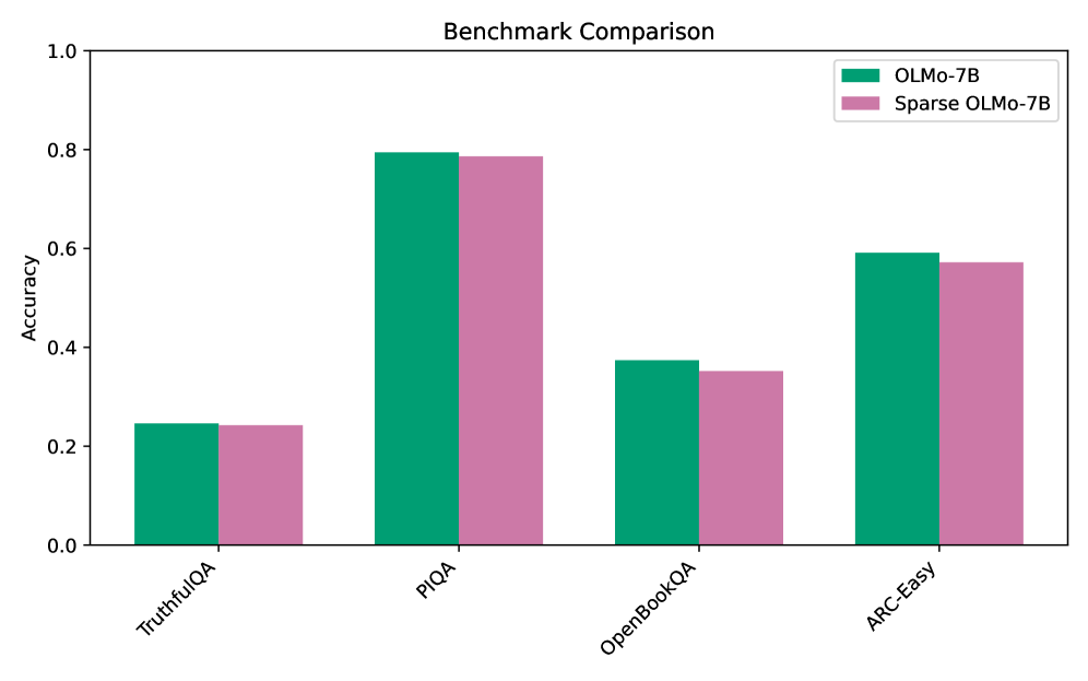
Figure 2: Comparison of model performance between the base OLMo model and the sparsified model evaluated on the various benchmarks. Across all tasks, the performance of the sparse model remains comparable with the base model despite using substantially fewer attention edges.
4 Experiments
To evaluate the effectiveness of our post-training pipeline, we finetune pre-trained LLMs and compare their prediction performance and interpretability before and after applying sparsity regularisation. We perform full finetuning on a GPT-2 base model (Radford et al., 2019) (124M parameters) on the OpenWebText dataset (Gokaslan and Cohen, 2019). To investigate the generality and scalability of our method, we perform LoRA finetuning on the larger OLMo-7B model (Groeneveld et al., 2024) on the Dolma dataset (Soldaini et al., 2024), which is the dataset on which the base model was trained. The GPT-2 model and the OLMo model are trained on sequences of length 64 and 512, respectively. In the following subsections, we first present a quantitative evaluation of model performance and sparsity after sparse post-training. We then conduct two interpretability studies, using activation patching and attribution graphs, to demonstrate that our method enables the discovery of substantially smaller circuits.
4.1 Model Performance and Sparsity
We begin by evaluating both performance retention and the degree of sparsity achieved by post-training. We set cross-entropy targets of 3.50 for GPT-2 (base model: 3.48) and 2.29 for OLMo (base model: 2.24). After training, the mean cross-entropy loss for both models remains within $± 0.01$ of the target, indicating that the dual optimisation scheme effectively enforces a tight performance constraint. To quantify the sparsity achieved by the models, we evaluate them on the validation split of their respective datasets and compute the mean number of non-zero attention edges per attention head. We find that the sparsified GPT-2 model activates, on average, only 0.22% of its attention edges, while the sparsified OLMo model activates 0.44%, indicating substantial sparsification in both cases. Table 1 provides a summary of the results. To further verify that this drastic reduction in message passing between tokens does not substantially alter model behaviour, we evaluate the sparsified OLMo model on a subset of the benchmarks used to assess the original model. As shown in Figure 2, the sparse model largely retains the performance of the base model across a diverse set of tasks. In sum, our results demonstrate that sparse post-training is effective in consolidating information flow into a small number of edges while maintaining a commensurate level of performance.
| GPT-2 | 3.48 | 3.50 | 3.501 | 0.22% |
| --- | --- | --- | --- | --- |
| OLMo | 2.24 | 2.29 | 2.287 | 0.44% |
Table 1: Performance and sparsity of post-trained models. Final cross-entropy losses closely match the specified targets, while attention sparsity is substantially increased.
4.2 Circuit Discovery with Activation Patching
<details>
<summary>x3.png Details</summary>
### Visual Description
## Grid of Attention Maps: Standard GPT2 vs. Sparse GPT2
### Overview
The image displays a comparative visualization of attention head patterns from two different neural network models: a standard "GPT2" model and a "Sparse GPT2" model. The visualization consists of numerous small, square heatmaps (matrices) organized into two distinct, rounded-rectangular panels. Each small square represents the attention weights of a specific attention head across a sequence of tokens. All matrices are lower-triangular, which is characteristic of causal (autoregressive) language models where a token can only attend to itself and preceding tokens.
### Components/Axes
* **Panels:**
* **Top Panel:** Labeled "GPT2" in the top-left corner. Contains a grid of 61 attention maps.
* **Bottom Panel:** Labeled "Sparse GPT2" in the top-left corner. Contains a single row of 9 attention maps.
* **Individual Heatmaps (Attention Maps):**
* **Y-axis (implied):** Query token position (sequence index), starting from the top (position 0) and moving downward.
* **X-axis (implied):** Key token position (sequence index), starting from the left (position 0) and moving rightward.
* **Color Scale (implied legend):** The color gradient ranges from white to dark blue. White represents an attention weight of approximately 0.0. Dark blue represents a high attention weight (approaching 1.0).
* **Masking:** The upper-right triangle of every plot is pure white, representing the causal mask (future tokens are hidden).
* **Labels:** Each heatmap has an alphanumeric label in the top-right corner in the format `L[x]H[y]`, where `L` stands for Layer and `H` stands for Head (e.g., `L0H0` means Layer 0, Head 0).
---
### Content Details
#### Component 1: GPT2 Panel (Top)
**Spatial Grounding:** This panel occupies the upper 80% of the image. It contains a grid arranged in 7 rows. Rows 1 through 6 contain 9 columns. Row 7 contains 7 columns.
**Label Transcription (Left to Right, Top to Bottom):**
* **Row 1:** L0H0, L0H2, L5H5, L0H7, L0H1, L0H10, L0H3, L8H5, L1H3
* **Row 2:** L7H6, L3H10, L4H8, L2H11, L5H8, L6H7, L11H0, L6H10, L7H3
* **Row 3:** L3H0, L5H9, L7H1, L2H10, L7H2, L8H10, L7H10, L0H5, L0H9
* **Row 4:** L6H6, L7H11, L2H9, L1H4, L6H11, L3H8, L5H3, L7H7, L1H10
* **Row 5:** L9H5, L6H9, L4H9, L1H2, L11H10, L4H3, L6H1, L5H6, L11H4
* **Row 6:** L3H11, L6H8, L4H7, L0H6, L3H1, L5H7, L10H2, L1H0, L5H1
* **Row 7:** L3H6, L6H3, L11H11, L5H2, L3H2, L2H3, L0H11
**Trend Verification & Pattern Categorization:**
The attention maps in this standard GPT2 model exhibit a variety of dense and semi-dense patterns.
1. **Vertical Edge (First-Token Attention):** A solid dark blue line runs down the far-left edge (X=0). This indicates the head pays heavy attention to the very first token in the sequence regardless of the current token position.
* *Examples:* L0H0, L7H6, L3H0, L9H5, L3H11, L3H6.
2. **Main Diagonal (Local/Previous-Token Attention):** A solid dark blue line runs diagonally from top-left to bottom-right along the edge of the causal mask. This indicates the head attends primarily to the immediately preceding token or the current token.
* *Examples:* L0H1, L0H3, L7H10, L6H8, L4H7.
3. **Offset Diagonal:** A diagonal line that is shifted downward from the main diagonal. This indicates attention to a token a fixed number of steps in the past.
* *Examples:* L5H5, L5H8, L7H2, L6H9, L5H1.
4. **Diffuse/Broad Attention:** A light blue wash spread across the lower triangle, indicating attention is distributed across many past tokens.
* *Examples:* L0H2, L2H11, L1H4, L1H2.
5. **Banded/Vertical Stripes:** Multiple faint vertical lines, indicating attention to specific absolute positions or specific recurring tokens.
* *Examples:* L11H0, L0H6, L10H2, L0H11.
6. **Complex/Hybrid:** Combinations of the above, such as a strong diagonal combined with a strong first-token vertical line.
* *Examples:* L0H5, L5H6, L1H0.
#### Component 2: Sparse GPT2 Panel (Bottom)
**Spatial Grounding:** This panel occupies the bottom 20% of the image. It contains a single row of 9 heatmaps.
**Label Transcription (Left to Right):**
* L0H5, L5H1, L4H11, L6H8, L5H5, L1H0, L6H9, L3H4, L5H6
**Trend Verification & Pattern Categorization:**
The defining visual trend here is **extreme sparsity**. Unlike the top panel, there is almost no light blue "wash" or diffuse attention. The matrices are predominantly pure white. The attention weights are concentrated into discrete, sharp, dark blue dots.
* **Strict Diagonals:** L4H11, L6H8, L1H0 exhibit dots forming a perfect main diagonal.
* **Strict Offset Diagonals:** L5H1, L5H5, L6H9 exhibit dots forming a diagonal shifted downward.
* **Fragmented/Multiple Diagonals:** L0H5 and L5H6 show dots forming segments of multiple parallel diagonals.
* **Near-Empty:** L3H4 is almost entirely white, with only one or two faint dots visible on the far left edge.
---
### Key Observations
1. **Direct Comparison of Specific Heads:** Several heads shown in the Sparse GPT2 panel are also present in the standard GPT2 panel. Comparing them reveals the exact effect of the sparsification process:
* **L0H5:** In standard GPT2, it has a solid main diagonal and a solid offset diagonal. In Sparse GPT2, the continuous lines are broken into discrete, separated dots, and any background noise is removed.
* **L6H8:** In standard GPT2, it is a solid, continuous main diagonal. In Sparse GPT2, it is a dotted diagonal.
* **L1H0:** In standard GPT2, it has a strong diagonal with a diffuse blue wash below it. In Sparse GPT2, the diffuse wash is completely eliminated, leaving only the diagonal dots.
2. **Elimination of the "Attention Sink":** The prominent vertical line on the left edge (attention to the first token) seen frequently in standard GPT2 (e.g., L0H0, L7H6) is notably absent in the sample of Sparse GPT2 heads provided.
3. **Discretization:** The Sparse GPT2 model forces attention to be binary or highly localized, rather than distributed continuously across a sequence.
---
### Interpretation
This image serves as a technical diagnostic visualization demonstrating the internal mechanics of attention heads in Transformer-based language models, specifically highlighting the impact of applying a sparsity constraint.
**Reading Between the Lines (Peircean Investigative Analysis):**
* **Head Specialization:** The standard GPT2 panel proves that different attention heads learn distinct, specialized roles without human intervention. Some act as "previous token" fetchers (diagonals), some look for specific syntactic offsets (offset diagonals), and some aggregate broad context (diffuse).
* **The "Attention Sink" Phenomenon:** The heavy vertical lines on the left of many standard GPT2 plots represent the model using the first token (often a `[BOS]` or starting token) as a "sink." When a head doesn't find anything relevant in the past context to attend to, it dumps its attention mass onto the first token to satisfy the mathematical requirement that attention weights sum to 1.0.
* **The Purpose of Sparsity:** The bottom panel demonstrates what happens when a model is trained or modified to be "sparse" (likely through techniques like sparse attention masks, thresholding, or specific regularization). The diffuse "noise" and the continuous lines are stripped away.
* **Efficiency vs. Expressivity:** The Sparse GPT2 maps suggest that much of the continuous attention in standard GPT2 might be redundant or unnecessary for certain tasks. By reducing attention to discrete points (dots instead of solid lines/washes), the model requires significantly less memory and compute (as zero-values don't need to be calculated in sparse matrix operations). However, the visual starkness of L3H4 (nearly empty) suggests that forcing sparsity might effectively "kill" or render certain heads inactive if they previously relied on broad, diffuse context gathering.
</details>
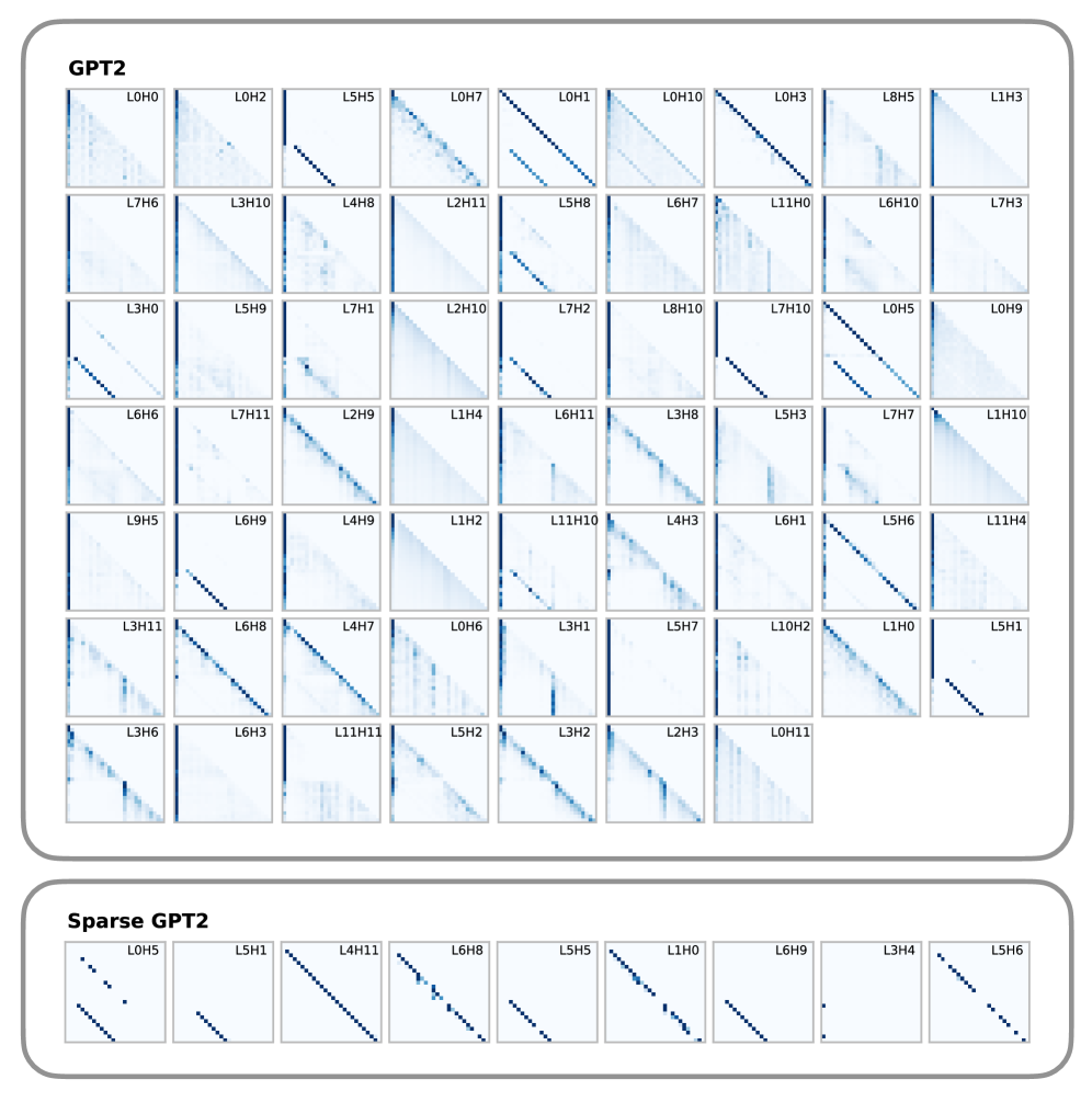
Figure 3: Attention patterns of the heads required to explain 90% of model behaviour on a copy task. The sparse model requires substantially fewer attention heads. Moreover, the selected heads exhibit the characteristic ‘induction head’ pattern: each token attends to a previous token at a fixed relative offset, effectively copying information forward through the sequence, a pattern well known to implement the copy mechanism in transformer models. Equivalent plots for OLMo can be found in Appendix D.
<details>
<summary>x4.png Details</summary>
### Visual Description
## Line Charts: Efficiency Comparison of Standard vs. Sparse Language Models
### Overview
The image consists of a horizontal array of four line charts. Each chart compares the performance of a standard large language model against a "sparse" version of that same model across four different tasks. The charts demonstrate how many attention heads are required to achieve a certain level of "Explained Effect." The language present in the image is entirely English.
### Components/Axes
The image is divided into four distinct panels (sub-charts) arranged from left to right.
**Common Axes across all panels:**
* **Y-axis:** Labeled "Explained Effect". The scale runs from 0.0 at the bottom to 1.0 at the top, with tick marks at 0.0, 0.5, and 1.0.
* **X-axis:** Labeled "Number of Heads Kept". The scale varies depending on the model being evaluated.
* Panels 1 & 2 (GPT-2): Tick marks at 50 and 100. The axis appears to range from 0 to approximately 140.
* Panels 3 & 4 (OLMo-7B): Tick marks at 250, 500, 750, and 1000. The axis ranges from 0 to slightly over 1000.
**Legends:**
* **Panel 1 (Bottom Right):**
* Blue line = `GPT-2`
* Orange line = `Sparse GPT-2`
* **Panel 3 (Bottom Right):**
* Green line = `OLMo-7B`
* Pink/Purple line = `Sparse OLMo-7B`
*(Note: Panels 2 and 4 do not have explicit legends but visually inherit the color coding from Panels 1 and 3, respectively).*
**Annotations:**
Every panel features a horizontal dashed black line connecting the two curves at a high Y-value (approximately 0.9). Above this dashed line is a text label indicating a multiplier (e.g., "4.5x"). Shaded regions surrounding the solid lines indicate variance or confidence intervals.
---
### Detailed Analysis
#### Panel 1: Greater Than (Far Left)
* **Header/Title:** "Greater Than" (Top left of the panel).
* **Trend Verification:** The orange line (Sparse GPT-2) slopes upward extremely rapidly, reaching near-maximum effect with very few heads. The blue line (GPT-2) slopes upward much more gradually, requiring significantly more heads to reach the same level.
* **Data Points (Approximate):**
* **Sparse GPT-2 (Orange):** Starts at (0, 0). Rises sharply to ~0.9 at ~20 heads. Plateaus at 1.0 by ~40 heads.
* **GPT-2 (Blue):** Starts at (0, 0). Reaches 0.5 at ~50 heads. Reaches ~0.9 at ~90 heads. Approaches 1.0 at ~140 heads.
* **Annotation:** A dashed line connects the orange curve at X≈20 to the blue curve at X≈90, at Y≈0.9. The text reads **"4.5x"**.
#### Panel 2: IOI (Center Left)
* **Header/Title:** "IOI" (Top left of the panel).
* **Trend Verification:** The orange line (Sparse GPT-2) remains flat briefly, then slopes upward sharply. The blue line (GPT-2) remains flat for longer, then slopes upward at a moderate pace.
* **Data Points (Approximate):**
* **Sparse GPT-2 (Orange):** Starts at (0, 0). Rises to ~0.9 at ~40 heads. Plateaus at 1.0 by ~50 heads.
* **GPT-2 (Blue):** Flat at 0 until ~25 heads. Reaches 0.5 at ~50 heads. Reaches ~0.9 at ~90 heads.
* **Annotation:** A dashed line connects the orange curve at X≈40 to the blue curve at X≈90, at Y≈0.9. The text reads **"2.2x"**.
#### Panel 3: Docstring (Center Right)
* **Header/Title:** "Docstring" (Top left of the panel).
* **Trend Verification:** The pink line (Sparse OLMo-7B) slopes upward steeply starting around 100 heads. The green line (OLMo-7B) slopes upward more gradually and exhibits noticeable jaggedness and a wider shaded variance band compared to the other charts.
* **Data Points (Approximate):**
* **Sparse OLMo-7B (Pink):** Starts at (0, 0). Rises to ~0.9 at ~250 heads. Plateaus at 1.0 by ~300 heads.
* **OLMo-7B (Green):** Starts at (0, 0). Reaches 0.5 at ~200 heads. Reaches ~0.9 at ~550 heads. Plateaus at 1.0 by ~650 heads.
* **Annotation:** A dashed line connects the pink curve at X≈250 to the green curve at X≈550, at Y≈0.9. The text reads **"2.2x"**.
#### Panel 4: IOI Long (Far Right)
* **Header/Title:** "IOI Long" (Top left of the panel).
* **Trend Verification:** Both lines remain completely flat at 0 for a significant portion of the X-axis before shooting up almost vertically. The pink line (Sparse OLMo-7B) initiates its vertical climb much earlier than the green line (OLMo-7B).
* **Data Points (Approximate):**
* **Sparse OLMo-7B (Pink):** Flat at 0 until ~300 heads. Shoots vertically to ~0.9 at ~400 heads. Plateaus at 1.0 by ~450 heads.
* **OLMo-7B (Green):** Flat at 0 until ~450 heads. Shoots vertically to ~0.9 at ~550 heads. Plateaus at 1.0 by ~600 heads.
* **Annotation:** A dashed line connects the pink curve at X≈400 to the green curve at X≈550, at Y≈0.9. The text reads **"1.4x"**.
---
### Key Observations
1. **Consistent Superiority of Sparse Models:** In every single panel, the "Sparse" version of the model (Orange or Pink) is positioned to the left of the standard model (Blue or Green). This indicates that the sparse models achieve high "Explained Effect" using fewer "Heads Kept."
2. **The Multiplier Metric:** The dashed lines and text annotations (4.5x, 2.2x, 2.2x, 1.4x) represent a ratio of efficiency. It shows how many *more* heads the standard model needs to achieve roughly 90% (0.9) explained effect compared to the sparse model.
3. **Task Dependency:** The shape of the curves varies wildly by task. "Greater Than" and "Docstring" show gradual accumulation of effect. "IOI Long" shows a threshold effect, where the models explain nothing until a specific number of heads are kept, at which point they explain everything almost instantly.
4. **Model Scale Differences:** The GPT-2 charts (left half) operate on a scale of 0-140 heads. The OLMo-7B charts (right half) operate on a scale of 0-1000 heads, reflecting the vastly different architectural sizes of these two base models.
---
### Interpretation
This image serves as empirical evidence for the efficacy of a specific model sparsification technique (likely related to pruning attention heads in Transformer architectures).
**What the data means:**
The "Explained Effect" likely refers to how much of the model's performance on a specific task (like "Greater Than" logic, or "Docstring" generation) can be recovered or explained by a subset of its attention heads.
The data clearly demonstrates that standard models (GPT-2, OLMo-7B) have their task-specific knowledge distributed across a wide array of heads. To get 90% performance, you have to keep a large number of them.
Conversely, the "Sparse" models have been optimized so that task-critical information is concentrated into a much smaller number of heads.
**Reading between the lines (Peircean investigative):**
* **Efficiency Gains:** The annotations (e.g., "4.5x") are the core marketing/scientific claim of the chart. If Sparse GPT-2 can do the same job as GPT-2 using 4.5 times fewer heads, it implies massive potential savings in computational cost, memory footprint, and inference speed without sacrificing task performance.
* **The "IOI Long" Anomaly:** The step-function nature of the "IOI Long" chart suggests that this specific task requires a complex circuit of attention heads to function at all. If you don't have the complete circuit (e.g., fewer than 450 heads for standard OLMo-7B), performance is zero. The sparsification technique successfully compressed this necessary circuit from ~550 heads down to ~400 heads (a 1.4x improvement).
* **Variance:** The wider shaded bands on the standard models (especially visible in the "Docstring" panel) suggest that picking *which* heads to keep in a standard model yields highly variable results. The sparse models have much tighter confidence intervals, implying that the "important" heads are much more clearly defined and isolated.
</details>
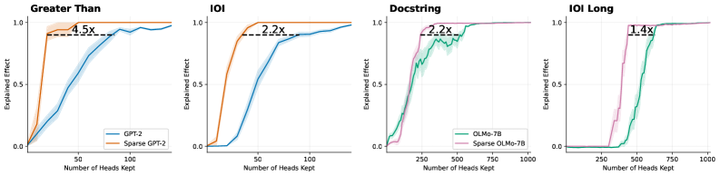
Figure 4: Logit attribution keeping only the top- $k$ attention heads. Dotted line annotates the number of attention heads needed to explain 90% of the logit difference. Sparse models yields 1.4 $×$ to 4.5 $×$ smaller circuits. Shaded areas show standard error across 20 prompts.
<details>
<summary>x5.png Details</summary>
### Visual Description
## Line Charts: Explained Effect vs. Number of Edges Kept Across Four Tasks
### Overview
The image consists of a 1x4 grid of line charts comparing the performance of standard language models against their "Sparse" counterparts across four different tasks: "Greater Than", "IOI", "Docstring", and "IOI Long". The charts illustrate how rapidly each model achieves a high "Explained Effect" as the "Number of Edges Kept" increases. In all four panels, the sparse models achieve higher explained effects with significantly fewer edges than the standard models.
### Components/Axes
All four charts share identical axis definitions and scales:
* **Y-Axis:** Labeled "Explained Effect". The scale is linear, with major tick marks and gridlines at **0.0, 0.5, and 1.0**.
* **X-Axis:** Labeled "Number of Edges Kept". The scale is logarithmic (base 10). The range varies slightly depending on the model being evaluated:
* Charts 1 & 2 (GPT-2): Ticks at **$10^0$, $10^1$, $10^2$, $10^3$, $10^4$**.
* Charts 3 & 4 (OLMo-7B): Ticks at **$10^0$, $10^1$, $10^2$, $10^3$, $10^4$, $10^5$**.
* **Legends:**
* Located in the bottom-right corner of the first chart ("Greater Than"):
* **Blue Line:** GPT-2
* **Orange Line:** Sparse GPT-2
* *(Note: This color coding applies to the second chart, "IOI", as well).*
* Located in the bottom-right corner of the third chart ("Docstring"):
* **Green Line:** OLMo-7B
* **Pink/Purple Line:** Sparse OLMo-7B
* *(Note: This color coding applies to the fourth chart, "IOI Long", as well).*
* **Annotations:** Each chart features a horizontal dashed black line connecting the two curves at approximately the y = 0.9 level. Above this dashed line is a text label indicating a multiplier (e.g., "97.0x"), representing the ratio of edges required by the standard model versus the sparse model to achieve that specific Explained Effect.
### Detailed Analysis
#### Panel 1: Greater Than (Far Left)
* **Trend Verification:** The orange line (Sparse GPT-2) rises sharply from the y-intercept, reaching maximum effect quickly. The blue line (GPT-2) remains low initially and requires a much higher number of edges to rise.
* **Data Points (Approximate):**
* **Sparse GPT-2 (Orange):** Starts at y ~ 0.15 (x=$10^0$). Reaches y=0.5 at x ~ $10^1$. Reaches y=0.9 at x ~ 30. Reaches y=1.0 just after x=$10^2$.
* **GPT-2 (Blue):** Starts at y ~ 0.0 (x=$10^0$). Reaches y=0.5 at x ~ $10^3$. Reaches y=0.9 at x ~ 3,000. Reaches y=1.0 near x=$10^4$.
* **Annotation:** A dashed line at y ~ 0.9 connects the curves. The label reads **97.0x**, indicating GPT-2 requires 97 times more edges than Sparse GPT-2 to reach this level of explained effect.
#### Panel 2: IOI (Center Left)
* **Trend Verification:** Similar to Panel 1, the orange line (Sparse GPT-2) ascends much faster than the blue line (GPT-2).
* **Data Points (Approximate):**
* **Sparse GPT-2 (Orange):** Starts at y ~ 0.25 (x=$10^0$). Reaches y=0.5 at x ~ 5. Reaches y=0.9 at x ~ 40. Reaches y=1.0 near x=$10^2$.
* **GPT-2 (Blue):** Starts at y ~ 0.05 (x=$10^0$). Reaches y=0.5 at x ~ $10^2$. Reaches y=0.9 at x ~ 1,700. Reaches y=1.0 near x=$10^4$.
* **Annotation:** A dashed line at y ~ 0.9 connects the curves. The label reads **42.8x**.
#### Panel 3: Docstring (Center Right)
* **Trend Verification:** The pink line (Sparse OLMo-7B) rises steadily, preceding the green line (OLMo-7B), which follows a similar but delayed trajectory along the x-axis.
* **Data Points (Approximate):**
* **Sparse OLMo-7B (Pink):** Starts at y ~ 0.0 (x=$10^0$). Reaches y=0.5 at x ~ $10^3$. Reaches y=0.9 at x ~ 4,000. Reaches y=1.0 near x=$10^4$.
* **OLMo-7B (Green):** Starts at y ~ 0.0 (x=$10^0$). Reaches y=0.5 at x ~ $10^4$. Reaches y=0.9 at x ~ 35,000. Reaches y=1.0 near x=$10^5$.
* **Annotation:** A dashed line at y ~ 0.9 connects the curves. The label reads **8.6x**.
#### Panel 4: IOI Long (Far Right)
* **Trend Verification:** The pink line (Sparse OLMo-7B) rises before the green line (OLMo-7B), though the gap between them appears visually narrower than in the GPT-2 charts.
* **Data Points (Approximate):**
* **Sparse OLMo-7B (Pink):** Starts at y ~ 0.0 (x=$10^0$). Reaches y=0.5 at x ~ 500. Reaches y=0.9 at x ~ 10,000. Reaches y=1.0 near x=$10^5$.
* **OLMo-7B (Green):** Starts at y ~ 0.0 (x=$10^0$). Reaches y=0.5 at x ~ 3,000. Reaches y=0.9 at x ~ 54,000. Reaches y=1.0 slightly after the pink line.
* **Annotation:** A dashed line at y ~ 0.9 connects the curves. The label reads **5.4x**.
### Key Observations
1. **Consistent Superiority of Sparse Models:** In every task evaluated, the "Sparse" version of the model (Sparse GPT-2, Sparse OLMo-7B) achieves a high "Explained Effect" using orders of magnitude fewer "Edges" than the baseline models.
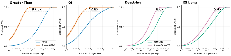
2. **Varying Efficiency Gains:** The efficiency multiplier (annotated at the ~0.9 Explained Effect mark) varies drastically depending on the model and task. The gain is massive for GPT-2 on the "Greater Than" task (97.0x) but much more modest for OLMo-7B on the "IOI Long" task (5.4x).
3. **Model Scale Differences:** The x-axis reveals that the OLMo-7B models generally require more edges overall (up to $10^5$) to reach a 1.0 explained effect compared to the GPT-2 models (which max out around $10^4$), reflecting the likely difference in the total size and complexity of the underlying models.
### Interpretation
These charts are highly indicative of research in **mechanistic interpretability** or **network pruning** within Large Language Models (LLMs).
* **"Edges Kept"** likely refers to the connections between nodes, attention heads, or MLP layers within the neural network's computational graph (often referred to as a "circuit").
* **"Explained Effect"** represents how well a sub-network (the kept edges) can replicate the performance or specific behavior of the full, unpruned model on a specific task (like "Greater Than" or "Indirect Object Identification - IOI").
**The core finding demonstrated by this data is that "Sparse" models are vastly more efficient for circuit discovery.** The data proves that by using a sparse variant of a model, researchers can isolate the specific pathways (edges) responsible for a task while throwing away the vast majority of the network. For example, in the "Greater Than" task, the sparse GPT-2 model can explain ~90% of the model's behavior using nearly 100 times fewer connections than standard GPT-2. This suggests that the sparse models have highly localized, disentangled representations for these tasks, making them significantly easier to interpret and analyze than their dense counterparts.
</details>
Figure 5: Logit attribution per sentence keeping only the top- $k$ attention edges. Sparse models yields 5.4 $×$ to 97 $×$ smaller circuits. Shaded area shows standard error across 20 prompts.
We begin by outlining the experimental procedure used for circuit discovery. Activation patching (Nanda et al., 2023) is a widely used technique for identifying task-specific circuits in transformer models. In a typical setup, the model is evaluated on pairs of prompts: a clean prompt, for which the model predicts a correct target token, and a corrupted prompt that shares the overall structure of the clean prompt but is modified to induce an incorrect prediction. Here, the goal is to find the set of model components that is responsible for the model’s preference for the correct answer over the wrong one, as measured by the logit difference between the corresponding tokens. In activation patching, individual model components, such as attention heads and individual edges, can be ’switched-off’ by patching activation at the specific positions. Circuit discovery amounts to finding a set of components whose replacement causes the model’s prediction to shift from the correct to the corrupted answer.
Since searching over every possible subset of model components is infeasible due to the exponential number of potential subsets, we adopt a common heuristic to rank each model component. Specifically, for each individual component, we compute an importance score by replacing the activations of the component with the corrupted activations and measuring its effect on the logit difference. In our experiments, we use this ranking to select the top- $k$ components and intervene on the model by freezing all remaining components, with the goal of identifying the minimal set that accounts for at least 90% of the model’s preference for the correct prediction. Note that these importance scores can be computed at two levels: (i) a single-sentence level, using a single pair of correct and corrupted inputs, and (ii) a global level, obtained by averaging scores across many task variants. In our experiments, we report the results using single-sentence scores. In Appendix D, we also provide results using the global scores, which are largely consistent with our main results. There are also two standard approaches for freezing component activations: setting the activation to zero or replacing it with a mean activation value (Conmy et al., 2023). We evaluate both variants for each model and report results for the patching strategy that yields the smallest circuits.
We first focus on the copy task with the following prompt: "AJEFCKLMOPQRSTVWZS, AJEFCKLMOPQRSTVWZ", where the model has to copy the letter S to the next token position. This task is well studied and is widely believed to be implemented by emergent induction heads (Elhage et al., 2021), which propagate token information forward in the sequence. Figure 3 illustrates the attention patterns of the set of attention heads that explains this prompt for the sparse and base GPT-2 models. See Appendix D for analogous results for the OLMo models. The sparse model admits a substantially smaller set of attention heads (9 heads) than its fully connected counterpart (61 heads). Moreover, the identified heads in the sparse model exhibit cleaner induction head patterns, with each token attending to a single prior position at a fixed relative offset. These results illustrate how sparsification facilitates interpretability under simple ranking-based methods and support our hypothesis that sparse post-training yields models that are more amenable to mechanistic interpretability techniques.
To further verify our hypothesis, we repeat the experiment on classical circuit discovery tasks. For GPT-2, we evaluate variants of the Indirect Object Identification (IOI) task, in which the model copies a person’s name from the start of a sentence, and the Greater Than task, in which the model predicts a number that is larger than a previously mentioned number. To further assess the scalability of our approach, we investigate more challenging and longer horizon tasks for OLMo, including a longer context IOI task and a Docstring task where the model needs to predict an argument name in a Docstring based on an implemented function. Details of each task can be found in Appendix E. Figure 4 and 5 show the fraction of model behaviour explained as a function of the number of retained model components (attention heads and attention edges, respectively). Across all tasks and models, the sparse models consistently produce significantly smaller circuits, as measured by the number of model components needed to explain 90% of model prediction. This further corroborates our claim that sparse models lead to simpler and more interpretable internal circuits.
4.3 Attribution-graph
Next, we present a more fine-grained, feature-level investigation of whether sparsity in attention leads to interpretable circuits in practice using cross-layer transcoders (CLTs). Since training CLTs on OLMo-7B is computationally prohibitive The largest open-source CLT is on Gemma-2B at the time of writing., we focus our analysis on the GPT-2 models. For the rest of the section, we perform analysis on CLTs trained on the sparse and base GPT-2 models, trained with an expansion factor of $32$ and achieve above $80\%$ replacement score measured with Circuit Tracer (Hanna et al., 2025). See Appendix F and G for details on training and visualisation.
We study the problem of attention attribution, which seeks to understand how edges between features are mediated. The key challenge here is that any given edge can be affected by a large number of model components, making mediation circuits difficult to analyse both computationally and conceptually: computationally, exhaustive enumeration is costly; conceptually, the resulting circuits are often large and uninterpretable. In this experiment, we demonstrate that sparse attention patterns induced via post-training substantially alleviate these challenges, as the vast majority of attention components have zero effect on the computation.
As in (Ameisen et al., 2025), we define the total attribution score between feature $n$ at layer $\ell$ and position $k$ , and feature $n^{\prime}$ at layer $\ell^{\prime}$ and position $k^{\prime}$ as
$$
a_{\ell,k,n}^{\ell^{\prime},k^{\prime},n^{\prime}}=f_{k,n}^{\ell}\;J_{\ell,k}^{\ell^{\prime},k^{\prime}}\;g_{k^{\prime},n^{\prime}}^{\ell^{\prime}}. \tag{6}
$$
Here, $f_{k,n}^{\ell}$ denotes the decoder vector corresponding to feature $n$ at layer $\ell$ and position $k$ , and $g_{k^{\prime},n^{\prime}}^{\ell^{\prime}}$ is the corresponding encoder vector for feature $n^{\prime}$ at layer $\ell^{\prime}$ and position $k^{\prime}$ . The term $J_{\ell,k}^{\ell^{\prime},k^{\prime}}$ is the Jacobian from the MLP output at $(\ell,k)$ to the MLP input at $(\ell^{\prime},k^{\prime})$ . This Jacobian is computed during a forward pass in which all nonlinearities are frozen using stop-gradient operations. Under this linearisation, the attribution score represents the sum over all linear paths from the source feature to the target feature.
To analyse how this total effect between two features is mediated by each model component, we define the component-specific attribution by subtracting the contribution of all paths that do not pass through the component:
$$
a_{\ell,k,n}^{\ell^{\prime},k^{\prime},n^{\prime}}(h)=f_{k,n}^{\ell}\;J_{\ell,k}^{\ell^{\prime},k^{\prime}}\;g_{k^{\prime},n^{\prime}}^{\ell^{\prime}}-f_{k,n}^{\ell}\;\bigl[J_{\ell,k}^{\ell^{\prime},k^{\prime}}\bigr]_{h}\;g_{k^{\prime},n^{\prime}}^{\ell^{\prime}}.
$$
Here, $\bigl[J_{\ell,k}^{\ell^{\prime},k^{\prime}}\bigr]_{h}$ denotes a modified Jacobian computed under the same linearization as above, but with the specific attention component $h$ additionaly frozen via stop-gradient. As such, these component-specific scores quantifies how much each model component impacts a particular edge between features.
Empicially, we evaluate the method on ten pruned attribution graphs, computed on the IOI, greater-than, completion, and category tasks. Similar to our previous circuit discovery experiment, we compute attribution scores on the level of attention heads as well as individual key–query pairs. In practice, attention sparsity yields substantial computational savings: because inactive key–query pairs are known a priori to have exactly zero attribution score, attribution need only be computed for a small subset of components. This reduces the computation time per attribution graph from several hours to several minutes.
<details>
<summary>x6.png Details</summary>
### Visual Description
## Line Charts: Mean Cumulative Mass Distribution for Edges and Heads (Sparse vs. Non-Sparse)
### Overview
The image consists of two side-by-side line charts comparing the "Mean Cumulative Mass" against a "Sorted Index" for two different components: "Edges" (left chart) and "Heads" (right chart). Both charts plot two data series distinguished by color (orange and blue), representing "Sparse" and "Non Sparse" configurations, respectively. The charts demonstrate how quickly cumulative mass is achieved as the sorted index increases, highlighting the efficiency of sparse representations.
**Language Declaration:** All text in the image is in English.
---
### Components/Axes
**Global Elements:**
* **Legend:** Located in the bottom-right corner of the right chart ("Heads"). It applies to both charts based on color consistency.
* **Blue Line:** Non Sparse
* **Orange Line:** Sparse
**Left Chart: "Edges"**
* **Title:** "Edges" (Top-left, bold text).
* **Y-axis:** Label: "Mean Cumulative Mass". Linear scale with visible markers at 0.50, 0.75, and 1.00. The axis extends slightly below 0.50 (approximately to 0.25). Faint horizontal grid lines align with the major ticks.
* **X-axis:** Label: "Sorted Index (log scale)". Logarithmic scale with visible markers at $10^0$, $10^1$, $10^2$, and $10^3$. Faint vertical grid lines align with the major ticks.
**Right Chart: "Heads"**
* **Title:** "Heads" (Top-left, bold text).
* **Y-axis:** Label: "Mean Cumulative Mass". Linear scale with visible markers at 0.50, 0.75, and 1.00. The axis extends slightly below 0.50. Faint horizontal grid lines align with the major ticks.
* **X-axis:** Label: "Sorted Index". Linear scale with visible markers at 25, 50, 75, 100, and 125. Faint vertical grid lines align with the major ticks.
---
### Detailed Analysis
#### Left Chart: Edges (Logarithmic X-Axis)
* **Trend Verification:** Both lines slope upward from left to right, starting at a lower cumulative mass and asymptotically approaching 1.00. The Orange (Sparse) line rises significantly steeper and earlier than the Blue (Non Sparse) line.
* **Orange Line (Sparse):**
* Starts at approximately y = 0.45 at x = $10^0$ (1).
* Crosses y = 0.75 at approximately x = 5.
* Reaches y = 0.90 at approximately x = 15.
* Plateaus at y = 1.00 around x = $10^2$ (100).
* **Blue Line (Non Sparse):**
* Starts below the visible y-axis labels, approximately y = 0.20 at x = $10^0$ (1).
* Crosses y = 0.50 at approximately x = 5.
* Crosses y = 0.75 at approximately x = 30.
* Reaches y = 0.90 at approximately x = 240.
* Approaches y = 1.00 near x = $10^3$ (1000) and beyond.
* **Annotation:** A horizontal dashed black line connects the Orange line to the Blue line at a y-value of approximately 0.90. Above this dashed line is the text **"16.1x"**. This indicates that to reach ~90% of the mean cumulative mass, the Non Sparse model requires an index that is 16.1 times larger than the Sparse model. (e.g., $15 \times 16.1 \approx 241$).
#### Right Chart: Heads (Linear X-Axis)
* **Trend Verification:** Similar to the left chart, both lines slope upward, starting low and plateauing at 1.00. The Orange (Sparse) line rises much faster than the Blue (Non Sparse) line.
* **Orange Line (Sparse):**
* Starts at approximately y = 0.40 near x = 0.
* Crosses y = 0.75 at approximately x = 5.
* Reaches y = 0.90 at approximately x = 10.
* Plateaus at y = 1.00 around x = 30.
* **Blue Line (Non Sparse):**
* Starts at approximately y = 0.25 near x = 0.
* Crosses y = 0.50 at approximately x = 5.
* Crosses y = 0.75 at approximately x = 15.
* Reaches y = 0.90 at approximately x = 34.
* Plateaus at y = 1.00 around x = 100.
* **Annotation:** A horizontal dashed black line connects the Orange line to the Blue line at a y-value of approximately 0.90. Above this dashed line is the text **"3.4x"**. This indicates that to reach ~90% of the mean cumulative mass, the Non Sparse model requires an index that is 3.4 times larger than the Sparse model. (e.g., $10 \times 3.4 = 34$).
---
### Key Observations
1. **Concentration of Mass:** In both "Edges" and "Heads", the "Sparse" (orange) configuration concentrates its mass in a much smaller number of indices compared to the "Non Sparse" (blue) configuration.
2. **Magnitude of Sparsity:** The effect of sparsity is vastly more pronounced in the "Edges" than in the "Heads". The multiplier to reach ~90% mass is 16.1x for Edges, compared to only 3.4x for Heads.
3. **Scale Differences:** The x-axis for Edges is logarithmic, spanning thousands of indices, whereas the x-axis for Heads is linear, spanning only about 140 indices. This suggests there are significantly more "Edges" in the system being measured than there are "Heads".
---
### Interpretation
These charts likely represent an analysis of a neural network architecture, specifically a Transformer model (implied by the terms "Heads" for attention heads and "Edges" for network connections/graph edges).
The "Sorted Index" represents individual components (heads or edges) sorted by their importance or "mass" (likely activation magnitude, attention weight, or parameter value) in descending order. The "Mean Cumulative Mass" shows what percentage of the total network's activity/weight is captured as you add more of these sorted components.
**Reading between the lines (Peircean investigative analysis):**
* **The Power of Sparsity:** The data proves that applying sparse techniques to this model is highly effective. By using the "Sparse" method, the model can capture 90% of the necessary information using a fraction of the parameters.
* **Pruning Potential:** For "Edges", you could theoretically prune (remove) the vast majority of the connections (everything past index ~100) in the sparse model and still retain 100% of the cumulative mass. In the non-sparse model, you would need to keep over 1,000 edges to achieve the same result. The "16.1x" annotation is a direct boast of computational efficiency: the sparse edge representation is 16 times more efficient at concentrating importance.
* **Architectural Insights:** The fact that "Edges" require a logarithmic scale up to $10^3$ while "Heads" only go up to ~140 indicates the structural reality of the model: there are relatively few attention heads, but a massive number of edge connections between nodes/tokens. Sparsifying the edges yields a much higher relative reduction in required components (16.1x) than sparsifying the heads (3.4x), making edge-sparsification a highly lucrative target for model optimization and compression.
</details>
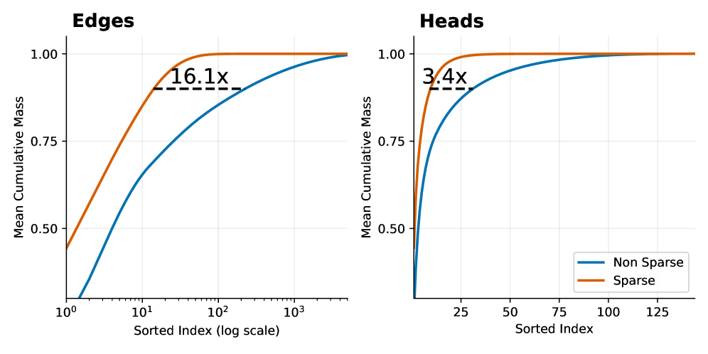
Figure 6: Mean cumulative distribution of the component scores that mediate an attribution graph edge. The components are on the left key-query pairs within a head, and on the right full attention heads.
In terms of circuit size, Figure 6 shows the mean cumulative distribution of component attribution scores for each edge in the attribution graph. We find that, to reach a cumulative attribution threshold of $90\%$ , the sparse model on average requires $16.1×$ fewer key–query pairs and $3.4×$ fewer attention heads when compared to the dense GPT-2 model, supporting our hypothesis that sparse attention patterns leads to simpler mediation circuits.
<details>
<summary>x7.png Details</summary>
### Visual Description
## Diagram: Mechanistic Interpretability of Antonym Resolution in GPT-2
### Overview
This image is a technical diagram illustrating how a transformer-based language model (specifically comparing standard GPT-2 to a "Sparse GPT-2" concept) processes a specific sequence of text to predict an antonym. The left side displays a dense grid of attention maps from standard GPT-2. The right side isolates specific components (attention heads and feature layers) in a "Sparse GPT-2" architecture to demonstrate how the model logically deduces that the opposite of "large" is "small".
### Components/Axes
* **Left Panel (GPT-2):** A 6x6 grid of individual attention matrices. No explicit axes are labeled, but standard convention implies Query (Q) vs. Key (K) token positions.
* **Top-Right Panel (Attention Heads):**
* **Y-Axis:** Labeled **Q** (Query) with an upward-pointing arrow.
* **X-Axis:** Labeled **K** (Key) with a right-pointing arrow.
* **Labels:** Five specific attention heads are identified: **L11-H7**, **L10-H1**, **L9-H7**, **L9-H1**, **L8-H6** (where L = Layer, H = Head).
* **Bottom-Right Panel (Sequence & Features):**
* **Text Sequence:** A tokenized sentence with corresponding position indices (1 through 8).
* **Feature Blocks:** Stacked rounded rectangles representing activated concepts/features at specific layers (e.g., "opposite layer 0-1").
### Detailed Analysis
#### 1. Left Panel: Standard GPT-2 Attention
* **Position:** Left half of the image, enclosed in a black border.
* **Label:** "GPT-2" centered at the bottom.
* **Visuals:** 36 individual attention maps arranged in a 6x6 grid.
* **Trends:** The maps show dense, complex attention patterns.
* Dark blue squares indicate high attention weights.
* Many maps show strong vertical blue lines (attention focused on a single past token across all current queries).
* Some maps show diagonal blue lines (attention to the immediately preceding token).
* Red squares are scattered throughout, highlighting specific attention points, but they are buried within the dense blue noise.
#### 2. Top-Right Panel: Isolated Attention Heads
* **Position:** Top right, enclosed in a black border.
* **Header Text (Red):** "All heads map key pos 5 to query pos 8"
* **Visuals:** Five isolated 8x8 grid attention maps.
* **Data Points:**
* In *every* one of the five grids, there is a distinct **red square** located at the exact coordinate of **K=5, Q=8** (5th column from the left, 8th row from the bottom).
* Grids L11-H7 and L9-H1 also contain a single blue square immediately below the red square (at K=5, Q=7).
* The rest of the grid cells are empty/white, demonstrating "sparsity" compared to the dense left panel.
#### 3. Bottom-Right Panel: Sequence and Feature Flow
* **Position:** Bottom right.
* **Label:** "Sparse GPT-2" located above the sequence.
* **Sequence Table:**
| Position | 1 | 2 | 3 | 4 | 5 (Red) | 6 | 7 | 8 (Red) |
| :--- | :--- | :--- | :--- | :--- | :--- | :--- | :--- | :--- |
| **Token** | The | opposite | of | " | large | " | is | " |
* **Feature Blocks (Spatial Grounding):**
* Positioned above token 2 ("opposite"): A block labeled **opposite** (subtext: *layer 0-1*).
* Positioned above token 5 ("large"): A block labeled **large** (subtext: *layer 0-3*).
* Positioned to the far right (top): A block labeled **small** (subtext: *layer 12*).
* Positioned to the far right (bottom): A block labeled **brackets** (subtext: *layer 0-10*).
* **Annotations & Flow:**
* Two curved black arrows originate from the Top-Right Panel (the isolated attention heads) and point directly to the **small** feature block.
* A speech bubble points to the arrows/small block containing the text: "**Modulated at 80% by**".
### Key Observations
1. **Color-Coded Correlation:** There is a direct, critical link established by the color red. In the text sequence, position **5** ("large") and position **8** (the final quotation mark) are colored red. This perfectly corresponds to the red text "key pos 5 to query pos 8" and the red squares plotted at coordinates (5, 8) in the isolated attention heads.
2. **Information Routing:** The diagram explicitly shows that specific attention heads in middle-to-late layers (Layers 8, 9, 10, 11) are responsible for looking back from the current position (8) to a specific past position (5).
3. **Dense vs. Sparse:** The left panel illustrates how difficult it is to see this specific mechanism in a standard, fully dense model. The right panel strips away the noise to show the exact sub-network performing the task.
### Interpretation
This diagram is a classic example of **Mechanistic Interpretability** in Large Language Models. It attempts to reverse-engineer *how* a model arrives at a specific output.
* **The Task:** The model is given the prompt: `The opposite of " large " is "` and must predict the next token. The correct logical answer is "small".
* **The Mechanism:**
1. Early layers identify the core concepts: "opposite" (layers 0-1) and "large" (layers 0-3).
2. When the model reaches position 8 (the final quote, where it must make its prediction), it needs to know *what* it is finding the opposite of.
3. A specific circuit of attention heads (L11-H7, L10-H1, L9-H7, L9-H1, L8-H6) activates. Their sole job in this context is to route information from position 5 ("large") to the current position 8.
4. This routed information ("large") interacts with the previously established context ("opposite").
5. This interaction heavily modulates (at 80% influence) the activation of the final output feature: the concept of **"small"** at the final layer (layer 12).
* **Conclusion:** The diagram proves that the model isn't just guessing; it has formed a specific, identifiable neural circuit to perform antonym resolution. By making the model "sparse" (isolating these specific heads and features), researchers can map the exact flow of logic from the prompt to the generated output.
</details>
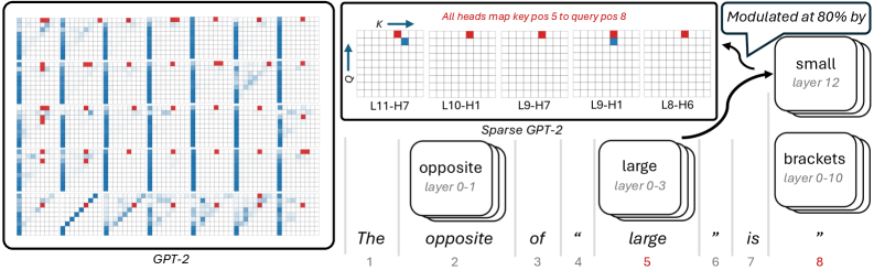
Figure 7: Sketch of the attribution graph for the sentence “The opposite of ‘large’ is”. The cluster of features associated with large at token position 5 maps directly to the final next-token prediction logit small. We show the attention patterns of all key–query pairs required to account for $80\%$ of the cumulative attribution score. In the sparse-attention setting, this corresponds to five attention heads, compared to more than forty heads in the dense-attention case. In the sparse model, these heads read from token position 5 and write directly to the last token residual stream at token position 8. These heads thus compute in parallel and provide a clear picture of the internal computation.
Next, we present a qualitative case-study to showcase the benefits of sparse attention patterns. For a given key–query pair, we compute the causal effect from all other features in the attribution graph to both the key and the query vectors. Figure 7 illustrates this analysis for the prompt “The opposite of ‘large’ is”. The resulting attribution graph decomposes into four coherent clusters of features: features related to opposite, features related to large, features activating on bracketed tokens, and the final next-token logit corresponding to small (see Appendix H for example of features and visualization).
Here, the features in the large cluster are directly connected to the small logit. The key question is then to understand how this connection from the large to the small logit comes about. To this end, we analyse their mediation structure. We find that $80\%$ of the cumulative attribution score of the edges connecting the large cluster to the small logit is mediated by the same five late layer attention key–query pairs. These attention components map features from token position $5$ directly into the final-layer residual stream at position $8$ , and thus operate in parallel.
For these five key–query pairs, we then compute the causal influence of all other features in the graph on their key and query vectors. The query vectors are primarily modulated by features associated with bracketed tokens in the last token position, while the key vectors are driven by strongly active features in both the opposite and large clusters, as shown in Figure 8.These results are in agreement with the recent work on attention attribution and the ”opposite of” attribution graph (Kamath et al., 2025). In stark contrast, Figure 7 (left) shows that a similar (and more computationally expensive) analysis on the dense model produces a much more complicated circuit. This case study illustrates the potential of sparse attention in the context of attribution graphs, as it enables a unified view of features and circuits. By jointly analyzing feature activations, attention components, and their mediating roles, we obtain a more faithful picture of the computational graph underlying the model’s input–output behavior.
5 Conclusion
Achieving interpretability requires innovations in both interpretation techniques and model design. We investigate how large models can be trained to be intrinsically interpretable. We present a flexible post-training procedure that sparsifies transformer attention while preserving the original pretraining loss. By minimally adapting the architecture, we apply a sparsity penalty under a constrained-loss objective, allowing pre-trained model to reorganise its connectivity into a much more selective and structured pattern.
$→$ Query
⬇
1. large (pos 5)
2. large (pos 5)
3. quantities (pos 5)
4. comparison (pos 3)
5. opposite (pos 3)
$→$ Key
⬇
1. bracket (pos 8)
2. bracket (pos 8)
3. bracket (pos 8)
4. bracket (pos 8)
5. bracket (pos 8)
Figure 8: Minimal description of the top5 features activating the query and the key vectors for the attention head L8-H6 from Figure 7.
Mechanistically, this induced sparsity gives rise to substantially simpler circuits: task-relevant computation concentrates into a small number of attention heads and edges. Across a range of tasks and analyses, we show that sparsity improves interpretability at the circuit level by reducing the number of components involved in specific behaviours. In circuit discovery experiments, most of the model’s behaviour can be explained by circuits that are orders of magnitude smaller than in dense models; in attribution graph analyses, the reduced number of mediating components renders attention attribution tractable. Together, these results position sparse post-training of attention as a practical and effective tool for enhancing the mechanistic interpretability of pre-trained models.
Limitations and Future Work.
One limitation of the present investigation is that, while we deliberately focus on sparsity as a post-training intervention, it remains an open question whether injecting a sparsity bias directly during training would yield qualitatively different or simpler circuit structures. Also, a comprehensive exploration of the performance trade-offs for larger models and for tasks that require very dense or long-range attention patterns would be beneficial, even if beyond the computational means currently at our disposal. Moreover, our study is primarily restricted to sparsifying attention patterns, the underlying principle of leveraging sparsity to promote interpretability naturally extends to other components of the transformer architecture. As such, combining the proposed method with complementary approaches for training intrinsically interpretable models, such as Sparse Mixture-of-Experts (Yang et al., 2025), sparsifying model weights (Gao et al., 2024), or limiting superposition offers a promising direction for future work. Another exciting avenue for future work is to apply the sparsity regularisation framework developed here within alternative post-training paradigms, such as reinforcement learning (Ouyang et al., 2022; Zhou et al., 2024) or supervised fine-tuning (Pareja et al., 2025).
Impact Statement
This paper presents work whose goal is to advance the field of Machine Learning. There are many potential societal consequences of our work, none which we feel must be specifically highlighted here.
Acknowledgment
F. D. acknowledges support through a fellowship from the Hector Fellow Academy. A. L. is supported by an EPSRC Programme Grant (EP/V000748/1). I. P. holds concurrent appointments as a Professor of Applied AI at the University of Oxford and as an Amazon Scholar. This paper describes work performed at the University of Oxford and is not associated with Amazon.
References
- E. Ameisen, J. Lindsey, A. Pearce, W. Gurnee, N. L. Turner, B. Chen, C. Citro, D. Abrahams, S. Carter, B. Hosmer, J. Marcus, M. Sklar, A. Templeton, T. Bricken, C. McDougall, H. Cunningham, T. Henighan, A. Jermyn, A. Jones, A. Persic, Z. Qi, T. Ben Thompson, S. Zimmerman, K. Rivoire, T. Conerly, C. Olah, and J. Batson (2025) Circuit tracing: revealing computational graphs in language models. Transformer Circuits Thread. External Links: Link Cited by: Appendix F, Appendix G, Appendix G, §1, §2.3, §4.3.
- I. Beltagy, M. E. Peters, and A. Cohan (2020) Longformer: the long-document transformer. arXiv preprint arXiv:2004.05150. Cited by: §2.1.
- L. Bereska and E. Gavves (2024) Mechanistic interpretability for ai safety–a review. arXiv preprint arXiv:2404.14082. Cited by: §1.
- R. e. al. Bommasani (2021) On the opportunities and risks of foundation models. ArXiv. External Links: Link Cited by: §1.
- R. Child, S. Gray, A. Radford, and I. Sutskever (2019) Generating long sequences with sparse transformers. arXiv preprint arXiv:1904.10509. Cited by: §2.1.
- T. Conerly, H. Cunningham, A. Templeton, J. Lindsey, B. Hosmer, and A. Jermyn (2025) Circuits updates – january 2025. Note: Transformer Circuits Thread External Links: Link Cited by: Appendix F.
- A. Conmy, A. Mavor-Parker, A. Lynch, S. Heimersheim, and A. Garriga-Alonso (2023) Towards automated circuit discovery for mechanistic interpretability. Advances in Neural Information Processing Systems 36, pp. 16318–16352. Cited by: §E.2, §E.3, §1, §1, §2.2, §4.2.
- T. Dao (2023) Flashattention-2: faster attention with better parallelism and work partitioning. arXiv preprint arXiv:2307.08691. Cited by: Appendix B, §3.3.
- DeepSeek-AI (2025) DeepSeek-v3.2: pushing the frontier of open large language models. External Links: 2512.02556, Link Cited by: §2.1.
- J. Dunefsky, P. Chlenski, and N. Nanda (2024) Transcoders find interpretable LLM feature circuits. Advances in Neural Information Processing Systems 37, pp. 24375–24410. Cited by: §2.3.
- N. Elhage, N. Nanda, et al. (2021) A mathematical framework for transformer circuits. Transformer Circuits Thread. Note: https://transformer-circuits.pub/2021/framework/index.html Cited by: §E.1, §E.2, §4.2.
- L. Gao, A. Rajaram, J. Coxon, S. V. Govande, B. Baker, and D. Mossing (2024) Weight-sparse transformers have interpretable circuits. Technical report OpenAI. External Links: Link Cited by: §5.
- A. Gokaslan and V. Cohen (2019) OpenWebText corpus. Note: http://Skylion007.github.io/OpenWebTextCorpus Cited by: §4.
- D. Groeneveld, I. Beltagy, P. Walsh, A. Bhagia, R. Kinney, O. Tafjord, A. H. Jha, H. Ivison, I. Magnusson, Y. Wang, S. Arora, D. Atkinson, R. Authur, K. Chandu, A. Cohan, J. Dumas, Y. Elazar, Y. Gu, J. Hessel, T. Khot, W. Merrill, J. Morrison, N. Muennighoff, A. Naik, C. Nam, M. E. Peters, V. Pyatkin, A. Ravichander, D. Schwenk, S. Shah, W. Smith, N. Subramani, M. Wortsman, P. Dasigi, N. Lambert, K. Richardson, J. Dodge, K. Lo, L. Soldaini, N. A. Smith, and H. Hajishirzi (2024) OLMo: accelerating the science of language models. Preprint. Cited by: §4.
- Y. Gu, L. Dong, F. Wei, and M. Huang (2024) MiniLLM: knowledge distillation of large language models. In The Twelfth International Conference on Learning Representations, External Links: Link Cited by: §3.3.
- A. Gupta, G. Dar, S. Goodman, D. Ciprut, and J. Berant (2021) Memory-efficient transformers via top- $k$ attention. arXiv preprint arXiv:2106.06899. Cited by: §2.1.
- M. Hanna, M. Piotrowski, J. Lindsey, and E. Ameisen (2025) Circuit-tracer. Note: https://github.com/safety-research/circuit-tracer The first two authors contributed equally and are listed alphabetically. Cited by: Appendix G, §4.3.
- S. Heimersheim and J. Janiak (2023) A circuit for python docstrings in a 4-layer attention-only transformer. In Alignment Forum, Cited by: §E.3.
- E. J. Hu, Y. Shen, P. Wallis, Z. Allen-Zhu, Y. Li, S. Wang, L. Wang, W. Chen, et al. (2022) Lora: low-rank adaptation of large language models.. ICLR 1 (2), pp. 3. Cited by: §3.3.
- E. Jang, S. Gu, and B. Poole (2017) Categorical reparameterization with gumbel-softmax. In International Conference on Learning Representations, External Links: Link Cited by: §3.1.
- H. Kamath, E. Ameisen, I. Kauvar, R. Luger, W. Gurnee, A. Pearce, S. Zimmerman, J. Batson, T. Conerly, C. Olah, and J. Lindsey (2025) Tracing attention computation through feature interactions. Transformer Circuits Thread. External Links: Link Cited by: §1, §2.3, §4.3.
- A. Lei, B. Schölkopf, and I. Posner (2025) SPARTAN: a sparse transformer world model attending to what matters. In The Thirty-ninth Annual Conference on Neural Information Processing Systems, External Links: Link Cited by: §1, §2.1, §3.2, §3.
- J. Lindsey, E. Ameisen, N. Nanda, S. Shabalin, M. Piotrowski, T. McGrath, M. Hanna, O. Lewis, C. Tigges, J. Merullo, C. Watts, G. Paulo, J. Batson, L. Gorton, E. Simon, M. Loeffler, C. McDougall, and J. Lin (2025a) The circuits research landscape: results and perspectives. Neuronpedia. External Links: Link Cited by: Appendix F.
- J. Lindsey, W. Gurnee, E. Ameisen, B. Chen, A. Pearce, N. L. Turner, C. Citro, D. Abrahams, S. Carter, B. Hosmer, J. Marcus, M. Sklar, A. Templeton, T. Bricken, C. McDougall, H. Cunningham, T. Henighan, A. Jermyn, A. Jones, A. Persic, Z. Qi, T. B. Thompson, S. Zimmerman, K. Rivoire, T. Conerly, C. Olah, and J. Batson (2025b) On the biology of a large language model. Transformer Circuits Thread. External Links: Link Cited by: §2.3.
- N. Nanda, L. Chan, T. Lieberum, J. Smith, and J. Steinhardt (2023) Progress measures for grokking via mechanistic interpretability. arXiv preprint arXiv:2301.05217. Cited by: §E.1, §1, §2.2, §4.2.
- C. Olsson, N. Elhage, N. Nanda, N. Joseph, N. DasSarma, T. Henighan, B. Mann, A. Askell, Y. Bai, A. Chen, et al. (2022) In-context learning and induction heads. arXiv preprint arXiv:2209.11895. Cited by: §1.
- L. Ouyang, J. Wu, X. Jiang, D. Almeida, C. Wainwright, P. Mishkin, C. Zhang, S. Agarwal, K. Slama, A. Ray, et al. (2022) Training language models to follow instructions with human feedback. Advances in neural information processing systems 35, pp. 27730–27744. Cited by: §5.
- A. Pareja, N. S. Nayak, H. Wang, K. Killamsetty, S. Sudalairaj, W. Zhao, S. Han, A. Bhandwaldar, G. Xu, K. Xu, L. Han, L. Inglis, and A. Srivastava (2025) Unveiling the secret recipe: a guide for supervised fine-tuning small LLMs. In The Thirteenth International Conference on Learning Representations, External Links: Link Cited by: §5.
- Z. Qiu, Z. Wang, B. Zheng, Z. Huang, K. Wen, S. Yang, R. Men, L. Yu, F. Huang, S. Huang, D. Liu, J. Zhou, and J. Lin (2025) Gated attention for large language models: non-linearity, sparsity, and attention-sink-free. In The Thirty-ninth Annual Conference on Neural Information Processing Systems, External Links: Link Cited by: §2.1.
- A. Radford, J. Wu, R. Child, D. Luan, D. Amodei, I. Sutskever, et al. (2019) Language models are unsupervised multitask learners. OpenAI blog 1 (8), pp. 9. Cited by: §4.
- D. J. Rezende and F. Viola (2018) Taming vaes. External Links: 1810.00597, Link Cited by: §3.2.
- L. Soldaini, R. Kinney, A. Bhagia, D. Schwenk, D. Atkinson, R. Authur, B. Bogin, K. Chandu, J. Dumas, Y. Elazar, V. Hofmann, A. H. Jha, S. Kumar, L. Lucy, X. Lyu, N. Lambert, I. Magnusson, J. Morrison, N. Muennighoff, A. Naik, C. Nam, M. E. Peters, A. Ravichander, K. Richardson, Z. Shen, E. Strubell, N. Subramani, O. Tafjord, P. Walsh, L. Zettlemoyer, N. A. Smith, H. Hajishirzi, I. Beltagy, D. Groeneveld, J. Dodge, and K. Lo (2024) Dolma: an Open Corpus of Three Trillion Tokens for Language Model Pretraining Research. arXiv preprint. Cited by: §4.
- A. Syed, C. Rager, and A. Conmy (2024) Attribution patching outperforms automated circuit discovery. In Proceedings of the 7th BlackboxNLP Workshop: Analyzing and Interpreting Neural Networks for NLP, pp. 407–416. Cited by: §2.2.
- X. Yang, C. Venhoff, A. Khakzar, C. S. de Witt, P. K. Dokania, A. Bibi, and P. Torr (2025) Mixture of experts made intrinsically interpretable. arXiv preprint arXiv:2503.07639. Cited by: §5.
- M. Zaheer, G. Guruganesh, K. A. Dubey, J. Ainslie, C. Alberti, S. Ontanon, P. Pham, A. Ravula, Q. Wang, L. Yang, et al. (2020) Big bird: transformers for longer sequences. Advances in neural information processing systems 33, pp. 17283–17297. Cited by: §2.1.
- F. Zhang and N. Nanda (2023) Towards best practices of activation patching in language models: metrics and methods. arXiv preprint arXiv:2309.16042. Cited by: §2.2.
- Y. Zhou, A. Zanette, J. Pan, S. Levine, and A. Kumar (2024) ArCHer: training language model agents via hierarchical multi-turn rl. In ICML, External Links: Link Cited by: §5.
Appendix A Two-Digit Addition Study
<details>
<summary>x8.png Details</summary>
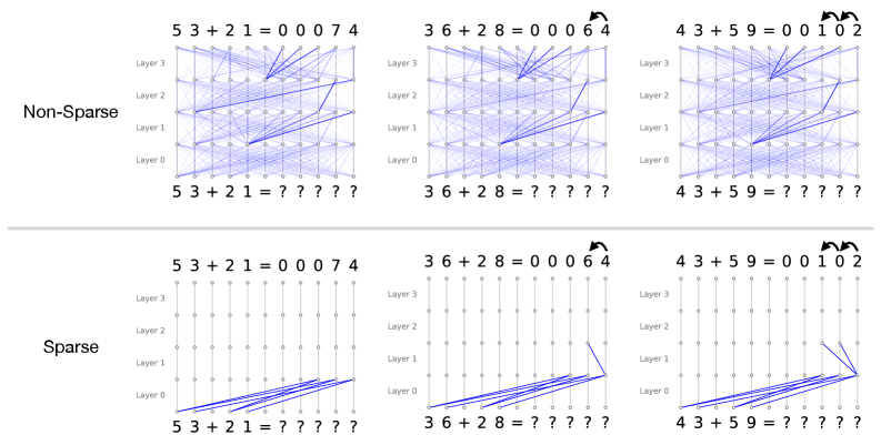
### Visual Description
## Diagram: Neural Network Attention Patterns: Non-Sparse vs. Sparse in Addition Tasks
### Overview
This image presents a comparative visualization of internal information flow (likely attention weights or activation pathways) within a multi-layer neural network performing multi-digit addition. It contrasts two architectural or regularization approaches: "Non-Sparse" (top row) and "Sparse" (bottom row). The comparison is demonstrated across three distinct addition problems of increasing algorithmic complexity: no carry-over, a single carry-over, and a double carry-over.
The primary language present in the image is English (labels such as "Non-Sparse", "Sparse", "Layer"). The rest of the text consists of mathematical equations and symbols.
### Components/Axes
**Global Layout:**
* **Rows:** Two main horizontal sections separated by a light gray line.
* Top Row: Labeled **"Non-Sparse"** on the far left.
* Bottom Row: Labeled **"Sparse"** on the far left.
* **Columns:** Three vertical columns representing different addition problems.
* Left Column: $53 + 21$ (No carry)
* Middle Column: $36 + 28$ (Single carry)
* Right Column: $43 + 59$ (Double carry)
**Individual Diagram Structure (Applies to all 6 sub-diagrams):**
* **Y-Axis (Vertical):** Represents the depth of the neural network, labeled on the left side of each diagram from bottom to top:
* `Layer 0`
* `Layer 1`
* `Layer 2`
* `Layer 3`
* **X-Axis Bottom (Input Sequence):** The sequence of tokens fed into the model.
* Format: `[Digit] [Digit] + [Digit] [Digit] = ? ? ? ? ?`
* **X-Axis Top (Output Sequence):** The sequence of tokens produced by the model.
* Format: `[Digit] [Digit] + [Digit] [Digit] = [Pad] [Pad] [Pad] [Digit] [Digit]` (Note: leading zeros are used as padding).
* **Nodes:** Small circles arranged in a grid (11 columns wide by 4 layers high). Each node represents a token's representation at a specific layer.
* **Edges (Lines):** Blue lines connecting nodes between adjacent layers. These represent the flow of information or attention weights. Thicker/darker lines indicate stronger connections.
* **Annotations:** Curved black arrows above the output sequences in the middle and right columns, indicating mathematical "carry" operations.
---
### Detailed Analysis & Content Details
#### Section 1: Non-Sparse Model (Top Row)
*Visual Trend:* Across all three problems, the Non-Sparse model exhibits a highly entangled, dense web of connections. Information from almost every node in a lower layer is broadcast to multiple nodes in the subsequent layer.
* **Left Diagram (No Carry):**
* **Input:** `5 3 + 2 1 = ? ? ? ? ?`
* **Output:** `5 3 + 2 1 = 0 0 0 7 4`
* **Flow:** A dense mesh of blue lines connects Layer 0 through Layer 3. While dense, thicker blue lines can be seen routing information from the input digits (`5, 3, 2, 1`) diagonally towards the right side of the network, specifically targeting the nodes that will output `7` and `4`.
* **Middle Diagram (Single Carry):**
* **Input:** `3 6 + 2 8 = ? ? ? ? ?`
* **Output:** `3 6 + 2 8 = 0 0 0 6 4`
* **Annotation:** A curved black arrow points from the `4` to the `6` in the output, denoting the carry from $6+8=14$.
* **Flow:** Similar dense mesh. Stronger attention pathways are visible converging on the nodes responsible for outputting `6` and `4`. The network is solving the carry, but the mechanism is distributed across many nodes and layers.
* **Right Diagram (Double Carry):**
* **Input:** `4 3 + 5 9 = ? ? ? ? ?`
* **Output:** `4 3 + 5 9 = 0 0 1 0 2`
* **Annotation:** Two curved black arrows. One from `2` to `0`, and another from `0` to `1`, denoting the cascading carries ($3+9=12$; $4+5+1=10$).
* **Flow:** The densest web of the three. The model successfully calculates the output, but the internal routing is highly complex and visually uninterpretable regarding *how* the double carry is executed.
#### Section 2: Sparse Model (Bottom Row)
*Visual Trend:* The Sparse model exhibits a radically simplified, highly structured flow of information. The vast majority of connections are strictly vertical (identity or residual connections, where a token simply passes its state to the next layer). Diagonal connections (cross-token attention) are rare, deliberate, and highly localized.
* **Left Diagram (No Carry):**
* **Input:** `5 3 + 2 1 = ? ? ? ? ?`
* **Output:** `5 3 + 2 1 = 0 0 0 7 4`
* **Flow:**
* **Layer 0 to Layer 1:** Diagonal blue lines route information from the input digits (`5, 3, 2, 1`) directly to the specific token positions that will become the output digits (`7` and `4`).
* **Layer 1 to Layer 3:** Strictly vertical lines. No further cross-token communication is needed because no carry operation is required. The calculation is completed in the first layer transition.
* **Middle Diagram (Single Carry):**
* **Input:** `3 6 + 2 8 = ? ? ? ? ?`
* **Output:** `3 6 + 2 8 = 0 0 0 6 4`
* **Annotation:** Curved arrow from `4` to `6`.
* **Flow:**
* **Layer 0 to Layer 1:** Similar to the left diagram, inputs are routed to the output positions.
* **Layer 1 to Layer 2:** A single, distinct diagonal blue line appears. It connects the node at the ones-place output position (under the `4`) to the node at the tens-place output position (under the `6`). This line perfectly mirrors the carry annotation above it.
* **Layer 2 to Layer 3:** Strictly vertical lines.
* **Right Diagram (Double Carry):**
* **Input:** `4 3 + 5 9 = ? ? ? ? ?`
* **Output:** `4 3 + 5 9 = 0 0 1 0 2`
* **Annotation:** Two curved arrows (from `2` to `0`, and `0` to `1`).
* **Flow:**
* **Layer 0 to Layer 1:** Inputs are routed to the output positions.
* **Layer 1 to Layer 2:** Two distinct diagonal blue lines appear.
1. One line connects the ones-place position (under `2`) to the tens-place position (under `0`).
2. A second line connects the tens-place position (under `0`) to the hundreds-place position (under `1`).
* These two lines perfectly mirror the double-carry annotations at the top of the diagram.
* **Layer 2 to Layer 3:** Strictly vertical lines.
---
### Key Observations
1. **Entanglement vs. Isolation:** The Non-Sparse model uses a "black box" distributed representation where every layer mixes information from all tokens. The Sparse model isolates specific algorithmic steps to specific layers.
2. **Algorithmic Layering in Sparse Model:** The Sparse model demonstrates a clear, human-readable algorithm:
* *Step 1 (Layer 0 $\rightarrow$ 1):* Gather operands (route inputs to output positions).
* *Step 2 (Layer 1 $\rightarrow$ 2):* Execute carry operations (route information from right to left).
* *Step 3 (Layer 2 $\rightarrow$ 3):* Finalize output (pass information vertically).
3. **Visualizing the "Carry":** The most striking observation is how the Sparse model physically manifests the mathematical "carry" operation as a literal diagonal connection between adjacent token positions in Layer 1 $\rightarrow$ Layer 2.
### Interpretation
This diagram serves as a powerful piece of evidence in the field of Mechanistic Interpretability within machine learning.
It demonstrates that standard, dense neural networks (Non-Sparse) tend to learn tasks in a highly distributed, polysemantic way that is incredibly difficult for humans to reverse-engineer. While the dense model gets the math right, it does so using a messy web of heuristics.
Conversely, by applying sparsity (likely through sparse attention mechanisms or specific regularization techniques during training), the network is forced to drop unnecessary connections. This constraint forces the model to learn a clean, discrete, and highly interpretable algorithm. The Sparse model has essentially re-invented the human method of column addition: it aligns the numbers, adds the columns, and then explicitly passes the "carry" to the next column to the left in a subsequent processing step.
The image proves that under the right constraints, neural networks do not have to be black boxes; they can learn human-readable, step-by-step logical circuits.
</details>
Figure 9: Simple example showing the attention patterns (shown in blue) of sparse and non-sparse transformers trained on a two digit addition task. Both models are able to correctly predict the sum, but the attention patterns are very different: the non-sparse model solves the task with highly dispersed information flow, while the sparse model uses a highly interpretable attention pattern: in Layer 0, the model first attends to the corresponding digits to be added, then in Layer 1, it attends to the carry bit only if it is needed (see middle and right columns, where the model has to carry once and twice respectively).
In the introduction, we used a two-digit addition task to demonstrate how sparse attention patterns can lead to intrinsically interpretable circuits. The result presented is gathered in a small scale toy experiment described below. We train 4-layer single-head Transformer models on a two-digit addition task, where the input is a sequence of digits and the model is trained to predict the sum. In this task, there are 13 total tokens: ten digits and three symbols ”+”, ”=” and ”?”.
Within this setting, we train two models: a standard transformer model and a sparse transformer with a fixed sparsity regularisation strength. Figure 9 shows several examples of the learned attention patterns. In these examples, we can clearly see that the pressure of sparsity leads to the emergence of human-recognisable algorithmic patterns: in the first layer, each digit in the answer attends to the corresponding digits in the input, while the second layer computes the carry bit when necessary. By enforcing selective information flow through sparse message-passing, the sparse model is able to learn crisp and localised mechanisms that are immediately amenable to interpretation.
Appendix B Sparse Attention Implementation
For the experiments, we implemented efficient GPU kernels for the sparse attention layers using the helion domain-specific language https://helionlang.com/. We refer to this implementation as Splash Attention (Sp arse f lash Attention). Our implementation follows the same core algorithmic structure as FlashAttention-2 (Dao, 2023), including the use of online softmax computation and tiling. Note that the sparse attention variant (Eq. 2) only differs from the standard attention by a pointwise multiplication of the adjacency matrix, which can be easily integrated into FlashAttention by computing $A_{ij}$ on-the-fly. We additionally fuse the Gumbel-softmax computation, the straight-through gradient, and the computation of the expected number of edges (required for the penalty) into a single optimized kernel, the implementation of which will be released together with the experiment code. Figure 10 compares our Splash Attention implementation against a naive baseline based on PyTorch-native operations.
<details>
<summary>figures/splash_attention.png Details</summary>
### Visual Description
## Line Charts: Splash Attention vs. Naive Attention Performance
### Overview
The image consists of two side-by-side line charts comparing the performance of two computational methods: "Splash Attention" and "Naive Attention." The left chart compares Execution Time, while the right chart compares Peak Memory usage. Both charts measure these metrics against an increasing "Sequence Length." The language used in the image is entirely English.
### Component Isolation & Spatial Grounding
The image is divided into two distinct halves:
1. **Left Chart:** Focuses on Execution Time.
2. **Right Chart:** Focuses on Peak Memory.
**Shared Elements:**
* **X-Axis (Both Charts):** Labeled "Sequence Length" at the bottom center of each chart. The scale is logarithmic (base 10), with major gridline markers explicitly labeled at $10^2$ (100) and $10^3$ (1000). Based on the spacing and standard machine learning practices, the data points are plotted at powers of 2 (approximately 32, 64, 128, 256, 512, 1024, 2048).
* **Legend (Both Charts):** Positioned in the top-left corner of the plotting area, enclosed in a white box with a light gray border.
* Blue line with solid circular markers: "Splash Attention"
* Orange line with solid square markers: "Naive Attention"
* **Grid:** Both charts feature a light gray, semi-transparent grid. Vertical lines follow the logarithmic scale, while horizontal lines follow the linear Y-axis scale.
---
### Detailed Analysis: Left Chart (Execution Time Comparison)
* **Header:** "Execution Time Comparison" (Centered at the top of the left chart).
* **Y-Axis:** Labeled "Time (ms)" vertically on the left side. The scale is linear, with major markers at 0, 10, 20, 30, and 40.
**Trend Verification & Data Extraction:**
* **Splash Attention (Blue Line / Circular Markers):**
* *Trend:* The line remains nearly flat and close to zero for the majority of the sequence lengths. It only begins a very slight upward slope at the final two data points.
* *Approximate Data Points:*
* Seq Len ~32: ~0.2 ms
* Seq Len ~64: ~0.2 ms
* Seq Len ~128: ~0.2 ms
* Seq Len ~256: ~0.3 ms
* Seq Len ~512: ~0.5 ms
* Seq Len ~1024 ($10^3$): ~1.5 ms
* Seq Len ~2048: ~6.0 ms
* **Naive Attention (Orange Line / Square Markers):**
* *Trend:* The line starts flat, identical to Splash Attention. However, after a sequence length of ~256, it begins to curve upward. After ~512, it exhibits a steep, exponential/quadratic upward trajectory.
* *Approximate Data Points:*
* Seq Len ~32: ~0.2 ms
* Seq Len ~64: ~0.2 ms
* Seq Len ~128: ~0.3 ms
* Seq Len ~256: ~0.8 ms
* Seq Len ~512: ~3.0 ms
* Seq Len ~1024 ($10^3$): ~11.8 ms
* Seq Len ~2048: ~46.0 ms
---
### Detailed Analysis: Right Chart (Memory Peak Comparison)
* **Header:** "Memory Peak Comparison" (Centered at the top of the right chart).
* **Y-Axis:** Labeled "Peak Memory (GB)" vertically on the left side. The scale is linear, with major markers at 0, 2, 4, 6, 8, and 10.
**Trend Verification & Data Extraction:**
* **Splash Attention (Blue Line / Circular Markers):**
* *Trend:* There is a slight anomaly at the very first data point where memory is slightly elevated. Immediately after, the line drops to near-zero and remains perfectly flat horizontally across all subsequent sequence lengths.
* *Approximate Data Points:*
* Seq Len ~32: ~0.25 GB
* Seq Len ~64: ~0.01 GB
* Seq Len ~128: ~0.01 GB
* Seq Len ~256: ~0.01 GB
* Seq Len ~512: ~0.01 GB
* Seq Len ~1024 ($10^3$): ~0.01 GB
* Seq Len ~2048: ~0.01 GB
* **Naive Attention (Orange Line / Square Markers):**
* *Trend:* The line starts near zero. Similar to the execution time chart, it begins a noticeable upward curve around a sequence length of ~256 and scales up dramatically (quadratically) as sequence length increases.
* *Approximate Data Points:*
* Seq Len ~32: ~0.01 GB
* Seq Len ~64: ~0.01 GB
* Seq Len ~128: ~0.05 GB
* Seq Len ~256: ~0.15 GB
* Seq Len ~512: ~0.6 GB
* Seq Len ~1024 ($10^3$): ~2.5 GB
* Seq Len ~2048: ~9.8 GB
---
### Key Observations
1. **Divergence Point:** In both execution time and memory, the performance of the two methods is nearly indistinguishable at shorter sequence lengths (under 256). The critical divergence point occurs between sequence lengths of 256 and 512.
2. **Memory Flatline:** The most striking visual feature is the Splash Attention memory curve (Right Chart, Blue Line). After the initial point, it demonstrates constant $O(1)$ memory usage relative to sequence length, whereas Naive Attention consumes nearly 10 GB at the maximum plotted length.
3. **Time Scaling:** While Splash Attention's execution time does increase at the highest sequence length (reaching ~6ms), it is roughly 7.5 times faster than Naive Attention (~46ms) at a sequence length of ~2048.
4. **Initial Memory Anomaly:** Splash Attention shows a slightly higher peak memory at the lowest sequence length (~32) compared to Naive Attention, before dropping to near zero.
### Interpretation
These charts demonstrate a classic problem in machine learning, specifically regarding Transformer architectures. "Naive Attention" represents the standard self-attention mechanism, which is mathematically known to have $O(N^2)$ (quadratic) complexity for both time and memory with respect to sequence length ($N$). The orange lines perfectly illustrate this quadratic explosion; as the sequence length doubles from 1024 to 2048, the time and memory roughly quadruple.
"Splash Attention" represents an optimized, likely sparse or linear, attention mechanism designed to solve this bottleneck.
* **Reading between the lines:** The data suggests Splash Attention achieves linear $O(N)$ time complexity (the blue line on the left grows much slower than the quadratic orange line) and potentially constant $O(1)$ or highly optimized memory complexity for the attention calculation itself (the flat blue line on the right).
* **Practical Application:** This data proves that Splash Attention is highly scalable. While Naive Attention would quickly run out of VRAM (GPU memory) on longer documents, Splash Attention could theoretically handle vastly longer contexts (e.g., entire books or long codebases) without crashing due to memory limits, while also computing the results significantly faster. The slight memory overhead at the very beginning for Splash Attention likely indicates a fixed initialization cost or buffer allocation that becomes negligible as the sequence grows.
</details>
Figure 10: Performance comparison between our implementation (Splash) and a naive PyTorch baseline.
Appendix C Training Details
C.1 Hyperparameters and Compute Resources
| Hyperparameter | OLMo | GPT-2 |
| --- | --- | --- |
| Base Model | allenai/OLMo-7B-hf | gpt2 |
| Context window | 512 | 64 |
| Dataset | dolma-v1 | OpenWebText |
| Batch size | 16 | 256 |
| Gradient accumulation steps | 4 | 4 |
| Total steps | 400,000 | 1,200,000 |
| Learning rate | $1× 10^{-5}$ | $1× 10^{-5}$ |
| Minimum learning rate | $1× 10^{-6}$ | $1× 10^{-6}$ |
| Optimizer | Adam | Adam |
| Weight decay | 0.1 | 0.1 |
| Scheduler | Cosine (1 cycle) | Cosine (1 cycle) |
| Warmup steps | 1,000 | 1,000 |
| Finetuning strategy | LoRA | Full |
| LoRA rank ( $r$ ) | 400 | - |
| LoRA scaling ( $\alpha$ ) | 800 | - |
| LoRA dropout | 0 | - |
| LoRA target modules | q,k,v,o,fc_in,fc_out | - |
| Dual Optimisation LR | 0.01 | 0.1 |
| Target cross-entropy | 2.29 | 3.5 |
Table 2: Key hyperparameters used for sparse post-training experiments on OLMo-7B.
We provide the key hyperparameters for our experiments in table 2. All training are performed on NVIDIA H100 GPUs. The GPT-2 model is trained on a single GPU while the OLMo model is trained on a node of 8 GPUs. The total training time for both models is roughly 14 days. The main sparse attention code will be made available as a Transformer library wrapper. The implementation code as well as model weights will also be released.
C.2 Training Dynamics
<details>
<summary>x9.png Details</summary>
### Visual Description
## Line Charts: Training Metrics over Time (Sparsity, Regularisation Strength, Validation Cross Entropy)
### Overview
The image consists of three line charts arranged horizontally side-by-side. All three charts share an identical X-axis representing "Training Steps" from 0 to 400,000. The charts display the evolution of three distinct machine learning metrics during a training run. A highly notable, synchronized anomaly or intervention occurs across all three charts at exactly 100,000 training steps.
### Components/Axes
**Global X-Axis (Applies to all three charts):**
* **Label:** `Training Steps`
* **Scale:** Linear
* **Range:** 0 to 400,000
* **Major Markers:** 0, 100000, 200000, 300000, 400000
**Left Chart Y-Axis:**
* **Label:** `Sparsity`
* **Scale:** Logarithmic
* **Major Markers:** $10^{-2}$, $10^{-1}$ (Gridlines suggest minor ticks between these powers of 10)
**Middle Chart Y-Axis:**
* **Label:** `Regularisation Strength`
* **Scale:** Linear
* **Range:** 0 to slightly above 3000
* **Major Markers:** 0, 500, 1000, 1500, 2000, 2500, 3000
**Right Chart Y-Axis:**
* **Label:** `Validation Cross Entropy`
* **Scale:** Linear
* **Range:** 2.0 to 3.0
* **Major Markers:** 2.0, 2.2, 2.4, 2.6, 2.8, 3.0
* **Additional Element:** A horizontal dashed black line is present at exactly the 2.3 mark.
---
### Detailed Analysis
#### 1. Left Chart: Sparsity vs. Training Steps
* **Visual Trend:** The line begins at a high value, remains relatively flat, and then experiences a steep drop. It bottoms out just before the 100k mark. At exactly 100,000 steps, there is a sharp, instantaneous upward spike. Following the spike, the line forms a rounded local peak before gradually decaying with high-frequency noise (jitter) for the remainder of the training, ending at its lowest point.
* **Data Points (Approximate):**
* **Step 0 to ~30,000:** Starts flat at approximately $2 \times 10^{-1}$ (0.2).
* **Step ~30,000 to 99,999:** Drops sharply, reaching a local minimum of approximately $6 \times 10^{-3}$ (0.006).
* **Step 100,000:** Instantaneous spike up to approximately $3 \times 10^{-2}$ (0.03).
* **Step ~110,000:** Forms a local peak at approximately $2 \times 10^{-2}$ (0.02).
* **Step 150,000 to 400,000:** Gradual, noisy decay, ending at approximately $4 \times 10^{-3}$ (0.004) at step 400,000.
#### 2. Middle Chart: Regularisation Strength vs. Training Steps
* **Visual Trend:** The line starts at zero and remains flat. It then rises in a smooth S-curve (sigmoid-like) shape. At exactly 100,000 steps, it plummets instantaneously back to zero. It remains at zero briefly before initiating a second, much larger S-curve rise. This second rise becomes increasingly noisy and continues to trend upward until the end of the chart.
* **Data Points (Approximate):**
* **Step 0 to ~40,000:** Flat at 0.
* **Step ~40,000 to 99,999:** Rises steeply, peaking at approximately 2050.
* **Step 100,000:** Instantaneous drop to 0.
* **Step 100,000 to ~120,000:** Remains near 0.
* **Step ~120,000 to 400,000:** Rises steeply again, crossing the previous peak of 2000 around step 175,000. The line becomes noisy, reaching a maximum of approximately 3150 near step 380,000, and ends slightly lower at ~3000 at step 400,000.
#### 3. Right Chart: Validation Cross Entropy vs. Training Steps
* **Visual Trend:** The line starts near the dashed reference line, dips down to a minimum, and then slowly curves back up to meet the dashed line. At exactly 100,000 steps, there is a massive, instantaneous vertical spike that exceeds the upper bounds of the chart. Immediately after, it drops back down to a low value, and slowly curves back up, eventually asymptoting perfectly onto the horizontal dashed line for the entire second half of the training run.
* **Data Points (Approximate):**
* **Step 0:** Starts at approximately 2.3.
* **Step ~20,000 to 40,000:** Dips to a minimum of approximately 2.21.
* **Step ~40,000 to 99,999:** Rises smoothly, reaching exactly 2.3 (the dashed line) just before the 100k mark.
* **Step 100,000:** A massive spike that shoots vertically past the maximum Y-axis value of 3.0.
* **Step ~105,000:** Drops rapidly back down to approximately 2.22.
* **Step ~105,000 to 200,000:** Rises smoothly back toward the dashed line.
* **Step 200,000 to 400,000:** The line flattens out and tracks exactly on the dashed reference line at 2.3, with very minor noise.
---
### Key Observations
1. **The 100k Step Anomaly:** There is a highly coordinated event at exactly 100,000 training steps. Regularisation is turned off (drops to 0), Sparsity spikes upward, and Validation Cross Entropy experiences a massive, out-of-bounds spike.
2. **Correlated Curves:** The shape of the "Regularisation Strength" curve (Middle) is inversely correlated with the initial drop in "Sparsity" (Left) and directly correlated with the rise in "Validation Cross Entropy" (Right). When regularisation is 0, cross-entropy is at its lowest (~2.21). As regularisation increases, cross-entropy increases.
3. **The Dashed Target Line:** The dashed line at 2.3 on the rightmost chart acts as a hard ceiling or target. The system appears to increase regularisation *until* the validation cross-entropy hits 2.3, at which point it stops increasing the loss further.
### Interpretation
These charts depict a sophisticated, dynamic training curriculum for a machine learning model, likely involving automated network pruning or a sparsity-inducing penalty (such as L1 regularization).
* **Phase 1 (0 - 100k steps):** The model begins training normally. Around 40k steps, an automated controller begins applying a "Regularisation Strength" penalty. As this penalty increases, the model becomes less sparse (Sparsity drops from $10^{-1}$ to $10^{-2}$). However, this regularisation harms the model's performance, causing the Validation Cross Entropy (loss) to rise from its natural minimum of 2.21 up to a predefined tolerance threshold of 2.3.
* **The Intervention (100k steps):** At 100,000 steps, a hard reset or phase shift occurs. The regularisation penalty is instantly removed (drops to 0). This sudden change in the loss landscape causes a massive, temporary shock to the model's validation loss (the spike > 3.0). Simultaneously, the sparsity spikes, indicating a sudden change in the network's weights (perhaps a pruning mask was updated or weights were re-initialized).
* **Phase 2 (100k - 400k steps):** The model recovers quickly from the shock, and loss drops back down. The automated controller once again begins ramping up the Regularisation Strength. This time, it pushes the regularisation much higher (up to 3000 compared to the previous 2000). It continues to push this penalty higher and higher, driving Sparsity down to its absolute minimum ($~4 \times 10^{-3}$), while perfectly balancing the Validation Cross Entropy exactly on the maximum allowed threshold of 2.3.
**Conclusion:** The data demonstrates an algorithm designed to maximize regularisation (and thereby minimize sparsity) *subject to the constraint* that validation loss must not exceed 2.3. The event at 100k steps was likely a programmed curriculum shift to allow the model to escape a local minimum and find a state where it could accept even higher regularisation while maintaining the target loss.
</details>
Figure 11: The training curves for post-training OLMo-7B tacking the model sparsity (left), regularisation strength (middle), and the cross-entropy loss (right). The black dotted line on the cross-entropy plot indicates the pre-defined threshold, $\tau$ .
A key feature of our post-training framework is that the strength of the sparsity regularisation is automatically controlled via a constrained optimisation scheme. By pre-specifying an accepted level for the cross-entropy target, $\tau$ , the training procedure can be written as the max-min objective:
$$
\max_{\lambda>0}\min_{\theta}\bigg[\sum_{l}\mathbb{E}\big[|A_{l}|\big]+\lambda(CE-\tau)\bigg], \tag{7}
$$
which can be optimised by taking alternating gradient steps in the model weight space and in the $\lambda$ space. The resulting training dynamics means that the sparsity regularisation strength increases when the model cross-entropy is lower than the target, and decreases when the model is above the threshold. Figure 11 shows the training curves for the OLMo-7B model. Here, we observe that the strength of sparsity regularisation keeps increasing slowly while the model cross-entropy is clipped at the desired level. Note that during a model spike (at around 100K steps), the sparsity regularisation automatically decreases to let the model recover.
Appendix D Extra Experiments for Circuit Discovery
In this section, we provide additional results for the activation patching circuit discovery experiment presented in the main text.
Figure 12 shows the attention patterns of the heads required to explain 90% of model behaviour on a copy task. To fully test the longer context window afforded by OLMo, we use a longer prompt than the one used for GPT2 in the main text. The result is consistent with the GPT-2 experiment: sparsified model facilitates the discovery of smaller circuits of induction heads that implement the copy task.
<details>
<summary>x10.png Details</summary>
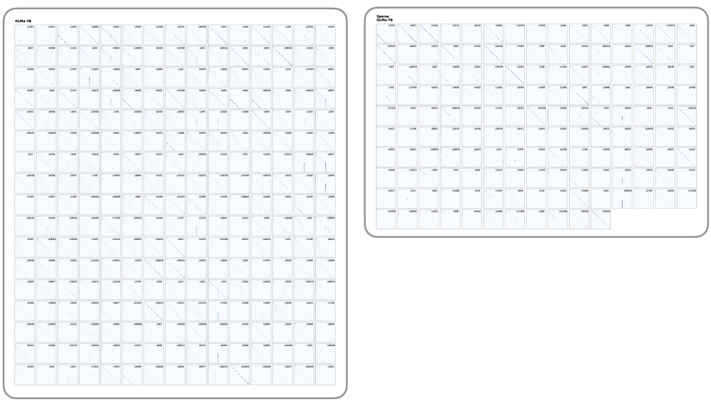
### Visual Description
## Diagram: Attention Head Visualizations - OLMo-7B vs. Sparse OLMo-7B
### Overview
This image presents a side-by-side technical visualization of attention matrices (or weight patterns) for two variations of a Large Language Model: a standard "OLMo-7B" and a "Sparse OLMo-7B". The image is divided into two distinct panels, each containing a grid of smaller square plots. Each small plot represents the attention pattern of a specific "Head" within a specific "Layer" of the transformer architecture. The visualizations demonstrate the effect of sparsification (pruning) on the model's attention mechanisms.
### Components/Axes
* **Left Panel (Dense Model):**
* **Title:** "OLMo-7B" (located top-left of the panel).
* **Structure:** A perfect 16 $\times$ 16 grid of square plots. Totaling 256 plots.
* **Right Panel (Sparse Model):**
* **Title:** "Sparse OLMo-7B" (located top-left of the panel).
* **Structure:** An incomplete grid consisting of 10 rows and 16 columns. The first 9 rows are full (16 plots each), and the 10th row contains 11 plots. Totaling 155 plots.
* **Individual Plots (Sub-components):**
* **Axes (Implicit):** In standard attention maps, the X-axis represents the "Key" token sequence position, and the Y-axis represents the "Query" token sequence position. The origin (0,0) is at the top-left of each square.
* **Data Points:** Dark blue/black pixels against a white/light-blue background indicate high attention weights or activation values between specific token positions.
* **Labels:** Every single plot has a microscopic alphanumeric label in its top-right corner following the format `L[#]H[#]`, where `L` stands for Layer and `H` stands for Head.
### Content Details & Trend Verification
#### 1. Left Panel: OLMo-7B (Systematic Sample)
* **Labeling Pattern:** Due to image resolution, not every label is perfectly legible, but a clear structural pattern emerges upon close inspection of the grid edges:
* **Columns (Left to Right):** Represent Heads 0 through 15 (`H0` to `H15`).
* **Rows (Top to Bottom):** Represent *even-numbered* Layers. Row 1 is `L0`, Row 2 is `L2`, Row 3 is `L4`, down to Row 16 which is `L30`.
* *Transcription Example (Top Row):* `L0H0`, `L0H1`, `L0H2` ... `L0H15`.
* *Transcription Example (First Column):* `L0H0`, `L2H0`, `L4H0` ... `L30H0`.
* **Visual Trends:**
* **Diagonal Lines:** The vast majority of the plots feature a distinct, sharp line running diagonally from the top-left to the bottom-right. This indicates causal or local attention, where a token primarily attends to itself or immediately preceding tokens.
* **Vertical Lines:** Several plots (e.g., in the 4th, 8th, and 14th columns across various layers) show distinct vertical lines, usually on the far left side of the plot. This indicates "sink" attention, where all tokens in the sequence attend heavily to the first few tokens (often a Beginning-of-Sequence token).
* **Sparsity within Dense:** Even in this standard model, some heads (e.g., `L10H3`, `L20H12`) appear mostly blank, indicating they contribute very little distinct routing information.
#### 2. Right Panel: Sparse OLMo-7B (Retained Subset)
* **Labeling Pattern:** Unlike the left panel, the right panel does *not* follow a uniform grid of sequential layers and heads. The labels represent the specific subset of heads that survived the sparsification process.
* The total number of plots is exactly 155.
* The labels appear to be sorted sequentially by Layer and then Head, but with massive gaps.
* *Transcription Example (Row 1):* The first row appears to retain many of the early layer heads, starting with `L0H0`, `L0H1`, etc.
* *Transcription Example (Scattered):* Moving down the rows, the layer numbers jump irregularly, indicating that the pruning algorithm selectively dropped specific heads across the entire network based on a specific criteria (likely importance or magnitude), rather than dropping entire layers uniformly.
* **Visual Trends:**
* The fundamental visual patterns (diagonals and verticals) remain identical to the left panel.
* The heads retained in this sparse model predominantly feature very sharp, highly defined diagonal lines. Heads that were "blank" or diffuse in the standard model appear to have been purged.
### Key Observations
1. **Volume Reduction:** The most striking observation is the difference in volume. The left panel shows a 256-head sample of the dense model (which likely has 1024 total heads if it's a 32-layer, 32-head architecture). The right panel shows only 155 heads *in total* for the sparse model. This implies a massive pruning ratio (potentially removing over 80% of the attention heads).
2. **Pattern Preservation:** Despite the massive reduction in the number of heads, the fundamental geometric patterns of attention (causal diagonals and BOS-token verticals) are strictly preserved in the remaining heads.
### Interpretation
This image serves as visual proof of a model pruning or sparsification experiment.
In Large Language Models, it is a known phenomenon that many attention heads learn redundant features or contribute very little to the final output (often referred to as the "lottery ticket hypothesis" or head redundancy). The left panel shows the baseline state: a vast array of heads, some with strong patterns, some weak.
The right panel ("Sparse OLMo-7B") demonstrates the result of an algorithm designed to identify and remove the "useless" heads to save compute and memory. By looking at the irregular labels and the total count (155), we can deduce that this was an *unstructured* or *semi-structured* head pruning approach. The algorithm evaluated every head individually and kept only the most critical ones.
The fact that the surviving heads in the Sparse model almost universally display strong, crisp diagonal or vertical patterns suggests that the pruning algorithm successfully identified heads with high-confidence, structured routing behaviors as the most "important" to retain, discarding heads with diffuse or noisy attention matrices.
</details>
Figure 12: Attention patterns of the heads required to explain 90% of model behaviour on a longer copy task. Similar to the GPT-2 results in Figure 3, the sparse model requires substantially fewer attention heads.
Figure 13 and 14 show the fraction of explained model preference as a function of the number of model components kept un-ablated. The difference between these plots and Figure 4 and 5 lies in the way individual model components are ranked. Here, the ranking is performed on a task level, meaning that the importance score for each component is pooled across different instances of the same task. Overall, the results are commensurate with results presented in the main paper, where the ranking strategy consistently discover smaller circuits in sparse models. The only exception is the Greater Than task for GPT-2 where the number of attention heads required for the sparse model is larger than that of the base model. We hypothesise that this is due to the sparse model choosing different circuits to implement different instances of the same task, rendering the task-level importance score less suitable for circuit discovery in this case. Finally, in Figure 15, we provide a qualitative visualisation of the edges required to completed the IOI task.
<details>
<summary>x11.png Details</summary>
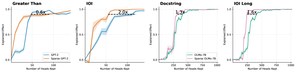
### Visual Description
## Line Charts: Explained Effect vs. Number of Heads Kept for Dense and Sparse Models
### Overview
This image consists of four side-by-side line charts comparing the "Explained Effect" against the "Number of Heads Kept" for standard (dense) language models versus their sparse counterparts across four different tasks. The image is divided into four distinct panels from left to right. The first two panels compare GPT-2 models, while the last two compare OLMo-7B models. All text in the image is in English.
### Components/Axes
**Global Elements (Consistent across all panels):**
* **Y-axis Label:** "Explained Effect" (positioned vertically on the left of each panel).
* **Y-axis Scale:** Marked at 0.0, 0.5, and 1.0. Faint horizontal grid lines correspond to these values.
* **X-axis Label:** "Number of Heads Kept" (positioned horizontally at the bottom of each panel).
* **Data Representation:** Solid lines represent the mean value, surrounded by lighter shaded regions representing variance or confidence intervals.
* **Annotations:** Each panel features a horizontal dashed black line connecting the two model curves at a high Y-value (typically between 0.85 and 0.95), accompanied by a text label indicating a multiplier (e.g., "0.6x").
**Panel-Specific Elements:**
* **Panel 1 (Far Left):**
* **Title:** "Greater Than" (Top left).
* **X-axis Markers:** 50, 100.
* **Legend:** Located in the bottom right.
* Blue line = "GPT-2"
* Orange line = "Sparse GPT-2"
* **Panel 2 (Center Left):**
* **Title:** "IOI" (Top left).
* **X-axis Markers:** 50, 100.
* **Legend:** None explicitly present. Colors visually inherit from Panel 1 (Blue = GPT-2, Orange = Sparse GPT-2).
* **Panel 3 (Center Right):**
* **Title:** "Docstring" (Top left).
* **X-axis Markers:** 250, 500, 750, 1000.
* **Legend:** Located in the bottom right.
* Teal/Green line = "OLMo-7B"
* Purple/Pink line = "Sparse OLMo-7B"
* **Panel 4 (Far Right):**
* **Title:** "IOI Long" (Top left).
* **X-axis Markers:** 250, 500, 750, 1000.
* **Legend:** None explicitly present. Colors visually inherit from Panel 3 (Teal = OLMo-7B, Purple = Sparse OLMo-7B).
---
### Detailed Analysis
#### Panel 1: Greater Than
* **Visual Trend:** The Sparse GPT-2 (orange) curve rises much earlier and steeper than the standard GPT-2 (blue) curve. The blue curve remains low until a sudden spike.
* **Data Points (Approximate):**
* *Sparse GPT-2 (Orange):* Starts at (0, 0). Rises sharply to y≈0.5 at x≈10. Reaches y≈0.8 at x≈25. Plateaus around y≈0.9 from x≈40 onward.
* *GPT-2 (Blue):* Starts at (0, 0). Rises slowly to y≈0.2 at x≈40. Spikes sharply to y≈0.9 at x≈50. Fluctuates slightly between 0.85 and 0.95 thereafter.
* **Annotation:** A dashed line at y≈0.85 spans from the orange curve (x≈25) to the blue curve (x≈45). The text above it reads **"0.6x"**.
#### Panel 2: IOI
* **Visual Trend:** The Sparse GPT-2 (orange) curve again rises earlier and steeper than the standard GPT-2 (blue) curve, which exhibits a more gradual, steady climb.
* **Data Points (Approximate):**
* *Sparse GPT-2 (Orange):* Starts at (0, 0), dips slightly below 0, then shoots up at x≈20 to y≈0.6. Reaches y≈0.95 at x≈60 and plateaus near 1.0.
* *GPT-2 (Blue):* Starts at (0, 0). Rises steadily, reaching y≈0.5 at x≈40, y≈0.8 at x≈70, and slowly climbs to y≈0.95 at x≈140.
* **Annotation:** A dashed line at y≈0.9 spans from the orange curve (x≈55) to the blue curve (x≈110). The text above it reads **"2.0x"**.
#### Panel 3: Docstring
* **Visual Trend:** Both models stay near zero initially. The Sparse OLMo-7B (purple) curve spikes to a high explained effect earlier than the standard OLMo-7B (teal) curve.
* **Data Points (Approximate):**
* *Sparse OLMo-7B (Purple):* Starts near 0. Small bump at x≈200 (y≈0.2). Shoots up sharply at x≈250 to y≈0.9. Plateaus near 1.0 from x≈400 onward.
* *OLMo-7B (Teal):* Starts near 0. Small bump at x≈200 (y≈0.15). Shoots up sharply at x≈300 to y≈0.8, climbing to y≈0.95 at x≈500. Plateaus near 1.0.
* **Annotation:** A dashed line at y≈0.9 spans from the purple curve (x≈300) to the teal curve (x≈400). The text above it reads **"1.3x"**.
#### Panel 4: IOI Long
* **Visual Trend:** The Sparse OLMo-7B (purple) curve rises in a single sharp spike, while the standard OLMo-7B (teal) curve rises in a more stepped, gradual manner later on the x-axis.
* **Data Points (Approximate):**
* *Sparse OLMo-7B (Purple):* Starts near 0. Shoots up sharply at x≈200 to y≈0.95. Plateaus near 1.0.
* *OLMo-7B (Teal):* Starts near 0. Rises in steps: y≈0.15 at x≈200, y≈0.5 at x≈250, y≈0.8 at x≈300, reaching y≈0.95 at x≈450. Plateaus near 1.0.
* **Annotation:** A dashed line at y≈0.9 spans from the purple curve (x≈250) to the teal curve (x≈400). The text above it reads **"1.6x"**.
---
### Key Observations
1. **Consistent Leftward Shift:** Across all four tasks and both model architectures (GPT-2 and OLMo-7B), the curve for the "Sparse" model is consistently shifted to the left compared to the standard model.
2. **Efficiency Multipliers:** The dashed lines and multipliers quantify the horizontal gap between the curves at a high performance threshold (y ≈ 0.85 to 0.95).
* In Panels 2, 3, and 4, the multipliers (2.0x, 1.3x, 1.6x) appear to represent the ratio of heads required by the Dense model compared to the Sparse model (Dense / Sparse). For example, in Panel 2, 110 / 55 = 2.0.
* In Panel 1, the multiplier "0.6x" appears to represent the inverse ratio (Sparse / Dense), as the sparse model requires roughly 25 heads to reach the threshold, while the dense requires roughly 45 (25 / 45 ≈ 0.55, rounded to 0.6x).
3. **Scale Differences:** The GPT-2 tasks (Panels 1 & 2) achieve maximum explained effect with fewer than 150 heads. The OLMo-7B tasks (Panels 3 & 4) require significantly more heads, scaling up to 1000, indicating a larger model or more distributed task representation.
### Interpretation
This data strongly demonstrates that **sparse models are significantly more efficient at concentrating task-specific mechanisms into fewer attention heads** compared to standard, dense models.
In the context of mechanistic interpretability, "Explained Effect" likely measures how well a specific subset of attention heads can account for the model's overall performance on a specific task (like "Greater Than" or "Indirect Object Identification - IOI"). Because the sparse curves reach a high Explained Effect (e.g., 0.9 or 90%) much earlier on the X-axis, it proves that pruning or sparse training forces the model to localize its reasoning circuits.
The multipliers explicitly quantify this efficiency gain. For instance, in the "IOI" task (Panel 2), standard GPT-2 requires twice as many heads (2.0x) to achieve the same explanatory power as Sparse GPT-2. This suggests that sparsity reduces the redundancy and distribution of features across heads, making the resulting models much easier to reverse-engineer and interpret, as the critical behaviors are isolated within a much smaller, more manageable subset of components.
</details>
Figure 13: Logit attribution per sentence keeping only the top-k attention heads based on a global ranking score. Dotted line annotates the number of attention heads needed to explain 90% of the logit difference. With the exception of the Greater Than task for GPT-2, the sparse models admits smaller circuits.
<details>
<summary>x12.png Details</summary>
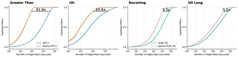
### Visual Description
## Line Charts: Explained Effect vs. Number of Edges Kept Across Models and Tasks
### Overview
The image consists of four horizontally aligned line charts comparing the performance of standard language models against their "sparse" counterparts across four different tasks: "Greater Than", "IOI", "Docstring", and "IOI Long". The charts demonstrate how many "edges" (presumably components or connections in a computational graph or neural network) must be kept to achieve a certain level of "Explained Effect" (performance or fidelity). In all four charts, the sparse models achieve high performance using significantly fewer edges than the standard models.
### Components/Axes
**Global Axes (Consistent across all four charts):**
* **Y-axis:** Labeled "Explained Effect". Linear scale with major tick marks at `0.0`, `0.5`, and `1.0`. Light gray horizontal grid lines correspond to these ticks.
* **X-axis:** Labeled "Number of Edges Kept (log scale)". Logarithmic scale.
* Charts 1 & 2 (Left): Major ticks at `10^0`, `10^1`, `10^2`, `10^3`, `10^4`.
* Charts 3 & 4 (Right): Major ticks at `10^0`, `10^1`, `10^2`, `10^3`, `10^4`, `10^5`. Light gray vertical grid lines correspond to these major ticks.
**Legends & Color Mapping:**
* **Legend 1 (Located in the bottom-right of the first chart):** Applies to the first two charts.
* Blue Line: `GPT-2`
* Orange Line: `Sparse GPT-2`
* **Legend 2 (Located in the bottom-right of the third chart):** Applies to the last two charts.
* Green Line: `OLMo-7B`
* Purple/Pink Line: `Sparse OLMo-7B`
**Annotations:**
* Each chart features a horizontal dashed black line connecting the two curves near the top of the Y-axis (approximately at Y = 0.9).
* Above each dashed line is a text label indicating a multiplier (e.g., `41.9x`), representing the ratio of edges required by the standard model versus the sparse model to achieve that specific Explained Effect.
---
### Detailed Analysis
#### Region 1: "Greater Than" Chart (Far Left)
* **Trend Verification:** Both the orange line (Sparse GPT-2) and blue line (GPT-2) follow an upward-sloping S-curve (sigmoid) trajectory. The orange line rises steeply at a much lower X-value than the blue line. Faint shaded bands (indicating variance or confidence intervals) are visible around both lines, slightly more pronounced on the orange line at the lower end.
* **Data Points (Approximate):**
* **Sparse GPT-2 (Orange):** Starts at Y ≈ 0.05 at X = $10^0$. Crosses Y = 0.5 at X ≈ $10^1$. Reaches Y = 1.0 at X ≈ $2 \times 10^2$.
* **GPT-2 (Blue):** Starts at Y ≈ 0.0 at X = $10^0$. Crosses Y = 0.5 at X ≈ $10^3$. Reaches Y = 1.0 at X ≈ $10^4$.
* **Annotation:** A dashed line at Y ≈ 0.9 connects the orange curve (at X ≈ 100) to the blue curve (at X ≈ 4000). The label reads **`41.9x`**.
#### Region 2: "IOI" Chart (Second from Left)
* **Trend Verification:** Both lines slope upward. The orange line (Sparse GPT-2) again precedes the blue line (GPT-2). The shaded variance band is notably visible on the orange line between X = $10^0$ and $10^1$.
* **Data Points (Approximate):**
* **Sparse GPT-2 (Orange):** Starts at Y ≈ 0.15 at X = $10^0$. Crosses Y = 0.5 at X ≈ $10^1$. Reaches Y = 1.0 at X ≈ $10^3$.
* **GPT-2 (Blue):** Starts at Y ≈ 0.05 at X = $10^0$. Crosses Y = 0.5 at X ≈ $10^2$. Reaches Y = 1.0 at X ≈ $5 \times 10^3$.
* **Annotation:** A dashed line at Y ≈ 0.9 connects the orange curve to the blue curve. The label reads **`14.9x`**.
#### Region 3: "Docstring" Chart (Third from Left)
* **Trend Verification:** Both the purple line (Sparse OLMo-7B) and green line (OLMo-7B) slope upward in an S-curve. The purple line rises earlier than the green line. The curves here are smoother and more gradual than in the GPT-2 charts.
* **Data Points (Approximate):**
* **Sparse OLMo-7B (Purple):** Starts at Y ≈ 0.0 at X = $10^0$. Crosses Y = 0.5 at X ≈ $2 \times 10^3$. Reaches Y = 1.0 at X ≈ $5 \times 10^4$.
* **OLMo-7B (Green):** Starts at Y ≈ 0.0 at X = $10^0$. Crosses Y = 0.5 at X ≈ $10^4$. Reaches Y = 1.0 at X ≈ $2 \times 10^5$.
* **Annotation:** A dashed line at Y ≈ 0.9 connects the purple curve to the green curve. The label reads **`5.5x`**.
#### Region 4: "IOI Long" Chart (Far Right)
* **Trend Verification:** Both lines slope upward. The purple line (Sparse OLMo-7B) rises earlier than the green line (OLMo-7B).
* **Data Points (Approximate):**
* **Sparse OLMo-7B (Purple):** Starts at Y ≈ 0.0 at X = $10^0$. Crosses Y = 0.5 at X ≈ $10^3$. Reaches Y = 1.0 at X ≈ $5 \times 10^4$.
* **OLMo-7B (Green):** Starts at Y ≈ 0.0 at X = $10^0$. Crosses Y = 0.5 at X ≈ $5 \times 10^3$. Reaches Y = 1.0 at X ≈ $10^5$.
* **Annotation:** A dashed line at Y ≈ 0.9 connects the purple curve to the green curve. The label reads **`3.1x`**.
---
### Key Observations
1. **Consistent Superiority of Sparse Models in Efficiency:** Across all four tasks and both base models (GPT-2 and OLMo-7B), the "Sparse" variant consistently achieves a high "Explained Effect" using exponentially fewer edges than the standard model. This is visually represented by the sparse curves being shifted significantly to the left.
2. **Varying Degrees of Compression:** The efficiency gain (represented by the multiplier annotations at Y ≈ 0.9) varies drastically depending on the task and model.
* The highest efficiency gain is seen in GPT-2 on the "Greater Than" task (41.9x fewer edges needed).
* The lowest efficiency gain shown is OLMo-7B on the "IOI Long" task (3.1x fewer edges needed).
3. **Scale Differences:** The OLMo-7B tasks (Docstring, IOI Long) generally require more edges overall to achieve a high explained effect compared to the GPT-2 tasks, evidenced by the X-axis extending to $10^5$ rather than $10^4$.
### Interpretation
These charts are highly likely from a research paper focused on model interpretability, circuit discovery, or network pruning.
* **"Edges Kept"** likely refers to the number of connections, attention heads, or computational sub-components retained when attempting to isolate the specific "circuit" within the neural network responsible for a specific task (like identifying "Greater Than" relationships or resolving Indirect Object Identification - "IOI").
* **"Explained Effect"** serves as a metric of fidelity—how well the pruned/isolated sub-network performs the task compared to the full, unpruned model (where 1.0 equals 100% of the original performance).
* **The Core Finding:** The data demonstrates that applying "Sparse" techniques (likely sparse autoencoders or sparse probing methods) allows researchers to isolate the functional circuits of a language model much more effectively. Because the sparse models reach 90% explained effect with 3.1x to 41.9x fewer edges, it proves that standard models have highly entangled representations, whereas sparse models disentangle these representations, allowing for much tighter, more interpretable, and highly compressed computational graphs without losing task-specific performance.
</details>
Figure 14: Logit attribution per sentence keeping only the top-k attention edges based on a global ranking score. Dotted line annotates the number of attention heads needed to explain 90% of the logit difference.
<details>
<summary>x13.png Details</summary>
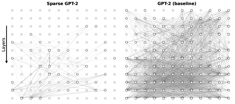
### Visual Description
## Network Diagram: Sparse GPT-2 vs. GPT-2 (baseline) Architecture Comparison
### Overview
This image presents a side-by-side visual comparison of two neural network architectures: "Sparse GPT-2" on the left and "GPT-2 (baseline)" on the right. The diagrams use a grid of nodes and connecting lines to illustrate the density of connections (likely representing attention weights or layer-to-layer information flow) within the models. The image starkly contrasts a highly pruned, sparse network with a traditional, fully connected dense network.
### Components/Axes
* **Headers (Top):**
* Left: "Sparse GPT-2"
* Right: "GPT-2 (baseline)"
* **Y-Axis Indicator (Far Left):** A solid black arrow pointing downward, accompanied by the text label "Layers". This establishes the spatial grounding that information flows from the top row (early layers) to the bottom row (late layers).
* **Nodes (Grid Points):** Both diagrams consist of an identical 12x12 grid of circular nodes (144 nodes total per diagram).
* *Light Gray Nodes (No outline):* Represent inactive, pruned, or unconnected components.
* *White Nodes (Black outline):* Represent active components participating in the network's information flow.
* **Edges (Lines):** Thin gray lines connecting the nodes. These represent active pathways, connections, or attention mechanisms between the nodes across different layers.
### Detailed Analysis
**Component Isolation 1: Left Diagram (Sparse GPT-2)**
* **Node Activation:** The vast majority of nodes in this grid are light gray (inactive).
* **Spatial Distribution:**
* *Top Region (Rows 1-3):* Completely devoid of active nodes and connections. All 36 nodes are light gray.
* *Middle Region (Rows 4-7):* Very sparse activation. Row 4 contains only two active nodes (approximate positions: column 8 and 10). A few scattered active nodes appear in rows 5, 6, and 7, with minimal, thin connecting lines.
* *Bottom Region (Rows 8-12):* This is where the majority of the network's activity is concentrated. There is a cluster of active nodes and intersecting lines, particularly weighted toward the bottom-left and bottom-center of the grid.
* **Connection Trend:** The lines form a highly selective, asymmetrical web. Connections frequently skip layers and are heavily localized rather than distributed evenly.
**Component Isolation 2: Right Diagram (GPT-2 baseline)**
* **Node Activation:** Almost every node in the 12x12 grid is white with a black outline (active). Only a tiny fraction (approximately 6-8 nodes scattered primarily in the top 3 rows and far edges) are light gray.
* **Spatial Distribution:** Active nodes are distributed uniformly across the entire grid, from layer 1 down to layer 12.
* **Connection Trend:** The connecting lines form a massive, dense, almost opaque mesh. Every active node appears to be connected to multiple other nodes across various layers. The visual density of the gray lines makes it difficult to trace individual paths, indicating a highly complex, fully interconnected architecture.
### Key Observations
1. **Extreme Density Contrast:** The baseline model exhibits near-total interconnectivity, whereas the sparse model operates on a tiny fraction of those connections.
2. **Early Layer Pruning:** The Sparse GPT-2 model has entirely eliminated connections in the first three layers, suggesting that whatever processing normally occurs there has been bypassed or deemed unnecessary for this specific sparse configuration.
3. **Bottom-Heavy Processing:** The sparse model relies almost entirely on the deeper layers (bottom half of the grid) to route information.
### Interpretation
* **What the data suggests:** This visualization demonstrates the concept of network pruning or sparse attention in Large Language Models (LLMs). The baseline GPT-2 uses a dense attention mechanism where every component (likely attention heads) attends to many others, requiring massive computational power (FLOPs) and memory. The Sparse GPT-2 diagram proves that a model can be heavily pruned—removing the vast majority of its connections—while presumably still functioning.
* **Reading between the lines (Peircean analysis):** The fact that the top layers of the Sparse model are completely inactive is highly significant. In standard LLMs, early layers usually handle basic syntactic and lexical feature extraction, while deeper layers handle complex semantics. The total bypass of early layers here suggests either that the input embeddings are being routed directly to deeper layers, or that this specific sparse model has been optimized for a task where early-layer feature extraction is redundant.
* **Why it matters:** This image visually justifies the pursuit of sparse models. The dense web on the right represents high latency and high hardware requirements. The sparse web on the left represents a highly efficient, compressed model that would run significantly faster and require less memory, highlighting the inherent over-parameterization present in baseline foundational models.
</details>
Figure 15: An example of the attention-head edges required to reach 0.9 cumulative score based on the averaged scores for the IOI task.
Appendix E Circuit Discovery Tasks
In the following, we provide the details and the prompts for the various tasks used in section 4.2.
E.1 Greater-Than Task
Each example contains a clean prompt, a corrupt prompt, and two disjoint sets of candidate continuations, answers and wrong_answers. A typical entry is:
{ "clean": "The demonstrations lasted from the year 1363 to 13", "corrupt": "The demonstrations lasted from the year 1301 to 13", "answers": ["64", "65", ..., "99"], "wrong_answers": ["00", "01", ..., "63"] }
For the clean prompt, any token in answers yields an end year strictly greater than the start year (e.g. "1364" – "1399"), whereas tokens in wrong_answers correspond to years that are less than or equal to the start year. The corrupt prompt changes only the starting year, shifting which continuations correspond to valid end years. We use the logit difference between the aggregated probability mass on answers vs. wrong_answers in clean vs. corrupt contexts as our signal, in the spirit of prior mechanistic studies on simple algorithmic tasks (Elhage et al., 2021; Nanda et al., 2023).
E.2 Indirect Object Identification (IOI) Task
Our IOI setup follows the standard indirect object identification paradigm for mechanistic interpretability (Elhage et al., 2021; Conmy et al., 2023). Each example is generated by combining:
- a pair of names $(A,B)$ , e.g. (" Mary", " John");
- a natural-language template with placeholders [A], [B], and [S].
We instantiate templates such as: "Then, [B] and [A] went to the park. [S] gave a ball to" "When [B] and [A] got a snack at the cafe, [S] decided to give it to" "After the lunch, [B] and [A] went to the mall. [S] gave a gift to"
by sampling a name pair and substituting $[A]$ and $[B]$ , then choosing the subject $[S]$ (either one of the pair). The correct continuation is the indirect object, i.e. the other member of the pair.
For example, with $(A,B)=(\texttt{" John"},\texttt{" Mary"})$ and $S=B$ , one instance is:
Then, Mary and John went to the park. Mary gave a ball to
The correct continuation is " John", while " Mary" and any distractor names are treated as incorrect candidates.
In the OLMo experiments, in order to further test the capability of our approach, we use a different set of IOI task with increased complexity and prompt length. Example templates include: "After several months without any contact due to conflicting schedules and unexpected personal obligations, [B] and [A] finally met again at the park, where they spent a long afternoon catching up on past events, sharing stories, and reflecting on how much had changed. As the day came to an end, [S] gave a ball to" "Although [B] and [A] had previously been involved in a long and emotionally charged argument that left several issues unresolved, they agreed to meet in order to clarify their misunderstandings. After a tense but honest conversation, [S] said to"
E.3 Docstring Task
We also test the OLMo models on a more complex Docstring task (Heimersheim and Janiak, 2023; Conmy et al., 2023), where the model needs to attend to a specific argument for a specified function in order to complete a Docstring. Similarly to the Greater Than task, each example contains a clean prompt, a corrupt prompt, and two disjoint sets of candidate continuations. A typical entry is: { "clean": "def model(self, results, old, option): """ stage agency security vision spot tone joy session river unit :param results: bone paper selection sky :param old: host action hell miss :param", "corrupt": "def model(self, command, output, state): """ stage agency security vision spot tone joy session river unit :param old: bone paper selection sky :param results: host action hell miss param", "answers": [" option"], "wrong_answers": [" results"," old"] }
Appendix F Cross-Layer-Transcoder
| Category Model Input dimension ( $d_{\text{in}}$ ) | Setting GPT-2 (HookedTransformer) 768 |
| --- | --- |
| Latent dimension ( $d_{\text{latent}}$ ) | 24 576 |
| Expansion factor | 32 |
| Context size | 64 |
| Batch size (tokens) | 1 024 |
| Precision | Mixed (FP32 / AMP) |
| Device | CUDA |
| Distributed training | DDP |
| Optimizer | Adam |
| Learning rate | $2× 10^{-4}$ |
| Adam $\beta_{1}$ / $\beta_{2}$ | 0.9 / 0.999 |
| Learning rate warm-up | Cosine (1 000 steps) |
| Learning rate decay steps | 1 874 |
| Final LR scale | 0.1 |
| $L_{0}$ coefficient | 2 |
| Optimal $L_{0}$ | 3 |
| $L_{0}$ warm-up | Linear (18 749 steps) |
| Dead feature penalty | $10^{-5}$ |
| Dead feature window | 250 |
Table 3: Training configuration for the GPT-2 cross-layer-transcoders.
To implement a cross-layer transcoder, let $\mathbf{h}_{\ell}∈\mathbb{R}^{d_{\text{model}}}$ denote the input to the MLP at layer $\ell$ for a single token position. This representation is projected into a sparse feature space via an encoder,
$$
\mathbf{z}_{\ell}=\mathrm{ReLU}\!\left(\mathbf{W}_{\mathrm{enc}}^{\ell}\mathbf{h}_{\ell}+\mathbf{b}_{\mathrm{enc}}^{\ell}\right)\in\mathbb{R}^{d_{\text{features}}}, \tag{8}
$$
where $\mathbf{W}_{\mathrm{enc}}^{\ell}∈\mathbb{R}^{d_{\text{features}}× d_{\text{model}}}$ and $\mathbf{b}_{\mathrm{enc}}^{\ell}∈\mathbb{R}^{d_{\text{features}}}$ are layer-specific encoder parameters.
The CLT reconstructs the MLP output at a target layer $\ell^{\prime}$ by linearly aggregating feature activations originating from all preceding layers,
$$
\hat{\mathbf{m}}_{\ell^{\prime}}=\sum_{\ell\leq\ell^{\prime}}\mathbf{W}_{\mathrm{dec}}^{\ell\rightarrow\ell^{\prime}}\mathbf{z}_{\ell}+\mathbf{b}_{\mathrm{dec}}^{\ell^{\prime}}, \tag{9}
$$
where $\mathbf{W}_{\mathrm{dec}}^{\ell→\ell^{\prime}}∈\mathbb{R}^{d_{\text{model}}× d_{\text{features}}}$ denotes the decoder mapping from layer $\ell$ to layer $\ell^{\prime}$ .
The summation over layers reflects the fact that a given semantic feature may manifest in different representations across multiple MLP layers. For example, a feature that emerges in the MLP at layer $\ell$ may reappear, potentially in a transformed form, in the outputs of subsequent MLPs. Without accounting for these layer-dependent variations, such duplicated representations would lead to redundant nodes in the attribution graph. By allowing features to be represented differently across layers while being linked through a shared latent space, the cross-layer transcoder avoids this duplication and yields a more compact and interpretable attribution structure. For a detailed comparison between cross-layer transcoders and standard transcoders, we refer the reader to Lindsey et al. (2025a).
Following the training procedure proposed by Anthropic (Ameisen et al., 2025), the final objective combines reconstruction accuracy with sparsity and dead-feature regularization:
$$
\displaystyle\mathcal{L}= \displaystyle\underbrace{\sum_{\ell^{\prime}}\left\|\hat{\mathbf{m}}_{\ell^{\prime}}-\mathbf{m}_{\ell^{\prime}}\right\|_{2}^{2}}_{\text{MSE reconstruction}} \displaystyle+\lambda_{0}\underbrace{\sum_{\ell}\tanh\!\big(C\,(\mathbf{z}_{\ell}\odot\|\mathbf{W}_{\mathrm{dec}}^{\ell}\|)\big)}_{\text{$L_{0}$ sparsity}} \displaystyle+\lambda_{\mathrm{df}}\underbrace{\sum_{\ell}\mathrm{ReLU}\!\Big(\exp(\tau)-\mathbf{h}_{\ell}^{\mathrm{pre}}\Big)\|\mathbf{W}_{\mathrm{dec}}^{\ell}\|}_{\text{dead-feature penalty}}, \tag{10}
$$
where $\mathbf{W}_{\mathrm{dec}}^{\ell}$ denotes the concatenated decoder weights associated with layer $\ell$ , $\mathbf{h}_{\ell}^{\mathrm{pre}}$ are the corresponding pre-activation values, $\tau$ is a threshold parameter, and $C$ is a scaling constant. The hyperparameters $\lambda_{0}$ and $\lambda_{\mathrm{df}}$ control the strength of the sparsity and dead-feature regularization terms. We initialize the weights with following circuits updates (Conerly et al., 2025). The encoder biais is initialize to have a fixed proportion of the features active at initialization. We provide in Figure 16 the training curves of the sparsity value, the sparsity coefficient, the explained variance, and the amount of dead features. We hope this can help the community in training their own cross-layer transcoders.
<details>
<summary>figures/l0_vs_steps.png Details</summary>
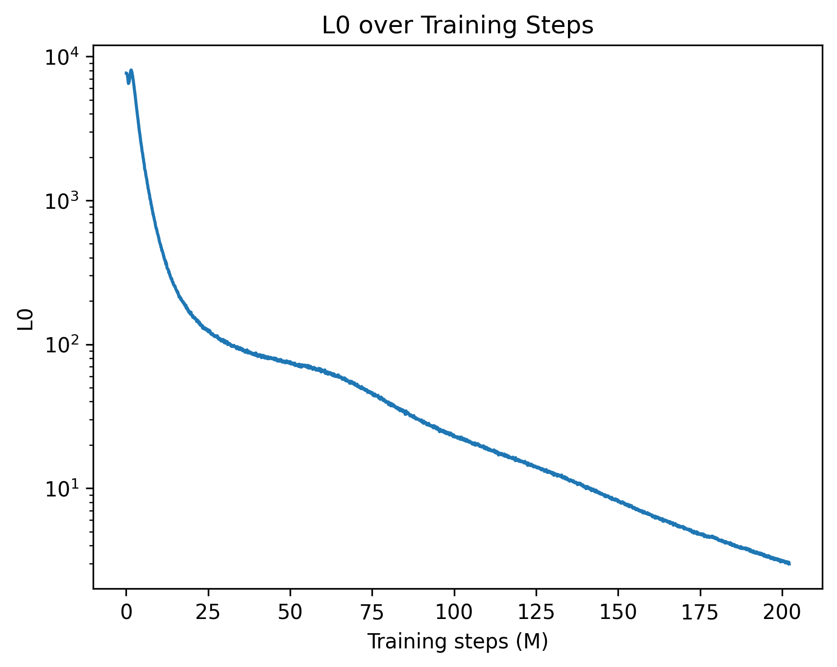
### Visual Description
## Line Chart: L0 over Training Steps
### Overview
This image is a line chart depicting the progression of a metric labeled "L0" over a period of 200 million "Training steps". The chart illustrates a rapid initial decline in the L0 metric, followed by a slower, continuous exponential decay.
### Components/Axes
* **Header (Top Center):** The title of the chart is "L0 over Training Steps".
* **X-Axis (Bottom):**
* **Label:** "Training steps (M)" positioned at the bottom center. The "(M)" likely denotes millions.
* **Scale:** Linear.
* **Markers:** Major tick marks are placed at intervals of 25, specifically labeled at: 0, 25, 50, 75, 100, 125, 150, 175, and 200.
* **Y-Axis (Left):**
* **Label:** "L0" positioned vertically along the left edge.
* **Scale:** Logarithmic (base 10).
* **Markers:** Major tick marks are labeled at $10^1$, $10^2$, $10^3$, and $10^4$. Minor tick marks are visible between these major powers of 10, indicating the logarithmic progression.
* **Data Series:** A single, solid blue line representing the L0 value.
* **Legend:** There is no legend present, as there is only one data series.
### Detailed Analysis
**Trend Verification:**
The blue line begins near the top-left of the chart area, just below the $10^4$ mark. It exhibits a very steep, almost vertical downward slope during the initial training steps. Around the 25M step mark, the rate of descent slows significantly, creating a "shoulder" or inflection point in the curve between 25M and 75M steps. After 75M steps, the line settles into a steady, near-linear downward slope on this logarithmic scale, indicating a consistent exponential decay until the end of the recorded steps. The line is slightly jagged throughout, indicating minor step-to-step variance rather than a perfectly smoothed average.
**Approximate Data Points (with uncertainty due to log scale):**
* **X = 0:** The line starts with a tiny spike, peaking just below $10^4$ (approximately 8,000 - 9,000).
* **X = 10:** The value drops precipitously by a full order of magnitude to approximately $10^3$ (1,000).
* **X = 25:** The steep drop begins to level out, with the value sitting slightly above $10^2$ (approximately 120 - 150).
* **X = 50:** The curve flattens noticeably here, with the value dropping just below $10^2$ (approximately 80 - 90).
* **X = 75:** The steady decay phase begins, with the value at approximately 50.
* **X = 100:** The value is approximately 25 - 30.
* **X = 125:** The value is approximately 15.
* **X = 150:** The line crosses below the $10^1$ major tick mark, sitting at approximately 8 - 9.
* **X = 175:** The value is approximately 5.
* **X = 200:** The chart concludes with the L0 value at its lowest point, approximately 3.
### Key Observations
1. **Massive Initial Reduction:** The most significant observation is the reduction of the L0 metric by nearly two orders of magnitude (from ~8000 to ~100) within the first 12.5% of the training process (0 to 25M steps).
2. **Phase Transition:** The distinct change in the slope between 25M and 75M steps suggests a shift in the training dynamics.
3. **Diminishing Returns:** While the metric continues to improve (decrease) all the way to 200M steps, the absolute reduction in the final 100M steps (dropping from ~30 to ~3) is minuscule compared to the first 25M steps, though it remains significant on a relative/logarithmic basis.
### Interpretation
In the context of machine learning and neural network training, this chart represents a classic loss or penalty curve.
* **What is L0?** While "L0" can sometimes refer to the L0-norm (a measure of sparsity counting non-zero elements), true L0 is non-differentiable. In modern deep learning, "L0" often refers to a continuous approximation of the L0 penalty (e.g., L0 regularization used to encourage sparse neural networks) or a specific component of a loss function.
* **Training Dynamics:** The graph demonstrates that the model rapidly optimizes the most obvious or impactful parameters early in the training run (the steep drop). The "shoulder" around 50M steps could indicate the model escaping a local minimum, a scheduled change in the learning rate, or a transition from learning broad features to fine-tuning complex, subtle patterns.
* **Reading Between the Lines (Peircean Investigative):** The choice of a logarithmic Y-axis is deliberate and necessary. If plotted on a linear scale, the curve after 25M steps would look like a flat line at zero, obscuring the fact that the model is still actively learning and improving. The slight, high-frequency jaggedness of the blue line implies that this data is plotted at a high resolution (perhaps every few hundred or thousand steps) rather than being heavily smoothed across entire epochs, revealing the inherent stochastic noise of batch-based gradient descent. The fact that the curve is still trending downward at 200M steps suggests that the model has not yet fully converged and could potentially benefit from further training, albeit at a very slow rate of absolute improvement.
</details>
(a) $L_{0}$ vs steps
<details>
<summary>figures/l0_coef_vs_steps.png Details</summary>
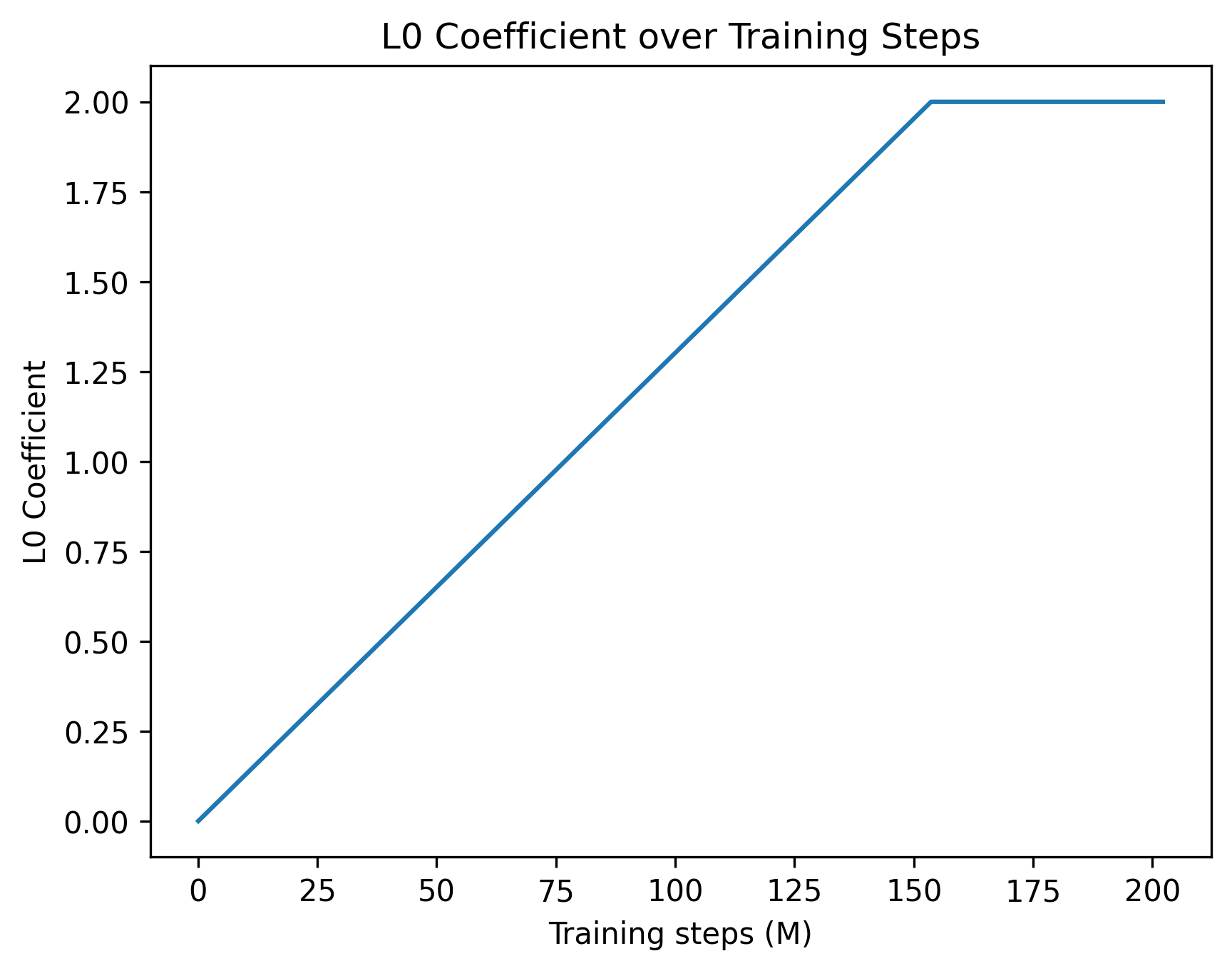
### Visual Description
## Line Chart: L0 Coefficient over Training Steps
### Overview
This image is a 2D line chart illustrating the scheduled progression of a hyperparameter, specifically the "L0 Coefficient," over the course of a machine learning model's training process. The chart displays a single data series characterized by a linear increase followed by a constant plateau.
### Components/Axes
**Header Region:**
* **Title:** "L0 Coefficient over Training Steps" (Positioned at the top center).
**Left Region (Y-Axis):**
* **Axis Title:** "L0 Coefficient" (Rotated 90 degrees counter-clockwise, positioned vertically along the left edge).
* **Scale:** Linear scale ranging from 0.00 to 2.00.
* **Major Markers:** 0.00, 0.25, 0.50, 0.75, 1.00, 1.25, 1.50, 1.75, 2.00.
**Bottom Region (X-Axis):**
* **Axis Title:** "Training steps (M)" (Positioned horizontally at the bottom center). The "(M)" likely denotes "Millions".
* **Scale:** Linear scale ranging from 0 to slightly past 200.
* **Major Markers:** 0, 25, 50, 75, 100, 125, 150, 175, 200.
**Main Chart Region:**
* **Data Series:** A single, solid blue line representing the coefficient's value.
* **Legend:** No legend is present, as there is only one data series.
### Detailed Analysis
**Trend Verification:**
The solid blue line begins at the origin in the bottom-left corner. It slopes upward in a strict, constant linear fashion (positive slope) across the majority of the chart. In the top-right quadrant, the slope abruptly changes to zero, forming a sharp corner, and the line continues perfectly horizontally to the right edge of the plot area.
**Data Extraction (Approximate Values):**
* **Start Point:** The line originates exactly at X = 0, Y = 0.00.
* **Mid-point Check:** At X = 75, the line is positioned just slightly below the Y = 1.00 mark (approximately Y ≈ 0.97), confirming the linear trajectory.
* **Inflection Point:** The linear increase halts when the line reaches Y = 2.00. Looking at the X-axis, this occurs slightly to the right of the 150 marker. Estimating the distance between 150 and 175, the inflection point sits at approximately **X ≈ 154** (± 2).
* **Plateau/End Point:** From X ≈ 154 onward, the line remains flat at Y = 2.00. The line terminates slightly past the final X-axis marker, at approximately **X ≈ 202**.
### Key Observations
* **Sharp Transition:** The transition from the linear growth phase to the plateau is a sharp angle, not a smooth asymptotic curve. This indicates a hard-coded programmatic threshold rather than an organic decay function.
* **Capped Value:** The maximum value of the L0 Coefficient is strictly capped at 2.00.
* **Duration:** The "warmup" or increasing phase takes up roughly 75% of the total plotted training time, with the plateau phase making up the remaining 25%.
### Interpretation
* **What the data suggests:** In the context of machine learning, an "L0 Coefficient" typically refers to the weight of an L0 regularization penalty. L0 regularization penalizes the absolute number of non-zero parameters in a model, encouraging sparsity (forcing weights to become exactly zero).
* **How the elements relate:** The chart depicts a "warmup schedule" for this penalty. At the beginning of training (0 steps), the penalty is 0, allowing the model to learn freely and utilize all its parameters to capture initial representations. As training progresses to ~154 million steps, the penalty is gradually and linearly introduced, slowly forcing the network to become sparse. Once the penalty reaches its maximum intended weight of 2.00, it is held constant for the remainder of the training run to fine-tune the now-sparse model.
* **Peircean/Investigative reading:** The use of "(M)" for millions of steps indicates a very large-scale training run, typical of Large Language Models (LLMs) or massive computer vision models. The specific choice to linearly scale the L0 penalty rather than applying it immediately suggests that applying strict sparsity constraints too early in training causes instability or prevents the model from converging effectively. The sharp inflection point implies a scheduling function likely written as `coefficient = min(current_step * slope, 2.0)`.
</details>
(b) $L_{0}$ coefficient vs steps
<details>
<summary>figures/dead_features_vs_steps.png Details</summary>
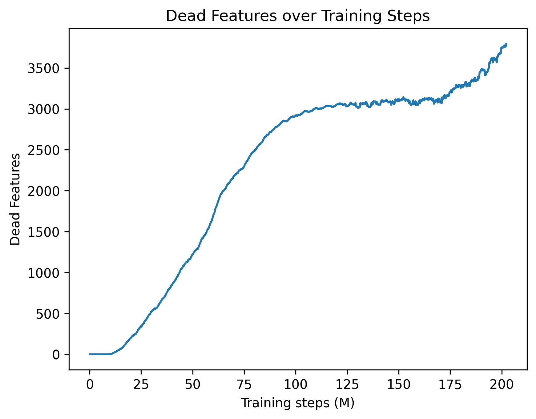
### Visual Description
## Line Chart: Dead Features over Training Steps
### Overview
This image is a 2D line chart illustrating the accumulation of "dead features" within a machine learning model over the course of its training process. The chart tracks a single metric (represented by a blue line) across millions of training steps, showing distinct phases of stability, rapid growth, plateauing, and secondary growth.
### Components/Axes
The image can be isolated into the following spatial components:
* **Header Region (Top Center):** Contains the chart title: `Dead Features over Training Steps`.
* **X-Axis (Bottom Region):**
* **Label:** `Training steps (M)` (Centered below the axis). The "(M)" indicates the unit is in millions.
* **Scale:** Linear scale starting at 0 and extending slightly past 200.
* **Markers:** Major tick marks are placed at intervals of 25: `0`, `25`, `50`, `75`, `100`, `125`, `150`, `175`, `200`.
* **Y-Axis (Left Region):**
* **Label:** `Dead Features` (Rotated 90 degrees counter-clockwise, centered vertically).
* **Scale:** Linear scale starting at 0 and extending to 3500 (with the plot area allowing for values up to approximately 3900).
* **Markers:** Major tick marks are placed at intervals of 500: `0`, `500`, `1000`, `1500`, `2000`, `2500`, `3000`, `3500`.
* **Main Chart Area (Center):** Contains a single, solid blue line representing the data series. There is no legend as there is only one data series.
### Detailed Analysis
**Trend Verification and Data Extraction:**
The single blue line exhibits four distinct behavioral phases. Below is the visual trend followed by approximate data points (with an uncertainty of ±50 on the Y-axis and ±2 on the X-axis).
1. **Initial Dormancy (Flatline):** The line begins at the origin and remains perfectly flat, sloping neither up nor down.
* At X = 0 M, Y = 0
* At X ≈ 12 M, Y = 0
2. **Rapid Accumulation (Steep Upward Slope):** Starting around 12M steps, the line slopes upward steeply. The slope is relatively consistent but contains minor, high-frequency jitter.
* At X = 25 M, Y ≈ 250
* At X = 50 M, Y ≈ 1200
* At X = 75 M, Y ≈ 2300
* At X = 100 M, Y ≈ 2900
3. **Equilibrium Plateau (Flat but Noisy):** Between 100M and 170M steps, the upward slope ceases. The line becomes horizontal but exhibits continuous, jagged, high-frequency noise.
* At X = 125 M, Y ≈ 3050
* At X = 150 M, Y ≈ 3100
* At X = 170 M, Y ≈ 3100
4. **Secondary Accumulation (Resumed Upward Slope):** After 170M steps, the line breaks the plateau and begins sloping upward steeply again, maintaining the jagged noise profile.
* At X = 175 M, Y ≈ 3200
* At X = 200 M, Y ≈ 3600
* At X ≈ 202 M (End of chart), Y ≈ 3800
### Key Observations
* **Delayed Onset:** The phenomenon of "dead features" does not begin immediately; there is a grace period of roughly 12 million steps where all features remain active.
* **High-Frequency Noise:** Once the rapid accumulation phase ends (around 100M steps), the line is no longer smooth. The constant jitter suggests that features might be dying and occasionally reviving, or the metric is highly sensitive to batch-to-batch variance.
* **Anomalous Late-Stage Rise:** The most notable visual anomaly is the secondary spike starting at 170M steps. After 70 million steps of stability, a sudden change causes features to begin dying again at a rapid pace.
### Interpretation
* **What the data suggests:** In neural network training (particularly in models using ReLU activations or Sparse Autoencoders), a "dead feature" or "dead neuron" is one that ceases to activate for any input in the dataset, effectively contributing nothing to the model's output. This chart tracks the loss of model capacity over time. Out of an unknown total number of features, nearly 3,800 have died by the end of the run.
* **Relational Dynamics:** The initial flatline suggests that early in training, the initialization parameters or high learning rates keep all neurons active. As the model begins to learn and optimize (12M to 100M steps), it aggressively prunes or abandons certain representations, leading to a massive die-off of features. The plateau (100M to 170M) indicates the model reached a stable representational state where the active capacity was sufficient for the task.
* **Reading between the lines (Peircean Investigative):** The sudden secondary rise at 170M steps is highly indicative of an external intervention in the training hyperparameters. In standard training runs, if a plateau is reached, it usually remains flat. A sudden spike late in training strongly implies a **Learning Rate Decay** schedule kicked in (e.g., a step decay or cosine annealing reaching its minimum). When the learning rate drops significantly, the model settles into sharper local minima, which often causes a secondary wave of neurons to die off because they no longer receive large enough gradient updates to stay active. Alternatively, this could represent a shift in the training data curriculum at the 170M step mark.
</details>
(c) Dead features vs steps
<details>
<summary>figures/explained_variance_vs_steps.png Details</summary>
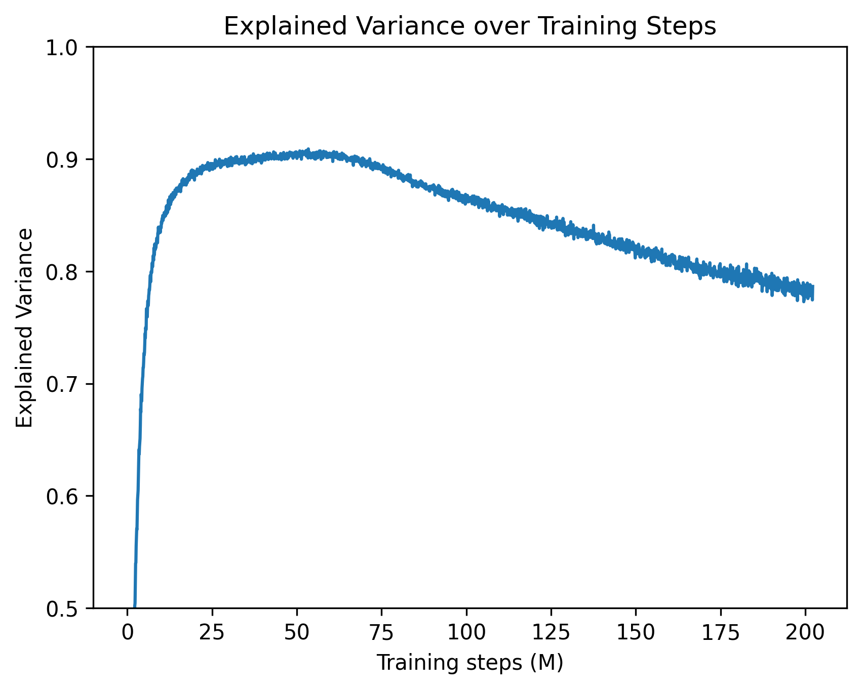
### Visual Description
## Line Chart: Explained Variance over Training Steps
### Overview
The image is a two-dimensional line chart illustrating the trajectory of a machine learning metric, "Explained Variance," over a duration measured in "Training steps (M)". The chart features a single, unlabelled data series represented by a solid blue line. The language used in the chart is entirely English.
### Components/Axes
**Header Region:**
* **Title:** "Explained Variance over Training Steps" (Positioned at the top center).
**Main Chart Region:**
* **Data Series:** A single blue line plotting the relationship between the X and Y axes. There is no legend present, implying only one model or run is being evaluated.
**Y-Axis (Left side, vertical):**
* **Label:** "Explained Variance" (Rotated 90 degrees counter-clockwise).
* **Scale:** Linear, ranging from 0.5 to 1.0.
* **Markers (Tick marks):** 0.5, 0.6, 0.7, 0.8, 0.9, 1.0.
**X-Axis (Bottom, horizontal):**
* **Label:** "Training steps (M)" (Positioned below the axis markers). The "(M)" conventionally denotes "Millions".
* **Scale:** Linear, ranging from 0 to slightly past 200.
* **Markers (Tick marks):** 0, 25, 50, 75, 100, 125, 150, 175, 200.
### Detailed Analysis
**Trend Verification:**
The blue line exhibits three distinct phases:
1. A rapid, near-vertical ascent from the start.
2. A gentle curve leading to a rounded peak.
3. A long, steady, linear decline characterized by high-frequency, low-amplitude noise (visible as "fuzziness" on the line).
**Data Point Extraction (Approximate values with ±0.01 uncertainty):**
* **Start (x=0):** The line originates below the visible Y-axis minimum of 0.5.
* **x ≈ 2.5:** The line crosses the Y=0.5 threshold.
* **x = 10:** The line has risen sharply to approximately Y=0.82.
* **x = 25:** The rate of increase slows significantly, reaching approximately Y=0.89.
* **x = 50:** The line reaches its global maximum (peak) at approximately Y=0.90 to 0.91.
* **x = 75:** The line begins its gradual decline, sitting at approximately Y=0.89.
* **x = 100:** The downward trend continues, reaching approximately Y=0.86.
* **x = 125:** The value drops to approximately Y=0.84.
* **x = 150:** The value drops to approximately Y=0.82.
* **x = 175:** The value drops to approximately Y=0.80.
* **x = 200:** The line ends at approximately Y=0.78.
### Key Observations
* **Asymmetry:** The rate of learning (ascent) is vastly faster than the rate of degradation (descent). The model achieves 90% of its peak performance within the first 10% of the training timeline.
* **Peak Performance:** The optimal point for this specific metric occurs around 50 million training steps.
* **Signal Noise:** The line is not perfectly smooth, particularly during the descent phase (from 50M to 200M steps). This micro-variance indicates step-to-step fluctuations inherent in the training process (e.g., mini-batch sampling noise).
### Interpretation
This chart displays a classic machine learning training dynamic, likely from a deep learning or reinforcement learning context.
* **The Metric:** "Explained Variance" measures the proportion of mathematical variance in a dataset that is accounted for by the model. A value of 1.0 indicates perfect prediction/explanation. Reaching ~0.90 indicates a highly effective model at that specific point in time.
* **Initial Phase (0 - 25M steps):** The model rapidly learns the underlying patterns of the data or environment. The steepness suggests the initial gradients are highly informative.
* **The Decline (50M - 200M steps):** The steady drop in explained variance after 50 million steps is a strong indicator of **overfitting** or **representation degradation**.
* If this is evaluated on a *validation set*, the model is beginning to memorize the training data at the expense of generalization.
* If this is a Reinforcement Learning scenario (where Explained Variance is often used to evaluate the Value Function), the policy may be changing in a way that makes the environment harder to predict, or the network is suffering from catastrophic forgetting as it updates over too many steps.
* **Actionable Insight:** Based on this chart, a practitioner would likely employ "Early Stopping" around 40M to 60M steps to capture the model at its peak explanatory power, as continuing to train up to 200M steps results in a net loss of performance (dropping back down to levels seen at just 8M steps).
</details>
(d) Explained variance vs steps
Figure 16: Training dynamics of the cross-layer transcoder, showing sparsity, regularization strength, dead features, and reconstruction quality over training.
Appendix G Attribution-Graph
Following Ameisen et al. (2025), we define the attribution score between feature $n$ at layer $\ell$ and position $k$ , and feature $n^{\prime}$ at layer $\ell^{\prime}$ and position $k^{\prime}$ , as
$$
a_{\ell,k,n}^{\ell^{\prime},k^{\prime},n^{\prime}}=\sum_{\ell\leq s\leq\ell^{\prime}}f_{k,n}^{\ell\rightarrow s}\;J_{s,k}^{\ell^{\prime},k^{\prime}}\;g_{k^{\prime},n^{\prime}}^{\ell^{\prime}}, \tag{11}
$$
where $f_{k,n}^{\ell→ s}$ denotes the decoder vector associated with feature $n$ projecting from layer $\ell$ to layer $s$ , $J_{s,k}^{\ell^{\prime},k^{\prime}}$ is the Jacobian mapping the MLP output at $(\ell,k)$ to the MLP input at $(\ell^{\prime},k^{\prime})$ , and $g_{k^{\prime},n^{\prime}}^{\ell^{\prime}}$ is the corresponding encoder feature at layer $\ell^{\prime}$ and position $k^{\prime}$ . The sum in this equation reflects the cross-layer mapping of the cross-layer transcoder.
The Jacobian is computed during a modified forward pass in which all nonlinear operations, including normalization layers, attention mechanisms, and MLPs, are frozen using stop-gradient operations. The resulting attribution graph is pruned by retaining only those features that cumulatively explain $80\%$ of the contribution to the final logit, and only those edges that account for $95\%$ of the total edge-level effect. All attribution computations are performed using the circuit-tracer library (Hanna et al., 2025). For a complete description of the attribution graph computation and pruning, we refer the user to reading (Ameisen et al., 2025).
For the visualization and the autointerp, we write our own pipeline. In Figure 17, we show a screenshot of the interface for the ’The opposite of ”large” is ”’ attribution graph. The features are colored with respect to their corresponding clusters.
<details>
<summary>x14.png Details</summary>
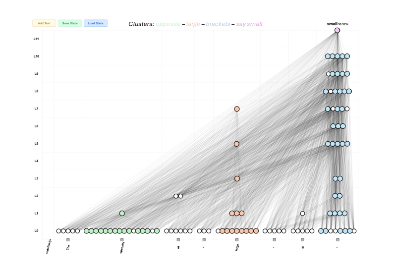
### Visual Description
## Network Graph: Transformer Model Attention and Information Flow
### Overview
This image is a technical visualization of a neural network's internal state, likely a Transformer model, processing a sequence of text to predict the next token. It displays a two-dimensional grid where the X-axis represents the input text sequence and the Y-axis represents the layers of the model. Nodes (circles) represent specific attention heads or network components active at specific layer-token intersections. Edges (grey lines) represent the flow of information or attention weights between these nodes across different layers. The visualization highlights how specific concepts ("clusters") are routed through the network to produce the final prediction.
### Components/Axes
**Header UI Elements (Top Left):**
* Button 1: `Add Text` (Light yellow background)
* Button 2: `Save State` (Light green background)
* Button 3: `Load State` (Light blue background)
**Legend (Top Center):**
* Text: `Clusters: ` followed by color-coded categories:
* `opposite` (Light green text)
* `–` (Black dash separator)
* `large` (Light orange/peach text)
* `–` (Black dash separator)
* `brackets` (Light blue text)
* `–` (Black dash separator)
* `say small` (Light pink/magenta text)
**Y-Axis (Left side, vertical):**
* Represents network layers, labeled from bottom to top: `L0`, `L1`, `L2`, `L3`, `L4`, `L5`, `L6`, `L7`, `L8`, `L9`, `L10`, `L11`.
**X-Axis (Bottom, horizontal):**
* Represents the input token sequence. The text is angled downwards. Below each token is a small grey square marker.
* Tokens (reading left to right):
1. `<|endoftext|>`
2. `The`
3. `opposite`
4. `of`
5. `"` (Note: While visually appearing as a double quote, the legend refers to this category of tokens as "brackets")
6. `large`
7. `"`
8. `is`
9. `"`
**Target Label (Top Right):**
* Positioned directly above the highest node at L11 in the final column.
* Text: **`small`** `16.32%` (Indicates the predicted next token and its probability).
### Detailed Analysis
**Visual Trend Verification:**
The dominant visual trend is a massive convergence of semi-transparent grey lines (edges) flowing from the bottom-left and bottom-center of the graph upwards and rightwards, culminating at the top-right node. There is also a strong vertical column of nodes and edges on the far right, indicating heavy information processing at the final token position across all layers.
**Node Distribution and Clustering (Spatial Grounding):**
Nodes are colored according to the legend. White nodes appear to be unclustered or neutral components.
* **Layer 0 (L0 - Bottom Row):** This layer contains the highest density of nodes, acting as the foundational embedding/input layer.
* `<|endoftext|>`: 5 white nodes.
* `The`: 1 white node.
* `opposite`: ~15 light green nodes (matching the "opposite" cluster).
* `of`: 6 white nodes.
* `"`: 3 white nodes.
* `large`: ~10 light orange nodes (matching the "large" cluster).
* `"`: 5 white nodes.
* `is`: 5 white nodes.
* `"` (Final token): ~8 light blue nodes (matching the "brackets" cluster).
* **Intermediate Layers (L1 to L10):** Node density decreases significantly, with activity concentrated in specific columns.
* **The "opposite" column:** Has 1 light green node at L1.
* **The "of" column:** Has 2 white nodes at L2.
* **The "large" column:** Shows vertical progression with light orange nodes at L1 (3 nodes), L3 (1 node), L5 (1 node), and L7 (1 node).
* **The "is" column:** Has 1 white node at L1.
* **The Final `"` column (Far Right):** This column is highly active across almost all layers, primarily populated by light blue ("brackets") nodes.
* L1: 4 light blue nodes.
* L2: 2 light blue nodes.
* L3: 2 light blue nodes.
* L4: 2 light blue nodes.
* L5: 4 light blue nodes.
* L6: 3 light blue nodes.
* L7: 3 light blue nodes, 1 white node.
* L8: 6 light blue nodes.
* L9: 5 light blue nodes.
* L10: 5 light blue nodes.
* **Layer 11 (L11 - Top Row):**
* Contains only a single node, located in the far-right column (above the final `"` token).
* Color: Light pink (matching the "say small" cluster).
* This node is the focal point of the entire graph, receiving edge connections from almost all active nodes in the layers below.
### Key Observations
1. **Information Routing to the Final Token:** The most striking pattern is how information from earlier tokens (specifically "opposite" and "large") is routed diagonally across the layers to the final token position (`"`).
2. **Functional Clustering:** The model has clearly dedicated specific components (nodes) to process specific semantic concepts. The green nodes exclusively handle "opposite", the orange nodes handle "large", and the blue nodes handle the punctuation/structure ("brackets").
3. **Vertical Integration:** The "large" token and the final `"` token show significant vertical integration, meaning information is passed up through multiple layers within the same token position before being routed elsewhere.
4. **The "Say Small" Node:** The entire network's activity culminates in a single, specialized pink node at L11. This node is responsible for outputting the final prediction ("small" at 16.32%).
### Interpretation
This diagram is a mechanistic interpretability visualization. It demonstrates *how* a Large Language Model (LLM) arrives at the logical conclusion that "The opposite of 'large' is 'small'".
Reading between the lines, the data suggests the following computational process within the model:
1. **Encoding:** At L0, the model heavily encodes the semantic meaning of the key words "opposite" (green cluster) and "large" (orange cluster).
2. **Information Movement:** As processing moves up through the layers (L1-L10), the model uses attention mechanisms (the grey lines) to move the semantic information of "opposite" and "large" from their original positions in the sequence over to the final token position.
3. **Structural Awareness:** The blue "brackets" cluster indicates the model is highly aware of the syntactic structure (the quotation marks), using them as anchors to gather information. The final quotation mark acts as a collection point.
4. **Synthesis and Prediction:** By layer 11, all necessary context—the concept of an antonym ("opposite") and the target word ("large")—has been routed to the final token position. The specialized pink node ("say small") synthesizes this gathered context and triggers the prediction of the word "small".
The visualization proves that the model is not merely guessing based on surface-level statistics, but has learned internal, localized circuits to perform specific logical tasks (like finding an antonym) and routing that information to the correct output position.
</details>
Figure 17: Circuit-tracing interface example for the ’The opposite of ”large” is ”’ with GPT2-sparse.
Appendix H Graph: The opposite of ”large” is ”
We obtain a replacement score of 0.82, with 459 features identified before pruning and 82 features remaining after pruning. The majority of features in the resulting attribution graph fall into four dominant clusters:
- Opposition cluster: features associated with opposition and comparison, primarily localized at the token position corresponding to opposite.
- Magnitude cluster: features related to notions of size (e.g., large, big, full, medium), predominantly located in the residual stream at the large token position.
- Bracket cluster: features that activate on tokens enclosed in brackets.
- Final-logit cluster: mainly the final logit itself and a couple of features that activate before the token ”small” or related terms.
In the boxes below, we present the top activations of representative feature sets for each cluster.
Feature 1117 ”Opposite” cluster in Washington has now adopted the wider measure of student debt outstanding. This new the situation in Syria, Iran and the wider region. ”The recharged by the wider dense forests of Sanjay Van and its overflow drained public, with interesting accounts of Oswald’s demeanor at this significant moment has a slightly wider range. Specifically, the Atom-powered NANO 56 becoming part of the wider Seven Years’ War in which Britain and France
Feature 1337 ”Opposite” cluster opposite, piece of Mexico’s cultural identity. I made the hour opposite shows, or something bigger, “where there’s villains opposite sides of Mars in 2004 and used their instruments to discover geologic evidence opposite, but not anymore. Now everything he says to me is some kind opposite direction, and had little trouble finding space at the campsites. always seem to be just the opposite. show a growing trend to cast “no” votes , opposing how much salary and the occupation of the opposing forces was generally limited to mutual observation. work hand in hand for the purpose of opposing all movements of the thinking part the defense’s inability to stop opposing run games. The Bills have ing opposing quarterbacks. The Seahawks not only had depth, they were versatile. to win more hand battles particularly when the opposing tackle neutralizes his initial
Feature 901 ”Large” cluster Let’s be honest: When someone advocates for large-scale Muslim robot provides a tragicomic reminder of why RWD needs to consider large as what kind of social safety nets should be in place to protect people from large advocates to limit the power of large, established corporations, analysts say. of large law firms is that they are so great that the only reason anyone that by scaling up tests, the method would be conducive for use on larger
Feature 933 ”Large” cluster people healthy and anticipating health issues before they become a problem . Big Data is Big brown bucks with funny accents.” Judy flinched at BIG UP UBUNTU: Ubuntu releases are named after industry.¡—endoftext—¿ BIG LEAGUE: Barron’s Says The they need to submit their content in the same way . Big enough apps and offering alternatives routes . Big data and optical fiber
Feature 1004 ”Large” cluster guide said was ? full of drinking saloons, dime museums, small would have 2 mana sources next turn (unless his hand was full of fast ’s house, it ’s full of adventure itself.? statement that all German Catholics had a right to full transparency” glimpsing a lobby full of construction debris. The front hallway was full of Jokubas had recently been reading a newspaper article which was full of
Feature 412 “Brackets” cluster group answered either “very” or “somewhat” attached – except some work colleagues. Wilcox said she found it ‘highly unlikely very rare , “very likely ,” “high risk,” she says. ulent. Pentagon spokesman Peter Cook said the sample was “ on of PopMatters called the album “brilliant” and said arlene Lowe, described him as being “one of my biggest supporters”.
Feature 518 “Brackets” cluster Kerry said Washington and Hanoi will “continue to have differences in opinions the United States will “take care of it.” He told reporters after the legislation would “provide new enforcement tools for protecting our citizens and will help Gary Ross, said in a statement that the Air Force is currently “short said, and Syrian President Bashar al-Assad would “have to go”. introduces politics into consumer policies,” said Palmor, adding that it would ”