# AI Transparency Atlas: Framework, Scoring, and Real-Time Model Card Evaluation Pipeline
**Authors**: Akhmadillo Mamirov1, Faiaz Azmain1, Hanyu Wang
## Abstract
AI model documentation is fragmented across platforms and inconsistent in structure, preventing policymakers, auditors, and users from reliably assessing safety claims, data provenance, and version changes. We analyzed documentation from five frontier models (Gemini 3, Grok 4.1, Llama 4, GPT-5, Claude 4.5) and 100 Hugging Face model cards, identifying 947 unique section names with extreme naming variation—usage information alone appeared under 97 different labels. Using the EU AI Act Annex IV and Stanford Transparency Index as baselines, we developed a weighted transparency framework with 8 sections and 23 subsections that prioritizes safety-critical disclosures (Safety Evaluation: 25%, Critical Risk: 20%) over technical specifications. We implemented an automated multi-agent pipeline that extracts documentation from public sources and scores completeness through LLM consensus. Evaluating 50 models across vision, multimodal, open-source, and closed-source systems cost less than $3 total and revealed systematic gaps: frontier labs (xAI, Microsoft, Anthropic) achieve 80% compliance, while most providers fall below 60%. Safety-critical categories show the largest deficits—deception behaviors, hallucinations, and child safety evaluations account for 148, 124, and 116 aggregate points lost respectively across all evaluated models.
## I Introduction
AI model documentation today is fragmented across whitepapers, GitHub READMEs, Hugging Face model cards, system cards, and blog posts. This fragmentation raises a core question: what practical steps can move the ecosystem from documentation inconsistency toward something standardized enough to be useful?
Documentation gaps affect every stakeholder. Regulators cannot reliably assess governance or safety without consistent reporting. Downstream institutions such as hospitals, schools, and public agencies lack visibility into model risks, evaluation protocols, and version-level changes. Even within the same platform, model cards differ dramatically in length, scope, and granularity. Some include details about architecture, training data, and evaluation settings, while others provide only brief paragraphs. Critically, documentation often does not evolve as models evolve. Major capability updates, training adjustments, and safety interventions rarely trigger corresponding updates. Versioning is ad hoc or entirely absent, causing transparency to degrade over time.
System cards attempt to address transparency at the deployment level, but they introduce their own challenges. Many system cards are high-level but not actionable; others remain closed, incomplete, or not understandable to external auditors. When modern AI systems depend on chains of interconnected models, datasets, and processes, opacity at the system layer becomes a structural barrier to accountability. When something goes wrong, responding is difficult because relevant information is scattered across multiple documents and repositories [winecoff2024improvinggovernanceoutcomesai].
### I-A Why Does This Inconsistency Persist?
The persistence of fragmented AI documentation reflects structural challenges in the AI development ecosystem. Unlike regulated industries where documentation is mandatory and enforcement mechanisms are well established, AI transparency remains largely voluntary, resulting in misaligned incentives.
Economic and competitive pressures. Comprehensive documentation is resource-intensive, requiring dedicated teams for safety evaluations, data provenance tracking, and version management. Organizations prioritizing rapid deployment often treat documentation as secondary to product development. Closed-source developers face additional tension: detailed transparency can expose competitive advantages related to training methods, data sources, or architectural choices. As a result, disclosure decisions frequently involve trade-offs between transparency commitments and intellectual property protection.
Organizational fragmentation. High-quality documentation requires coordination across teams that typically operate independently. Engineers prioritize model performance, safety teams focus on risk assessment, and communications teams manage external messaging. Without integrated workflows that treat documentation as a natural byproduct of development, information remains siloed across internal wikis, isolated reports, and fragmented public communications.
Competing standards. Developers encounter overlapping documentation proposals, including Model Cards, Datasheets for Datasets, System Cards, and emerging regulatory frameworks, each emphasizing different priorities and formats. In the absence of a unified standard specifying required content, level of detail, and structure, developers make inconsistent choices. Some release brief model cards, while others publish extensive technical reports. Neither approach consistently satisfies stakeholder needs because no authoritative standard exists.
Limited accountability. Documentation quality improves when it can be credibly evaluated. Currently, users lack practical means to assess completeness or accuracy, regulators lack scalable audit tools, and civil society organizations can identify only the most visible gaps. Without mechanisms to systematically measure and publicly compare documentation quality, providers face limited accountability for incomplete or uneven disclosures.
### I-B Our Approach Builds on Existing Regulatory and Academic Frameworks.
We address these challenges through a structured transparency framework grounded in existing regulatory and academic standards. The EU AI Act Annex IV provides concrete documentation requirements that we adopt as a regulatory baseline [eu_ai_act_annex_iv]. We use the Stanford Transparency Index as an academic reference point for evaluating disclosure completeness across AI providers [bommasani2024fmti].
To populate this framework at scale, we built an automated pipeline that extracts documentation from dispersed public sources, evaluates completeness using multi-agent LLM consensus, and generates transparency scores. This approach enables systematic, continuous assessment of documentation quality across hundreds of models without requiring direct developer cooperation.
## II Background and Related Work
The Foundation Model Transparency Index (May 2024) by Stanford University provides a comprehensive assessment of foundation model developer transparency [bommasani2024fmti]. The index evaluates disclosure practices across major AI labs using data provided directly by developers. While this approach offers depth and accuracy for covered models, it relies on developer cooperation and self-reported information. Our work takes a complementary approach: we evaluate documentation completeness using only publicly available information online—the same information accessible to regulators, auditors, and downstream users in practice. This distinction is critical because real-world transparency depends on what stakeholders can actually access and verify, not just what developers are willing to share upon request.
<details>
<summary>sections.png Details</summary>
### Visual Description
\n
## Horizontal Bar Chart: Information Category Presence Across Model Cards
### Overview
This image is a horizontal bar chart titled "Information Category Presence Across Model Cards." It displays the percentage of model cards (documents accompanying AI models) that include specific categories of information. The chart uses color-coding to group categories relative to a 50% threshold.
### Components/Axes
* **Chart Title:** "Information Category Presence Across Model Cards" (centered at the top).
* **Y-Axis (Vertical):** Lists 11 information categories. From top to bottom:
1. Model Architecture
2. Evaluation Metrics
3. Compute Requirements
4. Intended Use
5. License
6. Limitations
7. Training Data
8. Bias Fairness
9. Safety Evaluation
10. Out Of Scope
11. Interpretability
* **X-Axis (Horizontal):** Labeled "Percentage of Model Cards." The scale runs from 0 to 80, with major tick marks at 0, 10, 20, 30, 40, 50, 60, 70, and 80.
* **Legend:** Located in the bottom-right corner. It contains a single entry: a dashed grey line labeled "50% threshold."
* **Threshold Line:** A vertical, dashed grey line extends from the x-axis at the 50% mark to the top of the chart area.
* **Color Coding:**
* **Green Bars:** Categories with presence significantly above 50%.
* **Orange Bars:** Categories with presence above 50% but lower than the green group.
* **Red Bars:** Categories with presence below 50%.
### Detailed Analysis
The chart presents the following data points, ordered from highest to lowest presence. Values are approximate based on visual alignment with the x-axis.
1. **Model Architecture (Green Bar):** ~85%
2. **Evaluation Metrics (Green Bar):** ~85%
3. **Compute Requirements (Green Bar):** ~85%
4. **Intended Use (Orange Bar):** ~65%
5. **License (Orange Bar):** ~65%
6. **Limitations (Orange Bar):** ~61%
7. **Training Data (Orange Bar):** ~60%
8. **Bias Fairness (Orange Bar):** ~54%
9. **Safety Evaluation (Orange Bar):** ~52%
10. **Out Of Scope (Red Bar):** ~49% (just below the 50% threshold line)
11. **Interpretability (Red Bar):** ~18%
**Trend Verification:** The visual trend is a clear descending order of presence. The top three technical categories form a plateau at the highest value. The middle group (orange) shows a gradual decline. The final two categories (red) drop off sharply, with "Interpretability" being a significant outlier at the low end.
### Key Observations
* **Clear Tiering:** The data is grouped into three distinct tiers based on color and value: High Presence (Green, ~85%), Moderate Presence (Orange, 52-65%), and Low Presence (Red, <50%).
* **Technical vs. Ethical/Safety Focus:** The most commonly included categories are technical (Architecture, Metrics, Compute). Ethical and safety-related categories (Bias Fairness, Safety Evaluation) are present in just over half of model cards.
* **Significant Gap in Interpretability:** "Interpretability" is the least common category by a large margin, present in less than one-fifth of model cards.
* **Threshold as a Benchmark:** The 50% dashed line serves as a clear visual benchmark. Nine of the eleven categories exceed this threshold, while two fall below it.
### Interpretation
This chart provides a quantitative snapshot of the current state of documentation practices for AI models. It reveals a strong emphasis on documenting the technical specifications and intended use of models. However, it also highlights a critical gap in the documentation of model interpretability—the ability to understand and explain a model's decisions—which is a key component for trust, debugging, and accountability.
The data suggests that while the AI community has standardized reporting on *what* a model is and *how* to run it, there is less consistent reporting on *why* it makes specific decisions or on formally evaluating its limitations and safety. The near-50% presence of "Out Of Scope" documentation indicates that many model cards do address limitations, but this is not yet universal practice. Overall, the chart underscores an opportunity to improve the comprehensiveness and transparency of model documentation, particularly in areas related to explainability and robust safety evaluation.
</details>
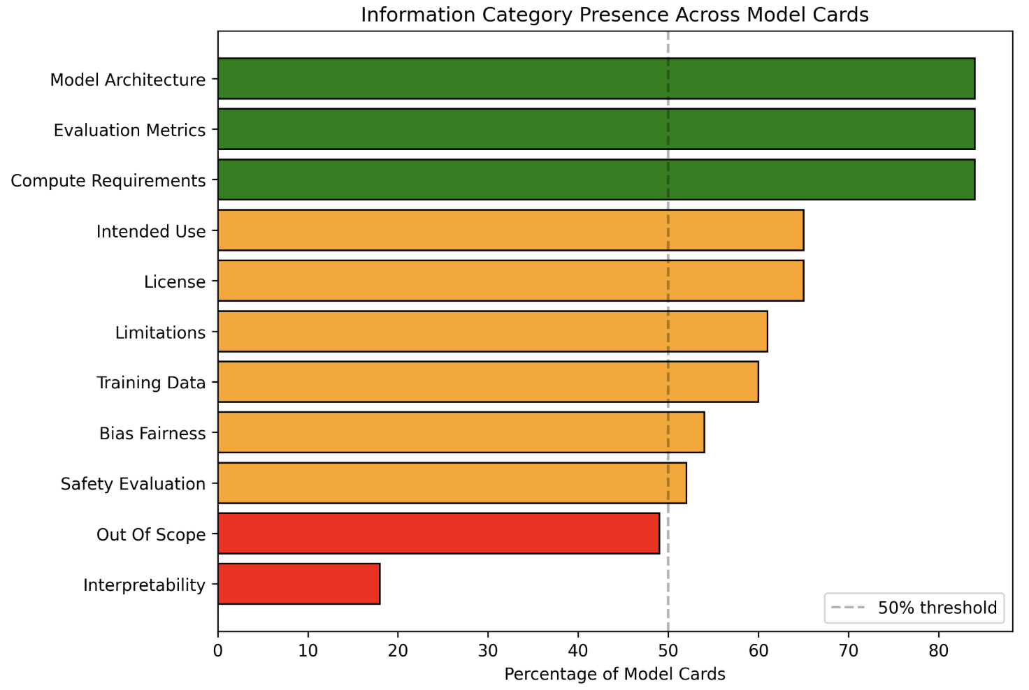
Figure 1: Category presence rates across 100 model cards. Technical categories exceed 90% presence while safety-critical categories often fall below 50%
## III CURRENT STATE OF AI MODEL DOCUMENTATION
### III-A Frontier Model Documentation Review
To ground our framework in existing practice, we conducted a structured review of recent documentation artifacts from leading AI developers, including Google (Gemini 3), xAI (Grok 4.1), Meta (Llama 4), OpenAI (GPT–5), and Anthropic (Claude 4.5). We also compared these against the original Model Cards proposal by Mitchell et al. (2019), which remains the conceptual baseline [DBLP:journals/corr/abs-1810-03993].
Across these models, we observed major differences in scope, depth, structure, and emphasis:
- Google’s Gemini 3 includes detailed sections on training data, architecture, sustainability, safety evaluations, and frontier-safety considerations [google_gemini3_modelcard].
- xAI’s Grok 4.1 concentrates heavily on refusal behavior, adversarial robustness, dual-use risk, and transparency around data and training [xai_grok4_1_modelcard].
- Meta’s Llama 4 emphasizes environmental footprint, quantization, safeguards, community governance, critical risks, and detailed fine-tuning behavior [meta_llama4_modelcard].
- OpenAI’s GPT-5 provides the most extensive safety-evaluation sections, including red-teaming by multiple external organizations, biological risk assessments, cybersecurity stress tests, deception and sycophancy evaluations, and system-level protections [openai_gpt5_system_card].
- Anthropic’s Claude 4.5 offers the most granular system-level reporting, covering agentic risks, alignment attempts, cyber ranges, interpretability studies, reward-hacking investigations, welfare assessments, and Responsibly Scaling Policy (RSP) aligned evaluations [anthropic_claude_sonnet45_system_card].
### III-B Systematic Analysis of Hugging Face Model Cards
To assess whether these documentation patterns extend beyond frontier models, we analyzed 100 model cards from Hugging Face, spanning diverse model types, parameter scales, and deployment contexts [AI_documentation_analysis_2025]. This approach follows Liang et al. [liang2024whatsdocumentedaisystematic], who conducted a systematic analysis of 32,000 AI model cards and demonstrated that Hugging Face provides a representative sample of documentation practices across the broader AI ecosystem. From this broader sample, we identified 11 recurring documentation categories that appeared with varying frequency and depth: Model Architecture, Compute Requirements, Evaluation Metrics, License, Intended Use, Training Data, Limitations, Bias and Fairness, Safety Evaluation, Out-of-Scope Use, and Interpretability.
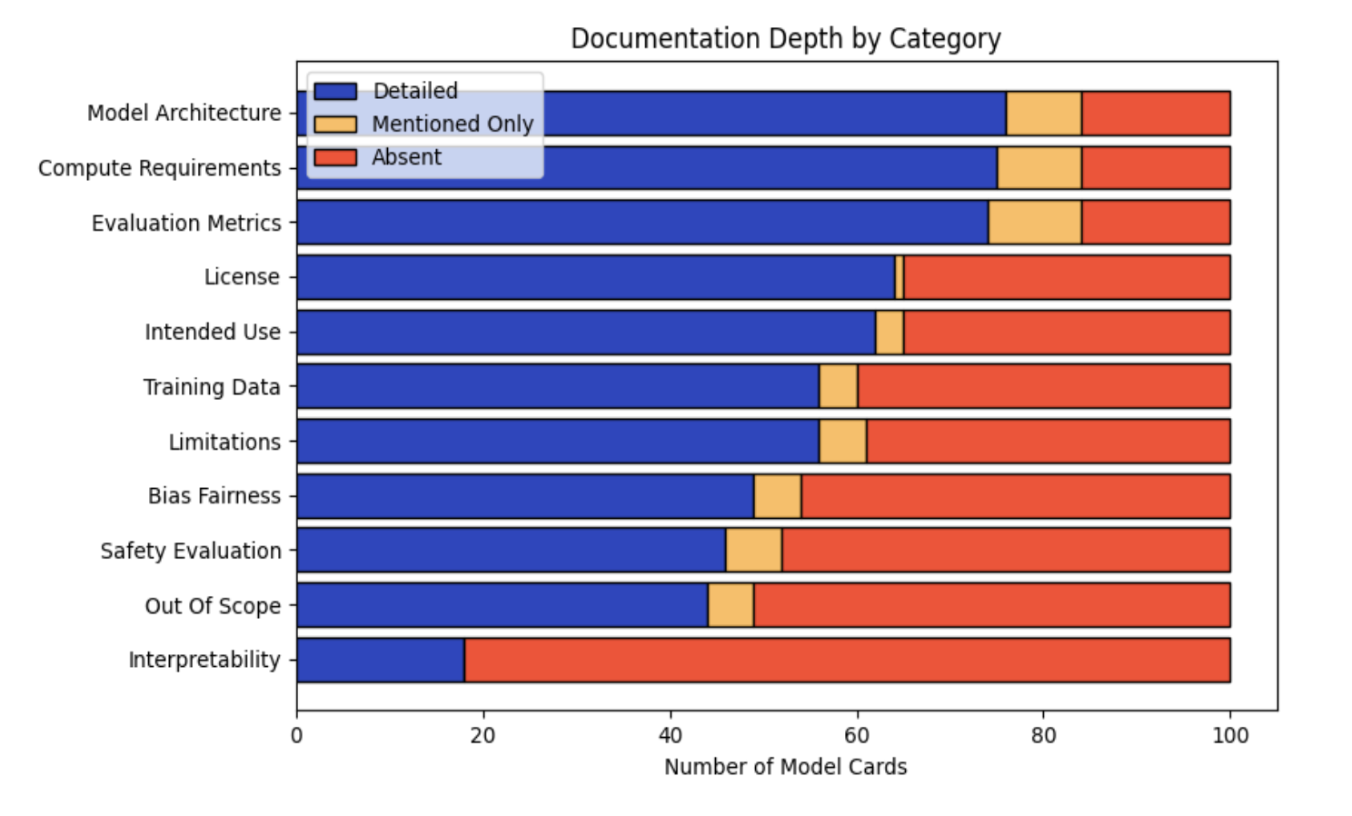
Each model card was evaluated according to three levels of completeness:
- Detailed: The category includes substantive information with specific details, metrics, or actionable content.
- Mentioned Only: The category is present but limited to high-level or superficial statements.
- Absent: The category is not addressed.
Figure 1 illustrates category presence rates across the dataset. While over 90% of model cards included Model Architecture, Evaluation Metrics, and Compute Requirements, several critical transparency indicators fell below the 50% threshold. Interpretability appeared in only approximately 20% of cards, and Out-of-Scope use cases in roughly 60%. Even when present, Safety Evaluation (approximately 65%) and Bias and Fairness (approximately 60%) were often addressed superficially.
<details>
<summary>completeness.png Details</summary>
### Visual Description
\n
## Horizontal Stacked Bar Chart: Documentation Depth by Category
### Overview
This image is a horizontal stacked bar chart titled "Documentation Depth by Category." It visualizes the level of documentation provided across 11 different categories within a set of "Model Cards." Each bar represents a category and is segmented into three colors indicating the depth of documentation: "Detailed" (blue), "Mentioned Only" (yellow), and "Absent" (red). The total length of each bar represents 100 model cards.
### Components/Axes
* **Title:** "Documentation Depth by Category" (centered at the top).
* **Legend:** Located in the top-left corner of the chart area. It defines the three data series:
* **Detailed:** Blue color.
* **Mentioned Only:** Yellow color.
* **Absent:** Red color.
* **Y-Axis (Vertical):** Lists the 11 documentation categories. From top to bottom:
1. Model Architecture
2. Compute Requirements
3. Evaluation Metrics
4. License
5. Intended Use
6. Training Data
7. Limitations
8. Bias Fairness
9. Safety Evaluation
10. Out Of Scope
11. Interpretability
* **X-Axis (Horizontal):** Labeled "Number of Model Cards." The scale runs from 0 to 100, with major tick marks at intervals of 20 (0, 20, 40, 60, 80, 100).
### Detailed Analysis
The following table reconstructs the approximate data for each category. Values are estimated based on the bar segment lengths relative to the x-axis scale. The sum for each row is 100.
| Category | Detailed (Blue) | Mentioned Only (Yellow) | Absent (Red) |
| :--- | :--- | :--- | :--- |
| **Model Architecture** | ~76 | ~8 | ~16 |
| **Compute Requirements** | ~75 | ~9 | ~16 |
| **Evaluation Metrics** | ~74 | ~10 | ~16 |
| **License** | ~64 | ~1 | ~35 |
| **Intended Use** | ~62 | ~3 | ~35 |
| **Training Data** | ~56 | ~4 | ~40 |
| **Limitations** | ~56 | ~5 | ~39 |
| **Bias Fairness** | ~49 | ~5 | ~46 |
| **Safety Evaluation** | ~46 | ~6 | ~48 |
| **Out Of Scope** | ~44 | ~5 | ~51 |
| **Interpretability** | ~18 | ~0 | ~82 |
**Trend Verification:**
* The "Detailed" (blue) segment shows a clear downward trend from the top category ("Model Architecture") to the bottom category ("Interpretability"). The line formed by the right edge of the blue segments slopes consistently downward.
* The "Absent" (red) segment shows a corresponding upward trend, increasing in length as you move down the list of categories.
* The "Mentioned Only" (yellow) segment is generally small across all categories, with no strong directional trend.
### Key Observations
1. **Best Documented Categories:** "Model Architecture," "Compute Requirements," and "Evaluation Metrics" have the highest proportion of detailed documentation, each with over 70% of model cards providing details.
2. **Worst Documented Category:** "Interpretability" is a significant outlier. It has the lowest "Detailed" score (~18) and the highest "Absent" score (~82), indicating it is rarely documented in detail and often completely missing.
3. **Binary Documentation Pattern:** For categories like "License" and "Intended Use," the "Mentioned Only" segment is very thin (~1-3). This suggests documentation tends to be either comprehensive ("Detailed") or entirely missing ("Absent"), with little middle ground.
4. **Ethical & Safety Gaps:** Categories related to ethical considerations and safety ("Bias Fairness," "Safety Evaluation," "Out Of Scope") all show less than 50% detailed documentation and have "Absent" portions approaching or exceeding 50%.
### Interpretation
This chart provides a quantitative audit of transparency in AI model documentation (specifically "Model Cards"). The data suggests a strong bias towards documenting technical specifications (architecture, compute, metrics) over ethical, safety, and usage considerations.
The stark gradient from top to bottom reveals a hierarchy of documentation priorities. Foundational technical details are consistently reported, while crucial context about a model's limitations, biases, safe application boundaries, and inner workings ("Interpretability") is frequently omitted. This creates a significant information asymmetry: users may know *what* the model is and *how* it was built, but have little insight into *how it behaves* in complex real-world scenarios or *how to use it responsibly*.
The near absence of the "Mentioned Only" category for many items indicates an "all-or-nothing" approach to documentation. This lack of partial disclosure means that if a topic isn't covered in depth, it is likely not addressed at all, leaving dangerous knowledge gaps. The extreme case of "Interpretability" highlights a critical blind spot in the field, where the mechanisms of model decision-making are largely opaque in public documentation.
</details>
Figure 2: Documentation completeness by category across 100 Hugging Face model cards. Technical details are well-documented while safety-critical information is frequently absent.
Figure 2 shows the distribution of documentation depth across all 100 model cards. Technical categories such as Model Architecture, Compute Requirements, and Evaluation Metrics were most consistently documented in detail. In contrast, safety-critical categories exhibited significant gaps: Interpretability was detailed in fewer than 20% of model cards and absent in over 80%. Safety Evaluation, Bias and Fairness, and Limitations were frequently mentioned but rarely described in depth.
## IV Proposed Approach
### IV-A Defining a Minimal Core Documentation Schema
We propose establishing a minimal consensus core schema that layers on top of existing approaches such as model cards, data sheets, and system cards. This schema would specify 20–30 essential fields that all high-impact models should report, including intended use, primary benchmarks (with exact benchmark names), high-level training data types, and known risk domains.
<details>
<summary>variation.png Details</summary>
### Visual Description
\n
## Bar Chart: Naming Variation by Concept (Inconsistency Measure)
### Overview
The image displays a vertical bar chart titled "Naming Variation by Concept (Inconsistency Measure)". It quantifies the inconsistency in terminology used for different conceptual sections within a body of technical documentation (likely AI model cards or similar reports). The metric is the count of distinct names used to refer to the same underlying concept.
### Components/Axes
* **Chart Title:** "Naming Variation by Concept (Inconsistency Measure)" (Top center).
* **Y-Axis:** Labeled "Number of Different Section Names". The scale runs from 0 to 100, with major tick marks at intervals of 20 (0, 20, 40, 60, 80, 100).
* **X-Axis:** Contains eight categorical labels, each representing a conceptual section. The labels are rotated approximately 45 degrees for readability. From left to right, they are:
1. `model_info`
2. `evaluation`
3. `usage`
4. `license`
5. `citation`
6. `limitations`
7. `safety`
8. `training`
* **Data Series:** A single series represented by light purple bars with black outlines. There is no legend, as the categories are directly labeled on the x-axis.
### Detailed Analysis
The chart presents the following approximate values for the number of different names used for each concept. Values are estimated based on bar height relative to the y-axis scale.
| Concept (X-Axis Label) | Approximate Number of Different Names (Y-Axis Value) | Visual Trend Description |
| :--- | :--- | :--- |
| `model_info` | ~12 | Short bar, indicating low naming variation. |
| `evaluation` | ~52 | Tall bar, indicating high naming variation. |
| `usage` | ~97 | The tallest bar by a significant margin, indicating extremely high naming variation. |
| `license` | ~8 | The shortest bar, indicating the lowest naming variation. |
| `citation` | ~15 | Short bar, similar in height to `model_info`. |
| `limitations` | ~21 | Moderate height, slightly taller than `citation`. |
| `safety` | ~10 | Very short bar, similar to `license`. |
| `training` | ~38 | Moderate height, the third tallest bar. |
### Key Observations
1. **Extreme Outlier:** The concept `usage` shows by far the highest inconsistency, with nearly 100 different names used across the analyzed documents. This is almost double the next highest category (`evaluation`).
2. **High Variation Cluster:** `evaluation` (~52) and `training` (~38) also demonstrate significant naming inconsistency.
3. **Low Variation Cluster:** `license` (~8), `safety` (~10), `model_info` (~12), and `citation` (~15) show relatively consistent naming, with fewer than 20 distinct terms for each.
4. **Overall Pattern:** There is no clear linear trend across the ordered categories. The variation is highly dependent on the specific concept, with practical/operational concepts (`usage`, `evaluation`, `training`) showing much higher inconsistency than formal/legal concepts (`license`, `citation`).
### Interpretation
This chart diagnoses a significant problem in the standardization of technical documentation, likely within the AI/ML field. The data suggests:
* **Communication & Searchability Risk:** The extreme inconsistency for core concepts like `usage` (e.g., might be called "How to Use," "Application," "Deployment," "Inference," etc.) creates barriers for users trying to find information and for automated tools trying to parse or compare documents. It indicates a lack of a shared, controlled vocabulary.
* **Documentation Maturity:** Concepts with low variation (`license`, `citation`) are likely governed by strong external conventions (e.g., standard license types, academic citation formats). Concepts with high variation are more internal and subjective, revealing where community standards are weakest.
* **Actionable Insight:** The chart provides a clear priority list for style guide development or taxonomy creation. Efforts to standardize terminology should focus first on `usage`, then `evaluation` and `training`, to achieve the greatest improvement in document clarity and interoperability. The low variation for `safety` is notable and could be studied as a potential model for standardization.
</details>
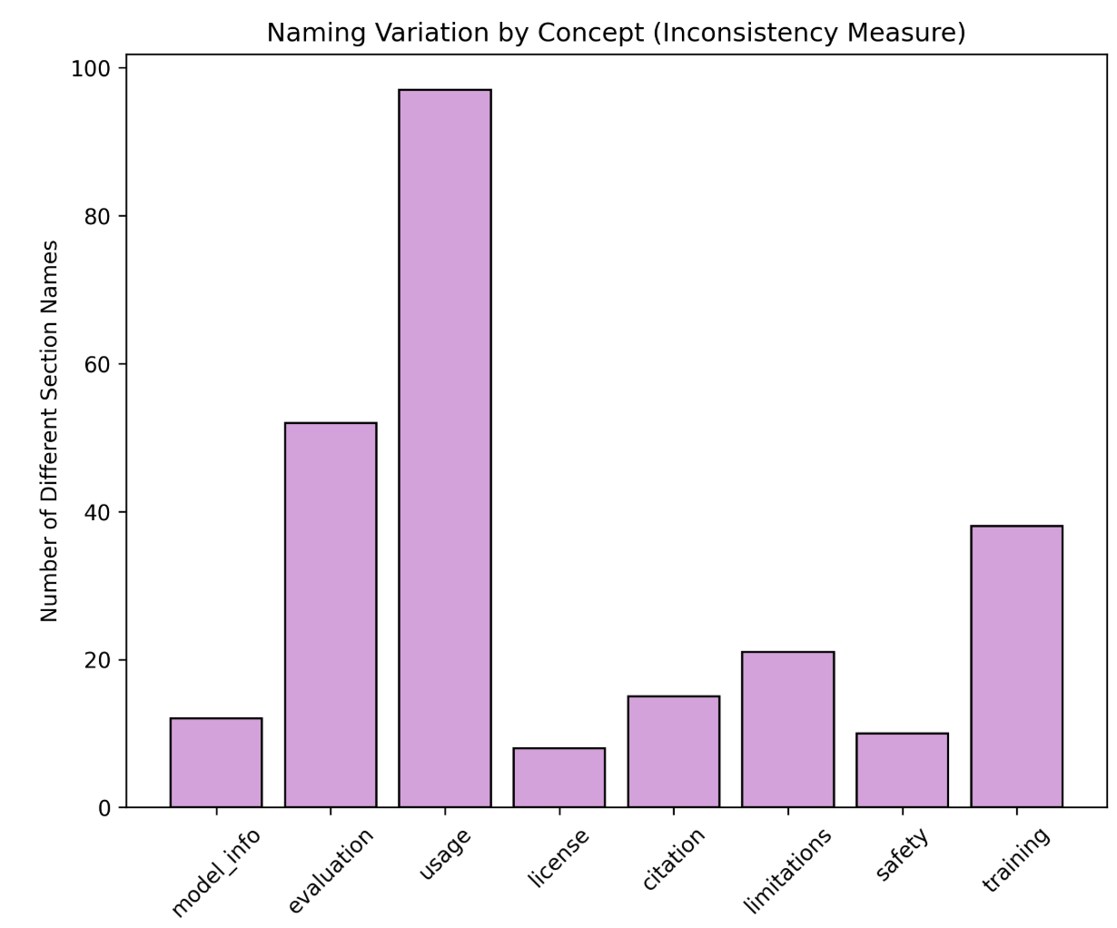
Figure 3: Naming variation across core documentation concepts. Usage information appears under 97 different section names, demonstrating severe inconsistency in model card structure
Our analysis identified 947 unique section names across all cards. We used fuzzy matching to group semantically similar section names by core concept (e.g., all variations describing model usage, evaluation, or training). Figure 3 shows the number of different section names used for each concept. Usage-related information showed the highest variation with 97 different section names, followed by evaluation (52 variations) and training (38 variations). Even fundamental concepts like license information appeared under 8 different names. This extreme variability makes it nearly impossible to systematically extract and compare information across models, reinforcing the need for a stable and shared documentation schema.
We also found that:
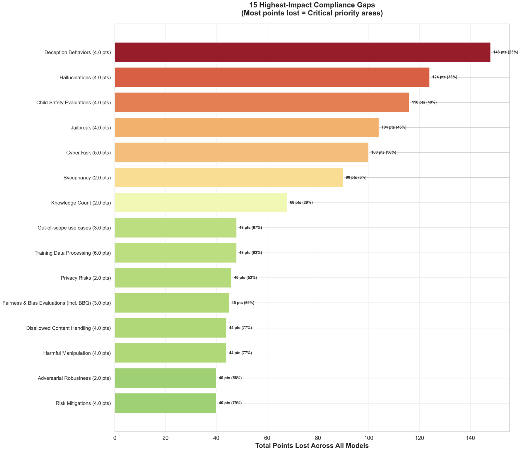
- Safety-critical fields (e.g., hallucination behavior, jailbreak resistance, cyber risk) show the largest deficits (Figure 4).
- Providers differ widely in average compliance (Figure 5).
- Weighted scoring exposes high-impact gaps that unweighted scoring fails to surface.
<details>
<summary>gap-comply.png Details</summary>
### Visual Description
## Horizontal Bar Chart: 15 Highest-Impact Compliance Gaps
### Overview
This is a horizontal bar chart titled "15 Highest-Impact Compliance Gaps (Most points lost = Critical priority areas)". It ranks 15 categories of AI model compliance failures based on the total points lost across all evaluated models. The chart uses a color gradient from dark red (most critical) to light green (less critical) to visually emphasize priority. The bars are ordered from the highest total points lost at the top to the lowest at the bottom.
### Components/Axes
* **Title:** "15 Highest-Impact Compliance Gaps (Most points lost = Critical priority areas)" - Located at the top center.
* **Y-Axis (Vertical):** Lists the 15 compliance gap categories. Each label includes the category name and a base point value in parentheses (e.g., "Deception Behaviors (4.0 pts)").
* **X-Axis (Horizontal):** Labeled "Total Points Lost Across All Models". The scale runs from 0 to 140, with major gridlines at intervals of 20 (0, 20, 40, 60, 80, 100, 120, 140).
* **Data Labels:** Each bar has a data label at its end showing the exact "Total Points Lost" and a percentage in parentheses (e.g., "148 pts (23%)").
* **Color Legend:** While not in a separate box, the color of each bar serves as a visual legend for severity. The gradient progresses from dark red (top) through orange and yellow to light green (bottom).
### Detailed Analysis
The chart presents the following data, listed from top (most critical) to bottom:
1. **Deception Behaviors (4.0 pts):** Dark red bar. **148 pts (23%)**. This is the longest bar, extending past the 140 mark on the x-axis.
2. **Hallucinations (4.0 pts):** Red-orange bar. **124 pts (35%)**.
3. **Child Safety Evaluations (4.0 pts):** Orange bar. **116 pts (40%)**.
4. **Jailbreak (4.0 pts):** Light orange bar. **104 pts (46%)**.
5. **Cyber Risk (5.0 pts):** Yellow-orange bar. **100 pts (58%)**.
6. **Sycophancy (2.0 pts):** Yellow bar. **90 pts (6%)**.
7. **Knowledge Count (2.0 pts):** Light yellow bar. **68 pts (29%)**.
8. **Out-of-scope use cases (3.0 pts):** Yellow-green bar. **48 pts (67%)**.
9. **Training Data Processing (6.0 pts):** Yellow-green bar. **48 pts (83%)**.
10. **Privacy Risks (2.0 pts):** Light green bar. **46 pts (52%)**.
11. **Fairness & Bias Evaluations (incl. BBQ) (3.0 pts):** Light green bar. **45 pts (69%)**.
12. **Disallowed Content Handling (4.0 pts):** Light green bar. **44 pts (77%)**.
13. **Harmful Manipulation (4.0 pts):** Light green bar. **44 pts (77%)**.
14. **Adversarial Robustness (2.0 pts):** Light green bar. **40 pts (58%)**.
15. **Risk Mitigations (4.0 pts):** Light green bar. **40 pts (79%)**.
**Spatial Grounding:** The title is centered at the top. The y-axis labels are left-aligned. The x-axis label is centered at the bottom. The data labels are right-aligned to the end of each bar.
### Key Observations
* **Clear Priority Tier:** The top four gaps (Deception Behaviors, Hallucinations, Child Safety, Jailbreak) are visually distinct, colored in shades of red/orange, and have significantly higher point losses (104-148 pts) than the rest.
* **Color-Severity Correlation:** The color gradient strongly correlates with the ranking. The most critical issues are red, transitioning through orange and yellow to green for the least critical in this top-15 list.
* **Inverse Relationship with Compliance %:** The percentage in parentheses (likely representing a compliance or failure rate) does not directly correlate with the total points lost. For example, "Sycophancy" has a very low 6% but is 6th in points lost, while "Training Data Processing" has a high 83% but is 9th. This suggests the percentage is a different metric (e.g., failure rate within the category) and the "points lost" is an aggregate impact score.
* **Tied Values:** "Out-of-scope use cases" and "Training Data Processing" are tied at 48 pts. "Disallowed Content Handling" and "Harmful Manipulation" are tied at 44 pts. "Adversarial Robustness" and "Risk Mitigations" are tied at 40 pts.
### Interpretation
This chart is a risk prioritization tool for AI model compliance and safety. It demonstrates that **deceptive behaviors and hallucinations are the most impactful failure modes**, causing the greatest aggregate point loss across models. This suggests these areas are both highly weighted in the scoring system and represent widespread weaknesses.
The high ranking of **Child Safety** and **Jailbreak** vulnerabilities indicates these are also critical, high-priority areas for mitigation. The data implies that while models may have varying failure rates (the percentages) within categories, the *cumulative impact* of failures in categories like Deception and Hallucinations is far greater, making them the most urgent targets for improvement.
The chart effectively argues that resources should be allocated first to the red/orange categories at the top, as addressing these gaps would yield the largest improvement in overall compliance score. The green categories, while still important, represent lower-impact gaps relative to the top tier.
</details>
Figure 4: Aggregate point loss by subsection across all models. Higher point loss indicates categories where documentation gaps have the greatest impact on overall transparency scores due to their weight and prevalence of absence.
### IV-B Introduce a Documentation Benchmarking Scorecard
This core schema is implemented as a framework that consists of 8 main sections and 23 subsections (see Table I). The framework synthesizes common documentation categories we identified across existing models, aligns them with EU AI Act Annex IV requirements and the Stanford Transparency Index, and prioritizes fields based on their importance for safety and governance [eu_ai_act_annex_iv, bommasani2024fmti]. Our framework assigns weighted scores to each subsection, with weights reflecting the relative importance of different disclosure types. Safety-critical information receives substantially higher weights: Safety Evaluation (25%), Critical Risk (20%), and Model Data (15%) together account for 60% of the total score, while technical specifications like Model Implementation and Sustainability (5%) and Risk Mitigations (4%) receive lower weights. By emphasizing safety-critical disclosures, the scorecard highlights governance-relevant gaps that unweighted scoring obscures.
<details>
<summary>compliance.jpg Details</summary>
### Visual Description
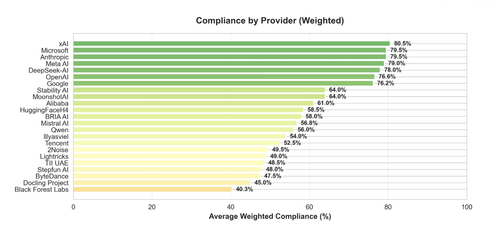
## Horizontal Bar Chart: Compliance by Provider (Weighted)
### Overview
This image displays a horizontal bar chart titled "Compliance by Provider (Weighted)". It ranks 22 artificial intelligence companies or projects based on a metric called "Average Weighted Compliance (%)". The chart uses a color gradient from dark green (highest compliance) to light yellow (lowest compliance) to visually group performance tiers.
### Components/Axes
* **Chart Title:** "Compliance by Provider (Weighted)" - located at the top center.
* **Y-Axis (Vertical):** Lists the names of the AI providers. The list is ordered from highest compliance at the top to lowest at the bottom.
* **X-Axis (Horizontal):** Labeled "Average Weighted Compliance (%)". The scale runs from 0 to 100, with major tick marks and labels at 0, 20, 40, 60, 80, and 100.
* **Data Representation:** Horizontal bars extend from the y-axis to the right. The length of each bar corresponds to the compliance percentage, which is also written numerically at the end of each bar.
* **Color Legend (Implied):** There is no separate legend box. The color of the bars serves as an implicit legend:
* **Dark Green:** Highest compliance tier (approximately 76% and above).
* **Medium Green:** High compliance tier (approximately 64% to 76%).
* **Light Green/Yellow:** Mid-tier compliance (approximately 56% to 64%).
* **Pale Yellow:** Lower compliance tier (approximately 40% to 56%).
### Detailed Analysis
The chart presents the following data points, listed from top (highest) to bottom (lowest). The visual trend is a clear, stepwise decrease in bar length and a shift in color from dark green to pale yellow as you move down the list.
| Provider | Average Weighted Compliance (%) | Bar Color (Approximate) |
| :--- | :--- | :--- |
| xAI | 80.5% | Dark Green |
| Microsoft | 79.5% | Dark Green |
| Anthropic | 79.5% | Dark Green |
| Meta AI | 79.0% | Dark Green |
| DeepSeek-AI | 78.0% | Dark Green |
| OpenAI | 76.6% | Dark Green |
| Google | 76.2% | Dark Green |
| Stability AI | 64.0% | Medium Green |
| MoonshotAI | 64.0% | Medium Green |
| Alibaba | 61.0% | Light Green |
| HuggingFaceH4 | 58.5% | Light Green |
| BRIA AI | 58.0% | Light Green |
| Mistral AI | 56.8% | Light Green |
| Qwen | 56.0% | Light Green |
| Illyasviel | 54.0% | Pale Yellow |
| Tencent | 52.5% | Pale Yellow |
| 2Noise | 49.5% | Pale Yellow |
| Lightricks | 49.0% | Pale Yellow |
| TII UAE | 48.5% | Pale Yellow |
| Stepfun AI | 48.0% | Pale Yellow |
| ByteDance | 47.5% | Pale Yellow |
| Docling Project | 45.0% | Pale Yellow |
| Black Forest Labs | 40.3% | Pale Yellow |
### Key Observations
1. **Top Tier Clustering:** Seven providers (xAI through Google) form a distinct top cluster with compliance scores between 76.2% and 80.5%. The differences within this group are small (max 4.3 percentage points).
2. **Significant Drop-off:** There is a notable 12.2 percentage point gap between the lowest of the top tier (Google at 76.2%) and the highest of the next tier (Stability AI and MoonshotAI at 64.0%).
3. **Gradual Decline:** Below the top tier, the decline in compliance scores is more gradual, with a steady decrease from 64.0% down to 40.3%.
4. **Color-Coded Performance:** The color gradient effectively segments the providers into performance bands, making the tier structure immediately apparent.
5. **Lowest Performer:** Black Forest Labs has the lowest recorded compliance at 40.3%, which is less than half the score of the top performer, xAI (80.5%).
### Interpretation
This chart provides a comparative snapshot of how different AI providers perform against a "weighted compliance" standard. The data suggests a highly competitive and relatively homogeneous top tier, where leading companies are achieving very similar, high levels of compliance. The significant gap after this group indicates a clear stratification in the market, possibly reflecting differences in resources, maturity, or strategic focus on compliance metrics.
The "weighted" nature of the compliance score implies that not all compliance factors are treated equally; some criteria likely carry more importance in the calculation. The chart does not specify what these criteria are (e.g., safety protocols, content moderation, regulatory adherence, transparency). Therefore, while it effectively ranks providers, the underlying reasons for the disparities require additional context about the evaluation methodology. The visualization is effective for quick benchmarking but would be most powerful when accompanied by a definition of the compliance metrics used.
</details>
Figure 5: Weighted compliance scores by provider. Major frontier labs (xAI, Microsoft, Anthropic, Meta) achieve 80% compliance, while smaller providers range from 40-65%.
| Model Details (15%) | Model overview | 3 |
| --- | --- | --- |
| Organization developing the model | 1 | |
| Model Version | 2 | |
| Model Release Date | 0.5 | |
| Model Version Progression | 1 | |
| Model Architecture | 4 | |
| Model Dependencies | 1 | |
| Paper and relevant links | 0.5 | |
| Model Distribution Forms | 2 | |
| Model Inputs & Outputs (6%) | Inputs | 2 |
| Outputs | 2 | |
| Token Count | 2 | |
| Model Data (15%) | Training Dataset | 7 |
| Training Data Processing | 6 | |
| Knowledge Count | 2 | |
| Model Implementation and Sustainability (5%) | Hardware Used During Training & Inference | 2 |
| Software Frameworks & Tooling | 2 | |
| Energy Use / Sustainability Metrics | 1 | |
| Intended Use (10%) | Primary intended uses | 5 |
| Primary intended users | 2 | |
| Out-of-scope use cases | 3 | |
| Critical Risk (20%) | CBRN (Chemical, Biological, Radiological or Nuclear) | 5 |
| Cyber Risk | 5 | |
| Harmful Manipulation | 4 | |
| Child Safety Evaluations | 4 | |
| Privacy Risks | 2 | |
| Safety Evaluation (25%) | Refusals | 1 |
| Disallowed Content Handling | 4 | |
| Sycophancy | 2 | |
| Jailbreak | 4 | |
| Hallucinations | 4 | |
| Deception Behaviors | 4 | |
| Fairness & Bias Evaluations (incl. BBQ) | 3 | |
| Adversarial Robustness | 2 | |
| Red Teaming Results | 1 | |
| Risk Mitigations (4%) | Risk Mitigation | 4 |
TABLE I: Proposed Documentation Transparency Framework: Sections, Subsections, and Scores
### IV-C Framework Objectives and Weighting Approach
Our framework targets the two largest deficiencies in current AI documentation ecosystems: consistency and evaluability. Rather than adding yet another lengthy template, it distills the essential fields that matter for oversight and aligns them with existing regulatory expectations, making adoption practical for developers and meaningful for policymakers.
Our weighted scoring method also addresses the problem of treating all documentation fields as equally important. By weighting safety-critical disclosures more heavily, the scorecard highlights the gaps that matter most for governance. In our evaluation, this method surfaced high-risk blind spots that were invisible under unweighted scoring, producing a clearer and more policy-relevant picture of model transparency.
We recommend requiring AI developers to publish model and system documentation not only as PDFs or web pages but also as machine-readable JSON following an open, extensible schema. This schema would encode core fields such as model name and version, training data summary, evaluation benchmarks, known limitations, and implemented safety mitigations. Machine-readable documentation enables researchers, regulators, and civil-society organizations to programmatically ingest, compare, and audit models at scale.
In developing our methodology, we also examined several plausible approaches for improving AI documentation consistency and transparency. Each alternative offers conceptual advantages but also reveals structural limitations that constrain its practical effectiveness.
- Developing a comprehensive new documentation framework. One approach is to design a fully new documentation standard that supersedes existing model cards, data sheets, and system cards. While appealing in terms of conceptual clarity, this strategy adds another framework to an already crowded landscape. Creating a standalone standard risks poor adoption, limited interoperability with existing tools, and slow industry uptake. It also overlooks areas where partial convergence already exists, such as shared fields across model cards and system cards.
- Strengthening voluntary narrative guidelines. Another approach is to rely on high-level best-practice recommendations encouraging developers to “write better model cards.” Although lightweight and easy to disseminate, purely narrative guidance does not correct the structural issues observed in our empirical analysis: inconsistent field definitions, lack of machine-readable formats, and wide variability in documentation depth. Moreover, voluntary guidelines provide weak incentives and no mechanism for automated evaluation, limiting their ability to drive meaningful improvement.
- Establishing an immediate, globally harmonized regulatory standard. A third approach is to push for a fully harmonized international standard for AI documentation. While this could theoretically provide a unified foundation, it is politically and technically difficult to implement in the near term. Regulatory ecosystems differ across jurisdictions, and AI systems evolve faster than global regulatory consensus can form. Such an approach risks regulatory stagnation or adoption of a lowest-common-denominator standard. As a result, it provides limited near-term utility for practitioners or policymakers.
<details>
<summary>system-design.jpg Details</summary>
### Visual Description
## Diagram: Automated Model Card Population Process Flow
### Overview
This image is a technical flowchart diagram illustrating a multi-step, automated process for populating a "New Model Card Framework" using external data sources and multiple Large Language Models (LLMs) for consensus-based scoring. The process involves querying the internet, processing results through multiple AI models, and using a majority vote to finalize the framework's content.
### Components/Axes
The diagram is composed of colored rectangular and cloud-shaped nodes connected by directional arrows with descriptive labels. The components are spatially arranged in a roughly circular flow.
**Nodes (Components):**
1. **Start** (Yellow box, top-left): The initiation point of the process.
2. **Our New Model Card Framework** (Green box, left-center): Labeled as the "Source of Truth." This is the target document being populated.
3. **Query Generation** (Orange box, center): The first of two nodes with this label. It receives input from the framework and the model dataset.
4. **Data set of models (Claude, GPT...etc)** (Blue cloud, top-center): Represents an external repository of AI models.
5. **Perplexity Search API** (Purple box, right-center): An external search service used to gather information.
6. **Query Generation** (Orange box, bottom-right): The second node with this label. It processes search results.
7. **LLM1, LLM2, LLM3** (Green, Yellow, Grey circles, vertically stacked in a white container, bottom-center): Three distinct Large Language Models used for analysis and scoring.
8. **Consensus: Majority vote** (Pink box, bottom-left): The decision-making step based on LLM outputs.
9. **Populate the Framework** (Cyan box, bottom-left): The final action step that updates the source document.
**Flow Connections (Arrows & Labels):**
* **Start** → **Our New Model Card Framework**
* **Our New Model Card Framework** → **Query Generation (1st)**: Label: "Select a section e.g. Safety"
* **Data set of models** → **Query Generation (1st)**: Label: "Select a model e.g. Claude Sonnet 4"
* **Query Generation (1st)** → **Perplexity Search API**: Label: "Search the internet for safety and its subsections for Claude Sonnet 4"
* **Perplexity Search API** → **Query Generation (2nd)**: Label: "Results in Chunks with sources"
* **Query Generation (2nd)** → **LLM1, LLM2, LLM3**: Three separate arrows, one to each LLM. Label on the arrow to LLM2: "Score based on our new model card"
* **LLM1, LLM2, LLM3** → **Consensus: Majority vote**: Three separate arrows converging on the consensus node.
* **Consensus: Majority vote** → **Populate the Framework**
* **Populate the Framework** → **Start**: A long, curved arrow completing the loop, indicating the process can be iterative.
### Detailed Analysis / Content Details
The process flow is sequential with a feedback loop:
1. **Initiation & Scoping:** The process begins at "Start." It uses the existing "New Model Card Framework" as the source of truth. A specific section (e.g., "Safety") is selected from this framework.
2. **Model Selection & Query Formulation:** Concurrently, a specific AI model (e.g., "Claude Sonnet 4") is selected from an external dataset. These two inputs (section and model name) are fed into the first "Query Generation" step.
3. **Information Retrieval:** The generated query is sent to the "Perplexity Search API" to search the internet for relevant information (e.g., "safety and its subsections for Claude Sonnet 4").
4. **Result Processing:** The search API returns "Results in Chunks with sources." These results are processed by the second "Query Generation" node.
5. **Multi-Model Analysis & Scoring:** The processed information is sent to three separate LLMs (LLM1, LLM2, LLM3). The label indicates they "Score based on our new model card," meaning they evaluate the retrieved information against the framework's criteria.
6. **Consensus Decision:** The scores or outputs from the three LLMs are aggregated in the "Consensus: Majority vote" step to determine the final, agreed-upon content.
7. **Action & Iteration:** The consensus result is used to "Populate the Framework." An arrow loops back from this step to "Start," indicating the entire process can be repeated for another section or model.
### Key Observations
* **Redundancy for Accuracy:** The use of three separate LLMs (LLM1, LLM2, LLM3) and a majority vote consensus mechanism is a key design choice to improve reliability and reduce bias or error from any single model.
* **External Data Dependency:** The process critically depends on two external services: a "Data set of models" for selection and the "Perplexity Search API" for real-time information retrieval.
* **Iterative Design:** The feedback loop from "Populate the Framework" back to "Start" suggests this is designed as a continuous or batch process to fill out the entire model card section by section.
* **Clear Role Separation:** There is a clear separation between query formulation (orange boxes), information retrieval (purple box), analysis (LLM circles), and decision-making (pink box).
### Interpretation
This diagram outlines a sophisticated, automated pipeline for creating or updating technical documentation (model cards) for AI systems. The core problem it solves is the manual, time-consuming effort required to gather and synthesize accurate, up-to-date information about AI model capabilities and safety from disparate internet sources.
The process demonstrates a **Peircean investigative approach**:
1. **Abduction (Hypothesis Generation):** The "Query Generation" steps form a hypothesis about what information is needed (e.g., "What are Claude Sonnet 4's safety subsections?").
2. **Deduction (Prediction):** The search API is used to deduce where that information might be found online.
3. **Induction (Testing & Generalization):** The three LLMs act as independent testers, evaluating the retrieved evidence against the model card framework. The majority vote is an inductive step to generalize the most reliable conclusion from multiple observations.
The **underlying principle** is leveraging consensus among multiple AI agents to produce trustworthy, sourced content, thereby automating a complex research and synthesis task. The "Source of Truth" label on the framework implies it is the canonical structure, while the external search and LLM analysis provide the dynamic content to fill it. The outlier in the flow is the direct link from the model dataset to query generation, highlighting that the process is model-specific, not generic.
</details>
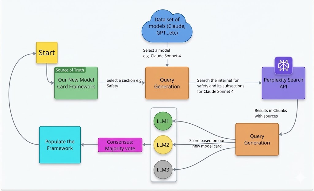
Figure 6: Overview of our automated data extraction and scoring pipeline. Starting from our model card framework (source of truth), the system selects a model, generates targeted queries for each section, retrieves evidence from the Perplexity Search API, evaluates the results using multiple LLMs through majority-vote consensus, and populates the standardized model card schema.
## V Automated Documentation Extraction Pipeline
Manual evaluation of model documentation against our framework would be time-consuming and not scalable across hundreds of models. To address this limitation, we developed an automated agentic pipeline that extracts, evaluates, and scores documentation using a multi-agent LLM system with web search capabilities [AI_transparency_atlas_2025]. This approach builds on recent work by Liu et al. [liu2024automaticgenerationmodeldata], who demonstrated the feasibility of using LLMs to automatically generate model and data cards. While their work focuses on creating documentation artifacts, our pipeline evaluates and scores existing documentation by extracting information from dispersed public sources.
### V-A Pipeline Architecture
Figure 6 illustrates the overall pipeline architecture. The process begins by selecting a model from our dataset (e.g., Claude Sonnet 4, GPT-5, Llama 4). For each selected model, the pipeline iterates through the eight main sections and 23 subsections defined in our framework (see Table I).
### V-B Query Generation and Information Retrieval
For each subsection (e.g., Safety Evaluation $\rightarrow$ Jailbreak), the pipeline generates targeted search queries designed to retrieve relevant documentation from publicly available sources. We use the Perplexity Search API to collect evidence from model cards, system cards, technical reports, blog posts, and GitHub repositories.
This design reflects real-world auditing conditions, as it evaluates only information accessible to external auditors, policymakers, and users without direct cooperation from model developers. Search results are returned in structured chunks with source citations, preserving traceability and transparency.
### V-C Multi-Agent Consensus Scoring
Retrieved documentation is independently evaluated by three LLM agents (LLM 1, LLM 2, LLM 3). Each agent assesses documentation completeness for a given subsection according to our framework criteria and assigns one of the following labels:
- Detailed: Substantive, specific, and actionable information
- Mentioned: Present but superficial or vague information
- Absent: No relevant information found
The final score for each subsection is determined using majority-vote consensus across the three agents.
### V-D Framework Population
After all subsections are evaluated, the pipeline populates the framework with the extracted evidence and consensus scores. Subsection scores are then aggregated using the weighting scheme defined in Table I to produce an overall transparency rating for each model.
### V-E Scalability and Cost
The pipeline is fully automated and cost-efficient. Evaluating all 50 models across 23 subsections cost less than $3 total (under $0.06 per model), enabling large-scale analysis across hundreds of models. We validated the pipeline on models spanning vision, multimodal, open-source, and closed-source systems, demonstrating robustness across diverse documentation formats and styles.
## VI Discussion, Limitations, and Future Work
Our framework enables model providers to assess their documentation transparency in real-time. Providers can access a live dashboard showing their overall transparency score and subsection-level breakdowns, immediately identifying gaps in their documentation. For example, a provider scoring high on technical specifications (Model Architecture, Compute Requirements) but low on safety-critical categories (Jailbreak Evaluations, Child Safety) can prioritize improvements in those areas.
Our pipeline offers a pragmatic middle ground: instead of requiring providers to restructure their documentation, we automatically aggregate information from dispersed sources and present it through a standardized evaluation framework. This enables consistent cross-model comparison even when underlying documentation practices vary, lowering adoption barriers while improving transparency assessment for regulators, researchers, and users.
A potential limitation of any weighted scoring system is that providers may optimize for score maximization rather than genuine transparency. Since our framework assigns higher weights to safety-critical categories (Safety Evaluation: 25%, Critical Risk: 20%), providers could strategically prioritize these sections to boost scores while neglecting lower-weighted but still important disclosures.
However, several design features mitigate this risk. First, our framework requires substantive, detailed information—not just the presence of a section. Surface-level statements that mention safety evaluations without specific methodologies, results, or limitations receive lower scores than comprehensive disclosures. Second, the multi-agent consensus mechanism evaluates documentation quality, not just existence, making it harder to game through minimal compliance. Third, transparency scores are most valuable when used comparatively and longitudinally; providers who inflate scores through selective disclosure will be evident when their documentation is examined alongside peers or tracked over time.
Beyond point-in-time evaluation, our structured representation of publicly available documentation enables systematic tracking of documentation changes across model versions. By normalizing dispersed online disclosures into a consistent schema, the framework creates a stable reference that can be compared longitudinally as models evolve. While the current study focuses on static snapshots, we plan to extend this pipeline to support version-aware analysis, allowing transparency scores and subsection-level disclosures to be tracked across releases. This would enable stakeholders to monitor how safety claims, evaluation practices, and risk disclosures change over time, and to identify regressions or improvements in transparency as models are updated.
## VII Conclusion
AI model documentation today is fragmented, inconsistent, and insufficient for meaningful oversight. Information is scattered across platforms, section naming varies wildly across providers, and safety-critical disclosures are frequently absent or superficial. These gaps undermine the ability of regulators, researchers, and downstream users to assess model risks, compare alternatives, and make informed decisions. This paper presented a structured response to these challenges. Through empirical analysis of frontier model documentation and 100 Hugging Face model cards, we identified systematic inconsistencies in how models are documented. We developed a transparency framework with 8 sections and 23 subsections, grounded in the EU AI Act Annex IV and the Stanford Transparency Index, with weighted scoring that prioritizes safety-critical information over technical specifications.To operationalize this framework at scale, we built an automated agentic pipeline that extracts documentation from public sources, evaluates completeness using multi-agent consensus, and generates transparency scores. The pipeline cost less than $3 to evaluate 50 diverse models, demonstrating economic feasibility for continuous, large-scale monitoring. Our evaluation reveals significant transparency gaps across the ecosystem. While frontier labs like xAI, Microsoft, and Anthropic achieve 80% compliance, many smaller providers fall below 50%. Categories like Interpretability and Safety Evaluation—critical for governance—remain poorly documented across most models. The framework offers practical value for multiple stakeholders. Providers can use live dashboards to identify documentation gaps and track improvements over time. Regulators gain evidence-based tools for compliance assessment without manual audits. Researchers obtain standardized metrics for cross-model comparison. Users gain visibility into which models have comprehensive safety documentation. Moving forward, transparency in AI cannot rely solely on voluntary adoption of documentation standards. Our approach demonstrates that automated extraction and standardized evaluation can bridge the gap between current fragmented practices and the structured information needed for accountability. As AI systems become more capable and widely deployed, robust documentation transparency is not optional—it is foundational to responsible governance.