# Two Pathways to Truthfulness: On the Intrinsic Encoding of LLM Hallucinations
> Corresponding author
## Abstract
Despite their impressive capabilities, large language models (LLMs) frequently generate hallucinations. Previous work shows that their internal states encode rich signals of truthfulness, yet the origins and mechanisms of these signals remain unclear. In this paper, we demonstrate that truthfulness cues arise from two distinct information pathways: (1) a Question-Anchored pathway that depends on question–answer information flow, and (2) an Answer-Anchored pathway that derives self-contained evidence from the generated answer itself. First, we validate and disentangle these pathways through attention knockout and token patching. Afterwards, we uncover notable and intriguing properties of these two mechanisms. Further experiments reveal that (1) the two mechanisms are closely associated with LLM knowledge boundaries; and (2) internal representations are aware of their distinctions. Finally, building on these insightful findings, two applications are proposed to enhance hallucination detection performance. Overall, our work provides new insight into how LLMs internally encode truthfulness, offering directions for more reliable and self-aware generative systems.
Two Pathways to Truthfulness: On the Intrinsic Encoding of LLM Hallucinations
Wen Luo $\heartsuit$ , Guangyue Peng $\heartsuit$ , Wei Li $\heartsuit$ , Shaohang Wei $\heartsuit$ , Feifan Song $\heartsuit$ , Liang Wang ♠, Nan Yang ♠, Xingxing Zhang ♠, Jing Jin $\heartsuit$ , Furu Wei ♠, Houfeng Wang $\heartsuit$ thanks: Corresponding author $\heartsuit$ State Key Laboratory of Multimedia Information Processing, School of Computer Science, Peking University ♠ Microsoft Research Asia
## 1 Introduction
Despite their remarkable capabilities in natural language understanding and generation, large language models (LLMs) often produce hallucinations —outputs that appear plausible but are factually incorrect. This phenomenon poses a critical challenge for deploying LLMs in real-world applications where reliability and trustworthiness are paramount (Shi et al., 2024; Bai et al., 2024). One line of research tackles hallucination detection from an extrinsic perspective (Min et al., 2023; Hu et al., 2025; Huang et al., 2025), evaluating only the model’s outputs while disregarding its internal dynamics. Although such approaches can identify surface-level textual inconsistencies, their extrinsic focus limits the insight they offer into the underlying causes of hallucinations. Complementing these efforts, another line of work investigates the intrinsic properties of LLMs, revealing that their internal representations encode rich truthfulness signals (Burns et al., 2023; Li et al., 2023; Chen et al., 2024; Orgad et al., 2025; Niu et al., 2025). These internal truthfulness signals can be exploited to detect an LLM’s own generative hallucinations by training a linear classifier (i.e., a probe) on its hidden representations. However, while prior work establishes the presence of such cues, the mechanisms by which they arise and operate remain largely unexplored. Recent studies indicate well-established mechanisms in LLMs that underpin complex capabilities such as in-context learning (Wang et al., 2023), long-context retrieval (Wu et al., 2025), and reasoning (Qian et al., 2025). This observation naturally leads to a key question: how do truthfulness cues arise and function within LLMs?
In this paper, we uncover that truthfulness signals in LLMs arise from two distinct information pathways: (1) a Question-Anchored (Q-Anchored) pathway, which depends on the flow of information from the input question to the generated answer, and (2) an Answer-Anchored (A-Anchored) pathway, which derives self-contained evidence directly from the model’s own outputs. We begin with a preliminary study using saliency analysis to quantify information flow potentially relevant to hallucination detection. Results reveal a bimodal distribution of dependency on question–answer interactions, suggesting heterogeneous truthfulness encoding mechanisms. To validate this hypothesis, we design two experiments across 4 diverse datasets using 12 models that vary in both architecture and scale, including base, instruction-tuned, and reasoning-oriented models. By (i) blocking critical question–answer information flow through attention knockout (Geva et al., 2023; Fierro et al., 2025) and (ii) injecting hallucinatory cues into questions via token patching (Ghandeharioun et al., 2024; Todd et al., 2024), we disentangle these truthfulness pathways. Our analyses confirm that Q-Anchored signals rely heavily on question-derived cues, whereas A-Anchored signals are robust to their removal and primarily originate from the generated answer itself.
Building on this foundation, we further investigate emergent properties of these truthfulness pathways through large-scale experiments. Our findings highlight two intriguing characteristics: (1) Association with knowledge boundaries: Q-anchored encoding predominates for well-established facts that fall within the knowledge boundary, whereas A-anchored encoding is favored in long-tail cases. (2) Self-awareness: LLM internal states can distinguish which mechanism is being employed, suggesting intrinsic awareness of pathway distinctions.
Finally, these analyses not only deepen our mechanistic understanding of hallucinations but also enable practical applications. Specifically, by leveraging the fundamentally different dependencies of the truthfulness pathways and the model’s intrinsic awareness, we propose two pathway-aware strategies to enhance hallucination detection. (1) Mixture-of-Probes (MoP): Motivated by the specialization of internal pathways, MoP employs a set of expert probing classifiers, each tailored to capture distinct truthfulness encoding mechanisms. (2) Pathway Reweighting (PR): From the perspective of selectively emphasizing pathway-relevant internal cues, PR modulates information intensity to amplify signals that are most informative for hallucination detection, aligning internal activations with pathway-specific evidence. Experiments demonstrate that our proposed methods consistently outperform competing approaches, achieving up to a 10% AUC gain across various datasets and models.
Overall, our key contributions are summarized as follows:
- (Mechanism) We conduct a systematic investigation into how internal truthfulness signals emerge and operate within LLMs, revealing two distinct information pathways: a Question-Anchored pathway that relies on question–answer information flow, and an Answer-Anchored pathway that derives self-contained evidence from the generated output.
- (Discovery) Through large-scale experiments across multiple datasets and model families, we identify two key properties of these mechanisms: (i) association with knowledge boundaries, and (ii) intrinsic self-awareness of pathway distinctions.
- (Application) Building on these findings, we propose two pathway-aware detection methods that exploit the complementary nature of the two mechanisms to enhance hallucination detection, providing new insights for building more reliable generative systems.
## 2 Background
### 2.1 Hallucination Detection
Given an LLM $f$ , we denote the dataset as $D=\{(q_i,\hat{y}^f_i,z^f_i)\}_i=1^N$ , where $q_i$ is the question, $\hat{y}^f_i$ the model’s answer in open-ended generation, and $z^f_i∈\{0,1\}$ indicates whether the answer is hallucinatory. The task is to predict $z^f_i$ given the input $x^f_i=[q_i,\hat{y}^f_i]$ for each instance. Cases in which the model refuses to answer are excluded, as they are not genuine hallucinations and can be trivially classified. Methods based on internal signals assume access to the model’s hidden representations but no external resources (e.g., retrieval systems or fact–checking APIs) (Xue et al., 2025a). Within this paradigm, probing trains a lightweight linear classifier on hidden activations to discriminate between hallucinatory and factual outputs, and has been shown to be among the most effective approaches in this class of internal-signal-based methods (Orgad et al., 2025).
### 2.2 Exact Question and Answer Tokens
To analyze the origins and mechanisms of truthfulness signals in LLMs, we primarily focus on exact tokens in question–answer pairs. Not all tokens contribute equally to detecting factual errors: some carry core information essential to the meaning of the question or answer, while others provide peripheral details. We draw on semantic frame theory (Baker et al., 1998; Pagnoni et al., 2021), which represents a situation or event along with its participants and their roles. In the theory, frame elements are categorized as: (1) Core frame elements, which define the situation itself, and (2) Non-core elements, which provide additional, non-essential context.
As shown in Table 1, we define: (1) Exact question tokens: core frame elements in the question, typically including the exact subject and property tokens (i.e., South Carolina and capital). (2) Exact answer tokens: core frame elements in the answer that convey the critical information required to respond correctly (i.e., Columbia). Humans tend to rely more on core elements when detecting errors, as these tokens carry the most precise information. Consistent with this intuition, recent work (Orgad et al., 2025) shows that probing activations on the exact answer tokens offers the strongest signal for hallucination detection, outperforming all other token choices. Motivated by these findings, our analysis mainly centers on exact tokens to probe truthfulness signals in LLMs. Moreover, to validate the robustness of our conclusions, we also conduct comprehensive experiments using alternative, non–exact-token configurations (see Appendix B.2).
| Question: What is the capital of South Carolina? |
| --- |
| Answer: It is Columbia, a hub for government, culture, and education that houses the South Carolina State House and the University of South Carolina. |
Table 1: Example of exact question and answer tokens. Colors indicate token types: – exact property, – exact subject, and – exact answer tokens.
## 3 Two Internal Truthfulness Pathways
We begin with a preliminary analysis using metrics based on saliency scores (§ 3.1). The quantitative results reveal two distinct information pathways for truthfulness encoding: (1) a Question-Anchored (Q-Anchored) Pathway, which relies heavily on exact question tokens (i.e., the questions), and (2) an Answer-Anchored (A-Anchored) Pathway, in which the truthfulness signal is largely independent of the question-to-answer information flow. Section 3.2 presents experiments validating this hypothesis. In particular, we show that Q-Anchored Pathway depends critically on information flowing from the question to the answer, whereas the signals along the A-Anchored Pathway are primarily derived from the LLM-generated answer itself.
### 3.1 Saliency-Driven Preliminary Study
This section investigates the intrinsic characteristics of LLM attention interactions and their potential role in truthfulness encoding. We employ saliency analysis (Simonyan et al., 2014), a widely used interpretability method, to reveal how attention among tokens influences probe decisions. Following common practice (Michel et al., 2019; Wang et al., 2023), we compute the saliency score as:
$$
S^l(i,j)=≤ft|A^l(i,j)\frac{∂L(x)}{∂ A^l(i,j)}\right|, \tag{1}
$$
where $S^l$ denotes the saliency score matrix of the $l$ -th layer, $A^l$ represents the attention weights of that layer, and $L$ is the loss function for hallucination detection (i.e., the binary cross-entropy loss). Scores are averaged over all attention heads within each layer. In particular, $S^l(i,j)$ quantifies the saliency of attention from query $i$ to key $j$ , capturing how strongly the information flow from $j$ to $i$ contributes to the detection. We study two types of information flow: (1) $S_E_{Q→ E_A}$ , the saliency of direct information flow from the exact question tokens to the exact answer tokens, and (2) $S_E_{Q→*}$ , the saliency of the total information disseminated by the exact question tokens.
Results
<details>
<summary>x1.png Details</summary>
### Visual Description
\n
## Density Plots: Saliency Score Distributions for Llama-3 Models
### Overview
The image displays two side-by-side kernel density estimation (KDE) plots comparing the distribution of "Saliency Scores" for two different-sized language models (Llama-3-8B and Llama-3-70B) across two question-answering datasets (TriviaQA and NQ). The plots visualize how model attention or attribution (saliency) is distributed for different input-output mappings.
### Components/Axes
* **Titles:**
* Left Plot: `Llama-3-8B`
* Right Plot: `Llama-3-70B`
* **Axes:**
* **X-axis (both plots):** `Saliency Score`
* Llama-3-8B scale: 0.0 to 1.5, with major ticks at 0.0, 0.5, 1.0, 1.5.
* Llama-3-70B scale: 0.0 to 0.2, with major ticks at 0.0, 0.1, 0.2. **Note the significant difference in scale between the two models.**
* **Y-axis (both plots):** `Density`
* Llama-3-8B scale: 0.00 to 0.75, with major ticks at 0.00, 0.25, 0.50, 0.75.
* Llama-3-70B scale: 0 to 4, with major ticks at 0, 2, 4.
* **Legend:** Located at the bottom center, spanning both plots. It defines four data series by color and label:
1. **Light Blue:** `S_{E_Q -> E_A} (TriviaQA)` - Saliency from Question Embedding to Answer Embedding for TriviaQA.
2. **Light Orange:** `S_{E_Q -> *} (TriviaQA)` - Saliency from Question Embedding to all tokens (`*`) for TriviaQA.
3. **Light Green:** `S_{E_Q -> E_A} (NQ)` - Saliency from Question Embedding to Answer Embedding for Natural Questions (NQ).
4. **Light Red/Pink:** `S_{E_Q -> *} (NQ)` - Saliency from Question Embedding to all tokens (`*`) for NQ.
### Detailed Analysis
**Llama-3-8B (Left Plot):**
* **Trend Verification:** All four distributions are right-skewed, with the bulk of density concentrated at lower saliency scores (0.0 to 0.75) and long tails extending to higher values.
* **Data Series Analysis:**
* `S_{E_Q -> E_A} (TriviaQA)` (Blue): Has the highest peak density (~0.8) at a very low score (~0.05). Shows a secondary, smaller peak/hump around 0.3.
* `S_{E_Q -> E_A} (NQ)` (Green): Has the second-highest peak (~0.75) also near 0.05. Its distribution is slightly broader than the blue series, with a notable shoulder around 0.2.
* `S_{E_Q -> *}` (TriviaQA & NQ) (Orange & Red): These distributions are much flatter and broader. Their peaks are lower (~0.4 for Orange, ~0.35 for Red) and occur at higher saliency scores (around 0.5-0.6). They have significantly longer and heavier tails extending past 1.0.
**Llama-3-70B (Right Plot):**
* **Trend Verification:** Distributions are more peaked and concentrated within a much narrower range (0.0 to 0.2) compared to the 8B model. They are less skewed.
* **Data Series Analysis:**
* `S_{E_Q -> E_A} (TriviaQA)` (Blue): Exhibits the highest and sharpest peak (density >4) at a very low score (~0.02).
* `S_{E_Q -> E_A} (NQ)` (Green): Has the second-highest peak (~3.8) at a similarly low score (~0.03). It shows a distinct secondary peak/hump around 0.08.
* `S_{E_Q -> *}` (TriviaQA & NQ) (Orange & Red): These are again broader and flatter than the `E_A` series. Their peaks are lower (density ~2.5-3) and occur at slightly higher scores (around 0.05-0.07). Their tails are shorter, mostly contained below 0.15.
### Key Observations
1. **Model Size Effect:** The 70B model's saliency scores are an order of magnitude smaller (x-axis max 0.2 vs. 1.5) and more densely concentrated (y-axis max 4 vs. 0.75) than the 8B model's. This suggests the larger model's attributions are more focused and consistent.
2. **Attribution Target Effect:** For both models and both datasets, the saliency from Question to Answer (`S_{E_Q -> E_A}`) distributions are sharper and peak at lower scores than the saliency from Question to all tokens (`S_{E_Q -> *}`). This indicates that attribution to the specific answer is more concentrated than diffuse attribution to the entire output.
3. **Dataset Effect:** The difference between datasets (TriviaQA vs. NQ) is less pronounced than the difference between models or attribution targets. However, for the `S_{E_Q -> E_A}` metric, the NQ distribution (Green) consistently shows a more prominent secondary hump compared to TriviaQA (Blue).
### Interpretation
This visualization provides a technical comparison of model interpretability metrics. The data suggests that **larger models (70B) develop more precise and consistent internal attribution pathways** (lower, narrower saliency score distributions) compared to smaller models (8B), which have more variable and diffuse attributions.
Furthermore, the analysis distinguishes between **targeted attribution** (to the answer) and **diffuse attribution** (to all tokens). The consistently sharper peaks for `S_{E_Q -> E_A}` imply that when the model's attention is measured specifically on the answer-generating process, the signal is cleaner and more localized. The broader `S_{E_Q -> *}` distributions reflect the noisier, more distributed nature of attention across an entire generated sequence.
The secondary humps, particularly visible in the NQ `S_{E_Q -> E_A}` distributions for both models, may indicate a sub-population of questions or answer types where the model's saliency pattern differs systematically. This could be an avenue for further investigation into dataset properties or model behavior. The stark contrast in scale between the 8B and 70B models is the most striking finding, highlighting a fundamental shift in how larger models process and attribute information.
</details>
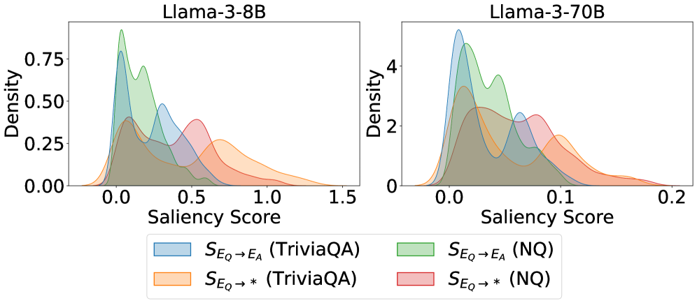
Figure 1: Kernel density estimates of saliency‐score distributions for critical question-to-answer information flows. The bimodal pattern suggests two distinct information mechanisms.
We demonstrate Kernel Density Estimation results of the saliency scores on TriviaQA (Joshi et al., 2017) and Natural Questions (Kwiatkowski et al., 2019) datasets. As shown in Figure 1, probability densities reveal a clear bimodal distribution: for all examined information types originating from the question, the probability mass concentrates around two peaks, one near zero saliency and another at a substantially higher value. The near-zero peak suggests that, for a substantial subset of samples, the question-to-answer information flow contributes minimally to hallucination detection, whereas the higher peak reflects strong dependence on such flow.
<details>
<summary>x2.png Details</summary>
### Visual Description
## Line Charts: Layer-wise ΔP for Different QA Datasets and Anchoring Methods
### Overview
The image contains three horizontally arranged line charts, each plotting the change in probability (ΔP) across the layers of a different large language model. The charts compare the performance of two anchoring methods ("Q-Anchored" and "A-Anchored") across four question-answering (QA) datasets. The overall trend shows a significant negative ΔP for Q-Anchored methods as layer depth increases, while A-Anchored methods remain stable near zero.
### Components/Axes
* **Chart Titles (Top Center):**
* Left Chart: `Llama-3-8B`
* Middle Chart: `Llama-3-70B`
* Right Chart: `Mistral-7B-v0.3`
* **X-Axis (Bottom):**
* Label: `Layer`
* Scale (Left Chart): 0 to 30, with major ticks at 0, 10, 20, 30.
* Scale (Middle Chart): 0 to 80, with major ticks at 0, 20, 40, 60, 80.
* Scale (Right Chart): 0 to 30, with major ticks at 0, 10, 20, 30.
* **Y-Axis (Left):**
* Label: `ΔP`
* Scale (All Charts): -80 to 0, with major ticks at -80, -60, -40, -20, 0.
* **Legend (Bottom Center, spanning all charts):**
* **Q-Anchored (Solid Lines):**
* Blue: `Q-Anchored (PopQA)`
* Green: `Q-Anchored (TriviaQA)`
* Purple: `Q-Anchored (HotpotQA)`
* Pink: `Q-Anchored (NQ)`
* **A-Anchored (Dashed Lines):**
* Orange: `A-Anchored (PopQA)`
* Red: `A-Anchored (TriviaQA)`
* Brown: `A-Anchored (HotpotQA)`
* Gray: `A-Anchored (NQ)`
### Detailed Analysis
**1. Llama-3-8B (Left Chart):**
* **Q-Anchored Lines (Solid):** All four lines (blue, green, purple, pink) begin near ΔP = 0 at Layer 0. They exhibit a steep, near-parallel decline starting around Layer 2-3. By Layer 30, all have dropped to approximately ΔP = -70 to -80. The pink line (NQ) appears slightly higher (less negative) than the others between layers 10-25.
* **A-Anchored Lines (Dashed):** All four dashed lines (orange, red, brown, gray) remain tightly clustered around ΔP = 0 across all 30 layers, showing minimal fluctuation.
**2. Llama-3-70B (Middle Chart):**
* **Q-Anchored Lines (Solid):** The decline begins later, around Layer 10. The drop is more volatile, with a significant dip and partial recovery between Layers 20-40. The lowest point for most lines is around Layer 30 (ΔP ≈ -70 to -80). After Layer 40, the lines trend downward again, ending near ΔP = -80 at Layer 80. The purple line (HotpotQA) shows the most pronounced volatility.
* **A-Anchored Lines (Dashed):** Similar to the 8B model, these lines stay near ΔP = 0 with minor noise across all 80 layers.
**3. Mistral-7B-v0.3 (Right Chart):**
* **Q-Anchored Lines (Solid):** The decline starts around Layer 5. The slope is steadier and less steep than in the Llama-3-8B chart. By Layer 30, the lines converge to a range of approximately ΔP = -60 to -75. The blue line (PopQA) is consistently the lowest (most negative) from Layer 15 onward.
* **A-Anchored Lines (Dashed):** Consistent with the other models, these lines hover around ΔP = 0 for the entire layer range.
### Key Observations
1. **Anchoring Method Disparity:** There is a stark and consistent contrast between the two anchoring methods. Q-Anchored performance (ΔP) degrades severely with model depth, while A-Anchored performance is robust and unaffected by layer.
2. **Model Architecture Influence:** The layer at which the Q-Anchored decline begins and its trajectory varies by model. Llama-3-8B shows the earliest and smoothest drop. Llama-3-70B shows a delayed but more complex, volatile pattern. Mistral-7B shows an intermediate, steadier decline.
3. **Dataset Similarity:** Within each anchoring method, the four QA datasets (PopQA, TriviaQA, HotpotQA, NQ) follow very similar trajectories, suggesting the observed phenomenon is general across these datasets rather than dataset-specific.
4. **Spatial Layout:** The legend is positioned centrally below all three charts, allowing for direct color/line-style comparison across the different model panels.
### Interpretation
This data strongly suggests that the mechanism measured by ΔP (likely related to the model's internal probability assignment or knowledge retention) is highly sensitive to the anchoring strategy used during evaluation or probing.
* **Q-Anchored (Question-Anchored) Vulnerability:** The consistent negative trend indicates that as information propagates through the deeper layers of the transformer, the model's processing or representation related to the *question* context becomes progressively less aligned with the final output probability. This could imply a form of "forgetting" or a shift in representational focus away from the initial query in later layers.
* **A-Anchored (Answer-Anchored) Stability:** The flat lines near zero demonstrate that when anchored to the *answer*, the measured probability change is stable across all layers. This suggests the model's internal representation of the answer itself remains consistent and robust throughout the network depth.
* **Architectural Implications:** The differences between Llama-3 (8B vs. 70B) and Mistral suggest that model scale and architecture influence *how* and *when* this representational shift occurs, but not *whether* it occurs. The more complex pattern in the 70B model might reflect more sophisticated internal processing or routing.
* **Practical Implication:** For tasks requiring deep, layer-wise analysis of model reasoning (e.g., interpretability, probing), the choice of anchoring point (question vs. answer) is not a minor detail but a critical methodological decision that fundamentally changes the observed results. The A-Anchored method appears to provide a more stable signal for analysis across layers.
</details>
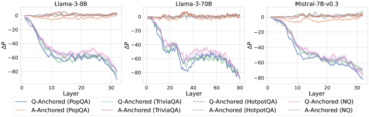
Figure 2: $ΔP$ under attention knockout. The layer axis indicates the Transformer layer on which the probe is trained. Shaded regions indicate 95% confidence intervals. Full results in Appendix C.
Hypothesis
These observations lead to the hypothesis that there are two distinct mechanisms of internal truthfulness encoding for hallucination detection: (1) one characterized by strong reliance on the key question-to-answer information from the exact question tokens, and (2) one in which truthfulness encoding is largely independent of the question. We validate the proposed hypothesis through further experiments in the next section.
### 3.2 Disentangling Information Mechanisms
We hypothesize that the internal truthfulness encoding operates through two distinct information flow mechanisms, driven by the attention modules within Transformer blocks. To validate the hypothesis, we first block information flows associated with the exact question tokens and analyze the resulting changes in the probe’s predictions. Subsequently, we apply a complementary technique, called token patching, to further substantiate the existence of these two mechanisms. Finally, we demonstrate that the self-contained information from the LLM-generated answer itself drives the truthfulness encoding for the A-Anchored type.
#### 3.2.1 Experimental Setup
Our analysis covers a diverse collection of 12 LLMs that vary in both scale and architectural design. Specifically, we consider three categories: (1) base models, including Llama-3.2-1B (Grattafiori et al., 2024), Llama-3.2-3B, Llama-3-8B, Llama-3-70B, Mistral-7B-v0.1 (Jiang et al., 2023), and Mistral-7B-v0.3; (2) instruction-tuned models, including Llama-3.2-3B-Instruct, Llama-3-8B-Instruct, Mistral-7B-Instruct-v0.1, and Mistral-7B-Instruct-v0.3; and (3) reasoning-oriented models, namely Qwen3-8B (Yang et al., 2025) and Qwen3-32B. We conduct experiments on 4 widely used question-answering datasets: PopQA (Mallen et al., 2023), TriviaQA (Joshi et al., 2017), HotpotQA (Yang et al., 2018), and Natural Questions (Kwiatkowski et al., 2019). Additional implementation details are provided in Appendix B.
#### 3.2.2 Identifying Anchored Modes via Attention Knockout
Experiment
To investigate whether internal truthfulness encoding operates via distinct information mechanisms, we perform an attention knockout experiment targeting the exact question tokens. Specifically, for a probe trained on representations from the $k$ -th layer, we set $A_l(i,E_Q)=0$ for layers $l∈\{1,\dots,k\}$ and positions $i>E_Q$ . This procedure blocks the information flow from question tokens to subsequent positions in the representation. We then examine how the probe’s predictions respond to this intervention. To provide a clearer picture, instances are categorized according to whether their prediction $\hat{z}$ changes after the attention knockout:
$$
Mode(x)=\begin{cases}Q-Anchored,&if \hat{z}≠\tilde{\hat{z}}\\
A-Anchored,&otherwise\end{cases} \tag{2}
$$
where $\hat{z}$ and $\tilde{\hat{z}}$ denote predictions before and after the attention knockout, respectively.
<details>
<summary>x3.png Details</summary>
### Visual Description
\n
## Bar Chart Series: Prediction Flip Rates Across Models and Datasets
### Overview
The image displays three grouped bar charts arranged horizontally, comparing the "Prediction Flip Rate" of three different language models across four question-answering datasets. The charts share a common y-axis and x-axis structure, with a unified legend at the bottom.
### Components/Axes
* **Chart Titles (Top Center of each subplot):**
* Left Chart: `Llama-3-8B`
* Middle Chart: `Llama-3-70B`
* Right Chart: `Mistral-7B-v0.3`
* **Y-Axis (Left side of each subplot):**
* Label: `Prediction Flip Rate`
* Scale: 0 to 80, with major tick marks at 0, 20, 40, 60, 80.
* **X-Axis (Bottom of each subplot):**
* Label: `Dataset`
* Categories (from left to right within each chart): `PopQA`, `TriviaQA`, `HotpotQA`, `NQ`.
* **Legend (Bottom Center, spanning all charts):**
* Four categories, each represented by a colored bar:
1. `Q-Anchored (exact_question)` - Light red/salmon color.
2. `Q-Anchored (random)` - Dark red/maroon color.
3. `A-Anchored (exact_question)` - Light gray color.
4. `A-Anchored (random)` - Dark gray/charcoal color.
### Detailed Analysis
Data is presented as grouped bars for each dataset within each model chart. Values are approximate visual estimates from the bar heights.
**1. Llama-3-8B Chart (Left)**
* **PopQA:** Q-Anchored (exact) ~75, Q-Anchored (random) ~10, A-Anchored (exact) ~38, A-Anchored (random) ~2.
* **TriviaQA:** Q-Anchored (exact) ~78, Q-Anchored (random) ~12, A-Anchored (exact) ~35, A-Anchored (random) ~2.
* **HotpotQA:** Q-Anchored (exact) ~72, Q-Anchored (random) ~15, A-Anchored (exact) ~12, A-Anchored (random) ~5.
* **NQ:** Q-Anchored (exact) ~74, Q-Anchored (random) ~12, A-Anchored (exact) ~20, A-Anchored (random) ~2.
**2. Llama-3-70B Chart (Middle)**
* **PopQA:** Q-Anchored (exact) ~74, Q-Anchored (random) ~18, A-Anchored (exact) ~30, A-Anchored (random) ~2.
* **TriviaQA:** Q-Anchored (exact) ~78, Q-Anchored (random) ~20, A-Anchored (exact) ~35, A-Anchored (random) ~5.
* **HotpotQA:** Q-Anchored (exact) ~75, Q-Anchored (random) ~20, A-Anchored (exact) ~10, A-Anchored (random) ~8.
* **NQ:** Q-Anchored (exact) ~58, Q-Anchored (random) ~18, A-Anchored (exact) ~22, A-Anchored (random) ~8.
**3. Mistral-7B-v0.3 Chart (Right)**
* **PopQA:** Q-Anchored (exact) ~75, Q-Anchored (random) ~10, A-Anchored (exact) ~25, A-Anchored (random) ~2.
* **TriviaQA:** Q-Anchored (exact) ~80, Q-Anchored (random) ~12, A-Anchored (exact) ~30, A-Anchored (random) ~2.
* **HotpotQA:** Q-Anchored (exact) ~78, Q-Anchored (random) ~10, A-Anchored (exact) ~10, A-Anchored (random) ~8.
* **NQ:** Q-Anchored (exact) ~76, Q-Anchored (random) ~18, A-Anchored (exact) ~26, A-Anchored (random) ~2.
### Key Observations
1. **Dominant Series:** The `Q-Anchored (exact_question)` bar (light red) is consistently the tallest across all models and datasets, typically ranging between 70-80.
2. **Lowest Series:** The `A-Anchored (random)` bar (dark gray) is consistently the shortest, often near or below 5.
3. **Model Comparison:** The `Llama-3-70B` model shows a notably lower `Q-Anchored (exact_question)` rate for the `NQ` dataset (~58) compared to its performance on other datasets and compared to the other two models on `NQ`.
4. **Dataset Sensitivity:** The `HotpotQA` dataset generally shows lower flip rates for the `A-Anchored (exact_question)` condition (light gray) compared to `PopQA` and `TriviaQA` across all models.
5. **Anchoring Effect:** For a given anchoring type (Q or A), the "exact_question" variant consistently results in a higher flip rate than the "random" variant.
### Interpretation
This visualization investigates the sensitivity of language model predictions to different types of "anchoring" prompts. The "Prediction Flip Rate" likely measures how often a model changes its answer when presented with a subtly altered prompt.
* **Core Finding:** Models are highly sensitive to the exact phrasing of the question (`Q-Anchored (exact_question)`), showing a high rate of answer changes. They are far less sensitive to random variations in the question or to answer-based anchoring, especially when the answer is randomized.
* **Model Scale:** The larger `Llama-3-70B` model does not show a uniform reduction in sensitivity. Its high sensitivity on most datasets, coupled with a distinct drop on `NQ`, suggests its behavior may be more dataset-dependent or that its training made it more robust to variations specific to the `NQ` format.
* **Dataset Nature:** The consistently lower flip rates for `A-Anchored (exact_question)` on `HotpotQA` might indicate that for multi-hop reasoning tasks (which `HotpotQA` involves), the model's answer is more firmly tied to the specific answer entity provided, making it less likely to flip even when the answer is anchored.
* **Practical Implication:** The data underscores a potential fragility in model outputs. A high flip rate for exact question rephrasing implies that minor, semantically equivalent changes in user input could lead to different model responses, which is a critical consideration for reliability and user experience in deployed applications.
</details>
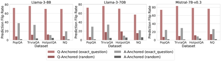
Figure 3: Prediction flip rate under token patching. Q-Anchored samples demonstrate significantly higher sensitivity than the counterparts when hallucinatory cues are injected into exact questions. Full results in Appendix D.
Results
The results in Figure 2 and Appendix C reveal a clear bifurcation of behaviors: for one subset of instances, probabilities shift substantially, while for another subset, probabilities remain nearly unchanged across all layers. Shaded regions indicate 95% confidence intervals, confirming that this qualitative separation is statistically robust. This sharp divergence supports the hypothesis that internal truthfulness encoding operates via two distinct mechanisms with respect to question–answer information. In Appendix C, we conduct a comprehensive analysis of alternative configurations for token selection, activation extraction, and various instruction- or reasoning-oriented models, and observe consistent patterns across all settings. Moreover, Figure 16 in Appendix C shows that blocking information from randomly selected question tokens yields negligible changes, in contrast to blocking exact question tokens, underscoring the nontrivial nature of the identified mechanisms.
#### 3.2.3 Further Validation via Token Patching
Experiment
To further validate our findings, we employ a critical token patching technique to investigate how the internal representations of the LLM respond to hallucinatory signals originating from exact question tokens under the two proposed mechanisms. Given a context sample $d_c$ , we randomly select a patch sample $d_p$ and replace the original question tokens $E_Q^c$ in $d_c$ with the exact question tokens $E_Q^p$ from $d_p$ . This operation introduces hallucinatory cues into the context sample, allowing us to assess whether the LLM’s internal states appropriately reflect the injected changes. We restrict our analysis to context instances where the original LLM answers are factual, ensuring that any observed changes can be attributed solely to the injected hallucinatory cues.
Results
We measure the sensitivity of the truthfulness signals using the prediction flip rate, defined as the frequency with which the probe’s prediction changes after hallucinatory cues are introduced. Figure 3 and Appendix D present the results of the best-performing layer of each model on four datasets when patching the exact subject tokens. Across models and datasets, Q-Anchored mode exhibits significantly higher sensitivity compared to A-Anchored mode when exposed to hallucination cues from the questions. Furthermore, within each pathway, the flip rates where exact question tokens are patched are substantially higher than those observed when random tokens are patched, ruling out the possibility that the observed effects are mainly due to general semantic disruption from token replacement. These consistent results provide further support for our hypothesis regarding distinct mechanisms of information pathways.
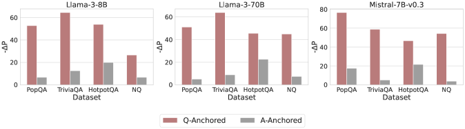
#### 3.2.4 What Drives A-Anchored Encoding?
Experiment
Since the A-Anchored mode operates largely independently of the question-to-answer information flow, it is important to investigate the source of information it uses to identify hallucinations. To this end, we remove the questions entirely from each sample and perform a separate forward pass using only the LLM-generated answers. This procedure yields answer-only hidden states, which are subsequently provided as input to the probe. We then evaluate how the probe’s predictions change under this “answer-only” condition. This setup enables us to assess whether A-Anchored predictions rely primarily on the generated answer itself rather than on the original question.
Results
As shown in Figure 4 and Appendix E, Q-Anchored instances exhibit substantial changes in prediction probability when the question is removed, reflecting their dependence on question-to-answer information. In contrast, A-Anchored instances remain largely invariant, indicating that the probe continues to detect hallucinations using information encoded within the LLM-generated answer itself. These findings suggest that the A-Anchored mechanism primarily leverages self-contained answer information to build signals about truthfulness.
<details>
<summary>x4.png Details</summary>
### Visual Description
\n
## Grouped Bar Charts: Model Performance Comparison (ΔΔP)
### Overview
The image displays three horizontally arranged grouped bar charts, each comparing the performance of a different large language model (LLM) on four question-answering datasets. The performance metric is labeled "ΔΔP" on the y-axis. Each chart compares two experimental conditions: "Q-Anchored" and "A-Anchored."
### Components/Axes
* **Chart Titles (Top Center):** "Llama-3-8B", "Llama-3-70B", "Mistral-7B-v0.3"
* **Y-Axis Label (Left Side):** "ΔΔP" (Delta Delta P). The scale varies slightly:
* Llama-3-8B and Llama-3-70B: 0 to 60, with major ticks at 0, 20, 40, 60.
* Mistral-7B-v0.3: 0 to 80, with major ticks at 0, 20, 40, 60, 80.
* **X-Axis Label (Bottom Center of each chart):** "Dataset"
* **X-Axis Categories (Bottom of each chart):** Four datasets are listed from left to right: "PopQA", "TriviaQA", "HotpotQA", "NQ".
* **Legend (Bottom Center of entire image):** A horizontal legend defines the bar colors:
* **Reddish-Brown Bar:** "Q-Anchored"
* **Gray Bar:** "A-Anchored"
### Detailed Analysis
**Chart 1: Llama-3-8B**
* **Trend:** For all four datasets, the Q-Anchored (reddish-brown) bar is substantially taller than the A-Anchored (gray) bar.
* **Data Points (Approximate ΔΔP):**
* **PopQA:** Q-Anchored ≈ 55, A-Anchored ≈ 8.
* **TriviaQA:** Q-Anchored ≈ 65 (highest in this chart), A-Anchored ≈ 12.
* **HotpotQA:** Q-Anchored ≈ 55, A-Anchored ≈ 20 (highest A-Anchored value in this chart).
* **NQ:** Q-Anchored ≈ 28, A-Anchored ≈ 8.
**Chart 2: Llama-3-70B**
* **Trend:** Consistent with the 8B model, Q-Anchored significantly outperforms A-Anchored across all datasets.
* **Data Points (Approximate ΔΔP):**
* **PopQA:** Q-Anchored ≈ 52, A-Anchored ≈ 6.
* **TriviaQA:** Q-Anchored ≈ 65 (highest in this chart), A-Anchored ≈ 10.
* **HotpotQA:** Q-Anchored ≈ 48, A-Anchored ≈ 22 (highest A-Anchored value in this chart).
* **NQ:** Q-Anchored ≈ 46, A-Anchored ≈ 9.
**Chart 3: Mistral-7B-v0.3**
* **Trend:** The pattern holds. Q-Anchored bars are taller than A-Anchored bars for every dataset.
* **Data Points (Approximate ΔΔP):**
* **PopQA:** Q-Anchored ≈ 78 (highest value across all charts), A-Anchored ≈ 18.
* **TriviaQA:** Q-Anchored ≈ 60, A-Anchored ≈ 6.
* **HotpotQA:** Q-Anchored ≈ 45, A-Anchored ≈ 20.
* **NQ:** Q-Anchored ≈ 55, A-Anchored ≈ 5.
### Key Observations
1. **Universal Q-Anchored Superiority:** The most prominent pattern is that the "Q-Anchored" condition yields a higher ΔΔP than the "A-Anchored" condition for every single model-dataset combination shown.
2. **Dataset Performance Variability:** The absolute performance (height of bars) varies by dataset. "TriviaQA" and "PopQA" often show the highest ΔΔP values for Q-Anchored, while "NQ" and "HotpotQA" sometimes show lower peaks.
3. **Model Comparison:** The Mistral-7B-v0.3 model achieves the single highest ΔΔP value (≈78 on PopQA). The Llama-3 models (8B and 70B) show very similar performance profiles to each other.
4. **A-Anchored Consistency:** The A-Anchored performance is consistently low, generally below 20 ΔΔP, with "HotpotQA" often being the dataset where it performs "best" (relatively speaking).
### Interpretation
This visualization strongly suggests that the "Q-Anchored" method or prompting strategy is significantly more effective than the "A-Anchored" alternative for the evaluated models on these question-answering tasks, as measured by the ΔΔP metric. The consistency of this finding across three different model architectures (Llama-3 8B/70B, Mistral) and four diverse datasets implies a robust effect.
The ΔΔP metric itself likely measures a change or improvement relative to a baseline. The large positive values for Q-Anchored indicate a substantial gain. The fact that A-Anchored values are positive but much smaller suggests it may offer a minor improvement over the baseline, but is far less effective than Q-Anchoring.
The variation across datasets hints that the difficulty or nature of the task influences the absolute magnitude of the improvement, but not the relative advantage of Q-Anchoring. The outlier data point (Mistral on PopQA) may indicate a particularly strong synergy between that model's architecture and the Q-Anchored approach for that specific type of knowledge-intensive question.
</details>
Figure 4: $-ΔP$ with only the LLM-generated answer. Q-Anchored instances exhibit substantial shifts, whereas A-Anchored instances remain stable, confirming that A-Anchored truthfulness encoding relies on information in the LLM-generated answer itself. Full results in Appendix E.
## 4 Properties of Truthfulness Pathways
This section examines notable properties and distinct behaviors of intrinsic truthfulness encoding: (1) Associations with knowledge boundaries: samples within the LLM’s knowledge boundary tend to encode truthfulness via the Q-Anchored pathway, whereas samples beyond the boundary often rely on the A-Anchored signal; (2) Self-awareness: internal representations can be used to predict which mechanism is being employed, suggesting that LLMs possess intrinsic awareness of pathway distinctions.
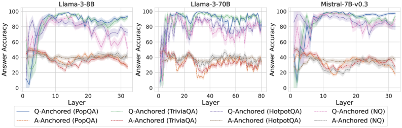
### 4.1 Associations with Knowledge Boundaries
We find that distinct patterns of truthfulness encoding are closely associated with the knowledge boundaries of LLMs. To characterize these boundaries, three complementary metrics are employed: (1) Answer accuracy, the most direct indicator of an LLM’s factual competence; (2) I-don’t-know rate (shown in Appendix G), which reflects the model’s ability to recognize and express its own knowledge limitations; (3) Entity popularity, which is widely used to distinguish between common and long-tail factual knowledge (Mallen et al., 2023).
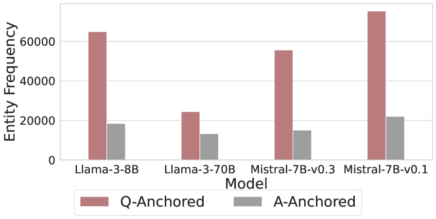
As shown in Figure 5 and Appendix F, Q-Anchored samples achieve significantly higher accuracy than those driven by the A-Anchored pathway. The results for the I-don’t-know rate, reported in Appendix G, exhibit trends consistent with answer accuracy, further indicating stronger knowledge handling in Q-Anchored samples. Moreover, entity popularity, shown in Figure 6, provides a more fine-grained perspective on knowledge boundaries. Specifically, Q-Anchored samples tend to involve more popular entities, whereas A-Anchored samples are more frequently associated with less popular, long-tail factual knowledge. These findings suggest that truthfulness encoding is strongly aligned with the availability of stored knowledge: when LLMs possess the requisite knowledge, they predominantly rely on question–answer information flow (Q-Anchored); when knowledge is unavailable, they instead draw upon internal patterns within their own generated outputs (A-Anchored).
<details>
<summary>x5.png Details</summary>
### Visual Description
\n
## Line Charts: Answer Accuracy Across Layers for Three Language Models
### Overview
The image displays three horizontally arranged line charts, each plotting "Answer Accuracy" (y-axis) against "Layer" (x-axis) for a specific large language model. The charts compare the performance of two anchoring methods ("Q-Anchored" and "A-Anchored") across four question-answering datasets (PopQA, TriviaQA, HotpotQA, NQ). The overall visual suggests an analysis of how model performance on different knowledge-intensive tasks evolves through the layers of the neural network.
### Components/Axes
* **Chart Titles (Top Center of each plot):**
* Left Chart: `Llama-3-8B`
* Middle Chart: `Llama-3-70B`
* Right Chart: `Mistral-7B-v0.3`
* **Y-Axis (Left side of each plot):**
* Label: `Answer Accuracy`
* Scale: 0 to 100, with major ticks at 0, 20, 40, 60, 80, 100.
* **X-Axis (Bottom of each plot):**
* Label: `Layer`
* Scale:
* Llama-3-8B: 0 to 30 (ticks every 10).
* Llama-3-70B: 0 to 80 (ticks every 20).
* Mistral-7B-v0.3: 0 to 30 (ticks every 10).
* **Legend (Bottom Center, spanning all charts):**
* **Q-Anchored Series (Solid Lines):**
* Blue solid line: `Q-Anchored (PopQA)`
* Green solid line: `Q-Anchored (TriviaQA)`
* Gray solid line: `Q-Anchored (HotpotQA)`
* Purple solid line: `Q-Anchored (NQ)`
* **A-Anchored Series (Dashed Lines):**
* Orange dashed line: `A-Anchored (PopQA)`
* Red dashed line: `A-Anchored (TriviaQA)`
* Brown dashed line: `A-Anchored (HotpotQA)`
* Pink dashed line: `A-Anchored (NQ)`
### Detailed Analysis
**General Trend Verification:**
* **Q-Anchored Lines (Solid):** For all three models, these lines typically start at very low accuracy (near 0-20%) in the earliest layers, rise sharply to a peak in the middle layers, and then often show a decline or increased volatility in the later layers.
* **A-Anchored Lines (Dashed):** These lines generally start at a moderate accuracy level (around 40-50%), exhibit less dramatic swings than the Q-Anchored lines, and often trend slightly downward or remain relatively flat across layers.
**Model-Specific Data Points (Approximate Values):**
1. **Llama-3-8B:**
* **Q-Anchored (PopQA - Blue):** Starts near 0%, peaks at ~95% around layer 15, declines to ~80% by layer 30.
* **Q-Anchored (TriviaQA - Green):** Follows a similar but slightly lower trajectory than PopQA, peaking near 90%.
* **Q-Anchored (NQ - Purple):** Shows high volatility, with multiple peaks and troughs between 60-95% after layer 10.
* **A-Anchored Series:** All cluster between 30-50% accuracy, showing a slight downward trend. PopQA (Orange) and TriviaQA (Red) are the lowest, often below 40%.
2. **Llama-3-70B:**
* **Q-Anchored Series:** All four datasets show a rapid rise to high accuracy (>80%) by layer 10-20. PopQA (Blue) and TriviaQA (Green) maintain very high accuracy (~90-98%) with less decline in later layers compared to the 8B model. NQ (Purple) and HotpotQA (Gray) are more volatile.
* **A-Anchored Series:** Again cluster in the 30-50% range, with a clearer downward trend for PopQA (Orange) and TriviaQA (Red), dropping to near 20% by layer 80.
3. **Mistral-7B-v0.3:**
* **Q-Anchored Series:** Similar rapid initial rise. PopQA (Blue) and TriviaQA (Green) reach near-perfect accuracy (~95-100%) and sustain it. NQ (Purple) and HotpotQA (Gray) are lower and more volatile, ranging between 60-90%.
* **A-Anchored Series:** Follow the established pattern, hovering between 20-40% with a slight downward slope.
### Key Observations
1. **Consistent Performance Gap:** Across all models and layers, the Q-Anchored method (solid lines) dramatically outperforms the A-Anchored method (dashed lines) on all four QA datasets.
2. **Layer-wise Evolution:** Q-Anchored performance is not static; it shows a characteristic "rise-peak-decline" pattern, suggesting different layers specialize in different aspects of the task. The peak performance layer varies by model and dataset.
3. **Dataset Difficulty:** HotpotQA (Gray lines) and NQ (Purple lines) generally show lower and more volatile accuracy for the Q-Anchored method compared to PopQA and TriviaQA, indicating they may be more challenging or require different reasoning pathways.
4. **Model Scale Effect:** The larger Llama-3-70B model sustains high Q-Anchored accuracy deeper into its network (later layers) compared to the smaller Llama-3-8B, where the decline is more pronounced.
5. **A-Anchored Stability:** The A-Anchored method, while performing poorly, shows much less variance across layers, suggesting its performance is less dependent on specific layer-wise processing.
### Interpretation
This data strongly suggests that **how information is anchored or presented to the model (as a question vs. as an answer) fundamentally changes its internal processing and ultimate accuracy.** The Q-Anchored approach appears to activate a more effective, layer-specific processing pathway that builds up to a peak of understanding in the middle layers. The subsequent decline could indicate over-processing, interference, or a shift in the model's internal representation away from the specific QA task in its final layers.
The stark contrast between the two methods implies that the model's "knowledge" is not uniformly accessible; its ability to retrieve and apply that knowledge is highly contingent on the prompt format. The A-Anchored method's low, flat performance might represent a baseline or a failure mode where the model does not engage its specialized QA circuitry. The differences between datasets highlight that model performance is not monolithic but varies significantly with the nature of the knowledge or reasoning required. This analysis is crucial for understanding model internals and designing more effective prompting strategies.
</details>
Figure 5: Comparisons of answer accuracy between pathways. Q-Anchored samples show higher accuracy than A-Anchored ones, highlighting the association between truthfulness encoding and LLM knowledge boundaries. Full results in Appendix F and G.
<details>
<summary>x6.png Details</summary>
### Visual Description
## Grouped Bar Chart: Entity Frequency by Model and Anchoring Method
### Overview
This is a grouped bar chart comparing the "Entity Frequency" for four different large language models, each evaluated under two anchoring conditions: "Q-Anchored" and "A-Anchored". The chart visually demonstrates a consistent and significant difference in entity frequency between the two anchoring methods across all models.
### Components/Axes
* **Chart Type:** Grouped Bar Chart.
* **X-Axis (Horizontal):** Labeled "Model". It lists four distinct models:
1. `Llama-3-8B`
2. `Llama-3-70B`
3. `Mistral-7B-v0.3`
4. `Mistral-7B-v0.1`
* **Y-Axis (Vertical):** Labeled "Entity Frequency". The scale runs from 0 to over 60,000, with major gridlines at intervals of 20,000 (0, 20000, 40000, 60000).
* **Legend:** Positioned at the bottom center of the chart.
* A reddish-brown (terracotta) square corresponds to the label `Q-Anchored`.
* A grey square corresponds to the label `A-Anchored`.
* **Data Series:** For each model on the x-axis, there are two adjacent bars:
* The left bar (reddish-brown) represents the `Q-Anchored` value.
* The right bar (grey) represents the `A-Anchored` value.
### Detailed Analysis
**Trend Verification:** For every model, the `Q-Anchored` bar (reddish-brown, left) is substantially taller than the corresponding `A-Anchored` bar (grey, right). This indicates a consistent trend where the Q-Anchored method yields a much higher entity frequency than the A-Anchored method.
**Approximate Data Points (Spatially Grounded):**
1. **Llama-3-8B:**
* `Q-Anchored` (left, reddish-brown): The bar extends slightly above the 60,000 gridline. Estimated value: ~64,000.
* `A-Anchored` (right, grey): The bar is just below the 20,000 gridline. Estimated value: ~18,000.
2. **Llama-3-70B:**
* `Q-Anchored` (left, reddish-brown): The bar is slightly above the 20,000 gridline. Estimated value: ~24,000.
* `A-Anchored` (right, grey): The bar is below the 20,000 gridline, lower than the Llama-3-8B A-Anchored bar. Estimated value: ~13,000.
3. **Mistral-7B-v0.3:**
* `Q-Anchored` (left, reddish-brown): The bar is between the 40,000 and 60,000 gridlines, closer to 60,000. Estimated value: ~55,000.
* `A-Anchored` (right, grey): The bar is below the 20,000 gridline, similar in height to the Llama-3-70B A-Anchored bar. Estimated value: ~15,000.
4. **Mistral-7B-v0.1:**
* `Q-Anchored` (left, reddish-brown): This is the tallest bar in the chart, extending well above the 60,000 gridline. Estimated value: ~75,000.
* `A-Anchored` (right, grey): The bar is just above the 20,000 gridline. Estimated value: ~22,000.
### Key Observations
1. **Dominant Anchoring Effect:** The most striking pattern is the massive disparity between Q-Anchored and A-Anchored frequencies. Q-Anchored values are 2.5 to 4 times higher than their A-Anchored counterparts for the same model.
2. **Model Performance Variance:** There is significant variation in Q-Anchored performance between models. `Mistral-7B-v0.1` shows the highest frequency, followed by `Llama-3-8B`, then `Mistral-7B-v0.3`, with `Llama-3-70B` showing the lowest.
3. **A-Anchored Consistency:** In contrast, the A-Anchored frequencies are relatively consistent and low across all models, clustering between approximately 13,000 and 22,000.
4. **Notable Outlier:** The `Mistral-7B-v0.1` model's Q-Anchored result is a clear outlier on the high end, suggesting it may be particularly sensitive to or effective with that anchoring method.
### Interpretation
The data strongly suggests that the anchoring method (Q vs. A) is a primary determinant of entity frequency in this evaluation, far more so than the specific model architecture or size (e.g., Llama-3-8B vs. 70B). The "Q-Anchored" condition appears to trigger or elicit a much higher rate of entity generation or recognition.
The variation among models in the Q-Anchored condition could indicate differences in how these models process or are prompted by the "Q" anchor. The relatively flat performance in the A-Anchored condition suggests it may represent a baseline or a less effective prompting strategy that all models handle similarly.
From a Peircean perspective, the chart acts as an *index* pointing to a causal relationship between the anchoring technique and the measured output (entity frequency). The consistent, large-magnitude difference across multiple models (the *iconic* similarity of the pattern) strengthens the hypothesis that this is a robust effect, not an artifact of a single model. The outlier (`Mistral-7B-v0.1`) invites further investigation into what specific characteristics of that model version make it so responsive to Q-Anchoring.
</details>
Figure 6: Entity frequency distributions for both pathways on PopQA. Q-Anchored samples concentrate on more popular entities, whereas A-Anchored samples skew toward long-tail entities.
### 4.2 Self-Awareness of Pathway Distinctions
Given that LLMs encode truthfulness via two distinct mechanisms, this section investigates whether their internal representations contain discriminative information that can be used to distinguish between these mechanisms. To this end, we train probing classifiers on the models’ original internal states (i.e., without knockout interventions) to predict which mechanism is being utilized.
Table 2 reports the pathway classification results of the best-performing layers in hallucination detection across different models. Our findings demonstrate that different mechanisms can be reliably inferred from internal representations, suggesting that, in addition to encoding truthfulness, LLMs exhibit intrinsic awareness of pathway distinctions. These findings highlight a potential avenue for fine-grained improvements targeting specific truthfulness encoding mechanisms.
Datasets Llama-3-8B Llama-3-70B Mistral-7B-v0.3 PopQA 87.80 92.66 87.64 TriviaQA 75.10 83.91 85.87 HotpotQA 86.31 87.34 92.13 NQ 78.31 84.14 84.83
Table 2: AUCs for encoding pathway classification. The predictability from internal representations indicates that LLMs possess intrinsic awareness of pathway distinctions.
## 5 Pathway-Aware Detection
Building on the intriguing findings, we explore how the discovered pathway distinctions can be leveraged to improve hallucination detection. Specifically, two simple yet effective pathway-aware strategies are proposed: (1) Mixture-of-Probes (MoP) (§ 5.1), which allows expert probes to specialize in Q-Anchored and A-Anchored pathways respectively, and (2) Pathway Reweighting (PR) (§ 5.2), a plug-and-play approach that amplifies pathway-relevant cues salient for detection.
### 5.1 Mixture-of-Probes
Motivated by the fundamentally different dependencies of the two encoding pathways and the LLMs’ intrinsic awareness of them, we propose a Mixture-of-Probes (MoP) framework that explicitly captures this heterogeneity. Rather than training a single probe to handle all inputs, MoP employs two pathway-specialized experts and leverages the self-awareness probe (§ 4.2) as a gating network to combine their predictions. Let $h^l^{*}(x)∈ℝ^d$ be the token hidden state from the best detection layer $l^*$ . Two expert probes $p_Q(·)$ and $p_A(·)$ are trained separately for two pathway samples, and the self-awareness probe provides a gating coefficient $π(h^l^{*}(x))∈[0,1]$ . The final prediction is a convex combination, requiring no extra training:
$$
\displaystyle p_MoP(z=1\midh^l^{*}(x)) \displaystyle=π_Q p_Q(z=1\midh^l^{*}(x)) \displaystyle +(1-π_Q) p_A(z=1\midh^l^{*}(x)). \tag{3}
$$
### 5.2 Pathway Reweighting
From the perspective of emphasizing pathway-relevant internal cues, we introduce a plug-and-play Pathway Reweighting (PR) method that directly modulates the question–answer information flow. The key idea is to adjust the attention from exact answer to question tokens according to the predicted pathway, amplifying the signals most salient for hallucination detection. For each layer $l≤ l^*$ , two learnable scalars $α_Q^l,α_A^l>0$ are introduced. Given self-awareness probability $π(h^l^{*}(x))$ , we rescale attention edges $i∈E_A$ , $j∈E_Q$ to construct representations tailored for detection:
$$
\tilde{A}^l(i,j)=\begin{cases}\bigl[1+s(h^l^{*}(x))\bigr]A^l(i,j),&i∈E_A,j∈E_Q,\\
A^l(i,j),&otherwise,\end{cases} \tag{4}
$$
where
$$
s(h^l^{*}(x))=π_Q α_Q^l-(1-π_Q) α_A^l. \tag{5}
$$
The extra parameters serve as a lightweight adapter, used only during detection to guide salient truthfulness cues and omitted during generation, leaving the generation capacity unaffected.
Method Llama-3-8B Mistral-7B-v0.3 PopQA TriviaQA HotpotQA NQ PopQA TriviaQA HotpotQA NQ P(True) 55.85 49.92 52.14 53.27 45.49 47.61 57.87 52.79 Logits-mean 74.52 60.39 51.94 52.63 69.52 66.76 55.45 57.88 Logits-min 85.36 70.89 61.28 56.50 87.05 77.33 68.08 54.40 Probing Baseline 88.71 77.58 82.23 70.20 87.39 81.74 83.19 73.60 mygray MoP-RandomGate 75.52 69.17 79.88 66.56 79.81 70.88 72.23 61.19 mygray MoP-VanillaExperts 89.11 78.73 84.57 71.21 88.53 80.93 82.93 73.77 mygray MoP 92.11 81.18 85.45 74.64 91.66 83.57 85.82 76.87 mygray PR 94.01 83.13 87.81 79.10 93.09 84.36 89.03 79.09
Table 3: Comparison of hallucination detection performance (AUC). Full results in Appendix H.
### 5.3 Experiments
Setup
The experimental setup follows Section 3.2.1. We compare our method against several internal-based baselines, including (1) P(True) (Kadavath et al., 2022), (2) uncertainty-based metrics (Aichberger et al., 2024; Xue et al., 2025a), and (3) probing classifiers (Chen et al., 2024; Orgad et al., 2025). Results are averaged over three random seeds. Additional implementation details are provided in Appendix B.5 and B.6.
Results
As shown in Table 3 and Appendix H, both MoP and PR consistently outperform competing approaches across different datasets and model scales. Specifically, for MoP, we further examine two ablated variants: (1) MoP-RandomGate, which randomly routes the two pathway experts without leveraging the self-awareness probe; and (2) MoP-VanillaExperts, which replaces the expert probes with two vanilla probes to serve as a simple ensemble strategy. Both ablated variants exhibit substantially degraded performance compared to MoP, underscoring the roles of pathway specialization and self-awareness gating. For PR, the method proves particularly effective in improving performance by dynamically adjusting the focus on salient truthfulness cues. These results demonstrate that explicitly modeling truthfulness encoding heterogeneity can effectively translate the insights of our analysis into practical gains for hallucination detection.
## 6 Related Work
Hallucination detection in LLMs has received increasing attention because of its critical role in building reliable and trustworthy generative systems (Tian et al., 2024; Shi et al., 2024; Bai et al., 2024). Existing approaches can be broadly grouped by whether they rely on external resources (e.g., retrieval systems or fact–checking APIs). Externally assisted methods cross-verify output texts against external knowledge bases (Min et al., 2023; Hu et al., 2025; Huang et al., 2025) or specialized LLM judges (Luo et al., 2024; Bouchard and Chauhan, 2025; Zhang et al., 2025). Resource-free methods avoid external data and instead exploit the model’s own intermediate computations. Some leverage the model’s self-awareness of knowledge boundaries (Kadavath et al., 2022; Luo et al., 2025), while others use uncertainty-based measures (Aichberger et al., 2024; Xue et al., 2025a), treating confidence as a proxy for truthfulness. These techniques analyze output distributions (e.g., logits) (Aichberger et al., 2024), variance across multiple samples (e.g., consistency) (Min et al., 2023; Aichberger et al., 2025), or other statistical indicators of prediction uncertainty (Xue et al., 2025b). Another line of work trains linear probing classifiers on hidden representations to capture intrinsic truthfulness signals. Prior work (Burns et al., 2023; Li et al., 2023; Chen et al., 2024; Orgad et al., 2025) shows that LLMs encode rich latent features correlated with factual accuracy, enabling efficient detection with minimal overhead. Yet the mechanisms behind these internal truthfulness encoding remain poorly understood. Compared to previous approaches, our work addresses this gap by dissecting how such intrinsic signals emerge and operate, revealing distinct information pathways that not only yield explanatory insights but also enhance detection performance.
## 7 Conclusion
We investigate how LLMs encode truthfulness, revealing two complementary pathways: a Question-Anchored pathway relying on question–answer flow, and an Answer-Anchored pathway extracting self-contained evidence from generated outputs. Analyses across datasets and models highlight their ties to knowledge boundaries and intrinsic self-awareness. Building on these insights, we further propose two applications to improve hallucination detection. Overall, our findings not only advance mechanistic understanding of intrinsic truthfulness encoding but also offer practical applications for building more reliable generative systems.
## Limitations
While this work provides a systematic analysis of intrinsic truthfulness encoding mechanisms in LLMs and demonstrates their utility for hallucination detection, one limitation is that, similar to prior work on mechanistic interpretability, our analyses and pathway-aware applications assume access to internal model representations. Such access may not always be available in strictly black-box settings. In these scenarios, additional engineering or alternative approximations may be required for practical deployment, which we leave for future work.
## Ethics Statement
Our work presents minimal potential for negative societal impact, primarily due to the use of publicly available datasets and models. This accessibility inherently reduces the risk of adverse effects on individuals or society.
## References
- Aichberger et al. (2024) Lukas Aichberger, Kajetan Schweighofer, Mykyta Ielanskyi, and Sepp Hochreiter. 2024. Semantically diverse language generation for uncertainty estimation in language models. arXiv preprint arXiv:2406.04306.
- Aichberger et al. (2025) Lukas Aichberger, Kajetan Schweighofer, Mykyta Ielanskyi, and Sepp Hochreiter. 2025. Improving uncertainty estimation through semantically diverse language generation. In The Thirteenth International Conference on Learning Representations, ICLR 2025, Singapore, April 24-28, 2025. OpenReview.net.
- Bai et al. (2024) Ge Bai, Jie Liu, Xingyuan Bu, Yancheng He, Jiaheng Liu, Zhanhui Zhou, Zhuoran Lin, Wenbo Su, Tiezheng Ge, Bo Zheng, and Wanli Ouyang. 2024. Mt-bench-101: A fine-grained benchmark for evaluating large language models in multi-turn dialogues. In Proceedings of the 62nd Annual Meeting of the Association for Computational Linguistics (Volume 1: Long Papers), ACL 2024, Bangkok, Thailand, August 11-16, 2024, pages 7421–7454. Association for Computational Linguistics.
- Baker et al. (1998) Collin F Baker, Charles J Fillmore, and John B Lowe. 1998. The berkeley framenet project. In 36th Annual Meeting of the Association for Computational Linguistics and 17th International Conference on Computational Linguistics, Volume 1, pages 86–90.
- Bouchard and Chauhan (2025) Dylan Bouchard and Mohit Singh Chauhan. 2025. Uncertainty quantification for language models: A suite of black-box, white-box, llm judge, and ensemble scorers. arXiv preprint arXiv:2504.19254.
- Burns et al. (2023) Collin Burns, Haotian Ye, Dan Klein, and Jacob Steinhardt. 2023. Discovering latent knowledge in language models without supervision. In The Eleventh International Conference on Learning Representations, ICLR 2023, Kigali, Rwanda, May 1-5, 2023. OpenReview.net.
- Chen et al. (2024) Chao Chen, Kai Liu, Ze Chen, Yi Gu, Yue Wu, Mingyuan Tao, Zhihang Fu, and Jieping Ye. 2024. INSIDE: llms’ internal states retain the power of hallucination detection. In The Twelfth International Conference on Learning Representations, ICLR 2024, Vienna, Austria, May 7-11, 2024. OpenReview.net.
- Fierro et al. (2025) Constanza Fierro, Negar Foroutan, Desmond Elliott, and Anders Søgaard. 2025. How do multilingual language models remember facts? In Findings of the Association for Computational Linguistics, ACL 2025, Vienna, Austria, July 27 - August 1, 2025, pages 16052–16106. Association for Computational Linguistics.
- Geva et al. (2023) Mor Geva, Jasmijn Bastings, Katja Filippova, and Amir Globerson. 2023. Dissecting recall of factual associations in auto-regressive language models. In Proceedings of the 2023 Conference on Empirical Methods in Natural Language Processing, EMNLP 2023, Singapore, December 6-10, 2023, pages 12216–12235. Association for Computational Linguistics.
- Ghandeharioun et al. (2024) Asma Ghandeharioun, Avi Caciularu, Adam Pearce, Lucas Dixon, and Mor Geva. 2024. Patchscopes: A unifying framework for inspecting hidden representations of language models. In Forty-first International Conference on Machine Learning, ICML 2024, Vienna, Austria, July 21-27, 2024. OpenReview.net.
- Grattafiori et al. (2024) Aaron Grattafiori, Abhimanyu Dubey, Abhinav Jauhri, Abhinav Pandey, Abhishek Kadian, Ahmad Al-Dahle, Aiesha Letman, Akhil Mathur, Alan Schelten, Alex Vaughan, Amy Yang, Angela Fan, Anirudh Goyal, Anthony Hartshorn, Aobo Yang, Archi Mitra, Archie Sravankumar, Artem Korenev, Arthur Hinsvark, and 542 others. 2024. The llama 3 herd of models. Preprint, arXiv:2407.21783.
- Hu et al. (2025) Wentao Hu, Wengyu Zhang, Yiyang Jiang, Chen Jason Zhang, Xiaoyong Wei, and Qing Li. 2025. Removal of hallucination on hallucination: Debate-augmented RAG. In Proceedings of the 63rd Annual Meeting of the Association for Computational Linguistics (Volume 1: Long Papers), ACL 2025, Vienna, Austria, July 27 - August 1, 2025, pages 15839–15853. Association for Computational Linguistics.
- Huang et al. (2025) Lei Huang, Xiaocheng Feng, Weitao Ma, Yuchun Fan, Xiachong Feng, Yuxuan Gu, Yangfan Ye, Liang Zhao, Weihong Zhong, Baoxin Wang, Dayong Wu, Guoping Hu, Lingpeng Kong, Tong Xiao, Ting Liu, and Bing Qin. 2025. Alleviating hallucinations from knowledge misalignment in large language models via selective abstention learning. In Proceedings of the 63rd Annual Meeting of the Association for Computational Linguistics (Volume 1: Long Papers), ACL 2025, Vienna, Austria, July 27 - August 1, 2025, pages 24564–24579. Association for Computational Linguistics.
- Jiang et al. (2023) Albert Q. Jiang, Alexandre Sablayrolles, Arthur Mensch, Chris Bamford, Devendra Singh Chaplot, Diego de las Casas, Florian Bressand, Gianna Lengyel, Guillaume Lample, Lucile Saulnier, Lélio Renard Lavaud, Marie-Anne Lachaux, Pierre Stock, Teven Le Scao, Thibaut Lavril, Thomas Wang, Timothée Lacroix, and William El Sayed. 2023. Mistral 7b. Preprint, arXiv:2310.06825.
- Joshi et al. (2017) Mandar Joshi, Eunsol Choi, Daniel Weld, and Luke Zettlemoyer. 2017. TriviaQA: A large scale distantly supervised challenge dataset for reading comprehension. In Proceedings of the 55th Annual Meeting of the Association for Computational Linguistics (Volume 1: Long Papers), pages 1601–1611, Vancouver, Canada. Association for Computational Linguistics.
- Kadavath et al. (2022) Saurav Kadavath, Tom Conerly, Amanda Askell, T. J. Henighan, Dawn Drain, Ethan Perez, Nicholas Schiefer, Zachary Dodds, Nova Dassarma, Eli Tran-Johnson, Scott Johnston, Sheer El-Showk, Andy Jones, Nelson Elhage, Tristan Hume, Anna Chen, Yuntao Bai, Sam Bowman, Stanislav Fort, and 17 others. 2022. Language models (mostly) know what they know. ArXiv, abs/2207.05221.
- Kwiatkowski et al. (2019) Tom Kwiatkowski, Jennimaria Palomaki, Olivia Redfield, Michael Collins, Ankur Parikh, Chris Alberti, Danielle Epstein, Illia Polosukhin, Jacob Devlin, Kenton Lee, Kristina Toutanova, Llion Jones, Matthew Kelcey, Ming-Wei Chang, Andrew M. Dai, Jakob Uszkoreit, Quoc Le, and Slav Petrov. 2019. Natural questions: A benchmark for question answering research. Transactions of the Association for Computational Linguistics, 7:452–466.
- Li et al. (2023) Kenneth Li, Oam Patel, Fernanda B. Viégas, Hanspeter Pfister, and Martin Wattenberg. 2023. Inference-time intervention: Eliciting truthful answers from a language model. In Advances in Neural Information Processing Systems 36: Annual Conference on Neural Information Processing Systems 2023, NeurIPS 2023, New Orleans, LA, USA, December 10 - 16, 2023.
- Luo et al. (2024) Wen Luo, Tianshu Shen, Wei Li, Guangyue Peng, Richeng Xuan, Houfeng Wang, and Xi Yang. 2024. Halludial: A large-scale benchmark for automatic dialogue-level hallucination evaluation. Preprint, arXiv:2406.07070.
- Luo et al. (2025) Wen Luo, Feifan Song, Wei Li, Guangyue Peng, Shaohang Wei, and Houfeng Wang. 2025. Odysseus navigates the sirens’ song: Dynamic focus decoding for factual and diverse open-ended text generation. In Proceedings of the 63rd Annual Meeting of the Association for Computational Linguistics (Volume 1: Long Papers), pages 27200–27218, Vienna, Austria. Association for Computational Linguistics.
- Mallen et al. (2023) Alex Mallen, Akari Asai, Victor Zhong, Rajarshi Das, Daniel Khashabi, and Hannaneh Hajishirzi. 2023. When not to trust language models: Investigating effectiveness of parametric and non-parametric memories. In Proceedings of the 61st Annual Meeting of the Association for Computational Linguistics (Volume 1: Long Papers), pages 9802–9822, Toronto, Canada. Association for Computational Linguistics.
- Michel et al. (2019) Paul Michel, Omer Levy, and Graham Neubig. 2019. Are sixteen heads really better than one? Advances in neural information processing systems, 32.
- Min et al. (2023) Sewon Min, Kalpesh Krishna, Xinxi Lyu, Mike Lewis, Wen-tau Yih, Pang Wei Koh, Mohit Iyyer, Luke Zettlemoyer, and Hannaneh Hajishirzi. 2023. Factscore: Fine-grained atomic evaluation of factual precision in long form text generation. In Proceedings of the 2023 Conference on Empirical Methods in Natural Language Processing, EMNLP 2023, Singapore, December 6-10, 2023, pages 12076–12100. Association for Computational Linguistics.
- Niu et al. (2025) Mengjia Niu, Hamed Haddadi, and Guansong Pang. 2025. Robust hallucination detection in llms via adaptive token selection. arXiv preprint arXiv:2504.07863.
- Orgad et al. (2025) Hadas Orgad, Michael Toker, Zorik Gekhman, Roi Reichart, Idan Szpektor, Hadas Kotek, and Yonatan Belinkov. 2025. Llms know more than they show: On the intrinsic representation of LLM hallucinations. In The Thirteenth International Conference on Learning Representations, ICLR 2025, Singapore, April 24-28, 2025. OpenReview.net.
- Pagnoni et al. (2021) Artidoro Pagnoni, Vidhisha Balachandran, and Yulia Tsvetkov. 2021. Understanding factuality in abstractive summarization with frank: A benchmark for factuality metrics. In Proceedings of the 2021 Conference of the North American Chapter of the Association for Computational Linguistics: Human Language Technologies, pages 4812–4829.
- Qian et al. (2025) Chen Qian, Dongrui Liu, Haochen Wen, Zhen Bai, Yong Liu, and Jing Shao. 2025. Demystifying reasoning dynamics with mutual information: Thinking tokens are information peaks in llm reasoning. arXiv preprint arXiv:2506.02867.
- Shi et al. (2024) Zhengliang Shi, Shuo Zhang, Weiwei Sun, Shen Gao, Pengjie Ren, Zhumin Chen, and Zhaochun Ren. 2024. Generate-then-ground in retrieval-augmented generation for multi-hop question answering. In Proceedings of the 62nd Annual Meeting of the Association for Computational Linguistics (Volume 1: Long Papers), ACL 2024, Bangkok, Thailand, August 11-16, 2024, pages 7339–7353. Association for Computational Linguistics.
- Simonyan et al. (2014) Karen Simonyan, Andrea Vedaldi, and Andrew Zisserman. 2014. Deep inside convolutional networks: Visualising image classification models and saliency maps. In 2nd International Conference on Learning Representations, ICLR 2014, Banff, AB, Canada, April 14-16, 2014, Workshop Track Proceedings.
- Tian et al. (2024) Yuanhe Tian, Ruyi Gan, Yan Song, Jiaxing Zhang, and Yongdong Zhang. 2024. Chimed-gpt: A chinese medical large language model with full training regime and better alignment to human preferences. In Proceedings of the 62nd Annual Meeting of the Association for Computational Linguistics (Volume 1: Long Papers), ACL 2024, Bangkok, Thailand, August 11-16, 2024, pages 7156–7173. Association for Computational Linguistics.
- Todd et al. (2024) Eric Todd, Millicent L. Li, Arnab Sen Sharma, Aaron Mueller, Byron C. Wallace, and David Bau. 2024. Function vectors in large language models. In The Twelfth International Conference on Learning Representations, ICLR 2024, Vienna, Austria, May 7-11, 2024. OpenReview.net.
- Wang et al. (2023) Lean Wang, Lei Li, Damai Dai, Deli Chen, Hao Zhou, Fandong Meng, Jie Zhou, and Xu Sun. 2023. Label words are anchors: An information flow perspective for understanding in-context learning. In Proceedings of the 2023 Conference on Empirical Methods in Natural Language Processing, pages 9840–9855.
- Wu et al. (2025) Wenhao Wu, Yizhong Wang, Guangxuan Xiao, Hao Peng, and Yao Fu. 2025. Retrieval head mechanistically explains long-context factuality. In The Thirteenth International Conference on Learning Representations, ICLR 2025, Singapore, April 24-28, 2025. OpenReview.net.
- Xue et al. (2025a) Boyang Xue, Fei Mi, Qi Zhu, Hongru Wang, Rui Wang, Sheng Wang, Erxin Yu, Xuming Hu, and Kam-Fai Wong. 2025a. UAlign: Leveraging uncertainty estimations for factuality alignment on large language models. In Proceedings of the 63rd Annual Meeting of the Association for Computational Linguistics (Volume 1: Long Papers), pages 6002–6024, Vienna, Austria. Association for Computational Linguistics.
- Xue et al. (2025b) Yihao Xue, Kristjan Greenewald, Youssef Mroueh, and Baharan Mirzasoleiman. 2025b. Verify when uncertain: Beyond self-consistency in black box hallucination detection. arXiv preprint arXiv:2502.15845.
- Yang et al. (2025) An Yang, Anfeng Li, Baosong Yang, Beichen Zhang, Binyuan Hui, Bo Zheng, Bowen Yu, Chang Gao, Chengen Huang, Chenxu Lv, Chujie Zheng, Dayiheng Liu, Fan Zhou, Fei Huang, Feng Hu, Hao Ge, Haoran Wei, Huan Lin, Jialong Tang, and 41 others. 2025. Qwen3 technical report. Preprint, arXiv:2505.09388.
- Yang et al. (2018) Zhilin Yang, Peng Qi, Saizheng Zhang, Yoshua Bengio, William Cohen, Ruslan Salakhutdinov, and Christopher D. Manning. 2018. HotpotQA: A dataset for diverse, explainable multi-hop question answering. In Proceedings of the 2018 Conference on Empirical Methods in Natural Language Processing, pages 2369–2380, Brussels, Belgium. Association for Computational Linguistics.
- Zhang et al. (2025) Yue Zhang, Yafu Li, Leyang Cui, Deng Cai, Lemao Liu, Tingchen Fu, Xinting Huang, Enbo Zhao, Yu Zhang, Yulong Chen, and 1 others. 2025. Siren’s song in the ai ocean: A survey on hallucination in large language models. Computational Linguistics, pages 1–46.
## Appendix A LLM Usage
In this work, we employ LLMs solely for language refinement to enhance clarity and explanatory quality. All content has been carefully verified for factual accuracy, and the authors take full responsibility for the entire manuscript. The core ideas, experimental design, and methodological framework are conceived and developed independently by the authors, without the use of LLMs.
## Appendix B Implementation Details
### B.1 Identifying Exact Question and Answer Tokens
To locate the exact question and answer tokens within a QA pair, we prompt GPT-4o (version gpt-4o_2024-11-20) to identify the precise positions of the core frame elements. The instruction templates are presented in Tables 5 and 6. A token is considered an exact question or exact answer if and only if it constitutes a valid substring of the corresponding question or answer. To mitigate potential biases, each example is prompted at most five times, and only successfully extracted instances are retained for downstream analysis. Prior work (Orgad et al., 2025) has shown that LLMs can accurately identify exact answer tokens, typically achieving over 95% accuracy. In addition, we manually verified GPT-4o’s identification quality in our setting. Specifically, it achieves 99.92%, 95.83%, and 96.62% accuracy on exact subject tokens, exact property tokens, and exact answer tokens, respectively. Furthermore, we also explore alternative configurations without the use of exact tokens to ensure the robustness of our findings (see Section B.2).
### B.2 Probing Implementation Details
We investigate multiple probing configurations. For token selection, we consider three types of tokens: (1) the final token of the answer, which is the most commonly adopted choice in prior work due to its global receptive field under attention (Chen et al., 2024); (2) the token immediately preceding the exact answer span; and (3) the final token within the exact answer span. For activation extraction, we obtain representations from either (1) the output of each attention sublayer or (2) the output of the final multi-layer perceptron (MLP) in each transformer layer. Across all configurations, our experimental results exhibit consistent trends, indicating that the observed findings are robust to these design choices. For the probing classifier, we follow standard practice (Chen et al., 2024; Orgad et al., 2025) and employ a logistic regression model implemented in scikit-learn.
### B.3 Models
Our analysis covers a diverse collection of 12 LLMs that vary in both scale and architectural design. Specifically, we consider three categories: (1) base models, including Llama-3.2-1B (Grattafiori et al., 2024), Llama-3.2-3B, Llama-3-8B, Llama-3-70B, Mistral-7B-v0.1 (Jiang et al., 2023), and Mistral-7B-v0.3; (2) instruction-tuned models, including Llama-3.2-3B-Instruct, Llama-3-8B-Instruct, Mistral-7B-Instruct-v0.1, and Mistral-7B-Instruct-v0.3; and (3) reasoning-oriented models, namely Qwen3-8B (Yang et al., 2025) and Qwen3-32B.
### B.4 Datasets
We consider four widely used question–answering datasets: PopQA (Mallen et al., 2023), TriviaQA (Joshi et al., 2017), HotpotQA (Yang et al., 2018), and Natural Questions (Kwiatkowski et al., 2019).
PopQA is an open-domain question-answering dataset that emphasizes entity-centric factual knowledge with a long-tail distribution. It is designed to probe LLMs’ ability to memorize less frequent facts, highlighting limitations in parametric knowledge.
TriviaQA is a reading comprehension dataset constructed by pairing trivia questions authored independently of evidence documents. The questions are often complex, requiring multi-sentence reasoning, and exhibit substantial lexical and syntactic variability.
HotpotQA is a challenging multi-hop question-answering dataset that requires reasoning. It includes diverse question types—span extraction, yes/no, and novel comparison questions—along with sentence-level supporting fact annotations, promoting the development of explainable QA systems.
Natural Questions is an open-domain dataset consisting of real, anonymized questions from Google search queries. Each question is annotated with both a long answer (paragraph or section) and a short answer (span or yes/no), or marked as null when no answer is available. Due to computational constraints, we randomly sample 2,000 training samples and 2,000 test samples for each dataset.
### B.5 Implementation Details of Baselines
In our experiments regarding applications, we compare our proposed methods against several internal-based baselines for hallucination detection. These baselines leverage the LLM’s internal signals, such as output probabilities, logits, and hidden representations, without relying on external resources. Below, we detail the implementation of each baseline.
P(True)
P(True) (Kadavath et al., 2022) exploits the LLM’s self-awareness of its knowledge boundaries by prompting the model to assess the correctness of its own generated answer. Specifically, for each question-answer pair $(q_i,\hat{y}^f_i)$ , we prompt the LLM with a template that asks it to evaluate whether its answer is factually correct. Following Kadavath et al. (2022), the prompt template is shown in Table 4.
| Question: {Here is the question} |
| --- |
| Possible answer: {Here is the answer} |
| Is the possible answer: |
| (A) True |
| (B) False |
| The possible answer is: |
Table 4: Prompt template used for the P(True) baseline.
Logits-based Baselines
The logits-based baselines utilize the raw logits produced by the LLM during the generation of the exact answer tokens. Let $\hat{y}^f_i,E_{A}=[t_1,t_2,\dots,t_m]$ represent the sequence of exact answer tokens for a given question-answer pair, where $m$ is the number of exact answer tokens. For each token $t_j$ (where $j∈\{1,\dots,m\}$ ), the LLM produces a logit vector $L_j∈ℝ^V$ , where $V$ is the vocabulary size, and the logit for the generated token $t_j$ is denoted $L_j[t_j]$ . The logits-based metrics are defined as follows:
- Logits-mean: The average of the logits across all exact answer tokens:
$$
Logits-mean=\frac{1}{m}∑_j=1^mL_j[t_j] \tag{6}
$$
- Logits-max: The maximum logit value among the exact answer tokens:
$$
Logits-max=\max_j∈\{1,\dots,m\}L_j[t_j] \tag{7}
$$
- Logits-min: The minimum logit value among the exact answer tokens:
$$
Logits-min=\min_j∈\{1,\dots,m\}L_j[t_j] \tag{8}
$$
These metrics serve as proxies for the model’s confidence in the generated answer, with lower logit values potentially indicating uncertainty or hallucination.
Scores-based Baselines
The scores-based baselines are derived from the softmax probabilities of the exact answer tokens. Using the same notation as above, for each exact answer token $t_j$ , the softmax probability is computed as:
$$
p_j[t_j]=\frac{\exp(L_j[t_j])}{∑_k=1^V\exp(L_j[k])} \tag{9}
$$
where $L_j[k]$ is the logit for the $k$ -th token in the vocabulary. The scores-based metrics are defined as follows:
- Scores-mean: The average of the softmax probabilities across all exact answer tokens:
$$
Scores-mean=\frac{1}{m}∑_j=1^mp_j[t_j] \tag{10}
$$
- Scores-max: The maximum softmax probability among the exact answer tokens:
$$
Scores-max=\max_j∈\{1,\dots,m\}p_j[t_j] \tag{11}
$$
- Scores-min: The minimum softmax probability among the exact answer tokens:
$$
Scores-min=\min_j∈\{1,\dots,m\}p_j[t_j] \tag{12}
$$
These probabilities provide a normalized measure of the model’s confidence, bounded between 0 and 1, with lower values potentially indicating a higher likelihood of hallucination.
Probing Baseline
The probing baseline follows the standard approach described in Chen et al. (2024); Orgad et al. (2025). A linear classifier is trained on the hidden representations of the last exact answer token from the best-performing layer. The training and evaluation data for the probing classifier are constructed following the procedure described in Appendix B.4. The classifier is implemented using scikit-learn with default hyperparameters, consistent with the probing setup described in Appendix B.2. The probing baseline serves as a direct comparison to our proposed applications, as it relies on the same type of internal signals but does not account for the heterogeneity of truthfulness encoding pathways.
### B.6 Implementation Details of MoP and PR
Model Backbone and Hidden Representations
All experiments use the same base LLM as in the main paper. Hidden representations $h^l^{*}(x)$ are extracted from the best-performing layer $l^*$ determined on a held-out validation split.
Mixture-of-Probes (MoP)
Similar to Appendix B.5, the two expert probes $p_Q$ and $p_A$ are implemented using scikit-learn with default hyperparameters, consistent with the probing setup described in Appendix B.2. The gating network is directly from the self-awareness probe described in Section 4.2. The training and evaluation data for the probing classifier are the same as Appendix B.5. The proposed MoP framework requires no additional retraining: we directly combine the two expert probes with the pathway-discrimination classifier described in Section 4.2 and perform inference without further parameter updates.
Pathway Reweighting (PR)
The training and evaluation data used for the probing classifier are identical to those described in Appendix B.5. For each Transformer layer $l≤ l^*$ , we introduce two learnable scalars $α_Q^l$ and $α_A^l$ for every attention head. These parameters, together with the probe parameters, are optimized using the Adam optimizer with a learning rate of $1× 10^-2$ , $β_1=0.9$ , and $β_2=0.999$ . Training is conducted with a batch size of 512 for 10 epochs, while all original LLM parameters remain frozen.
| You are given a factual open-domain question-answer pair. |
| --- |
| Your task is to identify: |
| 1. Core Entity (c) - the known specific entity in the question that the answer is about (a person, place, organization, or other proper noun). |
| 2. Relation (r) - the minimal phrase in the question that expresses what is being asked about the core entity, using only words from the question. |
| Guidelines: |
| The core entity must be a concrete, known entity mentioned in the question, not a general category. |
| If multiple entities appear, choose the one most central to the question—the entity the answer primarily concerns. |
| The relation should be the smallest meaningful span that directly connects the core entity to the answer. |
| Use only words from the question; do not paraphrase or add new words. |
| Exclude extra context, modifiers, or descriptive phrases that are not essential to defining the relationship. |
| For complex questions with long modifiers or embedded clauses, focus on the words that directly express the property, action, or attribute of the core entity relevant to the answer. |
| If you cannot confidently identify the core entity or the relation, output NO ANSWER. |
| Output format: |
| Core Entity: exact text |
| Relation: exact text |
| Example 1 |
| Question: Who was the director of Finale? |
| Answer: Ken Kwapis |
| Core Entity: Finale |
| Relation: director |
| Example 2 |
| Question: What film, in production between 2007 and 2009, is directed by James Cameron ("Titanic")? |
| Answer: Avatāra |
| Core Entity: James Cameron |
| Relation: film directed by |
| Example 3 |
| Question: Which novel, written in 1925 and often cited as a classic of American literature, was authored by F. Scott Fitzgerald? |
| Answer: The Great Gatsby |
| Core Entity: F. Scott Fitzgerald |
| Relation: novel authored by |
| Question: {Here is the question} |
| Answer: {Hese is the answer} |
Table 5: Prompt template used to locate the exact question tokens.
| You are given a factual open-domain question-answer pair. |
| --- |
| Your task is to extract the short exact answer from the long answer. |
| Guidelines: |
| Retain only the relevant tokens from the answer. |
| Use only words from the answer; do not paraphrase or add new words. |
| Extract the short answer regardless of whether the long answer is correct or incorrect. |
| If the short answer cannot be confidently determined, or if the long answer does not address the question, output NO ANSWER. |
| Example 1 |
| Q: Which musical featured the song The Street Where You Live? |
| A: The song "The Street Where You Live" is from the Lerner and Loewe musical "My Fair Lady." It is one of the most famous songs from the show, and it is sung by Professor Henry Higgins as he reflects on the transformation of Eliza Doolittle and the memories they have shared together. |
| Exact answer: My Fair Lady |
| Example 2 |
| Q: Which Swedish actress won the Best Supporting Actress Oscar for Murder on the Orient Express? |
| A: I’m glad you asked about a Swedish actress who won an Oscar for "Murder on the Orient Express," but I must clarify that there seems to be a misunderstanding here. No Swedish actress has won an Oscar for Best Supporting Actress for that film. The 1974 "Murder on the Orient Express" was an American production, and the cast was predominantly British and American. If you have any other questions or if there’s another |
| Exact answer: NO ANSWER |
| Example 3 |
| Q: Who invented the telephone? |
| A: The telephone was invented by Thomas Edison in the 19th century. |
| Exact answer: Thomas Edison |
| Q: {Here is the question} |
| A: {Here is the answer} |
| Exact answer: |
Table 6: Prompt template used to locate the exact answer tokens.
| You are given one factual question. Interpret it literally and think carefully. |
| --- |
| Your task is to decide whether you can answer it correctly with high confidence based only on your internal knowledge (no tools or web). If yes, output exactly: YES. If not or uncertain, output exactly: NO. You should output one word only. |
| Question: {Here is the question} |
| Your Output: |
Table 7: Prompt template used to obtain the i-don’t-know rate.
## Appendix C Attention Knockout
<details>
<summary>x7.png Details</summary>
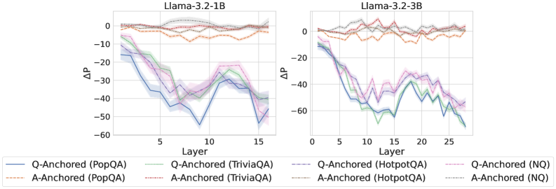
### Visual Description
## Line Charts: Llama-3.2 Model Layer-wise Performance Delta (ΔP)
### Overview
The image displays two side-by-side line charts comparing the performance delta (ΔP) across the layers of two different-sized language models: Llama-3.2-1B (left) and Llama-3.2-3B (right). The charts track the performance of eight different experimental conditions, which are combinations of two anchoring methods ("Q-Anchored" and "A-Anchored") applied to four different question-answering datasets (PopQA, TriviaQA, HotpotQA, NQ).
### Components/Axes
* **Chart Titles:** "Llama-3.2-1B" (left chart), "Llama-3.2-3B" (right chart).
* **Y-axis:** Labeled "ΔP" (Delta P). The scale is negative, ranging from 0 down to -60 for the 1B model and 0 down to -80 for the 3B model. This indicates a performance decrease.
* **X-axis:** Labeled "Layer". The 1B model chart shows layers from approximately 1 to 15. The 3B model chart shows layers from 0 to approximately 27.
* **Legend:** Positioned at the bottom, spanning both charts. It defines eight series:
* **Q-Anchored (Solid Lines):**
* Blue: PopQA
* Green: TriviaQA
* Purple: HotpotQA
* Pink: NQ
* **A-Anchored (Dashed Lines):**
* Orange: PopQA
* Red: TriviaQA
* Brown: HotpotQA
* Gray: NQ
### Detailed Analysis
**Llama-3.2-1B Chart (Left):**
* **A-Anchored Series (Dashed Lines):** All four series (Orange, Red, Brown, Gray) remain clustered near the top of the chart, fluctuating between approximately ΔP = 0 and ΔP = -10 across all 15 layers. Their trend is relatively flat with minor oscillations.
* **Q-Anchored Series (Solid Lines):** All four series show a pronounced downward trend.
* They start between ΔP = -10 and -20 at Layer 1.
* They experience a steep decline, reaching their lowest points (troughs) between Layers 8 and 12. The blue line (PopQA) reaches the lowest point, approximately ΔP = -55 around Layer 10.
* After the trough, they show a partial recovery, rising back to between ΔP = -30 and -45 by Layer 15.
* The lines are tightly grouped, with the blue (PopQA) and green (TriviaQA) lines generally performing slightly worse (more negative) than the purple (HotpotQA) and pink (NQ) lines.
**Llama-3.2-3B Chart (Right):**
* **A-Anchored Series (Dashed Lines):** Similar to the 1B model, these series remain near the top, fluctuating between ΔP = 0 and ΔP = -15 across all ~27 layers. The trend is flat with noise.
* **Q-Anchored Series (Solid Lines):** These show a more severe and sustained decline compared to the 1B model.
* They start near ΔP = -10 at Layer 0.
* They drop sharply, reaching a deep trough between Layers 10 and 15. The green line (TriviaQA) appears to hit the lowest point, approximately ΔP = -70 around Layer 12.
* Following the trough, there is a modest recovery, but the values remain deeply negative, ending between ΔP = -50 and -70 at Layer 27.
* The grouping is similar to the 1B model, with PopQA (blue) and TriviaQA (green) consistently at the bottom of the cluster.
### Key Observations
1. **Fundamental Dichotomy:** There is a stark, consistent separation between the performance of A-Anchored methods (dashed lines, near-zero ΔP) and Q-Anchored methods (solid lines, large negative ΔP) across both model sizes and all four datasets.
2. **Layer-wise Degradation Pattern:** Q-Anchored performance degrades significantly in the middle layers (roughly layers 8-15 for 1B, 10-20 for 3B) before a partial recovery in later layers. This creates a distinct "U" or "V" shaped curve.
3. **Model Size Effect:** The larger Llama-3.2-3B model exhibits a more severe performance drop (ΔP reaching ~-70 vs. ~-55) and a longer degradation phase across more layers compared to the 1B model.
4. **Dataset Consistency:** The relative ordering of datasets within each anchoring group is fairly consistent. For Q-Anchored, PopQA and TriviaQA generally show the worst performance, while HotpotQA and NQ are slightly better.
### Interpretation
This data suggests a critical finding about how these Llama-3.2 models process information internally for question-answering tasks. The "ΔP" metric likely measures the change in performance or probability attributed to a specific layer's representations.
* **Anchoring Method is Paramount:** The anchoring strategy (question vs. answer) has a far greater impact on layer-wise performance than the specific dataset or even the model size. Using an answer anchor (A-Anchored) preserves performance across all layers, while a question anchor (Q-Anchored) leads to severe degradation in mid-to-late layers.
* **Mid-Layer Vulnerability:** The middle layers of the transformer appear to be a bottleneck or transformation zone where question-anchored representations become less useful or more noisy for the final prediction task. The partial recovery in later layers suggests some re-calibration or refinement occurs.
* **Scaling Amplifies the Effect:** The larger model's more pronounced drop indicates that this mid-layer degradation phenomenon is not only consistent but may be amplified with scale, potentially due to more specialized or complex internal processing.
* **Practical Implication:** For tasks or interpretability methods that rely on inspecting or manipulating internal model states (like activation patching or representation analysis), the choice of anchor point is crucial. Using answer-based anchors appears to yield more stable and interpretable signals across the model's depth, whereas question-based anchors reveal a specific, dynamic vulnerability in the model's processing pipeline.
</details>
<details>
<summary>x8.png Details</summary>
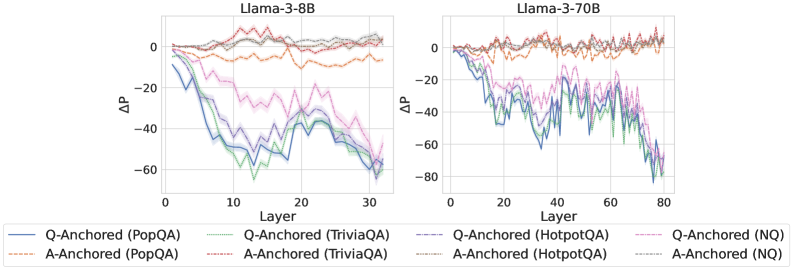
### Visual Description
## Line Charts: Llama-3 Model Layer-wise ΔP Analysis
### Overview
The image displays two side-by-side line charts comparing the layer-wise change in probability (ΔP) for two different-sized language models: Llama-3-8B (left) and Llama-3-70B (right). The charts analyze the performance of two anchoring methods (Q-Anchored and A-Anchored) across four different question-answering datasets (PopQA, TriviaQA, HotpotQA, NQ).
### Components/Axes
* **Chart Titles:** "Llama-3-8B" (left chart), "Llama-3-70B" (right chart).
* **Y-Axis:** Labeled "ΔP" (Delta P, likely representing a change in probability or performance metric). The scale ranges from -80 to 0, with major gridlines at intervals of 20.
* **X-Axis:** Labeled "Layer". The scale for Llama-3-8B ranges from 0 to 30. The scale for Llama-3-70B ranges from 0 to 80.
* **Legend:** Positioned at the bottom, spanning both charts. It defines eight data series using a combination of line color and style (solid vs. dashed):
* **Q-Anchored (Solid Lines):**
* Blue: PopQA
* Green: TriviaQA
* Purple: HotpotQA
* Pink: NQ
* **A-Anchored (Dashed Lines):**
* Orange: PopQA
* Red: TriviaQA
* Brown: HotpotQA
* Gray: NQ
### Detailed Analysis
**Llama-3-8B Chart (Left):**
* **Q-Anchored Series (Solid Lines):** All four solid lines show a pronounced downward trend, indicating a significant negative ΔP as the layer number increases.
* The **Blue (PopQA)** and **Green (TriviaQA)** lines exhibit the steepest decline, dropping from near 0 at layer 0 to approximately -60 by layer 30. Their lowest points are around layers 15-20.
* The **Purple (HotpotQA)** and **Pink (NQ)** lines follow a similar but slightly less severe downward trajectory, ending near -50 by layer 30.
* **A-Anchored Series (Dashed Lines):** All four dashed lines remain relatively stable and close to the zero line throughout all layers, fluctuating mostly between -10 and +5. They show no strong downward or upward trend.
**Llama-3-70B Chart (Right):**
* **Q-Anchored Series (Solid Lines):** The pattern is more volatile but follows the same core trend as the 8B model. The lines show a general decline with significant fluctuations.
* The **Blue (PopQA)**, **Green (TriviaQA)**, and **Purple (HotpotQA)** lines all descend sharply, reaching values between -60 and -80 by layer 80. The **Pink (NQ)** line also declines but ends slightly higher, around -50.
* The decline appears to accelerate after approximately layer 40.
* **A-Anchored Series (Dashed Lines):** Similar to the 8B model, the dashed lines for A-Anchored methods remain clustered near the zero line across all layers, showing minor fluctuations but no significant drift.
### Key Observations
1. **Method Dichotomy:** There is a stark and consistent contrast between the two anchoring methods. Q-Anchored methods (solid lines) result in a large, layer-dependent negative ΔP, while A-Anchored methods (dashed lines) maintain a ΔP near zero.
2. **Model Size Scaling:** The trend observed in the 8B model is amplified and extended in the larger 70B model. The negative ΔP for Q-Anchored methods reaches similar or greater magnitudes but is distributed across many more layers (80 vs. 30).
3. **Dataset Variation:** Within the Q-Anchored group, the PopQA (blue) and TriviaQA (green) datasets consistently show the most negative ΔP across both model sizes. The NQ (pink) dataset often shows the least negative ΔP among the Q-Anchored series.
4. **Volatility:** The Llama-3-70B chart exhibits greater high-frequency volatility (more jagged lines) in the Q-Anchored series compared to the Llama-3-8B chart.
### Interpretation
This data suggests a fundamental difference in how the "Q-Anchored" and "A-Anchored" techniques influence the internal processing of the Llama-3 models across their layers.
* **Q-Anchored Impact:** The strong negative ΔP trend for Q-Anchored methods indicates that this technique causes a progressive and significant reduction in the measured probability metric as information flows through the network's layers. This could imply that Q-Anchoring suppresses or alters the model's confidence or the probability assigned to certain outputs in a layer-wise manner. The effect is more pronounced for datasets like PopQA and TriviaQA.
* **A-Anchored Stability:** In contrast, A-Anchored methods appear to be largely neutral, preserving the ΔP near its initial value throughout the network. This suggests this technique does not induce the same layer-wise drift in the model's internal representations for this metric.
* **Scaling Effect:** The pattern holds across model scales (8B to 70B parameters), but the larger model's deeper architecture allows the effect to manifest over a longer sequence of layers, with increased volatility possibly reflecting more complex internal dynamics.
**In essence, the charts demonstrate that the choice of anchoring method (Q vs. A) is a critical determinant of layer-wise behavior in Llama-3 models, with Q-Anchoring introducing a strong, dataset-sensitive, and layer-dependent suppression effect that scales with model depth.**
</details>
<details>
<summary>x9.png Details</summary>
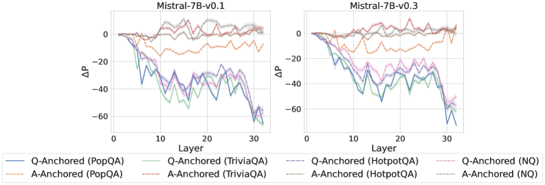
### Visual Description
## Comparative Line Charts: Model Performance Across Layers
### Overview
The image displays two side-by-side line charts comparing the performance change (ΔP) across 30 layers of two language model versions: **Mistral-7B-v0.1** (left chart) and **Mistral-7B-v0.3** (right chart). Each chart plots the performance delta for four different question-answering (QA) datasets, using two distinct anchoring methods: "Q-Anchored" (solid lines) and "A-Anchored" (dashed lines).
### Components/Axes
* **Chart Titles:**
* Left Chart: `Mistral-7B-v0.1`
* Right Chart: `Mistral-7B-v0.3`
* **X-Axis (Both Charts):**
* Label: `Layer`
* Scale: Linear, from 0 to 30, with major ticks at 0, 10, 20, 30.
* **Y-Axis (Both Charts):**
* Label: `ΔP` (Delta P, likely representing a change in performance or probability).
* Scale: Linear, from -60 to 0, with major ticks at -60, -40, -20, 0.
* **Legend (Located below both charts):**
* The legend contains 8 entries, mapping line color and style to a specific dataset and anchoring method.
* **Q-Anchored (Solid Lines):**
* Blue: `Q-Anchored (PopQA)`
* Green: `Q-Anchored (TriviaQA)`
* Purple: `Q-Anchored (HotpotQA)`
* Pink: `Q-Anchored (NQ)`
* **A-Anchored (Dashed Lines):**
* Orange: `A-Anchored (PopQA)`
* Red: `A-Anchored (TriviaQA)`
* Brown: `A-Anchored (HotpotQA)`
* Gray: `A-Anchored (NQ)`
### Detailed Analysis
**Chart 1: Mistral-7B-v0.1**
* **A-Anchored Lines (Dashed):** All four dashed lines (Orange, Red, Brown, Gray) remain relatively high and stable, fluctuating mostly between ΔP = -20 and 0 across all layers. They show minor dips but no severe downward trend.
* **Q-Anchored Lines (Solid):** All four solid lines (Blue, Green, Purple, Pink) show a pronounced downward trend as layer number increases.
* They start near ΔP = 0 at Layer 0.
* They begin a steep decline around Layer 5-10.
* They reach their lowest points (most negative ΔP) between Layers 25-30.
* **Approximate Trough Values (Layer ~30):**
* Blue (PopQA): ~ -60
* Green (TriviaQA): ~ -55
* Purple (HotpotQA): ~ -50
* Pink (NQ): ~ -45
* The lines are tightly clustered, with Blue (PopQA) generally being the lowest.
**Chart 2: Mistral-7B-v0.3**
* **A-Anchored Lines (Dashed):** Similar to v0.1, the dashed lines remain in the upper region (ΔP between -20 and 0). The Orange (PopQA) line appears slightly more volatile, with a notable dip around Layer 15.
* **Q-Anchored Lines (Solid):** The downward trend is even more severe and consistent compared to v0.1.
* The decline starts earlier, around Layer 3-5.
* The lines are more tightly grouped during the descent.
* They reach lower troughs overall.
* **Approximate Trough Values (Layer ~30):**
* Blue (PopQA): ~ -65
* Green (TriviaQA): ~ -60
* Purple (HotpotQA): ~ -55
* Pink (NQ): ~ -50
* The final drop from Layer 25 to 30 is particularly sharp for all Q-Anchored series.
### Key Observations
1. **Anchoring Method Dominance:** Across both model versions and all datasets, the **A-Anchored (dashed) method consistently results in significantly higher ΔP values** (closer to zero) than the Q-Anchored (solid) method. This is the most striking pattern.
2. **Layer-Dependent Degradation:** Performance change (ΔP) for the Q-Anchored method degrades dramatically with increasing layer depth. The effect is non-linear, with the steepest decline occurring in the middle to later layers (10-30).
3. **Model Version Comparison:** The degradation trend for Q-Anchored methods is **more severe in Mistral-7B-v0.3** than in v0.1. The lines descend faster and reach lower minima in the v0.3 chart.
4. **Dataset Variation:** Within the Q-Anchored group, the **PopQA dataset (Blue line) consistently shows the largest negative ΔP**, followed by TriviaQA, HotpotQA, and NQ. This hierarchy is consistent across both model versions.
5. **Stability of A-Anchored:** The A-Anchored lines, while showing some noise, do not exhibit the systematic layer-dependent collapse seen in the Q-Anchored lines.
### Interpretation
This data suggests a fundamental difference in how information is processed or retained across the layers of the Mistral-7B model depending on the anchoring strategy.
* **A-Anchored vs. Q-Anchored:** The "A-Anchored" method (likely anchoring on the *Answer*) appears to create a more stable representation that is robust to the transformations occurring across the model's depth. In contrast, the "Q-Anchored" method (anchoring on the *Question*) leads to representations that progressively diverge or degrade as they pass through subsequent layers, resulting in a large negative ΔP. This could indicate that answer-centric representations are more invariant within the model's processing pipeline.
* **Layer-wise Function:** The charts imply that the model's middle and later layers (10-30) are where the most significant transformation or "drift" occurs for question-anchored representations. The early layers (0-5) show minimal change.
* **Model Evolution:** The increased degradation in v0.3 suggests that the updates between model versions may have altered the internal processing dynamics, making the question-anchored pathway even more susceptible to layer-wise transformation. This could be a side effect of other training improvements.
* **Dataset Difficulty:** The consistent ordering of datasets (PopQA > TriviaQA > HotpotQA > NQ in terms of negative ΔP) might reflect inherent properties of the datasets, such as the complexity or specificity of the questions, which affects how stable their anchored representations are through the network.
**In summary, the visualization provides strong evidence that the choice of anchoring point (Question vs. Answer) is a critical factor influencing the stability of internal representations across the layers of a large language model, with answer anchoring providing far greater robustness.**
</details>
Figure 7: $ΔP$ under attention knockout, probing attention activations of the final token.
<details>
<summary>x10.png Details</summary>
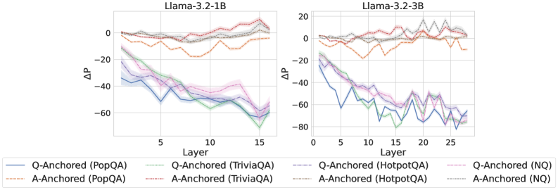
### Visual Description
## Line Charts: Llama-3.2 Model Layer-wise ΔP Analysis
### Overview
The image displays two side-by-side line charts comparing the performance change (ΔP) across the layers of two different-sized language models: Llama-3.2-1B (left) and Llama-3.2-3B (right). The charts track the ΔP metric for two different anchoring methods (Q-Anchored and A-Anchored) applied to four distinct question-answering datasets.
### Components/Axes
* **Chart Titles:**
* Left Chart: `Llama-3.2-1B`
* Right Chart: `Llama-3.2-3B`
* **X-Axis (Both Charts):** Labeled `Layer`. Represents the sequential layers of the neural network model.
* Llama-3.2-1B Chart: Ticks at 0, 5, 10, 15. The data spans layers 0 to 15.
* Llama-3.2-3B Chart: Ticks at 0, 5, 10, 15, 20, 25. The data spans layers 0 to 27 (approx.).
* **Y-Axis (Both Charts):** Labeled `ΔP`. Represents a change in a performance or probability metric.
* Llama-3.2-1B Chart: Ticks at -60, -40, -20, 0.
* Llama-3.2-3B Chart: Ticks at -80, -60, -40, -20, 0, 20.
* **Legend (Bottom, spanning both charts):** Contains 8 entries, differentiating lines by color, line style (solid/dashed), and dataset.
* **Solid Lines (Q-Anchored):**
* Blue: `Q-Anchored (PopQA)`
* Green: `Q-Anchored (TriviaQA)`
* Purple: `Q-Anchored (HotpotQA)`
* Pink: `Q-Anchored (NQ)`
* **Dashed Lines (A-Anchored):**
* Orange: `A-Anchored (PopQA)`
* Red: `A-Anchored (TriviaQA)`
* Gray: `A-Anchored (HotpotQA)`
* Brown: `A-Anchored (NQ)`
* **Language Note:** The legend contains Chinese characters in parentheses for the dataset names. The direct transcription is: `PopQA`, `TriviaQA`, `HotpotQA`, `NQ`. These are standard dataset acronyms and do not require translation.
### Detailed Analysis
#### Llama-3.2-1B Chart (Left)
* **Q-Anchored Series (Solid Lines):** All four solid lines exhibit a strong, consistent downward trend as layer number increases.
* They start clustered between approximately -10 and -20 at Layer 0.
* They decline steadily, reaching their lowest points between -50 and -70 at Layer 15.
* The blue line (PopQA) and green line (TriviaQA) show the steepest decline, ending near -70.
* The purple (HotpotQA) and pink (NQ) lines follow a similar path but end slightly higher, around -55 to -60.
* **A-Anchored Series (Dashed Lines):** These lines show relative stability or a slight upward trend.
* They start clustered near 0 at Layer 0.
* The orange line (PopQA) dips to around -20 between layers 5-10 before recovering to near 0.
* The red (TriviaQA), gray (HotpotQA), and brown (NQ) lines fluctuate gently around the 0 line, with a slight upward drift, ending between 0 and +10 at Layer 15.
#### Llama-3.2-3B Chart (Right)
* **Q-Anchored Series (Solid Lines):** The downward trend is present but more volatile and extends over more layers.
* They start between -10 and -20 at Layer 0.
* They show significant fluctuations (peaks and troughs) but maintain a general downward trajectory.
* The lowest points are reached between layers 20-25, with values between -60 and -80.
* The blue line (PopQA) reaches the lowest point, approximately -80, around layer 22.
* All lines show a slight recovery in the final layers (25-27).
* **A-Anchored Series (Dashed Lines):** These lines are more volatile than in the 1B model but remain in a higher range than the Q-Anchored lines.
* They start near 0 at Layer 0.
* They exhibit pronounced fluctuations, with values ranging roughly between -20 and +20.
* The red line (TriviaQA) shows the highest peak, reaching approximately +20 around layer 20.
* The orange line (PopQA) shows the most negative dips, reaching near -20 around layer 10.
* Overall, they do not show a clear upward or downward trend across all layers, instead oscillating.
### Key Observations
1. **Fundamental Dichotomy:** There is a clear and consistent separation between the behavior of Q-Anchored (solid, declining) and A-Anchored (dashed, stable/rising) methods across both model sizes.
2. **Model Size Effect:** The larger model (3B) exhibits greater volatility in ΔP across all series compared to the smaller model (1B), suggesting more complex internal dynamics.
3. **Dataset Sensitivity:** While the overall trend for each anchoring method is consistent, the specific ΔP values and volatility vary by dataset (color). For example, PopQA (blue/orange) often shows more extreme values.
4. **Layer-Dependent Performance:** For Q-Anchored methods, performance (as measured by ΔP) degrades significantly with model depth. For A-Anchored methods, performance is maintained or even improves slightly in deeper layers.
### Interpretation
This data suggests a fundamental difference in how "question-anchored" (Q) versus "answer-anchored" (A) representations or processing pathways evolve within a transformer-based language model.
* **Q-Anchored Degradation:** The consistent negative slope for Q-Anchored lines indicates that as information passes through deeper layers of the model, the specific signal or representation anchored to the *question* becomes less effective or more distorted, leading to a decrease in the measured metric (ΔP). This could imply that deeper layers are less optimized for maintaining question-specific context.
* **A-Anchored Robustness:** In contrast, A-Anchored methods show resilience. The stability or slight increase in ΔP suggests that representations anchored to the *answer* are either preserved or refined in deeper layers. This might align with the hypothesis that deeper layers in LLMs are more involved in reasoning and answer synthesis rather than initial question parsing.
* **Model Scaling:** The increased volatility in the 3B model suggests that scaling up model size introduces more non-linearities and specialized functions across layers, making the ΔP metric more sensitive to specific layer computations.
* **Practical Implication:** The findings could inform model editing or interpretability techniques. If one wishes to intervene on a model's behavior related to a specific question, earlier layers might be more effective for Q-anchored approaches. Conversely, interventions related to answer generation or verification might be more stable in deeper layers using A-anchored approaches. The choice of dataset also matters, as the magnitude of the effect varies.
</details>
<details>
<summary>x11.png Details</summary>
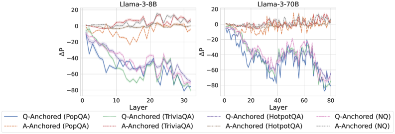
### Visual Description
## [Line Charts]: Llama-3 Model Layer-wise ΔP Performance
### Overview
The image displays two side-by-side line charts comparing the performance change (ΔP) across the layers of two different-sized language models: Llama-3-8B (left) and Llama-3-70B (right). Each chart plots the ΔP metric for eight different experimental conditions, which are combinations of an anchoring method (Q-Anchored or A-Anchored) and a dataset (PopQA, TriviaQA, HotpotQA, NQ). The charts illustrate how performance evolves as information propagates through the model's layers.
### Components/Axes
* **Chart Titles:**
* Left Chart: `Llama-3-8B`
* Right Chart: `Llama-3-70B`
* **Y-Axis (Both Charts):**
* Label: `ΔP`
* Scale: Linear, ranging from -80 to 20, with major ticks at intervals of 20 (-80, -60, -40, -20, 0, 20).
* **X-Axis (Both Charts):**
* Label: `Layer`
* Scale (Llama-3-8B): Linear, from 0 to 30, with major ticks at 0, 10, 20, 30.
* Scale (Llama-3-70B): Linear, from 0 to 80, with major ticks at 0, 20, 40, 60, 80.
* **Legend (Positioned below both charts, centered):**
* Contains 8 entries, each with a unique line style and color.
* **Q-Anchored Series (Solid Lines):**
* `Q-Anchored (PopQA)`: Solid blue line.
* `Q-Anchored (TriviaQA)`: Solid green line.
* `Q-Anchored (HotpotQA)`: Solid purple line.
* `Q-Anchored (NQ)`: Solid pink line.
* **A-Anchored Series (Dashed Lines):**
* `A-Anchored (PopQA)`: Dashed orange line.
* `A-Anchored (TriviaQA)`: Dashed red line.
* `A-Anchored (HotpotQA)`: Dashed brown line.
* `A-Anchored (NQ)`: Dashed gray line.
### Detailed Analysis
**Llama-3-8B Chart (Left):**
* **Q-Anchored Lines (Solid):** All four solid lines show a strong, consistent downward trend. They start near ΔP = 0 at Layer 0 and decline steeply, reaching values between approximately -60 and -80 by Layer 30. The lines are tightly clustered, indicating similar degradation across all four datasets for the Q-Anchored method.
* **A-Anchored Lines (Dashed):** All four dashed lines remain relatively stable and close to ΔP = 0 across all layers. They exhibit minor fluctuations but no significant upward or downward trend. The `A-Anchored (PopQA)` (dashed orange) line shows slightly more negative values (dipping to around -20) in the middle layers (10-20) compared to the others, which stay closer to zero.
**Llama-3-70B Chart (Right):**
* **Q-Anchored Lines (Solid):** Similar to the 8B model, the solid lines trend downward. However, the decline is more volatile, with pronounced peaks and valleys, especially between layers 40 and 60. The final values at Layer 80 are again in the -60 to -80 range. The volatility suggests less stable performance degradation in the larger model's mid-to-late layers.
* **A-Anchored Lines (Dashed):** These lines also remain stable around ΔP = 0, similar to the 8B model. They show slightly more high-frequency noise than in the 8B chart but maintain the same overall flat trend, indicating robustness across layers.
### Key Observations
1. **Clear Dichotomy by Anchoring Method:** The most striking pattern is the complete separation between Q-Anchored (solid, declining) and A-Anchored (dashed, stable) lines. This effect is consistent across both model sizes and all four datasets.
2. **Layer-Dependent Degradation for Q-Anchored:** Performance (ΔP) for Q-Anchored methods deteriorates significantly and monotonically with increasing layer depth.
3. **Stability of A-Anchored:** A-Anchored methods show no layer-dependent degradation, maintaining performance near the baseline (ΔP ≈ 0) throughout the network.
4. **Model Size Effect on Volatility:** The larger Llama-3-70B model exhibits greater volatility in the declining Q-Anchored lines compared to the smoother decline in Llama-3-8B, particularly in the middle layers.
5. **Dataset Similarity:** Within each anchoring group (Q or A), the lines for different datasets (PopQA, TriviaQA, HotpotQA, NQ) follow very similar trajectories, suggesting the observed effect is primarily driven by the anchoring method, not the specific knowledge dataset.
### Interpretation
This data strongly suggests that the **choice of anchoring method (Q vs. A) is a critical factor determining how a model's internal representations affect performance on knowledge-intensive tasks across its layers.**
* **Q-Anchored (Question-Anchored) methods** appear to suffer from a form of "representational drift" or interference as information passes through deeper layers. The initial question representation becomes less effective for retrieval or reasoning as it is transformed, leading to a steady drop in ΔP. The increased volatility in the 70B model might indicate that larger models have more complex internal transformations that can amplify this instability.
* **A-Anchored (Answer-Anchored) methods** demonstrate remarkable stability. This implies that anchoring the process to the answer representation provides a consistent signal that is preserved or even reinforced through the network's layers, making the model's performance robust to depth.
**In practical terms,** for tasks requiring deep, multi-layer processing of knowledge (like complex reasoning over retrieved facts), using an A-Anchored approach appears far more reliable. The Q-Anchored approach, while potentially effective in early layers, becomes increasingly detrimental in deeper layers, which could harm performance on tasks that require deep integration of information. The consistency across four different QA datasets (PopQA, TriviaQA, HotpotQA, NQ) indicates this is a fundamental architectural or methodological insight, not a dataset-specific artifact.
</details>
<details>
<summary>x12.png Details</summary>
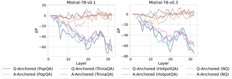
### Visual Description
## Line Charts: Comparison of ΔP Across Layers for Mistral-7B Model Versions
### Overview
The image displays two side-by-side line charts comparing the change in probability (ΔP) across the 32 layers of two versions of the Mistral-7B language model: "Mistral-7B-v0.1" (left chart) and "Mistral-7B-v0.3" (right chart). Each chart plots eight data series, representing two anchoring methods (Q-Anchored and A-Anchored) applied to four different question-answering datasets (PopQA, TriviaQA, HotpotQA, NQ).
### Components/Axes
* **Chart Titles:** "Mistral-7B-v0.1" (left), "Mistral-7B-v0.3" (right).
* **Y-Axis:** Labeled "ΔP". The scale ranges from -80 to 20, with major tick marks at intervals of 20 (-80, -60, -40, -20, 0, 20).
* **X-Axis:** Labeled "Layer". The scale ranges from 0 to 30, with major tick marks at intervals of 10 (0, 10, 20, 30). The data appears to be plotted for layers 1 through 32.
* **Legend:** Positioned at the bottom, spanning the width of both charts. It defines eight series using a combination of color and line style (solid vs. dashed).
* **Q-Anchored (Solid Lines):**
* Blue: Q-Anchored (PopQA)
* Green: Q-Anchored (TriviaQA)
* Purple: Q-Anchored (HotpotQA)
* Pink: Q-Anchored (NQ)
* **A-Anchored (Dashed Lines):**
* Orange: A-Anchored (PopQA)
* Red: A-Anchored (TriviaQA)
* Gray: A-Anchored (HotpotQA)
* Brown: A-Anchored (NQ)
### Detailed Analysis
**Trend Verification & Data Points (Approximate):**
* **Mistral-7B-v0.1 (Left Chart):**
* **Q-Anchored Series (Solid Lines):** All four solid lines show a pronounced downward trend, indicating a significant negative ΔP as layer depth increases.
* **Q-Anchored (PopQA) - Blue:** Starts near 0 at Layer 1. Drops steeply, reaching approximately -40 by Layer 10, -60 by Layer 20, and fluctuating between -50 and -70 from Layer 25 to 32.
* **Q-Anchored (TriviaQA) - Green:** Follows a very similar trajectory to the blue line, closely overlapping it, especially in deeper layers (20-32), ending near -60.
* **Q-Anchored (HotpotQA) - Purple:** Also follows the steep decline, generally positioned slightly above the blue and green lines in mid-layers (10-20) but converging with them in the deepest layers.
* **Q-Anchored (NQ) - Pink:** Shows the same pattern, often the highest of the solid lines in mid-layers but still dropping to around -50 to -60 by Layer 32.
* **A-Anchored Series (Dashed Lines):** All four dashed lines remain relatively stable, fluctuating around the 0 line with much smaller magnitude changes.
* **A-Anchored (PopQA) - Orange:** Fluctuates mostly between -10 and +10 across all layers.
* **A-Anchored (TriviaQA) - Red:** Similar stable pattern, fluctuating near 0.
* **A-Anchored (HotpotQA) - Gray:** Stable, fluctuating near 0.
* **A-Anchored (NQ) - Brown:** Stable, fluctuating near 0.
* **Mistral-7B-v0.3 (Right Chart):**
* **Q-Anchored Series (Solid Lines):** The same strong downward trend is present, but the magnitude of the negative ΔP appears slightly larger in the deepest layers compared to v0.1.
* **Q-Anchored (PopQA) - Blue:** Declines from 0, reaching approximately -50 by Layer 10, -70 by Layer 20, and fluctuating between -60 and -80 from Layer 25 to 32.
* **Q-Anchored (TriviaQA) - Green:** Closely tracks the blue line, ending in the -60 to -80 range.
* **Q-Anchored (HotpotQA) - Purple:** Follows the decline, often slightly above the blue/green lines, ending near -60.
* **Q-Anchored (NQ) - Pink:** Similar pattern, ending near -60.
* **A-Anchored Series (Dashed Lines):** Continue to show stability around 0, with no significant downward trend.
* **A-Anchored (PopQA) - Orange:** Fluctuates near 0.
* **A-Anchored (TriviaQA) - Red:** Fluctuates near 0.
* **A-Anchored (HotpotQA) - Gray:** Fluctuates near 0.
* **A-Anchored (NQ) - Brown:** Fluctuates near 0.
### Key Observations
1. **Fundamental Dichotomy:** There is a stark and consistent contrast between the behavior of Q-Anchored (solid lines) and A-Anchored (dashed lines) methods across both model versions and all four datasets.
2. **Layer-Dependent Degradation for Q-Anchored:** The Q-Anchored methods exhibit a strong, monotonic decrease in ΔP as the layer number increases. The most significant drops occur between layers 5-20, with values stabilizing at a large negative magnitude in the final 10 layers.
3. **Stability of A-Anchored:** The A-Anchored methods show no such layer-dependent degradation. Their ΔP values oscillate within a narrow band (approximately ±15) around zero throughout the network depth.
4. **Dataset Similarity:** Within each anchoring method group (Q or A), the four lines for different datasets (PopQA, TriviaQA, HotpotQA, NQ) follow remarkably similar trajectories, suggesting the observed effect is driven primarily by the anchoring method, not the specific dataset.
5. **Model Version Comparison:** The overall pattern is nearly identical between Mistral-7B-v0.1 and v0.3. However, the negative ΔP for Q-Anchored methods in the final layers (25-32) appears slightly more severe (reaching closer to -80) in the v0.3 chart.
### Interpretation
This visualization demonstrates a critical finding related to how language models process information internally, specifically concerning "anchoring" to either the question (Q) or the answer (A).
* **What the Data Suggests:** The ΔP metric likely measures a change in the model's probability assignment or internal representation confidence. The steep negative trend for Q-Anchored methods implies that as information propagates through the network's layers, the model's processing anchored to the *question* leads to a significant and progressive reduction in this probability metric. In contrast, anchoring to the *answer* maintains a stable probability signal throughout the network.
* **Relationship Between Elements:** The charts isolate the effect of two variables: **Model Version** (v0.1 vs. v0.3) and **Anchoring Method** (Q vs. A). The primary driver of the ΔP trend is the anchoring method. The model version has a minor, secondary effect on the magnitude of the Q-Anchored degradation. The dataset appears to be a negligible factor in this specific comparison.
* **Notable Anomalies/Patterns:** The most striking pattern is the perfect separation of the two method groups. There is no overlap between the solid and dashed line clusters after the first few layers. This suggests a fundamental difference in how the model's internal computations evolve when conditioned on the question versus the answer. The consistency across four diverse QA datasets reinforces that this is a general model behavior, not an artifact of a specific data distribution.
* **Implication (Reading Between the Lines):** This could indicate that the model's internal "reasoning" or representation pathway diverges significantly based on the anchoring point. The Q-Anchored pathway may involve a process of evidence accumulation or hypothesis testing that results in a downward adjustment of probabilities, while the A-Anchored pathway might involve verification or reinforcement, leading to stability. The slight increase in degradation from v0.1 to v0.3 could suggest that model updates, while potentially improving overall performance, might amplify this internal representational dynamic.
</details>
Figure 8: $ΔP$ under attention knockout, probing attention activations of the token immediately preceding the exact answer tokens.
<details>
<summary>x13.png Details</summary>
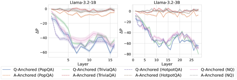
### Visual Description
## Line Charts: Llama-3.2 Model Layer-wise ΔP Analysis
### Overview
The image displays two side-by-side line charts comparing the performance metric "ΔP" across the layers of two different language models: Llama-3.2-1B (left) and Llama-3.2-3B (right). Each chart plots multiple data series representing different experimental conditions (Q-Anchored vs. A-Anchored) evaluated on four distinct question-answering datasets.
### Components/Axes
* **Titles:**
* Left Chart: `Llama-3.2-1B`
* Right Chart: `Llama-3.2-3B`
* **Y-Axis (Both Charts):**
* Label: `ΔP` (Delta P)
* Scale: Linear, ranging from 0 at the top to negative values at the bottom.
* Left Chart Range: 0 to -80 (major ticks at 0, -20, -40, -60).
* Right Chart Range: 0 to -80 (major ticks at 0, -20, -40, -60, -80).
* **X-Axis (Both Charts):**
* Label: `Layer`
* Left Chart Scale: 0 to 15 (major ticks at 0, 5, 10, 15).
* Right Chart Scale: 0 to 25 (major ticks at 0, 5, 10, 15, 20, 25).
* **Legend (Bottom Center, spanning both charts):**
* Contains 8 entries, differentiating lines by color and style (solid vs. dashed).
* **Q-Anchored Series (Solid Lines):**
* Blue: `Q-Anchored (PopQA)`
* Green: `Q-Anchored (TriviaQA)`
* Purple: `Q-Anchored (HotpotQA)`
* Pink: `Q-Anchored (NQ)`
* **A-Anchored Series (Dashed Lines):**
* Orange: `A-Anchored (PopQA)`
* Red: `A-Anchored (TriviaQA)`
* Gray: `A-Anchored (HotpotQA)`
* Brown: `A-Anchored (NQ)`
* **Data Representation:** Each data series is shown as a line with a semi-transparent shaded band around it, likely representing a confidence interval or standard deviation.
### Detailed Analysis
**Llama-3.2-1B (Left Chart):**
* **Q-Anchored (Solid Lines) Trend:** All four solid lines show a strong, consistent downward trend. Starting near ΔP = 0 at Layer 0, they decline steeply, reaching their lowest points between Layers 10-15. The values at Layer 15 are approximately:
* Q-Anchored (PopQA) [Blue]: ~ -60
* Q-Anchored (TriviaQA) [Green]: ~ -55
* Q-Anchored (HotpotQA) [Purple]: ~ -50
* Q-Anchored (NQ) [Pink]: ~ -45
* **A-Anchored (Dashed Lines) Trend:** All four dashed lines remain relatively stable and close to zero throughout all layers. They fluctuate slightly but generally stay within the range of ΔP = 0 to -10. There is no significant downward trend.
**Llama-3.2-3B (Right Chart):**
* **Q-Anchored (Solid Lines) Trend:** Similar to the 1B model, the solid lines exhibit a pronounced downward trajectory. The decline appears more volatile, with deeper troughs. The lowest points occur around Layers 20-25. Approximate values at Layer 25:
* Q-Anchored (PopQA) [Blue]: ~ -70
* Q-Anchored (TriviaQA) [Green]: ~ -65
* Q-Anchored (HotpotQA) [Purple]: ~ -60
* Q-Anchored (NQ) [Pink]: ~ -55
* **A-Anchored (Dashed Lines) Trend:** Consistent with the 1B model, the dashed lines for A-Anchored conditions hover near ΔP = 0 across all layers, showing minor fluctuations but no major decline.
### Key Observations
1. **Clear Dichotomy:** There is a stark and consistent separation between the behavior of Q-Anchored (solid lines) and A-Anchored (dashed lines) conditions across both models. This is the most prominent feature of the data.
2. **Layer-Dependent Degradation:** For Q-Anchored conditions, the metric ΔP degrades significantly (becomes more negative) as information propagates through the network layers. This degradation is progressive.
3. **Model Scale Effect:** The larger model (3B) shows a similar pattern but extends over more layers (25 vs. 15) and reaches slightly more negative ΔP values for the Q-Anchored conditions, suggesting the effect may be amplified or more measurable in a deeper network.
4. **Dataset Consistency:** The relative ordering of the four datasets within the Q-Anchored group is roughly consistent between models: PopQA (blue) tends to show the most negative ΔP, followed by TriviaQA (green), HotpotQA (purple), and NQ (pink). The A-Anchored lines are tightly clustered near zero with no clear dataset ordering.
### Interpretation
The data suggests a fundamental difference in how "question-anchored" (Q-Anchored) versus "answer-anchored" (A-Anchored) information is processed or retained across the layers of these Llama models.
* **Q-Anchored Processing:** The steep negative trend in ΔP for Q-Anchored conditions indicates that the model's internal representation or processing related to the question itself changes dramatically and progressively as it moves through the network layers. The metric ΔP, which likely measures some form of probability shift or performance delta, deteriorates. This could imply that the question context becomes less "stable" or is transformed in a way that negatively impacts this specific metric as depth increases.
* **A-Anchored Processing:** In contrast, the stability of ΔP near zero for A-Anchored conditions suggests that anchoring to the answer provides a robust signal that maintains its integrity or influence throughout the network's depth. The model's processing related to the answer appears less susceptible to layer-wise degradation on this metric.
* **Implication:** This contrast may highlight a potential vulnerability or characteristic of how these models handle query-based (question) versus target-based (answer) information flow. The findings could be relevant for understanding model interpretability, the mechanics of information propagation in transformers, or for designing more robust prompting and fine-tuning strategies. The consistency across four different QA datasets strengthens the generalizability of this observed pattern.
</details>
<details>
<summary>x14.png Details</summary>
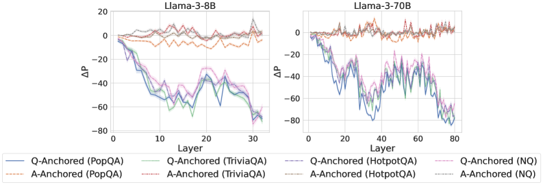
### Visual Description
\n
## Line Charts: Llama-3 Model Layer-wise ΔP Analysis
### Overview
The image displays two side-by-side line charts comparing the layer-wise change in probability (ΔP) for two different Large Language Models (LLMs): Llama-3-8B (left chart) and Llama-3-70B (right chart). Each chart plots ΔP against the model's layer number for multiple question-answering (QA) datasets, using two different prompting strategies: "Q-Anchored" and "A-Anchored".
### Components/Axes
* **Chart Titles:**
* Left Chart: `Llama-3-8B`
* Right Chart: `Llama-3-70B`
* **Y-Axis (Both Charts):** Label is `ΔP`. The scale ranges from -80 to 20, with major gridlines at intervals of 20 (-80, -60, -40, -20, 0, 20).
* **X-Axis (Both Charts):** Label is `Layer`.
* For Llama-3-8B: Scale ranges from 0 to 30, with major ticks at 0, 10, 20, 30.
* For Llama-3-70B: Scale ranges from 0 to 80, with major ticks at 0, 20, 40, 60, 80.
* **Legend (Bottom, spanning both charts):** Contains 8 entries, differentiating lines by color and style (solid vs. dashed).
* **Q-Anchored (Solid Lines):**
* Blue: `Q-Anchored (PopQA)`
* Green: `Q-Anchored (TriviaQA)`
* Purple: `Q-Anchored (HotpotQA)`
* Pink: `Q-Anchored (NQ)`
* **A-Anchored (Dashed Lines):**
* Orange: `A-Anchored (PopQA)`
* Red: `A-Anchored (TriviaQA)`
* Brown: `A-Anchored (HotpotQA)`
* Gray: `A-Anchored (NQ)`
### Detailed Analysis
**Llama-3-8B Chart (Left):**
* **Q-Anchored Series (Solid Lines):** All four datasets (PopQA, TriviaQA, HotpotQA, NQ) show a strong, consistent downward trend. They start near ΔP = 0 at Layer 0 and decline to approximately ΔP = -70 by Layer 30. The lines are tightly clustered, with the blue (PopQA) and green (TriviaQA) lines often slightly lower than the purple (HotpotQA) and pink (NQ) lines in the middle layers (10-20).
* **A-Anchored Series (Dashed Lines):** All four datasets show a relatively flat, stable trend, fluctuating near ΔP = 0 across all layers. They exhibit minor noise but no significant upward or downward slope. The orange (PopQA) and red (TriviaQA) lines appear to have slightly more variance than the brown (HotpotQA) and gray (NQ) lines.
**Llama-3-70B Chart (Right):**
* **Q-Anchored Series (Solid Lines):** Similar to the 8B model, all four datasets show a pronounced downward trend. They start near ΔP = 0 at Layer 0 and decline to approximately ΔP = -70 to -80 by Layer 80. The trend is more volatile (noisier) than in the 8B model, with significant dips and recoveries, particularly between layers 20 and 60. The lines remain closely grouped.
* **A-Anchored Series (Dashed Lines):** Consistent with the 8B model, all four datasets remain stable, fluctuating around ΔP = 0 across the entire layer range (0-80). The noise level appears slightly higher than in the 8B chart.
### Key Observations
1. **Strategy Dichotomy:** There is a stark and consistent contrast between the two prompting strategies across both model sizes. Q-Anchored prompting leads to a dramatic, layer-dependent decrease in ΔP, while A-Anchored prompting results in a stable ΔP near zero.
2. **Model Size Effect:** The general pattern is preserved from the 8B to the 70B model. The primary difference is the extended x-axis (more layers) and increased volatility in the Q-Anchored lines for the larger model.
3. **Dataset Similarity:** Within each prompting strategy (Q-Anchored or A-Anchored), the behavior across the four different QA datasets (PopQA, TriviaQA, HotpotQA, NQ) is remarkably similar. The lines for different datasets follow nearly identical trajectories.
4. **Spatial Grounding:** The legend is positioned at the bottom center of the entire figure. In both charts, the Q-Anchored (solid) lines occupy the lower portion of the graph (negative ΔP), while the A-Anchored (dashed) lines occupy the upper portion (near-zero ΔP).
### Interpretation
This data suggests a fundamental difference in how information is processed or retained across model layers depending on the prompt anchoring strategy.
* **Q-Anchored (Question-Anchored) Prompting:** The consistent, steep decline in ΔP indicates that as information propagates through the network's layers, the model's probability assignment (likely to the correct answer or a specific token) diminishes significantly. This could imply that the question context becomes less influential or is "forgotten" in deeper layers, or that the model's internal representations shift away from the initial question framing. The increased noise in the larger 70B model might reflect more complex internal dynamics.
* **A-Anchored (Answer-Anchored) Prompting:** The stable ΔP near zero suggests that when the answer is provided in the prompt, the model's probability assignment remains consistent across layers. This indicates a form of stability or reinforcement; the presence of the answer anchor may create a consistent signal that persists through the network's depth.
**Conclusion:** The choice between question-anchored and answer-anchored prompting is not merely a surface-level formatting choice but appears to fundamentally alter the layer-wise dynamics of probability assignment within Llama-3 models. The A-Anchored strategy promotes stability, while the Q-Anchored strategy leads to a progressive attenuation of the initial signal. This has significant implications for understanding model behavior, designing prompts for specific tasks (e.g., retrieval-augmented generation vs. closed-book QA), and potentially for model interpretability. The consistency across diverse QA datasets suggests this is a general model characteristic rather than a dataset-specific artifact.
</details>
<details>
<summary>x15.png Details</summary>
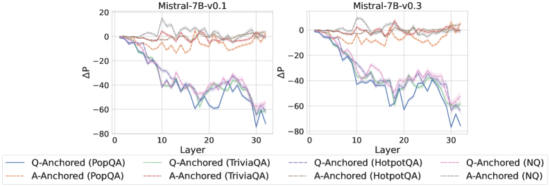
### Visual Description
## Line Charts: Performance Delta (ΔP) Across Model Layers for Two Mistral-7B Versions
### Overview
The image displays two side-by-side line charts comparing the performance delta (ΔP) across the 32 layers of two versions of the Mistral-7B language model: "Mistral-7B-v0.1" (left chart) and "Mistral-7B-v0.3" (right chart). Each chart plots the ΔP metric for eight different experimental conditions, which are combinations of an anchoring method (Q-Anchored or A-Anchored) and a dataset (PopQA, TriviaQA, HotpotQA, NQ). The charts illustrate how this performance metric changes as one moves from the model's input layer (Layer 0) to its output layer (Layer 32).
### Components/Axes
* **Chart Titles:** "Mistral-7B-v0.1" (left), "Mistral-7B-v0.3" (right).
* **Y-Axis:** Labeled "ΔP". The scale ranges from -80 to 20, with major tick marks at intervals of 20 (-80, -60, -40, -20, 0, 20).
* **X-Axis:** Labeled "Layer". The scale ranges from 0 to 30, with major tick marks at intervals of 10 (0, 10, 20, 30). The data appears to extend to Layer 32.
* **Legend:** Positioned at the bottom of the image, spanning both charts. It defines eight data series:
1. **Q-Anchored (PopQA):** Solid blue line.
2. **A-Anchored (PopQA):** Dashed orange line.
3. **Q-Anchored (TriviaQA):** Solid green line.
4. **A-Anchored (TriviaQA):** Dashed red line.
5. **Q-Anchored (HotpotQA):** Solid purple line.
6. **A-Anchored (HotpotQA):** Dashed brown line.
7. **Q-Anchored (NQ):** Solid pink line.
8. **A-Anchored (NQ):** Dashed gray line.
### Detailed Analysis
**Trend Verification & Data Points (Approximate Values):**
**Chart 1: Mistral-7B-v0.1**
* **Q-Anchored Series (Solid Lines - Blue, Green, Purple, Pink):** All four lines exhibit a strong, consistent downward trend. They start near ΔP = 0 at Layer 0. By Layer 10, they have dropped to approximately -20 to -40. The decline continues, reaching a trough between Layers 20-30, with values ranging from approximately -40 to -70. There is a slight recovery towards Layer 32, but values remain deeply negative (approx. -50 to -70). The lines are tightly clustered, indicating similar behavior across datasets for the Q-Anchored method.
* **A-Anchored Series (Dashed Lines - Orange, Red, Brown, Gray):** These lines show a markedly different pattern. They fluctuate around the ΔP = 0 baseline across all layers. The values generally stay within a band between -20 and +10. There is no strong directional trend; the lines oscillate, sometimes crossing above and below zero. The orange (PopQA) and red (TriviaQA) lines appear slightly more volatile than the brown (HotpotQA) and gray (NQ) lines.
**Chart 2: Mistral-7B-v0.3**
* **Q-Anchored Series (Solid Lines):** The overall downward trend is present but appears less steep and more erratic compared to v0.1. Starting near 0, the lines drop to around -20 to -40 by Layer 10. The decline continues with significant volatility, hitting lows between -40 and -70 in the Layer 20-30 range. The recovery at the final layers is less pronounced than in v0.1. The clustering of the four lines is slightly looser than in the v0.1 chart.
* **A-Anchored Series (Dashed Lines):** Similar to v0.1, these lines fluctuate around zero. The range of fluctuation appears comparable, mostly between -20 and +10. The behavior is stable across layers without a clear upward or downward trajectory.
### Key Observations
1. **Fundamental Dichotomy:** The most striking observation is the clear separation between the behavior of Q-Anchored methods (solid lines) and A-Anchored methods (dashed lines). This pattern is consistent across both model versions.
2. **Layer-Dependent Degradation for Q-Anchored:** Q-Anchored performance (ΔP) degrades significantly and progressively in the middle to later layers of the model (approx. Layers 10-30).
3. **Stability of A-Anchored:** A-Anchored performance remains relatively stable and close to the baseline (ΔP ≈ 0) throughout the entire depth of the network.
4. **Model Version Comparison:** The general trends are similar between Mistral-7B-v0.1 and v0.3. However, the Q-Anchored degradation in v0.3 appears slightly noisier and the final recovery less clean than in v0.1.
5. **Dataset Similarity:** Within each anchoring method (Q or A), the lines for the four different datasets (PopQA, TriviaQA, HotpotQA, NQ) follow very similar trajectories, suggesting the observed effect is robust across these question-answering benchmarks.
### Interpretation
The data suggests a fundamental difference in how the two anchoring mechanisms interact with the internal representations of the Mistral-7B model across its layers.
* **Q-Anchored (Query-Anchored) methods** appear to rely on information or processing that becomes progressively less effective or more distorted in the deeper, more abstract layers of the network. The large negative ΔP indicates a substantial drop in the measured performance metric. This could imply that the query's representation is not well-preserved or is actively interfered with as it propagates through the transformer blocks.
* **A-Anchored (Answer-Anchored) methods** demonstrate robustness. Their stable ΔP near zero suggests that anchoring to the answer provides a consistent signal or reference point that is maintained throughout the network's depth. This stability might be key to reliable performance.
The **Peircean investigative reading** would focus on the *indexical* relationship: The layer number acts as an index of processing depth. The charts show that the *sign* of Q-Anchored performance (a sharp negative trend) is an index of a specific underlying process (likely representation drift or interference), while the *sign* of A-Anchored performance (stable oscillation) indexes a different, more stable process. The consistency across datasets (PopQA, TriviaQA, etc.) strengthens the claim that this is a model-internal phenomenon, not an artifact of a specific data distribution. The slight differences between v0.1 and v0.3 could indicate architectural or training changes that marginally affect this internal dynamics. The critical takeaway is that the choice of anchoring point (query vs. answer) dictates whether the model's internal processing for this task is layer-sensitive (and degrading) or layer-invariant (and stable).
</details>
Figure 9: $ΔP$ under attention knockout, probing attention activations of the last exact answer token.
<details>
<summary>x16.png Details</summary>
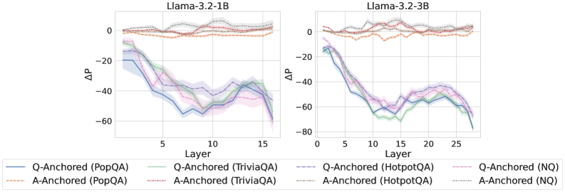
### Visual Description
## Line Charts: Layer-wise ΔP for Llama-3.2 Models
### Overview
The image displays two side-by-side line charts comparing the performance change (ΔP) across model layers for two different Large Language Models (LLMs): Llama-3.2-1B (left chart) and Llama-3.2-3B (right chart). Each chart plots multiple data series representing different "anchoring" methods (Q-Anchored vs. A-Anchored) evaluated on four distinct question-answering datasets (PopQA, TriviaQA, HotpotQA, NQ).
### Components/Axes
* **Chart Titles:**
* Left Chart: `Llama-3.2-1B`
* Right Chart: `Llama-3.2-3B`
* **X-Axis (Both Charts):**
* Label: `Layer`
* Scale: Linear, from 0 to approximately 16 (for 1B model) and 0 to approximately 27 (for 3B model). Major tick marks are at intervals of 5 (0, 5, 10, 15, 20, 25).
* **Y-Axis (Both Charts):**
* Label: `ΔP` (Delta P, likely representing a change in probability or performance metric).
* Scale: Linear, ranging from approximately -80 to 0. Major tick marks are at intervals of 20 (-80, -60, -40, -20, 0).
* **Legend (Bottom Center, spanning both charts):**
* The legend contains 8 entries, organized in two rows and four columns. Each entry pairs a line style/color with a method and dataset.
* **Row 1 (Q-Anchored Methods):**
1. `Q-Anchored (PopQA)` - Solid blue line.
2. `Q-Anchored (TriviaQA)` - Solid green line.
3. `Q-Anchored (HotpotQA)` - Dashed purple line.
4. `Q-Anchored (NQ)` - Solid pink/magenta line.
* **Row 2 (A-Anchored Methods):**
1. `A-Anchored (PopQA)` - Dashed orange line.
2. `A-Anchored (TriviaQA)` - Dashed red line.
3. `A-Anchored (HotpotQA)` - Dashed grey line.
4. `A-Anchored (NQ)` - Dashed brown line.
### Detailed Analysis
**Llama-3.2-1B Chart (Left):**
* **Q-Anchored Series (Solid/Dashed Cool Colors):** All four Q-Anchored lines follow a similar, pronounced "U" or "V" shaped trend.
* They start near ΔP = -20 at Layer 0.
* They descend sharply, reaching a minimum (trough) between Layers 7 and 12. The lowest point is approximately ΔP = -55 to -60.
* They then ascend, recovering to values between ΔP = -40 and -20 by Layer 16.
* The lines are tightly clustered, with `Q-Anchored (TriviaQA)` (green) often being the lowest and `Q-Anchored (HotpotQA)` (purple dashed) being slightly higher in the recovery phase.
* **A-Anchored Series (Dashed Warm Colors):** All four A-Anchored lines show a very different, stable trend.
* They fluctuate closely around the ΔP = 0 line across all layers.
* The values remain within a narrow band, approximately between ΔP = -5 and +5.
* There is no significant downward or upward trend; the lines are relatively flat with minor noise.
**Llama-3.2-3B Chart (Right):**
* **Q-Anchored Series:** The pattern is similar to the 1B model but more exaggerated and extended.
* They start near ΔP = -15 at Layer 0.
* They descend to a deeper and broader trough. The minimum values are lower, reaching approximately ΔP = -70 to -75 between Layers 10 and 15.
* The recovery phase is also present, with values rising to between ΔP = -50 and -30 by Layer 27.
* The clustering is similar, with `Q-Anchored (TriviaQA)` (green) again often at the bottom of the cluster.
* **A-Anchored Series:** The trend mirrors the 1B model.
* Lines remain stable and close to ΔP = 0.
* Fluctuations are contained within approximately ΔP = -10 to +5.
* No major deviation from the zero baseline is observed.
### Key Observations
1. **Fundamental Dichotomy:** There is a stark, consistent contrast between Q-Anchored and A-Anchored methods across both model sizes. Q-Anchored methods show large, layer-dependent variation in ΔP, while A-Anchored methods show negligible variation.
2. **Model Size Effect:** The magnitude of the negative ΔP for Q-Anchored methods is greater in the larger model (3B), and the trough occurs over a wider range of middle layers.
3. **Dataset Consistency:** The relative ordering and shape of the curves for a given anchoring method (Q or A) are highly consistent across all four datasets (PopQA, TriviaQA, HotpotQA, NQ). This suggests the observed phenomenon is robust to the specific QA dataset used.
4. **Spatial Layout:** The legend is positioned centrally below both charts, allowing for easy cross-referencing. The charts share identical axis labels and scales, facilitating direct visual comparison.
### Interpretation
The data suggests a fundamental difference in how "Q-Anchored" and "A-Anchored" interventions or analyses affect the model's internal processing across its layers.
* **Q-Anchored Sensitivity:** The pronounced negative ΔP in the middle layers for Q-Anchored methods indicates that these layers are highly sensitive to whatever the "Q" (likely Question) anchoring represents. The significant drop suggests a disruption or a specific type of processing occurring at these depths. The subsequent partial recovery in later layers might indicate a correction or integration phase.
* **A-Anchored Stability:** The near-zero ΔP for A-Anchored methods implies that anchoring on "A" (likely Answer) has minimal disruptive effect on the model's internal probability distributions across layers. This could mean the model's processing related to answers is more stable or less susceptible to the measured intervention.
* **Architectural Insight:** The pattern is consistent across model scales (1B and 3B parameters), implying it's a characteristic of the model architecture or training paradigm, not a quirk of a specific model size. The deeper and broader trough in the 3B model could reflect its greater capacity and more specialized layer functions.
* **Practical Implication:** If ΔP measures a performance drop or a shift away from a desired behavior, this analysis pinpoints the middle layers as critical for Q-Anchored tasks. Techniques aimed at improving or stabilizing model performance might need to focus specifically on these layers for question-based processing. Conversely, answer-based processing appears inherently more robust.
</details>
<details>
<summary>x17.png Details</summary>
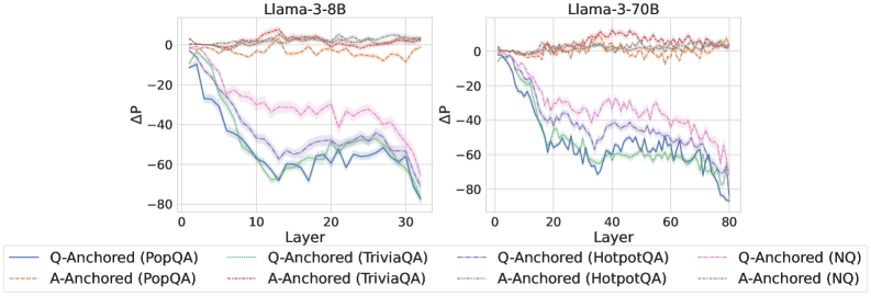
### Visual Description
## Line Charts: Llama-3 Model Layer-wise ΔP Analysis
### Overview
The image contains two side-by-side line charts comparing the performance metric "ΔP" across the layers of two different Large Language Models: Llama-3-8B (left chart) and Llama-3-70B (right chart). Each chart plots multiple data series representing different experimental conditions, defined by an anchoring method (Q-Anchored or A-Anchored) applied to four distinct question-answering datasets.
### Components/Axes
* **Chart Titles:**
* Left Chart: `Llama-3-8B`
* Right Chart: `Llama-3-70B`
* **Y-Axis (Both Charts):**
* Label: `ΔP` (Delta P)
* Scale: Linear, ranging from approximately -80 to 0.
* Major Ticks: 0, -20, -40, -60, -80.
* **X-Axis (Both Charts):**
* Label: `Layer`
* Scale: Linear.
* Left Chart (8B) Range: 0 to 30. Major ticks appear at 0, 10, 20, 30.
* Right Chart (70B) Range: 0 to 80. Major ticks appear at 0, 20, 40, 60, 80.
* **Legend (Bottom Center, spanning both charts):**
* Contains 8 entries, differentiating lines by color and line style (solid vs. dashed).
* **Solid Lines (Q-Anchored):**
* Blue: `Q-Anchored (PopQA)`
* Green: `Q-Anchored (TriviaQA)`
* Purple: `Q-Anchored (HotpotQA)`
* Pink: `Q-Anchored (NQ)`
* **Dashed Lines (A-Anchored):**
* Orange: `A-Anchored (PopQA)`
* Red: `A-Anchored (TriviaQA)`
* Gray: `A-Anchored (HotpotQA)`
* Brown: `A-Anchored (NQ)`
### Detailed Analysis
**Llama-3-8B Chart (Left):**
* **Q-Anchored Series (Solid Lines):** All four solid lines exhibit a strong, consistent downward trend. They start near ΔP = 0 at Layer 0 and decline steeply, reaching values between approximately -60 and -80 by Layer 30.
* The Blue (PopQA) and Green (TriviaQA) lines show the most significant drop, ending near -80.
* The Purple (HotpotQA) and Pink (NQ) lines follow a similar trajectory but end slightly higher, around -60 to -70.
* The lines are jagged, indicating layer-to-layer volatility, but the overall negative slope is unambiguous.
* **A-Anchored Series (Dashed Lines):** All four dashed lines remain relatively stable and close to ΔP = 0 throughout all 30 layers. They fluctuate within a narrow band, roughly between -10 and +5, showing no significant downward or upward trend. They are tightly clustered together.
**Llama-3-70B Chart (Right):**
* **Q-Anchored Series (Solid Lines):** The pattern is similar to the 8B model but extended over 80 layers. The solid lines again show a pronounced downward trend from Layer 0.
* They descend rapidly in the first 20-30 layers, reaching a range of -40 to -60.
* From Layer 30 to 80, the decline continues but at a slower, more volatile rate, with significant fluctuations. By Layer 80, the lines are spread between approximately -50 and -80.
* The relative ordering is less consistent than in the 8B chart, with lines crossing frequently, but the Blue (PopQA) and Green (TriviaQA) lines generally remain among the lowest.
* **A-Anchored Series (Dashed Lines):** As in the 8B chart, the dashed lines are stable and hover near the ΔP = 0 baseline across all 80 layers. They show minor fluctuations but no systematic drift, remaining clustered in the -10 to +5 range.
### Key Observations
1. **Anchoring Method Dominance:** The most striking pattern is the stark contrast between Q-Anchored (solid) and A-Anchored (dashed) conditions. Q-Anchoring leads to a large, progressive decrease in ΔP across model layers, while A-Anchoring results in a stable ΔP near zero.
2. **Model Scale Effect:** The trend for Q-Anchored lines is present in both model sizes (8B and 70B parameters). The 70B model chart shows the trend persisting over a greater number of layers (80 vs. 30), with increased volatility in the deeper layers.
3. **Dataset Variation:** Within the Q-Anchored group, the PopQA (blue) and TriviaQA (green) datasets consistently show the largest negative ΔP, especially in the 8B model. The NQ (pink) and HotpotQA (purple) datasets show a slightly attenuated effect.
4. **Spatial Layout:** The legend is positioned at the bottom, centered between the two charts. The charts themselves are aligned horizontally, sharing the same y-axis scale for direct comparison.
### Interpretation
This data suggests a fundamental difference in how the Llama-3 model processes information depending on the anchoring prompt. "ΔP" likely represents a change in probability or performance metric.
* **Q-Anchored (Question-Anchored) prompting** appears to cause a significant and layer-dependent degradation in the measured metric (ΔP becomes increasingly negative). This could indicate that when the model's processing is "anchored" to the question format, its internal representations or outputs shift dramatically as information propagates through the network layers, potentially moving away from a correct or stable answer distribution.
* **A-Anchored (Answer-Anchored) prompting** maintains a stable ΔP near zero across all layers. This suggests that anchoring the model to the answer format results in more consistent internal processing, where the metric does not drift significantly from its initial value regardless of depth.
* The consistency of this pattern across two model scales (8B and 70B) and four different QA datasets implies it is a robust phenomenon related to the prompting strategy itself, not a quirk of a specific model size or data domain. The increased volatility in the 70B model's deeper layers might reflect more complex or specialized processing in the larger model.
* **Practical Implication:** For tasks where maintaining a stable probability or performance metric across model layers is desirable, A-Anchored prompting appears far more effective than Q-Anchored prompting based on this analysis. The choice of dataset (PopQA/TriviaQA vs. HotpotQA/NQ) modulates the effect's magnitude but does not change its fundamental direction.
</details>
<details>
<summary>x18.png Details</summary>
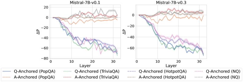
### Visual Description
## Line Charts: Mistral-7B Model Layer-wise Performance Change (ΔP)
### Overview
The image displays two side-by-side line charts comparing the layer-wise change in performance (ΔP) for two versions of the Mistral-7B language model: "Mistral-7B-v0.1" (left) and "Mistral-7B-v0.3" (right). Each chart plots ΔP against the model's layer number (0 to 30+). The data is broken down by two anchoring methods (Q-Anchored and A-Anchored) across four different question-answering datasets (PopQA, TriviaQA, HotpotQA, NQ).
### Components/Axes
* **Chart Titles:** Centered above each plot: "Mistral-7B-v0.1" (left) and "Mistral-7B-v0.3" (right).
* **X-Axis:** Labeled "Layer". Linear scale with major tick marks at 0, 10, 20, and 30.
* **Y-Axis:** Labeled "ΔP". Linear scale with major tick marks at -80, -60, -40, -20, 0, and 20.
* **Legend:** Positioned at the bottom, spanning the width of both charts. It defines eight data series using a combination of color and line style:
* **Solid Lines (Q-Anchored):**
* Blue: Q-Anchored (PopQA)
* Green: Q-Anchored (TriviaQA)
* Purple: Q-Anchored (HotpotQA)
* Pink: Q-Anchored (NQ)
* **Dashed Lines (A-Anchored):**
* Orange: A-Anchored (PopQA)
* Red: A-Anchored (TriviaQA)
* Gray: A-Anchored (HotpotQA)
* Light Blue: A-Anchored (NQ)
### Detailed Analysis
**Mistral-7B-v0.1 (Left Chart):**
* **Q-Anchored Series (Solid Lines):** All four lines (Blue/PopQA, Green/TriviaQA, Purple/HotpotQA, Pink/NQ) follow a very similar, pronounced downward trend. They start near ΔP = 0 at Layer 0, begin a steep decline around Layer 5-10, and continue to fall, reaching values between approximately -60 and -75 by Layer 30. The lines are tightly clustered, with the Green (TriviaQA) and Pink (NQ) lines often at the lower bound of the cluster.
* **A-Anchored Series (Dashed Lines):** These lines exhibit a fundamentally different pattern. They fluctuate around ΔP = 0 throughout all layers, showing no consistent downward or upward trend. The Orange (PopQA) and Red (TriviaQA) lines show more volatility, with peaks reaching near +10 and troughs near -15. The Gray (HotpotQA) and Light Blue (NQ) lines are slightly more stable but still oscillate within a range of roughly -10 to +15.
**Mistral-7B-v0.3 (Right Chart):**
* **Q-Anchored Series (Solid Lines):** The downward trend is again present but appears slightly less severe compared to v0.1. The lines start near 0, begin declining around Layer 10, and reach values between approximately -50 and -65 by Layer 30. The clustering is similar, with Green (TriviaQA) and Pink (NQ) often among the lowest.
* **A-Anchored Series (Dashed Lines):** These lines are notably more stable than in v0.1. They hover very close to ΔP = 0 across all layers, with significantly reduced amplitude of fluctuation. Most lines stay within a narrow band of approximately -5 to +5. The Orange (PopQA) line shows the most deviation, with a slight negative bias in the middle layers.
### Key Observations
1. **Fundamental Dichotomy:** There is a stark and consistent difference between the behavior of Q-Anchored and A-Anchored methods across both model versions. Q-Anchored performance degrades significantly with layer depth, while A-Anchored performance remains stable.
2. **Version Comparison (v0.1 vs. v0.3):** The A-Anchored lines in v0.3 are markedly more stable (closer to zero with less variance) than in v0.1. The Q-Anchored lines in v0.3 show a similar pattern of degradation but may start their decline slightly later and end at a marginally higher (less negative) ΔP.
3. **Dataset Similarity:** Within each anchoring method, the four datasets (PopQA, TriviaQA, HotpotQA, NQ) produce highly correlated trends. Their lines are tightly grouped, suggesting the observed layer-wise effect is robust across these different QA benchmarks.
4. **Spatial Grounding:** The legend is placed centrally at the bottom, clearly associating each color/style with its label. In the charts, the solid (Q-Anchored) lines occupy the lower half (negative ΔP) after the initial layers, while the dashed (A-Anchored) lines occupy the central band around zero.
### Interpretation
This data suggests a critical insight into the internal mechanics of the Mistral-7B model across its versions. The metric ΔP likely represents a change in some performance measure (e.g., probability, accuracy) when using different "anchoring" techniques.
* **Q-Anchored vs. A-Anchored:** The consistent degradation of Q-Anchored performance in deeper layers implies that the model's processing of the *question* (Q) becomes less effective or more perturbed as information flows through the network. In contrast, the stability of A-Anchored performance suggests the model's handling of the *answer* (A) context is robust to depth. This could indicate that deeper layers specialize in or are more sensitive to answer-related processing.
* **Model Evolution (v0.1 to v0.3):** The improved stability of the A-Anchored lines in v0.3 suggests that this model version has been refined to maintain more consistent performance on answer-anchored tasks across its depth, representing a potential architectural or training improvement.
* **Robustness Across Tasks:** The tight clustering of lines for different datasets indicates that this layer-wise phenomenon is a general property of the model's architecture and the anchoring methods, not an artifact of a specific question set.
**In summary, the charts reveal a fundamental asymmetry in how the model processes question versus answer information across its layers, with evidence of iterative improvement between model versions in stabilizing answer-based processing.**
</details>
Figure 10: $ΔP$ under attention knockout, probing mlp activations of the final token.
<details>
<summary>x19.png Details</summary>
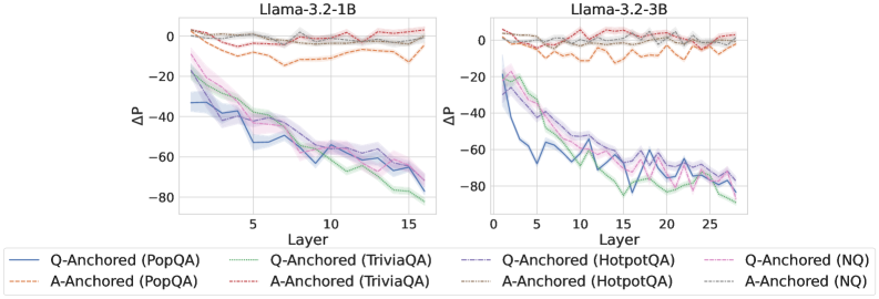
### Visual Description
\n
## Line Charts: ΔP Across Layers for Llama-3.2 Models
### Overview
The image displays two side-by-side line charts comparing the performance change (ΔP) across the layers of two different-sized language models: Llama-3.2-1B (left) and Llama-3.2-3B (right). Each chart plots multiple data series representing different experimental conditions (Q-Anchored vs. A-Anchored) across four question-answering datasets (PopQA, TriviaQA, HotpotQA, NQ). The charts illustrate how the measured metric ΔP evolves as information passes through the model's layers.
### Components/Axes
* **Chart Titles:**
* Left Chart: `Llama-3.2-1B`
* Right Chart: `Llama-3.2-3B`
* **X-Axis (Both Charts):** Labeled `Layer`. Represents the sequential layers of the neural network.
* Llama-3.2-1B: Ticks at 0, 5, 10, 15. The axis spans approximately layers 0 to 16.
* Llama-3.2-3B: Ticks at 0, 5, 10, 15, 20, 25. The axis spans approximately layers 0 to 26.
* **Y-Axis (Both Charts):** Labeled `ΔP`. Represents a change in probability or performance metric. The scale ranges from approximately -80 to +10, with major ticks at -80, -60, -40, -20, 0.
* **Legend (Bottom, spanning both charts):** Contains 8 entries, differentiating lines by color and style (solid vs. dashed).
* **Q-Anchored (Solid Lines):**
* `Q-Anchored (PopQA)`: Blue solid line.
* `Q-Anchored (TriviaQA)`: Green solid line.
* `Q-Anchored (HotpotQA)`: Purple solid line.
* `Q-Anchored (NQ)`: Pink solid line.
* **A-Anchored (Dashed Lines):**
* `A-Anchored (PopQA)`: Orange dashed line.
* `A-Anchored (TriviaQA)`: Red dashed line.
* `A-Anchored (HotpotQA)`: Brown dashed line.
* `A-Anchored (NQ)`: Gray dashed line.
### Detailed Analysis
**Llama-3.2-1B Chart (Left):**
* **Q-Anchored Series (Solid Lines):** All four solid lines show a strong, consistent downward trend. They start near ΔP = -10 to -20 at Layer 0 and decline steadily to between -60 and -80 by Layer 16. The lines are tightly clustered, with the green (TriviaQA) and blue (PopQA) lines often at the lower bound of the cluster. Shaded regions around each line indicate variance or confidence intervals.
* **A-Anchored Series (Dashed Lines):** All four dashed lines remain relatively flat and close to ΔP = 0 across all layers. They exhibit minor fluctuations but no significant upward or downward trend. The orange (PopQA) and red (TriviaQA) dashed lines show slightly more volatility than the others, occasionally dipping to around -10.
**Llama-3.2-3B Chart (Right):**
* **Q-Anchored Series (Solid Lines):** The pattern is similar to the 1B model but extended over more layers. The downward trend begins at Layer 0 (ΔP ≈ -20) and continues to Layer 26, where values reach between -70 and -80. The decline appears slightly less linear than in the 1B model, with some minor plateaus and variations. The green (TriviaQA) line again often represents the lowest values.
* **A-Anchored Series (Dashed Lines):** Consistent with the 1B model, these lines hover near ΔP = 0 throughout all 26 layers. They show minor noise but no directional trend. The orange (PopQA) dashed line is again the most volatile within this group.
### Key Observations
1. **Fundamental Dichotomy:** There is a stark, consistent difference between the behavior of Q-Anchored and A-Anchored conditions. Q-Anchored leads to a severe, layer-dependent degradation in ΔP, while A-Anchored maintains a stable ΔP near zero.
2. **Model Size Scaling:** The core trend is preserved when scaling from the 1B to the 3B parameter model. The 3B model simply extends the layer-wise analysis further, showing the Q-Anchored decline continues predictably with depth.
3. **Dataset Similarity:** Within each anchoring condition (Q or A), the four datasets (PopQA, TriviaQA, HotpotQA, NQ) produce remarkably similar trajectories. This suggests the observed effect is robust across different data sources and not an artifact of a specific dataset.
4. **Variance:** The shaded error bands are relatively narrow, indicating the reported trends are consistent across multiple runs or samples.
### Interpretation
This visualization presents a clear technical finding about the internal dynamics of Llama-3.2 models during a specific task (likely related to question answering or knowledge recall).
* **What the Data Suggests:** The metric ΔP, which likely measures the model's confidence or probability assigned to a correct answer, is highly sensitive to the "anchoring" method used during processing. "Q-Anchored" (possibly meaning the model's processing is conditioned heavily on the question) causes a catastrophic, layer-by-layer erosion of this confidence. In contrast, "A-Anchored" (possibly conditioning on the answer or a different representation) preserves the initial confidence level throughout the network's depth.
* **Relationship Between Elements:** The charts demonstrate that this degradation is a function of network depth (layer number) and is intrinsic to the model architecture/training, as it manifests identically in both the 1B and 3B variants. The consistency across datasets reinforces that this is a general mechanistic property, not a data-specific quirk.
* **Notable Implications:** The findings imply that for this task, the way information is "anchored" or represented as it flows through the model's layers is critical. The Q-Anchored pathway appears to suffer from a form of signal degradation or interference that accumulates with depth. This could inform techniques for improving model performance, such as modifying how question information is propagated or introducing architectural changes to stabilize representations in deeper layers. The stability of the A-Anchored condition provides a potential baseline or target for such interventions.
</details>
<details>
<summary>x20.png Details</summary>
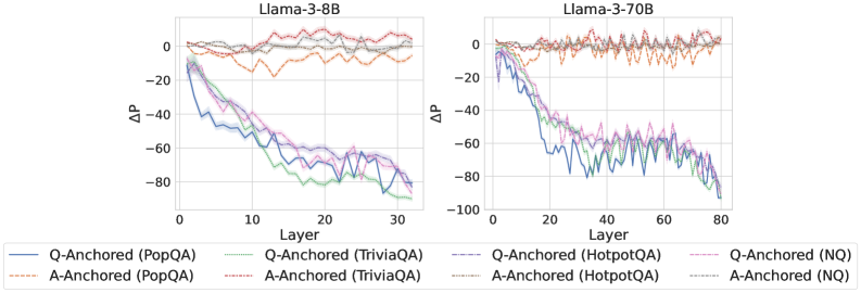
### Visual Description
## Line Charts: Llama-3 Model Layer-wise ΔP Analysis
### Overview
The image contains two side-by-side line charts comparing the performance change (ΔP) across layers for two different-sized language models: Llama-3-8B (left) and Llama-3-70B (right). Each chart plots multiple data series representing different question-answering datasets under two anchoring conditions: "Q-Anchored" and "A-Anchored". The charts illustrate how the performance metric ΔP evolves as information propagates through the model's layers.
### Components/Axes
* **Chart Titles:**
* Left Chart: "Llama-3-8B"
* Right Chart: "Llama-3-70B"
* **X-Axis (Both Charts):**
* Label: "Layer"
* Scale (Llama-3-8B): 0 to 30, with major ticks at 0, 10, 20, 30.
* Scale (Llama-3-70B): 0 to 80, with major ticks at 0, 20, 40, 60, 80.
* **Y-Axis (Both Charts):**
* Label: "ΔP" (Delta P)
* Scale (Llama-3-8B): -100 to 0, with major ticks at -100, -80, -60, -40, -20, 0.
* Scale (Llama-3-70B): -100 to 0, with major ticks at -100, -80, -60, -40, -20, 0.
* **Legend (Bottom of Image, spanning both charts):**
* The legend is positioned below the x-axes of both charts.
* It contains 8 entries, organized in two rows and four columns.
* **First Row (Q-Anchored, Solid Lines):**
1. `Q-Anchored (PopQA)` - Solid blue line.
2. `Q-Anchored (TriviaQA)` - Solid green line.
3. `Q-Anchored (HotpotQA)` - Solid purple line.
4. `Q-Anchored (NQ)` - Solid pink line.
* **Second Row (A-Anchored, Dashed Lines):**
1. `A-Anchored (PopQA)` - Dashed orange line.
2. `A-Anchored (TriviaQA)` - Dashed red line.
3. `A-Anchored (HotpotQA)` - Dashed gray line.
4. `A-Anchored (NQ)` - Dashed light blue/cyan line.
### Detailed Analysis
**Llama-3-8B Chart (Left):**
* **Q-Anchored Series (Solid Lines):** All four datasets (PopQA, TriviaQA, HotpotQA, NQ) show a strong, consistent downward trend. Starting near ΔP = 0 at Layer 0, they decline steeply. By Layer 30, all have dropped significantly, clustering between approximately ΔP = -70 and -90. The lines are tightly grouped, with TriviaQA (green) often appearing as the lowest (most negative) and PopQA (blue) slightly higher, but the differences are small relative to the overall drop.
* **A-Anchored Series (Dashed Lines):** All four datasets show a fundamentally different pattern. They fluctuate around ΔP = 0 across all layers, with no clear downward trend. The values oscillate roughly between -20 and +10. The lines are interwoven and do not show a consistent hierarchy.
**Llama-3-70B Chart (Right):**
* **Q-Anchored Series (Solid Lines):** The same steep downward trend is present but extends over more layers (up to 80). The decline appears slightly less smooth than in the 8B model, with more pronounced fluctuations. By Layer 80, the series converge in a range from approximately ΔP = -70 to -95. The relative ordering of the datasets is less consistent than in the 8B chart.
* **A-Anchored Series (Dashed Lines):** Similar to the 8B model, these series fluctuate around ΔP = 0 without a sustained downward trend. The range of fluctuation appears slightly wider, perhaps between -25 and +15. The lines remain interwoven.
### Key Observations
1. **Fundamental Dichotomy:** There is a stark, consistent difference between Q-Anchored and A-Anchored conditions across both model sizes. Q-Anchored performance (ΔP) degrades dramatically with layer depth, while A-Anchored performance remains stable near zero.
2. **Model Size Scaling:** The trend observed in the 8B model is replicated and extended in the larger 70B model, suggesting the phenomenon is consistent across model scales. The 70B model's chart simply has a longer x-axis (more layers).
3. **Dataset Similarity:** Within each anchoring condition (Q or A), the four different QA datasets (PopQA, TriviaQA, HotpotQA, NQ) exhibit very similar behavior. Their lines are tightly clustered, indicating the anchoring method, not the specific dataset, is the primary driver of the observed trend.
4. **Visual Noise:** The lines, especially for the A-Anchored condition and the later layers of the Q-Anchored condition in the 70B model, are jagged. This indicates high variance or noise in the ΔP measurement at individual layers.
### Interpretation
The data strongly suggests that the mechanism measured by ΔP is highly sensitive to the anchoring point in the input.
* **Q-Anchored (Question-Anchored):** The steep negative slope indicates that as information moves from the input layers (where the question is processed) toward the output layers, the model's internal state diverges significantly from the initial "question-anchored" reference point. This could represent the model transforming the question into an answer representation, a process that inherently changes the internal activation patterns.
* **A-Anchored (Answer-Anchored):** The stable, near-zero ΔP suggests that when anchored to the answer, the model's internal state remains relatively consistent across layers. This might imply that the answer representation is more stable or that the model's processing from middle to later layers is focused on refining or verifying this answer representation rather than constructing it from scratch.
* **Why It Matters:** This visualization provides empirical evidence for a fundamental difference in how large language models process information depending on the prompt structure. It highlights that the "path" from question to answer involves a significant transformation of the model's internal state (Q-Anchored decline), while the state associated with the answer itself is more preserved (A-Anchored stability). This has implications for understanding model interpretability, the flow of information in transformers, and potentially for designing more effective prompting or fine-tuning strategies. The consistency across datasets and model sizes underscores that this is a core architectural or training characteristic, not an artifact of a specific task.
</details>
<details>
<summary>x21.png Details</summary>
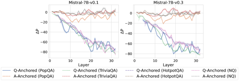
### Visual Description
## Line Chart: Model Layer Performance Comparison (Mistral-7B-v0.1 vs. v0.3)
### Overview
The image displays two side-by-side line charts comparing the performance change (ΔP) across model layers for two versions of the Mistral-7B model: "Mistral-7B-v0.1" (left plot) and "Mistral-7B-v0.3" (right plot). Each chart plots the performance metric ΔP against the model layer number (0 to 32) for eight different data series, representing two anchoring methods (Q-Anchored and A-Anchored) evaluated on four different question-answering datasets.
### Components/Axes
* **Chart Titles:**
* Left Plot: `Mistral-7B-v0.1`
* Right Plot: `Mistral-7B-v0.3`
* **X-Axis (Both Plots):**
* **Label:** `Layer`
* **Scale:** Linear, from 0 to 32. Major tick marks are at intervals of 10 (0, 10, 20, 30).
* **Y-Axis (Both Plots):**
* **Label:** `ΔP` (Delta P, likely representing a change in performance or probability).
* **Scale:** Linear, ranging from approximately -80 to +10. Major tick marks are at intervals of 20 (-80, -60, -40, -20, 0).
* **Legend (Bottom of Image, spanning both plots):**
* **Position:** Centered below the two charts.
* **Structure:** Two rows, four columns, listing eight series.
* **Series List (with approximate color and line style descriptions):**
1. `Q-Anchored (PopQA)` - Solid blue line.
2. `Q-Anchored (TriviaQA)` - Solid green line.
3. `Q-Anchored (HotpotQA)` - Dashed purple line.
4. `Q-Anchored (NQ)` - Solid pink/magenta line.
5. `A-Anchored (PopQA)` - Dashed orange line.
6. `A-Anchored (TriviaQA)` - Dashed red line.
7. `A-Anchored (HotpotQA)` - Dashed gray line.
8. `A-Anchored (NQ)` - Dotted light blue/cyan line.
### Detailed Analysis
**1. Mistral-7B-v0.1 (Left Plot):**
* **Q-Anchored Series (Solid/Dashed Blue, Green, Purple, Pink):** All four lines exhibit a strong, consistent downward trend. They start near ΔP = 0 at Layer 0 and decline steeply, reaching values between approximately -60 and -80 by Layer 32. The lines are tightly clustered, indicating similar degradation across datasets for the Q-Anchored method.
* **A-Anchored Series (Dashed Orange, Red, Gray; Dotted Cyan):** These lines show a markedly different pattern. They fluctuate around ΔP = 0, with no strong downward or upward trend across layers. The values generally stay within a band between -20 and +5. The `A-Anchored (PopQA)` (orange dashed) line shows slightly more volatility than the others.
**2. Mistral-7B-v0.3 (Right Plot):**
* **Q-Anchored Series:** The pattern is very similar to v0.1. All four lines show a pronounced downward trend from Layer 0 to Layer 32, ending in the -60 to -80 range. The clustering and slope appear nearly identical to the left plot.
* **A-Anchored Series:** These lines also remain relatively stable around ΔP = 0, fluctuating mostly between -20 and +5. The behavior is consistent with the v0.1 plot, showing no significant layer-wise degradation.
### Key Observations
1. **Clear Dichotomy:** There is a stark and consistent contrast between the two anchoring methods across both model versions. Q-Anchored performance (ΔP) degrades severely with increasing layer depth, while A-Anchored performance remains stable.
2. **Model Version Similarity:** The trends for both Q-Anchored and A-Anchored methods are remarkably similar between Mistral-7B-v0.1 and Mistral-7B-v0.3. This suggests the observed layer-wise behavior is a stable characteristic of the model architecture or the evaluation method, not an artifact fixed between these versions.
3. **Dataset Consistency:** Within each anchoring method, the four different datasets (PopQA, TriviaQA, HotpotQA, NQ) produce very similar trend lines. This indicates the observed effect is robust across different data sources.
4. **Volatility:** The A-Anchored lines, while stable in trend, exhibit more point-to-point volatility (jaggedness) compared to the smoother downward slope of the Q-Anchored lines.
### Interpretation
This visualization demonstrates a fundamental difference in how two types of "anchoring" (likely referring to how information is retrieved or attended to within the model) function across the layers of a large language model.
* **Q-Anchored (Question-Anchored?) Performance:** The steep negative slope suggests that as information propagates deeper into the model's layers, the model's ability to maintain or utilize the question-anchored signal diminishes significantly. By the final layers, the performance change is strongly negative. This could imply that deeper layers are less suited for, or actively interfere with, this specific mode of processing.
* **A-Anchored (Answer-Anchored?) Performance:** The stable, near-zero trend indicates that the answer-anchored signal is preserved or consistently processed throughout the model's depth. The model's layers do not systematically degrade this type of information.
* **Implication:** The data suggests a potential architectural or functional specialization within the model. The earlier layers may be crucial for processing question-anchored information, while the entire network maintains answer-anchored information. This could inform techniques for model editing, pruning, or understanding where different types of reasoning occur. The consistency across model versions (v0.1 to v0.3) and datasets strengthens the conclusion that this is a core behavioral property being measured. The "ΔP" metric, while not defined here, clearly captures a layer-sensitive phenomenon that differentiates these two anchoring strategies.
</details>
Figure 11: $ΔP$ under attention knockout, probing mlp activations of the token immediately preceding the exact answer tokens.
<details>
<summary>x22.png Details</summary>
### Visual Description
\n
## Line Charts: Llama-3.2 Model Layer-wise ΔP Analysis
### Overview
The image displays two side-by-side line charts comparing the layer-wise change in probability (ΔP) for two different-sized language models (Llama-3.2-1B and Llama-3.2-3B) across four question-answering datasets. The analysis contrasts two anchoring methods: "Q-Anchored" (solid lines) and "A-Anchored" (dashed lines).
### Components/Axes
* **Chart Titles:**
* Left Chart: `Llama-3.2-1B`
* Right Chart: `Llama-3.2-3B`
* **X-Axis (Both Charts):** Label: `Layer`. Represents the layer number within the neural network model.
* Left Chart Scale: 0 to 15, with major ticks at 0, 5, 10, 15.
* Right Chart Scale: 0 to 25, with major ticks at 0, 5, 10, 15, 20, 25.
* **Y-Axis (Both Charts):** Label: `ΔP`. Represents the change in probability. The scale is negative, indicating a decrease.
* Left Chart Scale: 0 to -80, with major ticks at 0, -20, -40, -60.
* Right Chart Scale: 0 to -80, with major ticks at 0, -20, -40, -60, -80.
* **Legend (Bottom Center, spanning both charts):** Contains 8 entries, differentiating by line style (solid/dashed) and color.
* **Q-Anchored (Solid Lines):**
* Blue: `Q-Anchored (PopQA)`
* Green: `Q-Anchored (TriviaQA)`
* Purple: `Q-Anchored (HotpotQA)`
* Pink: `Q-Anchored (NQ)`
* **A-Anchored (Dashed Lines):**
* Orange: `A-Anchored (PopQA)`
* Red: `A-Anchored (TriviaQA)`
* Gray: `A-Anchored (HotpotQA)`
* Brown: `A-Anchored (NQ)`
### Detailed Analysis
**Left Chart (Llama-3.2-1B):**
* **A-Anchored Series (Dashed Lines):** All four dashed lines (Orange, Red, Gray, Brown) remain clustered tightly near the top of the chart, fluctuating between approximately ΔP = 0 and ΔP = -10 across all layers (0-15). They show minimal downward trend.
* **Q-Anchored Series (Solid Lines):** All four solid lines show a pronounced downward trend.
* **General Trend:** They start near ΔP = 0 at Layer 0, drop steeply until approximately Layer 7-8, then continue a more gradual decline with some fluctuations, ending between ΔP = -60 and -70 at Layer 15.
* **Specific Series (Approximate End Values at Layer 15):**
* Blue (PopQA): ~ -65
* Green (TriviaQA): ~ -60
* Purple (HotpotQA): ~ -68
* Pink (NQ): ~ -62
**Right Chart (Llama-3.2-3B):**
* **A-Anchored Series (Dashed Lines):** Similar to the 1B model, the dashed lines remain near the top, fluctuating between ΔP = 0 and ΔP = -10 across layers 0-25.
* **Q-Anchored Series (Solid Lines):** The downward trend is even more pronounced and extends over more layers.
* **General Trend:** A steep decline from Layer 0 to approximately Layer 10, followed by a plateau or slower decline with notable fluctuations between Layers 10-20, and a final drop towards Layer 25.
* **Specific Series (Approximate End Values at Layer 25):**
* Blue (PopQA): ~ -75
* Green (TriviaQA): ~ -70
* Purple (HotpotQA): ~ -78
* Pink (NQ): ~ -72
### Key Observations
1. **Fundamental Dichotomy:** There is a stark and consistent separation between the behavior of Q-Anchored (solid) and A-Anchored (dashed) methods across both models and all datasets. A-Anchoring results in near-zero ΔP, while Q-Anchoring leads to significant negative ΔP.
2. **Model Size Effect:** The Llama-3.2-3B model (right chart) shows a more extended and slightly deeper decline for Q-Anchored series compared to the 1B model, correlating with its greater number of layers.
3. **Dataset Consistency:** The relative ordering and shape of the Q-Anchored lines are remarkably consistent across datasets within each model. For example, the Purple line (HotpotQA) is consistently among the lowest, while the Pink line (NQ) is often among the highest of the solid lines.
4. **Mid-Layer Fluctuations:** Both models exhibit non-monotonic behavior in the Q-Anchored series, with noticeable "bumps" or temporary recoveries in ΔP around Layers 10-14 (1B) and Layers 12-18 (3B).
### Interpretation
This visualization demonstrates a core finding about the internal mechanics of these language models during a specific task (likely related to question answering or knowledge recall). The **ΔP** metric likely measures how much the model's probability assignment to a target answer changes as information is processed through its layers.
* **Anchoring Effect:** The "A-Anchored" condition (dashed lines) appears to provide a stable reference point that prevents significant probability drift, keeping ΔP near zero. In contrast, the "Q-Anchored" condition (solid lines) leads to a progressive and substantial decrease in probability as the signal propagates through the network. This suggests the model's internal representation or confidence in the answer is being systematically altered when anchored to the question versus the answer itself.
* **Layer-wise Processing:** The steep initial drop in Q-Anchored ΔP indicates that the most significant transformations occur in the early-to-mid layers. The fluctuations in deeper layers suggest complex, non-linear processing where the model may be integrating information or resolving conflicts, leading to temporary reversals in the probability trend.
* **Scalability:** The pattern holds across model sizes (1B vs. 3B parameters), indicating this is a fundamental characteristic of the model architecture or training, not an artifact of scale. The deeper model simply extends the process over more layers.
* **Robustness Across Domains:** The consistency across four distinct QA datasets (PopQA, TriviaQA, HotpotQA, NQ) implies this anchoring phenomenon is a general property of the model's operation, not specific to a single type of knowledge or question format.
In essence, the charts provide empirical evidence that the choice of anchoring point (question vs. answer) fundamentally dictates the trajectory of probability change through a transformer's layers, with Q-Anchoring inducing a strong, consistent decay in ΔP.
</details>
<details>
<summary>x23.png Details</summary>
### Visual Description
## Line Charts: Layer-wise ΔP for Llama-3 Models
### Overview
The image displays two side-by-side line charts comparing the change in probability (ΔP) across neural network layers for two different model sizes: Llama-3-8B (left) and Llama-3-70B (right). The charts analyze the performance of two anchoring methods (Q-Anchored and A-Anchored) across four different question-answering datasets.
### Components/Axes
* **Titles:**
* Left Chart: "Llama-3-8B"
* Right Chart: "Llama-3-70B"
* **Y-Axis (Both Charts):** Label is "ΔP". Scale ranges from -80 to 0, with major tick marks at intervals of 20 (-80, -60, -40, -20, 0).
* **X-Axis (Left Chart - Llama-3-8B):** Label is "Layer". Scale ranges from 0 to 30, with major tick marks at 0, 10, 20, 30.
* **X-Axis (Right Chart - Llama-3-70B):** Label is "Layer". Scale ranges from 0 to 80, with major tick marks at 0, 20, 40, 60, 80.
* **Legend (Bottom Center):** Contains 8 entries, differentiating lines by color and style (solid vs. dashed).
* **Q-Anchored (Solid Lines):**
* Blue: Q-Anchored (PopQA)
* Green: Q-Anchored (TriviaQA)
* Purple: Q-Anchored (HotpotQA)
* Pink: Q-Anchored (NQ)
* **A-Anchored (Dashed Lines):**
* Orange: A-Anchored (PopQA)
* Red: A-Anchored (TriviaQA)
* Gray: A-Anchored (HotpotQA)
* Brown: A-Anchored (NQ)
### Detailed Analysis
**Llama-3-8B Chart (Left):**
* **Q-Anchored Lines (Solid):** All four solid lines (Blue, Green, Purple, Pink) exhibit a strong, consistent downward trend. They start near ΔP = 0 at Layer 0 and decline steeply, converging in a cluster between approximately -60 and -80 by Layer 30. The lines are tightly grouped, with the Pink line (NQ) appearing slightly higher (less negative) than the others in the mid-layers (10-20).
* **A-Anchored Lines (Dashed):** All four dashed lines (Orange, Red, Gray, Brown) remain relatively flat and close to ΔP = 0 across all layers (0-30). They show minor fluctuations but no significant downward or upward trend, staying within a narrow band roughly between -10 and +5.
**Llama-3-70B Chart (Right):**
* **Q-Anchored Lines (Solid):** The same four solid lines show a similar downward trend but over a longer layer span. They start near 0 and decline to a cluster between -60 and -80 by Layer 80. The decline is less steep per layer compared to the 8B model. The Purple line (HotpotQA) appears to have the most pronounced dip around Layer 40 before recovering slightly.
* **A-Anchored Lines (Dashed):** Consistent with the 8B model, the dashed lines remain stable near ΔP = 0 across all 80 layers, with minor noise.
### Key Observations
1. **Anchoring Method Dichotomy:** There is a stark and consistent contrast between the two anchoring methods across both model sizes and all four datasets. Q-Anchored performance (ΔP) degrades significantly with depth, while A-Anchored performance remains stable.
2. **Model Size Effect:** The trend for Q-Anchored lines is similar in shape but stretched across more layers in the larger (70B) model. The final ΔP values at the deepest layers are comparable (~ -80), but the rate of decline is slower in the 70B model.
3. **Dataset Similarity:** Within each anchoring group (Q or A), the lines for different datasets (PopQA, TriviaQA, HotpotQA, NQ) follow very similar trajectories, suggesting the observed phenomenon is robust across these QA benchmarks.
4. **Spatial Layout:** The legend is positioned centrally below both charts, allowing for direct cross-referencing. The charts share the same y-axis scale and label, facilitating direct comparison of the ΔP magnitude.
### Interpretation
The data suggests a fundamental difference in how information is processed or retained across layers depending on the anchoring method. "ΔP" likely represents a change in probability or performance metric relative to a baseline.
* **Q-Anchored (Question-Anchored):** The consistent negative trend indicates that as information propagates through deeper layers of the model, the probability or confidence associated with the question-anchored representation diminishes significantly. This could imply that deeper layers are less effective at maintaining or utilizing the initial question context, or that the representation becomes "diluted."
* **A-Anchored (Answer-Anchored):** The stability near zero suggests that the answer-anchored representation is robustly maintained throughout the network's depth. The model's processing does not degrade the answer-related signal as it moves through the layers.
The contrast between the 8B and 70B models for the Q-Anchored lines is particularly insightful. The more gradual decline in the larger model might indicate that increased model capacity allows for a better preservation of the question-anchored signal across a deeper architecture, even if the ultimate degradation at the final layer is similar. This visualization provides strong evidence that the choice of anchoring (question vs. answer) has a profound and systematic impact on internal model dynamics across layers.
</details>
<details>
<summary>x24.png Details</summary>
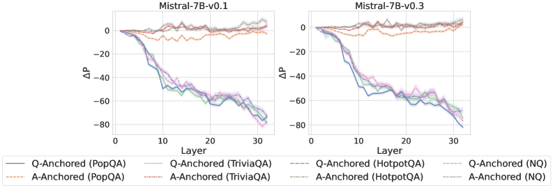
### Visual Description
\n
## Line Charts: Mistral-7B Model Layer-wise ΔP Analysis
### Overview
The image displays two side-by-side line charts comparing the performance change (ΔP) across the 32 layers of two versions of the Mistral-7B language model: "Mistral-7B-v0.1" (left) and "Mistral-7B-v0.3" (right). Each chart plots the ΔP metric for four different question-answering datasets, using two distinct anchoring methods ("Q-Anchored" and "A-Anchored").
### Components/Axes
* **Chart Titles:** "Mistral-7B-v0.1" (left chart), "Mistral-7B-v0.3" (right chart).
* **X-Axis:** Labeled "Layer". Linear scale from 0 to 30, with major tick marks at 0, 10, 20, and 30. Represents the transformer layer index within the model.
* **Y-Axis:** Labeled "ΔP". Linear scale from -80 to 0, with major tick marks at -80, -60, -40, -20, and 0. Represents a change in a performance or probability metric.
* **Legend:** Positioned at the bottom, spanning both charts. It defines 8 data series using a combination of color and line style:
* **Solid Lines (Q-Anchored):**
* Blue: Q-Anchored (PopQA)
* Green: Q-Anchored (TriviaQA)
* Purple: Q-Anchored (HotpotQA)
* Pink: Q-Anchored (NQ)
* **Dashed Lines (A-Anchored):**
* Orange: A-Anchored (PopQA)
* Red: A-Anchored (TriviaQA)
* Brown: A-Anchored (HotpotQA)
* Gray: A-Anchored (NQ)
### Detailed Analysis
**Trend Verification & Data Points (Approximate):**
**1. Mistral-7B-v0.1 (Left Chart):**
* **Q-Anchored Series (Solid Lines):** All four lines exhibit a strong, consistent downward trend. They start near ΔP = 0 at Layer 0 and decline steeply, reaching between -70 and -80 by Layer 32.
* *Blue (PopQA):* Drops to ~-60 by Layer 15, ends near -75.
* *Green (TriviaQA):* Follows a very similar path to Blue, ending near -75.
* *Purple (HotpotQA):* Slightly less steep initially, but converges with the others, ending near -75.
* *Pink (NQ):* Follows the same general trend, ending near -75.
* **A-Anchored Series (Dashed Lines):** All four lines remain relatively flat and close to ΔP = 0 throughout all layers, with minor fluctuations.
* *Orange (PopQA):* Fluctuates between approximately +5 and -10.
* *Red (TriviaQA):* Fluctuates between approximately +5 and -15, with a notable dip around Layer 10.
* *Brown (HotpotQA):* Fluctuates tightly around 0, mostly between +5 and -5.
* *Gray (NQ):* Fluctuates around 0, mostly between +5 and -5.
**2. Mistral-7B-v0.3 (Right Chart):**
* **Q-Anchored Series (Solid Lines):** The same strong downward trend is present. The decline appears slightly steeper in the early layers (0-10) compared to v0.1.
* *Blue (PopQA):* Drops to ~-60 by Layer 10, ends near -80.
* *Green (TriviaQA):* Very similar to Blue, ends near -80.
* *Purple (HotpotQA):* Follows closely, ends near -80.
* *Pink (NQ):* Follows the trend, ends near -80.
* **A-Anchored Series (Dashed Lines):** Again, these lines remain flat near ΔP = 0.
* *Orange (PopQA):* Fluctuates between approximately +5 and -10.
* *Red (TriviaQA):* Fluctuates between approximately +5 and -10.
* *Brown (HotpotQA):* Fluctuates tightly around 0.
* *Gray (NQ):* Fluctuates tightly around 0.
### Key Observations
1. **Method Dichotomy:** There is a stark, consistent contrast between the two anchoring methods across both model versions and all four datasets. Q-Anchored methods cause ΔP to plummet with model depth, while A-Anchored methods keep ΔP stable near zero.
2. **Dataset Consistency:** Within each anchoring method, the behavior across the four different QA datasets (PopQA, TriviaQA, HotpotQA, NQ) is remarkably similar. The lines for each method are tightly clustered.
3. **Model Version Similarity:** The overall patterns are nearly identical between Mistral-7B-v0.1 and v0.3. The primary difference is a slightly more pronounced early decline in the Q-Anchored lines for v0.3.
4. **Layer Sensitivity:** The Q-Anchored effect is layer-dependent, showing a near-linear negative correlation with layer index. The A-Anchored effect is layer-invariant.
### Interpretation
This visualization demonstrates a fundamental difference in how two types of "anchoring" (likely referring to prompt engineering or attention mechanisms) affect the internal processing of a large language model across its layers.
* **Q-Anchoring (Question-Anchored):** This method appears to progressively suppress or alter a specific probability metric (ΔP) as information flows through the network. The consistent negative trend suggests that focusing on the question leads to a cumulative reduction in whatever P represents (perhaps the probability of a default or prior answer) from early to late layers. The uniformity across datasets implies this is a general architectural response, not task-specific.
* **A-Anchoring (Answer-Anchored):** This method maintains the metric ΔP at a baseline level (near zero change) throughout the network. This suggests that anchoring to the answer stabilizes the model's internal representations with respect to this metric, preventing the layer-wise drift seen with Q-Anchoring.
**In essence, the choice of anchoring fundamentally rewires the model's internal computational trajectory.** Q-Anchoring induces a strong, depth-dependent transformation, while A-Anchoring preserves a stable state. The fact that this pattern holds across model versions and diverse QA datasets points to a core mechanistic property of the Mistral-7B architecture being revealed by this analysis. The outlier is the slight dip in the A-Anchored TriviaQA line in v0.1, which may indicate a minor, dataset-specific instability in that model version.
</details>
Figure 12: $ΔP$ under attention knockout, probing mlp activations of the last exact answer token.
<details>
<summary>x25.png Details</summary>
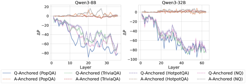
### Visual Description
## Line Charts: Qwen3-8B and Qwen3-32B Layer-wise ΔP Analysis
### Overview
The image displays two side-by-side line charts comparing the performance metric "ΔP" across neural network layers for two different model sizes: Qwen3-8B (left) and Qwen3-32B (right). Each chart plots multiple data series representing two anchoring methods ("Q-Anchored" and "A-Anchored") evaluated on four distinct question-answering datasets.
### Components/Axes
* **Titles:**
* Left Chart: `Qwen3-8B`
* Right Chart: `Qwen3-32B`
* **Axes:**
* **X-axis (both charts):** Label is `Layer`. The scale represents the layer number within the model.
* Qwen3-8B chart: Ticks at 0, 10, 20, 30. The data spans approximately layers 0 to 35.
* Qwen3-32B chart: Ticks at 0, 20, 40, 60. The data spans approximately layers 0 to 65.
* **Y-axis (both charts):** Label is `ΔP`. This likely represents a change in probability or performance metric.
* Qwen3-8B chart: Ticks at -80, -60, -40, -20, 0, 20.
* Qwen3-32B chart: Ticks at -100, -80, -60, -40, -20, 0.
* **Legend (Bottom, spanning both charts):** Contains 8 entries, differentiating lines by color and style (solid vs. dashed).
* **Q-Anchored Series (Solid Lines):**
* `Q-Anchored (PopQA)`: Solid blue line.
* `Q-Anchored (TriviaQA)`: Solid green line.
* `Q-Anchored (HotpotQA)`: Solid purple line.
* `Q-Anchored (NQ)`: Solid pink/magenta line.
* **A-Anchored Series (Dashed Lines):**
* `A-Anchored (PopQA)`: Dashed orange line.
* `A-Anchored (TriviaQA)`: Dashed red line.
* `A-Anchored (HotpotQA)`: Dashed brown line.
* `A-Anchored (NQ)`: Dashed gray line.
### Detailed Analysis
**Qwen3-8B Chart (Left):**
* **Q-Anchored Lines (Solid):** All four lines (blue, green, purple, pink) exhibit a strong, noisy downward trend. They start near ΔP = 0 at layer 0 and decline to values between approximately -60 and -80 by layer 35. The decline is not monotonic; there are significant local peaks and troughs. The blue line (PopQA) often reaches the lowest points.
* **A-Anchored Lines (Dashed):** All four lines (orange, red, brown, gray) remain relatively stable and close to ΔP = 0 throughout all layers. They show minor fluctuations but no significant upward or downward trend, staying within a narrow band roughly between -5 and +5.
**Qwen3-32B Chart (Right):**
* **Q-Anchored Lines (Solid):** Similar to the 8B model, these lines show a pronounced downward trend. The decline appears steeper and reaches lower absolute values, dropping to between approximately -80 and -100 by layer 65. The noise/fluctuation is also very high. The separation between the different dataset lines is less distinct than in the 8B chart.
* **A-Anchored Lines (Dashed):** Consistent with the 8B model, these lines remain stable near ΔP = 0 across all layers, with minor fluctuations.
### Key Observations
1. **Anchoring Method Dichotomy:** There is a stark and consistent contrast between the two anchoring methods across both model sizes. Q-Anchored performance (ΔP) degrades dramatically with increasing layer depth, while A-Anchored performance remains stable.
2. **Model Size Effect:** The larger model (Qwen3-32B) shows a more severe degradation for Q-Anchored methods, reaching lower ΔP values (-80 to -100) compared to the smaller model (-60 to -80). The layer range is also extended.
3. **Dataset Consistency:** Within each anchoring method, the trend is highly consistent across all four datasets (PopQA, TriviaQA, HotpotQA, NQ). The lines for Q-Anchored datasets are tightly clustered in their downward trajectory, as are the lines for A-Anchored datasets in their stability.
4. **High Variance:** The Q-Anchored lines are characterized by high-frequency noise or variance from layer to layer, superimposed on the clear downward trend.
### Interpretation
The data suggests a fundamental difference in how "Q-Anchored" and "A-Anchored" processing pathways utilize information across the layers of these language models.
* **Q-Anchored Pathway:** The consistent, layer-wise decline in ΔP indicates that this method's effectiveness or signal strength diminishes as information is processed deeper into the network. This could imply that the "Q" (likely Question) representation becomes less informative or is progressively overwritten by other information as it passes through the layers. The high variance suggests instability in this process.
* **A-Anchored Pathway:** The stability of ΔP near zero across all layers suggests this method maintains a consistent level of performance or signal integrity throughout the network depth. The "A" (likely Answer or context) representation appears to be robustly preserved or utilized in a layer-invariant manner.
* **Model Scaling Impact:** The more severe decline in the larger model (32B) for the Q-Anchored method is intriguing. It may indicate that the increased depth and capacity of the larger model exacerbates the degradation of the question-centric signal, or that its processing dynamics are fundamentally different.
* **Overall Implication:** For tasks measured by ΔP, the A-Anchored approach appears far more robust to network depth than the Q-Anchored approach. This finding could be critical for understanding model internals and designing more effective prompting or fine-tuning strategies that leverage stable internal representations. The consistency across diverse QA datasets strengthens the generalizability of this observation.
</details>
<details>
<summary>x26.png Details</summary>
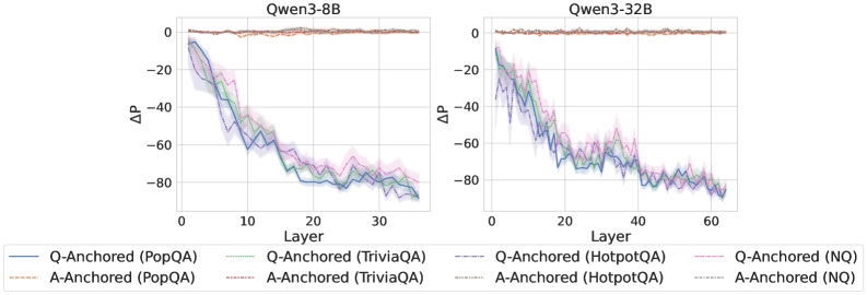
### Visual Description
\n
## Line Charts: Qwen3-8B and Qwen3-32B Layer-wise ΔP Analysis
### Overview
The image displays two side-by-side line charts comparing the layer-wise change in probability (ΔP) for two different language models: **Qwen3-8B** (left) and **Qwen3-32B** (right). Each chart plots the ΔP metric across the model's layers for four different question-answering datasets, using two distinct anchoring methods ("Q-Anchored" and "A-Anchored").
### Components/Axes
* **Chart Titles:**
* Left Chart: `Qwen3-8B`
* Right Chart: `Qwen3-32B`
* **Y-Axis (Both Charts):**
* Label: `ΔP`
* Scale: Ranges from approximately -80 to 0. Major gridlines are at intervals of 20 (-80, -60, -40, -20, 0).
* **X-Axis (Both Charts):**
* Label: `Layer`
* Scale (Qwen3-8B): Ranges from 0 to 35. Major ticks are at 0, 10, 20, 30.
* Scale (Qwen3-32B): Ranges from 0 to 60. Major ticks are at 0, 20, 40, 60.
* **Legend (Bottom of Image, spanning both charts):**
* Contains 8 entries, each with a unique color and line style.
* **Q-Anchored Series (Solid Lines):**
* `Q-Anchored (PopQA)` - Solid blue line
* `Q-Anchored (TriviaQA)` - Solid green line
* `Q-Anchored (HotpotQA)` - Solid purple line
* `Q-Anchored (NQ)` - Solid pink line
* **A-Anchored Series (Dashed Lines):**
* `A-Anchored (PopQA)` - Dashed orange line
* `A-Anchored (TriviaQA)` - Dashed red line
* `A-Anchored (HotpotQA)` - Dashed gray line
* `A-Anchored (NQ)` - Dashed cyan line
* **Visual Elements:** Each data series is represented by a colored line with a semi-transparent shaded band of the same color around it, likely indicating standard deviation or confidence intervals.
### Detailed Analysis
**Qwen3-8B Chart (Left):**
* **Trend Verification:** All four **Q-Anchored** lines (solid) show a strong, consistent downward trend from Layer 0 to Layer 35. They start near ΔP = 0 and descend to between -70 and -80 by the final layer. The lines are tightly clustered, with minor fluctuations.
* **Trend Verification:** All four **A-Anchored** lines (dashed) remain relatively flat and close to ΔP = 0 across all layers, showing minimal change. They exhibit very slight noise but no significant downward or upward slope.
* **Data Points (Approximate):**
* At Layer 0: All series start near ΔP = 0.
* At Layer 10: Q-Anchored lines are around ΔP = -40 to -50. A-Anchored lines are near 0.
* At Layer 20: Q-Anchored lines are around ΔP = -60 to -70.
* At Layer 35 (Final): Q-Anchored lines converge between -70 and -80. A-Anchored lines remain near 0.
**Qwen3-32B Chart (Right):**
* **Trend Verification:** The pattern is similar to the 8B model but extended over more layers. The **Q-Anchored** lines (solid) again show a pronounced downward trend, starting near 0 and falling to approximately -80 by Layer 60. The descent appears slightly more gradual initially compared to the 8B model.
* **Trend Verification:** The **A-Anchored** lines (dashed) are again stable near ΔP = 0 across the entire 60-layer span.
* **Data Points (Approximate):**
* At Layer 0: All series start near ΔP = 0.
* At Layer 20: Q-Anchored lines are around ΔP = -40 to -50.
* At Layer 40: Q-Anchored lines are around ΔP = -60 to -70.
* At Layer 60 (Final): Q-Anchored lines are clustered near -80. A-Anchored lines are near 0.
### Key Observations
1. **Method Dichotomy:** There is a stark and consistent difference between the two anchoring methods. **Q-Anchored** processing leads to a large, layer-dependent decrease in ΔP, while **A-Anchored** processing results in a ΔP that remains stable near zero.
2. **Dataset Consistency:** The trend described above holds true across all four datasets (PopQA, TriviaQA, HotpotQA, NQ). The lines for different datasets within the same anchoring method are very close to each other, suggesting the effect is robust across these benchmarks.
3. **Model Scaling:** The larger model (Qwen3-32B) exhibits the same qualitative behavior as the smaller model (Qwen3-8B) but over a greater number of layers. The final ΔP values for the Q-Anchored series are similar in magnitude (~ -80) for both models.
4. **Uncertainty Bands:** The shaded error bands are relatively narrow for the A-Anchored series (indicating low variance) and wider for the Q-Anchored series, especially in the middle layers, suggesting more variability in the ΔP measurement for that method.
### Interpretation
This visualization demonstrates a fundamental difference in how information or probability is processed within the transformer layers of these models, depending on the anchoring strategy.
* **Q-Anchored vs. A-Anchored:** The "Q" likely refers to the Question and "A" to the Answer. The data suggests that when the model's internal representations are anchored to the question (Q-Anchored), there is a progressive and significant reduction in the measured probability change (ΔP) as information flows deeper into the network. This could indicate a process of evidence accumulation, hypothesis testing, or probability redistribution that culminates in a final answer. In contrast, anchoring to the answer (A-Anchored) results in a stable internal state, possibly reflecting a verification or consistency-checking process where the probability of the pre-specified answer does not change substantially.
* **Layer-wise Progression:** The smooth, monotonic decrease for Q-Anchored series implies a coordinated, layer-by-layer computational process. The fact that this process spans the entire depth of the network (all 35 or 60 layers) highlights its centrality to the model's reasoning for these tasks.
* **Robustness:** The consistency across four diverse QA datasets indicates that this is a general property of the model's architecture and the anchoring methods, not an artifact of a specific type of question.
* **Implication:** The chart provides empirical evidence for distinct internal processing pathways. The Q-Anchored pathway appears to be the active "reasoning" chain, while the A-Anchored pathway may represent a more static "answer evaluation" mechanism. This could inform techniques for model interpretability or for designing more efficient inference methods.
</details>
<details>
<summary>x27.png Details</summary>
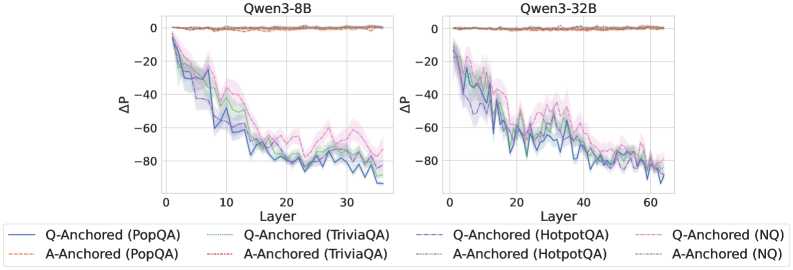
### Visual Description
## Line Charts: Qwen3-8B and Qwen3-32B Layer-wise ΔP Analysis
### Overview
The image displays two side-by-side line charts comparing the layer-wise change in probability (ΔP) for two different-sized language models: Qwen3-8B (left) and Qwen3-32B (right). Each chart plots the ΔP metric across the model's layers for four different question-answering datasets, using two distinct anchoring methods (Q-Anchored and A-Anchored).
### Components/Axes
* **Chart Titles:** "Qwen3-8B" (left chart), "Qwen3-32B" (right chart).
* **X-Axis:** Labeled "Layer". Represents the sequential layers within the neural network model.
* Qwen3-8B chart: Scale from 0 to 30, with major ticks at 0, 10, 20, 30.
* Qwen3-32B chart: Scale from 0 to 60, with major ticks at 0, 20, 40, 60.
* **Y-Axis:** Labeled "ΔP". Represents a change in probability metric. The scale is negative, ranging from 0 at the top to -80 at the bottom, with major ticks at 0, -20, -40, -60, -80.
* **Legend:** Positioned at the bottom, spanning the width of both charts. It defines eight data series using a combination of color and line style:
* **Solid Lines (Q-Anchored):**
* Blue: Q-Anchored (PopQA)
* Green: Q-Anchored (TriviaQA)
* Purple: Q-Anchored (HotpotQA)
* Pink: Q-Anchored (NQ)
* **Dashed Lines (A-Anchored):**
* Orange: A-Anchored (PopQA)
* Red: A-Anchored (TriviaQA)
* Gray: A-Anchored (HotpotQA)
* Light Blue: A-Anchored (NQ)
* **Data Series:** Each chart contains eight lines (four solid, four dashed) with shaded regions around them, likely indicating variance or confidence intervals.
### Detailed Analysis
**Trend Verification & Data Point Extraction (Approximate):**
* **A-Anchored Series (All Dashed Lines):** In both charts, all four A-Anchored lines (orange, red, gray, light blue) remain very close to ΔP = 0 across all layers. They exhibit minimal fluctuation, forming a nearly flat band at the top of the chart. This trend is consistent for both the 8B and 32B models.
* **Q-Anchored Series (All Solid Lines):** All four Q-Anchored lines show a pronounced downward trend as layer number increases.
* **Qwen3-8B Chart (Layers 0-30):**
* The lines start near ΔP = 0 at Layer 0.
* They descend steeply, reaching approximately ΔP = -60 to -70 by Layer 10.
* The descent continues, albeit with more volatility, reaching a range of approximately ΔP = -70 to -85 by Layer 30.
* The pink line (Q-Anchored (NQ)) appears to be the highest (least negative) among the Q-Anchored series in the later layers, while the blue line (Q-Anchored (PopQA)) is often the lowest (most negative).
* **Qwen3-32B Chart (Layers 0-60):**
* The lines start near ΔP = 0 at Layer 0.
* They descend to approximately ΔP = -40 to -50 by Layer 20.
* The downward trend continues, reaching approximately ΔP = -70 to -85 by Layer 60.
* The pattern of the pink line (NQ) being relatively higher and the blue line (PopQA) being relatively lower among the Q-Anchored series is also visible here.
**Spatial Grounding:** The legend is centered at the bottom. The Qwen3-8B chart occupies the left half of the image, and the Qwen3-32B chart occupies the right half. Within each chart, the A-Anchored lines are consistently positioned at the top (near y=0), while the Q-Anchored lines occupy the middle to bottom portion of the plot area, descending from top-left to bottom-right.
### Key Observations
1. **Anchoring Method Dominance:** The most striking pattern is the drastic difference between anchoring methods. A-Anchored processing results in negligible ΔP change across all layers, while Q-Anchored processing causes a large, layer-dependent decrease in ΔP.
2. **Layer-Dependent Effect:** For Q-Anchored methods, the ΔP metric is not static; it degrades progressively as information moves through the network layers.
3. **Model Scale Consistency:** The qualitative trends are remarkably consistent between the 8-billion-parameter and 32-billion-parameter models, suggesting the observed phenomenon is a property of the architecture or method, not model size.
4. **Dataset Variation:** While all Q-Anchored lines follow the same downward trend, there is consistent separation between datasets. The NQ dataset (pink) generally shows the smallest decrease, while PopQA (blue) often shows the largest decrease.
### Interpretation
This visualization provides strong evidence that the choice of "anchoring" (likely referring to which part of the input—Question or Answer—is used as a reference point for some internal measurement) fundamentally alters how information is processed across the layers of these language models.
* **A-Anchored Stability:** The flat lines for A-Anchored methods suggest that when the model's internal state is measured relative to the *Answer*, the metric ΔP remains stable. This could imply the answer representation is preserved or consistently referenced throughout the network.
* **Q-Anchored Drift:** The steep decline for Q-Anchored methods indicates that when measured relative to the *Question*, the metric ΔP deteriorates. This suggests the model's internal representation progressively diverges from the initial question context as it processes information through deeper layers. The layer-wise progression implies this is a cumulative transformation.
* **Practical Implication:** The findings highlight that model behavior and internal metrics are highly sensitive to the experimental setup (anchoring choice). Researchers must be precise in defining their measurement baselines. The consistency across model scales suggests this is a robust characteristic worth investigating for understanding how transformers process and transform query information.
* **Dataset Sensitivity:** The consistent ordering of datasets (NQ > TriviaQA/HotpotQA > PopQA in terms of ΔP retention) might reflect differences in dataset complexity, question type, or how "answer-anchored" the model's training on those datasets was. PopQA, showing the largest drop, might contain questions that require the most significant transformation from the initial query to arrive at the answer.
</details>
Figure 13: $ΔP$ under attention knockout for reasoning models. Probing attention activations for the final token (top), the token immediately preceding the exact answer tokens (middle), and the last exact answer token (bottom).
<details>
<summary>x28.png Details</summary>
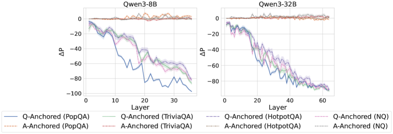
### Visual Description
\n
## Line Charts: Qwen3-8B and Qwen3-32B Layer-wise ΔP Analysis
### Overview
The image displays two side-by-side line charts comparing the performance change (ΔP) across model layers for two different model sizes: Qwen3-8B (left) and Qwen3-32B (right). Each chart plots multiple data series representing different question-answering (QA) datasets and two anchoring methods ("Q-Anchored" and "A-Anchored"). The overall trend shows a decline in ΔP as layer depth increases, with distinct patterns between the anchoring methods.
### Components/Axes
* **Chart Titles:**
* Left Chart: `Qwen3-8B`
* Right Chart: `Qwen3-32B`
* **Y-Axis (Both Charts):**
* Label: `ΔP`
* Scale: Linear, ranging from approximately -100 to 0. Major tick marks are at intervals of 20 (0, -20, -40, -60, -80, -100).
* **X-Axis (Both Charts):**
* Label: `Layer`
* Scale: Linear.
* Qwen3-8B: Ranges from 0 to approximately 35. Major tick marks at 0, 10, 20, 30.
* Qwen3-32B: Ranges from 0 to approximately 65. Major tick marks at 0, 20, 40, 60.
* **Legend (Bottom, spanning both charts):**
* Positioned below the x-axes of both charts.
* Contains 8 entries, each with a unique color and line style combination:
1. `Q-Anchored (PopQA)`: Solid blue line.
2. `A-Anchored (PopQA)`: Dashed orange line.
3. `Q-Anchored (TriviaQA)`: Solid green line.
4. `A-Anchored (TriviaQA)`: Dashed red line.
5. `Q-Anchored (HotpotQA)`: Solid purple line.
6. `A-Anchored (HotpotQA)`: Dashed brown line.
7. `Q-Anchored (NQ)`: Solid pink line.
8. `A-Anchored (NQ)`: Dashed gray line.
### Detailed Analysis
**Qwen3-8B Chart (Left):**
* **Trend Verification:** All eight data series begin near ΔP = 0 at Layer 0. The "A-Anchored" series (dashed lines) remain relatively flat, hovering near 0 with minor fluctuations across all layers. The "Q-Anchored" series (solid lines) show a pronounced downward trend, with ΔP decreasing (becoming more negative) as the layer number increases.
* **Data Points & Series Behavior:**
* **A-Anchored Series (All Datasets):** These lines (orange, red, brown, gray dashed) are tightly clustered near the top of the chart (ΔP ≈ 0 to -10) from Layer 0 to Layer ~35. They exhibit high-frequency, low-amplitude noise but no significant directional trend.
* **Q-Anchored Series (All Datasets):** These lines (blue, green, purple, pink solid) descend from near 0. They show a general, noisy decline.
* By Layer 10, they have dropped to a range of approximately -20 to -40.
* By Layer 20, they are in the range of approximately -40 to -70.
* By the final layer (~35), they converge in a range of approximately -70 to -95.
* **Relative Performance:** Among the Q-Anchored lines, the blue line (`PopQA`) often appears as the lowest (most negative) in the mid-to-late layers (e.g., near Layer 25-30), while the pink line (`NQ`) and green line (`TriviaQA`) are sometimes slightly higher. However, the lines are intertwined, and the differences are not consistently large.
**Qwen3-32B Chart (Right):**
* **Trend Verification:** The pattern is qualitatively similar to the 8B model but extended over more layers. "A-Anchored" series remain flat near zero. "Q-Anchored" series show a steady, noisy decline with increasing layer depth.
* **Data Points & Series Behavior:**
* **A-Anchored Series (All Datasets):** Again, the dashed lines cluster tightly near ΔP = 0 across the entire layer range (0 to ~65), showing only minor noise.
* **Q-Anchored Series (All Dataset):** The solid lines descend from 0.
* By Layer 20, they have dropped to a range of approximately -30 to -50.
* By Layer 40, they are in the range of approximately -60 to -85.
* By the final layer (~65), they converge very tightly in the range of approximately -85 to -95.
* **Convergence:** The Q-Anchored lines for the 32B model appear to converge more tightly at the final layers compared to the 8B model, forming a narrow band near -90.
### Key Observations
1. **Anchoring Method Dichotomy:** The most striking pattern is the fundamental difference between "Q-Anchored" and "A-Anchored" methods. A-Anchoring results in stable ΔP near zero across all layers, while Q-Anchoring leads to a strong, layer-dependent decrease in ΔP.
2. **Layer-Dependent Effect for Q-Anchoring:** For Q-Anchored methods, the measured effect (ΔP) is not uniform; it becomes progressively more negative in deeper layers of the network.
3. **Model Size Scaling:** The trend observed in the 8B model is replicated and extended in the larger 32B model. The rate of decline per layer appears somewhat similar, but the 32B model has more layers over which the effect accumulates.
4. **Dataset Similarity:** Within each anchoring method, the lines for different QA datasets (PopQA, TriviaQA, HotpotQA, NQ) follow very similar trajectories. While there is some separation and noise, no single dataset dramatically outperforms or underperforms the others in a consistent manner across all layers.
### Interpretation
This data suggests a fundamental difference in how "Q-Anchored" and "A-Anchored" methods interact with the internal representations of the Qwen3 language models. The stable, near-zero ΔP for A-Anchored methods implies that this anchoring technique does not induce a significant layer-wise shift in the measured property (likely related to probability or performance). In contrast, the Q-Anchored method causes a systematic change that compounds with network depth.
The layer-wise decline for Q-Anchoring could indicate that the method's effect is integrated progressively during the forward pass, or that deeper layers are more sensitive to this type of intervention. The consistency across four different QA datasets suggests this is a general phenomenon related to the model's architecture and the anchoring method, not an artifact of a specific data distribution.
The convergence of Q-Anchored lines in the final layers of the 32B model might imply a saturation point, where the maximum achievable effect of the anchoring is reached. From a technical perspective, this visualization is crucial for understanding where and how different prompting or intervention techniques (like anchoring) exert their influence within a transformer model's hierarchy. It provides empirical evidence that the impact is not uniform across layers.
</details>
<details>
<summary>x29.png Details</summary>
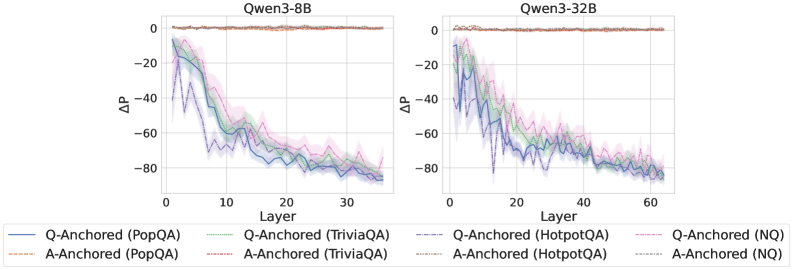
### Visual Description
## Line Charts: Layer-wise ΔP for Q-Anchored vs. A-Anchored Methods on Qwen3 Models
### Overview
The image displays two side-by-side line charts comparing the performance metric ΔP across model layers for two different large language models: **Qwen3-8B** (left chart) and **Qwen3-32B** (right chart). Each chart plots multiple data series representing different experimental methods ("Q-Anchored" and "A-Anchored") applied to four distinct question-answering datasets. The charts share a common legend and axis labels.
### Components/Axes
* **Chart Titles:**
* Left Chart: `Qwen3-8B`
* Right Chart: `Qwen3-32B`
* **X-Axis (Both Charts):**
* Label: `Layer`
* Scale (Qwen3-8B): 0 to ~35, with major ticks at 0, 10, 20, 30.
* Scale (Qwen3-32B): 0 to ~65, with major ticks at 0, 20, 40, 60.
* **Y-Axis (Both Charts):**
* Label: `ΔP` (Delta P)
* Scale: Approximately -90 to +5, with major ticks at -80, -60, -40, -20, 0.
* **Legend (Bottom, spanning both charts):**
* The legend is positioned at the bottom of the figure, below both charts.
* It defines 8 data series using a combination of line color and style (solid vs. dashed).
* **Q-Anchored (Solid Lines):**
* Blue solid line: `Q-Anchored (PopQA)`
* Green solid line: `Q-Anchored (TriviaQA)`
* Purple solid line: `Q-Anchored (HotpotQA)`
* Pink solid line: `Q-Anchored (NQ)`
* **A-Anchored (Dashed Lines):**
* Orange dashed line: `A-Anchored (PopQA)`
* Red dashed line: `A-Anchored (TriviaQA)`
* Gray dashed line: `A-Anchored (HotpotQA)`
* Light blue dashed line: `A-Anchored (NQ)`
* **Visual Elements:** Each data series is plotted as a line with a shaded region around it, likely representing a confidence interval or standard deviation.
### Detailed Analysis
**Qwen3-8B Chart (Left):**
* **Q-Anchored Series (Solid Lines):** All four solid lines (PopQA, TriviaQA, HotpotQA, NQ) exhibit a strong, consistent downward trend.
* They start at Layer 1 with ΔP values between approximately -10 and -20.
* They decline steeply until around Layer 15-20, reaching values between -60 and -70.
* The decline continues at a slower rate, ending near Layer 35 with values clustered around -80.
* The lines are tightly grouped, with the blue (PopQA) and purple (HotpotQA) lines often at the lower edge of the cluster.
* **A-Anchored Series (Dashed Lines):** All four dashed lines remain very close to the ΔP = 0 baseline across all layers (0 to ~35). They show minimal fluctuation, staying within a narrow band roughly between -5 and +5.
**Qwen3-32B Chart (Right):**
* **Q-Anchored Series (Solid Lines):** The pattern is similar to the 8B model but extended over more layers.
* They start near Layer 1 with ΔP values between -10 and -25.
* A steep decline occurs until approximately Layer 25-30, where values reach between -60 and -75.
* The decline persists, ending near Layer 65 with values tightly clustered around -80.
* The grouping of lines is very tight, making individual series difficult to distinguish in the later layers.
* **A-Anchored Series (Dashed Lines):** Identical to the 8B chart, these lines hover consistently near ΔP = 0 across the entire layer range (0 to ~65).
### Key Observations
1. **Fundamental Dichotomy:** There is a stark, categorical difference between the behavior of Q-Anchored and A-Anchored methods. Q-Anchored methods show a large, layer-dependent negative ΔP, while A-Anchored methods show a ΔP near zero that is layer-invariant.
2. **Layer-Dependent Degradation:** For Q-Anchored methods, the metric ΔP degrades (becomes more negative) significantly as information propagates through deeper layers of the network. The most rapid change occurs in the first half of the layers.
3. **Model Scale Invariance of Pattern:** The qualitative pattern is identical between the 8B and 32B parameter models. The 32B model simply extends the trend over a greater number of layers.
4. **Dataset Similarity:** Within each anchoring method (Q or A), the performance across the four different datasets (PopQA, TriviaQA, HotpotQA, NQ) is remarkably similar. The lines for different datasets are tightly clustered, suggesting the observed effect is robust across these QA benchmarks.
5. **Convergence:** By the final layers, the Q-Anchored lines for all datasets converge to a very similar, low ΔP value (approx. -80).
### Interpretation
This visualization presents a technical analysis of internal model behavior, likely probing how different "anchoring" techniques affect a model's internal probability distributions (ΔP) across its layers.
* **What the data suggests:** The "A-Anchored" method appears to stabilize the model's internal representations, maintaining a consistent probability shift (ΔP ≈ 0) regardless of depth. In contrast, the "Q-Anchored" method leads to a progressive and substantial negative shift in probabilities as information moves from early to late layers. This could indicate that anchoring on the question (Q) causes the model to increasingly suppress or alter certain probability distributions in deeper processing stages, while anchoring on the answer (A) preserves the initial distribution.
* **How elements relate:** The side-by-side comparison of two model sizes demonstrates that this is a fundamental property of the anchoring methods themselves, not an artifact of a specific model scale. The consistency across four datasets reinforces that the finding is generalizable within the domain of question answering.
* **Notable anomalies/trends:** The most striking "anomaly" is the perfect separation between the two method families. There is no overlap or ambiguity. The trend is not merely a gradual decline for Q-Anchored methods; it is a steep, monotonic drop that accounts for nearly the entire y-axis range. The tight clustering of datasets suggests the underlying mechanism being measured is highly consistent.
* **Peircean investigative reading:** The charts function as an *index* pointing to a causal relationship: the choice of anchoring technique (Q vs. A) directly causes a drastic difference in the layer-wise evolution of the model's internal state (ΔP). The consistency across models and datasets makes this a reliable sign of a core mechanistic difference. A researcher would infer that "A-Anchoring" acts as a regularizer or stabilizer for internal probabilities, while "Q-Anchoring" allows or induces a significant transformation of those probabilities during deep processing. This has implications for understanding model interpretability and designing probing experiments.
</details>
<details>
<summary>x30.png Details</summary>
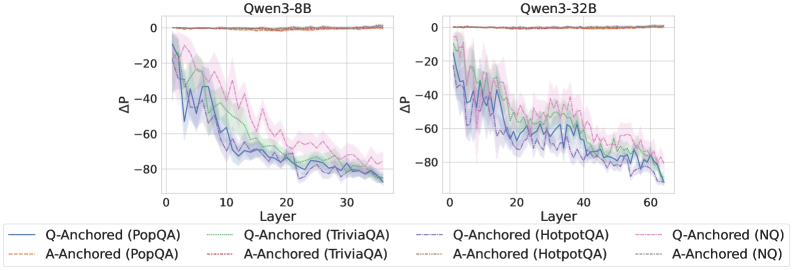
### Visual Description
\n
## Line Charts: Qwen3-8B and Qwen3-32B Layer-wise ΔP Analysis
### Overview
The image displays two side-by-side line charts comparing the layer-wise change in probability (ΔP) for two different model sizes: Qwen3-8B (left) and Qwen3-32B (right). Each chart plots ΔP against the model layer number for eight different experimental conditions, categorized by anchoring method (Q-Anchored vs. A-Anchored) and dataset (PopQA, TriviaQA, HotpotQA, NQ).
### Components/Axes
* **Chart Titles:** "Qwen3-8B" (left chart), "Qwen3-32B" (right chart).
* **X-Axis:** Labeled "Layer". The Qwen3-8B chart ranges from 0 to approximately 35. The Qwen3-32B chart ranges from 0 to approximately 65.
* **Y-Axis:** Labeled "ΔP" (Delta P). Both charts share the same scale, ranging from 0 at the top to -80 at the bottom, with major gridlines at intervals of 20 (0, -20, -40, -60, -80).
* **Legend:** Positioned at the bottom of the image, spanning both charts. It defines eight series using a combination of color and line style:
* **Solid Lines (Q-Anchored):**
* Blue: `Q-Anchored (PopQA)`
* Green: `Q-Anchored (TriviaQA)`
* Purple: `Q-Anchored (HotpotQA)`
* Pink: `Q-Anchored (NQ)`
* **Dashed Lines (A-Anchored):**
* Orange: `A-Anchored (PopQA)`
* Red: `A-Anchored (TriviaQA)`
* Gray: `A-Anchored (HotpotQA)`
* Cyan: `A-Anchored (NQ)`
* **Data Series:** Each chart contains eight lines (four solid, four dashed) with shaded regions around them, likely representing confidence intervals or standard deviation.
### Detailed Analysis
**Qwen3-8B Chart (Left):**
* **Trend for Q-Anchored (Solid Lines):** All four solid lines show a strong, consistent downward trend. They start near ΔP = 0 at Layer 0 and decline steeply.
* **Blue (PopQA):** Drops most sharply, reaching approximately ΔP = -60 by Layer 10 and continuing to a final value near -80 by Layer 35.
* **Green (TriviaQA):** Follows a similar path but generally stays slightly above the blue line, ending near -75.
* **Purple (HotpotQA) & Pink (NQ):** Show more volatility but follow the same overall downward trajectory, ending in the -70 to -80 range.
* **Trend for A-Anchored (Dashed Lines):** All four dashed lines remain very close to ΔP = 0 across all layers, showing negligible change. They form a tight cluster along the top of the chart.
**Qwen3-32B Chart (Right):**
* **Trend for Q-Anchored (Solid Lines):** The pattern is qualitatively identical to the 8B model but extended over more layers.
* **Blue (PopQA):** Again shows the steepest initial decline, crossing ΔP = -60 before Layer 20 and approaching -80 by Layer 60.
* **Green, Purple, Pink:** All follow the same steep downward slope, with significant overlap and volatility, converging in the -70 to -80 range by the final layers.
* **Trend for A-Anchored (Dashed Lines):** As in the 8B model, all dashed lines remain flat near ΔP = 0 throughout all ~65 layers.
### Key Observations
1. **Fundamental Dichotomy:** There is a stark, consistent difference between the two anchoring methods. Q-Anchored conditions lead to a large, layer-dependent decrease in ΔP, while A-Anchored conditions show almost no change.
2. **Model Size Scaling:** The trend observed in the 8B model is faithfully reproduced in the larger 32B model, suggesting the phenomenon is consistent across model scales. The primary difference is the x-axis extent, corresponding to the greater number of layers in the 32B model.
3. **Dataset Variation:** Among the Q-Anchored lines, the PopQA dataset (blue) consistently shows the most pronounced initial drop. The other datasets (TriviaQA, HotpotQA, NQ) are tightly clustered, indicating similar behavior.
4. **Volatility:** The Q-Anchored lines, especially in the 32B model, exhibit considerable point-to-point volatility (jaggedness), though the overall downward trend is unmistakable. The shaded error bands are also wider for these lines.
### Interpretation
This data demonstrates a critical and systematic difference in how language model representations evolve across layers depending on the anchoring point used in the analysis.
* **Q-Anchored vs. A-Anchored:** The "ΔP" metric likely measures a shift in probability or representation. The dramatic decline for Q-Anchored (Question-Anchored) series suggests that as information propagates through the network layers, the model's internal state moves significantly away from its initial question-focused representation. In contrast, the stability of the A-Anchored (Answer-Anchored) series indicates that the answer-focused representation remains relatively constant throughout the network.
* **Implication for Model Processing:** This could imply that the model's processing involves a transformation from a question-oriented state to a different, possibly answer-oriented, state in deeper layers. The fact that the A-Anchored line is stable near zero might mean the final answer representation is established early and maintained, or that the metric is less sensitive to changes in that subspace.
* **Consistency Across Scale and Data:** The replication of the pattern from 8B to 32B parameters suggests this is a fundamental architectural or training characteristic of the Qwen3 model family, not an artifact of a specific model size. The similarity across four distinct QA datasets (PopQA, TriviaQA, HotpotQA, NQ) further indicates this is a general property of the model's question-answering behavior, not specific to one data distribution.
* **Outlier/Anomaly:** There are no true outliers; all series within their respective groups (Q-Anchored or A-Anchored) behave consistently. The main "anomaly" is the stark contrast between the two groups itself, which is the central finding of the visualization.
</details>
Figure 14: $ΔP$ under attention knockout for reasoning models. Probing mlp activations for the final token (top), the token immediately preceding the exact answer tokens (middle), and the last exact answer token (bottom).
<details>
<summary>x31.png Details</summary>
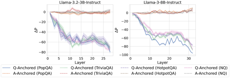
### Visual Description
## Line Charts: Llama-3.2 Model Layer-wise ΔP Analysis
### Overview
The image displays two side-by-side line charts comparing the layer-wise change in probability (ΔP) for two different-sized language models from the Llama-3.2 series: a 3-billion parameter model (3B-Instruct) on the left and an 8-billion parameter model (8B-Instruct) on the right. Each chart plots the ΔP metric across the model's layers for four different question-answering datasets, using two distinct anchoring methods (Q-Anchored and A-Anchored).
### Components/Axes
* **Titles:**
* Left Chart: `Llama-3.2-3B-Instruct`
* Right Chart: `Llama-3.2-8B-Instruct`
* **Axes:**
* **X-axis (Both Charts):** Labeled `Layer`. The scale runs from 0 to approximately 30, with major tick marks at 0, 5, 10, 15, 20, 25, and 30.
* **Y-axis (Both Charts):** Labeled `ΔP`. The scale runs from -100 to 0, with major tick marks at -100, -80, -60, -40, -20, and 0.
* **Legend (Bottom, spanning both charts):** Contains 8 entries, differentiating lines by color, line style (solid vs. dashed), and dataset.
* **Solid Lines (Q-Anchored):**
* Blue: `Q-Anchored (PopQA)`
* Green: `Q-Anchored (TriviaQA)`
* Purple: `Q-Anchored (HotpotQA)`
* Pink: `Q-Anchored (NQ)`
* **Dashed Lines (A-Anchored):**
* Orange: `A-Anchored (PopQA)`
* Red: `A-Anchored (TriviaQA)`
* Brown: `A-Anchored (HotpotQA)`
* Gray: `A-Anchored (NQ)`
* **Visual Elements:** Each data series is represented by a colored line with a semi-transparent shaded region around it, likely indicating confidence intervals or standard deviation.
### Detailed Analysis
**Left Chart: Llama-3.2-3B-Instruct**
* **Q-Anchored Series (Solid Lines):** All four datasets show a strong, consistent downward trend. ΔP starts near 0 at Layer 0 and decreases sharply, reaching values between approximately -60 and -80 by Layer 27. The lines are tightly clustered, with the blue (PopQA) and purple (HotpotQA) lines often at the lower end of the range.
* **A-Anchored Series (Dashed Lines):** All four datasets show a flat, stable trend. ΔP remains very close to 0 across all layers, with minor fluctuations. The lines are tightly clustered near the top of the chart.
**Right Chart: Llama-3.2-8B-Instruct**
* **Q-Anchored Series (Solid Lines):** The downward trend is present but more varied compared to the 3B model. The blue line (PopQA) shows the steepest and most volatile decline, dropping to near -100 around Layer 20 before a slight recovery. The green (TriviaQA), purple (HotpotQA), and pink (NQ) lines follow a smoother downward path, ending between -60 and -80 by Layer 32.
* **A-Anchored Series (Dashed Lines):** Similar to the 3B model, these series remain stable and close to 0 across all layers, with minimal fluctuation.
### Key Observations
1. **Anchoring Method Dominance:** The most striking pattern is the drastic difference between Q-Anchored and A-Anchored methods. Q-Anchoring leads to a significant negative ΔP that grows with layer depth, while A-Anchoring maintains a ΔP near zero.
2. **Model Size Effect:** The 8B model exhibits more pronounced volatility in the Q-Anchored PopQA series (blue line) compared to the 3B model. The other Q-Anchored series in the 8B model also show slightly more separation from each other.
3. **Dataset Similarity:** Within each anchoring method, the trends across the four datasets (PopQA, TriviaQA, HotpotQA, NQ) are broadly similar, suggesting the anchoring technique is a stronger factor than the specific dataset in determining the ΔP trajectory.
4. **Layer Dependence:** For Q-Anchored methods, the effect (negative ΔP) is not uniform; it intensifies progressively through the network layers.
### Interpretation
The data demonstrates a fundamental difference in how information is processed or retained within the model layers depending on the anchoring technique. "ΔP" likely represents a change in probability or confidence. The results suggest:
* **Q-Anchored (Question-Anchored) processing** causes a progressive and significant decrease in the measured probability metric as information flows deeper into the network. This could indicate a process of evidence accumulation, refinement, or a shift in focus away from the initial question's framing as the model generates an answer.
* **A-Anchored (Answer-Anchored) processing** maintains a stable probability metric throughout the layers. This implies that when anchored to the answer, the model's internal state regarding this metric does not change significantly from input to output, suggesting a more consistent or fixed processing pathway.
* The increased volatility in the larger 8B model's Q-Anchored PopQA series might reflect greater model capacity leading to more complex or non-linear internal transformations for that specific dataset.
In essence, the charts reveal that the choice of anchoring (question vs. answer) fundamentally alters the layer-wise dynamics of the model's internal probability landscape, with the question-anchored approach inducing a strong, depth-dependent decay effect.
</details>
<details>
<summary>x32.png Details</summary>
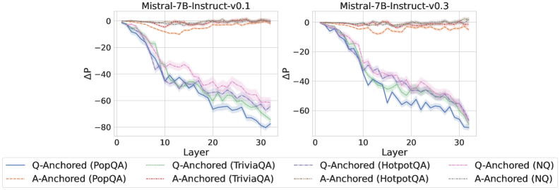
### Visual Description
## Dual Line Charts: Layer-wise ΔP for Mistral-7B-Instruct Models
### Overview
The image displays two side-by-side line charts comparing the layer-wise performance change (ΔP) for two versions of the Mistral-7B-Instruct model (v0.1 and v0.3) across four different question-answering datasets. Each chart plots ΔP against the model layer number (0 to 30). The data is split into two primary conditions: "Q-Anchored" and "A-Anchored" for each dataset.
### Components/Axes
* **Chart Titles:**
* Left Chart: `Mistral-7B-Instruct-v0.1`
* Right Chart: `Mistral-7B-Instruct-v0.3`
* **X-Axis (Both Charts):**
* Label: `Layer`
* Scale: Linear, from 0 to 30, with major ticks at 0, 10, 20, 30.
* **Y-Axis (Both Charts):**
* Label: `ΔP` (Delta P)
* Scale: Linear, from -80 to 0, with major ticks at -80, -60, -40, -20, 0.
* **Legend (Positioned below both charts):**
* Contains 8 entries, organized in two rows of four.
* **Row 1 (Q-Anchored):**
1. `Q-Anchored (PopQA)` - Solid blue line.
2. `Q-Anchored (TriviaQA)` - Solid green line.
3. `Q-Anchored (HotpotQA)` - Dashed purple line.
4. `Q-Anchored (NQ)` - Solid pink line.
* **Row 2 (A-Anchored):**
1. `A-Anchored (PopQA)` - Dashed orange line.
2. `A-Anchored (TriviaQA)` - Dashed red line.
3. `A-Anchored (HotpotQA)` - Dashed gray line.
4. `A-Anchored (NQ)` - Dashed light blue line.
### Detailed Analysis
**Chart 1: Mistral-7B-Instruct-v0.1**
* **Q-Anchored Series (All show a strong negative trend):**
* **Trend:** All four lines begin near ΔP=0 at Layer 0 and exhibit a steep, roughly linear decline as layer number increases.
* **PopQA (Blue, Solid):** Declines the most sharply. Approximate values: ~-40 at Layer 10, ~-65 at Layer 20, ending near -80 at Layer 30.
* **TriviaQA (Green, Solid):** Follows a similar path to PopQA but is slightly less negative. Approximate values: ~-35 at Layer 10, ~-60 at Layer 20, ending near -70 at Layer 30.
* **HotpotQA (Purple, Dashed):** Declines less steeply than PopQA/TriviaQA initially but converges with them at higher layers. Approximate values: ~-30 at Layer 10, ~-55 at Layer 20, ending near -65 at Layer 30.
* **NQ (Pink, Solid):** Shows the least negative trend among the Q-Anchored group. Approximate values: ~-25 at Layer 10, ~-50 at Layer 20, ending near -60 at Layer 30.
* **A-Anchored Series (All show minimal change, hovering near zero):**
* **Trend:** All four dashed lines remain relatively flat, fluctuating closely around the ΔP=0 baseline across all layers.
* **PopQA (Orange, Dashed):** Fluctuates between approximately +5 and -10.
* **TriviaQA (Red, Dashed):** Fluctuates between approximately +5 and -10.
* **HotpotQA (Gray, Dashed):** Fluctuates between approximately +5 and -5.
* **NQ (Light Blue, Dashed):** Fluctuates between approximately +5 and -5.
**Chart 2: Mistral-7B-Instruct-v0.3**
* **Q-Anchored Series (Trends are very similar to v0.1, with slightly more negative endpoints for some):**
* **Trend:** Consistent steep decline from Layer 0 to Layer 30.
* **PopQA (Blue, Solid):** Approximate values: ~-45 at Layer 10, ~-70 at Layer 20, ending near -80 at Layer 30.
* **TriviaQA (Green, Solid):** Approximate values: ~-40 at Layer 10, ~-65 at Layer 20, ending near -75 at Layer 30.
* **HotpotQA (Purple, Dashed):** Approximate values: ~-35 at Layer 10, ~-60 at Layer 20, ending near -70 at Layer 30.
* **NQ (Pink, Solid):** Approximate values: ~-30 at Layer 10, ~-55 at Layer 20, ending near -65 at Layer 30.
* **A-Anchored Series (Consistently flat near zero, similar to v0.1):**
* **Trend:** All lines show negligible change, staying within a narrow band around ΔP=0.
* **PopQA (Orange, Dashed):** Fluctuates between approximately +5 and -10.
* **TriviaQA (Red, Dashed):** Fluctuates between approximately +5 and -10.
* **HotpotQA (Gray, Dashed):** Fluctuates between approximately +5 and -5.
* **NQ (Light Blue, Dashed):** Fluctuates between approximately +5 and -5.
### Key Observations
1. **Dominant Pattern:** There is a stark, consistent dichotomy between the Q-Anchored and A-Anchored conditions across both model versions and all four datasets.
2. **Q-Anchored Degradation:** The Q-Anchored condition leads to a significant and progressive decrease in ΔP as the layer number increases, suggesting a cumulative negative effect through the model's layers.
3. **A-Anchored Stability:** The A-Anchored condition shows remarkable stability, with ΔP remaining near zero throughout all layers, indicating little to no layer-wise degradation.
4. **Dataset Hierarchy:** Within the Q-Anchored group, the magnitude of decline follows a consistent order across layers: PopQA (most negative) > TriviaQA > HotpotQA > NQ (least negative).
5. **Model Version Similarity:** The overall patterns and relationships between datasets are highly similar between Mistral-7B-Instruct-v0.1 and v0.3. The primary difference is that v0.3 shows slightly more negative ΔP values for the Q-Anchored series at equivalent layers.
### Interpretation
The data strongly suggests that the method of "anchoring" (likely referring to how information is presented or retrieved during inference) has a profound impact on the internal layer-wise performance metric (ΔP) of these language models.
* **Q-Anchored vs. A-Anchored:** The "Q-Anchored" approach (possibly anchoring on the Question) appears to cause a systematic degradation in the measured property (ΔP) as information propagates through the model's layers. In contrast, the "A-Anchored" approach (possibly anchoring on the Answer) maintains stability. This could imply that framing tasks around questions versus answers engages the model's internal processing in fundamentally different ways, with the question-centric approach leading to a form of cumulative "drift" or loss.
* **Layer-wise Progression:** The near-linear decline for Q-Anchored series indicates the effect is not localized but propagates and compounds through the network depth. This is a critical insight for understanding how different prompting or retrieval strategies affect internal representations.
* **Dataset Sensitivity:** The consistent hierarchy (PopQA > TriviaQA > HotpotQA > NQ) in the Q-Anchored decline suggests that the nature of the dataset (e.g., question complexity, answer specificity, knowledge type) modulates the severity of this layer-wise effect. PopQA, which shows the steepest decline, might represent a task type that is particularly disruptive under the Q-Anchored condition.
* **Model Robustness:** The similarity between v0.1 and v0.3 indicates this is a stable characteristic of the model architecture or training paradigm, not an artifact of a specific version. The slightly worse performance in v0.3 for Q-Anchored tasks could hint at a trade-off introduced during model updates.
In summary, this visualization provides clear evidence that the anchoring strategy is a major determinant of internal model dynamics, with question-anchored processing inducing a significant, layer-dependent negative shift in the ΔP metric across diverse knowledge-intensive tasks.
</details>
Figure 15: $ΔP$ under attention knockout for instruct models.
<details>
<summary>x33.png Details</summary>
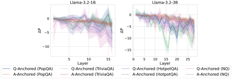
### Visual Description
## Line Charts: Llama-3.2 Model Layer-wise ΔP Analysis
### Overview
The image displays two side-by-side line charts comparing the performance metric "ΔP" across the layers of two different-sized language models: "Llama-3.2-1B" (left) and "Llama-3.2-3B" (right). Each chart plots multiple data series representing different experimental conditions (Q-Anchored vs. A-Anchored) applied to four distinct question-answering datasets (PopQA, TriviaQA, HotpotQA, NQ). The charts include shaded regions around each line, indicating variance or confidence intervals.
### Components/Axes
* **Chart Titles:**
* Left Chart: `Llama-3.2-1B`
* Right Chart: `Llama-3.2-3B`
* **X-Axis (Both Charts):**
* Label: `Layer`
* Scale: Linear, from 0 to approximately 16 (for 1B model) and 0 to approximately 28 (for 3B model). Major tick marks are at intervals of 5.
* **Y-Axis (Both Charts):**
* Label: `ΔP` (Delta P)
* Scale: Linear, negative values. The 1B chart ranges from approximately +2 to -12. The 3B chart ranges from approximately +2 to -16.
* **Legend (Bottom, spanning both charts):**
* **Q-Anchored Series (Solid Lines):**
* `Q-Anchored (PopQA)` - Solid blue line
* `Q-Anchored (TriviaQA)` - Solid green line
* `Q-Anchored (HotpotQA)` - Solid purple line
* `Q-Anchored (NQ)` - Solid red line
* **A-Anchored Series (Dashed Lines):**
* `A-Anchored (PopQA)` - Dashed orange line
* `A-Anchored (TriviaQA)` - Dashed brown line
* `A-Anchored (HotpotQA)` - Dashed gray line
* `A-Anchored (NQ)` - Dashed pink line
### Detailed Analysis
**Llama-3.2-1B Chart (Left):**
* **General Trend:** All series show a general downward trend in ΔP as the layer number increases, starting near 0 and becoming more negative. The decline is relatively gradual and noisy.
* **Q-Anchored Series (Solid Lines):**
* `Q-Anchored (TriviaQA)` (Green): Shows the most pronounced negative trend, reaching the lowest point of approximately -10 around layer 15.
* `Q-Anchored (HotpotQA)` (Purple): Also shows a strong negative trend, ending near -8.
* `Q-Anchored (PopQA)` (Blue) and `Q-Anchored (NQ)` (Red): Follow a similar, slightly less negative path, ending between -4 and -6.
* **A-Anchored Series (Dashed Lines):**
* These series generally exhibit less negative ΔP values compared to their Q-Anchored counterparts for the same dataset. They cluster more tightly together, ending in the range of -2 to -4.
* **Variance (Shaded Areas):** The shaded confidence intervals are substantial for all lines, often overlapping, indicating high variability in the measurements, especially in the middle layers (5-15).
**Llama-3.2-3B Chart (Right):**
* **General Trend:** Similar downward trend as the 1B model, but the magnitude of negative ΔP is significantly larger, and the curves are more volatile with sharper dips.
* **Q-Anchored Series (Solid Lines):**
* `Q-Anchored (TriviaQA)` (Green): Exhibits the most extreme behavior, with a dramatic drop to approximately -15 around layer 15, followed by a partial recovery.
* `Q-Anchored (HotpotQA)` (Purple): Shows a steep decline, reaching near -12 around layer 20.
* `Q-Anchored (PopQA)` (Blue) and `Q-Anchored (NQ)` (Red): Follow a steep downward path, ending between -8 and -10.
* **A-Anchored Series (Dashed Lines):**
* Again, these show a less severe decline than the Q-Anchored series. They end in the range of -4 to -7, with `A-Anchored (TriviaQA)` (Brown) being the most negative among them.
* **Variance (Shaded Areas):** Variance remains high, particularly for the Q-Anchored series during their steep descents.
### Key Observations
1. **Model Size Effect:** The larger 3B model exhibits both a greater magnitude of negative ΔP and more pronounced volatility across layers compared to the 1B model.
2. **Anchoring Method Effect:** Across both models and all datasets, the **Q-Anchored** method (solid lines) consistently results in more negative ΔP values than the **A-Anchored** method (dashed lines).
3. **Dataset Sensitivity:** The `TriviaQA` dataset (green/brown lines) appears most sensitive to the layer-wise effect, showing the largest negative ΔP, especially under Q-Anchoring. `HotpotQA` (purple/gray) is the next most sensitive.
4. **Layer-wise Degradation:** ΔP does not improve with depth; it degrades. The most significant negative changes often occur in the middle-to-late layers (e.g., layers 10-20 for the 3B model).
5. **High Variance:** The wide shaded regions suggest that the measured ΔP is not stable and has significant run-to-run or sample-to-sample variability.
### Interpretation
The charts demonstrate a systematic degradation in the measured metric (ΔP) as information propagates through the layers of Llama-3.2 models. The key finding is that the **choice of anchoring method (Q vs. A) has a larger and more consistent impact on this degradation than the specific dataset used**. Q-Anchoring leads to a more severe layer-wise decline in ΔP.
The increased volatility and magnitude of the effect in the 3B model suggest that larger models may be more susceptible to this form of signal degradation or that the effect is amplified with scale. The particularly strong effect on `TriviaQA` and `HotpotQA` might indicate that these datasets, which likely require more complex reasoning or multi-hop retrieval, are more vulnerable to the perturbations introduced by the anchoring process across layers.
**In essence, the data suggests that for the Llama-3.2 architecture, using an A-Anchored approach results in a more stable preservation of the ΔP metric across network depth compared to a Q-Anchored approach, and this finding holds across multiple evaluation datasets.** The high variance, however, implies that these trends, while clear on average, may not be uniform for every input.
</details>
<details>
<summary>x34.png Details</summary>
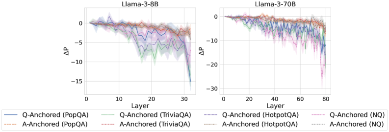
### Visual Description
\n
## Layer-wise Performance Delta (ΔP) Comparison Charts
### Overview
The image displays two side-by-side line charts comparing the layer-wise change in performance (ΔP) for two different Llama-3 language models (8B and 70B parameters). The charts track this metric across the models' layers for eight different evaluation scenarios, defined by a combination of an anchoring method (Q-Anchored or A-Anchored) and a dataset (PopQA, TriviaQA, HotpotQA, NQ).
### Components/Axes
* **Titles:** The left chart is titled "Llama-3-8B". The right chart is titled "Llama-3-70B".
* **X-Axis (Both Charts):** Labeled "Layer". It represents the sequential layers of the neural network.
* Llama-3-8B: Scale runs from 0 to 30, with major ticks at 0, 10, 20, 30.
* Llama-3-70B: Scale runs from 0 to 80, with major ticks at 0, 20, 40, 60, 80.
* **Y-Axis (Both Charts):** Labeled "ΔP". This represents a change in a performance metric (likely probability or accuracy delta). Negative values indicate a decrease.
* Llama-3-8B: Scale runs from -15 to 0, with major ticks at -15, -10, -5, 0.
* Llama-3-70B: Scale runs from -30 to 0, with major ticks at -30, -20, -10, 0.
* **Legend:** Positioned at the bottom of the image, spanning both charts. It defines eight data series:
1. `Q-Anchored (PopQA)`: Solid blue line.
2. `Q-Anchored (TriviaQA)`: Solid green line.
3. `Q-Anchored (HotpotQA)`: Dashed blue line.
4. `Q-Anchored (NQ)`: Dashed magenta/pink line.
5. `A-Anchored (PopQA)`: Dashed orange line.
6. `A-Anchored (TriviaQA)`: Dashed red line.
7. `A-Anchored (HotpotQA)`: Dotted green line.
8. `A-Anchored (NQ)`: Dotted cyan/light blue line.
### Detailed Analysis
**Llama-3-8B Chart (Left):**
* **General Trend:** All lines start near ΔP = 0 at layer 0. Most lines show a general downward trend as layers increase, with increased volatility in later layers (20-30).
* **Q-Anchored Series (Solid/Dashed lines):** These show the most significant negative ΔP.
* `Q-Anchored (TriviaQA)` (solid green) and `Q-Anchored (NQ)` (dashed magenta) exhibit the steepest declines, dropping sharply after layer 20 to reach approximately ΔP = -15 by layer 30.
* `Q-Anchored (PopQA)` (solid blue) and `Q-Anchored (HotpotQA)` (dashed blue) also decline significantly, reaching approximately ΔP = -10 to -12 by layer 30.
* **A-Anchored Series (Dashed/Dotted lines):** These lines remain much closer to zero.
* `A-Anchored (PopQA)` (dashed orange) and `A-Anchored (TriviaQA)` (dashed red) show a slight, gradual decline, staying above ΔP = -5.
* `A-Anchored (HotpotQA)` (dotted green) and `A-Anchored (NQ)` (dotted cyan) are the most stable, fluctuating near ΔP = 0 throughout all layers.
**Llama-3-70B Chart (Right):**
* **General Trend:** Similar starting point at ΔP ≈ 0. The decline for some series begins earlier (around layer 20) and is more pronounced, with a very sharp drop in the final layers (70-80).
* **Q-Anchored Series:**
* `Q-Anchored (NQ)` (dashed magenta) shows the most extreme behavior, plummeting after layer 60 to a low of approximately ΔP = -25 to -30 by layer 80.
* `Q-Anchored (TriviaQA)` (solid green) and `Q-Anchored (HotpotQA)` (dashed blue) also experience a severe late drop, reaching approximately ΔP = -15 to -20.
* `Q-Anchored (PopQA)` (solid blue) declines steadily but less severely, ending near ΔP = -10.
* **A-Anchored Series:**
* `A-Anchored (TriviaQA)` (dashed red) and `A-Anchored (PopQA)` (dashed orange) show a moderate, noisy decline, ending between ΔP = -5 and -10.
* `A-Anchored (HotpotQA)` (dotted green) and `A-Anchored (NQ)` (dotted cyan) again remain the most stable, hovering near or slightly below ΔP = 0.
### Key Observations
1. **Anchoring Method Dominance:** The most striking pattern is the consistent, significant difference between **Q-Anchored** and **A-Anchored** methods. A-Anchored lines are consistently more stable (closer to ΔP=0) across all datasets and both models.
2. **Dataset Difficulty:** Within the Q-Anchored group, the **NQ** and **TriviaQA** datasets consistently show the largest negative ΔP, suggesting they are more challenging for this anchoring method. **PopQA** appears to be the least challenging for Q-Anchored methods.
3. **Model Scale Effect:** The larger model (Llama-3-70B) exhibits more extreme behavior. The negative ΔP for difficult cases (Q-Anchored on NQ/TriviaQA) is much larger in magnitude (-30 vs -15) and the drop is concentrated in the very final layers.
4. **Late-Layer Collapse:** Both models, but especially the 70B, show a dramatic acceleration in performance drop (negative ΔP) in the last ~10 layers for the Q-Anchored scenarios.
5. **Stability of Certain Configurations:** The A-Anchored configurations on HotpotQA and NQ are remarkably flat, indicating that for these datasets, the performance metric (ΔP) is largely unaffected by the layer when using answer-anchoring.
### Interpretation
These charts visualize how the internal processing of a Large Language Model (LLM) affects its performance on different knowledge-intensive QA tasks, depending on whether the model's attention is "anchored" to the question (Q) or the answer (A).
* **What the data suggests:** The consistent negative ΔP for Q-Anchored methods implies that as information propagates through the network layers, the model's confidence or accuracy on the correct answer *decreases* when it is forced to attend primarily to the question. This could indicate a form of "detrimental refinement" or interference in deeper layers for these tasks.
* **Why A-Anchoring is stable:** Anchoring to the answer (A-Anchored) likely provides a stronger, more consistent signal that preserves the correct information pathway through the network, preventing the degradation seen with question-anchoring.
* **The "Late-Layer Collapse" phenomenon:** The sharp drop in the final layers of the 70B model for hard Q-Anchored tasks is particularly notable. It suggests that the final processing stages in very large models might be highly specialized or sensitive, and when given a potentially weaker signal (question-only anchoring), they can dramatically amplify errors or uncertainties.
* **Practical Implication:** The results argue for the importance of **answer-aware or answer-anchored mechanisms** in the architecture or prompting of LLMs for knowledge-intensive tasks, as they appear to provide a more robust signal that maintains performance across the model's depth. The vulnerability of Q-Anchored methods, especially in large models, highlights a potential failure mode to be aware of in interpretability and steering research.
**Language Note:** All text in the image is in English.
</details>
<details>
<summary>x35.png Details</summary>
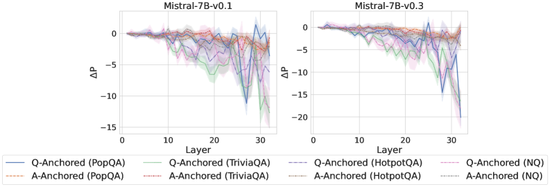
### Visual Description
\n
## Line Charts: Mistral-7B Model Layer-wise ΔP Analysis
### Overview
The image displays two side-by-side line charts comparing the layer-wise change in a metric (ΔP) for two versions of the Mistral-7B language model: v0.1 (left) and v0.3 (right). Each chart plots multiple data series representing different question-answering datasets, using two anchoring methods ("Q-Anchored" and "A-Anchored").
### Components/Axes
* **Chart Titles:**
* Left Chart: `Mistral-7B-v0.1`
* Right Chart: `Mistral-7B-v0.3`
* **X-Axis (Both Charts):**
* Label: `Layer`
* Scale: Linear, from 0 to 30, with major ticks at 0, 10, 20, 30.
* **Y-Axis (Both Charts):**
* Label: `ΔP` (Delta P)
* Scale: Linear.
* Left Chart (v0.1): Ranges from approximately -15 to 0.
* Right Chart (v0.3): Ranges from approximately -20 to 0.
* **Legend (Bottom, spanning both charts):**
* The legend is positioned below the two chart panels.
* It defines 8 data series using a combination of color and line style (solid vs. dashed).
* **Legend Entries (Transcribed):**
1. `Q-Anchored (PopQA)` - Solid blue line.
2. `A-Anchored (PopQA)` - Dashed orange line.
3. `Q-Anchored (TriviaQA)` - Solid green line.
4. `A-Anchored (TriviaQA)` - Dashed red line.
5. `Q-Anchored (HotpotQA)` - Solid purple line.
6. `A-Anchored (HotpotQA)` - Dashed brown line.
7. `Q-Anchored (NQ)` - Solid pink line.
8. `A-Anchored (NQ)` - Dashed gray line.
### Detailed Analysis
**Chart 1: Mistral-7B-v0.1 (Left Panel)**
* **General Trend:** All data series begin near ΔP = 0 at Layer 0. As the layer number increases, the ΔP values for all series trend downward (become more negative), indicating a decrease in the measured metric. The decline is gradual until approximately Layer 15-20, after which the lines become more volatile and show steeper drops.
* **Series-Specific Observations:**
* **Q-Anchored (PopQA) [Solid Blue]:** Shows a moderate decline, with a notable sharp dip around Layer 27-28, reaching near -12, before recovering slightly.
* **A-Anchored (PopQA) [Dashed Orange]:** Follows a smoother, less volatile downward trend compared to its Q-Anchored counterpart.
* **Q-Anchored (TriviaQA) [Solid Green]:** Exhibits one of the most significant declines, with a steep drop starting around Layer 20 and reaching the lowest point on this chart, approximately -14, near Layer 30.
* **A-Anchored (TriviaQA) [Dashed Red]:** Declines steadily but remains less negative than the Q-Anchored version.
* **Q-Anchored (HotpotQA) [Solid Purple]:** Shows high volatility in the later layers (25-30), with multiple sharp peaks and troughs.
* **A-Anchored (HotpotQA) [Dashed Brown]:** Follows a relatively smooth downward path.
* **Q-Anchored (NQ) [Solid Pink]:** Declines steadily, clustering with several other lines in the mid-range of negativity.
* **A-Anchored (NQ) [Dashed Gray]:** Similar to other A-Anchored series, showing a smoother decline.
**Chart 2: Mistral-7B-v0.3 (Right Panel)**
* **General Trend:** Similar to v0.1, all series start near 0 and trend downward. However, the magnitude of the negative ΔP is generally larger in v0.3, especially in the final layers (25-30), where the Y-axis extends to -20. The volatility in the later layers appears more pronounced.
* **Series-Specific Observations:**
* **Q-Anchored (PopQA) [Solid Blue]:** Displays extreme volatility after Layer 25, with a dramatic plunge to approximately -18 around Layer 29, the single lowest point visible in either chart.
* **A-Anchored (PopQA) [Dashed Orange]:** Shows a more consistent decline than in v0.1 but still exhibits more late-layer volatility.
* **Q-Anchored (TriviaQA) [Solid Green]:** Again shows a very steep decline, dropping below -15 after Layer 25.
* **A-Anchored (TriviaQA) [Dashed Red]:** Follows a downward trend, less severe than the Q-Anchored line.
* **Q-Anchored (HotpotQA) [Solid Purple]:** Highly volatile in the final quarter of the layers, with sharp oscillations.
* **A-Anchored (HotpotQA) [Dashed Brown]:** Shows a clear downward trend with moderate volatility.
* **Q-Anchored (NQ) [Solid Pink]:** Declines significantly, clustering with the other Q-Anchored lines in the deep negative region.
* **A-Anchored (NQ) [Dashed Gray]:** Shows a steady decline, generally less negative than the Q-Anchored NQ line.
### Key Observations
1. **Version Comparison:** The ΔP metric becomes more negative and exhibits greater volatility in the later layers (20-30) for model version v0.3 compared to v0.1.
2. **Anchoring Method Effect:** Across all datasets and both model versions, the **Q-Anchored** variants (solid lines) consistently show more negative ΔP values and higher volatility in deeper layers than their **A-Anchored** (dashed line) counterparts.
3. **Dataset Sensitivity:** The **TriviaQA** (green lines) and **PopQA** (blue lines) datasets, particularly when Q-Anchored, appear most sensitive, showing the largest negative ΔP values. The **NQ** and **HotpotQA** datasets show significant but slightly less extreme changes.
4. **Layer-wise Pattern:** The metric is relatively stable in early layers (0-15), begins to diverge and decline in middle layers (15-25), and shows the most dramatic changes and instability in the final layers (25-30).
### Interpretation
This visualization likely analyzes how internal model representations or behaviors change across layers for different factual question-answering tasks. The metric **ΔP** probably represents a change in probability, performance, or some probing metric between a baseline and a condition.
* **What the data suggests:** The consistent negative trend indicates that as information propagates through the model's layers, the measured property (ΔP) decreases. The greater negativity in v0.3 suggests this effect is amplified in the newer model version.
* **Relationship between elements:** The stark contrast between Q-Anchored and A-Anchored lines is the most critical finding. It implies that the model's processing or representation of the *question* (Q) leads to a more significant shift in the measured metric across layers than processing the *answer* (A). This could point to differences in how the model encodes or utilizes query versus answer information hierarchically.
* **Notable anomalies:** The extreme, sharp drops for Q-Anchored PopQA and TriviaQA in the final layers of v0.3 are significant outliers. They may indicate specific layers where the model's processing for these question types undergoes a drastic transformation or where the probing metric becomes particularly sensitive.
* **Why it matters:** This layer-wise analysis provides a "microscopic" view of model internals. It helps researchers understand not just *if* a model knows something, but *how* and *where* that knowledge is processed and transformed. The differences between model versions (v0.1 vs. v0.3) and anchoring methods offer clues for model debugging, interpretability, and understanding the impact of architectural or training changes.
</details>
Figure 16: $ΔP$ under attention knockout with randomly masked question tokens. Unlike selectively blocking the exact question tokens, both Q-Anchored and A-Anchored samples exhibit similar patterns, with substantially smaller probability changes when question tokens are masked at random. This suggests that exact question tokens play a critical role in conveying the semantic information of core frame elements.
## Appendix D Token Patching
<details>
<summary>x36.png Details</summary>
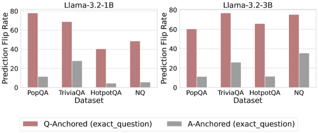
### Visual Description
## Grouped Bar Chart: Prediction Flip Rates by Dataset and Anchoring Method
### Overview
The image displays two side-by-side grouped bar charts comparing the "Prediction Flip Rate" for two different model sizes (Llama-3.2-1B and Llama-3.2-3B) across four question-answering datasets. The charts evaluate the effect of two anchoring methods: "Q-Anchored (exact_question)" and "A-Anchored (exact_question)".
### Components/Axes
- **Chart Titles:**
- Left Chart: `Llama-3.2-1B`
- Right Chart: `Llama-3.2-3B`
- **Y-Axis (Both Charts):**
- Label: `Prediction Flip Rate`
- Scale: Linear, from 0 to 80, with major tick marks at 0, 20, 40, 60, 80.
- **X-Axis (Both Charts):**
- Label: `Dataset`
- Categories (from left to right): `PopQA`, `TriviaQA`, `HotpotQA`, `NQ`.
- **Legend (Bottom Center, spanning both charts):**
- Reddish-brown bar: `Q-Anchored (exact_question)`
- Gray bar: `A-Anchored (exact_question)`
### Detailed Analysis
**Chart 1: Llama-3.2-1B**
- **Trend Verification:** For all four datasets, the Q-Anchored (reddish-brown) bar is significantly taller than the A-Anchored (gray) bar, indicating a higher flip rate.
- **Data Points (Approximate Values):**
- **PopQA:**
- Q-Anchored: ~78
- A-Anchored: ~10
- **TriviaQA:**
- Q-Anchored: ~69
- A-Anchored: ~28
- **HotpotQA:**
- Q-Anchored: ~40
- A-Anchored: ~5
- **NQ:**
- Q-Anchored: ~49
- A-Anchored: ~6
**Chart 2: Llama-3.2-3B**
- **Trend Verification:** The same pattern holds: Q-Anchored bars are consistently taller than A-Anchored bars across all datasets.
- **Data Points (Approximate Values):**
- **PopQA:**
- Q-Anchored: ~60
- A-Anchored: ~11
- **TriviaQA:**
- Q-Anchored: ~77
- A-Anchored: ~27
- **HotpotQA:**
- Q-Anchored: ~66
- A-Anchored: ~11
- **NQ:**
- Q-Anchored: ~76
- A-Anchored: ~36
### Key Observations
1. **Consistent Dominance of Q-Anchoring:** In every single comparison (8 out of 8), the Q-Anchored method results in a higher Prediction Flip Rate than the A-Anchored method.
2. **Dataset Variability:** The magnitude of the flip rate varies by dataset. For the 1B model, PopQA shows the highest Q-Anchored flip rate (~78), while HotpotQA shows the lowest (~40). For the 3B model, TriviaQA and NQ show the highest Q-Anchored rates (~77, ~76).
3. **Model Size Effect:** Comparing the two charts, the 3B model generally shows higher flip rates for the Q-Anchored method on three of the four datasets (TriviaQA, HotpotQA, NQ), with the most dramatic increase on HotpotQA (from ~40 to ~66). The A-Anchored rates also show a moderate increase for the 3B model, most notably on NQ (from ~6 to ~36).
4. **Relative Gap:** The absolute difference between the two anchoring methods is largest for PopQA in the 1B model (~68 points) and smallest for NQ in the 3B model (~40 points).
### Interpretation
This data suggests a strong and consistent effect of the anchoring method on model behavior. "Prediction Flip Rate" likely measures how often a model changes its answer when presented with a specific piece of information (the "anchor").
- **Q-Anchored (exact_question):** Providing the exact question as an anchor leads to a high rate of answer changes. This implies the model's initial answer is highly sensitive to re-evaluation when the question is explicitly restated, possibly due to re-contextualization or triggering different retrieval pathways.
- **A-Anchored (exact_question):** Providing the exact answer as an anchor results in a much lower flip rate. This suggests that when the model is given the answer directly, it is more likely to stick with that answer, demonstrating a form of confirmation bias or anchoring effect where the provided answer heavily influences the final output.
- **Model Scaling:** The increase in flip rates for the larger (3B) model, particularly for Q-Anchoring, could indicate that larger models are more sensitive to contextual cues or have more volatile reasoning processes that are easily redirected by new information.
- **Practical Implication:** For tasks requiring robust and consistent answers, anchoring with the answer (A-Anchored) appears to produce more stable outputs. Conversely, if the goal is to explore alternative answers or stress-test a model's reasoning, Q-Anchoring is a more effective perturbation. The choice of dataset also significantly impacts the magnitude of this effect.
</details>
<details>
<summary>x37.png Details</summary>
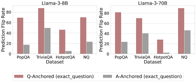
### Visual Description
## Bar Charts: Prediction Flip Rates for Llama-3 Models
### Overview
The image contains two side-by-side bar charts comparing the "Prediction Flip Rate" of two language models (Llama-3-8B and Llama-3-70B) across four question-answering datasets. The charts evaluate the stability of model predictions under two different anchoring conditions.
### Components/Axes
* **Chart Titles:** "Llama-3-8B" (left chart), "Llama-3-70B" (right chart).
* **Y-Axis (Both Charts):** Label is "Prediction Flip Rate". Scale ranges from 0 to 80, with major tick marks at 0, 20, 40, 60, and 80.
* **X-Axis (Both Charts):** Label is "Dataset". Categories are, from left to right: "PopQA", "TriviaQA", "HotpotQA", "NQ".
* **Legend:** Positioned at the bottom center of the entire image.
* **Red Bar:** "Q-Anchored (exact_question)"
* **Gray Bar:** "A-Anchored (exact_question)"
### Detailed Analysis
**Llama-3-8B Chart (Left):**
* **PopQA:** Q-Anchored (red) ≈ 70. A-Anchored (gray) ≈ 20.
* **TriviaQA:** Q-Anchored (red) ≈ 90 (exceeds the 80 axis mark). A-Anchored (gray) ≈ 50.
* **HotpotQA:** Q-Anchored (red) ≈ 45. A-Anchored (gray) ≈ 5.
* **NQ:** Q-Anchored (red) ≈ 70. A-Anchored (gray) ≈ 25.
**Llama-3-70B Chart (Right):**
* **PopQA:** Q-Anchored (red) ≈ 80. A-Anchored (gray) ≈ 25.
* **TriviaQA:** Q-Anchored (red) ≈ 70. A-Anchored (gray) ≈ 40.
* **HotpotQA:** Q-Anchored (red) ≈ 30. A-Anchored (gray) ≈ 3.
* **NQ:** Q-Anchored (red) ≈ 90 (exceeds the 80 axis mark). A-Anchored (gray) ≈ 45.
**Trend Verification:**
* In both models and across all four datasets, the **Q-Anchored (red) bar is consistently and significantly taller** than the corresponding A-Anchored (gray) bar.
* For the **Llama-3-8B model**, the highest flip rate is for TriviaQA (Q-Anchored), and the lowest is for HotpotQA (A-Anchored).
* For the **Llama-3-70B model**, the highest flip rate is for NQ (Q-Anchored), and the lowest is for HotpotQA (A-Anchored).
### Key Observations
1. **Dominant Pattern:** The anchoring method has a dramatic effect on prediction stability. Using the exact question as an anchor ("Q-Anchored") leads to a much higher rate of prediction flips compared to using the exact answer as an anchor ("A-Anchored").
2. **Dataset Sensitivity:** The "HotpotQA" dataset shows the lowest flip rates overall, especially for the A-Anchored condition, where the rate is near zero for both models. This suggests predictions on this dataset are more stable under answer anchoring.
3. **Model Scale Effect:** Comparing the two models, the larger Llama-3-70B shows a notably higher Q-Anchored flip rate for the "NQ" dataset (≈90 vs ≈70 for the 8B model) but a lower rate for "TriviaQA" (≈70 vs ≈90). The A-Anchored rates are generally similar or slightly higher for the 70B model.
### Interpretation
This data demonstrates a strong **anchoring bias** in the Llama-3 models' question-answering behavior. A "prediction flip" likely refers to the model changing its answer when presented with a slightly modified or rephrased query. The results show that when the model's reasoning is anchored to the specific phrasing of the question (Q-Anchored), its output is highly unstable and prone to flipping. Conversely, when anchored to a specific answer (A-Anchored), its predictions become far more consistent.
The variation across datasets (PopQA, TriviaQA, HotpotQA, NQ) indicates that the nature of the questions or the knowledge domain influences this stability. HotpotQA, which often involves multi-hop reasoning, appears to produce the most stable answers under answer anchoring. The difference between the 8B and 70B models suggests that model scale interacts with this bias, but not in a uniformly linear way—increasing scale amplifies the instability for some datasets (like NQ) while reducing it for others (like TriviaQA). This has practical implications for prompt engineering and the reliability of model outputs, highlighting that the way a query is framed can drastically alter the consistency of the response.
</details>
<details>
<summary>x38.png Details</summary>
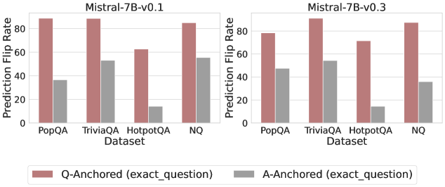
### Visual Description
## Grouped Bar Chart: Prediction Flip Rate Comparison for Mistral-7B Models
### Overview
The image displays two side-by-side grouped bar charts comparing the "Prediction Flip Rate" of two versions of the Mistral-7B language model (v0.1 and v0.3) across four question-answering datasets. The charts evaluate the model's sensitivity to two different anchoring methods: "Q-Anchored" and "A-Anchored".
### Components/Axes
* **Chart Titles:**
* Left Chart: `Mistral-7B-v0.1`
* Right Chart: `Mistral-7B-v0.3`
* **Y-Axis (Both Charts):**
* Label: `Prediction Flip Rate`
* Scale: Linear, from 0 to 80, with major tick marks at 0, 20, 40, 60, 80.
* **X-Axis (Both Charts):**
* Label: `Dataset`
* Categories (from left to right): `PopQA`, `TriviaQA`, `HotpotQA`, `NQ`.
* **Legend (Bottom Center, spanning both charts):**
* Color: Reddish-brown (approx. hex #b36a6a) -> Label: `Q-Anchored (exact_question)`
* Color: Gray (approx. hex #999999) -> Label: `A-Anchored (exact_question)`
* **Spatial Layout:** The two charts are arranged horizontally. The legend is positioned below both charts, centered. Each chart contains four pairs of bars, one pair per dataset category.
### Detailed Analysis
**Data Series & Trends:**
1. **Q-Anchored (Reddish-brown bars):** This series shows consistently higher flip rates than the A-Anchored series across all datasets and both model versions.
* **Mistral-7B-v0.1:**
* PopQA: ~85
* TriviaQA: ~85
* HotpotQA: ~60
* NQ: ~85
* **Mistral-7B-v0.3:**
* PopQA: ~78
* TriviaQA: ~88
* HotpotQA: ~70
* NQ: ~85
* **Trend:** The Q-Anchored flip rate is high (75-88) for three datasets (PopQA, TriviaQA, NQ) in both models, with HotpotQA being a notable exception with a lower rate (60-70).
2. **A-Anchored (Gray bars):** This series shows lower and more variable flip rates.
* **Mistral-7B-v0.1:**
* PopQA: ~35
* TriviaQA: ~50
* HotpotQA: ~15
* NQ: ~55
* **Mistral-7B-v0.3:**
* PopQA: ~45
* TriviaQA: ~52
* HotpotQA: ~15
* NQ: ~35
* **Trend:** The A-Anchored flip rate is lowest for HotpotQA (~15) in both models. The other datasets show moderate rates (35-55).
**Cross-Version Comparison (v0.1 vs. v0.3):**
* **PopQA:** Q-Anchored rate decreased slightly (~85 to ~78), while A-Anchored rate increased (~35 to ~45).
* **TriviaQA:** Both rates remained relatively stable (Q: ~85 to ~88, A: ~50 to ~52).
* **HotpotQA:** Q-Anchored rate increased (~60 to ~70), while A-Anchored rate remained very low and stable (~15).
* **NQ:** Q-Anchored rate remained stable (~85), while A-Anchored rate decreased (~55 to ~35).
### Key Observations
1. **Dominant Pattern:** The Q-Anchored method results in a significantly higher Prediction Flip Rate than the A-Anchored method for every dataset in both model versions.
2. **Dataset Sensitivity:** The HotpotQA dataset exhibits the lowest flip rates for the A-Anchored method in both models and the lowest Q-Anchored rate in v0.1, suggesting it may be less sensitive to these specific anchoring perturbations.
3. **Model Version Differences:** The transition from v0.1 to v0.3 shows mixed effects. Flip rates for some dataset/method combinations increased (e.g., HotpotQA Q-Anchored), some decreased (e.g., NQ A-Anchored), and some stayed similar. There is no uniform improvement or degradation across all metrics.
### Interpretation
This chart likely measures the stability or robustness of the Mistral-7B model's answers when the input prompt is anchored to either the exact question (`Q-Anchored`) or the exact answer (`A-Anchored`). A higher "Prediction Flip Rate" indicates that the model's output is more likely to change under that specific anchoring condition.
The data suggests that **the model's predictions are far more volatile when anchored to the question phrasing** (Q-Anchored) than when anchored to the answer (A-Anchored). This implies that subtle changes or emphasis on the question part of the prompt lead to more inconsistent outputs compared to emphasis on the answer component.
The variation across datasets indicates that the model's sensitivity is not uniform; it depends on the nature of the question-answering task (e.g., factual recall in PopQA vs. multi-hop reasoning potentially in HotpotQA). The comparison between v0.1 and v0.3 does not show a clear, consistent trend toward greater stability, suggesting that model updates may have complex, non-uniform effects on this specific robustness metric. The persistent low A-Anchored flip rate for HotpotQA is a notable outlier, potentially indicating that for this dataset, the answer itself is a stronger anchor for the model's behavior.
</details>
Figure 17: Prediction flip rate under token patching, probing attention activations of the final token.
<details>
<summary>x39.png Details</summary>
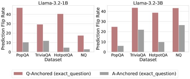
### Visual Description
## Bar Charts: Prediction Flip Rates for Llama-3.2 Models
### Overview
The image displays two side-by-side bar charts comparing the "Prediction Flip Rate" of two language models (Llama-3.2-1B and Llama-3.2-3B) across four question-answering datasets. The charts evaluate the effect of two anchoring methods: "Q-Anchored (exact_question)" and "A-Anchored (exact_question)".
### Components/Axes
* **Titles:** Two charts are labeled at the top: "Llama-3.2-1B" (left) and "Llama-3.2-3B" (right).
* **Y-Axis (Both Charts):** Labeled "Prediction Flip Rate". The scale runs from 0 to 40, with major tick marks at 0, 10, 20, 30, and 40.
* **X-Axis (Both Charts):** Labeled "Dataset". The categories are, from left to right: "PopQA", "TriviaQA", "HotpotQA", and "NQ".
* **Legend:** Positioned at the bottom center of the entire image.
* **Q-Anchored (exact_question):** Represented by a reddish-brown (terracotta) bar.
* **A-Anchored (exact_question):** Represented by a gray bar.
### Detailed Analysis
**Chart 1: Llama-3.2-1B**
* **Trend Verification:** For all four datasets, the Q-Anchored (reddish-brown) bar is significantly taller than the A-Anchored (gray) bar, indicating a higher flip rate.
* **Data Points (Approximate Values):**
* **PopQA:** Q-Anchored ≈ 45, A-Anchored ≈ 10.
* **TriviaQA:** Q-Anchored ≈ 30, A-Anchored ≈ 12.
* **HotpotQA:** Q-Anchored ≈ 40, A-Anchored ≈ 5.
* **NQ:** Q-Anchored ≈ 18, A-Anchored ≈ 3.
**Chart 2: Llama-3.2-3B**
* **Trend Verification:** The pattern of Q-Anchored bars being taller than A-Anchored bars holds for all datasets. However, the A-Anchored rates are notably higher in this larger model compared to the 1B model.
* **Data Points (Approximate Values):**
* **PopQA:** Q-Anchored ≈ 25, A-Anchored ≈ 6.
* **TriviaQA:** Q-Anchored ≈ 43, A-Anchored ≈ 22.
* **HotpotQA:** Q-Anchored ≈ 39, A-Anchored ≈ 10.
* **NQ:** Q-Anchored ≈ 43, A-Anchored ≈ 26.
### Key Observations
1. **Consistent Anchoring Effect:** Across both model sizes and all datasets, the "Q-Anchored" method results in a higher Prediction Flip Rate than the "A-Anchored" method.
2. **Model Size Impact:** The larger model (3B) shows a substantial increase in the A-Anchored flip rates for TriviaQA and NQ compared to the smaller model (1B), while the Q-Anchored rates remain high.
3. **Dataset Variability:** The magnitude of the flip rate varies by dataset. For example, HotpotQA shows one of the largest gaps between Q and A anchoring in the 1B model, while NQ shows the smallest Q-Anchored rate in the 1B model but one of the highest in the 3B model.
### Interpretation
The data suggests that the method of anchoring—whether the model is prompted with the exact question (Q-Anchored) or the exact answer (A-Anchored)—has a significant and consistent impact on the stability of its predictions, as measured by the "flip rate." A higher flip rate indicates less stability.
The "Q-Anchored" condition appears to destabilize model predictions more than the "A-Anchored" condition. This could imply that re-encountering the exact question makes the model more likely to reconsider or change its initial answer, whereas being anchored to a specific answer may create a stronger prior that resists change.
The increase in A-Anchored flip rates for the larger 3B model, particularly on TriviaQA and NQ, is a notable anomaly. It suggests that while larger models may be more capable, their predictions when anchored to an answer might be more sensitive to re-evaluation on certain types of knowledge-intensive datasets. This could point to a complex relationship between model scale, knowledge representation, and susceptibility to anchoring biases. The charts effectively demonstrate that anchoring is not a neutral intervention and that its effect is modulated by both model size and the nature of the dataset.
</details>
<details>
<summary>x40.png Details</summary>
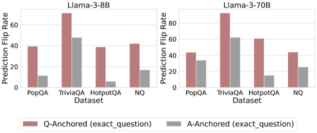
### Visual Description
## Grouped Bar Chart: Prediction Flip Rate by Dataset and Anchoring Method
### Overview
The image displays two side-by-side grouped bar charts comparing the "Prediction Flip Rate" of two language models (Llama-3-8B and Llama-3-70B) across four question-answering datasets. The charts evaluate the effect of two different anchoring methods ("Q-Anchored" and "A-Anchored") on model prediction stability.
### Components/Axes
* **Chart Titles:** "Llama-3-8B" (left chart), "Llama-3-70B" (right chart).
* **Y-Axis (Both Charts):** Labeled "Prediction Flip Rate". The scale runs from 0 to 80, with major tick marks at intervals of 20 (0, 20, 40, 60, 80).
* **X-Axis (Both Charts):** Labeled "Dataset". Four categorical datasets are listed: "PopQA", "TriviaQA", "HotpotQA", "NQ".
* **Legend:** Positioned at the bottom center of the entire image, spanning both charts.
* **Reddish-brown bar:** "Q-Anchored (exact_question)"
* **Gray bar:** "A-Anchored (exact_question)"
### Detailed Analysis
**Llama-3-8B Chart (Left):**
* **PopQA:** Q-Anchored bar is at approximately 40. A-Anchored bar is significantly lower, at approximately 10.
* **TriviaQA:** Q-Anchored bar is the highest in this chart, at approximately 70. A-Anchored bar is at approximately 48.
* **HotpotQA:** Q-Anchored bar is at approximately 39. A-Anchored bar is the lowest in the chart, at approximately 5.
* **NQ:** Q-Anchored bar is at approximately 42. A-Anchored bar is at approximately 18.
**Llama-3-70B Chart (Right):**
* **PopQA:** Q-Anchored bar is at approximately 44. A-Anchored bar is at approximately 34.
* **TriviaQA:** Q-Anchored bar is the highest in the entire image, at approximately 90. A-Anchored bar is at approximately 62.
* **HotpotQA:** Q-Anchored bar is at approximately 61. A-Anchored bar is at approximately 16.
* **NQ:** Q-Anchored bar is at approximately 45. A-Anchored bar is at approximately 26.
**Trend Verification:**
* In both charts, for every dataset, the **Q-Anchored (reddish-brown) bar is taller than the A-Anchored (gray) bar**. This visual trend is consistent.
* The **TriviaQA dataset** consistently shows the highest flip rates for both anchoring methods in both models.
* The **HotpotQA dataset** shows the most dramatic relative difference between anchoring methods, especially in the 8B model where the A-Anchored rate is very low.
### Key Observations
1. **Consistent Anchoring Effect:** The "Q-Anchored" method consistently results in a higher Prediction Flip Rate than the "A-Anchored" method across all datasets and both model sizes.
2. **Model Size Impact:** The larger Llama-3-70B model exhibits higher flip rates overall compared to the Llama-3-8B model for the same datasets and anchoring methods.
3. **Dataset Sensitivity:** The "TriviaQA" dataset appears to be the most sensitive to anchoring, producing the highest flip rates. "HotpotQA" shows the largest disparity between the two anchoring methods.
4. **Spatial Layout:** The charts are placed side-by-side for direct comparison. The shared legend at the bottom applies to both, ensuring consistent color coding.
### Interpretation
This data suggests that the method of anchoring context (providing the exact question vs. the exact answer) significantly influences the stability of a language model's predictions. The consistently higher flip rates for "Q-Anchored" indicate that when the model is primed with the exact question, its final answer is more likely to change compared to when it is primed with the exact answer. This could imply that the model's reasoning path is more malleable or sensitive when focused on the question formulation.
The increased flip rates in the larger 70B model might suggest that greater model capacity leads to a higher sensitivity to contextual anchoring, potentially incorporating the anchor more deeply into its reasoning process. The outlier behavior of "HotpotQA," where A-Anchored flip rates are particularly low, may indicate that for multi-hop reasoning tasks (which HotpotQA often involves), being anchored with the answer provides a much stronger, more stabilizing signal to the model than being anchored with the question alone. Overall, the chart demonstrates that prediction stability is not a fixed property of a model but is contingent on both the task (dataset) and the specific prompting strategy (anchoring method) employed.
</details>
<details>
<summary>x41.png Details</summary>
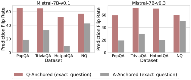
### Visual Description
## Grouped Bar Chart: Prediction Flip Rate Comparison for Mistral-7B Model Versions
### Overview
The image displays two side-by-side grouped bar charts comparing the "Prediction Flip Rate" of two versions of the Mistral-7B language model (v0.1 and v0.3) across four different question-answering datasets. The charts evaluate the stability of model predictions under two different anchoring conditions.
### Components/Axes
* **Chart Titles (Top Center):**
* Left Chart: `Mistral-7B-v0.1`
* Right Chart: `Mistral-7B-v0.3`
* **Y-Axis (Vertical, Left of each chart):**
* Label: `Prediction Flip Rate`
* Scale: Linear, from 0 to 60, with major tick marks at 0, 20, 40, and 60.
* **X-Axis (Horizontal, Bottom of each chart):**
* Label: `Dataset`
* Categories (from left to right): `PopQA`, `TriviaQA`, `HotpotQA`, `NQ`
* **Legend (Bottom Center, spanning both charts):**
* A colored box and label pair.
* **Red/Brown Bar:** `Q-Anchored (exact_question)`
* **Gray Bar:** `A-Anchored (exact_question)`
### Detailed Analysis
The data is presented as pairs of bars for each dataset, one for each anchoring method. Values are approximate visual estimates.
**For Mistral-7B-v0.1 (Left Chart):**
* **PopQA:**
* Q-Anchored: ~65
* A-Anchored: ~18
* **TriviaQA:**
* Q-Anchored: ~65
* A-Anchored: ~33
* **HotpotQA:**
* Q-Anchored: ~52
* A-Anchored: ~10
* **NQ:**
* Q-Anchored: ~58
* A-Anchored: ~43
**For Mistral-7B-v0.3 (Right Chart):**
* **PopQA:**
* Q-Anchored: ~59
* A-Anchored: ~19
* **TriviaQA:**
* Q-Anchored: ~70
* A-Anchored: ~30
* **HotpotQA:**
* Q-Anchored: ~69
* A-Anchored: ~20
* **NQ:**
* Q-Anchored: ~59
* A-Anchored: ~50
**Visual Trend Verification:**
* In **both model versions**, for **every dataset**, the red/brown bar (Q-Anchored) is significantly taller than the gray bar (A-Anchored). This indicates a consistently higher prediction flip rate when the model is anchored to the exact question versus the exact answer.
* Comparing **v0.1 to v0.3**, the Q-Anchored flip rates for `TriviaQA` and `HotpotQA` show a noticeable increase, while the rate for `PopQA` slightly decreases. The A-Anchored rates show mixed, smaller changes.
### Key Observations
1. **Dominant Pattern:** The Q-Anchored condition universally results in a higher prediction flip rate than the A-Anchored condition across all datasets and both model versions.
2. **Dataset Variability:** The magnitude of the difference between anchoring methods varies by dataset. The gap is largest for `HotpotQA` in v0.1 (~42 point difference) and smallest for `NQ` in v0.3 (~9 point difference).
3. **Model Version Change:** The transition from v0.1 to v0.3 appears to increase the model's sensitivity (higher flip rate) to question anchoring for more complex datasets like `TriviaQA` and `HotpotQA`, while making it slightly more stable (lower flip rate) for `PopQA` under the same condition.
4. **Highest Flip Rate:** The single highest observed flip rate is for `TriviaQA` under Q-Anchoring in the v0.3 model (~70).
5. **Lowest Flip Rate:** The single lowest observed flip rate is for `HotpotQA` under A-Anchoring in the v0.1 model (~10).
### Interpretation
This chart investigates the stability of a language model's outputs. A "prediction flip" likely means the model gives a different answer when prompted in a slightly different way. The data suggests that **anchoring the model's context to the exact question (Q-Anchored) makes its outputs far less stable** than anchoring to the exact answer (A-Anchored). This implies the model's reasoning or retrieval process is more volatile when focused on the query itself.
The difference between model versions (v0.1 vs. v0.3) indicates that updates to the model can alter this stability profile in dataset-specific ways. The increase in flip rate for `TriviaQA` and `HotpotQA` in v0.3 might suggest the newer model is more sensitive to question phrasing or engages in more varied reasoning paths for these types of questions. Conversely, the decreased flip rate for `PopQA` could indicate improved consistency on that specific knowledge domain.
From a practical standpoint, this has implications for evaluation and deployment. If a model's answers flip frequently based on minor prompt variations (especially question-anchored ones), its reliability in real-world applications, where queries are never perfectly standardized, could be a concern. The A-Anchored results provide a baseline, showing the model is more consistent when the answer is fixed in context.
</details>
Figure 18: Prediction flip rate under token patching, probing attention activations of the token immediately preceding the exact answer tokens.
<details>
<summary>x42.png Details</summary>
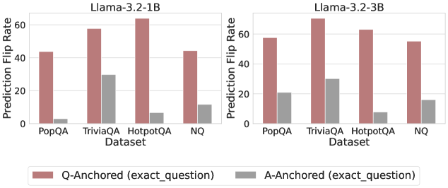
### Visual Description
\n
## Bar Charts: Prediction Flip Rates for Llama-3.2 Models
### Overview
The image displays two side-by-side bar charts comparing the "Prediction Flip Rate" of two language models (Llama-3.2-1B and Llama-3.2-3B) across four question-answering datasets. Each chart compares two experimental conditions: "Q-Anchored (exact_question)" and "A-Anchored (exact_question)".
### Components/Axes
* **Chart Titles (Subtitles):**
* Left Chart: `Llama-3.2-1B`
* Right Chart: `Llama-3.2-3B`
* **Y-Axis (Both Charts):**
* Label: `Prediction Flip Rate`
* Scale: Linear, from 0 to 60, with major tick marks at 0, 20, 40, and 60.
* **X-Axis (Both Charts):**
* Label: `Dataset`
* Categories (from left to right): `PopQA`, `TriviaQA`, `HotpotQA`, `NQ`.
* **Legend:**
* Position: Centered at the bottom of the entire image, below both charts.
* Items:
* A reddish-brown (terracotta) bar labeled: `Q-Anchored (exact_question)`
* A gray bar labeled: `A-Anchored (exact_question)`
### Detailed Analysis
**Chart 1: Llama-3.2-1B (Left)**
* **Trend Verification:** For all four datasets, the Q-Anchored (reddish-brown) bar is significantly taller than the A-Anchored (gray) bar, indicating a higher flip rate.
* **Data Points (Approximate Values):**
* **PopQA:**
* Q-Anchored: ~44
* A-Anchored: ~3
* **TriviaQA:**
* Q-Anchored: ~58
* A-Anchored: ~30
* **HotpotQA:**
* Q-Anchored: ~64 (The highest value in this chart)
* A-Anchored: ~7
* **NQ:**
* Q-Anchored: ~45
* A-Anchored: ~12
**Chart 2: Llama-3.2-3B (Right)**
* **Trend Verification:** The same pattern holds: Q-Anchored bars are consistently taller than A-Anchored bars across all datasets. The overall values for the 3B model appear slightly higher than for the 1B model.
* **Data Points (Approximate Values):**
* **PopQA:**
* Q-Anchored: ~58
* A-Anchored: ~21
* **TriviaQA:**
* Q-Anchored: ~69 (The highest value in the entire image)
* A-Anchored: ~30
* **HotpotQA:**
* Q-Anchored: ~63
* A-Anchored: ~8
* **NQ:**
* Q-Anchored: ~55
* A-Anchored: ~16
### Key Observations
1. **Dominant Pattern:** The "Q-Anchored" condition results in a substantially higher Prediction Flip Rate than the "A-Anchored" condition for every dataset and both model sizes.
2. **Dataset Sensitivity:** The `TriviaQA` and `HotpotQA` datasets elicit the highest flip rates under the Q-Anchored condition for both models. `PopQA` generally shows the lowest Q-Anchored flip rate.
3. **Model Size Effect:** The larger Llama-3.2-3B model exhibits higher flip rates overall compared to the 1B model, particularly noticeable in the `PopQA` and `NQ` datasets for the Q-Anchored condition.
4. **A-Anchored Stability:** The A-Anchored condition shows relatively low and stable flip rates, with the exception of `TriviaQA`, which has a notably higher A-Anchored flip rate (~30) in both models compared to the other datasets (ranging from ~3 to ~21).
### Interpretation
This data suggests a strong asymmetry in model sensitivity based on anchoring. The "Prediction Flip Rate" likely measures how often a model's answer changes when a specific component (the question or the answer) is held constant ("anchored") while other parts of the input vary.
* **Q-Anchored High Sensitivity:** The high flip rates for Q-Anchored indicate that when the exact question is fixed, the model's prediction is highly sensitive to other changes in the input context. This could imply that the model's reasoning is heavily influenced by contextual details beyond the literal question phrasing.
* **A-Anchored Low Sensitivity:** Conversely, the low flip rates for A-Anchored suggest that when the exact answer is fixed, the model's prediction (presumably of something else, like a supporting fact or the question itself) is much more stable. This indicates a stronger binding between the answer and its supporting context in the model's internal representation.
* **Dataset Characteristics:** The particularly high Q-Anchored flip rates for `TriviaQA` and `HotpotQA` may reflect the nature of these datasets. They might contain more ambiguous or multi-faceted questions where contextual cues heavily sway the model's final output, even when the question text is identical.
* **Model Scaling:** The increased flip rates in the 3B model could signify that larger models develop more nuanced or context-dependent representations, making them more susceptible to these anchoring effects. They are not simply more consistent; they are more sensitive to the experimental manipulation.
**Uncertainty Note:** All numerical values are visual approximations extracted from the bar heights relative to the y-axis scale. The exact values are not provided in the image.
</details>
<details>
<summary>x43.png Details</summary>
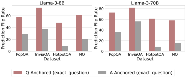
### Visual Description
## Grouped Bar Chart: Prediction Flip Rate by Dataset and Anchoring Method for Llama-3 Models
### Overview
The image displays two side-by-side grouped bar charts comparing the "Prediction Flip Rate" of two language models (Llama-3-8B and Llama-3-70B) across four question-answering datasets. The comparison is between two anchoring methods: "Q-Anchored (exact_question)" and "A-Anchored (exact_question)".
### Components/Axes
* **Chart Titles (Top Center):**
* Left Chart: `Llama-3-8B`
* Right Chart: `Llama-3-70B`
* **Y-Axis (Vertical, Left of each chart):**
* Label: `Prediction Flip Rate`
* Scale: 0 to 80, with major tick marks at 0, 20, 40, 60, 80.
* **X-Axis (Horizontal, Bottom of each chart):**
* Label: `Dataset`
* Categories (from left to right): `PopQA`, `TriviaQA`, `HotpotQA`, `NQ`.
* **Legend (Bottom Center, spanning both charts):**
* A reddish-brown square: `Q-Anchored (exact_question)`
* A gray square: `A-Anchored (exact_question)`
### Detailed Analysis
**Llama-3-8B Chart (Left):**
* **Trend Verification:** For all four datasets, the Q-Anchored (reddish-brown) bar is significantly taller than the A-Anchored (gray) bar, indicating a higher flip rate.
* **Data Points (Approximate Values):**
* **PopQA:** Q-Anchored ≈ 58, A-Anchored ≈ 29.
* **TriviaQA:** Q-Anchored ≈ 75 (highest in this chart), A-Anchored ≈ 38.
* **HotpotQA:** Q-Anchored ≈ 48, A-Anchored ≈ 9 (lowest in this chart).
* **NQ:** Q-Anchored ≈ 62, A-Anchored ≈ 21.
**Llama-3-70B Chart (Right):**
* **Trend Verification:** Similar to the 8B model, the Q-Anchored bar is taller than the A-Anchored bar for every dataset. The overall flip rates for Q-Anchored appear slightly higher than for the 8B model.
* **Data Points (Approximate Values):**
* **PopQA:** Q-Anchored ≈ 73, A-Anchored ≈ 36.
* **TriviaQA:** Q-Anchored ≈ 81 (highest in the entire image), A-Anchored ≈ 56.
* **HotpotQA:** Q-Anchored ≈ 61, A-Anchored ≈ 9 (lowest in this chart, similar to 8B).
* **NQ:** Q-Anchored ≈ 58, A-Anchored ≈ 15.
### Key Observations
1. **Consistent Anchoring Effect:** Across both model sizes and all four datasets, the "Q-Anchored (exact_question)" method consistently results in a higher Prediction Flip Rate than the "A-Anchored (exact_question)" method.
2. **Model Size Impact:** The larger Llama-3-70B model generally exhibits higher flip rates for the Q-Anchored method compared to the Llama-3-8B model (e.g., PopQA: ~73 vs ~58, TriviaQA: ~81 vs ~75). The effect on A-Anchored rates is less consistent.
3. **Dataset Variability:** The "TriviaQA" dataset shows the highest flip rates for both models under Q-Anchoring. The "HotpotQA" dataset shows the lowest flip rates for A-Anchoring in both models.
4. **Relative Gap:** The absolute difference (gap) between Q-Anchored and A-Anchored flip rates is largest for "TriviaQA" in both models and smallest for "HotpotQA".
### Interpretation
This chart investigates the stability of model predictions when the input is anchored to either the exact question (Q-Anchored) or the exact answer (A-Anchored). A higher "Prediction Flip Rate" suggests the model's output is more sensitive to changes in the input context when anchored to the question versus the answer.
The data strongly suggests that **anchoring to the exact question makes model predictions significantly more volatile** (prone to flipping) than anchoring to the exact answer. This pattern holds regardless of model scale (8B vs 70B parameters). The increased volatility with question-anchoring might indicate that models rely more heavily on the precise phrasing of the question to generate an answer, whereas answer-anchoring provides a more stable reference point. The particularly high flip rate on TriviaQA could imply that this dataset contains questions where phrasing is especially critical or where multiple valid answer formulations exist, making the model's output highly dependent on the exact question wording. The consistent, low flip rate for A-Anchored on HotpotQA suggests that for this multi-hop reasoning dataset, once the answer is fixed, the model's reasoning path is relatively stable.
</details>
<details>
<summary>x44.png Details</summary>
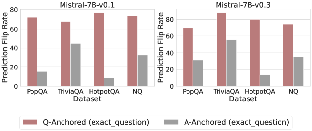
### Visual Description
\n
## Grouped Bar Chart: Prediction Flip Rate by Dataset and Anchoring Method
### Overview
The image displays two side-by-side grouped bar charts comparing the "Prediction Flip Rate" for two versions of the Mistral-7B model (v0.1 and v0.3) across four question-answering datasets. The charts analyze the sensitivity of model predictions to the anchoring method used in the prompt.
### Components/Axes
* **Chart Titles:**
* Left Chart: `Mistral-7B-v0.1`
* Right Chart: `Mistral-7B-v0.3`
* **Y-Axis (Both Charts):**
* Label: `Prediction Flip Rate`
* Scale: 0 to 80, with major tick marks at 0, 20, 40, 60, 80.
* **X-Axis (Both Charts):**
* Label: `Dataset`
* Categories (from left to right): `PopQA`, `TriviaQA`, `HotpotQA`, `NQ`.
* **Legend (Bottom Center):**
* A red/brown bar labeled: `Q-Anchored (exact_question)`
* A grey bar labeled: `A-Anchored (exact_question)`
### Detailed Analysis
The data is presented as pairs of bars for each dataset, one for each anchoring method.
**For Mistral-7B-v0.1 (Left Chart):**
* **PopQA:** Q-Anchored bar is high (~72). A-Anchored bar is low (~15).
* **TriviaQA:** Q-Anchored bar is high (~68). A-Anchored bar is moderate (~45).
* **HotpotQA:** Q-Anchored bar is the highest (~78). A-Anchored bar is very low (~8).
* **NQ:** Q-Anchored bar is high (~74). A-Anchored bar is moderate (~33).
**For Mistral-7B-v0.3 (Right Chart):**
* **PopQA:** Q-Anchored bar is high (~70). A-Anchored bar is moderate (~32).
* **TriviaQA:** Q-Anchored bar is the highest (~86). A-Anchored bar is moderate-high (~55).
* **HotpotQA:** Q-Anchored bar is high (~80). A-Anchored bar is low (~13).
* **NQ:** Q-Anchored bar is high (~75). A-Anchored bar is moderate (~35).
**Visual Trend Verification:**
* In both model versions, the **Q-Anchored (red/brown) bars are consistently and significantly higher** than the A-Anchored (grey) bars for every dataset.
* The **A-Anchored bars show more variability** across datasets compared to the relatively stable high values of the Q-Anchored bars.
* Comparing model versions, the **Q-Anchored rates remain similarly high**. The **A-Anchored rates appear to increase slightly** from v0.1 to v0.3 for PopQA and TriviaQA, while remaining similarly low for HotpotQA and similar for NQ.
### Key Observations
1. **Dominant Anchoring Effect:** The choice of anchoring method (Q-Anchored vs. A-Anchored) has a dramatic impact on the prediction flip rate, far more than the choice of dataset or model version shown here.
2. **Dataset Sensitivity:** The A-Anchored method's flip rate is highly sensitive to the dataset. It is lowest on HotpotQA and highest on TriviaQA in both models.
3. **Model Version Difference:** The primary difference between v0.1 and v0.3 appears to be a moderate increase in the A-Anchored flip rate for the PopQA and TriviaQA datasets, suggesting a change in model behavior for those specific data distributions.
### Interpretation
This data demonstrates a strong **prompt sensitivity** or **anchoring bias** in the Mistral-7B models. The "Prediction Flip Rate" likely measures how often a model's answer changes when the prompt is formatted differently but contains the same core information.
* **Q-Anchored (exact_question):** This method, where the question is precisely anchored in the prompt, leads to a high flip rate (~70-86%). This suggests the model's output is highly volatile and dependent on the exact phrasing of the question, even when the underlying query is identical. It indicates a lack of robustness in reasoning.
* **A-Anchored (exact_question):** This method, where the answer is anchored, results in a lower flip rate (~8-55%). This implies that when the model is prompted with a structure that emphasizes or includes the answer, its outputs are more stable. The lower rate suggests the model may be relying more on pattern matching to the provided answer format rather than independent reasoning.
The stark contrast between the two bars for each dataset highlights a potential vulnerability: the model's responses can be easily manipulated or made inconsistent by simple changes in prompt structure. The variation across datasets for the A-Anchored method further suggests that this stability is not uniform and depends on the nature of the knowledge or reasoning required (e.g., HotpotQA, which involves multi-hop reasoning, shows the lowest A-Anchored stability). The slight increase in A-Anchored flip rates from v0.1 to v0.3 for some datasets could indicate a shift in the model's training or alignment that affects its sensitivity to answer-anchored prompts.
</details>
Figure 19: Prediction flip rate under token patching, probing attention activations of the last exact answer token.
<details>
<summary>x45.png Details</summary>
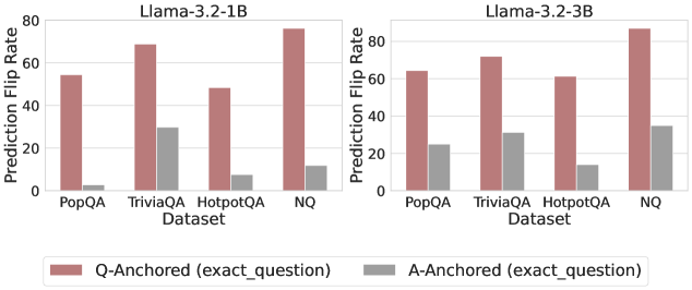
### Visual Description
## Bar Chart: Prediction Flip Rate Comparison for Llama-3.2 Models
### Overview
The image displays two side-by-side bar charts comparing the "Prediction Flip Rate" of two language models, Llama-3.2-1B and Llama-3.2-3B, across four question-answering datasets. The charts evaluate the models' sensitivity to two different prompting methods: "Q-Anchored" and "A-Anchored".
### Components/Axes
* **Chart Titles:**
* Left Chart: `Llama-3.2-1B`
* Right Chart: `Llama-3.2-3B`
* **Y-Axis (Both Charts):**
* Label: `Prediction Flip Rate`
* Scale: 0 to 80, with major tick marks at 0, 20, 40, 60, 80.
* **X-Axis (Both Charts):**
* Label: `Dataset`
* Categories (from left to right): `PopQA`, `TriviaQA`, `HotpotQA`, `NQ`.
* **Legend (Bottom Center):**
* A reddish-brown bar labeled: `Q-Anchored (exact_question)`
* A gray bar labeled: `A-Anchored (exact_question)`
### Detailed Analysis
**Llama-3.2-1B (Left Chart):**
* **PopQA:**
* Q-Anchored: ~55
* A-Anchored: ~2 (very low, near zero)
* **TriviaQA:**
* Q-Anchored: ~69
* A-Anchored: ~30
* **HotpotQA:**
* Q-Anchored: ~49
* A-Anchored: ~7
* **NQ:**
* Q-Anchored: ~78 (highest value in this chart)
* A-Anchored: ~12
**Llama-3.2-3B (Right Chart):**
* **PopQA:**
* Q-Anchored: ~64
* A-Anchored: ~25
* **TriviaQA:**
* Q-Anchored: ~71
* A-Anchored: ~31
* **HotpotQA:**
* Q-Anchored: ~61
* A-Anchored: ~15
* **NQ:**
* Q-Anchored: ~85 (highest value in the entire image)
* A-Anchored: ~34
**Trend Verification:**
* In both models, the **Q-Anchored** bars (reddish-brown) are consistently and significantly taller than the **A-Anchored** bars (gray) for every dataset.
* The **A-Anchored** flip rate is very low for the 1B model on PopQA and HotpotQA, but shows a noticeable increase in the 3B model for those same datasets.
* The **NQ** dataset shows the highest flip rate for the Q-Anchored method in both models.
### Key Observations
1. **Dominant Trend:** The Q-Anchored prompting method results in a substantially higher Prediction Flip Rate than the A-Anchored method across all datasets and both model sizes.
2. **Model Size Impact:** The larger Llama-3.2-3B model exhibits higher flip rates overall compared to the 1B model. This increase is particularly dramatic for the A-Anchored method on the PopQA and HotpotQA datasets.
3. **Dataset Sensitivity:** The NQ dataset consistently yields the highest flip rates for the Q-Anchored method. The HotpotQA dataset shows the lowest Q-Anchored flip rate for the 1B model but a much higher one for the 3B model.
4. **A-Anchored Stability:** The A-Anchored method shows relatively lower and more stable flip rates, especially in the smaller model, suggesting it may be a less volatile prompting strategy.
### Interpretation
This data suggests that the model's predictions are far more sensitive to variations when using a "Q-Anchored" (question-anchored) prompting format compared to an "A-Anchored" (answer-anchored) format. The "Prediction Flip Rate" likely measures how often a model changes its answer when the prompt is slightly altered.
The significant increase in flip rates for the larger 3B model, especially under A-Anchored prompting, indicates that increased model capacity may lead to greater sensitivity or less robustness to prompt phrasing, rather than more stability. The high flip rate on the NQ dataset could imply that questions in this dataset are more ambiguous or that the model's knowledge about them is less certain, making its answers more prone to change. The stark contrast between the two anchoring methods highlights a critical design choice in prompt engineering for achieving consistent model outputs.
</details>
<details>
<summary>x46.png Details</summary>
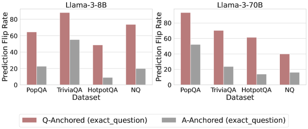
### Visual Description
\n
## Bar Chart: Prediction Flip Rate Comparison for Llama-3 Models
### Overview
The image displays two side-by-side grouped bar charts comparing the "Prediction Flip Rate" for two different sizes of the Llama-3 model (8B and 70B parameters) across four question-answering datasets. The charts evaluate the stability of model predictions when using two different anchoring methods: "Q-Anchored (exact_question)" and "A-Anchored (exact_question)".
### Components/Axes
* **Chart Titles (Top):**
* Left Chart: `Llama-3-8B`
* Right Chart: `Llama-3-70B`
* **Y-Axis (Vertical):**
* Label: `Prediction Flip Rate`
* Scale: 0 to 80, with major tick marks at 0, 20, 40, 60, 80.
* **X-Axis (Horizontal):**
* Label: `Dataset`
* Categories (for both charts): `PopQA`, `TriviaQA`, `HotpotQA`, `NQ`.
* **Legend (Bottom Center):**
* A red/brown bar: `Q-Anchored (exact_question)`
* A grey bar: `A-Anchored (exact_question)`
* **Data Series:** Each dataset category contains two bars, one for each anchoring method, placed side-by-side.
### Detailed Analysis
**Llama-3-8B Chart (Left Panel):**
* **PopQA:**
* Q-Anchored (red/brown): ~65
* A-Anchored (grey): ~22
* **TriviaQA:**
* Q-Anchored (red/brown): ~88 (highest in this panel)
* A-Anchored (grey): ~55
* **HotpotQA:**
* Q-Anchored (red/brown): ~48
* A-Anchored (grey): ~8 (lowest in this panel)
* **NQ:**
* Q-Anchored (red/brown): ~74
* A-Anchored (grey): ~20
**Llama-3-70B Chart (Right Panel):**
* **PopQA:**
* Q-Anchored (red/brown): ~90 (highest in the entire image)
* A-Anchored (grey): ~52
* **TriviaQA:**
* Q-Anchored (red/brown): ~70
* A-Anchored (grey): ~24
* **HotpotQA:**
* Q-Anchored (red/brown): ~61
* A-Anchored (grey): ~14
* **NQ:**
* Q-Anchored (red/brown): ~40
* A-Anchored (grey): ~16
### Key Observations
1. **Consistent Anchoring Effect:** Across all datasets and both model sizes, the **Q-Anchored** method (red/brown bars) consistently results in a significantly higher Prediction Flip Rate than the **A-Anchored** method (grey bars).
2. **Model Size Impact:** The larger Llama-3-70B model shows a more extreme pattern. Its highest flip rate (PopQA, Q-Anchored) is higher than the 8B model's peak, and its lowest flip rate (HotpotQA, A-Anchored) is lower than the 8B model's low.
3. **Dataset Variability:** The flip rate varies substantially by dataset. For the 8B model, TriviaQA shows the highest instability with Q-Anchoring. For the 70B model, PopQA shows the highest instability with Q-Anchoring, while NQ shows the lowest flip rates overall for both anchoring methods.
4. **Trend Verification:**
* For the **Q-Anchored** series in the 8B model, the trend is: PopQA (medium) -> TriviaQA (peak) -> HotpotQA (dip) -> NQ (high).
* For the **A-Anchored** series in the 8B model, the trend is: PopQA (medium) -> TriviaQA (peak) -> HotpotQA (deep valley) -> NQ (medium-low).
* For the **Q-Anchored** series in the 70B model, the trend is: PopQA (peak) -> TriviaQA (medium) -> HotpotQA (medium) -> NQ (low).
* For the **A-Anchored** series in the 70B model, the trend is: PopQA (peak) -> TriviaQA (medium) -> HotpotQA (low) -> NQ (low).
### Interpretation
The data suggests that the **method used to anchor or frame a question (Q-Anchored vs. A-Anchored) has a profound and consistent impact on the stability of a large language model's predictions**, more so than the model's size or the specific dataset in many cases.
* **Q-Anchoring** (likely using the exact question text as a prompt anchor) leads to much higher prediction flip rates, indicating **lower consistency**. This could mean the model's answers are more sensitive to minor variations or perturbations when the question itself is the primary anchor.
* **A-Anchoring** (likely using the exact answer text as an anchor) results in dramatically lower flip rates, suggesting **higher robustness and consistency**. This implies that anchoring on the answer space stabilizes the model's output.
* The **increase in model scale (8B to 70B) amplifies this effect** rather than mitigating it. The larger model becomes even more stable with A-Anchoring and even more volatile with Q-Anchoring on certain datasets (like PopQA). This challenges the assumption that larger models are inherently more robust; their stability appears highly dependent on the prompting or anchoring strategy.
* The **variation across datasets** (PopQA, TriviaQA, HotpotQA, NQ) indicates that the nature of the questions and knowledge domain also interacts with the anchoring method. Datasets requiring multi-hop reasoning (HotpotQA) or containing popular knowledge (PopQA) may elicit different stability profiles.
In essence, the charts provide strong empirical evidence that **how you "ground" or anchor a query to an LLM critically determines the reliability of its responses**, and this design choice may be as important as model size for practical applications requiring consistent outputs.
</details>
<details>
<summary>x47.png Details</summary>
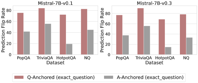
### Visual Description
## Bar Chart: Prediction Flip Rate Comparison for Mistral-7B Models
### Overview
The image displays two grouped bar charts side-by-side, comparing the "Prediction Flip Rate" of two versions of the Mistral-7B language model (v0.1 and v0.3) across four question-answering datasets. The metric likely measures how often a model's prediction changes when prompted with a specific anchoring method.
### Components/Axes
* **Chart Type:** Grouped Bar Chart (two subplots).
* **Y-Axis (Both Charts):** Label: "Prediction Flip Rate". Scale: 0 to 80, with major gridlines at intervals of 20 (0, 20, 40, 60, 80). The unit is implied to be percentage (%).
* **X-Axis (Both Charts):** Label: "Dataset". Categories (from left to right): "PopQA", "TriviaQA", "HotpotQA", "NQ".
* **Legend (Bottom Center):** Two entries.
* **Color:** Reddish-brown (approx. hex #B07171). **Label:** "Q-Anchored (exact_question)"
* **Color:** Gray (approx. hex #999999). **Label:** "A-Anchored (exact_question)"
* **Subplot Titles (Top Center):**
* Left Chart: "Mistral-7B-v0.1"
* Right Chart: "Mistral-7B-v0.3"
### Detailed Analysis
**Mistral-7B-v0.1 (Left Chart):**
* **PopQA:**
* Q-Anchored (Reddish-brown): Bar height is approximately 75%.
* A-Anchored (Gray): Bar height is approximately 42%.
* **TriviaQA:**
* Q-Anchored (Reddish-brown): Bar height is the highest in this chart, approximately 85%.
* A-Anchored (Gray): Bar height is approximately 55%.
* **HotpotQA:**
* Q-Anchored (Reddish-brown): Bar height is approximately 72%.
* A-Anchored (Gray): Bar height is the lowest in this chart, approximately 20%.
* **NQ:**
* Q-Anchored (Reddish-brown): Bar height is approximately 83%.
* A-Anchored (Gray): Bar height is approximately 45%.
**Mistral-7B-v0.3 (Right Chart):**
* **PopQA:**
* Q-Anchored (Reddish-brown): Bar height is approximately 77%.
* A-Anchored (Gray): Bar height is approximately 38%.
* **TriviaQA:**
* Q-Anchored (Reddish-brown): Bar height is the highest in this chart, approximately 88%.
* A-Anchored (Gray): Bar height is approximately 56%.
* **HotpotQA:**
* Q-Anchored (Reddish-brown): Bar height is approximately 69%.
* A-Anchored (Gray): Bar height is the lowest in the entire image, approximately 15%.
* **NQ:**
* Q-Anchored (Reddish-brown): Bar height is approximately 79%.
* A-Anchored (Gray): Bar height is approximately 34%.
### Key Observations
1. **Consistent Dominance:** In every single dataset and for both model versions, the "Q-Anchored" method results in a significantly higher Prediction Flip Rate than the "A-Anchored" method.
2. **Dataset Sensitivity:** The "HotpotQA" dataset shows the most extreme disparity between the two anchoring methods. The A-Anchored flip rate for HotpotQA is dramatically lower (~15-20%) compared to other datasets (~34-56%).
3. **Model Version Comparison:** The overall pattern is very similar between v0.1 and v0.3. However, for the A-Anchored method, the flip rates appear slightly lower in v0.3 across all datasets (e.g., NQ drops from ~45% to ~34%, HotpotQA from ~20% to ~15%). The Q-Anchored rates remain relatively stable or show minor increases.
4. **Highest Flip Rate:** The highest recorded flip rate is for TriviaQA using the Q-Anchored method in model v0.3 (~88%).
### Interpretation
This chart investigates model sensitivity to prompt formulation. The "Prediction Flip Rate" likely measures how often a model's answer changes when the prompt is anchored to the exact question (Q-Anchored) versus anchored to the exact answer (A-Anchored).
* **Core Finding:** Models are far more sensitive to variations or perturbations when anchored to the question itself. This suggests that the model's reasoning or retrieval process tied directly to the question phrasing is less stable. Conversely, anchoring to the answer appears to produce more consistent predictions.
* **Dataset Implication:** The HotpotQA dataset, which often involves multi-hop reasoning, shows the most stable predictions under A-Anchoring. This could imply that for complex reasoning tasks, once an answer is provided as an anchor, the model's output is highly consistent, whereas question-based prompting for the same task is highly variable.
* **Model Evolution:** The slight decrease in A-Anchored flip rates from v0.1 to v0.3 might indicate an improvement in model consistency when the answer is provided as context, though the fundamental sensitivity pattern remains unchanged.
* **Practical Takeaway:** For applications requiring stable, reproducible outputs from this model family, providing the answer within the prompt (A-Anchoring) is a more reliable strategy than relying solely on the question (Q-Anchoring). The choice of dataset also critically impacts this stability.
</details>
Figure 20: Prediction flip rate under token patching, probing mlp activations of the final token.
<details>
<summary>x48.png Details</summary>
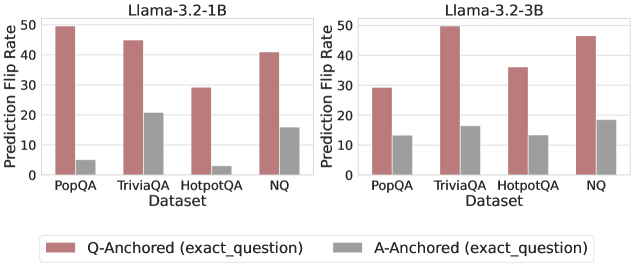
### Visual Description
## Bar Chart: Prediction Flip Rates for Llama-3.2 Models
### Overview
The image displays two grouped bar charts side-by-side, comparing the "Prediction Flip Rate" of two language models (Llama-3.2-1B and Llama-3.2-3B) across four question-answering datasets. Each chart compares two anchoring methods: "Q-Anchored (exact_question)" and "A-Anchored (exact_question)".
### Components/Axes
* **Main Titles (Top of each subplot):**
* Left Chart: `Llama-3.2-1B`
* Right Chart: `Llama-3.2-3B`
* **Y-Axis (Vertical, both charts):**
* **Label:** `Prediction Flip Rate`
* **Scale:** Linear, from 0 to 50, with major tick marks at 0, 10, 20, 30, 40, 50.
* **X-Axis (Horizontal, both charts):**
* **Label:** `Dataset`
* **Categories (from left to right):** `PopQA`, `TriviaQA`, `HotpotQA`, `NQ`.
* **Legend (Bottom center, spanning both charts):**
* **Reddish-brown square:** `Q-Anchored (exact_question)`
* **Gray square:** `A-Anchored (exact_question)`
* **Spatial Layout:** The two charts are positioned horizontally adjacent. The legend is placed below both charts, centered.
### Detailed Analysis
**Data Series & Approximate Values:**
The following values are visual estimates based on bar height relative to the y-axis scale.
**Chart 1: Llama-3.2-1B**
* **Trend:** For all four datasets, the Q-Anchored (reddish-brown) bar is significantly taller than the A-Anchored (gray) bar.
* **Data Points:**
* **PopQA:** Q-Anchored ≈ 50, A-Anchored ≈ 5.
* **TriviaQA:** Q-Anchored ≈ 45, A-Anchored ≈ 20.
* **HotpotQA:** Q-Anchored ≈ 28, A-Anchored ≈ 3.
* **NQ:** Q-Anchored ≈ 40, A-Anchored ≈ 15.
**Chart 2: Llama-3.2-3B**
* **Trend:** Similar to the 1B model, the Q-Anchored bar is taller than the A-Anchored bar for every dataset. The pattern of which dataset has the highest flip rate differs from the 1B model.
* **Data Points:**
* **PopQA:** Q-Anchored ≈ 28, A-Anchored ≈ 13.
* **TriviaQA:** Q-Anchored ≈ 50, A-Anchored ≈ 16.
* **HotpotQA:** Q-Anchored ≈ 35, A-Anchored ≈ 13.
* **NQ:** Q-Anchored ≈ 45, A-Anchored ≈ 18.
### Key Observations
1. **Consistent Disparity:** Across both models and all four datasets, the Prediction Flip Rate is consistently and substantially higher for the Q-Anchored method compared to the A-Anchored method.
2. **Model Size Effect:** The Llama-3.2-3B model shows a different dataset ranking for Q-Anchored flip rates. For the 1B model, PopQA has the highest rate (~50), while for the 3B model, TriviaQA has the highest (~50). The 3B model's rates for PopQA and HotpotQA are notably lower than the 1B model's.
3. **Dataset Sensitivity:** The `HotpotQA` dataset shows the lowest A-Anchored flip rates in both models (≈3 for 1B, ≈13 for 3B), suggesting predictions anchored to its answers are particularly stable.
4. **Scale of Difference:** The ratio between Q-Anchored and A-Anchored flip rates is most extreme for the `PopQA` and `HotpotQA` datasets in the 1B model.
### Interpretation
This visualization demonstrates a fundamental difference in model sensitivity based on anchoring strategy. The "Prediction Flip Rate" likely measures how often a model's output changes when a specific component (the question or the answer) is held constant ("anchored") while other parts of the input vary.
* **Q-Anchored vs. A-Anchored:** The consistently higher flip rates for Q-Anchored anchoring suggest that the models' predictions are far more volatile when the exact question is fixed but the answer context changes, compared to when the exact answer is fixed. This implies the models' outputs are more sensitive to variations in the answer presentation or supporting context than to variations in the question phrasing.
* **Model Scaling:** The change in pattern between the 1B and 3B models indicates that scaling the model size alters its sensitivity profile across different types of QA datasets. The 3B model's lower flip rate on PopQA (compared to its 1B counterpart) might suggest improved robustness or a different internal representation for that specific knowledge domain.
* **Dataset Characteristics:** The notably low A-Anchored flip rate for HotpotQA could be due to the nature of the dataset (e.g., multi-hop reasoning), where fixing the answer provides a very strong, unambiguous signal that stabilizes the model's output regardless of other contextual changes.
In summary, the data strongly suggests that for these Llama-3.2 models, anchoring on the question leads to much less stable predictions than anchoring on the answer, and this relationship is modulated by both model scale and the specific knowledge domain of the dataset.
</details>
<details>
<summary>x49.png Details</summary>
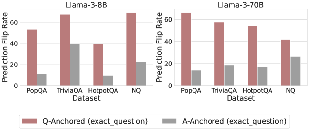
### Visual Description
## Grouped Bar Chart: Prediction Flip Rate by Dataset and Model
### Overview
The image displays two side-by-side grouped bar charts comparing the "Prediction Flip Rate" for two different large language models (Llama-3-8B and Llama-3-70B) across four question-answering datasets. The charts evaluate the stability of model predictions under two different anchoring conditions.
### Components/Axes
* **Chart Titles (Top Center):**
* Left Chart: `Llama-3-8B`
* Right Chart: `Llama-3-70B`
* **Y-Axis (Left Side of Each Chart):**
* Label: `Prediction Flip Rate`
* Scale: 0 to 60, with major tick marks at 0, 20, 40, and 60.
* **X-Axis (Bottom of Each Chart):**
* Label: `Dataset`
* Categories (from left to right): `PopQA`, `TriviaQA`, `HotpotQA`, `NQ`
* **Legend (Bottom Center, spanning both charts):**
* A red/brown square labeled: `Q-Anchored (exact_question)`
* A gray square labeled: `A-Anchored (exact_question)`
* **Data Series:** Each dataset category has two bars, one for each anchoring condition, placed side-by-side.
### Detailed Analysis
**Llama-3-8B Chart (Left Panel):**
* **Trend Verification:** For all four datasets, the Q-Anchored (red/brown) bar is significantly taller than the A-Anchored (gray) bar, indicating a higher prediction flip rate when the question is anchored.
* **Data Points (Approximate Values):**
* **PopQA:** Q-Anchored ≈ 53, A-Anchored ≈ 10
* **TriviaQA:** Q-Anchored ≈ 68, A-Anchored ≈ 39
* **HotpotQA:** Q-Anchored ≈ 39, A-Anchored ≈ 9
* **NQ:** Q-Anchored ≈ 69, A-Anchored ≈ 22
**Llama-3-70B Chart (Right Panel):**
* **Trend Verification:** The same pattern holds: Q-Anchored bars are consistently taller than A-Anchored bars across all datasets. The overall height of the bars appears slightly lower compared to the 8B model for most categories.
* **Data Points (Approximate Values):**
* **PopQA:** Q-Anchored ≈ 66, A-Anchored ≈ 14
* **TriviaQA:** Q-Anchored ≈ 57, A-Anchored ≈ 18
* **HotpotQA:** Q-Anchored ≈ 54, A-Anchored ≈ 17
* **NQ:** Q-Anchored ≈ 42, A-Anchored ≈ 26
### Key Observations
1. **Consistent Anchoring Effect:** Across both model sizes and all four datasets, anchoring the prompt with the exact question (`Q-Anchored`) leads to a substantially higher prediction flip rate than anchoring with the exact answer (`A-Anchored`).
2. **Dataset Variability:** The magnitude of the flip rate varies by dataset. For example, `TriviaQA` and `NQ` show very high Q-Anchored flip rates for the 8B model, while `HotpotQA` shows the lowest for both anchoring types in that model.
3. **Model Size Comparison:** The larger Llama-3-70B model generally exhibits lower flip rates than the 8B model, particularly for the Q-Anchored condition on datasets like `TriviaQA` and `NQ`. However, for `PopQA`, the 70B model's Q-Anchored flip rate is higher.
4. **Relative Stability:** The A-Anchored condition results in flip rates mostly below 30, suggesting predictions are more stable when anchored to an answer format.
### Interpretation
This data suggests that the **format of the prompt significantly influences the stability of a large language model's predictions**. When a model is prompted with a question (`Q-Anchored`), its output is more volatile and prone to "flipping" (changing) compared to when it is prompted with a fixed answer format (`A-Anchored`).
The **Peircean investigative reading** implies that the "exact_question" anchor introduces more interpretative ambiguity or contextual variability for the model, leading to less deterministic outputs. In contrast, the "exact_question" anchor (likely meaning the prompt is structured around providing an answer) constrains the model's response space, leading to greater consistency.
The **anomaly** is that while the 70B model is generally more stable, it is not uniformly so; its higher flip rate on `PopQA` under Q-Anchoring indicates that dataset-specific characteristics can interact with model scale in non-linear ways. This highlights that prompt engineering for stability must be tailored to both the model and the specific knowledge domain (dataset).
</details>
<details>
<summary>x50.png Details</summary>
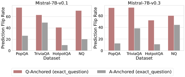
### Visual Description
## Grouped Bar Chart: Prediction Flip Rate Comparison for Mistral-7B Models
### Overview
The image displays two side-by-side grouped bar charts comparing the "Prediction Flip Rate" of two versions of the Mistral-7B language model (v0.1 and v0.3) across four question-answering datasets. The charts evaluate model sensitivity to question phrasing by comparing two anchoring methods.
### Components/Axes
* **Chart Titles:** "Mistral-7B-v0.1" (left panel), "Mistral-7B-v0.3" (right panel).
* **Y-Axis (Both Panels):** Labeled "Prediction Flip Rate". The scale runs from 0 to 60 (v0.1) and 0 to 70 (v0.3), with major gridlines at intervals of 20.
* **X-Axis (Both Panels):** Labeled "Dataset". The four categories are: "PopQA", "TriviaQA", "HotpotQA", and "NQ".
* **Legend:** Positioned at the bottom center of the entire figure.
* **Reddish-Brown Bar:** "Q-Anchored (exact_question)"
* **Gray Bar:** "A-Anchored (exact_question)"
### Detailed Analysis
**Mistral-7B-v0.1 (Left Panel):**
* **PopQA:** Q-Anchored flip rate is the highest, approximately 75. A-Anchored is significantly lower, around 25.
* **TriviaQA:** Q-Anchored is approximately 65. A-Anchored is relatively high, around 50.
* **HotpotQA:** Q-Anchored is the lowest for this model version, approximately 40. A-Anchored is very low, around 10.
* **NQ:** Q-Anchored is high, approximately 70. A-Anchored is low, around 20.
**Mistral-7B-v0.3 (Right Panel):**
* **PopQA:** Q-Anchored remains very high, approximately 75. A-Anchored has decreased notably to around 12.
* **TriviaQA:** Q-Anchored has increased to approximately 75. A-Anchored has decreased to around 38.
* **HotpotQA:** Q-Anchored has increased to approximately 52. A-Anchored remains very low, around 10.
* **NQ:** Q-Anchored has decreased to approximately 60. A-Anchored has increased significantly to around 45.
**Trend Verification:**
* In both model versions, the **Q-Anchored (reddish-brown) bars are consistently taller** than the corresponding A-Anchored (gray) bars for every dataset.
* From v0.1 to v0.3, the Q-Anchored flip rate **increased** for TriviaQA and HotpotQA, **decreased** for NQ, and remained **stable** for PopQA.
* From v0.1 to v0.3, the A-Anchored flip rate **decreased** for PopQA and TriviaQA, **increased** for NQ, and remained **stable** for HotpotQA.
### Key Observations
1. **Dominant Pattern:** The Q-Anchored method consistently results in a higher prediction flip rate than the A-Anchored method across all datasets and both model versions.
2. **Largest Discrepancy:** The greatest difference between the two anchoring methods is observed in the **PopQA** dataset for both model versions.
3. **Notable Change (v0.1 to v0.3):** The **NQ** dataset shows a significant shift. The Q-Anchored flip rate decreased, while the A-Anchored flip rate more than doubled, making the gap between the two methods much smaller in v0.3.
4. **Stable Low Point:** The **HotpotQA** dataset's A-Anchored flip rate remains consistently low (~10) across both model versions.
### Interpretation
This data suggests that the model's predictions are generally more sensitive to variations in the question phrasing (Q-Anchored) than to variations in the answer phrasing (A-Anchored). A higher "Prediction Flip Rate" indicates lower robustness; the model changes its answer more frequently when the input is perturbed.
The comparison between v0.1 and v0.3 reveals that model updates have a dataset-specific impact on robustness. For example, the model became **more robust** to question perturbations on NQ (Q-Anchored flip rate decreased) but **less robust** to answer perturbations on the same dataset (A-Anchored flip rate increased). The significant reduction in A-Anchored flip rate for PopQA and TriviaQA in v0.3 suggests an improvement in stability when the answer is fixed for those datasets. The consistently low A-Anchored flip rate for HotpotQA might indicate that this dataset's answers are particularly deterministic or that the model's knowledge about these topics is very stable. Overall, the charts demonstrate that evaluating model robustness requires looking at multiple datasets and perturbation types, as improvements are not uniform.
</details>
Figure 21: Prediction flip rate under token patching, probing mlp activations of the token immediately preceding the exact answer tokens.
<details>
<summary>x51.png Details</summary>
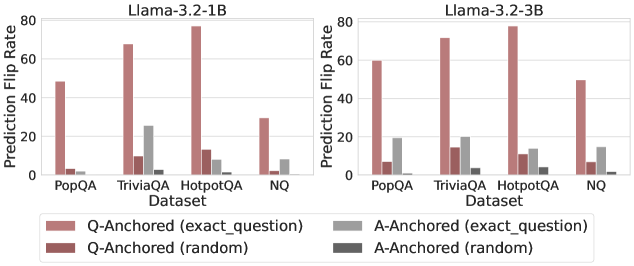
### Visual Description
\n
## Bar Charts: Prediction Flip Rate Comparison for Llama-3.2 Models
### Overview
The image displays two side-by-side bar charts comparing the "Prediction Flip Rate" of two language models, Llama-3.2-1B and Llama-3.2-3B, across four question-answering datasets. The charts measure how often a model's prediction changes (flips) under different experimental conditions.
### Components/Axes
* **Chart Titles:** "Llama-3.2-1B" (left chart), "Llama-3.2-3B" (right chart).
* **Y-Axis:** Labeled "Prediction Flip Rate". Scale ranges from 0 to 80, with major tick marks at 0, 20, 40, 60, and 80.
* **X-Axis:** Labeled "Dataset". Four categorical datasets are listed: "PopQA", "TriviaQA", "HotpotQA", and "NQ".
* **Legend:** Positioned at the bottom center, spanning both charts. It defines four data series:
* **Pink Bar:** `Q-Anchored (exact_question)`
* **Dark Red Bar:** `Q-Anchored (random)`
* **Light Gray Bar:** `A-Anchored (exact_question)`
* **Dark Gray Bar:** `A-Anchored (random)`
### Detailed Analysis
**Llama-3.2-1B (Left Chart):**
* **PopQA:**
* `Q-Anchored (exact_question)`: ~50
* `Q-Anchored (random)`: ~5
* `A-Anchored (exact_question)`: ~3
* `A-Anchored (random)`: ~1
* **TriviaQA:**
* `Q-Anchored (exact_question)`: ~68
* `Q-Anchored (random)`: ~10
* `A-Anchored (exact_question)`: ~26
* `A-Anchored (random)`: ~3
* **HotpotQA:**
* `Q-Anchored (exact_question)`: ~78 (Highest value in this chart)
* `Q-Anchored (random)`: ~12
* `A-Anchored (exact_question)`: ~10
* `A-Anchored (random)`: ~5
* **NQ:**
* `Q-Anchored (exact_question)`: ~30
* `Q-Anchored (random)`: ~2
* `A-Anchored (exact_question)`: ~9
* `A-Anchored (random)`: ~1
**Llama-3.2-3B (Right Chart):**
* **PopQA:**
* `Q-Anchored (exact_question)`: ~60
* `Q-Anchored (random)`: ~7
* `A-Anchored (exact_question)`: ~19
* `A-Anchored (random)`: ~2
* **TriviaQA:**
* `Q-Anchored (exact_question)`: ~72
* `Q-Anchored (random)`: ~15
* `A-Anchored (exact_question)`: ~20
* `A-Anchored (random)`: ~4
* **HotpotQA:**
* `Q-Anchored (exact_question)`: ~79 (Highest value in this chart)
* `Q-Anchored (random)`: ~12
* `A-Anchored (exact_question)`: ~14
* `A-Anchored (random)`: ~6
* **NQ:**
* `Q-Anchored (exact_question)`: ~50
* `Q-Anchored (random)`: ~7
* `A-Anchored (exact_question)`: ~15
* `A-Anchored (random)`: ~1
### Key Observations
1. **Dominant Series:** The `Q-Anchored (exact_question)` condition (pink bars) consistently produces the highest prediction flip rate across all datasets and both models, often by a very large margin.
2. **Model Comparison:** The larger model (Llama-3.2-3B) generally shows higher flip rates for the `Q-Anchored (exact_question)` condition compared to the smaller model (1B), except for HotpotQA where they are nearly equal (~78 vs ~79).
3. **Dataset Sensitivity:** HotpotQA elicits the highest flip rates for the primary condition in both models. PopQA and NQ tend to have lower flip rates.
4. **Anchoring Effect:** "Q-Anchored" conditions (both exact and random) consistently result in higher flip rates than their "A-Anchored" counterparts.
5. **Random vs. Exact:** Within each anchoring type (Q or A), the "exact_question" variant leads to a significantly higher flip rate than the "random" variant.
### Interpretation
This data investigates the stability of model predictions when the input prompt is "anchored" to either the question (Q) or the answer (A). A high "Prediction Flip Rate" indicates that small changes to the prompt (like using an exact vs. random question) cause the model to change its output frequently, suggesting lower robustness.
The key finding is that **models are far more sensitive to variations in the question phrasing (`Q-Anchored`) than to variations related to the answer (`A-Anchored`)**. This sensitivity is dramatically amplified when the question is presented exactly as seen during training/evaluation (`exact_question`), as shown by the dominant pink bars. The trend suggests that the model's prediction is highly contingent on the precise lexical form of the question, more so than on the semantic content of the answer context. The larger model (3B) exhibits slightly more stability (lower flip rates) in some A-Anchored scenarios but is equally or more sensitive in the critical Q-Anchored (exact) scenario, indicating that increased scale does not necessarily mitigate this specific form of prompt sensitivity. The outlier is HotpotQA, which consistently causes the most prediction instability, possibly due to its multi-hop reasoning nature making models more fragile to prompt variations.
</details>
<details>
<summary>x52.png Details</summary>
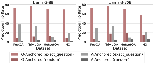
### Visual Description
\n
## Grouped Bar Chart: Prediction Flip Rate by Dataset and Model
### Overview
The image displays two side-by-side grouped bar charts comparing the "Prediction Flip Rate" across four question-answering datasets for two different language models: Llama-3-8B (left panel) and Llama-3-70B (right panel). The charts analyze how different "anchoring" methods affect the stability of model predictions.
### Components/Axes
* **Chart Type:** Two grouped bar charts (panels).
* **Panel Titles:**
* Left: `Llama-3-8B`
* Right: `Llama-3-70B`
* **Y-Axis (Both Panels):**
* **Label:** `Prediction Flip Rate`
* **Scale:** Linear, from 0 to 80, with major tick marks at 0, 20, 40, 60, 80.
* **X-Axis (Both Panels):**
* **Label:** `Dataset`
* **Categories (from left to right):** `PopQA`, `TriviaQA`, `HotpotQA`, `NQ`.
* **Legend (Bottom Center, spanning both panels):**
* **Position:** Below the x-axis labels.
* **Categories & Colors (from left to right):**
1. `Q-Anchored (exact_question)` - Light reddish-brown (salmon) bar.
2. `Q-Anchored (random)` - Dark red (burgundy) bar.
3. `A-Anchored (exact_question)` - Light gray bar.
4. `A-Anchored (random)` - Dark gray bar.
### Detailed Analysis
The analysis is segmented by model panel. Values are approximate visual estimates from the chart.
**Panel 1: Llama-3-8B**
* **PopQA:**
* Q-Anchored (exact_question): ~72
* Q-Anchored (random): ~8
* A-Anchored (exact_question): ~38
* A-Anchored (random): ~1
* **TriviaQA:**
* Q-Anchored (exact_question): ~78
* Q-Anchored (random): ~12
* A-Anchored (exact_question): ~34
* A-Anchored (random): ~4
* **HotpotQA:**
* Q-Anchored (exact_question): ~70
* Q-Anchored (random): ~12
* A-Anchored (exact_question): ~12
* A-Anchored (random): ~6
* **NQ:**
* Q-Anchored (exact_question): ~70
* Q-Anchored (random): ~9
* A-Anchored (exact_question): ~19
* A-Anchored (random): ~1
**Panel 2: Llama-3-70B**
* **PopQA:**
* Q-Anchored (exact_question): ~73
* Q-Anchored (random): ~7
* A-Anchored (exact_question): ~31
* A-Anchored (random): ~1
* **TriviaQA:**
* Q-Anchored (exact_question): ~78
* Q-Anchored (random): ~17
* A-Anchored (exact_question): ~35
* A-Anchored (random): ~5
* **HotpotQA:**
* Q-Anchored (exact_question): ~70
* Q-Anchored (random): ~19
* A-Anchored (exact_question): ~12
* A-Anchored (random): ~6
* **NQ:**
* Q-Anchored (exact_question): ~57
* Q-Anchored (random): ~15
* A-Anchored (exact_question): ~22
* A-Anchored (random): ~6
### Key Observations
1. **Dominant Series:** The `Q-Anchored (exact_question)` bar (light reddish-brown) is consistently the tallest across all datasets and both models, indicating the highest prediction flip rate.
2. **Secondary Series:** The `A-Anchored (exact_question)` bar (light gray) is consistently the second tallest, but significantly lower than its Q-Anchored counterpart.
3. **Low Flip Rates:** The `Q-Anchored (random)` (dark red) and `A-Anchored (random)` (dark gray) bars show very low flip rates, often below 20 and frequently below 10.
4. **Model Comparison (8B vs. 70B):** The overall pattern is similar between models. However, for the `NQ` dataset, the `Q-Anchored (exact_question)` flip rate appears noticeably lower for the 70B model (~57) compared to the 8B model (~70). Conversely, the `Q-Anchored (random)` rate for `NQ` is slightly higher in the 70B model.
5. **Dataset Variation:** The `TriviaQA` dataset tends to show the highest flip rates for the `Q-Anchored (exact_question)` method in both models. The `HotpotQA` dataset shows the smallest difference between the `Q-Anchored (exact_question)` and `A-Anchored (exact_question)` methods.
### Interpretation
This chart investigates the stability of language model answers when the input prompt is slightly altered ("anchored"). A high "Prediction Flip Rate" means the model frequently changes its answer.
* **Core Finding:** Anchoring a prompt to the **exact question** (`Q-Anchored (exact_question)`) makes model predictions highly unstable, causing them to "flip" their answers over 70% of the time in most cases. This suggests models are very sensitive to minor rephrasings of the same question.
* **Anchoring to Answers:** Anchoring to the exact answer (`A-Anchored (exact_question)`) also causes instability, but to a much lesser degree (~12-38%). This implies that providing the answer in the prompt still perturbs the model, but less than rephrasing the question.
* **Random Anchoring:** Using a random question or answer for anchoring (`random` variants) results in minimal flip rates. This is a crucial control, showing that the high flip rates are not due to randomness in the anchoring process itself, but specifically due to using the *exact* question or answer from the evaluation set.
* **Model Scale:** The larger Llama-3-70B model does not show a universal improvement in stability (lower flip rates). Its behavior is dataset-dependent, performing slightly worse (higher flip rates) on some random-anchored tasks but better on the challenging `Q-Anchored (exact_question)` task for the `NQ` dataset. This indicates that simply increasing model size does not automatically resolve sensitivity to prompt phrasing.
* **Practical Implication:** The data strongly suggests that evaluating models using multiple, semantically equivalent but phrased-differently questions (a common practice) may lead to highly variable results, undermining the reliability of single-point accuracy metrics. The model's "answer" is not a fixed property but is highly contingent on the precise formulation of the query.
</details>
<details>
<summary>x53.png Details</summary>
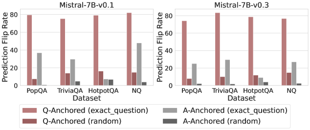
### Visual Description
## Grouped Bar Chart: Prediction Flip Rate by Dataset and Anchoring Method
### Overview
The image displays two side-by-side grouped bar charts comparing the "Prediction Flip Rate" of two language model versions (Mistral-7B-v0.1 and Mistral-7B-v0.3) across four question-answering datasets. The charts analyze how model predictions change ("flip") under different experimental conditions involving question and answer anchoring.
### Components/Axes
* **Chart Titles (Top Center):**
* Left Chart: `Mistral-7B-v0.1`
* Right Chart: `Mistral-7B-v0.3`
* **Y-Axis (Left Vertical):**
* Label: `Prediction Flip Rate`
* Scale: Linear, from 0 to 80, with major tick marks at 0, 20, 40, 60, 80.
* **X-Axis (Bottom Horizontal):**
* Label: `Dataset`
* Categories (from left to right for each chart): `PopQA`, `TriviaQA`, `HotpotQA`, `NQ`.
* **Legend (Bottom Center, spanning both charts):**
* **Position:** Below the x-axis labels.
* **Categories (with color/pattern key):**
1. `Q-Anchored (exact_question)`: Solid, medium reddish-brown bar.
2. `Q-Anchored (random)`: Solid, darker reddish-brown bar.
3. `A-Anchored (exact_question)`: Solid, medium grey bar.
4. `A-Anchored (random)`: Solid, dark grey bar.
### Detailed Analysis
**Chart 1: Mistral-7B-v0.1 (Left)**
| Dataset | Q-Anchored (exact_question) | Q-Anchored (random) | A-Anchored (exact_question) | A-Anchored (random) |
|-----------|-----------------------------|---------------------|-----------------------------|---------------------|
| PopQA | ~80 | ~8 | ~37 | ~1 |
| TriviaQA | ~76 | ~14 | ~30 | ~5 |
| HotpotQA | ~80 | ~17 | ~7 | ~7 |
| NQ | ~82 | ~15 | ~48 | ~3 |
**Chart 2: Mistral-7B-v0.3 (Right)**
| Dataset | Q-Anchored (exact_question) | Q-Anchored (random) | A-Anchored (exact_question) | A-Anchored (random) |
|-----------|-----------------------------|---------------------|-----------------------------|---------------------|
| PopQA | ~74 | ~8 | ~25 | ~1 |
| TriviaQA | ~82 | ~10 | ~30 | ~1 |
| HotpotQA | ~79 | ~11 | ~8 | ~5 |
| NQ | ~77 | ~15 | ~27 | ~1 |
### Key Observations
1. **Dominant Series:** The `Q-Anchored (exact_question)` condition (medium reddish-brown bar) consistently yields the highest Prediction Flip Rate across all datasets and both model versions, typically ranging between 74 and 82.
2. **Minimal Impact Series:** The `A-Anchored (random)` condition (dark grey bar) consistently results in the lowest flip rates, often near zero (1-7).
3. **Dataset Variation:** The `A-Anchored (exact_question)` condition (medium grey bar) shows significant variation by dataset. It is relatively high for PopQA and NQ (especially in v0.1) but very low for HotpotQA.
4. **Model Version Comparison:** The overall pattern is similar between v0.1 and v0.3. A notable difference is the `A-Anchored (exact_question)` rate for the NQ dataset, which drops from ~48 in v0.1 to ~27 in v0.3.
### Interpretation
This data investigates the sensitivity of the Mistral-7B model's predictions to different types of perturbations. The "Prediction Flip Rate" likely measures how often a model changes its answer when presented with a modified version of the original query or context.
* **High Sensitivity to Exact Question Rephrasing:** The extremely high flip rates for `Q-Anchored (exact_question)` suggest that when the model's prediction is "anchored" to a specific question, even rephrasing that same question (while keeping the answer constant) causes the model to change its answer a large majority of the time. This indicates a potential lack of robustness or consistency in the model's reasoning process based on question phrasing.
* **Low Sensitivity to Random Answer Anchoring:** The near-zero flip rates for `A-Anchored (random)` indicate that if the model's prediction is anchored to a random answer, changing the question has almost no effect. This is a logical control, showing the flip rate isn't high simply due to randomness.
* **Dataset-Dependent Answer Anchoring:** The variable performance of `A-Anchored (exact_question)` is insightful. For datasets like PopQA and NQ, anchoring to the exact answer makes the model moderately sensitive to question changes (flip rates of 25-48). However, for HotpotQA, this effect is minimal (~7-8). This could reflect differences in dataset nature—HotpotQA may involve more complex, multi-hop reasoning where the answer itself is a stronger anchor, making the model less likely to flip even if the question is altered.
* **Model Evolution:** The decrease in flip rate for `A-Anchored (exact_question)` on NQ from v0.1 to v0.3 might suggest an improvement in the model's ability to maintain a consistent answer when anchored to it, despite question variations, for that specific dataset.
**In summary, the charts reveal that the model's predictions are highly volatile when anchored to a question and then the question is rephrased, but stable when anchored to a random answer. The influence of anchoring to the *correct* answer is dataset-specific, highlighting that the model's robustness is not uniform across different types of knowledge or reasoning tasks.**
</details>
Figure 22: Prediction flip rate under token patching, probing mlp activations of the last exact answer token.
## Appendix E Answer-Only Input
<details>
<summary>x54.png Details</summary>
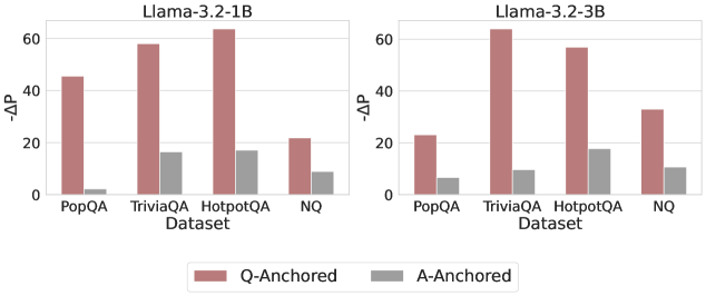
### Visual Description
## Bar Charts: Llama-3.2 Model Performance (ΔAP) by Dataset and Anchoring Method
### Overview
The image displays two side-by-side vertical bar charts comparing the performance change (ΔAP) of two different-sized language models (Llama-3.2-1B and Llama-3.2-3B) across four question-answering datasets. Performance is measured for two different methods: "Q-Anchored" and "A-Anchored".
### Components/Axes
* **Titles:**
* Left Chart: `Llama-3.2-1B`
* Right Chart: `Llama-3.2-3B`
* **Y-Axis (Both Charts):** Labeled `ΔAP`. The scale runs from 0 to 60, with major tick marks at 0, 20, 40, and 60.
* **X-Axis (Both Charts):** Labeled `Dataset`. The categories are, from left to right: `PopQA`, `TriviaQA`, `HotpotQA`, `NQ`.
* **Legend:** Positioned at the bottom center of the entire image, spanning both charts.
* A red/brown square corresponds to `Q-Anchored`.
* A gray square corresponds to `A-Anchored`.
### Detailed Analysis
**Chart 1: Llama-3.2-1B (Left)**
* **Trend Verification:** For all four datasets, the red `Q-Anchored` bar is significantly taller than the gray `A-Anchored` bar.
* **Data Points (Approximate ΔAP values):**
* **PopQA:** Q-Anchored ≈ 45, A-Anchored ≈ 3
* **TriviaQA:** Q-Anchored ≈ 58, A-Anchored ≈ 18
* **HotpotQA:** Q-Anchored ≈ 65 (exceeds the 60 axis line), A-Anchored ≈ 18
* **NQ:** Q-Anchored ≈ 22, A-Anchored ≈ 10
**Chart 2: Llama-3.2-3B (Right)**
* **Trend Verification:** Similar to the 1B model, the `Q-Anchored` bars are consistently taller than the `A-Anchored` bars across all datasets.
* **Data Points (Approximate ΔAP values):**
* **PopQA:** Q-Anchored ≈ 25, A-Anchored ≈ 8
* **TriviaQA:** Q-Anchored ≈ 65 (exceeds the 60 axis line), A-Anchored ≈ 10
* **HotpotQA:** Q-Anchored ≈ 58, A-Anchored ≈ 18
* **NQ:** Q-Anchored ≈ 35, A-Anchored ≈ 12
### Key Observations
1. **Dominant Method:** The `Q-Anchored` method yields a substantially higher ΔAP than the `A-Anchored` method for every dataset-model combination shown.
2. **Model Size Impact:** The larger `Llama-3.2-3B` model achieves higher peak ΔAP values (notably on TriviaQA and HotpotQA) compared to the `Llama-3.2-1B` model.
3. **Dataset Sensitivity:** The performance gain (ΔAP) varies significantly by dataset. For the 1B model, HotpotQA shows the highest Q-Anchored gain. For the 3B model, TriviaQA shows the highest gain.
4. **A-Anchored Stability:** The performance of the `A-Anchored` method is relatively low and stable across datasets, generally ranging between ΔAP values of 3 to 18, with less variation than the Q-Anchored method.
### Interpretation
The data suggests that for the evaluated Llama-3.2 models, anchoring on the question (`Q-Anchored`) is a far more effective strategy for improving performance (as measured by ΔAP) than anchoring on the answer (`A-Anchored`). This advantage holds across diverse QA datasets (PopQA, TriviaQA, HotpotQA, NQ).
The relationship between model size and performance gain is non-uniform. While the 3B model shows a higher maximum gain, the 1B model's largest gain is on HotpotQA, whereas the 3B model's largest gain shifts to TriviaQA. This indicates that the optimal dataset for observing performance improvements may depend on the model's scale.
The consistently low ΔAP for the `A-Anchored` method implies that simply conditioning on the answer provides minimal benefit over the baseline, or may even be a less effective prompting/anchoring technique for these tasks. The notable outlier is the Q-Anchored performance on HotpotQA for the 1B model, which is exceptionally high relative to its performance on other datasets, suggesting a particular synergy between that model size, the Q-Anchored method, and the nature of the HotpotQA dataset (which often requires multi-hop reasoning).
</details>
<details>
<summary>x55.png Details</summary>
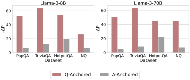
### Visual Description
## Bar Chart Comparison: Llama-3 Model Performance (ΔP) Across Datasets
### Overview
The image displays two side-by-side bar charts comparing the performance (measured as ΔP) of two language models—Llama-3-8B and Llama-3-70B—across four question-answering datasets. Each chart contrasts two evaluation methods: "Q-Anchored" and "A-Anchored."
### Components/Axes
* **Main Titles:** "Llama-3-8B" (left chart), "Llama-3-70B" (right chart).
* **X-Axis (Both Charts):** Labeled "Dataset." Categories are, from left to right: "PopQA", "TriviaQA", "HotpotQA", "NQ".
* **Y-Axis (Both Charts):** Labeled "ΔP". The scale runs from 0 to 60, with major tick marks at 0, 20, 40, and 60.
* **Legend:** Positioned centrally at the bottom, below both charts. It defines two series:
* **Q-Anchored:** Represented by a reddish-brown (terracotta) bar.
* **A-Anchored:** Represented by a gray bar.
* **Chart Structure:** Each dataset category on the x-axis contains a pair of bars: the left (reddish-brown) bar for Q-Anchored and the right (gray) bar for A-Anchored.
### Detailed Analysis
**Llama-3-8B Chart (Left):**
* **PopQA:** Q-Anchored ≈ 52, A-Anchored ≈ 7.
* **TriviaQA:** Q-Anchored ≈ 65 (highest in this chart), A-Anchored ≈ 12.
* **HotpotQA:** Q-Anchored ≈ 54, A-Anchored ≈ 20 (highest A-Anchored value in this chart).
* **NQ:** Q-Anchored ≈ 26 (lowest Q-Anchored value in this chart), A-Anchored ≈ 7.
**Llama-3-70B Chart (Right):**
* **PopQA:** Q-Anchored ≈ 51, A-Anchored ≈ 5.
* **TriviaQA:** Q-Anchored ≈ 63 (highest in this chart), A-Anchored ≈ 9.
* **HotpotQA:** Q-Anchored ≈ 46, A-Anchored ≈ 23 (highest A-Anchored value in this chart).
* **NQ:** Q-Anchored ≈ 45, A-Anchored ≈ 8.
**Trend Verification:**
* In both models, the **Q-Anchored** (reddish-brown) bars are consistently and significantly taller than the **A-Anchored** (gray) bars for every dataset.
* For Q-Anchored, performance peaks on "TriviaQA" in both models.
* For A-Anchored, performance peaks on "HotpotQA" in both models.
### Key Observations
1. **Dominant Performance Gap:** The Q-Anchored method yields a substantially higher ΔP than the A-Anchored method across all four datasets and both model sizes. The gap is often 4-5 times larger.
2. **Dataset Sensitivity:** The magnitude of ΔP varies by dataset. "TriviaQA" consistently shows the highest Q-Anchored performance, while "NQ" shows the lowest for the 8B model but not for the 70B model.
3. **Model Size Effect:** Comparing the two charts:
* The Q-Anchored performance for "NQ" increases dramatically from ~26 (8B) to ~45 (70B).
* Conversely, the Q-Anchored performance for "HotpotQA" decreases from ~54 (8B) to ~46 (70B).
* A-Anchored performance remains relatively low and stable across model sizes, with a slight increase for "HotpotQA" in the 70B model.
### Interpretation
The data strongly suggests that the **Q-Anchored evaluation or training paradigm is far more effective** at achieving a high ΔP score than the A-Anchored paradigm for these question-answering tasks, regardless of model scale (8B vs. 70B parameters). ΔP likely measures some form of performance gain or probability shift, where a higher value is better.
The variation across datasets indicates that task difficulty or nature influences the absolute ΔP scores. The notable increase in Q-Anchored performance on the "NQ" dataset when scaling from 8B to 70B parameters suggests that **larger models may be particularly better at leveraging the Q-Anchored approach for that specific type of knowledge or question format**. The corresponding decrease on "HotpotQA" for the larger model is an interesting counterpoint, possibly indicating a different scaling behavior or dataset characteristic.
The consistently low A-Anchored scores imply this method is either a much weaker baseline or represents a more challenging condition. The fact that its highest point is on "HotpotQA"—a dataset often involving multi-hop reasoning—might suggest A-Anchored performance is less sensitive to simple factual recall and more to complex reasoning, though it still lags far behind Q-Anchored.
</details>
<details>
<summary>x56.png Details</summary>
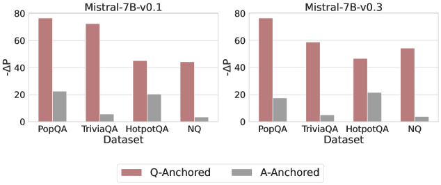
### Visual Description
\n
## Bar Chart: Model Performance Comparison (ΔP)
### Overview
The image displays two side-by-side bar charts comparing the performance change (ΔP) of two versions of the Mistral-7B model across four question-answering datasets. The comparison is between two anchoring methods: "Q-Anchored" and "A-Anchored".
### Components/Axes
* **Chart Titles:** "Mistral-7B-v0.1" (left chart), "Mistral-7B-v0.3" (right chart).
* **Y-Axis:** Labeled "ΔP". The scale runs from 0 to 80, with major tick marks at 0, 20, 40, 60, and 80.
* **X-Axis:** Labeled "Dataset". The categories are, from left to right: "PopQA", "TriviaQA", "HotpotQA", "NQ".
* **Legend:** Located at the bottom center of the image. It defines two data series:
* **Q-Anchored:** Represented by a reddish-brown (terracotta) color.
* **A-Anchored:** Represented by a grey color.
* **Data Series:** Each dataset category has two adjacent bars, one for each anchoring method.
### Detailed Analysis
**Mistral-7B-v0.1 (Left Chart):**
* **Trend Verification:** The Q-Anchored (reddish-brown) bars are consistently and significantly taller than the A-Anchored (grey) bars for all datasets.
* **Data Points (Approximate ΔP values):**
* **PopQA:** Q-Anchored ≈ 75, A-Anchored ≈ 22.
* **TriviaQA:** Q-Anchored ≈ 72, A-Anchored ≈ 5.
* **HotpotQA:** Q-Anchored ≈ 45, A-Anchored ≈ 20.
* **NQ:** Q-Anchored ≈ 44, A-Anchored ≈ 3.
**Mistral-7B-v0.3 (Right Chart):**
* **Trend Verification:** The Q-Anchored bars remain taller than the A-Anchored bars for all datasets. Compared to v0.1, the Q-Anchored performance appears to have decreased for most datasets, while A-Anchored performance remains low and relatively stable.
* **Data Points (Approximate ΔP values):**
* **PopQA:** Q-Anchored ≈ 76, A-Anchored ≈ 17.
* **TriviaQA:** Q-Anchored ≈ 59, A-Anchored ≈ 5.
* **HotpotQA:** Q-Anchored ≈ 47, A-Anchored ≈ 21.
* **NQ:** Q-Anchored ≈ 54, A-Anchored ≈ 4.
### Key Observations
1. **Dominant Anchoring Method:** The Q-Anchored method yields a substantially higher ΔP than the A-Anchored method across all datasets and both model versions. The difference is most extreme for TriviaQA and NQ in v0.1.
2. **Version Comparison (v0.1 vs. v0.3):**
* **PopQA:** Performance is very similar between versions for both methods.
* **TriviaQA:** Shows the most significant change. The Q-Anchored ΔP drops sharply from ~72 (v0.1) to ~59 (v0.3).
* **HotpotQA & NQ:** Q-Anchored ΔP increases slightly from v0.1 to v0.3 (HotpotQA: ~45 to ~47; NQ: ~44 to ~54).
* **A-Anchored:** Shows minimal change across versions for all datasets.
3. **Dataset Sensitivity:** The impact of the model version change is not uniform; it negatively affects performance on TriviaQA while positively affecting it on NQ for the Q-Anchored method.
### Interpretation
This chart likely illustrates the effectiveness of different prompting or fine-tuning strategies ("anchoring") on a model's performance, measured by a metric ΔP (which could represent a performance gain, probability change, or similar).
* **What the data suggests:** The "Q-Anchored" strategy is overwhelmingly more effective than the "A-Anchored" strategy for the Mistral-7B model on these knowledge-intensive QA tasks. This could imply that conditioning on or emphasizing the question (Q) is more beneficial than conditioning on the answer (A) for this model and metric.
* **How elements relate:** The side-by-side comparison isolates the effect of the model version (v0.1 vs. v0.3). The varying impact across datasets suggests that the updates between model versions did not uniformly improve all capabilities. The improvement on NQ and decline on TriviaQA might indicate shifts in the model's internal knowledge base or reasoning patterns between versions.
* **Notable anomalies:** The drastic drop in Q-Anchored performance on TriviaQA for v0.3 is a key anomaly. It suggests a potential regression in the model's ability to handle that specific type of question or data distribution when using the otherwise superior anchoring method. The consistently low A-Anchored scores indicate this method provides little to no benefit over a baseline (ΔP=0) for these tasks.
</details>
Figure 23: $-ΔP$ with only the LLM-generated answer. Q-Anchored instances exhibit substantial shifts, whereas A-Anchored instances remain stable, confirming that A-Anchored truthfulness encoding relies on information in the LLM-generated answer itself.
## Appendix F Answer Accuracy
<details>
<summary>x57.png Details</summary>
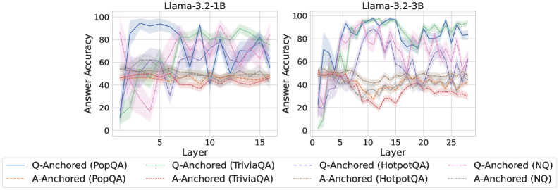
### Visual Description
## Line Charts: Answer Accuracy Across Layers for Llama-3.2 Models
### Overview
The image displays two side-by-side line charts comparing the "Answer Accuracy" of different question-answering methods across the layers of two language models: Llama-3.2-1B (left) and Llama-3.2-3B (right). Each chart plots multiple data series, distinguished by color and line style, representing different anchoring methods (Q-Anchored vs. A-Anchored) applied to four distinct QA datasets.
### Components/Axes
* **Chart Titles:**
* Left Chart: `Llama-3.2-1B`
* Right Chart: `Llama-3.2-3B`
* **Y-Axis (Both Charts):**
* Label: `Answer Accuracy`
* Scale: 0 to 100, with major tick marks at intervals of 20 (0, 20, 40, 60, 80, 100).
* **X-Axis (Both Charts):**
* Label: `Layer`
* Scale (Left Chart - 1B): 0 to 15, with major tick marks at 0, 5, 10, 15.
* Scale (Right Chart - 3B): 0 to 25, with major tick marks at 0, 5, 10, 15, 20, 25.
* **Legend (Bottom, spanning both charts):**
* **Q-Anchored (Solid Lines):**
* Blue Solid Line: `Q-Anchored (PopQA)`
* Green Solid Line: `Q-Anchored (TriviaQA)`
* Purple Solid Line: `Q-Anchored (HotpotQA)`
* Pink Solid Line: `Q-Anchored (NQ)`
* **A-Anchored (Dashed Lines):**
* Orange Dashed Line: `A-Anchored (PopQA)`
* Red Dashed Line: `A-Anchored (TriviaQA)`
* Brown Dashed Line: `A-Anchored (HotpotQA)`
* Gray Dashed Line: `A-Anchored (NQ)`
### Detailed Analysis
**Llama-3.2-1B (Left Chart):**
* **General Trend:** The Q-Anchored methods (solid lines) generally achieve higher accuracy than the A-Anchored methods (dashed lines) across most layers, but exhibit significantly higher variance (indicated by the shaded confidence bands).
* **Q-Anchored Series:**
* **PopQA (Blue):** Starts low (~10% at layer 0), rises sharply to a peak near 95% around layer 3-4, then fluctuates with a general downward trend, ending near 70% at layer 15.
* **TriviaQA (Green):** Starts near 0%, climbs steadily to a peak of ~90% around layer 10, then declines slightly.
* **HotpotQA (Purple):** Shows high volatility. Starts near 0%, spikes to ~80% around layer 2, drops, then has another major peak near 90% around layer 10.
* **NQ (Pink):** Also highly volatile. Starts near 0%, peaks near 80% around layer 3, drops sharply, then has another peak near 90% around layer 12.
* **A-Anchored Series:** All four dashed lines (Orange, Red, Brown, Gray) cluster in a lower band, mostly between 40% and 60% accuracy. They show relatively stable performance with minor fluctuations across layers, lacking the dramatic peaks of the Q-Anchored lines.
**Llama-3.2-3B (Right Chart):**
* **General Trend:** Similar to the 1B model, Q-Anchored methods outperform A-Anchored methods. The overall accuracy levels are higher, and the performance peaks are more pronounced and sustained.
* **Q-Anchored Series:**
* **PopQA (Blue):** Rises quickly from ~20% to over 90% by layer 5, maintains high accuracy (>80%) with fluctuations across the remaining layers.
* **TriviaQA (Green):** Shows a strong, steady climb from near 0% to a plateau of ~95% accuracy from layer 10 onward.
* **HotpotQA (Purple):** Exhibits a volatile but high-performing trajectory, with multiple peaks above 90% between layers 5-20.
* **NQ (Pink):** Rises to ~80% by layer 5, then fluctuates between 60% and 90% for the remaining layers.
* **A-Anchored Series:** Again, the four dashed lines cluster together, but at a slightly lower level than in the 1B model, primarily between 30% and 50% accuracy. They remain relatively flat across layers.
### Key Observations
1. **Anchoring Method Dominance:** Across both model sizes and all four datasets, the Q-Anchored (question-anchored) approach consistently yields higher answer accuracy than the A-Anchored (answer-anchored) approach.
2. **Model Size Effect:** The larger 3B model achieves higher peak accuracies and sustains high performance across more layers compared to the 1B model, especially for the Q-Anchored methods.
3. **Dataset Variability:** The performance of Q-Anchored methods varies significantly by dataset. TriviaQA (green) shows the most stable high performance in the 3B model, while HotpotQA (purple) and NQ (pink) are more volatile in both models.
4. **Layer Sensitivity:** Q-Anchored accuracy is highly sensitive to the layer, showing dramatic peaks and troughs. A-Anchored accuracy is largely insensitive to the layer, remaining in a narrow, lower band.
5. **Early Layer Performance:** Both models show a rapid increase in accuracy for Q-Anchored methods within the first 5 layers.
### Interpretation
The data suggests a fundamental difference in how question-anchored versus answer-anchored representations evolve through the layers of a language model for factual question answering.
* **Q-Anchored Representations** appear to develop specialized, high-fidelity information in specific middle layers (e.g., layers 3-4 for PopQA in 1B, layers 5+ for TriviaQA in 3B). The volatility indicates that this information is not uniformly distributed; certain layers become "experts" for certain types of questions. The superior performance implies that anchoring the model's internal state to the question is a more effective strategy for retrieving answer-relevant knowledge.
* **A-Anchored Representations** seem to maintain a more generic, lower-level association with potential answers throughout the network. Their flat, lower performance suggests this is a less effective strategy for pinpointing the correct answer from the model's parametric knowledge.
* The **improvement from 1B to 3B** indicates that increased model capacity allows for the development of more robust and precise question-anchored representations, leading to higher and more stable accuracy.
**In essence, the charts provide evidence that for these Llama models, how you "anchor" the internal processing (to the question vs. to the answer) has a profound impact on the model's ability to accurately recall factual knowledge, and this impact is mediated by both the specific dataset and the depth within the network.**
</details>
<details>
<summary>x58.png Details</summary>
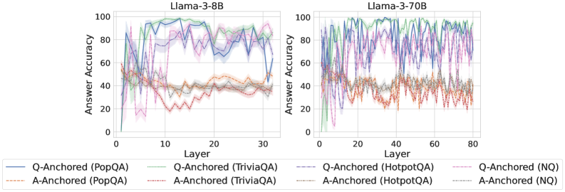
### Visual Description
## Line Charts: Llama-3 Model Answer Accuracy by Layer
### Overview
The image displays two side-by-side line charts comparing the "Answer Accuracy" across network layers for two different-sized language models: Llama-3-8B (left) and Llama-3-70B (right). Each chart plots the performance of eight different experimental conditions, defined by an anchoring method (Q-Anchored or A-Anchored) applied to four different question-answering datasets.
### Components/Axes
* **Chart Titles:** "Llama-3-8B" (left chart), "Llama-3-70B" (right chart).
* **Y-Axis (Both Charts):** Label: "Answer Accuracy". Scale: 0 to 100, with major tick marks at intervals of 20 (0, 20, 40, 60, 80, 100).
* **X-Axis (Left Chart - Llama-3-8B):** Label: "Layer". Scale: 0 to 30, with major tick marks at 0, 10, 20, 30.
* **X-Axis (Right Chart - Llama-3-70B):** Label: "Layer". Scale: 0 to 80, with major tick marks at 0, 20, 40, 60, 80.
* **Legend (Bottom, spanning both charts):** Contains 8 entries, differentiating lines by color and style (solid vs. dashed).
* **Solid Lines (Q-Anchored):**
* Blue: Q-Anchored (PopQA)
* Green: Q-Anchored (TriviaQA)
* Purple: Q-Anchored (HotpotQA)
* Pink: Q-Anchored (NQ)
* **Dashed Lines (A-Anchored):**
* Orange: A-Anchored (PopQA)
* Red: A-Anchored (TriviaQA)
* Gray: A-Anchored (HotpotQA)
* Light Blue: A-Anchored (NQ)
### Detailed Analysis
**Llama-3-8B Chart (Left):**
* **Q-Anchored Lines (Solid):** All four lines show a rapid initial rise from layer 0, reaching a high plateau (approximately 70-100% accuracy) by layer 5-10. They maintain this high performance with moderate fluctuations across the remaining layers (10-30). The Green (TriviaQA) and Pink (NQ) lines appear to be the highest and most stable, often near 90-100%. The Blue (PopQA) and Purple (HotpotQA) lines are slightly lower and more volatile, with a notable dip for Blue around layer 25.
* **A-Anchored Lines (Dashed):** These lines perform significantly worse. They start low, rise to a modest peak between layers 5-15 (approximately 40-60% accuracy), and then generally decline or stagnate at a lower level (20-50%) for the remaining layers. The Red (TriviaQA) line shows the most pronounced decline after its early peak. The Orange (PopQA), Gray (HotpotQA), and Light Blue (NQ) lines cluster together in the 30-50% range for most layers.
**Llama-3-70B Chart (Right):**
* **Q-Anchored Lines (Solid):** Similar to the 8B model, these lines rise quickly to a high accuracy band (approximately 70-100%). However, the performance is much more volatile, with frequent, sharp peaks and troughs across all layers (0-80). Despite the noise, the Green (TriviaQA) and Pink (NQ) lines again appear to be the strongest performers. The Purple (HotpotQA) line shows extreme volatility, with deep drops below 60%.
* **A-Anchored Lines (Dashed):** These lines also show higher volatility compared to their 8B counterparts. They occupy a lower accuracy band, mostly between 20-60%. There is no clear upward trend after the initial layers; instead, they fluctuate within this range. The Red (TriviaQA) line is particularly low and volatile, often dipping near 20%.
### Key Observations
1. **Anchoring Method Dominance:** The most striking pattern is the clear and consistent separation between Q-Anchored (solid lines) and A-Anchored (dashed lines) performance across both models and all datasets. Q-Anchored methods yield substantially higher answer accuracy.
2. **Model Size and Volatility:** The larger Llama-3-70B model exhibits significantly greater layer-to-layer volatility in accuracy for both anchoring methods compared to the more stable Llama-3-8B.
3. **Dataset Hierarchy:** Within the Q-Anchored group, performance on TriviaQA (Green) and NQ (Pink) tends to be highest and most stable, followed by PopQA (Blue) and HotpotQA (Purple).
4. **Early Layer Behavior:** Both models show a critical phase in the first 5-10 layers where accuracy for Q-Anchored methods rapidly ascends to its operational plateau.
5. **A-Anchored Plateau/Decline:** A-Anchored methods in the 8B model show an early peak followed by a decline, suggesting later layers may be less optimized for this representation. In the 70B model, they simply fluctuate at a low level.
### Interpretation
The data strongly suggests that the **anchoring method is a far more critical factor for final answer accuracy than the specific layer within the network** (for layers beyond the initial few). Representations anchored to the question (Q-Anchored) are consistently and significantly more effective for extracting accurate answers than those anchored to the answer (A-Anchored) across diverse datasets.
The increased volatility in the 70B model could indicate more specialized or "opinionated" layers, where individual layers have stronger, more variable effects on the final output. This might be a characteristic of larger models with greater capacity. The consistent performance hierarchy among datasets (TriviaQA/NQ > PopQA/HotpotQA) for Q-Anchored methods may reflect intrinsic differences in dataset difficulty or how well the model's pre-training aligns with the knowledge required for each.
**Notable Anomaly:** The sharp, deep dip in the Q-Anchored (HotpotQA - Purple) line in the Llama-3-70B chart around layer 50 is an outlier. This could represent a layer that is particularly detrimental to performance on multi-hop reasoning tasks (which HotpotQA tests), or it could be an artifact of the specific experimental run.
</details>
<details>
<summary>x59.png Details</summary>
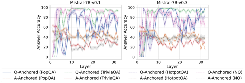
### Visual Description
## Line Charts: Mistral-7B Model Layer-wise Answer Accuracy
### Overview
The image displays two side-by-side line charts comparing the "Answer Accuracy" across model layers (0-30) for two versions of the Mistral-7B model: v0.1 (left) and v0.3 (right). Each chart plots the performance of eight different evaluation setups, defined by a combination of an anchoring method (Q-Anchored or A-Anchored) and a dataset (PopQA, TriviaQA, HotpotQA, NQ).
### Components/Axes
* **Titles:**
* Left Chart: `Mistral-7B-v0.1`
* Right Chart: `Mistral-7B-v0.3`
* **X-Axis (Both Charts):** Label: `Layer`. Scale: Linear, from 0 to 30, with major ticks at 0, 10, 20, 30.
* **Y-Axis (Both Charts):** Label: `Answer Accuracy`. Scale: Linear, from 0 to 100, with major ticks at 0, 20, 40, 60, 80, 100.
* **Legend (Bottom, spanning both charts):** Contains 8 entries, each with a specific color and line style:
1. `Q-Anchored (PopQA)`: Solid blue line.
2. `Q-Anchored (TriviaQA)`: Solid green line.
3. `Q-Anchored (HotpotQA)`: Dashed purple line.
4. `Q-Anchored (NQ)`: Dotted pink line.
5. `A-Anchored (PopQA)`: Dashed orange line.
6. `A-Anchored (TriviaQA)`: Dotted red line.
7. `A-Anchored (HotpotQA)`: Dash-dot gray line.
8. `A-Anchored (NQ)`: Dash-dot-dot light blue line.
* **Plot Elements:** Each data series is represented by a colored line with a semi-transparent shaded band around it, likely indicating variance or confidence intervals.
### Detailed Analysis
**Mistral-7B-v0.1 (Left Chart):**
* **Q-Anchored Series (Generally Higher Accuracy):**
* `Q-Anchored (TriviaQA)` (Solid Green): Shows a strong upward trend from layer 0, peaks near 100% accuracy between layers ~10-20, then gradually declines but remains above 80% at layer 30.
* `Q-Anchored (HotpotQA)` (Dashed Purple): Follows a similar but slightly lower trajectory than TriviaQA, peaking near 100% around layer 15 and ending near 80%.
* `Q-Anchored (PopQA)` (Solid Blue): Highly volatile. Starts low, spikes to ~90% near layer 5, drops sharply, then oscillates with high amplitude between ~20% and 90% across the remaining layers.
* `Q-Anchored (NQ)` (Dotted Pink): Rises to a peak of ~95% around layer 10, then declines steadily to about 60% by layer 30.
* **A-Anchored Series (Generally Lower, More Volatile Accuracy):**
* All four A-Anchored lines (`PopQA`-orange, `TriviaQA`-red, `HotpotQA`-gray, `NQ`-light blue) cluster in the lower half of the chart (mostly between 20% and 60%).
* They exhibit significant volatility and overlap, with no single dataset clearly dominating. Their trends are less defined, often dipping below 20% at various layers.
**Mistral-7B-v0.3 (Right Chart):**
* **Q-Anchored Series:**
* `Q-Anchored (TriviaQA)` (Solid Green): Maintains very high accuracy (>90%) across almost all layers from 5 to 30, showing more stability than in v0.1.
* `Q-Anchored (HotpotQA)` (Dashed Purple): Also shows improved stability, staying mostly above 80% after layer 5, with a dip around layer 20.
* `Q-Anchored (PopQA)` (Solid Blue): Remains highly volatile, with sharp peaks and troughs across the entire layer range, similar to v0.1.
* `Q-Anchored (NQ)` (Dotted Pink): Peaks early (~95% at layer 5) and then shows a more pronounced decline compared to v0.1, falling to around 50% by layer 30.
* **A-Anchored Series:**
* The cluster of A-Anchored lines remains in the lower accuracy band (20%-60%).
* They appear slightly more separated than in v0.1, with `A-Anchored (PopQA)` (orange) and `A-Anchored (TriviaQA)` (red) showing somewhat more distinct, though still volatile, paths.
### Key Observations
1. **Anchoring Method Dominance:** The most striking pattern is the clear performance gap between Q-Anchored and A-Anchored methods. Q-Anchored approaches consistently achieve higher answer accuracy across both model versions and most datasets.
2. **Dataset Sensitivity:** Performance is highly dataset-dependent. `TriviaQA` and `HotpotQA` under Q-Anchoring show the most robust and high accuracy, especially in later layers of v0.3. `PopQA` under Q-Anchoring is uniquely unstable.
3. **Model Version Evolution (v0.1 to v0.3):** The transition from v0.1 to v0.3 appears to stabilize and improve the performance of the top-performing Q-Anchored series (`TriviaQA`, `HotpotQA`), particularly in the middle-to-late layers (10-30). The volatile `Q-Anchored (PopQA)` and declining `Q-Anchored (NQ)` patterns persist.
4. **Layer-wise Trends:** Accuracy is not monotonic with layer depth. For high-performing series, accuracy often peaks in the middle layers (5-20) before plateauing or declining. Early layers (0-5) generally show lower accuracy.
### Interpretation
This data suggests that the **choice of anchoring method (Q vs. A) is a more critical factor for performance than the specific model version (v0.1 vs. v0.3)** for these tasks. Q-Anchoring, which likely conditions the model on the question, provides a much stronger signal for retrieving accurate answers than A-Anchoring (conditioning on the answer), which leads to noisy and poor performance.
The **improvement from v0.1 to v0.3** indicates targeted refinement. The model's internal representations for factual recall (as measured by TriviaQA and HotpotQA) have become more robust and consistent across its depth, suggesting better knowledge consolidation or more effective information flow in the later version.
The **extreme volatility of `Q-Anchored (PopQA)`** is a notable anomaly. It implies that for this specific dataset, the model's ability to produce accurate answers is highly sensitive to the specific layer being probed, possibly due to the nature of the questions or answers in PopQA interfering with the model's processing pathway.
The **declining trend for `Q-Anchored (NQ)`** in both versions, but more sharply in v0.3, is curious. It might indicate that for Natural Questions, the most relevant information is encoded in middle layers, and deeper layers may be over-specializing or drifting away from this specific type of factual recall.
In summary, the charts reveal that optimal performance is achieved by **combining Q-Anchoring with datasets like TriviaQA or HotpotQA and utilizing the model's middle-to-late layers**, with the newer model version offering more stability. The results highlight the importance of both the evaluation methodology (anchoring) and the model's internal layer-wise organization for factual accuracy.
</details>
Figure 24: Comparisons of answer accuracy between pathways, probing attention activations of the final token.
<details>
<summary>x60.png Details</summary>
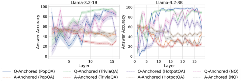
### Visual Description
## Line Charts: Llama-3.2 Model Answer Accuracy by Layer
### Overview
The image displays two side-by-side line charts comparing the "Answer Accuracy" of two language models, Llama-3.2-1B (left) and Llama-3.2-3B (right), across their internal layers. Each chart plots the performance of eight different evaluation series, which are combinations of two anchoring methods (Q-Anchored and A-Anchored) applied to four question-answering datasets (PopQA, TriviaQA, HotpotQA, NQ).
### Components/Axes
* **Chart Titles:** "Llama-3.2-1B" (left chart), "Llama-3.2-3B" (right chart).
* **X-Axis (Both Charts):** Labeled "Layer". The 1B model chart shows layers from approximately 0 to 16. The 3B model chart shows layers from approximately 0 to 28.
* **Y-Axis (Both Charts):** Labeled "Answer Accuracy". The scale runs from 0 to 100 in increments of 20.
* **Legend (Bottom of Image):** Contains eight entries, each defining a line's color, style, and the series it represents.
* **Solid Blue Line:** Q-Anchored (PopQA)
* **Dashed Orange Line:** A-Anchored (PopQA)
* **Solid Green Line:** Q-Anchored (TriviaQA)
* **Dashed Red Line:** A-Anchored (TriviaQA)
* **Solid Purple Line:** Q-Anchored (HotpotQA)
* **Dashed Brown Line:** A-Anchored (HotpotQA)
* **Solid Pink Line:** Q-Anchored (NQ)
* **Dashed Gray Line:** A-Anchored (NQ)
### Detailed Analysis
**Llama-3.2-1B Chart (Left):**
* **General Trend:** Accuracy for most series fluctuates significantly across layers, with a general upward trend for Q-Anchored methods and a flat or slightly downward trend for A-Anchored methods.
* **Q-Anchored Series (Solid Lines):**
* **PopQA (Blue):** Starts near 90% at layer 0, drops sharply to ~20% by layer 5, then recovers with high volatility, ending near 90% at layer 16.
* **TriviaQA (Green):** Starts around 40%, shows a steady, volatile climb to peak near 100% around layer 13, ending slightly lower.
* **HotpotQA (Purple):** Starts low (~10%), climbs erratically to a peak of ~80% around layer 12, then declines.
* **NQ (Pink):** Starts around 60%, shows high volatility with a peak near 95% at layer 3, then fluctuates between 40-80%.
* **A-Anchored Series (Dashed Lines):**
* All four A-Anchored series (PopQA-Orange, TriviaQA-Red, HotpotQA-Brown, NQ-Gray) cluster in a band between approximately 20% and 60% accuracy. They show less dramatic climbs than their Q-Anchored counterparts and often trend slightly downward in later layers.
**Llama-3.2-3B Chart (Right):**
* **General Trend:** The separation between Q-Anchored and A-Anchored performance is more pronounced. Q-Anchored methods show stronger, more sustained improvement with layer depth.
* **Q-Anchored Series (Solid Lines):**
* **PopQA (Blue):** Starts near 0%, climbs steeply to ~95% by layer 10, and maintains high accuracy (80-100%) through layer 28.
* **TriviaQA (Green):** Starts around 60%, climbs to near 100% by layer 10 and remains very high.
* **HotpotQA (Purple):** Starts low (~10%), climbs to a plateau of ~80% between layers 10-20, then becomes more volatile.
* **NQ (Pink):** Starts around 60%, shows high early volatility, then stabilizes in the 60-80% range.
* **A-Anchored Series (Dashed Lines):**
* Similar to the 1B model, these series (Orange, Red, Brown, Gray) are clustered in the lower half of the chart (mostly 20-60%). They show an initial rise but then plateau or decline, with TriviaQA (Red) and PopQA (Orange) trending lowest in later layers.
### Key Observations
1. **Model Scale Effect:** The larger 3B model demonstrates a clearer and more sustained improvement in accuracy for Q-Anchored methods as layers deepen, compared to the more volatile 1B model.
2. **Anchoring Method Dominance:** Across both models and all datasets, **Q-Anchored methods (solid lines) consistently achieve higher peak and final-layer accuracy than A-Anchored methods (dashed lines)**. This is the most salient pattern.
3. **Dataset Variability:** Performance varies by dataset. For Q-Anchored methods, TriviaQA (Green) and PopQA (Blue) often reach the highest accuracies, while HotpotQA (Purple) tends to be lower.
4. **Layer-wise Behavior:** Accuracy is not monotonic. Most series show significant layer-to-layer volatility, suggesting internal representations are being dynamically refined. Performance often peaks in the middle-to-late layers (e.g., layers 10-15 for 1B, layers 10-20 for 3B) before sometimes declining.
### Interpretation
This data suggests a fundamental difference in how information is utilized within the transformer layers of these models depending on the anchoring strategy. **Q-Anchored methods, which likely condition the model on the question, appear to enable the progressive building of more accurate internal representations as information flows through the network layers.** This effect is amplified with model scale (3B vs. 1B).
Conversely, **A-Anchored methods, which may condition on the answer or a different context, fail to leverage the depth of the network for accuracy gains.** Their performance stagnates or degrades, indicating that the model's intermediate layers are not being effectively optimized for the task under this paradigm.
The volatility across layers is a key finding, indicating that "deeper is not always linearly better." The model's internal processing involves complex transformations where accuracy can dip before rising, highlighting the non-linear nature of feature extraction and reasoning within the network. The charts provide empirical evidence for the importance of both **anchoring strategy** and **model scale** in determining how a large language model's performance evolves across its layers.
</details>
<details>
<summary>x61.png Details</summary>
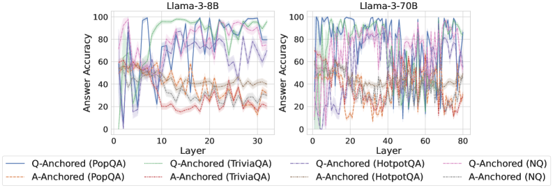
### Visual Description
## Line Charts: Llama-3 Model Layer-wise Answer Accuracy
### Overview
The image displays two side-by-side line charts comparing the "Answer Accuracy" of two Large Language Models (Llama-3-8B and Llama-3-70B) across their internal layers. The analysis evaluates performance using two different prompting methods ("Q-Anchored" and "A-Anchored") across four distinct question-answering datasets. The charts are dense and noisy, showing significant fluctuation in accuracy from layer to layer.
### Components/Axes
* **Chart Titles:**
* Left Chart: `Llama-3-8B`
* Right Chart: `Llama-3-70B`
* **X-Axis (Both Charts):** Label is `Layer`. Represents the sequential layer index within the model.
* Llama-3-8B scale: 0 to 30, with major ticks at 0, 10, 20, 30.
* Llama-3-70B scale: 0 to 80, with major ticks at 0, 20, 40, 60, 80.
* **Y-Axis (Both Charts):** Label is `Answer Accuracy`. Represents a percentage score.
* Scale: 0 to 100, with major ticks at 0, 20, 40, 60, 80, 100.
* **Legend (Bottom of Image, spanning both charts):** Contains 8 series, differentiated by color and line style (solid vs. dashed).
* **Solid Lines (Q-Anchored):**
* Blue: `Q-Anchored (PopQA)`
* Green: `Q-Anchored (TriviaQA)`
* Purple: `Q-Anchored (HotpotQA)`
* Pink: `Q-Anchored (NQ)`
* **Dashed Lines (A-Anchored):**
* Orange: `A-Anchored (PopQA)`
* Red: `A-Anchored (TriviaQA)`
* Gray: `A-Anchored (HotpotQA)`
* Light Blue: `A-Anchored (NQ)`
### Detailed Analysis
**Llama-3-8B Chart (Left):**
* **General Trend:** All lines exhibit high variance, with sharp peaks and troughs from one layer to the next. There is no smooth, monotonic trend for any series.
* **Q-Anchored Series (Solid Lines):** Generally achieve higher peak accuracy than their A-Anchored counterparts. The blue (PopQA) and green (TriviaQA) lines frequently reach the highest accuracy values, often peaking between 80-100% in the mid-to-late layers (layers 10-30). The purple (HotpotQA) and pink (NQ) lines also show high peaks but appear slightly more volatile.
* **A-Anchored Series (Dashed Lines):** Consistently perform worse than the Q-Anchored versions of the same dataset. The orange (PopQA) and red (TriviaQA) lines often reside in the lower half of the chart, frequently below 40% accuracy. The gray (HotpotQA) and light blue (NQ) lines show moderate performance, often fluctuating between 20-60%.
* **Spatial Grounding:** The legend is positioned below the two chart panels. The highest accuracy peaks for Q-Anchored methods are concentrated in the right half of the chart (layers 15-30).
**Llama-3-70B Chart (Right):**
* **General Trend:** Similar high-variance, noisy pattern as the 8B model, but across a greater number of layers (0-80).
* **Q-Anchored Series (Solid Lines):** Again, these lines (blue, green, purple, pink) dominate the upper region of the chart. They show sustained high accuracy (often 60-100%) across a broad range of layers, particularly from layer 20 onwards. The blue (PopQA) and green (TriviaQA) lines are again among the top performers.
* **A-Anchored Series (Dashed Lines):** These lines (orange, red, gray, light blue) are clearly separated and generally occupy the lower portion of the chart, mostly below 60% accuracy. The orange (PopQA) and red (TriviaQA) lines are notably the lowest, often dipping below 20%.
* **Spatial Grounding:** The performance gap between Q-Anchored (top) and A-Anchored (bottom) methods is visually stark and consistent across the entire layer range. The highest density of high-accuracy points for Q-Anchored methods is in the central to right portion of the chart (layers 30-80).
### Key Observations
1. **Anchoring Method Dominance:** The most prominent pattern is the consistent and significant performance advantage of **Q-Anchored** prompting (solid lines) over **A-Anchored** prompting (dashed lines) for every single dataset, in both models.
2. **Dataset Hierarchy:** Within each anchoring method, a rough performance hierarchy is visible. For Q-Anchored, PopQA (blue) and TriviaQA (green) tend to be the top performers. For A-Anchored, HotpotQA (gray) and NQ (light blue) often outperform PopQA (orange) and TriviaQA (red).
3. **Model Scale Comparison:** The larger Llama-3-70B model shows a more sustained high-accuracy region for Q-Anchored methods across its many layers, whereas the 8B model's high accuracy is more concentrated in specific layer bands.
4. **Layer-wise Volatility:** Accuracy is not stable across layers; it fluctuates dramatically. This suggests that the model's internal representations for factual recall are highly specialized and not uniformly good at all processing stages.
5. **Performance Floor:** A-Anchored methods, especially on PopQA and TriviaQA, frequently hit a performance floor near or below 20% accuracy, indicating a near-total failure of this prompting strategy for those tasks at many layers.
### Interpretation
This data strongly suggests that **how a question is presented to the model's internal layers (the anchoring method) is a critical factor for eliciting accurate factual knowledge**, far more so than the specific layer being probed. The Q-Anchored method, which likely involves conditioning the model on the question throughout its processing, consistently unlocks much higher accuracy than the A-Anchored method (conditioning on the answer).
The high layer-to-layer variance indicates that factual knowledge in these LLMs is not stored in a monolithic, easily accessible "database." Instead, it appears to be distributed and dynamically processed, with different layers specializing in different aspects of the retrieval or reasoning process. The superior performance of the larger model (70B) suggests that increased model capacity leads to more robust and widely distributed knowledge representations.
The consistent dataset hierarchy (e.g., PopQA being easier for Q-Anchored but harder for A-Anchored) implies that the nature of the knowledge (e.g., popularity-based vs. trivia-based) interacts differently with the prompting strategy. This has practical implications: optimal prompting may be task-dependent. The charts serve as a powerful visualization that probing a model's internals is not a straightforward readout, but a complex interaction between the model's architecture, the prompting technique, and the nature of the knowledge being sought.
</details>
<details>
<summary>x62.png Details</summary>
### Visual Description
## Line Charts: Answer Accuracy by Layer for Mistral-7B Model Versions
### Overview
The image displays two side-by-side line charts comparing the "Answer Accuracy" of different question-answering methods across the layers of two versions of the Mistral-7B language model: Mistral-7B-v0.1 (left) and Mistral-7B-v0.3 (right). Each chart plots the performance of eight distinct method-dataset combinations.
### Components/Axes
* **Chart Titles:**
* Left Chart: `Mistral-7B-v0.1`
* Right Chart: `Mistral-7B-v0.3`
* **X-Axis (Both Charts):** Labeled `Layer`. The scale runs from 0 to 30, with major tick marks at 0, 10, 20, and 30.
* **Y-Axis (Both Charts):** Labeled `Answer Accuracy`. The scale runs from 0 to 100, with major tick marks at 0, 20, 40, 60, 80, and 100.
* **Legend (Bottom Center, spanning both charts):** Contains eight entries, differentiating methods by line style and color.
* **Solid Lines (Q-Anchored Methods):**
* Blue: `Q-Anchored (PopQA)`
* Green: `Q-Anchored (TriviaQA)`
* Purple: `Q-Anchored (HotpotQA)`
* Pink: `Q-Anchored (NQ)`
* **Dashed Lines (A-Anchored Methods):**
* Orange: `A-Anchored (PopQA)`
* Red: `A-Anchored (TriviaQA)`
* Brown: `A-Anchored (HotpotQA)`
* Gray: `A-Anchored (NQ)`
### Detailed Analysis
**Mistral-7B-v0.1 (Left Chart):**
* **General Trend:** All lines exhibit high volatility, with sharp peaks and troughs across layers. Performance is highly unstable.
* **Q-Anchored (Solid Lines):** Generally achieve higher peak accuracies (often reaching 80-100) but also experience severe drops (sometimes below 20). The blue (PopQA) and purple (HotpotQA) lines show particularly extreme swings.
* **A-Anchored (Dashed Lines):** Tend to have lower peak accuracies (mostly below 70) and also fluctuate significantly. The orange (PopQA) and red (TriviaQA) lines show a notable dip in accuracy between layers 10-20.
* **Notable Points:** Around layer 5, several Q-Anchored methods (green, purple, pink) spike to near 100% accuracy before dropping sharply. Around layer 25, the blue line (Q-Anchored PopQA) plummets to near 0%.
**Mistral-7B-v0.3 (Right Chart):**
* **General Trend:** Lines appear less volatile than in v0.1, especially for Q-Anchored methods, which show more sustained high performance in the later layers (20-30).
* **Q-Anchored (Solid Lines):** Show a clearer pattern of improvement with depth. The green (TriviaQA) and purple (HotpotQA) lines, in particular, rise to and maintain high accuracy (>80) from layer 20 onward. The blue line (PopQA) still fluctuates but has a higher average.
* **A-Anchored (Dashed Lines):** Continue to show lower and more variable performance compared to their Q-Anchored counterparts. The orange (PopQA) and red (TriviaQA) lines remain in the lower accuracy range (20-50) for most layers.
* **Notable Points:** The green line (Q-Anchored TriviaQA) starts very low (near 0 at layer 0) but climbs steadily to become one of the top performers. The gray line (A-Anchored NQ) shows a distinct peak around layer 15 before declining.
### Key Observations
1. **Method Superiority:** Across both model versions, **Q-Anchored methods (solid lines) consistently outperform their A-Anchored (dashed line) counterparts** on the same dataset. This is the most prominent pattern.
2. **Model Version Improvement:** **Mistral-7B-v0.3 demonstrates more stable and generally higher accuracy** in the later layers (20-30) for Q-Anchored methods compared to v0.1. The chaotic volatility seen in v0.1 is somewhat tamed.
3. **Dataset Sensitivity:** Performance varies significantly by dataset. For example, Q-Anchored on TriviaQA (green) and HotpotQA (purple) shows strong late-layer performance in v0.3, while performance on PopQA (blue) remains more erratic.
4. **Layer Sensitivity:** Accuracy is not monotonic with layer depth. There are specific layers where performance peaks or crashes for various methods, suggesting certain layers are more specialized or sensitive for these tasks.
### Interpretation
This data suggests a fundamental difference in how "Q-Anchored" and "A-Anchored" methods utilize the model's internal representations. The consistent superiority of Q-Anchored methods implies that anchoring the model's processing to the *question* throughout its layers leads to more accurate answers than anchoring to the *answer* candidates.
The comparison between v0.1 and v0.3 indicates that the model update led to **more robust and reliable internal processing for question-answering tasks**, particularly in the deeper layers. The reduced volatility suggests the newer model's representations are more stable and less prone to catastrophic failures at specific layers.
The high layer-to-layer variance, especially in v0.1, is a critical finding. It indicates that a model's QA ability is not a smooth function of depth; instead, specific layers hold disproportionate importance, and performance can be fragile. This has implications for model interpretability and techniques like early exiting or layer-wise probing. The charts serve as a diagnostic tool, revealing that simply averaging performance across layers would mask these crucial dynamics.
</details>
Figure 25: Comparisons of answer accuracy between pathways, probing attention activations of the token immediately preceding the exact answer tokens.
<details>
<summary>x63.png Details</summary>
### Visual Description
\n
## Line Charts: Llama-3.2 Model Layer-wise Answer Accuracy
### Overview
The image displays two side-by-side line charts comparing the "Answer Accuracy" across model layers for two different sizes of the Llama-3.2 model (1B and 3B parameters). Each chart plots the performance of eight different experimental conditions, which are combinations of two anchoring methods (Q-Anchored and A-Anchored) evaluated on four distinct question-answering datasets (PopQA, TriviaQA, HotpotQA, NQ).
### Components/Axes
* **Chart Titles (Top Center):**
* Left Chart: `Llama-3.2-1B`
* Right Chart: `Llama-3.2-3B`
* **Y-Axis (Left Side of Each Chart):**
* Label: `Answer Accuracy`
* Scale: 0 to 100, with major tick marks at 0, 20, 40, 60, 80, 100.
* **X-Axis (Bottom of Each Chart):**
* Label: `Layer`
* Scale (Left Chart): 0 to 15, with major tick marks at 0, 5, 10, 15.
* Scale (Right Chart): 0 to 25, with major tick marks at 0, 5, 10, 15, 20, 25.
* **Legend (Bottom Center, spanning both charts):**
* The legend defines eight series using a combination of line color, style (solid vs. dashed), and label.
* **Q-Anchored Series (Solid Lines):**
* `Q-Anchored (PopQA)` - Solid blue line.
* `Q-Anchored (TriviaQA)` - Solid green line.
* `Q-Anchored (HotpotQA)` - Solid purple line.
* `Q-Anchored (NQ)` - Solid pink line.
* **A-Anchored Series (Dashed Lines):**
* `A-Anchored (PopQA)` - Dashed orange line.
* `A-Anchored (TriviaQA)` - Dashed red line.
* `A-Anchored (HotpotQA)` - Dashed brown line.
* `A-Anchored (NQ)` - Dashed gray line.
### Detailed Analysis
**Llama-3.2-1B (Left Chart):**
* **Q-Anchored Lines (Solid):** All four lines start at low accuracy (near 0-20%) at Layer 0. They show a rapid increase, peaking between Layers 5-10. The peak accuracies are approximately: PopQA ~95%, TriviaQA ~90%, HotpotQA ~85%, NQ ~80%. After the peak, performance fluctuates significantly, with a general downward trend towards Layer 15, ending between 60-90%.
* **A-Anchored Lines (Dashed):** These lines start higher than Q-Anchored at Layer 0 (around 40-50%). They remain relatively stable and clustered together throughout all layers, fluctuating within a band of approximately 30% to 55% accuracy. There is no strong upward or downward trend. A notable dip occurs for `A-Anchored (TriviaQA)` (dashed red) around Layer 10, dropping to near 30%.
**Llama-3.2-3B (Right Chart):**
* **Q-Anchored Lines (Solid):** Similar initial pattern to the 1B model, starting low and rising sharply. However, the peak accuracies are higher and are sustained over more layers. Peak accuracies are approximately: PopQA ~98%, TriviaQA ~95%, HotpotQA ~90%, NQ ~85%. The lines exhibit high volatility after Layer 10, with sharp drops and recoveries, particularly for `Q-Anchored (HotpotQA)` (solid purple), which drops to near 60% around Layer 15 before recovering.
* **A-Anchored Lines (Dashed):** These lines start around 50% accuracy at Layer 0. They show more variation than in the 1B model but remain generally lower than the Q-Anchored lines after the initial layers. They fluctuate mostly between 40% and 65%. The `A-Anchored (TriviaQA)` (dashed red) line shows a significant dip to near 10% around Layer 12.
### Key Observations
1. **Anchoring Method Disparity:** There is a clear and consistent separation between the two anchoring methods. Q-Anchored approaches (solid lines) achieve significantly higher peak accuracy than A-Anchored approaches (dashed lines) in both model sizes.
2. **Model Size Effect:** The larger 3B model achieves higher peak accuracies for the Q-Anchored methods and maintains high performance across a broader range of middle layers compared to the 1B model.
3. **Layer-wise Trend:** Q-Anchored performance follows a distinct "rise-peak-fluctuate/decline" pattern across layers. A-Anchored performance is more stable and flat across layers.
4. **Dataset Variability:** Performance varies by dataset within each anchoring method. For Q-Anchored, PopQA generally yields the highest accuracy, followed by TriviaQA, HotpotQA, and NQ.
5. **Volatility:** The 3B model's Q-Anchored lines show greater volatility (sharper peaks and troughs) in the later layers compared to the 1B model.
### Interpretation
The data suggests a fundamental difference in how information is utilized across model layers depending on the anchoring strategy. The **Q-Anchored** method appears to leverage intermediate layers (5-10 for 1B, 5-15 for 3B) very effectively for answer accuracy, indicating these layers may be crucial for processing the question-centric information needed for these QA tasks. The subsequent volatility might reflect over-specialization or interference in deeper layers.
In contrast, the **A-Anchored** method shows a more consistent, but lower, performance profile. This could imply it relies on a more distributed or less layer-specific representation, or that it is less effective at extracting the necessary signals from the model's hidden states for these benchmarks.
The performance gap between the two methods widens with model scale (from 1B to 3B parameters), suggesting that the advantage of the Q-Anchored approach becomes more pronounced in larger models. The significant dips in performance for specific datasets at certain layers (e.g., TriviaQA for A-Anchored) may point to architectural characteristics or training data biases that create "weak spots" for particular types of knowledge retrieval at specific processing depths.
</details>
<details>
<summary>x64.png Details</summary>
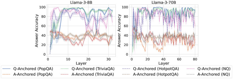
### Visual Description
## Line Charts: Llama-3 Model Answer Accuracy by Layer
### Overview
The image displays two side-by-side line charts comparing the "Answer Accuracy" of two Large Language Models (Llama-3-8B and Llama-3-70B) across their internal layers. The performance is measured on four question-answering datasets (PopQA, TriviaQA, HotpotQA, NQ) using two different methods: "Q-Anchored" and "A-Anchored". The charts visualize how accuracy evolves as information propagates through the model's layers.
### Components/Axes
* **Chart Titles:** "Llama-3-8B" (left chart), "Llama-3-70B" (right chart).
* **Y-Axis (Both Charts):** Label: "Answer Accuracy". Scale: 0 to 100, with major tick marks at 0, 20, 40, 60, 80, 100.
* **X-Axis (Left Chart - Llama-3-8B):** Label: "Layer". Scale: 0 to 30, with major tick marks at 0, 10, 20, 30.
* **X-Axis (Right Chart - Llama-3-70B):** Label: "Layer". Scale: 0 to 80, with major tick marks at 0, 20, 40, 60, 80.
* **Legend (Bottom, spanning both charts):** Contains 8 entries, each with a unique color and line style.
* **Q-Anchored Series (Solid Lines):**
* `Q-Anchored (PopQA)`: Blue solid line.
* `Q-Anchored (TriviaQA)`: Green solid line.
* `Q-Anchored (HotpotQA)`: Purple solid line.
* `Q-Anchored (NQ)`: Pink solid line.
* **A-Anchored Series (Dashed Lines):**
* `A-Anchored (PopQA)`: Orange dashed line.
* `A-Anchored (TriviaQA)`: Red dashed line.
* `A-Anchored (HotpotQA)`: Brown dashed line.
* `A-Anchored (NQ)`: Gray dashed line.
* **Data Representation:** Each series is plotted as a line with a shaded region around it, likely representing confidence intervals or variance across multiple runs.
### Detailed Analysis
**Llama-3-8B Chart (Left):**
* **Q-Anchored Lines (Solid):** All four lines show a rapid increase in accuracy from layer 0 to approximately layer 5-7, reaching a plateau between ~80-100% accuracy. They exhibit significant volatility, with sharp dips and recoveries throughout the layers. The `Q-Anchored (TriviaQA)` (green) and `Q-Anchored (PopQA)` (blue) lines frequently reach the highest accuracy values, often near 100%. The `Q-Anchored (NQ)` (pink) line shows a notable dip around layer 20.
* **A-Anchored Lines (Dashed):** These lines cluster in a lower accuracy band, primarily between 20% and 50%. They are more stable than the Q-Anchored lines but still show fluctuations. The `A-Anchored (PopQA)` (orange) and `A-Anchored (TriviaQA)` (red) lines are generally at the top of this cluster, while `A-Anchored (NQ)` (gray) is often at the bottom.
**Llama-3-70B Chart (Right):**
* **Q-Anchored Lines (Solid):** Similar to the 8B model, these lines rise sharply in the early layers (0-10) to a high-accuracy plateau (80-100%). The volatility is even more pronounced, with frequent, deep oscillations across all layers. The lines for different datasets are tightly interwoven, making it difficult to declare a consistent top performer, though `Q-Anchored (TriviaQA)` (green) and `Q-Anchored (HotpotQA)` (purple) often spike highest.
* **A-Anchored Lines (Dashed):** These lines again occupy a lower accuracy range, roughly 10% to 50%. The `A-Anchored (PopQA)` (orange) line shows a distinct downward trend from layer 0 to about layer 20 before stabilizing. The other A-Anchored lines fluctuate within their band without a clear directional trend.
**Cross-Model Comparison:**
* The fundamental pattern is consistent: Q-Anchored methods dramatically outperform A-Anchored methods across all datasets and both model sizes.
* The larger model (70B) operates over more layers (80 vs. 30) and exhibits greater volatility in the Q-Anchored accuracy scores.
* The performance gap between Q-Anchored and A-Anchored methods appears slightly wider in the 70B model.
### Key Observations
1. **Method Dominance:** The most striking pattern is the clear and consistent superiority of the Q-Anchored approach over the A-Anchored approach for all tested datasets.
2. **Layer Sensitivity:** Accuracy is highly sensitive to the specific layer within the model, especially for Q-Anchored methods, as shown by the jagged lines.
3. **Early Layer Convergence:** Both models achieve near-peak accuracy for Q-Anchored methods within the first 10-20% of their layers.
4. **Dataset Variability:** While Q-Anchored is always better, the relative ranking of datasets (e.g., TriviaQA vs. NQ) varies between layers and models, suggesting dataset-specific characteristics interact with the model's internal processing.
5. **Stability Contrast:** A-Anchored methods, while lower performing, show less dramatic layer-to-layer variance than Q-Anchored methods.
### Interpretation
The data suggests that the **"anchoring" strategy is a critical factor** in determining the answer accuracy extracted from intermediate layers of Llama-3 models. The Q-Anchored method (likely using the question as a prompt or reference) is far more effective at eliciting correct answers from the model's internal representations than the A-Anchored method (likely using the answer itself).
The high volatility in Q-Anchored accuracy indicates that **different layers specialize in different types of knowledge or reasoning steps**. The sharp dips could represent layers where information is being transformed or re-represented in a way that is temporarily less directly accessible for answer extraction. The early plateau suggests that the core information needed to answer these factual questions is encoded relatively early in the network's processing pipeline.
The greater volatility in the larger 70B model might reflect a more complex and specialized internal organization, where knowledge is distributed across more layers, leading to more pronounced peaks and valleys in accessibility. The consistent underperformance of A-Anchored methods implies that using the answer as an anchor does not effectively tap into the model's knowledge retrieval mechanism in the intermediate layers, possibly because it creates a mismatch with how the model naturally processes and stores information. This has practical implications for techniques like model probing or interpretability, highlighting the importance of choosing the correct prompt or anchor to query a model's internal state.
</details>
<details>
<summary>x65.png Details</summary>
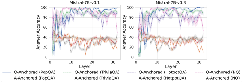
### Visual Description
\n
## Line Charts: Answer Accuracy by Layer for Mistral-7B Model Versions
### Overview
The image displays two side-by-side line charts comparing the "Answer Accuracy" of two model versions (Mistral-7B-v0.1 and Mistral-7B-v0.3) across 30+ layers. Each chart plots the performance of eight different evaluation setups, defined by a method (Q-Anchored or A-Anchored) and a dataset (PopQA, TriviaQA, HotpotQA, NQ). The charts are designed to show how internal model layer progression affects accuracy on different knowledge-intensive question-answering tasks.
### Components/Axes
* **Chart Titles:**
* Left Chart: `Mistral-7B-v0.1`
* Right Chart: `Mistral-7B-v0.3`
* **Y-Axis (Both Charts):** Label: `Answer Accuracy`. Scale: 0 to 100, with major tick marks at 0, 20, 40, 60, 80, 100.
* **X-Axis (Both Charts):** Label: `Layer`. Scale: 0 to 30, with major tick marks at 0, 10, 20, 30.
* **Legend (Bottom, spanning both charts):** Contains 8 entries, each with a colored line sample and a label. The legend is positioned below the x-axis labels.
1. **Solid Blue Line:** `Q-Anchored (PopQA)`
2. **Dashed Orange Line:** `A-Anchored (PopQA)`
3. **Solid Green Line:** `Q-Anchored (TriviaQA)`
4. **Dashed Red Line:** `A-Anchored (TriviaQA)`
5. **Solid Purple Line:** `Q-Anchored (HotpotQA)`
6. **Dashed Brown Line:** `A-Anchored (HotpotQA)`
7. **Solid Pink Line:** `Q-Anchored (NQ)`
8. **Dashed Gray Line:** `A-Anchored (NQ)`
### Detailed Analysis
**Chart 1: Mistral-7B-v0.1 (Left)**
* **Q-Anchored Series (Solid Lines):** All four series show a similar pattern: very low accuracy (<20%) at layer 0, a sharp spike to high accuracy (60-90% range) by layer ~5, followed by high but volatile performance across the remaining layers, generally staying between 60% and 100%.
* `Q-Anchored (PopQA)` (Blue): Peaks near 100% around layer 5, then fluctuates heavily between ~70% and 100%.
* `Q-Anchored (TriviaQA)` (Green): Follows a similar volatile high-accuracy path, often intertwining with the blue line.
* `Q-Anchored (HotpotQA)` (Purple): Also volatile, with a notable dip to ~60% around layer 25.
* `Q-Anchored (NQ)` (Pink): Shows the most volatility among the Q-Anchored lines, with several deep dips (e.g., to ~60% near layer 28).
* **A-Anchored Series (Dashed Lines):** All four series exhibit significantly lower and more volatile accuracy compared to their Q-Anchored counterparts. They fluctuate primarily in the 10% to 50% range.
* `A-Anchored (PopQA)` (Orange): Highly erratic, with values bouncing between ~10% and 50%.
* `A-Anchored (TriviaQA)` (Red): Similar volatility, often in the 20-40% range.
* `A-Anchored (HotpotQA)` (Brown): Shows a slight upward trend from layer 0 to 30 but remains below 50%.
* `A-Anchored (NQ)` (Gray): Also highly volatile, with a notable low point near 10% around layer 10.
**Chart 2: Mistral-7B-v0.3 (Right)**
* **Q-Anchored Series (Solid Lines):** The pattern is similar to v0.1 but appears slightly more stable at the high end for some datasets.
* `Q-Anchored (PopQA)` (Blue): Still volatile but seems to spend more time in the 80-100% band after layer 10.
* `Q-Anchored (TriviaQA)` (Green): Very high and relatively stable performance, frequently touching or exceeding 90% after layer 10.
* `Q-Anchored (HotpotQA)` (Purple): Shows a strong upward trend from layer 0, becoming one of the top performers after layer 15, often above 80%.
* `Q-Anchored (NQ)` (Pink): Remains the most volatile of the Q-Anchored group, with significant dips (e.g., to ~60% near layer 25).
* **A-Anchored Series (Dashed Lines):** Performance remains low and volatile, largely mirroring the patterns seen in v0.1, with accuracies mostly between 10% and 50%.
* The relative ordering and volatility of the four A-Anchored lines appear consistent with the v0.1 chart.
### Key Observations
1. **Method Dominance:** The most striking pattern is the large, consistent gap between **Q-Anchored** (solid lines) and **A-Anchored** (dashed lines) methods across all layers and both model versions. Q-Anchored methods achieve 60-100% accuracy, while A-Anchored methods struggle to exceed 50%.
2. **Layer Sensitivity:** Accuracy for Q-Anchored methods is extremely sensitive to the specific layer, showing high-frequency volatility. This suggests the model's internal representations for these tasks are not monotonically improving but fluctuate significantly.
3. **Model Version Comparison:** While the overall patterns are similar, Mistral-7B-v0.3 (right chart) shows signs of improvement for certain Q-Anchored tasks. Notably, `Q-Anchored (HotpotQA)` (purple) and `Q-Anchored (TriviaQA)` (green) appear to reach and sustain higher accuracy levels more consistently in v0.3 compared to v0.1.
4. **Dataset Difficulty:** Under the A-Anchored method, performance is uniformly poor across datasets. Under the Q-Anchored method, `NQ` (pink) appears to be the most challenging dataset, exhibiting the largest and most frequent drops in accuracy.
### Interpretation
This visualization provides a technical diagnostic of how knowledge is accessed and utilized across the layers of two Mistral-7B model versions. The data strongly suggests that the **Q-Anchored prompting/evaluation method is far more effective** at eliciting correct answers from the model's internal states than the A-Anchored method. The high volatility across layers indicates that the "knowledge" or "capability" to answer these questions is not stored in a smooth, progressive manner but is instead distributed in a complex, non-linear fashion throughout the network, with specific layers being "hotspots" for certain types of queries.
The comparison between v0.1 and v0.3 hints at **iterative model improvement**. The increased stability and peak performance for datasets like HotpotQA and TriviaQA in v0.3 suggest that the update may have refined how the model processes or retrieves multi-hop (HotpotQA) and factual (TriviaQA) information. However, the persistent volatility and the unchanged poor performance of A-Anchored methods indicate that fundamental characteristics of the model's architecture or training data still impose limits on consistent performance. This type of analysis is crucial for understanding model internals, debugging failure modes, and guiding future model development.
</details>
Figure 26: Comparisons of answer accuracy between pathways, probing attention activations of the last exact answer token.
<details>
<summary>x66.png Details</summary>
### Visual Description
## Line Charts: Llama-3.2 Model Answer Accuracy by Layer
### Overview
The image displays two side-by-side line charts comparing the "Answer Accuracy" of two language models, Llama-3.2-1B and Llama-3.2-3B, across their internal layers. The performance is measured on four question-answering datasets (PopQA, TriviaQA, HotpotQA, NQ) using two different methods: "Q-Anchored" and "A-Anchored". The charts illustrate how accuracy evolves as information propagates through the model's layers.
### Components/Axes
* **Chart Titles:**
* Left Chart: `Llama-3.2-1B`
* Right Chart: `Llama-3.2-3B`
* **Y-Axis (Both Charts):**
* Label: `Answer Accuracy`
* Scale: 0 to 100, with major tick marks at 0, 20, 40, 60, 80, 100.
* **X-Axis (Both Charts):**
* Label: `Layer`
* Scale (Llama-3.2-1B): Approximately 1 to 16, with major tick marks at 5, 10, 15.
* Scale (Llama-3.2-3B): Approximately 1 to 28, with major tick marks at 5, 10, 15, 20, 25.
* **Legend (Bottom, spanning both charts):**
* Contains 8 entries, each pairing an anchoring method with a dataset.
* **Q-Anchored Series (Solid Lines):**
* `Q-Anchored (PopQA)`: Solid blue line.
* `Q-Anchored (TriviaQA)`: Solid green line.
* `Q-Anchored (HotpotQA)`: Solid purple line.
* `Q-Anchored (NQ)`: Solid pink line.
* **A-Anchored Series (Dashed/Dotted Lines):**
* `A-Anchored (PopQA)`: Dashed orange line.
* `A-Anchored (TriviaQA)`: Dashed red line.
* `A-Anchored (HotpotQA)`: Dotted gray line.
* `A-Anchored (NQ)`: Dotted light blue line.
### Detailed Analysis
**Chart 1: Llama-3.2-1B (Left)**
* **General Trend:** Most Q-Anchored lines show a rapid initial increase in accuracy within the first 5 layers, followed by high volatility (sharp peaks and troughs) across the middle and later layers. A-Anchored lines are generally lower and more stable, with less dramatic swings.
* **Q-Anchored (PopQA) - Solid Blue:** Starts near 0, spikes to ~95 by layer 3, fluctuates between ~70-100, and ends near 70 at layer 16.
* **Q-Anchored (TriviaQA) - Solid Green:** Starts near 0, rises to ~80 by layer 5, dips sharply to ~20 around layer 7, recovers to ~90 by layer 12, and ends near 80.
* **Q-Anchored (HotpotQA) - Solid Purple:** Starts near 0, climbs to ~90 by layer 4, fluctuates between ~60-95, and ends near 65.
* **Q-Anchored (NQ) - Solid Pink:** Starts near 0, rises to ~85 by layer 5, shows a significant dip to near 0 around layer 6, recovers to ~80, and ends near 75.
* **A-Anchored (PopQA) - Dashed Orange:** Hovers between ~40-60 throughout all layers, with a slight downward trend in later layers.
* **A-Anchored (TriviaQA) - Dashed Red:** Similar to A-Anchored PopQA, fluctuating between ~35-55.
* **A-Anchored (HotpotQA) - Dotted Gray:** Remains relatively flat, centered around 50.
* **A-Anchored (NQ) - Dotted Light Blue:** Also flat, hovering around 50.
**Chart 2: Llama-3.2-3B (Right)**
* **General Trend:** Similar pattern to the 1B model but with more pronounced separation between datasets. Q-Anchored lines again show high volatility after an initial rise. The A-Anchored lines for PopQA and TriviaQA show a distinct downward trend in the middle layers before a slight recovery.
* **Q-Anchored (PopQA) - Solid Blue:** Starts near 0, rapidly ascends to ~90 by layer 4, fluctuates between ~70-95, and ends high near 95.
* **Q-Anchored (TriviaQA) - Solid Green:** Starts near 0, rises to ~95 by layer 8, maintains high accuracy (>80) with some dips, and ends near 90.
* **Q-Anchored (HotpotQA) - Solid Purple:** Starts near 0, climbs to ~85 by layer 5, fluctuates between ~60-90, and ends near 80.
* **Q-Anchored (NQ) - Solid Pink:** Starts near 0, rises to ~80 by layer 5, dips to ~50 around layer 10, recovers to ~80, and ends near 70.
* **A-Anchored (PopQA) - Dashed Orange:** Starts around 50, declines to a trough of ~20 between layers 10-15, then recovers to ~40 by layer 28.
* **A-Anchored (TriviaQA) - Dashed Red:** Follows a similar U-shaped trend to A-Anchored PopQA, starting near 50, dipping to ~25, and recovering to ~35.
* **A-Anchored (HotpotQA) - Dotted Gray:** Remains relatively stable around 50.
* **A-Anchored (NQ) - Dotted Light Blue:** Also stable, hovering around 50.
### Key Observations
1. **Method Disparity:** Q-Anchored methods consistently achieve higher peak accuracy than A-Anchored methods across both models and all datasets, but exhibit much greater instability across layers.
2. **Model Scale Effect:** The larger Llama-3.2-3B model shows more defined performance separation between datasets (e.g., TriviaQA performs best) and a more pronounced mid-layer performance dip for A-Anchored methods on PopQA and TriviaQA.
3. **Layer Sensitivity:** Performance is highly sensitive to specific layers, especially for Q-Anchored methods, with dramatic drops (e.g., Q-Anchored NQ at layer 6 in 1B model) suggesting potential "bottleneck" or processing stages within the network.
4. **Dataset Difficulty:** The A-Anchored performance on HotpotQA and NQ is consistently flat and near 50% (likely chance level for multiple-choice), suggesting these methods fail to extract useful information for these datasets. In contrast, Q-Anchored methods show they can leverage the model's representations for these tasks.
### Interpretation
The data suggests a fundamental difference in how information is utilized by the two anchoring methods. **Q-Anchored** methods appear to tap into dynamic, layer-specific representations that are highly potent for answering questions but are also fragile and non-monotonic. The sharp fluctuations indicate that the "answer" signal is not built progressively but emerges, fades, and re-emerges across the network's depth.
**A-Anchored** methods yield more stable but generally weaker performance. The U-shaped curve for PopQA and TriviaQA in the 3B model is particularly insightful: it implies that middle layers may transform the information in a way that is less directly accessible to this anchoring method, before later layers reorganize it into a more usable form.
The stark contrast between datasets for A-Anchored methods (flat for HotpotQA/NQ vs. dynamic for PopQA/TriviaQA) hints that the underlying knowledge or its representation format differs significantly between these QA benchmarks. Overall, the charts argue that the "where" (which layer) and "how" (anchoring method) of probing a model are critical for understanding and measuring its internal knowledge processing.
</details>
<details>
<summary>x67.png Details</summary>
### Visual Description
## Line Charts: Llama-3 Model Layer-wise Answer Accuracy
### Overview
The image displays two side-by-side line charts comparing the "Answer Accuracy" across model layers for two different Large Language Models: **Llama-3-8B** (left chart) and **Llama-3-70B** (right chart). Each chart plots the performance of eight different evaluation configurations, distinguished by anchoring method (Q-Anchored vs. A-Anchored) and dataset (PopQA, TriviaQA, HotpotQA, NQ).
### Components/Axes
* **Chart Titles:** "Llama-3-8B" (left), "Llama-3-70B" (right). Positioned at the top-center of each respective plot area.
* **Y-Axis (Both Charts):** Label is "Answer Accuracy". Scale runs from 0 to 100 in increments of 20.
* **X-Axis (Left Chart - Llama-3-8B):** Label is "Layer". Scale runs from 0 to 30 in increments of 10.
* **X-Axis (Right Chart - Llama-3-70B):** Label is "Layer". Scale runs from 0 to 80 in increments of 20.
* **Legend:** Positioned below both charts, spanning the full width. It defines eight data series using a combination of color and line style (solid vs. dashed).
* **Q-Anchored (Solid Lines):**
* `Q-Anchored (PopQA)`: Solid blue line.
* `Q-Anchored (TriviaQA)`: Solid green line.
* `Q-Anchored (HotpotQA)`: Solid purple line.
* `Q-Anchored (NQ)`: Solid pink line.
* **A-Anchored (Dashed Lines):**
* `A-Anchored (PopQA)`: Dashed orange line.
* `A-Anchored (TriviaQA)`: Dashed red line.
* `A-Anchored (HotpotQA)`: Dashed gray line.
* `A-Anchored (NQ)`: Dashed light blue line.
### Detailed Analysis
**Llama-3-8B Chart (Left):**
* **Trend Verification:** All Q-Anchored (solid) lines show a sharp initial rise from layer 0, peak between layers 5-10, and then exhibit a general downward trend with significant volatility as layers increase towards 30. The A-Anchored (dashed) lines start higher than Q-Anchored at layer 0, show less dramatic peaks, and maintain a more stable, albeit lower, accuracy plateau between 20-50 across most layers.
* **Data Points (Approximate):**
* **Q-Anchored (PopQA - Blue):** Peaks near 100% accuracy around layer 5. Declines to ~60-70% by layer 30.
* **Q-Anchored (TriviaQA - Green):** Peaks near 100% around layer 7. Declines to ~80-90% by layer 30, remaining the highest-performing series.
* **Q-Anchored (HotpotQA - Purple):** Peaks near 90% around layer 8. Shows high volatility, ending near 60% at layer 30.
* **Q-Anchored (NQ - Pink):** Peaks near 90% around layer 10. Declines to ~50-60% by layer 30.
* **A-Anchored Series (All Dashed):** Cluster in the 20-50% accuracy range. `A-Anchored (TriviaQA - Red)` and `A-Anchored (PopQA - Orange)` are often the lowest, hovering near 20-40%. `A-Anchored (HotpotQA - Gray)` and `A-Anchored (NQ - Light Blue)` are slightly higher, often between 30-50%.
**Llama-3-70B Chart (Right):**
* **Trend Verification:** Similar overall pattern to the 8B model but extended over 80 layers. Q-Anchored lines spike early (layers 5-15), then decline with high variance. A-Anchored lines are more stable but lower. The larger model shows higher peak accuracies and more pronounced separation between datasets.
* **Data Points (Approximate):**
* **Q-Anchored (PopQA - Blue):** Peaks near 100% around layer 10. Shows a gradual decline with volatility, ending near 80% at layer 80.
* **Q-Anchored (TriviaQA - Green):** Peaks near 100% around layer 12. Remains very high, mostly above 90%, ending near 95% at layer 80.
* **Q-Anchored (HotpotQA - Purple):** Peaks near 95% around layer 15. Highly volatile, with a wide range (60-90%) in later layers.
* **Q-Anchored (NQ - Pink):** Peaks near 90% around layer 20. Declines to a volatile range of 60-80% in later layers.
* **A-Anchored Series (All Dashed):** Again form a lower, more stable cluster between 20-50%. `A-Anchored (TriviaQA - Red)` is consistently among the lowest (20-35%). `A-Anchored (HotpotQA - Gray)` and `A-Anchored (NQ - Light Blue)` are slightly higher (30-50%).
### Key Observations
1. **Anchoring Method Disparity:** There is a stark and consistent performance gap between Q-Anchored (solid lines) and A-Anchored (dashed lines) configurations across both models and all datasets. Q-Anchored methods achieve much higher peak accuracy.
2. **Layer Sensitivity:** Q-Anchored performance is highly sensitive to layer depth, showing a characteristic "peak and decay" pattern. Optimal performance is found in early-to-mid layers (roughly layers 5-20).
3. **Dataset Hierarchy:** A clear performance hierarchy by dataset is visible, especially in the Q-Anchored results. `TriviaQA` (green) consistently yields the highest accuracy, followed generally by `PopQA` (blue), then `HotpotQA` (purple) and `NQ` (pink).
4. **Model Scale Effect:** The Llama-3-70B model not only operates over more layers but also demonstrates higher sustained accuracy for its top-performing configurations (e.g., Q-Anchored TriviaQA remains >90% across most layers) compared to the 8B model.
5. **Volatility:** The Q-Anchored lines, particularly for `HotpotQA` and `NQ`, exhibit significant layer-to-layer volatility, suggesting unstable representations for those tasks at certain depths.
### Interpretation
This data suggests a fundamental difference in how information is utilized across a model's layers depending on the prompting or evaluation strategy ("anchoring"). The **Q-Anchored** approach (likely using a question-based prompt) appears to leverage early and middle layers for peak factual recall, with performance degrading in deeper layers, possibly due to over-processing or task misalignment. In contrast, the **A-Anchored** approach (likely using an answer-based or different prompt format) yields more stable but significantly weaker performance across all layers, indicating it may not effectively activate the model's parametric knowledge.
The **dataset hierarchy** (`TriviaQA` > `PopQA` > `HotpotQA`/`NQ`) reflects the nature of the knowledge required: `TriviaQA` likely involves more straightforward, encyclopedic facts that the model has memorized well, while `HotpotQA` (multi-hop reasoning) and `NQ` (natural questions) present more complex or varied challenges.
The **"peak and decay"** pattern for Q-Anchored methods is a critical finding. It implies that for factual recall tasks, the most useful representations are not in the final layers but in the intermediate ones. This has practical implications for model editing, knowledge extraction, or interpretability techniques, which should target these mid-layer regions. The increased stability and higher baseline of the 70B model suggest that scale improves both the capacity for knowledge storage and the robustness of its retrieval across layers.
</details>
<details>
<summary>x68.png Details</summary>
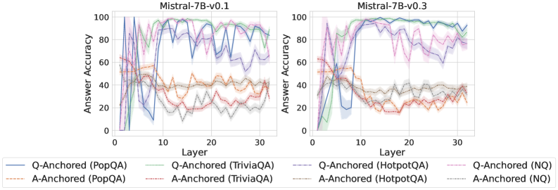
### Visual Description
## Line Charts: Mistral-7B Model Layer-wise Answer Accuracy
### Overview
The image displays two side-by-side line charts comparing the "Answer Accuracy" across model layers (0-30) for two versions of the Mistral-7B model: v0.1 (left) and v0.3 (right). Each chart plots the performance of eight different evaluation setups, distinguished by anchoring method (Q-Anchored or A-Anchored) and dataset (PopQA, TriviaQA, HotpotQA, NQ). The lines include shaded regions, likely representing confidence intervals or standard deviation.
### Components/Axes
* **Chart Titles:** "Mistral-7B-v0.1" (left chart), "Mistral-7B-v0.3" (right chart). Positioned at the top-center of each respective plot.
* **Y-Axis:** Label is "Answer Accuracy". Scale runs from 0 to 100 with major tick marks at 0, 20, 40, 60, 80, 100.
* **X-Axis:** Label is "Layer". Scale runs from 0 to 30 with major tick marks at 0, 10, 20, 30.
* **Legend:** Positioned below both charts, centered. It contains eight entries, each with a colored line sample and a text label:
1. `Q-Anchored (PopQA)` - Solid blue line
2. `A-Anchored (PopQA)` - Dashed orange line
3. `Q-Anchored (TriviaQA)` - Solid green line
4. `A-Anchored (TriviaQA)` - Dashed red line
5. `Q-Anchored (HotpotQA)` - Dashed purple line
6. `A-Anchored (HotpotQA)` - Dashed brown line
7. `Q-Anchored (NQ)` - Dashed pink line
8. `A-Anchored (NQ)` - Dashed gray line
### Detailed Analysis
**Mistral-7B-v0.1 (Left Chart):**
* **Q-Anchored (PopQA) [Solid Blue]:** Starts near 0, rises sharply to a peak of ~95-100 around layer 8, then fluctuates with a general downward trend, ending near 80 at layer 30.
* **Q-Anchored (TriviaQA) [Solid Green]:** Starts near 0, rises very steeply to near 100 by layer 5, maintains high accuracy (~90-100) with some volatility across all layers.
* **Q-Anchored (HotpotQA) [Dashed Purple]:** Starts near 0, rises to a peak of ~90 around layer 10, then shows a gradual decline with significant fluctuations, ending near 60 at layer 30.
* **Q-Anchored (NQ) [Dashed Pink]:** Starts near 0, rises to a peak of ~85 around layer 7, then declines steadily with fluctuations, ending near 40 at layer 30.
* **A-Anchored Lines (All Dashed):** All four A-Anchored series (PopQA-orange, TriviaQA-red, HotpotQA-brown, NQ-gray) show significantly lower performance than their Q-Anchored counterparts. They generally start between 20-60, exhibit a slight downward trend or remain relatively flat with high variance, and cluster between 20-40 accuracy by layer 30. The A-Anchored (PopQA) [orange] line is often the highest among this group.
**Mistral-7B-v0.3 (Right Chart):**
* **Q-Anchored (PopQA) [Solid Blue]:** Starts near 0, rises to a peak of ~95 around layer 10, then maintains a very high and stable accuracy (~90-95) through layer 30, showing less decline than in v0.1.
* **Q-Anchored (TriviaQA) [Solid Green]:** Similar to v0.1, starts near 0, rockets to near 100 by layer 5, and remains extremely high and stable (~95-100) across all subsequent layers.
* **Q-Anchored (HotpotQA) [Dashed Purple]:** Starts near 0, rises to a peak of ~95 around layer 12, then shows a more gradual decline than in v0.1, ending near 70 at layer 30.
* **Q-Anchored (NQ) [Dashed Pink]:** Starts near 0, rises to a peak of ~85 around layer 8, then declines, ending near 50 at layer 30. Shows slightly better late-layer performance than v0.1.
* **A-Anchored Lines (All Dashed):** The pattern is similar to v0.1, with all A-Anchored series performing worse than Q-Anchored ones. They start in the 20-60 range and trend slightly downward or flat, clustering between 20-40 by layer 30. The separation between the different A-Anchored datasets appears slightly less pronounced than in v0.1.
### Key Observations
1. **Anchoring Method Dominance:** Across both model versions and all four datasets, the **Q-Anchored** evaluation method consistently yields dramatically higher answer accuracy than the **A-Anchored** method. This is the most salient trend.
2. **Dataset Difficulty:** For Q-Anchored evaluation, **TriviaQA** (green) appears to be the "easiest" dataset, achieving near-perfect accuracy very early (by layer 5) and maintaining it. **PopQA** (blue) is also high-performing. **HotpotQA** (purple) and **NQ** (pink) show more pronounced performance degradation in later layers.
3. **Model Version Comparison (v0.1 vs. v0.3):** The v0.3 model shows improved stability in the Q-Anchored performance for **PopQA** and **HotpotQA** in the later layers (15-30), with less dramatic drops compared to v0.1. The performance on **TriviaQA** is consistently excellent in both versions.
4. **Layer-wise Trend:** For Q-Anchored methods, accuracy typically rises sharply in the first 5-10 layers, peaks, and then either stabilizes (TriviaQA, PopQA in v0.3) or gradually declines (HotpotQA, NQ). A-Anchored methods show no clear early-layer rise and remain in a lower, noisier band.
5. **Uncertainty/Variance:** The shaded regions around each line indicate variance in the measurements. The variance appears generally larger for the A-Anchored methods and for the Q-Anchored methods on the more challenging datasets (HotpotQA, NQ) in later layers.
### Interpretation
This data strongly suggests that the **evaluation paradigm (Q-Anchored vs. A-Anchored) is a critical factor** in measuring the factual recall capabilities of the Mistral-7B model across its layers. The Q-Anchored setup, which likely provides the question as context, allows the model to access and utilize its parametric knowledge much more effectively, especially in the middle layers (5-15).
The difference between datasets indicates varying levels of complexity or alignment with the model's training data. TriviaQA's consistently high performance suggests its questions are well-represented in the model's pre-training. The decline in accuracy for HotpotQA and NQ in later layers might indicate that the knowledge for these more complex or specific questions is stored in or accessible primarily through middle layers, and later layers may be more specialized for other tasks (like reasoning or language modeling), potentially "overwriting" or not maintaining pure recall.
The improvement in stability from v0.1 to v0.3 for certain datasets suggests that the model update may have led to a more robust or consistent internal representation of factual knowledge across its depth. The stark contrast between anchoring methods highlights the importance of careful experimental design when probing neural networks; the choice of prompt format can lead to vastly different conclusions about a model's internal knowledge organization.
</details>
Figure 27: Comparisons of answer accuracy between pathways, probing mlp activations of the final token.
<details>
<summary>x69.png Details</summary>
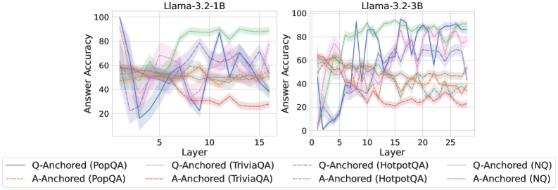
### Visual Description
## Line Charts: Llama-3.2 Model Layer-wise Answer Accuracy
### Overview
The image displays two side-by-side line charts comparing the "Answer Accuracy" across different layers of two language models: **Llama-3.2-1B** (left) and **Llama-3.2-3B** (right). Each chart plots the performance of eight different experimental conditions, defined by an anchoring method (Q-Anchored or A-Anchored) applied to four distinct question-answering datasets (PopQA, TriviaQA, HotpotQA, NQ).
### Components/Axes
* **Titles:**
* Left Chart: `Llama-3.2-1B`
* Right Chart: `Llama-3.2-3B`
* **Y-Axis (Both Charts):**
* Label: `Answer Accuracy`
* Scale: 0 to 100, with major tick marks at 0, 20, 40, 60, 80, 100.
* **X-Axis (Both Charts):**
* Label: `Layer`
* Scale (Llama-3.2-1B): 0 to 15, with major tick marks at 5, 10, 15.
* Scale (Llama-3.2-3B): 0 to 25, with major tick marks at 5, 10, 15, 20, 25.
* **Legend (Bottom, spanning both charts):**
* Positioned below the x-axes of both charts.
* Contains 8 entries, each with a unique line style/color and label:
1. `Q-Anchored (PopQA)` - Solid blue line.
2. `Q-Anchored (TriviaQA)` - Solid green line.
3. `Q-Anchored (HotpotQA)` - Dashed purple line.
4. `Q-Anchored (NQ)` - Dotted pink line.
5. `A-Anchored (PopQA)` - Dash-dot orange line.
6. `A-Anchored (TriviaQA)` - Dash-dot red line.
7. `A-Anchored (HotpotQA)` - Dash-dot-dot gray line.
8. `A-Anchored (NQ)` - Dash-dot-dot brown line.
### Detailed Analysis
**Llama-3.2-1B Chart (Left):**
* **General Trend:** Most lines show significant fluctuation across layers, with no single, smooth monotonic trend for any condition.
* **Q-Anchored (TriviaQA) - Solid Green:** This is the top-performing line for most layers after layer 5. It starts around 50% accuracy, rises sharply to a peak of ~90% near layer 10, and remains high (between 80-90%) through layer 15.
* **Q-Anchored (PopQA) - Solid Blue:** Shows extreme volatility. It starts very high (~100% at layer 1), plummets to ~15% by layer 3, recovers to ~90% near layer 11, and ends around 40% at layer 15.
* **A-Anchored Lines (Orange, Red, Gray, Brown):** These lines are generally clustered in the lower half of the chart (20-60% accuracy). They exhibit less extreme volatility than the Q-Anchored PopQA line but still fluctuate considerably. The A-Anchored (TriviaQA) - Red line trends downward from ~60% to ~25%.
* **Q-Anchored (HotpotQA) - Dashed Purple & Q-Anchored (NQ) - Dotted Pink:** These lines occupy the middle range (40-80%), with the HotpotQA line generally above the NQ line. Both show a general, noisy upward trend from layer 1 to layer 15.
**Llama-3.2-3B Chart (Right):**
* **General Trend:** Similar high volatility is present, but the performance spread between the best and worst conditions appears wider, and the peak accuracies are higher.
* **Q-Anchored (TriviaQA) - Solid Green:** Again a top performer. It starts near 60%, climbs to a peak of ~95% around layer 15, and maintains >90% accuracy through layer 25.
* **Q-Anchored (PopQA) - Solid Blue:** Extremely volatile. It starts near 0%, spikes to ~90% by layer 5, drops to ~40%, then oscillates wildly between 40-95% for the remaining layers.
* **Q-Anchored (HotpotQA) - Dashed Purple:** Shows a strong, noisy upward trend, starting near 40% and reaching peaks above 90% in later layers (20-25).
* **A-Anchored Lines:** The A-Anchored (TriviaQA) - Red line shows a clear downward trend from ~60% to ~20%. The other A-Anchored lines (PopQA-Orange, HotpotQA-Gray, NQ-Brown) are clustered between 20-60%, showing moderate fluctuation without a strong directional trend.
### Key Observations
1. **Dataset Performance Hierarchy:** Across both models, the **TriviaQA** dataset (green and red lines) consistently yields the highest accuracy when using Q-Anchoring and the lowest when using A-Anchoring. This suggests TriviaQA is highly sensitive to the anchoring method.
2. **Anchoring Method Impact:** **Q-Anchoring** (solid/dashed/dotted lines) generally leads to higher peak accuracy and greater volatility compared to **A-Anchoring** (dash-dot lines), which produces more stable but lower performance.
3. **Model Size Effect:** The larger **Llama-3.2-3B** model achieves higher peak accuracies (near 95%) compared to the 1B model (near 90%) and sustains high performance for the best conditions (Q-Anchored TriviaQA) across more layers.
4. **Layer-wise Volatility:** Accuracy does not improve smoothly with depth. Instead, it exhibits sharp peaks and troughs, indicating that specific layers are specialized for certain types of knowledge or reasoning tasks related to the datasets.
5. **PopQA Anomaly:** The Q-Anchored PopQA condition (solid blue) is an outlier in its extreme volatility, especially in the 1B model, suggesting the model's handling of this dataset is highly unstable across layers.
### Interpretation
This data visualizes the internal "knowledge localization" within Llama-3.2 models. The key finding is that **factual knowledge is not stored uniformly across the model's layers**. Instead, specific layers become "experts" for specific datasets, and this expertise is dramatically unlocked or suppressed by the prompting strategy (Q-Anchoring vs. A-Anchoring).
* **Q-Anchoring** likely activates a more direct, question-focused retrieval pathway, leading to high but brittle performance concentrated in specific layers. The extreme volatility of the PopQA line suggests its knowledge is particularly fragmented.
* **A-Anchoring** may engage a more generalized, answer-generation pathway, resulting in more stable but sub-optimal performance across layers.
* The **downward trend of A-Anchored TriviaQA** is particularly notable. It suggests that as information propagates through the network, the model's ability to generate the correct answer *without* the question prompt degrades, implying the knowledge is tightly coupled to the question context.
* The **superior and sustained performance of Q-Anchored TriviaQA** in the larger model indicates that scaling model size may improve the robustness and consolidation of knowledge for certain tasks when the correct prompting strategy is used.
In essence, the charts argue that understanding a model's capabilities requires probing its internal layer-wise structure and that performance is a complex interaction between model scale, dataset nature, and prompting technique.
</details>
<details>
<summary>x70.png Details</summary>
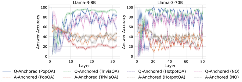
### Visual Description
## Line Charts: Answer Accuracy Across Layers for Llama-3 Models
### Overview
The image contains two side-by-side line charts comparing the "Answer Accuracy" of different question-answering (QA) datasets across the layers of two large language models: Llama-3-8B (left chart) and Llama-3-70B (right chart). The charts evaluate two distinct methods, "Q-Anchored" and "A-Anchored," across four datasets: PopQA, TriviaQA, HotpotQA, and NQ.
### Components/Axes
* **Chart Titles:** "Llama-3-8B" (left), "Llama-3-70B" (right).
* **Y-Axis (Both Charts):** Label: "Answer Accuracy". Scale: 0 to 100, with major ticks at intervals of 20 (0, 20, 40, 60, 80, 100).
* **X-Axis (Left Chart - Llama-3-8B):** Label: "Layer". Scale: 0 to 30, with major ticks at 0, 10, 20, 30.
* **X-Axis (Right Chart - Llama-3-70B):** Label: "Layer". Scale: 0 to 80, with major ticks at 0, 20, 40, 60, 80.
* **Legend (Bottom, spanning both charts):** Contains 8 entries, differentiating lines by color and style (solid vs. dashed).
* **Q-Anchored (Solid Lines):**
* Blue: Q-Anchored (PopQA)
* Green: Q-Anchored (TriviaQA)
* Purple: Q-Anchored (HotpotQA)
* Pink: Q-Anchored (NQ)
* **A-Anchored (Dashed Lines):**
* Orange: A-Anchored (PopQA)
* Red: A-Anchored (TriviaQA)
* Brown: A-Anchored (HotpotQA)
* Gray: A-Anchored (NQ)
### Detailed Analysis
**Llama-3-8B Chart (Left):**
* **Q-Anchored (Solid Lines):** All four solid lines show a general trend of increasing accuracy from layer 0, peaking in the middle-to-late layers (approximately layers 10-25), and then slightly declining or stabilizing towards layer 30.
* **Q-Anchored (TriviaQA - Green):** Appears to be the top performer, reaching near 100% accuracy around layer 15 and maintaining high accuracy (>80%) thereafter.
* **Q-Anchored (HotpotQA - Purple):** Shows high volatility but generally high accuracy, peaking around 90% in the mid-layers.
* **Q-Anchored (PopQA - Blue) & (NQ - Pink):** Follow similar trajectories, peaking between 70-90% accuracy in the mid-layers.
* **A-Anchored (Dashed Lines):** All four dashed lines exhibit significantly lower accuracy compared to their Q-Anchored counterparts. They start around 40-60% accuracy at layer 0, show a general downward trend with high volatility, and mostly settle between 20-40% accuracy in the later layers.
* **A-Anchored (TriviaQA - Red):** Shows the most pronounced decline, dropping to near 20% accuracy by layer 30.
* The other A-Anchored lines (PopQA - Orange, HotpotQA - Brown, NQ - Gray) cluster together in the 30-40% range in the final layers.
**Llama-3-70B Chart (Right):**
* **Q-Anchored (Solid Lines):** The pattern is similar to the 8B model but extended over more layers. Accuracy rises sharply in the first ~10 layers, reaches a high plateau (often between 80-100%) from layers ~15 to ~60, and shows a slight decline or increased volatility in the final 20 layers.
* **Q-Anchored (TriviaQA - Green) & (HotpotQA - Purple):** Consistently perform at the top, frequently touching or exceeding 90% accuracy through the middle layers.
* **Q-Anchored (PopQA - Blue) & (NQ - Pink):** Also perform strongly, generally staying above 70% accuracy in the stable middle region.
* **A-Anchored (Dashed Lines):** As with the 8B model, these lines perform markedly worse. They start between 40-60%, exhibit a downward trend with significant noise, and converge into a band between approximately 20-40% accuracy from layer 40 onward.
* The four A-Anchored lines are tightly clustered and difficult to distinguish in the later layers, all showing similar low-accuracy, high-volatility behavior.
### Key Observations
1. **Method Dominance:** There is a stark and consistent performance gap between the Q-Anchored (solid lines) and A-Anchored (dashed lines) methods across both models and all four datasets. Q-Anchored is vastly superior.
2. **Layer-wise Trend:** For the effective Q-Anchored method, accuracy follows an inverted-U or plateau shape: low in very early layers, high in middle layers, and slightly declining in the final layers.
3. **Model Scale:** The larger Llama-3-70B model maintains high accuracy for a longer span of layers (a wider plateau) compared to the 8B model, suggesting more robust internal processing across its depth.
4. **Dataset Variation:** Among the Q-Anchored results, TriviaQA (green) and HotpotQA (purple) often achieve the highest peak accuracies, while PopQA and NQ are slightly lower but follow the same pattern.
5. **A-Anchored Instability:** The A-Anchored method not only yields lower accuracy but also shows high volatility (jagged lines), indicating unstable performance across layers.
### Interpretation
This data strongly suggests that the **"Q-Anchored" approach is fundamentally more effective** for extracting accurate answers from these Llama-3 models than the "A-Anchored" approach. The Q-Anchored method likely leverages the model's internal representations in a way that aligns better with its knowledge retrieval and reasoning processes, particularly in the middle layers which are often associated with higher-level semantic processing.
The **decline in accuracy in the final layers** for the Q-Anchored method is a notable finding. It could indicate that the very last layers are specialized for tasks other than direct answer generation (e.g., output formatting, safety filtering) or that the signal becomes nozier. The **superior and more stable performance of the 70B model** demonstrates the benefit of scale, not just in peak accuracy but in maintaining that accuracy across a broader section of the network.
The **poor and unstable performance of the A-Anchored method** serves as a critical control, highlighting that not all probing or anchoring techniques are equal. Its failure across all datasets and models points to a methodological flaw in how it interfaces with the model's knowledge. For technical document purposes, this chart provides clear empirical evidence to guide the selection of methodologies when working with Llama-3 models for question-answering tasks.
</details>
<details>
<summary>x71.png Details</summary>
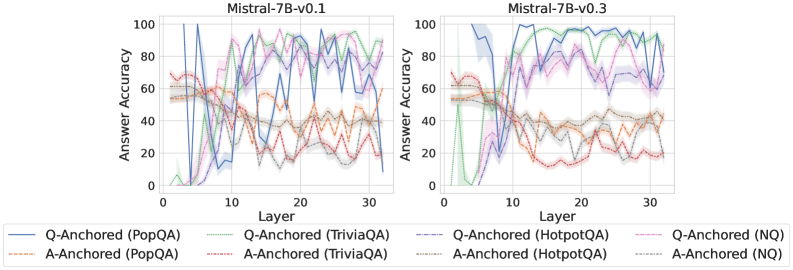
### Visual Description
## Line Charts: Mistral-7B Model Layer-wise Answer Accuracy
### Overview
The image displays two side-by-side line charts comparing the layer-wise answer accuracy of two versions of the Mistral-7B language model (v0.1 and v0.3) across four different question-answering datasets. Each chart plots "Answer Accuracy" (y-axis) against the model's internal "Layer" number (x-axis) for two anchoring methods: "Q-Anchored" (question-anchored) and "A-Anchored" (answer-anchored).
### Components/Axes
* **Chart Titles:** "Mistral-7B-v0.1" (left chart), "Mistral-7B-v0.3" (right chart).
* **X-Axis:** Labeled "Layer". Scale runs from 0 to approximately 32, with major tick marks at 0, 10, 20, and 30.
* **Y-Axis:** Labeled "Answer Accuracy". Scale runs from 0 to 100, with major tick marks at 0, 20, 40, 60, 80, and 100.
* **Legend:** Positioned below both charts. It defines eight data series using a combination of color and line style:
* **Q-Anchored Series (Solid Lines):**
* Blue solid line: `Q-Anchored (PopQA)`
* Green solid line: `Q-Anchored (TriviaQA)`
* Purple solid line: `Q-Anchored (HotpotQA)`
* Pink solid line: `Q-Anchored (NQ)`
* **A-Anchored Series (Dashed/Dotted Lines):**
* Orange dashed line: `A-Anchored (PopQA)`
* Red dashed line: `A-Anchored (TriviaQA)`
* Brown dashed line: `A-Anchored (HotpotQA)`
* Gray dashed line: `A-Anchored (NQ)`
### Detailed Analysis
**Chart 1: Mistral-7B-v0.1**
* **Trend Verification:** The Q-Anchored (solid) lines generally show an initial rise, peak in the middle layers (approx. layers 8-20), and then exhibit high variance or decline in later layers. The A-Anchored (dashed) lines tend to start higher in early layers but show a more consistent downward trend as layer depth increases.
* **Data Points (Approximate):**
* **Q-Anchored (PopQA - Blue Solid):** Starts near 0% at layer 0, spikes to ~100% around layer 8, then fluctuates wildly between ~40% and ~100% for the remaining layers.
* **Q-Anchored (TriviaQA - Green Solid):** Starts near 0%, rises to ~80% by layer 10, peaks near ~95% around layer 25, and ends near ~80% at layer 32.
* **A-Anchored (PopQA - Orange Dashed):** Starts around ~60% at layer 0, gradually declines with fluctuations, ending near ~40% at layer 32.
* **A-Anchored (TriviaQA - Red Dashed):** Starts around ~70%, declines steadily to ~20% by layer 20, and remains low.
**Chart 2: Mistral-7B-v0.3**
* **Trend Verification:** A significant shift is visible. The Q-Anchored (solid) lines rise sharply and reach high accuracy (>80%) by layer 10, maintaining high performance with less variance through the later layers. The A-Anchored (dashed) lines still show a declining trend but start from a lower initial point compared to v0.1.
* **Data Points (Approximate):**
* **Q-Anchored (PopQA - Blue Solid):** Rises steeply from ~0% to ~100% by layer 8, and remains consistently near or at 100% through layer 32.
* **Q-Anchored (TriviaQA - Green Solid):** Follows a similar steep rise to ~90% by layer 10 and stays between ~85%-95% thereafter.
* **A-Anchored (PopQA - Orange Dashed):** Starts around ~55%, declines to ~40% by layer 15, and fluctuates around 30-40% for later layers.
* **A-Anchored (TriviaQA - Red Dashed):** Starts around ~65%, drops sharply to ~20% by layer 12, and remains very low (~10-20%).
### Key Observations
1. **Version Comparison:** Mistral-7B-v0.3 shows a dramatic improvement in the performance of Q-Anchored methods. They achieve high accuracy much earlier (by layer ~8-10) and sustain it, whereas in v0.1, performance was more volatile and peaked later.
2. **Anchoring Method Divergence:** Across both model versions, Q-Anchored methods consistently outperform A-Anchored methods in the middle and later layers. The gap between the two methods widens significantly in v0.3.
3. **Dataset Variability:** Performance varies by dataset. For example, in v0.3, `Q-Anchored (PopQA)` reaches a perfect 100% and stays there, while `Q-Anchored (HotpotQA)` (purple solid) shows more fluctuation between 60-90% in the later layers.
4. **Early Layer Behavior:** In both models, accuracy for most series is low in the very first layers (0-5), indicating the initial layers are not specialized for this task.
### Interpretation
The data suggests a fundamental difference in how information is processed across the layers of the two model versions. The "Q-Anchored" approach, which likely measures the model's internal representation of the question, becomes a strong predictor of final answer accuracy early in the network of v0.3. This implies that v0.3 has developed more robust and task-relevant representations in its early-to-mid layers.
Conversely, the declining trend of "A-Anchored" accuracy suggests that the direct representation of the answer becomes less determinative or is transformed as information flows through the network. The stark improvement from v0.1 to v0.3 indicates that the model update significantly enhanced the model's ability to encode and preserve question-relevant information through its processing depth, leading to more reliable performance. The persistent variability in datasets like HotpotQA (which involves multi-hop reasoning) highlights that complex reasoning remains a greater challenge even in the improved model.
</details>
Figure 28: Comparisons of answer accuracy between pathways, probing mlp activations of the token immediately preceding the exact answer tokens.
<details>
<summary>x72.png Details</summary>
### Visual Description
\n
## Line Charts: Answer Accuracy Across Layers for Llama-3.2 Models
### Overview
The image displays two side-by-side line charts comparing the "Answer Accuracy" of two language models, Llama-3.2-1B and Llama-3.2-3B, across their internal layers. Each chart plots the performance of eight different evaluation configurations, defined by an anchoring method (Q-Anchored or A-Anchored) and a dataset (PopQA, TriviaQA, HotpotQA, NQ).
### Components/Axes
* **Chart Titles:** "Llama-3.2-1B" (left chart), "Llama-3.2-3B" (right chart).
* **X-Axis:** Labeled "Layer". The left chart (1B model) has ticks at 5, 10, and 15, with data plotted from approximately layer 1 to 16. The right chart (3B model) has ticks at 5, 10, 15, 20, and 25, with data plotted from approximately layer 1 to 27.
* **Y-Axis:** Labeled "Answer Accuracy". Both charts share the same scale from 0 to 100, with major ticks at 0, 20, 40, 60, 80, and 100.
* **Legend:** Positioned at the bottom center of the image, spanning both charts. It defines eight data series:
1. `Q-Anchored (PopQA)`: Solid blue line.
2. `Q-Anchored (TriviaQA)`: Solid green line.
3. `Q-Anchored (HotpotQA)`: Dashed blue line.
4. `Q-Anchored (NQ)`: Dashed pink line.
5. `A-Anchored (PopQA)`: Dashed orange line.
6. `A-Anchored (TriviaQA)`: Dashed red line.
7. `A-Anchored (HotpotQA)`: Dotted grey line.
8. `A-Anchored (NQ)`: Dotted teal line.
* **Data Series:** Each series is represented by a line with a shaded region, likely indicating confidence intervals or standard deviation across multiple runs.
### Detailed Analysis: Llama-3.2-1B (Left Chart)
* **Q-Anchored Series (Solid/Dashed Lines):** These lines generally start at low accuracy (below 20) in the earliest layers, rise sharply to a peak between layers 5-10, and then exhibit a gradual decline or fluctuation in later layers.
* `Q-Anchored (TriviaQA)` (Solid Green): Shows the highest peak, reaching near 100% accuracy around layer 7-8. It then declines to approximately 70% by layer 16.
* `Q-Anchored (PopQA)` (Solid Blue): Peaks around 95% near layer 8, then declines to about 80% by layer 16.
* `Q-Anchored (NQ)` (Dashed Pink): Peaks around 90% near layer 7, then shows a more pronounced decline to roughly 60% by layer 16.
* `Q-Anchored (HotpotQA)` (Dashed Blue): Follows a similar pattern to PopQA but with slightly lower peak accuracy (~85%).
* **A-Anchored Series (Dashed/Dotted Lines):** These lines show significantly less variation across layers. They start at a moderate accuracy (around 40-50%) and remain relatively flat, with a slight downward trend in the middle layers (5-10) before recovering.
* All four A-Anchored series (`PopQA`, `TriviaQA`, `HotpotQA`, `NQ`) cluster tightly between approximately 30% and 50% accuracy throughout all layers. `A-Anchored (TriviaQA)` (Dashed Red) appears to be the lowest-performing, dipping to near 30% around layer 8.
### Detailed Analysis: Llama-3.2-3B (Right Chart)
* **Q-Anchored Series:** The pattern is similar to the 1B model but with higher overall accuracy and more pronounced volatility in later layers.
* `Q-Anchored (TriviaQA)` (Solid Green): Again achieves the highest peak, reaching nearly 100% around layer 10. It shows significant drops and recoveries, ending near 90% at layer 27.
* `Q-Anchored (PopQA)` (Solid Blue): Peaks near 95% around layer 10, then fluctuates between 70-90% in later layers.
* `Q-Anchored (NQ)` (Dashed Pink): Peaks around 90% near layer 8, then declines more steeply than the 1B model, falling to approximately 60% by layer 27.
* `Q-Anchored (HotpotQA)` (Dashed Blue): Follows a pattern between PopQA and NQ.
* **A-Anchored Series:** These lines are again clustered and relatively flat, but sit at a slightly lower accuracy band (approximately 25-45%) compared to the 1B model. They exhibit a shallow dip in the middle layers (around layers 10-15).
### Key Observations
1. **Anchoring Method Dominance:** The most striking pattern is the large performance gap between Q-Anchored and A-Anchored evaluations. Q-Anchored methods consistently yield much higher accuracy, especially in the middle layers.
2. **Layer Sensitivity:** Q-Anchored accuracy is highly sensitive to layer depth, showing a characteristic "rise-peak-decline" pattern. A-Anchored accuracy is largely insensitive to layer.
3. **Model Size Effect:** The larger 3B model achieves similar or slightly higher peak accuracies than the 1B model but exhibits more volatility in later layers for Q-Anchored evaluations. The A-Anchored performance is slightly worse in the 3B model.
4. **Dataset Variation:** For Q-Anchored evaluations, TriviaQA consistently yields the highest accuracy, followed by PopQA, HotpotQA, and NQ. This hierarchy is less distinct for A-Anchored evaluations.
### Interpretation
The data suggests a fundamental difference in how information is processed and utilized within the model's layers depending on the evaluation setup.
* **Q-Anchored vs. A-Anchored:** The "Q-Anchored" setup likely provides the model with a direct question or query at each layer, allowing it to dynamically retrieve and refine an answer. The strong layer dependence indicates that the model's internal representations for answering questions are most potent in the middle layers and may become less task-specific or more abstract in the final layers. The "A-Anchored" setup, which may provide an answer cue, appears to bypass this dynamic retrieval process, leading to stable but mediocre performance that doesn't benefit from the model's deeper processing.
* **The "Sweet Spot":** The middle layers (roughly 5-10 for 1B, 8-15 for 3B) appear to be a "sweet spot" for question-answering capability when the model is queried appropriately (Q-Anchored). This could be where factual knowledge is most accessibly encoded.
* **Model Scaling:** Increasing model size from 1B to 3B parameters does not fundamentally change the processing pattern but may increase the capacity for high accuracy (higher peaks) at the cost of less stable representations in deeper layers (greater volatility).
* **Dataset Difficulty:** The consistent performance hierarchy across datasets (TriviaQA > PopQA > HotpotQA > NQ) for Q-Anchored evaluations suggests these datasets vary in difficulty or in how well their question-answer pairs align with the model's pre-training knowledge.
**In summary, the charts demonstrate that the internal processing of a Llama-3.2 model for factual question answering is highly dependent on both the layer being probed and the method of probing. The model's middle layers contain the most potent task-specific representations, but accessing them effectively requires a query-based (Q-Anchored) approach.**
</details>
<details>
<summary>x73.png Details</summary>
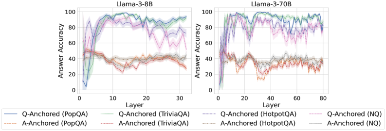
### Visual Description
## Line Charts: Answer Accuracy Across Layers for Llama-3 Models
### Overview
The image displays two side-by-side line charts comparing the "Answer Accuracy" of two Large Language Models (LLMs)—Llama-3-8B and Llama-3-70B—across their internal layers. The performance is measured on four different question-answering (QA) datasets using two distinct prompting or anchoring methods: "Q-Anchored" and "A-Anchored." The charts illustrate how model performance evolves from early to late layers.
### Components/Axes
* **Chart Titles:** "Llama-3-8B" (left chart), "Llama-3-70B" (right chart).
* **Y-Axis (Both Charts):** Label: "Answer Accuracy". Scale: 0 to 100, with major tick marks at intervals of 20 (0, 20, 40, 60, 80, 100).
* **X-Axis (Left Chart - Llama-3-8B):** Label: "Layer". Scale: 0 to 30, with major tick marks at intervals of 10 (0, 10, 20, 30).
* **X-Axis (Right Chart - Llama-3-70B):** Label: "Layer". Scale: 0 to 80, with major tick marks at intervals of 20 (0, 20, 40, 60, 80).
* **Legend (Bottom, spanning both charts):** Contains eight entries, each defined by a line style and color:
1. `Q-Anchored (PopQA)`: Solid blue line.
2. `Q-Anchored (TriviaQA)`: Solid green line.
3. `Q-Anchored (HotpotQA)`: Dashed purple line.
4. `Q-Anchored (NQ)`: Dotted pink line.
5. `A-Anchored (PopQA)`: Dash-dot orange line.
6. `A-Anchored (TriviaQA)`: Dash-dot red line.
7. `A-Anchored (HotpotQA)`: Dash-dot gray line.
8. `A-Anchored (NQ)`: Dash-dot light blue line.
### Detailed Analysis
**Llama-3-8B (Left Chart):**
* **Q-Anchored Series (Solid/Dashed/Dotted Lines):** All four datasets show a similar trend. Accuracy starts very low (near 0-10%) at layer 0, rises sharply to a peak between layers 10-20 (reaching ~90-95% for PopQA/TriviaQA, ~85-90% for HotpotQA/NQ), and then gradually declines or stabilizes at a slightly lower level (~80-90%) towards layer 30. The `Q-Anchored (PopQA)` (solid blue) and `Q-Anchored (TriviaQA)` (solid green) lines are consistently the top performers.
* **A-Anchored Series (Dash-dot Lines):** These series exhibit significantly lower accuracy throughout. They start around 40-50% at layer 0, show a slight dip in the early layers (10-15), and then fluctuate between approximately 30% and 45% for the remainder of the layers. There is no strong upward trend; performance remains relatively flat and noisy. The `A-Anchored (TriviaQA)` (dash-dot red) line appears to be the lowest-performing series overall.
**Llama-3-70B (Right Chart):**
* **Q-Anchored Series:** The pattern is more volatile but follows a similar arc. Accuracy climbs rapidly from layer 0, reaching high levels (>80%) by layer 10. Performance peaks in the middle layers (approximately 20-50), with `Q-Anchored (PopQA)` and `Q-Anchored (TriviaQA)` frequently hitting near 100% accuracy. After layer 50, there is a noticeable downward trend for all Q-Anchored series, ending between 70-90% at layer 80. The lines show more pronounced dips and recoveries compared to the 8B model.
* **A-Anchored Series:** Similar to the 8B model, these series perform poorly. They start around 30-40%, dip to their lowest points (some near 10-20%) between layers 20-40, and then recover slightly to fluctuate between 20-40% for the later layers. The `A-Anchored (TriviaQA)` (dash-dot red) line again shows some of the lowest accuracy values.
### Key Observations
1. **Dominant Performance Gap:** There is a stark and consistent separation between the Q-Anchored and A-Anchored methods across both models and all datasets. Q-Anchored prompting yields dramatically higher answer accuracy.
2. **Layer-Wise Arc:** For the effective Q-Anchored method, performance follows an arc: low in very early layers, peaking in the middle layers, and often declining slightly in the final layers. This suggests the model's "knowledge" or answer formulation is most accessible in its intermediate processing stages.
3. **Model Scale Effect:** The larger Llama-3-70B model achieves higher peak accuracies (near 100% for some datasets) but also exhibits greater volatility and a more pronounced late-layer decline compared to the smaller Llama-3-8B.
4. **Dataset Hierarchy:** For Q-Anchored evaluation, PopQA and TriviaQA consistently yield the highest accuracy, followed by HotpotQA and NQ. This ordering is maintained across both models.
5. **A-Anchored Instability:** The A-Anchored lines are not only lower but also noisier, with significant dips, particularly in the 70B model around layers 20-40.
### Interpretation
The data strongly suggests that the **method of anchoring or prompting (Q-Anchored vs. A-Anchored) is a far more critical factor for extracting accurate answers from these Llama-3 models than the model size or the specific QA dataset.** The Q-Anchored method, which likely involves framing the query in a specific way relative to the model's internal representations, successfully activates the model's parametric knowledge stored in its middle layers.
The observed arc—low early, peak middle, slight decline late—provides a Peircean insight into the model's information processing. The early layers are likely performing low-level feature extraction, the middle layers integrate this into high-level semantic representations where answers are most readily accessible, and the final layers may be specializing for next-token prediction in a way that slightly obfuscates the direct answer retrieval measured here.
The greater volatility and higher peak in the 70B model could indicate that its larger capacity allows for more specialized and powerful internal representations (leading to near-perfect scores) but also makes the retrieval process more sensitive to the specific layer, resulting in less stable performance across the network. The consistently poor performance of A-Anchored methods implies that this approach fails to properly interface with the models' knowledge stores, possibly by providing the wrong type of cue or context.
</details>
<details>
<summary>x74.png Details</summary>
### Visual Description
## Line Charts: Mistral-7B Model Layer-wise Answer Accuracy by Anchoring Method and Dataset
### Overview
The image displays two side-by-side line charts comparing the "Answer Accuracy" across model layers (0-30) for two versions of the Mistral-7B model: **Mistral-7B-v0.1** (left chart) and **Mistral-7B-v0.3** (right chart). Each chart plots the performance of eight different experimental conditions, defined by a combination of an anchoring method (Q-Anchored or A-Anchored) and a question-answering dataset (PopQA, TriviaQA, HotpotQA, NQ). The charts include shaded regions around each line, likely representing confidence intervals or standard deviation.
### Components/Axes
* **Chart Titles:** "Mistral-7B-v0.1" (left), "Mistral-7B-v0.3" (right).
* **Y-Axis:** Labeled "Answer Accuracy". Scale runs from 0 to 100 in increments of 20.
* **X-Axis:** Labeled "Layer". Scale runs from 0 to 30 in increments of 10.
* **Legend:** Positioned below both charts. Contains 8 entries, each with a unique line style and color:
1. `Q-Anchored (PopQA)`: Solid blue line.
2. `A-Anchored (PopQA)`: Dashed orange line.
3. `Q-Anchored (TriviaQA)`: Solid green line.
4. `A-Anchored (TriviaQA)`: Dashed red line.
5. `Q-Anchored (HotpotQA)`: Solid purple line.
6. `A-Anchored (HotpotQA)`: Dashed brown line.
7. `Q-Anchored (NQ)`: Solid pink line.
8. `A-Anchored (NQ)`: Dashed gray line.
### Detailed Analysis
**General Trend Across Both Charts:**
* **Q-Anchored Methods (Solid Lines):** These lines consistently achieve higher accuracy than their A-Anchored counterparts. They typically start low (near 0-20% at Layer 0), rise sharply within the first 5-10 layers to a high plateau (often between 80-100%), and maintain relatively high accuracy through Layer 30, with some fluctuations.
* **A-Anchored Methods (Dashed Lines):** These lines show significantly lower accuracy. They often start around 40-50% at Layer 0, exhibit high volatility (sharp peaks and troughs) in the early layers (0-10), and then generally trend downward or stabilize at a lower level (approximately 20-40%) in the later layers (10-30).
**Mistral-7B-v0.1 (Left Chart) Specifics:**
* **Q-Anchored (PopQA - Blue):** Rises steeply to ~95% by Layer 5, peaks near 100% around Layer 10, and remains high (~90-95%) thereafter.
* **Q-Anchored (TriviaQA - Green):** Follows a similar steep rise, reaching ~95% by Layer 5, but shows more volatility in the mid-layers (10-20) before stabilizing near 90%.
* **Q-Anchored (HotpotQA - Purple):** Rises to ~90% by Layer 5, dips slightly around Layer 15, then recovers to ~90%.
* **Q-Anchored (NQ - Pink):** Shows the most volatile rise among Q-Anchored lines, reaching ~90% by Layer 5 but with significant dips, notably around Layer 3 and Layer 15.
* **A-Anchored Lines:** All start between 40-50%. They show a general downward trend after Layer 10, converging into a band between ~20-40% by Layer 30. `A-Anchored (TriviaQA - Red)` appears to be the lowest-performing series in the later layers.
**Mistral-7B-v0.3 (Right Chart) Specifics:**
* **Q-Anchored Methods:** The overall pattern is similar to v0.1, but the rise to high accuracy appears slightly more consistent and less volatile in the very early layers (0-5). The plateau accuracy levels are comparable (80-100%).
* **A-Anchored Methods:** The downward trend after the initial layers is more pronounced. By Layer 30, most A-Anchored lines are clustered tightly between ~20-35%, with `A-Anchored (TriviaQA - Red)` again appearing among the lowest.
### Key Observations
1. **Dominant Performance Gap:** The most striking feature is the large and consistent performance gap between Q-Anchored (solid lines) and A-Anchored (dashed lines) methods across all datasets and both model versions. Q-Anchored methods are vastly superior.
2. **Layer Sensitivity:** Q-Anchored performance improves dramatically with depth in the early layers (0-10) and then stabilizes. A-Anchored performance is highly unstable in early layers and degrades or stagnates in later layers.
3. **Dataset Variability:** While the Q-Anchored vs. A-Anchored pattern holds for all datasets, there is variability in the exact accuracy levels and volatility. For example, `Q-Anchored (NQ)` shows more dips than `Q-Anchored (PopQA)`.
4. **Model Version Similarity:** The overall trends and relative performance of the methods are remarkably consistent between Mistral-7B-v0.1 and v0.3, suggesting the observed phenomenon is robust to this version update.
### Interpretation
This data strongly suggests that the **anchoring strategy** (framing the model's internal processing around the question vs. the answer) is a critical factor influencing the accuracy of the Mistral-7B model across its layers.
* **Q-Anchoring is Highly Effective:** Processing information anchored to the question leads to high accuracy that develops early in the network (first 10 layers) and is maintained. This implies the model's middle and later layers are well-optimized for question-centric reasoning.
* **A-Anchoring is Detrimental:** Anchoring to the answer appears to confuse or misdirect the model's processing. The initial volatility suggests instability in early feature extraction, and the subsequent decline indicates that deeper layers cannot effectively build upon this flawed foundation. It may force the model into a less natural or more constrained processing path.
* **Practical Implication:** For tasks using these models (like retrieval-augmented generation or question answering), system prompts or architectural designs that encourage the model to "think from the question" (Q-Anchored) are likely to yield significantly better results than those that start from or emphasize the answer (A-Anchored).
* **Underlying Mechanism:** The charts provide empirical evidence for a specific form of **layer-wise specialization** in LLMs. The early layers (0-10) appear to be crucial for establishing the correct "frame" (question-anchored), which then enables stable, high-performance reasoning in subsequent layers. An incorrect frame (answer-anchored) leads to a cascade of errors.
</details>
Figure 29: Comparisons of answer accuracy between pathways, probing mlp activations of the last exact answer token.
## Appendix G I-Don’t-Know Rate
<details>
<summary>x75.png Details</summary>
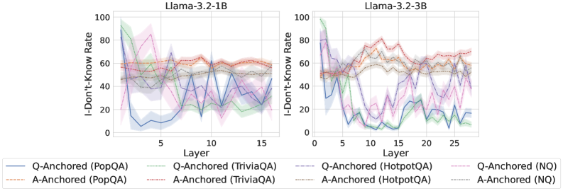
### Visual Description
\n
## Line Charts: "I-Don't-Know Rate" Across Model Layers for Llama-3.2 Models
### Overview
The image displays two side-by-side line charts comparing the "I-Don't-Know Rate" across the internal layers of two different-sized language models: Llama-3.2-1B (left) and Llama-3.2-3B (right). The charts track how the model's tendency to express uncertainty (an "I don't know" response) changes as information propagates through its layers, using two different prompting methods ("Q-Anchored" and "A-Anchored") across four different question-answering datasets.
### Components/Axes
* **Chart Titles:**
* Left Chart: `Llama-3.2-1B`
* Right Chart: `Llama-3.2-3B`
* **Y-Axis (Both Charts):** Label: `I-Don't-Know Rate`. Scale: 0 to 100, with major tick marks at 0, 20, 40, 60, 80, 100.
* **X-Axis (Both Charts):** Label: `Layer`.
* Left Chart Scale: 0 to 15, with major tick marks at 0, 5, 10, 15.
* Right Chart Scale: 0 to 25, with major tick marks at 0, 5, 10, 15, 20, 25.
* **Legend (Bottom, spanning both charts):** Contains 8 entries, each a combination of an anchoring method and a dataset. The legend is positioned below the X-axes of both charts.
1. `Q-Anchored (PopQA)` - Solid blue line.
2. `A-Anchored (PopQA)` - Dashed orange line.
3. `Q-Anchored (TriviaQA)` - Solid green line.
4. `A-Anchored (TriviaQA)` - Dashed red line.
5. `Q-Anchored (HotpotQA)` - Solid purple line.
6. `A-Anchored (HotpotQA)` - Dashed brown line.
7. `Q-Anchored (NQ)` - Solid pink line.
8. `A-Anchored (NQ)` - Dashed gray line.
### Detailed Analysis
**Chart 1: Llama-3.2-1B (Left)**
* **General Trend:** The "Q-Anchored" lines (solid) show high initial rates (60-100) that drop dramatically within the first 3-5 layers, then exhibit significant volatility (spikes and dips) between layers 5 and 15. The "A-Anchored" lines (dashed) are much more stable, generally hovering between 40 and 70 across all layers with less pronounced fluctuations.
* **Key Data Points (Approximate):**
* **Q-Anchored (PopQA - Blue):** Starts ~95 at layer 0, plummets to ~10 by layer 3, then fluctuates between ~5 and ~60.
* **Q-Anchored (TriviaQA - Green):** Starts ~100, drops to ~20 by layer 5, then shows a notable spike back to ~60 around layer 10 before falling again.
* **A-Anchored (All Datasets):** All four dashed lines cluster in the 40-70 band. For example, A-Anchored (PopQA - Orange) remains near 60 for most layers.
**Chart 2: Llama-3.2-3B (Right)**
* **General Trend:** Similar initial drop for Q-Anchored lines, but the subsequent behavior differs. The volatility in later layers appears more pronounced, and the separation between some lines is clearer. The A-Anchored lines again show more stability but with a slightly wider spread than in the 1B model.
* **Key Data Points (Approximate):**
* **Q-Anchored (TriviaQA - Green):** Starts ~100, drops to near 0 around layer 10, then shows a slight recovery to ~10-20 by layer 25.
* **Q-Anchored (PopQA - Blue):** Starts ~90, drops to ~10 by layer 5, then fluctuates between ~5 and ~30.
* **A-Anchored (TriviaQA - Red):** Shows a distinct upward trend from ~50 at layer 0 to a peak of ~80 around layer 12, before settling back to ~70.
* **A-Anchored (HotpotQA - Brown):** Remains relatively flat around 50-60.
### Key Observations
1. **Anchoring Method Dominance:** The most striking pattern is the fundamental difference between Q-Anchored and A-Anchored prompting. Q-Anchored leads to high initial uncertainty that is rapidly reduced in early layers but becomes unstable. A-Anchored results in a more consistent, moderate level of uncertainty throughout the network.
2. **Model Size Effect:** The larger 3B model (right chart) shows more extreme behavior for some Q-Anchored lines (e.g., TriviaQA dropping to near zero) and more distinct trends for some A-Anchored lines (e.g., TriviaQA's rise and fall) compared to the 1B model.
3. **Dataset Variability:** The effect is not uniform across datasets. For instance, the Q-Anchored (TriviaQA) line behaves very differently from Q-Anchored (PopQA) in both models, suggesting the model's uncertainty dynamics are sensitive to the type of knowledge being queried.
4. **Layer-wise Volatility:** The middle layers (approx. 5-15 for 1B, 5-20 for 3B) are regions of high volatility for the Q-Anchored method, where the "I-Don't-Know Rate" can swing by 40-50 points between adjacent layers.
### Interpretation
This data suggests that the **prompting strategy (anchoring) fundamentally alters how uncertainty is processed within the model's layers**. The "Q-Anchored" method (likely prompting with the question) creates a state of high initial uncertainty that the model aggressively tries to resolve in its first few layers, but this process is noisy and unstable in deeper layers. In contrast, the "A-Anchored" method (likely prompting with a potential answer) establishes a more stable, baseline level of uncertainty that persists, possibly indicating a more cautious or verification-focused processing mode.
The differences between the 1B and 3B models imply that **larger models may develop more specialized or pronounced internal mechanisms for handling uncertainty**, as seen in the more extreme dips and clearer trends. The variation across datasets indicates that the model's confidence is not a monolithic property but is **contingent on the specific domain or type of factual knowledge** involved.
From a technical document perspective, this visualization is crucial for understanding the **internal "epistemology" of large language models**—how they manage and express uncertainty as information flows through their architecture. It provides empirical evidence that model behavior can be steered not just by the final output layer, but by interventions (like anchoring) that affect processing in the middle layers.
</details>
<details>
<summary>x76.png Details</summary>
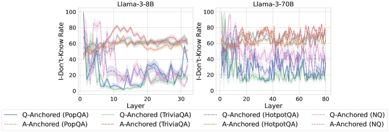
### Visual Description
## Line Charts: I-Don't-Know Rate Across Model Layers
### Overview
The image displays two side-by-side line charts comparing the "I-Don't-Know Rate" across the layers of two different Large Language Models: Llama-3-8B (left) and Llama-3-70B (right). Each chart plots the performance of eight different experimental conditions, defined by an anchoring method (Q-Anchored or A-Anchored) applied to four different question-answering datasets (PopQA, TriviaQA, HotpotQA, NQ).
### Components/Axes
* **Chart Titles:**
* Left Chart: `Llama-3-8B`
* Right Chart: `Llama-3-70B`
* **Y-Axis (Both Charts):**
* Label: `I-Don't-Know Rate`
* Scale: 0 to 100, with major tick marks at 0, 20, 40, 60, 80, 100.
* **X-Axis (Both Charts):**
* Label: `Layer`
* Scale (Llama-3-8B): 0 to 30, with major tick marks at 0, 10, 20, 30.
* Scale (Llama-3-70B): 0 to 80, with major tick marks at 0, 20, 40, 60, 80.
* **Legend (Bottom, spanning both charts):**
* The legend is positioned below the two charts and defines eight distinct lines using a combination of color and line style (solid vs. dashed).
* **Q-Anchored (Solid Lines):**
* Blue solid line: `Q-Anchored (PopQA)`
* Green solid line: `Q-Anchored (TriviaQA)`
* Purple solid line: `Q-Anchored (HotpotQA)`
* Pink solid line: `Q-Anchored (NQ)`
* **A-Anchored (Dashed Lines):**
* Orange dashed line: `A-Anchored (PopQA)`
* Red dashed line: `A-Anchored (TriviaQA)`
* Brown dashed line: `A-Anchored (HotpotQA)`
* Gray dashed line: `A-Anchored (NQ)`
### Detailed Analysis
**Llama-3-8B Chart (Left):**
* **Q-Anchored Lines (Solid):** All four solid lines exhibit a similar, pronounced downward trend. They start at a high I-Don't-Know Rate (between ~60 and ~100) in the earliest layers (Layer 0-5). They then drop sharply, reaching their lowest points (between ~0 and ~30) in the middle layers (approximately Layers 10-20). In the final layers (25-30), they show a slight upward rebound.
* *Trend Verification:* The blue (PopQA) and green (TriviaQA) lines show the most dramatic drop, falling below 10 in the middle layers. The purple (HotpotQA) and pink (NQ) lines follow the same pattern but remain slightly higher.
* **A-Anchored Lines (Dashed):** All four dashed lines show a general upward trend, the inverse of the Q-Anchored lines. They start at a moderate rate (between ~20 and ~50) in the early layers. They rise steadily, peaking in the middle-to-late layers (approximately Layers 15-25) at values between ~60 and ~80. They then plateau or slightly decline towards the final layer.
* *Trend Verification:* The orange (PopQA) and red (TriviaQA) dashed lines reach the highest peaks, near 80. The brown (HotpotQA) and gray (NQ) lines follow a similar shape but peak at lower values (~60-70).
**Llama-3-70B Chart (Right):**
* **General Observation:** The lines in this chart are significantly more volatile and "noisy" compared to the smoother trends in the 8B model. The overall patterns are similar but less cleanly defined.
* **Q-Anchored Lines (Solid):** They still show a general downward trend from early to middle layers, but with much larger fluctuations. The initial values are high (~60-100), and they reach their approximate minima in the middle layers (around Layers 30-50), though the values bounce considerably (e.g., between ~10 and ~40). The final layers show high volatility without a clear, uniform rebound.
* **A-Anchored Lines (Dashed):** They exhibit a general upward trend with high volatility. Starting from moderate values (~30-60), they rise to reach a broad, noisy plateau in the middle-to-late layers (approximately Layers 40-70), with values fluctuating mostly between ~60 and ~85. There is no clear decline in the final layers.
### Key Observations
1. **Inverse Relationship:** There is a clear inverse relationship between the Q-Anchored and A-Anchored conditions across layers in both models. As one set of lines decreases, the other increases.
2. **Model Size Effect:** The larger model (Llama-3-70B) displays much higher variance and noise in its I-Don't-Know Rate across layers compared to the smaller, smoother model (Llama-3-8B).
3. **Dataset Variation:** While the overall trend is consistent for all datasets within an anchoring method, there are consistent offsets. For example, PopQA (blue/orange) and TriviaQA (green/red) often show more extreme values (higher highs and lower lows) than HotpotQA (purple/brown) and NQ (pink/gray).
4. **Layer Sensitivity:** The "crossover point" where the A-Anchored rate surpasses the Q-Anchored rate occurs in the early layers (around Layer 5-10) for both models.
### Interpretation
This data suggests a fundamental difference in how the model's internal representations process uncertainty based on the anchoring prompt. The "I-Don't-Know Rate" is not a static property but evolves dramatically through the network's layers.
* **Q-Anchored (Question-Anchored):** When prompted with the question, the model's early layers express high uncertainty ("I-Don't-Know"). This uncertainty is rapidly resolved in the middle layers, suggesting this is where the core reasoning or retrieval from parametric knowledge occurs. The slight rise in later layers for the 8B model might indicate a final "sanity check" or calibration step.
* **A-Anchored (Answer-Anchored):** When prompted with a potential answer, the model starts with lower uncertainty. The increasing rate through the layers suggests the model is progressively *finding reasons to doubt* the provided answer, with peak skepticism in the middle-to-late layers. This could reflect a process of verification against internal knowledge.
* **Model Scale:** The increased noise in the 70B model's signal might indicate a more complex, distributed, or less linear processing of uncertainty across its many more layers. The core inverse pattern remains, but the path is less deterministic.
* **Peircean Insight:** The charts reveal that the model's expression of ignorance is a *process*, not an output. The anchoring method essentially sets the initial hypothesis (high uncertainty for a question, lower uncertainty for an answer), and the subsequent layers perform an investigative routine that either confirms or challenges that initial state. The middle layers (~10-25 for 8B, ~30-60 for 70B) appear to be the critical "investigative engine" where this processing is most active.
</details>
<details>
<summary>x77.png Details</summary>

### Visual Description
## Line Charts: Mistral-7B-v0.1 and Mistral-7B-v0.3 "I-Don't-Know Rate" by Layer
### Overview
The image displays two side-by-side line charts comparing the "I-Don't-Know Rate" across the 32 layers (0-31) of two versions of the Mistral-7B language model: v0.1 (left) and v0.3 (right). Each chart plots eight data series, representing combinations of two anchoring methods (Q-Anchored and A-Anchored) applied to four different question-answering datasets (PopQA, TriviaQA, HotpotQA, NQ). The charts visualize how the model's expressed uncertainty (the rate of producing an "I don't know" response) varies by layer and model version.
### Components/Axes
* **Titles:**
* Left Chart: `Mistral-7B-v0.1`
* Right Chart: `Mistral-7B-v0.3`
* **Y-Axis (Both Charts):** Label is `I-Don't-Know Rate`. Scale runs from 0 to 100 in increments of 20.
* **X-Axis (Both Charts):** Label is `Layer`. Scale runs from 0 to 30, with major ticks at 0, 10, 20, and 30. The data appears to cover layers 0 through 31.
* **Legend (Bottom, spanning both charts):** Contains eight entries, each with a unique line style and color.
* **Q-Anchored Series (Solid Lines):**
* `Q-Anchored (PopQA)`: Solid blue line.
* `Q-Anchored (TriviaQA)`: Solid green line.
* `Q-Anchored (HotpotQA)`: Solid purple line.
* `Q-Anchored (NQ)`: Solid pink line.
* **A-Anchored Series (Dashed Lines):**
* `A-Anchored (PopQA)`: Dashed orange line.
* `A-Anchored (TriviaQA)`: Dashed red line.
* `A-Anchored (HotpotQA)`: Dashed gray line.
* `A-Anchored (NQ)`: Dashed brown line.
### Detailed Analysis
**Mistral-7B-v0.1 (Left Chart):**
* **General Trend:** All series show high volatility across layers, with sharp peaks and troughs. There is no single monotonic trend for any series.
* **Q-Anchored Series (Solid Lines):** These generally exhibit lower "I-Don't-Know Rates" compared to their A-Anchored counterparts for the same dataset, particularly in the middle layers (approx. 5-25). The solid blue (PopQA) and solid green (TriviaQA) lines show the most dramatic dips, reaching near 0% around layers 10-15 and 20-25.
* **A-Anchored Series (Dashed Lines):** These maintain higher rates, often fluctuating between 40% and 90%. The dashed red (TriviaQA) and dashed gray (HotpotQA) lines are frequently among the highest.
* **Notable Points:**
* A significant convergence of multiple lines occurs around layer 0, starting at high rates (60-100%).
* A pronounced dip for several Q-Anchored series is visible between layers 10 and 15.
* The dashed orange line (A-Anchored PopQA) shows a distinctive peak near layer 25.
**Mistral-7B-v0.3 (Right Chart):**
* **General Trend:** The volatility appears somewhat reduced compared to v0.1, with lines showing slightly smoother transitions between layers. The overall spread between the highest and lowest lines seems narrower.
* **Q-Anchored Series (Solid Lines):** The solid blue (PopQA) line shows a very distinct pattern: it starts high, drops sharply to a low plateau (approx. 10-20%) between layers 10-20, then rises again. The solid green (TriviaQA) line also shows a notable dip in the middle layers.
* **A-Anchored Series (Dashed Lines):** These continue to generally sit higher than the Q-Anchored lines. The dashed red (TriviaQA) and dashed gray (HotpotQA) lines remain prominent at the top of the chart.
* **Notable Points:**
* The separation between the solid blue line (Q-Anchored PopQA) and the others is more sustained and defined in the middle layers compared to v0.1.
* The dashed brown line (A-Anchored NQ) appears to have a lower profile in v0.3 compared to v0.1.
* The overall "floor" of the rates (the lowest points reached) seems slightly higher in v0.3 for most series.
### Key Observations
1. **Anchoring Effect:** Across both model versions and all datasets, the **A-Anchored** (dashed lines) method consistently results in a higher "I-Don't-Know Rate" than the **Q-Anchored** (solid lines) method. This is the most salient pattern.
2. **Dataset Variation:** The choice of dataset significantly impacts the rate. For example, the PopQA dataset (blue/orange lines) often shows more extreme swings, especially in the Q-Anchored configuration.
3. **Model Version Difference:** Mistral-7B-v0.3 exhibits different layer-wise uncertainty profiles than v0.1. The most striking difference is the behavior of the Q-Anchored PopQA series (solid blue), which in v0.3 shows a deep, sustained valley in the middle layers, a pattern less clearly defined in v0.1.
4. **Layer Sensitivity:** The "I-Don't-Know Rate" is highly sensitive to the specific layer within the model, indicating that different layers process or express uncertainty in fundamentally different ways.
### Interpretation
These charts provide a technical diagnostic of how two versions of the Mistral-7B model express calibrated uncertainty ("I don't know") internally across their processing layers. The data suggests several key insights:
* **Anchoring Controls Uncertainty Expression:** The consistent gap between A-Anchored and Q-Anchored lines indicates that the prompting or anchoring strategy is a primary lever for controlling a model's propensity to abstain from answering. A-Anchoring appears to make the model more cautious or more likely to express uncertainty.
* **Model Evolution Changes Internal Dynamics:** The differences between v0.1 and v0.3 show that updates to the model architecture or training data alter not just final output quality, but also the internal, layer-by-layer pathway to generating an answer. The more defined pattern in v0.3 might suggest a more structured or specialized processing of uncertainty.
* **Layers Have Functional Specialization:** The high volatility and lack of a smooth trend imply that layers are not simply becoming "more certain" or "less certain" sequentially. Instead, specific layers or ranges of layers may be critically involved in evidence integration, confidence estimation, or decision gating, and this function varies by the type of question (dataset) and prompting method.
* **Practical Implication:** For developers using these models, this analysis underscores that the model's reliability and calibration are not uniform. To elicit a well-calibrated "I don't know," one must consider both the **prompting strategy** (Q vs. A-Anchored) and potentially the **internal layer** from which a final answer is derived, if such control is available. The model version is also a critical factor.
</details>
Figure 30: Comparisons of i-don’t-know rate between pathways, probing attention activations of the final token.
<details>
<summary>x78.png Details</summary>
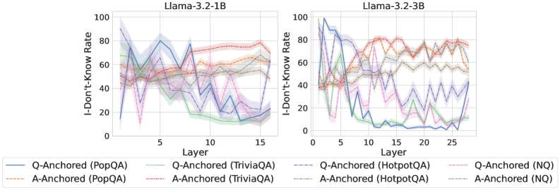
### Visual Description
## Line Charts: I-Don't-Know Rate Across Model Layers
### Overview
The image displays two side-by-side line charts comparing the "I-Don't-Know Rate" across the layers of two different language models: Llama-3.2-1B (left) and Llama-3.2-3B (right). The charts track how this rate changes for different question-answering datasets under two anchoring conditions (Q-Anchored and A-Anchored).
### Components/Axes
* **Titles:**
* Left Chart: `Llama-3.2-1B`
* Right Chart: `Llama-3.2-3B`
* **Y-Axis (Both Charts):** Label: `I-Don't-Know Rate`. Scale: 0 to 100, with major tick marks at 0, 20, 40, 60, 80, 100.
* **X-Axis (Both Charts):** Label: `Layer`.
* Left Chart Scale: 0 to 15, with major tick marks at 0, 5, 10, 15.
* Right Chart Scale: 0 to 25, with major tick marks at 0, 5, 10, 15, 20, 25.
* **Legend (Bottom, spanning both charts):** Contains 8 entries, differentiating lines by color and style (solid vs. dashed).
* **Solid Lines (Q-Anchored):**
* Blue: `Q-Anchored (PopQA)`
* Green: `Q-Anchored (TriviaQA)`
* Purple: `Q-Anchored (HotpotQA)`
* Pink: `Q-Anchored (NQ)`
* **Dashed Lines (A-Anchored):**
* Orange: `A-Anchored (PopQA)`
* Red: `A-Anchored (TriviaQA)`
* Brown: `A-Anchored (HotpotQA)`
* Gray: `A-Anchored (NQ)`
### Detailed Analysis
**Chart 1: Llama-3.2-1B**
* **Q-Anchored Lines (Solid):** All four solid lines show a general **downward trend** as layer number increases.
* They start with high variability and high rates (between ~40% and ~90%) in the early layers (0-5).
* They converge and decline significantly after layer 5, ending in a tighter cluster between approximately 10% and 30% by layer 15.
* The blue line (PopQA) shows the most dramatic drop, from near 90% to below 20%.
* **A-Anchored Lines (Dashed):** All four dashed lines show a relatively **stable or slightly increasing trend**.
* They start in a middle range (between ~40% and ~60%) and remain within a band of approximately 50% to 80% across all layers.
* There is less dramatic change compared to the Q-Anchored lines. The red line (TriviaQA) appears to be among the highest, ending near 80%.
**Chart 2: Llama-3.2-3B**
* **Q-Anchored Lines (Solid):** The downward trend is **more pronounced and steeper** than in the 1B model.
* Starting from high and variable points (some near 100%), they drop sharply after layer 5.
* By layer 15, most Q-Anchored lines have fallen to very low rates, with several approaching or reaching 0%. The blue (PopQA) and green (TriviaQA) lines are notably close to 0% from layer 10 onward.
* The lines show more volatility (sharp spikes and dips) compared to the 1B model.
* **A-Anchored Lines (Dashed):** These lines maintain a **high and relatively stable trend**, similar to the 1B model but with more pronounced fluctuations.
* They generally occupy the upper portion of the chart, mostly between 60% and 80%.
* The red (TriviaQA) and orange (PopQA) dashed lines are consistently among the highest.
### Key Observations
1. **Anchoring Effect:** There is a stark and consistent difference between Q-Anchored (solid) and A-Anchored (dashed) conditions across both models. Q-Anchoring leads to a decreasing "I-Don't-Know" rate with depth, while A-Anchoring maintains a high rate.
2. **Model Size Effect:** The larger model (3B) exhibits a more extreme version of the trends seen in the smaller model (1B). The decline for Q-Anchored lines is steeper and reaches lower final values, and the fluctuations are more dramatic.
3. **Layer Dependency:** The critical transition for Q-Anchored lines appears to happen after layer 5 in both models.
4. **Dataset Variation:** While the overall trend by anchoring type is dominant, there is variation between datasets. For example, A-Anchored TriviaQA (red dashed) often has the highest rate, while Q-Anchored PopQA (blue solid) often shows the most dramatic decline.
### Interpretation
This data suggests a fundamental difference in how the model processes information depending on the anchoring prompt. **Q-Anchoring** (likely prompting with the question) appears to activate the model's internal knowledge progressively through its layers, reducing uncertainty ("I-Don't-Know") as information is processed deeper in the network. This effect is stronger in the larger model.
Conversely, **A-Anchoring** (likely prompting with a potential answer) seems to keep the model in a state of higher uncertainty throughout its processing depth. This could indicate that this prompting style does not effectively engage the knowledge retrieval pathways, or it may trigger a more cautious, verification-oriented process that maintains a high "I-Don't-Know" rate.
The charts provide visual evidence that the method of prompting (anchoring) has a more significant impact on this uncertainty metric than the specific knowledge dataset (PopQA, TriviaQA, etc.) or even the model size, although model size amplifies the observed effects. The clear layer-wise progression for Q-Anchored lines offers insight into the sequential nature of knowledge processing within the transformer architecture.
</details>
<details>
<summary>x79.png Details</summary>
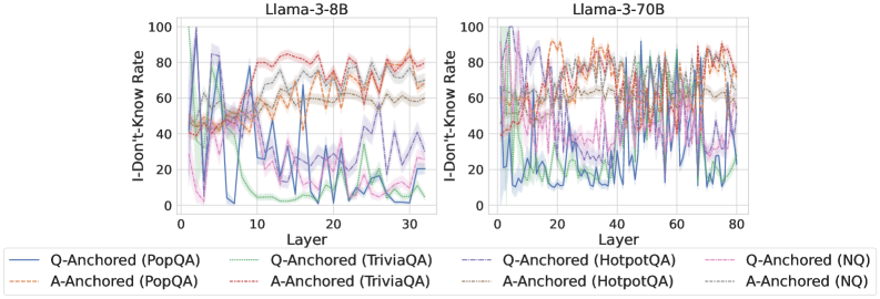
### Visual Description
## Line Charts: I-Don't-Know Rate Across Model Layers for Llama-3-8B and Llama-3-70B
### Overview
The image displays two side-by-side line charts comparing the "I-Don't-Know Rate" across the layers of two different language models: Llama-3-8B (left) and Llama-3-70B (right). Each chart plots multiple data series representing different experimental conditions, defined by an anchoring method (Q-Anchored or A-Anchored) applied to four distinct question-answering datasets (PopQA, TriviaQA, HotpotQA, NQ). The charts visualize how the model's propensity to output an "I-Don't-Know" response changes as information propagates through its internal layers.
### Components/Axes
* **Chart Titles:**
* Left Chart: `Llama-3-8B`
* Right Chart: `Llama-3-70B`
* **Y-Axis (Both Charts):**
* Label: `I-Don't-Know Rate`
* Scale: 0 to 100, with major tick marks at 0, 20, 40, 60, 80, 100.
* **X-Axis:**
* Label: `Layer`
* Left Chart Scale: 0 to 30, with major tick marks at 0, 10, 20, 30.
* Right Chart Scale: 0 to 80, with major tick marks at 0, 20, 40, 60, 80.
* **Legend (Bottom Center, spanning both charts):**
* The legend contains 8 entries, each pairing a line style/color with a condition.
* **Q-Anchored Series (Solid Lines):**
* `Q-Anchored (PopQA)`: Solid blue line.
* `Q-Anchored (TriviaQA)`: Solid green line.
* `Q-Anchored (HotpotQA)`: Solid purple line.
* `Q-Anchored (NQ)`: Solid pink line.
* **A-Anchored Series (Dashed Lines):**
* `A-Anchored (PopQA)`: Dashed orange line.
* `A-Anchored (TriviaQA)`: Dashed red line.
* `A-Anchored (HotpotQA)`: Dashed gray line.
* `A-Anchored (NQ)`: Dashed light blue line.
### Detailed Analysis
#### **Chart 1: Llama-3-8B (Left)**
* **General Trend:** The chart shows high volatility, especially in the early layers (0-10). Most lines exhibit significant fluctuations before settling into more stable trends in later layers.
* **Q-Anchored Series (Solid Lines):**
* **Q-Anchored (PopQA) - Solid Blue:** Starts very high (~100 at layer 0), drops sharply to ~20 by layer 5, and then fluctuates erratically between approximately 10 and 40 for the remaining layers.
* **Q-Anchored (TriviaQA) - Solid Green:** Begins around 60, drops to near 0 by layer 10, and remains very low (mostly below 10) for the rest of the layers.
* **Q-Anchored (HotpotQA) - Solid Purple:** Starts around 80, shows a general downward trend with high variance, ending near 20 at layer 30.
* **Q-Anchored (NQ) - Solid Pink:** Starts around 70, drops quickly, and then fluctuates in the lower range (approximately 5-30) from layer 10 onward.
* **A-Anchored Series (Dashed Lines):**
* **A-Anchored (PopQA) - Dashed Orange:** Starts around 40, rises to a plateau between 60-80, and remains relatively high and stable with minor fluctuations.
* **A-Anchored (TriviaQA) - Dashed Red:** Follows a similar pattern to A-Anchored (PopQA), starting near 40 and stabilizing in the 70-80 range.
* **A-Anchored (HotpotQA) - Dashed Gray:** Starts around 50, shows a gradual increase, and stabilizes around 60.
* **A-Anchored (NQ) - Dashed Light Blue:** Starts near 40, rises, and fluctuates in the 50-70 range.
#### **Chart 2: Llama-3-70B (Right)**
* **General Trend:** With more layers (0-80), the trends appear somewhat smoother than in the 8B model, though significant noise remains. The separation between Q-Anchored and A-Anchored series is more consistent.
* **Q-Anchored Series (Solid Lines):**
* **Q-Anchored (PopQA) - Solid Blue:** Starts high (~90), drops rapidly within the first 10 layers to ~30, and then fluctuates with a slight downward trend, ending near 20.
* **Q-Anchored (TriviaQA) - Solid Green:** Starts around 70, drops to a low level (<20) by layer 20, and remains low with minor fluctuations.
* **Q-Anchored (HotpotQA) - Solid Purple:** Starts near 80, declines steadily with noise, and settles in the 20-40 range in later layers.
* **Q-Anchored (NQ) - Solid Pink:** Starts around 60, drops to the 10-30 range by layer 20, and stays there.
* **A-Anchored Series (Dashed Lines):**
* **A-Anchored (PopQA) - Dashed Orange:** Starts around 50, climbs to a high plateau (70-90) by layer 20, and maintains that level.
* **A-Anchored (TriviaQA) - Dashed Red:** Similar to its PopQA counterpart, starting near 50 and stabilizing in the 70-90 range.
* **A-Anchored (HotpotQA) - Dashed Gray:** Starts near 50, rises to the 60-80 range, and remains stable.
* **A-Anchored (NQ) - Dashed Light Blue:** Starts around 40, increases to the 50-70 range, and fluctuates there.
### Key Observations
1. **Clear Dichotomy:** Across both models, there is a stark and consistent separation between the two anchoring methods. **A-Anchored (dashed lines)** series consistently maintain a higher "I-Don't-Know Rate" (generally 50-90) across most layers. **Q-Anchored (solid lines)** series show a pronounced drop in the early layers and maintain a much lower rate (generally 0-40) thereafter.
2. **Early-Layer Volatility:** The most dramatic changes in rate occur in the first 10-20 layers for both models, suggesting this is where the models' internal "confidence" or "knowledge routing" is most actively determined.
3. **Model Scale Effect:** The larger Llama-3-70B model exhibits slightly smoother and more sustained trends compared to the more volatile Llama-3-8B, particularly for the A-Anchored series which reach and maintain higher plateaus.
4. **Dataset Variation:** While the anchoring method is the dominant factor, dataset choice introduces secondary variation. For example, within the Q-Anchored group, the TriviaQA (green) line often drops to the lowest levels, while PopQA (blue) starts the highest.
### Interpretation
This data suggests a fundamental difference in how the two anchoring methods influence the model's internal processing. The **A-Anchored** approach appears to instill or preserve a state of high uncertainty ("I-Don't-Know") throughout the network's depth. This could be interpreted as the model maintaining a cautious, retrieval-averse, or knowledge-limited state when answers are anchored to specific answer text.
Conversely, the **Q-Anchored** approach leads to a rapid decrease in this uncertainty metric after the initial layers. This implies that anchoring to the question itself allows the model to quickly activate relevant knowledge pathways, reducing its expressed uncertainty as information flows forward. The early-layer volatility likely represents the point where the model commits to a knowledge-retrieval or response-generation strategy.
The consistency of this pattern across two model scales (8B and 70B parameters) and four diverse datasets indicates it is a robust phenomenon related to the anchoring technique itself, not an artifact of a specific model size or data domain. The charts provide strong visual evidence that the choice of anchoring point (question vs. answer) dramatically shapes the model's internal confidence dynamics.
</details>
<details>
<summary>x80.png Details</summary>
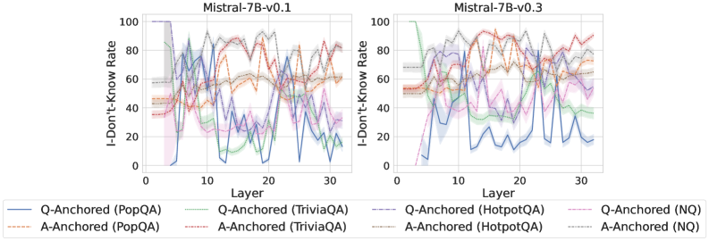
### Visual Description
\n
## Line Charts: Comparison of "I-Don't-Know Rate" Across Model Layers for Two Mistral-7B Versions
### Overview
The image displays two side-by-side line charts comparing the "I-Don't-Know Rate" (a measure of model uncertainty or refusal to answer) across the 32 layers of two different versions of the Mistral-7B language model: version 0.1 (left chart) and version 0.3 (right chart). Each chart plots multiple data series representing different question-answering datasets, further broken down by two "anchoring" methods (Q-Anchored and A-Anchored).
### Components/Axes
* **Chart Titles:**
* Left Chart: `Mistral-7B-v0.1`
* Right Chart: `Mistral-7B-v0.3`
* **Y-Axis (Both Charts):** Label: `I-Don't-Know Rate`. Scale: 0 to 100, with major gridlines at intervals of 20 (0, 20, 40, 60, 80, 100).
* **X-Axis (Both Charts):** Label: `Layer`. Scale: 0 to 30, with major tick marks labeled at 0, 10, 20, and 30. The data appears to cover all 32 layers (0-31).
* **Legend (Bottom Center, spanning both charts):** Contains 8 entries, differentiating lines by color and style (solid vs. dashed).
* **Solid Lines (Q-Anchored):**
* Blue: `Q-Anchored (PopQA)`
* Green: `Q-Anchored (TriviaQA)`
* Purple: `Q-Anchored (HotpotQA)`
* Pink: `Q-Anchored (NQ)`
* **Dashed Lines (A-Anchored):**
* Orange: `A-Anchored (PopQA)`
* Red: `A-Anchored (TriviaQA)`
* Brown: `A-Anchored (HotpotQA)`
* Gray: `A-Anchored (NQ)`
### Detailed Analysis
**Chart 1: Mistral-7B-v0.1 (Left)**
* **General Trend:** High variability and volatility across all layers for all data series. Lines frequently cross and show sharp peaks and troughs.
* **Q-Anchored Series (Solid Lines):**
* `PopQA (Blue)`: Starts near 0 at layer 0, spikes to ~80 by layer 5, then fluctuates wildly between ~10 and ~80 for the remaining layers.
* `TriviaQA (Green)`: Starts around 40, shows a general downward trend with significant noise, ending near 20 at layer 30.
* `HotpotQA (Purple)`: Starts around 50, exhibits large oscillations, with peaks near 90 and troughs near 20.
* `NQ (Pink)`: Starts around 40, shows a slight overall downward trend but with high variance, ending near 30.
* **A-Anchored Series (Dashed Lines):**
* `PopQA (Orange)`: Starts around 45, shows a gradual upward trend with fluctuations, ending near 60.
* `TriviaQA (Red)`: Starts around 45, trends upward with high volatility, reaching peaks near 90.
* `HotpotQA (Brown)`: Starts around 50, shows a general upward trend, ending near 80.
* `NQ (Gray)`: Starts around 55, remains relatively high and stable compared to others, fluctuating between 60 and 90.
**Chart 2: Mistral-7B-v0.3 (Right)**
* **General Trend:** Shows more structured and less chaotic patterns compared to v0.1. Several series exhibit clearer directional trends (upward or downward) across layers.
* **Q-Anchored Series (Solid Lines):**
* `PopQA (Blue)`: Starts near 0, rises to ~40 by layer 5, then follows a distinct downward trend, reaching near 0 again by layer 30.
* `TriviaQA (Green)`: Starts very high (~100), drops sharply to ~40 by layer 5, then continues a steady decline to near 0.
* `HotpotQA (Purple)`: Starts around 50, shows a general downward trend with moderate fluctuations, ending near 30.
* `NQ (Pink)`: Starts around 40, shows a gradual downward trend, ending near 20.
* **A-Anchored Series (Dashed Lines):**
* `PopQA (Orange)`: Starts around 50, shows a clear upward trend, ending near 80.
* `TriviaQA (Red)`: Starts around 50, shows a strong upward trend, becoming one of the highest lines, ending near 90.
* `HotpotQA (Brown)`: Starts around 55, shows a steady upward trend, ending near 85.
* `NQ (Gray)`: Starts around 60, remains high and relatively stable, fluctuating between 70 and 90.
### Key Observations
1. **Version Comparison:** The transition from v0.1 to v0.3 results in a dramatic reduction of noise and volatility in the "I-Don't-Know Rate" across layers. Trends become more monotonic and interpretable.
2. **Anchoring Effect:** A consistent and striking pattern emerges in v0.3: **Q-Anchored methods (solid lines) generally show a *decreasing* "I-Don't-Know Rate" as layer depth increases**, while **A-Anchored methods (dashed lines) show an *increasing* rate**. This divergence is much less clear in the noisy v0.1 chart.
3. **Dataset Sensitivity:** The magnitude and trend of the rate vary by dataset. For example, in v0.3, `TriviaQA` shows the most extreme changes (very high start for Q-Anchored, strong rise for A-Anchored), while `NQ` shows more moderate, stable values.
4. **Early Layer Behavior:** In both models, the first few layers (0-5) often show rapid changes, suggesting this is a critical region for the model's internal "decision" about whether it can answer a question.
### Interpretation
This data visualizes how two iterations of the same language model differ in their internal processing of uncertainty. The "I-Don't-Know Rate" likely reflects the model's confidence or its tendency to activate a refusal mechanism at different stages (layers) of its computation.
* **Model Evolution (v0.1 -> v0.3):** The shift from chaotic to structured patterns suggests v0.3 has a more calibrated and consistent internal representation of uncertainty across its layers. The noise in v0.1 might indicate instability in how uncertainty signals propagate.
* **The Anchoring Dichotomy:** The clear inverse relationship between Q-Anchored and A-Anchored methods in v0.3 is the most significant finding. It implies:
* **Q-Anchored (Question-Anchored):** As information flows deeper into the network (higher layers), the model becomes *more confident* (lower "I-Don't-Know" rate) when processing questions anchored to the query itself.
* **A-Anchored (Answer-Anchored):** Conversely, when processing information anchored to potential answers, the model becomes *less confident* (higher "I-Don't-Know" rate) in deeper layers. This could suggest deeper layers are better at detecting inconsistencies or lack of support for answer candidates.
* **Practical Implication:** This analysis provides a "map" of where uncertainty resides within the model. For v0.3, interventions to improve calibration could target early layers for Q-Anchored processing and later layers for A-Anchored processing. The stark difference between datasets also highlights that model confidence is not a monolithic property but is highly dependent on the type of knowledge being queried.
</details>
Figure 31: Comparisons of i-don’t-know rate between pathways, probing attention activations of the token immediately preceding the exact answer tokens.
<details>
<summary>x81.png Details</summary>
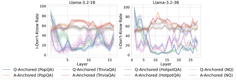
### Visual Description
## Line Charts: I-Don't-Know Rate Across Model Layers
### Overview
The image displays two side-by-side line charts comparing the "I-Don't-Know Rate" across the layers of two different language models: Llama-3.2-1B (left) and Llama-3.2-3B (right). Each chart plots multiple data series representing different question-answering datasets and two anchoring methods ("Q-Anchored" and "A-Anchored"). The charts include shaded regions around each line, likely representing confidence intervals or standard deviation.
### Components/Axes
* **Chart Titles:**
* Left Chart: `Llama-3.2-1B`
* Right Chart: `Llama-3.2-3B`
* **Y-Axis (Both Charts):**
* Label: `I-Don't-Know Rate`
* Scale: 0 to 100, with major tick marks at 0, 20, 40, 60, 80, 100.
* **X-Axis (Both Charts):**
* Label: `Layer`
* Left Chart Scale: 0 to 15, with major tick marks at 5, 10, 15.
* Right Chart Scale: 0 to 25, with major tick marks at 10, 20, 25.
* **Legend (Bottom, spanning both charts):**
* The legend is positioned below the x-axes of both charts.
* It defines 8 data series, differentiated by color and line style (solid vs. dashed).
* **Q-Anchored Series (Solid Lines):**
* Blue: `Q-Anchored (PopQA)`
* Green: `Q-Anchored (TriviaQA)`
* Purple: `Q-Anchored (HotpotQA)`
* Pink: `Q-Anchored (NQ)`
* **A-Anchored Series (Dashed Lines):**
* Orange: `A-Anchored (PopQA)`
* Red: `A-Anchored (TriviaQA)`
* Brown: `A-Anchored (HotpotQA)`
* Gray: `A-Anchored (NQ)`
### Detailed Analysis
**Llama-3.2-1B Chart (Left):**
* **General Trend:** Q-Anchored (solid) lines show a dramatic, steep decline from high initial rates (approx. 80-95) in early layers (1-3) to much lower rates (approx. 10-40) by layer 5, after which they fluctuate. A-Anchored (dashed) lines start lower (approx. 50-60) and remain relatively stable or show a slight, gradual increase across layers, generally staying between 50-70.
* **Specific Series Observations:**
* `Q-Anchored (PopQA)` (Blue, Solid): Starts highest (~95), plummets to ~10 by layer 5, then fluctuates between ~10-40.
* `Q-Anchored (TriviaQA)` (Green, Solid): Starts ~85, drops to ~20 by layer 5, fluctuates between ~10-40.
* `Q-Anchored (HotpotQA)` (Purple, Solid): Starts ~80, drops to ~20 by layer 5, shows more volatility, peaking near ~50 around layer 12.
* `Q-Anchored (NQ)` (Pink, Solid): Starts ~80, drops to ~30 by layer 5, fluctuates between ~20-50.
* `A-Anchored (PopQA)` (Orange, Dashed): Starts ~55, rises gradually to ~70 by layer 10, ends ~65.
* `A-Anchored (TriviaQA)` (Red, Dashed): Starts ~55, rises to ~70 by layer 7, remains around 65-70.
* `A-Anchored (HotpotQA)` (Brown, Dashed): Starts ~50, rises to ~60 by layer 5, stays near 60.
* `A-Anchored (NQ)` (Gray, Dashed): Starts ~50, rises to ~60 by layer 5, stays near 60.
**Llama-3.2-3B Chart (Right):**
* **General Trend:** Similar pattern to the 1B model but with more pronounced separation and volatility. Q-Anchored lines again show a sharp early decline. A-Anchored lines are more volatile than in the 1B model but still maintain a higher average rate than the Q-Anchored lines after the initial layers.
* **Specific Series Observations:**
* `Q-Anchored (PopQA)` (Blue, Solid): Starts ~100, crashes to near 0 by layer 10, remains very low (<10).
* `Q-Anchored (TriviaQA)` (Green, Solid): Starts ~90, drops to ~10 by layer 10, fluctuates between ~5-30.
* `Q-Anchored (HotpotQA)` (Purple, Solid): Starts ~80, drops to ~20 by layer 10, highly volatile, spikes to ~50 around layer 20.
* `Q-Anchored (NQ)` (Pink, Solid): Starts ~80, drops to ~20 by layer 10, fluctuates between ~10-40.
* `A-Anchored (PopQA)` (Orange, Dashed): Starts ~50, highly volatile, peaks near ~90 around layer 12, ends ~70.
* `A-Anchored (TriviaQA)` (Red, Dashed): Starts ~50, rises to ~80 by layer 10, fluctuates between 60-80.
* `A-Anchored (HotpotQA)` (Brown, Dashed): Starts ~50, rises to ~70 by layer 10, fluctuates between 60-70.
* `A-Anchored (NQ)` (Gray, Dashed): Starts ~50, rises to ~65 by layer 10, fluctuates between 55-65.
### Key Observations
1. **Anchoring Method Dominance:** The most striking pattern is the fundamental difference between Q-Anchored and A-Anchored methods. Q-Anchored rates collapse in early layers, while A-Anchored rates remain high and stable or increase.
2. **Model Size Effect:** The larger 3B model shows more extreme behavior: a deeper collapse for Q-Anchored (especially PopQA) and greater volatility for A-Anchored series.
3. **Dataset Variation:** Within each anchoring method, different datasets (PopQA, TriviaQA, HotpotQA, NQ) follow similar broad trends but have distinct absolute values and volatility profiles. PopQA often shows the most extreme values.
4. **Layer Sensitivity:** The critical transition for Q-Anchored methods occurs within the first 5-10 layers. After this point, rates stabilize at a lower level with noise.
### Interpretation
This data visualizes how a model's expressed uncertainty ("I-Don't-Know Rate") evolves through its processing layers, heavily influenced by the prompting strategy (anchoring to the Question vs. the Answer).
* **Q-Anchored (Question-Anchored):** The sharp early decline suggests that when prompted with the question, the model quickly moves from a state of high expressed uncertainty to one of lower uncertainty (or higher confidence) within its first few processing stages. This could indicate rapid pattern matching or retrieval activation.
* **A-Anchored (Answer-Anchored):** The stable or rising high rates suggest that when anchored to a potential answer, the model maintains or even increases its expressed uncertainty throughout processing. This might reflect a more cautious verification process or difficulty reconciling the provided answer with internal knowledge.
* **Model Scale:** The more pronounced effects in the 3B model imply that increased model capacity amplifies these anchoring-dependent processing pathways.
* **Practical Implication:** The choice of prompting framework (Q-Anchored vs. A-Anchored) doesn't just change the final output; it fundamentally alters the model's internal confidence trajectory. This has significant implications for designing systems that rely on model uncertainty estimates, such as retrieval-augmented generation or abstention mechanisms. The charts argue that "uncertainty" is not a fixed property but a dynamic state heavily mediated by input format.
</details>
<details>
<summary>x82.png Details</summary>
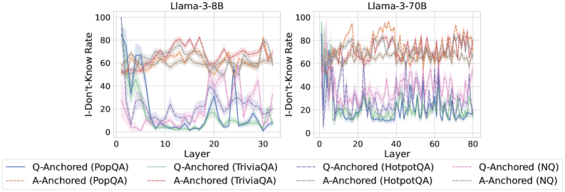
### Visual Description
## Line Chart: I-Don't-Know Rate vs. Layer for Llama-3 Models
### Overview
The image displays two side-by-side line charts comparing the "I-Don't-Know Rate" across the layers of two different-sized language models: Llama-3-8B (left) and Llama-3-70B (right). The charts analyze model uncertainty on four question-answering (QA) datasets under two different prompting conditions ("Q-Anchored" and "A-Anchored").
### Components/Axes
* **Chart Titles:** "Llama-3-8B" (left chart), "Llama-3-70B" (right chart).
* **Y-Axis (Both Charts):** Label: "I-Don't-Know Rate". Scale: 0 to 100, with major tick marks at 0, 20, 40, 60, 80, 100.
* **X-Axis (Left Chart - Llama-3-8B):** Label: "Layer". Scale: 0 to 30, with major tick marks at 0, 10, 20, 30.
* **X-Axis (Right Chart - Llama-3-70B):** Label: "Layer". Scale: 0 to 80, with major tick marks at 0, 20, 40, 60, 80.
* **Legend (Bottom, spanning both charts):** Contains 8 entries, differentiating lines by color and style (solid vs. dashed).
| Style | Color | Dataset | Condition |
| :--- | :--- | :--- | :--- |
| Solid | Blue | PopQA | Q-Anchored |
| Solid | Green | TriviaQA | Q-Anchored |
| Solid | Purple | HotpotQA | Q-Anchored |
| Solid | Pink | NQ | Q-Anchored |
| Dashed | Orange | PopQA | A-Anchored |
| Dashed | Red | TriviaQA | A-Anchored |
| Dashed | Brown | HotpotQA | A-Anchored |
| Dashed | Gray | NQ | A-Anchored |
### Detailed Analysis
**Chart 1: Llama-3-8B (Left)**
* **Q-Anchored Lines (Solid):** All four solid lines exhibit a similar, dramatic trend. They start at a very high I-Don't-Know Rate (approximately 80-95) at Layer 0. There is a sharp, precipitous drop within the first 5 layers, falling to rates between ~5 and ~30. After this initial drop, the lines fluctuate significantly across the remaining layers (5-30), with no clear upward or downward trend, oscillating mostly between 5 and 40. The blue (PopQA) and green (TriviaQA) lines generally remain at the lower end of this range.
* **A-Anchored Lines (Dashed):** In stark contrast, the four dashed lines show a much more stable and elevated pattern. They begin at a moderate rate (approximately 50-65) at Layer 0. They show a slight, gradual increase over the first ~15 layers, peaking around 70-80. From layer 15 to 30, they fluctuate but remain consistently high, mostly between 60 and 80. The orange (PopQA) and red (TriviaQA) dashed lines are often the highest.
**Chart 2: Llama-3-70B (Right)**
* **Q-Anchored Lines (Solid):** The pattern is more volatile than in the 8B model. The lines start high (70-100) at Layer 0 and drop sharply within the first 10 layers, similar to the 8B model. However, the subsequent fluctuations are more extreme and frequent across the entire 80-layer span. The rates frequently spike and dip between ~5 and ~50. The purple (HotpotQA) line shows particularly high volatility.
* **A-Anchored Lines (Dashed):** These lines also start high (60-90) and remain elevated throughout. They exhibit significant volatility, with frequent peaks and troughs across all layers, generally staying within the 50-90 range. The orange (PopQA) and red (TriviaQA) dashed lines again frequently register the highest rates, often peaking above 80.
### Key Observations
1. **Anchoring Effect:** The most prominent pattern is the stark difference between Q-Anchored (solid) and A-Anchored (dashed) conditions. A-Anchored prompting consistently results in a much higher "I-Don't-Know Rate" across all layers for both model sizes.
2. **Early Layer Drop:** Both models show a dramatic decrease in uncertainty (I-Don't-Know Rate) for Q-Anchored prompts within the first 5-10 layers.
3. **Model Size & Volatility:** The larger Llama-3-70B model exhibits greater volatility in its uncertainty rates across deeper layers compared to the 8B model, for both prompting conditions.
4. **Dataset Variation:** PopQA (blue/orange) and TriviaQA (green/red) often represent the extremes within their respective line groups (Q-Anchored or A-Anchored).
### Interpretation
This data suggests that the method of prompting ("anchoring") has a profound and consistent impact on a model's expressed uncertainty, more so than the specific layer or even the model size. "A-Anchored" prompts (likely providing an answer anchor) lead the model to express high uncertainty ("I-Don't-Know") throughout its processing layers. Conversely, "Q-Anchored" prompts (likely providing only a question anchor) cause the model to rapidly reduce its expressed uncertainty in the early layers, after which uncertainty fluctuates at a lower level.
The increased volatility in the larger 70B model might indicate more complex internal processing or specialization across its many layers. The early-layer drop in the Q-Anchored condition could represent a phase where the model quickly commits to a knowledge retrieval pathway, reducing its initial "I don't know" stance. The persistent high rate in the A-Anchored condition is counter-intuitive and warrants investigation—it may reflect a failure mode where providing an answer context somehow triggers a more conservative, "I don't know" response strategy. The chart effectively visualizes how model behavior and self-assessed confidence are not static but evolve dynamically through the network's depth and are highly sensitive to input framing.
</details>
<details>
<summary>x83.png Details</summary>
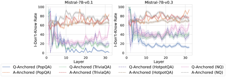
### Visual Description
## Line Chart with Error Bands: Mistral-7B Model Layer-wise "I-Don't-Know" Rate Analysis
### Overview
The image displays two side-by-side line charts comparing the "I-Don't-Know Rate" across the layers of two versions of the Mistral-7B language model: v0.1 (left) and v0.3 (right). Each chart plots eight data series, representing two anchoring methods (Q-Anchored and A-Anchored) evaluated on four different question-answering datasets (PopQA, TriviaQA, HotpotQA, NQ). The lines show the rate trend across model layers (0 to 32), with shaded regions indicating uncertainty or variance.
### Components/Axes
* **Chart Titles:**
* Left Chart: `Mistral-7B-v0.1`
* Right Chart: `Mistral-7B-v0.3`
* **Y-Axis (Both Charts):** Label: `I-Don't-Know Rate`. Scale: 0 to 100, with major ticks at 0, 20, 40, 60, 80, 100.
* **X-Axis (Both Charts):** Label: `Layer`. Scale: 0 to 32, with major ticks at 0, 10, 20, 30.
* **Legend (Bottom, spanning both charts):** Contains 8 entries, differentiating lines by color and style (solid for Q-Anchored, dashed for A-Anchored).
* `Q-Anchored (PopQA)`: Solid blue line
* `A-Anchored (PopQA)`: Dashed orange line
* `Q-Anchored (TriviaQA)`: Solid green line
* `A-Anchored (TriviaQA)`: Dashed red line
* `Q-Anchored (HotpotQA)`: Solid purple line
* `A-Anchored (HotpotQA)`: Dashed brown line
* `Q-Anchored (NQ)`: Solid pink line
* `A-Anchored (NQ)`: Dashed gray line
### Detailed Analysis
**Chart 1: Mistral-7B-v0.1**
* **Q-Anchored Series (Solid Lines):** All four series show a similar, dramatic trend. They start at a very high "I-Don't-Know Rate" (approximately 80-100) at Layer 0. There is a sharp, precipitous drop within the first 5-7 layers, falling to rates between ~10 and ~40. After this initial drop, the rates fluctuate with moderate volatility across the remaining layers (10-32). The blue line (PopQA) ends the lowest, near 0-10. The pink line (NQ) ends the highest among this group, near 40-50.
* **A-Anchored Series (Dashed Lines):** These series exhibit a markedly different pattern. They start at a moderate rate (approximately 50-70) at Layer 0. They show a slight initial increase or stability in the early layers, followed by a general, gradual upward trend with fluctuations. By Layer 32, all A-Anchored series converge in a high range, approximately between 70 and 90. The orange line (PopQA) and red line (TriviaQA) appear to be among the highest at the final layer.
**Chart 2: Mistral-7B-v0.3**
* **Q-Anchored Series (Solid Lines):** The pattern is broadly similar to v0.1 but with notable differences in magnitude. The initial drop from Layer 0 is still present but appears less severe for some datasets. The post-drop fluctuation occurs at a generally higher baseline. For example, the blue line (PopQA) stabilizes around 10-20 instead of near 0. The pink line (NQ) fluctuates between 40-60.
* **A-Anchored Series (Dashed Lines):** These series also start in the 50-70 range and trend upward. The final values at Layer 32 appear slightly higher and more tightly clustered than in v0.1, mostly between 75 and 95. The separation between the A-Anchored cluster and the Q-Anchored cluster is more pronounced in the later layers compared to v0.1.
### Key Observations
1. **Fundamental Dichotomy:** There is a clear and consistent separation in behavior between Q-Anchored and A-Anchored evaluation methods across both model versions. Q-Anchored rates drop sharply early on, while A-Anchored rates trend upward gradually.
2. **Layer Sensitivity:** The model's tendency to output "I don't know" is highly sensitive to the specific layer being probed, especially in the first quarter of the network (Layers 0-8).
3. **Model Version Difference:** Mistral-7B-v0.3 shows a general increase in the "I-Don't-Know Rate" for both anchoring methods compared to v0.1, particularly in the middle and later layers. The Q-Anchored rates in v0.3 do not fall as low as in v0.1.
4. **Dataset Variation:** While the overall trend is consistent per anchoring method, the specific rate values differ by dataset. For instance, NQ (pink/gray) consistently shows higher Q-Anchored rates than PopQA (blue/orange) in the later layers of both models.
### Interpretation
This data suggests a fundamental difference in what the Q-Anchored and A-Anchored probing methods measure within the Mistral-7B model's internal representations.
* **Q-Anchored (Question-Anchored)** probing likely measures the model's *confidence in generating an answer* given the question context. The sharp early drop indicates that by the early-to-mid layers, the model has already committed to generating *some* answer token (whether correct or not), drastically reducing its propensity to explicitly state uncertainty. The low final rates suggest the model rarely defaults to "I don't know" when conditioned on the question alone in its later processing stages.
* **A-Anchored (Answer-Anchored)** probing likely measures the model's *ability to recognize or validate a given answer*. The gradual upward trend suggests that as information propagates through deeper layers, the model becomes *more likely* to reject a provided answer as incorrect or unsupported, hence increasing the "I-Don't-Know" rate. This reflects a growing critical evaluation mechanism.
The increase in rates from v0.1 to v0.3 could indicate a shift in the model's training or alignment, making it either more cautious (higher A-Anchored rejection) or less confident in its initial recall (higher Q-Anchored uncertainty). The charts reveal that a model's "uncertainty" is not a single value but a dynamic property that depends heavily on *how* and *where* within its architecture it is measured.
</details>
Figure 32: Comparisons of i-don’t-know rate between pathways, probing attention activations of the last exact answer token.
<details>
<summary>x84.png Details</summary>
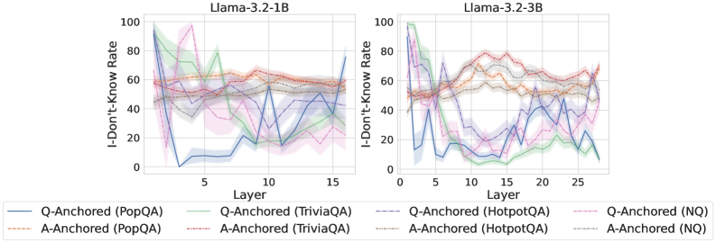
### Visual Description
\n
## Comparative Analysis: "I-Don't-Know Rate" Across Model Layers
### Overview
The image displays two side-by-side line charts comparing the "I-Don't-Know Rate" across the internal layers of two different Large Language Models: **Llama-3.2-1B** (left chart) and **Llama-3.2-3B** (right chart). Each chart plots the performance of eight different experimental conditions, which are combinations of two methods (Q-Anchored and A-Anchored) applied to four different question-answering datasets (PopQA, TriviaQA, HotpotQA, NQ). The charts visualize how the model's tendency to output an "I don't know" response changes as information propagates through its layers.
### Components/Axes
* **Chart Titles:**
* Left Chart: `Llama-3.2-1B`
* Right Chart: `Llama-3.2-3B`
* **Y-Axis (Both Charts):**
* **Label:** `I-Don't-Know Rate`
* **Scale:** 0 to 100 (percentage).
* **Ticks:** 0, 20, 40, 60, 80, 100.
* **X-Axis (Both Charts):**
* **Label:** `Layer`
* **Scale (Left Chart - 1B Model):** 0 to 16. Ticks at 0, 5, 10, 15.
* **Scale (Right Chart - 3B Model):** 0 to 28. Ticks at 0, 5, 10, 15, 20, 25.
* **Legend (Positioned at the bottom, spanning both charts):**
* The legend defines eight series, differentiated by color and line style (solid vs. dashed). Each entry follows the format: `[Method] ([Dataset])`.
* **Solid Lines (Q-Anchored):**
1. `Q-Anchored (PopQA)` - **Blue, solid line**
2. `Q-Anchored (TriviaQA)` - **Green, solid line**
3. `Q-Anchored (HotpotQA)` - **Purple, solid line**
4. `Q-Anchored (NQ)` - **Pink, solid line**
* **Dashed Lines (A-Anchored):**
5. `A-Anchored (PopQA)` - **Orange, dashed line**
6. `A-Anchored (TriviaQA)` - **Red, dashed line**
7. `A-Anchored (HotpotQA)` - **Brown, dashed line**
8. `A-Anchored (NQ)` - **Gray, dashed line**
* **Visual Elements:** Each data series is represented by a line with a surrounding shaded area of the same color, likely indicating variance or confidence intervals.
### Detailed Analysis
#### **Chart 1: Llama-3.2-1B (Left)**
* **Trend Verification & Data Points (Approximate):**
* **Q-Anchored (PopQA) [Blue, Solid]:** Starts very high (~90% at Layer 0), plummets dramatically to near 0% by Layer 3, then exhibits high volatility, fluctuating between ~10% and ~60% for the remaining layers, ending near ~40% at Layer 16.
* **A-Anchored (PopQA) [Orange, Dashed]:** Shows remarkable stability. Hovers consistently in a narrow band between approximately 50% and 60% across all layers.
* **Q-Anchored (TriviaQA) [Green, Solid]:** Starts moderately high (~70%), dips, then peaks sharply around Layer 4 (~80%). After this peak, it generally trends downward with fluctuations, ending near ~30%.
* **A-Anchored (TriviaQA) [Red, Dashed]:** Relatively stable, similar to its PopQA counterpart. Fluctuates gently between ~50% and ~65%.
* **Q-Anchored (HotpotQA) [Purple, Solid]:** Highly volatile. Starts around ~60%, drops, spikes to ~70% near Layer 5, then sees a deep trough (~10%) around Layer 10 before rising again. Ends near ~50%.
* **A-Anchored (HotpotQA) [Brown, Dashed]:** More stable than its Q-Anchored version. Generally stays between ~45% and ~60%.
* **Q-Anchored (NQ) [Pink, Solid]:** Starts high (~80%), drops, then shows a broad peak between Layers 5-10 (~60-70%). Trends downward thereafter, ending near ~20%.
* **A-Anchored (NQ) [Gray, Dashed]:** Stable, fluctuating between ~40% and ~55%.
#### **Chart 2: Llama-3.2-3B (Right)**
* **Trend Verification & Data Points (Approximate):**
* **Q-Anchored (PopQA) [Blue, Solid]:** Starts high (~80%), drops sharply to a low of ~10-20% by Layer 5. Then enters a volatile phase with multiple peaks (e.g., ~60% near Layer 12, ~50% near Layer 22) and troughs, ending near ~10%.
* **A-Anchored (PopQA) [Orange, Dashed]:** Stable, but with a slight downward trend. Starts near ~55%, ends near ~45%.
* **Q-Anchored (TriviaQA) [Green, Solid]:** Starts very high (~100%), crashes to near 0% by Layer 5. Remains very low (<20%) for the rest of the layers, with minor fluctuations.
* **A-Anchored (TriviaQA) [Red, Dashed]:** Very stable, hovering around 60-70% for the entire depth.
* **Q-Anchored (HotpotQA) [Purple, Solid]:** Extremely volatile. Shows large swings, from lows near 0% (Layer 15) to peaks near 60% (Layer 8, Layer 25). No clear directional trend.
* **A-Anchored (HotpotQA) [Brown, Dashed]:** Moderately stable, fluctuating between ~40% and ~55%.
* **Q-Anchored (NQ) [Pink, Solid]:** Starts high (~90%), drops to a low (~10%) by Layer 7. Recovers to a peak of ~40% near Layer 18, then declines again.
* **A-Anchored (NQ) [Gray, Dashed]:** Stable, centered around ~50%.
### Key Observations
1. **Method Dichotomy:** The most striking pattern is the fundamental difference between **Q-Anchored (solid lines)** and **A-Anchored (dashed lines)** methods. A-Anchored lines are consistently stable across layers for all datasets, while Q-Anchored lines are highly volatile, often showing dramatic drops and recoveries.
2. **Model Size Effect:** The volatility of the Q-Anchored methods appears more pronounced in the larger **3B model**. The drops are steeper (e.g., TriviaQA green line crashes from 100% to 0%), and the subsequent fluctuations are more extreme compared to the 1B model.
3. **Dataset Influence:** The dataset used significantly impacts the absolute level and pattern of the "I-Don't-Know Rate," especially for Q-Anchored methods. For example, in the 3B model, Q-Anchored on TriviaQA (green) stays near zero after the initial drop, while on HotpotQA (purple) it continues to swing wildly.
4. **Layer Sensitivity:** For Q-Anchored methods, the early layers (0-5) often show the most dramatic changes, suggesting this is where the anchoring mechanism has the strongest initial effect on the model's uncertainty expression.
### Interpretation
This data suggests a fundamental difference in how the "Q-Anchored" and "A-Anchored" techniques influence the model's internal processing of uncertainty.
* **A-Anchored methods** appear to induce a **consistent, layer-invariant bias** towards expressing uncertainty (or not). The stable "I-Don't-Know Rate" implies this method sets a fixed propensity for hedging that is maintained throughout the network's depth.
* **Q-Anchored methods** seem to interact dynamically with the model's representations as they are processed layer-by-layer. The initial high rate suggests the question anchor initially triggers uncertainty, which is then rapidly resolved (the sharp drop) in early layers. The subsequent volatility indicates that later layers continually re-evaluate this uncertainty based on the evolving internal context, leading to fluctuations. The greater volatility in the 3B model may reflect its larger capacity for nuanced, layer-specific processing.
The stark contrast implies that **A-Anchoring acts more like a global setting, while Q-Anchoring engages with the model's step-by-step reasoning process.** The choice of dataset further modulates this interaction, likely due to differences in question complexity, answer ambiguity, or the model's pre-trained knowledge about those domains. The charts effectively visualize not just a performance metric, but the *dynamics* of uncertainty expression within the neural network.
</details>
<details>
<summary>x85.png Details</summary>
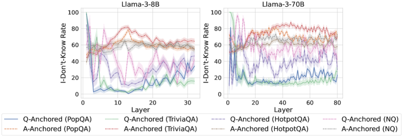
### Visual Description
\n
## Comparative Line Charts: "I-Don't-Know Rate" Across Model Layers
### Overview
The image displays two side-by-side line charts comparing the "I-Don't-Know Rate" (y-axis) across different layers (x-axis) for two language models: **Llama-3-8B** (left panel) and **Llama-3-70B** (right panel). Each chart plots multiple data series representing different question-answering datasets, categorized by two anchoring methods: "Q-Anchored" and "A-Anchored."
### Components/Axes
* **Chart Titles (Top Center):**
* Left Panel: `Llama-3-8B`
* Right Panel: `Llama-3-70B`
* **Y-Axis (Left Side, Both Panels):**
* Label: `I-Don't-Know Rate`
* Scale: 0 to 100, with major tick marks at 0, 20, 40, 60, 80, 100.
* **X-Axis (Bottom, Both Panels):**
* Label: `Layer`
* Scale (Llama-3-8B): 0 to 30, with major tick marks at 0, 10, 20, 30.
* Scale (Llama-3-70B): 0 to 80, with major tick marks at 0, 20, 40, 60, 80.
* **Legend (Bottom Center, spanning both charts):**
* Positioned below the x-axis labels.
* Contains 8 entries, organized in two rows of four.
* **Row 1 (Q-Anchored):**
* Solid Blue Line: `Q-Anchored (PopQA)`
* Solid Green Line: `Q-Anchored (TriviaQA)`
* Dashed Purple Line: `Q-Anchored (HotpotQA)`
* Dashed Pink Line: `Q-Anchored (NQ)`
* **Row 2 (A-Anchored):**
* Dashed Orange Line: `A-Anchored (PopQA)`
* Dashed Red Line: `A-Anchored (TriviaQA)`
* Dashed Gray Line: `A-Anchored (HotpotQA)`
* Dashed Light Blue Line: `A-Anchored (NQ)`
### Detailed Analysis
**Llama-3-8B Chart (Left Panel):**
* **Q-Anchored Series (Solid Lines):** All four series show a dramatic, steep decline from a high initial rate (near 80-100) within the first 5 layers, dropping to between 0-40. After this initial drop, they exhibit significant volatility, fluctuating between approximately 10 and 50 for the remaining layers (5-30). The `Q-Anchored (PopQA)` (solid blue) line ends near 40, while `Q-Anchored (TriviaQA)` (solid green) ends near 20.
* **A-Anchored Series (Dashed Lines):** These series start lower (around 40-60) and show a general upward trend or stability in the early layers (0-15), peaking between 60-80. After layer 15, they trend slightly downward or stabilize, ending in the 40-70 range. The `A-Anchored (TriviaQA)` (dashed red) line shows one of the highest sustained rates, peaking above 80 around layer 12.
**Llama-3-70B Chart (Right Panel):**
* **Q-Anchored Series (Solid Lines):** Similar to the 8B model, these series start high and drop sharply in the first ~10 layers. However, the post-drop behavior is different. They stabilize at a lower level (mostly between 10-30) with less extreme volatility compared to the 8B model. The `Q-Anchored (PopQA)` (solid blue) line settles around 20-30.
* **A-Anchored Series (Dashed Lines):** These series show a more pronounced and sustained increase in the "I-Don't-Know Rate" across the first 40-50 layers, often reaching and maintaining levels between 70-90. The `A-Anchored (TriviaQA)` (dashed red) and `A-Anchored (PopQA)` (dashed orange) lines are particularly high, frequently above 80. After layer 50, they show a slight decline but remain high (60-80).
### Key Observations
1. **Anchoring Method Dichotomy:** There is a clear and consistent separation between Q-Anchored and A-Anchored series across both models. Q-Anchored methods lead to a rapid decrease in the "I-Don't-Know Rate" early in the network, while A-Anchored methods lead to an increase or maintenance of a higher rate.
2. **Model Size Effect:** The larger Llama-3-70B model exhibits more pronounced and stable trends. The A-Anchored rates climb higher and stay higher for longer, and the Q-Anchored rates stabilize at a lower, less volatile level compared to the 8B model.
3. **Dataset Variation:** Within each anchoring category, different datasets (PopQA, TriviaQA, HotpotQA, NQ) follow similar general trends but with distinct offsets and volatility. For example, `A-Anchored (TriviaQA)` (dashed red) consistently shows among the highest rates in both models.
4. **Layer Sensitivity:** The most significant changes for all series occur in the first quarter of the layers (0-10 for 8B, 0-20 for 70B), indicating these early-to-mid layers are critical for the model's calibration of uncertainty.
### Interpretation
The data suggests a fundamental difference in how the model processes questions versus answers when calibrating its uncertainty ("I-Don't-Know" response).
* **Q-Anchored (Question-Anchored):** When the model's processing is anchored to the question, it appears to rapidly gain confidence (or reduce its stated uncertainty) in the early layers. This could indicate that the model quickly extracts features from the question that allow it to commit to an answer path, reducing its propensity to say "I don't know."
* **A-Anchored (Answer-Anchored):** When anchored to the answer, the model's uncertainty increases or remains high through many more layers. This suggests that evaluating or generating an answer requires more sustained processing and perhaps more internal "deliberation," leading to a higher reported uncertainty rate for a longer portion of the network depth.
The difference between the 8B and 70B models implies that larger models develop more distinct and stable internal pathways for handling question vs. answer context. The higher, more sustained uncertainty in the A-Anchored 70B model might reflect a more nuanced or cautious evaluation process when an answer is in focus. The consistent ranking of datasets (e.g., TriviaQA often highest) suggests some datasets are inherently more challenging or elicit more uncertainty from the model under these anchoring conditions. This analysis provides insight into the internal mechanics of large language models, showing how the point of focus (question vs. answer) dramatically shapes the model's expressed confidence across its layers.
</details>
<details>
<summary>x86.png Details</summary>
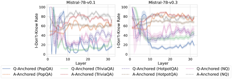
### Visual Description
\n
## Line Charts: I-Don't-Know Rate vs. Layer for Mistral-7B Models
### Overview
The image displays two side-by-side line charts comparing the "I-Don't-Know Rate" across the 32 layers (0-31) of two versions of the Mistral-7B language model: v0.1 (left) and v0.3 (right). Each chart plots eight data series, representing two anchoring methods (Q-Anchored and A-Anchored) applied to four different question-answering datasets (PopQA, TriviaQA, HotpotQA, NQ). The charts visualize how the model's propensity to output "I don't know" changes through its layers for different evaluation setups.
### Components/Axes
* **Titles:**
* Left Chart: `Mistral-7B-v0.1`
* Right Chart: `Mistral-7B-v0.3`
* **X-Axis (Both Charts):**
* Label: `Layer`
* Scale: Linear, from 0 to 30, with major ticks at 0, 10, 20, 30. The data appears to cover layers 0 through 31.
* **Y-Axis (Both Charts):**
* Label: `I-Don't-Know Rate`
* Scale: Linear, from 0 to 100, with major ticks at 0, 20, 40, 60, 80, 100.
* **Legend (Bottom, spanning both charts):**
* The legend is positioned below the two chart panels.
* It defines eight series using a combination of color and line style (solid vs. dashed).
* **Q-Anchored Series (Solid Lines):**
* Blue solid: `Q-Anchored (PopQA)`
* Green solid: `Q-Anchored (TriviaQA)`
* Purple solid: `Q-Anchored (HotpotQA)`
* Pink solid: `Q-Anchored (NQ)`
* **A-Anchored Series (Dashed Lines):**
* Orange dashed: `A-Anchored (PopQA)`
* Red dashed: `A-Anchored (TriviaQA)`
* Brown dashed: `A-Anchored (HotpotQA)`
* Gray dashed: `A-Anchored (NQ)`
### Detailed Analysis
**Chart 1: Mistral-7B-v0.1 (Left Panel)**
* **Q-Anchored (Solid Lines) Trend:** All four solid lines exhibit a similar, dramatic pattern. They start at a very high I-Don't-Know Rate (near 100% for PopQA/HotpotQA, ~80% for TriviaQA/NQ) in the earliest layers (0-2). They then plummet sharply within the first 5-7 layers to rates between 10% and 40%. After this initial drop, they fluctuate significantly in the middle and later layers (10-31), with no single clear trend, oscillating roughly between 5% and 50%.
* **A-Anchored (Dashed Lines) Trend:** The dashed lines show more varied and generally higher rates than their Q-Anchored counterparts after the initial layers.
* `A-Anchored (PopQA)` (Orange dashed): Starts around 40%, rises to ~60% by layer 10, and remains relatively stable between 55-65% for the rest of the layers.
* `A-Anchored (TriviaQA)` (Red dashed): Starts high (~80%), dips slightly, then climbs to the highest sustained rate on the chart, fluctuating between 70-90% from layer 10 onward.
* `A-Anchored (HotpotQA)` (Brown dashed): Starts around 60%, shows a gradual upward trend, ending near 70-75%.
* `A-Anchored (NQ)` (Gray dashed): Starts around 50%, rises to ~70% by layer 10, and stays in the 65-75% range.
**Chart 2: Mistral-7B-v0.3 (Right Panel)**
* **Q-Anchored (Solid Lines) Trend:** The pattern is notably different from v0.1. The initial drop is less severe for some datasets.
* `Q-Anchored (PopQA)` (Blue solid): Still shows a sharp drop from ~100% to ~20% within the first 10 layers, then stabilizes at a low rate (10-25%).
* `Q-Anchored (TriviaQA)` (Green solid): Drops from ~80% to ~40% by layer 10 and remains in the 30-45% band.
* `Q-Anchored (HotpotQA)` (Purple solid): Drops from ~90% to ~50% by layer 10, then fluctuates between 40-60%.
* `Q-Anchored (NQ)` (Pink solid): Drops from ~70% to ~40% by layer 10, then fluctuates between 30-50%.
* **A-Anchored (Dashed Lines) Trend:** These lines are more tightly clustered and stable compared to v0.1.
* All four dashed lines (Orange, Red, Brown, Gray) converge into a band between approximately 60% and 85% after layer 10.
* `A-Anchored (TriviaQA)` (Red dashed) and `A-Anchored (PopQA)` (Orange dashed) are generally at the top of this band (70-85%).
* `A-Anchored (HotpotQA)` (Brown dashed) and `A-Anchored (NQ)` (Gray dashed) are slightly lower (60-75%).
### Key Observations
1. **Anchoring Method Effect:** Across both model versions, the **A-Anchored** evaluation (dashed lines) consistently results in a higher I-Don't-Know Rate in the middle and later layers compared to the **Q-Anchored** evaluation (solid lines) for the same dataset.
2. **Model Version Difference:** The transition from v0.1 to v0.3 shows a clear change in behavior. In v0.3, the Q-Anchored rates stabilize at higher levels for most datasets (except PopQA), and the A-Anchored rates become more uniform and clustered.
3. **Dataset Sensitivity:** The PopQA dataset (blue/orange) often shows the most extreme behavior—the highest starting point and the lowest stabilized point for Q-Anchored, and a strong rise for A-Anchored. TriviaQA (green/red) tends to have the highest sustained A-Anchored rates.
4. **Layer Sensitivity:** The most significant changes in rate occur in the first 10 layers. Layers beyond 10 show more stable, though still fluctuating, behavior.
### Interpretation
These charts investigate how a large language model's internal representations evolve across its layers, specifically regarding its uncertainty or refusal to answer ("I don't know"). The "anchoring" likely refers to what part of the prompt the model's internal state is measured on—the question (Q) or the answer (A).
* **The Core Finding:** The stark difference between Q-Anchored and A-Anchored lines suggests that the model's internal "certainty" is highly dependent on the context it is given. When probed based on the question alone (Q-Anchored), the model's uncertainty drops rapidly in early layers, indicating it quickly forms a potential answer pathway. However, when probed based on a provided answer (A-Anchored), uncertainty remains high, suggesting the model maintains a critical or verifying stance towards supplied information.
* **Evolution from v0.1 to v0.3:** The changes in v0.3 imply a shift in the model's internal processing. The higher stabilized Q-Anchored rates (for datasets other than PopQA) might indicate the updated model is more conservative or less confident in its internal answer representations. The convergence of A-Anchored rates suggests a more uniform verification mechanism across different knowledge domains in the newer version.
* **Practical Implication:** This data is crucial for understanding model reliability and for techniques like activation steering or uncertainty quantification. It shows that a model's "confidence" is not a single value but a dynamic property that varies by layer, evaluation method, and the specific knowledge domain (dataset). The high A-Anchored rates, especially in v0.3, could be leveraged to detect when the model is being fed incorrect information, as its internal state remains highly uncertain.
</details>
Figure 33: Comparisons of i-don’t-know rate between pathways, probing mlp activations of the final token.
<details>
<summary>x87.png Details</summary>
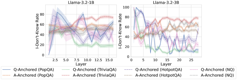
### Visual Description
## Line Charts: I-Don't-Know Rate Across Model Layers for Llama-3.2 Models
### Overview
The image displays two side-by-side line charts comparing the "I-Don't-Know Rate" across different layers of two language models: Llama-3.2-1B (left) and Llama-3.2-3B (right). The charts analyze how the model's tendency to produce an "I don't know" response varies by layer, depending on the question-answering method (Q-Anchored vs. A-Anchored) and the dataset used (PopQA, TriviaQA, HotpotQA, NQ).
### Components/Axes
* **Titles:**
* Left Chart: `Llama-3.2-1B`
* Right Chart: `Llama-3.2-3B`
* **Y-Axis (Both Charts):** Label: `I-Don't-Know Rate`. Scale: 0 to 100, with major ticks at 0, 20, 40, 60, 80, 100.
* **X-Axis (Both Charts):** Label: `Layer`.
* Left Chart Scale: 0 to ~16, with major ticks at 2.5, 5.0, 7.5, 10.0, 12.5, 15.0.
* Right Chart Scale: 0 to ~28, with major ticks at 0, 5, 10, 15, 20, 25.
* **Legend (Bottom, spanning both charts):** Contains 8 entries, differentiating lines by color and style (solid vs. dashed).
* **Solid Lines (Q-Anchored):**
* Blue: `Q-Anchored (PopQA)`
* Green: `Q-Anchored (TriviaQA)`
* Purple: `Q-Anchored (HotpotQA)`
* Pink: `Q-Anchored (NQ)`
* **Dashed Lines (A-Anchored):**
* Orange: `A-Anchored (PopQA)`
* Red: `A-Anchored (TriviaQA)`
* Brown: `A-Anchored (HotpotQA)`
* Gray: `A-Anchored (NQ)`
### Detailed Analysis
**Llama-3.2-1B (Left Chart):**
* **General Trend:** A-Anchored methods (dashed lines) generally maintain a higher and more stable I-Don't-Know Rate (mostly between 40-80) across layers. Q-Anchored methods (solid lines) start lower, exhibit significant volatility, and often show a declining trend in later layers.
* **Q-Anchored Series:**
* **PopQA (Blue, Solid):** Starts near 0, spikes sharply to ~80 at layer ~2.5, then fluctuates dramatically, ending near 60 at layer 15.
* **TriviaQA (Green, Solid):** Starts around 40, peaks near 60 at layer ~5, then declines steadily to ~20 by layer 15.
* **HotpotQA (Purple, Solid) & NQ (Pink, Solid):** Both start between 20-40, show high volatility with multiple peaks and troughs, and end in the 20-40 range.
* **A-Anchored Series:**
* **PopQA (Orange, Dashed):** Relatively stable, hovering between 50-65.
* **TriviaQA (Red, Dashed):** The highest and most stable series, consistently between 60-80.
* **HotpotQA (Brown, Dashed) & NQ (Gray, Dashed):** Both are stable and intertwined, generally ranging from 40-60.
**Llama-3.2-3B (Right Chart):**
* **General Trend:** Similar pattern to the 1B model but with more pronounced volatility in the Q-Anchored lines and a wider layer range. A-Anchored lines remain higher and more stable.
* **Q-Anchored Series:**
* **PopQA (Blue, Solid):** Extremely volatile. Starts near 0, spikes to ~100 at layer ~2, crashes to ~10 at layer ~5, then oscillates wildly between 20-80.
* **TriviaQA (Green, Solid):** Starts near 40, peaks at ~70 around layer 5, then shows a general decline with volatility, ending near 10 at layer 27.
* **HotpotQA (Purple, Solid) & NQ (Pink, Solid):** Both show high volatility, starting low (20-40), with multiple peaks often reaching 60-80, and ending in the 20-50 range.
* **A-Anchored Series:**
* **PopQA (Orange, Dashed):** Stable, mostly between 50-70.
* **TriviaQA (Red, Dashed):** Again the highest, stable between 70-80.
* **HotpotQA (Brown, Dashed) & NQ (Gray, Dashed):** Stable and closely grouped, ranging from 50-70.
### Key Observations
1. **Method Dichotomy:** There is a clear and consistent separation between Q-Anchored (solid) and A-Anchored (dashed) lines across both models. A-Anchored methods yield significantly higher and more stable "I-Don't-Know" rates.
2. **Dataset Hierarchy:** For A-Anchored methods, the dataset order from highest to lowest rate is consistent: TriviaQA (Red) > PopQA (Orange) ≈ HotpotQA (Brown) ≈ NQ (Gray).
3. **Model Scale Effect:** The larger model (3B) exhibits greater volatility in the Q-Anchored responses, particularly for PopQA, suggesting more dramatic shifts in internal representation or confidence across its deeper layers.
4. **Layer Sensitivity:** Q-Anchored performance is highly sensitive to specific layers, with sharp peaks and troughs, whereas A-Anchored performance is largely layer-invariant.
### Interpretation
The data suggests a fundamental difference in how the model processes questions versus answers when generating abstention responses. **A-Anchored prompting** (likely conditioning on the answer format) leads to a consistent, high baseline of "I don't know" responses, implying it reliably triggers a cautious or abstention mode regardless of the layer or specific knowledge domain (dataset). This could be useful for applications requiring high precision and low hallucination rates.
In contrast, **Q-Anchored prompting** (conditioning on the question) results in a volatile, layer-dependent abstention rate. The early-layer spikes might indicate initial uncertainty processing, while the mid-layer peaks could correspond to specific knowledge retrieval or integration points. The decline in later layers for some datasets (e.g., TriviaQA) might suggest the model becomes more confident (or less cautious) in its final representations. The extreme volatility in the 3B model's Q-Anchored PopQA line is a notable anomaly, indicating that for certain datasets, the larger model's internal decision-making regarding abstention is highly unstable across its processing depth.
**In essence, the choice of anchoring method is a more powerful lever for controlling the model's abstention behavior than the specific layer or model size, with A-Anchored methods providing a predictable, high-abstention profile.**
</details>
<details>
<summary>x88.png Details</summary>
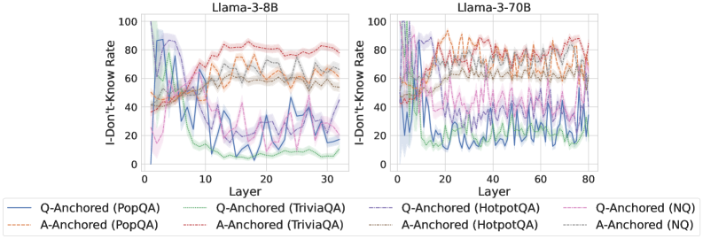
### Visual Description
## Line Charts: Llama-3 Model "I-Don't-Know Rate" Across Layers
### Overview
The image displays two side-by-side line charts comparing the "I-Don't-Know Rate" across the layers of two different-sized language models: Llama-3-8B (left) and Llama-3-70B (right). Each chart plots the performance of eight different experimental configurations, distinguished by anchoring method (Q-Anchored vs. A-Anchored) and evaluation dataset (PopQA, TriviaQA, HotpotQA, NQ). The charts visualize how the model's propensity to output an "I don't know" response changes as information propagates through its internal layers.
### Components/Axes
* **Chart Titles:**
* Left Chart: `Llama-3-8B`
* Right Chart: `Llama-3-70B`
* **Y-Axis (Both Charts):**
* Label: `I-Don't-Know Rate`
* Scale: 0 to 100, with major tick marks at 0, 20, 40, 60, 80, 100.
* **X-Axis:**
* Label: `Layer`
* Left Chart Scale: 0 to 30, with major tick marks at 0, 10, 20, 30.
* Right Chart Scale: 0 to 80, with major tick marks at 0, 20, 40, 60, 80.
* **Legend (Bottom of Image, spanning both charts):**
* Contains 8 entries, each with a line sample and text label.
* **Q-Anchored (Solid Lines):**
* Blue solid line: `Q-Anchored (PopQA)`
* Green solid line: `Q-Anchored (TriviaQA)`
* Purple solid line: `Q-Anchored (HotpotQA)`
* Pink solid line: `Q-Anchored (NQ)`
* **A-Anchored (Dashed Lines):**
* Orange dashed line: `A-Anchored (PopQA)`
* Red dashed line: `A-Anchored (TriviaQA)`
* Brown dashed line: `A-Anchored (HotpotQA)`
* Gray dashed line: `A-Anchored (NQ)`
### Detailed Analysis
**Llama-3-8B Chart (Left):**
* **Q-Anchored Lines (Solid):** These lines generally show a **downward trend** in the early layers (0-10), indicating a decreasing "I-Don't-Know Rate." After layer 10, they exhibit significant volatility but tend to stabilize at lower values (mostly between 10-40) compared to their starting points.
* `Q-Anchored (PopQA)` (Blue): Starts very high (~90), drops sharply to ~10 by layer 10, then fluctuates between ~10-40.
* `Q-Anchored (TriviaQA)` (Green): Starts high (~80), drops to near 0 by layer 10, then fluctuates at a very low level (0-20).
* `Q-Anchored (HotpotQA)` (Purple): Starts high (~85), drops to ~20 by layer 10, then shows high volatility between ~10-50.
* `Q-Anchored (NQ)` (Pink): Starts moderately high (~60), drops to ~20 by layer 10, then fluctuates between ~10-40.
* **A-Anchored Lines (Dashed):** These lines show a general **upward trend** across layers, indicating an increasing "I-Don't-Know Rate."
* `A-Anchored (PopQA)` (Orange): Starts around 40, rises steadily to ~70 by layer 30.
* `A-Anchored (TriviaQA)` (Red): Starts around 40, rises to the highest level among all lines, reaching ~80 by layer 30.
* `A-Anchored (HotpotQA)` (Brown): Starts around 40, rises to ~60 by layer 30.
* `A-Anchored (NQ)` (Gray): Starts around 40, rises to ~60 by layer 30.
**Llama-3-70B Chart (Right):**
* **Q-Anchored Lines (Solid):** Similar to the 8B model, these lines show an initial **downward trend** but with more pronounced and sustained volatility across the deeper layers (0-80).
* `Q-Anchored (PopQA)` (Blue): Starts very high (~95), drops steeply to ~10 by layer 20, then fluctuates widely between ~5-40.
* `Q-Anchored (TriviaQA)` (Green): Starts high (~85), drops to near 0 by layer 20, then remains very low (0-10) with minor fluctuations.
* `Q-Anchored (HotpotQA)` (Purple): Starts high (~90), drops to ~20 by layer 20, then exhibits extreme volatility between ~5-60.
* `Q-Anchored (NQ)` (Pink): Starts moderately high (~70), drops to ~20 by layer 20, then fluctuates between ~10-50.
* **A-Anchored Lines (Dashed):** These lines also show a general **upward trend**, but they reach higher peaks and exhibit more noise compared to the 8B model.
* `A-Anchored (PopQA)` (Orange): Starts around 40, rises with high volatility to a peak near 90 around layer 60.
* `A-Anchored (TriviaQA)` (Red): Starts around 40, rises to the highest sustained levels, fluctuating between 70-90 from layer 40 onward.
* `A-Anchored (HotpotQA)` (Brown): Starts around 40, rises to fluctuate between 60-80 from layer 40 onward.
* `A-Anchored (NQ)` (Gray): Starts around 40, rises to fluctuate between 50-70 from layer 40 onward.
### Key Observations
1. **Divergent Anchoring Effects:** There is a stark and consistent contrast between anchoring methods. **Q-Anchored** methods lead to a *decrease* in the "I-Don't-Know Rate" through the layers, while **A-Anchored** methods lead to an *increase*.
2. **Model Size Impact:** The larger Llama-3-70B model shows more extreme values (both higher peaks for A-Anchored and lower troughs for Q-Anchored) and significantly greater volatility in its layer-wise responses compared to the 8B model.
3. **Dataset Sensitivity:** The effect magnitude varies by dataset. For Q-Anchored methods, `TriviaQA` (green) consistently results in the lowest "I-Don't-Know Rate." For A-Anchored methods, `TriviaQA` (red) and `PopQA` (orange) often result in the highest rates.
4. **Early Layer Convergence:** For Q-Anchored methods, the most dramatic change occurs in the first 10-20 layers, after which the rate stabilizes or fluctuates around a new, lower baseline.
### Interpretation
This data suggests a fundamental difference in how information is processed under the two anchoring paradigms. The **Q-Anchored** approach appears to progressively build confidence or extract answer-related information as data moves through the network layers, reducing uncertainty. Conversely, the **A-Anchored** approach seems to amplify uncertainty or "forget" initial priors, leading to a higher likelihood of a non-answer response in deeper layers.
The increased volatility in the 70B model indicates that larger models may have more specialized or unstable internal representations across layers for these tasks. The consistent dataset-specific patterns (e.g., TriviaQA being easiest for Q-Anchored) imply that the underlying nature of the knowledge or question format in each dataset interacts predictably with the model's architecture and the anchoring method.
From a technical document perspective, these charts provide strong evidence that the choice of anchoring method (Q vs. A) is a critical hyperparameter that dramatically influences model behavior and calibration (as measured by the "I-Don't-Know" rate) across its depth, with effects that scale with model size.
</details>
<details>
<summary>x89.png Details</summary>
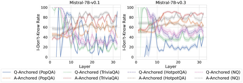
### Visual Description
## Line Charts: I-Don't-Know Rate Across Model Layers
### Overview
The image displays two side-by-side line charts comparing the "I-Don't-Know Rate" across the layers (0-30) of two versions of the Mistral-7B language model: v0.1 (left) and v0.3 (right). Each chart plots eight data series, representing two different prompting methods ("Q-Anchored" and "A-Anchored") applied to four distinct question-answering datasets (PopQA, TriviaQA, HotpotQA, NQ). The charts illustrate how the model's expressed uncertainty (its rate of producing an "I don't know" response) changes as information propagates through its internal layers.
### Components/Axes
* **Chart Titles:** "Mistral-7B-v0.1" (left chart), "Mistral-7B-v0.3" (right chart).
* **Y-Axis (Both Charts):** Label: "I-Don't-Know Rate". Scale: 0 to 100, with major tick marks at intervals of 20 (0, 20, 40, 60, 80, 100).
* **X-Axis (Both Charts):** Label: "Layer". Scale: 0 to 30, with major tick marks at intervals of 10 (0, 10, 20, 30).
* **Legend (Bottom Center, spanning both charts):** Contains eight entries, each with a unique line color and style.
* **Q-Anchored Series (Solid Lines):**
* `Q-Anchored (PopQA)`: Solid blue line.
* `Q-Anchored (TriviaQA)`: Solid green line.
* `Q-Anchored (HotpotQA)`: Solid purple line.
* `Q-Anchored (NQ)`: Solid pink/red line.
* **A-Anchored Series (Dashed Lines):**
* `A-Anchored (PopQA)`: Dashed orange line.
* `A-Anchored (TriviaQA)`: Dashed red line.
* `A-Anchored (HotpotQA)`: Dashed gray line.
* `A-Anchored (NQ)`: Dashed brown line.
* **Grid:** Light gray grid lines are present in the background of both charts.
### Detailed Analysis
**Mistral-7B-v0.1 (Left Chart):**
* **General Trend:** All series show high variability and fluctuation across layers. There is no single, smooth monotonic trend for any series.
* **Q-Anchored Series (Solid Lines):** These lines generally start at a high rate (between ~60-100) in the early layers (0-5). They exhibit a sharp dip or valley between layers 5-10, often dropping below 40. After layer 10, they enter a phase of high-amplitude oscillation, with values swinging between approximately 10 and 90 through layer 30. The blue line (PopQA) and green line (TriviaQA) show particularly deep troughs near layer 10.
* **A-Anchored Series (Dashed Lines):** These lines start at a moderate level (between ~40-60) in the early layers. They show a more gradual, undulating pattern compared to the Q-Anchored lines. They generally rise to a peak between layers 15-25, with values often reaching 70-90, before showing a slight decline or stabilization towards layer 30. The dashed lines are generally less volatile than the solid lines in the later layers (20-30).
**Mistral-7B-v0.3 (Right Chart):**
* **General Trend:** The patterns are distinctly different from v0.1, showing more separation between the two method types (Q-Anchored vs. A-Anchored).
* **Q-Anchored Series (Solid Lines):** These lines start very high (near 100) in the earliest layers (0-3). They then experience a dramatic and sustained decline. The blue line (PopQA) plummets to near 0 by layer 10 and remains very low (mostly below 20) for the rest of the layers. The other solid lines (green, purple, pink) also decline significantly but stabilize at a higher plateau, fluctuating roughly between 20 and 50 from layer 10 to 30.
* **A-Anchored Series (Dashed Lines):** These lines start at a moderate level (~50-70) and show a general upward trend, peaking in the middle-to-late layers (15-25). They maintain high values (mostly between 60 and 90) throughout the second half of the network, showing less decline than their v0.1 counterparts. They are consistently higher than the Q-Anchored lines after approximately layer 8.
### Key Observations
1. **Version Comparison:** The most striking difference is the behavior of the Q-Anchored (solid) lines. In v0.3, they show a strong, sustained decrease in "I-Don't-Know Rate" after the initial layers, which is not present in v0.1. This is especially extreme for the PopQA dataset.
2. **Method Divergence:** In v0.3, a clear gap opens up between the two methods after layer ~8. The A-Anchored method maintains a high uncertainty rate, while the Q-Anchored method's uncertainty drops significantly. This separation is much less pronounced in v0.1.
3. **Dataset Sensitivity:** The PopQA dataset (blue/orange lines) shows the most extreme behavior in both charts, particularly the near-zero rate for Q-Anchored in v0.3. The other three datasets (TriviaQA, HotpotQA, NQ) follow more similar, grouped patterns within each method.
4. **Early Layer Behavior:** Both model versions show very high uncertainty (near 100) for Q-Anchored methods in the first few layers, suggesting the model initially lacks confidence regardless of version.
### Interpretation
The data suggests a significant evolution in the internal processing of the Mistral-7B model between versions v0.1 and v0.3, specifically regarding how it handles uncertainty when prompted with different formats.
* **Model Maturation:** The dramatic drop in "I-Don't-Know Rate" for Q-Anchored prompts in v0.3's deeper layers indicates that the updated model has become much more confident in its internal representations when the question is directly anchored. It appears to resolve uncertainty earlier in its processing stream (by layer 10) for this prompting style.
* **Anchoring Method Impact:** The persistent high uncertainty for A-Anchored prompts in v0.3 suggests that anchoring the answer format may prevent the model from consolidating confidence in the same way. The model seems to retain a higher degree of expressed uncertainty throughout its layers when the answer is pre-specified.
* **Dataset Characteristics:** The outlier behavior of PopQA, especially in v0.3, implies that the nature of the questions or answers in this dataset interacts uniquely with the model's knowledge and the anchoring mechanism, leading to near-complete elimination of "I don't know" responses for Q-Anchored prompts in later layers.
* **Architectural Insight:** The charts provide a window into the "confidence calibration" across the model's depth. The transition from high early-layer uncertainty to lower later-layer uncertainty (for Q-Anchored in v0.3) mirrors the expected flow of information processing, where raw inputs are transformed into more confident internal states. The lack of this trend in v0.1 suggests a less refined internal confidence mechanism.
**Language:** All text in the image is in English.
</details>
Figure 34: Comparisons of i-don’t-know rate between pathways, probing mlp activations of the token immediately preceding the exact answer tokens.
<details>
<summary>x90.png Details</summary>
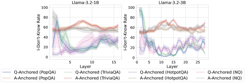
### Visual Description
## Line Charts: I-Don't-Know Rate Across Model Layers
### Overview
The image displays two side-by-side line charts comparing the "I-Don't-Know Rate" across the internal layers of two different Large Language Models (LLMs): Llama-3.2-1B (left) and Llama-3.2-3B (right). The charts track this rate for questions from four different datasets (PopQA, TriviaQA, HotpotQA, NQ) under two different experimental conditions ("Q-Anchored" and "A-Anchored").
### Components/Axes
* **Chart Titles:** "Llama-3.2-1B" (left chart), "Llama-3.2-3B" (right chart).
* **Y-Axis (Both Charts):** Label: "I-Don't-Know Rate". Scale: 0 to 100, with major tick marks at 0, 20, 40, 60, 80, 100.
* **X-Axis (Left Chart):** Label: "Layer". Scale: 0 to 15, with major tick marks at 0, 5, 10, 15.
* **X-Axis (Right Chart):** Label: "Layer". Scale: 0 to 25, with major tick marks at 0, 5, 10, 15, 20, 25.
* **Legend (Bottom Center, spanning both charts):** Contains 8 entries, each a combination of line style/color and label.
* **Q-Anchored Series (Solid Lines):**
* Blue solid line: `Q-Anchored (PopQA)`
* Green solid line: `Q-Anchored (TriviaQA)`
* Purple solid line: `Q-Anchored (HotpotQA)`
* Pink solid line: `Q-Anchored (NQ)`
* **A-Anchored Series (Dashed Lines):**
* Orange dashed line: `A-Anchored (PopQA)`
* Red dashed line: `A-Anchored (TriviaQA)`
* Gray dashed line: `A-Anchored (HotpotQA)`
* Brown dashed line: `A-Anchored (NQ)`
* **Visual Elements:** Each data line is accompanied by a semi-transparent shaded area of the same color, likely representing a confidence interval or variance across multiple runs.
### Detailed Analysis
**Llama-3.2-1B (Left Chart):**
* **Q-Anchored (Solid Lines) Trend:** All four solid lines show a similar pattern: a very high initial rate (between ~60-95) at Layer 0-1, followed by a steep decline to a trough between Layers 3-7 (rates dropping to ~10-30), and then a gradual, oscillating increase towards the final layers (ending between ~20-40).
* `Q-Anchored (PopQA)` (Blue): Starts highest (~95), drops sharply to ~15 by Layer 5, then slowly rises to ~35 by Layer 15.
* `Q-Anchored (TriviaQA)` (Green): Starts ~80, drops to ~10 by Layer 7, rises to ~25 by Layer 15.
* `Q-Anchored (HotpotQA)` (Purple): Starts ~60, drops to ~15 by Layer 5, rises to ~40 by Layer 15.
* `Q-Anchored (NQ)` (Pink): Starts ~70, drops to ~20 by Layer 5, rises to ~30 by Layer 15.
* **A-Anchored (Dashed Lines) Trend:** All four dashed lines are relatively stable and clustered together in the upper half of the chart. They start between ~50-60, show a slight rise to a peak around Layers 8-12 (rates ~60-75), and then a slight decline towards the end (ending ~50-60).
* `A-Anchored (PopQA)` (Orange): Fluctuates between ~55-70.
* `A-Anchored (TriviaQA)` (Red): Shows the highest peak, reaching ~75 around Layer 10.
* `A-Anchored (HotpotQA)` (Gray): Remains the most stable, hovering around ~55-60.
* `A-Anchored (NQ)` (Brown): Follows a similar path to the orange line, ~50-65.
**Llama-3.2-3B (Right Chart):**
* **Q-Anchored (Solid Lines) Trend:** The pattern is similar to the 1B model but more pronounced and extended over more layers. A high start, a deep trough in the early-middle layers (Layers 5-15), and a recovery in later layers.
* `Q-Anchored (PopQA)` (Blue): Starts ~95, plummets to near 0 by Layer 10, recovers to ~30 by Layer 25.
* `Q-Anchored (TriviaQA)` (Green): Starts ~90, drops to ~5 by Layer 12, recovers to ~20 by Layer 25.
* `Q-Anchored (HotpotQA)` (Purple): Starts ~50, drops to ~10 by Layer 8, recovers to ~40 by Layer 25.
* `Q-Anchored (NQ)` (Pink): Starts ~60, drops to ~15 by Layer 7, recovers to ~35 by Layer 25.
* **A-Anchored (Dashed Lines) Trend:** Again, these lines are stable and high, showing less variation across layers compared to the Q-Anchored lines. They occupy the ~50-80 range.
* `A-Anchored (PopQA)` (Orange): Fluctuates between ~55-75.
* `A-Anchored (TriviaQA)` (Red): Shows the highest values, peaking near ~80 around Layer 15.
* `A-Anchored (HotpotQA)` (Gray): Stable around ~55-65.
* `A-Anchored (NQ)` (Brown): Stable around ~50-60.
### Key Observations
1. **Fundamental Dichotomy:** There is a stark, consistent difference between the Q-Anchored (solid) and A-Anchored (dashed) conditions across both models and all datasets. Q-Anchored lines are dynamic (high-low-high), while A-Anchored lines are static (consistently high).
2. **Layer-Wise Pattern for Q-Anchoring:** The "I-Don't-Know Rate" for Q-Anchored evaluation follows a clear U-shaped (or V-shaped) curve across layers: highest at the input/output layers and lowest in the middle layers.
3. **Model Scale Effect:** The 3B model (right) exhibits a deeper and more prolonged trough for the Q-Anchored lines compared to the 1B model (left), suggesting the larger model's middle layers are even more confident (lower "I-Don't-Know" rate) when processing the question anchor.
4. **Dataset Variation:** The `TriviaQA` dataset (green/red) often shows the most extreme values—both the lowest troughs for Q-Anchored and the highest peaks for A-Anchored. `HotpotQA` (purple/gray) tends to be the most moderate.
### Interpretation
This data visualizes a probe into the internal "confidence" or "knowledge retrieval" process of Llama models. The "I-Don't-Know Rate" likely measures how often a model's internal representations at a given layer, when probed, fail to contain the answer.
* **Q-Anchored vs. A-Anchored:** The condition labels suggest an experimental setup. "Q-Anchored" likely means the model is prompted or conditioned with the Question, and layers are probed for the Answer. "A-Anchored" likely means it's conditioned with the Answer, and layers are probed for the Question. The results show that when the model is given the question, its middle layers are highly knowledgeable (low "I-Don't-Know" rate), but this knowledge fades at the very beginning and end of the network. Conversely, when given the answer, the model's layers consistently struggle to recall the associated question (high "I-Don't-Know" rate) throughout the network.
* **The "Valley of Knowledge":** The U-shaped curve for Q-Anchoring suggests a functional specialization within the transformer layers. The initial layers process raw input, the middle layers (the "valley") are where deep semantic understanding and fact retrieval occur, and the final layers are specialized for output generation. The deeper valley in the 3B model implies this knowledge-retrieval function is more concentrated or robust in larger models.
* **Asymmetry of Recall:** The stark contrast between the two conditions reveals a fundamental asymmetry: it's easier for the model to retrieve an answer from a question (concentrated in middle layers) than it is to retrieve a question from an answer (uniformly difficult). This aligns with how these models are trained—primarily to generate answers given questions.
</details>
<details>
<summary>x91.png Details</summary>
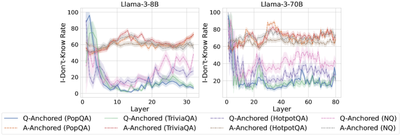
### Visual Description
## Line Charts: Llama-3 Model "I-Don't-Know Rate" Across Layers
### Overview
The image displays two side-by-side line charts comparing the "I-Don't-Know Rate" across the layers of two large language models: Llama-3-8B (left chart) and Llama-3-70B (right chart). Each chart plots multiple data series representing different question-answering datasets (PopQA, TriviaQA, HotpotQA, NQ) under two experimental conditions: "Q-Anchored" and "A-Anchored". The charts illustrate how the models' propensity to output "I don't know" changes as information propagates through the network's layers.
### Components/Axes
* **Chart Titles:**
* Left Chart: `Llama-3-8B`
* Right Chart: `Llama-3-70B`
* **Y-Axis (Both Charts):** Label is `I-Don't-Know Rate`. Scale runs from 0 to 100 in increments of 20.
* **X-Axis (Both Charts):** Label is `Layer`.
* For Llama-3-8B, the scale runs from 0 to 30.
* For Llama-3-70B, the scale runs from 0 to 80.
* **Legend (Bottom, spanning both charts):** Contains 8 entries, differentiating series by color and line style (solid vs. dashed).
* **Solid Lines (Q-Anchored):**
* Blue: `Q-Anchored (PopQA)`
* Green: `Q-Anchored (TriviaQA)`
* Purple: `Q-Anchored (HotpotQA)`
* Pink: `Q-Anchored (NQ)`
* **Dashed Lines (A-Anchored):**
* Orange: `A-Anchored (PopQA)`
* Red: `A-Anchored (TriviaQA)`
* Brown: `A-Anchored (HotpotQA)`
* Gray: `A-Anchored (NQ)`
### Detailed Analysis
**Llama-3-8B Chart (Left):**
* **Q-Anchored Series (Solid Lines):** All four solid lines show a similar, dramatic trend. They start at a very high rate (between ~80-100) at Layer 0, then plummet sharply within the first 5-10 layers to a low point (between ~0-20). After this initial drop, they exhibit a gradual, fluctuating upward trend through the remaining layers, ending between approximately 10-40 at Layer 30.
* *Trend Verification:* Steep initial decline followed by a slow, noisy recovery.
* **A-Anchored Series (Dashed Lines):** These lines follow a distinctly different pattern. They start at a moderate level (between ~40-60) at Layer 0. They show a general, fluctuating upward trend throughout all layers, ending at a higher rate (between ~60-75) at Layer 30. They do not exhibit the sharp initial drop seen in the Q-Anchored lines.
* *Trend Verification:* General upward drift with significant layer-to-layer fluctuation.
* **Spatial Grounding:** The Q-Anchored (solid) lines are consistently below the A-Anchored (dashed) lines from approximately Layer 5 onward. The highest final value belongs to the red dashed line (A-Anchored, TriviaQA).
**Llama-3-70B Chart (Right):**
* **Q-Anchored Series (Solid Lines):** Similar to the 8B model, these lines start high (near 100) and drop sharply in the early layers (0-10). However, the subsequent behavior is more volatile. They fluctuate significantly, with some series (notably blue - PopQA) showing a pronounced secondary dip around Layer 40 before rising again. Final values at Layer 80 are generally low, clustered between ~10-30.
* *Trend Verification:* Sharp initial drop, followed by high volatility and a general low plateau.
* **A-Anchored Series (Dashed Lines):** These lines start at a moderate-to-high level (~60-80). They exhibit a strong, fluctuating upward trend, peaking around Layers 30-50 (with some values exceeding 80), before slightly declining or stabilizing towards Layer 80. Final values remain high, between ~60-80.
* *Trend Verification:* Strong rise to a mid-network peak, followed by a slight decline or plateau.
* **Spatial Grounding:** The separation between Q-Anchored (solid, lower) and A-Anchored (dashed, higher) groups is even more pronounced and consistent across most layers compared to the 8B model. The orange dashed line (A-Anchored, PopQA) appears to be among the highest for much of the chart.
### Key Observations
1. **Fundamental Dichotomy:** There is a clear and consistent separation between the behavior of Q-Anchored (solid lines) and A-Anchored (dashed lines) conditions across both models. Q-Anchored leads to a low "I-Don't-Know Rate" after early layers, while A-Anchored maintains a high rate.
2. **Model Size Effect:** The larger Llama-3-70B model shows more pronounced volatility in its Q-Anchored rates and a more defined peak in its A-Anchored rates compared to the 8B model. The layer scale is also more than double.
3. **Early-Layer Criticality:** The most dramatic change for Q-Anchored series occurs in the first ~10 layers, suggesting this is where the model's internal "confidence" or answer formulation is most actively determined.
4. **Dataset Variation:** While the overall trends are consistent per anchoring method, there is notable variation between datasets (different colors). For example, in the 70B model, the blue Q-Anchored (PopQA) line shows a unique secondary dip.
### Interpretation
The data suggests a fundamental difference in how the model processes information based on the anchoring method. **Q-Anchoring** (likely conditioning on the question) appears to drive the model toward committing to an answer (or a "know" state) very early in its processing stream, resulting in a low "I-Don't-Know Rate" for the majority of the network. The subsequent slow rise may indicate a gradual reintroduction of uncertainty or a refinement process.
In contrast, **A-Anchoring** (likely conditioning on a potential answer) seems to keep the model in a more evaluative or uncertain state throughout its processing. The high and even increasing "I-Don't-Know Rate" suggests the model is constantly weighing the anchored answer against its internal knowledge, leading to higher expressed uncertainty. The peak in the middle layers of the 70B model could represent a point of maximal information integration or conflict resolution.
The stark contrast between the two conditions implies that the model's internal representation of "knowing" vs. "not knowing" is highly sensitive to the initial framing or prompt structure. This has significant implications for understanding model confidence and for designing prompts that elicit more calibrated expressions of uncertainty. The increased volatility in the larger model may reflect a more complex and nuanced internal deliberation process.
</details>
<details>
<summary>x92.png Details</summary>
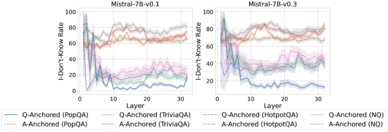
### Visual Description
## Line Chart: Mistral-7B Model "I-Don't-Know Rate" by Layer
### Overview
The image displays two side-by-side line charts comparing the "I-Don't-Know Rate" across the 32 layers (0-31) of two versions of the Mistral-7B language model: version 0.1 (left) and version 0.3 (right). The charts analyze this rate using two different methods ("Q-Anchored" and "A-Anchored") across four different question-answering datasets (PopQA, TriviaQA, HotpotQA, NQ). The data suggests an investigation into how model uncertainty or refusal behavior changes across its internal layers and between model versions.
### Components/Axes
* **Chart Titles:** "Mistral-7B-v0.1" (left chart), "Mistral-7B-v0.3" (right chart).
* **X-Axis:** Labeled "Layer". Linear scale from 0 to 30, with major tick marks every 10 units (0, 10, 20, 30). Represents the layer index within the neural network.
* **Y-Axis:** Labeled "I-Don't-Know Rate". Linear scale from 0 to 100, with major tick marks every 20 units (0, 20, 40, 60, 80, 100). Represents a percentage rate.
* **Legend:** Positioned below both charts, centered. Contains 8 entries, differentiating lines by color and style (solid vs. dashed).
* **Solid Lines (Q-Anchored):**
* Blue: Q-Anchored (PopQA)
* Green: Q-Anchored (TriviaQA)
* Purple: Q-Anchored (HotpotQA)
* Pink: Q-Anchored (NQ)
* **Dashed Lines (A-Anchored):**
* Orange: A-Anchored (PopQA)
* Red: A-Anchored (TriviaQA)
* Gray: A-Anchored (HotpotQA)
* Brown: A-Anchored (NQ)
* **Data Series:** Each chart contains 8 lines, one for each legend entry. Each line is accompanied by a semi-transparent shaded area of the same color, likely representing a confidence interval or standard deviation.
### Detailed Analysis
**Mistral-7B-v0.1 (Left Chart):**
* **Q-Anchored Series (Solid Lines):** All four series show a similar, dramatic trend. They start at a very high rate (approximately 80-100%) at Layer 0. There is a sharp, precipitous drop within the first 5 layers, falling to between ~0% and ~40%. After this initial drop, the rates stabilize at a low level for the remaining layers (5-31), with minor fluctuations. The PopQA (blue) line ends the lowest, near 0%. The HotpotQA (purple) and NQ (pink) lines remain slightly higher, fluctuating between ~20-40%.
* **A-Anchored Series (Dashed Lines):** These series exhibit a completely different pattern. They start at a moderate rate (approximately 50-70%) at Layer 0. Instead of dropping, they show a general, gradual upward trend across layers, ending between ~60% and ~80% at Layer 31. The lines are tightly clustered, with the HotpotQA (gray) and NQ (brown) series appearing slightly higher than PopQA (orange) and TriviaQA (red) in the later layers.
**Mistral-7B-v0.3 (Right Chart):**
* **Q-Anchored Series (Solid Lines):** The pattern is similar to v0.1 but less extreme. Rates start high (70-100%) at Layer 0 and drop sharply in the first ~5 layers. However, the post-drop stabilization occurs at a higher level compared to v0.1. The PopQA (blue) line again drops the lowest, to around 10-20%. The other three (TriviaQA-green, HotpotQA-purple, NQ-pink) stabilize in a band between approximately 30% and 50%.
* **A-Anchored Series (Dashed Lines):** The trend is again a gradual increase from Layer 0 to Layer 31, starting around 60-70% and ending between ~70% and ~90%. The clustering is similar to v0.1, with HotpotQA (gray) and NQ (brown) generally at the top of the cluster.
### Key Observations
1. **Method-Driven Dichotomy:** The most striking pattern is the fundamental difference between the Q-Anchored (solid) and A-Anchored (dashed) methods. Q-Anchored rates collapse in early layers, while A-Anchored rates build gradually.
2. **Early Layer Criticality:** For the Q-Anchored method, the first 5 layers are decisive, where the "I-Don't-Know" behavior is largely determined.
3. **Model Version Difference:** Mistral-7B-v0.3 shows higher stabilized "I-Don't-Know" rates for the Q-Anchored method (except PopQA) compared to v0.1, suggesting a change in the model's internal processing of uncertainty.
4. **Dataset Sensitivity:** The PopQA dataset (blue/orange) consistently yields the lowest rates for both methods across both model versions, indicating it may be an easier or different type of dataset for the model. HotpotQA and NQ often show the highest rates.
### Interpretation
This data visualizes how two different probing techniques ("Q-Anchored" vs. "A-Anchored") reveal opposing narratives about a language model's internal "knowledge" or "confidence" across its layers.
* The **Q-Anchored** method (likely probing based on the question) suggests that the model's initial layers contain a high degree of uncertainty or a default "I don't know" state, which is rapidly resolved or suppressed by layer 5. This could indicate that early layers perform a kind of "reality check" or initial processing that quickly moves away from a state of non-knowledge.
* The **A-Anchored** method (likely probing based on the answer) suggests the opposite: that certainty or answer-related information builds up gradually throughout the network. This could reflect the progressive assembly or refinement of an answer representation.
* The contrast implies that "knowing" is not a monolithic property within the model. The model's state can be interpreted as highly uncertain from one perspective (question-focused) while simultaneously becoming more committed from another (answer-focused), especially in the later layers.
* The difference between v0.1 and v0.3 suggests that model updates can significantly alter these internal dynamics, particularly the baseline level of uncertainty maintained in the mid-to-layers when probed with the Q-Anchored method. The consistent outlier behavior of PopQA warrants further investigation into its characteristics relative to the other datasets.
</details>
Figure 35: Comparisons of i-don’t-know rate between pathways, probing mlp activations of the last exact answer token.
## Appendix H Pathway-Aware Detection
Method LLama-3.2-1B LLama-3.2-3B PopQA TriviaQA HotpotQA NQ PopQA TriviaQA HotpotQA NQ P(True) 60.00 49.65 43.34 52.83 54.58 51.76 47.73 53.78 Logits-mean 74.89 60.24 60.18 49.92 73.47 63.46 60.35 54.89 Logits-max 58.56 52.37 52.29 46.19 56.03 54.33 48.65 48.88 Logits-min 78.66 62.37 67.14 51.20 80.92 69.60 71.11 58.24 Scores-mean 72.91 61.13 62.16 64.67 67.99 61.96 64.91 61.71 Scores-max 69.33 59.74 61.29 64.08 63.34 61.92 61.09 57.56 Scores-min 64.84 55.93 59.28 55.81 61.51 56.76 63.95 57.43 Probing Baseline 94.25 77.17 90.25 74.83 90.96 76.61 86.54 74.20 mygray MoP-RandomGate 83.69 69.20 84.11 68.76 79.69 72.38 75.13 67.11 mygray MoP-VanillaExperts 93.86 78.63 90.91 75.73 90.98 77.68 86.41 75.30 mygray MoP 95.85 80.07 91.51 79.19 92.74 78.72 88.16 78.14 mygray PR 96.18 84.22 92.80 86.45 95.70 80.66 90.66 81.91
Table 8: Comparison of hallucination detection performance (AUC) on LLama-3.2-1B and LLama-3.2-3B.
Method LLama-3-8B LLama-3-70B PopQA TriviaQA HotpotQA NQ PopQA TriviaQA HotpotQA NQ P(True) 55.85 49.92 52.14 53.27 54.83 50.96 49.39 51.18 Logits-mean 74.52 60.39 51.94 52.63 67.81 52.40 50.45 48.28 Logits-max 58.08 52.20 46.40 47.89 56.21 48.16 43.42 45.33 Logits-min 85.36 70.89 61.28 56.50 79.96 61.53 62.63 52.16 Scores-mean 62.87 62.09 62.06 60.32 56.81 60.70 60.91 58.05 Scores-max 56.62 60.24 59.85 56.06 55.15 59.60 57.32 51.93 Scores-min 60.99 58.27 60.33 57.68 58.77 58.22 64.06 58.05 Probing Baseline 88.71 77.58 82.23 70.20 86.88 81.59 84.45 74.39 mygray MoP-RandomGate 75.52 69.17 79.88 66.56 67.96 70.56 72.16 66.28 mygray MoP-VanillaExperts 89.11 78.73 84.57 71.21 86.04 82.47 82.48 73.85 mygray MoP 92.11 81.18 85.45 74.64 88.54 84.12 86.65 76.12 mygray PR 94.01 83.13 87.81 79.10 90.08 84.21 87.69 78.24
Table 9: Comparison of hallucination detection performance (AUC) on LLama-3-8B and LLama-3-70B.
Method Mistral-7B-v0.1 Mistral-7B-v0.3 PopQA TriviaQA HotpotQA NQ PopQA TriviaQA HotpotQA NQ P(True) 48.78 50.43 51.94 55.52 45.49 47.61 57.87 52.79 Logits-mean 69.09 64.95 54.47 59.41 69.52 66.76 55.45 57.88 Logits-max 54.37 54.76 46.74 56.45 54.34 55.24 48.39 54.37 Logits-min 86.02 76.56 68.06 53.73 87.05 77.33 68.08 54.40 Scores-mean 59.00 59.61 64.18 57.60 58.84 60.22 63.28 60.05 Scores-max 51.71 56.58 63.29 55.82 53.00 55.55 63.13 57.73 Scores-min 60.00 57.48 61.17 48.51 60.59 57.84 59.85 50.76 Probing Baseline 89.61 78.43 83.76 74.10 87.39 81.74 83.19 73.60 mygray MoP-RandomGate 80.50 68.27 74.51 68.05 79.81 70.88 72.23 61.19 mygray MoP-VanillaExperts 89.82 79.51 83.54 74.78 88.53 80.93 82.93 73.77 mygray MoP 92.44 84.03 84.63 76.38 91.66 83.57 85.82 76.87 mygray PR 94.72 84.66 89.04 80.92 93.09 84.36 89.03 79.09
Table 10: Comparison of hallucination detection performance (AUC) on Mistral-7B-v0.1 and Mistral-7B-v0.3.