# Dynamic Thinking-Token Selection for Efficient Reasoning in Large Reasoning Models
**Authors**: Zhenyuan Guo, Tong Chen, Wenlong Meng, Chen Gong, Xin Yu, Chengkun Wei, Wenzhi Chen
Abstract
Large Reasoning Models (LRMs) excel at solving complex problems by explicitly generating a reasoning trace before deriving the final answer. However, these extended generations incur substantial memory footprint and computational overhead, bottlenecking LRMs’ efficiency. This work uses attention maps to analyze the influence of reasoning traces and uncover an interesting phenomenon: only some decision-critical tokens in a reasoning trace steer the model toward the final answer, while the remaining tokens contribute negligibly. Building on this observation, we propose Dyn amic T hinking-Token S election (DynTS). This method identifies decision-critical tokens and retains only their associated Key-Value (KV) cache states during inference, evicting the remaining redundant entries to optimize efficiency. Across six benchmarks, DynTS surpasses the state-of-the-art KV cache compression methods, improving Pass@1 by $2.6\%$ under the same budget. Compared to vanilla Transformers, it reduces inference latency by $1.84–2.62×$ and peak KV-cache memory footprint by $3.32–5.73×$ without compromising LRMs’ reasoning performance. The code is available at the github link. https://github.com/Robin930/DynTS
KV Cache Compression, Efficient LRM, LLM
1 Introduction
<details>
<summary>x1.png Details</summary>
### Visual Description
## Token Retention Methods Diagram
### Overview
The image is a diagram illustrating different methods for token retention in language models. It compares Transformers, SnapKV, StreamingLLM, H2O, and DynTS, showing which tokens each method keeps based on different criteria.
### Components/Axes
* **Methods (Left Column):** Lists the different language model methods being compared: Transformers, SnapKV, StreamingLLM, H2O, and DynTS.
* **Tokens (Top Row):** Represents the sequence of tokens processed by each method. Each token is represented by a square.
* **Keeps (Right Column):** A legend explaining the color-coding used to indicate which tokens are kept by each method.
* White: All Tokens
* Orange: High Importance Prefill Tokens
* Yellow: Attention Sink Tokens
* Light Blue: Local Tokens
* Green: Heavy-Hitter Tokens
* Red: Predicted Importance Tokens
### Detailed Analysis
* **Transformers:** All tokens are kept (represented by white squares).
* **SnapKV:** Keeps some tokens as "High Importance Prefill Tokens" (orange squares) within a "Prompt" region. An "Observation Window" is also indicated. The remaining tokens are gray, implying they are not retained.
* **StreamingLLM:** Keeps a few "Attention Sink Tokens" (yellow squares) at the beginning, followed by "Local Tokens" (light blue squares).
* **H2O:** Keeps some "Heavy-Hitter Tokens" (green squares) and then "Local Tokens" (light blue squares).
* **DynTS:** Keeps "Predicted Importance Tokens" (red squares) and "Local Tokens" (light blue squares). Arrows point from the red and gray tokens to a box labeled "Answer," indicating the predicted importance of tokens to the final answer.
### Key Observations
* Transformers retain all tokens, while the other methods selectively retain tokens based on different criteria.
* SnapKV focuses on retaining tokens from the prompt.
* StreamingLLM and H2O retain a combination of specific token types (Attention Sink, Heavy-Hitter) and local tokens.
* DynTS retains tokens based on their predicted importance to the final answer.
### Interpretation
The diagram illustrates different strategies for managing and retaining tokens in language models. The methods vary in their approach, with some focusing on retaining important tokens from the prompt (SnapKV), others on specific token types (StreamingLLM, H2O), and others on predicted importance to the final answer (DynTS). The choice of method likely depends on the specific application and the trade-off between computational cost and performance. The diagram highlights the evolution from retaining all tokens (Transformers) to more selective retention strategies.
</details>
<details>
<summary>x2.png Details</summary>
### Visual Description
## Bar Chart: Accuracy vs. KV Cache Length
### Overview
The image is a bar chart comparing the accuracy of different models (Transformers, DynTS, Window StreamingLLM, SepLLM, H2O, SnapKV, R-KV) against their KV Cache Length. Accuracy is represented by gray bars, while KV Cache Length is represented by a blue dashed line with square markers.
### Components/Axes
* **X-axis:** Model names (Transformers, DynTS, Window StreamingLLM, SepLLM, H2O, SnapKV, R-KV)
* **Left Y-axis:** Accuracy (%), ranging from 0 to 70.
* **Right Y-axis:** KV Cache Length, ranging from 2k to 20k.
* **Legend:**
* Gray: Accuracy
* Blue: KV Cache Length
### Detailed Analysis
* **Accuracy (Gray Bars):**
* Transformers: 63.6%
* DynTS: 63.5%
* Window StreamingLLM: 49.4%
* SepLLM: 51.6%
* H2O: 54.5%
* SnapKV: 58.8%
* R-KV: 59.8%
* R-KV: 60.9%
* **KV Cache Length (Blue Dashed Line):**
* Transformers: Starts at approximately 17k, then drops sharply.
* DynTS: Drops to approximately 3k.
* Window StreamingLLM: Remains relatively constant at approximately 4k.
* SepLLM: Remains relatively constant at approximately 4k.
* H2O: Remains relatively constant at approximately 4k.
* SnapKV: Remains relatively constant at approximately 4k.
* R-KV: Remains relatively constant at approximately 4k.
### Key Observations
* Transformers and DynTS have the highest accuracy.
* Transformers has a significantly higher KV Cache Length compared to other models.
* DynTS has a low KV Cache Length despite having high accuracy.
* Window StreamingLLM, SepLLM, H2O, SnapKV, and R-KV have similar KV Cache Lengths.
### Interpretation
The chart suggests that DynTS achieves comparable accuracy to Transformers but with a significantly reduced KV Cache Length. This implies that DynTS is more memory-efficient. The other models (Window StreamingLLM, SepLLM, H2O, SnapKV, and R-KV) have lower accuracy and similar, low KV Cache Lengths. The data demonstrates a trade-off between accuracy and memory usage, with DynTS potentially offering a better balance. The high KV Cache Length of Transformers may be a limiting factor in certain applications.
</details>
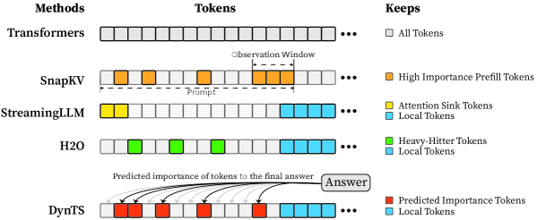
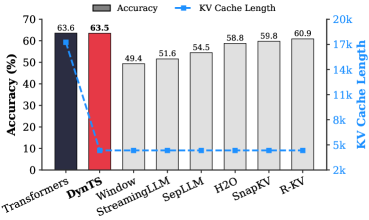
Figure 1: (Left) Comparison of token selection strategies across different KV cache eviction methods. In each row, colored blocks denote the retained high-importance tokens, while grey blocks represent the evicted tokens during LRM inference. (Right) The average reasoning performance and KV cache memory footprint on DeepSeek-R1-Distall-Llama-8B and DeepSeek-R1-Distall-Qwen-7B across six reasoning benchmarks.
Recent advancements in Large Reasoning Models (LRMs) (Chen et al., 2025) have significantly strengthened the reasoning capabilities of Large Language Models (LLMs). Representative models such as DeepSeek-R1 (Guo et al., 2025), Gemini-3-Pro (DeepMind, 2025), and ChatGPT-5.2 (OpenAI, 2025) support deep thinking mode to strengthen reasoning capability in the challenging mathematics, programming, and science tasks (Zhang et al., 2025b). These models spend a substantial number of intermediate thinking tokens on reflection, reasoning, and verification to derive the correct response during inference (Feng et al., 2025). However, the thinking process necessitates the immense KV cache memory footprint and attention-related computational cost, posing a critical deployment challenge in resource-constrained environments.
KV cache compression techniques aim to optimize the cache state by periodically evicting non-essential tokens (Shi et al., 2024; WEI et al., 2025; Liu et al., 2025b; Qin et al., 2025), typically guided by predefined token retention rules (Chen et al., 2024; Xiao et al., 2024; Devoto et al., 2024) or attention-based importance metrics (Zhang et al., 2023; Li et al., 2024; Choi et al., 2025). Nevertheless, incorporating them into the inference process of LRMs faces two key limitations: (1) Methods designed for long-context prefilling are ill-suited to the short-prefill and long-decoding scenarios of LRMs; (2) Methods tailored for long-decoding struggle to match the reasoning performance of the Full KV baseline (SOTA $60.9\%$ vs. Full KV $63.6\%$ , Fig. 1 Left). Specifically, in LRM inference, the model conducts an extensive reasoning process and then summarizes the reasoning content to derive the final answer (Minegishi et al., 2025). This implies that the correctness of the final answer relies on the thinking tokens within the preceding reasoning (Bogdan et al., 2025). However, existing compression methods cannot identify the tokens that are essential to the future answer. This leads to a significant misalignment between the retained tokens and the critical thinking tokens, resulting in degradation in the model’s reasoning performance.
To address this issue, we analyze the LRM’s generated content and study which tokens are most important for the model to steer the final answer. Some works point out attention weights capturing inter-token dependencies (Vaswani et al., 2017; Wiegreffe and Pinter, 2019; Bogdan et al., 2025), which can serve as a metric to assess the importance of tokens. Consequently, we decompose the generated content into a reasoning trace and a final answer, and then calculate the importance score of each thinking token in the trajectory by aggregating the attention weights from the answer to thinking tokens. We find that only a small subset of thinking tokens ( $\sim 20\%$ tokens in the reasoning trace, see Section § 3.1) have significant scores, which may be critical for the final answer. To validate these hypotheses, we retain these tokens and prompt the model to directly generate the final answer. Experimental results show that the model maintains close accuracy compared to using the whole KV cache. This reveals a Pareto principle The Pareto principle, also known as the 80/20 rule, posits that $20\%$ of critical factors drive $80\%$ of the outcomes. In this paper, it implies that a small fraction of pivotal thinking tokens dictates the correctness of the model’s final response. in LRMs: only a small subset of decision-critical thinking tokens with high importance scores drives the model toward the final answer, while the remaining tokens contribute negligibly.
Based on the above insight, we introduce DynTS (Dyn amic T hinking-Token S election), a novel method for dynamically predicting and selecting decision-critical thinking tokens on-the-fly during decoding, as shown in Fig. 1 (Left). The key innovation of DynTS is the integration of a trainable, lightweight Importance Predictor at the final layer of LRMs, enabling the model to dynamically predict the importance of each thinking token to the final answer. By utilizing importance scores derived from sampled reasoning traces as supervision signals, the predictor learns to distinguish between critical tokens and redundant tokens. During inference, DynTS manages memory through a dual-window mechanism: generated tokens flow from a Local Window (which captures recent context) into a Selection Window (which stores long-term history). Once the KV cache reaches the budget, the system retains the KV cache of tokens with higher predicted importance scores in the Select Window and all tokens in the Local Window (Zhang et al., 2023; Chen et al., 2024). By evicting redundant KV cache entries, DynTS effectively reduces both system memory pressure and computational overhead. We also theoretically analyze the computational overhead introduced by the importance predictor and the savings from cache eviction, and derive a Break-Even Condition for net computational gain.
Then, we train the Importance Predictor based on the MATH (Hendrycks et al., 2021) train set, and evaluate DynTS on the other six reasoning benchmarks. The reasoning performance and KV cache length compare with the SOTA KV cache compression method, as reported in Fig. 1 (Right). Our method reduces the KV cache memory footprint by up to $3.32–5.73×$ without compromising reasoning performance compared to the full-cache transformer baseline. Within the same budget, our method achieves a $2.6\%$ improvement in accuracy over the SOTA KV cache compression approach.
2 Preliminaries
Large Reasoning Model (LRM).
Unlike standard LLMs that directly generate answers, LRMs incorporate an intermediate reasoning process prior to producing the final answer (Chen et al., 2025; Zhang et al., 2025a; Sui et al., 2025). Given a user prompt $\mathbf{x}=(x_{1},...,x_{M})$ , the model generated content represents as $\mathbf{y}$ , which can be decomposed into a reasoning trace $\mathbf{t}$ and a final answer $\mathbf{a}$ . The trajectory is delimited by a start tag <think> and an end tag </think>. Formally, the model output is defined as:
$$
\mathbf{y}=[\texttt{<think>},\mathbf{t},\texttt{</think>},\mathbf{a}], \tag{1}
$$
where the trajectory $\mathbf{t}=(t_{1},...,t_{L})$ composed of $L$ thinking tokens, and $\mathbf{a}=(a_{1},...,a_{K})$ represents the answer composed of $K$ tokens. During autoregressive generation, the model conducts a reasoning phase that produces thinking tokens $t_{i}$ , followed by an answer phase that generates the answer token $a_{i}$ . This process is formally defined as:
$$
P(\mathbf{y}|\mathbf{x})=\underbrace{\prod_{i=1}^{L}P(t_{i}|\mathbf{x},\mathbf{t}_{<i})}_{\text{Reasoning Phase}}\cdot\underbrace{\prod_{j=1}^{K}P(a_{j}|\mathbf{x},\mathbf{t},\mathbf{a}_{<j})}_{\text{Answer Phase}} \tag{2}
$$
Since the length of the reasoning trace significantly exceeds that of the final answer ( $L\gg K$ ) (Xu et al., 2025), we focus on selecting critical thinking tokens in the reasoning trace to reduce memory and computational overhead.
<details>
<summary>x3.png Details</summary>
### Visual Description
## Line Chart: Question Importance Score vs. Step
### Overview
The image presents a line chart that visualizes the importance score of questions over a series of steps. The chart is divided into two sections: the "Question" section on the left, spanning steps 0-200, and the "Thinking" section on the right, spanning steps 200-14000. A horizontal dotted red line indicates the mean score and ratio.
### Components/Axes
* **Title:** Thinking
* **Y-axis:** "Importance Score" with a gradient scale from "Low" to "High" on the left.
* **X-axis:** "(Step)" ranging from 0 to approximately 14000. Tick marks are present at 0, 200, 2000, 4000, 6000, 8000, 10000, and 12000.
* **Data Series:** A blue line representing the importance score at each step.
* **Mean Score Line:** A horizontal dotted red line indicating "Mean Score: 0.126; Ratio: 0.211".
### Detailed Analysis
* **Question Section (Steps 0-200):** The importance score fluctuates rapidly and generally remains high. The blue line shows many peaks reaching near the "High" level of the y-axis.
* **Thinking Section (Steps 200-14000):** The importance score is generally lower than in the "Question" section. There are several spikes in importance score at approximately steps 2000, 4000, 6000, 10000, and 13000. The score remains relatively low between these spikes.
* **Mean Score:** The red dotted line representing the mean score is positioned relatively low on the y-axis, suggesting that the average importance score is closer to "Low" than "High".
### Key Observations
* The "Question" section exhibits significantly higher and more consistent importance scores compared to the "Thinking" section.
* The "Thinking" section shows periodic spikes in importance score, indicating moments of increased questioning or uncertainty.
* The mean score is relatively low, suggesting that the overall importance of questions is not consistently high throughout the entire process.
### Interpretation
The chart likely represents the importance of questions during a problem-solving or learning process. The initial "Question" phase (0-200 steps) is characterized by high questioning activity, possibly reflecting initial exploration and information gathering. The "Thinking" phase (200-14000 steps) shows a decrease in overall questioning, with intermittent spikes indicating moments where questions become more critical, perhaps when encountering challenges or new information. The relatively low mean score suggests that questioning is not a constant activity but rather a strategic one, used when needed to navigate the problem space. The ratio of 0.211 may represent the proportion of steps where the importance score exceeds a certain threshold, further emphasizing the intermittent nature of high-importance questions.
</details>
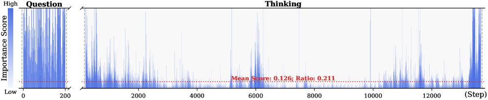
Figure 2: Importance scores of question tokens and thinking tokens in a reasoning trace, computed based on attention contributions to the answer. Darker colors indicate higher importance. The red dashed line shows the mean importance score, and the annotated ratio indicates the fraction of tokens with importance above the mean.
<details>
<summary>x4.png Details</summary>
### Visual Description
## Line Chart: Accuracy vs. Ratio
### Overview
The image is a line chart comparing the accuracy of different methods ("Full", "Random", "Bottom", "Top") against varying ratios, ranging from 2% to 50%. The y-axis represents accuracy in percentage, and the x-axis represents the ratio in percentage.
### Components/Axes
* **X-axis:** Ratio (%), with markers at 2, 4, 6, 8, 10, 20, 30, 40, and 50.
* **Y-axis:** Accuracy (%), with markers at 65, 70, 75, 80, 85, 90, and 95.
* **Legend:** Located in the top-right of the chart.
* "Full" - Dashed gray line with 'x' markers.
* "Random" - Solid green line with triangle markers.
* "Bottom" - Solid blue line with square markers.
* "Top" - Solid red line with circle markers.
### Detailed Analysis
* **Full (Dashed Gray Line with 'x' markers):** This line remains almost constant at approximately 96% accuracy across all ratios.
* Ratio 2%: ~96%
* Ratio 50%: ~96%
* **Random (Solid Green Line with Triangle markers):** This line shows a general upward trend, indicating increasing accuracy with higher ratios.
* Ratio 2%: ~64%
* Ratio 6%: ~66%
* Ratio 20%: ~70%
* Ratio 50%: ~85%
* **Bottom (Solid Blue Line with Square markers):** This line also shows an upward trend, but with some fluctuations.
* Ratio 2%: ~66%
* Ratio 6%: ~63%
* Ratio 20%: ~70%
* Ratio 50%: ~80%
* **Top (Solid Red Line with Circle markers):** This line starts high and plateaus after a certain ratio.
* Ratio 2%: ~88%
* Ratio 6%: ~93%
* Ratio 20%: ~94%
* Ratio 50%: ~96%
### Key Observations
* The "Full" method consistently achieves the highest accuracy, remaining stable across all ratios.
* The "Top" method starts with high accuracy and quickly approaches the "Full" method's performance.
* The "Random" and "Bottom" methods show increasing accuracy as the ratio increases, but they remain significantly lower than the "Full" and "Top" methods.
* The "Bottom" method has a slight dip in accuracy between ratios 2% and 6%.
### Interpretation
The chart suggests that the "Full" method is the most reliable, maintaining high accuracy regardless of the ratio. The "Top" method is also effective, quickly reaching a high accuracy level. The "Random" and "Bottom" methods are less accurate, but their performance improves with higher ratios. This could indicate that as the ratio increases, the information captured by these methods becomes more relevant, leading to better accuracy. The "Bottom" method's initial dip might suggest that at very low ratios, it captures less useful information compared to the "Random" method.
</details>
<details>
<summary>x5.png Details</summary>
### Visual Description
## Radar Chart: Performance Comparison
### Overview
The image is a radar chart comparing the performance of four different methods (Full, Bottom, Random, Top) across six categories: AIME24, AIME25, AMC23, GPQA-D, GAOKAO2023EN, and MATH500. The chart visualizes the relative strengths and weaknesses of each method in each category.
### Components/Axes
* **Axes:** The chart has six radial axes, each representing a category. The categories are:
* AIME24
* AIME25
* AMC23
* GPQA-D
* GAOKAO2023EN
* MATH500
* **Scale:** The radial scale ranges from 0 to 100, with markers at 20, 40, 60, 80, and 100.
* **Legend:** Located in the top-right corner, the legend identifies the four methods:
* Full (Gray line with an 'x' marker)
* Bottom (Blue line with a square marker)
* Random (Green line with a triangle marker)
* Top (Red line with a circle marker)
### Detailed Analysis
Here's a breakdown of the performance of each method in each category:
* **Full (Gray):**
* AIME24: Approximately 28
* AIME25: Approximately 28
* AMC23: Approximately 28
* GPQA-D: Approximately 28
* GAOKAO2023EN: Approximately 28
* MATH500: Approximately 28
* Trend: The "Full" method has a constant value across all categories.
* **Bottom (Blue):**
* AIME24: Approximately 20
* AIME25: Approximately 40
* AMC23: Approximately 80
* GPQA-D: Approximately 30
* GAOKAO2023EN: Approximately 20
* MATH500: Approximately 20
* Trend: The "Bottom" method shows variability, peaking at AMC23.
* **Random (Green):**
* AIME24: Approximately 25
* AIME25: Approximately 45
* AMC23: Approximately 75
* GPQA-D: Approximately 35
* GAOKAO2023EN: Approximately 25
* MATH500: Approximately 25
* Trend: The "Random" method shows variability, peaking at AMC23.
* **Top (Red):**
* AIME24: Approximately 30
* AIME25: Approximately 95
* AMC23: Approximately 95
* GPQA-D: Approximately 20
* GAOKAO2023EN: Approximately 10
* MATH500: Approximately 10
* Trend: The "Top" method shows significant variability, with high values for AIME25 and AMC23, and low values for GAOKAO2023EN and MATH500.
### Key Observations
* The "Full" method has a constant value across all categories.
* The "Top" method performs exceptionally well in AIME25 and AMC23 but poorly in GAOKAO2023EN and MATH500.
* The "Bottom" and "Random" methods show similar trends, with a peak in AMC23.
### Interpretation
The radar chart provides a clear visualization of the strengths and weaknesses of each method across different categories. The "Top" method appears to be highly specialized, excelling in some areas but failing in others. The "Full" method provides a baseline performance across all categories. The "Bottom" and "Random" methods offer intermediate performance, with a notable strength in AMC23. The choice of method would depend on the specific requirements and priorities of the task.
</details>
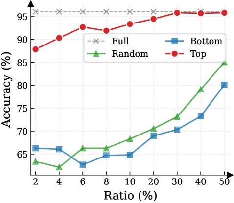
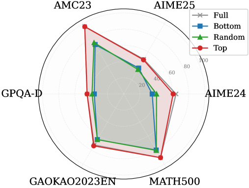
Figure 3: (Left) Reasoning performance trends as a function of thinking token retention ratio, where the $x$ -axis indicates the retention percentage and the $y$ -axis is the accuracy. (Right) Accuracy across all datasets when retaining $30\%$ of the thinking tokens.
Attention Mechanism.
Attention Mechanism is a core component of Transformer-based LRMs, such as Multi-Head Attention (Vaswani et al., 2017), Grouped-Query Attention (Ainslie et al., 2023), and their variants. To highlight the memory challenges in LRMs, we formulate the attention computation at the token level. Consider the decode step $t$ . Let $\mathbf{h}_{t}∈\mathbb{R}^{d}$ be the input hidden state of the current token. The model projects $\mathbf{h}_{t}$ into query, key, and value vectors:
$$
\mathbf{q}_{t}=\mathbf{W}_{Q}\mathbf{h}_{t},\quad\mathbf{k}_{t}=\mathbf{W}_{K}\mathbf{h}_{t},\quad\mathbf{v}_{t}=\mathbf{W}_{V}\mathbf{h}_{t}, \tag{3}
$$
where $\mathbf{W}_{Q},\mathbf{W}_{K},\mathbf{W}_{V}$ are learnable projection matrices. The query $\mathbf{q}_{t}$ attends to the keys of all preceding positions $j∈\{1,...,t\}$ . The attention weight $a_{t,j}$ between the current token $t$ and a past token $j$ is:
$$
\alpha_{t,j}=\frac{\exp(e_{t,j})}{\sum_{i=1}^{t}\exp(e_{t,i})},\qquad e_{t,j}=\frac{\mathbf{q}_{t}^{\top}\mathbf{k}_{j}}{\sqrt{d_{k}}}. \tag{4}
$$
These scores represent the relevance of the current step to the $j$ -th token. Finally, the output of the attention head $\mathbf{o}_{t}$ is the weighted sum of all historical value vectors:
$$
\mathbf{o}_{t}=\sum_{j=1}^{t}\alpha_{t,j}\mathbf{v}_{j}. \tag{5}
$$
As Equation 5 implies, calculating $\mathbf{o}_{t}$ requires access to the entire sequence of past keys and values $\{\mathbf{k}_{j},\mathbf{v}_{j}\}_{j=1}^{t-1}$ . In standard implementation, these vectors are stored in the KV cache to avoid redundant computation (Vaswani et al., 2017; Pope et al., 2023). In the LRMs’ inference, the reasoning trace is exceptionally long, imposing significant memory bottlenecks and increasing computational overhead.
3 Observations and Insight
This section presents the observed sparsity of thinking tokens and the Pareto Principle in LRMs, serving as the basis for DynTS. Detailed experimental settings and additional results are provided in Appendix § B.
<details>
<summary>x6.png Details</summary>
### Visual Description
## Diagram: Training and Inference Process with Importance Predictor
### Overview
The image presents a diagram illustrating the training and inference processes of a Large Reasoning Model (LRM) enhanced with an Importance Predictor (IP). The diagram is split into two main sections: "Training" on the left and "Inference" on the right. The training section shows how the IP is trained using Mean Squared Error Loss, while the inference section demonstrates how the IP is used to manage a KV Cache Budget during multi-step reasoning.
### Components/Axes
**Training Section:**
* **Title:** Training
* **Elements:**
* Input Tokens: A series of gray boxes at the bottom, representing input tokens.
* Large Reasoning Model (LRM): A light blue box above the input tokens. A snowflake icon is present on the right side of the box.
* Importance Predictor (IP): A red box above the LRM. A flame icon is present on the right side of the box.
* Mean Squared Error Loss: A dashed box above the IP, containing a series of boxes with varying shades of red, representing the error loss.
* Thinking Tokens: A series of boxes with varying shades of red, representing the model's internal "thinking" process.
* Answer: A series of gray boxes, representing the correct answer.
* Arrows: Arrows indicate the flow of information:
* Upward arrows from the LRM to the IP and then to the Mean Squared Error Loss.
* "Aggregate" arrow pointing from the Thinking Tokens to the Mean Squared Error Loss.
* "Backward" arrow pointing from the Mean Squared Error Loss back to the IP.
**Inference Section:**
* **Title:** Inference
* **Axes:**
* Vertical Axis: Labeled "Selection" in the middle, and "Local" at the bottom.
* Horizontal Axis: Labeled "Steps" at the bottom-right, indicating the progression of the inference process.
* **Elements:**
* Question: Labeled at the top, containing token pairs A and B, each with a value of infinity.
* KV Cache Budget: Labeled on the right side, representing the memory allocated for key-value pairs.
* Reach Budget: A pink shaded region.
* Select Critical Tokens: A green shaded region.
* Tokens: Represented by boxes containing a letter and a numerical value. The color of the box indicates the token's importance or relevance.
* Arrows: Arrows indicate the flow of information and dependencies between tokens.
* Text Labels: "Evict," "Keep," and "Retain" indicate actions taken on tokens.
* Current Token: Labeled at the bottom-left, showing "Current Token X".
* LRM with IP: A light blue box with a red section on the right, representing the LRM enhanced with the IP.
* Next Token: Labeled at the bottom-right, showing "Next Token Y".
* Predicted Score: A box containing "0.2" with a red fill, representing the predicted score for the next token.
### Detailed Analysis
**Training Section:**
* The "Thinking Tokens" section shows a sequence of tokens, with the intensity of the red color indicating the level of "thinking" or processing associated with each token. The first 10 tokens are colored, with the 6th token being the most intense red. The last 3 tokens are gray.
* The "Mean Squared Error Loss" section shows a similar sequence of tokens, with the intensity of the red color indicating the magnitude of the error. The 6th token is the most intense red.
* The "Importance Predictor (IP)" receives input from the "Large Reasoning Model (LRM)" and is trained using the "Mean Squared Error Loss."
**Inference Section:**
* The "Question" tokens A and B have infinite values and are kept throughout the process.
* The "Selection" section shows a series of tokens (C, D, E, F, G, H) with associated values (0.2, 0.1, 0.5, 0.1, 0.4, 0.2). Some tokens are evicted based on their values.
* The "Local" section shows tokens (I, J, K) with associated values (0.2, 0.1, 0.3). These tokens are kept.
* The "Reach Budget" region highlights tokens that are considered for retention in the KV Cache.
* The "Select Critical Tokens" region shows the tokens that are ultimately retained in the KV Cache.
* The KV Cache Budget section shows the final set of tokens (L, M, N, O) with associated values (0.7, 0.4, 0.1, 0.2).
* The process starts with a "Current Token X," which is fed into the "LRM with IP" to predict the "Next Token Y" and its associated score.
**Token Values and Actions:**
| Token | Value | Action (Inference) |
|-------|-------|--------------------|
| A | ∞ | Keep |
| B | ∞ | Keep |
| C | 0.2 | Evict |
| D | 0.1 | Evict |
| E | 0.5 | Retain |
| F | 0.1 | Evict |
| G | 0.4 | Retain |
| H | 0.2 | Evict |
| I | 0.2 | Keep |
| J | 0.1 | Keep |
| K | 0.3 | Keep |
| L | 0.7 | - |
| M | 0.4 | - |
| N | 0.1 | - |
| O | 0.2 | - |
### Key Observations
* The "Training" section focuses on minimizing the error between the model's "thinking" process and the correct answer.
* The "Inference" section demonstrates how the IP is used to selectively retain important tokens in the KV Cache, optimizing memory usage and potentially improving performance.
* Tokens with higher values are more likely to be retained in the KV Cache.
* The "Reach Budget" and "Select Critical Tokens" regions visually represent the token selection process.
### Interpretation
The diagram illustrates a system where an Importance Predictor (IP) is trained to identify and retain critical tokens during the inference process of a Large Reasoning Model (LRM). The training process uses Mean Squared Error Loss to refine the IP's ability to predict the importance of tokens. During inference, the IP helps manage the KV Cache Budget by selectively retaining tokens based on their predicted importance, as indicated by their numerical values. This approach aims to optimize memory usage and potentially improve the efficiency and performance of the LRM by focusing on the most relevant information. The "Evict," "Keep," and "Retain" actions demonstrate the dynamic management of the KV Cache, highlighting the IP's role in prioritizing and preserving important tokens while discarding less relevant ones.
</details>
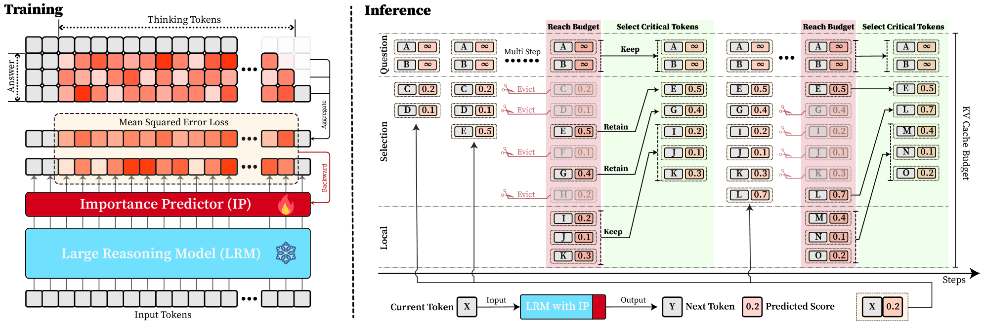
Figure 4: Overview of DynTS. (Left) Importance Predictor Training. The upper heatmap visualizes attention weights, where orange intensity represents the importance of thinking tokens to the answer. The lower part shows a LRM integrated with an Importance Predictor (IP) to learn these importance scores. (Right) Inference with KV Cache Selection. The model outputs the next token and a predicted importance score of the current token. When the cache budget is reached, the selection strategy retains the KV cache of question tokens, local tokens, and top-k thinking tokens based on the predicted importance score.
3.1 Sparsity for Thinking Tokens
Previous works (Bogdan et al., 2025; Zhang et al., 2023; Singh et al., 2024) have shown that attention weights (Eq. 4) serve as a reliable proxy for token importance. Building on this insight, we calculate an importance score for each question and thinking token by accumulating the attention they receive from all answer tokens. Formally, the importance scores are defined as:
$$
I_{x_{j}}=\sum_{i=1}^{K}\alpha_{a_{i},x_{j}},\qquad I_{t_{j}}=\sum_{i=1}^{K}\alpha_{a_{i},t_{j}}, \tag{6}
$$
where $I_{x_{j}}$ and $I_{t_{j}}$ denote the importance scores of the $j$ -th question token $x_{j}$ and thinking token $t_{j}$ . Here, $\alpha_{a_{i},x_{j}}$ and $\alpha_{a_{i},t_{j}}$ represent the attention weights from the $i$ -th answer token $a_{i}$ to the corresponding question or thinking token, and $K$ is the total number of answer tokens. We perform full autoregressive inference on LRMs to extract attention weights and compute token-level importance scores for both question and thinking tokens.
Observation. As illustrated in Fig. 2, the question tokens (left panel) exhibit consistently significant and dense importance scores. In contrast, the thinking tokens (right panel) display a highly sparse distribution. Despite the extensive reasoning trace (exceeding 12k tokens), only $21.1\%$ of thinking tokens exceed the mean importance score. This indicates that the vast majority of reasoning steps exert only a marginal influence on the final answer.
Analysis. Follow attention-based methods (Cai et al., 2025; Li et al., 2024; Cai et al., 2024), tokens with higher importance scores intuitively correspond to decision-critical reasoning steps, which are critical for the model to generate the final answer. The low-importance tokens serve as syntactic scaffolding or intermediate states that become redundant after reasoning progresses (We report the ratio of Content Words, see Appendix B.2). Consequently, we hypothesize that the model maintains close reasoning performance to that of the full token sequence, even when it selectively retains only these critical thinking tokens.
3.2 Pareto Principle in LRMs
To validate the aforementioned hypothesis, we retain all question tokens while preserving only the top- $p\%$ of thinking tokens ranked by importance score, and prompt the model to directly generate the final answer.
Observation. As illustrated in Fig. 3 (Left), the importance-based top- $p\%$ selection strategy substantially outperforms both random- and bottom-selection baselines. Notably, the model recovers nearly its full performance (grey dashed line) when retaining only $\sim 30\%$ thinking tokens with top importance scores. Fig. 3 (Right) further confirms this trend across six diverse datasets, where the performance polygon under the top- $30\%$ retention strategy almost completely overlaps with the full thinking tokens.
Insights. These empirical results illustrate and reveal the Pareto Principle in LRM reasoning: Only a small subset of thinking tokens ( $30\%$ ) with high importance scores serve as “pivotal nodes,” which are critical for the model to output a final answer, while the remaining tokens contribute negligibly to the outcome. This finding provides strong empirical support for LRMs’ KV cache compression, indicating that it is possible to reduce memory footprint and computational overhead without sacrificing performance.
4 Dynamic Thinking-Token Selection
Building on the Pareto Principle in LRMs, critical thinking tokens can be identified via the importance score computed by Equation 6. However, this computation requires the attention weights from the answer to the thinking tokens, which are inaccessible until the model completes the entire decoding stage. To address this limitation, we introduce an Importance Predictor that dynamically estimates the importance score of each thinking token during inference time. Furthermore, we design a decoding-time KV cache Selection Strategy that retains critical thinking tokens and evicts redundant ones. We refer to this approach as DynTS (Dyn amic T hinking Token S election), and the overview is illustrated in Fig. 4.
4.1 Importance Predictor
Integrate Importance Predictor in LRMs.
Transformer-based Large Language Models (LLMs) typically consist of stacked Transformer blocks followed by a language modeling head (Vaswani et al., 2017), where the output of the final block serves as a feature representation of the current token. Building on this architecture, we attach an additional lightweight MLP head to the final hidden state, named as Importance Predictor (Huang et al., 2024). It is used to predict the importance score of the current thinking token during model inference, capturing its contribution to the final answer. Formally, we define the modified LRM as a mapping function $\mathcal{M}$ that processes the input sequence $\mathbf{x}_{≤ t}$ to produce a dual-output tuple comprising the next token $x_{t+1}$ and the current importance score $s_{x_{t}}$ :
$$
\mathcal{M}(\mathbf{x}_{\leq t})\rightarrow(x_{t+1},s_{x_{t}}) \tag{7}
$$
Predictor Training.
To obtain supervision signals for training, we prompt the LRMs based on the training dataset to generate complete sequences denoted as $\{x_{1... M},t_{1... L},a_{1... K}\}$ , filtering out incorrect or incomplete reasoning. Here, $x$ , $t$ , and $a$ represent the question, thinking, and answer tokens, respectively. Based on the observation in Section § 3, the thinking tokens significantly outnumber answer tokens ( $L\gg K$ ), and question tokens remain essential. Therefore, DynTS only focuses on predicting the importance of thinking tokens. By utilizing the attention weights from answer to thinking tokens, we derive the ground-truth importance score $I_{t_{i}}$ for each thinking token according to Equation 6. Finally, the Importance Predictor parameters can be optimized by minimizing the Mean Squared Error (MSE) loss (Wang and Bovik, 2009) as follows:
$$
\mathcal{L}_{\text{MSE}}=\frac{1}{K}\sum_{i=1}^{K}(I_{t_{i}}-s_{t_{i}})^{2}. \tag{8}
$$
To preserve the LRMs’ original performance, we freeze the backbone parameters and optimize the Importance Predictor exclusively. The trained model can predict the importance of thinking tokens to the answer. This paper focuses on mathematical reasoning tasks. We optimize the Importance Predictor only on the MATH training set and validated across six other datasets (See Section § 6.1).
4.2 KV Cache Selection
During LRMs’ inference, we establish a maximum KV cache budget $B$ , which is composed of a question window $W_{q}$ , a selection window $W_{s}$ , and a local window $W_{l}$ , formulated as $B=W_{q}+W_{s}+W_{l}$ . Specifically, the question window stores the KV caches of question tokens generated during the prefilling phase, i.e., the window size $W_{q}$ is equal to the number of question tokens $M$ ( $W_{q}=M$ ). Since these tokens are critical for the final answer (see Section § 3), we assign an importance score of $+∞$ to these tokens, ensuring their KV caches are immune to eviction throughout the inference process.
In the subsequent decoding phase, we maintain a sequential stream of tokens. Newly generated KV caches and their corresponding importance scores are sequentially appended to the selection window ( $W_{s}$ ) and the local window ( $W_{l}$ ). Once the total token count reaches the budget limit $B$ , the critical token selection process is triggered, as illustrated in Fig. 4 (Right). Within the selection window, we retain the KV caches of the top- $k$ tokens with the highest scores and evict the remainder. Simultaneously, drawing inspiration from (Chen et al., 2024; Zhang et al., 2023; Zhao et al., 2024), we maintain the KV caches within the local window to ensure the overall coherence of the subsequently generated sequence. This inference process continues until decoding terminates.
5 Theoretical Overhead Analysis
In DynTS, the KV cache selection strategy reduces computational overhead by constraining cache length, while the importance predictor introduces a slight overhead. In this section, we theoretically analyze the trade-off between these two components and derive the Break-even Condition required to achieve net computational gains.
Notions. Let $\mathcal{M}_{\text{base}}$ be the vanilla LRM with $L$ layers and hidden dimension $d$ , and $\mathcal{M}_{\text{opt}}$ be the LRM with Importance Predictor (MLP: $d→ 2d→ d/2→ 1$ ). We define the prefill length as $M$ and the current decoding step as $i∈\mathbb{Z}^{+}$ . For vanilla decoding, the effective KV cache length grows linearly as $S_{i}^{\text{base}}=M+i$ . While DynTS evicts $K$ tokens by the KV Cache Selection when the effective KV cache length reaches the budget $B$ . Resulting in the effective length $S_{i}^{\text{opt}}=M+i-n_{i}· K$ , where $n_{i}=\max\left(0,\left\lfloor\frac{(M+i)-B}{K}\right\rfloor+1\right)$ denotes the count of cache eviction event at step $i$ . By leveraging Floating-Point Operations (FLOPs) to quantify computational overhead, we establish the following theorem. The detailed proof is provided in Appendix A.
**Theorem 5.1 (Computational Gain)**
*Let $\Delta\mathcal{C}(i)$ be the reduction FLOPs achieved by DynTS at decoding step $i$ . The gain function is derived as the difference between the eviction event savings from KV Cache Selection and the introduced overhead of the predictor:
$$
\Delta\mathcal{C}(i)=\underbrace{n_{i}\cdot 4LdK}_{\text{Eviction Saving}}-\underbrace{(6d^{2}+d)}_{\text{Predictor Overhead}}, \tag{9}
$$*
Based on the formulation above, we derive a critical corollary regarding the net computational gain.
**Corollary 5.2 (Break-even Condition)**
*To achieve a net computational gain ( $\Delta\mathcal{C}(i)>0$ ) at the $n_{i}$ -th eviction event, the eviction volume $K$ must satisfy the following inequality:
$$
K>\frac{6d^{2}+d}{n_{i}\cdot 4Ld}\approx\frac{1.5d}{n_{i}L} \tag{10}
$$*
This inequality provides a theoretical lower bound for the eviction volume $K$ . demonstrating that the break-even point is determined by the model’s architectural (hidden dimension $d$ and layer count $L$ ).
Table 1: Performance comparison of different methods on R1-Llama and R1-Qwen. We report the average Pass@1 and Throughput (TPS) across six benchmarks. “Transformers” denotes the full cache baseline, and “Window” represents the local window baseline.
| Transformers Window StreamingLLM | 47.3 18.6 20.6 | 215.1 447.9 445.8 | 28.6 14.6 16.6 | 213.9 441.3 445.7 | 86.5 59.5 65.0 | 200.6 409.4 410.9 | 46.4 37.6 37.8 | 207.9 408.8 407.4 | 73.1 47.0 53.4 | 390.9 622.6 624.6 | 87.5 58.1 66.1 | 323.4 590.5 592.1 | 61.6 39.2 43.3 | 258.6 486.7 487.7 |
| --- | --- | --- | --- | --- | --- | --- | --- | --- | --- | --- | --- | --- | --- | --- |
| SepLLM | 30.0 | 448.2 | 20.0 | 445.1 | 71.0 | 414.1 | 39.7 | 406.6 | 61.4 | 635.0 | 74.5 | 600.4 | 49.4 | 491.6 |
| H2O | 38.6 | 426.2 | 22.6 | 423.4 | 82.5 | 396.1 | 41.6 | 381.5 | 67.5 | 601.8 | 82.7 | 573.4 | 55.9 | 467.1 |
| SnapKV | 39.3 | 438.2 | 24.6 | 436.3 | 80.5 | 406.9 | 41.9 | 394.1 | 68.7 | 615.7 | 83.1 | 584.5 | 56.3 | 479.3 |
| R-KV | 44.0 | 437.4 | 26.0 | 434.7 | 86.5 | 409.5 | 44.5 | 394.9 | 71.4 | 622.6 | 85.2 | 589.2 | 59.6 | 481.4 |
| DynTS (Ours) | 49.3 | 444.6 | 29.3 | 443.5 | 87.0 | 412.9 | 46.3 | 397.6 | 72.3 | 631.8 | 87.2 | 608.2 | 61.9 | 489.8 |
| R1-Qwen | | | | | | | | | | | | | | |
| Transformers | 52.0 | 357.2 | 35.3 | 354.3 | 87.5 | 376.2 | 49.0 | 349.4 | 77.9 | 593.7 | 91.3 | 517.3 | 65.5 | 424.7 |
| Window | 41.3 | 650.4 | 31.3 | 643.0 | 82.0 | 652.3 | 45.9 | 634.1 | 71.8 | 815.2 | 85.0 | 767.0 | 59.5 | 693.7 |
| StreamingLLM | 42.0 | 655.7 | 29.3 | 648.5 | 85.0 | 657.2 | 45.9 | 631.1 | 71.2 | 824.0 | 85.8 | 786.1 | 59.8 | 700.5 |
| SepLLM | 38.6 | 650.0 | 31.3 | 647.6 | 85.5 | 653.2 | 45.6 | 639.5 | 72.0 | 820.1 | 84.4 | 792.2 | 59.6 | 700.4 |
| H2O | 42.6 | 610.9 | 33.3 | 610.7 | 84.5 | 609.9 | 48.1 | 593.6 | 74.1 | 780.1 | 87.0 | 725.4 | 61.6 | 655.1 |
| SnapKV | 48.6 | 639.6 | 33.3 | 633.1 | 87.5 | 633.2 | 46.5 | 622.0 | 74.9 | 787.4 | 88.2 | 768.7 | 63.2 | 680.7 |
| R-KV | 44.0 | 639.5 | 32.6 | 634.7 | 85.0 | 636.8 | 47.2 | 615.1 | 75.8 | 792.8 | 88.8 | 765.5 | 62.2 | 680.7 |
| DynTS (Ours) | 52.0 | 645.6 | 36.6 | 643.0 | 88.5 | 646.0 | 48.1 | 625.7 | 76.4 | 788.5 | 90.0 | 779.5 | 65.3 | 688.1 |
6 Experiment
This section introduces experimental settings, followed by the results, ablation studies on retanind tokens and hyperparameters, and the Importance Predictor analysis. For more detailed configurations and additional results, please refer to Appendix C and D.
6.1 Experimental Setup
Models and Datasets. We conduct experiments on two mainstream LRMs: R1-Qwen (DeepSeek-R1-Distill-Qwen-7B) and R1-Llama (DeepSeek-R1-Distill-Llama-8B) (Guo et al., 2025). To evaluate the performance and robustness of our method across diverse tasks, we select five mathematical reasoning datasets of varying difficulty levels—AIME24 (Zhang and Math-AI, 2024), AIME25 (Zhang and Math-AI, 2025), AMC23 https://huggingface.co/datasets/math-ai/amc23, GK23EN (GAOKAO2023EN) https://huggingface.co/datasets/MARIO-Math-Reasoning/Gaokao2023-Math-En, and MATH500 (Hendrycks et al., 2021) —along with the GPQA-D (GPQA-Diamond) (Rein et al., 2024) scientific question-answering dataset as evaluation benchmarks.
Implementation Details. (1) Training Settings: To train the importance predictor, we sample the model-generated contents with correct answers from the MATH training set and calculate the importance scores of thinking tokens. We freeze the model backbone and optimize only the predictor ( $3$ -layer MLP), setting the number of training epochs to 15, the learning rate to $5\text{e-}4$ , and the maximum sequence length to 18,000. (2) Inference Settings. Following (Guo et al., 2025), setting the maximum decoding steps to 16,384, the sampling temperature to 0.6, top- $p$ to 0.95, and top- $k$ to 20. We apply budget settings based on task difficulty. For challenging benchmarks (AIME24, AIME25, AMC23, and GPQA-D), we set the budget $B$ to 5,000 with a local window size of 2,000; For simpler tasks, the budget is set to 3,000 with a local window of 1,500 for R1-Qwen and 1,000 for R1-Llama. The token retention ratio in the selection window is set to 0.4 for R1-Qwen and 0.3 for R1-Llama. We generate 5 responses for each problem and report the average Pass@1 as the evaluation metric.
Baselines. Our approach focuses on compressing the KV cache by selecting critical tokens. Therefore, we compare our method against the state-of-the-art KV cache compressing approaches. These include StreamingLLM (Xiao et al., 2024), H2O (Zhang et al., 2023), SepLLM (Chen et al., 2024), and SnapKV (Li et al., 2024) (decode-time variant (Liu et al., 2025a)) for LLMs, along with R-KV (Cai et al., 2025) for LRMs. To ensure a fair comparison, all methods were set with the same token overhead and maximum budget. We also report results for standard Transformers and local window methods as evaluation baselines.
6.2 Main Results
Reasoning Accuracy. As shown in Table 1, our proposed DynTS consistently outperforms all other KV cache eviction baselines. On R1-Llama and R1-Qwen, DynTS achieves an average accuracy of $61.9\%$ and $65.3\%$ , respectively, significantly surpassing the runner-up methods R-KV ( $59.6\%$ ) and SnapKV ( $63.2\%$ ). Notably, the overall reasoning capability of DynTS is on par with the Full Cache Transformers baseline ( $61.9\%$ vs. $61.6\%$ on R1-Llama, $65.3\%$ vs. $65.5\%$ on R1-Llama). Even outperforms the Transformers on several challenging tasks, such as AIME24 on R1-Llama, where it improves accuracy by $2.0\%$ ; and AIME25 on R1-Qwen, where it improves accuracy by $1.3\%$ .
Table 2: Ablation study on different token retention strategies in DynTS, where w.o. Q / T / L denotes the removal of Question tokens (Q), critical Thinking tokens (T), and Local window tokens (L), respectively. T-Random and T-Bottom represent strategies that select thinking tokens randomly and the tokens with the bottom-k importance scores, respectively.
| DynTS w.o. L w.o. Q | 49.3 40.6 19.3 | 29.3 23.3 14.6 | 87.0 86.5 59.0 | 46.3 46.3 38.1 | 72.3 72.0 47.8 | 87.2 85.5 59.8 | 61.9 59.0 39.8 |
| --- | --- | --- | --- | --- | --- | --- | --- |
| w.o. T | 44.0 | 27.3 | 85.0 | 44.0 | 71.5 | 85.9 | 59.6 |
| T-Random | 24.6 | 16.0 | 59.5 | 37.4 | 51.7 | 63.9 | 42.2 |
| T-Bottom | 20.6 | 15.3 | 59.0 | 37.3 | 47.3 | 59.5 | 39.8 |
| R1-Qwen | | | | | | | |
| DynTS | 52.0 | 36.6 | 88.5 | 48.1 | 76.4 | 90.0 | 65.3 |
| w.o. L | 42.0 | 32.0 | 87.5 | 46.3 | 75.2 | 87.0 | 61.6 |
| w.o. Q | 46.0 | 36.0 | 86.0 | 43.9 | 75.1 | 89.0 | 62.6 |
| w.o. T | 47.3 | 34.6 | 85.5 | 49.1 | 75.1 | 89.2 | 63.5 |
| T-Random | 46.0 | 32.6 | 84.5 | 47.5 | 73.8 | 86.9 | 61.9 |
| T-Bottom | 38.0 | 30.0 | 80.0 | 44.3 | 69.8 | 83.3 | 57.6 |
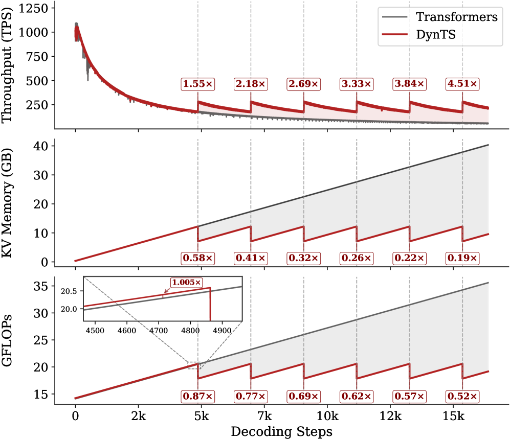
Inference Efficiency. Referring to Table 1, DynTS achieves $1.9×$ and $1.6×$ speedup compared to standard Transformers on R1-Llama and R1-Qwen, respectively, across all benchmarks. While DynTS maintains throughput comparable to other KV Cache compression methods. Further observing Figure 5, as the generated sequence length grows, standard Transformers suffer from linear accumulation in both memory footprint and compute overhead (GFLOPs), leading to continuous throughput degradation. In contrast, DynTS effectively bounds resource consumption. The distinctive sawtooth pattern illustrates our periodic compression mechanism, where the inflection points correspond to the execution of KV Cache Selection to evict the KV pairs of non-essential thinking tokens. Consequently, the efficiency advantage escalates as the decoding step increases, DynTS achieves a peak speedup of 4.51 $×$ , compresses the memory footprint to 0.19 $×$ , and reduces the compute overhead to 0.52 $×$ compared to the full-cache baseline. The zoom-in view reveals that the computational cost drops below the baseline immediately after the first KV cache eviction. This illustrates that our experimental settings are rational, as they satisfy the break-even condition ( $K=900≥\frac{1.5d}{n_{i}L}=192$ ) outlined in Corollary 5.2.
<details>
<summary>x7.png Details</summary>
### Visual Description
## Performance Comparison: Transformers vs. DynTS
### Overview
The image presents a comparative performance analysis between "Transformers" (represented by gray lines) and "DynTS" (represented by red lines) across three key metrics: Throughput (TPS), KV Memory (GB), and GFLOPS, plotted against Decoding Steps. The chart aims to illustrate the efficiency and resource utilization of DynTS relative to Transformers during a decoding process. The x-axis represents decoding steps, ranging from 0 to 15k.
### Components/Axes
* **Top Chart:**
* Y-axis: Throughput (TPS), ranging from 0 to 1250.
* X-axis: Decoding Steps (shared across all charts).
* Legend (top-right):
* Transformers (gray line)
* DynTS (red line)
* **Middle Chart:**
* Y-axis: KV Memory (GB), ranging from 0 to 40.
* X-axis: Decoding Steps.
* **Bottom Chart:**
* Y-axis: GFLOPS, ranging from 15 to 35.
* X-axis: Decoding Steps.
* Inset: Zoomed view of GFLOPS between 4500 and 4900 decoding steps, Y-axis ranging from 20.0 to 20.5.
* **X-Axis (shared):** Decoding Steps, labeled from 0 to 15k in increments of 2k, with vertical dashed lines at approximately 5k, 7k, 10k, 12k, and 15k.
### Detailed Analysis
**1. Throughput (TPS):**
* **Transformers (gray):** Starts at approximately 1100 TPS and rapidly decreases to around 200 TPS, then gradually declines further, approaching 100 TPS by 15k decoding steps.
* **DynTS (red):** Starts at approximately 1100 TPS, decreases to around 300 TPS, and then exhibits a saw-tooth pattern, with periodic increases at intervals marked by vertical dashed lines.
* **Ratio Markers:**
* At 5k steps: 1.55x
* At 7k steps: 2.18x
* At 10k steps: 2.69x
* At 12k steps: 3.33x
* At 15k steps: 3.84x
* Beyond 15k steps: 4.51x
**2. KV Memory (GB):**
* **Transformers (gray):** Increases linearly from approximately 0 GB to 40 GB over 15k decoding steps.
* **DynTS (red):** Increases in a saw-tooth pattern, with linear increases followed by sharp drops at intervals marked by vertical dashed lines.
* **Ratio Markers:**
* At 5k steps: 0.58x
* At 7k steps: 0.41x
* At 10k steps: 0.32x
* At 12k steps: 0.26x
* At 15k steps: 0.22x
* Beyond 15k steps: 0.19x
**3. GFLOPS:**
* **Transformers (gray):** Increases linearly from approximately 14 GFLOPS to 34 GFLOPS over 15k decoding steps.
* **DynTS (red):** Increases in a saw-tooth pattern, with linear increases followed by sharp drops at intervals marked by vertical dashed lines.
* **Ratio Markers:**
* At 5k steps: 0.87x
* At 7k steps: 0.77x
* At 10k steps: 0.69x
* At 12k steps: 0.62x
* At 15k steps: 0.57x
* Beyond 15k steps: 0.52x
* **Inset Details:** The inset shows a zoomed-in view around 4500-4900 decoding steps. The Transformers line (gray) is slightly above the DynTS line (red), with a ratio marker of 1.005x near the 4800 step mark.
### Key Observations
* **Throughput:** DynTS maintains a higher throughput than Transformers after the initial drop, as indicated by the ratios greater than 1.
* **KV Memory:** DynTS uses significantly less KV Memory than Transformers, as indicated by the ratios less than 1.
* **GFLOPS:** DynTS requires fewer GFLOPS than Transformers, as indicated by the ratios less than 1.
* **Saw-tooth Pattern:** The saw-tooth pattern in DynTS's KV Memory and GFLOPS usage suggests a periodic memory release or optimization strategy.
### Interpretation
The data suggests that DynTS offers a more efficient alternative to Transformers, particularly in terms of KV Memory usage and GFLOPS. While the initial throughput is similar, DynTS manages to maintain a higher throughput while consuming fewer resources as the decoding process progresses. The saw-tooth pattern indicates a memory management strategy that periodically reduces memory footprint and computational load, leading to improved efficiency. The ratios provided at specific decoding steps quantify the performance gains achieved by DynTS over Transformers. The inset highlights a specific region where the GFLOPS performance is very close, but DynTS still maintains a slight advantage.
</details>
Figure 5: Real-time throughput, memory, and compute overhead tracking over total decoding step. The inflection points in the sawtooth correspond to the steps where DynTS executes KV Cache Selection.
6.3 Ablation Study
Impact of Retained Token. As shown in Tab. 2, the full DynTS method outperforms all ablated variants, achieving the highest average accuracy on both R1-Llama ( $61.9\%$ ) and R1-Qwen ( $65.3\%$ ). This demonstrates that all retained tokens of DynTS are critical for the model to output the correct final answer. Moreover, we observe that the strategy for selecting thinking tokens plays a critical role in the model’s reasoning performance. When some redundant tokens are retained (T-Random and T-Bottom strategies), there is a significant performance drop compared to completely removing thinking tokens ( $59.6\%→ 39.8\%$ on R1-Llama and $63.5\%→ 57.6\%$ on R1-Qwen). This finding demonstrates the effectiveness of our Importance Predictor to identify critical tokens. It also explains why existing KV cache compression methods hurt model performance: inadvertently retaining redundant tokens. Finally, the local window is crucial for preserving local linguistic coherence, which contributes to stable model performance.
<details>
<summary>x8.png Details</summary>
### Visual Description
## Heatmap: R1-Llama vs. R1-Qwen Performance
### Overview
The image presents two heatmaps comparing the performance of "R1-Llama" and "R1-Qwen" models. The heatmaps visualize the "Pass@1" metric across different "Local Window Sizes" and "Ratio" values. The color intensity represents the Pass@1 score, with lighter shades indicating lower scores and darker shades indicating higher scores.
### Components/Axes
* **Titles:** "R1-Llama" (left heatmap), "R1-Qwen" (right heatmap)
* **Y-axis (Local Window Size):** 500, 1000, 2000, 3000
* **X-axis (Ratio):** 0.1, 0.2, 0.3, 0.4, 0.5
* **Color Legend (Pass@1):** Ranges from approximately 50 (lightest shade) to 56 (darkest shade). The legend shows a continuous color gradient.
### Detailed Analysis
**R1-Llama Heatmap:**
| Local Window Size | Ratio 0.1 | Ratio 0.2 | Ratio 0.3 | Ratio 0.4 | Ratio 0.5 |
| ----------------- | --------- | --------- | --------- | --------- | --------- |
| 3000 | 49.1 | 50.1 | 50.6 | 50.7 | 51.4 |
| 2000 | 49.5 | 51.7 | 52.8 | 52.5 | 50.9 |
| 1000 | 49.9 | 52.7 | 51.0 | 51.9 | 51.7 |
| 500 | 49.8 | 52.1 | 50.7 | 50.8 | 51.7 |
* **Trend:** The Pass@1 score for R1-Llama generally increases as the Ratio increases from 0.1 to 0.2. After 0.2, the performance fluctuates. The performance is generally lower for a Local Window Size of 3000.
**R1-Qwen Heatmap:**
| Local Window Size | Ratio 0.1 | Ratio 0.2 | Ratio 0.3 | Ratio 0.4 | Ratio 0.5 |
| ----------------- | --------- | --------- | --------- | --------- | --------- |
| 3000 | 53.9 | 53.9 | 53.2 | 54.4 | 53.8 |
| 2000 | 52.4 | 51.9 | 54.6 | 56.3 | 53.7 |
| 1000 | 52.2 | 54.4 | 53.8 | 53.3 | 53.0 |
| 500 | 51.5 | 51.8 | 52.0 | 54.3 | 54.6 |
* **Trend:** The Pass@1 score for R1-Qwen shows a more pronounced increase with higher Ratio values, particularly at a Local Window Size of 2000 and Ratio of 0.4, where the performance peaks.
### Key Observations
* R1-Qwen generally outperforms R1-Llama across most configurations.
* The highest Pass@1 score is achieved by R1-Qwen with a Local Window Size of 2000 and a Ratio of 0.4 (56.3).
* R1-Llama's performance seems less sensitive to changes in Ratio and Local Window Size compared to R1-Qwen.
### Interpretation
The heatmaps provide a visual comparison of the performance of two models, R1-Llama and R1-Qwen, under varying configurations of "Local Window Size" and "Ratio." The data suggests that R1-Qwen is a superior model, achieving higher Pass@1 scores across most parameter settings. The optimal configuration for R1-Qwen appears to be a Local Window Size of 2000 and a Ratio of 0.4, indicating that these settings are crucial for maximizing its performance. R1-Llama's relatively stable performance across different configurations might suggest a more robust but less optimized model. The choice of model and configuration should be guided by the specific application and the trade-off between performance and sensitivity to parameter tuning.
</details>
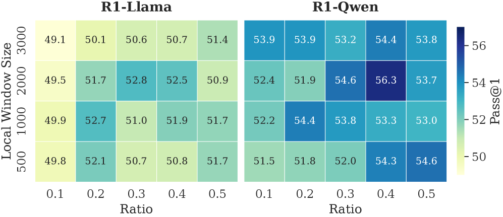
Figure 6: The accuracy of R1-Llama and R1-Qwen across different local window sizes and selection window retention ratios.
Local Window & Retention Ratio. As shown in Fig. 6, we report the model’s reasoning performance across different configurations. The performance improves with a larger local window and a higher retention ratio within a reasonable range. These two settings respectively ensure local contextual coherence and an adequate number of thinking tokens. Setting either to overly small values leads to pronounced performance degradation. However, excessively large values introduce a higher proportion of non-essential tokens, which in turn negatively impacts model performance. Empirically, a local window size of approximately 2,000 and a retention ratio of 0.3–0.4 yield optimal performance. We further observe that R1-Qwen is particularly sensitive to the local window size. This may be caused by the Dual Chunk Attention introduced during the long-context pre-training stage (Yang et al., 2025), which biases attention toward tokens within the local window.
<details>
<summary>x9.png Details</summary>
### Visual Description
## Line Chart: MSE Loss, Kendall, and Overlap Rate vs. Step
### Overview
The image presents two line charts stacked vertically. The top chart displays the MSE Loss and Kendall values against the step number. The bottom chart shows the overlap rate (%) for different top percentages (20% to 90%) against the step number. Both charts share the same x-axis (Step).
### Components/Axes
**Top Chart:**
* **Title:** Value vs. Step
* **Y-axis Label:** Value
* **Y-axis Scale:** 0 to 3, with tick marks at 0, 1, 2, and 3.
* **X-axis Label:** Step (shared with the bottom chart)
* **Legend (Top-Right):**
* Blue line: MSE Loss
* Orange line: Kendall
**Bottom Chart:**
* **Title:** Overlap Rate (%) vs. Step
* **Y-axis Label:** Overlap Rate (%)
* **Y-axis Scale:** 20 to 100, with tick marks at 20, 40, 60, 80, and 100.
* **X-axis Label:** Step
* **X-axis Scale:** 0 to 400, with tick marks at intervals of 50 (0, 50, 100, 150, 200, 250, 300, 350, 400).
* **Legend (Bottom-Right):**
* Dark Purple: Top-20%
* Purple: Top-30%
* Dark Blue: Top-40%
* Light Blue: Top-50%
* Teal: Top-60%
* Green: Top-70%
* Light Green: Top-80%
* Yellow-Green: Top-90%
### Detailed Analysis
**Top Chart:**
* **MSE Loss (Blue):** Starts at approximately 3, rapidly decreases to around 0.2 within the first 50 steps, and then fluctuates around 0.2 for the remaining steps.
* **Kendall (Orange):** Starts at approximately 1.2, decreases to around 0.5 within the first 50 steps, and then remains relatively stable around 0.5 for the remaining steps.
**Bottom Chart:**
* **Top-20% (Dark Purple):** Starts at approximately 20%, increases to around 65% within the first 100 steps, and then fluctuates around 65% for the remaining steps.
* **Top-30% (Purple):** Starts at approximately 22%, increases to around 75% within the first 100 steps, and then fluctuates around 75% for the remaining steps.
* **Top-40% (Dark Blue):** Starts at approximately 25%, increases to around 82% within the first 100 steps, and then fluctuates around 82% for the remaining steps.
* **Top-50% (Light Blue):** Starts at approximately 30%, increases to around 88% within the first 100 steps, and then fluctuates around 88% for the remaining steps.
* **Top-60% (Teal):** Starts at approximately 35%, increases to around 92% within the first 100 steps, and then fluctuates around 92% for the remaining steps.
* **Top-70% (Green):** Starts at approximately 40%, increases to around 95% within the first 100 steps, and then fluctuates around 95% for the remaining steps.
* **Top-80% (Light Green):** Starts at approximately 42%, increases to around 97% within the first 100 steps, and then fluctuates around 97% for the remaining steps.
* **Top-90% (Yellow-Green):** Starts at approximately 45%, increases to around 98% within the first 100 steps, and then fluctuates around 98% for the remaining steps.
### Key Observations
* Both MSE Loss and Kendall values decrease significantly in the initial steps and then stabilize.
* The overlap rate for all top percentages increases rapidly in the initial steps and then stabilizes.
* Higher top percentages generally have higher overlap rates.
* The most significant changes in both charts occur within the first 100 steps.
### Interpretation
The charts illustrate the training process of a model, likely related to ranking or information retrieval. The MSE Loss and Kendall values in the top chart indicate the model's error and ranking correlation, respectively. The decrease in these values suggests that the model is learning and improving its performance.
The bottom chart shows the overlap rate between the top-ranked items predicted by the model and the ground truth. The increasing overlap rates for different top percentages indicate that the model is becoming more accurate in identifying the most relevant items. The higher overlap rates for higher top percentages suggest that the model is better at ranking the most relevant items at the top of the list.
The stabilization of both charts after the first 100 steps suggests that the model has reached a point of diminishing returns, where further training may not significantly improve its performance.
</details>
Figure 7: The top panel illustrates the convergence of MSE Loss and the Kendall rank correlation coefficient over training steps. The bottom panel tracks the overlap rate of the top- $20\%$ ground-truth tokens within the top- $p\%$ ( $p∈[20,90]$ ) predicted tokens.
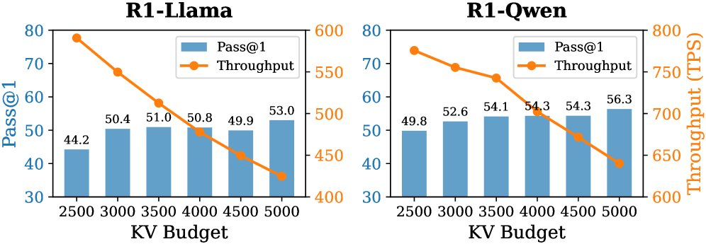
Budget. We report the model’s reasoning performance and throughput in different budget settings in Fig. 8. As expected, as the KV budget increases, the accuracy of R1-Llama and R1-Qwen improves, and the throughput decreases. At the maximum evaluated budget of 5000, DynTS delivers its strongest reasoning results ( $53.0\%$ for R1-Llama and $56.3\%$ for R1-Qwen), minimizing the performance gap with the full-cache baseline.
<details>
<summary>x10.png Details</summary>
### Visual Description
## Bar and Line Chart: R1-Llama vs. R1-Qwen Performance
### Overview
The image presents two combined bar and line charts comparing the performance of "R1-Llama" and "R1-Qwen" models. Each chart plots "Pass@1" (as blue bars) and "Throughput" (as an orange line) against varying "KV Budget" values. The charts aim to illustrate the relationship between KV Budget, Pass@1 accuracy, and Throughput for each model.
### Components/Axes
* **Titles:**
* Left Chart: "R1-Llama"
* Right Chart: "R1-Qwen"
* **X-Axis (Shared):** "KV Budget" with values 2500, 3000, 3500, 4000, 4500, and 5000.
* **Left Y-Axis:** "Pass@1" ranging from 30 to 80.
* **Right Y-Axis:** "Throughput (TPS)" ranging from 600 to 800 (for R1-Qwen) and 400 to 600 (for R1-Llama).
* **Legend (Top-Center of each chart):**
* Blue bars: "Pass@1"
* Orange line: "Throughput"
### Detailed Analysis
**R1-Llama Chart:**
* **Pass@1 (Blue Bars):** The Pass@1 accuracy generally increases with the KV Budget.
* KV Budget 2500: Pass@1 = 44.2
* KV Budget 3000: Pass@1 = 50.4
* KV Budget 3500: Pass@1 = 51.0
* KV Budget 4000: Pass@1 = 50.8
* KV Budget 4500: Pass@1 = 49.9
* KV Budget 5000: Pass@1 = 53.0
* **Throughput (Orange Line):** The Throughput decreases as the KV Budget increases.
* KV Budget 2500: Throughput = 578 TPS (approximate)
* KV Budget 3000: Throughput = 525 TPS (approximate)
* KV Budget 3500: Throughput = 490 TPS (approximate)
* KV Budget 4000: Throughput = 470 TPS (approximate)
* KV Budget 4500: Throughput = 450 TPS (approximate)
* KV Budget 5000: Throughput = 420 TPS (approximate)
**R1-Qwen Chart:**
* **Pass@1 (Blue Bars):** The Pass@1 accuracy generally increases with the KV Budget.
* KV Budget 2500: Pass@1 = 49.8
* KV Budget 3000: Pass@1 = 52.6
* KV Budget 3500: Pass@1 = 54.1
* KV Budget 4000: Pass@1 = 54.3
* KV Budget 4500: Pass@1 = 54.3
* KV Budget 5000: Pass@1 = 56.3
* **Throughput (Orange Line):** The Throughput decreases as the KV Budget increases.
* KV Budget 2500: Throughput = 740 TPS (approximate)
* KV Budget 3000: Throughput = 700 TPS (approximate)
* KV Budget 3500: Throughput = 670 TPS (approximate)
* KV Budget 4000: Throughput = 670 TPS (approximate)
* KV Budget 4500: Throughput = 650 TPS (approximate)
* KV Budget 5000: Throughput = 620 TPS (approximate)
### Key Observations
* For both models, increasing the KV Budget generally improves the Pass@1 accuracy.
* For both models, increasing the KV Budget leads to a decrease in Throughput.
* R1-Qwen consistently achieves higher Throughput compared to R1-Llama across all KV Budget values.
* R1-Qwen also generally achieves higher Pass@1 accuracy compared to R1-Llama across all KV Budget values.
### Interpretation
The charts illustrate a trade-off between accuracy (Pass@1) and speed (Throughput) when adjusting the KV Budget for both R1-Llama and R1-Qwen models. Increasing the KV Budget allows the models to achieve higher accuracy, likely due to increased capacity to store and process information. However, this comes at the cost of reduced Throughput, possibly because larger KV Budgets require more computational resources and time to manage.
R1-Qwen appears to be a more efficient model than R1-Llama, as it achieves both higher accuracy and higher throughput across the tested KV Budget range. This suggests that R1-Qwen may have a more optimized architecture or implementation.
The data suggests that the optimal KV Budget would depend on the specific application and the relative importance of accuracy and speed. If accuracy is paramount, a higher KV Budget would be preferred. If speed is more critical, a lower KV Budget might be more suitable.
</details>
Figure 8: Accuracy and throughput across varying KV budgets.
6.4 Analysis of Importance Predictor
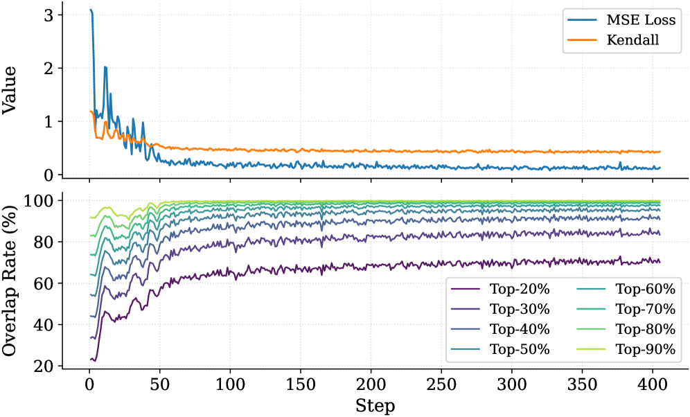
To validate that the Importance Predictor effectively learns the ground-truth thinking token importance scores, we report the MSE Loss and the Kendall rank correlation coefficient (Abdi, 2007) in the top panel of Fig. 7. As the number of training steps increases, both metrics exhibit clear convergence. The MSE loss demonstrates that the predictor can fit the true importance scores. The Kendall coefficient measures the consistency of rankings between the ground-truth importance scores and the predicted values. This result indicates that the predictor successfully captures each thinking token’s importance to the answer. Furthermore, we analyze the overlap rate of predicted critical thinking tokens, as shown in the bottom panel of Fig. 7. Notably, at the end of training, the overlap rate of critical tokens within the top $30\%$ of the predicted tokens exceeds $80\%$ . This confirms that the Importance Predictor in DynTS effectively identifies the most pivotal tokens, ensuring the retention of essential thinking tokens even at high compression rates.
7 Related Work
Recent works on KV cache compression have primarily focused on classical LLMs, applying eviction strategies based on attention scores or heuristic rules. One line of work addresses long-context pruning at the prefill stage. Such as SnapKV (Li et al., 2024), PyramidKV (Cai et al., 2024), and AdaKV (Feng et al., 2024). However, they are ill-suited for the inference scenarios of LRMs, which have short prefill tokens followed by long decoding steps. Furthermore, several strategies have been proposed specifically for the decoding phase. For instance, H2O (Zhang et al., 2023) leverages accumulated attention scores, StreamingLLM (Xiao et al., 2024) retains attention sinks and recent tokens, and SepLLM (Chen et al., 2024) preserves only the separator tokens. More recently, targeting LRMs, (Cai et al., 2025) introduced RKV, which adds a similarity-based metric to evict redundant tokens, while RLKV (Du et al., 2025) utilizes reinforcement learning to retain critical reasoning heads. However, these methods fail to accurately assess the contribution of intermediate tokens to the final answer. Consequently, they risk erroneously evicting decision-critical tokens, compromising the model’s reasoning performance.
8 Conclusion and Discussion
In this work, we investigated the relationship between the reasoning traces and their final answers in LRMs. Our analysis revealed a Pareto Principle in LRMs: only the decision-critical thinking tokens ( $20\%\sim 30\%$ in the reasoning traces) steer the model toward the final answer. Building on this insight, we proposed DynTS, a novel KV cache compression method. Departing from current strategies that rely on local attention scores for eviction, DynTS introduces a learnable Importance Predictor to predict the contribution of the current token to the final answer. Based on the predicted score, DynTS retains pivotal KV cache. Empirical results on six datasets confirm that DynTS outperforms other SOTA baselines. We also discuss the limitations of DynTS and outline potential directions for future improvement. Please refer to Appendix E for details.
Impact Statement
This paper presents work aimed at advancing the field of KV cache compression. There are many potential societal consequences of our work, none of which we feel must be specifically highlighted here. The primary impact of this research is to improve the memory and computational efficiency of LRM’s inference. By reducing memory requirements, our method helps lower the barrier to deploying powerful models on resource-constrained edge devices. We believe our work does not introduce specific ethical or societal risks beyond the general considerations inherent to advancing generative AI.
References
- H. Abdi (2007) The kendall rank correlation coefficient. Encyclopedia of measurement and statistics 2, pp. 508–510. Cited by: §6.4.
- J. Ainslie, J. Lee-Thorp, M. De Jong, Y. Zemlyanskiy, F. Lebrón, and S. Sanghai (2023) Gqa: training generalized multi-query transformer models from multi-head checkpoints. arXiv preprint arXiv:2305.13245. Cited by: §2.
- P. C. Bogdan, U. Macar, N. Nanda, and A. Conmy (2025) Thought anchors: which llm reasoning steps matter?. arXiv preprint arXiv:2506.19143. Cited by: §1, §1, §3.1.
- Z. Cai, W. Xiao, H. Sun, C. Luo, Y. Zhang, K. Wan, Y. Li, Y. Zhou, L. Chang, J. Gu, et al. (2025) R-kv: redundancy-aware kv cache compression for reasoning models. In The Thirty-ninth Annual Conference on Neural Information Processing Systems, Cited by: §3.1, §6.1, §7.
- Z. Cai, Y. Zhang, B. Gao, Y. Liu, Y. Li, T. Liu, K. Lu, W. Xiong, Y. Dong, J. Hu, et al. (2024) Pyramidkv: dynamic kv cache compression based on pyramidal information funneling. arXiv preprint arXiv:2406.02069. Cited by: §3.1, §7.
- G. Chen, H. Shi, J. Li, Y. Gao, X. Ren, Y. Chen, X. Jiang, Z. Li, W. Liu, and C. Huang (2024) Sepllm: accelerate large language models by compressing one segment into one separator. arXiv preprint arXiv:2412.12094. Cited by: §1, §1, §4.2, §6.1, §7.
- Q. Chen, L. Qin, J. Liu, D. Peng, J. Guan, P. Wang, M. Hu, Y. Zhou, T. Gao, and W. Che (2025) Towards reasoning era: a survey of long chain-of-thought for reasoning large language models. arXiv preprint arXiv:2503.09567. Cited by: §1, §2.
- D. Choi, J. Lee, J. Tack, W. Song, S. Dingliwal, S. M. Jayanthi, B. Ganesh, J. Shin, A. Galstyan, and S. B. Bodapati (2025) Think clearly: improving reasoning via redundant token pruning. arXiv preprint arXiv:2507.08806 4. Cited by: §1.
- G. DeepMind (2025) A new era of intelligence with gemini 3. Note: https://blog.google/products/gemini/gemini-3/#gemini-3-deep-think Cited by: §1.
- A. Devoto, Y. Zhao, S. Scardapane, and P. Minervini (2024) A simple and effective $L\_2$ norm-based strategy for kv cache compression. arXiv preprint arXiv:2406.11430. Cited by: §1.
- W. Du, L. Jiang, K. Tao, X. Liu, and H. Wang (2025) Which heads matter for reasoning? rl-guided kv cache compression. arXiv preprint arXiv:2510.08525. Cited by: §7.
- S. Feng, G. Fang, X. Ma, and X. Wang (2025) Efficient reasoning models: a survey. arXiv preprint arXiv:2504.10903. Cited by: §1.
- Y. Feng, J. Lv, Y. Cao, X. Xie, and S. K. Zhou (2024) Ada-kv: optimizing kv cache eviction by adaptive budget allocation for efficient llm inference. arXiv preprint arXiv:2407.11550. Cited by: §7.
- D. Guo, D. Yang, H. Zhang, J. Song, R. Zhang, R. Xu, Q. Zhu, S. Ma, P. Wang, X. Bi, et al. (2025) Deepseek-r1: incentivizing reasoning capability in llms via reinforcement learning. arXiv preprint arXiv:2501.12948. Cited by: §B.1, §1, §6.1, §6.1.
- D. Hendrycks, C. Burns, S. Kadavath, A. Arora, S. Basart, E. Tang, D. Song, and J. Steinhardt (2021) Measuring mathematical problem solving with the math dataset. arXiv preprint arXiv:2103.03874. Cited by: §1, §6.1.
- W. Huang, Z. Zhai, Y. Shen, S. Cao, F. Zhao, X. Xu, Z. Ye, Y. Hu, and S. Lin (2024) Dynamic-llava: efficient multimodal large language models via dynamic vision-language context sparsification. arXiv preprint arXiv:2412.00876. Cited by: §4.1.
- W. Kwon, Z. Li, S. Zhuang, Y. Sheng, L. Zheng, C. H. Yu, J. Gonzalez, H. Zhang, and I. Stoica (2023) Efficient memory management for large language model serving with pagedattention. In Proceedings of the 29th symposium on operating systems principles, pp. 611–626. Cited by: §B.1.
- Y. Li, Y. Huang, B. Yang, B. Venkitesh, A. Locatelli, H. Ye, T. Cai, P. Lewis, and D. Chen (2024) Snapkv: llm knows what you are looking for before generation. Advances in Neural Information Processing Systems 37, pp. 22947–22970. Cited by: §1, §3.1, §6.1, §7.
- M. Liu, A. Palnitkar, T. Rabbani, H. Jae, K. R. Sang, D. Yao, S. Shabihi, F. Zhao, T. Li, C. Zhang, et al. (2025a) Hold onto that thought: assessing kv cache compression on reasoning. arXiv preprint arXiv:2512.12008. Cited by: §6.1.
- Y. Liu, J. Fu, S. Liu, Y. Zou, S. Zhang, and J. Zhou (2025b) KV cache compression for inference efficiency in llms: a review. In Proceedings of the 4th International Conference on Artificial Intelligence and Intelligent Information Processing, pp. 207–212. Cited by: §1.
- G. Minegishi, H. Furuta, T. Kojima, Y. Iwasawa, and Y. Matsuo (2025) Topology of reasoning: understanding large reasoning models through reasoning graph properties. arXiv preprint arXiv:2506.05744. Cited by: §1.
- OpenAI (2025) OpenAI. External Links: Link Cited by: §1.
- R. Pope, S. Douglas, A. Chowdhery, J. Devlin, J. Bradbury, J. Heek, K. Xiao, S. Agrawal, and J. Dean (2023) Efficiently scaling transformer inference. Proceedings of machine learning and systems 5, pp. 606–624. Cited by: §2.
- Z. Qin, Y. Cao, M. Lin, W. Hu, S. Fan, K. Cheng, W. Lin, and J. Li (2025) Cake: cascading and adaptive kv cache eviction with layer preferences. arXiv preprint arXiv:2503.12491. Cited by: §1.
- D. Rein, B. L. Hou, A. C. Stickland, J. Petty, R. Y. Pang, J. Dirani, J. Michael, and S. R. Bowman (2024) Gpqa: a graduate-level google-proof q&a benchmark. In First Conference on Language Modeling, Cited by: §6.1.
- L. Shi, H. Zhang, Y. Yao, Z. Li, and H. Zhao (2024) Keep the cost down: a review on methods to optimize llm’s kv-cache consumption. arXiv preprint arXiv:2407.18003. Cited by: §1.
- C. Singh, J. P. Inala, M. Galley, R. Caruana, and J. Gao (2024) Rethinking interpretability in the era of large language models. arXiv preprint arXiv:2402.01761. Cited by: §3.1.
- Y. Sui, Y. Chuang, G. Wang, J. Zhang, T. Zhang, J. Yuan, H. Liu, A. Wen, S. Zhong, N. Zou, et al. (2025) Stop overthinking: a survey on efficient reasoning for large language models. arXiv preprint arXiv:2503.16419. Cited by: §2.
- A. Vaswani, N. Shazeer, N. Parmar, J. Uszkoreit, L. Jones, A. N. Gomez, Ł. Kaiser, and I. Polosukhin (2017) Attention is all you need. Advances in neural information processing systems 30. Cited by: §1, §2, §2, §4.1.
- Z. Wang and A. C. Bovik (2009) Mean squared error: love it or leave it? a new look at signal fidelity measures. IEEE Signal Processing Magazine 26 (1), pp. 98–117. External Links: Document Cited by: §4.1.
- G. WEI, X. Zhou, P. Sun, T. Zhang, and Y. Wen (2025) Rethinking key-value cache compression techniques for large language model serving. Proceedings of Machine Learning and Systems 7. Cited by: §1.
- S. Wiegreffe and Y. Pinter (2019) Attention is not not explanation. In Proceedings of the 2019 Conference on Empirical Methods in Natural Language Processing and the 9th International Joint Conference on Natural Language Processing (EMNLP-IJCNLP), K. Inui, J. Jiang, V. Ng, and X. Wan (Eds.), Hong Kong, China, pp. 11–20. External Links: Link, Document Cited by: §1.
- G. Xiao, Y. Tian, B. Chen, S. Han, and M. Lewis (2024) EFFICIENT streaming language models with attention sinks. Cited by: §C.3, §1, §6.1, §7.
- F. Xu, Q. Hao, Z. Zong, J. Wang, Y. Zhang, J. Wang, X. Lan, J. Gong, T. Ouyang, F. Meng, et al. (2025) Towards large reasoning models: a survey of reinforced reasoning with large language models. arXiv preprint arXiv:2501.09686. Cited by: §2.
- A. Yang, A. Li, B. Yang, B. Zhang, B. Hui, B. Zheng, B. Yu, C. Gao, C. Huang, C. Lv, et al. (2025) Qwen3 technical report. arXiv preprint arXiv:2505.09388. Cited by: §6.3.
- D. Zhang, Z. Li, M. Zhang, J. Zhang, Z. Liu, Y. Yao, H. Xu, J. Zheng, X. Chen, Y. Zhang, et al. (2025a) From system 1 to system 2: a survey of reasoning large language models. IEEE Transactions on Pattern Analysis and Machine Intelligence. Cited by: §2.
- Q. Zhang, F. Lyu, Z. Sun, L. Wang, W. Zhang, W. Hua, H. Wu, Z. Guo, Y. Wang, N. Muennighoff, et al. (2025b) A survey on test-time scaling in large language models: what, how, where, and how well?. arXiv preprint arXiv:2503.24235. Cited by: §1.
- Y. Zhang and T. Math-AI (2024) American invitational mathematics examination (aime) 2024. Cited by: §6.1.
- Y. Zhang and T. Math-AI (2025) American invitational mathematics examination (aime) 2025. Cited by: §6.1.
- Z. Zhang, Y. Sheng, T. Zhou, T. Chen, L. Zheng, R. Cai, Z. Song, Y. Tian, C. Ré, C. Barrett, et al. (2023) H2o: heavy-hitter oracle for efficient generative inference of large language models. Advances in Neural Information Processing Systems 36, pp. 34661–34710. Cited by: §1, §1, §3.1, §4.2, §6.1, §7.
- J. Zhao, Z. Fang, S. Li, S. Yang, and S. He (2024) Buzz: beehive-structured sparse kv cache with segmented heavy hitters for efficient llm inference. arXiv preprint arXiv:2410.23079. Cited by: §4.2.
Appendix A Proof of Cumulative Computational Gain
**Definition A.1 (Predictor Overhead)**
*Let $\mathcal{M}_{\text{base}}$ be the vanilla LRM with $L$ layers and a hidden dimension $d$ , and $\mathcal{M}_{\text{opt}}$ be the LRM with Importance Predictor. The predictor is defined as a three-layer linear MLP with dimensions $d→ m_{1}→ m_{2}→ m_{3}$ . The computational cost per decode step is:
$$
\mathcal{C}_{\text{mlp}}=2(d\cdot m_{1}+m_{1}\cdot m_{2}+m_{2}\cdot m_{3}). \tag{11}
$$
Setting $m_{1}=2d$ , $m_{2}=d/2$ , and $m_{3}=1$ yields:
$$
\mathcal{C}_{\text{mlp}}=6d^{2}+d \tag{12}
$$*
**Definition A.2 (Effective KV Cache Length)**
*Let $M$ denote the length of the prefill sequence. At decode step $i$ , when the effective cache length reaches the budget $B$ , DynTS performs KV Cache Selection to evict $K$ redundant tokens. The effective KV cache length $S_{i}$ for the base and optimized models is given by:
$$
S_{i}^{\text{base}}=M+i,\quad S_{i}^{\text{opt}}=M+i-n_{i}\cdot K, \tag{13}
$$
where $n_{i}=\max\left(0,\left\lfloor\frac{(M+i)-B}{K}\right\rfloor+1\right)$ denotes the count of cache eviction event at step $i$ .*
**Definition A.3 (LLM Overhead)**
*The computational overhead per step for a decoder-only transformer is composed of a static component $\mathcal{C}_{\text{static}}$ (independent of sequence length) and a dynamic attention component $\mathcal{C}_{\text{attn}}$ (linearly dependent on effective cache length). The static cost $\mathcal{C}_{\text{static}}$ for the backbone remains identical for both models. The self-attention cost for a single layer is $4· d· S_{i}$ (counting $Q· K^{→p}$ and $\text{Softmax}· V$ ). Across $L$ layers:
$$
\mathcal{C}_{\text{attn}}(S_{i})=4\cdot L\cdot d\cdot S_{i} \tag{14}
$$*
* Proof: Computational Gain*
Let $\Delta\mathcal{C}(i)$ be the reduction in FLOPs achieved by DynTS at decoding step $i$ , which is defined as $\text{FLOPs}(\mathcal{M}_{\text{base}}(i))-\text{FLOPs}(\mathcal{M}_{\text{opt}}(i))$ :
$$
\Delta\mathcal{C}(i)=\left[\mathcal{C}_{\text{static}}(i)+\mathcal{C}_{\text{attn}}(S_{i}^{\text{base}})\right]-\left[\mathcal{C}_{\text{static}}(i)+\mathcal{C}_{\text{mlp}}+\mathcal{C}_{\text{attn}}(S_{i}^{\text{opt}})\right]. \tag{15}
$$
Eliminating the static term $\mathcal{C}_{\text{static}}$
$$
\Delta\mathcal{C}(i)=\mathcal{C}_{\text{attn}}(S_{i}^{\text{base}})-\mathcal{C}_{\text{attn}}(S_{i}^{\text{opt}})-\mathcal{C}_{\text{mlp}}. \tag{16}
$$
Substituting $S_{i}^{\text{base}}$ , $S_{i}^{\text{opt}}$ and $\mathcal{C}_{\text{mlp}}$ :
$$
\displaystyle\Delta\mathcal{C}(i) \displaystyle=4\cdot L\cdot d\cdot(M+i)-4\cdot L\cdot d\cdot(M+i-n_{i}\cdot K)-\mathcal{C}_{\text{mlp}} \displaystyle=\underbrace{n_{i}\cdot 4LdK}_{\text{Eviction Saving}}-\underbrace{(6d^{2}+d)}_{\text{Predictor Overhead}}. \tag{17}
$$
This completes the proof. $\square$ ∎
Appendix B Empirical Analysis and Observations
B.1 Implementation Details
To calculate the importance of each thinking token to the final answer sequence, we first utilized vLLM (Kwon et al., 2023) to generate the complete reasoning trace. Following (Guo et al., 2025), we set the temperature to 0.6, top-p to 0.95, top-k to 20, and max length to 16,384. To ensure sequence completeness, we sampled 5 times for each question and filtered out samples with incomplete inference traces. Then, we fed the full sequence into the model for a single forward pass to extract the submatrices of attention weight, corresponding to the answer and thinking tokens. Finally, we aggregate the matrices across all layers and heads, and sum along the answer dimension (rows). The aggregated 1D vector is the importance score of each thinking token.
Based on the calculated importance scores, we employ three selection strategies to retain critical thinking tokens: top- $p\%$ , bottom- $p\%$ , and random sampling, where $p∈[2,4,6,8,10,20,30,40,50]$ . The retained tokens are concatenated with the original question to form the input sequence. The input sequence is processed by vLLM over 5 independent runs using the aforementioned configuration. We report the average Pass@1 across these results as the final accuracy.
B.2 Ratio of Content Words
To investigate the distinctions of thinking tokens with varying importance scores, we employed spaCy to analyze the Part-of-Speech (POS) tags of each token. Specifically, we heuristically categorized nouns, verbs, adjectives, adverbs, and proper nouns as Content Words carrying substantive meaning, while treating other POS tags as Function Words with limited semantic information. The thinking tokens were sorted by importance score and then partitioned into ten equal parts. We report the ratio of Content Words and Function Words within each part in Fig 9. The tokens with higher importance scores exhibit a significantly higher proportion of content words, suggesting that they encode the core semantic meaning. Conversely, tokens with lower scores are predominantly function words, which primarily serve as syntactic scaffolding or intermediate states to maintain sequence coherence. Consequently, once the full sentence is generated, removing these low-importance tokens has a negligible impact on overall comprehension.
<details>
<summary>x11.png Details</summary>

### Visual Description
## Horizontal Bar Chart: R1-Llama | AIME24
### Overview
The image is a horizontal bar chart comparing the ratio of "Content Words" and "Function Words" across different percentile ranges (Top-10% to 90-100%) for R1-Llama in AIME24. The chart displays the percentage of each word type within each percentile range.
### Components/Axes
* **Title:** R1-Llama | AIME24
* **Y-axis (Percentile Ranges):** Top-10%, 10-20%, 20-30%, 30-40%, 40-50%, 50-60%, 60-70%, 70-80%, 80-90%, 90-100%
* **X-axis (Ratio %):** 0, 20, 40, 60, 80, 100
* **Legend (Top-Right):**
* Content Words (Dark Red)
* Function Words (Light Gray with diagonal lines)
### Detailed Analysis
The chart shows the ratio of content words and function words for different percentile ranges.
* **Top-10%:** Content Words: 45.4%, Function Words: 54.6% (approximate)
* **10-20%:** Content Words: 40.3%, Function Words: 59.7% (approximate)
* **20-30%:** Content Words: 36.9%, Function Words: 63.1% (approximate)
* **30-40%:** Content Words: 34.1%, Function Words: 65.9% (approximate)
* **40-50%:** Content Words: 32.2%, Function Words: 67.8% (approximate)
* **50-60%:** Content Words: 31.1%, Function Words: 68.9% (approximate)
* **60-70%:** Content Words: 30.8%, Function Words: 69.2% (approximate)
* **70-80%:** Content Words: 30.7%, Function Words: 69.3% (approximate)
* **80-90%:** Content Words: 30.8%, Function Words: 69.2% (approximate)
* **90-100%:** Content Words: 31.0%, Function Words: 69.0% (approximate)
**Trend Verification:**
The "Content Words" series generally decreases as the percentile range moves from Top-10% to 90-100%. The "Function Words" series increases as the percentile range moves from Top-10% to 90-100%.
### Key Observations
* The proportion of "Content Words" is highest in the "Top-10%" range (45.4%) and lowest in the "70-80%" range (30.7%).
* The proportion of "Function Words" is generally higher than "Content Words" across all percentile ranges.
* There is a noticeable difference in the ratio of "Content Words" and "Function Words" between the "Top-10%" and the other percentile ranges.
### Interpretation
The data suggests that the "Top-10%" percentile range utilizes a higher proportion of "Content Words" compared to other percentile ranges. This could indicate that the top performers in R1-Llama | AIME24 use more meaningful and specific vocabulary. Conversely, the lower percentile ranges rely more on "Function Words," which are typically grammatical words that provide structure but less semantic content. The difference in word usage might be a factor contributing to the performance differences observed across the percentile ranges. The chart highlights the importance of vocabulary choice and content richness in achieving higher performance in the given context.
</details>
<details>
<summary>x12.png Details</summary>
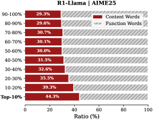
### Visual Description
## Bar Chart: R1-Llama | AIME25
### Overview
The image is a horizontal bar chart comparing the ratio of "Content Words" and "Function Words" across different percentile ranges (Top-10% to 90-100%) for R1-Llama on AIME25. The chart shows how the proportion of content words increases as we move towards the top percentiles.
### Components/Axes
* **Title:** R1-Llama | AIME25
* **Y-axis (Percentile Ranges):** Top-10%, 10-20%, 20-30%, 30-40%, 40-50%, 50-60%, 60-70%, 70-80%, 80-90%, 90-100%
* **X-axis (Ratio %):** Scale from 0 to 100%
* **Legend:**
* Content Words (Dark Red)
* Function Words (Gray with diagonal lines)
### Detailed Analysis
The chart displays the ratio of content words and function words for each percentile range.
* **Top-10%:** Content Words: 44.3%, Function Words: approximately 55.7%
* **10-20%:** Content Words: 39.3%, Function Words: approximately 60.7%
* **20-30%:** Content Words: 35.5%, Function Words: approximately 64.5%
* **30-40%:** Content Words: 32.6%, Function Words: approximately 67.4%
* **40-50%:** Content Words: 31.5%, Function Words: approximately 68.5%
* **50-60%:** Content Words: 30.0%, Function Words: approximately 70.0%
* **60-70%:** Content Words: 30.1%, Function Words: approximately 69.9%
* **70-80%:** Content Words: 30.7%, Function Words: approximately 69.3%
* **80-90%:** Content Words: 29.6%, Function Words: approximately 70.4%
* **90-100%:** Content Words: 29.3%, Function Words: approximately 70.7%
**Trend Verification:**
The "Content Words" series generally slopes upward as we move from the 90-100% percentile range to the Top-10% percentile range.
### Key Observations
* The proportion of "Content Words" is highest in the Top-10% percentile range (44.3%) and lowest in the 90-100% percentile range (29.3%).
* The proportion of "Function Words" is highest in the 90-100% percentile range and decreases as we move towards the Top-10% percentile range.
* There is a clear inverse relationship between the proportion of "Content Words" and "Function Words" across the percentile ranges.
### Interpretation
The data suggests that R1-Llama's responses in the top percentiles (Top-10%) contain a higher ratio of content-rich words compared to function words. This could indicate that the model is more focused on delivering substantive information in its best-performing responses. Conversely, in the lower percentiles (90-100%), the model's responses rely more on function words, which might imply less informative or more generic answers. The trend highlights that the quality of the model's output, as measured by the content-to-function word ratio, improves as we move towards the top-performing responses.
</details>
<details>
<summary>x13.png Details</summary>
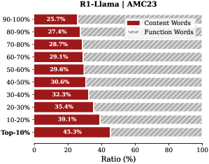
### Visual Description
## Bar Chart: R1-Llama | AMC23
### Overview
The image is a horizontal bar chart comparing the ratio (%) of "Content Words" and "Function Words" across different percentile ranges (Top-10% to 90-100%) for R1-Llama | AMC23. The chart shows how the proportion of content words changes as we move from the top percentile to the lower percentiles.
### Components/Axes
* **Title:** R1-Llama | AMC23
* **Y-axis (Vertical):** Percentile ranges (Top-10%, 10-20%, 20-30%, 30-40%, 40-50%, 50-60%, 60-70%, 70-80%, 80-90%, 90-100%)
* **X-axis (Horizontal):** Ratio (%) from 0 to 100
* **Legend (Top-Right):**
* Content Words (Dark Red)
* Function Words (Light Gray with diagonal stripes)
### Detailed Analysis
The chart displays the ratio of content words in dark red and function words in light gray with diagonal stripes for each percentile range.
* **Top-10%:** Content Words: 45.3%, Function Words: approximately 54.7%
* **10-20%:** Content Words: 39.1%, Function Words: approximately 60.9%
* **20-30%:** Content Words: 35.4%, Function Words: approximately 64.6%
* **30-40%:** Content Words: 32.3%, Function Words: approximately 67.7%
* **40-50%:** Content Words: 30.6%, Function Words: approximately 69.4%
* **50-60%:** Content Words: 29.6%, Function Words: approximately 70.4%
* **60-70%:** Content Words: 29.1%, Function Words: approximately 70.9%
* **70-80%:** Content Words: 28.7%, Function Words: approximately 71.3%
* **80-90%:** Content Words: 27.4%, Function Words: approximately 72.6%
* **90-100%:** Content Words: 25.7%, Function Words: approximately 74.3%
### Key Observations
* The proportion of content words decreases as the percentile range decreases (from Top-10% to 90-100%).
* The proportion of function words increases as the percentile range decreases.
* The Top-10% percentile has the highest ratio of content words (45.3%).
* The 90-100% percentile has the lowest ratio of content words (25.7%).
### Interpretation
The data suggests that the "Top-10%" percentile contains a higher proportion of content words compared to the other percentile ranges. This indicates that the text generated or analyzed in the top percentile is more focused on conveying specific information or meaning, while the lower percentiles rely more on function words, which serve grammatical purposes. The trend demonstrates that as we move away from the top percentile, the content becomes less dense and more reliant on structural words. This could imply that the quality or informativeness of the text decreases as we move down the percentile ranges.
</details>
<details>
<summary>x14.png Details</summary>
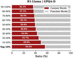
### Visual Description
## Bar Chart: R1-Llama | GPQA-D
### Overview
This is a horizontal bar chart comparing the ratio of Content Words to Function Words across different performance percentiles (Top-10% to 90-100%) for R1-Llama on the GPQA-D dataset. The chart shows how the proportion of content words changes as performance increases.
### Components/Axes
* **Title:** R1-Llama | GPQA-D
* **Y-axis (Vertical):** Performance Percentiles (Top-10%, 10-20%, 20-30%, 30-40%, 40-50%, 50-60%, 60-70%, 70-80%, 80-90%, 90-100%)
* **X-axis (Horizontal):** Ratio (%) from 0 to 100
* **Legend (Top-Right):**
* Content Words (Dark Red)
* Function Words (Light Gray with diagonal lines)
### Detailed Analysis
The chart displays the ratio of Content Words and Function Words for each performance percentile.
* **Top-10%:** Content Words: 56.6%, Function Words: 43.4% (estimated)
* **10-20%:** Content Words: 49.6%, Function Words: 50.4% (estimated)
* **20-30%:** Content Words: 45.7%, Function Words: 54.3% (estimated)
* **30-40%:** Content Words: 42.9%, Function Words: 57.1% (estimated)
* **40-50%:** Content Words: 40.8%, Function Words: 59.2% (estimated)
* **50-60%:** Content Words: 39.6%, Function Words: 60.4% (estimated)
* **60-70%:** Content Words: 39.1%, Function Words: 60.9% (estimated)
* **70-80%:** Content Words: 38.4%, Function Words: 61.6% (estimated)
* **80-90%:** Content Words: 37.1%, Function Words: 62.9% (estimated)
* **90-100%:** Content Words: 36.3%, Function Words: 63.7% (estimated)
**Trend:** As the performance percentile increases (from 90-100% to Top-10%), the ratio of Content Words increases, while the ratio of Function Words decreases.
### Key Observations
* The "Top-10%" percentile has the highest proportion of Content Words (56.6%).
* The "90-100%" percentile has the lowest proportion of Content Words (36.3%).
* There is a clear inverse relationship between performance percentile and the ratio of Function Words.
### Interpretation
The data suggests that higher-performing instances of R1-Llama on the GPQA-D dataset tend to use a greater proportion of Content Words compared to Function Words. This could indicate that better performance is associated with more direct and informative language, while lower performance might involve more filler words or less precise phrasing. The chart highlights the importance of content-rich language in achieving better results on this particular task.
</details>
<details>
<summary>x15.png Details</summary>
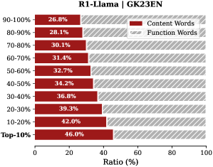
### Visual Description
## Bar Chart: R1-Llama | GK23EN
### Overview
The image is a horizontal bar chart comparing the ratio of "Content Words" and "Function Words" across different percentile ranges of a dataset, labeled "R1-Llama | GK23EN". The y-axis represents percentile ranges (Top-10% to 90-100%), and the x-axis represents the ratio in percentage (0-100%). The chart uses color-coding to distinguish between "Content Words" (dark red) and "Function Words" (light gray with diagonal lines).
### Components/Axes
* **Title:** R1-Llama | GK23EN
* **X-Axis Title:** Ratio (%)
* **X-Axis Scale:** 0 to 100, incrementing by 20.
* **Y-Axis Labels (Percentile Ranges):** Top-10%, 10-20%, 20-30%, 30-40%, 40-50%, 50-60%, 60-70%, 70-80%, 80-90%, 90-100%
* **Legend (Top-Right):**
* Dark Red: Content Words
* Light Gray with Diagonal Lines: Function Words
### Detailed Analysis
The chart displays the ratio of content words and function words for different percentile ranges. The "Content Words" ratio generally decreases as the percentile range increases (from Top-10% to 90-100%). The "Function Words" ratio is implicitly represented by the remaining percentage to reach 100% for each percentile range.
Here's a breakdown of the "Content Words" ratio for each percentile range:
* **Top-10%:** 46.0%
* **10-20%:** 42.0%
* **20-30%:** 39.3%
* **30-40%:** 36.8%
* **40-50%:** 34.2%
* **50-60%:** 32.7%
* **60-70%:** 31.4%
* **70-80%:** 30.1%
* **80-90%:** 28.1%
* **90-100%:** 26.8%
### Key Observations
* The ratio of "Content Words" is highest in the Top-10% percentile range (46.0%) and lowest in the 90-100% percentile range (26.8%).
* There is a general downward trend in the "Content Words" ratio as the percentile range increases.
* The "Function Words" ratio is implicitly the inverse of the "Content Words" ratio for each percentile range.
### Interpretation
The chart suggests that the top-performing segments (Top-10%) of the dataset, "R1-Llama | GK23EN", contain a higher proportion of content-rich words compared to the lower-performing segments (90-100%). This could indicate that the quality or informativeness of the content decreases as you move towards the higher percentile ranges. The higher proportion of function words in the higher percentile ranges might suggest a greater emphasis on grammatical structure or filler content in those segments. The data demonstrates a clear inverse relationship between the percentile range and the proportion of content words.
</details>
<details>
<summary>x16.png Details</summary>
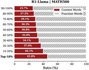
### Visual Description
## Bar Chart: R1-Llama | MATH500
### Overview
The image is a horizontal bar chart comparing the ratio of "Content Words" to "Function Words" across different performance percentiles (Top-10% to 90-100%) for R1-Llama on the MATH500 dataset. The chart shows that as performance increases (moving from 90-100% to Top-10%), the ratio of content words increases while the ratio of function words decreases.
### Components/Axes
* **Title:** R1-Llama | MATH500
* **Y-axis (Vertical):** Performance Percentiles (Top-10%, 10-20%, 20-30%, 30-40%, 40-50%, 50-60%, 60-70%, 70-80%, 80-90%, 90-100%)
* **X-axis (Horizontal):** Ratio (%) from 0 to 100
* **Legend (Top-Right):**
* Red: Content Words
* Gray (with diagonal lines): Function Words
### Detailed Analysis
The chart displays the ratio of content words and function words for each performance percentile.
* **Top-10%:** Content Words: 45.8%, Function Words: ~54.2%
* **10-20%:** Content Words: 40.1%, Function Words: ~59.9%
* **20-30%:** Content Words: 37.0%, Function Words: ~63.0%
* **30-40%:** Content Words: 34.1%, Function Words: ~65.9%
* **40-50%:** Content Words: 32.0%, Function Words: ~68.0%
* **50-60%:** Content Words: 30.8%, Function Words: ~69.2%
* **60-70%:** Content Words: 30.2%, Function Words: ~69.8%
* **70-80%:** Content Words: 29.1%, Function Words: ~70.9%
* **80-90%:** Content Words: 27.2%, Function Words: ~72.8%
* **90-100%:** Content Words: 25.7%, Function Words: ~74.3%
**Trends:**
* **Content Words:** The ratio of content words generally increases as performance improves (from 90-100% to Top-10%).
* **Function Words:** The ratio of function words generally decreases as performance improves.
### Key Observations
* The ratio of content words is highest in the Top-10% percentile.
* The ratio of function words is highest in the 90-100% percentile.
* There is a clear inverse relationship between the ratio of content words and function words as performance changes.
### Interpretation
The data suggests that higher-performing models (R1-Llama on MATH500) tend to use a higher proportion of content words compared to function words. This could indicate that better models are more concise and focused in their responses, relying less on grammatical structures and more on conveying essential information. The trend highlights a potential characteristic of successful models in this context: an ability to prioritize and effectively utilize content-rich vocabulary.
</details>
<details>
<summary>x17.png Details</summary>
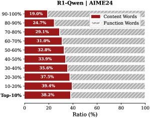
### Visual Description
## Bar Chart: R1-Qwen | AIME24
### Overview
The image is a horizontal bar chart comparing the ratio of "Content Words" to "Function Words" across different percentile ranges (Top-10% to 90-100%). The chart shows how the proportion of content words changes as we move from the top performers to the lower percentiles.
### Components/Axes
* **Title:** R1-Qwen | AIME24
* **X-axis:** Ratio (%), ranging from 0 to 100.
* **Y-axis:** Percentile ranges: Top-10%, 10-20%, 20-30%, 30-40%, 40-50%, 50-60%, 60-70%, 70-80%, 80-90%, 90-100%.
* **Legend:** Located at the top-right of the chart.
* Content Words (represented by solid dark red bars)
* Function Words (represented by hatched light gray bars)
### Detailed Analysis
The chart displays the ratio of content words and function words for different percentile ranges.
* **Top-10%:** Content Words: 38.2%. Function Words: approximately 61.8% (estimated).
* **10-20%:** Content Words: 39.4%. Function Words: approximately 60.6% (estimated).
* **20-30%:** Content Words: 37.5%. Function Words: approximately 62.5% (estimated).
* **30-40%:** Content Words: 35.6%. Function Words: approximately 64.4% (estimated).
* **40-50%:** Content Words: 33.9%. Function Words: approximately 66.1% (estimated).
* **50-60%:** Content Words: 32.8%. Function Words: approximately 67.2% (estimated).
* **60-70%:** Content Words: 31.0%. Function Words: approximately 69.0% (estimated).
* **70-80%:** Content Words: 29.1%. Function Words: approximately 70.9% (estimated).
* **80-90%:** Content Words: 24.7%. Function Words: approximately 75.3% (estimated).
* **90-100%:** Content Words: 19.0%. Function Words: approximately 81.0% (estimated).
The trend for "Content Words" is generally decreasing as the percentile range increases (from Top-10% to 90-100%). Conversely, the trend for "Function Words" is generally increasing as the percentile range increases.
### Key Observations
* The proportion of content words is highest in the 10-20% percentile range (39.4%).
* The proportion of content words is lowest in the 90-100% percentile range (19.0%).
* There is a noticeable shift in the balance between content and function words as we move from top performers to lower percentiles.
### Interpretation
The data suggests that higher-performing individuals (Top-10% to 30-40%) tend to use a relatively higher proportion of content words compared to function words. As we move towards lower-performing individuals (40-50% to 90-100%), the proportion of function words increases, indicating a potential difference in writing style or content focus. This could imply that top performers are more concise and use more meaningful words, while lower performers might use more filler words or grammatical structures. The difference in word usage could be a factor contributing to the performance differences observed in the AIME24 dataset.
</details>
<details>
<summary>x18.png Details</summary>
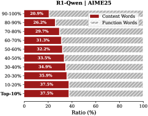
### Visual Description
## Bar Chart: R1-Qwen | AIME25
### Overview
The image is a horizontal bar chart comparing the ratio of "Content Words" and "Function Words" across different percentile ranges (Top-10% to 90-100%). The chart shows how the proportion of content words changes as we move from the top percentile to the lower percentiles.
### Components/Axes
* **Title:** R1-Qwen | AIME25
* **Y-axis (Categories):** Percentile ranges (Top-10%, 10-20%, 20-30%, 30-40%, 40-50%, 50-60%, 60-70%, 70-80%, 80-90%, 90-100%)
* **X-axis (Values):** Ratio (%) from 0 to 100
* **Legend:** Located at the top-right of the chart.
* Content Words (Dark Red)
* Function Words (Light Gray with diagonal lines)
### Detailed Analysis
The chart displays the ratio of content words in dark red and function words in light gray with diagonal lines for each percentile range.
* **Top-10%:** Content Words: 37.5%, Function Words: approximately 62.5%
* **10-20%:** Content Words: 37.5%, Function Words: approximately 62.5%
* **20-30%:** Content Words: 35.9%, Function Words: approximately 64.1%
* **30-40%:** Content Words: 34.9%, Function Words: approximately 65.1%
* **40-50%:** Content Words: 33.5%, Function Words: approximately 66.5%
* **50-60%:** Content Words: 32.2%, Function Words: approximately 67.8%
* **60-70%:** Content Words: 31.3%, Function Words: approximately 68.7%
* **70-80%:** Content Words: 29.7%, Function Words: approximately 70.3%
* **80-90%:** Content Words: 26.2%, Function Words: approximately 73.8%
* **90-100%:** Content Words: 20.9%, Function Words: approximately 79.1%
**Trend Verification:**
The "Content Words" series shows a decreasing trend as we move from the Top-10% to the 90-100% range. Conversely, the "Function Words" series shows an increasing trend.
### Key Observations
* The proportion of content words is highest in the Top-10% and 10-20% ranges (37.5%).
* The proportion of content words decreases as the percentile range increases (i.e., moving towards 90-100%).
* The proportion of function words increases as the percentile range increases.
### Interpretation
The chart suggests that the top percentiles (Top-10% and 10-20%) use a higher proportion of content words compared to function words. As we move towards the lower percentiles (90-100%), the proportion of function words increases, indicating a shift in the type of language used. This could imply that the top percentiles are more concise and information-dense, while the lower percentiles might use more filler words or grammatical structures. The data demonstrates a clear inverse relationship between the proportion of content words and function words across different percentile ranges.
</details>
<details>
<summary>x19.png Details</summary>
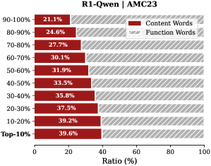
### Visual Description
## Horizontal Bar Chart: R1-Qwen | AMC23
### Overview
The image is a horizontal bar chart comparing the ratio (%) of "Content Words" and "Function Words" across different percentile ranges (Top-10% to 90-100%). The chart shows how the proportion of content words increases as you move from higher to lower percentiles.
### Components/Axes
* **Title:** R1-Qwen | AMC23
* **Y-axis (Percentile Ranges):** Top-10%, 10-20%, 20-30%, 30-40%, 40-50%, 50-60%, 60-70%, 70-80%, 80-90%, 90-100%
* **X-axis (Ratio %):** 0 to 100, with tick marks at intervals of 20.
* **Legend:** Located at the top-right of the chart.
* Content Words (Dark Red)
* Function Words (Light Gray with diagonal lines)
### Detailed Analysis
The chart displays the ratio of content words and function words for different percentile ranges. The "Content Words" are represented by dark red bars, and "Function Words" are represented by light gray bars with diagonal lines.
Here's a breakdown of the data for each percentile range:
* **Top-10%:** Content Words: 39.6%
* **10-20%:** Content Words: 39.2%
* **20-30%:** Content Words: 37.5%
* **30-40%:** Content Words: 35.8%
* **40-50%:** Content Words: 33.5%
* **50-60%:** Content Words: 31.9%
* **60-70%:** Content Words: 30.1%
* **70-80%:** Content Words: 27.7%
* **80-90%:** Content Words: 24.6%
* **90-100%:** Content Words: 21.1%
The "Function Words" ratio can be inferred by subtracting the "Content Words" ratio from 100%.
### Key Observations
* The proportion of "Content Words" decreases as the percentile range increases (from Top-10% to 90-100%).
* The highest proportion of "Content Words" is in the Top-10% range (39.6%).
* The lowest proportion of "Content Words" is in the 90-100% range (21.1%).
* The proportion of "Function Words" increases as the percentile range increases.
### Interpretation
The chart suggests that the top-performing content (Top-10%) has a higher ratio of content words compared to function words. As the performance decreases (moving towards 90-100%), the ratio of content words decreases, implying a greater reliance on function words. This could indicate that higher-performing content is more focused on delivering specific information, while lower-performing content may be more verbose or use more filler words. The data demonstrates a clear inverse relationship between percentile rank and the proportion of function words.
</details>
<details>
<summary>x20.png Details</summary>
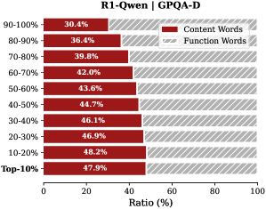
### Visual Description
## Bar Chart: R1-Qwen | GPQA-D
### Overview
The image is a horizontal bar chart comparing the ratio of "Content Words" and "Function Words" across different percentile ranges (Top-10% to 90-100%) for the R1-Qwen model on the GPQA-D dataset. The chart shows how the proportion of content words changes as we move from the top-performing samples to the lower-performing ones.
### Components/Axes
* **Title:** R1-Qwen | GPQA-D
* **Y-axis (Vertical):** Percentile ranges: Top-10%, 10-20%, 20-30%, 30-40%, 40-50%, 50-60%, 60-70%, 70-80%, 80-90%, 90-100%.
* **X-axis (Horizontal):** Ratio (%), ranging from 0 to 100.
* **Legend (Top-Right):**
* Red: Content Words
* Gray with diagonal lines: Function Words
### Detailed Analysis
The chart displays the ratio of content words for each percentile range. The remaining portion of each bar represents the ratio of function words.
* **Top-10%:** Content Words: 47.9%.
* **10-20%:** Content Words: 48.2%.
* **20-30%:** Content Words: 46.9%.
* **30-40%:** Content Words: 46.1%.
* **40-50%:** Content Words: 44.7%.
* **50-60%:** Content Words: 43.6%.
* **60-70%:** Content Words: 42.0%.
* **70-80%:** Content Words: 39.8%.
* **80-90%:** Content Words: 36.4%.
* **90-100%:** Content Words: 30.4%.
**Trend:** The proportion of "Content Words" generally decreases as the percentile range moves from Top-10% to 90-100%.
### Key Observations
* The highest proportion of "Content Words" is observed in the 10-20% range (48.2%).
* The lowest proportion of "Content Words" is observed in the 90-100% range (30.4%).
* There is a noticeable drop in the proportion of "Content Words" in the 90-100% range compared to other ranges.
### Interpretation
The chart suggests that the quality of the generated text, as measured by the proportion of content words, tends to be higher in the top-performing samples (Top-10% to 30-40%) compared to the lower-performing samples (60-70% to 90-100%). This could indicate that better-performing samples rely more on meaningful content words, while lower-performing samples may rely more on function words, potentially resulting in less informative or coherent text. The significant drop in content words in the 90-100% range could indicate a threshold where the quality of generated text significantly deteriorates.
</details>
<details>
<summary>x21.png Details</summary>
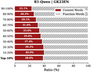
### Visual Description
## Bar Chart: R1-Qwen | GK23EN
### Overview
The image is a horizontal bar chart comparing the ratio of "Content Words" to "Function Words" across different percentile ranges (Top-10% to 90-100%). The chart shows how the proportion of content words changes as we move from the top percentiles to the lower percentiles.
### Components/Axes
* **Title:** R1-Qwen | GK23EN
* **Y-axis (Percentile Ranges):** Top-10%, 10-20%, 20-30%, 30-40%, 40-50%, 50-60%, 60-70%, 70-80%, 80-90%, 90-100%
* **X-axis (Ratio %):** 0 to 100%
* **Legend (Top-Right):**
* Content Words (Dark Red)
* Function Words (Light Gray with diagonal lines)
### Detailed Analysis
The chart displays the ratio of content words and function words for different percentile ranges. The content words are represented by dark red bars, and the function words are represented by light gray bars with diagonal lines.
* **Top-10%:** Content Words: 38.6%, Function Words: approximately 61.4%
* **10-20%:** Content Words: 40.0%, Function Words: approximately 60.0%
* **20-30%:** Content Words: 39.2%, Function Words: approximately 60.8%
* **30-40%:** Content Words: 37.4%, Function Words: approximately 62.6%
* **40-50%:** Content Words: 35.6%, Function Words: approximately 64.4%
* **50-60%:** Content Words: 33.6%, Function Words: approximately 66.4%
* **60-70%:** Content Words: 31.6%, Function Words: approximately 68.4%
* **70-80%:** Content Words: 29.1%, Function Words: approximately 70.9%
* **80-90%:** Content Words: 26.2%, Function Words: approximately 73.8%
* **90-100%:** Content Words: 23.1%, Function Words: approximately 76.9%
**Trend:** The proportion of content words generally decreases as the percentile range increases (from Top-10% to 90-100%). Conversely, the proportion of function words increases as the percentile range increases.
### Key Observations
* The highest proportion of content words is observed in the 10-20% range (40.0%).
* The lowest proportion of content words is observed in the 90-100% range (23.1%).
* There is a gradual decrease in the proportion of content words as we move from the top percentiles to the lower percentiles.
### Interpretation
The data suggests that in the top-performing segments (Top-10% to 10-20%), the ratio of content words is higher compared to function words. As we move towards lower-performing segments (90-100%), the ratio of function words increases, indicating a potential shift in the nature of the text or language used. This could imply that higher-performing segments use more substantive vocabulary, while lower-performing segments rely more on grammatical or structural words. The chart highlights a clear inverse relationship between the percentile range and the proportion of content words.
</details>
<details>
<summary>x22.png Details</summary>
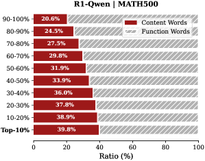
### Visual Description
## Stacked Bar Chart: R1-Qwen | MATH500
### Overview
The image is a stacked bar chart comparing the ratio of "Content Words" and "Function Words" across different performance percentiles (Top-10% to 90-100%) in the context of "R1-Qwen | MATH500". The x-axis represents the ratio in percentage, and the y-axis represents the performance percentile.
### Components/Axes
* **Title:** R1-Qwen | MATH500
* **X-axis:** Ratio (%) - Ranges from 0 to 100.
* **Y-axis:** Performance Percentiles - Categories are: Top-10%, 10-20%, 20-30%, 30-40%, 40-50%, 50-60%, 60-70%, 70-80%, 80-90%, 90-100%.
* **Legend:** Located at the top-right of the chart.
* Content Words (Dark Red)
* Function Words (Light Gray with diagonal lines)
### Detailed Analysis
The chart displays the ratio of content words and function words for different performance percentiles. The "Content Words" are represented by dark red bars, and "Function Words" are represented by light gray bars with diagonal lines. The bars are stacked, so the total length of each bar represents 100%.
Here's a breakdown of the data for each percentile:
* **Top-10%:** Content Words: 39.8%, Function Words: approximately 60.2%
* **10-20%:** Content Words: 38.9%, Function Words: approximately 61.1%
* **20-30%:** Content Words: 37.8%, Function Words: approximately 62.2%
* **30-40%:** Content Words: 36.0%, Function Words: approximately 64.0%
* **40-50%:** Content Words: 33.9%, Function Words: approximately 66.1%
* **50-60%:** Content Words: 31.9%, Function Words: approximately 68.1%
* **60-70%:** Content Words: 29.8%, Function Words: approximately 70.2%
* **70-80%:** Content Words: 27.5%, Function Words: approximately 72.5%
* **80-90%:** Content Words: 24.5%, Function Words: approximately 75.5%
* **90-100%:** Content Words: 20.6%, Function Words: approximately 79.4%
**Trends:**
* The ratio of "Content Words" generally decreases as the performance percentile decreases (from Top-10% to 90-100%).
* Conversely, the ratio of "Function Words" generally increases as the performance percentile decreases.
### Key Observations
* The "Top-10%" percentile has the highest ratio of "Content Words" (39.8%).
* The "90-100%" percentile has the lowest ratio of "Content Words" (20.6%).
* The difference in "Content Words" ratio between the "Top-10%" and "90-100%" percentiles is significant (39.8% vs 20.6%).
### Interpretation
The data suggests that higher-performing models (Top-10%) tend to use a higher proportion of "Content Words" compared to lower-performing models (90-100%). This could indicate that better models are more focused on the core content and meaning, while lower-performing models rely more on function words (e.g., prepositions, articles, conjunctions) which may contribute less to the semantic content. The trend highlights a potential correlation between the type of words used and the overall performance of the model in the MATH500 task. It is important to note that this is just one aspect of model performance, and other factors also play a significant role.
</details>
Figure 9: Proportion of content words versus function words in thinking tokens. Bars represent deciles sorted by importance score; e.g., the bottom bar indicates the ratio for the top- $10\%$ most important tokens.
<details>
<summary>x23.png Details</summary>
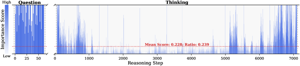
### Visual Description
## Chart Type: Importance Score vs. Reasoning Step
### Overview
The image presents a chart that visualizes the importance score over reasoning steps, split into two sections: "Question" and "Thinking". The "Question" section shows the importance score for the initial question, while the "Thinking" section displays the importance score across a series of reasoning steps. A red dotted line indicates the mean score and ratio for the "Thinking" section.
### Components/Axes
* **Title:** "Thinking" (located at the top-center of the chart)
* **Y-axis Label:** "Importance Score" (vertical, on the left side)
* Scale: "High" at the top, "Low" at the bottom. A gradient bar visually represents the scale.
* **X-axis Label:** "Reasoning Step" (horizontal, at the bottom)
* Scale: 0 to 7000, with markers at 0, 1000, 2000, 3000, 4000, 5000, 6000, and 7000.
* **Question Section:** Located on the left side of the chart.
* Title: "Question" (at the top)
* X-axis: 0 to 50, with markers at 0, 25, and 50.
* **Mean Score and Ratio:** "Mean Score: 0.228; Ratio: 0.239" (located in the middle of the "Thinking" section, slightly above the red dotted line)
* **Data Series:** Represented by blue vertical lines.
### Detailed Analysis
* **Question Section:**
* The importance score fluctuates significantly between "Low" and "High" across the 50 steps.
* The values appear to be densely packed, making precise individual readings difficult.
* **Thinking Section:**
* The importance score varies across the 7000 reasoning steps.
* The score is generally lower between steps 1000 and 5000 compared to the beginning and end.
* There are several spikes where the importance score reaches higher values, particularly near the beginning and end of the reasoning steps.
* The red dotted line, representing the mean score (0.228) and ratio (0.239), provides a reference point for the average importance score.
### Key Observations
* The "Question" section shows a high degree of variability in importance scores.
* The "Thinking" section exhibits periods of lower importance scores in the middle, with higher scores at the beginning and end.
* The mean score and ratio provide a quantitative measure of the average importance score during the "Thinking" process.
### Interpretation
The chart suggests that the initial question has varying levels of importance associated with it. During the "Thinking" process, the importance score tends to decrease in the middle steps, potentially indicating a period of routine processing or less critical reasoning. The spikes at the beginning and end of the "Thinking" section may represent key insights or critical steps in the reasoning process. The mean score and ratio provide a baseline for evaluating the overall importance of the reasoning steps. The data demonstrates the dynamic nature of importance scores during both the question phase and the subsequent reasoning process.
</details>
<details>
<summary>x24.png Details</summary>
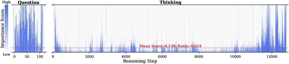
### Visual Description
## Line Chart: Question vs. Thinking Importance Scores
### Overview
The image presents a line chart comparing the "Importance Score" during a "Question" phase and a "Thinking" phase, plotted against "Reasoning Step". The "Question" phase is represented as a dense cluster of data points on the left, while the "Thinking" phase spans a larger range of reasoning steps. A horizontal dotted line indicates the mean score and ratio for the "Thinking" phase.
### Components/Axes
* **Title:** Thinking
* **Y-axis Label:** Importance Score
* Scale: "High" at the top, transitioning to "Low" at the bottom. The color gradient goes from dark blue to light blue.
* **X-axis Label:** Reasoning Step
* Scale: Ranges from 0 to approximately 12000 in increments of 2000.
* **Left-side Plot:** Question
* X-axis: 0 to 100
* **Horizontal Line (Thinking Phase):** Red dotted line indicating "Mean Score: 0.138; Ratio: 0.224"
### Detailed Analysis
**1. Question Phase (Left Side):**
* The data points are clustered between Reasoning Steps 0 and 100.
* The Importance Score fluctuates rapidly, reaching high values frequently.
* The overall trend is a high variance in importance scores within a small range of reasoning steps.
**2. Thinking Phase (Right Side):**
* The data spans Reasoning Steps from approximately 0 to 12000.
* The Importance Score generally remains low, with occasional spikes.
* The red dotted line represents the mean score of 0.138 and a ratio of 0.224.
* There appear to be clusters of higher importance scores near the end of the "Thinking" phase (around Reasoning Step 12000).
### Key Observations
* The "Question" phase exhibits significantly higher and more frequent peaks in Importance Score compared to the "Thinking" phase.
* The "Thinking" phase is characterized by a relatively low Importance Score, with occasional spikes indicating moments of higher importance.
* The mean score and ratio provide a quantitative measure of the average importance during the "Thinking" phase.
### Interpretation
The chart suggests that the "Question" phase involves a more intense and variable assessment of importance compared to the "Thinking" phase. The "Thinking" phase, while spanning a larger range of reasoning steps, generally maintains a lower level of importance, with occasional bursts of higher importance. The mean score and ratio provide a baseline for understanding the average importance during the "Thinking" phase. The clusters of higher importance scores near the end of the "Thinking" phase could indicate a final evaluation or decision-making process.
</details>
<details>
<summary>x25.png Details</summary>
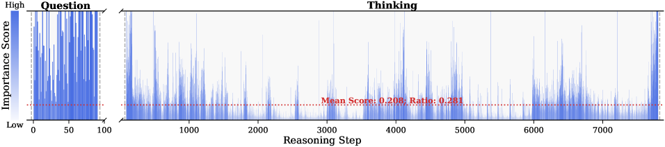
### Visual Description
## Chart Type: Importance Score vs. Reasoning Step
### Overview
The image presents two adjacent charts visualizing importance scores. The left chart, labeled "Question," displays the distribution of importance scores for a question. The right chart, labeled "Thinking," shows the importance score across reasoning steps. Both charts use a blue color gradient to represent the importance score, with higher scores indicated by a darker shade of blue. A red dotted line indicates the mean score and ratio for the "Thinking" chart.
### Components/Axes
* **Left Chart (Question):**
* **Title:** Question
* **Y-axis:** Importance Score (gradient from Low to High)
* **X-axis:** Implicitly represents the question components, ranging from 0 to 100.
* **Right Chart (Thinking):**
* **Title:** Thinking
* **Y-axis:** Importance Score (same gradient as the left chart)
* **X-axis:** Reasoning Step, ranging from 0 to approximately 7500.
* **Mean Score Line:** A red dotted line across the "Thinking" chart, labeled "Mean Score: 0.208; Ratio: 0.281".
* **Color Gradient Legend:** Located on the left side of the "Question" chart, indicating the mapping of color to importance score (Low to High).
### Detailed Analysis
* **Question Chart:**
* The importance scores are widely distributed, with many instances reaching the "High" end of the scale.
* The distribution appears relatively uniform across the question components (0-100).
* **Thinking Chart:**
* The importance scores fluctuate significantly across the reasoning steps.
* There are several peaks where the importance score reaches high values.
* The density of high importance scores seems to decrease as the reasoning step increases.
* The mean score line is at 0.208, with a ratio of 0.281.
* The importance scores are generally below 0.6.
* The highest importance scores are observed in the early reasoning steps (0-1000).
* There are some spikes in importance score around reasoning steps 3500, 4200, 5800, and 7300.
### Key Observations
* The "Question" chart shows a high degree of importance across all question components.
* The "Thinking" chart reveals that the importance score varies significantly during the reasoning process, with a general decreasing trend as the reasoning step increases.
* The mean score and ratio provide a quantitative measure of the overall importance score during the reasoning process.
### Interpretation
The charts suggest that while the initial question components are considered highly important, the importance of individual steps in the reasoning process fluctuates. The decreasing trend in importance score over reasoning steps could indicate that later steps are considered less critical or that the model is losing focus as it progresses. The mean score and ratio provide a baseline for evaluating the importance of individual reasoning steps. The spikes in importance score at specific reasoning steps might indicate key decision points or critical sub-tasks within the reasoning process. The difference in distribution between the "Question" and "Thinking" charts highlights the dynamic nature of importance during the reasoning process compared to the static importance of the initial question.
</details>
<details>
<summary>x26.png Details</summary>
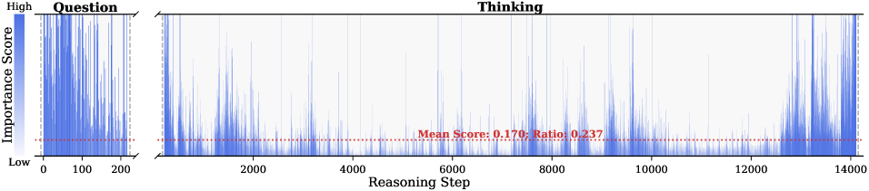
### Visual Description
## Chart: Importance Score vs. Reasoning Step for Question and Thinking
### Overview
The image presents a chart comparing the "Importance Score" against the "Reasoning Step" for two phases: "Question" and "Thinking". The chart uses a series of vertical lines to represent the importance score at each reasoning step. A color gradient indicates the importance score, ranging from low (light blue) to high (dark blue). A horizontal dotted red line indicates the mean score and ratio for the "Thinking" phase.
### Components/Axes
* **Title:** "Thinking"
* **X-axis:** "Reasoning Step" (ranging from 0 to 14000)
* **Y-axis:** "Importance Score" (ranging from Low to High)
* **Left Subplot Title:** "Question"
* **Left Subplot X-axis:** Reasoning Step (ranging from 0 to 200)
* **Color Gradient:** Blue, indicating Importance Score (Low to High)
* **Horizontal Red Dotted Line:** Represents the "Mean Score: 0.170; Ratio: 0.237" for the "Thinking" phase.
### Detailed Analysis
**1. Question Phase (Left Subplot):**
* The "Question" phase spans reasoning steps from 0 to 200.
* The importance scores are generally high, with many lines reaching the "High" end of the Importance Score axis.
* The density of lines is greater in the "Question" phase compared to the "Thinking" phase.
* The importance scores appear to decrease slightly as the reasoning step increases from 0 to 200.
**2. Thinking Phase (Main Chart):**
* The "Thinking" phase spans reasoning steps from 0 to 14000.
* The importance scores fluctuate significantly throughout the reasoning steps.
* There are several peaks where the importance scores reach high values, interspersed with periods of lower scores.
* The "Mean Score" is indicated by a horizontal red dotted line at approximately 0.170.
* The "Ratio" is given as 0.237.
**3. Data Points and Trends:**
* **Question Phase:** High initial importance scores that gradually decrease.
* **Thinking Phase:** Fluctuating importance scores with peaks at approximately reasoning steps: 1000, 3000, 5000, 7000, 9000, 11000, 13000.
* The mean score for the "Thinking" phase is 0.170, and the ratio is 0.237.
### Key Observations
* The "Question" phase has a higher overall importance score compared to the "Thinking" phase.
* The "Thinking" phase exhibits cyclical patterns with peaks in importance scores occurring roughly every 2000 reasoning steps.
* The mean score and ratio provide a quantitative measure of the average importance and its distribution during the "Thinking" phase.
### Interpretation
The chart illustrates the dynamics of importance scores during the "Question" and "Thinking" phases of a reasoning process. The high initial importance scores in the "Question" phase suggest that the initial problem formulation or information gathering is considered highly important. The fluctuating importance scores in the "Thinking" phase indicate that the relevance of different reasoning steps varies throughout the problem-solving process. The cyclical peaks in the "Thinking" phase could represent iterative cycles of analysis, hypothesis generation, and evaluation. The mean score and ratio provide a baseline for understanding the overall importance and variability of the reasoning steps in the "Thinking" phase. The difference in importance score between the "Question" and "Thinking" phases suggests a shift in focus from initial information to the reasoning process itself.
</details>
<details>
<summary>x27.png Details</summary>
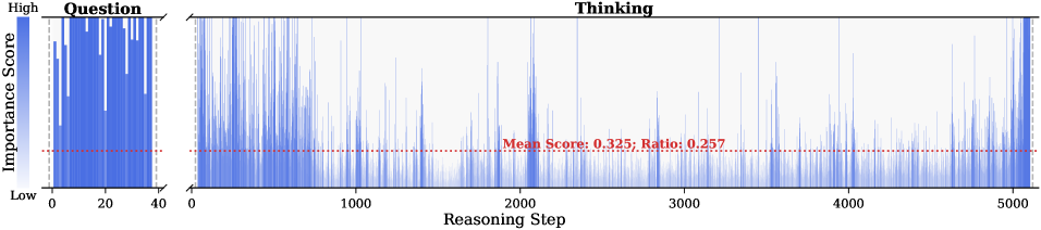
### Visual Description
## Chart: Question vs. Thinking Importance Score
### Overview
The image presents two bar charts showing the importance score for "Question" and "Thinking" across a series of reasoning steps. The "Question" chart displays the importance score for the initial question, while the "Thinking" chart shows the importance score for each reasoning step. A horizontal dotted line indicates the mean score and ratio for the "Thinking" chart.
### Components/Axes
* **Left Chart:**
* Title: "Question"
* Y-axis: "Importance Score" with a gradient from "Low" to "High"
* X-axis: Numerical values from 0 to 40, incrementing by 20.
* **Right Chart:**
* Title: "Thinking"
* X-axis: "Reasoning Step" with values from 0 to 5000, incrementing by 1000.
* Y-axis: Implied "Importance Score" (same as the left chart).
* **Horizontal Line (Thinking Chart):**
* Represents the mean score and ratio.
* Label: "Mean Score: 0.325; Ratio: 0.257"
### Detailed Analysis
* **Question Chart:**
* The bars are generally high, indicating a high importance score for the question.
* The importance score appears to fluctuate between approximately 0.6 and 1.0.
* **Thinking Chart:**
* The bars are generally lower than those in the "Question" chart, indicating a lower importance score for the reasoning steps.
* The importance score fluctuates significantly across the reasoning steps.
* The mean score is 0.325, and the ratio is 0.257, as indicated by the horizontal line.
* The importance score appears to increase towards the end of the reasoning steps (around 4000-5000).
### Key Observations
* The "Question" has a consistently high importance score.
* The "Thinking" process has a variable importance score, with a lower average compared to the "Question".
* There is a potential increase in importance score towards the end of the "Thinking" process.
### Interpretation
The data suggests that the initial question is considered highly important, while the individual reasoning steps vary in importance. The lower average importance score for the "Thinking" process could indicate that some reasoning steps are less relevant or contribute less to the overall solution. The increase in importance score towards the end of the "Thinking" process might suggest that the final reasoning steps are crucial for reaching a conclusion. The ratio of 0.257, in relation to the mean score of 0.325, could represent a measure of the variability or efficiency of the reasoning process. Further context is needed to fully understand the meaning of the ratio.
</details>
<details>
<summary>x28.png Details</summary>
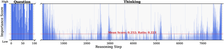
### Visual Description
## Chart: Importance Score vs. Reasoning Step
### Overview
The image presents a chart showing the "Importance Score" over "Reasoning Step" for two phases: "Question" and "Thinking". The "Question" phase is represented as a vertical bar chart, while the "Thinking" phase is represented as a line chart. A horizontal dotted line indicates the mean score and ratio for the "Thinking" phase.
### Components/Axes
* **Y-axis (Vertical):** "Importance Score" ranging from "Low" to "High". The color gradient from low to high is a light blue to a darker blue.
* **X-axis (Horizontal):** "Reasoning Step" ranging from 0 to approximately 7500.
* **Title:** "Thinking" is the title for the main chart.
* **Left-side Chart Title:** "Question" is the title for the left-side chart.
* **Horizontal Dotted Line:** Represents "Mean Score: 0.252; Ratio: 0.223" for the "Thinking" phase.
### Detailed Analysis
**1. Question Phase (Left-side Chart):**
* The x-axis ranges from 0 to 100.
* The "Importance Score" fluctuates significantly across the "Reasoning Step" in the "Question" phase.
* Many data points reach the "High" level of "Importance Score".
* The mean score line is present in this chart as well.
**2. Thinking Phase (Main Chart):**
* The x-axis ranges from 0 to approximately 7500.
* The "Importance Score" generally decreases after the initial steps and then fluctuates with several peaks.
* The "Importance Score" appears to increase towards the end of the "Reasoning Step".
* The horizontal dotted line representing the "Mean Score: 0.252; Ratio: 0.223" is positioned approximately at a score of 0.25 on the y-axis.
### Key Observations
* The "Question" phase shows a high degree of importance score throughout the reasoning steps.
* The "Thinking" phase starts with high importance scores, which then decrease and fluctuate around the mean score.
* There are spikes in the "Importance Score" at various points in the "Thinking" phase.
### Interpretation
The chart compares the "Importance Score" during the "Question" and "Thinking" phases of a reasoning process. The "Question" phase is characterized by consistently high importance scores, suggesting that the initial questioning or problem definition stage is considered highly important. The "Thinking" phase shows a more dynamic pattern, with an initial decrease in importance followed by fluctuations. The mean score and ratio provide a baseline for understanding the average importance during the "Thinking" phase. The spikes in the "Thinking" phase could represent key moments or insights during the reasoning process. The increase in "Importance Score" towards the end of the "Thinking" phase might indicate a final push or realization.
</details>
Figure 10: Visualization of token importance scores for question and thinking tokens within DeepSeek-R1-Distill-Llama-8B reasoning traces across six samples from AIME24, AIME25, AMC23, GPQA-D, GAOKAO2023EN, and MATH500.
<details>
<summary>x29.png Details</summary>
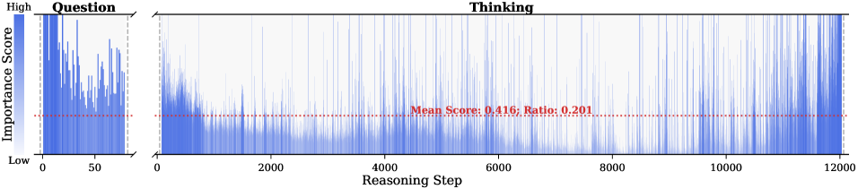
### Visual Description
## Chart: Importance Score vs. Reasoning Step
### Overview
The image presents a chart that visualizes the importance score during a reasoning process. The chart is divided into two sections: "Question" and "Thinking." The "Question" section shows the importance score for the initial question, while the "Thinking" section displays the importance score over the reasoning steps. The chart includes a horizontal line indicating the mean score and ratio.
### Components/Axes
* **Title:** Thinking
* **X-axis (Reasoning Step):** Ranges from 0 to 12000, with tick marks at 0, 2000, 4000, 6000, 8000, 10000, and 12000.
* **Y-axis (Importance Score):** Labeled "Importance Score" and ranges from "Low" to "High." A color gradient from light to dark blue indicates the score, with darker blue representing higher importance.
* **Question Section:** A separate section on the left showing the importance score for the initial question. The x-axis ranges from 0 to 50.
* **Mean Score Line:** A horizontal dashed red line indicating the mean score. The value is labeled as "Mean Score: 0.416; Ratio: 0.201".
### Detailed Analysis
* **Question Section:** The importance scores in the "Question" section are generally high, with significant variation. The scores range from approximately 0.2 to 0.9.
* **Thinking Section:**
* The importance scores in the "Thinking" section start high and decrease rapidly in the initial steps (0-2000).
* From step 2000 to 8000, the importance scores fluctuate but remain relatively low, with most values below 0.5.
* From step 8000 to 12000, the importance scores increase again, showing more frequent peaks.
* The mean score line is at approximately 0.4.
* **Data Representation:** The importance scores are represented by vertical blue lines. The height of each line corresponds to the importance score at that reasoning step.
### Key Observations
* The importance score is high for the initial question and decreases significantly during the initial reasoning steps.
* The importance score fluctuates during the reasoning process, with a general trend of increasing towards the end.
* The mean score provides a baseline for evaluating the importance scores at different reasoning steps.
### Interpretation
The chart suggests that the initial question holds high importance, but as the reasoning process progresses, the importance of individual steps decreases. The increase in importance scores towards the end of the reasoning process may indicate that the later steps are crucial for reaching a conclusion or solution. The mean score serves as a reference point to assess the relative importance of different reasoning steps. The ratio of 0.201 is not clearly defined in the image, but it likely relates to the proportion of steps with high importance scores relative to the total number of steps.
</details>
<details>
<summary>x30.png Details</summary>
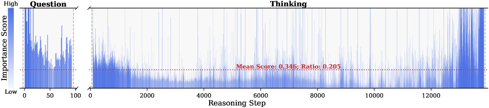
### Visual Description
## Chart: Importance Score vs. Reasoning Step
### Overview
The image presents a chart illustrating the importance score over the reasoning step. The chart is divided into two sections: "Question" and "Thinking." The y-axis represents the importance score, ranging from low to high, and the x-axis represents the reasoning step. A red dotted line indicates the mean score and ratio for the "Thinking" section.
### Components/Axes
* **Title:** Thinking
* **X-axis:** Reasoning Step, ranging from 0 to approximately 13000.
* **Y-axis:** Importance Score, ranging from Low to High. A gradient bar on the left shows the color mapping, with darker blue indicating higher importance.
* **Sections:** The chart is divided into two sections: "Question" (from 0 to 100 on the x-axis) and "Thinking" (from 0 to approximately 13000 on the x-axis).
* **Mean Score Line:** A red dotted line across the "Thinking" section indicates the mean score and ratio. The text "Mean Score: 0.346; Ratio: 0.205" is displayed near the line.
### Detailed Analysis
* **Question Section:** The importance score fluctuates significantly within the "Question" section, with several peaks and valleys. The scores generally appear higher in this section compared to the "Thinking" section.
* **Thinking Section:** The importance score in the "Thinking" section starts high and then decreases rapidly before stabilizing at a lower level. There are still fluctuations, but the magnitude is smaller than in the "Question" section. The importance score increases towards the end of the "Thinking" section.
* **Mean Score:** The red dotted line representing the mean score is at approximately 0.346. The ratio is 0.205.
### Key Observations
* The "Question" section shows higher and more volatile importance scores compared to the "Thinking" section.
* The importance score decreases significantly at the beginning of the "Thinking" section.
* The importance score increases towards the end of the "Thinking" section.
* The mean score in the "Thinking" section is 0.346, and the ratio is 0.205.
### Interpretation
The chart suggests that the initial "Question" phase involves more critical and variable reasoning steps, indicated by the higher and fluctuating importance scores. As the process transitions into the "Thinking" phase, the importance of individual reasoning steps decreases and stabilizes, as shown by the lower and less volatile scores. The increase in importance score towards the end of the "Thinking" section might indicate a final stage of critical reasoning or decision-making. The mean score and ratio provide a quantitative measure of the average importance and its proportion within the "Thinking" phase.
</details>
<details>
<summary>x31.png Details</summary>
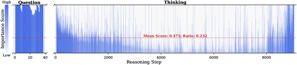
### Visual Description
## Chart: Importance Score vs. Reasoning Step
### Overview
The image presents two charts side-by-side. The left chart, labeled "Question," displays the distribution of importance scores. The right chart, labeled "Thinking," shows the importance score at each reasoning step. A horizontal dotted line indicates the mean score and ratio for the "Thinking" chart.
### Components/Axes
**Left Chart ("Question"):**
* **Title:** Question
* **Y-axis:** Importance Score, ranging from "Low" at the bottom to "High" at the top.
* **X-axis:** Ranges from 0 to 40.
**Right Chart ("Thinking"):**
* **Title:** Thinking
* **Y-axis:** Implicitly Importance Score, ranging from low to high.
* **X-axis:** Reasoning Step, ranging from 0 to 9000.
* **Horizontal Line:** Represents "Mean Score: 0.475; Ratio: 0.232"
### Detailed Analysis
**Left Chart ("Question"):**
* The data is represented as vertical bars.
* The distribution appears to be bimodal, with peaks around x=10 and x=30.
* The importance scores are generally high, with most bars reaching near the "High" level on the y-axis.
**Right Chart ("Thinking"):**
* The data is represented as vertical lines.
* The importance score fluctuates significantly across the reasoning steps.
* The density of lines is higher at the beginning and end of the reasoning process.
* The mean score is 0.475, and the ratio is 0.232, as indicated by the horizontal line.
* The importance scores appear to decrease from step 0 to approximately step 2000, then fluctuate around the mean. There is an increase in importance score from step 8000 to 9000.
### Key Observations
* The "Question" chart shows a relatively high importance score for the initial question.
* The "Thinking" chart shows a fluctuating importance score during the reasoning process, with a general decrease in importance score from step 0 to approximately step 2000.
* The mean score and ratio provide a baseline for understanding the overall importance score during the reasoning process.
### Interpretation
The charts suggest that the initial question is considered important, and the importance score fluctuates during the reasoning process. The decrease in importance score from step 0 to approximately step 2000 may indicate that the model is exploring different avenues of reasoning, some of which are less relevant to the initial question. The fluctuations around the mean score suggest that the model is constantly re-evaluating the importance of different reasoning steps. The increase in importance score from step 8000 to 9000 may indicate that the model is converging on a solution. The mean score and ratio provide a quantitative measure of the overall importance score during the reasoning process.
</details>
<details>
<summary>x32.png Details</summary>
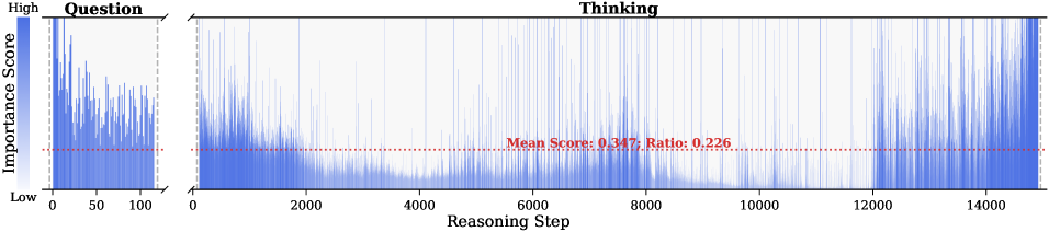
### Visual Description
## Bar Chart: Question vs. Thinking Importance Scores
### Overview
The image presents two bar charts showing "Importance Score" distributions. The left chart, labeled "Question," displays the distribution of importance scores for a question. The right chart, labeled "Thinking," shows the distribution of importance scores over a series of "Reasoning Steps." A color gradient indicates the importance score, ranging from low (light blue) to high (dark blue). A red dotted line indicates the mean score and ratio for the "Thinking" chart.
### Components/Axes
**Left Chart ("Question"):**
* **Title:** Question
* **Y-axis:** Importance Score, ranging from Low to High (indicated by a color gradient from light blue to dark blue).
* **X-axis:** Values ranging from 0 to 100.
**Right Chart ("Thinking"):**
* **Title:** Thinking
* **Y-axis:** Importance Score (same color gradient as the left chart).
* **X-axis:** Reasoning Step, ranging from 0 to 14000.
* **Mean Score and Ratio:** "Mean Score: 0.347; Ratio: 0.226" (indicated by a red dotted line).
### Detailed Analysis
**Left Chart ("Question"):**
* The bars are concentrated between 0 and 100 on the x-axis.
* The importance scores vary, with some bars reaching the "High" end of the color gradient.
* The distribution appears somewhat uniform, with no clear peaks or patterns.
**Right Chart ("Thinking"):**
* The x-axis represents the "Reasoning Step," ranging from 0 to 14000.
* The importance scores (y-axis) fluctuate significantly over the reasoning steps.
* **Trend:** The importance scores are generally higher at the beginning and end of the reasoning process, with a dip in the middle.
* From 0 to approximately 4000, the scores are relatively high, with many bars reaching the upper range of the color gradient.
* From 4000 to approximately 12000, the scores are generally lower, with fewer bars reaching the upper range.
* From 12000 to 14000, the scores increase again, approaching the levels seen at the beginning.
* The red dotted line represents the "Mean Score: 0.347; Ratio: 0.226." This line appears to be positioned around the 0.347 level on the y-axis (Importance Score).
### Key Observations
* The "Thinking" chart shows a clear trend of higher importance scores at the beginning and end of the reasoning process, with a dip in the middle.
* The "Question" chart shows a more uniform distribution of importance scores.
* The mean score and ratio for the "Thinking" chart are indicated by a red dotted line, providing a reference point for the overall importance score.
### Interpretation
The data suggests that, during the "Thinking" process, the importance of each step varies significantly. The higher importance scores at the beginning and end might indicate that the initial setup and final conclusion steps are considered more critical than the intermediate steps. The dip in importance scores in the middle could represent a phase of routine processing or less critical analysis. The "Question" chart, with its more uniform distribution, might represent the initial importance assigned to different aspects of the question itself, before the reasoning process begins. The mean score and ratio provide a quantitative measure of the overall importance during the "Thinking" process.
</details>
<details>
<summary>x33.png Details</summary>
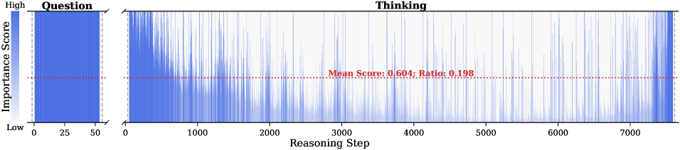
### Visual Description
## Line Chart: Question Importance Score vs. Reasoning Step
### Overview
The image presents a line chart that visualizes the importance score of a question during a reasoning process. The chart is divided into two sections: a vertical bar on the left representing the initial question importance, and a larger section on the right showing how the importance score changes over reasoning steps.
### Components/Axes
* **Title:** "Thinking" (located at the top-center of the chart)
* **Left Section:**
* **Title:** "Question" (located at the top-left of the chart)
* **Y-axis Label:** "Importance Score" (vertical, rotated 90 degrees counter-clockwise)
* **Y-axis Scale:** "High" (at the top), "Low" (at the bottom)
* **X-axis Markers:** 0, 25, 50
* **Right Section:**
* **X-axis Label:** "Reasoning Step"
* **X-axis Markers:** 0, 1000, 2000, 3000, 4000, 5000, 6000, 7000
* **Data Series:** Multiple overlapping blue lines representing the importance score at each reasoning step.
* **Horizontal Dotted Red Line:** Indicates the "Mean Score: 0.604; Ratio: 0.198"
### Detailed Analysis
* **Question Importance (Left Section):**
* The vertical bar representing the initial question importance is filled with blue lines.
* The density of the blue lines suggests a high initial importance score, concentrated near the "High" end of the "Importance Score" axis.
* The lines span from approximately 0 to 50 on the x-axis.
* **Importance Score over Reasoning Steps (Right Section):**
* The blue lines show the fluctuation of the importance score over the reasoning steps.
* **Trend:** The lines generally decrease in density as the reasoning step increases, indicating a decreasing importance score over time.
* The lines start with a high density at the beginning (Reasoning Step 0) and gradually spread out and decrease in density as the reasoning step increases.
* The horizontal red dotted line represents the mean score (0.604) and ratio (0.198).
### Key Observations
* The initial question importance is high.
* The importance score tends to decrease as the reasoning process progresses.
* There is significant variability in the importance score at each reasoning step, as indicated by the spread of the blue lines.
* The mean score provides a reference point for the average importance score throughout the reasoning process.
### Interpretation
The chart suggests that the initial question is considered highly important at the beginning of the reasoning process. However, as the reasoning progresses, the importance of the initial question tends to decrease. This could indicate that the reasoning process is exploring different aspects or sub-questions, leading to a shift in focus away from the initial question. The variability in the importance score at each step suggests that the reasoning process is not linear and involves revisiting or re-evaluating the importance of the initial question at different stages. The mean score and ratio provide a quantitative measure of the overall importance of the question throughout the reasoning process.
</details>
<details>
<summary>x34.png Details</summary>
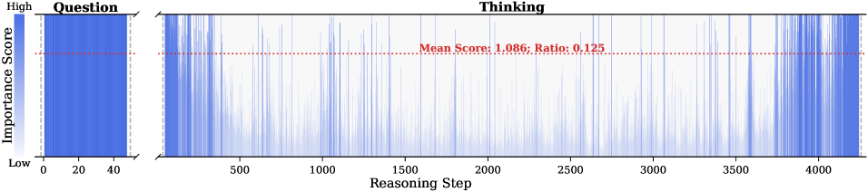
### Visual Description
## Chart: Question Importance Score vs. Reasoning Step
### Overview
The image presents two charts side-by-side. The left chart, labeled "Question," displays a dense vertical distribution of blue lines, representing the importance score. The right chart, labeled "Thinking," shows the importance score fluctuating across reasoning steps. A red dotted line indicates the mean score and ratio in the "Thinking" chart.
### Components/Axes
* **Left Chart (Question):**
* **Title:** Question
* **Y-axis:** Importance Score, ranging from "Low" at the bottom to "High" at the top.
* **X-axis:** No explicit label, but the scale ranges from 0 to 40.
* **Right Chart (Thinking):**
* **Title:** Thinking
* **Y-axis:** Implicitly Importance Score, similar to the left chart.
* **X-axis:** Reasoning Step, ranging from 0 to 4000.
* **Red Dotted Line:** Represents "Mean Score: 1.086; Ratio: 0.125".
### Detailed Analysis
* **Left Chart (Question):**
* The blue lines are densely packed, indicating a high concentration of importance scores across the range.
* The distribution appears relatively uniform, with no clear peaks or valleys.
* The importance score ranges from approximately 0 to the maximum value.
* **Right Chart (Thinking):**
* The blue lines fluctuate significantly across the reasoning steps, indicating varying importance scores.
* The density of the lines appears higher at the beginning and end of the reasoning steps, suggesting higher importance scores in those regions.
* The red dotted line representing the mean score is positioned at approximately 1.086 on the implicit y-axis.
* The importance score ranges from approximately 0 to the maximum value.
### Key Observations
* The "Question" chart shows a general distribution of importance scores, while the "Thinking" chart shows how the importance score changes during the reasoning process.
* The mean score in the "Thinking" chart is relatively low compared to the potential range of the importance score.
* The "Thinking" chart exhibits more variability than the "Question" chart.
### Interpretation
The data suggests that the importance score of the question varies significantly during the reasoning process. The higher density of lines at the beginning and end of the "Thinking" chart might indicate that the question is initially and finally considered more important than during the intermediate reasoning steps. The relatively low mean score suggests that, on average, the question's importance is not consistently high throughout the reasoning process. The "Question" chart provides a baseline distribution of importance scores, while the "Thinking" chart shows the dynamic changes in importance during reasoning. The ratio of 0.125 is not clearly defined in the context of the image, but it likely relates to the distribution or characteristics of the importance scores.
</details>
Figure 11: Visualization of token importance scores for question and thinking tokens within DeepSeek-R1-Distill-Qwen-7B reasoning traces across six samples from AIME24, AIME25, AMC23, GPQA-D, GAOKAO2023EN, and MATH500.
B.3 Additional Results
<details>
<summary>x35.png Details</summary>
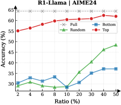
### Visual Description
## Line Chart: R1-Llama | AIME24
### Overview
The image is a line chart comparing the accuracy of different models (Full, Random, Bottom, Top) at various ratios. The x-axis represents the ratio in percentage, and the y-axis represents the accuracy in percentage.
### Components/Axes
* **Title:** R1-Llama | AIME24
* **X-axis:** Ratio (%) - with markers at 2, 4, 6, 8, 10, 20, 30, 40, 50
* **Y-axis:** Accuracy (%) - with markers at 30, 35, 40, 45, 50, 55, 60, 65
* **Legend:** Located in the top-right corner of the chart.
* Full (Gray dashed line with x markers)
* Random (Green line with triangle markers)
* Bottom (Blue line with square markers)
* Top (Red line with circle markers)
### Detailed Analysis
* **Full (Gray dashed line with x markers):** The accuracy remains relatively constant at approximately 64% across all ratios.
* Ratio 2%: ~64%
* Ratio 50%: ~64%
* **Random (Green line with triangle markers):** The accuracy starts around 32%, decreases slightly, then increases significantly as the ratio increases.
* Ratio 2%: ~32%
* Ratio 8%: ~28%
* Ratio 50%: ~49%
* **Bottom (Blue line with square markers):** The accuracy fluctuates between 30% and 38% across all ratios.
* Ratio 2%: ~30%
* Ratio 10%: ~29%
* Ratio 40%: ~37%
* Ratio 50%: ~37%
* **Top (Red line with circle markers):** The accuracy starts at 55% and gradually increases to approximately 62% as the ratio increases.
* Ratio 2%: ~55%
* Ratio 10%: ~60%
* Ratio 50%: ~62%
### Key Observations
* The "Full" model consistently maintains the highest accuracy across all ratios.
* The "Top" model shows a gradual increase in accuracy as the ratio increases.
* The "Random" model exhibits the most significant improvement in accuracy as the ratio increases.
* The "Bottom" model has the lowest and most stable accuracy across all ratios.
### Interpretation
The chart compares the performance of different models (Full, Random, Bottom, Top) based on accuracy at varying ratios. The "Full" model, likely representing the complete dataset or a baseline model, consistently outperforms the other models. The "Top" model shows a steady improvement, suggesting that focusing on the top-ranked data points enhances accuracy. The "Random" model's significant increase in accuracy with higher ratios indicates that random sampling becomes more effective as the dataset expands. The "Bottom" model's low and stable accuracy suggests that focusing on the bottom-ranked data points does not contribute significantly to overall accuracy. The data suggests that strategic selection of data points (e.g., "Top") can improve model performance compared to random selection or focusing on less relevant data points ("Bottom").
</details>
<details>
<summary>x36.png Details</summary>
### Visual Description
## Chart: R1-Llama Accuracy vs. Ratio
### Overview
The image is a line chart comparing the accuracy of R1-Llama models (Full, Random, Bottom, and Top) against varying ratios, likely representing a data sampling or selection strategy. The x-axis represents the ratio in percentage, and the y-axis represents the accuracy in percentage.
### Components/Axes
* **Title:** R1-Llama | AIME25
* **X-axis:** Ratio (%)
* Values: 2, 4, 6, 8, 10, 20, 30, 40, 50
* **Y-axis:** Accuracy (%)
* Values: 30.0, 32.5, 35.0, 37.5, 40.0, 42.5, 45.0, 47.5, 50.0
* **Legend:** Located in the top-right corner.
* Full (gray dashed line with 'x' markers)
* Random (green line with triangle markers)
* Bottom (blue line with square markers)
* Top (red line with circle markers)
### Detailed Analysis
* **Full:** The gray dashed line with 'x' markers remains relatively constant at approximately 49% accuracy across all ratios.
* Ratio 2%: ~49%
* Ratio 50%: ~49%
* **Random:** The green line with triangle markers shows a decreasing trend from 2% to 8%, then increases significantly from 20% to 40%.
* Ratio 2%: ~33%
* Ratio 8%: ~31%
* Ratio 40%: ~40%
* Ratio 50%: ~38%
* **Bottom:** The blue line with square markers shows a slight increasing trend from 2% to 8%, then remains relatively stable until 30%, followed by a slight increase to 50%.
* Ratio 2%: ~34%
* Ratio 8%: ~36%
* Ratio 30%: ~37%
* Ratio 50%: ~39%
* **Top:** The red line with circle markers shows an increasing trend from 2% to 6%, then remains relatively stable with minor fluctuations.
* Ratio 2%: ~44%
* Ratio 6%: ~48%
* Ratio 50%: ~49%
### Key Observations
* The "Full" model consistently achieves the highest accuracy across all ratios.
* The "Top" model starts with a lower accuracy than "Full" but quickly approaches its performance.
* The "Random" model has the lowest accuracy, with significant fluctuations based on the ratio.
* The "Bottom" model's accuracy is consistently higher than the "Random" model but lower than the "Top" model.
### Interpretation
The chart illustrates the impact of different data selection strategies (Full, Random, Bottom, Top) on the accuracy of the R1-Llama model. The "Full" model, which presumably uses the entire dataset, provides the best and most stable performance. The "Top" model, which likely prioritizes certain data points, quickly approaches the "Full" model's accuracy. The "Random" model's performance is the most variable, suggesting that random sampling is not an effective strategy for this model. The "Bottom" model, which may prioritize less important data points, performs better than the "Random" model but not as well as the "Top" model. The data suggests that strategic data selection can significantly impact model accuracy, and using the full dataset or prioritizing certain data points leads to better performance.
</details>
<details>
<summary>x37.png Details</summary>
### Visual Description
## Line Chart: R1-Llama | AMC23
### Overview
The image is a line chart comparing the accuracy of different methods ("Full", "Random", "Bottom", "Top") across varying ratios. The chart displays accuracy (in percentage) on the y-axis and ratio (in percentage) on the x-axis.
### Components/Axes
* **Title:** R1-Llama | AMC23
* **X-axis:** Ratio (%) with markers at 2, 4, 6, 8, 10, 20, 30, 40, 50
* **Y-axis:** Accuracy (%) with markers at 65, 70, 75, 80, 85, 90, 95
* **Legend:** Located in the top-center of the chart.
* Full (Gray dashed line with 'x' markers)
* Random (Green line with triangle markers)
* Bottom (Blue line with square markers)
* Top (Red line with circle markers)
### Detailed Analysis
* **Full (Gray dashed line with 'x' markers):** The accuracy remains relatively constant at approximately 96% across all ratios.
* Ratio 2%: ~96%
* Ratio 50%: ~96%
* **Random (Green line with triangle markers):** The accuracy generally increases with the ratio.
* Ratio 2%: ~63%
* Ratio 6%: ~63%
* Ratio 10%: ~68%
* Ratio 20%: ~70%
* Ratio 30%: ~75%
* Ratio 50%: ~85%
* **Bottom (Blue line with square markers):** The accuracy generally increases with the ratio, with some fluctuations.
* Ratio 2%: ~66%
* Ratio 6%: ~63%
* Ratio 10%: ~65%
* Ratio 20%: ~70%
* Ratio 30%: ~73%
* Ratio 50%: ~80%
* **Top (Red line with circle markers):** The accuracy starts high and remains relatively high, with some fluctuations.
* Ratio 2%: ~88%
* Ratio 6%: ~93%
* Ratio 10%: ~92%
* Ratio 20%: ~93%
* Ratio 30%: ~95%
* Ratio 50%: ~96%
### Key Observations
* The "Full" method consistently achieves the highest accuracy across all ratios.
* The "Random" method shows the most significant improvement in accuracy as the ratio increases.
* The "Top" method starts with high accuracy and maintains it across different ratios.
* The "Bottom" method shows a gradual increase in accuracy as the ratio increases.
### Interpretation
The chart compares the performance of different methods (Full, Random, Bottom, Top) in terms of accuracy at various ratios. The "Full" method, represented by the gray dashed line, consistently achieves the highest accuracy, suggesting it is the most reliable approach across different ratios. The "Random" method, represented by the green line, shows a notable improvement in accuracy as the ratio increases, indicating that its performance is more sensitive to the ratio. The "Top" method, represented by the red line, starts with high accuracy and maintains it across different ratios, suggesting it is a robust approach. The "Bottom" method, represented by the blue line, shows a gradual increase in accuracy as the ratio increases, indicating that its performance is also influenced by the ratio. Overall, the chart provides insights into the effectiveness of different methods at various ratios, with the "Full" method being the most consistent and accurate.
</details>
<details>
<summary>x38.png Details</summary>
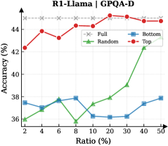
### Visual Description
## Chart: R1-Llama | GPQA-D Accuracy vs Ratio
### Overview
The image is a line chart comparing the accuracy (%) of different data selection methods (Full, Random, Bottom, Top) against the ratio (%) of data used. The chart shows how accuracy changes as the ratio of data increases for each method.
### Components/Axes
* **Title:** R1-Llama | GPQA-D
* **X-axis:** Ratio (%) - with markers at 2, 4, 6, 8, 10, 20, 30, 40, 50
* **Y-axis:** Accuracy (%) - with no explicit markers, but the range appears to be from approximately 35% to 45%.
* **Legend:** Located in the top-right corner.
* Full (gray dashed line with 'x' markers)
* Random (green line with triangle markers)
* Bottom (blue line with square markers)
* Top (red line with circle markers)
### Detailed Analysis
* **Full:** The gray dashed line representing "Full" data usage remains relatively constant at approximately 45% accuracy across all ratios.
* **Random:** The green line representing "Random" data usage starts at approximately 36% at a ratio of 2%, decreases to approximately 35.8% at a ratio of 8%, and then increases significantly to approximately 42.4% at a ratio of 40%.
* **Bottom:** The blue line representing "Bottom" data usage starts at approximately 37.5% at a ratio of 2%, decreases to approximately 37% at a ratio of 4%, increases to approximately 37.8% at a ratio of 6%, decreases to approximately 36.2% at a ratio of 10%, and then increases to approximately 37.4% at a ratio of 40%.
* **Top:** The red line representing "Top" data usage starts at approximately 42.4% at a ratio of 2%, increases to approximately 43.9% at a ratio of 4%, decreases to approximately 43.3% at a ratio of 6%, increases to approximately 44.4% at a ratio of 8%, and then remains relatively constant at approximately 44.7% at a ratio of 20%.
### Key Observations
* The "Full" data usage consistently provides the highest accuracy across all ratios.
* The "Top" data usage generally performs better than "Random" and "Bottom" data usage.
* The "Random" data usage shows a significant increase in accuracy as the ratio increases, particularly after a ratio of 10%.
* The "Bottom" data usage has the lowest accuracy among the three data selection methods.
### Interpretation
The chart suggests that using the full dataset ("Full") is the most effective approach for achieving high accuracy in the R1-Llama model for the GPQA-D task. Selecting data based on the "Top" method also yields relatively good results. The "Random" selection method shows improvement with increasing data ratio, while the "Bottom" selection method consistently underperforms. This indicates that the quality or relevance of the selected data significantly impacts the model's performance. The "Top" method likely selects the most informative or relevant data points, while the "Bottom" method selects the least informative ones. The "Random" method's performance improves as the ratio increases because it is more likely to include relevant data points as the sample size grows.
</details>
<details>
<summary>x39.png Details</summary>
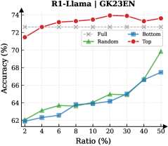
### Visual Description
## Line Chart: R1-Llama | GK23EN
### Overview
The image is a line chart comparing the accuracy (%) of different models (Full, Random, Bottom, Top) against the ratio (%) on the x-axis. The chart shows how the accuracy changes as the ratio increases for each model.
### Components/Axes
* **Title:** R1-Llama | GK23EN
* **X-axis:** Ratio (%) with markers at 2, 4, 6, 8, 10, 20, 30, 40, 50
* **Y-axis:** Accuracy (%) with markers at 62, 64, 66, 68, 70, 72, 74
* **Legend:** Located at the top-right of the chart.
* Full (gray dashed line with x markers)
* Random (green line with triangle markers)
* Bottom (blue line with square markers)
* Top (red line with circle markers)
### Detailed Analysis
* **Full:** The gray dashed line with 'x' markers remains relatively constant at approximately 72.7% accuracy across all ratios.
* **Random:** The green line with triangle markers shows an increasing trend.
* At Ratio 2%, accuracy is approximately 62%.
* At Ratio 50%, accuracy is approximately 70%.
* **Bottom:** The blue line with square markers shows an increasing trend.
* At Ratio 2%, accuracy is approximately 62%.
* At Ratio 50%, accuracy is approximately 67.5%.
* **Top:** The red line with circle markers starts high and plateaus.
* At Ratio 2%, accuracy is approximately 71.5%.
* It increases to approximately 73% around Ratio 6%.
* It remains relatively constant around 73% until Ratio 50%.
### Key Observations
* The "Full" model has a consistent accuracy across all ratios.
* The "Top" model has the highest accuracy overall.
* The "Random" and "Bottom" models show increasing accuracy as the ratio increases.
### Interpretation
The chart compares the performance of different models (Full, Random, Bottom, Top) in terms of accuracy as the ratio changes. The "Full" model serves as a baseline, maintaining a stable accuracy. The "Top" model consistently outperforms the others. The "Random" and "Bottom" models improve in accuracy as the ratio increases, suggesting that their performance is influenced by the ratio parameter. The "Top" model's high initial accuracy and plateau indicate that it might be less sensitive to changes in the ratio compared to the "Random" and "Bottom" models.
</details>
<details>
<summary>x40.png Details</summary>
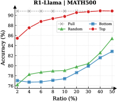
### Visual Description
## Chart: R1-Llama | MATH500 Accuracy vs. Ratio
### Overview
The image is a line chart comparing the accuracy of different data selection strategies (Full, Random, Bottom, Top) for the R1-Llama model on the MATH500 dataset, plotted against the data ratio used. The x-axis represents the ratio of data used (in percentage), and the y-axis represents the accuracy (in percentage).
### Components/Axes
* **Title:** R1-Llama | MATH500
* **X-axis:** Ratio (%) - with markers at 2, 4, 6, 8, 10, 20, 30, 40, 50
* **Y-axis:** Accuracy (%) - with markers at 76, 78, 80, 82, 84, 86, 88, 90
* **Legend:** Located at the top-right of the chart.
* Full (Gray dashed line with crosses)
* Random (Green line with triangles)
* Bottom (Blue line with squares)
* Top (Red line with circles)
### Detailed Analysis
* **Full (Gray dashed line with crosses):** This line represents the accuracy when using the full dataset. It starts at approximately 91.5% and remains relatively constant, with a slight increase to approximately 92.5%.
* Ratio 2%: ~91.5%
* Ratio 50%: ~92.5%
* **Random (Green line with triangles):** This line represents the accuracy when using a randomly selected subset of the data. It starts at approximately 76% and increases steadily with the ratio.
* Ratio 2%: ~76%
* Ratio 4%: ~78%
* Ratio 6%: ~78.7%
* Ratio 8%: ~79%
* Ratio 10%: ~79.5%
* Ratio 20%: ~80%
* Ratio 30%: ~81.5%
* Ratio 40%: ~82.5%
* Ratio 50%: ~85%
* **Bottom (Blue line with squares):** This line represents the accuracy when using the "bottom" subset of the data. It starts at approximately 77% and increases with the ratio, but not as steeply as the "Random" line.
* Ratio 2%: ~77%
* Ratio 4%: ~76.5%
* Ratio 6%: ~77%
* Ratio 8%: ~77%
* Ratio 10%: ~77.2%
* Ratio 20%: ~78.5%
* Ratio 30%: ~80%
* Ratio 40%: ~81.7%
* Ratio 50%: ~85%
* **Top (Red line with circles):** This line represents the accuracy when using the "top" subset of the data. It starts at approximately 85.5% and increases rapidly initially, then plateaus.
* Ratio 2%: ~85.5%
* Ratio 4%: ~87.7%
* Ratio 6%: ~88.8%
* Ratio 8%: ~89.2%
* Ratio 10%: ~89.7%
* Ratio 20%: ~90.5%
* Ratio 30%: ~91%
* Ratio 40%: ~91.2%
* Ratio 50%: ~91.5%
### Key Observations
* Using the full dataset ("Full") consistently yields the highest accuracy.
* Selecting the "top" subset of the data ("Top") performs significantly better than selecting a random subset ("Random") or the "bottom" subset ("Bottom"), especially at lower ratios.
* The "Random" and "Bottom" selection strategies show similar performance, with "Random" slightly outperforming "Bottom" at higher ratios.
* The accuracy of the "Top" selection strategy plateaus as the ratio increases, suggesting diminishing returns.
### Interpretation
The chart demonstrates the impact of data selection strategies on the accuracy of the R1-Llama model for the MATH500 dataset. The "Top" selection strategy appears to be the most effective way to improve accuracy when using a subset of the data. The "Full" dataset consistently provides the best performance, which is expected. The "Random" and "Bottom" selection strategies are less effective, indicating that the quality of the data used is more important than the quantity. The plateauing of the "Top" strategy suggests that there is a limit to how much accuracy can be gained by simply selecting the "top" data points. This information is valuable for optimizing the training process of the R1-Llama model and potentially other similar models.
</details>
<details>
<summary>x41.png Details</summary>
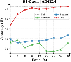
### Visual Description
## Chart: R1-Qwen | AIME24 Accuracy vs Ratio
### Overview
The image is a line chart comparing the accuracy of different strategies ("Full", "Random", "Bottom", "Top") against varying ratios. The x-axis represents the ratio in percentage, and the y-axis represents the accuracy in percentage.
### Components/Axes
* **Title:** R1-Qwen | AIME24
* **X-axis:** Ratio (%) with markers at 2, 4, 6, 8, 10, 20, 30, 40, 50
* **Y-axis:** Accuracy (%) with markers at 30, 40, 50, 60, 70
* **Legend:** Located in the top-right corner.
* Full (Gray dashed line with x markers)
* Random (Green line with triangle markers)
* Bottom (Blue line with square markers)
* Top (Red line with circle markers)
### Detailed Analysis
* **Full (Gray dashed line with x markers):** The accuracy is relatively constant at approximately 73% across all ratios.
* Ratio 2%: ~73%
* Ratio 50%: ~73%
* **Random (Green line with triangle markers):** The accuracy fluctuates between approximately 27% and 40%.
* Ratio 2%: ~37%
* Ratio 6%: ~31%
* Ratio 10%: ~36%
* Ratio 30%: ~27%
* Ratio 50%: ~35%
* **Bottom (Blue line with square markers):** The accuracy generally increases with the ratio, starting around 40% and reaching approximately 44%.
* Ratio 2%: ~40%
* Ratio 6%: ~38%
* Ratio 10%: ~38%
* Ratio 30%: ~40%
* Ratio 50%: ~44%
* **Top (Red line with circle markers):** The accuracy increases sharply from 54% to 71% between ratios 2% and 8%, then plateaus around 70-72%.
* Ratio 2%: ~54%
* Ratio 6%: ~69%
* Ratio 10%: ~70%
* Ratio 30%: ~72%
* Ratio 50%: ~73%
### Key Observations
* The "Full" strategy consistently provides the highest accuracy, remaining stable across all ratios.
* The "Top" strategy shows a rapid increase in accuracy initially, then plateaus.
* The "Bottom" strategy shows a gradual increase in accuracy as the ratio increases.
* The "Random" strategy has the lowest and most variable accuracy.
### Interpretation
The chart compares the performance of different strategies for a task (likely related to R1-Qwen and AIME24, which are probably model names or datasets). The "Full" strategy, which likely uses all available data, performs the best. The "Top" strategy, which might prioritize certain data points, shows a strong initial improvement but plateaus. The "Bottom" strategy, which might prioritize other data points, shows a gradual improvement. The "Random" strategy, which uses a random selection of data, performs the worst. This suggests that the selection of data points significantly impacts the accuracy of the model, and using all available data is the most effective approach.
</details>
<details>
<summary>x42.png Details</summary>
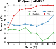
### Visual Description
## Chart: R1-Qwen | AIME25 Accuracy vs. Ratio
### Overview
The image is a line chart comparing the accuracy of different models (Full, Random, Bottom, Top) against varying ratios. The x-axis represents the ratio in percentage, and the y-axis represents the accuracy in percentage.
### Components/Axes
* **Title:** R1-Qwen | AIME25
* **X-axis:** Ratio (%) with markers at 2, 4, 6, 8, 10, 20, 30, 40, and 50.
* **Y-axis:** Accuracy (%) with markers at 20, 25, 30, 35, 40, 45, 50, 55, and 60.
* **Legend:** Located at the top-right of the chart.
* Full (Gray dashed line with x markers)
* Random (Green line with triangle markers)
* Bottom (Blue line with square markers)
* Top (Red line with circle markers)
### Detailed Analysis
* **Full (Gray dashed line with x markers):** The accuracy is relatively constant at approximately 62% across all ratios.
* Ratio 2%: ~62%
* Ratio 50%: ~62%
* **Random (Green line with triangle markers):** The accuracy fluctuates, generally decreasing as the ratio increases.
* Ratio 2%: ~37%
* Ratio 8%: ~37%
* Ratio 20%: ~30%
* Ratio 50%: ~31%
* **Bottom (Blue line with square markers):** The accuracy initially decreases, then increases as the ratio increases.
* Ratio 2%: ~43%
* Ratio 4%: ~39%
* Ratio 10%: ~41%
* Ratio 20%: ~38%
* Ratio 40%: ~44%
* Ratio 50%: ~51%
* **Top (Red line with circle markers):** The accuracy increases sharply initially, then plateaus as the ratio increases.
* Ratio 2%: ~38%
* Ratio 4%: ~50%
* Ratio 6%: ~57%
* Ratio 10%: ~58%
* Ratio 30%: ~62%
* Ratio 50%: ~62%
### Key Observations
* The "Full" model consistently maintains the highest accuracy across all ratios.
* The "Top" model shows a significant initial increase in accuracy but plateaus at higher ratios.
* The "Random" model exhibits the lowest and most fluctuating accuracy.
* The "Bottom" model shows an initial dip in accuracy, followed by a gradual increase.
### Interpretation
The chart compares the accuracy of different models (Full, Random, Bottom, Top) at various ratios. The "Full" model, which likely represents the complete dataset or a fully trained model, consistently outperforms the other models. The "Top" model shows promise with a rapid initial increase in accuracy, suggesting that focusing on the top-ranked data points can be effective up to a certain ratio. The "Random" model's poor performance indicates that random sampling is not an effective strategy. The "Bottom" model's behavior suggests that focusing on the bottom-ranked data points may have some value, especially at higher ratios. The data suggests that strategic data selection or weighting can significantly impact model accuracy, with the "Full" model serving as the benchmark for optimal performance.
</details>
<details>
<summary>x43.png Details</summary>
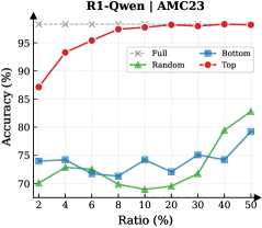
### Visual Description
## Chart: R1-Qwen Accuracy vs. Ratio
### Overview
The image is a line chart comparing the accuracy of different methods (Full, Random, Bottom, Top) against varying ratios. The chart displays the relationship between the ratio (x-axis) and the accuracy (y-axis) for each method.
### Components/Axes
* **Title:** R1-Qwen | AMC23
* **X-axis:** Ratio (%) - Values: 2, 4, 6, 8, 10, 20, 30, 40, 50
* **Y-axis:** Accuracy (%) - Values range from 70 to 98, with gridlines at approximately 75, 80, 85, 90, and 95.
* **Legend:** Located at the top-right of the chart.
* Full (Gray dashed line with 'x' markers)
* Random (Green line with triangle markers)
* Bottom (Blue line with square markers)
* Top (Red line with circle markers)
### Detailed Analysis
* **Full:** The gray dashed line remains almost constant at approximately 98% accuracy across all ratios.
* **Random:** The green line starts at approximately 70% accuracy at a ratio of 2%, decreases slightly to around 68% at a ratio of 10%, and then increases to approximately 82% at a ratio of 50%.
* **Bottom:** The blue line starts at approximately 74% accuracy at a ratio of 2%, fluctuates between 71% and 75% until a ratio of 30%, and then increases to approximately 79% at a ratio of 50%.
* **Top:** The red line starts at approximately 87% accuracy at a ratio of 2%, increases sharply to approximately 93% at a ratio of 4%, and then gradually increases to approximately 98% at a ratio of 50%.
### Key Observations
* The "Full" method consistently achieves the highest accuracy across all ratios.
* The "Top" method shows a rapid increase in accuracy at lower ratios and then plateaus.
* The "Random" and "Bottom" methods have lower accuracy compared to "Full" and "Top," with "Random" showing more variability.
### Interpretation
The chart suggests that the "Full" method is the most reliable, maintaining high accuracy regardless of the ratio. The "Top" method is effective, especially at lower ratios. The "Random" and "Bottom" methods are less accurate and more sensitive to changes in the ratio. The data demonstrates the performance differences between these methods, highlighting the importance of method selection based on the specific ratio being considered.
</details>
<details>
<summary>x44.png Details</summary>
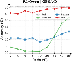
### Visual Description
## Chart: Accuracy vs Ratio for R1-Qwen | GPQA-D
### Overview
The image is a line chart comparing the accuracy (%) of different models (Full, Random, Bottom, Top) against the ratio (%) on the R1-Qwen | GPQA-D dataset. The x-axis represents the ratio (%), and the y-axis represents the accuracy (%).
### Components/Axes
* **Title:** R1-Qwen | GPQA-D
* **X-axis:** Ratio (%) with markers at 2, 4, 6, 8, 10, 20, 30, 40, 50
* **Y-axis:** Accuracy (%) with markers at 36, 38, 40, 42, 44, 46, 48, 50
* **Legend:** Located in the top-right corner.
* Full (Gray dashed line with x markers)
* Random (Green line with triangle markers)
* Bottom (Blue line with square markers)
* Top (Red line with circle markers)
### Detailed Analysis
* **Full (Gray dashed line with x markers):** The accuracy remains constant at approximately 50% across all ratios.
* Ratio 2%: 50.2%
* Ratio 50%: 50.2%
* **Random (Green line with triangle markers):** The accuracy decreases from 37.5% to 36% between ratios 2% and 8%, then increases sharply from 36% to 46.5% between ratios 8% and 50%.
* Ratio 2%: 37.5%
* Ratio 8%: 36%
* Ratio 50%: 46.5%
* **Bottom (Blue line with square markers):** The accuracy fluctuates between 40% and 42% from ratios 2% to 40%, then increases slightly to 42% at ratio 50%.
* Ratio 2%: 40.5%
* Ratio 8%: 39.2%
* Ratio 40%: 41.8%
* Ratio 50%: 42%
* **Top (Red line with circle markers):** The accuracy fluctuates between 48% and 50% across all ratios.
* Ratio 2%: 48.3%
* Ratio 6%: 49%
* Ratio 50%: 49.8%
### Key Observations
* The "Full" model consistently achieves the highest accuracy, remaining stable at approximately 50% across all ratios.
* The "Random" model shows a significant increase in accuracy as the ratio increases, starting low and rising sharply after a ratio of 10%.
* The "Bottom" model's accuracy remains relatively stable, with minor fluctuations around 40-42%.
* The "Top" model's accuracy is consistently high, fluctuating slightly around 48-50%.
### Interpretation
The chart compares the performance of different models (Full, Random, Bottom, Top) in terms of accuracy as the ratio changes. The "Full" model represents a complete or ideal model, achieving consistently high accuracy. The "Random" model's performance improves significantly with increasing ratio, suggesting that it benefits from more data or a larger sample size. The "Bottom" model's stable but lower accuracy indicates a consistent but less effective approach. The "Top" model performs well, but not as consistently as the "Full" model. The data suggests that the "Full" model is the most reliable, while the "Random" model's performance is highly dependent on the ratio. The "Bottom" model provides a baseline, and the "Top" model offers a good but not optimal solution.
</details>
<details>
<summary>x45.png Details</summary>
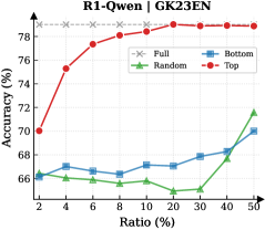
### Visual Description
## Chart: Accuracy vs. Ratio for R1-Qwen | GK23EN
### Overview
The image is a line chart comparing the accuracy (%) of different data selection methods (Full, Random, Bottom, Top) against the ratio (%) of data used. The chart shows how accuracy changes as the ratio of data increases from 2% to 50%.
### Components/Axes
* **Title:** R1-Qwen | GK23EN
* **X-axis:** Ratio (%) - Ranges from 2% to 50% with markers at 2, 4, 6, 8, 10, 20, 30, 40, and 50.
* **Y-axis:** Accuracy (%) - Ranges from 66% to 78% with no explicit markers.
* **Legend:** Located in the top-right corner.
* Full (Gray dashed line with an 'x' marker)
* Random (Green line with a triangle marker)
* Bottom (Blue line with a square marker)
* Top (Red line with a circle marker)
### Detailed Analysis
* **Full (Gray dashed line):** The accuracy is constant at approximately 78.8% across all ratios.
* **Random (Green line):** The accuracy starts at approximately 66.2% at 2% ratio, decreases to a minimum of approximately 64.8% at 20% ratio, and then increases to approximately 71.6% at 50% ratio.
* Ratio 2%: 66.2%
* Ratio 4%: 65.8%
* Ratio 6%: 65.8%
* Ratio 8%: 65.4%
* Ratio 10%: 65.6%
* Ratio 20%: 64.8%
* Ratio 30%: 65.2%
* Ratio 40%: 67.8%
* Ratio 50%: 71.6%
* **Bottom (Blue line):** The accuracy starts at approximately 66.2% at 2% ratio, increases to approximately 67.2% at 4% ratio, then remains relatively stable between 66.8% and 67.2% until 20% ratio, then increases to approximately 70% at 50% ratio.
* Ratio 2%: 66.2%
* Ratio 4%: 67.2%
* Ratio 6%: 66.8%
* Ratio 8%: 66.8%
* Ratio 10%: 67.2%
* Ratio 20%: 67%
* Ratio 30%: 67.8%
* Ratio 40%: 68.2%
* Ratio 50%: 70%
* **Top (Red line):** The accuracy starts at approximately 70% at 2% ratio, increases rapidly to approximately 77.2% at 6% ratio, and then gradually increases to approximately 78.4% at 50% ratio.
* Ratio 2%: 70%
* Ratio 4%: 75.4%
* Ratio 6%: 77.2%
* Ratio 8%: 78%
* Ratio 10%: 78.2%
* Ratio 20%: 78.4%
* Ratio 30%: 78.4%
* Ratio 40%: 78.6%
* Ratio 50%: 78.4%
### Key Observations
* The "Full" data selection method consistently achieves the highest accuracy, remaining constant across all ratios.
* The "Top" data selection method shows a rapid increase in accuracy initially, then plateaus at a high level.
* The "Random" data selection method has the lowest accuracy and exhibits a slight decrease before increasing again.
* The "Bottom" data selection method shows a gradual increase in accuracy as the ratio increases.
### Interpretation
The chart demonstrates the impact of different data selection methods on the accuracy of the R1-Qwen model. Selecting the "Top" data points appears to be an effective strategy for achieving high accuracy with a smaller data ratio. The "Full" method provides the best accuracy, but it requires using all the data. The "Random" method performs the worst, suggesting that random data selection is not an optimal strategy. The "Bottom" method performs better than "Random" but not as well as "Top". The data suggests that prioritizing certain data points (e.g., "Top") can lead to better performance than using a random sample.
</details>
<details>
<summary>x46.png Details</summary>
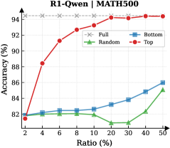
### Visual Description
## Chart: Accuracy vs Ratio
### Overview
The image is a line chart comparing the accuracy (%) of different models (Full, Random, Bottom, Top) against the ratio (%) on the R1-Qwen | MATH500 dataset. The x-axis represents the ratio (%), and the y-axis represents the accuracy (%).
### Components/Axes
* **Title:** R1-Qwen | MATH500
* **X-axis:** Ratio (%) with markers at 2, 4, 6, 8, 10, 20, 30, 40, 50
* **Y-axis:** Accuracy (%) with markers at 82, 84, 86, 88, 90, 92, 94
* **Legend:** Located in the top-right corner.
* Full (Gray dashed line with 'x' markers)
* Random (Green line with triangle markers)
* Bottom (Blue line with square markers)
* Top (Red line with circle markers)
### Detailed Analysis
* **Full (Gray dashed line with 'x' markers):** The accuracy remains almost constant at approximately 94.5% across all ratios.
* Ratio 2%: ~94.5%
* Ratio 50%: ~94.5%
* **Random (Green line with triangle markers):** The accuracy initially increases slightly, then decreases and plateaus.
* Ratio 2%: ~82%
* Ratio 6%: ~82%
* Ratio 10%: ~82%
* Ratio 20%: ~81%
* Ratio 30%: ~81%
* Ratio 50%: ~85%
* **Bottom (Blue line with square markers):** The accuracy increases steadily with the ratio.
* Ratio 2%: ~81.5%
* Ratio 6%: ~82.5%
* Ratio 10%: ~82.5%
* Ratio 20%: ~83%
* Ratio 30%: ~84%
* Ratio 50%: ~86%
* **Top (Red line with circle markers):** The accuracy increases rapidly initially, then plateaus at higher ratios.
* Ratio 2%: ~81.5%
* Ratio 4%: ~88.5%
* Ratio 6%: ~91.5%
* Ratio 8%: ~92.5%
* Ratio 10%: ~93%
* Ratio 20%: ~94%
* Ratio 30%: ~94.5%
* Ratio 50%: ~94.5%
### Key Observations
* The "Full" model consistently achieves the highest accuracy, remaining almost constant across all ratios.
* The "Top" model shows a significant initial increase in accuracy, eventually reaching a similar level to the "Full" model.
* The "Bottom" model's accuracy increases steadily but remains lower than the "Full" and "Top" models.
* The "Random" model performs the worst, with its accuracy fluctuating and remaining the lowest among all models.
### Interpretation
The chart compares the performance of different models based on accuracy versus ratio. The "Full" model serves as a benchmark, demonstrating the highest achievable accuracy. The "Top" model quickly approaches this benchmark, suggesting it is an efficient strategy. The "Bottom" model shows a gradual improvement, indicating it benefits from higher ratios but is less effective overall. The "Random" model's poor performance suggests that random selection is not a viable strategy for this task. The data suggests that focusing on the "Top" elements is a more effective approach than random selection or focusing on the "Bottom" elements.
</details>
Figure 12: Reasoning performance trends of Llama and Qwen models across six datasets as a function of thinking token retention ratio.
We present the evaluation results of R1-Llama (DeepSeek-R1-Distill-Llama-8B) and R1-Qwen (DeepSeek-R1-Distill-Qwen-7B) across the AIME24, AIME25, AMC23, GPQA-Diamond, GK23EN, and MATH-500 datasets. Fig. 10 and 11 illustrate the variation of token importance scores over decoding steps for representative samples from each dataset. Additionally, Fig. 12 demonstrates the reasoning performance under different thinking token retention strategies and retention ratios.
Appendix C Detailed Experimental Setup
C.1 Device and Environment
All experiments were conducted on a server equipped with 8 NVIDIA H800 GPUs. We utilize the Hugging Face transformers library and vLLM as the primary inference engine, and employ the veRL framework to optimize the parameters of the importance predictor.
C.2 Training of Importance Predictor
We generate 5 diverse reasoning traces for each question in the MATH training dataset. Only the traces leading to the correct answer are retained as training data. This process yields 7,142 and 7,064 valid samples for R1-Qwen and R1-Llama, respectively. The Importance Predictor is implemented as an MLP with dimensions of $(3584→ 7168→ 1792→ 1)$ and $(4096→ 8192→ 2048→ 1)$ for R1-Qwen and R1-Llama. We conduct the training using the veRL framework for a total of 15 epochs. The global batch size is set to 256, with a micro-batch size of 4 for the gradient accumulation step. Optimization is performed using AdamW optimizer with $\beta_{1}=0.9$ , $\beta_{2}=0.95$ , and a weight decay of $0.01$ . The learning rate is initialized at $5× 10^{-4}$ with a cosine decay schedule, and the gradient clipping threshold is set to $1.0$ .
C.3 Inference Setting
<details>
<summary>x47.png Details</summary>

### Visual Description
## Bar Chart: KV Cache Length Comparison
### Overview
The image is a bar chart comparing the KV Cache Length (in thousands) of "Transformers" and "DynTS (Ours)" across six different datasets: AIME24, AIME25, AMC23, GaoKao2023En, GPQA-D, and MATH500. The chart highlights the reduction in KV Cache Length achieved by DynTS compared to Transformers, with numerical factors indicating the reduction magnitude above each pair of bars.
### Components/Axes
* **Title:** KV Cache Length (10^3)
* **X-axis:** Datasets (AIME24, AIME25, AMC23, GaoKao2023En, GPQA-D, MATH500)
* **Y-axis:** KV Cache Length (10^3), with a scale from 0.0 to 20.0, incrementing by 2.5.
* **Legend:** Located at the top of the chart.
* Blue bars: Transformers
* Red bars: DynTS (Ours)
### Detailed Analysis
The chart presents a side-by-side comparison of KV Cache Length for Transformers and DynTS across the six datasets.
* **AIME24:**
* Transformers: Approximately 16.8 x 10^3
* DynTS: Approximately 5.0 x 10^3
* Reduction factor: 3.4x
* **AIME25:**
* Transformers: Approximately 17.2 x 10^3
* DynTS: Approximately 5.0 x 10^3
* Reduction factor: 3.4x
* **AMC23:**
* Transformers: Approximately 16.7 x 10^3
* DynTS: Approximately 5.0 x 10^3
* Reduction factor: 3.3x
* **GaoKao2023En:**
* Transformers: Approximately 19.2 x 10^3
* DynTS: Approximately 5.0 x 10^3
* Reduction factor: 3.8x
* **GPQA-D:**
* Transformers: Approximately 16.7 x 10^3
* DynTS: Approximately 3.0 x 10^3
* Reduction factor: 5.6x
* **MATH500:**
* Transformers: Approximately 17.2 x 10^3
* DynTS: Approximately 3.0 x 10^3
* Reduction factor: 5.7x
### Key Observations
* DynTS consistently achieves a lower KV Cache Length compared to Transformers across all datasets.
* The reduction factor varies across datasets, ranging from 3.3x to 5.7x.
* The largest reduction is observed in the MATH500 dataset (5.7x), followed by GPQA-D (5.6x).
* The KV Cache Length for Transformers is relatively consistent across all datasets, hovering around 17 x 10^3, with GaoKao2023En being a slight outlier at 19.2 x 10^3.
* The KV Cache Length for DynTS varies more significantly, ranging from 3.0 x 10^3 to 5.0 x 10^3.
### Interpretation
The bar chart demonstrates the effectiveness of DynTS in reducing KV Cache Length compared to Transformers. The reduction factors indicate the magnitude of this improvement, suggesting that DynTS is particularly effective on the MATH500 and GPQA-D datasets. The consistent KV Cache Length for Transformers across datasets suggests a stable baseline, while the variability in DynTS's KV Cache Length indicates that its performance is more sensitive to the specific dataset. This data suggests that DynTS could offer significant memory savings and potentially improved performance in certain applications compared to traditional Transformers.
</details>
(a) R1-Llama
<details>
<summary>x48.png Details</summary>
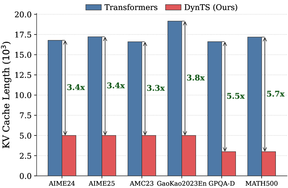
### Visual Description
## Bar Chart: KV Cache Length Comparison
### Overview
The image is a bar chart comparing the KV Cache Length (in thousands) of "Transformers" and "DynTS (Ours)" across six different datasets: AIME24, AIME25, AMC23, GaoKao2023En, GPQA-D, and MATH500. The chart displays the cache length for each model on each dataset, along with the multiplicative factor showing how much smaller DynTS is compared to Transformers.
### Components/Axes
* **Title:** KV Cache Length (103)
* **X-axis:** Datasets (AIME24, AIME25, AMC23, GaoKao2023En, GPQA-D, MATH500)
* **Y-axis:** KV Cache Length (103), ranging from 0.0 to 20.0 with increments of 2.5.
* **Legend:** Located at the top of the chart.
* Blue: Transformers
* Red: DynTS (Ours)
### Detailed Analysis
Here's a breakdown of the KV Cache Length for each dataset and model:
* **AIME24:**
* Transformers (Blue): Approximately 17.0 x 10^3
* DynTS (Ours) (Red): Approximately 5.0 x 10^3
* Factor: 3.4x
* **AIME25:**
* Transformers (Blue): Approximately 17.3 x 10^3
* DynTS (Ours) (Red): Approximately 5.1 x 10^3
* Factor: 3.4x
* **AMC23:**
* Transformers (Blue): Approximately 16.7 x 10^3
* DynTS (Ours) (Red): Approximately 5.0 x 10^3
* Factor: 3.3x
* **GaoKao2023En:**
* Transformers (Blue): Approximately 19.2 x 10^3
* DynTS (Ours) (Red): Approximately 5.0 x 10^3
* Factor: 3.8x
* **GPQA-D:**
* Transformers (Blue): Approximately 16.7 x 10^3
* DynTS (Ours) (Red): Approximately 3.0 x 10^3
* Factor: 5.5x
* **MATH500:**
* Transformers (Blue): Approximately 17.3 x 10^3
* DynTS (Ours) (Red): Approximately 3.0 x 10^3
* Factor: 5.7x
### Key Observations
* Transformers consistently have a higher KV Cache Length than DynTS across all datasets.
* The multiplicative factor (showing how much smaller DynTS is) varies from 3.3x to 5.7x.
* DynTS shows the most significant reduction in KV Cache Length compared to Transformers on the MATH500 and GPQA-D datasets.
* Transformers' KV Cache Length is relatively consistent across all datasets, ranging from approximately 16.7 x 10^3 to 19.2 x 10^3.
### Interpretation
The bar chart demonstrates that DynTS (Ours) significantly reduces the KV Cache Length compared to the standard Transformers model across various datasets. The reduction factor ranges from 3.3x to 5.7x, indicating a substantial improvement in memory efficiency. This suggests that DynTS is a more memory-efficient alternative to Transformers, particularly for the MATH500 and GPQA-D datasets. The consistent KV Cache Length of Transformers across datasets suggests a relatively fixed memory footprint, while DynTS adapts more effectively to different dataset characteristics.
</details>
(b) R1-Qwen
Figure 13: Comparison of average KV Cache length between standard Transformers and DynTS across six benchmarks. The arrows and annotations indicate the compression ratio achieved by our method on each dataset.
<details>
<summary>x49.png Details</summary>
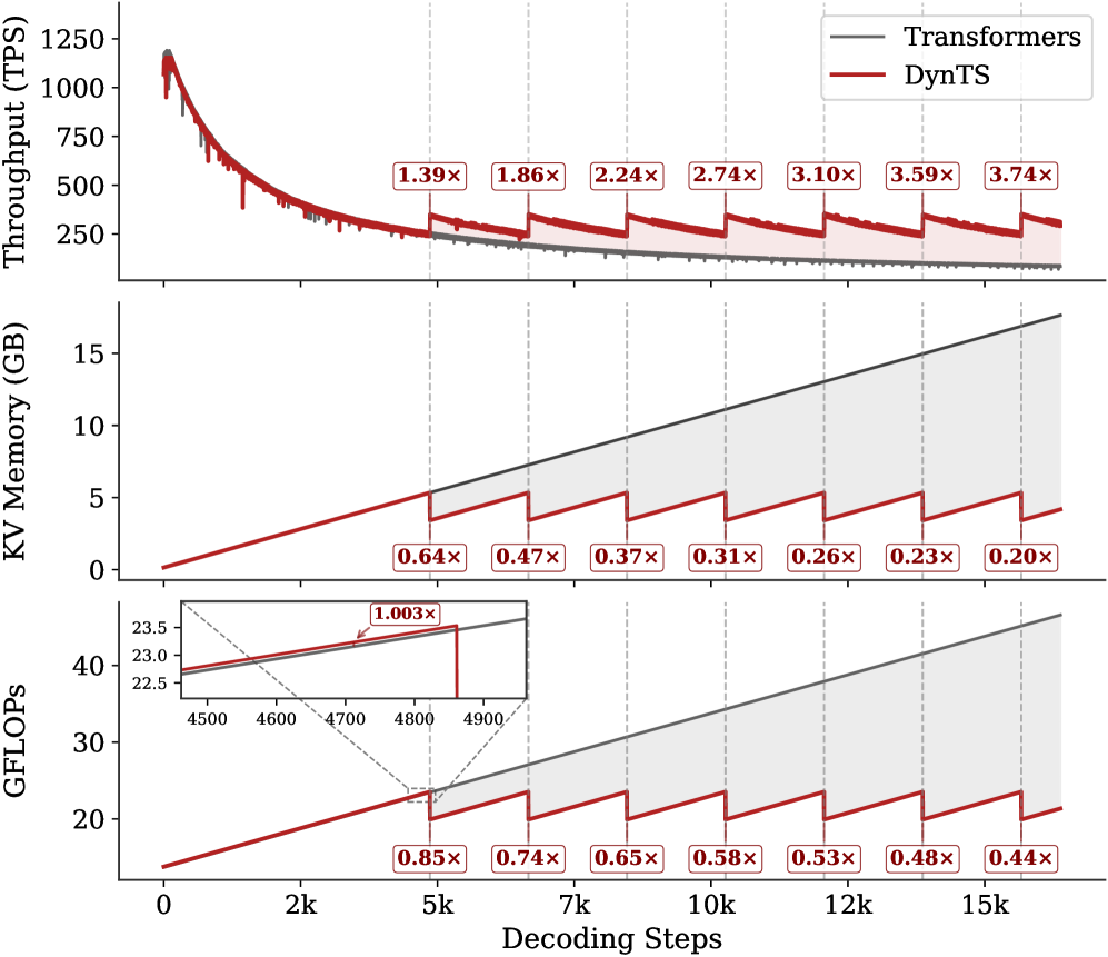
### Visual Description
## Chart Type: Performance Comparison of Transformers and DynTS
### Overview
The image presents three line charts comparing the performance of "Transformers" and "DynTS" across different decoding steps. The charts depict Throughput (TPS), KV Memory (GB), and GFLOPS as a function of decoding steps, ranging from 0 to 15k. The performance of DynTS is shown relative to Transformers with ratio labels at specific decoding steps.
### Components/Axes
* **X-axis (all charts):** Decoding Steps, ranging from 0 to 15k with tick marks at 0, 2k, 5k, 7k, 10k, 12k, and 15k.
* **Top Chart:**
* Y-axis: Throughput (TPS), ranging from 250 to 1250 with tick marks at 250, 500, 750, 1000, and 1250.
* Legend:
* Transformers (Gray line)
* DynTS (Red line)
* **Middle Chart:**
* Y-axis: KV Memory (GB), ranging from 0 to 15 with tick marks at 0, 5, 10, and 15.
* Legend: (Same as Top Chart)
* Transformers (Gray line)
* DynTS (Red line)
* **Bottom Chart:**
* Y-axis: GFLOPS, ranging from 20 to 40 with tick marks at 20, 30, and 40. An inset plot shows a zoomed-in view of the GFLOPS values between 22.5 and 23.5 for decoding steps 4500 to 4900.
* Legend: (Same as Top Chart)
* Transformers (Gray line)
* DynTS (Red line)
### Detailed Analysis
* **Top Chart (Throughput):**
* **Transformers (Gray):** The throughput starts high (approximately 1200 TPS) and rapidly decreases, then plateaus at a low value (approximately 50 TPS).
* At 5k Decoding Steps: ~50 TPS
* At 15k Decoding Steps: ~50 TPS
* **DynTS (Red):** The throughput starts high (approximately 1200 TPS) and rapidly decreases, then plateaus at a higher value than Transformers. The DynTS line shows periodic drops in throughput at intervals of approximately 2k decoding steps.
* At 5k Decoding Steps: ~275 TPS
* At 7k Decoding Steps: ~200 TPS
* At 10k Decoding Steps: ~150 TPS
* At 12k Decoding Steps: ~125 TPS
* At 15k Decoding Steps: ~100 TPS
* Ratio labels above the DynTS line indicate the multiplicative factor of DynTS throughput compared to Transformers at specific decoding steps:
* 2k Decoding Steps: 1.39x
* 5k Decoding Steps: 1.86x
* 7k Decoding Steps: 2.24x
* 9k Decoding Steps: 2.74x
* 11k Decoding Steps: 3.10x
* 13k Decoding Steps: 3.59x
* 15k Decoding Steps: 3.74x
* **Middle Chart (KV Memory):**
* **Transformers (Gray):** The KV Memory increases linearly with decoding steps, reaching approximately 17 GB at 15k steps.
* At 5k Decoding Steps: ~5.7 GB
* At 10k Decoding Steps: ~11.4 GB
* At 15k Decoding Steps: ~17 GB
* **DynTS (Red):** The KV Memory increases linearly but with periodic drops at intervals of approximately 2k decoding steps. The slope of the DynTS line is less steep than the Transformers line.
* At 5k Decoding Steps: ~3.6 GB
* At 7k Decoding Steps: ~3.2 GB
* At 10k Decoding Steps: ~3.0 GB
* At 12k Decoding Steps: ~2.8 GB
* At 15k Decoding Steps: ~2.6 GB
* Ratio labels below the DynTS line indicate the multiplicative factor of DynTS KV Memory compared to Transformers at specific decoding steps:
* 5k Decoding Steps: 0.64x
* 7k Decoding Steps: 0.47x
* 9k Decoding Steps: 0.37x
* 11k Decoding Steps: 0.31x
* 13k Decoding Steps: 0.26x
* 15k Decoding Steps: 0.23x
* 17k Decoding Steps: 0.20x
* **Bottom Chart (GFLOPS):**
* **Transformers (Gray):** The GFLOPS increases linearly with decoding steps, reaching approximately 38 GFLOPS at 15k steps.
* At 5k Decoding Steps: ~28.5 GFLOPS
* At 10k Decoding Steps: ~33 GFLOPS
* At 15k Decoding Steps: ~38 GFLOPS
* **DynTS (Red):** The GFLOPS increases linearly but with periodic drops at intervals of approximately 2k decoding steps. The slope of the DynTS line is less steep than the Transformers line.
* At 5k Decoding Steps: ~24 GFLOPS
* At 7k Decoding Steps: ~23 GFLOPS
* At 10k Decoding Steps: ~22 GFLOPS
* At 12k Decoding Steps: ~21 GFLOPS
* At 15k Decoding Steps: ~20 GFLOPS
* Ratio labels below the DynTS line indicate the multiplicative factor of DynTS GFLOPS compared to Transformers at specific decoding steps:
* 2k Decoding Steps: 0.85x
* 5k Decoding Steps: 0.74x
* 7k Decoding Steps: 0.65x
* 9k Decoding Steps: 0.58x
* 11k Decoding Steps: 0.53x
* 13k Decoding Steps: 0.48x
* 15k Decoding Steps: 0.44x
* Inset plot shows that at around 4750 decoding steps, the DynTS GFLOPS is 1.003x that of Transformers.
### Key Observations
* DynTS maintains a higher throughput than Transformers as decoding steps increase.
* DynTS uses significantly less KV Memory than Transformers.
* DynTS uses fewer GFLOPS than Transformers.
* The periodic drops in DynTS performance (throughput, KV memory, and GFLOPS) occur at regular intervals of approximately 2k decoding steps.
### Interpretation
The charts demonstrate that DynTS offers a more efficient alternative to Transformers, particularly in terms of KV Memory usage and GFLOPS. While the initial throughput is similar, DynTS maintains a higher throughput as decoding progresses. The periodic drops in DynTS performance likely correspond to a memory management or optimization process that occurs at regular intervals. The ratio labels quantify the performance gains of DynTS relative to Transformers, highlighting the increasing advantage of DynTS as decoding steps increase. The inset plot in the GFLOPS chart shows a point where DynTS is nearly equivalent to Transformers, suggesting a specific operational point where the two models have similar computational costs.
</details>
Figure 14: Real-time throughput, memory, and compute overhead tracking for R1-Qwen over total decoding steps. The results exhibit a trend consistent with R1-Llama, confirming the scalability of DynTS across different model architectures.
We implement DynTS and all baseline methods using the Hugging Face transformers library for KV cache compression. To ensure fairness, we use the effective KV cache length as the compression signal. Whenever the cache size reaches the predefined budget, all methods are restricted to retain an identical number of KV pairs. For SnapKV, H2O, and R-KV, we set identical local window sizes and retention ratios to those of our methods. For SepLLM, we preserve the separator tokens and evict the earliest generated non-separator tokens until the total cache length matches ours. For StreamingLLM, we set the same sink token size, following (Xiao et al., 2024). We set the number of parallel generated sequences to 20. The generation hyperparameters are configured as follows: temperature $T=0.6$ , top- $p=0.95$ , top- $k=20$ , and a maximum new token limit of 16,384. We conduct 5 independent sampling runs for all datasets. Ablation studies on the local window, retention ratio, and budget were conducted across four challenging benchmarks (AIME24, AIME25, AMC23, and GPQA-D) with the same other configurations to verify effectiveness. Fig. 6 and 8 report the mean results across these datasets.
Appendix D Additional Results
Inference Efficiency on R1-Qwen. Complementing the efficiency analysis of R1-Llama presented in the main text, Figure 14 illustrates the real-time throughput, memory footprint, and computational overhead for R1-Qwen. Consistent with previous observations, DynTS exhibits significant scalability advantages over the standard Transformer baseline as the sequence length increases, achieving a peak throughput speedup of $3.74×$ while compressing the memory footprint to $0.20×$ and reducing the cumulative computational cost (GFLOPs) to $0.44×$ after the last KV cache selection step. The recurrence of the characteristic sawtooth pattern further validates the robustness of our periodic KV Cache Selection mechanism, demonstrating that it effectively bounds resource accumulation and delivers substantial efficiency gains across diverse LRM architectures by continuously evicting non-essential thinking tokens.
KV Cache Compression Ratio. Figure 13 explicitly visualizes the reduction in KV Cache length achieved by DynTS across diverse reasoning tasks. By dynamically filtering out non-essential thinking tokens, our method drastically reduces the memory footprint compared to the full-cache Transformers baseline. For instance, on the MATH500 benchmark, DynTS achieves an impressive compression ratio of up to $5.7×$ , reducing the average cache length from over 17,000 tokens to the constrained budget of 3,000. These results directly explain the memory and throughput advantages reported in the efficiency analysis, confirming that DynTS successfully maintains high reasoning accuracy with a fraction of the memory cost.
<details>
<summary>x50.png Details</summary>
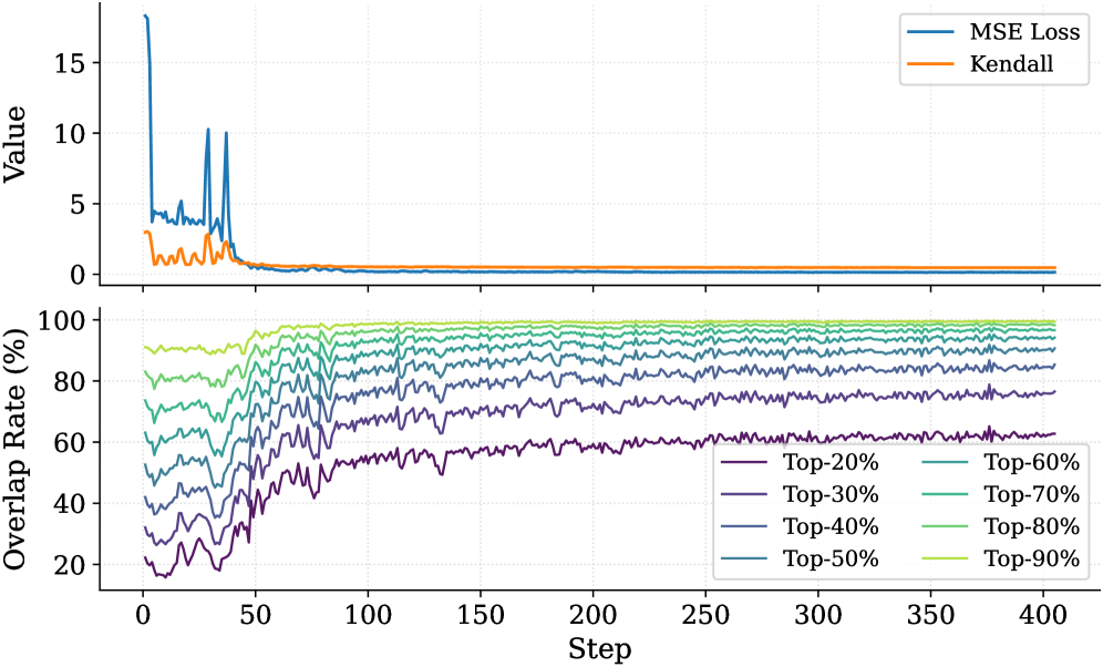
### Visual Description
## Line Graphs: MSE Loss, Kendall, and Overlap Rate vs. Step
### Overview
The image contains two line graphs plotted above each other. The top graph displays the MSE Loss and Kendall values against the step number. The bottom graph shows the overlap rate (%) for different top percentages (20% to 90%) against the step number.
### Components/Axes
**Top Graph:**
* **Y-axis:** "Value", ranging from 0 to 15. Axis markers are present at 0, 5, 10, and 15.
* **X-axis:** "Step", shared with the bottom graph, ranging from 0 to 400. Axis markers are present at 0, 50, 100, 150, 200, 250, 300, 350, and 400.
* **Legend (top-right):**
* Blue line: "MSE Loss"
* Orange line: "Kendall"
**Bottom Graph:**
* **Y-axis:** "Overlap Rate (%)", ranging from 20 to 100. Axis markers are present at 20, 40, 60, 80, and 100.
* **X-axis:** "Step", ranging from 0 to 400. Axis markers are present at 0, 50, 100, 150, 200, 250, 300, 350, and 400.
* **Legend (bottom-right):**
* Dark Purple line: "Top-20%"
* Purple line: "Top-30%"
* Dark Blue line: "Top-40%"
* Blue line: "Top-50%"
* Teal line: "Top-60%"
* Green line: "Top-70%"
* Light Green line: "Top-80%"
* Yellow-Green line: "Top-90%"
### Detailed Analysis
**Top Graph:**
* **MSE Loss (Blue):** The MSE Loss starts at a high value (approximately 17) and rapidly decreases within the first 50 steps. It experiences some spikes before stabilizing at a value close to 0 after approximately 100 steps.
* **Kendall (Orange):** The Kendall value starts at approximately 3, decreases rapidly within the first 50 steps, and then stabilizes at a value close to 0 after approximately 100 steps.
**Bottom Graph:**
* **Top-20% (Dark Purple):** Starts around 20%, increases to approximately 60% by step 100, and then fluctuates around 60% for the remaining steps.
* **Top-30% (Purple):** Starts around 30%, increases to approximately 70% by step 100, and then fluctuates around 70% for the remaining steps.
* **Top-40% (Dark Blue):** Starts around 40%, increases to approximately 75% by step 100, and then fluctuates around 75% for the remaining steps.
* **Top-50% (Blue):** Starts around 50%, increases to approximately 80% by step 100, and then fluctuates around 80% for the remaining steps.
* **Top-60% (Teal):** Starts around 60%, increases to approximately 85% by step 100, and then fluctuates around 85% for the remaining steps.
* **Top-70% (Green):** Starts around 70%, increases to approximately 90% by step 100, and then fluctuates around 90% for the remaining steps.
* **Top-80% (Light Green):** Starts around 75%, increases to approximately 95% by step 100, and then fluctuates around 95% for the remaining steps.
* **Top-90% (Yellow-Green):** Starts around 80%, increases to approximately 98% by step 100, and then fluctuates around 98% for the remaining steps.
### Key Observations
* Both MSE Loss and Kendall values decrease rapidly in the initial steps and stabilize around 0.
* The overlap rate for all top percentages increases rapidly in the initial steps and then fluctuates around a stable value.
* Higher top percentages generally have higher overlap rates.
* The stabilization point for both graphs appears to be around step 100.
### Interpretation
The graphs suggest that the model is learning effectively in the initial steps, as indicated by the rapid decrease in MSE Loss and Kendall values. The overlap rate also increases rapidly during this period, indicating that the model is becoming more consistent in its top predictions. After approximately 100 steps, the model's performance stabilizes, with only minor fluctuations in MSE Loss, Kendall, and overlap rates. The higher overlap rates for higher top percentages indicate that the model is more confident in its top predictions when considering a larger set of candidates. The convergence of MSE Loss and Kendall to near-zero values suggests that the model is effectively minimizing the error and improving the ranking correlation.
</details>
Figure 15: Training dynamics of the Importance Predictor on R1-Qwen. The top panel displays the convergence of MSE Loss and Kendall correlation, while the bottom panel shows the overlap rate of the top- $20\%$ ground-truth tokens within the top- $p\%$ ( $p∈[20,90]$ ) predicted tokens across training steps.
Importance Predictor Analysis for R1-Qwen. Complementing the findings on R1-Llama, Figure 15 depicts the learning trajectory of the Importance Predictor for the R1-Qwen model. The training process exhibits a similar convergence pattern: the MSE loss rapidly decreases and stabilizes, while the Kendall rank correlation coefficient steadily improves, indicating that the simple MLP architecture effectively captures the importance ranking of thinking tokens in R1-Qwen. Furthermore, the bottom panel highlights the high overlap rate between the predicted and ground-truth critical tokens; notably, the overlap rate for the top-40% of tokens exceeds 80% after approximately 200 steps. This high alignment confirms that the Importance Predictor can accurately identify pivotal tokens within R1-Qwen’s reasoning process, providing a reliable basis for the subsequent KV cache compression.
Budget Impact Analysis over Benchmarks. Figures 16 illustrate the granular impact of KV budget constraints on reasoning performance and system throughput. Focusing on R1-Llama, we observe a consistent trade-off across all datasets: increasing the KV budget significantly boosts reasoning accuracy at the cost of linearly decreasing throughput. Specifically, on the challenging AIME24 benchmark, expanding the budget from 2,500 to 5,000 tokens improves Pass@1 accuracy from $40.0\%$ to $49.3\%$ , while the throughput decreases from $\sim$ 600 to $\sim$ 445 tokens/s. This suggests that while a tighter budget accelerates inference, a larger budget is essential for solving complex problems requiring extensive context retention. Experimental results on R1-Qwen exhibit a highly similar trend, confirming that the performance characteristics of DynTS are model-agnostic. Overall, our method allows users to flexibly balance efficiency and accuracy based on specific deployment requirements.
<details>
<summary>x51.png Details</summary>
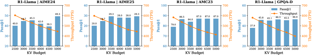
### Visual Description
## Bar and Line Charts: KV Budget vs. Pass@1 and Throughput
### Overview
The image contains four separate bar and line charts, each displaying the relationship between KV Budget (x-axis), Pass@1 (left y-axis, blue bars), and Throughput (right y-axis, orange line). Each chart represents a different configuration: R1-Llama with AIME24, AIME25, AMC23, and GPQA-D. The KV Budget ranges from 2500 to 5000 in increments of 500.
### Components/Axes
* **Titles:** Each chart has a title in the format "R1-Llama | [Configuration Name]", where the configuration names are AIME24, AIME25, AMC23, and GPQA-D.
* **X-Axis:** KV Budget, with values 2500, 3000, 3500, 4000, 4500, and 5000.
* **Left Y-Axis:** Pass@1, ranging from 0 to 60 (AIME25), 0 to 100 (AMC23), and 20 to 60 (AIME24, GPQA-D).
* **Right Y-Axis:** Throughput (TPS), ranging from 300 to 700 for all charts.
* **Legend:** Located in the top-right chart (R1-Llama | GPQA-D), indicating that blue bars represent "Pass@1" and the orange line represents "Throughput".
### Detailed Analysis
**Chart 1: R1-Llama | AIME24**
* **Pass@1 (Blue Bars):** The values increase with KV Budget: 40.0, 44.7, 45.3, 42.0, 39.3, 49.3.
* **Throughput (Orange Line):** The values decrease with KV Budget: approximately 50, 45, 42, 41, 38, 36.
**Chart 2: R1-Llama | AIME25**
* **Pass@1 (Blue Bars):** The values increase with KV Budget: 20.0, 29.3, 28.0, 28.0, 29.3.
* **Throughput (Orange Line):** The values decrease with KV Budget: approximately 30, 25, 24, 23, 22, 21.
**Chart 3: R1-Llama | AMC23**
* **Pass@1 (Blue Bars):** The values increase with KV Budget: 79.0, 86.5, 84.0, 87.0, 87.0, 87.0.
* **Throughput (Orange Line):** The values decrease with KV Budget: approximately 88, 83, 79, 76, 73, 71.
**Chart 4: R1-Llama | GPQA-D**
* **Pass@1 (Blue Bars):** The values increase with KV Budget: 37.9, 45.8, 45.1, 46.3, 45.5, 46.4.
* **Throughput (Orange Line):** The values decrease with KV Budget: approximately 48, 45, 43, 42, 41, 40.
### Key Observations
* Across all configurations, Pass@1 generally increases with KV Budget, although there are some fluctuations.
* Throughput consistently decreases with increasing KV Budget.
* The AMC23 configuration has the highest Pass@1 values, while AIME25 has the lowest.
### Interpretation
The charts suggest a trade-off between Pass@1 and Throughput when adjusting the KV Budget for the R1-Llama model. Increasing the KV Budget generally improves the Pass@1 metric, indicating better accuracy or performance on a specific task. However, this comes at the cost of reduced Throughput, meaning the model processes fewer transactions or inferences per second.
The different configurations (AIME24, AIME25, AMC23, GPQA-D) likely represent different datasets or training parameters. The varying Pass@1 values across these configurations indicate that the model's performance is sensitive to the specific data or training setup used. The consistent inverse relationship between Pass@1 and Throughput suggests a fundamental constraint in the model's architecture or resource allocation.
Further investigation would be needed to understand the specific nature of the tasks being performed and the reasons for the observed trade-off. It would also be beneficial to explore other configurations or optimization techniques to potentially improve both Pass@1 and Throughput simultaneously.
</details>
<details>
<summary>x52.png Details</summary>
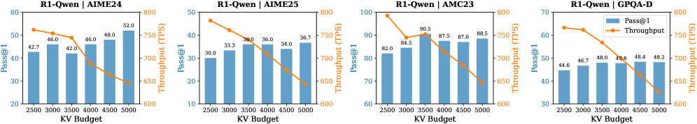
### Visual Description
## Bar and Line Charts: Performance Metrics vs. KV Budget
### Overview
The image contains four bar and line charts, each displaying the performance of "R1-Qwen" on different datasets (AIME24, AIME25, AMC23, and GPQA-D). Each chart plots "Pass@1" (a performance metric) as blue bars and "Throughput (TPS)" as an orange line, both against "KV Budget" on the x-axis.
### Components/Axes
* **Titles (Top of each chart):**
* Chart 1: "R1-Qwen | AIME24"
* Chart 2: "R1-Qwen | AIME25"
* Chart 3: "R1-Qwen | AMC23"
* Chart 4: "R1-Qwen | GPQA-D"
* **X-Axis:** "KV Budget" with markers at 2500, 3000, 3500, 4000, 4500, and 5000.
* **Left Y-Axis:** "Pass@1"
* Chart 1: Scale from 20 to 60
* Chart 2: Scale from 10 to 50
* Chart 3: Scale from 60 to 100
* Chart 4: Scale from 30 to 70
* **Right Y-Axis:** "Throughput (TPS)" with a scale from 600 to 800 on all charts.
* **Legend (Top-Right of the last chart):**
* Blue: "Pass@1"
* Orange: "Throughput"
### Detailed Analysis
**Chart 1: R1-Qwen | AIME24**
* **Pass@1 (Blue Bars):** Generally increasing with KV Budget.
* KV Budget 2500: Pass@1 ≈ 42.7
* KV Budget 3000: Pass@1 ≈ 46.0
* KV Budget 3500: Pass@1 ≈ 42.0
* KV Budget 4000: Pass@1 ≈ 46.0
* KV Budget 4500: Pass@1 ≈ 48.0
* KV Budget 5000: Pass@1 ≈ 52.0
* **Throughput (Orange Line):** Decreasing with KV Budget.
* KV Budget 2500: Throughput ≈ 780 TPS
* KV Budget 3000: Throughput ≈ 760 TPS
* KV Budget 3500: Throughput ≈ 750 TPS
* KV Budget 4000: Throughput ≈ 670 TPS
* KV Budget 4500: Throughput ≈ 650 TPS
* KV Budget 5000: Throughput ≈ 630 TPS
**Chart 2: R1-Qwen | AIME25**
* **Pass@1 (Blue Bars):** Generally increasing with KV Budget.
* KV Budget 2500: Pass@1 ≈ 30.0
* KV Budget 3000: Pass@1 ≈ 33.3
* KV Budget 3500: Pass@1 ≈ 36.0
* KV Budget 4000: Pass@1 ≈ 36.0
* KV Budget 4500: Pass@1 ≈ 34.0
* KV Budget 5000: Pass@1 ≈ 36.7
* **Throughput (Orange Line):** Decreasing with KV Budget.
* KV Budget 2500: Throughput ≈ 780 TPS
* KV Budget 3000: Throughput ≈ 760 TPS
* KV Budget 3500: Throughput ≈ 730 TPS
* KV Budget 4000: Throughput ≈ 690 TPS
* KV Budget 4500: Throughput ≈ 670 TPS
* KV Budget 5000: Throughput ≈ 650 TPS
**Chart 3: R1-Qwen | AMC23**
* **Pass@1 (Blue Bars):** Generally increasing with KV Budget.
* KV Budget 2500: Pass@1 ≈ 82.0
* KV Budget 3000: Pass@1 ≈ 84.5
* KV Budget 3500: Pass@1 ≈ 90.5
* KV Budget 4000: Pass@1 ≈ 87.5
* KV Budget 4500: Pass@1 ≈ 87.0
* KV Budget 5000: Pass@1 ≈ 88.5
* **Throughput (Orange Line):** Decreasing with KV Budget.
* KV Budget 2500: Throughput ≈ 785 TPS
* KV Budget 3000: Throughput ≈ 730 TPS
* KV Budget 3500: Throughput ≈ 760 TPS
* KV Budget 4000: Throughput ≈ 700 TPS
* KV Budget 4500: Throughput ≈ 680 TPS
* KV Budget 5000: Throughput ≈ 650 TPS
**Chart 4: R1-Qwen | GPQA-D**
* **Pass@1 (Blue Bars):** Relatively stable with KV Budget.
* KV Budget 2500: Pass@1 ≈ 44.6
* KV Budget 3000: Pass@1 ≈ 46.7
* KV Budget 3500: Pass@1 ≈ 48.0
* KV Budget 4000: Pass@1 ≈ 47.8
* KV Budget 4500: Pass@1 ≈ 48.4
* KV Budget 5000: Pass@1 ≈ 48.2
* **Throughput (Orange Line):** Decreasing with KV Budget.
* KV Budget 2500: Throughput ≈ 775 TPS
* KV Budget 3000: Throughput ≈ 740 TPS
* KV Budget 3500: Throughput ≈ 710 TPS
* KV Budget 4000: Throughput ≈ 680 TPS
* KV Budget 4500: Throughput ≈ 660 TPS
* KV Budget 5000: Throughput ≈ 630 TPS
### Key Observations
* Across all datasets, "Pass@1" generally increases or remains stable with increasing "KV Budget."
* Across all datasets, "Throughput (TPS)" consistently decreases with increasing "KV Budget."
* The "AMC23" dataset shows the highest "Pass@1" values compared to the other datasets.
### Interpretation
The charts suggest a trade-off between "Pass@1" and "Throughput (TPS)" for the "R1-Qwen" model. Increasing the "KV Budget" tends to improve the "Pass@1" metric, indicating better accuracy or performance on the given task. However, this comes at the cost of reduced "Throughput (TPS)," suggesting a decrease in processing speed or efficiency. The optimal "KV Budget" would depend on the specific application and the relative importance of accuracy versus speed. The different performance characteristics across datasets (AIME24, AIME25, AMC23, GPQA-D) indicate that the model's behavior is influenced by the nature of the data it is processing.
</details>
Figure 16: Impact of budget on Pass@1 and throughput for R1-Llama (top) and R1-Qwen (bottom) across AIME24, AIME25, AMC23, and GPQA-D datasets. The blue bars represent accuracy (left y-axis), and the orange lines represent throughput (right y-axis).
<details>
<summary>x53.png Details</summary>
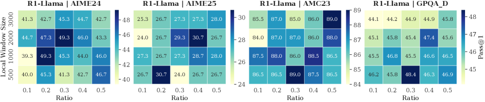
### Visual Description
## Heatmap: R1-Llama Performance on Different Datasets
### Overview
The image presents four heatmaps, each displaying the performance of the R1-Llama model on a different dataset (AIME24, AIME25, AMC23, and GPQA_D). The heatmaps show the "Pass@1" metric, which is a measure of accuracy, across different "Local Window Sizes" and "Ratio" values. The color intensity represents the performance level, with darker shades indicating higher "Pass@1" values.
### Components/Axes
* **Titles:** Each heatmap has a title in the format "R1-Llama | [Dataset Name]". The datasets are AIME24, AIME25, AMC23, and GPQA_D.
* **Y-axis:** "Local Window Size" with values 500, 1000, 2000, and 3000.
* **X-axis:** "Ratio" with values 0.1, 0.2, 0.3, 0.4, and 0.5.
* **Color Scale (Right of AIME25 and GPQA_D):**
* The color scale represents the "Pass@1" values.
* AIME24: Ranges from approximately 40 to 48.
* AIME25: Ranges from approximately 24 to 30.
* AMC23: Ranges from approximately 84 to 89.
* GPQA_D: Ranges from approximately 45 to 48.
* **Pass@1 (Right of GPQA_D):** Label for the color scale.
### Detailed Analysis
**R1-Llama | AIME24**
| Local Window Size | Ratio 0.1 | Ratio 0.2 | Ratio 0.3 | Ratio 0.4 | Ratio 0.5 |
| ----------------- | --------- | --------- | --------- | --------- | --------- |
| 3000 | 41.3 | 42.7 | 45.3 | 44.7 | 42.7 |
| 2000 | 44.7 | 47.3 | 49.3 | 46.0 | 43.3 |
| 1000 | 39.3 | 49.3 | 45.3 | 44.0 | 46.0 |
| 500 | 40.0 | 45.3 | 41.3 | 42.7 | 46.7 |
* Trend: The highest "Pass@1" values are generally observed at a "Ratio" of 0.2 or 0.3 and a "Local Window Size" of 1000 or 2000.
**R1-Llama | AIME25**
| Local Window Size | Ratio 0.1 | Ratio 0.2 | Ratio 0.3 | Ratio 0.4 | Ratio 0.5 |
| ----------------- | --------- | --------- | --------- | --------- | --------- |
| 3000 | 25.3 | 26.7 | 27.3 | 27.3 | 28.0 |
| 2000 | 24.0 | 26.7 | 29.3 | 30.7 | 26.7 |
| 1000 | 27.3 | 26.7 | 27.3 | 28.7 | 28.0 |
| 500 | 26.7 | 30.7 | 24.0 | 26.7 | 26.7 |
* Trend: The highest "Pass@1" values are observed at a "Ratio" of 0.2 and a "Local Window Size" of 500, and at a "Ratio" of 0.4 and a "Local Window Size" of 2000.
**R1-Llama | AMC23**
| Local Window Size | Ratio 0.1 | Ratio 0.2 | Ratio 0.3 | Ratio 0.4 | Ratio 0.5 |
| ----------------- | --------- | --------- | --------- | --------- | --------- |
| 3000 | 85.5 | 87.0 | 85.0 | 86.0 | 89.0 |
| 2000 | 84.0 | 87.0 | 87.0 | 86.0 | 88.0 |
| 1000 | 87.5 | 88.0 | 86.0 | 88.5 | 86.5 |
| 500 | 86.5 | 86.5 | 89.0 | 87.5 | 86.5 |
* Trend: The "Pass@1" values are generally high across all "Ratio" and "Local Window Size" combinations. The highest value is observed at a "Ratio" of 0.3 and a "Local Window Size" of 500.
**R1-Llama | GPQA_D**
| Local Window Size | Ratio 0.1 | Ratio 0.2 | Ratio 0.3 | Ratio 0.4 | Ratio 0.5 |
| ----------------- | --------- | --------- | --------- | --------- | --------- |
| 3000 | 44.1 | 44.2 | 44.9 | 44.9 | 45.8 |
| 2000 | 45.1 | 45.8 | 45.4 | 47.4 | 45.6 |
| 1000 | 45.5 | 46.8 | 45.5 | 46.6 | 46.5 |
| 500 | 46.2 | 45.8 | 48.4 | 46.3 | 46.9 |
* Trend: The highest "Pass@1" value is observed at a "Ratio" of 0.3 and a "Local Window Size" of 500.
### Key Observations
* The performance of R1-Llama varies significantly across different datasets.
* The optimal "Ratio" and "Local Window Size" settings depend on the specific dataset.
* AMC23 generally shows the highest "Pass@1" values, while AIME25 shows the lowest.
### Interpretation
The heatmaps illustrate the sensitivity of the R1-Llama model to different hyperparameter settings ("Ratio" and "Local Window Size") and datasets. The varying performance across datasets suggests that the model's ability to generalize depends on the characteristics of the data. The optimal hyperparameter settings appear to be dataset-specific, indicating that careful tuning is necessary to achieve the best performance on a given task. The high performance on AMC23 could be attributed to the nature of the questions in that dataset, while the lower performance on AIME25 might indicate greater complexity or difficulty.
</details>
<details>
<summary>x54.png Details</summary>
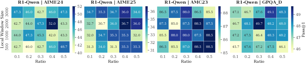
### Visual Description
## Heatmap: R1-Qwen Performance on Various Datasets
### Overview
The image presents four heatmaps, each displaying the performance of the R1-Qwen model on a different dataset (AIME24, AIME25, AMC23, and GPQA_D). The heatmaps visualize the "Pass@1" metric across different "Local Window Sizes" and "Ratio" values. The color intensity represents the Pass@1 score, with darker blues indicating higher scores and lighter yellows indicating lower scores.
### Components/Axes
* **Titles:** Each heatmap has a title in the format "R1-Qwen | [Dataset Name]". The datasets are AIME24, AIME25, AMC23, and GPQA_D.
* **X-axis:** "Ratio" with values 0.1, 0.2, 0.3, 0.4, and 0.5.
* **Y-axis:** "Local Window Size" with values 500, 1000, 2000, and 3000.
* **Color Scale (Legend):** Located between the AIME25 and AMC23 heatmaps, and between the AMC23 and GPQA_D heatmaps.
* The color scale represents the "Pass@1" metric.
* For AIME24 and AIME25: ranges from 40 (yellow) to 52 (dark blue) and 31 (yellow) to 36 (dark blue) respectively.
* For AMC23: ranges from 85 (yellow) to 88 (dark blue).
* For GPQA_D: ranges from 46 (yellow) to 49 (dark blue).
### Detailed Analysis
**Heatmap 1: R1-Qwen | AIME24**
| Local Window Size | Ratio 0.1 | Ratio 0.2 | Ratio 0.3 | Ratio 0.4 | Ratio 0.5 |
| ----------------- | --------- | --------- | --------- | --------- | --------- |
| 500 | 42.7 | 40.0 | 42.7 | 46.0 | 48.7 |
| 1000 | 44.0 | 47.3 | 45.3 | 42.0 | 43.3 |
| 2000 | 42.7 | 44.0 | 47.3 | 52.0 | 43.3 |
| 3000 | 47.3 | 46.0 | 42.7 | 46.0 | 47.3 |
* The highest Pass@1 score (52.0) is achieved with a Local Window Size of 2000 and a Ratio of 0.4.
* The lowest Pass@1 score (40.0) is achieved with a Local Window Size of 500 and a Ratio of 0.2.
**Heatmap 2: R1-Qwen | AIME25**
| Local Window Size | Ratio 0.1 | Ratio 0.2 | Ratio 0.3 | Ratio 0.4 | Ratio 0.5 |
| ----------------- | --------- | --------- | --------- | --------- | --------- |
| 500 | 31.3 | 34.0 | 31.3 | 35.3 | 35.3 |
| 1000 | 32.0 | 34.7 | 35.3 | 35.3 | 32.0 |
| 2000 | 32.7 | 30.7 | 34.0 | 36.7 | 36.0 |
| 3000 | 34.7 | 35.3 | 34.7 | 36.0 | 34.0 |
* The highest Pass@1 score (36.7) is achieved with a Local Window Size of 2000 and a Ratio of 0.4.
* The lowest Pass@1 score (30.7) is achieved with a Local Window Size of 2000 and a Ratio of 0.2.
**Heatmap 3: R1-Qwen | AMC23**
| Local Window Size | Ratio 0.1 | Ratio 0.2 | Ratio 0.3 | Ratio 0.4 | Ratio 0.5 |
| ----------------- | --------- | --------- | --------- | --------- | --------- |
| 500 | 86.5 | 85.5 | 87.0 | 88.5 | 88.5 |
| 1000 | 85.5 | 88.0 | 88.0 | 87.5 | 88.5 |
| 2000 | 87.5 | 85.0 | 87.5 | 88.5 | 87.5 |
| 3000 | 86.5 | 87.5 | 88.0 | 86.5 | 85.5 |
* The highest Pass@1 score (88.5) is achieved with a Local Window Size of 500 and a Ratio of 0.4, a Local Window Size of 500 and a Ratio of 0.5, a Local Window Size of 1000 and a Ratio of 0.5, and a Local Window Size of 2000 and a Ratio of 0.4.
* The lowest Pass@1 score (85.0) is achieved with a Local Window Size of 2000 and a Ratio of 0.2.
**Heatmap 4: R1-Qwen | GPQA_D**
| Local Window Size | Ratio 0.1 | Ratio 0.2 | Ratio 0.3 | Ratio 0.4 | Ratio 0.5 |
| ----------------- | --------- | --------- | --------- | --------- | --------- |
| 500 | 45.7 | 47.6 | 47.2 | 47.5 | 46.1 |
| 1000 | 47.2 | 47.5 | 46.4 | 48.3 | 48.2 |
| 2000 | 46.7 | 48.1 | 49.7 | 48.2 | 48.0 |
| 3000 | 47.1 | 46.7 | 47.6 | 49.1 | 48.3 |
* The highest Pass@1 score (49.7) is achieved with a Local Window Size of 2000 and a Ratio of 0.3.
* The lowest Pass@1 score (45.7) is achieved with a Local Window Size of 500 and a Ratio of 0.1.
### Key Observations
* The AMC23 dataset consistently yields the highest Pass@1 scores across all configurations, while AIME25 yields the lowest.
* The optimal "Ratio" and "Local Window Size" vary depending on the dataset.
* For AIME24, a Local Window Size of 2000 and a Ratio of 0.4 results in the best performance.
* For AIME25, a Local Window Size of 2000 and a Ratio of 0.4 results in the best performance.
* For AMC23, multiple configurations achieve the highest score (88.5).
* For GPQA_D, a Local Window Size of 2000 and a Ratio of 0.3 results in the best performance.
### Interpretation
The heatmaps illustrate the sensitivity of the R1-Qwen model's performance to different hyperparameter settings ("Ratio" and "Local Window Size") across various datasets. The results suggest that the optimal configuration is dataset-dependent, highlighting the importance of tuning these parameters for each specific task. The consistently high performance on the AMC23 dataset indicates that the model is particularly well-suited for this type of data, while the lower scores on AIME25 suggest potential challenges in processing that dataset. The data suggests that a local window size of 2000 is generally a good choice.
</details>
Figure 17: Impact of different local window sizes and retention ratios of section window
Local Window and Retention Ratio Analysis over Benchmarks. Figures 17 illustrate the sensitivity of model performance to variations in Local Window Size and the Retention Ratio of the Selection Window. A moderate local window (e.g., 1000–2000) typically yields optimal results, suggesting that recent context saturation is reached relatively. Furthermore, we observe that the retention ratio between $0.3$ and $0.4$ across most benchmarks (e.g., AIME24, GPQA), where the model effectively balances and reasoning performance. Whereas lower ratios (e.g., $0.1$ ) consistently degrade accuracy due to excessive information loss.
Appendix E Limitations and Future Work
Currently, DynTS is implemented based on the transformers library, and we are actively working on deploying it to other inference frameworks such as vLLM and SGLang. Additionally, our current training data focuses on mathematical reasoning, which may limit performance in other domains like coding or abstract reasoning. In the future, we plan to expand data diversity to adapt to a broader range of reasoning tasks. Moreover, constrained by computational resources, we used a relatively small dataset ( $\sim 7,000$ samples) for training. This dataset’s scale limits us to optimizing only the importance predictor’s parameters, since optimizing all parameters on the small dataset may compromise the model’s original generalization capabilities. This constraint may hinder the full potential of DynTS. Future work can focus on scaling up the dataset and jointly optimizing both the backbone and the predictor to elicit stronger capabilities.