# Dynamic Thinking-Token Selection for Efficient Reasoning in Large Reasoning Models
**Authors**: Zhenyuan Guo, Tong Chen, Wenlong Meng, Chen Gong, Xin Yu, Chengkun Wei, Wenzhi Chen
## Abstract
Large Reasoning Models (LRMs) excel at solving complex problems by explicitly generating a reasoning trace before deriving the final answer. However, these extended generations incur substantial memory footprint and computational overhead, bottlenecking LRMs’ efficiency. This work uses attention maps to analyze the influence of reasoning traces and uncover an interesting phenomenon: only some decision-critical tokens in a reasoning trace steer the model toward the final answer, while the remaining tokens contribute negligibly. Building on this observation, we propose Dyn amic T hinking-Token S election (DynTS). This method identifies decision-critical tokens and retains only their associated Key-Value (KV) cache states during inference, evicting the remaining redundant entries to optimize efficiency. Across six benchmarks, DynTS surpasses the state-of-the-art KV cache compression methods, improving Pass@1 by $2.6\$ under the same budget. Compared to vanilla Transformers, it reduces inference latency by $1.84–2.62\times$ and peak KV-cache memory footprint by $3.32–5.73\times$ without compromising LRMs’ reasoning performance. The code is available at the github link. https://github.com/Robin930/DynTS
KV Cache Compression, Efficient LRM, LLM
## 1 Introduction
<details>
<summary>x1.png Details</summary>
### Visual Description
\n
## Diagram: Token Selection Strategies in Language Model Methods
### Overview
This diagram illustrates and compares five different methods for processing and retaining tokens from an input prompt in large language models. It visually demonstrates how each method selects which tokens to keep for computation, highlighting strategies for efficiency and context management. The diagram is structured as a table with rows for each method and columns for the method name, a visual representation of its token sequence, and a legend explaining the token types.
### Components/Axes
The diagram is organized into three main columns:
1. **Methods (Left Column):** Lists the five methods being compared: `Transformers`, `SnapKV`, `StreamingLLM`, `H2O`, and `DynTS`.
2. **Tokens (Center Column):** Displays a horizontal sequence of squares representing tokens for each method. The sequence is truncated with an ellipsis (`...`) on the right, indicating a continuing sequence. A dashed box labeled `Observation Window` is shown within the `SnapKV` row.
3. **Keeps (Right Column / Legend):** A key that maps colors to the type of token each method retains.
* **White Square:** `All Tokens`
* **Orange Square:** `High Importance Prefill Tokens`
* **Yellow Square:** `Attention Sink Tokens`
* **Light Blue Square:** `Local Tokens`
* **Green Square:** `Heavy-Hitter Tokens`
* **Red Square:** `Predicted Importance Tokens`
### Detailed Analysis
The diagram details the token retention strategy for each method:
* **Transformers:**
* **Visual Trend:** The entire token sequence is composed of white squares.
* **Data Points/Strategy:** Retains **All Tokens** from the prompt for processing. This is the baseline, full-context approach.
* **SnapKV:**
* **Visual Trend:** The sequence contains a mix of white and orange squares. A dashed box labeled `Observation Window` encloses a cluster of orange squares towards the right side of the visible sequence. A label `Prompt` points to the beginning of the sequence.
* **Data Points/Strategy:** Selectively keeps **High Importance Prefill Tokens** (orange). The `Observation Window` suggests these important tokens are identified within a specific segment of the prompt. The remaining tokens (white) are presumably discarded or not used for the key-value cache.
* **StreamingLLM:**
* **Visual Trend:** The sequence starts with a few yellow squares on the far left, followed by white squares, and ends with a block of light blue squares on the far right.
* **Data Points/Strategy:** Keeps two types of tokens: **Attention Sink Tokens** (yellow) from the very beginning of the sequence and **Local Tokens** (light blue) from the most recent part of the sequence. The middle tokens (white) are not retained.
* **H2O (Heavy-Hitter Oracle):**
* **Visual Trend:** The sequence shows green squares interspersed among white squares in the first half, followed by a block of light blue squares at the end.
* **Data Points/Strategy:** Keeps **Heavy-Hitter Tokens** (green), which are likely tokens that receive high attention scores, scattered throughout the prompt, and **Local Tokens** (light blue) from the recent context.
* **DynTS (Dynamic Token Selection):**
* **Visual Trend:** The sequence begins with red squares, followed by white squares, and ends with light blue squares. Curved arrows originate from the red squares and point to a box labeled `Answer`. Text above the arrows reads: `Predicted importance of tokens to the final answer`.
* **Data Points/Strategy:** Keeps **Predicted Importance Tokens** (red) and **Local Tokens** (light blue). The arrows indicate that the red tokens are dynamically selected based on a model's prediction of their importance for generating the final `Answer`.
### Key Observations
1. **Progression of Selectivity:** There is a clear evolution from the `Transformers` method (keeping everything) to increasingly selective strategies (`SnapKV`, `StreamingLLM`, `H2O`, `DynTS`) that aim to reduce computational load by retaining only a subset of tokens.
2. **Common Element:** Four of the five methods (all except `Transformers`) explicitly retain **Local Tokens** (light blue) from the end of the sequence, underscoring the importance of recent context.
3. **Diverse Selection Criteria:** The methods use different heuristics to select non-local tokens: fixed position (`StreamingLLM`'s attention sinks), attention scores (`H2O`'s heavy-hitters), importance within a window (`SnapKV`), or predicted relevance to the output (`DynTS`).
4. **Spatial Layout:** The `Observation Window` in `SnapKV` is positioned in the center-right of its token sequence. The `Answer` box for `DynTS` is placed to the right of its token sequence, with arrows creating a visual flow from selected tokens to the output.
### Interpretation
This diagram serves as a technical comparison of context window management techniques in efficient language model inference. It demonstrates the core challenge: balancing the need for long-context understanding with the computational cost of processing every token.
* **What the data suggests:** The field is moving beyond simply truncating context (which would be represented by keeping only local tokens) towards more intelligent, dynamic selection mechanisms. Methods like `DynTS` represent a shift towards task-aware processing, where token retention is directly tied to the goal of generating a correct answer.
* **How elements relate:** The `Tokens` column visually contrasts the "full" sequence of `Transformers` with the "sparse" or "filtered" sequences of the other methods. The `Keeps` legend is essential for decoding the strategy behind each pattern. The `Observation Window` and `Answer` annotations provide crucial context for understanding the operational logic of `SnapKV` and `DynTS`, respectively.
* **Notable patterns/anomalies:** The most striking pattern is the universal retention of local tokens. This implies that regardless of the selection strategy for earlier context, the most recent information is consistently deemed critical. The `DynTS` method is unique in its explicit, goal-oriented selection mechanism, visualized by the predictive arrows, suggesting a more sophisticated, possibly model-driven approach compared to the heuristic-based methods above it.
</details>
<details>
<summary>x2.png Details</summary>
### Visual Description
## Dual-Axis Bar & Line Chart: Model Accuracy vs. KV Cache Length
### Overview
This image is a technical comparison chart evaluating eight different models or methods (Transformers, DynTS, Window, StreamingLLM, SepLLM, H2O, SnapKV, R-KV) on two metrics: Accuracy (%) and KV Cache Length. It uses a dual-axis design with bars representing accuracy (left y-axis) and a line representing KV cache length (right y-axis).
### Components/Axes
* **Chart Type:** Combined bar chart and line chart with dual y-axes.
* **X-Axis (Categories):** Lists eight models/methods. From left to right: `Transformers`, `DynTS`, `Window`, `StreamingLLM`, `SepLLM`, `H2O`, `SnapKV`, `R-KV`.
* **Primary Y-Axis (Left):** Labeled `Accuracy (%)`. Scale runs from 0 to 70 in increments of 10.
* **Secondary Y-Axis (Right):** Labeled `KV Cache Length`. Scale runs from 2k to 20k in increments of 3k (2k, 5k, 8k, 11k, 14k, 17k, 20k).
* **Legend:** Positioned at the top center of the chart area.
* A gray rectangle is labeled `Accuracy`.
* A blue line with a circular marker is labeled `KV Cache Length`.
* **Data Series:**
1. **Accuracy (Bars):** The height of each bar corresponds to the accuracy percentage. The first two bars are colored distinctly (dark blue for `Transformers`, red for `DynTS`), while the remaining six bars are gray.
2. **KV Cache Length (Line):** A blue dashed line with circular markers connects data points for each model, corresponding to the right y-axis.
### Detailed Analysis
**Accuracy Data (Bars):**
* `Transformers`: 63.6% (Dark blue bar, tallest)
* `DynTS`: 63.5% (Red bar, nearly equal to Transformers)
* `Window`: 49.4% (Gray bar)
* `StreamingLLM`: 51.6% (Gray bar)
* `SepLLM`: 54.5% (Gray bar)
* `H2O`: 58.8% (Gray bar)
* `SnapKV`: 59.8% (Gray bar)
* `R-KV`: 60.9% (Gray bar)
**KV Cache Length Data (Line - Estimated from visual position against right axis):**
* **Trend Verification:** The line shows a dramatic, steep downward slope from the first point to the second, followed by a nearly flat, low plateau for the remaining six points.
* `Transformers`: ~18k (Highest point, near the 17k-20k range)
* `DynTS`: ~4k (Sharp drop, positioned just above the 2k line)
* `Window`: ~3.5k
* `StreamingLLM`: ~3.5k
* `SepLLM`: ~3.5k
* `H2O`: ~3.5k
* `SnapKV`: ~3.5k
* `R-KV`: ~3.5k
*(Note: Exact values for KV Cache Length are not labeled; these are visual approximations. The line markers for the last six models are all clustered closely together just above the 2k axis line.)*
### Key Observations
1. **Accuracy Cluster:** `Transformers` and `DynTS` form a high-accuracy cluster (~63.5%), significantly outperforming the other six methods, which range from 49.4% to 60.9%.
2. **Efficiency Leap:** There is a massive reduction in KV Cache Length between `Transformers` (~18k) and `DynTS` (~4k), despite nearly identical accuracy.
3. **Performance Plateau:** The six methods from `Window` to `R-KV` show a gradual, incremental improvement in accuracy (from 49.4% to 60.9%) while maintaining a consistently low and similar KV Cache Length (~3.5k).
4. **Visual Emphasis:** The use of distinct colors (dark blue, red) for the first two bars visually highlights them as the primary subjects of comparison against the baseline (gray) methods.
### Interpretation
This chart demonstrates a critical trade-off and advancement in the efficiency of language model inference, specifically regarding the Key-Value (KV) cache, which stores attention keys and values and is a major consumer of memory.
* **The Core Finding:** The `DynTS` method achieves accuracy on par with the standard `Transformers` model while reducing the KV cache memory footprint by approximately 78% (from ~18k to ~4k). This suggests `DynTS` is a highly efficient optimization that preserves performance.
* **The Landscape of Alternatives:** The other six methods (`Window`, `StreamingLLM`, etc.) represent a different point on the efficiency-accuracy curve. They achieve even lower cache usage (~3.5k) but at a notable cost to accuracy (5-14 percentage points lower than `Transformers`/`DynTS`). Their incremental accuracy improvements suggest ongoing refinement within this "low-cache" paradigm.
* **Strategic Implication:** The data positions `DynTS` as a potentially optimal solution for scenarios requiring both high accuracy and memory efficiency. The chart argues that significant cache reduction is possible without the accuracy penalty incurred by the other listed methods. The visualization effectively makes the case for `DynTS` as a superior approach by placing its red bar directly beside the high-accuracy `Transformers` baseline while showing its dramatic drop on the cache-length line.
</details>
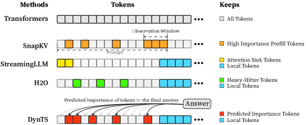
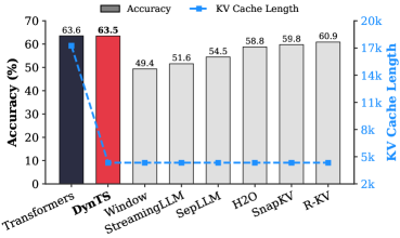
Figure 1: (Left) Comparison of token selection strategies across different KV cache eviction methods. In each row, colored blocks denote the retained high-importance tokens, while grey blocks represent the evicted tokens during LRM inference. (Right) The average reasoning performance and KV cache memory footprint on DeepSeek-R1-Distall-Llama-8B and DeepSeek-R1-Distall-Qwen-7B across six reasoning benchmarks.
Recent advancements in Large Reasoning Models (LRMs) (Chen et al., 2025) have significantly strengthened the reasoning capabilities of Large Language Models (LLMs). Representative models such as DeepSeek-R1 (Guo et al., 2025), Gemini-3-Pro (DeepMind, 2025), and ChatGPT-5.2 (OpenAI, 2025) support deep thinking mode to strengthen reasoning capability in the challenging mathematics, programming, and science tasks (Zhang et al., 2025b). These models spend a substantial number of intermediate thinking tokens on reflection, reasoning, and verification to derive the correct response during inference (Feng et al., 2025). However, the thinking process necessitates the immense KV cache memory footprint and attention-related computational cost, posing a critical deployment challenge in resource-constrained environments.
KV cache compression techniques aim to optimize the cache state by periodically evicting non-essential tokens (Shi et al., 2024; WEI et al., 2025; Liu et al., 2025b; Qin et al., 2025), typically guided by predefined token retention rules (Chen et al., 2024; Xiao et al., 2024; Devoto et al., 2024) or attention-based importance metrics (Zhang et al., 2023; Li et al., 2024; Choi et al., 2025). Nevertheless, incorporating them into the inference process of LRMs faces two key limitations: (1) Methods designed for long-context prefilling are ill-suited to the short-prefill and long-decoding scenarios of LRMs; (2) Methods tailored for long-decoding struggle to match the reasoning performance of the Full KV baseline (SOTA $60.9\$ vs. Full KV $63.6\$ , Fig. 1 Left). Specifically, in LRM inference, the model conducts an extensive reasoning process and then summarizes the reasoning content to derive the final answer (Minegishi et al., 2025). This implies that the correctness of the final answer relies on the thinking tokens within the preceding reasoning (Bogdan et al., 2025). However, existing compression methods cannot identify the tokens that are essential to the future answer. This leads to a significant misalignment between the retained tokens and the critical thinking tokens, resulting in degradation in the model’s reasoning performance.
To address this issue, we analyze the LRM’s generated content and study which tokens are most important for the model to steer the final answer. Some works point out attention weights capturing inter-token dependencies (Vaswani et al., 2017; Wiegreffe and Pinter, 2019; Bogdan et al., 2025), which can serve as a metric to assess the importance of tokens. Consequently, we decompose the generated content into a reasoning trace and a final answer, and then calculate the importance score of each thinking token in the trajectory by aggregating the attention weights from the answer to thinking tokens. We find that only a small subset of thinking tokens ( $\sim 20\$ tokens in the reasoning trace, see Section § 3.1) have significant scores, which may be critical for the final answer. To validate these hypotheses, we retain these tokens and prompt the model to directly generate the final answer. Experimental results show that the model maintains close accuracy compared to using the whole KV cache. This reveals a Pareto principle The Pareto principle, also known as the 80/20 rule, posits that $20\$ of critical factors drive $80\$ of the outcomes. In this paper, it implies that a small fraction of pivotal thinking tokens dictates the correctness of the model’s final response. in LRMs: only a small subset of decision-critical thinking tokens with high importance scores drives the model toward the final answer, while the remaining tokens contribute negligibly.
Based on the above insight, we introduce DynTS (Dyn amic T hinking-Token S election), a novel method for dynamically predicting and selecting decision-critical thinking tokens on-the-fly during decoding, as shown in Fig. 1 (Left). The key innovation of DynTS is the integration of a trainable, lightweight Importance Predictor at the final layer of LRMs, enabling the model to dynamically predict the importance of each thinking token to the final answer. By utilizing importance scores derived from sampled reasoning traces as supervision signals, the predictor learns to distinguish between critical tokens and redundant tokens. During inference, DynTS manages memory through a dual-window mechanism: generated tokens flow from a Local Window (which captures recent context) into a Selection Window (which stores long-term history). Once the KV cache reaches the budget, the system retains the KV cache of tokens with higher predicted importance scores in the Select Window and all tokens in the Local Window (Zhang et al., 2023; Chen et al., 2024). By evicting redundant KV cache entries, DynTS effectively reduces both system memory pressure and computational overhead. We also theoretically analyze the computational overhead introduced by the importance predictor and the savings from cache eviction, and derive a Break-Even Condition for net computational gain.
Then, we train the Importance Predictor based on the MATH (Hendrycks et al., 2021) train set, and evaluate DynTS on the other six reasoning benchmarks. The reasoning performance and KV cache length compare with the SOTA KV cache compression method, as reported in Fig. 1 (Right). Our method reduces the KV cache memory footprint by up to $3.32–5.73\times$ without compromising reasoning performance compared to the full-cache transformer baseline. Within the same budget, our method achieves a $2.6\$ improvement in accuracy over the SOTA KV cache compression approach.
## 2 Preliminaries
#### Large Reasoning Model (LRM).
Unlike standard LLMs that directly generate answers, LRMs incorporate an intermediate reasoning process prior to producing the final answer (Chen et al., 2025; Zhang et al., 2025a; Sui et al., 2025). Given a user prompt $\mathbf{x}=(x_{1},\dots,x_{M})$ , the model generated content represents as $\mathbf{y}$ , which can be decomposed into a reasoning trace $\mathbf{t}$ and a final answer $\mathbf{a}$ . The trajectory is delimited by a start tag <think> and an end tag </think>. Formally, the model output is defined as:
$$
\mathbf{y}=[\texttt{<think>},\mathbf{t},\texttt{</think>},\mathbf{a}], \tag{1}
$$
where the trajectory $\mathbf{t}=(t_{1},\dots,t_{L})$ composed of $L$ thinking tokens, and $\mathbf{a}=(a_{1},\dots,a_{K})$ represents the answer composed of $K$ tokens. During autoregressive generation, the model conducts a reasoning phase that produces thinking tokens $t_{i}$ , followed by an answer phase that generates the answer token $a_{i}$ . This process is formally defined as:
$$
P(\mathbf{y}|\mathbf{x})=\underbrace{\prod_{i=1}^{L}P(t_{i}|\mathbf{x},\mathbf{t}_{<i})}_{\text{Reasoning Phase}}\cdot\underbrace{\prod_{j=1}^{K}P(a_{j}|\mathbf{x},\mathbf{t},\mathbf{a}_{<j})}_{\text{Answer Phase}} \tag{2}
$$
Since the length of the reasoning trace significantly exceeds that of the final answer ( $L\gg K$ ) (Xu et al., 2025), we focus on selecting critical thinking tokens in the reasoning trace to reduce memory and computational overhead.
<details>
<summary>x3.png Details</summary>
### Visual Description
\n
## Time Series Chart: Importance Score Analysis Across "Question" and "Thinking" Phases
### Overview
The image displays a two-panel time series chart plotting an "Importance Score" over sequential "Steps." The chart is divided into two distinct temporal phases: a short "Question" phase on the left and a much longer "Thinking" phase on the right. A horizontal red dashed line indicates a mean score across the entire dataset.
### Components/Axes
* **Chart Title/Sections:**
* **Left Panel Title:** "Question" (positioned top-left).
* **Right Panel Title:** "Thinking" (positioned top-center).
* **Y-Axis:**
* **Label:** "Importance Score" (rotated vertically on the far left).
* **Scale:** Qualitative, marked only with "High" at the top and "Low" at the bottom. No numerical tick marks are provided.
* **X-Axis:**
* **Label:** "(Step)" (positioned bottom-right).
* **Scale:** Linear numerical scale. The "Question" panel spans steps 0 to 200. The "Thinking" panel spans steps 0 to over 12,000, with major tick marks at 0, 2000, 4000, 6000, 8000, 10000, and 12000.
* **Data Series:**
* A single data series is plotted as a filled area chart (or very dense line chart) in a semi-transparent blue color. The height of the blue area at any given step represents the Importance Score.
* **Reference Line & Annotation:**
* A red dashed horizontal line runs across both panels at a low position on the y-axis.
* **Annotation Text (centered in the "Thinking" panel, above the red line):** "Mean Score: 0.126; Ratio: 0.211"
### Detailed Analysis
* **"Question" Phase (Steps 0-200):**
* **Trend:** The Importance Score is consistently very high throughout this phase. The blue area frequently reaches the top of the chart ("High") and shows dense, rapid fluctuations. There is no period of low score within this window.
* **"Thinking" Phase (Steps 0-12,000+):**
* **Trend:** The Importance Score is highly variable and generally much lower than in the "Question" phase. The data shows a pattern of sporadic, sharp spikes interspersed with long periods of very low scores near the baseline.
* **Notable Clusters:** There are visible clusters of higher activity (more frequent and taller spikes) around steps 0-1000, 5000-6000, and 11,000-12,000.
* **Mean Line:** The red dashed line, representing a mean score of 0.126, sits very close to the bottom of the chart. The vast majority of the data points in the "Thinking" phase appear to be at or below this line, with only the sharp spikes exceeding it.
* **Statistical Annotation:**
* **Mean Score:** 0.126. This quantifies the average importance across all steps shown.
* **Ratio:** 0.211. This likely represents the proportion of steps where the Importance Score is above the mean (0.126), or another defined threshold. Given the visual distribution, it suggests only about 21.1% of steps are considered "important" by this metric.
### Key Observations
1. **Phase Dichotomy:** There is a stark contrast between the "Question" phase (uniformly high importance) and the "Thinking" phase (sporadic, spike-driven importance).
2. **Sparingly High Importance:** In the long "Thinking" phase, high importance scores are rare events, occurring as isolated spikes or brief clusters rather than sustained periods.
3. **Low Baseline:** The calculated mean score (0.126) is very low on the qualitative scale, confirming that the baseline state for the "Thinking" process is one of low measured importance.
4. **Spatial Layout:** The "Question" panel is compressed (200 steps) on the left, while the "Thinking" panel dominates the chart width (>12,000 steps), visually emphasizing the longer duration of the thinking process.
### Interpretation
This chart likely visualizes the output of an analytical model (e.g., an attention mechanism or an interpretability tool) applied to a two-stage process, such as a language model answering a query.
* **What it Suggests:** The "Question" phase is uniformly critical, implying the model dedicates consistent, high focus to parsing and understanding the input query. The subsequent "Thinking" phase is characterized by a low-level background process punctuated by brief moments of high computational or "attentional" importance. These spikes may correspond to key reasoning steps, retrieval of specific information, or decision points in the generation process.
* **Relationship Between Elements:** The "Question" sets the stage with high importance, defining the problem space. The "Thinking" phase then executes a process where most steps are routine (low score), but critical operations (high-score spikes) drive the solution forward. The mean score and ratio provide a quantitative summary of this sparsity.
* **Notable Anomaly/Pattern:** The most significant pattern is the extreme sparsity of high-importance events in the "Thinking" phase. This suggests the underlying process is not uniformly demanding; instead, it operates with a low overhead most of the time, concentrating its "effort" into discrete, intense bursts. This could be an efficient computational strategy or an inherent property of the reasoning process being measured. The clusters of spikes may indicate phases of complex integration or multi-step reasoning.
</details>
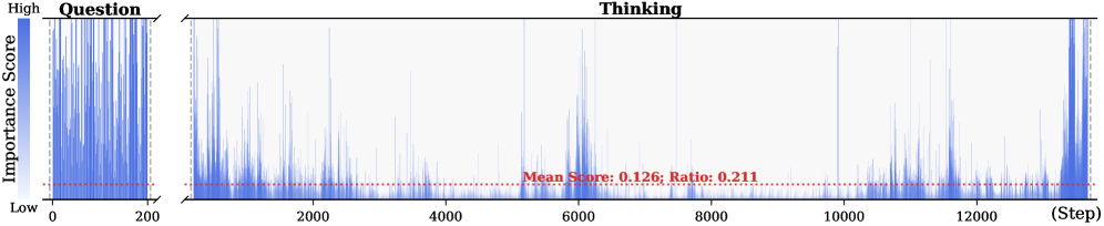
Figure 2: Importance scores of question tokens and thinking tokens in a reasoning trace, computed based on attention contributions to the answer. Darker colors indicate higher importance. The red dashed line shows the mean importance score, and the annotated ratio indicates the fraction of tokens with importance above the mean.
<details>
<summary>x4.png Details</summary>
### Visual Description
## Line Chart: Accuracy vs. Ratio for Different Sampling Methods
### Overview
The image is a line chart comparing the performance (Accuracy %) of four different methods or data sampling strategies across a range of ratios (Ratio %). The chart demonstrates how accuracy changes as the ratio increases for each method.
### Components/Axes
* **Chart Type:** Multi-line chart with markers.
* **X-Axis:**
* **Label:** `Ratio (%)`
* **Scale:** Logarithmic or non-linear scale. The marked values are: 2, 4, 6, 8, 10, 20, 30, 40, 50.
* **Y-Axis:**
* **Label:** `Accuracy (%)`
* **Scale:** Linear scale from 65 to 95, with major gridlines at intervals of 5%.
* **Legend:** Located in the top-right quadrant of the chart area. It contains four entries:
1. `Full` - Gray dashed line with 'x' markers.
2. `Random` - Green solid line with upward-pointing triangle markers.
3. `Bottom` - Blue solid line with square markers.
4. `Top` - Red solid line with circle markers.
### Detailed Analysis
**Data Series and Trends:**
1. **Full (Gray, dashed line, 'x' markers):**
* **Trend:** Perfectly horizontal, constant line.
* **Data Points:** Maintains an accuracy of approximately **95%** across all ratio values from 2% to 50%. This appears to be the baseline or upper-bound performance.
2. **Top (Red, solid line, circle markers):**
* **Trend:** Consistently upward-sloping, showing the highest performance among the non-full methods.
* **Data Points (Approximate):**
* Ratio 2%: ~88%
* Ratio 4%: ~90%
* Ratio 6%: ~92.5%
* Ratio 8%: ~92%
* Ratio 10%: ~93%
* Ratio 20%: ~94%
* Ratio 30%: ~95% (converges with the 'Full' line)
* Ratio 40%: ~95%
* Ratio 50%: ~95%
3. **Random (Green, solid line, triangle markers):**
* **Trend:** Initial slight dip, followed by a steady, strong upward slope.
* **Data Points (Approximate):**
* Ratio 2%: ~63%
* Ratio 4%: ~62% (lowest point)
* Ratio 6%: ~66%
* Ratio 8%: ~66%
* Ratio 10%: ~68%
* Ratio 20%: ~70%
* Ratio 30%: ~73%
* Ratio 40%: ~79%
* Ratio 50%: ~85%
4. **Bottom (Blue, solid line, square markers):**
* **Trend:** Initial decline, a period of stagnation, then a steady upward slope.
* **Data Points (Approximate):**
* Ratio 2%: ~66%
* Ratio 4%: ~66%
* Ratio 6%: ~63% (lowest point)
* Ratio 8%: ~65%
* Ratio 10%: ~65%
* Ratio 20%: ~69%
* Ratio 30%: ~70%
* Ratio 40%: ~73%
* Ratio 50%: ~80%
### Key Observations
1. **Performance Hierarchy:** There is a clear and consistent performance order: `Full` > `Top` > `Random` > `Bottom` for almost all ratio values. The `Top` method significantly outperforms `Random` and `Bottom`.
2. **Convergence:** The `Top` method's accuracy converges with the `Full` baseline at a ratio of approximately **30%** and remains equal thereafter.
3. **Low-Ratio Instability:** Both the `Random` and `Bottom` methods show a performance dip or stagnation at very low ratios (between 2% and 10%) before beginning a consistent climb.
4. **Growth Rate:** The `Random` method shows the steepest rate of improvement (slope) from ratio 10% onward, closing some of the gap with the `Top` method at higher ratios. The `Bottom` method improves at a slower, steadier rate.
5. **Legend Placement:** The legend is positioned in the upper right, overlapping slightly with the `Full` and `Top` data lines but not obscuring critical data points.
### Interpretation
This chart likely illustrates the effectiveness of different data selection or sampling strategies for a machine learning or statistical model, where "Ratio (%)" represents the percentage of data used (e.g., for training, fine-tuning, or as a subset for evaluation).
* **`Full`** represents the model's performance using the complete dataset, serving as the gold standard.
* **`Top`** likely refers to selecting data points based on a high-confidence or high-relevance score. Its rapid ascent to match `Full` performance suggests that a small subset (30%) of the most "important" data can be as effective as the entire dataset for this task.
* **`Random`** represents a naive random sampling baseline. Its lower performance indicates that data quality/importance matters more than sheer volume. Its strong improvement with more data shows that random sampling eventually becomes effective, but requires a much larger ratio.
* **`Bottom`** likely refers to selecting the lowest-confidence or least-relevant data points. Its poor performance, especially at low ratios, confirms that low-quality data is detrimental. Its eventual rise suggests that even low-quality data provides some signal when enough of it is used.
**The core insight** is that intelligent data selection (`Top`) is highly efficient, achieving maximum performance with a fraction of the data. This has significant implications for reducing computational costs, training time, and data storage requirements without sacrificing model accuracy. The dip in `Random` and `Bottom` at low ratios may indicate a critical threshold of data needed to overcome noise or establish a reliable pattern.
</details>
<details>
<summary>x5.png Details</summary>
### Visual Description
\n
## Radar Chart: Performance Comparison Across Mathematical and Reasoning Benchmarks
### Overview
This image is a radar chart (also known as a spider chart) comparing the performance of four different methods or models across six distinct benchmarks. The chart uses a radial layout where each axis represents a benchmark, and the distance from the center represents a score, likely a percentage or accuracy metric. The four methods are distinguished by different colors and marker shapes.
### Components/Axes
* **Chart Type:** Radar Chart.
* **Benchmarks (Axes):** Six axes radiate from the center, each labeled with a benchmark name. Starting from the top and moving clockwise:
1. `AMC23`
2. `AIME25`
3. `AIME24`
4. `MATH500`
5. `GAOKAO2023EN`
6. `GPQA-D`
* **Radial Scale:** Concentric circles represent the scoring scale. The innermost circle is unlabeled (likely 0). The labeled circles, moving outward, are marked: `20`, `40`, `60`, `80`, and `100` at the outermost edge.
* **Legend:** Located in the top-right corner of the chart area. It defines four data series:
* `Full`: Gray line with 'x' markers.
* `Bottom`: Blue line with square markers.
* `Random`: Green line with triangle markers.
* `Top`: Red line with circle markers.
* **Data Series:** Four polygons are plotted, each connecting the scores of one method across all six benchmarks.
### Detailed Analysis
The chart compares the performance profiles of the four methods. Below is an analysis of each benchmark, describing the visual trend (from lowest to highest score) and providing approximate score values based on the radial scale.
**1. AMC23 (Top Axis):**
* **Trend:** The `Top` (red) method scores significantly higher than the others. `Full` (gray) and `Random` (green) are close, with `Bottom` (blue) scoring the lowest.
* **Approximate Scores:**
* Top: ~95
* Random: ~75
* Full: ~70
* Bottom: ~65
**2. AIME25 (Top-Right Axis):**
* **Trend:** `Top` (red) again leads. `Full` (gray) and `Random` (green) are tightly clustered in the middle. `Bottom` (blue) is the lowest.
* **Approximate Scores:**
* Top: ~70
* Random: ~55
* Full: ~50
* Bottom: ~45
**3. AIME24 (Right Axis):**
* **Trend:** `Top` (red) is the highest. `Full` (gray) and `Random` (green) are nearly identical and in the middle. `Bottom` (blue) is the lowest.
* **Approximate Scores:**
* Top: ~65
* Random: ~50
* Full: ~50
* Bottom: ~40
**4. MATH500 (Bottom-Right Axis):**
* **Trend:** `Top` (red) has the highest score. `Random` (green) and `Bottom` (blue) are very close, with `Full` (gray) scoring slightly lower than them.
* **Approximate Scores:**
* Top: ~85
* Random: ~75
* Bottom: ~73
* Full: ~68
**5. GAOKAO2023EN (Bottom-Left Axis):**
* **Trend:** `Top` (red) is the highest. `Random` (green) and `Bottom` (blue) are again very close. `Full` (gray) is the lowest.
* **Approximate Scores:**
* Top: ~80
* Random: ~70
* Bottom: ~68
* Full: ~60
**6. GPQA-D (Left Axis):**
* **Trend:** `Top` (red) is the highest. `Full` (gray) and `Random` (green) are close in the middle. `Bottom` (blue) is the lowest.
* **Approximate Scores:**
* Top: ~60
* Random: ~45
* Full: ~42
* Bottom: ~35
### Key Observations
1. **Consistent Leader:** The `Top` method (red line/circles) achieves the highest score on every single benchmark, forming the outermost polygon.
2. **Middle Cluster:** The `Full` (gray/x) and `Random` (green/triangles) methods frequently perform similarly, often occupying the middle range of scores. Their lines overlap or run close together on several axes (AIME24, AIME25, GPQA-D).
3. **Lower Performer:** The `Bottom` method (blue/squares) is consistently among the lowest-scoring, often forming the innermost polygon, though it is sometimes very close to `Random` (e.g., MATH500, GAOKAO2023EN).
4. **Benchmark Difficulty:** The spread between the highest (`Top`) and lowest (`Bottom`) scores varies by benchmark. The spread appears largest on `AMC23` and `GPQA-D`, suggesting these benchmarks may differentiate the methods more starkly. The spread is narrower on `MATH500` and `GAOKAO2023EN`.
### Interpretation
This radar chart visually demonstrates a clear performance hierarchy among the four evaluated methods across a suite of mathematical and reasoning benchmarks.
* **What the data suggests:** The method labeled `Top` is unequivocally the strongest performer, suggesting it represents a high-performing model, a model fine-tuned on top-tier data, or an optimized configuration. The `Bottom` method's consistently lower scores imply it may represent a baseline, a model trained on lower-quality data, or a less optimized setup.
* **Relationship between elements:** The close performance of `Random` and `Full` is intriguing. It suggests that, for these benchmarks, a model using a random subset of data (`Random`) performs comparably to one using the full dataset (`Full`). This could indicate diminishing returns from the full dataset or that the random subset is sufficiently representative. The `Bottom` method's proximity to `Random` on some tasks further implies that selecting the "bottom" performers for training may not be worse than random selection, and is often better than using the full, potentially noisy, dataset.
* **Notable patterns:** The consistent dominance of `Top` across diverse benchmarks (from AMC/AIME competitions to the Chinese Gaokao and the graduate-level GPQA-D) indicates robust and generalizable superior performance. The chart effectively argues that the strategy or data represented by `Top` is highly effective. The investigation would next focus on understanding what "Top" specifically refers to (e.g., top 10% of data, a top-performing model variant) to replicate its success.
</details>
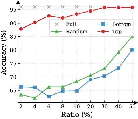
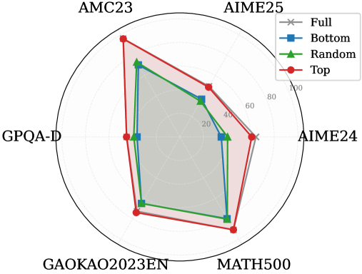
Figure 3: (Left) Reasoning performance trends as a function of thinking token retention ratio, where the $x$ -axis indicates the retention percentage and the $y$ -axis is the accuracy. (Right) Accuracy across all datasets when retaining $30\$ of the thinking tokens.
#### Attention Mechanism.
Attention Mechanism is a core component of Transformer-based LRMs, such as Multi-Head Attention (Vaswani et al., 2017), Grouped-Query Attention (Ainslie et al., 2023), and their variants. To highlight the memory challenges in LRMs, we formulate the attention computation at the token level. Consider the decode step $t$ . Let $\mathbf{h}_{t}\in\mathbb{R}^{d}$ be the input hidden state of the current token. The model projects $\mathbf{h}_{t}$ into query, key, and value vectors:
$$
\mathbf{q}_{t}=\mathbf{W}_{Q}\mathbf{h}_{t},\quad\mathbf{k}_{t}=\mathbf{W}_{K}\mathbf{h}_{t},\quad\mathbf{v}_{t}=\mathbf{W}_{V}\mathbf{h}_{t}, \tag{3}
$$
where $\mathbf{W}_{Q},\mathbf{W}_{K},\mathbf{W}_{V}$ are learnable projection matrices. The query $\mathbf{q}_{t}$ attends to the keys of all preceding positions $j\in\{1,\dots,t\}$ . The attention weight $a_{t,j}$ between the current token $t$ and a past token $j$ is:
$$
\alpha_{t,j}=\frac{\exp(e_{t,j})}{\sum_{i=1}^{t}\exp(e_{t,i})},\qquad e_{t,j}=\frac{\mathbf{q}_{t}^{\top}\mathbf{k}_{j}}{\sqrt{d_{k}}}. \tag{4}
$$
These scores represent the relevance of the current step to the $j$ -th token. Finally, the output of the attention head $\mathbf{o}_{t}$ is the weighted sum of all historical value vectors:
$$
\mathbf{o}_{t}=\sum_{j=1}^{t}\alpha_{t,j}\mathbf{v}_{j}. \tag{5}
$$
As Equation 5 implies, calculating $\mathbf{o}_{t}$ requires access to the entire sequence of past keys and values $\{\mathbf{k}_{j},\mathbf{v}_{j}\}_{j=1}^{t-1}$ . In standard implementation, these vectors are stored in the KV cache to avoid redundant computation (Vaswani et al., 2017; Pope et al., 2023). In the LRMs’ inference, the reasoning trace is exceptionally long, imposing significant memory bottlenecks and increasing computational overhead.
## 3 Observations and Insight
This section presents the observed sparsity of thinking tokens and the Pareto Principle in LRMs, serving as the basis for DynTS. Detailed experimental settings and additional results are provided in Appendix § B.
<details>
<summary>x6.png Details</summary>
### Visual Description
\n
## Diagram: Large Reasoning Model (LRM) with Importance Predictor (IP) - Training and Inference Architecture
### Overview
This technical diagram illustrates the architecture and workflow of a system that augments a Large Reasoning Model (LRM) with a trainable Importance Predictor (IP). The system is designed to optimize the Key-Value (KV) cache during inference by predicting the importance of tokens and selectively retaining or evicting them to meet a computational budget. The diagram is split into two primary sections: **Training** (left) and **Inference** (right).
### Components/Axes
The diagram is a flowchart/block diagram with the following major components and labels:
**Training Section (Left Panel):**
* **Input Tokens:** A sequence of grey squares at the bottom, representing the initial input.
* **Large Reasoning Model (LRM):** A large blue block labeled "Large Reasoning Model (LRM)" with a snowflake icon (❄️), indicating it is a frozen (non-trainable) component.
* **Importance Predictor (IP):** A red block labeled "Importance Predictor (IP)" with a fire icon (🔥), indicating it is a trainable component. It sits above the LRM.
* **Thinking Tokens:** A grid of squares above the IP, color-coded in shades of orange/red. A label "Thinking Tokens" with a double-headed arrow spans the top of this grid.
* **Answer:** A vertical label on the left side of the Thinking Tokens grid.
* **Mean Squared Error Loss:** A dashed box encompassing a row of orange/red squares, labeled "Mean Squared Error Loss".
* **Aggregate:** An arrow pointing from the right end of the Thinking Tokens grid to the loss calculation.
* **Backward:** An arrow pointing from the loss calculation back to the Importance Predictor (IP), indicating the backpropagation path for training.
**Inference Section (Right Panel):**
* **Steps:** A horizontal axis at the bottom labeled "Steps", indicating the progression of the inference process.
* **KV Cache Budget:** A vertical label on the far right, indicating the constraint on the cache size.
* **Multi Step:** A label at the top left of the inference flow.
* **Token Blocks:** Tokens are represented as pairs of boxes (e.g., `[A][∞]`, `[C][0.2]`). The first box contains a letter (token identifier), and the second contains a numerical score (predicted importance) or the infinity symbol (∞).
* **Process Labels:** The flow is annotated with labels: "Question", "Selection", "Local", "Reach Budget", "Select Critical Tokens", "Keep", "Evict", and "Retain".
* **LRM with IP:** A combined blue and red block at the bottom, labeled "LRM with IP".
* **Current Token / Next Token:** Boxes labeled "X" (Current Token) and "Y" (Next Token).
* **Predicted Score:** A box showing a numerical value (e.g., `0.2`).
**Color Coding & Legend:**
* **Grey Squares:** Input tokens, non-critical tokens, or evicted tokens.
* **Orange/Red Squares:** "Thinking Tokens" or tokens with high predicted importance scores.
* **Blue Block:** Frozen LRM component.
* **Red Block:** Trainable Importance Predictor (IP) component.
* **Pink/Red Background Shading:** Highlights tokens involved in the "Evict" action.
* **Green Background Shading:** Highlights the final set of retained tokens within the "KV Cache Budget".
### Detailed Analysis
The diagram details a two-phase process:
**1. Training Phase:**
* Input tokens are fed into the frozen **Large Reasoning Model (LRM)**.
* The LRM produces "Thinking Tokens" (a sequence of hidden states or activations).
* The trainable **Importance Predictor (IP)** processes these tokens.
* The system calculates a **Mean Squared Error Loss** by comparing the IP's predictions against an aggregated target derived from the thinking tokens.
* The loss is backpropagated (**Backward** arrow) to update only the Importance Predictor (IP), leaving the LRM frozen.
**2. Inference Phase (Multi-Step Process):**
The process flows from left to right across multiple steps, governed by a **KV Cache Budget**.
* **Initial State:** A set of tokens (A, B, C, D, E...) with their predicted importance scores (e.g., A: ∞, B: ∞, C: 0.2, D: 0.1, E: 0.5).
* **Selection & Eviction:** Based on the scores and the budget, tokens are processed:
* Tokens with infinite score (∞) or high score (e.g., E: 0.5) are **Kept** or **Retained**.
* Tokens with low scores (e.g., C: 0.2, D: 0.1, F: 0.1, H: 0.2) are marked for **Evict**ion (shown with scissors icons and pink background).
* **Local Context:** A separate set of recent tokens (I, J, K) is always **Kept** in a local cache.
* **Budget Enforcement:** The system selects the critical tokens (those not evicted and the local context) to fit within the **KV Cache Budget** (green shaded area). For example, after eviction, the retained set might be A, B, E, G, I, J, K.
* **Next Step Generation:** The current token (X) and the retained KV cache are input to the **LRM with IP**. The model outputs the next token (Y) and a new predicted importance score (e.g., 0.2) for the current token (X), which is then added to the cache for the next step. This cycle repeats.
### Key Observations
* **Selective Retention:** The core mechanism is the dynamic selection of tokens based on a learned importance score, not just recency.
* **Budget-Conscious:** The entire inference process is constrained by a predefined **KV Cache Budget**, forcing a trade-off between context length and computational efficiency.
* **Hybrid Cache:** The cache appears to consist of two parts: a **budget-constrained set** of historically important tokens and a **fixed local context** of recent tokens.
* **Training Focus:** Only the Importance Predictor is trained, using a self-supervised signal (MSE loss on thinking tokens), making the approach potentially efficient.
* **Symbolism:** The snowflake (❄️) on the LRM and fire (🔥) on the IP clearly distinguish between frozen and trainable components.
### Interpretation
This diagram presents a method for making large reasoning models more efficient during inference. The key innovation is decoupling the "reasoning" capability (frozen in the massive LRM) from the "memory management" capability (trainable in the lightweight IP).
The system learns *what to remember*. Instead of naively keeping all previous tokens in the KV cache (which grows linearly and becomes prohibitively expensive), it trains a predictor to assign importance scores. During inference, it actively curates the cache, evicting low-importance tokens to stay within a fixed budget. This allows the model to maintain a long effective context (by keeping critical past information) while controlling computational cost and memory usage.
The "Thinking Tokens" and the use of MSE loss suggest the IP is trained to predict which intermediate states of the LRM's reasoning process are most valuable for future generation. The multi-step inference flow demonstrates a practical, closed-loop system where the model's own predictions (both for the next token and for token importance) continuously update its working memory. This represents a shift from static context windows to dynamic, learned memory management for large language models.
</details>
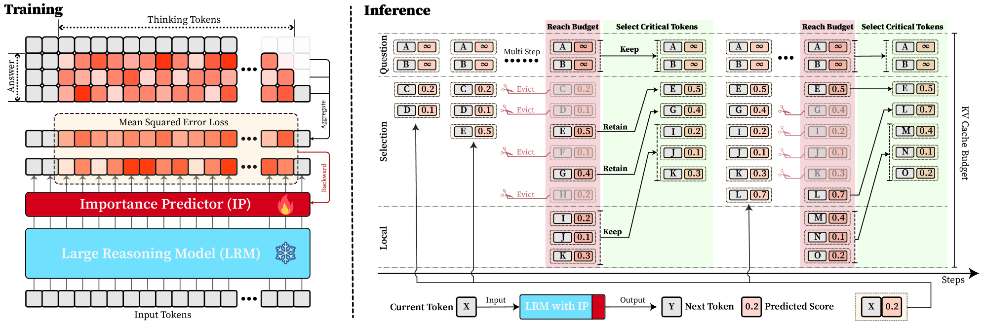
Figure 4: Overview of DynTS. (Left) Importance Predictor Training. The upper heatmap visualizes attention weights, where orange intensity represents the importance of thinking tokens to the answer. The lower part shows a LRM integrated with an Importance Predictor (IP) to learn these importance scores. (Right) Inference with KV Cache Selection. The model outputs the next token and a predicted importance score of the current token. When the cache budget is reached, the selection strategy retains the KV cache of question tokens, local tokens, and top-k thinking tokens based on the predicted importance score.
### 3.1 Sparsity for Thinking Tokens
Previous works (Bogdan et al., 2025; Zhang et al., 2023; Singh et al., 2024) have shown that attention weights (Eq. 4) serve as a reliable proxy for token importance. Building on this insight, we calculate an importance score for each question and thinking token by accumulating the attention they receive from all answer tokens. Formally, the importance scores are defined as:
$$
I_{x_{j}}=\sum_{i=1}^{K}\alpha_{a_{i},x_{j}},\qquad I_{t_{j}}=\sum_{i=1}^{K}\alpha_{a_{i},t_{j}}, \tag{6}
$$
where $I_{x_{j}}$ and $I_{t_{j}}$ denote the importance scores of the $j$ -th question token $x_{j}$ and thinking token $t_{j}$ . Here, $\alpha_{a_{i},x_{j}}$ and $\alpha_{a_{i},t_{j}}$ represent the attention weights from the $i$ -th answer token $a_{i}$ to the corresponding question or thinking token, and $K$ is the total number of answer tokens. We perform full autoregressive inference on LRMs to extract attention weights and compute token-level importance scores for both question and thinking tokens.
Observation. As illustrated in Fig. 2, the question tokens (left panel) exhibit consistently significant and dense importance scores. In contrast, the thinking tokens (right panel) display a highly sparse distribution. Despite the extensive reasoning trace (exceeding 12k tokens), only $21.1\$ of thinking tokens exceed the mean importance score. This indicates that the vast majority of reasoning steps exert only a marginal influence on the final answer.
Analysis. Follow attention-based methods (Cai et al., 2025; Li et al., 2024; Cai et al., 2024), tokens with higher importance scores intuitively correspond to decision-critical reasoning steps, which are critical for the model to generate the final answer. The low-importance tokens serve as syntactic scaffolding or intermediate states that become redundant after reasoning progresses (We report the ratio of Content Words, see Appendix B.2). Consequently, we hypothesize that the model maintains close reasoning performance to that of the full token sequence, even when it selectively retains only these critical thinking tokens.
### 3.2 Pareto Principle in LRMs
To validate the aforementioned hypothesis, we retain all question tokens while preserving only the top- $p\$ of thinking tokens ranked by importance score, and prompt the model to directly generate the final answer.
Observation. As illustrated in Fig. 3 (Left), the importance-based top- $p\$ selection strategy substantially outperforms both random- and bottom-selection baselines. Notably, the model recovers nearly its full performance (grey dashed line) when retaining only $\sim 30\$ thinking tokens with top importance scores. Fig. 3 (Right) further confirms this trend across six diverse datasets, where the performance polygon under the top- $30\$ retention strategy almost completely overlaps with the full thinking tokens.
Insights. These empirical results illustrate and reveal the Pareto Principle in LRM reasoning: Only a small subset of thinking tokens ( $30\$ ) with high importance scores serve as “pivotal nodes,” which are critical for the model to output a final answer, while the remaining tokens contribute negligibly to the outcome. This finding provides strong empirical support for LRMs’ KV cache compression, indicating that it is possible to reduce memory footprint and computational overhead without sacrificing performance.
## 4 Dynamic Thinking-Token Selection
Building on the Pareto Principle in LRMs, critical thinking tokens can be identified via the importance score computed by Equation 6. However, this computation requires the attention weights from the answer to the thinking tokens, which are inaccessible until the model completes the entire decoding stage. To address this limitation, we introduce an Importance Predictor that dynamically estimates the importance score of each thinking token during inference time. Furthermore, we design a decoding-time KV cache Selection Strategy that retains critical thinking tokens and evicts redundant ones. We refer to this approach as DynTS (Dyn amic T hinking Token S election), and the overview is illustrated in Fig. 4.
### 4.1 Importance Predictor
#### Integrate Importance Predictor in LRMs.
Transformer-based Large Language Models (LLMs) typically consist of stacked Transformer blocks followed by a language modeling head (Vaswani et al., 2017), where the output of the final block serves as a feature representation of the current token. Building on this architecture, we attach an additional lightweight MLP head to the final hidden state, named as Importance Predictor (Huang et al., 2024). It is used to predict the importance score of the current thinking token during model inference, capturing its contribution to the final answer. Formally, we define the modified LRM as a mapping function $\mathcal{M}$ that processes the input sequence $\mathbf{x}_{\leq t}$ to produce a dual-output tuple comprising the next token $x_{t+1}$ and the current importance score $s_{x_{t}}$ :
$$
\mathcal{M}(\mathbf{x}_{\leq t})\rightarrow(x_{t+1},s_{x_{t}}) \tag{7}
$$
#### Predictor Training.
To obtain supervision signals for training, we prompt the LRMs based on the training dataset to generate complete sequences denoted as $\{x_{1\dots M},t_{1\dots L},a_{1\dots K}\}$ , filtering out incorrect or incomplete reasoning. Here, $x$ , $t$ , and $a$ represent the question, thinking, and answer tokens, respectively. Based on the observation in Section § 3, the thinking tokens significantly outnumber answer tokens ( $L\gg K$ ), and question tokens remain essential. Therefore, DynTS only focuses on predicting the importance of thinking tokens. By utilizing the attention weights from answer to thinking tokens, we derive the ground-truth importance score $I_{t_{i}}$ for each thinking token according to Equation 6. Finally, the Importance Predictor parameters can be optimized by minimizing the Mean Squared Error (MSE) loss (Wang and Bovik, 2009) as follows:
$$
\mathcal{L}_{\text{MSE}}=\frac{1}{K}\sum_{i=1}^{K}(I_{t_{i}}-s_{t_{i}})^{2}. \tag{8}
$$
To preserve the LRMs’ original performance, we freeze the backbone parameters and optimize the Importance Predictor exclusively. The trained model can predict the importance of thinking tokens to the answer. This paper focuses on mathematical reasoning tasks. We optimize the Importance Predictor only on the MATH training set and validated across six other datasets (See Section § 6.1).
### 4.2 KV Cache Selection
During LRMs’ inference, we establish a maximum KV cache budget $B$ , which is composed of a question window $W_{q}$ , a selection window $W_{s}$ , and a local window $W_{l}$ , formulated as $B=W_{q}+W_{s}+W_{l}$ . Specifically, the question window stores the KV caches of question tokens generated during the prefilling phase, i.e., the window size $W_{q}$ is equal to the number of question tokens $M$ ( $W_{q}=M$ ). Since these tokens are critical for the final answer (see Section § 3), we assign an importance score of $+\infty$ to these tokens, ensuring their KV caches are immune to eviction throughout the inference process.
In the subsequent decoding phase, we maintain a sequential stream of tokens. Newly generated KV caches and their corresponding importance scores are sequentially appended to the selection window ( $W_{s}$ ) and the local window ( $W_{l}$ ). Once the total token count reaches the budget limit $B$ , the critical token selection process is triggered, as illustrated in Fig. 4 (Right). Within the selection window, we retain the KV caches of the top- $k$ tokens with the highest scores and evict the remainder. Simultaneously, drawing inspiration from (Chen et al., 2024; Zhang et al., 2023; Zhao et al., 2024), we maintain the KV caches within the local window to ensure the overall coherence of the subsequently generated sequence. This inference process continues until decoding terminates.
## 5 Theoretical Overhead Analysis
In DynTS, the KV cache selection strategy reduces computational overhead by constraining cache length, while the importance predictor introduces a slight overhead. In this section, we theoretically analyze the trade-off between these two components and derive the Break-even Condition required to achieve net computational gains.
Notions. Let $\mathcal{M}_{\text{base}}$ be the vanilla LRM with $L$ layers and hidden dimension $d$ , and $\mathcal{M}_{\text{opt}}$ be the LRM with Importance Predictor (MLP: $d\to 2d\to d/2\to 1$ ). We define the prefill length as $M$ and the current decoding step as $i\in\mathbb{Z}^{+}$ . For vanilla decoding, the effective KV cache length grows linearly as $S_{i}^{\text{base}}=M+i$ . While DynTS evicts $K$ tokens by the KV Cache Selection when the effective KV cache length reaches the budget $B$ . Resulting in the effective length $S_{i}^{\text{opt}}=M+i-n_{i}\cdot K$ , where $n_{i}=\max\left(0,\left\lfloor\frac{(M+i)-B}{K}\right\rfloor+1\right)$ denotes the count of cache eviction event at step $i$ . By leveraging Floating-Point Operations (FLOPs) to quantify computational overhead, we establish the following theorem. The detailed proof is provided in Appendix A.
**Theorem 5.1 (Computational Gain)**
*Let $\Delta\mathcal{C}(i)$ be the reduction FLOPs achieved by DynTS at decoding step $i$ . The gain function is derived as the difference between the eviction event savings from KV Cache Selection and the introduced overhead of the predictor:
$$
\Delta\mathcal{C}(i)=\underbrace{n_{i}\cdot 4LdK}_{\text{Eviction Saving}}-\underbrace{(6d^{2}+d)}_{\text{Predictor Overhead}}, \tag{9}
$$*
Based on the formulation above, we derive a critical corollary regarding the net computational gain.
**Corollary 5.2 (Break-even Condition)**
*To achieve a net computational gain ( $\Delta\mathcal{C}(i)>0$ ) at the $n_{i}$ -th eviction event, the eviction volume $K$ must satisfy the following inequality:
$$
K>\frac{6d^{2}+d}{n_{i}\cdot 4Ld}\approx\frac{1.5d}{n_{i}L} \tag{10}
$$*
This inequality provides a theoretical lower bound for the eviction volume $K$ . demonstrating that the break-even point is determined by the model’s architectural (hidden dimension $d$ and layer count $L$ ).
Table 1: Performance comparison of different methods on R1-Llama and R1-Qwen. We report the average Pass@1 and Throughput (TPS) across six benchmarks. “Transformers” denotes the full cache baseline, and “Window” represents the local window baseline.
| Transformers Window StreamingLLM | 47.3 18.6 20.6 | 215.1 447.9 445.8 | 28.6 14.6 16.6 | 213.9 441.3 445.7 | 86.5 59.5 65.0 | 200.6 409.4 410.9 | 46.4 37.6 37.8 | 207.9 408.8 407.4 | 73.1 47.0 53.4 | 390.9 622.6 624.6 | 87.5 58.1 66.1 | 323.4 590.5 592.1 | 61.6 39.2 43.3 | 258.6 486.7 487.7 |
| --- | --- | --- | --- | --- | --- | --- | --- | --- | --- | --- | --- | --- | --- | --- |
| SepLLM | 30.0 | 448.2 | 20.0 | 445.1 | 71.0 | 414.1 | 39.7 | 406.6 | 61.4 | 635.0 | 74.5 | 600.4 | 49.4 | 491.6 |
| H2O | 38.6 | 426.2 | 22.6 | 423.4 | 82.5 | 396.1 | 41.6 | 381.5 | 67.5 | 601.8 | 82.7 | 573.4 | 55.9 | 467.1 |
| SnapKV | 39.3 | 438.2 | 24.6 | 436.3 | 80.5 | 406.9 | 41.9 | 394.1 | 68.7 | 615.7 | 83.1 | 584.5 | 56.3 | 479.3 |
| R-KV | 44.0 | 437.4 | 26.0 | 434.7 | 86.5 | 409.5 | 44.5 | 394.9 | 71.4 | 622.6 | 85.2 | 589.2 | 59.6 | 481.4 |
| DynTS (Ours) | 49.3 | 444.6 | 29.3 | 443.5 | 87.0 | 412.9 | 46.3 | 397.6 | 72.3 | 631.8 | 87.2 | 608.2 | 61.9 | 489.8 |
| R1-Qwen | | | | | | | | | | | | | | |
| Transformers | 52.0 | 357.2 | 35.3 | 354.3 | 87.5 | 376.2 | 49.0 | 349.4 | 77.9 | 593.7 | 91.3 | 517.3 | 65.5 | 424.7 |
| Window | 41.3 | 650.4 | 31.3 | 643.0 | 82.0 | 652.3 | 45.9 | 634.1 | 71.8 | 815.2 | 85.0 | 767.0 | 59.5 | 693.7 |
| StreamingLLM | 42.0 | 655.7 | 29.3 | 648.5 | 85.0 | 657.2 | 45.9 | 631.1 | 71.2 | 824.0 | 85.8 | 786.1 | 59.8 | 700.5 |
| SepLLM | 38.6 | 650.0 | 31.3 | 647.6 | 85.5 | 653.2 | 45.6 | 639.5 | 72.0 | 820.1 | 84.4 | 792.2 | 59.6 | 700.4 |
| H2O | 42.6 | 610.9 | 33.3 | 610.7 | 84.5 | 609.9 | 48.1 | 593.6 | 74.1 | 780.1 | 87.0 | 725.4 | 61.6 | 655.1 |
| SnapKV | 48.6 | 639.6 | 33.3 | 633.1 | 87.5 | 633.2 | 46.5 | 622.0 | 74.9 | 787.4 | 88.2 | 768.7 | 63.2 | 680.7 |
| R-KV | 44.0 | 639.5 | 32.6 | 634.7 | 85.0 | 636.8 | 47.2 | 615.1 | 75.8 | 792.8 | 88.8 | 765.5 | 62.2 | 680.7 |
| DynTS (Ours) | 52.0 | 645.6 | 36.6 | 643.0 | 88.5 | 646.0 | 48.1 | 625.7 | 76.4 | 788.5 | 90.0 | 779.5 | 65.3 | 688.1 |
## 6 Experiment
This section introduces experimental settings, followed by the results, ablation studies on retanind tokens and hyperparameters, and the Importance Predictor analysis. For more detailed configurations and additional results, please refer to Appendix C and D.
### 6.1 Experimental Setup
Models and Datasets. We conduct experiments on two mainstream LRMs: R1-Qwen (DeepSeek-R1-Distill-Qwen-7B) and R1-Llama (DeepSeek-R1-Distill-Llama-8B) (Guo et al., 2025). To evaluate the performance and robustness of our method across diverse tasks, we select five mathematical reasoning datasets of varying difficulty levels—AIME24 (Zhang and Math-AI, 2024), AIME25 (Zhang and Math-AI, 2025), AMC23 https://huggingface.co/datasets/math-ai/amc23, GK23EN (GAOKAO2023EN) https://huggingface.co/datasets/MARIO-Math-Reasoning/Gaokao2023-Math-En, and MATH500 (Hendrycks et al., 2021) —along with the GPQA-D (GPQA-Diamond) (Rein et al., 2024) scientific question-answering dataset as evaluation benchmarks.
Implementation Details. (1) Training Settings: To train the importance predictor, we sample the model-generated contents with correct answers from the MATH training set and calculate the importance scores of thinking tokens. We freeze the model backbone and optimize only the predictor ( $3$ -layer MLP), setting the number of training epochs to 15, the learning rate to $5\text{e-}4$ , and the maximum sequence length to 18,000. (2) Inference Settings. Following (Guo et al., 2025), setting the maximum decoding steps to 16,384, the sampling temperature to 0.6, top- $p$ to 0.95, and top- $k$ to 20. We apply budget settings based on task difficulty. For challenging benchmarks (AIME24, AIME25, AMC23, and GPQA-D), we set the budget $B$ to 5,000 with a local window size of 2,000; For simpler tasks, the budget is set to 3,000 with a local window of 1,500 for R1-Qwen and 1,000 for R1-Llama. The token retention ratio in the selection window is set to 0.4 for R1-Qwen and 0.3 for R1-Llama. We generate 5 responses for each problem and report the average Pass@1 as the evaluation metric.
Baselines. Our approach focuses on compressing the KV cache by selecting critical tokens. Therefore, we compare our method against the state-of-the-art KV cache compressing approaches. These include StreamingLLM (Xiao et al., 2024), H2O (Zhang et al., 2023), SepLLM (Chen et al., 2024), and SnapKV (Li et al., 2024) (decode-time variant (Liu et al., 2025a)) for LLMs, along with R-KV (Cai et al., 2025) for LRMs. To ensure a fair comparison, all methods were set with the same token overhead and maximum budget. We also report results for standard Transformers and local window methods as evaluation baselines.
### 6.2 Main Results
Reasoning Accuracy. As shown in Table 1, our proposed DynTS consistently outperforms all other KV cache eviction baselines. On R1-Llama and R1-Qwen, DynTS achieves an average accuracy of $61.9\$ and $65.3\$ , respectively, significantly surpassing the runner-up methods R-KV ( $59.6\$ ) and SnapKV ( $63.2\$ ). Notably, the overall reasoning capability of DynTS is on par with the Full Cache Transformers baseline ( $61.9\$ vs. $61.6\$ on R1-Llama, $65.3\$ vs. $65.5\$ on R1-Llama). Even outperforms the Transformers on several challenging tasks, such as AIME24 on R1-Llama, where it improves accuracy by $2.0\$ ; and AIME25 on R1-Qwen, where it improves accuracy by $1.3\$ .
Table 2: Ablation study on different token retention strategies in DynTS, where w.o. Q / T / L denotes the removal of Question tokens (Q), critical Thinking tokens (T), and Local window tokens (L), respectively. T-Random and T-Bottom represent strategies that select thinking tokens randomly and the tokens with the bottom-k importance scores, respectively.
| DynTS w.o. L w.o. Q | 49.3 40.6 19.3 | 29.3 23.3 14.6 | 87.0 86.5 59.0 | 46.3 46.3 38.1 | 72.3 72.0 47.8 | 87.2 85.5 59.8 | 61.9 59.0 39.8 |
| --- | --- | --- | --- | --- | --- | --- | --- |
| w.o. T | 44.0 | 27.3 | 85.0 | 44.0 | 71.5 | 85.9 | 59.6 |
| T-Random | 24.6 | 16.0 | 59.5 | 37.4 | 51.7 | 63.9 | 42.2 |
| T-Bottom | 20.6 | 15.3 | 59.0 | 37.3 | 47.3 | 59.5 | 39.8 |
| R1-Qwen | | | | | | | |
| DynTS | 52.0 | 36.6 | 88.5 | 48.1 | 76.4 | 90.0 | 65.3 |
| w.o. L | 42.0 | 32.0 | 87.5 | 46.3 | 75.2 | 87.0 | 61.6 |
| w.o. Q | 46.0 | 36.0 | 86.0 | 43.9 | 75.1 | 89.0 | 62.6 |
| w.o. T | 47.3 | 34.6 | 85.5 | 49.1 | 75.1 | 89.2 | 63.5 |
| T-Random | 46.0 | 32.6 | 84.5 | 47.5 | 73.8 | 86.9 | 61.9 |
| T-Bottom | 38.0 | 30.0 | 80.0 | 44.3 | 69.8 | 83.3 | 57.6 |
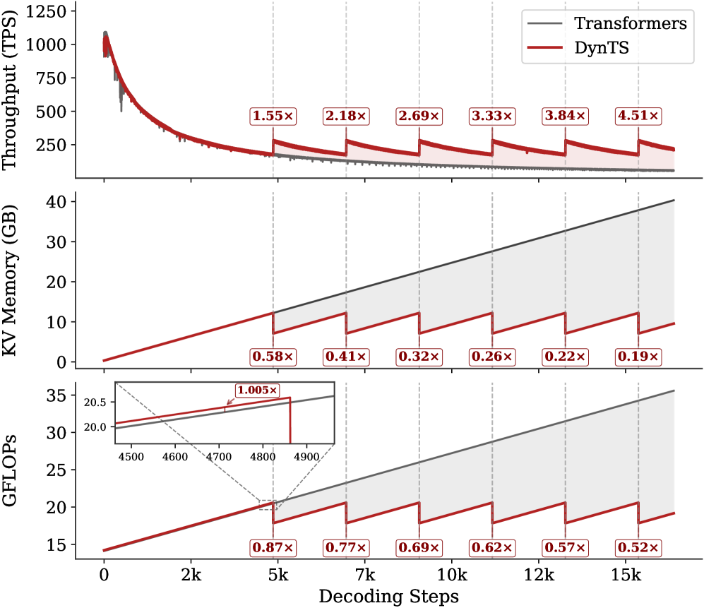
Inference Efficiency. Referring to Table 1, DynTS achieves $1.9\times$ and $1.6\times$ speedup compared to standard Transformers on R1-Llama and R1-Qwen, respectively, across all benchmarks. While DynTS maintains throughput comparable to other KV Cache compression methods. Further observing Figure 5, as the generated sequence length grows, standard Transformers suffer from linear accumulation in both memory footprint and compute overhead (GFLOPs), leading to continuous throughput degradation. In contrast, DynTS effectively bounds resource consumption. The distinctive sawtooth pattern illustrates our periodic compression mechanism, where the inflection points correspond to the execution of KV Cache Selection to evict the KV pairs of non-essential thinking tokens. Consequently, the efficiency advantage escalates as the decoding step increases, DynTS achieves a peak speedup of 4.51 $\times$ , compresses the memory footprint to 0.19 $\times$ , and reduces the compute overhead to 0.52 $\times$ compared to the full-cache baseline. The zoom-in view reveals that the computational cost drops below the baseline immediately after the first KV cache eviction. This illustrates that our experimental settings are rational, as they satisfy the break-even condition ( $K=900\geq\frac{1.5d}{n_{i}L}=192$ ) outlined in Corollary 5.2.
<details>
<summary>x7.png Details</summary>
### Visual Description
\n
## Multi-Panel Line Chart: Performance Comparison of Transformers vs. DynTS
### Overview
This image is a technical performance comparison chart consisting of three vertically stacked line plots sharing a common x-axis. It compares two systems: "Transformers" (represented by a gray line) and "DynTS" (represented by a red line) across three metrics—Throughput, KV Memory usage, and GFLOPs—as a function of decoding steps. The chart demonstrates the performance advantages of DynTS over standard Transformers, particularly as the sequence length (decoding steps) increases.
### Components/Axes
* **Shared X-Axis (Bottom):**
* **Label:** `Decoding Steps`
* **Scale:** Linear, from 0 to 15,000 (15k).
* **Major Tick Markers:** 0, 2k, 5k, 7k, 10k, 12k, 15k.
* **Top Panel - Y-Axis:**
* **Label:** `Throughput (TPS)` (Transactions Per Second).
* **Scale:** Linear, from 0 to 1250.
* **Major Tick Markers:** 0, 250, 500, 750, 1000, 1250.
* **Middle Panel - Y-Axis:**
* **Label:** `KV Memory (GB)` (Key-Value Memory in Gigabytes).
* **Scale:** Linear, from 0 to 40.
* **Major Tick Markers:** 0, 10, 20, 30, 40.
* **Bottom Panel - Y-Axis:**
* **Label:** `GFLOPs` (Giga Floating-Point Operations).
* **Scale:** Linear, from 15 to 35.
* **Major Tick Markers:** 15, 20, 25, 30, 35.
* **Legend (Top-Right of Top Panel):**
* **Position:** Top-right corner of the topmost chart.
* **Items:**
* A gray line labeled `Transformers`.
* A red line labeled `DynTS`.
* **Annotations:** Each panel contains red-bordered boxes with multiplier values (e.g., `1.55x`, `0.58x`) placed at specific decoding steps (5k, 7k, 10k, 12k, 15k). These indicate the performance ratio of DynTS relative to Transformers at those points.
* **Inset (Bottom Panel):** A small zoomed-in chart within the GFLOPs panel, focusing on the x-axis range of approximately 4500 to 4900 decoding steps.
### Detailed Analysis
**1. Top Panel: Throughput (TPS)**
* **Trend Verification:** Both lines show a steep, concave-upward decline in throughput as decoding steps increase from 0. The gray Transformers line declines smoothly. The red DynTS line follows a similar initial decline but exhibits a distinctive **sawtooth pattern**, with periodic sharp upward jumps followed by gradual declines.
* **Data Points & Annotations:**
* At ~0 steps: Both start near 1100 TPS.
* At 5k steps: DynTS shows a `1.55x` speedup over Transformers.
* At 7k steps: `2.18x` speedup.
* At 10k steps: `2.69x` speedup.
* At 12k steps: `3.33x` speedup.
* At 15k steps: `3.84x` speedup.
* A final annotation at the far right (beyond 15k) shows `4.51x`.
* **Interpretation:** DynTS maintains significantly higher throughput than Transformers as sequence length grows. The sawtooth pattern suggests periodic optimization or state reset events that temporarily boost performance.
**2. Middle Panel: KV Memory (GB)**
* **Trend Verification:** The gray Transformers line shows a **steady, linear increase** in memory usage. The red DynTS line also increases linearly but with a **sawtooth pattern of sharp drops**, resetting to a lower baseline at regular intervals.
* **Data Points & Annotations (DynTS Memory Reduction Factor vs. Transformers):**
* At 5k steps: `0.58x` (DynTS uses 58% of Transformers' memory).
* At 7k steps: `0.41x`.
* At 10k steps: `0.32x`.
* At 12k steps: `0.26x`.
* At 15k steps: `0.22x`.
* At the far right: `0.19x`.
* **Spatial Grounding:** The gray line is consistently above the red line. The shaded area between them represents the memory savings achieved by DynTS, which widens dramatically as steps increase.
* **Interpretation:** Transformers' memory grows without bound, which is a known limitation. DynTS employs a mechanism (likely eviction or compression) that periodically reduces KV cache memory, leading to massive savings (over 80% at 15k steps) and enabling longer context processing.
**3. Bottom Panel: GFLOPs**
* **Trend Verification:** Similar to the memory panel, the gray Transformers line shows a **steady, linear increase** in computational cost. The red DynTS line increases with a **sawtooth pattern of drops**.
* **Inset Analysis:** The inset zooms in on the region around 4500-4900 steps. It shows that just before a drop, DynTS's GFLOPs are slightly higher than Transformers (`1.005x` annotation), indicating a minor overhead before the optimization event triggers a significant reduction.
* **Data Points & Annotations (DynTS GFLOPs Reduction Factor vs. Transformers):**
* At 5k steps: `0.87x`.
* At 7k steps: `0.77x`.
* At 10k steps: `0.69x`.
* At 12k steps: `0.62x`.
* At 15k steps: `0.57x`.
* At the far right: `0.52x`.
* **Interpretation:** DynTS reduces the computational operations required for long-context inference. The savings grow with sequence length, complementing the memory savings and contributing to the higher throughput observed in the top panel.
### Key Observations
1. **Correlated Sawtooth Pattern:** The periodic drops in Memory and GFLOPs for DynTS are perfectly aligned vertically across the middle and bottom panels. These events correspond to the upward jumps in Throughput in the top panel, confirming they are the same optimization mechanism.
2. **Diverging Performance Gap:** The performance advantage of DynTS over Transformers (both in speedup and resource reduction) is not constant; it **widens progressively** as the number of decoding steps increases.
3. **Linear vs. Bounded Growth:** Transformers exhibit linear, unbounded growth in memory and compute. DynTS transforms this into a bounded, sawtooth growth pattern, which is crucial for scalability.
4. **Minor Overhead:** The inset in the GFLOPs chart reveals a very slight (`0.5%`) computational overhead for DynTS immediately before its optimization cycle, which is negligible compared to the subsequent ~50% reduction.
### Interpretation
This chart provides strong empirical evidence for the efficacy of the "DynTS" system in addressing the core scalability challenges of standard Transformer models for long-sequence inference.
* **What the data suggests:** The data demonstrates that DynTS implements a dynamic, periodic optimization strategy for the Key-Value (KV) cache. This strategy successfully curbs the linear growth in memory and computation that plagues standard Transformers.
* **How elements relate:** The three panels are causally linked. The periodic KV cache management events (seen as drops in Memory and GFLOPs) directly cause the periodic boosts in Throughput. This creates a virtuous cycle: saving memory and compute enables higher throughput, which is sustained over longer sequences.
* **Notable Implications:** The widening performance gap indicates that DynTS becomes **increasingly more valuable** for longer contexts. The final `4.51x` throughput and `0.19x` memory usage at extreme lengths suggest it could enable applications (e.g., very long document analysis, extended dialogues) that are prohibitively expensive with standard Transformers. The system trades a tiny, periodic computational overhead for massive, sustained savings in memory and operations, leading to a net positive impact on performance and scalability.
</details>
Figure 5: Real-time throughput, memory, and compute overhead tracking over total decoding step. The inflection points in the sawtooth correspond to the steps where DynTS executes KV Cache Selection.
### 6.3 Ablation Study
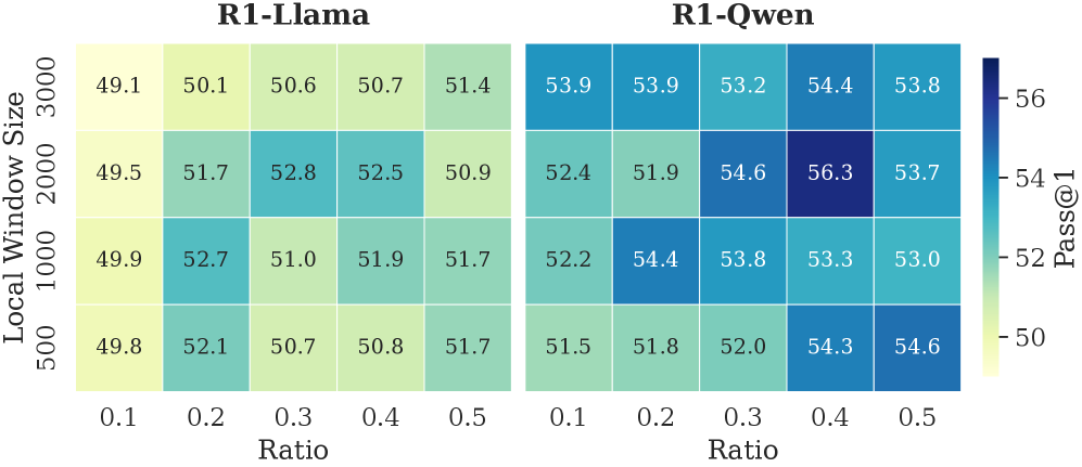
Impact of Retained Token. As shown in Tab. 2, the full DynTS method outperforms all ablated variants, achieving the highest average accuracy on both R1-Llama ( $61.9\$ ) and R1-Qwen ( $65.3\$ ). This demonstrates that all retained tokens of DynTS are critical for the model to output the correct final answer. Moreover, we observe that the strategy for selecting thinking tokens plays a critical role in the model’s reasoning performance. When some redundant tokens are retained (T-Random and T-Bottom strategies), there is a significant performance drop compared to completely removing thinking tokens ( $59.6\$ on R1-Llama and $63.5\$ on R1-Qwen). This finding demonstrates the effectiveness of our Importance Predictor to identify critical tokens. It also explains why existing KV cache compression methods hurt model performance: inadvertently retaining redundant tokens. Finally, the local window is crucial for preserving local linguistic coherence, which contributes to stable model performance.
<details>
<summary>x8.png Details</summary>
### Visual Description
## Heatmap Comparison: R1-Llama vs. R1-Qwen Performance (Pass@1)
### Overview
The image displays two side-by-side heatmaps comparing the performance of two models, "R1-Llama" and "R1-Qwen," across different configurations. Performance is measured by the "Pass@1" metric, visualized through a color gradient. The analysis explores how this metric changes with variations in "Local Window Size" and "Ratio."
### Components/Axes
* **Titles:** Two main titles are positioned at the top: "R1-Llama" (left heatmap) and "R1-Qwen" (right heatmap).
* **Y-Axis (Left):** Labeled "Local Window Size." It has four discrete, categorical values listed from top to bottom: 3000, 2000, 1000, 500.
* **X-Axis (Bottom):** Labeled "Ratio." It has five discrete, categorical values listed from left to right: 0.1, 0.2, 0.3, 0.4, 0.5.
* **Color Scale/Legend (Right):** A vertical color bar labeled "Pass@1" on its right side. The scale ranges from approximately 50 (light yellow) to 56 (dark blue). Tick marks are present at 50, 52, 54, and 56.
* **Data Grids:** Each heatmap is a 4-row by 5-column grid. Each cell contains a numerical value representing the Pass@1 score for a specific combination of Local Window Size and Ratio.
### Detailed Analysis
**R1-Llama Heatmap (Left):**
* **Row 1 (Local Window Size 3000):** Values from left to right (Ratio 0.1 to 0.5): 49.1, 50.1, 50.6, 50.7, 51.4. The color transitions from light yellow to light green.
* **Row 2 (Local Window Size 2000):** Values: 49.5, 51.7, 52.8, 52.5, 50.9. Colors range from light yellow to teal, with the highest value (52.8) at Ratio 0.3.
* **Row 3 (Local Window Size 1000):** Values: 49.9, 52.7, 51.0, 51.9, 51.7. Colors are a mix of light yellow and teal.
* **Row 4 (Local Window Size 500):** Values: 49.8, 52.1, 50.7, 50.8, 51.7. Colors are similar to Row 3.
**R1-Qwen Heatmap (Right):**
* **Row 1 (Local Window Size 3000):** Values: 53.9, 53.9, 53.2, 54.4, 53.8. Colors are shades of medium blue.
* **Row 2 (Local Window Size 2000):** Values: 52.4, 51.9, 54.6, 56.3, 53.7. This row contains the highest value in the entire chart (56.3 at Ratio 0.4), shown in dark blue.
* **Row 3 (Local Window Size 1000):** Values: 52.2, 54.4, 53.8, 53.3, 53.0. Colors are shades of blue.
* **Row 4 (Local Window Size 500):** Values: 51.5, 51.8, 52.0, 54.3, 54.6. Colors range from light blue to medium blue.
### Key Observations
1. **Overall Performance Gap:** The R1-Qwen model consistently achieves higher Pass@1 scores than the R1-Llama model across all tested configurations. The R1-Qwen cells are predominantly blue (scores >52), while R1-Llama cells are mostly yellow-green (scores <53).
2. **Peak Performance:** The absolute highest Pass@1 score (56.3) is achieved by R1-Qwen with a Local Window Size of 2000 and a Ratio of 0.4.
3. **Sensitivity to Parameters:**
* For **R1-Llama**, performance does not show a strong, consistent trend with increasing Ratio or decreasing Window Size. The highest scores are scattered (e.g., 52.8 at Size 2000/Ratio 0.3, 52.7 at Size 1000/Ratio 0.2).
* For **R1-Qwen**, there is a more noticeable pattern. Performance tends to be higher at moderate Ratios (0.3-0.5) compared to the lowest Ratio (0.1). The configuration of Size 2000/Ratio 0.4 is a clear outlier peak.
4. **Stability:** R1-Qwen's performance appears more stable across different Window Sizes for a given Ratio, especially at Ratios 0.4 and 0.5, where scores remain relatively high.
### Interpretation
This heatmap comparison provides a clear visual benchmark suggesting that the R1-Qwen model architecture or training methodology yields superior performance (as measured by Pass@1) compared to R1-Llama for the evaluated task. The data indicates that hyperparameter tuning has a significant impact, particularly for R1-Qwen, where a specific "sweet spot" (Size 2000, Ratio 0.4) is identified.
The lack of a simple linear trend in either model suggests a complex interaction between the Local Window Size and Ratio parameters. The investigation implies that simply increasing one parameter does not guarantee better performance; the optimal setting is configuration-dependent. For practical deployment, R1-Qwen is the preferable model based on this metric, and its configuration should be carefully tuned, with the Size 2000/Ratio 0.4 setting being a strong candidate for optimal results. The visualization effectively communicates that model choice and parameter selection are critical for maximizing Pass@1 performance.
</details>
Figure 6: The accuracy of R1-Llama and R1-Qwen across different local window sizes and selection window retention ratios.
Local Window & Retention Ratio. As shown in Fig. 6, we report the model’s reasoning performance across different configurations. The performance improves with a larger local window and a higher retention ratio within a reasonable range. These two settings respectively ensure local contextual coherence and an adequate number of thinking tokens. Setting either to overly small values leads to pronounced performance degradation. However, excessively large values introduce a higher proportion of non-essential tokens, which in turn negatively impacts model performance. Empirically, a local window size of approximately 2,000 and a retention ratio of 0.3–0.4 yield optimal performance. We further observe that R1-Qwen is particularly sensitive to the local window size. This may be caused by the Dual Chunk Attention introduced during the long-context pre-training stage (Yang et al., 2025), which biases attention toward tokens within the local window.
<details>
<summary>x9.png Details</summary>
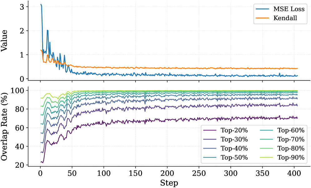
### Visual Description
\n
## Dual-Panel Line Chart: Training Metrics Over Steps
### Overview
The image displays a two-panel vertical chart tracking machine learning training metrics over 400 steps. The top panel plots two loss/correlation metrics on a shared "Value" axis, while the bottom panel shows the "Overlap Rate (%)" for different top-percentage cohorts. The charts share a common x-axis labeled "Step".
### Components/Axes
* **X-Axis (Both Panels):** Labeled "Step". Linear scale from 0 to 400, with major tick marks every 50 steps.
* **Top Panel Y-Axis:** Labeled "Value". Linear scale from 0 to 3, with major tick marks at 0, 1, 2, and 3.
* **Bottom Panel Y-Axis:** Labeled "Overlap Rate (%)". Linear scale from 20 to 100, with major tick marks every 20%.
* **Top Panel Legend:** Located in the top-right corner. Contains two entries:
* `MSE Loss` (Blue line)
* `Kendall` (Orange line)
* **Bottom Panel Legend:** Located in the bottom-right corner. Contains eight entries, each corresponding to a colored line:
* `Top-20%` (Dark Purple)
* `Top-30%` (Purple)
* `Top-40%` (Blue-Purple)
* `Top-50%` (Blue)
* `Top-60%` (Teal)
* `Top-70%` (Green-Teal)
* `Top-80%` (Green)
* `Top-90%` (Light Green)
### Detailed Analysis
**Top Panel (Value vs. Step):**
* **MSE Loss (Blue Line):**
* **Trend:** Starts very high, exhibits high volatility in the first ~50 steps, then decays rapidly and stabilizes.
* **Key Points:** Initial peak ~3.0 at Step 0. By Step 50, value is ~0.5. From Step 100 onward, it fluctuates with low amplitude around a value of approximately 0.1 to 0.2.
* **Kendall (Orange Line):**
* **Trend:** Starts moderately high, shows a smooth, gradual decline, and stabilizes.
* **Key Points:** Initial value ~1.1 at Step 0. Declines steadily, crossing below 1.0 around Step 25. Reaches a stable plateau around Step 100, maintaining a value of approximately 0.4 to 0.5 for the remainder of the chart.
**Bottom Panel (Overlap Rate (%) vs. Step):**
* **General Trend for All Lines:** All eight lines follow a similar pattern: a rapid, steep increase in the first 25-50 steps, followed by a gradual deceleration, eventually reaching a stable plateau. The final plateau value is directly correlated with the "Top-X%" label (higher X% = higher plateau).
* **Specific Plateau Values (Approximate at Step 400):**
* `Top-90%` (Light Green): ~99%
* `Top-80%` (Green): ~97%
* `Top-70%` (Green-Teal): ~95%
* `Top-60%` (Teal): ~92%
* `Top-50%` (Blue): ~88%
* `Top-40%` (Blue-Purple): ~83%
* `Top-30%` (Purple): ~77%
* `Top-20%` (Dark Purple): ~70%
* **Initial Values (Approximate at Step 0):** All lines start between 20% and 40%, with `Top-20%` starting the lowest (~22%) and `Top-90%` starting the highest (~38%).
### Key Observations
1. **Inverse Relationship in Top Panel:** The MSE Loss (blue) decreases sharply while the Kendall metric (orange) also decreases, but at a much slower rate and to a lesser degree. They do not move in opposition.
2. **Stratified Convergence in Bottom Panel:** The overlap rates converge to distinct, stratified levels based on their cohort definition. The spacing between the final plateau values is relatively even.
3. **Phase Change:** Both panels show a clear "learning phase" (Steps 0-100) characterized by rapid change and volatility, followed by a "stable phase" (Steps 100-400) where metrics plateau with minor fluctuations.
4. **Volatility Correlation:** The period of highest volatility in the MSE Loss (Steps 0-50) corresponds precisely with the period of most rapid increase in all overlap rates.
### Interpretation
This chart visualizes the training dynamics of a machine learning model, likely one involved in ranking or selection tasks.
* **Top Panel Meaning:** The decreasing **MSE Loss** indicates the model's predictions are becoming more accurate on a mean squared error basis. The decreasing **Kendall** metric (likely Kendall's Tau, a rank correlation coefficient) is more nuanced. A decreasing Kendall's Tau could suggest the model's internal ranking is becoming *less* correlated with some initial or baseline ranking as it learns, or it could indicate a shift in the evaluation context. The fact it stabilizes at a positive value (~0.45) suggests a moderate positive rank correlation persists.
* **Bottom Panel Meaning:** The **Overlap Rate** measures consistency. It answers: "What percentage of the items the model selected as 'top' at an early step are still considered 'top' at the current step?" The rapid rise shows the model quickly settles on a stable set of top candidates. The stratified plateaus are logical: it's easier to maintain consistency for a broader set (Top-90%) than a narrow, elite set (Top-20%).
* **Overall Narrative:** The model undergoes a rapid initial learning phase (first 100 steps) where it drastically reduces error (MSE) and solidifies its selection criteria (rising Overlap Rates). Concurrently, its ranking behavior (Kendall) shifts from an initial state to a new, stable learned state. After Step 100, the model has largely converged, with only minor refinements occurring. The strong correlation between the volatility period and the rapid overlap increase suggests the model is making its most significant selection decisions early in training.
</details>
Figure 7: The top panel illustrates the convergence of MSE Loss and the Kendall rank correlation coefficient over training steps. The bottom panel tracks the overlap rate of the top- $20\$ ground-truth tokens within the top- $p\$ ( $p\in[20,90]$ ) predicted tokens.
Budget. We report the model’s reasoning performance and throughput in different budget settings in Fig. 8. As expected, as the KV budget increases, the accuracy of R1-Llama and R1-Qwen improves, and the throughput decreases. At the maximum evaluated budget of 5000, DynTS delivers its strongest reasoning results ( $53.0\$ for R1-Llama and $56.3\$ for R1-Qwen), minimizing the performance gap with the full-cache baseline.
<details>
<summary>x10.png Details</summary>
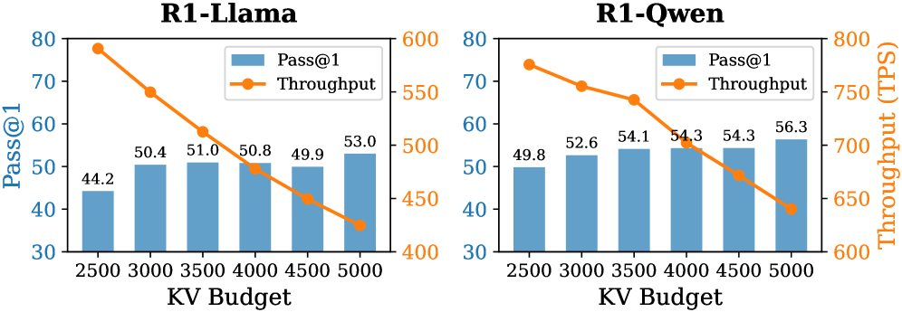
### Visual Description
\n
## [Combination Chart]: Performance vs. KV Budget for R1-Llama and R1-Qwen Models
### Overview
The image displays two side-by-side combination charts (bar and line) comparing the performance of two models, "R1-Llama" and "R1-Qwen," across different Key-Value (KV) Cache Budgets. Each chart plots two metrics: "Pass@1" (a performance score, represented by blue bars) and "Throughput" in Tokens Per Second (TPS, represented by an orange line with circular markers). The charts illustrate a trade-off between model performance and computational efficiency as the KV budget increases.
### Components/Axes
**Common Elements (Both Charts):**
* **X-Axis:** Labeled "KV Budget". It has six discrete, evenly spaced categories: `2500`, `3000`, `3500`, `4000`, `4500`, `5000`.
* **Primary Y-Axis (Left):** Labeled "Pass@1". Scale ranges from 30 to 80.
* **Secondary Y-Axis (Right):** Labeled "Throughput (TPS)". The scale differs between the two charts.
* **Legend:** Positioned in the top-right corner of each chart's plot area. It contains two entries:
* A blue square labeled "Pass@1".
* An orange line with a circle marker labeled "Throughput".
**Chart-Specific Details:**
* **Left Chart Title:** "R1-Llama" (centered at the top).
* **Right Chart Title:** "R1-Qwen" (centered at the top).
* **R1-Llama Secondary Y-Axis Scale:** Ranges from 400 to 600 TPS.
* **R1-Qwen Secondary Y-Axis Scale:** Ranges from 600 to 800 TPS.
### Detailed Analysis
**1. R1-Llama Chart (Left):**
* **Pass@1 (Blue Bars):** The values show a general upward trend with increasing KV Budget, with a slight dip at 4500.
* KV 2500: 44.2
* KV 3000: 50.4
* KV 3500: 51.0
* KV 4000: 50.8
* KV 4500: 49.9
* KV 5000: 53.0
* **Throughput (Orange Line):** The line shows a clear, consistent downward slope from left to right.
* KV 2500: ~580 TPS (point is near the top of the axis, between 550 and 600).
* KV 3000: ~540 TPS.
* KV 3500: ~510 TPS.
* KV 4000: ~490 TPS.
* KV 4500: ~460 TPS.
* KV 5000: ~430 TPS (point is near the bottom of the axis, between 400 and 450).
**2. R1-Qwen Chart (Right):**
* **Pass@1 (Blue Bars):** The values show a steady, monotonic increase with KV Budget.
* KV 2500: 49.8
* KV 3000: 52.6
* KV 3500: 54.1
* KV 4000: 54.3
* KV 4500: 54.3
* KV 5000: 56.3
* **Throughput (Orange Line):** The line shows a clear, consistent downward slope from left to right.
* KV 2500: ~770 TPS (point is near the top of the axis, between 750 and 800).
* KV 3000: ~750 TPS.
* KV 3500: ~730 TPS.
* KV 4000: ~710 TPS.
* KV 4500: ~680 TPS.
* KV 5000: ~650 TPS.
### Key Observations
1. **Inverse Relationship:** In both models, there is a clear inverse relationship between the KV Budget and Throughput. As the KV budget increases, throughput (processing speed) decreases.
2. **Performance Trend:** Pass@1 performance generally improves with a larger KV budget for both models, though the improvement is not perfectly linear for R1-Llama (a dip at 4500).
3. **Model Comparison:** The R1-Qwen model operates at a significantly higher throughput range (650-770 TPS) compared to R1-Llama (430-580 TPS) for the same KV budgets. Its Pass@1 scores also start higher and show a more consistent upward trend.
4. **Trade-off Point:** The charts visually highlight the engineering trade-off: allocating more KV cache (budget) improves model accuracy (Pass@1) but reduces the speed at which the model can generate tokens (Throughput).
### Interpretation
The data demonstrates a fundamental constraint in serving large language models: the memory and computational cost of the KV cache. A larger KV budget allows the model to attend to more context, which typically improves task performance (higher Pass@1). However, managing a larger cache requires more memory bandwidth and computation per generated token, which directly reduces throughput.
The comparison between R1-Llama and R1-Qwen suggests architectural or optimization differences. R1-Qwen achieves higher throughput at all measured points, indicating it may be a more efficient model for inference. Furthermore, its performance (Pass@1) scales more predictably with KV budget. The dip in R1-Llama's Pass@1 at a budget of 4500 could be an experimental artifact or indicate a point of diminishing returns or instability for that specific model configuration.
For a system designer, these charts provide critical data for provisioning. If the application is latency-sensitive (requires high throughput), a lower KV budget might be chosen, accepting a potential drop in accuracy. If accuracy is paramount (e.g., for complex reasoning tasks), a higher KV budget is justified despite the speed penalty. The optimal operating point depends on the specific requirements of the application.
</details>
Figure 8: Accuracy and throughput across varying KV budgets.
### 6.4 Analysis of Importance Predictor
To validate that the Importance Predictor effectively learns the ground-truth thinking token importance scores, we report the MSE Loss and the Kendall rank correlation coefficient (Abdi, 2007) in the top panel of Fig. 7. As the number of training steps increases, both metrics exhibit clear convergence. The MSE loss demonstrates that the predictor can fit the true importance scores. The Kendall coefficient measures the consistency of rankings between the ground-truth importance scores and the predicted values. This result indicates that the predictor successfully captures each thinking token’s importance to the answer. Furthermore, we analyze the overlap rate of predicted critical thinking tokens, as shown in the bottom panel of Fig. 7. Notably, at the end of training, the overlap rate of critical tokens within the top $30\$ of the predicted tokens exceeds $80\$ . This confirms that the Importance Predictor in DynTS effectively identifies the most pivotal tokens, ensuring the retention of essential thinking tokens even at high compression rates.
## 7 Related Work
Recent works on KV cache compression have primarily focused on classical LLMs, applying eviction strategies based on attention scores or heuristic rules. One line of work addresses long-context pruning at the prefill stage. Such as SnapKV (Li et al., 2024), PyramidKV (Cai et al., 2024), and AdaKV (Feng et al., 2024). However, they are ill-suited for the inference scenarios of LRMs, which have short prefill tokens followed by long decoding steps. Furthermore, several strategies have been proposed specifically for the decoding phase. For instance, H2O (Zhang et al., 2023) leverages accumulated attention scores, StreamingLLM (Xiao et al., 2024) retains attention sinks and recent tokens, and SepLLM (Chen et al., 2024) preserves only the separator tokens. More recently, targeting LRMs, (Cai et al., 2025) introduced RKV, which adds a similarity-based metric to evict redundant tokens, while RLKV (Du et al., 2025) utilizes reinforcement learning to retain critical reasoning heads. However, these methods fail to accurately assess the contribution of intermediate tokens to the final answer. Consequently, they risk erroneously evicting decision-critical tokens, compromising the model’s reasoning performance.
## 8 Conclusion and Discussion
In this work, we investigated the relationship between the reasoning traces and their final answers in LRMs. Our analysis revealed a Pareto Principle in LRMs: only the decision-critical thinking tokens ( $20\$ in the reasoning traces) steer the model toward the final answer. Building on this insight, we proposed DynTS, a novel KV cache compression method. Departing from current strategies that rely on local attention scores for eviction, DynTS introduces a learnable Importance Predictor to predict the contribution of the current token to the final answer. Based on the predicted score, DynTS retains pivotal KV cache. Empirical results on six datasets confirm that DynTS outperforms other SOTA baselines. We also discuss the limitations of DynTS and outline potential directions for future improvement. Please refer to Appendix E for details.
## Impact Statement
This paper presents work aimed at advancing the field of KV cache compression. There are many potential societal consequences of our work, none of which we feel must be specifically highlighted here. The primary impact of this research is to improve the memory and computational efficiency of LRM’s inference. By reducing memory requirements, our method helps lower the barrier to deploying powerful models on resource-constrained edge devices. We believe our work does not introduce specific ethical or societal risks beyond the general considerations inherent to advancing generative AI.
## References
- H. Abdi (2007) The kendall rank correlation coefficient. Encyclopedia of measurement and statistics 2, pp. 508–510. Cited by: §6.4.
- J. Ainslie, J. Lee-Thorp, M. De Jong, Y. Zemlyanskiy, F. Lebrón, and S. Sanghai (2023) Gqa: training generalized multi-query transformer models from multi-head checkpoints. arXiv preprint arXiv:2305.13245. Cited by: §2.
- P. C. Bogdan, U. Macar, N. Nanda, and A. Conmy (2025) Thought anchors: which llm reasoning steps matter?. arXiv preprint arXiv:2506.19143. Cited by: §1, §1, §3.1.
- Z. Cai, W. Xiao, H. Sun, C. Luo, Y. Zhang, K. Wan, Y. Li, Y. Zhou, L. Chang, J. Gu, et al. (2025) R-kv: redundancy-aware kv cache compression for reasoning models. In The Thirty-ninth Annual Conference on Neural Information Processing Systems, Cited by: §3.1, §6.1, §7.
- Z. Cai, Y. Zhang, B. Gao, Y. Liu, Y. Li, T. Liu, K. Lu, W. Xiong, Y. Dong, J. Hu, et al. (2024) Pyramidkv: dynamic kv cache compression based on pyramidal information funneling. arXiv preprint arXiv:2406.02069. Cited by: §3.1, §7.
- G. Chen, H. Shi, J. Li, Y. Gao, X. Ren, Y. Chen, X. Jiang, Z. Li, W. Liu, and C. Huang (2024) Sepllm: accelerate large language models by compressing one segment into one separator. arXiv preprint arXiv:2412.12094. Cited by: §1, §1, §4.2, §6.1, §7.
- Q. Chen, L. Qin, J. Liu, D. Peng, J. Guan, P. Wang, M. Hu, Y. Zhou, T. Gao, and W. Che (2025) Towards reasoning era: a survey of long chain-of-thought for reasoning large language models. arXiv preprint arXiv:2503.09567. Cited by: §1, §2.
- D. Choi, J. Lee, J. Tack, W. Song, S. Dingliwal, S. M. Jayanthi, B. Ganesh, J. Shin, A. Galstyan, and S. B. Bodapati (2025) Think clearly: improving reasoning via redundant token pruning. arXiv preprint arXiv:2507.08806 4. Cited by: §1.
- G. DeepMind (2025) A new era of intelligence with gemini 3. Note: https://blog.google/products/gemini/gemini-3/#gemini-3-deep-think Cited by: §1.
- A. Devoto, Y. Zhao, S. Scardapane, and P. Minervini (2024) A simple and effective $L\_2$ norm-based strategy for kv cache compression. arXiv preprint arXiv:2406.11430. Cited by: §1.
- W. Du, L. Jiang, K. Tao, X. Liu, and H. Wang (2025) Which heads matter for reasoning? rl-guided kv cache compression. arXiv preprint arXiv:2510.08525. Cited by: §7.
- S. Feng, G. Fang, X. Ma, and X. Wang (2025) Efficient reasoning models: a survey. arXiv preprint arXiv:2504.10903. Cited by: §1.
- Y. Feng, J. Lv, Y. Cao, X. Xie, and S. K. Zhou (2024) Ada-kv: optimizing kv cache eviction by adaptive budget allocation for efficient llm inference. arXiv preprint arXiv:2407.11550. Cited by: §7.
- D. Guo, D. Yang, H. Zhang, J. Song, R. Zhang, R. Xu, Q. Zhu, S. Ma, P. Wang, X. Bi, et al. (2025) Deepseek-r1: incentivizing reasoning capability in llms via reinforcement learning. arXiv preprint arXiv:2501.12948. Cited by: §B.1, §1, §6.1, §6.1.
- D. Hendrycks, C. Burns, S. Kadavath, A. Arora, S. Basart, E. Tang, D. Song, and J. Steinhardt (2021) Measuring mathematical problem solving with the math dataset. arXiv preprint arXiv:2103.03874. Cited by: §1, §6.1.
- W. Huang, Z. Zhai, Y. Shen, S. Cao, F. Zhao, X. Xu, Z. Ye, Y. Hu, and S. Lin (2024) Dynamic-llava: efficient multimodal large language models via dynamic vision-language context sparsification. arXiv preprint arXiv:2412.00876. Cited by: §4.1.
- W. Kwon, Z. Li, S. Zhuang, Y. Sheng, L. Zheng, C. H. Yu, J. Gonzalez, H. Zhang, and I. Stoica (2023) Efficient memory management for large language model serving with pagedattention. In Proceedings of the 29th symposium on operating systems principles, pp. 611–626. Cited by: §B.1.
- Y. Li, Y. Huang, B. Yang, B. Venkitesh, A. Locatelli, H. Ye, T. Cai, P. Lewis, and D. Chen (2024) Snapkv: llm knows what you are looking for before generation. Advances in Neural Information Processing Systems 37, pp. 22947–22970. Cited by: §1, §3.1, §6.1, §7.
- M. Liu, A. Palnitkar, T. Rabbani, H. Jae, K. R. Sang, D. Yao, S. Shabihi, F. Zhao, T. Li, C. Zhang, et al. (2025a) Hold onto that thought: assessing kv cache compression on reasoning. arXiv preprint arXiv:2512.12008. Cited by: §6.1.
- Y. Liu, J. Fu, S. Liu, Y. Zou, S. Zhang, and J. Zhou (2025b) KV cache compression for inference efficiency in llms: a review. In Proceedings of the 4th International Conference on Artificial Intelligence and Intelligent Information Processing, pp. 207–212. Cited by: §1.
- G. Minegishi, H. Furuta, T. Kojima, Y. Iwasawa, and Y. Matsuo (2025) Topology of reasoning: understanding large reasoning models through reasoning graph properties. arXiv preprint arXiv:2506.05744. Cited by: §1.
- OpenAI (2025) OpenAI. External Links: Link Cited by: §1.
- R. Pope, S. Douglas, A. Chowdhery, J. Devlin, J. Bradbury, J. Heek, K. Xiao, S. Agrawal, and J. Dean (2023) Efficiently scaling transformer inference. Proceedings of machine learning and systems 5, pp. 606–624. Cited by: §2.
- Z. Qin, Y. Cao, M. Lin, W. Hu, S. Fan, K. Cheng, W. Lin, and J. Li (2025) Cake: cascading and adaptive kv cache eviction with layer preferences. arXiv preprint arXiv:2503.12491. Cited by: §1.
- D. Rein, B. L. Hou, A. C. Stickland, J. Petty, R. Y. Pang, J. Dirani, J. Michael, and S. R. Bowman (2024) Gpqa: a graduate-level google-proof q&a benchmark. In First Conference on Language Modeling, Cited by: §6.1.
- L. Shi, H. Zhang, Y. Yao, Z. Li, and H. Zhao (2024) Keep the cost down: a review on methods to optimize llm’s kv-cache consumption. arXiv preprint arXiv:2407.18003. Cited by: §1.
- C. Singh, J. P. Inala, M. Galley, R. Caruana, and J. Gao (2024) Rethinking interpretability in the era of large language models. arXiv preprint arXiv:2402.01761. Cited by: §3.1.
- Y. Sui, Y. Chuang, G. Wang, J. Zhang, T. Zhang, J. Yuan, H. Liu, A. Wen, S. Zhong, N. Zou, et al. (2025) Stop overthinking: a survey on efficient reasoning for large language models. arXiv preprint arXiv:2503.16419. Cited by: §2.
- A. Vaswani, N. Shazeer, N. Parmar, J. Uszkoreit, L. Jones, A. N. Gomez, Ł. Kaiser, and I. Polosukhin (2017) Attention is all you need. Advances in neural information processing systems 30. Cited by: §1, §2, §2, §4.1.
- Z. Wang and A. C. Bovik (2009) Mean squared error: love it or leave it? a new look at signal fidelity measures. IEEE Signal Processing Magazine 26 (1), pp. 98–117. External Links: Document Cited by: §4.1.
- G. WEI, X. Zhou, P. Sun, T. Zhang, and Y. Wen (2025) Rethinking key-value cache compression techniques for large language model serving. Proceedings of Machine Learning and Systems 7. Cited by: §1.
- S. Wiegreffe and Y. Pinter (2019) Attention is not not explanation. In Proceedings of the 2019 Conference on Empirical Methods in Natural Language Processing and the 9th International Joint Conference on Natural Language Processing (EMNLP-IJCNLP), K. Inui, J. Jiang, V. Ng, and X. Wan (Eds.), Hong Kong, China, pp. 11–20. External Links: Link, Document Cited by: §1.
- G. Xiao, Y. Tian, B. Chen, S. Han, and M. Lewis (2024) EFFICIENT streaming language models with attention sinks. Cited by: §C.3, §1, §6.1, §7.
- F. Xu, Q. Hao, Z. Zong, J. Wang, Y. Zhang, J. Wang, X. Lan, J. Gong, T. Ouyang, F. Meng, et al. (2025) Towards large reasoning models: a survey of reinforced reasoning with large language models. arXiv preprint arXiv:2501.09686. Cited by: §2.
- A. Yang, A. Li, B. Yang, B. Zhang, B. Hui, B. Zheng, B. Yu, C. Gao, C. Huang, C. Lv, et al. (2025) Qwen3 technical report. arXiv preprint arXiv:2505.09388. Cited by: §6.3.
- D. Zhang, Z. Li, M. Zhang, J. Zhang, Z. Liu, Y. Yao, H. Xu, J. Zheng, X. Chen, Y. Zhang, et al. (2025a) From system 1 to system 2: a survey of reasoning large language models. IEEE Transactions on Pattern Analysis and Machine Intelligence. Cited by: §2.
- Q. Zhang, F. Lyu, Z. Sun, L. Wang, W. Zhang, W. Hua, H. Wu, Z. Guo, Y. Wang, N. Muennighoff, et al. (2025b) A survey on test-time scaling in large language models: what, how, where, and how well?. arXiv preprint arXiv:2503.24235. Cited by: §1.
- Y. Zhang and T. Math-AI (2024) American invitational mathematics examination (aime) 2024. Cited by: §6.1.
- Y. Zhang and T. Math-AI (2025) American invitational mathematics examination (aime) 2025. Cited by: §6.1.
- Z. Zhang, Y. Sheng, T. Zhou, T. Chen, L. Zheng, R. Cai, Z. Song, Y. Tian, C. Ré, C. Barrett, et al. (2023) H2o: heavy-hitter oracle for efficient generative inference of large language models. Advances in Neural Information Processing Systems 36, pp. 34661–34710. Cited by: §1, §1, §3.1, §4.2, §6.1, §7.
- J. Zhao, Z. Fang, S. Li, S. Yang, and S. He (2024) Buzz: beehive-structured sparse kv cache with segmented heavy hitters for efficient llm inference. arXiv preprint arXiv:2410.23079. Cited by: §4.2.
## Appendix A Proof of Cumulative Computational Gain
**Definition A.1 (Predictor Overhead)**
*Let $\mathcal{M}_{\text{base}}$ be the vanilla LRM with $L$ layers and a hidden dimension $d$ , and $\mathcal{M}_{\text{opt}}$ be the LRM with Importance Predictor. The predictor is defined as a three-layer linear MLP with dimensions $d\to m_{1}\to m_{2}\to m_{3}$ . The computational cost per decode step is:
$$
\mathcal{C}_{\text{mlp}}=2(d\cdot m_{1}+m_{1}\cdot m_{2}+m_{2}\cdot m_{3}). \tag{11}
$$
Setting $m_{1}=2d$ , $m_{2}=d/2$ , and $m_{3}=1$ yields:
$$
\mathcal{C}_{\text{mlp}}=6d^{2}+d \tag{12}
$$*
**Definition A.2 (Effective KV Cache Length)**
*Let $M$ denote the length of the prefill sequence. At decode step $i$ , when the effective cache length reaches the budget $B$ , DynTS performs KV Cache Selection to evict $K$ redundant tokens. The effective KV cache length $S_{i}$ for the base and optimized models is given by:
$$
S_{i}^{\text{base}}=M+i,\quad S_{i}^{\text{opt}}=M+i-n_{i}\cdot K, \tag{13}
$$
where $n_{i}=\max\left(0,\left\lfloor\frac{(M+i)-B}{K}\right\rfloor+1\right)$ denotes the count of cache eviction event at step $i$ .*
**Definition A.3 (LLM Overhead)**
*The computational overhead per step for a decoder-only transformer is composed of a static component $\mathcal{C}_{\text{static}}$ (independent of sequence length) and a dynamic attention component $\mathcal{C}_{\text{attn}}$ (linearly dependent on effective cache length). The static cost $\mathcal{C}_{\text{static}}$ for the backbone remains identical for both models. The self-attention cost for a single layer is $4\cdot d\cdot S_{i}$ (counting $Q\cdot K^{\top}$ and $\text{Softmax}\cdot V$ ). Across $L$ layers:
$$
\mathcal{C}_{\text{attn}}(S_{i})=4\cdot L\cdot d\cdot S_{i} \tag{14}
$$*
* Proof: Computational Gain*
Let $\Delta\mathcal{C}(i)$ be the reduction in FLOPs achieved by DynTS at decoding step $i$ , which is defined as $\text{FLOPs}(\mathcal{M}_{\text{base}}(i))-\text{FLOPs}(\mathcal{M}_{\text{opt}}(i))$ :
$$
\Delta\mathcal{C}(i)=\left[\mathcal{C}_{\text{static}}(i)+\mathcal{C}_{\text{attn}}(S_{i}^{\text{base}})\right]-\left[\mathcal{C}_{\text{static}}(i)+\mathcal{C}_{\text{mlp}}+\mathcal{C}_{\text{attn}}(S_{i}^{\text{opt}})\right]. \tag{15}
$$
Eliminating the static term $\mathcal{C}_{\text{static}}$
$$
\Delta\mathcal{C}(i)=\mathcal{C}_{\text{attn}}(S_{i}^{\text{base}})-\mathcal{C}_{\text{attn}}(S_{i}^{\text{opt}})-\mathcal{C}_{\text{mlp}}. \tag{16}
$$
Substituting $S_{i}^{\text{base}}$ , $S_{i}^{\text{opt}}$ and $\mathcal{C}_{\text{mlp}}$ :
$$
\displaystyle\Delta\mathcal{C}(i) \displaystyle=4\cdot L\cdot d\cdot(M+i)-4\cdot L\cdot d\cdot(M+i-n_{i}\cdot K)-\mathcal{C}_{\text{mlp}} \displaystyle=\underbrace{n_{i}\cdot 4LdK}_{\text{Eviction Saving}}-\underbrace{(6d^{2}+d)}_{\text{Predictor Overhead}}. \tag{17}
$$
This completes the proof. $\square$ ∎
## Appendix B Empirical Analysis and Observations
### B.1 Implementation Details
To calculate the importance of each thinking token to the final answer sequence, we first utilized vLLM (Kwon et al., 2023) to generate the complete reasoning trace. Following (Guo et al., 2025), we set the temperature to 0.6, top-p to 0.95, top-k to 20, and max length to 16,384. To ensure sequence completeness, we sampled 5 times for each question and filtered out samples with incomplete inference traces. Then, we fed the full sequence into the model for a single forward pass to extract the submatrices of attention weight, corresponding to the answer and thinking tokens. Finally, we aggregate the matrices across all layers and heads, and sum along the answer dimension (rows). The aggregated 1D vector is the importance score of each thinking token.
Based on the calculated importance scores, we employ three selection strategies to retain critical thinking tokens: top- $p\$ , bottom- $p\$ , and random sampling, where $p\in[2,4,6,8,10,20,30,40,50]$ . The retained tokens are concatenated with the original question to form the input sequence. The input sequence is processed by vLLM over 5 independent runs using the aforementioned configuration. We report the average Pass@1 across these results as the final accuracy.
### B.2 Ratio of Content Words
To investigate the distinctions of thinking tokens with varying importance scores, we employed spaCy to analyze the Part-of-Speech (POS) tags of each token. Specifically, we heuristically categorized nouns, verbs, adjectives, adverbs, and proper nouns as Content Words carrying substantive meaning, while treating other POS tags as Function Words with limited semantic information. The thinking tokens were sorted by importance score and then partitioned into ten equal parts. We report the ratio of Content Words and Function Words within each part in Fig 9. The tokens with higher importance scores exhibit a significantly higher proportion of content words, suggesting that they encode the core semantic meaning. Conversely, tokens with lower scores are predominantly function words, which primarily serve as syntactic scaffolding or intermediate states to maintain sequence coherence. Consequently, once the full sentence is generated, removing these low-importance tokens has a negligible impact on overall comprehension.
<details>
<summary>x11.png Details</summary>

### Visual Description
## Horizontal Bar Chart: R1-Llama | AIME24
### Overview
The image displays a horizontal bar chart titled "R1-Llama | AIME24". It compares the percentage ratio of "Content Words" versus "Function Words" across different percentile-based categories, likely representing performance or data distribution tiers. The chart uses two distinct visual styles for the bars to differentiate the two word types.
### Components/Axes
* **Chart Title:** "R1-Llama | AIME24" (Top-center).
* **Y-Axis (Vertical):** Lists percentile-based categories. From top to bottom:
* 90-100%
* 80-90%
* 70-80%
* 60-70%
* 50-60%
* 40-50%
* 30-40%
* 20-30%
* 10-20%
* Top-10%
* **X-Axis (Horizontal):** Labeled "Ratio (%)". The scale runs from 0 to 100 with major tick marks at 0, 20, 40, 60, 80, and 100.
* **Legend:** Positioned in the top-right corner of the chart area.
* A solid red rectangle is labeled "Content Words".
* A red rectangle with diagonal white hatching is labeled "Function Words".
* **Data Bars:** For each y-axis category, there are two horizontal bars:
* A solid red bar representing the "Content Words" ratio.
* A hatched red bar representing the "Function Words" ratio.
* Each bar has its exact percentage value printed inside or at its end.
### Detailed Analysis
The chart presents the following data points for each category (Content Words, Function Words):
* **90-100%:** Content Words: 31.0%, Function Words: 30.8%
* **80-90%:** Content Words: 30.8%, Function Words: 30.7%
* **70-80%:** Content Words: 30.7%, Function Words: 30.8%
* **60-70%:** Content Words: 30.8%, Function Words: 31.1%
* **50-60%:** Content Words: 31.1%, Function Words: 32.2%
* **40-50%:** Content Words: 32.2%, Function Words: 34.1%
* **30-40%:** Content Words: 34.1%, Function Words: 36.9%
* **20-30%:** Content Words: 36.9%, Function Words: 40.3%
* **10-20%:** Content Words: 40.3%, Function Words: 45.4%
* **Top-10%:** Content Words: 45.4%, Function Words: 40.3%
**Visual Trend:** For both word types, the ratio generally increases as the percentile category decreases (moving down the y-axis), peaking in the "10-20%" or "Top-10%" range. The "Content Words" ratio is consistently higher than the "Function Words" ratio in the top four categories (90-100% down to 60-70%). The relationship inverts in the middle categories (50-60% to 10-20%), where "Function Words" have a higher ratio. The trend inverts again for the final "Top-10%" category, where "Content Words" regain a significantly higher ratio.
### Key Observations
1. **Inversion Point:** The relative dominance of Content vs. Function words flips twice. Content words lead in the highest and lowest percentile brackets, while Function words lead in the middle brackets.
2. **Peak Values:** The highest ratio for "Content Words" is 45.4% in the "Top-10%" category. The highest ratio for "Function Words" is 45.4% in the "10-20%" category.
3. **Smallest Difference:** The ratios are nearly identical in the "80-90%" and "70-80%" categories, with differences of only 0.1%.
4. **Largest Difference:** The most significant gap is in the "Top-10%" category, where "Content Words" exceed "Function Words" by 5.1 percentage points.
5. **Data Structure:** The categories appear to be ordered from highest percentile range (90-100%) at the top to a specific "Top-10%" group at the bottom, which may be a distinct aggregate.
### Interpretation
This chart likely analyzes the composition of text data processed or generated by the "R1-Llama" model on the "AIME24" dataset or benchmark. The "Ratio (%)" probably represents the proportion of total words that are either content words (nouns, verbs, adjectives carrying semantic meaning) or function words (articles, prepositions, conjunctions providing grammatical structure) within different performance tiers.
The data suggests a non-linear relationship between word type prevalence and the percentile metric (which could be accuracy, difficulty, or another score). The inversion pattern is notable:
* In the **highest-performing tiers (90-100% to 60-70%)**, content words are slightly more prevalent. This could indicate that high-performance outputs or inputs are characterized by a richer semantic core.
* In the **middle tiers (50-60% to 10-20%)**, function words become more dominant. This might reflect more complex grammatical structures or perhaps more verbose, less semantically dense text in these ranges.
* The **"Top-10%" category** shows a strong resurgence of content words. If this category represents the absolute best performance, it strongly implies that top-tier results are achieved through highly focused, semantically rich language, minimizing structural filler.
The chart reveals that the balance between meaning-carrying and structure-providing words is a key differentiator across performance levels in this specific context. The "Top-10%" result is particularly striking, suggesting a qualitative shift in language composition at the very highest level.
</details>
<details>
<summary>x12.png Details</summary>
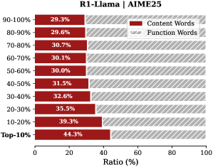
### Visual Description
## Horizontal Bar Chart: R1-Llama | AIME25
### Overview
This is a horizontal bar chart comparing the percentage ratio of "Content Words" versus "Function Words" across different performance percentile groups for a model or system identified as "R1-Llama" on the "AIME25" benchmark. The chart illustrates how the composition of language (content vs. function words) varies with performance level.
### Components/Axes
* **Title:** "R1-Llama | AIME25" (centered at the top).
* **Y-Axis (Vertical):** Lists performance percentile ranges. From top to bottom:
* 90-100%
* 80-90%
* 70-80%
* 60-70%
* 50-60%
* 40-50%
* 30-40%
* 20-30%
* 10-20%
* Top-10%
* **X-Axis (Horizontal):** Labeled "Ratio (%)". Scale runs from 0 to 100 with major tick marks at 0, 20, 40, 60, 80, and 100.
* **Legend:** Positioned in the top-right corner.
* **Red Solid Bar:** Labeled "Content Words".
* **Gray Hatched Bar:** Labeled "Function Words".
* **Data Series:** Each percentile range has a paired horizontal bar. The red "Content Words" bar is on the left, and the gray hatched "Function Words" bar is on the right, together summing to 100% for each row.
### Detailed Analysis
The chart presents the following precise data points for each percentile group. The trend is that the proportion of **Content Words increases** as performance improves (moving down the y-axis), while the proportion of **Function Words decreases**.
| Percentile Range | Content Words (Red Bar) | Function Words (Gray Hatched Bar) |
| :--- | :--- | :--- |
| 90-100% | 29.3% | 70.7% |
| 80-90% | 29.6% | 70.4% |
| 70-80% | 30.7% | 69.3% |
| 60-70% | 30.1% | 69.9% |
| 50-60% | 30.0% | 70.0% |
| 40-50% | 31.5% | 68.5% |
| 30-40% | 32.6% | 67.4% |
| 20-30% | 35.5% | 64.5% |
| 10-20% | 39.3% | 60.7% |
| Top-10% | 44.3% | 55.7% |
**Trend Verification:**
* **Content Words (Red):** The line formed by the ends of the red bars slopes steadily downward and to the right, indicating a consistent increase in percentage from the lowest-performing group (90-100% at 29.3%) to the highest-performing group (Top-10% at 44.3%).
* **Function Words (Gray):** The line formed by the ends of the gray bars slopes steadily downward and to the left, indicating a consistent decrease from 70.7% to 55.7% across the same groups.
### Key Observations
1. **Inverse Relationship:** The percentages for Content and Function words are perfectly complementary for each row, summing to 100%.
2. **Monotonic Trend:** The increase in Content Words (and decrease in Function Words) is nearly monotonic across the performance spectrum. The only minor deviation is between the 70-80% (30.7%) and 60-70% (30.1%) groups, where the Content Words percentage dips slightly before resuming its upward trend.
3. **Significant Gap:** The largest single jump in Content Words percentage occurs between the "10-20%" group (39.3%) and the "Top-10%" group (44.3%), a 5-percentage-point increase.
4. **Dominance of Function Words:** In all percentile groups, Function Words constitute the majority of the ratio (always >55%).
### Interpretation
This chart suggests a strong correlation between the linguistic composition of a model's output and its performance on the AIME25 benchmark. Higher-performing instances (those in the "Top-10%" and "10-20%" brackets) use a significantly higher proportion of **Content Words**—words carrying semantic meaning like nouns, verbs, adjectives—compared to lower-performing instances.
Conversely, lower-performing models rely more heavily on **Function Words**—grammatical words like prepositions, articles, and conjunctions that structure language but carry less intrinsic meaning.
**What this might mean:**
* **Precision vs. Structure:** Better performance may be associated with more precise, information-dense language (content words) rather than verbose, structurally complex but semantically lighter language (function words).
* **Efficiency:** The Top-10% models might be communicating ideas more efficiently, using fewer "filler" or structural words to convey the same or better information.
* **Benchmark Nature:** The AIME25 benchmark likely rewards answers that are direct, factual, and semantically rich, which aligns with a higher content-word ratio. This pattern could be specific to this type of evaluation.
The data implies that analyzing the part-of-speech distribution in model outputs could serve as a diagnostic tool for performance, with a higher content-to-function word ratio being a potential indicator of higher-quality reasoning or answer generation for this specific task.
</details>
<details>
<summary>x13.png Details</summary>
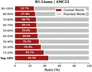
### Visual Description
\n
## Horizontal Bar Chart: R1-Llama | AMC23
### Overview
The image displays a horizontal stacked bar chart titled "R1-Llama | AMC23". It visualizes the percentage ratio of "Content Words" versus "Function Words" across ten decile-based categories, ranging from the "Top-10%" to the "90-100%" group. The chart suggests an analysis of linguistic composition within a dataset or model output, likely related to the AMC23 benchmark.
### Components/Axes
* **Chart Title:** "R1-Llama | AMC23" (centered at the top).
* **Y-Axis (Vertical):** Lists ten categorical decile ranges. From top to bottom:
* 90-100%
* 80-90%
* 70-80%
* 60-70%
* 50-60%
* 40-50%
* 30-40%
* 20-30%
* 10-20%
* Top-10%
* **X-Axis (Horizontal):** Labeled "Ratio (%)". The scale runs from 0 to 100 with major tick marks at 0, 20, 40, 60, 80, and 100.
* **Legend:** Positioned in the top-right corner of the chart area.
* A solid red rectangle is labeled "Content Words".
* A red rectangle with diagonal hatching (stripes) is labeled "Function Words".
* **Data Series:** Each horizontal bar is a stacked combination of the two series. The solid red segment ("Content Words") is on the left, and the hatched red segment ("Function Words") is on the right. The total length of each bar sums to 100%.
### Detailed Analysis
The chart presents the following data points for each decile category. The values are read directly from the percentage labels on each bar segment.
| Decile Category | Content Words (Solid Red) | Function Words (Hatched Red) |
| :--- | :--- | :--- |
| **90-100%** | 25.7% | 74.3% |
| **80-90%** | 27.4% | 72.6% |
| **70-80%** | 28.7% | 71.3% |
| **60-70%** | 29.1% | 70.9% |
| **50-60%** | 29.6% | 70.4% |
| **40-50%** | 30.6% | 69.4% |
| **30-40%** | 32.3% | 67.7% |
| **20-30%** | 35.4% | 64.6% |
| **10-20%** | 39.1% | 60.9% |
| **Top-10%** | 45.3% | 54.7% |
**Trend Verification:**
* **Content Words (Solid Red):** The line formed by the right edge of the solid red bars slopes **downward** from left to right as you move from the "Top-10%" category at the bottom to the "90-100%" category at the top. This indicates a **decreasing trend** in the ratio of content words as the decile percentile increases.
* **Function Words (Hatched Red):** Conversely, the line formed by the right edge of the entire bar (which is the left edge of the function words segment) slopes **upward** from left to right from bottom to top. This indicates an **increasing trend** in the ratio of function words as the decile percentile increases.
### Key Observations
1. **Inverse Relationship:** There is a clear, consistent inverse relationship between the two word categories. As the percentage of Content Words decreases across deciles, the percentage of Function Words increases by a corresponding amount.
2. **Maximum and Minimum:** The highest ratio of Content Words (45.3%) is found in the "Top-10%" category. The lowest ratio of Content Words (25.7%) is in the "90-100%" category.
3. **Dominance of Function Words:** In every single decile category, Function Words constitute the majority (over 50%) of the ratio. Their dominance increases from 54.7% in the "Top-10%" to 74.3% in the "90-100%".
4. **Non-Linear Progression:** The change between consecutive deciles is not perfectly uniform. The largest single jump in Content Words ratio occurs between the "10-20%" (39.1%) and "Top-10%" (45.3%) categories, a difference of 6.2 percentage points.
### Interpretation
This chart likely analyzes the linguistic properties of text generated by or associated with the "R1-Llama" model on the "AMC23" benchmark. The deciles ("Top-10%", "90-100%", etc.) probably rank samples based on a performance metric (e.g., accuracy, score), with "Top-10%" being the best-performing group.
The data suggests a strong correlation between performance and lexical composition:
* **Higher-performing samples (Top-10%, 10-20%)** use a significantly higher proportion of **Content Words** (nouns, verbs, adjectives, adverbs) which carry semantic meaning. This implies these responses are more information-dense, specific, and substantive.
* **Lower-performing samples (80-90%, 90-100%)** are dominated by **Function Words** (prepositions, articles, conjunctions, pronouns) which serve grammatical roles. This could indicate responses that are more verbose, structurally complex but semantically vague, or reliant on formulaic language without deep content.
The trend implies that for this task, the quality or effectiveness of output (as measured by the AMC23 benchmark) is closely tied to the density of meaningful, content-bearing vocabulary. The "Top-10%" responses are nearly twice as dense in content words (45.3%) as the "90-100%" responses (25.7%). This insight could be used to guide model fine-tuning or evaluation, emphasizing the generation of substantive content over purely grammatical but hollow phrasing.
</details>
<details>
<summary>x14.png Details</summary>
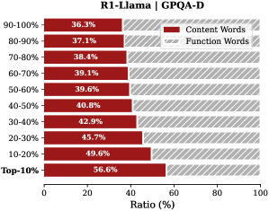
### Visual Description
## Horizontal Stacked Bar Chart: R1-Llama | GPQA-D
### Overview
This image is a horizontal stacked bar chart comparing the ratio of "Content Words" to "Function Words" across different percentile ranges for a model or dataset labeled "R1-Llama" on the "GPQA-D" benchmark. The chart visualizes how the composition of word types changes across performance or confidence tiers.
### Components/Axes
* **Chart Title:** "R1-Llama | GPQA-D" (centered at the top).
* **Vertical Axis (Y-axis):** Represents percentile ranges, ordered from highest to lowest. The categories are:
* 90-100%
* 80-90%
* 70-80%
* 60-70%
* 50-60%
* 40-50%
* 30-40%
* 20-30%
* 10-20%
* Top-10%
* **Horizontal Axis (X-axis):** Labeled "Ratio (%)" with a scale from 0 to 100, marked at intervals of 20 (0, 20, 40, 60, 80, 100).
* **Legend:** Located in the top-right corner of the chart area.
* A dark red square is labeled "Content Words".
* A light red (pinkish) square is labeled "Function Words".
* **Data Bars:** Each horizontal bar is stacked with two segments corresponding to the legend. The dark red segment (Content Words) is on the left, and the light red segment (Function Words) is on the right. The percentage value for the "Content Words" segment is printed inside each dark red bar.
### Detailed Analysis
The chart displays the following data points for each percentile range. The "Function Words" ratio is calculated as the complement to 100% of the given "Content Words" ratio.
| Percentile Range | Content Words Ratio (%) | Function Words Ratio (%) (Calculated) |
| :--- | :--- | :--- |
| Top-10% | 56.6% | 43.4% |
| 90-100% | 36.3% | 63.7% |
| 80-90% | 37.1% | 62.9% |
| 70-80% | 38.4% | 61.6% |
| 60-70% | 39.1% | 60.9% |
| 50-60% | 39.6% | 60.4% |
| 40-50% | 40.8% | 59.2% |
| 30-40% | 42.9% | 57.1% |
| 20-30% | 45.7% | 54.3% |
| 10-20% | 49.6% | 50.4% |
**Trend Verification:** Moving from the top of the chart (90-100% range) to the bottom (Top-10% range), the dark red "Content Words" segment consistently increases in length. Conversely, the light red "Function Words" segment consistently decreases. This indicates a clear inverse relationship between the two word types across the percentile tiers.
### Key Observations
1. **Dominance of Function Words:** In the highest percentile ranges (90-100% down to 50-60%), "Function Words" constitute the majority, ranging from approximately 64% to 60%.
2. **Crossover Point:** The ratio of "Content Words" to "Function Words" becomes roughly equal (near 50/50) in the 10-20% percentile range (49.6% vs. 50.4%).
3. **Content Word Dominance in Top Tier:** In the "Top-10%" category, "Content Words" become the dominant type, comprising 56.6% of the ratio.
4. **Monotonic Trend:** The increase in the "Content Words" ratio is monotonic and nearly linear as one moves from the highest to the lowest percentile ranges shown.
### Interpretation
This chart likely analyzes the linguistic composition of text generated by or associated with the "R1-Llama" model on the "GPQA-D" task, segmented by some measure of confidence, quality, or performance percentile.
* **What the data suggests:** The data demonstrates a strong correlation between the percentile tier and the type of words used. Higher-confidence or higher-performance outputs (90-100%) are characterized by a higher proportion of "Function Words" (e.g., articles, prepositions, conjunctions). Lower-confidence or lower-performance outputs (Top-10%) shift towards a higher proportion of "Content Words" (e.g., nouns, verbs, adjectives).
* **How elements relate:** The inverse relationship between the two word types is the core finding. The chart implies that as the model's output moves into lower percentile brackets (which may correspond to more challenging questions or less confident answers), its language becomes more "content-heavy" and less reliant on structural, grammatical function words.
* **Notable patterns/anomalies:** The most striking pattern is the smooth, consistent gradient. There are no sudden jumps or outliers, suggesting a fundamental and predictable shift in linguistic strategy across the performance spectrum. The "Top-10%" being the only category where content words outnumber function words is a critical threshold. This could indicate that for the most difficult or poorly-performing instances, the model's output becomes more focused on substantive terms, potentially at the expense of grammatical fluency or connective phrasing.
</details>
<details>
<summary>x15.png Details</summary>
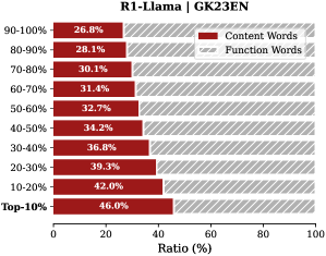
### Visual Description
## Horizontal Bar Chart: Content vs. Function Word Ratios by Percentile Range
### Overview
This image is a horizontal stacked bar chart titled "R1-Llama | G2K23EN". It displays the percentage ratio of "Content Words" versus "Function Words" across ten different percentile ranges, from "90-100%" down to "Top-10%". The chart illustrates how the proportion of content words changes relative to function words across these ranked segments.
### Components/Axes
* **Chart Title:** "R1-Llama | G2K23EN" (located at the top center).
* **Y-Axis (Vertical):** Lists ten categorical percentile ranges. From top to bottom, they are: "90-100%", "80-90%", "70-80%", "60-70%", "50-60%", "40-50%", "30-40%", "20-30%", "10-20%", and "Top-10%".
* **X-Axis (Horizontal):** Labeled "Ratio (%)". It is a linear scale marked from 0 to 100 in increments of 20 (0, 20, 40, 60, 80, 100).
* **Legend:** Positioned in the top-right corner of the chart area. It defines two categories:
* **Content Words:** Represented by a solid red color.
* **Function Words:** Represented by a gray and white diagonal striped pattern.
* **Data Bars:** Each horizontal bar corresponds to a percentile range on the y-axis. The bar is divided into two segments whose lengths represent the percentage ratio of each word type. The exact percentage value for the "Content Words" segment is printed in white text within the red portion of each bar.
### Detailed Analysis
The chart presents a clear, monotonic trend. As the percentile range moves from the lowest-performing segment ("90-100%") to the highest-performing segment ("Top-10%"), the ratio of Content Words consistently increases.
**Data Series - Content Words (Red Bars):**
* **Trend Verification:** The red segment of each bar grows progressively longer from the top of the chart to the bottom, indicating a steady upward trend in the Content Words ratio.
* **Extracted Values (from top to bottom):**
* 90-100%: 26.8%
* 80-90%: 28.1%
* 70-80%: 30.1%
* 60-70%: 31.4%
* 50-60%: 32.7%
* 40-50%: 34.2%
* 30-40%: 36.8%
* 20-30%: 39.3%
* 10-20%: 42.0%
* Top-10%: 46.0%
**Data Series - Function Words (Gray Striped Bars):**
* **Trend Verification:** The gray striped segment of each bar grows progressively shorter from top to bottom, indicating a steady downward trend in the Function Words ratio. This is the inverse of the Content Words trend.
* **Calculated Values (100% - Content Words %):**
* 90-100%: 73.2%
* 80-90%: 71.9%
* 70-80%: 69.9%
* 60-70%: 68.6%
* 50-60%: 67.3%
* 40-50%: 65.8%
* 30-40%: 63.2%
* 20-30%: 60.7%
* 10-20%: 58.0%
* Top-10%: 54.0%
### Key Observations
1. **Perfect Inverse Relationship:** The sum of Content Words and Function Words for each bar is exactly 100%, confirming they are complementary parts of a whole.
2. **Linear Progression:** The increase in Content Words ratio is remarkably consistent across the percentile ranges, with increments between consecutive ranges generally falling between 1.3% and 2.7%.
3. **Significant Range:** The Content Words ratio spans from a low of 26.8% to a high of 46.0%, a difference of 19.2 percentage points across the ranked segments.
4. **Peak at Top-10%:** The highest concentration of Content Words (46.0%) is found in the "Top-10%" segment, which likely represents the highest-performing or most relevant subset of the data (e.g., top-ranked responses or documents).
### Interpretation
This chart likely analyzes the linguistic composition of text outputs from a model named "R1-Llama" evaluated on a benchmark or dataset abbreviated "G2K23EN". The data suggests a strong, positive correlation between the proportion of "Content Words" (nouns, verbs, adjectives, adverbs carrying semantic meaning) and the ranking/performance tier of the text.
* **What it demonstrates:** Higher-performing outputs (those in the "Top-10%") are characterized by a significantly higher density of meaningful, content-bearing words. Conversely, lower-performing outputs rely more heavily on "Function Words" (prepositions, articles, conjunctions, pronouns that provide grammatical structure).
* **Relationship between elements:** The percentile ranking (y-axis) is the independent variable, and the word-type ratio (x-axis) is the dependent variable. The chart shows that as the independent variable improves (moving to a better percentile), the dependent variable shifts predictably toward more content words.
* **Implication:** This pattern could indicate that the evaluation metric or human preference for these texts favors substantive, information-dense language over structurally functional but semantically lighter language. It provides a quantitative linguistic feature that distinguishes high-quality from lower-quality outputs in this specific context. The "Top-10%" segment serves as a benchmark for the ideal content-to-function word ratio (~46:54) for this task.
</details>
<details>
<summary>x16.png Details</summary>
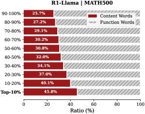
### Visual Description
## Horizontal Bar Chart: Content vs. Function Word Ratios by Percentile Group
### Overview
The image is a horizontal bar chart titled "R1-Llama | MATH500". It displays the percentage ratio of "Content Words" versus "Function Words" across ten distinct percentile groups, likely representing performance tiers on a dataset or evaluation named MATH500. The chart compares two linguistic categories across these groups.
### Components/Axes
* **Title:** "R1-Llama | MATH500" (Top-center).
* **Y-Axis (Vertical):** Lists ten percentile groups, ordered from highest to lowest: "90-100%", "80-90%", "70-80%", "60-70%", "50-60%", "40-50%", "30-40%", "20-30%", "10-20%", "Top-10%".
* **X-Axis (Horizontal):** Labeled "Ratio (%)". The scale runs from 0 to 100, with major tick marks at 0, 20, 40, 60, 80, and 100.
* **Legend:** Located in the top-right corner.
* **Red Solid Bar:** Labeled "Content Words".
* **Gray Hatched Bar:** Labeled "Function Words".
* **Data Labels:** Each bar segment has its percentage value printed directly on it.
### Detailed Analysis
The chart presents a stacked horizontal bar for each percentile group, where the total length of each bar represents 100%. The red segment (Content Words) starts from the left (0%), and the gray hatched segment (Function Words) continues to the right (100%).
**Data Points (Content Words %, Function Words %):**
* **90-100%:** 25.7%, 74.3%
* **80-90%:** 27.2%, 72.8%
* **70-80%:** 29.1%, 70.9%
* **60-70%:** 30.2%, 69.8%
* **50-60%:** 30.8%, 69.2%
* **40-50%:** 32.0%, 68.0%
* **30-40%:** 34.1%, 65.9%
* **20-30%:** 37.0%, 63.0%
* **10-20%:** 40.1%, 59.9%
* **Top-10%:** 45.8%, 54.2%
**Trend Verification:**
* **Content Words (Red):** The red segment lengthens progressively as we move down the y-axis from the "90-100%" group to the "Top-10%" group. The trend is a clear, monotonic increase.
* **Function Words (Gray):** The gray hatched segment shortens correspondingly as we move down the y-axis. The trend is a clear, monotonic decrease.
### Key Observations
1. **Inverse Relationship:** There is a perfect inverse relationship between the two word categories within each group; they sum to 100%.
2. **Performance Correlation:** The proportion of "Content Words" increases as the percentile group performance decreases (moving from the top-performing "90-100%" group to the "Top-10%" group). The highest proportion of Content Words (45.8%) is found in the "Top-10%" group, while the lowest (25.7%) is in the "90-100%" group.
3. **Magnitude of Change:** The shift is substantial. The "Top-10%" group uses nearly twice the ratio of Content Words (45.8%) compared to the "90-100%" group (25.7%).
4. **No Outliers:** The progression of values is smooth and consistent across all ten groups, with no sudden jumps or deviations from the overall trend.
### Interpretation
This chart likely analyzes the linguistic composition of outputs from a model named "R1-Llama" on the "MATH500" benchmark. The percentile groups probably rank model responses by quality or correctness, with "90-100%" being the highest-performing tier.
The data suggests a strong correlation between **lower performance** and a **higher density of content words** (nouns, verbs, adjectives carrying substantive meaning). Conversely, **higher performance** is associated with a **higher density of function words** (articles, prepositions, conjunctions that provide grammatical structure).
This could imply that top-tier responses on this math-focused task are characterized by more precise, structured, and logically connective language (function words), potentially indicating clearer reasoning steps. Lower-performing responses might rely more on listing substantive terms (content words) without the same degree of syntactic scaffolding, which could point to less coherent or incomplete explanations. The chart provides a quantitative linguistic fingerprint that distinguishes performance levels in model-generated text.
</details>
<details>
<summary>x17.png Details</summary>
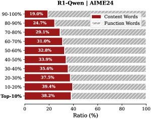
### Visual Description
## Horizontal Bar Chart: R1-Qwen | AIME24
### Overview
This image displays a horizontal stacked bar chart titled "R1-Qwen | AIME24". It compares the percentage ratio of "Content Words" versus "Function Words" across ten performance percentile categories, from "Top-10%" to "90-100%". The chart illustrates a clear inverse relationship between the two word types across the performance spectrum.
### Components/Axes
* **Chart Title:** "R1-Qwen | AIME24" (located at the top center).
* **Y-Axis (Vertical):** Lists ten performance percentile categories. From bottom to top: "Top-10%", "10-20%", "20-30%", "30-40%", "40-50%", "50-60%", "60-70%", "70-80%", "80-90%", "90-100%".
* **X-Axis (Horizontal):** Labeled "Ratio (%)". The scale runs from 0 to 100, with major tick marks at 0, 20, 40, 60, 80, and 100.
* **Legend:** Positioned in the top-right corner of the chart area.
* A solid red rectangle is labeled "Content Words".
* A gray rectangle with diagonal hatching is labeled "Function Words".
* **Data Bars:** Each category has a single horizontal bar spanning 100% of the width. The bar is divided into two segments:
* The left segment (solid red) represents the "Content Words" ratio.
* The right segment (gray with diagonal hatching) represents the "Function Words" ratio.
* The numerical percentage for the "Content Words" segment is printed inside the red portion of each bar.
### Detailed Analysis
The chart presents the following data points for each category:
| Performance Category | Content Words (%) | Function Words (%) |
| :------------------- | :---------------- | :----------------- |
| Top-10% | 38.2 | 61.8 |
| 10-20% | 39.4 | 60.6 |
| 20-30% | 37.5 | 62.5 |
| 30-40% | 35.6 | 64.4 |
| 40-50% | 33.9 | 66.1 |
| 50-60% | 32.8 | 67.2 |
| 60-70% | 31.0 | 69.0 |
| 70-80% | 29.1 | 70.9 |
| 80-90% | 24.7 | 75.3 |
| 90-100% | 19.0 | 81.0 |
**Trend Verification:**
* **Content Words (Red Bars):** The visual trend shows a consistent decrease in the length of the red segment as you move from the "Top-10%" category at the bottom to the "90-100%" category at the top. The numerical values confirm this downward trend, falling from a high of 39.4% (10-20%) to a low of 19.0% (90-100%).
* **Function Words (Gray Hatched Bars):** The visual trend is the inverse; the gray segment grows longer as you move up the y-axis. The numerical values increase from a low of 60.6% (10-20%) to a high of 81.0% (90-100%).
### Key Observations
1. **Inverse Relationship:** There is a perfect inverse correlation between the ratio of Content Words and Function Words across all categories. As one increases, the other decreases by the same amount, summing to 100%.
2. **Peak Content Word Ratio:** The highest proportion of Content Words (39.4%) is found in the "10-20%" performance bracket, not the absolute "Top-10%".
3. **Steepest Change:** The most significant single drop in Content Word ratio (5.6 percentage points) occurs between the "70-80%" (29.1%) and "80-90%" (24.7%) categories.
4. **Lowest Content Word Ratio:** The "90-100%" category has the lowest Content Word ratio at 19.0%, meaning over four-fifths of the words in this segment are Function Words.
### Interpretation
This chart likely analyzes the linguistic composition of text generated by or associated with the "R1-Qwen" model on the "AIME24" benchmark or dataset, segmented by performance percentiles.
* **What the data suggests:** The data demonstrates that higher-performing segments (especially the top 20%) utilize a significantly higher proportion of "Content Words" (nouns, verbs, adjectives, adverbs that carry semantic meaning) relative to "Function Words" (grammatical words like articles, prepositions, conjunctions). Conversely, the lowest-performing segment ("90-100%") relies heavily on Function Words, with Content Words making up less than a fifth of the total.
* **How elements relate:** The performance percentile (y-axis) is the independent variable, and the word type ratio (x-axis) is the dependent variable. The chart posits that the lexical choice—the balance between meaningful content and grammatical structure—is a strong correlate, and potentially an indicator, of performance quality on this specific task.
* **Notable implications:** This pattern could imply that successful responses are more information-dense and semantically rich. The lower-performing responses may be more verbose, structurally repetitive, or lack substantive content, relying on filler and grammatical scaffolding. The anomaly of the peak being at "10-20%" rather than "Top-10%" might suggest a slight over-correction or a different stylistic approach at the very highest tier of performance.
</details>
<details>
<summary>x18.png Details</summary>
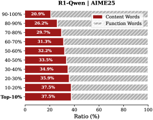
### Visual Description
\n
## Horizontal Bar Chart: R1-Qwen | AIME25
### Overview
This image displays a horizontal stacked bar chart analyzing the composition of words (Content vs. Function) across different performance percentile groups for a model or system identified as "R1-Qwen" on the "AIME25" benchmark or dataset. The chart quantifies the ratio of content words to function words for each percentile tier.
### Components/Axes
* **Chart Title:** "R1-Qwen | AIME25" (Top center).
* **Y-Axis (Vertical):** Labeled with percentile ranges, ordered from highest performance at the top to lowest at the bottom. The categories are:
* 90-100%
* 80-90%
* 70-80%
* 60-70%
* 50-60%
* 40-50%
* 30-40%
* 20-30%
* 10-20%
* Top-10%
* **X-Axis (Horizontal):** Labeled "Ratio (%)" with a scale from 0 to 100, marked at intervals of 0, 20, 40, 60, 80, 100.
* **Legend:** Positioned in the top-right corner of the chart area.
* **Content Words:** Represented by a solid, dark red bar.
* **Function Words:** Represented by a gray bar with diagonal hatching (stripes).
* **Data Labels:** Each bar segment contains a white text label indicating its precise percentage value.
### Detailed Analysis
The chart presents a stacked bar for each percentile group, where the total length of each bar represents 100%. The left segment (solid red) shows the percentage of Content Words, and the right segment (hatched gray) shows the percentage of Function Words.
**Data Points by Percentile Group (Content Words % / Function Words %):**
* **90-100%:** 20.9% / 79.1%
* **80-90%:** 26.2% / 73.8%
* **70-80%:** 29.7% / 70.3%
* **60-70%:** 31.1% / 68.9%
* **50-60%:** 32.2% / 67.8%
* **40-50%:** 33.3% / 66.7%
* **30-40%:** 34.9% / 65.1%
* **20-30%:** 35.9% / 64.1%
* **10-20%:** 37.5% / 62.5%
* **Top-10%:** 37.5% / 62.5%
**Trend Verification:**
* **Content Words (Red Bars):** The visual trend shows a clear and consistent increase in the length of the red bar segment as one moves down the y-axis from the highest percentile group (90-100%) to the lowest (Top-10%). The numerical values confirm this, rising from 20.9% to 37.5%.
* **Function Words (Gray Hatched Bars):** Conversely, the length of the gray hatched segment shows a consistent decrease from top to bottom, falling from 79.1% to 62.5%. This is the inverse of the Content Words trend.
### Key Observations
1. **Strong Inverse Correlation:** There is a perfect inverse relationship between the percentage of Content Words and Function Words across all groups. As one increases, the other decreases by the same amount, maintaining a 100% total for each bar.
2. **Performance Gradient:** The composition of language use changes systematically with performance tier. Higher-performing groups (e.g., 90-100%) have a significantly lower proportion of Content Words (~21%) compared to lower-performing groups (~37.5%).
3. **Plateau at the Bottom:** The two lowest percentile groups, "10-20%" and "Top-10%", show identical word composition (37.5% Content / 62.5% Function), suggesting a potential floor or convergence in language style at the lower end of the performance spectrum.
4. **Consistent Scale:** The x-axis scale is linear and clearly marked, allowing for reliable visual estimation of values even without the data labels.
### Interpretation
This chart suggests a significant correlation between the lexical composition of outputs (or inputs) and performance on the AIME25 benchmark for the R1-Qwen system. The data indicates that **higher performance is associated with a lower density of content words** (nouns, verbs, adjectives carrying core meaning) and a **higher density of function words** (articles, prepositions, conjunctions that provide grammatical structure).
This could imply several investigative possibilities:
* **Efficiency vs. Detail:** Top-performing responses may be more concise and structurally efficient, relying on precise function words to frame arguments, while lower-performing responses might use more content words in a less focused or more verbose manner.
* **Task Nature:** The AIME25 benchmark might reward a specific rhetorical or logical style that is characterized by this functional linguistic structure.
* **Model Behavior:** The pattern could reveal an intrinsic characteristic of the R1-Qwen model's generation strategy across different confidence or quality levels.
The identical composition for the bottom two tiers is a notable anomaly. It may indicate that below a certain performance threshold, the model's output style stabilizes into a specific, less effective pattern, or it could be an artifact of how the "Top-10%" category is defined relative to the "10-20%" group. The chart effectively visualizes a clear, quantifiable linguistic marker that differentiates performance levels.
</details>
<details>
<summary>x19.png Details</summary>
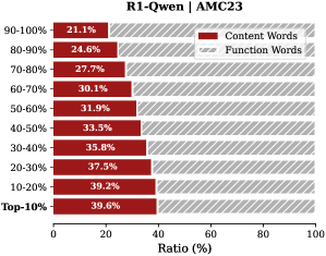
### Visual Description
\n
## Horizontal Bar Chart: R1-Qwen | AMC23
### Overview
This image displays a horizontal bar chart titled "R1-Qwen | AMC23". It compares the percentage ratio of "Content Words" versus "Function Words" across ten performance decile groups, from the "Top-10%" to the "90-100%" group. The chart illustrates an inverse relationship between the two word categories across the deciles.
### Components/Axes
* **Chart Title:** "R1-Qwen | AMC23" (centered at the top).
* **Y-Axis (Vertical):** Lists ten decile groups. From top to bottom: "Top-10%", "10-20%", "20-30%", "30-40%", "40-50%", "50-60%", "60-70%", "70-80%", "80-90%", "90-100%".
* **X-Axis (Horizontal):** Labeled "Ratio (%)". The scale runs from 0 to 100, with major tick marks at 0, 20, 40, 60, 80, and 100.
* **Legend:** Positioned in the top-right corner of the chart area.
* **Content Words:** Represented by a solid dark red bar.
* **Function Words:** Represented by a light gray bar with diagonal stripes.
* **Data Series:** Two horizontal bars are plotted for each decile group, stacked to sum to 100%. The "Content Words" bar is on the left, and the "Function Words" bar is on the right.
### Detailed Analysis
The chart presents the following data points for each decile group. The values are read directly from the labels on the "Content Words" bars. The "Function Words" value is the complement to 100%.
| Decile Group | Content Words (%) | Function Words (%) | Visual Trend (Content Words) |
| :--- | :--- | :--- | :--- |
| **Top-10%** | 39.6% | ~60.4% | Highest value. |
| **10-20%** | 39.2% | ~60.8% | Slight decrease from Top-10%. |
| **20-30%** | 37.5% | ~62.5% | Continued decrease. |
| **30-40%** | 35.8% | ~64.2% | Continued decrease. |
| **40-50%** | 33.3% | ~66.7% | Continued decrease. |
| **50-60%** | 31.9% | ~68.1% | Continued decrease. |
| **60-70%** | 30.1% | ~69.9% | Continued decrease. |
| **70-80%** | 27.7% | ~72.3% | Continued decrease. |
| **80-90%** | 24.0% | ~76.0% | Continued decrease. |
| **90-100%** | 21.1% | ~78.9% | Lowest value. |
**Trend Verification:**
* **Content Words (Dark Red Bars):** The line formed by the ends of the dark red bars slopes consistently **downward** from left to right as you move from the "Top-10%" group at the top of the y-axis to the "90-100%" group at the bottom. This indicates a decreasing percentage.
* **Function Words (Gray Striped Bars):** Conversely, the line formed by the ends of the gray bars slopes consistently **upward** from left to right, indicating an increasing percentage.
### Key Observations
1. **Perfect Inverse Relationship:** The sum of "Content Words" and "Function Words" for each decile is 100%. As one increases, the other decreases by an equal amount.
2. **Monotonic Trend:** There are no reversals in the trend. The percentage of "Content Words" decreases with every successive decile group from top to bottom.
3. **Magnitude of Change:** The "Content Words" ratio drops by approximately 18.5 percentage points (from 39.6% to 21.1%) across the full range of deciles. The change is most pronounced between the "70-80%" and "80-90%" groups (a 3.7-point drop) and between "80-90%" and "90-100%" (a 2.9-point drop).
4. **Dominant Category:** "Function Words" constitute the majority (over 50%) of the ratio in all decile groups. Their dominance increases from ~60.4% in the top performers to ~78.9% in the lowest-performing group.
### Interpretation
This chart likely analyzes the linguistic composition of text generated by or associated with the "R1-Qwen" model on the "AMC23" benchmark or dataset, segmented by performance deciles.
* **What the data suggests:** There is a clear correlation between performance level and word type usage. Higher-performing deciles (e.g., Top-10%) use a significantly higher proportion of "Content Words" (nouns, verbs, adjectives, adverbs that carry semantic meaning) compared to lower-performing deciles. Conversely, lower-performing deciles rely more heavily on "Function Words" (articles, prepositions, conjunctions, pronouns that provide grammatical structure).
* **How elements relate:** The decile grouping (y-axis) is the independent variable, likely representing model performance scores. The dependent variable is the lexical choice, measured as the ratio of content to function words. The inverse relationship is the core finding.
* **Potential Meaning:** This pattern could imply that more capable or accurate responses (higher deciles) are more information-dense, packing in more substantive, meaningful words. Lower-performing responses may be more verbose or structurally complex without adding semantic content, or they may struggle to generate precise content words, defaulting to more functional grammatical scaffolding. The chart provides quantitative evidence for a qualitative difference in output across performance tiers.
</details>
<details>
<summary>x20.png Details</summary>
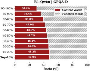
### Visual Description
## Horizontal Bar Chart: R1-Qwen | GPOA-D
### Overview
The image displays a horizontal bar chart comparing the percentage ratio of "Content Words" and "Function Words" across ten distinct percentile groups, from "Top-10%" to "90-100%". The chart is titled "R1-Qwen | GPOA-D". The data suggests an inverse relationship between the two word categories across the performance spectrum.
### Components/Axes
* **Chart Title:** "R1-Qwen | GPOA-D" (centered at the top).
* **Y-Axis (Vertical):** Lists ten percentile ranges, ordered from highest performance at the bottom to lowest at the top:
* Top-10%
* 10-20%
* 20-30%
* 30-40%
* 40-50%
* 50-60%
* 60-70%
* 70-80%
* 80-90%
* 90-100%
* **X-Axis (Horizontal):** Labeled "Ratio (%)", with a scale from 0 to 100 in increments of 20 (0, 20, 40, 60, 80, 100).
* **Legend:** Located in the top-right corner.
* A red rectangle corresponds to "Content Words".
* A gray rectangle corresponds to "Function Words".
* **Data Series:** For each percentile range, there are two horizontal bars:
* A **red bar** (left-aligned) representing the "Content Words" ratio.
* A **gray bar** (right-aligned, starting from the end of the red bar) representing the "Function Words" ratio. The combined length of both bars for each category sums to 100%.
### Detailed Analysis
The following table reconstructs the data presented in the chart. Values are read directly from the labels on each bar.
| Percentile Range | Content Words (Red Bar) | Function Words (Gray Bar) |
| :--- | :--- | :--- |
| **Top-10%** | 47.9% | 52.1% |
| **10-20%** | 48.2% | 51.8% |
| **20-30%** | 46.9% | 53.1% |
| **30-40%** | 46.1% | 53.9% |
| **40-50%** | 44.7% | 55.3% |
| **50-60%** | 43.6% | 56.4% |
| **60-70%** | 42.0% | 58.0% |
| **70-80%** | 39.8% | 60.2% |
| **80-90%** | 36.4% | 63.6% |
| **90-100%** | 30.4% | 69.6% |
**Trend Verification:**
* **Content Words (Red Bars):** The red bars show a clear **downward trend** as we move from the "Top-10%" group to the "90-100%" group. The ratio starts at its highest point (47.9%) and steadily decreases to its lowest point (30.4%).
* **Function Words (Gray Bars):** Conversely, the gray bars show a clear **upward trend** across the same progression. The ratio starts at its lowest point (52.1%) and steadily increases to its highest point (69.6%).
### Key Observations
1. **Inverse Relationship:** There is a perfect inverse correlation between the two metrics. As the percentile range indicates lower performance (moving up the y-axis), the proportion of Content Words decreases while the proportion of Function Words increases.
2. **Crossover Point:** The ratio of Content Words to Function Words is closest to parity (≈50/50) in the highest-performing groups ("Top-10%" and "10-20%"). The "Top-10%" group has the highest Content Word ratio (47.9%).
3. **Maximum Divergence:** The greatest disparity is observed in the lowest-performing group ("90-100%"), where Function Words (69.6%) are more than double the ratio of Content Words (30.4%).
4. **Monotonic Change:** The change in ratio between adjacent percentile groups is consistent and monotonic for both series, with no reversals in the trend.
### Interpretation
This chart likely visualizes a linguistic or textual analysis metric (GPOA-D) applied to the outputs of a model named "R1-Qwen". The data suggests a strong correlation between the lexical composition of text and a performance ranking.
* **What the data suggests:** Higher-performing outputs (Top-10%, 10-20%) are characterized by a more balanced use of "Content Words" (nouns, verbs, adjectives carrying semantic meaning) and "Function Words" (articles, prepositions, conjunctions providing grammatical structure). As performance decreases, the text becomes increasingly dominated by Function Words, with a corresponding drop in Content Words.
* **How elements relate:** The percentile ranking (y-axis) is the independent variable, and the word ratio (x-axis) is the dependent variable. The chart demonstrates that the GPOA-D metric is sensitive to this lexical balance.
* **Notable implications:** This pattern could indicate that higher-quality or more relevant outputs (as defined by the GPOA-D score) require a denser use of meaningful, content-specific vocabulary. Conversely, lower-quality outputs may be more verbose or structurally repetitive without adding substantive content. The trend is smooth and significant, suggesting the ratio of content to function words is a robust indicator within this evaluation framework.
</details>
<details>
<summary>x21.png Details</summary>
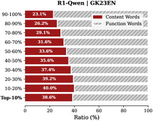
### Visual Description
## Horizontal Bar Chart: R1-Qwen | GK23EN
### Overview
This image is a horizontal stacked bar chart comparing the ratio of "Content Words" to "Function Words" across different percentile ranges of a dataset or model evaluation, likely related to the "R1-Qwen" model on the "GK23EN" benchmark. The chart visualizes how the proportion of these two word categories changes across different performance or frequency tiers.
### Components/Axes
* **Title:** "R1-Qwen | GK23EN" (Top center).
* **Y-Axis (Vertical):** Lists percentile ranges. From top to bottom: "90-100%", "80-90%", "70-80%", "60-70%", "50-60%", "40-50%", "30-40%", "20-30%", "10-20%", "Top-10%".
* **X-Axis (Horizontal):** Labeled "Ratio (%)". Scale runs from 0 to 100 with major tick marks at 0, 20, 40, 60, 80, 100.
* **Legend:** Located in the top-right corner.
* A red rectangle is labeled "Content Words".
* A gray rectangle is labeled "Function Words".
* **Data Series:** Each horizontal bar is a stacked combination of red (Content Words) and gray (Function Words). The red segment is always on the left, starting from 0%.
### Detailed Analysis
The chart displays the following precise ratios for "Content Words" (red segment) for each percentile range. The "Function Words" (gray segment) ratio is the complement to 100%.
| Percentile Range | Content Words Ratio (%) | Function Words Ratio (%) |
| :--- | :--- | :--- |
| 90-100% | 23.1 | 76.9 |
| 80-90% | 26.2 | 73.8 |
| 70-80% | 29.1 | 70.9 |
| 60-70% | 31.6 | 68.4 |
| 50-60% | 33.6 | 66.4 |
| 40-50% | 35.6 | 64.4 |
| 30-40% | 37.4 | 62.6 |
| 20-30% | 39.2 | 60.8 |
| 10-20% | 40.9 | 59.1 |
| Top-10% | 38.6 | 61.4 |
**Trend Verification:** The red bars (Content Words) show a clear, consistent upward trend in length (increasing ratio) as we move from the top of the chart (90-100%) down to the "10-20%" range. The trend reverses slightly for the final "Top-10%" bar, which is shorter than the "10-20%" bar.
### Key Observations
1. **Inverse Relationship:** There is a strong inverse relationship between the percentile tier and the ratio of Content Words. Higher percentile ranges (e.g., 90-100%) are dominated by Function Words (~77%), while lower percentile ranges have a much higher proportion of Content Words.
2. **Peak and Slight Drop:** The proportion of Content Words peaks in the "10-20%" range at 40.9% and then decreases slightly to 38.6% for the "Top-10%" group.
3. **Monotonic Increase:** The increase in Content Word ratio is monotonic and nearly linear from the 90-100% range down to the 10-20% range, with increments between 2-3 percentage points per decile.
4. **Dominance of Function Words:** In all displayed categories, Function Words constitute the majority (over 59%) of the ratio.
### Interpretation
This chart likely analyzes the linguistic composition of text generated by or associated with the R1-Qwen model on the GK23EN benchmark, segmented by some performance metric (e.g., answer correctness, confidence score, or frequency).
* **What the data suggests:** The data demonstrates that higher-performing or more frequent outputs (top percentiles) rely more heavily on **Function Words** (grammatical words like "the", "is", "and"). Conversely, lower-performing or less frequent outputs contain a higher density of **Content Words** (nouns, verbs, adjectives carrying semantic meaning).
* **How elements relate:** The percentile ranges on the y-axis act as the independent variable, directly influencing the dependent variable—the ratio of word types. The clear trend implies a systematic correlation between the model's output quality/category and its lexical choice.
* **Notable patterns/anomalies:** The most significant pattern is the inverse correlation. The slight dip in the "Top-10%" compared to "10-20%" is a minor anomaly that could indicate a different linguistic strategy at the very extreme of the performance spectrum. The consistent majority of Function Words across all tiers is a key finding, suggesting the model's outputs are structurally grammatical regardless of performance tier, but semantic density (Content Words) varies predictably with performance.
**Language Note:** All text in the image is in English.
</details>
<details>
<summary>x22.png Details</summary>
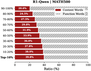
### Visual Description
## Horizontal Bar Chart: R1-Qwen | MATH500
### Overview
This image is a horizontal bar chart comparing the percentage ratio of "Content Words" versus "Function Words" across different performance percentile groups for a model or system identified as "R1-Qwen" on the "MATH500" benchmark. The chart visualizes how the composition of language (content vs. function words) changes as performance improves.
### Components/Axes
* **Chart Title:** "R1-Qwen | MATH500" (centered at the top).
* **Y-Axis (Vertical):** Represents performance percentile groups. The categories, from top to bottom, are:
* 90-100%
* 80-90%
* 70-80%
* 60-70%
* 50-60%
* 40-50%
* 30-40%
* 20-30%
* 10-20%
* Top-10%
* **X-Axis (Horizontal):** Labeled "Ratio (%)". It is a linear scale from 0 to 100, with major tick marks at 0, 20, 40, 60, 80, and 100.
* **Legend:** Positioned in the top-right corner of the chart area.
* A dark red square is labeled "Content Words".
* A light gray square is labeled "Function Words".
* **Data Series:** Each horizontal bar is a stacked bar representing 100% of the words for that percentile group. The bar is divided into two segments:
* The left segment (dark red) represents the percentage of "Content Words".
* The right segment (light gray) represents the percentage of "Function Words".
* The exact percentage for each segment is printed inside or adjacent to its respective bar segment.
### Detailed Analysis
The chart presents the following data points for each percentile group (Content Words % / Function Words %):
1. **90-100%:** 20.6% / 79.4%
2. **80-90%:** 24.3% / 75.7%
3. **70-80%:** 27.5% / 72.5%
4. **60-70%:** 29.8% / 70.2%
5. **50-60%:** 31.9% / 68.1%
6. **40-50%:** 33.9% / 66.1%
7. **30-40%:** 36.0% / 64.0%
8. **20-30%:** 37.8% / 62.2%
9. **10-20%:** 38.9% / 61.1%
10. **Top-10%:** 39.8% / 60.2%
**Trend Verification:**
* **Content Words (Dark Red):** The length of the dark red segment and its labeled percentage show a clear and consistent **upward trend** as we move down the y-axis from the highest performance group (90-100%) to the lowest (Top-10%). The value increases from 20.6% to 39.8%.
* **Function Words (Light Gray):** Conversely, the length of the light gray segment and its percentage show a consistent **downward trend** over the same progression. The value decreases from 79.4% to 60.2%.
### Key Observations
1. **Inverse Relationship:** There is a perfect inverse relationship between the two word categories. As the percentage of Content Words increases, the percentage of Function Words decreases by the same amount, summing to 100% for each bar.
2. **Monotonic Change:** The change in percentages is monotonic and nearly linear across the performance groups. There are no outliers or reversals in the trend.
3. **Magnitude of Shift:** The shift is substantial. The Top-10% group uses nearly double the proportion of Content Words (39.8%) compared to the 90-100% group (20.6%).
4. **Labeling Precision:** All data points are explicitly labeled with one decimal place of precision.
### Interpretation
This chart suggests a strong correlation between a model's performance on the MATH500 benchmark and the lexical composition of its outputs. The data demonstrates that **higher-performing models (those in the 90-100% percentile) rely significantly more on Function Words** (e.g., articles, prepositions, conjunctions) and less on Content Words (e.g., nouns, verbs, adjectives carrying substantive meaning).
This pattern could imply several things about the nature of high-performance reasoning on this math benchmark:
* **Efficiency and Abstraction:** Top models may generate more concise, logically structured explanations where function words are crucial for connecting steps and maintaining grammatical coherence, while the core mathematical content is expressed with fewer, more potent content words.
* **Reasoning Style:** Lower-performing models might "pad" their responses with more descriptive content words, potentially indicating less focused or less efficient reasoning chains.
* **Benchmark Characteristics:** The trend might reflect the specific language patterns rewarded by the MATH500 evaluation, where clarity of logical flow (aided by function words) is paramount.
The consistent, monotonic nature of the trend across all ten performance brackets strongly indicates that this is a fundamental characteristic of the model's behavior on this task, not a statistical anomaly. The chart effectively argues that linguistic style, as measured by this simple content/function word ratio, is a key differentiator of performance.
</details>
Figure 9: Proportion of content words versus function words in thinking tokens. Bars represent deciles sorted by importance score; e.g., the bottom bar indicates the ratio for the top- $10\$ most important tokens.
<details>
<summary>x23.png Details</summary>
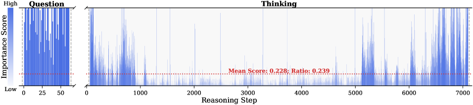
### Visual Description
## Heatmap/Bar Chart: Importance Score Across Reasoning Steps
### Overview
The image displays a two-part horizontal bar chart (or heatmap) visualizing "Importance Score" across a sequence of "Reasoning Steps." The chart is divided into two distinct sections labeled "Question" and "Thinking," suggesting an analysis of a model's or system's attention or focus during different phases of a task. The overall aesthetic is technical and data-dense, using a blue color gradient to represent score intensity.
### Components/Axes
* **Y-Axis (Vertical):** Labeled **"Importance Score"**. The scale is qualitative, marked with **"High"** at the top and **"Low"** at the bottom. There are no numerical tick marks on this axis.
* **X-Axis (Horizontal):** Labeled **"Reasoning Step"**. It is a numerical scale with major tick marks at intervals of 1000, ranging from **0** to **7000**.
* **Chart Sections:**
1. **Left Section ("Question"):** A separate, narrower panel on the far left. Its own x-axis ranges from **0** to **50**.
2. **Right Section ("Thinking"):** The main, wider panel. Its x-axis ranges from **0** to **7000**.
* **Data Representation:** Vertical blue bars (or lines) of varying height and density. The height of each bar corresponds to the "Importance Score" at that specific "Reasoning Step." The color intensity (shade of blue) appears correlated with height/score.
* **Annotation:** A horizontal **red dashed line** runs across the entire width of the "Thinking" section, positioned near the bottom of the y-axis scale. It is accompanied by red text: **"Mean Score: 0.228; Ratio: 0.239"**.
### Detailed Analysis
* **"Question" Section (Steps 0-50):**
* **Trend:** The bars are extremely dense and consistently tall, reaching near the "High" mark on the y-axis throughout the entire range.
* **Data Points:** This indicates that nearly every step within the initial "Question" phase (first 50 steps) is assigned a very high importance score. There is minimal variation; the importance is uniformly high.
* **"Thinking" Section (Steps 0-7000):**
* **Trend:** The distribution is highly non-uniform and sparse compared to the "Question" section. Importance scores are generally low, with sporadic, sharp peaks of high importance.
* **Data Points & Spatial Grounding:**
* **Steps 0-1000:** Contains several clusters of high-importance peaks, particularly dense between steps ~200-800.
* **Steps 1000-5000:** Shows a long period of predominantly low importance scores, with only a few isolated, narrow peaks (e.g., around steps ~1500, ~2500, ~3500).
* **Steps 5000-7000:** Experiences a significant resurgence in activity. There is a dense cluster of high-importance peaks starting around step 5200 and continuing, with varying density, through to step 7000.
* **Red Annotation Line:** The red dashed line is positioned at a constant y-value corresponding to the **"Mean Score: 0.228"**. Visually, this line sits very low on the "Importance Score" axis, confirming that the average importance across all 7000 "Thinking" steps is low. The **"Ratio: 0.239"** likely represents the proportion of steps considered "important" (perhaps those above a certain threshold).
### Key Observations
1. **Phase Dichotomy:** There is a stark contrast between the "Question" phase (uniformly high importance) and the "Thinking" phase (sporadic, peak-driven importance).
2. **Temporal Clustering in "Thinking":** High-importance reasoning steps are not randomly distributed. They occur in distinct temporal clusters: early in the process (0-1000), very sparsely in the middle (1000-5000), and heavily towards the end (5000-7000).
3. **Low Mean Importance:** Despite the visible peaks, the calculated mean score of 0.228 (on a normalized scale where "High" is presumably 1.0) indicates that the vast majority of "Thinking" steps have very low assigned importance.
4. **Density vs. Sparsity:** The "Question" section is information-dense (every step matters), while the "Thinking" section is information-sparse (most steps matter little, a few matter a lot).
### Interpretation
This chart likely visualizes the internal attention or salience map of a large language model or reasoning system as it processes a query.
* **What it suggests:** The system dedicates intense, uniform focus to understanding the initial **"Question"** (first 50 steps). The subsequent **"Thinking"** process (7000 steps) is not a steady, uniform effort. Instead, it involves long periods of low-importance processing (possibly background computation, hypothesis generation, or dead ends) punctuated by brief, critical moments of high-importance reasoning or decision-making (the peaks). The clustering of peaks at the end suggests a final synthesis or conclusion phase where many important steps occur in rapid succession.
* **How elements relate:** The "Question" phase sets the stage, consuming a small but uniformly critical portion of the process. The "Thinking" phase is the main computational effort, characterized by efficiency—most steps are low-cost (low importance), allowing resources to concentrate on the key reasoning leaps (the peaks). The mean score and ratio quantify this efficiency, showing that only about 24% of the thinking steps carry significant weight.
* **Notable anomalies/patterns:** The most striking pattern is the **long quiet period between steps 1000 and 5000**. This could represent a phase of exploration, verification, or waiting for sub-processes, where no single step is deemed critically important. The resurgence at the end is a common pattern in complex problem-solving, where disparate threads of thought converge. The chart effectively argues that "thinking" is not a smooth process but a punctuated equilibrium of insight.
</details>
<details>
<summary>x24.png Details</summary>
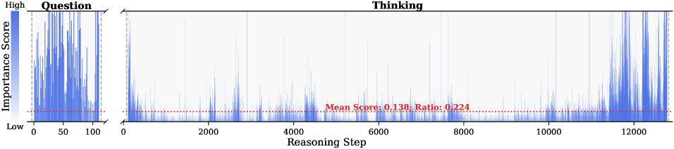
### Visual Description
## Chart: Importance Score Across Reasoning Steps
### Overview
The image displays a two-panel chart visualizing the "Importance Score" of different steps in a reasoning process. The chart is divided into a narrow left panel labeled "Question" and a wide right panel labeled "Thinking," both sharing a common y-axis. The data is represented as a series of vertical blue bars (a bar chart or high-density line plot), where the height of each bar corresponds to an importance score. A horizontal red dashed line in the "Thinking" panel indicates a mean value.
### Components/Axes
* **Y-Axis (Vertical):**
* **Label:** "Importance Score"
* **Scale:** Qualitative, marked with "High" at the top and "Low" at the bottom. No numerical tick marks are provided.
* **X-Axis (Horizontal):**
* **Label:** "Reasoning Step"
* **Scale:** Numerical, linear.
* **Tick Marks (Left Panel - "Question"):** 0, 50, 100.
* **Tick Marks (Right Panel - "Thinking"):** 0, 2000, 4000, 6000, 8000, 10000, 12000.
* **Panel Titles:**
* **Left Panel:** "Question" (positioned top-center of its panel).
* **Right Panel:** "Thinking" (positioned top-center of its panel).
* **Data Series:**
* Represented by blue vertical bars. The color is consistent across both panels.
* **Annotation (in "Thinking" panel):**
* A red dashed horizontal line runs across the panel.
* **Text on Line:** "Mean Score: 0.138; Ratio: 0.224" (positioned near the center, slightly below the line).
### Detailed Analysis
1. **"Question" Panel (Steps 0-100):**
* This panel shows a very high density of blue bars.
* **Trend:** The bars are consistently tall, indicating that importance scores are predominantly "High" throughout the initial 100 reasoning steps. There is significant variability, with many bars reaching near the top of the axis, but no clear upward or downward trend is discernible due to the density.
2. **"Thinking" Panel (Steps 0-12000+):**
* This panel shows a much sparser distribution of blue bars compared to the "Question" panel.
* **Trend:** The vast majority of bars are very short, clustering near the "Low" end of the importance scale. However, there are sporadic, isolated spikes where bars reach medium to high importance.
* **Notable Spike Locations:** Visually prominent spikes occur near steps ~2000, ~4000, ~6000, ~8000, ~10000, and a cluster of high spikes near step 12000.
* **Red Dashed Line:** This line represents a constant value across the "Thinking" steps. Its associated text provides two key metrics:
* **Mean Score: 0.138** - This is the average importance score across all steps in the "Thinking" panel. Given the qualitative y-axis, this numerical value suggests a scoring system where 0 is "Low" and 1 is "High," placing the average firmly in the lower range.
* **Ratio: 0.224** - This likely represents the proportion (22.4%) of reasoning steps in the "Thinking" phase that are considered "important" (e.g., above a certain threshold).
### Key Observations
* **Bimodal Distribution of Importance:** There is a stark contrast between the "Question" phase (consistently high importance) and the "Thinking" phase (predominantly low importance with intermittent spikes).
* **Concentration of Critical Information:** The initial "Question" phase appears to contain the most densely packed important information.
* **Sparse High-Importance Events in Thinking:** The "Thinking" process is characterized by long sequences of low-importance steps punctuated by brief, critical reasoning moments (the spikes).
* **Quantitative Metrics:** The provided mean (0.138) and ratio (0.224) offer a quantitative summary of the "Thinking" phase's importance profile, confirming the visual impression of low average importance with a subset of significant steps.
### Interpretation
This chart likely visualizes the output of an interpretability tool for an AI model or a cognitive process model. It suggests a fundamental difference in the information density between formulating a question and executing a reasoning chain.
* **The "Question" Phase** is information-rich and critical, as every step appears highly important for defining the problem space.
* **The "Thinking" Phase** resembles a search or deliberation process. The model spends most of its steps on low-importance computations (e.g., exploring dead ends, performing routine calculations), with occasional breakthroughs or key deductions (the high-importance spikes). The final cluster of high spikes near step 12000 may indicate the convergence on a solution or the synthesis of the final answer.
* The **Mean Score and Ratio** are crucial for evaluation. A low mean score (0.138) is not necessarily negative; it may simply reflect the nature of exhaustive search. The ratio (0.224) is more telling, indicating that about one-fifth of the thinking steps contribute significantly to the outcome. This metric could be used to compare the efficiency of different reasoning strategies or models.
**In essence, the chart argues that the value in a reasoning process is not evenly distributed. It is heavily front-loaded in the question formulation and occurs in rare, critical bursts during the extended thinking phase.**
</details>
<details>
<summary>x25.png Details</summary>
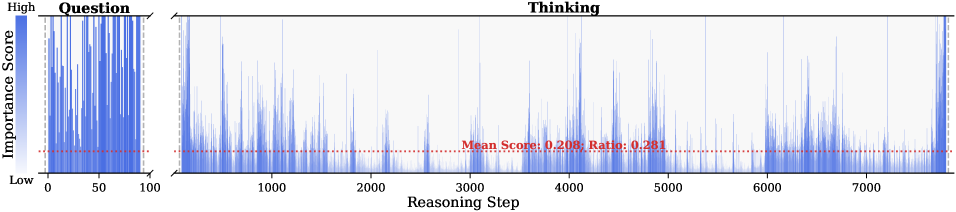
### Visual Description
## Heatmap/Bar Chart: Importance Score Across Reasoning Steps
### Overview
The image displays a two-part horizontal bar chart or heatmap visualizing "Importance Score" across a sequence of "Reasoning Step" values. The chart is divided into two distinct sections labeled "Question" and "Thinking," separated by a break in the x-axis. A horizontal red dashed line indicates a mean threshold across the entire dataset.
### Components/Axes
* **Chart Title/Sections:**
* **Left Section:** Labeled "Question" at the top. This section covers Reasoning Steps from 0 to 100.
* **Right Section:** Labeled "Thinking" at the top. This section covers Reasoning Steps from approximately 1000 to over 7000.
* **Y-Axis (Vertical):**
* **Label:** "Importance Score" (written vertically on the left side).
* **Scale:** A continuous gradient from "Low" (bottom, white/light color) to "High" (top, dark blue). The axis itself is not numerically labeled, but the color intensity represents the score.
* **X-Axis (Horizontal):**
* **Label:** "Reasoning Step" (centered at the bottom).
* **Scale (Question Section):** Linear scale with major ticks at 0, 50, and 100.
* **Scale (Thinking Section):** Linear scale with major ticks at 1000, 2000, 3000, 4000, 5000, 6000, and 7000. The axis extends slightly beyond 7000.
* **Legend/Key:** There is no separate legend box. The color gradient on the y-axis serves as the key, mapping blue intensity to importance score magnitude.
* **Annotation:** A horizontal red dashed line runs across the entire width of both chart sections. Centered over the "Thinking" section, red text is placed just above this line: **"Mean Score: 0.206, Ratio: 0.281"**.
### Detailed Analysis
* **Data Representation:** Each vertical line or thin bar corresponds to a single "Reasoning Step." Its color intensity (from white to dark blue) represents the "Importance Score" for that step.
* **"Question" Section (Steps 0-100):**
* **Trend:** This section shows consistently high importance scores. The bars are predominantly dark blue, forming a dense, nearly solid block of color from the bottom to the top of the chart area. There is very little variation or white space, indicating that nearly all steps in this initial phase are assigned high importance.
* **"Thinking" Section (Steps ~1000-7000+):**
* **Trend:** This section shows high variability. The pattern is a series of spikes and clusters.
* **Pattern:** There are numerous isolated or clustered dark blue spikes indicating steps with high importance scores. These are interspersed with large areas of lighter blue or white, indicating many steps with low to moderate importance scores. The distribution appears non-uniform, with some dense clusters of activity (e.g., around steps 1000-1500, 3000-3500, 4000-4500, and 6000-6500) and other relatively quiet periods.
* **Red Threshold Line:**
* The line is positioned at a constant y-value, visually estimated to be around 20-25% of the height from the "Low" baseline.
* The annotation states the **Mean Score is 0.206**. Assuming the "Low" baseline is 0.0 and "High" is 1.0, this line represents that average.
* The **Ratio is 0.281**. This likely represents the proportion of reasoning steps (in the "Thinking" section, or overall) that have an importance score above this mean threshold.
### Key Observations
1. **Phase Dichotomy:** There is a stark contrast between the "Question" phase (uniformly high importance) and the "Thinking" phase (highly variable importance).
2. **Sporadic High-Importance Events:** The "Thinking" phase is characterized by sporadic bursts of high-importance reasoning steps, not a sustained high level of importance.
3. **Meaning of the Ratio:** The ratio of 0.281 suggests that only about 28.1% of the reasoning steps (likely in the extended "Thinking" phase) are considered above-average in importance.
4. **Scale Disparity:** The "Thinking" phase involves a vastly greater number of steps (thousands) compared to the brief "Question" phase (100 steps).
### Interpretation
This chart likely visualizes the internal process of an AI or cognitive model during a task. The **"Question" phase** represents the initial processing of the input query, where every step is deemed critical for understanding the task, hence uniformly high importance. The subsequent **"Thinking" phase** represents the model's internal reasoning or generation process. Here, importance is not constant; the model engages in many low-importance steps (possibly routine computation, exploration, or filler) punctuated by key moments of high-importance reasoning, insight, or decision-making (the dark blue spikes).
The **mean score (0.206)** sets a baseline for "average importance." The **ratio (0.281)** is a key metric, indicating that the model's reasoning is sparse in terms of high-impact steps—only about a quarter of its thinking steps are above average in importance. This could be interpreted as efficiency (most steps are low-cost) or as a sign of a process where critical insights are rare events within a sea of background computation. The visualization argues that not all reasoning steps are equal; understanding a problem ("Question") is uniformly critical, while solving it ("Thinking") involves a long tail of low-importance work with intermittent high-value cognitive events.
</details>
<details>
<summary>x26.png Details</summary>
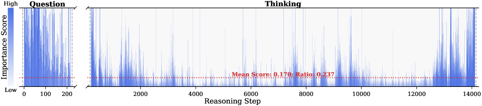
### Visual Description
## Heatmap/Bar Chart: Importance Score Across Reasoning Steps
### Overview
The image displays a two-part chart visualizing the "Importance Score" (vertical axis) across a sequence of "Reasoning Step" (horizontal axis). The chart is split into two distinct panels: a smaller left panel labeled "Question" and a larger right panel labeled "Thinking." A horizontal red dashed line runs across both panels, annotated with a mean score and a ratio. The data is represented by vertical blue bars of varying heights, creating a dense, spike-like pattern.
### Components/Axes
* **Vertical Axis (Y-axis):**
* **Label:** "Importance Score"
* **Scale:** Qualitative, marked from "Low" at the bottom to "High" at the top. No numerical scale is provided.
* **Horizontal Axis (X-axis):**
* **Label:** "Reasoning Step"
* **Scale:** Numerical, linear.
* **Left Panel ("Question"):** Ranges from 0 to 200, with major ticks at 0, 100, and 200.
* **Right Panel ("Thinking"):** Ranges from 0 to 14000, with major ticks at 0, 2000, 4000, 6000, 8000, 10000, 12000, and 14000. A break in the axis (indicated by a zigzag line) separates it from the "Question" panel.
* **Data Series:**
* Represented by vertical blue bars. The height of each bar corresponds to the Importance Score at that specific Reasoning Step.
* **Reference Line:**
* A horizontal red dashed line spans the entire width of both panels.
* **Annotation (Centered on the line in the "Thinking" panel):** "Mean Score: 0.170; Ratio: 0.237"
* **Panel Labels:**
* **Left Panel Title:** "Question" (positioned top-left).
* **Right Panel Title:** "Thinking" (positioned top-center).
### Detailed Analysis
* **"Question" Panel (Steps 0-200):**
* The blue bars are densely packed, indicating data points for nearly every step.
* Bar heights show high variability, with frequent spikes reaching towards the "High" end of the Importance Score axis. There is no clear upward or downward trend; the pattern appears stochastic or bursty.
* **"Thinking" Panel (Steps 0-14000):**
* The blue bars are also dense but appear slightly less packed than in the "Question" panel, possibly due to the compressed horizontal scale.
* The overall trend shows a baseline of low importance scores (bars near the "Low" mark) punctuated by frequent, irregular spikes of higher importance.
* **Notable Trend:** The frequency and magnitude of the high-importance spikes appear to increase in the latter portion of the sequence, particularly from step ~12000 to 14000, where several tall spikes are clustered.
* **Reference Line Data:**
* **Mean Score:** 0.170. This suggests the average importance score across all steps (in both panels) is relatively low on the implied 0-1 scale.
* **Ratio:** 0.237. This likely represents the proportion of steps with an importance score above a certain threshold (possibly the mean itself, or another defined cutoff).
### Key Observations
1. **Bimodal Distribution:** The data suggests a pattern where most reasoning steps have low importance, but a significant minority of steps are assigned high importance.
2. **Phase Comparison:** The "Question" phase (first 200 steps) exhibits intense, concentrated bursts of high importance. The "Thinking" phase (next 14000 steps) shows a more sustained process with sporadic high-importance events that become more frequent towards the end.
3. **Late-Stage Intensification:** The cluster of high spikes between steps 12000 and 14000 in the "Thinking" panel is a prominent visual feature, indicating a period of heightened importance or critical processing near the conclusion of the sequence.
4. **Quantitative Benchmark:** The red line provides a fixed reference. Visually, a large majority of the blue bars fall below this line, consistent with the low mean score of 0.170.
### Interpretation
This chart likely visualizes the internal attention or salience mechanism of an AI model during a complex reasoning task. The "Importance Score" could represent attention weights, gradient magnitudes, or another metric of step significance.
* **What it suggests:** The process is not uniformly important. The model dedicates most of its steps to low-importance processing, interspersed with critical "breakthrough" or "focus" moments (the high spikes). The "Question" phase involves intense, immediate analysis of the input. The extended "Thinking" phase involves a long-tail reasoning process where importance is generally low but punctuated by key insights, with a notable surge in critical activity as the process nears completion (steps 12000-14000).
* **Relationship between elements:** The two panels contrast the initial, concentrated analysis ("Question") with the prolonged, iterative reasoning ("Thinking"). The red mean line acts as a global benchmark, highlighting that high-importance steps are the exception, not the rule.
* **Anomalies/Notable Patterns:** The increasing density of high-importance spikes at the end of the "Thinking" phase is the most significant pattern. It could indicate the model converging on a solution, synthesizing information, or experiencing a cascade of related insights. The ratio of 0.237 quantifies that roughly 23.7% of the steps are considered "important" by the model's own metric, which is a substantial minority for a 14,000-step process.
</details>
<details>
<summary>x27.png Details</summary>
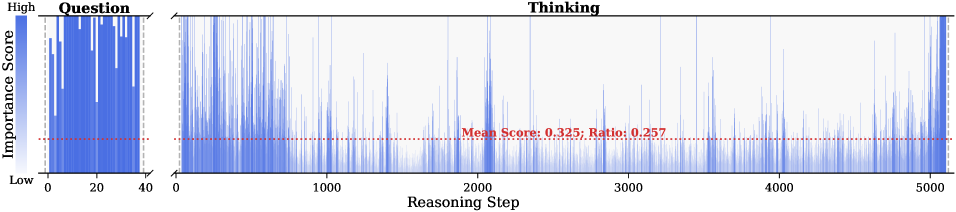
### Visual Description
## Heatmap/Bar Chart: Importance Score Distribution Across Question and Thinking Phases
### Overview
The image displays a two-part horizontal bar chart (or heatmap) visualizing the "Importance Score" of discrete steps within two distinct phases: "Question" and "Thinking." The chart compares the distribution and magnitude of importance scores across a short, dense sequence (Question) and a long, sparse sequence (Thinking).
### Components/Axes
* **Main Title/Phase Labels:** The chart is divided into two labeled sections:
* **Left Section:** Titled **"Question"**.
* **Right Section:** Titled **"Thinking"**.
* **Y-Axis (Vertical):**
* **Label:** "Importance Score".
* **Scale:** A continuous scale from **"Low"** at the bottom to **"High"** at the top. No numerical markers are provided on this axis.
* **X-Axis (Horizontal):**
* **Label (Shared):** "Reasoning Step".
* **"Question" Section Scale:** Linear scale from **0** to **40**.
* **"Thinking" Section Scale:** Linear scale from **0** to **5000**.
* **Data Representation:** Vertical blue bars. The height of each bar corresponds to the Importance Score for that specific Reasoning Step. The color intensity (shade of blue) appears consistent, with height being the primary variable.
* **Annotation:** A horizontal red dashed line runs across the entire chart at a constant y-value. Centered within the "Thinking" section, red text is overlaid on this line: **"Mean Score: 0.325; Ratio: 0.257"**.
### Detailed Analysis
**1. "Question" Phase (Steps 0-40):**
* **Spatial Grounding:** Occupies the left ~15% of the chart's width.
* **Trend & Data:** This section shows a very dense cluster of blue bars. The bars exhibit high variability in height, with many reaching near the top of the y-axis ("High" importance). The distribution appears relatively uniform across the 40 steps, with no clear increasing or decreasing trend. The density suggests every step in this short phase is assigned an importance score.
**2. "Thinking" Phase (Steps 0-5000):**
* **Spatial Grounding:** Occupies the right ~85% of the chart's width.
* **Trend & Data:** This section shows a much sparser distribution of blue bars. The bars are irregularly spaced, with large gaps of white space (indicating steps with a score of zero or near-zero). The heights of the visible bars are highly variable but generally appear lower on average than the peaks in the "Question" phase. There is no smooth trend; instead, there are sporadic spikes of higher importance scattered throughout the 5000 steps.
**3. Annotation Analysis:**
* The red dashed line and its associated text (**"Mean Score: 0.325; Ratio: 0.257"**) provide summary statistics.
* **Mean Score (0.325):** This likely represents the average Importance Score across *all* steps in both phases combined, or possibly just the "Thinking" phase. Given the visual density, it's more plausible as the mean for the "Thinking" phase.
* **Ratio (0.257):** This is ambiguous without a legend. It could represent:
* The ratio of the mean score to the maximum possible score.
* The proportion of steps with a non-zero importance score.
* The ratio of the "Thinking" phase mean to the "Question" phase mean.
### Key Observations
1. **Phase Contrast:** There is a stark contrast between the two phases. The "Question" phase is short (40 steps) but densely packed with high-importance signals. The "Thinking" phase is extremely long (5000 steps) but sparse, with importance signals appearing intermittently.
2. **Importance Concentration:** The highest density of high-importance scores is concentrated in the initial "Question" phase.
3. **Sparsity in Extended Reasoning:** The "Thinking" phase is characterized by sparsity, suggesting that most of the extended reasoning steps contribute minimally to the final output, with only specific steps being highly important.
4. **Quantitative Benchmark:** The annotation provides a quantitative benchmark (Mean: 0.325) against which individual step importance can be visually compared.
### Interpretation
This chart likely visualizes the internal attention or importance weighting of an AI model during a complex reasoning task. The **"Question"** phase represents the model's processing of the initial prompt or query. The high, dense importance scores here indicate that the model correctly identifies and heavily weights the core components of the input question.
The **"Thinking"** phase represents the model's internal chain-of-thought or reasoning process. The sparsity and lower average importance suggest that while the model generates a very long sequence of internal steps, only a small fraction of these steps are critical for arriving at the solution. The scattered high-importance spikes may correspond to key logical deductions, intermediate conclusions, or moments of "insight" within the reasoning chain.
The **Mean Score (0.325)** and **Ratio (0.257)** serve as diagnostic metrics. A low mean score in the thinking phase might indicate inefficient or meandering reasoning. The ratio could be a measure of reasoning efficiency—how concentrated the important steps are. This visualization is crucial for understanding model behavior, diagnosing inefficiencies in long-form reasoning, and potentially guiding techniques to make the thinking process more focused and effective.
</details>
<details>
<summary>x28.png Details</summary>
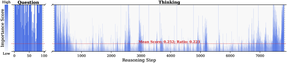
### Visual Description
## Heatmap/Bar Chart: Importance Score Across Reasoning Steps
### Overview
The image displays a two-part horizontal bar chart (or heatmap) visualizing the "Importance Score" of different steps in a reasoning process. The chart is divided into two distinct sections labeled "Question" and "Thinking," plotted against a common "Reasoning Step" x-axis. A horizontal red dashed line indicates the mean importance score across all steps.
### Components/Axes
* **Chart Title/Sections:** The chart is split into two labeled regions at the top:
* **Left Section:** "Question" (approximately steps 0-100).
* **Right Section:** "Thinking" (approximately steps 100-7500+).
* **Y-Axis (Vertical):** Labeled "Importance Score" on the far left. The scale is qualitative, marked with "Low" at the bottom and "High" at the top. No numerical scale is provided.
* **X-Axis (Horizontal):** Labeled "Reasoning Step" at the bottom center. It is a numerical scale with major tick marks at 0, 50, 100, 1000, 2000, 3000, 4000, 5000, 6000, and 7000. The axis appears to be linear within each section but has a break between the "Question" (0-100) and "Thinking" (100+) sections.
* **Data Representation:** Vertical blue bars represent the importance score for each reasoning step. The height (or color intensity, if interpreted as a heatmap) of each bar corresponds to its score.
* **Legend/Annotation:** A red dashed horizontal line runs across the entire chart. Centered over the "Thinking" section is red text stating: **"Mean Score: 0.252; Ratio: 0.223"**. This line and text serve as the legend for the mean value.
* **Spatial Layout:** The "Question" section occupies the left ~15% of the chart width. The "Thinking" section occupies the remaining ~85%. The y-axis label is positioned to the left of the "Question" section. The x-axis label is centered below the entire chart.
### Detailed Analysis
**1. "Question" Section (Steps 0-100):**
* **Trend:** This section shows a very dense cluster of tall blue bars. The visual trend is consistently high importance, with most bars reaching near the "High" mark on the y-axis. There is some variation, but the overall density and height are markedly greater than in the "Thinking" section.
* **Data Points:** It is not possible to extract individual numerical scores due to the density and lack of a numerical y-scale. The visual data suggests that steps associated with analyzing the "Question" are assigned very high importance scores.
**2. "Thinking" Section (Steps 100-7500+):**
* **Trend:** This section shows a much more variable pattern. The blue bars are generally shorter and less dense than in the "Question" section. There are distinct clusters or bursts of higher importance scores interspersed with long periods of low importance.
* **Notable Clusters:** Visually prominent clusters of taller bars appear approximately around:
* Steps 3000-4000
* Steps 5000-6000
* Steps 7000-7500+
* **Mean Line:** The red dashed line representing the mean score (0.252) sits at roughly one-quarter of the total height from the "Low" baseline. A significant majority of the bars in the "Thinking" section fall below this mean line, indicating that most individual thinking steps have a below-average importance score. The high-importance clusters are the exceptions that pull the mean up.
**3. Text Transcription:**
* All text is in English.
* **Top Labels:** "Question", "Thinking"
* **Y-Axis Label:** "Importance Score"
* **Y-Axis Markers:** "High", "Low"
* **X-Axis Label:** "Reasoning Step"
* **X-Axis Markers:** "0", "50", "100", "1000", "2000", "3000", "4000", "5000", "6000", "7000"
* **Annotation Text:** "Mean Score: 0.252; Ratio: 0.223"
### Key Observations
1. **Bimodal Importance Distribution:** The reasoning process exhibits a clear two-phase structure. The initial "Question" phase is uniformly high-importance, while the subsequent "Thinking" phase is characterized by low baseline importance with intermittent high-importance spikes.
2. **Clustering in "Thinking":** High-importance events during the thinking process are not random; they occur in specific clusters, suggesting periods of critical reasoning or key decision points within the model's thought process.
3. **Low Mean Relative to Peaks:** The mean score of 0.252 is relatively low compared to the visual peaks, especially those in the "Question" section. This indicates the mean is heavily influenced by the large number of low-importance steps in the "Thinking" phase.
4. **Ratio Interpretation:** The "Ratio: 0.223" likely represents the proportion of steps that are considered "high importance" or perhaps the ratio of the mean score to the maximum possible score. Without a precise definition, its exact meaning is uncertain.
### Interpretation
This chart visualizes the internal attention or salience of a language model during a complex reasoning task. The **"Question"** phase corresponds to the model parsing and understanding the user's query, a process deemed critically important (hence the uniformly high scores). The **"Thinking"** phase represents the model's internal chain-of-thought or reasoning steps.
The data suggests that most of the model's internal reasoning steps are of low individual importance—perhaps representing routine information retrieval, hypothesis generation, or intermediate calculations. However, specific clusters of steps (e.g., around 3500, 5500, 7200) are flagged as highly important. These likely correspond to **key inferential leaps, the resolution of contradictions, the integration of critical information, or the formulation of the final answer's core logic.**
The stark contrast between the two sections implies that the model's "effort" or focus is heavily front-loaded onto understanding the prompt, with the subsequent thinking process being a more diffuse search punctuated by moments of high significance. The mean score and ratio provide aggregate metrics, but the true insight lies in the temporal pattern of importance, revealing the architecture of the model's reasoning process. This type of analysis is crucial for interpretability, debugging model behavior, and understanding how AI systems break down complex problems.
</details>
Figure 10: Visualization of token importance scores for question and thinking tokens within DeepSeek-R1-Distill-Llama-8B reasoning traces across six samples from AIME24, AIME25, AMC23, GPQA-D, GAOKAO2023EN, and MATH500.
<details>
<summary>x29.png Details</summary>
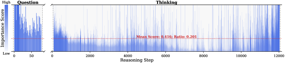
### Visual Description
## Heatmap/Bar Chart: Importance Score Across Reasoning Steps
### Overview
The image displays a two-panel chart visualizing the "Importance Score" of different "Reasoning Steps" during a process, split into a "Question" phase and a "Thinking" phase. The chart uses vertical blue bars to represent scores, with a horizontal red dashed line indicating a mean threshold. The overall trend shows high importance in early steps, which generally diminishes as the reasoning step count increases, particularly in the "Thinking" phase.
### Components/Axes
* **Y-Axis (Vertical):** Labeled **"Importance Score"**. It is a continuous scale from **"Low"** at the bottom to **"High"** at the top. No numerical markers are provided on this axis.
* **X-Axis (Horizontal):** Labeled **"Reasoning Step"**. It is a numerical scale.
* **Left Panel ("Question"):** The scale runs from **0** to approximately **50** (the last visible tick is 50, but the data extends slightly beyond).
* **Right Panel ("Thinking"):** The scale runs from **0** to **12000**, with major ticks at 0, 2000, 4000, 6000, 8000, 10000, and 12000.
* **Panel Titles:**
* Left Panel: **"Question"** (positioned top-left of its chart area).
* Right Panel: **"Thinking"** (positioned top-center of its chart area).
* **Key Annotation:** A horizontal red dashed line spans both panels. Centered above this line in the "Thinking" panel is red text: **"Mean Score: 0.416, Ratio: 0.201"**.
* **Data Representation:** Vertical blue bars. The height of each bar corresponds to the Importance Score for that specific Reasoning Step. The density and height of these bars vary across the x-axis.
* **Background:** The "Thinking" panel has a subtle light blue gradient background behind the bars, which is absent in the "Question" panel.
### Detailed Analysis
**1. "Question" Panel (Left, Steps 0-~50):**
* **Trend:** The importance scores are consistently high and densely packed. The highest scores appear very early, near step 0. There is significant fluctuation, but the bars rarely drop to the lower third of the y-axis range.
* **Data Points (Approximate):** The scores appear to range mostly between the upper half and the top of the "High" scale. The red mean line (0.416) sits in the lower-middle portion of this panel's data range, indicating the average score here is above the overall mean.
**2. "Thinking" Panel (Right, Steps 0-12000):**
* **Trend:** A clear decaying trend is visible. Scores are highest in the first ~2000 steps, with dense, tall bars. After step 2000, both the density and average height of the bars decrease markedly. From step ~6000 to 12000, the bars become very sparse and are predominantly low, indicating most reasoning steps in this late phase have low importance.
* **Data Points (Approximate):** The highest scores in the first 2000 steps reach the top of the scale. The red mean line at 0.416 cuts through the lower section of the dense early data and sits above the sparse late data. The stated **"Ratio: 0.201"** likely refers to the proportion of steps (or total importance) that meet or exceed this mean threshold.
**3. Cross-Reference & Spatial Grounding:**
* The red dashed line is positioned at a constant y-value (Importance Score = 0.416) across the entire width of both panels.
* The text **"Mean Score: 0.416, Ratio: 0.201"** is placed in the upper-middle area of the "Thinking" panel, directly above the red line it describes.
* The blue color of the bars is consistent across both panels, representing the same metric (Importance Score).
### Key Observations
1. **Phase Disparity:** The "Question" phase (first ~50 steps) is characterized by uniformly high importance. The "Thinking" phase (up to 12000 steps) shows a long tail of low-importance steps.
2. **Critical Early Window:** The most important reasoning occurs very early in the process—within the first 50 "Question" steps and the first 2000 "Thinking" steps.
3. **Efficiency Metric:** The **"Ratio: 0.201"** suggests that only about 20.1% of the reasoning steps (or their cumulative weight) are above the mean importance score of 0.416, highlighting a potential inefficiency or natural filtering in the later stages.
4. **Visual Density as Data:** The fading density of blue bars in the later "Thinking" steps is as informative as their height, visually reinforcing the scarcity of important steps.
### Interpretation
This chart likely visualizes the output of an AI or cognitive model's reasoning process. It demonstrates a **"front-loaded" importance distribution**.
* **What it suggests:** The core, high-value reasoning is concentrated at the beginning. The initial "Question" phase and the early "Thinking" phase are where the model dedicates its most significant processing or where the most decisive information is handled. The vast majority of subsequent "Thinking" steps (from ~2000 to 12000) contribute minimally to the final outcome, as measured by this "Importance Score."
* **How elements relate:** The two panels show a continuous process split for clarity. The red mean line acts as a benchmark, separating "high-importance" from "low-importance" work. The ratio quantifies the efficiency of the process.
* **Notable implications:** This pattern could indicate a model that quickly converges on a solution or key insight and then spends considerable resources on verification, refinement, or exploration of low-yield paths. For optimization, one might investigate whether the long tail of low-importance steps in the "Thinking" phase can be truncated or pruned without affecting the quality of the final output, thereby improving computational efficiency. The chart provides a clear visual argument for where attention should be focused in analyzing or improving the underlying system.
</details>
<details>
<summary>x30.png Details</summary>
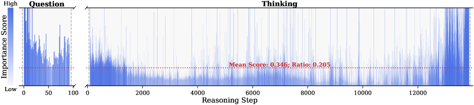
### Visual Description
## Chart Type: Dual-Panel Bar Chart (Importance Score vs. Reasoning Step)
### Overview
The image displays a two-panel horizontal bar chart visualizing the "Importance Score" of different "Reasoning Steps" across two distinct phases: "Question" and "Thinking." The chart uses a consistent blue color for all data bars and includes a red dashed horizontal line representing a mean score across the entire dataset. The overall purpose is to compare the distribution and magnitude of importance scores between the initial questioning phase and the subsequent thinking phase of a process.
### Components/Axes
* **Y-Axis (Vertical):** Labeled **"Importance Score"**. It is a categorical axis with two labeled positions: **"High"** at the top and **"Low"** at the bottom. The axis itself is not numerical but represents a relative scale.
* **X-Axis (Horizontal):** Labeled **"Reasoning Step"**. It is a numerical axis representing the sequence of steps. The axis is split into two distinct panels with different scales.
* **Panel 1 (Left):** Titled **"Question"**. Its x-axis ranges from **0 to 100**.
* **Panel 2 (Right):** Titled **"Thinking"**. Its x-axis ranges from **0 to approximately 13,000** (the last visible major tick is 12,000, but data extends beyond).
* **Legend/Annotation:** A red dashed horizontal line runs across both panels. An annotation in red text, positioned in the center of the "Thinking" panel, reads: **"Mean Score: 0.345; Ratio: 0.205"**.
* **Data Representation:** Vertical blue bars. The height of each bar corresponds to the "Importance Score" for a specific "Reasoning Step."
### Detailed Analysis
**Panel 1: "Question" (Steps 0-100)**
* **Trend:** The data shows high variability and several prominent spikes. The importance scores are generally elevated compared to the early part of the "Thinking" phase.
* **Key Data Points & Observations:**
* The highest importance scores in the entire chart appear in the first ~10 steps of the "Question" phase, with multiple bars reaching near the "High" label.
* There is a significant cluster of high scores between steps 0-20.
* Notable spikes occur around steps 40, 60, and 80.
* The scores fluctuate rapidly, indicating that importance is highly step-dependent in this phase.
* The majority of bars in this panel appear to be above the red "Mean Score" line.
**Panel 2: "Thinking" (Steps 0-13,000+)**
* **Trend:** The data exhibits two distinct regimes. From step 0 to roughly 2,000, scores are densely packed and predominantly low. From step 2,000 onward, the distribution becomes more sparse with higher variability and more frequent high-scoring spikes.
* **Key Data Points & Observations:**
* **Phase A (Steps 0-2000):** A very dense, low-amplitude "carpet" of blue bars. Most scores here are below the red mean line. The density suggests many small, low-importance steps.
* **Phase B (Steps 2000-13000+):** The pattern shifts. While low scores persist, there are numerous isolated, tall spikes indicating steps of high importance scattered throughout the thinking process.
* The frequency of high-importance spikes appears to increase slightly in the latter half (steps 6000+).
* The final segment (steps ~12,500-13,000+) shows a dense cluster of very high importance scores, rivaling those seen in the "Question" phase.
* The red "Mean Score: 0.345" line sits in the upper portion of the dense low-score carpet but is frequently exceeded by the tall spikes.
**Cross-Reference & Spatial Grounding:**
* The red dashed "Mean Score" line is positioned at a constant y-level across both panels, visually anchored to the "Importance Score" axis.
* The annotation "Mean Score: 0.345; Ratio: 0.205" is placed in the upper-middle area of the "Thinking" panel, overlaying the data.
* The "Ratio: 0.205" likely represents the proportion of total steps (or total importance) that the "Question" phase comprises relative to the entire process (Question + Thinking). Given the step counts (100 vs. ~13,000), this ratio seems plausible for a normalized metric rather than a raw step count ratio.
### Key Observations
1. **Phase Dichotomy:** The "Question" phase is short (100 steps) but contains a high density of important steps. The "Thinking" phase is extremely long (~13,000 steps) and is dominated by a vast number of low-importance steps, punctuated by intermittent high-importance ones.
2. **Importance Distribution:** High importance is not uniformly distributed. It is concentrated at the very beginning (Question) and at sporadic, critical junctures throughout the extended Thinking process, with a notable surge at the end.
3. **The "Carpet" vs. "Spikes":** The visual contrast between the dense, low "carpet" of bars in early thinking and the isolated "spikes" later on is the most striking feature, suggesting a shift from granular, low-level processing to more significant, discrete reasoning operations.
4. **Mean Score Context:** The mean score of 0.345 serves as a benchmark. In the "Question" phase, most steps are above this mean. In the "Thinking" phase, the vast majority of steps are below it, but the high spikes pull the overall average up.
### Interpretation
This chart likely visualizes the internal attention or importance weighting of a complex reasoning system (e.g., a large language model or an AI agent) as it processes a task.
* **What it suggests:** The process begins with a highly focused "Question" phase where nearly every step is deemed important for understanding the query. This is followed by a massive "Thinking" phase. The initial part of thinking involves many fine-grained, low-importance computations (the "carpet"), possibly representing information retrieval, pattern matching, or hypothesis generation. As thinking progresses, the system identifies and commits to more significant reasoning steps (the "spikes"), which could represent key deductions, plan formulations, or evidence evaluations. The final cluster of high-importance steps may correspond to conclusion synthesis or answer formulation.
* **Relationship between elements:** The "Question" sets the stage and is uniformly critical. The "Thinking" is the exploratory engine, mostly operating at a low "importance" level but relying on crucial high-importance milestones to guide its path. The mean score provides a system-wide average, highlighting how exceptional the high-importance steps are.
* **Anomalies/Notable Trends:** The most notable trend is the phase transition from dense, low-importance processing to sparse, high-importance events. The absence of a gradual ramp-up—instead, it's a sudden shift from "carpet" to "spikes"—could indicate a threshold in the reasoning process where the system moves from exploration to exploitation or from data gathering to conclusion drawing. The final surge in importance is particularly interesting, suggesting the culmination of the thinking process is as critical as the initial question.
</details>
<details>
<summary>x31.png Details</summary>
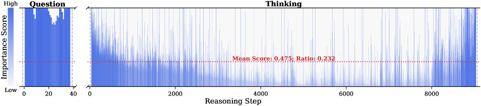
### Visual Description
## Heatmap/Bar Chart: Importance Score vs. Reasoning Step
### Overview
The image displays a two-part horizontal bar chart (or heatmap) visualizing the "Importance Score" of different "Reasoning Steps" across two distinct phases: "Question" and "Thinking." The chart uses a blue color gradient to represent score intensity, with a red dashed reference line indicating a mean score.
### Components/Axes
* **Y-Axis (Vertical):** Labeled **"Importance Score"**. It is a categorical scale with two marked positions: **"High"** at the top and **"Low"** at the bottom.
* **X-Axis (Horizontal):** Labeled **"Reasoning Step"**. It is a numerical scale with major tick marks at **0, 2000, 4000, 6000, and 8000**.
* **Chart Sections:** The chart is divided into two adjacent panels:
1. **Left Panel:** Titled **"Question"**. It covers the x-axis range from approximately step 0 to step 40.
2. **Right Panel:** Titled **"Thinking"**. It covers the x-axis range from step 0 to beyond step 8000.
* **Reference Line:** A horizontal red dashed line runs across both panels. It is annotated with the text: **"Mean Score: 0.475; Ratio: 0.232"**. This line is positioned at a y-value corresponding to an importance score of approximately 0.475.
* **Data Representation:** Data is represented as vertical bars (or heatmap cells) colored in shades of blue. The height (or color intensity) of each bar corresponds to its Importance Score. Darker/Fuller blue indicates a higher score.
### Detailed Analysis
**1. "Question" Panel (Steps 0-40):**
* **Trend:** This section shows a very dense, nearly continuous block of high importance scores.
* **Data Points:** From step 0 to approximately step 40, the importance scores are consistently at or near the "High" level. The blue bars fill almost the entire vertical space from "Low" to "High," indicating sustained high importance throughout this initial phase. There is a slight dip in density/score around steps 20-30.
**2. "Thinking" Panel (Steps 0-8000+):**
* **Trend:** This section shows a sparse, irregular distribution of high importance scores against a background of generally lower scores.
* **Data Points:**
* **Early Phase (Steps 0-2000):** There is a cluster of high-importance spikes at the very beginning (steps 0-500), followed by a period of relatively lower and more scattered scores.
* **Middle Phase (Steps 2000-6000):** High-importance scores appear as isolated, thin vertical lines or small clusters. Notable spikes occur around steps ~2500, ~3500, ~4500, and ~5500. The density of high scores is lower here than in the early or late phases.
* **Late Phase (Steps 6000-8000+):** The frequency and density of high-importance spikes increase significantly, particularly from step 7000 onward, culminating in a very dense cluster of high scores around and after step 8000.
**3. Reference Line & Annotation:**
* The red dashed line at **y ≈ 0.475** serves as a visual threshold. A significant portion of the data points in the "Thinking" panel fall below this line, while most of the "Question" panel data is above it.
* The annotation **"Mean Score: 0.475; Ratio: 0.232"** provides summary statistics. The "Mean Score" likely refers to the average importance score across the entire dataset. The "Ratio: 0.232" is ambiguous but could represent the proportion of steps exceeding the mean, or another derived metric.
### Key Observations
1. **Phase Dichotomy:** There is a stark contrast between the "Question" phase (short, uniformly high importance) and the "Thinking" phase (long, sporadically high importance).
2. **Temporal Clustering in "Thinking":** High-importance events in the "Thinking" phase are not random; they show clustering at the beginning and especially at the end of the process.
3. **Mean Score Threshold:** The annotated mean score (0.475) visually separates the consistently high "Question" phase from the variable "Thinking" phase.
4. **Spatial Layout:** The "Question" panel is positioned on the far left, emphasizing its role as the initiating phase. The "Thinking" panel dominates the chart area, reflecting its longer duration. The legend/annotation is placed centrally within the "Thinking" panel.
### Interpretation
This chart likely visualizes the output of an AI or cognitive model's reasoning process. The data suggests a clear two-stage architecture:
* **Stage 1 - Question Analysis:** The model dedicates intense, focused attention (high importance) to understanding the initial question or prompt. This is a short but critical phase where the problem is framed.
* **Stage 2 - Deliberative Thinking:** The model then engages in a prolonged reasoning process. Importance scores here are bursty, indicating that the model's "attention" or "confidence" spikes at specific, non-contiguous steps. These spikes likely correspond to key inferential leaps, hypothesis evaluations, or evidence integration points. The increased density of high-importance scores towards the end (steps 7000+) suggests a convergence phase where the model synthesizes information to form a conclusion.
The **"Ratio: 0.232"** is a key metric. If interpreted as the fraction of steps with importance above the mean, it indicates that only about 23.2% of the reasoning steps are considered highly important by the model's internal scoring mechanism. This highlights the efficiency of the process—most steps are background computation, with critical insights occurring at specific junctures.
**In essence, the chart maps the "cognitive effort" or "attentional focus" of a system over time, revealing a pattern of concentrated initial analysis followed by a long, punctuated deliberation leading to a conclusion.**
</details>
<details>
<summary>x32.png Details</summary>
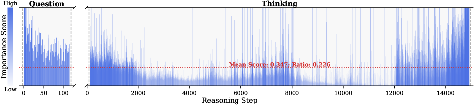
### Visual Description
\n
## Dual-Panel Bar Chart: Importance Score vs. Reasoning Step
### Overview
The image displays a two-panel horizontal bar chart (or heatmap-style visualization) comparing the "Importance Score" of elements across "Reasoning Steps" in two distinct contexts: "Question" and "Thinking." The chart uses a blue color gradient to represent score magnitude and includes a statistical reference line.
### Components/Axes
* **Y-Axis (Vertical):** Labeled **"Importance Score"**. The scale is qualitative, marked with **"High"** at the top and **"Low"** at the bottom. No numerical scale is provided.
* **X-Axis (Horizontal):** Labeled **"Reasoning Step"**. It is a numerical scale representing a sequence or timeline.
* **Panels:** The chart is split into two distinct panels:
1. **Left Panel:** Titled **"Question"**. Its x-axis ranges from **0 to 100**.
2. **Right Panel:** Titled **"Thinking"**. Its x-axis ranges from **0 to 14000**.
* **Data Representation:** Data is shown as vertical blue bars. The height (or intensity) of each bar corresponds to the Importance Score at that specific Reasoning Step. The color gradient appears to map from a lighter blue (lower score) to a darker, more saturated blue (higher score).
* **Reference Line:** A horizontal **red dashed line** runs across both panels at a constant y-position. In the "Thinking" panel, this line is annotated with the text: **"Mean Score: 0.347; Ratio: 0.226"**.
### Detailed Analysis
* **"Question" Panel (Steps 0-100):**
* The distribution of importance scores is highly variable and dense.
* There are numerous sharp peaks (high importance scores) scattered throughout the 100-step range, with no single dominant cluster.
* The red dashed line (mean score) sits in the lower half of the vertical scale, indicating that the majority of steps have an importance score below this mean value.
* **"Thinking" Panel (Steps 0-14000):**
* This panel shows a much longer sequence. The data pattern is characterized by long stretches of low importance scores (short, light blue bars) interspersed with frequent, sharp spikes of high importance (tall, dark blue bars).
* The spikes appear to be distributed somewhat randomly across the entire 14,000-step range, with no obvious periodic pattern.
* The annotated **Mean Score of 0.347** (on an implied 0-1 scale) confirms that the average importance is relatively low. The **Ratio of 0.226** likely indicates the proportion of steps that are considered "important" (perhaps those above the mean or a certain threshold).
* **Cross-Panel Comparison:** The "Question" phase is short (100 steps) and densely packed with variable importance. The "Thinking" phase is two orders of magnitude longer (14,000 steps) and shows a "sparse" pattern where high-importance events are rare but occur throughout the process.
### Key Observations
1. **Bimodal Importance:** Both panels suggest a process where most steps have low importance, but a critical minority of steps have very high importance.
2. **Scale Disparity:** The "Thinking" process is vastly longer than the "Question" process (140x in terms of step count).
3. **Persistent Mean:** The same mean score line (0.347) is applied to both panels, suggesting it is a global average across the entire dataset or a fixed threshold for comparison.
4. **No Clear Temporal Clustering:** In the "Thinking" panel, high-importance steps do not appear to cluster in specific phases (e.g., only at the beginning or end); they are distributed across the entire timeline.
### Interpretation
This visualization likely represents the output of an analytical model (e.g., from AI interpretability research) that scores the importance of individual reasoning steps in a language model's process. The "Question" panel may analyze the model's processing of an input query, while the "Thinking" panel analyzes its internal chain-of-thought or generation process.
The data suggests that meaningful "reasoning" is not a continuous, uniformly important process. Instead, it is characterized by long periods of low-importance computation punctuated by brief, critical moments of high importance. The low mean score (0.347) and ratio (0.226) quantify this sparsity, indicating that only about 22.6% of the steps contribute significantly above the average. This pattern is consistent across both the initial question analysis and the extended thinking phase, though the latter operates on a much larger scale. The chart effectively argues that identifying these sparse, high-importance "spikes" is key to understanding the model's reasoning efficiency and decision points.
</details>
<details>
<summary>x33.png Details</summary>
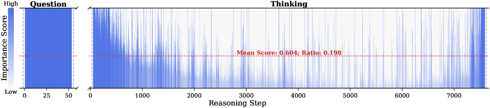
### Visual Description
\n
## Heatmap/Bar Chart: Importance Score Across Reasoning Steps
### Overview
The image displays a two-part chart visualizing the "Importance Score" (y-axis) across different stages of a process, divided into a "Question" phase and a "Thinking" phase. The chart uses a blue color intensity scale to represent score magnitude, with a horizontal red dashed line indicating a mean value.
### Components/Axes
* **Y-Axis (Vertical):** Labeled **"Importance Score"**. The scale is qualitative, marked with **"High"** at the top and **"Low"** at the bottom. No numerical scale is provided.
* **X-Axis (Horizontal):** Represents a sequence or timeline, split into two distinct sections:
1. **Left Section ("Question"):** X-axis markers at **0, 25, 50**. This section is a solid, dense blue block.
2. **Right Section ("Thinking"):** X-axis labeled **"Reasoning Step"** with markers at **0, 1000, 2000, 3000, 4000, 5000, 6000, 7000**. This section shows a fluctuating line/area graph.
* **Legend/Key:** There is no separate legend box. The color blue directly maps to the "Importance Score" value, with darker/denser blue indicating a higher score.
* **Annotation:** A horizontal red dashed line spans the "Thinking" section. Centered text on this line reads: **"Mean Score: 0.604; Ratio: 0.198"**.
### Detailed Analysis
* **"Question" Phase (Steps 0-50):** This region is a uniform, solid blue block extending from the "Low" to the "High" mark on the y-axis. This indicates that throughout the initial 50 steps (presumably related to processing or understanding the question), the importance score is consistently at or near the maximum value.
* **"Thinking" Phase (Steps 0-7000+):** This region shows a highly variable blue line/area graph.
* **Trend:** The graph exhibits frequent, sharp peaks and troughs. There is no single overarching upward or downward trend across the entire 7000 steps. Instead, it shows bursts of high importance (tall blue spikes) interspersed with periods of lower importance (shorter blue spikes or valleys).
* **Data Points:** Precise numerical values for each step cannot be extracted as the y-axis is not numerically scaled. However, visually, many spikes reach near the "High" level, while the baseline frequently drops to near the "Low" level.
* **Mean Score Line:** The red dashed line provides a quantitative reference. The **"Mean Score: 0.604"** suggests that, on a normalized scale (likely 0 to 1), the average importance across the "Thinking" steps is approximately 0.604, which is moderately high.
* **Ratio:** The **"Ratio: 0.198"** is provided without explicit context. It may represent the proportion of steps that exceed the mean score, the ratio of high-importance to low-importance steps, or another derived metric. Visually, the dense clustering of spikes makes it difficult to confirm this ratio precisely from the graph alone.
### Key Observations
1. **Phase Dichotomy:** There is a stark contrast between the "Question" and "Thinking" phases. The "Question" phase is uniformly high-importance, while the "Thinking" phase is characterized by volatility.
2. **Bursty Importance:** The "Thinking" process does not maintain a steady level of importance. Instead, it appears to have discrete moments or intervals of high cognitive salience (the tall spikes).
3. **Quantitative Anchor:** The mean score (0.604) serves as the only precise numerical data point, indicating the central tendency of importance during the reasoning phase is above the midpoint.
4. **Spatial Layout:** The "Question" section occupies the leftmost ~7% of the chart's width (0-50 vs. 0-7000+), visually emphasizing that the bulk of the process (in terms of step count) is the "Thinking" phase.
### Interpretation
This chart likely visualizes the output of an analytical model assessing the importance of different tokens or steps in a language model's reasoning chain. The **"Question" phase** being uniformly high suggests that every part of the initial query is deemed critical for setting the context. The **"Thinking" phase** reveals the model's internal reasoning process: it is not a smooth, equally-weighted deduction but a series of focused, high-importance computations (the spikes) connected by less critical transitional or integrative steps (the valleys).
The **Mean Score of 0.604** indicates that, on average, the reasoning steps carry substantial weight. The **Ratio of 0.198** is particularly intriguing. If interpreted as the fraction of steps with high importance, it suggests that only about 20% of the reasoning steps are truly pivotal, while the remaining 80% play a supporting role. This aligns with the visual "bursty" pattern. The chart demonstrates that effective reasoning, as modeled here, is not about constant high effort but about strategically deploying high-importance processing at key junctures.
</details>
<details>
<summary>x34.png Details</summary>
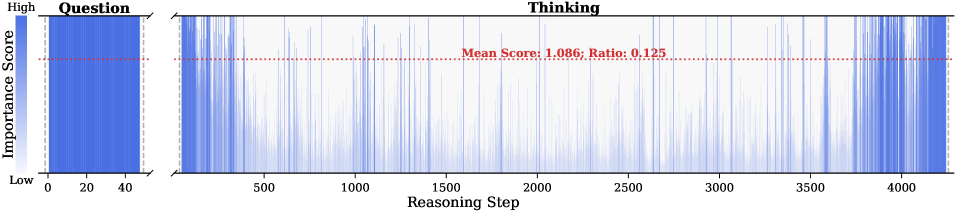
### Visual Description
## Heatmap/Bar Chart: Importance Score Across Reasoning Steps
### Overview
The image is a horizontal heatmap or bar chart visualizing the "Importance Score" of different "Reasoning Steps" in a process. The chart is divided into two distinct sections: a narrow "Question" phase and a much longer "Thinking" phase. A horizontal red dashed line indicates the mean score across the "Thinking" phase.
### Components/Axes
* **Y-Axis (Vertical):** Labeled **"Importance Score"**. The scale is qualitative, marked with **"High"** at the top and **"Low"** at the bottom. There are no numerical tick marks on this axis.
* **X-Axis (Horizontal):** Labeled **"Reasoning Step"**. It is a numerical scale with major tick marks at: 0, 20, 40, 500, 1000, 1500, 2000, 2500, 3000, 3500, and 4000.
* **Section Labels:**
* **"Question"**: Positioned above the leftmost segment of the chart (approximately steps 0-40).
* **"Thinking"**: Positioned above the main, rightward segment of the chart (approximately steps 500-4000).
* **Annotation:** A red dashed horizontal line spans the "Thinking" section. Above this line, centered, is the text: **"Mean Score: 1.086; Ratio: 0.125"**.
* **Legend/Color Scale:** A vertical color bar is implied on the far left. Dark blue represents a **"High"** importance score, fading to white/light blue for a **"Low"** importance score.
### Detailed Analysis
The chart displays data as vertical bars or a continuous heatmap where color intensity corresponds to the importance score.
1. **"Question" Phase (Steps ~0-40):**
* **Trend:** This section is a solid, uniform block of dark blue.
* **Data Points:** Every reasoning step within this range has a consistently **high importance score**. There is no visible variation.
2. **"Thinking" Phase (Steps ~500-4000):**
* **Trend:** This section shows a highly variable pattern. The color fluctuates rapidly between dark blue (high importance) and white/light blue (low importance) across the 3500+ steps.
* **Data Distribution:** High-importance scores (dark blue spikes) appear scattered throughout the entire range. There are clusters of higher activity (e.g., around steps 500-700, 1200-1400, 2800-3000, and 3600-4000), but no single, dominant trend of increasing or decreasing importance over the long term.
* **Statistical Annotation:** The red dashed line and its label provide summary statistics for this phase:
* **Mean Score:** 1.086 (This is a numerical value, suggesting the underlying importance score is quantified on a scale where ~1 is the average for the "Thinking" phase).
* **Ratio:** 0.125 (This likely represents the proportion of steps in the "Thinking" phase that are considered "high importance," perhaps those scoring above a certain threshold).
### Key Observations
* **Bimodal Pattern:** The process exhibits two clear modes: a short, uniformly critical "Question" phase and a long, variably important "Thinking" phase.
* **High Variability in Thinking:** The "Thinking" phase is not monolithic; importance spikes and drops frequently, indicating that specific steps within reasoning are more pivotal than others.
* **Meaning of the Ratio:** A ratio of 0.125 (or 1/8th) suggests that only about 12.5% of the steps in the extended "Thinking" process are of high importance, highlighting the efficiency or sparsity of critical operations within a larger computational flow.
* **Spatial Layout:** The "Question" section is compressed on the far left, visually emphasizing its brevity compared to the expansive "Thinking" process. The mean score line is positioned in the upper half of the "Thinking" section's vertical space, indicating the mean importance score (1.086) is relatively high on the "Low" to "High" scale.
### Interpretation
This chart likely visualizes the internal attention or importance weighting of a reasoning model (like a large language model) as it processes a query.
* **What it suggests:** The model dedicates intense, uniform focus to understanding the initial **"Question"**. The subsequent **"Thinking"** or reasoning process involves a long chain of steps where the model's "attention" or the computational importance is highly selective. Most steps are of low importance (background processing), with intermittent spikes where key inferences, connections, or decisions are made.
* **Relationship between elements:** The "Question" sets the stage with high importance, defining the problem space. The "Thinking" phase then executes a complex, non-linear reasoning trajectory where importance is not evenly distributed. The mean score and ratio quantify the overall intensity and sparsity of this process.
* **Notable insight:** The stark contrast between the two phases underscores a fundamental principle in complex reasoning: problem definition ("Question") is uniformly critical, while the solution path ("Thinking") involves many low-stakes steps punctuated by a few high-stakes cognitive operations. The ratio of 0.125 provides a potential metric for the "cognitive efficiency" or "focus density" of the model's reasoning algorithm.
</details>
Figure 11: Visualization of token importance scores for question and thinking tokens within DeepSeek-R1-Distill-Qwen-7B reasoning traces across six samples from AIME24, AIME25, AMC23, GPQA-D, GAOKAO2023EN, and MATH500.
### B.3 Additional Results
<details>
<summary>x35.png Details</summary>
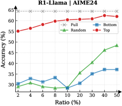
### Visual Description
## Line Chart: R1-Llama / AIME24 Performance vs. Ratio
### Overview
The image is a line chart titled "R1-Llama / AIME24". It plots the performance metric "Accuracy (%)" against a variable "Ratio (%)" for four different methods or data subsets: Full, Bottom, Random, and Top. The chart demonstrates how the accuracy of each method changes as the ratio increases from 2% to 50%.
### Components/Axes
* **Chart Title:** "R1-Llama / AIME24" (centered at the top).
* **Y-Axis:**
* **Label:** "Accuracy (%)"
* **Scale:** Linear scale from 25 to 65, with major tick marks every 5 units (25, 30, 35, 40, 45, 50, 55, 60, 65).
* **X-Axis:**
* **Label:** "Ratio (%)"
* **Scale:** Non-linear scale with marked points at 2, 4, 6, 8, 10, 20, 30, 40, and 50.
* **Legend:** Located in the top-right quadrant of the chart area. It defines four data series:
1. **Full:** Red line with solid circle markers.
2. **Bottom:** Blue line with solid square markers.
3. **Random:** Green line with solid triangle markers.
4. **Top:** Gray line with 'x' markers.
### Detailed Analysis
**Data Series Trends and Approximate Values:**
1. **Full (Red Circles):**
* **Trend:** Shows a steady, monotonic upward trend. Accuracy increases consistently as the Ratio increases.
* **Data Points (Approximate):**
* Ratio 2%: ~55%
* Ratio 4%: ~56%
* Ratio 6%: ~57%
* Ratio 8%: ~58%
* Ratio 10%: ~59%
* Ratio 20%: ~60%
* Ratio 30%: ~61%
* Ratio 40%: ~61.5%
* Ratio 50%: ~62%
2. **Bottom (Blue Squares):**
* **Trend:** Relatively flat with minor fluctuations. It shows a slight dip around Ratio 10% before recovering and plateauing.
* **Data Points (Approximate):**
* Ratio 2%: ~30%
* Ratio 4%: ~32%
* Ratio 6%: ~31%
* Ratio 8%: ~33%
* Ratio 10%: ~28% (notable dip)
* Ratio 20%: ~30%
* Ratio 30%: ~35%
* Ratio 40%: ~37%
* Ratio 50%: ~37%
3. **Random (Green Triangles):**
* **Trend:** Exhibits a distinct "hockey stick" or exponential-like growth pattern. It remains low and flat for Ratios up to 10%, then increases sharply and linearly from 20% to 50%.
* **Data Points (Approximate):**
* Ratio 2%: ~31%
* Ratio 4%: ~32%
* Ratio 6%: ~30%
* Ratio 8%: ~29%
* Ratio 10%: ~28%
* Ratio 20%: ~35%
* Ratio 30%: ~40%
* Ratio 40%: ~45%
* Ratio 50%: ~48%
4. **Top (Gray 'x's):**
* **Trend:** Perfectly flat, horizontal line. Accuracy is constant and does not change with the Ratio.
* **Data Points (Approximate):**
* All Ratios (2% to 50%): ~63%
### Key Observations
* **Performance Hierarchy:** The "Top" method consistently achieves the highest accuracy (~63%), followed by "Full" (~55-62%). "Random" and "Bottom" perform significantly worse, especially at low ratios.
* **Critical Threshold:** The "Random" series shows a dramatic change in behavior at a Ratio of approximately 10%. Below this point, its accuracy is stagnant and low; above it, accuracy improves rapidly.
* **Stability vs. Growth:** "Top" is perfectly stable. "Full" shows steady, reliable growth. "Bottom" is unstable with a notable performance drop at 10%. "Random" is highly sensitive to the Ratio, showing poor initial performance but strong late growth.
* **Convergence:** At the highest measured Ratio (50%), the gap between "Random" (~48%) and "Bottom" (~37%) has widened significantly, with "Random" clearly outperforming "Bottom".
### Interpretation
This chart likely evaluates different data selection or sampling strategies ("Full", "Bottom", "Random", "Top") for a model or task named "R1-Llama" on the "AIME24" benchmark. The "Ratio (%)" probably represents the percentage of data used (e.g., for training, fine-tuning, or retrieval).
The data suggests:
1. **Superiority of "Top" Selection:** Using the "Top" data (presumably the highest-quality or most relevant samples) yields the best and most consistent performance, independent of the quantity used within this range. This implies high data quality is paramount.
2. **Value of "Full" Data:** Using all available data ("Full") provides a strong, predictable performance baseline that improves with more data, but it never reaches the peak efficiency of the curated "Top" set.
3. **Inefficiency of "Bottom" Data:** The "Bottom" subset (likely the lowest-quality data) provides poor and erratic performance. The dip at 10% could indicate a point where adding more low-quality data introduces noise that harms performance before sheer volume compensates slightly.
4. **"Random" Sampling's Phase Change:** The "Random" strategy is ineffective at low ratios but becomes surprisingly effective as the ratio increases beyond 10%. This suggests that once a sufficient random sample size is reached, it begins to capture enough useful signal to drive significant performance gains, though it remains less efficient than using curated ("Top") or complete ("Full") data.
**Overall Implication:** For this specific task, investing in data curation to create a "Top" subset is the most effective strategy. If curation is not possible, using all data ("Full") is a reliable fallback. Random sampling requires a substantial data volume (>10% ratio) to become viable, while relying on the "Bottom" data is not recommended.
</details>
<details>
<summary>x36.png Details</summary>
### Visual Description
## Line Chart: R1-Llama | AIME25
### Overview
This is a line chart comparing the performance (Accuracy %) of four different data selection strategies ("Full", "Bottom", "Random", "Top") for a model referred to as "R1-Llama" on a benchmark or task labeled "AIME25". The chart plots Accuracy against an increasing "Ratio (%)", which likely represents the proportion of data used for training or selection.
### Components/Axes
* **Chart Title:** "R1-Llama | AIME25" (Top center)
* **Y-Axis:**
* **Label:** "Accuracy (%)" (Left side, vertical)
* **Scale:** Linear, ranging from 30.0 to 50.0, with major tick marks every 2.5 units (30.0, 32.5, 35.0, 37.5, 40.0, 42.5, 45.0, 47.5, 50.0).
* **X-Axis:**
* **Label:** "Ratio (%)" (Bottom center)
* **Scale:** Categorical/Logarithmic-like, with discrete points at 2, 4, 6, 8, 10, 20, 30, 40, 50.
* **Legend:** Positioned in the top-right corner of the chart area. It defines four data series:
1. **Full:** Gray dashed line with 'x' markers.
2. **Bottom:** Blue solid line with square markers.
3. **Random:** Green solid line with upward-pointing triangle markers.
4. **Top:** Red solid line with circle markers.
### Detailed Analysis
**Data Series Trends and Approximate Values:**
1. **Top (Red line, circle markers):**
* **Trend:** Shows a strong, consistent upward trend. Accuracy increases rapidly at low ratios and continues to improve steadily, approaching the performance of the "Full" baseline.
* **Data Points (Ratio%, Accuracy%):** (2, ~45.0), (4, ~47.5), (6, ~48.0), (8, ~48.5), (10, ~48.5), (20, ~49.0), (30, ~49.5), (40, ~49.5), (50, ~49.8).
2. **Bottom (Blue line, square markers):**
* **Trend:** Shows a gradual, modest upward trend. It starts lower than "Top" and "Random", dips slightly at Ratio 4, then slowly climbs.
* **Data Points (Ratio%, Accuracy%):** (2, ~34.0), (4, ~33.5), (6, ~35.0), (8, ~36.0), (10, ~35.5), (20, ~36.0), (30, ~36.0), (40, ~36.5), (50, ~37.5).
3. **Random (Green line, triangle markers):**
* **Trend:** Highly volatile. It starts near the "Bottom" series, drops significantly to a low point at Ratio 6, recovers, dips again at Ratio 20, and then shows a sharp increase in the final segments (Ratios 30-50).
* **Data Points (Ratio%, Accuracy%):** (2, ~34.0), (4, ~32.0), (6, ~31.0), (8, ~31.5), (10, ~32.0), (20, ~31.0), (30, ~36.0), (40, ~39.5), (50, ~39.0).
4. **Full (Gray dashed line, 'x' markers):**
* **Trend:** Perfectly flat horizontal line. This represents a constant baseline performance.
* **Data Points (Ratio%, Accuracy%):** Constant at ~48.5% across all Ratios.
### Key Observations
* **Performance Hierarchy:** The "Top" strategy consistently outperforms "Random" and "Bottom" at all data ratios. The "Full" dataset baseline is only matched by the "Top" strategy at very high data ratios (approaching 50%).
* **Volatility:** The "Random" selection strategy exhibits the most unstable performance, with significant drops and rises, suggesting high variance in the quality of randomly selected data subsets.
* **Convergence:** The "Top" strategy's accuracy curve converges toward the "Full" baseline, indicating that selecting the top-performing data points can achieve near-optimal results with a fraction (50%) of the total data.
* **Low-Ratio Efficacy:** Even at a very low data ratio of 2%, the "Top" strategy achieves ~45% accuracy, which is significantly higher than the other selective strategies and only ~3.5 percentage points below the full-data baseline.
### Interpretation
This chart demonstrates the critical importance of **data selection strategy** for the R1-Llama model on the AIME25 task. The data suggests:
1. **Quality over Quantity:** Selecting a small subset of high-quality ("Top") data is far more effective than using a larger subset of low-quality ("Bottom") or randomly selected data. The "Top" strategy achieves superior performance with just 2% of the data compared to what "Bottom" achieves with 50%.
2. **Diminishing Returns:** The "Top" curve shows diminishing returns; the largest accuracy gains occur when increasing the ratio from 2% to 10%, after which improvements become marginal. This implies the most informative data points are concentrated in a small "top" tier.
3. **Risk of Random Selection:** The erratic performance of the "Random" strategy highlights the risk and inefficiency of unguided data selection. Its final surge at high ratios may be an artifact of eventually including more "top-tier" points as the sample size grows.
4. **Baseline Context:** The "Full" line serves as an upper-bound reference. The fact that "Top" nearly reaches it at 50% ratio suggests the remaining 50% of the data (the "bottom" half) contributes very little additional value for this specific task and model.
**In essence, the chart provides strong evidence for a data pruning or curriculum learning approach: carefully curating a small, high-quality training set can yield model performance comparable to using the entire dataset, offering significant computational savings.**
</details>
<details>
<summary>x37.png Details</summary>
### Visual Description
## Line Chart: R1-Llama | AMC23
### Overview
The image displays a line chart comparing the performance of four different methods or data selection strategies ("Full", "Random", "Bottom", "Top") on a task labeled "AMC23". The chart plots model accuracy against an increasing ratio of data used, showing how each method's effectiveness scales.
### Components/Axes
* **Chart Title:** "R1-Llama | AMC23" (Top center)
* **Y-Axis:** Labeled "Accuracy (%)". Scale runs from 65 to 95 in increments of 5.
* **X-Axis:** Labeled "Ratio (%)". The scale is non-linear, with marked points at 2, 4, 6, 10, 20, 30, 40, and 50.
* **Legend:** Positioned in the top-left corner of the plot area. It defines four data series:
* **Full:** Gray line with 'x' markers.
* **Random:** Green line with upward-pointing triangle markers.
* **Bottom:** Blue line with square markers.
* **Top:** Red line with circle markers.
### Detailed Analysis
**Data Series Trends and Approximate Points:**
1. **Full (Gray, 'x'):**
* **Trend:** Perfectly horizontal line, indicating constant performance.
* **Data Points:** Accuracy remains at approximately 95% across all ratios from 2% to 50%.
2. **Top (Red, Circles):**
* **Trend:** Starts high and shows a steady, slight upward trend, consistently outperforming Random and Bottom.
* **Data Points (Approximate):**
* Ratio 2%: ~88%
* Ratio 4%: ~90%
* Ratio 6%: ~93%
* Ratio 10%: ~93%
* Ratio 20%: ~94%
* Ratio 30%: ~95%
* Ratio 40%: ~95%
* Ratio 50%: ~95%
3. **Random (Green, Triangles):**
* **Trend:** Starts low, dips slightly at ratio 6%, then shows a consistent upward slope, converging towards the Top method at higher ratios.
* **Data Points (Approximate):**
* Ratio 2%: ~63%
* Ratio 4%: ~64%
* Ratio 6%: ~63% (local minimum)
* Ratio 10%: ~66%
* Ratio 20%: ~68%
* Ratio 30%: ~71%
* Ratio 40%: ~80%
* Ratio 50%: ~85%
4. **Bottom (Blue, Squares):**
* **Trend:** Starts low, dips at ratio 6%, then increases steadily but remains the lowest-performing method until the highest ratios, where it begins to close the gap with Random.
* **Data Points (Approximate):**
* Ratio 2%: ~65%
* Ratio 4%: ~65%
* Ratio 6%: ~62% (local minimum)
* Ratio 10%: ~65%
* Ratio 20%: ~67%
* Ratio 30%: ~70%
* Ratio 40%: ~73%
* Ratio 50%: ~80%
### Key Observations
* **Performance Hierarchy:** A clear and consistent hierarchy is visible: Full > Top > Random > Bottom for almost all data ratios.
* **The "Full" Baseline:** The "Full" method serves as a performance ceiling, maintaining perfect accuracy (95%) regardless of the data ratio, suggesting it represents training on the complete dataset.
* **Critical Dip at 6%:** Both the "Random" and "Bottom" methods show a noticeable dip in accuracy at the 6% data ratio before recovering and improving.
* **Convergence at High Ratios:** As the data ratio increases towards 50%, the performance gap between "Random" and "Bottom" narrows, and both show accelerated improvement, though they remain below "Top" and "Full".
* **"Top" Method Efficiency:** The "Top" method achieves near-ceiling performance (~93-95%) with as little as 6-10% of the data, indicating highly effective data selection.
### Interpretation
This chart demonstrates the efficacy of different data selection or curriculum learning strategies for the "R1-Llama" model on the "AMC23" task. The data suggests:
1. **Strategic Selection is Powerful:** The "Top" strategy, which likely selects the most informative or highest-quality data samples, is extremely efficient. It reaches near-optimal performance using only a small fraction (6-10%) of the total available data. This has significant implications for reducing training costs and time.
2. **Random Sampling is Suboptimal but Improves:** Randomly selecting data ("Random") is a poor strategy at low ratios but improves steadily as more data is added, showing that quantity can eventually compensate somewhat for lack of quality in selection.
3. **"Bottom" Selection is Detrimental:** Selecting from the "Bottom" (likely the least informative or lowest-quality data) yields the worst performance, confirming that not all data is equally valuable. Its persistent underperformance highlights the risk of using poorly curated datasets.
4. **The Value of Full Data:** The flat "Full" line confirms that the model's peak performance on this task is 95% accuracy, achievable only with the complete dataset. The other lines show how close different selection strategies can get to this peak with less data.
5. **Anomaly at 6% Ratio:** The synchronized dip for "Random" and "Bottom" at the 6% ratio is curious. It could indicate a specific subset of data introduced at that ratio which is particularly noisy or misleading for these non-selective methods, or it could be a statistical artifact in the experiment.
In essence, the chart provides strong evidence that intelligent data curation ("Top") is a highly effective method for achieving high model performance efficiently, significantly outperforming naive random sampling or the use of low-quality data.
</details>
<details>
<summary>x38.png Details</summary>
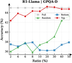
### Visual Description
## Line Chart: R1-Llama on GPAQ-D
### Overview
This is a line chart comparing the performance (accuracy) of four different methods or data selection strategies ("Full", "Random", "Bottom", "Top") on the GPAQ-D benchmark as a function of the "Ratio (%)" of data used. The chart demonstrates how accuracy changes for each method as the percentage of data increases from 2% to 50%.
### Components/Axes
* **Chart Title:** "R1-Llama on GPAQ-D" (centered at the top).
* **Y-Axis:** Labeled "Accuracy (%)". The scale runs from 36 to 44, with major tick marks at 36, 38, 40, 42, and 44.
* **X-Axis:** Labeled "Ratio (%)". The scale is non-linear, with marked points at 2, 4, 6, 8, 10, 20, 30, 40, and 50.
* **Legend:** Positioned in the top-right corner of the plot area. It defines four data series:
* **Full:** Red line with solid circle markers (●).
* **Random:** Green line with solid triangle markers (▲).
* **Bottom:** Blue line with solid square markers (■).
* **Top:** Red line with solid diamond markers (◆).
### Detailed Analysis
**Data Series Trends and Approximate Values:**
1. **Full (Red, ●):**
* **Trend:** Starts high, shows a slight peak early, then remains relatively stable with minor fluctuations at a high accuracy level.
* **Data Points (Ratio%, Accuracy%):** (2, ~42.2), (4, ~44.0), (6, ~43.5), (8, ~43.8), (10, ~43.2), (20, ~44.0), (30, ~43.8), (40, ~43.5), (50, ~43.2).
2. **Top (Red, ◆):**
* **Trend:** Follows a very similar high-accuracy path to the "Full" series, consistently just slightly below it.
* **Data Points (Ratio%, Accuracy%):** (2, ~42.0), (4, ~43.8), (6, ~43.2), (8, ~43.5), (10, ~43.0), (20, ~43.8), (30, ~43.5), (40, ~43.2), (50, ~43.0).
3. **Random (Green, ▲):**
* **Trend:** Starts low, dips to its minimum at 10% ratio, then shows a clear and steady upward trend as the ratio increases.
* **Data Points (Ratio%, Accuracy%):** (2, ~36.0), (4, ~36.5), (6, ~37.0), (8, ~36.2), (10, ~35.8), (20, ~37.5), (30, ~38.0), (40, ~39.0), (50, ~39.5).
4. **Bottom (Blue, ■):**
* **Trend:** Fluctuates within a narrow, low-accuracy band (36-38%) with no clear upward or downward trend across the entire ratio range.
* **Data Points (Ratio%, Accuracy%):** (2, ~37.5), (4, ~36.8), (6, ~37.8), (8, ~37.5), (10, ~36.2), (20, ~36.0), (30, ~36.2), (40, ~36.8), (50, ~37.8).
### Key Observations
1. **Performance Hierarchy:** There is a clear and consistent separation between two performance tiers. "Full" and "Top" form a high-accuracy tier (~42-44%), while "Random" and "Bottom" form a lower-accuracy tier (~36-40%).
2. **"Top" vs. "Full":** The "Top" method achieves accuracy nearly identical to using the "Full" dataset, suggesting that selecting the top-performing subset of data is highly effective.
3. **"Random" Improvement:** The "Random" selection method shows a positive correlation between data ratio and accuracy, especially after the 10% mark. More random data leads to better performance.
4. **"Bottom" Stagnation:** The "Bottom" method shows no meaningful improvement with more data, indicating that this selection strategy is consistently ineffective.
5. **Critical Point for Random:** The dip for "Random" at 10% ratio is a notable anomaly before its upward trend begins.
### Interpretation
This chart provides a compelling analysis of data efficiency and selection strategies for the R1-Llama model on the GPAQ-D task.
* **Core Finding:** The data suggests that **quality trumps quantity**. Using a carefully selected high-quality subset ("Top") yields performance on par with using the entire dataset ("Full"). This has significant implications for reducing computational costs and training time without sacrificing accuracy.
* **Ineffectiveness of Poor Selection:** Conversely, selecting the "Bottom" subset is actively detrimental and provides no benefit from additional data, highlighting the risk of poor data curation.
* **Random Sampling as a Baseline:** The "Random" series acts as a crucial baseline. Its upward trend confirms that more data is generally beneficial, but its consistently lower performance compared to "Top" underscores the value of intelligent data selection over naive sampling.
* **Practical Implication:** For resource-constrained applications, employing a "Top"-like data selection strategy appears to be the most efficient path, offering near-maximal accuracy with a fraction of the data. The chart effectively argues against both using all data (if inefficient) and using poorly selected data.
</details>
<details>
<summary>x39.png Details</summary>
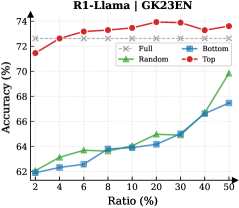
### Visual Description
## Line Chart: R1-Llama | GK23EN
### Overview
This is a line chart comparing the performance (Accuracy %) of four different data selection strategies ("Full", "Random", "Bottom", "Top") for a model or system named "R1-Llama" on a task or dataset labeled "GK23EN". The chart plots Accuracy against an increasing Ratio (%).
### Components/Axes
* **Chart Title:** "R1-Llama | GK23EN" (Top center)
* **Y-Axis:** Label: "Accuracy (%)". Scale: Linear, ranging from 62 to 74, with major tick marks at 62, 64, 66, 68, 70, 72, 74.
* **X-Axis:** Label: "Ratio (%)". Scale: Appears to be a logarithmic or custom scale with discrete points at 2, 4, 6, 10, 20, 30, 40, 50.
* **Legend:** Positioned in the top-right quadrant of the chart area. It defines four data series:
* **Full:** Gray line with 'x' markers.
* **Random:** Green line with upward-pointing triangle markers.
* **Bottom:** Blue line with square markers.
* **Top:** Red line with circle markers.
### Detailed Analysis
**Data Series Trends and Approximate Values:**
1. **Full (Gray, 'x'):**
* **Trend:** Very flat, nearly horizontal line with a slight upward slope. It represents a high, stable baseline.
* **Data Points (Approximate):**
* Ratio 2%: ~72.2%
* Ratio 4%: ~72.3%
* Ratio 6%: ~72.4%
* Ratio 10%: ~72.5%
* Ratio 20%: ~72.7%
* Ratio 30%: ~72.8%
* Ratio 40%: ~72.9%
* Ratio 50%: ~73.0%
2. **Top (Red, circles):**
* **Trend:** Consistently upward-sloping line. It starts below the "Full" line but surpasses it around a 10-20% ratio and maintains the highest accuracy thereafter.
* **Data Points (Approximate):**
* Ratio 2%: ~71.0%
* Ratio 4%: ~71.5%
* Ratio 6%: ~72.0%
* Ratio 10%: ~72.5% (Intersects with "Full" line)
* Ratio 20%: ~73.0%
* Ratio 30%: ~73.2%
* Ratio 40%: ~73.5%
* Ratio 50%: ~73.3% (Slight dip from previous point)
3. **Random (Green, triangles):**
* **Trend:** Starts low, increases slowly until a ratio of 20%, after which the slope increases dramatically, showing rapid improvement.
* **Data Points (Approximate):**
* Ratio 2%: ~62.0%
* Ratio 4%: ~62.5%
* Ratio 6%: ~63.0%
* Ratio 10%: ~64.0%
* Ratio 20%: ~65.0%
* Ratio 30%: ~67.0%
* Ratio 40%: ~68.5%
* Ratio 50%: ~70.0%
4. **Bottom (Blue, squares):**
* **Trend:** Starts at the same low point as "Random", increases slowly and steadily, but at a slower rate than "Random" after the 20% ratio point. It remains the lowest-performing strategy at higher ratios.
* **Data Points (Approximate):**
* Ratio 2%: ~62.0%
* Ratio 4%: ~62.2%
* Ratio 6%: ~62.5%
* Ratio 10%: ~63.5%
* Ratio 20%: ~64.5%
* Ratio 30%: ~65.0%
* Ratio 40%: ~66.0%
* Ratio 50%: ~67.0%
### Key Observations
* **Performance Hierarchy:** At low ratios (2-6%), the hierarchy is clear: Full ≈ Top > Random ≈ Bottom. At high ratios (40-50%), the hierarchy is: Top > Full > Random > Bottom.
* **Crossover Point:** The "Top" strategy's accuracy line crosses above the "Full" strategy's line between the 10% and 20% ratio marks.
* **Divergence of Random/Bottom:** The "Random" and "Bottom" strategies start at identical accuracy (~62%) but begin to diverge significantly after the 10% ratio, with "Random" improving much faster.
* **Stability vs. Growth:** The "Full" dataset line is remarkably stable, showing minimal gain from increasing ratio. The "Top" strategy shows consistent growth. The "Random" strategy shows a "hockey stick" growth curve, accelerating after 20%.
### Interpretation
This chart demonstrates the impact of data selection quality and quantity on model accuracy for the R1-Llama model on the GK23EN task.
* **Quality over Quantity (Initially):** Using a small ratio (2-10%) of the highest-ranked data ("Top") achieves accuracy comparable to using the entire dataset ("Full"), suggesting high data efficiency and that a core subset of high-quality data is highly informative.
* **The Power of Curation:** As the data ratio increases, the curated "Top" subset not only matches but eventually surpasses the performance of the full dataset. This implies that the full dataset may contain noise or lower-quality examples that, when included in large proportions, can slightly hinder peak performance compared to a perfectly curated set.
* **Random Sampling's Threshold:** The "Random" strategy's poor initial performance and later acceleration suggest a critical mass effect. Below a ~20% ratio, random data lacks sufficient coverage of important patterns. Beyond that threshold, the added diversity begins to pay off rapidly, though it never catches up to curated selection within the tested range.
* **The "Bottom" Penalty:** Consistently selecting the lowest-ranked data ("Bottom") yields the worst performance, confirming that the ranking metric used is meaningful and that low-quality data is actively detrimental or, at best, minimally helpful.
**In essence, the data argues for intelligent data curation ("Top" selection) as the most effective strategy, offering both high efficiency at low ratios and superior peak performance at higher ratios.** The full dataset is a robust but sub-optimal baseline, while random selection requires a significant volume of data to become competitive.
</details>
<details>
<summary>x40.png Details</summary>
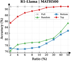
### Visual Description
## Line Chart: L1-LLaMA | MATH500
### Overview
The image is a line chart comparing the performance (accuracy) of four different data selection strategies for a model named "L1-LLaMA" on the "MATH500" benchmark. The chart plots accuracy against an increasing ratio of data used.
### Components/Axes
* **Chart Title:** "L1-LLaMA | MATH500" (located at the top center).
* **Y-Axis:** Labeled "Accuracy (%)". The scale runs from 76 to 90, with major tick marks at 76, 78, 80, 82, 84, 86, 88, and 90.
* **X-Axis:** Labeled "Ratio (%)". The scale is non-linear, with marked points at 2, 4, 6, 8, 10, 20, 30, 40, and 50.
* **Legend:** Located in the bottom-right quadrant of the chart area. It defines four data series:
* **Full:** Gray line with 'x' markers.
* **Random:** Green line with upward-pointing triangle markers.
* **Bottom:** Blue line with square markers.
* **Top:** Red line with circle markers.
### Detailed Analysis
The chart displays four distinct performance trends:
1. **Full (Gray, 'x'):** This series represents a baseline or upper bound. It shows a constant, high accuracy of approximately **90%** across all data ratios from 2% to 50%. The line is perfectly horizontal.
2. **Top (Red, circles):** This series shows the highest performance among the variable strategies. It starts at an accuracy of approximately **86%** at a 2% ratio and demonstrates a steady, logarithmic-like increase, approaching the "Full" baseline. Key approximate data points:
* 2%: ~86%
* 10%: ~88.5%
* 20%: ~89.5%
* 50%: ~90% (nearly converging with the "Full" line).
3. **Random (Green, triangles):** This series shows moderate performance that improves with more data. It starts at approximately **77%** at a 2% ratio and increases in a roughly linear fashion. Key approximate data points:
* 2%: ~77%
* 10%: ~79%
* 20%: ~80%
* 50%: ~85%.
4. **Bottom (Blue, squares):** This series shows the lowest performance. It starts at approximately **76%** at a 2% ratio and increases slowly. Key approximate data points:
* 2%: ~76%
* 10%: ~77%
* 20%: ~78.5%
* 50%: ~82%.
### Key Observations
* **Performance Hierarchy:** There is a clear and consistent performance hierarchy: **Full > Top > Random > Bottom**. This order is maintained at every data ratio point.
* **Convergence:** The "Top" strategy's performance rapidly converges toward the "Full" baseline, nearly matching it by a 50% data ratio. The "Random" and "Bottom" strategies remain significantly below this baseline even at 50% data.
* **Diminishing Returns:** The "Top" curve shows strong diminishing returns; the largest accuracy gains occur between 2% and 10% ratio, with much smaller gains thereafter.
* **Relative Improvement:** From 2% to 50% ratio, the "Bottom" strategy improves by ~6 percentage points, "Random" by ~8 points, and "Top" by ~4 points (though it starts from a much higher base).
### Interpretation
This chart demonstrates the critical impact of **data selection quality** on the fine-tuning or training efficiency of the L1-LLaMA model on the MATH500 task.
* **The "Top" strategy is highly effective.** Using only the top-performing 2% of data yields 86% accuracy, which is 10 points higher than using the bottom 2% and only 4 points below using 100% of the data. This suggests the model learns most effectively from high-quality, relevant examples.
* **The "Bottom" strategy is detrimental.** Training on the lowest-performing data results in poor accuracy, indicating these examples may be noisy, mislabeled, or simply not instructive for the task.
* **The "Random" strategy serves as a control.** Its performance lies between the targeted "Top" and "Bottom" selections, confirming that intelligent data curation ("Top") provides a significant advantage over random sampling, while using harmful data ("Bottom") is worse than random.
* **Practical Implication:** For resource-constrained scenarios, using a small, carefully selected subset of high-quality data (the "Top" strategy) can achieve performance nearly equivalent to using the full dataset, offering a major efficiency gain. The chart argues against using low-quality data, as it actively harms model performance.
</details>
<details>
<summary>x41.png Details</summary>
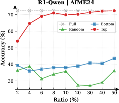
### Visual Description
## Line Chart: R1-Qwen | AIME24
### Overview
The image is a line chart comparing the performance of four different methods or configurations ("Full", "Bottom", "Random", "Top") on a task labeled "AIME24". Performance is measured by "Accuracy (%)" on the left vertical axis, plotted against a "Ratio (%)" on the horizontal axis. The chart demonstrates how accuracy changes for each method as the ratio parameter increases from 2% to 50%.
### Components/Axes
* **Chart Title:** "R1-Qwen | AIME24" (centered at the top).
* **Left Y-Axis:** Labeled "Accuracy (%)". Scale runs from 30 to 70 with major tick marks at 30, 40, 50, 60, 70.
* **Right Y-Axis:** Labeled "Ratio (%)". This axis appears to be a secondary axis, but its scale is not explicitly marked with values. It shares the same vertical space as the Accuracy axis.
* **X-Axis:** Labeled "Ratio (%)". The scale is non-linear, with marked points at 2, 4, 6, 8, 10, 20, 30, 40, 50.
* **Legend:** Positioned in the top-right corner of the chart area. It defines four data series:
* **Full:** Gray dashed line with 'x' markers.
* **Bottom:** Blue solid line with square markers.
* **Random:** Green solid line with triangle markers.
* **Top:** Red solid line with circle markers.
### Detailed Analysis
**Data Series Trends and Approximate Values:**
1. **Top (Red line, circle markers):**
* **Trend:** Shows a strong, consistent upward trend. Accuracy increases rapidly at low ratios and continues to climb steadily, approaching an asymptote near the top of the chart.
* **Key Points (Approximate):**
* Ratio 2%: ~54% Accuracy
* Ratio 4%: ~63% Accuracy
* Ratio 6%: ~67% Accuracy
* Ratio 8%: ~69% Accuracy
* Ratio 10%: ~70% Accuracy
* Ratio 20%: ~71% Accuracy
* Ratio 30%: ~72% Accuracy
* Ratio 40%: ~72.5% Accuracy
* Ratio 50%: ~73% Accuracy
2. **Full (Gray dashed line, 'x' markers):**
* **Trend:** Appears as a flat, horizontal line, indicating constant performance regardless of the ratio.
* **Key Point:** Maintains an accuracy of approximately 70% across all ratio values from 2% to 50%.
3. **Bottom (Blue line, square markers):**
* **Trend:** Shows a slight, gradual upward trend. It starts around 40% accuracy and increases slowly, with a more noticeable uptick at the highest ratios.
* **Key Points (Approximate):**
* Ratio 2%: ~40% Accuracy
* Ratio 4%: ~39% Accuracy
* Ratio 6%: ~38% Accuracy
* Ratio 8%: ~38% Accuracy
* Ratio 10%: ~39% Accuracy
* Ratio 20%: ~40% Accuracy
* Ratio 30%: ~41% Accuracy
* Ratio 40%: ~41% Accuracy
* Ratio 50%: ~43% Accuracy
4. **Random (Green line, triangle markers):**
* **Trend:** Exhibits high variability and a general downward trend. It fluctuates significantly, with a notable dip in the middle range (10-30%) before a slight recovery at the end.
* **Key Points (Approximate):**
* Ratio 2%: ~37% Accuracy
* Ratio 4%: ~38% Accuracy
* Ratio 6%: ~31% Accuracy
* Ratio 8%: ~34% Accuracy
* Ratio 10%: ~36% Accuracy
* Ratio 20%: ~26% Accuracy
* Ratio 30%: ~26% Accuracy
* Ratio 40%: ~27% Accuracy
* Ratio 50%: ~36% Accuracy
### Key Observations
1. **Performance Hierarchy:** There is a clear and consistent performance hierarchy: **Top > Full > Bottom > Random**. The "Top" method significantly outperforms all others, especially at higher ratios.
2. **Diverging Trends:** The "Top" and "Bottom" series show positive correlation with the ratio (accuracy improves as ratio increases), while the "Random" series shows a negative or unstable correlation. The "Full" series is invariant.
3. **Critical Point for Random:** The "Random" method performs worst in the 20-30% ratio range, suggesting a particular vulnerability or inefficiency in that operational zone.
4. **Convergence at High Ratio:** At the highest ratio (50%), the gap between "Bottom" and "Random" closes, with both ending near 36-43% accuracy, while "Top" and "Full" remain far above.
### Interpretation
This chart likely evaluates different data selection or sampling strategies ("Top", "Bottom", "Random") against a baseline ("Full") for a model named R1-Qwen on the AIME24 benchmark. The "Ratio (%)" probably represents the percentage of data used, a pruning threshold, or a similar resource constraint.
* **The "Top" strategy is highly effective,** suggesting that selecting the highest-quality or most relevant data (based on some metric) yields superior model accuracy, and this advantage scales with the amount of data/resources allocated.
* **The "Full" baseline is robust,** indicating that using all available data provides stable, high performance, but is ultimately surpassed by the intelligent curation of the "Top" method.
* **The "Bottom" strategy is marginally better than random,** implying that even selecting the worst-performing data (by some metric) contains more signal than pure chance, but is far from optimal.
* **The "Random" strategy's poor and erratic performance** serves as a control, highlighting that intelligent selection is crucial. Its dip in the middle range could indicate a phase where random sampling includes a detrimental mix of informative and noisy data points.
**Conclusion:** The data strongly advocates for a "Top"-based selection strategy over random or full-data approaches for this task, as it maximizes accuracy efficiently. The "Full" method is a reliable but sub-optimal fallback. The results underscore the importance of data quality and curation over mere quantity for the R1-Qwen model on the AIME24 task.
</details>
<details>
<summary>x42.png Details</summary>
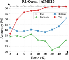
### Visual Description
## Line Chart: R1-Qwen1 | AIME25
### Overview
The image is a line chart titled "R1-Qwen1 | AIME25". It plots the performance metric "Accuracy (%)" against a variable "Ratio (%)" for four different methods or conditions labeled "Full", "Bottom", "Random", and "Top". The chart demonstrates how the accuracy of each method changes as the ratio increases from 2% to 50%.
### Components/Axes
* **Chart Title:** "R1-Qwen1 | AIME25" (centered at the top).
* **Y-Axis (Vertical):**
* **Label:** "Accuracy (%)"
* **Scale:** Linear, ranging from 20 to 60.
* **Major Ticks:** 20, 30, 40, 50, 60.
* **X-Axis (Horizontal):**
* **Label:** "Ratio (%)"
* **Scale:** Appears to be a logarithmic or non-linear scale, with marked points at 2, 4, 6, 8, 10, 20, 30, 40, 50.
* **Legend:** Located in the top-right corner of the plot area. It defines four data series:
1. **Full:** Red line with solid circle markers (●).
2. **Bottom:** Blue line with solid square markers (■).
3. **Random:** Green line with solid triangle markers (▲).
4. **Top:** Gray line with "x" markers (×).
### Detailed Analysis
The chart contains four distinct data series, each with a unique visual trend:
1. **"Top" Series (Gray line with × markers):**
* **Trend:** Perfectly horizontal, constant line.
* **Data Points:** Maintains an accuracy of **60%** at every plotted ratio (2, 4, 6, 8, 10, 20, 30, 40, 50).
* **Spatial Grounding:** This line is positioned at the very top of the chart's data range.
2. **"Full" Series (Red line with ● markers):**
* **Trend:** Strong, consistent upward slope that plateaus at higher ratios.
* **Data Points (Approximate):**
* Ratio 2%: ~35%
* Ratio 4%: ~42%
* Ratio 6%: ~50%
* Ratio 8%: ~55%
* Ratio 10%: ~57%
* Ratio 20%: ~59%
* Ratio 30%: ~60%
* Ratio 40%: ~60%
* Ratio 50%: ~60%
* **Spatial Grounding:** Starts as the second-lowest line at Ratio 2% but rises to converge with the "Top" line at 60% from Ratio 30% onward.
3. **"Bottom" Series (Blue line with ■ markers):**
* **Trend:** Fluctuating, with a general slight upward trend, ending with a notable increase.
* **Data Points (Approximate):**
* Ratio 2%: ~42%
* Ratio 4%: ~38%
* Ratio 6%: ~39%
* Ratio 8%: ~40%
* Ratio 10%: ~39%
* Ratio 20%: ~38%
* Ratio 30%: ~40%
* Ratio 40%: ~43%
* Ratio 50%: ~50%
* **Spatial Grounding:** Generally occupies the middle range of the chart, below "Full" and "Top" but above "Random".
4. **"Random" Series (Green line with ▲ markers):**
* **Trend:** Fluctuating with a general downward trend until Ratio 30%, followed by a recovery.
* **Data Points (Approximate):**
* Ratio 2%: ~34%
* Ratio 4%: ~33%
* Ratio 6%: ~34%
* Ratio 8%: ~33%
* Ratio 10%: ~36%
* Ratio 20%: ~30%
* Ratio 30%: ~22% (notable low point)
* Ratio 40%: ~27%
* Ratio 50%: ~31%
* **Spatial Grounding:** This is consistently the lowest-performing series across all ratios.
### Key Observations
* **Performance Hierarchy:** A clear and consistent performance hierarchy is visible: **Top > Full > Bottom > Random**. This order holds for almost all data points, with the exception that "Full" surpasses "Bottom" after Ratio 4%.
* **Plateau Effect:** The "Full" method shows diminishing returns, plateauing at the maximum accuracy of 60% once the ratio reaches approximately 20-30%.
* **Stability vs. Sensitivity:** The "Top" method is perfectly stable and unaffected by the ratio. In contrast, the "Random" method is highly sensitive and volatile, showing the worst performance and a significant dip at Ratio 30%.
* **Convergence:** At the highest measured ratio (50%), the "Bottom" method shows a sharp increase, narrowing the gap with the "Full" and "Top" methods.
### Interpretation
This chart likely compares different data selection or sampling strategies ("Full", "Bottom", "Random", "Top") for a model or algorithm (R1-Qwen1) on a specific task (AIME25). The "Ratio (%)" probably represents the percentage of a dataset used for training, fine-tuning, or evaluation.
* **"Top"** likely represents using only the highest-quality or most relevant data subset. Its constant 60% accuracy suggests this subset is both highly effective and sufficient on its own; adding more data (increasing the ratio) provides no benefit.
* **"Full"** represents using the entire dataset. Its rising accuracy indicates that incorporating more data improves performance, but only up to a point (saturation at ~20% ratio), after which the added data is redundant or of lower quality than the "Top" subset.
* **"Bottom"** likely uses the lowest-quality data. Its generally lower accuracy is expected, but its final uptick at 50% ratio is an interesting anomaly. It could suggest that at very high inclusion rates, even low-quality data begins to contribute useful signal, or it could be a measurement artifact.
* **"Random"** serves as a baseline. Its poor and erratic performance confirms that the other methods are leveraging some meaningful structure in the data. The dip at 30% is an outlier that may warrant investigation into that specific data slice.
**Overall Conclusion:** The data suggests that for this task, a curated high-quality data subset ("Top") is the most efficient and effective strategy. While using all data ("Full") can eventually match that performance, it requires significantly more data (a higher ratio). Strategies based on low-quality ("Bottom") or random data are substantially inferior. The chart effectively argues for the value of data quality over sheer quantity.
</details>
<details>
<summary>x43.png Details</summary>
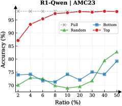
### Visual Description
## Line Chart: R1-Qwen1 / AMC23 Accuracy vs. Ratio
### Overview
This is a line chart comparing the performance (accuracy) of four different data selection or sampling strategies ("Full", "Random", "Bottom", "Top") for a model or system identified as "R1-Qwen1" on a task or dataset labeled "AMC23". The chart plots accuracy as a percentage against a variable called "Ratio", also expressed as a percentage.
### Components/Axes
* **Chart Title:** "R1-Qwen1 / AMC23" (centered at the top).
* **Y-Axis:**
* **Label:** "Accuracy (%)" (vertical text on the left).
* **Scale:** Linear scale from 70 to 100.
* **Major Ticks:** 70, 75, 80, 85, 90, 95, 100.
* **X-Axis:**
* **Label:** "Ratio (%)" (horizontal text at the bottom).
* **Scale:** Appears to be a logarithmic or non-linear scale, with values: 2, 4, 6, 8, 10, 20, 30, 40, 50.
* **Legend:** Located in the top-right quadrant of the chart area.
* **"Full":** Gray line with 'x' markers.
* **"Random":** Green line with upward-pointing triangle markers.
* **"Bottom":** Blue line with square markers.
* **"Top":** Red line with circle markers.
### Detailed Analysis
**Data Series Trends & Approximate Values:**
1. **"Full" (Gray, 'x' markers):**
* **Trend:** A perfectly horizontal line at the top of the chart.
* **Data Points:** Constant at 100% accuracy for all Ratio values (2% to 50%). This likely represents a baseline or upper-bound performance using the full dataset.
2. **"Top" (Red, circle markers):**
* **Trend:** A steeply rising curve that plateaus near the top. It is the highest-performing strategy for all ratios greater than 2%.
* **Data Points (Approximate):**
* Ratio 2%: ~87%
* Ratio 4%: ~93%
* Ratio 6%: ~95%
* Ratio 8%: ~96%
* Ratio 10%: ~97%
* Ratio 20%: ~98%
* Ratio 30%: ~98.5%
* Ratio 40%: ~99%
* Ratio 50%: ~99.5%
3. **"Bottom" (Blue, square markers):**
* **Trend:** A fluctuating line with no strong upward or downward trend, generally staying in the 70-80% range. It is often the lowest or second-lowest performing strategy.
* **Data Points (Approximate):**
* Ratio 2%: ~74%
* Ratio 4%: ~75%
* Ratio 6%: ~72%
* Ratio 8%: ~71%
* Ratio 10%: ~73%
* Ratio 20%: ~70%
* Ratio 30%: ~76%
* Ratio 40%: ~74%
* Ratio 50%: ~79%
4. **"Random" (Green, triangle markers):**
* **Trend:** Starts low, dips slightly, then shows a clear upward trend after the 20% ratio point, surpassing the "Bottom" strategy at higher ratios.
* **Data Points (Approximate):**
* Ratio 2%: ~70%
* Ratio 4%: ~71%
* Ratio 6%: ~72%
* Ratio 8%: ~70%
* Ratio 10%: ~69%
* Ratio 20%: ~68%
* Ratio 30%: ~72%
* Ratio 40%: ~78%
* Ratio 50%: ~83%
### Key Observations
* **Performance Hierarchy:** The "Top" strategy significantly outperforms both "Random" and "Bottom" selection across all measured ratios. The "Full" dataset yields perfect accuracy.
* **Critical Threshold:** The "Random" strategy shows a notable performance inflection point around a 20% ratio, after which its accuracy improves substantially.
* **Stability vs. Growth:** The "Bottom" strategy's performance is relatively unstable and does not show consistent improvement with increased ratio. In contrast, "Top" shows rapid initial gains that diminish as it approaches the 100% ceiling.
* **Low-Ratio Performance:** At the smallest ratio (2%), the gap between "Top" (~87%) and the other non-full strategies (~70-74%) is already very large.
### Interpretation
This chart demonstrates the effectiveness of a **data selection strategy** for the R1-Qwen1 model on the AMC23 task. The "Top" label likely refers to selecting samples based on some quality or relevance metric (e.g., highest confidence scores, most informative examples). The results suggest that:
1. **Quality over Quantity:** Using a small subset (e.g., 10%) of the highest-quality data ("Top") achieves near-perfect performance, vastly outperforming using a larger amount of random or low-quality data.
2. **Inefficiency of Low-Quality Data:** The "Bottom" strategy, presumably using the lowest-quality samples, yields poor and inconsistent results, indicating that adding such data does not help and may even harm model performance.
3. **Random Sampling Baseline:** The "Random" strategy serves as a baseline. Its eventual improvement suggests that with enough random data (approaching 50% of the dataset), the model can begin to learn effectively, but it is far less data-efficient than targeted selection.
4. **Implication for Resource Allocation:** The data strongly supports investing resources in identifying and curating high-quality training data ("Top") rather than simply amassing large volumes of unfiltered data. The perfect score of "Full" indicates the task is solvable with the complete dataset, but the "Top" curve shows it can be solved almost as well with a fraction of it.
**In summary, the chart is a compelling argument for intelligent data curation in machine learning, showing that strategic selection of a small amount of high-value data is superior to using larger amounts of random or low-value data.**
</details>
<details>
<summary>x44.png Details</summary>
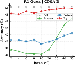
### Visual Description
## Line Chart: R1-Qwen-7B on GPQA-D
### Overview
This is a line chart comparing the performance (accuracy) of four different methods or data selection strategies ("Full", "Random", "Bottom", "Top") on the R1-Qwen-7B model, evaluated on the GPQA-D dataset. The chart plots accuracy against an increasing ratio (percentage), likely representing the proportion of data used for training or evaluation.
### Components/Axes
* **Chart Title:** "R1-Qwen-7B on GPQA-D" (centered at the top).
* **Y-Axis:** Labeled "Accuracy (%)". The scale runs from 36 to 50, with major tick marks at 36, 38, 40, 42, 44, 46, 48, and 50.
* **X-Axis:** Labeled "Ratio (%)". The scale is non-linear, with marked points at 2, 4, 6, 8, 10, 20, 30, 40, and 50.
* **Legend:** Located in the top-left corner of the plot area. It defines four data series:
* **Full:** Represented by a gray line with 'x' markers.
* **Random:** Represented by a green line with upward-pointing triangle markers.
* **Bottom:** Represented by a blue line with square markers.
* **Top:** Represented by a red line with circle markers.
### Detailed Analysis
**1. "Full" Series (Gray line, 'x' markers):**
* **Trend:** This line is perfectly horizontal, indicating constant performance.
* **Data Points:** The accuracy remains fixed at **50%** across all ratio values from 2% to 50%. This likely represents a baseline or upper-bound performance using the full dataset.
**2. "Top" Series (Red line, circle markers):**
* **Trend:** This line shows a generally increasing trend with some fluctuation. It starts high, dips slightly, then rises to converge with the "Full" baseline.
* **Data Points (Approximate):**
* Ratio 2%: ~48.5%
* Ratio 4%: ~48.2%
* Ratio 6%: ~48.8%
* Ratio 8%: ~48.5%
* Ratio 10%: ~49.2%
* Ratio 20%: ~49.0%
* Ratio 30%: ~49.5%
* Ratio 40%: ~49.8%
* Ratio 50%: ~50.0% (matches "Full")
**3. "Bottom" Series (Blue line, square markers):**
* **Trend:** This line shows a gradual, steady upward trend after an initial plateau.
* **Data Points (Approximate):**
* Ratio 2%: ~40.2%
* Ratio 4%: ~40.0%
* Ratio 6%: ~39.8%
* Ratio 8%: ~40.2%
* Ratio 10%: ~39.2%
* Ratio 20%: ~40.0%
* Ratio 30%: ~40.8%
* Ratio 40%: ~41.8%
* Ratio 50%: ~42.5%
**4. "Random" Series (Green line, triangle markers):**
* **Trend:** This line shows a distinct "hockey stick" or exponential growth pattern. It remains low and flat for small ratios, then increases sharply after the 20% mark.
* **Data Points (Approximate):**
* Ratio 2%: ~37.0%
* Ratio 4%: ~36.8%
* Ratio 6%: ~36.2%
* Ratio 8%: ~36.5%
* Ratio 10%: ~36.2%
* Ratio 20%: ~38.0%
* Ratio 30%: ~41.0%
* Ratio 40%: ~44.5%
* Ratio 50%: ~47.0%
### Key Observations
1. **Performance Hierarchy:** At low data ratios (2-10%), there is a clear and significant performance gap: "Top" (~48-49%) >> "Bottom" (~40%) > "Random" (~36-37%).
2. **Convergence at High Ratios:** As the ratio increases to 50%, the performance of all methods improves, and the gaps narrow considerably. "Top" reaches the "Full" baseline, "Random" shows dramatic improvement, and "Bottom" improves steadily.
3. **Critical Threshold for Random Sampling:** The "Random" method exhibits a phase shift or critical threshold around the 20% ratio mark, after which its accuracy improves rapidly.
4. **Stability vs. Growth:** The "Top" method provides high and relatively stable performance even with very little data. The "Random" method is highly sensitive to the amount of data, performing poorly with small samples but becoming competitive with large samples.
5. **"Bottom" Method Underperformance:** The "Bottom" method consistently underperforms the "Top" method across all ratios, suggesting that selecting data based on whatever criterion "Bottom" represents is less effective than the "Top" criterion.
### Interpretation
This chart demonstrates the impact of data selection strategies on model performance when working with limited data (low ratios). The key insight is that **intelligent data selection ("Top") is vastly superior to random selection when data is scarce.** Using just 2% of the data selected by the "Top" method yields accuracy (~48.5%) that is nearly equal to using 50% of the data selected randomly (~47.0%).
The "Top" strategy likely selects the most informative or high-quality examples, allowing the model to learn efficiently. The "Bottom" strategy may select the least informative or most difficult examples, leading to slower learning. The "Random" strategy's performance curve is characteristic of learning curves in machine learning, where performance improves with more data, but the rate of improvement accelerates after a sufficient data volume is reached.
The flat "Full" line at 50% serves as the performance ceiling for this specific task and model setup. The fact that "Top" reaches this ceiling at a 50% ratio suggests that the other 50% of the data (presumably the "Bottom" half) contributes little to no additional performance gain for this model on this task. This has significant implications for efficient data curation and cost reduction in training or evaluation pipelines.
</details>
<details>
<summary>x45.png Details</summary>
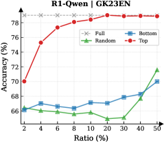
### Visual Description
## Line Chart: R1-Owen | GK23EN
### Overview
The image is a line chart comparing the performance (Accuracy %) of four different methods or data selection strategies ("Full", "Random", "Bottom", "Top") as a function of an increasing "Ratio (%)". The chart suggests an experiment where a model's accuracy is evaluated when trained or fine-tuned on subsets of data, with the "Ratio" likely representing the percentage of the total dataset used.
### Components/Axes
* **Chart Title:** "R1-Owen | GK23EN" (located at the top center).
* **Y-Axis:**
* **Label:** "Accuracy (%)"
* **Scale:** Linear, ranging from 66% to 78%.
* **Major Ticks:** 66, 68, 70, 72, 74, 76, 78.
* **X-Axis:**
* **Label:** "Ratio (%)"
* **Scale:** Appears to be a logarithmic or custom scale, not linear. The labeled points are: 2, 4, 6, 8, 10, 20, 30, 40, 50.
* **Legend:** Positioned in the top-right corner of the chart area. It contains four entries:
1. **Full:** Gray dashed line with 'x' markers.
2. **Random:** Green solid line with upward-pointing triangle markers.
3. **Bottom:** Blue solid line with square markers.
4. **Top:** Red solid line with square markers.
### Detailed Analysis
**Data Series and Trends:**
1. **Full (Gray, dashed line, 'x' marker):**
* **Trend:** Perfectly horizontal, constant line.
* **Value:** Maintains a constant accuracy of **78%** across all ratios. This likely represents the baseline performance using the entire dataset (100% ratio).
2. **Top (Red, solid line, square marker):**
* **Trend:** Shows a strong, consistent upward trend. It starts as the second-highest performer at low ratios and steadily increases, converging with the "Full" baseline at the highest ratios.
* **Data Points (Approximate):**
* Ratio 2%: ~70%
* Ratio 4%: ~75.5%
* Ratio 6%: ~77%
* Ratio 8%: ~77.5%
* Ratio 10%: ~78% (matches Full baseline)
* Ratios 20%, 30%, 40%, 50%: ~78% (plateaus at baseline)
3. **Bottom (Blue, solid line, square marker):**
* **Trend:** Shows a very gradual, shallow upward trend. It remains the second-lowest performer for most of the chart, with a slight uptick at the highest ratios.
* **Data Points (Approximate):**
* Ratio 2%: ~66.5%
* Ratio 4%: ~66.8%
* Ratio 6%: ~66.5%
* Ratio 8%: ~66.8%
* Ratio 10%: ~67.2%
* Ratio 20%: ~67%
* Ratio 30%: ~67.5%
* Ratio 40%: ~68%
* Ratio 50%: ~70%
4. **Random (Green, solid line, triangle marker):**
* **Trend:** Shows a fluctuating but generally upward trend. It starts as the lowest performer, dips at a mid-range ratio, and then rises sharply to become the second-highest performer at the 50% ratio.
* **Data Points (Approximate):**
* Ratio 2%: ~66%
* Ratio 4%: ~66.2%
* Ratio 6%: ~66%
* Ratio 8%: ~65.8%
* Ratio 10%: ~66%
* Ratio 20%: ~65.5% (notable dip)
* Ratio 30%: ~66.5%
* Ratio 40%: ~68.5%
* Ratio 50%: ~71.5%
### Key Observations
1. **Clear Hierarchy:** The "Top" strategy (red) is vastly superior to "Random" and "Bottom" at all data ratios below 10%. It achieves near-maximum accuracy with only 10% of the data.
2. **Convergence:** The "Top" method's performance converges with the "Full" data baseline at a 10% ratio and remains there.
3. **Inefficiency of "Bottom":** The "Bottom" strategy (blue) shows minimal improvement, suggesting the data it selects is of low quality or relevance for the task.
4. **Non-linear "Random" Performance:** The "Random" selection (green) does not improve linearly. Its performance dip at 20% ratio is an anomaly, suggesting potential variance or a non-uniform data distribution where a random 20% subset is particularly unrepresentative.
5. **Late Surge by "Random":** At the 50% ratio, "Random" selection outperforms "Bottom" selection, indicating that with enough data, even random sampling captures sufficient useful information.
### Interpretation
This chart demonstrates the critical importance of **data selection strategy** in machine learning or model fine-tuning. The "Top" method likely represents a curated selection of high-quality, relevant, or informative data samples. Its steep learning curve shows that a small, well-chosen subset of data can be as effective as the entire dataset, which has significant implications for reducing computational costs and training time.
The poor performance of "Bottom" suggests that not all data is beneficial; some may be noisy, irrelevant, or even harmful to model performance. The "Random" line serves as a control, showing the expected performance gain from simply adding more data without intelligent selection. Its fluctuating path highlights the risk of relying on random sampling, as performance can be inconsistent until a large enough sample size is reached.
The overarching conclusion is that **quality trumps quantity** in data for this specific task (R1-Owen on GK23EN). Investing in identifying and using the "Top" 10-20% of data yields maximum performance, while using the "Bottom" data or even random data is far less efficient. The "Full" baseline being matched so early indicates potential redundancy in the complete dataset.
</details>
<details>
<summary>x46.png Details</summary>
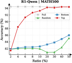
### Visual Description
## Line Chart: R1-Qwen | MATH500
### Overview
This is a line chart comparing the performance (accuracy) of four different data selection strategies ("Full", "Bottom", "Random", "Top") on the MATH500 benchmark as the ratio of training data used increases. The chart demonstrates how accuracy changes with the percentage of data utilized.
### Components/Axes
* **Title:** "R1-Qwen | MATH500" (Top center)
* **Y-Axis:** Label is "Accuracy (%)". Scale runs from 80 to 94 in increments of 2.
* **X-Axis:** Label is "Ratio (%)". The scale is non-linear, with marked points at 2, 4, 6, 8, 10, 20, 30, 40, and 50.
* **Legend:** Located in the top-right corner of the chart area. It defines four data series:
* **Full:** Gray dashed line with 'x' markers.
* **Bottom:** Blue solid line with square markers.
* **Random:** Green solid line with triangle markers.
* **Top:** Red solid line with circle markers.
### Detailed Analysis
**Data Series and Trends:**
1. **Full (Gray, 'x' markers):**
* **Trend:** Perfectly horizontal line, indicating constant performance.
* **Data Points:** Accuracy is consistently at **94%** for all data ratios from 2% to 50%.
2. **Top (Red, circle markers):**
* **Trend:** Strong, consistent upward slope. Shows the most significant improvement as more data is added.
* **Data Points (Approximate):**
* Ratio 2%: ~82%
* Ratio 4%: ~88%
* Ratio 6%: ~90%
* Ratio 8%: ~92%
* Ratio 10%: ~93%
* Ratio 20%: ~93.5%
* Ratio 30%: ~94%
* Ratio 40%: ~94%
* Ratio 50%: ~94%
3. **Bottom (Blue, square markers):**
* **Trend:** Gradual, steady upward slope. Performance improves slowly with more data.
* **Data Points (Approximate):**
* Ratio 2%: ~82%
* Ratio 4%: ~82.2%
* Ratio 6%: ~82.5%
* Ratio 8%: ~82.5%
* Ratio 10%: ~82.5%
* Ratio 20%: ~83%
* Ratio 30%: ~84%
* Ratio 40%: ~85%
* Ratio 50%: ~86%
4. **Random (Green, triangle markers):**
* **Trend:** Fluctuating, with a slight overall upward trend. It dips in the middle range before recovering.
* **Data Points (Approximate):**
* Ratio 2%: ~82%
* Ratio 4%: ~82%
* Ratio 6%: ~82%
* Ratio 8%: ~82%
* Ratio 10%: ~82%
* Ratio 20%: ~81%
* Ratio 30%: ~81%
* Ratio 40%: ~83%
* Ratio 50%: ~85%
### Key Observations
* The **"Full"** model sets the performance ceiling at 94% accuracy.
* The **"Top"** selection strategy rapidly approaches the "Full" model's performance, matching it by the 30% data ratio mark.
* The **"Bottom"** and **"Random"** strategies perform significantly worse than "Top" at all data ratios. "Random" performs worse than "Bottom" for most of the middle range (10%-30%).
* All strategies start at approximately the same accuracy (~82%) when using only 2% of the data.
* There is a notable performance dip for the **"Random"** strategy between 10% and 30% data ratio.
### Interpretation
This chart illustrates the principle of data quality over quantity for this specific task (MATH500 with R1-Qwen). The "Top" strategy, which presumably selects the highest-quality or most relevant data samples, achieves near-maximum performance using only 30% of the available data. This suggests that a significant portion of the training data may be redundant or less informative for improving accuracy on this benchmark.
The poor performance of the "Bottom" (likely lowest-quality data) and "Random" strategies confirms that indiscriminate data addition is inefficient. The dip in the "Random" curve could indicate that adding certain mid-quality data points introduces noise that temporarily hinders model performance before the benefit of increased data volume takes over at higher ratios.
The key takeaway is that intelligent data curation ("Top" selection) is a highly effective method for achieving optimal model performance with reduced computational cost, as it avoids processing the full dataset.
</details>
Figure 12: Reasoning performance trends of Llama and Qwen models across six datasets as a function of thinking token retention ratio.
We present the evaluation results of R1-Llama (DeepSeek-R1-Distill-Llama-8B) and R1-Qwen (DeepSeek-R1-Distill-Qwen-7B) across the AIME24, AIME25, AMC23, GPQA-Diamond, GK23EN, and MATH-500 datasets. Fig. 10 and 11 illustrate the variation of token importance scores over decoding steps for representative samples from each dataset. Additionally, Fig. 12 demonstrates the reasoning performance under different thinking token retention strategies and retention ratios.
## Appendix C Detailed Experimental Setup
### C.1 Device and Environment
All experiments were conducted on a server equipped with 8 NVIDIA H800 GPUs. We utilize the Hugging Face transformers library and vLLM as the primary inference engine, and employ the veRL framework to optimize the parameters of the importance predictor.
### C.2 Training of Importance Predictor
We generate 5 diverse reasoning traces for each question in the MATH training dataset. Only the traces leading to the correct answer are retained as training data. This process yields 7,142 and 7,064 valid samples for R1-Qwen and R1-Llama, respectively. The Importance Predictor is implemented as an MLP with dimensions of $(3584\to 7168\to 1792\to 1)$ and $(4096\to 8192\to 2048\to 1)$ for R1-Qwen and R1-Llama. We conduct the training using the veRL framework for a total of 15 epochs. The global batch size is set to 256, with a micro-batch size of 4 for the gradient accumulation step. Optimization is performed using AdamW optimizer with $\beta_{1}=0.9$ , $\beta_{2}=0.95$ , and a weight decay of $0.01$ . The learning rate is initialized at $5\times 10^{-4}$ with a cosine decay schedule, and the gradient clipping threshold is set to $1.0$ .
### C.3 Inference Setting
<details>
<summary>x47.png Details</summary>

### Visual Description
\n
## Grouped Bar Chart: KV Cache Length Comparison Between Transformers and DynTS
### Overview
This image is a grouped bar chart comparing the Key-Value (KV) Cache Length (in thousands) of two models—"Transformers" and "DynTS (Ours)"—across six different benchmark datasets. The chart visually demonstrates the memory efficiency advantage of the DynTS model.
### Components/Axes
* **Chart Type:** Grouped vertical bar chart.
* **Y-Axis:**
* **Label:** "KV Cache Length (10³)" - indicating the values are in thousands.
* **Scale:** Linear scale from 0.0 to 20.0, with major tick marks every 2.5 units (0.0, 2.5, 5.0, 7.5, 10.0, 12.5, 15.0, 17.5, 20.0).
* **X-Axis:**
* **Categories (Datasets):** Six distinct datasets are listed from left to right: `AIME24`, `AIME25`, `AMC23`, `GaoKao2023En`, `GPQA-D`, `MATH500`.
* **Legend:**
* **Position:** Top center of the chart area.
* **Labels & Colors:**
* Blue square: `Transformers`
* Red square: `DynTS (Ours)`
* **Data Series & Annotations:**
* For each dataset, there is a pair of bars: a blue bar (Transformers) on the left and a red bar (DynTS) on the right.
* A double-headed vertical arrow spans the height difference between the top of the blue bar and the top of the red bar for each pair.
* A green text label is placed next to each arrow, indicating the multiplicative reduction factor (e.g., "3.4x").
### Detailed Analysis
The analysis proceeds dataset by dataset, from left to right. For each, the visual trend is that the blue bar (Transformers) is significantly taller than the red bar (DynTS).
1. **AIME24:**
* **Transformers (Blue):** Approximately 17.0 (10³).
* **DynTS (Red):** Approximately 5.0 (10³).
* **Multiplier Annotation:** "3.4x" (indicating the Transformer cache is ~3.4 times larger).
2. **AIME25:**
* **Transformers (Blue):** Approximately 17.2 (10³).
* **DynTS (Red):** Approximately 5.0 (10³).
* **Multiplier Annotation:** "3.4x".
3. **AMC23:**
* **Transformers (Blue):** Approximately 16.7 (10³).
* **DynTS (Red):** Approximately 5.0 (10³).
* **Multiplier Annotation:** "3.3x".
4. **GaoKao2023En:**
* **Transformers (Blue):** Approximately 19.2 (10³) - this is the highest value for Transformers.
* **DynTS (Red):** Approximately 5.0 (10³).
* **Multiplier Annotation:** "3.8x".
5. **GPQA-D:**
* **Transformers (Blue):** Approximately 16.7 (10³).
* **DynTS (Red):** Approximately 3.0 (10³) - this is the lowest value for DynTS.
* **Multiplier Annotation:** "5.6x".
6. **MATH500:**
* **Transformers (Blue):** Approximately 17.2 (10³).
* **DynTS (Red):** Approximately 3.0 (10³).
* **Multiplier Annotation:** "5.7x" - this is the largest reduction factor shown.
### Key Observations
* **Consistent Reduction:** The KV Cache Length for DynTS is consistently and substantially lower than that of the standard Transformer model across all six benchmarks.
* **Magnitude of Improvement:** The reduction factor ranges from 3.3x to 5.7x. The most significant improvements are seen on the `GPQA-D` and `MATH500` datasets.
* **Transformer Cache Length:** The cache length for Transformers is relatively stable across datasets, hovering between approximately 16.7 and 19.2 (10³), with `GaoKao2023En` being the peak.
* **DynTS Cache Length:** The cache length for DynTS shows two tiers: approximately 5.0 (10³) for the first four datasets and a lower tier of approximately 3.0 (10³) for `GPQA-D` and `MATH500`.
### Interpretation
This chart presents strong empirical evidence for the memory efficiency of the proposed "DynTS" model compared to a standard Transformer architecture. The KV cache is a critical component in autoregressive models (like LLMs) that stores past key and value states to avoid recomputation, and its size directly impacts memory consumption and cost during inference.
The data suggests that DynTS achieves a dramatic reduction in this memory overhead—by a factor of 3.3 to 5.7 times—without specifying performance parity on the tasks themselves. This implies DynTS likely employs a dynamic or more efficient mechanism for managing or compressing the KV cache. The variation in the reduction factor across datasets indicates that the efficiency gain may be task-dependent, with particularly large savings on complex reasoning benchmarks like `MATH500` and `GPQA-D`. The primary takeaway is that DynTS offers a significant practical advantage for deploying large models in memory-constrained environments.
</details>
(a) R1-Llama
<details>
<summary>x48.png Details</summary>
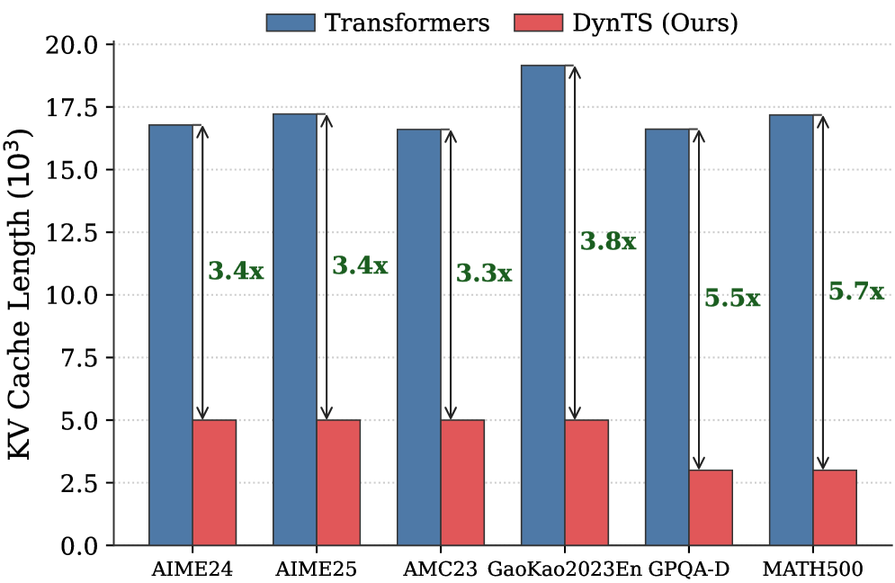
### Visual Description
## Bar Chart: KV Cache Length Comparison Between Transformers and DynTS
### Overview
This is a vertical bar chart comparing the Key-Value (KV) cache length (in thousands) of two model architectures—"Transformers" and "DynTS (Ours)"—across six different benchmark datasets. The chart visually demonstrates the reduction in KV cache length achieved by the DynTS method.
### Components/Axes
* **Chart Type:** Grouped bar chart.
* **Title/Legend:** Located at the top center. It defines two data series:
* **Blue Bar:** "Transformers"
* **Red Bar:** "DynTS (Ours)"
* **Y-Axis:**
* **Label:** "KV Cache Length (10³)" - This indicates the values are in thousands.
* **Scale:** Linear scale from 0.0 to 20.0, with major tick marks every 2.5 units (0.0, 2.5, 5.0, 7.5, 10.0, 12.5, 15.0, 17.5, 20.0).
* **X-Axis:**
* **Categories (Datasets):** Six distinct benchmark datasets are listed from left to right:
1. AIME24
2. AIME25
3. AMC23
4. GaoKao2023En
5. GPQA-D
6. MATH500
* **Data Annotations:** For each dataset pair, a vertical double-headed arrow connects the top of the blue bar to the top of the red bar. Next to each arrow, a green text label indicates the multiplicative reduction factor (e.g., "3.4x").
### Detailed Analysis
**Data Series & Approximate Values:**
The chart presents paired bars for each dataset. The blue "Transformers" bars are consistently much taller than the red "DynTS (Ours)" bars.
1. **AIME24:**
* Transformers (Blue): ~16.8 (thousand)
* DynTS (Red): ~5.0 (thousand)
* **Reduction Factor:** 3.4x (as annotated).
2. **AIME25:**
* Transformers (Blue): ~17.2 (thousand)
* DynTS (Red): ~5.0 (thousand)
* **Reduction Factor:** 3.4x (as annotated).
3. **AMC23:**
* Transformers (Blue): ~16.5 (thousand)
* DynTS (Red): ~5.0 (thousand)
* **Reduction Factor:** 3.3x (as annotated).
4. **GaoKao2023En:**
* Transformers (Blue): ~19.2 (thousand) - *This is the highest value for Transformers.*
* DynTS (Red): ~5.0 (thousand)
* **Reduction Factor:** 3.8x (as annotated).
5. **GPQA-D:**
* Transformers (Blue): ~16.5 (thousand)
* DynTS (Red): ~3.0 (thousand)
* **Reduction Factor:** 5.5x (as annotated).
6. **MATH500:**
* Transformers (Blue): ~17.2 (thousand)
* DynTS (Red): ~3.0 (thousand)
* **Reduction Factor:** 5.7x (as annotated) - *This is the highest reduction factor.*
**Trend Verification:**
* **Transformers Series (Blue):** The bars show relatively stable, high KV cache lengths across all datasets, fluctuating between approximately 16.5 and 19.2 thousand. There is no strong upward or downward trend across the dataset order.
* **DynTS Series (Red):** The bars show two distinct levels. For the first four datasets (AIME24, AIME25, AMC23, GaoKao2023En), the value is stable at ~5.0 thousand. For the last two datasets (GPQA-D, MATH500), the value drops to a stable ~3.0 thousand.
* **Reduction Factor Trend:** The annotated reduction factor generally increases from left to right, starting at 3.3x-3.4x for the first three datasets and rising to 5.5x-5.7x for the last two.
### Key Observations
1. **Consistent Superiority:** The DynTS method results in a substantially lower KV cache length than the standard Transformer across all six benchmarks.
2. **Magnitude of Reduction:** The reduction is significant, ranging from a factor of 3.3x to 5.7x.
3. **Dataset-Dependent Performance:** The efficiency gain (reduction factor) is not uniform. DynTS shows its greatest relative improvement on the GPQA-D and MATH500 datasets (5.5x and 5.7x reduction), where its absolute KV cache length is also lowest (~3.0k).
4. **Stability of Baseline:** The KV cache length for the standard Transformer model is remarkably consistent across diverse benchmarks, suggesting a fundamental characteristic of the architecture under these test conditions.
### Interpretation
This chart provides strong empirical evidence for the memory efficiency of the proposed DynTS architecture. The KV cache is a critical component in autoregressive models like Transformers, directly impacting memory usage and inference cost, especially for long sequences.
* **What the data suggests:** DynTS successfully reduces the memory footprint (as proxied by KV cache length) by a factor of 3 to nearly 6, depending on the task. This implies that DynTS could enable the processing of longer contexts or larger batch sizes within the same hardware memory constraints compared to a standard Transformer.
* **Relationship between elements:** The direct pairing of bars and the explicit reduction factor annotations create a clear, immediate comparison. The increasing reduction factor from left to right hints that DynTS's advantages may be more pronounced on certain types of tasks or data distributions represented by GPQA-D and MATH500.
* **Notable implications:** The most striking finding is the dichotomy in DynTS's performance: it maintains a cache length of ~5k for four datasets but drops to ~3k for two others. This suggests the method's compression or caching mechanism may be particularly effective for the characteristics of the latter tasks. The consistent high values for the Transformer baseline underscore the memory challenge that DynTS aims to solve. The chart effectively argues that DynTS is a promising approach for making large-scale models more memory-efficient without, presumably, sacrificing performance (though performance metrics are not shown here).
</details>
(b) R1-Qwen
Figure 13: Comparison of average KV Cache length between standard Transformers and DynTS across six benchmarks. The arrows and annotations indicate the compression ratio achieved by our method on each dataset.
<details>
<summary>x49.png Details</summary>
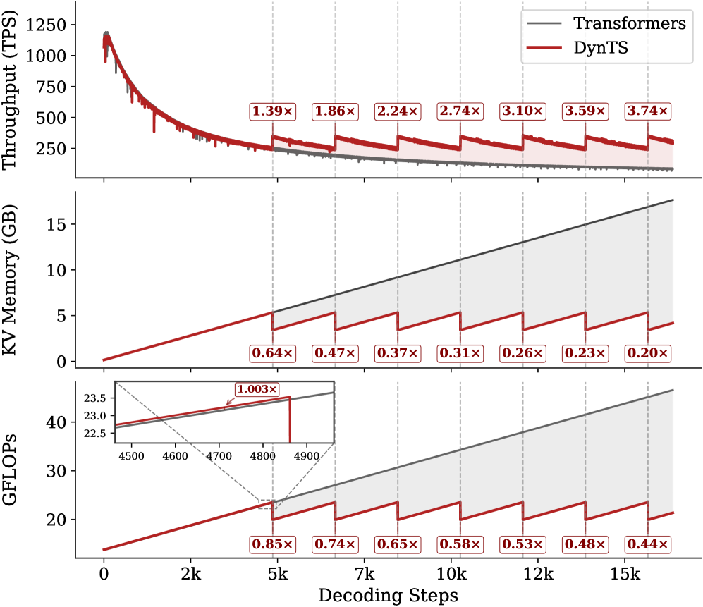
### Visual Description
\n
## Multi-Panel Performance Comparison Chart: Transformers vs. DynTS
### Overview
The image is a three-panel vertical chart comparing the performance of a standard "Transformers" model (gray line) against a proposed "DynTS" model (red line) across three key metrics as a function of decoding steps. The chart demonstrates that DynTS achieves significant improvements in throughput and reductions in memory and computational cost, particularly as the sequence length (decoding steps) increases. The performance gains are presented as multipliers relative to the baseline Transformers model.
### Components/Axes
* **Common X-Axis (Bottom):** "Decoding Steps". The scale is linear, marked at 0, 2k, 5k, 7k, 10k, 12k, and 15k steps.
* **Legend (Top-Right of Top Panel):** A box containing two entries:
* A gray line labeled "Transformers".
* A red line labeled "DynTS".
* **Panel 1 (Top):**
* **Y-Axis Label (Left):** "Throughput (TPS)" - Transactions Per Second.
* **Y-Axis Scale:** Linear, from 0 to 1250, with major ticks at 250, 500, 750, 1000, 1250.
* **Data Series:** Two lines showing throughput decay as decoding steps increase.
* **Annotations:** Seven red boxes with white text, placed above the red line at specific intervals, showing the throughput multiplier of DynTS vs. Transformers: `1.39×`, `1.86×`, `2.24×`, `2.74×`, `3.10×`, `3.59×`, `3.74×`.
* **Panel 2 (Middle):**
* **Y-Axis Label (Left):** "KV Memory (GB)" - Key-Value cache memory in Gigabytes.
* **Y-Axis Scale:** Linear, from 0 to 15, with major ticks at 0, 5, 10, 15.
* **Data Series:** Two lines showing memory usage growth.
* **Annotations:** Seven red boxes with white text, placed below the red line, showing the memory usage multiplier of DynTS vs. Transformers: `0.64×`, `0.47×`, `0.37×`, `0.31×`, `0.26×`, `0.23×`, `0.20×`.
* **Panel 3 (Bottom):**
* **Y-Axis Label (Left):** "GFLOPs" - Giga Floating-Point Operations.
* **Y-Axis Scale:** Linear, from 20 to 40, with major ticks at 20, 30, 40.
* **Data Series:** Two lines showing computational cost growth.
* **Annotations:** Seven red boxes with white text, placed below the red line, showing the GFLOPs multiplier of DynTS vs. Transformers: `0.85×`, `0.74×`, `0.65×`, `0.58×`, `0.53×`, `0.48×`, `0.44×`.
* **Inset Zoom (Top-Left of Panel):** A small zoomed-in view of the region around 4500-4900 decoding steps. It shows the red and gray lines nearly overlapping, with a red annotation box stating `1.003×`, indicating near-identical computational cost at that specific, early stage.
### Detailed Analysis
**Panel 1: Throughput (TPS)**
* **Trend Verification:** Both lines show a steep, near-identical decline in throughput from ~1200 TPS at 0 steps to ~250 TPS at 5k steps. After 5k steps, the Transformers line continues a smooth, gradual decline. The DynTS line exhibits a distinctive **sawtooth pattern**: it periodically drops sharply and then recovers, but each recovery peak is higher than the previous trough, and the overall trend remains above the Transformers line.
* **Data Points (Multipliers):** The annotated multipliers quantify DynTS's increasing advantage: `1.39×` at ~5k steps, `1.86×` at ~7k, `2.24×` at ~10k, `2.74×` at ~12k, `3.10×` at ~13k, `3.59×` at ~14k, and `3.74×` at ~15k steps.
**Panel 2: KV Memory (GB)**
* **Trend Verification:** The Transformers line (gray) shows a **linear, steady increase** in memory usage, growing from near 0 GB to approximately 17 GB at 15k steps. The DynTS line (red) also increases linearly but at a much shallower slope. It also features a **sawtooth pattern**, where memory usage is periodically reset to a lower value before climbing again.
* **Data Points (Multipliers):** The memory reduction factor of DynTS improves dramatically with sequence length: `0.64×` at ~5k steps, `0.47×` at ~7k, `0.37×` at ~10k, `0.31×` at ~12k, `0.26×` at ~13k, `0.23×` at ~14k, and `0.20×` at ~15k steps. At 15k steps, DynTS uses only about 20% of the memory required by Transformers.
**Panel 3: GFLOPs**
* **Trend Verification:** Similar to memory, the Transformers line shows a **linear increase** in computational cost, rising from below 20 GFLOPs to over 40 GFLOPs. The DynTS line increases at a lower rate and also displays the characteristic **sawtooth pattern** of periodic reduction.
* **Data Points (Multipliers):** The computational savings grow over time: `0.85×` at ~5k steps, `0.74×` at ~7k, `0.65×` at ~10k, `0.58×` at ~12k, `0.53×` at ~13k, `0.48×` at ~14k, and `0.44×` at ~15k steps.
* **Inset Detail:** The inset confirms that for very short sequences (around 4.7k steps), the computational cost of DynTS is virtually identical to Transformers (`1.003×`), with the lines overlapping. The significant savings accrue for longer sequences.
### Key Observations
1. **Sawtooth Pattern:** The most striking visual feature is the periodic sawtooth pattern in all three DynTS metrics. This suggests a dynamic, periodic optimization or reset mechanism that becomes active after a certain sequence length (~5k steps).
2. **Diverging Performance:** The performance gap between DynTS and Transformers widens consistently as decoding steps increase. DynTS's advantages are not static but scale with sequence length.
3. **Metric Correlation:** Improvements in throughput, memory, and computation are correlated. The points where memory and GFLOPs are reset (the troughs of the sawtooth) correspond to points where throughput sees a relative boost (the peaks of its sawtooth).
4. **Early-Stage Parity:** The inset in the GFLOPs panel highlights that for short sequences, the overhead of DynTS's mechanism may negate its benefits, resulting in near-identical cost to the baseline.
### Interpretation
This chart presents compelling evidence for the efficiency of the "DynTS" method, likely a dynamic transformer variant, for long-sequence decoding tasks. The data suggests DynTS implements a **periodic compression or eviction strategy** for the Key-Value (KV) cache, which is the primary source of memory and computational growth in standard transformers.
* **The Sawtooth as Evidence of a Reset:** The periodic drops in memory and GFLOPs (and corresponding throughput adjustments) are the direct visual signature of this cache management policy. Each "tooth" represents a cycle of cache growth followed by a compression/eviction event.
* **Scalability:** The core message is scalability. While standard Transformers suffer from linearly increasing resource demands, DynTS mitigates this. The `0.20×` memory multiplier at 15k steps is particularly significant, as KV cache memory is often the primary bottleneck for serving long-context models.
* **Trade-off and Sweet Spot:** The throughput graph shows that while DynTS always outperforms Transformers after the initial phase, the *rate* of improvement changes. The most dramatic relative gains (`3.74×`) occur at the longest measured sequences, indicating DynTS is specifically designed for and excels in long-context scenarios. The inset warns that for short contexts, the added complexity may not be worthwhile.
* **Practical Implication:** For applications requiring generation of very long sequences (e.g., document drafting, extended dialogue, code generation), DynTS promises substantially higher throughput and drastically lower hardware requirements (memory and compute), making such tasks more feasible and cost-effective.
</details>
Figure 14: Real-time throughput, memory, and compute overhead tracking for R1-Qwen over total decoding steps. The results exhibit a trend consistent with R1-Llama, confirming the scalability of DynTS across different model architectures.
We implement DynTS and all baseline methods using the Hugging Face transformers library for KV cache compression. To ensure fairness, we use the effective KV cache length as the compression signal. Whenever the cache size reaches the predefined budget, all methods are restricted to retain an identical number of KV pairs. For SnapKV, H2O, and R-KV, we set identical local window sizes and retention ratios to those of our methods. For SepLLM, we preserve the separator tokens and evict the earliest generated non-separator tokens until the total cache length matches ours. For StreamingLLM, we set the same sink token size, following (Xiao et al., 2024). We set the number of parallel generated sequences to 20. The generation hyperparameters are configured as follows: temperature $T=0.6$ , top- $p=0.95$ , top- $k=20$ , and a maximum new token limit of 16,384. We conduct 5 independent sampling runs for all datasets. Ablation studies on the local window, retention ratio, and budget were conducted across four challenging benchmarks (AIME24, AIME25, AMC23, and GPQA-D) with the same other configurations to verify effectiveness. Fig. 6 and 8 report the mean results across these datasets.
## Appendix D Additional Results
Inference Efficiency on R1-Qwen. Complementing the efficiency analysis of R1-Llama presented in the main text, Figure 14 illustrates the real-time throughput, memory footprint, and computational overhead for R1-Qwen. Consistent with previous observations, DynTS exhibits significant scalability advantages over the standard Transformer baseline as the sequence length increases, achieving a peak throughput speedup of $3.74\times$ while compressing the memory footprint to $0.20\times$ and reducing the cumulative computational cost (GFLOPs) to $0.44\times$ after the last KV cache selection step. The recurrence of the characteristic sawtooth pattern further validates the robustness of our periodic KV Cache Selection mechanism, demonstrating that it effectively bounds resource accumulation and delivers substantial efficiency gains across diverse LRM architectures by continuously evicting non-essential thinking tokens.
KV Cache Compression Ratio. Figure 13 explicitly visualizes the reduction in KV Cache length achieved by DynTS across diverse reasoning tasks. By dynamically filtering out non-essential thinking tokens, our method drastically reduces the memory footprint compared to the full-cache Transformers baseline. For instance, on the MATH500 benchmark, DynTS achieves an impressive compression ratio of up to $5.7\times$ , reducing the average cache length from over 17,000 tokens to the constrained budget of 3,000. These results directly explain the memory and throughput advantages reported in the efficiency analysis, confirming that DynTS successfully maintains high reasoning accuracy with a fraction of the memory cost.
<details>
<summary>x50.png Details</summary>
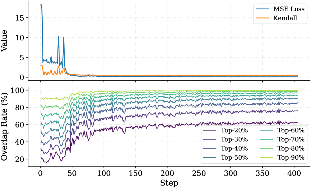
### Visual Description
\n
## Line Chart: Training Metrics and Overlap Rates
### Overview
The image displays a two-panel vertical line chart tracking metrics over 400 training steps. The top panel shows two loss/correlation metrics, while the bottom panel shows the "Overlap Rate" for different top-percentage cohorts. The overall trend indicates model convergence and increasing stability in predictions over time.
### Components/Axes
**Shared X-Axis (Both Panels):**
* **Label:** `Step`
* **Scale:** Linear, from 0 to 400, with major ticks every 50 steps.
**Top Panel:**
* **Y-Axis Label:** `Value`
* **Scale:** Linear, from 0 to approximately 18.
* **Legend (Top-Right):**
* `MSE Loss` (Blue line)
* `Kendall` (Orange line)
**Bottom Panel:**
* **Y-Axis Label:** `Overlap Rate (%)`
* **Scale:** Linear, from 0% to 100%, with major ticks every 20%.
* **Legend (Bottom-Right, 2 columns):**
* `Top-20%` (Dark Purple)
* `Top-30%` (Purple)
* `Top-40%` (Blue-Purple)
* `Top-50%` (Blue)
* `Top-60%` (Teal)
* `Top-70%` (Green-Teal)
* `Top-80%` (Light Green)
* `Top-90%` (Yellow-Green)
### Detailed Analysis
**Top Panel (MSE Loss & Kendall):**
* **MSE Loss (Blue):** Starts at a very high value (approx. 18) at step 0. It drops rapidly to around 5 by step 25, then exhibits significant volatility with two sharp spikes back to ~10 around steps 40 and 50. After step 60, it decays smoothly and stabilizes at a very low value (approx. 0.1-0.3) from step 100 onward.
* **Kendall (Orange):** Starts at a moderate value (approx. 3). It fluctuates noisily between 0 and 3 for the first 60 steps. After step 60, it converges to a stable value very close to 0 (approx. 0.0-0.2) for the remainder of the training.
**Bottom Panel (Overlap Rate %):**
* **General Trend:** All eight lines show a similar pattern: high volatility and lower values in the first 50-75 steps, followed by a steady increase and stabilization. The lines are strictly ordered, with higher Top-% cohorts having higher Overlap Rates.
* **Top-90% (Yellow-Green):** Starts highest (~90%), quickly rises, and stabilizes near 98-99% after step 100.
* **Top-80% (Light Green):** Starts ~80%, stabilizes near 95-97%.
* **Top-70% (Green-Teal):** Starts ~70%, stabilizes near 92-94%.
* **Top-60% (Teal):** Starts ~60%, stabilizes near 88-90%.
* **Top-50% (Blue):** Starts ~50%, stabilizes near 82-85%.
* **Top-40% (Blue-Purple):** Starts ~40%, stabilizes near 75-78%.
* **Top-30% (Purple):** Starts ~30%, stabilizes near 65-68%.
* **Top-20% (Dark Purple):** Starts lowest (~20%), shows the most pronounced upward trend, and stabilizes at the lowest level, approximately 60-62%.
### Key Observations
1. **Phase Transition:** A clear phase change occurs around step 50-75. Before this, metrics are volatile; after, they enter a stable, convergent phase.
2. **Loss Spike Correlation:** The two large spikes in MSE Loss (steps ~40, 50) correspond to a period of increased noise and a slight dip in the Overlap Rate lines, suggesting a temporary disruption in training.
3. **Stable Hierarchy:** In the bottom panel, the ordering of the Overlap Rate lines by Top-% cohort is perfectly maintained throughout all 400 steps. No lines cross.
4. **Convergence Values:** The final Overlap Rate is not 100% for any cohort, even Top-90%. There is a persistent gap, with the Top-20% cohort showing the largest deficit (~38% non-overlap).
### Interpretation
This chart likely visualizes the training progress of a machine learning model, possibly involving ranking or selection tasks.
* **Top Panel Meaning:** The `MSE Loss` measures prediction error, which decreases and stabilizes, indicating the model is learning. The `Kendall` metric (likely Kendall's Tau) measures rank correlation. Its convergence to near zero is unusual and suggests the model's predicted rankings become uncorrelated with some initial or reference ranking as training progresses. This could be intentional (e.g., learning a new ranking) or a sign of a problem.
* **Bottom Panel Meaning:** The "Overlap Rate" measures how often the model's top-K% predictions match a target set. The increasing rates show the model's predictions are becoming more consistent with the target over time. The strict hierarchy is logical: it's easier to correctly identify the top 90% of items than the top 20%.
* **Overall Narrative:** The model undergoes an unstable initial phase (high loss, volatile overlap) before converging. Post-convergence, it achieves high but imperfect overlap with the target, with performance degrading as the prediction task becomes more precise (from Top-90% to Top-20%). The near-zero Kendall Tau combined with high Overlap Rates is a key point for investigation—it may indicate the model learns the correct *set* of top items but not their precise *order* relative to the original ranking.
</details>
Figure 15: Training dynamics of the Importance Predictor on R1-Qwen. The top panel displays the convergence of MSE Loss and Kendall correlation, while the bottom panel shows the overlap rate of the top- $20\$ ground-truth tokens within the top- $p\$ ( $p\in[20,90]$ ) predicted tokens across training steps.
Importance Predictor Analysis for R1-Qwen. Complementing the findings on R1-Llama, Figure 15 depicts the learning trajectory of the Importance Predictor for the R1-Qwen model. The training process exhibits a similar convergence pattern: the MSE loss rapidly decreases and stabilizes, while the Kendall rank correlation coefficient steadily improves, indicating that the simple MLP architecture effectively captures the importance ranking of thinking tokens in R1-Qwen. Furthermore, the bottom panel highlights the high overlap rate between the predicted and ground-truth critical tokens; notably, the overlap rate for the top-40% of tokens exceeds 80% after approximately 200 steps. This high alignment confirms that the Importance Predictor can accurately identify pivotal tokens within R1-Qwen’s reasoning process, providing a reliable basis for the subsequent KV cache compression.
Budget Impact Analysis over Benchmarks. Figures 16 illustrate the granular impact of KV budget constraints on reasoning performance and system throughput. Focusing on R1-Llama, we observe a consistent trade-off across all datasets: increasing the KV budget significantly boosts reasoning accuracy at the cost of linearly decreasing throughput. Specifically, on the challenging AIME24 benchmark, expanding the budget from 2,500 to 5,000 tokens improves Pass@1 accuracy from $40.0\$ to $49.3\$ , while the throughput decreases from $\sim$ 600 to $\sim$ 445 tokens/s. This suggests that while a tighter budget accelerates inference, a larger budget is essential for solving complex problems requiring extensive context retention. Experimental results on R1-Qwen exhibit a highly similar trend, confirming that the performance characteristics of DynTS are model-agnostic. Overall, our method allows users to flexibly balance efficiency and accuracy based on specific deployment requirements.
<details>
<summary>x51.png Details</summary>
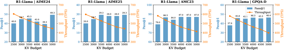
### Visual Description
\n
## Bar Charts with Overlaid Line Graphs: R1-Llama Performance Across Benchmarks
### Overview
The image displays four horizontally arranged composite charts. Each chart is a dual-axis graph combining a bar chart and a line graph to visualize the performance of a model named "R1-Llama" on four different benchmarks: AIME24, AIME25, AMC23, and GPQA-D. The charts analyze the relationship between "KV Budget" (x-axis) and two performance metrics: "Pass@1" (left y-axis, represented by blue bars) and "Throughput (TPS)" (right y-axis, represented by an orange line with markers).
### Components/Axes
* **Titles (Top of each chart, from left to right):**
1. `R1-Llama | AIME24`
2. `R1-Llama | AIME25`
3. `R1-Llama | AMC23`
4. `R1-Llama | GPQA-D`
* **X-Axis (Common to all charts):**
* **Label:** `KV Budget`
* **Ticks/Values:** 2500, 3000, 3500, 4000, 4500, 5000.
* **Primary Y-Axis (Left side, for bars):**
* **Label:** `Pass@1`
* **Scale:** Varies per chart (see Detailed Analysis).
* **Secondary Y-Axis (Right side, for line):**
* **Label:** `Throughput (TPS)`
* **Scale:** 300 to 700 for all charts.
* **Legend (Located in the top-right corner of the fourth chart - GPQA-D):**
* A blue square labeled `Pass@1`.
* An orange line with a circle marker labeled `Throughput`.
### Detailed Analysis
**Chart 1: R1-Llama | AIME24**
* **Pass@1 (Blue Bars):** The left y-axis ranges from 20 to 60. The bars show a general upward trend with some fluctuation.
* KV 2500: ~40.0
* KV 3000: ~44.7
* KV 3500: ~45.3
* KV 4000: ~42.0
* KV 4500: ~39.3
* KV 5000: ~49.3
* **Throughput (Orange Line):** The line shows a clear, steady downward trend.
* KV 2500: ~600 TPS
* KV 3000: ~570 TPS
* KV 3500: ~540 TPS
* KV 4000: ~510 TPS
* KV 4500: ~480 TPS
* KV 5000: ~450 TPS
**Chart 2: R1-Llama | AIME25**
* **Pass@1 (Blue Bars):** The left y-axis ranges from 0 to 40. The bars show a general upward trend.
* KV 2500: ~20.0
* KV 3000: ~24.7
* KV 3500: ~29.3
* KV 4000: ~28.0
* KV 4500: ~28.0
* KV 5000: ~29.3
* **Throughput (Orange Line):** The line shows a clear, steady downward trend.
* KV 2500: ~600 TPS
* KV 3000: ~570 TPS
* KV 3500: ~540 TPS
* KV 4000: ~510 TPS
* KV 4500: ~480 TPS
* KV 5000: ~450 TPS
**Chart 3: R1-Llama | AMC23**
* **Pass@1 (Blue Bars):** The left y-axis ranges from 60 to 100. The bars show a general upward trend, plateauing at higher KV budgets.
* KV 2500: ~79.0
* KV 3000: ~86.5
* KV 3500: ~84.0
* KV 4000: ~87.0
* KV 4500: ~87.0
* KV 5000: ~87.0
* **Throughput (Orange Line):** The line shows a clear, steady downward trend.
* KV 2500: ~600 TPS
* KV 3000: ~570 TPS
* KV 3500: ~540 TPS
* KV 4000: ~510 TPS
* KV 4500: ~480 TPS
* KV 5000: ~450 TPS
**Chart 4: R1-Llama | GPQA-D**
* **Pass@1 (Blue Bars):** The left y-axis ranges from 20 to 60. The bars show a general upward trend.
* KV 2500: ~37.9
* KV 3000: ~45.8
* KV 3500: ~45.1
* KV 4000: ~46.3
* KV 4500: ~45.5
* KV 5000: ~46.4
* **Throughput (Orange Line):** The line shows a clear, steady downward trend.
* KV 2500: ~600 TPS
* KV 3000: ~570 TPS
* KV 3500: ~540 TPS
* KV 4000: ~510 TPS
* KV 4500: ~480 TPS
* KV 5000: ~450 TPS
### Key Observations
1. **Consistent Inverse Relationship:** Across all four benchmarks, there is a clear and consistent inverse relationship between the two metrics. As the KV Budget increases, the model's **Throughput (TPS) decreases linearly**.
2. **Variable Pass@1 Response:** The model's **Pass@1 accuracy** generally improves or plateaus with increased KV Budget, but the pattern is less uniform than throughput. The improvement is most pronounced in the AIME24 and AIME25 benchmarks. The AMC23 benchmark shows a performance plateau after KV=4000.
3. **Benchmark Difficulty:** The absolute Pass@1 values suggest varying difficulty among the benchmarks. AMC23 appears to be the easiest for this model (scores ~80-87), while AIME25 appears the most challenging (scores ~20-29).
4. **Throughput Uniformity:** The throughput line is virtually identical in slope and value across all four charts, suggesting that the computational cost (in terms of TPS) of processing a given KV Budget is independent of the specific benchmark task.
### Interpretation
This data demonstrates a fundamental **trade-off between computational efficiency (Throughput) and model performance (Pass@1 accuracy)** when scaling the KV Budget for the R1-Llama model.
* **The Trade-off:** Increasing the KV Budget allows the model to process more context or use more complex reasoning, which generally leads to better accuracy on knowledge-intensive and reasoning benchmarks (AIME, GPQA). However, this comes at a direct and predictable cost to speed, as measured by Tokens Per Second.
* **Peircean Insight (Reading Between the Lines):** The near-identical throughput lines across different tasks imply that the KV Budget's impact on system performance is a **hardware or architecture-bound constraint**, not a task-dependent one. The variation in Pass@1 trends, however, is **task-dependent**. This suggests that while you can predict the speed penalty of increasing KV Budget, the accuracy benefit is highly contingent on the nature of the problem. For some tasks (like AMC23), there's a point of diminishing returns where adding more KV Budget no longer improves accuracy but continues to slow down the system.
* **Practical Implication:** A user or engineer must choose an operating point on the KV Budget axis based on their priority. For real-time applications where speed is critical, a lower KV Budget (e.g., 2500-3000) is preferable. For offline analysis or tasks where accuracy is paramount, a higher KV Budget (e.g., 4500-5000) can be justified despite the lower throughput. The optimal point likely varies by benchmark, as shown by the different Pass@1 curves.
</details>
<details>
<summary>x52.png Details</summary>
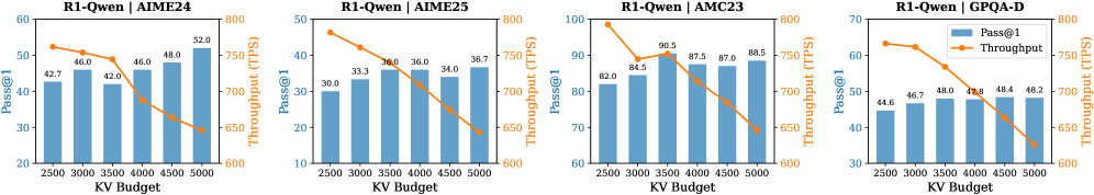
### Visual Description
## Multi-Chart Performance Analysis: R1-Qwen Model Across Four Datasets
### Overview
The image displays a set of four horizontally arranged bar-and-line combination charts. Each chart analyzes the performance of the "R1-Qwen" model on a different benchmark dataset (AIME24, AIME25, AMC23, GPQA-D) as a function of "KV Budget." The charts consistently show two metrics: **Pass@1** (represented by blue bars, left y-axis) and **Throughput** in Tokens Per Second (TPS, represented by an orange line, right y-axis).
### Components/Axes
* **Titles:** Each subplot has a title at the top center: "R1-Qwen | AIME24", "R1-Qwen | AIME25", "R1-Qwen | AMC23", "R1-Qwen | GPQA-D".
* **X-Axis (Common):** Labeled "KV Budget". The axis markers are at 2500, 3000, 3500, 4000, 4500, and 5000.
* **Primary Y-Axis (Left):** Labeled "Pass@1". The scale varies per chart to fit the data range.
* **Secondary Y-Axis (Right):** Labeled "Throughput (TPS)". The scale is consistent across all charts, ranging from 600 to 800 TPS.
* **Legend:** Located in the top-right corner of the fourth chart (GPQA-D). It defines:
* Blue Bar: "Pass@1"
* Orange Line with circular markers: "Throughput"
### Detailed Analysis
**Chart 1: R1-Qwen | AIME24**
* **Pass@1 (Blue Bars):** Shows a general upward trend with increasing KV Budget. Values are approximately: 42.7 (2500), 46.0 (3000), 42.0 (3500), 46.0 (4000), 48.0 (4500), 52.0 (5000). There is a notable dip at 3500.
* **Throughput (Orange Line):** Shows a clear downward trend. Starts at ~750 TPS at 2500 KV Budget and declines steadily to ~650 TPS at 5000 KV Budget.
**Chart 2: R1-Qwen | AIME25**
* **Pass@1 (Blue Bars):** Shows a consistent upward trend. Values are approximately: 30.0 (2500), 33.3 (3000), 34.0 (3500), 36.0 (4000), 34.0 (4500), 36.7 (5000). A slight dip occurs at 4500.
* **Throughput (Orange Line):** Shows a consistent downward trend. Starts at ~770 TPS at 2500 KV Budget and declines to ~640 TPS at 5000 KV Budget.
**Chart 3: R1-Qwen | AMC23**
* **Pass@1 (Blue Bars):** Shows a strong upward trend. Values are approximately: 82.0 (2500), 84.5 (3000), 90.5 (3500), 87.5 (4000), 87.0 (4500), 88.5 (5000). The peak is at 3500.
* **Throughput (Orange Line):** Shows a consistent downward trend. Starts at ~790 TPS at 2500 KV Budget and declines to ~640 TPS at 5000 KV Budget.
**Chart 4: R1-Qwen | GPQA-D**
* **Pass@1 (Blue Bars):** Shows a very gradual upward trend. Values are approximately: 44.6 (2500), 46.7 (3000), 48.0 (3500), 48.0 (4000), 48.4 (4500), 48.2 (5000). Performance plateaus after 3500.
* **Throughput (Orange Line):** Shows a consistent downward trend. Starts at ~750 TPS at 2500 KV Budget and declines to ~630 TPS at 5000 KV Budget.
### Key Observations
1. **Universal Trade-off:** Across all four datasets, there is a clear and consistent inverse relationship between **Pass@1** and **Throughput** as the KV Budget increases. Higher KV Budget improves accuracy (Pass@1) but reduces processing speed (Throughput).
2. **Dataset Sensitivity:** The model's absolute performance (Pass@1) and the magnitude of improvement vary significantly by dataset. AMC23 yields the highest scores (80s-90s), while AIME25 yields the lowest (30s).
3. **Non-Monotonic Pass@1:** While the general trend for Pass@1 is upward, several charts show minor dips or plateaus at specific KV Budgets (e.g., AIME24 at 3500, AIME25 at 4500, AMC23 after 3500), suggesting potential sweet spots or diminishing returns.
4. **Throughput Consistency:** The decline in Throughput is remarkably linear and similar in slope across all charts, indicating the computational cost of increasing KV Budget is dataset-agnostic.
### Interpretation
The data demonstrates a fundamental engineering trade-off in the R1-Qwen model's configuration. **KV Budget** likely controls a resource allocation parameter (e.g., key-value cache size in a transformer model). Increasing this budget allows the model to retain more context or perform more detailed computation, leading to better reasoning accuracy (higher Pass@1) on complex benchmarks like AIME and AMC. However, this comes at a direct and predictable cost to inference speed (lower Throughput).
The variation in Pass@1 scores across datasets suggests the model's capabilities are better aligned with the problem types in AMC23 (likely math competition problems) than in AIME25 or GPQA-D. The plateauing of Pass@1 in some charts (notably GPQA-D) indicates that beyond a certain KV Budget (~3500-4000), additional resources yield negligible accuracy gains, making the throughput penalty unjustifiable for those tasks. This analysis is crucial for optimizing deployment: one must choose a KV Budget that balances the required accuracy for a given task against acceptable latency constraints.
</details>
Figure 16: Impact of budget on Pass@1 and throughput for R1-Llama (top) and R1-Qwen (bottom) across AIME24, AIME25, AMC23, and GPQA-D datasets. The blue bars represent accuracy (left y-axis), and the orange lines represent throughput (right y-axis).
<details>
<summary>x53.png Details</summary>
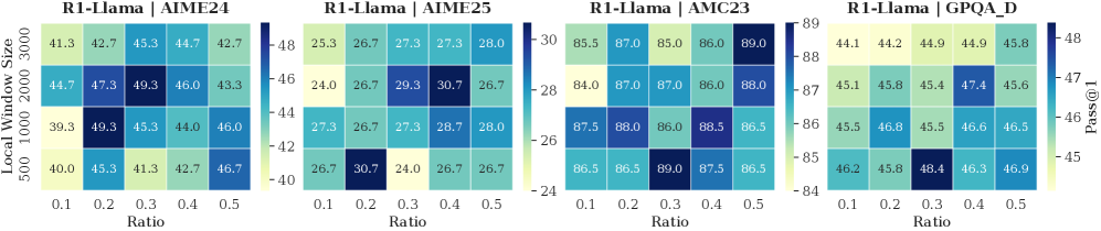
### Visual Description
## Heatmap Series: R1-Llama Model Performance Across Benchmarks
### Overview
The image displays four horizontally arranged heatmaps, each visualizing the performance (measured by "Pass@1") of a model labeled "R1-Llama" on a different benchmark. The performance is plotted as a function of two hyperparameters: "Ratio" (x-axis) and "Local Window Size" (y-axis). Each heatmap uses a distinct color scale to represent the Pass@1 score, with darker blues indicating higher values.
### Components/Axes
* **Titles (Top of each heatmap, left to right):**
1. `R1-Llama | AIME24`
2. `R1-Llama | AIME25`
3. `R1-Llama | AMC23`
4. `R1-Llama | GPQA_D`
* **Common X-Axis (Bottom of each heatmap):** Labeled `Ratio`. Ticks are at values: `0.1`, `0.2`, `0.3`, `0.4`, `0.5`.
* **Common Y-Axis (Left side of the first heatmap, applies to all):** Labeled `Local Window Size`. Ticks are at values: `500`, `1000`, `2000`, `3000` (ordered from bottom to top).
* **Color Bars (Right side of each heatmap):** Each has a vertical color bar labeled `Pass@1` at the top. The numerical scale varies per heatmap:
* **AIME24:** Scale from ~40 (light yellow) to ~48 (dark blue).
* **AIME25:** Scale from ~24 (light yellow) to ~30 (dark blue).
* **AMC23:** Scale from ~84 (light yellow) to ~89 (dark blue).
* **GPQA_D:** Scale from ~45 (light yellow) to ~48 (dark blue).
* **Data Grids:** Each heatmap is a 4 (rows) x 5 (columns) grid of colored cells, with the Pass@1 score printed inside each cell.
### Detailed Analysis
**1. R1-Llama | AIME24**
* **Trend:** Performance shows a moderate peak in the middle of the parameter space.
* **Data Points (Row from top [Window=3000] to bottom [Window=500]):**
* Window 3000: 41.3, 42.7, 45.3, 44.7, 42.7
* Window 2000: 44.7, 47.3, **49.3**, 46.0, 43.3
* Window 1000: 39.3, **49.3**, 45.3, 44.0, 46.0
* Window 500: 40.0, 45.3, 41.3, 42.7, 46.7
* **Peak Value:** 49.3, achieved at two points: (Ratio=0.3, Window=2000) and (Ratio=0.2, Window=1000).
**2. R1-Llama | AIME25**
* **Trend:** Performance is more variable, with a notable high point at a lower window size.
* **Data Points:**
* Window 3000: 25.3, 26.7, 27.3, 27.3, 28.0
* Window 2000: 24.0, 26.7, 29.3, **30.7**, 26.7
* Window 1000: 27.3, 26.7, 27.3, 28.7, 28.0
* Window 500: 26.7, **30.7**, 24.0, 26.7, 26.7
* **Peak Value:** 30.7, achieved at (Ratio=0.4, Window=2000) and (Ratio=0.2, Window=500).
**3. R1-Llama | AMC23**
* **Trend:** Generally high performance across the board, with several cells reaching the top of the scale.
* **Data Points:**
* Window 3000: 85.5, 87.0, 85.0, 86.0, **89.0**
* Window 2000: 84.0, 87.0, 87.0, 86.0, 88.0
* Window 1000: 87.5, 88.0, 86.0, 88.5, 86.5
* Window 500: 86.5, 86.5, **89.0**, 87.5, 86.5
* **Peak Value:** 89.0, achieved at (Ratio=0.5, Window=3000) and (Ratio=0.3, Window=500).
**4. R1-Llama | GPQA_D**
* **Trend:** Performance increases slightly with lower window sizes and specific ratios.
* **Data Points:**
* Window 3000: 44.1, 44.2, 44.9, 44.9, 45.8
* Window 2000: 45.1, 45.8, 45.4, **47.4**, 45.6
* Window 1000: 45.5, 46.8, 45.5, 46.6, 46.5
* Window 500: 46.2, 45.8, **48.4**, 46.3, 46.9
* **Peak Value:** 48.4, achieved at (Ratio=0.3, Window=500).
### Key Observations
1. **Benchmark-Dependent Optima:** The optimal combination of `Ratio` and `Local Window Size` varies significantly between benchmarks. There is no single "best" configuration.
2. **Performance Range:** The absolute Pass@1 scores differ greatly by benchmark (AIME25: ~24-31, AIME24: ~39-49, GPQA_D: ~44-48, AMC23: ~84-89), indicating varying difficulty or scoring scales.
3. **Parameter Sensitivity:** The AMC23 benchmark shows relatively stable high performance, while AIME25 shows more pronounced sensitivity to parameter changes.
4. **Peak Locations:** High performance often occurs at mid-range Ratios (0.2-0.4) and is not consistently tied to the largest or smallest window size.
### Interpretation
This visualization is a hyperparameter sensitivity analysis for the R1-Llama model. It demonstrates that the model's ability to pass benchmarks (Pass@1) is contingent on the interaction between the `Ratio` (likely a sampling or filtering parameter) and the `Local Window Size` (likely the context or attention window).
The key takeaway is that **hyperparameter tuning is benchmark-specific**. A configuration that excels on the AMC23 benchmark (e.g., Ratio=0.5, Window=3000) is suboptimal for AIME25. This suggests the underlying tasks or data distributions of these benchmarks are distinct, requiring different model operating points. The heatmaps serve as a guide for selecting parameters: for a given target benchmark, one should choose the `Ratio` and `Window Size` corresponding to the darkest blue cell. The absence of a universal optimum highlights the trade-offs involved in model configuration and the importance of empirical validation across diverse evaluation sets.
</details>
<details>
<summary>x54.png Details</summary>
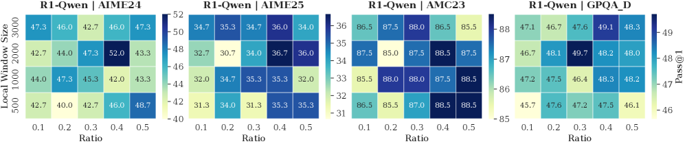
### Visual Description
## Heatmap Series: R1-Qwen Model Performance Across Benchmarks
### Overview
The image displays four horizontally arranged heatmaps, each visualizing the performance (Pass@1 metric) of a model labeled "R1-Qwen" on a different benchmark. Performance is plotted as a function of two hyperparameters: "Local Window Size" (y-axis) and "Ratio" (x-axis). The color intensity in each cell represents the Pass@1 score, with a dedicated color bar scale for each chart.
### Components/Axes
**Common Elements (All Four Charts):**
* **Y-Axis Label:** `Local Window Size` (Position: Left side, rotated vertically)
* **Y-Axis Ticks (from bottom to top):** `500`, `1000`, `2000`, `3000`
* **X-Axis Label:** `Ratio` (Position: Bottom center)
* **X-Axis Ticks (from left to right):** `0.1`, `0.2`, `0.3`, `0.4`, `0.5`
* **Color Scale:** A vertical gradient bar to the right of each heatmap, mapping cell color to a numerical Pass@1 value. The scale range varies per chart.
* **Metric Label:** `Pass@1` (Position: Far right, next to the color bar of the fourth chart).
**Individual Chart Titles (Position: Centered above each heatmap):**
1. `R1-Qwen | AIME'24`
2. `R1-Qwen | AIME'25`
3. `R1-Qwen | AMC23`
4. `R1-Qwen | GPQA_D`
### Detailed Analysis
**Chart 1: R1-Qwen | AIME'24**
* **Color Bar Scale:** Ranges from ~40 (light yellow) to ~52 (dark blue).
* **Data Grid (Pass@1 scores, rows=Window Size, columns=Ratio):**
| Window Size | Ratio 0.1 | Ratio 0.2 | Ratio 0.3 | Ratio 0.4 | Ratio 0.5 |
| :--- | :--- | :--- | :--- | :--- | :--- |
| **3000** | 47.3 | 46.0 | 42.7 | 46.0 | 47.3 |
| **2000** | 42.7 | 44.0 | 47.3 | **52.0** | 43.3 |
| **1000** | 44.0 | 47.3 | 45.3 | 42.0 | 43.3 |
| **500** | 42.7 | 40.0 | 42.7 | 46.0 | 48.7 |
* **Trend Verification:** No single monotonic trend across all series. The highest value (52.0) is an isolated peak at (Window=2000, Ratio=0.4). Performance at Window=500 generally increases with Ratio. Performance at Window=3000 is relatively stable.
**Chart 2: R1-Qwen | AIME'25**
* **Color Bar Scale:** Ranges from ~31 (light yellow) to ~36 (dark blue).
* **Data Grid:**
| Window Size | Ratio 0.1 | Ratio 0.2 | Ratio 0.3 | Ratio 0.4 | Ratio 0.5 |
| :--- | :--- | :--- | :--- | :--- | :--- |
| **3000** | 34.7 | 35.3 | 34.7 | 36.0 | 34.0 |
| **2000** | 32.7 | 30.7 | 34.0 | 36.7 | 36.0 |
| **1000** | 32.0 | 34.7 | 35.3 | 35.3 | 32.0 |
| **500** | 31.3 | 34.0 | 31.3 | 35.3 | 35.3 |
* **Trend Verification:** Similar to AIME'24, the peak (36.7) occurs at (Window=2000, Ratio=0.4). The lowest values are clustered in the lower-left region (smaller window, smaller ratio).
**Chart 3: R1-Qwen | AMC23**
* **Color Bar Scale:** Ranges from ~85 (light yellow) to ~88 (dark blue). Note the significantly higher absolute values compared to other charts.
* **Data Grid:**
| Window Size | Ratio 0.1 | Ratio 0.2 | Ratio 0.3 | Ratio 0.4 | Ratio 0.5 |
| :--- | :--- | :--- | :--- | :--- | :--- |
| **3000** | 86.5 | 87.5 | 88.0 | 86.5 | 85.5 |
| **2000** | 87.5 | 85.0 | 87.5 | 88.5 | 87.5 |
| **1000** | 85.5 | 88.0 | 88.0 | 87.5 | 88.5 |
| **500** | 86.5 | 85.5 | 87.0 | 88.5 | 88.5 |
* **Trend Verification:** Performance is uniformly high (85.0-88.5). The highest values (88.5) appear at multiple points: (Window=2000, Ratio=0.4), (Window=1000, Ratio=0.5), and (Window=500, Ratios 0.4 & 0.5). There is no strong, consistent directional trend.
**Chart 4: R1-Qwen | GPQA_D**
* **Color Bar Scale:** Ranges from ~46 (light yellow) to ~49 (dark blue).
* **Data Grid:**
| Window Size | Ratio 0.1 | Ratio 0.2 | Ratio 0.3 | Ratio 0.4 | Ratio 0.5 |
| :--- | :--- | :--- | :--- | :--- | :--- |
| **3000** | 47.1 | 46.7 | 47.6 | 49.1 | 48.3 |
| **2000** | 46.7 | 48.1 | **49.7** | 48.2 | 48.0 |
| **1000** | 47.2 | 47.5 | 46.4 | 48.3 | 48.2 |
| **500** | 45.7 | 47.6 | 47.2 | 47.5 | 46.1 |
* **Trend Verification:** The global peak (49.7) is at (Window=2000, Ratio=0.3). The series for Window=3000 shows a general upward trend with increasing Ratio. The series for Window=500 is more erratic.
### Key Observations
1. **Consistent Peak Location:** In three of the four benchmarks (AIME'24, AIME'25, GPQA_D), the highest performance is achieved with a **Local Window Size of 2000**. The optimal Ratio varies (0.4 for AIME benchmarks, 0.3 for GPQA_D).
2. **Benchmark Difficulty:** The absolute Pass@1 scores vary dramatically by benchmark. **AMC23** yields the highest scores (85-88), suggesting it is the easiest for this model. **AIME'25** yields the lowest scores (31-37), indicating it is the most challenging.
3. **Parameter Sensitivity:** Performance is sensitive to both hyperparameters, but not in a uniform way across tasks. The relationship is non-linear, with specific combinations (like 2000/0.4) creating performance peaks.
4. **Color Scale Deception:** Visually, the heatmaps look similar in color distribution, but the numerical scales are vastly different. Direct visual comparison of "darkness" between charts is misleading without referencing the specific color bar.
### Interpretation
This analysis provides a hyperparameter sensitivity study for the R1-Qwen model. The data suggests that model performance on reasoning benchmarks (AIME, AMC, GPQA) is not governed by simple "bigger is better" rules for window size or ratio. Instead, there exists a **sweet spot** in the configuration space, particularly around a window size of 2000 tokens.
The stark difference in score ranges between AMC23 (~87) and AIME'25 (~34) highlights the varying difficulty and possibly the different skill sets tested by these benchmarks. The model's strong performance on AMC23 indicates solid foundational problem-solving, while the lower scores on AIME (especially the 2025 version) suggest challenges with more advanced or novel competition problems.
For a practitioner, this chart is a guide for tuning: starting with a window size of 2000 and exploring ratios between 0.3 and 0.4 would be a prudent strategy for maximizing performance on similar tasks. The lack of a universal trend underscores the importance of benchmark-specific tuning.
</details>
Figure 17: Impact of different local window sizes and retention ratios of section window
Local Window and Retention Ratio Analysis over Benchmarks. Figures 17 illustrate the sensitivity of model performance to variations in Local Window Size and the Retention Ratio of the Selection Window. A moderate local window (e.g., 1000–2000) typically yields optimal results, suggesting that recent context saturation is reached relatively. Furthermore, we observe that the retention ratio between $0.3$ and $0.4$ across most benchmarks (e.g., AIME24, GPQA), where the model effectively balances and reasoning performance. Whereas lower ratios (e.g., $0.1$ ) consistently degrade accuracy due to excessive information loss.
## Appendix E Limitations and Future Work
Currently, DynTS is implemented based on the transformers library, and we are actively working on deploying it to other inference frameworks such as vLLM and SGLang. Additionally, our current training data focuses on mathematical reasoning, which may limit performance in other domains like coding or abstract reasoning. In the future, we plan to expand data diversity to adapt to a broader range of reasoning tasks. Moreover, constrained by computational resources, we used a relatively small dataset ( $\sim 7,000$ samples) for training. This dataset’s scale limits us to optimizing only the importance predictor’s parameters, since optimizing all parameters on the small dataset may compromise the model’s original generalization capabilities. This constraint may hinder the full potential of DynTS. Future work can focus on scaling up the dataset and jointly optimizing both the backbone and the predictor to elicit stronger capabilities.