# Neuro-symbolic Action Masking for Deep Reinforcement Learning
**Authors**: Shuai Han, Mehdi Dastani, Shihan Wang
ifaamas [AAMAS ’26]Proc. of the 25th International Conference on Autonomous Agents and Multiagent Systems (AAMAS 2026)May 25 – 29, 2026 Paphos, CyprusC. Amato, L. Dennis, V. Mascardi, J. Thangarajah (eds.) 2026 2026 Utrecht University Utrecht the Netherland Utrecht University Utrecht the Netherland Utrecht University Utrecht the Netherland
## Abstract
Deep reinforcement learning (DRL) may explore infeasible actions during training and execution. Existing approaches assume a symbol grounding function that maps high-dimensional states to consistent symbolic representations and a manually specified action masking techniques to constrain actions. In this paper, we propose Neuro-symbolic Action Masking (NSAM), a novel framework that automatically learn symbolic models, which are consistent with given domain constraints of high-dimensional states, in a minimally supervised manner during the DRL process. Based on the learned symbolic model of states, NSAM learns action masks that rules out infeasible actions. NSAM enables end-to-end integration of symbolic reasoning and deep policy optimization, where improvements in symbolic grounding and policy learning mutually reinforce each other. We evaluate NSAM on multiple domains with constraints, and experimental results demonstrate that NSAM significantly improves sample efficiency of DRL agent while substantially reducing constraint violations.
Key words and phrases: Deep reinforcement learning, neuro-symbolic learning, action masking
doi: JWPH6906
## 1. Introduction
With the powerful representation capability of neural networks, deep reinforcement learning (DRL) has achieved remarkable success in a variety of complex domains that require autonomous agents, such as autonomous driving autodriving4_1; autodriving4_2; autodriving4_3, resource management resourcem4_1; resourcem4_2, algorithmic trading autotrading4_1; autotrading4_2 and robotics roboticRL4_1; roboticRL4_2; roboticRL4_3. However, in real-world scenarios, agents face the challenges of learning policies from few interactions roboticRL4_2 and keeping violations of domain constraints to a minimum during training and execution autodriving_safe. To address these challenges, an increasing number of neuro-symbolic reinforcement learning (NSRL) approaches have been proposed, aiming to exploit the structural knowledge of the problem to improve sample efficiency shindo2024blendrl; RM; nsrl2025_planning or to constrain agents to select actions PLPG; PPAM; nsrl2024_plpg_multi.
Among these NSRL approaches, a promising practice is to exclude infeasible actions for the agents. We use the term infeasible actions throughout the paper, which can also be considered as unsafe, unethical or in general undesirable actions. This is typically achieved by assuming a predefined symbolic grounding nsplanning or label function RM that maps high-dimensional states into symbolic representations and manually specify action masking techniques actionmasking_app1; actionmasking_app3; actionmasking_app4. However, predefining the symbolic grounding function is often expensive neuroRM, as it requires complete knowledge of the environmental states, and could be practically impossible when the states are high-dimensional or infinite. Learning symbolic grounding from environmental state is therefore crucial for NSRL approaches and remains a highly challenging problem neuroRM.
In particular, there are three main challenges. First, real-world environments should often satisfy complex constraints expressed in a domain specific language, which makes learning the symbolic grounding function difficult ahmed2022semantic. Second, obtaining full supervision for learning symbolic representations in DRL environments is unrealistic, as those environments rarely provide the ground-truth symbolic description of every state. Finally, even if symbolic grounding can be learned, integrating it into reinforcement learning to achieve end-to-end learning remains a challenge.
To address these challenges, we propose Neuro-symbolic Action Masking (NSAM), a framework that integrates symbolic reasoning into deep reinforcement learning. The basic idea is to use probabilistic sentential decision diagrams (PSDDs) to learn symbolic grounding. PSDDs serve two purposes: they guarantee that any learned symbolic model satisfies domain constraints expressed in a domain specific language kisa2014probabilistic, and they allow the agent to represent probability distributions over symbolic models conditioned on high-dimensional states. In this way, PSDDs bridge the gap between numerical states and symbolic reasoning without requiring manually defined mappings. Based on the learned PSDDs, NSAM combines action preconditions with the inferred symbolic model of numeric states to construct action masks, thereby filtering out infeasible actions. Crucially, this process only relies on minimal supervision in the form of action explorablility feedback, rather than full symbolic description at every state. Finally, NSAM is trained end-to-end, where the improvement of symbolic grounding and policy optimization mutually reinforce each other.
We evaluate NSAM on four DRL decision-making domains with domain constraints, and compare it against a series of state-of-the-art baselines. Experimental results demonstrate that NSAM not only learns more efficiently, consistently surpassing all baselines, but also substantially reduces constraint violations during training. The results further show that the symbolic grounding plays a crucial role in exploiting underlying knowledge structures for DRL.
## 2. Problem setting
We study reinforcement learning (RL) on a Markov Decision Process (MDP) RL1998 $\mathcal{M}=(\mathcal{S},\mathcal{A},\mathcal{T},R,\gamma)$ where $\mathcal{S}$ is a set of states, $\mathcal{A}$ is a finite set of actions, $\mathcal{T}:\mathcal{S}\times\mathcal{A}\times\mathcal{S}\rightarrow[0,1]$ is a transition function, $\gamma\in[0,1)$ is a discount factor and $R:\mathcal{S}\times\mathcal{A}\times\mathcal{S}\rightarrow\mathbb{R}$ is a reward function. An agent employs a policy $\pi$ to interact with the environment. At a time step $t$ , the agent takes action $a_{t}$ according to the current state $s_{t}$ . The environment state will transfer to next state $s_{t+1}$ based on the transition probability $\mathcal{T}$ . The agent will receive the reward $r_{t}$ . Then, the next round of interaction begins. The goal of this agent is to find the optimal policy $\pi^{*}$ that maximizes the expected return: $\mathbb{E}[\sum_{t=0}^{T}\gamma^{t}r_{t}|\pi]$ , where $T$ is the terminal time step.
To augment RL with symbolic domain knowledge, we extend the normal MDP with the following modules $(\mathcal{P},\mathcal{AP},\phi)$ where $\mathcal{P}=\{p_{1},..,p_{K}\}$ is a finite set of atomic propositions (each $p\in\mathcal{P}$ represents a Boolean property of a state $s\in\mathcal{S}$ ), $\mathcal{AP}=\{(a,\varphi)|a\in\mathcal{A},\varphi\in L(\mathcal{P})\}$ is the set of actions with their preconditions, and $L(\mathcal{P})$ denotes the propositional language over $\mathcal{P}$ . We use $(a,\varphi)$ to state that action $a$ is explorable All actions $a\in\mathcal{A}$ can in principle be chosen by the agent. However, we use the term explorable to distinguish actions whose preconditions are satisfied (safe, ethical, desriable actions) from those whose preconditions are not satisfied (unsafe, unethical, undesirable actions). in a state if and only if its precondition $\varphi$ holds in that state, $\phi\in L(\mathcal{P})$ is a domain constraint. We use $|[\phi]|=\{\bm{m}|\bm{m}\models\phi\}$ to denote the set of all possible symbolic models of $\phi$ a model is a truth assignment to all propositions in $\mathcal{P}$ .
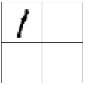
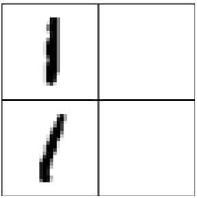
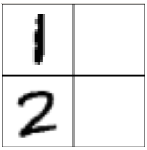
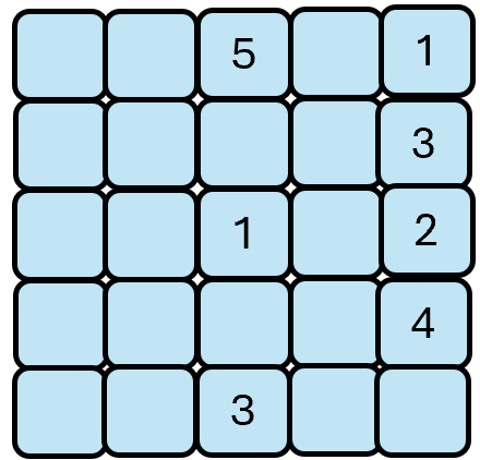
To illustrate how symbolic domain knowledge $(\mathcal{P},\mathcal{AP},\phi)$ is reflected in our formulation, we consider the Visual Sudoku task as a concrete example. In this environment, each state is represented as a non-symbolic image input. The properties of a state can be described using propositions in $\mathcal{P}$ . For example, the properties of the state in Figure 1(a) include ‘position (1,1) is number 1’, ‘position (1,2) is empty’, etc. Each action $a$ of filling a number in a certain position corresponds to a symbolic precondition $\varphi$ , represented by $(a,\varphi)\in\mathcal{AP}$ . For example, the action ‘filling number 1 at position (1,1)’ requires that both propositions ‘position (1,2) is number 1’ and ‘position (2,1) is number 1’ are false. Finally, $\phi$ is used to constrain the set of possible states, e.g., ‘position (1,1) is number 1’ and ‘position (1,1) is number 2’ cannot both be simultaneously true for a given state. To leverage this knowledge, challenges arise due to the following problems.
<details>
<summary>sudo1.png Details</summary>
### Visual Description
## Image Analysis: Divided Square with Diagonal Line
### Overview
The image depicts a square divided into four equal quadrants. A diagonal line, composed of dark pixels, is present in the top-left quadrant. The other three quadrants are empty.
### Components/Axes
* **Quadrants:** The square is divided into four quadrants by two perpendicular lines intersecting at the center.
* **Diagonal Line:** A line composed of dark pixels runs diagonally from the bottom-left to the top-right of the top-left quadrant.
### Detailed Analysis
* **Top-Left Quadrant:** Contains a diagonal line. The line appears to be approximately 1/3 the length of the quadrant's diagonal.
* **Top-Right Quadrant:** Empty.
* **Bottom-Left Quadrant:** Empty.
* **Bottom-Right Quadrant:** Empty.
### Key Observations
* The diagonal line is the only element present in the image besides the dividing lines of the square.
* The line is not perfectly straight, showing some pixelation.
### Interpretation
The image is a simple composition. The diagonal line in the top-left quadrant is the focal point. The empty quadrants create a sense of balance and contrast. The image does not provide any specific data or facts beyond its visual elements. It could be interpreted as an abstract representation or a component of a larger visual system.
</details>
(a)
<details>
<summary>sudo2.png Details</summary>
### Visual Description
## Image Analysis: Grid with Lines
### Overview
The image is a 2x2 grid. The top-left cell contains a vertical line, and the bottom-left cell contains a diagonal line. The other two cells are empty.
### Components/Axes
* **Grid:** 2x2 grid structure.
* **Top-Left Cell:** Contains a vertical line.
* **Bottom-Left Cell:** Contains a diagonal line.
* **Top-Right Cell:** Empty.
* **Bottom-Right Cell:** Empty.
### Detailed Analysis or ### Content Details
* **Vertical Line:** Located in the top-left cell. It is approximately vertical, with some minor deviations.
* **Diagonal Line:** Located in the bottom-left cell. It slopes upwards from left to right.
### Key Observations
* The lines are simple, stylized representations.
* The grid provides a clear spatial context for the lines.
### Interpretation
The image presents a basic visual arrangement of lines within a grid. The vertical and diagonal lines are distinct elements, and their placement in the grid creates a simple composition. The empty cells contribute to the overall balance of the image. There is no data or specific information being conveyed beyond the visual arrangement.
</details>
(b)
<details>
<summary>sudo3.png Details</summary>
### Visual Description
## Image: Number Grid
### Overview
The image is a 2x2 grid. The top-left cell contains the number "1", and the bottom-left cell contains the number "2". The other two cells are empty.
### Components/Axes
* **Grid:** 2x2 grid structure.
* **Top-Left Cell:** Contains the number "1".
* **Bottom-Left Cell:** Contains the number "2".
* **Top-Right Cell:** Empty.
* **Bottom-Right Cell:** Empty.
### Detailed Analysis
* The number "1" in the top-left cell is vertically oriented and slightly distorted.
* The number "2" in the bottom-left cell is clearly visible and well-formed.
* The top-right and bottom-right cells are completely blank.
### Key Observations
* The grid contains only two numbers, "1" and "2", in the specified cells.
* The other cells are empty, suggesting a possible sequence or pattern that is incomplete.
### Interpretation
The image presents a simple numerical arrangement within a grid. The presence of "1" and "2" in adjacent cells might indicate a sequence or a counting exercise. The empty cells suggest that the sequence or pattern is not fully represented, leaving room for further interpretation or completion.
</details>
(c)
Figure 1. Example states in the Visual Sudoku environment
(P1) Numerical–symbolic gap. Knowledge is based on symbolic property of states, but only raw numerical states are available.
(P2) Constraint satisfaction. The truth values of propositions in $\mathcal{P}$ mapped from a DRL state $s$ must satisfy domain constraints $\phi$ .
<details>
<summary>pr.png Details</summary>
### Visual Description
## Data Table: Probability Distribution
### Overview
The image presents a data table showing a probability distribution over three binary variables (p1, p2, p3) and their corresponding probabilities (Pr). The table lists all possible combinations of the binary variables and their associated probabilities.
### Components/Axes
* **Columns:**
* p1: Binary variable 1 (0 or 1)
* p2: Binary variable 2 (0 or 1)
* p3: Binary variable 3 (0 or 1)
* Pr: Probability associated with the combination of p1, p2, and p3
### Detailed Analysis or ### Content Details
The table contains the following data:
| p1 | p2 | p3 | Pr |
| -- | -- | -- | --- |
| 0 | 0 | 0 | 0.2 |
| 0 | 0 | 1 | 0.2 |
| 0 | 1 | 0 | 0 |
| 0 | 1 | 1 | 0.1 |
| 1 | 0 | 0 | 0 |
| 1 | 0 | 1 | 0.3 |
| 1 | 1 | 0 | 0.1 |
| 1 | 1 | 1 | 0.1 |
### Key Observations
* The probabilities sum to 1.0 (0.2 + 0.2 + 0 + 0.1 + 0 + 0.3 + 0.1 + 0.1 = 1.0).
* The combination (1, 0, 1) has the highest probability (0.3).
* The combinations (0, 1, 0) and (1, 0, 0) have zero probability.
### Interpretation
The table represents a joint probability distribution over three binary variables. It specifies the probability of each possible combination of the variables. The distribution is not uniform, as some combinations are more likely than others. The zero probabilities indicate that certain combinations are impossible or highly unlikely under the given distribution.
</details>
(a) Distribution
<details>
<summary>psdd_sdd.png Details</summary>
### Visual Description
## Logic Diagram: Fault Tree Analysis
### Overview
The image presents a fault tree diagram, a top-down, deductive failure analysis used to determine how systems can fail, identify the best ways to reduce risk, and determine (or get a feeling for) event rates of a safety accident or a particular system level (functional) failure. The diagram uses standard logic gate symbols (OR and AND) to represent the relationships between events leading to a top-level event. The diagram is rendered in green.
### Components/Axes
* **Logic Gates:**
* OR Gate: Represented by a curved-bottom symbol. An OR gate indicates that the output event occurs if at least one of the input events occurs.
* AND Gate: Represented by a flat-bottom symbol. An AND gate indicates that the output event occurs only if all input events occur.
* **Events:** Represented by text labels (p1, p2, p3, ¬p1, ¬p2, ¬p3). The '¬' symbol indicates the negation of the event.
* **Legend:** Located in the top-left corner, explaining the symbols for OR and AND gates.
### Detailed Analysis
The fault tree diagram starts with a single output at the top and branches down to the input events at the bottom.
* **Top Level:** A single OR gate at the top.
* **Second Level:** The top OR gate connects to two gates: an AND gate on the left and an OR gate on the right.
* **Third Level (Left Branch):** The AND gate connects to two gates: an AND gate on the left and an OR gate on the right.
* **Third Level (Right Branch):** The OR gate connects to a single event, p3.
* **Fourth Level (Left Branch):** The AND gate connects to two events: p3 and ¬p3.
* **Fourth Level (Right Branch):** The OR gate connects to two gates: an AND gate on the left and an AND gate on the right.
* **Bottom Level:** The bottom level consists of the following events: p1, p2, ¬p1, ¬p2, p1, ¬p2, p1, p2.
### Key Observations
* The diagram uses a combination of OR and AND gates to model the relationships between events.
* The negation symbol (¬) is used to represent the complement of an event.
* The diagram shows how multiple events can combine to cause a top-level event.
### Interpretation
The fault tree diagram is a visual representation of the logical relationships between events that can lead to a system failure. By analyzing the diagram, one can identify the critical events and combinations of events that are most likely to cause the failure. This information can be used to improve system design, implement safety measures, and reduce the risk of failure. The presence of both p3 and ¬p3 in the same branch suggests a potential contradiction or a scenario where both the event and its negation are considered. The repetition of p1, p2, ¬p1, and ¬p2 at the bottom level indicates that these events are fundamental to the overall system failure.
</details>
(b) SDD
<details>
<summary>psdd.png Details</summary>
### Visual Description
## Fault Tree Diagram: Boolean Logic Tree
### Overview
The image presents a fault tree diagram, a top-down, deductive failure analysis used to determine how system failures can occur. The diagram uses logic gates (AND, OR) to represent the relationships between events leading to a top-level fault. The diagram is rendered in light green, with probabilities associated with certain branches.
### Components/Axes
* **Logic Gates:** The diagram uses rounded-corner rectangles to represent logic gates.
* **Events:** Events are represented by the inputs to the logic gates, labeled with propositional variables (p1, p2, p3) or combinations thereof.
* **Probabilities:** Numerical values (e.g., 0.6, 0.4, 0.33) are associated with branches, representing probabilities of events occurring.
* **Labels:** The labels include propositional variables (p1, p2, p3) and their negations (¬p1, ¬p2, ¬p3).
### Detailed Analysis
The diagram can be broken down into levels, starting from the top:
* **Top Level:** A single OR gate at the top.
* The output of the top OR gate is connected to two inputs with probabilities 0.6 and 0.4.
* **Second Level:** The left input of the top OR gate is connected to an AND gate. The right input of the top OR gate is connected to an OR gate with an additional input.
* The right input of the top OR gate has an additional input labeled "p3".
* **Third Level:** The left AND gate is connected to two OR gates. The right OR gate is connected to a single AND gate.
* The left OR gate has probabilities 0.33 and 0.67.
* The right OR gate has probabilities 0.75 and 0.25.
* The left AND gate has probabilities 0.5 and 0.5, with labels "p3" and "¬p3".
* **Bottom Level:** The bottom level consists of inputs to the OR and AND gates, labeled with propositional variables and their negations.
* The left OR gate has inputs "p1" and "p2".
* The right OR gate has inputs "¬p1" and "¬p2".
* The left OR gate has inputs "p1" and "¬p2".
* The right OR gate has inputs "¬p1" and "p2".
The probabilities are associated with the branches leading into the logic gates. For example, the top OR gate has inputs with probabilities 0.6 and 0.4. The sum of these probabilities is 1.0.
### Key Observations
* The diagram represents a fault tree, showing how different events can lead to a top-level failure.
* The probabilities associated with the branches indicate the likelihood of each event occurring.
* The logic gates (AND, OR) define the relationships between the events.
* The propositional variables (p1, p2, p3) represent the basic events in the system.
### Interpretation
The fault tree diagram provides a visual representation of the potential causes of a system failure. By analyzing the diagram, it is possible to identify the most critical events and the most likely paths to failure. The probabilities associated with the branches allow for a quantitative assessment of the risk associated with each event. The diagram can be used to improve system design, identify potential weaknesses, and develop mitigation strategies to reduce the likelihood of failure. The presence of both p3 and ¬p3 suggests that the system's behavior depends on both the occurrence and non-occurrence of event p3. The diagram highlights the importance of considering both individual component failures and the interactions between components when assessing system reliability.
</details>
(c) PSDD
<details>
<summary>vtree.png Details</summary>
### Visual Description
## Diagram: Tree Structure
### Overview
The image depicts a tree diagram with nodes labeled with numbers and variables. The tree has a hierarchical structure, branching from a root node to several leaf nodes. All nodes are green.
### Components/Axes
* **Nodes:** Represented by green circles, each labeled with a number.
* Node 0
* Node 1
* Node 2
* Node 3
* Node 4
* **Edges:** Represented by green lines connecting the nodes, indicating the relationships between them.
* **Labels:** Each node has a numerical label and some nodes have an additional variable label.
* Node 0 is labeled with "0" and "p₁"
* Node 1 is labeled with "1"
* Node 2 is labeled with "2" and "p₂"
* Node 3 is labeled with "3"
* Node 4 is labeled with "4" and "p₃"
### Detailed Analysis or ### Content Details
The tree structure can be described as follows:
* Node 1 is the parent node, connected to nodes 0 and 2.
* Node 3 is the parent node, connected to nodes 1 and 4.
* Nodes 0, 2, and 4 are leaf nodes.
The connections are:
* Node 3 connects to Node 1.
* Node 3 connects to Node 4.
* Node 1 connects to Node 0.
* Node 1 connects to Node 2.
### Key Observations
* The tree has a clear hierarchical structure with a single root (Node 3).
* The nodes are labeled with consecutive numbers, but the numbering doesn't seem to follow a strict depth-first or breadth-first traversal.
* The variables p₁, p₂, and p₃ are associated with the leaf nodes 0, 2, and 4, respectively.
### Interpretation
The diagram likely represents a decision tree or a similar hierarchical structure used in computer science or mathematics. The numerical labels could represent states, steps, or indices, while the variables p₁, p₂, and p₃ might represent probabilities or parameters associated with the leaf nodes. The tree structure visualizes the relationships and dependencies between these elements.
</details>
(d) Vtree
<details>
<summary>nml.png Details</summary>
### Visual Description
## Logic Diagram: Prime and Sub-Prime Logic Gate Network
### Overview
The image depicts a logic diagram consisting of multiple AND gates feeding into a single OR gate. The inputs to the AND gates are labeled as "prime" and "sub", with numerical subscripts. The outputs of the AND gates are labeled with alpha symbols, also with numerical subscripts. The entire diagram is rendered in a light green color.
### Components/Axes
* **Logic Gates:** The diagram uses two types of logic gates: AND gates and an OR gate.
* **Inputs:** The inputs to the AND gates are labeled as "prime₁ sub₁ ... primeₙ subₙ".
* **Outputs:** The outputs of the AND gates are labeled as "α₁", "α₂", ..., "αₙ".
* **Connectors:** Lines connect the outputs of the AND gates to the inputs of the OR gate.
### Detailed Analysis
* **AND Gates:** There are multiple AND gates, each with two inputs labeled "primeᵢ" and "subᵢ", where 'i' ranges from 1 to 'n'. The AND gates are represented by a curved shape with two inputs and one output.
* **OR Gate:** A single OR gate is present at the top of the diagram. It has multiple inputs, each connected to the output of an AND gate. The OR gate is represented by a curved shape with multiple inputs and one output.
* **Input Labels:** The inputs to the AND gates are labeled as follows:
* "prime₁" and "sub₁" for the first AND gate.
* "primeₙ" and "subₙ" for the last AND gate.
* The inputs for the intermediate AND gates are represented by ellipsis (...).
* **Output Labels:** The outputs of the AND gates are labeled as follows:
* "α₁" for the first AND gate.
* "α₂" for the second AND gate.
* "αₙ" for the last AND gate.
* The outputs for the intermediate AND gates are represented by ellipsis (...).
* **Connections:** The outputs "α₁", "α₂", ..., "αₙ" are connected to the inputs of the OR gate.
### Key Observations
* The diagram represents a logic network where the outputs of multiple AND gates are combined using an OR gate.
* The inputs to the AND gates are labeled as "prime" and "sub", suggesting a relationship between these inputs.
* The number of AND gates is 'n', as indicated by the subscripts on the input and output labels.
### Interpretation
The diagram likely represents a logical function where the OR gate's output is true if at least one of the AND gates outputs a true value. Each AND gate requires both its "prime" and "sub" inputs to be true in order to output a true value. The overall function could be interpreted as a condition where at least one "prime" and its corresponding "sub" condition must be met for the final output to be true. The ellipsis indicate that the pattern continues for an unspecified number of AND gates.
</details>
(e) A general fragment
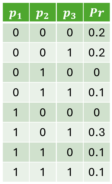
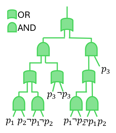
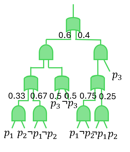
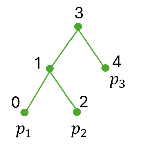
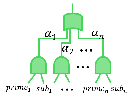
Figure 2. (a) An example of joint distribution for three propositions $p_{1},p_{2}$ and $p_{3}$ with the constraint $(p_{1}\leftrightarrow p_{2})\lor p_{3}$ . (b) A SDD circuit with ‘OR’ and ‘AND’ logic gate to represent the constrain $(p_{1}\leftrightarrow p_{2})\lor p_{3}$ . (c) The PSDD circuit to represent the distribution in Fig. 2(a). (d) The vtree used to group variables. (e) A general fragment to show the structure of SDD and PSDD.
(P3) Minimal supervision. The RL environment cannot provide full ground truth of propositions at each state.
(P4) Differentiability. The symbolic reasoning with $\varphi$ introduces non-differentiable process, which could be conflicting with gradient-based DRL algorithms that require differentiable policies.
(P5) End-to-end learning. Achieving end-to-end training on prediction of propositions, symbolic reasoning over preconditions and optimization of policy is challenging.
In summary, the above challenges fall into three categories. (P1–P3) concern learning symbolic models from high-dimensional states in DRL, which we address in Section 3. (P4) relates to the differentiability barrier when combining symbolic reasoning with gradient-based DRL, which we tackle in Section 4. (P5) raises the need for an end-to-end training, which we present in Section 5.
## 3. Learning Symbolic Grounding
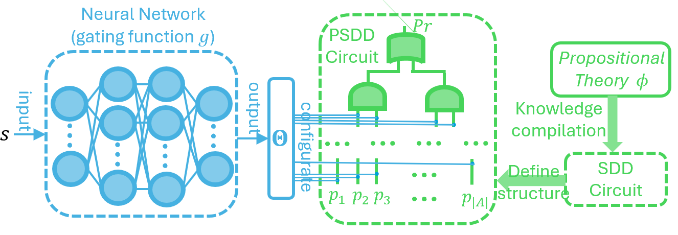
This section introduces how NSAM learns symbolic grounding. At a high level, the goal is to learn whether an action is explorable in a state. Specifically, the agent receives minimal supervision from state transitions after executing an action $a$ . Using this supervision, NSAM learns to estimate the symbolic model of the high-dimensional input state that is in turn used to check the satisfiability of action preconditions. To achieve this, Section 3.1 presents a knowledge compilation step to encode domain constraints into a symbolic structure, while Section 3.2 explains how this symbolic structure is parameterized and learned from minimal supervision.
### 3.1. Compiling the Knowledge
To address P2 (Constraint satisfaction), we introduce the Probabilistic Sentential Decision Diagram (PSDD) kisa2014probabilistic. PSDDs are designed to represent probability distributions $Pr(\bm{m})$ over possible models, where any model $\bm{m}$ that violates domain constraints is assigned zero probability conditionalPSDD. For example, consider the distribution in Figure 2(a). The first step in constructing a PSDD is to build a Boolean circuit that captures the entries whose probability values are always zero, as shown in Figure 2(b). Specifically, the circuit evaluates to $0$ for model $\bm{m}$ if and only if $\bm{m}\not\models\phi$ . The second step is to parameterize this Boolean circuit to represent the (non-zero) probability of valid entries, yielding the PSDD in Figure 2(c).
To obtain the Boolean circuit in Figure 2(b), we represent the domain constraint $\phi$ using a general data structure called a Sentential Decision Diagram (SDD) sdd. An SDD is a normal form of a Boolean formula that generalizes the well-known Ordered Binary Decision Diagram (OBDD) OBDD; OBDD2. SDD circuits satisfy specific syntactic and semantic properties defined with respect to a binary tree, called a vtree, whose leaves correspond to propositions (see Figure 2(d)). Following Darwiche’s definition sdd; psdd_infer1, an SDD normalized for a vtree $v$ is a Boolean circuit defined as follows: If $v$ is a leaf node labeled with variable $p$ , the SDD is either $p$ , $\neg p$ , $\top$ , $\bot$ , or an OR gate with inputs $p$ and $\neg p$ . If $v$ is an internal node, the SDD has the structure shown in Figure 2(e), where $\textit{prime}_{1},\ldots,\textit{prime}_{n}$ are SDDs normalized for the left child $v^{l}$ , and $\textit{sub}_{1},\ldots,\textit{sub}_{n}$ are SDDs normalized for the right child $v^{r}$ . SDD circuits alternate between OR gates and AND gates, with each AND gate having exactly two inputs. The OR gates are mutually exclusive in that at most one of their inputs evaluates to true under any circuit input sdd; psdd_infer1.
A PSDD is obtained by annotating each OR gate in an SDD with parameters $(\alpha_{1},\ldots,\alpha_{n})$ over its inputs kisa2014probabilistic; psdd_infer1, where $\sum_{i}\alpha_{i}=1$ (see Figure 2(e)). The probability distribution defined by a PSDD is as follows. Let $\bm{m}$ be a model that assigns truth values to the PSDD variables, and suppose the underlying SDD evaluates to $0$ under $\bm{m}$ ; then $Pr(\bm{m})=0$ . Otherwise, $Pr(\bm{m})$ is obtained by multiplying the parameters along the path from the output gate.
The key advantage of using PSDDs in our setting is twofold. First, PSDDs strictly enforce domain constraints by assigning zero probability to any model $\bm{m}$ that violates $\phi$ conditionalPSDD, thereby ensuring logical consistency (P2). Second, by ruling out impossible truth assignment through domain knowledge, PSDDs effectively reduce the scale of the probability distribution to be learned ahmed2022semantic.
Besides, PSDDs also support tractable probabilistic queries PCbooks; psdd_infer1. While PSDD compilation can be computationally expensive as its size grows exponentially in the number of propositions and constraints, it is a one-time offline cost. Once compilation is completed, PSDD inference is linear-time, making symbolic reasoning efficient during both training and execution psdd_infer1.
### 3.2. Learning the parameters of PSDD in DRL
To address P1 (Numerical–symbolic gap), we need to learn distributions of models that satisfy the domain constraints. Inspired by recent deep supervised learning work on PSDDs ahmed2022semantic, we parameterize the PSDD using the output of gating function $g$ . This gating function is a neural network that maps high-dimensional RL states to PSDD parameters $\Theta=g(s)$ . This design allows the PSDD to represent state-conditioned distributions over propositions through its learned parameters, while strictly adhering to domain constraints (via its structure defined by symbolic knowledge $\phi$ ). The overall process is shown in Figure 3. We use $Pr(\bm{m}\mid\bm{\Theta}=g(s),\bm{m}\models\phi)$ to denote the probability of model $\bm{m}$ that satisfy the domain constrains $\phi$ given the state $s$ (this is calculated by PSDD in Figure 3).
After initializing $g$ and the PSDD according to the structure in Figure 3, we obtain a distribution over $\bm{m}$ such that for all $\bm{m}\not\models\phi$ , $Pr(\bm{m}\mid\bm{\Theta}=g(s),\bm{m}\not\models\phi)=0$ . However, for the probability distribution over $\bm{m}$ that does satisfy $\phi$ , we still need to learn from data to capture the probability of different $\bm{m}$ by adjusting parameters of gating function $g$ . To train the PSDD from minimal supervision signals (for problem (P3) in Section 2), we construct the supervision data from $\Gamma_{\phi}$ , which consists of tuples $(s,a,s^{\prime},y)$ where transitions $(s,a,s^{\prime})$ are explored from the environment and $y$ is calculated by:
$$
y=\begin{cases}1,&\text{if }s\;\text{and}\;s^{\prime}\;\text{do not violate}\;\phi,\\
0,&\text{otherwise.}\end{cases} \tag{1}
$$
That is, the action $a$ is labeled as explorable (i.e., $y=1$ ) in state $s$ if it does not lead to a violation of the domain constraint $\phi$ ; otherwise the action a is not explorable (i.e., $y=0$ ).
<details>
<summary>Framework.png Details</summary>
### Visual Description
## System Diagram: Neural Network Gating for PSDD and SDD Circuits
### Overview
The image is a system diagram illustrating the flow from a neural network to a PSDD circuit and then to an SDD circuit, involving propositional theory and knowledge compilation. The diagram shows how a neural network's output configures a PSDD circuit, which is then used to define the structure of an SDD circuit derived from a propositional theory.
### Components/Axes
* **Neural Network (gating function g):** Located on the left side of the diagram, represented by a dashed blue box containing a multi-layered neural network. It takes an input 'S' and produces an output.
* **Output Configuration:** The output of the neural network is labeled "output" and is connected to a block labeled "configure".
* **PSDD Circuit:** Located in the center of the diagram, enclosed in a dashed green box. It contains a circuit diagram with logic gates (AND/OR) and input lines labeled p1, p2, p3, ..., p|A|. The top of the PSDD circuit is labeled "Pr".
* **Propositional Theory φ:** Located on the right side of the diagram, enclosed in a rounded green box.
* **SDD Circuit:** Located below the "Propositional Theory φ", enclosed in a dashed green box.
* **Arrows:** Arrows indicate the flow of information and processes.
* An arrow from the Neural Network's "output" to the "configure" block.
* An arrow from the "configure" block to the PSDD circuit.
* An arrow from "Propositional Theory φ" to "SDD Circuit" labeled "Knowledge compilation".
* An arrow from the PSDD circuit to the SDD circuit labeled "Define structure".
### Detailed Analysis or Content Details
* **Neural Network:** The neural network has multiple layers of interconnected nodes. The input is labeled 'S', and the output is labeled 'output'.
* **PSDD Circuit:** The circuit consists of AND and OR gates. The inputs to the circuit are labeled p1, p2, p3, and p|A|. The top of the circuit is labeled "Pr".
* **Propositional Theory φ:** This block represents a propositional theory, which is compiled into an SDD circuit.
* **SDD Circuit:** The SDD circuit is derived from the propositional theory and its structure is defined by the PSDD circuit.
### Key Observations
* The diagram illustrates a process where a neural network's output is used to configure a PSDD circuit.
* The PSDD circuit then defines the structure of an SDD circuit, which is derived from a propositional theory.
* The flow is from left to right, starting with the neural network and ending with the SDD circuit.
### Interpretation
The diagram describes a system that integrates a neural network with logical circuits (PSDD and SDD) to perform knowledge compilation. The neural network acts as a gating function, influencing the configuration of the PSDD circuit. This configuration, in turn, guides the structure of the SDD circuit, which is derived from a propositional theory. This suggests a method for incorporating learned patterns from data (via the neural network) into logical reasoning and knowledge representation (via the SDD circuit). The system could be used to create more efficient or adaptive logical systems by leveraging the strengths of both neural networks and logical circuits.
</details>
Figure 3. The architecture design to calculate the probability of symbolic model $\bm{m}$ given DRL state $s$ .
Unlike a fully supervised setting that expensively requires labeling every propositional variable in $P$ , Eq. (1) only requires labeling whether a given state violates the domain constraint $\phi$ , which is a minimal supervision signal. In practice, the annotation of $y$ can be obtained either (i) by providing labeled data on whether the resulting state $s^{\prime}$ violates the constraint $\phi$ book2006, or (ii) via an automatic constraint-violation detection mechanism autochecking1; autochecking2.
We emphasize that action preconditions $\varphi$ and the domain constraints $\phi$ are two separate elements and treated differently. We first automatically generate training data to learn PSDD parameters by constructing tuples $(s,a,s^{\prime},y)$ as defined in Equation (1). The argument $y$ in tuples $(s,a,s’,y)$ is then used as an indicator for action preconditions. Specifically, we use $y$ to label whether action $a$ is excutable in state $s$ , i.e., if transition $(s,a,s^{\prime})$ is explored by DRL policy in a non-violating states $s$ and $s^{\prime}$ , then $y=1$ , meaning that action a is explorable in $s$ ; otherwise $y=0$ . We thus use $y$ in $(s,a,s’,y)$ as a minimal supervision signal to estimate the probability of the precondition of action $a$ being satisfied in non-violating $s$ during PSDD training.
By continuously rolling out the DRL agent in the environment, we store $(s,a,s^{\prime},y)$ into a buffer $\mathcal{D}$ . After collecting sufficient data, we sample batches from $\mathcal{D}$ and update $g$ via stochastic gradient descent SDG; ADAM. Concretely, the update proceeds as follows. Given samples $(s,a,s^{\prime},y)$ , we first use the current PSDD to estimate the probability that action $a$ is explorable in state $s$ , i.e., the probability that $s$ satisfies the precondition $\varphi$ associated with $a$ in $\mathcal{AP}$ :
$$
\hat{P}(a|s)=\sum_{\bm{m}\models\varphi}Pr(\bm{m}|\bm{\Theta}=g(s),\bm{m}\models\phi) \tag{2}
$$
Note that $\hat{P}(a|s)$ here does not represent a policy as in standard DRL; rather, it denotes the estimated probability that action $a$ is explorable in state $s$ . As shown in Equation (2), this probability is calculated by aggregating the probabilities of all models $\bm{m}$ that satisfy the precondition $\varphi$ . In addition, to evaluate if $\bm{m}\models\varphi$ , we assign truth values to the leaf variables of $\varphi$ ’s SDD circuit based on $\bm{m}$ and propagate them bottom-up through the ‘OR’ and ‘AND’ gates, where the Boolean value at the root indicates the satisfiability.
Given the probability estimated from Equation (2), we compute the cross-entropy loss CROSSENTR by comparing it with the explorability label $y$ . Specifically, for a single data $(s,a,s^{\prime},y)$ , the loss is:
$$
L_{g}=-[y\cdot log(\hat{P}(a|s))+(1-y)\cdot log(1-\hat{P}(a|s))] \tag{3}
$$
The intuition of this loss is straightforward: at each $s$ it encourages the PSDD to generate higher probability to actions that are explorable (when $y=1$ ), and generate lower probability to those that are not explorable (when $y=0$ ).
## 4. Combining symbolic reasoning with gradient-based DRL
Through the training of the gating function defined in Equation (3), the PSDD in Figure 3 can predict, for a given DRL state, a distribution over the symbolic model $\bm{m}$ for atomic propositions in $\mathcal{P}$ . This distribution then can be used to evaluate the truth values of the preconditions in $\mathcal{AP}$ and to reason about the explorability of actions. However, directly applying symbolic logical formula of preconditions to take actions results in non-differentiable decision-making sg2_1, which prevents gradient flow during policy optimization. This raises a key challenge on integrating symbolic reasoning with gradient-based DRL training in a way that preserves differentiability, i.e., problem (P4) in Section 2.
To address this issue, we employ the PSDD to perform maximum a posteriori (MAP) query PCbooks, obtaining the most likely model $\hat{\bm{m}}$ for the current state. Based on $\hat{\bm{m}}$ and the precondition $\varphi$ of each action $a$ , we re-normalize the action probabilities from a policy network. In this way, the learned symbolic representation from the PSDD can be used to constrain action selection, while the underlying policy network still provides a probability distribution that can be updated through gradient-based optimization.
Concretely, before the DRL agent makes a decision, we first use the PSDD to obtain the most likely model describing the state:
$$
\hat{\bm{m}}=argmax_{\bm{m}}Pr(\bm{m}|\bm{\Theta}=g(s),\bm{m}\models\phi) \tag{4}
$$
Importantly, the argmax operation on the PSDD does not require enumerating all possible $\bm{m}$ . Instead, it can be computed in linear time with respect to the PSDD size by exploiting its structural properties on decomposability and Determinism (see psdd_infer1). This linear-time inference makes PSDDs particularly attractive for DRL, where efficient evaluation of candidate actions are essential anokhinhandling.
After obtaining the symbolic model of the state, we renormalize the probability of each action $a$ according to its precondition $\varphi$ :
$$
\pi^{+}(s,a,\phi)=\frac{\pi(s,a)\cdot C_{\varphi}(\hat{\bm{m}})}{\sum_{a^{\prime}\in\mathcal{A}}\pi(s,a^{\prime})\cdot C_{\varphi^{\prime}}(\hat{\bm{m}})} \tag{5}
$$
where $\pi(s,a)$ denotes the probability of action $a$ at state $s$ predicted by the policy network, $C_{\varphi}(\hat{\bm{m}})$ is the evaluation of the SDD encoding from $\varphi$ under the model $\hat{\bm{m}}$ , and $\varphi^{\prime}$ is the precondition of action $a^{\prime}$ . The input of Equation (5) explicitly includes $\phi$ , as $\phi$ is required for evaluating the model $\hat{\bm{m}}$ in Equation (4). Intuitively, $C_{\varphi}(\hat{\bm{m}})$ acts as a symbolic mask. It equals to 1 if $\hat{\bm{m}}\models\varphi$ (i.e., the precondition is satisfied) and 0 otherwise. As a result, actions whose preconditions are violated are excluded from selection, while the probabilities of the remaining actions are renormalized as a new distribution. It is important to note that during the execution, we use the PSDD (trained by $y$ in Equation (2) and (3) ) to infer the most probable symbolic model of the current state (in Equation (4)), and therefore can formally verify whether each action’s precondition is satisfied with this symbolic model (happened in $C_{\varphi}$ in Equation (5)).
According to prior work, such $0$ - $1$ masking and renormalization still yield a valid policy gradient, thereby preserving the theoretical guarantees of policy optimization actionmasking_vPG. In practice, we optimize the masked policy $\pi^{+}$ using the Proximal Policy Optimization (PPO) objective schulman2017ppo. Concretely, the loss is:
$$
\mathcal{L}_{\text{PPO}}(\pi^{+})=\mathbb{E}_{t}\!\left[\min\!\Big(\mathfrak{r}_{t}(\pi^{+})\,\hat{A}_{t},\text{clip}(\mathfrak{r}_{t}(\pi^{+}),1-\epsilon,1+\epsilon)\,\hat{A}_{t}\Big)\right] \tag{6}
$$
where $\mathfrak{r}_{t}(\pi^{+})$ denotes the probability ratio between the new and old masked policies, ‘ clip ’ is the clip function and $\hat{A}_{t}$ is the advantage estimate schulman2017ppo. In this way, the masked policy can be trained with PPO to effectively exploit symbolic action preconditions, leading to safer and more sample-efficient learning.
## 5. End-to-end training framework
After deriving the gating function loss of PSDD in Equation (3) and the DRL policy loss in Equation (6), we now introduce an end-to-end training framework that combines the two components.
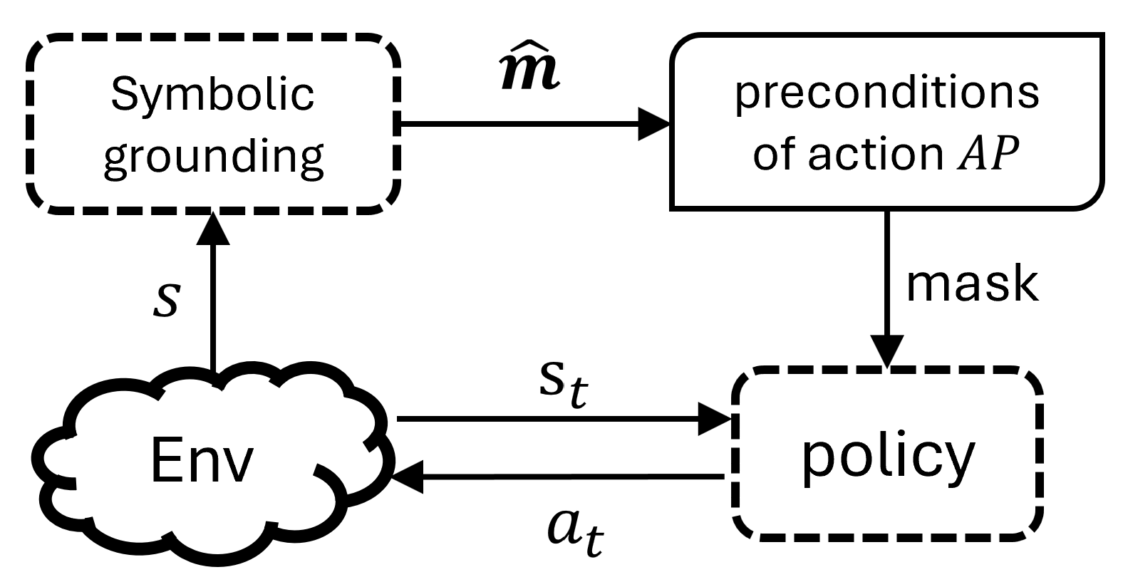
Before presenting the training procedure, we first summarize how the agent makes decisions, as illustrated in Figure 4. At each time step, the state $s$ is first input into the symbolic grounding module, whose internal structure is shown in Figure 3. Within this module, the PSDD produces the most probable symbolic description of the state, i.e., a model $\hat{\bm{m}}$ , according to Equation (4). The agent then leverages the preconditions in $\mathcal{AP}$ (following Equation (5)) to mask the action distribution from policy network, and samples an action from the renormalized distribution to interact with the environment.
<details>
<summary>probSetting.png Details</summary>
### Visual Description
## Diagram: Symbolic Grounding and Policy Interaction
### Overview
The image is a diagram illustrating the interaction between symbolic grounding, preconditions of an action, an environment, and a policy. It depicts a flow of information and control between these components.
### Components/Axes
* **Symbolic grounding:** A dashed-line rectangle at the top-left.
* **preconditions of action AP:** A solid-line rectangle with rounded corners at the top-right.
* **Env:** A cloud-shaped object at the bottom-left.
* **policy:** A dashed-line rectangle at the bottom-right.
* **Arrows:** Indicate the direction of information flow.
* An arrow labeled "$\hat{m}$" points from "Symbolic grounding" to "preconditions of action AP".
* An arrow labeled "s" points from "Env" to "Symbolic grounding".
* An arrow labeled "mask" points from "preconditions of action AP" to "policy".
* An arrow labeled "$s_t$" points from "Env" to "policy".
* An arrow labeled "$a_t$" points from "policy" to "Env".
### Detailed Analysis or ### Content Details
The diagram shows the following relationships:
1. Symbolic grounding provides information ($\hat{m}$) to the preconditions of an action AP.
2. The environment (Env) provides state information (s) to symbolic grounding.
3. The preconditions of action AP provide a mask to the policy.
4. The environment (Env) provides state information ($s_t$) to the policy.
5. The policy outputs an action ($a_t$) that affects the environment (Env).
### Key Observations
* The diagram represents a closed-loop system.
* Symbolic grounding and preconditions of action AP are at a higher level of abstraction compared to the environment and policy.
* The policy interacts directly with the environment.
### Interpretation
The diagram illustrates a system where symbolic knowledge (grounding and preconditions) influences a policy's behavior within an environment. The symbolic grounding provides a high-level understanding of the environment, which is used to define the preconditions for actions. The policy then uses these preconditions, along with the current state of the environment, to select an action. The action, in turn, affects the environment, creating a feedback loop. The "mask" suggests that the preconditions filter or constrain the policy's actions. The diagram suggests a hierarchical control structure where symbolic reasoning guides the policy's decision-making process.
</details>
Figure 4. An illustration of the decision process of our agent, where the symbolic grounding module is as in Figure 3 and $\hat{\bm{m}}$ is calculated via the PSDD by Equation (4).
An illustration of the decision process of our agent.
Algorithm 1 Training framework.
1: Compile $\phi$ as SDD to obtain structure of PSDD
2: Initialize gating network $g$ according to the structure of PSDD
3: Initialize policy network $\pi$ , total step $T\leftarrow 0$
4: Initialize a data buffer $\mathcal{D}$ for learning PSDD
5: for $Episode=1\to M$ do
6: Reset $Env$ and get $s$
7: while not terminal do
8: Calculate action distribution before masking $\pi(s,a)$
9: Calculate $\Theta=g(s)$ and assign parameter $\Theta$ to PSDD
10: Calculate $\hat{\bm{m}}$ in Equation (4)
11: Calculate action distribution after masking $\pi^{+}(s,a,\phi)$
12: Sample an action $a$ from $\pi^{+}(s,a,\phi)$
13: Execute $a$ and get $r$ , $s^{\prime}$ from $Env$
14: Obtain the truth-value $y$ according to Equ. (1)
15: Store $(s,a,\varphi)$ into $\mathcal{D}$
16: if terminal then
17: Update policy $\pi^{+}(s,a,\phi)$ using the trajectory of this episode with Equation (6)
18: end if
19: if $(T+1)\;\$ then
20: Sample batches from $\mathcal{D}$
21: Update gating function $g$ with Equation (3)
22: end if
23: $s\leftarrow s^{\prime}$ , $T\leftarrow T+1$
24: end while
25: end for
To achieve end-to-end training, we propose Algorithm 1. The key idea for this training framework is to periodically update the gating function of the PSDD during the agent’s interaction with the environment, while simultaneously training the policy network under the guidance of action masks. As the RL agent explores, it continuously generates minimally supervised feedback for the PSDD via $\Gamma_{\phi}$ , thereby improving the quality of the learned action masks. In turn, the improved action masking reduces infeasible actions and guides the agent toward higher rewards and more informative trajectories, which accelerates policy learning.
Concretely, before the start of training, the domain constrain $\phi$ is compiled into an SDD in Line 1, which determines both the structure of the PSDD and the output dimensionality of the gating function. Lines 2 $\sim$ 4 initialize the gating function, the RL policy network, and a replay buffer $\mathcal{D}$ that stores minimally supervised feedback for PSDD training. In Lines 5 $\sim$ 25, the agent interacts with the environment and jointly learns the gating function and policy network. At each step (lines 8 $\sim$ 11), the agent computes the masked action distribution based on the current gating function and policy network, which is crucial to minimizing the selection of infeasible actions during training. At the end of each episode (lines 16 $\sim$ 18), the policy network is updated using the trajectory of this episode. In this process, the gating function is kept frozen. In addition, the gating function is periodically updated (lines 19 $\sim$ 22) with frequency $freq_{g}$ . This periodically update enables the PSDD to provide increasingly accurate action masks in subsequent interactions, which simultaneously improves policy optimization and reduces constraint violations.
## 6. Related work
Symbolic grounding in neuro-symbolic learning. In the literature on neuro-symbolic systems NSsys; NSsys2, symbol grounding refers to learning a mapping from raw data to symbolic representations, which is considered as a key challenge for integrating neural networks with symbolic knowledge neuroRM. Various approaches have been proposed to address this challenge in deep supervised learning. sg1_1; sg1_2; sg1_3 leverage logic abduction or consistency checking to periodically correct the output symbolic representations. To achieve end-to-end differentiable training, the most common methods are embedding symbolic knowledge into neural networks through differentiable relaxations of logic operators, such as fuzzy logic sg2_2 or Logic Tensor Networks (LTNs) sg2_1. These methods approximate logical operators with smooth functions, allowing symbolic supervision to be incorporated into gradient-based optimization sg2_2; sg2_3; sg2_4; neuroRM. More recently, advances in probabilistic circuits psdd_infer1; PCbooks give rise to efficient methods that embed symbolic knowledge via differentiable probabilistic representations, such as PSDD kisa2014probabilistic. In these methods, symbolic knowledge is first compiled into SDD sdd to initialize the structure, after which a neural network is used to learn the parameters for predicting symbolic outputs ahmed2022semantic. This class of approaches has been successfully applied to structured output prediction tasks, including multi-label classification ahmed2022semantic and routing psdd_infer2.
Symbolic grounding is also crucial in DRL. NRM neuroRM learn to capture the symbolic structure of reward functions in non-Markovian reward settings. In contrast, our approach learns symbolic properties of states to constrain actions under Markovian reward settings. KCAC KCAC has extended PSDDs to MDP with combinatorial action spaces, where symbolic knowledge is used to constrain action composition. Our work also uses PSDDs but differs from KCAC. We use preconditions of actions as symbolic knowledge to determine the explorability of each individual action in a standard DRL setting, whereas KCAC incorporates knowledge about valid combinations of actions in a DRL setting with combinatorial action spaces.
Action masking. In DRL, action masking refers to masking out invalid actions during training to sample actions from a valid set actionmasking_vPG. Empirical studies in early real-world applications show that masking invalid actions can significantly improve sample efficiency of DRL actionmasking_app1; actionmasking_app2; actionmasking_app3; actionmasking_app4; actionmasking_app5; actionmasking_app6. Following the systematic discussion of action masking in DRL actionmasking_review, actionmasking_onoffpolicy investigates the impact of action masking on both on-policy and off-policy algorithms. Works such as actionmasking_continous; actionmasking_continous2 extend action masking to continuous action spaces. actionmasking_vPG proves that binary action masking have Valid policy gradients during learning. In contrast to these approaches, our method does not assume that the set of invalid actions is predefined by the environment. Instead, we learn the set of invalid actions in each state for DRL using action precondition knowledge.
Another line of work employs a logical system (e.g., linear temporal logic LTL1985) to restrict the agent’s actions shielding1; shielding2; shielding3; PPAM. These approaches require a predefined symbol grounding function to map states into its symbolic representations, whereas our method learn such function (via PSDD) from data. PLPG PLPG learns the probability of applying shielding with action constraints formulated in probabilistic logics. By contrast, our preconditions are hard constraints expressed in propositional logic: if the precondition of an action is evaluated to be false, the action is strictly not explorable.
Cost-based safe reinforcement learning. In addition to action masking, a complementary approach is to jointly optimize rewards and a safety-wise cost function to improve RL safety. In these cost-based settings, a policy is considered safe if its expected cumulative cost remains below a pre-specified threshold safeexp1; PPOlarg. A representative foundation of such cost-based approach is the constrained Markov decision process (CMDP) framework CMDP1994, which aims to maximize expected reward while ensuring costs below a threshold. Subsequent works often adopt Lagrangian relaxation to incorporate constraints into the optimization objective ppo-larg1; ppo-larg2; ppo-larg3; ppo-larg4; PPOlarg. However, these methods often suffer from unsafe behaviors in the early stages of training highvoil1. To address such issues, safe exploration approaches emphasize to control the cost during exploration in unknown environments shielding1; shielding2. Recently, SaGui safeexp1 employed imitation learning and policy distillation to enable agents to acquire safe behaviors from a teacher agent during early training. RC-PPO RCPPO augmented unsafe states to allow the agent to anticipate potential future losses. While constraints can in principle be reformulated as cost functions, our approach does not rely on cost-based optimization. Instead, we directly exploit them to learn masks to avoid the violation of actions constraints.
## 7. Experiment
The experimental design aims to answer the following questions:
Q1: Without predefined symbolic grounding, can NSAM leverage symbolic knowledge to improve the sample efficiency of DRL?
Q2: By jointly learning symbolic grounding and masking strategies, can NSAM significantly reduce constraint violations during exploration, thereby enhancing safety?
Q3: In NSAM, is symbolic grounding with PSDDs more effective than replacing it with a module based on standard neural network?
Q4: In what ways does symbolic knowledge contribute to the learning process of NSAM?
### 7.1. Environments
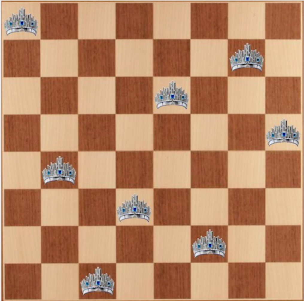
We evaluate ASG on four highly challenging reinforcement learning domains with logical constraints as shown in Figure 5. Across all these environments, agents receive inputs in the form of unknown representation such as vectors or images.
<details>
<summary>Sudoku.png Details</summary>
### Visual Description
## Grid Diagram: Numbered Cells
### Overview
The image is a 5x5 grid of rounded squares. Most squares are light blue and empty, but some contain a single digit number. The numbers present are 1, 2, 3, 4, and 5.
### Components/Axes
* **Grid:** 5 rows and 5 columns.
* **Cells:** Each cell is a rounded square with a light blue fill and a black border.
* **Numbers:** Digits 1 through 5 are present in some cells.
### Detailed Analysis
The grid is structured as follows:
| | Column 1 | Column 2 | Column 3 | Column 4 | Column 5 |
| :---- | :------- | :------- | :------- | :------- | :------- |
| Row 1 | | | 5 | | 1 |
| Row 2 | | | | | 3 |
| Row 3 | | | 1 | | 2 |
| Row 4 | | | | | 4 |
| Row 5 | | | 3 | | |
Specifically:
* The cell in Row 1, Column 3 contains the number 5.
* The cell in Row 1, Column 5 contains the number 1.
* The cell in Row 2, Column 5 contains the number 3.
* The cell in Row 3, Column 3 contains the number 1.
* The cell in Row 3, Column 5 contains the number 2.
* The cell in Row 4, Column 5 contains the number 4.
* The cell in Row 5, Column 3 contains the number 3.
### Key Observations
* The numbers are only present in Columns 3 and 5.
* Column 1, 2, and 4 are empty.
* The numbers in Column 5 are in ascending order from top to bottom, excluding the first row.
* The numbers in Column 3 are 5, 1, 3 from top to bottom.
### Interpretation
The diagram appears to represent a sparse matrix or a visual representation of data points within a grid. The numbers could represent values, counts, or identifiers associated with specific locations in the grid. The pattern of numbered cells suggests a non-uniform distribution of data, with concentrations in Columns 3 and 5. The ascending order of numbers in Column 5 might indicate a sequential or hierarchical relationship.
</details>
(a) Sudoku
<details>
<summary>nqueens.png Details</summary>
### Visual Description
## Chessboard Diagram: Crown Placement
### Overview
The image depicts a standard 8x8 chessboard with alternating light and dark squares. Seven crown icons are placed on various squares of the board. The crowns appear to be identical in design, featuring a silver or white base with blue jewel accents.
### Components/Axes
* **Chessboard:** An 8x8 grid with alternating light and dark squares. The light squares are a pale yellow or beige, while the dark squares are a medium brown.
* **Crown Icons:** Seven identical crown icons are placed on the board. The crowns are silver or white with blue jewels.
### Detailed Analysis
The crown icons are positioned on the following squares (using standard algebraic notation, assuming the bottom-left square is a1):
* **a8:** Top-left corner.
* **e8:** Top row, fifth column.
* **h6:** Sixth row, eighth column.
* **b4:** Fourth row, second column.
* **e4:** Fourth row, fifth column.
* **d2:** Second row, fourth column.
* **a1:** Bottom-left corner.
### Key Observations
* The crowns are not placed in any immediately obvious pattern.
* There are no crowns on the first or eighth columns, or the first or eighth rows, except for the corners.
* The crowns are scattered across the board.
### Interpretation
The image appears to be a visual puzzle or a representation of a specific game state or problem involving the placement of crowns on a chessboard. Without additional context, the significance of the crown positions is unclear. It could represent a strategic arrangement, a mathematical problem, or simply an artistic composition. The placement of the crowns in the corners and the scattering of the other crowns suggests a deliberate, but currently unknown, purpose.
</details>
(b) N-queens
<details>
<summary>coloringG.png Details</summary>
### Visual Description
## Graph Diagram: Network of Nodes
### Overview
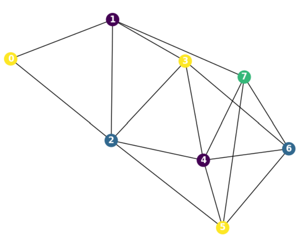
The image depicts a graph diagram consisting of 8 nodes (labeled 0 through 7) connected by edges. The nodes are colored differently, and the edges represent relationships or connections between them.
### Components/Axes
* **Nodes:** 8 nodes, labeled 0, 1, 2, 3, 4, 5, 6, and 7. Each node is represented by a colored circle with a number inside.
* Node 0: Yellow
* Node 1: Purple
* Node 2: Dark Blue
* Node 3: Yellow
* Node 4: Purple
* Node 5: Yellow
* Node 6: Dark Blue
* Node 7: Green
* **Edges:** Black lines connecting the nodes, indicating relationships between them.
### Detailed Analysis
The graph shows the following connections:
* Node 0 (Yellow) is connected to Node 1 (Purple) and Node 2 (Dark Blue).
* Node 1 (Purple) is connected to Node 0 (Yellow), Node 2 (Dark Blue), and Node 3 (Yellow).
* Node 2 (Dark Blue) is connected to Node 0 (Yellow), Node 1 (Purple), Node 3 (Yellow), Node 4 (Purple), and Node 5 (Yellow).
* Node 3 (Yellow) is connected to Node 1 (Purple), Node 2 (Dark Blue), Node 4 (Purple), and Node 7 (Green).
* Node 4 (Purple) is connected to Node 2 (Dark Blue), Node 3 (Yellow), Node 5 (Yellow), Node 6 (Dark Blue), and Node 7 (Green).
* Node 5 (Yellow) is connected to Node 2 (Dark Blue), Node 4 (Purple), and Node 6 (Dark Blue).
* Node 6 (Dark Blue) is connected to Node 4 (Purple), Node 5 (Yellow), and Node 7 (Green).
* Node 7 (Green) is connected to Node 3 (Yellow), Node 4 (Purple), and Node 6 (Dark Blue).
### Key Observations
* Node 2 (Dark Blue) has the most connections (5 edges).
* Node 0 (Yellow) has the fewest connections (2 edges).
* The graph appears to be undirected, meaning the edges do not have a specific direction.
* Nodes 3, 4, 6, and 7 form a highly interconnected cluster.
### Interpretation
The graph diagram represents a network where nodes are interconnected based on certain relationships. The different colors assigned to the nodes could represent different categories or attributes. The connections between nodes indicate interactions or dependencies. The density of connections varies across the graph, with some nodes being more central or influential than others. The diagram could be used to visualize social networks, communication networks, or any system where entities are related to each other.
</details>
(c) Graph coloring
<details>
<summary>sudokuV.png Details</summary>
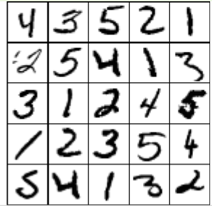
### Visual Description
## Image: Handwritten Digits Grid
### Overview
The image shows a 5x5 grid of handwritten digits, ranging from 1 to 5. Each cell contains a single digit written in black ink on a white background. The digits vary in style and clarity.
### Components/Axes
* **Grid:** 5 rows and 5 columns.
* **Digits:** Handwritten numbers from 1 to 5.
### Detailed Analysis
The grid contains the following digits, read row by row:
* **Row 1:** 4, 3, 5, 2, 1
* **Row 2:** 2, 5, 4, 1, 3
* **Row 3:** 3, 1, 2, 4, 5
* **Row 4:** 1, 2, 3, 5, 4
* **Row 5:** 5, 4, 1, 3, 2
### Key Observations
* The digits are handwritten and vary in style.
* All digits from 1 to 5 are represented.
* There is no apparent pattern in the arrangement of the digits.
### Interpretation
The image likely represents a sample of handwritten digits, possibly used for training or testing a machine learning model for digit recognition. The variability in the handwriting styles highlights the challenges involved in accurately recognizing handwritten digits. The random arrangement suggests the data is not ordered in any meaningful way.
</details>
(d) Visual Sudoku
Figure 5. Four tasks with logical constraints
<details>
<summary>S33.png Details</summary>
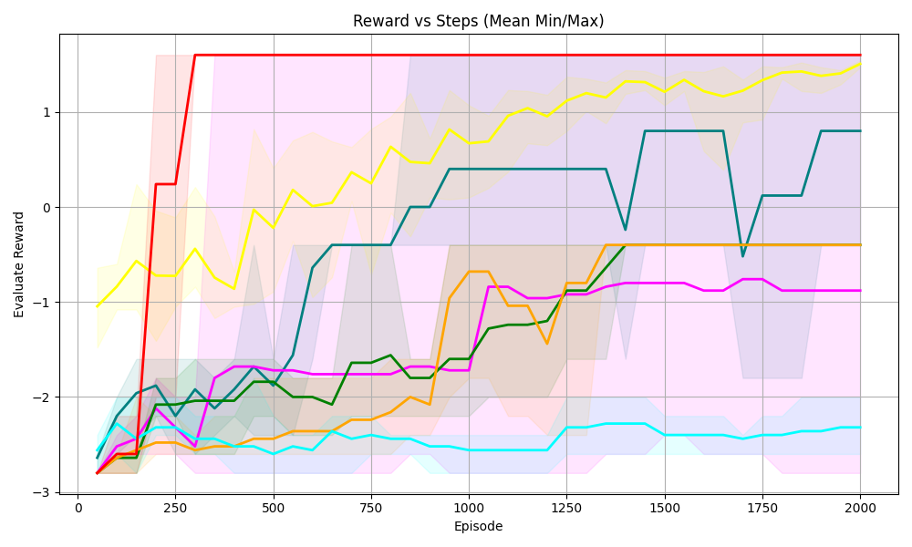
### Visual Description
## Line Chart: Reward vs Steps (Mean Min/Max)
### Overview
The image is a line chart that plots the "Evaluate Reward" against "Episode" steps. It shows the mean, minimum, and maximum reward values for multiple data series, each represented by a different colored line. The chart includes a grid for easier reading and shaded regions indicating the min/max range for each series.
### Components/Axes
* **Title:** Reward vs Steps (Mean Min/Max)
* **X-axis:** Episode, with markers at 0, 250, 500, 750, 1000, 1250, 1500, 1750, and 2000.
* **Y-axis:** Evaluate Reward, with markers at -3, -2, -1, 0, and 1.
* **Data Series:** There are six distinct data series, each represented by a different color: red, yellow, teal, dark green, orange, and magenta. Each series has a solid line representing the mean reward and a shaded area around the line representing the min/max range.
### Detailed Analysis
**Red Series:**
* **Trend:** The red line increases sharply from approximately -2.75 to 1.25 between episode 0 and 250, then remains constant at approximately 1.25 until episode 2000.
* **Min/Max Range:** The shaded area is relatively narrow, indicating a small variance.
**Yellow Series:**
* **Trend:** The yellow line starts at approximately -1 at episode 0, fluctuates between -1 and 1.25 until episode 2000.
* **Min/Max Range:** The shaded area is wider than the red series, indicating a larger variance.
**Teal Series:**
* **Trend:** The teal line starts at approximately -2.75 at episode 0, increases to approximately -2.25 by episode 250, and then remains relatively constant between -2.25 and -2.5 until episode 2000.
* **Min/Max Range:** The shaded area is relatively narrow, indicating a small variance.
**Dark Green Series:**
* **Trend:** The dark green line starts at approximately -2.75 at episode 0, increases to approximately -1.75 by episode 500, fluctuates between -2 and -1 until episode 1250, and then remains relatively constant between -1.25 and -1.5 until episode 2000.
* **Min/Max Range:** The shaded area is wider than the red series, indicating a larger variance.
**Orange Series:**
* **Trend:** The orange line starts at approximately -2.75 at episode 0, increases to approximately -2.5 by episode 250, increases to approximately -2 by episode 500, increases to approximately -1.75 by episode 750, increases to approximately -0.5 by episode 1000, and then remains relatively constant between -0.5 and -0.25 until episode 2000.
* **Min/Max Range:** The shaded area is wider than the red series, indicating a larger variance.
**Magenta Series:**
* **Trend:** The magenta line starts at approximately -2.75 at episode 0, increases to approximately -2.5 by episode 250, increases to approximately -1.75 by episode 500, and then remains relatively constant between -1.75 and -1.5 until episode 2000.
* **Min/Max Range:** The shaded area is wider than the red series, indicating a larger variance.
### Key Observations
* The red series shows the most rapid and stable increase in reward, reaching a high plateau early on.
* The yellow series exhibits the most fluctuation in reward.
* The teal series shows the least improvement in reward over the episodes.
* The other series (dark green, orange, and magenta) show gradual improvements in reward over time.
* The min/max ranges vary across the series, indicating different levels of stability or variance in the reward values.
### Interpretation
The chart compares the performance of different agents or algorithms (represented by the different colored lines) in terms of reward earned over a series of episodes. The red series demonstrates the most successful and stable learning, quickly achieving a high reward and maintaining it. The yellow series, on the other hand, shows inconsistent performance. The other series show varying degrees of learning progress. The shaded areas provide insight into the consistency of the reward for each agent, with wider areas indicating more variability. The data suggests that the red agent/algorithm is the most effective in this environment, while the yellow agent/algorithm may require further tuning or a different approach.
</details>
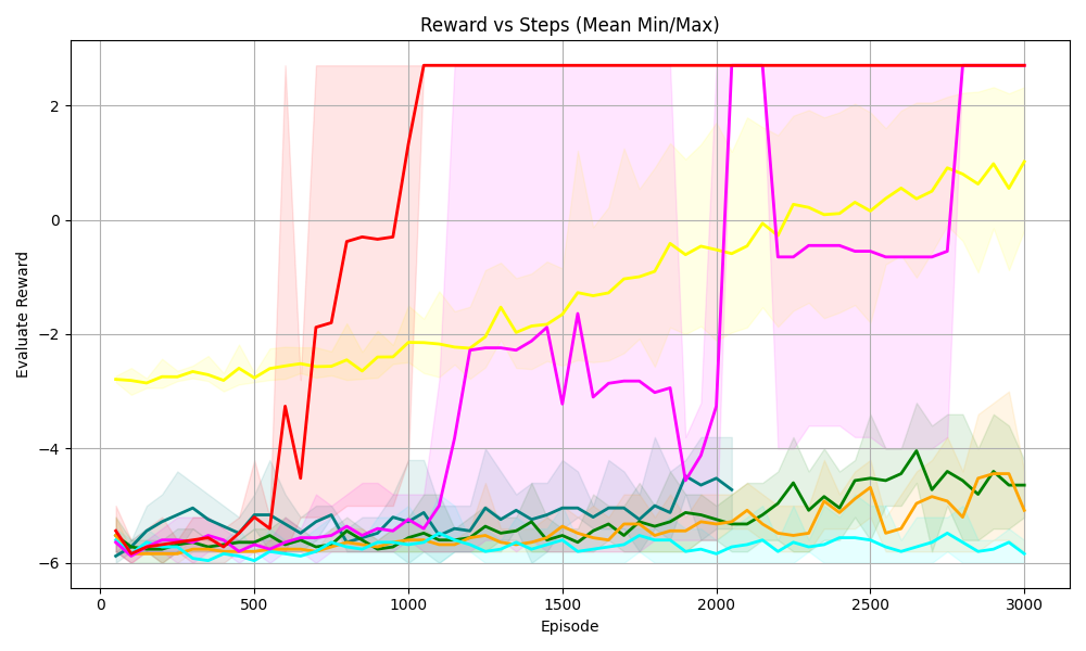
(a) Sudoku 3 $\times$ 3
<details>
<summary>S44.png Details</summary>
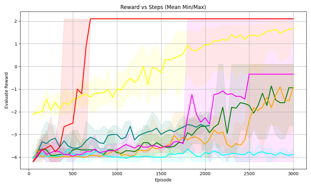
### Visual Description
## Chart: Reward vs Steps (Mean Min/Max)
### Overview
The image is a line chart displaying the "Evaluate Reward" versus "Episode" (steps). There are multiple lines, each representing a different algorithm or configuration. The chart also includes shaded regions around some of the lines, indicating the min/max range of the reward.
### Components/Axes
* **Title:** Reward vs Steps (Mean Min/Max)
* **X-axis:** Episode, ranging from 0 to 3000 in increments of 500.
* **Y-axis:** Evaluate Reward, ranging from -4 to 2 in increments of 1.
* **Grid:** Present in the background.
* **Data Series:** Multiple lines with different colors, each representing a different algorithm or configuration.
* Red: Starts at approximately -4, increases sharply to approximately 2 by episode 750, and then remains constant at approximately 2.
* Yellow: Starts at approximately -2, gradually increases to approximately 1.8 by episode 3000.
* Green: Starts at approximately -4, fluctuates and gradually increases to approximately -1 by episode 3000.
* Orange: Starts at approximately -4, fluctuates and gradually increases to approximately -1 by episode 3000.
* Magenta: Starts at approximately -4, fluctuates, increases to approximately 0 by episode 2500, and then remains constant.
* Cyan: Starts at approximately -4, remains relatively constant at approximately -4.
* **Shaded Regions:** Shaded regions around some of the lines, indicating the min/max range of the reward.
* Red: Shaded region around the red line.
* Yellow: Shaded region around the yellow line.
* Green: Shaded region around the green line.
* Orange: Shaded region around the orange line.
* Magenta: Shaded region around the magenta line.
* Cyan: Shaded region around the cyan line.
### Detailed Analysis
* **Red Line:** The red line shows a rapid increase in reward early in the training process, quickly reaching a plateau at a reward of approximately 2. This suggests a fast-learning algorithm.
* **Yellow Line:** The yellow line shows a more gradual increase in reward, eventually reaching a reward of approximately 1.8 by the end of the training process. This suggests a slower-learning algorithm.
* **Green Line:** The green line shows a fluctuating reward, with a gradual increase over time. This suggests an algorithm that is learning but experiencing some instability.
* **Orange Line:** The orange line shows a fluctuating reward, with a gradual increase over time. This suggests an algorithm that is learning but experiencing some instability.
* **Magenta Line:** The magenta line shows a fluctuating reward, with a gradual increase over time. This suggests an algorithm that is learning but experiencing some instability.
* **Cyan Line:** The cyan line shows a relatively constant reward, suggesting that the algorithm is not learning.
### Key Observations
* The red line shows the fastest learning and highest reward.
* The yellow line shows a slower learning but still achieves a high reward.
* The green, orange, and magenta lines show fluctuating rewards, suggesting instability.
* The cyan line shows no learning.
### Interpretation
The chart compares the performance of different algorithms or configurations in terms of reward versus episode. The red line represents the most successful algorithm, achieving a high reward quickly. The yellow line represents a slower-learning but still successful algorithm. The green, orange, and magenta lines represent algorithms that are learning but experiencing some instability. The cyan line represents an algorithm that is not learning. The shaded regions around the lines indicate the min/max range of the reward, providing a measure of the variability of the algorithm's performance. The chart suggests that the red algorithm is the most effective, while the cyan algorithm is the least effective. The other algorithms show varying degrees of success and instability.
</details>
(b) Sudoku 4 $\times$ 4
<details>
<summary>S55.png Details</summary>
### Visual Description
## Line Chart: Reward vs Steps (Mean Min/Max)
### Overview
The image is a line chart displaying the relationship between "Reward" and "Episode" steps. It shows multiple data series, each represented by a different colored line, along with shaded regions indicating the min/max range for each series. The chart aims to visualize the performance of different algorithms or configurations over time, as measured by the "Evaluate Reward" metric.
### Components/Axes
* **Title:** Reward vs Steps (Mean Min/Max)
* **X-axis:** Episode
* Scale: 0 to 3000, with markers at 0, 500, 1000, 1500, 2000, 2500, and 3000.
* **Y-axis:** Evaluate Reward
* Scale: -6 to 2, with markers at -6, -4, -2, 0, and 2.
* **Data Series:** There are multiple data series represented by different colored lines. The exact number of series is difficult to determine without a legend, but there are at least 6 distinct colors: red, yellow, magenta, green, orange, and cyan. Each series also has a shaded region around it, representing the minimum and maximum reward values at each episode.
### Detailed Analysis
Here's a breakdown of the trends observed for each data series:
* **Red Line:** Starts around -6. It increases sharply around episode 750 to approximately -0.25, then again around episode 1000 to a value of 2.5, and remains relatively constant at that level for the rest of the episodes. The shaded region around the red line is quite wide initially, narrowing significantly after the sharp increase.
* **Yellow Line:** Starts around -2.5 and remains relatively flat until episode 2000, then gradually increases to approximately 1 by episode 3000. The shaded region around the yellow line is relatively narrow.
* **Magenta Line:** Starts around -6. It fluctuates between -6 and -2 until episode 2000, where it sharply increases to approximately 2.5, then drops again to approximately -0.5 by episode 2500, and remains relatively constant. The shaded region around the magenta line is wide.
* **Green Line:** Starts around -6. It gradually increases to approximately -4.5 by episode 3000. The shaded region around the green line is relatively narrow.
* **Orange Line:** Starts around -6. It remains relatively flat around -6 until episode 2500, then gradually increases to approximately -4.5 by episode 3000. The shaded region around the orange line is relatively narrow.
* **Cyan Line:** Starts around -6. It remains relatively flat around -6 for the entire duration of the episodes. The shaded region around the cyan line is relatively narrow.
* **Teal Line:** Starts around -6. It remains relatively flat around -6 for the entire duration of the episodes. The shaded region around the teal line is relatively narrow.
### Key Observations
* The red and magenta lines show the most significant improvement in reward over the episodes, with the red line achieving a high reward relatively early in the training process.
* The yellow line shows a gradual improvement in reward over time.
* The green, orange, cyan, and teal lines show little to no improvement in reward over the episodes.
* The shaded regions indicate the variability in reward for each series. Some series have more consistent rewards (narrow shaded regions), while others have more variable rewards (wide shaded regions).
### Interpretation
The chart compares the performance of different algorithms or configurations (represented by the different colored lines) in terms of the "Evaluate Reward" metric over a series of episodes. The red line represents the most successful algorithm, as it achieves a high reward relatively early in the training process and maintains that level for the rest of the episodes. The magenta line also shows significant improvement, but it is more volatile than the red line. The yellow line shows a gradual improvement, while the green, orange, cyan, and teal lines show little to no improvement.
The shaded regions provide information about the stability of each algorithm. Algorithms with narrow shaded regions are more consistent in their performance, while algorithms with wide shaded regions are more variable.
Overall, the chart suggests that the red algorithm is the most effective for this particular task, followed by the magenta and yellow algorithms. The green, orange, cyan, and teal algorithms are not performing well and may need to be adjusted or replaced.
</details>
(c) Sudoku 5 $\times$ 5
<details>
<summary>4queens.png Details</summary>
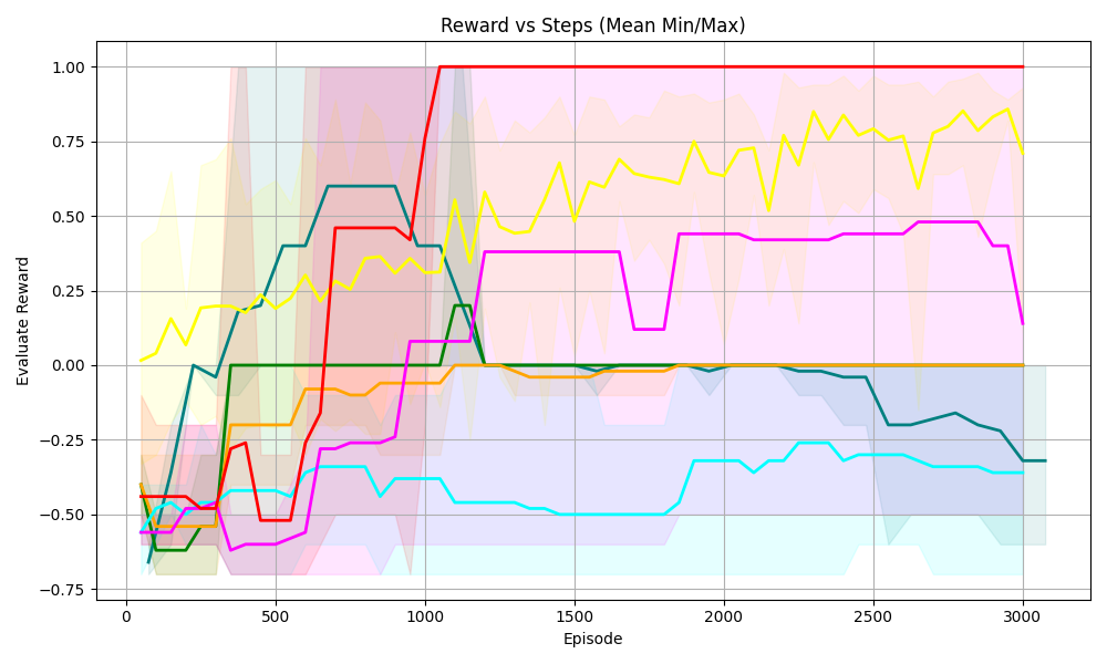
### Visual Description
## Line Chart: Reward vs Steps (Mean Min/Max)
### Overview
The image is a line chart displaying the "Evaluate Reward" on the y-axis against "Episode" (steps) on the x-axis. There are multiple lines, each representing a different data series, with shaded regions around each line indicating the min/max range. The chart aims to show how the reward changes over the course of episodes for different experimental conditions.
### Components/Axes
* **Title:** Reward vs Steps (Mean Min/Max)
* **X-axis:**
* Label: Episode
* Scale: 0 to 3000, with markers at 0, 500, 1000, 1500, 2000, 2500, and 3000.
* **Y-axis:**
* Label: Evaluate Reward
* Scale: -0.75 to 1.00, with markers at -0.75, -0.50, -0.25, 0.00, 0.25, 0.50, 0.75, and 1.00.
* **Data Series:** There are 6 distinct data series represented by different colored lines. There is no explicit legend.
### Detailed Analysis
Since there is no legend, I will refer to the lines by their color.
* **Red Line:** Starts at approximately -0.5. Initially decreases slightly, then sharply increases to 1.0 around episode 1000, and remains constant at 1.0 for the rest of the episodes.
* **Yellow Line:** Starts at approximately 0.1. Increases to approximately 0.4 at episode 500, then fluctuates between 0.25 and 0.75 for the remaining episodes.
* **Teal Line:** Starts at approximately -0.6. Increases to approximately 0.6 at episode 750, then decreases to approximately -0.3 at episode 2000, and remains relatively constant at -0.3 for the rest of the episodes.
* **Green Line:** Starts at approximately -0.6. Increases to approximately 0.0 at episode 750, and remains relatively constant at 0.0 for the rest of the episodes.
* **Orange Line:** Starts at approximately -0.5. Increases to approximately 0.0 at episode 1000, and remains relatively constant at 0.0 for the rest of the episodes.
* **Magenta Line:** Starts at approximately -0.6. Increases to approximately 0.5 at episode 750, then fluctuates between -0.3 and 0.5 for the remaining episodes.
### Key Observations
* The red line shows the most significant and rapid improvement in reward, reaching the maximum value of 1.0 and maintaining it.
* The yellow line shows a moderate and fluctuating reward.
* The teal line shows an initial improvement followed by a decline and stabilization at a negative reward.
* The green and orange lines show a gradual improvement to a reward of 0.0 and then remain constant.
* The magenta line shows an initial improvement followed by fluctuations.
### Interpretation
The chart compares the performance of different experimental conditions or algorithms over a series of episodes. The red line indicates the most successful condition, as it quickly achieves and maintains the highest possible reward. The other lines show varying degrees of success, with some conditions leading to negative rewards or fluctuating performance. The shaded regions around each line indicate the variability in the reward for each condition, providing insight into the consistency of the performance. The data suggests that the experimental condition represented by the red line is the most effective, while the others may require further optimization or are inherently less effective.
</details>
(d) 4 Queens
<details>
<summary>6queens.png Details</summary>
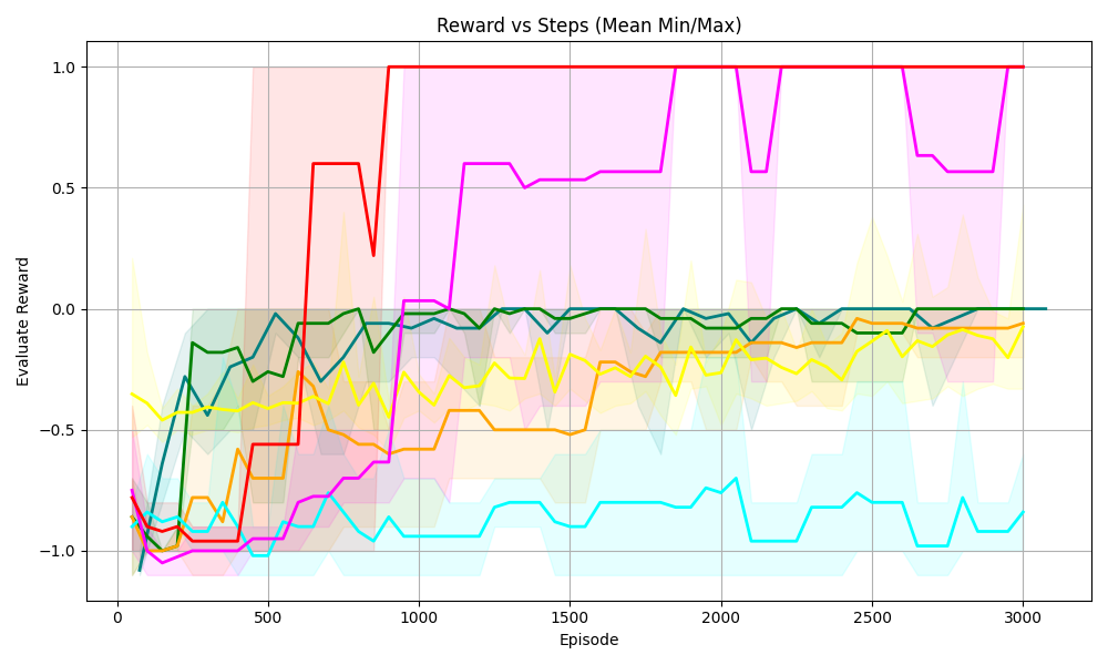
### Visual Description
## Line Chart: Reward vs Steps (Mean Min/Max)
### Overview
The image is a line chart displaying the "Evaluate Reward" on the y-axis versus "Episode" (steps) on the x-axis. There are multiple lines, each representing a different data series, along with shaded regions indicating the min/max range for each series. The chart visualizes how the reward changes over the course of episodes for different scenarios or algorithms.
### Components/Axes
* **Title:** Reward vs Steps (Mean Min/Max)
* **X-axis:**
* Label: Episode
* Scale: 0 to 3000, with markers at 0, 500, 1000, 1500, 2000, 2500, and 3000.
* **Y-axis:**
* Label: Evaluate Reward
* Scale: -1.0 to 1.0, with markers at -1.0, -0.5, 0.0, 0.5, and 1.0.
* **Data Series:** There are six distinct data series, each represented by a different color line and a corresponding shaded region indicating the min/max range. The colors are red, magenta, green, teal, yellow, and orange.
### Detailed Analysis
* **Red Line:**
* Trend: Starts around -1.0, rapidly increases to approximately 0.6 by episode 500, then reaches 1.0 around episode 800, and remains at 1.0 for the rest of the episodes.
* Values:
* Episode 0: -1.0
* Episode 500: 0.6
* Episode 800: 1.0
* Episode 3000: 1.0
* **Magenta Line:**
* Trend: Starts around -1.0, increases to approximately -0.7 by episode 500, then gradually increases to around 0.5 by episode 1000, and fluctuates between 0.5 and 1.0 for the rest of the episodes.
* Values:
* Episode 0: -1.0
* Episode 500: -0.7
* Episode 1000: 0.5
* Episode 3000: 0.9
* **Green Line:**
* Trend: Starts around -0.8, increases to approximately 0.0 by episode 500, and then remains relatively stable around 0.0 for the rest of the episodes.
* Values:
* Episode 0: -0.8
* Episode 500: 0.0
* Episode 3000: 0.0
* **Teal Line:**
* Trend: Starts around -0.9, decreases to approximately -1.0 by episode 200, then fluctuates between -1.0 and -0.7 for the rest of the episodes.
* Values:
* Episode 0: -0.9
* Episode 200: -1.0
* Episode 3000: -0.8
* **Yellow Line:**
* Trend: Starts around -0.3, decreases to approximately -0.6 by episode 200, then gradually increases to around -0.1 by episode 3000.
* Values:
* Episode 0: -0.3
* Episode 200: -0.6
* Episode 3000: -0.1
* **Orange Line:**
* Trend: Starts around -0.9, increases to approximately -0.5 by episode 500, then gradually increases to around 0.0 by episode 3000.
* Values:
* Episode 0: -0.9
* Episode 500: -0.5
* Episode 3000: 0.0
### Key Observations
* The red line shows the most rapid and significant increase in reward, reaching the maximum value of 1.0 relatively quickly and maintaining it.
* The magenta line also shows a significant increase in reward, but it fluctuates more than the red line.
* The green line shows a moderate increase in reward and then stabilizes.
* The teal line shows the least improvement in reward, fluctuating around a negative value.
* The yellow and orange lines show gradual increases in reward over time.
* The shaded regions indicate the variability in reward for each series, with some series showing more variability than others.
### Interpretation
The chart compares the performance of different strategies or algorithms (represented by the different colored lines) in terms of reward earned over a series of episodes. The red line represents the most successful strategy, as it quickly achieves and maintains the maximum reward. The magenta line also performs well, but with more variability. The green line shows a moderate level of success, while the teal line struggles to achieve a positive reward. The yellow and orange lines show gradual improvements, suggesting a learning process. The shaded regions provide insight into the consistency of each strategy, with wider regions indicating more variability in performance. Overall, the chart demonstrates the relative effectiveness of different approaches to a reinforcement learning problem, highlighting the importance of selecting a strategy that can consistently achieve high rewards.
</details>
(e) 6 Queens
<details>
<summary>8queens.png Details</summary>
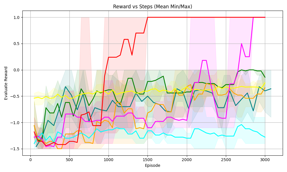
### Visual Description
## Line Chart: Reward vs Steps (Mean Min/Max)
### Overview
The image is a line chart displaying the "Evaluate Reward" on the y-axis versus "Episode" on the x-axis. There are multiple lines, each representing a different series, along with shaded regions indicating the min/max range for each series. The chart visualizes the performance of different strategies or algorithms over a number of episodes.
### Components/Axes
* **Title:** Reward vs Steps (Mean Min/Max)
* **X-axis:**
* Label: Episode
* Scale: 0 to 3000, with major ticks at 0, 500, 1000, 1500, 2000, 2500, and 3000.
* **Y-axis:**
* Label: Evaluate Reward
* Scale: -1.5 to 1.0, with major ticks at -1.5, -1.0, -0.5, 0.0, 0.5, and 1.0.
* **Data Series:** There are six distinct data series, each represented by a different color line and a corresponding shaded region indicating the min/max range. The colors are red, green, yellow, teal, orange, and magenta.
### Detailed Analysis
Here's a breakdown of each data series:
* **Red Line:**
* Trend: Starts around -1.5, fluctuates slightly until around episode 800, then rapidly increases to around 0.7 by episode 1200, and then plateaus at 1.0 from episode 1500 onwards.
* Approximate Values:
* Episode 0: -1.5
* Episode 800: -1.4
* Episode 1200: 0.7
* Episode 1500-3000: 1.0
* **Green Line:**
* Trend: Starts around -1.2, fluctuates between -1.2 and -0.2, and ends around 0.0.
* Approximate Values:
* Episode 0: -1.2
* Episode 1500: -0.2
* Episode 3000: 0.0
* **Yellow Line:**
* Trend: Relatively stable, fluctuating around -0.5.
* Approximate Values:
* Episode 0-3000: -0.5
* **Teal Line:**
* Trend: Starts around -1.3, fluctuates, and generally decreases to around -1.2.
* Approximate Values:
* Episode 0: -1.3
* Episode 3000: -1.2
* **Orange Line:**
* Trend: Starts around -1.0, fluctuates, and ends around -0.4.
* Approximate Values:
* Episode 0: -1.0
* Episode 3000: -0.4
* **Magenta Line:**
* Trend: Starts around -1.4, fluctuates, increases around episode 2500, and ends around 1.0.
* Approximate Values:
* Episode 0: -1.4
* Episode 2500: 0.5
* Episode 3000: 1.0
### Key Observations
* The red line shows the most significant improvement in reward over the episodes, reaching a plateau at the maximum reward value.
* The yellow line shows the most stable performance, with minimal fluctuation in reward.
* The teal line shows a slight decrease in reward over the episodes.
* The shaded regions indicate the variability in reward for each series, with some series showing more consistent performance than others.
### Interpretation
The chart compares the performance of different strategies or algorithms (represented by the different colored lines) in terms of "Evaluate Reward" over a series of "Episodes". The red line represents the most successful strategy, as it quickly learns and achieves the highest reward. The yellow line represents a strategy that is consistently mediocre. The other lines represent strategies with varying degrees of success and stability. The shaded regions provide insight into the consistency of each strategy's performance, with narrower regions indicating more consistent results. The data suggests that the red strategy is the most effective for this particular task or environment. The magenta strategy also shows promise, eventually reaching the same reward level as the red strategy, but with more fluctuation.
</details>
(f) 8 Queens
<details>
<summary>10queens.png Details</summary>
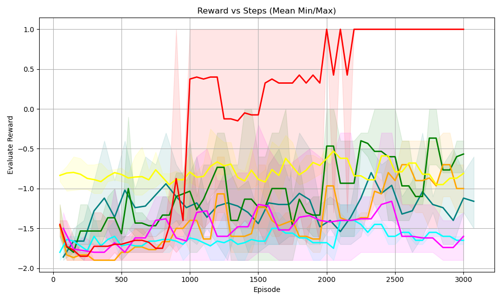
### Visual Description
## Line Chart: Reward vs Steps (Mean Min/Max)
### Overview
The image is a line chart displaying the "Evaluate Reward" on the y-axis against "Episode" (steps) on the x-axis. There are multiple lines, each representing a different data series, with shaded regions around each line indicating the min/max range. The chart title is "Reward vs Steps (Mean Min/Max)".
### Components/Axes
* **Title:** Reward vs Steps (Mean Min/Max)
* **X-axis:**
* Label: Episode
* Scale: 0 to 3000, with markers at 0, 500, 1000, 1500, 2000, 2500, and 3000.
* **Y-axis:**
* Label: Evaluate Reward
* Scale: -2.0 to 1.0, with markers at -2.0, -1.5, -1.0, -0.5, 0.0, 0.5, and 1.0.
* **Data Series:** There are 6 data series represented by different colored lines: red, yellow, green, teal, orange, and magenta. Each line has a shaded region around it, indicating the min/max range for that series. There is no explicit legend.
### Detailed Analysis
**Red Line:**
* Trend: Starts around -1.8, increases sharply around episode 900 to approximately 0.4, then fluctuates between -0.2 and 0.4 until around episode 2000, where it spikes to 1.0, and remains at 1.0 until the end.
* Data Points:
* Episode 0: -1.8
* Episode 900: 0.4
* Episode 1500: -0.2
* Episode 2000: 1.0
* Episode 3000: 1.0
**Yellow Line:**
* Trend: Starts around -0.8, fluctuates between -0.7 and -1.0 throughout the entire range.
* Data Points:
* Episode 0: -0.8
* Episode 1500: -0.8
* Episode 3000: -0.7
**Green Line:**
* Trend: Starts around -1.6, increases to around -1.0 by episode 500, fluctuates between -0.5 and -1.5 until the end.
* Data Points:
* Episode 0: -1.6
* Episode 500: -1.0
* Episode 1800: -0.5
* Episode 3000: -0.6
**Teal Line:**
* Trend: Starts around -1.8, increases to around -1.5 by episode 500, fluctuates between -1.5 and -1.8 until the end.
* Data Points:
* Episode 0: -1.8
* Episode 500: -1.5
* Episode 3000: -1.6
**Orange Line:**
* Trend: Starts around -1.8, increases to around -1.6 by episode 500, fluctuates between -1.2 and -1.8 until the end.
* Data Points:
* Episode 0: -1.8
* Episode 500: -1.6
* Episode 3000: -1.2
**Magenta Line:**
* Trend: Starts around -1.7, increases to around -1.4 by episode 500, fluctuates between -1.4 and -1.8 until the end.
* Data Points:
* Episode 0: -1.7
* Episode 500: -1.4
* Episode 3000: -1.7
### Key Observations
* The red line shows a significant increase in reward around episode 900 and then stabilizes at the maximum reward (1.0) after episode 2000.
* The other lines (yellow, green, teal, orange, and magenta) show relatively stable rewards, fluctuating within a narrower range between -0.5 and -1.8.
* The shaded regions around each line indicate the variability (min/max) of the reward for each series.
### Interpretation
The chart suggests that the red data series (likely representing a specific algorithm or configuration) learns to achieve a high reward after a certain number of episodes (around 900), eventually reaching and maintaining the maximum possible reward. The other series show less learning progress and remain at lower reward levels. The shaded regions indicate the consistency of the rewards for each series, with wider regions suggesting more variability. The red series demonstrates a clear learning curve, while the others show limited improvement over the course of the episodes.
</details>
(g) 10 Queens
<details>
<summary>Graph1.png Details</summary>
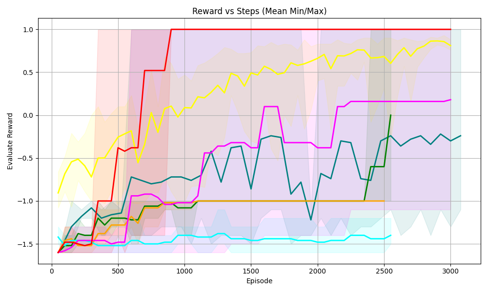
### Visual Description
## Line Chart: Reward vs Steps (Mean Min/Max)
### Overview
The image is a line chart displaying the relationship between "Reward" and "Steps" (represented as "Episode"). The chart includes multiple data series, each representing a different scenario or algorithm, along with shaded regions indicating the min/max range for each series. The x-axis represents the "Episode" (steps), and the y-axis represents the "Evaluate Reward".
### Components/Axes
* **Title:** Reward vs Steps (Mean Min/Max)
* **X-axis:**
* Label: Episode
* Scale: 0 to 3000, with major ticks at 0, 500, 1000, 1500, 2000, 2500, and 3000.
* **Y-axis:**
* Label: Evaluate Reward
* Scale: -1.5 to 1.0, with major ticks at -1.5, -1.0, -0.5, 0.0, 0.5, and 1.0.
* **Data Series:** There are multiple data series represented by different colored lines, each with a shaded region around it. The colors are red, yellow, magenta, teal, dark green, orange, and light blue. There is no explicit legend.
### Detailed Analysis
**Red Line:**
* Trend: The red line starts at approximately -1.5 and quickly rises to 1.0 around episode 750, where it remains constant for the rest of the episodes.
* Data Points: Starts at approximately -1.5, rises to 0.5 around episode 500, and reaches 1.0 around episode 750.
**Yellow Line:**
* Trend: The yellow line starts at approximately -0.6 and gradually increases with fluctuations, reaching approximately 0.9 by episode 3000.
* Data Points: Starts at approximately -0.6, reaches -0.3 around episode 500, fluctuates between 0.3 and 0.7 between episodes 1000 and 2000, and reaches approximately 0.9 by episode 3000.
**Magenta Line:**
* Trend: The magenta line starts at approximately -1.5, increases to approximately -0.9 around episode 1000, and then gradually increases to approximately 0.2 by episode 3000.
* Data Points: Starts at approximately -1.5, reaches -1.0 around episode 500, -0.9 around episode 1000, and approximately 0.2 by episode 3000.
**Teal Line:**
* Trend: The teal line starts at approximately -1.2, decreases to approximately -1.5, and then fluctuates around -0.5, ending at approximately -0.2.
* Data Points: Starts at approximately -1.2, decreases to approximately -1.5 around episode 250, fluctuates around -0.5 between episodes 1000 and 2500, and ends at approximately -0.2.
**Dark Green Line:**
* Trend: The dark green line starts at approximately -1.3, fluctuates, and ends at approximately -0.2.
* Data Points: Starts at approximately -1.3, reaches -1.0 around episode 500, fluctuates between -0.8 and -0.3 between episodes 1000 and 2500, and ends at approximately -0.2.
**Orange Line:**
* Trend: The orange line starts at approximately -1.5, increases to approximately -1.1, and then remains relatively constant at approximately -1.0.
* Data Points: Starts at approximately -1.5, increases to approximately -1.1 around episode 500, and then remains relatively constant at approximately -1.0.
**Light Blue Line:**
* Trend: The light blue line starts at approximately -1.6 and remains relatively constant at approximately -1.5.
* Data Points: Starts at approximately -1.6 and remains relatively constant at approximately -1.5.
### Key Observations
* The red line shows the most rapid and significant increase in reward, reaching the maximum value of 1.0 and remaining there.
* The yellow line shows a gradual increase in reward with fluctuations.
* The magenta line shows a moderate increase in reward.
* The teal and dark green lines show fluctuations in reward.
* The orange and light blue lines show relatively constant and low reward values.
### Interpretation
The chart compares the performance of different algorithms or scenarios based on the "Evaluate Reward" achieved over a number of "Episodes". The red line represents the most successful algorithm, as it quickly reaches the maximum reward and maintains it. The other lines represent algorithms with varying degrees of success, with some showing gradual improvement and others remaining relatively constant. The shaded regions indicate the variability in the reward for each algorithm, providing insight into the consistency of their performance. The data suggests that the red line algorithm is the most effective, while the orange and light blue line algorithms are the least effective.
</details>
(h) Graph 1
<details>
<summary>Graph2.png Details</summary>
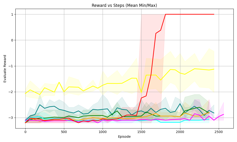
### Visual Description
## Line Chart: Reward vs Steps (Mean Min/Max)
### Overview
The image is a line chart displaying the relationship between "Reward" and "Steps" (represented as "Episode"). The chart includes multiple data series, each represented by a different colored line. The chart also displays the mean, minimum, and maximum values for one of the data series, indicated by a shaded region around the line.
### Components/Axes
* **Title:** Reward vs Steps (Mean Min/Max)
* **X-axis:** Episode
* Scale: 0 to 2500, with markers at 0, 500, 1000, 1500, 2000, and 2500.
* **Y-axis:** Evaluate Reward
* Scale: -3 to 1, with markers at -3, -2, -1, 0, and 1.
* **Data Series:** There are multiple data series represented by different colored lines: red, yellow, teal, green, orange, magenta, and cyan.
* **Shaded Regions:** A yellow shaded region surrounds the yellow line, a teal shaded region surrounds the teal line, and a red shaded region surrounds the red line. These shaded regions likely represent the min/max range for each series.
### Detailed Analysis
* **Red Line:** This line starts at approximately -3 around episode 0. It remains relatively flat until around episode 1500, where it sharply increases to 1. It then remains at 1 for the rest of the episodes. The red shaded region is visible after episode 1500.
* **Yellow Line:** This line starts at approximately -2 around episode 0. It fluctuates between -2 and -1.5 until around episode 1500. After episode 1500, it fluctuates between -2 and -1. The yellow shaded region surrounds this line.
* **Teal Line:** This line starts at approximately -3 around episode 0. It fluctuates between -3 and -2.5 until around episode 1500. After episode 1500, it fluctuates between -3 and -2. The teal shaded region surrounds this line.
* **Green Line:** This line starts at approximately -3 around episode 0. It remains relatively flat around -3 for the duration of the episodes.
* **Orange Line:** This line starts at approximately -3 around episode 0. It remains relatively flat around -3 for the duration of the episodes.
* **Magenta Line:** This line starts at approximately -3 around episode 0. It remains relatively flat around -3 for the duration of the episodes, with a slight dip towards -3.2 around episode 2500.
* **Cyan Line:** This line starts at approximately -3 around episode 0. It remains relatively flat around -3 for the duration of the episodes.
### Key Observations
* The red line shows a significant increase in reward around episode 1500, indicating a potential learning point or change in strategy.
* The yellow line shows more fluctuation in reward compared to the other lines, suggesting a less stable performance.
* The green, orange, magenta, and cyan lines remain relatively flat, indicating a consistent but low reward.
* The shaded regions around the yellow, teal, and red lines provide information about the variability of the reward for those series.
### Interpretation
The chart likely represents the performance of different agents or algorithms over a series of episodes. The "Evaluate Reward" indicates the performance metric being used. The red line's sharp increase suggests that the corresponding agent or algorithm learned a successful strategy around episode 1500. The other lines indicate less successful or stable strategies. The shaded regions provide insight into the range of possible rewards for each strategy, with wider regions indicating greater variability. The data suggests that the red line represents the most successful strategy, while the others are less effective.
</details>
(i) Graph 2
<details>
<summary>Graph3.png Details</summary>
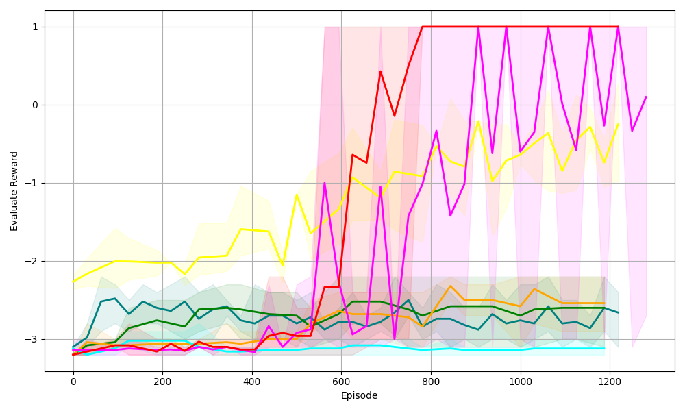
### Visual Description
## Line Chart: Evaluate Reward vs. Episode
### Overview
The image is a line chart displaying the "Evaluate Reward" on the y-axis against the "Episode" number on the x-axis. There are multiple lines, each representing a different series, with shaded regions around each line indicating variability or confidence intervals. The chart shows how the reward changes over the course of episodes for different algorithms or configurations.
### Components/Axes
* **X-axis:** "Episode" - Ranges from 0 to 1200, with gridlines at intervals of 200.
* **Y-axis:** "Evaluate Reward" - Ranges from -3 to 1, with gridlines at intervals of 1.
* **Lines:** There are multiple lines of different colors, each with a shaded region of the same color around it. The colors are red, magenta, yellow, orange, teal, dark green, and dark teal. There is no explicit legend.
### Detailed Analysis
Here's a breakdown of each line's trend and approximate values:
* **Red Line:** This line starts around -3 and remains relatively flat until approximately episode 550. It then sharply increases to around 0.75 by episode 650, then reaches 1 around episode 750, and stays at 1 until the end of the chart.
* **Magenta Line:** This line starts around -3 and remains relatively flat until approximately episode 550. It then sharply increases to around -0.5 by episode 650, then oscillates between 0 and 1 for the remainder of the episodes.
* **Yellow Line:** This line starts around -2.25 and gradually increases to around -1.5 by episode 400. It then decreases slightly before sharply increasing to around -0.5 by episode 650, then oscillates between -1 and 0 for the remainder of the episodes.
* **Orange Line:** This line starts around -3 and remains relatively flat, fluctuating slightly between -3 and -2.5, until the end of the chart.
* **Teal Line:** This line starts around -3 and remains relatively flat, fluctuating slightly between -3 and -2.75, until the end of the chart.
* **Dark Green Line:** This line starts around -3 and increases to around -2.5 by episode 200. It then remains relatively flat, fluctuating slightly between -3 and -2.5, until the end of the chart.
* **Dark Teal Line:** This line starts around -3.2 and increases to around -2.5 by episode 200. It then remains relatively flat, fluctuating slightly between -3 and -2.5, until the end of the chart.
### Key Observations
* The red and magenta lines show a significant improvement in reward after approximately episode 550.
* The yellow line also shows improvement, but it is less dramatic than the red and magenta lines.
* The orange, teal, dark green, and dark teal lines remain relatively flat throughout the episodes, indicating little to no improvement in reward.
* The shaded regions around each line indicate the variability in the reward for each episode. The red and magenta lines have larger shaded regions after episode 600, indicating more variability in the reward.
### Interpretation
The chart suggests that some algorithms or configurations (represented by the red, magenta, and yellow lines) are more effective than others (represented by the orange, teal, dark green, and dark teal lines) in improving the reward over the course of episodes. The red and magenta lines show the most significant improvement, indicating that these algorithms or configurations are the most successful. The larger shaded regions around the red and magenta lines after episode 600 suggest that these algorithms or configurations are also more variable in their performance. The flat lines indicate that the corresponding algorithms or configurations are not learning or improving over time.
</details>
(j) Graph 3
<details>
<summary>Graph4.png Details</summary>
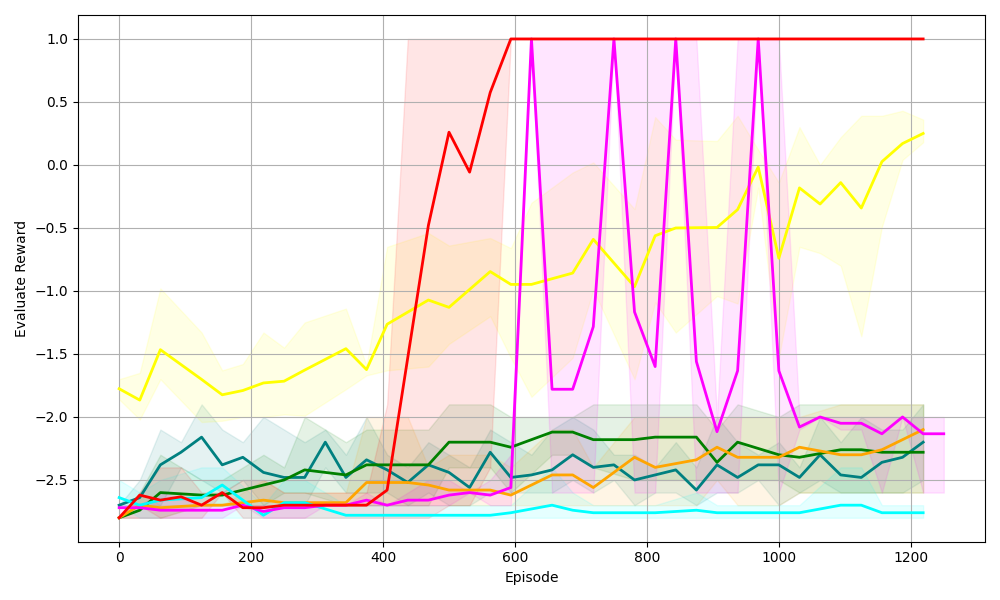
### Visual Description
## Line Chart: Evaluate Reward vs. Episode
### Overview
The image is a line chart displaying the "Evaluate Reward" on the y-axis versus "Episode" on the x-axis. There are multiple colored lines, each representing a different data series, along with shaded regions around each line indicating variability or confidence intervals. The chart spans from episode 0 to 1200, and the reward ranges from approximately -2.7 to 1.0.
### Components/Axes
* **X-axis:** Episode, ranging from 0 to 1200 in increments of 200.
* **Y-axis:** Evaluate Reward, ranging from -2.5 to 1.0 in increments of 0.5.
* **Gridlines:** Present on both axes, aiding in value estimation.
* **Data Series:** Multiple colored lines, each with a corresponding shaded region. The colors are red, magenta, yellow, green, teal, dark teal, and orange. There is no legend, so the meaning of each color is unknown.
### Detailed Analysis
* **Red Line:** Initially at approximately -2.7, the red line increases sharply around episode 400, reaching a reward of 0.0 around episode 500. It then rises to 1.0 around episode 600 and remains at 1.0 until the end of the chart at episode 1200.
* **Magenta Line:** Starts at approximately -2.7. It remains relatively flat until around episode 600, after which it exhibits significant oscillations, reaching values as high as 1.0 and as low as -2.7 multiple times between episodes 600 and 1000. After episode 1000, it stabilizes around -2.0.
* **Yellow Line:** Begins around -1.8 and fluctuates between -2.0 and -1.5 until around episode 400. It then gradually increases, reaching approximately -0.1 by episode 1200.
* **Green Line:** Starts around -2.6 and fluctuates slightly, generally staying between -2.6 and -2.2 throughout the entire range of episodes.
* **Teal Line:** Starts around -2.6 and remains relatively flat around -2.7 throughout the entire range of episodes.
* **Dark Teal Line:** Starts around -2.6 and gradually increases to approximately -2.2 by episode 200. It then fluctuates between -2.5 and -2.0 until the end of the chart.
* **Orange Line:** Starts around -2.6 and fluctuates slightly, generally staying between -2.6 and -2.4 until around episode 600. It then increases to approximately -2.4 and remains relatively flat until the end of the chart.
### Key Observations
* The red line shows the most significant improvement in reward, quickly reaching and maintaining the maximum reward value.
* The magenta line exhibits high volatility in reward between episodes 600 and 1000.
* The teal line shows the least change in reward, remaining consistently low.
* The shaded regions around each line indicate the variance or uncertainty associated with each data series.
### Interpretation
The chart likely represents the performance of different algorithms or configurations (represented by the different colored lines) during a learning process, where the "Evaluate Reward" measures the success of each algorithm at each "Episode." The red line represents the most successful algorithm, as it quickly learns and maintains a high reward. The magenta line shows an algorithm that initially struggles but then exhibits volatile behavior, possibly indicating instability or overshooting. The teal line represents an algorithm that fails to learn effectively, consistently achieving low rewards. The other lines represent algorithms with varying degrees of success and stability. The shaded regions provide insight into the consistency of each algorithm's performance.
</details>
(k) Graph 4
<details>
<summary>SV22.png Details</summary>
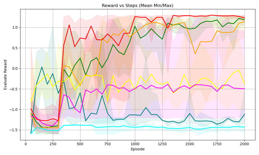
### Visual Description
## Line Chart: Reward vs Steps (Mean Min/Max)
### Overview
The image is a line chart displaying the relationship between "Reward" and "Episode" (steps), showing multiple data series, each representing a different scenario or algorithm. The chart includes shaded regions around each line, indicating the min/max range for each series.
### Components/Axes
* **Title:** Reward vs Steps (Mean Min/Max)
* **X-axis:** Episode
* Scale: 0 to 2000, with markers at 0, 250, 500, 750, 1000, 1250, 1500, 1750, and 2000.
* **Y-axis:** Evaluate Reward
* Scale: -1.5 to 1.0, with markers at -1.5, -1.0, -0.5, 0.0, 0.5, and 1.0.
* **Data Series:** There are six distinct data series, each represented by a different color: red, orange, green, yellow, magenta, and cyan. Each series has a corresponding shaded region indicating the min/max range.
### Detailed Analysis
* **Red Line:**
* Trend: Starts around -1.25, drops slightly, then sharply increases around Episode 250 to reach a value near 1.0. It fluctuates slightly around 1.0 for the remainder of the episodes.
* Approximate Values:
* Episode 0: -1.25
* Episode 250: -1.3
* Episode 500: 0.9
* Episode 1000: 0.75
* Episode 1500: 0.9
* Episode 2000: 1.1
* **Orange Line:**
* Trend: Starts around -1.4, drops slightly, then increases sharply around Episode 250 to reach a value near 0.0. It then gradually increases to around 0.8 by Episode 2000.
* Approximate Values:
* Episode 0: -1.4
* Episode 250: -1.5
* Episode 500: -0.1
* Episode 1000: 0.3
* Episode 1500: 0.7
* Episode 2000: 0.8
* **Green Line:**
* Trend: Starts around 0.0, decreases, then increases sharply around Episode 250 to reach a value near 0.0. It then gradually increases to around 1.0 by Episode 2000.
* Approximate Values:
* Episode 0: 0.0
* Episode 250: -0.75
* Episode 500: 0.2
* Episode 1000: 0.3
* Episode 1500: 0.8
* Episode 2000: 1.0
* **Yellow Line:**
* Trend: Starts around -0.25, decreases, then increases sharply around Episode 250 to reach a value near -0.25. It then fluctuates around -0.25 to 0.0 by Episode 2000.
* Approximate Values:
* Episode 0: -0.25
* Episode 250: -0.75
* Episode 500: -0.3
* Episode 1000: -0.4
* Episode 1500: -0.3
* Episode 2000: -0.1
* **Magenta Line:**
* Trend: Starts around -1.25, decreases, then increases sharply around Episode 250 to reach a value near -1.0. It then fluctuates around -0.75 to -0.5 by Episode 2000.
* Approximate Values:
* Episode 0: -1.25
* Episode 250: -1.25
* Episode 500: -0.9
* Episode 1000: -0.5
* Episode 1500: -0.5
* Episode 2000: -0.5
* **Cyan Line:**
* Trend: Starts around -1.5, remains relatively flat around -1.5 for the duration of the episodes.
* Approximate Values:
* Episode 0: -1.5
* Episode 250: -1.5
* Episode 500: -1.4
* Episode 1000: -1.4
* Episode 1500: -1.4
* Episode 2000: -1.4
### Key Observations
* The red line consistently achieves the highest reward after the initial episodes.
* The cyan line consistently performs the worst, with a reward around -1.5.
* The shaded regions indicate significant variability in the min/max reward values, especially in the early episodes.
* Most lines show a significant increase in reward around Episode 250.
### Interpretation
The chart compares the performance of different algorithms or scenarios (represented by the different colored lines) in terms of reward gained over a series of episodes. The red line represents the most successful approach, consistently achieving high rewards. The cyan line represents the least successful approach. The shaded regions indicate the range of possible outcomes for each approach, suggesting the stability or variability of each method. The sharp increase in reward around Episode 250 for most lines suggests a learning phase or a critical point in the training process. The data suggests that some algorithms are significantly more effective than others in maximizing reward within the given environment or task.
</details>
(l) Visual Sudoku 2 $\times$ 2
<details>
<summary>SV33.png Details</summary>
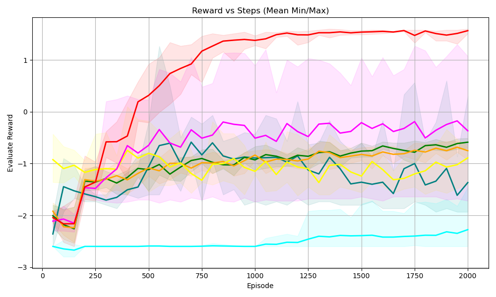
### Visual Description
## Line Chart: Reward vs Steps (Mean Min/Max)
### Overview
The image is a line chart displaying the "Evaluate Reward" on the y-axis versus "Episode" on the x-axis. There are multiple lines, each representing a different data series, along with shaded regions around each line, indicating the min/max range. The chart visualizes the performance or learning progress over episodes.
### Components/Axes
* **Title:** Reward vs Steps (Mean Min/Max)
* **X-axis:**
* Label: Episode
* Scale: 0 to 2000, with markers at 0, 250, 500, 750, 1000, 1250, 1500, 1750, and 2000.
* **Y-axis:**
* Label: Evaluate Reward
* Scale: -3 to 1, with markers at -3, -2, -1, 0, and 1.
* **Data Series:** There are six distinct data series represented by different colored lines. Each line has a shaded region around it, presumably indicating the range (min/max) of the reward at each episode. The colors are red, magenta, teal, yellow, orange, and green. There is no explicit legend.
### Detailed Analysis
* **Red Line:** This line starts around -2 and rapidly increases to approximately 1 by episode 500. It then plateaus around 1.25, with a shaded region indicating a relatively small variance.
* **Magenta Line:** This line starts around -2 and increases to approximately -0.25 by episode 500. It then fluctuates between -0.25 and -0.5 until episode 2000.
* **Teal Line:** This line starts around -2.5 and remains relatively constant around -2.5 to -2.75 throughout the entire range of episodes.
* **Yellow Line:** This line starts around -1 and decreases to approximately -1.25 by episode 250. It then fluctuates between -1.25 and -0.75 until episode 2000.
* **Orange Line:** This line starts around -2 and increases to approximately -1 by episode 500. It then fluctuates between -1 and -0.75 until episode 2000.
* **Green Line:** This line starts around -2 and increases to approximately -1 by episode 500. It then fluctuates between -1 and -0.75 until episode 2000.
### Key Observations
* The red line shows the most significant improvement in reward over the episodes, reaching a plateau at a high reward value.
* The teal line shows the worst performance, with a consistently low reward value.
* The other lines (magenta, yellow, orange, and green) show moderate improvement initially, but then fluctuate around a relatively low reward value.
* The shaded regions indicate the variability in reward for each episode. The red line has a relatively small shaded region after episode 500, indicating consistent performance.
### Interpretation
The chart likely represents the performance of different agents or algorithms during a reinforcement learning process. The "Evaluate Reward" indicates the success of the agent in achieving its goal, and the "Episode" represents the number of training iterations.
The red line represents the most successful agent, as it quickly learns to achieve a high reward and maintains consistent performance. The teal line represents the least successful agent, as it fails to improve its reward over time. The other agents show some initial learning, but their performance plateaus at a relatively low reward value.
The shaded regions provide information about the stability of the learning process. A smaller shaded region indicates that the agent's performance is more consistent, while a larger shaded region indicates more variability.
</details>
(m) Visual Sudoku 3 $\times$ 3
<details>
<summary>SV44.png Details</summary>
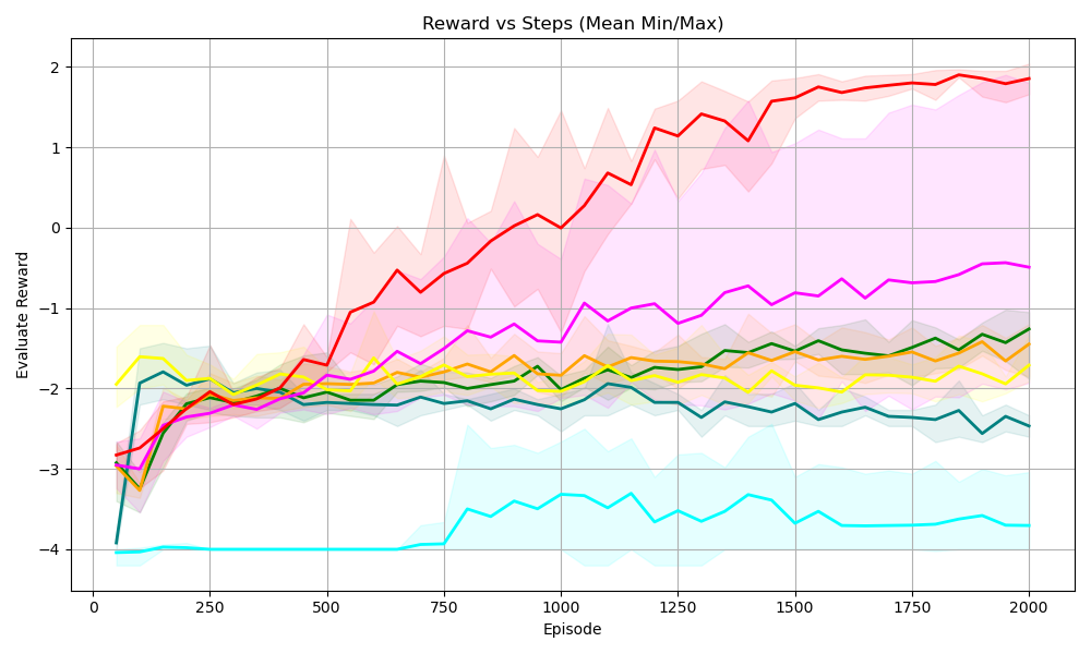
### Visual Description
## Line Chart: Reward vs Steps (Mean Min/Max)
### Overview
The image is a line chart displaying the "Evaluate Reward" on the y-axis against "Episode" on the x-axis. The chart shows multiple data series, each represented by a different colored line, along with shaded regions indicating the min/max range for each series. The chart title is "Reward vs Steps (Mean Min/Max)".
### Components/Axes
* **Title:** Reward vs Steps (Mean Min/Max)
* **X-axis:** Episode, with tick marks at 0, 250, 500, 750, 1000, 1250, 1500, 1750, and 2000.
* **Y-axis:** Evaluate Reward, with tick marks at -4, -3, -2, -1, 0, 1, and 2.
* **Data Series:** There are multiple data series represented by different colored lines. Each line has a shaded region around it, representing the min/max range. The colors are red, magenta, orange, yellow, green, teal, and dark teal. There is no explicit legend.
### Detailed Analysis
* **Red Line:** This line starts at approximately -3 at Episode 0, increases rapidly to approximately -2 at Episode 250, then continues to increase, reaching approximately 0 at Episode 750, and continues to increase to approximately 1.5 at Episode 1250, and then plateaus around 1.8-2.0 from Episode 1500 to 2000. The shaded region around this line is pink, indicating the min/max range.
* **Magenta Line:** This line starts at approximately -2.5 at Episode 0, increases to approximately -2 at Episode 250, and then fluctuates between -1 and -0.5 from Episode 750 to 2000.
* **Orange Line:** This line starts at approximately -2.5 at Episode 0, increases to approximately -2 at Episode 250, and then fluctuates around -1.5 from Episode 500 to 2000.
* **Yellow Line:** This line starts at approximately -3 at Episode 0, increases to approximately -2 at Episode 250, and then fluctuates around -2 from Episode 500 to 2000.
* **Green Line:** This line starts at approximately -2 at Episode 0, decreases slightly to approximately -2.2 at Episode 250, and then fluctuates around -2 from Episode 500 to 2000.
* **Teal Line:** This line starts at approximately -2 at Episode 0, decreases slightly to approximately -2.5 at Episode 250, and then fluctuates around -2.5 from Episode 500 to 2000.
* **Dark Teal Line:** This line starts at approximately -4 at Episode 0, increases to approximately -4 at Episode 750, then increases to approximately -3.5 at Episode 1000, and then fluctuates around -3.5 from Episode 1000 to 2000.
### Key Observations
* The red line shows the most significant improvement in "Evaluate Reward" as the number of episodes increases.
* The dark teal line shows the least improvement in "Evaluate Reward" as the number of episodes increases.
* The other lines (magenta, orange, yellow, green, and teal) show some improvement initially, but then plateau and fluctuate around a relatively constant "Evaluate Reward".
* The shaded regions indicate the variability in the "Evaluate Reward" for each series. The red line has the largest variability, especially in the early episodes.
### Interpretation
The chart compares the performance of different algorithms or configurations (represented by the different colored lines) in terms of "Evaluate Reward" over a series of episodes. The red line represents the most successful algorithm, as it achieves the highest "Evaluate Reward" and shows the most significant improvement over time. The dark teal line represents the least successful algorithm, as it achieves the lowest "Evaluate Reward" and shows little improvement over time. The other algorithms show intermediate performance. The shaded regions indicate the stability or variability of each algorithm's performance. The red line's large variability in the early episodes suggests that it may be more sensitive to initial conditions or random fluctuations, but it eventually converges to a high-performing state.
</details>
(n) Visual Sudoku 4 $\times$ 4
<details>
<summary>SV55.png Details</summary>
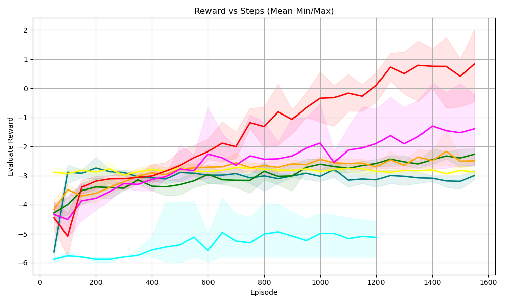
### Visual Description
## Line Chart: Reward vs Steps (Mean Min/Max)
### Overview
The image is a line chart displaying the relationship between "Reward" and "Steps" (represented as "Episode"). The chart shows multiple data series, each represented by a colored line, along with shaded regions indicating the min/max range for each series. The x-axis represents the "Episode" and the y-axis represents the "Evaluate Reward".
### Components/Axes
* **Title:** Reward vs Steps (Mean Min/Max)
* **X-axis:**
* Label: Episode
* Scale: 0 to 1600, with major ticks at 200 intervals (0, 200, 400, 600, 800, 1000, 1200, 1400, 1600)
* **Y-axis:**
* Label: Evaluate Reward
* Scale: -6 to 2, with major ticks at integer intervals (-6, -5, -4, -3, -2, -1, 0, 1, 2)
* **Data Series:** There are multiple data series represented by different colored lines. The exact number of series and their corresponding labels are not explicitly provided in the image, but the following colors are visible:
* Red
* Magenta
* Yellow
* Orange
* Green
* Teal/Cyan
* Dark Teal
### Detailed Analysis
Here's a breakdown of the trends for each visible data series:
* **Red Line:** Starts at approximately -5 at Episode 0, shows a strong upward trend, reaching approximately 0.75 at Episode 1600. The shaded region around the red line indicates the min/max range, which widens as the episode number increases.
* Episode 0: -5
* Episode 1600: 0.75
* **Magenta Line:** Starts at approximately -4 at Episode 0, increases to approximately -2.25 by Episode 600, and then fluctuates between -1.5 and -2.5 until Episode 1600. The shaded region around the magenta line indicates the min/max range.
* Episode 0: -4
* Episode 1600: -1.75
* **Yellow Line:** Starts at approximately -4 at Episode 0, quickly rises to approximately -2.75 by Episode 200, and then remains relatively stable between -2.5 and -3 until Episode 1600.
* Episode 0: -4
* Episode 1600: -3
* **Orange Line:** Starts at approximately -4 at Episode 0, rises to approximately -2.75 by Episode 400, and then remains relatively stable between -2.5 and -3 until Episode 1600.
* Episode 0: -4
* Episode 1600: -2.5
* **Green Line:** Starts at approximately -5.75 at Episode 0, rises to approximately -3 by Episode 400, and then remains relatively stable between -3 and -3.25 until Episode 1600.
* Episode 0: -5.75
* Episode 1600: -3
* **Teal/Cyan Line:** Starts at approximately -5.75 at Episode 0, drops to approximately -5.75 by Episode 100, and then fluctuates between -5 and -6 until Episode 1200, after which the line stops. The shaded region around the teal line indicates the min/max range.
* Episode 0: -5.75
* Episode 1200: -5
* **Dark Teal Line:** Starts at approximately -4.25 at Episode 0, rises to approximately -3 by Episode 200, and then remains relatively stable between -3 and -3.25 until Episode 1600.
* Episode 0: -4.25
* Episode 1600: -3.25
### Key Observations
* The red line shows the most significant improvement in reward as the number of episodes increases.
* The teal/cyan line performs the worst, with a consistently low reward.
* The other lines (magenta, yellow, orange, green, dark teal) show some initial improvement but then plateau, indicating that the agent's performance has stabilized.
* The shaded regions indicate the variability in reward for each series.
### Interpretation
The chart compares the performance of different agents or algorithms (represented by the different colored lines) in terms of reward as they progress through episodes. The red line represents the most successful agent, as it achieves the highest reward over time. The teal/cyan line represents the least successful agent. The other agents show moderate performance. The shaded regions indicate the consistency of the reward for each agent. A wider shaded region suggests more variability in the reward, while a narrower region suggests more consistent performance. The data suggests that the red agent is learning and improving its performance over time, while the other agents have reached a point where they are no longer improving significantly.
</details>
(o) Visual Sudoku 5 $\times$ 5
<details>
<summary>legends.png Details</summary>

### Visual Description
## Legend: Algorithm Performance Comparison
### Overview
The image is a legend that identifies the different algorithms used in a performance comparison chart. Each algorithm is represented by a unique color.
### Components/Axes
The legend is composed of the following elements:
- **Algorithm Names**: Rainbow, PPO, PPO-Lagrangian, KCAC, RC-PPO, PLPG, NSAM(ours)
- **Colors**: Teal, Green, Orange, Yellow, Cyan, Magenta, Red
### Detailed Analysis or ### Content Details
The legend maps each algorithm to a specific color:
- Rainbow: Teal
- PPO: Green
- PPO-Lagrangian: Orange
- KCAC: Yellow
- RC-PPO: Cyan
- PLPG: Magenta
- NSAM(ours): Red
### Key Observations
The legend provides a clear mapping between algorithm names and their corresponding colors, which is essential for interpreting the performance comparison chart.
### Interpretation
The legend is a key component for understanding the performance comparison chart. It allows the viewer to quickly identify which algorithm each data point or line represents. The inclusion of "NSAM(ours)" suggests that this algorithm is the focus of the study.
</details>
Figure 6. Comparsion of learning curves on 4 domains. As the size and queen number increase in Sudoku and N-Queens, the learning task becomes more challenging. Graphs 1 $\sim$ 4 denote four graph coloring tasks with different topologies.
Sudoku. Sudoku is a decision-making domain with logical constraints sudokuRL. In this domain, the agent fills one cell with a number at each step until the board is complete. Action preconditions naturally arise: filling a number to a cell requires that the same number does not already exist in this row and column. Prior work sudokuRL; sudokuMLP shows that existing DRL algorithms struggle to solve Sudoku without predefined symbolic grounding functions.
| | Rainbow | PPO | PPO-lagrangian. | KCAC | RC-PPO | PLPG | NSAM(ours) | | | | | | | | |
| --- | --- | --- | --- | --- | --- | --- | --- | --- | --- | --- | --- | --- | --- | --- | --- |
| Rew. | Viol. | Rew. | Viol. | Rew. | Viol. | Rew. | Viol. | Rew. | Viol. | Rew. | Viol. | Rew. | Viol. | | |
| Sudoku | 2×2 | 1.3 | 36.2% | 1.3 | 14.9% | 1.3 | 0.7% | 1.3 | 9.2% | 0.3 | 11.3% | -0.8 | 5.9% | 1.3 | 0.1% |
| 3×3 | 0.8 | 88.2% | -0.4 | 99.6% | -0.4 | 99.9% | 1.5 | 57.1% | -2.3 | 99.0% | -0.9 | 8.9% | 1.6 | 0.3% | |
| 4×4 | -2.6 | 100% | -2.6 | 100% | -3.4 | 100% | 1.0 | 91.2% | -3.8 | 99.9% | -2.2 | 15.7% | 2.1 | 0.6% | |
| 5×5 | -4.5 | 100% | -5.2 | 100% | -5.3 | 100% | -0.5 | 94.9% | -5.8 | 100% | -3.3 | 18.3% | 2.7 | 4.3% | |
| N-Queens | N=4 | -0.3 | 97.8% | 0.0 | 99.8% | 0.0 | 100% | 0.7 | 78.7% | -0.3 | 93.6% | 0.1 | 10.4% | 1.0 | 2.3% |
| N=6 | 0.0 | 100% | 0.0 | 100% | -0.1 | 100% | -0.1 | 100% | -0.8 | 100% | 1.0 | 12.1% | 1.0 | 1.3% | |
| N=8 | -0.4 | 100% | -0.1 | 100% | -0.3 | 100% | -0.2 | 100% | -1.3 | 100% | 1.0 | 41.6% | 1.0 | 1.1% | |
| N=10 | -1.2 | 100% | -0.6 | 100% | -1.0 | 100% | -0.8 | 100% | -1.7 | 100% | -1.6 | 98.2% | 1.0 | 1.5% | |
| Graph Coloring | G1 | -0.2 | 88.7% | 0.0 | 98.6% | -1.0 | 100% | 0.8 | 43.9% | -1.4 | 99.1% | 0.2 | 5.9% | 1.0 | 0.7% |
| G2 | -2.8 | 100% | -2.8 | 100% | -2.8 | 100% | -1.1 | 98.7% | -3.1 | 98.7% | -2.8 | 18.7% | 1.0 | 0.7% | |
| G3 | -2.7 | 100% | -2.6 | 100% | -2.5 | 100% | -0.3 | 90.0% | -3.1 | 98.9% | 0.1 | 7.5% | 1.0 | 0.4% | |
| G4 | -2.2 | 100% | -2.3 | 100% | -2.1 | 100% | 0.3 | 85.4% | -2.8 | 75.8% | -2.1 | 11.2% | 1.0 | 0.2% | |
| Visual Sudoku | 2×2 | -1.1 | 61.8% | 1.2 | 60.0% | 1.1 | 25.0% | -0.4 | 32.2% | -1.4 | 68.3% | -0.5 | 16.1% | 1.2 | 6.1% |
| 3×3 | -1.4 | 96.0% | -0.6 | 99.6% | -0.8 | 100% | -0.9 | 40.3% | -2.3 | 95.4% | -0.4 | 34.6% | 1.5 | 1.0% | |
| 4×4 | -2.5 | 100% | -1.3 | 100% | -1.4 | 100% | -1.7 | 39.4% | -3.7 | 96.3% | -0.5 | 38.2% | 1.9 | 0.6% | |
| 5×5 | -3.0 | 100% | -2.2 | 100% | -2.5 | 100% | -2.9 | 88.5% | -5.1 | 99.7% | -1.4 | 53.7% | 0.8 | 2.5% | |
Table 1. Comaprison of final reward (Rew.) and violation (Viol.) rate during training.
N-Queens. The N-Queens problem requires placing $N$ queens on a chessboard so that no two attack each other, making it a classic domain with logical constraints nqueens. The agent places one queen per step on the chessboard until all $N$ queens are placed safely. This task fits naturally within our extended MDP framework, where action preconditions arise: a queen can be placed at a position if and only if no already-placed queen can attack it.
Graph Coloring. Graph coloring is a NP-hard problem and serves as a reinforcement learning domain with logical constraints Graphc. The agent sequentially colors the nodes of an undirected graph with a limited set of colors. Action preconditions arise naturally: a node may be colored with a given color if and only if none of its neighbors have already been assigned that color.
Visual Sudoku. Visual Sudoku follows the same rules as standard Sudoku but uses image-based digit representations instead of vector inputs. Following prior visual Sudoku benchmark SudokuV_SATNET, we generate boards by randomly sampling digits from the MNIST dataset mnist. Visual Sudoku 5×5 is with a 140×140-dimensional state space and a 125-dimensional action space. In addition, the corresponding PSDD contains 125 atomic propositions and 782 clauses as constrains. This environment poses an additional challenge, as the digits are high-dimensional and uncertain representations, which increases the difficulty of symbolic grounding.
### 7.2. Hyperparameters
We run NSAM on a 2.60 GHz AMD Rome 7H12 CPU and an NVIDIA GeForce RTX 3070 GPU. For the policy and value functions, NSAM uses three-layer fully connected networks with 64 neurons per layer, while the gating function (Figure 3) uses a three-layer fully connected network with 128 neurons per layer. In the Visual Sudoku environment with image-based inputs, the policy and value functions are equipped with a convolutional encoder consisting of two convolutional layers (kernel sizes of 5 and 3, stride 2), followed by ReLU activations. The encoder output is then connected to a two-layer fully connected network with 256 neurons per layer. Similarly, the gating function in Visual Sudoku incorporates the same convolutional encoder, whose output is connected to a three-layer fully connected network with 128 neurons per layer. The learning rates for the actor, critic, and gating networks are set to $3\times 10^{-4}$ , $3\times 10^{-4}$ , and $2\times 10^{-4}$ , respectively. The gating function is trained using the Adam optimizer with a batch size of 128, updated every 1,000 time steps with 1,000 gradient updates per interval. Other hyperparameters follow the standard PPO settings The code of NSAM is open-sourced at: https://github.com/shan0126/NSRL.
### 7.3. Baselines
We compare ASG with representative baselines from four categories. (1) Classical RL: Rainbow Rainbow and PPO schulman2017ppo, two standard DRL methods, where Rainbow integrates several DQN enhancements and PPO is known for robustness and sample efficiency. (2) Neuro-symbolic RL: KCAC KCAC, which incorporates domain constraint knowledge to reduce invalid actions and represents the state-of-the-art in action-constrained DRL. (3) Action masking: PLPG PLPG, a state-of-the-art method that learns soft action masks for automatic action filtering. (4) Cost-based safe DRL: PPO-Lagrangian PPOlarg and RC-PPO RCPPO, which jointly optimize rewards and costs under the CMDP framework. For these methods, we construct the cost function using $(s,a,s^{\prime},y)\in\Gamma_{\phi}$ , where $y=0$ increases the cost by 1 wachi2023safe.
### 7.4. Learning efficiency and final performance
To answer Q1, we compare our method with all baselines on 16 tasks across four domains. The learning curves are shown in Figure 6. The error bounds (i.e., shadow shapes) indicate the upper and lower bounds of the performance with 5 runs using different random seeds. During the learning process of NSAM, we apply the normalization process defined in Eq. (5), which plays a critical role in excluding unsafe or unexplorable actions from the RL policy. On the Sudoku tasks, as the size increases and the action-state space grows, NSAM exhibits a slight decrease in sample efficiency but consistently outperforms all baselines. A similar trend is observed in the N-Queens domain as the number of queens increases. In the Graph Coloring tasks, NSAM is able to converge to the optimal policy regardless of the graph topology among Graph 1 $\sim$ 4. For the Visual Sudoku tasks, NSAM shows small fluctuations in performance after convergence due to the occurrence of previously unseen images. These fluctuations remain minor, indicating that NSAM’s symbolic grounding and learned policy generalize well to unseen digit images. The final converged reward values are reported in Table 1. Overall, NSAM achieves stable and competitive performance, consistently matching or outperforming the baselines.
### 7.5. Less violation
To answer Q2, we record constraint violations during training for each task. An episode is considered to violate constraints if any transition $(s,a,s^{\prime},y)$ is labeled with $y=0$ , i.e., the action $a$ is not explorable in that state. The violation rate is computed as the ratio of the episodes violating constraints to the total number of episodes. The final violation rates are summarized in Table 1. MSAM achieves significantly lower violation rates than all other methods.
<details>
<summary>viol1.png Details</summary>
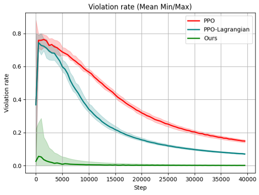
### Visual Description
## Line Chart: Violation rate (Mean Min/Max)
### Overview
The image is a line chart comparing the violation rates of three different algorithms: PPO, PPO-Lagrangian, and "Ours". The chart displays the mean violation rate along with the min/max range as shaded areas around each line. The x-axis represents the "Step" and the y-axis represents the "Violation rate".
### Components/Axes
* **Title:** Violation rate (Mean Min/Max)
* **X-axis:**
* Label: Step
* Scale: 0 to 40000, with major ticks at 0, 5000, 10000, 15000, 20000, 25000, 30000, 35000, and 40000.
* **Y-axis:**
* Label: Violation rate
* Scale: 0.0 to 0.8, with major ticks at 0.0, 0.2, 0.4, 0.6, and 0.8.
* **Legend:** Located in the top-right corner.
* PPO (Red line with light red shaded area)
* PPO-Lagrangian (Teal line with light teal shaded area)
* Ours (Green line with light green shaded area)
### Detailed Analysis
* **PPO (Red):**
* Trend: Initially increases sharply, then decreases gradually.
* Data Points: Starts around 0.0, rises to approximately 0.77 around step 2500, and then decreases to approximately 0.18 at step 40000.
* Min/Max Range: The shaded area around the red line indicates the minimum and maximum violation rates for PPO at each step. The range is wider at the beginning and narrows as the step increases.
* **PPO-Lagrangian (Teal):**
* Trend: Initially increases sharply, then decreases gradually.
* Data Points: Starts around 0.0, rises to approximately 0.73 around step 2500, and then decreases to approximately 0.07 at step 40000.
* Min/Max Range: The shaded area around the teal line indicates the minimum and maximum violation rates for PPO-Lagrangian at each step. The range is wider at the beginning and narrows as the step increases.
* **Ours (Green):**
* Trend: Remains relatively constant at a low violation rate.
* Data Points: Starts around 0.04 and remains close to 0.0 for the entire range of steps.
* Min/Max Range: The shaded area around the green line indicates the minimum and maximum violation rates for "Ours" at each step. The range is narrow, indicating low variability.
### Key Observations
* PPO and PPO-Lagrangian exhibit similar trends, with a sharp initial increase in violation rate followed by a gradual decrease.
* The "Ours" algorithm consistently maintains a very low violation rate throughout the entire range of steps.
* The min/max ranges for PPO and PPO-Lagrangian are wider at the beginning, indicating higher variability in the initial steps.
* The "Ours" algorithm has a much narrower min/max range, indicating more consistent performance.
### Interpretation
The chart suggests that the "Ours" algorithm is significantly more effective at minimizing violation rates compared to PPO and PPO-Lagrangian. While PPO and PPO-Lagrangian initially perform poorly, their violation rates decrease over time, suggesting some learning or adaptation. However, they never reach the consistently low violation rate achieved by the "Ours" algorithm. The min/max ranges indicate that the performance of PPO and PPO-Lagrangian is more variable, especially in the early stages, while the "Ours" algorithm provides more stable and reliable performance. The data demonstrates the superior performance of the "Ours" algorithm in terms of minimizing violation rates.
</details>
(a) Sudoku 2 $\times$ 2
<details>
<summary>viol2.png Details</summary>
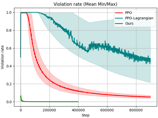
### Visual Description
## Line Chart: Violation Rate (Mean Min/Max)
### Overview
The image is a line chart comparing the violation rates of three different algorithms: PPO (Proximal Policy Optimization), PPO-Lagrangian, and "Ours". The chart displays the violation rate on the y-axis against the step number on the x-axis. Each algorithm's performance is represented by a line, with shaded regions indicating the min/max range around the mean.
### Components/Axes
* **Title:** Violation rate (Mean Min/Max)
* **X-axis:** Step, with markers at 0, 200000, 400000, 600000, and 800000.
* **Y-axis:** Violation rate, with markers at 0.0, 0.2, 0.4, 0.6, 0.8, and 1.0.
* **Legend (Top-Right):**
* PPO (Red line with red shaded region)
* PPO-Lagrangian (Teal line with teal shaded region)
* Ours (Green line)
### Detailed Analysis
* **PPO (Red):**
* Trend: The violation rate starts at approximately 1.0 and rapidly decreases to around 0.2 by step 200000. It then gradually decreases further, reaching approximately 0.05 by step 800000.
* Data Points:
* Step 0: Violation rate ~ 1.0
* Step 200000: Violation rate ~ 0.2
* Step 400000: Violation rate ~ 0.12
* Step 600000: Violation rate ~ 0.08
* Step 800000: Violation rate ~ 0.05
* The red shaded region indicates the min/max range, which narrows as the step increases.
* **PPO-Lagrangian (Teal):**
* Trend: The violation rate starts at approximately 1.0 and gradually decreases to around 0.6 by step 800000. The line exhibits more fluctuations compared to the PPO line.
* Data Points:
* Step 0: Violation rate ~ 1.0
* Step 200000: Violation rate ~ 0.9
* Step 400000: Violation rate ~ 0.75
* Step 600000: Violation rate ~ 0.65
* Step 800000: Violation rate ~ 0.6
* The teal shaded region indicates the min/max range, which is wider than the PPO range, especially in the earlier steps.
* **Ours (Green):**
* Trend: The violation rate starts at approximately 1.0, rapidly decreases to near 0.0 within the first few steps, and remains close to 0.0 for the rest of the steps.
* Data Points:
* Step 0: Violation rate ~ 1.0
* Step ~10000: Violation rate ~ 0.0
* Step 800000: Violation rate ~ 0.0
* The green line is consistently near the x-axis, indicating a very low violation rate.
### Key Observations
* The "Ours" algorithm consistently achieves the lowest violation rate across all steps.
* The PPO algorithm shows a significant decrease in violation rate over time, outperforming PPO-Lagrangian.
* The PPO-Lagrangian algorithm has a higher and more variable violation rate compared to the other two algorithms.
* The min/max range for PPO-Lagrangian is wider than that of PPO, indicating greater variability in its performance.
### Interpretation
The chart demonstrates the performance of three different algorithms in terms of violation rate over a series of steps. The "Ours" algorithm appears to be the most effective in minimizing violations, as its violation rate quickly drops to near zero and remains there. The PPO algorithm also shows a significant reduction in violation rate, eventually outperforming the PPO-Lagrangian algorithm. The PPO-Lagrangian algorithm exhibits a higher and more variable violation rate, suggesting that it may be less stable or less effective in this particular context. The shaded regions provide insight into the variability of each algorithm's performance, with PPO-Lagrangian showing the widest range. Overall, the data suggests that the "Ours" algorithm is the preferred choice for minimizing violations, followed by PPO.
</details>
(b) Sudoku 3 $\times$ 3
Figure 7. Violation rate during training
<details>
<summary>ab3.png Details</summary>
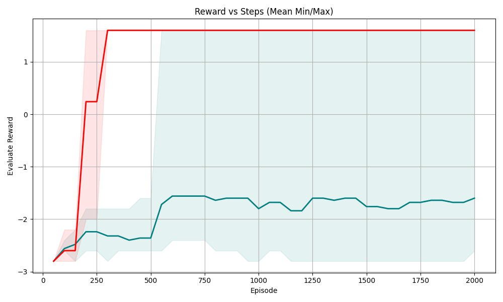
### Visual Description
## Line Chart: Reward vs Steps (Mean Min/Max)
### Overview
The image is a line chart showing the relationship between "Reward" and "Episode" (steps), displaying the mean, minimum, and maximum reward values over 2000 episodes. There are two primary data series: one representing the "Evaluate Reward" (teal line) and another representing the "Reward" (red line). Shaded regions around each line indicate the min/max range.
### Components/Axes
* **Title:** Reward vs Steps (Mean Min/Max)
* **X-axis:** Episode
* Scale: 0 to 2000, with markers at 0, 250, 500, 750, 1000, 1250, 1500, 1750, and 2000.
* **Y-axis:** Evaluate Reward
* Scale: -3 to 1, with markers at -3, -2, -1, 0, and 1.
* **Data Series:**
* **Reward (Red):** Represents the reward value. The shaded red area around the red line represents the min/max range for the reward.
* **Evaluate Reward (Teal):** Represents the evaluate reward value. The shaded teal area around the teal line represents the min/max range for the evaluate reward.
### Detailed Analysis
* **Reward (Red Line):**
* Trend: The red line starts at approximately -2.75 at episode 0, rapidly increases to approximately 0.25 by episode 150, then jumps to approximately 1.25 by episode 250, and remains constant at approximately 1.25 for the rest of the episodes.
* Data Points:
* Episode 0: -2.75 +/- 0.25
* Episode 150: 0.25 +/- 0.25
* Episode 250 - 2000: 1.25 +/- 0.25
* **Evaluate Reward (Teal Line):**
* Trend: The teal line starts at approximately -2.75 at episode 0, fluctuates slightly until episode 500, then increases to approximately -1.5, and remains relatively stable around -1.5 for the rest of the episodes.
* Data Points:
* Episode 0: -2.75 +/- 0.25
* Episode 500: -2.5 +/- 0.25
* Episode 750 - 2000: -1.5 +/- 0.25
* **Min/Max Shaded Regions:**
* The red shaded region shows the variability in the "Reward" values, which is higher in the initial episodes and becomes negligible after the reward stabilizes.
* The teal shaded region shows the variability in the "Evaluate Reward" values, which remains relatively consistent throughout the episodes.
### Key Observations
* The "Reward" increases rapidly in the initial episodes and then plateaus at a high value.
* The "Evaluate Reward" increases gradually and stabilizes at a lower value compared to the "Reward".
* The variability in "Reward" decreases significantly as the episodes progress, while the variability in "Evaluate Reward" remains relatively constant.
### Interpretation
The chart suggests that the agent quickly learns to maximize the reward, as indicated by the rapid increase and subsequent plateau of the "Reward" line. The "Evaluate Reward" line, which likely represents the performance of the agent on a separate evaluation set, shows a more gradual improvement and stabilizes at a lower level. This could indicate that the agent is overfitting to the training environment or that the evaluation environment is more challenging. The shaded regions provide insights into the consistency of the rewards, with the "Reward" becoming more consistent over time while the "Evaluate Reward" remains relatively variable.
</details>
(a) Sudoku 3 $\times$ 3
<details>
<summary>ab4.png Details</summary>
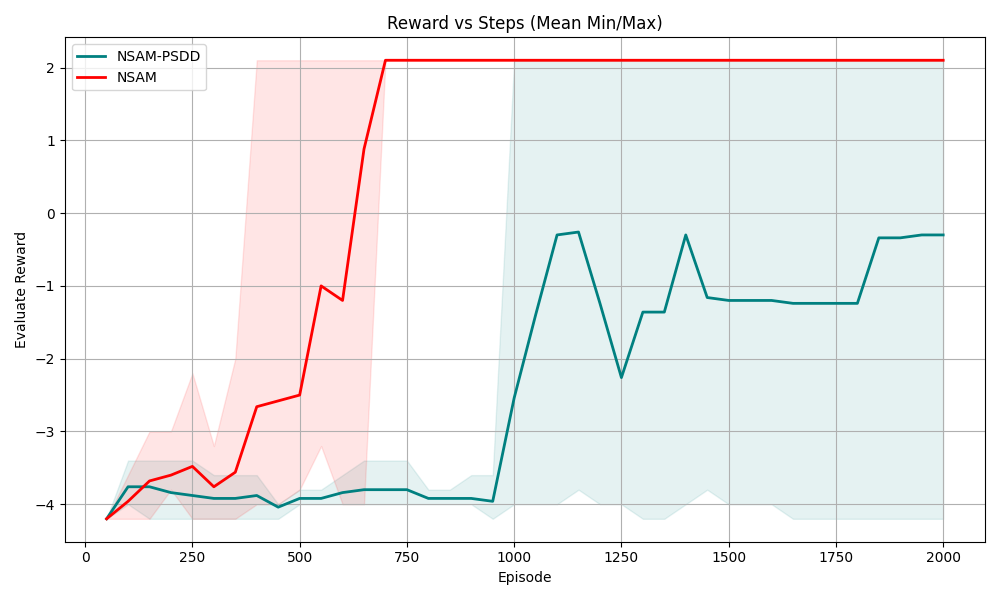
### Visual Description
## Chart: Reward vs Steps (Mean Min/Max)
### Overview
The image is a line chart comparing the performance of two algorithms, "NSAM-PSDD" and "NSAM", over a series of episodes. The chart displays the "Evaluate Reward" on the y-axis against the "Episode" number on the x-axis. The chart also includes shaded regions representing the min/max range for each algorithm.
### Components/Axes
* **Title:** Reward vs Steps (Mean Min/Max)
* **X-axis:**
* Label: Episode
* Scale: 0 to 2000, with major ticks at 0, 250, 500, 750, 1000, 1250, 1500, 1750, and 2000.
* **Y-axis:**
* Label: Evaluate Reward
* Scale: -4 to 2, with major ticks at -4, -3, -2, -1, 0, 1, and 2.
* **Legend:** Located in the top-left corner.
* NSAM-PSDD (Teal line with light teal shaded region)
* NSAM (Red line with light red shaded region)
### Detailed Analysis
* **NSAM-PSDD (Teal):**
* Trend: Initially, the line is relatively flat around -4. After episode 1000, the line shows significant fluctuations, ranging from approximately -0.3 to -2.2. Towards the end, the line stabilizes around -0.3.
* Data Points:
* Episode 0: approximately -4.2
* Episode 250: approximately -3.9
* Episode 500: approximately -4.0
* Episode 750: approximately -3.8
* Episode 1000: approximately -3.9
* Episode 1125: approximately -0.3
* Episode 1250: approximately -2.2
* Episode 1375: approximately -1.3
* Episode 1500: approximately -1.2
* Episode 1750: approximately -1.2
* Episode 2000: approximately -0.3
* Min/Max Range: The light teal shaded region around the teal line indicates the range of reward values for NSAM-PSDD. The range is relatively narrow, suggesting consistent performance.
* **NSAM (Red):**
* Trend: The line starts around -4 and increases sharply after episode 500, reaching a plateau at approximately 2 around episode 750.
* Data Points:
* Episode 0: approximately -4.1
* Episode 250: approximately -3.5
* Episode 500: approximately -2.5
* Episode 625: approximately -1.0
* Episode 750: approximately 2.1
* Episode 2000: approximately 2.1
* Min/Max Range: The light red shaded region around the red line indicates the range of reward values for NSAM. The range widens significantly during the period of rapid increase, suggesting more variable performance.
### Key Observations
* NSAM initially performs worse than NSAM-PSDD but quickly surpasses it after approximately 500 episodes.
* NSAM-PSDD shows more stable performance, as indicated by the narrower min/max range.
* NSAM reaches a higher reward plateau than NSAM-PSDD.
### Interpretation
The chart suggests that NSAM is a more effective algorithm in the long run, as it achieves a higher reward. However, NSAM-PSDD exhibits more consistent performance, particularly in the initial stages. The shaded regions highlight the variability in performance for each algorithm, with NSAM showing a wider range during its learning phase. The data indicates a trade-off between initial stability (NSAM-PSDD) and eventual performance (NSAM).
</details>
(b) Sudoku 4 $\times$ 4
Figure 8. Ablation study on PSDD in NSAM
We further compare the change of violation rates during training for NSAM, PPO, and PPO-Lagrangian, as shown in Figure 7. In the early stages of training, NSAM exhibits a slightly higher violation rate because the PSDD parameters is not trained, which may cause inaccurate evaluation of action preconditions $\varphi$ . However, as training progresses, the violation rate rapidly decreases to near zero. During the whole training process, the violation rate of NSAM is consistently lower than that of PPO and PPO-Lagrangian.
### 7.6. Ablation study
To answer Q3, we conduct an ablation study on the symbolic grounding module by replacing the PSDD with a standard three-layer fully connected neural network (128 neurons per layer). The experiment results are shown in Figure 8. Unlike PSDDs, neural networks struggle to efficiently exploit symbolic knowledge and cannot guarantee logical consistency in their predictions. As a result, the policy trained with this ablated grounding module exhibits highly unstable performance, confirming the importance of PSDD for reliable symbolic grounding in NSAM.
### 7.7. Exploiting knowledge structure
To answer Q4, we design a special experiment where NSAM and PPO-Lagrangian are trained using only a single transition, as illustrated on the left side of Fig. 9. The right side of the figure shows the heatmaps of action probabilities after training. With the cost function defined via $\Gamma_{\phi}$ , PPO-Lagrangian can only leverage this single negative transition to reduce the probability of the specific action in this transition. As a result, in the heatmap of action probabilities after training, only the probability of this specific action decreases. In contrast, our method can exploit the structural knowledge of action preconditions to infer from the explorability of one action that a set of related actions are also infeasible. Consequently, in the heatmap, our method simultaneously reduces the probabilities of four actions. This demonstrates that our approach can utilize knowledge to generalize policy from very limited experience, which can significantly improve sample efficiency of DRL.
<details>
<summary>1data.png Details</summary>
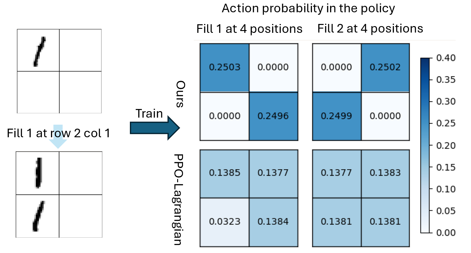
### Visual Description
## Heatmap: Action Probability in the Policy
### Overview
The image presents a comparison of action probabilities in a policy, comparing two methods ("Ours" and "PPO-Lagrangian") for two different actions ("Fill 1" and "Fill 2") across four positions. The action probabilities are visualized as heatmaps, with color intensity representing the probability value. The image also shows an example of the training data.
### Components/Axes
* **Title:** Action probability in the policy
* **X-Axis (Top):** "Fill 1 at 4 positions", "Fill 2 at 4 positions"
* **Y-Axis (Left):** "Ours", "PPO-Lagrangian"
* **Colorbar (Right):** Represents probability values, ranging from 0.00 to 0.40. The color gradient goes from white (0.00) to dark blue (0.40).
* 0.00
* 0.05
* 0.10
* 0.15
* 0.20
* 0.25
* 0.30
* 0.35
* 0.40
* **Training Data (Left):** Two 2x2 grids representing the training data. The top grid shows a partial stroke, and the bottom grid shows the result of "Fill 1 at row 2 col 1". An arrow labeled "Train" points from the training data to the heatmaps.
### Detailed Analysis
The heatmap is structured as a 2x2 grid, where each cell represents the probability of taking a specific action at a specific position.
**"Ours" Method:**
* **Fill 1 at 4 positions:**
* Top-left: 0.2503 (Dark Blue)
* Top-right: 0.0000 (White)
* Bottom-left: 0.0000 (White)
* Bottom-right: 0.2496 (Dark Blue)
* **Fill 2 at 4 positions:**
* Top-left: 0.0000 (White)
* Top-right: 0.2502 (Dark Blue)
* Bottom-left: 0.2499 (Dark Blue)
* Bottom-right: 0.0000 (White)
**"PPO-Lagrangian" Method:**
* **Fill 1 at 4 positions:**
* Top-left: 0.1385 (Light Blue)
* Top-right: 0.1377 (Light Blue)
* Bottom-left: 0.0323 (Almost White)
* Bottom-right: 0.1384 (Light Blue)
* **Fill 2 at 4 positions:**
* Top-left: 0.1377 (Light Blue)
* Top-right: 0.1383 (Light Blue)
* Bottom-left: 0.1381 (Light Blue)
* Bottom-right: 0.1381 (Light Blue)
### Key Observations
* The "Ours" method shows a strong preference for specific positions when filling, with probabilities close to 0.25 for two positions and 0.00 for the other two.
* The "PPO-Lagrangian" method shows a more uniform distribution of probabilities across all positions, with values around 0.13-0.14.
* The color intensity directly corresponds to the probability value, as indicated by the colorbar.
### Interpretation
The data suggests that the "Ours" method has learned a more deterministic policy, focusing on specific positions for each action. In contrast, the "PPO-Lagrangian" method has learned a more stochastic policy, distributing probabilities more evenly across all positions. This could indicate that the "Ours" method is more confident in its actions, while the "PPO-Lagrangian" method is more exploratory. The training data provides context for the actions, showing the initial state and the result of filling a specific position.
</details>
Figure 9. Policy training result from a single transition.
## 8. Conclusions and future work
In this paper, we proposed NSAM, a novel framework that integrates symbolic reasoning with deep reinforcement learning through PSDDs. NSAM addresses the key challenges of learning symbolic grounding from high-dimensional states with minimal supervision, ensuring logical consistency, and enabling end-to-end differentiable training. By leveraging action precondition knowledge, NSAM learns effective action masks that substantially reduce constraint violations while improving the sample efficiency of policy optimization. Our empirical evaluation across four domains demonstrates that NSAM consistently outperforms baselines in terms of sample efficiency and violation rate. In this work, the symbolic knowledge in propositional form. A promising research direction for future work is to investigate richer forms of symbolic knowledge as action preconditions, such as temporal logics or to design learning framework when constraints are unknown or incorrect. Extending NSAM to broader real-world domains is also an important future direction.
We sincerely thank the anonymous reviewers. This work is partly funded by the China Scholarship Council (CSC).
## References