# Statistical Learning Analysis of Physics-Informed Neural Networks
**Authors**: David Barajas-Solano
## Abstract
We study the training and performance of physics-informed learning for initial and boundary value problems (IBVP) with physics-informed neural networks (PINNs) from a statistical learning perspective. Specifically, we restrict ourselves to parameterizations with hard initial and boundary condition constraints and reformulate the problem of estimating PINN parameters as a statistical learning problem. From this perspective, the physics penalty on the IBVP residuals can be better understood not as a regularizing term bus as an infinite source of indirect data, and the learning process as fitting the PINN distribution of residuals $p(y\mid x,t,w)q(x,t)$ to the true data-generating distribution $\delta(0)q(x,t)$ by minimizing the Kullback-Leibler divergence between the true and PINN distributions. Furthermore, this analysis show that physics-informed learning with PINNs is a singular learning problem, and we employ singular learning theory tools, namely the so-called Local Learning Coefficient [7] to analyze the estimates of PINN parameters obtained via stochastic optimization for a heat equation IBVP. Finally, we discuss implications of this analysis on the quantification of predictive uncertainty of PINNs and the extrapolation capacity of PINNs.
keywords: Physics-informed learning , physics-informed neural networks , statistical learning , singular learning theory
[PNNL]organization=Pacific Northwest National Laboratory,city=Richland, postcode=99352, state=WA, USA
## 1 Introduction
Physics-informed machine learning with physics-informed neural networks (PINNs) (see [6] for a comprehensive overview) has been widely advanced and successfully employed in recent years to solve approximate the solution of initial and boundary value problems (IBVPs) in computational mathematics. The central mechanism of physics-informed learning is model parameter identification by minimizing “physics penalty” terms penalizing the governing equation and initial and boundary condition residuals predicted by a given set of model parameters. While various significant longstanding issues of the use PINNs for physics-informed learning such as the spectral bias have been addressed, it remains active area of research, and our understanding of various features of the problem such as the loss landscape, and the extrapolation capacity of PINN models, remains incomplete.
It has been widely recognized that traditional statistical tools are inadequate for analyzing deep learning. Watanabe’s “singular learning theory” (SLT) (see [13] for a review) recognizes that this is due to the singular character of learning with deep learning models and aims to address these limitations. The development of efficient deep learning and Bayesian inference tools and frameworks [3, 15, 2, 1] has enabled the application of SLT to analyzing practical applications of deep learning, leading to various insights on the features of the loss landscape, the generalization capacity of the model, and the training process [7, 4, 10].
Given that physics-informed learning with PINNs is also singular due to its use of neural networks as the backbone architecture, we propose in this work to use SLT to analyze the training and performance of PINNs. The physics penalty in physics-informed learning precludes an out-of-the-box application of SLT, so we first reformulate the PINN learning problem as a statistical learning problem by restricting our attention to PINN parameterizations with hard initial and boundary condition constraints. Employing this formulation, it can be seen that the PINN learning problem is equivalent to the statistical learning problem of fitting the PINN distribution of governing equation residuals $p(y\mid x,t,w)q(x,t)$ to the true data-generating distribution $\delta(0)q(x,t)$ corresponding to zero residuals $y(x,t)\equiv 0$ for all $(x,t)\in\Omega\times(0,T]$ , by minimizing the Kullback-Leibler divergence between the true and PINN distributions. We argue this implies that the physics penalty in physics-informed learning can be better understood as an infinite source of indirect data (with the residuals interpreted as indirect observations given that they are a function of the PINN prediction) as opposed to as a regularizing term as it is commonly interpreted in the literature. Furthermore, we employ the SLT’s so-called Local Learning Coefficient (LLC) to study the features of the PINN loss for a heat equation IBVP.
This manuscript is structured as follows: In section 2 we reformulate and analyze the physics-informed learning problem as a singular statistical learning problem. In section 3 we discuss the numerical approximation of the LLC and compute it for a heat equation IBVP. Finally, further implications of this analysis are discussed in section 4.
## 2 Statistical learning interpretation of physics-informed learning for IBVPs
Consider the well-posed boundary value problem
$$
\displaystyle\mathcal{L}(u(x,t),x,t) \displaystyle=0 \displaystyle\forall x\in\Omega, \displaystyle t\in(0,T], \displaystyle\mathcal{B}(u(x,t),x,t) \displaystyle=0 \displaystyle\forall x\in\partial\Omega, \displaystyle t\in[0,T], \displaystyle u(x,0) \displaystyle=u_{0}(x) \displaystyle\forall x\in\Omega, \tag{1}
$$
where the $\Omega$ denotes the IBVP’s spatial domain, $\partial\Omega$ the domain’s boundary, $T$ the maximum simulation time, and $u(x,t)$ the IBVP’s solution. In the PINN framework, we approximate the solution $u(x,t)$ using an overparameterized deep learning-based model $u(x,t,w)$ , usually a neural network model $\text{NN}_{w}(x,t)$ , where $w\in W$ denotes the model parameters and $W\subset\mathbb{R}^{d}$ denotes the parameter space. For simplicity, we assume that the model $u(x,t,w)$ is constructed in such a way that the initial and boundary conditions are identically satisfied for any model parameter, that is,
| | $\displaystyle\mathcal{B}(u(x,t,w),x,t)=0\quad\forall x\in\partial\Omega,\ t\in(0,T],\ w\in W,$ | |
| --- | --- | --- |
via hard-constraints parameterizations (e.g., [8, 9]). The model parameters are then identified by minimizing the squared residuals of the governing equation evaluated at $n$ “residual evaluation” points $\{x_{i},t_{i}\}^{n}_{i=1}$ , that is, by minimizing the loss
$$
L^{\text{PINN}}_{n}(w)\coloneqq\frac{1}{n}\sum^{n}_{i=1}\left[\mathcal{L}(u(x_{i},t_{i},w),x_{i},t_{i})\right]^{2}, \tag{4}
$$
In the physics-informed-only limit, the PINN framework aims to approximate the solution without using direct observations of the solution, that is, without using labeled data pairs of the form $(x_{i},t_{i},u(x_{i},t_{i}))$ , which leads many authors to refer to it as an “unsupervised” learning framework. An alternative view of the PINN learning problem is that it actually does use labeled data, but of the form $(x_{i},t_{i},\mathcal{L}(u(x_{i},t_{i}),x_{i},t_{i})\equiv 0)$ , as the PINN formulation encourages the residuals of the parameterized model, $\mathcal{L}(u(x,t,w),x,t)$ , to be as close to zero as possible. Crucially, “residual” data of this form is “infinite” in the sense that such pairs can be constructed for all $x\in\Omega$ , $t\in(0,T]$ . In fact, the loss 4 can be interpreted as a sample approximation of the volume-and-time-averaged loss $L^{\text{PINN}}\coloneqq\int_{\Omega\times(0,T]}\left[\mathcal{L}(u(x,t),x,t)\right]^{2}q(x,t)\,\mathrm{d}x\mathrm{d}t$ for a certain weighting function $q(x,t)$ .
We can then establish a parallel with statistical learning theory. Namely, we can introduce a density over the inputs, $q(x,t)$ , and the true data-generating distribution $q(x,t,y)=\delta(0)q(x,t)$ , where $y$ denotes the equation residuals. For a given error model $p(y\mid\mathcal{L}(u(x,t,w),x,t))$ , the PINN model induces a conditional distribution of residuals $p(y\mid x,w)$ . For example, for a Gaussian error model $p(y\mid\mathcal{L}(u(x,t,w),x,t))=\mathcal{N}(y\mid 0,\sigma^{2})$ , the conditional distribution of residuals is of the form
$$
p(y\mid x,t,w)\propto\exp\left\{-\frac{1}{2\sigma^{2}}\left[\mathcal{L}(u(x,t,w),x,t)\right]^{2}\right\}. \tag{5}
$$
The PINN framework can then be understood as aiming to fit the model $p(x,t,y\mid w)\coloneqq p(y\mid x,t,w)q(x,t)$ to the data-generating distribution by minimizing the sample negative log-likelihood $L_{n}(w)$ of the training dataset $\{(x_{i},t_{i}y_{i}\equiv 0)\}^{n}_{i=1}$ drawn i.i.d. from $q(x,t,y)$ , with
$$
L_{n}(w)\coloneqq-\frac{1}{n}\sum^{n}_{i=1}\log p(y_{i}\equiv 0\mid x_{i},t_{i},w). \tag{6}
$$
Associated to this negative log-likelihood we also have the population negative log-likelihood $L(w)\coloneqq-\mathbb{E}_{q(x,t,y)}\log p(y\mid x,t,w)$ . Note that for the Gaussian error model introduced above we have that $L^{\text{PINN}}_{n}(w)=2\sigma^{2}L_{n}(w)$ up to an additive constant, so that learning by minimizing the PINN loss 4 and the negative log-likelihood 6 is equivalent. Furthermore, also note that $L^{\text{PINN}}(w)=2\sigma^{2}L(w)$ up to an additive constant if the volume-and-time averaging function is taken to be the same as the data-generating distribution of the inputs, $q(x,t)$ . Therefore, it follows that PINN training is equivalent to minimizing the Kullback-Leibler divergence between the true and model distributions of the residuals.
This equivalent reformulation of the PINN learning problem allows us to employ the tools of statistical learning theory to analyze the training of PINNs. Specifically, we observe that, because of the neural network-based forward model $\text{NN}_{w}(x)$ is a singular model, the PINN model $p(y\mid x,t,w)$ is also singular, that is, the parameter-to-distribution map $w\mapsto p(x,t,y\mid w)$ is not one-to-one, and the Fisher information matrix $I(w)\coloneqq\mathbb{E}_{p(x,t,y\mid w)}\nabla\nabla_{w}\,\log p(x,t,y\mid w)$ is not everywhere positive definite in $W$ . As a consequence, the PINN loss 4 is not characterized by a discrete, measure-zero, possibly infinite set of local minima that can be locally approximated quadratically. Instead, the PINN loss landscape, just as is generally the case for deep learning loss landscapes, is characterized by “flat” minima, crucially even in the limit of the number of residual evaluation points $n\to\infty$ . This feature allows us to better understand the role of the residual data in physics-informed learning.
Namely, it has been widely observed that the solutions to the PINN problem $\operatorname*{arg\,min}_{w}L^{\text{PINN}}_{n}(w)$ for a given loss tolerance $\epsilon$ are not unique even for large number of residual evaluation points, and regardless of the scheme used to generate such points (uniformly distributed, low-discrepancy sequences such as latin hypercube sampling, random sampling, etc.), while on the other hand it has also been observed that increasing $n$ seems to “regularize” or “smoothen” the PINN loss landscape (e.g., [11]). Although one may interpret this observed smoothing as similar to the regularizing effect of explicit regularization (e.g., $\ell_{2}$ regularization or the use of a proper prior on the parameters), in fact increasing $n$ doesn’t sharpen the loss landscape into locally quadratic local minima as explicit regularization does. Therefore, residual data (and correspondingly, the physics penalty) in physics-informed learning should not be understood as a regularizer but simply as a source of indirect data.
As estimates of the solution to the PINN problem are not unique, it is necessary to characterize them through other means besides their loss value. In this work we employ the SLT-based LLC metric, which aims to characterize the “flatness” of the loss landscape of singular models. For completeness, we reproduce the definition of the LLC (introduced in [7]) in the sequel. Let $w^{\star}$ denote a local minima and $B(w^{\star})$ a sufficiently small neighborhood of $w^{\star}$ such that $L(\omega)\geq L(\omega^{\star})$ ; furthermore, let $B(w^{\star},\epsilon)\coloneqq\{w\in B(w^{\star})\mid L(w)-L(w^{\star})<\epsilon\}$ denote the subset of the neighborhood of $w^{\star}$ with loss within a certain tolerance $\epsilon$ , and $V(\epsilon)$ denote the volume of such subset, that is,
$$
V(\epsilon)\coloneqq\operatorname{vol}(B(w^{\star},\epsilon))=\int_{B(w^{\star},\epsilon)}\mathrm{d}w.
$$
Then, the LLC is defined as the rational number $\lambda(w^{\star})$ such that the volume scales as $V(\epsilon)\propto\exp\{\lambda(w^{\star})\}$ . The LLC can be interpreted as a measure of flatness because it corresponds to the rate at which the volume of solutions within the tolerance $\epsilon$ decreases as $\epsilon\to 0$ , with smaller LLC values correspond to slower loss of volume.
As its name implies, the LLC is the local analog to the SLT (global) learning coefficient $\lambda$ , which figures in the asymptotic expansion of the free energy of a singular statistical model. Specifically $\lambda(w^{\star})\equiv\lambda$ if $w^{\star}$ is a global minimum and $B(w^{\star})$ is taken to be the entire parameter space $W$ . The free energy $F_{n}$ is defined as
$$
F_{n}\coloneqq-\log\int\exp\{-nL_{n}(w)\}\varphi(w)\,\mathrm{d}w,
$$
where $\varphi(w)$ is a prior on the model parameters. Then, according to the SLT, the free energy for a singular model has the asymptotic expansion [13]
$$
F_{n}=nL_{n}(w_{0})+\lambda\log n+O_{P}(\log\log n),\quad n\to\infty,
$$
where $w_{0}$ is the parameter vector that minimizes the Kullback-Leibler divergence between the true data-generating distribution and the estimated distribution $p(y\mid x,t,w)q(x,t)$ , whereas for a regular model it has the expansion
$$
F_{n}=nL_{n}(\hat{w})+\frac{d}{2}\log n+O_{P}(1),\quad n\to\infty, \tag{1}
$$
where $\hat{w}$ is the maximum likelihood estimator of the model parameters, and $d$ the number of model parameters. The learning coefficient can then be interpreted as measuring model complexity, as it is the singular model analog to a regular model’s model complexity $d/2$ . Therefore, by computing the LLC around different estimates to the PINN solution we can gain some insight into the PINN loss landscape.
## 3 Numerical estimation of the local learning coefficient
### 3.1 MCMC-based local learning coefficient estimator
While there may exist other approaches to estimating the LLC (namely, via Imai’s estimator [5] or Watanabe’s estimator [14] of the real log-canonical threshold), in this work we choose to employ the estimation framework introduced in [7], which we briefly describe as follows. Let $B_{\gamma}(w^{\star})$ denote a small ball of radius $\gamma$ centered around $w^{\star}$ . We introduce the local to $w^{\star}$ analog to the free energy and its asymptotic expansion:
$$
\begin{split}F_{n}(B_{\gamma}(w^{\star}))&=-\log\int_{B_{\gamma}(w^{\star})}\exp\{-nL_{n}(w)\}\varphi(w)\,\mathrm{d}w\\
&=nL_{n}(w^{\star})+\lambda(w^{\star})\log n+O_{P}(\log\log n).\end{split} \tag{7}
$$
We then substitute the hard restriction in the integral above to $B_{\gamma}(w^{\star})$ with a softer Gaussian weighting around $w^{\star}$ with covariance $\gamma^{-1}I_{d}$ , where $\gamma>0$ is a scale parameter. Let $\mathbb{E}_{w\mid w^{\star},\beta,\gamma}[\cdot]$ denote the expectation with respect to the tempered distribution
$$
p(w\mid w^{\star},\beta,\gamma)\propto\exp\left\{-n\beta L_{n}(w)-\frac{\gamma}{2}\|w-w^{\star}\|^{2}_{2}\right\}
$$
with inverse temperature $\beta\equiv 1/\log n$ ; then, $\mathbb{E}_{w\mid w^{\star},\beta,\gamma}[nL_{n}(w)]$ is a good estimator of the partition function of this tempered distribution, which is, depending on the choice $\gamma$ , an approximation to the local free energy. Substituting this approximation into 7, we obtain the estimator
$$
\hat{\lambda}_{\gamma}(w^{\star})\coloneqq n\beta\left[\mathbb{E}_{w\mid w^{\star},\beta,\gamma}[L_{n}(w)]-L_{n}(w^{\star})\right]. \tag{8}
$$
In this work we compute this estimate by computing samples $w\mid w^{\star},\beta,\gamma$ via Markov chain Monte Carlo (MCMC) simulation. Specifically, we employ the No-U Turns Sampler (NUTS) algorithm [3]. Furthermore, to evaluate $L_{n}(w)$ we choose a fixed set of $n$ residual evaluation points chosen randomly from $q(x,t)$ , with $n$ large enough that we can employ the asymptotic expansion 7 and that eq. 8 is valid. Note that $\hat{\lambda}_{\gamma}(w^{\star})$ is strictly positive as $w^{\star}$ is a local minima of $L_{n}(w)$ , so that $\mathbb{E}_{w\mid w^{\star},\beta,\gamma}[L_{n}(w)]-L_{n}(w^{\star})\geq 0$ . In fact, negative estimates of the LLC imply that the MCMC chain was able to visit a significant volume of parameter space for which $L_{n}(w)<L_{n}(w^{\star})$ , which means that $w^{\star}$ is not an actual minima of $L_{n}(w)$ . Given that minimization of the PINN loss via stochastic optimization algorithms is not guaranteed to produce exact minima, in practice it may be possible to obtain negative estimates of the LLC.
### 3.2 Numerical experiments
To analyze the PINN loss landscape for a concrete case, we compute and analyze the LLC for the following physics-informed learning problem: We consider the heat equation IBVP
| | $\displaystyle\partial_{t}u-\partial_{xx}u$ | $\displaystyle=f(x,t)$ | $\displaystyle\forall x\in(0,2),\ t\in(0,2],$ | |
| --- | --- | --- | --- | --- |
where $f(x,t)$ is chosen so that the solution to the IBVP is
$$
u(x,t)=\exp^{-t}\sin(\pi x).
$$
To exactly enforce initial and boundary conditions, we employ the hard-constraints parameterization of the PINN model
$$
u(x,t,w)=\sin(\pi x)+tx(x-1)\text{NN}_{w}(x,t). \tag{9}
$$
The neural network model $\text{NN}_{w}$ is taken to be a multi-layer perceptron (MLP) with 2 hidden layers of $50$ units each. This model has a total number of parameters $d=20,601.$ This relatively small model ensures that the wall-clock time of computing multiple MCMC chains is reasonable. The model eq. 9 is implemented using Flax NNX library [2], and MCMC sampling is performed using the BlackJAX library [1].
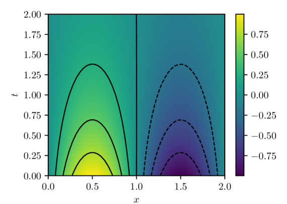
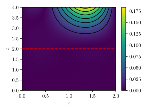
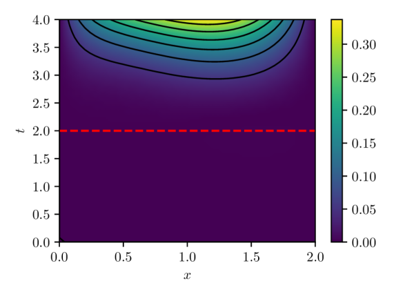
The parameters of the model are estimated by minimizing the PINN loss eq. 4 using the Adam stochastic optimization algorithm for $50,000$ iterations. At each iteration, a new batch of residual evaluation points is drawn from $q(x,t)$ and used to evaluate the PINN loss and its gradient. Note that these batches of residual evaluation points are distinct from the set used to evaluate $L_{n}(w)$ in eq. 8, which is fixed for a given experiment. Figure 1 shows the PINN solution $u(x,t,w^{\star})$ for $w^{\star}$ estimated using a batch size of $32$ and learning rate of $1\times 10^{-4}$ . This solution has an associated PINN loss of $1.854\times 10^{-5}$ , which, although small, shows that the true data-generating distribution $\delta(0)q(x,t)$ is not realizable within the model class 9 with the MLP architecture indicated above due to the finite capacity of the class.
<details>
<summary>x1.png Details</summary>
### Visual Description
## Contour Plot: Symmetric Positive and Negative Regions
### Overview
The image is a 2D contour plot (or heatmap) displaying a scalar field over a domain defined by variables `x` and `t`. The plot is divided into two distinct, symmetric regions by a vertical line at `x = 1.0`. The left region (`x < 1.0`) shows positive values (warm colors), while the right region (`x > 1.0`) shows negative values (cool colors). The data is represented by both a continuous color gradient and discrete contour lines.
### Components/Axes
* **X-Axis:** Labeled `x`. Linear scale ranging from `0.0` to `2.0`, with major tick marks at `0.0`, `0.5`, `1.0`, `1.5`, and `2.0`.
* **Y-Axis:** Labeled `t`. Linear scale ranging from `0.00` to `2.00`, with major tick marks at intervals of `0.25` (`0.00`, `0.25`, `0.50`, `0.75`, `1.00`, `1.25`, `1.50`, `1.75`, `2.00`).
* **Color Bar (Legend):** Positioned vertically on the right side of the plot. It maps color to numerical values, ranging from approximately `-0.75` (dark purple) to `+0.75` (bright yellow). Key labeled ticks are at `-0.75`, `-0.50`, `-0.25`, `0.00`, `0.25`, `0.50`, and `0.75`.
* **Contour Lines:**
* **Left Region (`x < 1.0`):** Solid black lines. These are upward-opening parabolas (concave down) centered around `x = 0.5`. Three distinct contours are visible.
* **Right Region (`x > 1.0`):** Dashed black lines. These are downward-opening parabolas (concave up) centered around `x = 1.5`. Three distinct contours are visible.
* **Dividing Line:** A solid vertical black line at `x = 1.0`, separating the positive and negative domains.
### Detailed Analysis
* **Color Gradient & Value Distribution:**
* The highest positive values (bright yellow, ~`+0.75`) are concentrated in a small region near the bottom center of the left domain, around `(x=0.5, t=0.0)`.
* Values decrease (transitioning through green to teal) as one moves away from this peak, both in the `+x` and `+t` directions within the left region.
* The lowest negative values (dark purple, ~`-0.75`) are concentrated in a small region near the bottom center of the right domain, around `(x=1.5, t=0.0)`.
* Values increase (transitioning through blue to teal) as one moves away from this trough, both in the `+x` and `+t` directions within the right region.
* The value is approximately `0.00` (teal color) along the vertical line `x=1.0` and in the upper portions of the plot (`t > ~1.5`).
* **Contour Line Analysis (Trend Verification):**
* **Left Region (Solid Lines):** The contours represent lines of constant positive value. The innermost (lowest) solid contour peaks at approximately `t ≈ 0.25`. The middle solid contour peaks at approximately `t ≈ 0.70`. The outermost (highest) solid contour peaks at approximately `t ≈ 1.35`. The trend is that for a given positive value, the `t` coordinate is highest at `x=0.5` and decreases symmetrically as `x` moves towards `0.0` or `1.0`.
* **Right Region (Dashed Lines):** The contours represent lines of constant negative value. The innermost (lowest) dashed contour dips to a minimum at approximately `t ≈ 0.25`. The middle dashed contour dips to a minimum at approximately `t ≈ 0.70`. The outermost (highest) dashed contour dips to a minimum at approximately `t ≈ 1.35`. The trend is that for a given negative value, the `t` coordinate is lowest at `x=1.5` and increases symmetrically as `x` moves towards `1.0` or `2.0`.
### Key Observations
1. **Perfect Symmetry:** The plot exhibits reflectional symmetry about the vertical line `x = 1.0`. The pattern of contours on the left is a mirror image of the pattern on the right, with the sign of the value inverted.
2. **Bounded Influence:** The regions of significant positive or negative magnitude (strong yellow/purple) are confined to the lower half of the plot (`t < ~1.0`). The field decays towards zero as `t` increases.
3. **Zero-Line:** The line `x = 1.0` acts as a zero-isoline, separating the positive and negative domains.
4. **Contour Correspondence:** Each solid contour in the left region has a corresponding dashed contour in the right region at the same `t`-level (e.g., the solid contour peaking at `t≈1.35` corresponds to the dashed contour dipping at `t≈1.35`), indicating they represent values of equal magnitude but opposite sign.
### Interpretation
This plot likely visualizes the solution to a partial differential equation (PDE) or a mathematical function with an antisymmetric property about `x=1.0`. The structure suggests a system where a disturbance or source term centered at `x=0.5` generates a positive response that decays with distance (`x`) and time (`t`), while an equal and opposite disturbance centered at `x=1.5` generates a negative response.
The confinement of strong values to low `t` could indicate a transient phenomenon that dissipates over time, or a spatially localized effect that weakens with distance from its source. The perfect symmetry implies the underlying physics or mathematics is invariant under the transformation `(x, value) -> (2.0 - x, -value)`. This type of pattern is common in wave interference, potential theory, or reaction-diffusion systems with symmetric initial conditions. The vertical line at `x=1.0` is a nodal line where the field is zero.
</details>
(a) PINN solution $u(x,t,w^{\star})$
<details>
<summary>x2.png Details</summary>

### Visual Description
## Contour Plot: Scalar Field over Space (x) and Time (t)
### Overview
The image is a 2D contour plot (or heatmap) visualizing a scalar field as a function of two variables: a spatial coordinate `x` and a temporal coordinate `t`. The plot uses a color gradient and contour lines to represent the magnitude of the scalar value at each (x, t) point. A vertical color bar on the right serves as the legend, mapping colors to numerical values.
### Components/Axes
* **Main Plot Area:** A square region displaying the scalar field.
* **X-Axis (Horizontal):**
* **Label:** `x` (italicized, positioned below the axis).
* **Scale:** Linear, ranging from `0.0` to `2.0`.
* **Major Tick Marks & Labels:** `0.0`, `0.5`, `1.0`, `1.5`, `2.0`.
* **T-Axis (Vertical):**
* **Label:** `t` (italicized, positioned to the left of the axis).
* **Scale:** Linear, ranging from `0.00` to `2.00`.
* **Major Tick Marks & Labels:** `0.00`, `0.25`, `0.50`, `0.75`, `1.00`, `1.25`, `1.50`, `1.75`, `2.00`.
* **Color Bar (Legend):**
* **Position:** Right side of the main plot, vertically aligned.
* **Scale:** Linear, representing the scalar field's value.
* **Range & Labels:** Approximately `-0.002` (dark purple) to `0.001` (bright yellow). Labeled ticks are at `-0.002`, `-0.001`, `0.000`, and `0.001`.
* **Color Gradient:** Transitions from dark purple (lowest values) through blue, teal, and green to yellow (highest values).
* **Contour Lines:** Black lines overlaid on the color field, connecting points of equal value.
* **Solid Lines:** Represent positive or zero contour levels.
* **Dashed Lines:** Represent negative contour levels (visible in the top-left region).
### Detailed Analysis
* **Data Series & Trend:** The data is a single continuous scalar field. The visual trend shows a prominent region of high values (yellow) and a distinct region of low values (dark purple), with a gradient connecting them.
* **Spatial Distribution of Values:**
* **High-Value Region (Peak):** A roughly elliptical area of bright yellow, indicating the maximum value in the plot (~`0.001`). It is centered approximately at `x ≈ 1.5`, `t ≈ 1.25`.
* **Low-Value Region (Trough):** A region of dark purple in the top-left corner, indicating the minimum value (~`-0.002`). It is centered approximately at `x ≈ 0.25`, `t ≈ 1.75`.
* **Gradient Flow:** The value generally increases from the top-left (low) towards the center-right (high). A secondary, less intense area of slightly elevated values (light green/yellow) appears near the bottom-right corner (`x ≈ 1.8`, `t ≈ 0.1`).
* **Contour Line Analysis:**
* The dashed contour lines in the top-left confirm the negative values in that region.
* The solid contour lines form closed loops around the high-value peak and outline the broader shape of the elevated region.
* The spacing between contour lines indicates the steepness of the gradient. Lines are closer together on the left side of the high-value peak, suggesting a steeper gradient there compared to the right side.
### Key Observations
1. **Bimodal Distribution:** The field is dominated by one strong positive peak and one strong negative trough.
2. **Asymmetry:** The high-value region is more localized and intense than the broader, more diffuse low-value region.
3. **Temporal Evolution:** For a fixed `x` (e.g., `x=1.5`), the value increases from `t=0` to a maximum around `t=1.25` before decreasing. For a fixed `t` (e.g., `t=1.25`), the value peaks around `x=1.5`.
4. **Boundary Behavior:** The values near the boundaries (`x=0`, `x=2`, `t=0`, `t=2`) are generally intermediate (green/teal), suggesting the extremes are contained within the domain.
### Interpretation
This plot likely represents the solution to a partial differential equation (PDE) or a simulation result modeling a physical or abstract process evolving in both space (`x`) and time (`t`). The scalar field could represent quantities like temperature, concentration, pressure, or a probability amplitude.
* **What the data suggests:** The system exhibits a localized "source" or "excitation" (the yellow peak) that emerges, peaks, and likely decays over time, centered around `x=1.5`. Conversely, there is a "sink" or "depletion" zone (the purple trough) in the top-left corner. The dashed negative contours are particularly interesting, as they may indicate an undershoot or a phase difference if the field is wave-like.
* **Relationship between elements:** The `x` and `t` axes define the domain of the process. The color bar provides the quantitative scale, while the contour lines offer a topological map of the field's structure, highlighting ridges, valleys, and saddle points. The spatial relationship between the peak and trough suggests a possible dipole-like structure or a transfer of "mass" or energy from one region to another over time.
* **Notable patterns/anomalies:** The most notable pattern is the clear separation and intensity of the positive and negative extrema. The smooth, continuous nature of the contours suggests a well-behaved, differentiable function. There are no obvious discontinuities or noise, indicating this is likely a theoretical or numerically smooth solution rather than raw experimental data. The secondary rise in the bottom-right could be a reflection, a boundary effect, or the beginning of a new feature entering the domain.
</details>
(b) Pointwise errors $u(x,t)-u(x,t,w^{\star})$
Figure 1: PINN solution and estimation error computed with batch size of $32$ and Adam learning rate of $1\times 10^{-4}.$
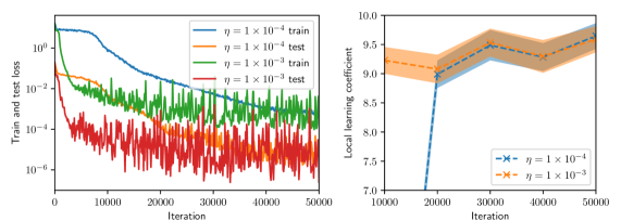
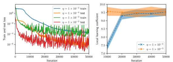
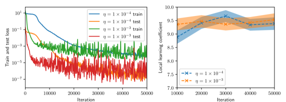
LLC estimates are computed for batch sizes of $8$ , $16$ , and $32$ , and for Adam learning rates $\eta$ of $1\times 10^{-3}$ and $1\times 10^{-4}.$ Furthermore, for all experiments we compute the LLC estimate using a fixed set of $256$ residual evaluation points drawn randomly from $q(x,t).$ To compute the LLC, we employ the Gaussian likelihood of residuals (5). As such, the LLC estimate depends not only on the choice of $\gamma$ but also on the standard deviation $\sigma$ . For each experiment we generate 2 MCMC chains and each chain is initialized with an warmup adaptation interval.
To inform the choice of hyperparameters of the LLC estimator we make the following observations: First, both hyperparameters control the volume of the local neighborhood employed to estimate the LLC, in the case of $\gamma$ by expanding or contracting the prior centered around $w^{\star}$ , and in the case of $\sigma$ by increasing or decreasing the range of values $L_{n}(w)$ can take within the local neighborhood. Second, given that the true data-generating distribution is not realizable, the PINN loss will always be non-zero. Therefore, for the true zero residuals to be resolvable with non-trivial probability by the PINN model we must choose $\sigma$ larger than the average optimal PINN residuals (the squared root of the optimal PINN loss.)
Given that $\gamma=1$ controls the volume of the local neighborhood, we take the value of $\gamma=1$ For the architecture described above, we find that the optimal PINN loss is $O(10^{-5})$ , so that $\sigma$ must be chosen to be $3\times 10^{-3}$ or larger. Given that $\sigma$ also controls the volume of the local neighborhood, we take the conservative value of $\sigma=1$ . It is not entirely obvious whether this conservative choice overestimates or underestimates the LLC. Numerical experiments not presented in this work showed that the small choice $\sigma=1\times 10^{-2}$ led often to negative LLC estimates and therefore was rejected. LLC values estimated for $\sigma=1\times 10^{-1}$ where consistently slightly larger than those for $\sigma=1$ , which indicates that the model class of PINN models that are more physics-respecting has slightly more complexity than a less physics-respecting class. Nevertheless, given that the difference in LLC estimates is small we proceeded with the conservative choice.
<details>
<summary>x3.png Details</summary>
### Visual Description
## Dual-Plot Analysis: Training Loss and Local Learning Coefficient
### Overview
The image contains two side-by-side scientific plots. The left plot is a line chart showing training and test loss over iterations for two different learning rates (η). The right plot is a line chart with shaded confidence intervals, showing the "Local learning coefficient" over iterations for the same two learning rates. Both plots share the same x-axis label ("Iteration") but have different y-axes and data.
### Components/Axes
**Left Plot:**
* **Chart Type:** Line chart with logarithmic y-axis.
* **Y-axis:** Label: "Train and test loss". Scale: Logarithmic, ranging from 10⁻⁶ to 10⁰ (0.000001 to 1). Major tick marks at 10⁻⁶, 10⁻⁴, 10⁻², 10⁰.
* **X-axis:** Label: "Iteration". Scale: Linear, ranging from 0 to 50,000. Major tick marks at 0, 10000, 20000, 30000, 40000, 50000.
* **Legend:** Located in the top-right corner, inside the plot area. Contains four entries:
1. `η = 1 × 10⁻⁴ train` (solid blue line)
2. `η = 1 × 10⁻⁴ test` (solid orange line)
3. `η = 1 × 10⁻³ train` (solid green line)
4. `η = 1 × 10⁻³ test` (solid red line)
**Right Plot:**
* **Chart Type:** Line chart with shaded regions (likely representing standard deviation or confidence intervals).
* **Y-axis:** Label: "Local learning coefficient". Scale: Linear, ranging from 7.0 to 10.0. Major tick marks at 7.0, 7.5, 8.0, 8.5, 9.0, 9.5, 10.0.
* **X-axis:** Label: "Iteration". Scale: Linear, ranging from 10,000 to 50,000. Major tick marks at 10000, 20000, 30000, 40000, 50000.
* **Legend:** Located in the bottom-right corner, inside the plot area. Contains two entries:
1. `η = 1 × 10⁻⁴` (blue line with 'x' markers, blue shaded region)
2. `η = 1 × 10⁻³` (orange line with 'x' markers, orange shaded region)
### Detailed Analysis
**Left Plot (Loss vs. Iteration):**
* **Trend Verification:**
* **Blue Line (η = 1 × 10⁻⁴ train):** Starts high (~10⁰), shows a smooth, steady downward slope, ending near 10⁻⁴ at 50,000 iterations.
* **Orange Line (η = 1 × 10⁻⁴ test):** Follows a similar smooth downward trend to the blue line but is consistently positioned above it, ending slightly above 10⁻³.
* **Green Line (η = 1 × 10⁻³ train):** Starts lower than the blue line (~10⁻²), exhibits high-frequency noise/oscillation throughout, but follows a general downward trend, ending near 10⁻⁴.
* **Red Line (η = 1 × 10⁻³ test):** Starts around 10⁻², is extremely noisy with large oscillations, but maintains a general downward trend, ending between 10⁻⁴ and 10⁻⁵. It is consistently the lowest line after approximately 15,000 iterations.
* **Data Points (Approximate):**
* At Iteration 0: Blue/Orange ~1.0, Green/Red ~0.01.
* At Iteration 25,000: Blue ~0.001, Orange ~0.01, Green ~0.001, Red ~0.0001.
* At Iteration 50,000: Blue ~0.0001, Orange ~0.002, Green ~0.0002, Red ~0.00005.
**Right Plot (Local Learning Coefficient vs. Iteration):**
* **Trend Verification:**
* **Blue Line (η = 1 × 10⁻⁴):** Starts at a low value (~7.0 at 15,000 iterations), shows a very sharp upward slope between 15,000 and 30,000 iterations, then plateaus with a slight upward trend, ending near 9.7 at 50,000 iterations. The blue shaded region is narrow.
* **Orange Line (η = 1 × 10⁻³):** Starts at a higher value (~9.2 at 10,000 iterations), shows a gentle, steady upward slope throughout, ending near 9.6 at 50,000 iterations. The orange shaded region is wider than the blue one, indicating higher variance.
* **Data Points (Approximate):**
* At Iteration 15,000: Blue ~7.0, Orange ~9.2.
* At Iteration 30,000: Blue ~9.5, Orange ~9.4.
* At Iteration 50,000: Blue ~9.7, Orange ~9.6.
### Key Observations
1. **Learning Rate Impact on Loss:** The higher learning rate (η = 1 × 10⁻³) results in significantly noisier loss curves (green, red) but achieves a lower final test loss (red line) compared to the lower learning rate (η = 1 × 10⁻⁴).
2. **Generalization Gap:** For both learning rates, the test loss (orange, red) is higher than the corresponding training loss (blue, green), which is the expected generalization gap.
3. **Learning Coefficient Dynamics:** The local learning coefficient for the lower learning rate (blue) undergoes a dramatic phase of increase between 15k-30k iterations before stabilizing. The higher learning rate (orange) starts high and increases gradually.
4. **Convergence:** By 50,000 iterations, the loss curves for both learning rates appear to be converging, though the higher learning rate curves remain noisier.
### Interpretation
This data suggests a trade-off controlled by the learning rate (η) in a machine learning training process.
* A **lower learning rate (1 × 10⁻⁴)** leads to stable, smooth convergence in both loss and the local learning coefficient, but may converge to a solution with slightly higher final test loss.
* A **higher learning rate (1 × 10⁻³)** introduces significant noise and oscillation during training, which appears to help the model escape local minima, ultimately finding a solution with lower test loss. However, this comes at the cost of training stability.
* The **local learning coefficient** (right plot) appears to be a metric that adapts during training. Its sharp rise for the lower learning rate suggests the model's optimization landscape or its sensitivity changes dramatically during a specific phase of training (15k-30k iterations). The higher learning rate starts in a different regime (higher coefficient) and evolves more smoothly.
* The relationship between the two plots is key: the phase where the blue learning coefficient rises sharply (15k-30k iterations) corresponds to the period where the blue loss curve (left plot) is decreasing most rapidly. This implies the local learning coefficient may be a useful diagnostic for understanding training dynamics and convergence phases. The noisier, but ultimately more effective, training with the higher learning rate is reflected in the higher-variance, but steadily increasing, learning coefficient.
</details>
(a) Batch size $=8$
<details>
<summary>x4.png Details</summary>
### Visual Description
## [Dual-Panel Chart]: Training Loss and Local Learning Coefficient vs. Iteration
### Overview
The image contains two side-by-side line charts. The left chart plots training and test loss on a logarithmic scale against training iterations for two different learning rates (η). The right chart plots the "Local learning coefficient" against iterations for the same two learning rates, with shaded regions indicating variance or confidence intervals. The overall purpose is to compare the training dynamics and a derived metric (local learning coefficient) for two different hyperparameter settings.
### Components/Axes
**Left Chart:**
* **Chart Type:** Line chart with logarithmic y-axis.
* **X-axis:** Label: "Iteration". Scale: Linear, from 0 to 50,000, with major ticks at 0, 10000, 20000, 30000, 40000, 50000.
* **Y-axis:** Label: "Train and test loss". Scale: Logarithmic (base 10), from 10^-6 to 10^0 (1).
* **Legend:** Located in the top-right corner of the plot area. Contains four entries:
1. Blue solid line: `η = 1 × 10⁻⁴ train`
2. Orange dashed line: `η = 1 × 10⁻⁴ test`
3. Green solid line: `η = 1 × 10⁻³ train`
4. Red dashed line: `η = 1 × 10⁻³ test`
**Right Chart:**
* **Chart Type:** Line chart with shaded confidence/variance bands.
* **X-axis:** Label: "Iteration". Scale: Linear, from 10,000 to 50,000, with major ticks at 10000, 20000, 30000, 40000, 50000.
* **Y-axis:** Label: "Local learning coefficient". Scale: Linear, from 7.0 to 10.0, with major ticks at 7.0, 7.5, 8.0, 8.5, 9.0, 9.5, 10.0.
* **Legend:** Located in the bottom-right corner of the plot area. Contains two entries:
1. Blue line with 'x' markers and blue shaded band: `η = 1 × 10⁻⁴`
2. Orange line with 'x' markers and orange shaded band: `η = 1 × 10⁻³`
### Detailed Analysis
**Left Chart - Loss vs. Iteration:**
* **Trend Verification:** All four series show a general downward trend, indicating decreasing loss as training progresses. The lines for the higher learning rate (η=1×10⁻³, green/red) are consistently lower on the y-axis than those for the lower learning rate (η=1×10⁻⁴, blue/orange).
* **Data Series & Approximate Values:**
* **η = 1 × 10⁻⁴ train (Blue solid):** Starts near 10^0 (1.0) at iteration 0. Decreases steadily, crossing 10^-1 (~0.1) around iteration 10,000, and 10^-2 (~0.01) around iteration 25,000. Ends near 10^-3 (~0.001) at iteration 50,000.
* **η = 1 × 10⁻⁴ test (Orange dashed):** Follows a similar but noisier path to its training counterpart. Starts near 10^0, shows significant variance, and ends in the range of 10^-3 to 10^-2.
* **η = 1 × 10⁻³ train (Green solid):** Starts lower, around 10^-1 (~0.1) at iteration 0. Decreases rapidly, reaching 10^-3 (~0.001) by iteration 10,000. Continues to decrease with high-frequency noise, ending near 10^-4 (~0.0001) at iteration 50,000.
* **η = 1 × 10⁻³ test (Red dashed):** Follows the green training line closely but with even greater noise/fluctuation. Its final value at 50,000 iterations is approximately between 10^-5 and 10^-4.
**Right Chart - Local Learning Coefficient vs. Iteration:**
* **Trend Verification:** Both series show an upward trend, indicating the local learning coefficient increases with training iterations. The series for η=1×10⁻³ (orange) is consistently above the series for η=1×10⁻⁴ (blue).
* **Data Series & Approximate Values:**
* **η = 1 × 10⁻⁴ (Blue):** At iteration 10,000, the value is approximately 7.3. It rises sharply to about 9.3 by iteration 20,000. The increase slows, reaching approximately 9.4 by iteration 50,000. The blue shaded band (variance) is narrow, spanning roughly ±0.2 around the line.
* **η = 1 × 10⁻³ (Orange):** At iteration 10,000, the value is already high, approximately 9.5. It increases gradually and relatively linearly, reaching approximately 9.7 by iteration 50,000. The orange shaded band is wider than the blue one, especially at later iterations, spanning roughly ±0.3 to ±0.4 around the line.
### Key Observations
1. **Learning Rate Impact:** The higher learning rate (η=1×10⁻³) leads to significantly lower loss values (by 1-2 orders of magnitude) throughout training compared to the lower rate (η=1×10⁻⁴).
2. **Loss Noise:** Test loss curves (dashed lines) are substantially noisier than their corresponding training loss curves (solid lines), which is typical.
3. **Coefficient Convergence:** The local learning coefficient for the lower learning rate (blue) shows a period of rapid increase between 10k and 20k iterations before plateauing. The coefficient for the higher learning rate (orange) starts high and increases slowly, suggesting it may be in a different phase of learning.
4. **Variance:** The shaded bands on the right chart indicate greater variance/uncertainty in the local learning coefficient estimate for the higher learning rate (η=1×10⁻³).
### Interpretation
This data suggests a trade-off or different dynamic governed by the learning rate hyperparameter (η). The higher learning rate (1×10⁻³) achieves a much lower loss faster, indicating more aggressive optimization. However, its associated "local learning coefficient" is higher and more variable, which might imply the optimization is occurring in a region of the loss landscape with different curvature properties or that the parameter updates are more stochastic.
The lower learning rate (1×10⁻⁴) results in higher loss but a learning coefficient that evolves from a low value to a stable plateau. This could indicate a more gradual, stable descent into a minimum. The fact that the coefficient for the higher learning rate is always above that of the lower one, even when loss is lower, is a key finding. It suggests the local learning coefficient is not a simple proxy for loss but captures a distinct property of the training dynamics, possibly related to the effective step size or the geometry of the optimization path. The investigation appears to be probing the relationship between a hyperparameter, the resulting loss, and a derived metric that may offer deeper insight into the learning process.
</details>
(b) Batch size $=16$
<details>
<summary>x5.png Details</summary>
### Visual Description
\n
## [Chart Type]: Dual-Panel Training Dynamics Plot
### Overview
The image displays two side-by-side line charts analyzing the training dynamics of a machine learning model under two different learning rates (η). The left panel shows the training and test loss over iterations on a logarithmic scale. The right panel shows the "Local learning coefficient" over iterations on a linear scale. Both charts compare the same two learning rates: η = 1×10⁻⁴ and η = 1×10⁻³.
### Components/Axes
**Left Panel (Loss vs. Iteration):**
* **Y-axis:** Label: "Train and test loss". Scale: Logarithmic, ranging from 10⁻⁷ to 10¹.
* **X-axis:** Label: "Iteration". Scale: Linear, from 0 to 50,000.
* **Legend (Top-Left):** Contains four entries:
1. `η = 1 × 10⁻⁴ train` (Solid blue line)
2. `η = 1 × 10⁻⁴ test` (Solid orange line)
3. `η = 1 × 10⁻³ train` (Solid green line)
4. `η = 1 × 10⁻³ test` (Solid red line)
**Right Panel (Local Learning Coefficient vs. Iteration):**
* **Y-axis:** Label: "Local learning coefficient". Scale: Linear, from 7.0 to 10.0.
* **X-axis:** Label: "Iteration". Scale: Linear, from 10,000 to 50,000.
* **Legend (Bottom-Right):** Contains two entries:
1. `η = 1 × 10⁻⁴` (Blue dashed line with 'x' markers, shaded blue confidence interval)
2. `η = 1 × 10⁻³` (Orange dashed line with 'x' markers, shaded orange confidence interval)
### Detailed Analysis
**Left Panel - Loss Trends:**
* **η = 1×10⁻⁴ (Blue/Orange):** Both training (blue) and test (orange) loss start high (~10⁰ to 10¹). They show a steep, smooth decline until approximately iteration 10,000. After this point, the decline slows significantly. The training loss (blue) continues a steady, smooth decrease, reaching approximately 10⁻⁵ by iteration 50,000. The test loss (orange) follows a similar path but exhibits more noise/fluctuation and remains slightly above the training loss, ending near 10⁻⁴.
* **η = 1×10⁻³ (Green/Red):** Both losses start lower than the η=1×10⁻⁴ case. They drop extremely rapidly within the first few thousand iterations. The training loss (green) stabilizes into a very noisy band between approximately 10⁻³ and 10⁻⁴. The test loss (red) is the noisiest series, fluctuating wildly in a band between 10⁻⁵ and 10⁻⁷, and is consistently lower than its corresponding training loss, which is an unusual pattern.
**Right Panel - Local Learning Coefficient Trends:**
* **η = 1×10⁻⁴ (Blue):** The coefficient starts at approximately 8.8 at iteration 10,000. It shows a clear upward trend, peaking at about 9.7 around iteration 30,000, before slightly declining and stabilizing around 9.5 by iteration 50,000. The shaded confidence interval is relatively narrow.
* **η = 1×10⁻³ (Orange):** The coefficient starts higher, at approximately 9.3 at iteration 10,000. It follows a similar upward trend but is consistently lower than the η=1×10⁻⁴ line after the initial point. It peaks at about 9.5 around iteration 25,000 and then gently declines to approximately 9.3 by iteration 50,000. Its confidence interval is wider than the blue line's, indicating higher variance.
### Key Observations
1. **Learning Rate Impact on Loss:** The higher learning rate (η=1×10⁻³) leads to much faster initial loss reduction but results in higher final loss values and significantly more noise (instability) in both training and test loss compared to the lower learning rate (η=1×10⁻⁴).
2. **Unusual Test/Train Loss Relationship:** For η=1×10⁻³, the test loss (red) is consistently and significantly *lower* than the training loss (green). This is atypical and could indicate issues like data leakage, a non-representative test set, or a specific regularization effect.
3. **Learning Coefficient Evolution:** The local learning coefficient increases for both learning rates during the observed window (10k-50k iterations), suggesting the model is moving through a region of the loss landscape where parameters are becoming more sensitive. The lower learning rate maintains a higher coefficient value.
4. **Noise Correlation:** The high noise in the loss curves for η=1×10⁻³ correlates with the wider confidence interval (higher variance) in its local learning coefficient measurement.
### Interpretation
This data provides a technical comparison of optimization dynamics. The **lower learning rate (η=1×10⁻⁴)** demonstrates more stable, controlled convergence: it achieves lower final loss with smooth curves and a higher, more stable local learning coefficient, suggesting it is navigating the loss landscape more precisely. The **higher learning rate (η=1×10⁻³)** causes aggressive, noisy optimization. While it reduces loss quickly initially, it fails to settle into a deep minimum (higher final loss) and exhibits erratic behavior, as seen in the noisy loss bands and the lower, more variable learning coefficient.
The anomalous test loss being lower than training loss for the high learning rate is a critical red flag for investigation. It challenges the standard expectation that training loss should be lower and could imply the test set is easier than the training set, or that the high learning rate is acting as a strong implicit regularizer that benefits generalization more than in-distribution fitting in a non-standard way.
The rising local learning coefficient for both rates indicates the training process is not in a simple, flat region of the loss landscape; the model's parameters remain sensitive to updates even after 50,000 iterations. The fact that the lower learning rate maintains a higher coefficient suggests it is preserving more "learnability" or is positioned in a more curved region of the loss landscape.
</details>
(c) Batch size $=32$
Figure 2: Training and test histories (left, shown every 100 iterations), and LLC estimates with 95% confidence intervals (right, shown every 1,000 iterations) for various values of batch size and Adam learning rate.
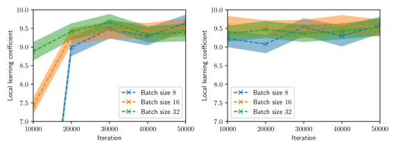
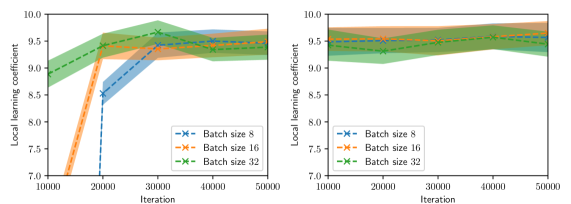
Figure 2 summarizes the results of the computational experiments. The left panels show the history of the training and test losses every $100$ iterations. Here, the test loss is the average of $(u(x,t,w)-u(x,t))^{2}$ evaluated over a $51\times 51$ uniform grid of $(x,t)$ pairs. The right panels show the LLC estimates computed every $10,000$ iterations. Here, care must be taken when interpreting the smaller LLC estimates seen for earlier iterations. For early iterations, the parameter estimate $w_{t}$ is not a minima; therefore, the MCMC chains cover regions of parameter space for which $L_{n}(w)<L_{n}(w_{t})$ , leading to small and possibly negative values. Modulo this observation, it can be seen that across all experiments (batch size and learning rate values), the estimated LLC is $\hat{\lambda}(w^{\star})\approx 9.5$ . Additional experiments conducted by varying the pseudo-random number generator seed used to initialize $w$ also lead to the same estimate of the LLC (see fig. 3.)
This number is remarkable for two reasons: First, despite the estimate of the local minima $w^{\star}$ being vastly different across experiments, the LLC estimate is very consistent. Second, $\hat{\lambda}(w^{\star})$ is significantly smaller than the number of parameters $d=20,601$ of the PINN model. If the PINN model were regular, then it would have a much smaller $O(10)$ number of parameters. These results indicate that the PINN solution corresponds to a very flat region of parameter space, and different choices of initializations and stochastic optimization hyperparameters lead to the same region. As seen in figs. 2 and 3, the lower learning rate of $1\times 10^{-4}$ , due to reduced stochastic optimization noise, takes a larger number of iterations to arrive at this region than the larger learning rate of $1\times 10^{-3}.$
<details>
<summary>x6.png Details</summary>
### Visual Description
## Dual Line Charts: Local Learning Coefficient vs. Iteration for Different Batch Sizes
### Overview
The image displays two line charts arranged side-by-side. Both charts plot the "Local learning coefficient" on the y-axis against "Iteration" on the x-axis for three different batch sizes (8, 16, and 32). The charts appear to compare the same metrics under two different conditions or experimental setups, with the left chart showing more pronounced initial differences and the right chart showing more stable, converged values.
### Components/Axes
* **Chart Type:** Dual line charts with shaded confidence intervals.
* **X-Axis (Both Charts):** Label: "Iteration". Ticks: 10000, 20000, 30000, 40000, 50000.
* **Y-Axis (Both Charts):** Label: "Local learning coefficient". Scale: 7.0 to 10.0, with major ticks at 7.0, 8.0, 9.0, 10.0.
* **Legend (Bottom-Right of each chart):**
* Blue dashed line with 'x' markers: "Batch size 8"
* Orange dashed line with 'x' markers: "Batch size 16"
* Green dashed line with 'x' markers: "Batch size 32"
* **Visual Elements:** Each data series is represented by a dashed line connecting 'x' markers, surrounded by a semi-transparent shaded area of the same color, indicating a confidence interval or variance.
### Detailed Analysis
#### Left Chart Analysis
* **Trend Verification:**
* **Batch size 8 (Blue):** Shows a steep, positive slope from iteration 10000 to 20000, followed by a more gradual positive slope to 50000.
* **Batch size 16 (Orange):** Shows a steady, positive slope from 10000 to 30000, then plateaus with a slight negative slope.
* **Batch size 32 (Green):** Shows a moderate positive slope to a peak at 30000, then a slight negative slope.
* **Data Points (Approximate):**
* **Batch size 8:** (10000, ~7.5), (20000, ~9.0), (30000, ~9.4), (40000, ~9.5), (50000, ~9.8).
* **Batch size 16:** (10000, ~8.8), (20000, ~9.3), (30000, ~9.6), (40000, ~9.5), (50000, ~9.6).
* **Batch size 32:** (10000, ~9.0), (20000, ~9.5), (30000, ~9.8), (40000, ~9.6), (50000, ~9.7).
* **Confidence Intervals:** The shaded area for Batch size 8 is very wide at iteration 10000 (spanning ~7.0 to ~8.0) and narrows significantly as iterations increase. The intervals for Batch sizes 16 and 32 are narrower throughout.
#### Right Chart Analysis
* **Trend Verification:**
* All three lines show relatively flat trends with minor fluctuations, indicating stability across iterations.
* **Batch size 8 (Blue):** Exhibits the most variance, with a slight dip around 20000.
* **Batch size 16 (Orange) & 32 (Green):** Show very stable, nearly horizontal trends.
* **Data Points (Approximate):**
* **Batch size 8:** Hovers between ~9.2 and ~9.6 across all iterations.
* **Batch size 16:** Hovers between ~9.5 and ~9.7 across all iterations.
* **Batch size 32:** Hovers between ~9.4 and ~9.6 across all iterations.
* **Confidence Intervals:** All shaded regions are much narrower compared to the left chart, especially for Batch size 8. The intervals for all three batch sizes overlap significantly.
### Key Observations
1. **Initial Disparity vs. Convergence:** The left chart shows a large initial performance gap (Batch size 8 starts much lower), which closes significantly by iteration 50000. The right chart shows no such initial gap; all batch sizes start and remain high.
2. **Performance Hierarchy:** In the left chart, the final order (at 50000) is Batch 8 > Batch 32 > Batch 16, though values are close. In the right chart, the order is less clear due to overlap, but Batch 16 appears consistently at the top of the cluster.
3. **Variance Reduction:** The left chart shows dramatic reduction in variance (shaded area width) for Batch size 8 as training progresses. The right chart shows consistently low variance for all settings.
4. **Peak Performance:** The highest single observed value (~9.8) occurs for Batch size 32 at iteration 30000 in the left chart.
### Interpretation
These charts likely illustrate the impact of batch size on the stability and trajectory of a learning metric (local learning coefficient) during model training. The **left chart** may represent a scenario with a more challenging optimization landscape or a less optimized training setup, where smaller batch sizes (8) initially struggle (low coefficient, high variance) but eventually catch up and even surpass larger batches. This aligns with the known phenomenon where smaller batches can provide a noisier but sometimes more beneficial gradient signal.
The **right chart** likely represents a scenario with a more stable or well-conditioned optimization process (e.g., after hyperparameter tuning, with a different model architecture, or on an easier task). Here, the choice of batch size has a minimal effect on the final learning coefficient, and all settings achieve high, stable performance from the outset. The key takeaway is that the sensitivity of training dynamics to batch size is highly context-dependent. The data suggests that under certain conditions (left chart), patience with smaller batches is rewarded, while under others (right chart), batch size is a less critical hyperparameter for this specific metric.
</details>
(a) First initialization
<details>
<summary>x7.png Details</summary>
### Visual Description
## Line Charts: Local Learning Coefficient vs. Iteration for Different Batch Sizes
### Overview
The image displays two side-by-side line charts comparing the "Local learning coefficient" over training "Iterations" for three different batch sizes (8, 16, and 32). Each chart plots the coefficient's mean value (solid line) with a shaded region representing the confidence interval or variance. The left chart shows a more volatile learning phase, while the right chart depicts a more stable, later phase.
### Components/Axes
* **Chart Type:** Two line charts with shaded confidence intervals.
* **Y-Axis (Both Charts):** Label: "Local learning coefficient". Scale: 7.0 to 10.0, with major ticks at 0.5 intervals (7.0, 7.5, 8.0, 8.5, 9.0, 9.5, 10.0).
* **X-Axis (Both Charts):** Label: "Iteration". Scale: 10000 to 50000, with major ticks at 10000, 20000, 30000, 40000, and 50000.
* **Legend (Bottom-Right of each chart):**
* Blue line with 'x' markers: "Batch size 8"
* Orange line with 'x' markers: "Batch size 16"
* Green line with 'x' markers: "Batch size 32"
* **Shaded Regions:** Each line has a corresponding semi-transparent shaded area of the same color, indicating the range of uncertainty or variance around the mean value.
### Detailed Analysis
**Left Chart Analysis:**
* **Batch size 8 (Blue):** Starts very low (~7.0 at 10k iterations), rises sharply to ~8.5 at 20k, then continues a steady increase to ~9.5 by 50k. The confidence interval is very wide at the start (spanning ~7.0 to ~8.0 at 10k) and narrows as iterations increase.
* **Batch size 16 (Orange):** Starts around ~7.5 at 10k, increases steadily to ~9.5 by 30k, and then plateaus near ~9.5 for the remainder. Its confidence interval is moderately wide initially and narrows significantly after 30k.
* **Batch size 32 (Green):** Starts the highest at ~9.0 at 10k, peaks at ~9.7 around 30k, then shows a slight decline to ~9.3 by 50k. Its confidence interval is relatively narrow throughout compared to the smaller batch sizes.
**Right Chart Analysis:**
* **Batch size 8 (Blue):** Starts much higher than in the left chart, at ~9.3 at 10k. It fluctuates slightly, dipping to ~9.2 at 20k, then gradually rises to ~9.5 by 50k. The confidence interval is consistently narrow.
* **Batch size 16 (Orange):** Starts at ~9.5 at 10k, shows a slight dip at 20k (~9.4), then increases to ~9.7 by 40k and holds near that level. Confidence interval is narrow.
* **Batch size 32 (Green):** Starts at ~9.4 at 10k, increases to ~9.6 by 30k, and remains stable around ~9.6 through 50k. Confidence interval is the narrowest among the three.
### Key Observations
1. **Phase Difference:** The left chart likely represents an earlier or more exploratory training phase, characterized by lower starting values and high variance, especially for smaller batch sizes. The right chart represents a later, more converged phase with higher, more stable coefficients.
2. **Batch Size Impact:** In both phases, larger batch sizes (32) lead to higher initial learning coefficients and greater stability (narrower confidence intervals). Smaller batch sizes (8) start lower and exhibit more volatility.
3. **Convergence Trend:** All batch sizes in the right chart converge to a high coefficient value between ~9.5 and ~9.7, suggesting the model reaches a similar level of learning regardless of batch size in the long run, though the path differs.
4. **Anomaly:** In the left chart, the Batch size 32 line shows a slight downward trend after 30k iterations, while the others are still rising or plateauing. This could indicate a minor instability or a different optimization dynamic for the largest batch size during that phase.
### Interpretation
The data demonstrates the significant impact of batch size on the dynamics of the "local learning coefficient," a metric likely related to the model's capacity to learn or adapt at a given point in training.
* **Smaller batches (8, 16)** induce a more volatile, exploratory learning process early on (left chart), starting from a lower coefficient but eventually catching up. This aligns with the known property of smaller batches providing noisier gradient estimates, which can help escape local minima but slow initial convergence.
* **Larger batches (32)** provide a more stable, higher-fidelity gradient signal from the start, leading to a consistently higher learning coefficient early in training. However, the slight dip in the left chart suggests this stability might come with a risk of premature convergence or reduced exploration at certain stages.
* The **right chart** shows that given sufficient iterations, all batch sizes achieve a similarly high learning coefficient, indicating the model's final learned state is robust to this hyperparameter. The primary difference is the *path* to convergence: smaller batches take a more circuitous, high-variance route, while larger batches follow a more direct, stable path.
**In summary:** Batch size acts as a control knob for the trade-off between exploration (small batches, high variance) and exploitation/stability (large batches, low variance) during training, without necessarily affecting the final model's learning capacity as measured by this coefficient.
</details>
(b) Second initialization
Figure 3: LLC estimates with 95% confidence intervals shown every 1,000 iterations, computed for various values of batch size and Adam learning rate $\eta$ and for two intializations. Left: $\eta=1\times 10^{-4}$ . Right: $\eta=1\times 10^{-3}$ .
## 4 Discussion
A significant limitation of the proposed reformulation of the physics-informed learning problem is that it’s limited to PINN models with hard initial and boundary condition constraints. In practice, physics-informed learning is often carried without such hard constraints by penalizing not only the residual of the governing equation, $y_{\text{GE}}(x,t)\coloneqq\mathcal{L}(u(x,t,w),x,t)$ but also the residual of the initial conditions, $y_{\text{IC}}(x,w)\coloneqq u(x,0,w)$ , and boundary conditions, $y_{\text{BC}}\coloneqq\mathcal{B}(u(x,t,w),x,t)$ . These residuals can also be regarded as observables of the PINN model. As such, a possible approach to reformulate the physics-informed learning problem with multiple residuals is to introduce a single vector observable $y\coloneqq[y_{\text{GE}},y_{\text{IC}},y_{\text{BC}}]$ and consider the statistical learning problem problem with model $p(y\mid x,t,w)q(x,t).$ In such a formulation, the number of samples $n$ would be the same for all residuals, which goes against the common practice of using different numbers of residual evaluation points for each term of the PINN loss. Nevertheless, we note that as indicated in section 2, PINN learning with randomized batches approximates minimizing the population loss $L(w)\equiv\lim_{n\to\infty}L_{n}(w)$ , which establishes a possible equivalency between the physics-informed learning problem with multiple residuals and the reformulation described above. Furthermore, special care must be taken when considering the weighting coefficients commonly used in physics-informed learning to weight the different residuals in the PINN loss. These problems will be considered in future work.
The presented statistical learning analysis of the physics-informed learning problem has interesting implications on the quantification of uncertainty in PINN predictions. Bayesian uncertainty quantification (UQ) in PINN predictions is often carried out by choosing a prior on the model parameters and a fixed set of residual evaluation points and computing samples from the posterior distribution of PINN parameters (see, e.g. [17, 16].) As noted in [17], MCMC sampling of the PINN loss is highly challenging computationally due to the singular nature of PINN models, but such an exhaustive exploration of parameter space may not be necessary because the solution candidates may differ significantly in parameter space but correspond to only a limited range of loss values and thus a limited range of possible predictions. In other words, this analysis justifies taking a function-space view of Bayesian UQ for physics-informed learning due to the singular nature of the PINN models involved.
<details>
<summary>x8.png Details</summary>
### Visual Description
## Heatmap/Contour Plot: Spatiotemporal Distribution of a Scalar Field
### Overview
The image displays a 2D contour plot (heatmap) representing the magnitude of a scalar quantity over a spatial dimension `x` and a temporal dimension `t`. The plot uses a color gradient to indicate value intensity, with a prominent peak in the upper-central region. A horizontal red dashed line is superimposed at a specific time value.
### Components/Axes
* **X-Axis (Horizontal):**
* **Label:** `x`
* **Range:** 0.0 to 2.0
* **Major Ticks:** 0.0, 0.5, 1.0, 1.5, 2.0
* **Y-Axis (Vertical):**
* **Label:** `t`
* **Range:** 0.0 to 4.0
* **Major Ticks:** 0.0, 0.5, 1.0, 1.5, 2.0, 2.5, 3.0, 3.5, 4.0
* **Color Bar (Legend):**
* **Position:** Right side of the plot.
* **Scale:** Linear, from 0.000 (dark purple) to approximately 0.175 (bright yellow).
* **Key Value Markers:** 0.000, 0.025, 0.050, 0.075, 0.100, 0.125, 0.150, 0.175.
* **Color Gradient:** Transitions from dark purple (low) through blue, teal, and green to yellow (high).
* **Overlay Element:**
* A horizontal, red, dashed line spans the entire width of the plot at `t = 2.0`.
### Detailed Analysis
* **Data Distribution & Trends:**
* **Primary Feature (Peak):** A region of high values is centered approximately at `x ≈ 1.25` and `t ≈ 3.75`. The contours form concentric, semi-circular arcs radiating downward and outward from the top edge of the plot.
* **Value Gradient:** The value increases sharply towards the peak. The outermost visible contour line (dark blue) corresponds to a value of approximately 0.050. Moving inward, subsequent contours represent increasing values (~0.075, 0.100, 0.125, 0.150), culminating in a bright yellow core exceeding 0.175.
* **Background Field:** The vast majority of the plot area, particularly for `t < 2.5` and outside the central peak region, is a uniform dark purple, indicating values at or very near 0.000.
* **Temporal Evolution:** The scalar field appears to be zero or negligible for early times (`t < ~2.5`). The disturbance emerges and intensifies rapidly in the upper-central region after this time.
* **Spatial Distribution:** At any given time `t > 2.5`, the field is strongest near the center (`x ≈ 1.0 - 1.5`) and decays symmetrically towards the boundaries at `x=0.0` and `x=2.0`.
### Key Observations
1. **Localized Peak:** The phenomenon is highly localized in both space and time, with no significant activity outside the central upper quadrant.
2. **Symmetry:** The pattern exhibits approximate symmetry about the vertical line `x = 1.25`.
3. **Sharp Onset:** The transition from the zero-field region (dark purple) to the high-value region (contours) is relatively sharp, suggesting a front or wave-like propagation.
4. **Reference Line:** The red dashed line at `t = 2.0` serves as a clear temporal marker, possibly indicating an initial condition, a trigger time, or a boundary between different phases of the process being visualized.
### Interpretation
This plot likely visualizes the solution to a partial differential equation (PDE) modeling a diffusion, wave, or transport process. The pattern is characteristic of a **localized source or initial disturbance** that activates or becomes significant after `t ≈ 2.5`, spreading outward in space while its intensity peaks and then presumably decays (though decay is not visible within the `t=4.0` window).
* **What it Suggests:** The data demonstrates a process where a quantity is generated or concentrated at a specific location (`x≈1.25`) starting at a specific time, then diffuses or propagates spatially. The red line at `t=2.0` may mark the moment before the main event begins, highlighting the "quiet" initial state.
* **Relationships:** The `x` and `t` axes are independent variables defining the domain. The color-mapped value is the dependent variable. The contours connect points of equal value, revealing the shape and gradient of the field. The red line is an annotation for analytical reference.
* **Anomalies/Notable Points:** The most notable feature is the **absence of data** in the lower half of the plot. This is not an anomaly but a key characteristic: the system is quiescent until a later time. The perfect symmetry suggests an idealized or controlled scenario. The peak value (~0.175) is the maximum intensity achieved within the observed timeframe.
</details>
(a) $|u(x,t)-u(x,t,w^{0})|$
<details>
<summary>x9.png Details</summary>
### Visual Description
## Heatmap/Contour Plot: Spatiotemporal Value Distribution
### Overview
The image is a 2D contour plot (heatmap) visualizing a scalar field over a spatial dimension `x` and a temporal dimension `t`. The plot shows a region of high values concentrated at the top-center, with values decreasing radially outward. A prominent red dashed line is superimposed horizontally across the plot.
### Components/Axes
* **Main Plot Area:** A rectangular region with a color gradient representing the value of an unspecified variable.
* **X-Axis (Horizontal):**
* **Label:** `x`
* **Scale:** Linear, ranging from `0.0` to `2.0`.
* **Major Tick Markers:** `0.0`, `0.5`, `1.0`, `1.5`, `2.0`.
* **Y-Axis (Vertical):**
* **Label:** `t`
* **Scale:** Linear, ranging from `0.0` to `4.0`.
* **Major Tick Markers:** `0.0`, `0.5`, `1.0`, `1.5`, `2.0`, `2.5`, `3.0`, `3.5`, `4.0`.
* **Color Bar (Legend):**
* **Position:** Right side of the plot.
* **Scale:** Linear, ranging from `0.00` to `0.30`.
* **Major Tick Markers:** `0.00`, `0.05`, `0.10`, `0.15`, `0.20`, `0.25`, `0.30`.
* **Color Gradient:** A continuous map from dark purple (low values, ~`0.00`) through blue and green to bright yellow (high values, ~`0.30`).
* **Overlay Element:**
* A horizontal, red, dashed line spanning the full width of the plot at the coordinate `t = 2.0`.
### Detailed Analysis
* **Data Distribution & Trends:**
* The highest values (bright yellow, ~`0.30` on the color bar) are located in a concentrated region at the top-center of the plot, approximately at `x = 1.0` and `t = 4.0`.
* From this peak, the values decrease in all directions, forming concentric, elliptical contour lines. The trend is a smooth, radial decay from the top-center.
* The majority of the plot area, especially for `t < 2.5`, is dominated by the lowest values (dark purple, ~`0.00` to `0.05`).
* **Contour Lines:** Black contour lines are drawn at specific value levels. They are densely packed near the peak (`t=4.0, x=1.0`) and become more widely spaced as values decrease, indicating a steeper gradient near the maximum.
* **Red Dashed Line:** This line at `t = 2.0` serves as a clear visual marker or threshold within the temporal domain. It lies entirely within the region of very low values (dark purple).
### Key Observations
1. **Single Peak:** The data exhibits a single, well-defined maximum at the spatial and temporal boundary (`x=1.0, t=4.0`).
2. **Boundary Concentration:** The phenomenon being visualized appears to originate from or be most intense at the upper temporal boundary (`t=4.0`).
3. **Temporal Threshold:** The red line at `t=2.0` demarcates a significant drop in value. The region below this line (`t < 2.0`) shows almost uniform, minimal values.
4. **Spatial Symmetry:** The distribution is roughly symmetric about the vertical line `x = 1.0`.
### Interpretation
This plot likely represents the solution to a partial differential equation (PDE), such as a heat or diffusion equation, over a 1D spatial domain (`x`) and time (`t`). The high-value region at `(x=1.0, t=4.0)` suggests an initial condition or a source term applied at the final time `t=4.0`, with the values diffusing "backwards" in time (or representing a steady-state solution viewed in reverse). Alternatively, it could show the accumulation of a quantity over time, peaking at the end of the observed period.
The red dashed line at `t=2.0` is an annotation, likely indicating a specific time of interest for analysis, a cutoff point, or the time at which a particular event or measurement occurs. The stark contrast between the active region (`t > 2.5`) and the quiescent region (`t < 2.0`) suggests a system that undergoes a significant change or activation in the latter half of the observed timeframe. The smooth, elliptical contours are characteristic of diffusive processes, where gradients drive the spread of the quantity from regions of high concentration to low concentration.
</details>
(b) $|u(x,t)-u(x,t,w^{1})|$
Figure 4: PINN pointwise absolute estimation errors for two different parameter vectors, $w^{0}$ and $w^{1}$ , obtained via different initializations of the PINN model parameters. Both parameter estimates were computed using batch size of 32 and Adam learning rate of $1\times 10^{-4}$ over $100,000$ iterations. Despite both cases exhibiting result in similar loss $L_{n}(w)$ values ( $O(10^{-5}$ ) and similar LLCs $\hat{\lambda}(w^{0})\approx\hat{\lambda}(w^{1})\approx 9.5$ , they exhibit noticeably different extrapolation behavior.
Finally, another implication of the presented analysis is related to the extrapolatory capacity of PINNs. It is understood that PINNs, particularly time-dependent PINNs, exhibit limited extrapolation capacity for times outside the training window $(0,T]$ (see, e.g., [12].) The presented analysis indicates that this is not a feature of the IBVP being solved, or the number and arrangement of residual evaluation points in space and time, or the optimization algorithm, but rather because physics-informed learning estimates model parameters by effectively minimizing $L(w)\propto\mathbb{E}_{q(x,t)}[\mathcal{L}(u(x,t,w),x,t)]^{2}$ , that is, the expected loss over the input-generating distribution $q(x,t)$ with support given by the spatio-temporal training windows. While PINN solution candidates along the flat minima are all within a limited range of loss values, there is no guarantee that this would hold for a different loss $L^{\prime}(w)\propto\mathbb{E}_{q^{\prime}(x,t)}[\mathcal{L}(u(x,t,w),x,t)]^{2}$ because the structure of the flat minima is tightly tied to the definition of the original loss, which is tightly tied to the input-generating distribution and thus to the spatio-temporal training window. In fact, it can be expected that two $w$ s with losses $L(w)$ within tolerance will lead to vastly different extrapolation losses $L^{\prime}(w)$ (e.g., see fig. 4), consistent with extrapolation results reported in the literature.
## 5 Conclusions
We have presented in this work a reformulation of physics-informed learning for IBVPs as a statistical learning problem valid for hard-constraints parameterizations. Employing this reformulation we argue that the physics penalty in physics-informed learning is not a regularizer as it is often interpreted (see, e.g. [6]) but as an infinite source of data, and that physics-informed learning with randomized batches of residual evaluation points is equivalent to minimizing $L(w)\propto\mathbb{E}_{q(x,t)}[\mathcal{L}(u(x,t,w),x,t)]^{2}$ . Furthermore, we show that the PINN loss landscape is not characterized by discrete, measure-zero local minima even in the limit $n\to\infty$ of the number of residual evaluation points but by very flat local minima corresponding to a low-complexity (relative to the number of model parameters) model class. We characterize the flatness of local minima of the PINN loss landscape by computing the LLC for a heat equation IBVP and various initializations and choices of learning hyperparameters, and find that across all initializations and hyperparameters studied the estimated LLC is very similar, indicating that the neighborhoods around the different PINN parameter estimates obtained across the experiments exhibit similar flatness properties. Finally, we discuss the implications of the proposed analysis on the quantification of the uncertainty in PINN predictions, and the extrapolation capacity of PINN models.
## Acknowledgments
This material is based upon work supported by the U.S. Department of Energy (DOE), Office of Science, Office of Advanced Scientific Computing Research. Pacific Northwest National Laboratory is operated by Battelle for the DOE under Contract DE-AC05-76RL01830.
## References
- [1] A. Cabezas, A. Corenflos, J. Lao, and R. Louf (2024) BlackJAX: composable Bayesian inference in JAX. External Links: 2402.10797 Cited by: §1, §3.2.
- [2] Flax: a neural network library and ecosystem for JAX External Links: Link Cited by: §1, §3.2.
- [3] M. D. Homan and A. Gelman (2014-01) The no-u-turn sampler: adaptively setting path lengths in hamiltonian monte carlo. J. Mach. Learn. Res. 15 (1), pp. 1593–1623. External Links: ISSN 1532-4435 Cited by: §1, §3.1.
- [4] J. Hoogland, G. Wang, M. Farrugia-Roberts, L. Carroll, S. Wei, and D. Murfet (2025) Loss landscape degeneracy and stagewise development in transformers. Transactions on Machine Learning Research. Note: External Links: ISSN 2835-8856, Link Cited by: §1.
- [5] T. Imai (2019-06) Estimating Real Log Canonical Thresholds. arXiv e-prints, pp. arXiv:1906.01341. External Links: Document, 1906.01341 Cited by: §3.1.
- [6] G. E. Karniadakis, I. G. Kevrekidis, L. Lu, P. Perdikaris, S. Wang, and L. Yang (2021) Physics-informed machine learning. Nature Reviews Physics 3 (6), pp. 422–440. Cited by: §1, §5.
- [7] E. Lau, Z. Furman, G. Wang, D. Murfet, and S. Wei (2025-03–05 May) The local learning coefficient: a singularity-aware complexity measure. In Proceedings of The 28th International Conference on Artificial Intelligence and Statistics, Y. Li, S. Mandt, S. Agrawal, and E. Khan (Eds.), Proceedings of Machine Learning Research, Vol. 258, pp. 244–252. External Links: Link Cited by: §1, §2, §3.1, Statistical Learning Analysis of Physics-Informed Neural Networks.
- [8] X. Li, J. Deng, J. Wu, S. Zhang, W. Li, and Y. Wang (2024) Physical informed neural networks with soft and hard boundary constraints for solving advection-diffusion equations using fourier expansions. Computers & Mathematics with Applications 159, pp. 60–75. External Links: ISSN 0898-1221, Document, Link Cited by: §2.
- [9] L. Lu, R. Pestourie, W. Yao, Z. Wang, F. Verdugo, and S. G. Johnson (2021) Physics-informed neural networks with hard constraints for inverse design. SIAM Journal on Scientific Computing 43 (6), pp. B1105–B1132. External Links: Document, Link, https://doi.org/10.1137/21M1397908 Cited by: §2.
- [10] A. Muhamed and V. Smith (2025) The geometry of forgetting: analyzing machine unlearning through local learning coefficients. In ICML 2025 Workshop on Reliable and Responsible Foundation Models, External Links: Link Cited by: §1.
- [11] A. M. Tartakovsky and Y. Zong (2024) Physics-informed machine learning method with space-time karhunen-loève expansions for forward and inverse partial differential equations. Journal of Computational Physics 499, pp. 112723. External Links: ISSN 0021-9991, Document, Link Cited by: §2.
- [12] Y. Wang, Y. Yao, and Z. Gao (2025) An extrapolation-driven network architecture for physics-informed deep learning. Neural Networks 183, pp. 106998. External Links: ISSN 0893-6080, Document, Link Cited by: §4.
- [13] S. Watanabe (2009) Algebraic geometry and statistical learning theory. Vol. 25, Cambridge University Press. Cited by: §1, §2.
- [14] S. Watanabe (2013-03) A widely applicable bayesian information criterion. 14 (1), pp. 867–897. External Links: ISSN 1532-4435 Cited by: §3.1.
- [15] M. Welling and Y. W. Teh (2011) Bayesian learning via stochastic gradient langevin dynamics. In Proceedings of the 28th International Conference on International Conference on Machine Learning, ICML’11, Madison, WI, USA, pp. 681–688. External Links: ISBN 9781450306195 Cited by: §1.
- [16] L. Yang, X. Meng, and G. E. Karniadakis (2021) B-pinns: bayesian physics-informed neural networks for forward and inverse pde problems with noisy data. Journal of Computational Physics 425, pp. 109913. External Links: ISSN 0021-9991, Document, Link Cited by: §4.
- [17] Y. Zong, D. A. Barajas-Solano, and A. M. Tartakovsky (2025) Randomized Physics-informed Neural Networks for Bayesian Data Assimilation. Comput. Methods Appl. Mech. Eng. 436, pp. 117670. External Links: Document Cited by: §4.