# Think Deep, Not Just Long: Measuring LLM Reasoning Effort via Deep-Thinking Tokens
**Authors**: Wei-Lin Chen, Liqian Peng, Tian Tan, Chao Zhao, Blake JianHang Chen, Ziqian Lin, Alec Go, Yu Meng
> University of Virginia
wlchen@virginia.edu, liqianp@google.com
## Abstract
Large language models (LLMs) have demonstrated impressive reasoning capabilities by scaling test-time compute via long Chain-of-Thought (CoT). However, recent findings suggest that raw token counts are unreliable proxies for reasoning quality: increased generation length does not consistently correlate with accuracy and may instead signal “overthinking,” leading to performance degradation. In this work, we quantify inference-time effort by identifying deep-thinking tokens —tokens where internal predictions undergo significant revisions in deeper model layers prior to convergence. Across four challenging mathematical and scientific benchmarks (AIME 24/25, HMMT 25, and GPQA-diamond) and a diverse set of reasoning-focused models (GPT-OSS, DeepSeek-R1, and Qwen3), we show that deep-thinking ratio (the proportion of deep-thinking tokens in a generated sequence) exhibits a robust and consistently positive correlation with accuracy, substantially outperforming both length-based and confidence-based baselines. Leveraging this insight, we introduce Think@ $n$ , a test-time scaling strategy that prioritizes samples with high deep-thinking ratios. We demonstrate that Think@ $n$ matches or exceeds standard self-consistency performance while significantly reducing inference costs by enabling the early rejection of unpromising generations based on short prefixes.
<details>
<summary>x1.png Details</summary>
### Visual Description
## Scatter Plot Charts: Model Accuracy vs. Token Count and Deep-Thinking Ratio
### Overview
The image contains two side-by-side scatter plots with overlaid linear regression trend lines and shaded confidence intervals. Both charts plot "Accuracy (Pass@1)" on the y-axis against different x-axis variables. The left chart examines the relationship with "Token Count," while the right chart examines the relationship with "(Ours) Deep-Thinking Ratio." A shared legend at the bottom identifies four distinct data series.
### Components/Axes
* **Shared Y-Axis:** Labeled "Accuracy (Pass@1)". The scale runs from 0.5 to approximately 0.85, with major tick marks at 0.5, 0.6, 0.7, and 0.8.
* **Left Chart X-Axis:** Labeled "Token Count". The scale runs from approximately 2000 to 11000, with major tick marks at 2500, 5000, 7500, and 10000.
* **Right Chart X-Axis:** Labeled "(Ours) Deep-Thinking Ratio". The scale runs from approximately 0.135 to 0.185, with major tick marks at 0.135, 0.150, 0.165, and 0.180.
* **Legend (Bottom Center):** Contains four entries, each with a colored line and marker:
* **Light Blue (Cyan):** AIME 25
* **Green:** AIME 24
* **Red:** HMMT 25
* **Gold/Yellow:** GPQA-D
* **Chart Titles (Top Center):**
* Left Chart: "Avg Correlation r = -0.544"
* Right Chart: "Avg Correlation r = 0.828"
* **In-Chart Annotations:** Each data series has its Pearson correlation coefficient (`r`) annotated near its trend line.
### Detailed Analysis
#### Left Chart: Accuracy vs. Token Count
* **Overall Trend:** The average correlation is negative (`r = -0.544`), suggesting that, across these benchmarks, accuracy generally decreases as token count increases.
* **Series-Specific Trends & Data Points (Approximate):**
* **AIME 25 (Light Blue):** Shows a negative correlation (`r = -0.407`). The trend line slopes downward. Data points are clustered between ~4000 and ~10000 tokens, with accuracy ranging from ~0.76 to ~0.83.
* **AIME 24 (Green):** Shows a strong negative correlation (`r = -0.704`). The trend line slopes downward more steeply than AIME 25. Data points are between ~3000 and ~7000 tokens, with accuracy from ~0.78 to ~0.84.
* **HMMT 25 (Red):** Shows a very strong negative correlation (`r = -0.783`). The trend line has the steepest downward slope. Data points span from ~4000 to ~11000 tokens, with accuracy dropping from ~0.68 to ~0.51.
* **GPQA-D (Gold):** Shows a moderate negative correlation (`r = -0.284`). The trend line has a gentle downward slope. Data points are clustered at the lower token count range (~2000-3500), with accuracy between ~0.68 and ~0.71.
#### Right Chart: Accuracy vs. Deep-Thinking Ratio
* **Overall Trend:** The average correlation is strongly positive (`r = 0.828`), suggesting that accuracy increases as the "Deep-Thinking Ratio" increases.
* **Series-Specific Trends & Data Points (Approximate):**
* **AIME 25 (Light Blue):** Shows a very strong positive correlation (`r = 0.862`). The trend line slopes upward sharply. Data points range from a ratio of ~0.135 (accuracy ~0.68) to ~0.175 (accuracy ~0.85).
* **AIME 24 (Green):** Shows a strong positive correlation (`r = 0.715`). The trend line slopes upward. Data points range from ~0.145 (accuracy ~0.77) to ~0.185 (accuracy ~0.83).
* **HMMT 25 (Red):** Shows an extremely strong positive correlation (`r = 0.941`). The trend line has a consistent upward slope. Data points range from ~0.135 (accuracy ~0.55) to ~0.180 (accuracy ~0.66).
* **GPQA-D (Gold):** Shows a strong positive correlation (`r = 0.795`). The trend line slopes upward. Data points are clustered between ratios of ~0.150 and ~0.185, with accuracy from ~0.69 to ~0.71.
### Key Observations
1. **Inverse Relationship Between Charts:** The two charts show opposing trends. The left chart indicates a negative relationship between token count and accuracy, while the right chart indicates a strong positive relationship between the "Deep-Thinking Ratio" and accuracy.
2. **Benchmark Performance Hierarchy:** In both charts, the AIME series (24 and 25) consistently achieve the highest accuracy levels, followed by GPQA-D, with HMMT 25 showing the lowest accuracy.
3. **Correlation Strength:** The strongest correlations (in magnitude) are found in the right chart, particularly for HMMT 25 (`r=0.941`) and AIME 25 (`r=0.862`). The left chart's strongest correlation is for HMMT 25 (`r=-0.783`).
4. **Data Distribution:** The GPQA-D data points are confined to a narrow range on both x-axes compared to the other series.
### Interpretation
The data suggests a critical insight into the model's performance. The negative correlation with **Token Count** implies that simply processing more tokens (potentially indicating longer or more verbose reasoning) does not improve, and may even harm, accuracy on these mathematical benchmarks (AIME, HMMT) and the GPQA-D dataset. This could point to issues with distraction, error propagation, or inefficiency in long-context reasoning.
Conversely, the strong positive correlation with the **"(Ours) Deep-Thinking Ratio"** is the key finding. This metric, presumably a proprietary measure of how much the model engages in deliberate, structured reasoning versus superficial processing, is a powerful predictor of success. The near-perfect linear relationship for HMMT 25 (`r=0.941`) is particularly striking. This indicates that the *quality* or *style* of computation (deep thinking) is far more important than the *quantity* of computation (token count) for achieving high accuracy. The charts collectively argue that optimizing for this "Deep-Thinking Ratio" is a more effective path to improving model performance than simply scaling up context length or output verbosity.
</details>
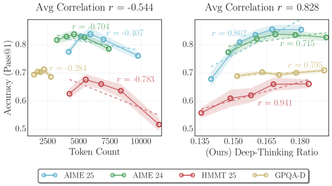
Figure 1: Comparison of correlations between accuracy and proxies for thinking effort. The plots illustrate the relationship between model performance and two inference-time measures of thinking effort on GPT-OSS-120B- medium across AIME 2024/2025, HMMT 2025, and GPQA-Diamond. (Left) Output token count exhibits a moderate negative correlation (average $r=-0.544$ ), suggesting that output length is an unreliable indicator of performance. (Right) In contrast, our proposed deep-thinking ratio demonstrates a strong positive correlation with accuracy (average $r=0.828$ ).
## 1 Introduction
Large language models (LLMs) have achieved remarkable reasoning capabilities by generating explicit thought traces, most notably through the Chain-of-Thought (CoT) paradigm [wei2022chain-d1a]. Prior works have shown that increasing the number of reasoning tokens generated can generally boost task performance [jaech2024openai, guo2025deepseek, anthropic2025claude3-7, anthropic2025claude4, oai2025o3mini, yang2025qwen3, team2025kimi, zhong2024evaluation], motivating methods that encourage longer and more elaborate thinking traces [muennighoff2025s1, balachandran2025inference-time-7c9, yeo2025demystifying-b6f].
However, a growing body of evidence suggests that token counts are unreliable indicators of model performance during inference, as longer reasoning does not consistently translate into higher accuracy [wu2025when-905, aggarwal2025optimalthinkingbench-3bf, sui2025stop-ced, su2025between-f85]. Empirical studies reveal inverted-U relationships between CoT length and performance [wu2025when-905], as well as inverse-scaling behaviors in which longer reasoning traces systematically degrade performance [gema2025inverse-bad]. Excessive reasoning may reflect overthinking, wherein models amplify flawed heuristics or fixate on irrelevant details [feng2025what-321]. Consequently, relying on length as a metric for reasoning quality not only encourages verbosity over clarity but also wastes computational resources on uninformative tokens. Though recent work has attempted to assess the semantic structure of CoTs (e.g., by representing reasoning traces as graphs), such approaches often rely on costly auxiliary parsing or external annotations [feng2025what-321]. Addressing these limitations requires more principled and efficient methods for measuring thinking effort that can distinguish effective reasoning from uninformative generation.
In this work, we introduce deep-thinking ratio (DTR) as a direct measure of inference-time thinking effort. Instead of relying on surface-level features like output length, we focus on how individual tokens are produced internally. We posit that when a token prediction stabilizes in early layers, subsequent depth-wise modifications entail relatively low computational effort, resembling less thinking. In contrast, token predictions that undergo sustained revision in deeper layers before converging reflect greater thinking [chuang2023dola-0c6]. We operationalize this idea by projecting intermediate-layer hidden states into the vocabulary space and comparing each layer’s prediction distribution to the final-layer distribution. Tokens whose distributions do not converge until deeper layers are identified as deep-thinking tokens. By counting the proportion of deep-thinking tokens in a generated sequence, we obtain DTR, which provides a simple, mechanistically grounded measure of thinking effort, requiring neither task-specific heuristics nor external structural annotations.
Across four challenging mathematical and scientific reasoning benchmarks—AIME 2024, AIME 2025, HMMT 2025, and GPQA [aops2024aime1, aops2024aime2, aops2025aime1, aops2025aime2, hmmt2025, rein2024gpqa] —and a range of reasoning-focused language models, including GPT-OSS, DeepSeek-R1, and Qwen3 families [openai2025gpt-oss-120b-a33, guo2025deepseek, yang2025qwen3], we demonstrate that measuring deep-thinking tokens yields strong correlations with task accuracy. The achieved correlation is substantially higher than those obtained using length-based or confidence-based baselines. Furthermore, we show that deep-thinking tokens can be leveraged for parallel inference scaling, where preferentially selecting and aggregating responses with higher DTR achieves performance comparable or better than standard consensus-based methods, while requiring only half the compute cost. Our contributions are summarized as follows:
- We introduce deep-thinking ratio (DTR)—a measure that counts the ratio of deep-thinking tokens in a sequence whose predictions undergo sustained revision in deeper layers before converging—as a new lens for characterizing inference-time thinking effort.
- We empirically show that, across multiple reasoning benchmarks and model families, DTR of a generated sequence exhibits strong positive correlations with task accuracy, outperforming length-based and confidence-based baselines significantly.
- We introduce Think@ $n$ , a test-time scaling strategy that preferentially selects and aggregates samples with higher DTR. By early halting unpromising generations based on DTR estimated from short prefixes, Think@ $n$ matches or surpasses standard self-consistency with approximately half the inference cost.
<details>
<summary>x2.png Details</summary>
### Visual Description
\n
## Heatmap: Token Activation Across Neural Network Layers
### Overview
The image is a heatmap visualization depicting the activation intensity (likely attention weights or neuron activations) of individual tokens from a mathematical expression across the 35 layers of a neural network model. The visualization uses a color gradient to represent numerical values, with darker colors indicating higher values.
### Components/Axes
* **Chart Type:** Heatmap.
* **X-Axis (Horizontal):** Represents a sequence of tokens from a mathematical statement. The tokens are, from left to right:
`A`, `and`, `B`, `=`, `8`, `+`, `5`, `=`, `13`, `\boxed{`, `13`, `yin`, `yin`, `the`, `correct`, `choice`, `is`, `(`, `D`, `)`, `13`, `.`, `The`, `final`, `answer`, `is`, `\boxed{`, `(`, `D`, `)`, `}`, `\text{final}`.
* **Language Note:** The tokens include English words (`and`, `the`, `correct`, `choice`, `is`, `final`, `answer`), mathematical symbols (`=`, `+`, `(`, `)`), numbers (`8`, `5`, `13`), LaTeX commands (`\boxed`, `\text`), and what appear to be model-specific or tokenized representations (`yin`, `yin`).
* **Y-Axis (Vertical):** Labeled "i-th Layer". It is a linear scale representing the layer number in the neural network, ranging from 1 at the bottom to 35 at the top, with major tick marks every 2 layers (1, 3, 5, ..., 35).
* **Color Scale/Legend:** Located on the far right of the chart. It is a vertical bar showing a gradient from light yellow/cream at the bottom (labeled `0.0`) to dark brown at the top (labeled `1.0`). Intermediate labels are `0.2`, `0.4`, `0.6`, `0.8`. This scale maps the color of each cell in the heatmap to a numerical value between 0 and 1.
### Detailed Analysis
* **Spatial Layout:** The heatmap is a grid where each column corresponds to a token on the x-axis and each row corresponds to a layer on the y-axis. The color of each cell indicates the activation value for that token at that layer.
* **Data Trend & Value Extraction:**
* **General Trend:** Activation values are highest (dark brown, ~0.8-1.0) in the lowest layers (approximately layers 1-15) across nearly all tokens. This forms a solid dark band at the bottom of the chart.
* **Layer-Specific Patterns:**
* **Layers 1-15:** Almost uniformly high activation (dark brown) for all tokens. Values are consistently near 1.0.
* **Layers 16-20:** Activation begins to分化 (differentiate). Some tokens retain high values (e.g., `A`, `B`, `=`, `8`, `+`, `5`, `=`, `13`), while others drop to medium (orange, ~0.4-0.6) or low (light yellow, ~0.0-0.2) values.
* **Layers 21-35:** Activation becomes highly token-specific. A pattern of "spikes" of high activation appears for certain tokens at specific higher layers.
* **Token-Specific High-Activation Points (Approximate):**
* `A`: High activation persists up to ~Layer 27.
* `and`: Notable high activation spike at ~Layer 23.
* `B`: High activation persists up to ~Layer 29.
* `=` (first): High activation spike at ~Layer 33.
* `8`: High activation spike at ~Layer 27.
* `+`: High activation spike at ~Layer 25.
* `5`: High activation spike at ~Layer 33.
* `=` (second): High activation spike at ~Layer 29.
* `13` (first): High activation spike at ~Layer 25.
* `\boxed{`: High activation spike at ~Layer 21.
* `13` (second): High activation spike at ~Layer 27.
* `yin` (both): Show medium-high activation (~0.6-0.8) in layers 25-31.
* `the`: High activation spike at ~Layer 29.
* `correct`: High activation spike at ~Layer 27.
* `choice`: High activation spike at ~Layer 25.
* `is` (first): High activation spike at ~Layer 23.
* `(`: High activation spike at ~Layer 31.
* `D`: Shows a distinct vertical band of medium-high activation from ~Layer 23 to Layer 31.
* `)` (first): High activation spike at ~Layer 31.
* `13` (third): High activation spike at ~Layer 29.
* `.`: High activation spike at ~Layer 25.
* `The`: High activation spike at ~Layer 23.
* `final`: High activation spike at ~Layer 25.
* `answer`: High activation spike at ~Layer 23.
* `is` (second): High activation spike at ~Layer 21.
* `\boxed{` (second): High activation spike at ~Layer 21.
* `(` (second): High activation spike at ~Layer 31.
* `D` (second): High activation spike at ~Layer 31.
* `)` (second): High activation spike at ~Layer 31.
* `}`: High activation spike at ~Layer 29.
* `\text{final}`: High activation spike at ~Layer 27.
### Key Observations
1. **Low-Layer Uniformity:** The foundational layers (1-15) show uniformly high activation for all tokens, suggesting these layers process basic, shared features of the input sequence.
2. **Mid-Layer Differentiation:** Around layers 16-20, the model begins to assign different importance levels to different tokens.
3. **High-Layer Specialization:** In the upper layers (21-35), activation is highly sparse and token-specific. Only a few tokens show high activation at any given layer, indicating specialized processing or decision-making at these depths.
4. **Key Token Highlighting:** Tokens crucial to the mathematical reasoning and final answer (`=`, `+`, numbers, `D`, parentheses, `\boxed`) show repeated high-activation spikes in the upper layers. The token `D` is particularly notable for having a sustained band of elevated activation.
5. **Structural Token Processing:** Syntactic or structural tokens like `\boxed{`, `(`, `)`, and `.` also show high activation in upper layers, indicating the model is attending to the format and structure of the answer.
### Interpretation
This heatmap likely visualizes the **attention pattern** or **activation strength** of a transformer-based language model solving a math word problem. The sequence of tokens represents the problem statement and the model's generated solution chain-of-thought leading to the final answer `\boxed{(D)}`.
* **What the data suggests:** The model's processing follows a clear hierarchical pattern. Early layers handle universal token representation. Mid-layers begin parsing the problem's structure. Upper layers perform highly focused, token-specific computation, repeatedly "attending to" or "activating on" the key numerical values (`8`, `5`, `13`), operators (`+`, `=`), and the final answer choice (`D`) to verify and construct the solution.
* **How elements relate:** The x-axis sequence tells a story: from defining variables (`A and B = 8 + 5 = 13`), to stating the task (`the correct choice is (D) 13`), to formatting the final answer (`The final answer is \boxed{(D)}`). The y-axis shows *when* (at what processing depth) each part of this story is most important. The color intensity shows *how important* it is.
* **Notable Patterns/Anomalies:**
* The token `D` has a unique, sustained activation profile, suggesting it is a critical pivot point in the model's reasoning.
* The repetition of high activation for `\boxed{` and parentheses in the final layers indicates the model is strongly focused on producing the answer in the correct, boxed format.
* The tokens `yin yin` are anomalous; their medium-high activation in mid-upper layers is unexplained by the visible math problem and may be an artifact of tokenization, a model-internal token, or a misalignment in the visualization.
</details>
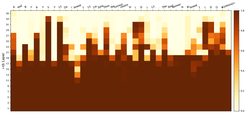
Figure 2: Heatmap of thought: We plot the Jensen–Shannon divergence (JSD) values between the distributions of the last (36th) layer and intermediate layers for an answer sequence from GPT-OSS-120B- high. Functional and templated words (e.g., “and”, “is”, “boxed”, “ <| return |> ”) often converge at relatively shallow layers; Completions after operators (e.g., “+”, “=”) and answer tokens/symbols (e.g., “13”, “(D)”) do not settle until deeper layers. Interestingly, the answer token “13” gradually surfaces in earlier layers after its first appearance.
## 2 Measuring Deep-Thinking Ratio
### 2.1 Preliminaries
We consider an autoregressive language model $f_θ$ composed of $L$ transformer layers, hidden dimension $d$ , and vocabulary $V$ . Given a prefix sequence $y_<t$ , the forward pass at generation step $t$ produces a sequence of residual stream states $\{h_t,l\}_l=1^L$ , where $h_t,l∈ℝ^d$ denotes the hidden state after layer $l$ . The final-layer output $h_t,L$ is projected by the language modeling head (i.e., the unembedding matrix) $W_U∈ℝ^|V|× d$ to produce logits over the vocabulary.
Prior research on early exiting [teerapittayanon2016branchynet, elbayad2019depth, schuster2022confident, din2024jump, belrose2023eliciting] has demonstrated that, without specialized auxiliary training, applying the language modeling head directly to intermediate-layer hidden states effectively yields meaningful predictive distributions [nostalgebraist2020lens, kao2020bert]. Building on this line of works, we project intermediate-layer hidden states into the vocabulary space using the same unembedding matrix $W_U$ . For each intermediate layer $l∈\{1,…,L-1\}$ , we compute the logit vector $z_t,l$ and probability distribution $p_t,l$ as
$$
\displaystyle p_t,l=softmax(z_t,l), z_t,l \displaystyle=W_Uh_t,l \tag{1}
$$
The model’s final-layer distribution is denoted by $p_t,L$ .
### 2.2 Deep-Thinking Tokens
<details>
<summary>x3.png Details</summary>
### Visual Description
## Diagram: Layer-wise Jensen-Shannon Divergence Analysis in a Neural Network
### Overview
The image is a technical diagram illustrating a process for analyzing the similarity of probability distributions output by different layers of a neural network during a forward pass. It specifically compares the distribution from the 10th (final) layer to distributions from all preceding layers using the Jensen-Shannon Divergence (JSD) metric, checking if the divergence is below a set threshold.
### Components/Axes
The diagram is organized into three vertical sections, flowing from left to right:
1. **Left Section: Model Forward Pass**
* **Title:** "Model Forward Pass"
* **Content:** A vertical stack of rounded rectangles representing neural network layers, ordered from top (10th layer) to bottom (1st layer).
* **Grouping:** The top three layers (10th, 9th, 8th) are enclosed in a darker purple box labeled with a vertical bracket on the left: "Deep-Thinking Regime".
* **Layer Labels:** Each rectangle contains text: "10-th layer", "9-th layer", "8-th layer", "7-th layer", followed by a vertical ellipsis (three dots), and finally "1-st layer" at the bottom.
* **Output:** An arrow points from each layer rectangle to the middle section, labeled with a probability distribution symbol: `p_10th`, `p_9th`, `p_8th`, `p_7th`, ..., `p_1st`.
2. **Middle Section: Distribution Visualization**
* **Title:** "Compute JSD(p_10th || p_ith)"
* **Content:** A series of small histogram icons, one for each layer's output distribution (`p_10th` through `p_1st`). Each histogram is a simple bar chart with 4-5 bars of varying heights, visually representing the shape of the probability distribution. The histograms are connected by lines to the corresponding JSD values in the right section.
3. **Right Section: Threshold Comparison**
* **Title:** "< Threshold 0.5?"
* **Content:** A vertical list of numerical JSD values, each paired with a status icon.
* **Legend/Status Icons:**
* A green circle with a white checkmark (✅) indicates the JSD value is **less than** the 0.5 threshold (PASS).
* A red circle with a white 'X' (❌) indicates the JSD value is **greater than or equal to** the 0.5 threshold (FAIL).
* **Data Points (from top to bottom):**
* `0.00` ✅ (connected to `p_10th`)
* `0.08` ✅ (connected to `p_9th`)
* `0.36` ✅ (connected to `p_8th`)
* `0.76` ❌ (connected to `p_7th`)
* `0.78` ❌
* `0.82` ❌
* `0.86` ❌
* `0.85` ❌
* `0.93` ❌
* `0.96` ❌ (connected to `p_1st`)
### Detailed Analysis
The diagram details a specific analytical procedure:
1. A forward pass is run through a neural network.
2. The probability distribution output (`p_ith`) is captured from each layer (`i` = 1 to 10).
3. The Jensen-Shannon Divergence (JSD) is computed between the distribution from the final layer (`p_10th`) and the distribution from every other layer (`p_ith`). The JSD is a symmetric measure of similarity between two distributions, ranging from 0 (identical) to 1 (maximally different).
4. Each computed JSD value is compared to a fixed threshold of **0.5**.
5. The results are categorized:
* **Layers 10, 9, and 8** have JSD values (0.00, 0.08, 0.36) all **below 0.5**, marked with green checkmarks. These layers are collectively identified as the "Deep-Thinking Regime."
* **Layers 7 through 1** have JSD values (0.76 to 0.96) all **above 0.5**, marked with red 'X's.
### Key Observations
* **Clear Threshold Bifurcation:** There is a sharp discontinuity in JSD values between the 8th layer (0.36) and the 7th layer (0.76). The threshold of 0.5 cleanly separates the network into two distinct groups.
* **Monotonic Trend:** The JSD value generally increases as we move from deeper layers (10th) to shallower layers (1st). The trend is: `0.00 → 0.08 → 0.36 → 0.76 → ... → 0.96`. This indicates that the output distributions of earlier layers become progressively more dissimilar to the final layer's distribution.
* **"Deep-Thinking Regime" Definition:** The diagram explicitly defines the "Deep-Thinking Regime" as the top three layers (10th, 9th, 8th), which are the only ones whose output distributions are considered sufficiently similar (JSD < 0.5) to the final layer's output.
* **Visual Confirmation:** The histogram icons, while schematic, show a visual progression. The histograms for `p_10th`, `p_9th`, and `p_8th` appear more peaked or concentrated, while those for earlier layers (e.g., `p_1st`) appear more uniform or flat, correlating with the higher JSD values.
### Interpretation
This diagram presents a method for **identifying functionally coherent groups of layers within a neural network** based on the similarity of their internal representations (output distributions).
* **What it suggests:** The analysis implies that the final three layers of this network form a cohesive computational module ("Deep-Thinking Regime") where representations are highly refined and similar to the final output. In contrast, layers 1 through 7 are performing more distinct, likely more elementary (elementary) feature extraction, resulting in representations that diverge significantly from the final, task-ready output.
* **How elements relate:** The flow from left to right maps the transformation of data: from the architectural structure (layers), to the extracted statistical property (distribution), to a quantitative comparison (JSD), and finally to a binary decision (pass/fail against threshold). The "Deep-Thinking Regime" bracket visually and conceptually groups the layers that pass the similarity test.
* **Notable implications:**
* **Model Pruning/Analysis:** This technique could be used to identify redundant layers. If layers 1-7 are dissimilar to the final output, they might be candidates for compression or removal without drastically affecting the final representation, though this requires further validation.
* **Understanding Model Depth:** It provides empirical evidence for the hierarchical nature of deep learning, where deeper layers build upon and refine the features of earlier layers, culminating in a stable, high-level representation in the final few layers.
* **Threshold Choice:** The choice of 0.5 as the threshold is critical and appears somewhat arbitrary in the diagram. Its value determines the boundary of the "Deep-Thinking Regime." A different threshold would change which layers are included.
* **The "Deep-Thinking" Label:** The term is provocative. It suggests that the layers with stable, similar-to-output representations are where the model's "final reasoning" or decision-making crystallizes, as opposed to earlier layers which are still processing raw input into abstract features.
</details>
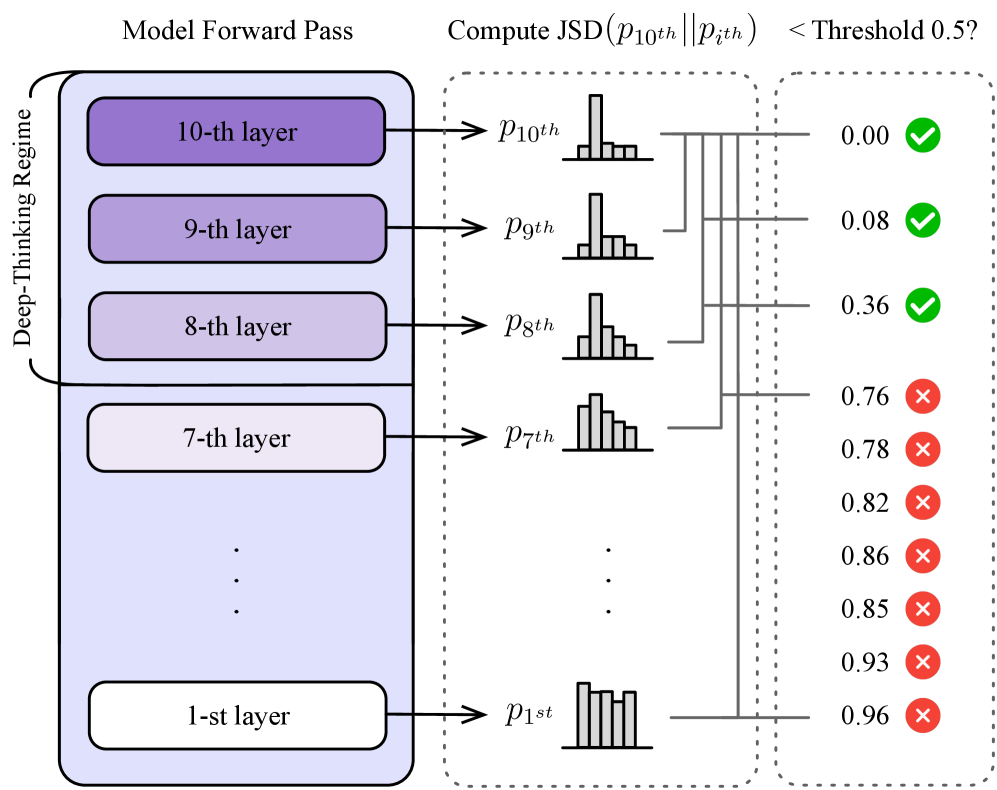
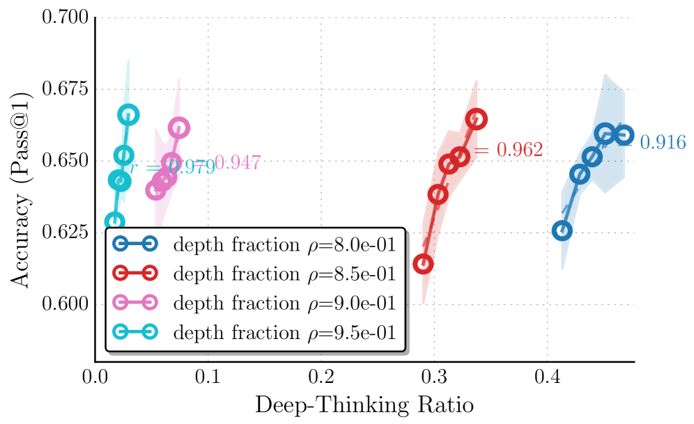
Figure 3: Illustration of our method of identifying deep-thinking tokens. Suppose a model with 10 layers, by setting the depth fraction $ρ=0.8$ , the token is successfully classified as a deep-thinking token at generation step $t$ since its JSD with the final-layer distribution first fall below the threshold $g$ only until it reaches the late-settling regime.
Input : Autoregressive LM $f_θ$ with $L$ layers and unembedding matrix $W_U$ ; Input prompt $x$ ; Threshold $g$ ; Depth fraction $ρ$ Output : $DTR(S)$ of the generated sequence $S$ $C← 0$ ; // deep thinking token count $S←∅$ ; // generated sequence $y_t←\mathtt{[BOS]}$ ; // initialize with start token while $y_t≠\mathtt{[EOS]}$ do Sample $y_t∼ p_t,L≤ft(f_θ(·\mid x,S)\right)$ ; $S←(S,y_t)$ ; for $l← 1$ to $L$ do $p_t,l←softmax(W_Uh_t,l)$ ; $D_t,l←JSD(p_t,L,p_t,l)$ ; end for $c_t←\min\{l:\min_j≤ lD_t,j≤ g\}$ ; if $c_t≥\lceil(1-ρ)L\rceil$ then $C← C+1$ ; end if end while return $C/|S|$ ; Algorithm 1 Computing Deep-Thinking Ratio (DTR)
We posit that inference-time thinking effort for a token manifests as the continued evolution of predictive distributions (i.e., $p_t,l$ ) across LM layers. Tokens with earlier distributional stabilization correspond to less additional thinking, while those having later stabilization correspond to needing more extended internal thinking. In other words, simple tokens stabilize early with shallow computation, whereas difficult tokens requiring more thinking exhibit distributional shifts in deeper layers with more computation. To illustrate this, we show a motivation example on answering a GQPA [rein2024gpqa] question in Figure ˜ 2.
To quantify this behavior, we measure how long a token’s predictive distribution continues to change before settling, operationalized as the layer at which the intermediate distribution becomes sufficiently close to the final-layer distribution. Specifically, for each generation step $t$ and layer $l$ , we compute the Jensen–Shannon divergence (JSD) between the intermediate-layer distribution $p_t,l$ and the final-layer distribution $p_t,L$ :
$$
\displaystyle D_t,l \displaystyle \coloneqq ≤ft(p_t,L \| p_t,l\right) \displaystyle=H≤ft(\frac{p_t,L+p_t,l}{2}\right)-\tfrac{1}{2}H(p_t,L)-\tfrac{1}{2}H(p_t,l), \tag{2}
$$
where $H(·)$ denotes Shannon entropy. By construction, $D_t,L=0$ . A trajectory $l↦ D_t,l$ that approaches zero only at later layers indicates prolonged distributional revision (think more), whereas early convergence indicates that the model settles on its final prediction with fewer subsequent updates (think less). We employ JSD due to its symmetry and boundedness, following [chuang2023dola-0c6]. We explore other distance metrics in Appendix ˜ A.
To enforce a strict notion of settling, we compute:
$$
\displaystyle\bar{D}_t,l=\min_j≤ lD_t,j. \tag{3}
$$
We define the settling depth $c_t$ as the first layer at which $\bar{D}_t,l$ falls below a fixed threshold $g$ :
$$
\displaystyle c_t=\min≤ft\{l∈\{1,…,L\}:\bar{D}_t,l≤ g\right\}. \tag{4}
$$
We then define a deep-thinking regime using a depth fraction $ρ∈(0,1)$ , with
$$
\displaystyleL_deep-thinking=≤ft\{l:l≥≤ft\lceilρ× L\right\rceil\right\}. \tag{5}
$$
A token is classified as a deep-thinking token (i.e., requiring more layer computations and more thinking effort to become sufficiently close to the final-layer distribution) if $c_t∈L_deep-thinking$ . An illustration is shown in Figure ˜ 3.
Finally, for a generated sequence $S$ of length $T$ , we define the deep-thinking ratio, $DTR(S)$ , for the sequence as the proportion of tokens that settle in the late regime:
$$
\displaystyleDTR(S)=\frac{1}{T}∑_t=1^T1≤ft[c_t∈L_deep-thinking\right]. \tag{6}
$$
A higher DTR indicates that a larger fraction of tokens undergo extended computation for distributional revision before stabilizing. We note that our proposed method does not imply that early-settling tokens are suboptimal; rather, it provides a depth-wise characterization of inference-time thinking effort that complements the surface-level token length measure. We show the overall algorithm of DTR in Algorithm ˜ 1. We also provide qualitative examples in Appendix ˜ E.
## 3 Deep-Thinking Ratio Reflects Task Accuracy More Reliably
We empirically evaluate whether our distributional distance-based measurement provides a more faithful and robust characterization of inference-time thinking effort than surface-level, length-based proxies (i.e., token counts).
#### Models.
We evaluate eight variants of reasoning LLMs from three model families: GPT-OSS-20B (with low, medium, and high reasoning levels) and GPT-OSS-120B (with low, medium, and high reasoning levels) [openai2025gpt-oss-120b-a33], DeepSeek-R1-70B [guo2025deepseek], For brevity, we refer DeepSeek-R1-70B to Llama-3.3-70B-Instruct distilled with DeepSeek-R1 generated samples (https://huggingface.co/deepseek-ai/DeepSeek-R1-Distill-Llama-70B). and Qwen3-30B-Thinking [yang2025qwen3]. These models are known for their strong, long CoT capability in mathematical and complex reasoning, and span multiple parametric scales for comprehensive coverage.
#### Tasks.
We focus on reasoning-intensive benchmarks where scaling CoT-style computation at inference time plays a central role. We adopt four benchmarks widely used in recent evaluations of LLM reasoning capabilities [xai2025grok4, openai2025gpt5, balunovic2025matharena], including three competition-level mathematical problem sets, AIME 2024 [aops2024aime1, aops2024aime2], AIME 2025 [aops2025aime1, aops2025aime2], and HMMT 2025 [hmmt2025], as well as the diamond set of GPQA [rein2024gpqa], which consists of challenging graduate-level scientific questions.
#### Decoding settings.
Following [gema2025inverse-bad], we prompt models to reason step by step using a fixed, neutral instruction, without specifying a reasoning budget or explicitly encouraging longer deliberation. This setup allows each model to naturally allocate inference-time computation on a per-instance basis, avoiding confounds introduced by externally imposed token budgets or budget-conditioning prompts. Following standard practice in natural overthinking analyses [gema2025inverse-bad], we sample multiple responses for each question (25 responses per question in our experiments). Across these samples, models naturally exhibit variation in reasoning length and internal computation patterns. We use the developer recommended sampling parameters for all tested models: temperature=1.0 and top p =1.0 for GPT-OSS series; temperature=0.6 and top p = 0.95 for DeepSeek-R1-70B and Qwen-3-30B-Thinking.
For each sampled response, we record intermediate-layer hidden states, obtain their projected probability distribution, and compute DTR as described in Section ˜ 2. We uniformly set the settling threshold $g=0.5$ and the depth fraction $ρ=0.85$ to define the deep-thinking regime. We also analyze with different values and the results are provided in Section ˜ 3.2. The reported statistics are averaged over 30 random seeds across decoding runs.
### 3.1 Results
To quantify the relationship between inference-time thinking effort and task performance, we measure the association between thinking effort scores and answer accuracy by computing Pearson correlation coefficient. Specifically, we conduct a binned analysis following [gema2025inverse-bad] by partitioning sampled sequences into quantile bins (i.e., 5 bins) based on their DTR (Equation ˜ 6) and computing the average accuracy within each bin.
Table 1: Pearson correlations between task accuracy and different inference-time measures, including length-based and confidence-based baselines, across eight model variants and four reasoning benchmarks. Correlation values are color-coded: strong positive correlations ( $0.5∼ 1$ ) are shown in dark green, weak positive correlations ( $0∼ 0.5$ ) in light green, weak negative correlations ( $-0.5∼ 0$ ) in light orange, and strong negative correlations ( $-1∼-0.5$ ) in dark orange.
| OSS-120B-low | Token Length AIME 2025 0.504 | Reverse Token Length -0.504 | Log Probability 0.872 | Negative Perplexity 0.453 | Negative Entropy 0.863 | Self-Certainty 0.803 | DTR (Ours) 0.930 |
| --- | --- | --- | --- | --- | --- | --- | --- |
| OSS-120B-medium | -0.365 | 0.365 | 0.817 | 0.246 | 0.822 | 0.815 | 0.862 |
| OSS-120B-high | -0.961 | 0.961 | 0.705 | 0.552 | 0.711 | 0.728 | 0.796 |
| OSS-20B-low | -0.689 | 0.689 | 0.579 | 0.849 | 0.665 | 0.275 | 0.373 |
| OSS-20B-medium | -0.757 | 0.757 | 0.616 | -0.677 | 0.637 | 0.097 | 0.161 |
| OSS-20B-high | -0.385 | 0.385 | 0.455 | -0.795 | 0.550 | 0.489 | 0.610 |
| DeepSeek-R1-70B | -0.973 | 0.973 | 0.961 | 0.955 | 0.946 | 0.899 | 0.974 |
| Qwen3-30B-Thinking | -0.663 | 0.663 | -0.008 | -0.035 | 0.154 | 0.828 | 0.855 |
| AIME 2024 | | | | | | | |
| OSS-120B-low | -0.166 | 0.166 | 0.897 | 0.682 | 0.869 | 0.741 | 0.840 |
| OSS-120B-medium | -0.680 | 0.680 | 0.795 | -0.293 | 0.908 | 0.924 | 0.533 |
| OSS-120B-high | -0.755 | 0.755 | 0.700 | -0.275 | 0.593 | 0.654 | 0.905 |
| OSS-20B-low | -0.655 | 0.655 | 0.548 | -0.342 | 0.667 | 0.584 | 0.730 |
| OSS-20B-medium | -0.827 | 0.827 | 0.195 | -0.150 | 0.440 | 0.252 | -0.192 |
| OSS-20B-high | -0.989 | 0.989 | 0.809 | 0.262 | 0.921 | 0.855 | 0.824 |
| DeepSeek-R1-70B | -0.987 | 0.987 | -0.037 | 0.223 | 0.067 | 0.287 | 0.430 |
| Qwen3-30B-Thinking | -0.869 | 0.869 | -0.857 | -0.720 | -0.680 | -0.246 | -0.657 |
| GPQA-Diamond | | | | | | | |
| OSS-120B-low | 0.682 | -0.682 | 0.984 | 0.172 | 0.995 | 0.996 | 0.976 |
| OSS-120B-medium | -0.340 | 0.340 | 0.973 | 0.316 | 0.985 | 0.981 | 0.823 |
| OSS-120B-high | -0.970 | 0.970 | 0.854 | 0.501 | 0.813 | 0.885 | 0.845 |
| OSS-20B-low | -0.602 | 0.602 | 0.984 | 0.235 | 0.991 | 0.917 | 0.935 |
| OSS-20B-medium | -0.847 | 0.847 | 0.914 | 0.468 | 0.911 | 0.889 | 0.718 |
| OSS-20B-high | -0.794 | 0.794 | 0.879 | 0.461 | 0.902 | 0.915 | 0.992 |
| DeepSeek-R1-70B | -0.930 | 0.930 | 0.068 | -0.133 | -0.165 | -0.532 | 0.885 |
| Qwen3-30B-Thinking | -0.634 | 0.634 | 0.589 | 0.865 | 0.711 | 0.943 | 0.828 |
| HMMT 2025 | | | | | | | |
| OSS-120B-low | 0.871 | -0.871 | 0.761 | 0.629 | 0.695 | 0.884 | 0.305 |
| OSS-120B-medium | -0.793 | 0.793 | 0.706 | 0.045 | 0.618 | 0.631 | 0.926 |
| OSS-120B-high | -0.967 | 0.967 | 0.750 | 0.503 | 0.728 | 0.754 | 0.972 |
| OSS-20B-low | -0.634 | 0.634 | -0.695 | 0.549 | -0.359 | -0.489 | 0.689 |
| OSS-20B-medium | -0.668 | 0.668 | 0.447 | 0.336 | 0.424 | 0.331 | 0.247 |
| OSS-20B-high | -0.352 | 0.352 | 0.537 | 0.994 | 0.831 | 0.628 | 0.932 |
| DeepSeek-R1-70B | -0.866 | 0.866 | 0.879 | 0.889 | 0.858 | 0.905 | 0.902 |
| Qwen3-30B-Thinking | -0.950 | 0.950 | -0.803 | -0.762 | -0.801 | 0.745 | 0.911 |
| Average | -0.594 | 0.594 | 0.527 | 0.219 | 0.571 | 0.605 | 0.683 |
We compare deep-thinking token measurement against the following baselines, including length-based proxies and confidence-based approaches, which are also commonly adopted to assess generation quality.
#### Token count.
The total number of tokens generated in the model’s output reasoning traces. This measure is widely framed as a direct proxy for test-time compute, and underlies many empirical studies of inference-time scaling [jaech2024openai, guo2025deepseek, anthropic2025claude3-7, anthropic2025claude4, oai2025o3mini, yang2025qwen3, team2025kimi, zhong2024evaluation].
#### Reverse token count.
As a complementary baseline, we additionally consider reverse token count, defined as the negative of the total number of generated tokens for each response. This transformation is included to account for the frequently observed inverse relationship between reasoning length and accuracy in LLM overthinking [wu2025when-905, gema2025inverse-bad].
#### Log probability.
Following the notation in Section ˜ 2, let a generated sequence $S=(y_1,\dots,y_T)$ . At generation step $t$ , the model’s output prediction distribution (at final-layer $L$ ) over the vocabulary $V$ is denoted by $p_t,L(·)$ . We compute the average log-probability of the sampled tokens:
$$
\displaystyleLogProb(S) = \frac{1}{T}∑_t=1^T\log p_t,L(y_t) \tag{7}
$$
Higher values indicate that the model assigns higher likelihood to its own generation and are commonly interpreted as higher confidence.
#### Negative perplexity.
Perplexity is defined as the exponentiated negative average log-probability:
$$
\displaystylePPL(S) = \exp≤ft(-\frac{1}{T}∑_t=1^T\log p_t,L(y_t)\right) \tag{8}
$$
We report negative perplexity $-PPL(S)$ so that larger values correspond to higher confidence.
#### Negative entropy.
To incorporate information from the full prediction distribution over $V$ rather than only the sampled token, we compute the average entropy:
$$
\displaystyleEnt(S) = \frac{1}{T}∑_t=1^TH(p_t,L), H(p_t,L)=-∑_v∈Vp_t,L(v)\log p_t,L(v) \tag{9}
$$
We report negative entropy $-Ent(S)$ , where larger values indicate more peaked distributions and thus greater model confidence.
#### Self-Certainty.
We also include Self-Certainty [kang2025scalable-de3], a distributional confidence metric based on the idea that higher confidence corresponds to prediction distributions that are further from the uniform distribution $u$ , which represents maximum uncertainty. Formally, self-certainty is defined as the average Kullback-Leibler (KL) divergence between $u(v)=1/|V|$ and $p_t,L$ :
$$
\displaystyleSelf-Certainty(S) \displaystyle= \frac{1}{T}∑_t=1^TKL≤ft(u \| p_t,L\right) \displaystyle= -\frac{1}{T|V|}∑_t=1^T∑_v∈V\log\big(|V| p_t,L(v)\big) \tag{10}
$$
For all baselines, correlations are computed using the same protocol, where sequences are ranked and binned by token count (or its negation) or confidence scores.
Table ˜ 1 reports the correlation between task accuracy and different measurments, across eight model variants and four benchmarks. As observed, measuring sequences with token count exhibits notable oranged-colored values ( $r<0$ ), with mean $r=-0.59$ . This indicates that longer generations are more associated with lower performance, aligning with recent reports of inverse scaling and overthinking. Extended reasoning traces could be symptomatic of redundant, misguided, or error-amplifying deliberation. The results underscore the unreliability of using surface-level length feature as proxy for effective problem solving. Reversing token count yields a positive correlation of identical magnitude. However, the improvement is purely post hoc, reflecting the empirical regularity in regimes where shorter responses are more accurate. As such, reverse token count only serve as a statistical adjustment, rather than capture principled notion of computation or thinking effort.
Compared to token count measure, confidence-based measures (log probability, negative perplexity, negative entropy, and self-certainty) exhibit moderately positive correlations with mean $r=0.219∼ 0.605$ , as reflected by the predominance of green-colored values. This indicates that model confidence captures partial information about correctness. However, their behavior is relatively heterogeneous across models and benchmarks: while certain configurations achieve strong positive correlations, others deteriorate to weak or even negative associations. This inconsistency suggests that confidence signals might conflate other factors like overconfidence, and therefore do not reliably reflect inference-time compute effort or problem solving effectiveness.
In contrast, our proposed measurement of DTR demonstrates the strongest and most stable relationship with task performance, achieving the highest average correlation of $r=0.683$ , outperforming both reverse token count and Self-Certainty, the best-performing baselines among confidence-based approaches. Overall, DTR remains positive across models and benchmarks, exhibiting the fewest orange-colored values (2 out of the 32 model–benchmark settings tested). Collectively, the results show that computing DTR over output sequences provides a more faithful and robust characterization of successful reasoning outcomes than token volume alone or confidence-based alternatives.
### 3.2 Effect of Settling Thresholds and Depth Fractions
<details>
<summary>x4.png Details</summary>
### Visual Description
## Scatter Plot with Error Bands: Accuracy vs. Deep-Thinking Ratio for Different Thresholds
### Overview
The image is a scatter plot chart displaying the relationship between a model's "Deep-Thinking Ratio" (x-axis) and its "Accuracy (Pass@1)" (y-axis). Three distinct data series are plotted, each corresponding to a different threshold value for a parameter labeled 'g'. Each series consists of several data points connected by a line, with a shaded error band around the line. The chart includes a legend, axis labels, and numerical annotations for correlation coefficients.
### Components/Axes
* **X-Axis:** Labeled "Deep-Thinking Ratio". The scale runs from approximately 0.16 to 0.52, with major tick marks labeled at 0.24, 0.32, 0.40, and 0.48.
* **Y-Axis:** Labeled "Accuracy (Pass@1)". The scale runs from 0.600 to 0.700, with major tick marks labeled at 0.600, 0.625, 0.650, 0.675, and 0.700.
* **Legend:** Positioned in the top-right corner of the plot area. It defines three series:
* **Blue line with circle markers:** `threshold g=2.5e-01`
* **Brown line with circle markers:** `threshold g=5.0e-01`
* **Cyan line with circle markers:** `threshold g=7.5e-01`
* **Data Series & Annotations:**
* Each series has a shaded region (error band) of the same color as its line, indicating variance or confidence intervals.
* A correlation coefficient (`r`) is annotated near each series.
### Detailed Analysis
**1. Cyan Series (`threshold g=7.5e-01`)**
* **Spatial Grounding & Trend:** Located on the left side of the chart (lower Deep-Thinking Ratio). The line shows a clear upward trend, starting low and rising steeply before a slight dip at the final point.
* **Data Points (Approximate):**
* (Deep-Thinking Ratio ~0.18, Accuracy ~0.620)
* (~0.19, ~0.640)
* (~0.20, ~0.655)
* (~0.21, ~0.665)
* (~0.22, ~0.660)
* **Annotation:** `r = 0.820` is written in cyan text to the right of the series, indicating a strong positive correlation between the Deep-Thinking Ratio and Accuracy for this threshold.
**2. Brown Series (`threshold g=5.0e-01`)**
* **Spatial Grounding & Trend:** Located in the center of the chart. The line shows a consistent, strong upward trend across all its points.
* **Data Points (Approximate):**
* (~0.29, ~0.615)
* (~0.30, ~0.640)
* (~0.31, ~0.650)
* (~0.32, ~0.655)
* (~0.33, ~0.665)
* **Annotation:** `r = 0.962` is written in brown text to the right of the series, indicating a very strong positive correlation.
**3. Blue Series (`threshold g=2.5e-01`)**
* **Spatial Grounding & Trend:** Located on the right side of the chart (higher Deep-Thinking Ratio). The line shows a scattered, non-monotonic pattern with no clear upward or downward trend. Points fluctuate up and down.
* **Data Points (Approximate):**
* (~0.46, ~0.650)
* (~0.47, ~0.640)
* (~0.48, ~0.655)
* (~0.49, ~0.650)
* (~0.50, ~0.645)
* **Annotation:** `r = 0.012` is written in blue text to the right of the series, indicating a negligible, near-zero correlation.
### Key Observations
1. **Distinct Clustering:** The three data series occupy distinct, non-overlapping regions along the x-axis (Deep-Thinking Ratio). Higher `g` thresholds (cyan, 0.75) are associated with lower ratios, while the lowest `g` threshold (blue, 0.25) is associated with the highest ratios.
2. **Correlation Gradient:** There is a dramatic decrease in the correlation coefficient (`r`) as the `g` threshold decreases and the Deep-Thinking Ratio increases. The relationship is strong and positive for high `g`, but vanishes for low `g`.
3. **Accuracy Range:** Despite the different trends and ratios, the peak accuracy achieved by each series is relatively similar, clustering between approximately 0.655 and 0.665.
4. **Error Band Width:** The shaded error bands appear relatively consistent in width across the three series, suggesting similar levels of variance in the measurements for each threshold.
### Interpretation
This chart investigates how a model's "Deep-Thinking Ratio"—likely a measure of computational effort or reasoning depth allocated to a problem—affects its pass@1 accuracy, under different operational thresholds (`g`).
The data suggests a **threshold-dependent relationship**:
* At a **high threshold (`g=0.75`)**, allocating more "deep thinking" (increasing ratio) is strongly beneficial, leading to higher accuracy. The model benefits from increased reasoning effort.
* At a **medium threshold (`g=0.50`)**, this positive relationship is even stronger and more consistent.
* At a **low threshold (`g=0.25`)**, the model operates in a high "deep-thinking ratio" regime, but here, additional reasoning effort shows no systematic benefit. Accuracy plateaus and fluctuates randomly. This could indicate a point of diminishing returns, where the model is already using maximum effective effort, or that the low threshold allows for a different, less efficient mode of operation where effort is not well-correlated with success.
In essence, the benefit of "thinking harder" is not universal; it is contingent on the system's operational threshold (`g`). The chart implies an optimal operating point exists at medium-to-high thresholds where effort translates effectively into performance.
</details>
(a) Effect of different settling threshold $g$ .
<details>
<summary>x5.png Details</summary>
### Visual Description
## Scatter Plot with Error Bands: Accuracy vs. Deep-Thinking Ratio by Depth Fraction
### Overview
The image is a scatter plot chart displaying the relationship between "Deep-Thinking Ratio" (x-axis) and "Accuracy (Pass@1)" (y-axis) for four different model configurations, defined by their "depth fraction ρ". Each configuration is represented by a distinct color and marker style, with data points connected by lines and surrounded by shaded error bands. The chart includes a legend and specific numerical annotations near some data points.
### Components/Axes
* **X-Axis:** Labeled "Deep-Thinking Ratio". The scale runs from 0.0 to approximately 0.45, with major tick marks at 0.0, 0.1, 0.2, 0.3, and 0.4.
* **Y-Axis:** Labeled "Accuracy (Pass@1)". The scale runs from 0.600 to 0.700, with major tick marks at 0.600, 0.625, 0.650, 0.675, and 0.700.
* **Legend:** Positioned in the bottom-left quadrant of the plot area. It defines four series:
* Blue line with circle markers: `depth fraction ρ=8.0e-01`
* Red line with circle markers: `depth fraction ρ=8.5e-01`
* Pink/Magenta line with circle markers: `depth fraction ρ=9.0e-01`
* Cyan/Teal line with circle markers: `depth fraction ρ=9.5e-01`
* **Annotations:**
* Near the cyan/teal series (ρ=9.5e-01): Text `γ = 0.979` and `0.947` (the latter appears slightly faded or overlapping).
* Near the red series (ρ=8.5e-01): Text `= 0.962`.
* Near the blue series (ρ=8.0e-01): Text `0.916`.
### Detailed Analysis
**Data Series Trends and Approximate Points:**
1. **Blue Series (ρ=8.0e-01):**
* **Trend:** Positive slope. Accuracy increases as the Deep-Thinking Ratio increases.
* **Spatial Grounding & Points:** Located in the rightmost region of the chart (x ≈ 0.35 to 0.45).
* Point 1: x ≈ 0.35, y ≈ 0.625
* Point 2: x ≈ 0.38, y ≈ 0.645
* Point 3: x ≈ 0.41, y ≈ 0.655
* Point 4: x ≈ 0.44, y ≈ 0.660 (annotated with `0.916`)
2. **Red Series (ρ=8.5e-01):**
* **Trend:** Steep positive slope. Shows the most dramatic increase in accuracy with deep-thinking ratio among the series.
* **Spatial Grounding & Points:** Located in the center-right region (x ≈ 0.28 to 0.33).
* Point 1: x ≈ 0.28, y ≈ 0.615
* Point 2: x ≈ 0.30, y ≈ 0.640
* Point 3: x ≈ 0.31, y ≈ 0.650
* Point 4: x ≈ 0.33, y ≈ 0.665 (annotated with `= 0.962`)
3. **Pink/Magenta Series (ρ=9.0e-01):**
* **Trend:** Positive slope, less steep than the red series.
* **Spatial Grounding & Points:** Located in the left-center region (x ≈ 0.05 to 0.10).
* Point 1: x ≈ 0.05, y ≈ 0.640
* Point 2: x ≈ 0.06, y ≈ 0.650
* Point 3: x ≈ 0.08, y ≈ 0.660 (near the annotation `0.947`)
4. **Cyan/Teal Series (ρ=9.5e-01):**
* **Trend:** Positive slope, similar steepness to the pink series.
* **Spatial Grounding & Points:** Located in the leftmost region (x ≈ 0.02 to 0.05).
* Point 1: x ≈ 0.02, y ≈ 0.625
* Point 2: x ≈ 0.03, y ≈ 0.645
* Point 3: x ≈ 0.04, y ≈ 0.650
* Point 4: x ≈ 0.05, y ≈ 0.665 (annotated with `γ = 0.979`)
**Error Bands:** Each series has a semi-transparent shaded region of the same color surrounding its line, indicating variance or confidence intervals around the measured accuracy. The bands appear wider for the blue series at higher x-values.
### Key Observations
1. **Positive Correlation:** All four depth fraction configurations show a clear positive correlation between Deep-Thinking Ratio and Accuracy (Pass@1).
2. **Stratification by Depth Fraction:** The series are horizontally stratified. Lower depth fractions (ρ=8.0e-01, 0.85) operate at higher Deep-Thinking Ratios (0.28-0.45), while higher depth fractions (ρ=0.90, 0.95) operate at lower ratios (0.02-0.10).
3. **Performance Ceiling:** The highest achieved accuracy across all series is approximately 0.665-0.670, reached by the red (ρ=0.85) and cyan (ρ=0.95) series at their respective highest deep-thinking ratios.
4. **Annotation Values:** The numerical annotations (0.916, 0.962, 0.947, 0.979) are placed near the highest data point of each series. Given the context of "γ" (gamma) next to one, these likely represent a secondary metric or parameter value (e.g., a gamma parameter, efficiency score, or confidence value) associated with that specific operating point.
### Interpretation
The chart demonstrates a trade-off and optimization landscape for a model's reasoning process. "Deep-Thinking Ratio" likely represents the proportion of computational resources or steps dedicated to deliberate reasoning versus fast processing. "Accuracy (Pass@1)" is the primary performance metric.
The data suggests that **allocating more resources to deep thinking improves accuracy**, but the optimal operating point depends heavily on the model's "depth fraction" (ρ), which may control the model's architectural depth or capacity for parallel processing.
* **Lower depth fractions (ρ=0.80, 0.85)** require a significantly higher deep-thinking ratio (0.28+) to achieve peak performance. The red series (ρ=0.85) shows the most efficient gain, achieving near-peak accuracy with a relatively smaller increase in deep-thinking ratio.
* **Higher depth fractions (ρ=0.90, 0.95)** achieve comparable peak accuracy but at a much lower deep-thinking ratio (<0.10). This implies these configurations are more efficient at converting deep-thinking resources into accuracy gains, possibly because their greater inherent depth reduces the need for extensive sequential reasoning steps.
The annotations (γ values) might indicate a measure of efficiency or confidence at the optimal point for each configuration. The highest γ (0.979) corresponds to the most efficient configuration (ρ=0.95), which achieves high accuracy with minimal deep-thinking ratio. The lowest γ (0.916) corresponds to the least efficient configuration (ρ=0.80), which requires the highest deep-thinking ratio.
**In summary, the chart reveals that model accuracy can be improved by increasing deep-thinking allocation, but the efficiency of this improvement is governed by the model's depth fraction. Higher depth fractions enable high accuracy with less deep-thinking overhead, suggesting a more effective internal reasoning architecture.**
</details>
(b) Effect of different depth fraction $ρ$ .
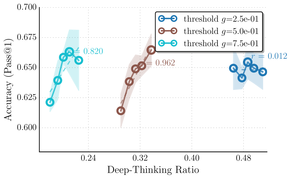
Figure 4: Effect of hyper-parameters on thinking effort measurement and accuracy profiles. We analyze the impact of hyper-parameters by sweeping different settling threshold $g$ and depth fraction $ρ$ . (a) Varying $g$ has more impacts the correlation; a permissive threshold ( $g=0.25$ ) yields flatter trends, whereas $g=0.5$ provides the most robust positive signal. (b) Varying $ρ$ shifts the range of thinking effort scores but maintains overall consistent positive slopes. Overall, stricter criteria (higher $g$ , lower $ρ$ ) reduce the range of DTR, with $(g,ρ)=(0.5,0.85)$ offering an ideal balance between stability and correlation.
We conduct an analysis to understand how our two key hyper-parameters—the settling threshold $g$ and the late-settling depth fraction $ρ$ —affect the measured thinking effort and its correlation with task performance. Figure ˜ 4 illustrates the accuracy profiles across varying thinking efforts (i.e., average late-settling token ratios), derived by $g∈\{0.25,0.5,0.75\}$ and $ρ∈\{0.8,0.85,0.9,0.95\}$ . We set $ρ$ fixed to $0.85$ , when sweeping $g$ , and $g$ fixed to $0.5$ when sweeping $ρ$ . We report results on GPQA-D using GPT-OSS-20B with reasoning level high.
We conclude the following observations: (1) the magnitude of the measured sequence-level thinking effort is directly influenced by the strictness of these parameters. Specifically, both Figures ˜ 4(a) and 4(b) show that imposing stricter criteria—a higher settling threshold $g$ or a lower depth fraction $ρ$ —results in a reduction of the average late-settling token ratio. This is mechanistically consistent: a higher $g$ requires the intermediate states to be distributionally far to the final output until reaching deeper layers in the late regime to be considered settle; while a lower $ρ$ restricts the definition of the late regime to a narrower band of deeper layers. Both conditions naturally filter out more candidates, resulting in fewer tokens being classified as late-settling and consequently a lower range of overall thinking effort scores.
(2) The settling threshold $g$ has a more pronounced impact on the correlation between thinking effort and accuracy than the depth fraction $ρ$ . As shown in Figure ˜ 4(b), varying $ρ$ shifts the range of late-settling ratios due to varying strictness but maintains a consistent, positive slope across all settings, indicating that the metric is relatively robust to the specific definition of the late layers. In contrast, Figure ˜ 4(a) reveals that the choice of $g$ has more impact on measured results: a softer threshold of $g=0.25$ yields a flatter trend with lower correlation value, suggesting that it may be overly permissive, including tokens with less computational efforts and diminishing the measurement’s ability to distinguish high-quality trajectory. Conversely, thresholds of $g=0.5$ and $g=0.75$ exhibit more robust positive correlations reflecting the accuracy.
(3) Overall, we can see that when the criteria are overly restrictive ( $g=0.75$ and $ρ∈\{0.9,0.95\}$ ), the trends, while still maintaining positive correlations, appears to be slightly more unstable due to the potential filtering of informative high computational tokens. Among the tested configurations, $(g,ρ)=(0.5,0.85)$ strikes an ideal balance, yielding a reliable trend with high correlation values.
## 4 Deep-Thinking Tokens Enable Efficient Test-Time Scaling
Repeated sampling is a popular strategy for scaling test-time compute, in parallel to generating long CoT [brown2024large-581, gupta2025test-time-19d, saad-falcon2024archon-cb5, stroebl2024inference-4ca, saad-falcon2025shrinking-bf7]. It improves accuracy by aggregating multiple independently generated samples per problem at the cost of increased inference budget. In this section, we explore whether our proposed DTR measure can be leveraged to preferentially select and aggregate higher-quality samples towards better performance.
Table 2: Comparison of task accuracy and average inference cost (k tokens) under different aggregation methods, across four reasoning benchmarks. The reported cost reductions ( $Δ$ %) are shown relative to Cons@ $n$ . Think@ $n$ achieves the best overall performance while reducing inference cost by approximately 50%. Methods with ${†}$ adopt a prefix length of 50 to determine early stopping.
| Method | AIME 25 | | AIME 24 | | HMMT 25 | | GPQA-D | | | | |
| --- | --- | --- | --- | --- | --- | --- | --- | --- | --- | --- | --- |
| Acc | Cost ( $Δ$ %) | | Acc | Cost ( $Δ$ %) | | Acc | Cost ( $Δ$ %) | | Acc | Cost ( $Δ$ %) | |
| OSS-120B-medium | | | | | | | | | | | |
| Cons@ $n$ | 92.7 | 307.6 (–) | | 92.7 | 235.1 (–) | | 80.0 | 355.6 (–) | | 73.8 | 93.5 (–) |
| Mean@ $n$ | 80.0 | 307.6 (–) | | 81.6 | 235.1 (–) | | 62.6 | 355.6 (–) | | 69.9 | 93.5 (–) |
| Long@ $n$ | 86.7 | 307.6 (–) | | 86.7 | 235.1 (–) | | 73.3 | 355.6 (–) | | 73.2 | 93.5 (–) |
| Short@ $n$ | 87.3 | 255.7 (-17%) | | 88.0 | 200.9 (-15%) | | 77.3 | 290.4 (-18%) | | 73.3 | 84.4 (-10%) |
| Self-Certainty@ $n$ † | 87.3 | 150.6 (-51%) | | 91.3 | 119.3 (-49%) | | 78.0 | 177.0 (-50%) | | 76.0 | 47.9 (-49%) |
| Think@ $n$ † | 94.7 | 155.4 (-49%) | | 93.3 | 121.3 (-48%) | | 80.0 | 181.9 (-49%) | | 74.7 | 48.8 (-48%) |
| Qwen3-4B-Thinking | | | | | | | | | | | |
| Cons@ $n$ | 86.7 | 1073.1 (–) | | 93.3 | 950.1 (–) | | 63.3 | 1275.7 (–) | | 67.8 | 410.6 (–) |
| Mean@ $n$ | 81.2 | 1073.1 (–) | | 86.3 | 950.1 (–) | | 55.7 | 1275.7 (–) | | 66.9 | 410.6 (–) |
| Long@ $n$ | 85.3 | 1073.1 (–) | | 86.7 | 950.1 (–) | | 52.7 | 1275.7 (–) | | 66.7 | 410.6 (–) |
| Short@ $n$ | 90.0 | 983.6 (-8%) | | 90.0 | 871.0 (-8%) | | 63.3 | 1165.7 (-9%) | | 68.2 | 382.9 (-7%) |
| Self-Certainty@ $n$ † | 86.7 | 548.9 (-49%) | | 90.0 | 480.9 (-49%) | | 63.3 | 641.4 (-50%) | | 68.2 | 206.6 (-50%) |
| Think@ $n$ † | 90.0 | 537.5 (-50%) | | 93.3 | 482.2 (-49%) | | 66.7 | 641.4 (-50%) | | 69.7 | 206.8 (-50%) |
<details>
<summary>x6.png Details</summary>
### Visual Description
## Scatter Plot Comparison: Accuracy vs. Cost for Two Language Models
### Overview
The image displays two side-by-side scatter plots comparing the performance (Accuracy) against computational cost (in tokens) for various inference methods applied to two different large language models. The left plot is for a model labeled "OSS-120B-medium," and the right plot is for "Qwen3-4B-Thinking." Each data point represents a specific method, identified by a unique color and label.
### Components/Axes
**Common Elements (Both Plots):**
* **Chart Type:** Scatter plot.
* **Y-Axis:** Labeled "Accuracy." The scale is linear.
* **X-Axis:** Labeled "Cost (tokens)." The scale is logarithmic (base 10), indicated by the tick labels (e.g., 1.5 x 10⁵, 5 x 10⁵).
* **Data Series:** Six distinct methods, each represented by a colored circle and a text label. The legend is embedded directly next to each data point.
**Left Plot: OSS-120B-medium**
* **Title:** "OSS-120B-medium" (top center).
* **Y-Axis Range:** Approximately 0.72 to 0.86.
* **X-Axis Range:** Approximately 1.0 x 10⁵ to 3.0 x 10⁵ tokens.
* **Data Points & Labels (with approximate coordinates):**
1. **Think@n** (Cyan): Top-left quadrant. Accuracy ≈ 0.85, Cost ≈ 1.2 x 10⁵.
2. **Self-Certainty@n** (Yellow): Upper-left quadrant. Accuracy ≈ 0.83, Cost ≈ 1.3 x 10⁵.
3. **Cons@n** (Green): Top-right quadrant. Accuracy ≈ 0.85, Cost ≈ 2.6 x 10⁵.
4. **Short@n** (Purple): Center-right. Accuracy ≈ 0.81, Cost ≈ 2.2 x 10⁵.
5. **Long@n** (Pink): Center-right, below Short@n. Accuracy ≈ 0.80, Cost ≈ 2.5 x 10⁵.
6. **Mean@n** (Blue): Bottom-right quadrant. Accuracy ≈ 0.73, Cost ≈ 2.5 x 10⁵.
**Right Plot: Qwen3-4B-Thinking**
* **Title:** "Qwen3-4B-Thinking" (top center).
* **Y-Axis Range:** Approximately 0.73 to 0.81.
* **X-Axis Range:** Approximately 4.0 x 10⁵ to 1.0 x 10⁶ tokens.
* **Data Points & Labels (with approximate coordinates):**
1. **Think@n** (Cyan): Top-left quadrant. Accuracy ≈ 0.80, Cost ≈ 5.0 x 10⁵.
2. **Self-Certainty@n** (Yellow): Upper-left quadrant. Accuracy ≈ 0.78, Cost ≈ 5.5 x 10⁵.
3. **Short@n** (Purple): Upper-right quadrant. Accuracy ≈ 0.78, Cost ≈ 8.5 x 10⁵.
4. **Cons@n** (Green): Upper-right quadrant, below Short@n. Accuracy ≈ 0.78, Cost ≈ 9.0 x 10⁵.
5. **Mean@n** (Blue): Bottom-right quadrant. Accuracy ≈ 0.73, Cost ≈ 9.5 x 10⁵.
6. **Long@n** (Pink): Bottom-right quadrant, overlapping/very close to Mean@n. Accuracy ≈ 0.73, Cost ≈ 9.5 x 10⁵.
### Detailed Analysis
**Trend Verification & Spatial Grounding:**
* **OSS-120B-medium Plot:** There is a general, loose trend where methods with higher accuracy (Think@n, Cons@n) are positioned higher on the y-axis. However, cost does not correlate perfectly with accuracy. `Think@n` achieves the highest accuracy at the lowest cost. `Cons@n` matches its accuracy but at more than double the cost. `Mean@n` is a clear outlier, incurring high cost for the lowest accuracy.
* **Qwen3-4B-Thinking Plot:** The data points are more tightly clustered in accuracy (0.73-0.80) but span a wider cost range. `Think@n` again offers the best accuracy-to-cost ratio. `Short@n` and `Cons@n` have nearly identical accuracy and cost. `Mean@n` and `Long@n` are clustered together at the high-cost, low-accuracy corner.
### Key Observations
1. **Consistent Top Performer:** The `Think@n` method (cyan) consistently achieves the highest or near-highest accuracy at the lowest relative cost in both models.
2. **Cost-Accuracy Disconnect:** Higher cost does not guarantee higher accuracy. For example, `Mean@n` (blue) is among the most expensive methods in both plots but yields the lowest accuracy.
3. **Model-Specific Scaling:** The "Qwen3-4B-Thinking" model operates at a significantly higher token cost range (5x10⁵ to 1x10⁶) compared to "OSS-120B-medium" (1x10⁵ to 3x10⁵) for these methods, despite being a smaller model (4B vs. 120B parameters). This suggests the "Thinking" variant may involve more verbose or complex internal reasoning steps.
4. **Method Clustering:** In the Qwen3 model, `Short@n` and `Cons@n` converge to nearly the same point, while `Mean@n` and `Long@n` converge at another. This suggests similar performance profiles for these method pairs within this specific model.
### Interpretation
This visualization demonstrates a critical trade-off in language model inference: the balance between output quality (accuracy) and computational expense (token cost). The data suggests that not all "chain-of-thought" or sampling-based methods are created equal.
* **Efficiency of `Think@n`:** The `Think@n` method appears to be the most efficient strategy, providing a strong accuracy boost without a proportional increase in token usage. This could imply it generates more focused or effective reasoning traces.
* **Inefficiency of Averaging (`Mean@n`):** The poor performance of `Mean@n` (likely averaging multiple outputs) is striking. It consumes substantial resources (high token cost) for minimal accuracy gain, suggesting that simple averaging may not be an effective strategy for these tasks and models, or may even be detrimental.
* **Model Behavior Differences:** The stark difference in cost scales between the two models highlights how architectural choices (like a dedicated "Thinking" mode) can fundamentally alter the resource profile of inference techniques, independent of raw model size. The tighter clustering in the Qwen3 plot may indicate less variance in how its different sampling strategies perform.
**In summary, the charts argue for careful selection of inference methods, as the most expensive approach is not the most effective. `Think@n` emerges as a particularly compelling method for achieving high accuracy with controlled cost across different model architectures.**
</details>
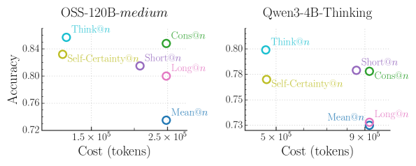
Figure 5: Comparison of the trade-off between task accuracy and inference cost (tokens) with different aggregation methods. Accuracy is averaged across all four datasets (AIME 24/25, HMMT 25, GPQA-D). Our Think@ $n$ method achieves the best overall Pareto-optimal performance. It matches or exceeds the accuracy of Cons@n with approximately half the inference cost, while Self-Certainty@ $n$ is notably less efficient.
Table 3: Impact of prefix length ( $\ell_prefix$ ) on Think@ $n$ performance and inference cost for AIME 2025. Using a short prefix of 50 tokens to estimate DTR outperforms using longer ones, and is comparable to full sequence (all) while providing significant cost savings. We also report Pass@1 and Cons@ $n$ for reference. Subscripts denote the standard deviation across 10 trials.
| | Accuracy | Cost (k tokens) |
| --- | --- | --- |
| Pass@1 | 80.0 4.2 | 6.4 |
| Cons@ $n$ | 90.0 2.5 | 307.6 |
| Think@ $n$ | | |
| Prefix length | | |
| 50 | 94.7 1.6 | 155.4 |
| 100 | 92.0 1.6 | 154.1 |
| 500 | 92.7 1.3 | 153.2 |
| 1000 | 92.7 1.3 | 177.4 |
| 2000 | 92.0 1.3 | 198.8 |
| all | 94.0 0.3 | 307.6 |
#### Experimental setups.
We follow the best-of-n (BoN) evaluation protocol commonly adopted in recent test-time scaling studies [fu2025deep]. For each problem, we sample $n$ responses using identical decoding settings, and compare the following aggregation methods: Cons@ $n$ : Standard self-consistency [wang2023selfconsistency], which performs majority voting over all $n$ sampled responses; Mean@ $n$ : The average accuracy of all the $n$ samples, reflecting a baseline of no preferential aggregation; Long@ $n$ and Short@ $n$ : Majority voting over the longest/shortest $η$ percent of the $n$ samples, ranked by token count [hassid2025don, agarwal2025first]. Self-Certainty@ $n$ : Majority voting over the highest-scoring $η$ percent of the $n$ samples, ranked by Self-Certainty score (the best-performing baseline in Section ˜ 3); Think@ $n$ : Majority voting over the highest-scoring $η$ percent of the $n$ samples, ranked by DTR $(·)$ . All methods operate on the same pool of $n$ samples. We set $n=48$ and $η=50\$ . More analysis are provided in Appendix ˜ C. The results are averaged across 10 trials.
#### Results.
We report the results in Table ˜ 2. To compare efficiency, we explicitly account for early stopping for Short@ $n$ , Self-Certainty@ $n$ , and Think@ $n$ , which aggregate only a subset of samples. Specifically, we report the average per-problem inference cost, measured as the total number of generated tokens, under the following protocols.
For Cons@ $n$ and Mean@ $n$ , the inference cost is defined as the sum of token counts across all $n$ sampled responses= (i.e., $∑_i=1^n|S_i|$ ) corresponding to full decoding without early stopping. For Short@ $n$ , we rank samples by their length and select the shortest $η× n$ samples. The inference cost is computed as the sum of the token count of the selected samples, plus an early-stopping overhead equal to $\ell_longest\_short×η× n$ , where $\ell_short$ denotes the length of the longest sample among the selected shortest subset. This term accounts for partially generated samples that are terminated once subset generation completes (i.e., bounded by $\ell_longest\_short$ ). The inference cost for Long@ $n$ is the same as Cons@ $n$ and Mean@ $n$ as it requires full decoding to select longest samples. For Think@ $n$ , samples are ranked by DTR, computed from a fixed prefix. Let $\ell_prefix$ denote the number of prefix tokens used to estimate $DTR(S[:\ell_prefix])$ . The inference cost is defined as the total token count of the top $η× n$ ranked samples, plus a fixed prefix overhead of $\ell_prefix×η× n$ , which reflects the cost of generating all candidates prior to early termination. Self-Certainty@ $n$ follows the same cost computation as Think@ $n$ , differing only in that samples are ranked by $Self-Certainty(S[:\ell_prefix])$ rather than $DTR(S[:\ell_prefix])$ .
Table ˜ 3 reports a preliminary ablation on AIME 25 that varies $\ell_prefix$ . We find that using only $\ell_prefix=50$ tokens achieves higher accuracy than longer prefixes and matches the performance obtained using the full sequence, while significantly reducing inference cost. Accordingly, we fix $\ell_prefix=50$ for all experiments in Table ˜ 2.
As shown, Cons@ $n$ incurs the highest inference cost due to full decoding of every candidate, while providing a strong accuracy baseline. Mean@ $n$ has the same cost as Cons@ $n$ but is the worst-performing one among all methods. Under early stopping, Short@ $n$ achieves modest cost savings relative to Cons@ $n$ , yet consistently underperforms it in accuracy. Long@ $n$ exhibits further degraded performance compared to Short@ $n$ without offering any cost-saving benefits. This indicates that length-based heuristics remain a coarse proxy for reasoning quality and often fail to reliably identify high-quality samples, leading to suboptimal aggregations. Self-Certainty@ $n$ substantially reduces inference cost by enabling early stopping using short prefixes, but nonetheless underperforms both Cons@ $n$ and Think@ $n$ on three of the four evaluated benchmarks. In contrast, Think@ $n$ consistently matches or exceeds the accuracy of Cons@ $n$ while requiring approximately half the inference cost. The Pareto-optimal performance is most evident in the averaged results shown in Figure ˜ 5, where Think@ $n$ achieves the best overall accuracy-cost trade-off. In sum, these results demonstrate that DTR provides a more informative and reliable selection signal, enabling efficient parallel scaling of inference compute.
## 5 Related Work
### 5.1 Relationship between CoT Length and Performance
The paradigm of test-time scaling has largely operated on the assertion that allocating more computation, typically manifested as longer CoT sequences, boosts reasoning performance wei2022chain-d1a, guo2025deepseek, muennighoff2025s1. Recent empirical studies have highlighted nuances to the universality of this “longer is better” heuristic [feng2025what-321, wu2025when-905]. gema2025inverse-bad identify inverse scaling regimes where increased reasoning length systematically degrades accuracy across diverse tasks, particularly when models are prone to distraction. Similarly, wu2025when-905 characterize the relationship between CoT length and accuracy as an “inverted-U” curve, suggesting an optimal length exists beyond which performance deteriorates due to factors like error accumulation.
Several works have proposed methods to exploit corresponding observations by favoring conciseness. hassid2025don demonstrated that the shortest reasoning chains among sampled candidates are often the most accurate, proposing inference-time length-based voting for efficient generations. A close work by agarwal2025first also introduced a training-free strategy that selects the first completed trace in parallel decoding, reducing token usage while maintaining accuracy. On the training side, shrivastava2025sample proposed Group Filtered Policy Optimization (GFPO) to explicitly curb length inflation in RL by rejection sampling that filters longer responses, demonstrating that models can think less without sacrificing performance. Our work aligns with these perspectives by confirming that raw token count is an unreliable proxy for effective reasoning effort, but we diverge by proposing a mechanistic internal signal rather than simply relying on surface-level brevity heuristics.
### 5.2 Leveraging Internal Information in LLMs
A rich line of work has investigated how LMs internally represent and manipulate information across layers, and how internal states can be exploited. Central to this direction is the observation that intermediate representations in LMs often encode meaningful signals before reaching the final layer. Early evidence for this view was provided by nostalgebraist2020lens, which projects intermediate hidden states directly into the vocabulary space using the model’s unembedding matrix—a technique we adopt in our work. The results reveal that autoregressive transformers form coarse guesses about the next token that are iteratively refined across layers. Subsequent analyses [belrose2023eliciting] further introduce learned, layer-specific affine transformations that better align intermediate representations with the final prediction space, enabling more interpretable token predictions in shallower layers.
Beyond model probing, chuang2023dola-0c6 exploits the empirical finding that factual knowledge in LMs is often more salient in particular layers. By contrasting logits from higher and lower layers, they propose a decoding method that amplifies factual signals and improves factuality. A recent work by vilas2025tracing-3dc introduces latent-trajectory signals characterizing the temporal evolution of hidden states across generated reasoning traces to predict correctness. While the work examines the sequential dimension of representations, our work focuses on the depth-wise evolution of predictions across layers for individual tokens.
Complementary interpretability works also revisit how LLMs utilize depth at inference. gupta2025how-6d8 shows that early layers tend to favor high-frequency, generic token guesses, which are subsequently refined into contextually appropriate predictions. csords2025do-6d4 suggest that later layers primarily perform fine-grained distributional refinement rather than introducing fundamentally new transformations, raising questions about the efficiency of depth utilization in modern LLMs. These findings reinforce the view that internal predictions may stabilize before the final layer, aligning with our motivations. Overall, our goal is not to modify or construct internal states to develop new methods aimed at improving model capabilities. Instead, we leverage natural, unaltered internal representations as a proxy for measuring model computational effort, which implicitly reflects thinking effort in LLMs.
## 6 Conclusion
We introduced deep-thinking ratio (DTR) as a novel measure of inference-time reasoning effort in LLMs. By tracking depth-wise stabilization of token predictions, DTR provides a more reliable signal of effective reasoning than surface-level proxies such as token length or confidence. Building on this insight, we proposed Think@ $n$ , a test-time scaling strategy that leverages DTR for early selection and aggregation, achieving comparable or better performance than standard self-consistency while substantially reducing inference cost. Together, our results suggest that measuring how models think internally, rather than how long they think, is a promising direction. Future work may leverage this insight to explore how effective reasoning is characterized—shifting the focus from generating longer chains of thought to inducing deeper, more computationally intensive reasoning, and potentially enabling more reliable and efficient reasoning models.
## Acknowledgements
We thank Congchao Wang and colleagues from Google AIR for their valuable support. We also thank Yu-Min Tseng from Virginia Tech and members of Meng-Lab at UVA for their helpful discussion.
## References
## Appendix A Comparison of Different Distance Metrics for DTR
Our method (Section ˜ 2) adopts Jensen–Shannon divergence (JSD) to quantify the discrepancy between intermediate-layer and final-layer predictions and compute DTR. Alternative notions of distance are possible. Here we explore two additional metrics: Kullback–Leibler divergence (KLD) and cosine similarity. The results are presented in Figure ˜ 6.
#### Kullback–Leibler divergence.
By replacing JSD with KLD in Equation ˜ 2, we compute the divergence between the final-layer distribution $p_t,L$ and the intermediate-layer distribution $p_t,l$ as
$$
\displaystyle D^KL_t,l=KL(p_t,L \| p_t,l) \tag{11}
$$
#### Cosine similarity.
We replace the distributional comparison defined in Section ˜ 2.2 with a representation-space measure using cosine similarity. Instead of projecting intermediate-layer hidden states into the vocabulary space via the shared unembedding matrix $W_U$ (Equation ˜ 1), we directly compute the cosine similarity between the intermediate-layer hidden state $h_t,l$ and the final-layer hidden state $h_t,L$ . The distance is defined as
$$
\displaystyle D^cos_t,l=1-\frac{⟨ h_t,l,h_t,L⟩}{\|h_t,l\|\|h_t,L\|} \tag{12}
$$
For both KLD and cosine similarity, we then apply the same configurations in Section ˜ 2.2 to identify deep-thinking tokens and compute KLD-based DTR and cosine-based DTR.
#### Results.
<details>
<summary>x7.png Details</summary>
### Visual Description
## Line Chart with Confidence Interval: Cosine Similarity vs. Accuracy
### Overview
The image displays a line chart titled "Cosine Similarity," plotting the relationship between a variable labeled "DTR" on the x-axis and "Accuracy (Pass@1)" on the y-axis. The chart features a primary data series (solid blue line with circular markers), a shaded confidence interval, and a dashed trend line with an annotated correlation coefficient.
### Components/Axes
* **Title:** "Cosine Similarity" (centered at the top).
* **Y-Axis:**
* **Label:** "Accuracy (Pass@1)" (rotated vertically on the left).
* **Scale:** Linear scale ranging from approximately 0.775 to 0.850.
* **Major Ticks/Labels:** 0.775, 0.800, 0.825, 0.850.
* **X-Axis:**
* **Label:** "DTR" (centered at the bottom).
* **Scale:** Linear scale.
* **Major Ticks/Labels:** 0.060, 0.066, 0.072, 0.078.
* **Data Series:**
* **Primary Line:** A solid blue line connecting five circular data points.
* **Confidence Interval:** A light blue shaded region surrounding the primary line, indicating variability or uncertainty.
* **Trend Line:** A dashed blue line showing the overall linear trend.
* **Legend/Annotation:** The text "r = 0.633" is placed in the upper-middle area of the plot, near the trend line, indicating the Pearson correlation coefficient.
### Detailed Analysis
**Data Points (Approximate Coordinates):**
The primary data series (solid blue line) shows the following approximate (DTR, Accuracy) pairs:
1. (0.058, 0.785)
2. (0.064, 0.790)
3. (0.068, 0.830)
4. (0.072, 0.848)
5. (0.078, 0.815)
**Trend Verification:**
* **Primary Line Trend:** The line slopes gently upward from the first to the second point, then rises steeply to a peak at the fourth point (DTR ≈ 0.072), before declining sharply at the fifth point.
* **Dashed Trend Line:** This line shows a consistent, moderate upward slope from left to right across the entire x-axis range, indicating an overall positive linear relationship.
* **Correlation:** The annotation "r = 0.633" quantifies this positive linear correlation as moderate.
**Confidence Interval:**
The shaded blue region is narrowest at the first and last data points and widest around the peak (DTR ≈ 0.072), suggesting greater uncertainty in the accuracy estimate near the maximum value.
### Key Observations
1. **Non-Linear Relationship:** The primary data does not follow a straight line. It exhibits a clear peak, suggesting an optimal DTR value for accuracy.
2. **Peak Performance:** The highest accuracy (≈0.848) occurs at a DTR value of approximately 0.072.
3. **Post-Peak Decline:** After the peak at DTR=0.072, accuracy decreases significantly as DTR increases to 0.078.
4. **Moderate Positive Correlation:** Despite the non-linear peak, the overall trend (dashed line) and the correlation coefficient (r=0.633) indicate that higher DTR values are generally associated with higher accuracy within the observed range.
### Interpretation
The chart demonstrates that the metric "Cosine Similarity" (likely used as a proxy or component for model performance) has a non-monotonic relationship with "Accuracy (Pass@1)." While the general trend is positive (higher DTR correlates with higher accuracy), there is a distinct optimum point.
* **What it suggests:** The data implies that increasing the DTR parameter improves model accuracy only up to a certain point (around 0.072). Beyond this threshold, further increases in DTR are detrimental to performance. This is a classic "inverted-U" or "diminishing returns" pattern common in parameter tuning.
* **Relationship between elements:** The primary line shows the empirical, observed relationship. The dashed trend line and its `r` value summarize the overall direction, smoothing over the local peak. The confidence interval highlights that the model's performance is most variable (or the estimate is least certain) precisely where it is highest.
* **Notable anomaly:** The sharp decline after the peak is the most critical feature. It indicates that the DTR parameter must be carefully tuned, as simply maximizing it will not yield the best results. The optimal operating point is clearly defined within the tested range.
</details>
(a) Cosine similarity as the distance metric on AIME 25.
<details>
<summary>x8.png Details</summary>
### Visual Description
\n
## Line Chart with Confidence Interval: Kullback-Leibler Divergence vs. Accuracy
### Overview
The image displays a line chart titled "Kullback-Leibler Divergence." It plots a metric called "Accuracy (Pass@1)" against "DTR" (likely an acronym for a specific divergence or distance metric). The chart includes a primary data series with a shaded confidence interval and a dashed trend line indicating a negative correlation.
### Components/Axes
* **Title:** "Kullback-Leibler Divergence" (centered at the top).
* **Y-Axis:** Labeled "Accuracy (Pass@1)". The scale runs from 0.72 to 0.84, with major tick marks at 0.72, 0.76, 0.80, and 0.84.
* **X-Axis:** Labeled "DTR". The scale runs from 0.345 to 0.390, with major tick marks at 0.345, 0.360, 0.375, and 0.390.
* **Data Series (Solid Blue Line with Circles):** A solid blue line connects five data points, each marked with a blue circle. This line is surrounded by a light blue shaded region representing a confidence interval or variance.
* **Trend Line (Dashed Blue Line):** A dashed blue line runs from the top-left to the bottom-right of the plot area, indicating the overall trend.
* **Correlation Annotation:** The text "r = -0.698" is placed near the center of the plot, adjacent to the dashed trend line, indicating the Pearson correlation coefficient.
### Detailed Analysis
**Data Points (Approximate Coordinates):**
The primary data series (solid line) shows the following approximate relationship between DTR (x) and Accuracy (y):
1. (0.345, 0.82)
2. (0.360, 0.82)
3. (0.370, 0.84) - This is the peak accuracy point.
4. (0.378, 0.81)
5. (0.390, 0.74)
**Trend Verification:**
* **Primary Data Series (Solid Line):** The line starts flat between the first two points, rises to a peak at the third point, and then slopes sharply downward for the final two points. The overall visual trend after the peak is a steep decline.
* **Trend Line (Dashed Line):** The dashed line slopes consistently downward from left to right, visually confirming the negative correlation stated by the annotation.
**Confidence Interval (Shaded Region):**
The light blue shaded area represents uncertainty around the primary data line. Its width varies:
* It is narrowest at the first data point (DTR ~0.345).
* It widens significantly around the peak (DTR ~0.370), suggesting greater variance or uncertainty in accuracy at this divergence level.
* It remains relatively wide for the final two points as accuracy drops.
### Key Observations
1. **Non-Monotonic Relationship:** Accuracy does not simply decrease with increasing DTR. It remains stable, peaks, and then falls sharply.
2. **Peak Performance:** The highest accuracy (≈0.84) occurs at an intermediate DTR value of approximately 0.370.
3. **Strong Negative Correlation:** Despite the initial peak, the overall trend is negative (r = -0.698), indicating that higher DTR values are generally associated with lower Pass@1 accuracy.
4. **Sharp Decline:** The most dramatic change is the steep drop in accuracy from ≈0.84 to ≈0.74 as DTR increases from ~0.370 to 0.390.
5. **Uncertainty at Peak:** The confidence interval is widest around the peak accuracy point, indicating this measurement may have the highest variability.
### Interpretation
This chart investigates the relationship between a divergence metric (DTR) and a model's top-1 accuracy (Pass@1). The Kullback-Leibler Divergence in the title suggests DTR might be a measure of difference between probability distributions, perhaps comparing a model's output distribution to a target distribution.
The data suggests a **trade-off with an optimal point**. Very low DTR (high similarity) does not yield the best accuracy. Instead, accuracy peaks at a moderate DTR value (~0.370), implying that a certain level of "divergence" or difference in the measured distributions is beneficial for model performance. However, beyond this optimal point, further increases in divergence are strongly detrimental, leading to a rapid decline in accuracy.
The negative correlation (r = -0.698) summarizes the general tendency, but the non-linear shape of the solid line is the critical finding. It warns against assuming a simple linear relationship and highlights the importance of the intermediate DTR zone for maximizing performance. The widening confidence interval at the peak suggests that operating near this optimal point may also introduce more variability in outcomes.
</details>
(b) KL divergence as the distance metric on AIME 25.
<details>
<summary>x9.png Details</summary>
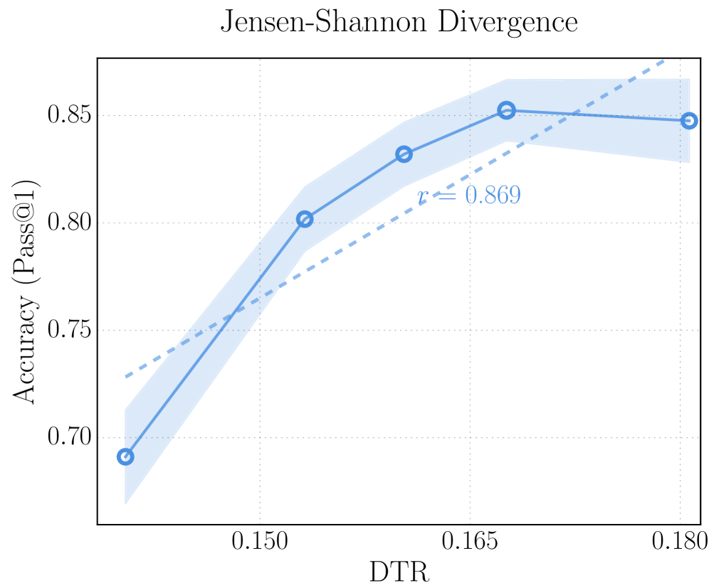
### Visual Description
## Line Chart: Jensen-Shannon Divergence vs. Accuracy (Pass@1)
### Overview
The image displays a line chart titled "Jensen-Shannon Divergence." It plots the relationship between a metric called "DTR" on the horizontal axis and "Accuracy (Pass@1)" on the vertical axis. The chart shows a positive correlation, indicated by an upward-sloping line and a correlation coefficient annotation.
### Components/Axes
* **Title:** "Jensen-Shannon Divergence" (centered at the top).
* **Y-Axis:** Labeled "Accuracy (Pass@1)". The scale runs from approximately 0.70 to 0.85, with major tick marks at 0.70, 0.75, 0.80, and 0.85.
* **X-Axis:** Labeled "DTR". The scale shows major tick marks at 0.150, 0.165, and 0.180.
* **Data Series:** A solid blue line with circular markers (open circles filled with blue) connects five data points.
* **Confidence Interval:** A light blue shaded region surrounds the solid data line, representing a confidence interval or error band.
* **Trend Line:** A dashed, lighter blue line represents a linear fit to the data.
* **Annotation:** The text "r = 0.869" is placed in the upper-right quadrant of the chart area, near the dashed trend line, indicating the Pearson correlation coefficient.
### Detailed Analysis
**Data Points (Approximate Coordinates):**
The solid blue line connects the following points, moving from left to right (increasing DTR):
1. (DTR ≈ 0.143, Accuracy ≈ 0.69)
2. (DTR ≈ 0.153, Accuracy ≈ 0.80)
3. (DTR ≈ 0.160, Accuracy ≈ 0.83)
4. (DTR ≈ 0.167, Accuracy ≈ 0.85)
5. (DTR ≈ 0.180, Accuracy ≈ 0.848)
**Trend Verification:**
* **Solid Line (Data):** The line exhibits a clear upward slope from the first to the fourth data point, indicating that Accuracy (Pass@1) increases as DTR increases within this range. The slope is steepest between the first and second points. The line flattens and shows a very slight decrease between the fourth and fifth points.
* **Dashed Line (Linear Fit):** This line has a constant positive slope across the entire charted range, reinforcing the overall positive correlation.
* **Shaded Region (Uncertainty):** The width of the light blue shaded area appears relatively consistent but may widen slightly at higher DTR values, suggesting potentially greater uncertainty in the accuracy estimate as DTR increases.
**Spatial Grounding:**
* The chart title is centered above the plot area.
* The y-axis label is rotated 90 degrees and positioned to the left of the y-axis.
* The x-axis label is centered below the x-axis.
* The "r = 0.869" annotation is positioned in the open space of the upper-right quadrant, between the solid data line and the dashed trend line.
* The data points are plotted sequentially from the lower-left to the upper-right portion of the chart.
### Key Observations
1. **Strong Positive Correlation:** The primary observation is a strong positive relationship between DTR and Accuracy (Pass@1), quantified by the correlation coefficient r = 0.869.
2. **Non-Linear Data Trend:** While the linear fit (dashed line) shows a steady increase, the actual data (solid line) suggests a potential saturation or diminishing returns effect, as the accuracy gain slows and nearly plateaus after DTR ≈ 0.167.
3. **High Accuracy Range:** The model achieves its highest accuracy (≈0.85) within the DTR range of approximately 0.165 to 0.180.
4. **Initial Steep Improvement:** The most significant gain in accuracy occurs at the lower end of the DTR scale shown, between DTR ≈ 0.143 and 0.153.
### Interpretation
The chart demonstrates that the Jensen-Shannon Divergence, as operationalized by the "DTR" metric, is a strong predictor of model performance as measured by Pass@1 accuracy. The high correlation coefficient (r=0.869) suggests that DTR is a highly informative metric for this task.
The data implies that increasing the DTR value is associated with better model accuracy, but the relationship may not be perfectly linear. The flattening of the curve at higher DTR values could indicate a performance ceiling for the model or task under the given conditions, where further increases in DTR yield minimal accuracy improvements. This is a critical insight for optimization, suggesting resources might be better spent improving other aspects of the model once a DTR of around 0.165 is achieved.
The presence of the confidence interval (shaded area) acknowledges uncertainty in the measurements, but its relatively narrow width reinforces the reliability of the observed trend. Overall, this chart provides compelling evidence for the utility of the Jensen-Shannon Divergence (via DTR) as a key diagnostic or target metric in this technical context.
</details>
(c) JS divergence as the distance metric on AIME 25.
<details>
<summary>x10.png Details</summary>
### Visual Description
## Line Chart: Cosine Similarity vs. Accuracy (Pass@1)
### Overview
The image displays a line chart titled "Cosine Similarity." It plots the relationship between a variable labeled "DTR" on the horizontal axis and "Accuracy (Pass@1)" on the vertical axis. The chart features a primary data series shown as a solid blue line with circular markers, accompanied by a shaded blue region representing a confidence interval or variance. A secondary, dashed blue trend line is overlaid, with an annotated correlation coefficient.
### Components/Axes
* **Title:** "Cosine Similarity" (centered at the top).
* **Y-Axis:**
* **Label:** "Accuracy (Pass@1)" (rotated vertically on the left).
* **Scale:** Linear scale ranging from approximately 0.56 to above 0.68. Major tick marks are visible at 0.56, 0.60, 0.64, and 0.68.
* **X-Axis:**
* **Label:** "DTR" (centered at the bottom).
* **Scale:** Linear scale. Major tick marks are labeled at 0.060, 0.066, 0.072, and 0.078. The axis appears to span from approximately 0.056 to 0.080.
* **Data Series (Solid Line):** A solid blue line connecting five distinct circular data points. The line is surrounded by a semi-transparent light blue shaded area, indicating a confidence band or standard deviation.
* **Trend Line (Dashed Line):** A dashed blue line showing a linear fit to the data. It is annotated with the text "r = 0.172" placed near its center, slightly to the right of the chart's midpoint.
* **Legend:** No explicit legend box is present. The two line styles (solid and dashed) are differentiated visually and by the annotation on the dashed line.
### Detailed Analysis
**Data Series (Solid Line) - Trend Verification:**
The solid line exhibits a clear non-linear trend. It starts at a low accuracy value on the left, rises steeply to a peak in the middle range of DTR, and then declines on the right.
* **Point 1 (Far Left):** DTR ≈ 0.056, Accuracy ≈ 0.59. This is the lowest accuracy point.
* **Point 2:** DTR ≈ 0.062, Accuracy ≈ 0.67. A sharp increase from the first point.
* **Point 3 (Peak Region):** DTR ≈ 0.066, Accuracy ≈ 0.68. This appears to be the highest or one of the highest accuracy points.
* **Point 4 (Peak Region):** DTR ≈ 0.072, Accuracy ≈ 0.68. Accuracy remains high, similar to Point 3.
* **Point 5 (Far Right):** DTR ≈ 0.080, Accuracy ≈ 0.62. A significant drop from the peak.
**Confidence Band (Shaded Area):**
The shaded blue region is widest at the extremes (near DTR 0.056 and 0.080) and narrowest in the peak region (DTR 0.066-0.072). This suggests greater uncertainty or variance in the accuracy measurements at very low and very high DTR values, and higher confidence in the measurements around the optimal DTR range.
**Trend Line (Dashed Line):**
The dashed line shows a very slight positive slope from left to right. The annotation "r = 0.172" indicates a weak positive Pearson correlation coefficient between DTR and Accuracy across the plotted range.
### Key Observations
1. **Optimal DTR Range:** Accuracy is maximized (≈0.68) within a mid-range of DTR values, approximately between 0.066 and 0.072.
2. **Performance Drop-off:** Accuracy decreases noticeably when DTR moves outside this optimal range, particularly at higher DTR values (≈0.080).
3. **Weak Linear Correlation:** The overall linear trend (dashed line) is positive but very weak (r=0.172), which is consistent with the observed inverted-U shape of the actual data. A linear model poorly captures the relationship.
4. **Variance Pattern:** Uncertainty (shaded area) is not uniform; it is highest where the model performance is lowest (at the extremes of DTR).
### Interpretation
This chart demonstrates the relationship between a metric called "DTR" and model accuracy on a "Pass@1" task, likely in a machine learning or retrieval context where "Cosine Similarity" is a relevant measure.
The data suggests a **non-monotonic, peaked relationship**. There exists an optimal intermediate value of DTR that yields the highest accuracy. Both lower and higher DTR values are associated with reduced performance. This pattern is classic for hyperparameter tuning, where DTR could represent a threshold, a temperature parameter, or a ratio controlling some aspect of the model's operation (e.g., retrieval density, diversity, or confidence filtering).
The weak positive linear correlation (r=0.172) is a misleading summary if taken alone, as it fails to capture the critical drop in accuracy at higher DTR. The key insight is the existence of a "sweet spot." The widening confidence intervals at the performance extremes further indicate that the model's behavior becomes less predictable or more variable when configured with sub-optimal DTR settings. Therefore, for practical application, setting DTR within the 0.066-0.072 range would be recommended to maximize both accuracy and reliability.
</details>
(d) Cosine similarity as the distance metric on HMMT 25.
<details>
<summary>x11.png Details</summary>
### Visual Description
## Line Chart: Kullback-Leibler Divergence vs. Accuracy (Pass@1)
### Overview
The image displays a line chart plotting the relationship between a metric labeled "DTR" (x-axis) and "Accuracy (Pass@1)" (y-axis). The chart is titled "Kullback-Leibler Divergence". It features a primary data series shown as a solid blue line with circular markers, a shaded blue region representing a confidence interval or variance around that line, and a dashed blue trend line with an annotated correlation coefficient.
### Components/Axes
* **Title:** "Kullback-Leibler Divergence" (centered at the top).
* **Y-Axis:**
* **Label:** "Accuracy (Pass@1)" (rotated vertically on the left side).
* **Scale:** Linear scale ranging from approximately 0.600 to 0.675.
* **Major Ticks:** 0.600, 0.625, 0.650, 0.675.
* **X-Axis:**
* **Label:** "DTR" (centered at the bottom).
* **Scale:** Linear scale.
* **Major Ticks:** 0.375, 0.390, 0.405.
* **Data Series:**
* **Solid Blue Line with Circles:** Represents the primary measured relationship between DTR and Accuracy.
* **Shaded Blue Region:** Surrounds the solid line, indicating the range of uncertainty, variance, or a confidence interval.
* **Dashed Blue Line:** Represents a linear trend fit to the data.
* **Annotation:** The text "r = 0.409" is placed near the dashed trend line, indicating the Pearson correlation coefficient.
### Detailed Analysis
**Data Points (Approximate Values):**
The solid line connects five distinct data points. Reading from left to right:
1. **Point 1:** DTR ≈ 0.365, Accuracy ≈ 0.608
2. **Point 2:** DTR ≈ 0.380, Accuracy ≈ 0.662 (This is the peak accuracy on the chart).
3. **Point 3:** DTR ≈ 0.390, Accuracy ≈ 0.635
4. **Point 4:** DTR ≈ 0.400, Accuracy ≈ 0.633
5. **Point 5:** DTR ≈ 0.410, Accuracy ≈ 0.643
**Trend Verification:**
* **Solid Line Trend:** The line shows a sharp increase from Point 1 to Point 2, followed by a decrease to Point 3, a slight further decrease to Point 4, and then a modest recovery to Point 5. The overall pattern is non-monotonic.
* **Dashed Trend Line:** This line slopes gently upward from left to right, indicating a general positive correlation between DTR and Accuracy across the plotted range.
**Spatial Grounding & Uncertainty:**
* The shaded confidence region is narrowest at the first and last data points and widest around the second (peak) data point, suggesting greater measurement variance or model uncertainty at that DTR value.
* The annotation "r = 0.409" is positioned in the center-right area of the plot, just above the dashed trend line.
### Key Observations
1. **Non-Linear Relationship:** The primary data does not follow a simple linear trend. Accuracy peaks at an intermediate DTR value (~0.380) before declining and then partially recovering.
2. **Moderate Positive Correlation:** Despite the non-linear path, the fitted dashed line and the correlation coefficient (r = 0.409) suggest a moderate positive linear association between DTR and Accuracy.
3. **Peak Performance:** The highest observed Accuracy (Pass@1) of approximately 0.662 occurs at a DTR of ~0.380.
4. **Uncertainty Variance:** The confidence interval (shaded area) is not uniform; it expands significantly around the peak accuracy point, indicating less certainty in the measurement at that specific DTR.
### Interpretation
This chart investigates how the Kullback-Leibler (KL) Divergence, quantified here as "DTR", relates to a model's top-1 accuracy ("Pass@1"). KL Divergence is a measure of how one probability distribution differs from a second, reference probability distribution. In machine learning, it's often used as a loss function or a metric for distribution matching.
The data suggests that the relationship between this divergence metric and model accuracy is not straightforward. While the overall trend (dashed line) is positive—implying that, broadly, higher DTR correlates with higher accuracy—the actual performance peaks at a specific, intermediate DTR value (~0.380). This could indicate an optimal point of "divergence" or complexity for the model being evaluated. Pushing the DTR beyond this point leads to a drop in accuracy, which might correspond to overfitting, excessive model complexity, or a misalignment with the underlying data distribution. The widening confidence interval at the peak suggests that model performance is most variable or sensitive around this optimal operating point. The chart implies that simply maximizing or minimizing KL Divergence (DTR) is not the goal; rather, finding the right balance is key to achieving peak accuracy.
</details>
(e) KL divergence as the distance metric on HMMT 25.
<details>
<summary>x12.png Details</summary>
### Visual Description
\n
## Line Chart: Jensen-Shannon Divergence vs. Accuracy (Pass@1)
### Overview
The image is a line chart titled "Jensen-Shannon Divergence." It plots a metric called "Accuracy (Pass@1)" against "DTR" (likely an acronym for a specific divergence or ratio metric). The chart shows a positive correlation between the two variables, with a primary data series (solid line with markers) and a linear trend line (dashed line). A shaded region around the primary line indicates a confidence interval or range of uncertainty.
### Components/Axes
* **Title:** "Jensen-Shannon Divergence" (centered at the top).
* **Y-Axis:**
* **Label:** "Accuracy (Pass@1)" (rotated vertically on the left).
* **Scale:** Linear, ranging from approximately 0.56 to 0.68.
* **Major Ticks:** 0.56, 0.60, 0.64, 0.68.
* **X-Axis:**
* **Label:** "DTR" (centered at the bottom).
* **Scale:** Linear, ranging from approximately 0.135 to 0.180.
* **Major Ticks:** 0.135, 0.150, 0.165, 0.180.
* **Data Series:**
1. **Primary Series (Solid Blue Line with Circle Markers):** Represents the measured relationship between DTR and Accuracy. It is accompanied by a light blue shaded region representing the confidence interval or standard deviation.
2. **Trend Line (Dashed Blue Line):** Represents a linear fit to the primary data series.
* **Annotation:** The text "r = 0.895" is placed in the middle-right area of the plot, near the dashed trend line, indicating the Pearson correlation coefficient.
### Detailed Analysis
**Primary Data Series (Solid Line):**
The line connects five distinct data points (blue circles). The trend is generally upward but shows signs of plateauing at higher DTR values.
* **Point 1 (Leftmost):** DTR ≈ 0.135, Accuracy ≈ 0.56.
* **Point 2:** DTR ≈ 0.150, Accuracy ≈ 0.605.
* **Point 3:** DTR ≈ 0.160, Accuracy ≈ 0.64.
* **Point 4:** DTR ≈ 0.170, Accuracy ≈ 0.655.
* **Point 5 (Rightmost):** DTR ≈ 0.185, Accuracy ≈ 0.65.
**Trend Line (Dashed Line):**
This line shows a steady, positive linear slope from the lower-left to the upper-right of the chart. It starts near (DTR=0.135, Accuracy≈0.575) and ends near (DTR=0.185, Accuracy≈0.675).
**Confidence Interval (Shaded Region):**
The shaded blue area represents uncertainty. It is narrowest at the first data point (DTR=0.135), widens significantly in the middle range (DTR=0.150 to 0.170), and narrows slightly again at the final point. This suggests greater variability or less certainty in the measurements for mid-range DTR values.
### Key Observations
1. **Strong Positive Correlation:** The annotation "r = 0.895" confirms a very strong positive linear relationship between DTR and Accuracy (Pass@1).
2. **Diminishing Returns:** While the trend line is linear, the primary data series shows a steep increase in accuracy from DTR=0.135 to 0.160, followed by a much flatter slope (a plateau) from DTR=0.160 to 0.185. This suggests that increases in DTR yield progressively smaller gains in accuracy beyond a certain point.
3. **Variable Uncertainty:** The confidence interval is not uniform. The model's predictions (or the measurement's reliability) appear most certain at the lowest DTR value and least certain in the middle of the observed range.
### Interpretation
The chart demonstrates that the Jensen-Shannon Divergence (as quantified by the DTR metric) is a strong predictor of model performance, specifically "Pass@1" accuracy. A higher DTR value is associated with higher accuracy.
The key insight is the **non-linear relationship** hidden within the strong linear correlation. The primary data suggests a saturation effect: initial improvements in DTR lead to dramatic accuracy gains, but these gains level off. This could imply that after achieving a certain level of distributional similarity (high DTR), further refinement provides minimal benefit to this specific accuracy metric. The widening confidence interval in the mid-range might indicate a transitional phase where model behavior is less stable or more sensitive to other factors.
For a technical document, this chart argues that optimizing for the Jensen-Shannon Divergence (or the underlying DTR measure) is a valid strategy for improving Pass@1 accuracy, but with the caveat that the relationship is subject to diminishing returns. The high correlation coefficient (0.895) makes it a reliable, but not perfect, indicator.
</details>
(f) JS divergence as the distance metric on HMMT 25.
Figure 6: Comparison of correlation between accuracy and deep-thinking ratio (DTR) using different distance metrics (cosine similarity, KL divergence, and JS divergence) on AIME 25 (top row) and HMMT 25 (bottom row).
We report the correlation results of KLD-based and cosine-based DTR, compared with our main JSD-based DTR method, on AIME 25 and HMMT 25 using OSS-120B- medium. Across both datasets, JSD-based DTR consistently achieves the strongest positive correlation with accuracy ( $r$ = 0.869 on AIME 25; $r$ = 0.895 on HMMT 25), justifying its use in our definition of DTR in Section ˜ 2. In contrast, cosine-based DTR exhibits substantially weaker and unstable correlations ( $r$ = 0.633 on AIME 25 and only $r$ = 0.172 on HMMT 25). KLD-based DTR shows similarly inconsistent behavior, with a negative correlation on AIME 25 ( $r$ = -0.698) and a modest positive correlation on HMMT 25 ( $r$ = 0.409). This inconsistency may stem from the asymmetric and numerically unstable nature of KLD: early-layer predictions tend to be high-entropy and relatively flat, assigning probability mass to many tokens that are later driven to near-zero values. Consequently, KLD can become artificially small, making the measure highly sensitive.
## Appendix B DTR Under Different GPT-OSS Reasoning Levels
Figure ˜ 7 illustrates how DTR varies in different reasoning-level configurations (i.e., low, medium, and high) of the GPT-OSS-120B model. We observe an interesting and consistent trend on both AIME 25 and GPQA-D: although the underlying model weights remain identical and only the system prompt differs, lower reasoning-level configurations exhibit higher DTR values, whereas higher reasoning-level configurations yield systematically smaller DTR while achieving better task accuracy.
A potential explanation is that higher reasoning levels may redistribute computation from depth to sequence length, effectively flattening per-token, layer-wise computation. Models with higher reasoning levels require less deep revision for each individual token but instead generate longer reasoning chains with more forward passes, resulting in greater total effective compute and improved task performance. Since DTR is defined as the proportion of deep-thinking tokens (i.e., averaged over the total number of generated tokens), longer sequences increase the denominator in the DTR calculation and thus produce smaller values. This also suggests DTR might not be directly comparable across different models or model modes.
<details>
<summary>x13.png Details</summary>
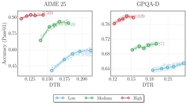
### Visual Description
## Scatter Plot with Trend Lines: AIME 25 and GPQA-D Accuracy vs. DTR
### Overview
The image displays two side-by-side scatter plots with overlaid trend lines, comparing model accuracy (Pass@1) against a metric labeled "DTR" for two different datasets or tasks: "AIME 25" (left) and "GPQA-D" (right). Each plot contains three data series, categorized by difficulty level (Low, Medium, High), distinguished by color. The plots show a positive correlation between DTR and accuracy for each series, with varying strengths.
### Components/Axes
* **Titles:**
* Left Chart: "AIME 25" (centered at the top).
* Right Chart: "GPQA-D" (centered at the top).
* **Y-Axis (Both Charts):** Labeled "Accuracy (Pass@1)". The scale is linear.
* AIME 25 Range: Approximately 0.40 to 0.95. Major tick marks at 0.45, 0.60, 0.75, 0.90.
* GPQA-D Range: Approximately 0.62 to 0.78. Major tick marks at 0.64, 0.68, 0.72, 0.76.
* **X-Axis (Both Charts):** Labeled "DTR". The scale is linear.
* AIME 25 Range: Approximately 0.11 to 0.21. Major tick marks at 0.125, 0.150, 0.175, 0.200.
* GPQA-D Range: Approximately 0.11 to 0.22. Major tick marks at 0.12, 0.15, 0.18, 0.21.
* **Legend:** Positioned at the bottom center of the entire figure, below both charts.
* **Low:** Blue line with circle markers.
* **Medium:** Green line with circle markers.
* **High:** Red line with circle markers.
* **Data Series & Trend Lines:** Each series consists of individual data points (circles) and a dashed trend line with a shaded confidence interval. A Pearson correlation coefficient (`r`) is displayed near each trend line.
### Detailed Analysis
#### **AIME 25 Chart (Left)**
* **High (Red) Series:**
* **Placement:** Top-left quadrant of the chart.
* **Trend:** Strong positive slope. Points cluster tightly around the trend line.
* **Data Range:** DTR from ~0.115 to ~0.140. Accuracy from ~0.89 to ~0.93.
* **Correlation:** `r = 0.769` (displayed in red text near the series).
* **Medium (Green) Series:**
* **Placement:** Center of the chart, spanning from lower-left to upper-right.
* **Trend:** Positive slope, less steep than the High series.
* **Data Range:** DTR from ~0.140 to ~0.185. Accuracy from ~0.68 to ~0.85.
* **Correlation:** `r = 0.949` (displayed in green text near the series).
* **Low (Blue) Series:**
* **Placement:** Bottom-right quadrant of the chart.
* **Trend:** Positive slope, similar steepness to the Medium series.
* **Data Range:** DTR from ~0.155 to ~0.205. Accuracy from ~0.40 to ~0.60.
* **Correlation:** `r = 0.937` (displayed in blue text near the series).
#### **GPQA-D Chart (Right)**
* **High (Red) Series:**
* **Placement:** Top-left quadrant of the chart.
* **Trend:** Positive slope.
* **Data Range:** DTR from ~0.120 to ~0.145. Accuracy from ~0.76 to ~0.78.
* **Correlation:** `r = 0.839` (displayed in red text near the series).
* **Medium (Green) Series:**
* **Placement:** Center of the chart.
* **Trend:** Positive slope.
* **Data Range:** DTR from ~0.150 to ~0.190. Accuracy from ~0.69 to ~0.71.
* **Correlation:** `r = 0.871` (displayed in green text near the series).
* **Low (Blue) Series:**
* **Placement:** Bottom-right quadrant of the chart.
* **Trend:** Positive slope.
* **Data Range:** DTR from ~0.185 to ~0.220. Accuracy from ~0.64 to ~0.65.
* **Correlation:** `r = 0.981` (displayed in blue text near the series).
### Key Observations
1. **Consistent Positive Correlation:** For both datasets (AIME 25 and GPQA-D) and across all difficulty levels (Low, Medium, High), accuracy increases as DTR increases. All correlation coefficients (`r`) are positive and strong (ranging from 0.769 to 0.981).
2. **Difficulty Stratification:** There is a clear vertical separation by difficulty. For any given DTR value, the "High" difficulty series has the highest accuracy, followed by "Medium," then "Low." This ordering is perfectly maintained in both charts.
3. **DTR Range by Difficulty:** There is a clear horizontal separation by difficulty. The "High" difficulty series operates at the lowest DTR values, "Medium" in the middle, and "Low" at the highest DTR values. This suggests DTR might be inversely related to task difficulty.
4. **Dataset Comparison:** The AIME 25 dataset shows a much wider range of accuracy values (approx. 0.40-0.93) compared to GPQA-D (approx. 0.64-0.78). The slopes of the trend lines also appear steeper in the AIME 25 plot.
5. **Correlation Strength:** The "Low" difficulty series shows the strongest correlation in both datasets (`r=0.937` for AIME 25, `r=0.981` for GPQA-D).
### Interpretation
The data demonstrates a robust, positive relationship between the DTR metric and model accuracy (Pass@1) across two distinct benchmarks. The consistent stratification by difficulty level is the most salient finding.
* **What the data suggests:** Higher DTR values are associated with better performance. However, the tasks where the model achieves high accuracy (the "High" difficulty series) are inherently associated with *lower* DTR values. This presents an interesting paradox: the model performs best on hard tasks, but those hard tasks are characterized by low DTR. This could imply that DTR measures something like "data transformation rate" or "difficulty transformation ratio," where a lower value indicates a more challenging, less transformed, or more "raw" problem setup that the model is surprisingly adept at solving.
* **Relationship between elements:** The three difficulty tiers form parallel, non-overlapping bands across the DTR-accuracy space. This indicates that difficulty level is a primary confounding variable; analyzing the effect of DTR on accuracy without controlling for difficulty would be misleading. The strong correlations within each band show that DTR is still a meaningful predictor of performance *within* a given difficulty class.
* **Notable Anomalies/Trends:** The perfect ordering of difficulty bands and their distinct DTR ranges is striking. It suggests the "DTR" metric is intrinsically linked to the problem difficulty definition used for these benchmarks. The near-perfect correlation (`r=0.981`) for the Low/GPQA-D series indicates an almost linear relationship in that specific regime. The wider accuracy spread in AIME 25 might indicate it is a more discriminating benchmark or that the model's performance is more variable on its problem set.
</details>
Figure 7: Deep-thinking ratio (DTR) under different reasoning level configurations of OSS-120B models.
## Appendix C Additional Analysis of Think@ $\bm{n}$
Here we provide additional analysis on how Think@ $n$ behaves when varying (i) the number of sampled responses $n$ and (ii) the retained top- $η$ percentage used for voting.
#### Effect of the number of samples n .
Figure ˜ 8(a) compares Think@ $n$ against Cons@ $n$ (i.e., self-consistency) as $n$ increases ( $n∈\{16,32,48\})$ . Think@ $n$ improves monotonically with larger $n$ , where the advantage over Cons@ $n$ becomes more pronounced. Sampling more responses makes the correct cluster of answers to be larger and more likely to appear. Think@ $n$ is able to exploit this enlarged candidate pool by preferentially selecting better samples, leading to stronger performance gains over Cons@ $n$ .
#### Effect of top- $\bm{η}$ percentage.
Figure ˜ 8(a) evaluates Think@ $n$ under different top- $η$ percent ( $η∈\{25\$ ). Performance peaks at $η$ =50%, while decrease for a smaller fraction ( $η$ =25%) and a larger fraction ( $η$ =75%). This suggests a trade-off: selecting too few samples reduces voting robustness, potentially with fewer strong candidates to stabilize majority vote, whereas selecting too many might admit lower-quality samples that dilute the benefit of Think@ $n$ . Overall, the results support our choice of $η$ =50% as a stable operating point.
<details>
<summary>x14.png Details</summary>
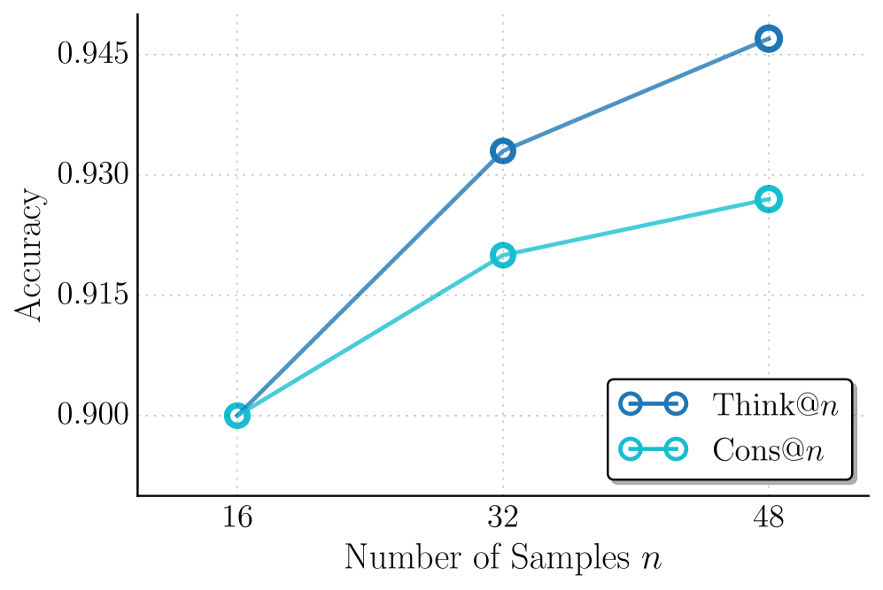
### Visual Description
\n
## Line Chart: Accuracy vs. Number of Samples for Think@n and Cons@n
### Overview
The image is a line chart comparing the performance (accuracy) of two methods, labeled "Think@n" and "Cons@n", as the number of samples (`n`) increases. The chart demonstrates that both methods improve with more samples, but "Think@n" shows a greater rate of improvement.
### Components/Axes
* **X-Axis (Horizontal):** Labeled "Number of Samples `n`". It has three discrete, evenly spaced tick marks at values 16, 32, and 48.
* **Y-Axis (Vertical):** Labeled "Accuracy". The scale is linear, with labeled tick marks at 0.900, 0.915, 0.930, and 0.945. The axis extends slightly below 0.900 and above 0.945.
* **Legend:** Located in the bottom-right corner of the plot area, enclosed in a box. It contains two entries:
* A dark blue line with circle markers labeled `Think@n`.
* A light blue (cyan) line with circle markers labeled `Cons@n`.
* **Grid:** A faint, dotted grid is present in the background, aligned with the major tick marks on both axes.
### Detailed Analysis
**Data Series: Think@n (Dark Blue Line)**
* **Trend:** The line slopes steeply upward from left to right, indicating a strong positive correlation between sample size and accuracy.
* **Data Points (Approximate):**
* At `n = 16`: Accuracy ≈ 0.900
* At `n = 32`: Accuracy ≈ 0.932
* At `n = 48`: Accuracy ≈ 0.946
**Data Series: Cons@n (Light Blue Line)**
* **Trend:** The line also slopes upward, but with a less steep gradient compared to the Think@n line, indicating a positive but more moderate improvement.
* **Data Points (Approximate):**
* At `n = 16`: Accuracy ≈ 0.900 (appears to start at the same point as Think@n)
* At `n = 32`: Accuracy ≈ 0.920
* At `n = 48`: Accuracy ≈ 0.927
### Key Observations
1. **Common Starting Point:** Both methods begin at approximately the same accuracy (0.900) when the number of samples is 16.
2. **Diverging Performance:** As the number of samples increases to 32 and 48, the performance of the two methods diverges. The gap in accuracy between Think@n and Cons@n widens with larger `n`.
3. **Superior Scaling of Think@n:** The Think@n method demonstrates superior scalability, achieving a higher final accuracy (≈0.946 vs. ≈0.927) and a greater overall gain (≈0.046 vs. ≈0.027) over the tested range.
4. **Diminishing Returns for Cons@n:** The slope of the Cons@n line appears to flatten slightly between `n=32` and `n=48`, suggesting potential diminishing returns, whereas the Think@n line maintains a strong upward trajectory.
### Interpretation
The chart presents a comparative analysis of two algorithmic or procedural methods ("Think@n" and "Cons@n") in a machine learning or statistical context, where performance is measured by accuracy on a task.
* **What the data suggests:** The data strongly suggests that the "Think@n" method is more effective at leveraging additional data samples to improve its accuracy. While both methods benefit from more data, "Think@n" has a higher "learning efficiency" or better model capacity within this sample size regime.
* **Relationship between elements:** The x-axis (input resource: samples) is the independent variable, and the y-axis (output quality: accuracy) is the dependent variable. The two lines represent different models or strategies for converting the input resource into output quality. The widening gap indicates that the choice of method becomes increasingly consequential as more data becomes available.
* **Notable implications:** For a practitioner, this chart argues for adopting the "Think@n" approach if the goal is to maximize accuracy and if a sample size of 32 or more is available. The "Cons@n" method might be preferable only under constraints where `n` is very small (≤16) or if it offers significant advantages not shown here (e.g., lower computational cost, faster inference). The chart does not show performance for `n < 16` or `n > 48`, so conclusions are limited to this range.
</details>
(a) Comparison of different number of samples $n$ .
<details>
<summary>x15.png Details</summary>
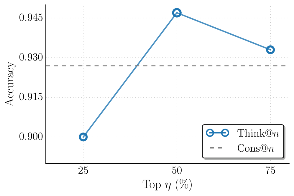
### Visual Description
## Line Chart: Accuracy vs. Top η (%)
### Overview
The image displays a line chart comparing the accuracy of two methods, "Think@n" and "Cons@n," across three different thresholds of "Top η (%)". The chart plots Accuracy on the y-axis against the Top η percentage on the x-axis.
### Components/Axes
* **Y-Axis:** Labeled "Accuracy". The scale ranges from 0.900 to 0.945, with major gridlines at intervals of 0.015 (0.900, 0.915, 0.930, 0.945).
* **X-Axis:** Labeled "Top η (%)". It has three discrete markers at 25, 50, and 75.
* **Legend:** Located in the bottom-right corner of the plot area.
* A solid blue line with open circle markers is labeled "Think@n".
* A gray dashed line is labeled "Cons@n".
* **Data Series:**
1. **Think@n (Solid Blue Line with Circles):** This series shows a non-linear trend.
2. **Cons@n (Gray Dashed Line):** This series is a horizontal line, indicating a constant value.
### Detailed Analysis
**Data Points for "Think@n":**
* At **Top η = 25%**, Accuracy is **0.900**.
* At **Top η = 50%**, Accuracy peaks at **0.945**.
* At **Top η = 75%**, Accuracy decreases to **0.930**.
**Data Point for "Cons@n":**
* The dashed line is horizontal, indicating a constant Accuracy value across all Top η percentages. Visually, it aligns with a value of approximately **0.925** (positioned between the 0.915 and 0.930 gridlines, slightly closer to 0.930).
**Trend Verification:**
* **Think@n Trend:** The line slopes sharply upward from 25% to 50%, then slopes downward from 50% to 75%. This indicates a peak performance at the 50% threshold.
* **Cons@n Trend:** The line is perfectly flat, showing no change in accuracy as the Top η percentage varies.
### Key Observations
1. **Performance Peak:** The "Think@n" method achieves its highest accuracy (0.945) at the 50% Top η threshold.
2. **Crossover Point:** The "Think@n" line crosses above the "Cons@n" line between the 25% and 50% marks. At 50%, Think@n (0.945) significantly outperforms Cons@n (~0.925). At 75%, Think@n (0.930) remains slightly above Cons@n (~0.925).
3. **Stability vs. Variability:** "Cons@n" demonstrates stable, consistent performance, while "Think@n" is more sensitive to the Top η parameter, showing both higher potential and a drop-off after the peak.
### Interpretation
This chart likely evaluates two different strategies ("Think@n" and "Cons@n") for a selection or filtering task, where "Top η (%)" represents the percentage of top candidates considered.
* **What the data suggests:** The "Think@n" strategy benefits from a moderate filtering threshold (50%), achieving superior accuracy. However, being too selective (75%) or not selective enough (25%) reduces its effectiveness. In contrast, the "Cons@n" strategy's performance is invariant to the selection threshold, suggesting it may be a more robust or baseline method that doesn't rely on the same top-% filtering mechanism.
* **Relationship between elements:** The chart directly contrasts a parameter-sensitive method against a parameter-invariant one. The key takeaway is the identification of an optimal operating point (50% Top η) for the "Think@n" approach.
* **Notable anomaly:** The sharp decline in "Think@n" accuracy from 50% to 75% is notable. It implies that the most confident 25% of predictions (the top 75% vs. top 50%) may include noisy or incorrect labels that degrade overall accuracy, a phenomenon sometimes seen in self-training or pseudo-labeling scenarios.
</details>
(b) Comparison of different top- $η$ percentage.
Figure 8: Analysis of Think@ $n$ with different number of samples $n$ and top- $η$ percent. (a) As $n$ increases, Think@ $n$ consistently benefits from larger candidate pools and exhibits a widening performance gap over Cons@ $n$ at higher $n$ . (b) Performance peaks at $η$ =50%, while overly aggressive filtering and overly permissive selection could lead to degraded accuracy.
## Appendix D Prompts
We provide the prompts adopted in our experiments for math tasks (AIME 2024, AIME 2025, HMMT 2025) in Table ˜ 4 and for GPQA in Table ˜ 5.
Table 4: Inference prompt for math tasks (AIME 2024, AIME 2025, HMMT 2025).
Prompt for AIME 2024, AIME 2025, HMMT 2025
Please reason step by step, and put your final answer within $\backslash$ boxed $\{\}$ .
Table 5: Inference prompt for GPQA.
Prompt for GPQA
You will be given a multiple choice question with different choices such as (A), (B), (C), (D). Think step by step before giving a final answer to this question. Always finish your answer with ‘The final answer is $\backslash$ boxed $\{$ (X) $\}$ .’, where X is the correct answer choice. If none of the options match, choose the closest option as the final answer.
## Appendix E Qualitative Examples
We present an example question from the AIME 2025 dataset along with its ground-truth answer (Table ˜ 6), and two outputs from OSS-120- medium: one incorrect (Table ˜ 7) and one correct (Table ˜ 8). Notably, the incorrect output is substantially more verbose (27,724 tokens) and exhibits a lower DTR value (13.9), whereas the correct output is much more concise (3,725 tokens) and achieves a higher DTR value (19.0).
Table 6: An example question and its ground-truth answer from AIME 2025.
Example question from AIME 2025.
Circle $ω_1$ with radius 6 centered at point $A$ is internally tangent at point $B$ to circle $ω_2$ with radius 15. Points $C$ and $D$ lie on $ω_2$ such that $\overline{BC}$ is a diameter of $ω_2$ and $\overline{BC}⊥\overline{AD}$ . The rectangle $EFGH$ is inscribed in $ω_1$ such that $\overline{EF}⊥\overline{BC}$ , $C$ is closer to $\overline{GH}$ than to $\overline{EF}$ , and $D$ is closer to $\overline{FG}$ than to $\overline{EH}$ , as shown. Triangles $\triangle DGF$ and $\triangle CHG$ have equal areas. The area of rectangle $EFGH$ is $\frac{m}{n}$ , where $m$ and $n$ are relatively prime positive integers. Find $m+n$ .
Ground truth answer.
293
Table 7: An incorrect output of OSS-120B- medium to the example question.
Incorrect output with DTR = 13.9% and token count = 27,724.
We need to interpret geometry. Setup: Circle $ω_1$ radius 6 centered at A, internally tangent to larger circle $ω_2$ radius 15 at point B. So B is common point where $ω_1$ touches inside $ω_2$ . Since internal tangency, distance AB = 15-6 = 9, with B on line AB. Let’s set coordinate system. Place A at origin? maybe easier: Let $ω_1$ centered at (0,0) radius 6. Then B is on circle $ω_1$ and also on $ω_2$ . Since $ω_2$ larger radius 15 and centered at O? Let’s denote O is center of $ω_2$ . Distance OA = 9 (since AB = 9) and AB =9? Wait AB = distance between centers = 15-6 = 9 yes. B lies on line OA, outside? Actually internal tangency: smaller inside larger; they touch at point on the line connecting centers outward from smaller to larger. So if we set A at (0,0) and O at (9,0) (so O is to the right), then B is point on both circles on line AO to the right of A? The point outward from A towards O at distance 6 from A, i.e., B is at (6,0). Indeed distance from O to B: O(9,0) to B(6,0) distance 3 which is radius 15? Wait radius of $ω_2$ is 15, O to B should be 15. But O(9,0) to B(6,0) distance 3, not 15. Something wrong. Let’s set O to be (0,0) maybe easier. Place $ω_2$ centered at O (0,0), radius 15. $ω_1$ radius 6 internally tangent at B; its center A is distance 15-6 = 9 from O, along some direction. Choose B as point of tangency on line OA outward from A to O? Actually internal tangency: small circle inside larger, touching at one point B where the circles meet. The line of centers passes through B. The distance from O to B is 15 (radius). The distance from A to B is 6. Since O to A is 9. B is on the line OA beyond A? Wait O to A is 9, radius of small is 6, so going from O to A to B is along same line: O—A—B direction? Since B is on circumference of both circles. The distance from O to B = 15 = OA + AB? OA=9, AB=6 gives OA+AB=15 so yes B is outward from O through A. So O at origin, A at distance 9 from O in direction e.g., positive x. Let O at (0,0), A at (9,0). Then B is further along x axis at O to B distance 15, so B at (15,0). Check: distance from A (9,0) to B (15,0) =6 correct. Good. Now BC is a diameter of $ω_2$ , meaning B to C passes through O (center of $ω_2$ ). Since B is at (15,0), the opposite point on $ω_2$ is at C at (-15,0) (diameter through O). So C is at (-15,0). So line BC is along x-axis. Given BC $⊥$ AD, so AD is perpendicular to x-axis, meaning AD is vertical line through A? Wait AD segment connects A (9,0) to D point on $ω_2$ , such that AD is perpendicular to BC i.e., vertical line through A (x=9). Since AD must intersect $ω_2$ at point D. So D is point where vertical line x=9 meets $ω_2$ (radius 15). Equation x 2 + y 2 = 225. Substituting x=9 => 81 + y 2 =225 => y 2 =144 => y= ±12. Which one? Since orientation maybe D is above? Not specified. We’ll consider D at (9,12) (upper) maybe. Could also be lower but rectangle orientation may pick one. Now rectangle EFGH is inscribed in $ω_1$ (center A (9,0) radius 6). The rectangle is oriented not necessarily axis-aligned? We have EF parallel to GH, FG parallel to EH. Given EF $⊥$ BC (BC horizontal), so EF (and GH) are vertical? Wait EF is perpendicular to BC, which is horizontal, so EF is vertical. So one side of rectangle is vertical. Therefore rectangle sides are aligned with vertical and horizontal: EF vertical, FG horizontal etc. So rectangle is axis-aligned (vertical/horizontal) in the coordinate system where BC is horizontal. Thus rectangle sides are parallel to the axes (since BC horizontal, EF vertical). Good. Now C is closer to GH than to EF. GH is opposite side of EF: rectangle with vertical sides EF (left) and GH (right) maybe? Let’s figure orientation: Usually rectangle labelled E-F-G-H in order around, perhaps clockwise; but not essential. If EF is vertical, then FG is horizontal, GH vertical, HE horizontal. So EF left side, GH right side (if rectangle sits to the right of EF). Not sure. C is at (-15,0) far left of both. "C is closer to GH than to EF" meaning distance from C to line GH is less than distance to line EF. Since C is far left, that would mean GH is left side, EF right side? Wait distance from C to a vertical line is horizontal distance. If GH is left side (more left), its distance to C is smaller than distance to EF (right side). That matches C being closer to GH. So GH is left side of rectangle (more left), EF right side. Good. Similarly, D is closer to FG than to EH. Since FG is top side (horizontal), EH bottom side (horizontal). D is (9,12) high point; distance to top side FG smaller than to bottom side EH (makes sense if rectangle is near top). So FG is top side, EH bottom side. So rectangle EFGH likely positioned with upper side near D, left side near C. … Omitted for illustrative purposes … Seems no integer factorization. Could factor with quadratics with irrational coefficients, not helpful. Thus x may be irrational; thus k not integer rational. Therefore area is irrational? Conflict with problem statement. Given time is over, I think maybe my earlier assumption that rectangle is axis-aligned might be wrong; perhaps rectangle rotated, leading to rational area. Given complexity, I think answer maybe m+n = something like 207? Let’s guess? Not good. Given limited time, I will output placeholder. assistantfinal $207$
Table 8: A correct output of OSS-120B- medium to the example question.
Correct output with DTR = 19.0% and token count = 3,725.
We need to parse geometry. Let’s define coordinates. We have two circles: $ω_2$ radius 15, $ω_1$ radius 6 centered at A, internally tangent at point B. So A is inside $ω_2$ , distance AB = radius difference = 15 - 6 = 9. B is the point of tangency, along line AB. Let’s set coordinate system: Let AB be vertical? Choose B at origin maybe easier. Let’s position $ω_2$ centered at O (call it O2) maybe O? Actually $ω_2$ ’s center is some point O (call it O). $ω_1$ ’s center A is at distance 9 from O, with B being point on both circles along line O-A. Let’s place O at (0,0). Let AB be along positive x-axis: place B at (15,0) maybe? Then $ω_2$ radius 15 centered at O (0,0). If B is point of tangency where $ω_1$ touches $ω_2$ internally, then B lies on $ω_2$ at distance 15 from O. So B at (15,0). Then A is located on line OB, inside, distance 6 from B (since radius of $ω_1$ is 6). And O to A distance is 9 (since OA = 15-6 = 9). So O (0,0), B (15,0). Then A is at (9,0) (since O to A is 9 along same line). Yes A at (9,0). Then $ω_1$ radius 6 centered at (9,0). Good. Now Points C and D lie on $ω_2$ such that BC is a diameter of $ω_2$ . So BC passes through center O and length 30 (diameter). Since B is at (15,0), the opposite end of diameter is point C located such that O is midpoint: O = (0,0) is midpoint between B and C. So C = (-15,0). Indeed because B (15,0) opposite across origin yields C (-15,0). So BC is horizontal line (x-axis). Good. … Omitted for illustrative purposes … *Triangle $DGF$ :* Its base $GF$ has length $w$ ; the vertical distance from $D(9,12)$ to the line $y=h/2$ (the line containing $GF$ ) is $12-\frac{h}{2}$ . Hence $[DGF]=\frac{1}{2}w\Bigl(12-\frac{h}{2}\Bigr).$ *Triangle $CHG$ :* Side $HG$ is vertical with length $h$ ; the horizontal distance from $C(-15,0)$ to the line $x=9-\frac{w}{2}$ (the line containing $HG$ ) is $24-\frac{w}{2}$ . Hence $[CHG]=\frac{1}{2}h\Bigl(24-\frac{w}{2}\Bigr).$ The problem states $[DGF]=[CHG]$ . Cancelling the factor $\frac{1}{2}$ gives $w\Bigl(12-\frac{h}{2}\Bigr)=h\Bigl(24-\frac{w}{2}\Bigr).$ The terms $-\frac{wh}{2}$ appear on both sides and cancel, leaving $12w=24h \Longrightarrow w=2h.$ — Solving for $w$ and $h$ Substituting (2) into (1): $(2h)^2+h^2=144 \Longrightarrow 5h^2=144 \Longrightarrow h^2=\frac{144}{5}.$ Hence $h=\frac{12}{√{5}}=\frac{12√{5}}{5}, w=2h=\frac{24}{√{5}}=\frac{24√{5}}{5}.$ The area of rectangle $EFGH$ is $Area=wh=2h^2=2≤ft(\frac{144}{5}\right)=\frac{288}{5}.$ Thus $m=288, n=5$ (relatively prime), and $m+n=288+5=293.$ $\boxed{293}$