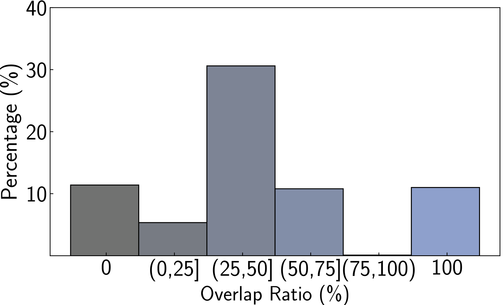
## Bar Chart: Percentage Distribution of Overlap Ratio
### Overview
This image is a bar chart displaying the percentage distribution of an "Overlap Ratio (%)" across different ranges. The chart has a vertical axis representing "Percentage (%)" and a horizontal axis representing the "Overlap Ratio (%)".
### Components/Axes
* **Vertical Axis (Y-axis):**
* **Title:** "Percentage (%)"
* **Scale:** Ranges from 0 to 40, with major tick marks at 0, 10, 20, 30, and 40. Minor tick marks are present between the major ones, indicating increments of 5.
* **Horizontal Axis (X-axis):**
* **Title:** "Overlap Ratio (%)"
* **Categories:** The axis is divided into bins representing ranges of the overlap ratio. These are:
* `0`
* `(0, 25]` (Overlap ratio from greater than 0% to 25%)
* `(25, 50]` (Overlap ratio from greater than 25% to 50%)
* `(50, 75]` (Overlap ratio from greater than 50% to 75%)
* `100`
### Detailed Analysis
The chart displays five distinct bars, each representing a category on the horizontal axis and its corresponding percentage on the vertical axis.
1. **Bar 1 (Dark Grey):**
* **Category:** `0`
* **Value:** Approximately 11.5% (with an uncertainty of +/- 0.5%).
2. **Bar 2 (Medium Grey):**
* **Category:** `(0, 25]`
* **Value:** Approximately 5% (with an uncertainty of +/- 0.5%).
3. **Bar 3 (Blue-Grey):**
* **Category:** `(25, 50]`
* **Value:** Approximately 30.5% (with an uncertainty of +/- 0.5%). This is the tallest bar in the chart.
4. **Bar 4 (Light Blue-Grey):**
* **Category:** `(50, 75]`
* **Value:** Approximately 10.5% (with an uncertainty of +/- 0.5%).
5. **Bar 5 (Light Blue):**
* **Category:** `100`
* **Value:** Approximately 11% (with an uncertainty of +/- 0.5%).
**Note on X-axis Categories:** The categories `0` and `100` are presented as single points, but visually they correspond to bars. It's possible these represent specific values or bins that are not explicitly defined as ranges like the others. The bin `(0, 25]` implies that values greater than 0 and up to and including 25 are grouped. Similarly for `(25, 50]` and `(50, 75]`. The category `(75, 100]` appears to be missing a bar.
### Key Observations
* The most significant percentage of the "Overlap Ratio" falls within the `(25, 50]` range, accounting for approximately 30.5%.
* The categories `0`, `(50, 75]`, and `100` have relatively similar percentage distributions, ranging from approximately 10.5% to 11.5%.
* The category `(0, 25]` has the second lowest percentage, at approximately 5%.
* There is a noticeable gap in the data presentation, as there is no bar corresponding to the `(75, 100]` range.
### Interpretation
This bar chart visually represents the distribution of data points based on their overlap ratio. The dominant presence of data in the `(25, 50]` range suggests that this is the most common or significant overlap ratio observed in the dataset. The relatively uniform distribution across the `0`, `(50, 75]`, and `100` categories indicates a secondary tier of common overlap ratios. The low percentage in the `(0, 25]` range suggests that very low overlap ratios are less frequent.
The absence of a bar for the `(75, 100]` range is a notable anomaly. This could imply that no data points fell within this specific overlap ratio range, or it could be an omission in the chart's presentation. Further investigation would be needed to confirm the reason for this missing category.
In essence, the data demonstrates a unimodal distribution with a peak in the mid-range overlap ratios, suggesting a tendency for moderate overlap rather than very low or very high overlap, with the exception of the `100` category which is similar to the `0` and `(50, 75]` ranges.