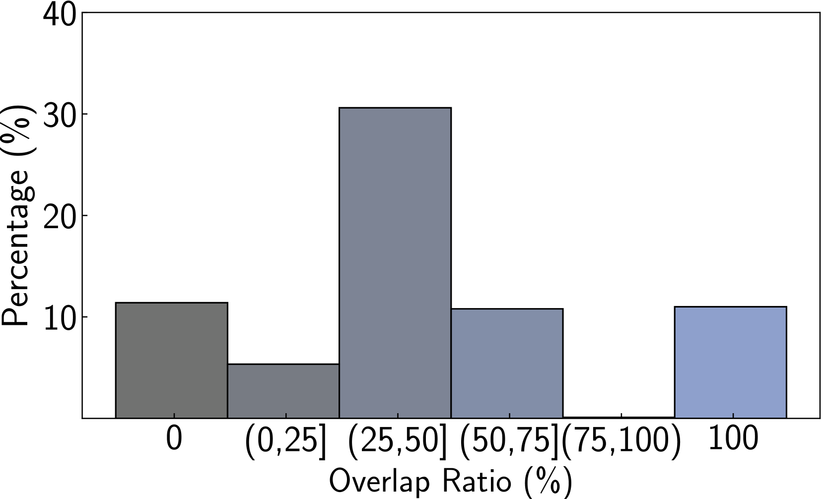
## Bar Chart: Distribution of Overlap Ratios
### Overview
The image displays a bar chart illustrating the percentage distribution of data across six distinct categories of "Overlap Ratio (%)". The chart uses a single data series represented by bars of varying heights, with a color gradient from dark gray to light blue moving from left to right along the x-axis.
### Components/Axes
* **Chart Type:** Vertical Bar Chart (Histogram-like).
* **Y-Axis:**
* **Label:** "Percentage (%)"
* **Scale:** Linear scale from 0 to 40.
* **Tick Marks:** Major ticks at 0, 10, 20, 30, and 40.
* **X-Axis:**
* **Label:** "Overlap Ratio (%)"
* **Categories (Bins):** Six discrete categories are labeled:
1. `0`
2. `(0,25]` (Greater than 0% and less than or equal to 25%)
3. `(25,50]` (Greater than 25% and less than or equal to 50%)
4. `(50,75]` (Greater than 50% and less than or equal to 75%)
5. `(75,100)` (Greater than 75% and less than 100%)
6. `100`
* **Legend:** Not present. The chart contains a single data series.
* **Spatial Layout:** The plot area is framed by a black border. The y-axis label is positioned vertically to the left of the axis. The x-axis label is centered below the category labels. The bars are centered above their respective category labels.
### Detailed Analysis
The following table reconstructs the approximate data presented in the chart. Values are estimated based on the bar heights relative to the y-axis scale.
| Overlap Ratio Category | Approximate Percentage (%) | Visual Trend & Bar Color |
| :--- | :--- | :--- |
| **0** | ~11% | Dark gray bar. |
| **(0,25]** | ~5% | Medium-dark gray bar. The shortest bar in the chart. |
| **(25,50]** | ~31% | Medium gray-blue bar. The tallest bar, representing the mode of the distribution. |
| **(50,75]** | ~11% | Medium-light blue-gray bar. Similar in height to the "0" and "100" bars. |
| **(75,100)** | 0% | No visible bar. This category has a percentage of zero. |
| **100** | ~11% | Light blue bar. Similar in height to the "0" and "(50,75]" bars. |
**Trend Verification:** The distribution is not uniform. It peaks sharply in the `(25,50]%` range, drops significantly for `(0,25]%`, and shows moderate, equal representation at the extremes (`0%` and `100%`) and the `(50,75]%` range. There is a complete absence of data in the `(75,100)%` range.
### Key Observations
1. **Dominant Category:** The `(25,50]%` overlap ratio category contains the highest percentage of the data, at approximately 31%.
2. **Bimodal Extremes:** There is a notable presence of data points at both complete non-overlap (`0%`) and complete overlap (`100%`), each comprising about 11% of the total.
3. **Data Gap:** The `(75,100)%` category is empty, indicating no instances in the dataset had an overlap ratio in this specific high-but-not-complete range.
4. **Symmetry:** The percentages for `0%`, `(50,75]%`, and `100%` are visually very similar (~11%), creating a rough symmetry around the central peak.
### Interpretation
This chart visualizes the frequency distribution of a metric called "Overlap Ratio." The data suggests a non-normal, potentially bimodal or multi-modal distribution.
* **Central Tendency:** The most common scenario involves a moderate overlap, between 25% and 50%.
* **Polarization:** A significant portion of the data (over 20% combined) exists at the absolute extremes—either no overlap or perfect overlap. This could indicate two distinct subgroups or conditions within the dataset.
* **The "Missing Middle-High":** The complete lack of data in the `(75,100)%` range is the most striking anomaly. This gap suggests a potential threshold effect or a categorical distinction in the underlying process being measured. For example, once overlap exceeds 75%, it may rapidly tend toward 100%, or the measurement method may not capture values in this range.
* **Implication:** The distribution implies that the phenomenon generating this "Overlap Ratio" does not produce a smooth continuum of values. Instead, outcomes cluster around moderate overlap, with significant chances of no or total overlap, and an avoidance of the near-total overlap zone. This pattern would be critical for understanding system behavior, model performance, or biological/physical interactions, depending on the context of the data.