## Line Chart: Dual Distribution Comparison
### Overview
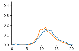
The image displays a 2D line chart comparing two data series (blue and orange lines) plotted against a common x-axis. The chart lacks a title, axis labels, and a legend, presenting only the plotted data and numerical axis markers. The visual suggests a comparison of two similar, unimodal distributions.
### Components/Axes
* **X-Axis:** Horizontal axis with numerical markers at intervals of 5, labeled: `0`, `5`, `10`, `15`, `20`. The axis line extends slightly beyond the final marker.
* **Y-Axis:** Vertical axis with numerical markers at intervals of 0.1, labeled: `0.0`, `0.1`, `0.2`, `0.3`, `0.4`.
* **Data Series:**
* **Blue Line:** A continuous line representing one data series.
* **Orange Line:** A continuous line representing a second data series.
* **Legend:** **Not present.** The identity of the blue and orange lines is not specified within the image.
### Detailed Analysis
**Spatial Grounding & Trend Verification:**
* **Blue Line Trend:** The line begins near y=0 at x=0. It shows a very slight, broad elevation between x=1 and x=4, then begins a steady ascent. It reaches a broad, slightly jagged peak plateau between approximately x=12 and x=14, with a maximum value near y=0.16. After x=14, it descends steadily, approaching y=0 near x=20.
* **Orange Line Trend:** The line also begins near y=0 at x=0. It remains flat until approximately x=5, then ascends more steeply than the blue line. It reaches a sharper, more defined peak at approximately x=11, with a maximum value near y=0.18. After its peak, it descends, crossing below the blue line around x=13-14, and continues descending to approach y=0 near x=20.
**Approximate Data Points (Estimated from visual inspection):**
| X-Value (Approx.) | Blue Line Y-Value (Approx.) | Orange Line Y-Value (Approx.) | Relative Position |
| :--- | :--- | :--- | :--- |
| 0 | ~0.00 | ~0.00 | Lines converge |
| 2 | ~0.02 | ~0.00 | Blue slightly above |
| 5 | ~0.01 | ~0.01 | Lines converge |
| 8 | ~0.06 | ~0.08 | Orange above |
| 10 | ~0.12 | ~0.16 | Orange above |
| **11** | **~0.14** | **~0.18 (Peak)** | **Orange at peak, above blue** |
| **13** | **~0.16 (Peak)** | **~0.14** | **Blue at peak, above orange** |
| 15 | ~0.12 | ~0.10 | Blue above |
| 18 | ~0.04 | ~0.03 | Blue slightly above |
| 20 | ~0.00 | ~0.00 | Lines converge |
### Key Observations
1. **Missing Metadata:** The most significant observation is the complete absence of contextual information: no chart title, no axis labels (e.g., "Time," "Probability," "Frequency"), and no legend to identify the blue and orange series.
2. **Similar Distribution Shape:** Both lines depict unimodal (single-peaked) distributions that are right-skewed (the tail extends further to the right).
3. **Peak Discrepancy:** The orange line peaks earlier (x≈11) and at a higher value (y≈0.18) than the blue line (x≈13, y≈0.16).
4. **Crossover Points:** The lines intersect at least three times: near x=0, x=5, and between x=13-14. The orange line is dominant (higher y-value) during the main ascent and peak phase (x=6 to x=13), while the blue line is dominant during the later descent phase (x>14).
5. **Low-Value Region:** Both series show minimal activity (y≈0) for x<5 and x>18.
### Interpretation
The chart presents a comparative analysis of two related phenomena, likely representing probability distributions, signal intensities, or frequency counts over a common domain (the x-axis). The data suggests that the process represented by the **orange line** reacts or accumulates more quickly, reaching a higher maximum intensity earlier in the domain. The process represented by the **blue line** has a more delayed and slightly subdued peak but maintains its intensity for a longer duration, as evidenced by its higher values in the later phase (x>14).
**Peircean Investigative Reading:** The absence of labels forces an investigation based purely on relational patterns. The crossing lines imply a dynamic relationship where the leading indicator (orange) peaks and fades, while a lagging indicator (blue) follows a similar but temporally shifted and dampened pattern. This could model scenarios like:
* The spread of two related news stories or memes.
* The activation levels of two different neural populations in response to a stimulus.
* The concentration of two chemical reactants in a time-based experiment.
The critical missing piece is the semantic frame of reference (the axis labels and legend), which is necessary to move from abstract pattern recognition to concrete scientific or technical understanding. The image provides robust data on the *relationship* between the two series but withholds the context needed to interpret their *meaning*.