\n
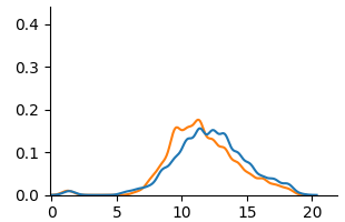
## Line Chart: Distribution Comparison
### Overview
The image presents a line chart comparing two distributions. The x-axis ranges from 0 to 20, and the y-axis ranges from 0 to 0.4. Two lines, one blue and one orange, depict the distributions. There are no explicit labels for the lines or axes.
### Components/Axes
* **X-axis:** Ranges from 0 to 20, with tick marks at integer values.
* **Y-axis:** Ranges from 0 to 0.4, with tick marks at 0.1 intervals.
* **Line 1:** Blue line.
* **Line 2:** Orange line.
* **Legend:** No legend is present.
### Detailed Analysis
**Line 1 (Blue):**
The blue line starts at approximately y=0 at x=0. It gradually increases, reaching a peak around x=11, where y is approximately 0.18. After the peak, the line decreases, approaching y=0 again around x=20.
**Line 2 (Orange):**
The orange line also starts at approximately y=0 at x=0. It increases more rapidly than the blue line, reaching a peak around x=12, where y is approximately 0.21. The line then decreases, approaching y=0 around x=20.
**Approximate Data Points (estimated from the visual):**
| X | Blue Line (Y) | Orange Line (Y) |
| --- | ------------- | --------------- |
| 0 | 0.0 | 0.0 |
| 5 | 0.03 | 0.08 |
| 10 | 0.15 | 0.19 |
| 11 | 0.18 | 0.21 |
| 12 | 0.16 | 0.18 |
| 15 | 0.08 | 0.07 |
| 20 | 0.0 | 0.0 |
### Key Observations
* Both distributions are unimodal, with a single peak.
* The orange line has a slightly higher peak than the blue line.
* The orange line rises more quickly than the blue line.
* Both lines converge towards zero at both ends of the x-axis.
### Interpretation
The chart likely represents the distributions of two different datasets. The similarity in shape suggests that the datasets share some underlying characteristics, but the differences in peak height and rate of increase indicate variations in their distributions. Without labels, it's impossible to determine what these datasets represent. The distributions could represent frequencies of events, probabilities, or other continuous variables. The slight shift in the peak positions (11 for blue, 12 for orange) suggests a subtle difference in the central tendency of the two datasets. The lack of a legend and axis labels limits the ability to draw definitive conclusions.