## Line Graph: Growth Trends of C(t) and D(t) Over Time
### Overview
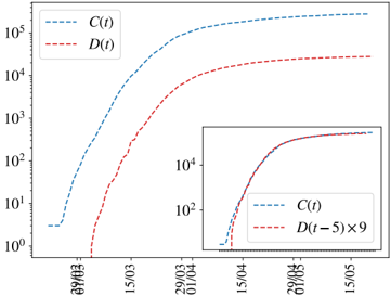
The image displays a logarithmic-scale line graph comparing two time-dependent variables, **C(t)** (blue dashed line) and **D(t)** (red dashed line), over a date range from **29/03** to **15/05**. A secondary inset graph in the bottom-right corner compares **C(t)** with **D(t-5) × 9**, focusing on a narrower date range (**15/04** to **15/05**). Both axes use logarithmic scaling (y-axis: 10⁰ to 10⁵; x-axis: dates).
---
### Components/Axes
- **X-axis (Horizontal)**: Dates labeled as **29/03**, **15/03**, **29/04**, **15/04**, **29/05**, **15/05**.
- **Y-axis (Vertical)**: Logarithmic scale from **10⁰** to **10⁵**, with ticks at **10¹**, **10²**, **10³**, **10⁴**, **10⁵**.
- **Legend**:
- Top-left corner:
- **C(t)**: Blue dashed line.
- **D(t)**: Red dashed line.
- **Inset Graph**:
- Bottom-right corner:
- **C(t)**: Blue dashed line.
- **D(t-5) × 9**: Red dashed line.
---
### Detailed Analysis
#### Main Graph Trends
1. **C(t) (Blue Dashed Line)**:
- Starts near **10¹** on **29/03**.
- Rises steadily, reaching **~10⁵** by **15/05**.
- Growth appears exponential, with a consistent upward slope.
2. **D(t) (Red Dashed Line)**:
- Begins near **10⁰** on **29/03**.
- Accelerates sharply after **15/03**, surpassing **10³** by **29/04**.
- Plateaus near **10⁴** by **15/05**, remaining below **C(t)** throughout.
#### Inset Graph Trends
- **C(t) (Blue Dashed Line)**:
- Starts near **10¹** on **15/04**.
- Reaches **~10⁴** by **15/05**, mirroring the main graph’s trend.
- **D(t-5) × 9 (Red Dashed Line)**:
- Begins near **10⁰** on **15/04**.
- Accelerates to **~10⁴** by **15/05**, closely matching **C(t)**.
- The scaling factor **×9** suggests normalization to align with **C(t)**’s growth trajectory.
---
### Key Observations
1. **Growth Disparity**:
- **C(t)** grows exponentially faster than **D(t)** in the main graph.
- **D(t)** lags significantly behind **C(t)** until the final date (**15/05**).
2. **Inset Normalization**:
- Scaling **D(t-5)** by **×9** in the inset compresses its growth to align with **C(t)** by **15/05**.
- This implies **D(t)** may represent a delayed or scaled version of **C(t)**.
3. **Date-Specific Values**:
- **C(t)**:
- **29/03**: ~10¹
- **15/03**: ~10²
- **29/04**: ~10³.5
- **15/05**: ~10⁵
- **D(t)**:
- **29/03**: ~10⁰
- **15/03**: ~10¹
- **29/04**: ~10³
- **15/05**: ~10⁴
---
### Interpretation
- **Relationship Between C(t) and D(t)**:
The inset graph suggests **D(t)** is a delayed and scaled version of **C(t)**. The **×9** factor and **5-day lag** (D(t-5)) indicate that **D(t)** may represent a cumulative or lagged effect of **C(t)**, such as a delayed response in a dynamic system.
- **Exponential Growth**:
Both variables exhibit exponential growth, but **C(t)** dominates, implying it could represent a primary driver (e.g., infection rate) while **D(t)** reflects a secondary metric (e.g., recovery rate) with inherent delays.
- **Anomalies**:
- **D(t)**’s sharp acceleration after **15/03** may indicate an external intervention or phase change.
- The **×9** scaling in the inset highlights the need for normalization to compare trends directly.
- **Practical Implications**:
If **C(t)** and **D(t)** represent real-world metrics (e.g., disease spread and mitigation efforts), the data suggests mitigation efforts (**D(t)**) lag behind the primary trend (**C(t)**) but eventually converge when scaled appropriately.
---
### Final Notes
- All legend labels and line colors are consistent.
- Logarithmic scaling emphasizes relative growth rates over absolute values.
- The inset graph is critical for understanding the relationship between **C(t)** and **D(t)**.