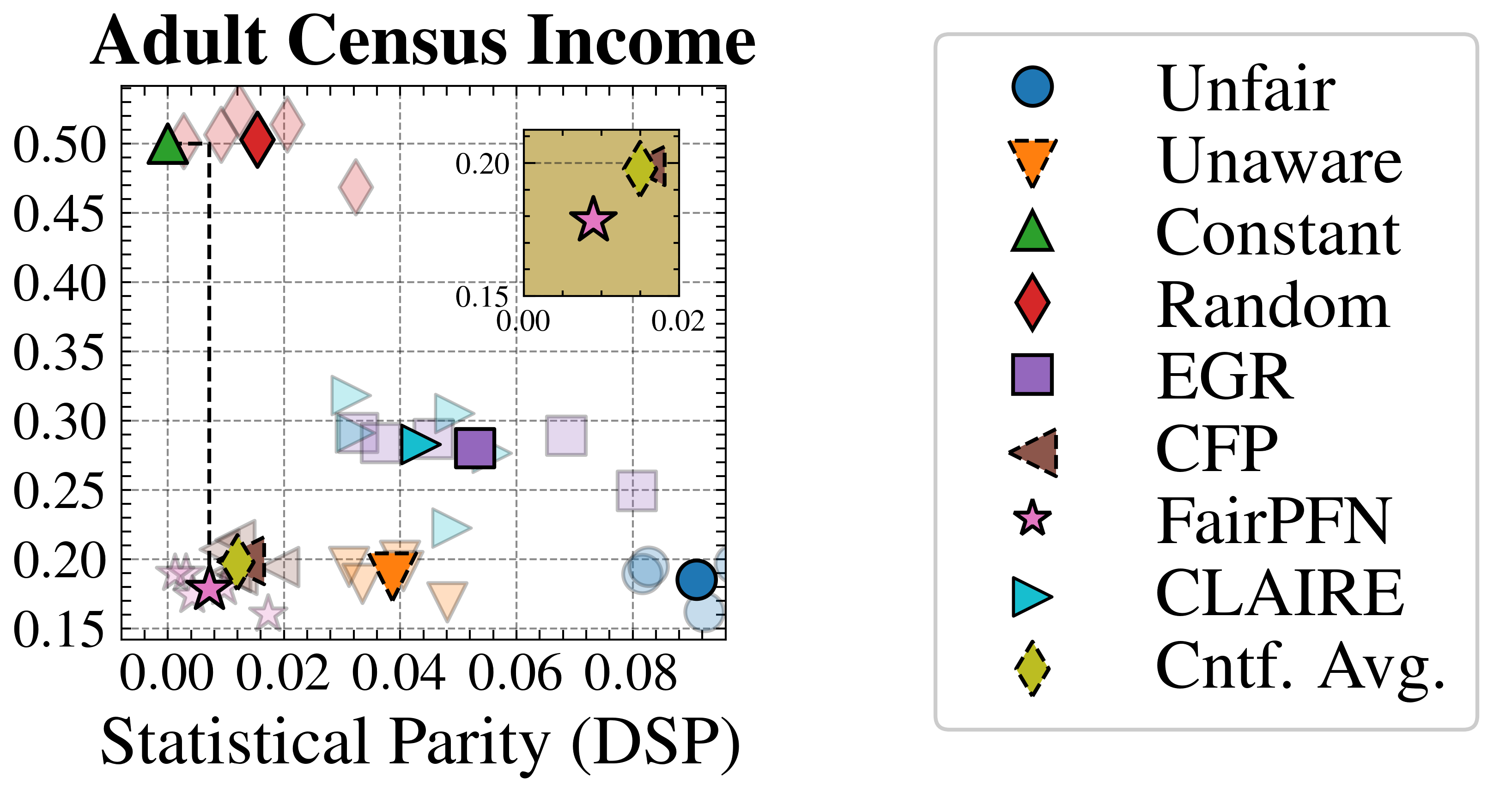
## Scatter Plot: Adult Census Income
### Overview
The image is a scatter plot titled "Adult Census Income". It visualizes the relationship between two variables, likely representing performance metrics of different algorithms or models related to fairness and accuracy in predicting adult census income. The plot includes several data points, each representing a different algorithm, and a legend that identifies each algorithm by shape and color. There is also a smaller inset plot showing a zoomed-in view of the bottom-left corner.
### Components/Axes
* **Title:** Adult Census Income
* **X-axis:** Statistical Parity (DSP). The scale ranges from 0.00 to 0.08, with gridlines at intervals of 0.01.
* **Y-axis:** The scale ranges from 0.15 to 0.50, with gridlines at intervals of 0.05.
* **Legend:** Located on the right side of the plot, the legend maps shapes and colors to algorithm names:
* Blue Circle: Unfair
* Orange Downward Triangle (dashed outline): Unaware
* Green Upward Triangle: Constant
* Red Diamond: Random
* Purple Square: EGR
* Brown Downward Triangle (dashed outline): CFP
* Pink Star: FairPFN
* Teal Sideways Triangle: CLAIRE
* Yellow-Green Diamond (dashed outline): Cntf. Avg.
* **Inset Plot:** Located in the top-right corner of the main plot, showing a zoomed-in view of the region near the origin. The x-axis of the inset plot ranges from 0.00 to 0.02, and the y-axis ranges from 0.15 to 0.20.
### Detailed Analysis or ### Content Details
* **Unfair (Blue Circle):** Located at approximately (0.08, 0.19).
* **Unaware (Orange Downward Triangle):** Located at approximately (0.04, 0.19).
* **Constant (Green Upward Triangle):** Located at approximately (0.00, 0.50).
* **Random (Red Diamond):** Located at approximately (0.01, 0.50).
* **EGR (Purple Square):** Located at approximately (0.05, 0.28).
* **CFP (Brown Downward Triangle):** Located at approximately (0.01, 0.20).
* **FairPFN (Pink Star):** Located at approximately (0.01, 0.17).
* **CLAIRE (Teal Sideways Triangle):** Located at approximately (0.04, 0.29).
* **Cntf. Avg. (Yellow-Green Diamond):** Located at approximately (0.01, 0.20).
A dashed vertical line is present at x = 0.00.
### Key Observations
* The 'Unfair' algorithm has the highest Statistical Parity (DSP) value among the algorithms plotted.
* The 'Constant' and 'Random' algorithms have the highest y-axis values.
* The inset plot provides a closer view of the algorithms clustered near the origin, making it easier to distinguish their positions.
### Interpretation
The scatter plot visualizes the trade-offs between Statistical Parity (DSP) and another performance metric (likely accuracy or income prediction performance) for different algorithms. Algorithms like 'Constant' and 'Random' have high y-axis values but low Statistical Parity, suggesting they might prioritize accuracy over fairness. Conversely, 'Unfair' has a high Statistical Parity but a lower y-axis value, indicating a potential trade-off. The 'FairPFN' algorithm is clustered near the origin, suggesting it might be optimized for both fairness and accuracy, but at a potentially lower overall performance level. The plot helps in comparing the performance of different algorithms and understanding their strengths and weaknesses in the context of fairness and accuracy in income prediction.