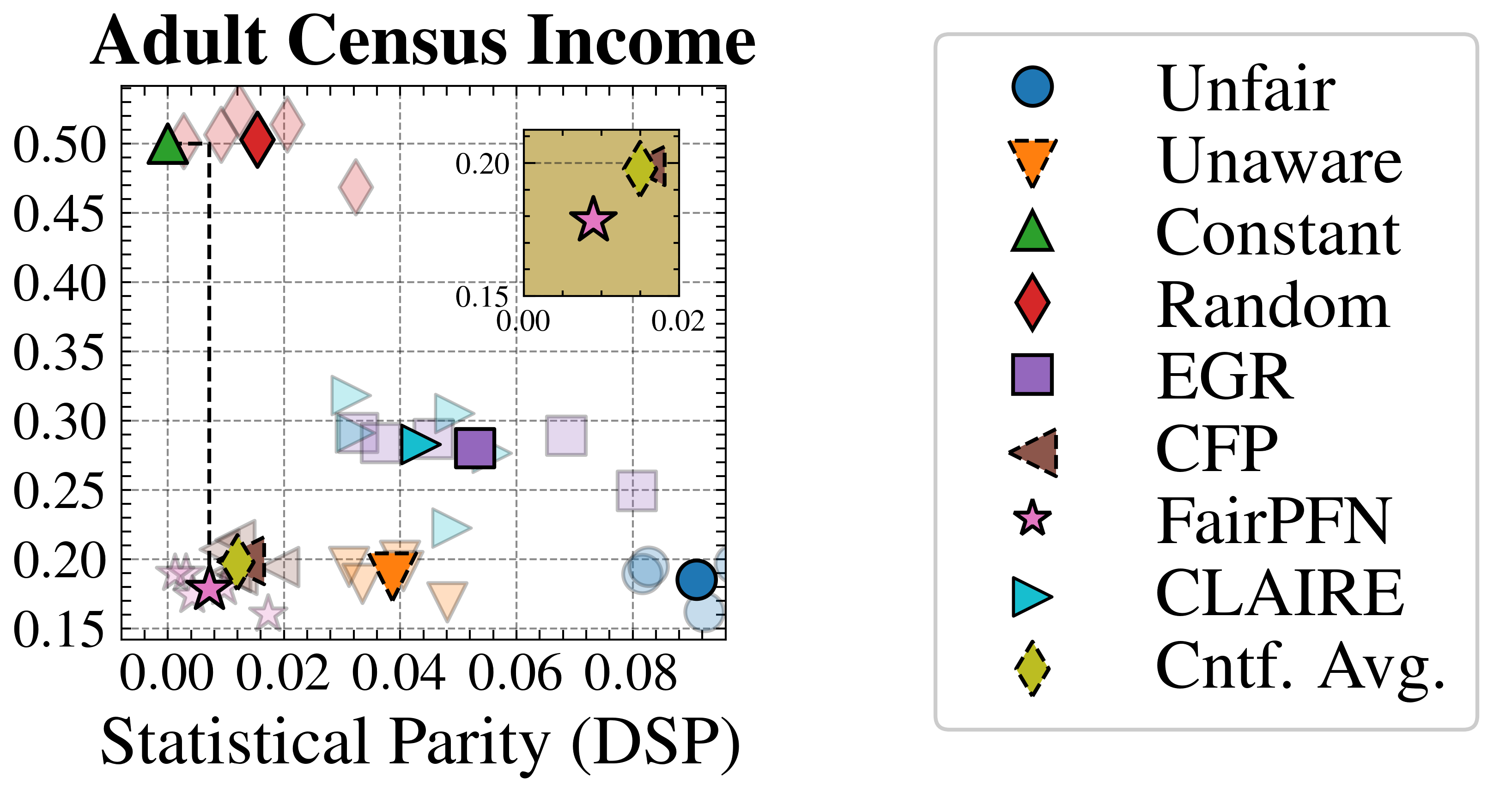
## Scatter Plot: Adult Census Income
### Overview
This image presents a scatter plot visualizing the relationship between Statistical Parity (DSP) and an unnamed y-axis metric, likely representing some measure of fairness or accuracy related to income prediction. The plot compares several different algorithms or methods (Unfair, Unaware, Constant, Random, EGR, CFP, FairPFN, CLAIRE, and Cntf. Avg.) based on their performance on these two metrics. A zoomed-in inset plot highlights a specific region of the main plot.
### Components/Axes
* **Title:** "Adult Census Income" (top-center)
* **X-axis:** "Statistical Parity (DSP)" - ranging from approximately 0.00 to 0.08, with tick marks at 0.00, 0.02, 0.04, 0.06, and 0.08.
* **Y-axis:** Unlabeled, ranging from approximately 0.15 to 0.50, with tick marks at 0.15, 0.20, 0.25, 0.30, 0.35, 0.40, 0.45, and 0.50.
* **Legend:** Located in the top-right corner, listing the algorithms/methods and their corresponding marker shapes and colors:
* Blue Circle: Unfair
* Orange Inverted Triangle: Unaware
* Green Triangle: Constant
* Red Diamond: Random
* Purple Square: EGR
* Gray Triangle: CFP
* Black Star: FairPFN
* Blue Diamond: CLAIRE
* Yellow Diamond: Cntf. Avg.
* **Inset Plot:** A zoomed-in section of the main plot, located in the top-right corner, with axes ranging from 0.00 to 0.02 on the x-axis and 0.15 to 0.20 on the y-axis.
### Detailed Analysis
The main plot displays data points for each algorithm/method. Here's a breakdown of the approximate coordinates for each, based on visual estimation and cross-referencing with the legend:
* **Unfair (Blue Circle):** (0.00, 0.18), (0.08, 0.22)
* **Unaware (Orange Inverted Triangle):** (0.04, 0.22), (0.06, 0.28)
* **Constant (Green Triangle):** (0.00, 0.48), (0.04, 0.32)
* **Random (Red Diamond):** (0.04, 0.48), (0.06, 0.28)
* **EGR (Purple Square):** (0.04, 0.28), (0.06, 0.26)
* **CFP (Gray Triangle):** (0.06, 0.24), (0.08, 0.26)
* **FairPFN (Black Star):** (0.00, 0.16), (0.02, 0.18) - prominent in the inset plot.
* **CLAIRE (Blue Diamond):** (0.04, 0.26), (0.08, 0.20)
* **Cntf. Avg. (Yellow Diamond):** (0.04, 0.30), (0.08, 0.24)
**Trends:**
* The "Unfair" data points show a slight positive trend, increasing with DSP.
* "Unaware" shows a slight positive trend.
* "Constant" shows a decreasing trend.
* "Random" shows a decreasing trend.
* "EGR" appears relatively stable.
* "CFP" appears relatively stable.
* "FairPFN" appears to cluster in the lower-left corner of the main plot and is highlighted in the inset.
* "CLAIRE" shows a slight negative trend.
* "Cntf. Avg." shows a slight negative trend.
### Key Observations
* The "FairPFN" algorithm consistently exhibits low values for both Statistical Parity (DSP) and the y-axis metric, as seen in the inset plot.
* The "Constant" algorithm has the highest y-axis values, suggesting it may prioritize a different fairness criterion.
* There is a wide spread of values across the different algorithms, indicating varying trade-offs between DSP and the y-axis metric.
* The inset plot focuses on the lower-left region of the main plot, suggesting that this area is of particular interest for analysis.
### Interpretation
The scatter plot illustrates the performance of different algorithms in balancing Statistical Parity (DSP) with another fairness or accuracy metric when applied to the Adult Census Income dataset. The y-axis likely represents a measure of predictive performance or another fairness metric.
The positioning of each algorithm on the plot reveals its trade-offs. Algorithms like "Constant" may achieve high values on the y-axis but at the cost of lower DSP, potentially indicating a bias towards certain groups. Conversely, "FairPFN" demonstrates low values for both metrics, suggesting a different approach to fairness that may prioritize minimizing disparities even if it means sacrificing some accuracy.
The inset plot's focus on the lower-left corner suggests that researchers are particularly interested in algorithms that achieve both low DSP and low values on the y-axis, potentially representing a desirable region of fairness and accuracy. The wide spread of data points indicates that there is no single "best" algorithm, and the optimal choice depends on the specific priorities and constraints of the application. The dashed line at approximately DSP = 0.04 may represent a threshold or benchmark for acceptable levels of statistical parity.