\n
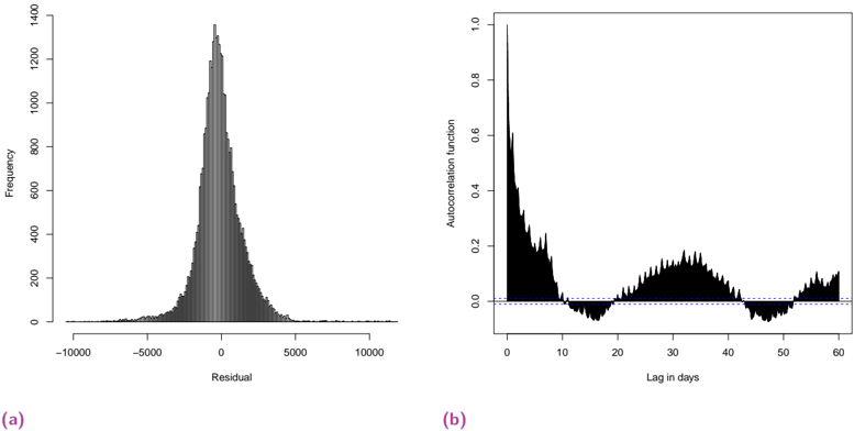
## Charts: Residual Analysis and Autocorrelation Function
### Overview
The image presents two charts: (a) a histogram of residuals and (b) a plot of the autocorrelation function. Both charts are likely related to the analysis of a time series or regression model. The histogram shows the distribution of the residuals, while the autocorrelation function plot reveals the correlation between residuals at different time lags.
### Components/Axes
**Chart (a): Histogram of Residuals**
* **X-axis:** "Residual" - Scale ranges approximately from -10000 to 10000.
* **Y-axis:** "Frequency" - Scale ranges approximately from 0 to 1400.
* No legend is present.
**Chart (b): Autocorrelation Function**
* **X-axis:** "Lag in days" - Scale ranges from 0 to 60.
* **Y-axis:** "Autocorrelation function" - Scale ranges approximately from 0 to 1.0.
* A horizontal dashed line is present at y = 0.
* No legend is present.
### Detailed Analysis or Content Details
**Chart (a): Histogram of Residuals**
The histogram is approximately symmetrical around zero. The peak frequency is around 1200, occurring at a residual value close to zero. The distribution has heavy tails, meaning there are some residuals with large absolute values (both positive and negative). The frequency decreases rapidly as the absolute value of the residual increases. Approximate values:
* Residual = 0, Frequency ≈ 1200
* Residual = 2000, Frequency ≈ 600
* Residual = 4000, Frequency ≈ 200
* Residual = 6000, Frequency ≈ 100
* Residual = 8000, Frequency ≈ 50
* Residual = 10000, Frequency ≈ 20
**Chart (b): Autocorrelation Function**
The autocorrelation function starts at a value of approximately 1.0 at lag 0. It then decreases rapidly to a value close to 0 around lag 10. After that, it oscillates around the zero line (dashed line) with some positive and negative values. There appears to be a slight positive autocorrelation around lag 20-30, but it remains close to zero. Approximate values:
* Lag 0, Autocorrelation ≈ 1.0
* Lag 5, Autocorrelation ≈ 0.3
* Lag 10, Autocorrelation ≈ 0.05
* Lag 15, Autocorrelation ≈ -0.05
* Lag 20, Autocorrelation ≈ 0.1
* Lag 30, Autocorrelation ≈ 0.05
* Lag 40, Autocorrelation ≈ -0.05
* Lag 50, Autocorrelation ≈ -0.05
* Lag 60, Autocorrelation ≈ 0.0
### Key Observations
* The residual histogram (a) suggests that the residuals are approximately normally distributed, but with heavier tails than a normal distribution.
* The autocorrelation function (b) shows a strong autocorrelation at lag 0 (as expected) and a rapid decay to near zero for higher lags. The oscillations around zero suggest that there is no significant autocorrelation remaining in the residuals.
### Interpretation
The combination of these two charts suggests that the model used to generate these residuals is reasonably well-fitted to the data. The approximately normal distribution of residuals indicates that the model's assumptions are likely met. The lack of significant autocorrelation in the residuals confirms that the model is capturing the temporal dependencies in the data and that there is no remaining pattern in the errors. The heavy tails in the residual distribution might indicate the presence of outliers or that the model is not perfectly capturing all the variability in the data. The autocorrelation function plot indicates that the residuals are independent of each other over time, which is a desirable property of a well-fitted model.