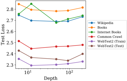
## Line Chart: Test Loss vs. Depth for Different Datasets
### Overview
This line chart depicts the relationship between 'Depth' (on a logarithmic scale) and 'Test Loss' for six different datasets: Wikipedia, Books, Internet Books, Common Crawl, WebText2 (Train), and WebText2 (Test). The chart aims to illustrate how the test loss changes as the depth of a model or process increases for each dataset.
### Components/Axes
* **X-axis:** 'Depth', ranging from approximately 10<sup>1</sup> to 10<sup>2</sup> (logarithmic scale).
* **Y-axis:** 'Test Loss', ranging from approximately 2.3 to 2.9.
* **Legend:** Located in the top-right corner, identifying each line with a corresponding color:
* Blue: Wikipedia
* Orange: Books
* Green: Internet Books
* Red: Common Crawl
* Purple: WebText2 (Train)
* Brown: WebText2 (Test)
### Detailed Analysis
Here's a breakdown of each data series and their trends:
* **Wikipedia (Blue):** The line starts at approximately 2.73 at Depth 10<sup>1</sup>, dips slightly to around 2.70, and then rises to approximately 2.75 at Depth 10<sup>2</sup>. The trend is relatively flat with a slight upward slope.
* **Books (Orange):** The line begins at approximately 2.86 at Depth 10<sup>1</sup>, decreases to around 2.78, and then increases to approximately 2.88 at Depth 10<sup>2</sup>. This line shows a slight dip followed by an increase.
* **Internet Books (Green):** This line exhibits the most pronounced dip. It starts at approximately 2.92 at Depth 10<sup>1</sup>, drops sharply to around 2.68 at an intermediate depth, and then rises to approximately 2.80 at Depth 10<sup>2</sup>.
* **Common Crawl (Red):** The line starts at approximately 2.53 at Depth 10<sup>1</sup>, decreases slightly to around 2.48, and then remains relatively stable, ending at approximately 2.50 at Depth 10<sup>2</sup>. This line shows a slight decrease and then plateaus.
* **WebText2 (Train) (Purple):** The line begins at approximately 2.38 at Depth 10<sup>1</sup>, decreases to around 2.33, and then increases to approximately 2.37 at Depth 10<sup>2</sup>. This line shows a slight decrease followed by a slight increase.
* **WebText2 (Test) (Brown):** The line starts at approximately 2.44 at Depth 10<sup>1</sup>, remains relatively flat around 2.40, and then increases to approximately 2.45 at Depth 10<sup>2</sup>. This line is mostly flat with a slight upward trend.
### Key Observations
* The 'Internet Books' dataset shows the most significant decrease in test loss as depth increases, suggesting it benefits the most from increased depth within the observed range.
* 'WebText2 (Train)' consistently exhibits the lowest test loss across all depths.
* 'Wikipedia' and 'Books' show relatively stable test loss values with minor fluctuations.
* 'Common Crawl' shows a slight initial decrease in test loss, followed by stabilization.
* 'WebText2 (Test)' shows a slight increase in test loss.
### Interpretation
The chart suggests that increasing the 'Depth' of a model or process does not consistently lead to lower 'Test Loss' across all datasets. The impact of depth is dataset-dependent. The 'Internet Books' dataset appears to be particularly sensitive to depth, experiencing a substantial reduction in test loss. The relatively low and stable test loss for 'WebText2 (Train)' indicates that this dataset may be well-suited for the model or process being evaluated. The divergence between 'WebText2 (Train)' and 'WebText2 (Test)' at higher depths suggests potential overfitting on the training data. The logarithmic scale of the x-axis implies that the benefits of increasing depth may diminish as depth increases further. The chart provides insights into the optimal depth for different datasets, helping to guide model or process design and tuning. The data suggests that a one-size-fits-all approach to depth is not optimal, and dataset-specific considerations are crucial.