\n
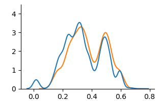
## Line Chart: Distribution Comparison
### Overview
The image presents a line chart comparing two distributions. The chart displays the frequency or density of values along the x-axis, ranging from approximately 0.0 to 0.8. The y-axis represents the corresponding frequency or density, ranging from 0.0 to approximately 4.0. Two lines, one blue and one orange, depict the distributions.
### Components/Axes
* **X-axis:** Ranges from 0.0 to 0.8, with tick marks at 0.0, 0.2, 0.4, 0.6, and 0.8. The axis is not explicitly labeled, but represents a variable with values between 0 and 0.8.
* **Y-axis:** Ranges from 0.0 to 4.0, with tick marks at 0.0, 1.0, 2.0, 3.0, and 4.0. The axis is not explicitly labeled, but represents the frequency or density of the variable on the x-axis.
* **Line 1 (Blue):** Represents the first distribution.
* **Line 2 (Orange):** Represents the second distribution.
* **Legend:** There is no explicit legend, but the colors of the lines are used to differentiate the distributions.
### Detailed Analysis
* **Blue Line:** The blue line starts at approximately 0.0 at x=0.0, rises to a peak of approximately 3.2 at x=0.3, decreases to a local minimum of approximately 1.5 at x=0.4, rises again to a peak of approximately 2.8 at x=0.5, and then declines to approximately 0.0 at x=0.7.
* **Orange Line:** The orange line starts at approximately 0.0 at x=0.0, rises to a peak of approximately 3.4 at x=0.25, decreases to a local minimum of approximately 1.8 at x=0.4, rises again to a peak of approximately 3.0 at x=0.55, and then declines to approximately 0.0 at x=0.7.
### Key Observations
* Both distributions exhibit a similar shape, with two prominent peaks.
* The orange line appears to be slightly shifted to the right compared to the blue line.
* The peak at approximately x=0.3 (blue) and x=0.25 (orange) are similar in magnitude.
* The peak at approximately x=0.5 (blue) and x=0.55 (orange) are also similar in magnitude.
* Both lines converge to approximately 0.0 around x=0.7.
### Interpretation
The chart suggests that the two variables represented by the blue and orange lines have similar underlying distributions, but with a slight difference in their central tendency. The two peaks could represent two distinct modes or clusters within the data. The similarity in shape suggests that the variables are related, but the shift in position indicates that one variable tends to have slightly higher values than the other. Without knowing what the x-axis represents, it is difficult to draw more specific conclusions. The chart could be visualizing the distribution of scores, measurements, or probabilities. The convergence to zero at the right end of the x-axis suggests that values beyond a certain point become increasingly rare.