## Line Chart: Pass@k Performance Comparison
### Overview
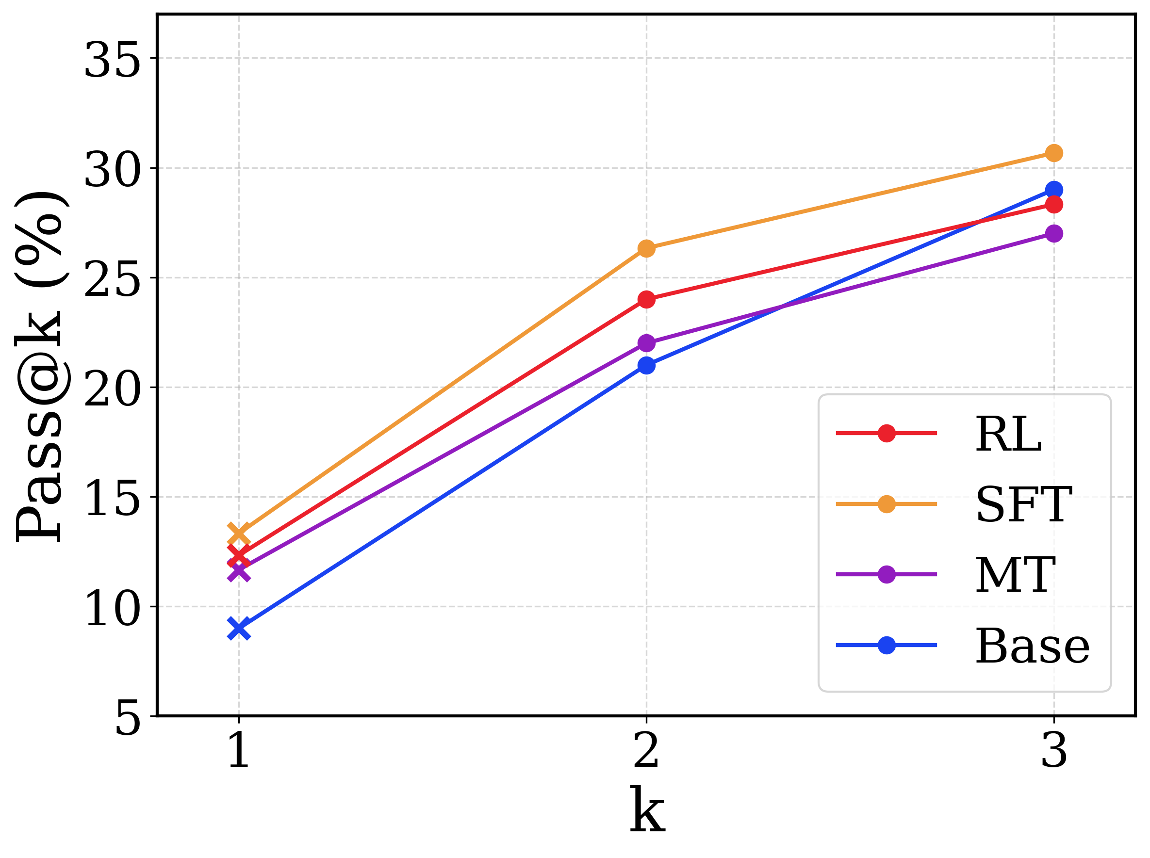
This image is a line chart comparing the performance of four different models or methodologies across three discrete evaluation points. The metric being measured is "Pass@k (%)", which typically represents the probability that at least one correct result is found within the top $k$ generated samples. The chart demonstrates how performance scales as the number of allowed attempts ($k$) increases. All text in the image is in English.
### Components/Axes
**1. Chart Area & Grid:**
* The chart features a white background with a light gray, dashed grid.
* Horizontal grid lines align with the Y-axis major ticks.
* Vertical grid lines align with the X-axis major ticks.
**2. Y-Axis (Left Edge):**
* **Label:** "Pass@k (%)" (Rotated 90 degrees counter-clockwise, positioned vertically along the left edge).
* **Scale:** Linear, ranging from 5 to 35.
* **Markers/Ticks:** 5, 10, 15, 20, 25, 30, 35.
**3. X-Axis (Bottom Edge):**
* **Label:** "k" (Positioned centrally below the axis markers).
* **Scale:** Discrete categorical/ordinal steps.
* **Markers/Ticks:** 1, 2, 3.
**4. Legend (Bottom-Right Quadrant):**
* Positioned inside the main chart area, in the lower right corner.
* Enclosed in a rounded rectangular box with a light gray border.
* Contains four entries, mapping line colors to model names:
* Red line with a solid circle: **RL**
* Orange line with a solid circle: **SFT**
* Purple line with a solid circle: **MT**
* Blue line with a solid circle: **Base**
*Note on Markers:* While the legend displays solid circles for all entries, the actual data points plotted on the chart at $k=1$ are represented by 'x' (cross) markers. The data points at $k=2$ and $k=3$ are represented by solid circles.
### Detailed Analysis
**Trend Verification & Data Extraction:**
All four data series exhibit a positive, upward-sloping trend, indicating that the Pass@k percentage increases for all models as $k$ increases from 1 to 3.
* **SFT (Orange Line):**
* *Trend:* Slopes upward steeply from $k=1$ to $k=2$, then continues upward at a slightly shallower angle to $k=3$. It remains the highest-performing model across all values of $k$.
* $k=1$: ~13.5% ('x' marker)
* $k=2$: ~26.5% (circle marker)
* $k=3$: ~30.5% (circle marker)
* **RL (Red Line):**
* *Trend:* Slopes upward. It starts as the second-highest performer at $k=1$ and $k=2$, but its trajectory flattens slightly between $k=2$ and $k=3$, causing it to be overtaken by the Base model.
* $k=1$: ~12.5% ('x' marker)
* $k=2$: ~24.0% (circle marker)
* $k=3$: ~28.5% (circle marker)
* **MT (Purple Line):**
* *Trend:* Slopes upward. It maintains the third-highest position at $k=1$ and $k=2$. Between $k=2$ and $k=3$, it has the shallowest slope of all models, resulting in it becoming the lowest-performing model at $k=3$.
* $k=1$: ~11.5% ('x' marker)
* $k=2$: ~22.0% (circle marker)
* $k=3$: ~27.0% (circle marker)
* **Base (Blue Line):**
* *Trend:* Slopes upward with the steepest overall trajectory. It starts as the lowest-performing model at $k=1$ and $k=2$. However, due to its steep continuous climb, it crosses both the MT and RL lines to become the second-highest performer at $k=3$.
* $k=1$: ~9.0% ('x' marker)
* $k=2$: ~21.0% (circle marker)
* $k=3$: ~29.0% (circle marker)
**Reconstructed Data Table (Approximate Values ±0.5%):**
| Model | k=1 | k=2 | k=3 |
| :--- | :--- | :--- | :--- |
| **SFT** (Orange) | ~13.5% | ~26.5% | ~30.5% |
| **RL** (Red) | ~12.5% | ~24.0% | ~28.5% |
| **MT** (Purple) | ~11.5% | ~22.0% | ~27.0% |
| **Base** (Blue) | ~9.0% | ~21.0% | ~29.0% |
### Key Observations
1. **Consistent Leader:** The "SFT" model consistently outperforms all other models at every measured value of $k$.
2. **Steepest Improver:** The "Base" model shows the most dramatic improvement as $k$ increases. While it is the worst performer at a single attempt ($k=1$), it scales incredibly well, surpassing MT and RL when given three attempts ($k=3$).
3. **Diminishing Returns for MT:** The "MT" model shows the most significant drop-off in improvement rate between $k=2$ and $k=3$, causing it to fall to the bottom of the pack.
4. **Marker Anomaly:** The use of 'x' markers exclusively at $k=1$ (despite the legend showing circles) suggests a potential methodological difference in how the $k=1$ metric was calculated or evaluated compared to $k>1$, though this is not explicitly stated in the image.
### Interpretation
This chart likely represents the evaluation of Large Language Models (LLMs) on a coding or reasoning benchmark (such as HumanEval or MBPP), where "Pass@k" measures the likelihood of the model generating a correct solution if allowed to generate $k$ different answers.
* **SFT (Supervised Fine-Tuning)** appears to be the most robust method overall, providing the highest baseline accuracy and scaling well with multiple attempts.
* The **Base** model's behavior is highly notable. Its low Pass@1 but high Pass@3 suggests that while its "top choice" or most confident answer is often wrong, the correct answer is very frequently present within its top three generations. This indicates high variance but good underlying capability.
* **RL (Reinforcement Learning)** and **MT (potentially Multi-Task or Machine Translation, depending on context)** improve upon the Base model for single-shot attempts ($k=1$), likely by aligning the model to output the correct answer first. However, they seem to suffer from "mode collapse" or reduced diversity compared to the Base model; because their generations are more homogenous, giving them more attempts ($k=3$) does not yield as much additional benefit as it does for the Base model.